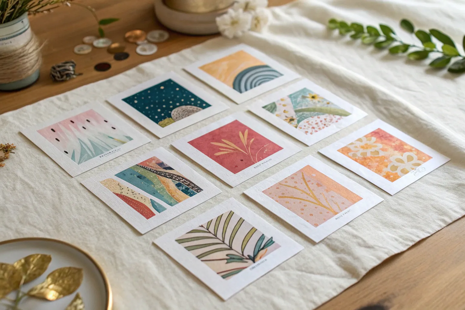
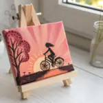
Artist trading cards are tiny, collectible artworks that pack a big creative punch into a 2.5 x 3.5-inch space. I love them because you can experiment fast, make little themed series, and actually trade your art with other artists like a mini gallery exchange.
Classic Mini Portrait Series
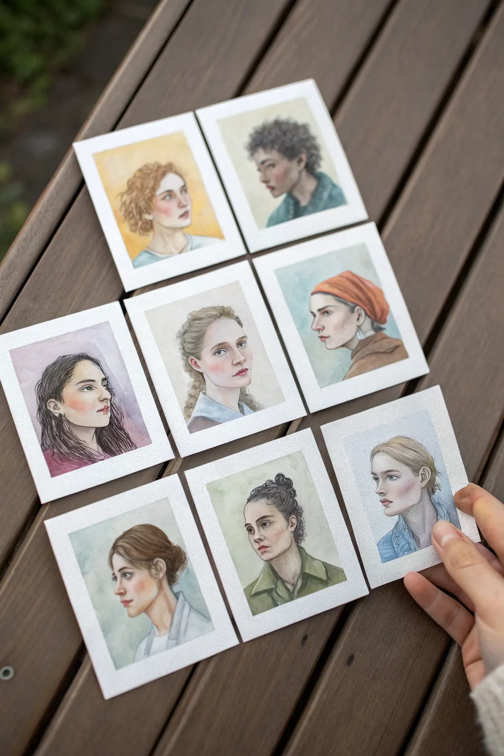
Capture the delicate beauty of the human face with this series of artist trading cards, focusing on diverse profiles and subtle expressions. Each card works as a standalone study in features and skin tones, but together they create a stunning gallery of characters in soft, translucent watercolor.
Step-by-Step Tutorial
Materials
- Cold press watercolor paper (300 gsm), cut to ATC size (2.5 x 3.5 inches)
- Watercolor paints (pan or tube set)
- Round watercolor brushes (sizes 0, 2, and 4)
- H or HB graphite pencil for sketching
- Kneaded eraser
- Waterproof fine liner pen (brown or grey, optional)
- White gouache or gel pen for highlights
- Masking tape
- Mixing palette
- Board for taping down paper
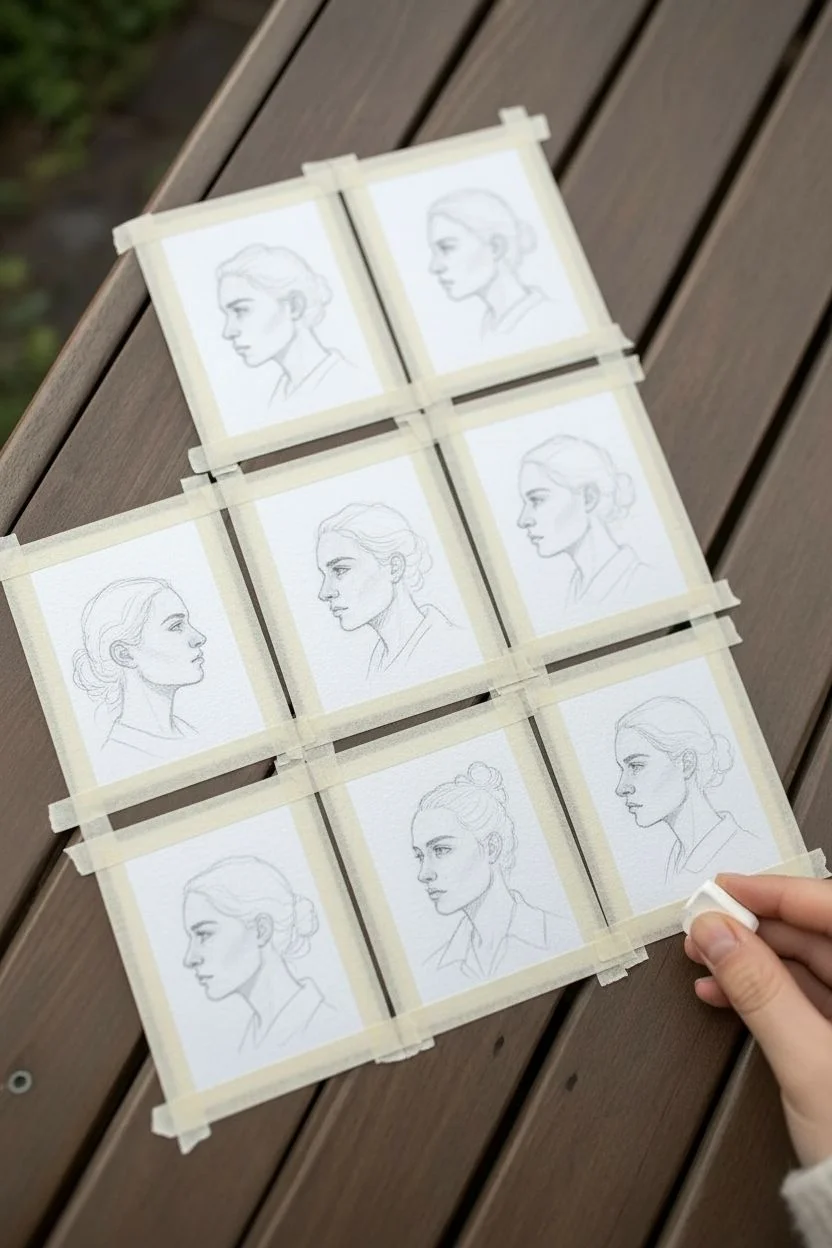
Step 1: Preparation and Sketching
-
Prepare the canvas:
Cut your watercolor paper into standard 2.5 x 3.5 inch rectangles. Tape each card down to your board using masking tape, leaving a clean 1/8-inch border around the edges to frame the final portrait. -
Map the proportions:
Using an H pencil, lightly sketch the basic head shapes. Focus on placing the ear centrally for profiles and ensuring the eye line falls exactly halfway down the face. -
Refine the features:
Draw the specific features for each character. Vary the nose shapes, jawlines, and hairstyles to create diversity across your series. Keep your pencil pressure extremely light so the graphite doesn’t muddy the watercolor later. -
Clean the sketch:
Gently roll a kneaded eraser over your sketches to lift excess graphite, leaving only the faintest guide lines visible for painting.
Step 2: Painting the Skin Tones
-
Mix your base tones:
Prepare a watery wash for the skin base. I like to mix variations using yellow ochre, burnt sienna, and a touch of alizarin crimson for warmth. -
Apply the first wash:
Lay down a wet-on-dry wash over the face and neck area, avoiding the eyes and hair. Let the pigment pool naturaly in shadow areas like under the chin. -
Build facial structure:
While the first layer is still slightly damp, drop in a slightly darker, reddish mix on the cheeks, nose tip, and ears to create a natural flush. Allow this to dry completely. -
Deepen shadows:
Mix a cool shadow tone (add a tiny bit of cobalt blue or purple to your skin mix). Paint the shadows under the jaw, inside the ear, and in the eye sockets to create three-dimensional form.
Too Much Water?
If a bloom forms or color bleeds where you don’t want it, quickly lift the excess moisture with the corner of a clean, dry paper towel or a thirsty brush.
Step 3: Features and Hair
-
Define the eyes:
Using your size 0 brush, carefully paint the iris and pupil. Remember to leave a tiny speck of white paper for the catchlight, or add it later with gouache. -
Paint the lips:
Use a diluted red or containment mix for the lips. The upper lip is usually in shadow and darker than the lower lip. Soften the edges with a clean, damp brush so they don’t look outlined. -
Block in hair shapes:
Start the hair with a medium-value wash that matches the local hair color. Paint the general mass of the hair rather than individual strands. -
Add hair texture:
Once the hair base is dry, use a size 2 brush with darker, more saturated paint to define curls, waves, or strands. Focus these dark strokes near the roots and tucked behind ears. -
Clothing washes:
Paint the collars and shoulders with simple, loose washes. Using cool blues, greens, or neutrals here contrasts nicely with the warm skin tones.
Pro Tip: Shadow Temperature
Skin shadows aren’t just darker; they are cooler. Adding a touch of blue or violet to your skin mix for neck shadows makes the face look instantly more realistic.
Step 4: Final Details
-
Background wash:
Apply a very pale, watery background wash behind the head if desired. This helps the profile pop; a soft slate blue or pale ochre works well. -
Refine edges:
If you want more definition, use a diluted brown watercolor or a very fine waterproof pen to sparingly outline the jawline or eyelashes. -
Highlights:
Use white gouache or a white gel pen to add sharp highlights to the tip of the nose, the lip, and the center of the eyes. -
Reveal the border:
Wait until the paper is bone dry—cool to the touch—before carefully peeling away the masking tape to reveal the crisp white edges.
Arrange your finished portraits together to admire the variety of expressions and personalities you have brought to life


Watercolor Wash and Ink Doodle ATCs
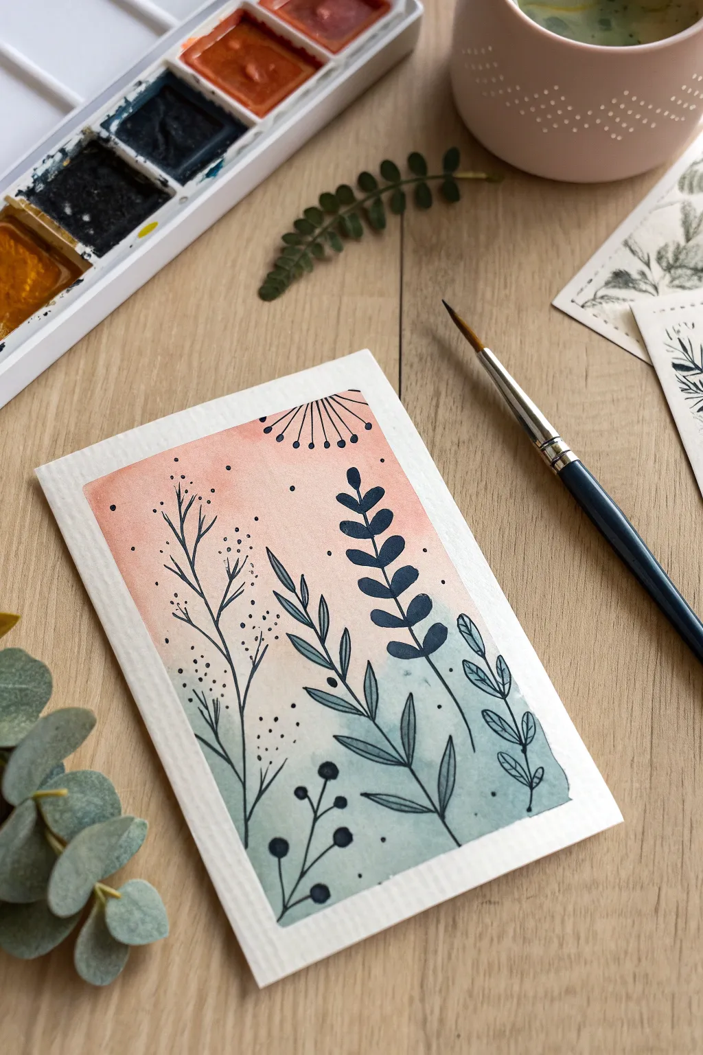
Blend the soft elegance of watercolor gradients with the crisp definition of ink illustration in this charming artist trading card. By layering organic leafy doodles over a warm-to-cool ombre wash, you can create a striking piece that looks complex but is delightfully simple to execute.
Detailed Instructions
Materials
- Watercolor paper (cold press recommended, at least 140lb/300gsm)
- Watercolor paints (Peach/Coral tone and Teal/Sage Green tone)
- Round watercolor brush (size 4 or 6)
- Black fine liner pen (waterproof) or India ink with a dip pen
- Painter’s tape or washi tape
- Cup of water and paper towels
- Pencil and eraser (optional)
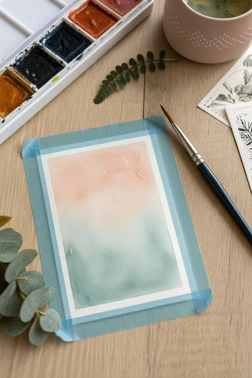
Step 1: Preparing the Base
-
Cutting the cards:
Begin by cutting your watercolor paper to the standard ATC size of 2.5 x 3.5 inches. Ensure your edges are straight and clean for a professional finish. -
Taping the borders:
Secure the card to your workspace using painter’s tape or artist’s tape. Create a border about 1/4 inch thick on all four sides to frame the artwork cleanly. -
Pre-wetting the paper:
With a clean brush and clear water, lightly dampen the exposed rectangle of paper. You want it shiny but not pooling with water to prime it for the wet-on-wet technique.
Bleeding Lines?
If your ink feathers or spreads, the paper is likely still damp inside. Wait longer or use a waterproof pigment liner instead of water-soluble fountain pen ink.
Step 2: Creating the Ombre Wash
-
Applying the warm tone:
Load your brush with a diluted peach or coral watercolor mix. Start painting at the very top of the taped area, moving horizontally across. -
Fading the top color:
As you work your way down to the middle of the card, dip your brush in water to lighten the pigment, allowing the peach tone to fade gently. -
Applying the cool tone:
Rinse your brush thoroughly. Pick up your teal or sage green pigment and start painting from the bottom edge, moving upward. -
Blending the middle:
Where the green meets the faded peach in the center, use a clean, slightly damp brush to encourage the two colors to merge softly without creating a muddy line. -
Letting it dry completely:
Step away and let the wash dry fully. The paper must be bone-dry before you add ink, or the lines will bleed. I usually wait about 15-20 minutes or use a hairdryer on low heat.
Pro Tip: Contrast
Vary your line weights! Use a thicker pen (0.8mm) for the solid leaves and a thinner one (0.1mm) for the delicate wispy textures to add visual depth.
Step 3: Adding the Botanical Doodles
-
Anchoring the main stem:
Using your black fine liner, draw a simple curved line starting from the bottom right corner, extending up toward the middle. This will be your primary focal plant. -
Adding bold leaves:
Draw paired, oval-shaped leaves along this first stem. Fill them in solid black for high contrast against the pastel background. -
Sketching the secondary plant:
Draw a taller, thinner stem rising from the bottom center, reaching higher than the first. Keep this line delicate. -
Drawing open leaves:
On this second stem, draw elongated, pointed leaves. Instead of filling them in, leave them as outlines and draw a single center vein in each for variety. -
Adding a wispy sprig:
On the left side, create a very thin, branching structure that curves naturally. Draw tiny dots or micro-leaves at the tips to suggest a wildflower or grass texture. -
Filling the gaps:
Add smaller botanical elements near the bottom, like a short stem with round berries or buds to balance the composition. -
Adding decorative details:
In the upper open space, draw a stylized sunburst or flower head using simple lines radiating from a point, topping each line with a dot. -
Sprinkling stardust:
Finish the composition by placing small clusters of dots randomly around the stems to fill empty negative space and add a magical, pollen-like effect.
Step 4: Finishing Touches
-
Removing the tape:
Once the ink is totally dry, slowly peel back the painter’s tape at a 45-degree angle away from the artwork to reveal your crisp white border. -
Signing your work:
Don’t forget to sign and date the back of your card, which is a tradition for Artist Trading Cards.
Now you have a serene little garden scene ready to trade or display
Botanical Studies in Tiny Frames
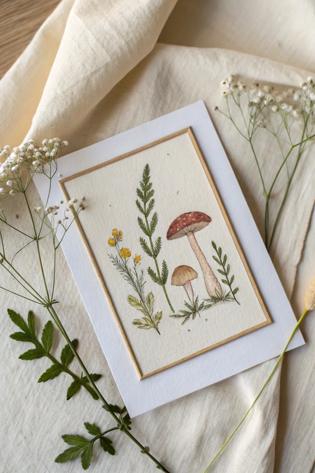
Capture the delicate beauty of the woodland undergrowth with this refined botanical artist trading card. By combining fine liner detailing with soft watercolor washes on cream paper, you can create a vintage-inspired study that feels both scientific and whimsical.
Step-by-Step Guide
Materials
- Cream or off-white cold press watercolor paper (cut to 2.5″ x 3.5″)
- White cardstock (for mounting, slightly larger than the art panel)
- Fine liner pen (Sepia or Dark Brown, size 005 or 01)
- Watercolor paints (Burnt Sienna, Red Ochre, Sap Green, Yellow Ochre, Lamp Black)
- Small round brush (size 0 or 2)
- Ruler
- Pencil and kneaded eraser
- Gold or bronze gel pen
- Double-sided tape or glue stick
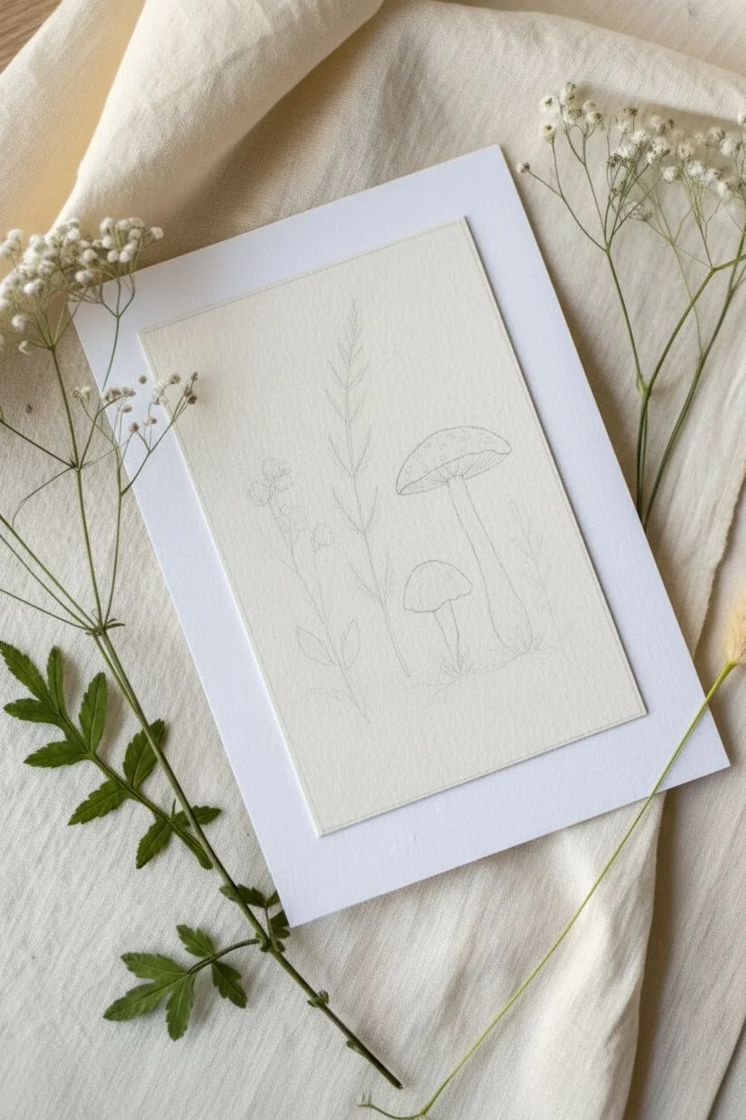
Step 1: Sketching the Composition
-
Prepare the paper:
Cut your cream watercolor paper into a rectangle slightly smaller than standard ATC size, approximately 2.25″ x 3.25″. This will allow the white backing to create a frame later. -
Lightly sketch the elements:
Using a hard pencil (like an H or 2H), very faintly sketch the vertical positions of your plants. Place the tall fern in the center, the mushrooms to the right, and the wildflowers to the left. -
Refine the shapes:
Flesh out the mushroom caps—one large and open, one small button—and mark the main stems for the greenery. Keep the pencil pressure extremely light so it doesn’t show through the paint.
Vintage Patina
For an aged look, lightly brush the edges of your cream paper with a damp teabag before drawing. It adds a subtle, antique stain.
Step 2: Inking the Outlines
-
Select your liner:
Choose a sepia or dark brown fine liner instead of black. This softens the look and mimics vintage botanical prints. -
Draw the fern:
Start with the central fern. Draw a thin central stalk, then use quick, short flicks of the pen to create the leaflets. Let the leaves get smaller as they reach the tip. -
Outline the mushrooms:
Trace the mushroom caps and stems with a slightly broken line to suggest texture. Use stippling (dots) under the cap of the large mushroom to hint at gills. -
Detail the wildflowers:
Draw the stems for the yellow flowers on the left. Keep the lines organic and slightly wavering. Add tiny clusters of circles for the flower heads. -
Add ground cover:
At the base of all stems, draw a few jagged, grass-like lines to ground the plants so they aren’t floating in space. -
Erase pencil marks:
Wait until the ink is completely dry, then gently lift away your graphite sketch with a kneaded eraser.
Step 3: Watercolor Application
-
Paint the large mushroom:
Mix a watery Red Ochre or Burnt Sienna. Paint the cap of the tall mushroom, leaving tiny specs of white paper dry to represent the spots on the toadstool. -
Paint the small mushroom:
Use a diluted wash of light brown or beige for the smaller mushroom cap. It should be significantly paler than the large one. -
Add stem shadows:
Mix a very faint grey-brown. Run a thin line down one side of the mushroom stems to give them cylindrical volume. -
Color the greenery:
Using Sap Green, carefully fill in the fern leaves. I like to vary the water load here—making some leaves darker and others more transparent creates depth. -
Paint the flowers:
Dab Yellow Ochre onto the flower clusters. Keep the paint fairly concentrated so the yellow stands out against the cream paper.
Textured Gills
Use a white gel pen to draw tiny, thin lines under the red mushroom cap after painting. It makes the gills pop against the shadow.
Step 4: Finishing Touches
-
Draw the border:
Once the paint is dry, use a ruler and a gold or bronze gel pen to draw a straight border around the edge of the cream paper, about 1/8 inch from the side. -
Add initials:
Sign your work with tiny initials at the bottom near the roots using your brown fine liner. -
Mount the card:
Apply double-sided tape to the back of the painted panel and center it onto the pristine white cardstock base.
Now you have a charming, gallery-worthy botanical study ready to trade or display

Simple Landscape Gradient Skies
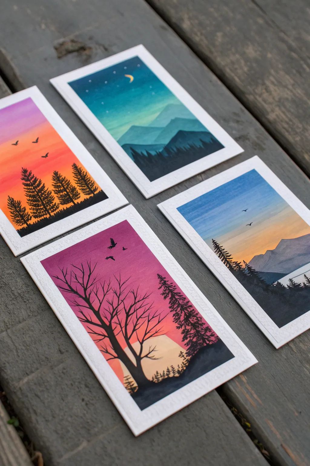
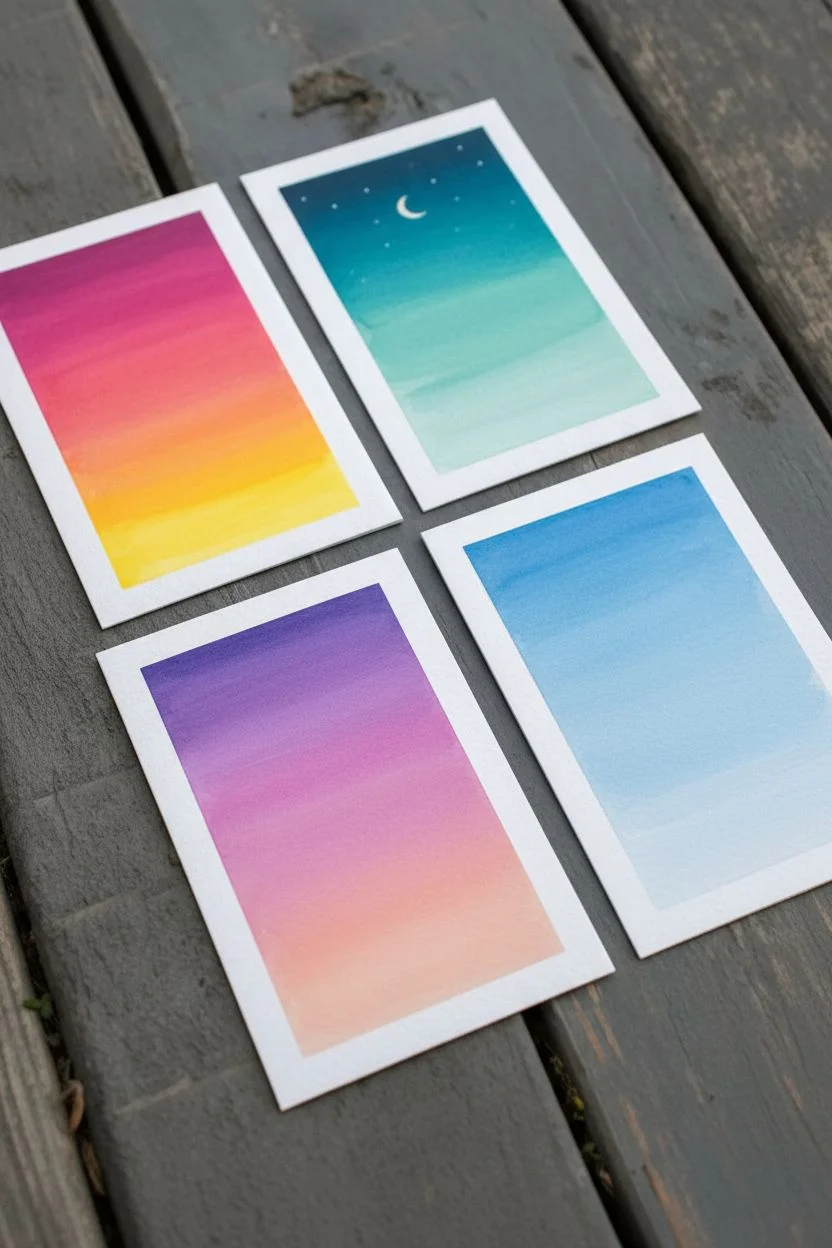
These striking artist trading cards feature smooth, gradient skies transitioning behind bold black silhouettes of trees and mountains. The contrast between the vibrant blended backgrounds and the crisp foreground details creates a sense of depth and atmosphere in a miniature playing-card format.
Step-by-Step Tutorial
Materials
- Artist Trading Card (ATC) paper (2.5″ x 3.5″ watercolor or mixed media paper)
- Acrylic paints or Gouache (Cyan, Magenta, Yellow, White, Black, Deep Blue)
- Flat shader brushes (small and medium)
- Fine detail liner brush (size 00 or 000)
- Washi tape or masking tape
- Mixing palette
- Water cup and paper towels
Step 1: Preparation & Sky Gradients
-
Prepare the canvas:
Begin by taping down your ATC paper to a flat surface. Since these are small cards, securing them prevents the paper from buckling and gives you a nice clean border if you tape over the edges slightly. -
Plan your palette:
Decide on four distinct color schemes like the ones shown: a sunset orange/yellow, a twilight teal/blue, a sunrise purple/pink, and a daylight blue/pale orange. Squeeze out your base colors onto the palette. -
Start the sunset blend:
For the orange sunset card, start at the top with a mix of magenta and a touch of white. Apply this smoothly across the top third of the card using a flat brush. -
Transition to orange:
Clean your brush slightly and pick up bright orange (mix red and yellow if needed). Paint the middle section, blending upward into the pink while the paint is still wet to create a seamless transition. -
Finish with yellow:
Load your brush with yellow and paint the bottom third. Blend upward into the orange. The goal is a smooth ombre effect without hard lines. -
Create the twilight sky:
For the night scene, use a deep teal or Prussian blue at the top, transitioning down into a lighter turquoise mixed with white. Keep the strokes horizontal and smooth. -
Paint the purple dawn:
For the purple card, start with a rich violet at the top, blending down into magenta, and finally a soft peach or pale pink at the bottom horizon line. -
Establish the blue landscape:
For the final card, create a classic blue fade. Start with a medium sky blue at the top, fading into a very pale, almost white blue near the planned horizon. -
Add celestial details:
Once the twilight card is dry, use your smallest brush or a white gel pen to dot tiny stars in the upper dark section and paint a small crescent moon.
Streaky Skies?
If your gradient feels streaky, your paint might be drying too fast. Add a tiny drop of water or retarder medium to keep the acrylic workable for longer blending times.
Step 2: Silhouettes & Foreground
-
Mix your silhouette color:
You need a very opaque black for the foregrounds. I prefer to mix a tiny bit of dark blue into my black acrylic to give it richness, or simply use straight Mars Black. -
Paint distant mountains:
For the scenic depth shown in the teal and blue cards, paint distant mountains first using a lighter shade (mix your background color with a little gray). Let these dry completely. -
Add the main horizon line:
Using your black paint, establish the ground level across the bottom of each card. Make the line slightly uneven to mimic natural terrain like grass or hills. -
Detail the pine trees:
Switch to your fine liner brush. To paint the pine trees, draw a thin vertical line for the trunk. Then, using a stippling motion, tap small branches extending outward, getting wider as you move down the tree. -
Create the bare tree:
For the purple card, paint a larger, twisting trunk on the left side. Extend thin, jagged branches upward and outward, letting them taper off into fine points against the pink sky. -
Add flying birds:
With the very tip of your detail brush, paint tiny ‘v’ or ‘m’ shapes in the sky to represent distant birds. Vary their sizes slightly to suggest distance. -
Layer the foregrounds:
On the cards with mountains, paint a darker, closer layer of jagged peaks or treelines in pure black over the lighter, distant mountains to emphasize atmospheric perspective. -
Refine the edges:
Check the bottom edges of your trees and ground. Use small dabbing motions to create the texture of grass or undergrowth where the trees meet the ground. -
Final drying and peeling:
Ensure the thick black paint is 100% dry. Carefully peel off your tape at a 45-degree angle to reveal the crisp edges of your miniature masterpieces.
Level Up: Metallic Pop
Use metallic gold or silver paint for the moon and stars, or lightly dry-brush the tips of the trees with white to mimic frost or moonlight reflection.
You now have a stunning set of atmospheric landscapes ready to trade or display
BRUSH GUIDE
The Right Brush for Every Stroke
From clean lines to bold texture — master brush choice, stroke control, and essential techniques.
Explore the Full Guide
Collage-First Mixed Media ATCs
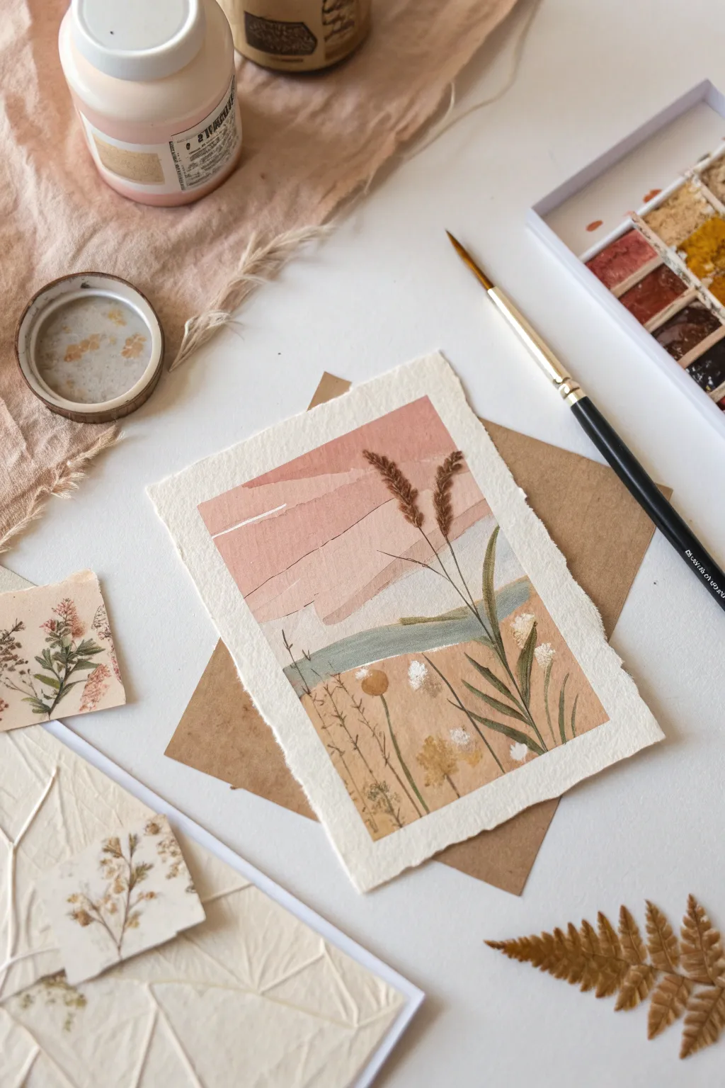
Create a serene, mixed-media artist trading card that combines the soft textures of painting with delicate paper layering. This project captures a dreamy, stylized landscape using a palette of dusty rose, sage green, and earthy ochres.
How-To Guide
Materials
- Heavyweight watercolor paper or mixed media paper (deckled edge preferred)
- Paints (Gouache or opaque watercolor in dusty rose, peach, sage green, and white)
- Flat shader brush (size 6 or 8)
- Fine liner brush (size 0 or 1)
- Scrap paper in neutral tones (kraft paper, beige)
- Adhesive (glue stick or matte medium)
- Dried botanicals or very fine faux stems
- Scissors
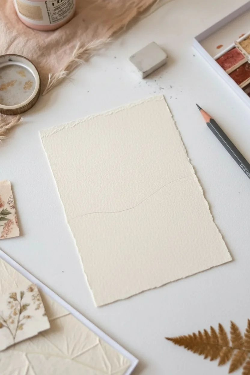
Step 1: Preparing the Base
-
Shape your paper:
Begin by tearing your watercolor paper down to approximately 2.5 x 3.5 inches, or slightly larger if you prefer a mat. If you have paper with a deckled edge, position your cut so this natural edge becomes the bottom or top of your card for added texture. -
Establish the horizon:
Lightly sketch a very faint horizon line about one-third of the way up from the bottom of the card. This doesn’t need to be perfectly straight; a slight organic curve adds to the natural feel.
Step 2: Painting the Backdrop
-
Mix the sky colors:
On your palette, mix a gradient of three colors: a deep dusty rose, a lighter peach, and a very pale, almost white pink. Gouache works beautifully here for its matte, opaque finish. -
Paint the sky layers:
Starting from the top, paint irregular, horizontal bands of color. Use your flat brush to lay down the deepest rose first, then the peach, and finally the palest pink as you move toward the horizon line. -
Create texture:
Don’t blend the layers perfectly. Allow the edges of each color band to be rough and distinct, mimicking the look of torn paper or distant strata. -
Add the distant hills:
Mix a muted teal or sage green with a bit of white. Paint a rolling hill shape just below your pink sky layers. Let this layer dry completely before moving on.
Torn Paper Trick
Brush a line of water where you want to tear your paper. Wait 30 seconds, and it will tear easily along that exact wet line for a soft, fuzzy edge.
Step 3: Foreground Collage
-
Prepare the foreground paper:
Take a piece of kraft paper or beige scrap paper. Tear the top edge to create a ragged, grassy look. This piece should cover the bottom third of your card. -
Add visual interest:
Before gluing, use watered-down brown paint or tea to add subtle splatters or stains to this kraft paper piece, giving it an aged, earthy appearance. -
Attach the foreground:
Glue the torn kraft paper onto the bottom of your card, overlapping the bottom edge of your painted green hill. Press it down firmly to ensure it lies flat.
Go 3D
Instead of painting all the grasses, use actual dried moss or real pressed flower stems glued onto the surface for incredible tactile texture.
Step 4: Botanical Details
-
Paint the main stems:
Switch to your fine liner brush. Using a dark olive or brownish-green paint, draw two or three tall, slender stalks rising from the foreground up into the sky area. -
Add grass blades:
fill the bottom foreground with finer, shorter lines in various shades of brown and green to represent wild grasses. Vary the pressure on your brush to create thick-to-thin lines. -
Paint the seed heads:
At the top of your tall stalks, dab small, textured spots of brownish-red paint to create the look of heavy seed heads, like wheat or sorrel. I like to tap the brush tip repeatedly to build up a fuzzy texture. -
Highlight with white:
Using pure white gouache or a white gel pen, add tiny dots or dashes to the seed heads and some of the grass tips. This simulates light catching the edges of the plants.
Step 5: Finishing Touches
-
Add floral accents:
Dip a small round brush or even a cotton swab into muted yellow or ochre paint. Press gently into the lower grassy area to create blurred, abstract wildflowers. -
Incorporate real texture:
If you have tiny dried flower bits or very thin skeleton leaves, glue one or two small pieces into the foreground for a true mixed-media 3D element. -
Flatten and seal:
Once all paint and glue is dry, place the card under a heavy book overnight to flatten any buckling. You can lightly spray with a matte fixative to protect the gouache.
Now you have a tranquil, tiny landscape ready for trading or framing
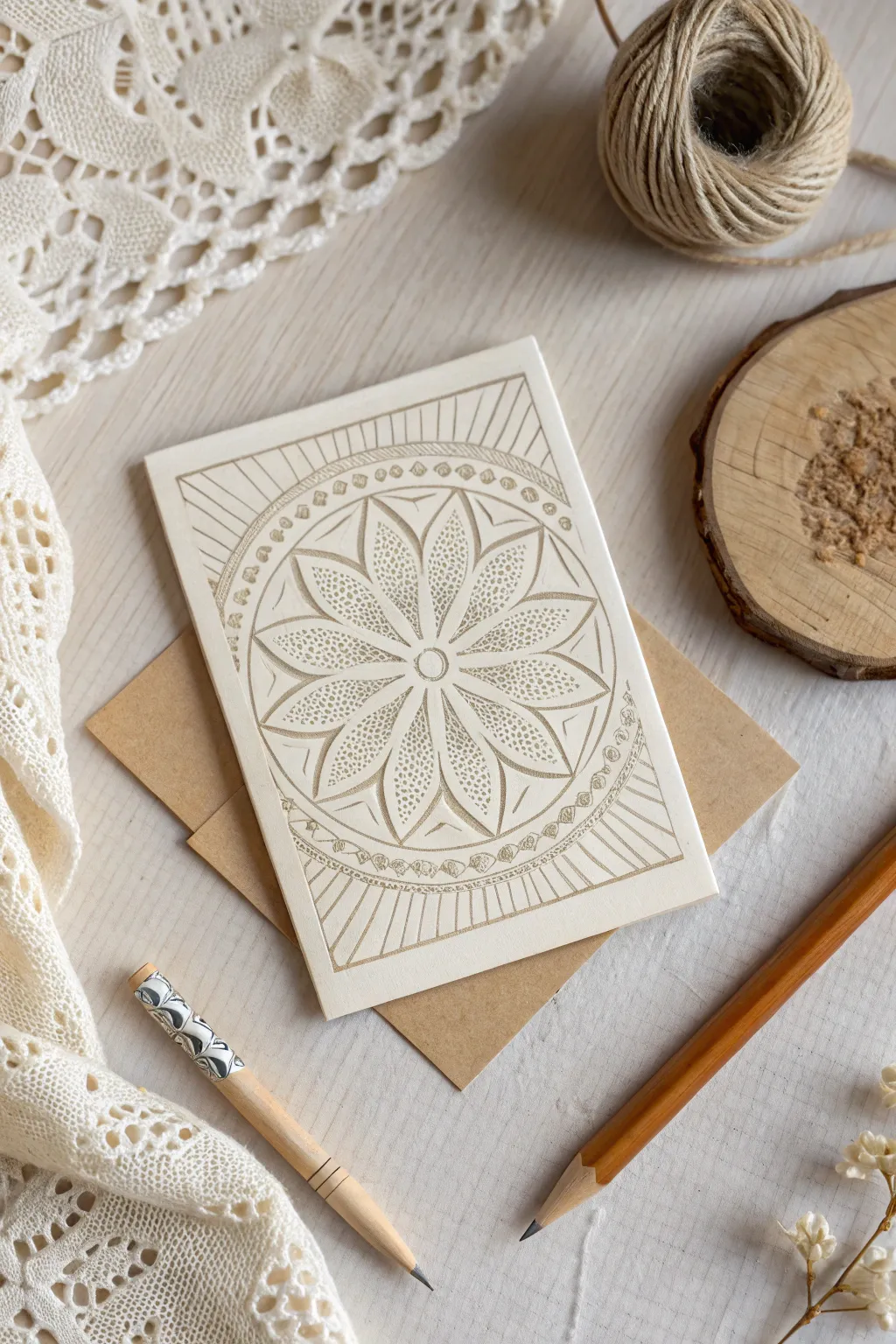
Stamped Patterns and Hand-Painted Details
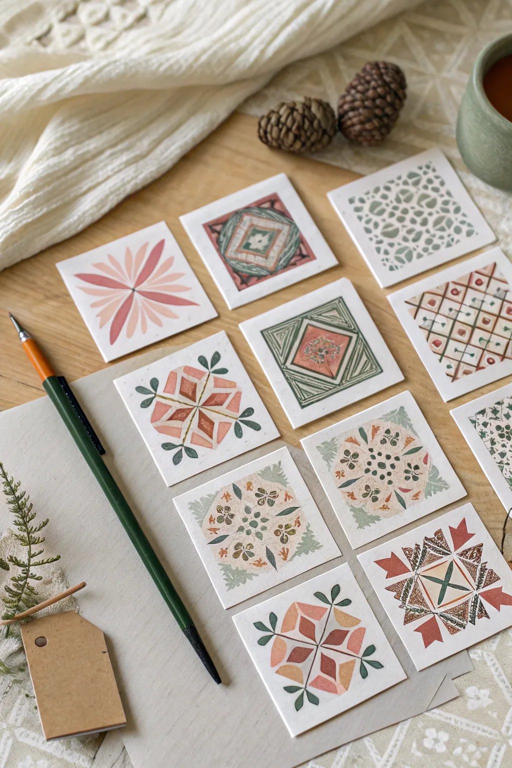
These charming artist trading cards feature a delightful mix of geometric precision and organic warmth, using a soft, earthy color palette of terracotta, sage, and pale peach. Perfect for swapping or collecting, each card serves as a miniature canvas for exploring repeating motifs and mandala-like designs.
Step-by-Step Guide
Materials
- Heavyweight watercolor paper or mixed media cardstock
- Gouache or matte acrylic paints (terracotta, sage green, mustard, cream, deep red)
- Fine liner brushes (sizes 0 and 00)
- Small flat shader brush (size 2-4)
- Ruler
- Pencil and eraser
- Scissors or craft knife
- Mixing palette
- Water container
- Paper towels
Step 1: Preparation & Base Layout
-
Cut the Cards:
Begin by measuring and cutting your watercolor paper into standard Artist Trading Card sizes (2.5 x 3.5 inches) or square variations (2.5 x 2.5 inches) as shown in the inspiration image. -
Establish Center Points:
For the symmetrical designs, lightly mark the exact center of your square cards with a pencil. Draw faint guidelines connecting opposite corners to form an ‘X’ or bisect the sides to form a cross. -
Sketch the Framework:
Using a very light hand, sketch the primary geometric shapes for each design. For diamond patterns, draw nested squares rotated 45 degrees. For floral mandalas, sketch the outer petal boundaries lightly.
Step 2: Painting the Motifs
-
Mix Your Palette:
Prepare your gouache or acrylics. You want a consistency similar to heavy cream—opaque enough to cover, but fluid enough for fine lines. Mix a muted palette: desaturate your reds with a touch of green to get that lovely terracotta, and soften greens with a bit of white or yellow ochre. -
Block in solid Shapes:
Start with the largest solid areas, such as the pink floral petals or the central diamond blocks. Use your flat brush for these geometric shapes to keep edges crisp. -
Layering Details:
Once the base shapes are dry to the touch, switch to a smaller round brush to add secondary colors. For example, on the ‘quilt’ style squares, paint the alternating triangles in sage green and mustard. -
Adding Fine Lines:
Using your finest liner brush, paint the delicate borders and concentric lines inside the diamond patterns. Keep your hand steady and rotate the paper, not your hand, to maintain a comfortable angle. -
Stippling Texture:
For the intricate lace-like designs, use the tip of your smallest brush to dab tiny dots or ‘stippling’ marks in dark green or brown to create seeds and pollen details in the center of the floral motifs.
Clean Lines Hack
For perfectly straight geometric borders without a ruler, use masking tape or distinct washi tape. Paint over the edge, let it dry partially, and peel back for a crisp line.
Step 3: Refining & Finishing
-
Erase Guidelines:
Ensure the paint is completely bone-dry. Gently erase any visible pencil marks that weren’t covered by paint, particularly around the outer edges of the designs. -
Clean Up Edges:
If any paint bled or lines look uneven, touch them up with a little bit of opaque white paint (or the background paper color) to sharpen the geometry. -
Add Leaf Accents:
On the floral designs, freehand small, simple leaves extending from the main motif. Use a single stroke method: press the brush down to widen the belly, then lift up to create a point. -
Final Inspection:
Check for visual balance. If a design feels too heavy on one side, add a small dot or line detail on the opposite side to correct the weight. -
Flattening:
If the water content in the paint caused the paper to buckle slightly, place the finished dry cards under a heavy book overnight to flatten them out perfectly.
Chalky Finish?
If your gouache dries too chalky and rubs off, add a tiny drop of gum arabic to your mixing water. This binds the pigment better and adds a very slight sheen.
Now you have a stunning set of miniature artworks ready to trade or display in a tiny frame

PENCIL GUIDE
Understanding Pencil Grades from H to B
From first sketch to finished drawing — learn pencil grades, line control, and shading techniques.
Explore the Full Guide
Bold Typography and Pocket Positivity ATCs


Brighten someone’s day with this charming, minimalist artist trading card that features bold typography and cheerful organic shapes. The design combines clean lines with a playful scattering of botanicals and abstract forms, making it a perfect project for beginners looking to practice composition.
Detailed Instructions
Materials
- Heavyweight white cardstock or watercolor paper (cut to 2.5 x 3.5 inches for a standard ATC, or 5 x 3.5 inches folded)
- Blue fine-liner or brush pen (navy or dark blue)
- Small round paintbrush (size 2 or 4)
- Gouache or acrylic paints (mustard yellow, terracotta red, navy blue)
- Pencil and eraser
- Ruler
- Water formatting cup and paper towel
Step 1: Planning and Layout
-
Prepare your canvas:
Start with a piece of high-quality white cardstock. You can either cut a single 2.5 x 3.5 inch card for a traditional ATC or cut a 5 x 3.5 inch piece and fold it in half to create a mini greeting card style like the one shown. -
Establish the text guideline:
Using a ruler and a very light pencil touch, draw a horizontal line across the center of the card. This will serve as the baseline for your lettering to ensure it stays perfectly straight. -
Draft the typography:
Sketch the word “POSITIVE” in all capital letters along your guideline. Aim for a clean, sans-serif or slight serif style with wide spacing between the letters to let the word breathe.
Clean Edges
If your hand is shaky, use low-tack washi tape to mask off the edges of your geometric shapes or the borders of the card for ultra-crisp lines.
Step 2: Lettering
-
Ink the letters:
Take your navy blue fine-liner or a very steady brush pen. carefully trace over your pencil letters. Keep the line weight consistent for a modern look. -
Clean up sketch lines:
Allow the ink to dry completely—give it a few minutes to be safe—before gently erasing your pencil guideline and sketching marks so you have a pristine white background.
Step 3: Painting the Motifs
-
Mix your palette:
Prepare your paints. You’ll need a warm mustard yellow, a dusty terracotta red, and a deep navy blue that matches your ink. If using gouache, mix to a creamy consistency similar to heavy cream. -
Paint the top corner details:
In the top left corner, paint a terracotta quarter-circle arc. Add a second, thinner arc inside it to create a rainbow-like effect. -
Add the yellow botanical:
Using the mustard yellow and a fine-tip brush, paint a delicate stem curving down from the top center. Add small, oval-shaped leaves along the stem in pairs. -
Create the sun shape:
In the top right quadrant, paint a solid mustard yellow circle, but leave a curved negative space (white paper showing through) to make it look like a stylized sun or moon phase. -
Paint the red botanical:
Switch back to your terracotta red. In the bottom left area, paint a stem curving upward with small, rounded leaves, mirroring the yellow branch above but angled differently. -
Anchor with a blue arch:
In the bottom right corner, paint a bold navy blue thick arch. I find it easiest to paint the outline first and then fill it in. -
Add the bottom geometric shape:
Inside or near the blue arch, add a touch of mustard yellow—either a small semicircle or a quarter circle tucked into the corner. -
Balance with a yellow mound:
paint a solid mustard yellow semi-circle shape at the bottom edge, slightly left of center, to ground the composition.
Texture Up
After the paint dries, use colored pencils to add shading or texture lines over the solid painted shapes for a mixed-media illustrative look.
Step 4: Final Details
-
Scatter the confetti:
Now, fill the empty white spaces with small decorative elements to tie the piece together. Start by painting a small yellow five-pointed star near the center right. -
Add colored dots:
Using the tip of your brush handle or a very small brush, dab small dots of navy blue, red, and yellow randomly around the text and larger shapes. -
Verify balance:
Step back and look at your composition. If any area feels too white or empty, add a tiny dot or a very small star to balance it out. -
Final drying time:
Let the card sit flat until the gouache or acrylic is completely dry to the touch to prevent smudging.
Now you have a vibrant little pocket of optimism ready to trade or gift
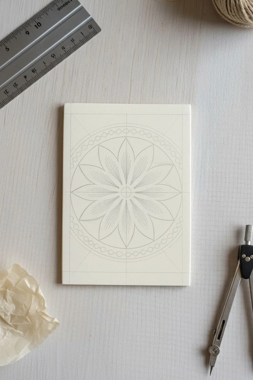
Black-and-White Zentangle-Inspired ATCs
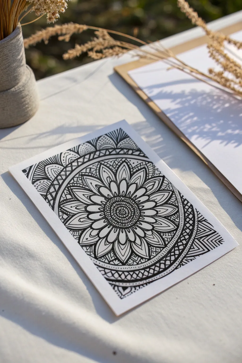
Embrace the meditative simplicity of black ink on white paper with this stunning intricate floral mandala design. The sharp contrast creates a bold statement piece that is surprisingly relaxing to construct layer by layer.
Step-by-Step Tutorial
Materials
- High-quality white cardstock or artist trading card blank (2.5″ x 3.5″ or similar)
- Fine liner pens (sizes 005, 01, and 05 or 08)
- Compass or circle template
- Pencil (HB or 2B)
- Ruler
- Eraser
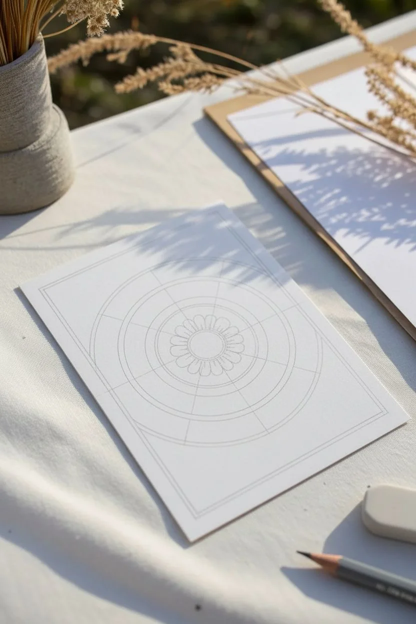
Step 1: Setting the Structure
-
Draw the border:
Begin by using a ruler and pencil to lightly draw a rectangular border about 1/4 inch from the edge of your card. This frames your workspace. -
Establish the center:
Locate the center of your card. Using your compass, draw a small central circle (about half an inch in diameter). Then, draw two larger concentric circles around it, spacing them out to create bands for patterns. -
Define the petal guides:
Lightly sketch lines radiating from the center to divide your largest circle into equal sections. This will help keep your flower petals symmetrical.
Step 2: Drawing the Core Flower
-
Inking the center:
Switch to your 01 fineliner. Ink the smallest central circle. Inside it, draw a mesh or grid pattern using slightly curved lines to give it a spherical look. -
Small petal ring:
Around the gridded center, draw a ring of very small, tight U-shapes to create the flower’s stamen layer. -
Primary petals:
Using your penciled guide lines, draw large, pointed oval petals extending to the next circle boundary. Make sure they all touch at the base. -
Internal petal details:
Inside each large petal, draw a smaller, similar shape that follows the contour of the outer petal. Leave a small gap between the lines for visual breathing room. -
Central veins:
Draw a single line down the center of each inner petal shape, stopping just short of the tip. Add tiny dots at the base for texture. -
Secondary petals:
Behind the primary petals, draw the tips of a second layer of petals peeking out from the gaps. These should look like simple triangles.
Smudge Prevention
Working from the center outward helps, but place a clean scrap of paper under your drawing hand to prevent oils or smudges on finished ink areas.
Step 3: Detailed Bands & Background
-
Geometric border band:
Move to the outer concentric circle band you drew in pencil. Fill this channel with a crisscross or diamond pattern using the 01 pen. -
Bold outlines:
Switch to a thicker pen (05 or 08). Trace the main structural circles of the mandala to separate the floral section from the background patterns clearly. -
Corner fans:
In the corners of the card outside the mandala, draw fan-like shapes radiating from the circle outwards towards the card edges. -
Curved striping:
Fill these corner fan shapes with alternating curved stripes. Color every other stripe solid black for high contrast. -
Dotted accents:
In any remaining negative space between the petals and the outer ring, add small stippling dots. This gradation adds depth without adding complex lines. -
Final clean up:
Once the ink is completely dry—I usually give it at least 10 minutes—gently erase all your pencil guide lines.
Line Weight Magic
Use your thickest pen (08) only for the outermost perimeter of shapes. This makes the delicate interior patterns pop and adds instant 3D depth.
Step back and admire the rhythmic complexity you’ve achieved with just a few simple repetitive strokes


Mini Animal Characters With Outlined Features
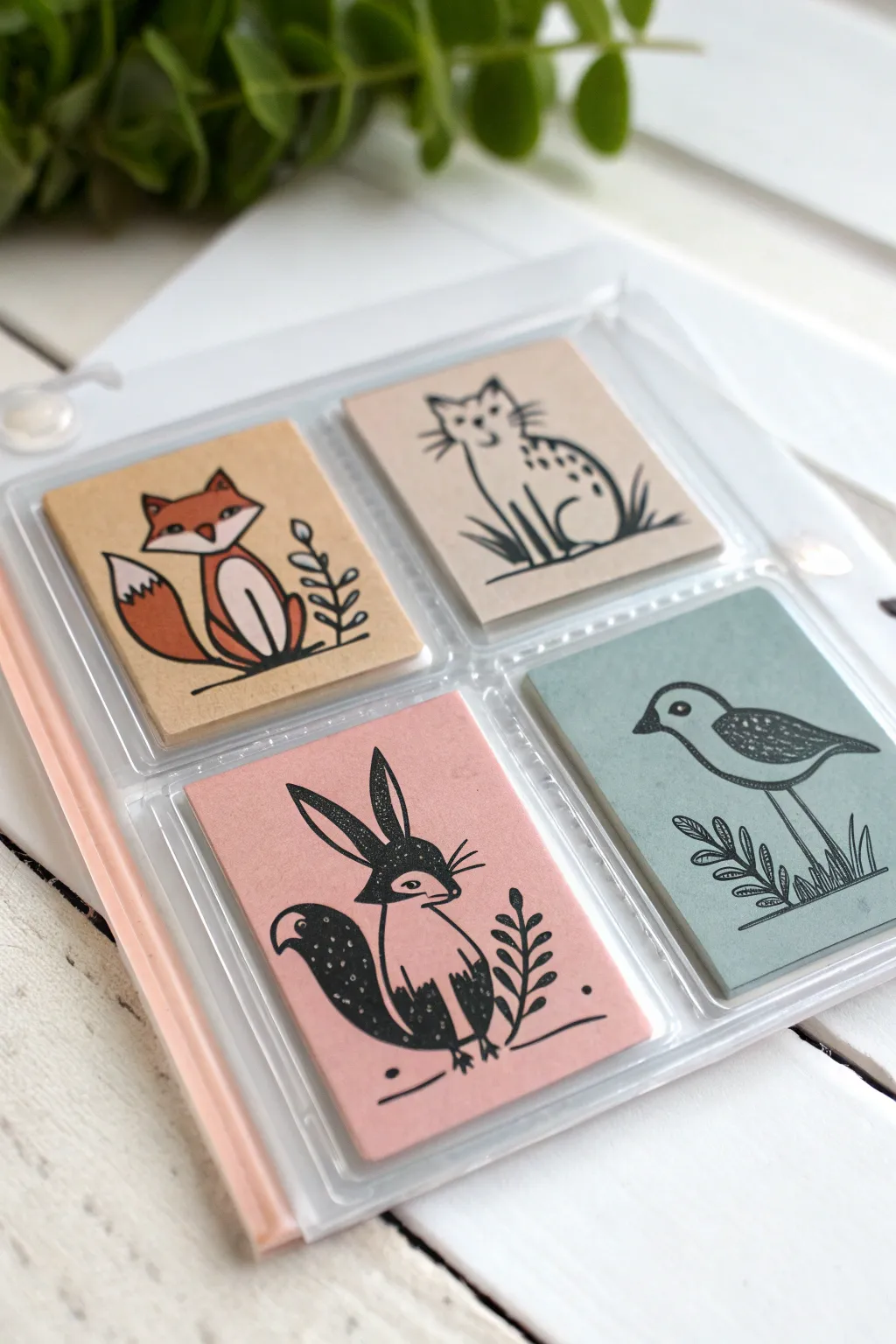
These charming artist trading cards feature stylized woodland creatures rendered in bold black ink on muted, colored cardstock. The project combines simple shapes with expressive linework to create distinct, miniature portraits perfect for trading or collecting.
How-To Guide
Materials
- Artist Trading Card (ATC) blanks or cardstock (2.5 x 3.5 inches)
- Cardstock text weight paper in muted tones: kraft brown, cream, dusty rose, sage green
- Fine liner pens (black, sizes 01 and 05)
- Brush pen (black) or black marker
- White gel pen (opaque)
- Pencil and eraser
- Ruler
- Paper trimmer or scissors
- Bone folder (optional)
- Clear trading card sleeves
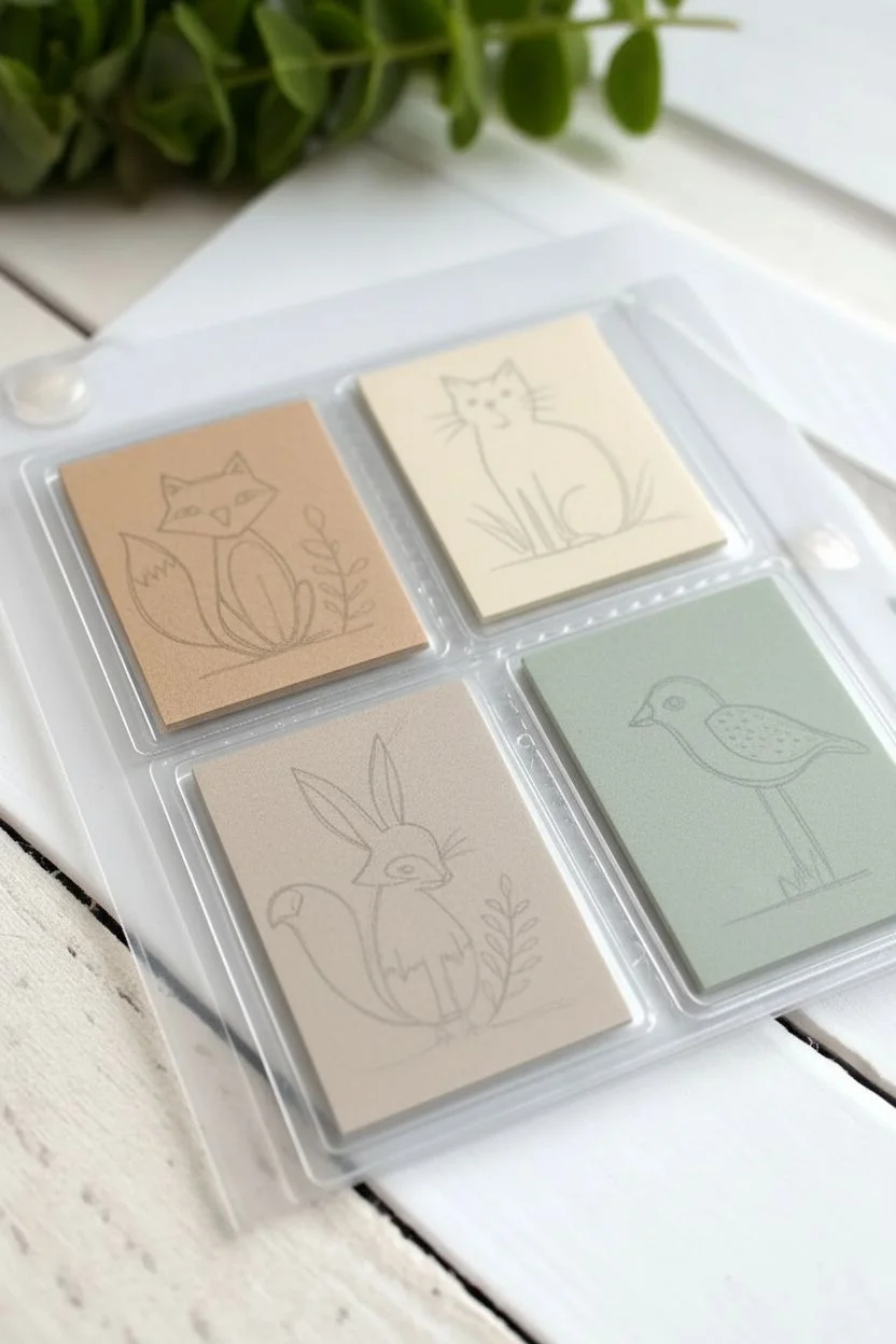
Step 1: Preparation & Shapes
-
Cut the bases:
Start by cutting your colored cardstock into standard ATC dimensions, which are exactly 2.5 by 3.5 inches. Select a palette of muted, earthy tones like kraft brown, cream, dusty rose, and sage green to give the set a cohesive, nature-inspired look. -
Sketch the fox:
On the kraft brown card, lightly sketch a fox sitting down. Use simple geometric shapes: a triangle for the head, a curved teardrop for the body, and a large, fluffy tail wrapping around the side. -
Sketch the cat:
Move to the cream or light tan card. Draw a cat with a slightly elongated body sitting upright. Focus on the ears and a long tail that curves near the paws. -
Sketch the rabbit or squirrel:
On the dusty rose card, sketch a creature that looks like a fantastical mix of a rabbit and squirrel. Give it tall, pointed ears and a very bushy, oversized tail that curves upward. -
Sketch the bird:
Finally, on the sage green card, outline a bird profile. Use a simple oval for the body, a small circle for the head, and long, thin legs standing among grass.
Ink Confidence
Don’t worry about shaky lines. In this folk-art style, slight wobbles add organic charm. Thickening the outer contour line can hide many small sketching errors.
Step 2: Inking & Defining
-
Outline the fox:
Using a thicker Micron pen (size 05 or 08), go over your pencil lines for the fox. Make the outer contours bold and confident. -
Add fox details:
Switch to a thinner 01 pen for the fur texture inside the ears and the small plant sprig next to the fox. Use a brush pen or marker to fill in the nose and the tip of the ears solid black. -
Outline the cat:
Ink the cat’s main body shape. Instead of a smooth line for the back, use small, broken dashes to suggest fur texture along the spine. -
Pattern the cat:
Draw small dashes and spots on the cat’s back to create a tabby pattern. Add whiskers and simplified facial features with your finest pen tip. -
Ink the rabbit-creature:
For the creature on the pink card, outline the body. Use the brush pen to fill the large ears solid black, leaving a thin white or colored gap if desired, or fill them entirely. -
Fill the dark areas:
Using your brush pen or marker, color the rabbit-creature’s tail and paws solid black. This high-contrast look defines this specific style. -
Ink the bird:
On the green card, outline the bird’s body. Draw the wing shape clearly within the body oval. -
Texture the bird:
Fill the top of the bird’s head and the wing with a stippling technique (small dots) or dense scribbles to create a dark grey value without making it solid black.
Smudge Alert
If your gel pen smears over the black ink, the black layer underneath wasn’t dry. Wait longer, or try a white paint marker which dries faster and sits on top better.
Step 3: Atmosphere & Finishing Touches
-
Add botanical elements:
Beside each animal, draw simple botanical elements like a fern, a leafy branch, or blades of grass. Keep these stylized and flat to match the character art. -
Ground the characters:
Draw a simple horizontal line or a few scratchy marks underneath each animal so they aren’t floating in space. -
Erase pencil lines:
Wait until the ink is completely dry—I usually give it at least five minutes to be safe—and then gently erase all remaining graphite sketches. -
Apply white highlights:
Using a white gel pen, add tiny details over the black ink areas. Add small dots to the rabbit’s dark tail, separating lines on the bird’s wing, or whiskers on the black parts of the fur. -
Highlight eyes:
Place a single white dot in the eyes of the animals to bring them to life and add a spark of personality. -
Sleeve them up:
Once fully dry, slide your finished masterpieces into clear individual trading card sleeves or a 4-pocket page protector to keep them pristine.
Now you have a whimsical set of woodland friends ready to swap or display in your mini album
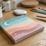
Galaxy and Night-Sky ATCs
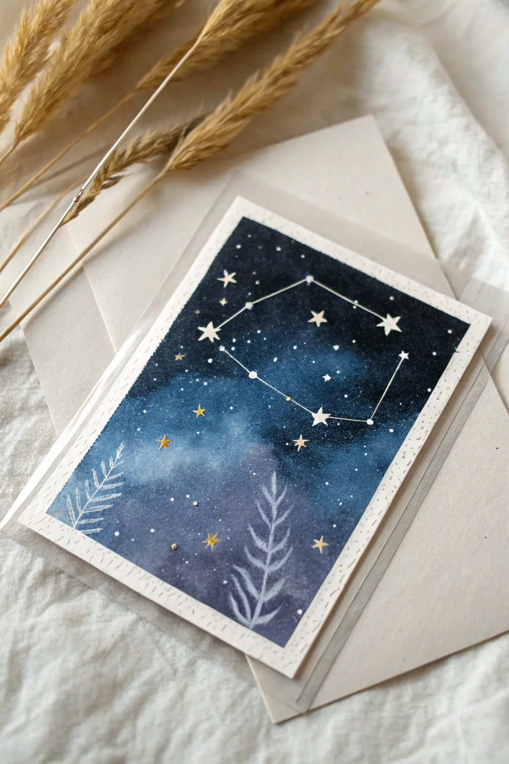
Capture the magic of a deep, sparkling night sky on a miniature canvas with this mesmerizing watercolor galaxy card. Featuring a stylized constellation and delicate botanical silhouettes, this project perfects the balance between wet-on-wet blending and precise detailing.
Step-by-Step Tutorial
Materials
- Watercolor paper (cold press, heavy weight)
- Watercolors (indigo, prussian blue, black, bright blue, white gouache)
- Metallic gold watercolor or gold pen
- White gel pen (fine tip)
- Painter’s tape or washi tape
- Round watercolor brushes (size 4 or 6 for background, size 0 for details)
- Ruler
- Paper towels and two jars of water
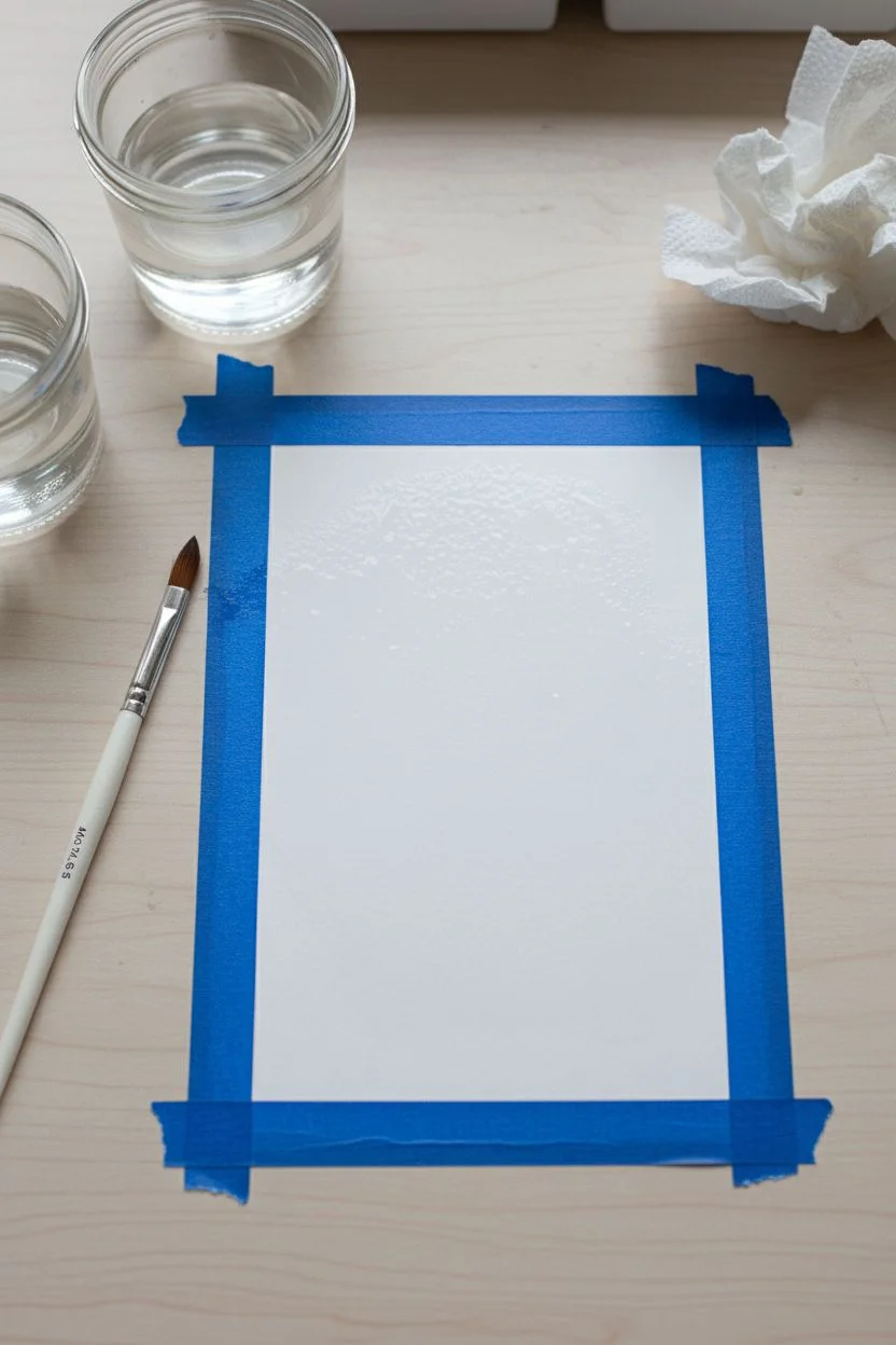
Step 1: Setting the Stage
-
Prepare the canvas:
Cut your watercolor paper to the standard Artist Trading Card size of 2.5 by 3.5 inches. -
Mask the borders:
Tape the paper down to your work surface using painter’s tape or artist-grade masking tape. Create a border about 1/8 to 1/4 inch wide on all four sides to ensure a crisp, clean edge later. -
Pre-wet the paper:
Using a clean brush and clean water, lightly wet the area inside the tape. The paper should be damp and glistening, but not flooded with puddles.
Starry Splatter Trick
Load a toothbrush with white gouache. Run your thumb across the bristles to flick fine mist over the dried sky for a realistic Milky Way effect.
Step 2: Creating the Galaxy
-
Lay the foundation:
Start by dropping in a medium bright blue in the center and lower half of the card. Let the wet paper help the pigment bloom naturally. -
Deepen the sky:
While the paper is still wet, introduce darker shades of indigo and Prussian blue around the edges and top corners. -
Create depth:
Mix a small amount of black with your indigo to create a near-black shade. Apply this to the very top edge and corners to simulate the darkest part of the night sky. -
Blend the transitions:
Use a damp, clean brush to gently soften any harsh lines where the dark blue meets the lighter center, creating a glowing nebula effect. -
Add first star layer:
While slightly damp, splatter tiny specks of clean water onto the dark paint. Let it sit for a few seconds, then dab with a paper towel to lift the pigment, creating soft, distant star clusters. -
Dry completely:
Allow the background to dry thoroughly. This is crucial—if the paper is cool to the touch, it’s not ready for the crisp details.
Constellation Custom
Personalize this card by painting the zodiac constellation of the recipient for a thoughtful, custom birthday gift.
Step 3: Details & Constellations
-
Draft the constellation:
Visualize or lightly pencil the main points of your chosen constellation (the example features a shape similar to Leo). -
Paint the major stars:
Using opaque white gouache or a white gel pen, draw small five-pointed stars or solid dots at the main constellation intersections. -
Connect the dots:
Use a ruler and a white gel pen to draw thin, straight lines connecting the star points. -
Scatter background stars:
Add tiny white dots randomly throughout the dark sky areas. Vary the pressure to create different sizes representing stars at different distances. -
Add gold accents:
Using metallic gold paint or a gold pen, draw a few select stars. I find that layering a few gold accents near the constellation lines adds a magical depth. -
Create botanical silhouettes:
Mix a watery white gouache (so it appears semi-transparent) or use a white colored pencil. Sketch two simple fern-like fronds growing from the bottom edge upwards. -
Refine the botanicals:
Go over the main stem of the ferns with a stronger white line, leaving the leaves slightly more ghostly and transparent to push them into the background. -
Final touches:
Add tiny gold dots or ‘berries’ near the base of the ferns for extra sparkle. -
The reveal:
Gently peel away the tape at a 45-degree angle to reveal your crisp white borders.
Slip your finished miniature masterpiece into an envelope or trade it to share a piece of the cosmos
Miniature “Art Supply” ATCs (Meta and Fun)
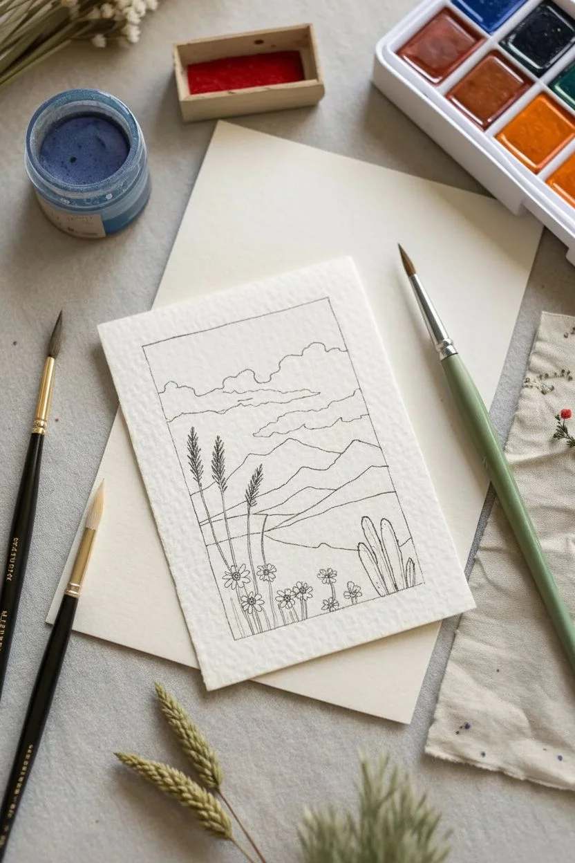
Capture the magic of a vast wilderness on a tiny canvas with this charming watercolor and ink artist trading card. This project combines intricate line work with vibrant washes to create a layered mountain scene featuring a starry night sky and blooming desert flora.
Detailed Instructions
Materials
- Heavyweight watercolor paper (300gsm cold press recommended)
- Fine liner pen (waterproof, black, 0.1mm or 0.3mm)
- Standard watercolor paints (pan or tube)
- Round watercolor brushes (size 0 and size 2)
- Jar of clean water
- Paper towel or cloth
- Pencil and eraser
- Ruler
Step 1: Sketching and Line Work
-
Prepare your card:
Cut or tear your watercolor paper to the standard ATC size of 2.5 by 3.5 inches. For that lovely vintage look seen in the photo, gently tear the edges against a ruler to create a soft, deckled effect. -
Draft the horizon:
Using a pencil, lightly sketch a rectangular border about a quarter-inch from the edge of the paper. Inside this border, draw a rolling horizon line slightly below the middle of the card. -
Add mountain layers:
Above the first horizon, sketch jagged shapes for distant mountains. Layer them so you have at least two distinct ranges—one closer and one further back—to create depth. -
Design the sky:
Sketch fluffy, cumulus-style clouds just above the mountain peaks. Leave a significant portion of the top area clear for the night sky. -
Foreground details:
In the bottom third of the composition, sketch three tall, thin stalks on the left side and a small cactus cluster on the right. Add small circles for flowers near the bottom edge. -
Ink the outlines:
Take your waterproof fine liner and carefully trace over your pencil lines. Don’t worry about perfect straightness; a slightly wobbling line adds to the illustrative character. Erase any visible pencil marks once the ink is totally dry.
Muddy colors?
Wait for each section (like sky vs. clouds) to dry completely before painting a neighbor. If wet edges touch, colors will bleed and brown.
Step 2: Painting the Scene
-
Sky gradient:
Start with the sky. Mix a deep teal or indigo blue. Paint the top section above the clouds, keeping the color richest at the very top and slightly lighter near the cloud line. -
Cloud shadows:
While the sky dries, mix a very diluted light blue-grey. Paint just the bottom edges of the clouds to give them volume, leaving the tops bright white. -
Mountain ranges:
Using a cool blue-grey tone, paint the furthest mountain range. For the closer range, add a touch more pigment or a hint of green to distinguish it from the distant peaks. -
Rolling hills:
Mix a warm ochre or terra cotta orange. Fill in the rolling hills in the middle ground. I find that lifting a little color with a thirsty brush creates nice texture here. -
Greenery base:
Paint the immediate foreground with a muted olive green. Carefully paint around the flower shapes you sketched earlier. -
Cacti and stalks:
Using a slightly darker blue-green, fill in the cactus shapes on the right and the tall stalks on the left. This cooler green helps separate these elements from the grassy ground.
Step 3: Final Details
-
Floral pops:
Load your smallest brush (size 0) with bright yellow or orange paint. Fill in the small flower circles in the foreground, letting the color be bold and opaque. -
Starry accents:
Once the dark sky is completely dry, use a white gel pen or opaque white gouache to dot tiny stars into the blue area. Add a small crescent moon or a shooting star for whimsy. -
Enhancing contrast:
If any ink lines have faded under the watercolor, carefully re-trace key outlines like the flower petals or mountain peaks to make them pop again.
Deckle edge trick
To get perfectly soft torn edges, paint a line of water where you want the tear, let it soak for a minute, then pull parts gently apart.
Now you have a serene little window into nature that fits right in your pocket
Texture Rubbings and Pencil Shading ATCs
Embrace the tactile charm of texture rubbings with this elegant geometric floral design. This project focuses on capturing intricate relief patterns using simple graphite shading for a remarkably polished look.
How-To Guide
Materials
- Hot press watercolor paper or smooth cardstock (ATC size: 2.5″ x 3.5″ or card size: 4″ x 6″)
- Carving block (soft linoleum or rubber block)
- Linoleum cutter tool with V-gouge and U-gouge blades
- Pencil (HB or B hardness)
- Ruler
- Compass or circular template
- Tracing paper (optional)
- Fine-grit sandpaper (optional, for smoothing the block)
Step 1: Designing the Master Block
-
Prepare the block:
Begin by trimming your rubber carving block to the exact size of your final card. Ensure the edges are straight and corners are squared. -
Mark the center:
Use a ruler to lightly find the center point of the block. This will serve as the anchor for your radial floral design. -
Draft the central flower:
Using a compass or a circular template, draw a circle in the center. Inside this circle, sketch an eight-petaled flower. Aim for long, pointed petals that radiate outward like a starburst. -
Add detail layers:
Surround your central flower with a concentric circle. Leave a small gap, then draw a second, larger circle to create a border band. -
Create the outer rays:
From the outermost circle border, use your ruler to draw straight lines extending to the edges of the block, creating a sun-ray effect that fills the negative space in the corners.
Choosing Your Paper
Use thin, strong paper like layout bond or lightweight hot-press paper. Thick watercolor paper won’t pick up the fine relief details well.
Step 2: Carving the Relief
-
Carve the outlines:
Equip your lino cutter with a fine V-gouge blade. Carefully carve along all your drawn pencil lines. Remember to carve away from your body for safety. -
Detail the border:
Inside the circular border band you created earlier, use a small U-gouge or the tip of the V-gouge to make small, evenly spaced divots or circles. This adds a lovely beaded texture. -
Texture the petals:
Switch to a tool that allows for stippling or very fine texture. Gently peck the surface of the inner petals to create a dotted, seed-like texture, contrasting them with the smooth areas. -
Clear the background:
Go back over your main lines to ensure they are deep enough to register clearly. The goal is to have the lines be the ‘low’ points (white) and the uncarved surface be the ‘high’ points (shaded). -
Clean the block:
Brush away any loose rubber crumbs. You can wash the block with mild soap and water to remove graphite dust, ensuring a clean rubbing later.
Level Up: Metallic Touch
Swap the graphite pencil for a gold or silver crayon. Rub over the texture on dark navy or black cardstock for a striking, high-contrast ATC.
Step 3: Creating the Rubbing
-
Position the paper:
Place your carving block face-up on a flat, hard surface. Lay your smooth paper directly on top of the block, aligning the edges seamlessly. -
Secure the setup:
I find it helpful to tape one edge of the paper to the table surface (not the block) to prevent shifting while you work. -
Begin shading:
Hold a sharp pencil at a low angle, almost parallel to the paper. Lightly rub the side of the lead across the paper surface where the block lies underneath. -
Build the tone:
Work in layers. Start with a faint gray wash to reveal the pattern. Then, go back in with slightly more pressure to darken specific areas, like the tips of the petals or the outer corners. -
Refine the details:
Use the point of the pencil very gently to define the edges of the petals if the rubbing is too soft. Focus on creating contrast between the textured stippling and the smooth lines. -
Final inspection:
Lift a corner of the paper to check your progress. If the design looks crisp and the shading is even, remove the paper.
Mount your finished piece on a contrasting kraft backing paper to replicate the rustic, organic feel of the original image
Mini “Postage Stamp” Frame ATCs
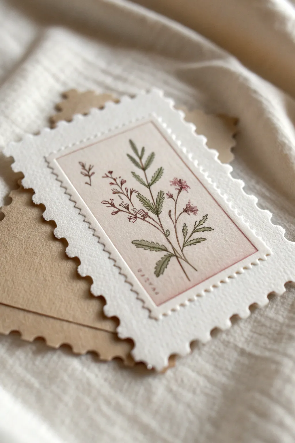
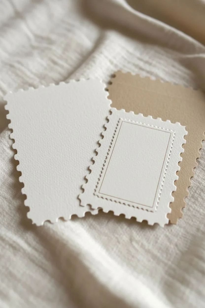
Transform your miniature art into charming ephemera with this vintage-inspired postage stamp project. By layering delicate botanical illustrations onto deckled-edge paper, you create dimension and nostalgic appeal perfect for trading or journalling.
Step-by-Step Tutorial
Materials
- Heavyweight watercolor paper or mixed media cardstock (white)
- Kraft paper or light brown cardstock
- Postage stamp edging scissors or a postage stamp craft punch/die set
- Fine liner pens (sepia or dark brown)
- Watercolor paints or watercolor pencils (muted pinks, sage greens)
- Small round detail brush (size 0 or 1)
- Paper trimmer or scissors
- Glue stick or double-sided tape
- Ruler
- Pencil for sketching
Step 1: Creating the Stamp Base
-
Cut the primary bases:
Begin by cutting your white watercolor paper into a standard ATC size of 2.5 x 3.5 inches, but leave a little extra margin if you are using decorative scissors. -
Create the perforated edge:
Use postage stamp framing scissors or a specific die-cut machine to clear the edges of your white card. The goal is to create that classic perforated, scalloped look around the entire perimeter. -
Cut the kraft backing:
Repeat this process with the kraft paper, cutting a second identical scalloped shape. This will serve as a layered shadow or a backing card for trading. -
Prepare the central canvas:
Cut a smaller rectangle from smooth, cream-colored or off-white paper. This should measure approximately 1.5 x 2.5 inches to sit comfortably inside your perforated frame. -
Add faux-stitching details:
Before gluing anything, take your ruler and a very fine-point pen or a piercing tool. Create a subtle indented line or draw faint faux-stitching marks just inside the edge of your central cream rectangle to mimic a pressed plate mark.
Step 2: Illustrating the Botanical
-
Sketch the stems:
Lightly sketch a central stem structure with a pencil on your cream rectangle. Aim for a gentle curve rather than a straight line to give the plant organic movement. -
Ink the outlines:
Using a sepia or dark grey fine liner (0.1mm is ideal), trace over your pencil sketch. Keep your lines broken and delicate, especially on leaf veins, to maintain a vintage botanical print aesthetic. -
Add leaf details:
Draw serrated leaves branching from the lower stems. I like to vary the angles so some leaves overlap the stem slightly. -
Draw the blossoms:
Sketch small clusters of wildflowers at the top. Use tiny dashes and dots for the stamens and loose, open shapes for the petals. -
Mix your greens:
Prepare a watery wash of sage green watercolor. You want the color to look transparent and aged, not vibrant neon. -
Paint the foliage:
Carefully fill in the leaves using your size 0 brush. Don’t worry about filling every white space; leave small gaps for highlights. -
Block in floral colors:
Dip into a muted dusty rose or mauve paint. Dab color loosely onto the flower heads, allowing the pigment to pool slightly for natural variation. -
Add decorative text:
Once the paint is dry, use your finest pen or a tiny alphabet stamp set to add a botanical name or a vertically running word like ‘FLORA’ or ‘PAPER’ along the bottom left edge in a serif font.
Perforation Pro-Tip
If you lack postage scissors, use a sewing machine with no thread (needle only) to punch real holes along the edge, then tear carefully.
Step 3: Assembly
-
Mount the artwork:
Apply a thin layer of glue to the back of your illustrated cream rectangle. -
Center the piece:
Position the artwork carefully in the center of your white perforated stamp base. Press down firmly. -
Create the shadow layer:
Take your kraft paper perforated cutout and offset it slightly behind the white piece. It shouldn’t be glued directly aligned; shift it just a millimeter to the side to create visual depth. -
Final adhesion:
Glue the white stamp onto the kraft backing. This double layer makes the ATC rigid and substantial. -
Add a wash (optional):
If the white paper looks too new, do a very light tea-stain wash over the white perforated edges to age them before declaring it finished.
Level Up: Cancel It
Carve a small eraser into a squiggly line or circle and stamp overlapping black ink over a corner to mimic a cancelled postal mark.
Your miniature botanical gallery is now ready to be traded or displayed in a tiny album
Mini Map and Travel Collage ATCs
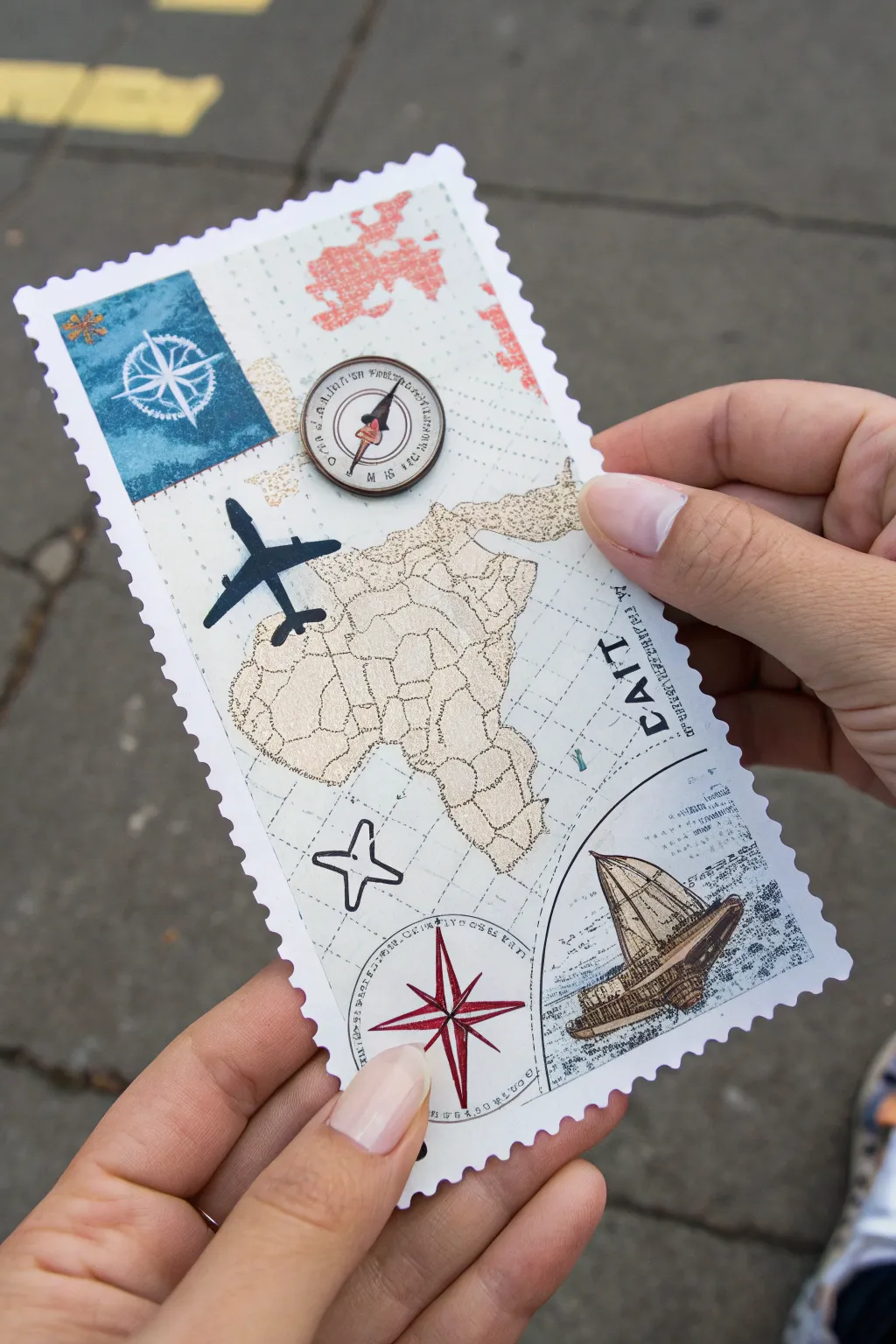
Capture the spirit of adventure with this oversized postage stamp-style ATC. Combining vintage map aesthetics with distinct travel icons, this collage brings together continents, compasses, and varied textures for a journey on paper.
Step-by-Step
Materials
- Heavyweight white cardstock or watercolor paper
- Decorative edge scissors (postage stamp/scalloped pattern)
- Vintage map scrapbook paper or atlas cutouts
- Africa map stencil or die-cut
- Gold or bronze gel pen
- Navy blue cardstock or patterned paper
- White gel pen or correction pen
- Fine-tip black ink pen
- Small compass sticker or printable
- Black airplane sticker or silhouette cutout
- Vintage ship illustration (stamp, sticker, or cutout)
- Small charm or 3D button (compass them)
- Glue stick or double-sided tape
- Ruler and pencil
Step 1: Planning the Base
-
Cut the foundation:
Begin by cutting a rectangle from your heavyweight white cardstock. A standard Artist Trading Card (ATC) size is 2.5 x 3.5 inches, but this project works beautifully at a slightly larger size, perhaps 3 x 6 inches, to mimic a commemorative stamp. -
Create the stamp edge:
Use decorative scissors with a scalloped or ‘stamp’ edge pattern to trim the entire perimeter of your white rectangle. This gives it that classic perforated look. -
Grid the background:
Lightly draw a grid pattern on the cardstock using a ruler and a very light grey pen or pencil. The lines should be spaced about a half-inch apart to resemble navigational charts.
Step 2: Map and Continent Layering
-
Prepare the map texture:
Select a piece of beige or tan paper with a subtle texture. Trace an outline of the African continent onto this paper. -
Add gold details:
Before cutting it out, use a gold or bronze gel pen to draw internal borders or topographic-style lines across the continent shape for a shimmering, high-end finish. -
Mount the continent:
Cut out the Africa shape and adhere it centrally on your cardstock base using a glue stick, tilting it slightly to align with your background grid. -
Add secondary map elements:
Cut a smaller, jagged shape representing Europe or another landmass from reddish-patterned paper and glue it near the top edge.
Stamp Edge Fix
If you don’t have stamp-edge scissors, use a standard hole punch along the edges of a rectangle, punching halfway in, to create perfect semi-circle scallops manually.
Step 3: Iconography and Elements
-
Create the blue compass box:
Cut a small square of navy blue textured paper. Using a white gel pen, draw a simple eight-point compass rose in the center. -
Attach the blue box:
Glue this blue square into the upper left corner, slightly overlapping the grid lines but staying within the perforated border. -
Add the flight path:
Place a black airplane silhouette sticker or cutout directly over the Africa map, angling it as if it’s mid-flight across the continent. -
Install the focal compass:
Position your 3D compass charm or button near the top center and glue it down securely. If using a heavy charm, I recommend a dab of strong liquid glue here. -
Anchor with the ship:
In the bottom right corner, adhere a vintage-style illustration of a sailing ship. This can be a stamp, a cutout from an old book, or a printable.
Aged Aesthetic
Lightly brush the edges of your white cardstock with a tea bag or distress ink pad before adding elements. This gives the ‘stamp’ a traveled, vintage patina.
Step 4: Finishing Touches
-
Draw the lower compass:
In the bottom center area, use red and black fine-tip pens to hand-draw a large compass needle star directly onto the background. -
Add textual elements:
Using a stamp set or black marker, add vertical text like ‘CAIT’ or destination names running up the right side of the card. -
Draw curved borders:
Use a black pen to draw curved lines specifically in the bottom right corner to frame the ship, separating it visually from the rest of the map. -
Add decorative crosses:
Draw a few hollow ‘plus’ signs or crosshairs in open spaces to reinforce the navigational chart theme. -
Final smooth:
Gently press all stickers and paper layers down with a clean bone folder or the back of a spoon to ensure everything is flat and secure.
Now you have a miniature tribute to exploration ready to trade or display
Monochrome Color-Challenge ATC Series
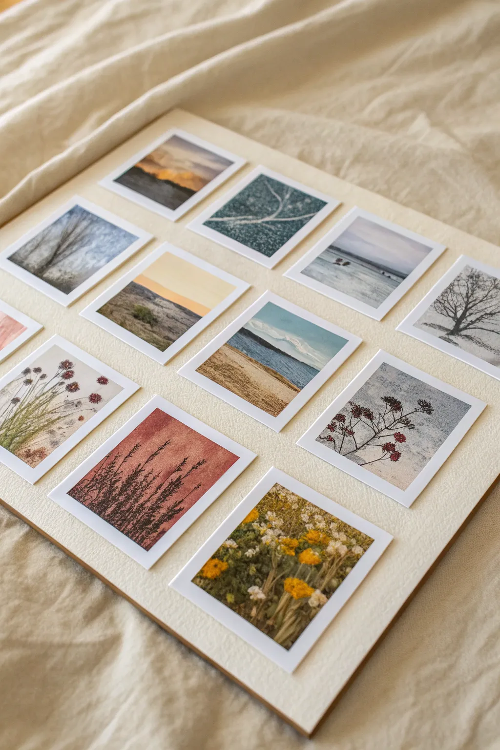
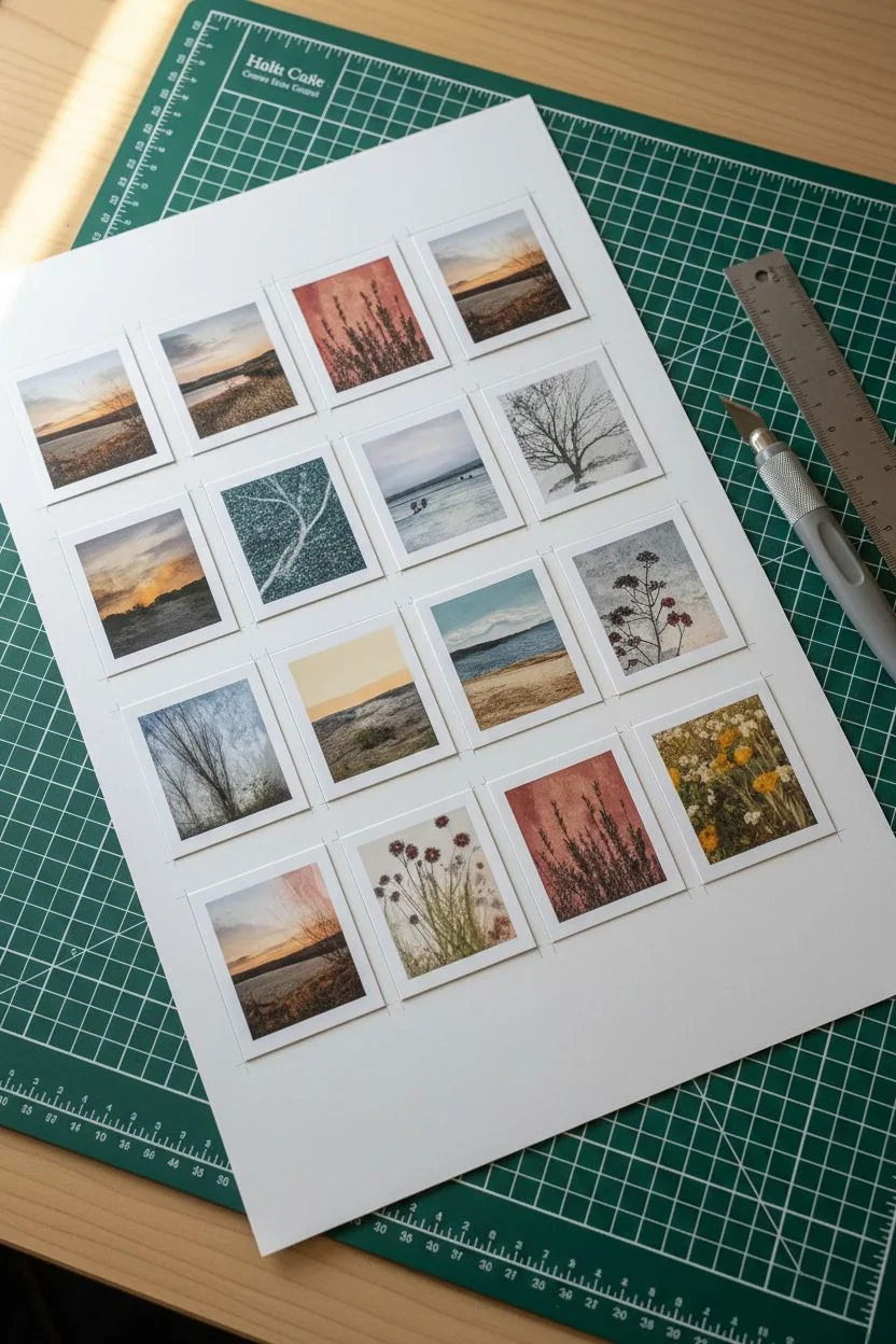
This project creates a serene gallery of miniature landscapes, each capturing a quiet moment in nature with soft, muted tones. By arranging twelve rectangular artist trading cards into a uniform grid, you create a cohesive visual narrative that mimics the nostalgic feel of vintage polaroids.
How-To Guide
Materials
- Matte photo paper or heavy white cardstock
- Digital photos of landscapes (or vintage stock images)
- Photo editing software or app
- Printer (inkjet preferable for texture)
- Craft knife or guillotine paper cutter
- Metal ruler
- Large cream or beige mounting board (approx. 12×16 inches)
- Double-sided tape or photo mounting squares
- Bone folder (optional)
- Self-healing cutting mat
Step 1: Image Curation & Editing
-
Select your theme:
Choose 12 to 14 landscape images that share a common mood. Look for wintry trees, empty beaches, misty fields, and dried botanicals to match the tranquil aesthetic shown. -
Edits for cohesion:
Open your images in editing software. Desaturate the colors slightly to achieve that muted, matte look. I find that lowering the contrast and lifting the blacks creates a lovely, soft haze. -
Set the dimensions:
Crop each digital image to a specific aspect ratio, likely 3:4. Prepare a digital canvas where you place the image inside a white border. The final print size for each card should be approximately 2.5 x 3.5 inches (standard ATC size), with the image taking up most of the space within a consistent white frame.
Step 2: Printing & Cutting
-
Paper selection:
Load your printer with matte photo paper. Glossy paper will reflect too much light and ruin the calm, vintage vibe we are aiming for. -
Print the sheet:
Print your images on a single sheet (or multiple sheets depending on paper size) at high quality. -
Score the lines:
Before cutting, use a ruler to lightly mark your cutting lines if your printer didn’t print crop marks. -
Cut the cards:
Using a metal ruler and a sharp craft knife on a self-healing mat, slice out each individual card. A guillotine cutter works wonders here for perfectly straight edges. -
Check the borders:
Examine your cut cards. Ensure the white borders look even on all sides. Trim any excess paper carefully.
Unify the Palette
Apply a subtle ‘warm photo filter’ overlay to all images in your software before printing. This tints them all slightly orange/yellow, making disparate photos look like a set.
Step 3: Layout & Assembly
-
Prepare the backing:
Cut your large cream mounting board to size. It needs to accommodate a grid of 3 rows and 4 columns with ample negative space around the edges. -
Dry fit the arrangement:
Lay your cut cards onto the board without adhesive. Arrange them to balance colors—alternate darker landscapes with lighter botanical shots. -
Establish spacing:
Aim for a uniform gap between cards, roughly 0.5 to 0.75 inches. Use a scrap piece of cardstock cut to this width as a temporary spacer tool. -
Apply adhesive:
Flip the first card (top left corner) over and apply double-sided tape or mounting squares to the back corners. -
Position the first card:
Place the first card carefully, measuring from the top and left edges of the board to ensure it is square. -
Continue the grid:
Work row by row. Use your spacer tool to place the subsequent cards next to the first one, maintaining strict alignment. -
Final press:
Once all cards are down, place a clean sheet of paper over the whole grid and rub gently with a bone folder or your hand to secure the adhesive without smudging the ink.
Add Texture
Print on cold-press watercolor paper instead of photo paper. The rough texture adds a tactile, artistic quality that mimics canvas and deepens the vintage feel.
Step back and admire how these small, individual scenes come together to form a peaceful window into nature
Transparent Layer Look Using Glazes
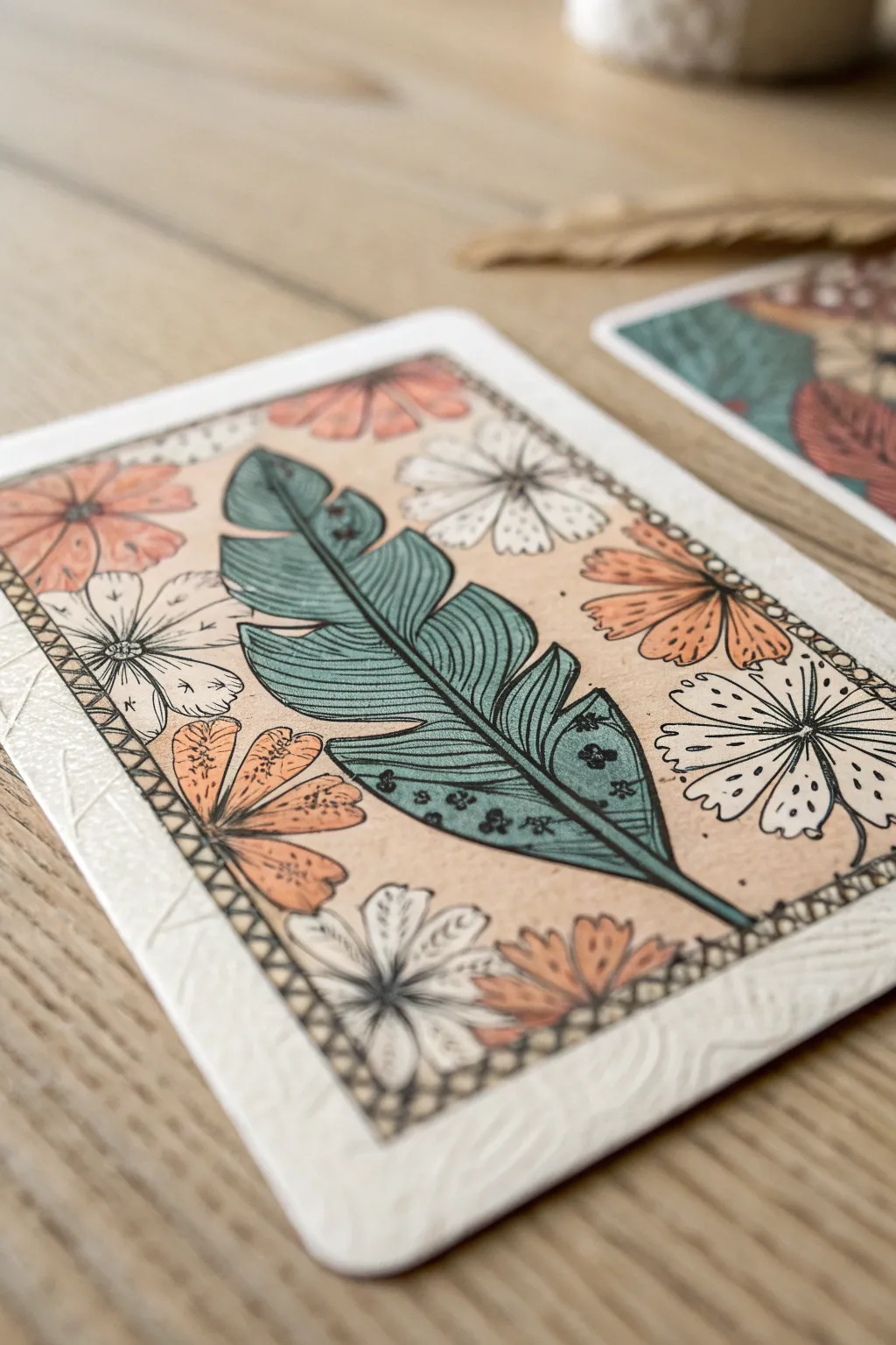
This elegant Artist Trading Card layout balances a bold, stylized feather motif with a delicate floral border, all brought together with a warm, unifying glaze. The technique simulates a vintage, layered look where the colors feel embedded into the paper rather than just sitting on top.
Step-by-Step Tutorial
Materials
- Blank Artist Trading Card (ATC) or heavy watercolor paper (2.5″ x 3.5″)
- Waterproof fine liner pen (black, 0.3mm or 0.5mm)
- Watercolor paints or fluid acrylics
- Matte medium or clear acrylic glaze
- Small round paintbrush (size 2 or 4)
- Pencil and eraser
- Tan/beige watercolor wash or diluted tea (optional for base)
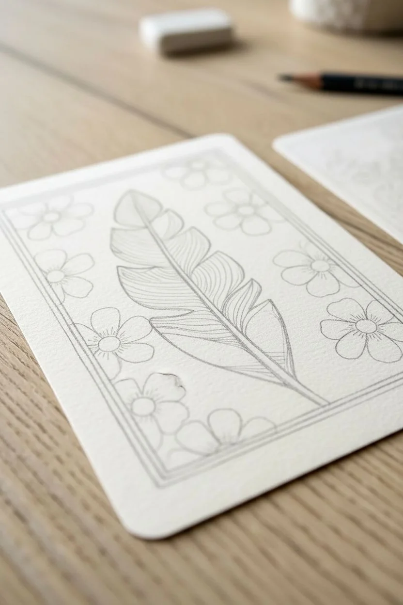
Step 1: Sketching the Layout
-
Establish the frame:
Lightly sketch a rectangular border about 1/4 inch from the edge of your card using a pencil. This will contain your main illustration. -
Draw the central motif:
In the center of the frame, sketch a large, curved feather or stylized palm leaf diagonally across the space. Make the central spine prominent and add segments for the leaf veins. -
Add floral elements:
Fill the negative space around the feather with simple flower shapes. Alternate the sizes, tucking some behind the feather and others near the frame edge. -
Refine the border:
Sketch a secondary, thinner line just outside your main frame line to create a narrow channel for a decorative pattern later.
Pro Tip: Line Weight
Use a slightly thicker pen (0.5mm) for the main outlines of the feather and frame, and a thinner one (0.1mm) for the internal veins to add depth.
Step 2: Inking the Design
-
Outline the feather:
Using your waterproof fine liner, trace the feather. Use a confident, consistent pressure. Add line texture inside the feather segments to suggest veins or fibers. -
Ink the flowers:
Outline the flower petals. Notice how the style in the image uses simple, rounded petals with central details. Keep the lines clean. -
Create the border pattern:
Ink the double-line frame. Inside that narrow channel, draw small ‘X’ shapes or a simple cross-stitch pattern all the way around to create a decorative edge. -
Add detailing:
Place small dots or stamen lines in the centers of the flowers and perhaps some decorative dots on the lower segments of the feather for visual interest. -
Clean up:
Once the ink is completely dry (give it a few minutes to avoid smearing), gently erase all your pencil guides.
Step 3: Adding Color & Glaze
-
Base tone (optional):
If you aren’t using intended colored paper, apply a very light wash of beige or tea-stained watercolor over the entire card to warm it up. Let it dry completely. -
Paint the feather:
Mix a teal or dusky blue-green watercolor. Paint the feather segments, leaving the central spine the color of the background paper. -
Color the flowers:
Select alternating flowers to paint in a muted coral or terracotta orange. Leave the remaining flowers white (or the background color) to create a checkerboard-like balance. -
Background fill:
Carefully paint the negative space between the flowers and the feather with a light tan or sand color if your paper isn’t naturally that hue. This pushes the white flowers forward. -
Apply the glaze:
Once the watercolor is bone dry, mix a tiny drop of brown or yellow ochre paint into your matte medium or clear glaze. I find this creates that aged, ‘sealed’ look visible in the reference. -
Seal the artwork:
Brush a thin, even layer of your tinted glaze over the entire central image (inside the border). This unifies the colors and adds a subtle sheen. -
Texture the frame (optional):
If you have an embossing tool or a stylus, you can gently press a pattern into the white border outside your inked frame to give the card a tactile, finished feel.
Level Up: Texture Pop
Use actual white gouache for the white flowers instead of leaving the paper bare. It makes them pop brilliantly against the glazed tan background.
Now you have a beautifully layered miniature artwork ready to trade or display
Interactive Lift-the-Flap ATCs That Still Fit Sleeves
This charming project combines the tactile delight of a tiny envelope with the elegance of botanical line art, all sized perfectly for an artist trading card. The interactive element comes from the removable insert, inviting the viewer to open the flap and discover the delicate drawing inside.
Step-by-Step Guide
Materials
- Kraft paper (medium weight)
- Cream or off-white textured cardstock
- Fine liner pen (black, 0.1mm or 0.3mm)
- Pencil and eraser
- Ruler
- Scissors or craft knife
- Bone folder
- Double-sided tape or glue stick
- ATC template (2.5 x 3.5 inches)
Step 1: Crafting the Pocket Envelope
-
Draft the envelope template:
Start by drawing a rectangle on your kraft paper that is slightly larger than a standard ATC, roughly 2.75 by 3.75 inches. This will form the body of the envelope. -
Add the flaps:
Draw triangular flaps extending from all four sides of your central rectangle. The bottom flap should be shorter (about 1.5 inches tall), the side flaps narrow enough to overlap slightly in the middle, and the top flap triangular and deep enough to tuck in. -
Cut and score:
Carefully cut out your entire cross-shaped template. Use a ruler and a bone folder to score lines along the four sides of the central rectangle to ensure crisp, clean folds. -
Assemble the pocket:
Fold the two side flaps inward first. Then, fold the bottom flap up over them. Apply a thin strip of double-sided tape or glue to the edges of the bottom flap where it meets the side flaps, securing them together. -
Check the fit:
Test the pocket to ensure a standard 2.5 x 3.5 inch card slides in easily but stays snug. Adjust your folds slightly if needed before the glue sets fully.
Step 2: Drawing the Botanical Insert
-
Prepare the card:
Cut your cream cardstock into a standard ATC size (2.5 x 3.5 inches). I like to use paper with a slight tooth or texture to mimic the look of watercolour paper. -
Pencil guidelines:
Lightly sketch a vertical stem structure. Aim for an asymmetrical composition, perhaps with one taller stem and a shorter, branching one blooming to the side. -
Rough in the blooms:
Sketch small circles or clusters at the ends of your stems to indicate where the flowers will go. Keep these marks extremely faint so they are easy to erase later. -
Ink the main stems:
Using your fine liner, trace the main stems. Keep your hand loose; natural stems aren’t perfectly straight lines but have slight wobbles and bumps. -
Draw the leaves:
Add elongated, lance-shaped leaves along the stem. Vary their angles—some pointing up, some drooping slightly. Use quick, confident strokes for the leaf veins. -
Detail the flowers:
For the blooms, use tiny dots and short dashes to create the impression of small wildflowers like baby’s breath or wildflowers. Don’t outline every petal; suggestion is key here. -
Add texture and shadow:
Add minimal stippling (dots) at the base of the leaves and where stems join to add depth, but keep the overall look airy and clean. -
Clean up:
Wait at least ten minutes for the ink to dry completely, then gently erase all your pencil guides.
Clean Lines Tip
When doing fine-line botanical art, lift your pen at the end of leaf strokes to create a tapered, natural point rather than a blunt, rounded end.
Step 3: Finishing Touches
-
Create a secondary card (optional):
If you want the layered look shown in the image, cut a second piece of cardstock slightly smaller than the envelope. Decorate it with a simple pattern, like scattered leaves or dots. -
Assemble the set:
Tuck the patterned card behind the envelope and place your botanical drawing inside the pocket, leaving the top half visible. -
Style the flap:
Fold the top flap of the envelope down gently. You can leave it loose for interaction or secure it with a tiny sticker or wax seal if you prefer it permanently closed.
Coffee Stain Effect
Lightly dab parts of the cream cardstock with cold coffee or tea using a sponge before drawing to give the paper an aged, vintage parchment look.
Now you have a secretive, interactive piece of art ready to trade or display
Tiny Diptych or Triptych ATCs Made to Trade as a Set
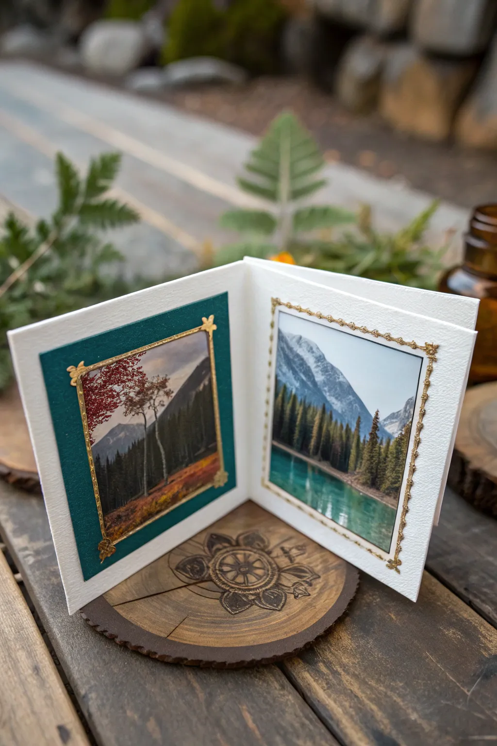
Elevate your trading card game with this elegant diptych design, featuring a hinged fold that lets your artwork stand independently on display. This project combines precise paper crafting with scenic imagery to create a miniature window into a peaceful landscape.
How-To Guide
Materials
- Heavyweight white textured cardstock (watercolor paper or textured cover stock)
- Deep emerald green cardstock
- Two landscape photographs or high-quality prints (roughly 2×2.5 inches)
- Gold foil adhesive strips or gold paint pen
- Gold corner stickers or gold embossing powder (for corners)
- Paper trimmer or craft knife
- Scoring board and bone folder
- Double-sided adhesive tape or glue tape
- Ruler
- Fine-grit sandpaper (optional for distressing)
Step 1: Constructing the Base
-
Measure and Cut the Base:
Start by cutting a strip of your white textured cardstock. Since standard ATCs are 2.5 x 3.5 inches, you will need a strip that measures 5 inches wide by 3.5 inches tall to create a double-wide canvas. -
Score the Center:
Place your 5-inch strip on your scoring board. Score a vertical line exactly at the 2.5-inch mark. This creates the central hinge. -
Fold and Burnish:
Carefully fold the card along the score line. Use your bone folder to press down firmly along the crease; a sharp, crisp fold is essential for the card to stand open properly.
Uneven Hinge?
If the card won’t close flat, your paper might be too thick. Use a craft knife to very lightly skim the inside of the fold to remove bulk without cutting through.
Step 2: Preparing the Matting
-
Cut the Green Mat:
From the deep emerald green cardstock, cut a rectangle measuring approximately 2.25 x 3.25 inches. This will serve as the mat for the left panel. -
Check the Fit:
Place the green rectangle on the left inside panel of your folded white base. Ensure there is an even white border around all four edges before adhering. -
Adhere the Mat:
Apply double-sided tape or glue tape to the back of the green cardstock. Center it carefully on the left panel and press down firmly to secure it. -
Trim the Photos:
Select your two landscape images. Trim the left image (the autumnal trees) to be slightly smaller than the green mat, leaving a thin border of green visible. Trim the right image (the mountain lake) to match the size of the green mat, or slightly smaller if you prefer a white border.
Level Up: Hidden Messages
Add a hidden pocket behind the green mat layer before gluing it down. Slip a tiny tag with a poem or date inside for the recipient to discover.
Step 3: Assembling the Scenes
-
Mount the Left Image:
I find it helpful to dry-fit everything first. Once satisfied, adhere the tree landscape photo onto the center of the emerald green mat. -
Mount the Right Image:
Adhere the mountain lake photo directly onto the right inside panel of the white base. Aim to align its top and bottom edges with the green mat on the opposite side for visual symmetry.
Step 4: Adding the Gold Details
-
Apply Gold Borders:
Using thin gold foil adhesive strips or a steady hand with a gold paint pen, create a rectangular border around the image on the right panel. Repeat this directly on top of the photo on the left panel. -
Detail the Corners:
Apply small, ornate gold corner stickers to the corners of your gold frames. If you don’t have stickers, you can dab a bit of glue and use gold embossing powder, heat setting it for a raised effect. -
Clean Up Edges:
Inspect the edges of your white cardstock. If the cut edge looks ragged, you can lightly sand it with fine-grit sandpaper for a professional finish. -
Final Press:
Close the card and place it under a heavy book for an hour. This helps the adhesive set flat and reinforces the memory of the fold.
Display your miniature gallery on a dedicated shelf or package it carefully for your next art trade
Mystery “Blind Swap” ATCs With Sealed Envelopes
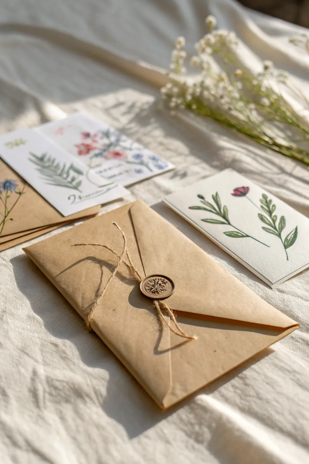
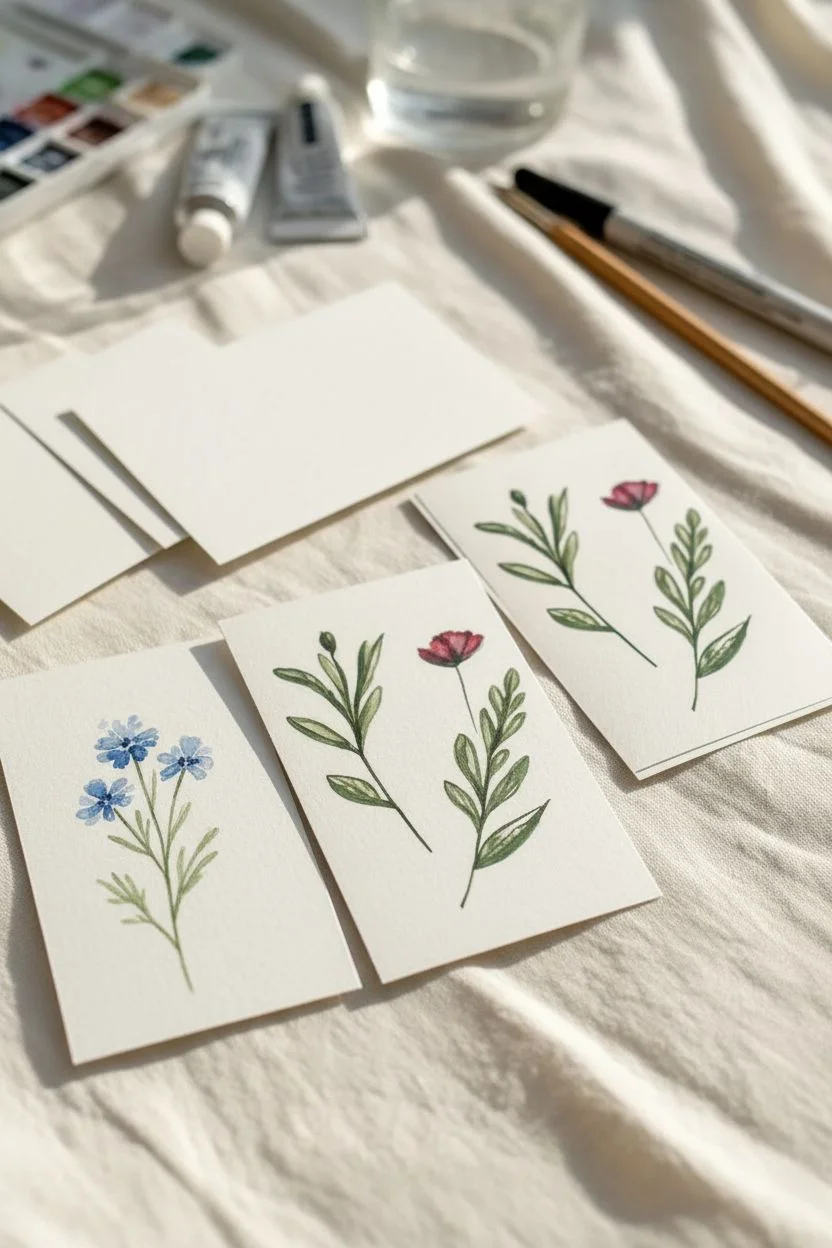
Elevate your artist trading card exchange with this charming, rustic presentation that turns the act of giving into an unwrapping experience. By combining hand-painted botanical cards with a wax-sealed kraft envelope, you create a delightful mystery for the recipient that feels personal and timeless.
Step-by-Step Tutorial
Materials
- Watercolor paper (140lb/300gsm, cold press)
- Small Kraft paper envelopes (sized for ATCs, typically 2.5″ x 3.5″)
- Jute twine or hemp cord (thin gauge)
- Sealing wax beads (bronze or antique gold)
- Wax seal stamp (botanical motif like dandelion or fern)
- Watercolor paints (various greens, reds, blues)
- Round watercolor brush (size 2 and 4)
- Fine liner pen (black or dark brown, waterproof)
- Melting spoon and tea light (or glue gun with wax sticks)
- Pencil and eraser
- Paper trimmer or scissors
Step 1: Creating the Botanical ATCs
-
Cut the base:
Measure and cut your watercolor paper into standard Artist Trading Card sizes, which are exactly 2.5 by 3.5 inches. Ensure the edges are crisp and straight. -
Sketch the layout:
Lightly sketch a simple botanical composition using your pencil. Aim for a central stem with symmetrical leaves or a small wildflower cluster, keeping the design open and airy. -
Paint the stems:
Load your size 2 brush with a sap green or olive watercolor mix. With a light hand, paint the main stems, starting from the bottom and lifting pressure as you reach the top for a tapered look. -
Add foliage:
While the stems are still damp but not soaking, paint small leaves. Press the belly of the brush down to create the leaf width and pull away to form the tip. -
Bloom the flowers:
Clean your brush and pick up a red or blue hue. Dab in small petals at the top of your stems. I like to keep these loose and impressionistic rather than perfectly detailed. -
Refine details:
Once the paint is fully dry, use a fine liner pen to add very subtle veins to the leaves or outline the petals. Broken lines often look more organic than solid tracing. -
Sign the back:
Don’t forget the most important part of an ATC—flip it over and write your name, the date, and the title of the piece on the back.
Chill Your Stamp
Keep your metal stamp on an ice pack before pressing. A cold stamp releases from hot wax much cleaner and creates a sharper image definition.
Step 2: Wrapping and Sealing
-
Insert the card:
Slide your finished, dried artwork into the kraft envelope. If you are including a note or a second card, stack them neatly inside. -
Close the flap:
Fold the envelope flap down. You don’t need to lick the adhesive if you are using twine, but sealing it lightly helps keep things aligned. -
Wrap the twine:
Cut a piece of jute twine about 12 inches long. Wrap it vertically around the center of the envelope. -
Secure the cross:
Bring the ends of the twine together in the middle of the envelope flap and cross them. Do not tie a bulky knot; just twist them once to hold them in place. -
Prepare the wax:
Place 2-3 wax beads into your melting spoon and hold it over the tea light flame. Wait until the wax is liquid and smooth, without any lumps. -
Pour the seal:
Carefully pour the molten wax directly over the point where the twine crosses. Aim for a circle roughly the size of a quarter. -
Stamp the impression:
Wait about 5-10 seconds for the wax to cool slightly—it shouldn’t be bubbling. Press your stamp firmly into the center of the wax puddle. -
Let it set:
Leave the stamp in place for another 15-20 seconds. If you pull too early, the wax will stick to the metal. Lift the stamp gently to reveal the impression. -
Trim the ends:
Once the wax is hard, trim the excess twine tails so they look neat, or fray the ends slightly for a more rustic texture.
Add Dried Florals
Tuck a tiny sprig of dried baby’s breath or a pressed fern leaf under the twine just before pouring the wax to seal it permanently into the design.
Now your beautiful mystery package is ready to be swapped and enjoyed
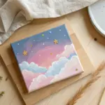


Have a question or want to share your own experience? I'd love to hear from you in the comments below!