When I’m staring at a blank canvas, I like having a short list of go-to ideas that feel doable right now. These paint ideas for canvas are the kind you can start today—simple enough for beginners, but still totally display-worthy.
Easy Blended Sunset Sky on Canvas
Capture the magic of twilight with this incredibly soft and dreamy gradient painting. Using simple blending techniques, you’ll create a seamless transition from deep violet skies down to a warm, glowing horizon.
How-To Guide
Materials
- Rectangular stretched canvas (any size, vertical orientation)
- White or light wood floating frame (optional)
- Acrylic paints: Titanium White, Ultramarine Blue, Dioxazine Purple, Magenta or Alizarin Crimson, Cadmium Orange, Cadmium Yellow
- Wide flat brush or hake brush for blending
- Medium filbert brush
- Palette knife (for mixing)
- Palette
- Cup of water and paper towels
- Slow-drying medium (optional but recommended)
Step 1: Preparing the Palette
-
Lay out your colors:
Squeeze generous amounts of your paints onto the palette. You will need plenty of White to create the pastel transitions, so use double the amount of white compared to the other colors. -
Pre-mix your gradient scales:
Using a palette knife, mix four distinct puddles of color to make the painting process smoother. Create a muted purple (Purple + Blue + White), a soft mauve (Purple + Magenta + White), a warm pink (Magenta + Orange + White), and a glowing peach (Orange + Yellow + White). -
Add a medium:
If you are using regular acrylics, mix a few drops of slow-drying medium or retarder into each puddle. This is crucial for achieving that ‘airbrushed’ look, as acrylics tend to dry too fast for smooth blending.
Step 2: Blocking in the Sky
-
Start at the top:
Load your wide flat brush with the muted purple mix. Paint the top 20% of the canvas using long, horizontal strokes that go all the way from the left edge to the right edge. -
Apply the mid-tones:
Clean your brush slightly (but not perfectly—a little residue helps blending). Pick up the soft mauve color and paint the next section down, overlapping slightly with the purple while the paint is still wet. -
Transition to pink:
Moving downwards, apply the warm pink mixture to the middle section of the canvas. Again, overlap the wet edge of the mauve section above it. -
Paint the horizon:
Fill the bottom quarter of the canvas with your glowing peach and orange tones. Make the color most intense right near the bottom edge.
Pro Tip: Keep it Wet
Keep a misting spray bottle handy. A very light mist over the canvas keeps the acrylics wet longer, giving you extra time to perfect that seamless, buttery gradient blend.
Step 3: Smoothing the Blend
-
The initial blend:
Wipe your wide brush completely clean on a dry paper towel. Starting at the top where the purple meets the mauve, gently sweep the brush back and forth horizontally across the seam to blur the line. -
Work downwards:
Continue this dry-brush blending technique at each color transition point: mauve to pink, and pink to orange. Wipe your brush frequently so you don’t drag purple paint down into the orange section. -
Check for consistency:
Stand back and look at the gradient. I like to squint my eyes to see if any hard lines stand out. If you see stripes, use a very slightly damp brush to feather the edges again.
Level Up: Silhouette
Once the background is 100% dry, paint a solid black silhouette of a city skyline, a tree line, or power lines across the bottom to add contrast and scale.
Step 4: Adding Clouds and Details
-
Mix cloud colors:
Create a slightly lighter version of your pink and a slightly darker version of your orange. You want these colors to be close to the background tones, not high contrast. -
Paint wispy clouds:
Switch to a medium filbert brush. Load a small amount of the lighter pink and gently drag it horizontally across the middle section to create thin, streaky clouds. -
Add depth:
Use the darker orange mix to add subtle shadows under the pink clouds. Keep the paint application thin and somewhat transparent. -
Create the sun’s glow:
Mix a tiny bit of bright yellow with plenty of white. Add a few very soft, almost invisible horizontal streaks near the bottom horizon to suggest where the sun has just set. -
Soften the clouds:
Take your large blending brush (clean and dry) and very lightly whisk over the clouds you just painted to soften their edges into the background sky. -
Paint the bottom edge:
For the very bottom strip of the canvas, verify you have a solid, opaque layer of your deepest orange-red to ground the composition. -
Final assessment:
Let the painting dry completely. If the colors look patchy, you may want to repeat the glazing process with watered-down paint to enrich the vibrancy.
Hang this piece in a bright room to enjoy the calming warmth of golden hour all day long


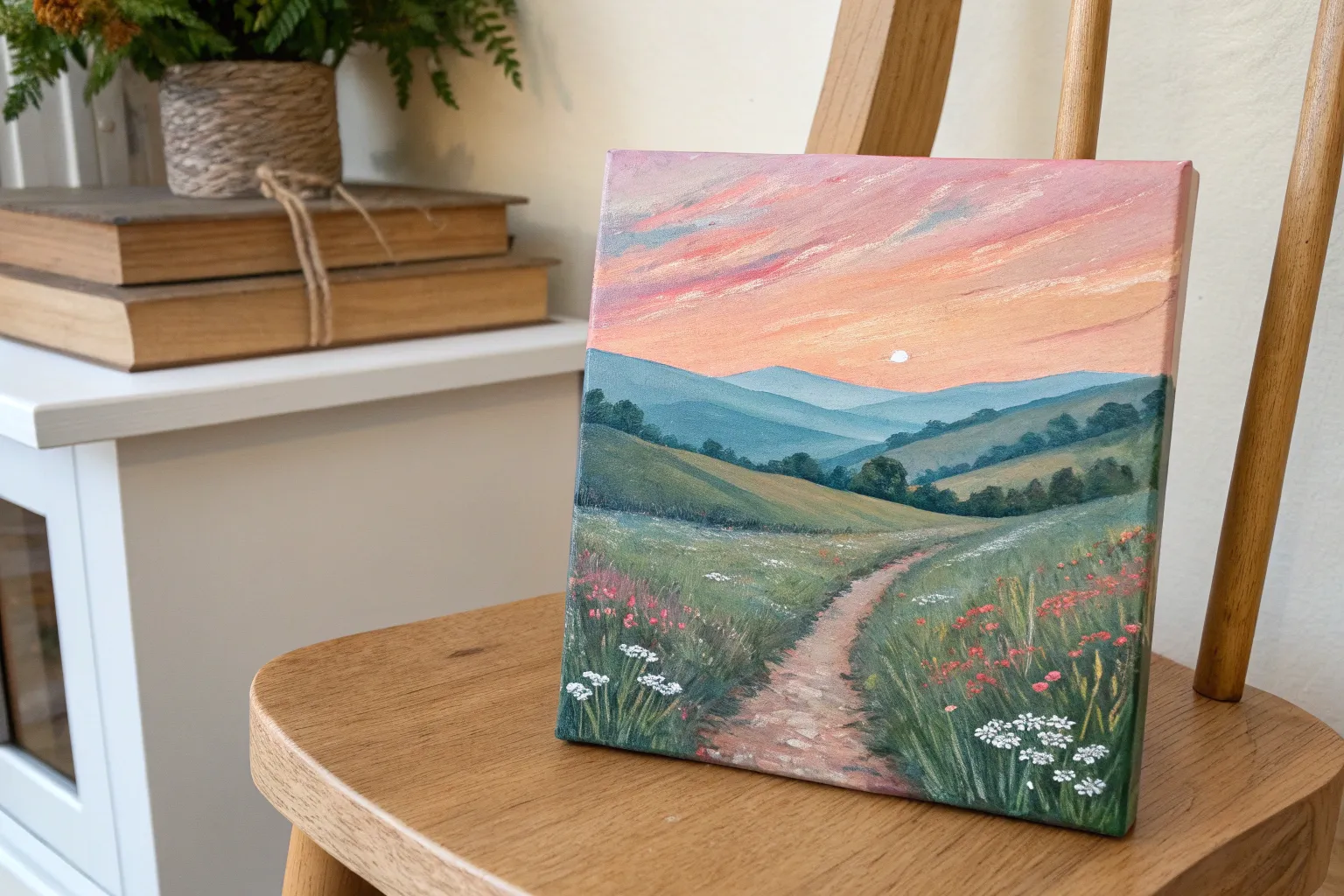
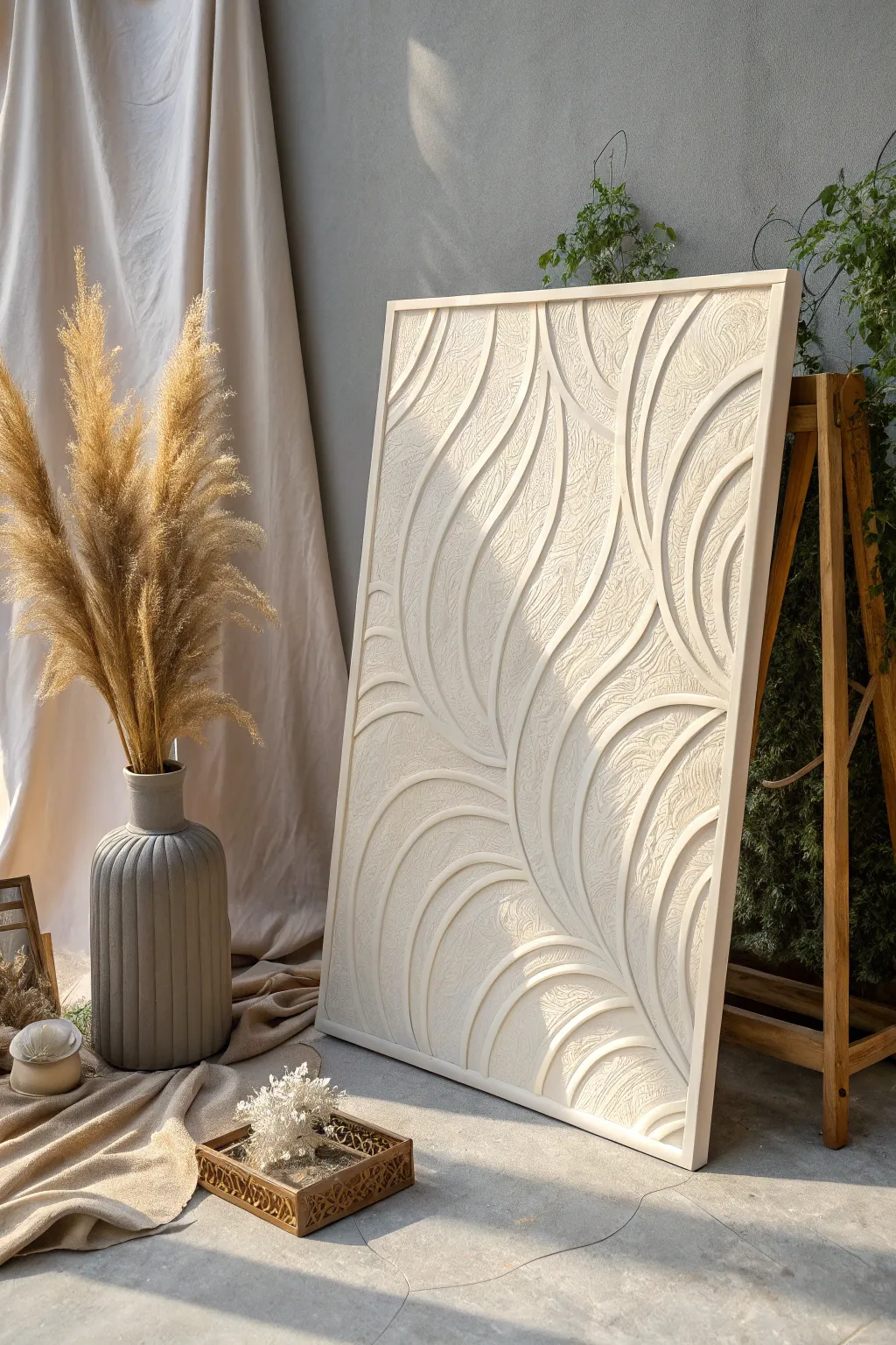
Mountain Landscape in Three Simple Layers
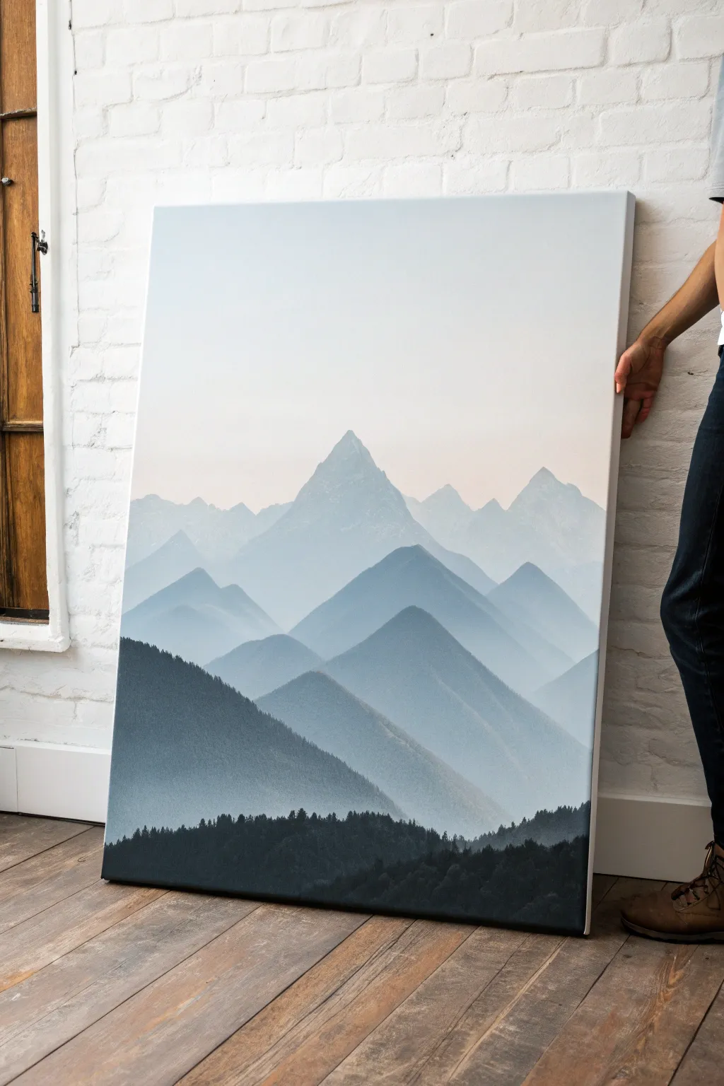
This serene, large-scale canvas captures the quiet majesty of receding mountain ranges fading into a pale sky. Using an atmospheric perspective technique, you’ll layer distinct mountain shapes from light to dark to build incredible depth with just a few colors.
Step-by-Step Tutorial
Materials
- Large rectangular canvas (approx. 30×40 inches or larger)
- Acrylic paints: Titanium White, Payne’s Grey, Phthalo Blue (Green Shade), Mars Black
- Large flat brush (2-3 inch) for blending sky
- Medium flat brush (1 inch) for mountain shapes
- Small round brush or fan brush for tree details
- Palette or disposable plates
- Water container and rags
- Pencil for sketching
- Slow-drying medium (optional)
Step 1: Setting the Atmosphere
-
Prime the sky:
Begin by determining your horizon line, which is quite low in this composition. Mix a large amount of Titanium White with the tiniest speck of Payne’s Grey to create an off-white, misty hue. -
Gradient base:
Cover the top two-thirds of the canvas with this pale mixture. While the paint is still wet, blend in slightly more white near the top edge to create a soft, barely-there gradient that mimics atmospheric haze. -
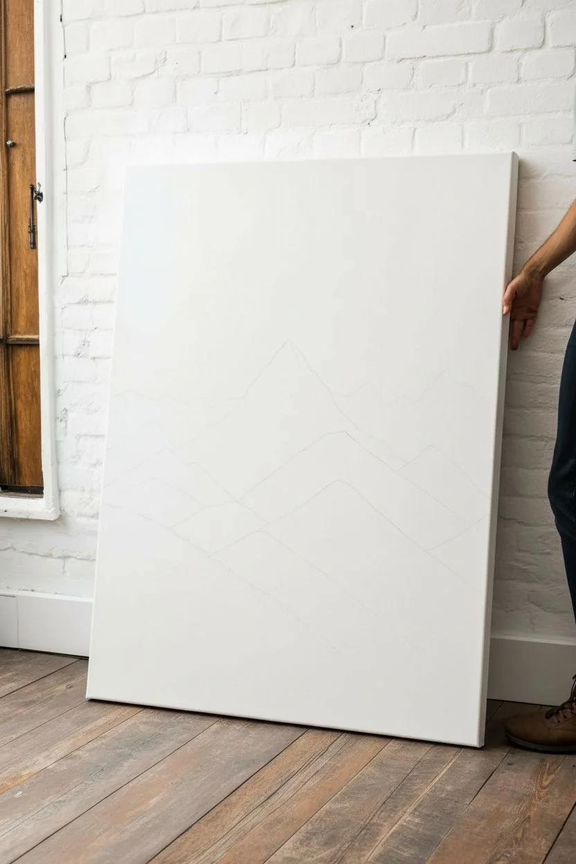
Sketching the peaks:
Once the sky is fully dry, lightly use a pencil to map out your mountain ranges. Draw four distinct overlapping layers: a high, distant peak in the center, followed by three progressively lower ranges moving toward the bottom.
Values Too Similar?
If your mountain layers are blending together, let them dry completely. Then, apply a thin wash of white paint over the more distant layer to push it back and lighten it.
Step 2: Painting the Distant Ranges
-
Mixing the lightest value:
For the furthest mountain range (the tall central peak and its neighbors), mix a very pale blue-grey. Combine White, a small touch of Payne’s Grey, and a hint of Phthalo Blue. It should be only slightly darker than your sky color. -
Blocking in the first layer:
Fill in the distant mountain shapes with this pale mix. Keep the edges relatively sharp against the sky, but don’t worry about the bottom edge as it will be covered by the next layer. -
Adding subtle texture:
While wet, I like to take a dry brush and lightly scuff the paint downward on the shaded sides of the peaks to suggest jagged rock faces, keeping it very subtle. -
Mixing the second layer:
Create a slightly darker value for the next range of mountains. Add a bit more Payne’s Grey and Blue to your previous mixture. Test the color on a scrap paper to ensure there is a clear distinction from the previous layer. -
Painting the middle ground:
Paint the second tier of mountains, which sits just below and overlaps the first. Ensure the peaks of this layer cut clearly across the base of the distant mountains to establish depth. -
Creating the third layer:
Mix your third value, going darker again. This should look like a medium steel blue. Paint the distinct triangular peaks of the third range. Notice how the shapes in the reference image are geometric and pyramid-like. -
Softening edges:
If the bottom of any mountain layer looks too harsh where it meets the next layer, you can lightly mist it with water or glaze it with white to simulate pockets of fog settling in the valleys.
Clean Ridges
For crisp mountain edges, use a piece of chalk to sketch your lines first. It wipes away easily and won’t leave graphite smudges in your pale paint mixes.
Step 3: The Foreground and Forest
-
Preparing the dark mix:
For the large, sweeping range in the lower middle section, mix a dark charcoal blue. Use Payne’s Grey and Phthalo Blue with very little white. This layer anchors the composition. -
Painting the dark slopes:
Apply this dark grey-blue to the large sloping mountain on the left side, sweeping down toward the right. Use long brush strokes that follow the angle of the slope. -
Adding texture to the slope:
Before this layer dries, stipple slightly darker paint along the top ridge of this slope to suggest jagged rocks or trees growing on the ridgeline. -
Mixing the deepest black:
For the absolute foreground forest, mix Mars Black with a touch of Phthalo Blue. This should be the darkest value on your canvas, creating a silhouette effect. -
Blocking the forest base:
Fill in the solid mass of the bottom section of the canvas with this black-blue mixture. -
Detailing the tree line:
Switch to your small round brush or a fan brush. Along the top edge of this black section, dab upwards to create tiny vertical points representing the tops of pine trees. -
Varying tree heights:
Ensure the tree line isn’t perfectly straight. Make some trees taller and group them in clusters to create a natural, organic silhouette against the lighter mountains behind them. -
Final assessment:
Step back and check your values. The progression should move clearly from white/pale grey at the top to deep black at the bottom. If any transition is too subtle, glaze a thin layer of darker color over the lower section to correct it.
Hang your new landscape in a well-lit room where the subtle gradients can really shine


Ocean Horizon Seascape With Foamy Waves
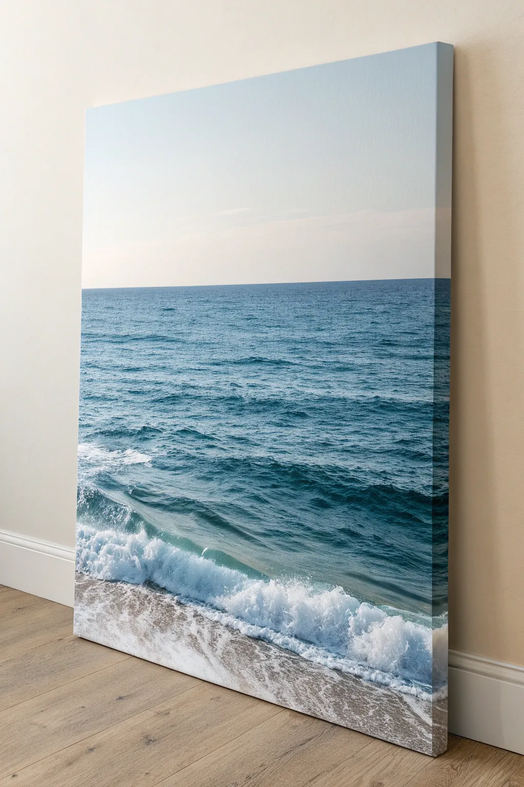
Capture the restorative calm of the sea with this vertical landscape painting, featuring a gradient sky, deep blue waters, and realistic crashing foam. The finished piece creates a window-like effect, perfect for bringing a coastal atmosphere into any room.
Step-by-Step Guide
Materials
- Large rectangular canvas (vertical orientation)
- Acrylic paints: Titanium White, Phthalo Blue, Ultramarine Blue, Cerulean Blue, Burnt Umber, Yellow Ochre
- Large flat brush (2-3 inch)
- Medium flat brush (1 inch)
- Small round brush (size 2 or 4)
- Fan brush
- Palette knife
- Water cup and paper towels
- Painter’s tape or straight edge
Step 1: Sky and Horizon
-
Establish the horizon line:
Decide on your horizon level, placing it slightly above the halfway point of the canvas. Use a strip of painter’s tape or lightly draw a straight line with a ruler to ensure the ocean remains perfectly level. -
Mix the sky gradient:
Prepare a very pale blue mix using a large amount of Titanium White with just a speck of Cerulean Blue. The sky in this reference is extremely soft, almost white near the horizon. -
Paint the sky:
Starting at the top of the canvas, paint downward using horizontal strokes. As you approach the horizon line, blend in even more white to create a hazy, atmospheric fade. -
Remove the guide:
Carefully peel off the painter’s tape while the paint is still tacky to reveal a crisp horizon line. If you used a pencil line instead, simply paint up to it carefully.
Sea Glass Translucency
For the translucent part of the wave just before it breaks, glaze a mixture of yellow-green and glazing medium over the dried blue base. This creates a glowing sunlit effect.
Step 2: Deep Ocean Water
-
Block in the deep sea:
Mix Phthalo Blue with a touch of Ultramarine Blue for the deepest ocean sections. Apply this dark mixture directly under the horizon line using your medium flat brush. -
Create the mid-water gradient:
As you move down the canvas, gradually mix in small amounts of Titanium White and a tiny bit of Yellow Ochre to the blue. This shifts the color toward a teal-green hue, representing shallower water. -
Add texture to the water:
While the blue paint is still wet, use horizontal strokes of slightly varying shades of blue. This mimics the gentle ripple of distant waves without needing excessive detail. -
Paint the wave trough:
Before the wave breaks, the water is transleucent. Mix a darker teal color and apply it in a diagonal curve where the main wave will rise up, creating depth behind the foam.
Textured Sands
Mix a small amount of real sand or texture paste into your beige paint for the shoreline. This adds a tactile, gritty dimension that contrasts beautifully with the smooth sky.
Step 3: Sand and Shore
-
Mix the sand color:
Combine Titanium White, Yellow Ochre, and a very small amount of Burnt Umber to create a warm, neutral beige tone for the wet sand. -
Paint the beach base:
Fill the bottom area of the canvas with your sand mixture. Because this is wet sand, you can brush it vertically or diagonally to match the recession of the water. -
Add shore reflections:
While the sand paint is wet, lightly glaze a very watered-down white over the areas closer to the wave. This simulates the sheen of water retreating on the beach.
Step 4: Crashing Waves and Foam
-
Form the main wave:
Load a fan brush or an old, splayed brush with thick Titanium White. Tap the brush vigorously along the diagonal line where the water meets the shore to create the main crashing wave. -
Structure the foam:
I like to use the corner of the brush to pull the bottom of the white foam upwards slightly, creating the ‘splash’ effect where the wave hits down. -
Add sea spray:
Flick the bristles of your brush or use a toothbrush with watered-down white paint to create fine mist droplets above the crashing wave section. -
Paint the retreating foam:
On the sand area, use a dry-brush technique to drag white paint loosely over the beige base. This creates the lacy, bubbly pattern of foam washing up onto the beach. -
Detail the water surface:
Use a small round brush with pure white to paint thin, wiggly horizontal lines on the darker blue water. These are the whitecaps and small ripples catching the light. -
Refine the shadows:
Mix a diluted grey-blue shade and carefully paint underneath the thickest parts of the white foam. This shadow gives the crashing wave volume, making it look 3D rather than flat. -
Final highlights:
Apply final dabs of pure, unmixed Titanium White to the brightest points of the crashing wave for maximum contrast.
Step back and enjoy the calming coastal view you have brought into your home


Simple Daisy Field With Loose Brush Dabs
Capture the serene beauty of a wildflower meadow with this step-by-step daisy painting tutorial. Featuring crisp white blooms against a moody, textured green background, this piece brings a touch of eternal spring to any room.
Step-by-Step
Materials
- Rectangular canvas (11×14 or similar)
- Acrylic paints: Dark Green (Phthalo Green), Sap Green, White, Yellow Ochre, Cadmium Yellow, Burnt Umber
- Large flat brush (1 inch)
- Medium filbert brush (size 6-8)
- Small round brush (size 2-4)
- Fine liner brush
- Palette
- Water cup
- Paper towels
Step 1: Setting the Mood
-
Mix your base greens:
On your palette, create a dark, rich green by mixing Phthalo Green with a small touch of Burnt Umber. Also, put out some plain Sap Green and White to create lighter variations. -
Apply the background base:
Using the large flat brush, paint the entire canvas with vertical strokes. I like to start with the darkest green at the bottom third to ground the composition. -
Create a vertical gradient:
As you move upward, blend in Sap Green and gradually add tiny amounts of White. The goal is a streak, vertical texture that looks lighter and ‘foggier’ near the top, simulating distance. -
Add background texture:
While the paint is still slightly tacky, use a dry brush to drag faint streaks of lighter green vertically through the dark sections. This creates the illusion of tall grasses in the distance. -
Flick for atmosphere:
For a magical touch, dilute a tiny bit of white paint with water and gently flick a few specks onto the upper half of the canvas to suggest pollen or distant light.
Natural Petals
Don’t aim for perfect symmetry. Real daisy petals are often missing, bent, or overlapping. Let your brush strokes be slightly irregular for a more organic, botanical feel.
Step 2: Planting the Stems
-
Mapping the layout:
Switch to your medium round brush. Mix a mid-tone green (Sap Green + Dark Green) and paint long, thin, curved lines rising from the bottom. Vary their heights, making some reach nearly the top and others stay low. -
Adding grass blades:
Using a liner brush and darker green paint, add very fine, whispier lines in between your main stems. This adds density to your field without overcrowding it. -
Painting fern-like leaves:
Near the bottom left and right corners, paint broader, fern-like leaves using a lighter sage green mix. Use a scalloped stroke to mimic the jagged edges of daisy foliage.
Step 3: Blooming Daisies
-
Establish flower centers:
Decide where your main flowers will go. Paint small, flattened oval shapes using Yellow Ochre mixed with a dot of Cadmium Yellow. These will serve as the anchors for your petals. -
First layer of petals:
Using the small filbert brush and pure White, paint petals radiating outward from the yellow centers. Press the brush down and lift as you pull outward to get that tapered petal shape. -
Varying perspectives:
Don’t make every flower face forward. For side-facing blooms, paint petals only on the bottom half of the center, sweeping them downwards like a skirt. -
Adding petal depth:
Once the white is dry, mix a tiny amount of grey (White + smallest dot of Black or Blue). Paint thin shadows near the base of the petals where they meet the center to add dimension. -
Highlighting petals:
Go back over the tips of the petals with bright, thick White paint. This second coat makes the flowers pop against the dark background.
Level Up: Morning Dew
Once fully dry, use a fine detail brush and pure white to add tiny dots on a few grass blades or petal tips. These small highlights mimic sparkling morning dew drops.
Step 4: Final Details
-
Detailing the centers:
Dab the top of your yellow centers with a mix of Cadmium Yellow and White for a highlight. Use Burnt Umber on the bottom edge of the center to give it a 3D, button-like shape. -
Connect stems to blooms:
Use your liner brush and green paint to ensure every flower head connects firmly to a stem. Add small sepals (tiny green leaves) right under the flower heads. -
Closing buds:
Paint a few small, closed buds—little white teardrop shapes tightly hugged by green sepals—on tall, thin stems to add variety to the life cycle of your field. -
Final foliage tweaks:
Step back and look at the bottom of the canvas. If it feels empty, add a few more dark, leafy strokes to weigh down the composition.
Allow your painting to dry completely before signing your name in the corner
BRUSH GUIDE
The Right Brush for Every Stroke
From clean lines to bold texture — master brush choice, stroke control, and essential techniques.
Explore the Full Guide
Moon and Clouds in a Dreamy Night Sky
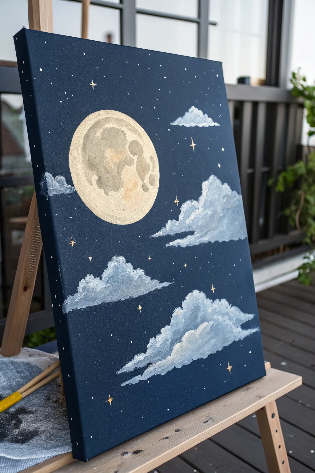
Capture the magic of a quiet evening with this serene painting featuring a textured, cratered moon and fluffy drifting clouds. The deep navy background contrasts beautifully with soft whites and touches of shimmering gold leaf or metallic paint.
Step-by-Step Tutorial
Materials
- Stretched canvas (e.g., 12×16 or similar vertical format)
- Acrylic paints: Navy Blue, Black, Titanium White, Unbleached Titanium (Beige), Light Grey
- Metallic Gold acrylic paint or a Gold Paint Pen
- Large flat brush for background
- Medium round brush
- Small detail brush or liner brush
- Old toothbrush (optional for stars)
- Circular object to trace (bowl or lid)
- Pencil
- Palette and water cup
Step 1: Setting the Night Sky
-
Mix the background color:
Start by mixing a deep, rich void color. Use a large amount of Navy Blue and mix in a touch of Black to deepen it without losing the blue hue. It shouldn’t be pitch black, just very dark midnight blue. -
Paint the canvas:
Apply this dark mixture over the entire canvas using your large flat brush. Ensure you paint the edges of the canvas too for a professional gallery-wrap look. Use long, horizontal strokes to ensure an even coat. -
Let it dry completely:
This base layer needs to be fully dry before adding the moon to prevent muddy colors. Acrylics dry fast, but give it about 15-20 minutes.
Fixing “Flat” Clouds
If your clouds look like stickers, blur the bottom edges slightly with a clean, damp brush. This softness helps them recede into the blue distance.
Step 2: Creating the Moon
-
Trace the shape:
Once the blue is dry, place your circular object (like a lid or bowl) near the upper left center of the canvas. Lightly trace around it with a pencil to get a perfect circle. -
Base coat the moon:
Fill in the circle with Unbleached Titanium (beige) or a mix of White and a tiny drop of Yellow Ochre. This serves as the glowing base for the moon. -
Add craters and texture:
While the beige is still slightly wet, mix a little Light Grey with your beige. Use a scruffy or dry brush to dab irregular blotches onto the moon surface. Focus on creating organic, rounded shapes that look like ‘maria’ or lunar seas. -
Highlight the rim:
Add a thin line of pure Titanium White along the upper left edge of the moon circle to suggest a light source hitting it directly.
Step 3: Painting Fluffy Clouds
-
Establish cloud shapes:
Mix a medium grey shade. Using a round brush, block in the general shapes of the clouds. Place a large formation on the bottom right and smaller ones floating near the moon. -
Layering the tops:
I like to work ‘wet-on-wet’ here. Dip your brush into Titanium White without cleaning off the grey completely. Dab the white paint onto the *top edges* of your cloud shapes, blending it downwards into the grey body. -
Building volume:
Continue dabbing in a circular, billowing motion. Keep the bottoms of the clouds flatter and darker (grey/blue), while making the tops fluffy and bright white. This creates dimension. -
Add subtle blue tints:
If the clouds look too stark, glaze a tiny amount of your background blue into the shadowed bottom areas to tie them into the atmosphere.
Make It 3D
Mix texture paste or modeling gel into your white paint for the clouds. This adds physical ridges that catch the light, making the clouds literally pop off the canvas.
Step 4: Stars and Details
-
Create distant stars:
Dilute a bit of white paint with water until it’s inky. Dip an old toothbrush into it and run your thumb across the bristles to flick tiny specks across the darkest parts of the sky. -
Paint larger stars:
Use a small detail brush or the handle end of a paintbrush dipped in white to dot specific, larger stars throughout the sky. -
Add the gold twinkle:
Using a gold paint pen or a fine liner brush with metallic gold paint, draw four-pointed ‘cross’ shapes scattered around the moon and clouds. These represent twinkling stars. -
Gild the moon:
For a final magical touch, dry brush a tiny bit of metallic gold over the lighter parts of the moon to make it shimmer.
Step back and admire your peaceful night sky masterpiece
Galaxy Canvas With Splattered Stars
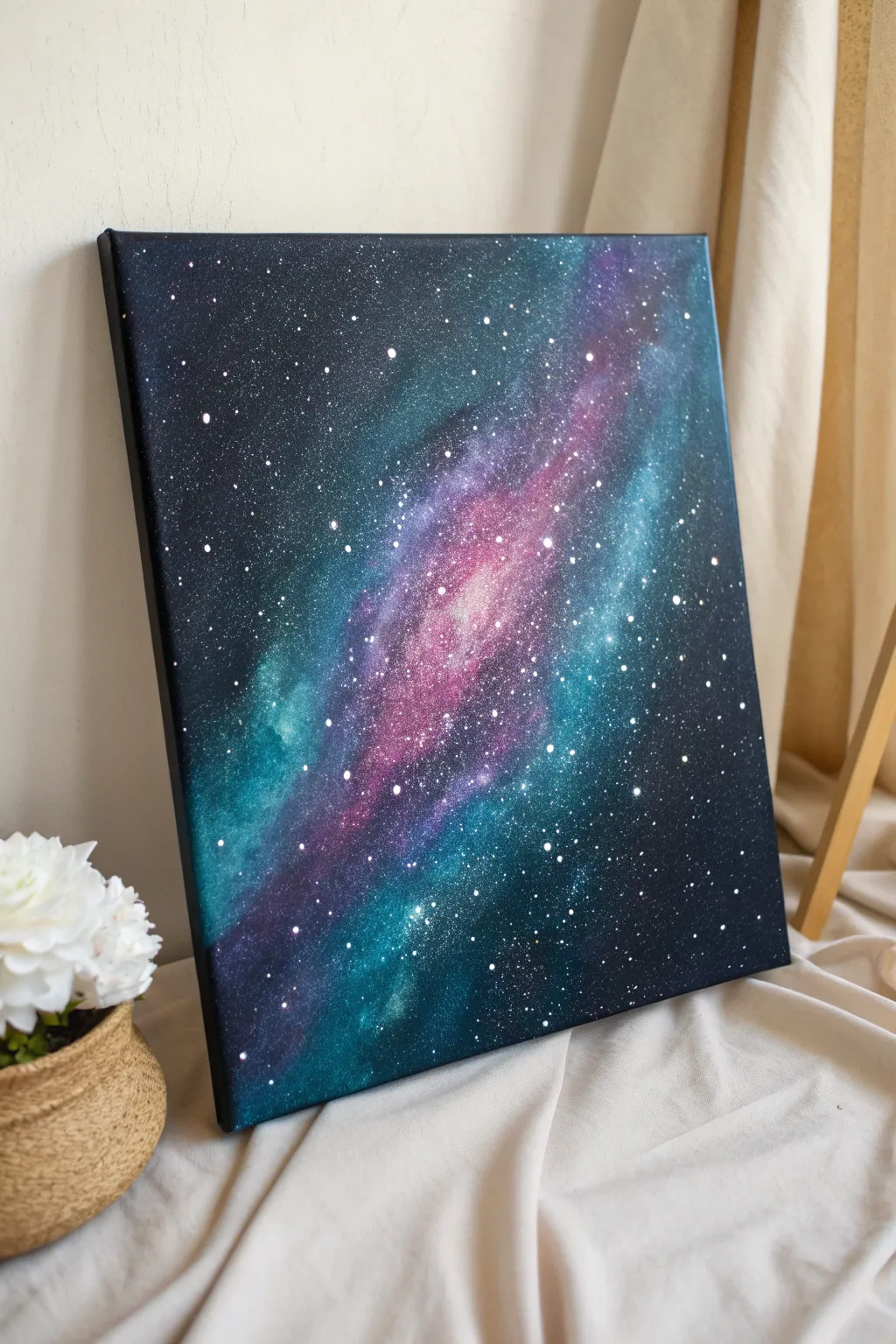
Bring the cosmos into your home with this stunning galaxy painting that features swirling nebulas of teal, purple, and pink against a deep void. The magical splatter technique creates hundreds of realistic stars in seconds, making this project surprisingly beginner-friendly.
Step-by-Step
Materials
- Stretched canvas (square or rectangular)
- Acrylic paints (Black, Prussian Blue, Turquoise/Teal, Purple, Magenta, White)
- Large flat brush or sponge brush
- Medium soft blending brush
- Small round brush
- Old toothbrush (stiff bristles)
- Palette or paper plate
- Cup of water and paper towels
Step 1: Setting the Background
-
Prime with darkness:
Begin by covering the entire canvas with black acrylic paint. Use a large flat brush or sponge brush to ensure full coverage, painting the sides of the canvas as well for a finished gallery look. -
Establish the corners:
While the black is still slightly wet, take a very small amount of Prussian Blue on your brush and blend it into the four corners, working inward. This adds subtle depth so the background isn’t simply flat black. -
Dry completely:
Let this base layer dry fully before moving on. Galaxies require distinct layers, and a wet background will turn your colorful nebula muddy.
Fixing Big Blobs
If the toothbrush splatters a large, unwanted blob of paint, wait for it to dry. Then, paint over it with black and re-add the nebula color or stars on top.
Step 2: Creating the Nebula
-
Map the Milky Way:
Load a clean, dry sponge or an old scruffy brush with white paint. Dab off almost all the paint onto a paper towel until it’s ‘dry brushing.’ Lightly tap a diagonal band across the canvas where your galaxy will flow. -
Add the first teal layer:
Mix a little Turquoise/Teal with white to create a glowing light blue. Using a soft blending brush, dab this color along the outer edges of your white diagonal path, keeping the movement irregular and cloudy. -
Introduce deep purple:
On the opposite side or adjacent to the teal, sponge or dab on purple paint. Allow it to overlap slightly with the teal to create interesting transitional blue-indigo hues. -
Brighten the core:
Mix Magenta with a touch of White to get a vibrant pink. Apply this to the very center of your diagonal band, which represents the hottest, brightest part of the nebula cloud. -
Blend the transitions:
With a clean, slightly damp soft brush, gently feather the edges where different colors meet. You want soft, smoky transitions rather than hard lines. -
Deepen the shadows:
If the colors look too pasted on, take a little watered-down black paint (a glaze) and lightly brush over the outer edges of the colored nebula to push them back into the dark background. -
Intensify highlights:
I like to go back in with almost pure white paint and tap tiny highlights into the very center of the pink and teal sections to make them look like they are glowing from within.
Step 3: The Starfield
-
Proper paint consistency:
Creating stars requires the right texture. Mix a small puddle of white paint with a few drops of water until it is the consistency of heavy cream or melted ice cream. -
The toothbrush technique:
Dip an old toothbrush into this thinned white paint. Test it on a piece of scrap paper first by running your thumb across the bristles to flick the spray. -
Create distant stars:
Hold the toothbrush about 12 inches away from the canvas and flick the bristles. Aim for an even misting of fine dots across the entire black background and over the colored nebula. -
Add major stars:
Bring the toothbrush closer to the canvas for a few specific spots to create larger, brighter clusters of stars along the main diagonal band of the galaxy. -
Paint hero stars:
Using your smallest round brush or even the tip of a toothpick, manually dot a few larger, distinct white stars in the empty black spaces to create focal points. -
Dry and seal:
Allow the splatter to dry completely, which is usually fast. If you wish to protect the painting, apply a coat of glossy varnish to make the dark colors pop even more.
Glow in the Dark
Mix glow-in-the-dark medium into your white star paint. The painting will look normal by day, but the galaxy will light up when the room goes dark.
Now you have a captured piece of the infinite universe right on your wall

PENCIL GUIDE
Understanding Pencil Grades from H to B
From first sketch to finished drawing — learn pencil grades, line control, and shading techniques.
Explore the Full Guide
Silhouette Trees Over a Gradient Sky
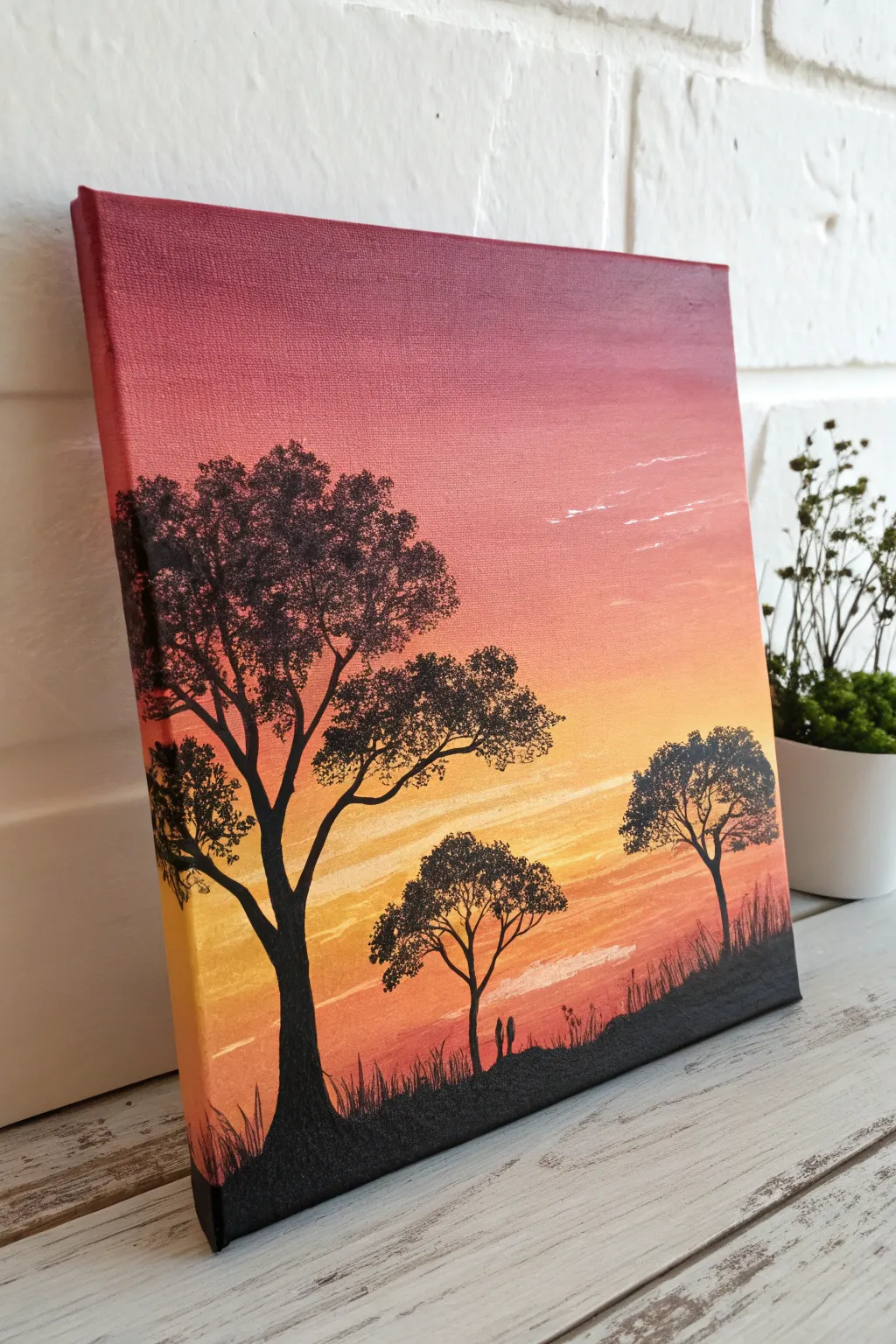
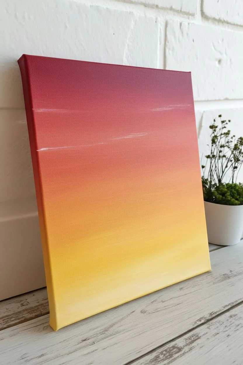
Capture the peaceful transition of day into night with this striking acrylic painting that balances a vibrant, warm gradient against crisp, black silhouettes. This project is perfect for beginners looking to master blending techniques while creating a sophisticated piece of art.
How-To Guide
Materials
- Stretched canvas (square or rectangular)
- Acrylic paints: Cadmium Red Medium, Cadmium Orange, Cadmium Yellow Medium, Mars Black, Titanium White
- Wide flat brush (1 inch or larger) for blending
- Medium flat brush
- Small round detail brush (size 0 or 1)
- Fan brush (optional, for foliage)
- Palette
- Cup of water and paper towels
Step 1: Creating the Gradient Sky
-
Prime the colors:
Squeeze out generous amounts of your red, orange, yellow, and white paints onto your palette. You will need plenty of paint to ensure a smooth, wet blend. -
Start with the darkest red:
Using your wide flat brush, paint the top third of the canvas with horizontal strokes using the deep red. Don’t worry about the bottom edge being perfect yet. -
Paint the edges:
While you have the red paint on your brush, extend the color around the top and side edges of the canvas for a professional, finished look. -
Introduce the orange:
Without cleaning your brush thoroughly (just wipe off excess red), pick up the orange paint. Apply this to the middle third of the canvas. -
Blend the transition:
Where the red and orange meet, brush back and forth horizontally with quick, light strokes to blur the line. If the paint feels draggy, dip the very tip of your brush in water. -
Add the yellow horizon:
Wipe your brush clean on a paper towel. Pick up the yellow paint and apply it to the bottom third of the canvas. -
Create the glow:
Mix a tiny bit of white into your yellow to create a pale sunlight effect. Blend this heavily into the orange section above it, creating a soft, hazy transition. -
Dry completely:
Let the background layer dry fully before moving on. This is crucial—painting black over wet yellow will create a muddy green mess.
Uneven Blending?
If your sky stripes aren’t mixing well, your acrylics might be drying too fast. Mist the canvas lightly with water or add a slow-drying medium to your paints to keep them workable longer.
Step 2: Adding the Silhouettes
-
Plan the horizon line:
Using your medium flat brush and black paint, create an uneven, sloping hill at the very bottom of the canvas. It should be higher on the right side and dip lower towards the left. -
Block in the main tree trunk:
Switch to your small round brush. Paint the trunk of the largest tree on the left side. Make the base wider and taper it as you go up, splitting it into two or three main large branches. -
Extend the branches:
Continue splitting the branches into thinner and thinner lines. Use a light hand and just the tip of the brush. Remember that branches naturally grow upward and outward. -
Stipple the foliage:
To create the leaves, you can use an old, scruffy brush or a fan brush.Load it with dry black paint and tap (stipple) it repeatedly over the branch ends. I like to keep spaces between the clumps so the sky peeks through. -
Add secondary trees:
Paint a smaller, thinner tree in the middle ground and another on the right side of the hill. Make these smaller than the first tree to create a sense of depth and distance. -
Add foliage to smaller trees:
Repeat the stippling technique on these smaller trees, keeping the leaf clusters slightly more compact. -
Paint the grass details:
Using your smallest detail brush, flick quick, upward strokes along the black hill to create the illusion of tall grass blades. -
Add subtle clouds:
Mix a very faint, watery white or pale pink. Using a clean brush, drag a few very thin, wispy lines horizontally across the upper red section to suggest high-altitude clouds. -
Final check:
Step back and look at your composition. If any black areas look patchy, add a second coat of black once the first is dry to make the silhouettes solid and opaque.
Hidden Details
Add two tiny silhouette figures walking near the trees or a swing hanging from a branch to give your landscape a story and a sense of scale.
Once the black paint has fully cured, you can seal your serene landscape with a varnish to make those warm colors truly pop
Cactus Silhouette at Dusk on Canvas
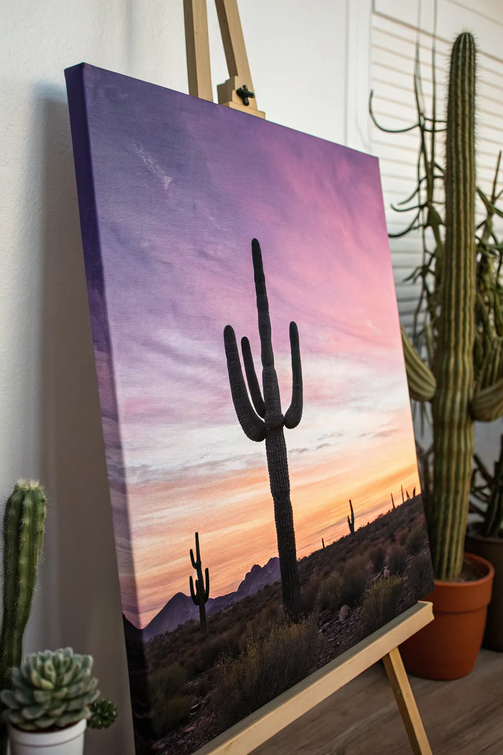
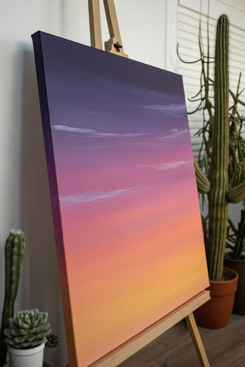
Capture the serene beauty of the American Southwest with a vibrant gradient sky and striking saguaro silhouettes. This project focuses on blending tranquil purples into warm oranges to create a glowing backdrop for crisp, bold foreground elements.
Detailed Instructions
Materials
- Stretched canvas (12×16 or larger recommended)
- Acrylic paints: Dioxazine Purple, Quinacridone Magenta, Cadmium Orange, Cadmium Yellow Light, Titanium White, Mars Black, Burnt Umber
- Wide flat synthetic brush (1-2 inch) for blending
- Medium flat brush
- Small round brush (size 2 or 4)
- Fine liner brush (size 0 or 00)
- Cup of water and paper towels
- Mixing palette
Step 1: The Sunset Sky Gradient
-
Prime the gradients:
Begin by deciding where your horizon line will be—about the bottom quarter of the canvas is ideal. Mentally divide the sky into zones: dark purple at the top, fading to pink, then orange, then yellow at the horizon. -
Apply the deepest purple:
Load your large flat brush with Dioxazine Purple mixed with a tiny touch of Titanium White to make it opaque but dark. Paint horizontal strokes across the top 2-3 inches of the canvas. -
Transition to violet-pink:
Without cleaning the brush fully, pick up some Quinacridone Magenta and a bit more White. Blend this into the bottom edge of your purple strip, moving down the canvas with long, sweeping horizontal strokes. -
Introduce warm tones:
Wipe your brush on a paper towel. Mix Cadmium Orange with a little White and Magenta. Apply this band below the pink section, using the paint that’s already on the canvas to help merge the colors seamlessly. -
Create the glowing horizon:
Clean your brush thoroughly. Mix Cadmium Yellow Light with White and a speck of Orange. Paint the strip right above your horizon line, blending upward into the orange layer while the paint is still wet to create a smooth, glowing transition. -
Add wispy clouds:
While the sky is damp but tacky, use a smaller dry brush with a very light lavender-grey mix. Lightly scumble subtle, streaks horizontally across the purple and pink sections to suggest distant, thin cloud layers.
Step 2: Painting the Landscape Silhouette
-
Block in the mountains:
Once the sky is completely dry, mix Mars Black with a little Dioxazine Purple to create a deep, cool shadow color. Use a medium flat brush to paint the distant mountain range shapes along the horizon line. -
Create mid-ground texture:
Mix Mars Black with a touch of Burnt Umber. Stipple this dark mixture beneath the mountains to create the textured appearance of scrub brush and uneven desert floor leading to the bottom edge. -
Sketch the main cactus:
Using a small round brush and thinned black paint, lightly outline the central Saguaro cactus. Make the main trunk tall and slightly tapered, adding one or two majestic arms curving upward. -
Fill the silhouette:
Switch to pure Mars Black. Fill in your cactus shape carefully. I find it helpful to use a flat brush for the main trunk’s straight edges and a round brush to smooth out the curved tips of the arms. -
Add texture to the cactus:
To give the silhouette dimension without breaking the shadow effect, mix a very dark grey (Black plus a tiny drop of White). Paint faint vertical lines down the length of the cactus to suggest its ribs. -
Paint distant vegetation:
Using a small round brush, add tinier cactus silhouettes in the background. Keep these shapes simpler and shorter to emphasize the scale of your main subject. -
Detail the foreground:
Load a fan brush or an old, splayed bristle brush with black paint. Tap it lightly along the very bottom of the canvas to create random tufts of desert grass and small bushes in the immediate foreground. -
Add highlights to scrub:
Mix a dark grey-brown. Lightly dab this onto the top edges of the foreground bushes and the desert floor to mock the last bits of light hitting the ground textures. -
Refine edges:
Use your fine liner brush to sharpen any blurry edges on the cactus arms or mountain peaks. Crisp edges are crucial for convincing silhouettes.
Pro Tip: Blending
Work quickly on the sky! Acrylics dry fast, so keep a misting bottle handy to keep the paint wet for smoother gradients.
Level Up: Needles
Use your finest liner brush to paint tiny, almost invisible hair-like spikes along the outer edge of the cactus silhouette for realism.
Step back and admire the warmth of your desert sunset painting


Cozy Campfire Silhouette Under a Starry Sky
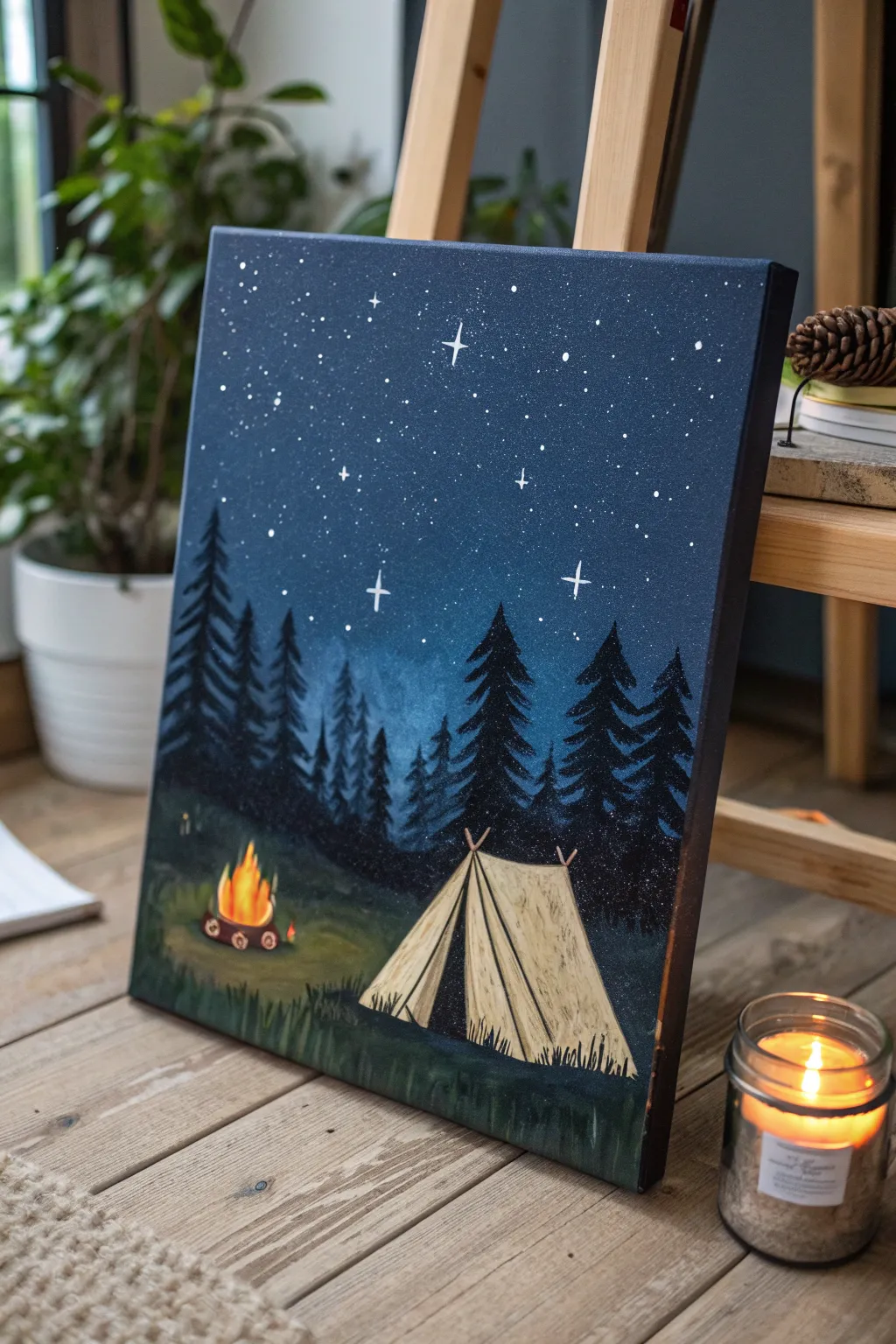
Capture the magic of a quiet night in the wilderness with this beginner-friendly acrylic painting. By layering deep blues for the sky and simple geometric shapes for the tent, you will create a cozy scene perfect for any nature lover’s wall.
Step-by-Step Guide
Materials
- Stretched canvas (11×14 or similar)
- Acrylic paints: Navy Blue, Black, White, Burnt Sienna, Yellow Ochre, Bright Orange, Yellow
- Large flat brush (1 inch)
- Medium flat brush
- Small round detail brush
- Old toothbrush (for stars)
- Cup of water
- Paper towels
- Palette or paper plate
Step 1: Setting the Night Sky
-
Base layer:
Begin by covering the entire upper two-thirds of your canvas with a deep Navy Blue. Use your large flat brush and smooth, horizontal strokes to ensure even coverage. -
Add depth:
While the blue is still slightly wet, mix a tiny amount of black into your blue on the palette. Paint the top corners and edges of the sky to create a vignette effect, drawing the eye toward the center. -
Create the horizon glow:
Mix a little white into your original Navy Blue to make a medium-light blue. Blend this gently into the lower middle section of the sky area, just above where the trees will go, to suggest distant light or atmosphere.
Starry Splatter Tip
Test your toothbrush splatter technique on a scrap piece of paper first. This helps you gauge how much water to add so you don’t get giant blobs on your sky.
Step 2: Painting the Forest Floor
-
Ground layer:
For the bottom third of the canvas, mix Black with a touch of Navy Blue and Green (if available, or just mix yellow and blue) to create a very dark, shadowy green tone. -
Texture:
Apply this dark mix to the bottom area using short, upward flicking strokes with a medium brush to simulate grass texture rather than painting it flat. -
Highlighting the grass:
Lighten your dark green mix slightly with a dab of Yellow Ochre. Add soft patches of lighter grass where the firelight and tent light would hit the ground.
Tree Trouble?
If your pine trees look too symmetric or perfect, hold the brush loosely at the very end of the handle. This forces your hand to jitter slightly for organic shapes.
Step 3: Building the Forest
-
Tree placement:
Using a smaller flat brush and pure Black paint, draw vertical lines to mark the trunks of your pine trees. Vary their heights, making the ones on the sides taller and the ones in the center shorter to create perspective. -
Painting branches:
Start at the top of each trunk line. Use the corner of your flat brush to dab outwards and slightly downwards, creating the jagged silhouette of pine branches. Get wider as you move down the tree. -
Refining silhouettes:
Fill in the trees completely with black, ensuring they look dense. Overlap the trees slightly to create a thick forest wall.
Step 4: The Tent and Fire
-
Tent shape:
Outline a simple triangle shape in the clearing using a small round brush and a mix of White and Yellow Ochre (beige). -
Tent details:
Fill in the tent shape with the beige mix. Use a slightly darker shade (add a speck of brown) to paint fold lines and the opening flap of the tent for dimension. -
Campfire base:
Paint small, dark brown ovals in a circle near the tent to represent the rocks around the fire pit. -
Ignite the fire:
block in the fire shape with Bright Orange. While wet, add Yellow close to the bottom center for heat, and flicks of red-orange near the top tips.
Step 5: Finishing Touches
-
Adding stars:
Dilute a small value of white paint with water until it’s inky. Dip an old toothbrush into it and flick the bristles with your thumb to spray tiny stars across the dry blue sky. -
Big stars:
Use your smallest detail brush to manually paint a few larger, four-pointed ‘cross’ stars for visual interest. -
Final glow:
Add tiny touches of yellow reflectivity on the grass closest to the fire and a thin line of highlight on the tent pole.
Step back and admire the peaceful solitude of your hand-painted campsite.
Mini Canvas Trio: Same Scene, Three Color Moods
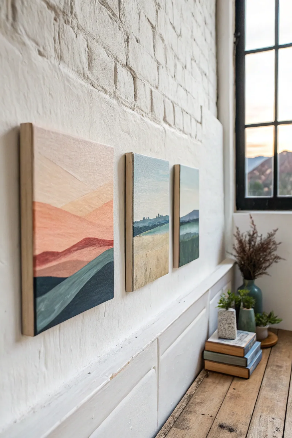
This abstract landscape series shows how changing a color palette can completely transform the mood of the same scene. By simplifying rolling hills into bold, layered shapes, you’ll create a cohesive trio of modern artworks that feel both serene and striking.
Step-by-Step Tutorial
Materials
- 3 deep-edge canvases or wood panels (approx. 8×10 or 9×12 inches)
- Acrylic paints (Titanium White, Burnt Sienna, Yellow Ochre, Ultramarine Blue, Phthalo Green, Cadmium Red, Hooker’s Green)
- Set of flat synthetic brushes (medium and large)
- Pencil
- Palette knife (for mixing)
- Palette or paper plate
- Cup of water and paper towels
- Painter’s tape (optional)
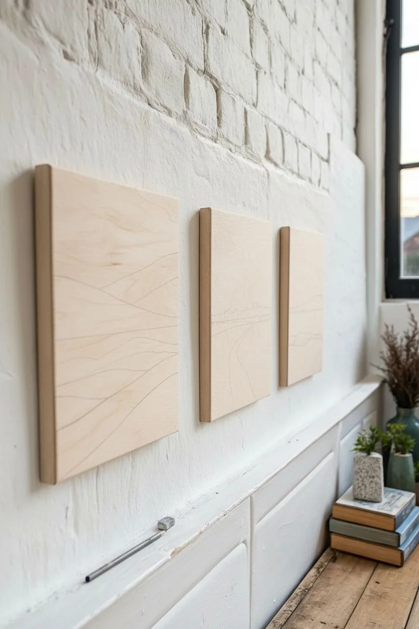
Step 1: Planning and Sketching
-
Surface Preparation:
Begin by ensuring your three canvases are clean and dust-free. If you are using raw wood panels, apply a coat of gesso first to prime the surface and let it dry completely. -
Consistent Horizon:
Arrange the three canvases side-by-side. Using a pencil, lightly draw a horizon line that flows across all three surfaces at roughly the same height, about one-third up from the bottom. -
Sketching the Shapes:
Draw simple, overlapping hill shapes. Keep the designs similar but not identical. The foreground should slope gently, showing a distinct ‘path’ or valley, while the background hills should recede into the distance.
Color Harmony Tip
To make the series feel connected despite different palettes, mix a tiny bit of the same white or grey into every single color you use across all three canvases.
Step 2: Painting the ‘Sunset’ Canvas (Left)
-
Mixing Warm Sky Tones:
For the leftmost canvas, mix a large amount of pale blush pink using Titanium White and a tiny dot of Cadmium Red. Paint the top sky section with broad, horizontal strokes. -
Layering the Hills:
Mix a slightly darker coral or peach tone for the distant mountains. Apply this below the sky line, ensuring a crisp edge between the two colors. -
Adding Depth:
Mix Burnt Sienna with a touch of Red/Pink to create a terracotta shade. Paint the middle ground hills with this richer color to bring them forward visually. -
Foreground Contrast:
For the bottom section, mix a deep, cool navy or teal using Ultramarine Blue and Phthalo Green. Paint the bottom-most shape to ground the composition with strong contrast.
Fixing Wobbly Lines
If your horizon lines aren’t crisp, let the paint dry completely. Then, apply a strip of painter’s tape over the dry area and paint the adjacent section for a perfect edge.
Step 3: Painting the ‘Midday’ Canvas (Center)
-
Creating a Soft Sky:
On the middle canvas, mix a very pale blue-grey for the sky. Use mostly White with a speck of Blue to keep it airy and bright. -
Distant Elements:
Paint the distant horizon line in a muted blue-green. Add tiny vertical brush dabs along the ridge to suggest distant trees or a tree line. -
Golden Fields:
Mix Yellow Ochre with plenty of White to create a wheat or sand color. Apply this to the large middle section of the painting. -
Texture:
While the ochre paint is still slightly wet, use a dry brush to streak in slightly darker vertical lines, simulating tall grass or wheat stalks.
Step 4: Painting the ‘Dusk’ Canvas (Right)
-
Cool Sky Tones:
For the final canvas, mix a cool, pale grey-green for the sky. It should feel slightly more moody than the center painting. -
blue Mountains:
Mix a medium slate blue for the distant mountain range. Paint this shape with a flat brush to get sharp, angular peaks. -
Verdant Greens:
Combine Hooker’s Green with a touch of Ultramarine Blue and White for a muted sage green. Fill in the middle ground area. -
Deep Shadows:
Finish the bottom foreground with a dark forest green. Add a little black or brown if needed to make it the darkest value of the trio.
Step 5: Finishing Touches
-
Refining Edges:
Once broadly filled, go back with a smaller brush. Clean up the lines where the colors meet to ensure the abstract shapes look intentional and crisp. -
Painting the Sides:
Since these are deep-edge canvases, decide whether to wrap the painting around the sides or paint the edges a solid neutral color like white or raw wood beige. -
Sealing:
Allow the acrylics to cure for at least 24 hours. Apply a matte or satin varnish to protect the paint and unify the sheen across all three pieces.
Hang these pieces together with about two inches of spacing between them to let the color story flow across your wall
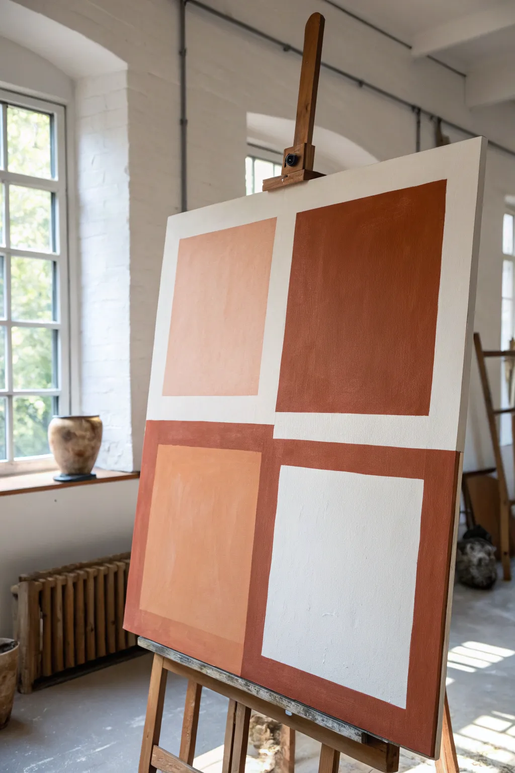
Abstract Color Block Canvas With Clean Edges
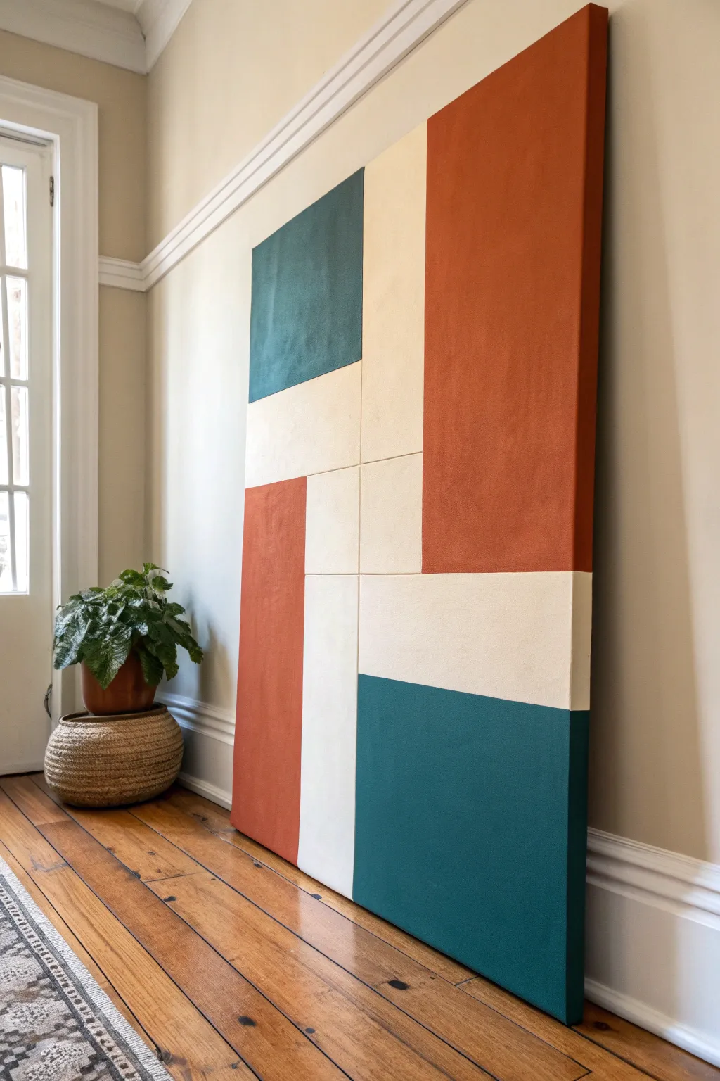
Transform a blank canvas into a striking statement piece with this abstract geometric design. Featuring a warm palette of rust, teal, and cream, this project relies on sharp, clean lines to achieve a professional, modern aesthetic.
Step-by-Step Guide
Materials
- Large stretched canvas (24×36 or larger recommended)
- Acrylic paints (Rust/Burnt Sienna, Deep Teal/Hunter Green, Cream/Warm White)
- Painter’s tape or masking tape (high quality)
- Gesso or matte medium (clear or white)
- Flat paintbrushes (2-inch and 1-inch sizes)
- Ruler or T-square
- Pencil
- Eraser
- Drop cloth or workspace cover
Step 1: Preparation & Layout
-
Prime the Surface:
Begin by ensuring your canvas is clean and taut. Apply a thin coat of white gesso if the canvas isn’t pre-primed, or if you want a smoother texture to work on. Let this dry completely before moving forward. -
Map the Grid:
Analyze the reference image’s layout. It uses a series of rectangles in varying orientations. Using a ruler and a light pencil, draw your main vertical and horizontal lines. Don’t press too hard; you just need a faint guide. -
Refine the Chaos:
This design looks like a ‘pinwheel’ or interlocking blocks. Sketch out the larger rust orange rectangle on the top right and the thinner rust rectangle on the bottom left. -
Mark the Teal Sections:
Outline the square teal block in the top left quadrant and the larger, wide teal rectangle in the bottom right corner. -
Define the Cream Space:
The remaining negative space in the center and sides will be your cream sections. Double-check your measurements to ensure the lines look straight and balanced.
Bleeding Lines?
If paint bleeds under the tape, wait for it to dry fully. Then, place a piece of tape over the ‘good’ side and use the original background color to paint over the bleed, acting like an eraser.
Step 2: Taping for Crisp Edges
-
Tape the First Round:
You cannot paint adjacent sections simultaneously if you want perfect lines. Apply painter’s tape along the OUTSIDE edges of the first set of shapes you want to paint (e.g., the rust sections). -
Seal the Tape:
This is the most crucial step for clean lines. Apply a very thin layer of clear matte medium or white paint along the edge of the tape. This seals any gaps so paint doesn’t bleed underneath. -
Let the Seal Dry:
Allow the sealing layer to dry for about 15-20 minutes. It should be dry to the touch before you introduce color.
Add Texture
Mix a modeling paste or fine sand into your acrylic paint before applying. This adds a tactile, stucco-like dimensions found in high-end abstract art.
Step 3: Applying Color
-
Paint the Rust Sections:
Mix your rust color using burnt sienna and a touch of red or orange if needed. Use a large flat brush to apply the paint within your taped rust zones. Brush in smooth, vertical strokes. -
Build Opacity:
Acrylics often need two coats for rich coverage. Let the first coat dry, then apply a second layer to ensure the white canvas doesn’t show through. -
Remove Tape While Damp:
I prefer to peel the tape off slowly while the second coat is still slightly tacky, pulling away from the paint edge. This helps prevent the paint film from ripping. -
Wait for Full Dry:
Allow the rust sections to dry completely—ideally for a few hours—before taping over them for the next colors. -
Tape for Teal:
Once dry, apply fresh tape to mask off the rust sections and the cream areas, exposing only the zones meant for teal paint. Repeat the sealing process with matte medium. -
Paint the Teal Blocks:
Apply your deep teal paint. Use steady strokes and ensure you cover the corners thoroughly. Apply a second coat if the color looks streaky. -
Reveal the Design:
Carefully remove the tape from the teal sections. You should now see the rust and teal shapes clearly defined against the white canvas.
Step 4: Finishing Touches
-
Paint the Cream Areas:
Finally, you can paint the remaining white canvas areas with a warm cream color. You can tape this off if you need to, or carefully cut in with a smaller flat brush against the existing colored edges. -
Clean Up Edges:
Inspect your lines. If there’s any small bleed-through, use a tiny detailed brush and the appropriate color to touch up the mistakes. -
Paint the Canvas Sides:
Don’t forget the deep edges of the canvas. Extend the design’s lines around the sides, or paint the entire edge a solid color (like the cream tone) for a framed look. -
Final Varnish:
Once the entire piece has cured for 24-48 hours, apply a clear varnish (matte or satin works best for this style) to protect the surface from dust and UV light.
Hang your new masterpiece in a well-lit hallway or living area to showcase those crisp architectural lines
Tape-Resist Geometric Lines on Canvas
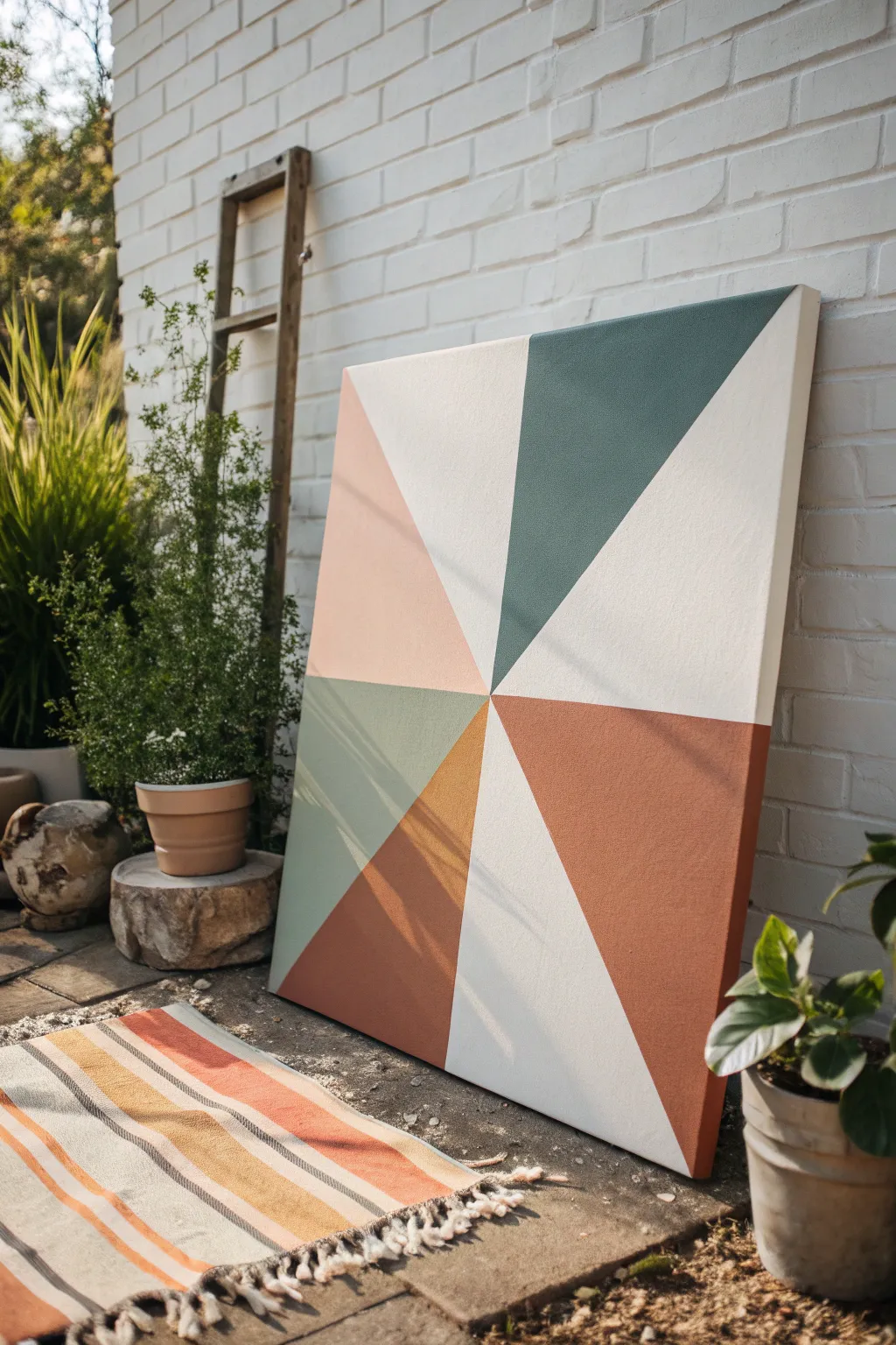
Create a striking focal point for your garden porch or living room with this clean, geometric canvas art. Using a simple tape-resist method, this project combines muted earth tones—terracotta, sage, and deep green—into a sophisticated radial design that looks far more complex than it actually is.
Step-by-Step Tutorial
Materials
- Large square canvas (24×24 or 36×36 inches suggested)
- Painter’s tape (1-inch width works best)
- Acrylic paints (Titanium White, Terracotta/Rust Orange, Sage Green, Hunter Green, Light Peach/Blush, Burnt Sienna)
- Medium flat synthetic paintbrush
- Gesso (optional, for priming)
- Pencil and ruler
- Palette or paper plate
- Matte spray sealant (optional)
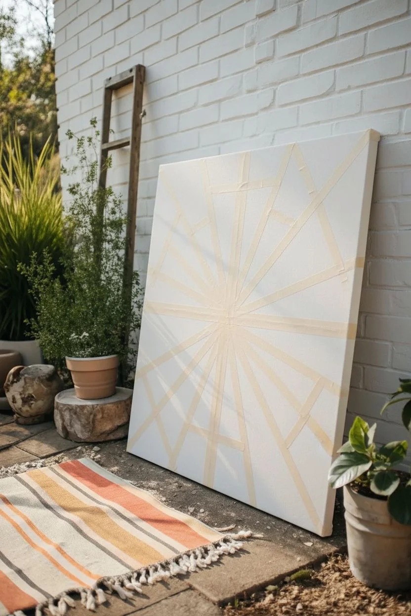
Step 1: Planning and Taping
-
Prime your surface:
If your canvas isn’t pre-primed, apply a coat of gesso to ensure a smooth texture and help the paint adhere evenly. Let this dry completely before moving on. -
Mark the center:
Using a ruler, measure the width and height of your canvas to find the exact center point. Mark this lightly with a pencil. -
Establish the radial lines:
You need to create the ‘sections’ for your colors. Start by running a strip of painter’s tape from the top left corner directly to your center mark. -
Continue the pattern:
Place additional strips of tape radiating from the center point out to the edges. Looking at the reference, notice the sections aren’t all equal sizes—some triangles are wide, others are narrow. Vary the spacing for dynamic visual interest. -
Seal the tape edges:
Once your tape spokes are placed, press down firmly along every edge. I like to run the back of a spoon or a fingernail over the tape to prevent paint from bleeding underneath later. -
Apply a base seal (optional):
For razor-sharp lines, paint a very thin layer of white paint (or your background color) over the tape edges. This fills any microscopic gaps with the base color so your colored paints won’t seep through.
Step 2: Painting the Sections
-
Mix your palette:
Prepare your acrylics. You’ll need substantial amounts of Cream/Off-White, plus smaller pools of Terracotta, Sage, Dark Green, Peach, and Burnt Sienna. Mixing a touch of white into your colors can help give them that matte, muted look. -
Paint the white sections:
Identify the large triangles that you want to remain light (about three distinct sections in the reference). Paint these with your Cream or Off-White tone. -
Apply the dark green:
Choose one of the wider triangular sections for the deep green. Use long, smooth strokes starting from the tape and pulling inward towards the center of the section to avoid pushing paint under the tape. -
Fill in the warm tones:
Select a section adjacent to a white one for your Rust/Terracotta color. Paint this section thoroughly, ensuring opaque coverage. -
Add the sage accent:
Paint one of the smaller or medium-sized sections with your Sage Green. This cool tone balances the warmth of the terracotta and peach. -
Complete with peach and brown:
Fill the remaining segments with Light Peach and Burnt Sienna. If your paint looks streaky, let the first coat dry to the touch and apply a second coat for solid, bold color. -
Check for coverage:
Inspect all painted areas. Make sure the canvas weave is fully covered and the colors are solid. Touch up any thin spots while the tape is still on.
Tape Removal Trick
Pull the tape slowly while the paint is still slightly tacky/damp. If the paint is fully dry, it can form a film that rips; if so, score the edge lightly with a craft knife first.
Step 3: The Reveal
-
Let it dry… mostly:
Allow the paint to set until it is tacky but not fully hardened. Removing tape too late can sometimes peel up dried acrylic skin. -
Peel the tape:
Slowly peel the tape away at a 45-degree angle. Pull gently away from the painted area to ensure a crisp, clean line. -
Paint the negative space:
The area where the tape was will now be raw canvas white. While this looks cool, you might want to fill these lines with your Off-White color to make the whole piece look cohesive, or leave them raw for texture. -
Final touch-ups:
If any paint bled through, use a small detail brush and your Off-White paint to carefully clean up the edges. -
Seal the work:
Once fully dry (give it 24 hours), spray with a matte sealant to protect the colors from UV fading, especially if you plan to display it near a window.
Level Up: Texture
Mix a texture medium or baking soda into your acrylics before painting. This gives the geometric shapes a gritty, stone-like relief that looks high-end.
Now you have a bold, architectural piece of art that looks professionally designed and anchors your space perfectly
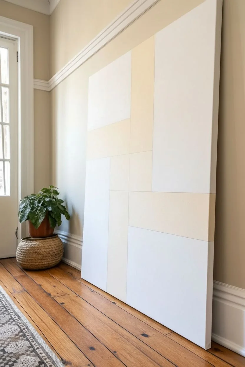
Monochrome Value Study on Canvas (One Color, Many Tints)
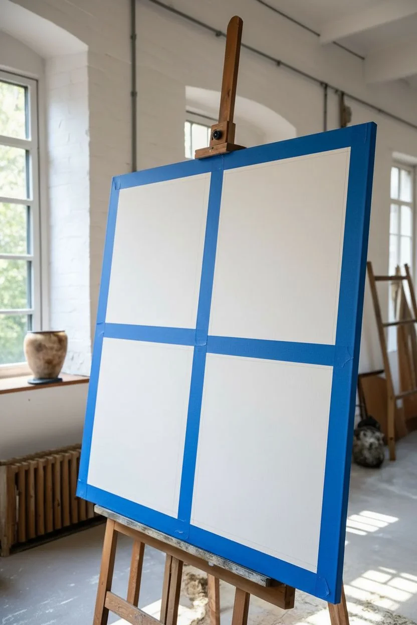
Master the art of color value with this striking geometric study, exploring how a single hue can transform through tinting and shading. This large-scale minimalist piece uses warm terracotta tones to create a balanced, modern grid that feels both structured and organic.
Step-by-Step Guide
Materials
- Large stretched canvas (24″x30″ or similar rectangular ratio)
- Acrylic heavy body paint: Burnt Sienna
- Acrylic heavy body paint: Titanium White
- Acrylic heavy body paint: Raw Umber (optional, for deepening)
- Wide flat synthetic brush (2-3 inch)
- Medium flat synthetic brush (1 inch)
- Painter’s tape (1 inch width or wider)
- T-square or long ruler
- Pencil
- Palette or large mixing surface
- Jar of water
- Paper towels
Step 1: Drafting the Grid
-
Prime the Surface:
Ensure your canvas is clean and primed. While most canvases come gessoed, adding a fresh coat of white gesso gives you a smoother, more brilliant surface for these flat color fields to sit on. -
Measure the Margins:
Using your ruler and pencil, lightly mark a border around the entire edge of the canvas. About 2 to 3 inches creates a nice negative space frame, but adjust based on your canvas size. -
Define the Center:
Find the vertical and horizontal center points of your canvas inside the border you just drew. Mark these lightly to guide your grid’s central cross. -
Draw the Quadrants:
Connect your measurements to draw four large rectangles (or squares) separated by a central cross-shaped gap. This gap should match the width of your outer border to maintain visual consistency. -
Tape the Boundaries:
Apply painter’s tape along the *outside* lines of your drawn squares. Press the edges down firmly with your fingernail or a palette knife to prevent paint bleed.
Bleeding Lines?
Before painting your color, seal the tape edge with a thin layer of matte medium or white paint. This fills gaps so your color won’t seep underneath.
Step 2: Mixing Values
-
Establish the Base Hue:
Squeeze out a generous amount of Burnt Sienna. This earthy reddish-brown will be the parent color for the entire piece. -
Create the Darkest Value:
For the deep, rich square (top right), mix a small amount of Raw Umber into your Burnt Sienna if you want it earthier, or use the Burnt Sienna straight from the tube for maximum saturation. -
Mix the Mid-Tone:
Scoop some of your base Burnt Sienna to a new spot and add a dollop of Titanium White. You want a warm, dusty coral color—lighter than the base, but still holding plenty of pigment. -
Create the Lightest Tint:
Take a small amount of your mid-tone mix and add a significant amount of Titanium White. This should be a very pale, soft peach tone.
Step 3: Painting the Composition
-
Paint the Darkest Block:
Starting with the top right quadrant, apply your darkest Burnt Sienna mix. Use the wide flat brush and paint in smooth, horizontal strokes to cover the area fully. -
Apply the Mid-Tone:
Clean your brush thoroughly. Move to the bottom left quadrant and fill it with the mid-tone coral mix. Keep your strokes consistent in direction for a professional finish. -
Paint the Lightest Block:
Clean the brush again. Fill the top left quadrant with your palest peach tint. I find two thin coats often look smoother than one thick, gloopy coat. -
Leave the Negative Space:
The bottom right quadrant in this specific composition remains white, acting as a negative space balance. If your canvas isn’t bright white, paint this square with pure Titanium White. -
Add the Frame Element:
Notice the dark rust-colored border surrounding the bottom two squares in the reference? Carefully tape off a ‘frame’ around the bottom-left and bottom-right sections and paint it with your darkest Burnt Sienna mix. -
Second Coats:
Inspect your painted squares. Some acrylics are transparent, so apply second coats as needed to ensure solid, opaque blocks of color. -
Remove Tape:
Wait until the paint is dry to the touch but not fully cured (usually about 20-30 minutes). Peel the tape away slowly at a 45-degree angle to reveal crisp lines. -
Refine Edges:
If any paint seeped under the tape, use a small detail brush and white paint (or the adjacent color) to tidy up the straight lines.
Pro Tip: Batch Mixing
Mix more paint than you think you need for each value. It is incredibly difficult to re-mix the exact same tint if you run out halfway through a section.
Hang your new monochrome study in a well-lit area to let the subtle shifts in value warm up the room
Palette Knife Texture: Simple Florals on Canvas
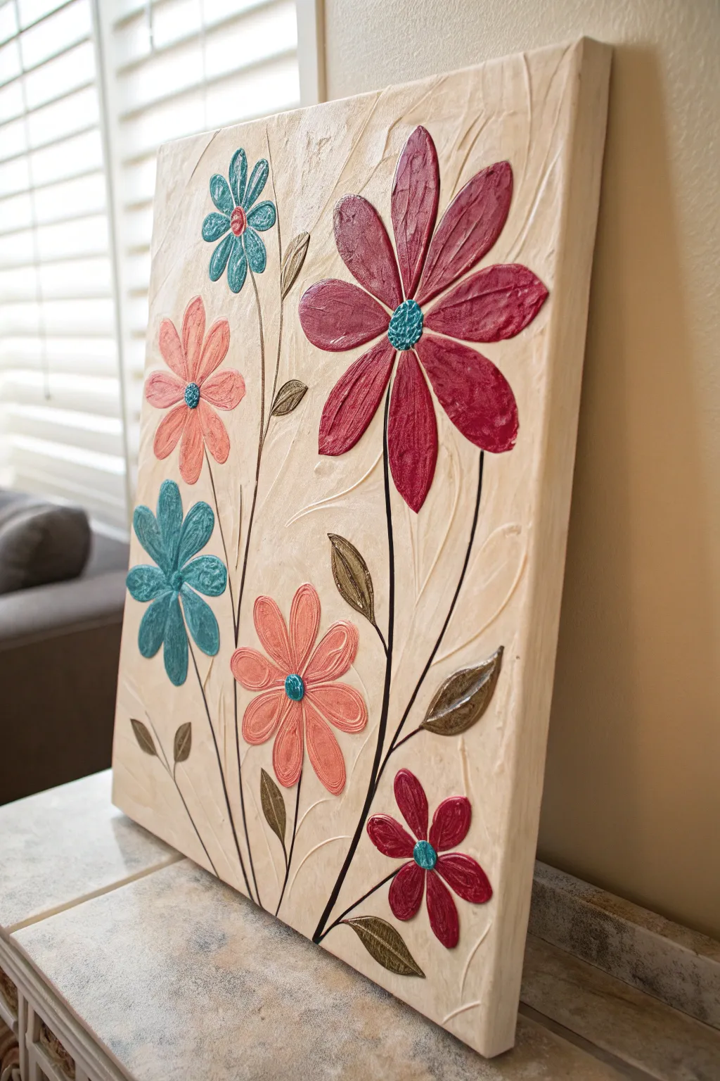
Bring your canvas to life with this tactile project that combines the elegance of floral motifs with the satisfying depth of impasto texture. The raised petals and swirling background create a piece that begs to be touched, featuring a harmonious palette of teal, coral, and maroon.
Step-by-Step
Materials
- Stretched canvas (rectangular format, e.g., 16×20 inches)
- Modeling paste or heavy structure gel
- Acrylic paints: Teal/Turquoise, Coral/Peach, Deep Maroon/Burgundy, Cream/Beige, Metallic Bronze, Black/Dark Brown
- Palette knives (assorted shapes, especially teardrop and trowel shapes)
- Piping bag with round tip (optional, for precise petals)
- Fine liner brush
- Wide flat brush
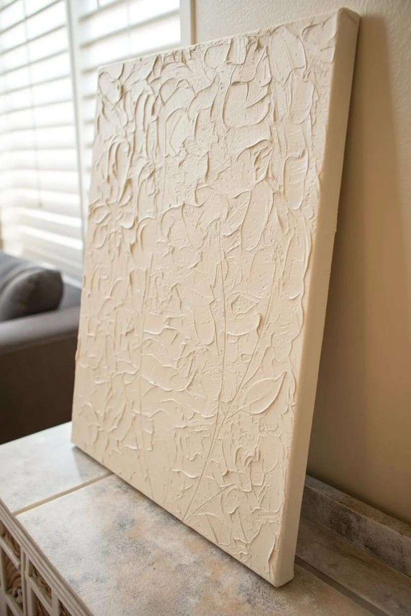
Step 1: Texturing the Canvas
-
Prepare the base:
Start by mixing a generous amount of cream or beige acrylic paint with modeling paste. You want a thick, frosting-like consistency that will hold its shape. -
Apply the background:
Using a wide palette knife or a flat spreading tool, slather the mixture onto the canvas. Don’t aim for smoothness; instead, use sweeping, curved motions to create swirling ridges and subtle peaks. -
Refine the texture:
Before the background dries, use the clean edge of a knife to scratch in subtle vertical curves or arcs that mimic the flow of stems or unseen foliage. This adds movement to the negative space. -
Dry completely:
Allow this base layer to dry fully. Depending on the thickness of your paste, this could take several hours or even overnight. It needs to be hard to the touch before proceeding.
Cracking Paste?
If your thick impasto layers crack while drying, mix a little gloss medium into your modeling paste next time. It increases flexibility and prevents those hairline fractures.
Step 2: Sculpting the Flowers
-
Map out the placement:
Lightly sketch the positions of your flower centers using a pencil or a very faint wash of paint. Plan for a large maroon bloom on the right, balanced by smaller teal and coral flowers on the left. -
Mix the petal paste:
Mix your petal colors (teal, coral, maroon) individually with modeling paste. Aim for a 50/50 mix to keep the color vibrant but the texture thick. -
Shape the maroon petals:
For the large flower, use a teardrop-shaped palette knife. Load the back of the knife with maroon paste, press it down near the outer edge of the bloom, and drag it inward toward the center, lifting slightly as you go to create a tapered point. -
Create smaller blooms:
Repeat the process for the teal and coral flowers. I find a smaller knife works best here. Ensure the petals have distinct, raised ridges along their edges for that embossed look. -
Add texture to centers:
For the flower centers, dab a small mound of contrasting paste (teal for the maroon flower, maroon for the others) right in the middle. Stipple it with the tip of a toothpick or brush handle to create a bumpy texture.
Go Glamorous
Mix fine glitter or iridescent medium into the paste for the flower centers or the metallic leaves. It catches the light beautifully and adds a subtle, magical sparkle.
Step 3: Stems and Details
-
Paint the stems:
Dilute your black or dark brown paint with a little water until it flows like ink. Using your fine liner brush, paint thin, sweeping lines from the bottom of the canvas up to each flower head. -
Add metallic leaves:
Mix metallic bronze paint with a small amount of paste. Use a small palette knife to apply leaf shapes attached to the stems. Press and swipe in a single motion to create a leaf that looks sculpted. -
Define the leaves:
While the leaf paste is wet, use the edge of your knife or a toothpick to gently score a central vein down the middle of each bronze leaf. -
Clean up edges:
Check the edges of your petals. If any paste has spread too far, gently scrape it back or reshape it with a clean, slightly damp brush before it sets. -
Final cure:
Let the flower and leaf layers dry completely. Thicker areas like the flower centers will take the longest to cure. -
Seal the work:
Once fully cured (after 24 hours), apply a clear gloss varnish over the entire piece. This will make the metallic leaves shine and deepen the rich colors of the petals.
You now have a stunning, dimensional floral piece that adds sophisticated texture to any room
Textured Underpainting With Raised Shapes You Paint Over
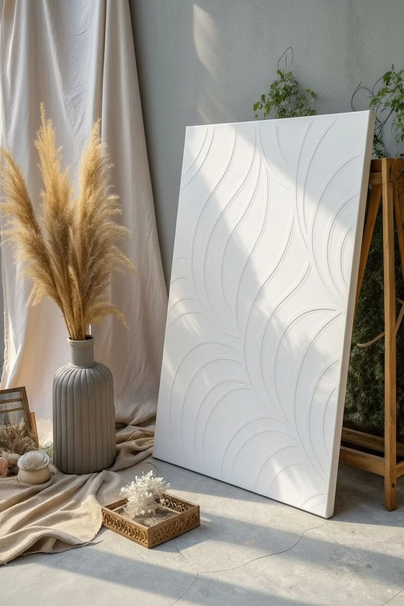
This sophisticated, monochromatic piece transforms a simple canvas into high-end architectural decor using little more than modeling paste and patience. The deep relief lines create shifting shadows throughout the day, bringing movement and elegance to any minimalist space.
How-To Guide
Materials
- Large sturdy canvas or wood panel (24×36 or larger)
- Heavy body acrylic modeling paste or joint compound
- Piping bag with a large round tip (or a thick plastic bag)
- Palette knife
- Pencil and eraser
- Gesso primer
- Cream or off-white acrylic paint (matte finish)
- Small stiff fan brush
- Wide flat brush
- Ruler
Step 1: Planning and Priming
-
Prepare the Surface:
Begin by applying a generous coat of Gesso to your canvas or wood panel. This ensures the heavy texture medium adheres properly without cracking later on. -
Sketch the Flow:
Lightly sketch your design directly onto the dry Gesso using a pencil. For this look, draw long, sweeping curves that originate from the bottom and sides, overlapping in graceful arches that mimic leaves or feathers. -
Refine the Arches:
Double-check that your lines flow naturally. The beauty of this piece relies on the ‘negative space’ between the raised lines, so ensure your sketched shapes aren’t too crowded.
Cracking Compounds?
If your thick ridges crack while drying, don’t panic. Mix a small amount of paste with a drop of water and smooth it into the cracks with your finger, then repaint.
Step 2: Creating the Raised Lines
-
Fill the Piping Bag:
Scoop your modeling paste or joint compound into a piping bag fitted with a large round tip. If you don’t have a tip, simply snip the corner of a sturdy freezer bag to create an opening about the width of a pencil. -
Test the Flow:
I always squeeze a test line onto a scrap piece of cardboard first. You want a consistent, thick bead of paste that holds its shape without spreading too much. -
Pipe the Outlines:
Steadily pipe over your pencil sketches, applying even pressure to create raised ridges. Move your entire arm rather than just your wrist to keep the curves smooth and continuous. -
Sharpen the Edges:
While the paste is wet, use a slightly damp palette knife to gently tidy up any wobbly sections of your piping, sharpening the outer edges of the curves for a crisp look.
Step 3: Adding Internal Texture
-
Fill the Gaps:
Using a palette knife, spread a thinner layer of modeling paste inside the areas between your piped ridges. It shouldn’t be as high as the ridges themselves. -
Create the Leaf Veins:
Take a stiff fan brush or a coarse bristle brush and drag it through the wet paste inside the shapes. Follow the curve of the piped lines to create a directional, vein-like texture. -
Add Subtle Roughness:
For added dimension, dab the flat side of your palette knife randomly into the inner sections to pull up tiny peaks of paste, contrasting with the smooth piped borders. -
Let it Cure:
Allow the entire piece to dry completely. Because the paste is thick, this step is crucial and may take 24 to 48 hours. Do not rush this, or the inside will remain soft.
Pro Tip: Tint the Paste
Mix a small amount of your final paint color directly into the modeling paste before piping. This creates a base tone and makes missed spots in the final painting stage less obvious.
Step 4: Finishing Touches
-
Sand Rough Spots:
Once fully cured, gently run a fine-grit sandpaper over the very tops of the piped ridges if there are any unwanted sharp peaks. Wipe away dust with a dry cloth. -
Apply Base Color:
Mix a warm cream or off-white acrylic paint. Using a wide flat brush, apply the first coat over the entire piece, working the paint into all the textured crevices. -
Check Coverage:
Inspect the artwork from different angles. The deep textures often hide missed spots, so touch up any white gaps where the raw paste is still showing. -
Matte Finish:
A matte finish is essential for this look as it mimics plaster or stone. If your paint has a sheen, finish with a spray matte varnish to knock back the shine.
Hang your piece near a window where natural light can play across the ridges and bring the texture to life
Paint Pour Look on Canvas for Organic Marbling
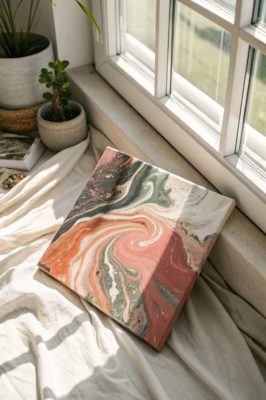
Capture the natural elegance of stone marbling with this fluid art project that blends rust, sage, and cream hues. The result is a sophisticated, organic canvas that looks stunning propped on a shelf or mounted on a wall.
Detailed Instructions
Materials
- Square stretched canvas (e.g., 10×10 or 12×12 inches)
- Acrylic fluid paints (Rust Orange, Salmon Pink, Deep Forest Green, Cream/Off-White, Black)
- Pouring medium
- Silicone oil (optional, for cells)
- Plastic cups (one for each color plus one pour cup)
- Craft sticks for stirring
- Plastic drop cloth or garbage bag
- Gloves
- Push pins (4 large)
- Heat gun or culinary torch
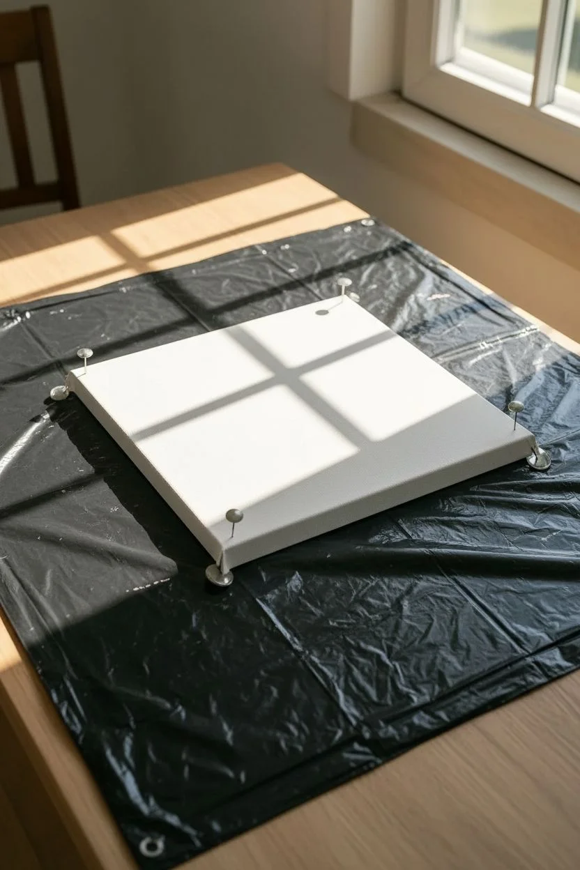
Step 1: Setting the Stage
-
Prepare your workspace:
Fluid art gets messy, so cover your entire working surface with a plastic drop cloth or a large garbage bag to catch drips. -
Elevate the canvas:
Insert four large push pins into the wooden frame corners on the back of your canvas. This lifts the canvas off the table, allowing paint to drip freely over the edges. -
Check for level:
Ensure your workspace is perfectly level. Even a slight tilt can cause your beautifully marbled pattern to slide right off the canvas while it dries.
Step 2: Mixing the Hues
-
Mix paint and medium:
In separate cups, mix each acrylic paint color with pouring medium. A standard ratio is 1 part paint to 2 parts medium, but follow the specific instructions on your medium’s bottle. -
Achieve the right consistency:
Stir gently until the consistency resembles warm honey. The paint should flow off the stick in a thin, continuous stream without breaking immediately. -
Add silicone (optional):
If you want small ‘cells’ or bubble-like effects within the marble, add 1-2 drops of silicone oil to your rust and green mixtures and stir just once or twice.
Don’t Over-Mix
When layering paints in your dirty pour cup, pour gently down the side. If you dump them too fast or stir, they will blend into a muddy brown instead of distinct marble veins.
Step 3: The Pour Technique
-
Layer the dirty pour cup:
Take your empty ‘pour cup’ and start layering the colors. I usually begin with white or cream to help the other colors glide. -
Build the layers:
Pour small amounts of the rust, forest green, salmon, and black into the cup, layering them one on top of the other. Don’t stir this cup; let the colors sit together. -
Repeat until full:
Continue layering until the cup is about half to three-quarters full, ensuring you have enough paint to cover the entire canvas surface. -
The flip or pour:
You can either place the canvas face down on the cup and flip them together, or simply pour the contents of the cup onto the center of the canvas in a slow, circular motion.
Too Much Paint?
If you have a massive puddle in the middle that won’t dry, you likely used too much paint. Next time, calculate roughly: (Length x Width) / 28 = ounces of paint needed.
Step 4: Creating the Marble
-
Tilt the canvas:
Gently lift the canvas and begin tilting it slowly. Guide the puddle of paint toward one corner, then back toward the center. -
Stretch the pattern:
Change directions to cover the other corners. Watch how the circular pour stretches into long, organic striations resembling natural stone. -
Cover the edges:
Ensure the paint flows over all four edges. You can use your finger to touch up any dry spots on the sides with the dripping paint. -
Pop air bubbles:
Pass a heat gun or torch quickly over the surface creating a ‘swooshing’ motion. This pops trapped air bubbles and can bring up small cells if you used silicone. -
Final composition check:
Look at the composition. If there is a section you don’t like, you can tilt a bit more to run it off the edge, but be careful not to over-stretch the remaining paint.
Step 5: Drying and Finishing
-
Protect while drying:
Fluid art takes a long time to cure. Place a large cardboard box over the wet canvas (without touching it) to prevent dust and pet hair from landing in the paint. -
Let it cure:
Allow the painting to dry undisturbed for at least 24 to 48 hours. The surface must be completely dry to the touch before moving it. -
Seal the artwork:
Once fully cured (which can take up to a few weeks for deep layers), apply a coat of glossy varnish to protect the surface and make the colors pop like polished stone.
Once sealed, this organic abstract piece brings a warm, earthy touch to any sunlit window ledge
Collage-and-Paint Canvas: Papers First, Paint to Unite It
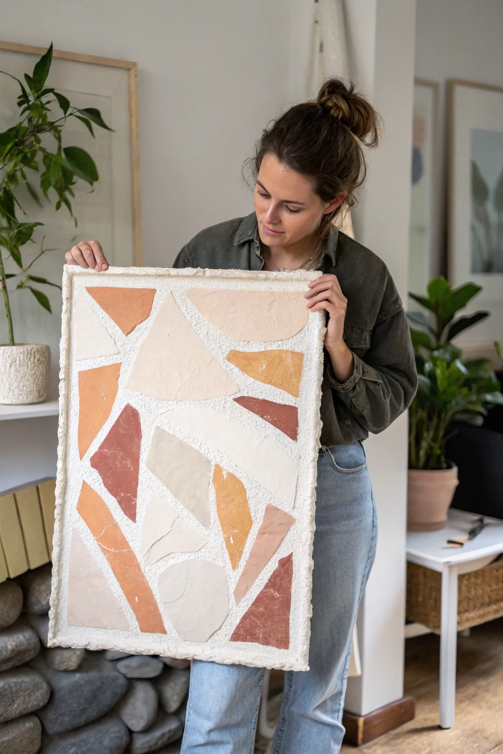
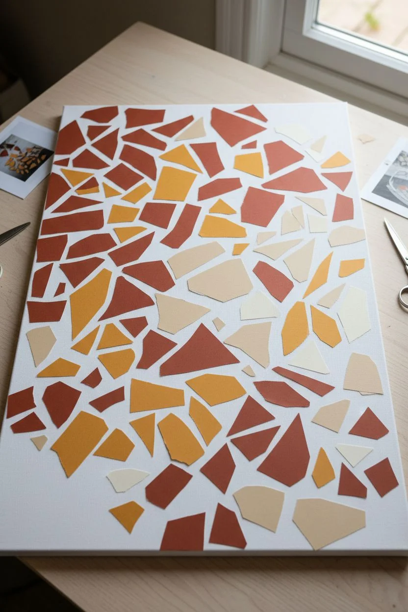
Bring the organic warmth of terrazzo tiling to your walls with this plaster-based canvas art project. By combining jagged, earth-toned shapes with a dimensional, gritty background, you’ll create a piece that feels both modern and handcrafted.
How-To Guide
Materials
- Large rectangular canvas (approx. 24×36 inches)
- Joint compound or texture paste
- Fine sand or grit additive (optional)
- Palette knife or trowel
- Heavyweight colored paper, cardstock, or thin painted cardboard in earth tones (terracotta, beige, cream, mustard)
- Scissors
- Mod Podge or heavy gel medium
- White acrylic paint
- Matte spray sealant
Step 1: Preparing the Shapes
-
Gather your palette:
Start by selecting your paper materials. You want a cohesive palette of warm earth tones. If you can’t find the exact colors, simply paint sheets of cardstock with acrylics and let them dry completely. -
Cut jagged forms:
Using scissors, cut out irregular, geometric shapes from your colored papers. Aim for ‘shards’ rather than perfect triangles or squares. The look we are going for is broken stone or ceramic tile. -
Vary the sizes:
Ensure you have a good mix of large, dominant pieces and smaller, filler shapes. This variety keeps the composition dynamic. Keep the edges sharp and angular. -
Dry run arrangement:
Lay your canvas flat on a table and arrange the paper cutouts on top of the plain canvas. Play with the spacing, leaving distinct gaps between pieces like grout lines. Once satisfied, snap a photo for reference and set the pieces aside.
Stone Effect
Mix a tiny drop of grey or beige paint into your white plaster base, but don’t blend fully. This creates subtle marble-like streaks.
Step 2: Creating the Texture Base
-
Mix your plaster:
In a bucket or tray, mix your joint compound with a small amount of white acrylic paint to ensure it dries bright white. For extra grit, I like to mix in a handful of clean, fine sand. -
Apply the base layer:
Using a trowel or wide palette knife, spread a consistent layer of the mixture over the entire front face of the canvas. It should be thick enough to hide the weave but not so thick it cracks. -
Roughen the edges:
Pay special attention to the outer perimeter. Build up a slight ridge along the edges to create a framed, stone-slab effect. Don’t smooth it out; let it look raw and organic. -
Add surface texture:
While the compound is still wet, tap the flat side of your trowel against the surface to create subtle peaks and pits. This mimics the look of rough-hewn stone or grout.
Adhesion Issues
If paper peels as the plaster dries, dab a little Mod Podge under the lifting corner and press it back down firmly.
Step 3: Embedding the Design
-
Position the first piece:
While the plaster base is still wet but slightly tacky, gently press your first large paper shape into the surface. Refer to your reference photo for placement. -
Embed firmly:
Press down firmly so the paper adheres to the wet compound. You want it to sit slightly recessed or flush, not floating on top. -
Complete the puzzle:
Continue placing your shapes, working from the center outwards. maintain those wide, irregular ‘grout’ gaps between each piece. -
Clean up edges:
If any plaster oozes onto the front of your colored paper, wipe it away immediately with a slightly damp paper towel or cotton swab.
Step 4: Finishing Touches
-
Texture integration:
Once all shapes are placed, use a small tool or toothpick to roughen up the white gaps between the papers again if they got smoothed down during placement. -
Allow to cure:
Let the entire piece dry flat for at least 24 hours. The thick plaster needs time to harden completely. If you move it too soon, the surface might crack. -
Seal the work:
Once bone dry, take the canvas to a ventilated area and apply a coat of matte spray sealant. This protects the paper from moisture and fixes the gritty texture in place.
Hang your textured masterpiece in a spot with good natural light to highlight the dimension of the relief.
Stenciled Leaf Imprints on Canvas With Bold Background Color
Using the beauty of nature as your stencil, this project transforms a simple canvas into a striking botanical display. The deep blue background provides a dramatic contrast against the creamy white leaf imprints, creating a look reminiscent of classic cyanotypes or sun prints.
Detailed Instructions
Materials
- Square stretched canvas (e.g., 12×12 or 16×16 inches)
- Deep indigo or navy blue acrylic paint
- Cream or off-white acrylic paint
- Assorted flat leaves (ferns, rose leaves, or similar)
- Large flat paintbrush or foam roller
- Small foam pouncer or sponge
- Paper towels
- Heavy books or a flower press
- Detail liner brush (optional)
- Masking tape or delicate surface artist tape
Step 1: Preparation & Background
-
Prepare your foliage:
Gather a variety of leaves with distinct shapes and interesting vein patterns. Ferns work exceptionally well for this, as do compound leaves like ash or rose. If your leaves are fresh, place them between heavy books for a few hours to flatten them; this ensures sharper edges when stenciling. -
Prime the canvas:
Though most canvases come pre-primed, adding a base coat of your cream or off-white paint ensures the final leaf color is solid. Paint the entire canvas face with the cream color and let it dry completely. -
Mix your background color:
Prepare your deep blue hue. You want a rich, dark indigo. If your navy feels too flat, mixing in a tiny touch of black or deep violet can add depth. -
Test placement:
Before painting, arranging the dry leaves on your white canvas helps you visualize the composition. Aim for a mix of large focal leaves (like a big fern frond) and smaller accent leaves to fill the corners.
Step 2: Creating the Imprints
-
Secure the leaves:
Once you are happy with the arrangement, you need to keep the leaves in place. Use very small loops of artist tape on the back of each leaf to tack them down gently to the cream-painted canvas. -
Double-check edges:
Press down firmly on the edges of every leaf. The tighter the seal between the leaf and the canvas, the crispier your silhouette will be. -
Start the color application:
Pour your deep blue paint onto a palette or paper plate. Load a paintbrush or a foam roller with a moderate amount of paint—you don’t want it dripping. -
Paint outward from the center:
Beginning in the middle of a leaf, paint outward over the edge and onto the canvas. This technique prevents paint from being forced underneath the leaf, which would ruin the silhouette. -
Cover the canvas:
Work your way across the entire surface. Paint right over the leaves and the background until everything is covered in a uniform layer of blue. Don’t forget to paint the sides of the canvas for a finished, gallery-wrapped look. -
Dab for detail:
If you have intricate areas, like the tiny teeth of a fern, swap to a foam pouncer. Use an up-and-down motion to apply paint straight down over the delicate edges without shifting them. -
Let it set slightly:
Allow the paint to dry until it is tacky but not fully hardened—usually about 10 to 15 minutes depending on humidity. You don’t want the paint to act like glue and trap the leaves.
Bleeding Lines?
If paint bleeds under the leaf, wait for it to dry fully. Then, dip a stiff angled brush in rubbing alcohol to gently scrub away the excess acrylic from the white base coat.
Step 3: Reveal and Refine
-
Peel the leaves:
Carefully lift the stem of a leaf. Pull it slowly upward and away from the canvas. The leaf acts as a resist, revealing the cream background underneath in the exact shape of your botanical specimen. -
Remove all foliage:
Continue removing all leaves. If a bit of tape sticks to the canvas, gently roll it off with your finger. -
Dry completely:
Let the blue paint cure fully. This might take an hour or two. -
Add vein details:
To mimic the look of the project image, which has detailed veins within the white shapes, use your detail liner brush and the blue paint. Carefully paint a central stem line and branching veins inside the white leaf silhouettes. -
Refine the edges:
I like to scan the edges for any blue bleed-through. If you spot any fuzzy lines, you can touch them up carefully with a bit of the cream paint on a small brush to sharpen the silhouette. -
Final coat:
Once perfectly dry, you can seal the work with a matte varnish spray to protect the surface and even out the sheen.
Add Texture
For a more organic look, use a dry brush technique when painting the veins. This creates a faded, stamped effect rather than solid, harsh lines.
Hang your botanical blueprint in a well-lit spot to admire the crisp contrast of nature’s design

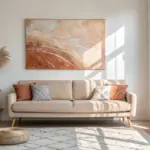
Have a question or want to share your own experience? I'd love to hear from you in the comments below!