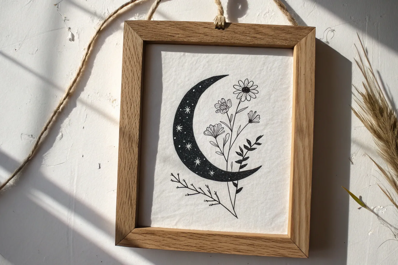
Black and white drawing is where your line, value, and contrast get to be the main characters. If you’ve been craving ideas that look bold on the page without needing color, these are my go-to prompts for filling a sketchbook fast.
Day and Night Split Circle Scene
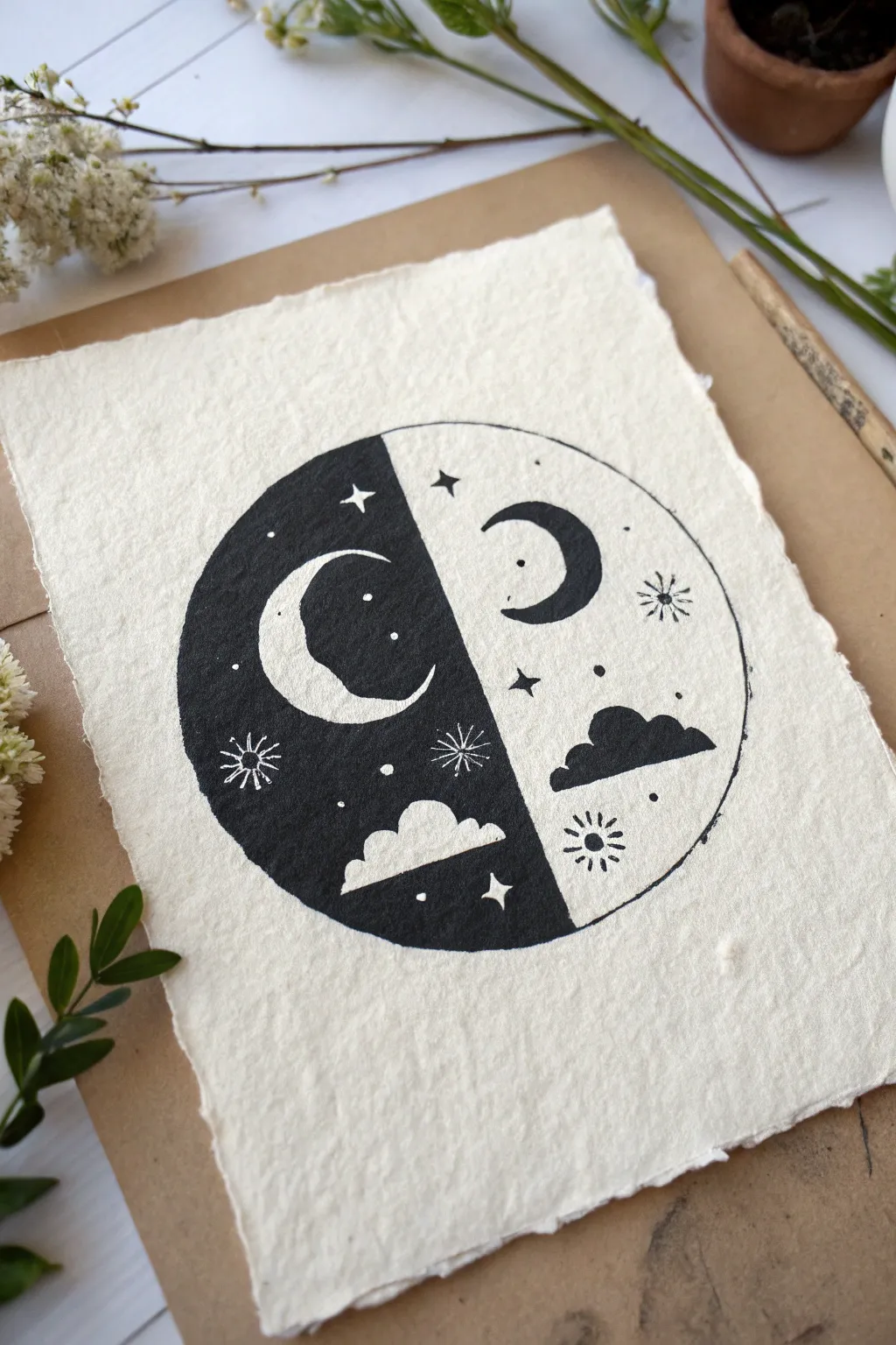
Capture the harmony of opposites with this striking block print design on textured handmade paper. The artwork features a circle split into day and night, using positive and negative space to create a balanced, monochrome masterpiece.
Step-by-Step Guide
Materials
- Soft linoleum block or rubber carving block (4×6 inch minimum)
- Linoleum carving tools (V-gouge and U-gouge)
- Black block printing ink (water-soluble or oil-based)
- Brayer (rubber roller)
- Handmade cotton rag paper or textured watercolor paper
- Pencil
- Tracing paper
- Craft knife or circle cutter
- Ruler
- Inking plate or piece of glass
- Baren or wooden spoon
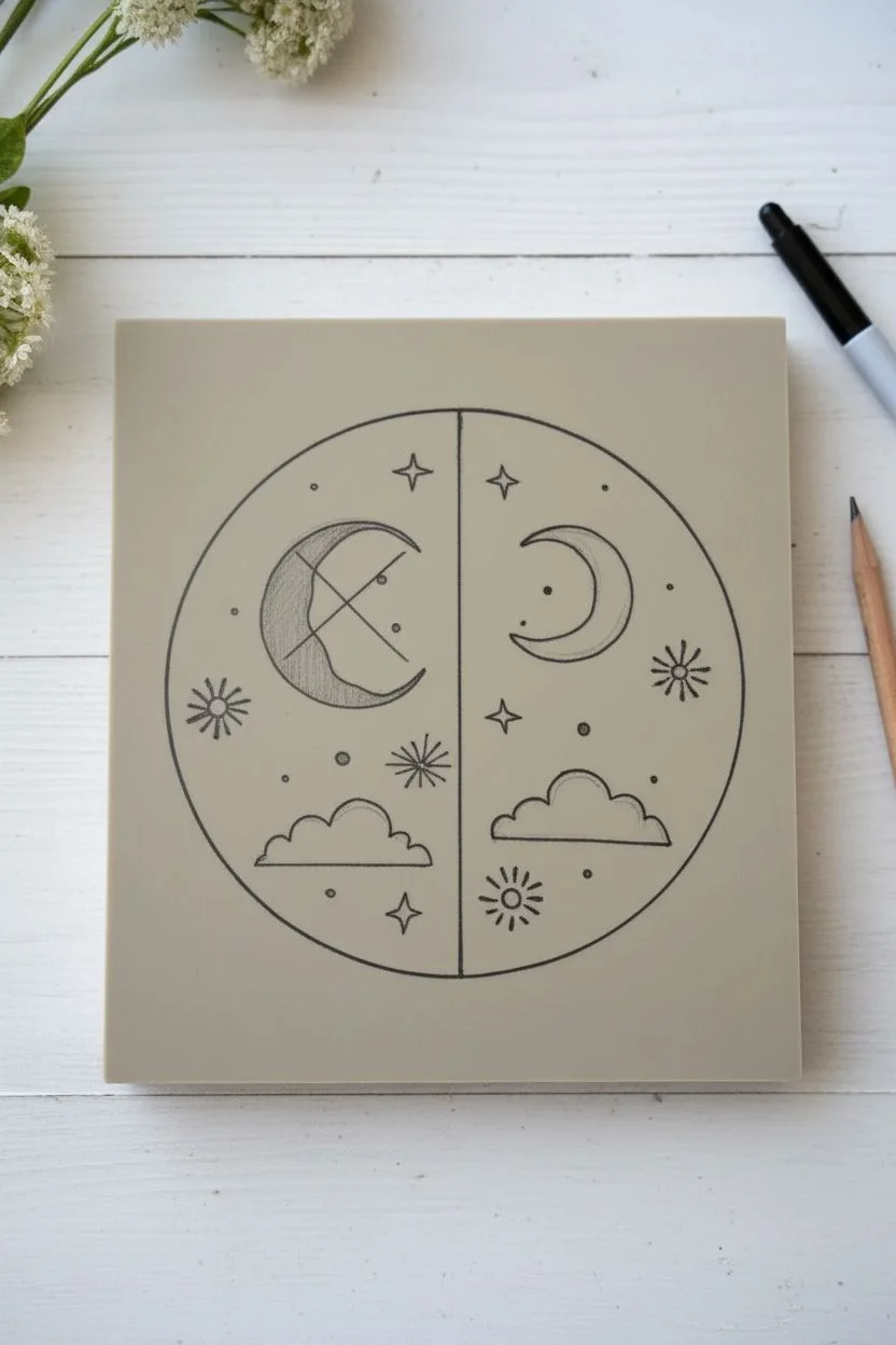
Step 1: Preparation and Transfer
-
Draft the design:
Start by drawing a perfect circle on a piece of sketching paper. Use a ruler to draw a vertical line straight down the center, dividing it into two equal semi-circles. -
Plan the composition:
Visualize the duality: the left side will be the ‘night’ background (black with white elements), and the right side will be the ‘day’ background (white with black elements). Sketch a crescent moon, a cloud, stars, and a sunburst on each side, mirroring the placement roughly but varying the shapes for interest. -
Prepare the transfer:
Place tracing paper over your sketch and trace the design carefully with a soft lead pencil. Flip the tracing paper over onto your carving block. The image will be reversed, which is crucial for printing, though less critical for this symmetrical abstract design. -
Transfer to block:
Rub the back of the tracing paper firmly with a bone folder or the back of a spoon to transfer the graphite onto the rubber block. You should see a faint grey outline of your circle and celestial symbols. -
Refine the lines:
Go over the faint graphical lines on the block with a permanent marker or dark pencil so you can see exactly where to carve. Mark the left semi-circle with an ‘X’ or light shading to remind yourself that this area needs to remain raised (uncarved) to print black.
Patchy black ink?
If the solid black side looks salty or speckled, you likely need more ink on the block, or you need to apply more pressure while burnishing that specific area.
Step 2: Carving the Block
-
Outline the circle:
Using a small V-gouge, carefully carve the outer perimeter of the main circle. This defines your working edge. Remove the excess rubber outside the circle completely if you want a clean edge, or just carve a deep trench around it. -
Carve the ‘Day’ side (Right):
On the right side of the split, you are carving away the background (white space) and leaving the lines raised. Use a small gouge to carve around the outline of the crescent moon, the cloud, and the sunburst rays. -
Clear the background:
Switch to a wider U-gouge to clear away the large negative space on the right side. Be careful not to nick the raised shapes you just outlined. The goal is to leave only the moon, cloud, and stars raised. -
Carve the ‘Night’ side (Left):
This side is inverted. You need to carve *inside* the shapes. Use a V-gouge to carve out the body of the crescent moon, the cloud shape, the starbursts, and the small dots. The large background area surrounding these shapes must remain untouched so it prints black. -
Define the center line:
Run a V-gouge carefully down the center vertical line. This separation must be crisp to distinguish the two halves. Ensure the transition between the black background on the left and the white background on the right is sharp. -
Clean up stray ridges:
Inspect your ‘white’ areas (the carved-away sections). If there are high ridges of rubber left behind, shave them down with a flat gouge so they don’t accidentally pick up ink.
Step 3: Printing the Edition
-
Prepare the paper:
Tear your handmade paper to size. I like to leave a generous border around the design to let the deckled edges frame the artwork naturally. -
Roll out ink:
Squeeze a small amount of black block printing ink onto your inking plate. roll the brayer back and forth and lift it occasionally to create a velvety, even texture. It should sound like sizzling bacon when the consistency is right. -
Ink the block:
Roll the inked brayer over your carved block. Apply thin, even layers. Roll in multiple directions to ensure the solid black areas on the left side get full coverage without flooding the fine carved lines. -
Position the paper:
Carefully align your paper over the inked block. Once the paper touches the ink, do not shift it, or the image will smudge. -
Burnish the print:
Using a baren or the back of a wooden spoon, rub the back of the paper in small circular motions. Apply firm pressure, focusing especially on the solid black areas to ensure a rich, dark transfer. -
The reveal:
Slowly peel the paper off the block from one corner. This is always the most exciting part. -
Dry and flatten:
Place your finished print on a drying rack or a clean flat surface. Allow the ink to dry completely (which may take a day or two for oil-based inks) before framing or displaying.
Add a gilded touch
Once the black ink is fully dry, use a fine brush and gold leaf adhesive to gild just the crescent moon on the darker side for a shimmering, magical contrast.
Display your celestial print in a floating frame to show off those beautiful deckled paper edges

Close-Up Eye Study in Graphite Values
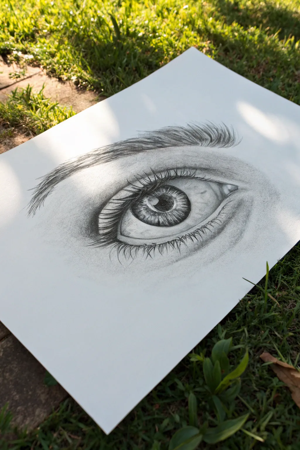
Master the art of realistic shading with this detailed graphite study of a human eye. You will learn to build depth through layers of value, creating a striking contrast between the dark pupil and the shimmering highlights.
How-To Guide
Materials
- High-quality drawing paper (smooth or Bristol board recommended)
- Graphite pencils (H, HB, 2B, 4B, 6B)
- Kneaded eraser
- Fine mechanical pencil (0.5mm, HB or 2B)
- Blending stumps (tortillons) or tissue
- Pencil sharpener
Step 1: Basic Structure & Outline
-
Draft the Eye Shape:
Begin with an HB pencil, using very light pressure. Draw a simple almond shape for the eye opening. Add a smaller circle inside for the iris and a centered dot for the pupil to establish placement. -
Define the Lids:
Sketch the upper eyelid crease, arching it above the eye shape. Add the lower eyelid’s waterline by drawing a thin, parallel line just inside the bottom edge of your almond shape. -
Map the Highlights:
Before adding any dark values, lightly outline the shapes of the reflections in the eye. Protecting these white spaces is crucial for that glassy, wet look later. -
Outline the Eyebrow:
Lightly sketch the general flow and shape of the eyebrow above the eye. Don’t draw individual hairs yet; just mark the area where they will go.
Pro Tip: Mirror Check
Look at your drawing in a mirror or snap a photo with your phone. Flipping the perspective helps you spot lopsided proportions you might miss while drawing.
Step 2: Shading the Iris & Pupil
-
Darken the Pupil:
Switch to a 4B or 6B pencil. Fill in the pupil, making it the blackest part of your drawing. Ensure the edges are clean but slightly soft to look natural. -
Iris Radiating Lines:
Using a 2B pencil, draw lines radiating outward from the pupil like spokes on a wheel. Vary the length and pressure, leaving lighter gaps in between to create texture. -
Outer Ring:
Define the limbal ring (the outer edge of the iris) with a darker 4B line. Shade inward slightly from this ring to create a soft gradient toward the center. -
Detailing the Iris:
Use a mechanical pencil to add erratic, squiggly lines within the iris for intricate muscle detail. Deepen the shadows under the upper eyelid where it casts a shadow on the iris. -
Highlight Contrast:
Ensure the reserved highlight areas remain paper-white. If you accidentally smudged them, use a clean edge of your eraser to lift the graphite back out.
Step 3: Shading the Skin & Sclera
-
Shade the Sclera (White of Eye):
The eyeball is a sphere, so shading is key. Using an H or HB pencil, lightly shade the corners of the ‘white’ to make it look round. It should be greyest at the edges and white near the iris. -
Contour the Eyelids:
Shade the upper eyelid crease deeply with a 2B pencil to show depth. Fade this shading out onto the lid. Shade the skin below the lower lid to suggest the eye socket. -
Blending for Softness:
Use a blending stump (tortillon) or a soft tissue to smooth out your skin shading. Circular motions work best for a seamless, skin-like texture. -
Tear Duct Detail:
In the inner corner, draw the small fleshy tear duct. Keep the lines soft and use values to mock wetness, leaving tiny highlights.
Troubleshooting: Shiny Graphite
If dark areas look shiny or grey instead of black, you’ve burnished the paper. Switch to a softer pencil (6B-8B) and press lighter, layering the graphite gently.
Step 4: Lashes & Brows
-
Draw Upper Lashes:
With a sharpened 4B or 6B pencil, draw the upper eyelashes. Start from the lash line and flick your wrist upward to create a tapered hair. Curve them slightly; avoid straight spikes. -
Add Lash Reflections:
Notice how lashes sometimes clumps together. Draw a few lashes crossing over each other. Add a reflection of these lashes in the top highlight of the eye for extra realism. -
Draw Lower Lashes:
Use a lighter touch (2B) for the lower lashes. These should originate from the outer edge of the waterline, curving downward. Make them shorter and sparser than the top ones. -
Create the Eyebrow:
Using a mechanical pencil or sharp HB, draw individual brow hairs. Follow the direction of hair growth—upward at the start, flattening out toward the tail. Layer them to build density. -
Final Adjustments:
Step back and check your contrast. Darken the pupil or lash line if needed. Use a kneaded eraser to tap highlights onto the skin around the tear duct or brow bone.
Take a moment to clean up any stray smudges around the edges for a gallery-ready finish


Botanical Line Drawing With Bold Fills
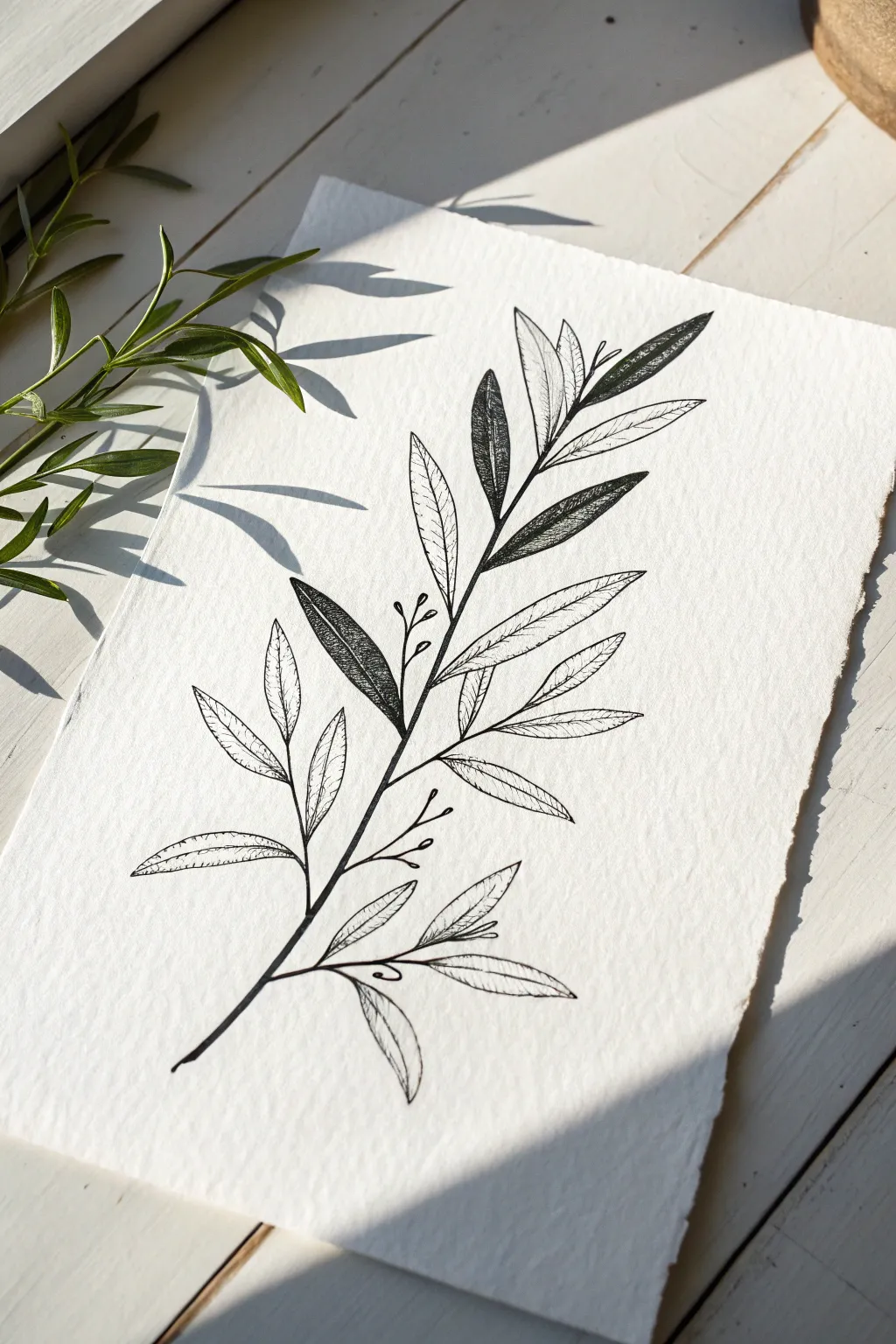
This elegant botanical study plays with contrast by mixing delicate line work with bold, dark fills on textured watercolor paper. It captures the organic beauty of an olive or eucalyptus branch, using negative space and solid ink to create visual rhythm.
Detailed Instructions
Materials
- Cold press watercolor paper (300gsm for texture)
- HB or 2H graphite pencil
- Kneaded eraser
- Fine liner pen (size 01 or 03)
- Brush pen or thicker felt tip marker (black)
- Ruler (optional for paper tearing)
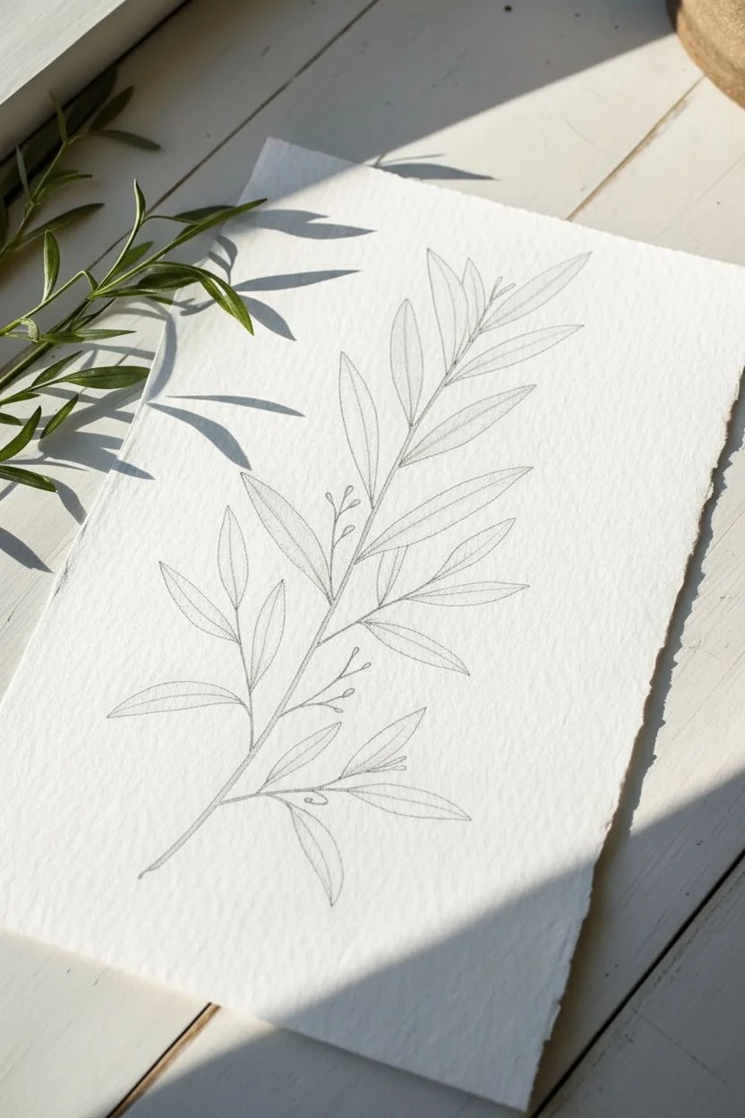
Step 1: Sketching the Framework
-
Prepare your paper:
Start by preparing your paper surface. To achieve the rustic, deckled edges shown in the reference, fold your watercolor paper back and forth along a ruler edge and carefully tear it by hand rather than cutting it with scissors. -
Draw the central vein:
Using your graphite pencil, lightly sketch a long, slightly curved line running diagonally from the bottom left to the top right. This will serve as the main stem of your branch. -
Mark leaf positions:
Along the main stem, mark small ticks where the leaves will attach. Alternate sides as you move up the stem to create a natural, organic growth pattern. -
Sketch the leaf shapes:
Draw elongated oval shapes for the leaves. Keep them slender and pointed at the tips. Vary the angles slightly so some point upward and others lean outward, mimicking nature’s irregularity. -
Add delicate buds:
interspersed between the main leaves, sketch tiny, thin stems branching off. Add small circles at the ends of these thin lines to represent buds or berries.
Step 2: Inking the Foundation
-
Outline the main stem:
Switch to your fine liner pen (size 03 works well here). Carefully trace over your pencil line for the main stem, thickening it slightly at the bottom and tapering it as it reaches the top. -
Define the outline leaves:
Select about two-thirds of the leaves to remain as open line drawings. Ink the outer contours of these leaves with a steady hand. Don’t worry if the lines aren’t perfectly smooth; a little wobble adds character. -
Draw the center veins:
Inside the open leaves, draw a single line from the base to the tip. This is the central vein. -
Add vein details:
From the central vein, draw fine, diagonal lines extending toward the leaf edges. Keep these lines very light and disconnected from the outer edge to keep the look airy. -
Ink the berry stems:
Trace the delicate, thin stems for the buds using your smallest pen nib (01 or 005). Ink the small circular buds at the tips.
Ink Flow Tip
On rough watercolor paper, pens can skip. Move your hand slower than usual to allow the ink to soak into the paper’s valleys for a solid, continuous line.
Step 3: Creating Contrast & Texture
-
Select leaves for filling:
Choose 3 to 5 specific leaves to become your dark focal points. Spread them out across the composition—perhaps one near the bottom, one in the middle, and one near the top—to balance the visual weight. -
Fill with texture:
Instead of coloring these leaves solid black immediately, I prefer to use a dense stippling or tight cross-hatching technique first. This adds depth that a flat fill might miss. -
Darken the fills:
Go over the textured leaves with your brush pen or thicker marker to fill them in black, but leave tiny specks of white or lighter areas near the center vein to suggest light hitting the leaf surface. -
Refine the stem connections:
Check where the leaves attach to the main stem. Add a tiny bit of extra ink at these junctions to mimic the slightly thicker node where a leaf grows. -
Erase pencil guides:
Wait until the ink is completely dry—give it a full five to ten minutes to avoid smearing. Then, gently roll your kneaded eraser over the entire drawing to lift the original graphite sketch. -
Final assessment:
Step back and look at the balance. If the drawing feels too light in one area, you can thicken a leaf outline or add a few more vein details to ground the composition.
Add Metallic Flair
Once the black ink is dry, use a gold or silver gel pen to trace just the veins inside the dark-filled leaves for a sophisticated, shimmering accent.
Frame your new botanical illustration in a simple wood frame to complement the organic feel


Portrait With One Bold Shadow Shape
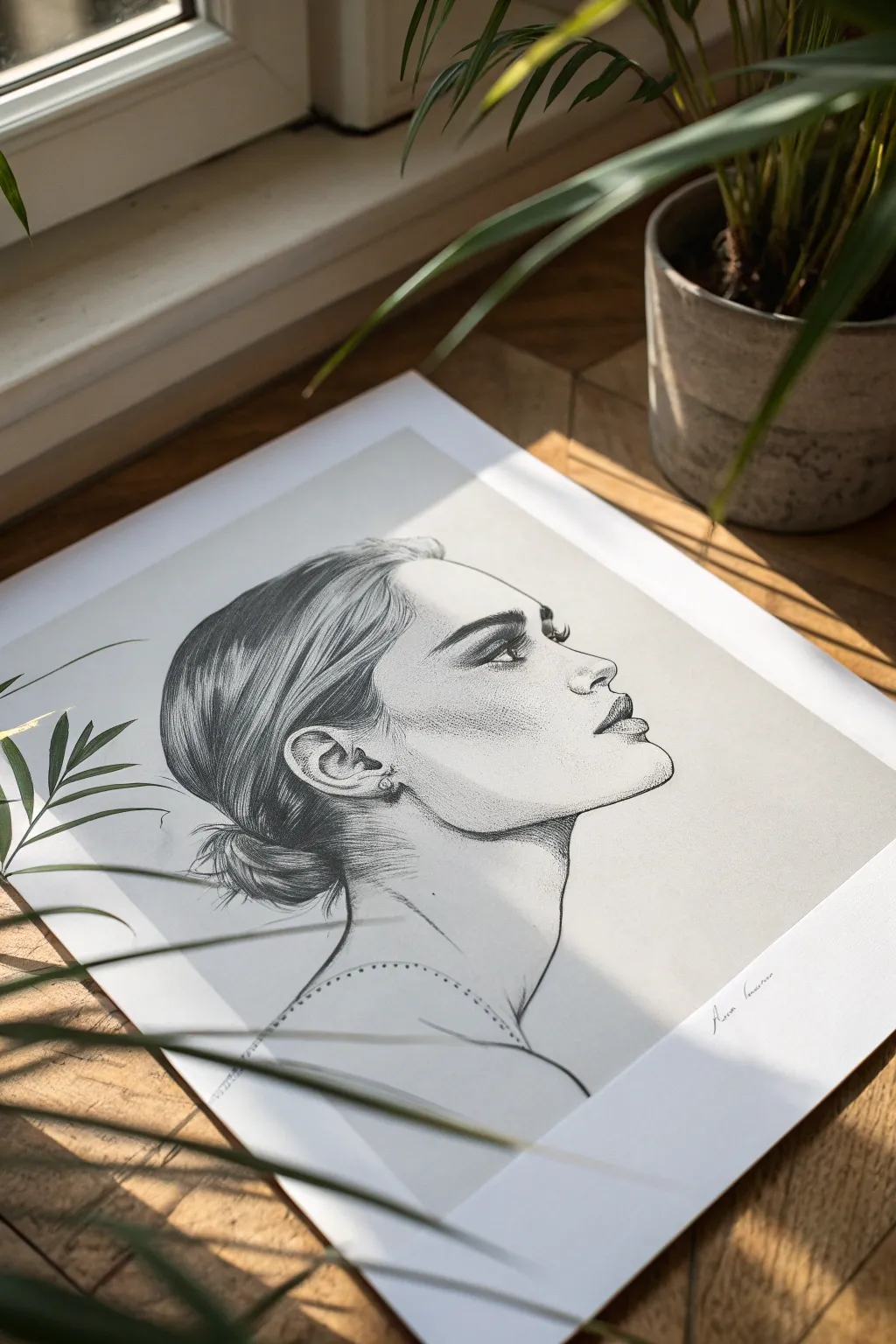
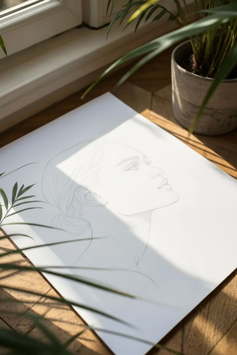
This striking black and white portrait captures a serene profile with clean lines and delicate shading techniques. By focusing on the interplay between deep blacks in the hair and subtle stippling on the skin, you’ll create a piece that feels both classical and modern.
How-To Guide
Materials
- High-quality drawing paper (smooth or bristol vellum surface)
- Graphite pencils (HB, 2B, 4B, 6B)
- Mechanical pencil (0.5mm HB for details)
- Kneaded eraser
- Blending stump (tortillon)
- Fine liner pen (optional for darkest accents)
- Fixative spray
Step 1: Laying the Foundation
-
Contour Sketching:
Begin with an HB pencil, using very light pressure to sketch the basic profile. Focus on the sweeping curve of the neck, the sharp angle of the jawline, and the gentle slope of the nose. -
Refining Features:
Tighten the shape of the eye, nostril, and lips. The subject is looking upward, so ensure the iris sits higher in the eye shape and the eyelashes sweep upwards. -
Mapping the Hair:
Outline the main mass of the hair, sweeping it back into a low bun. Don’t draw individual strands yet; just map out the flow and the shape of the bun at the nape of the neck. -
Shoulder and Neckline:
Draw the sleek line of the neck transitioning into the shoulder. Lightly indicate the neckline of the clothing or a necklace path with a dotted line as a guide.
Fixing Smudges
If your hand drags graphite across the white paper, place a clean sheet of scrap paper under your drawing hand. Lift stubborn stains by pressing—not rubbing—with a kneaded eraser.
Step 2: Defining the Values
-
Darkest Accents:
Switch to a 4B or 6B pencil to establish the deepest values. Fill in the pupil, the dark line of the upper eyelid, and the nostril. This establishes your contrast range early on. -
Rendering the Eye:
Carefully shade the iris, leaving a small white highlight. Use a sharp mechanical pencil to flick in thick, dark lashes. Add a soft shadow in the crease of the eyelid. -
Lip Volumizing:
Shade the upper lip darker than the bottom. On the bottom lip, shade the outer edges but leave the center lighter to create a plump, rounded effect. Define the corner of the mouth sharply.
Add Gold Leaf
For a mixed-media twist, apply a tiny amount of gold leaf to the earring or the necklace line. This metallic pop contrasts beautifully with the matte grey graphite.
Step 3: Hair and Texture
-
Hair Direction:
Using a 2B pencil, draw long, confident strokes following the curve of the skull towards the bun. These strokes should mimic the way hair is pulled back. -
Deepening Shadows:
Layer 4B pencil strokes over the 2B in the shadowed areas of the hair—specifically behind the ear and at the base of the bun. This creates depth and shine. -
The Bun Detail:
Sketch the bun using circular, wrapping motions. Leave some areas lighter to suggest light hitting the curve of the hair tie-back. -
Ear Detailing:
Draw the complex curves of the ear. Use the mechanical pencil for the earring detail, keeping the metal precise and clean against the skin tones.
Step 4: Shading and Finishing
-
Skin Tone Stippling:
Instead of smooth blending, use a stippling technique (tiny dots) with a fine pencil tip on the cheekbone and jawline to create texture and shadow transition. -
Under-Chin Shadow:
Apply a soft, hatched shadow under the jawline to separate the head from the neck. I like to keep this hatching directional, following the curve of the neck. -
Neck Definition:
Add subtle vertical hatching on the neck to show the anatomy of the sternocleidomastoid muscle. Keep this very light (HB pencil) so it doesn’t look too rigid. -
Necklace Detail:
Go back to the dotted line on the shoulder. darken these dots or add tiny decorative elements to imply a delicate chain resting on the skin. -
Final Cleanup:
Use a kneaded eraser to lift off any graphite smudges from the background, ensuring a stark white contrast against the profile.
Sign your name near the bottom edge and frame your elegant profile drawing to display its timeless beauty

PENCIL GUIDE
Understanding Pencil Grades from H to B
From first sketch to finished drawing — learn pencil grades, line control, and shading techniques.
Explore the Full Guide
Zentangle-Inspired Pattern Tile
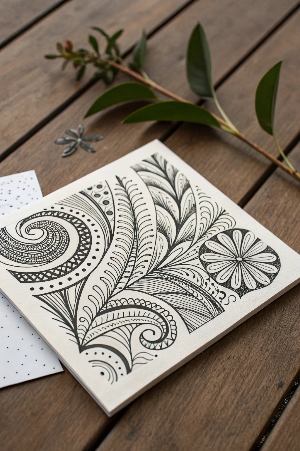
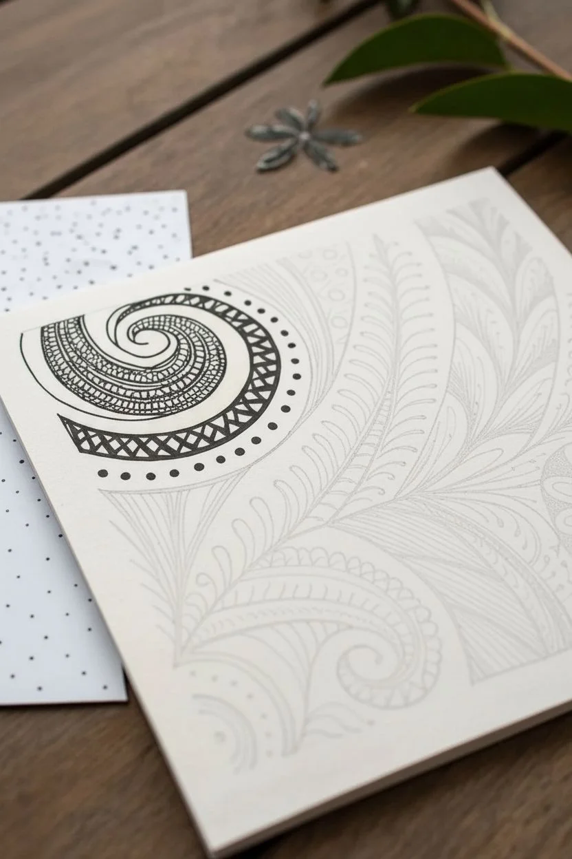
This intricate black and white drawing combines organic swirls, structured feathers, and bold floral motifs into a unified composition. Using fine liner pens on a square paper tile, you’ll build up complex textures from surprisingly simple repetitive strokes.
Step-by-Step Guide
Materials
- Square artist tile (3.5″ x 3.5″ or 4″ x 4″ heavy cardstock or watercolor paper)
- Pencil (HB or 2B)
- Fine liner pen, black (Size 01 or 03)
- Fine liner pen, black (Size 05 or 08 for thicker lines)
- Eraser
Step 1: Planning and The Main Spiral
-
Map out the string:
Begin by lightly sketching a pencil ‘string’ or guide. Draw a large curve sweeping from the bottom left corner up towards the top middle, creating a divide. Roughly mark a circle in the top left for the spiral and a circle in the middle right for the flower. -
Draft the spiral structure:
Using your 01 pen, draw the central spiral in the upper left quadrant. Start from the center and wind outwards. Create a double line for the outer band of the spiral to create a ribbon effect. -
Fill the spiral band:
Inside the ribbon created by the double lines, draw a zig-zag or diamond pattern. Fill in alternate triangles with solid black ink to create a bold, high-contrast look. -
Add texture to the center:
In the inner section of the spiral, draw tightly packed, curved hatching lines that follow the flow of the swirl. This creates a sense of depth and volume. -
Embellish the outer edge:
Draw a final, thinner aura line around the outside of the spiral ribbon. In the space between, add a row of small, evenly spaced dots.
Step 2: The Central Feather Plume
-
Draw the main stem:
Draw a strong, curved line extending from the bottom center upwards, branching slightly to the right. This will be the spine for the feather-like patterns. -
Create the leaf outlines:
On the left side of this spine, draw a series of long, curved leaf shapes stacked on top of each other. Repeat this on the right side, making them slightly larger near the top. -
Detail the left leaves:
Inside the left-side leaves, fill them with ‘flux’ shapes—teardrops that originate from the spine. Add a tiny dot inside the curve of each teardrop. -
Detail the top right feather:
For the large feather shape at the top right, sketch a central vein in each segment. Add fine diagonal hatching lines on one side of each vein to create shading.
Ink Confidence
Don’t worry about shaky lines. In this style, re-tracing a line slightly off-center just adds character and weight, making the pattern look more organic.
Step 3: The Flower and Lower Flourishes
-
Outline the flower:
In the middle right area, draw a small circle for the flower center. Surround it with 8-10 petal shapes that extend outward to form a wheel. -
Add floral depth:
Draw a straight line down the center of each petal. At the outer tip of each petal, fill the small negative spaces between them with solid black ink. This ’rounding’ technique makes the flower pop. -
Create the bottom organic curve:
In the bottom center, draw a large distinct shape resembling a paisley or a wave. Outline it with a double line, similar to the first spiral. -
Decorate the wave interior:
Inside this bottom shape, draw a series of small, curved scallops or semi-circles along the inner edge. Add a small hash mark inside each scallop. -
Fill the lower section:
Beneath the wave, fill the remaining corner space with curved parallel lines (aura) that echo the shape of the wave, creating a rippled water effect.
Level Up: Color Pop
After the black ink dries, use watercolor pencils or markers to fill just the ‘negative space’ background colors, leaving the patterns stark black and white.
Step 4: Final Details and Shading
-
Connect the elements:
Fill any awkward gaps between your three main elements (spiral, feather, flower) with simple filler patterns. I find adding tiny orbs or faint aura lines helps unify the separate sections. -
Add weight to lines:
Switch to your thicker 05 or 08 pen. Carefully re-trace the major structural lines—the main stems and the outer borders of the major shapes—to make them stand out against the fine details. -
Clean up:
Once you are absolutely certain the ink is dry, gently erase your initial pencil string and guide marks. -
Optional shading:
If you wish, use a pencil to lightly shade overlap points, such as where the feather stem tucks behind the spiral, to act as a finishing touch.
Now you have a stunning, complex-looking art tile created one simple stroke at a time.
Mandala With Thick-and-Thin Linework
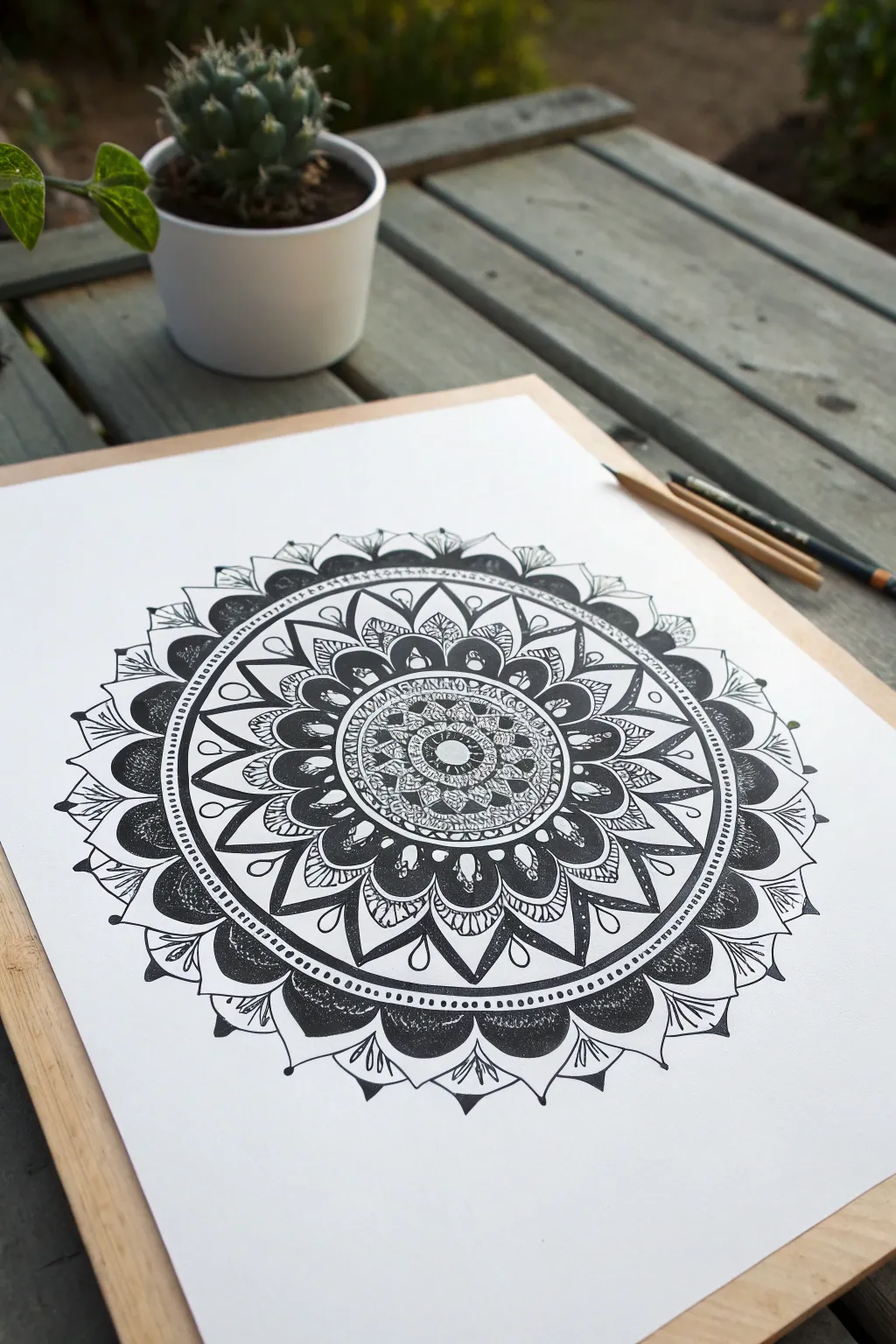
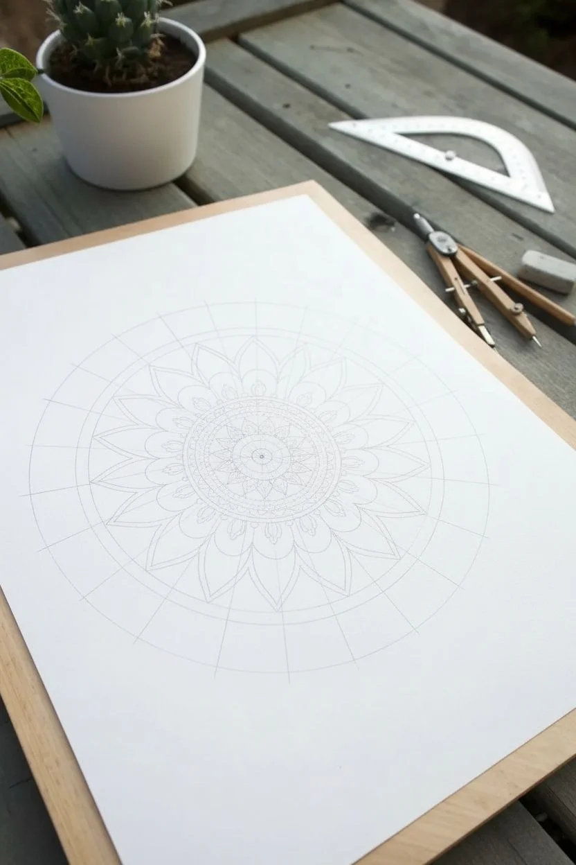
This striking mandala project focuses on the interplay between bold, filled-in darkness and delicate, intricate linework to create depth. By alternating thick, heavy shapes with whisper-thin details, you’ll build a hypnotic circular design that feels both grounded and airy.
Step-by-Step
Materials
- Smooth white drawing paper or Bristol board (A4 size)
- Pencil (HB for sketching)
- Compass
- Ruler
- Protractor
- Fine liner pens (sizes 0.05, 0.1, 0.3, and 0.5)
- Thick black marker or brush pen (for filling large areas)
- Eraser
Step 1: Setting the Structure
-
Find the center:
Mark the exact center of your paper lightly with a pencil. This anchor point is crucial for symmetry. -
Draft the concentric circles:
Using your compass, draw a series of light concentric circles expanding outward. Start small with a 1-inch diameter circle, then space subsequent rings about 0.5 to 1 inch apart until you have about 6-8 rings to work within. -
Divide the pie:
Use a protractor to mark every 22.5 degrees (giving you 16 sections) or every 30 degrees (12 sections). Draw straight lines through the center to the edge to create your guide segments.
Symmetry slipping?
If your petals start leaning, rotate your paper frequently. Always draw the line ‘away’ from your body in the same direction for every single segment to maintain muscle memory curve.
Step 2: The Inner Core
-
Start the center rosette:
With a 0.3 fine liner, draw small flower petals in the innermost circle. Add tiny stippling dots in the very center to create texture immediately. -
Build the first detailed band:
In the next ring outward, draw a grid pattern or tiny scales. I like to use the 0.05 pen here to make the mesh look incredibly delicate against the darker center. -
Add the first dark contrast:
Create a ring of small, solid black scallops or semi-circles around your mesh band. Use the thicker marker to fill these in completely solid black.
Contrast makes it pop
Don’t fear the black ink! The beauty of this style relies on the heavy black sections. If it looks flat, locate your largest white area and fill negative spaces with solid black.
Step 3: Mid-Layer Complexity
-
Large petals framework:
Draw larger, pointed petals extending through the next two guide rings. Keep the shapes consistent using your pencil grid as a reference. -
Internal petal details:
Inside each large petal, draw a smaller, similar shape. Fill the gap between the inner and outer petal lines with fine, parallel lines (hatching) to create a grey value without using grey ink. -
Negative space accents:
Between the tips of these petals, draw small teardrop shapes. Leave the inside of the teardrop white, but thicken the outline heavily.
Step 4: The Bold Outer Rings
-
Create the heavy black band:
Draw a wide ring of large, rounded scallops. Outline them first with a 0.5 pen. -
Fill the dark voids:
Switch to your brush pen or thick marker. Color in the bulk of these scallop shapes, but leave a small white highlight or motif inside each one to prevent it from looking like a black blob. -
Dotted border:
Draw two concentric circles close together just outside the black scallops. Fill the channel between them with evenly spaced black dots using a 0.5 pen.
Step 5: Final Flourishes
-
Outer petal layer:
Sketch final, wide, leaf-like shapes for the outermost edge. Give them a double outline. -
Add delicate veins:
Using your thinnest 0.05 pen, draw very fine veins or flourishes inside these outer leaves. The contrast between this thin line work and the previous solid black headers is key. -
Erase pencil guides:
Wait at least 15-20 minutes for the ink to fully cure. Gently erase all pencil circles and grid lines to reveal the crisp black and white art. -
Touch up:
Inspect your solid black areas. If the paper grain is showing through, go over them a second time to ensure a rich, deep black.
Take a moment to admire how projected bold shapes can organize delicate chaos into a unified whole
BRUSH GUIDE
The Right Brush for Every Stroke
From clean lines to bold texture — master brush choice, stroke control, and essential techniques.
Explore the Full Guide
Feather Texture Study in Ink
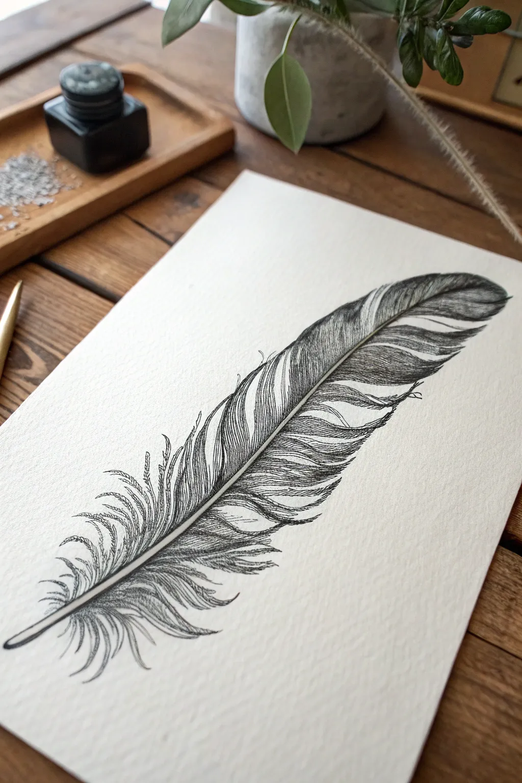
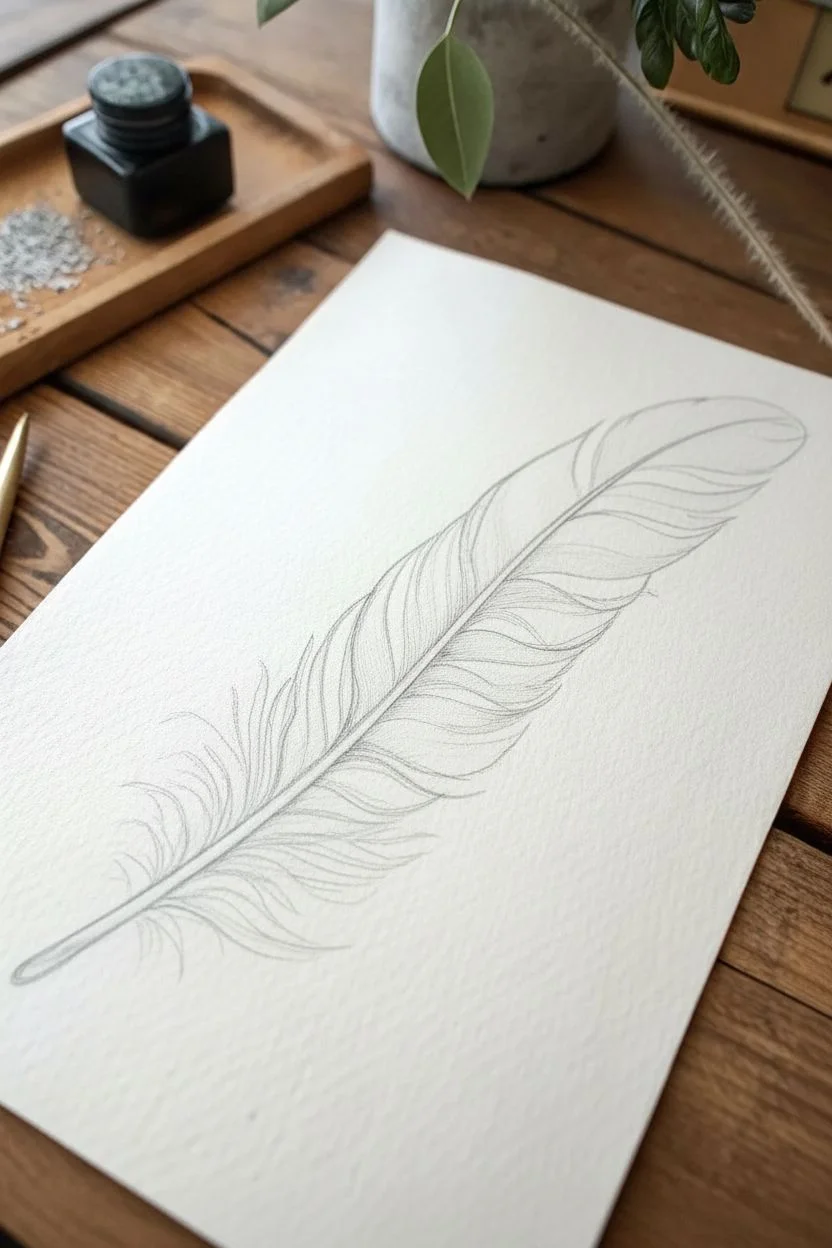
Master the delicate textures of a bird’s feather using fine liner pens and meticulous cross-hatching. This study focuses on capturing the organic splits, the central rachis, and the velvety softness of the barbs for a striking monochromatic piece.
Step-by-Step Guide
Materials
- High-quality watercolor paper or heavy textured drawing paper (cold press)
- HB graphite pencil
- Kneadable eraser
- Fine liner pens (sizes 0.05, 0.1, 0.3, and 0.5)
- Ruler (optional, for checking angles)
Step 1: Pencil Underdrawing
-
Map the spine:
Begin by lightly sketching a long, slightly curved diagonal line across your paper. This represents the rachis (the central shaft) of the feather. -
Define the shaft width:
Turn that single line into a narrow, tapering tube. It should be thickest at the bottom (the quill) and gradually vanish into a single line at the tip. -
Outline the vane shape:
Sketch the overall outer shape of the feather around the shaft. Keep it asymmetrical; the top curve is usually smoother, while the bottom section near the quill often looks fluffier and looser. -
Identify shifts and splits:
Mark a few V-shaped notches along the edges of the feather. Real feathers aren’t perfect solids; these splits add essential realism to the silhouette. -
Refine the quill:
At the very bottom, round off the tip of the quill to look like a cut nib or a natural point, ensuring it connects smoothly to the rest of the shaft.
Step 2: Inking the Structure
-
Outline the rachis:
Switch to a 0.1 fine liner. Carefully ink the two sides of the central shaft. Don’t make the lines perfectly straight; a tiny bit of wobble makes it look organic. -
Establish the main splits:
Using the same 0.1 pen, draw the major splits in the feather’s edge. Think of how the barbs separate naturally—sometimes they overlap slightly. -
Top edge definition:
Ink the smooth, upper edge of the feather. Use confident, sweeping strokes rather than short, scratchy ones to maintain a clean silhouette. -
Fluffy down base:
For the bottom area near the quill, use looser, erratic squiggles with a 0.05 pen. These barbs are unstructured and soft, unlike the stiff upper vane.
Inky Blobs?
If you rest your hand on wet ink, it will smear. Place a scrap piece of paper under your drawing hand to protect your work and keep skin oils off the paper.
Step 3: Creating Texture and Value
-
Directional mapping:
Before heavy shading, visualize the direction the barbs grow—diagonal and outward from the shaft. Lightly mark these flow lines if needed. -
Initial hatching:
Using a 0.05 pen, start adding fine, parallel lines originating from the central shaft outward. Keep your pressure extremely light. -
Darkening the spine:
Use a 0.3 pen to add shadow strictly to one side of the central shaft. This creates a cylindrical illusion, making the spine pop off the page. -
Mid-tone development:
Return to the vane with a 0.1 pen. Add a second layer of hatching in the darker areas (usually near the shaft and under the overlaps of the splits) to build density. -
Accentuating the splits:
Where the feather splits, darken the edges of the gap using short, tapered strokes. This shows thickness and separation between the barbs. -
Deepest shadows:
Switch to a 0.5 pen for the darkest blacks. Apply ink sparingly under the curve of the feather or where the barbs are dense, giving the object weight. -
Refining the tip:
The tip of the feather texture should obtain more white space. Fade your hatching out as you reach the outer edge so the feather looks light and airy. -
Adding imperfections:
Draw tiny, stray hairs or broken barbs sticking out from main silhouette using the 0.05 pen. These imperfections are crucial for a realistic look.
Try Stippling
For the very bottom fluffy section, mix tiny dots (stippling) in with your loose lines. This creates a denser, softer texture that looks distinct from the stiff upper vane.
Step 4: Final Touches
-
Evaluate contrast:
Stand back and look at the drawing. If the feather looks too flat, deepen the shadows right next to the central rib using your 0.3 pen. -
Clean up:
Once the ink is completely dry (give it a few minutes to be safe), gently erase all visible pencil guidelines with the kneadable eraser.
You now have a beautifully textured ink study ready to be framed or added to a nature journal.
Water Ripples Using Only Line and Value
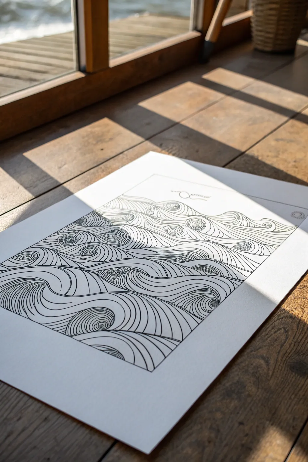
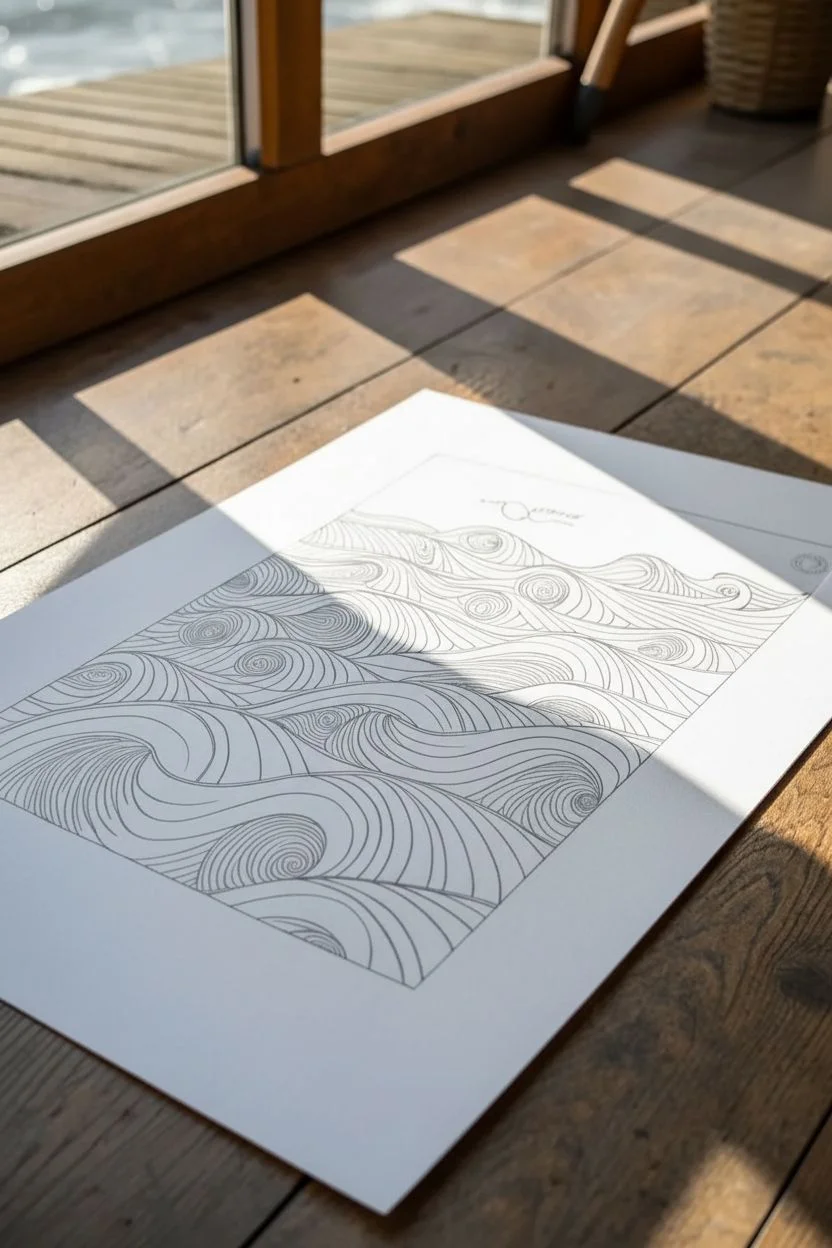
Capture the hypnotic rhythm of the sea using nothing but simple lines and contrast. This project transforms a flat sheet of paper into a rolling seascape by cleverly manipulating line curvature to simulate depth and movement.
How-To Guide
Materials
- High-quality white drawing paper (Bristol board or hot press watercolor paper)
- Fine liner pens (sizes 0.1, 0.3, and 0.5mm)
- Graphite pencil (HB or 2H)
- Quality eraser
- Ruler or T-square
Step 1: Planning and Sketching
-
Define the Frame:
Begin by using your ruler and pencil to draw a crisp rectangular border on your paper. Leave a generous margin of white space around the outside to give the artwork a professional, matted look. -
Establish the Horizon:
Lightly sketch the top edge of your water. Instead of a straight horizontal line, draw a gently undulating wave pattern across the upper third of the rectangle to suggest the water’s surface. -
Map the Wave Crests:
Sketch a series of organic, flowing curves across the paper. Think of these as the ‘spines’ or tops of each wave. Vary their direction—some curving left, some right—to create a chaotic, natural sea feeling. -
Draw the Spirals:
At the peak or trough of several waves, lightly pencil in small circles or spirals. These will act as the focal points or ‘eyes’ where the ripples will converge. -
Refine the Flow:
Step back and look at your pencil sketch. Ensure the lines interact smoothly, avoiding stiff intersections. I like to erase and redraw stiff areas until the movement feels fluid.
Step 2: Inking the Contours
-
Start the Main Lines:
Switch to your 0.5mm fine liner. Carefully go over your main ‘spine’ lines and the spirals you sketched. These bold lines will define the distinct sections of the water. -
Begin the Contour Fill:
Using a thinner 0.3mm pen, start drawing lines parallel to your main wave spines. Follow the curve exactly. If the spine curves up, your new line curves up. -
Create Volume:
As you add more parallel lines, widen the gap slightly at the peak of the curve and narrow the gap where the lines tuck under or meet another wave. This compression creates the 3D illusion. -
Developing the Spirals:
When approaching the spiral points, wrap your lines around the center circle. Continue spiraling outward, letting the lines expand as they move away from the tight center. -
Navigating Intersections:
Where two wave sections meet, allow the lines from one section to stop cleanly against the border of the other. This overlap tells the viewer which wave is ‘in front’ of the other.
Line Variance tip
Use a thicker pen for the foreground waves and a thinner one for background waves. This simple trick instantly adds atmospheric depth.
Step 3: Detailing and Depth
-
Switch to Fine Details:
Pick up your 0.1mm pen for the tightest areas. Use this ultra-fine tip to add lines in the deep crevices between waves where shadows would naturally fall. -
Adjust Line Density:
To create darker value without shading, simply draw your lines closer together in the ‘valleys’ of the waves. Keep them further apart on the ‘crests’. -
Fixing Gaps:
Scan your drawing for awkward white spaces. Fill these with partial lines that mimic the surrounding flow, ensuring no empty patch disrupts the illusion of a continuous surface. -
The Final Pass:
Use the 0.5mm pen one last time to re-trace the outermost border of the drawing block, giving it a clean, sharp finish that contains all the energy within. -
Clean Up:
Wait at least 15 minutes for the ink to cure fully. Gently erase all underlying pencil marks, being careful not to buckle the paper.
Wobbly Lines?
Don’t stress over perfect straightness. Slight wobbles actually make the water look more liquid and natural. Just keep the spacing consistent.
Now you have a mesmerizing piece of line art that moves before your eyes


Wood Grain Study With Layered Hatching
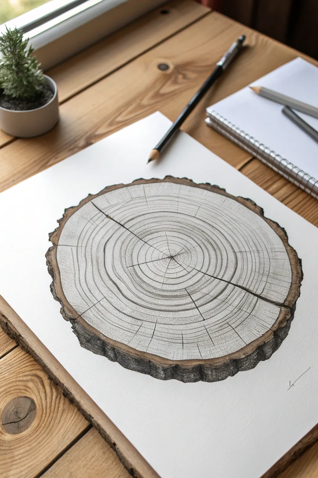
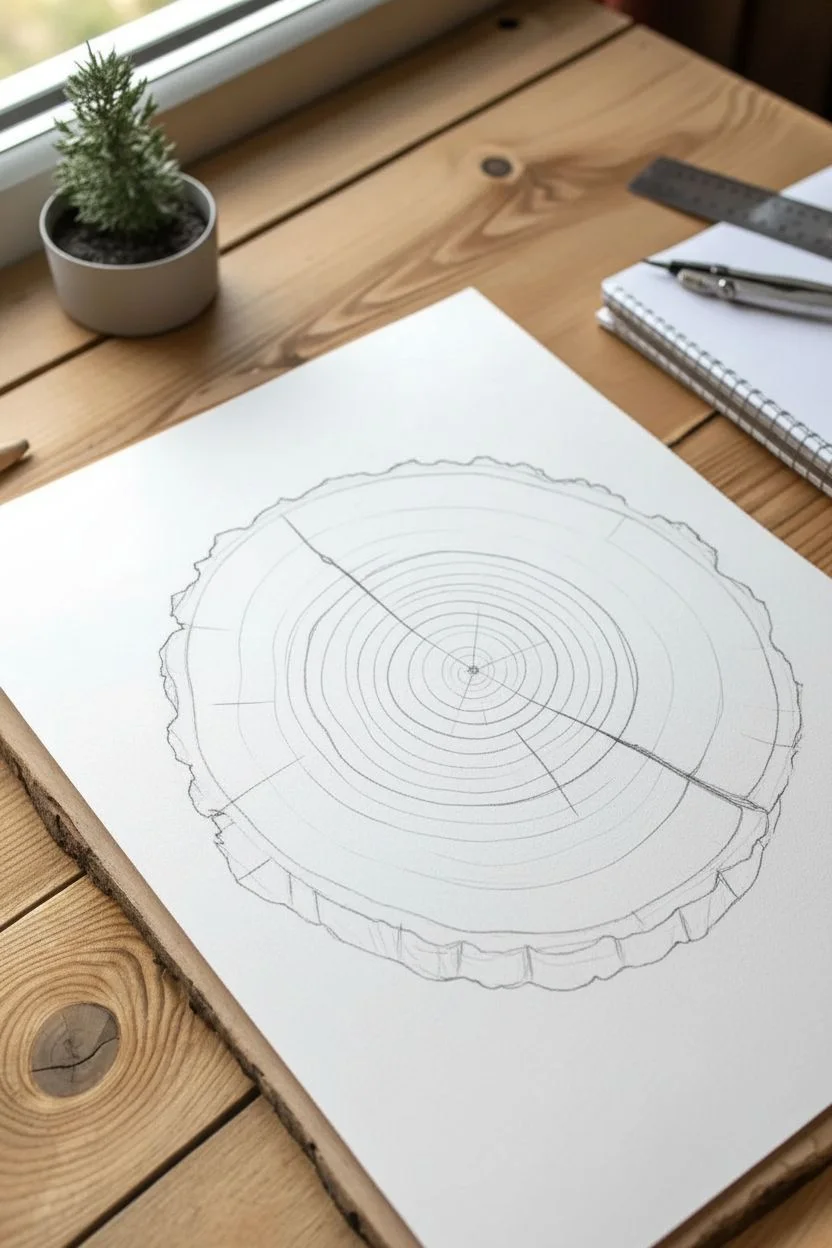
Capture the organic beauty of nature with this detailed study of a wood log cross-section. You’ll use precision line work and layered hatching to build up realistic growth rings and rough bark texture.
Step-by-Step Tutorial
Materials
- Smooth bristol board or heavyweight drawing paper
- Graphite pencils (HB, 2B, 4B)
- Fine liner pens (0.1mm, 0.3mm, 0.5mm)
- Compass or circular object (for initial shape)
- Ruler
- Brown colored pencil or sepia fineliner (optional)
- Kneaded eraser
Step 1: Structural Layout
-
Establish the perimeter:
Begin by lightly drawing a large circle using a compass or by tracing a round object. This doesn’t need to be perfectly round—in fact, for the final outline, you’ll want to wobble your line slightly to mimic natural growth, but the perfect circle helps as a guide. -
Define the bark thickness:
Draw a jagged, uneven line just outside your initial circle to represent the outer edge of the bark. The space between your first circle and this new jagged line will become the bark layer. -
Map the center point:
Locate the center of your log. It doesn’t have to be the exact geometric center; offsetting it slightly makes the drawing look more organic. -
Sketch the primary cracks:
Using a ruler, lightly sketch 2-3 major straight lines radiating from the center to the edge. These represent the natural radial cracks (checks) that form as wood dries. Don’t make them perfect rays; let them zigzag slightly.
Step 2: Drawing the Growth Rings
-
Start the inner rings:
Switch to a sharp HB pencil. Starting from the center point, draw small, tight concentric circles. Keep your hand loose so the lines aren’t perfectly mechanical. -
Expand outward:
Continue drawing rings moving toward the bark. vary the spacing between rings; wide spacing indicates wet years of rapid growth, while tight spacing suggests dry years. This variation adds realism. -
Ink the rings:
Go over your pencil rings with a 0.1mm fine liner. Keep the pressure very light. If the line breaks occasionally, that’s fine—it adds texture. -
Deepen the cracks:
Use a 0.3mm pen to darken the radial cracks you sketched earlier. Make these lines thicker than the rings. -
Add connecting cracks:
Draw fine, hairline fractures branching off the main cracks or running perpendicular between growth rings using your 0.1mm pen.
Natural Imperfections
Don’t connect every single ring. Purposefully breaking the lines or making them wobble creates a dry, aged wood effect rather than a target pattern.
Step 3: Texturing and Shading
-
Shade the core:
Using a 2B pencil, lightly shade the innermost rings to give the ‘heartwood’ a slightly darker tone than the surrounding sapwood. -
Structure the bark:
Focus on the outer rim. Use heavy, vertical hatching and scumbling (scribbling mostly) to fill in the bark area. The texture should look rough and chunky. -
Add dimension to the bark:
Use a 4B pencil or a thicker pen to darken the deeply recessed areas of the bark. This high contrast makes the rough edge pop. -
Introduce color (optional):
If you want the warm look from the reference, lightly glaze the bark area with a brown colored pencil, blending it into your graphite shading. -
Refine the shadows:
Add a slight drop shadow under the bottom edge of the log to ground it on the page. -
Enhance radial texture:
Draw very faint, straight lines radiating from the center outward across the rings (medullary rays). These should be barely visible, just enough to break up the circular pattern. -
Final clean up:
Erase any remaining construction guidelines. Use a kneaded eraser to tap (lift) graphite off the brightest areas of the wood face to create highlights.
Sepia Tone Wash
Instead of colored pencils, try using a diluted coffee wash or sepia watercolor on the bark area before applying your ink details for an antique botanical look.
Step back and admire the complex organic rhythm of your finished wood study
Insect Illustration With Scientific-Style Detail
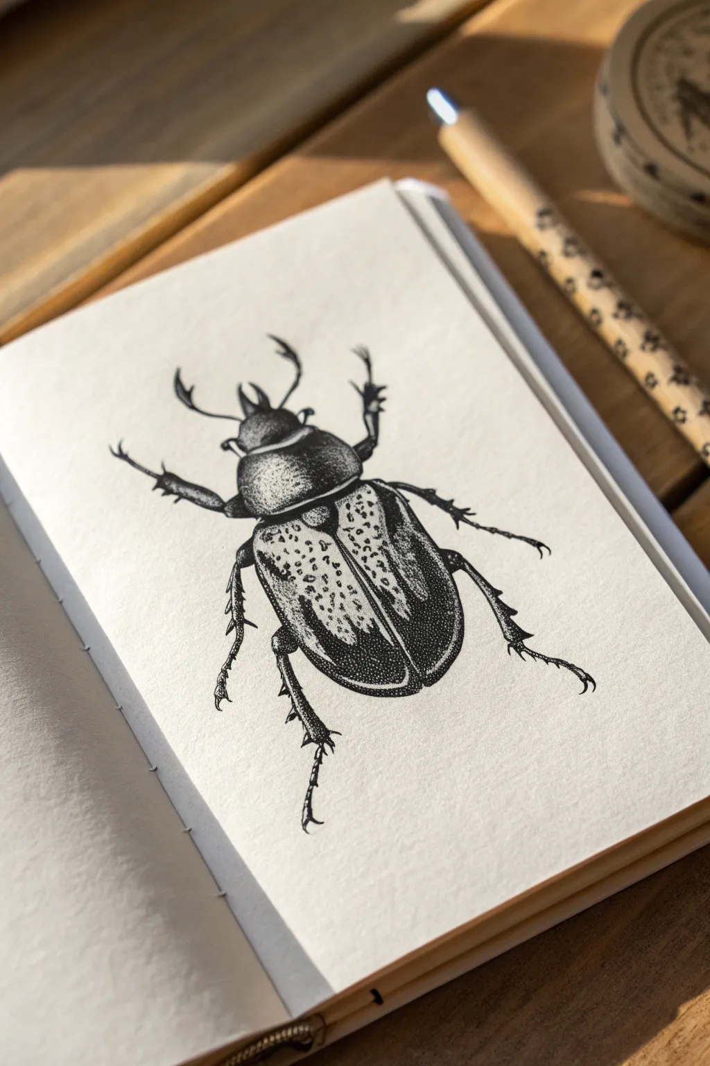
Master the precise art of scientific illustration by recreating this detailed beetle drawing using fine liners and stippling techniques. This project focuses on building texture and three-dimensional volume through thousands of tiny, carefully placed dots.
How-To Guide
Materials
- Smooth sketchbook paper (hot press watercolor or bristol board preferred)
- HB Graphite pencil
- Kneaded eraser
- Fine liner pens (sizes 005, 01, and 03)
- Black ink
- Reference photo of a beetle (Dynastinae subfamily)
Step 1: Structural Sketching
-
Draft the central axis:
Begin with your HB pencil by drawing a very light vertical line down the center of your page. This axis line is crucial for keeping the beetle’s anatomy symmetrical. -
Map the main body shapes:
Draw an oval for the abdomen (the large bottom section) and a smaller, rounded rectangle shape above it for the thorax. Connect a small head shape at the very top. -
Add legs and antennae:
Sketch the legs extending outward, paying attention to the joints. The front legs should angle forward near the head, while the middle and back legs angle backward. Add the small, pincers-like mandibles and antennae at the front. -
Refine the outline:
Go over your shapes to create a clean, single contour line. Define the separation between the wing cases (elytra) down the center of the abdomen and sharpen the jagged spikes on the legs.
Don’t Rush The Dots
Keep your pen vertical. If you tap at an angle, your dots will become dashes or ‘commas,’ which ruins the texture. Take breaks to relax your hand.
Step 2: Inking Outlines
-
Trace the main contour:
Using an 01 fine liner, carefully ink the outer perimeter of the beetle. Keep your hand steady but allow for slight organic variations in the line weight. -
Define interior segments:
Ink the separation between the thorax and abdomen, and the line splitting the wing cases. Use a slightly lighter touch here than on the outer edges. -
Detail the legs:
Switch to an 005 pen for the fine hairs and spikes on the legs. These should look sharp and delicate, not heavy or blocky. -
Erase pencil marks:
Once the ink is completely dry, gently roll a kneaded eraser over the drawing to lift all graphite guidelines, leaving a clean ink outline.
Add Subtle Color
Once fully dry, try glazing a very watery layer of sepia or iridescent watercolor over the wing cases to give the shell a realistic, shifting sheen.
Step 3: Shading with Stippling
-
Establish the darkest blacks:
Using an 03 pen, fill in the solid black areas. Focus on the shadow beneath the thorax rim and the deep, glossy sections on the outer edges of the wing cases using dense stippling that merges into solid black. -
Begin the gradient on the thorax:
Switch to the 01 pen. Start stippling (dotting) heavily on the left and right sides of the upper body segment (thorax), leaving the center lighter to suggest a highlight. -
Texture the wing cases:
The wing cases have a mottled texture. Draw small, irregular organic shapes or spots on the elytra using the 005 pen. Do not color them in; outline them lightly. -
Darken around the spots:
Stipple around these small organic shapes. The density of dots should be higher near the edges of the beetle and fade out toward the center highlight. -
Build the volume:
Increase the dot density on the curved sides of the abdomen. I find it helpful to squint at the drawing occasionally to check if the drawing creates a rounded, 3D cylinder effect. -
Shade the legs:
Add dots to the underside of the legs to give them roundness, keeping the top edges mostly clear paper to represent light hitting the exoskeleton.
Step 4: Final Refinements
-
Deepen the contrast:
Go back with your 005 pen and add a second pass of very fine dots in the transition zones—where the dark shadows meet the highlights—to make the gradient smoother. -
Enhance the texture:
Add tiny, stray dots inside the lighter areas and highlights. This prevents the white paper from looking too stark and mimics the natural, imperfect surface of a bug shell. -
Final assessment:
Check the symmetry of your shading. Ensure the gap between the wings is distinct and dark, anchoring the composition.
Now you have a striking, scientific-style beetle illustration ready to be framed or added to your nature journal
Negative Space Lettering With Black Fill
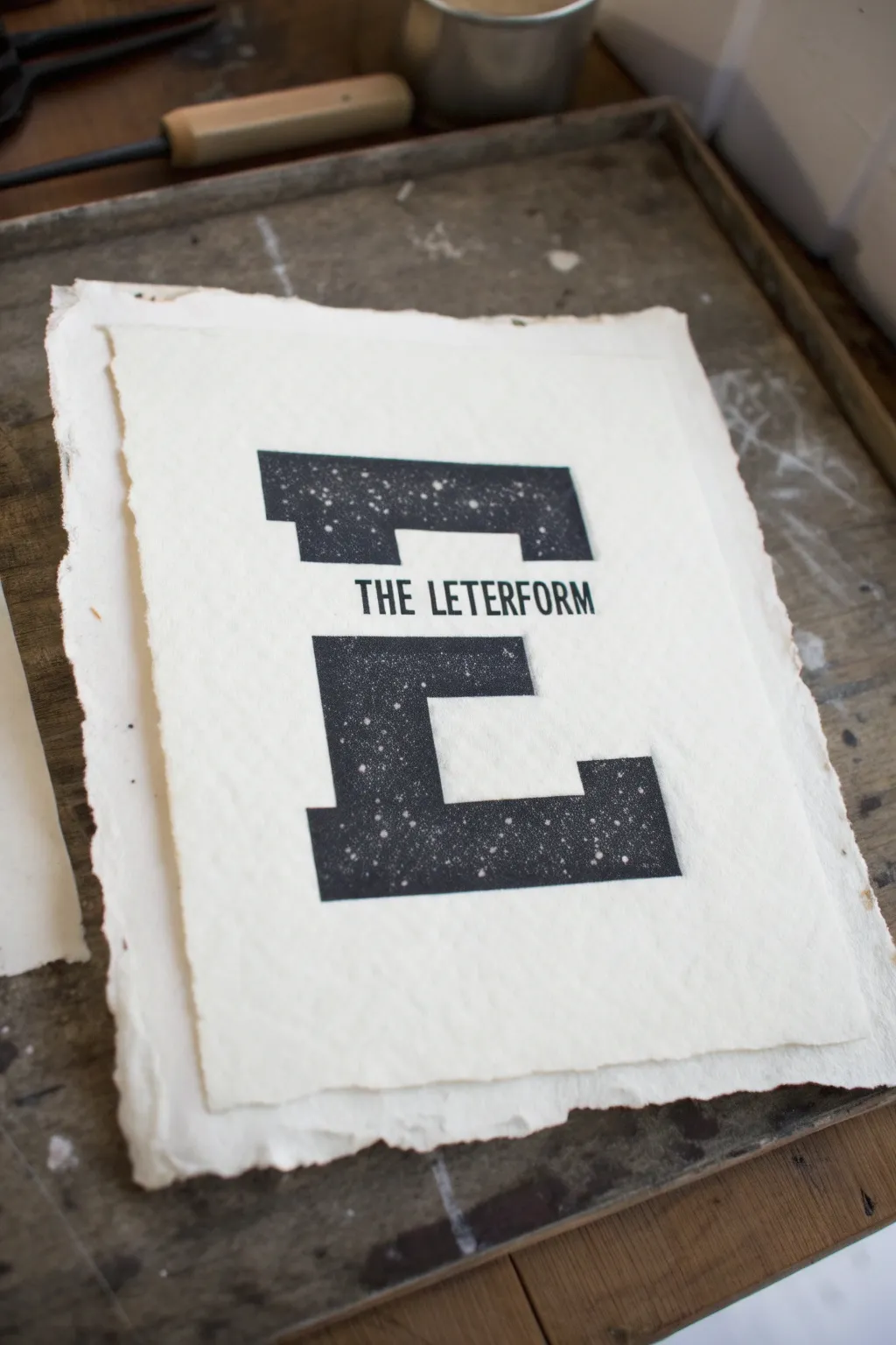
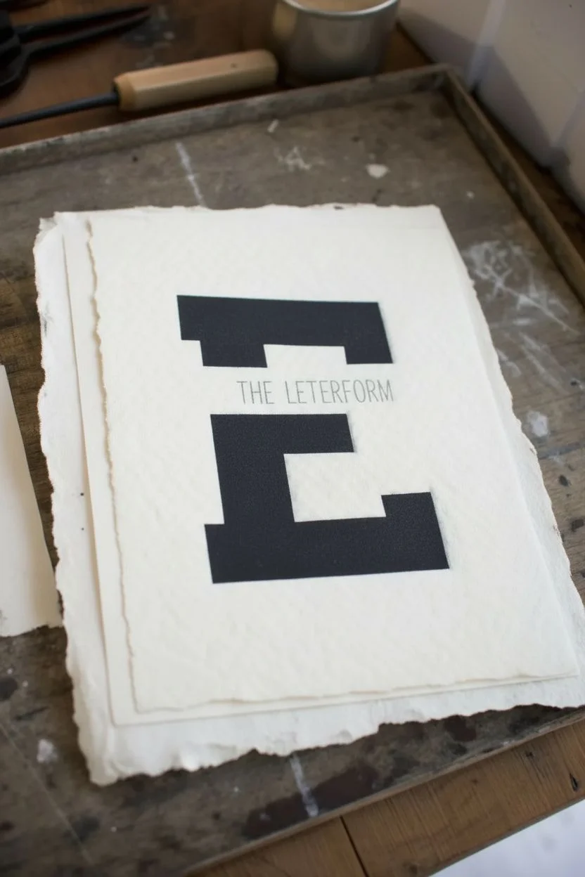
Create a striking typographic art piece that plays with negative space and texture. This project combines bold block lettering with a speckled, starlike finish on beautiful deckled-edge paper for a handcrafted, industrial feel.
Step-by-Step
Materials
- High-quality printmaking paper with deckled edges (e.g., Rives BFK or cotton rag)
- Black screen printing ink or block printing ink
- Brayer (rubber roller)
- Sheet of linoleum or a screen printing frame with mesh
- Carving tools (gauges) if doing linocut
- Screen filler or stencil film if doing screen printing
- Masking tape
- Ruler
- Pencil
- Old toothbrush or stiff bristle brush
- White acrylic paint or ink
- Transparency film or tracing paper
Step 1: Designing the Letterform
-
Draft your letter:
Start by sketching a large, bold serif letter ‘E’ on a piece of scrap paper to get the proportions right. Aim for a heavy, slab-serif style that fills the page well. -
Create the fragmentation:
Visualize a horizontal strip cutting through the center of your ‘E’. Draw a rectangular guideline across the middle where the negative space will be. -
Insert text:
In that central negative space, pencil in the words ‘THE LETERFORM’ (or your chosen phrase) in a clean, sans-serif font. Ensure the text fits comfortably within the gap without touching the black segments above or below. -
Finalize the template:
Once happy with the layout, trace your final design onto transparency film or transfer it directly onto your linoleum block or screen, depending on your chosen method. For this specific textured look, I find screen printing or a very flat linocut works best.
Pro Tip: Deckled Edges
To get that torn edge look without buying expensive paper, fold your paper sharply, wet the fold with a brush, and slowly tear it along a ruler.
Step 2: Preparing the Matrix
-
Masking method (Screen Printing):
If using a screen, you can use the paper stencil method. Cut out the black parts of the ‘E’ from a piece of paper. Place the negative stencil (the paper with holes in the shape of the E parts) under the screen. -
Carving method (Block Printing):
If carving, carefully gouge away everything that *isn’t* the black ‘E’. You will need to carve away the central horizontal strip completely, leaving the space for the text empty. -
Adding text:
For the small text ‘THE LETERFORM’, it is often cleaner to add this later with a stamp or a separate smaller stencil, rather than trying to carve around it in the main block. Let’s plan to stamp or print it separately to keep it sharp.
Step 3: Printing the Base
-
Prepare your ink:
Squeeze out a line of black ink onto your inking plate or glass palette. Use your brayer to roll it out until you hear that satisfying ‘velcro’ sound, indicating a thin, even layer. -
Ink the matrix:
Roll the ink onto your block or flood your screen. Ensure the coverage is solid but not gloopy. -
Position the paper:
Center your deckled-edge paper. If you have a registration board, use it to ensure the print lands exactly in the middle. -
Print the ‘E’:
Press the paper onto the block or pull the squeegee across the screen. Apply firm, even pressure to transfer the black shapes of the ‘E’ onto the textured paper. -
Lift and inspect:
Carefully peel the paper away. You should have the top and bottom sections of the ‘E’ in solid black, with a clean gap in the middle. -
Dry time:
Allow this black layer to dry completely before touching it again. Block ink can take a while, so be patient.
Troubleshooting: Smudged Text
If your central text keeps smudging, the ink might be too wet. Switch to a permanent ink pad for the stamped text instead of block printing ink.
Step 4: Adding Text and Texture
-
Stamp the central text:
Use a small alphabet stamp set or a custom text stencil to print ‘THE LETERFORM’ into the negative space gap. Align it carefully with a ruler so it sits perfectly horizontal. -
Prepare for splatter:
To get that cosmic, starry effect, dilute a small amount of white acrylic paint or ink with water until it has a milky consistency. -
Mask the paper:
Use scrap paper to cover the white areas of your artwork around the black ‘E’. You only want the white specks to land on the black ink. -
Splatter technique:
Dip an old toothbrush into the white mixture. Hold it over the black areas and run your thumb across the bristles to flick tiny droplets onto the black ink. Go lightly at first; you can always add more. -
Vary the specks:
Create some variation by flicking closer and further away. You want a mix of microscopic dust and distinct small stars. -
Final dry:
Remove the masking paper carefully and let the white specks dry. The contrast between the stark black, the white texture, and the creamy paper creates a wonderful depth.
Hang your finished print in a simple frame to let the textured paper and bold typography speak for themselves
Stippled Galaxy in a Jar
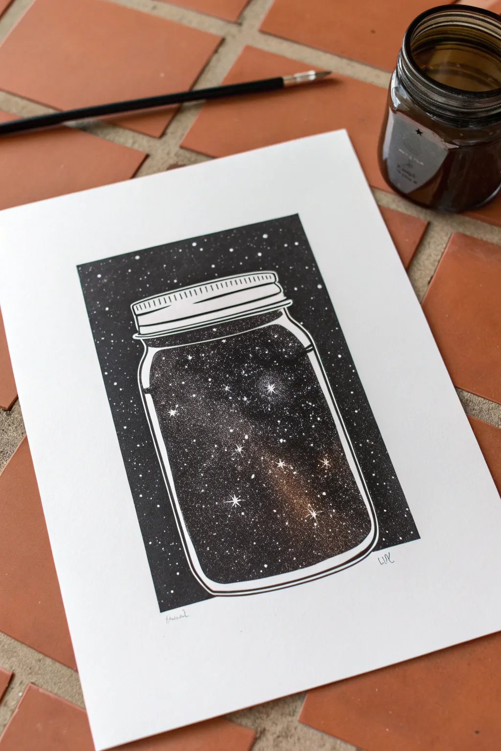
Capture the infinite wonder of the cosmos inside a simple household object with this high-contrast ink drawing. Using stippling techniques and negative space, you’ll create a glowing nebula effect that looks complex but is built from thousands of tiny, patient dots.
Step-by-Step Guide
Materials
- Smooth bristol board or heavy cardstock (bright white)
- Black waterproof Indian ink or archival ink fine liners (0.05, 0.1, and 0.5 sizes)
- White gel pen (size 08 or 10) or white gouache with a fine brush
- Pencil (HB or H)
- Ruler
- Eraser
- Small round paintbrush (if using bottle ink)
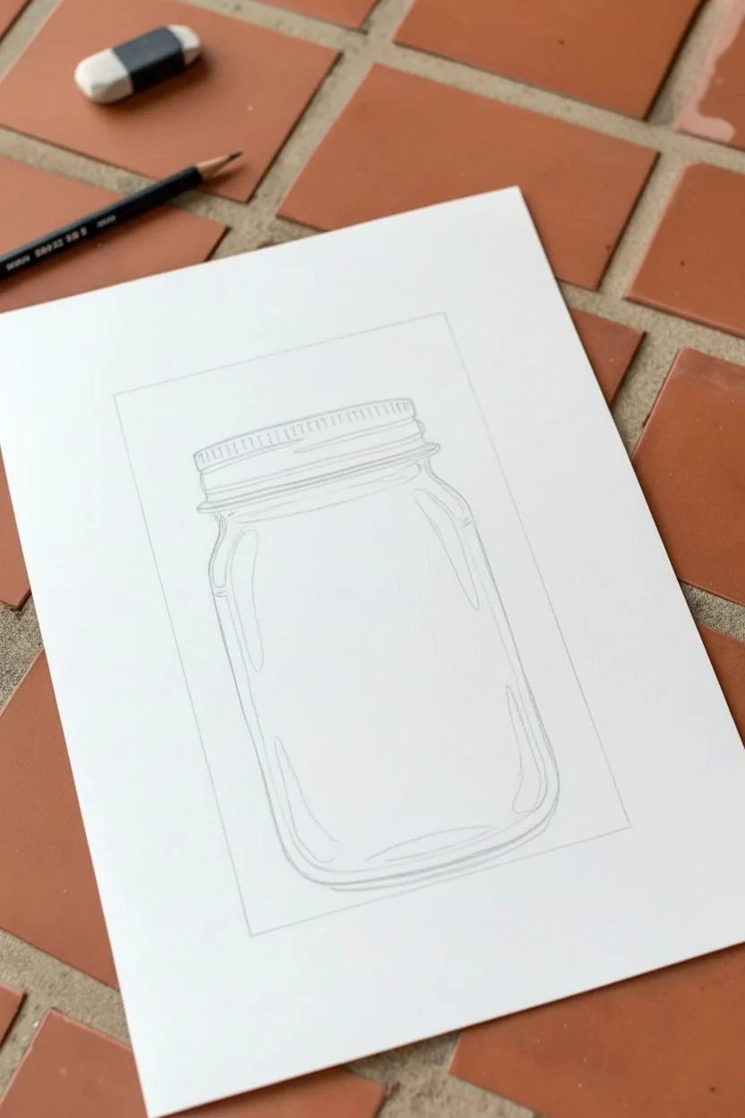
Step 1: Drafting the Composition
-
Define the boundaries:
Begin by using your ruler to draw a crisp rectangle in the center of your paper. This will serve as the hard edge for your background, framing the entire piece. -
Sketch the jar:
Lightly sketch the outline of a mason jar in the center of the rectangle. Ensure the jar’s shoulders are rounded and the bottom is slightly curved to show perspective. -
Add lid details:
Draw the lid with a few horizontal bands to mimic the screw-top threads. Keep these lines clean and parallel, leaving space between them for highlights later. -
Mark the highlights:
Sketch long, thin vertical shapes along the sides of the glass jar and curved shapes on the shoulders. These areas must remain perfectly white to represent reflection on the glass.
Step 2: Inking the Background
-
Outline the main shapes:
Switch to a medium-sized pen (around 0.5) to ink the outer rectangular border and the main outline of the jar. Be careful not to ink through the reflection lines you sketched sketch earlier. -
Fill the outer void:
Using a brush with Indian ink or a large marker, fill in the space surrounding the jar, staying strictly inside the rectangular border. This creates the dark void of space outside the jar. -
Protect the stars:
As you fill the black background, leave tiny random circular specks of white paper untouched. These negative spaces will become the distant stars outside the jar.
Wrist Saver
Stippling can be tiring. Hold the pen vertically and use a gentle tapping motion from your wrist, not your whole arm. Take breaks if your hand cramps.
Step 3: Creating the Galaxy Inside
-
Establish the black base:
Inside the jar, identify the areas that will be the deepest, darkest space. Fill these sections with solid black ink, but leave large, organic cloud-shapes empty in the middle for the nebula. -
Begin the transition:
Use a 0.5 or 0.3 pen to start stippling (dotting) along the edges of your solid black areas. The dots should be very dense near the black ink and gradually spread out as they move toward the white paper. -
Refine the gradient:
Switch to a finer 0.1 pen. Continue stippling into the white areas. I find it helpful to vary the pressure slightly to create different dot sizes, which adds depth to the gas cloud effect. -
Preserve the glass reflections:
Be extremely careful to leave the reflection highlights you sketched earlier completely untouched by ink. The stark white paper against the stippled interior is what makes the glass look shiny. -
Deepen the contrast:
Go back over the transition areas with more dots to smoothen the gradient. The smoother the transition from black to white, the more glowing and ethereal the galaxy will appear.
Blobs of Ink?
If you accidentally drip black ink in a white area, don’t panic. Let it dry completely, then use white gouache or a gel pen to cover it and turn it into a bright star.
Step 4: Final Details
-
Detail the lid:
Ink the lines of the lid, keeping the lines on the left side thicker for shadow and breaking the lines on the right side to suggest a light source hitting the metal. -
Add bright stars:
Once the black ink is fully dry, use a white gel pen or white gouache to add a few larger, brighter stars inside the jar. Add cross-shapes to one or two of them to create a twinkling lens flare. -
Sprinkle smaller stars:
Add tiny white dots over the solid black areas inside the jar to represent distant stars that are peeking through the darkness. -
Clean up:
Wait at least 15 minutes for all ink to cure completely, then gently erase any visible pencil sketch lines, especially around the glass reflections.
Now you have a captured universe sitting quietly on your paper, ready to be framed
Shattered Lightbulb With Surreal Elements
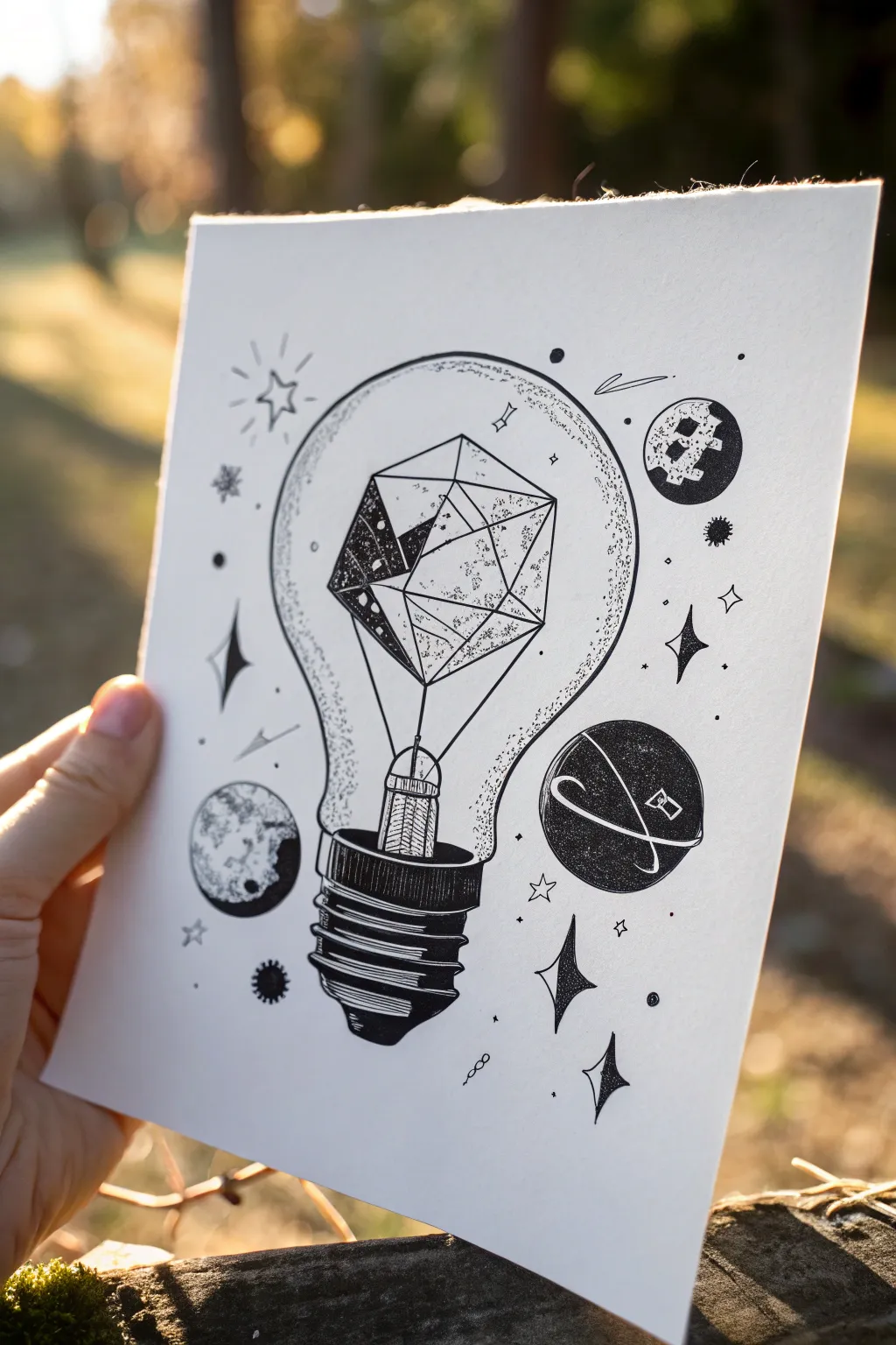
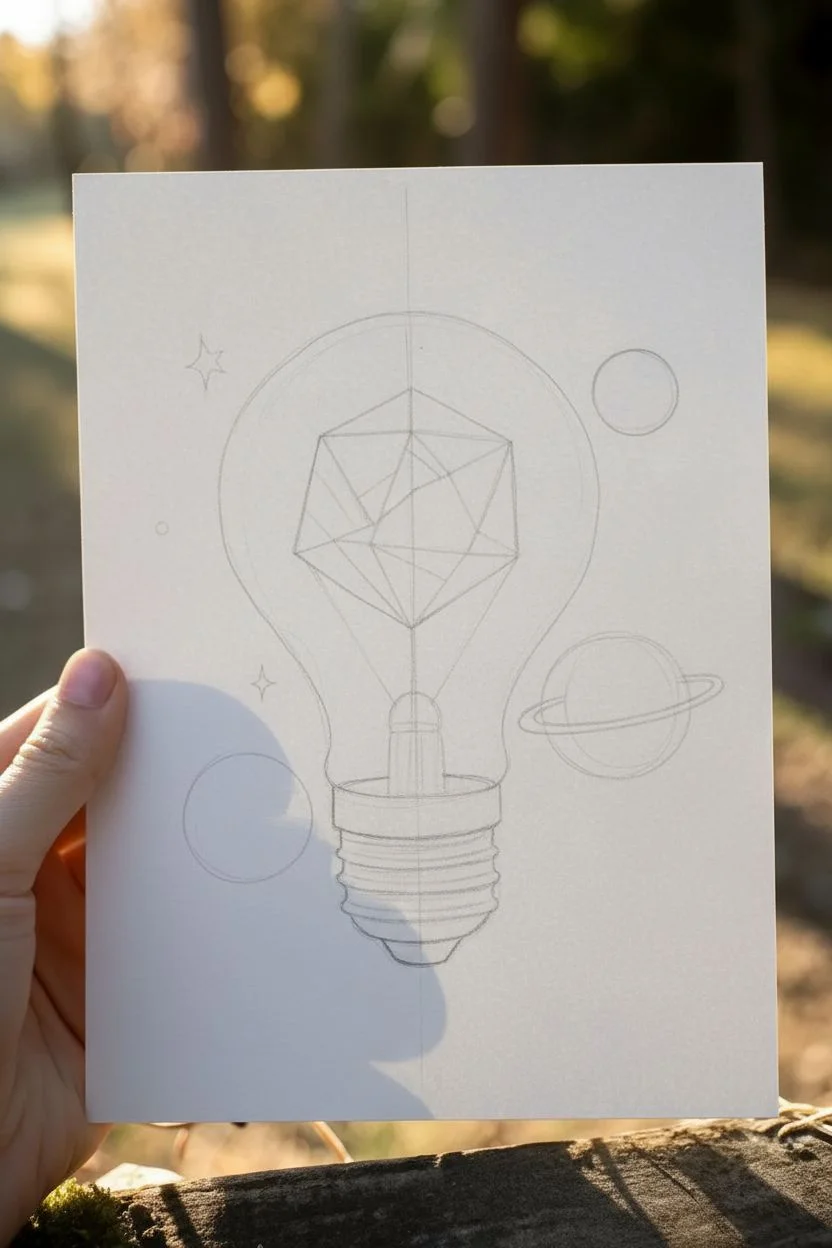
Blend scientific curiosity with artistic surrealism in this striking ink illustration. A standard lightbulb is reimagined as a container for geometric forms and planets, created using precise stippling and bold linework.
Detailed Instructions
Materials
- Smooth bristol vellum or hot-press watercolor paper
- Pencil (HB or 2H)
- Eraser (kneaded preferred)
- Fine liner pens (sizes 005, 01, 03, 05, and 08)
- Ruler or straight edge
- Compass or circle template
Step 1: Drafting the Foundations
-
Sketch the bulb shape:
Begin with a pencil to lightly draw the classic pear shape of a lightbulb. Use a ruler to ensure the centerline is vertical, which helps keep the bulb symmetrical. -
Outline the screw base:
At the bottom of your bulb shape, sketch the cylindrical screw base. Draw slightly curved horizontal lines to indicate the threading ridges and finish with the rounded contact point at the very bottom. -
Construct the inner geometry:
Instead of a filament, draw a suspended geometric polyhedron in the center of the bulb bubble. Start with a hexagon or general diamond shape and dissect it with connecting lines to create faceted planes. -
Add surreal elements:
Around the bulb, lightly sketch floating circles for planets. Add a ring around one, and perhaps draw a few small starbursts or diamond shapes to fill the negative space.
Uneven Stippling?
If your dot shading looks patchy, go back over the transition areas. Add intermediate dots to smooth the gradient from dark to light.
Step 2: Inking the Structure
-
Define the screw base:
Switch to a thicker pen (05 or 08). Carefully outline the screw base. Fill in the shadowed areas under each thread ridge with solid black ink to give it weight and dimension. -
Detail the bulb glass:
Using a thinner pen (03), trace the outer glass shape. Break the line occasionally or vary the pressure to keep the glass looking delicate rather than heavy. -
Ink the geometric core:
Use a 01 or 03 pen for the geometric shape inside. Use a ruler here to ensure these lines are perfectly crisp and straight, contrasting with the organic curves of the bulb. -
Connect the core:
Draw two thin lines extending downward from the geometric shape to the base assembly, anchoring it in place like a traditional filament support.
Crisp Geo-Lines
Clean ruler edges frequently. Ink can build up on the edge of the ruler and smear across your paper when you move it.
Step 3: Shading and Texture
-
Stipple the glass:
Switch to your finest pen (005). Create the illusion of round glass by adding dots (stippling) along the inner edges of the bulb outline. Concentrate the dots heavily near the line and fade them out toward the center. -
Shade the facets:
Select a few facets of your geometric shape to darken. I often fill one or two completely black, and use hatching or heavy stippling on adjacent ones to create a glowing, 3D effect. -
Texture the large planet:
For the ringed planet, fill the sphere with dense stippling or very tight hatching, leaving thin white lines to represent the rings crossing in front. Use solid black for deep contrast on the shadow side. -
Detail the moon:
For the cratered moon shape, use irregular, blotchy scribbles to mimic craters and regolith. Leave some areas white for highlights.
Step 4: Celestial Accents
-
Fill the small icons:
Ink any floating diamonds or 4-point stars. Fill these solid black to make them pop against the white paper. -
Add motion lines:
Draw tiny, dashed lines or loops near the planets and stars to suggest orbit or movement. -
Create background atmosphere:
Scatter very fine dots randomly around the bulb and between the planets to simulate distant stars and dust, tying the composition together. -
Cleanup:
Wait at least 15 minutes for the ink to dry completely. Gently erase all remaining pencil guidelines to reveal the crisp black and white contrast.
Now you have a surreal piece of art that perfectly captures a universe of ideas within a single bulb
Double Exposure Animal Silhouette
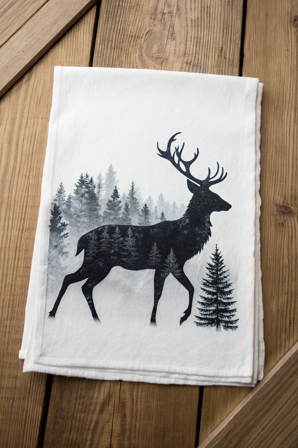
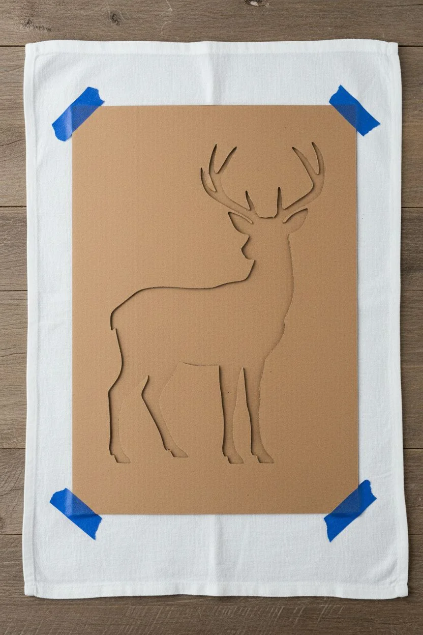
Transform a plain flour sack towel into a piece of rustic art by combining the stark elegance of a silhouette with the atmospheric depth of a misty forest. This project uses fabric stamping and stenciling techniques to achieve a professional-looking double exposure effect directly on fabric.
Step-by-Step Tutorial
Materials
- White flour sack towel or cotton tea towel
- Cardstock or stencil film
- X-Acto knife and cutting mat
- Black fabric paint (or screen printing ink)
- Fabric medium (if using standard acrylics)
- Small sea sponge or stippling brush
- Fine detail paintbrush (size 0 or 1)
- Masking tape or painter’s tape
- Cardboard (to place under fabric)
- Stag silhouette template (printed)
- Iron (for heat setting)
Step 1: Preparation and Stencil Creation
-
Prepare the fabric:
Wash and dry your tea towel without fabric softener to remove any sizing chemicals that might repel the paint, then iron it totally flat. -
Print the template:
Find or draw a stag silhouette reference you like and print it onto cardstock or heavyweight paper. Make sure the size fits well within the bottom third of your towel. -
Cut the main stencil:
Using your X-Acto knife, carefully cut out the stag shape. Keep the negative space (the outer paper) intact, as this will be your primary stencil. I find it helpful to tape the corners down to the cutting mat so the paper doesn’t shift. -
Secure the workspace:
Place a piece of cardboard inside the towel or underneath the layer you are painting to prevent bleed-through to the other side. -
Position the stencil:
Lay your stencil on the towel, positioning it centered horizontally and somewhat near the bottom edge. Secure it firmly with painter’s tape.
Paint Bleeding Under Stencil?
Work with a ‘dry’ brush or sponge. Dab most of the paint onto a paper towel first. Too much wet paint is the #1 cause of bleeding edges.
Step 2: Creating the Double Exposure Effect
-
Mix your paint:
Pour a small amount of black fabric paint onto a palette. If you want a slightly faded ‘misty’ look for the background trees, mix a tiny drop of white or water into a separate puddle of black to create a charcoal grey. -
Apply the background trees:
Dip your sponge lightly into the charcoal grey mix and tap off excess. Gently dab inside the stag stencil, focusing on the back legs and lower body area to create the distant, foggy tree line. -
Build the forest layers:
Switch to pure black paint. Using a fine brush or a fresh sponge edge, paint clearly defined triangular tree shapes over your grey misty layer, staying strictly within the stencil boundaries. -
Detail the internal trees:
Use your smallest brush to add tiny branches and distinct pine textures to the trees inside the body. Let these trees fade out as they reach the stag’s neck. -
Solidify the head and neck:
Paint the stag’s head, antlers, and chest area solid black. This contrast is crucial for the silhouette to be readable. -
Blend the transition:
Where the solid black neck meets the forest body, use a stippling motion with your brush to create a speckled, gradual transition rather than a hard line. -
Check the edges:
Ensure the edges of the stencil are fully filled in so the outline of the deer is crisp.
Step 3: Finishing Touches
-
Reveal the stag:
Carefully peel back the tape and lift the stencil straight up to avoid smearing the wet paint. -
Fix imperfections:
If any edges are ragged, use your fine detail brush with a tiny bit of black paint to smooth out the silhouette’s outline. -
Extend the forest:
To integrate the animal with the environment, paint faint, misty grey trees directly on the towel behind the stag’s back legs, extending outside the silhouette. -
Add the foreground tree:
Paint a sharp, high-contrast pine tree standing freely just in front of the stag’s front legs to anchor the composition. -
Dry completely:
Allow the paint to air dry for at least 24 hours. -
Heat set:
Once dry, iron the reverse side of the painted area on a high heat setting (no steam) for 3-5 minutes to make the design permanent and washable.
Level Up: Texture Trick
Use a toothbrush to gently flick tiny specks of white paint over the bottom of the dried design to simulate falling snow.
Fold your towel over an oven handle or gift it to a nature lover to enjoy that serene woodland atmosphere.
Surreal Object Mashup With Clean Ink Lines


Blend the cozy comfort of a tea break with a touch of surreal weather in this stippled ink illustration. You will create a whimsical scene featuring a patterned teacup catching rain from a personal little storm cloud using fine liners and patience.
Detailed Instructions
Materials
- Smooth bristol board or heavyweight drawing paper (A4 or A5)
- Pencil (HB or H for light sketching)
- Kneaded eraser
- Fine liner pens (sizes 0.1, 0.3, and 0.5)
- Ruler (optional, for rain lines)
Step 1: Sketching the Foundations
-
Establish the cup shape:
Start by lightly sketching a wide oval for the rim of the teacup in the center of your page. Below it, draw a curved U-shape to form the body of the cup, tapering it slightly at the bottom. -
Add the saucer:
Draw a larger, flatter oval underneath the cup body to represent the saucer’s rim. Add a second, inner oval close to the cup’s base to show the indentation where the cup sits. -
Sketch the handle:
On the right side of the cup, sketch a curved ear-shape for the handle. Make sure to draw both the inner and outer lines to give it thickness. -
Draw the floating clouds:
Sketch a large, fluffy cloud hovering directly above the cup. Ensure the bottom is relatively flat but bumpy. Add two smaller clouds flanking either side of the rain area and three small cloud shapes directly onto the cup’s surface as a pattern.
Patience with Dots
Stippling takes time. Keep your wrist loose and tap the paper vertically. Slanted dots turn into dashes, which ruins the soft texture.
Step 2: Inking Outlines
-
Define the main clouds:
Switch to a 0.5 fine liner. Trace the outline of the large top cloud and the smaller floating clouds. Use a slightly bumpy, uneven line rather than a perfect curve to imply fluffiness. -
Outline the crockery:
Carefully ink the rim of the cup, the handle, and the saucer using the 0.3 pen. For the saucer’s rim, you can double the line slightly to show the thickness of the ceramic. -
Detail the cup pattern:
Outline the small clouds on the face of the cup. Add small circles or swirls between them to complete the decorative pattern. -
Erase pencil guides:
Once the ink is completely dry—give it a full minute—gently erase all your pencil marks with the kneaded eraser so the drawing is clean.
Make It Stormy
Add tiny lightning bolts mixed in with the rain lines, or color the liquid inside the cup a dark storm-grey with diluted ink wash.
Step 3: Shading with Stippling
-
Start the dark liquid:
Use your 0.5 pen to fill the inside of the cup with liquid. Don’t color it solid black; instead, use dense stippling (lots of dots close together) to create a dark texture, leaving a brighter rim near the edge to suggest a reflection. -
Shade the clouds:
Switch to the 0.1 pen for delicate shading. Apply dots to the bottom edges of the clouds to give them volume. The stippling should be dense at the bottom line and fade out as you move up into the cloud. -
Create the rain:
Using the 0.1 pen, draw vertical dashed lines falling from the main cloud into the cup. Vary the lengths of the dashes to make the rain look active and light. -
Shadow the cup body:
Add shading to the left side and bottom of the cup using the stippling technique. Concentrate your dots on the left curve to make the cup look round. -
Pattern depth:
I like to add tiny dots inside the cloud patterns on the cup itself, focusing on their lower edges, so they look slightly embossed or painted on. -
Shade the saucer:
Stipple the area directly under the cup on the saucer to cast a shadow. Also shade the underside of the saucer rim to curve it downwards visually. -
Final contrast check:
Look for areas that need more depth, like the inside of the handle or the deepest part of the tea liquid. Go over these with your 0.3 pen, adding more dots to darken the values.
Now you have a serene yet surreal piece of art that perfectly captures a stormy mood in a teacup
Framed Portal Drawing Inside a Geometric Shape
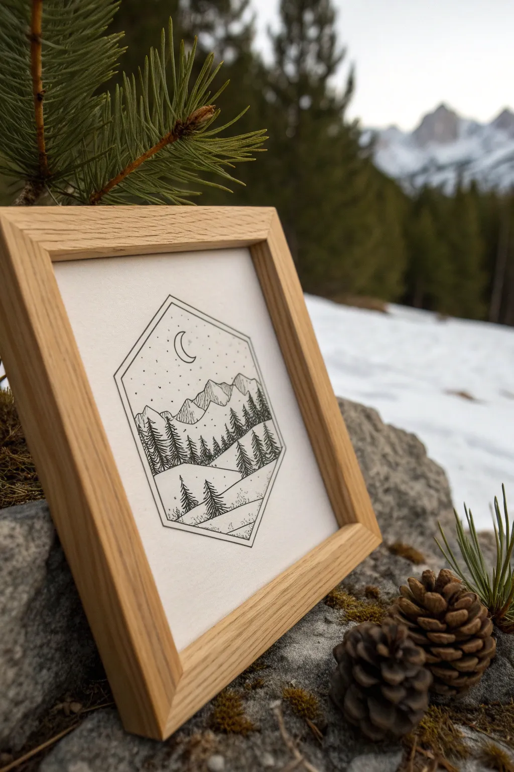
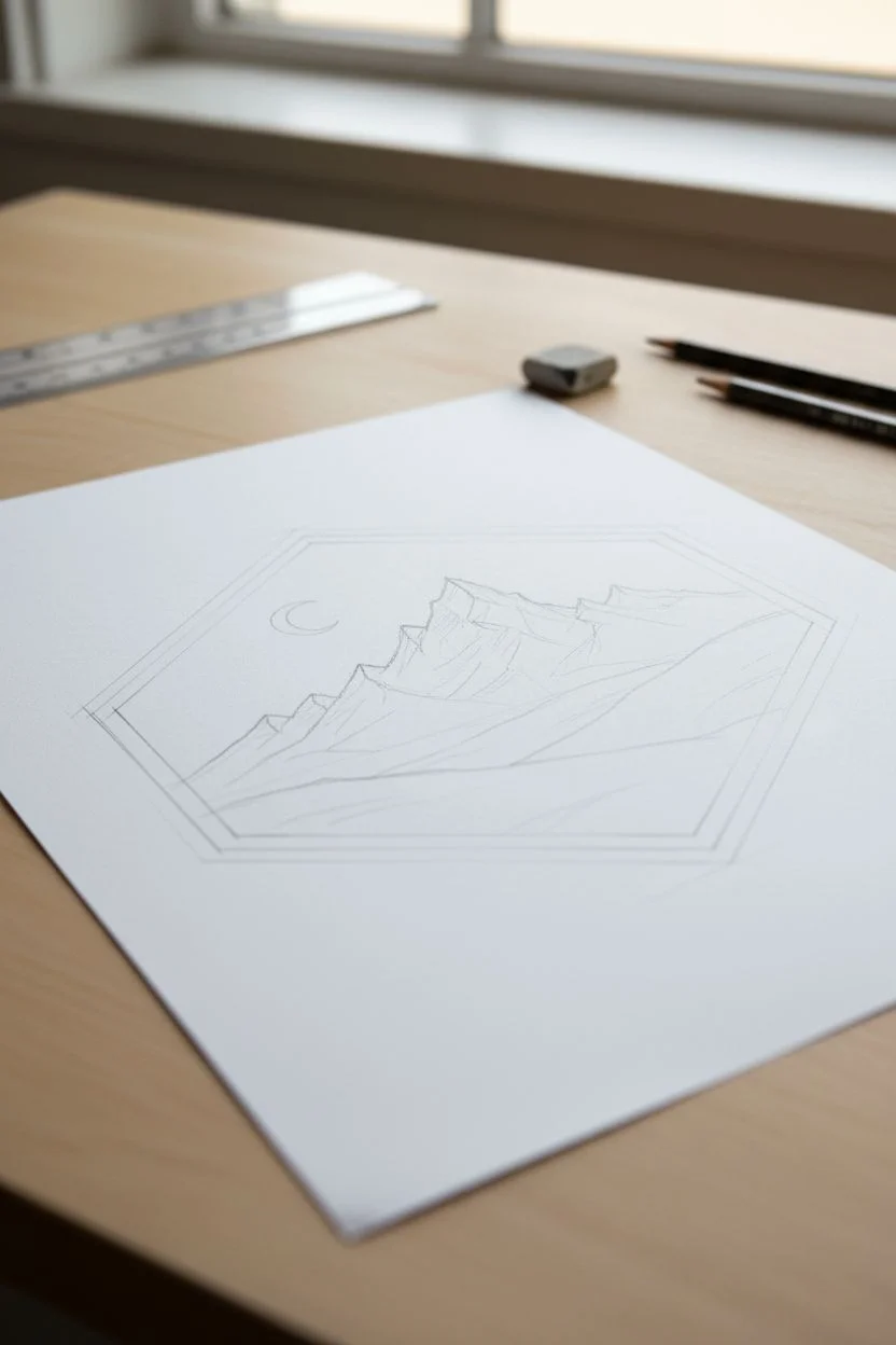
Capture the serenity of the wilderness with this clean, geometric ink illustration. By confining a sweeping mountain landscape within a sharp hexagonal frame, you create a beautiful ‘portal’ effect that looks modern and sophisticated, especially when displayed in a simple wooden frame.
Step-by-Step Guide
Materials
- High-quality bright white drawing paper or Bristol board (cut to square)
- Pencil (HB or H)
- Ruler
- Protractor (optional, for precise angles)
- Fine liner pens (sizes 005, 01, 03, and 05)
- Kneaded eraser
- Square wood frame (approx. 6×6 or 8×8 inches)
Step 1: Drafting the Geometric Frame
-
Center your workspace:
Begin by finding the center of your paper. Make a tiny, faint mark to serve as your anchor point. -
Measure the vertical axis:
Using your ruler and the center mark, draw a faint vertical line. Mark the top and bottom points of your hexagon along this line to determine the total height. -
Draw the hexagon:
Construct an elongated hexagon around your vertical axis. The top and bottom should be pointed, while the sides run straight and parallel. Use a ruler to ensure clean, sharp lines. -
Create the double border:
Draw a second, slightly smaller hexagon inside the first one, leaving about a 2-3mm gap. This double line creates the frame-within-a-frame look. -
Sketch the horizon lines:
Lightly sketch sloping lines across the lower half of the hexagon. These will become your rolling hills. Vary the angles slightly to create depth. -
Outline the mountains:
In the middle section, sketch jagged peaks for your mountain range. Keep them asymmetrical for a more natural look.
Straight Line Secret
For the crispest geometric border, lift your pen off the paper slightly at the sharp corners rather than trying to turn continuously. Intersecting lines look sharper.
Step 2: Inking the Landscape
-
Ink the geometric border:
Switch to your 05 fineliner. Carefully trace over your pencil lines for the double hexagon frame. Use a ruler here to keep the lines crisp and mechanical. -
Define the moon:
Using an 03 pen, draw a small crescent moon in the upper left section of the sky. Keep the shape clean and simple. -
Ink the mountain outlines:
With the 03 pen, go over your mountain peaks. Make the lines slightly shaky or uneven to suggest rocky terrain, avoiding the ruler here. -
Add mountain texture:
Using your finest 005 pen, add vertical hatching lines down the sides of the mountains. Concentrate the lines on one side of each peak to indicate shadow. -
Draw foreground trees:
Start with vertical lines for trunks in the lowest hill section. Use short, downward zig-zag strokes to create pine branches. Make these trees the darkest and most detailed using an 03 pen. -
Fill the mid-ground forest:
Move to the hill behind the foreground. Draw a dense row of smaller pine trees. You don’t need to draw every branch; imply the shapes with vertical strokes and clustered textures using an 01 pen.
Uneven Stippling?
If your sky dots look like a grid, focus on randomization. Rotate your paper frequently and tap at varying speeds to avoid creating unintentional patterns.
Step 3: Detailing and Framing
-
Add stippling to the sky:
Take your 005 pen and gently tap dots throughout the sky area. Cluster them slightly denser near the top of the hexagon and around the moon, fading out as you move down. -
Texture the hills:
Add very sparse stippling or tiny broken lines to the snowy hills to give them ground texture without making them look dark. -
Erase pencil guides:
Wait at least 15 minutes for the ink to fully cure. Gently run a kneaded eraser over the entire drawing to lift the graphite without smudging the ink. -
Final inspection:
Look for any gaps in your black lines or areas that need a bit more contrast. I sometimes go back and thicken the outer border line just a tiny bit to make it pop. -
Mount and frame:
Place your finished drawing into the wooden frame. If the frame has a mat, center the hexagon within the window; otherwise, ensure the paper is trimmed to fit snugly against the glass.
Hang your new portal art in a cozy corner to bring a touch of mountain calm to your room
Abstract Contrast Study With Black Shapes and White Cuts
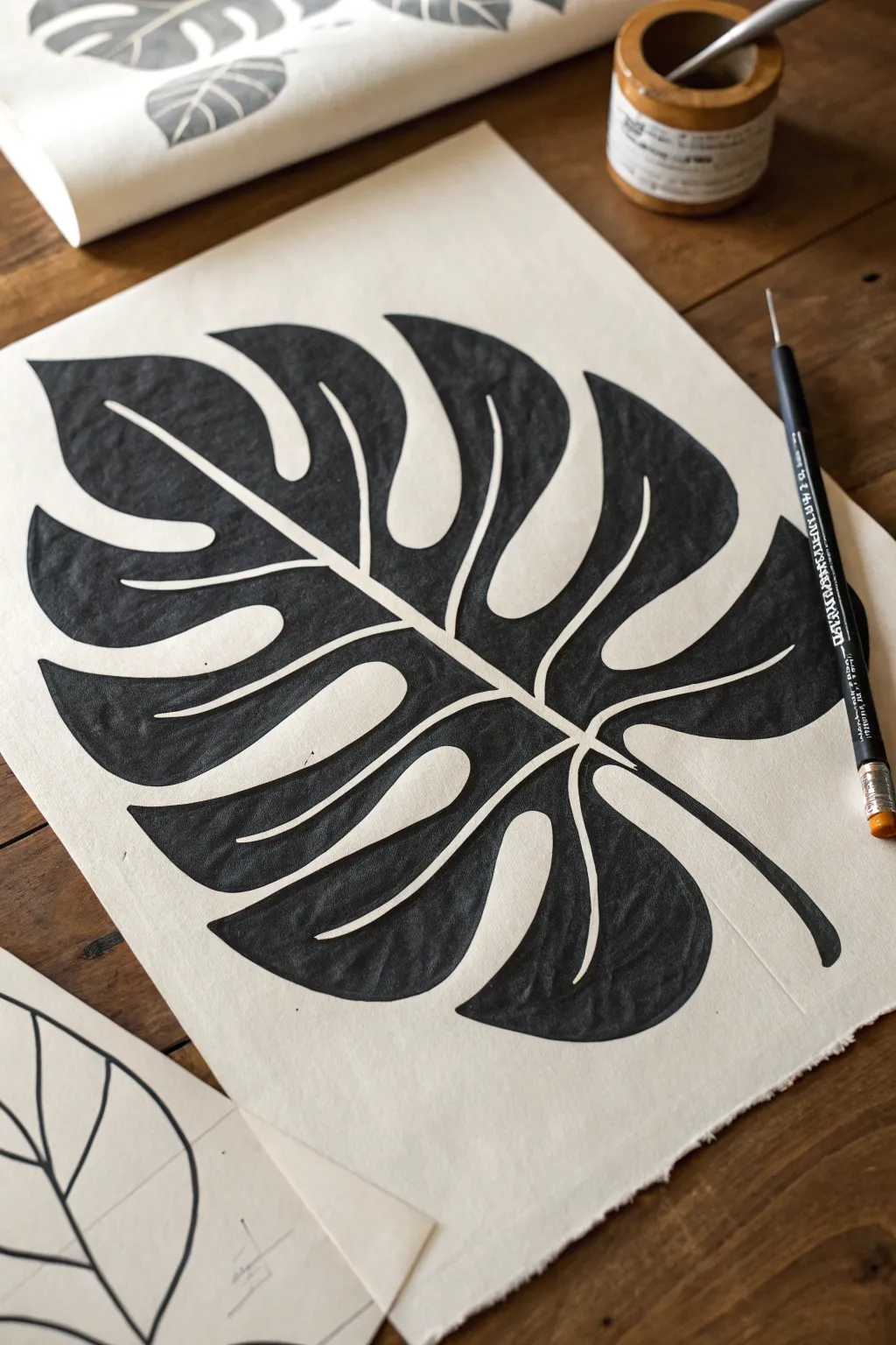
This striking project explores the power of negative space through a stylized Monstera leaf design. By flooding the page with dense black ink while carefully preserving crisp white definition lines, you’ll create a bold botanical illustration that mimics the look of a classic linocut print.
Detailed Instructions
Materials
- Heavyweight textured paper (cotton rag or watercolor paper)
- Black India ink or high-quality acrylic ink
- Graphite pencil (HB or 2B)
- Kneaded eraser
- Fine liner pen (0.3mm or 0.5mm) for outlining
- Small round paintbrush (size 2 or 4)
- Medium flat paintbrush (for filling large areas)
- Masking fluid (optional, but helpful)
Step 1: Planning and Sketching
-
Paper Selection:
Begin with a sheet of heavyweight paper that has some tooth to it. A handmade cotton rag paper works beautifully here because the texture interacts with the ink to give it that organic, printed feel. -
Center Line:
Lightly draw a curved diagonal line across your page with your pencil. This will serve as the central vein (midrib) of your Monstera leaf. -
Outline the Shape:
Sketch the broad, heart-shaped perimeter of the leaf around your central line. Don’t worry about the splits just yet; focus on getting the overall scale right for your paper size. -
Adding Fenestrations:
Now, draw the deep splits and holes (fenestrations) characteristic of the Monstera. These should be exaggerated curved indentations moving from the outer edge toward the center. -
Refining the Ribs:
Draw the veins extending from the center line into each leaf section. These veins are crucial—they will remain white in the final piece, acting as the ‘cut’ lines. -
The Double Line Technique:
Go back over your veins and the central stem. Instead of a single line, draw them as double lines with a small gap in between. This gap is the white space we need to preserve.
Step 2: Defining Boundaries
-
Clean Up:
Use your kneaded eraser to lift up any heavy graphite sketch lines, leaving only a faint guide visible so the pencil doesn’t smudge into your ink later. -
Ink Outlining:
Take your fine liner pen and carefully trace the *edges* of the black shapes. You are outlining the areas that will be filled in, not the white lines themselves. -
Protecting the White:
If you are worried about a steady hand, you can apply a thin uneven layer of masking fluid over the intended white veins and let it dry completely. I prefer to just paint carefully, but masking guarantees crispness.
Bleeding Lines?
If ink bleeds into the white paper grain, your ink might be too watery. Use thicker ink or lightly seal the paper with a matte gel medium before painting.
Step 3: Inking the Forms
-
Starting Small:
Dip your small round brush into the India ink. Begin filling in the tight corners and sharp points of the leaf sections where they meet the central vein. -
Edge Control:
Work slowly along your fine liner boundaries. The goal is to make the transition from the pen line to the brush fill seamless. -
Filling the Mass:
Switch to your medium flat brush to fill in the larger, fleshy parts of the leaf lobes. Load the brush generously to get a deep, opaque black. -
Directional Strokes:
Try to pull your brush strokes in the direction of the leaf’s growth (from center to tip). Even though it’s solid black, the texture of the drying ink can add subtle movement. -
Checking Consistency:
Look for any gray or patchy areas as the ink dries. India ink sometimes dries lighter than it looks when wet. -
Second Coat:
If necessary, apply a second layer of ink to the largest sections to ensure a uniform, velvety matte black finish.
Pro Tip: Texture
Don’t aim for perfectly flat black. Let the paper’s texture show through slightly in some strokes to mimic the look of a hand-pressed block print.
Step 4: Final Touches
-
Drying Time:
Let the artwork dry completely. This is vital; India ink can smudge easily if damp. -
Erase Guides:
Once fully dry, gently erase any remaining pencil marks visible in the white veins. -
Refining Edges:
Inspect your white lines. If any ink bled over, use a tiny amount of opaque white gouache or a white gel pen to touch up and sharpen the negative space.
Step back and admire the stark, graphic impact of your botanical silhouette


Have a question or want to share your own experience? I'd love to hear from you in the comments below!