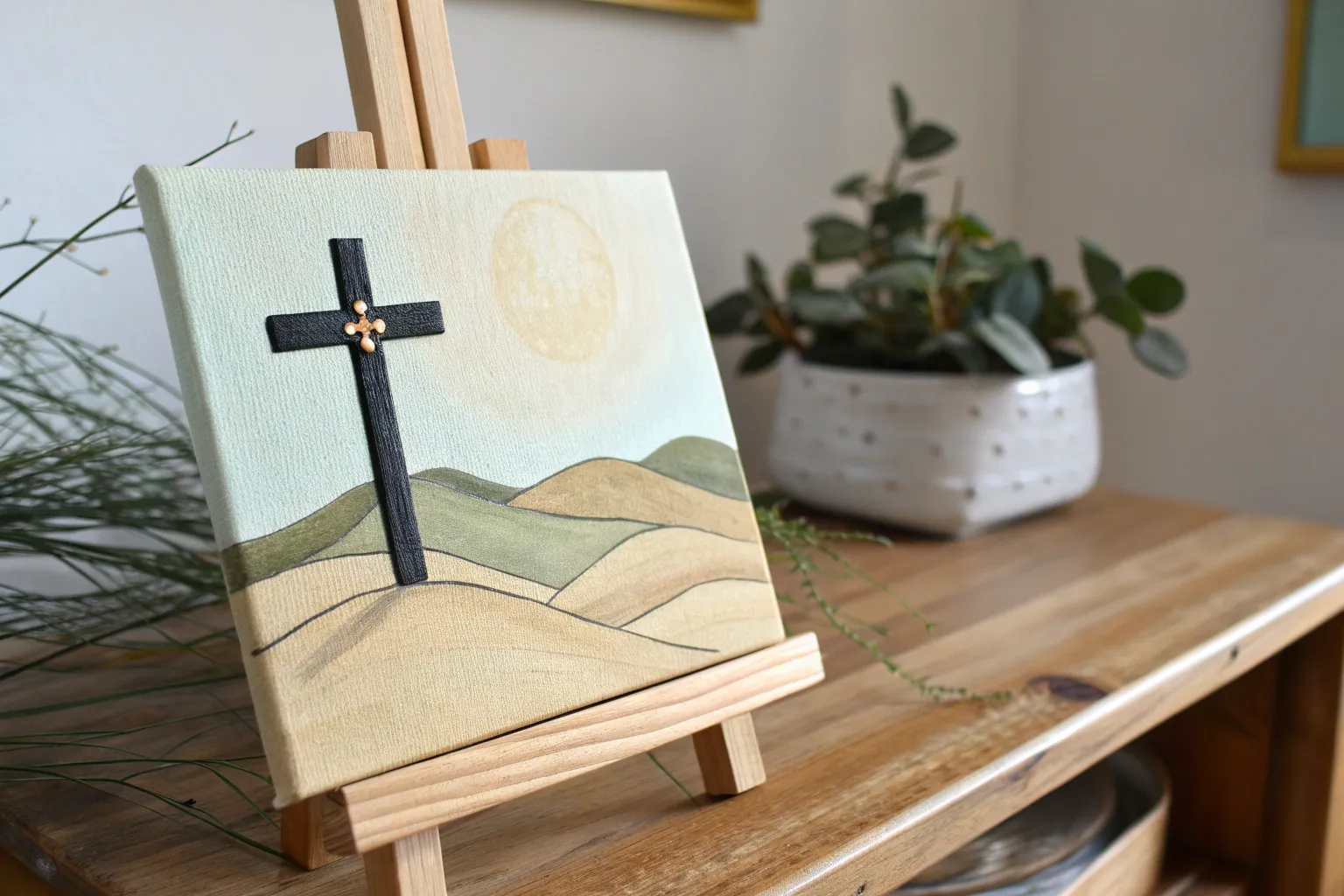
When I’m craving a painting session that feels calming and meaningful, I love reaching for Christian imagery—it’s timeless, symbolic, and honestly so fun to interpret in your own style. Here are my favorite Christian painting ideas you can recreate easily, whether you’re working in watercolor, acrylic, or simple pencil sketches.
Sunset Cross Silhouette With Blended Skies
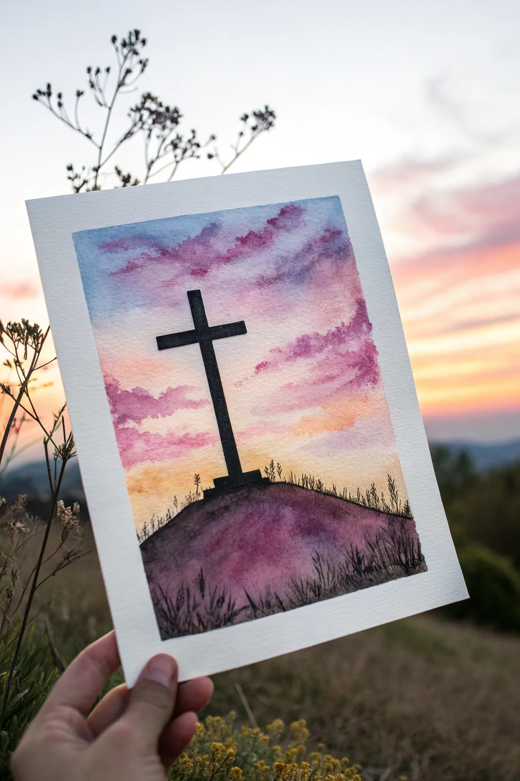
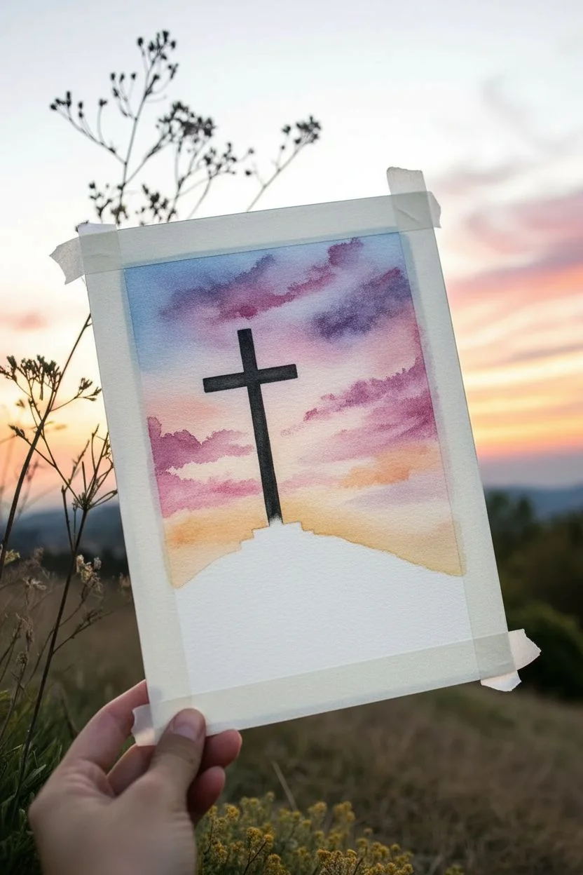
This moving watercolor piece captures the quiet majesty of a cross silhouetted against a vibrant evening sky. By blending soft pinks, purples, and oranges, you will create a serene backdrop that makes the stark black focal point truly stand out.
Step-by-Step Tutorial
Materials
- Cold press watercolor paper (300 gsm recommended)
- Watercolor paints (Indigo, Purple/Violet, Magenta, Cadmium Orange, Yellow Ochre)
- Black waterproof ink or black acrylic paint
- Masking tape
- Flat wash brush (3/4 inch)
- Round brushes (sizes 6 and 2)
- Fine liner brush or black fine-tip pen
- Clean water jar
- Paper towels
- Pencil and ruler
Step 1: Preparing the Sky Wash
-
Secure the Paper:
Begin by taping down all four edges of your watercolor paper to a rigid board using masking tape. This creates a crisp white border and prevents buckling when the paper gets wet. -
Sketch the Horizon:
Lightly sketch a gentle curve near the bottom one-third of the paper to mark the top of the hill. You can also make a very faint vertical line in the center to help guide the placement of the cross later. -
Pre-wet the Sky:
Using your large flat brush and clean water, wet the entire sky area from the top edge down to your pencil line. The paper should be glistening but not forming puddles. -
Apply the Blue Upper Sky:
Load your brush with a diluted Indigo or cool blue. Gently sweep this across the very top of the wet paper, letting the color naturally feather downwards. -
Introduce Purple Clouds:
While the paper is still wet, drop in patches of Purple or Violet just below the blue. Use a dabbing motion to create soft, cloud-like formations rather than straight lines. -
Blend the Middle Tones:
Rinse your brush and pick up some Magenta or Rose. I find it works best to apply this slightly below the purple, allowing the wetness on the page to merge the edges where the colors meet. -
Add the Sunset Glow:
Near the horizon line, paint a band of Cadmium Orange blending into Yellow Ochre. Ensure this lightest section stays bright to mimic the setting sun. -
Deepen the Clouds:
While everything is still damp, take a more concentrated mix of Purple and tap it into the existing cloud shapes to add volume and shadow. Let the sky dry completely before moving on.
Step 2: The Hill and Cross
-
Paint the Hill Base:
Switch to a round brush. Mix a dark, muted purple using your Purple paint with a touch of Indigo or Black. Fill in the hill shape below your pencil line. -
Add Texture to the Ground:
While the hill is wet, drop in deeper pigment near the bottom edge to create depth. You can also splatter tiny drops of clean water onto the drying hill for a textured, earthy effect. -
Outline the Cross:
Once the background is strictly bone-dry, use your ruler and a pencil to refine the outline of the cross standing centrally on the hill. -
Fill the Silhouette:
Using deep black waterproof ink or black acrylic paint, carefully fill in the cross. Acrylic is often easier here as it is opaque and covers the background wash thoroughly. -
Anchor the Cross:
Paint a small, stepped base at the foot of the cross so it feels firmly planted in the ground rather than floating. -
Create Grass Details:
Using a very fine liner brush or a black pen, flick quick, upward strokes along the crest of the hill to simulate tall grass silhouetted against the light. -
Add Foreground Foliage:
Darken the very bottom of the hill with more black and paint slightly taller, thicker weeds and grass blades in the foreground to create visual depth. -
Final Touches:
Check for any uneven edges on your cross and tidy them up carefully. Once fully dry, peel off the masking tape slowly at a 45-degree angle to reveal your clean border.
Cloud Control
To keep clouds fluffy, use a ‘thirsty’ brush (damp, not dripping) to lift paint back off the paper in small circular motions while the wash is still wet.
Bleeding Lines?
if the black ink bleeds into the sky, your background wasn’t dry enough. Wait longer, or dry it with a hair dryer on low, before applying the silhouette.
This serene painting now serves as a beautiful reminder of hope and peace for your home or as a gift


Three Crosses on a Hill at Calvary
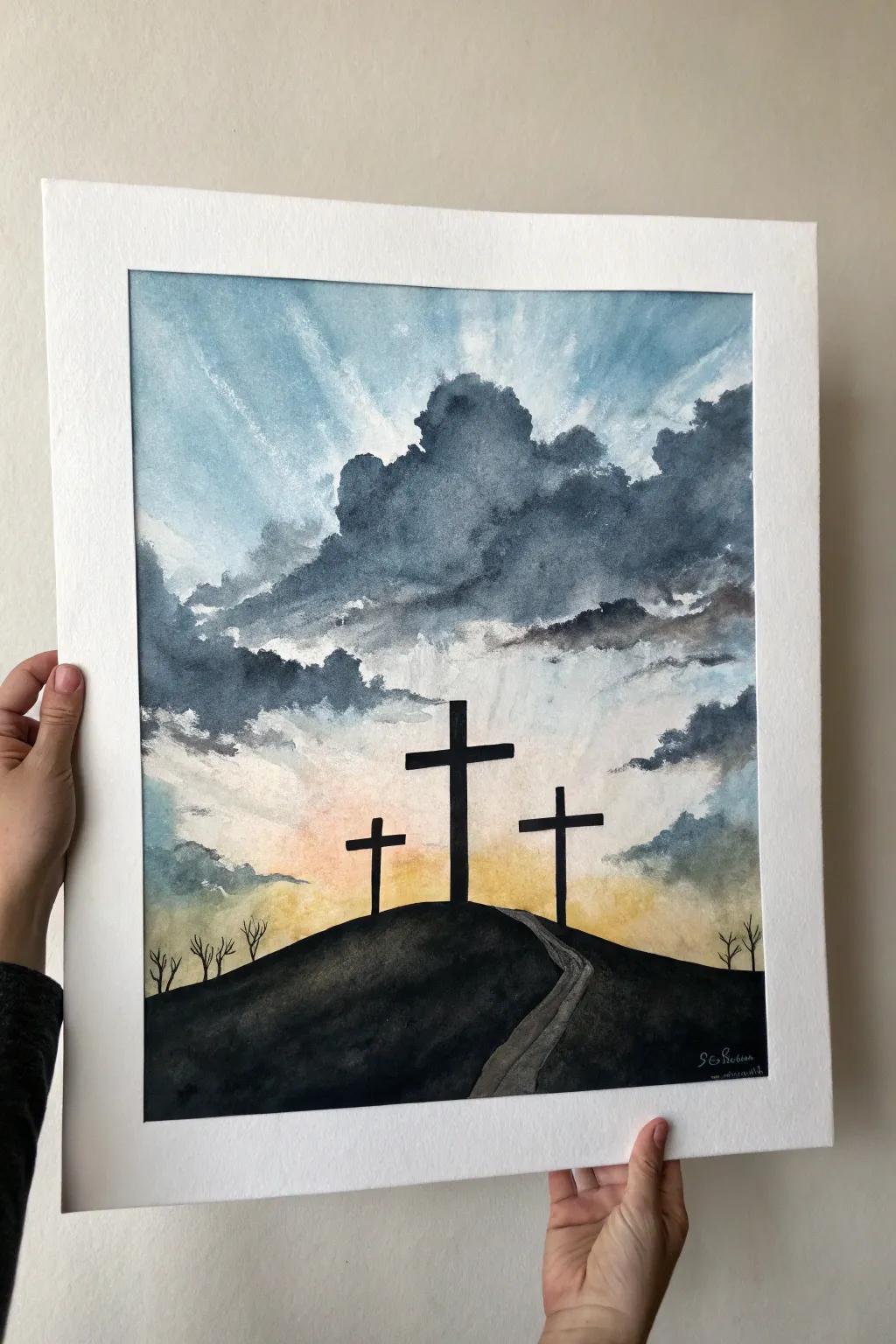
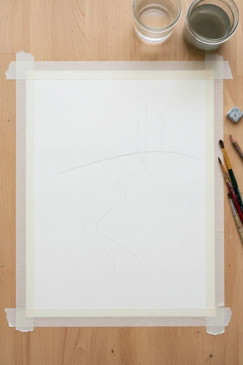
Capture the solemn beauty of sunrise over Calvary with this evocative watercolor painting. Using simple wet-in-wet techniques, you will create dramatic cloud formations and celestial rays that contrast perfectly against the stark silhouettes of the three crosses.
Detailed Instructions
Materials
- Cold press watercolor paper (140lb/300gsm)
- Watercolor paints (Indigo, Payne’s Gray, Yellow Ochre, Burnt Sienna, Cadmium Orange)
- Black ink or gouache (for opaque silhouettes)
- Masking tape
- Flat wash brush (¾ inch)
- Round brushes (sizes 4 and 8)
- Small detail brush (size 0 or 1)
- Pencil and eraser
- Paper towels
- Two jars of water
Step 1: Sketching and Masking
-
Secure the edges:
Begin by taping down all four edges of your watercolor paper to a board or table. This creates that clean, professional white border shown in the example and prevents the paper from buckling during the heavy washes. -
Outline the composition:
Lightly sketch the horizon line for the hill—make it curved and organic, sloping upwards towards the center. Draw a winding path leading to the top. -
Mark the crosses:
Use a pencil to lightly mark vertical lines where the three crosses will stand. Don’t worry about drawing the full thickness yet; these marks are just for positioning.
Cloud Control
If your clouds look too stiff, use a spray bottle to lightly mist the paper while the paint is wet, encouraging more organic blooms and softer edges.
Step 2: Painting the Sky and Rays
-
Pre-wet the sky area:
Using your large flat brush and clean water, wet the entire sky area above the hill line. The paper should be glisten but not have puddles. -
Establish the light source:
Mix a watery wash of Yellow Ochre and a touch of Cadmium Orange. Drop this color just above the center of the hill where the sun would be rising, letting it bleed gently upward into the wet paper. -
Create the blue atmosphere:
While the paper is still damp, take a diluted mix of Indigo or light blue. Paint from the top corners downward, leaving clear angled streaks unpainted to represent the sunbeams radiating from the center. -
Softening the rays:
I like to take a clean, damp brush and gently lift pigment along the ray paths if the blue paint has encroached too much, ensuring distinct shafts of light remain.
Go Metallic
Mix a tiny amount of gold watercolor or metallic powder into the yellow sunbeams to make the divine light actually shimmer when viewed at an angle.
Step 3: Adding Dramatic Clouds
-
Mix storm colors:
Create a saturated, darker mix of Payne’s Gray and Indigo. You want a color that looks stormy and heavy. -
Form the cloud edges:
While the sky layer is semi-dry (damp, not soaking), dab this dark mixture into the upper center area to create billowing distinct cloud shapes. The paint should bloom slightly but keep a textured edge. -
Build cloud volume:
Continue adding this dark gray mix towards the sides, framing the central light source. Leave the area directly above the rising sun relatively clear to heighten the contrast. -
Layer lower clouds:
Add smaller, horizontal wisps of gray near the horizon line on the sides, blending them softly into the yellow glow. -
Dry thoroughly:
This is crucial: allow the entire sky section to dry completely before moving on. The paper must be bone dry, or the black silhouettes will bleed.
Step 4: Silhouettes and Foreground
-
Paint the hill:
Switch to opaque black gouache or very concentrated dark watercolor. Fill in the hill shape, carefully cutting around the path you sketched earlier. -
Detail the path:
For the winding path, mix a watery gray wash. Paint the path so it is distinct from the black hill but darker than the sky. Add a few darker streaks along the path edges for texture. -
Raise the crosses:
Using a flat brush or a steady round brush, paint the three crosses in solid black. Ensure the center cross is the tallest and thickest, with the side crosses slightly smaller and angled if you wish. -
Add barren trees:
Switch to your smallest detail brush (size 0 or 1). On the far left and right edges of the hill, paint tiny, leafless trees with spindly branches reaching upward. -
Final touches:
Check for any light spots in your black silhouettes and apply a second coat if needed for total opacity. Allow everything to dry, then carefully sign your name in the corner with a white gel pen or metallic marker. -
Reveal the border:
Once fully dry, slowly peel away the masking tape at a 45-degree angle to reveal the crisp white frame around your artwork.
Step back and admire the powerful contrast between the stormy sky and the hopeful light in your completed piece


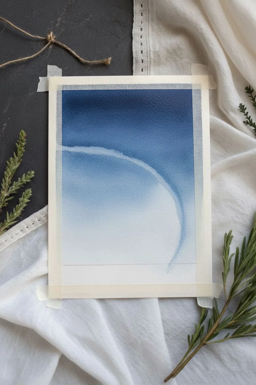
Nativity Night With a Soft Star Glow
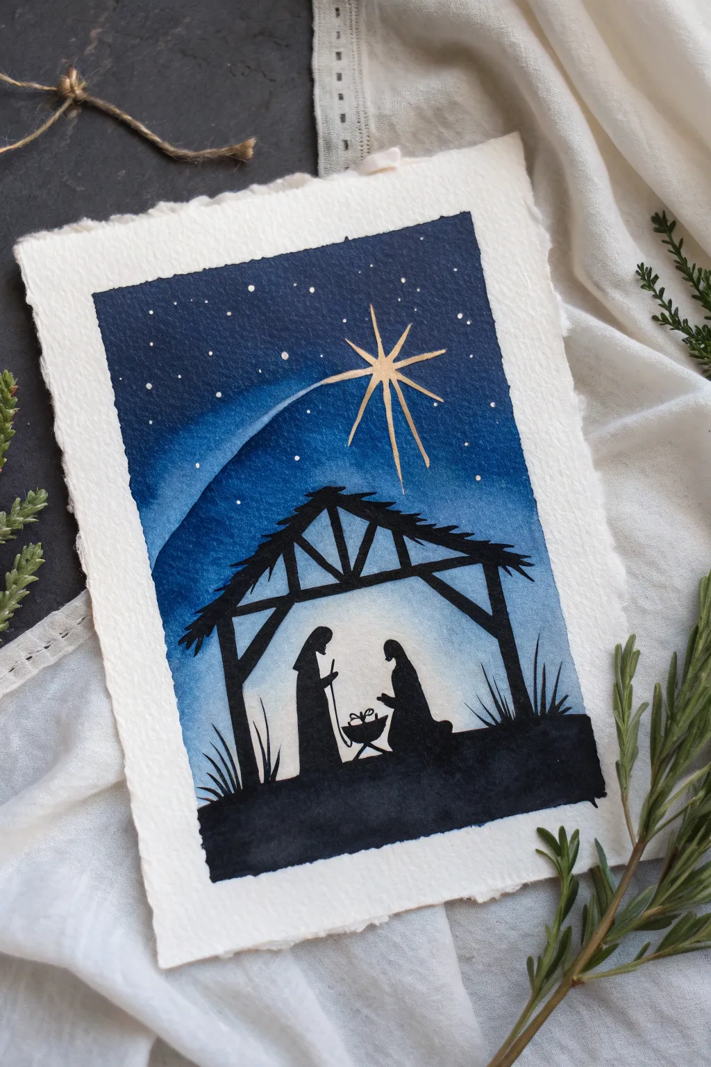
Capture the serene mood of the first Christmas with this striking watercolor project featuring deep indigo skies and a crisp black silhouette. The contrast between the glowing night sky and the solid foreground creates a peaceful, reverent atmosphere that’s perfect for holiday cards or framed decor.
Step-by-Step Tutorial
Materials
- Cold press watercolor paper (deckled edge optional)
- Watercolor paints: Indigo, Prussian Blue, Black (or India Ink)
- Gold ink, gold watercolor, or a metallic gold gel pen
- Masking tape
- Flat wash brush (3/4 inch or 1 inch)
- Round brush (size 4 or 6)
- Detail brush (size 0 or 00)
- Pencil and eraser
- Clean water and paper towels
- White gouache or white gel pen (for stars)
Step 1: Preparing the Sky
-
Tape the edges:
Secure your watercolor paper to a board or table with masking tape. This prevents the paper from buckling when we add water and creates a clean border. -
Sketch the silhouette line:
Lightly sketch a horizontal line near the bottom third of the paper to mark where the ground begins. Don’t worry about drawing the figures yet; just establish the horizon. -
Wet the sky area:
Using your large flat brush, apply clean water to the entire sky area above your horizon line. The paper should be glisten with a sheen but not have puddles. -
Apply the darkest blue:
Load your brush with a mixture of Indigo and a touch of Black. Start painting at the very top of the paper, allowing the color to be richest and darkest at the upper edge. -
Create the gradient:
As you move down the paper, switch to Prussian Blue. Blend it into the Indigo while everything is still wet. Add a little more water to your brush as you approach the horizon line to fade the color into a lighter, softer blue. -
Lift the star path:
While the paint is still damp but not soaking wet, use a clean, slightly thirsty damp brush to lift a sweeping curved line where the shooting star’s tail will be. I find this creates a perfect soft glow underneath the gold details later. -
Let it dry completely:
This step is crucial. Allow the background to dry fully before moving on. The paper must be bone-dry to crisp silhouette lines.
Bleeding Lines?
If your black silhouette bleeds into the blue sky, the background wasn’t dry enough. Wait longer or use a hair dryer on the ‘cool’ setting before painting the foreground.
Step 2: Painting the Silhouette
-
Draft the scene:
With a light touch, pencil in the outline of the stable structure, Joseph standing, Mary kneeling, and the manger. Keep the shapes simple and graphic. -
Outline the stable:
Switch to your round brush and thick black watercolor (or India Ink for opacity). Carefully paint the beams and roof of the stable. Use the tip of the brush to create the thatched texture on the roof. -
Fill the ground:
Paint the solid black ground at the bottom, covering your initial horizon line. Ensure the bottom edge is solid and opaque. -
Paint the figures:
Using your smaller detail brush, fill in the silhouettes of Joseph and Mary. Pay attention to the negative space between them to define their postures clearly. -
Add grassy details:
Use the very tip of your detail brush to flick upward from the ground, creating small blades of grass or reeds on the sides of the stable.
Step 3: The Star and Finishing Touches
-
Paint the main star:
Using gold ink or metallic paint, draw an elongated cross shape at the head of the light trail we lifted earlier. Add diagonal rays between the main points for a sparkling effect. -
Add the tail:
Drag the gold paint downward in a curve following the lighter area of the sky, letting the line feather out as it reaches the stable roof. -
Splatter stars:
Dilute a tiny bit of white gouache or white watercolor. Tap your brush against a finger to splatter tiny white specks across the upper dark blue section. -
Detail the stars:
For more control, use a white gel pen to add slightly larger, distinct stars in the darkest parts of the sky. -
Remove tape:
Once everything is completely dry, slowly peel away the masking tape at a 45-degree angle to reveal your clean edges.
Pro Tip: Opacity
Watercolor dries lighter than it looks wet. For the silhouette, apply a second coat of black once the first is dry to ensure it looks solid and opaque rather than grey.
Display your finished piece in a simple frame or gift it to bring a touch of peace to someone’s holiday season


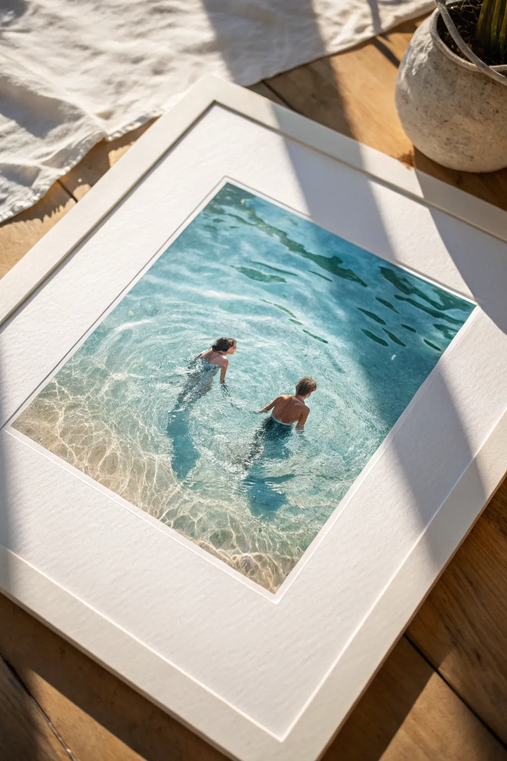
Walking on Water in a Minimal Seascape
Capture a powerful moment of solitude and faith with this moody, evocative watercolor painting. Using a limited palette of indigos and greys, you will create a figure walking calmly amidst churning waves, illuminated by a soft break in the clouds.
Step-by-Step Guide
Materials
- Cold Press Watercolor Paper (140lb/300gsm, 100% cotton recommended)
- Watercolor Paints: Indigo, Payne’s Grey, Prussian Blue, Burnt Sienna, Yellow Ochre, Titanium White (gouache or watercolor)
- Masking Fluid (optional but helpful)
- Round Brushes (Size 4, 8, and 12)
- Flat Wash Brush (1 inch)
- Clean Water & Palette
- Paper Towels
- Pencil (HB or H) & Kneaded Eraser
Step 1: Preparation and Sketching
-
Paper Setup:
Begin by taping down all four edges of your watercolor paper to a board. Leave a clean border of about half an inch to create that crisp frame seen in the reference. -
Horizon Line:
Lightly draw your horizon line with a pencil. Place it just above the center of the page to give prominence to the water and waves in the foreground. -
Figure Placement:
Sketch the small silhouette of the figure in the lower third of the composition. Keep the details minimal—focus on the posture of walking and looking out toward the horizon. -
Wave outlines:
Very faintly sketch the major crests of the waves. You don’t need every ripple, just the main horizontal shapes where the water is breaking. -
Masking (Optional):
If you are worried about losing your whites, apply a tiny bit of masking fluid to the figure and the brightest white caps of the waves. Allow it to dry completely.
Muddy Waters?
If your ocean colors look muddy, you likely overworked the paper while it was damp. Let layers dry completely between glazes. Use separate water jars for rinsing warm and cool colors.
Step 2: Painting the Sky and Horizon
-
Wet-in-Wet Sky:
Pre-wet the sky area with clean water using your flat brush. While glistening, drop in a mix of Indigo and Payne’s Grey near the top corners. -
The Light Break:
While the sky is still wet, lift out a central area using a thirsty brush or paper towel. Gently dab in a very watery mix of Yellow Ochre and a touch of Burnt Sienna to create the soft, warm glow breaking through the storm. -
Softening Clouds:
Blur the edges of your grey clouds into the warm light. As you move closer to the horizon, lighten your blue-grey mix with water to create atmospheric perspective. -
Drying Time:
Let the sky dry completely before moving to the ocean. I usually take a break here or use a hairdryer on a low setting to ensure the horizon line remains sharp.
Add Texture
Make the scene more dynamic by splattering a tiny amount of white gouache or masking fluid over the crashing wave section to mimic sea spray.
Step 3: Creating the Churning Ocean
-
Distant Ocean:
Using a size 8 round brush, paint the distant water right against the horizon with a steady hand. Use a medium-dark mix of Prussian Blue and Indigo, creating horizontal strokes that get slightly larger as you move down. -
Mid-Ground Waves:
For the large crashing waves in the middle, work wet-on-dry to get hard edges on the top of the wave. Use a rich, saturated mix of Indigo and Prussian Blue for the body of the wave. -
Lifting Highlights:
Before the wave paint dries, rinse your brush, dry it slightly, and lift paint along the top edge of the wave to suggest foam and light hitting the water. -
Foreground Water:
The water near the figure should be calmer but rippled. Use localized wet-on-wet technique here. Wet the bottom area, then drop in horizontal streaks of blue, leaving white paper showing through for the foam patterns. -
Adding Depth:
Once the initial wash is dry, come back with your darkest Indigo mix. Paint the deep shadows underneath the white foam caps to make the waves look 3D and heavy.
Step 4: The Figure and Final Details
-
Painting the Figure:
If you used masking fluid, rub it off now. Paint the figure carefully using a small size 4 brush. Use a dark, almost black mix (Indigo + Burnt Sienna) for the legs and coat, perhaps leaving lighter blue tones on the shoulders where the light hits. -
Reflections:
Add a vertical, wavy reflection directly beneath the figure’s feet. This anchors them to the water rather than making them look like they are floating above it. -
White Highlights:
Use Titanium White (watercolor or gouache) straight from the tube. Dry brush it onto the tops of the crashing waves and the foreground foam to create sparkle and texture. -
Final Glazing:
Assess your values. If the water looks too flat, add a very transparent glaze of blue over the shadow areas to unify the colors. -
Remove Tape:
Once the paper is bone dry, carefully peel away the tape at a 45-degree angle to reveal your crisp, clean edges.
Now you have a serene, spiritual seascape that captures the miraculous feeling of walking on water.
BRUSH GUIDE
The Right Brush for Every Stroke
From clean lines to bold texture — master brush choice, stroke control, and essential techniques.
Explore the Full Guide
Holy Spirit Dove With Radiating Light Beams

Capture the ethereal beauty of the Holy Spirit with this serene watercolor piece, featuring a white dove in flight against a glowing sunburst. The finished painting is mounted on a simple wooden poster hanger, giving it a timeless, scroll-like appearance perfect for hanging anywhere in your home.
How-To Guide
Materials
- Cold press watercolor paper (approx. 11×15 inches)
- Watercolor paints (Cerulean Blue, Ultramarine, Cadmium Yellow, Alizarin Crimson, Burnt Sienna)
- Metallic gold watercolor paint or gold gouache
- Round watercolor brushes (sizes 2, 6, and 10)
- Pencil (HB or 2H)
- Kneadable eraser
- Masking fluid (optional)
- Wooden poster hanger frame with string
- Ruler
- Painter’s tape and drawing board
Step 1: Preparation & Sketching
-
Secure the paper:
Tape your watercolor paper down to a board on all four sides. This prevents buckling when the paper gets wet and creates a clean white border around the edge. -
Outline the dove:
Using a light hand and an HB pencil, sketch the outline of the dove in the center. Refer to the reference image to get the curve of the wings right—they should form a gentle V-shape. -
Detail the feathers:
Lightly draw the individual primary flight feathers at the wing tips and the fan shape of the tail. Don’t press too hard, as you want these lines to disappear under the paint. -
mark the sunburst:
Draw a small semi-circle or circle directly behind the dove’s head and upper body to represent the sun’s core. Use a ruler to lightly sketch radiating lines extending outward to the paper’s edge.
Step 2: Painting the Background
-
Protect the dove:
If you are worried about painting over the white dove, apply masking fluid carefully over the bird’s shape. Let it dry completely before moving to the next step. -
Wet-on-wet sky base:
Wet the entire background area around the dove with clean water. While wet, drop in a very diluted wash of Cerulean Blue, keeping it lighter near the center and slightly darker at the corners. -
Add warmth:
While the paper is still damp, mix a soft peach color using Cadmium Yellow and a touch of Alizarin Crimson. Paint this into the center area around the sun, letting it blend softly into the blue sky. -
Deepen the sun core:
Paint the circle directly behind the dove with a stronger mix of Cadmium Yellow. I like to soften the edges with a clean, damp brush so it glows rather than looking like a hard sticker. -
Let it dry:
Allow the background layer to dry completely. The paper should be flat and room temperature to the touch.
Muddy Shadows?
If your grey shadows look dirty, you likely used too much brown or black. Mix cool blue with a tiny bit of orange instead for a clean, airy shadow.
Step 3: The Dove & Details
-
Shadowing the body:
The dove is white, so we paint shadows, not the bird itself. Mix a very pale grey using Ultramarine and Burnt Sienna. Paint shadows on the underside of the wings and the belly to create volume. -
Defining feathers:
Using the size 2 brush and your pale grey mix, paint thin lines to separate the wing feathers. Leave the tops of the feathers white to catch the light. -
Face and beak:
Use a tiny dot of black or dark grey for the eye, leaving a speck of white paper for the highlight. Paint the beak with a mix of yellow and a tiny touch of brown. -
Feet details:
Paint the feet tucked underneath using a reddish-pink mix (Alizarin Crimson with a little white or water). Keep this subtle as they are partly hidden. -
Remove masking:
If you used masking fluid, gently rub it away now that the paint is dry. Soften any hard edges with a slightly damp brush.
Level Up: Texture
Sprinkle a tiny pinch of salt onto the wet blue background paint while it dries. This creates bloom effects that look like soft clouds.
Step 4: Finishing Touches
-
Painting the rays:
Load a liner brush or size 2 round brush with metallic gold paint. Carefully trace over your pencil lines for the sun rays, starting from the center and flicking outward. -
Enhance the glow:
Add a few shorter, fainter rays between the long gold ones using a dilute yellow wash to make the light feel dynamic. -
Final assessment:
Step back and check the contrast. If the bird feels too flat, deepen the grey shadows slightly under the wing where it meets the body. -
Mount and hang:
Once fully dry, remove the tape. Clamp the top and bottom of the paper into the wooden poster hanger frame and attach the string for hanging.
Hang your beautiful creation in a spot where natural light can catch those shimmering gold rays
The Lamb as a Gentle Symbol of Redemption
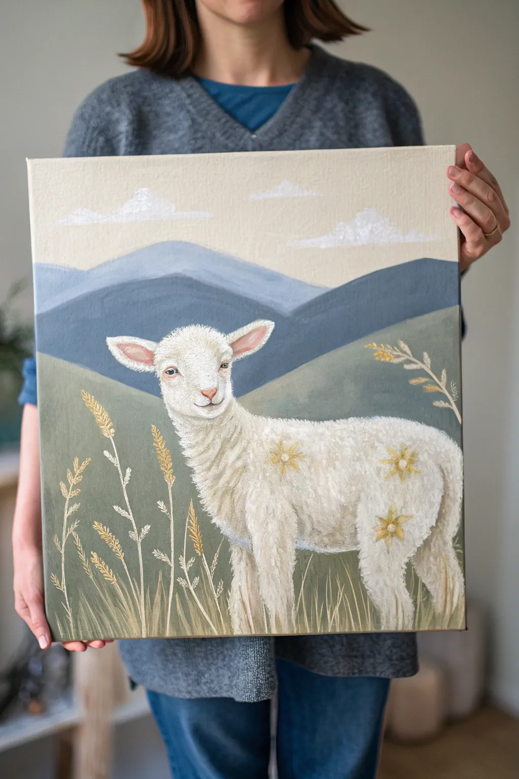
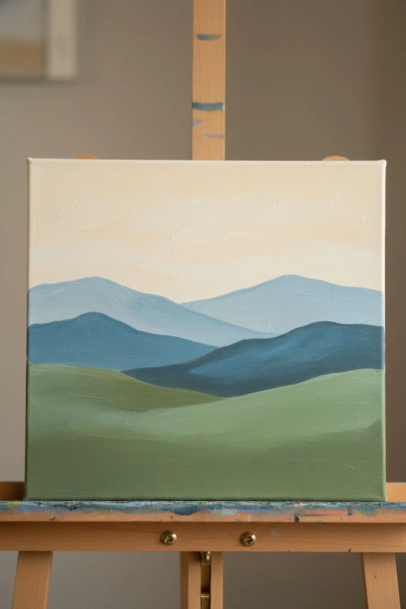
This serene acrylic project captures a gentle white lamb standing amidst rolling hills and stylized wheat stalks. With its soft color palette of sage greens, muted blues, and creamy whites, this painting offers a peaceful reflection on redemption suitable for any skill level.
Detailed Instructions
Materials
- Square stretched canvas (approx. 12×12 or 16×16 inches)
- Acrylic paints (Titanium White, Unbleached Titanium/Cream, Sage Green, Olive Green, Payne’s Gray, Ultramarine Blue, Yellow Ochre, Burnt Sienna)
- Brushes: large flat shader, medium filbert, lush round brush, small detail liner
- Palette knife (optional for mixing)
- Water cup and paper towels
- Chalk or pastel pencil for sketching
Step 1: Blocking the Background
-
Prepare the sky:
Begin by mixing a large amount of Titanium White with a touch of Unbleached Titanium to create a warm, creamy off-white. Using a large flat brush, paint the top third of the canvas with smooth horizontal strokes. -
Paint the distant mountains:
Mix Titanium White with a small amount of Ultramarine Blue and a tiny dot of Payne’s Gray to get a pale, hazy blue. Paint the furthest mountain range with soft, rolling peaks just below the sky. -
Add the middle hills:
Deepen your blue mixture by adding more Payne’s Gray and a touch of Sage Green. Paint a second, darker range of hills overlapping the first one to create depth and perspective. -
Lay in the foreground valley:
For the grassy hills behind the lamb, mix Sage Green with a bit of White and Olive Green. Fill the bottom half of the canvas with this muted green tone, curving the horizon line gently.
Wool Texture Trick
Use a dry, stiff-bristled brush with very little paint to ‘scumble’ the white over the base coat. It creates instant fluffiness without painting individual hairs.
Step 2: Creating the Lamb
-
Sketch the subject:
Once the background is completely dry, use a piece of chalk or a pastel pencil to lightly outline the shape of the lamb in the center. Focus on the oval body, the gentle curve of the neck, and the alert ears. -
Base coat the lamb:
Fill in the lamb’s entire silhouette with a solid coat of Unbleached Titanium or a warm light gray. Don’t worry about texture yet; just get the shape solid and opaque. -
Build the wool texture:
Switch to a worn-out filbert brush or a small round brush. Dip it into pure Titanium White and use a dabbing or stippling motion to create fluffy wool curls over the body. Leave some of the base coat showing for shadow. -
Detail the face:
Use a small detail liner brush to paint the face. Use a very pale pink for the inside of the ears and the nose. Use a mix of Burnt Sienna and White to outline the eyes and mouth gently. -
Paint the eyes:
With steady hands, paint the eyes using dark brown or black, adding a tiny white highlight dot to bring the lamb to life. This creates that gentle, knowing expression. -
Add floral accents:
Mix a soft Yellow Ochre. Paint simple, star-shaped flowers directly onto the lamb’s wool, as if they are part of its coat or reflecting the field. Add a tiny white dot in the center of each flower.
Add Hidden Meaning
Paint small, subtle symbols in the grass or clouds, like a dove or a cross, using a gloss varnish so they only appear when the light hits the canvas right.
Step 3: Foreground Details & Finish
-
Paint grass blades:
Load a liner brush with watered-down Unbleached Titanium or pale Sage. Paint long, vertical strokes starting from the bottom edge, flicking upward to create thin, swaying grass blades. -
Add wheat stalks:
Mix Yellow Ochre with a bit of White. Paint thicker stems interspersed among the grass. At the tips, add small dashes in a V-shape to mimic the texture of wheat or seed heads. -
Highlight the foliage:
Add touches of pure White to the tips of the grasses and wheat to simulate sunlight catching the edges. I like to keep these strokes loose to maintain movement. -
Paint the clouds:
Return to the sky with a clean brush. Dab pure White in irregular, horizontal patches to create soft, stylized clouds that mirror the texture of the lamb’s wool. -
Final touches:
Check the painting for balance. Deepen shadows under the lamb’s belly with a watered-down gray glaze if needed to ground the figure.
Now you have a gentle reminder of peace and redemption to display in your home or gift to a loved one

PENCIL GUIDE
Understanding Pencil Grades from H to B
From first sketch to finished drawing — learn pencil grades, line control, and shading techniques.
Explore the Full Guide
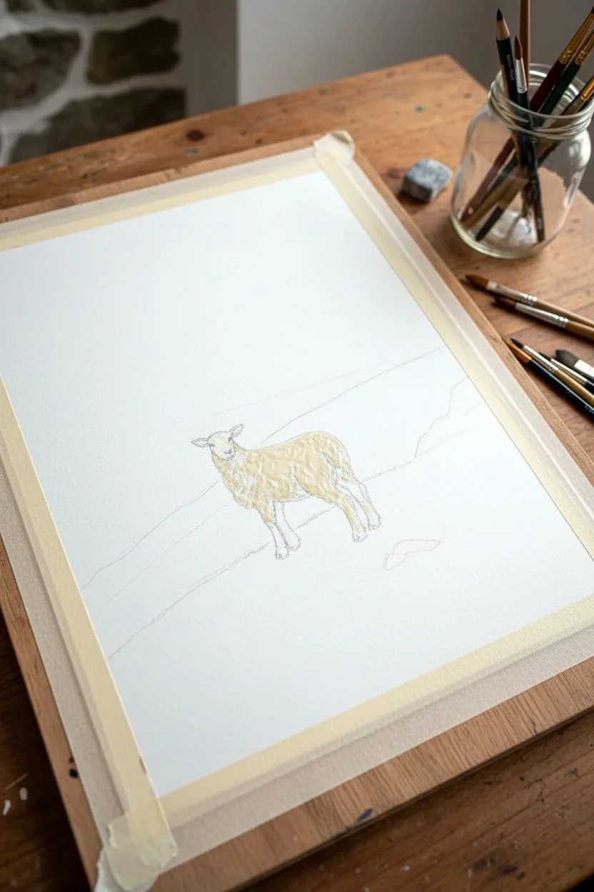
Lost Sheep in a Wide, Quiet Landscape
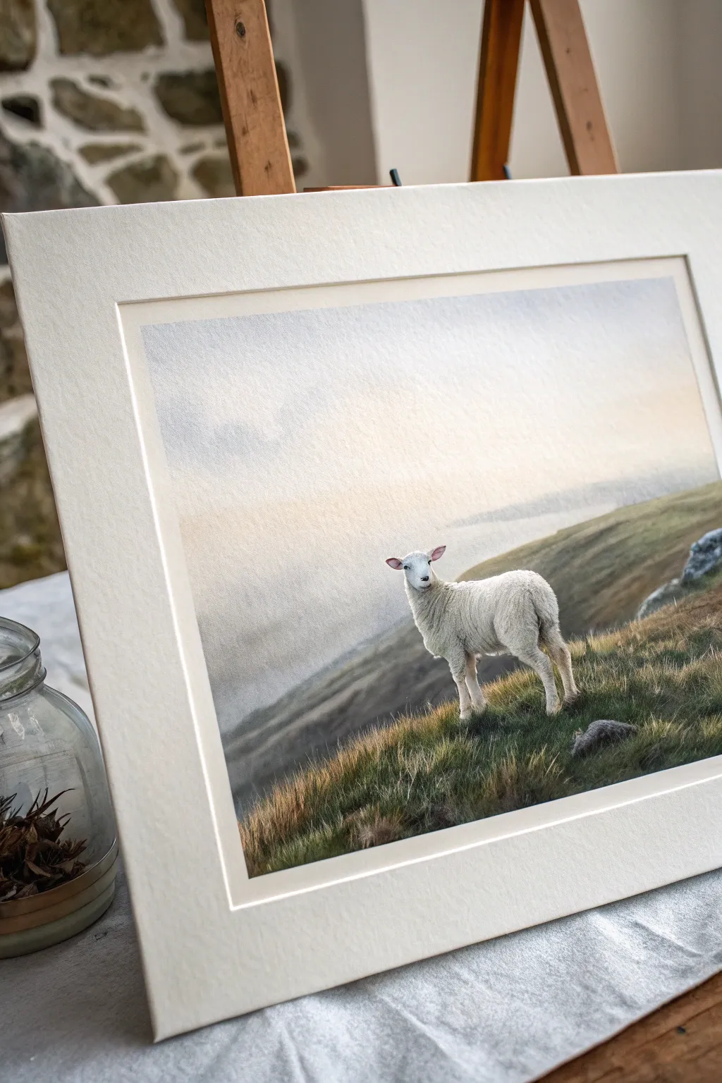
Capture the serene symbolism of the lost sheep with this atmospheric watercolor painting. This project focuses on soft, misty horizons and detailed textures to create a contemplative piece perfect for quiet reflection.
Step-by-Step Tutorial
Materials
- Cold press watercolor paper (300 gsm)
- Watercolor paints (Ultramarine Blue, Burnt Sienna, Yellow Ochre, Sap Green, Payne’s Gray, Titanium White gouache)
- Masking fluid
- Round brushes (size 4, 8, and a fine detail brush)
- Flat wash brush (1 inch)
- Pencil and kneaded eraser
- Painting board and tape
- Paper towels and two water jars
Step 1: Preparation and Sketching
-
Secure the paper:
Tape your watercolor paper down firmly to a board on all four sides. This prevents buckling when we add the heavy washes for the sky later. -
Sketch the composition:
Lightly sketch the horizon line about two-thirds down the paper due to the high skyline. Draw the sloping foreground hill and then place the sheep off-center to the right, ensuring its proportions are accurate but kept simple. -
Protect the highlights:
Apply masking fluid carefully over the sheep’s body. Since the sheep is white against a darker background, this step is crucial for keeping those crisp, bright edges without struggling later.
Pro Tip: Soft Horizons
To get that perfect misty look, tilt your board slightly while the background is wet. Gravity pulls the pigment down, creating a natural gradient.
Step 2: Atmospheric Background
-
Wet-on-wet sky:
Using your large flat brush, wet the entire sky area above the horizon line with clean water. The paper should glisten but not look like a puddle. -
Initial sky wash:
Mix a very dilute wash of Ultramarine Blue and a touch of Burnt Sienna to create a soft, grey-blue. drop this into the top left, letting it fade as it moves down and right towards the light source. -
Warm glow:
While the paper is still damp, introduce a very faint wash of Yellow Ochre near the horizon on the right side to suggest a piercing, misty sunlight. -
Distant hills:
Mix a slightly stronger grey-blue. Paint the distant hills while the sky is just barely damp to create soft, fuzzy edges that recede into the mist. If the edges are too sharp, soften them with a clean, damp brush. -
Drying time:
Let this background layer dry completely. The paper must be bone dry before you start the foreground to maintain separation between the mist and the crisp grass.
Level Up: Framing
Use an extra-thick, textured mat board (mount) when framing. The deep bevel draws the eye inward and enhances the delicate atmosphere of the piece.
Step 3: Foreground and Texture
-
Base layer for the hill:
Mix Sap Green with a little Burnt Sienna and Payne’s Gray for a muted, earthy olive tone. Apply this wash over the foreground hill area. -
Building depth:
While the base wash is still wet, drop in more concentrated pigment (Payne’s Gray and Green) near the bottom right corner and under where the sheep stands to ground the composition. -
Creating texture:
Once the initial wash is semi-dry/damp, use a dry brush technique with darker green-browns to flick upward strokes, simulating tufts of wild grass on the slope. -
Adding rocks:
Paint the small rocks in the foreground using a mix of Payne’s Gray and Blue. Keep the tops lighter to suggest light hitting them, and darken the bottoms where they meet the grass.
Step 4: The Sheep and Details
-
Remove masking:
Gently rub away the masking fluid from the sheep once the paper is totally dry to reveal the pristine white paper underneath. -
Shadowing the wool:
Mix a very watery purple-grey using Ultramarine and a dot of Alizarin or Red. Paint the shadows on the underside of the sheep’s belly and neck to give it volume, leaving the top back bright white. -
Facial details:
Switch to your smallest detail brush. Use a dark grey mix to carefully paint the nose, eyes, and inner ears. Keep these marks precise, as they define the sheep’s expression. -
Legs and hooves:
Paint the legs using a light tan wash, darkening near the hooves. Ensure the feet settle into the grass rather than floating on top by adding tiny grass blades overlapping the hooves. -
Wool texture:
i like to use a nearly dry brush with faint grey paint to stipple barely-there texture onto the body, suggesting the fluffiness of the fleece without overworking it. -
Final highlights:
If you lost any bright highlights on the grass tips or the sheep’s eye, use a tiny dot of Titanium White gouache to bring them back.
Step back and admire the gentle stillness you’ve captured in your landscape
Baptism Scene With Ripples and Light
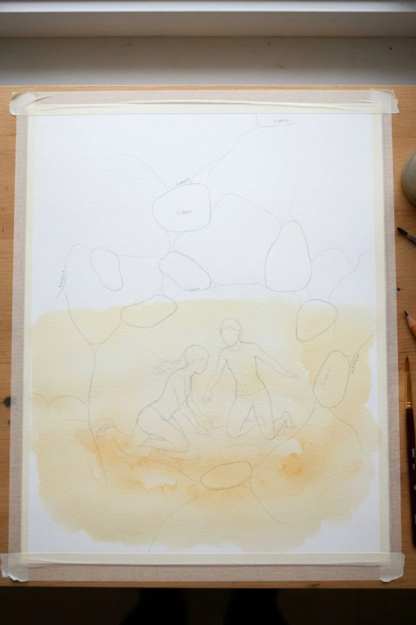
Capture the serene and holy moment of a baptism with this project that focuses on mastering the transparency of water and the play of sunlight. You will learn to layer turquoise glazes and lift crisp white highlights to create a convincing, rippling effect over submerged figures.
Step-by-Step Guide
Materials
- Heavyweight watercolor paper (300gsm cold press) or canvas board
- Acrylic paints: Phthalo Blue, Phthalo Green, Titanium White, Burnt Umber, Yellow Ochre, Raw Sienna
- Synthetic flat brushes (1 inch, 1/2 inch) for washes
- Small round brushes (size 0, 2) for details
- Glazing medium or water for thinning
- Masking fluid (optional)
- Palette knife for texture (optional)
- Pencil for sketching
- White mat board for framing
Step 1: Planning the Composition
-
Sketch the figures:
Begin by lightly sketching your two figures in the center-lower third of your paper. Focus on the posture; the figures should look partially submerged. Don’t worry about facial details—this scene relies on body language. -
Map the light:
Lightly draw irregular oval shapes and squiggles across the water surface to map where the strongest sun reflections will be. These ‘caustics’ form a web-like pattern on the sandy bottom. -
Establish the sand color:
Mix a wash of Yellow Ochre, a touch of Raw Sienna, and plenty of water (or glazing medium). Apply this pale sandy color over the entire bottom half of the painting, fading it out as you move toward deeper water at the top.
Step 2: Painting the Water
-
Mix the base water tone:
Combine Phthalo Blue with a tiny dot of Phthalo Green and Titanium White. You want a bright, clear turquoise. Dilute this until it is semi-transparent. -
Apply the first water glaze:
Wash this turquoise mixture over the sand layer, letting the yellow underneath show through slightly. This creates that greenish-blue tropical look. Leave the figures unpainted for now. -
Deepen the hues:
While the first layer is still damp, drop in slightly more concentrated blue near the top of the canvas to suggest deeper water. I like to tilt the board slightly here to let gravity help the gradient blend naturally. -
Paint the submerged bodies:
Mix your skin tones using White, Ochre, and a touch of Burnt Umber. Paint the figures, but keep the parts that are underwater slightly muted and bluish. You can glaze a thin layer of your water color over their legs later to push them underwater.
Muddy Water Fix
If your turquoise turns muddy over the sand layer, ensure the sand layer is 100% dry before glazing blue over it. Wet-on-wet mixing here creates gray, not clear water.
Step 3: Creating Ripples and Refractions
-
Draft the dark ripples:
Using a small round brush and a mix of Phthalo Blue and Burnt Umber, paint thin, wobbly lines that follow the movement of the water. Concentrate these lines around the figures where their movement disturbs the surface. -
Soften the edges:
Before the dark lines dry completely, use a clean, slightly damp brush to soften one side of each ripple line. This creates a shadowed side and a soft transition into the water. -
Add reflected light:
Mix a very pale, almost white turquoise. Paint broad, soft strokes in between the dark ripples to show the sky reflecting on the surface. -
Detail the caustic patterns:
On the sandy bottom areas (especially the bottom left), paint web-like patterns using a brighter, creamy sand color (Titanium White + Yellow Ochre). These are not on the surface, but ON the floor of the sea, so keep them slightly blurry.
Sunlight Boost
Use a tiny bit of iridescent medium mixed into your top white highlights. It catches the room’s light and makes the water surface literally sparkle from different angles.
Step 4: Highlights and Finishing Touches
-
Pure white highlights:
Load a fine brush or a rigger brush with pure Titanium White. Paint the sharpest, brightest highlights right on the crests of the ripples. These should be crisp lines or broken dashes. -
Connect the figures to the water:
Paint white foam or disturbance rings directly around the waists/bodies of the figures. This anchors them into the liquid rather than having them look like cutouts pasted on top. -
Shadows on the sand:
Mix a transparent dark wash (Blue + Umber) and glaze faint shadows on the sandy bottom to the left of the figures. The water distorts these shadows, so keep the edges soft and wavy. -
Final assessment:
Step back and check your values. If the water looks too flat, add another thin glaze of Phthalo Blue in the shadow areas. Finally, mount your dried painting behind a clean white mat.
Frame this piece in a simple white mat to let the vibrant blues and spiritual subject matter take center stage


Communion Still Life With Bread and Cup
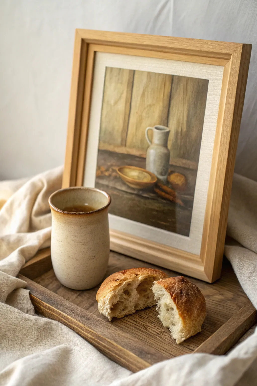
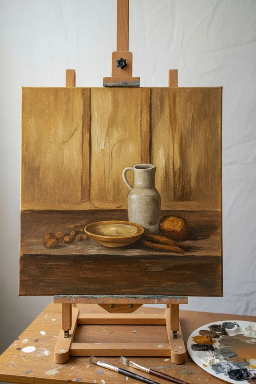
This project captures the quiet reverence of communion through a warm, rustic still life painting of a pitcher, bowl, and bread. With its earthy tones and simple composition, this piece serves as a gentle visual reminder of faith and provision.
Step-by-Step Tutorial
Materials
- 11×14 inch Canvas panel or stretched canvas
- Acrylic paints (Raw Umber, Burnt Sienna, Yellow Ochre, Titanium White, Paynes Grey, Cadmium Red Medium)
- Set of synthetic brushes (1-inch flat, #6 and #8 filbert, #2 round for details)
- Palette for mixing
- Cup of water and paper towels
- Easel or flat working surface
- Wooden floating frame (optional, for finishing)
Step 1: Setting the Foundation
-
Prepare the Background:
Begin by mixing a wash of Raw Umber and a touch of Burnt Sienna with plenty of water. Brush this loosely over the entire canvas to tone it, removing the stark white. Let this dry completely before moving on. -
Sketch the Composition:
Using a small round brush dipped in diluted Raw Umber, lightly sketch the outlines of your objects. Place the vertical lines for the wooden background planks first, then sketch the rough shape of the pitcher just right of center and the bowl slightly to the left and lower. -
Block in Background Woods:
Mix Yellow Ochre with White and a tiny dot of Umber. Use the 1-inch flat brush to paint the vertical wooden planks behind the objects. Apply the paint in vertical strokes, leaving slight gaps between the boards to suggest seams. -
Add Wood Grain Depth:
While the background paint is still slightly tacky, streak in darker vertical lines using Raw Umber on the edge of your brush. This creates the illusion of wood grain and shadow between the boards. -
Paint the Table Surface:
For the horizontal surface where the objects sit, mix a darker, richer brown using Burnt Sienna and Paynes Grey. Paint horizontal strokes across the bottom third of the canvas, ensuring the horizon line behind the objects is straight but soft.
Soft Edges
To get that dreamy, old-world look, lightly brush over wet paint edges with a soft, dry makeup brush. This blurs harsh lines instantly.
Step 2: Developing the Objects
-
Base Coat the Pitcher:
Mix Titanium White with a very small amount of Paynes Grey to create a soft, cool antique white. Paint the entire silhouette of the pitcher, including the handle. Don’t worry about shadows yet; just get good solid coverage. -
Base Coat the Bowl and Bread:
Use Yellow Ochre mixed with Burnt Sienna to fill in the wooden bowl shape. For the bread loaf and smaller pieces, use a warmer mix of Yellow Ochre and a touch of Titanium White. -
Shadowing the Pitcher:
I find it helpful to squint at the subject to see the shadows better. Mix a glaze of sticking medium and Paynes Grey. Apply this to the right side of the pitcher and under the lip to create volume, blending the edge into the white with a clean, damp filbert brush. -
Detailing the Bowl:
Add a dark brown rim to the bowl using Raw Umber. Paint the interior of the bowl with a lighter creamy yellow to suggest it is full or hollowed out, adding a shadow on the interior right side to match the light source. -
Texturing the Bread:
Stipple (dab repeatedly) the bread surface using a small stiff brush with varied mixtures of Burnt Sienna and White. This builds up the rough texture of the crust.
Muddy Colors?
If your browns look dull or grey, stop mixing too many colors. Let the layer dry, then glaze pure Burnt Sienna over it to bring back the warmth.
Step 3: Refining and Finishing
-
Cast Shadows:
Mix a dark, semi-transparent black-brown using Burnt Sienna and Paynes Grey. Paint horizontal shadows stretching to the right of the pitcher, bowl, and bread crumbs to ground them on the table surface. -
Highlights and Accents:
Take pure Titanium White on your smallest brush. Add a crisp highlight to the left shoulder of the pitcher and the rim of the bowl where the light would hit most intensely. -
Warm Glazes:
Once the main paint layers are dry, mix a very watery glaze of Yellow Ochre. Generally brush this over the lower half of the painting to unify the colors and give the piece an aged, warm varnish look. -
Final Touches:
Step back and assess the contrast. If the background wood needs more definition, darken the seams between planks with a thin liner brush. Add a few small strokes of dark brown around the bread to define crumbs. -
Varnish and Frame:
Allow the painting to cure for at least 24 hours. Apply a matte or satin varnish to protect the surface. Once dry, place the canvas into a simple light wood floating frame to complete the rustic aesthetic.
Now you have a thoughtful piece of art ready to bring a peaceful atmosphere to your home.
Prayer Hands With a Floral Halo Border
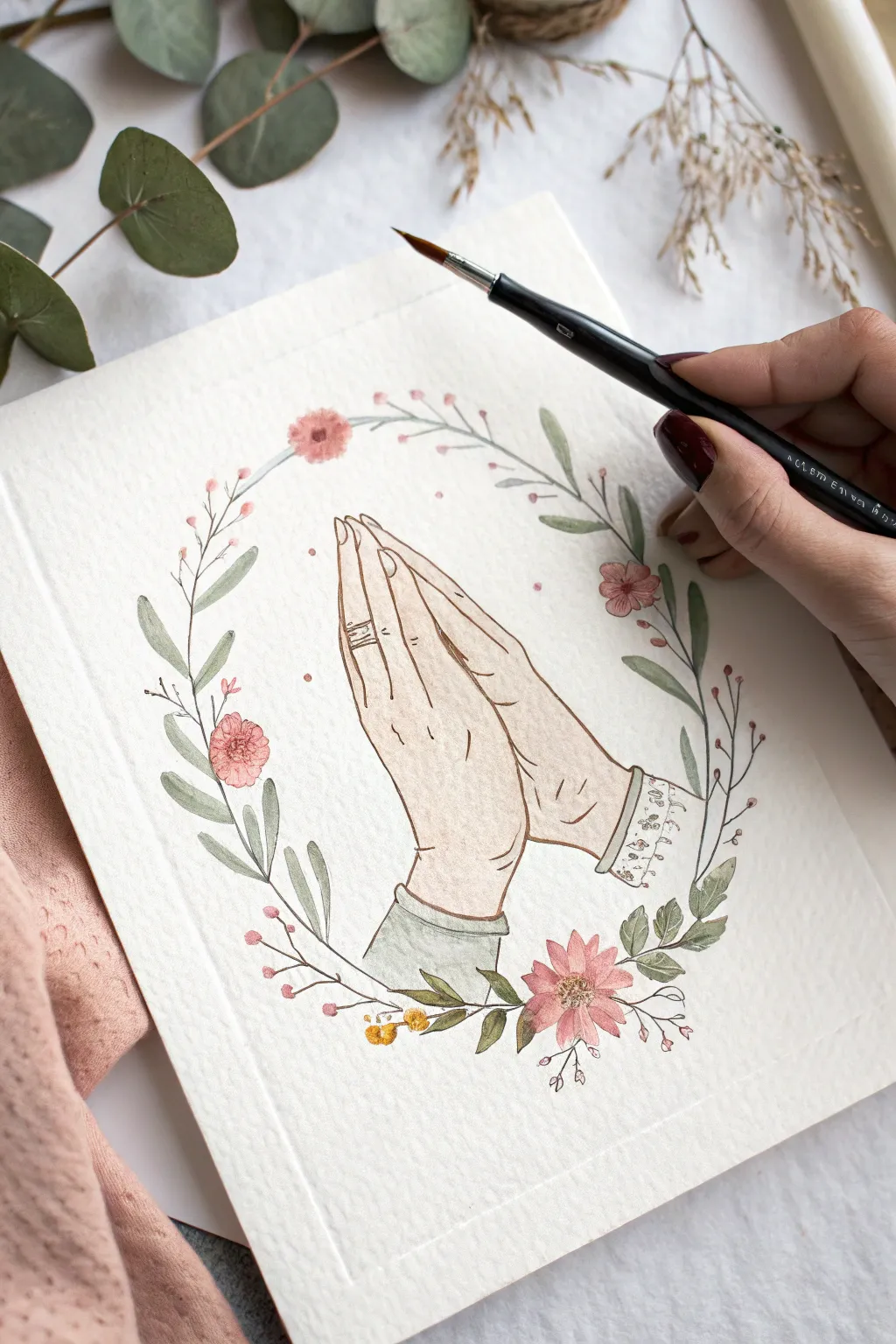
This delicate watercolor piece captures a moment of quiet devotion, featuring praying hands framed by a soft, romantic floral border. The combination of gentle washes and fine ink details creates an artwork that feels both traditional and refreshingly modern.
Step-by-Step Tutorial
Materials
- Cold press watercolor paper (300 gsm)
- HB pencil and kneadable eraser
- Waterproof fine liner pen (brown or sepia, 0.1mm or 0.3mm)
- Watercolor paints (skin tones, sage green, dusty pink, burnt sienna)
- Round watercolor brushes (size 2 and size 4)
- Clean water and paper towel
Step 1: Drawing the Base Sketch
-
Center the Hands:
Begin by lightly sketching the praying hands in the center of your paper. Start with the geometric shapes—two slanted rectangles for the palms meeting in the middle—before refining the contours of the fingers. -
Refine the Fingers:
Add details to the hands. Notice how the fingers interlock slightly or press flat against each other. Sketch a simple cuff at the wrist and perhaps a ring on the finger for a personal touch. -
Outline the Wreath Shape:
Lightly draw a large circle or oval surrounding the hands to guide your wreath placement. This doesn’t need to be perfect; it’s just a guideline for where the stems will flow. -
Add Floral Elements:
Along your circle guide, sketch sweeping curves for stems. Add small clusters of leaves and mark positions for three or four main blooms—one at the bottom center and others balanced on the sides.
Keep it Steady
Rest your wrist on a clean sheet of scrap paper while inking. This prevents oils from your hand transferring to the art paper, which can resist watercolor paint later.
Step 2: Inking the Design
-
Choosing Your Liner:
Select a waterproof fine liner. I prefer a sepia or brown tone for this project instead of harsh black, as it complements the soft vintage aesthetic better. -
Trace the Hands:
Carefully go over your hand sketch with the pen. Use confident, smooth lines. Add small creases at the knuckles and wrist to suggest skin texture, but keep them minimal. -
Ink the Floral Wreath:
Trace the stems and leaves. For the flowers, keep your lines somewhat loose and organic rather than stiffly closing every shape. Add tiny stamen details in the flower centers. -
Erase Guidelines:
Wait until the ink is completely dry—give it a few minutes to be safe. Then gently erase all your pencil marks with a kneadable eraser so strictly the ink remains.
Step 3: Applying Watercolor Washes
-
Mix Skin Tones:
Prepare a watery mix for the skin. Use a touch of burnt sienna mixed with plenty of water, perhaps softened with a tiny bit of yellow ochre or pink. Test the color on a scrap piece of paper first. -
Paint the Hands:
Using a size 4 brush, apply the skin wash over the hands. Work quickly to avoid hard edges. While the paint is still damp, drop slightly more concentrated pigment near the fingers’ creases and the wrists for shadow. -
Paint the Greenery:
Mix a dusty sage green. With your smaller brush, paint the leaves. Vary the intensity by adding more water for some leaves and less for others, creating depth in your wreath. -
Add Color to Blooms:
Use a soft dusty pink or coral for the main flowers. Paint the petals, leaving tiny slivers of white paper showing to create highlights. For smaller buds, just dab a small dot of color. -
Detail the Cuff:
If you drew a sleeve cuff, paint it a contrasting soft color, like a pale grey-green or cream. You can add tiny patterned details with your pen once this paint is dry. -
Add Warm Accents:
For the tiny berries or smaller filler flowers, use a warm yellow or goldenrod shade. These small pops of warmth help balance the pinks and greens.
Gold Leaf Accents
For a sacred touch, apply tiny bits of gold leaf or metallic gold watercolor paint to the flower centers or the ring on the finger after the painting is dry.
Step 4: Finishing Touches
-
Deepen Shadows:
Once the first layer on the hands is fully dry, mix a slightly darker version of your skin tone. Glaze this over the shadowed side of the hands (usually the side away from the light source) and between the fingers. -
Enhance Flower Centers:
Darken the centers of your flowers with a dab of burnt umber or dark pink to give them dimension. -
Final Splatters (Optional):
I like to take a very wet brush with pale pink paint and tap it gently against my finger to create tiny, subtle splatters around the wreath for a whimsical effect.
Now you have a serene piece of art perfect for gifting or framing in a quiet corner of your home
Stained-Glass Effect Cross Using Color Blocking
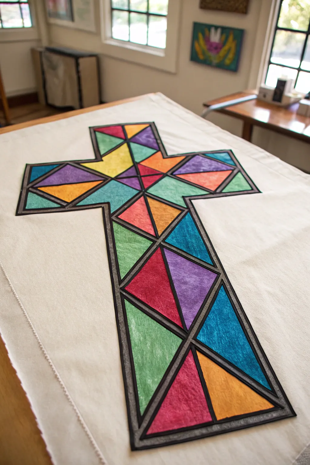
Bring the luminous beauty of cathedral windows into your home with this striking fabric art project. Using a clever color-blocking technique and bold black outlines, you’ll create a vibrant cross that mimics the classic look of traditional stained glass.
Detailed Instructions
Materials
- Large canvas or heavy white cotton fabric (banner size)
- Pencil and long ruler
- Fabric points or acrylic paint mixed with fabric medium
- Assorted flat paintbrushes (medium and small)
- Black fusible bias tape (1/4 inch width) or black dimensional fabric paint
- Iron and ironing board
- Fabric glue (if not using fusible tape)
- Painter’s tape or masking tape (optional)
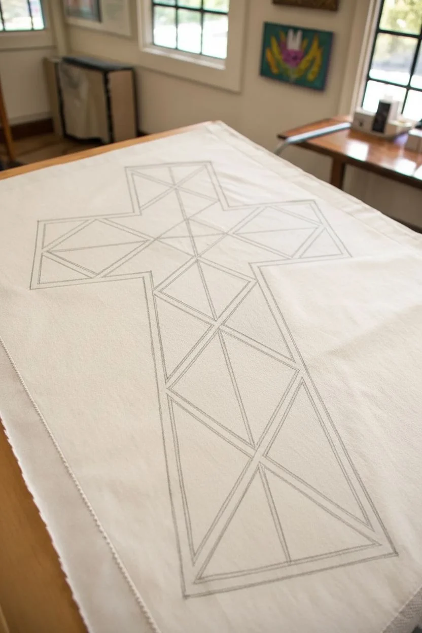
Step 1: Drafting the Design
-
Prepare your canvas:
Lay your white fabric flat on a large table. Iron it perfectly smooth first, as wrinkles will distort your geometric lines later. -
Outline the cross frame:
Using a pencil and ruler, lightly draw the main outline of a large cross in the center of your fabric. Ensure the arms are symmetrical and the width is consistent throughout. -
Draw the geometric web:
Inside the main cross outline, start drawing your ‘shattered glass’ pattern. Use your ruler to create intersecting diagonal lines that form triangles and quadrilaterals. -
Plan your symmetry:
While random patterns work, this specific design mirrors the geometry from left to right. I find it helpful to draw one line on the left and immediately replicate its partner on the right to keep things balanced.
Fixing Wobbly Lines
If your painted edges are uneven, don’t worry. Just use slightly wider bias tape (like 1/2 inch) to cover larger gaps or mistakes between color sections.
Step 2: Adding Color
-
Select your palette:
Choose 6-8 distinct, vibrant colors. For a true stained-glass effect, avoid pastels and go for rich jewel tones like royal blue, emerald green, deep purple, and ruby red. -
Start painting sections:
Begin filling in the geometric shapes. Use a flat brush to apply the paint near the pencil lines, being careful not to paint over the lines where your black tape will eventually go. -
Distribute colors evenly:
Don’t put two shapes of the same color right next to each other. Step back occasionally to ensure the colors are balanced across the whole cross. -
Create texture (Optional):
To mimic the uneven texture of real glass, apply the paint with slight variations in thickness or dab it slightly with a sponge rather than making it completely opaque and flat. -
Let it dry completely:
Allow the paint to cure fully according to the bottle instructions. This usually takes 24 hours, but it determines whether your black lines adhere correctly.
Step 3: The Lead Lines
-
Outline the exterior:
Start by applying the black fusible bias tape to the main outer perimeter of the cross first. Cut the tape to length and press it down with a hot iron to fuse it to the fabric. -
Apply interior long lines:
Identify the longest continuous lines inside the pattern and apply tape to those next. Lay the tape over your pencil marks, covering the edges of your paint. -
Fill the smaller segments:
Cut smaller pieces of bias tape for the individual geometric intersections. Carefully butt the raw edges of the tape against existing lines so there are no gaps. -
Seal intersecting points:
Where multiple lines meet, you can add a tiny dab of fabric glue under the connection point to ensure the tape ends don’t lift up over time. -
Final press:
Once all black lines are placed, place a pressing cloth over the entire design and iron it firmly one last time to permanently set the fusible tape. -
Clean up edges (Optional):
If you plan to hang this as a banner, hem the raw edges of the white canvas or attach a dowel rod pocket at the top.
Add Metallic Shimmer
Mix a tiny drop of gold or silver fabric paint into your colors before applying. It gives the ‘glass’ a subtle shimmer when the light hits it.
Hang your finished piece in a sunny spot to enjoy the vibrant interplay of color and geometry


Have a question or want to share your own experience? I'd love to hear from you in the comments below!