If you’re craving easy oil painting ideas that feel relaxing instead of intimidating, you’re in the right place. I love projects that give you quick wins with simple shapes, limited colors, and that buttery oil-paint blending magic.
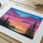
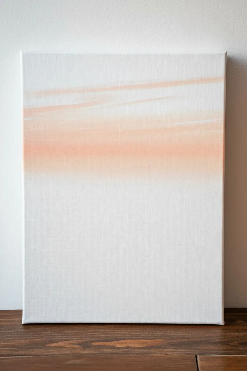
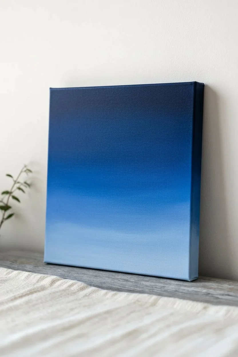
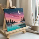
Simple Sunset Gradient With Silhouettes
Capture the serene beauty of twilight with this gradient oil painting featuring rolling mountain silhouettes. The smooth transition from deep violet to warm orange creates a stunning backdrop for the crisp, dark foreground layers.
Step-by-Step Guide
Materials
- Small square stretched canvas (e.g., 6×6 or 8×8 inches)
- Oil paints: Titanium White, Cadmium Yellow, Cadmium Orange, Alizarin Crimson, Ultramarine Blue, Ivory Black
- Flat synthetic brushes (various sizes: 1 inch for sky, smaller for details)
- Small round detail brush (size 0 or 00)
- Palette knife for mixing
- Palette paper or wooden palette
- Odorless mineral spirits or turpentine
- Lint-free rag or paper towels
Step 1: Creating the Sky Gradient
-
Prepare your palette:
Squeeze out generous amounts of your sky colors: Blue, Crimson, Orange, Yellow, and White. You’ll want to pre-mix four distinct shades: a deep violet-blue, a softer purple, a vibrant pinkish-orange, and a pale yellow-orange. -
Prime the canvas top:
Start at the very top edge of the canvas. Using your largest flat brush, apply a band of the deep violet-blue mixture across the top 1/4 of the canvas. Don’t worry about being too neat yet; just get the color on. -
Add the middle band:
Immediately below the blue, while the paint is still wet, apply a band of your purple mixture. Let the edges touch the blue band above. -
Blend the upper transition:
Wipe your brush clean. Gently brush back and forth horizontally where the blue and purple meet to create a seamless blur. Clean the brush often to avoid dragging dark color too far down. -
Apply the warm tones:
Below the purple, add your vibrant pinkish-orange mixture. Paint this band down to just above the halfway point of the canvas. -
Finish the sky base:
Fill the remaining lower portion of the sky area with your pale yellow-orange mix. This will be the glowing light behind the mountains. -
Final sky blending:
With a clean, dry soft brush, gently sweep horizontally across the entire sky from top to bottom. Use very light pressure—like a whisper—to smooth out brushstrokes and perfect the gradient. -
Let it tack:
Allow the sky layer to dry for several hours or overnight. It doesn’t need to be fully cured, but it should be tacky enough that painting over it won’t lift the underlayer.
Clean Brush Magic
For the smoothest sky gradient, wipe your blending brush on a paper towel after every single pass. A loaded brush will drag dark colors into light areas and ruin the fade.
Step 2: Painting the Mountain Layers
-
Mix mountain colors:
Create three shades of purple for the mountains. Mix Ultramarine Blue, Alizarin Crimson, and White. Your farthest mountain color should be the lightest and haziest (add more white and a touch of the sky color to push it back). -
Paint the distant range:
Using a medium flat brush, paint the silhouette of the furthest mountain range about halfway down the canvas. Keep the top edge undulating and organic. -
Mix the middle range color:
Darken your purple mixture by adding slightly more Blue and Crimson. It should be visibly darker than the first range but not black. -
Add the middle mountains:
Paint the second layer of mountains below the first, overlapping them slightly. Vary the peaks and valleys so they don’t mirror the first layer exactly. -
Mix the foreground color:
prepare a deep, dark blue-black. Mix Ultramarine Blue with a little Ivory Black. It shouldn’t be pure black yet, just a very deep shadow tone. -
Paint the near mountains:
Apply another layer of mountainous shapes at the bottom third of the canvas using this deep blue mix. Ensure this layer has a crisp top edge against the lighter purple behind it.
Step 3: Foreground and Details
-
Create the tree line:
Mix pure Ivory Black with just a tiny touch of the deep blue. Using a smaller flat brush, fill in the bottom-most section of the canvas solidly black. -
Texture the treeline:
I prefer to switch to a small detail brush here. Tap the top edge of the black area to create tiny, irregular spikes representing tree tops. Keep them random and varied in height. -
Adding the birds:
Thin a small amount of black paint with a drop of mineral spirits or oil medium to make it flow like ink. Using your finest detail brush (size 00), paint small ‘V’ shapes in the upper left quadrant. -
Refine the birds:
Give the birds slightly curved wings rather than straight stick lines to make them look natural. Make the birds closer to the center slightly smaller to suggest distance. -
Check the edges:
Paint the black ‘treeline’ color around the sides of the canvas at the bottom, and extend the sky colors around the top sides for a finished, gallery-wrap look. -
Final drying:
Set the painting in a dust-free area to dry completely. Since the black layer is thick, this may take a few days to a week.
Muddy colors?
If your mountain layers are blending into the sky too much, stop! Let the sky dry until it’s barely sticky to the touch before adding the mountains on top.
Now you have a tranquil sunset scene that captures the perfect transition from day to night

Calm Ocean Horizon With Soft Blending
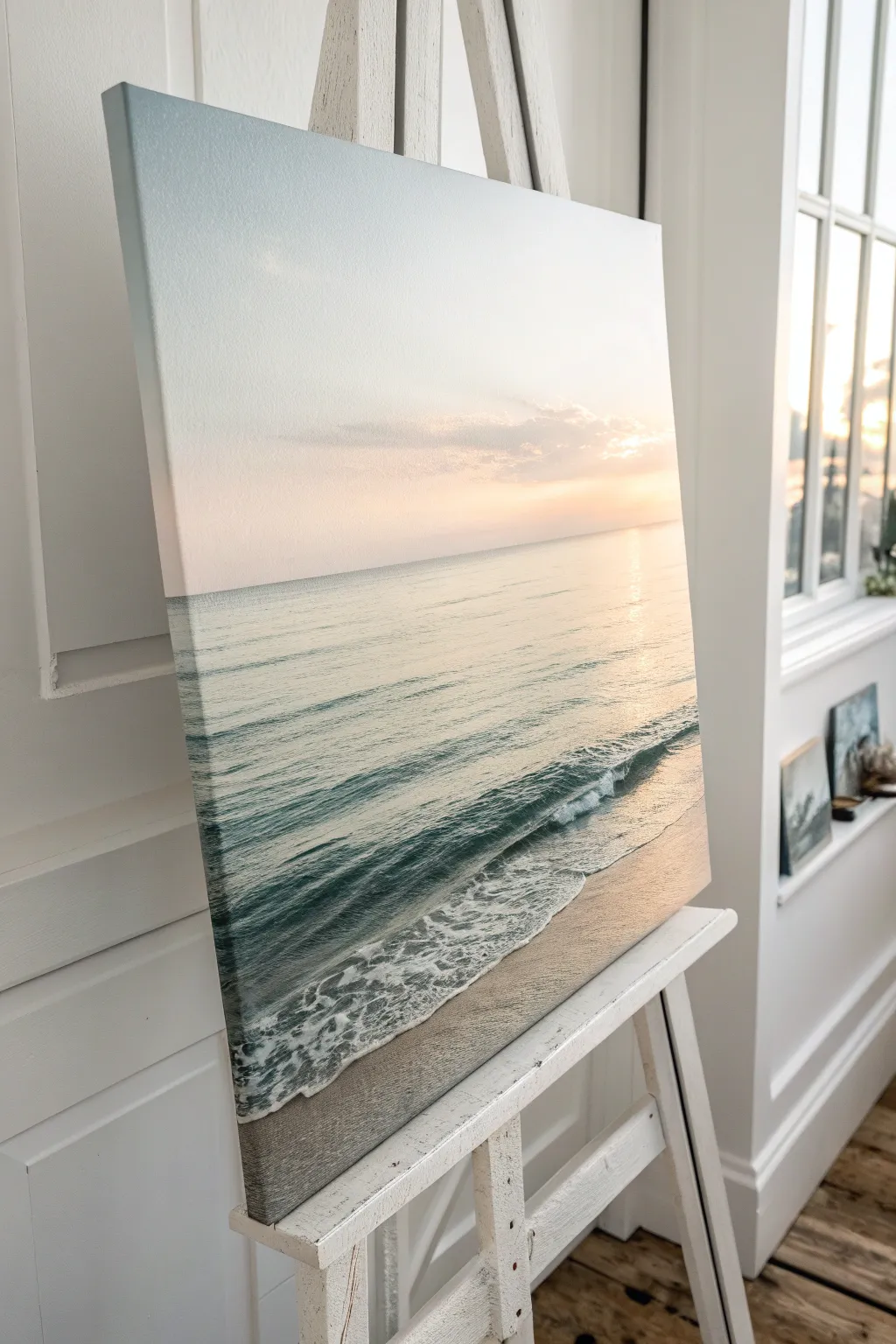
Capture the peaceful stillness of a morning shoreline with this gentle seascape oil painting. You will learn to use soft blending techniques to create a seamless gradient sky and realistic, rhythmic waves rolling onto damp sand.
How-To Guide
Materials
- Stretched canvas (rectangular format, e.g., 16×20 inches)
- Oil paints: Titanium White, Cerulean Blue, Ultramarine Blue, Alizarin Crimson, Cadmium Yellow Light, Burnt Umber
- Large flat brush (for sky blending)
- Medium filbert brush (for water body)
- Small flat brush (for wave definition)
- Fan brush (optional, for foam)
- Palette knife
- Odorless mineral spirits or turpentine
- Linseed oil medium
- Clean rags or paper towels
- Easel
Step 1: Sky Gradient & Horizon
-
Prime the horizon:
Begin by lightly sketching a straight horizontal line across your canvas, positioning it about one-third of the way up from the bottom. This separates your sky from the sea. -
Mix the sky colors:
Prepare three piles of paint for the sky: a pale blue (Cerulean + White), a soft peach (White + tiny dot of Alizarin Crimson + tiny dot of Cadmium Yellow), and a creamy white (Titanium White + a speck of Yellow). -
Apply the upper sky:
Using a large flat brush, apply the pale blue mixture to the top corners and upper edge of the canvas, brushing horizontally. -
Blend downwards:
While the paint is wet, gradually mix in more white as you move down the canvas, fading the blue out before you reach the middle. -
Add the sunrise glow:
Clean your brush thoroughly. Starting just above the horizon line, apply the soft peach color, blending it upwards into the white transition area to create a seamless gradient. -
Highlight the sun source:
Use the creamy white mix to create a bright, diffused light source on the right side of the canvas, just above the horizon. Soften the edges so there is no hard circle, just a glow.
Keep it horizontal
Keep brushstrokes strictly horizontal for the water and sky. Even a slight tilt can make the ocean look like it’s sliding off the canvas.
Step 2: Painting the Ocean
-
Establish the distant water:
Mix a muted turquoise using Titanium White, a small amount of Cerulean Blue, and a tiny touch of Burnt Umber to desaturate it. Paint horizontal strokes directly underneath the horizon line. -
Create the sun reflection:
Use pure Titanium White mixed with a little linseed oil to paint a vertical band of shimmering light directly under your sun glow. Use short, horizontal dashes to mimic light hitting water ripples. -
Darken the mid-ocean:
As you move closer to the foreground (but before the breaking wave), mix a slightly deeper teal using Ultramarine Blue, a touch of Green (or Yellow + Blue) and White. Strokes should become slightly thicker here. -
Suggest gentle swells:
Using a dry, clean brush, very lightly sweep horizontally across the transition between the highlight and the teal water to soften the separation.
Soft Cloud Effect
Use a dry fan brush to lightly tap touches of violet-grey into the peach sky area to create distant, gentle cloud formations.
Step 3: The Breaking Wave & Foreground
-
Block in the wave shadow:
For the darker underside of the crashing wave, mix Ultramarine Blue with a touch of Burnt Umber. Paint diagonal, rolling shapes where the wave begins to curl. -
Paint the wet sand:
For the sand, mix Titanium White, Burnt Umber, and a touch of the peach sky color. Paint the bottom section of the canvas with smooth, horizontal strokes. -
Add sand reflections:
While the sand color is wet, wipe your brush and drag some of the dark wave color downwards into the sand area to simulate the glossy reflection of wet possibilities. -
Create the sea foam:
Load a small flat brush or fan brush with thick Titanium White. Tap the brush along the edge of the breaking wave to create the frothy texture. -
Detail the ripples:
Add thin, lacy lines of white foam trailing behind the main wave and dissolving onto the sand. Keep these lines irregular and organic. -
Refine the motion:
I like to use a palette knife edge to bright, crisp white highlights on the very crest of the wave for extra sparkle. -
Adjust values:
Step back and check your contrast. If the horizon line is too sharp, use a clean, dry brush to gently tap slightly along the line to blur it into the atmosphere.
Allow your painting to dry in a dust-free area for several days before varnishing to protect that beautiful sheen


Three-Bottle Still Life In Muted Tones
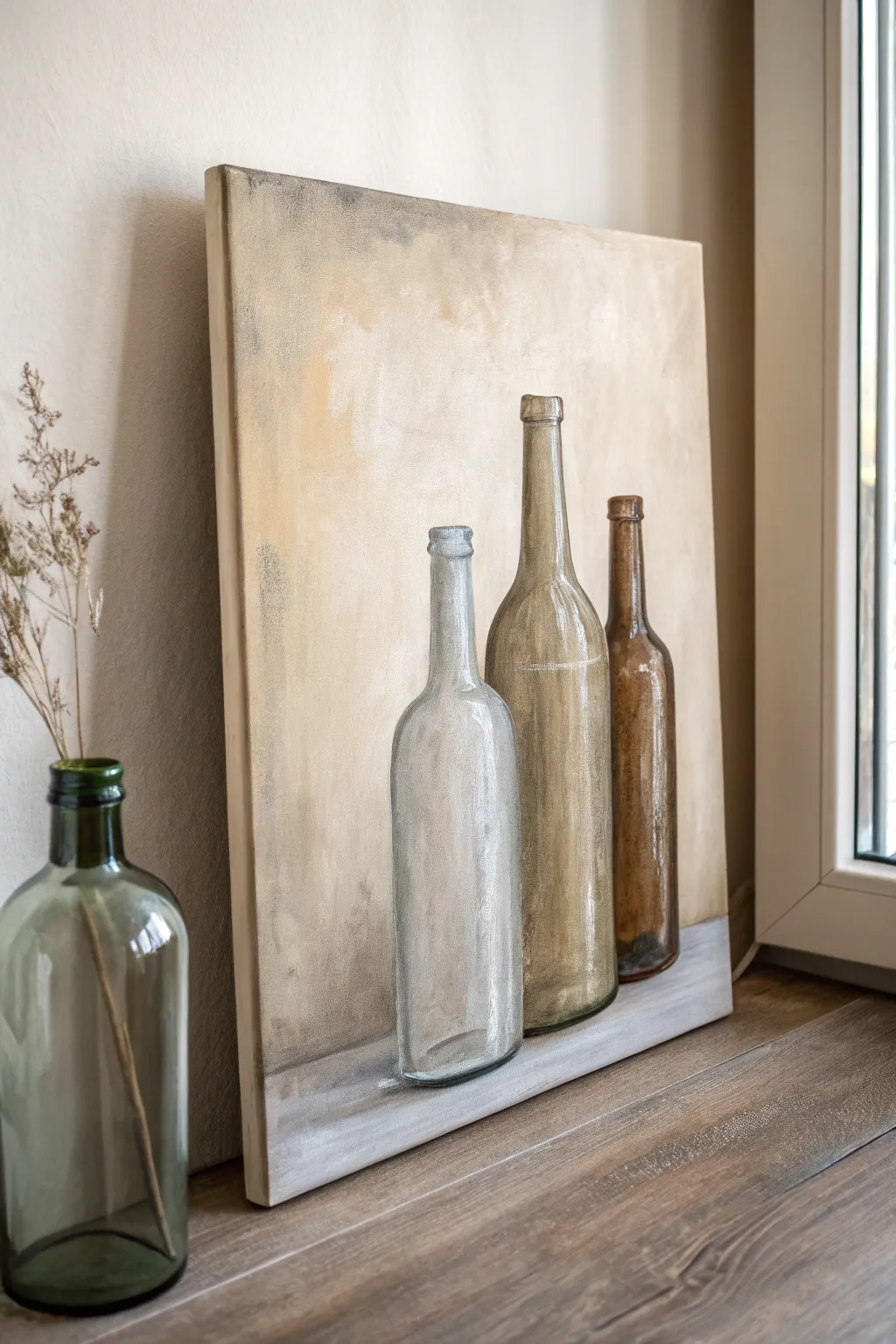
Master the art of painting transparency with this elegant three-bottle still life study. Through layers of soft earth tones and strategic highlighting, you will transform a simple canvas into a sophisticated piece of decor perfect for any neutral interior.
Detailed Instructions
Materials
- Stretched canvas or canvas board (approx. 16×20 inches)
- Oil paints: Titanium White, Burnt Umber, Yellow Ochre, Raw Sienna, Payne’s Grey, Ivory Black
- Odorless mineral spirits or turpentine
- Linseed oil medium
- Large flat brush (1-inch) for background
- Medium filbert brushes (size 4 and 8)
- Small round detail brush (size 0 or 1)
- Palette knife
- Rag or paper towels
- Charcoal stick or graphite pencil
Step 1: Setting the Scene
-
Prepare the background wash:
Begin by mixing a large amount of Titanium White with a touch of Yellow Ochre and a tiny dab of Burnt Umber. Thin this mixture significantly with mineral spirits to create a wash. -
Apply the base coat:
Using your large flat brush, cover the entire upper three-quarters of the canvas with your creamy wash. Use broad, sweeping strokes in various directions to create a subtle, textured stucco effect rather than a perfectly flat color. -
Define the shelf:
For the bottom strip (the table or shelf surface), mix Titanium White with a small amount of Payne’s Grey. Paint a horizontal band across the bottom edge, blending the meeting point slightly with the wall color to keep the horizon line soft. -
Sketch the composition:
Once the background is tacky but touch-dry, use a charcoal stick or a thinned paint wash on a small brush to lightly sketch the outlines of the three bottles. Place the tallest bottle in the center, overlapping slightly with the shorter, stout bottle to its left and the darker bottle to its right.
Transparency Trick
To make glass look real, paint the background ‘through’ the bottle first. The bottle color is just a transparent glaze over the wall color behind it.
Step 2: Blocking in the Forms
-
Mix the grey bottle tones:
For the leftmost bottle, mix Titanium White with Payne’s Grey and a tiny hint of Phthalo Blue if available, or just keeping it cool grey. Block in the shape, keeping the paint semi-transparent by using a little linseed oil. -
Paint the amber bottle:
For the central bottle, mix Yellow Ochre with a touch of Raw Sienna. Fill in this shape, again keeping the layer thin to suggest glass. Darken the edges slightly with a bit of Burnt Umber to show the curve. -
Fill the dark brown bottle:
The rightmost bottle requires a darker mix. Combine Burnt Umber with a touch of Black. Paint this form, focusing on the neck and shoulders, but leave the center slightly lighter to indicate the hollow space inside. -
Add the first shadows:
Mix a diluted grey-brown shade and gently sweep it under the base of each bottle, pulling the color slightly to the right to ground the objects on the shelf.
Step 3: Creating Transparency and Detail
-
Develop the lighter bottle:
Return to the grey bottle. Add pure Titanium White to your grey mix and paint vertical streaks down the sides. This simulates the thickness of the glass catching the light. -
Texturize the amber glass:
For the central bottle, mix Yellow Ochre with White. Use a dry brush technique to scumble this lighter color onto the middle of the bottle, creating a dusty, aged glass appearance. -
Deepen the brown glass:
Glaze a thin layer of Burnt Umber over the rightmost bottle. While wet, lift off a vertical strip of paint in the center using a clean, dry brush to reveal the lighter underlayer, mimicking light passing through dark liquid or glass. -
Refine the bottle necks:
Using your small round brush, carefully paint the rims and lips of the bottles. Use a darker shade of each bottle’s respective color to outline the distinct rings at the top. -
Enhance the background texture:
The background shouldn’t be too flat. Mix a slightly darker beige (White + Raw Sienna) and lightly scumble it around the bottles’ contours. This negative painting helps the bottles pop forward.
Dusty Finish
For a vintage look, lightly drag a dry brush with a tiny bit of white paint horizontally across the finished dry bottles to mimic dust.
Step 4: Highlights and Finishing Touches
-
Add strong highlights:
This is crucial for glass. Take pure Titanium White (thick, straight from the tube) on your detail brush. Place confident vertical dashes on the shoulders and necks where the light hits the strongest. -
Create reflections:
Add smaller white dots or thin lines on the opposite side of the main highlight to show secondary reflections. I find keeping these minimal works best. -
Defining the corks:
Paint the cork or cap areas with a solid, opaque mix of Yellow Ochre and White. Add a tiny shadow line underneath the lip to define the dimension. -
Softening edges:
Use a clean, dry filbert brush to very gently blur the edges where the bottles meet the background. Glass interacts with its environment, so the edges shouldn’t be cutting or sticker-like. -
Final shelf details:
Reinforce the lighter grey of the shelf beneath the bottles with a fresh swipe of paint to clean up any messy bottom edges of the glass.
Let your painting dry thoroughly in a dust-free area before displaying your sophisticated still life.


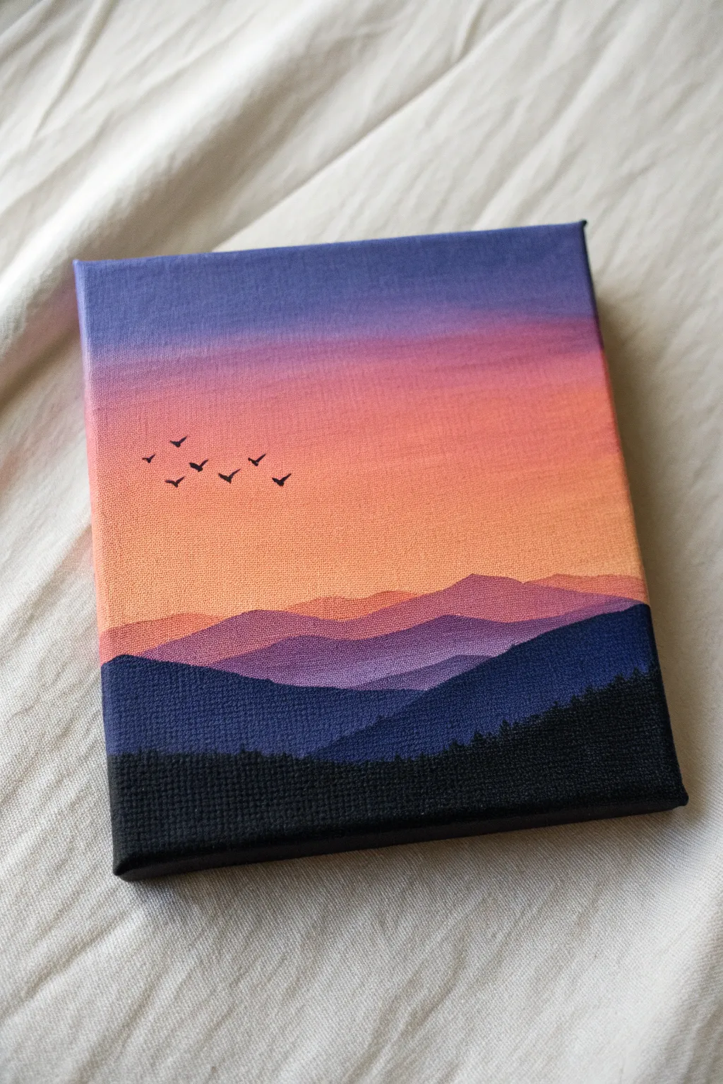
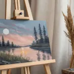
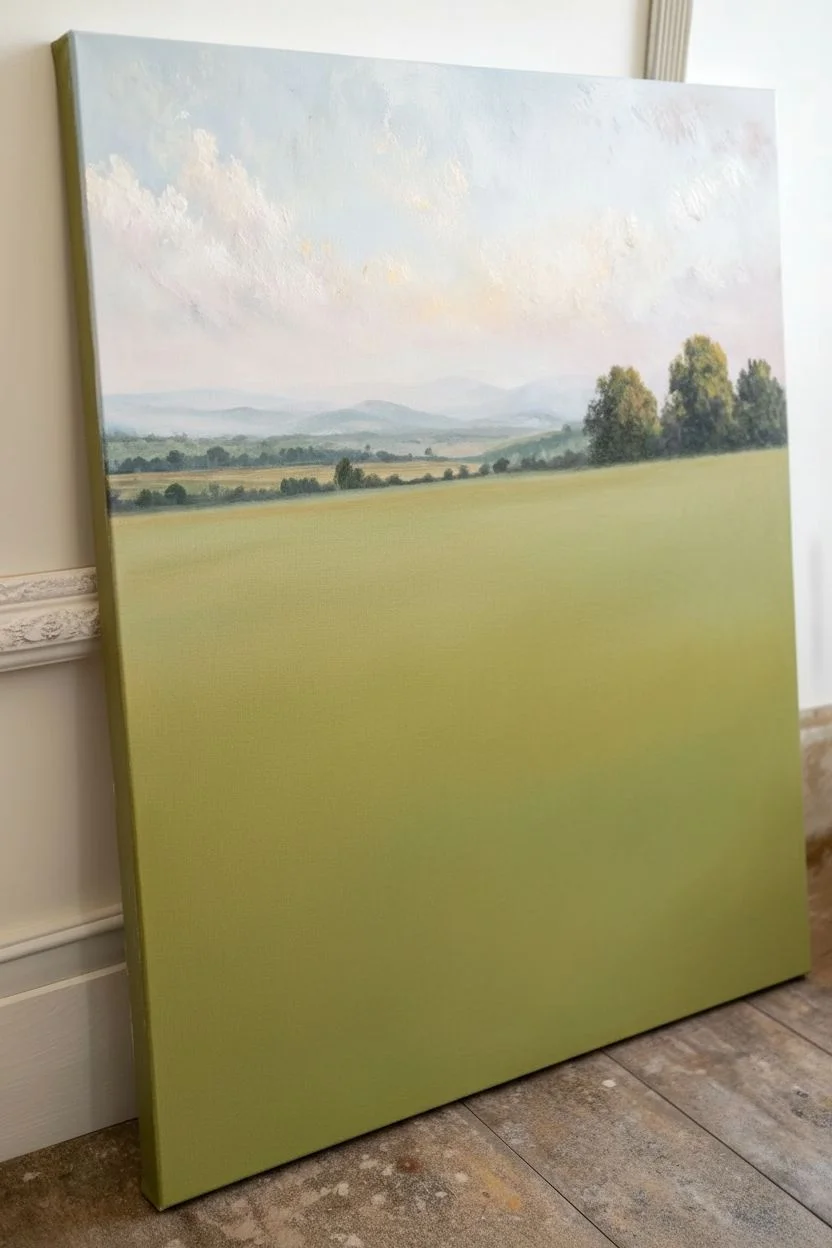
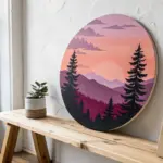
Mini Mountain Range Under A Gradient Sky
Capture the serene beauty of receding mountain ridges with this vertical landscape study. By mastering atmospheric perspective and soft gradients, you’ll learn how to create depth using progressively lighter shades of blue and a warm, glowing sky.
Step-by-Step
Materials
- Stretched canvas (11×14 or similar vertical orientation)
- Oil paints: Titanium White, Ultramarine Blue, Phthalo Blue, Alizarin Crimson, Burnt Umber, Yellow Ochre, Cadmium Yellow Light
- Brushes: Large flat brush (2 inch), medium flat brush (3/4 inch), small round brush, fan brush
- Palette knife
- Odorless mineral spirits or turpentine
- Linseed oil medium
- Palette for mixing
- Paper towels or rags
Step 1: The Glowing Sky
-
Prime the sky:
Begin by covering the top quarter of your canvas with a very thin layer of liquid white or a mix of white with a touch of linseed oil. This wet base will help your gradient blend smoothly. -
Apply the sunset warmth:
Mix a soft peach color using Titanium White, a dot of Alizarin Crimson, and a tiny bit of Cadmium Yellow. Apply this horizontally across the middle of the sky area, where the sun would be dipping behind the mountains. -
Blend the upper sky:
Clean your large flat brush thoroughly. Take pure Titanium White and blend it into the top edge of the canvas, pulling it down into the peach tone to create a seamless drift from white to soft sunset pink. -
Add cloud streaks:
With a clean, dry brush, gently sweep horizontal strokes across the sky to mimic thin cirrus clouds. Soften them until they look like whispers of vapor rather than solid shapes.
Misty Edges
If your mist looks too streaky, use a large, completely dry blending brush. Use a criss-cross motion so gentle that the bristles barely touch the canvas to blur the paint.
Step 2: Distant Peaks
-
Mix the furthest mountain color:
Create a pale, cool blue by mixing a large amount of Titanium White with a small amount of Phthalo Blue and a tiny touch of Alizarin Crimson to push it toward lavender. -
Paint the jagged horizon:
Using a palette knife or a small flat brush, carve out the shapes of the highest, most distant peaks against the sky. The edges should be somewhat distinct but not razor-sharp. -
Add snow highlights:
While the blue paint is tacky, use the knife to gently scrape a bit of Titanium White onto the sun-facing (right) slopes of the highest peak to suggest snow or light hitting the rock. -
Create the mist:
With a clean, dry 2-inch brush, tap the bottom edge of these mountains to diffuse the paint. Gentle, mist-like blending here is crucial; you want the base of the mountains to disappear into the fog below.
Step 3: Mid-Ground Ridges
-
Darken the mixture:
For the next ridge closer to the viewer, take your previous blue mix and add slightly more Phthalo Blue and a touch of Ultramarine. It should be visibly darker than the first range. -
Paint the second layer:
Paint a new mountain shape below the mist you just created. Ensure this ridge overlaps the distant ones, creating the illusion of distance. -
Enhance the fog effect:
Like before, tap the bottom edge of this new ridge with a clean brush to blur it out. I like to lift the brush slightly upward at the end of the stroke to simulate rising mist. -
Repeat for the third ridge:
Mix a distinctly darker blue-grey for the third ridge down, perhaps adding a tiny bit of Burnt Umber to dull the blue. Paint this shape lower down, again keeping the top edge crisp and the bottom edge misty.
Make It Golden
Swap the cool pink/white sky for a rich gold and orange gradient. Use the same colors to highlight the foreground grass for a ‘Golden Hour’ version of this scene.
Step 4: Foreground Slopes
-
Establish the dark base:
For the large, sloping hills in the foreground, mix a dark value using Burnt Umber and Ultramarine Blue. This creates a deep, near-black shadow color. -
Block in the geometry:
Paint the large diagonal slope coming from the bottom left, rising to the right. Then paint the countering slope behind it. These should be solid and opaque, anchoring the composition. -
Add grassy textures:
Mix Yellow Ochre with a bit of Titanium White and a touch of Burnt Umber to get a dry grass color. Using a fan brush or a worn flat brush turned sideways, tap along the slope to create the texture of tufted grass. -
Highlight the ridges:
Focus your grassy highlights on the top edges of the slopes where sunlight would catch. Leave the valleys and lower sections dark to maintain the feeling of deep folds in the terrain. -
Detail the rocky corner:
In the bottom left corner, use a palette knife to apply thick touches of grey (White + Black/Blue mix) to create rocky geometric forms. Add pure white highlights to the top edges of these rocks for crispness.
Step back and admire the depth you’ve created through layers of atmosphere and light
BRUSH GUIDE
The Right Brush for Every Stroke
From clean lines to bold texture — master brush choice, stroke control, and essential techniques.
Explore the Full Guide
Misty Pine Forest With Atmospheric Layers
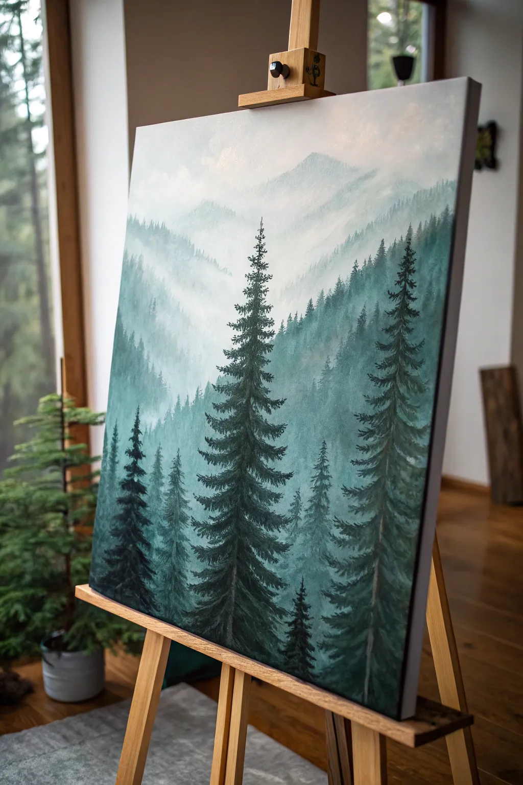
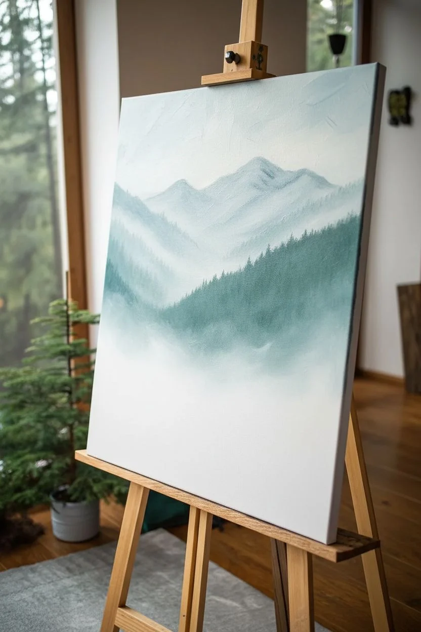
This serene oil painting captures the quiet mystery of a mountain range shrouded in mist. By building up layers from soft, blurry backgrounds to crisp, dark foregrounds, you will create a stunning sense of depth and atmospheric perspective.
Step-by-Step Tutorial
Materials
- Stretched canvas (vertical orientation, e.g., 16×20 inches)
- Oil paints: Titanium White, Ivory Black, Phthalo Green, Sap Green, Prussian Blue, Burnt Umber
- Odorless mineral spirits or turpentine
- Large flat brush (1-inch) for sky and background
- Medium filbert brush for distant trees
- Small round brush or rigger brush for detailed pines
- Fan brush (optional, for tree texture)
- Palette for mixing
- Lint-free rags
Step 1: Sky and Distant Mountains
-
Prime the sky:
Begin by covering the top quarter of your canvas with a thin layer of Titanium White mixed with a tiny speck of Phthalo Green. Use your large flat brush and paint in crisscross strokes to create a soft, hazy atmosphere. -
Mix the furthest mountain color:
On your palette, mix a very pale blue-grey using Titanium White, a small touch of Prussian Blue, and a hint of Ivory Black. It should be barely darker than the sky. -
Paint the distant peak:
With the flat brush, lay in the shape of the furthest mountain peak near the top. Don’t worry about sharp edges; gently blend the bottom of the mountain into the wet sky color so it seems to disappear into the fog. -
Create the second layer:
Mix a slightly darker value of your blue-grey, perhaps adding a touch of Phthalo Green this time. Paint a mountain ridge overlapping the first one, sitting slightly lower on the canvas. -
Blend the mist:
While the paint is still wet, take a clean, dry brush and very gently tap the bottom edge of this second mountain ridge to blur it downwards into white, creating the ‘mist’ between layers.
Fog looks muddy?
Clean your brush often! If you drag dark green paint into the white misty areas, it turns grey. Wipe your brush thoroughly on a rag between every blending stroke to keep the mist pure.
Step 2: Mid-Ground Forests
-
Darken the mix:
As you move forward, your colors need to get darker and more saturated. Mix Phthalo Green with a little White and a touch of Burnt Umber for a muted teal-green. -
Suggest tree shapes:
Switch to a medium filbert brush. Paint the next ridge of hills. Along the top edge of this ridge, use vertical dabbing motions to suggest the tops of distant pine trees, rather than a smooth line. -
Add atmospheric fog:
Just like before, blend the bottom of this layer into a lighter, mistier color. I find adding a little extra white to the bottom edge helps exaggerate the fog effect before moving to the next layer. -
Layer the green hills:
Continue this process for 2-3 more layers, moving down the canvas. Each layer should be progressively darker (more green/blue, less white) and the tree details on the ridges should get slightly larger.
Make it yours
Add a tiny pop of color to break up the greens. A few tiny, barely-there reddish-brown dots near the bottom can suggest pinecones or a forest path, adding warmth to the cool palette.
Step 3: The Hero Trees
-
Mix the darkest value:
For the foreground trees, you need a rich, deep color. Mix Sap Green, Phthalo Green, and a significant amount of Ivory Black or Burnt Umber. It should look nearly black. -
Place the central pine:
Using a small round brush or the chisel edge of a flat brush, draw a straight vertical line for the trunk of the tall, central tree. It should start near the bottom and reach almost to the distant peak. -
Build the branches:
Starting from the top of the trunk, paint the branches. Use a zig-zag motion that gets wider as you go down. Keep the top branches short and upward-pointing, and lower branches heavier and drooping slightly. -
Detail the needles:
Go back over your branches with a rigger brush or a fan brush turned vertically to tap in needle textures. Leave gaps in the foliage so the misty background peeks through. -
Add companion trees:
Paint the large tree on the right side using the same technique, making it bold and dark. Then, add the shorter trees on the left. Vary their heights to keep the composition dynamic. -
Anchor the bottom:
Fill in the very bottom of the canvas with your darkest green mix to represent the forest floor, blending the base of your foreground trees into this shadow. -
Final highlights:
Mix a small amount of Sap Green with just a touch of White. Lightly tap this onto the tips of the foreground branches that would be catching the diffuse light, giving them volume.
Step back and admire how simple layers of color have transformed into a deep, breathing forest landscape.
Moonlit Night Sky With Dark Treeline
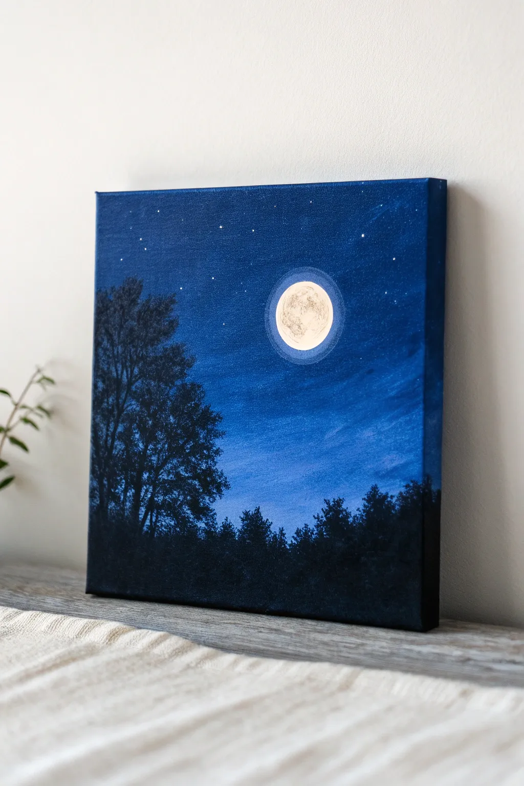
Capture the serene beauty of a crisp evening with this deeply atmospheric oil painting. Using a simple gradient technique and silhouette work, you’ll create a glowing full moon that pops against a velvety blue backdrop.
How-To Guide
Materials
- Square stretched canvas (e.g., 10×10 or 12×12 inches)
- Oil paints: Prussian Blue, Ultramarine Blue, Titanium White, Lamp Black, Burnt Umber
- Flat bristle brush (large, approx. 1 inch)
- Flat synthetic brush (medium)
- Round detail brush (small, size 0 or 1)
- Fan brush (optional, for trees)
- Palette knife
- Palette paper or wood palette
- Odorless mineral spirits or turpentine
- Rag or paper towels
- Jar lid or circular object (for tracing the moon)
Step 1: Setting the Sky Gradation
-
Prime the background:
Start by mixing a dark, rich blue using Prussian Blue with a tiny touch of Burnt Umber to deepen it without making it black. Apply this generously to the top third of the canvas using your large flat brush. -
Transition the blue:
For the middle section, switch to pure Ultramarine Blue. Blend it upward into the darker Prussian Blue while the paint is still wet, using horizontal strokes to create a seamless transition. -
Lighten the horizon:
Mix Titanium White with Ultramarine Blue to create a lighter, misty blue. Paint the bottom third of the canvas with this shade, blending it gently upwards into the mid-tone blue to suggest atmospheric perspective. -
Smooth the gradient:
Wipe your large brush clean and dry it well. Make long, gentle horizontal sweeps across the entire canvas from top to bottom to soften any harsh lines between your color zones.
Muddy Silhouettes?
If your black trees are mixing with the blue sky too much, the sky layer is too wet. Wait about 30-60 minutes for the sky to tack up before painting the trees over it.
Step 2: Creating the Moon
-
Outline the placement:
Once the background is tacky but not fully dry, position a jar lid or circular object in the upper right quadrant. Gently press it into the paint or trace lightly with a clean brush to mark your moon’s boundary. -
Create the halo:
Mix a very translucent, pale blue glaze using plenty of medium or detailed thinner and a touch of Titanium White. With a clean brush, paint a soft, circular glow extending slightly outside your moon outline. I like to gently tap the edges with a clean finger to blur them. -
Fill the base:
Using your medium flat brush, fill in the moon circle with pure Titanium White. Apply this layer relatively thinly; we will add texture on top. -
Add lunar texture:
Mix a tiny amount of Burnt Umber and Ultramarine Blue into Titanium White to make a light grey. Using the tip of a small round brush or even a crumpled bit of paper towel, dab irregular patterns onto the white moon to mimic craters and shadows. -
Refine the crisp edge:
Use your smallest detail brush and pure Titanium White to carefully repaint the very edge of the moon on the bottom right side, making it crisp against the dark sky.
Make it Shine
Add a tiny dot of pale yellow or warm white to the very center of the moon while the white paint is wet. Blend slightly outward to give the moon an inner warmth.
Step 3: Painting the Tree Silhouettes
-
Mix the silhouette color:
Combine Lamp Black with a small amount of Prussian Blue. Pure black can look flat, so adding blue gives it depth that matches the atmosphere. -
Block in the ground:
Using the large flat brush, paint a solid, uneven strip along the very bottom of the canvas to represent the forest floor and distant undergrowth. -
Establish the main tree:
On the left side, use a small round brush to paint a tall, vertical trunk line. Add primary branches reaching upward and outward. -
Add leafy volume:
Using an old, splayed bristle brush or a fan brush turned vertically, tap thick dark paint onto your branches. Keep the texture loose and airy so the blue sky peeks through the leaves. -
Fill the horizon line:
Paint varying heights of jagged shapes along the horizon line to simulate distant pine treetops. Keep these lower than your main tree on the left. -
Create mid-ground texture:
Dab the brush between the tall trees and the ground line to create the appearance of bushes and smaller saplings, ensuring no white canvas shows through at the bottom.
Step 4: Final Details
-
Add the stars:
Thin down some Titanium White with odorless mineral spirits until it is inky. Load a small brush and gently flick the bristles to splatter tiny stars across the upper sky. -
Place specific stars:
Use your smallest detail brush to manually place a few brighter, larger stars in the darker upper corners of the painting for balance. -
Paint the edges:
Don’t forget to extend your dark blue and black colors around the sides of the canvas so the painting looks finished even without a frame.
Allow your painting to dry for several days in a dust-free area before displaying your tranquil night scene

PENCIL GUIDE
Understanding Pencil Grades from H to B
From first sketch to finished drawing — learn pencil grades, line control, and shading techniques.
Explore the Full Guide
Easy Cloud Study In A Blue Sky
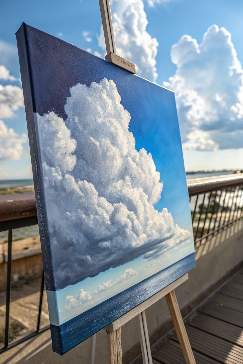
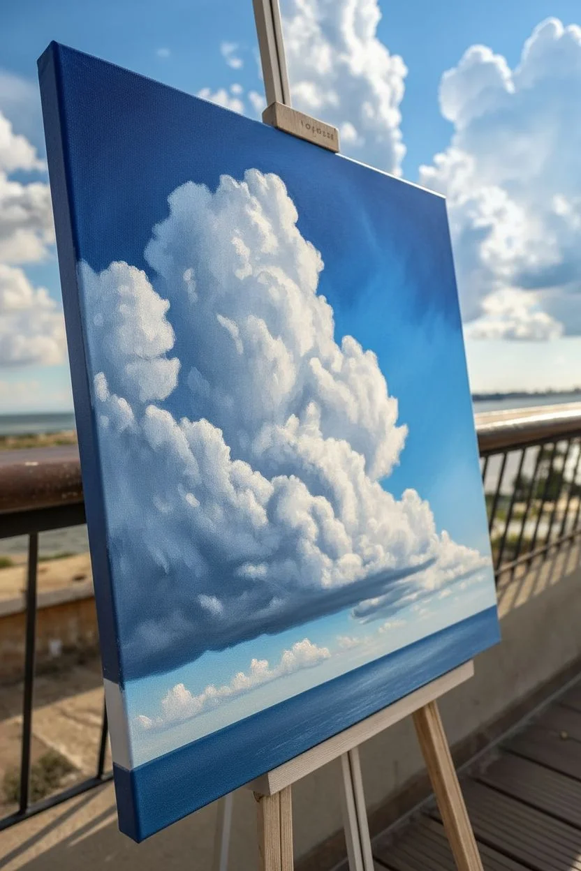
Capture the majestic height and volume of a summer storm cloud with this breathtaking oil painting study. You’ll learn to build dramatic contrast between the deep cerulean sky and the brilliant white peaks of a towering cumulus formation.
Step-by-Step Tutorial
Materials
- Stretched canvas (square or portrait orientation)
- Oil paints: Titanium White, Ultramarine Blue, Phthalo Blue, Burnt Umber, Alizarin Crimson, Yellow Ochre
- Large flat brush (for sky)
- Filbert brushes (sizes 4, 8, and 12)
- Small round brush for details
- Palette knife
- Odorless mineral spirits
- Linseed oil or painting medium
- Palette for mixing
- Paper towels or rags
Step 1: Setting the Stage
-
Prime and tone:
If your canvas isn’t pre-primed, apply gesso. While not strictly necessary, toning the canvas with a very thin wash of diluted burnt umber can help visualize values later. Let this dry completely before starting. -
Sketch the composition:
Using a small round brush and thinned blue paint, lightly sketch the horizon line about one-fifth of the way up from the bottom. Outline the massive cloud shape, ensuring it dominates the center and reaches nearly to the top left corner. -
Mix the sky gradient:
Prepare a large amount of sky blue. Mix Phthalo Blue and Ultramarine Blue with Titanium White. Create three piles: a dark, rich blue for the top corners; a mid-tone blue; and a paler, slightly warmer blue (add a tiny speck of Yellow Ochre) for the horizon area. -
Block in the sky:
Starting at the top corners, apply the darkest blue mix. As you work downward, blend in the mid-tone, and finally the palest blue near the horizon. Paint carefully around your cloud outline, but don’t worry about being too precise yet.
Softening Edges
Use a large, clean, soft makeup brush to very gently sweep over the dry painting. This blends harsh brushstrokes just enough to make the cloud look fluffy and vaporous without losing structure.
Step 2: Building the Cloud Structure
-
Establish the shadow values:
Mix a dark, stormy gray using Ultramarine Blue, Alizarin Crimson, and a touch of Burnt Umber mixed with White. This should be a cool, purple-gray tone. Paint the entire underside of the main cloud mass with this color. -
Carve out the mid-tones:
Lighten your gray mix with more white to create a mid-tone shadow. Apply this to the vertical sides of the cloud that aren’t in direct sunlight but aren’t in deep shadow either. This transitions the dark base into the lighter top. -
Paint the ocean base:
For the sea, mix a deep, dark blue using Phthalo Blue and a touch of Burnt Umber to desaturate it. Paint the water area horizontally, making it darkest at the bottom edge and slightly lighter as it meets the horizon. -
Add distant atmosphere:
Just above the water horizon, paint a very thin band of pale blue-white to represent clear sky or distant haze beneath the storm cloud.
Step 3: Sculpting Volume and Light
-
Apply the highlight foundation:
Mix a large pile of Titanium White with a tiny hint of Yellow Ochre to warm it up. Using a filbert brush, start blobbing in the main cloud shapes where the sun hits them, focusing on the top-left and upper areas. -
Refine the cloud edges:
Use a clean, dry filbert brush to soften the edges where the white cloud meets the blue sky. I like to twist the brush slightly to create ragged, natural-looking edges rather than a smooth cartoon outline. -
Create internal volume:
Clouds are made of many smaller puffs. Use your white mix to paint circular, cauliflower-like shapes within the main cloud body. Overlap these lighter shapes on top of the mid-tone grays you painted earlier. -
Add ‘silver lining’ highlights:
Mix pure Titanium White (thick paint, no medium). Apply this to the very brightest edges of the cloud tufts that are facing the imaginary sun source. This high contrast creates the 3D effect. -
Deepen the shadows:
Return to your dark purple-gray mix. Glaze this over the bottom of the cloud to make it look ominous and heavy. Extend this shadow slightly horizontally to suggest a flat bottom to the cloud formation.
Add a Focal Point
To give the viewer a sense of huge scale, paint a tiny silhouette of a sailboat on the distant horizon line or a single seagull near the cloud’s base using a rigger brush.
Step 4: Final Details
-
Paint the distant cumulus:
Using a small brush, paint the tiny, low-lying clouds near the horizon line underneath the main tower. Keep these soft and fairly indistinct to push them into the background. -
Texture the water:
Add subtle horizontal streaks of lighter blue to the water surface to suggest waves catching the light. Keep these strokes perfectly horizontal to maintain the perspective. -
Check the contrast:
Stand back and look at your painting. If the sky isn’t dark enough against the bright cloud, glaze a thin layer of Ultramarine Blue over the sky area (avoiding the cloud) to make the white pop more. -
Paint the canvas edges:
As seen in the project image, carry the painting around the sides of the canvas for a professional, gallery-ready finish without needing a frame.
Step back and admire how the simple combination of shadow and light creates such a massive sense of scale on your canvas
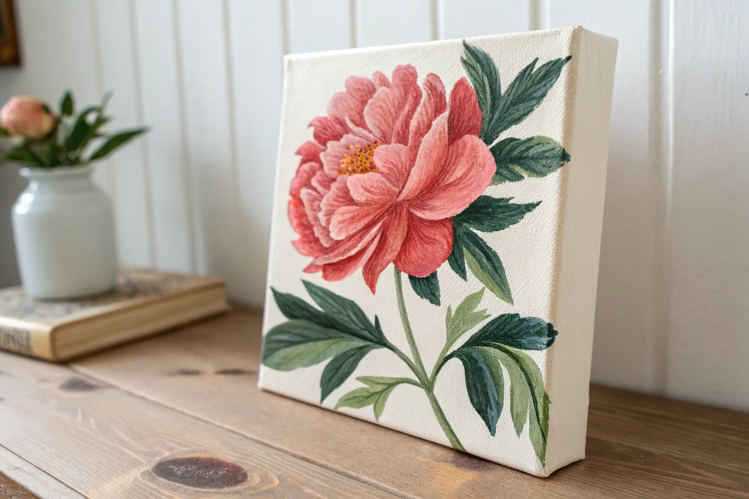
One Flower On A Stem (Up-Close And Loose)
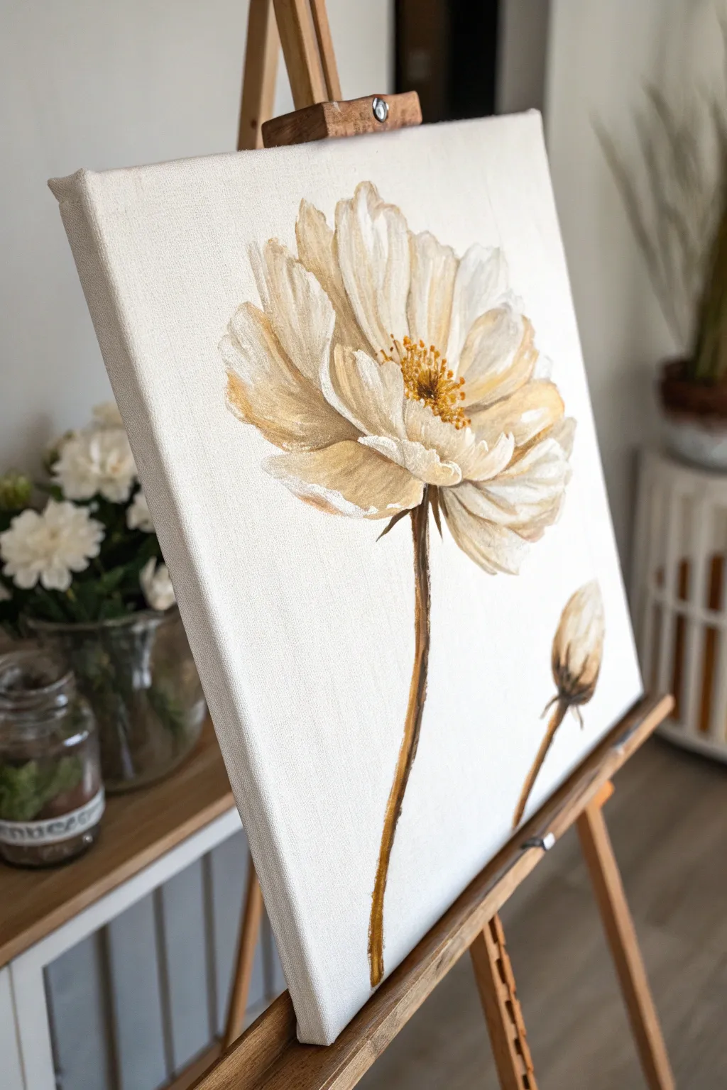
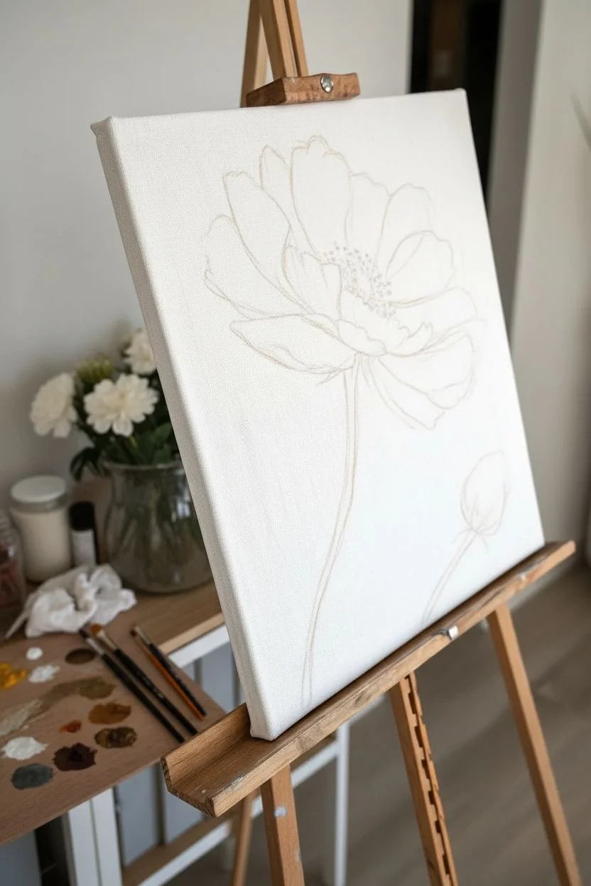
Capture the delicate elegance of a single peony-style bloom with this loose, expressive oil painting project. The focus is on soft beige tones, visible brushwork, and a striking composition that balances a large open flower against a quiet, closed bud.
Step-by-Step Guide
Materials
- Stretched canvas (rectangular, portrait orientation)
- Oil paints: Titanium White, Yellow Ochre, Burnt Umber, Raw Sienna
- Paint thinner or odorless mineral spirits
- Flat bristle brushes (large and medium)
- Small round brush for details
- Palette knife (optional for mixing)
- Palette
- Rag or paper towels
Step 1: Planning and Underpainting
-
Define the composition:
Visualize the placement of your main flower. It should dominate the upper half of the canvas, slightly off-center to the right to leave negative space on the left. -
Sketch the stems:
Using a small round brush dipped in thinned Burnt Umber, lightly sketch a long, slightly curved line for the main stem. Add a second, shorter stem branching off to the right for the bud. -
Outline the flower shapes:
Sketch a large, rough oval for the main flower head and a smaller teardrop shape for the bud. Keep these lines faint and loose; they are just guides.
Step 2: Blocking in Color
-
Mix your base petal color:
On your palette, mix a large amount of Titanium White with a touches of Yellow Ochre and a tiny speck of Burnt Umber to create a warm, creamy beige. -
Paint the shadow shapes:
Mix a darker version of your beige by adding more Raw Sienna. Use a medium flat brush to paint the inner parts of the petals where shadows would fall, particularly towards the center of the bloom. -
Apply the mid-tones:
Load your brush with the original cream mixture. Apply broad, confident strokes to establish the main body of the petals, letting the brush bristles leave texture. -
Create the bud:
Use the same cream and shadow mixtures to fill in the bud shape. Paint the bottom of the bud darker where it connects to the stem.
Muddy Colors?
If your beige turns gray or muddy on the canvas, stop and clean your brush completely. Wet-on-wet painting requires a clean tool when switching between shadow and highlight tones.
Step 3: Adding Texture and Detail
-
Highlight the petals:
Clean your brush thoroughly. Pick up pure Titanium White and paint the tips and upper edges of the petals. I like to lay this paint on thick to catch the light. -
Refine the petal edges:
Use the white paint to carve out the separation between petals. Keep the edges relatively loose and painterly rather than sharp and photographic. -
Paint the stems:
Mix Burnt Umber with a little Yellow Ochre. Using a medium flat brush turned sideways or a round brush, paint the long stems. Don’t make the line perfectly straight; vary the pressure to create a natural, organic thickness. -
Add stem sepals:
At the base of the main flower and the bud, paint small, leaf-like sepals using the dark brown stem mixture to connect the bloom to the stalk.
Make it Shine
Once the painting is fully dry (after several weeks), apply a layer of gloss varnish. This will make the subtle variations in the beige tones richer and give the piece a professional finish.
Step 4: The Center and Final Touches
-
Build the flower center base:
Mix Raw Sienna with a little Burnt Umber. Dab this color into the very center of the open flower to create depth. -
Paint the stamen:
Dip a small round brush into thick Yellow Ochre or a mix of yellow and white. Stipple small dots over the dark center area to create the pollen-covered stamen. -
Add deep contrast:
Look for areas where petals overlap deeply. Add very thin touches of dark Burnt Umber here to make the light petals pop forward. -
Soften the background:
If you got any paint on the white background, use clean white paint to tidy up the negative space, cutting back into the flower shape if you need to correct the silhouette. -
Review contrast:
Step back and check if your highlights are bright enough. If the paint has sunk in, add one final pass of thick Titanium White on the brightest petal tips.
Enjoy the soothing simplicity of this botanical study as it dries


Simple Bouquet In A Vase
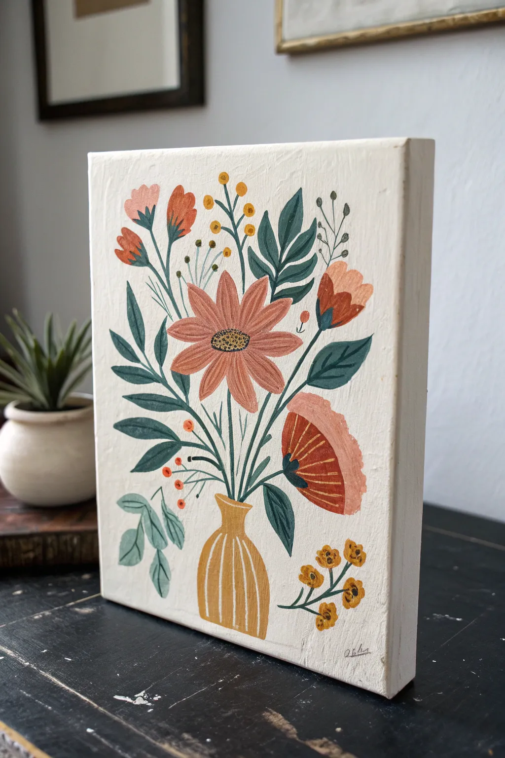
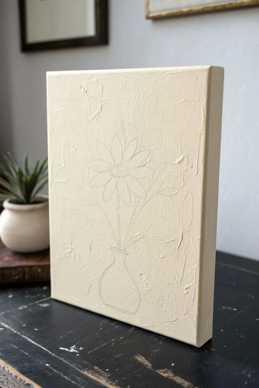
This charming project combines a rustic, illustrative style with warm earthy tones to create a delightful floral bouquet. Using thick, opaque strokes on a chunky canvas or wood block gives the piece a wonderful texture and dimensional feel.
Step-by-Step
Materials
- Small canvas board or wood panel (approx 5×7 or 6×8 inches)
- Oil paints (burnt sienna, yellow ochre, sap green, deep teal/viridian, titanium white, cadmium red/orange)
- Small flat synthetic brushes (size 4 and 6)
- Fine liner brush (size 0 or 00)
- Palette paper or wooden palette
- Odorless mineral spirits or brush cleaner
- Paper towels
- Pencil for sketching
Step 1: Preparation and Base Layer
-
Surface Prep:
Begin with a clean canvas or wood panel. The thick sides of the panel in the reference look great, so if you have a deep-edge canvas, paint the sides a creamy off-white to match the front. -
Background Application:
Mix Titanium White with a tiny touch of Yellow Ochre to create a warm, creamy off-white. Apply this generously across the entire front surface. Use slightly messy, textured strokes to create an organic, handmade feel rather than a perfectly smooth finish. -
Initial Sketch:
Once the background is touch-dry (or while wet if you are confident), lightly sketch the vase position at the bottom center and map out the general shape of the central flower and surrounding stems with a pencil.
Clean Lines
For crisp details like the vase stripes or leaf veins, slightly thin your oil paint with a drop of linseed oil or mineral spirits so it flows smoothly off the liner brush.
Step 2: Painting the Vase and Greens
-
The Vase Shape:
Mix Yellow Ochre with a dot of Burnt Sienna. Using a small flat brush, paint the bulbous vase shape. Don’t worry about perfect symmetry; a slightly wonky edge adds to the folk art charm. -
Vase Details:
While the vase paint is still tacky, use a liner brush with pure Cream (your background color) to paint curved vertical stripes down the vase to suggest volume. -
Dark Leaves:
Mix a Deep Teal or Viridian Green. Using the flat edge of your brush, paint the large, pointed leaves on the left and right sides. Press down and lift off to create the tapered leaf shape. -
Leaf Veins:
While the dark teal paint is wet, take your liner brush with a lighter green (add white to your teal mixture) and gently pull a center line through each leaf. -
Light Green Sprigs:
Mix Sap Green with White for a soft sage color. Paint the trailing leaves near the bottom left of the vase and the sprigs near the top.
Step 3: Adding the Blooms
-
The Central Flower:
Mix Burnt Sienna with White and a touch of Cadmium Red to get a dusty pink/terracotta shade. Paint the long, daisy-like petals of the central flower, radiating outward from a blank center. -
Flower Center:
Fill the center of the main flower with Yellow Ochre. Once placed, use the tip of a small brush to stipple small dots of dark brown or black for texture. -
The Side Profile FLowers:
Use a darker orange-red (mix Cadmium Red with Burnt Sienna) to paint the tulip-shaped blooms on the upper right side. These are simple cup shapes with jagged top edges. -
The Large Side Bloom:
On the lower right, paint a large semi-circle fan shape using a deep terracotta red. Add a lighter pink wash to the outer edge of this bloom to create a two-tone effect. -
Small Filler Buds:
Using a reddish-orange mix, dab small oval shapes on the upper left stems. These represent unopened buds.
Level Up: Texture
Use a palette knife to apply the background create faint ridges. When you paint the delicate stems over it later, the texture will add a beautiful, aged fresco quality.
Step 4: Fine Details and Finishing
-
Stem Work:
Switch to your finest liner brush with a dark green-black mixture. Carefully connect all your floating flowers and leaves to the vase. I like to keep lines thin and slightly curved for elegance. -
Golden Berries:
Mix a bright Mustard Yellow. Add small circles on fine stems poking out from the top of the arrangement and near the bottom right corner. -
Tiny Red Berries:
Use a pure red or orange to add tiny dots on thin stems near the vase neck on the left side, filling in that negative space. -
Decorative Stripes:
Go back to the large fan-shaped flower on the right. Using a very thin brush and a pale yellow, paint fine radial lines from the center outward to give it structure. -
Final Tweaks:
Step back and look at the composition. If any stems look disconnected or a color feels too flat, add a tiny highlight of white or a shadow of dark teal to bring it to life. -
Signing:
Once you are happy, sign your name in the bottom corner with a fine brush using a diluted dark gray paint.
Allow your painting to dry in a dust-free area for several days before displaying your cheerful bouquet
Impressionistic Field Of Wildflowers
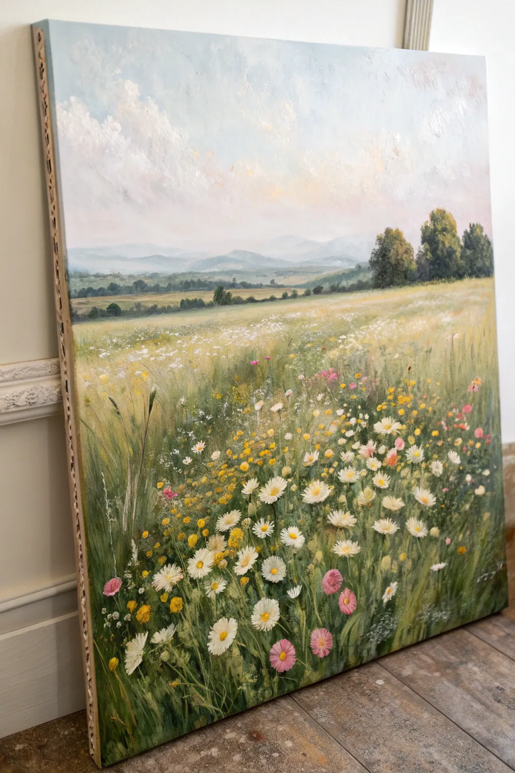
Capture the serene beauty of a summer day with this impressionistic oil painting, featuring a lush foreground of daisies and pink blooms fading into rolling hills. The soft, textured brushstrokes create a sense of movement and depth that feels both classic and fresh.
Step-by-Step Guide
Materials
- Canvas (stretched on frame, medium grain)
- Oil paints (Titanium White, Ultramarine Blue, Sap Green, Cadmium Yellow, Alizarin Crimson, Burnt Umber, Yellow Ochre)
- Hog bristle brushes (large flat, medium filbert, lush round)
- Fine liner brush or rigger brush
- Palette knife
- Odorless mineral spirits or turpentine
- Linseed oil medium
- Wooden palette
- Rag or paper towels
Step 1: Sky and Background Atmosphere
-
Priming the Sky:
Start by mixing a very pale blue using Titanium White and a tiny touch of Ultramarine Blue. Apply this to the top third of the canvas using a large flat brush, keeping the strokes loose and horizontal. -
Adding Cloud Texture:
While the blue is still wet, mix pure Titanium White with a hint of Yellow Ochre for warmth. Scumble this mixture over the blue in irregular, fluffy circular motions to create soft, billowing clouds. -
Creating Distance:
For the distant hills, mix Ultramarine Blue, White, and a tiny bit of Alizarin Crimson to make a hazy purple-grey. Paint the furthest mountain range with a soft silhouette, blurring the edges into the sky to simulate atmospheric perspective. -
Mid-Ground Hills:
Mix Sap Green with White and a touch of Blue to create a cool, muted green. Paint the rolling hills just below the mountains, allowing the colors to slightly blend with the wet paint of the background for a misty effect. -
Defining the Tree Line:
Using a dark mixture of Sap Green and Burnt Umber, dab in the shapes of distant trees on the right side and along the horizon line. Keep these shapes general rather than detailed.
Muddy Colors?
If your greens and pinks are turning brown, your brush isn’t clean enough between color families. Wipe brushes thoroughly or keep separate brushes for warm flowers and cool, grassy foliage.
Step 2: Laying the Meadow Foundation
-
Underpainting the Field:
Cover the remaining bottom two-thirds of the canvas with a thin wash of Sap Green and Yellow Ochre. This establishes the warm, grassy base tone. -
Building Texture:
Switch to a medium filbert brush and thicker paint. Apply vertical strokes of varying greens—mix in some darker greens (Sap Green + Burnt Umber) for the bottom corners and lighter, yellow-greens for the middle distance. -
Creating Grass Movement:
Use the edge of your palette knife or a dry bristly brush to drag some of the wet paint upwards. This ‘sgraffito’ or dragging technique mimics individual tall blades of grass catching the light. -
Adding Color Variation:
Before adding flowers, dot in some subtle patches of brown and deeper Ochre throughout the green field. This suggests pockets of earth and dried grass, adding realism to the meadow.
Step 3: Cultivating the Wildflowers
-
Distant Blooms:
For the flowers far away in the field, simply stipple tiny dots of white and pale yellow. Don’t paint petals here; mere suggestions of color will trick the eye into seeing a vast field. -
Scattered Pinks:
Mix a soft pink using White and Alizarin Crimson. Randomly place small clusters of pink flowers in the middle ground and foreground, keeping the shapes loose and organic. -
Painting Daisy Centers:
In the immediate foreground, place distinct dots of Cadmium Yellow and Yellow Ochre where you want your main focal flowers to be. -
Detailing White Petals:
Using a smaller round brush loaded with thick Titanium White, paint the petals radiating from your yellow centers. I like to use a single, confident stroke for each petal, pressing down and lifting up to create a tapered shape. -
Adding Variety:
Don’t make every flower face forward. Paint some daisies from the side (ellipses) and some that are just buds to make the arrangement feel natural and wild. -
Pink Flower Details:
Return to your foreground pink flowers and add highlights with a lighter pink mixture on the top edges of the petals to give them volume.
Texture Boost
Mix a little cold wax medium or impasto gel into your white paint for the foreground daisies. This thickens the paint, making the petals physically stand out from the canvas for a 3D effect.
Step 4: Final Touches
-
Refining Stems:
Use a fine liner or rigger brush with thinned sap green paint to connect the foreground flower heads to the grass below. -
Highlights and Accents:
Add tiny flecks of pure Yellow and White throughout the green grass to look like sun-dappled leaves or tiny buttercups. -
Structuring the Edge:
If painting on a stretched canvas, consider painting the sides a neutral grey or extending the image around the edge for a polished, frameless look.
Step back and admire your peaceful meadow scene as the thick impasto flowers catch the light.
Butterfly Silhouette Over A Color Blend
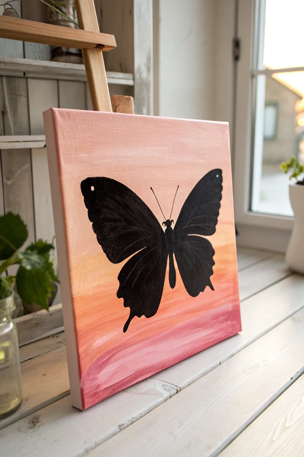
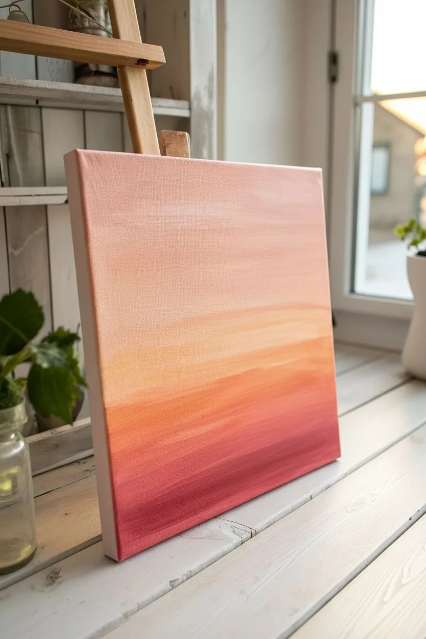
Capture the serene beauty of dusk with this beginner-friendly oil painting project. You’ll create a glowing, warm gradient background that sets the perfect stage for a striking, high-contrast black butterfly silhouette.
Step-by-Step Tutorial
Materials
- Square stretched canvas (e.g., 10×10 or 12×12 inches)
- Oil paints: Titanium White, Cadmium Yellow, Napthol Red (or a pinkish red), Ivory Black
- Flat bristle brush (large, around 1 inch)
- Round synthetic brush (small, size 2 or 4)
- Detail liner brush (size 0 or 00)
- Palette for mixing
- Palette knife
- Paper towels or rag
- Pencil (optional)
- Odorless mineral spirits or brush cleaner
Step 1: Creating the Sunset Gradient
-
Prepare your palette:
Squeeze out generous amounts of white, yellow, and red onto your palette. Using your palette knife, pre-mix three main shades: a deep pinkish-red, a vibrant orange (red + yellow), and a very pale peach (lots of white + tiny touch of red/yellow). -
Paint the base strip:
Dip your large flat brush into the deep pinkish-red mixture. Apply this color in broad, horizontal strokes across the bottom 2-3 inches of the canvas. Don’t worry about being perfectly neat; messy strokes add texture. -
Add the middle tone:
Wipe your brush slightly (don’t clean it fully) and pick up the orange mixture. Paint the middle section of the canvas, overlapping slightly with the wet red layer below to encourage mingling. -
Apply the top highlight:
Clean your brush thoroughly. Load it with the pale peach mixture and paint the top third of the canvas. Bring this light color down to meet the orange section. -
Blend the transitions:
With a clean, dry flat brush, gently sweep back and forth horizontally across the lines where the colors meet. Use a light touch to soften the hard edges without muddying the colors completely. -
Refine the texture:
I like to leave visible horizontal brushmarks rather than blending it perfectly smooth. If needed, add a touch more white to the top area to brighten it further before the paint sets. -
Dry time:
Oil paints dry slowly. Allow this background layer to dry until it is at least tacky to the touch—ideally overnight—so your black silhouette doesn’t bleed into the background.
Muddy Gradient?
If colors merge into gray or brown, wipe your brush clean more often. Don’t over-blend; let the distinct bands of color sit next to each other.
Step 2: Painting the Silhouette
-
Sketch the outline:
Once the background is dry enough, lightly sketch the butterfly shape with a pencil. Start with a thin oval body in the center, tilted slightly if you want a dynamic look. -
Draft the wings:
Draw the upper wings as large, rounded triangles that curve upward. Then, add the lower wings, which should be slightly smaller and feature scalloped edges and little ‘tails’ at the bottom. -
Fill the upper wings:
Switch to your medium round brush and load it with pure Ivory Black. Carefully paint the inside of the upper wings, keeping your edges crisp against the sunset background. -
Painting the lower wings:
Continue filling in the lower wings with black. Pay special attention to the scalloped edges; use the tip of the brush to get sharp points on the wing tails. -
Define the body:
Paint the central body shape. It needs to be distinct but connected to the wings. Ensure the paint is opaque enough to cover the background colors entirely. -
Detail work:
Switch to your fine liner brush. Add two thin, delicate antennae curving outward from the top of the head. Keep your hand steady and use fluid paint for smooth lines. -
Add contrast dots:
If you want a hint of detail, dip the very tip of a clean liner brush handle or a toothpick into white paint. Place a tiny dot on the upper corner of the wing for a subtle highlight. -
Final check:
Step back and look for any spots where the background shows through the black. Apply a second coat of black to the silhouette if necessary for a solid, velvety finish.
Level Up: Glitter Wings
While the black paint is still wet, sprinkle a tiny pinch of fine black or iridescent glitter onto the wet wings for a magical, shimmering texture.
Hang your new masterpiece in a bright spot where the warm tones can really shine
Palette Knife Abstract With Two Or Three Colors
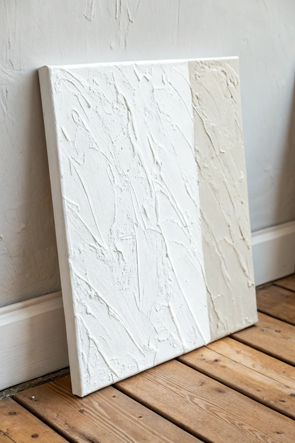
Learn to master texture paste and clean lines with this minimalist two-tone abstract artwork. This project relies on thick, sculptural layers created with a palette knife to achieve a modern, tactile finish that looks high-end but is simple to execute.
How-To Guide
Materials
- Stretched canvas (square or rectangular)
- Texture paste or heavy body modeling paste
- Oil paints (Titanium White, Buff Titanium or Unbleached Titanium)
- Large palette knife (trowel shape)
- Painter’s tape (low tack)
- Disposable palette or mixing plate
- Pencil
- Ruler
Step 1: Preparing the Canvas
-
Clean the surface:
Wipe down your canvas with a dry cloth to ensure there is no dust, which can interfere with the adhesion of the texture paste. -
Draw the dividing line:
Decide on your composition. For this look, measure a vertical line about two-thirds of the way across the canvas. Use a ruler and pencil to draw this line lightly from top to bottom. -
Tape the boundary:
Apply a strip of painter’s tape along the pencil line. Place the tape on the side that will become the *white* section first, so you can work on the beige strip without bleeding over. -
Seal the tape edge:
Run your fingernail or the back of a spoon firmly along the edge of the tape to seal it tightly against the canvas texture.
Step 2: Mixing and Applying Texture
-
Mix the beige tone:
On your palette, mix a generous amount of modeling paste with a small squeeze of Buff Titanium oil paint. The goal is a uniform, sandy beige color that holds its shape. -
Apply the first dollop:
Scoop up a large amount of the beige mixture with your palette knife and place it on the exposed canvas strip. -
Spread vertically:
Using the flat side of the knife, spread the paste vertically. Apply firm pressure to cover the canvas, but keep the layer thick enough to hide the weave. -
Create texture valleys:
Turn your knife slightly on its edge and drag it downwards through the wet paste. This creates random ridges and valleys similar to bark or rough stone. -
Add chaotic strokes:
Intersect your vertical lines with a few short, angled scrapes. Don’t overthink this; the randomness is what gives the piece character. -
Remove the tape:
While the paste is still wet, carefully peel back the painter’s tape at a 45-degree angle. This ensures a crisp, sharp line. -
Let it cure:
Allow this section to dry completely. Modeling paste can take several hours or even overnight depending on thickness, and it must be hard before you tape over it.
Clean Knife Cuts
Wipe your palette knife clean with a paper towel between every few strokes. Dried bits on the blade will drag through wet paste and ruin smooth areas.
Step 3: The White Section
-
Tape the second side:
Once the beige side is rock-solid dry, apply painter’s tape specifically over the *beige* edge you just created to protect it. -
Prepare the white mix:
Mix fresh modeling paste with Titanium White oil paint. I usually add just enough paint to brighten the paste without making it runny. -
Apply to canvas:
Load your palette knife and spread the white mixture over the larger remaining section of the canvas. -
Emphasize ridges:
For the white section, create bolder, deeper texture. Press the knife flat against the canvas and lift straight up to create peaks, or drag heavily to create rifts. -
Blend the edges:
Pay attention to the outer edges of the canvas. Wrap the texture paste slightly around the sides of the frame for a professional, gallery-style finish. -
Refine the surface:
Look for any areas that seem too flat. Add small extra dollops of paste and smooth them partially out to create layers of depth. -
Reveal the line:
Gently remove the tape from the beige side. Do this slowly to avoid chipping the dried texture underneath. -
Final drying:
Set the painting upright in a dust-free area to cure. Thick oil-based texture takes time, so be patient before hanging it.
Metallic Accent
Once the painting is fully dry, lightly dry-brush gold or silver oil paint just on the highest peaks of the texture to catch the light.
Hang your textured masterpiece in a well-lit spot to let shadows play across the ridges
Geometric Color Blocks With Crisp Edges
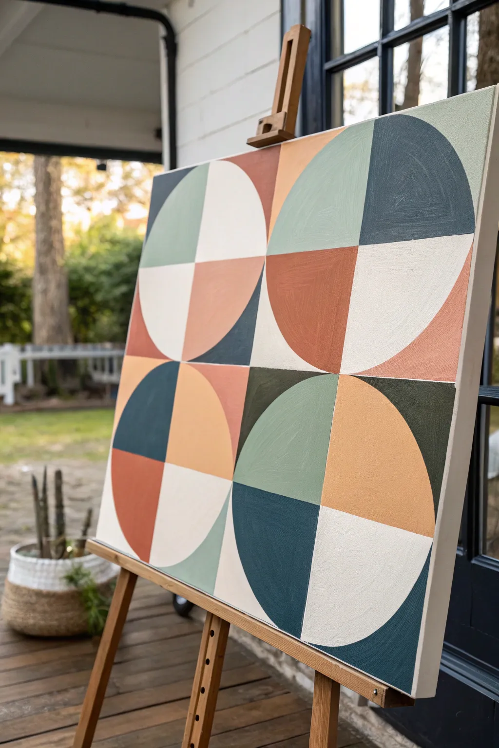
Embrace the crisp, modern appeal of geometric abstraction with this striking quartered circle design. Using a palette of muted earth tones—terra cotta, sage, deep teal, and cream—you will build a balanced composition that feels both retro and contemporary.
Step-by-Step
Materials
- Stretched canvas (rectangular, approx. 18×24 or 24×30 inches)
- Oil paints (Titanium White, Burnt Sienna, Yellow Ochre, Ultramarine Blue, Phthalo Green, Sap Green)
- Gesso (optional, for priming)
- Painter’s tape (low-tack, various widths)
- Compass or round objects for tracing
- Ruler or T-square
- Pencil
- Flat synthetic brushes (various sizes for filling shapes)
- Palette knife and palette
- Odorless mineral spirits or brush cleaner
- Lint-free rags
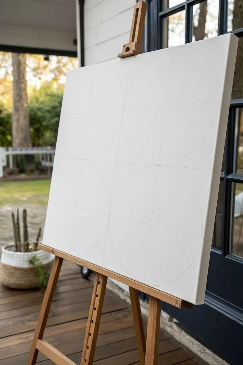
Step 1: Planning and Sketching
-
Prepare the canvas:
Begin with a clean canvas. If you prefer a smoother surface for geometric work, apply an extra coat of gesso and sand it lightly once dry to reduce the weave texture. -
Mark the grid:
Use your ruler to find the exact center of the canvas. Lightly draw a vertical line and a horizontal line that divide the canvas into four equal quadrants. -
Draw the circles:
In the center of each of the four quadrants, draw a large circle. The circles should be large enough that they almost touch the edges of their quadrant boundaries. -
Segment the shapes:
Divide each large circle into four equal pie wedges using vertical and horizontal lines through their centers. You should now have a grid where the positive space (the circles) and negative space (the background corners) interact.
Seal the Tape Edge
Before painting your color, brush a thin layer of clear medium or the base color over the tape edge. This seals gaps so your lines stay razor-sharp.
Step 2: Color Mixing
-
Mix the cream:
Start with a large amount of Titanium White and add a tiny touch of Yellow Ochre and a speck of Burnt Sienna to warm it up without turning it beige. -
Create the sage green:
Combine Sap Green with Titanium White. To desaturate it and make it earthy, add a very small amount of Burnt Sienna or Red. -
Mix the terra cotta:
Mix Burnt Sienna with a little Yellow Ochre and a touch of Titanium White to create a soft, rusty orange-red. -
Blend the deep teal:
Mix Phthalo Green and Ultramarine Blue in equal parts. Add a touch of black or Burnt Umber to deepen it, then barely lighten with white until it matches the dark, moody blue-green in the reference. -
Mix the background colors:
You will also need slight variations of these colors for the ‘negative space’ corners outside the circles. I like to mix slightly lighter or darker versions of the main four colors to create subtle contrast.
Add Texture
For a more organic look, mix cold wax medium into your oil paints. This creates a matte, velvety finish and prevents the colors from looking like plastic.
Step 3: Painting the Design
-
Tape the first set of shapes:
Apply painter’s tape along the straight edges of the non-adjacent shapes you want to paint first. Press the edges of the tape down firmly with your fingernail to prevent paint bleed. -
Apply the first color blocks:
Using a flat brush, fill in the taped sections. Use smooth, even strokes. For the curved edges where tape is hard to use, careful freehand painting with a steady hand is best. -
Work in diagonal pairs:
To keep the balance, paint corresponding shapes across the canvas. If you paint a teal wedge in the bottom left, paint the opposing teal wedge in the top right to maintain color harmony. -
Remove tape carefully:
Peel back the tape while the paint is still slightly wet rather than bone dry; this helps ensure a crisp line without chipping rigid dry paint. -
Allow sticking time:
Let these first sections dry to the touch (or at least become tacky) before taping over them to paint neighboring sections. Oil paint takes time, so patience here prevents smudging. -
Fill the remaining wedges:
Proceed to fill the remaining pie wedges in the circles. Alternate between your cream, sage, terra cotta, and teal mixes, ensuring no two adjacent shapes share the exact same color. -
Paint the background corners:
Finally, fill in the negative spaces (the corners outside the circles). Use colors that contrast with the adjacent circle wedge to make the circular form pop. -
Refine the edges:
Once the main blocking is done, use a small detail brush to neaten up any curves that look wobbly. You can cut back into shapes with the background color to sharpen points.
Step 4: Finishing Touches
-
Check opacity:
Step back and look for translucent patches. Some colors, like the cream or yellow ochre mixes, may need a second coat for solid, opaque coverage. -
Paint the sides:
Don’t forget the edges of the canvas. Painting them a neutral gray or extending the design over the side gives the piece a professional, gallery-ready finish without needing a frame.
Hang your new masterpiece in a well-lit spot to enjoy the interplay of structured geometry and calming colors
Nine Tiny Paintings On One Theme (Mini-Series Grid)
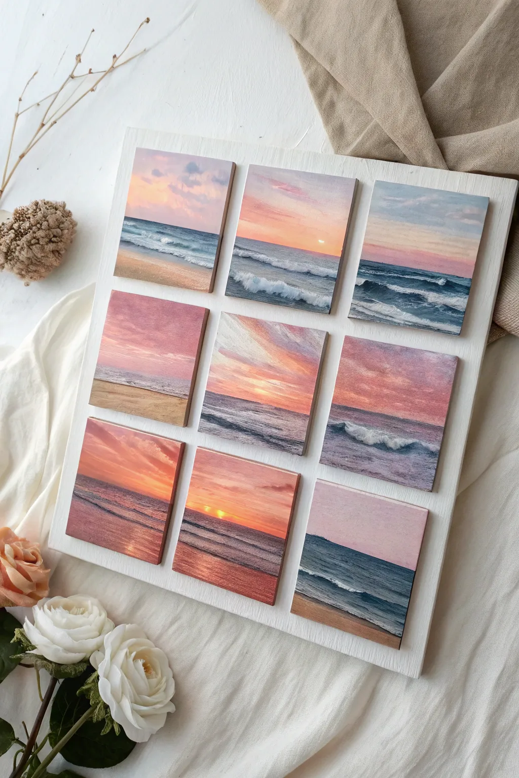
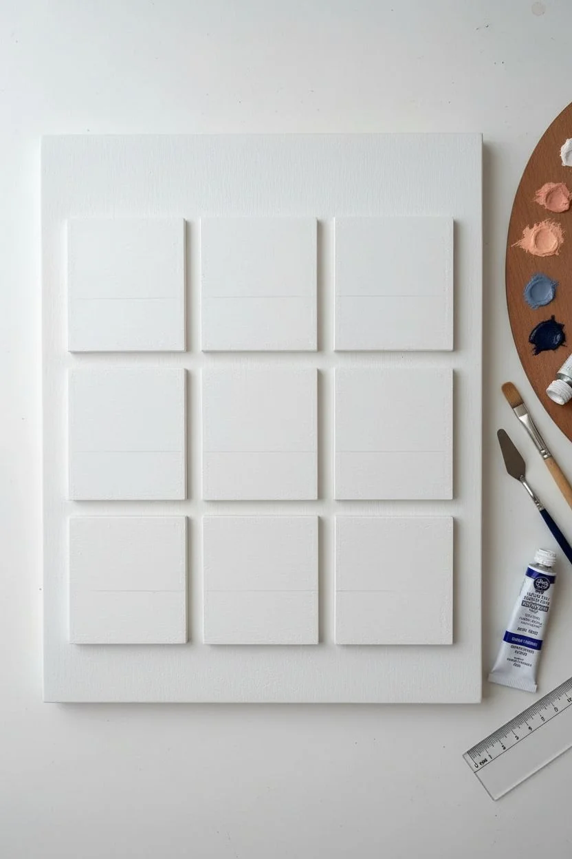
Capture the shifting moods of a coastal sunset with this grid of nine miniature oil paintings. By repeating a single theme across small wooden blocks, you create a cohesive and impressive gallery wall piece that feels far grander than the sum of its parts.
How-To Guide
Materials
- 9 small square wood panels or mini canvases (approx. 3×3 or 4×4 inches)
- Large white wooden mounting board or heavy cradle framing board
- Oil paints (Titanium White, Ultramarine Blue, Alizarin Crimson, Cadmium Yellow, Burnt Sienna, Phthalo Blue)
- Small flat brushes (sizes 2 and 4)
- Small round detail brush (size 0 or 00)
- Palette knife for mixing
- Odorless mineral spirits or brush cleaner
- Strong craft glue or wood glue
- Ruler and pencil
- Sandpaper (fine grit)
Step 1: Preparation & Planning
-
Prep the surface:
If using raw wood squares, give their faces a light sanding to create a smooth surface. Apply two thin coats of gesso to prime them, allowing full drying time between coats to prevent the oil paint from sinking into the wood grain. -
Plan the palette:
Squeeze out your colors. Since this is a sunset theme, you’ll want to pre-mix a few gradients. Create a soft peach (White + tiny dot of Yellow + Crimson), a dusky lavender (White + Blue + Crimson), and a deep ocean blue (Ultramarine + minimal Burnt Sienna to darken). -
Sketch the horizon lines:
Lightly draw a straight horizon line on each square. Vary the placement—put some high (focusing on the sand) and some low (focusing on the sky) to create visual interest across the grid.
Step 2: Painting the Skies
-
Start with the light source:
On panels featuring the sun, paint a small circle of pure white or very pale yellow near the horizon. Don’t worry about blending yet; this marks your light source. -
Apply the gradient base:
Using a flat brush, block in the sky colors. Start with yellows and oranges near the horizon and transition into pinks, purples, or soft blues as you move upward. I find it helpful to paint all nine skies first to keep the color harmony consistent. -
Blend wet-on-wet:
While the paint is still wet, use a clean, dry flat brush to gently sweep back and forth across the transition lines between colors. This creates that seamless, soft glow typical of oil paints. -
Add cloud definition:
Dip a corner of your brush into a slightly darker violet or grey-purple. Dab in irregular cloud shapes, keeping the bottoms flat and the tops fluffy. Soften the edges again with a dry brush so they look distant.
Sticky Situation?
If your glue isn’t holding the heavy wood blocks, try using a heavy-duty construction adhesive (like Liquid Nails) or heavy-duty double-sided mounting tape for an instant hold.
Step 3: Painting the Ocean & Sand
-
Block in the water:
Use your deep blues and teal mixtures for the water. The water line at the horizon should be perfectly straight and darker than the water in the foreground. -
Reflect the sky:
If the sky above is bright orange, brush some of that orange into the wet blue paint of the water directly beneath the sun. This reflection ties the two halves of the painting together. -
Paint the shore:
For panels showing the beach, mix White, Yellow, and a touch of Burnt Sienna to make a sand color. Paint this at the bottom, blending it slightly where it meets the water to look like wet sand. -
Create waves:
Load a small round brush with thick Titanium White. Paint thin, horizontal lines for distant waves. For crashing waves near the shore, use a slightly thicker application and drag the paint downward slightly to mimic the transparency of the curl. -
Add seafoam texture:
Stipple (tap repeatedly) white paint along the shoreline where the water meets the sand. This rough texture mimics seafoam. Don’t over-blend this part; let the texture stand out.
Make it Shine
Once the oils are fully cured (after 6+ months), apply a high-gloss varnish to each mini-painting. This makes the water look permanently wet and vibrant.
Step 4: Assembly & Finishing
-
Allow to cure:
Oil paint takes time to dry—usually several days to a week depending on thickness. Store the tiles in a dust-free area until they are dry to the touch. -
Prepare the backboard:
While the paintings dry, take your large white mounting board. Measure the total width of your grid plus spacing. Mark the exact center of the board to ensure your grid is centered. -
Mark the grid lines:
Using a ruler and very light pencil marks, draw a 3×3 grid outline on the mount board. Leave a consistent gap (about 0.5 to 1 inch) between each square outline. -
Glue the panels:
Apply a strong wood glue specifically to the back of each painted tile. Press them firmly onto their marked spots on the board. Wipe away any excess glue immediately. -
Weight it down:
Place a clean sheet of wax paper over the paintings, then lay heavy books on top to ensure the glue bonds flat and secure while drying overnight.
Hang your finished seascape grid in a spot that gets good light to show off those subtle gradient blends
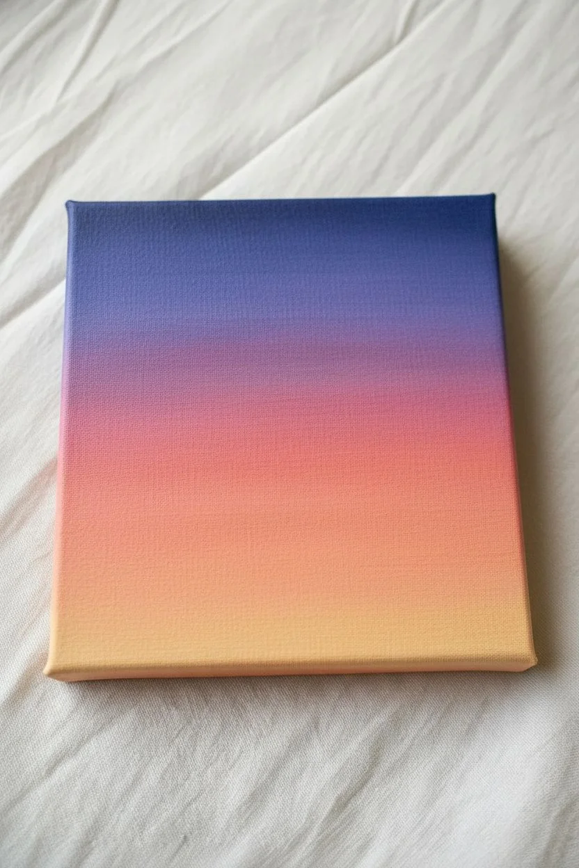
Loose, Colorful Underpainting Turned Into A Finished Piece
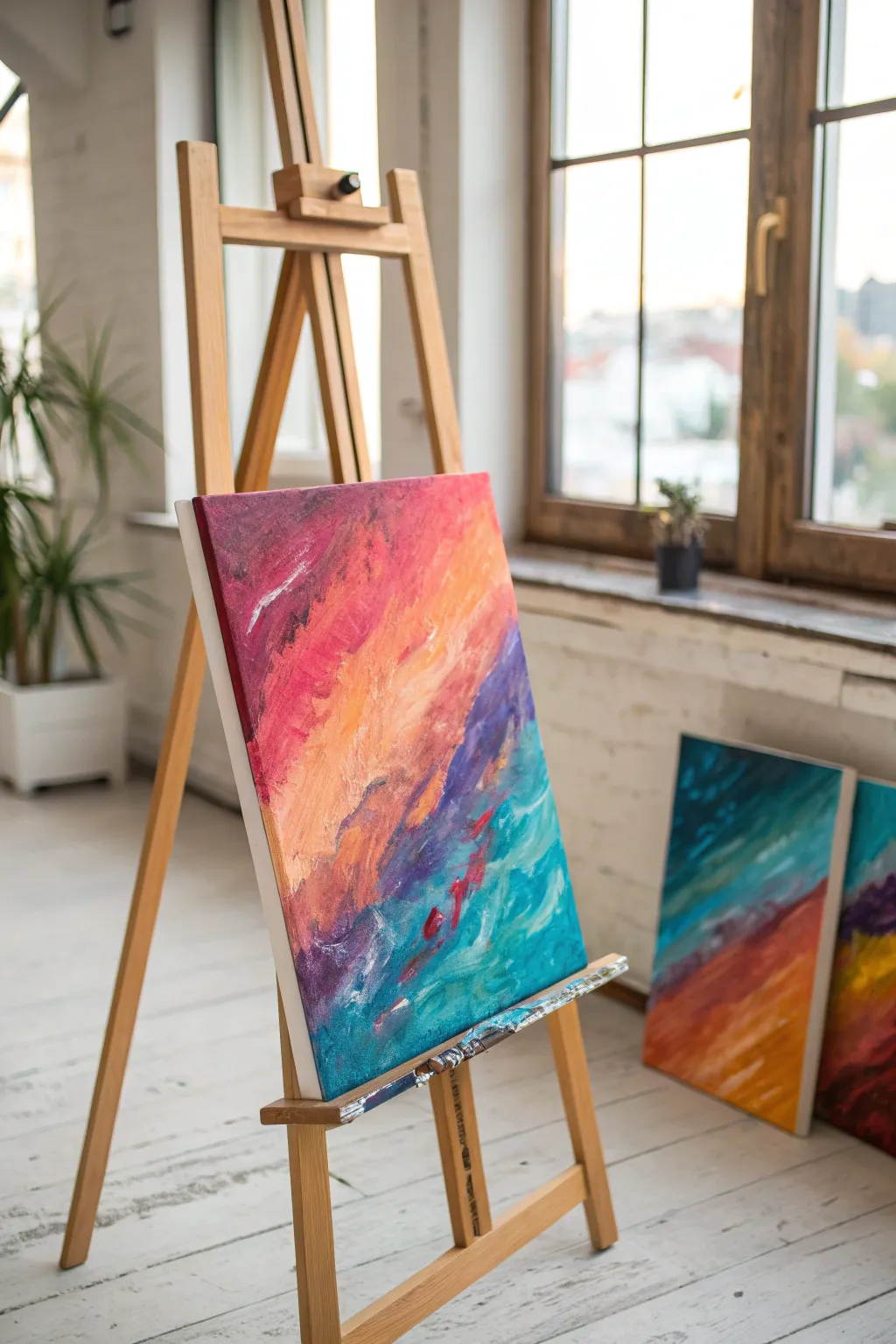
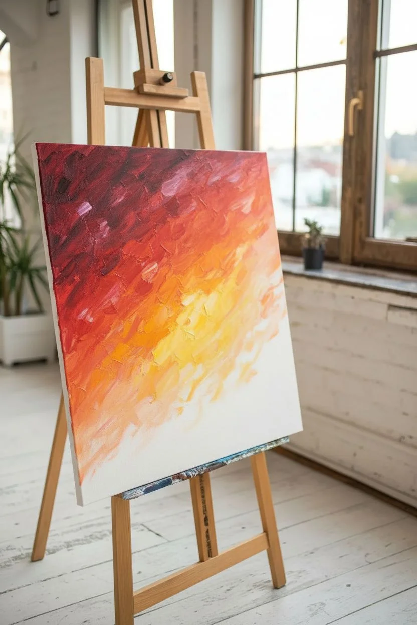
This project embraces the freedom of loose, diagonal strokes to create a vibrant gradient that feels like an abstract sunset meeting ocean waves. By layering bold warm tones against cool teals and blues, you’ll build a richly textured piece that celebrates the joy of color mixing directly on the canvas.
Step-by-Step Guide
Materials
- Stretched canvas (16×20 or similar)
- Oil paints: Alizarin Crimson, Cadmium Red, Cadmium Orange, Yellow Ochre, Ultramarine Blue, Phthalo Turquoise, Titanium White, Dioxazine Purple
- Large flat bristle brush (size 10 or 12)
- Medium filbert brush
- Palette knife (trowel shape)
- Odorless mineral spirits or painting medium
- Palette (wood or tear-off pad)
- Rags or paper towels
Step 1: Setting the Diagonal Flow
-
Map the Composition:
Visualize a diagonal line cutting the canvas from the bottom-left corner up towards the top-right. This will separate your warm zone from your cool zone. -
Mix Your Deep Reds:
On your palette, combine Alizarin Crimson with a touch of Dioxazine Purple to create a deep, moody wine color. This will be the anchor for the upper left corner. -
Apply the Darkest Warm Layer:
Using your large flat brush, scrub this dark red mixture into the top left corner. Don’t worry about being neat; use vigorous, multi-directional strokes to cover the white canvas. -
Transition to Bright Red:
Without cleaning your brush fully, pick up pure Cadmium Red. Blend this into the edge of your dark crimson area, working downwards and towards the center. -
Introduce Orange Tones:
Clean your brush with spirits. Load it with Cadmium Orange and a little Cadmium Red. Apply this next to the pure red section, allowing the wet paints to mix on the canvas surface for soft transitions. -
Create the Glowing Center:
Mix Yellow Ochre with a significant amount of Titanium White and a dash of Cadmium Orange. Paint this into the center of the canvas where the warm and cool zones will eventually meet, creating a high-key focal point. -
Blend the Warm Gradient:
Use a dry, clean rag to gently wipe or dab the boundaries between your reds, oranges, and yellows if they look too stripey. You want a flowing, cloud-like gradient.
Step 2: Establishing the Cool Bed
-
Mix Deep Violet:
Combine Ultramarine Blue with Alizarin Crimson and Dioxazine Purple. You want a dark, bruised purple hue that will serve as the shadow transition. -
Apply the Transition Zone:
Paint this purple mixture in a jagged line right below your warm orange/red section. Let the purple slightly invade the orange areas to create muddy, neutral greys that add realism to the painting’s depth. -
Prepare the Teal Base:
Mix Phthalo Turquoise with Titanium White. You want a vibrant, sea-glass color. Keep a second pile of pure, unmixed Turquoise ready as well. -
Fill the Bottom Corner:
Block in the bottom right corner with the pure Turquoise first, establishing the darkest value for the water area. -
Lighten the Waters:
Using the lighter Turquoise mix, paint upwards from the bottom corner towards the purple transition line. Use horizontal, choppy strokes here to mimic the movement of water.
Muddy colors?
If the purple and orange mix into brown mud, wait for the orange layer to dry to the touch (about 2-3 days) before applying the cool tones over it. Patience prevents grey messes.
Step 3: Texturing and Defining
-
Switch to Palette Knife:
Pick up your palette knife. Mix a thick pile of Titanium White with a tiny dot of Turquoise. -
Add Sea Foam Highlights:
Load the edge of the knife and gently scrape it over the dried teal area. The paint should catch on the canvas texture, creating broken, organic lines that look like sea foam or sparkling light. -
Intensify the Warmth:
Clean the knife and mix a thick bright pink using Alizarin Crimson and White. Apply a few bold, impasto strokes over the red area to bring texture to the ‘sky’ portion. -
Create Movement:
I like to take a dry filbert brush and lightly drag some of the purple paint down into the teal, and push some teal up into the purple. This interlocking effect ties the two halves together. -
Final Light Accents:
Add small touches of pure White mixed with Lemon Yellow (or just thin White) to the brightest part of the orange section to make it pop. -
Red Accents in the Blue:
For contrast, dab a few tiny spots of pure red into the blue/teal water area. This reflects the sky color into the water and balances the composition. -
Step Back and Assess:
Look at the painting from a distance. If the transition between warm and cold feels too harsh, use a large dry brush to feather the edges very softly while the paint is still tacky.
Try gold leaf
Once the oil paint is fully cured, apply small flecks of gold leaf along the diagonal transition line. This adds a shimmering effect that mimics sunlight hitting waves.
Allow your painting to dry in a dust-free area for several days before displaying your vibrant abstract landscape

Have a question or want to share your own experience? I'd love to hear from you in the comments below!