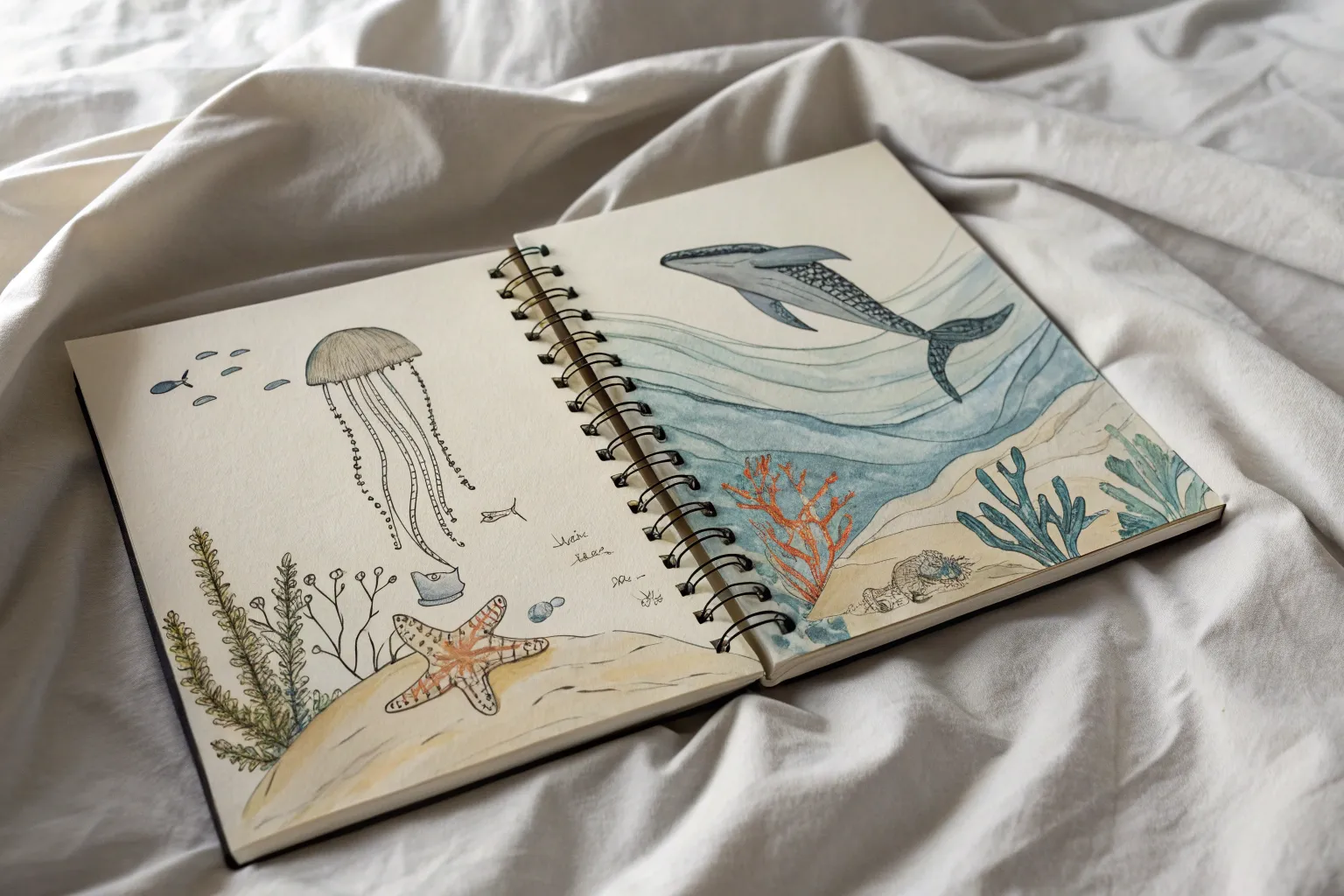
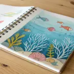
Whenever I’m stuck, I circle back to ocean drawing ideas because the sea gives you instant movement, texture, and mood. Grab your sketchbook and let’s play with everything from classic waves and sunsets to dreamy deep-sea scenes and wild, imaginative underwater worlds.
Classic Rolling Wave Studies
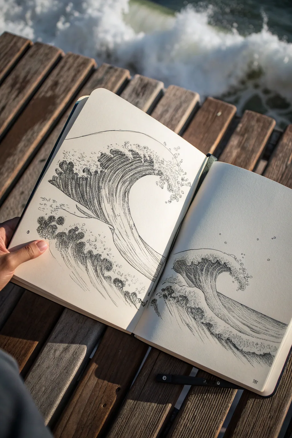
This project explores the dynamic energy of the ocean through contrasting line weights and directional strokes. Using a simple ink pen on a sketchbook spread, you’ll create two complementary studies of rolling waves that feel both powerful and elegant.
Step-by-Step Tutorial
Materials
- Sketchbook with smooth, heavy-weight paper (A5 or similar size)
- Black fineliner pens (0.1mm, 0.3mm, and 0.5mm)
- HB Pencil
- Kneaded eraser
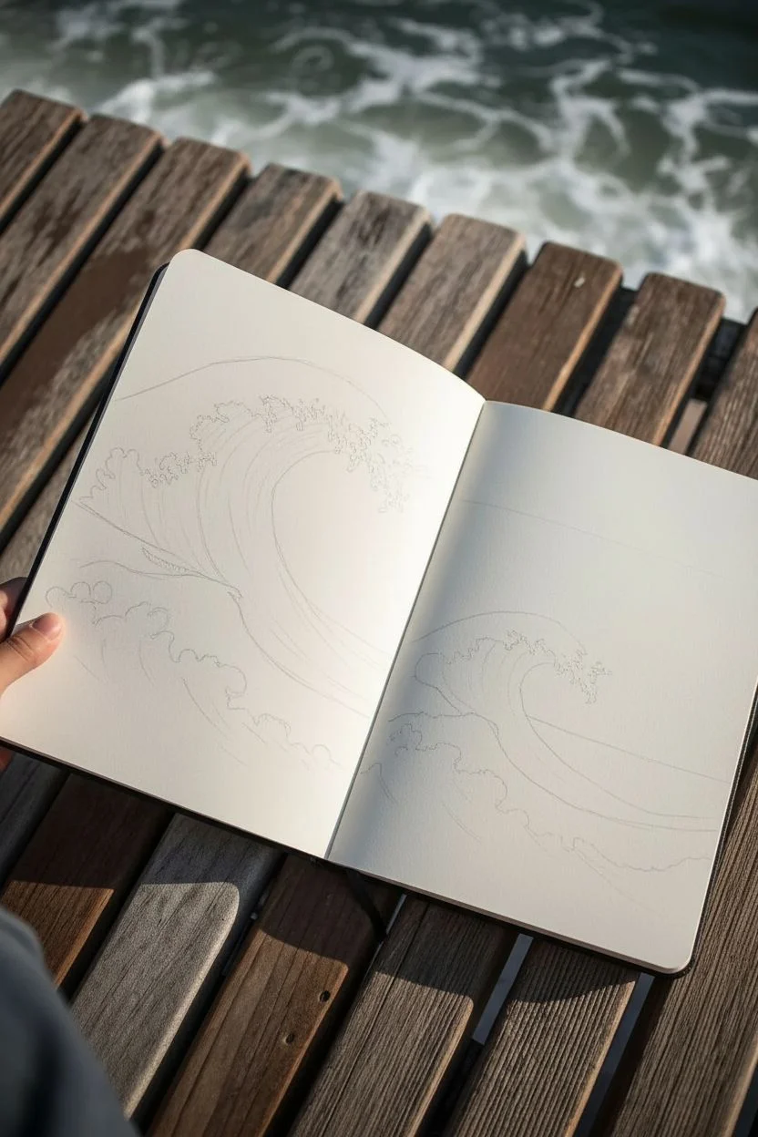
Step 1: Conceptualizing the Flow
-
Establish the horizon:
Begin by lightly sketching a faint horizon line with your HB pencil across both pages to ground your composition, keeping it lower on the page to allow space for the wave’s height. -
Block in the first wave shape:
On the left page, sketch a large, swooping ‘C’ shape that rises from the left and curls over to the right. This will be your primary crashing wave. -
Add secondary wave movement:
Below the main curl, sketch smaller, choppy mounds to represent the turbulent water and smaller swells leading up to the main event. -
Mirror the motion:
On the right page, draw a similar but slightly smaller wave form. Vary the angle slightly so it looks like a continuation of the same sea, perhaps crashing a bit later than the first. -
Outline the crests:
Lightly pencil in the jagged, frothy edges of the wave crests. Think of these like claw shapes or irregular lace patterns where the water breaks into foam.
Step 2: Inking the Structure
-
Define the main contours:
Switch to your 0.5mm pen. Trace the main outer curve of the wave and the bottom edge of the water. Use a confident, continuous line to maintain the feeling of fluidity. -
Draw the foam outline:
With a slightly lighter touch or a 0.3mm pen, outline the frothy crest. Keep your hand loose to create jagged, organic bubbling shapes rather than perfect circles. -
Add floating spray:
Dot small circles and irregular specks around the top of the wave and in the air nearby to represent sea spray launching off the crest. -
Erase pencil guides:
Once the initial ink outlines are completely dry, gently erase the visible pencil marks with a kneaded eraser to give yourself a clean slate for shading.
Uneven Ink Flow?
If your long hatching lines look shaky or uneven, try moving your entire arm from the shoulder rather than just flicking your wrist. This creates smoother, more consistent curves.
Step 3: Creating Volume and Texture
-
Begin directional hatching:
Using a 0.1mm pen, start drawing long, curved hatching lines usually following the flow of the water. Start from the base of the wave and curve upward into the curl. -
Deepen the shadows:
Add density to your hatching right under the lip of the wave crest. This area is naturally darker because the foam casts a shadow on the water wall. -
Detail the inner barrel:
For the inside of the wave tube, use tighter, darker lines. I find that curving these lines horizontally helps differentiate the inside of the barrel from the vertical rise of the wave face. -
Texture the foam:
Stipple (dot) clusters of ink within the foam shapes you outlined earlier. Focus the dots near the bottom of foam clumps to give them volume and weight. -
Suggest turbulent water:
For the smaller waves at the bottom, use shorter, choppier strokes. Cross-hatch slightly here to show the chaotic, churning nature of the water surface. -
Refine the spray:
Go back to the spray droplets in the air. Add tiny semi-circles to some droplets to make them look like bubbles, and vary their sizes for a more realistic chaotic effect. -
Final contrast check:
Step back and look at the whole spread. Use your 0.5mm pen to darken the deepest crevices under the wave lip if they need more punch.
Pro Tip: Line Weight
Use the 0.5mm pen mainly for the outline and shadow depths, and stick to the 0.1mm for the texture lines. This hierarchy keeps the drawing readable and prevents it from looking cluttered.
You now have a lively double-page study that perfectly preserves the raw power of the ocean in ink
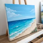
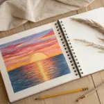
Sunset Horizon Over the Ocean
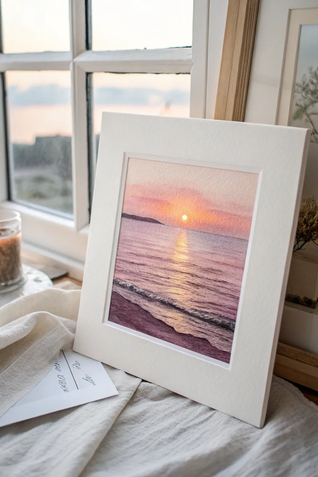
Capture the serene beauty of day meeting night with this soft watercolor landscape. By layering warm pinks and purples, you’ll create a glowing horizon and a shimmering path of light across gentle beach waves.
Step-by-Step
Materials
- Cold press watercolor paper (300 gsm)
- Masking fluid
- Watercolor paints: Rose Madder, Cadmium Yellow, Ultramarine Blue, Burnt Sienna
- Flat brush (3/4 inch)
- Round brush (size 4)
- Fine detail brush (size 0 or 1)
- Jar of clean water
- Paper towels
- Board and masking tape
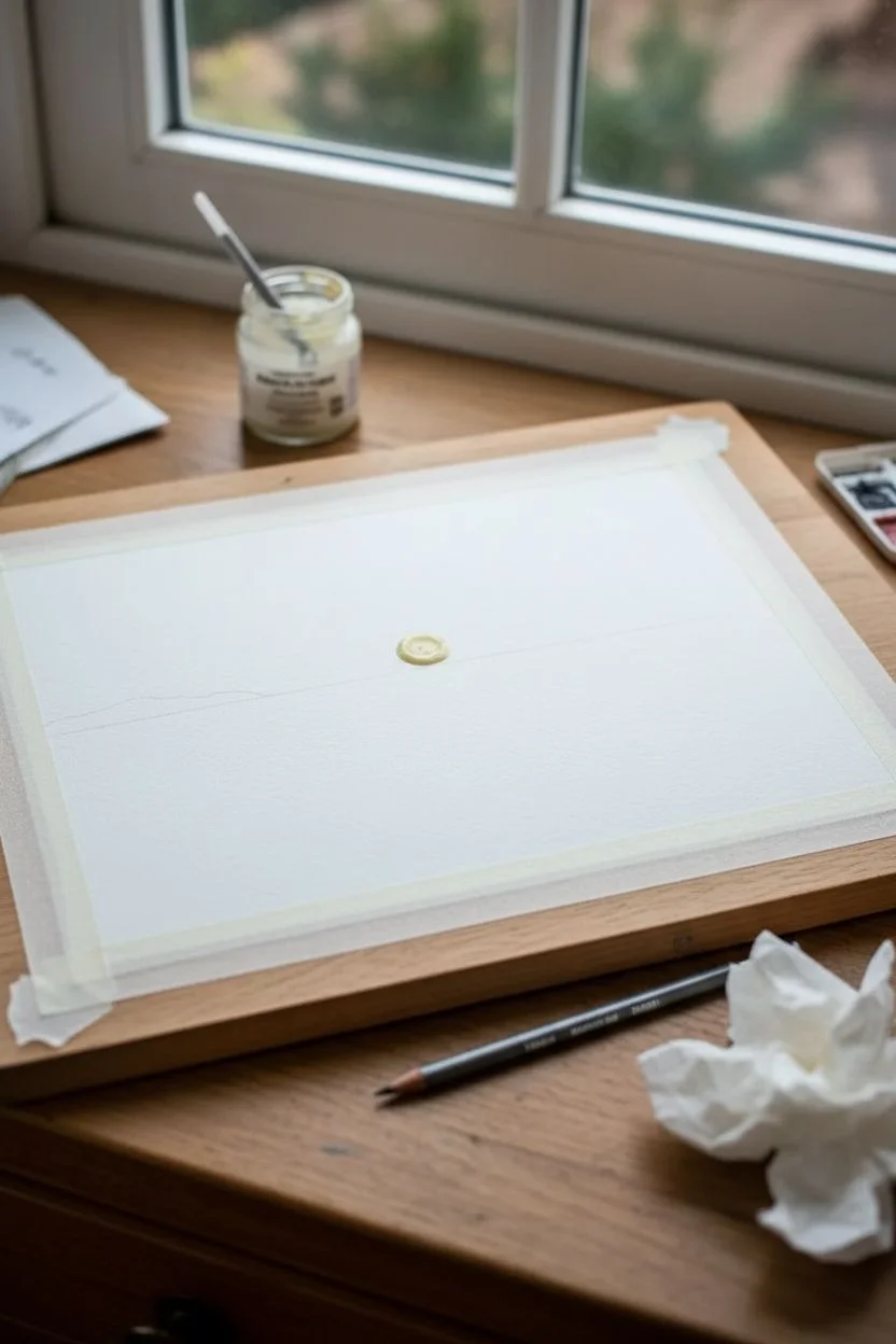
Step 1: Preparation and Base
-
Prepare your surface:
Begin by taping your watercolor paper securely to a board. Use masking tape along all four edges to create a clean white border and prevent buckling when the paper gets wet. -
Sketch the horizon:
Using a very light touch with a pencil, draw a straight horizon line about one-third of the way down from the top. Add a faint indication of the distant headland on the left side. -
Mask the sun:
Identify the spot where the sun sits just above the horizon. Apply a small, perfect circle of masking fluid here. Let it dry completely before painting; this preserves the pure white of the paper for the brightest light.
Step 2: Painting the Sky
-
Wet the sky area:
Use your flat brush to apply clean water to the sky area, stopping precisely at the horizon line. The paper should be glistening but not pooling with water. -
Apply the glow:
While the paper is wet, drop a watered-down Cadmium Yellow around the masked sun area. Allow it to diffuse softly outward. -
Introduce sunset pinks:
Mix Rose Madder with a touch of yellow. Gently sweep this coral color across the upper sky, blending it down towards the yellow glow without covering it completely. -
Deepen the upper sky:
For the very top of the sky, mix a faint amount of Ultramarine Blue into your pink to create a soft violet. Apply this to the top edge to simulate the fading daylight. -
Paint the distant land:
Once the sky is damp but not soaking, mix a dark purple-grey using Ultramarine and Burnt Sienna. Paint the distant headland silhouette along the horizon line, softening the bottom edge slightly.
Sun Reflection Trick
Keep your yellow reflection strokes strictly horizontal. Even slightly angled strokes can ruin the illusion of flat water and make the ocean surface look tilted or unnatural.
Step 3: Creating the Ocean
-
Lay the water base:
Wet the ocean area below the horizon. Use horizontal strokes with a mix of watered-down Rose Madder and Ultramarine Blue to create a very pale, purplish base color for the water. -
Establish the sun path:
While the wash is still wet, lift out pigment directly under the sun using a clean, damp brush. Then, drop in pure yellow strokes horizontally to start the reflection path. -
Add wave shadows:
As the paper begins to dry, switch to a round brush. Mix a slightly darker violet tone and paint thin, horizontal lines to suggest ripples, getting wider as they come closer to the bottom foreground. -
Intensify the reflection:
I like to go back in with concentrated yellow and orange paint on a damp brush to strengthen the center reflection line. Make these strokes short and broken to mimic sparkles on the water.
Level Up: Texture
Sprinkle a tiny pinch of salt onto the wet sand area in the foreground. As it dries, the salt pushes pigment away, creating a perfect sandy texture without needing to paint individual grains.
Step 4: Foreground and Details
-
Paint the wet sand:
For the immediate foreground, mix a darker, cooler purple. Paint the sand area at the bottom, using horizontal strokes that angle slightly to follow the shoreline. -
Create crashing foam:
Leave a jagged, unpainted strip between the dark purple water and the wet sand to represent sea foam. You can also use white gouache later if you accidentally paint over it. -
Add texture to the waves:
use a smaller brush with a dark purple-blue mix to paint the shadow under the main crashing wave. Keep the top edge of this shadow sharp against the white foam and the bottom edge soft. -
Remove the mask:
Once the entire painting is bone dry, gently rub away the masking fluid from the sun using your finger or a rubber cement pickup. -
Refine the sun:
Soften the hard edges of the revealed white circle with a slightly damp brush to make the sun look glowing rather than like a cutout. -
Final highlights:
If needed, use a tiny amount of white gouache or a white gel pen to add sharp sparkle highlights to the center of the water reflection path.
Peel off your tape carefully to reveal those crisp edges and enjoy your permanent sunset


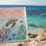
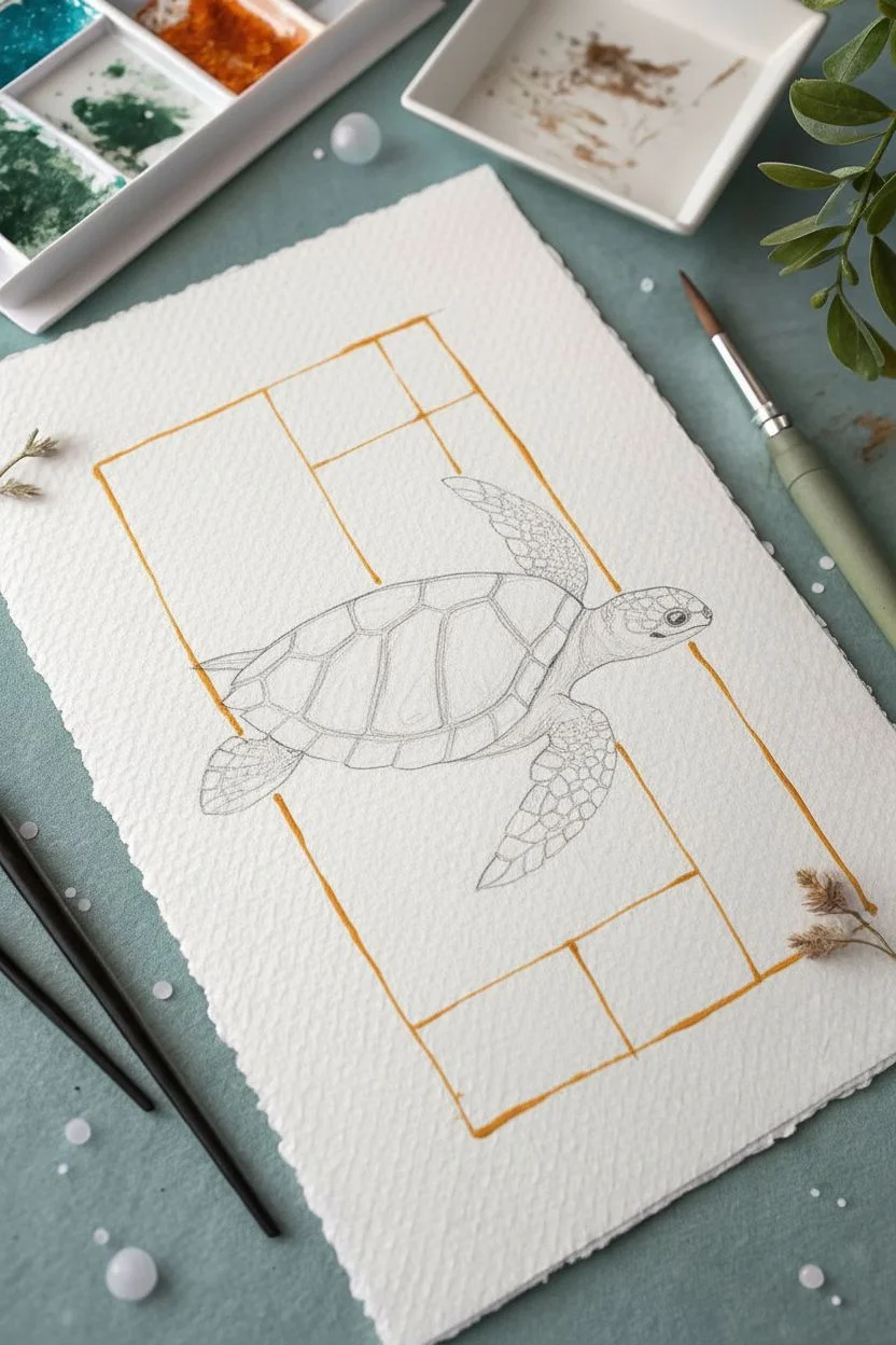
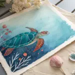
Sea Turtle Gliding Through Open Water
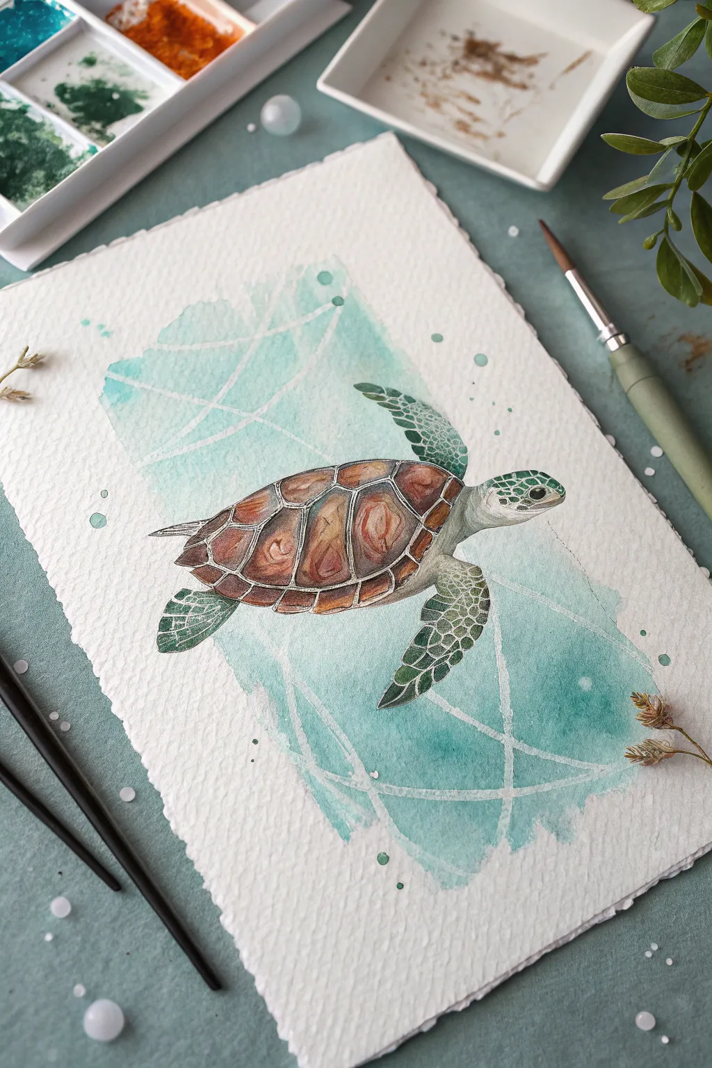
This stunning watercolor project captures the serene beauty of a sea turtle navigating crystalline waters. With a delicate blend of warm browns for the shell and cool teals for the sea, you’ll create a piece that feels both realistic and artistically modern.
Step-by-Step
Materials
- Cold press watercolor paper (300 gsm, with deckled edge)
- Watercolor paints (Burnt Sienna, Burnt Umber, Hooker’s Green, Phthalo Blue, Turquoise, Payne’s Gray)
- White gouache or white gel pen
- Masking fluid (drawing gum) and old brush
- Round watercolor brushes (Size 2, 4, and 8)
- Pencil (HB) and kneaded eraser
- Palette for mixing
- Two jars of water
- Paper towels
Step 1: Preparation and Sketching
-
Outline the turtle:
Start with a light pencil sketch in the center of your paper. Draw an oval for the main shell (carapace), adding the head, flippers, and small tail. Keep your lines faint so they don’t show through the transparent watercolor layers later. -
Detail the scutes:
Map out the pattern on the shell. Draw the central row of hexagonal shapes and the smaller scales surrounding them. Sketch the scale patterns on the head and flippers, noting that the scales get smaller near the edges. -
Apply masking fluid:
Using an old brush or a silicone applicator, paint thin lines of masking fluid over the geometric white lines you want in the background. These lines act as a resist, preserving the white paper underneath the upcoming wash. -
Let it cure:
Allow the masking fluid to dry completely. It should feel rubbery and not tacky to the touch before you proceed with any paint.
Clear Waters Tip
To keep the turtle’s colors bright, ensure the background wash is 100% dry before painting the turtle. This prevents the brown shell paint from bleeding into the teal water.
Step 2: The Abstract Ocean Background
-
Mix your ocean teal:
On your palette, combine Turquoise and a touch of Phthalo Blue. Create a watery, diluted puddle for a light wash. -
Paint the background patch:
Identify the rectangular-ish area behind the turtle. Using a size 8 brush, paint this area with your teal mix. Don’t worry about perfect edges; a loose, organic shape looks best here. Paint right over the dried masking fluid lines. -
Add depth:
While the background is still wet, drop in slightly more concentrated spots of Turquoise near the bottom right to create a subtle gradient. Let this background layer dry completely.
Step 3: Painting the Turtle
-
Base layer for the shell:
Mix a light wash of Burnt Sienna. Paint the individual scutes of the shell, leaving tiny gaps of white paper between them to define the segments. -
Deepen the shell tones:
Once the base is damp but not soaking, drop in Burnt Umber and a tiny bit of red-brown into the centers and edges of the scutes to create a domed, 3D effect. The paint will bloom naturally. -
Paint the skin base:
Mix a very pale, milky green using Hooker’s Green and a lot of water. Wash over the head and flippers. -
Define the skin scales:
Switch to your size 2 brush. Using a darker mix of Hooker’s Green and a touch of Payne’s Gray, carefully paint the individual scales on the flippers and head. Leave the pale base color showing between the dark scales. -
Enhance the eye:
Paint the eye with a dark mix of Payne’s Gray and Burnt Umber. leave a tiny speck of white paper unpainted for the highlight, or add it later with white gouache. -
Add underbelly shadows:
I like to mix a very watery grey wash to tint the underbelly and the underside of the neck, giving the turtle volume so it doesn’t look flat.
Add Some Sparkle
Mix a tiny amount of iridescent medium or pearl watercolor into your teal background wash. When the light hits the paper, the water will shimmer like a real ocean.
Step 4: Finishing Touches
-
Remove masking fluid:
Gently rub your finger or a rubber cement pickup eraser over the background to peel away the masking fluid, revealing the crisp white geometric lines underneath. -
Refine the lines:
If any lines need sharpening or if you want to add more white accents, use a white gel pen or a fine brush with white gouache to tidy them up. -
Add highlights:
Use the white gouache to add final reflective highlights on the top of the shell scutes and the wettest look of the eye. -
Splatter texture:
Load your brush with watery teal paint and tap the handle against a finger to flick tiny droplets onto the background for an organic, bubbly texture.
Now you have a tranquil ocean scene ready to frame or gift to a sea life lover
Dolphin Leap at the Surface
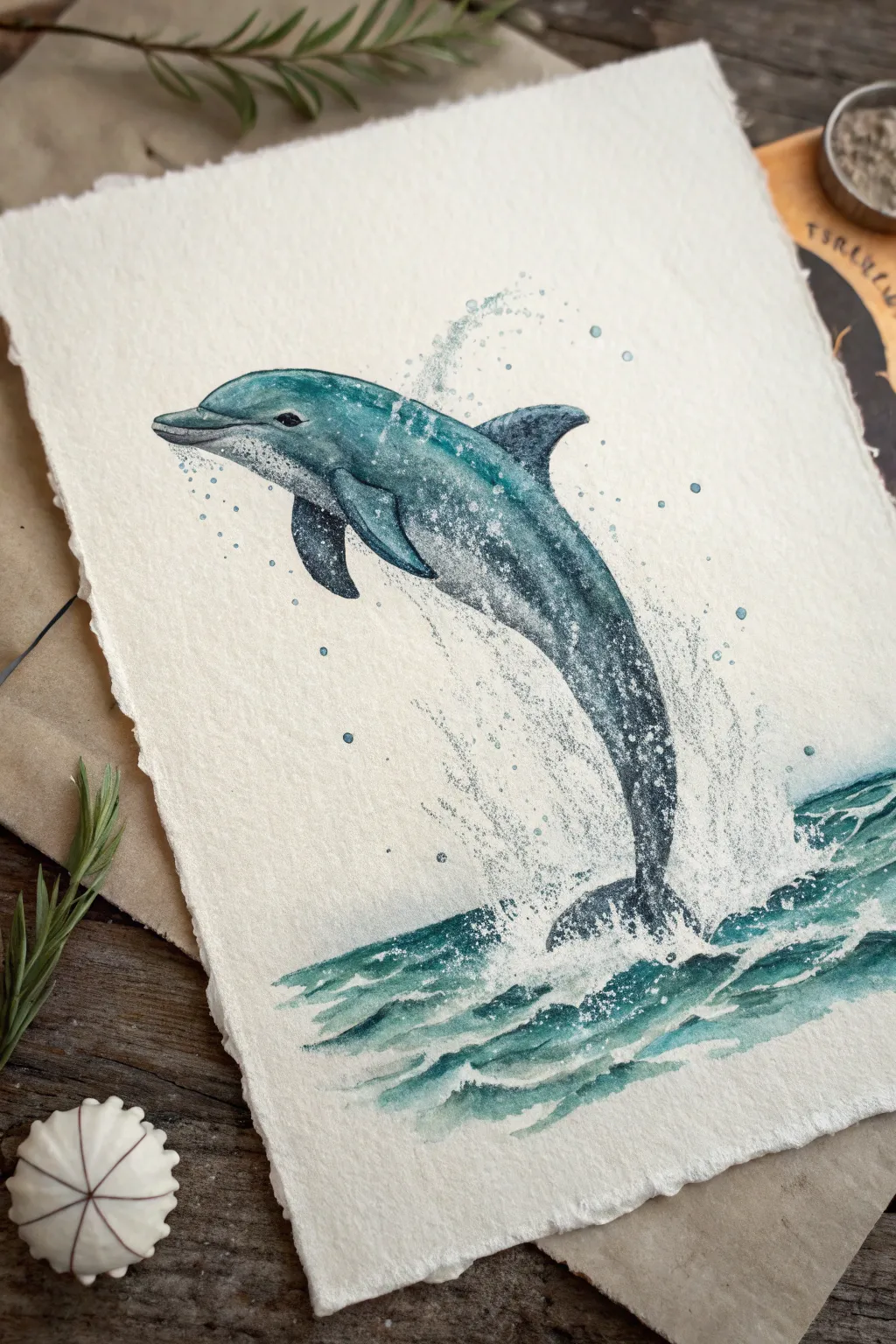
Capture the joyful energy of a dolphin mid-leap with this dynamic watercolor project. Using a blend of wet-on-wet techniques and careful splatter effects, you’ll create a sense of movement and ocean spray on beautiful deckled-edge paper.
Step-by-Step Tutorial
Materials
- Hot press watercolor paper (deckled edge preferred)
- Watercolor paints (Phthalo Blue, Indigo, Burnt Umber, Payne’s Grey)
- Round watercolor brushes (sizes 2, 4, and 8)
- White gouache or white ink
- Pencil (HB or 2H)
- Kneaded eraser
- Old toothbrush or stiff bristle brush
- Paper towels
- Two jars of water
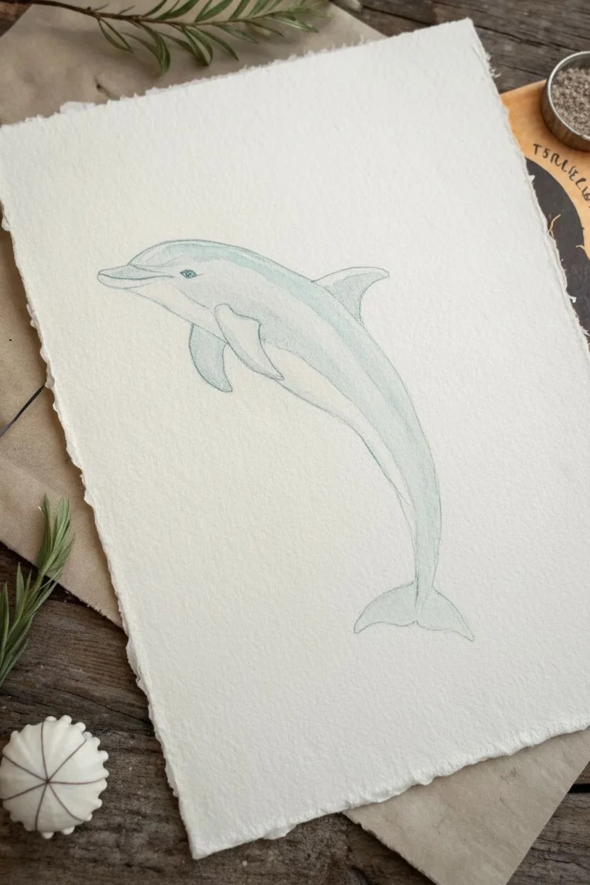
Step 1: Sketching and Base Layer
-
Outline the form:
Begin with a very light pencil sketch of the dolphin. Use a sweeping C-curve to establish the leaping motion, placing the head high on the left and the tail entering the water on the lower right. Keep your lines faint so they won’t show through the transparency of the watercolor. -
Refine the anatomy:
Add the dorsal fin on the back, the pectoral fin on the side, and the characteristic beak. Outline the area where the water splashes at the bottom, but keep these lines rough and organic. -
First wash:
Mix a watery wash of Phthalo Blue with a touch of Payne’s Grey. With your size 8 brush, wet the dolphin’s body area with clean water first (wet-on-wet technique), then drop in your blue mix, letting the pigment bloom naturally. Leave the belly area white or extremely pale for a natural highlight. -
Define the shadows:
While the paper is still damp, mix a darker version of your blue-grey. Apply this to the underside of the dolphin, the bottom edge of the beak, and the leading edge of the fins to create volume.
Step 2: Building Depth and Texture
-
Darken the extremities:
Once the first layer is touch-dry, switch to a size 4 brush. Use a concentrated mix of Indigo and Payne’s Grey to darken the dorsal fin, the pectoral fin, and the tail flukes. This high contrast anchors the painting. -
Add skin texture:
Dolphins have sleek but mottled skin. Create texture by ‘scumbling’ or dry-brushing some of the darker grey mix heavily along the back and sides. Don’t cover the lighter blue completely; let the underlayer shine through. -
Detail the face:
With the size 2 brush and nearly pure Indigo or Black, carefully paint the eye and the line of the mouth. This small detail brings the animal to life instantly. -
Create the ocean waves:
For the water below, use horizontal strokes of Phthalo Blue and Indigo. Keep the strokes jagged and broken to mimic choppy waves. Leave significant gaps of white paper to represent the foam and disturbance.
Unwanted Blooms?
If a water bloom creates a ‘cauliflower’ edge where you don’t want it, wait until bone dry. Then, gently scrub the edge with a damp stiff brush to soften it.
Step 3: Splash and Spray Effects
-
Prepare the splatter:
Cover the main body of your dolphin with a scrap of paper to protect the face. Load an old toothbrush or stiff brush with white gouache (consistency of heavy cream). -
Apply the spray:
Flick the bristles to create a fine mist of white dots around the tail entry point and under the belly. This mimics the explosive splash of the jump. -
Add directional droplets:
Use a small brush to flick slightly larger droplets of blue-grey paint upwards from the tail, following the arc of the jump. This emphasizes the direction of movement. -
Highlight the water:
Take your white gouache and a fine brush to paint sharp, jagged highlights on the crests of the water waves. I find this sharp white contrast really makes the water look wet and glistening. -
Integrate the splash:
soften the bottom edge of the dolphin’s tail where it meets the water using the white gouache, blending it slightly so the animal looks submerged in the chaotic spray. -
Final speckling:
Add a few tiny speckles of dark blue to the dolphin’s skin, particularly on the grey areas, to enhance that realistic, textured skin look. -
Review and refine:
Step back and check the contrast. If the dolphin looks too flat, enhance the darkest shadows under the fins once more with your darkest Indigo mix.
Use Gravity
Tilt your paper while the water wash is wet. Let the paint pool towards the bottom of the dolphin’s belly to create a natural, seamless transition from light to shadow.
Once the gouache touches are completely dry, you can mount your artwork to celebrate the ocean’s most playful resident
BRUSH GUIDE
The Right Brush for Every Stroke
From clean lines to bold texture — master brush choice, stroke control, and essential techniques.
Explore the Full Guide
Whale Tail With Splash and Ripples
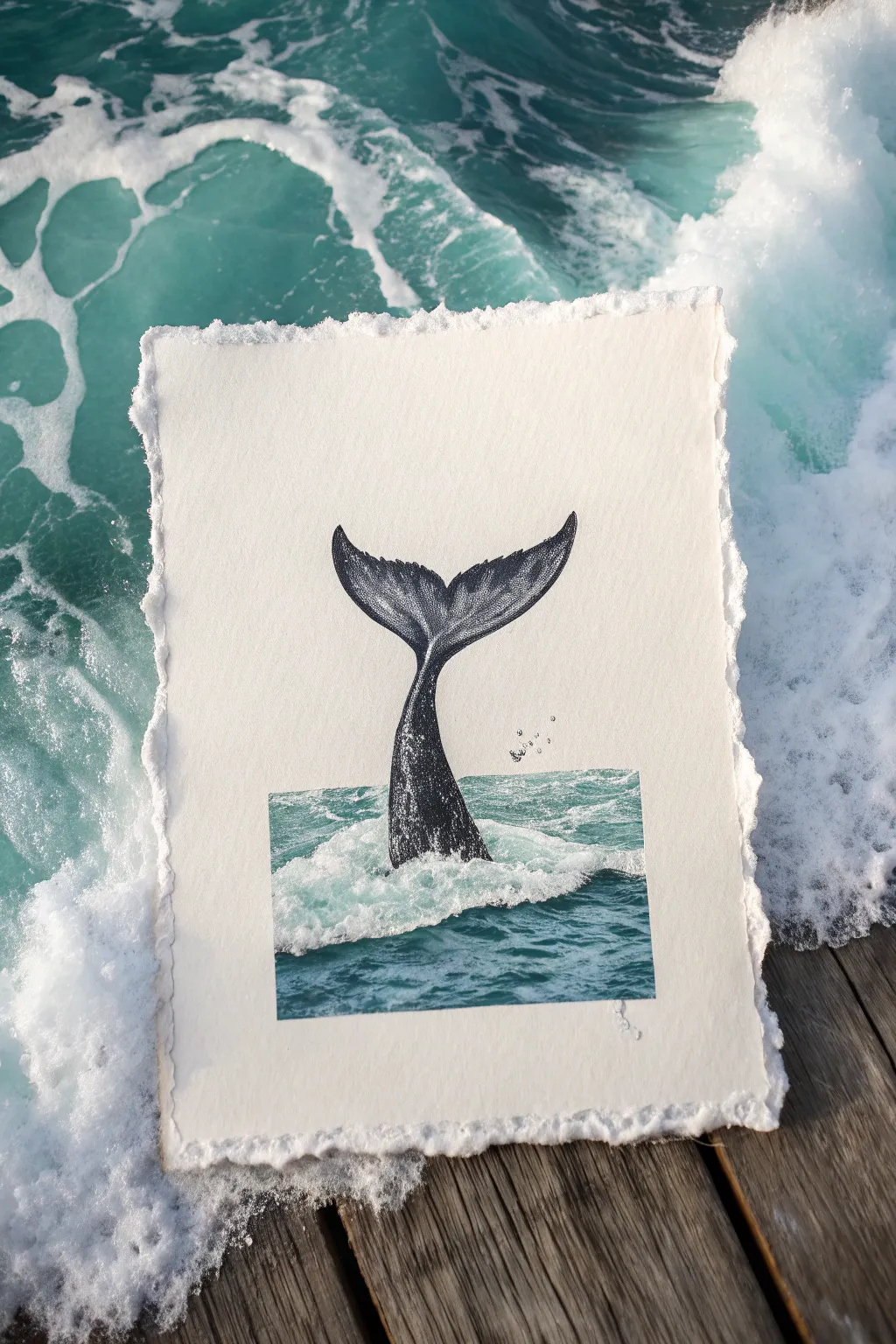
Capture the majesty of the ocean with this unique mixed-media project that blends realistic pen-and-ink drawing with aquatic photography. The result is a striking contrast between the textured black-and-white stippling of the whale tail and the vivid, splashing blue water.
How-To Guide
Materials
- Heavyweight cold-press watercolor paper or handmade cotton rag paper (deckled edge preferred)
- Fine liner pens (sizes 0.05, 0.1, and 0.5, black ink)
- Printer and high-quality photo paper (glossy or matte)
- Digital photo of ocean water (or a magazine cutout)
- Craft knife or precision scissors
- Acid-free glue stick or spray adhesive
- Pencil (HB) and eraser
- White gel pen (optional for highlights)
Step 1: Preparation & Composition
-
Select your paper:
Choose a high-quality, textured paper for your base. A handmade cotton rag paper with rough, deckled edges adds a beautiful, organic feel that complements the ocean theme. -
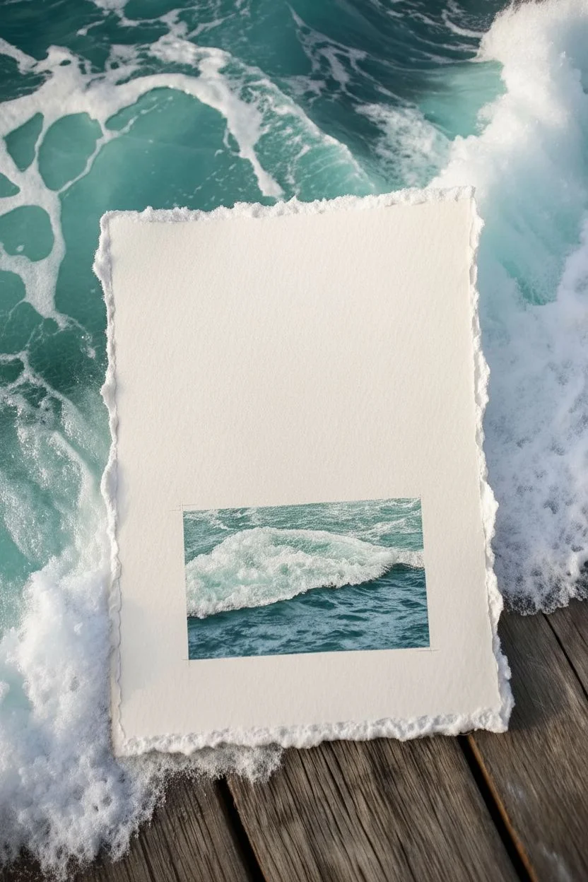
Source the water element:
Find a high-resolution photograph of ocean water, specifically looking for one with white foam or splashes. Print this onto photo paper at a size that fits the lower quarter of your art paper. -
Cut the water splice:
Using a craft knife and a ruler, cut your water photo into a neat rectangle. This creates the ‘window’ effect that anchors the drawing. -
Position the elements:
Place the water photo cutout near the bottom center of your main paper without gluing it yet. Lightly mark the corners with a pencil so you know exactly where it will sit.
Seamless Splice
Use a white gel pen to draw tiny foam bubbles right over the seam where the photo meets the paper. It hides the straight edge instantly.
Step 2: Sketching the Whale
-
Draft the tail shape:
Lightly sketch the outline of the whale’s tail (flukes) rising out of your marked water area. The peduncle (the muscular tail stock) should center directly where the water splash will be. -
Refine the flukes:
Refine the curve of the flukes, ensuring they taper elegantly to the tips. Add a slight central dip where the two lobes meet. -
Mark shadow areas:
Lightly outline where the darkest shadows will fall—typically on the underside of the flukes and down the center of the tail stock.
Step 3: Inking & Texturing
-
Outline the form:
Using your 0.1 fine liner, go over your pencil sketch with a clean, confident line. Don’t worry about the bottom edge where it meets the water yet. -
Begin stippling shading:
Start adding value using stippling (tiny dots). Use a 0.5 pen for the darkest areas on the underside of the tail to build density quickly. -
Create gradients:
Switch to a 0.1 or 0.05 pen as you move toward the lighter areas. Space your dots further apart to create a smooth gradient from shadow to highlight. -
Add skin texture:
On the upper surface of the flukes, use fine, directional hatching lines that follow the curve of the tail to suggest wet, slick skin. -
detail the barnacles:
If you want added realism, draw small, irregular circles near the edges of the tail to represent barnacles, leaving the centers white. -
Incorporate water drops:
Draw tiny floating circles and droplets falling from the tips of the flukes. I like to keep these sparse to imply motion without cluttering the scene.
Upgrade The Texture
Tear the edges of your main paper manually against a ruler instead of cutting them. This creates a soft ‘deckled’ look that feels vintage.
Step 4: Assembly
-
Erase pencil lines:
Once the ink is completely dry, gently erase all underlying pencil sketches to clean up the artwork. -
Prepare the splice point:
If your drawing extends slightly below where the photo top edge will be, that’s perfect. It ensures no white gap appears between drawing and photo. -
Adhere the water photo:
Apply adhesive to the back of your water photo cutout. Carefully align it with your initial pencil marks and press down firmly. -
Blend the edges:
To make the transition seamless, you can use a white gel pen to add tiny dots of ‘foam’ that overlap from the photo onto the drawing paper, bridging the two mediums.
Now you have a stunning piece of oceanic art that perfectly balances precision drawing with photographic realism
Sailboat Silhouette on Choppy Seas
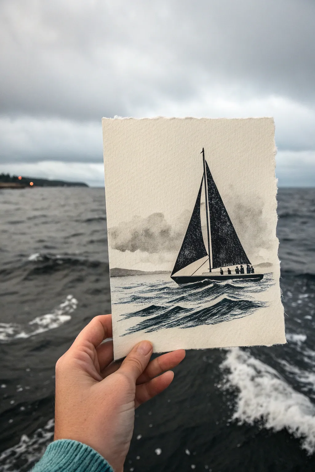
Capture the moody elegance of a day at sea with this mixed-media study. Combining waterproof ink for the bold silhouette with soft watercolor washes for the sky and waves creates a striking contrast on textured paper.
Step-by-Step Tutorial
Materials
- Heavyweight watercolor paper (300gsm, cold press/rough)
- Black waterproof Indian ink or fineliners (0.1, 0.5, and brush pen)
- Diluted black watercolor or grey ink wash
- Small round brush (size 2 or 4)
- Pencil and eraser
- Ruler
- White gel pen (optional)
- Masking tape (optional)
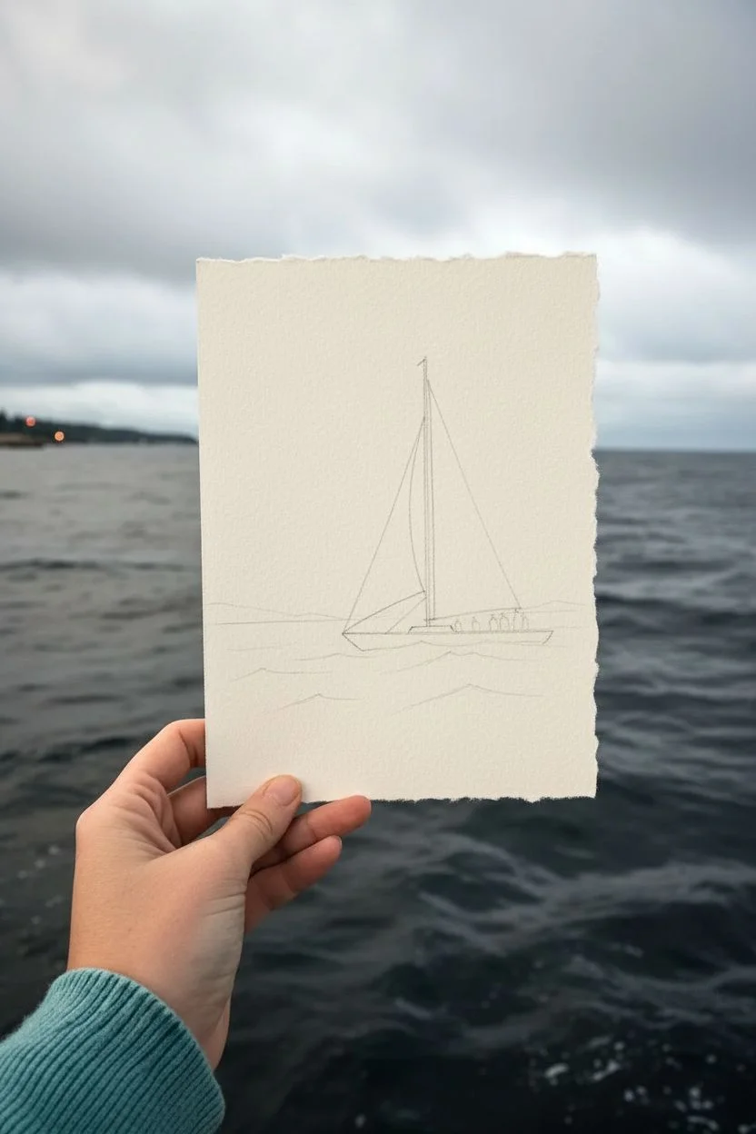
Step 1: Preparation & Sketching
-
Prepare the paper:
Tear your watercolor paper to size instead of cutting it with scissors. This creates the soft, deckled edge seen in the example, adding to the rustic, handmade feel. -
Map the horizon:
Lightly sketch a horizon line about one-third of the way up the paper using a pencil. Keep it straight but faint. -
Draft the hull:
Draw the slender hull of the sailboat just below the horizon line. It should be a long, narrow shape tapering at the front and back. -
Raise the mast:
Draw a vertical line for the mast, positioning it slightly forward of the center of the hull. It should extend almost to the top of the paper. -
Outline the sails:
Sketch two large triangular shapes for the sails. The mainsail (aft) should be larger, and the jib (front) slightly smaller. Leave a tiny gap between the sails and the hull.
Dry Brush Magic
For the sails, wipe most ink off your brush before painting. Dragging a nearly dry brush across rough paper creates that perfect, weathered canvas texture.
Step 2: Inking the Silhouette
-
Fill the sails:
Using your black waterproof ink or a brush pen, carefully fill in the two sail shapes. To mimic the texture in the photo, don’t make it a solid, flat black block; let the grain of the paper show through slightly by using a ‘dry brush’ technique or stippling. -
Detail the mast and boom:
Use a fine liner (0.1 or 0.3) to draw the thin line of the mast and the horizontal boom extending from it. -
Ink the hull:
Fill in the hull shape with solid black ink. Ensure the bottom edge is somewhat uneven to suggest it is submerged in water. -
Add the crew:
With the tip of your finest pen, draw tiny, indistinct vertical dashes along the deck to represent people. These don’t need detail—just simple silhouettes. -
Add rigging lines:
Draw very thin, delicate lines connecting the top of the mast to the hull for the standing rigging.
Add a Pop of Color
While the monochromatic look is classic, try adding a tiny dot of red on top of the mast for a navigation light, or paint one crew member’s jacket yellow.
Step 3: Creating Atmosphere
-
Mix your grey wash:
Dilute a drop of black watercolor or ink with plenty of water to create a very pale, transparent grey. Test it on a scrap piece of paper first. -
Paint the distant land:
Paint a faint, low strip of land on the horizon line behind the boat. This should be barely visible, just enough to ground the scene. -
Cloud formation:
Wet the sky area lightly with clean water. Drop in your grey wash in uneven patches to create soft, fluffy storm clouds. Keep the edges soft and diffused. -
Let it dry:
Wait for the sky layer to dry completely before touching the water area to prevent bleeding.
Step 4: Rendering the Sea
-
Base water texture:
Using a slightly darker grey wash than the sky, paint horizontal strokes below the boat. Leave plenty of white paper showing to represent the foam and light on the water. -
Define the waves:
Switch back to your ink or a very fine brush. Draw distinct, choppy wave lines in the foreground. Use quick, jagged strokes that mimic the triangular shape of waves. -
Add movement:
Concentrate darker ink strokes directly under the hull to show the boat cutting through the water and the shadow it casts. -
Foreground details:
In the immediate foreground, use thicker ink lines to create larger, rolling wave shapes. These should angle slightly upward to suggest the swell. -
Final touches:
If you lost any white highlights in the water, use a white gel pen to bring back the crisp foam on the crests of the waves.
Once dry, display your miniature seascape where it can remind you of the open ocean

PENCIL GUIDE
Understanding Pencil Grades from H to B
From first sketch to finished drawing — learn pencil grades, line control, and shading techniques.
Explore the Full Guide
Lighthouse on a Windy Ocean Cliff
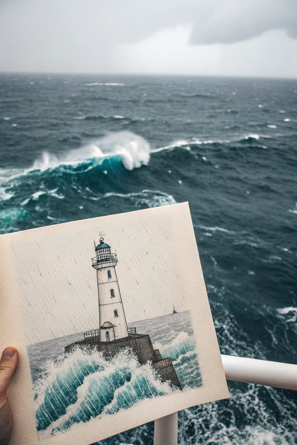
Capture the raw energy of the sea with this dramatic pen and mixed-media drawing. By combining precise ink lines with expressive splashes of teal and foam white, you’ll create a striking contrast between the sturdy lighthouse and the wild, crashing waves.
Step-by-Step Guide
Materials
- Heavyweight mixed-media or watercolor paper (cream or off-white tone works best)
- Fine liner pens (sizes 0.1, 0.3, and 0.5; black waterproof ink)
- Graphite pencil (HB) and kneaded eraser
- Watercolor paints or watercolor pencils (Teal, Prussian Blue, Payne’s Grey)
- White gouache or white gel pen
- Small round brush (size 2 or 4)
- Ruler
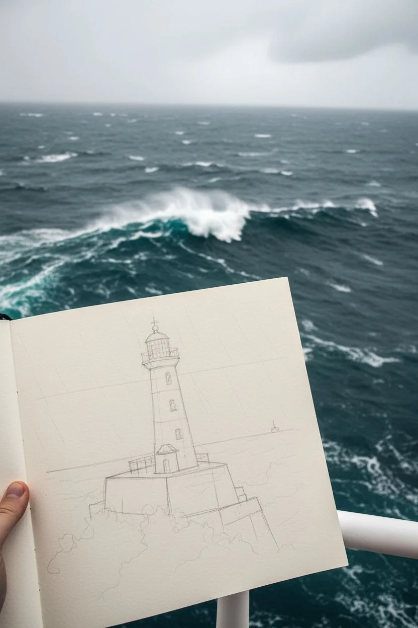
Step 1: Drafting the Structure
-
Establish the Horizon:
Begin by lightly sketching a horizontal line about one-third of the way up the page. This marks the separation between the sea and the sky. -
Outline the Lighthouse Base:
Draw the concrete pier foundation. Start with blocky shapes emerging from the water line, angling the top surface slightly to show perspective. -
Erect the Tower:
Sketch the lighthouse tower rising from the center of the pier. It should taper slightly as it goes up. Use your ruler to ensure the vertical lines are straight, but keep the stroke pressure light. -
Detail the Lantern Room:
At the top of the tower, add the gallery railing and the glass lantern room. Top it with a domed roof and a small weather vane or lightning rod.
Uneven Rain Lines?
If your rain lines feel too wobbly, use a clear ruler as a guide, but lift your pen quickly at the end of each stroke to keep the line looking energetic rather than mechanical.
Step 2: Inking the Architecture
-
Define the Pier:
Switch to a 0.5 pen to outline the heavy concrete pier. Use vertical hatching lines to suggest the rough texture of wet stone and concrete. -
Ink the Tower Walls:
Use a 0.3 pen for the main lighthouse structure. Draw the windows with small arched tops, adding depth by darkening the inside frames. -
Refine the Railings:
Carefully ink the delicate railings and the lantern glass with a 0.1 pen. Precision is key here to make the ironwork look believable. -
Erase Pencil Guidelines:
Once the ink is completely dry, gently erase your initial graphite sketch to leave a crisp black outline.
Stormier Skies
Darken the sky behind the white lighthouse using a light wash of Payne’s Grey. This negative space technique makes the white tower pop dramatically against the background.
Step 3: Atmosphere and Ocean
-
Sketch the Waves:
Using a pencil again, lightly map out the chaotic shapes of the waves crashing against the pier base. Focus on jagged, upward movements. -
Add Water Color:
Mix a deep teal using your watercolors. Apply this to the main body of the waves, starting dark at the bottom and fading as you move up toward the foam. -
Create Texture:
While the paint is damp, drop in small touches of Prussian Blue to create shadowing within the wave troughs. -
Paint the Lantern:
add a tiny wash of teal or blue to the glass of the lantern room at the top, giving it a reflective quality. -
Draw the Rain:
Using a 0.1 pen or a very sharp grey pencil, draw faint, diagonal lines across the entire sky area to simulate driving rain. Keep the spacing fairly consistent but relaxed.
Step 4: Final Flourishes
-
Intensify the Spray:
Using opaque white gouache or a gel pen, draw the sea foam. Use stippling and quick scribbles to mimic the chaotic splash of water hitting rock. -
Layer the White:
I like to add a second layer of white over the dried teal parts of the wave to make the spray look like it’s overlapping the water. -
Deepen Shadows:
Add final cross-hatching with your 0.1 pen to the shadowed side of the lighthouse tower to enhance its cylindrical form. -
Ground the Horizon:
Add faint grey wash or light hatching to the distant water line to separate it from the rainy sky. -
Add a Distant Detail:
Draw a tiny silhouette of a distant ship on the horizon line to give the scene a sense of vast scale.
Now you have a dynamic seascape that captures the solitude and strength of a lighthouse standing against the elements
Underwater Sun Rays and Light Refraction
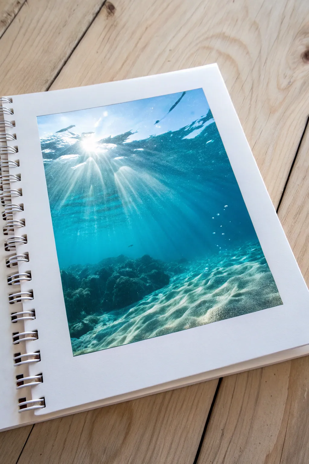

This tutorial guides you through creating a photorealistic underwater scene inside a sketchbook, focusing specifically on the mesmerizing effect of sunlight piercing through the ocean surface. You will learn to build depth with gradients and master the ethereal quality of light refraction.
How-To Guide
Materials
- Spiral-bound sketchbook (heavyweight paper, mixed media or bristol)
- Soft pastel sticks (blues, teals, white)
- Pastel pencils (white, dark blue, black)
- Blending stumps or tortillons
- Paper towels or soft cloth
- Workable fixative spray
- Masking tape (optional for clean edges)
- Kneaded eraser
Step 1: Setting the Ambient Water
-
Prepare the base gradient:
Start by lightly applying a bright turquoise or aqua blue soft pastel to the upper third of your sketchbook page. This represents the shallowest, brightest water near the surface. -
Deepen the blue:
Transition into a medium cerulean blue for the middle section of the water. Overlap it slightly with the turquoise to ensure a seamless blend later. -
Create the abyss:
For the bottom third, just above the seabed, apply a deep Prussian blue or indigo. The water gets darker as it gets deeper, so don’t be afraid to go heavy with the pigment here. -
Blend the gradient:
Using a paper towel or your fingers, blend the colors horizontally. Smooth out the transitions until you have a flawless gradient from bright surface water to the deep blue abyss.
Muddy Water?
If your rays turn gray, your blue layer wasn’t fully set. Spray a layer of fixative over the blue background and let it dry completely before drawing the white rays on top.
Step 2: The Sandy Seabed
-
Block in the sand:
At the very bottom of the page, sketch the undulating shape of the sandy floor using a beige or warm grey pastel. Create hills and valleys rather than a straight line to add dimension. -
Add shadows to the sand:
Use a darker cool grey or mute blue to shade the valleys of the sand dunes. This establishes the form of the seabed before we add the light patterns. -
Depict the rocky formation:
On the left side, block in a dark, jagged shape for the coral or rock formation using deep indigo and black charcoal or pastel. keep the edges slightly soft to simulate the water’s density.
Eraser beams
For subtle, ghostly rays, don’t draw with white. Instead, cover the area in blue, then use the sharp edge of a kneaded eraser to lift streaks of pigment, revealing the paper.
Step 3: Creating the Refracted Light (Caustics)
-
Start the surface light:
Using a sharp white pastel pencil, draw the bright, broken surface of the water at the very top. Use zig-zag, horizontal motions to mimic waves catching the sun. -
Draw the main sunburst:
Identify the source of the light near the top center. Press hard with a white soft pastel to create a concentrated ball of light. -
Streaking the sun rays:
From the sunburst, drag long, straight lines of white downward into the deep blue. Vary the pressure—some rays should be bright and distinct, others faint and ghostly. -
Refining the rays:
I find using a clean blending stump helps here. Gently smudge the edges of the light rays so they look like beams of light suspended in water, rather than painted white stripes. -
Dancing light on the sand:
This is the magic step. Use the white pastel pencil to draw a web-like pattern of light (caustics) on the sandy bottom. These lines should follow the contours of the sand dunes you drew earlier. -
Brightening the sand highlights:
Where a sun ray hits the sand directly, make the web pattern much brighter and thicker. This connects the light source above to the floor below.
Step 4: Atmospheric Details
-
Add floating bubbles:
Scatter a few tiny clusters of bubbles rising towards the surface using the tip of your white pastel pencil. Group them in threes or fours for a natural look. -
Highlight the rocks:
Lightly graze the top edges of the dark rock formation with a light blue or teal pencil. This shows the filtered sunlight hitting the coral structures. -
Enhance surface texture:
Return to the water’s surface and add some dark blue irregular shapes amidst the bright white. These represent the underside of waves that aren’t catching the light. -
Final contrast check:
Step back and squint at your drawing. If the deep water looks too washed out, gently layer more black or indigo pastel over the darkest areas to make the light rays pop. -
Fix the drawing:
Once satisfied, spray a light coat of workable fixative over the page. This prevents the pastel dust from transferring to the facing page when you close your sketchbook.
Close your sketchbook knowing you’ve captured a permanent piece of summer sunshine.


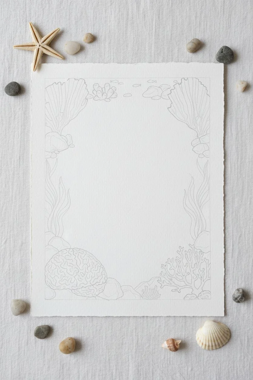
Coral Reef Corner Packed With Life
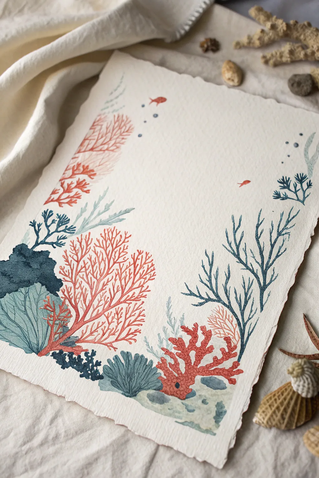
This delicate watercolor project creates a stunning natural frame using coral reef motifs, leaving negative space in the center for calligraphy or a photo. The piece features a balance of deeply saturated blues and vibrant corals on beautiful deckle-edge paper.
Step-by-Step
Materials
- Heavyweight watercolor paper (300gsm cold press with deckled edges recommended)
- Watercolor paints: Indigo, Prussian Blue, Teal/Turquoise, Coral Red, Burnt Sienna
- Round brushes: size 2 and size 6
- Pencil (HB or H) for light sketching
- Kneaded eraser
- Two jars of water
- Paper towels
Step 1: Preparation and Sketching
-
Define the perimeter:
Begin by lightly marking the corners of your paper where you want the painting to stop. Visualize a loose ‘U’ shape or a rectangular border, keeping the center completely clear. -
Sketch anchor elements:
Using your HB pencil, very faintly sketch the largest elements to anchor your composition. Draw the rounded brain coral shape in the bottom left and the branching skeleton coral on the bottom right. -
Draft secondary corals:
Add the taller, fan-like structures. Sketch vertical sea fans reaching up the left and right sides. Keep your pencil lines extremely light so they don’t show through the transparent watercolor later. -
Refine the details:
Fill in the gaps with smaller shapes like sea rocks, tiny overlapping seaweed clusters, and a few tiny fish silhouettes near the top. Don’t worry about perfect realism; stylized shapes work best here.
Muddy Colors?
If your coral reds look brown where they touch the blue seaweed, ensure the blue layer is 100% dry before painting red over or near it to prevent unwanted bleeding.
Step 2: Painting the Base Layers
-
Start with the brain coral:
Mix a watery Teal or Turquoise. Using the size 6 brush, paint the large brain coral shape on the bottom left. While it’s still wet, drop in a slightly darker teal near the base to create volume. -
Paint the dark masses:
Load your brush with a saturated Indigo or Navy. Paint the solid, rock-like shape tucked behind the brain coral on the left side. This dark value creates depth and pushes the lighter teal forward. -
Block in bottom elements:
Move across the bottom edge. Paint the small scallop-shaped shell/coral cluster in the center using a muted teal-grey mix. Add a few small pebbles in grey tones. -
Right-side foundation:
On the bottom right, paint the base of the red branch coral. Use a vivid Coral Red mixed with a touch of Burnt Sienna so it isn’t too neon. Paint the main thick stems now, aiming for solid coverage.
Step 3: Adding Detailed Flora
-
Detail the red fan:
Let’s focus on the large red sea fan on the left side. Switching to your size 2 brush, paint delicate, branching veins extending upward from the bottom cluster. Keep your hand loose to mimic organic growth. -
Create the blue branches:
On the right side, just above the red coral, paint the tall, spindly blue seaweed structures. Use a mix of Prussian Blue and Teal. These lines should face slightly inward, guiding the viewer’s eye toward the center. -
Add soft background textures:
Mix a very dilute, pale teal. Paint ghostly, soft seaweed shapes in the background, particularly in the upper left corner. These should be much lighter than your foreground elements to imply distance. -
Incorporate accent colors:
Use a darker Navy Blue to paint the small, leafy seaweed bunches tucked into the bottom left corner and the small sprigs on the far right edge. This ties the dark values together across the composition.
Add Some Shimmer
Once the matte paint is dry, use a metallic gold watercolor or a gold gel pen to add tiny highlights on the fish scales or the tips of the coral for a magical effect.
Step 4: Finishing Touches
-
Paint the fish:
Using your Coral Red, paint the tiny silhouettes of fish swimming near the top and middle. Keep them simple—just a small oval with a tail. -
Add texture to the brain coral:
Once the teal brain coral is fully dry, use your size 0 or 2 brush with a slightly darker teal to paint thin, wavy lines over the surface to mimic the ridges. -
Apply dots and bubbles:
Dip the tip of your small brush into Indigo and carefully dot a few ‘bubbles’ rising near the top right and left corners. Vary the pressure to make some dots larger than others. -
Review and refine:
Step back and look at the balance. If the bottom feels too heavy, add a few more wispy lines extending upward. Erase any visible pencil marks once the paint is bone dry.
Now you have a serene underwater frame ready to hold your favorite quote or seaside memory
Jellyfish With Flowing Tentacles
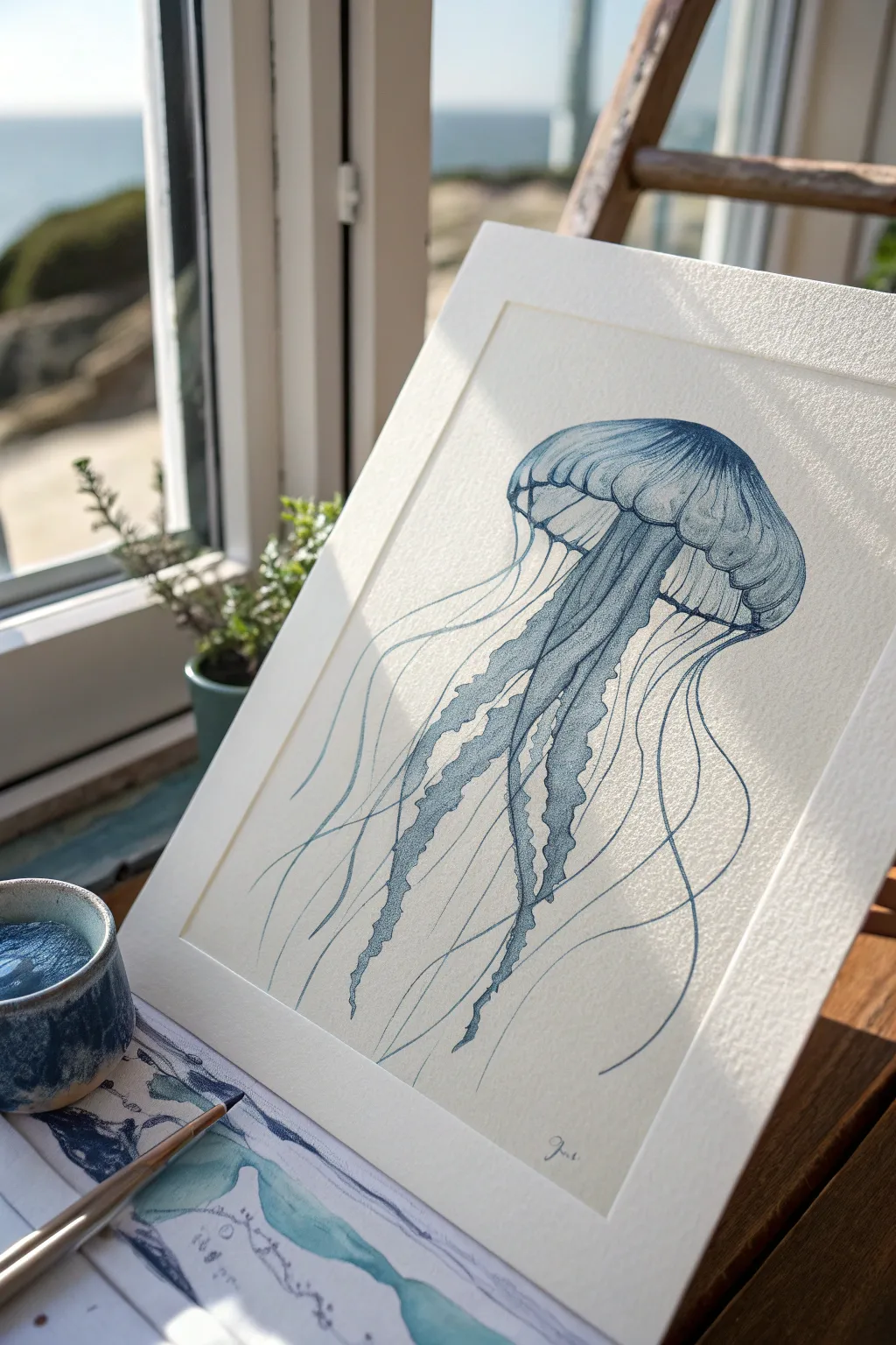
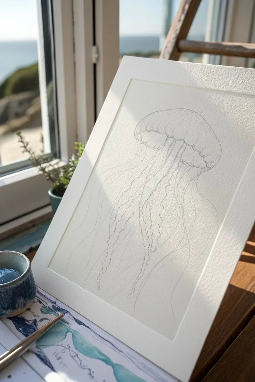
Capture the ethereal movement of the sea with this delicate, single-color study of a jellyfish. Using a fine dip pen and rich indigo ink, you will create graceful, flowing lines that contrast beautifully against textured cream paper.
How-To Guide
Materials
- Heavyweight cold-press watercolor paper (smooth or medium texture)
- Indigo drawing ink (or deep prussian blue)
- Dip pen with a fine nib (G-nib is versatile)
- Small round watercolor brush (size 2 or 4)
- Pencil (HB) and kneaded eraser
- Small ceramic dish or ink well
- Paper towels
- Clean water for dilution
Step 1: Sketching the Form
-
Outline the Bell:
Begin by lightly sketching a mushroom-shaped cap for the jellyfish’s bell. Keep the top curve smooth and rounded, while the bottom edge should have a scalloped, organic ruffle. -
Establish the Oral Arms:
Draw the central drooping structures (oral arms) extending from the center of the bell. These should look thicker and more ruffled than the outer tentacles, twisting slightly as they hang down. -
Map the Tentacles:
Sketch long, sweeping guidelines for the thinner tentacles. Let them drift in diverse directions—some crossing over others—to simulate the feeling of floating underwater. -
Refine the Details:
Lightly trace the internal radial lines on the bell, giving it a sectioned, umbrella-like appearance. Use your kneaded eraser to lift the graphite until the lines are barely visible guides.
Ink Flow Control
If your dip pen is dropping blobs, wipe the nib on a paper towel after dipping. The ink should coat the nib without dripping excessively.
Step 2: Inking the Bell
-
Outline with Ink:
Dip your pen into the indigo ink. Start by outlining the top curve of the bell with a confident, unbroken line. Vary your pressure slightly: press harder for a thicker line on the shadowed side. -
Detail the Ruffles:
Move to the bottom edge of the bell. Use short, interrupted strokes to create the scalloped texture, implying soft, folded tissue rather than a rigid edge. -
Add Texture with Hatching:
Using very light pressure, add fine vertical hatching lines along the sides of the bell’s dome. This shading builds volume and suggests the translucency of the creature. -
Define the Underside:
Draw the visible underside structures where the tentacles attach. Use darker, more concentrated ink here to create depth and separate the foreground from the background.
Step 3: The Flowing Appendages
-
Texture the Oral Arms:
For the thick central arms, I like to use a stippling technique mixed with short, squiggly lines. This mimics the grainy, soft texture of these appendages. -
Build Central Density:
Layer your ink marks more densely in the center of the oral arms. Leave the edges lighter to make them look rounded and dimensional. -
Draw Main Tentacles:
With a fully loaded nib, draw the long, trailing tentacles. Use your whole arm to make smooth, sweeping motions rather than just your wrist. -
Variation in Line Weight:
Allow the ink to run out slightly on the ends of the tentacles for a tapered, fading effect. Re-dip and add a few darker lines crossing behind the main cluster for depth. -
Connect to the Bell:
Ensure every tentacle clearly originates from the rim of the bell. Draw small loops or connection points at the base so they don’t look like they are floating disconnectedly.
Uneven Lines?
Shaky lines happen if you move too slowly. Practice swift, confident strokes on scrap paper first. Speed often equals smoothness with dip pens.
Step 4: Washes and Finishing
-
Prepare a Wash:
Put a single drop of ink into a separate well and mix it with a generous amount of water to create a very pale, transparent blue wash. -
Shade the Bell:
Using your small brush, apply this pale wash to the shadowed side of the bell (usually the left or right side). Be careful not to smudge your ink lines if they aren’t fully waterproof. -
Add Volume to Arms:
Paint a thin line of the wash down the center of the oral arms. This softer shadow complements the harsh ink lines and adds realistic volume. -
Final Contrast Check:
Once the wash is dry, look for areas that need more punch. Use your dip pen to darken the deepest crevices under the bell. -
Sign and Dry:
Add your signature in a small, unobtrusive spot at the bottom. Let the piece dry completely, ideally overnight, before erasing any remaining pencil marks.
Now you have a serene piece of marine art ready to frame.
Octopus Close-Up With Suckers and Texture
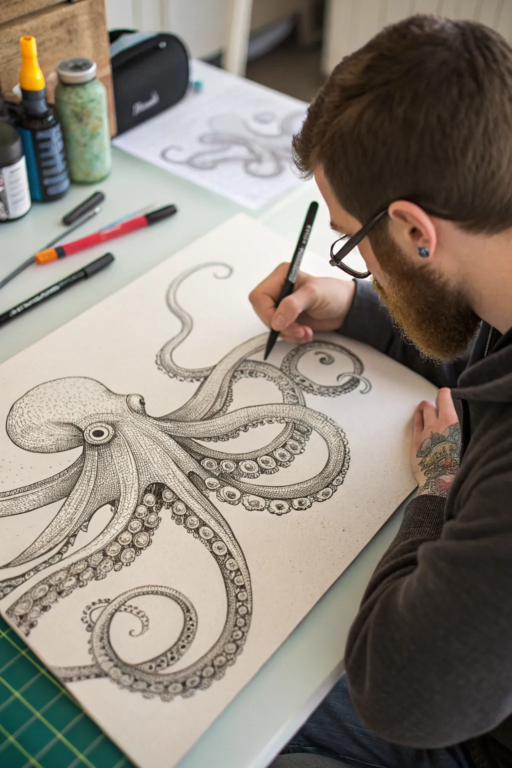
This intricate octopus illustration captures the stunning complexity of marine life using simple black ink on paper. By focusing on the detailed texture of the suckers and graceful curves of the tentacles, you will create a piece that feels both scientific and artistic.
Step-by-Step Guide
Materials
- High-quality smooth bristol board or illustration paper (A3 size recommended)
- Graphite pencil (HB or 2H)
- Kneaded eraser
- Set of black fine-liner pens (0.05mm, 0.1mm, 0.3mm, 0.5mm, and 0.8mm)
- Ruler (optional for layout)
- Reference photo of an octopus
Step 1: Sketching the Form
-
Map out the composition:
Begin by lightly sketching the general placement of the octopus on your paper using an HB or 2H pencil. Mark a large oval for the mantle (head) and draw flowing S-curves to indicate the direction of the eight arms. -
Refine the mantle shape:
Flesh out the bulbous shape of the head, ensuring it connects smoothly to the area where the arms converge. Sketch the eye prominently on the side, giving it a distinct, layered rim. -
Define the tentacle volume:
Turn your single-line curves into thick tentacles. Vary the thickness, making them widest at the base and tapering to thin, elegant points at the ends. Allow some arms to overlap others to create a sense of depth. -
Section off the underside:
Lightly draw a line down the length of each tentacle to separate the top smooth skin from the underside where the suckers will go. This perspective shift is crucial for realism. -
Placement of suckers:
Sketch circles and ovals along the underside sections of the arms. Start with larger circles near the base of the arms and gradually make them smaller and more oval-shaped as they move toward the tips.
Step 2: Inking the Outline
-
Trace the main contours:
Switch to a 0.5mm fine-liner. Carefully trace the external outline of the octopus. Keep your hand steady and use long, confident strokes to avoid wobbly lines. -
Outline the suckers:
Use a slightly finer pen, like a 0.3mm, to ink the circles of the suckers. I like to double up the line on one side of each sucker to imply a bit of dimension before I even start shading. -
Detail the eye:
Ink the eye using a 0.5mm pen for the pupil and outer rim, but switch to a 0.05mm for the delicate texture of the iris. Leave a small white highlight to make the eye look wet and alive. -
Erase pencil guides:
Once the ink is completely dry—be patient here—gently erase all the visible pencil marks with your kneaded eraser to reveal a clean line drawing.
Ink Smearing?
If you smudge ink while drawing, cover the mistake by turning it into a localized shadow or texture patch. Place a piece of scrap paper under your drawing hand to prevent future slips.
Step 3: Texturing and Shading
-
Establish the shadow source:
Decide on a light source (e.g., coming from the top left). This means shadows will fall on the bottom right of the head and the underside of the tentacles. -
Stippling the mantle:
Using your 0.1mm and 0.05mm pens, begin stippling (drawing small dots) on the mantle. Cluster dots densely in shadow areas and spread them out into white space for the highlights. -
Texture the top skin:
Instead of just dots, use tiny, broken lines or hatching on the top surface of the arms to mimic the rough, wrinkled texture of octopus skin. Follow the curve of the arm with your strokes. -
Deepen the crevices:
Use a 0.3mm pen to darken the areas where tentacles overlap. This separation is vital for making the creature look three-dimensional rather than flat. -
Shading the sucker rims:
Add small hatch marks or stippling inside the rim of each sucker. Keep the center of the sucker lighter to show that it is a hollow cup. -
Refine the gradients:
Go back over your shaded areas with the 0.05mm pen to smooth out the transition between the dark ink and the white paper. The smoother the gradient, the rounder the form will appear. -
Add final contrast:
Take your thickest pen (0.8mm) and carefully re-trace purely the outermost silhouette line of the entire octopus. This ‘line weight’ trick makes the drawing pop off the page.
Mastering Stippling
Don’t rush the dots! Fast, hard tapping ruins pen tips and makes ‘tails’ on your dots. Hold the pen vertically and press gently for perfectly round, uniform stippling points.
Step back and admire the complex textures you have built up layer by layer
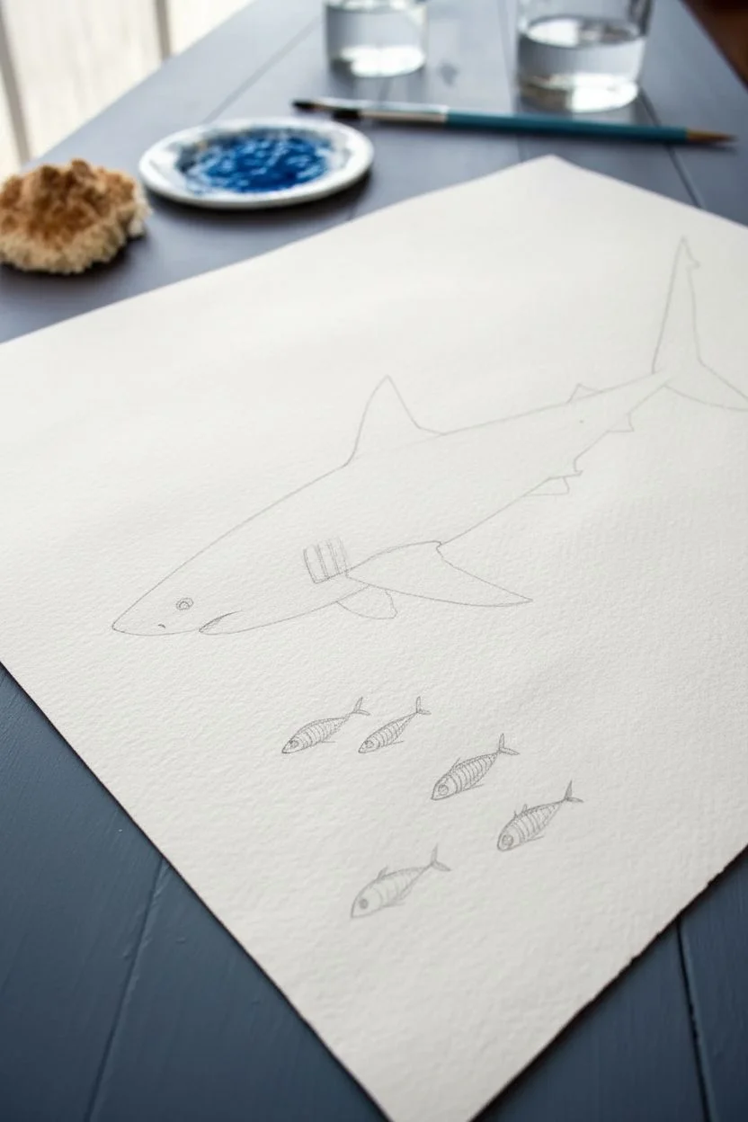
Shark Profile Cutting Through the Blue
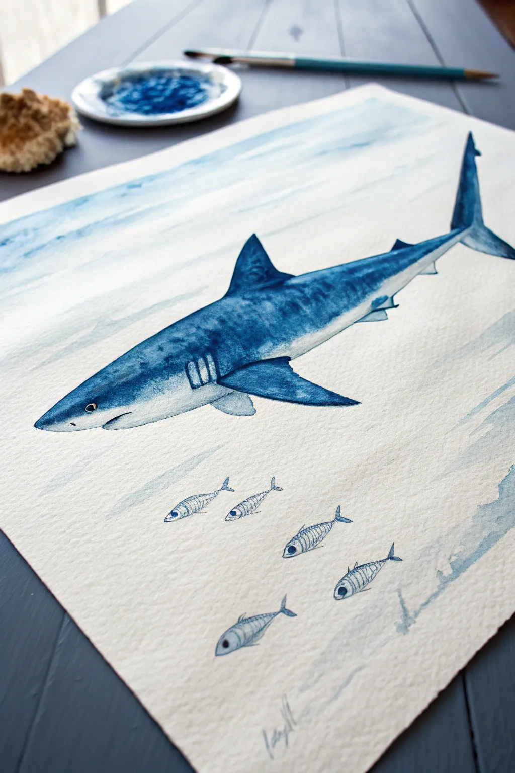
Capture the sleek power of the ocean’s apex predator with this striking watercolor profile. Using a single hue—indigo—you will build depth and form through careful layering, creating a piece that feels both classic and distinctly modern.
Detailed Instructions
Materials
- Cold press watercolor paper (300 gsm)
- Indigo watercolor paint (tube or pan)
- Round watercolor brushes (size 4 and 8)
- Fine liner brush (size 0 or 00)
- Graphite pencil (HB or 2H)
- Kneaded eraser
- Palette for mixing
- Clean water jar
- Paper towels
Step 1: Sketching the Layout
-
Map the Shark’s Form:
Begin by lightly sketching the shark’s main body shape. It’s roughly a torpedo shape, tapering towards the tail. Keep your pencil pressure very light so the graphite doesn’t smudge later. -
Add Fins and Details:
Draw the dorsal fin on top (triangular with a slight curve backwards) and the pectoral fin on the side. Sketch the iconic tail fin, the gill slits near the neck, and the eye placement. -
Position the School of Fish:
Below the shark, sketch five small, oval shapes to represent the school of fish. Arrange them diagonally to create a sense of movement, mirroring the shark’s direction.
Wet-on-Wet Magic
For a smoother gradient on the shark’s belly, wet the paper slightly with clean water *before* applying the blue paint. The color will bleed naturally downwards.
Step 2: Painting the Shark
-
Prepare the Indigo Wash:
Mix a medium-strength puddle of indigo paint on your palette. Add enough water so it flows easily but retains a strong blue color. -
Paint the Upper Body:
Using your size 8 brush, apply the indigo wash to the upper half of the shark’s body and the dorsal fin. Leave the belly area unpainted for now to preserve the white of the paper. -
Soften the Transition:
Before the paint dries, rinse your brush and blot it slightly. Use the damp brush to pull the bottom edge of the blue paint downwards, creating a soft, gradient fade into the white belly. -
Darken the Fins:
While the body is drying, paint the pectoral fin and the tail fin with a more concentrated indigo mix. These areas should be darker to show depth and separation from the body. -
Add Texture and Shadows:
Once the first layer is dry, mix a dark, thick indigo. Use a dryer brush technique to scumble texture along the shark’s back and sides, mimicking rough skin. Add shadows under the pectoral fin and near the tail base. -
Detail the Gills and Face:
Switch to your size 4 brush. Carefully paint vertical stripes for the gills, leaving thin white spaces between them. Define the eye with a dark dot, leaving a tiny speck of white for the highlight.
Make it Sparkle
Mix a tiny amount of iridescent medum into your final indigo layer on the shark’s back. It will give the skin a subtle, wet shimmer when the light hits it.
Step 3: Painting the School
-
Outline the Small Fish:
Using the fine liner brush (size 0), carefully outline the small fish below the shark using a diluted indigo mix. Keep the lines delicate. -
Add Fish Details:
Paint the large eyes on the small fish—these act as focal points. Add distinct vertical skeleton-like lines or stripes on their bodies to give them character without overcrowding them with detail.
Step 4: Background and Final Touches
-
Create Water Streaks:
Mix a very watery, pale indigo wash. Using a large brush, paint horizontal, sweeping strokes above and below the shark to suggest ocean currents. Keep these loose and disconnected. -
Refine Edges:
Look closely at the shark’s outline. If any edges look too fuzzy, use the fine brush with concentrated paint to crispen the silhouette, especially around the nose and fins. -
Erase Guidelines:
Once the paper is completely bone-dry, use the kneaded eraser to gently lift any visible pencil marks that weren’t covered by paint.
Step back and admire how a single color can bring such life and movement to your nautical masterpiece
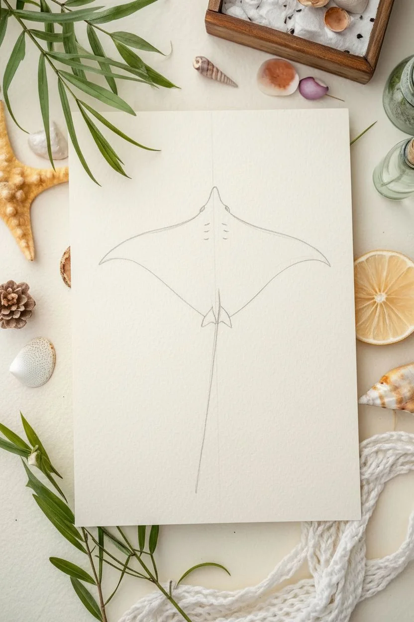
Manta Ray Floating Like a Kite
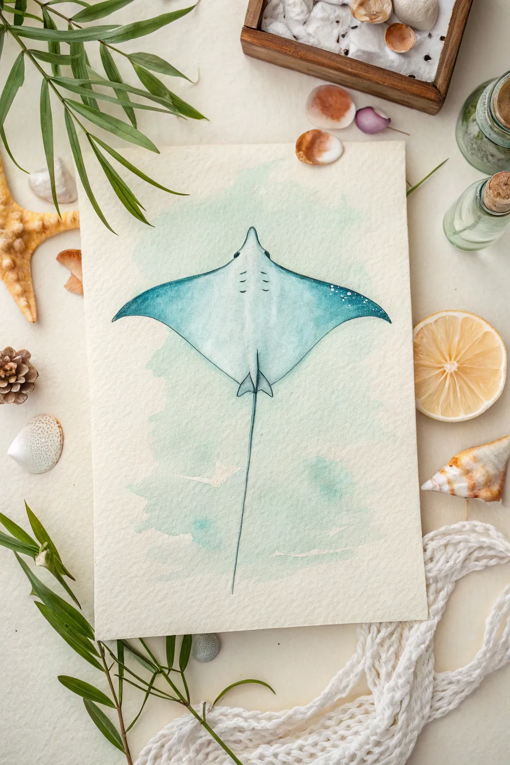
Capture the graceful, gliding motion of a manta ray with this serene watercolor project. The soft teal wash and delicate speckling create a tranquil underwater feel that looks beautiful on textured paper.
How-To Guide
Materials
- Cold press watercolor paper (thick gsm)
- Watercolor paints (Turquoise, Phthalo Blue, Indigo, Paynes Grey)
- Round brushes (size 6 for washes, size 2 or 0 for details)
- Pencil (HB or lighter)
- Kneaded eraser
- Jar of clean water
- Paper towels
- White gouache or white gel pen
Step 1: Sketching the Shape
-
Define the center:
Start by lightly drawing a vertical centerline down the middle of your paper to ensure symmetry. This guide will help you place the body and tail correctly. -
Map the body:
Draw a diamond shape, curving the front edges slightly inward and the back edges outward. Soften the top point for the head and extend the side points into graceful, wing-like fins. -
Add the tail:
From the bottom center of the body, draw a very long, slender line for the tail. It should taper to a fine point and can curve slightly to suggest movement. -
Detail the head:
Refine the head area by drawing two small cephalic lobes (the little fins near the mouth) and marking the position of the eyes on the sides of the head bump. -
Clean up:
Gently erase your centerline and lighten your sketch with a kneaded eraser until the graphite is barely visible. Clean lines are crucial for the delicate watercolor look.
Water Control Tip
If your ray’s body color bleeds into the background, the background wasn’t dry enough. Use a hair dryer on the low setting to ensure layers are bone-dry before touching borders.
Step 2: Applying the Washes
-
Wet the background:
Using a clean brush and water, wet the area around the ray in an irregular, splashy shape. You want the paper damp but not soaking wet. -
Drop in background color:
Load your brush with a very watery mix of turquoise and pale green. Touch it to the wet paper around the ray, letting the color bloom outward naturally. Fade the edges to white for a soft vignette. -
Base coat the ray:
Wait for the background to dry completely. Then, fill the body of the ray with a light wash of turquoise, keeping the center of the back slightly lighter to create a highlight effect. -
Deepen the wings:
While the base coat is still slightly damp, introduce a darker teal or Phthalo Blue to the tips of the wings. Allow this darker pigment to bleed softly toward the lighter center. -
Tail wash:
Paint the tail with a mix of blue and grey. Use your finest brush to keep the line crisp and consistent all the way down.
Step 3: Refining Details
-
Define the spine:
Once the body layer is dry, mix a slightly stronger teal. Paint a faint line down the center of the back and add subtle shading around the base of the tail to give the body volume. -
Add the gills and markings:
Using a size 0 brush and a dark grey or indigo mix, paint small, curved dashes for the gills or markings on the back. Keep these delicate and precise. -
Darken the edges:
Reinforce the outer edges of the wings with a thin line of Indigo paint. This crisp outline helps separate the ray from the background wash. -
Pelvic fins:
Don’t forget the small pelvic fins at the base of the tail. Outline these carefully and shade them lightly to distinguish them from the main body. -
Speckling texture:
Load a small brush with white gouache. Tap the brush handle against your finger to splatter tiny white dots onto the wingtips, simulating skin texture or light reflecting off the water. -
Salt texture (optional):
If you want more organic texture, I sometimes sprinkle a tiny pinch of salt onto the background wash while it’s still wet, then brush it off once dry. -
Final highlights:
Use a white gel pen or thick gouache to add tiny highlights to the eyes and the highest ridge of the back to make the form pop.
Make It Shimmer
Mix a small amount of iridescent medium or metallic watercolor paint into your final teal glaze. The wings will catch the light beautifully, just like wet skin.
Step back and admire the fluid movement of your watercolor ocean creation
Split-Level Ocean Scene Above and Below the Waterline
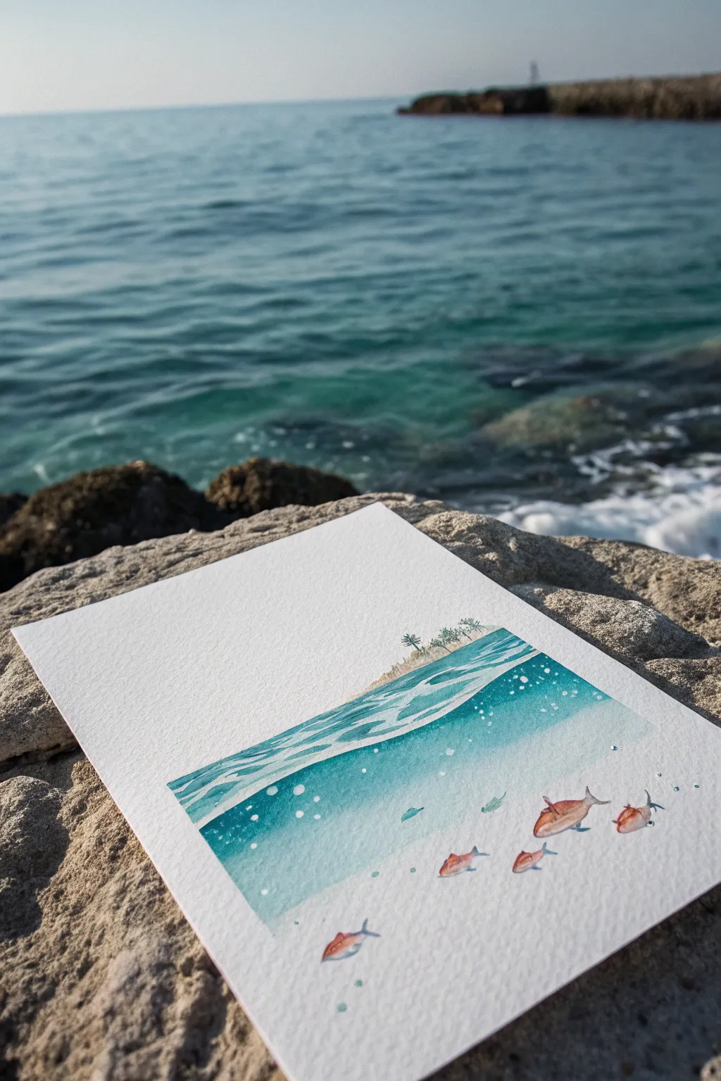
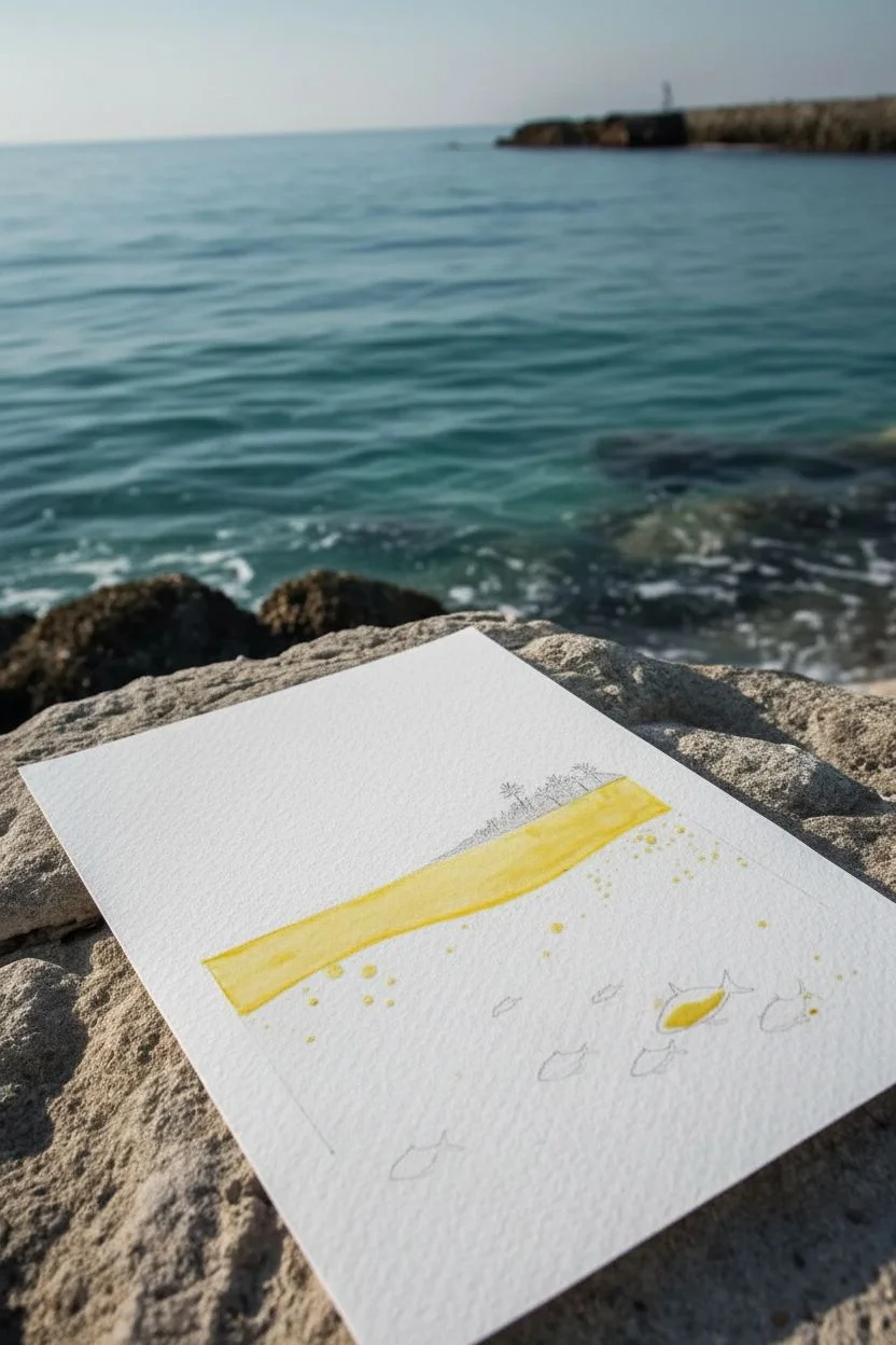
Capture the magic of two worlds in one painting with this serene split-level composition. This watercolor project combines a tranquil island horizon with a lively underwater scene, using clever masking and layering to create a convincing water line effect.
Step-by-Step
Materials
- Cold press watercolor paper (300 gsm)
- Watercolor paints (Turquoise, Phthalo Blue, Cerulean Blue, Sap Green, Burnt Sienna, Burnt Umber, Alizarin Crimson)
- Masking fluid (drawing gum) and old brush
- Watercolor brushes: Round size 4 or 6, Fine liner size 0, Flat wash brush 1/2 inch
- Pencil and eraser
- Paper towels
- Jar of clean water
- White gouache or white gel pen
Step 1: Planning and Masking
-
Sketch the horizon:
Begin by lightly sketching a horizontal line about one-third of the way down your paper. This will be your water surface line. -
Outline the island:
On top of that line, sketch a tiny, distant island with a few palm trees. Keep the details very small and simple to suggest distance. -
Draw the fish:
Below the waterline, sketch the outlines of several fish swimming at different depths. Vary their sizes to create a sense of perspective. -
Mask the highlights:
Using an old brush or a silicone applicator, apply masking fluid to the waterline itself to keep it crisp white. Also mask the fish bodies and tiny dots for bubbles rising to the surface. -
Let it dry:
Wait until the masking fluid is completely dry and rubbery to the touch before proceeding with any paint.
Step 2: Above the Water
-
Paint the island base:
Mix a very watery wash of Burnt Sienna or Yellow Ochre for the sandy beach of the tiny island. -
Add foliage:
With a fine liner brush and Sap Green mixed with a touch of Burnt Umber, paint tiny palm fronds and vegetation. Keep your strokes delicate. -
Create the sky (optional):
This specific style leaves the sky largely white for a minimalist look, but you can add a very faint wash of blue at the top edge if you prefer.
Don’t ruin your brush
Never use your good watercolor brushes for masking fluid! The fluid dries into rubber and ruins bristles instantly. Use a silicone tool or a dedicated ‘trash’ brush coated in bar soap first.
Step 3: Painting the Ocean
-
Mix your ocean gradient:
Prepare a gradient of blues. You’ll want a deeper Phthalo or Turquoise for the top meant for the surface waves, fading into a lighter wash below. -
Paint the surface layer:
Paint the area immediately below the masked waterline with horizontal strokes using Turquoise. Leave some gaps or use ‘lifting’ techniques to suggest ripples on the surface. -
Wash the deep water:
For the main underwater section, use a flat brush to apply a wash of diluted Turquoise or Cyan. Start darker near the surface line and let it fade to almost clear water at the bottom. -
Soften edges:
While the paint is still damp, use a clean, slightly wet brush to soften the transition between the darker surface water and the lighter deep water. -
Add underwater depth:
Drop in slightly more concentrated blue pigment in the upper corners of the underwater section to create a vignette effect. -
Dry thoroughly:
Allow the entire blue wash to dry completely. This is crucial before removing the masking fluid.
Smudged masking lines?
If paint bleeds under your masking fluid, the paper might be too textured or the fluid applied too thinly. Tidy up ragged edges with opaque white gouache at the very end.
Step 4: Details and Finishing
-
Remove masking:
Gently rub away the dried masking fluid with your finger or a rubber cement pickup tool to reveal the pristine white paper underneath. -
Paint the fish:
Color the fish using a mix of Alizarin Crimson and Burnt Sienna. Keep the belly slightly lighter than the top fin. -
Add fish details:
Use your smallest liner brush to add tiny eyes and fins. I like to add a tiny shadow under the fish with diluted blue to ground them in the space. -
Refine the bubbles:
If your masked bubbles look too stark, soften one edge with a damp brush or outline the bottom of the circle with a tiny amount of blue for dimension. -
Highlight the waves:
Use white gouache or a gel pen to accentuate the ripples on the water surface and add extra sparkle to the bubbles.
Once the final details are dry, you have a lovely window into a tropical paradise to display
Have a question or want to share your own experience? I'd love to hear from you in the comments below!