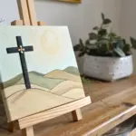
Black History Month is such a powerful time to draw with purpose—celebrating stories, voices, and achievements through your own art. These ideas are meant to feel approachable at any skill level, whether you’re sketching at the kitchen table or planning a full classroom display.
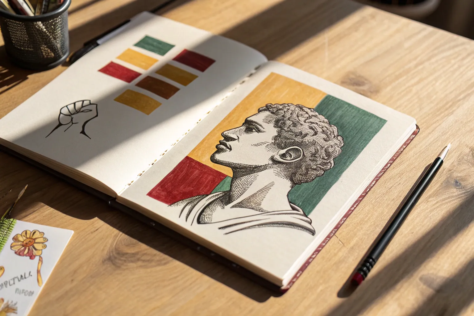
Portrait Study of a Black History Leader
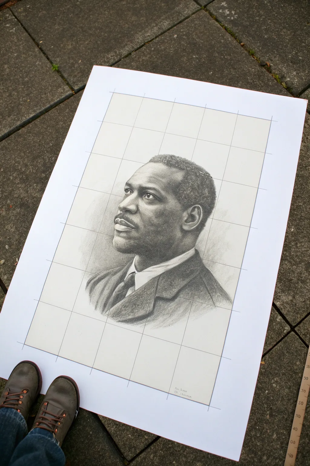
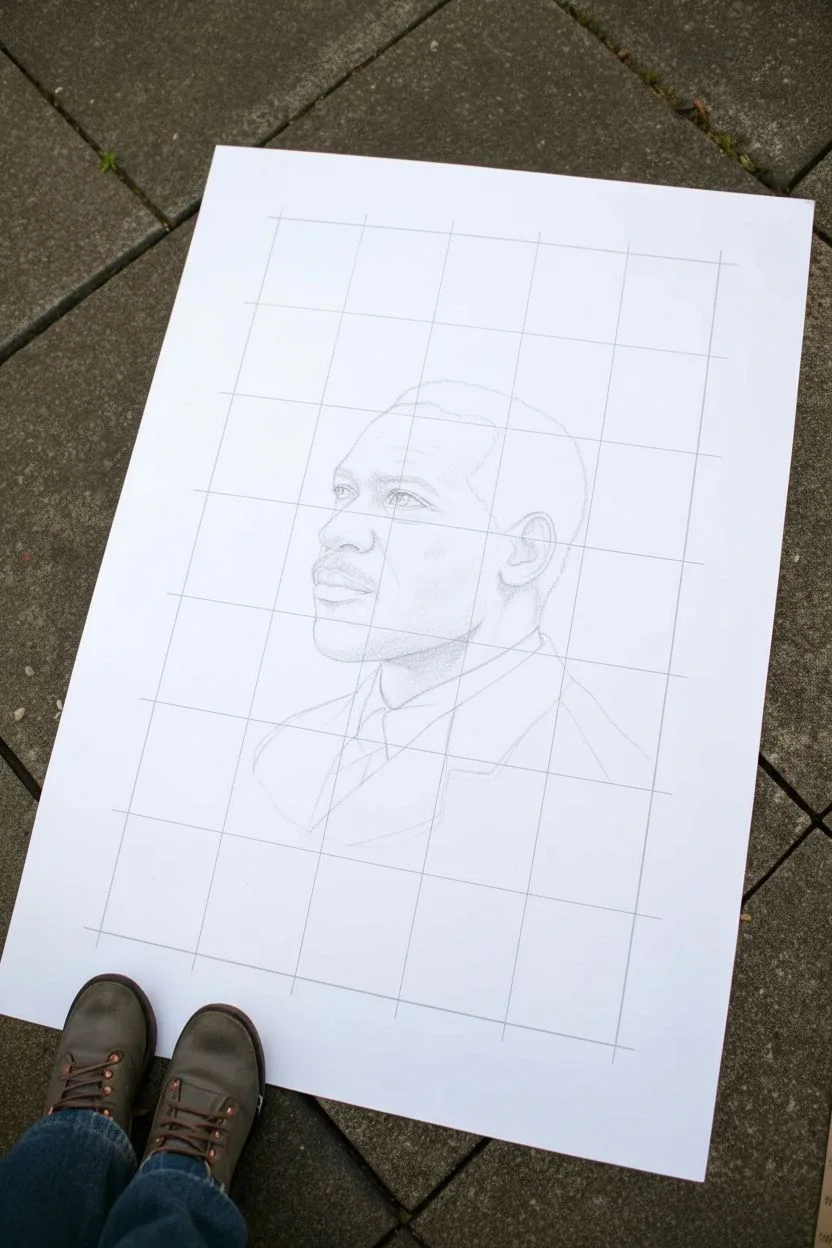
This project guides you through creating a realistic portrait of a historical figure using the classical grid method, which breaks down complex forms into manageable sections. The result is a striking, hyper-realistic graphite drawing on high-quality toned or white paper that captures both dignity and likeness.
Step-by-Step Tutorial
Materials
- Large sheet of smooth Bristol board or drawing paper (A2 or similar size)
- Graphite pencils (ranging from 2H to 6B)
- Mechanical pencil (0.5mm HB)
- Kneadable eraser and stick eraser
- Ruler (preferably 24-inch or longer)
- Blending stumps (tortillons)
- Tissue or chamois cloth
- Reference photo of chosen leader
- Masking tape
Step 1: Preparation and Gridding
-
Select your reference:
Choose a high-contrast black and white photograph of your chosen Black History leader. A photo with clear lighting and distinct shadows works best for graphite studies. -
Grid the reference:
Draw a grid over your printed reference photo using 1-inch squares. Alternatively, use a digital art program to overlay a grid on your image file before printing. -
Grid the drawing paper:
Lightly tape your drawing paper to a flat surface. Using your 2H pencil and the long ruler, draw a corresponding grid on your paper. Keep these lines extremely faint, as they need to be erased later. Scale up the squares if you want the drawing larger than the photo. -
Outline the basic shapes:
Focusing on one square at a time, transfer the main contours of the face, hair, and clothing onto your paper. Look specifically at where lines intersect the grid marks to ensure accurate proportions.
Clean Edges
Keep a piece of scrap paper under your drawing hand at all times. This prevents oils from your hand transferring to the paper and stops you from accidentally smudging your finished shading.
Step 2: Drafting the Face
-
Establish the eyes:
Start with the eyes using an HB pencil. Pay close attention to the shape of the eyelids and the spacing between the eyes. Leave small white shapes within the pupil specifically for the catchlights (reflections), which bring the subject to life. -
Map the nose structure:
Lightly sketch the bridge and nostrils. Avoid hard outlines for the nose; instead, use soft shading to define its shape, particularly the shadows underneath. -
Define the mouth:
Draw the parting line between the lips first, as this is usually the darkest part. Shade the upper lip slightly darker than the bottom lip to simulate overhead lighting. -
Outline the hairline and ears:
Sketch the boundary of the hair and the basic shape of the ear. The ear is complex, so look for the abstract shapes of shadows within the curves of the cartilage.
Step 3: Shading and Rendering
-
Build the first layer of tone:
Using a 2B pencil, begin laying down a mid-tone gray over the shadowed areas of the face. Use light, circular motions to create a smooth texture, avoiding harsh scribbles. -
Blend for skin texture:
Take a tissue or a blending stump and gently smudge the graphite you just applied. This unifies the pencil strokes and creates a base skin tone. I find wrapping the tissue around my finger helps control the pressure. -
Deepen the shadows:
Switch to a 4B or 6B pencil to darken the deepest shadows: under the chin, the nostrils, the pupils, and the folds of the collar. Focus on the high contrast on the shadow side of the face. -
Render the hair texture:
For short, textured hair, use small, tight circular motions with a sharp 4B pencil. Don’t color it in solid black; vary the pressure to suggest curls catching the light. -
Refine facial features:
Return to the eyes and mouth with your mechanical pencil for crisp details. Darken the lashes and add subtle texture lines to the lips. -
Erase highlights:
Use your kneadable eraser to lift graphite off the paper. Tap or drag the eraser on the forehead, nose bridge, and cheekbones to create bright highlights that reveal the bone structure.
Grid Ghosting?
If you can still see grid lines after erasing, your initial faint lines were too heavy. Next time, try drawing the grid on a separate transparency sheet and overlaying it, rather than drawing on the art paper.
Step 4: Clothing and Final Touches
-
Block in the suit:
Using broad strokes with the side of a 6B pencil, fill in the dark fabric of the jacket. The texture here can be rougher than the skin to differentiate materials. -
Detail the tie and collar:
Add precise shading to the knot of the tie and the shadows cast by the collar. Keep the white shirt paper-white or very lightly shaded to maintain contrast. -
Remove grid lines:
Carefully erase any visible grid lines that haven’t been covered by drawing. Be extremely gentle near the shaded areas to avoid smearing your work. -
Final assessment:
Step back from the drawing. Check the value range—does your darkest dark look black, and is your brightest light pure white? Strengthen any areas that look washed out.
Once signed, this detailed portrait serves as a powerful tribute and a testament to your patience and observation skills


Ruby Bridges-Inspired School Walk Scene
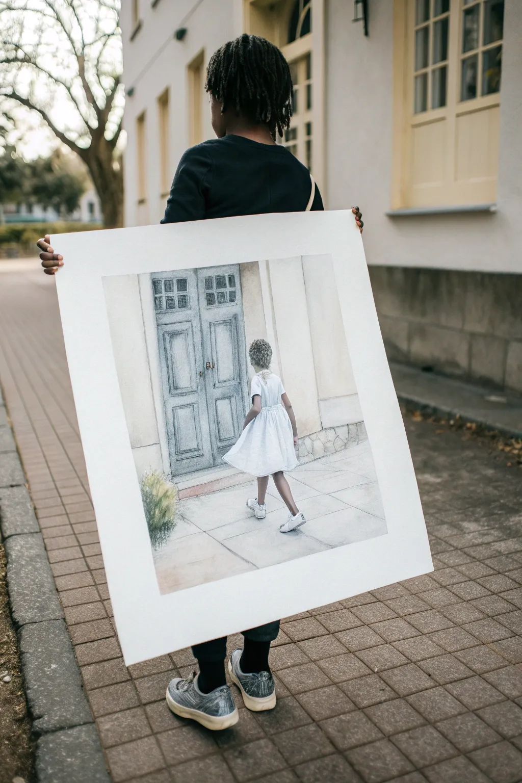
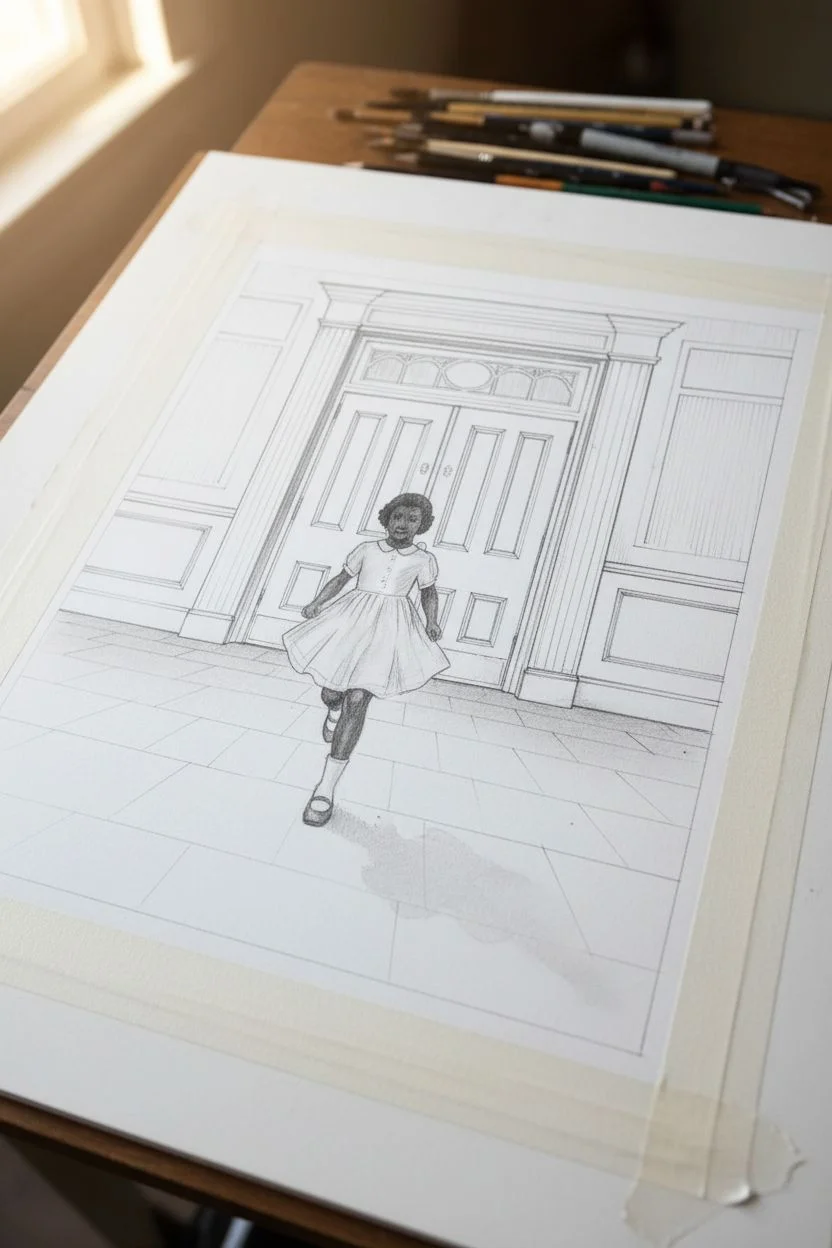
Capture a powerful moment of history with this delicate mixed-media drawing inspired by Ruby Bridges. The piece features soft watercolor washes and precise pencil detailing to create a poignant scene of courage and new beginnings.
Step-by-Step Tutorial
Materials
- Large sheet of heavyweight watercolor paper (hot press for smoothness)
- Graphite pencils (HB, 2B, 4B)
- Watercolor paint set (focus on cool greys, ochre, white, and muted blues)
- White gouache paint
- Soft synthetic watercolor brushes (rounds and flats)
- Ruler or T-square
- Masking tape
- Eraser (kneaded)
- Large white mounting board or foam core backing
Step 1: Drafting the Scene
-
Set the horizon:
Begin by lightly tracing a horizon line about one-quarter up from the bottom of your paper. This establishes the ground plane and ensures the perspective of the building feels grounded. -
Outline the doors:
Use your ruler to draw the large double doors in the center. Sketch the vertical panels and the transom windows above them. Keep lines faint so they don’t show through later paint layers. -
Frame the architecture:
Draw the surrounding architectural elements like the door frame and the wall panels on either side. These should be vertical lines that give the structure scale. -
Position the figure:
Sketch the silhouette of the girl centrally in front of the doors. Focus on the shape of the dress flaring out and the position of her legs walking forward to capture movement. -
Detail the clothing:
Refine the drawing of the dress, adding soft folds to indicate fabric draping. Sketch the shoes and socks carefully, as these details ground the figure. -
Add texture marks:
Lightly indicate the separation of pavement stones on the ground with diagonal lines that converge towards a vanishing point, giving the scene depth.
Fixing Water Blooms
If water pools and creates a ‘bloom’ or cauliflower edge, wait for it to dry completely. Then, gently scrub the edge with a damp stiff brush to soften the hard line.
Step 2: Applying Watercolor Washes
-
Base wash for walls:
Mix a very watery wash of yellow ochre and a touch of grey. Apply this to the wall areas, avoiding the door and the figure, to create a warm, aged stone look. -
Painting the doors:
Create a cool, muted blue-grey mix. Paint the door panels, letting the color pool slightly in the corners for natural shading. Keep the touch light to maintain a weathered appearance. -
Shadowing the ground:
Brush a light grey wash over the pavement area. While wet, drop in slightly darker grey near the bottom of the paper and under the figure to suggest cast shadows. -
Initial dress layer:
Use a very diluted grey wash to paint the shadows on the white dress. Leave the majority of the dress the pure white of the paper; you are only painting the folds.
Add Historical Depth
For a ‘Level Up,’ write faint text from historical speeches or headlines into the grey pavement area using a hard H pencil, creating a hidden layer of context.
Step 3: Refining and Detailing
-
Deepening architectural details:
Once the first layers are bone dry, use a smaller brush and a darker grey mix to paint the recessed areas of the door panels and the window frames above. -
Defining the figure:
Mix a skin tone suitable for the lighting—likely a cool brown since the light source is in front. Paint the legs and the back of the neck carefully. -
Hair texture:
Use a dry-brush technique with dark grey or black paint to stipple the hair texture. I find tapping the brush tip creates a more natural curl pattern than stroking. -
Highlighting the dress:
Use white gouache to add crisp highlights to the top edges of the dress folds and the socks. This opaque white pops against the watercolor paper. -
Pencil reinforcement:
Take your 2B pencil and lightly outline critical edges, like the door molding and the separation between the dress and the background, to bring back sharpness. -
Adding the greenery:
In the bottom left corner, use quick, upward strokes of green and yellow watercolor to suggest a small bush. Once dry, add pencil lines for individual grass blades.
Step 4: Mounting and Finishing
-
Final shadows:
Use a 4B pencil to deepen the darkest shadows, specifically under the shoes and in the deepest recesses of the door frame. -
Clean up:
Erase any stray graphite lines from the initial sketch that distract from the softness of the paint. -
Prepare the mount:
Ideally, mount the finished drawing onto a large white board or foam core. Leave a wide white border around the image to act as a built-in mat.
Display your finished piece proudly as a tribute to resilience and the steps taken toward equality


Harriet Tubman Night-Sky Journey Drawing
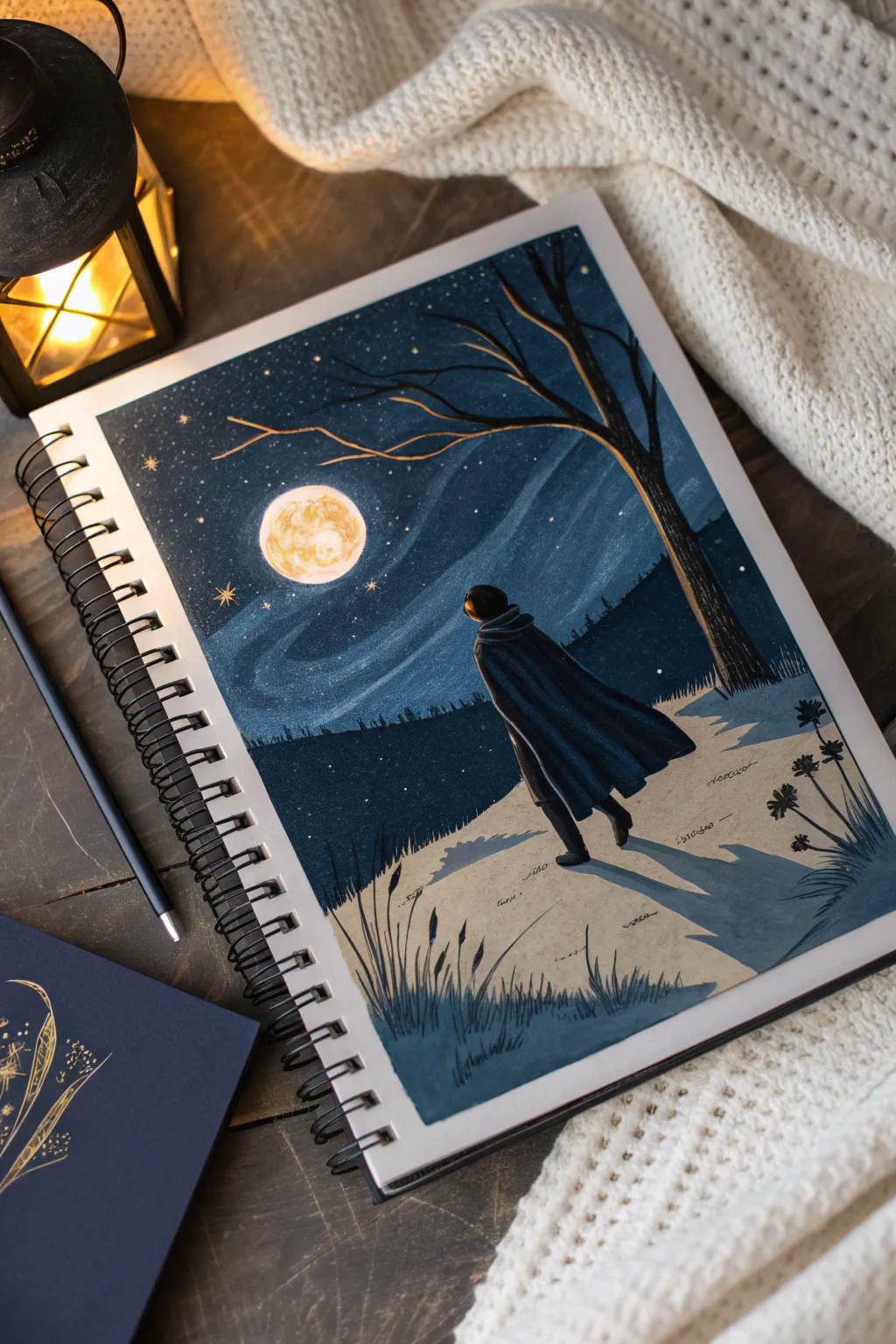
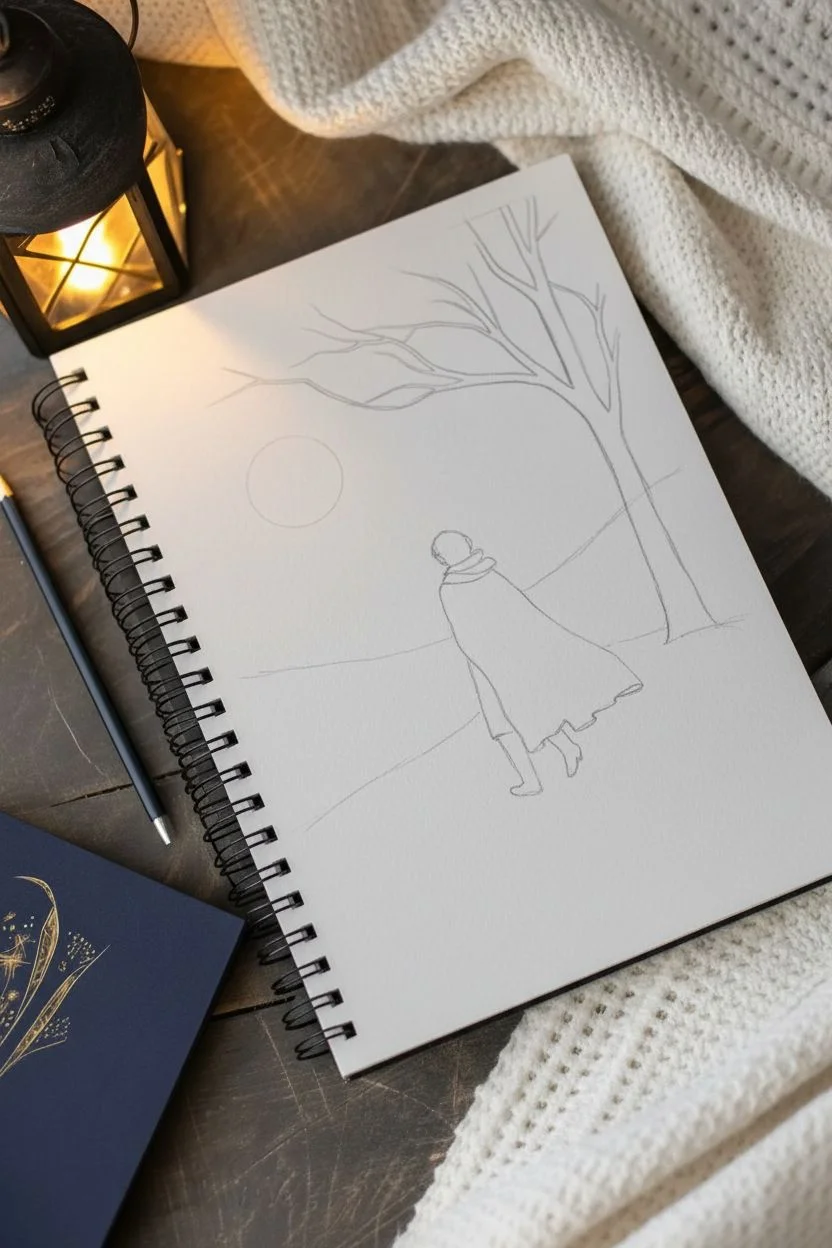
Capture a serene and powerful moment inspired by Harriet Tubman’s journeys to freedom in this mixed-media illustration. Using deep indigos and warm moonlit tones, you will create a scene that emphasizes guidance, hope, and the quiet bravery of navigating the unknown.
Step-by-Step Guide
Materials
- Spiral-bound sketchbook (heavyweight paper)
- Gouache or acrylic gouache paints (Deep Indigo, Black, White, Burnt Umber, Yellow Ochre, Beige)
- Flat shader brush (size 6 or 8)
- Fine liner brush (size 0 or 00)
- Pencil (HB or 2B) for sketching
- Gold metallic paint or gel pen (optional)
- Mixing palette
- Water cup and paper towels
Step 1: Sketching the Composition
-
Horizon line:
Begin by lightly sketching a sloping horizon line about one-third of the way up the page. It doesn’t need to be perfectly straight; a slight diagonal suggests movement. -
The tree:
Draw the trunk of a bare tree on the right side, leaning slightly inwards over the scene. Branch it out towards the top left, creating a frame for where the moon will go. -
The figure:
Place the figure in the lower right center, facing away toward the horizon. Sketch a simple silhouette of a cloak or cape billowing slightly to the right to suggest a gentle wind.
Making It Glow
Add a very thin outline of pale yellow or gold along the left side of the tree branches and the figure’s shoulder. This ‘rim lighting’ instantly boosts the moonlit effect.
Step 2: Painting the Night Sky
-
Base sky color:
Mix a rich Deep Indigo with a touch of Black. Paint the entire sky area, carefully cutting in around your pencil sketch of the moon and the tree branches. -
Creating atmosphere:
While the blue paint is still slightly wet, mix a lighter blue-grey using Indigo and White. Sweep this color across the sky in gentle curves to mimic wind currents or cloud wisps. -
Moon base:
Fill in the moon circle with a solid coat of White paint to block out the underlying paper tone.
Step 3: Land and Silhouette
-
Foreground terrain:
Paint the ground area with a creamy Beige or very light tan. This represents a snowy or sandy path lit by moonlight. -
The distant forest:
Using your darkest Indigo or a near-black, paint a jagged row of tree shapes along the horizon line. These should be small and indistinct to show distance. -
Shadows:
Mix a transparent glaze of blue-grey and paint long shadows stretching from the figure and the tree towards the left, anchoring them to the ground.
Patchy Sky?
Gouache can dry patchy if applied too thinly. If your dark sky looks uneven, I find that applying a second coat with slightly less water usually creates that perfect matte finish.
Step 4: The Figure and Details
-
Cloak base:
Paint the figure’s cloak in a dark Navy or Black. Use vertical strokes that follow the drape of the fabric. -
Cloak highlights:
Mix a slightly lighter blue and add thin highlights to the folds of the cloak, particularly on the left shoulder where the moonlight hits. -
Tree texture:
Fill in the tree trunk with Burnt Umber mixed with Black. Once dry, dry-brush a little lighter brown or gold on the left edge of the trunk to show the moon’s reflection. -
Grasses:
Using your finest liner brush and dark blue paint, flick upward strokes in the bottom left corner to create tall, wild grasses.
Step 5: Illumination
-
Moon texture:
On top of your dried white circle, dab small splotches of Yellow Ochre and a tiny bit of faint orange to create craters and a warm glow. -
Stars:
Dip a toothbrush or stiff brush in watered-down White or Gold paint and flick it to splatter stars across the dark sky. -
Larger stars:
Use a white gel pen or fine brush to manually draw a few distinct four-point stars, placing one specifically near the horizon as the North Star.
Now you have a stunning tribute to guidance and perseverance captured in your sketchbook


Black History Month Typography Poster
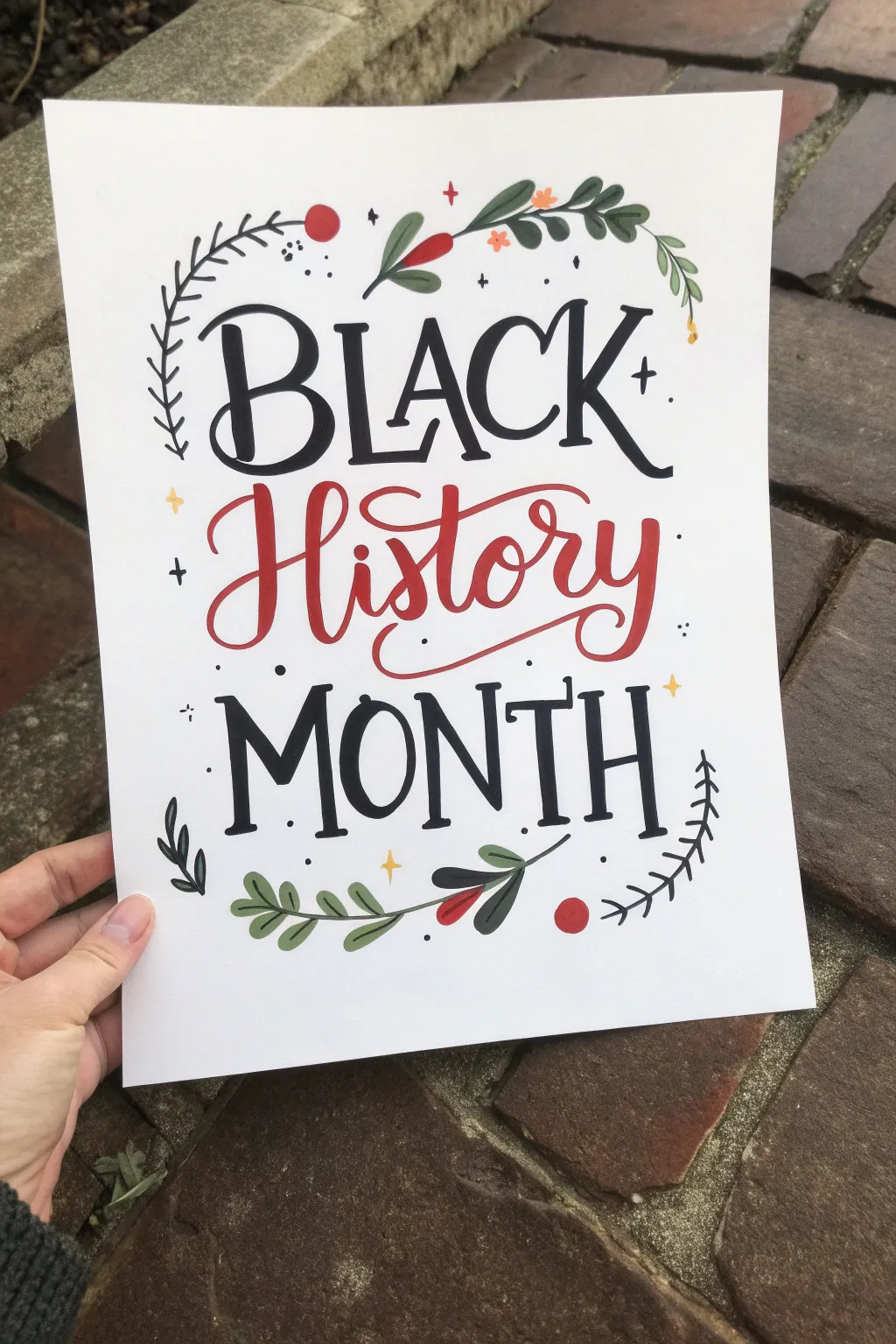
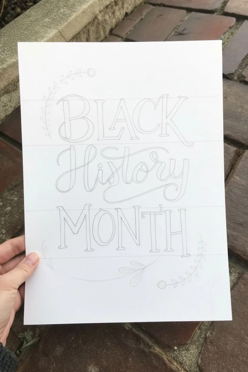
Celebrate Black History Month with this elegant hand-lettered poster featuring classic serif typography and decorative botanical flourishes. The design balances bold black lettering with warm red accents and soft greens for a timeless, sophisticated look.
Detailed Instructions
Materials
- White cardstock or heavy drawing paper (8.5 x 11 inches)
- Black brush pen or calligraphy marker
- Red brush pen or calligraphy marker
- Fine-tip black drawing pen (0.5mm)
- Green colored pencil or marker (muted sage tone)
- Red colored pencil or marker
- Orange colored pencil or marker
- Yellow or gold gel pen/marker
- Pencil
- Eraser
- Ruler
Step 1: Planning and Layout
-
Grid the paper:
Begin by lightly sketching three horizontal guidelines across your paper using your ruler and pencil. These will define the baselines for ‘BLACK’, ‘History’, and ‘MONTH’. Leave generous space at the top and bottom for floral borders. -
Draft the lettering skeleton:
Using a very light pencil touch, sketch the skeleton of your letters. ‘BLACK’ and ‘MONTH’ should be in all-caps serif style, while ‘History’ will be a flowing cursive script in the center. -
refine letter shapes:
Go back over your pencil sketch to thicken the downstrokes of the serif letters. For the script word ‘History’, outline where the strokes will be thickest to guide your marker work later. -
Sketch botanical elements:
Lightly draw the floral frames. Sketch a curved vine in the top left corner and another in the bottom center. Add small leaf shapes and circle berries along these paths.
Step 2: Inking the Typography
-
Ink the word ‘BLACK’:
Take your black brush pen or calligraphy marker. Carefully fill in the letters for ‘BLACK’. Add small triangular serifs to the ends of the strokes to give it that classic book-cover feel. -
Detail the serifs:
For the serifs on the ‘L’ and ‘A’, slightly curve the edges so they look elegant rather than blocky. Ensure the ‘K’ has a nice swash at the bottom leg. -
Ink the word ‘History’:
Switch to your red brush pen. Write ‘History’ in a bouncing calligraphy style. I find it helps to pause briefly between letters to ensure connections remain smooth. -
Add script flourishes:
Extend the tail of the ‘y’ in ‘History’ so it loops beautifully underneath the word, creating a cradle for the letters. Add a small swash to the entry of the ‘H’. -
Ink the word ‘MONTH’:
Return to your black marker for ‘MONTH’. Match the style of the first word, keeping the height consistent but perhaps slightly more condensed if needed to fit the width. -
Refine typography edges:
Use your fine-tip black pen to sharpen any fuzzy edges on your bold letters, making the corners crisp and professional.
Tip: Choosing Paper
Use smooth cardstock or Bristol paper. Textured paper can fray brush pens and make crisp edges harder to achieve.
Step 3: Adding Illustrations and Details
-
Draw the main vines:
Using the green marker or pencil, draw the main stems for the top and bottom foliage. Keep the lines organic and slightly curved. -
Add leaves:
Fill in the leaf shapes attached to the vines. Vary the sizes, making some small and others larger, using a muted sage green for a natural look. -
Create fern details:
With the fine-tip black pen, draw simple fern-like branches on the left side (near ‘BLACK’) and the bottom right corner. These are just single lines with tiny dashes for leaves. -
Add red berries:
Use your red marker to draw circle berries among the green leaves. Place a larger red dot near the top left and a few near the bottom center. -
Add floral accents:
Draw tiny five-petal flowers using an orange or light red pencil near the top vine to add color variety. -
sprinkle sparkles:
Take the yellow or gold pen and draw small four-point stars (diamonds) scattered around the text. Place them in empty negative spaces to balance the composition. -
Add black dots:
Using the fine-tip black pen, stipple tiny dots and small ‘plus’ signs (+) randomly around the letters and vines to fill gaps and add texture. -
Erase guidelines:
Wait until the ink is completely dry—give it a good 10 minutes—then gently erase all pencil marks to reveal the clean design.
Trouble: Shaky Lines?
If your long strokes look wobbly, exhale slowly while drawing the line. Speed up slightly; faster strokes are often smoother.
Display your beautiful poster proudly to inspire conversation and reflection throughout the month

PENCIL GUIDE
Understanding Pencil Grades from H to B
From first sketch to finished drawing — learn pencil grades, line control, and shading techniques.
Explore the Full Guide
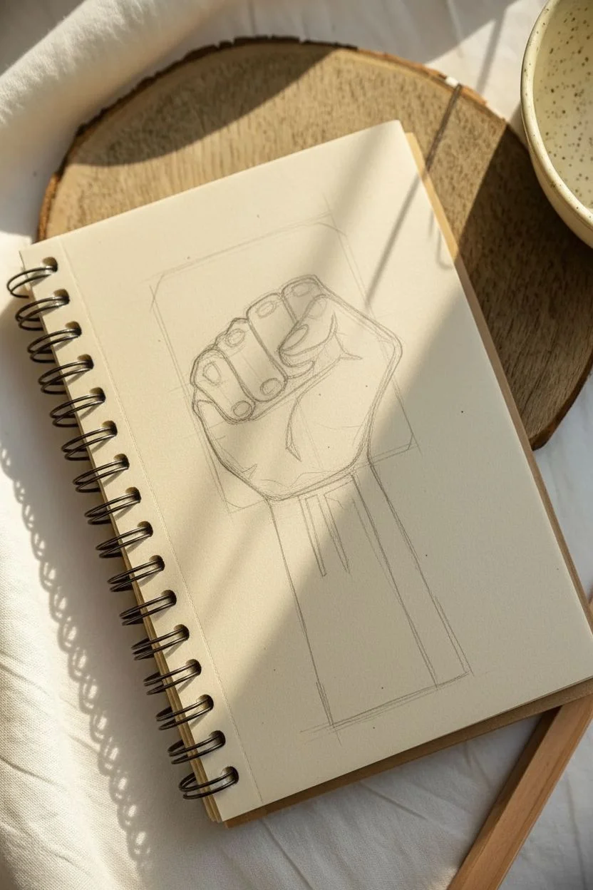
Raised Fist Symbol Drawing With Texture
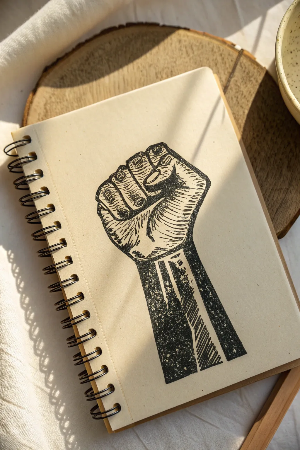
This striking project captures the powerful symbol of a raised fist using a bold, high-contrast aesthetic that mimics the look of a traditional linocut print. The finish has a beautifully tactile quality, with distinct hatched lines and organic textures that pop against the cream-colored sketchbook paper.
How-To Guide
Materials
- Spiral-bound sketchbook with cream or off-white paper (heavyweight is best)
- Black ink brush pen or fine-point marker (e.g., Faber-Castell Pitt or Pigma Micron)
- Thicker black permanent marker or chisel tip pen for filling large areas
- Soft graphite pencil (HB or 2B) for sketching
- Kneaded eraser
- Ruler (optional, for arm alignment)
Step 1: Sketching the Framework
-
Map the basic shape:
Begin by lightly sketching the outline of the fist using your graphite pencil. Start with a rounded square shape for the knuckles and palm, then sketch a sturdy rectangular column extending downward for the arm. -
Define the fingers:
Divide the top ‘square’ section into four segments to represent the curled fingers. The index finger should dip slightly lower than the middle finger, creating a natural arch. -
Position the thumb:
Sketch the thumb crossing over the folded fingers. It should wrap around horizontally, tucked just under the first knuckle of the index and middle fingers. -
Refine the outline:
Go over your sketch to firm up the contour lines. Add slight curves to the sides of the wrist to show muscle tension, but keep the overall style geometric and blocky to support the woodcut look later.
Uneven Ink Flow?
If your marker is too consistent, try drying it out slightly on scrap paper or using an older pen. The ‘dying pen’ look is actually perfect for this specific textured art style.
Step 2: Inking the Outlines
-
Trace the perimeter:
Using your fine-point black pen, carefully ink the outer boundary of the fist and arm. Keep your lines deliberate and slightly uneven to mimic the vibration of a carved block. -
Separate the segments:
Draw the dividing lines between the fingers and define the edges of the thumb. Don’t worry about perfect smoothness; a little grit adds character to this style. -
Erase the guides:
Once the initial ink is totally dry, gently run your kneaded eraser over the drawing to lift away the graphite guidelines.
Step 3: Creating Texture and Shading
-
Hatch the fingers:
Switch back to your fine-point pen. On the curled fingers, draw a series of short, horizontal lines. Leave small gaps of white space to suggest highlights on the knuckles. -
Detail the thumb:
Add curved hatching lines along the length of the thumb. These strokes should follow the rounded form of the digit rather than being perfectly straight. -
Shade the palm area:
Beneath the pinky finger on the side of the hand, use denser, angled hatching strokes. This creates a shadow that gives the fist three-dimensional volume. -
Block out the shadows:
Identify the deepest shadow areas—specifically the triangular gap between the thumb and fingers, and the deep creases of the palm. Use your thicker marker to fill these in solid black.
Pro Tip: Directional Flow
Ensure your hatching lines follow the curve of the hand. Curved lines make the drawing look round and 3D, while straight, flat lines will flatten the image.
Step 4: The Arm and Final Details
-
Texturize the arm:
The arm requires a grittier texture. Instead of clean lines, use a stippling or ‘distressed’ fill technique. Imagine you are inking a stamp that didn’t get fully covered in ink. -
Create the forearm shadow:
Draw a thick vertical band of black down the left side of the arm area, but keep the edges rough and speckled. I like to dab the pen tip repeatedly here to build up that noisy texture. -
Add directional strokes:
On the right side of the arm, use diagonal, scratchy lines that point downward. Leave significant negative space (the paper color) showing through to act as the lit side of the arm. -
Distress the solid blacks:
Go back over your solid black areas on the arm. If they look too perfect, use a white gel pen or simply scratch carefully with a blade (if paper permits) to add tiny specks of white noise. -
Review contrast:
Step back and look at the balance of light and dark. If the hand looks too pale compared to the dark arm, thicken the contour lines around the fingers to visually connect the two sections. -
Final drying:
Let the ink settle completely before closing your sketchbook to prevent any transfer to the opposite page.
You now have a powerful, symbolic piece of art that carries the visual weight of a classic woodblock print
Story Quilt-Inspired Border Drawing
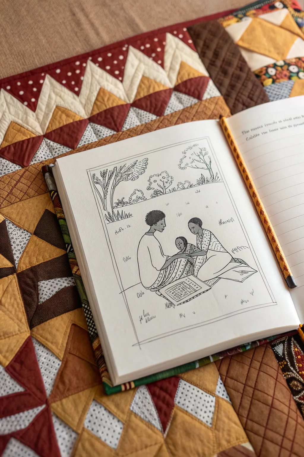
Capture the essence of narrative folk art with this serene line drawing, inspired by the tradition of story quilts. You’ll sketch an intimate family moment centered around a patterned mat, using clean ink lines to mimic stitching and fabric textures.
Detailed Instructions
Materials
- Hardbound sketchbook or heavyweight drawing paper
- Pencil (HB or H for light sketching)
- Fine-liner pen (0.1mm or 0.3mm, black archival ink)
- Eraser (kneaded preferred)
- Ruler
Step 1: Setting the Frame
-
Define the borders:
Begin by lightly drawing a large rectangle on your page to serve as the art boundary. Leave a generous margin of white space around the outside to give it that ‘framed’ illustration look. -
Add the inner frame:
Sketch a second, smaller rectangle just inside the first, creating a thin double border. This mimics the binding or edge stitching often seen on fabric squares. -
Establish the horizon:
About two-thirds of the way down the frame, draw a very faint horizontal line. This will separate your foreground figures from the distant trees.
Smudge Prevention
Place a scrap piece of paper under your drawing hand. This acts as a shield, preventing oils from your skin from smearing the fresh ink or graphite as you work across the page.
Step 2: Sketching the Figures
-
Place the central figures:
In the lower center of the frame, sketch the basic shapes for two seated adults facing each other. Use simple ovals for heads and rounded triangles for their torsos to get the posture right before adding detail. -
Add the infant:
Nestle a small, swaddled figure between the two adults. Their arms should be positioned to gently touch or hold the child, creating a connection between all three characters. -
Draw the blanket:
Underneath the group, sketch a rectangular mat or blanket. Angle it slightly to show perspective, making the front edge wider than the back edge. -
Sketch the clothing details:
Outline the clothing. Focus on the drape of fabric—long sleeves and wrapped skirts or pants that pool slightly on the ground. Keep lines fluid to suggest soft material.
Step 3: Background Elements
-
Position the trees:
In the upper third of the composition, sketch three distinct trees. Place a larger, leaning tree on the left and two smaller, upright trees on the right side. -
Detail the foliage:
Instead of drawing individual leaves, use clusters of loops and wavy lines to suggest tree canopies. For the left tree, draw long, palm-like fronds drooping downwards. -
Add ground cover:
Scatter small, tufted grass marks across the middle ground. Keep these sparse to maintain a clean, airy feeling in the open space.
Add Color Washes
For a true quilt look, use watercolor pencils to add faint washes of earth tones to the clothing blocks—ochre, terracotta both look great—before going over them with a damp brush.
Step 4: Inking and Refing
-
Outline the characters:
Switch to your fine-liner pen. Carefully trace over your pencil lines for the figures. Use a confident, consistent pressure to create a clear narrative style. -
Pattern the clothing:
Add texture to the clothing using small strokes. I like to use tiny dots or dashes on one figure’s shirt to differentiate it from the solid fabrics of the others. -
Texture the blanket:
Draw a grid pattern on the center of the blanket to make it look like a game board or a pieced quilt block. Add fringe details to the edges of the mat. -
Ink the background:
Go over the tree trunks and foliage. Use slightly jerkier, more organic lines here to contrast with the smooth lines of the human figures. -
Finalize the frame:
Trace your double-frame border with the pen. It doesn’t need to be perfectly straight; a slight waver adds to the hand-drawn, folk-art charm. -
Add decorative script:
If you wish, add small, illegible scribbles or symbols near the figures and trees to mimic annotations or embroidery stitching often found on story quilts. -
Erase guidelines:
Wait at least five minutes to ensure the ink is completely dry. Gently erase all underlying pencil marks to reveal the crisp black-and-white illustration.
Now you have a timeless line drawing that honors the tradition of visual storytelling
BRUSH GUIDE
The Right Brush for Every Stroke
From clean lines to bold texture — master brush choice, stroke control, and essential techniques.
Explore the Full Guide
Collage-Style Portrait With Patterned Clothing
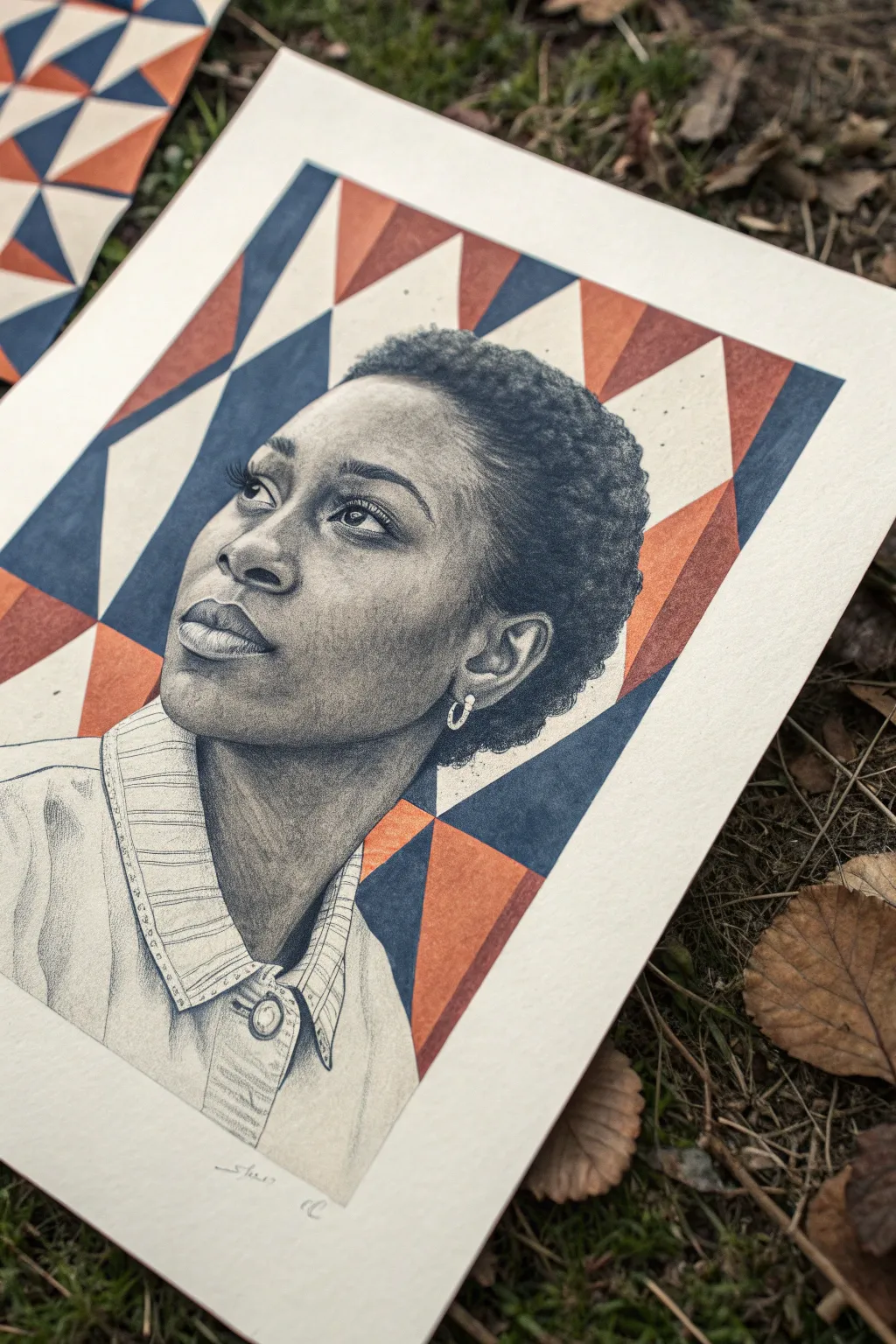
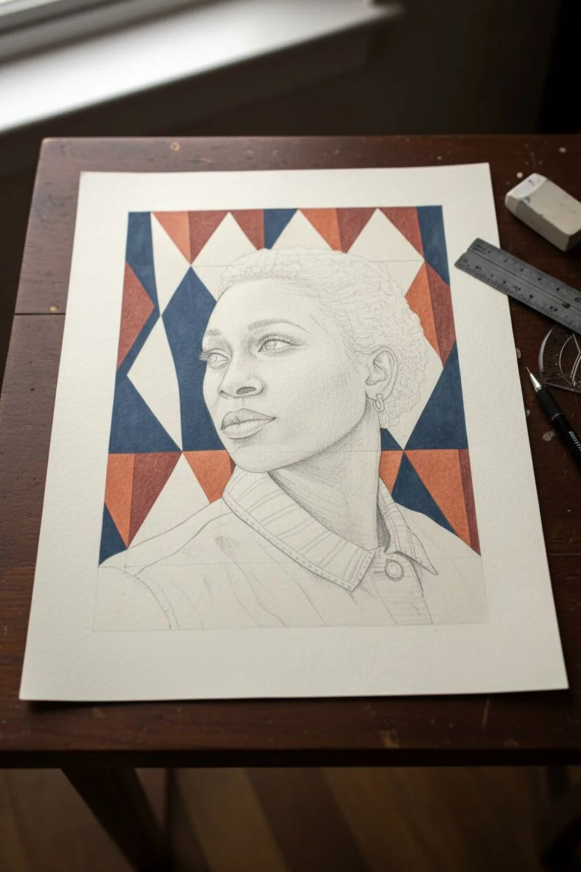
Merge the softness of hyper-realistic graphite drawing with the bold, graphic impact of geometric design in this stunning mixed-media portrait. This project challenges you to balance delicate shading techniques with sharp, flat fields of color for a striking visual contrast.
Step-by-Step Guide
Materials
- High-quality Bristol board or hot-press watercolor paper (smooth finish)
- Graphite pencils (ranging from 2H to 6B)
- Mechanical pencil (0.5mm HB) for fine details
- Kneaded eraser
- Tombow Mono Zero eraser (for highlights)
- Masking fluid or low-tack artist’s tape
- Gouache or acrylic paint (Navy Blue, Burnt Orange, Cream)
- Small flat brushes and fine liner brushes
- Ruler and protractor (optional for pattern precision)
- Blending stumps or tortillons
Step 1: Planning the Composition
-
Establish the layout:
Begin by lightly sketching the outline of your subject’s portrait in the center of the paper. Keep the lines incredibly faint, as you want them to disappear later. -
Overlay the geometry:
Using a ruler, draw a diamond or triangle-based grid across the entire background, extending it straight through the empty space where the clothes would be. This creates the ‘collage’ effect where the pattern becomes the clothing. -
Identify pattern zones:
Mark lightly which geometric shapes will be Navy, Orange, or Cream to ensure a balanced distribution of color before you start painting.
Grid Genius
Don’t press hard when drawing your geometric grid. Heavy indentations will show through the paint. Keep the ruler hand light and the pencil sharp.
Step 2: The Graphite Portrait
-
Base shading layers:
Start with a hard pencil like a 2H or H to lay down a smooth, light grey base tone for the skin. Work in small circular motions to avoid visible strokes. -
Developing the eyes:
Switch to a sharpened 2B or 4B for the pupils and lash line. Leave the white of the eye clean, but add subtle shading in the corners to give the eyeball roundness. -
Building skin depth:
Layer darker graphite (2B, 4B) into the shadow areas: under the chin, the cheek hollows, and the side of the nose. Blend these gently with a stump for a seamless transition. -
Detailing the hair:
For the textured hair, use a technique called scumbling (tight, tiny scribbles) with a soft 4B or 6B pencil. Build up density to create the look of tight curls, fading out slightly at the edges. -
Lifting highlights:
Take your kneaded eraser or a precision eraser and lift graphite from the high points of the face: the tip of the nose, the forehead, and the Cupid’s bow. This contrast brings the face to life. -
Defining the features:
Refine the lips and nostrils with your darkest 6B pencil. Ensure the edges are distinct but not harsh outlines.
Smudge Control
Graphite smears easily on white paper. Place a scrap sheet of paper under your drawing hand to protect your work while you shade or paint.
Step 3: The Geometric Background & Clothing
-
Masking the portrait:
Carefully apply masking fluid or use tape to protect the edges of your finished graphite face. You want a crisp barrier between the pencil work and the paint. -
Painting the darks:
Mix a deep Navy Blue gouache or acrylic. Paint the designated blue triangles in the background and the shirt area, ensuring opaque, flat coverage. -
Adding warmth:
Once the blue is dry, apply the Burnt Orange tone to its assigned shapes. I find gouache works best here for that matte, velvety finish. -
The light tones:
Fill the remaining geometric shapes with a Cream or Off-White paint. If your paper is already cream, you might choose to leave these negative spaces bare. -
Clothing outlines:
Once the paint is fully dry, grab a graphite pencil again. Draw the collar, button placket, and stitching details directly over the painted pattern or negative space to suggest the shirt’s structure. -
Texture on the shirt:
Add subtle vertical lines or cross-hatching to the collar area using a regular pencil to mimic fabric texture without disrupting the bold pattern underneath.
Step 4: Final Touches
-
Remove masking:
Gently peel away your tape or rub off the masking fluid. Clean up any jagged edges where the paint meets the graphite with a fine white gel pen or sharp eraser. -
Deepen contrasts:
Step back and assess your values. Re-darken the deepest shadows in the portrait if the bold colored background has made them look washed out. -
The earring detail:
Use a white gel pen or leave the paper pure white to create the crisp highlight of the hoop earring against the dark hair texture.
Now you have a piece that beautifully bridges the gap between classic portraiture and modern graphic design
Hair Texture Studies as an Art Page
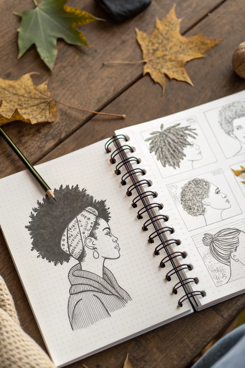
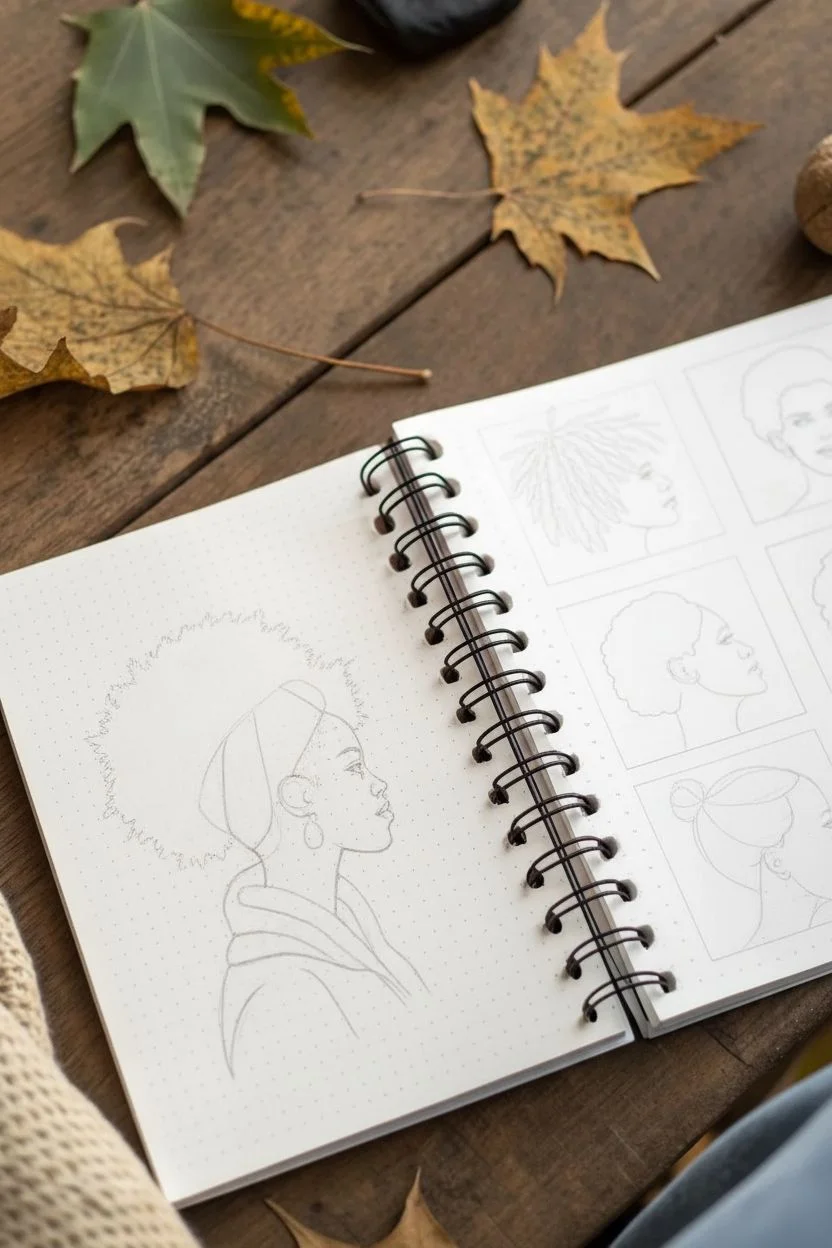
This project transforms a sketchbook spread into a stunning celebration of natural hair textures using fine liner pens. The main focus is a detailed profile portrait showcasing the volume and beauty of an afro, surrounded by smaller studies on the opposite page.
How-To Guide
Materials
- Wire-bound sketchbook (dot grid or plain paper)
- Pencil (HB or H for sketching)
- Eraser (kneaded preferred)
- Fine liner pens (sizes 0.1, 0.3, and 0.5)
- Brush pen or thick black marker
Step 1: Planning composition
-
Map out the spread:
Begin with your sketchbook open flat. Decide on the layout: the left page will feature the main, large portrait, while the right page will be divided into a grid for smaller texture studies. -
Sketch the main profile:
On the left page, lightly sketch the profile of a face using your pencil. Focus on the forehead, nose, lips, and chin line. Keep the lines faint so they can be erased later. -
Outline the hair shape:
Draw a large, cloud-like perimeter around the head to define the afro’s volume. Don’t worry about individual curls yet; just establish the overall silhouette. -
Add accessories and clothing:
Sketch a wide headband wrapping around the forehead and under the hair. Add a simple collar and shoulder line below the neck to ground the figure.
Ink Patience
Wait at least 15 minutes before erasing pencil lines. Heavy ink areas, especially where you stippled the hair, take longer to dry and can smear easily.
Step 2: Inking the portrait
-
Define facial features:
Using a 0.3 fine liner, carefully trace over your pencil lines for the face profile. Add details like the eye, eyebrow, and ear. -
Detail the headband:
Ink the outline of the headband. Fill it with a pattern of your choice—small circles, dashes, or geometric shapes work well—using a 0.1 pen for delicate lines. -
Create the heavy texture:
Switch to a brush pen or a thick marker to fill in the main body of the hair. Use a stippling motion (rapid dots) or very tight, small scribbles to create a dense, textured black mass that implies thick curls. -
Refine the edges:
At the outer edges of the hair, switch back to a 0.3 pen. Draw tiny, individual curls or leafy shapes breaking out from the main black mass to make the silhouette look organic and fluffy rather than solid. -
Ink the clothing:
Use a 0.3 pen to outline the clothing. Create texture on the shirt using parallel hatching lines that follow the curve of the fabric folds.
Add Autumn Warmth
Use watercolor or colored pencils to maintain a greyscale look but add a single accent color, like burnt orange or gold, to the headband or clothing.
Step 3: Creating the study grid
-
Draw the frames:
On the right page, use a ruler to lightly draw four square boxes. These will house your smaller hair studies. -
Sketch variety:
In each box, pencil in a different head profile and hair type. Try one with dreadlocks, one with short natural curls, and one with a bun. -
Ink the smaller profiles:
Outline the faces in the grid using your 0.1 fine liner, keeping the lines crisp and minimal. -
Texture study: Dreadlocks:
For the dreadlock style, use thick, leaf-like shapes radiating from the head. Fill them with dense hatching lines to show weight and texture. -
Texture study: Coils:
For the short curls, use a stippling technique or tiny, tight loops. Build up layers of ink to show density near the scalp. -
Texture study: Bun:
For the bun style, use long, sweeping curved lines that gather at the back of the head, mimicking smooth pulled-back hair.
Step 4: Finishing touches
-
Erase pencil guides:
Once you are certain the ink is completely dry, gently run a kneaded eraser over the entire page to lift the graphite. -
Reinforce shadows:
Look at your main drawing again. Use your 0.1 pen to add subtle hatching under the chin and around the ear to give the face dimension.
Now you have a beautiful reference page focusing on the diversity and artistry of hair textures


Micrography Portrait of an Influential Figure
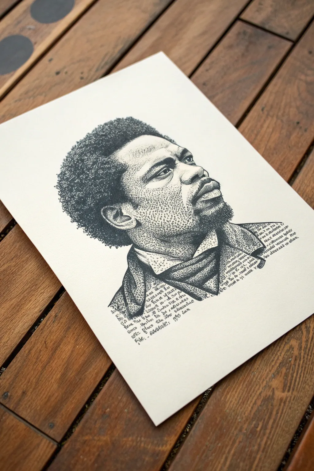
Capture the solemn dignity of Frederick Douglass in this striking ink portrait that blends meticulous stippling with the art of micrography. By using varying densities of dots and tiny scripted text to form shadows and contours, you will create a deeply textured piece that honors Black history through technique and subject.
Step-by-Step
Materials
- High-quality Bristol board or smooth watercolor paper (A4 or A3)
- Fine liner pens (sizes 0.05, 0.1, 0.3, and 0.5mm)
- Graphite pencil (HB or 2H)
- Kneaded eraser
- Reference photo of Frederick Douglass
- Ruler (optional for grid method)
Step 1: Preparation and Sketching
-
Analyze the reference:
Start by studying your reference photo of Frederick Douglass. Note where the darkest shadows fall—under the chin, the hair, and the folds of the cravat—and where the highlights hit the forehead and cheek. -
Create the outline:
Using your HB or 2H pencil, lightly sketch the contour of the head, the shape of the Afro hair, the facial features, and the collar. Keep your lines incredibly faint, just enough to guide you. -
Map the shadows:
Lightly outline the major shadow shapes on the face and clothing. These ‘maps’ will tell you where to concentrate your ink later.
Step 2: Facial Features and Stippling
-
Secure the eyes:
Use a 0.05mm fine liner to carefully dot the pupils and iris. Don’t draw solid lines; build up the dark shapes with clustered dots to keep the texture consistent. -
Build the nose and mouth:
Move to the nostrils and lips. Place dots closer together for the dark corners of the mouth and the shadow under the nose, spreading them out as you move toward highlighted skin. -
Model the skin tone:
Switch between 0.05mm and 0.1mm pens. Start stippling the mid-tones of the cheeks and forehead. I find it helpful to work in small circular patches to avoid creating accidental linear patterns. -
Deepen the contrast:
Layer more dots over the shadowed side of the face. Leave the paper completely white for the brightest highlights on the bridge of the nose and the cheekbone.
Wrist Saver
Stippling can be tiring! Take frequent breaks to stretch your hand, or hold the pen more vertically to let the tip do the work without heavy pressure.
Step 3: Hair and Texture
-
Start the hair texture:
For the iconic Afro, switch to a slightly thicker 0.3mm pen. Instead of simple dots, use tiny, tight circular scribbles or dense clusters of stippling to mimic the coarse texture of the hair. -
Define the hair edge:
Allow the dots at the outer edge of the hair to scatter loosely. This creates a soft, realistic transition into the empty space rather than a harsh outline. -
Fill the dense areas:
Go back into the core of the hair shape with a 0.5mm pen to punch up the blackest areas, giving the portrait volume and weight.
Ink Blotches?
If you accidentally make a dot too large or dark, don’t panic. Gently widen the area of dark dots around it to blend the mistake into a shadow shape.
Step 4: Micrography Clothing
-
Plan the text:
Decide on the text you want to use for the clothing—perhaps quotes from Douglass’s speeches or biographical details. Write it out on a scrap paper first to test size. -
Outline contours with text:
Using a 0.05mm pen, begin writing your chosen text along the faint pencil lines of the collar and cravat. Let the lines of text curve to follow the form of the fabric. -
Create shadow with word density:
To shade the clothing, write the words smaller and closer together, or layer lines of text over each other. The text should become illegible and dark in the deepest folds of the scarf. -
Fade out the edges:
As the clothing fades out at the bottom, space the letters further apart or leave sentences unfinished to create a ragged, artistic bottom edge.
Step 5: Finishing Touches
-
Assess values:
Step back and squint at your drawing. Look for areas that need more depth. Usually, the shadow under the chin needs one final pass of dense stippling to pop the jawline forward. -
Clean up:
Wait at least 30 minutes for the ink to fully cure. Then, gently dab your kneaded eraser over the entire piece to lift the graphite guidelines without smudging the ink.
Frame your portrait simply to keep the focus on the intricate details of your handiwork
Jazz and Blues Tribute Drawing With Rhythm Lines
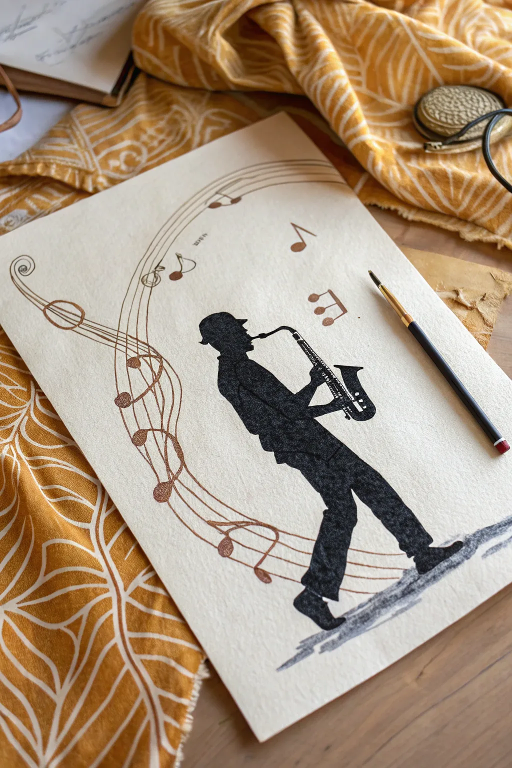
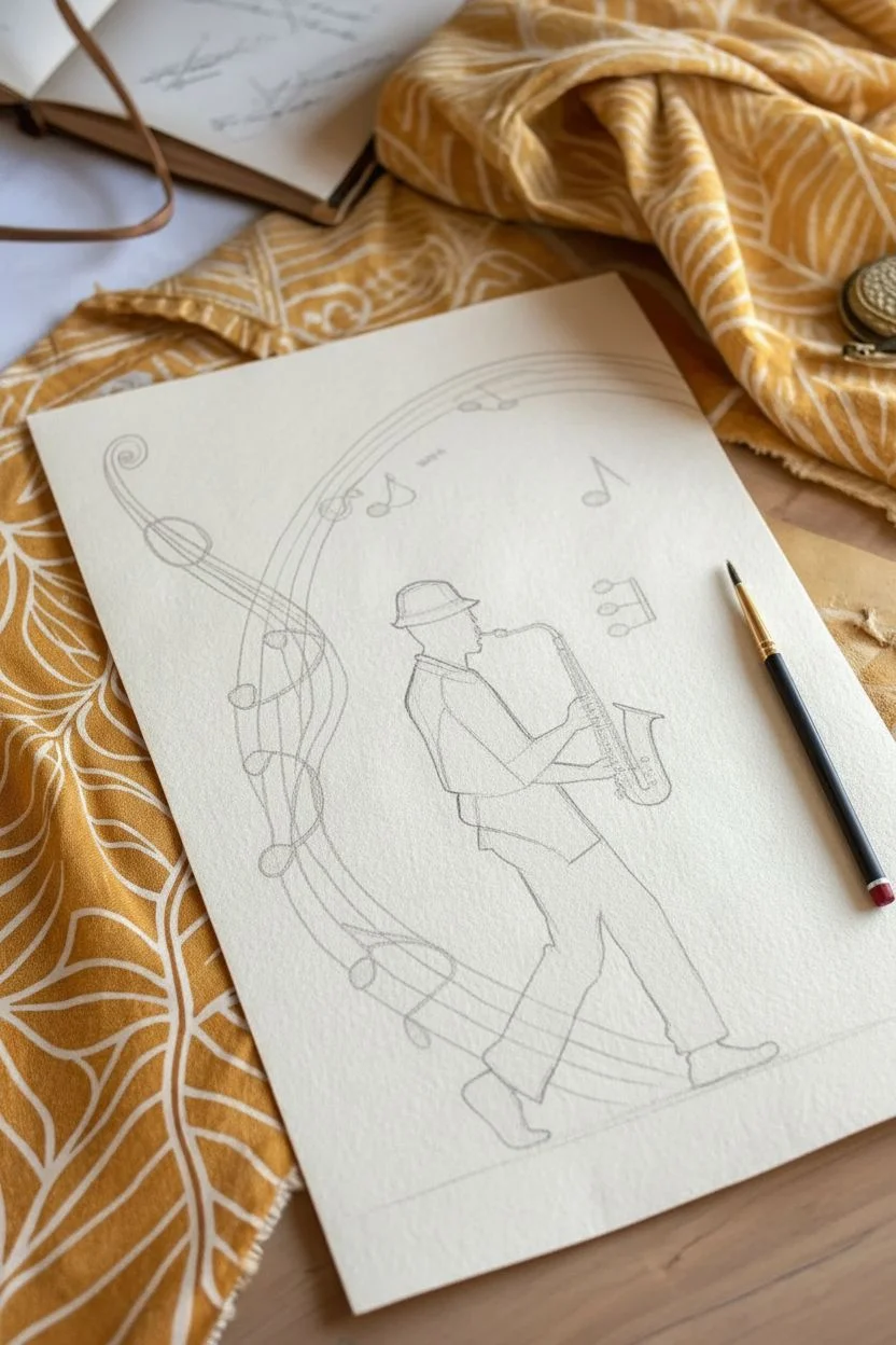
Capture the soul of jazz with this striking mixed-media artwork featuring a bold silhouette and flowing rhythm lines. Using a limited palette of black ink and metallic or earth-toned paints, you will create a piece that feels both vintage and vibrantly musical.
Step-by-Step Tutorial
Materials
- High-quality watercolor paper or mixed-media paper (cream or off-white recommended)
- Black drawing ink or India ink
- Fine liner pens (black, 0.3mm and 0.5mm)
- White gel pen or fine white paint marker
- Metallic copper or bronze watercolor paint
- Round brush (size 2 or 4)
- Fine detail brush (size 0 or 00)
- Pencil (HB) and eraser
Step 1: Planning and Sketching
-
Establish the pose:
Begin by lightly sketching the musician’s posture in the center-right of your paper. Draw an oval for the head, a slanted rectangle for the torso, and lines to indicate the legs striding forward. The figure should be leaning back slightly as if deep in a solo. -
Refine the outline:
Flesh out the silhouette. Add the distinctive fedora or pork pie hat, define the collar of the shirt, and sketch the baggy trousers gathered at the shoes. Don’t worry about internal details; focus purely on the outer shape. -
Sketch the saxophone:
Draw the saxophone shape being held by the figure. Pay close attention to the curve of the neck and the bell. Ensure the hands are positioned correctly on the keys. -
Map the rhythm lines:
Starting from the bottom left, sketch a large, sweeping ‘C’ curve that flows upward and behind the musician. Add three to four parallel lines following this path to create a musical staff effect. -
Add musical accents:
Along your sweeping staff lines, sketch in varying sizes of musical notes—quarter notes and eighth notes work well. Add a few loose, floating notes to the right of the figure to balance the composition.
Uneven Ink Coverage?
If your black silhouette looks streaky after drying, apply a second coat of ink. Alternatively, use a high-quality black gouache for a matte, velvety finish that hides brushstrokes well.
Step 2: Inking the Silhouette
-
Outline the musician:
Using your fine detail brush and black ink, carefully trace the outline of your pencil sketch for the musician’s body and hat. Keep your hand steady to get a crisp edge. -
Fill the form:
Switch to a slightly larger round brush to fill in the body figure with solid black ink. I usually work in sections—head, torso, legs—to ensure the ink coverage is opaque and even. -
Detail the saxophone:
When outlining the saxophone, leave the interior keys and metalwork unpainted for now. Carefully paint the black structure of the instrument around these tiny shapes. -
Add the shadow:
Mix a very watery wash of black ink (gray). Brush irregular, horizontal strokes beneath the musician’s feet to create a grounded cast shadow.
Level Up: Vintage Vibe
Stain your paper with strong coffee or tea before starting the drawing. Let it dry flat to create an aged, parchment-like background that complements the jazz theme perfectly.
Step 3: Adding the Music
-
Paint the rhythm lines:
Load your fine brush with metallic copper or bronze watercolor. Paint over your pencil lines for the sweeping musical staff. The metallic sheen adds a beautiful warmth against the black silhouette. -
Fill the notes:
Using the same metallic copper paint, fill in the heads of the musical notes on the staff and the floating notes on the right. -
Create stems and flags:
Use a fine liner or the very tip of your detail brush to add the stems to the notes. You can make these black for contrast or keep them copper for a softer look. -
Add decorative swirls:
Enhance the beginning of your rhythm lines (bottom left) with decorative spirals, similar to a violin scroll or a treble clef tail.
Step 4: Final Details
-
Saxophone highlights:
Once the black ink is completely dry, use a white gel pen or fine white paint marker to draw the intricate keys, rods, and bell details on the saxophone. This high contrast makes the instrument pop. -
Clean up:
Wait until the entire piece is bone dry. Gently erase any visible pencil sketch lines, being careful not to rub over the metallic paint or ink too vigorously.
Now you have a timeless tribute to the jazz age ready to be framed
Mask-Inspired Drawing With Bold Geometric Shapes
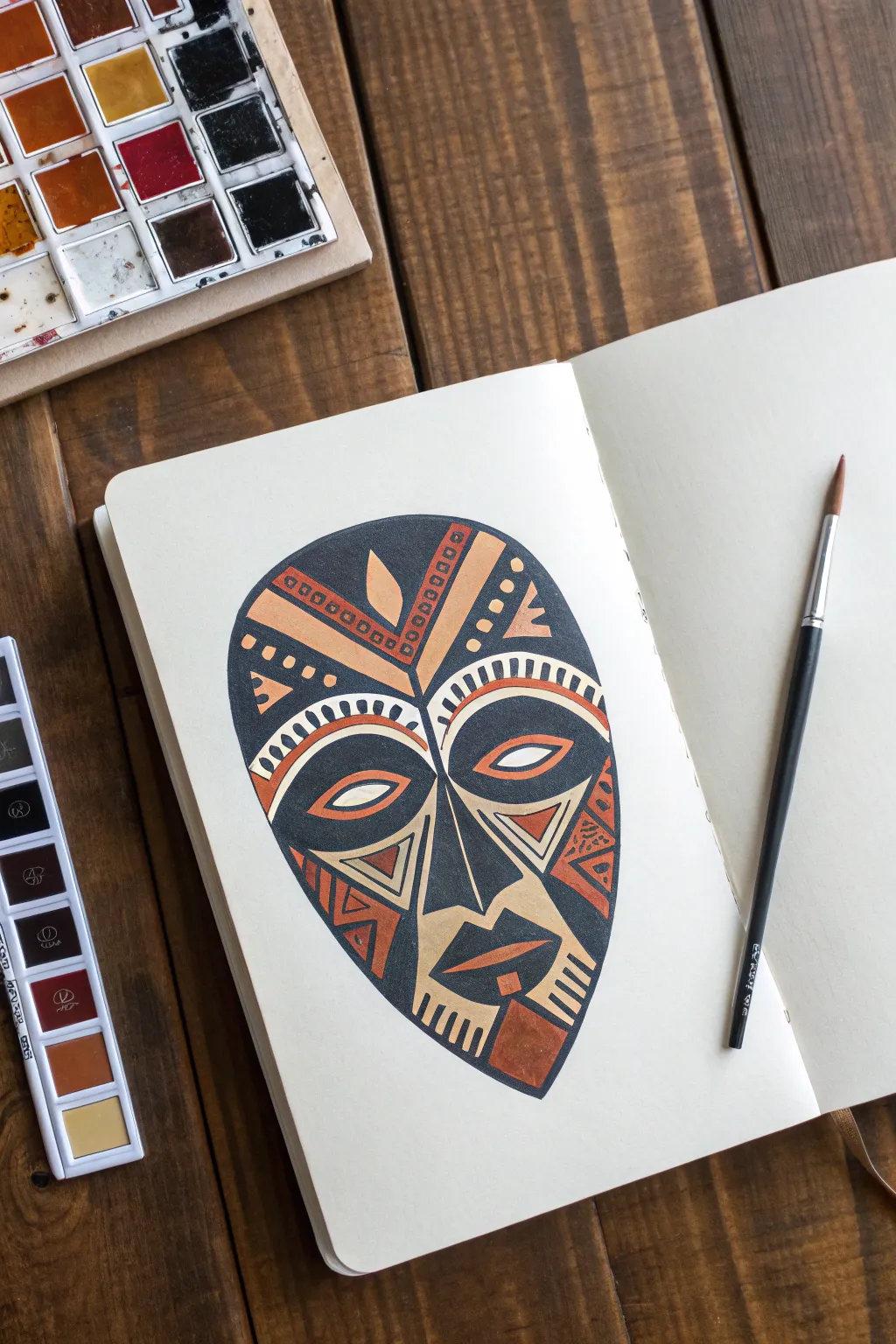
This striking illustration captures the essence of traditional African masks through bold abstraction and warm, earthy tones. Using sharp geometric lines and high-contrast colors, you will create a piece that feels both modern and historically rooted.
Detailed Instructions
Materials
- Sketchbook with thick multimedia or watercolor paper
- Watercolor paint set (focusing on black, terracotta/rust, and ochre/tan)
- Small round paint brush (size 2 or 4)
- Pencil (HB or 2H)
- Eraser
- Fine liner pen (optional for clean-up)
- Ruler (optional for symmetry)
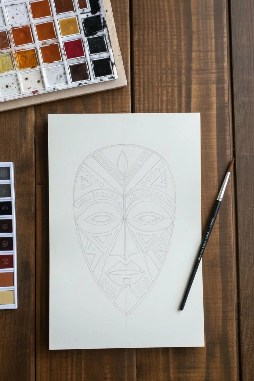
Step 1: Planning and Sketching
-
Outline the mask shape:
Start by lightly sketching a large, inverted egg shape in the center of your page. The top should be broad and rounded, tapering down to a narrower, slightly pointed chin area. -
Define the central axis:
Draw a faint vertical line straight down the middle of the mask. This is crucial for maintaining the symmetry characteristic of mask designs. -
Sketch the forehead chevron:
At the top of the mask, draw a large V-shape originating from the nose bridge upward. Inside this V, sketch a central leaf or flame shape. -
Plan the eyes:
Draw two large, almond-shaped eyes equidistant from the center line. Because this is stylized, make them exaggerated and surrounded by curved bands that sweep upwards towards the ears. -
Develop the nose and mouth:
Bridge the nose down from the forehead chevron into a long, triangular shape. Below that, sketch geometric, angular lips—think of them as stacked trapezoids rather than realistic curves. -
Add detail patterns:
Fill the remaining spaces with geometric motifs. Sketch triangles on the cheeks, small squares or dashes along the forehead bands, and striped patterns near the jawline to mimic scarification or decorative carving.
Clean Lines Troubleshooting
If your paint bleeds across lines, your paint is too wet. Let layers dry fully before painting adjacent shapes, or use a smaller brush with less water on it.
Step 2: Painting the Base Colors
-
Prepare your palette:
Mix three distinct puddles of watercolor: a deep, saturated black (or dark indigo), a warm terracotta orange, and a pale creamy tan or ochre. -
Apply the light tones first:
Using the creamy tan color, fill in the specific geometric highlights: the center ‘leaf’ on the forehead, the bands immediately above the eyes, the eyelids themselves, and the triangular cheek accents. -
Paint the mid-tones:
Switch to your terracotta orange. Carefully fill in the secondary patterns, such as the outer forehead bands, the small squares inside the V-shape, and the decorative triangles on the sides of the face.
Level Up: Texture
For a rustic look, dry-brush a little brown paint over the dried black areas to make the mask look like carved wood rather than flat illustration.
Step 3: Adding Contrast and Refining
-
Fill the dark background:
Now for the most dramatic step. Load your brush with the dark black paint. Carefully paint around all the shapes you just filled, defining the negative space. This large background area makes the warm colors pop. -
Define the features:
Use the black paint to fill in the pupils, the nose structure, and the lips. I find that using the very tip of the brush helps keep these edges sharp without bleeding into the lighter colors. -
Add intricate black details:
Once the base layers are dry, go back in with black to add the tiny squares inside the orange bands and the small dashed lines on the white forehead arches. -
Refine the edges:
Check the perimeter of the mask. If your paint edge is a bit ragged, smooth it out with a final pass of black paint to create a solid, crisp silhouette. -
Balance the jawline:
Complete the bottom of the mask by painting the rectangular chin ornament in orange and the surrounding jaw stripes in black and cream. -
Final drying and erasing:
Let the entire piece dry completely—if the paper feels cold to the touch, it’s still wet. Once dry, gently erase any visible pencil sketch lines that show through the lighter paint areas.
Now you have a bold, geometric artwork that honors the visual language of traditional mask-making
Monumental Poster Design Using Negative Space
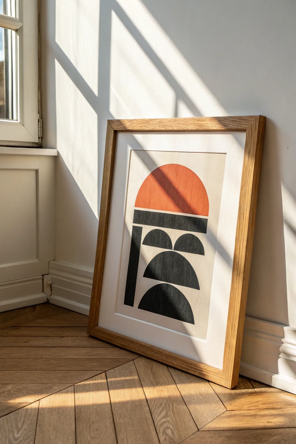
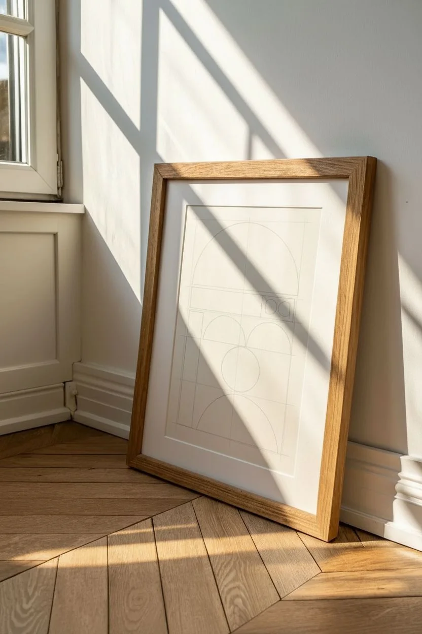
This minimalist abstract poster uses bold shapes and powerful negative space to create a striking piece of wall art perfect for minimal or mid-century modern decor. By balancing a warm terracotta sun against structured black forms, you create a sense of grounded movement and monumental architecture.
How-To Guide
Materials
- Heavyweight drawing paper or canvas sheet (cream or off-white)
- Pencil (HB or H)
- Ruler
- Compass or round objects for tracing
- Painter’s tape or masking tape
- Terracotta or burnt orange acrylic paint
- Black acrylic paint or India ink
- Flat shader brushes (medium and large)
- Fine detail brush
- Eraser
Step 1: Planning the Layout
-
Establish the margins:
Begin by measuring and lightly marking a generous border around your paper. For the look in the photo, leave about 2-3 inches of negative space on all sides to let the artwork breathe. -
Define the central column:
Draw two faint vertical lines to define the width of your main composition. This invisible column will contain all your shapes and keep the artwork centered. -
Sketch the sun shape:
At the top of your column, use a compass or trace a bowl to draw a large semi-circle. The flat bottom of the semi-circle should align perfectly with the horizontal line where your black shapes will begin. -
Draft the horizontal bar:
Directly beneath the sun’s flat edge, draw a rectangle that spans the full width of your column. It should be thick and substantial, anchoring the top colored shape. -
Divide the lower section:
Below the horizontal bar, divide the remaining vertical space into three equal distinct zones for the remaining geometric elements. -
Draw the vertical pillar:
On the left side of your column, sketch a vertical rectangle that runs from the horizontal bar down to the bottom of the lowest shape. This creates the ‘spine’ of the design.
Wobbly Curves?
If painting perfect curves is tricky, cut a stencil from cardstock or acetate first. Tape the stencil over your paper and sponge the paint in for a clean edge.
Step 2: Adding the Geometric Details
-
Draft the small semi-circles:
In the space to the right of your vertical pillar, draw two small side-by-side semi-circles in the top zone. They should sit flat on an invisible horizontal line. -
Sketch the medium semi-circle:
In the middle zone, draw a single, larger semi-circle. It should be centered within the remaining space to the right of the vertical pillar. -
Add the bottom anchor shape:
In the bottom zone, draw one final semi-circle, similar in size to the middle one, grounded at the very base of your vertical pillar. -
Refine the lines:
Go over your sketch, darkening the lines slightly so they are visible through the first coat of paint, but keep them light enough to be covered easily.
Framing Pro-Tip
Choose a frame with natural wood tones like oak or walnut. The warm wood grain complements the terracotta sun and enhances the mid-century aesthetic.
Step 3: Painting the Composition
-
Tape the edges:
Carefully apply painter’s tape along the straight edges of your rectangular shapes. This ensures crisp, razor-sharp lines for the structural elements. -
Paint the sun:
Using your flat brush, fill in the top semi-circle with the terracotta orange paint. I like to work from the curved edge inward to maintain a smooth arc. -
Fill the black structures:
Once the orange is dry to the touch, begin filling in the black sections. Start with the large horizontal bar and vertical pillar, using the tape as a guide. -
Paint the black curves:
Switch to a smaller brush to carefully hand-paint the curved edges of the black semi-circles. Use confident, sweeping strokes rather than short, choppy ones to keep the curve smooth. -
Apply a second coat:
Let the first layer dry completely, then apply a second coat of black to ensure it is opaque and solid. The contrast needs to be stark against the cream paper. -
Remove tape and touch up:
Peel away the painter’s tape slowly at a 45-degree angle. Use a fine detail brush and a tiny bit of cream paint (or white mixed with a dot of yellow/brown) to tidy up any bleed-through on the edges. -
Erase guidelines:
Once the paint is fully cured—give it at least an hour—gently erase any visible pencil marks remaining in the negative space or around the shapes.
Place your finished abstract piece in a simple wooden frame and lean it against a wall to catch the afternoon light

Have a question or want to share your own experience? I'd love to hear from you in the comments below!