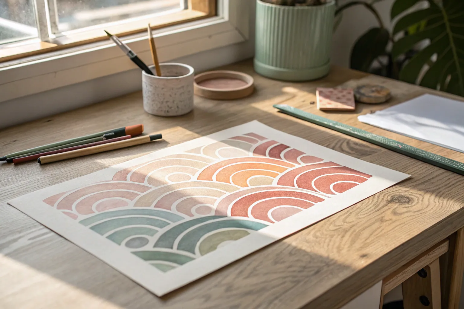
Whenever I’m craving color without the pressure of “painting a thing,” abstract watercolor is my go-to playground. These ideas lean into watercolor flow, juicy blooms, and easy structure—so you can make something striking even on a busy day.
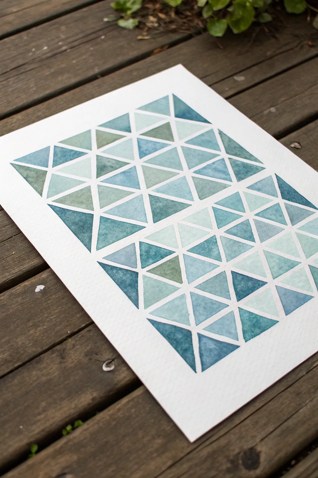
Tape-Resist Geometric Blocks
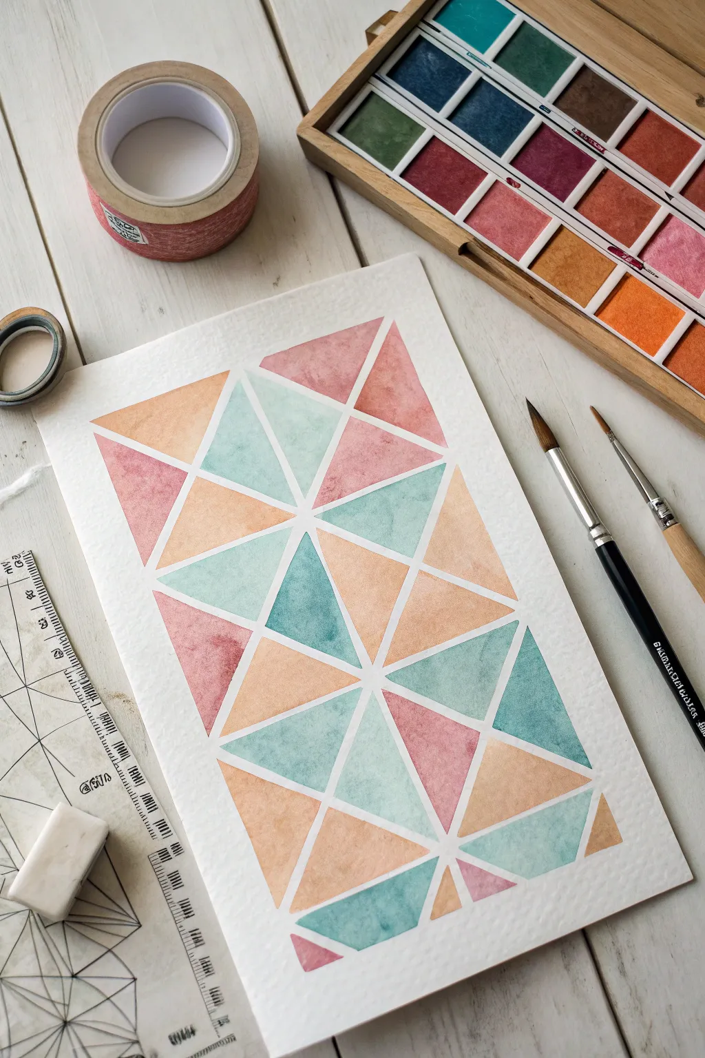
This project creates a stunning mosaic of triangles in soft, airy pastels separated by crisp white lines. It is a relaxing exercise in planning and color balance that looks deceptively complex but relies on a simple masking technique.
Step-by-Step Guide
Materials
- Cold press watercolor paper (approx. A4 or letter size)
- Painter’s tape or washi tape (approx. 5-7mm width)
- Watercolor paints (pan set preferred)
- Round brushes (sizes 4 and 8)
- Ruler
- Pencil
- Eraser
- Ruler or straight edge
- Drafting triangle or geometric template (optional)
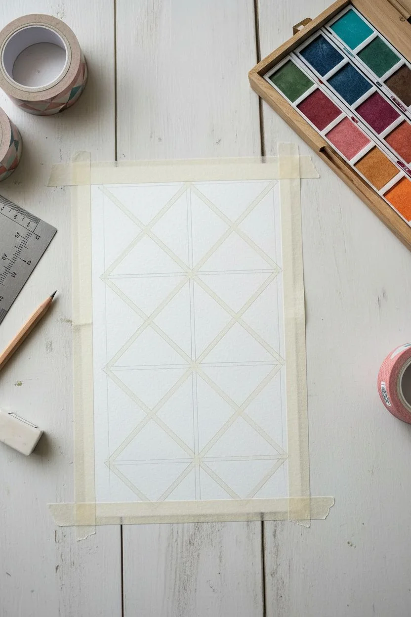
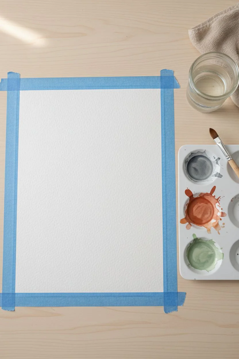
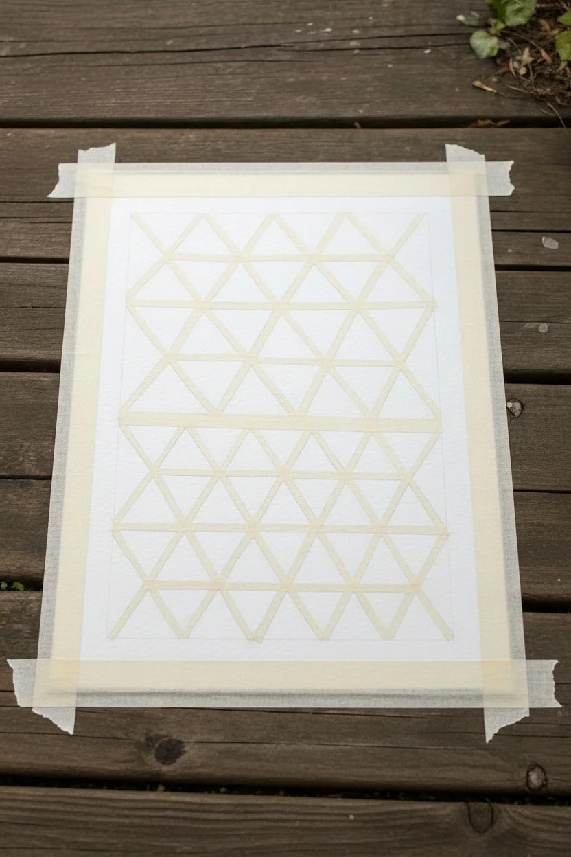
Step 1: Planning and Taping
-
Prepare your paper:
Begin by securing your watercolor paper to your workspace. You can tape down the four edges to create a border, or work freely if you prefer the pattern to float in the center as shown in the example. -
Draft the grid:
Using a ruler and a light pencil touch, draw a large rectangle in the center of your page to define the boundaries of your artwork. -
Subdivide the space:
Within your rectangle, sketch a basic grid of larger triangles. You don’t need to be mathematically perfect, but try to keep your angles consistent. A drafting triangle can help you maintain sharp geometric forms. -
Refine the triangles:
Divide your larger triangles into smaller ones. The pattern seen here relies on splitting large shapes into three or four smaller triangles, radiating from a central point. -
Apply the masking tape:
Carefully place your narrow painter’s tape or washi tape over your pencil lines. Ensure the tape intersects cleanly at the corners. -
Trim the intersections:
For the crispest points where multiple lines meet, I like to use a craft knife to gently trim overlapping tape so the corners stay sharp rather than rounded. -
Seal the edges:
Run the back of your fingernail or a bone folder firmly over all the tape edges. This crucial step prevents paint from bleeding underneath and spoiling your white lines.
Step 2: Painting the Mosaic
-
Mix your palette:
Prepare watery pools of your chosen colors. Aim for a cohesive palette: a soft peach, a muted pink, a pale mint green, and a deeper teal blue. -
Start with the lightest tones:
Begin filling in random triangles with your palest mint green color. Use your larger brush to drop color in, guiding it to the tape edges. -
Add warm accents:
Switch to your peach tone. Paint triangles that are adjacent to the green ones, but try not to let two of the same color touch if possible. -
Deepen the contrast:
Introduce the pink and the darker teal. These stronger colors act as anchors for the composition, so space them out evenly across the grid. -
Create texture:
While the paint is still wet in some triangles, you can dab a clean, thirsty brush into the center to lift a little pigment, creating a soft, cloud-like texture. -
Vary opacity:
Make some triangles more saturated with pigment and others more watery. This transparency variation adds depth to the flat geometric shapes. -
Let it dry completely:
Allow the painting to dry fully. If the paper is cool to the touch, it is still damp. Impatience here is the enemy of crisp lines.
Pro Tip: Bleed Prevention
Before painting colors, paint clear water or white gouache over the tape edges first. This seals the tape, meaning any leaks are invisible.
Step 3: The Reveal
-
Remove the tape:
Once bone dry, begin peeling the tape. Pull it slowly, low and close to the paper at a 45-degree angle, to avoid ripping the surface. -
Clean up:
Use your eraser to gently remove any visible pencil marks that were covered by the tape, leaving pure white channels between your colors.
Level Up: Metallic Touch
Once the tape is removed, use a gold gel pen or fine liner to outline specific triangles or trace inside the white channels for a touch of glamour.
Step back and admire how the simple act of masking has transformed chaotic splashes of color into an orderly, modern design


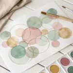
Overlapping Transparent Circles
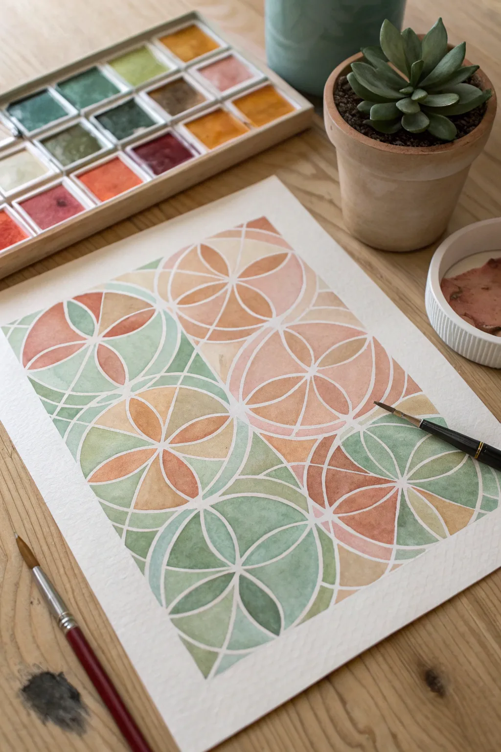
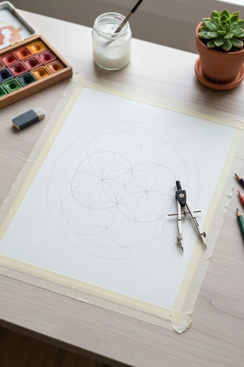
This soothing geometric project plays with transparency and soft earth tones to create a mesmerizing ‘Flower of Life’ pattern. By using masking fluid to preserve crisp white lines, you can freely wash watercolors over the shapes to achieve beautiful, luminous overlaps.
Step-by-Step Tutorial
Materials
- Cold press watercolor paper (300 gsm)
- Watercolor paints (Terracotta, Ochre, Sage Green, Dusty Rose)
- Liquid masking fluid (drawing gum)
- Geometric compass
- Pencil and eraser
- Small round brushes (sizes 2 and 4)
- Old brush or ruling pen for masking fluid
- Masking tape
Step 1: Drafting the Grid
-
Tape it down:
Start by securing your watercolor paper to a flat surface using masking tape on all four sides. This prevents the paper from buckling when it gets wet later. -
Find the center:
Using a ruler, lightly mark the center point of your paper. This will be the anchor for your first circle. -
Set your compass:
Adjust your compass to a radius of about 1.5 to 2 inches. Keep this radius locked for the entire drafting process to ensure the pattern aligns perfectly. -
Draw the central circle:
Place the compass point on your center mark and draw the first circle very lightly with a pencil. -
Create the first petals:
Place your compass point anywhere on the circumference of that first circle. Draw a second circle. Note where this new circle intersects the first one. -
Complete the flower:
Move your compass point to an intersection point you just created. Draw another circle. Continue this process around the center circle until you see a six-petaled flower emerge in the middle. -
Expand the grid:
Continue adding circles outward, always placing your compass point at the intersections of existing circles, until your page is filled with the interlocking grid.
Step 2: Masking & Painting
-
Apply masking fluid:
Using an old brush or a ruling pen, carefully trace over all your pencil lines with liquid masking fluid. Keep the lines consistent and thin. -
Let it cure:
Allow the masking fluid to dry completely. It should feel gummy and not tacky to the touch. This step is crucial to protect the white paper underneath. -
Mix your palette:
Prepare watery pools of your chosen colors: terracotta, sage green, ochre, and dusty rose. Aim for a milky consistency to ensure transparency. -
Start the first wash:
Choose one ‘flower’ cluster and fill its petals with a single color, like the sage green. Let the paint pool naturally for texture. -
Alternate colors:
Move to an adjacent cluster and switch to a contrasting tone, perhaps the terracotta. I find it helpful to look at the overall balance and not place two similar colors right next to each other. -
Blend wet-in-wet:
For some petals, drop a second color into the wet paint while it’s still damp. Watch as the pigments bleed together to create soft transitions. -
Fill the gaps:
Continue painting until all enclosed shapes are filled. Don’t worry if you paint over the masking lines; the fluid will protect the paper. -
Dry thoroughly:
Wait until the paint is bone dry. If the paper feels cool to the touch, it is still damp deep down. -
Wait, then reveal:
Once absolutely dry, gently rub your finger or a clean eraser over the masking fluid lines to peel them away, revealing the crisp white grid. -
Final touches:
Use an eraser to remove any visible pencil marks remaining inside the white lines for a clean finish.
Save Your Brushes
Coat your brush bristles with bar soap before dipping into masking fluid. It creates a barrier that makes cleaning the sticky fluid much easier later.
Layer Up
Glaze a second layer of very diluted paint over random petals after the first layer dries. This adds visual depth and makes the transparency effect pop.
Step back and admire the lovely rhythm created by the interlocking shapes and soft colors


Simple Parallel Lines With Soft Bleeds
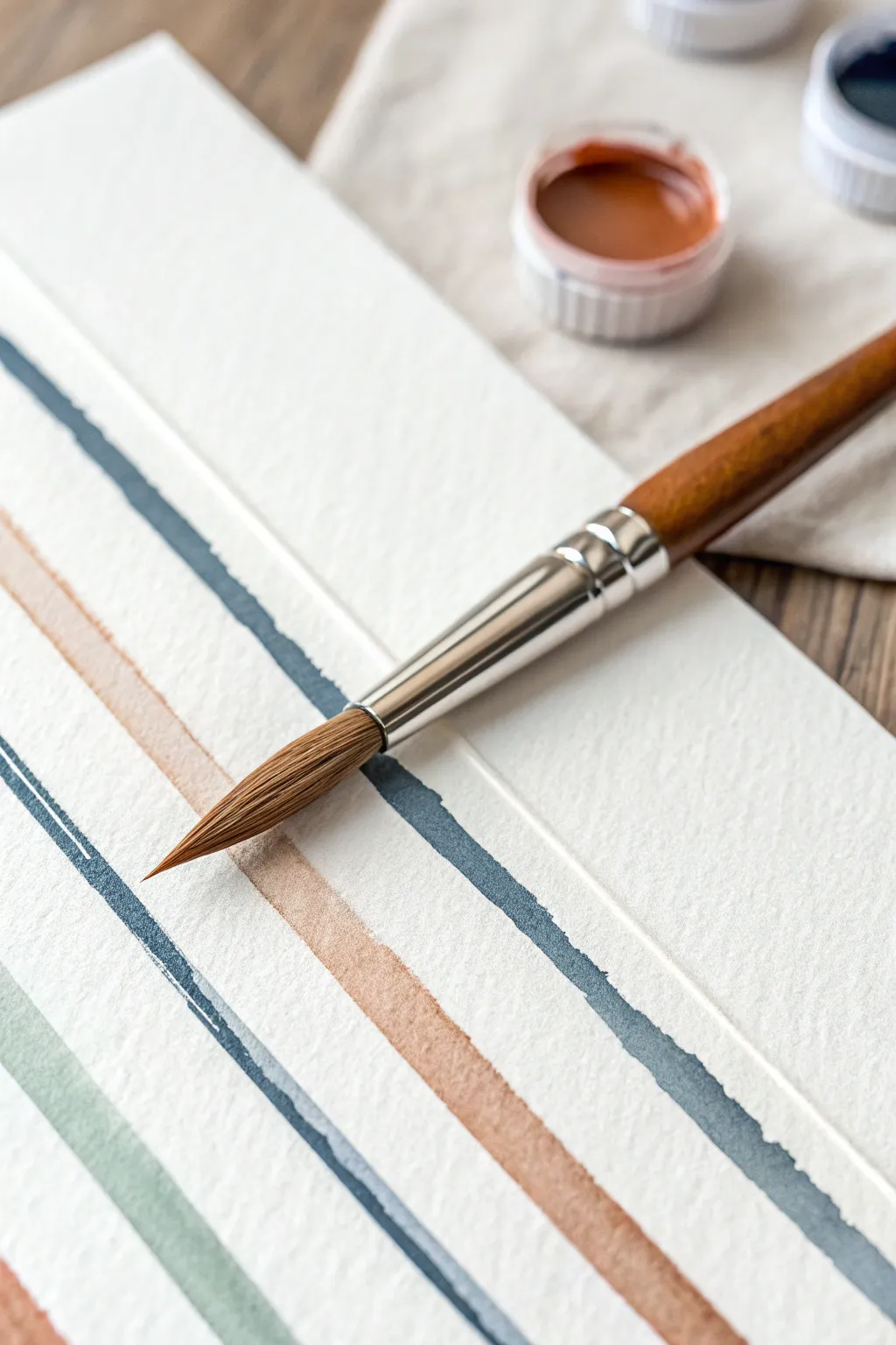
This project embraces the meditative nature of painting simple lines, allowing the beautiful texture of watercolor paper to shine through. The result is a minimalist abstract piece featuring muted earth tones and soft, natural edges that celebrate the medium’s fluidity.
Step-by-Step
Materials
- Cold press watercolor paper (medium texture)
- Round watercolor brush (size 6 or 8)
- Watercolor paints (Payne’s Grey, Burnt Sienna, Sage Green)
- Jar of clean water
- Paper towel or rag
- Mixing palette
- Painter’s tape or masking tape
Step 1: Preparation and Mixing
-
Secure the Paper:
Begin by taping down your cold press watercolor paper to a sturdy board or table. This prevents buckling and keeps your workspace steady. -
Prepare the Palette:
Squeeze a small amount of Payne’s Grey, Burnt Sienna, and a Sage Green onto your palette. If you don’t have sage, mix a little green with a touch of brown. -
Dilute the Grey:
Wet your brush and pull some Payne’s Grey into a mixing well. Add water gradually until you have a mixture the consistency of tea—fluid but still rich in pigment. -
Mix the Terra Cotta:
Clean your brush thoroughly. In a fresh well, mix the Burnt Sienna with water to create a warm, rusty terra cotta hue. Ensure it has the same fluid consistency as the grey. -
Prepare the Sage:
Finally, prepare your sage green mixture. Keep all three puddles wet and ready to use so you don’t have to stop mid-painting.
Fixing “Blooms”
If you see cauliflower-like blooms forming, your brush was too wet when adding paint to a drying area. Just let it dry; the texture often looks intentional.
Step 2: Painting the Lines
-
Load the Brush:
Dip your round brush into the Payne’s Grey mixture. Fully saturate the bristles but tap the excess drip off on the side of the palette. -
Paint the First Stroke:
Start near the top left edge of your paper. With steady, moderate pressure, pull the brush diagonally across the paper to create your first line. Don’t worry about it being perfectly straight. -
Enhance the Edge:
While the paint is still wet, you can touch the tip of your brush to random spots along the edge of the line to deposit a little extra pigment, creating variation. -
Clean and Switch:
Rinse your brush in the water jar and blot it slightly on a paper towel. It should be damp but not dripping. -
Load the Rust Color:
Pick up your Burnt Sienna mixture. I like to make sure the belly of the brush is holding plenty of paint for a long, uninterrupted stroke. -
Spacing the Second Line:
Leave a gap of white space about the width of your brush (or slightly wider) below the grey line. Paint a parallel line with the rust color using a slow, deliberate pull. -
Watch for Texture:
Allow the texture of the cold press paper to do the work. If the brush skips slightly, leave those white speckles—they add character. -
Paint the Third Line:
Rinse again. Switch back to your Payne’s Grey (or a slightly deeper version of it) for the third line. Maintain that parallel spacing, watching the white gap between colors. -
Add the Sage Line:
Clean your brush and load the Sage Green. Paint the final line in the bottom corner area, following the same diagonal flow.
Go Metallic
Once the matte colors are dry, add a very thin pinstripe of metallic gold watercolor right down the center of the white gaps for a luxurious touch.
Step 3: Finishing Touches
-
Create Soft Bleeds:
Before everything dries completely, check if you want any ‘bleeds.’ If two lines are close, you can use a tiny drop of clean water to bridge the gap and let colors touch slightly. -
Dry Naturally:
Let the painting sit flat to air dry. Using a hair dryer might push the pigment pools around too much, so patience is key here. -
Remove Tape:
Once the paper is bone dry to the touch, carefully peel away the painter’s tape at a 45-degree angle to reveal crisp borders.
Enjoy the calm simplicity of your new abstract line art

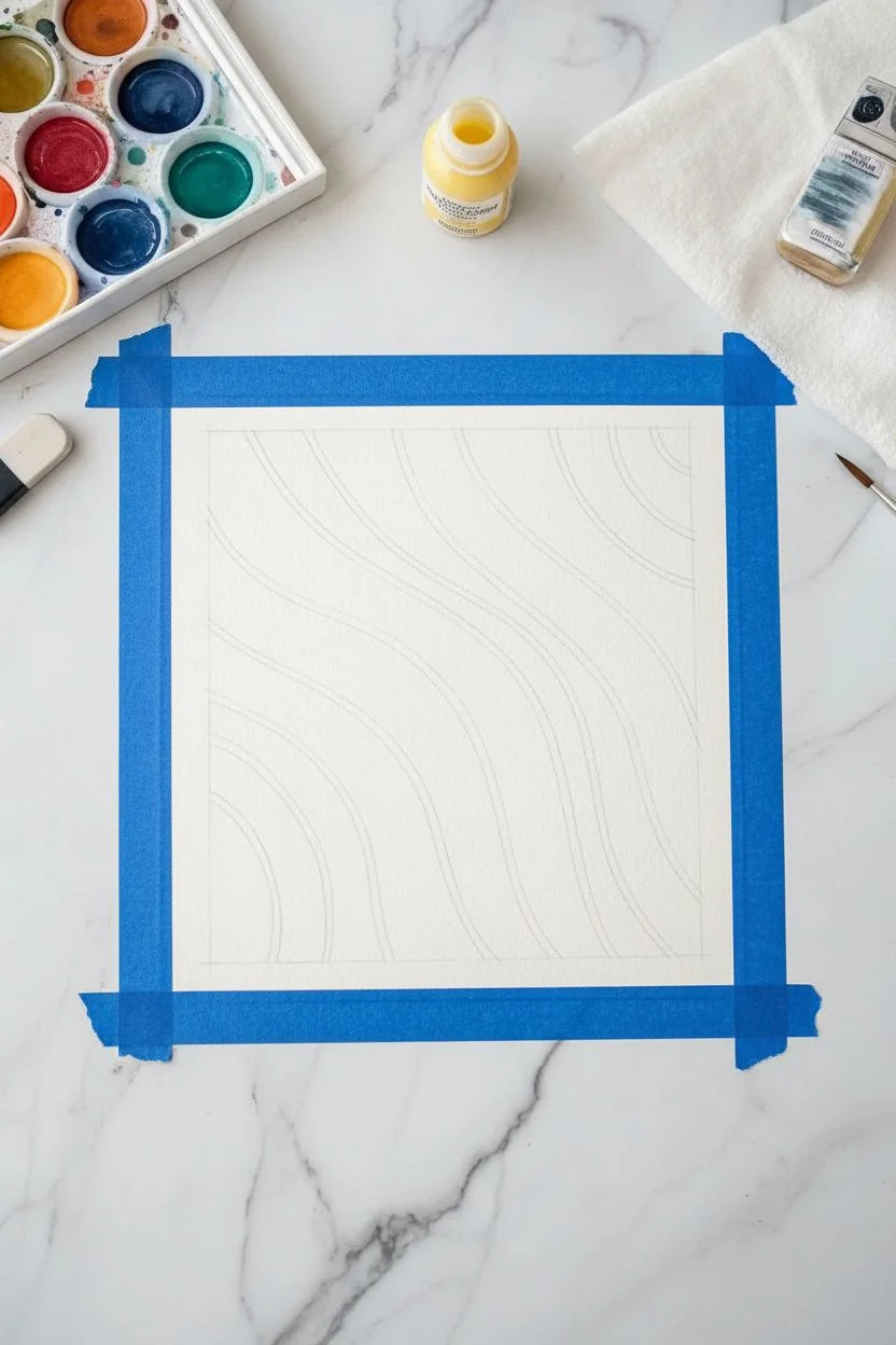
Glazed Ribbon Weave
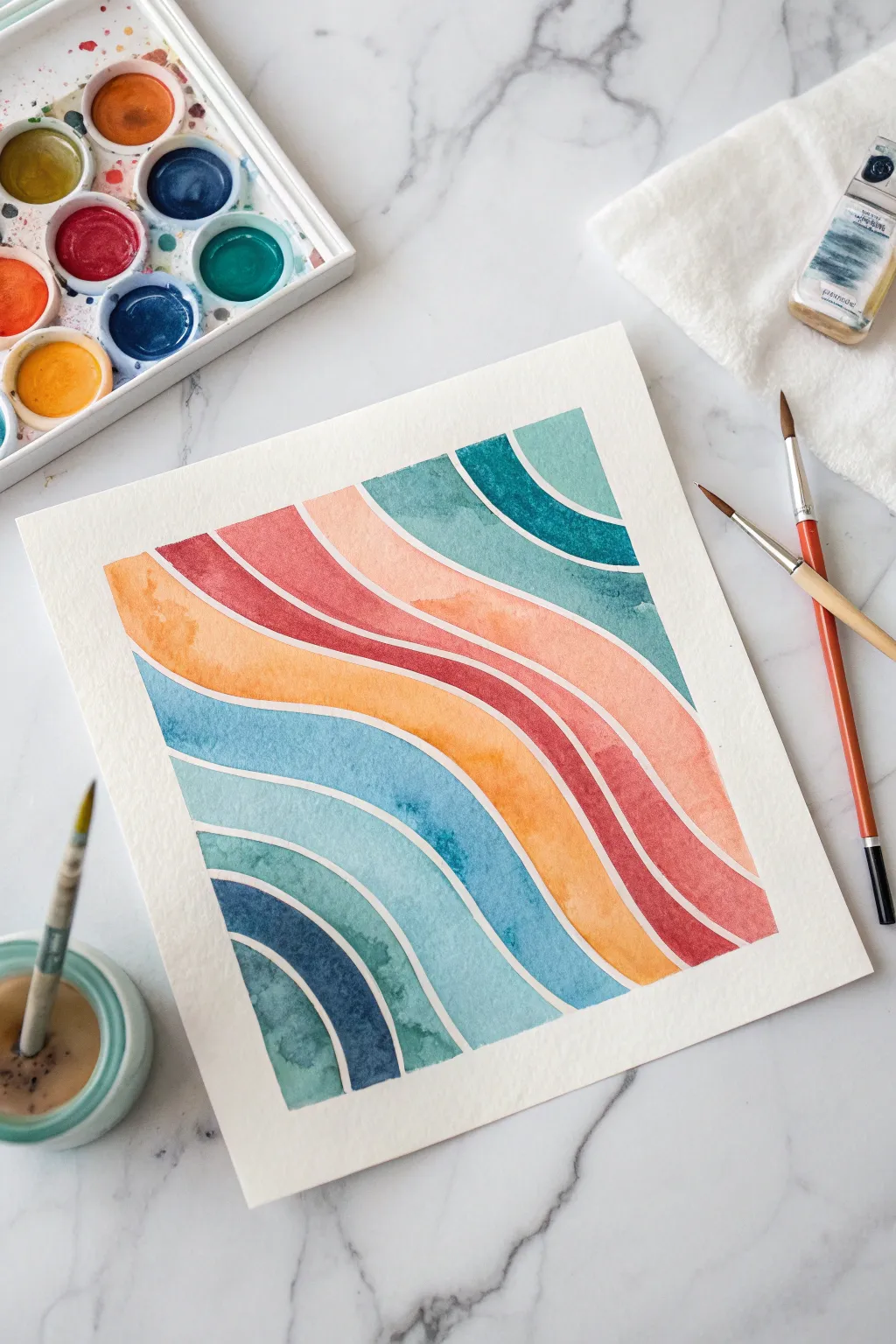
This project creates a soothing, rhythmic pattern of undulating color bands that seem to flow across the page. By carefully preserving thin white lines between each wave, you’ll achieve a clean, modern aesthetic with satisfying color gradients.
Step-by-Step Guide
Materials
- Cold press watercolor paper (square format recommended)
- Watercolor paints (teal, indigo, yellow-ochre, crimson red, burnt orange)
- Round watercolor brushes (size 4 and 8)
- Pencil (HB or H)
- Masking fluid (optional but helpful)
- Fine liner brush or rubber shaper tool (for masking fluid)
- Painter’s tape or wash tape
- Paper towels
- Two jars of water
Step 1: Preparation and Sketching
-
Secure the paper:
Tape down all four edges of your watercolor paper to a sturdy board or your work surface. This prevents buckling and creates a crisp white border around the final piece. -
Map the waves:
Using an H pencil, lightly sketch the wavy lines across the paper. Start from the bottom left corner and curve upwards toward the top right diagonally. -
Create the gaps:
Instead of drawing single lines, draw double lines spaced about 1–2mm apart. This empty channel will become the white negative space separating your colors. -
Mask the negative space (Optional):
If you struggle with unsteady hands, apply a thin line of masking fluid in those narrow channels you just drew. Let it dry completely before painting. If you’re confident, you can skip this and simply paint carefully around the gaps.
Steady Hand Trick
To get smoother curves when painting the edges, lock your wrist and move your entire arm from the shoulder. This creates arc-like movements naturally.
Step 2: Painting the Cool Tones
-
Mix your blues:
Prepare a palette with three distinct cool tones: a deep indigo, a medium teal, and a lighter watery turquoise. Keep them separate but ready. -
Start the bottom corner:
Begin with the bottom-left curve. Load your size 8 brush with the deep indigo and fill the curve, carefully tracing the edge of your pencil line or masking fluid. -
Add variance:
While the paint is still wet, drop a tiny amount of water or a slightly lighter blue into center of the band to create subtle texture and bloom. -
Paint the second wave:
Move to the next band up, switching to your teal mixture. Ensure the paint meets the edge crisply but does not cross into the white channel. -
Third wave transition:
For the third band, use the lightest turquoise mix. Painted wet-on-dry, this layer should be fairly transparent to let the paper texture shine through. -
Top corner echo:
Look at the top right corner of the paper. There are partial curves that mirror the bottom ones. Paint these using the teal and deep blue shades to balance the composition.
Fixing Bleeds
If paint accidentally bridges a white gap, don’t panic. Wet a clean stiff brush, scrub the spot gently, and blot with a paper towel immediately to lift the color.
Step 3: Adding the Warm Tones
-
Prepare warm colors:
Clean your brush thoroughly. Mix a burnt orange, a crimson red, and a yellow-ochre. You want these to feel earthy but vibrant. -
The central focal point:
Locate the widest, most prominent central wave. Paint this using the yellow-ochre or bright orange. Start from one side and pull the color across. -
Create a gradient:
As you paint that central orange band, consider dipping your brush tip in a bit of red near the ends of the stroke to create a natural, soft gradient within the single strip. -
Layering the red:
Paint the band directly above the orange one with your crimson red. The contrast between this hot color and the cool teal above it is key to the design’s energy. -
Upper warm accents:
Fill in the remaining upper bands with lighter washes of a peachy-pink tone (watered down crimson) to soften the transition toward the top edge.
Step 4: Finishing Touches
-
Check edges:
Once the main colors are down, switch to your size 4 brush. Refine any jagged edges along the white channels to make the curves look smooth and intentional. -
Dry completely:
Let the painting sit until the paper is cool to the touch and visibly dry. Using a hairdryer on a low setting can speed this up. -
Remove masking (if used):
If you used masking fluid, gently rub it away with a clean finger or a rubber cement pickup tool to reveal the pristine white lines. -
Erase guidelines:
Once absolutely dry, very gently erase any visible pencil marks in the white channels, being careful not to smudge the paint. -
Peel the tape:
Slowly peel off the painter’s tape at a 45-degree angle away from the artwork to prevent tearing the paper surface.
Step back and admire the flow of colors as they weave together on your paper
BRUSH GUIDE
The Right Brush for Every Stroke
From clean lines to bold texture — master brush choice, stroke control, and essential techniques.
Explore the Full Guide
Wet-on-Wet Color Blooms
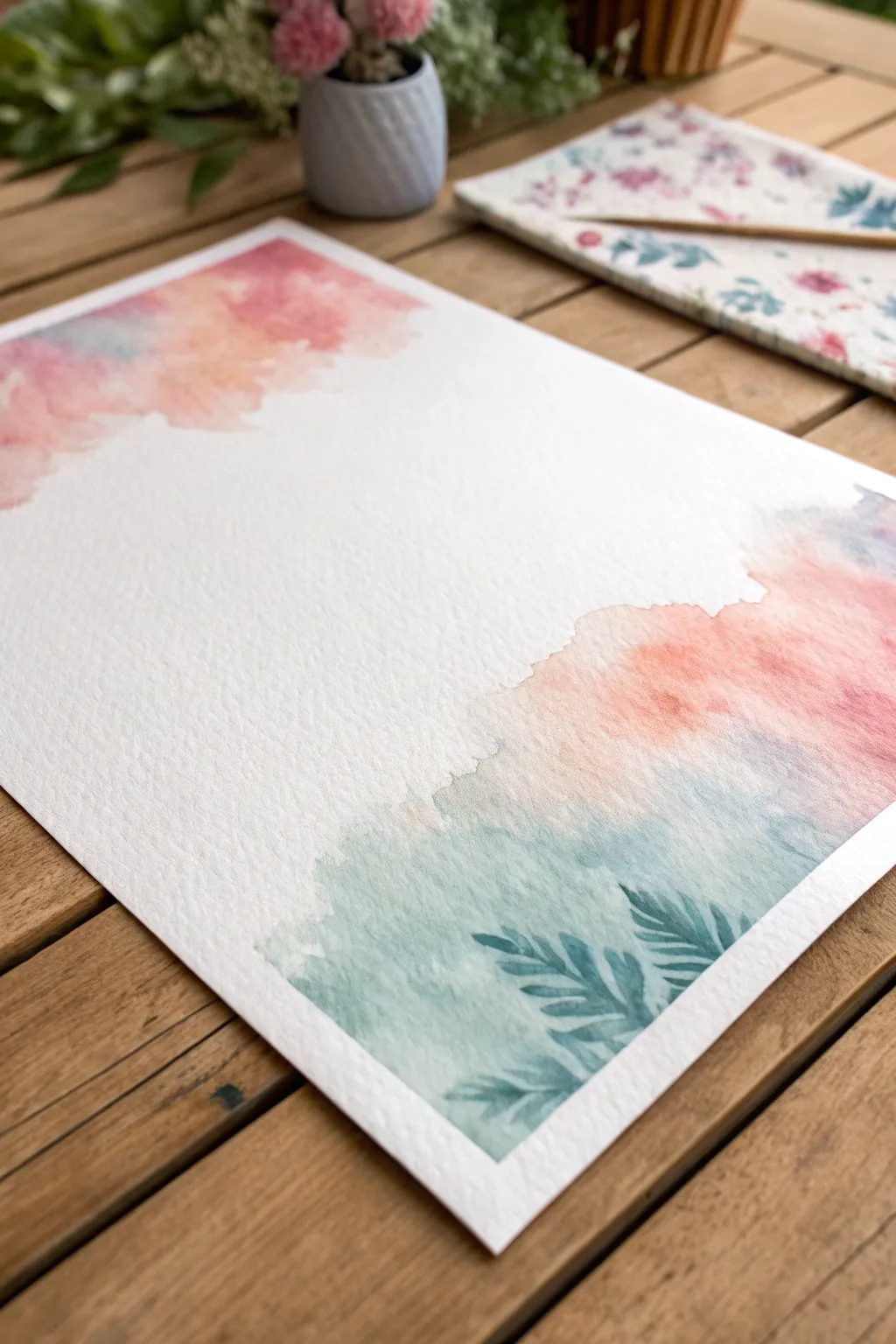
Embrace the unpredictable beauty of watercolor with this tutorial on wet-on-wet blooms that frame your page in pastel softness. By focusing on the corners, you create a perfect backdrop for calligraphy or simply a serene piece of abstract art.
Step-by-Step Tutorial
Materials
- Cold press watercolor paper (300 gsm or higher for best texture)
- Watercolor paints (peachy pink, coral, soft blue, teal)
- Round watercolor brush (size 8 or 10)
- Fine liner brush (size 0 or 2)
- Clean water jar
- Paper towels
- Washi tape or masking tape
Step 1: Preparation and Top Corner
-
Secure the Paper:
Begin by taping down all four edges of your watercolor paper to a sturdy board or your work surface. This prevents the paper from buckling when we apply water later. -
Wet the Top Corner:
Dip your larger round brush into clean water. Gently brush water onto the top-left corner of the paper in an irregular, cloud-like shape. You want the paper glistening but not forming a puddle. -
Introduce Soft Pink:
Load your brush with a watered-down peachy pink. Touch the tip to the wet area you just created. Watch as the pigment explodes outward on its own. -
Add Coral Depth:
Before the first layer dries, drop in a slightly more saturated coral or reddish-pink tone near the edge of your water shape. Let it bleed naturally into the lighter pink. -
Hint of Blue:
Clean your brush and pick up a very faint, watery blue. Dab this into the transition area where the paint meets the white paper, softening the edges further. -
Let Gravity Work:
Tilt your board slightly if you want the colors to mix more dynamically, but keep the shapes concentrated in that upper corner.
Bloom Control
If colors are spreading too fast, your paper is too wet. Dab it with a dry brush to soak up excess water, or wait 30 seconds for it to evaporate slightly.
Step 2: Bottom Corner and Foliage
-
Wet the Bottom Corner:
Move to the bottom-right corner. Apply clean water here as well, extending the wet area significantly higher and wider than the top corner to create visual balance. -
Apply Base Colors:
Start dropping in your peach and coral tones towards the top edge of this new wet patch, keeping them loose and airy. -
Transition to Teal:
While the paper is still wet, introduce a teal or sea-green color at the very bottom edge. Allow this cool tone to merge upward into the warm pinks, creating a soft, muddy-neutral transition zone. -
Create Texture:
I like to dab the wet paper gently with the corner of a paper towel in a few spots to lift pigment and create uneven, cloud-like textures. -
Dry Completely:
This is crucial: Let the painting dry completely. The paper must be bone-dry before adding the details, or they will blur away. -
Prep the Detail Brush:
Switch to your fine liner brush (size 0 or 2) and mix a slightly more concentrated teal or blue-green paint. -
Painting the Fern Stem:
In the teal section of the bottom corner, paint a thin, curved line extending upward. This will be the spine of your fern leaf. -
Adding Leaves:
Using short, confident strokes, paint small leaves angling outward from the stem. Press down at the start of the stroke and lift up at the end to create a tapered point. -
Layering Foliage:
Add two or three more partial fern shapes nearby. You can paint these directly over the dried watercolor wash for a lovely layered effect. -
Final Look:
Step back and assess your composition. If the white space in the middle feels too stark, you can add tiny splatters of diluted paint, but often the clean negative space is what makes this bold. -
Remove Tape:
Once absolutely everything is dry, peel your tape away slowly at a 45-degree angle to reveal those crisp, professional edges.
Hard Edges?
To avoid harsh lines where the paint dries, soften the outer edges of your shapes with a clean, slightly damp brush while the paint is still wet.
Enjoy the serene atmosphere your new abstract watercolor piece brings to your space
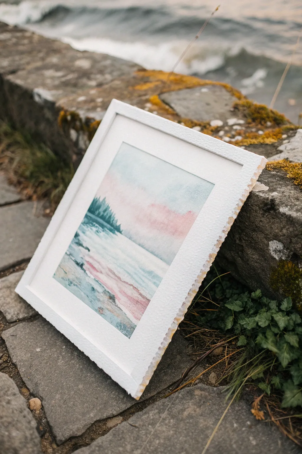
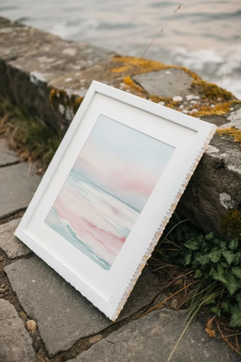
Abstract Horizon Bands
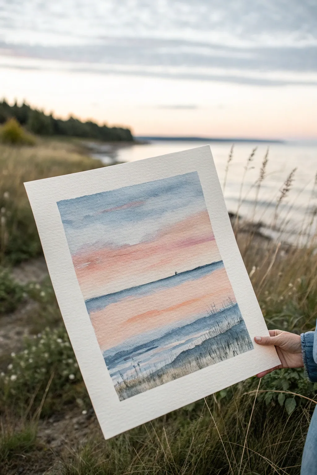
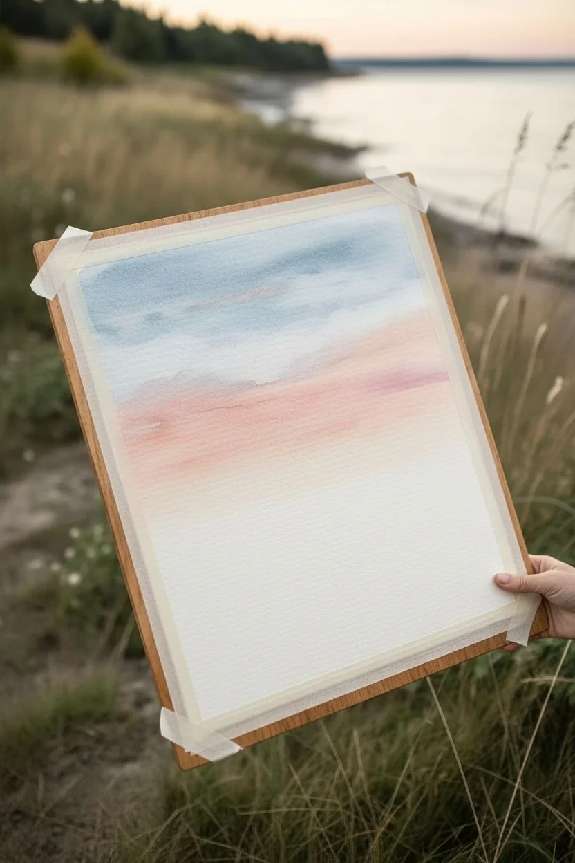
Capture the serenity of a sunset over the water with this layered, banded watercolor approach. By simplifying the landscape into soft, horizontal washes of color, you achieve a calm, abstract interpretation of the sea meeting the sky.
Step-by-Step Guide
Materials
- Cold press watercolor paper (140lb/300gsm)
- Painter’s tape or masking tape
- Watercolor paints (Indigo Blue, Rose Madder or Opera Pink, Yellow Ochre, Burnt Sienna)
- Large flat brush (3/4 inch or 1 inch)
- Medium round brush (size 6 or 8)
- Small liner brush (size 1 or 2)
- Two jars of water
- Paper towels
- Drawing board or hard surface
Step 1: Preparation and Sky
-
Tape the borders:
Secure your watercolor paper to a board using painter’s tape on all four sides. This creates that crisp, clean white edge seen in the photo and prevents the paper from buckling significantly when wet. -
Pre-wet the sky area:
Using your large flat brush and clean water, gently wet the top two-thirds of the paper. You want the paper to be damp and glistening, but not holding puddles of water. -
Apply the upper sky:
Load the flat brush with a diluted mix of Indigo Blue. Starting at the very top, paint horizontal strokes across the paper, allowing the paint to naturally bleed downwards into the damp surface. -
Introduce the sunset tones:
Rinse your brush thoroughly. Pick up a soft pink like Rose Madder. While the blue is still slightly damp but not soaking, apply a band of pink horizontally across the middle section, slightly overlapping the bottom of the blue wash to create a violet transition. -
Warm the horizon:
Mix a small amount of Yellow Ochre with your pink to create a peachy salmon tone. Paint this band directly below the pink, bringing the color down to where your horizon line will sit. -
Dry partially:
Let this sky section dry until it is cool to the touch but no longer shiny. This ensures your horizon line doesn’t bloom uncontrollably into the sky.
Step 2: The Ocean and Horizon
-
Paint the horizon line:
Using a stronger, less diluted mixture of Indigo Blue and your medium round brush, paint a straight, deliberate line across the paper to define the horizon. The stark contrast anchors the painting. -
Add the distant water:
Immediately below the dark horizon line, wash in a pale blue band. I find that leaving a tiny, fraction-of-an-millimeter gap of white paper between the dark horizon and this wash adds a lovely sparkle, though it’s optional. -
Mirror the sunset:
To reflect the sky in the water, lay down a wash of your peach/pink mixture below the pale blue water band. Keep your strokes strictly horizontal to maintain the calm water effect. -
Deepen the foreground water:
As you move toward the bottom of the painting, switch back to blue mixed with a touch of Burnt Sienna to gray it down. Create slightly wavy, irregular horizontal strokes to suggest small ripples or waves nearing the shore. -
Suggest the shoreline:
At the very bottom of the painted area, use a darker, saturated mix of blue and brown to create the heavy, shadowed area where the water meets the land.
Wet-on-Wet Secrets
Work quickly while the paper is damp. If the shine disappears, stop adding paint. Adding wet paint to drying paper creates ‘cauliflowers’ or blooms.
Step 3: Foreground Details
-
Dry thoroughly:
It is crucial to let the entire painting dry completely before adding the crisp foreground details. Ideally, wait about 10-15 minutes or use a hairdryer on a low setting. -
Paint the dune grass base:
Mix a dark, neutral color using Indigo and Burnt Sienna. With a drier brush, scumble this dark color along the bottom edge to create the sandy texture of the dune. -
Flick the grass blades:
Switch to your small liner brush. Using the same dark neutral mix, use quick, upward flicking motions to create thin grasses rising from the bottom edge. -
Vary the heights:
Make sure some grasses are short and dense, while others reach higher up into the water section. This variation creates depth. -
Add the distant focal point:
Using the very tip of your smallest brush and dark paint, add a tiny, indistinct shape on the horizon line purely for scale—it could be a distant boat or a small rock formation. -
Reveal the edges:
Once the paper is 100% bone dry, slowly peel off the masking tape at a 45-degree angle, pulling away from the painting to reveal the crisp white borders.
Fixing a Wobbly Horizon
If your horizon line isn’t straight, don’t try to fix it with more wet paint. Let it dry completely, then use a ruler and a watercolor pencil to gently straighten it.
Now you have a tranquil, abstract landscape that captures the feeling of a quiet evening by the sea

PENCIL GUIDE
Understanding Pencil Grades from H to B
From first sketch to finished drawing — learn pencil grades, line control, and shading techniques.
Explore the Full Guide
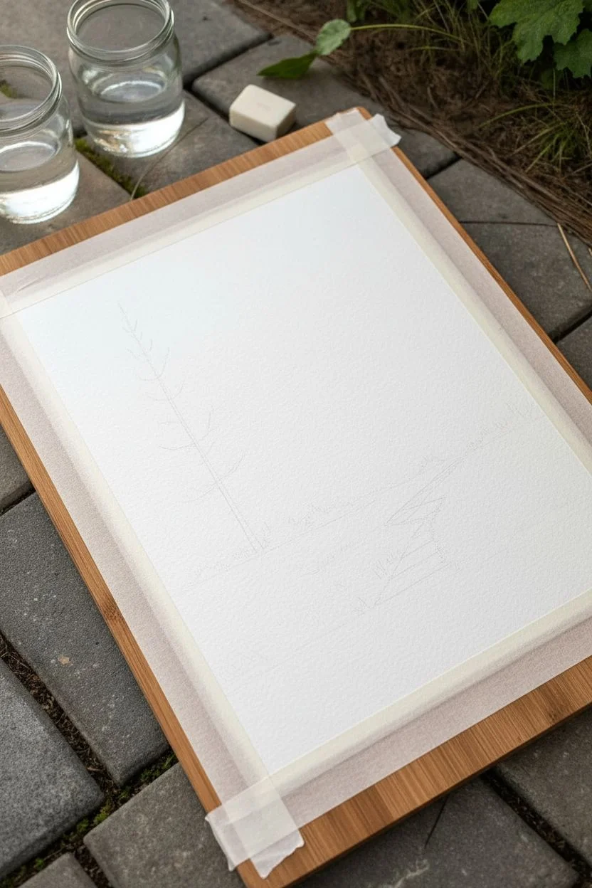
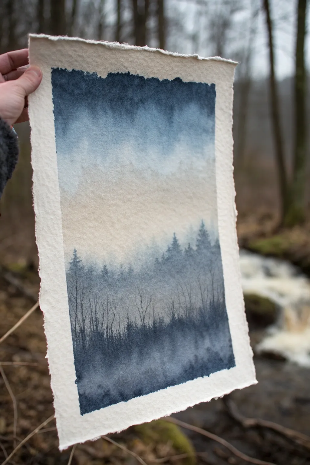
Misty Treeline Silhouettes
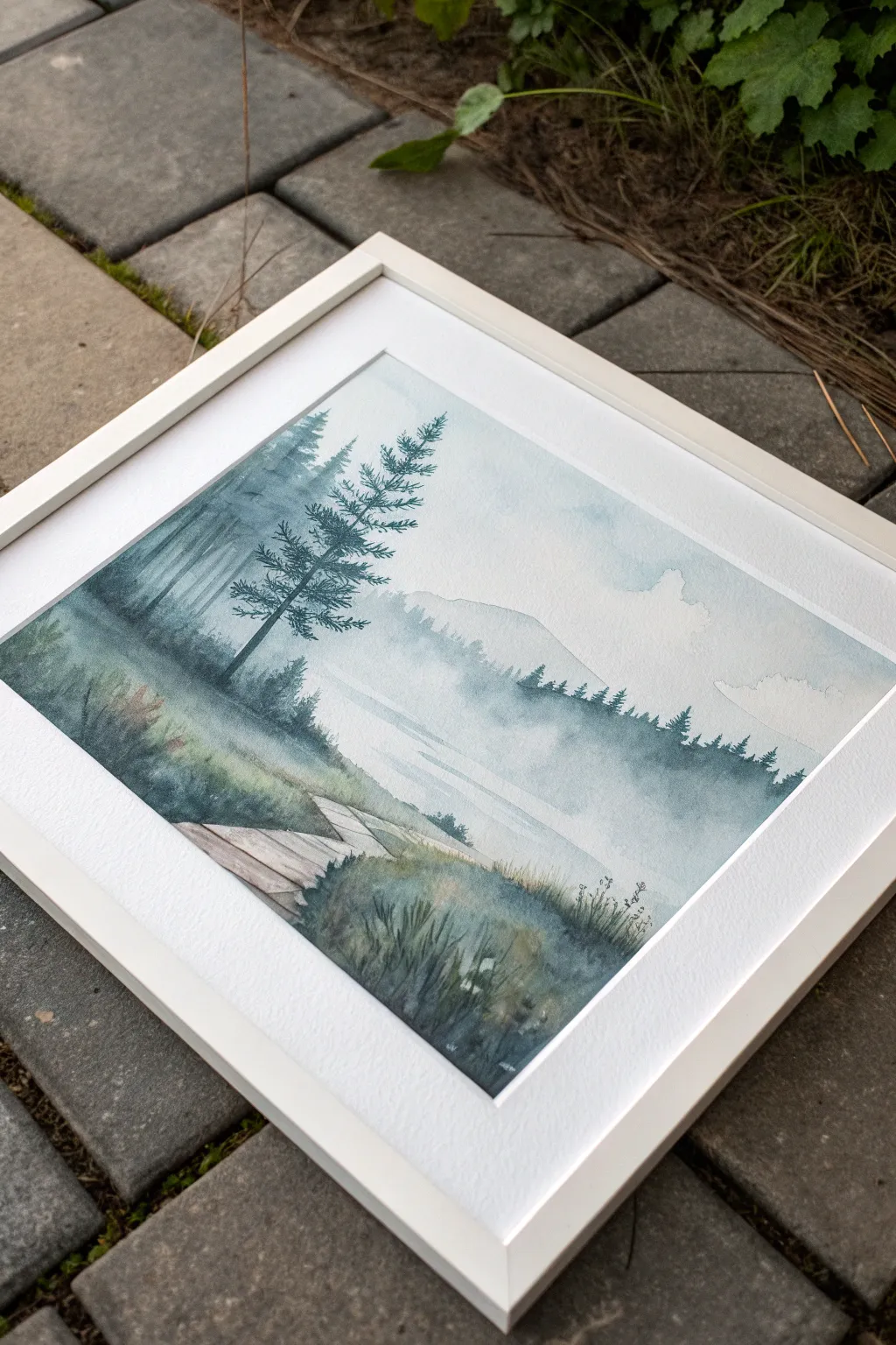
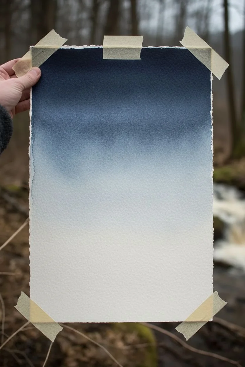
Capture the serene silence of a foggy morning with this atmospheric watercolor landscape featuring towering pine silhouettes. This project focuses on building depth through subtle layering and wet-on-wet techniques to create a dreamlike, misty effect.
Step-by-Step
Materials
- Cold press watercolor paper (300 gsm)
- Watercolor paints (Indigo, Payne’s Gray, Sap Green, Burnt Sienna, Sepia)
- White gouache (optional, for highlights)
- Round brushes (sizes 2, 6, and 10)
- Flat wash brush (1 inch)
- Masking tape
- Two jars of water
- Paper towels
- Pencil (HB) and kneaded eraser
Step 1: Preparation and Sketching
-
Paper Setup:
Secure your watercolor paper to a board using masking tape on all four sides. Ensure the tape is pressed down firmly to prevent water from seeping underneath and to create a crisp white border. -
Light Sketching:
Using an HB pencil, very lightly sketch the main compositional elements. Mark a low horizon line for the water’s edge, suggest the diagonal path of the boardwalk in the foreground, and lightly indicate where the main tall pine tree will stand on the left. -
Soften Lines:
Roll a kneaded eraser over your sketch to lift up excess graphite. You want the lines to be barely visible so they don’t show through the transparent watercolor layers later.
Fixing “Cauliflowers”
If unwanted water blooms appear in your sky, don’t panic. Wait for it to dry completely, then gently scrub the edge with a damp stiff brush to soften the hard line.
Step 2: Creating the Atmoshere
-
Wet-on-Wet Sky:
With your large flat brush, wet the entire sky area heavily with clean water, stopping just above the foreground grasses. The paper should have a nice sheen but no puddles. -
Initial Wash:
Mix a very dilute wash of Indigo and a touch of Payne’s Gray. While the paper is still wet, drop in this color near the top corners and along the horizon line, letting it bleed naturally to create soft clouds and mist. -
Distant Mountains:
While the sky is damp but not soaking, mix a slightly stronger, milky consistency of the blue-gray mix. Paint a faint, rolling mountain shape in the background. The damp paper will soften the edges, pushing the mountain into the distance. -
Foggy Treeline:
Mix a pale, cool green using Sap Green and Payne’s Gray. Paint a jagged, uneven line of distant trees along the base of the mountain. Soften the bottom edge of this strip with a clean, damp brush so it fades into the ‘fog’ below.
Step 3: Middle Ground and Foreground
-
Drying Time:
Allow the background layers to dry completely. This is crucial to keep the foreground crisp against the misty back. -
The Boardwalk Base:
For the wooden path, mix a watery wash of Burnt Sienna and a tiny bit of Sepia. Paint the planks using horizontal strokes, leaving small gaps of white paper between them to suggest light reflecting off the wood. -
Boardwalk Details:
Once the base wood color is damp-dry, use a size 2 brush with a darker Sepia mix to define the edges of the planks and add wood grain texture. -
Grassy Banks:
Using a size 6 brush, mix Sap Green, Indigo, and Sepia for a deep, moody green. Paint the grassy areas around the boardwalk using upward flicking motions to mimic blades of grass. -
Adding Depth to Grass:
While the grass layer is still wet, drop in more concentrated Indigo or Payne’s Gray at the bottom heavily to create shadows and weight in the foreground.
Pro Tip: Atmospheric Depth
Make your background trees bluer and paler, and your foreground trees warmer and darker. This color temperature shift forces the illusion of deep distance.
Step 4: The Pine Trees
-
Main Tree Trunk:
Switch to a size 2 or 6 brush loaded with a dark mix of Indigo and Sepia. Paint the slender trunk of the main pine tree on the left, starting thin at the top and slightly thicker at the base. -
Pine Branches:
Using the tip of the brush, paint the branches extending outward. Use a stippling or dabbing motion to create the look of needle clusters, keeping the top branches short and lengthening them as you move down. -
Secondary Trees:
Paint the smaller, fainter trees behind the main one using a more diluted version of the same dark mix. This value change creates immediate atmospheric perspective. -
Distant Reflections:
For the water area in the middle ground, use a clean, slightly damp flat brush to drag horizontal lines of very pale blue-grey across the white space, suggesting calm water reflecting the misty sky. -
Mid-ground Trees:
Paint the row of medium-sized treeline silhouettes on the right side. Keep the bottoms of these trees soft by running a damp brush along their base to blend them into the mist.
Step 5: Final Touches
-
Foreground Texture:
Once dry, use a dry-brush technique with dark green to add rough texture to the foreground bushes, suggesting dense foliage. -
Splatter Effect:
Load a small brush with clean water or white gouache and gently tap it over the foggy areas to create subtle texture variations or ‘blooms’ if the paint is still slightly active. -
Review and Refine:
Step back and check your values. If the main tree isn’t popping enough, glaze a layer of dark Indigo over the shadowed side of the trunk and branches. -
The Reveal:
Wait for the painting to be 100% bone dry. Carefully peel away the masking tape at a 45-degree angle to reveal the clean, sharp borders.
Frame your misty masterpiece in a simple white frame to let the subtle hues breathe.
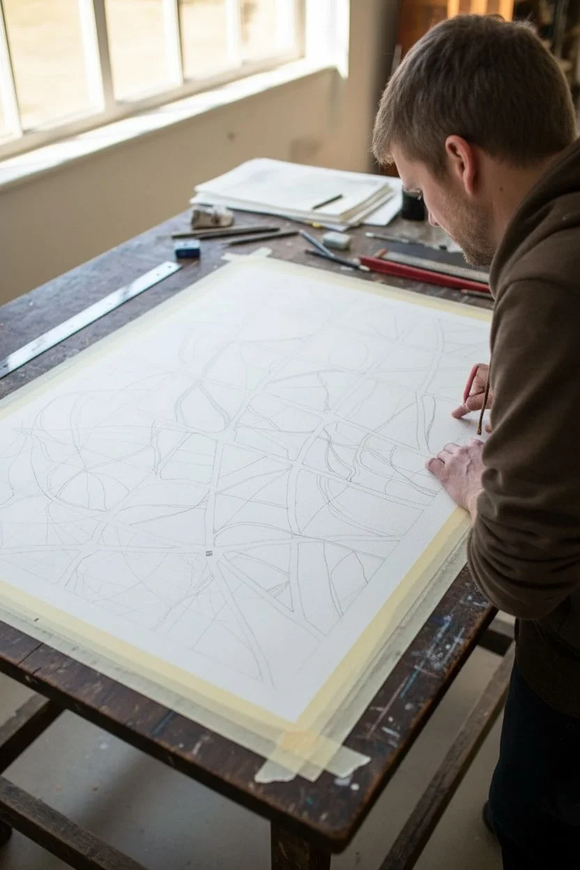
Random Pencil Map Shapes Filled With Washes
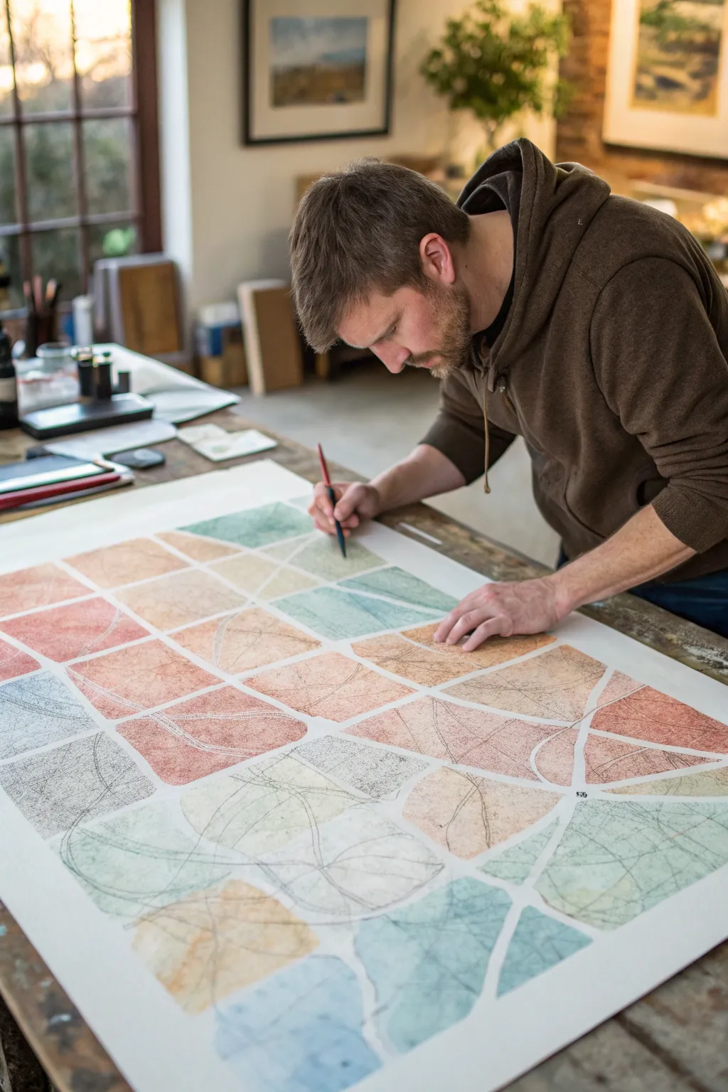
This project blends the structure of a grid with the freedom of organic forms, resulting in a mesmerizing, map-like mosaic. Soft, muted watercolor washes fill irregular segments, connected by flowing pencil lines that create a sense of movement across a large scale.
Step-by-Step Guide
Materials
- Large sheet of hot press watercolor paper (A2 or similar size)
- Watercolor paints (muted earth tones: terracotta, sage green, pale blue, ochre)
- Flat wash brush (1 inch)
- Round watercolor brush (size 6 or 8)
- Graphite pencil (HB or 2B)
- Ruler or straight edge
- Masking tape
- Water containers
- Paper towels
Step 1: Preparation & Grid Layout
-
Secure Your Paper:
Begin by taping down your large sheet of watercolor paper to a sturdy table or drawing board. This prevents the paper from buckling when you apply the washes later. Ensure the tape is pressed down firmly along all edges. -
Draft the Grid:
Using a ruler and a light pencil touch, draw a large grid across the entire paper. These don’t need to be perfect squares; slightly rectangular shapes add interest. Aim for a grid of roughly 4×5 or 5×6 spaces depending on your paper size, leaving a clear white border around the edge. -
Draw Organic Subdivisions:
Inside each grid square, draw curving, organic lines that cut across the straight edges. Think of river paths or leaf veins. Let these lines flow from one square into the next to create continuity, but allow them to break the rigid grid structure into smaller, irregular shard-like shapes. -
Refine the Shapes:
Go back over your grid. You want to identify distinct ‘islands’ or cells to paint. Erase lines where necessary to merge some shapes or add new lines to split larger areas, ensuring you have a pleasing variety of sizes.
Step 2: Applying Color Washes
-
Mix Your Palette:
Prepare your watercolor washes. You want a palette of muted, natural tones—think faded terracotta, sage green, slate blue, and sandy beige. Mix plenty of water with the pigment to keep the colors translucent and airy. -
Start the First Sections:
Select a specific shape within your grid and apply a wash of one color. Use your round brush for precision near the edges and the flat brush to fill larger centers. Keep the wash wet enough to avoid harsh streaks. -
Create Texture:
While the wash is still wet, you can drop in a tiny bit of water or a slightly darker saturation of the same color to create subtle blooms and texture. This gives the flat shapes depth. -
Work Non-Linearly:
Don’t paint adjacent shapes immediately. Jump around the board to let wet sections dry. This prevents colors from bleeding into each other across the pencil boundaries. -
Vary the Tones:
As you move across the paper, alternate your colors so no two touching shapes are the same hue. I like to cluster similar tones loosely—grouping a few warm reddish tones in one area and cool blues in another—to suggest a shifting landscape. -
Leave White Space:
Crucially, leave a thin channel of white paper—negative space—between every single painted shape. This ‘grout line’ defines the mosaic look and keeps the composition breathing. -
Fill the Grid:
Continue painting until all your mapped shapes are filled. Step back occasionally to check the color balance and ensure the distribution feels harmonious.
Bleeding Edges?
If paint seeps across your white gaps, your brush is likely too wet. Blot the brush on a paper towel before painting edges to gain more control.
Step 3: Linear Details & Finishing
-
Ensure Full Dryness:
Wait for the entire painting to be completely bone dry. If the paper is cool to the touch, it is likely still damp. Patience is key here to avoid tearing the paper in the next step. -
Pencil Overlays:
Take a sharpened HB or 2B pencil. Draw fresh, sweeping organic lines right over the dried paint. These lines should mimic the initial organic curves but add a new layer of complexity, like a topographic map drawn over the terrain. -
Connect the Forms:
Use these pencil lines to visually connect disparate shapes. A single curved line can start in a blue section, cross the white gap, and terminate in a red section, tying the composition together. -
Add Textural Marks:
In some of the larger shapes, add delicate hatching, scribbles, or smaller contoured lines with the pencil. This adds a graphic, sketched quality that contrasts beautifully with the soft watercolor. -
Review and Remove Tape:
Assess your work. Darken any pencil lines that feel too faint. Once satisfied, carefully peel away the masking tape at a 45-degree angle to reveal your clean, crisp border.
Variation Trick
For a more vintage look, lightly erase patches of the dried watercolor with a kneaded eraser to creates a worn, weathered texture on the paper.
Now you have a stunning, large-scale abstract piece that feels both structured and wildly free.


Triangle Mosaic Pattern
This project combines the structured beauty of geometry with the fluid, organic nature of watercolors. By using a resist technique, you’ll create crisp white lines that define a mesmerizing mosaic of ocean blues and soft greens.
Detailed Instructions
Materials
- High-quality watercolor paper (cold press creates nice texture)
- Painter’s tape or artist’s masking tape (1/4 inch width works best)
- Watercolor paints (phthalo blue, turquoise, sap green, indigo)
- Flat shader brush (size 6 or 8) for filling shapes
- Round brush (size 4) for detail work
- Pencil and ruler
- Palette for mixing
- Two jars of water
- Paper towels
Step 1: Drafting the Design
-
Prepare your paper:
Start by taping down your watercolor paper to a board or table on all four sides. This not only creates a clean border but keeps the paper flat when it gets wet later. -
Mark the grid:
Using a ruler and a light pencil touch, mark out a square or rectangular boundary for your mosaic in the center of the paper, leaving plenty of white space around the edges. -
Tape the vertical lines:
Apply strips of your thin masking tape vertically across your boundary box. Space them evenly if you want a perfect pattern, or irregularly for a more dynamic look. Press the edges down firmly. -
Tape the diagonal lines:
Now apply tape strips diagonally across the vertical ones to create triangles. You can vary the angles to create different sized triangles, but try to keep a consistent flow. -
Seal the edges:
Run a bone folder or the back of your fingernail firmly along every edge of the tape. This is crucial to prevent paint from bleeding under the tape and ruining your crisp white lines.
Bleeding Lines?
If paint leaked under the tape, wait for it to dry fully. Then, carefuly use a white gel pen or opaque white gouache to paint over the mistake and restore the crisp line.
Step 2: Mixing and Painting
-
Create your palette:
Mix puddles of your chosen colors on your palette. Aim for a spectrum: a deep indigo, a bright teal, a muted sea green, and a watery sky blue. I like to keep them quite watery for transparency. -
Start with the lightest tones:
Dip your flat brush into your palest blue. Randomly select three or four triangles across the grid and fill them in. Paint right over the tape edges to ensure full coverage. -
Introduce greens:
Clean your brush and switch to the sap green mixture. Paint a few scattered triangles, perhaps placing one next to a blue triangle to see how the colors play off each other. -
Add depth:
Move to your darker indigo and turquoise shades. Fill in the remaining empty triangles. Don’t be afraid to let a little water pool in some corners to create that characteristic watercolor texture as it dries. -
Create variation:
If a triangle looks too flat, you can drop a tiny bit of darker pigment into the wet paint while it’s still damp. This creates a lovely gradient effect within a single shape. -
Fill every shape:
Continue until every single white space between the tape is filled with color. Step back to ensure you have a balanced distribution of light and dark tones.
Salt Texture Pro-Tip
While the paint is still wet in the triangles, sprinkle a tiny pinch of table salt into a few of them. The salt absorbs pigment as it dries, creating beautiful starburst textures.
Step 3: The Reveal
-
Dry completely:
This is the hardest part: waiting. The paint must be 100% bone dry before you touch the tape. If the paper feels cool to the touch, it’s still damp. -
Remove tape slowly:
Once dry, pick a corner of heavy tape intersection. Peel the tape back slowly at a 45-degree angle, keeping it close to the paper surface. Don’t pull straight up, or you might rip the paper. -
Clean up borders:
Remove the border tape last. If you have any small paint bleeds, you can gently scrub them away with a clean, damp stiff brush or cover them with white gouache if necessary. -
Flatten the artwork:
Since we used a lot of water, the paper might buckle slightly after the tape is removed. Place the finished painting under a heavy book overnight to flatten it out perfectly.
Once flattened and framed, this geometric piece brings a modern, calming splash of color to any room
Negative-Space White Shapes With Surrounding Wash
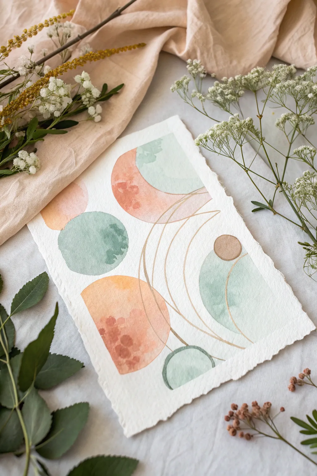
This ethereal abstract composition balances soft, organic watercolor washes with crisp, metallic structured lines. By combining warm terracotta tones with cool sage greens and delicate gold accents, you will create a piece that feels both modern and gently grounded.
How-To Guide
Materials
- Cold-pressed watercolor paper (300 gsm)
- Watercolor paints: Burnt Sienna, Alizarin Crimson, Sap Green, Phthalo Blue
- Metallic gold watercolor paint or a fine-tip gold gel pen
- Round watercolor brushes (Size 4 and 8)
- Fine liner brush (Size 0 or 1)
- Pencil and eraser
- Compass or circle stencils
- Ruler
- Paper towels
- Water jar
- Clean board to tape paper down (optional but recommended)
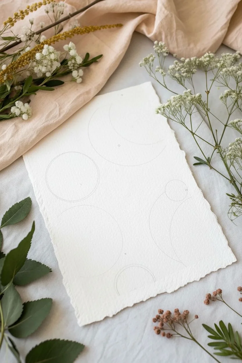
Step 1: Preparation & Sketching
-
Prepare the paper:
Begin by tearing your watercolor paper to size if you want those lovely, rustic deckled edges shown in the photo. Crease the paper firmly against a ruler and tear slowly. If you prefer clean edges, simply cut to size. -
Map out the composition:
Using a pencil very lightly, sketch the main geometric shapes. Start with the large circle in the center-left and the semi-circles at the top and bottom. Don’t worry about the connecting lines yet; just place the solid shapes. -
Establish the curve anchors:
Mark faint dots where your curved gold lines will eventually start and end. This helps visualize the flow without committing to heavy pencil lines that might show through the paint.
Wet-in-Wet Texture
To get the blooms seen in the photo, sprinkle a tiny pinch of salt or drop clean water into the paint shapes while they are still very wet and shiny.
Step 2: Mixing & Washing
-
Mix the terracotta hue:
Create a warm, earthy peach color by mixing plenty of water with Burnt Sienna and a tiny touch of Alizarin Crimson. You want a watery, semi-transparent consistency. -
Paint the warm shapes:
Fill in the bottom semi-circle and the top-left moon shape with your terracotta mix. I like to drop a slightly more concentrated dot of paint into the wet wash while it’s still damp to create that lovely texture and bloom effect. -
Mix the sage green:
Combine Sap Green with a little Phthalo Blue and neutralized it with a tiny bit of red or brown to get a soft, muted mint or sage color. Test it on a scrap piece of paper first to ensure it harmonizes with the peach tone. -
Paint the cool shapes:
Paint the large central circle and the bottom-right semi-circle section. Keep the edges relatively crisp but allow the interior wash to settle naturally. -
Create the overlap:
For the shape at the top right, paint the mint green section adjacent to the peach shape. Let the colors almost touch but leave a hair-thin line of white paper between them for separation. -
Add the gold accent dot:
Paint the small, solitary circle on the right side. You can use a diluted brown for a base, or go straight to a metallic bronze or gold paint for unexpected shimmer. -
Allow complete drying:
This is crucial: Let the painting dry completely. If the paper is cool to the touch, it’s still wet. The gold lines in the next phase will bleed if the surface is damp.
Level Up: Mixed Media
Instead of painted lines, sew through the paper with gold embroidery floss. Poke pre-made holes with a needle first to avoid tearing the paper.
Step 3: Gilded Details
-
Prepare the gold medium:
Activate your metallic watercolor pan with a few drops of water until it reaches a creamy, ink-like consistency. Alternatively, prime your gold gel pen. -
Draw the first large arc:
Starting from the bottom center, draw a sweeping curved line that extends up toward the top right corner. Use your whole arm movement, not just your wrist, to keep the curve smooth. -
Add parallel echoes:
Draw two or three more curved lines parallel to the first one. Let them overlap the painted shapes; the transparency of the watercolor underneath makes this layering look beautiful. -
Connect the elements:
Add a few smaller curved lines intersecting the sage green shape on the right, mimicking the arc of the main curves. These lines act as a visual thread connecting the separate color blocks. -
Refine the edges:
If any of your painted circles have ragged edges, you can carefully outline parts of them with the fine gold line to crisp them up, though leaving them rough adds to the organic look. -
Final assessment:
Step back and look at the balance. If a large area feels too empty, you might add a very small, floating gold circle or a short line segment to balance the visual weight.
Once the gold lines catch the light, your modern abstract piece is ready to be framed or displayed
Monochrome Value-Only Abstraction
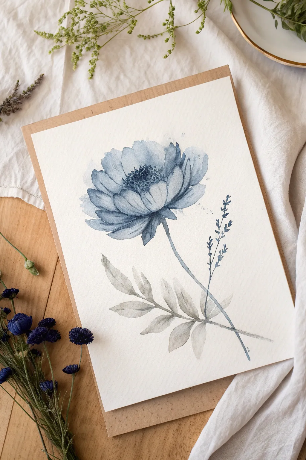
Embrace the elegance of a monochromatic palette with this moody, indigo-hued watercolor study. By restricting your colors to a single family of blues and greys, you focus entirely on value and shape to create a dreamy, atmospheric bloom.
Detailed Instructions
Materials
- Cold press watercolor paper (300 gsm)
- Indigo watercolor paint
- Payne’s Grey watercolor paint
- Round watercolor brush (size 6 or 8)
- Fine liner brush (size 0 or 1)
- Pencil for sketching
- Kneaded eraser
- Palette for mixing
- Two jars of water
- Paper towels
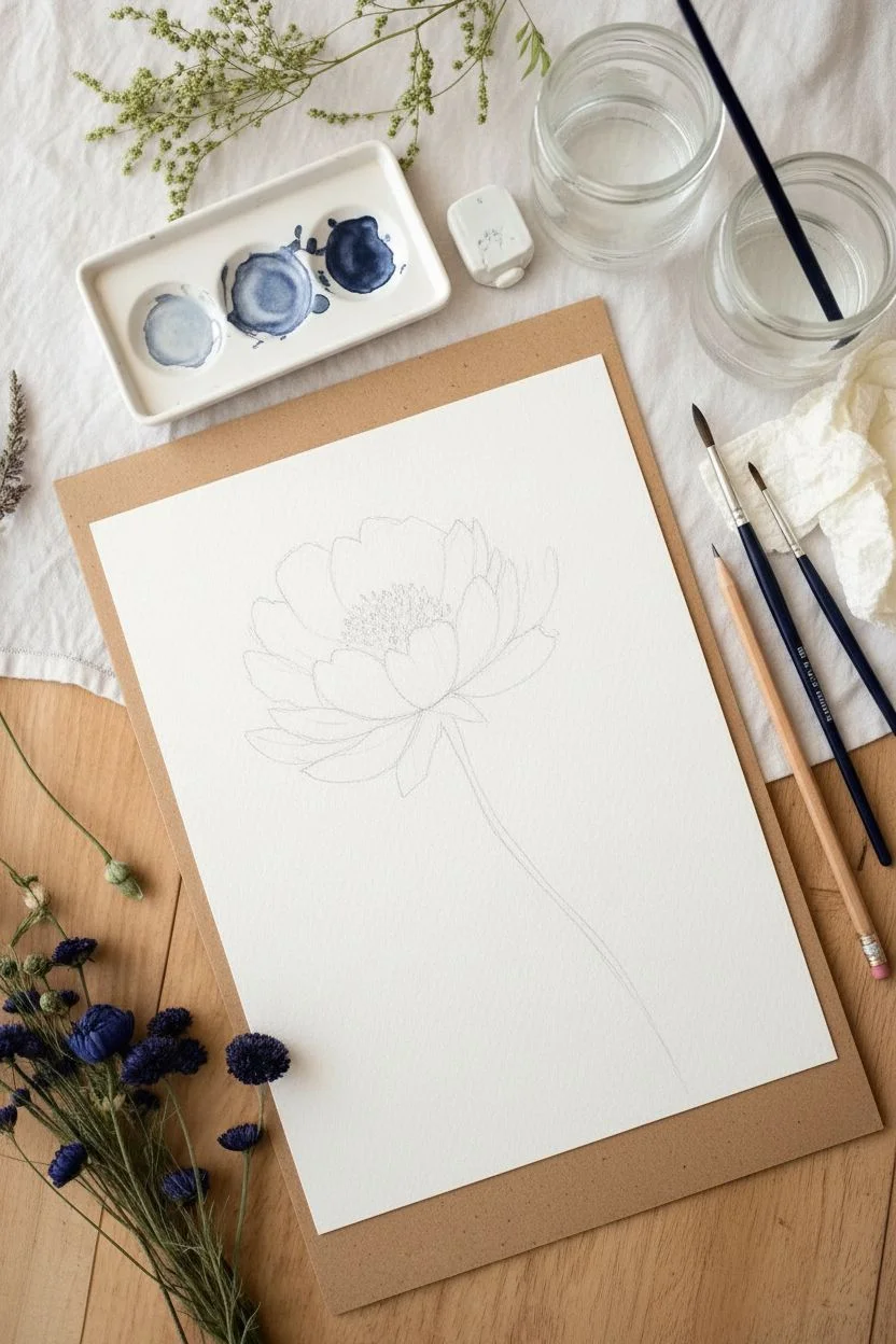
Step 1: Preparation and Sketching
-
Prepare your paper:
Since this particular piece is presented floating on a backing board, trim your watercolor paper to a size slightly smaller than your desired frame, roughly 5×7 inches is a good start. -
Mix your washes:
Prepare three puddles of Indigo paint on your palette: a very watery, tea-like consistency for the lighest petals, a milky consistency for mid-tones, and a thick, creamy mixture for the deep shadows. -
Light sketch:
Using a hard pencil, very lightly outline the general cup shape of the flower head and the direction of the stem. Don’t press hard, as graphite can muddy the translucent blue paint.
Step 2: Painting the Flower Use
-
First wash:
Dip your round brush into the lightest indigo wash. Paint the outer, larger petals first, keeping the edges wet and loose. Leave white space between petals to define them. -
Building form:
While the first layer is still slightly damp but not soaking, drop in some of the mid-tone mixture near the base of the petals where they meet the center. This creates a natural gradient. -
Defining the center:
Move inward to the smaller, central petals. Use a slightly more pigmented wash here to make the center recede. Keep your brush marks curved to mimic the cup shape of the bloom. -
Adding contrast:
Once the outer petals are semi-dry, use the tip of your brush and the darkest indigo mix to define the edges of the inner petals, separating them from the lighter outer ring. -
Creating the stamens:
Wait for the flower center to be almost completely dry. Switch to your fine liner brush with the thickest, darkest indigo paint and stipple tiny dots in the very middle to suggest the pollen and stamens.
Water Control is Key
To get those soft edges on the petals, ensure your paper is damp but not swimming in water. If a puddle forms, dab it gently with the corner of a paper towel to lift the excess.
Step 3: Stems and Leaves
-
Mixing the grey:
Clean your brush and mix a watery wash of Payne’s Grey. If you want color harmony, add just a tiny touch of the Indigo to this grey mix. -
Painting the main stem:
With the round brush, paint a single, confident line from the base of the flower head curving downward. If the line breaks slightly, it adds to the organic look. -
Adding the lower leaves:
Near the bottom of the stem, paint the grey leaves. Press the belly of the brush down to create the wide part of the leaf and lift up as you drag outward to create a point. -
Layering the leaves:
Notice how the leaves in the reference overlap. Paint the lighter (background) leaves first with a very watery grey. Let them dry, then paint darker grey leaves over the top for depth. -
Adding the sprig:
To the right of the main stem, add a delicate, vertical sprig using the fine liner brush and the dark indigo mix. Keep these marks tiny and rhythmic.
Add Metallic Accents
For a magical touch, re-paint the stamen dots in the center of the flower using a metallic gold or silver watercolor paint once the blue is fully dry.
Step 4: Finishing Touches
-
Final details:
Look at the main flower. If it feels too flat, add very thin, dark lines at the base of the petals to reinforce the shadows. -
Splatter texture:
I like to add a tiny bit of texture here. Load a brush with watery paint and tap it against another brush handle to create very subtle splatters around the petals. -
Mounting:
Once completely dry, mount your painted paper onto a piece of kraft or cardboard backing to achieve the framed look shown in the image.
Step back and admire the serene, atmospheric quality of your finished monochromatic piece
Limited-Palette Mood Fields
Capture the serenity of a twilight waterfront with this limited-palette watercolor study. By focusing on soft, wet-into-wet washes of rose and teal, you’ll create a dreamlike atmosphere that feels both expansive and grounded by a simple tree line.
Step-by-Step Guide
Materials
- Cold press watercolor paper (140lb/300gsm)
- Watercolor paints: Indigo, Prussian Blue, Alizarin Crimson, Sap Green
- Large flat wash brush (3/4 inch)
- Round brush (size 6)
- Rigger or liner brush (size 1)
- Masking tape
- Clean water jar
- Paper towels
- White mat board frame (textured/distressed style for finishing)
Step 1: Setting the Atmosphere
-
Prepare the paper:
Begin by taping your watercolor paper securely to a board. Use a large flat brush to wet the entire surface with clean water until it glistens. This establishes the foundation for the soft, diffused look we want. -
The initial sky wash:
Mix a very dilute wash of Prussian Blue. While the paper is still wet, gently sweep this color across the top third of the paper, allowing it to naturally bloom and soften. -
Adding warmth:
While the blue is still wet, introduce a watery mix of Alizarin Crimson (or a soft rose) into the middle section of the sky. Let the pink touch the blue slightly so they blend into a soft violet transition without becoming muddy. -
Reflecting the sky:
Continue the diluted pink wash down into the bottom third of the paper, representing the water’s reflection. Add horizontal strokes of the pale blue near the bottom edge to suggest ripples. -
Wait for partial dryness:
Allow this initial layer to dry until it is no longer shiny but feels cold to the touch. It should be damp, but not soaking wet, before proceeding to the next step.
Step 2: Establishing the Horizon
-
Creating the distant fog:
Mix a slightly stronger version of your blue-grey by combining Indigo and a touch of the pink. Using a horizontal stroke across the middle of the paper, create a soft horizon line that blends upwards into the sky. -
Softening the edge:
Immediately rinse your brush and run clean water along the top edge of that horizon line to blur it, making the distance look foggy and indistinct. -
Adding water texture:
With the round brush, paint loose, horizontal streaks of the blue-grey mix into the pink water area. Keep these strokes fluid to mimic the movement of gentle waves.
Muddy Colors?
If your pinks and blues are turning brown where they meet, let the first color dry completely before adding the second, or keep the paper much wetter so they push against each other rather than mixing.
Step 3: The Forest Edge
-
Mixing deep greens:
Prepare a dark, rich green by mixing Sap Green with Indigo. You want a value that is significantly darker than your sky washes to create contrast. -
Painting the tree line:
On the left side of the paper, paint a cluster of vertical shapes along the horizon line. Use the tip of your round brush to dab in irregular, jagged tops suggestive of pine trees. -
Varying heights:
Ensure the trees vary in height, with the tallest ones on the far left and the group tapering off as it moves toward the center of the painting. -
Reflecting the trees:
While the tree paint is wet, pull the color downwards slightly into the ‘water’ area using a damp brush. This creates a vertical reflection that anchors the landmass. -
Connecting the shore:
Extend a thin, broken line of this dark green-blue mix horizontally from the base of the trees to the right, implying a distant shoreline fading into the mist.
Deckle It Yourself
To get that rough, handmade edge on regular paper, paint a line of water where you want the cut, wait a minute, and carefully tear the paper along the wet line.
Step 4: Foreground Details
-
Strengthening the foreground:
Mix a watery grey using Indigo and Alizarin Crimson. Add a few more pronounced ripple lines in the immediate foreground (bottom left corner) to bring the viewer closer to the water. -
Dry brush texture:
Once the paper is completely dry, use a rigger brush with a tiny amount of dark pigment. Drag it lightly over the textured paper surface in the foreground to create sparkle and broken water lines. -
Final assessment:
Step back and check your values. If the watermark reflections look too harsh, you can gently lift some pigment with a damp paper towel to soften them. -
Framing:
To mimic the reference look, tear the edges of your paper against a ruler for a deckled look before mounting it in a textured white frame.
Place your finished piece in a bright spot where the soft colors can breath and bring a moment of calm to your day
Drip-Driven Night Reflections
Capture the moody serenity of a fog-laden woodland with this monochromatic watercolor study. Using a single deep indigo hue, you’ll learn to control value and creates depth through atmospheric perspective on beautiful deckle-edged paper.
How-To Guide
Materials
- Cold Press Watercolor Paper (approx. 5×7 inches, ideally handmade with deckle edge)
- Indigo Watercolor Paint (or a mix of Payne’s Grey and Phthalo Blue)
- Masking Tape (or Washi Tape)
- Flat Wash Brush (3/4 inch)
- Round Brush (Size 6)
- Rigger or Liner Brush (Size 0 or 1)
- Two Jars of Water
- Paper Towels
- Mixing Palette
Step 1: Setting the Atmosphere
-
Paper Preparation:
Tape your paper to a sturdy board. If you are using handmade paper with deckle edges as shown, tape only the corners or very edges to preserve that beautiful texture, or use a gummed block if available. Ensure the paper is flat. -
Prepare Your Palette:
Squeeze out a generous amount of Indigo paint. Create three puddles of varying dilution: a tea-consistency (very light), a milk-consistency (medium), and a cream-consistency (dark and saturated). -
Wet the Sky:
Using your flat wash brush and clean water, dampen the top third of the paper. You want an even sheen, not a swimming pool of water. -
The Sky Gradient:
Load the flat brush with your darkest Indigo mix. Apply a strip of color across the very top edge. Clean your brush slightly, pick up the medium mix, and blend it downwards into the wet paper. -
Fading the Mist:
While the paint is still wet, use a damp, clean brush to pull that color down into the middle of the paper. The goal is a smooth gradient that fades completely to the paper’s white by the time you reach the center. Let this sky layer dry completely.
Uneven Gradients?
If your sky gradient has streaks or ‘cauliflowers,’ your paper likely dried unevenly. Next time, ensure the paper is evenly damp (not soaked) before applying the first wash of color.
Step 2: Creating Distance
-
The First Tree Line:
Mix a very watery, light-grey wash of Indigo. Using your Size 6 round brush, paint a soft, indistinct horizon line just below the center of the paper. -
Adding Distant Shapes:
While this strip is wet, dab in tiny vertical shapes to suggest distant evergreens. Because the wash is light, these will look far away, shrouded in fog. Let this layer dry. -
The Middle Ground:
Re-wet the area slightly below your first tree line with clear water. Now, drop in a slightly darker (milk-consistency) mix of Indigo. Let it bleed slightly upwards into the previous ‘fog’ layer for a soft edge. -
Suggesting More Trees:
Using the tip of your round brush on this damp surface, drop in pigment to form the shapes of pine tree tops. Allow the bottoms of these shapes to diffuse into the wet paper below, eliminating hard edges.
Step 3: Foreground Details
-
Establishing the Foreground:
Once the middle ground is dry, wet the bottom third of the paper with clean water. I like to drop in pure, saturated Indigo here, letting the pigment bloom naturally to create that dark, heavy base. -
Darkest Values:
Strengthen the bottom edge with your darkest cream-consistency paint. This anchors the painting and provides contrast against the pale mist above. -
Painting Pine Silhouettes:
Switch to a liner brush or the very tip of your round brush. Using the dark paint, paint distinct evergreen shapes rising from the dark foreground. Make them taller than the previous layers. -
Varied Heights:
Ensure your trees aren’t all the same height. Some should barely peek out of the dark mass, while one or two should reach high into the ‘mist’ area for visual interest. -
Adding Deciduous Trees:
Now for the delicate work. Using your rigger or liner brush with a slightly diluted dark mix, paint thin, meandering lines to represent bare deciduous trees. -
Branch Work:
Extend these thin lines upward, adding tiny ‘Y’ shapes for branches. Keep the touch incredibly light; these should look fragile compared to the heavy pines. -
Merging the Base:
If the bottom of your trees has dried with hard lines, use a slightly damp brush to soften where the trunks meet the dark foreground mass, creating a misty forest floor effect. -
Final Assessment:
Step back and look at your values. If the foreground dries too light (watercolor always dries lighter!), add one final glaze of dark Indigo to the very bottom edge.
Add a Little warmth
For a subtle twist, mix a tiny touch of Burnt Sienna into your Indigo for the foreground trees. This warms up the darkest shadows without breaking the monochromatic feel.
Peel off your tape carefully to reveal the crisp edges against the rough paper texture and enjoy your atmospheric landscape
Salt-Crystal Texture Galaxies
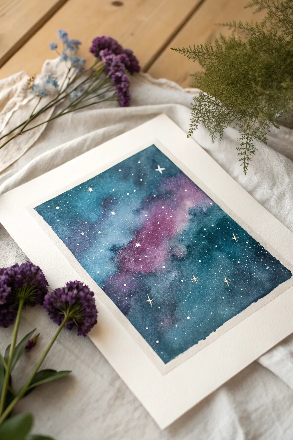
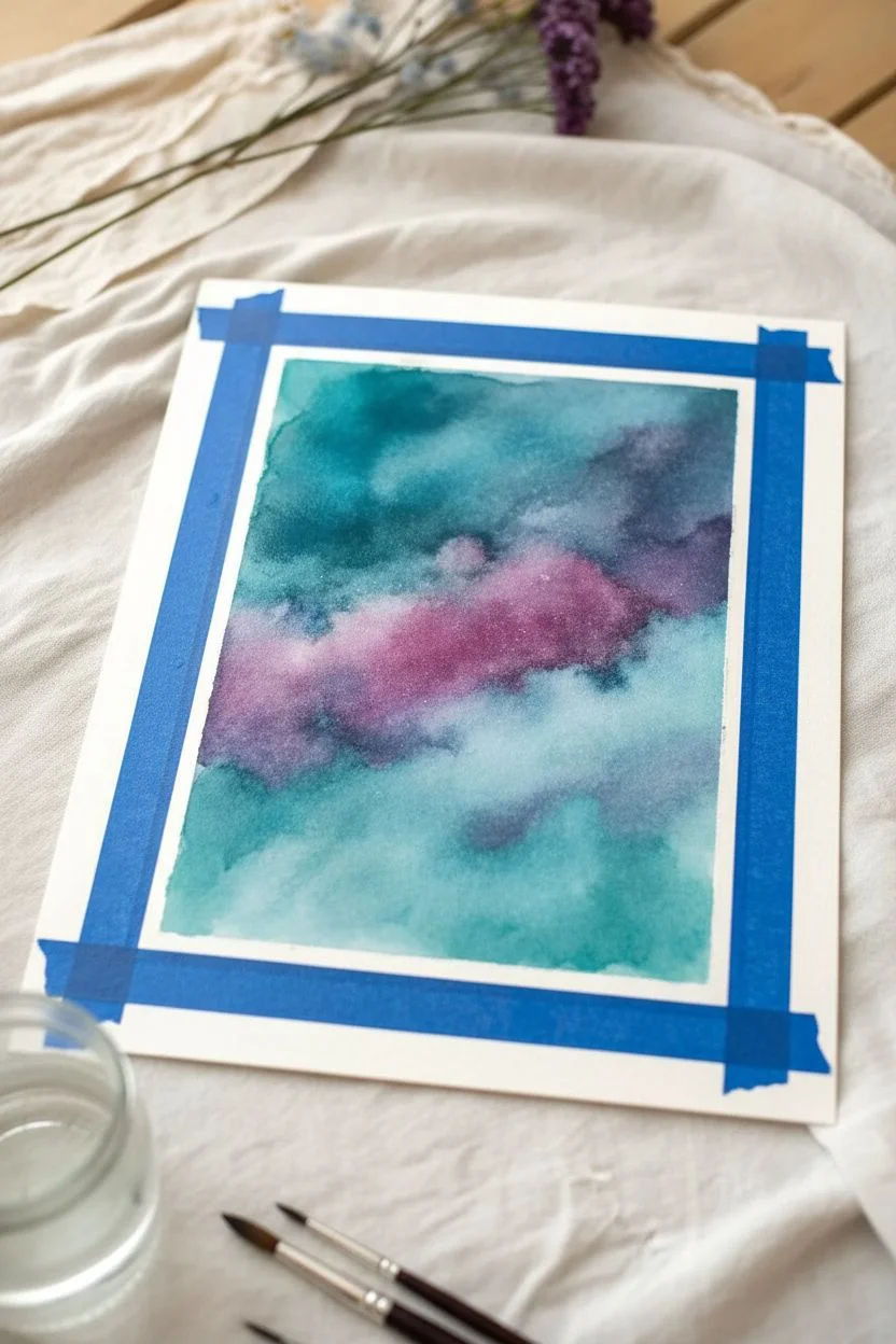
Capture the ethereal beauty of infinite space right on your paper with this vibrant galaxy painting. You will learn to blend deep blues, teals, and purples wet-on-wet to create cloudy nebulas, finishing with a dusting of sparkling starlight.
Step-by-Step Guide
Materials
- Cold press watercolor paper (300gsm)
- Painter’s tape or wash tape
- Watercolor paints (Indigo, Prussian Blue, Teal/Turquoise, Violet/Purple, Magenta)
- White opacity gouache or white ink
- Large flat brush or hake brush
- Medium round brush (size 6 or 8)
- Small liner or detail brush (size 0 or 1)
- Table salt
- Two jars of water
- Paper towels
- Old toothbrush (optional)
Step 1: Preparation and Base Layer
-
Secure the borders:
Begin by taping down all four edges of your watercolor paper to a board or your work surface. Press the tape down firmly to ensure crisp, clean edges once you peel it away later. -
Pre-wet the paper:
Using your large flat brush and clean water, apply an even coat of water across the entire area inside the tape. The paper should be glistering with a sheen but not holding distinct puddles. -
Drop in the lightest colors:
Load your medium round brush with a watery mix of Teal or Turquoise. Gently touch the brush to the wet paper in random patches, particularly near the edges, letting the pigment bloom and spread softly. -
Add warmth:
While the paper is still wet, drop in patches of diluted Magenta or Violet in the central band to create the glowing core of your nebula. Allow these pinks to touch and bleed slightly into the teal areas.
Salty Timing
For the best ‘starburst’ effect, add salt when the paper has a satin sheen—not soaking wet, but not dry. Too wet and it dissolves; too dry and it creates no texture.
Step 2: Deepening the Cosmos
-
Introduce deep blues:
Mix a saturated, creamy consistency of Prussian Blue. Dab this color into the negative spaces around your teal and purple clouds, careful not to cover them entirely. -
Build the darkest shadows:
Go directly into your Indigo paint to get a very dark value. Apply this to the outer corners and edges of the painting to create a vignetting effect that draws the eye inward. -
Blend the transitions:
Clean and slightly dampen your brush. Use it to gently soften any harsh lines where the dark indigo meets the lighter nebula colors, encouraging a seamless, smoky transition. -
Apply the salt texture:
While the paint is still visibly glossy and wet—this timing is crucial—sprinkle a pinch of table salt over the darker blue areas. The salt will push the pigment away, creating fractal, star-like textures. -
Let it dry completely:
Allow the painting to dry thoroughly. This step cannot be rushed; I usually wait until the paper is barely cool to the touch. Once dry, brush off all the salt grains.
Step 3: Starlight and Details
-
Prepare the stars:
Mix white gouache or white ink with a tiny drop of water until it reaches the consistency of heavy cream. It needs to be opaque enough to sit on top of the dark paint. -
Create background stars:
Dip an old toothbrush or a stiff bristled brush into the white mixture. Run your thumb across the bristles to flick a fine mist of white speckles across the entire galaxy. -
Paint prominent stars:
Switch to your smallest detail brush. Dip it into the opaque white and gently dot individual, larger stars in areas that feel empty or need balance. -
Add shining flares:
Select 3 or 4 of your largest white dots. Using the very tip of your detail brush, carefully pull four thin lines outward from the center—up, down, left, and right—to create cross-shaped star flares. -
Enhance the nebula:
If your nebula needs more depth, you can add tiny, faint dots of white in the lighter pink/purple sections to suggest cloud density. -
The reveal:
Once the white gouache is totally dry, slowly peel away the painter’s tape at a 45-degree angle, away from the painting, revealing your crisp white borders.
Metallic Magic
Mix a bit of iridescent medium into your white gouache for stars that actually shimmer in the light, or use gold ink for the larger star flares.
Now you have a piece of the universe captured on paper, ready to be framed or gifted
Blown-Paint River Networks
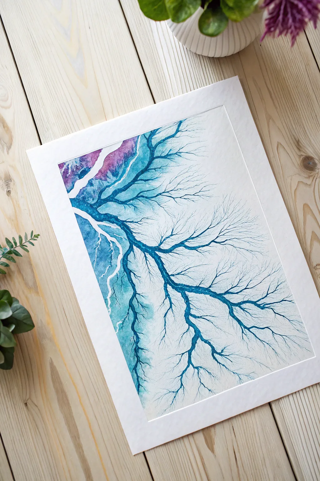
Create a mesmerizing, organic network of branching lines that mimics the natural flow of river deltas or intricate root systems. Using a simple blowing technique and fluid watercolors, this project captures the unpredictable beauty of nature in striking hues of turquoise, navy, and amethyst.
How-To Guide
Materials
- High-quality cold press watercolor paper (300 gsm)
- Liquid watercolors or high-flow fluid acrylics (Turquoise, Navy Blue, Violet)
- Plastic pipette or eye dropper
- Drinking straw (plastic or rigid silicone)
- Round watercolor brush (size 6 or 8)
- Masking tape
- Palette or small cups for mixing
- Clean water
- Paper towels
Step 1: Preparation and Base Wash
-
Secure the Paper:
Begin by taping down all four edges of your watercolor paper to a sturdy board or your work surface. This prevents buckling and creates that crisp white border seen in the final piece. -
Mix Your Palette:
Prepare your liquid watercolors in small wells. You’ll need a rich navy blue, a vibrant turquoise, and a deep violet. If using tube paints, dilute them with water until they have the consistency of milk—they need to be fluid enough to run easily. -
Pre-wet the ‘Ocean’ Area:
On the left side of the paper (about a 2-inch strip), use your round brush to apply clean water. Don’t soak the whole page, just the area where the main body of ‘water’ or the thickest trunk will originate. -
Drop in the Initial Color:
While the paper is still damp on the left, use your brush or pipette to drop in alternating patches of turquoise and violet. Let them bleed into each other slightly to create a dreamy, variegated background effect. -
Intensify the Edge:
Add a concentrated line of navy blue along the jagged edge where your wet wash meets the dry paper. This dark boundary will serve as the reservoir for your branches.
Air Control
For fine, spidery tips, pinch result the end of the straw slightly flat. This increases air velocity and creates thinner, sharper lines compared to a round straw opening.
Step 2: Creating the River Network
-
Puddle Placement:
Using your pipette, place a generous puddle of the navy blue liquid watercolor right at the edge of the wet section, aiming for the ‘trunk’ areas where you want the main branches to start. -
The First Blow:
Position your straw about an inch away from the puddle, aiming toward the dry, white side of the paper. Blow a sharp, strong burst of air to send a stream of paint shooting across the paper. -
Extend the Main Lines:
Chase the bead of paint with your straw. As the paint travels, blow gently and steadily to guide it further across the page, creating the thick primary branches. -
Create Divergence:
To make the line split, aim your airflow at the side of a paint stream rather than directly behind it. This will force the liquid to fork into two directions. -
Refining the Twigs:
As the paint runs low and the lines get thinner, blow harder using short, quick puffs. This forces the remaining pigment into delicate, spindly capillaries, mimicking tiny tributaries. -
Repeat the Process:
Return to the main dark edge, add another fresh drop of fluid paint if necessary, and repeat the blowing process. Vary the angle of your straw slightly to make branches curve and overlap naturally. -
Connect the Gaps:
If some branches feel disconnected, use a very fine detail brush to gently bridge gaps near the ‘trunk’ area, ensuring the flow looks continuous from the wash on the left. -
Add Depth:
While the thickest branches are still slightly wet, I like to drop in a tiny speck of violet or a darker blue at the divergence points. It adds a subtle shadow and visual weight to the painting.
Step 3: Finishing Touches
-
Soften the Wash:
Look back at the colorful wash on the left side. If hard edges have formed where you don’t want them, use a clean, damp brush to gently soften and blend the colors while avoiding the sharp blown lines. -
Patience is Key:
Allow the artwork to dry completely. The thicker puddles of ink at the start of the branches will take much longer to dry than the fine tips. -
The Reveal:
Once the paper is bone dry and cool to the touch, carefully peel away the masking tape at a 45-degree angle to reveal your clean edges.
Metallic Magic
Mix a small amount of iridescent gold or silver ink into your final branches. As it dries, the metallic pigment will separate slightly, creating glistening mineral veins.
Frame this piece behind glass to highlight the intricate details of your created currents

Have a question or want to share your own experience? I'd love to hear from you in the comments below!