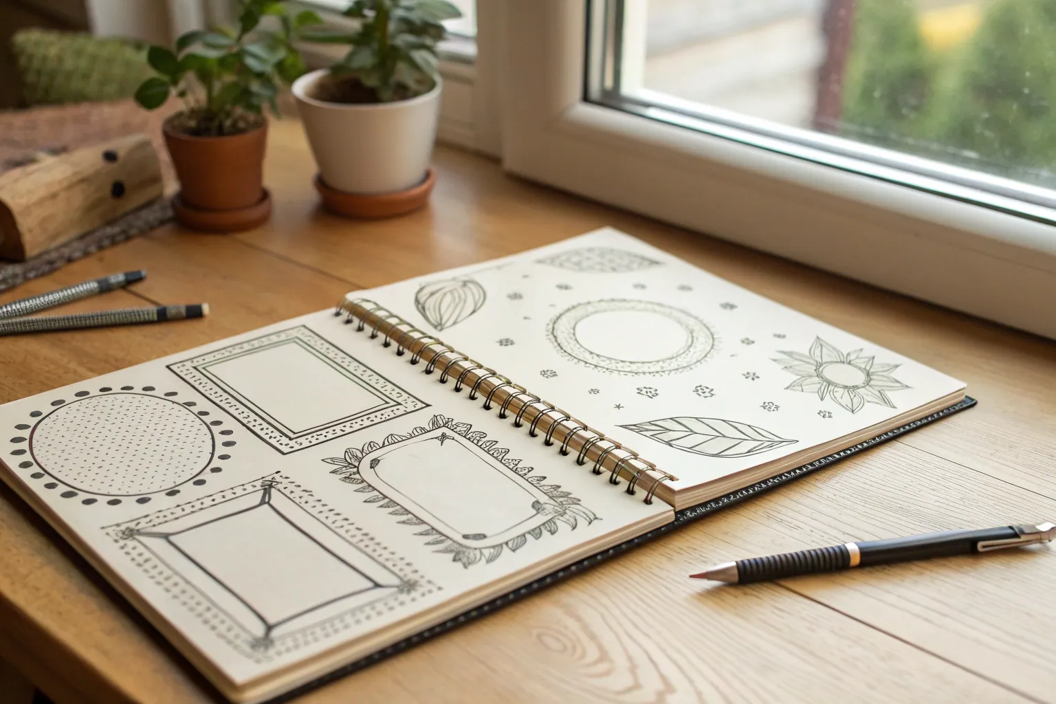
If you’ve ever stared at a blank page and wished it came with a little built-in structure, drawing a frame is the easiest way to get moving. These frame drawing ideas are my favorite go-tos for borders, journal boxes, and those “what do I draw?” moments when you just need a fun starting line.
Simple Doodle Square With Sketchy Overlap Lines
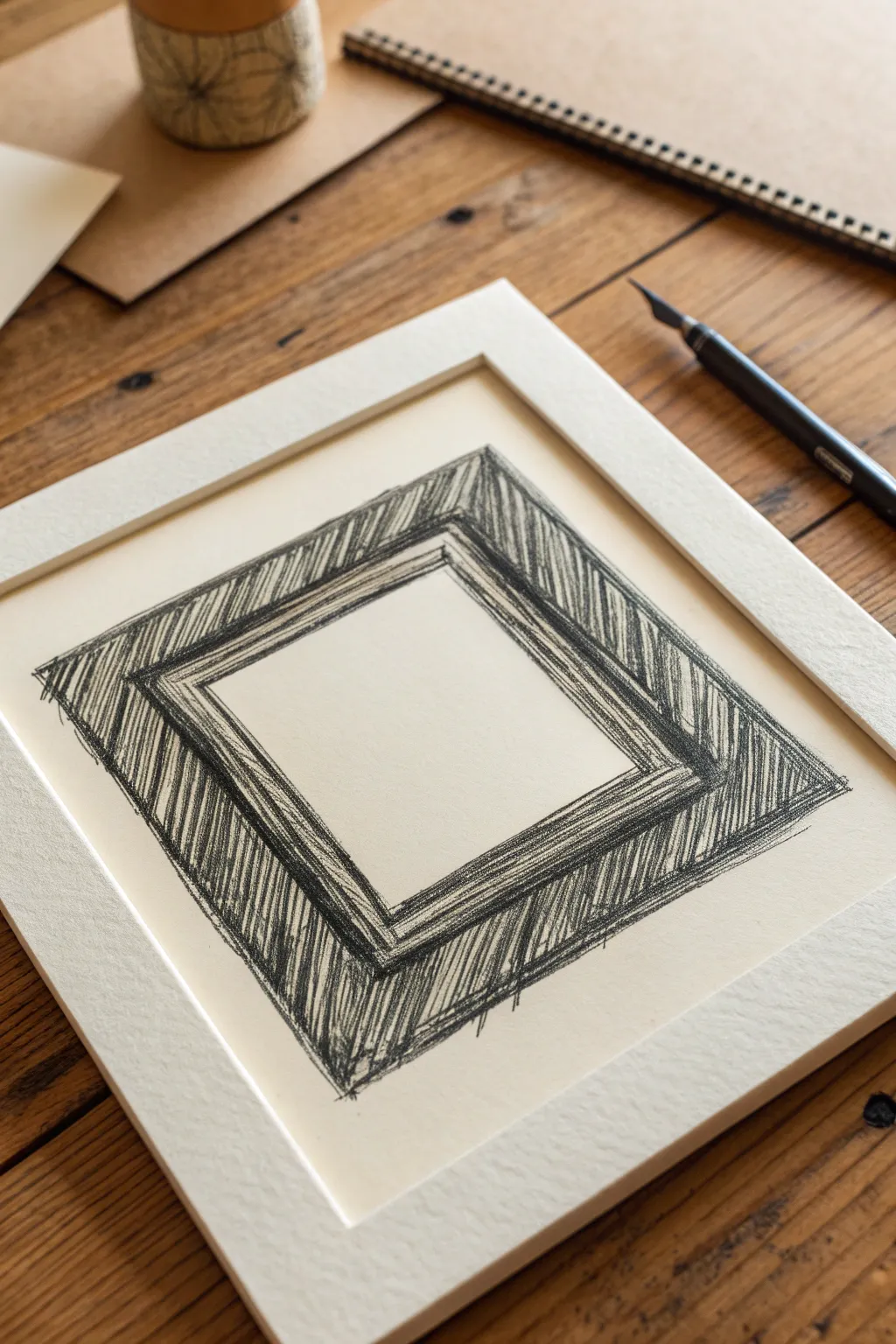
This project embraces the beauty of imperfection with a bold, energetic frame design. Using loose diagonal strokes and rough edges, you’ll create a visually striking border that feels organic and hand-drawn.
How-To Guide
Materials
- Textured heavy-weight paper (cream or off-white)
- Soft charcoal stick or 6B graphite pencil
- Ruler (optional, for guidelines only)
- Kneadable eraser
- Pre-cut mat board (white, slightly textured) for presentation
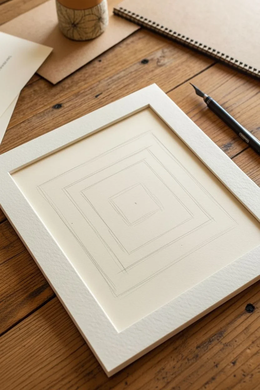
Step 1: Planning the Structure
-
Mark the center point:
Begin by finding the approximate center of your paper. You don’t need to be mathematically precise, but having a visual anchor helps keep the frame balanced. -
Define the inner window:
Lightly sketch a square in the middle of your page. This will be the empty space inside your frame. Press very lightly so these lines can be drawn over or erased later if needed. -
Set the outer boundary:
Sketch a larger square around the first one to determine the thickness of your frame. I usually aim for a band that is about 1.5 to 2 inches thick, but adjust this based on your paper size. -
Review the proportions:
Step back and look at your two squares. They act as the skeleton for the shading. Ensure the gap between the inner and outer square is roughly consistent on all four sides.
Keep it Loose
Hold your pencil or charcoal stick further back near the end, rather than close to the tip. This forces you to draw with your arm, creating straighter, more energetic lines.
Step 2: Building the Lines
-
Start the inner bold line:
Take your charcoal or soft pencil and draw over your inner square’s top line. Press firmly to create a dark, confident mark. Don’t worry if the line is slightly wobbly; that adds character. -
Overlap the corners:
As you draw the sides of the inner square, let your lines extend slightly past the corners where they meet. This ‘overshoot’ technique creates that architectural sketch look. -
Repeat for the outer border:
Now, draw the lines for the outer square. Again, focus on firm pressure and allow the lines to cross over each other at the four corners. The exterior boundary should feel rugged. -
Double up the lines:
Go back over your main structural lines a second time, but slightly offset your stroke. This creates a double-line effect that adds visual weight without needing perfect straightness.
Try Colored Paper
Instead of cream paper, try drawing this on a piece of kraft paper or grey toned paper. Use white charcoal for highlights alongside the black shading for a striking 3D effect.
Step 3: Adding Texture and Shading
-
Establish the stroke direction:
For the shading, decide on a single diagonal direction. In the example, the strokes run from top-right to bottom-left. Keeping the angle consistent is key to the cohesive look. -
Fill the top section:
Start with the top horizontal bar of the frame. Draw rapid, tight diagonal lines filling the space between the inner and outer border borders. -
Continue around the frame:
Move to the right vertical side, maintaining that same diagonal stroke angle. It might feel unnatural at first to hash across the shape rather than along it, but trust the process. -
Manage density:
As you fill the bottom and left sections, vary the pressure slightly. Some areas can be dense and dark, while others show a bit of the paper grain through the charcoal. -
Refine the corners:
Pay special attention to the corners where the frame sides meet. I like to darken these areas slightly more to emphasize the geometry of the square. -
Add distinct edge marks:
Near the outer edge of the frame, allow some of your hatching strokes to break free of the boundary line. These little ‘flyaway’ marks give the piece energy.
Step 4: Final Touches
-
Clean up the center:
Using your kneadable eraser, gently lift any stray smudge marks from inside the central white window. The clean negative space makes the rough frame pop. -
Fix the charcoal:
If you used charcoal, apply a light coat of fixative spray in a well-ventilated area to prevent the heavy black dust from smearing. -
Mount the artwork:
Place your finished drawing behind a clean white bevel-cut mat. The sharp, precise lines of the mat board provide a perfect contrast to your loose, sketchy drawing.
Now you have a dynamic, architectural frame drawing ready for display

Circle Frame With a Hand-Drawn Wobble
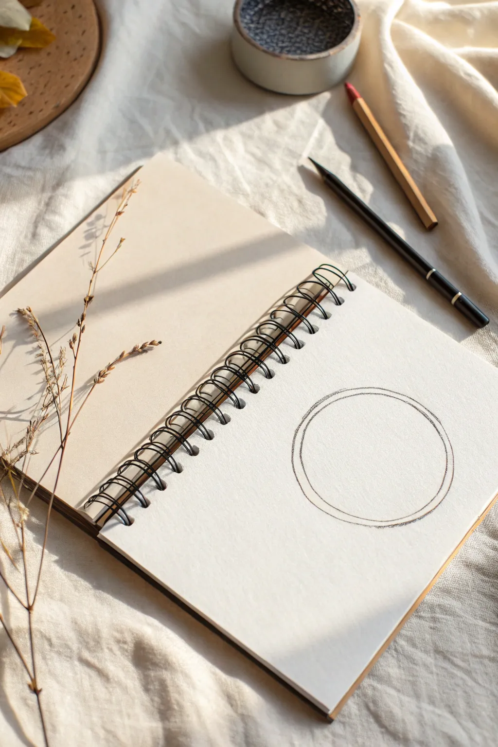
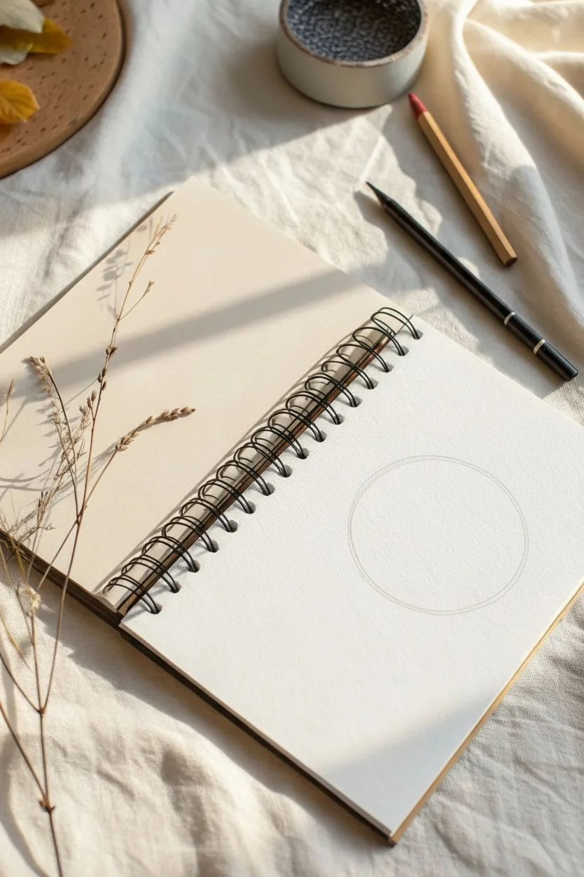
Embrace the beauty of imperfection with this minimalist circle frame that favors character over geometric precision. The charm lies in the wobbly, hand-drawn lines that create a soft, approachable border for your text or sketches.
Step-by-Step Tutorial
Materials
- Spiral-bound sketchbook with cream or off-white paper
- HB or 2B graphite pencil (for initial shape)
- 4B or 6B graphite pencil (for emphasis)
- Kneaded eraser
- Clean tissue or blending stump (optional)
- Compass or a circular object to trace (optional, for guidelines)
Step 1: Setting the Foundation
-
Prepare your workspace:
Finding a spot with good natural light will help you see the subtle texture of the paper. Open your sketchbook to a fresh, clean page, ensuring the spiral binding is on your left if you’re right-handed to avoid smudging. -
Visualize placement:
Decide where your frame will sit. In the reference, it’s positioned on the bottom right of the page, leaving plenty of negative space around it for an airy feel. -
Establish a light guide:
Using your lighter HB pencil, very faintly sketch a circle. You can do this freehand for a looser look, or lightly trace a round object (like a mason jar lid) if you want a reliable size guide. Keep this line barely visible; it’s just a roadmap.
Wrist Mechanics
Draw from your shoulder, not your wrist, even for small circles. Locking your wrist and moving your whole arm creates smoother, more consistent curves.
Step 2: Drawing the Inner Circle
-
Begin the first pass:
Switch to your softer pencil (2B or 4B). Start at the top of your guide and begin drawing the inner circle line. Don’t try to be a machine; let your hand relax. -
Create the wobble:
As you move your hand, allow slight deviations from a perfect arc. The goal is a line that looks human—slightly shaky but confident. Avoid picking up your pencil too often to maintain flow. -
Complete the loop:
Bring the line all the way around to meet your starting point. If the ends don’t meet perfectly, simply overlap them slightly rather than forcing a hard connection.
Step 3: Adding Dimension
-
Start the outer ring:
Position your pencil about 2-3 millimeters outside your first line. You’re going to echo the first shape you drew. -
Vary the gap slightly:
As you draw this second concentric circle, I like to let the gap between the lines expand and contract just a tiny bit. This enhances that organic, ‘sketched’ aesthetic. -
Keep the pressure consistent:
Maintain a medium pressure on the pencil. You want a dark grey line, not a jet black one, to keep the drawing feeling light and delicate. -
Close the second loop:
Finish the outer circle, again allowing for a gentle overlap where the start and end points meet.
Botanical Accent
Draw a tiny sprig of leaves or a single dried flower stem—like the props in the photo—overlapping one side of the circle to integrate the frame with nature.
Step 4: Refining the Frame
-
Assess the weight:
Step back and look at the two circles. If one side feels too faint, go over just that section lightly to balance the visual weight. -
Add subtle texture:
Take your 4B or 6B pencil and add extremely light, short strokes over the existing lines in random spots. This creates a slightly ‘fuzzy’ or charcoal-like texture without making the line thick. -
Clean up stray marks:
Use your kneaded eraser to lift away any parts of your initial guideline that are still visible outside or inside the frame. Press and lift rather than rubbing to preserve the paper’s tooth. -
Optional softening:
If the lines look too stark, lightly tap them with a clean tissue or your finger to soften the graphite just a hair, blending it faintly into the paper grain. -
Final check:
Ensure there are no accidental smudges from your hand resting on the page. The beauty of this frame is the clean, stark contrast against the cream paper.
Now you have a wonderfully imperfect frame ready to showcase your favorite quote or doodle


Leafy Vine Frame Border That Grows Around the Edge
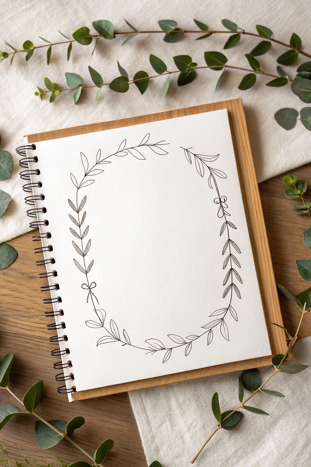
Capture the elegance of nature with this delicate hand-drawn wreath, featuring four distinct styles of leafy vines that connect to form a serene oval frame. This design balances simplicity with intricate details, creating a perfect border for journaling, calligraphy, or framing a favorite photo.
How-To Guide
Materials
- Spiral-bound sketchbook or high-quality drawing paper
- HB Pencil
- Soft eraser (kneaded eraser recommended)
- Fine liner pen (01 or 03 size, black ink)
- Ruler (optional, for spacing)
- Circle template or loose paper for tracing (optional)
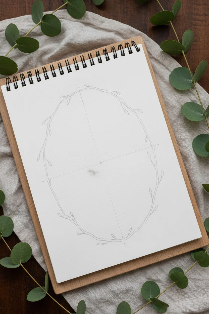
Step 1: Planning the Structure
-
Establish the shape:
Begin by lightly sketching a large oval in the center of your page using your HB pencil. This doesn’t need to be geometrically perfect; a slightly organic shape adds charm. This guideline will serve as the backbone for your vines. -
Mark the segments:
Divide your oval into four roughly equal quadrants. You don’t need harsh lines for this; just make small tick marks at the top, bottom, left, and right to visualize where each distinct vine style will transition. -
Sketch the stems:
Trace over your oval guideline to define the main stems. Notice specifically near the bottom left and right—the stems should curve slightly inward and overlap or approach each other, creating a natural breakage point around the 6 o’clock position.
Ink Confidence
Don’t rush the ink trying to trace perfectly. Pull the pen towards you in short, confident strokes rather than pushing it away.
Step 2: Drawing the Vines: Left Side
-
Create the bottom-left vine:
Starting from the bottom center mark, draw a vine moving upwards along the left curve. For this section, use simple, smooth lance-shaped leaves that point upwards. Keep the leaves spaced out generously. -
Draw the bow detail:
About a third of the way up the left side, sketch a small, simple bow tied around the stem. This acts as a visual separator between the bottom and middle sections. Draw two loops and two trailing ribbons hanging down. -
Draft the textured middle vine:
Above the bow, switch your leaf style. Draw pairs of leaves that are densely filled with tiny stippling or dot texture. These leaves should be thinner and more fern-like than the previous ones. -
Complete the top-left section:
As you approach the top of the oval, transition to a third leaf style. These leaves are larger, open, and have a distinct central vein line. They should curve gracefully over the top left arch.
Add Some Color
Use watercolor pencils to lightly shade just the tips of the leaves with sage green or soft brown for a subtle vintage look.
Step 3: Drawing the Vines: Right Side
-
Start the bottom-right vine:
Mirroring the left side, start at the bottom center and move up the right curve. Use the same simple lance-shaped leaves here to create symmetry at the base of your wreath. -
Add the berry accent:
Instead of a bow on this side, draw a small cluster of three round berries or beads about a third of the way up. This asymmetry keeps the design interesting. -
Draft the cross-hatched vine:
Above the berry cluster, draw leaves that feature a cross-hatching pattern. Sketch the leaf outline first, then fill the interior with diagonal lines for shading and texture. -
Finish the top-right arch:
Connect the remaining gap at the top right with simple, airy leaves. I like to leave a small opening at the very top center rather than having the tips touch perfectly, making the wreath feel more breathable.
Step 4: Inking and Refining
-
Ink the stems first:
Take your fine liner pen and carefully trace the main stem lines. Keep your hand steady but relaxed; a slightly wobbly line can actually look more organic and natural for botanicals. -
Outline the leaves:
Go around and outline each leaf shape. Pay attention to where the leaf stems join the main branch—thickening these connection points slightly adds realism. -
Add the details:
Now, fill in the specific textures you planned. Add the stippling dots to the middle-left leaves and the diagonal hatching lines to the middle-right leaves. -
Refine the accents:
Carefully ink the small bow on the left and the berry cluster on the right. Ensure the loops of the bow look fluid and the berries look round. -
Erase and clean up:
Wait at least five minutes to ensure the ink is completely dry. Then, gently erase all your pencil guidelines. Brush away the eraser crumbs to reveal your crisp, clean botanical frame.
Now you have a beautiful, hand-drawn border waiting to be filled with your favorite quote or illustration


Floral Garland Frame With Simple Petal Shapes
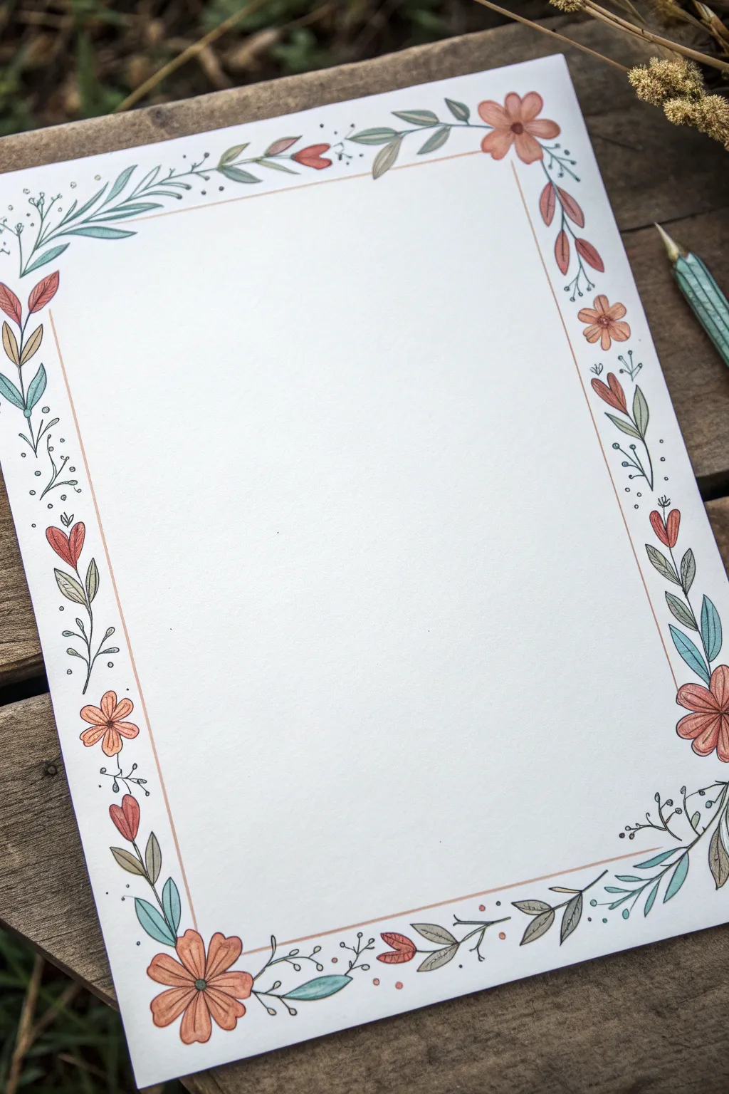
This charming project frames your page with a delicate dance of wildflowers and greenery, perfect for stationery or journal spreads. The style combines crisp ink outlines with soft, muted color fills for a natural, vintage-inspired look.
Detailed Instructions
Materials
- White cardstock or heavy drawing paper (A4 or A5 size)
- Fine-liner pen (0.3mm or 0.5mm, black or sepia)
- Pencil and eraser
- Ruler
- Colored pencils or watercolor markers (muted orange, sage green, teal blue, soft red)
Step 1: Planning the Structure
-
Establish the boundaries:
Begin by lightly sketching a rectangle on your paper using a pencil and ruler. Leave about a 1-inch margin from the edge of the paper to ensure your design has room to breathe. -
Ink the guiding line:
Take your fine-liner pen and ruler to ink over the pencil rectangle. Use a very light touch or a thin line weight here, as this line serves as the ‘vine’ that connects your floral elements. -
Sketch placement points:
Lightly mark pencil dots along the ink line where you want your main flowers to sit. I usually place one near each corner and space two or three more along the longer sides for balance.
Uneven Spacing?
Don’t panic if gaps look uneven. Simply add extra ‘floating’ berries or tiny detached leaves in the wider spaces to balance the visual weight without redesigning.
Step 2: Drawing the Flora
-
Draw the corner anchors:
Start at the bottom left corner with a prominent flower. Draw a simple six-petal daisy shape, keeping the petals rounded and open. -
Add secondary blooms:
Move along the frame line to your other marked spots. Draw smaller five-petal flowers or tulip-shaped buds. Vary their direction so some face inward and others outward. -
Connect with stems:
From the main frame line, draw short, curved stems extending out to meet the base of each flower you just drew. -
Intersperse leafy branches:
In the gaps between flowers, draw curving branches. Add simple oval-shaped leaves in pairs or alternating patterns along these small branches. -
Create heart-shaped leaves:
For variety, sketch a few stems that end in a heart shaped leaf or bud. This adds a sweet, folk-art touch to the composition. -
Fill the negative space:
Look for empty spots along the line. Add tiny sprigs with small circles at the ends to represent berries or buds, and draw simple single leaves directly attached to the main frame line. -
Refine the details:
Go back to your main flowers and add center details, like a simple circle or a few radiating lines for texture. -
Clean up sketch lines:
Once the ink is completely dry, gently erase all underlying pencil marks to reveal a clean black-and-white outline.
Add Gold Accents
Use a metallic gold gel pen to add tiny dots in the center of the flowers or to trace the main rectangular border line for an elegant, illuminated manuscript feel.
Step 3: Adding Color
-
Color the main blooms:
Using a muted orange or terracotta colored pencil, gently shade the petals of the daisy-like flowers. Keep the pressure light to maintain a soft feel. -
Shade the buds:
Select a soft red or deep pink for the tulip-shaped buds and the heart-shaped elements. Apply slightly more pressure at the base of the bud and fade out toward the tip. -
Greenery variation 1:
Choose a sage or olive green for approximately half of the leaves. Color them in smoothly, focusing on the larger, oval-shaped leaves. -
Greenery variation 2:
Switch to a teal or blue-green shade for the remaining leaves, particularly the thinner, more elongated ones. This color contrast creates visual depth. -
Add distinct dots:
If you drew berry sprigs, color the tiny circles with the orange or red pencil to make them pop against the white background. -
Highlight the stems:
I like to trace over the ‘leaf’ stems just once with the green pencil to integrate them with the leaves, leaving the main rectangular frame line stark black.
Your page is now beautifully framed and ready for a handwritten letter or a special poem
BRUSH GUIDE
The Right Brush for Every Stroke
From clean lines to bold texture — master brush choice, stroke control, and essential techniques.
Explore the Full Guide
Banner Label Frame for Titles and Captions
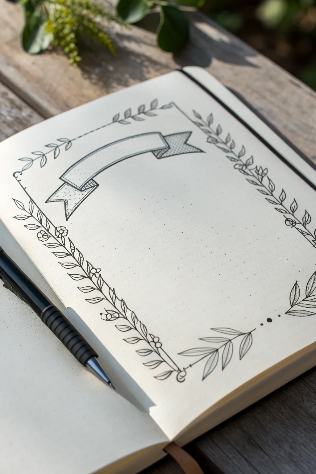
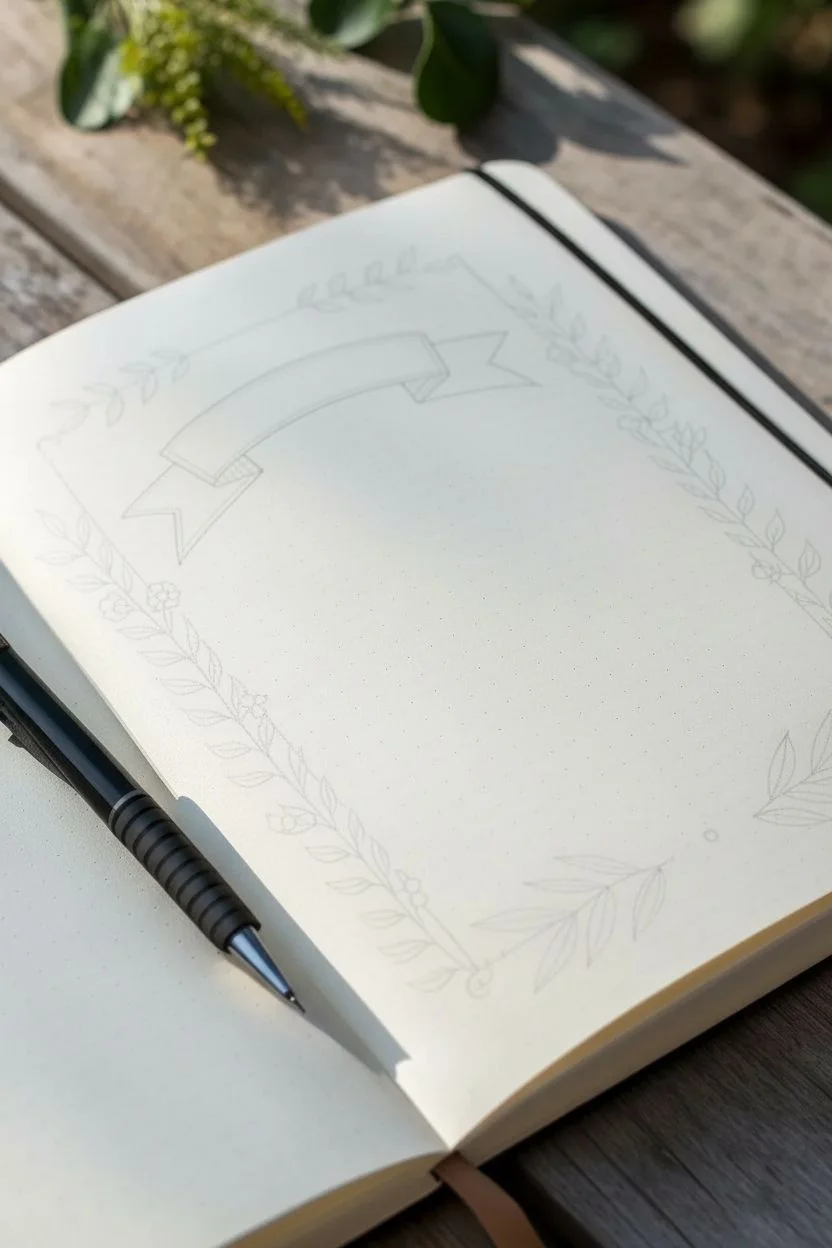
This elegant frame combines delicate leafy vines with a classic ribbon banner, perfect for highlighting titles in your bullet journal or sketchbook. The design creates a structured yet organic border that feels both vintage and fresh.
Step-by-Step Guide
Materials
- Dotted notebook or journal
- Pencil (HB or 2H)
- Eraser
- Fine liner pen (0.3mm or 0.5mm)
- Ruler (optional)
Step 1: Sketching the Layout
-
Define the perimeter:
Start by lightly sketching a large rectangle in pencil to define the outer boundary of your frame. Keep it about an inch away from the page edges to give the design breathing room. -
Place the banner:
In the upper-left quadrant, sketch a curving rectangular strip for the main part of the banner. Instead of a straight line, give the top and bottom edges a gentle arch. -
Add banner folds:
Draw the folded ends of the ribbon. Sketch short diagonal lines extending downward from the ends of the main strip, then connector lines back toward the center to create the illusion of the ribbon folding behind itself. -
Create the ribbon tails:
Finish the banner by adding ‘V’ shaped cuts at the very ends of the ribbon tails, making them look like fabric flags.
Wobbly Lines?
If your long stem lines look shaky, thicken them slightly in the wobbly areas to disguise the mistake as a variation in stem width.
Step 2: Drawing the Botanical Frame
-
Draft the vine stems:
Lightly pencil the main stems along your rectangular border guide. Don’t make them perfectly straight—let them have a slight, natural wave. -
Connect the corners:
Drawing the corners can be tricky, so instead of sharp 90-degree angles, let the stems cross over slightly or end with a small flourish or berry cluster. -
Begin inking the banner:
Switch to your fine liner. Outline the main body of the banner first with confident, smooth strokes. -
Detail the ribbon folds:
Ink the folded sections behind the main banner. To add depth, use hatching (closely spaced parallel lines) or cross-hatching on these recessed areas to simulate shadow. -
Texture the banner ends:
For the ribbon tails, add simple pointillism (tiny dots) to give the paper a bit of texture, contrasting with the smooth main area.
Step 3: Inking the Foliage
-
Ink the main stems:
Trace over your pencil stems with the fine liner. Feel free to break the line occasionally for a more organic look. -
Add alternating leaves:
Start at the bottom left corner. Draw small, almond-shaped leaves growing outward from the stem. Vary their angles so they don’t look too uniform. -
Incorporate floral details:
Along the left vertical side, intersperse small, simple flowers—just a circle center with five petals—among the leaves. -
Create climbing vines:
On the right vertical side, draw leaves that climb upward. Give these leaves slight veins by drawing a single line down the center of larger ones. -
Balance the top and bottom:
For the top and bottom borders, keep the leaves slightly smaller and simpler to avoid cluttering the page. I find this helps keep the focus on the banner. -
Connect with decorative dots:
If there are gaps between vine sections, particularly near the bottom right, draw three small solid dots in a row to visually connect the elements without solid lines. -
Add final flourishes:
Look for empty spaces along the stem and add tiny berry circles or small curling tendrils for extra whimsy. -
Clean up:
Wait at least 5-10 minutes for the ink to dry completely to avoid smearing. Then, gently erase all your underlying pencil sketches.
Make it Pop
Use a light gray marker or a highlighter to add a ‘drop shadow’ along one side of the banner to make it lift off the page visually.
Now you have a beautiful, custom frame ready to showcase your next journal entry or quote
Geometric Frame With Triangle and Line Patterns
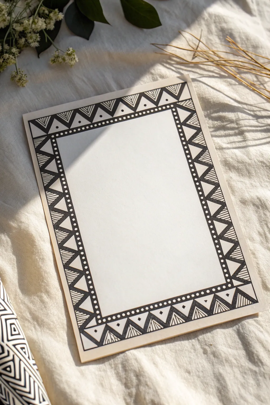
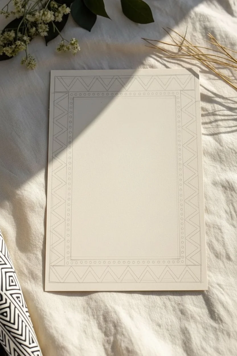
This striking black and white frame design uses simple geometric shapes to create a bold, tribal-inspired look. With just a ruler and a fine liner, you can transform a plain sheet of paper into a structured piece of art ready for calligraphy or journaling.
Detailed Instructions
Materials
- Heavyweight drawing paper or cardstock (cream or off-white recommended)
- Black fine liner pen (0.3mm or 0.5mm)
- Black brush pen or broad marker (for filling)
- Ruler
- Pencil (HB or 2B)
- Eraser
Step 1: Planning the Layout
-
Define the outer edge:
Start by using your pencil and ruler to draw a large rectangle on your paper. This will determine the overall size of your finished piece, so leave a comfortable margin of empty space around the edges. -
Create the inner boundary:
Draw a smaller rectangle inside the first one. Aim for a border width of about 1 to 1.5 inches all the way around. This space between the two rectangles is where your pattern will live. -
Draft the triangle grid:
Lightly sketch a zigzag line that bounces between the inner and outer rectangle lines. This creates the foundational row of large triangles that runs around the entire frame.
Keep it Sharp
Wipe the edge of your ruler with a tissue every few lines. Determining this habit prevents ink buildup on the ruler from smudging across your clean paper.
Step 2: Drawing the Details
-
Ink the main structure:
Switch to your black fine liner. Carefully trace over your pencil lines for the inner and outer rectangles, as well as the main zigzag line. Use your ruler to keep these lines crisp and straight. -
Add nested triangles:
Inside every large triangle pointing inward (the ones with their base on the outer edge), drawn a smaller, inner triangle. Leave a small gap between the lines to create a double-outlined effect. -
Create the striped fill:
For the triangles pointing outward (base on the inner edge), use your ruler to draw a series of parallel vertical lines. Space them tightly to create a textured, shaded look. -
Detail the corners:
Pay special attention to the corners where the pattern meets. You may need to adjust the size of the last few triangles slightly so they connect neatly without looking squashed.
Add Some Gold
Instead of black ink for the inner dots or the striped sections, use a metallic gold gel pen. This adds a sophisticated shimmer perfect for formal invitations.
Step 3: Adding Contrast and Texture
-
Thicken the lines:
Go back over the main zigzag line with a slightly thicker pen stroke or a second pass to make the primary division stand out. -
Fill the dark accents:
identify the small triangles created by your nested lines in step 5. Use a brush pen or broad marker to fill the innermost triangle completely black. This high contrast anchors the design. -
Draw the solid inner border:
Draw a new rectangle inside your frame, parallel to the inner edge you inked earlier. Leave about a quarter-inch gap between them. -
Create the dotted channel:
Draw one final rectangle line just inside the one you just made, creating a very narrow channel. Inside this thin channel, carefully draw a row of distinct, evenly spaced black dots. -
Add floating dots:
Return to the main triangle border. In the white space above the solid black triangles, place a single small dot to balance the negative space.
Step 4: Final Touches
-
Let the ink set:
Allow the drawing to sit for at least 15 minutes. This is crucial because erasing too soon will smear the fresh ink and ruin your sharp lines. -
Erase pencil marks:
Gently erase all the underlying pencil sketches. I find a kneaded eraser works best here to lift graphite without damaging the paper surface. -
Inspect and refine:
Look closely at your lines. If any lack opacity, go over them one last time to ensure the black is deep and consistent.
Now you have a beautifully framed space waiting for a quote, a photo, or a special handwritten note

PENCIL GUIDE
Understanding Pencil Grades from H to B
From first sketch to finished drawing — learn pencil grades, line control, and shading techniques.
Explore the Full Guide
Stepped Border Frame With Layered Lines
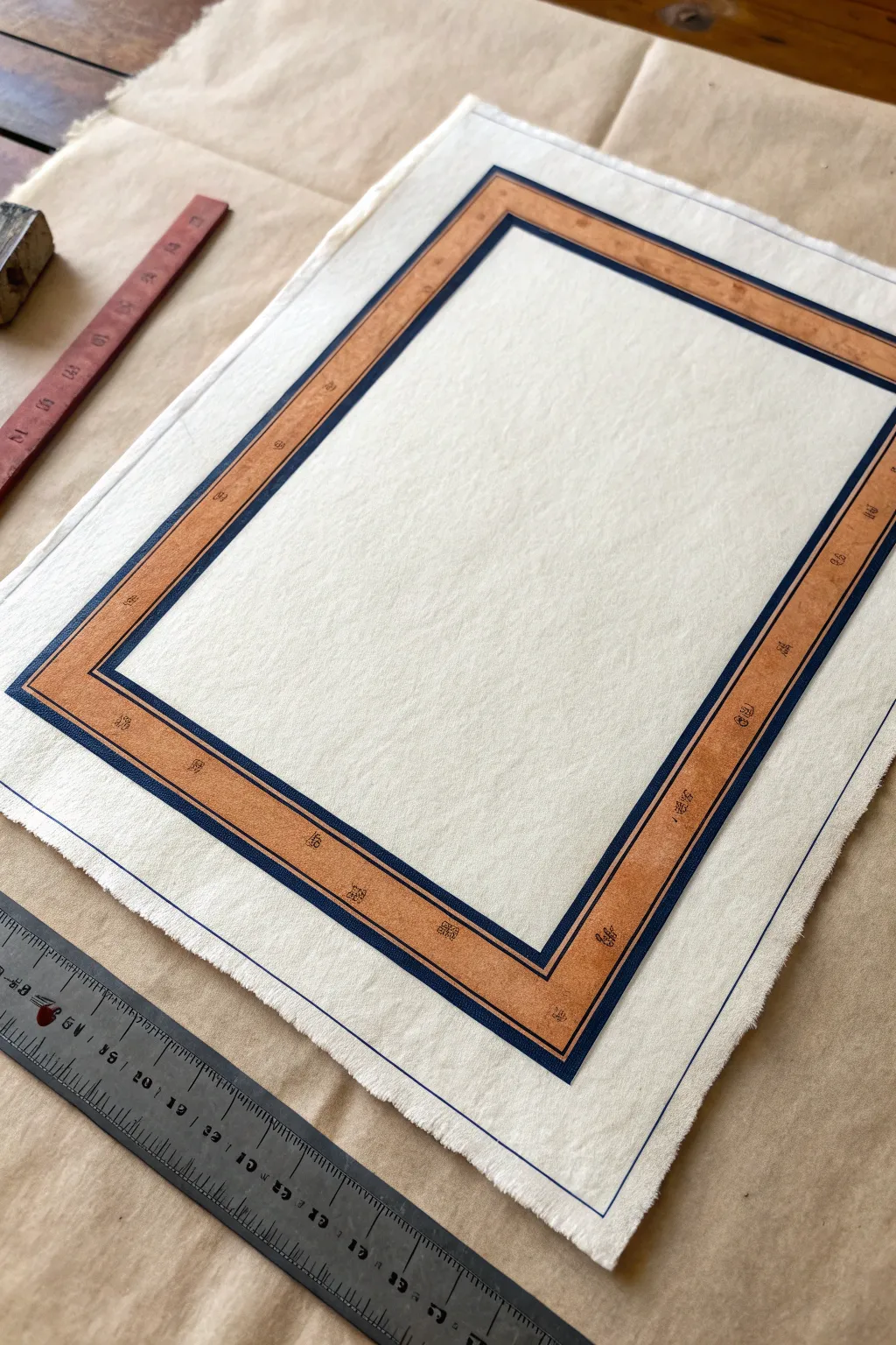
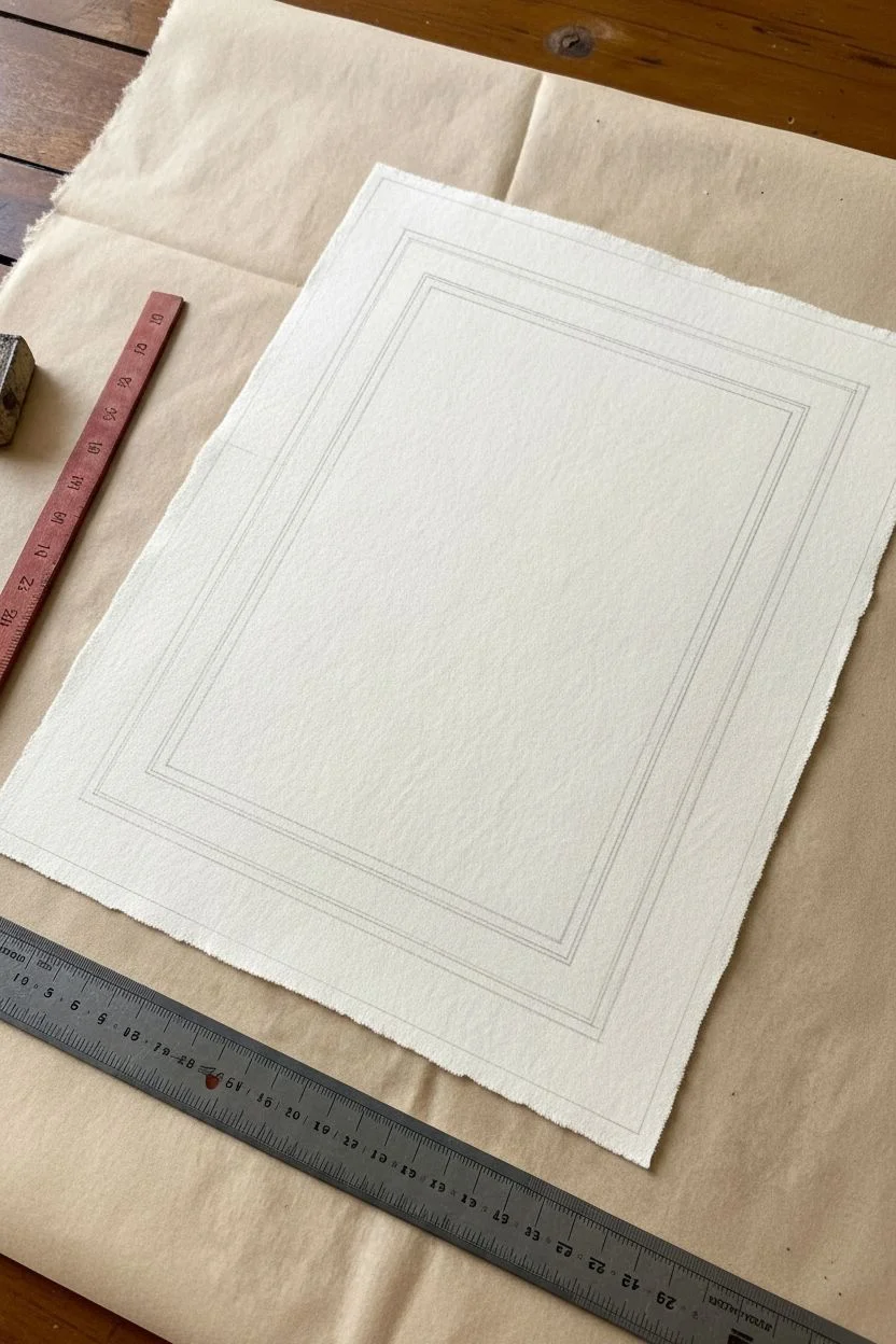
This classic, sophisticated frame design combines clean lines with a textured, faux-finish fill to create a timeless look. Using ink and colored pencil on quality paper, you’ll achieve a layered effect that mimics the appearance of a mounted border or mat.
Step-by-Step Guide
Materials
- High-quality textured paper (e.g., cold press watercolor paper or handmade cotton paper)
- Fine liner pens (dark blue or black, 0.5mm and 0.8mm)
- Ruler (metal preferred)
- Pencil (HB or H)
- Eraser
- Colored pencils (terracotta/burnt orange and dark brown)
- Blending stump or tissue
- Cutting mat (optional but helpful)
Step 1: Layout and Structure
-
Prepare your paper:
Start with a sheet of textured paper. If your paper has deckled edges like the example, be gentle when measuring near the sides. Position your paper on a flat, clean workspace. -
Mark the outer boundary:
Decide on the overall size of your frame. Using a pencil and your ruler, lightly mark the four corners of your main rectangular border. -
Draft the thick band:
Measure inward about 2-3 cm (or roughly one inch) from your first set of marks. Lightly draw a second rectangle inside the first. This space between the lines will become the colored band. -
Draft the thin outer line:
Measure outward about 5-8mm from your main outer border line. Draw a very faint single line all the way around. This acts as a delicate ‘containment’ line for the design. -
Double-check measurements:
Beforeinking, measure the width of your band at several points to ensure it is consistent all the way around. A wonky border is hard to fix later.
Ink Bleeding Issues
If using soft, fibrous paper, ink might feather. Test your pen on a scrap piece first. If it bleeds, spray a light coat of fixative before drawing.
Step 2: Inking the Lines
-
Trace the main outer border:
Using your thicker fine liner (0.8mm) and the ruler, carefully trace the outer edge of the main band. Keep the pen upright for a consistent line width. -
Trace the inner border:
Ink the inner rectangle of the band using the same 0.8mm pen. Be very precise at the corners so the lines meet sharply without overshooting. -
Add the step detail:
For that ‘stepped’ look, switch to a slightly thinner pen (0.5mm). Draw a second line immediately inside the inner border, leaving just a sliver of white space (about 1mm) between them. -
Ink the delicate outer perimeter:
Using the 0.5mm pen, ink that floating line you drew furthest out. This line should be crisp and separate from the main heavy band. -
Clean up:
Wait at least 15 minutes for the ink to truly dry—smudging is a heartbreak here. Once dry, gently erase all pencil guidelines.
Step 3: Color and Texture
-
Base layer coloring:
Take your terracotta or burnt orange colored pencil. Sharpen it well. Use a ruler as a guard to color inside the main band, using long, light strokes. -
Build saturation:
Go over the orange section a second time, pressing slightly harder to deepen the color. I find crossing my stroke direction helps eliminate obvious pencil lines. -
Add texture flecks:
Using a dark brown colored pencil with a dull point, lightly tap small dots or tiny irregular scribbles sporadically throughout the orange band. This mimics stone or aged paper. -
Refine the texture:
Using a blending stump or a folded tissue, rub circles over the colored band. This smooths the pencil wax and softens the brown flecks into the orange background. -
Final inspection:
Check for any white spots in the color band and fill them in. Use a very fine eraser to clean up any color that strayed past the ink lines.
Sharpen Your Look
Rotate your paper so you are always drawing the ruler line closest to your dominant hand. This prevents reaching over wet ink.
This refined border creates a beautiful space ready for calligraphy or a mounted photograph
Baroque-Inspired Frame With Curvy Ornament Corners
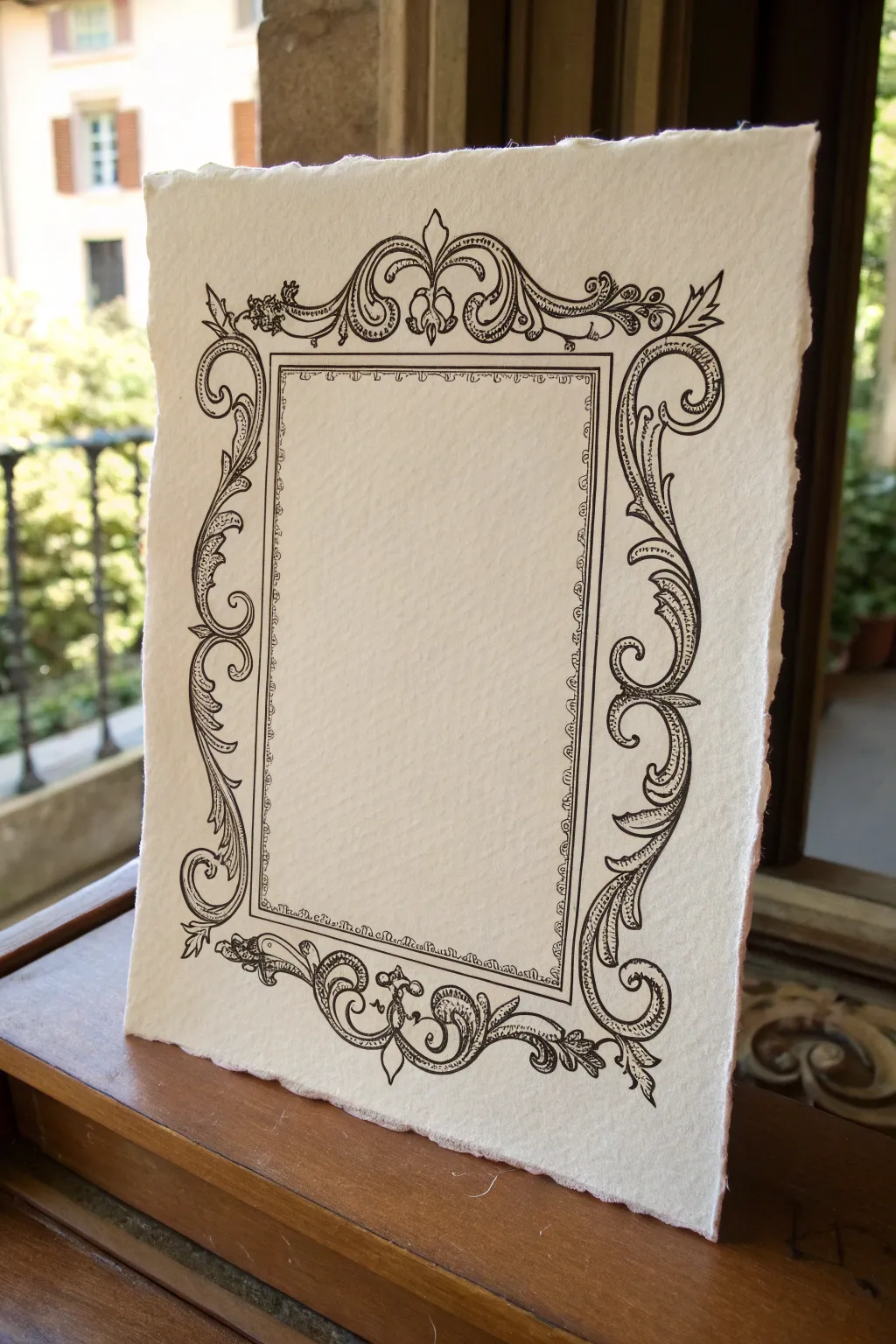
Transport your artwork back in time with this elegant, baroque-inspired frame drawing. Using fine ink lines on textured, handmade-style paper creates a sophisticated, vintage look perfect for framing calligraphy or delicate sketches.
Step-by-Step Tutorial
Materials
- Heavyweight textured paper with deckled edges (e.g., handmade cotton rag paper or cold press watercolor paper)
- Pencil (HB or H)
- Quality eraser (kneaded works best on textured paper)
- Ruler
- Fine liner pens (sizes 0.05, 0.1, and 0.3 or 0.5)
- Black ink finish (archival quality)
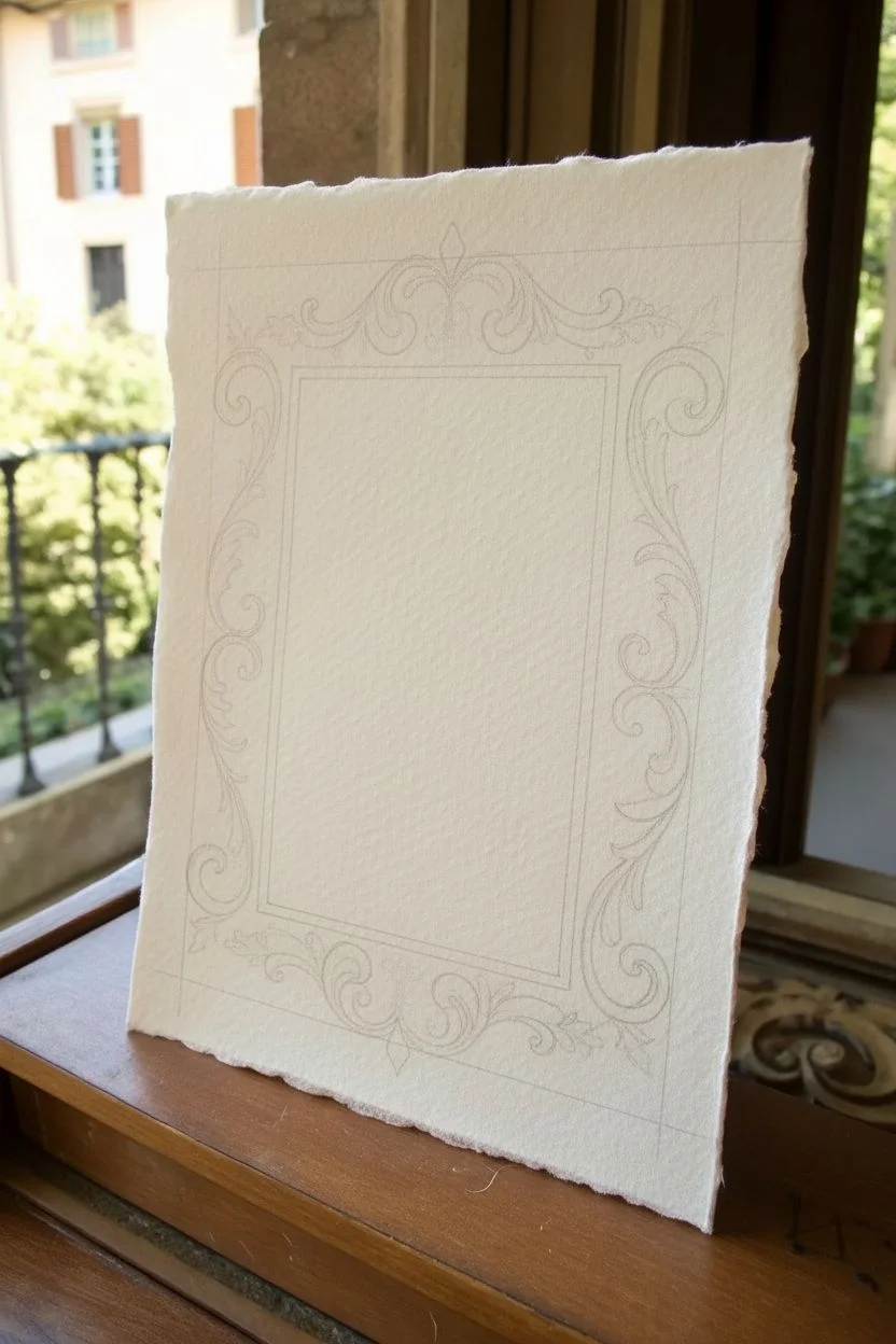
Step 1: Planning and Layout
-
Prepare the paper:
Begin with a sheet of high-quality, textured paper. If your paper doesn’t have deckled edges, you can create a faux effect by carefully tearing the edges against a ruler or dampening a line and pulling the paper apart. -
Mark the center rectangle:
Use your ruler and pencil to lightly draw a central rectangle. This will be the inner boundary of your frame. Leave ample white space around the outside for the ornamentation. -
Establish the outer boundaries:
Lightly sketch faint guidelines for where the outermost flourishes will reach. This ensures your design stays balanced and doesn’t run off the edge of the paper. -
Sketch the primary scrolls:
At each corner and the center of the top and bottom, lightly sketch the main ‘C’ and ‘S’ curves that form the skeleton of the baroque design. Focus on symmetry between the left and right sides.
Uneven Ink Lines?
On heavy texture, pens can skip. Don’t press harder; instead, slow your stroke speed way down to let the ink wick into the paper’s valleys.
Step 2: Detailing the Ornamentation
-
Flesh out the acanthus leaves:
Turn your skeletal curves into leafy shapes. Draw the jagged, organic edges of acanthus leaves wrapping around the scrolls. Keep your pencil strokes light so they are easy to adjust. -
Add the top crest:
Sketch the central motif at the very top. This usually features a small finial or floral bud surrounded by symmetrical scrolling leaves. -
Refine the inner border:
Inside your initial rectangle, add a double line to create thickness. You can sketch tiny repeating notches or a bead-and-reel pattern along this inner strip for added texture. -
Connect the elements:
Ensure all the floral elements flow into one another. The vines should look like they are growing continuously, rather than floating as separate stickers.
Go for Gold
Once the black ink is dry, use a fine-tip gold leaf pen or metallic watercolor to accent the crests and centers of the flowers for a royal look.
Step 3: Inking and Finishing
-
Outline the main shapes:
Switch to a 0.3 or 0.5 fineliner. Carefully trace the major outlines of the scrolls and leaves. I prefer to pull the pen towards me for steadier curves. -
Define the inner rectangle:
Ink the structural rectangular box in the center. Use a ruler if you want razor-sharp lines, or freehand it slowly for a more organic, antique feel. -
Add delicate details:
Switch to your finest pen (0.05 or 0.1). Add the tiny interior details of the leaves, the veins, and the fine shading lines (hatching) inside the curves. -
Create depth with hatching:
Use simple directional hatching to indicate shadow. placing darker lines where leaves overlap or curl under helps the frame look three-dimensional. -
Detail the perimeter:
Go back to that inner border strip and ink the tiny decorative scallops or dots you sketched earlier using the fine pen. -
Erase pencil marks:
Wait until the ink is completely dry—textured paper holds ink longer than smooth paper. Gently erase all pencil guidelines with a kneaded eraser to avoid damaging the paper surface. -
Assess and thicken:
Step back and look at the contrast. If the frame looks too delicate, go over the outermost edges of the main scrolls again to weigh them down visually.
Now you have a timeless border ready to house a special quote or photo


Starburst Frame Border for Instant Energy
This dynamic frame design uses simple radiating lines to create an energetic burst effect that draws the eye straight to the center of your page. It transforms a plain notebook page into a striking canvas perfect for quotes, journaling, or special sketches.
How-To Guide
Materials
- Spiral-bound sketchbook or notebook (unlined preferred)
- Ruler
- Pencil (HB or H)
- Eraser
- Fine liner pen (0.5mm or 0.8mm)
- Thicker graphic marker or brush pen (black)
Step 1: Setting the Structure
-
Define the margins:
Start by deciding how much white space you want around your frame. Use your ruler to measure about 1 to 1.5 inches in from each edge of the paper. -
Draw the inner rectangle:
Lightly sketch a central rectangle with your pencil. This box will remain empty and serves as the anchor for your entire design, so ensure the lines are straight and parallel to the page edges. -
Mark the outer boundary:
Visualize or very faintly mark an invisible outer border about half an inch from the page edge. This helps ensure your starburst spikes don’t run off the paper haphazardly. -
Ink the main frame:
Using your fine liner pen and ruler, trace over the pencil lines of your central rectangle. Create a crisp, double-line border by drawing a second rectangle just a millimeter or two outside the first one for added definition.
Don’t Be Too Rigid
For a more organic, energetic feel, ditch the ruler for the spikes. Swift, hand-drawn strokes often convey ‘bursting’ energy better than perfectly straight lines.
Step 2: Drafting the Bursts
-
Sketch the corner bursts:
With your pencil, lightly draw the longest spikes at the four corners. These should extend outward diagonally, giving you the primary direction for the rest of the lines. -
Fill in the sides:
Sketch the remaining spikes along the top, bottom, and sides. Vary their lengths intentionally—alternating between long, medium, and short strikes creates that vibrant, oscillating energy. -
Angle the lines:
Pay attention to the slope of the lines. Near the corners, they should lean heavily; as they approach the center of each side, they should straighten out until they are perpendicular to the frame.
Step 3: Inking and Refining
-
Start the ink work:
Begin inking your pencil spikes with the fine liner. Instead of just straight lines, draw them as narrow, elongated triangles that taper to a sharp point at the outer end. -
Vary line weight:
For the bases of the spikes (where they touch the rectangular frame), make the lines slightly thicker. I find this grounds the design and makes the burst feel like it’s emerging from behind the box. -
Create distinct flower motifs:
Select two or three spots on the border (often centrally located on the vertical sides) to create a focal ‘flower’ burst. Draw these spikes slightly wider and curved, resembling petals. -
Add circular accents:
Draw small black circles or dots at the base of your ‘flower’ motifs and occasionally in the corners. This breaks up the sharpness of the spikes. -
Fill the shapes:
Use your thicker marker to fill in any solid black areas, such as the small varying circles or the wider bases of the petal-like spikes.
Gold Leaf Accent
Add a touch of luxury by filling the small circular dots or specific larger spikes with a metallic gold gel pen or gold leaf paint instead of black ink.
Step 4: Final Details
-
Add directional movement:
Go back with your finest pen and add very thin, quick strokes between the main spikes. These ‘hatching’ lines add density and movement to the border. -
Connect the base:
Ensure every spike clearly touches the outer line of your central rectangle. If there are gaps, extend the lines carefully to close the form. -
Clean up:
Wait at least five minutes for the ink to dry completely to avoid smears. Then, gently erase all underlying pencil marks. -
Assess contrast:
Step back and look at the overall balance. If a section looks too light, add a few more small, dark triangular slivers between the existing spikes to increase the contrast.
Your page now has a powerful, energetic frame ready to highlight your most important thoughts and sketches
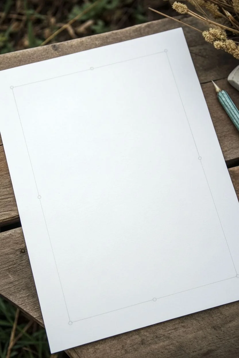
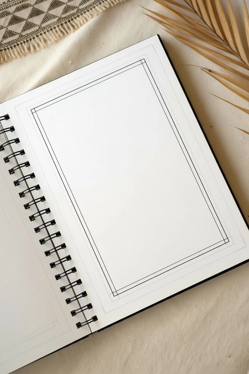
Reference Sheet of Mini Frame Drawings to Mix and Match
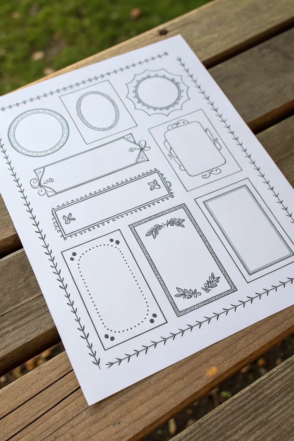
Create a charming collection of vintage-inspired frames and borders on a single reference sheet. This project focuses on drawing varied frame shapes—from simple rectangles to ornate ovals—perfect for bullet journaling or scrapbooking labels.
Step-by-Step
Materials
- Smooth white cardstock or drawing paper (A4 or Letter size)
- Pencil (HB or 2H)
- Eraser
- Ruler
- Compass or circle stencil
- Fine liner pens (0.3mm and 0.5mm)
- Black brush pen (optional for thicker accents)
Step 1: Layout & Basic Shapes
-
Prepare the grid:
Begin by lightly sketching a loose grid on your paper with a pencil to space out your frames evenly. You don’t need perfect measurements, but aim for three columns and three to four rows to fit about 9-10 distinct designs. -
Sketch the page border:
Draw a light pencil line around the entire perimeter of the page, leaving about a half-inch margin. This will eventually become a decorative vine border. -
Draft circle frames:
In the top left section, use a compass to draw two concentric circles for a simple round frame. Next to it, sketch an oval shape, and for a third variation, draw a circle with a zig-zag or scalloped outer edge. -
Draft rectangular frames:
Use your ruler to block out various rectangular shapes in the middle and lower sections. Vary the proportions—some long and narrow for banners, others tall and vertical for portraits, and strictly square ones for variety.
Wobbly Lines?
Don’t correct mistakes immediately. Ink the rest of the shape first; often, simply thickening the line weight slightly can hide a wobble without needing to restart.
Step 2: Inking the Frames
-
Ink the simple circle:
Using a 0.5mm fine liner, trace over your first circle sketch. Add a second inner circle and fill the space between them with tiny, evenly spaced hash marks to create a textured rim. -
Create the rope texture:
For the oval frame, draw small, interconnected ‘C’ shapes or diagonal dashes along the pencil line to simulate a twisted rope texture. -
Detail the sunburst frame:
On the scalloped circle, ink the outer jagged edge. Inside, draw a smooth circle and add small dots between the smooth line and the jagged points. -
Draw the banner frame:
Ink a long horizontal rectangle. At the left corners, add small swirls. At the right end, draw a stylized bow or ribbon knot to make it look like a hanging tag. -
Add nature motifs:
For one of the horizontal rectangles, draw a double border. Inside the corners, sketch simple three-petaled flowers or butterflies to soften the sharp angles. -
Ink the fancy corner frame:
On a central rectangular sketch, draw wavy, bracket-style lines instead of straight sides. Add loops at the corners and small scroll details at the midpoints of the lines. -
Create the botanical frame:
Select a tall vertical rectangle. Instead of a solid line, draw a double border with a pattern between the lines, like tiny leaves or a hatched shading pattern. Inside the frame at the top and bottom, draw sprigs of leaves curving inward. -
Detail the dotted frame:
For a minimalist look on another vertical rectangle, simply outline the shape with a solid line. Inside, draw a secondary border made entirely of dots, placing larger dots in the four corners for emphasis. -
Layer the photo frame:
For the final rectangle, draw three concentric rectangles. Make the outermost and innermost lines thin, and the middle line slightly bolder to create a matted photo frame effect.
Step 3: Finishing Touches
-
Ink the page border:
Go back to the page perimeter. Draw a continuous vine with small leaves branching off in alternating directions. I find it easier to rotate the paper as I work around the corners to keep my hand steady. -
Erase pencil lines:
Wait at least 15 minutes for the ink to dry completely to avoid smears. Gently erase all underlying pencil sketches and grid lines. -
Add final weights:
Check your line work. If any frames feel too light, re-trace the outer edge with a slightly thicker pen to make them pop off the page.
Style Variation
Mix up your corners for visual interest. Try inverted rounded corners, sharp 90-degree angles, and ornate loops on the same page to create a diverse reference sheet.
Now you have a master sheet of decorative borders ready to trace or copy into your journals


Have a question or want to share your own experience? I'd love to hear from you in the comments below!