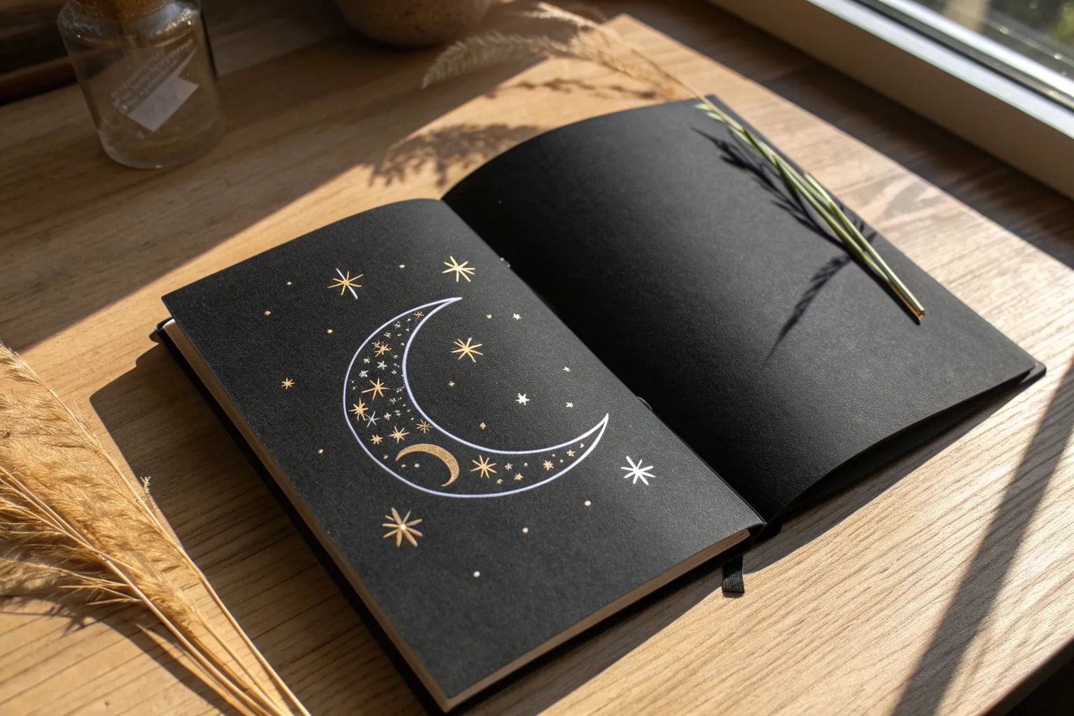
Black paper flips the whole drawing process for me—I’m not shading in darkness, I’m literally drawing the light. If you’re craving that bold high-contrast pop, these black paper drawing ideas will give you instant drama and glow.
Moon Phases on Black Paper With White Pencil
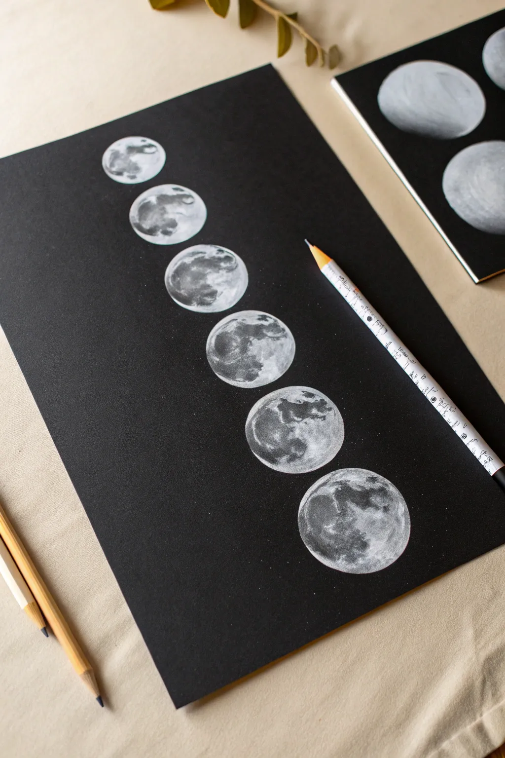
Capture the ethereal glow of the lunar cycle by drawing a vertical sequence of moon phases on deep black paper. This high-contrast study uses white shading to build realistic craters and texture, creating a striking piece of minimalist wall art.
Detailed Instructions
Materials
- Heavyweight black paper or cardstock (smooth or slight texture)
- White charcoal pencil or white pastel pencil
- Compass or circle template
- Ruler
- Soft paint brush (for sweeping away dust)
- Blending stump (tortillon) or cotton swab
- Kneaded eraser
- Pencil sharpener
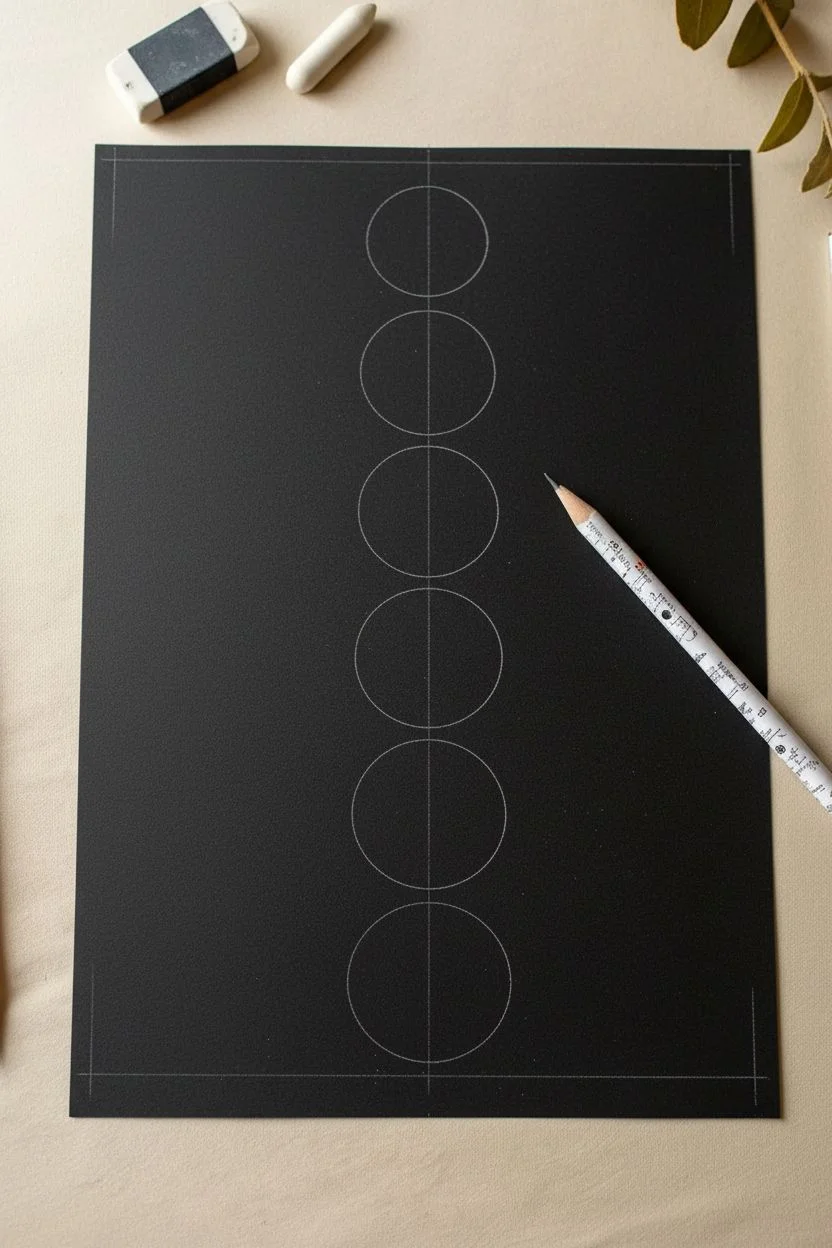
Step 1: Planning the Layout
-
Measure the centerline:
Start by finding the exact center of your black paper vertically. Use a ruler and your white pencil to make very faint tick marks at the top and bottom, aligning your workspace. -
Define the moon sizes:
Decide on the diameter of your moons. For a standard A4 or letter-sized sheet, a 1.5 to 2-inch diameter usually works well to fit six distinct phases vertically. -
Mark the spacing:
Calculate equal spacing between each moon. Mark the center point for six circles down your vertical line, ensuring you leave equal margins at the top and bottom of the page. -
Draw the outlines:
Using a compass or a circle stencil, lightly draw six perfect circles based on your center marks. Keep the pressure extremely light; you just want a guide that can be easily erased or covered later.
Step 2: Sketching the Phases
-
Map the shadows:
Lightly sketch the curved terminator lines—the line dividing the light side from the dark side—inside each circle. Start with a thin crescent at the top and gradually increase the lit portion as you move down the page. -
Observe the pattern:
The top moon should be a waxing crescent, widening into a quarter moon, then a gibbous, and finally approaching full at the bottom. Reference a moon chart if you want scientific accuracy. -
Erase guidelines:
Gently use your kneaded eraser to lift the visible outline on the ‘dark’ side of the moons. You want the black paper to represent the shadow, so no hard white outline should remain there.
Smudge Patrol
Charcoal loves to smear. Place a clean sheet of scrap paper under your drawing hand to protect finished moons while you work on the lower ones.
Step 3: Rendering Texture
-
Base layer:
On the first moon, lightly fill in the lit area with the side of your white charcoal pencil. Don’t press hard yet; we are just establishing the shape. -
Smudging for atmosphere:
Use your finger or a blending stump to gently rub this base layer. This pushes the white pigment into the paper’s grain and creates a soft, glowing gray foundation. -
Adding the maria:
The moon isn’t solid white; it has dark patches called maria. Use your kneaded eraser to lift pigment back up in irregular, blotchy shapes to create these darker gray plains. -
Building highlights:
Sharpen your pencil to a fine point. Go back into the bright areas and add harder, brighter white marks for crater edges and high plateaus. I find circular, stippling motions help mimic the cratered surface. -
Refining the edge:
Make the outer curved edge of the moon the brightest and sharpest part. Keep the inner terminator line (where light meets dark) softer and more textured to show the surface unevenness.
Glow Up
Create a subtle atmospheric glow by lightly rubbing a tiny bit of white pastel dust roughly 1mm outside the bright edge of the moon with a Q-tip.
Step 4: Completing the Series
-
Repeat the process:
Move to the second moon. Apply the base layer, smudge, lift out dark spots, and add bright crater highlights. As the moon phases get fuller, you will have more surface area to detail. -
Varying the brightness:
Try to keep the brightness consistent across all six moons. Step back occasionally to ensure one moon isn’t drastically brighter or dimmer than its neighbors. -
The gibbous details:
For the bottom, fuller moons, specifically focus on the ‘Tycho’ crater (the bright spot with rays radiating out). Adding this specific detail adds instant realism. -
Clean up:
Use a small, soft brush to sweep away any loose charcoal dust. Be careful not to smear your hard work with your hand. -
Final crisp edges:
Do one last pass with a freshly sharpened pencil to crisp up the outer edges of the lit sides. This high-contrast edge is what makes the drawing pop off the black paper.
Now you have a stunning lunar cycle illustration that perfectly captures the mystery of the night sky


Starry Night Sky on Black Paper With Constellation Lines
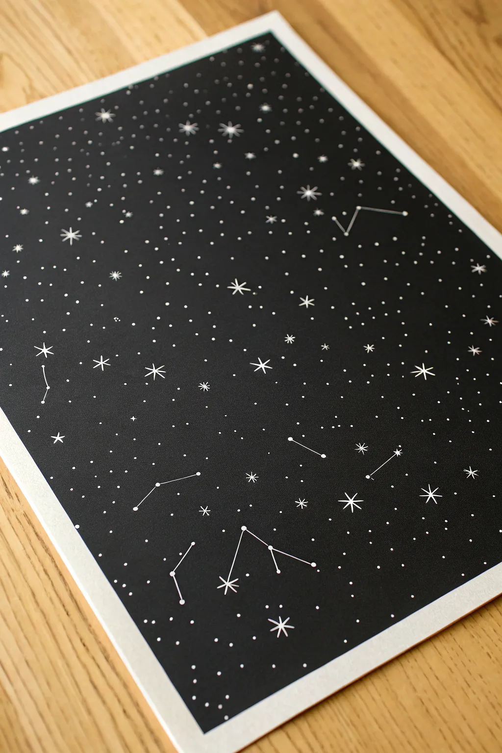
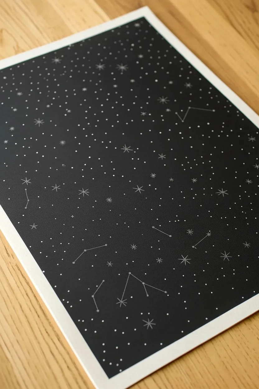
This minimal yet striking project transforms a simple sheet of black paper into a window to the cosmos. By combining tiny stippled stars with bold, geometric constellation lines, you can create a detailed star map perfect for framing.
How-To Guide
Materials
- High-quality black cardstock or mixed media black paper
- White gel pen (fine tip like 0.5mm)
- White paint marker (extra fine tip) or white India ink with a dip pen
- Ruler or straight edge
- Pencil (white charcoal or standard graphite)
- Eraser
- Reference image of real constellations (optional)
Step 1: Planning and Layout
-
Paper Preparation:
Select a smooth, heavyweight black paper. If you plan to frame it later, I recommend cutting the paper to a standard frame size like 8×10 or A4 before you begin drawing. -
Sketch the Major Stars:
Using a white charcoal pencil or very light graphite, map out where you want your constellations to sit. Mark the main ‘anchor’ stars with faint dots. -
Draft Connection Lines:
Lightly sketch the lines connecting your anchor stars to form the constellation shapes. Keep these initial marks barely visible so they can be easily covered or erased later.
Step 2: Drawing the Constellations
-
Inking the Anchor Stars:
Use your white gel pen or paint marker to draw solid white dots over your sketched anchor points. These should be larger than the background stars you will add later. -
Connecting the Dots:
Place your ruler against the center of two connected anchor stars. Draw a clean, straight line connecting them using the white pen. -
Complete the Geometry:
Continue using the ruler to ink all the connecting lines for your chosen figures. -
Adding Starbursts:
Choose a few prominent stars within or near the constellations to turn into twinkling flares. Draw a simple cross shape (+) through the center of the dot. -
Refining the Flare:
Add a smaller ‘X’ shape diagonally through the center of the first cross to create an eight-pointed starburst effect.
Ink Not Flowing?
White gel pens clog easily. Scribble on a scrap piece of paper or wipe that tip on your finger to get the ball rolling again. Store pens horizontally.
Step 3: Filling the Cosmos
-
Primary Star Layer:
Begin filling the negative space around the constellations with individual dots. Press the pen tip down firmly to create distinct, medium-sized stars. -
Creating Density:
Work in sections to add variety. Cluster some dots closer together to mimic the density of the Milky Way, leaving other areas sparser. -
Micro-Details:
Switch to a finer tip pen if you have one, or use a very light touch, to add tiny specks between the larger stars. This creates depth. -
Adding Distant Twinkles:
Scatter a few tiny four-pointed star shapes (just a simple cross) randomly throughout the background to break up the monotony of the dots. -
Building Texture:
Continue stippling until the black paper feels balanced. Avoid making the dots too uniform; chaos looks more natural here. -
Reviewing the Balance:
Step back from the paper to view the composition as a whole. Look for empty voids that might need a few more specks of ink.
Add Metallic Foil
Use a glue pen instead of white ink for the main constellation lines, then press silver or gold transfer foil over it for a shining, metallic finish.
Step 4: Final Touches
-
Cleaning Up:
Let the ink dry completely for at least 30 minutes to avoid smearing. Gently erase any visible pencil sketch marks. -
Brightening Highlights:
Go back over the largest anchor stars or starbursts with a second layer of white ink to make them pop against the dense background.
Frame your personal galaxy and enjoy the serene view of the stars from your own wall


Ringed Planet on Black Paper With Metallic Highlights
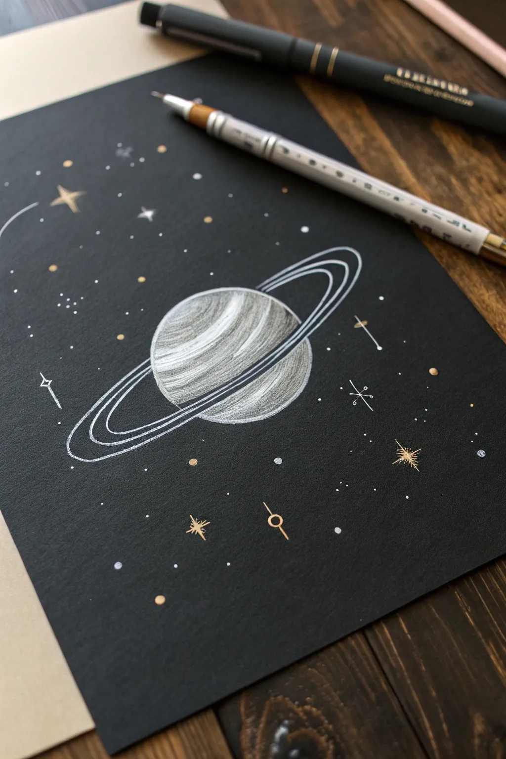
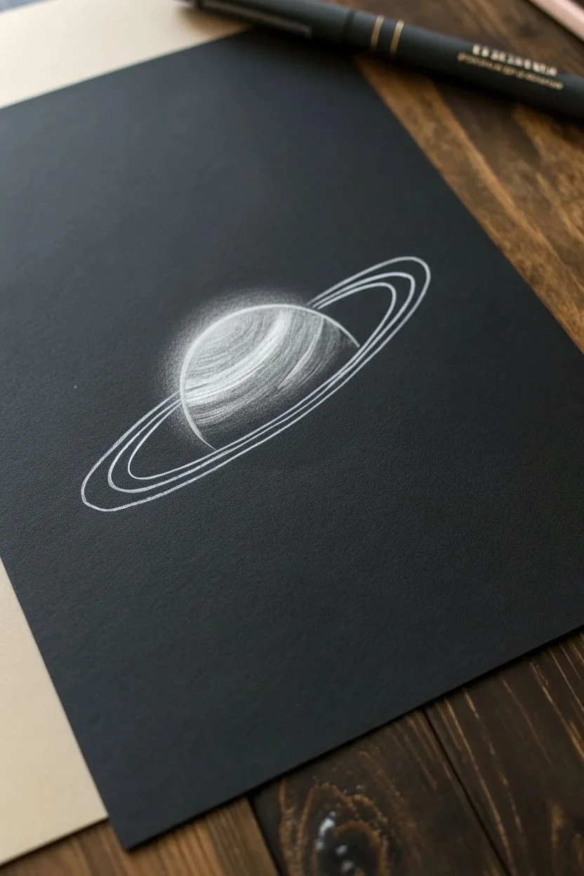
Capture the magic of space with this striking drawing of a ringed planet on deep black paper. The contrast of white pencil shading against the dark background, combined with shimmering metallic gold details, creates a celestial scene that pops off the page.
Detailed Instructions
Materials
- Black cardstock or mixed media paper
- White colored pencil (oil-based works best for opacity)
- White gel pen (size 08 or 10)
- Gold metallic marker or gel pen (bullet tip)
- Compass or circular object (for tracing)
- Pencil sharpener
- Eraser
Step 1: Drafting the Planet
-
Create the main sphere:
Start by drawing a circle in the center of your black paper using a white colored pencil. You can sketch this lightly freehand or use a compass for a perfect shape. Keep your pressure light so mistakes are easy to correct. -
Tilt the axis:
Visualize a diagonal line passing through the center of your sphere. This will determine the tilt of your planet and guide where the rings will sit. -
Sketch the ring path:
Lightly sketch a long, narrow ellipse around the planet, following the tilted axis you imagined. The front part of the ellipse should cross over the bottom-middle of the sphere, and the back part should disappear behind the top-middle. -
Add ring thickness:
Draw two more elliptical lines parallel to your first one to give the rings width. You want distinct bands, so leave a small gap between the lines. Erase the part of the sphere that is hidden ‘behind’ the rings in the back.
Step 2: Shading and Texture
-
Establish the light source:
Decide that your light is coming from the top left. Begin shading the top-left portion of the sphere with your white pencil, applying firmer pressure for a brighter white. -
Create gradients:
Fade your shading out as you move toward the bottom right. The bottom right edge should be very faint or essentially black to represent the shadow side of the planet. -
Add atmospheric bands:
Draw curved, sweeping lines across the surface of the planet using the white pencil. Vary your pressure to create distinct bands of clouds, leaving some areas dark to let the black paper show through. -
Define the rings:
Go over your ring outlines with the white pencil to make them solid. To distinguish them from the planet, use firm, consistent pressure. You can sharpen the pencil here to get crisp, clean edges on the rings. -
Refine the contrast:
Go back into the brightest highlight area on the planet (top left) and add a second layer of white pencil. Building up layers is key to getting that glowing effect on black paper.
Smudge Prevention
White pencil and gel ink smear easily on smooth black paper. Place a scrap sheet of paper under your drawing hand to protect your work as you shade.
Step 3: Inking and Details
-
Highlight the rings:
Take your white gel pen and carefully trace over the outermost and innermost edges of the rings. This sharp, opaque ink makes the rings look crisp and separate from the softer pencil texture of the planet. -
Add the starfield:
Using the white gel pen, dot the background with tiny specks to create distant stars. Group some closer together and leave other areas empty for a natural look. -
Create larger stars:
Draw a few four-pointed stars (diamond shapes with extended points) or simple cross-stars scattered around the planet. Vary their sizes to add depth to the drawing. -
Introduce gold accents:
Switch to your gold metallic marker. Add small gold dots interspersed among the white stars. I like to place these randomly to add warmth to the cold space scene. -
Draw celestial symbols:
Use the gold marker or white pen to add stylized elements like a stick-and-circle planet icon, a small four-pointed starburst, or a simple cross shape with circles at the ends. -
Final sparkle:
Pick one or two larger stars and give them a gold center or gold rays. This mix of silver/white and gold makes the final piece feel magical.
Sharper Highlights
If your white colored pencil looks too dull, try dipping the tip in a tiny bit of water before drawing. It acts like gouache for intense brightness.
Step back and admire how the metallic accents catch the light against the darkness of your new galaxy
Galaxy Swirl on Black Paper With Soft Blending
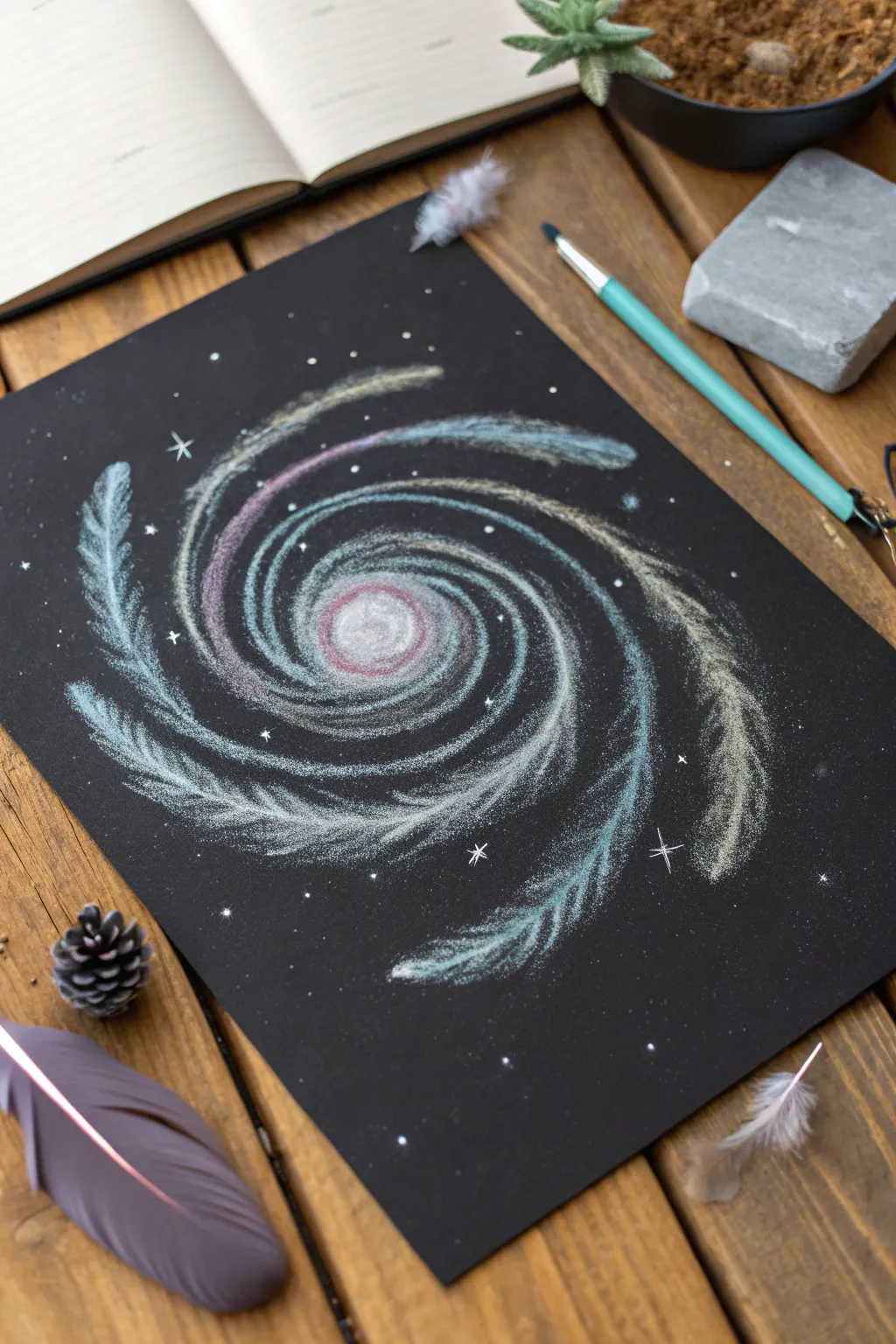
Capture the ethereal beauty of a distant galaxy using soft pastels on deep black paper. This project uses feathered strokes and gentle blending to create a luminous, spinning spiral effect that seems to glow against the dark background.
Step-by-Step Tutorial
Materials
- Black drawing paper or cardstock (smooth or slightly textured)
- Soft pastels or white charcoal pencils
- Colors: White, light turquoise, lavender, cream/pale yellow
- Blending stump (tortillon) or cotton swabs
- Kneaded eraser
- A small, stiff paintbrush (optional for texture)
- Workable fixative spray
Step 1: Planning the Core
-
Locate the Center:
Find the approximate center of your black paper. This doesn’t need to be mathematically perfect, but having a central anchor point helps keep the spiral balanced. -
Create the Nucleus:
Using your white soft pastel or charcoal pencil, draw a small, filled-in circle in the center. I like to keep this quite bright, as it represents the glowing heart of the galaxy. -
Add Inner Color:
Layer a touch of lavender or pale pink directly into the white center circle. Use your finger or a blending stump to gently smudge these colors together, creating a soft, hazy glow.
Smudge Control
Work from the center outward and rotate your paper frequently. This stops your hand from resting on finished areas and smearing the delicate pastel dust.
Step 2: Building the Spiral Arms
-
Draft the Curves:
Lightly sketch three to four curved lines radiating outward from the center. These are your guide lines for the spiral arms. Keep the pressure very light so they don’t become permanent. -
Feathering Technique:
Select a light turquoise or icy blue pastel. Instead of drawing a solid line along your guide, use short, quick, diagonal strokes that follow the curve. Imagine you are drawing tiny feathers that fan outwards. -
Varied Colors:
Create a second spiral arm using the cream or pale yellow shade. Use the same feathery stroke technique, letting the strokes flick outward to suggest movement and gas clouds. -
Introduce Purple tones:
For the third arm or inner sections between the existing arms, use the lavender pastel. Intertwining these colors creates depth and realism. -
Layering White:
Go back over the colored arms with your white pastel. Add highlights to the inner edge of each spiral arm to make them look brighter and more defined near the core.
Step 3: Refining and Blending
-
Soft Blending:
Take your blending stump or just a clean fingertip and very gently smudge the base of the spiral arms where they meet the black paper. This makes the galaxy look like it’s fading into the darkness. -
Protecting Texture:
Avoid blending the tips of your feathery strokes too much. Leaving the outer edges crisp and textured helps maintain that gaseous, grainy look of a star cluster. -
Extending the Arms:
Extend the tips of the spiral arms further out toward the paper’s edge. Let the pastel fade out gradually, so the tails of the galaxy seem to disappear. -
Adding Contrast:
If any black space between the arms got muddy, use a clean corner of a kneaded eraser to lift up the excess pastel dust and restore the deep black background.
Pro Tip: Depth Boost
Don’t cover every inch of the arms. Leaving tiny gaps where the black paper shows through the spiral creates an airy, transparent effect indistinguishable from real gas clouds.
Step 4: Starry Details
-
Create Distant Stars:
Take the white pastel and tap it gently against the paper in the empty black spaces to create tiny dots representing distant stars. -
Add Focal Stars:
Choose 3-5 spots around the galaxy to place larger stars. Draw a small cross or four-pointed shape (a simple ‘plus’ sign combined with an ‘x’) to create a twinkling effect. -
Dusting Technique:
For a subtle nebulous effect, scrape a tiny bit of pastel dust off the stick with a blade or fingernail over the paper, then press it in lightly with a tissue. -
Final Highlights:
Revisit the very center of the galaxy with a strong dot of pure white to ensure it remains the brightest focal point of the artwork. -
Seal the Work:
Pastels smudge easily, so take the drawing outside or to a ventilated area and spray a light coat of workable fixative to set the pigment.
Step back and admire your cosmic creation as the colors swirl together against the stunning dark backdrop
BRUSH GUIDE
The Right Brush for Every Stroke
From clean lines to bold texture — master brush choice, stroke control, and essential techniques.
Explore the Full Guide
City Skyline at Night on Black Paper With Window Lights
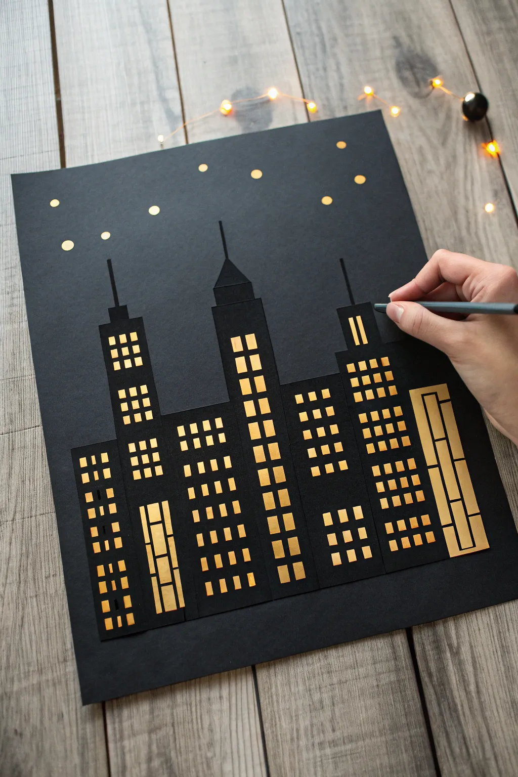
Capture the magic of an urban night with this striking paper craft project. By layering black silhouettes over metallic gold paper, you’ll create the illusion of warm, glowing skyscrapers set against a dark, starry sky.
Detailed Instructions
Materials
- Heavyweight black cardstock (for the background)
- Standard black construction paper or cardstock (for the buildings)
- Gold metallic or foil paper
- Craft knife (e.g., X-Acto)
- Cutting mat
- Ruler or straight edge
- Pencil
- Glue stick or double-sided tape
- Small hole punch or gold gel pen (optional)
- Scissors
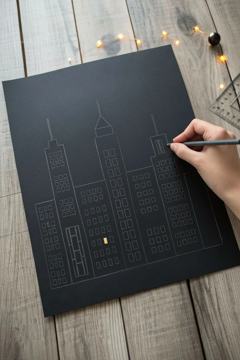
Step 1: Designing the Skyline
-
Plan distinct buildings:
Before cutting anything, sketch out three to five distinct skyscraper shapes on a piece of scratch paper first. Vary the heights and roof styles—mix flat tops with spires or slanted roofs to create visual interest. -
Transfer to black paper:
Once you’re happy with your design, lightly draw these building outlines onto your standard black paper. You can draw them as separate strips or grouped together. -
Sketch the window grid:
Using a ruler and pencil, lightly draw a grid of small squares or rectangles inside your building outlines where you want the windows to be. Leave the ‘frames’ between the windows thick enough so the paper doesn’t tear later.
Step 2: The Window Cutouts
-
Prepare your workspace:
Place your black paper on a self-healing cutting mat. This step requires precision and a sharp blade for clean edges. -
Cut the vertical lines:
Using your craft knife and a ruler, carefully cut all the vertical lines of your window grids first. Keeping the ruler steady here is key for professional-looking lines. -
Cut the horizontal lines:
Rotate your paper if needed and cut the horizontal lines to complete the squares. Lift out the tiny paper confetti squares as you go. -
Vary window styles:
For variety, try cutting some long, thin vertical rectangles for one building, and standard square grids for another. I find this mix makes the city look more organic. -
Cut out the buildings:
Once all interior windows are removed, use your scissors or craft knife to cut along the outer perimeter of each skyscraper shape.
Clean Cuts Pro-Tip
Change your X-Acto blade frequently! Even a slightly dull blade will drag and tear the paper corners rather than slicing cleanly through.
Step 3: Adding the Glow
-
Measure the gold backing:
Cut strips of your gold metallic paper that are slightly smaller than the width of each black building silhouette. -
Attach the gold layer:
Apply glue or double-sided tape to the *back* of your black building cutouts. Carefully press the gold strips onto the back so the gold shows through the window holes. -
Check for gaps:
Flip the buildings over to ensure the gold covers every window completely. Trim any excess gold paper sticking out from the edges of the black silhouette.
Level Up: 3D Effect
Use foam adhesive squares instead of glue for the front-most buildings. This will lift them off the page slightly, creating real shadows and depth.
Step 4: Assembly and Stars
-
Arrange the composition:
Take your large sheet of heavyweight black cardstock. Position your gold-backed buildings at the bottom, overlapping them slightly to create depth. Play with the arrangement until it feels balanced. -
Glue the skyline down:
Secure the buildings to the background sheet with adhesive. If you layer them, glue the back buildings first, then the front ones. -
Add detail with a spire:
For extra height, cut very thin strips of black paper and glue them to the tops of your buildings as antennas or lightning rods. -
Punch out stars:
Use a small hole punch on your leftover gold paper to create tiny gold circles. -
Place the stars:
Scatter these gold dots across the upper ‘sky’ portion of your background. Glue them down randomly, perhaps clustering a few together. -
Final touches:
If you have a gold gel pen or marker, you can manually draw tinier stars or add subtle highlights to the roof edges for extra shimmer.
Now step back and admire your glimmering cityscape created entirely from paper
Night Window Scene on Black Paper With Moonlit Reflections
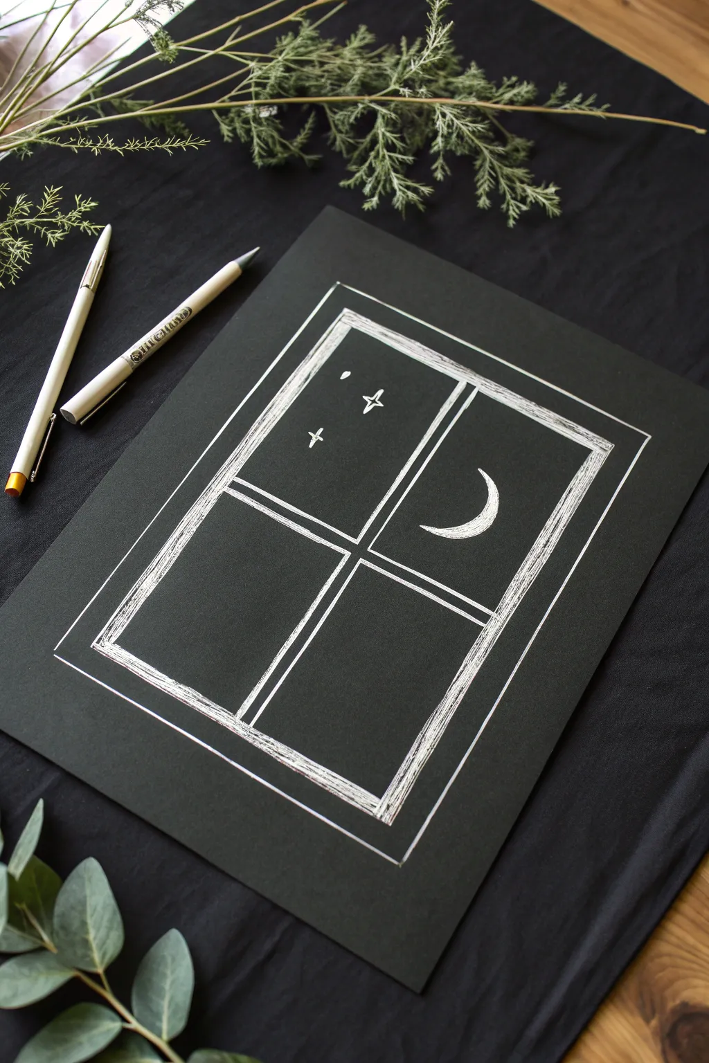
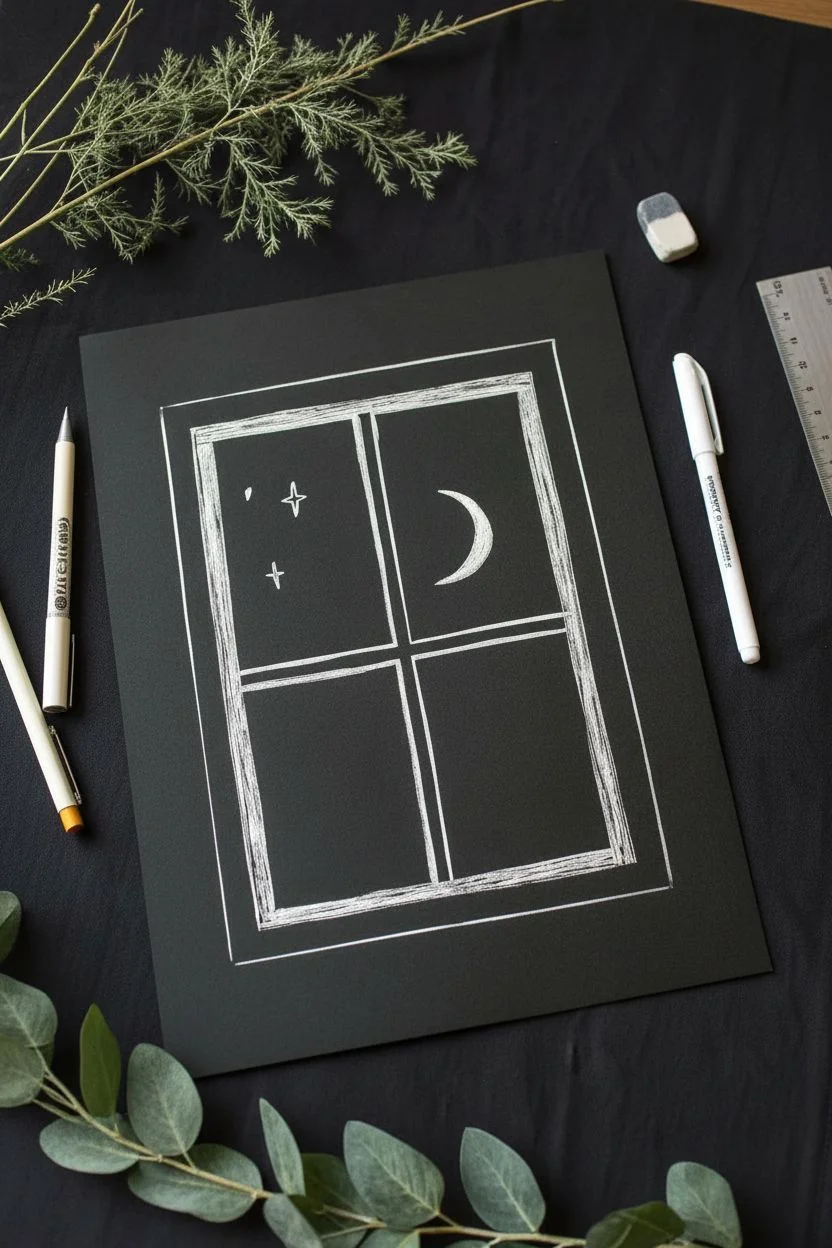
Capture the serene simplicity of a night sky view with this elegant line drawing on dark paper. Using basic white ink techniques, you’ll create a charming window frame looking out onto a crescent moon and scattered stars.
Step-by-Step
Materials
- Black cardstock or heavy drawing paper
- White gel pen (e.g., Gelly Roll or Sakura)
- White colored pencil (optional, for drafting)
- Ruler
- Pencil (HB or lighter)
- Eraser
Step 1: Drafting the Window Frame
-
Center your workspace:
Place your black paper on a flat surface. Ensure you have good lighting, as graphite lines can be hard to see on black paper. -
Draft the outer rectangle:
Using a ruler and a light pencil or white charcoal pencil, lightly draw a large vertical rectangle in the center of your page. Leave a generous margin around the edges. -
Create the inner frame thickness:
Measure about a half-inch inward from your first rectangle and draw a second, smaller rectangle inside it. This space between the lines will become the thick wooden frame of the window. -
Add the window panes:
Find the center point of the inner rectangle both vertically and horizontally. Use your ruler to draw a cross shape, creating four equal window panes. Add a parallel line next to each cross line to give the muntins (the dividers) some thickness.
Step 2: Inking the Structure
-
Trace the main lines:
Take your white gel pen and carefully trace over the pencil lines of the outer and inner rectangles. Keep your hand steady, but don’t worry if the lines have a slight wobble; it adds character. -
Ink the dividers:
Trace the cross-shaped dividers in the center. Ensure the lines connect fully to the inner frame edge. -
Add the outer border:
Draw one final, thin rectangle line about a quarter-inch outside the entire window structure. This acts as a decorative border or a wall edge. -
Erase guide lines:
Wait for the ink to dry completely—smudging white ink on black paper is very noticeable. Once dry, gently erase any visible pencil marks.
Ink Flow Pro-Tip
If your white gel pen stops flowing, scribble on a scrap piece of paper or run the tip over your thumb skin lightly to get the ink rolling again.
Step 3: Building Texture and Details
-
Texture the frame:
Return to the thick border of the window frame. Instead of coloring it in solid, use quick, scratchy diagonal lines to fill the space. This mimics a rough wood texture. -
Cross-hatch corners:
In the corners of the frame, slightly overlap your scribbles to make the white ink denser, creating a subtle shadow effect. -
Sketch the moon shape:
In the upper right pane, lightly sketch a crescent moon shape. The curve should face inward toward the center of the window. -
Fill the moon:
Fill in the crescent moon with your white pen. I like to use close, curved hatching lines here to mimic the roundness of the celestial body rather than a flat fill. -
Add stars:
In the upper left pane, draw two slight crosses for stars. Keep them simple—just two intersecting lines. -
Add a distant star:
Place a single small dot or tiny diamond shape near the stars to represent a more distant planet or star. -
Reinforce the frame:
Go over the main outline of the window frame one more time to make the white pop against the black background. -
Clean up edges:
Check for any gaps in your ink lines. If the gel pen skipped, carefully retouch those areas without making the line too thick.
Level Up: Reflections
Add faint white streaks on the glass panes using a white colored pencil to suggest moonlight reflecting off the window glass itself.
Now you have a peaceful night scene that pops beautifully against the dark background

PENCIL GUIDE
Understanding Pencil Grades from H to B
From first sketch to finished drawing — learn pencil grades, line control, and shading techniques.
Explore the Full Guide
Snow-Capped Mountains on Black Paper With Crisp Highlights
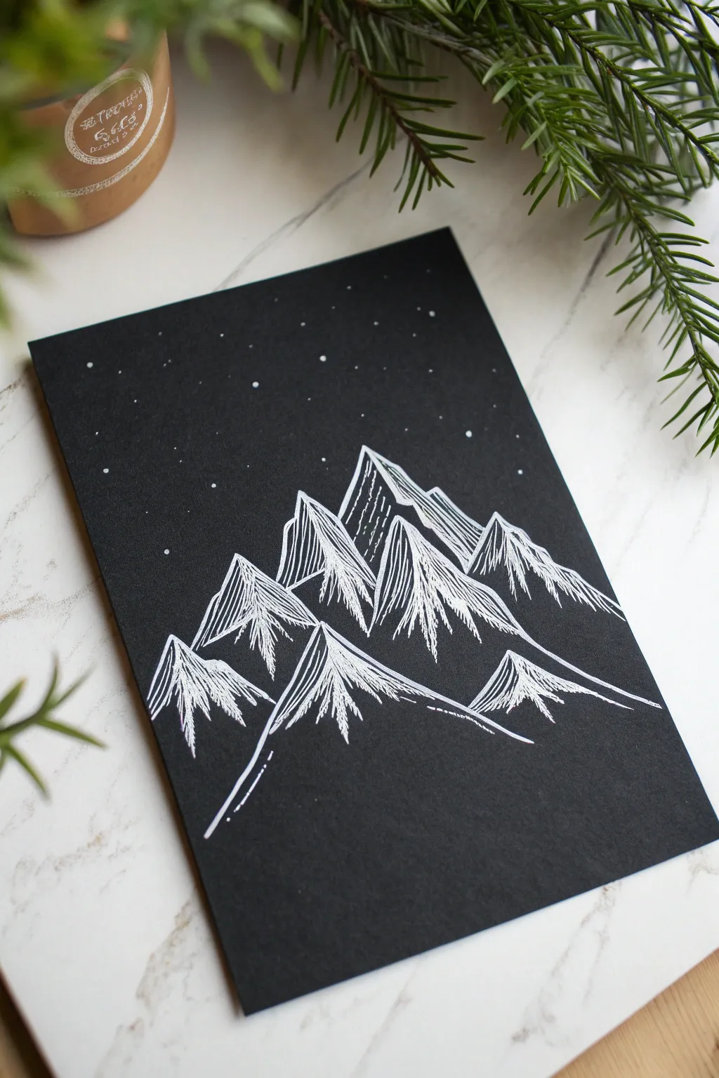
Transform a simple sheet of black cardstock into a serene nocturnal landscape with just a single white pen. This striking minimalist project uses high-contrast lines to create stylized snow-capped mountains under a delicate starlit sky.
How-To Guide
Materials
- High-quality black cardstock or heavy black paper (A5 size recommended)
- White gel pen (bold point, e.g., sizes 08 or 10)
- White gel pen (fine point, e.g., size 05)
- Pencil (HB or H)
- Eraser
- Ruler (optional)
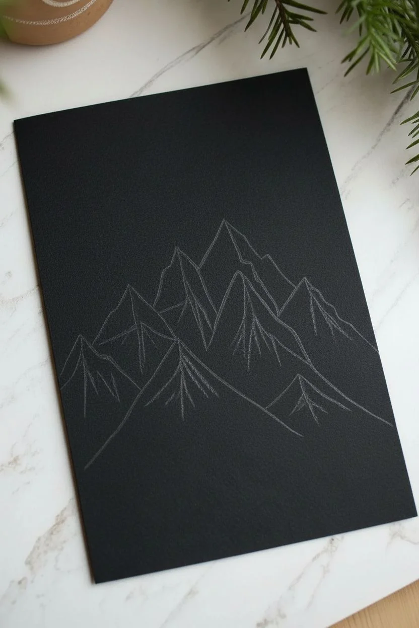
Step 1: Planning and Sketching
-
Prepare your canvas:
Start with a clean sheet of black cardstock. Ensure the surface is free of any oils or dust, which can interfere with the gel ink flow. -
Sketch the mountain range:
Using your pencil very lightly, draw a series of triangles to form your mountain range. Aim for about five to seven peaks of varying heights. -
Stagger the peaks:
Arrange the triangles so that the tallest peak is slightly off-center, with smaller peaks cascading down towards the foreground on either side to create depth. -
Define the ridgelines:
Lightly sketch a jagged line down the center of each triangle. This doesn’t need to be straight; a zig-zag or wavy line helps define the separation between the shadowed side and the lit side of the mountain.
Keep the Flow
White gel pens can skip on textured paper. If ink stops flowing, scribble on a scrap piece of paper or black thumb to get the ball rolling again.
Step 2: Inking the Mountains
-
Outline the first peak:
Take your bold white gel pen and carefully trace the outer silhouette of the central, highest mountain peak. Keep your hand steady for a clean, crisp line. -
Draw the main ridge:
Draw the central ridgeline you sketched earlier. This line anchors the shape, separating the left face from the right face. -
Begin the hatching:
On the right side of the mountain face (or whichever side you choose as your light source), start drawing vertical, slightly angled lines. These should run mostly parallel to the outer slope. -
Vary line density:
As you draw these hatching lines, I like to make the lines closer to the peak solid and bright, while allowing the lines near the bottom to break up or become thinner. This mimics snow fading into rock. -
Create texture:
Instead of perfect straight lines, allow your pen to waver slightly. Add a few shorter, jagged strokes in between the long parallel lines to suggest rocky texture. -
Outline the surrounding peaks:
Move on to the adjacent mountains. Outline their triangular shapes, ensuring they overlap logically—the peaks in front should obscure the bottom parts of the peaks behind them. -
Repeat the hatching process:
Fill in the ‘lit’ faces of these new mountains with similar vertical hatching. Maintain a consistent light source direction; if the right side of the main peak is lit, the right sides of all peaks should be lit. -
Leave shadow areas dark:
Leave the opposite faces of the mountains largely black. This negative space is crucial for creating the stark, high-contrast 3D effect shown in the image. -
Add detail to the shadows:
Switch to your fine point gel pen. On the dark, shadowed faces, add just a tiny handful of very thin, sparse lines near the ridges to suggest reflected light or textural detail, but keep it minimal. -
Foreground slopes:
For the mountains closest to the bottom, extend a few long, sweeping lines outwards to suggest the base of the range fading into the ground.
Step 3: Finishing Touches
-
Dry and erase:
Wait at least 10-15 minutes for the white ink to dry completely. Gel ink sits on top of the paper and smudges easily. Once dry, gently erase your pencil guidelines. -
Add the stars:
Using the bold pen, dot the sky above the mountains. Vary your pressure to create dots of different sizes. -
Create distant stars:
Use the fine point pen to add smaller, more distant stars in the gaps between the larger ones. -
Final assessment:
Step back and look at the composition. If any mountain peak needs more brightness, go over the hatching lines one more time to thicken them up.
Cosmic Splash
Instead of drawing stars by hand, load a stiff brush with white gouache or acrylic ink and flick it over the paper for a natural, splattered galaxy effect.
Frame this high-contrast piece in a simple white frame to make the black paper truly pop on your wall
Pine Forest Silhouettes on Black Paper With Foggy Glow
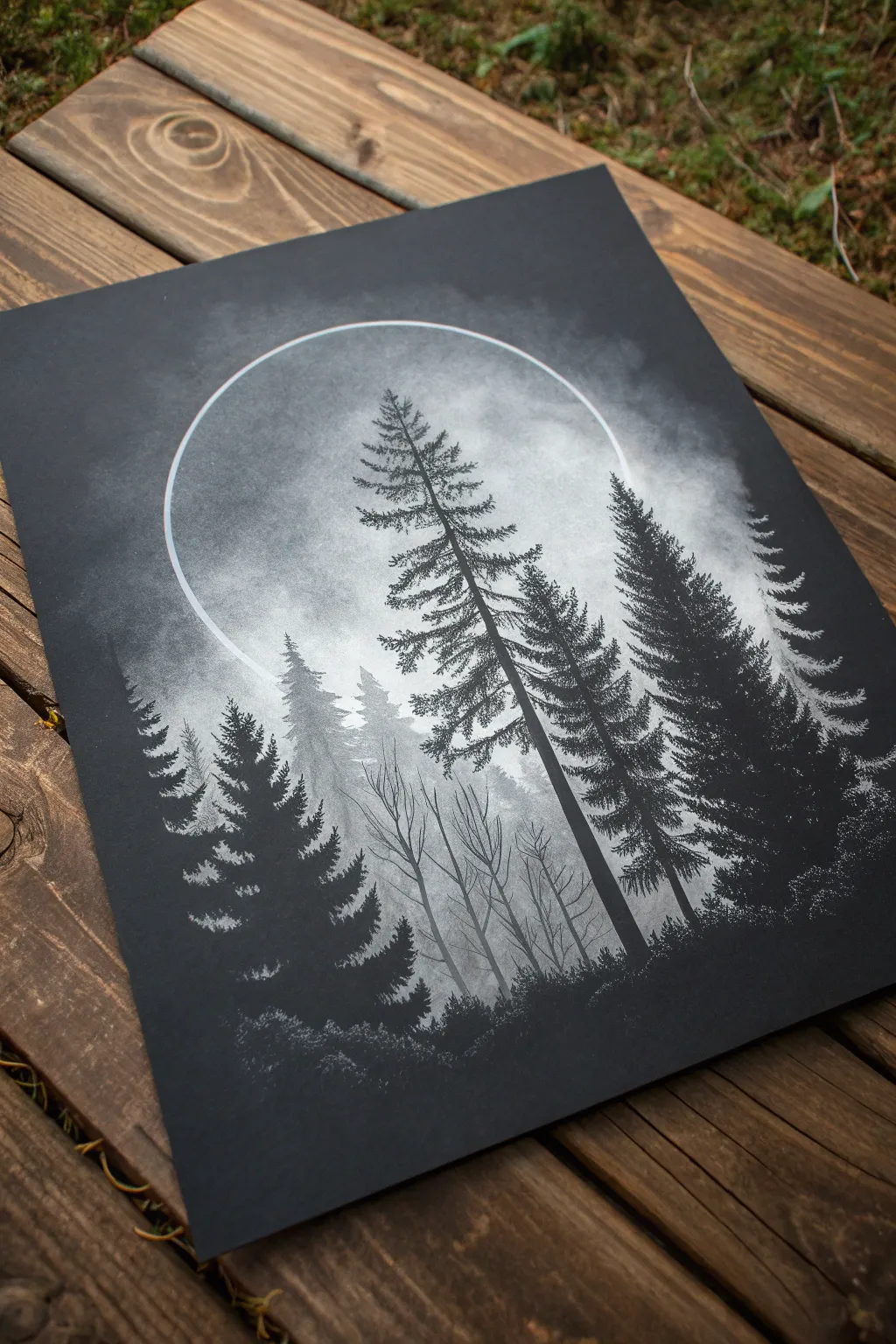
This striking project creates an eerie and beautiful sense of depth using simple contrasts between black paper and white media. You will build layers of atmospheric fog and crisp silhouettes to make a forest scene that looks like it’s glowing from within.
Step-by-Step Tutorial
Materials
- Heavyweight black mixed-media paper or cardstock (8×10 or similar)
- White soft pastels or pan pastels
- White charcoal pencil (or white pastel pencil)
- Black fine-liner pen or black ink brush pen
- Cotton balls or blending stumps
- Compass or large circular object (like a bowl) for tracing
- Fixative spray (workable)
- Black charcoal pencil (optional for deepening darks)
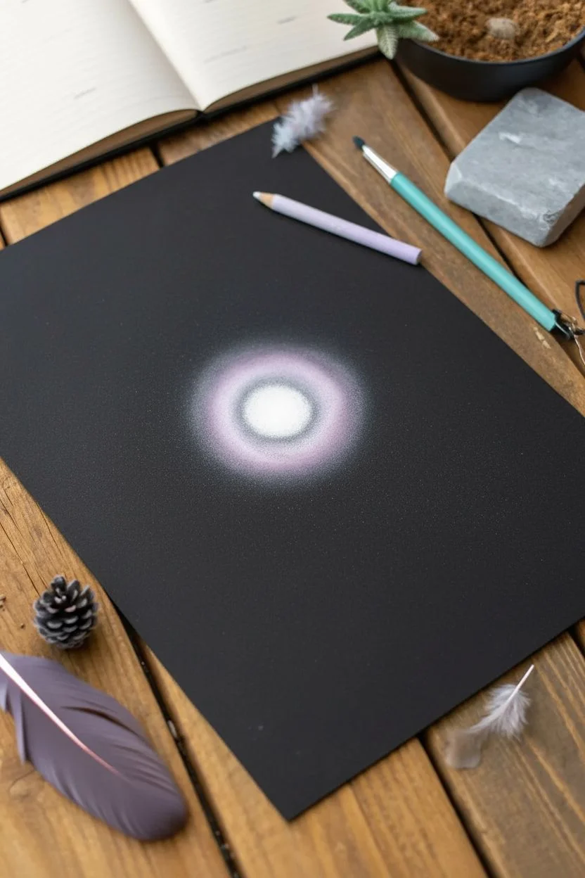
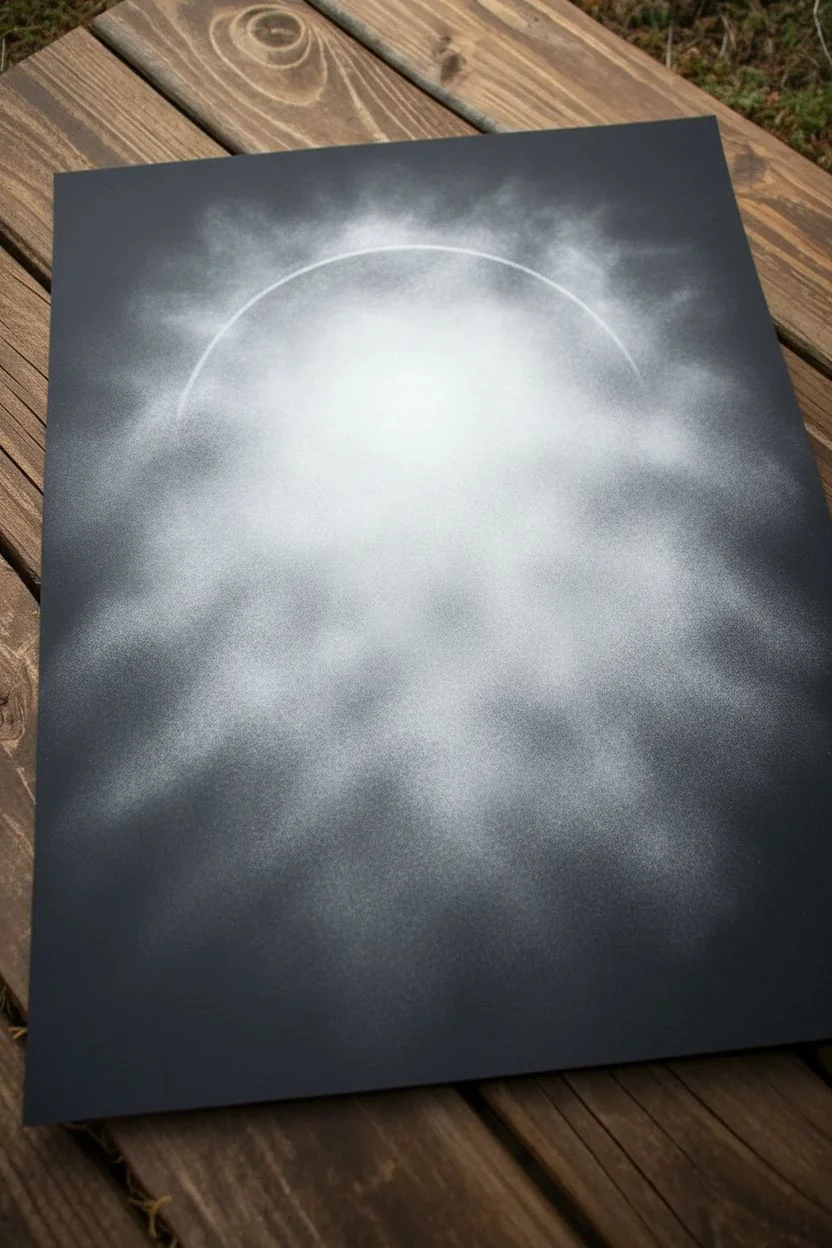
Step 1: Setting the Moon and Fog
-
Trace the circle:
Begin by positioning your compass or circular object near the upper middle of the paper. Lightly trace the outline of your moon using the white charcoal pencil; keep the line faint so it blends later. -
Apply base glow:
Using white soft pastel or pan pastel, apply a focused amount of pigment inside the circle, concentrating on the upper center area. -
Create the first fog layer:
With a cotton ball or soft sponge, rub the pastel created in the previous step into the paper, dragging it downwards outside the circle’s lower boundary to start the foggy effect. -
Intensify the moonlight:
Add a second, heavier layer of white pastel inside the circle, specifically around the top two-thirds. This creates the ‘source’ of the light. -
Blend the atmosphere:
Gently smudge the pigment again, swirling it into the black negative space around the circle to create soft, uneven clouds of mist. I like to let this fade naturally as it reaches the edges of the paper. -
Define the moon’s halo:
Take your white charcoal pencil and re-trace the upper arc of the moon with a slightly firmer pressure to make that crisp white rim pop against the hazy background.
Clean Lines Pro-Tip
Keep a piece of scrap paper under your drawing hand. Pastel dust smudges easily on black paper, and resting your hand on a clean sheet prevents muddy fingerprints.
Step 2: Building Background Elements
-
Sketch distant trees:
Using a light hand with your white charcoal pencil, sketch the faint outlines of distant pine trees within the foggy area below the moon. -
Fill the grey trees:
Shade these distant trees lightly with white charcoal. Don’t make them solid white; you want a deeply grey, ghostly look that suggests they are far away in the mist. -
Draw bare branches:
In the lower mid-ground, draw thin, skeletal deciduous trees using the sharp point of your white pencil. These should be delicate and wispy, lighter at the tips. -
Seal the background:
Lightly spray the artwork with workable fixative. This prevents your glowing background from muddying when you add the stark black foreground layers.
Step 3: Foreground Silhouettes
-
Establish the ground line:
Switch to your black ink pen or black charcoal. Darken the very bottom of the page to create an undulating, uneven forest floor silhouette. -
Draw the main trunk:
Draw a thick vertical line for your largest foreground pine tree. It should extend well up into the moon’s circle, anchoring the composition. -
Add horizontal branches:
Starting from the top of the trunk, make swift, jagged strokes outward and slightly downward to form the pine boughs. -
Thicken the foliage:
Go back over the branches, adding texture and thickness closer to the trunk. The tree should be widest at the bottom and tapered at the top. -
Add secondary pines:
Create 2-3 additional black pine trees on either side of the main one. Vary their heights so they don’t look like a picket fence. -
Stipple the underbrush:
Use a stippling or tapping motion with your white pastel pencil along the very bottom edge of the black trees to suggest fern or bush highlights caught in the moonlight. -
Enhance contrast:
If your black paper isn’t dark enough against the white pastel dust, go over the foreground trees with a black brush pen or ink for -
Final highlights:
Add tiny, sharp touches of white charcoal on just the tips of the black pine branches that fall directly in front of the moon, simulating backlighting.
Add a Starry Sky
Flick a stiff brush loaded with diluted white gouache or acrylic ink over the upper corners to create tiny, sharp stars in the dark areas.
Step back and admire how the simple contrast creates a moody, luminous world right on the page


Ocean Waves on Black Paper With Foam Highlights
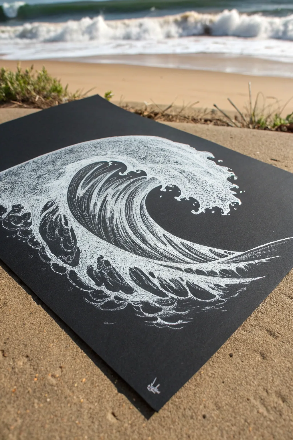
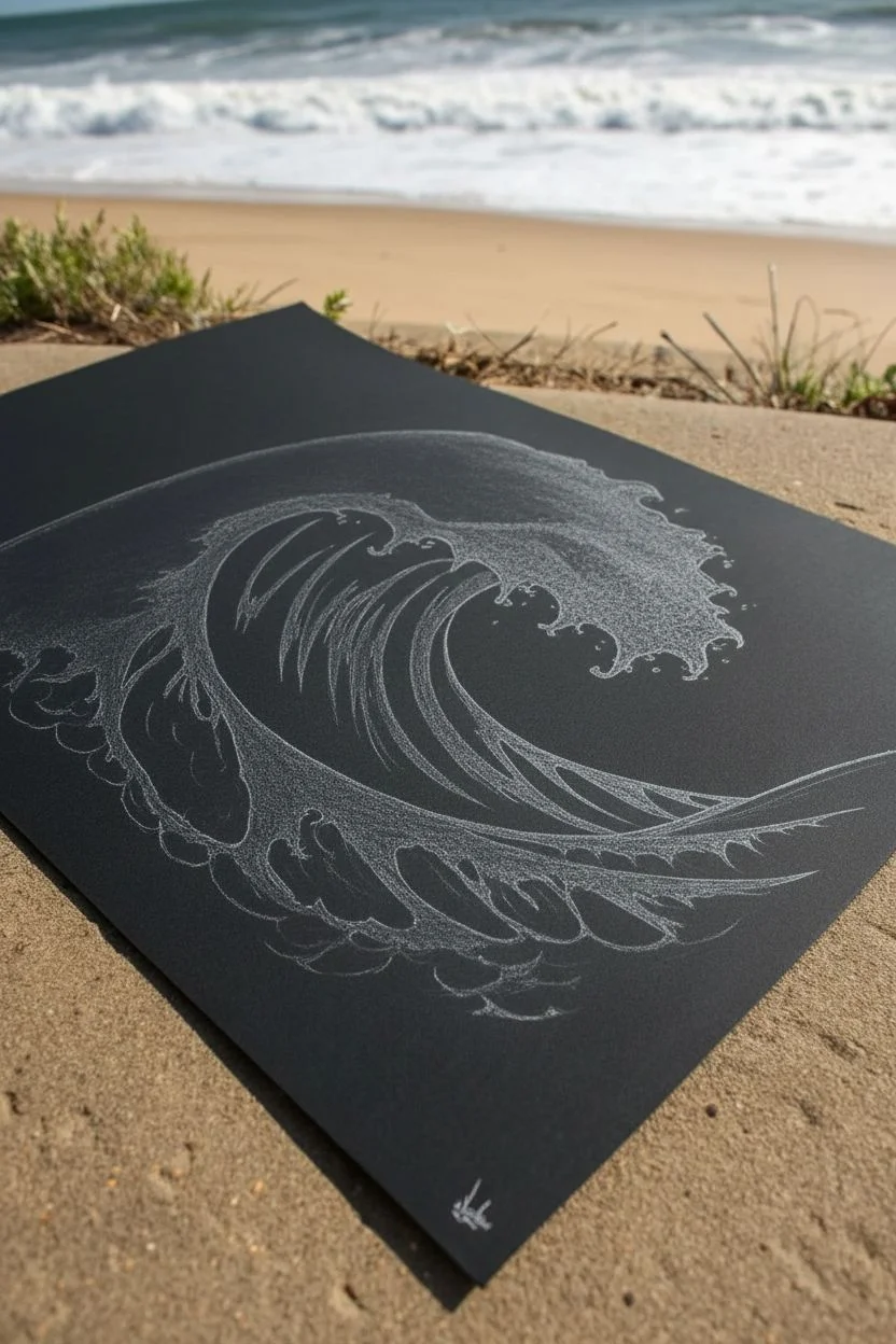
Capture the raw power of the ocean with this striking monochromatic study. Using fine white lines on deep black paper creates dramatic contrast, making the frothy foam and sleek barrel of the wave pop right off the page.
Step-by-Step
Materials
- Black cardstock or heavyweight art paper (A4 or A3 size)
- White gel pens (fine, medium, and bold tips)
- White colored pencil or pastel pencil (for sketching)
- Graphic liner pen (optional, for ultra-fine details)
- Reference photo of a crashing wave
Step 1: Sketching the Form
-
Establish the curve:
Begin by lightly sketching the main C-shape of the wave using a white colored pencil. Keep your pressure very light so the lines can be covered later. -
Define the barrel:
Draw the inner curve where the wave hollows out. This creates the ‘barrel’ or tube of the wave. -
Outline the crest:
Sketch a jagged, uneven line along the top ridge where the water breaks into foam. It shouldn’t be a perfect line; let it mimic the organic chaos of water. -
Map the base:
Lightly indicate the churning water at the bottom of the wave, creating a wide, unstable base for your composition.
Ink Flow Tip
If your gel pen skips on the textured paper, try cleaning the tip on a scrap piece of paper or warming it gently in your hands to get the ink flowing smoothly again.
Step 2: Inking the Flow
-
Start the inner flow lines:
Switch to a medium-tip white gel pen. Begin drawing long, sweeping lines inside the barrel of the wave, following the curve you sketched earlier. -
Create variation:
As you draw these flow lines, vary the spacing. Some lines should be close together to show shadow or depth, while wider spacing suggests highlights. -
Break the lines:
Don’t make every line continuous from top to bottom. Break them occasionally to suggest the texture of moving water and light reflection. -
Build the darker sections:
Near the top of the curve where the wave starts to overhang, leave some areas black or use very thin, sparse lines to indicate the shadow under the lip.
Step 3: Creating the Foam
-
Stipple the crest:
Using your boldest white pen, start stippling (creating masses of dots) along the jagged top edge of the wave. This simulates the aerated spray. -
Form the ‘claw’ shapes:
Draw small, hook-like drips and splashes ejecting from the main foam mass. These little details give the wave a sense of forward motion. -
Add texture to the foam:
Instead of solid white, use tiny tight circles and squiggles within the foamy areas. This keeps the texture interesting and less blocked-in. -
Connect foam to water:
Where the white foam meets the sleek water lines, gently fade your stippling out so it blends rather than looking like a sticker placed on top.
Go Metallic
For a magical, bioluminescent effect, swap the standard white gel pen for a metallic silver or light blue pen for just the highlight lines inside the wave barrel.
Step 4: Defining the Chaos
-
Detail the base:
At the bottom of the drawing, use a mix of curved lines and bubbly circles to depict the turbulent water crashing against itself. -
Add secondary splashes:
Draw disconnected clusters of dots and small rings floating away from the main wave to represent airborne spray. -
Highlight the ‘lip’:
Go over the very edge of the curling lip with your brightest, thickest ink to simulate the light catching the most transparent part of the water.
Step 5: Final Polish
-
Clean up sketch lines:
If any of your original colored pencil sketch is still visible in the black negative spaces, gently erase it now. -
Check contrast:
Step back and assess your drawing. Usually, I realize I need to add more density to the white foam areas to make them truly stand out against the black. -
Add the signature:
Sign your work at the bottom in a small, stylized white script to complete the piece.
Frame your high-contrast seascape to bring a cool coastal vibe to any room
Bubbles on Black Paper With Glasslike Reflections
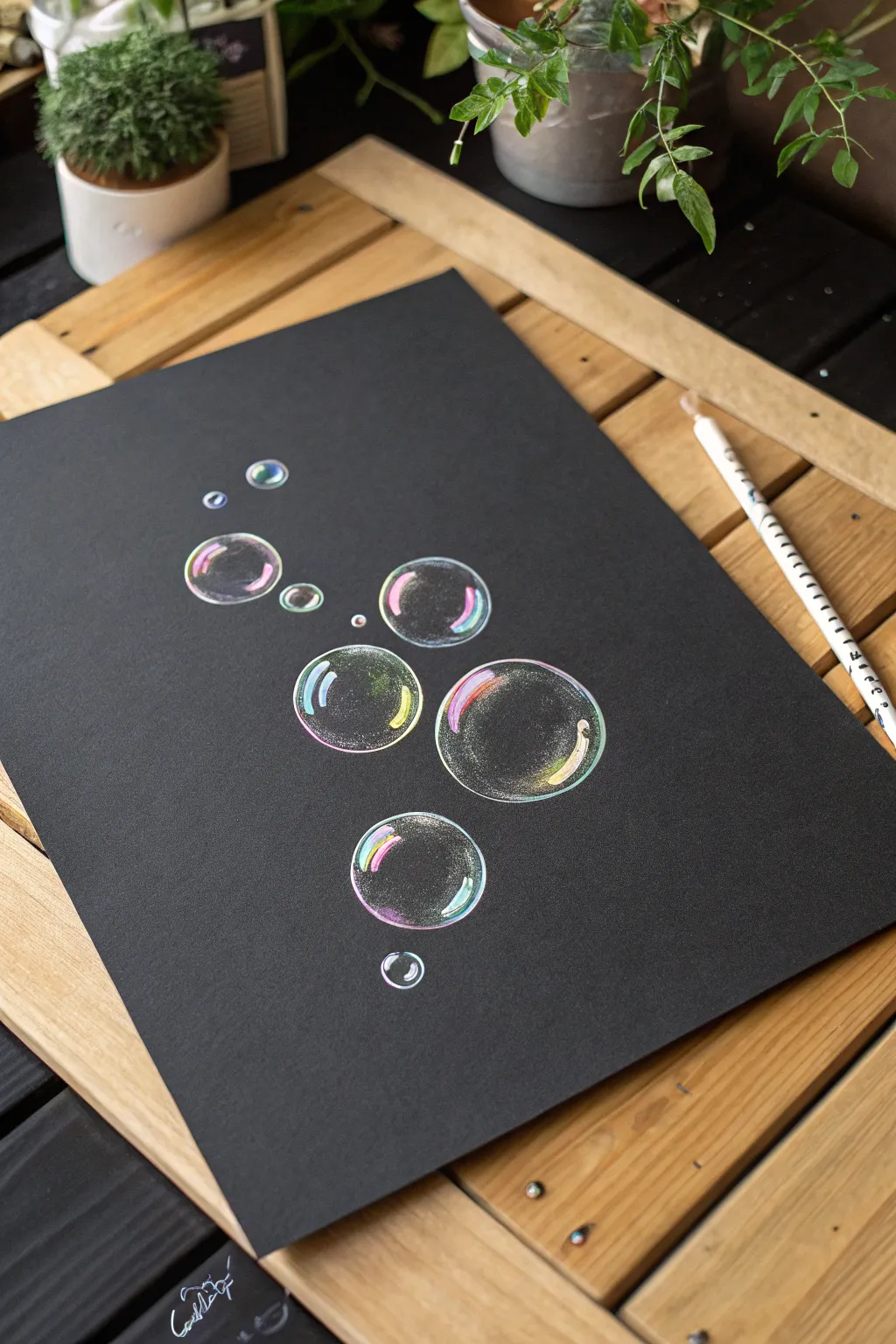
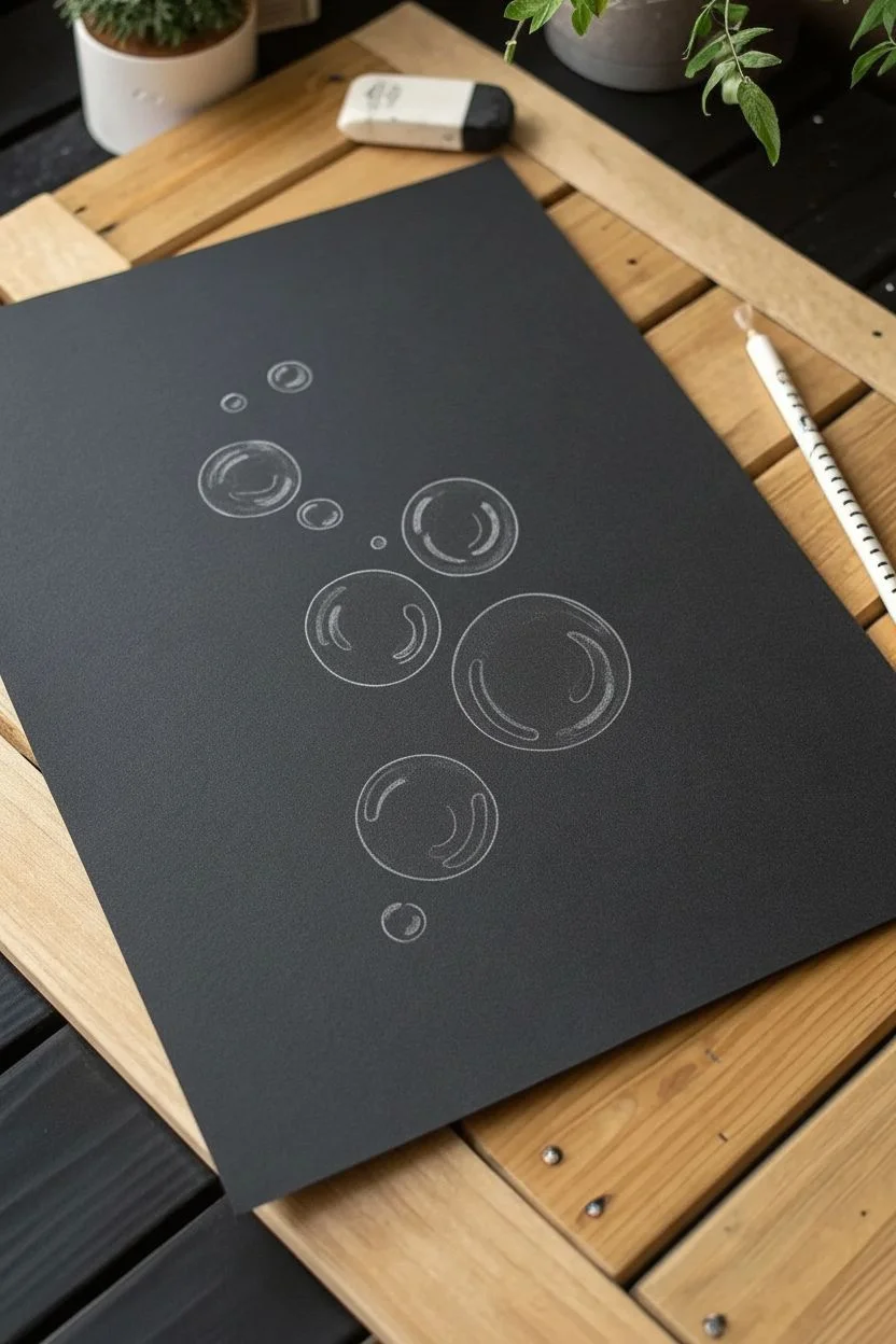
Capture the delicate, fleeting beauty of soap bubbles suspended in darkness with this vibrant drawing tutorial. Using soft colored pencils on black paper allows you to exaggerate the rainbow-like refractions and glassy highlights that make bubbles so mesmerizing.
Step-by-Step Guide
Materials
- Black drawing paper or cardstock (smooth texture is best)
- White charcoal pencil or white pastel pencil (for initial sketch and highlights)
- Set of soft colored pencils (specifically: pink, purple, light blue, teal, yellow, lime green)
- Circle template or various round objects to trace (bottle caps, coins)
- Kneaded eraser
- White gel pen (optional, for intense highlights)
Step 1: Laying the Foundation
-
Plan your composition:
Visualize where your bubbles will float. A scattered, rising formation usually looks most natural. Aim for a mix of sizes—one or two large focal bubbles, a few medium ones, and several tiny ‘satellite’ bubbles. -
Trace the circles:
Using a white charcoal pencil with a very light hand, trace your circles onto the black paper using your templates. Keep the lines incredibly faint; these are just guides and shouldn’t be visible in the final piece. -
Draft the inner reflections:
Inside each circle, lightly sketch distorted, curved shapes that hug the inner rim. These will become your colorful reflections. Think of them as warped windows reflecting the world around the bubble. -
Clean up guidelines:
Take your kneaded eraser and gently dab (don’t rub) the main circle outlines. You want them barely visible, almost like a ghost of a line, because bubbles don’t have hard black outlines.
Step 2: Adding Color Refractions
-
Start with cool tones:
Select a light blue or teal pencil. On the top left curve of your largest bubble, draw a thin, curved highlight that follows the sphere’s shape. Press firmly in the center of the stroke and fade out at the ends. -
Introduce warmth:
Opposite the blue, on the bottom right inner edge, apply a streak of pink or magenta. Blend it slightly into the black paper, keeping the edges soft. -
Layer secondary colors:
Next to the pink, add a touch of sunny yellow or lime green. Allow these colors to overlap slightly; where they meet, they will create new, interesting secondary hues. -
Repeat for all bubbles:
Go through each bubble and add these color pairings. Vary the placement slightly to make them look erratic and organic, but generally keep the light source consistent (e.g., light hitting from the top left). -
Soften the edges:
Use a clean finger or a cotton swab to very gently smudge the colored pencil strokes. This helps create that diffused, ethereal look characteristic of light hitting a soapy surface.
Pro Tip: Transparency Trick
Make sure the center of the bubble remains pure black paper. The more black visible inside the circle, the more transparent and hollow the bubble will appear to the viewer.
Step 3: Creating Glassy Definition
-
Define the rim:
Using a sharpened white pencil, very lightly draw extremely thin lines along parts of the bubble’s outer edge. Don’t connect the whole circle; broken lines trick the eye into seeing a transparent sphere. -
Add strong white highlights:
Press hard with your white pencil to create the sun glints. These usually appear as small, distorted rectangles or crisp curved lines on the upper curve of the bubble, overlaying the blue tones you laid down earlier. -
Intensify the bottom reflection:
Add a second, softer white reflection at the bottom of the bubble, sitting ‘inside’ the colored area. This represents light passing through the sphere and hitting the back wall. -
Create surface noise:
I like to take a white pencil and gently stipple a few tiny dots inside the bubble’s clear center. This subtle texture suggests micro-particles or imperfections on the soap film. -
Sharpen the brightest spots:
If you have a white gel pen, add a single tiny dot or crisp line in the center of your brightest white highlight. This maximizes the contrast against the black paper.
Level Up: Background Magic
Use a toothbrush to flick tiny speckles of white gouache or diluted acrylic across the background before drawing to create a starry night or underwater effect.
Step 4: Final Polish
-
Enhance color saturation:
Go back over your colored areas (pink, yellow, blue) and press harder to increase vibrancy. The contrast between bright color and deep black is what makes this drawing pop. -
Connect the spectrum:
Where there are gaps between colors on the rim, lightly glaze a purple or intermediate shade to bridge them, ensuring the transition isn’t too abrupt. -
Review outlines:
Check that no heavy white outlines remain. If an edge looks too thick, use the black paper’s darkness to your advantage and erase or color over it with a black pencil to thin the line back down. -
Final dust off:
Blow away any pencil crumbs. Avoid wiping with your hand, as this might smear the white charcoal across the black background.
Step back and admire how the colors seem to glow straight off the dark page
Crystal Study on Black Paper With Sharp Edges and Glints
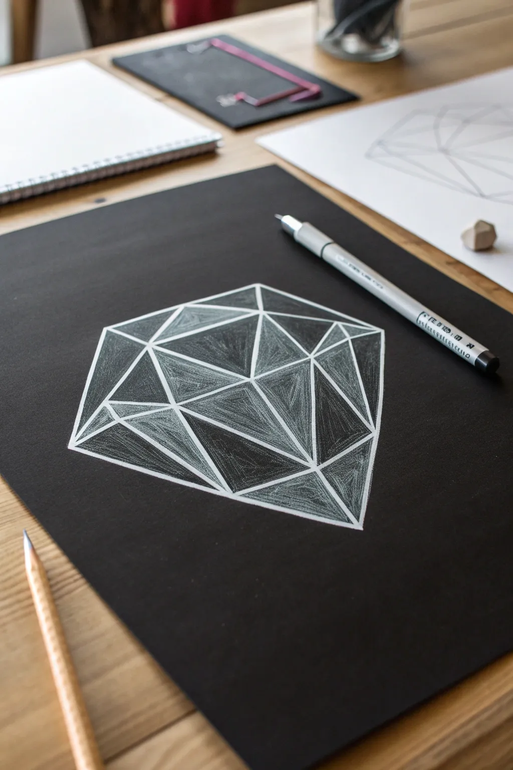
This striking crystal study explores the dramatic contrast between deep black paper and the luminous quality of white sketching. By focusing on sharp geometric facets, you’ll learn to build dimension solely through light and hatching techniques.
Step-by-Step Tutorial
Materials
- Black cardstock or heavyweight black drawing paper
- White colored pencil (wax or oil-based)
- White gel pen (fine tip) – optional for highlights
- Ruler or straight edge
- Graphite pencil (HB or harder) for initial layout
- Eraser (preferably a kneaded eraser)
- Pencil sharpener
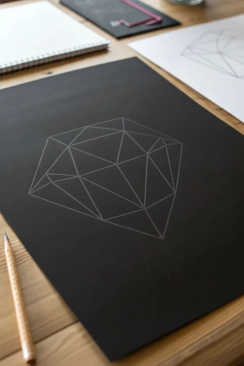
Step 1: Drafting the Skeleton
-
Establish the Outer Shape:
Begin by lightly sketching a wide hexagon shape in the center of your paper using your graphite pencil. Keep the lines incredibly faint, as graphite can create a shiny residue on black paper that is hard to cover later. -
Locate the Center Point:
Mark a point slightly off-center within your hexagon. This doesn’t need to be dead center; offsetting it slightly can give the crystal a more dynamic, tilted perspective. -
Connect the Vertices:
Using your ruler, draw straight lines connecting your central point to roughly every other corner of the outer hexagon. This creates the primary faces of your crystal. -
Form the Triangular Facets:
Connect the remaining outer corners to the lines you just drew, creating a network of interlocking triangles. You want to aim for an ‘icosahedron’ look, where every face is a triangle. -
Refine the Edges:
Go over your graphite grid with your ruler one last time to ensure every line is crisp and straight before we switch to white.
Step 2: Defining the Structure
-
First White Pass:
Switch to your white colored pencil. Sharpen it to a fine point. Firmly trace over your graphite skeleton lines. Use a ruler here to ensure the white lines are stark and architectural. -
Identify Light Source:
Decide where your light is coming from (usually top-left or top-right). This is crucial because it dictates which facets will be bright white and which will fade into the black paper. -
Thicken Key Edges:
Go back over the lines that are closest to your imaginary light source. Make these structural lines slightly thicker and brighter than the lines on the shadowed side.
Keep it Sharp
A dull pencil kills the geometric effect. Rotated your pencil in your fingers every few strokes to maintain a point, and sharpen frequently for those crisp facet edges.
Step 3: Shading and Faceting
-
Base Hatching:
Start shading the facets that are facing the light. Use shading strokes that run parallel to one edge of the triangle. Keep your pressure light to medium—we want a translucent, scratchy texture, not a solid block of white. -
Cross-Hatching for Depth:
On the brighter faces, add a second layer of hatching lines going in a different direction. This cross-hatching builds density and makes the face appear more solid. -
Gradating the Shadows:
For facets on the ‘shadow’ side of the crystal, apply very minimal pressure. Start shading at the edge of the triangle and fade out towards the center, letting the black paper show through heavily. -
Creating Contrast:
Look at where two facets meet. If one face is bright, try to leave the adjacent face darker. This contrast is what makes the object look 3D rather than flat. -
Edge Highlighting:
Take your sharpened white pencil and run it along the very inside edge of your brightest facets. I find this creates a nice ‘beveled’ glass effect. -
Adding Glints:
If you have a white gel pen, add tiny dots or short, sharp lines on the intersections of lines on the most illuminated side. If using pencil, press very hard to make opaque white spots. -
Fading the Bottom:
On the bottom-most facets, allow your shading to be looser and darker. The crystal should feel like it’s emerging from the darkness. -
Final Cleanup:
Use a clean eraser to gently lift any stray graphite marks or white dust surrounding the shape to keep the background pitch black.
Color Shift
Layer a faint amount of light blue or pale violet pencil over the white shading on just one side. This adds a cool, glassy iridescence without overpowering the monochrome look.
Now step back and admire how simple lines can construct such a complex form on the dark page
Candle Flame on Black Paper With Warm Color Layering

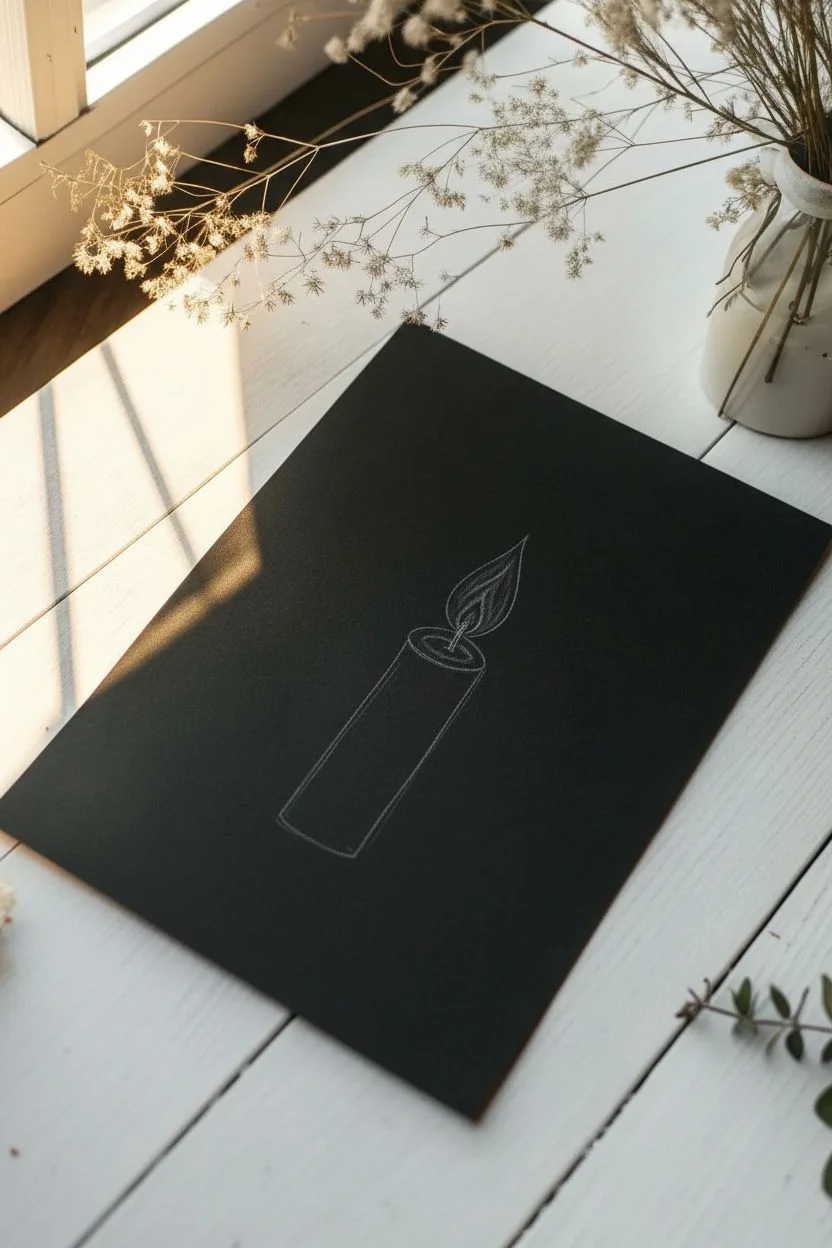
Contrast is key in this striking project, where a vibrant, warm flame pops against a deep black background. You’ll combine opaque white pens for crisp linework with layered colored pencils or pastels to create a glowing, mystical halo effect.
Detailed Instructions
Materials
- Black cardstock or mixed media paper (heavyweight)
- White gel pen (e.g., Gelly Roll or Posca, 0.7mm or finer)
- Colored pencils (Prismacolor Premier or similar soft core) in White, Yellow, Orange, and Burnt Sienna
- Metallic Gold gel pen or paint marker
- Ruler
- Compass or circular object for tracing
- Graphite pencil (hard, e.g., 2H for faint lines)
- Kneaded eraser
Step 1: Drafting the Layout
-
Center the composition:
Begin by finding the vertical center of your black paper. Lightly sketch a vertical line to guide the placement of the candle and flame. -
Sketch the candle shape:
Draw a rectangular cylinder near the bottom third of the page. Angle the top slightly to show the ellipse of the candle’s surface. -
Outline the flame:
Above the candle, sketch a classic teardrop flame shape. Add a small wick connecting the flame to the center of the candle top.
Step 2: Drawing the Candle
-
Detail the candle body:
Using your white gel pen, trace over your pencil lines for the candle. Instead of solid lines, use short, broken vertical strokes to create a wax-like texture. -
Add internal texture:
Fill the inside of the candle shape with varied vertical dashes and small dots. Keep the strokes loose to mimic the uneven surface of an old candle. -
Create the top surface:
Draw the top ellipse with a solid white line, then add a second inner ring to show the thickness of the wax. Add a few dots inside for depth. -
Draw the base:
Beneath the candle, draw three concentric, slightly irregular ovals using the white gel pen. These represent a ripple or a simple puddle of wax, grounding the object.
Gel Pen Won’t Flow?
White ink creates drag on texture. If the pen skips, scribble on a scrap piece of smooth plastic to get the ball rolling, or wipe the tip to remove dried paper dust.
Step 3: Igniting the Flame
-
Lay down the white base:
Before adding color, color in the entire flame shape solidly with your white colored pencil. This primer layer is crucial for making the colors pop on black paper. -
Add the yellow core:
Color the bottom and center of the flame with bright yellow pencil, blending it slightly into the white edges. -
Build the orange tones:
Layer orange pencil around the middle and top sections of the flame. Use vertical strokes that follow the flame’s direction. -
Deepen the tips:
Add a touch of red or burnt sienna to the very tip and edges of the flame for contrast. Use the white gel pen to draw a solid white highlight on the left side of the flame for a ‘wet’ look. -
Draw the wick:
Use a black pen or marker to draw the wick, leaving just the very tip of it white (or outlines in white) where it touches the fire.
Add Sparkle
For a magical touch, use a tiny dot of glitter glue on the flame’s highlight or incorporate metallic copper ink into the halo rays for a two-tone glow.
Step 4: The Golden Halo
-
Draw the halo guide:
Using a compass or tracing tool, lightly pencil a circle centered exactly behind the flame. -
Outline in gold:
Trace the circle with your metallic gold pen. I like to make this line slightly thick or double it up for better visibility. -
Fill the background:
Inside the golden circle (around the flame), lightly shade with a dark green or charcoal pencil to create a subtle separation from the black paper. -
Add the sunrays:
Using your ruler and metallic gold pen, draw varied lengths of rays extending outward from the gold circle. Alternate between long and medium strokes. -
Add shorter rays:
Fill the gaps between the main rays with much shorter gold dashes to create a dense, radiant burst effect.
Step 5: Final Flourishes
-
Add botanical elements:
Using the white gel pen, freehand simple botanical sprigs on the left and right sides of the candle base. Use a simple ‘arrow’ shape for leaves. -
Clean up:
Once all ink is fully dry, gently erase any visible graphite pencil lines with your kneaded eraser.
Step back and admire how the warmth of your flame breaks through the darkness of the page
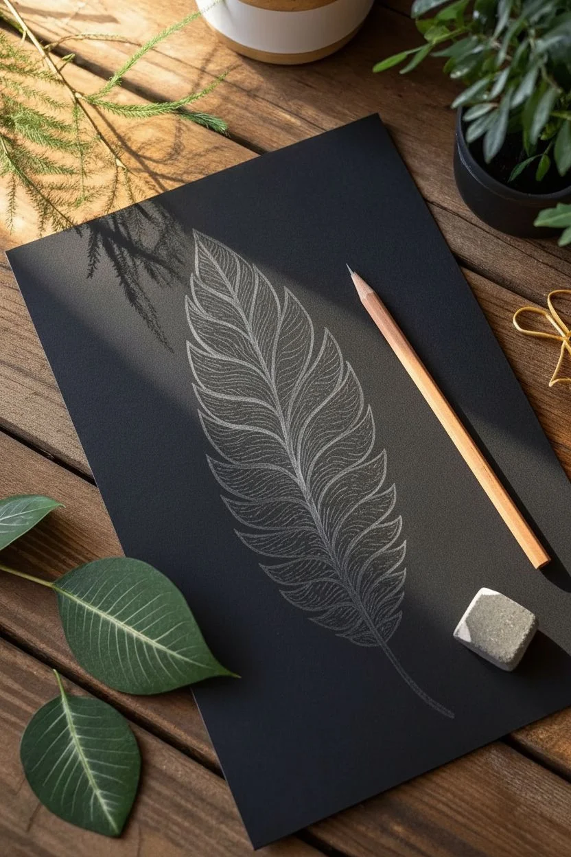
Feather Close-Up on Black Paper With Fine Linework
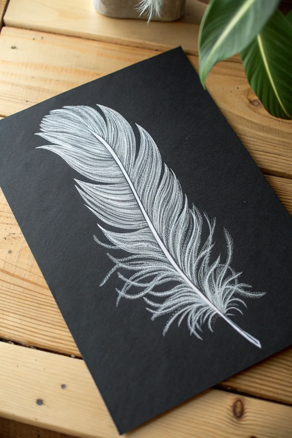
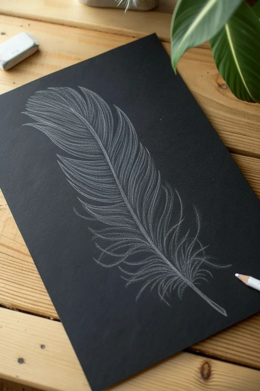
Capture the delicate beauty of a feather using high-contrast white ink on deep black paper. This project focuses on building texture through fine, repetitive strokes to create a realistic, airy effect that pops off the page.
How-To Guide
Materials
- Black drawing paper or cardstock (heavyweight is best)
- White gel pen (0.5mm tip works well)
- White charcoal pencil or pastel pencil (for sketching)
- Kneaded eraser
- Pencil sharpener
- Reference photo of a feather (optional)
Step 1: Sketching the Framework
-
Establish the curve:
Begin by lightly drawing the central shaft (rachis) of the feather using your white charcoal pencil. Draw a gentle, diagonal curve from the bottom right to the top left to mimic the natural drift of a falling feather. -
Define the width:
Lightly sketch the outer boundaries of the feather vanes. Don’t make a solid outline; instead, use faint dash marks to suggest the width on both sides of the center shaft, keeping the top wider and tapering toward the quill. -
Add separation points:
Mark a few spots where the feather barbs separate naturally. Feathers rarely stay perfect, so indicate a few V-shaped gaps along the edges to create realism later. -
Refine the quill:
Thicken the bottom line of the central shaft to create the hollow quill base. It should be widest at the very bottom and taper gradually as it moves up into the feathery section.
Ink Stopping?
If your gel pen skips on the textured paper, try scribbling on a scrap piece of smooth plastic or your thumbnail to get the ball rolling again. Don’t press harder; it can damage the paper.
Step 2: Creating the Central Shaft
-
Ink the spine:
Switch to your white gel pen. Carefully trace over the central shaft line you sketched. I like to use a slightly heavier pressure here to make this the brightest part of the drawing. -
Create dimension:
Draw a second, very thin line parallel to the first one within the shaft area, leaving a tiny gap of black paper between them. This negative space creates a cylindrical 3D look. -
Taper the top:
As you reach the top of the feather, let the two shaft lines merge into a single, hair-thin line that eventually disappears into the feathers.
Add Subtle Color
For a magical twist, lightly glaze over parts of the dried white ink with transparent colored pencils. A touch of pale blue or violet adds incredible depth to the shadows.
Step 3: Drawing the Barbs
-
Start directional strokes:
Begin at the top of the feather. Using the gel pen, flick fine lines outward and upward from the central shaft. These strokes should be quick and confident to ensure they taper naturally at the ends. -
Follow the curve:
As you move down the shaft, adjust the angle of your strokes. Near the top, they point upward; near the middle, they flatten out slightly. -
Layering for density:
Don’t try to fill the solid white areas in one pass. Draw a base layer of individual lines, then go back over certain sections with more lines to build up opaque brightness. -
Creating the gaps:
Remember those V-shaped gaps you sketched? When you reach those areas, stop your strokes short or curve them intentionally away from each other to leave distinct triangular breaks in the feather structure. -
Maintain texture:
Avoid coloring in solid blocks of white. Keep every mark visible as a distinct line. The texture of the feather comes from seeing thousands of individual barbs. -
Handle the edges:
When your strokes reach the outer edge of the feather, allow them to vary slightly in length. A perfectly smooth edge looks artificial; a slightly jagged edge looks organic.
Step 4: The Fluffy Base
-
Switching texture:
The bottom of a feather (the downy barbs) is much messier than the top. Instead of stiff, straight lines, use squiggly, wandering strokes for this section. -
Intertwining lines:
Let these lines cross over each other freely. They should look soft and chaotic, curving back toward the quill or drifting away entirely. -
Fading out:
Press very lightly with the pen for the outermost tips of the downy section so the white ink appears slightly translucent, suggesting softness.
Step 5: Final Touches
-
Clean up:
Once the ink is completely dry (give it a few minutes to avoid smearing), gently use the kneaded eraser to lift any visible charcoal sketch lines. -
Boost contrast:
Look at your drawing from a distance. If the central shaft or the top curves need to pop more, add one final layer of ink to the brightest highlights.
Now you have a striking, high-contrast piece of art that looks incredibly complex but was built one simple stroke at a time
Botanical Leaf Sketch on Black Paper With Vein Highlights
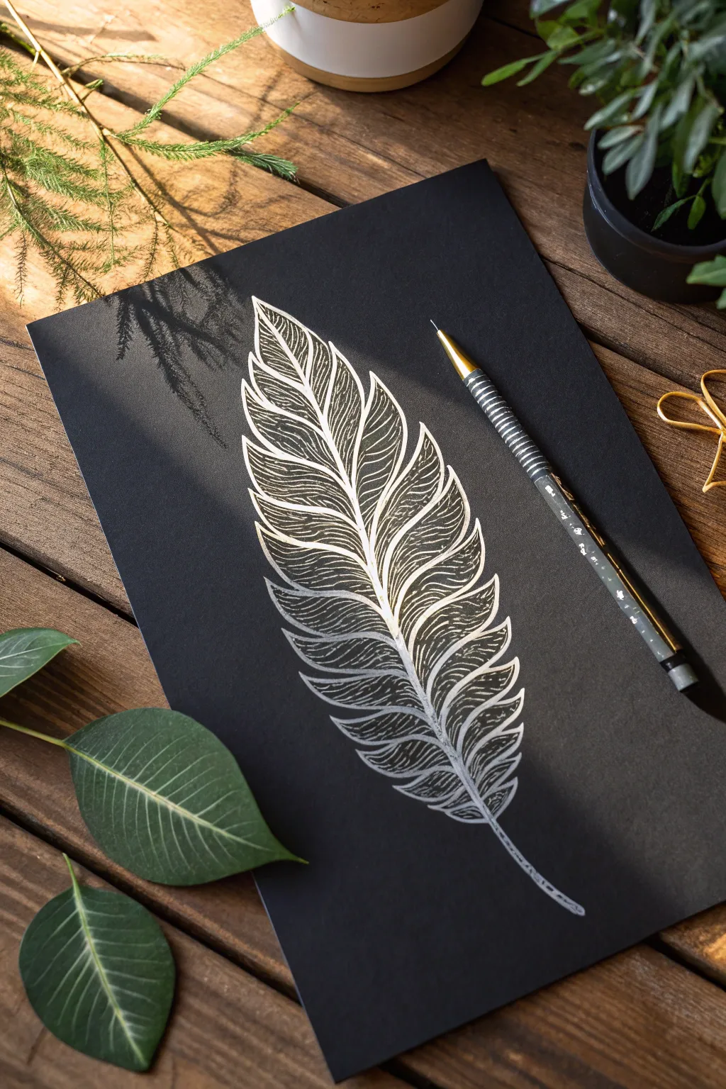
This elegant botanical sketch uses the stark contrast of metallic ink on black paper to create a luminous, feathery leaf design. The intricate linework mimics the delicate veins of a real leaf, resulting in a piece that feels both organic and magical.
Detailed Instructions
Materials
- High-quality black cardstock or mixed media black paper
- Silver or white gel pen (fine tip, 0.5mm or 0.8mm)
- HB pencil (for initial sketching)
- Kneaded eraser
- Ruler (optional)
- Reference photo of a fern or pinnate leaf
Step 1: Laying the Foundation
-
Establish the spine:
Begin by lightly sketching a curved central line using your HB pencil. This will serve as the midrib (rachis) of your leaf. -
Define the outer shape:
Lightly outline the overall almond or lanceolate shape of the leaf around the central spine to ensure your proportions stay balanced. -
Mark the leaflets:
Along the central spine, sketch faint, curved lines extending outward and upward to indicate the position of each individual leaflet segment. Make them slightly smaller as you reach the tip. -
Refine the edges:
Go back over your leaflet guidelines and give them a jagged, saw-toothed edge to mimic organic leaf margins. Keep these pencil lines extremely faint so they don’t show through later. -
Soft erase:
Roll your kneaded eraser gently over the entire sketch. You want to lift up most of the graphite, leaving only a ‘ghost’ of the image to guide your ink.
Ink Stopped Flowing?
Silver gel pens can clog. Scribble lightly on a scrap piece of rubber or your thumb skin to get the ball rolling again. Don’t press harder on the paper, or you might gouge the surface.
Step 2: Inking the Structure
-
Ink the midrib:
Take your silver gel pen and confidently draw the central spine. Start from the bottom stem and taper the pressure as you flick outward toward the usually thinner tip. -
Outline the segments:
Carefully trace the jagged outer edges of each leaflet segment. Don’t worry if your hand shakes slightly; organic lines look more natural than perfect curves. -
Add the central veins:
Draw the primary vein for each individual leaflet, connecting from the main spine to the tip of that specific segment. -
Let it set:
Pause for a moment to let this structural ink dry completely. Smudging silver ink on black paper is very noticeable and hard to fix.
Step 3: Creating Texture and Depth
-
Start the hatching:
Begin at the bottom-most leaflet. draw fine, curved lines radiating from the leaflet’s center vein toward the outer edge. -
Mind the flow:
Ensure your hatching lines follow the curvature of the leaf. If the leaf curves up, your internal lines should curve up too. -
Vary the spacing:
Leave small gaps of black paper visible between your silver lines. This negative space is crucial for defining the texture. -
Build the pattern:
Work your way up the leaf one segment at a time. I find it helpful to rotate the paper constantly to keep my hand at a comfortable drawing angle. -
Intensify highlights:
Go back to the areas where the leaf would catch the light—usually the top curves of the leaflets—and add a second layer of very fine lines or stippling to make the silver pop. -
Refine the stem:
Thicken the bottom stem slightly with a second pass of ink to give it visual weight. -
Final clean up:
Once you are 100% certain the ink is dry, gently dab away any remaining pencil marks with the kneaded eraser.
Pro Tip: Hand Guard
Place a scrap piece of clean paper under your drawing hand. This prevents skin oils from transferring to the black paper, which can repel the gel ink and cause skipping.
Frame your striking silver creation or use it as a sophisticated cover for a handmade greeting card
Intricate Mandala on Black Paper With White Line Art
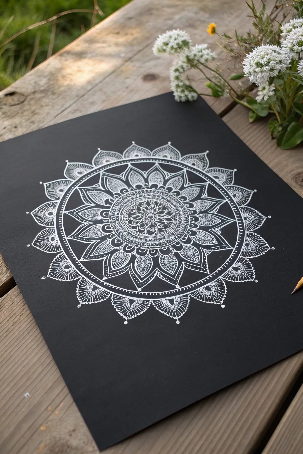
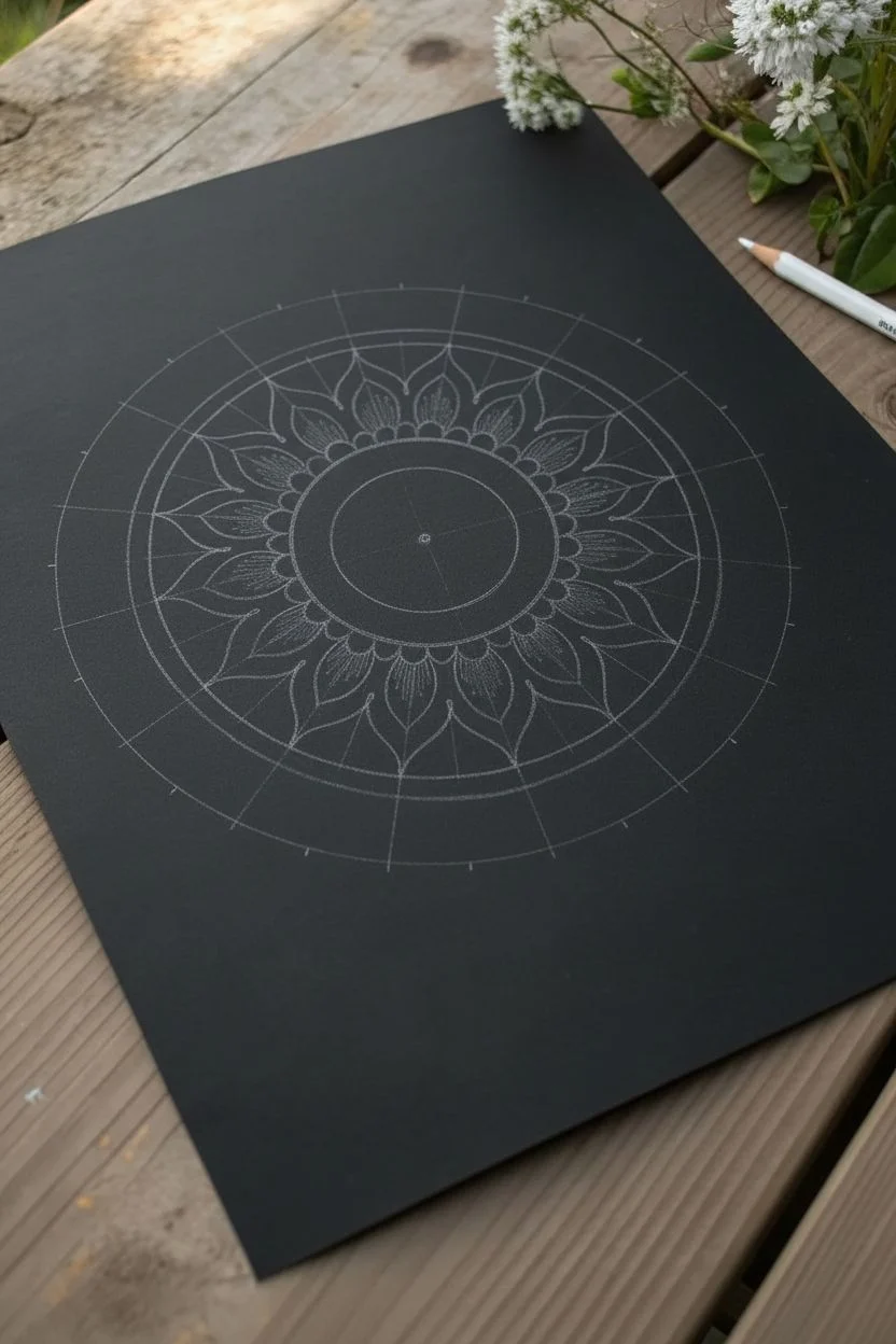
The striking contrast of crisp white ink against deep black paper transforms a standard mandala into a glowing piece of art. This project guides you through building complex patterns from the center outward, resulting in a mesmerizing, lace-like design.
How-To Guide
Materials
- High-quality black cardstock or mixed media black paper
- Compass with white lead or a white charcoal pencil
- Protractor
- Ruler
- White gel pens (fine tip 0.5mm and broad tip 0.8mm or 1.0mm)
- Eraser (kneaded eraser works best on black paper)
- Paper towel or scrap paper for testing pens
Step 1: Setting the Structure
-
Find the center:
Begin by finding the exact center of your black paper. Use your ruler to measure corner to corner lightly with a white charcoal pencil or chalk pencil to create a tiny ‘X’ mark. -
Draw guide circles:
Using your compass, draw a series of concentric circles radiating from your center point. Start small—about 1 inch in diameter—and add larger rings every 0.5 to 1 inch outward until you reach your desired total width. -
Mark degrees:
Place your protractor on the center point. Mark every 20 or 30 degrees around the circle. These marks will help keep your petals consistent and symmetrical. -
Create radial lines:
Connect your degree marks through the center point using a ruler, creating ‘slices’ like a pie. Press very lightly with your pencil so these lines can be erased later.
Ink Flow Secret
White gel pens can skip. Keep a scrap of black paper nearby to scribble on periodically to get the ink flowing smoothly again before touching your art.
Step 2: Drawing the Core
-
Start the center seed:
Switch to your fine-tip white gel pen. In the very center circle, draw a small flower or star shape. This anchors the entire design. -
Add the first petal layer:
In the first ring around the center, draw small, simple U-shaped petals. Use the radial guide lines to ensure each petal is the same width. -
Detail the inner ring:
Fill these small petals with tiny dots or lines. I find that stippling (dot work) creates a lovely texture that contrasts well with solid lines. -
Create a decorative border:
Draw a double line around your current section to create a distinct border ring. Fill the space between the two lines with small hatch marks or circles.
Step 3: Expanding the Pattern
-
Draw larger pointed petals:
Moving to the next concentric ring, draw larger, pointed petals (like lotus leaves). Let the tips touch the pencil guide circle. -
Layer intricate details:
Inside these larger petals, draw a smaller version of the same shape. Fill the gap between the inner and outer shapes with cross-hatching or a mesh pattern. -
Add connecting arches:
Between the peaks of the pointed petals, draw soft arches that bridge the gap. This connects the floral elements into a cohesive circle. -
Thicken main lines:
Go back over the primary outline of your large petals with a broader tip pen (0.8mm or 1.0mm). This line weight variation makes the design pop.
Glow Effect
Use a white charcoal pencil to lightly shade inside just one side of your petals. Smudge it with your finger to create a soft, glowing dimension.
Step 4: Final Flourishes
-
Create the outer rim:
Draw your final, largest ring of petals. For this outer layer, try an intricate lace pattern or a scallop shape with a dot at each peak. -
Emphasize with dots:
Place single white dots at the tips of your outer petals and in any negative space areas that feel too empty. These ‘floating’ dots add a magical quality. -
Wait for ink to dry:
Let your drawing sit for at least 15-20 minutes. Gel ink sits on top of the paper surface and takes longer to dry than ballpoint ink. -
Erase guide lines:
Gently erase your pencil circles and radial lines. A kneaded eraser is perfect here because it lifts the graphite/chalk without dragging or smudging the white ink.
Take a moment to admire how the intricate white lace pattern emerges from the darkness.
Gilded Fashion Sketch on Black Paper With Metallic Details
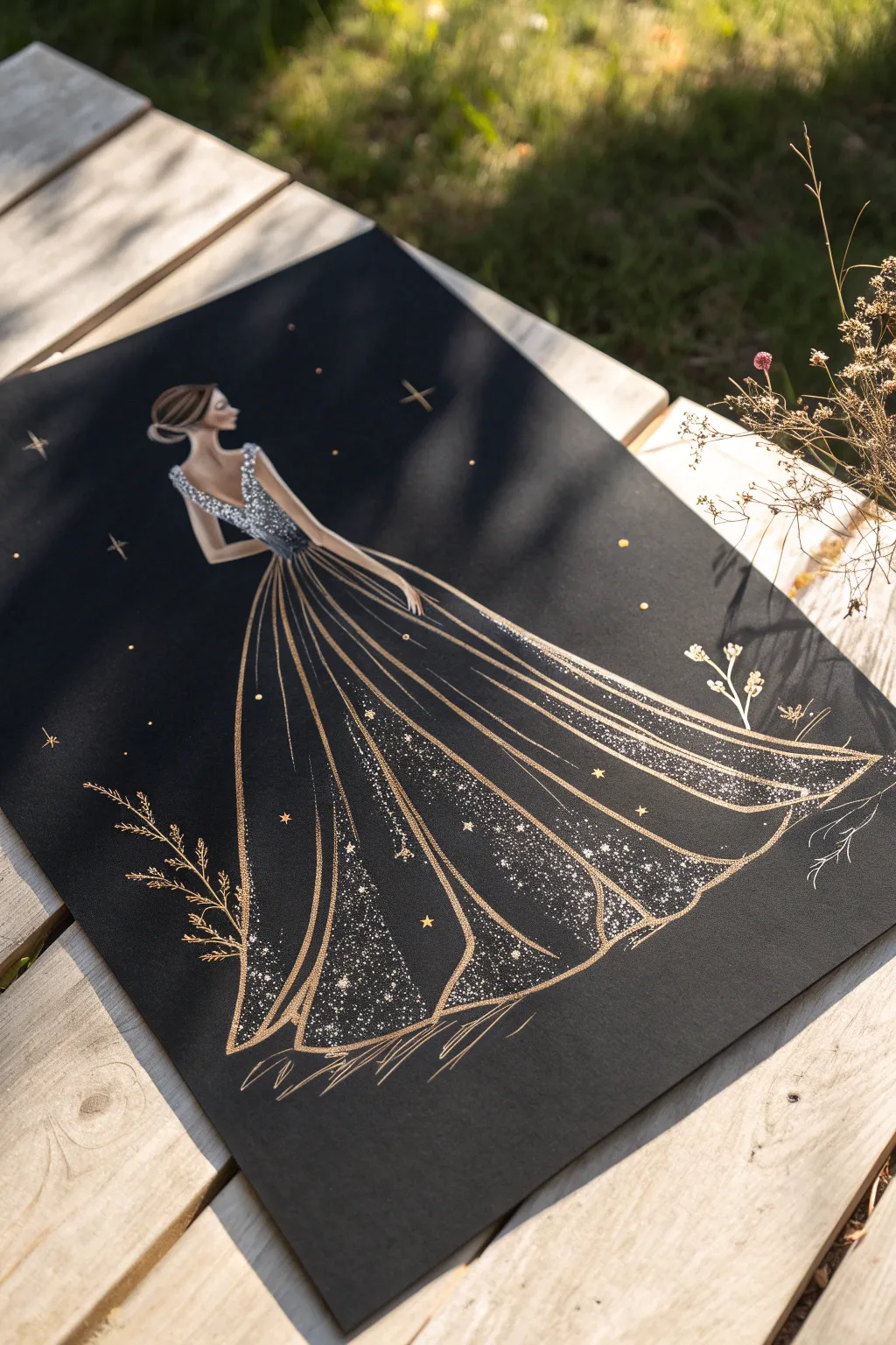
Capture the ethereal beauty of starlight fashion with this striking illustration on deep black paper. By combining metallic gold ink with glittery silver gel pens, you’ll create a gown that seems to shimmer right off the page.
Step-by-Step
Materials
- Heavyweight black mixed-media or drawing paper (A4 size)
- Graphite pencil (HB or 2H) and a kneaded eraser
- Gold metallic paint marker (fine tip) or gold ink with a dip pen
- Silver glitter gel pen or white gel pen
- Gold watercolor paint or gouache
- Fine detail paintbrush (size 0 or 00)
- Ruler (optional)
Step 1: Planning the Figure
-
Establish the pose:
Begin by lightly sketching a standard fashion croquis (figure template) on your black paper using a hard pencil like an HB. Draw a gentle ‘S’ curve to represent the spine and stance, placing the head near the top third. -
Map the body shapes:
Flesh out the figure with simple geometric shapes. Sketch an oval for the head, a trapezoid for the torso, and guiding lines for the arms. The figure should be looking over her shoulder, so position the head profile accordingly. -
Outline the gown’s silhouette:
Draw the dress starting from the waist, flowing outward in a wide, dramatic A-line shape that extends almost to the paper’s edge. Create long, sweeping vertical lines to indicate the folds of the fabric. -
Refine the sketch:
Go over your pencil lines to define the arms, neck, and the delicate updo hairstyle. Use your kneaded eraser to gently lift up most of the graphite, leaving only the faintest ghost lines to guide your ink.
Keep it flowing
When drawing long skirt folds, lock your wrist and move your entire arm from the shoulder. This creates smoother, more elegant curves than just moving your fingers.
Step 2: Inking the Gold Structure
-
Trace the main lines:
Using your fine-tip gold marker or dip pen, carefully trace the outline of the figure’s skin and hair. Use smooth, confident strokes to keep the lines clean against the black background. -
Define the dress folds:
Draw the vertical folds of the skirt with long, sweeping gold lines. Start from the waist and flick your wrist toward the hem to taper the lines naturally. -
Add bodice structure:
Outline the V-shape of the back of the dress and the straps. Ensure the waistline is clearly defined with a gold contour. -
Create the hemline:
At the bottom of the skirt, connect the vertical fold lines with curved strokes to create a ruffled, voluminous hem that looks like it’s resting on the ground.
Step 3: Adding the Sparkle
-
Fill the bodice:
Switch to your silver glitter gel pen. Densely stipple (dot) the bodice area to create a texture that looks like encrusted crystals or sequins. Leave tiny gaps of black to create depth. -
Highlight the skirt panels:
Identify the wide sections between your gold fold lines. Using the silver pen, add concentrated stippling near the bottom hem of these panels, fading out as you move upward. -
Create a gradient effect:
To make the fabric look diaphanous, scatter the silver dots more loosely as you move up the skirt, creating an ombré effect where the density is heaviest at the bottom. -
Add larger stars:
Intersperse a few tiny four-pointed stars or crosses within the glittery sections of the dress using the gold marker. This mixes the metallics for a richer look.
Ink stopping?
Metallic pens often clog on textured paper. Scribble on a scrap piece of paper to get the flow running again, or store pens tip-down between uses.
Step 4: Atmosphere and Details
-
Skin tone shading:
If you have a slightly opaque beige pencil or gouache, add very subtle shading to the back and arms. Alternatively, leave it black for a high-contrast, stylized look. -
Celestial background:
Surround the figure with floating golden stars. Draw small crosses and dots in the negative space around the upper body to create a night-sky atmosphere. -
Botanical accents:
At the bottom corners, sketch delicate, wispy floral sprigs using the gold marker or a fine brush. These should look like dried grasses or wildflowers framing the gown. -
Final highlights:
I like to add a few sharp white gel pen dots solely in the brightest areas of the silver bodice to make it pop. -
Clean up:
Once all ink is completely dry, use the eraser to remove any remaining visible graphite sketch lines.
Step back and admire how the light catches the metallic details of your elegant design
Bioluminescent Deep-Sea Scene on Black Paper With Glowing Creatures
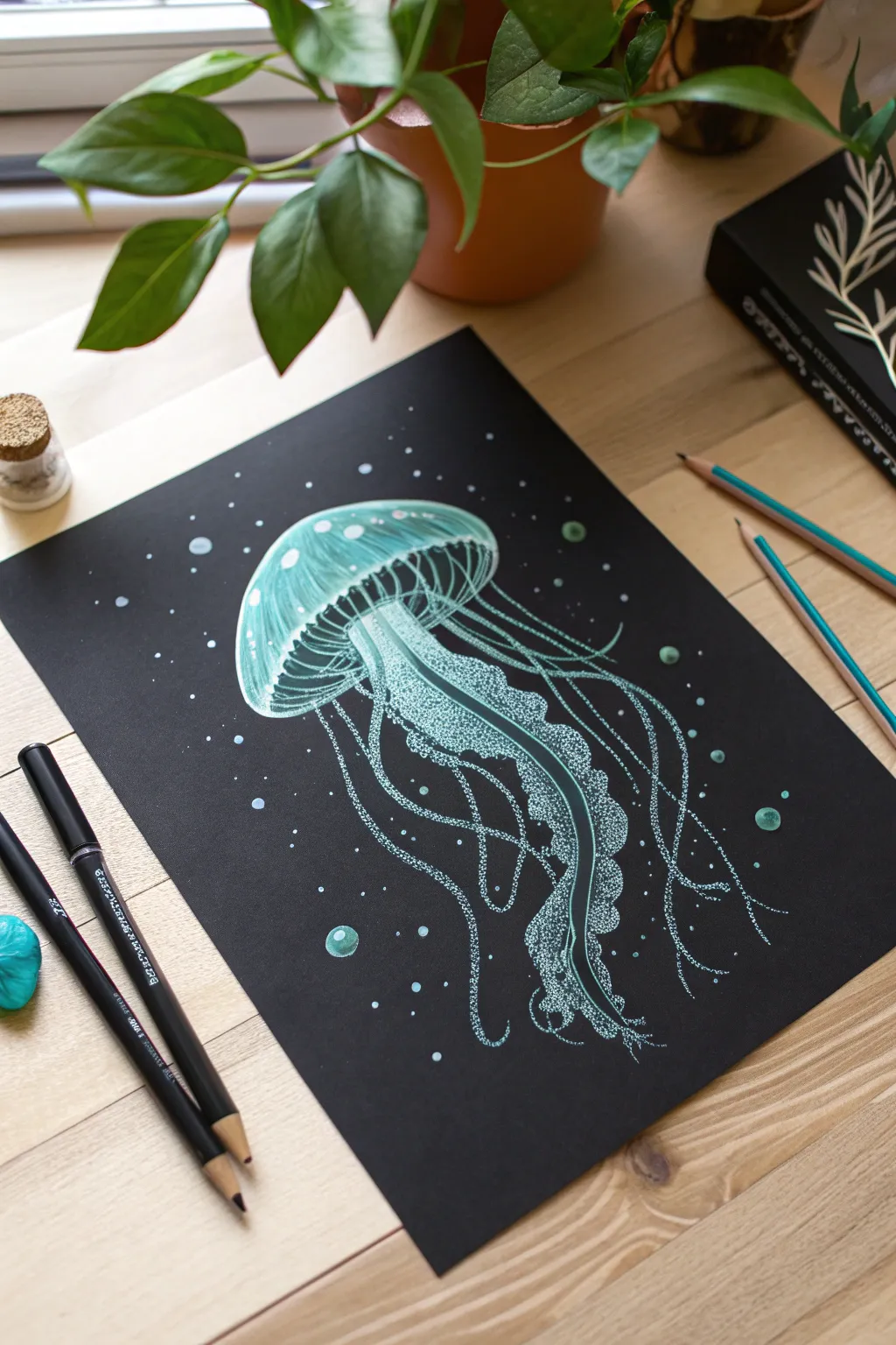
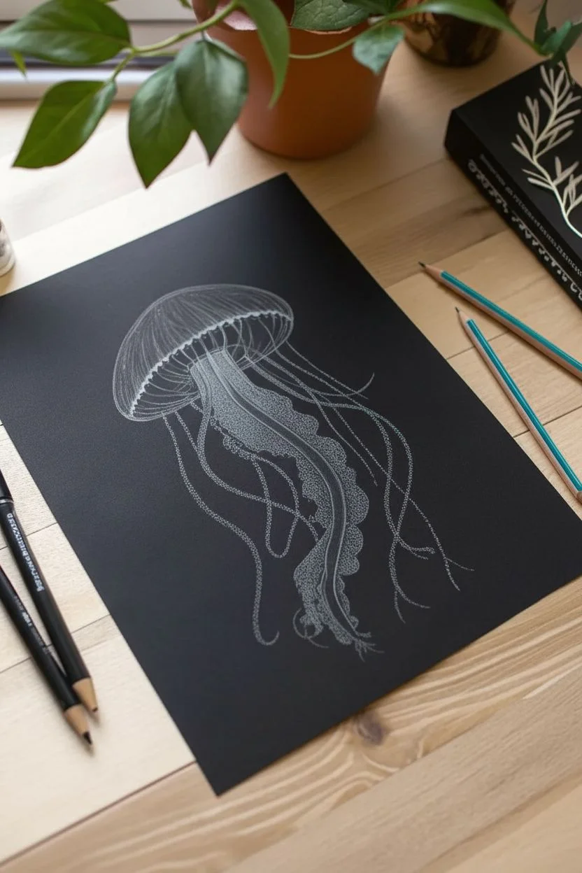
Capture the ethereal beauty of the deep sea with this striking drawing of a bioluminescent jellyfish. Using black paper as your canvas allows the cool, aquatic tones to pop, creating a natural glowing effect that brings this marine creature to life.
Step-by-Step Guide
Materials
- Black drawing paper or cardstock (smooth texture preferred)
- White colored pencil
- Turquoise or light teal colored pencil
- Mint green colored pencil
- White gel pen (fine tip) or white paint marker
- Blending stump or cotton swab
- Pencil sharpener
- Eraser
Step 1: Sketching the Shape
-
Outline the bell:
Start by lightly sketching a mushroom-cap shape near the top center of your paper using a white colored pencil. Keep your pressure very light so the lines can be adjusted or covered later. -
Define the rim:
Draw a curved line along the bottom of the cap to create the rim of the jellyfish’s bell. This gives the creature its fundamental three-dimensional form. -
Map the oral arms:
Sketch a thick, central wavy shape extending downward from the center of the bell. This will become the frilly ‘oral arms’ of the jellyfish. -
Indicate tentacles:
Draw long, flowing lines extending from the rim of the bell. Let them curve and wander down the page organically, rather than making them perfectly straight.
Glow Like a Pro
To enhance the glow effect, smudge a tiny bit of white pastel chalk around the brightest parts of the jellyfish. This creates a soft ‘halo’ light.
Step 2: Coloring and Shading
-
Base layer for the bell:
Fill in the top bell shape using your turquoise pencil. Apply the color in soft, circular motions, leaving the very top edge slightly darker and fading towards the center. -
Add dimension:
Layer the mint green pencil over the center of the bell to create a highlight. This establishes the rounded, translucent look of the jellyfish’s body. -
Detail the ribs:
Using the white pencil, draw faint vertical curved lines inside the bell to suggest the internal structure or ‘ribs’ of the creature. -
Highlight the rim:
Press harder with the white pencil along the bottom rim of the bell to make it stand out. I like to blend this slightly upward into the turquoise with my finger or a stump for a diffused glow. -
Texture the oral arms:
Fill in the central flowing shape with a mix of turquoise and mint green. Use a stippling technique—lots of small dots—rather than solid coloring to mimic a rough, frilly texture.
Step 3: Creating the Glow
-
Brighten the center:
Go over the central oral arms with the white colored pencil, concentrating on the edges to make them appear backlit and glowing. -
Trace the tentacles:
Retrace your initial tentacle lines with the turquoise pencil. Vary the pressure, making some segments brighter and others faint to show movement and depth. -
Add stippled details:
Use your white gel pen to add tiny, precise dots along the length of the oral arms and the main tentacles. These intense white points simulate bioluminescence perfectly. -
Create background bubbles:
Draw scattered circles in the background using the turquoise pencil. Fill them in lightly, then add a sharper white highlight on one side of each circle to make them look like bubbles. -
Dust with particles:
Scatter very small white dots around the jellyfish using the white pencil or gel pen. These represent floating sea particles catching the light. -
Final highlights:
Add a few confident strokes of white gel pen to the brightest parts of the bell’s rim and the tips of the tentacles for maximum contrast.
Gel Pen Won’t Write?
If your white gel pen skips on top of the colored pencil wax, scribble on a scrap piece of paper to get the ink flowing, or switch to a white paint marker.
Step back and admire how your simple strokes have transformed black paper into a window to the deep ocean

Have a question or want to share your own experience? I'd love to hear from you in the comments below!