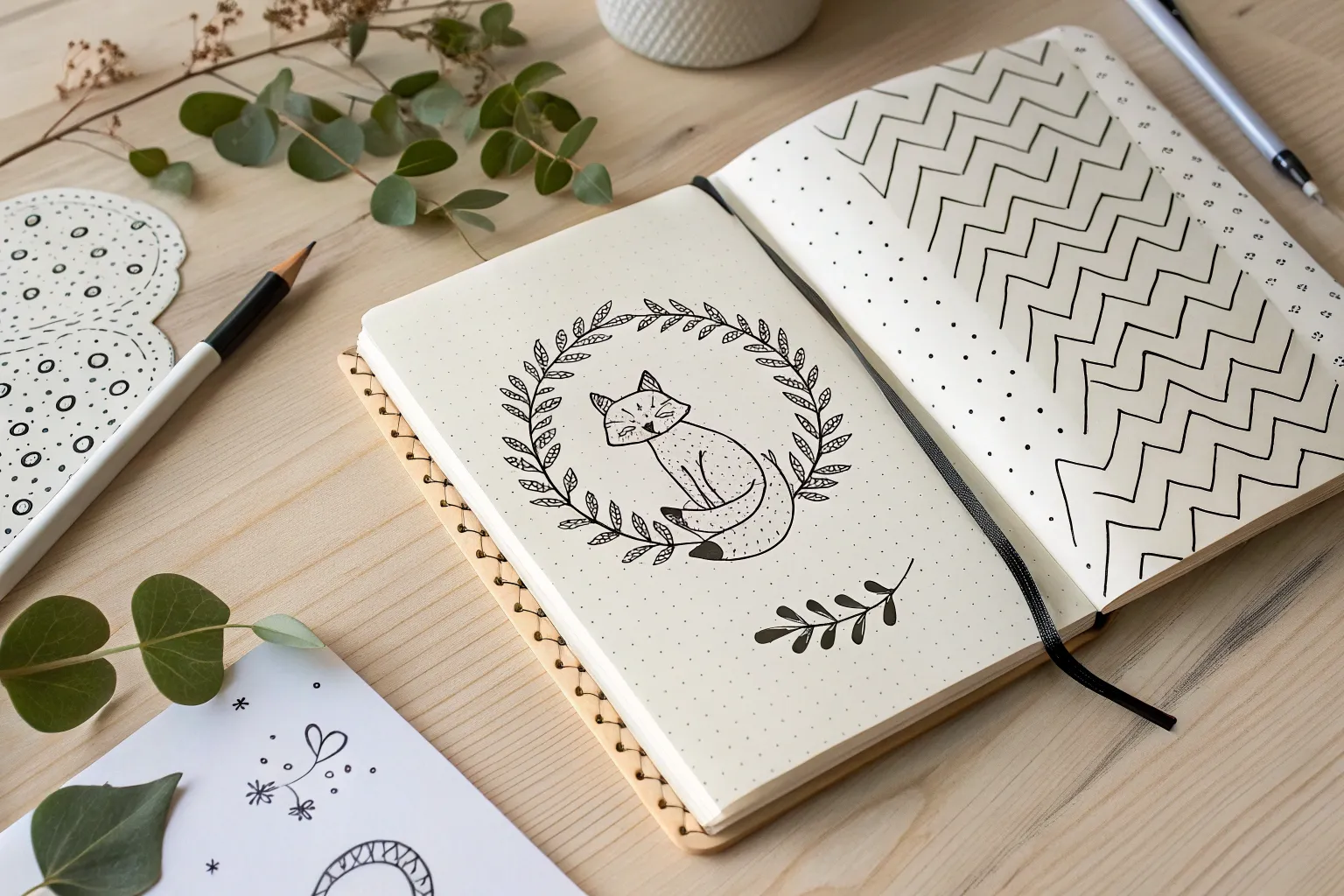
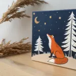
Twelve is such a fun drawing age because you’re ready for cooler details—like shading and perspective—without losing that playful spark. Here are my favorite drawing ideas for 12 year olds that feel doable, impressive, and totally you.
A 12-Year-Old-Friendly Pet Portrait With Soft Shading
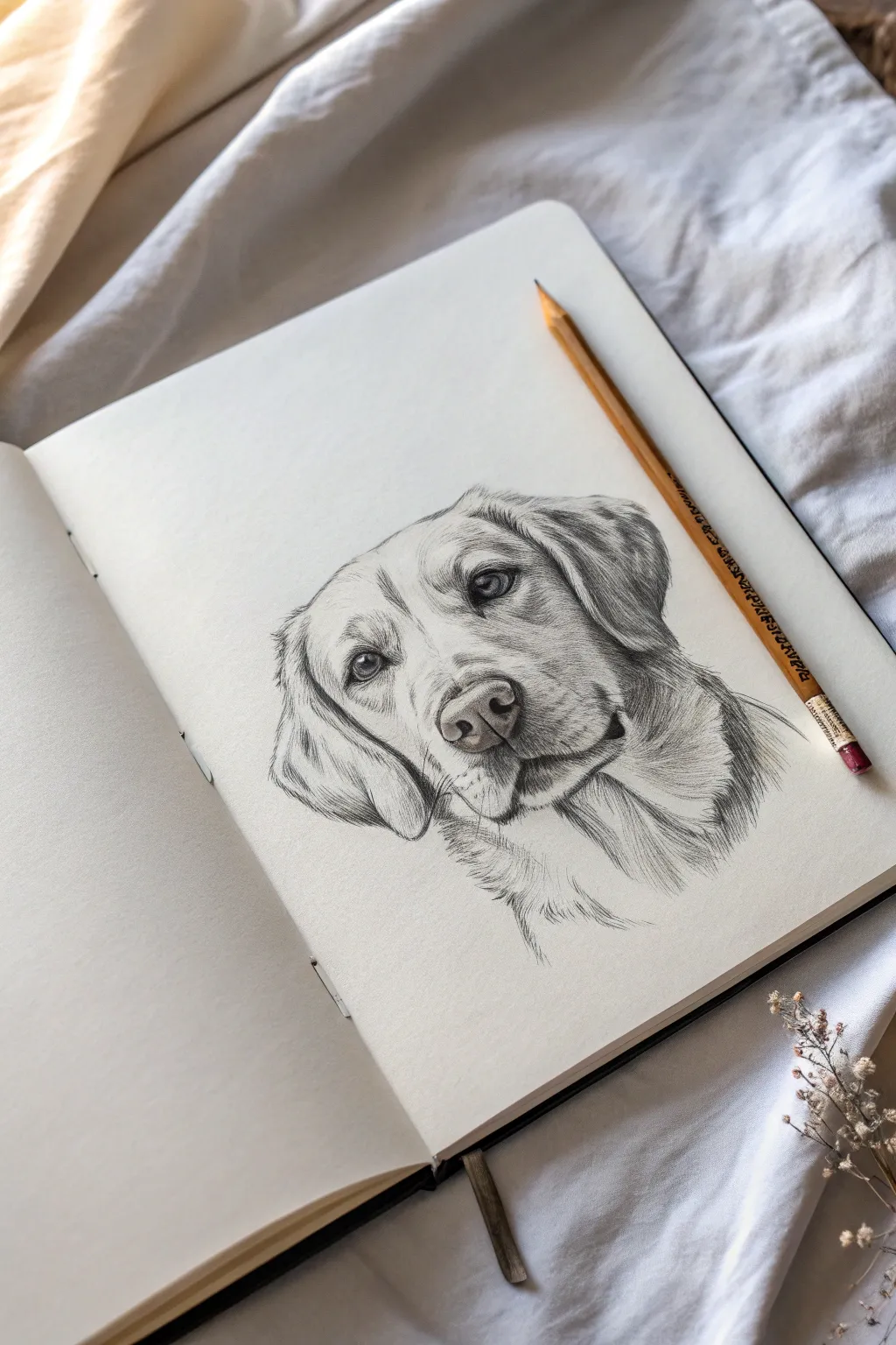
Capture the soulful expression of man’s best friend with this beginner-friendly guide to realistic animal sketching. You will learn to build up soft fur textures and deep, expressive eyes using simple pencil shading techniques.
Detailed Instructions
Materials
- High-quality sketchbook paper (smooth or light texture)
- Set of graphite pencils (HB, 2B, 4B)
- Kneaded eraser
- Pencil sharpener
- Blending stump or cotton swab (optional)
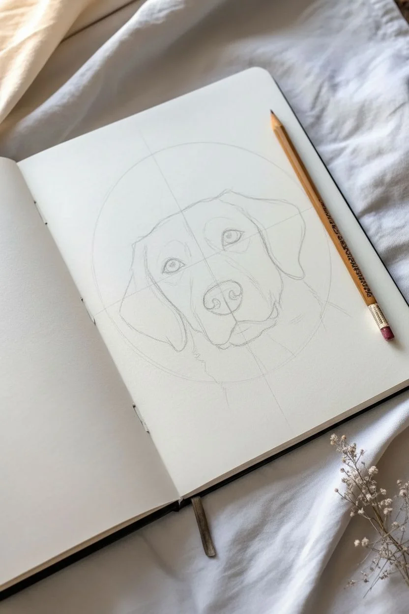
Step 1: Laying the Proportions
-
Sketch the basic head shape:
Start with a light HB pencil to draw a large, slightly squarish circle for the main part of the head. Keep your lines very faint so they can be erased later. -
Add the muzzle guide:
Attach a rounded, smaller rectangle shape to the bottom center of your circle to represent the snout or muzzle area. -
Place the guidelines:
lightly draw a vertical line down the center of the face and a horizontal line across the middle of the circle. This cross helps to ensure the eyes and nose align perfectly. -
Outline the flopped ears:
Sketch large, triangular yet soft shapes hanging down from the sides of the head. The ear on the right should appear slightly tucked back compared to the left. -
Refine the facial features:
Draw the almond shapes for the eyes along the horizontal guideline. Sketch the nose shape within the muzzle area, adding the distinctive curves of the nostrils.
Fur Flow Tip
Always rotate your paper while drawing fur.Pulling the pencil toward your body allows for more natural, tapered hair strokes than pushing away.
Step 2: Developing the Features
-
Define the eyes:
Using a 2B pencil, darken the pupils and the upper lash line. Leave a tiny white circle in each pupil for the highlight—this ‘catchlight’ brings the dog to life. -
Shade the nose:
Fill in the nostrils with your darkest 4B pencil. For the nose pad, use tiny stippling dots or small circles to mimic that leather-like texture. -
Carve out the mouth:
Darken the line where the lips meet, creating the slight ‘smile’ characteristic of Labs. Add a little shading under the chin to separate the jaw from the neck. -
Establish the shadows:
Before drawing fur, lightly shade the darkest areas: under the ear flaps, beneath the chin, and around the inner corners of the eyes.
Step 3: Creating Fur Texture
-
Start the fur direction:
Look closely at how hair grows on a dog’s face. Using short, quick strokes with an HB pencil, map out the direction the fur flows—outward from the nose and down the ears. -
Layering the snout:
On the bridge of the nose and muzzle, the fur is very short. Use tiny, distinct tick marks here, keeping the shading lighter on the top of the snout to show dimension. -
Building ear texture:
The ears have longer, wavy fur. Use long, sweeping strokes that curve downward. I find that lifting the pencil at the end of each stroke makes the hair look softer. -
Deepening the contrast:
Switch to your 4B pencil to add depth. Darken the fur in the crevices around the ears and neck to make the head pop forward. -
Refining the neck ruff:
Sketch loose, longer lines for the neck fur. It doesn’t need to be fully outlined; let the lines fade out at the bottom for a classic vignette look. -
Final highlights:
Take your kneaded eraser and gently tap or ‘lift’ graphite off the paper in areas that catch the light, like the brow bone and the top of the nose. -
Clean up:
Erase any remaining structural guidelines that are still visible and smudge any harsh pencil lines with a blending stump for a smoother finish.
Level Up: Colored Eyes
Make the portrait pop by doing the entire drawing in graphite, but using colored pencils just for the iris of the eyes in warm amber or brown tones.
You now have a wonderful, soulful pet portrait ready to be framed or gifted

A 12-Year-Old Animal Eye Study That Looks Super Real
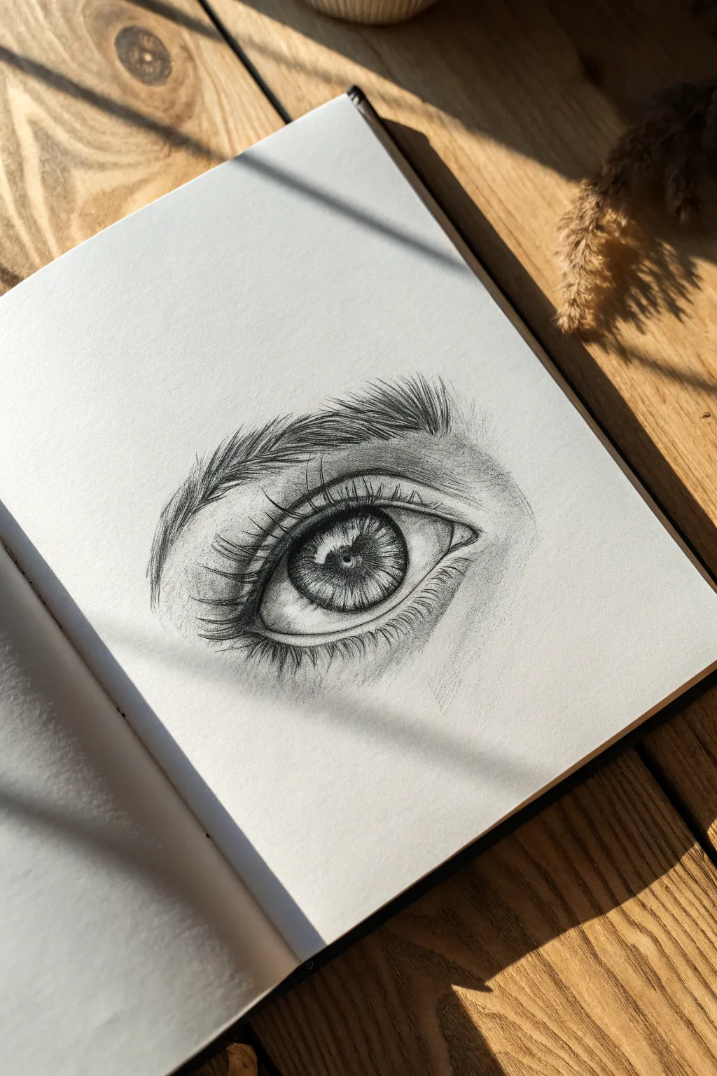
Master the art of observation by drawing a hyper-realistic human eye, focusing on the fine details of the iris and the flow of eyelashes. This project teaches shading, texture, and contrast to make the eye look like it’s glistening on the page.
Step-by-Step Tutorial
Materials
- Sketchbook with smooth, heavy paper
- Set of graphite pencils (HB, 2B, 4B, 6B)
- Mechanical pencil (0.5mm) for fine details
- Kneaded eraser
- Blending stump or tortillon
- Tissue or cotton swab
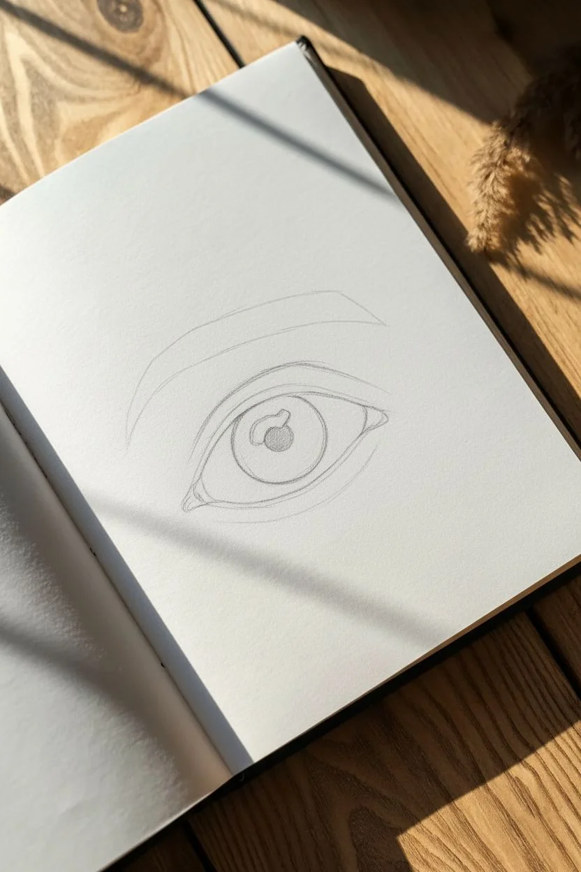
Step 1: Basic Structure
-
Outline the Shape:
Start lightly with an HB pencil to draw the main almond shape of the eye. Include the tear duct on the inner corner and lightly sketch the curve of the upper and lower eyelids. -
Place the Iris and Pupil:
Draw a perfect circle for the iris, slightly cut off at the top by the upper eyelid. Inside the center, draw a smaller, dark circle for the pupil. Leave a small, irregular white shape overlapping the pupil and iris for the reflection (catchlight). -
Define the Creases:
Sketch the crease of the eyelid above the main eye shape. This line should mimic the curve of the upper lid but extend slightly further on the sides. -
Block in the Eyebrow:
Lightly outline the general shape of the eyebrow above the eye, following the brow bone’s natural curve. Don’t draw individual hairs yet; just establish the area they will occupy.
Clean Highlights
Keep your kneaded eraser shaped into a fine point. Press it firmly onto the paper to lift graphite clean off for the brightest highlights in the tear duct and iris.
Step 2: Shading the Iris
-
Darken the Pupil:
Using a 4B or 6B pencil, fill in the pupil completely black, being extremely careful to preserve the bright white highlight area. -
Spoke-Like Details:
With a sharp 2B pencil, draw lines radiating outward from the pupil to the edge of the iris, like bicycle spokes. Vary the length and darkness of these lines to create a fibrous texture. -
Add Depth to the Iris:
Shade the outer rim of the iris darker than the center. I like to smudge this ring slightly inward with a tortillon to make the eye look spherical. -
Create Contrast:
Enhance the texture inside the iris by adding tiny squiggly lines and dots near the pupil, alternating between dark graphite and lifting highlights with a kneaded eraser.
Step 3: Skin and Eyelids
-
Shade the Eyeball:
The white of the eye isn’t actually white. Lightly shade the corners of the eyeball using an H or HB pencil, leaving the area near the iris brightest to show curve. -
Detail the Tear Duct:
Add shadows to the tear duct area using a 2B pencil, keeping the edges soft and slightly wet-looking by leaving tiny white specular highlights. -
Contour the Eyelid:
Shade under the upper eyelid crease and along the lower lash line. Use a blending stump to smooth these shadows into the skin for a soft, realistic transition. -
Deepen the Crease:
Go back over the main upper eyelid crease with a 4B pencil to make it a deep, defining fold.
Add Tears
Make the eye look emotional or watery by adding extra white highlights along the bottom water line and slightly blurring the lower lashes.
Step 4: Lashes and Brow
-
Directional Eyebrow Hairs:
Start drawing the eyebrow hairs with a sharp pencil. Remember, hairs near the nose grow upward, while the rest angle outward and down. Use flicking motions for tapered ends. -
Layering the Brow:
Build up density by layering darker strokes over lighter ones. Overlap some hairs to create a natural, unkempt look rather than perfect rows. -
Curving the Upper Lashes:
Draw the upper eyelashes using a 4B pencil. Start at the root on the upper waterline and flick outward in a curve. Ensure the lashes clump slightly together rather than standing straight up. -
Lower Lashes:
Draw the lower lashes shorter and more sparse than the upper ones. Be sure they originate from the outer edge of the lower lid rim, not directly from the eyeball. -
Reflection of Lashes:
If you want extra realism, lightly sketch the reflection of the upper lashes into the white highlight area of the eye.
Step back and admire the intense gaze you have captured on the paper


A 12-Year-Old Bird on a Branch With Feather Texture
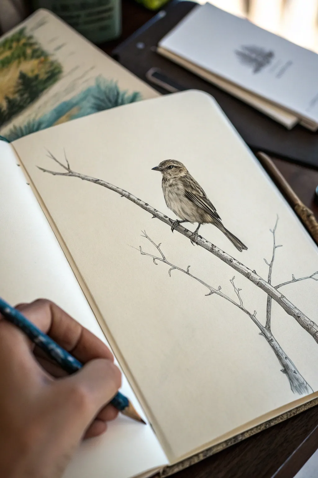
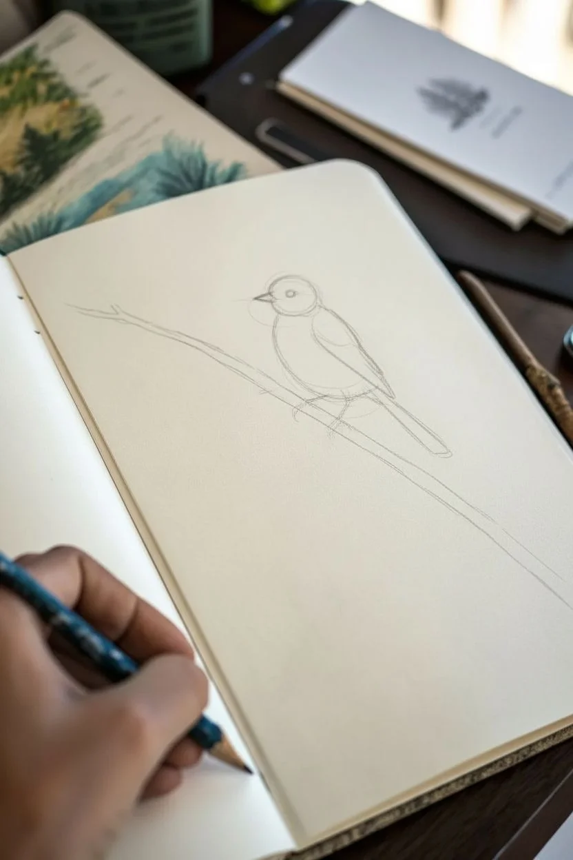
Capture the delicate beauty of a perched songbird with this detailed pencil study. You’ll learn how to build up realistic feather textures and create the illusion of roundness using simple shading techniques.
Step-by-Step
Materials
- Quality sketchbook paper (cream or white)
- HB pencil for initial outlining
- 2B or 4B pencil for shading and dark details
- Fine-point eraser or kneaded eraser
- Pencil sharpener
Step 1: Laying the Framework
-
Map the Body:
Begin by lightly sketching a medium oval for the bird’s body. Tilt it slightly upwards to mimic a perched posture. -
Add the Head:
Draw a smaller circle overlapping the top left of the body oval. Connect these two shapes with gentle, curved lines to form the neck. -
Position the Wings and Tail:
Sketch a long, tapered wedge shape extending from the back of the body downwards for the folded wing. Add a longer, thinner rectangle extending past the wing for the tail feathers. -
Establish the Branch:
Draw a long, diagonal line passing right under the bird’s belly. Thicken this line to create the branch, adding a slight curve so it doesn’t look like a ruler line. -
Rough in the Beak and Eye:
Place a small, triangular beak on the left side of the head circle. Mark a small dot for the eye, roughly in the center of the head but slightly closer to the beak.
Step 2: Refining the Shape
-
Contour the Outline:
Switch to a slightly darker stroke. Trace over your initial shapes to create a smooth, continuous outline for the bird. -
Detail the Face:
Darken the eye, leaving a tiny white speck for the highlight. Draw a subtle line extending backward from the eye to suggest the cheek patch. -
Form the Feet:
Sketch the tiny claws gripping the branch. The toes should wrap around the cylinder shape of the wood, with small, curved talons visible. -
Branch Texture:
Add small bumps or ‘knots’ to the branch outline. Draw a secondary, smaller twig branching off below the main one to balance the composition.
Sharpen Up!
Keep your pencil point extremely sharp for the feather strokes. A dull point creates fuzzy lines that look like fur rather than crisp bird feathers.
Step 3: Shading and Texture
-
Feather Direction:
Using your sharper pencil, start making short, quick strokes. These should flow from the head towards the tail, following the curve of the bird’s body. -
Wing Definition:
Draw distinct, longer lines on the wing area to represent the flight feathers. Make the lines closer together near the tip of the wing. -
Underbelly Shading:
Keep the belly area lighter. Use very faint, soft shading here to show roundness without drawing heavy individual feathers. -
Deepen the Darks:
I like to go back in with a softer pencil (like a 4B) to darken the darkest areas: under the wing, the pupil of the eye, and the shadow directly beneath the bird on the branch. -
Texturing the Branch:
Add wood grain by drawing wavy lines along the length of the branch. Add some cross-hatching or stippling (dots) on the underside of the branch to give it volume. -
Twig Details:
Don’t forget the lower twig. Keep its lines thinner and lighter so it doesn’t distract from the main subject. -
Final Cleanup:
Use your eraser to gently lift away any visible construction lines from the first step. Sharpen up the beak outline one last time for a crisp finish.
Background Idea
Instead of leaving the background blank, try lightly sketching vague leaf shapes or distant trees. Keep them very faint to make the detailed bird pop.
Now you have a lively little bird sketch ready to fly off the page


A 12-Year-Old Fruit Bowl Still Life for Easy Highlights
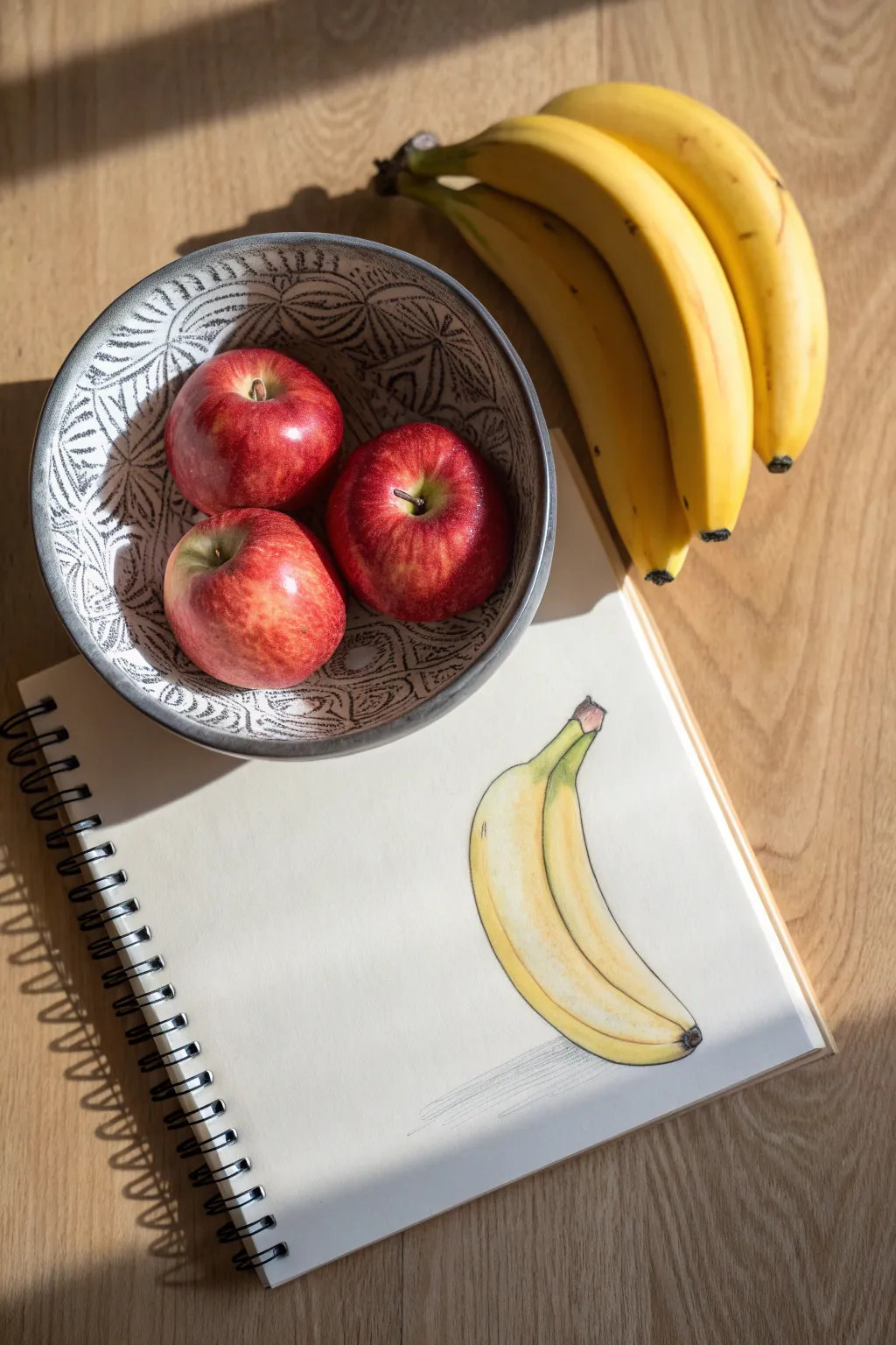
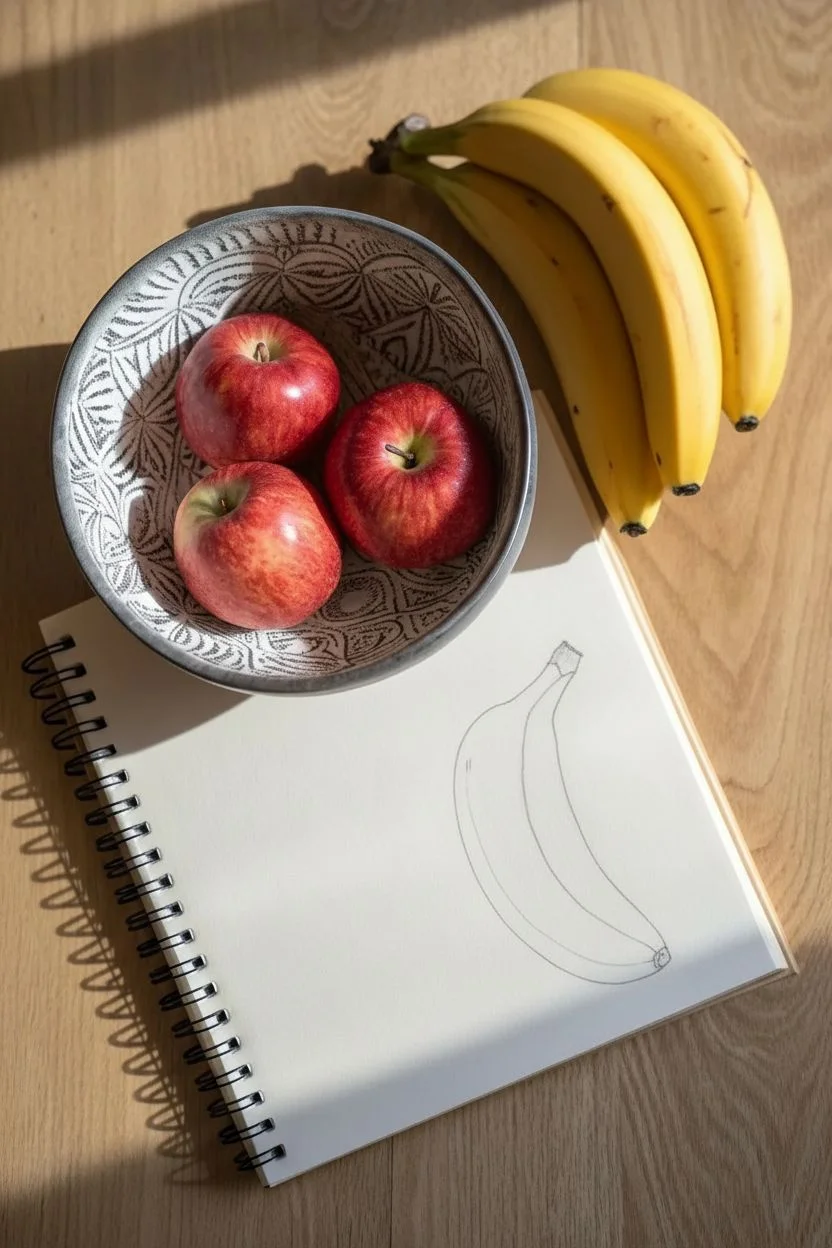
Capture the bright, sunny feeling of fresh fruit with this focused study of a single banana. By isolating one subject on your page, you can practice blending yellows and greens to create realistic curves and soft shadows.
Detailed Instructions
Materials
- Spiral-bound sketchbook (white paper)
- Graphite pencil (HB or 2B)
- Eraser
- Colored pencils (Yellow, Light Green, Brown, Ochre/Dark Yellow)
- Pencil sharpener
Step 1: Basic Shape & Outline
-
Observe the curve:
Start by looking closely at the curve of the banana. It’s like a soft crescent moon or a smile shape. Lightly sketch a central guideline on your paper to determine the direction and length of the fruit. -
Draft the body:
Draw the outline around your guideline. Make the bottom curve smooth and round, while the top edge should look a bit straighter or segmented, forming the ridges of the peel. -
Add the stem:
At the top end, sketch a boxy, squared-off shape for the stem where it would detach from the bunch. It should be slightly thicker than the tip. -
Mark the tip:
At the bottom end, bring your lines together to a small, rounded point. This is the flower end of the banana and often has a tiny dark spot. -
Define the ridges:
Draw a long, sweeping line down the center of the banana’s body. This line separates the different sides of the peel and gives the drawing a 3D effect instead of looking flat.
Step 2: Adding Color & Detail
-
Base layer used yellow:
Take your primary yellow pencil and fill in the entire shape. Use light pressure at first to create an even, soft layer without pressing hard into the paper grain. -
Intensify the yellow:
Go over the yellow areas again, pressing slightly harder on the main body of the banana to make the color vibrant and waxy. -
Add clear green accents:
Using a light green pencil, gently shade the stem area and blend it down slightly onto the top ‘shoulder’ of the banana. This shows that the fruit isn’t fully over-ripe yet. -
Shade the bottom curve:
Take an ochre or darker yellow pencil to add dimension. Shade along the very bottom edge of the banana curve. This creates a shadow on the object itself, making it look round. -
Darken the stem tip:
Use a brown pencil to color the very cut end of the stem. Make the strokes slightly rough to mimic the texture of the cut fiber. -
Add the flower end detail:
With the same brown pencil or a black one used very lightly, draw the small dark spot at the bottom tip of the banana. -
Define the ridge line:
Retrace that central ridge line you drew earlier with your pencil or a light brown color. This line is crucial for showing the sharp edge of the peel geometry.
Uneven Coloring?
If your pencil coloring looks scratchy, try coloring in small circular motions rather than back-and-forth lines. This fills the paper grain better.
Step 3: Finishing Touches
-
Refine the outline:
Go over the outer perimeter with a sharp pencil or a darker shade (like olive green or thin black ink) to make the drawing pop off the page. -
Create a cast shadow:
Using your graphite pencil, lightly sketch a shadow directly underneath the banana. Use horizontal hatching strokes that act as the ground surface. -
Fade the shadow:
Press harder directly under the fruit for the darkest shadow, and let your pencil strokes get lighter and further apart as you move away from the banana.
Pro Tip: Highlights
Leave a thin strip of white paper blank along the top curve of the banana creates a shiny ‘highlight’ effect without needing an eraser later.
Now you have a vibrant fruit study that captures the light perfectly
BRUSH GUIDE
The Right Brush for Every Stroke
From clean lines to bold texture — master brush choice, stroke control, and essential techniques.
Explore the Full Guide
A 12-Year-Old Flower Bouquet With Simple Line Layers
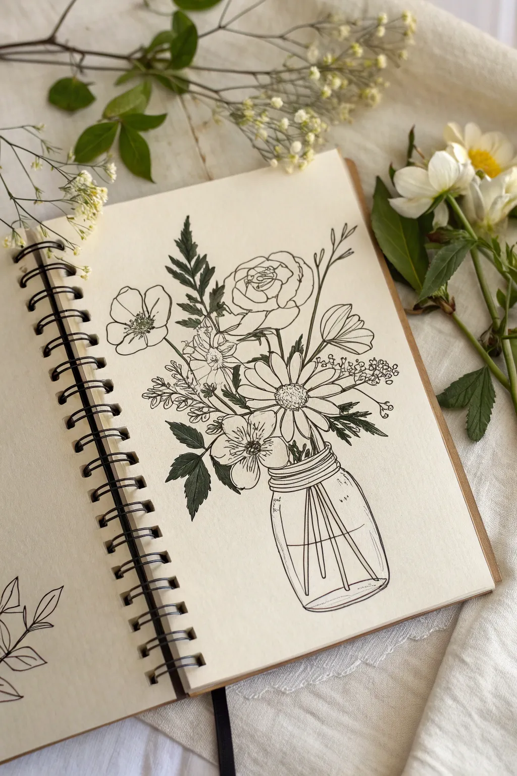
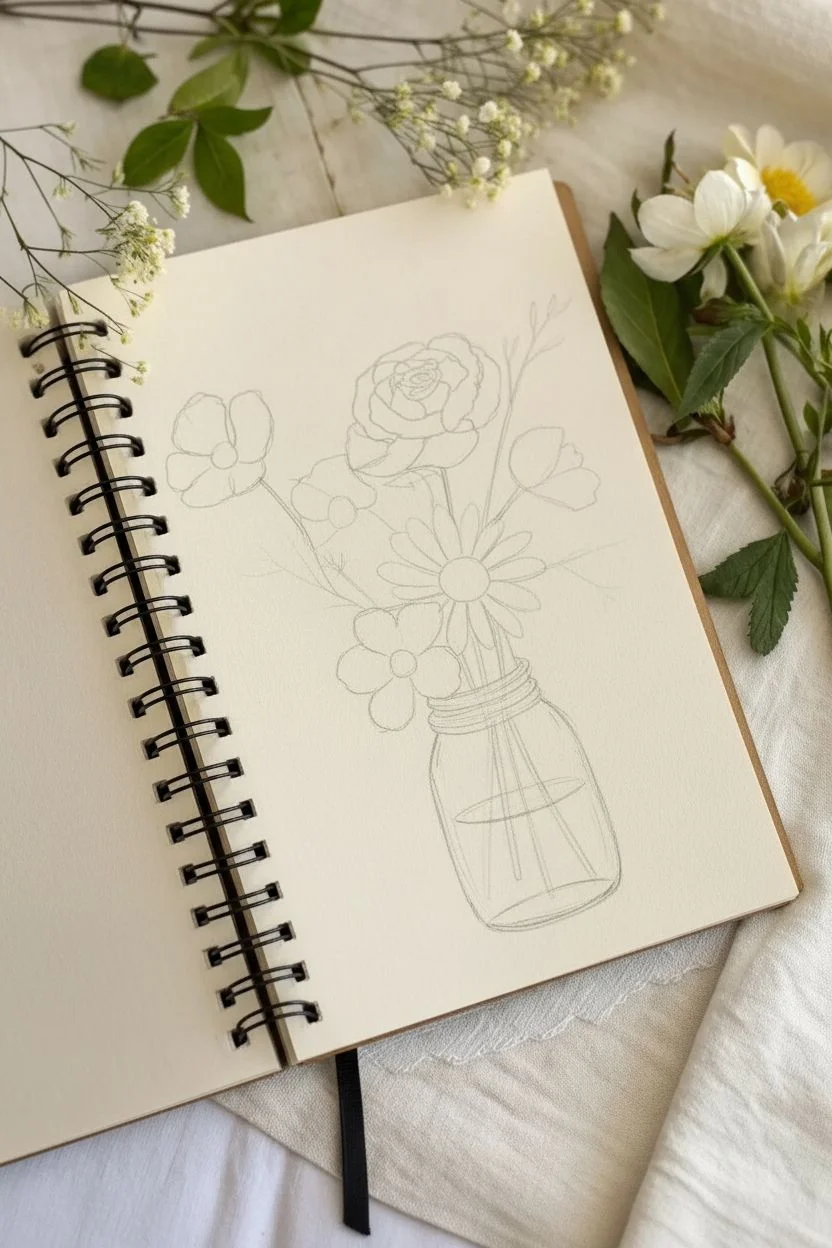
This charming sketch captures the simple beauty of wildflowers in a mason jar using clean black ink lines. It’s a perfect project for practicing botanical shapes and layering techniques without needing complex shading or colors.
Step-by-Step Guide
Materials
- Spiral-bound sketchbook (cream or white paper)
- Pencil (HB or H for light sketching)
- Eraser (kneaded eraser works best)
- Fine liner pen (01 or 03 size, black ink)
- Thicker graphic marker or brush pen (optional, for darker leaves)
Step 1: Sketching the Foundation
-
Draw the jar shape:
Start near the bottom of your page by sketching the mason jar lightly in pencil. Draw a simple cylinder with slightly rounded bottom corners and a narrower neck at the top where the lid rings will go. -
Add the water line:
Inside the jar, draw a curved horizontal line about halfway up to indicate the water level. Keep this line light. -
Position the main flowers:
Visualize where your biggest blooms will sit. Sketch rough circles as placeholders: one large one in the center for the daisy, one slightly higher for the ranunculus/rose shape, and one to the left for the poppy-style flower. -
Sketch the stems:
Draw lines connecting your flower circles down into the jar. Let the stems cross over each other inside the jar to look natural, stopping at the bottom of the glass.
Step 2: Drawing the Blooms
-
Detail the center daisy:
Using your pencil, define the large daisy in the middle. Draw a textured circle for the pollen center, then add long, oval-shaped petals radiating outward. Some petals can overlap others. -
Create the rose layers:
For the top flower, start with a tight spiral in the center and add curved, cup-shaped petals wrapping around it to create that layered rose or ranunculus look. -
Add the side flowers:
Flesh out the flower on the left with open, cup-shaped petals and a visible center. Add a smaller bud or side-view flower on the right side to balance the composition. -
Incorporate greenery:
Sketch in fern-like leaves and smaller filler flowers (like baby’s breath) in the gaps between the main blooms. Add jagged leaves extending from the stems.
Smudged Ink?
If you accidentally smudge wet ink, turn it into a shadow! Add a few hatching lines over the smudge to make it look like part of the shading plan.
Step 3: Inking and Refining
-
Outline the jar elements:
Switch to your fine liner pen. Carefully trace the jar, adding the threaded rings at the neck. Draw the water line, but keep it broken or slightly faint to suggest transparency. -
Ink the stems inside:
Draw the stems inside the jar first. Since the glass distorts things slightly, these lines don’t have to be perfectly straight. -
Ink the main flowers:
Outline your pencil sketches for the flower petals. Use a confident, continuous line. For the daisy center, use tiny stippling dots to create texture. -
Detail the fern leaves:
When inking the fern-like greenery on the left, use quick, short strokes to mimic the texture of the leaves. -
Fill in dark leaves:
I like to create contrast here by completely filling in recognizable jagged leaves with black ink. This makes the delicate white flowers pop against the page. -
Add delicate filler:
Draw the tiny clusters of baby’s breath or filler flowers using small circles or squiggly loops. Keep these lines very thin and light. -
Refine the petals:
Add a few very short, thin lines at the base of the petals (near the center of each flower) to suggest depth and curvature.
Pro Tip: Line Weight
Use a thicker pen (like an 05) for the outer outline of the jar and the main flower shapes, and a thinner pen (01) for the delicate inside details.
Step 4: Final Touches
-
Erase pencil guides:
Wait until the ink is completely dry—give it a full minute or two so you don’t smudge your hard work. Gently erase all remaining pencil marks. -
Check the balance:
Look at your drawing. If a spot looks too empty, draw a simple line for a stray stem or a small leaf to fill the gap.
Now you have a permanent bouquet that will never wilt in your sketchbook
A 12-Year-Old Self-Portrait With Big Shapes First
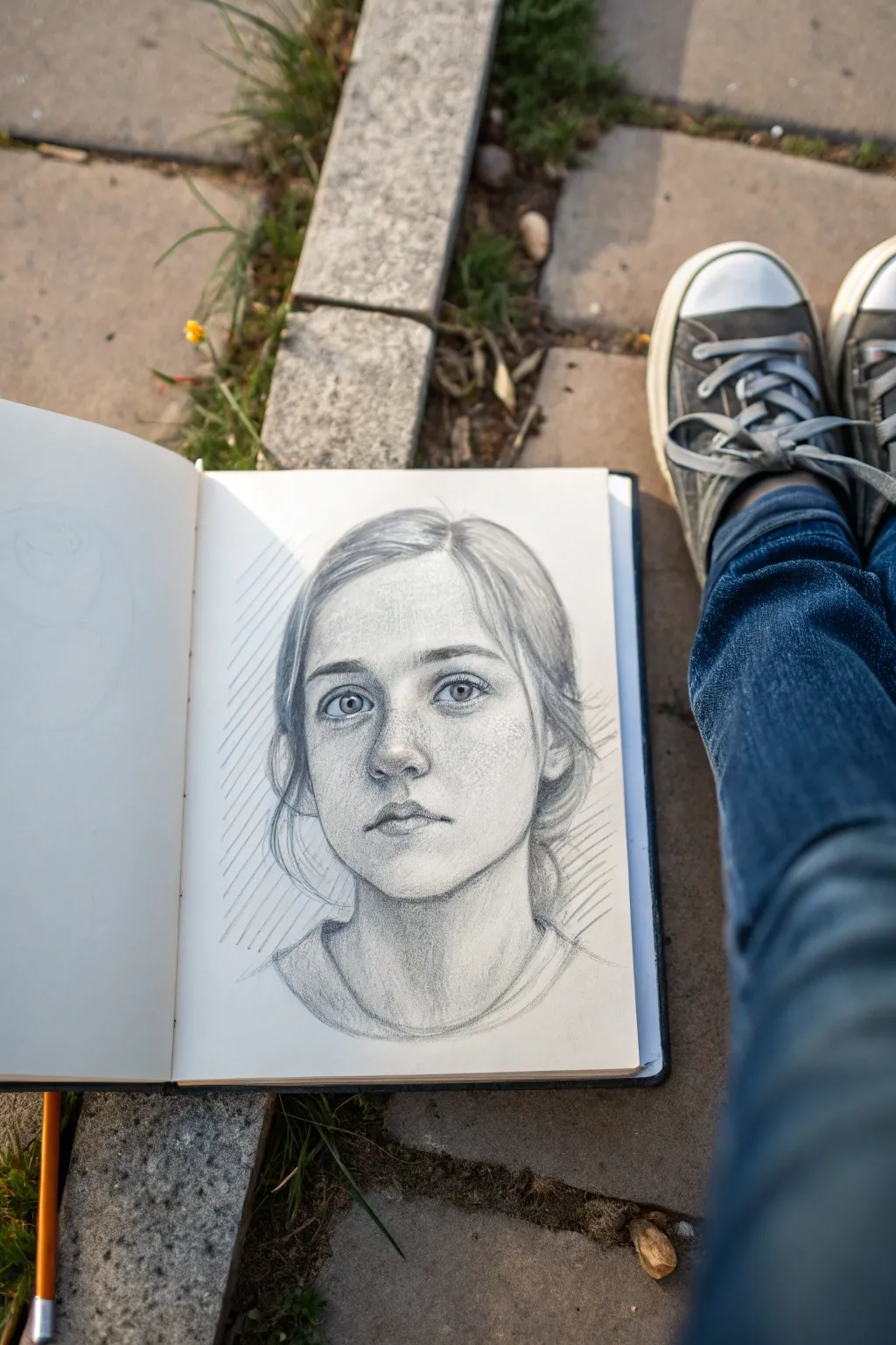
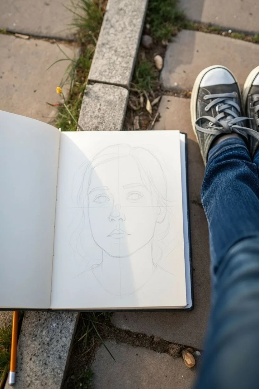
Master the art of realistic facial features with this soft graphite portrait that builds form through delicate shading. You’ll learn how to construct a face from simple shapes and render lifelike textures for hair and skin.
How-To Guide
Materials
- Sketchbook with medium-tooth paper (A4 or A5)
- Graphite pencils (HB, 2B, 4B)
- Kneaded eraser
- Pencil sharpener
- Blending stump (optional)
Step 1: Laying the Foundations
-
Map the head shape:
Begin with a light HB pencil. Draw a simple oval shape in the center of your page to represent the skull, keeping your lines very faint so they can be adjusted or erased later. -
Place guidlines:
Lightly sketch a vertical line down the center of the oval for symmetry. Then, draw a horizontal line halfway down the oval for the eyes, and another halfway between the eye line and the chin for the nose. -
Block in features:
Using simple geometric shapes, mark the placement of the eyes on the horizontal line. Add a small circle for the tip of the nose and a simple line for the mouth opening. -
Outline the hair:
Sketch the general volume of the hair around the head, looking for big shapes rather than individual strands. Notice how the hair parts and flows around the forehead.
Step 2: Refining the Features
-
Detail the eyes:
Switch to a 2B pencil to darken the upper lash line. Draw the iris as a perfect circle, but remember the upper lid usually covers the top part of it. Add a small shape for the highlight before shading the pupil. -
Shape the nose:
Avoid drawing hard outlines for the sides of the nose. Instead, lightly shade around the nostrils and the tip to suggest volume. The shadow under the nose is key for depth. -
Define the mouth:
Focus on the dark line between the lips and the shadow underneath the bottom lip. Keep the outline of the lips themselves soft and subtle, as distinct outlines can look cartoonish. -
Add the neck:
Extend two vertical lines down from the jawline to form the neck. Sketch a curved line for the collar of the shirt to anchor the portrait.
Eyes Come Alive
Always leave a tiny, pure white shape inside the pupil intersecting with the iris. This ‘catchlight’ is essentially the spark of life in any portrait.
Step 3: Shading and Texture
-
Establish light direction:
Decide where your light is coming from—in this example, it’s slightly from the left. I like to lightly mark an arrow in the margin to remind myself where the shadows should fall. -
Shade the skin:
Using the side of your HB or 2B pencil, apply soft graphite layers to the shadowed side of the face (the right side here). Build up tone gradually under the brow bone, beside the nose, and under the chin. -
Add freckles:
Take a sharpened pencil and gently tap random, tiny dots across the nose and cheeks. Vary the pressure so some are darker than others for a natural, unforced look. -
Render the hair:
Use long, sweeping strokes that follow the direction of hair growth. Start at the roots and lift your pencil as you move outward to create tapered lines that look like real strands. -
Deepen contrast:
Switch to your 4B pencil for the darkest darks: the pupils, the corners of the mouth, deep folds in the hair, and the nostrils. This high contrast makes the drawing pop. -
Refine highlights:
Use your kneaded eraser to lift off graphite in the brightest areas—the tip of the nose, the forehead, and the reflection in the eyes.
Hair Flow
Don’t draw every single hair strand. Instead, shade the dark ‘valleys’ between clumps of hair and leave the ‘hills’ light to suggest volume and shine.
Step 4: Background and Final Touches
-
Add background texture:
Create diagonal hatching lines behind the head using a ruler or freehand strokes. This distinct texture separates the smooth face from the white paper background. -
Enhance the collar:
Add a few quick, confident folds to the clothing at the neckline. Simple shadows here suggest the fabric’s texture without distracting from the face. -
Clean up:
Erase any remaining construction lines or smudges around the border of the drawing to keep the presentation neat.
Now you have a soulful portrait that captures both likeness and mood with classical technique

PENCIL GUIDE
Understanding Pencil Grades from H to B
From first sketch to finished drawing — learn pencil grades, line control, and shading techniques.
Explore the Full Guide
A 12-Year-Old Best-Friend Portrait in a Cute Cartoon Style
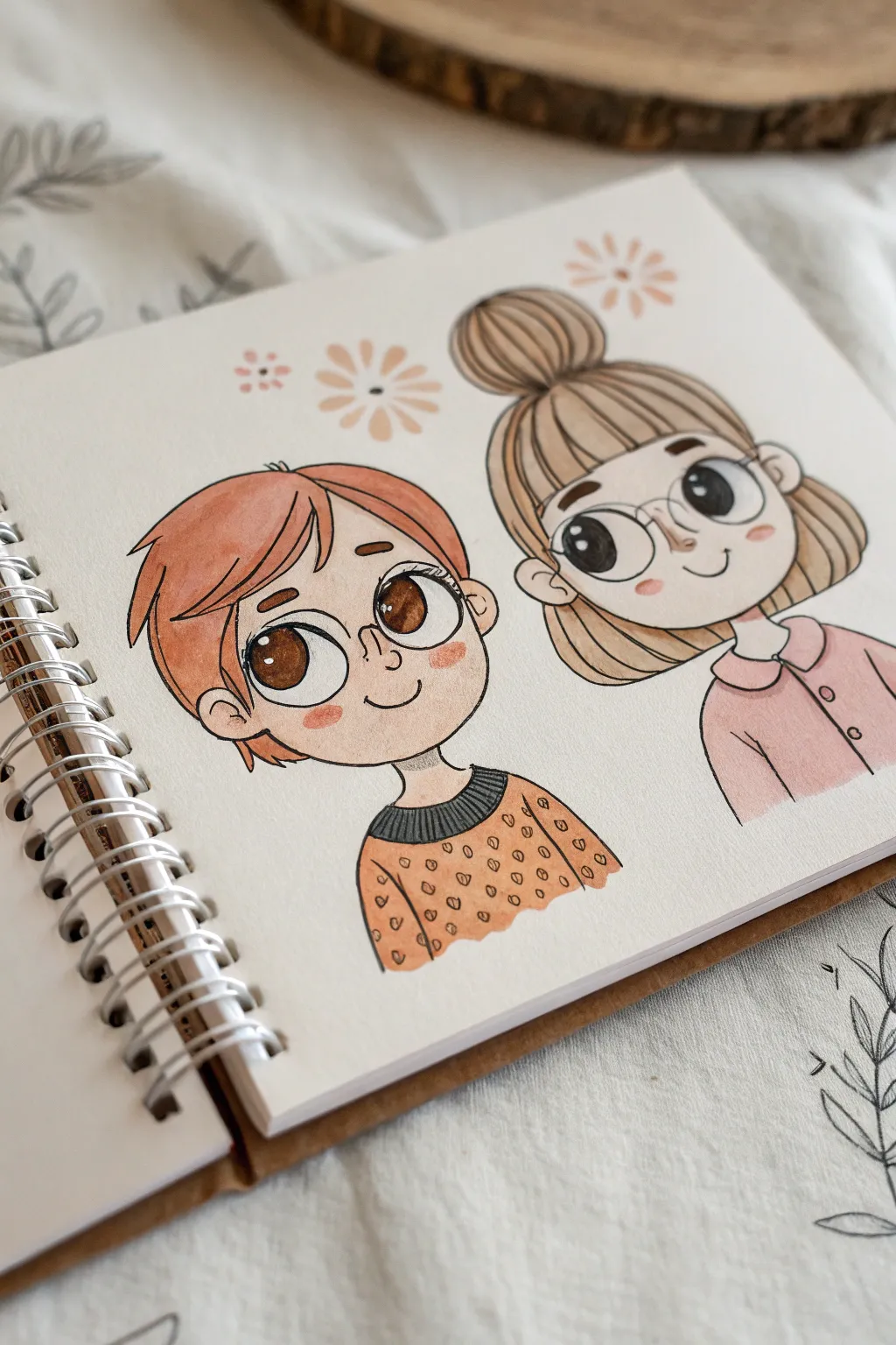
Capture the bond of friendship with this adorable cartoon-style portrait featuring oversized eyes and warm autumn tones. This project uses clean lines and alcohol markers to create a polished, sticker-like finish on spiral-bound sketchbook paper.
Detailed Instructions
Materials
- Spiral-bound sketchbook (mixed media or smooth bristol paper)
- HB pencil and eraser
- Fine liner pens (black, sizes 0.1 and 0.3)
- Alcohol-based markers (peach/skin tones, rust orange, dusty pink, grey, brown)
- White gel pen
- Reference photo of you and your friend
Step 1: Drafting the Shapes
-
Head shapes:
Begin by lightly sketching two large circles side-by-side using your HB pencil. Leave a little space between them so their hair doesn’t overlap too awkwardly. Add a small jawline curve to the bottom of each circle to create a soft, rounded face shape. -
Guidelines:
Draw a faint vertical line down the center of each face and a horizontal line about halfway down. This ‘T’ shape helps align the eyes and nose perfectly. -
Mapping the hair:
Sketch the outline of the hair. For the character on the left, draw short, choppy layers framing the face. For the character on the right, sketch a high bun shape on top and a smooth fringe across the forehead. -
Eye placement:
Draw huge, oval-shaped eyes sitting right on that horizontal guideline. They should take up a significant portion of the face to get that cute ‘chibi’ look. -
Outfits:
Sketch simple shoulders and necklines below each head. Give the left figure a ribbed sweater collar and the right figure a simple button-down collar.
Pro Tip: Eye Sparkle
For maximum cuteness, make the white highlights in the eyes quite large. Placing them in the top-right of both eyes makes them look focused and bright.
Step 2: Inking the Lines
-
Main outlines:
Switch to your 0.3 black fine liner. Carefully trace over your pencil lines for the face shape, hair connection points, and clothing. Keep your hand steady for smooth, confident strokes. -
Facial features:
Use the finer 0.1 pen for delicate details like the eyelashes and the tiny nose curve. Draw the glasses frames carefully if your characters wear them, making sure they sit symmetrically around the eyes. -
Clean up:
Once the ink is completely distinct and dry to the touch, erase all the pencil guidelines. Be gentle so you don’t wrinkle the paper.
Level Up: Accessories
Personalize the drawing by adding elements specific to you and your friend, like matching necklaces, specific earring studs, or favorite hair clips.
Step 3: Adding Color
-
Skin base:
Take a pale peach alcohol marker and fill in the faces and necks. Work in small circular motions to keep the ink even and avoid streaks. -
Hair base tones:
Color the left hairstyle with a warm rust-orange marker. For the right character, use a light sandy brown. Don’t worry about shading just yet; visuals look best with a flat base first. -
Sweater colors:
Use an orange marker for the left sweater and a dusty rose pink for the right shirt. Leave the collar on the left sweater uncolored for now. -
Eye details:
Fill in the irises with a rich brown. I like to leave a tiny white circle empty near the top of the pupil for a highlight, though we can add more white later. -
Pattern work:
Once the orange sweater ink is dry, use a slightly darker brown fine liner or marker tip to add small ‘v’ shapes or dots for a textured knit pattern. Color the ribbed collar dark grey.
Step 4: Finishing Touches
-
Blush:
Using a coral or light pink marker, gently dab small ovals just under the eyes on the cheeks. This instantly makes the characters look livelier. -
Hair shading:
Swipe a second layer of your hair color (or a slightly darker shade) near the roots and tips of the hair to add depth and volume. -
Highlights:
Grab your white gel pen. Add a small dot to the corner of each eye, a tiny line on the nose, and a few strokes on the hair to make it look shiny. -
Background doodles:
Finally, draw simple floating flower shapes in the empty space above their heads using muted pinks or beige markers to embrace the cozy theme.
Now you have a charming keepsake that celebrates your friendship in a timeless cartoon style
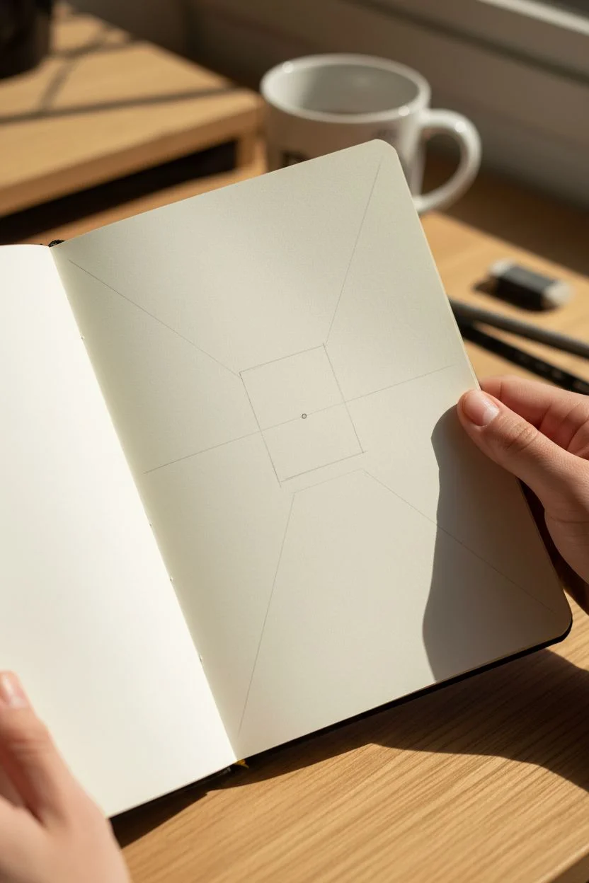
A 12-Year-Old One-Point Perspective Bedroom Drawing
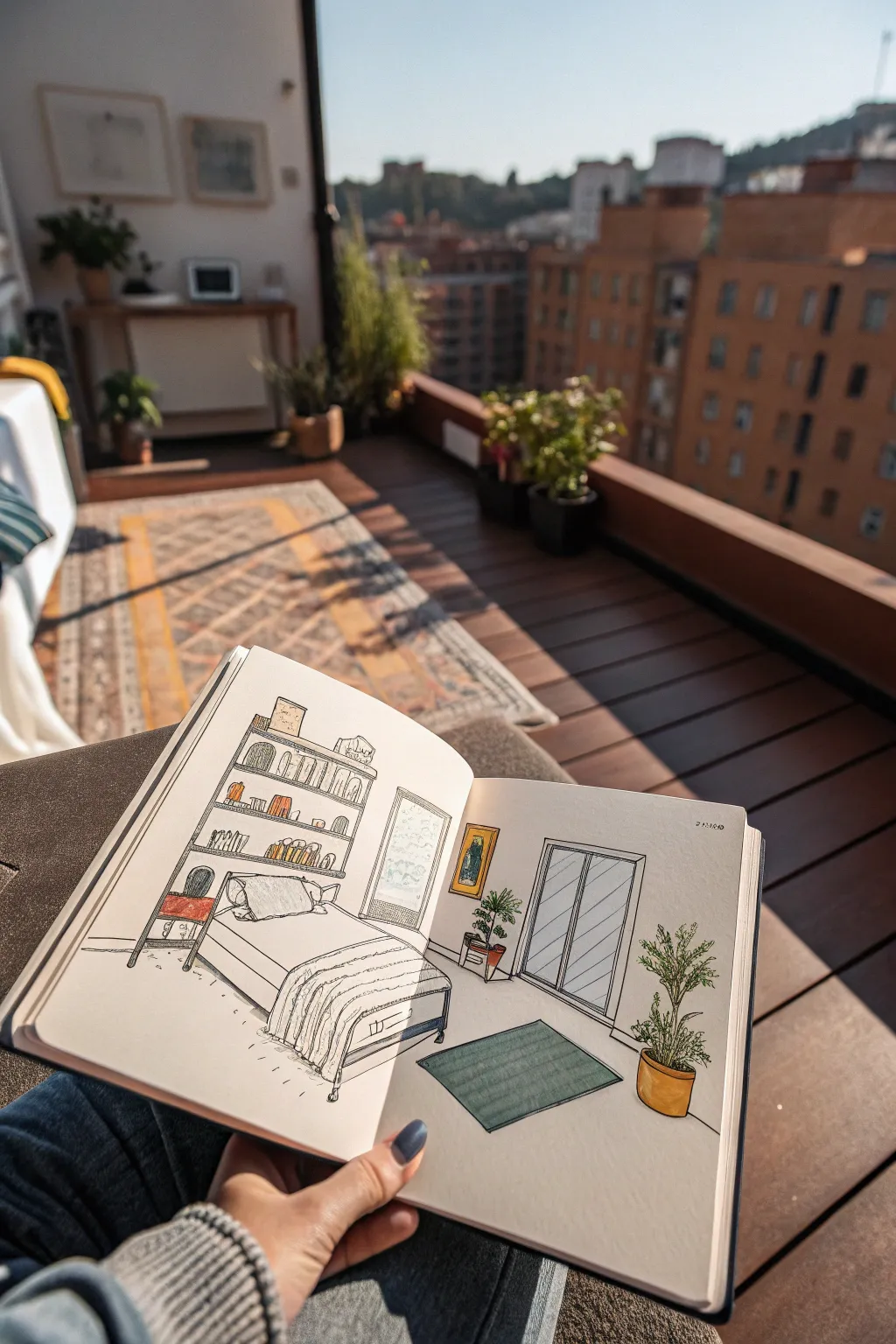
Learn the magic of depth by drawing a cozy, modern bedroom that looks like you could walk right into it. This project introduces one-point perspective in a fun, manageable way, resulting in a clean and colorful illustration perfect for your sketchbook.
Step-by-Step Guide
Materials
- Sketchbook or drawing paper (A5 or A4)
- Pencil (HB)
- Eraser
- Ruler or straight edge
- Fine liner pen (0.3mm or 0.5mm black)
- Colored pencils or alcohol markers (muted yellow, green, teal, grey, orange)
Step 1: Setting the Perspective Framework
-
Find the vanishing point:
Start by drawing a faint horizon line across the middle of your page. Just slightly left of the center, make a small dot on that line. This is your ‘vanishing point’—the spot where all receding lines will meet. -
Draw the back wall:
Around that vanishing point, lightly sketch a rectangle. This represents the far wall of the bedroom facing you. Keep the lines parallel to the edges of your paper. -
Create the room depth:
Using your ruler, lightly draw lines from each corner of your back wall rectangle outward to the corners of your paper. These diagonal lines define the floor, ceiling, and side walls.
Straight Edge Secret
Keep your ruler handy even while sketching freehand details. Checking your angles against the vanishing point often ensures the room doesn’t look “warped.”
Step 2: Constructing Furniture Shapes
-
Block in the bed:
On the left side of the floor, draw a rectangular box for the bed base. The horizontal lines stay straight, but the lines heading ‘back’ must angle directly toward your vanishing point. -
Add the bookshelf:
Against the left wall, sketch a tall, narrow rectangle. Divide it with horizontal lines for shelves. To make it look 3D, draw faint lines from the shelf corners toward the vanishing point to create depth. -
Sketch the sliding doors:
On the back wall, right of the center, draw a large rectangle for the closet or balcony doors. Divide it vertically in the middle. Add a simple trim around the edge. -
Place the rug and plants:
Draw a rectangle on the floor for the rug, using diagonal sides that point to the vanishing point. Sketch rough ovals for plant pots—one near the doors and one on a small stand.
Step 3: Adding Details and Inking
-
Detail the bedding:
Soften the hard lines of the bed. Sketch a fluffy pillow and a folded duvet at the foot of the bed. Add wrinkle lines to make the fabric look soft and lived-in. -
Fill the shelves:
Draw rows of books on the shelves. Vary their heights and lean some over. Leave empty spaces for small trinkets to make it look realistic. -
Grow the greenery:
For the plants, draw small, leafy shapes coming out of the pots. The tall plant on the right should have a thin trunk with clusters of leaves. -
Add wall decor:
Draw a small framed picture on the back wall near the window. Keep it simple. -
Inking the lines:
Taking your fine liner, go over your pencil sketch. Use confident strokes. I find it helps to rotate the sketchbook to get the best angle for your hand. -
Erase guidelines:
Wait a moment for the ink to dry completely, then gently erase all the pencil marks, especially the initial horizon line and perspective guides.
Make It Yours
Customize the room! Add a poster of your favorite band, change the rug pattern to stripes, or add a pet sleeping on the floor.
Step 4: Coloring the Room
-
Color the rug:
Use a teal or muted green pencil to fill in the rug. Apply gentle, even pressure to keep the texture smooth. -
Warm up the pots and accents:
Use an orange-yellow tone for the plant pots and the picture frame. Add a touch of this color to the books on the shelf to balance the room. -
Greenery and glass:
Color the plant leaves a vibrant green. For the sliding doors, use a very light grey or pale blue to suggest glass, leaving some white space for reflections. -
Bedding shadows:
Leave the bed sheets mostly white, but use a light grey to add shadows under the pillow and in the folds of the duvet to give it volume.
Now you have a stylish, architecturally correct room sketch that captures a peaceful moment


A 12-Year-Old City Skyline Silhouette at Sunset
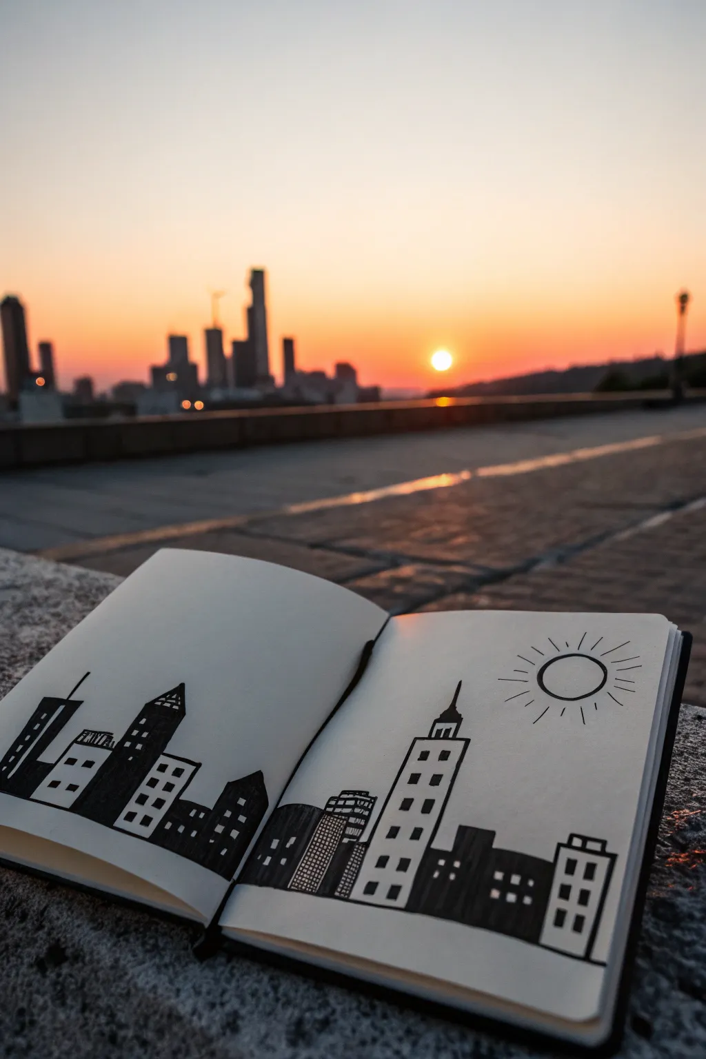
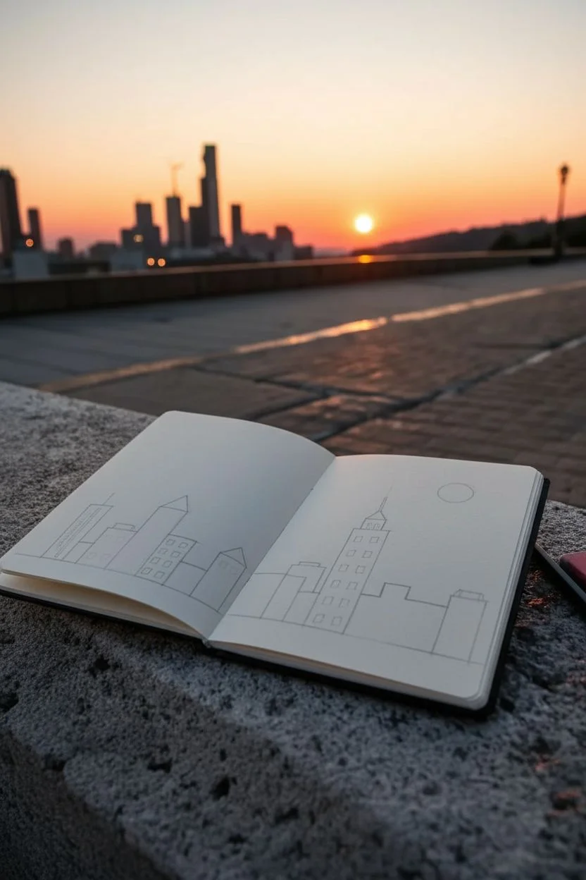
Capture the magic of an urban sunset with this bold, minimalist city skyline drawing that spans across two sketchbook pages. This project focuses on strong silhouettes and clean lines to create a striking contrast against the white paper, mimicking the look of buildings against a bright sky.
Step-by-Step Tutorial
Materials
- A5 or A6 sketchbook (smooth paper works best)
- Black fineliner pen (0.5mm or 0.8mm)
- Black brush pen or thick marker
- Pencil (HB)
- Eraser
- Ruler (optional)
Step 1: Planning the Layout
-
Open your canvas:
Lay your sketchbook flat on a solid surface. This drawing is a double-page spread, so press down the spine gently to ensure both pages are as level as possible for a continuous drawing experience. -
Draft the horizon:
Using your pencil lightly, draw a straight horizontal line across the bottom third of both pages. This doesn’t need to be perfectly straight, but it will serve as the base for all your buildings. -
Sketch the main towers:
Lightly sketch the outlines of about 4-5 tall ‘hero’ buildings. Vary their heights and shapes—some pointed, some flat-topped, and some slanted. Place one prominent tower on the right page to balance the composition. -
Fill in the gaps:
Draw shorter, wider building shapes between your tall towers. Overlap some shapes slightly to create depth. Include a grid-like building in the middle near the spine to bridge the two pages together. -
Add the sun:
On the upper right side of the right page, faint sketch a circle for the sun. Leave plenty of room around it for the rays you’ll add later.
Smudged Ink?
If you smear wet ink, turn it into a cloud or a bird silhouette. Accidents in ink drawing are just opportunities for new details.
Step 2: Inking the Structures
-
Outline the buildings:
Switch to your medium-thickness fineliner (0.5mm is great here). Carefully trace over your pencil outlines for the definition of each building. Don’t worry if lines are slightly wobbly; it adds character. -
Block in solid buildings:
Choose about half of your buildings to be solid black silhouettes. These usually look best if they are alternating—one detailed building, then one solid black one. Use your thick brush pen or marker to fill these shapes completely. -
Detail the white buildings:
For the buildings you left white, start drawing windows. Use small black squares or rectangles. I like to arrange them in neat grid patterns for skyscrapers or random clusters for older buildings. -
Create variation:
Mix up your window styles. For one building, draw horizontal bands; for another, use vertical lines. On the central building bridging the spine, try drawing a tight grid of small squares to mimic a modern glass facade. -
Add roof details:
Give your buildings personality with roof antennas, spires, or water towers. A simple vertical line or a small triangle on top of a flat roof makes a big difference to the silhouette.
Step 3: Finishing Touches
-
Ink the sun:
On the right page, trace your sun circle with the fineliner. Draw short, straight lines radiating outward from the circle to represent the sun’s rays. Keep them loose and varied in length. -
Refine the base:
Go over the bottom horizon line with a thicker stroke to ground the entire city. Ensure the buildings feel firmly planted on this line rather than floating. -
Check for contrast:
Look at your composition. If an area feels too empty, add a small, dark building or a few extra windows. Balance is key in black and white drawings. -
Erase guidelines:
Wait at least five minutes to ensure the ink is totally dry. Then, gently erase all visible pencil marks, being careful near the solid black areas to avoid smudging. -
Sign your work:
Add a tiny signature or the date in the corner of the page to mark the moment you captured your urban sunset.
Sky Wash
For a pop of color, use a diluted orange or pink highlighter to gently wash over the sky area after the black ink is fully waterproof and dry.
Enjoy viewing your handcrafted city view anytime you open your sketchbook
A 12-Year-Old Mountain Landscape With Atmospheric Depth
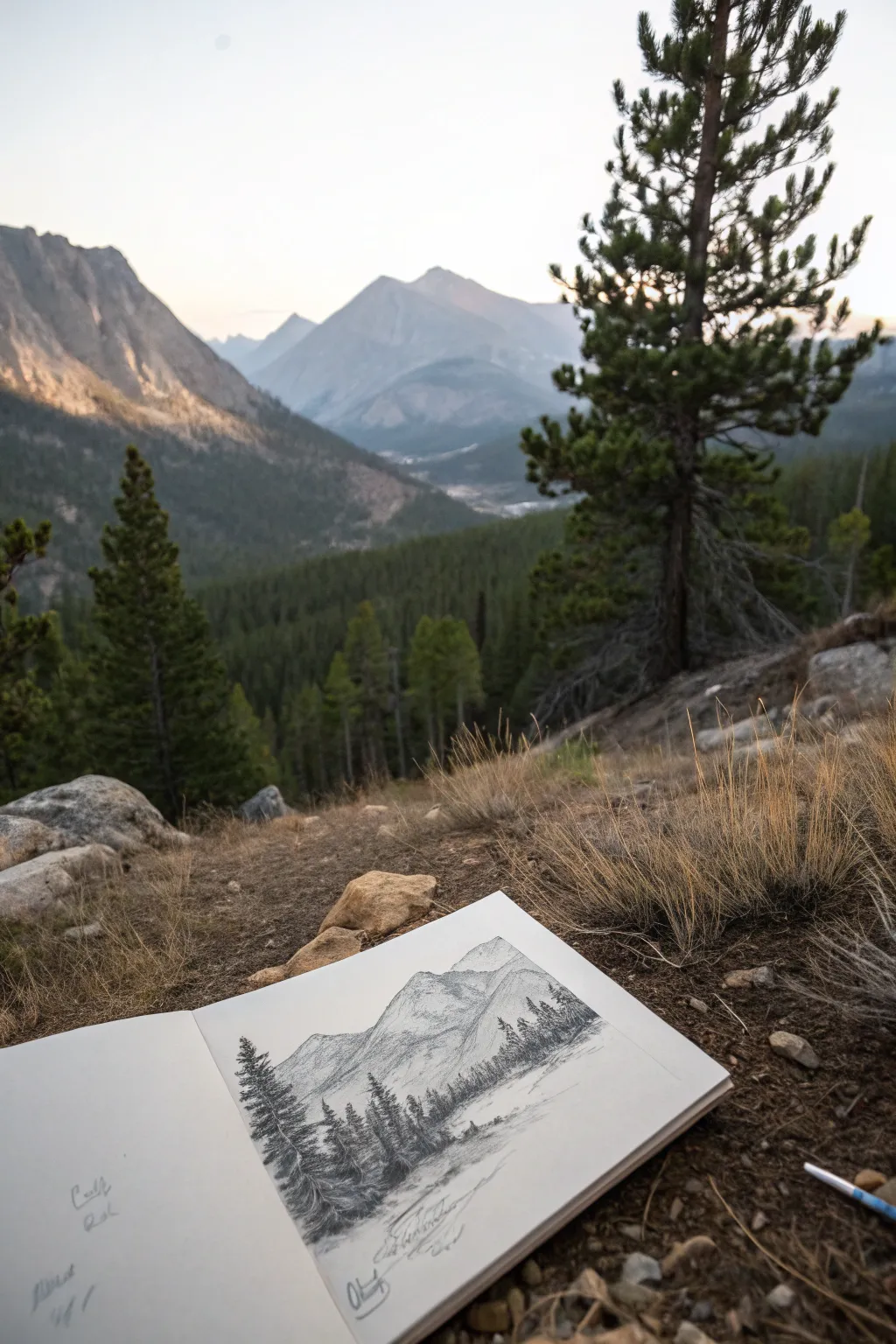
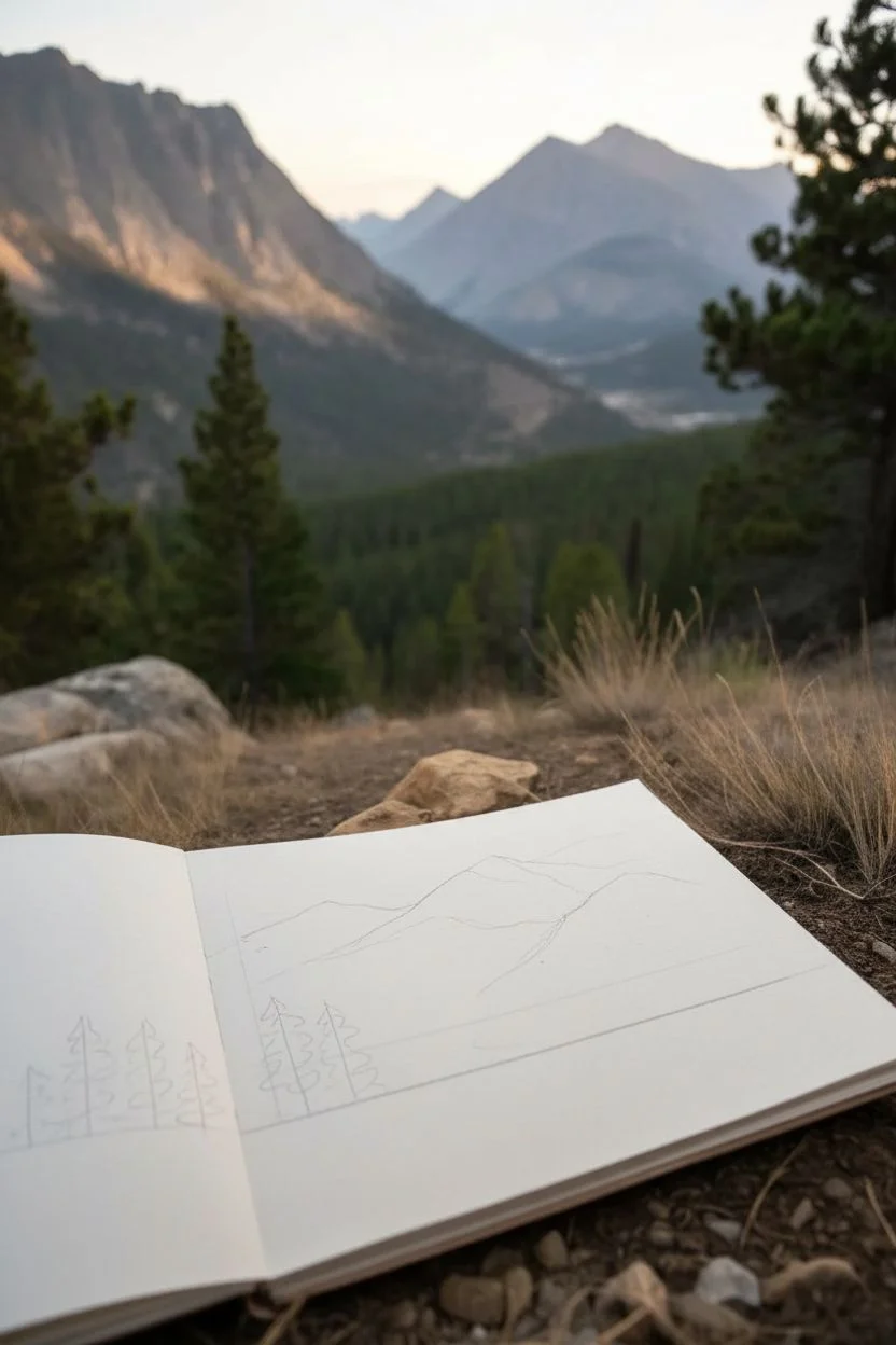
Learn how to capture the grandeur of a mountain range right in your sketchbook using simple shading techniques to create incredible depth. This graphite drawing focuses on distinguishing crisp, dark foreground trees from the softer, hazy mountains in the distance.
Step-by-Step
Materials
- Sketchbook or drawing paper (medium tooth)
- Set of graphite pencils (HB, 2B, 4B, 6B)
- Kneaded eraser
- Pencil sharpener
- Blending stump or tissue
- Ruler (optional)
Step 1: Laying the Foundation
-
Establish the horizon line:
Start by lightly drawing a horizontal line across the lower third of your page with an HB pencil. This doesn’t need to be perfectly straight; it just marks where the flat ground meets the rising mountains. -
Map out the mountain shapes:
Using very light pressure, sketch the basic triangular outlines of the mountain peaks. Place the tallest peak slightly off-center for a more natural composition, letting the slopes overlap each other to suggest distance. -
Indicate the foreground trees:
Sketch a few vertical lines in the lower left and center foreground to mark where your pine trees will stand. Make the trees on the left taller to show they are closest to the viewer.
Smudge Alert?
Place a scrap piece of paper under your hand while you draw. This acts as a shield, preventing your palm from smearing your hard work.
Step 2: Developing the Mountains
-
Define the mountain ridges:
Switch to a 2B pencil and refine the jagged edges of the mountain peaks. Give them uneven, rocky contours rather than smooth lines to make them look rugged and natural. -
Add structural shadows:
Identify a light source (imagine it coming from the upper right) and lightly shade the left side of the mountain peaks. Keep this shading relatively light and uniform for now. -
Texturing the rock faces:
With the 2B pencil, add scribbly, broken lines down the shadowed sides of the mountains to mimic craggy rock textures. I find that holding the pencil further back helps keep these lines loose and organic. -
Create atmospheric perspective:
For the mountains furthest in the back, keep your pencil marks very light and faint. As you move to the closer ridges, press slightly harder to make them darker. This fade effect pushes the distant peaks backward. -
Soften the distance:
Use a blending stump or a folded tissue to gently smudge the graphite on the most distant mountain. This blurs the details, simulating the haze of the atmosphere.
Step 3: Bringing the Foreground to Life
-
Start the pine trees:
Switch to a 4B pencil for darker, richer tones. Begin drawing the branches of the foreground pine trees, starting with short horizontal strokes at the top and getting wider as you move down. -
Dabbing texture:
Instead of drawing individual needles, use a stippling or scribbling motion to create dense clumps of foliage. Leave small gaps between branches so the sky or mountains peek through. -
Darken the closest trees:
Use a 6B pencil to add deep contrast to the largest tree on the left. Press firmly to get strong blacks; these dark values pull the tree forward visually, separating it from the grey mountains behind. -
Suggest a forest line:
Sketch a row of smaller, less detailed trees along the base of the mountains using the 2B pencil. These should be much smaller than your foreground trees to show how far away they are. -
Ground the scene:
Add horizontal scribbles and rough texture at the bottom of the page to represent the grassy or rocky ground beneath the trees. This anchors your drawing so the trees aren’t floating.
Extra Atmosphere
Use a white colored pencil or chalk over the distant mountains to create a misty fog effect that physically lightens the graphite grey.
Step 4: Final Touches
-
Refine the contrasts:
Look at your whole drawing. If the mountains blend too much into the sky, lightly define their edges again. Ensure the foreground trees remain the darkest part of the image. -
Add subtle details:
Use your sharpest HB pencil to add tiny details like a few jagged rocks on the mountain slopes or a distinct dead branch on a pine tree. -
Clean up highlights:
Take your kneaded eraser and dab it on the sunlit sides of the mountains to lift off graphite. This creates bright, snowy highlights that make the peaks pop. -
Sign your work:
Find a spot in the bottom sketchbook margin to scribble your signature and the date, just like an explorer documenting their travels.
Now you have a sketchbook page that looks like a view from a real expedition
A 12-Year-Old Dragon With Scales You Can Actually Draw
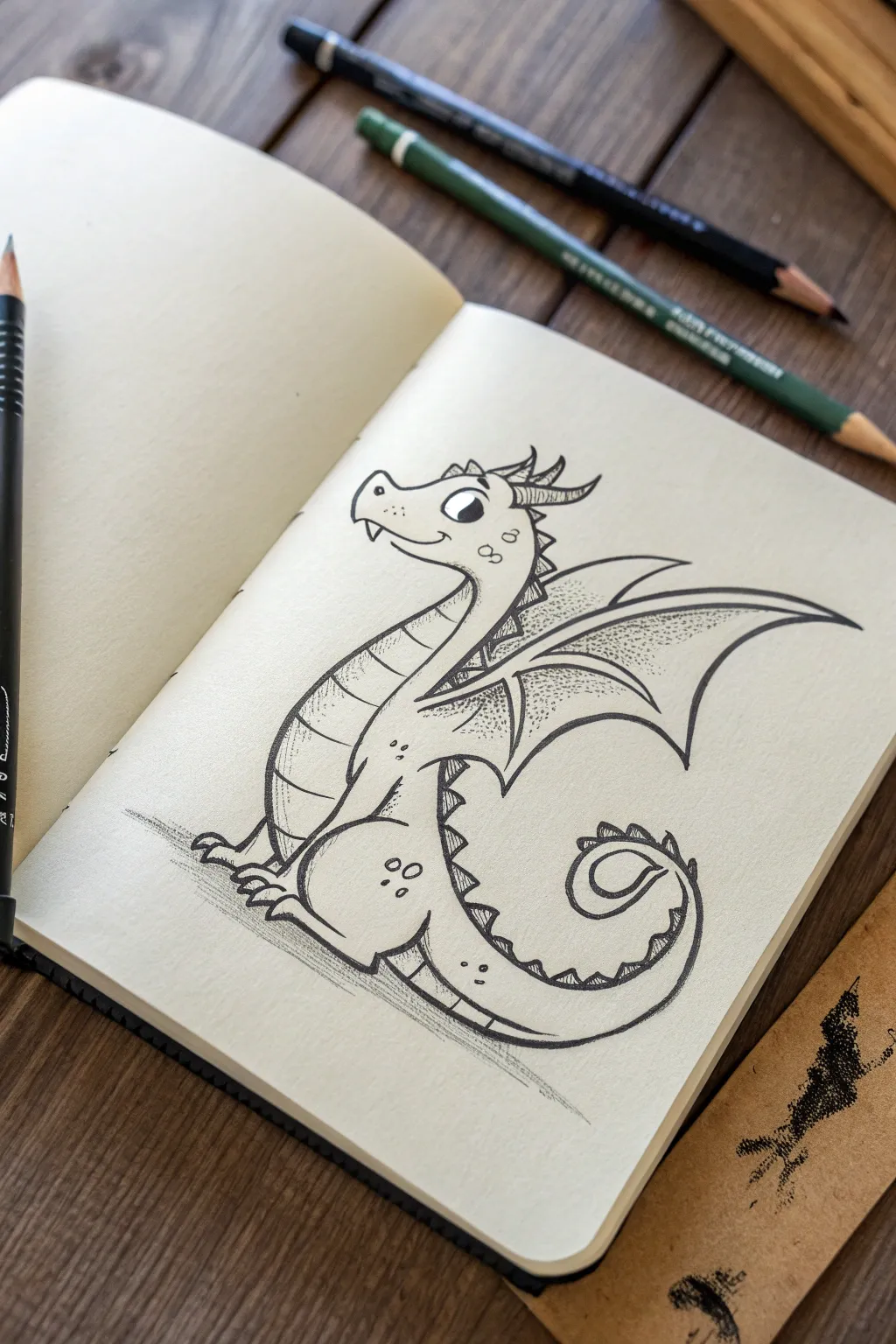
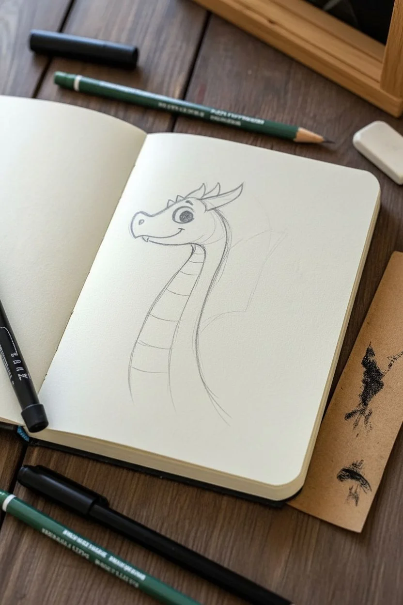
Create a friendly, stylized dragon character that looks like it flew right out of a storybook. This sketch uses simple geometric shapes and bold linework to build a charming creature with textured wings and a playful pose.
Step-by-Step Tutorial
Materials
- Sketchbook or heavy drawing paper
- HB or 2B graphite pencil (for initial sketching)
- Fine-point black fineliner pen (0.3mm or 0.5mm)
- Thicker black marker or brush pen (for outer outlines)
- Eraser
Step 1: Basic Structure & Head
-
Draw the head shape:
Start near the top center of your page. Draw a rounded, slightly boxy snout shape that curves up into the forehead. It should look a bit like a kidney bean tilted to the left. -
Add the face details:
Place a large circle for the eye near the top right of the head. Add a smaller pupil inside. Draw a tiny nostril near the tip of the snout and a curved smile line underneath. -
Sketch the neck:
Draw two parallel curved lines extending down from the back of the head. Curve them forward slightly to create a long, elegant neck posture.
Wobbly Lines?
Don’t stress if curves aren’t perfect! Dragon scales are organic. If a line goes rogue, just thicken it slightly to hide the wobble naturally.
Step 2: Body & Tail
-
Form the chest and belly:
From the bottom of the neck, sweep a large curved line down and to the left to form the chest, then curve it back underneath to create a round belly. -
Create the tail spiral:
Extend the back line down past the belly and curve it sharply upward and inward, spiraling into a curl. The tail should taper to a point at the end. -
Connect the underside:
Draw the belly scutes (scales) line. This is a parallel line following the inner curve of the neck, chest, and underside of the tail, creating a segmented strip. -
Draw the legs:
Sketch the rear leg as a large oval shape near the base of the tail. Add small, stubby toes at the bottom. For the front legs, draw small, simplified limbs extending from the chest area with tiny claws.
Step 3: Wings & Spikes
-
Outline the wing structure:
Draw a long, curved line extending from the upper back, arching up and to the right. Add a second shorter bone structure branching below it. -
Draw the wing membrane:
Connect the tips of the wing bones back to the body using scalloped, curved lines. This creates the bat-like webbing of the dragon’s wing. -
Add dorsal spikes:
Starting from the top of the head, draw a series of small triangles running all the way down the back of the neck, spine, and stopping partway down the tail. -
Detail the head horns:
Add two small, curved triangular horns on the back of the head, just behind the eye, pointing backwards.
Make it Yours
Try adding smoke wisping from the nostrils or giving the dragon different shaped horns, like spirals or ram horns, for a unique look.
Step 4: Inking & Texturing
-
Refine the outline:
Take your fine-point black pen and carefully trace over your pencil lines. Keep your hand steady to get clean, crisp curves. -
Thicken outer lines:
I like to go back over the main outer contour of the dragon with a slightly thicker pen or by doubling the line. This makes the character pop off the page. -
Add belly segments:
Draw horizontal curved lines across the belly strip you created earlier to define the individual plates or scales. -
Stipple the wings:
Using your finest pen, create texture on the wings by adding tiny dots (stippling). Concentrate the dots near the wing bones and fade them out toward the center of the membrane. -
Add character details:
Draw a few small circles or spots on the thigh and cheek for texture. Add a tiny jagged tooth poking out from the mouth if you like. -
Ground the figure:
Sketch a few horizontal scribbles or cross-hatching lines underneath the dragon to create a shadow so it doesn’t look like it’s floating. -
Clean up:
Wait a minute for the ink to dry completely, then gently erase all your underlying pencil sketches to reveal the finished artwork.
Now you have a fantastic little dragon buddy ready to guard your notebook pages
A 12-Year-Old Mashup Creature Made From Two Animals
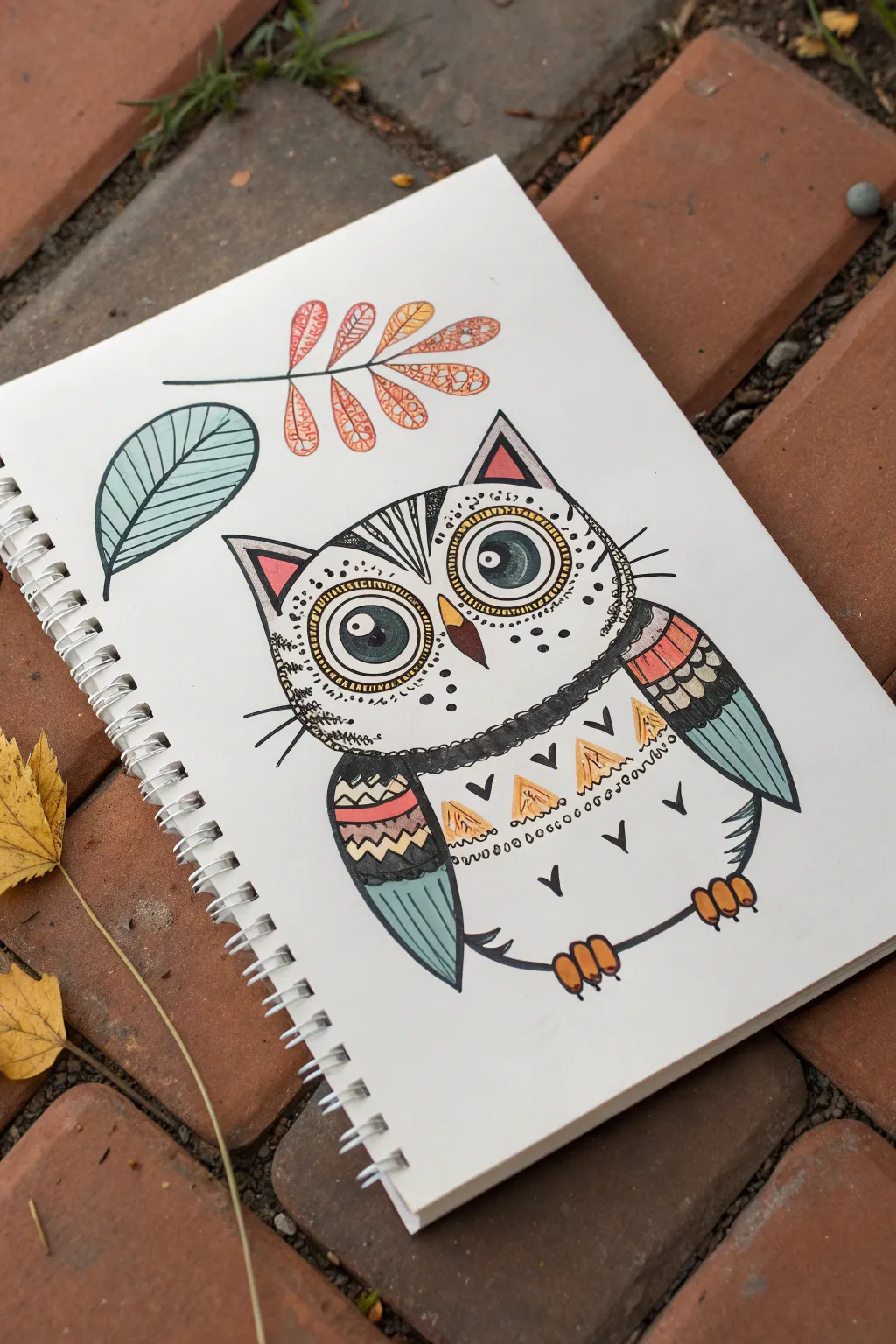
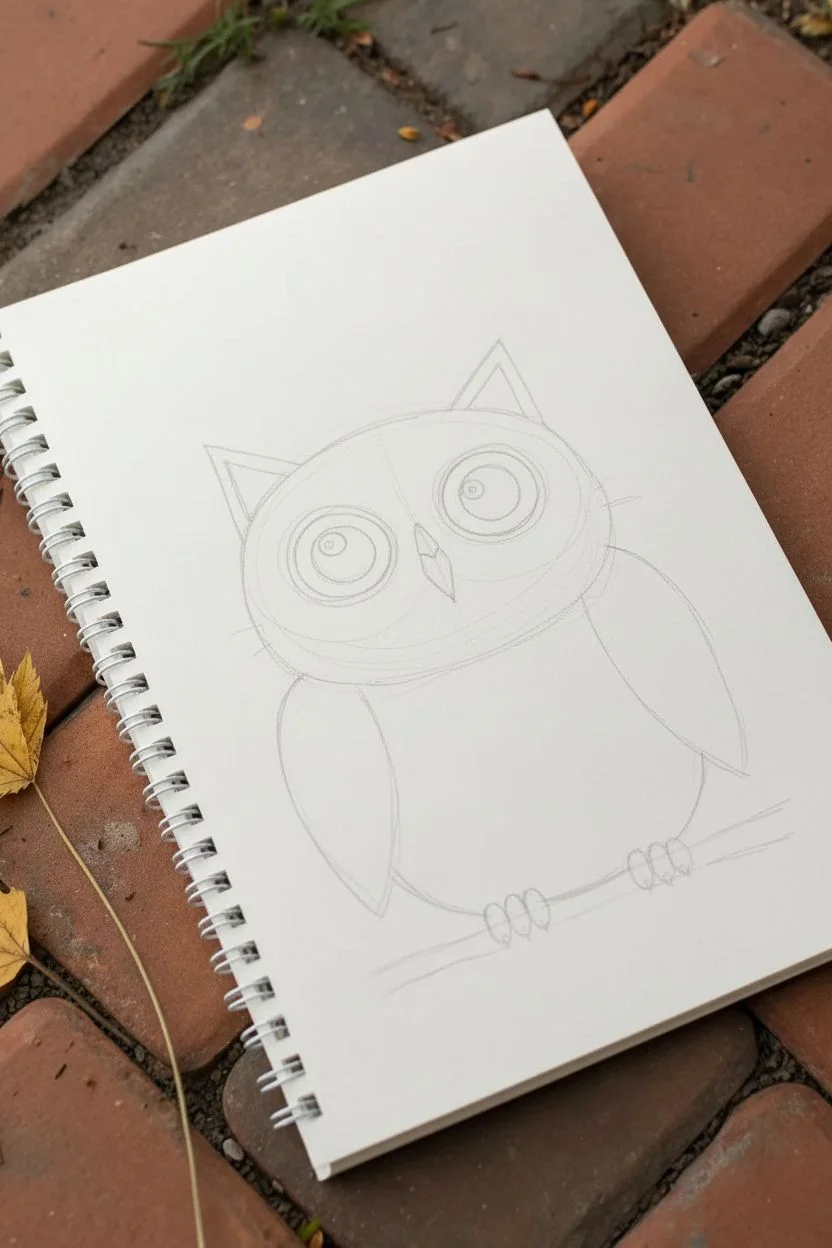
Create a charming hybrid creature that combines the wide-eyed wonder of an owl with the pointy ears and whiskers of a cat. This doodle-style illustration uses bold outlines and simple geometric patterns for a folk-art feel that looks great in a sketchbook.
Step-by-Step Guide
Materials
- Sketchbook or heavy drawing paper
- Pencil and eraser
- Fine-liner pen (black, waterproof)
- Thicker black marker for outlines
- Colored pencils or fine-tip markers (teal, orange, pink, yellow)
- White gel pen (optional for highlights)
Step 1: Sketching the Framework
-
Draw the basic shapes:
Start lightly with a pencil. Draw a large, slightly flattened oval for the body. This shape should be wider at the bottom than the top, like a rounded egg. -
Add the hybrid ears:
On top of the oval, sketch two large, triangle ears. Unlike a normal owl, make these pointy and cat-like, adding smaller triangles inside for the inner ear detail. -
Place the eyes and beak:
Draw two large circles near the top half of the body for the eyes. Inside each, add a smaller circle for the iris and a tiny dot for the pupil highlight. Between the eyes, place a small, downward-pointing triangle for the beak. -
Sketch the wings and feet:
Add two leaf-shaped wings tucking into the sides of the body. At the bottom, draw two sets of three small ovals for the claws gripping an imaginary branch.
Step 2: Adding Decorative Details
-
Detail the eyes:
Draw a ring around each eye circle. Fill this ring with tiny dots to create a textured frame. Above the eyes, lightly sketch curved lines toward the ears to suggest eyebrows or feather patterns. -
Create the chest pattern:
Divide the chest area with a gently curving horizontal line. Below this line, draw a row of distinct triangles pointing upward. Add a scalloped or wavy line underneath that row for extra texture. -
Decorate the wings:
Split the wings into sections with horizontal lines. In the top section, draw small ‘U’ shapes for feathers. In the middle, add a zig-zag line. Leave the bottom section plain for now to be colored later. -
Add nature elements:
In the white space above the creature, sketch a large, floating leaf on the left and a sprig of berries or smaller leaves on the right to frame the composition.
Clean Lines
Wait at least 5 minutes before erasing your pencil sketches, even if the ink looks dry. Smudging fresh ink is the biggest enemy of a clean drawing.
Step 3: Inking and Coloring
-
Outline the main shape:
Switch to your thicker black marker. Trace the main outline of the body, ears, and wings. The thicker line helps the drawing pop off the page. -
Define the fine details:
Use the fine-liner pen for the intricate patterns: the zig-zags, the eye dots, the claws, and the whiskers. Don’t forget to add three long whiskers on each cheek to emphasize the ‘cat’ part of the mashup. -
Color the eyes:
Using a teal pencil or marker, color the irises of the eyes. Leave the tiny pupil highlight white (or add it later with a white gel pen). -
Color the accents:
Use pink for the inner ears and a warm orange or yellow for the beak and claws. I usually apply color lightly so the black ink underneath stays visible. -
Fill in the patterns:
Color the triangles on the chest yellow or orange. For the wings, alternate between teal, pink, and orange stripes to create a colorful, patterned look. -
Enhance the background leaves:
Color the large leaf teal and the berry sprig orange. Outline them in black ink, adding simple vein lines inside the leaves for structure. -
Add final textures:
Use the fine-liner to add tiny ‘v’ shapes or dots on the white parts of the belly to suggest fluffy feathers or fur. Erase any remaining pencil lines once the ink is completely dry.
Make it Yours
Try mashing up two different animals using this same style. What would a fox-rabbit or a bear-eagle look like with these bold patterns?
Your sketchbook now hosts a unique creature ready for its own story
A 12-Year-Old Underwater Scene With Overlapping Fish
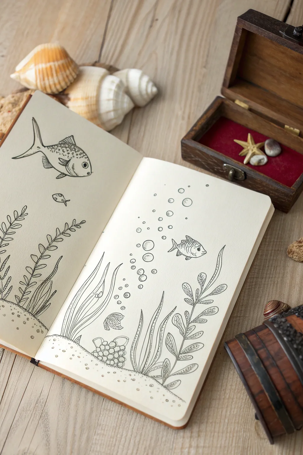
Dive into creativity with this charming underwater scene spread across two sketchbook pages. Using fine liners, you’ll create a lively aquatic world filled with bubbling currents, swaying seaweed, and friendly fish characters.
Step-by-Step
Materials
- Sketchbook (heavyweight paper preferred)
- HB Drawing pencil
- Eraser
- Fine liner pen (black, 0.3mm or 0.5mm)
- Thinner fine liner pen (black, 0.1mm for details)
- Ruler (optional)
Step 1: Planning the Seascape
-
Lay the sandy foundation:
Start on the bottom of the left page. Lightly sketch a curved, uneven mound rising slightly from the bottom left corner. Continue this line over to the right page, making it span the entire bottom width to create the ocean floor. -
Compose the main elements:
Visualize where your plants will grow. On the left page, mark positions for tall, leafy seaweed on the far left. On the right page, sketch rough guidelines for three distinct plant groups: a grassy clump on the left, a medium leafy plant in the center, and a tall, stalky plant on the right. -
Place the fish:
Sketch a large, oval shape for the main fish near the top of the left page. Add a tiny oval below it. On the right page, draw a medium-sized fish swimming towards the right, roughly in the middle of the page.
Line Weight Variation
Make the outer contour of the fish slightly thicker than the inner details like scales or fins. This ‘pop’ helps the subject stand out against the background.
Step 2: Drawing the Flora
-
Left page seaweed:
Using your pencil, flesh out the seaweed on the left. Draw a central stem that curves gently. Add small, leaf-like ovals in pairs all the way up the stem. Repeat this for a second, shorter stem next to it. -
Right page seagrass:
For the leftmost plant on the right page, draw long, flowing blades of grass. They should curve upwards and slightly to the right, mimicking the current. Add a small, spiral shell nestled at the base. -
Center coral cluster:
Draw the center plant as a cluster of round, stone-like shapes at the base, topped with short, smooth leaves. Next to it, draw a fan-shaped shell resting on the sand. -
Right page tall plant:
Create the tallest plant on the far right. Draw a long, winding stem. Instead of simple leaves, draw textured, oval leaves with internal veins to make it look distinct from the other seaweed.
Step 3: Detailing the Fauna
-
Define the big fish:
Refine the large fish on the left page. Give it a large, round eye with a pupil. Draw a curved gill line behind the head and add a dorsal fin on top and a pectoral fin on the side. Sketch small scales on its upper back for texture. -
Add the tiny companion:
Detail the tiny fish below the big one. Keep it simple—just an outline, a small eye, and a tail. -
Detail the swimming fish:
On the right page, add details to the medium fish. Give it a distinct eye, fins, and vertical stripe patterns on its body to distinguish it from the others.
Add Hidden Treasures
Hide small details in the sand for viewers to find later, like an old coin, a message in a bottle, or a tiny crab peeking out from behind a rock.
Step 4: Inking and Bubbles
-
Ink the outlines:
Take your 0.3mm or 0.5mm pen and carefully trace over your pencil lines. Start with the fish, then move to the plants and the sandy bottom. Use confident, smooth strokes. -
Add texture with a thinner pen:
Switch to your 0.1mm pen. Add delicate lines inside the fins of the fish and the leaves of the plants. I find this creates a nice contrast that looks very professional. -
Create the bubbles:
On the right page, draw a stream of bubbles rising from the plants towards the top. Draw circles of varying sizes—some tiny dots, some larger open circles. Add a small ‘highlight’ curve inside the larger bubbles to make them look shiny. -
Texture the sand:
Using the fine pen, add stippling (small dots) along the sandy bottom line. Cluster more dots near the lines and fewer as you move away to suggest depth and texture. -
Erase guidelines:
Wait for the ink to dry completely to avoid smudging. Gently erase all remaining pencil marks to reveal your crisp, clean line art.
Now you have a serene underwater snapshot captured forever in your sketchbook
A 12-Year-Old Space Explorer on a New Planet
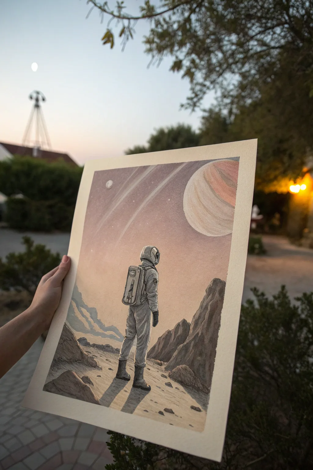
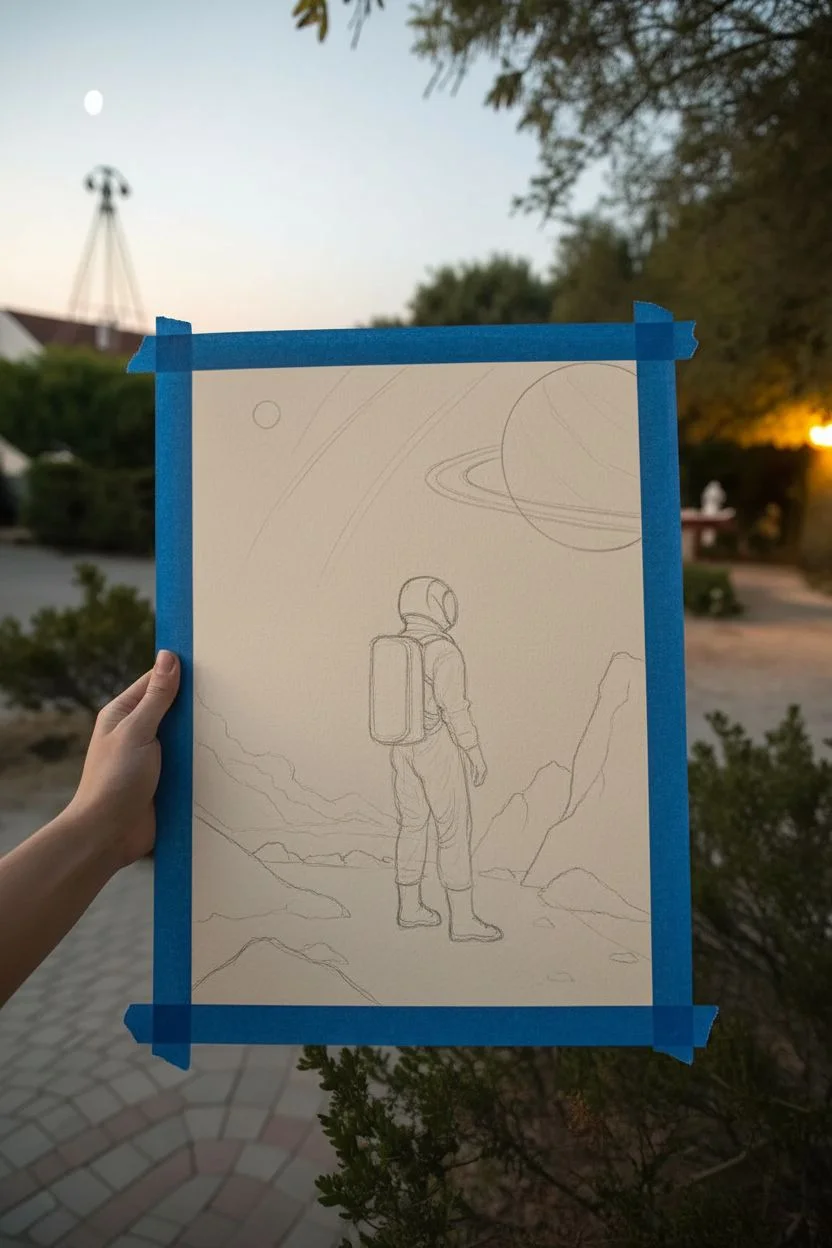
Transport yourself to a dusty, ringed world with this atmospheric mixed media illustration. By combining soft watercolor washes with crisp ink details, you’ll create a scene that feels vast, lonely, and full of sci-fi wonder.
How-To Guide
Materials
- Thick mixed-media or watercolor paper (cream or white)
- Pencil (HB) and eraser
- Watercolors or alcohol markers (muted mauve, dusty orange, light blue)
- Fine liner pens (black, sizes 0.1, 0.3, and 0.5)
- White gel pen or gouache paint
- Ruler
- Paintbrushes (medium round and fine detail)
- Masking tape (optional for borders)
Step 1: Sketching the Unknown
-
Border preparation:
Start by taping down your paper edges if you want that crisp, clean border shown in the photo. This frames the artwork beautifully. -
Setting the horizon:
About one-quarter of the way up from the bottom, sketch a rough, uneven horizon line. Keep it bumpy to represent rocky terrain. -
Positioning the astronaut:
Draw a vertical oval shape in the center of the foreground for the astronaut’s body. Add a rounded helmet on top and block out the legs standing firm. -
Adding the backpack:
Sketch a rectangular life-support backpack on the astronaut’s back. Don’t worry about tiny buttons yet; just get the boxy shape right. -
Sky elements:
In the upper right corner, lightly sketch a very large circle for the gas giant planet. Draw two or three sweeping, curved lines cutting across the sky behind it to represent planetary rings. -
Foreground rocks:
Add jagged shapes on the right and left sides of the foreground to create rocky outcrops. These help frame your explorer.
Fixing Wobbly Rings
If your planet rings look shaky or uneven, don’t erase! Turn them into belts of asteroids by adding small irregular rock shapes along the wobbly line.
Step 2: Washing in Color
-
The gradient sky:
Mix a watery, muted mauve or dusty purple color. Paint the top left of the sky, letting it fade into a dusty orange as you move toward the horizon line. -
Planet colors:
Paint the large planet with bands of pale peach and cream. Keep these colors very light so the planet looks distant and hazy. -
Rocky terrain base:
For the ground, use a sandy beige or light tan wash. While it’s still damp, drop in hints of grey near the rocks for natural shadows. -
Blue mountains:
In the distant background on the left, paint the low mountain range with a soft, pale blue-grey. This creates ‘atmospheric perspective,’ making them look far away. -
Drying time:
Let everything dry completely. I usually wait about 20 minutes here, because drawing ink over damp paper will cause ugly bleeding.
Step 3: Inking and Details
-
Outlining the suit:
Using your 0.3 pen, carefully outline the astronaut. Add wrinkles to the fabric around the knees and elbows to make the suit look puffy and pressurized. -
Helmet details:
Outline the helmet visor. Darken the side of the visor to show reflection, but leave a small white highlight area. -
Texturing the rocks:
Use the 0.1 pen to add texture to the rocks. Use jagged, vertical hatching lines to show cracks and the rough surface of the stone. -
Ground shadows:
Cast a long shadow stretching from the astronaut’s feet toward the left. Fill this shadow in with diagonal hatching lines or a grey marker. -
The backpack panel:
Draw the technical details on the backpack—little vents, tubes, and panels. Use the finest pen for this mechanical look. -
Defining the planet:
Lightly outline the large planet, but keep the line broken and thin so it doesn’t look like a sticker. Add faint stippling (dots) to the darker bands. -
Planetary rings:
Draw the rings with long, confident sweeping strokes. Use a ruler if your hand is shaky, but freehand looks more organic. -
Starry finish:
Take your white gel pen and tap tiny dots into the darker purple area of the sky for distant stars. Add one tiny bright moon if you have space.
Boost the Atmosphere
Once the ink is dry, add a very faint, watered-down wash of grey over the astronauts legs and lower rocks to ‘ground’ them in the scene.
Now you have a stunning view of a new world ready to be framed or gifted to a fellow space fan
A 12-Year-Old Pattern Doodle Page That Feels Like Zen
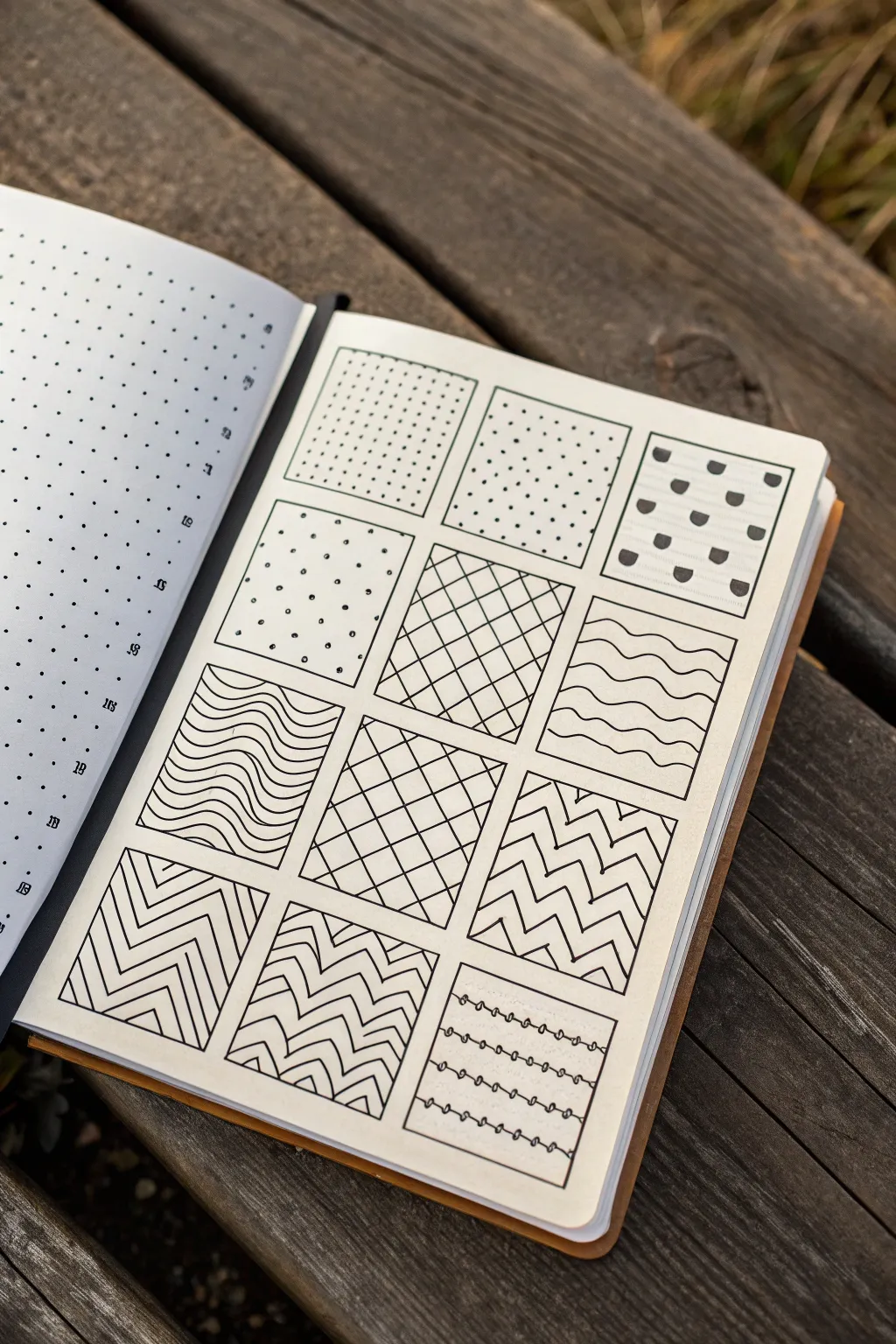
Create a satisfying and meditative grid of simple geometric patterns using just a pen and a notebook. This structured layout invites you to explore repetition and line work, resulting in a clean, minimalist piece of art that looks impressive but is deeply relaxing to draw.
Step-by-Step Guide
Materials
- Dot grid notebook or graph paper
- Fine liner pen (black, 0.3mm or 0.5mm)
- Ruler or straight edge
- Pencil (H or HB)
- Eraser
Step 1: Setting up the Grid
-
Map out the squares:
Using your pencil and ruler, lightly draw a large layout of 12 squares arranged in 4 rows of 3. On dot grid paper, I usually make each square about 8×8 or 10×10 dots to ensure there’s enough room for detail. -
Define the borders:
Go over your pencil squares with the black fine liner pen. Use your ruler to keep the lines crisp and straight, creating a solid frame for your patterns. Let the ink dry for a moment before erasing any visible pencil guidelines.
Uneven Lines?
If your freehand lines are wobble, embrace the organic look or switch to a thinner pen (0.1mm). Thinner lines hide small imperfections better than thick ones.
Step 2: Row 1: Exploring Dots & Shapes
-
Dense stippling:
In the top-left box, fill the space with a grid of small, evenly spaced dots. Use the underlying paper grid to align them perfectly vertically and horizontally for a uniform look. -
Sparse stippling:
For the middle box in the top row, create a similar dot pattern but space them out further—skipping every other grid intersection. This creates a lighter contrast to the first box. -
Semi-circle pattern:
In the top-right box, draw small semi-circles or ‘U’ shapes. Fill them in with solid black. Arrange them in alternating rows, like a brick pattern.
Level Up: Depth
Add shading with a grey marker or pencil to one side of the shapes (like the diamonds or waves) to make the patterns pop in 3D.
Step 3: Row 2: Rhythm & Diamonds
-
Scattered dots:
Move to the second row on the left. Draw small, open circles randomly or in a wide offset grid. Keep this one airy and light compared to the dense dots above. -
Diagonal grid:
In the center box, use your ruler to draw diagonal lines from bottom-left to top-right. Then, cross them with lines from bottom-right to top-left to create a diamond lattice pattern. -
Wavy lines:
For the right box, draw horizontal wavy lines. Try to keep the ‘waves’ aligned vertically so the peaks and valleys stack on top of each other neatly.
Step 4: Row 3: Flow & Zigzags
-
Curved waves:
In the third row, left box, draw sets of curved lines that sweep across the square. Group them in bands of three or four tight waves to create a distinct texture. -
Expanded lattice:
In the center box, replicate the diamond lattice from the row above, but space the lines slightly wider apart to vary the density. -
Sharp zigzags:
In the right box, draw continuous zigzag lines horizontally. Stack them closely so the points nest into each other, creating a vibrating effect.
Step 5: Row 4: Complex Chevrons & Loops
-
Nested chevrons:
For the bottom-left box, draw large ‘V’ shapes or chevrons. Inside each large chevron, draw smaller parallel lines to fill the shape with stripes. -
Alternating texture:
In the bottom-center box, combine the zigzag and chevron ideas. Draw distinct bands of zigzags, perhaps adding extra short lines within the peaks to add complexity. -
Looped strings:
Finally, in the bottom-right box, draw straight horizontal lines spaced widely apart. Along each line, draw tiny loops at regular intervals, making it look like strung beads or wire fencing. -
Final cleanup:
Check the entire page for any stray pencil marks and erase them gently. Ensure all ink is completely dry to prevent smudging.
Now you have a completed pattern library that serves as a great reference for future doodles
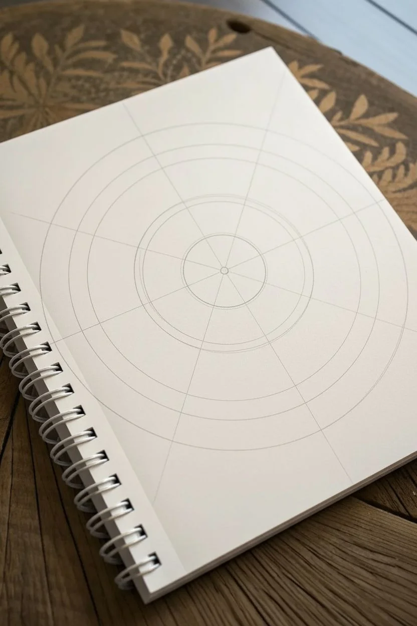
A 12-Year-Old Mandala Burst With Symmetry Tricks
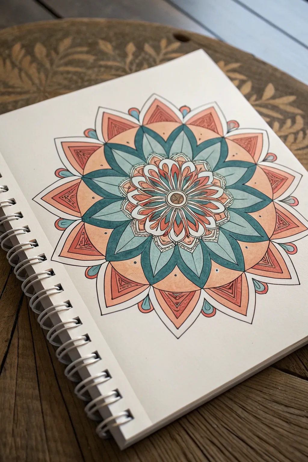
This vibrant mandala bursts off the page with its soothing blend of teal and peach tones, perfect for practicing symmetry and precision. It features layers of petal-like shapes radiating from a central core, colored with smooth markers for a clean, finished look.
Step-by-Step
Materials
- Spiral-bound sketchbook or heavy drawing paper
- Compass and ruler
- Pencil (HB or 2B)
- Eraser
- Fine-liner pen (black, 0.3mm or 0.5mm)
- Alcohol-based markers or colored pencils (Teal, Peach/Light Orange, Reddish-Orange)
Step 1: Planning and Structure
-
Find the Center:
Begin by lightly marking the center of your page. Use your ruler to ensure it is equidistant from the sides, giving your mandala plenty of room to expand. -
Draw Guide Circles:
Using your compass, draw a series of concentric circles radiating from the center point. Start with a tiny circle for the core, then create four increasingly larger rings spaced about 1 to 1.5 inches apart to serve as guidelines for your petal layers. -
Section the Wheel:
Use your ruler and pencil to divide the circles into pie slices. Draw straight lines through the center point to create 8 symmetrical sections, then split those again to make 16 total sections. This grid is the secret to keeping everything even.
Uneven Petals?
If your petals look different sizes, don’t erase everything! Just thicken the black outline on the smaller petal to match the others. Thinner lines make shapes look bigger; thick lines make them smaller.
Step 2: Drawing the Layers
-
The Center Seed:
In the smallest center circle, draw a simple dot or tiny circle. Immediately surrounding this, sketch small, thin petals radiating outward, fitting two into each pie slice section for a dense core. -
First Petal Ring:
Move to the next ring guideline. Draw longer, slender petals that extend from the core to the edge of this ring. These should look like long tear-drops, with one petal centered on each grid line. -
The Teal Layer:
For the next layer, draw wide, pointed leaf shapes. The tips of these leaves should touch the next circle guideline. Make them wide enough so they touch each other at the base, creating a solid ring of shapes. -
Create the Outer Ring:
Draw the largest set of petals in the outermost ring. These should be shorter and wider, like triangle-shaped mountains. Between each large petal, add a tiny peeking petal or ‘bead’ shape to fill the negative space. -
Detail Work:
Inside the large outer petals, sketch a smaller triangle shape to create a border effect. Then, add small dots or circles inside the teal layer petals for extra texture.
Shading Magic
After the marker ink dries, use a colored pencil in a slightly darker shade (like dark blue over teal) to shade the base of each petal. It adds instant 3D depth.
Step 3: Inking and Coloring
-
Ink the Outlines:
Trace over your pencil lines carefully with the black fine-liner. I like to rotate the notebook as I go so my hand position stays comfortable. Don’t rush this part; steady lines make the mandala pop. -
Erase Guidelines:
Wait ink to dry completely to avoid smears. Then, gently erase all the pencil guidelines and structural circles so only your clean black ink remains. -
Color the Core:
Start coloring from the center. Fill the tiny central petals with a reddish-orange marker, leaving the very center dot white or a neutral tone. -
Apply Teal Tones:
Color the middle ring of long, pointed leaves with your teal marker. For a sense of depth, you can go over the tips of these leaves a second time to darken them slightly. -
Fill the Background Ring:
Color the background space behind the teal leaves with a soft peach or light orange color. This creates a beautiful contrast that pushes the teal leaves forward. -
Color Outer Petals:
Fill the large outer triangular petals with the peach marker. Then, use the reddish-orange marker to color inside the inner triangle borders you drew earlier. -
Final Accents:
Color the small ‘peeking’ shapes between the outer petals with teal to tie the color scheme together. Add a final small dot of black ink near the tip of every teal leaf for a finished look.
Take a step back and admire the rhythmic pattern you have created on the page
A 12-Year-Old Hand-Trace Transformation Into a Bird
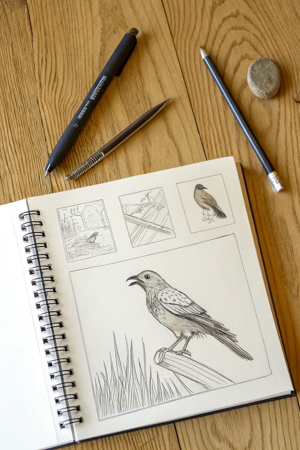
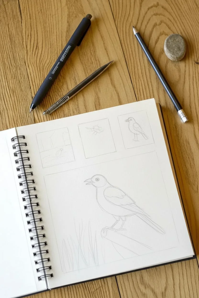
This project captures the delicate details of a bird in a classic sketchbook style, featuring a main portrait surrounded by smaller thumbnail studies. Using crisp ink lines and careful shading, you’ll create a professional-looking nature journal page that feels both studious and artistic.
How-To Guide
Materials
- Spiral-bound sketchbook (heavyweight paper)
- Fine liner pen (black, 0.3mm or 0.5mm)
- Graphite pencil (HB or 2B)
- Eraser
- Ruler (optional)
Step 1: Layout and Planning
-
Define the frame text:
Start by drawing a large rectangular box on the bottom two-thirds of your sketchbook page using your pencil. This will house the main bird illustration. -
Add thumbnail boxes:
Above the large rectangle, draw three smaller square boxes side-by-side. These will serve as spaces for your practice sketches or alternative angles. -
Rough out the main bird:
Inside the large box, lightly sketch the basic shapes of the bird. Use an oval for the body and a smaller circle for the head, connecting them with a gentle neck curve. -
Position the perch:
Draw a diagonal shape underneath the bird’s feet to represent the wooden fence post or branch it is standing on. -
Sketch the background elements:
Lightly indicate where the tall blades of grass will go in the bottom left corner of the large box, rising up towards the bird.
Don’t smudge the ink
Place a scrap piece of paper under your drawing hand. This prevents your hand’s oils from staining the paper and stops you from accidentally smearing fresh ink.
Step 2: Detailed Penciling
-
Refine the bird’s outline:
Go over your rough shapes to define the actual contour of the bird. Pay attention to the smooth slope of the back and the sharp point of the open beak. -
Add feature details:
Draw the circular eye with a small highlight inside. Sketch the wing feathers, layering them like roof shingles from the shoulder down to the tail tip. -
Detail the thumbnails:
In the top three boxes, lightly sketch simple scenes: a landscape on the left, a close-up detail in the center, and a smaller, standing bird on the right. -
Refine the post and grass:
Add wood grain texture lines to the perch and define individual blades of grass, making them vary in height and thickness.
Add watercolor wash
After the ink is totally dry, use a watercolor brush to add a very pale wash of blue or brown to the background for a vintage field-guide look.
Step 3: Inking and Finishing
-
Ink the frames:
Switch to your fine liner pen. Carefully trace the rectangular borders of all four boxes to create crisp, clean frames. -
Outline the main bird:
Trace the bird’s outline with steady strokes. I like to use broken or jagged lines slightly on the chest to suggest fluffy feathers. -
Create texture with hatching:
Use short, parallel hatch lines on the bird’s belly and under the wing to create shadow and volume. Keep the strokes light near the light source. -
Ink the wing feathers:
Darken the lines separating the long flight feathers. Add small ticks and lines within the feathers to show texture. -
Detail the eye and beak:
Fill in the pupil dark black, leaving a tiny white reflection. Outline the beak clearly, darkening the inside of the open mouth slightly. -
Ink the environment:
Go over the wooden post with long, flowing lines for grain. Ink the grass blades with quick, upward flicking motions to keep them looking sharp. -
Complete the thumbnails:
Quickly ink the sketches in the top boxes. Keep these looser and less detailed than the main drawing to emphasize that they are ‘studies.’ -
Erase and clean up:
Once the ink is completely dry (wait at least a few minutes), gently erase all the underlying pencil marks to reveal the clean black and white illustration.
Now you have a stunning page that looks like it belongs in a naturalist’s field guide
A 12-Year-Old Food Stack Drawing With Fun Textures
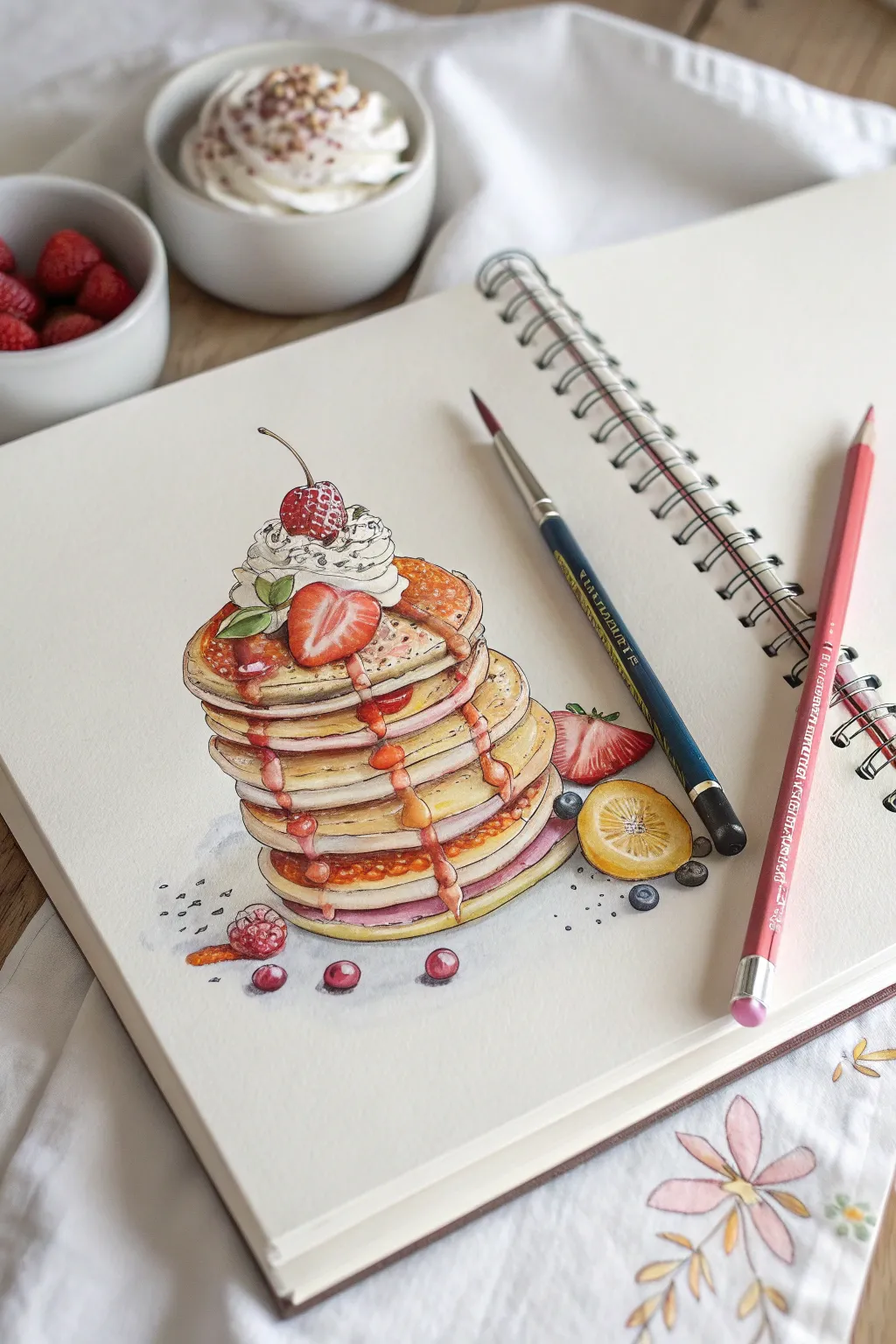
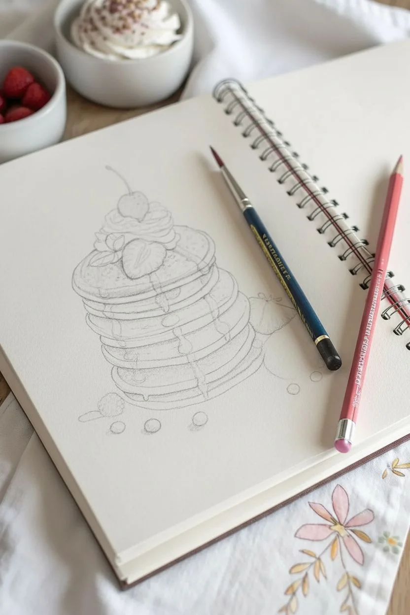
Capture the delicious details of a towering stack of pancakes using watercolor and colored pencils to create mouth-watering textures. This mixed-media project focuses on layering colors to achieve the fluffy look of pancakes and the glossy sheen of syrup.
Step-by-Step Tutorial
Materials
- Heavyweight sketchbook or mixed-media paper
- HB graphite pencil
- Kneaded eraser
- Watercolor paint set (Golden Yellow, Burnt Sienna, Alizarin Crimson, Ultramarine Blue)
- Small round brushes (Size 2 and 4)
- Colored pencils (Red, Brown, White, Cream)
- Water cup and paper towels
- White gel pen (optional)
Step 1: Sketching the Structure
-
Map the height:
Start by drawing a faint vertical line in the center of your page to determine the height of your stack. Mark the top and bottom points. -
Draw the ovals:
Sketch a series of flattened ovals stacked on top of each other. Don’t make them perfectly straight—let some slide slightly left or right to make the stack look natural and tippy. -
Add thickness:
Connect the edges of each oval downward to create the thickness of each pancake. Keep the bottom edges curved parallel to the top edge. -
Top it off:
Draw a mound of whipped cream on the very top pancake. Add a cherry stem sticking out and outline a strawberry sliced in half resting against the cream. -
Drip details:
Sketch wavy, irregular lines flowing down the sides of the stack to represent the syrup. Add a few small scattered berries around the base.
Syrup Shine Secret
To make syrup look intensely glossy, ensure your darkest dark outline is right next to your brightest white highlight on the drip.
Step 2: Watercolor Base Layer
-
Base pancake color:
Mix a light wash of Golden Yellow with a tiny drop of Brown. Paint the top surface of each pancake, leaving the syrup areas white for now. -
Shadows and sides:
While the first layer is damp, drop a slightly darker brown mixture into the sides of the pancakes to create a shadow and show the ‘cooked’ texture. -
Berry wash:
Paint the strawberries and cherries with a diluted Red. Don’t worry about being too perfect; we will add details later with pencil. -
Syrup base:
Use a translucent wash of Burnt Sienna (reddish-brown) for the syrup trails. Let the variation of water create natural light and dark spots.
Step 3: Refining with Pencils
-
Define the edges:
Once the paint is completely dry, use a sharp brown colored pencil to outline the pancakes. break up the line slightly to mimic the spongy texture. -
Create porosity:
Use the brown pencil to add tiny dots and small dashes along the cut edge of the pancakes. This essential texture makes them look fluffy rather than solid. -
Deepen the syrup:
Using a reddish-brown pencil, shade the edges of the syrup drips. Press harder on one side of the drip to create a 3D effect. -
Berry details:
Use a sharp red pencil to draw the seeds on the strawberry and the texture on the raspberries at the bottom. Leave tiny white specks for highlights. -
Whipped cream shadows:
Use a very light blue or grey watercolor wash or pencil to shade just the crevices of the whipped cream, keeping the majority bright white.
Make It A Meal
Instead of fruit, try drawing melting butter squares on top and draw bacon strips peeking out from between the layers.
Step 4: Final Highlights
-
Glossy shine:
Take your white colored pencil or a white gel pen and add tiny, sharp highlights on the curve of the syrup drips and the top of the cherry. -
Extra fruits:
If you sketched the lemon slice or loose blueberries, paint them now using bright yellows and deep blues, adding pencil outlines for crispness. -
Cast shadow:
Mix a watery purple-grey paint. Apply a soft shadow underneath the bottom pancake and the scattered fruit to ground the object to the paper.
Now you have a delicious-looking illustration that jumps off the page

Have a question or want to share your own experience? I'd love to hear from you in the comments below!