At 10, kids are ready for painting projects that feel more “real artist” than little-kid crafts, but still stay totally doable. These ideas are my go-tos for big color, simple steps, and that satisfying, frame-worthy finish you’ll actually want to hang up.
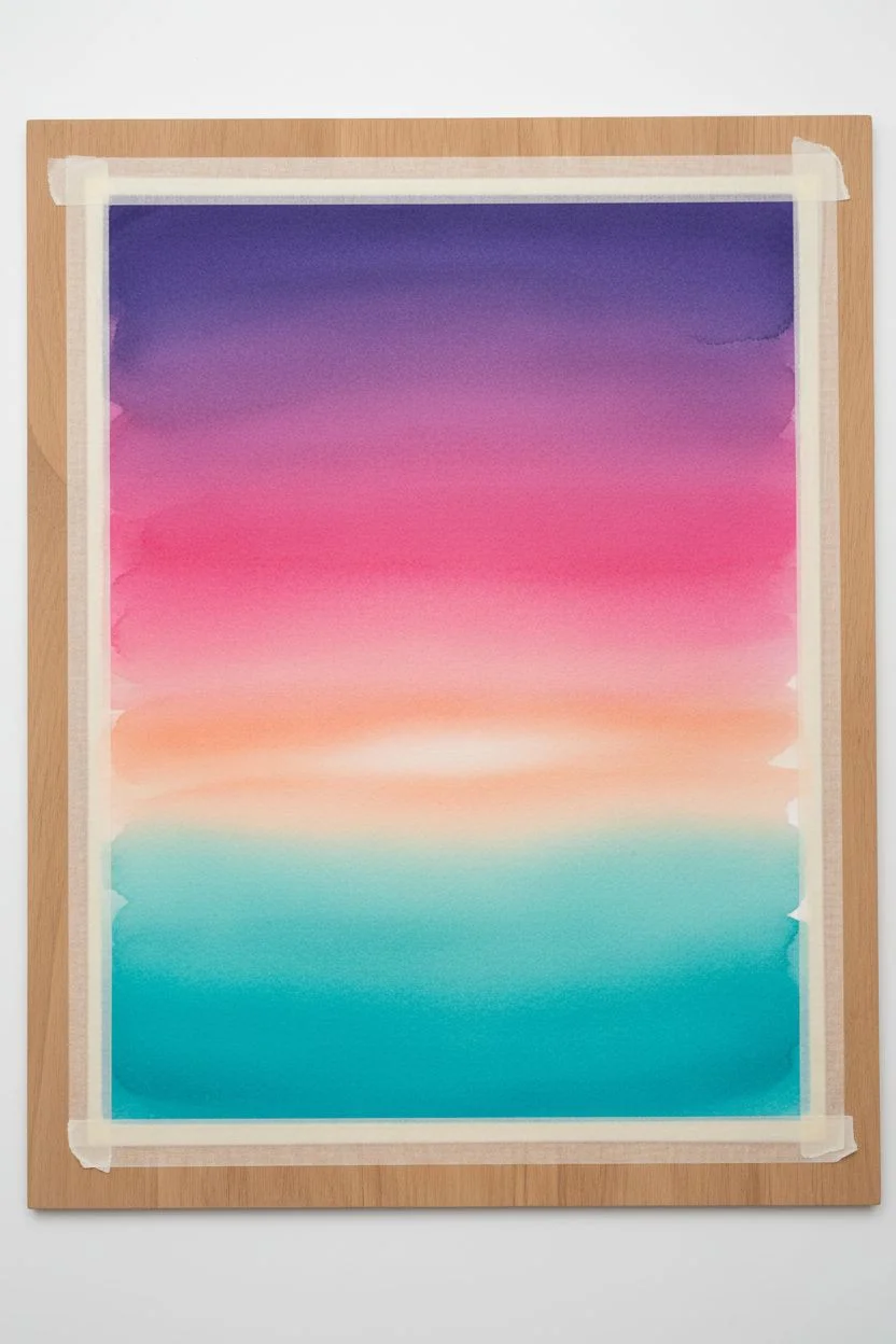
Sunset Gradient with Silhouette Trees
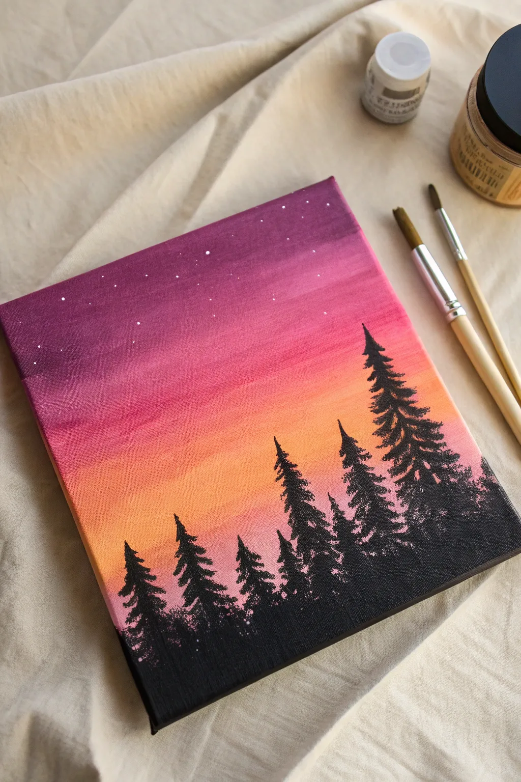
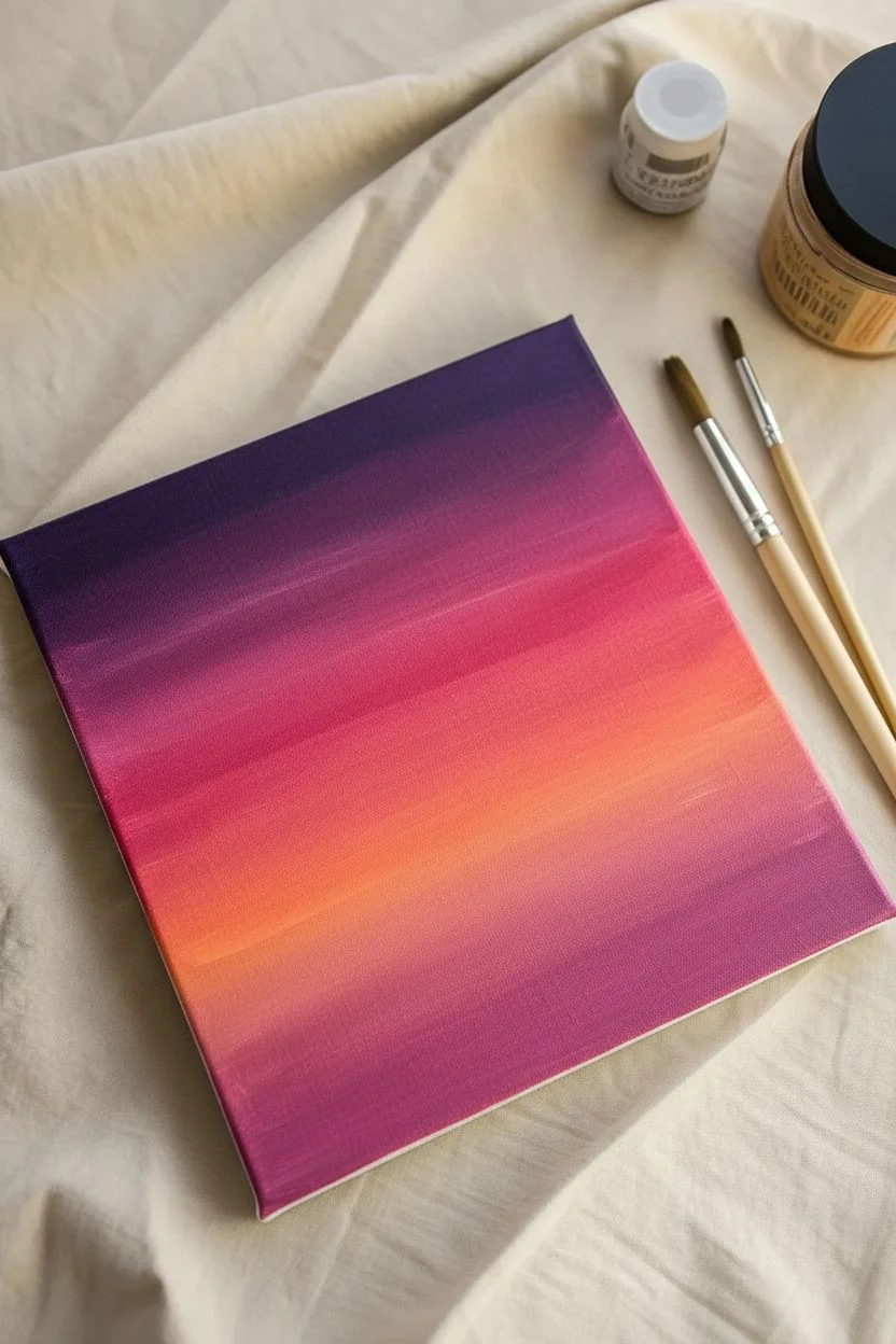
Capture the magic of twilight with this stunning silhouette painting that features a vibrant gradient sky. The seamless blend from deep purple to warm orange creates a perfect backdrop for the stark black pine trees, making this a rewarding project for young artists learning about blending.
How-To Guide
Materials
- Small square canvas (e.g., 8×8 or 10×10 inches)
- Acrylic paints: Deep Violet, Magenta/Pink, Orange, Titanium White, Black
- Wide flat brush (for the sky)
- Small round brush (for tree details)
- Fine liner brush (for stars)
- Cup of water
- Paper towels
- Palette or paper plate
Step 1: Painting the Sky Gradient
-
Prepare your colors:
Squeeze out generous amounts of your sky colors onto your palette: Deep Violet, Magenta, Orange, and a little White. Keep them separate for now so you can control the mixing. -
Start with the darkest shade:
Using your wide flat brush, pick up the Deep Violet paint. Apply a solid horizontal band across the top quarter of your canvas. Don’t forget to paint the top and side edges of the canvas too for a finished look. -
Add the middle magenta layer:
Clean your brush slightly, then load it with Magenta. Paint the next section below the purple, slightly overlapping the wet purple edge. -
Blend the purple and pink:
Without adding new paint, use rapid horizontal strokes right where the purple and magenta meet. The goal is to blur the line so you can’t tell where one color ends and the other begins. -
Introduce the orange horizon:
Wash your brush thoroughly. Load it with Orange and paint the bottom third of the canvas background. Leave some space at the very bottom black, or just paint the orange all the way down—it will be covered later. -
Blend the sunset transition:
Just like before, gently brush back and forth where the magenta meets the orange. If the transition feels too harsh, pick up a tiny bit of both colors on your brush and work them together on the canvas. -
Let the sky dry:
This step is crucial. Allow the sky to dry completely before moving on to the stars or trees. If the sky is wet, your sharp details will smudge.
Smooth Blends
Work quickly while blending the sky gradient! Acrylic dries fast, so blending the colors while they are still wet is the secret to getting that seamless, soft transition.
Step 2: Adding Stars
-
Mix a starry white:
Take a small amount of Titanium White paint and thin it slightly with a drop of water. You want a creamy consistency that flows easily off a small brush. -
Dot the stars:
Using your smallest fine liner brush or even a toothpick, gently tap tiny dots into the upper, darker purple section of the sky. Vary the pressure to make some stars slightly bigger than others. -
Create constellations:
Try grouping a few dots together or scattering them randomly. Avoid putting stars in the bright orange section, as they wouldn’t be visible during a sunset.
Step 3: Painting the Silhouette Trees
-
Establish the ground:
Switch to Black acrylic paint. Use your flat brush to paint a solid black strip along the very bottom edge of the canvas (about an inch high) to create the ground. -
Map out tree heights:
Using a small round brush and black paint, draw vertical lines sticking up from the ground to mark the center of each pine tree. Make them different heights—tall ones on the right look great for balance. -
Paint the tree tops:
Starting at the very top of one vertical line, use the very tip of your round brush to dab small, jagged shapes. These should be narrow and pointed at the peak. -
Widen the branches:
As you move down the tree trunk, make your dabbing strokes slightly wider. Use a tapping motion to create a rough, textured look that mimics pine needles. -
Leave some gaps:
Don’t fill the tree in completely solid. I find that leaving tiny peek-through holes where the sunset color shows through makes the trees look more realistic and airy. -
Fill the lower canopy:
Near the bottom of the tree, merge your branches into the solid black ground. The branches here can be thick and overlap with neighboring trees to create a dense forest feel. -
Repeat for the forest:
Continue this process for all your vertical lines. Vary the width and shape of the trees so they don’t look like carbon copies of each other. -
Final touch-ups:
Check the edges of your canvas. Extend the black ground and any overlapping branches around the sides so the image wraps around the artwork.
Make It a Galaxy
Flick white paint with a toothbrush over the purple section for a dense star field, or add a larger crescent moon in the violet area for extra night-time atmosphere.
Allow your beautiful landscape to dry fully before displaying it on a mini easel or hanging it on your wall

Four Seasons Tree Using Dabbing and Dots
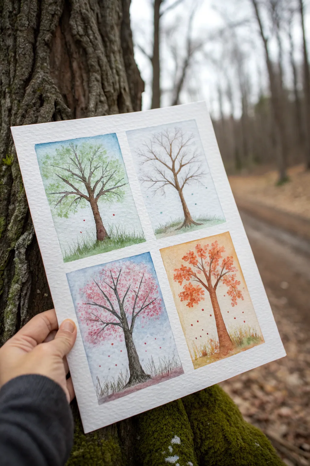
Capture the magic of nature’s cycle with this single sheet painting that divides one year into four distinct panels. Using simple watercolor techniques, you’ll paint the same tree transforming from spring’s fresh blooms to winter’s bare branches.
Detailed Instructions
Materials
- Cold press watercolor paper (A4 or similar size)
- Watercolor paint set (pan or tube)
- Masking tape or painter’s tape
- Small round brush (size 2-4)
- Medium round brush (size 6-8)
- Pencil and eraser
- Cup of water and paper towels
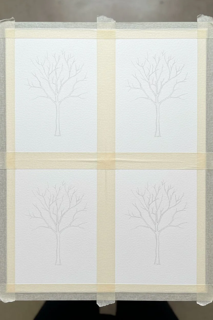
Step 1: Preparation and Sketching
-
Tape the borders:
Begin by taping down the edges of your watercolor paper to a hard surface. Then, place a strip of tape vertically down the center and horizontally across the middle to create four equal rectangular windows. -
Lightly sketch the trees:
Using a pencil, lightly draw a skeletal tree structure in the center of each quadrant. Try to make the trunk and main branches look roughly the same in each box, as if it’s the same tree changing through time. -
Erase guidelines:
Once you are happy with the shape of your trees, gently dab the lines with a kneadable eraser so they are barely visible, ensuring the graphite won’t muddy your paint later.
Bleeding edges?
If paint seeps under the tape, use a slightly damp, clean brush to gently scrub the unwanted paint, then blot with a paper towel. For next time, press the tape edges down firmly with a fingernail.
Step 2: Painting the Backgrounds
-
Wet the sky area:
Starting with the top left box (Spring), apply clean water to the sky area around the tree branches, being careful not to soak the paper too much. -
Add soft color fills:
Drop in a very diluted light blue for the Spring and Winter (top right) skies. For the Summer tree (bottom left), use a slightly deeper blue, and for Autumn (bottom right), try a warm, pale orange or yellow wash. -
Create the ground:
While the sky dries, paint the ground area in each box. Use fresh green for Spring, a brownish-green for Summer, warm ochre for Autumn, and a very pale, watery gray-blue to suggest snow for Winter. -
Let it dry completely:
Wait until the paper is bone dry before proceeding. If the paper feels cool to the touch, it’s still wet.
Level Up
Try sprinkling salt on the wet paint of the Winter sky while it’s still damp. When it dries and you brush the salt off, it creates a magical, crystallized snowflake texture.
Step 3: Painting the Trees
-
Paint the trunks:
Mix a medium brown shade. Using your small round brush, carefully paint the trunk and branches of all four trees. Keep the brush strokes loose and organic rather than perfectly straight. -
Add bark texture:
I like to drop a tiny bit of darker brown or black into the wet paint on the shadowed side of the trunk (usually the right side) to make the trees look round and 3D. -
Spring foliage (Top Left):
Mix a fresh leafy green. Using a ‘dabbing’ motion with the tip of your brush, create clusters of leaves on the ends of the branches. Keep the clusters airy so you can see the sky through them. -
Summer blossoms (Bottom Left):
For the flowering tree, switch to a vibrant pink. Use the same dabbing technique but make the clusters denser to show a tree in full bloom, adding a few dark pink dots for depth. -
Autumn leaves (Bottom Right):
Mix orange and rusty red tones. Dab these colors onto the branches, but use fewer touches than the summer tree to show leaves starting to fall. -
Winter branches (Top Right):
Leave the branches bare for the winter tree. You can add tiny, extremely faint blue lines along the tops of the main branches to hint at resting snow.
Step 4: Final Details
-
Add falling leaves:
In the Spring, Summer, and Autumn panels, add tiny dots of color ‘floating’ in the air between the branches and near the ground to look like falling petals or leaves. -
Detail the grass:
Use your smallest brush with a concentrated green or brown paint to flick tiny upward strokes at the base of the trees, creating the texture of grass or reeds. -
Winter snow dots:
For the winter pane, you can spatter tiny specks of white gouache or opaque white watercolor to create a snowfall effect. -
The reveal:
Once the painting is 100% dry, very slowly peel away the masking tape at a 45-degree angle to reveal the crisp, clean white borders between your seasons.
Now you have a beautiful grid of nature art that celebrates the changing year


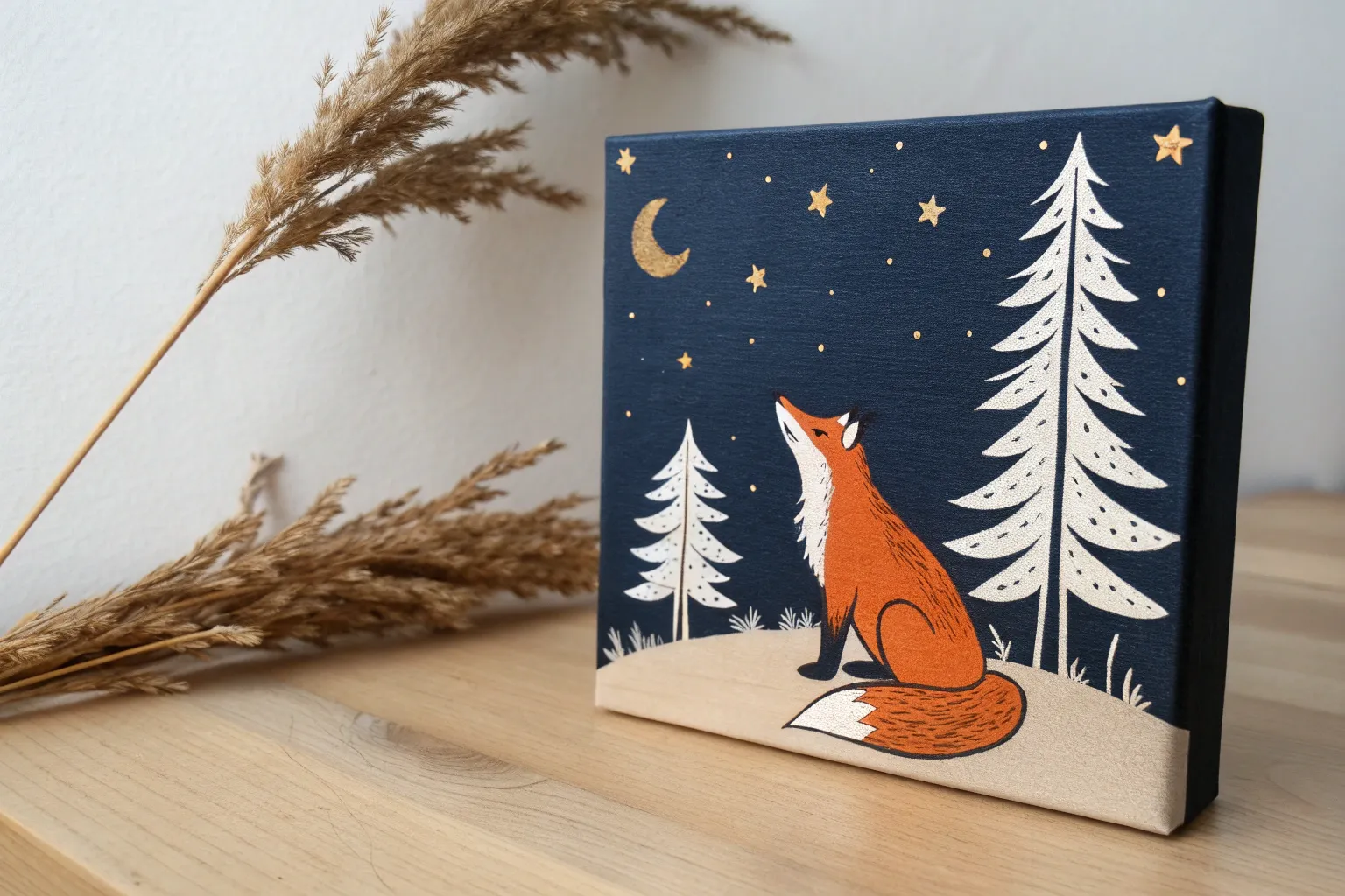
Easy Fox Portrait Built from Simple Shapes
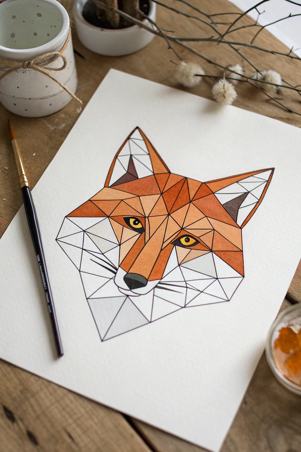
This striking fox portrait transforms a complex animal into a puzzle of simple triangles and polygons. It is a fantastic way to practice precision and learn how shifting shades of one color can create a sense of depth and form.
Step-by-Step
Materials
- Thick watercolor paper or mixed media paper
- Pencil (HB) for sketching
- Ruler or straight edge
- Fine-point black permanent marker or drawing pen (0.5mm or 0.8mm)
- Watercolor paints or gouache
- Small round paintbrush (size 2 or 4)
- Water cup and paper towels
- Eraser
Step 1: Drafting the Geometric Grid
-
Start with the center line:
Begin by drawing a very light vertical line down the middle of your paper using your ruler. This will act as your anchor to keep the fox symmetrical. -
Outline the main head shape:
Draw an upside-down focal triangle for the snout near the bottom center. From there, sketch faint lines diagonally upwards to mark where the ears will go, creating the basic ‘diamond’ silhouette of the head. -
Divide into shapes:
This is the fun part—connect the dots! Use your ruler to break the large head shape into smaller triangles and quadrilaterals. Don’t worry about them being perfectly even; the asymmetry makes it look more artistic. -
Refine the ears and fur:
At the top corners, draw large distinct triangles for ears. For the side ‘fur’ checks, extend your geometric shapes outward slightly so the head looks wider than just a simple triangle. -
Add the nose and whiskers:
Draw a small, rounded inverted triangle for the nose tip. Add three straight lines on each side of the muzzle to represent whiskers, keeping them stiff and geometric rather than curved. -
Place the eyes:
Find the two triangles that sit roughly in the middle of the head. Draw almond shapes inside them for the eyes. Doing this now ensures they look like they are peeking out from the geometric facets.
Step 2: Inking the Structure
-
Trace over your lines:
Take your black fine-point marker and carefully trace over every pencil line you want to keep. Use the ruler again here so your ink lines stay perfectly crisp and straight. -
Thicken slightly:
Go over the lines a second time if the pen is too thin. A bold, confident black outline is key to that ‘stained glass’ look that holds the color in. -
Erase the guides:
Wait about five minutes to ensure the ink is totally dry. Then, gently erase all the underlying pencil marks so your paper is clean and ready for paint.
Clean Edges Trick
If you struggle to stay inside the lines, use small strips of washi tape or masking tape along the edges of a triangle, paint it, and peel the tape off when dry.
Step 3: Painting the Facets
-
Mix your orange tones:
Prepare a palette with a bright orange. To create variety, mix two other puddles: one with a little brown added (for shadows) and one with extra water or yellow (for highlights). -
Paint the mid-tones:
Start by filling in random triangles on the cheeks and forehead with your standard bright orange. Skip every other shape so wet paint doesn’t bleed into neighbors. -
Add depth with shadows:
Use your darker, brownish-orange mix to paint the shapes that would naturally be in shadow, like the inner ears or under the brow ridge. This contrast makes the flat paper look 3D. -
Fill the light areas:
Use your lightest, watery orange-yellow mix for the top of the snout and the tips of the ears. -
Leave whites white:
Notice the bottom jaw and chin area? Leave those shapes completely unpainted to represent the fox’s white fur. If you accidentally paint one, just dab it with a paper towel quickly. -
Detail the eyes and nose:
Paint the eyes a striking yellow or gold. Once dry, use your black marker or dark grey paint to fill in the pupils and the nose tip. -
Final touches:
Wait for everything to dry completely. If some lines got covered by paint, re-trace them gently with your black marker to make the design pop again.
Galaxy Fox Style
Instead of realistic orange, try painting the shapes in purples, blues, and pinks for a magical ‘galaxy’ fox, leaving the lines white instead of black.
Now you have a sharp, modern piece of artwork that looks professional enough to frame


Symmetry Butterfly Wings with a Fold-Print Trick
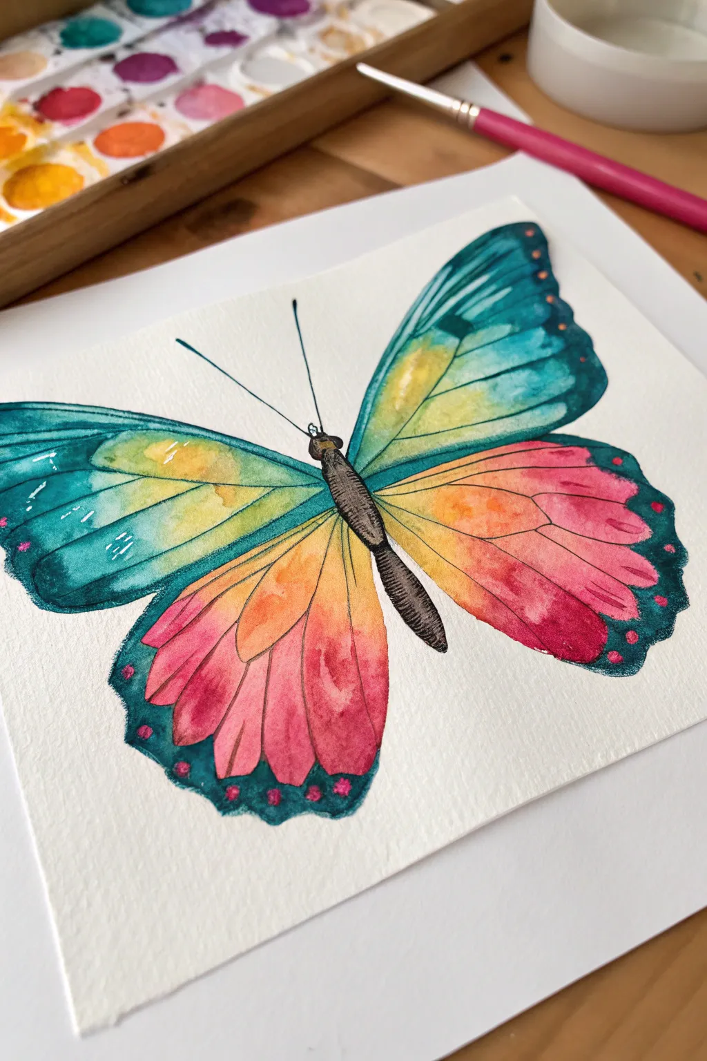
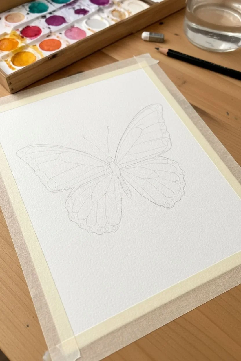
Learn to capture the iridescent beauty of butterfly wings with this radiant watercolor project that focuses on seamless color blending. You’ll master the wet-on-wet technique to create a stunning transition from cool teal to warm pinks and oranges.
How-To Guide
Materials
- Cold press watercolor paper (300 gsm)
- Watercolor paints (teal, yellow, orange, magenta/pink, black)
- Round watercolor brushes (size 4 and 8)
- Fine liner brush or black micron pen (optional)
- Pencil and eraser
- Masking tape
- Jar of clean water
- Paper towel
Step 1: Sketching and Preparation
-
Secure your paper:
Tape down all four edges of your watercolor paper to a board or table. This prevents buckling when the paper gets wet and creates that crisp white border shown in the image. -
Outline the body:
Lightly sketch the butterfly’s body in the center of the paper using a pencil. Draw a slender oval for the thorax and abdomen, and a small circle for the head. -
Draft the wings:
Extend two large upper wings from the thorax, curving upward and outward. Then, draw two lower wings that curve downward. Keep your pencil lines very faint so they don’t show through the final paint. -
Add wing segments:
Lightly draw lines inside the wings to separate the sections. Create a distinct border area along the outer edges of the wings where the teal color will be darkest.
Step 2: Creating the Color Gradients
-
Prime the upper wing:
Working on just one upper wing at a time, brush clean water over the area inside your pencil lines. The paper should be glisten, but not form a puddle. -
Start with yellow:
While the paper is wet, drop watery yellow paint near the body of the butterfly on the upper wing. Let it bloom slightly outward. -
Introduce the teal:
Load your brush with a rich teal or turquoise. Paint the outer edge of the upper wing, letting the color flow inward towards the yellow. Where they meet, they will naturally blend into a lovely soft green. -
Lower wing base:
Move to the lower wing on the same side. Wet the paper, then apply a band of yellow near the top edge where it meets the upper wing. -
Blend warm tones:
Next to the yellow on the lower wing, paint a stripe of orange, followed by a bright magenta or pink at the bottom tips. Use a damp brush to gently encourage these colors to bleed into each other for a sunset effect. -
Definition borders:
Carefully paint the outer scalloped edges of the wings with your deepest teal color. On the lower wings, dot small spots of pink into the wet teal border while it’s still damp to create soft, fuzzy markings. -
Repeat for symmetry:
Repeat the entire painting process on the opposite side. Try to mirror the color placement, but don’t worry if it’s perfectly identical—nature is full of variations. -
Let it dry completely:
Wait for the paint to be bone dry. If the paper feels cool to the touch, it is still damp.
Muddy Colors?
If your yellow and teal turn into a brown mess instead of green, rinse your brush more often. Only let the very edges of the wet colors touch so they blend on the paper, not on your brush.
Step 3: Detailing and Contrast
-
Paint the body:
Using a small brush and concentrated black paint (or a very dark grey), fill in the head, thorax, and abdomen. -
Texture the body:
I prefer to lift a tiny bit of color out with a thirsty brush or leave tiny white slivers to show the segmented texture of the insect’s body. -
Draw the antennae:
With your finest brush or a black pen, draw two long, slender antennae extending from the head. Keep your hand loose for a smooth line. -
Add veining:
Using a very dilute, watery mix of black or dark teal, paint thin vein lines over the dry wings. Follow the natural curve of the wings, radiating outward from the body to the edges. -
Final highlights:
If you lost any highlights, use a white gel pen or a tiny dot of white gouache to add sparkles to the edges of the wings or the eyes.
Salt Texture Magic
While the wing paint is still wet, sprinkle a few grains of table salt on the teal sections. Let it dry completely, then brush it off to reveal unique starburst textures.
Peel off your tape slowly to reveal a crisp, gallery-worthy butterfly painting ready to display
BRUSH GUIDE
The Right Brush for Every Stroke
From clean lines to bold texture — master brush choice, stroke control, and essential techniques.
Explore the Full Guide
Underwater Scene with Bubble Texture Backgrounds
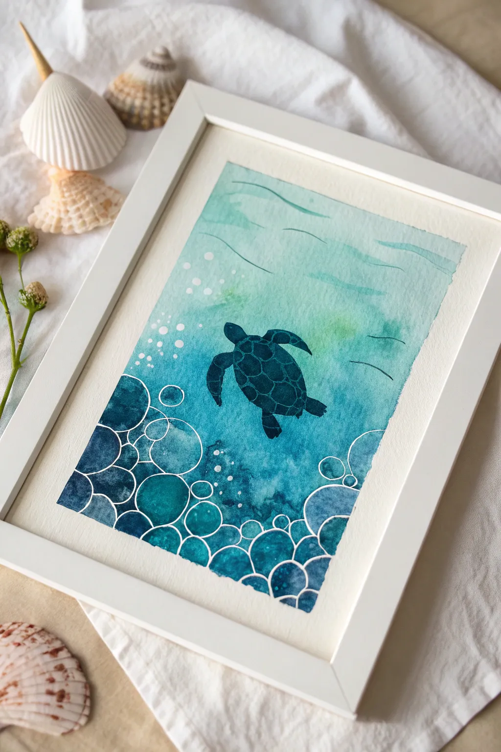
Dive into creativity with this beautiful watercolor project that captures a sea turtle swimming through ocean depths. Using a simple wax resist technique or white gel pen, you’ll create magical, bubbly textures that make the deep blue water pop against the gentle turquoise surface.
Detailed Instructions
Materials
- Watercolor paper (140lb cold press recommended)
- Watercolor paints (phthalo blue, turquoise, viridian green)
- White crayon or white oil pastel
- Round watercolor brushes (size 6 and 10)
- White gel pen or white acrylic paint pen
- Pencil and eraser
- Masking tape
- Jar of water
- Paper towels
- Salt (optional for texture)
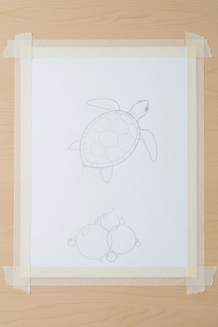
Step 1: Preparation and Sketching
-
Secure the paper:
Start by taping down all four edges of your watercolor paper to a hard board or table. This creates a clean white border like a picture frame and keeps the paper from buckling when it gets wet. -
Sketch the turtle:
Lightly draw the outline of a sea turtle in the center of your paper using a pencil. Keep the shape simple: a large oval shell, four flippers, and a small head pointing slightly upward. -
Add bubble outlines:
At the very bottom of the paper, sketch a cluster of large and small circles piling up on each other. These will become your sea floor bubbles.
Press Hard!
For the wax resist to work perfectly, press down hard with your white crayon. If you press too lightly, the watercolor paint might sneak over your lines and hide the bubbles.
Step 2: Creating the Resist Layer
-
Trace with wax:
Take your white crayon or oil pastel and press firmly while tracing over the bubble circles at the bottom. The wax will repel the water later, keeping those lines bright white. -
Add scattered bubbles:
Draw tiny solid white circles or dots floating up from the bubble pile towards the middle of the paper to look like rising air bubbles. -
Protect the turtle:
Carefully color in the entire turtle shape with the white crayon if you want to paint it later, or simply paint carefully around it. For this specific look, we will paint around the pencil lines, so no wax is needed on the turtle itself.
Paint Pooling?
If you have puddles of water on your paper, dab the corner of a dry paper towel into the puddle to soak up the excess liquid without smudging your colors.
Step 3: Painting the Ocean Gradient
-
Wet the paper:
Using your large brush and clean water, wet the entire background area around the turtle. Do not wet the inside of the turtle shape. -
Start with light colors:
Load your brush with watery turquoise or light green paint. Apply this to the top third of the painting, letting the color drift downwards. -
Mid-ocean depths:
Switch to a medium blue or teal color. Blend this into the middle section of the paper, overlapping slightly with the light green to create a smooth transition. -
Deep water darkness:
Mix a concentrated dark blue (like phthalocyanine blue mixed with a tiny bit of purple or black). Paint the bottom third of the paper, going right over your white crayon bubbles. -
Watch the magic:
As you paint over the bottom area, the white crayon lines will resist the paint, popping out as bright white bubble outlines against the dark water. -
Add water ripples:
While the top section is still slightly damp, use a clean brush with just a little blue pigment to paint gentle, wavy horizontal lines near the surface for water movement. -
Let it dry totally:
Wait for the entire background to feel dry to the touch before moving to the next step. If the paper is cold, it’s still wet.
Step 4: Painting the Turtle Detail
-
Base coat for turtle:
Fill in the turtle shape with a solid, dark teal or navy blue paint. It should be darker than the water directly around it so it stands out. -
Shell patterns:
Once the turtle’s base coat is dry, mix a slightly lighter blue-green. Paint erratic polygon shapes on the shell to create the scute pattern blocks. -
Enhance outlines:
If your bubble lines aren’t popping enough, or if you skipped the crayon step, use a white gel pen or paint pen to trace over the circles at the bottom now. -
Final touches:
Add a few white gel pen lines to the turtle’s fins or shell for highlights, making it look wet and shiny. -
Reveal the border:
Slowly peel off the masking tape at a 45-degree angle to reveal your crisp, white frame.
This serene underwater scene makes a perfect decoration for a bedroom wall or a handmade card for an ocean lover
City Skyline Silhouette with Neon-Look Skies
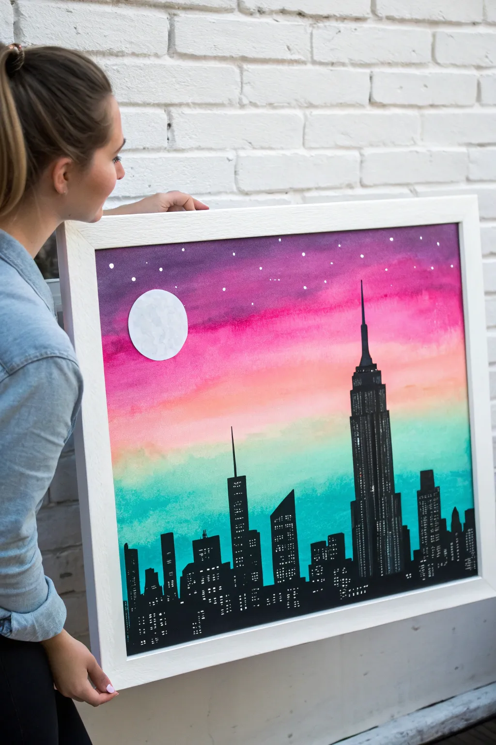
Create a stunning urban landscape that glows with the vibrant colors of sunset against a dramatic black cityscape. This project combines smooth blending techniques with bold silhouette work for a finished piece that looks professionally framed and ready to hang.
Step-by-Step
Materials
- Large square watercolor paper or canvas panel
- Watercolor or acrylic paints (Purple, Magenta, Peach/Orange, Turquoise/Teal)
- Black acrylic paint
- White acrylic paint or gel pen
- White cardstock or heavy paper
- Large flat brush for background
- Small round detail brush (size 0 or 1)
- Medium flat brush
- Scissors
- Glue stick
- Ruler
- Pencil
- Water cup and paper towels
Step 1: Creating the Sunset Sky
-
Prepare your surface:
If you are using watercolor paper, you might want to tape down the edges to a board to prevent buckling. Ensure your canvas or paper is clean and ready for colorful washes. -
Start with purple:
Load your large flat brush with purple paint. Start at the very top edge of your canvas and paint a horizontal strip about 2-3 inches wide. -
Transition to pink:
Rinse your brush slightly and pick up the magenta or deep pink paint. Paint the next horizontal section right below the purple, allowing the wet edges to touch so they begin to blend. -
Blend the upper sky:
Use a slightly damp, clean brush to gently sweep back and forth where the purple and pink meet to create a smooth, seamless gradient. -
Add the glow:
Continue moving down the canvas with a peach or light orange color. This represents the last light of the sun, so keep it bright and warm. -
Finish with teal:
For the bottom third of the sky, switch to a vibrant turquoise or teal. Blend this into the peach section carefully; if they mix too much, they might turn muddy, so I like to let the peach dry for just a minute before adding the blue. -
Let it dry completely:
Set the painting aside to dry fully. The background needs to be completely dry before we add the black silhouette, or the black paint might bleed.
Straight Edge Secret
For super straight building sides, place a strip of painter’s tape or masking tape vertically on the canvas. Paint your black building right up against it, then peel it off.
Step 2: Building the City Skyline
-
Mark the horizon:
Once the sky is dry, use a ruler and pencil to lightly draw a straight horizontal line across the bottom, about 2 inches up from the edge. -
Sketch the prominent buildings:
Lightly sketch the outlines of your skyscrapers. Include one very tall, distinct building like the Empire State Building with a needle top, and vary the heights and shapes of the others (some flat, some slanted). -
Fill in the block shapes:
Using your medium flat brush and black acrylic paint, fill in the main rectangular bodies of the buildings. Make sure the paint is opaque and solid. -
Refine the details:
Switch to your small round detail brush to paint the antennae, spires, and narrow tops of the buildings. Sharp, clean edges make the silhouette look crisp. -
Add windows:
Once the black paint is dry to the touch, use a white gel pen or a very fine brush with white paint to add rows of tiny dots or dashes on the buildings to look like lighted windows.
Muddy Colors?
If blending orange into teal turns brown, let the orange layer dry completely first. Then, add a very thin wash of white before painting the teal on top to keep colors separate.
Step 3: Celestial Details
-
Cut out the moon:
Draw a perfect circle on a separate piece of white cardstock or heavy paper—trace a cup or lid if you need help—and cut it out carefully with scissors. -
Texture the moon:
Dab a tiny bit of grey or watered-down black paint onto the white circle to create subtle craters and shadows, giving the moon some crater texture. -
Attach the moon:
Use a glue stick to adhere the moon to the upper left side of your sky, placing it over the purple and pink area. -
Paint the stars:
dip the handle end of a small paintbrush into white paint and dot it onto the purple and pink sections of the sky to create distant stars.
Hang your masterpiece in a spot where it can shine and show off your personal city view

PENCIL GUIDE
Understanding Pencil Grades from H to B
From first sketch to finished drawing — learn pencil grades, line control, and shading techniques.
Explore the Full Guide
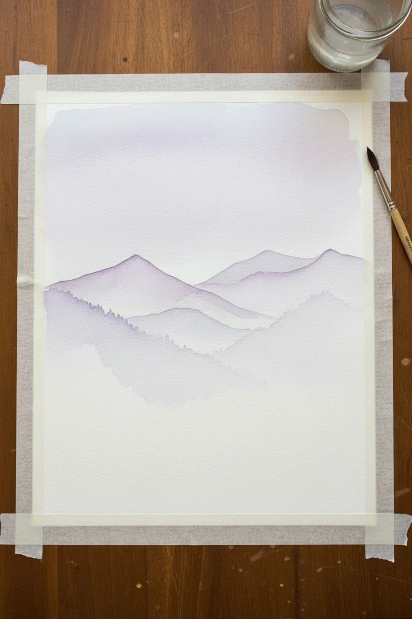
Layered Mountains with Misty Color Blending
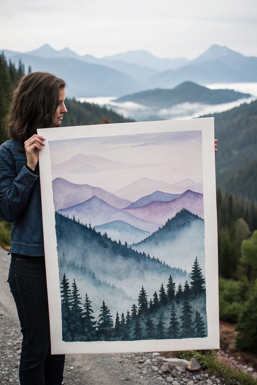
Capture the magic of a foggy morning with this beautiful watercolor project that teaches you how to create depth using layers. You will learn to fade colors from rich forest greens into soft, dreamy purples to make distant peaks disappear into the clouds.
Detailed Instructions
Materials
- High-quality watercolor paper (cold press, heavy weight like 140lb/300gsm)
- Watercolor paints (tube or pan set)
- Large flat wash brush
- Medium round brush (size 8 or 10)
- Small detail brush (size 2 or 4)
- Two jars of water (one clean, one dirty)
- Paper towels
- Masking tape
- Hairdryer (optional, for speed)
Step 1: Setting the Sky and Distant Peaks
-
Tape it down:
Start by taping your watercolor paper firmly to a board or table on all four sides. This creates a crisp white border and keeps the paper from buckling when it gets wet. -
Mix your sky wash:
Prepare a very watery, pale purple mixture on your palette. You want this to be 90% water and only 10% paint. -
Paint the sky:
Using your large flat brush, wet the top third of the paper with clean water first. Then, gently sweep your pale purple mix across the top, letting it fade out to clear water as you move down. -
First mountain layer:
While the sky is drying, mix a slightly darker lilac color. Once the sky is dry to the touch, use your medium round brush to paint a faint, wavy mountain outline across the upper middle section. -
Fade the bottom:
Immediately after painting the mountain shape, rinse your brush and use just clean water to soften the bottom edge of that mountain, dragging the color downward until it disappears into the white of the paper.
Fixing Water Blooms
If cauliflower-like blooms appear in your smooth sky, it means you added water to damp paint. Wait for it to dry completely, then lightly scrub the area with a damp brush to blend it out.
Step 2: Building the Middle Layers
-
Deepening the purple:
Add a tiny touch of blue to your purple mix to create a slightly cooler, darker lavender shade for the next range. -
Overlap the shapes:
Paint another mountain range slightly lower than the first one. Make the peaks intersect with the valleys of the previous layer to create interest. -
Create the mist effect:
Just like before, quickly rinse your brush and use clean water to drag the bottom edge of this new purple layer downwards, creating a soft gradient that looks like fog. -
Transition to blue:
Mix a blue-grey color by adding a little Payne’s Grey or dark blue to your purple. Paint a third layer of mountains, making sure the previous layer is completely dry first so the edges stay crisp. -
Scumble and fade:
For this blue layer, you can leave some white gaps or use a dryer brush near the bottom to create texture before fading it out with water.
Add Some Stars
For a night scene, wait until the sky is totally dry. Load a toothbrush with white acrylic paint or gouache and flick the bristles to spray tiny stars across the upper sky area.
Step 3: The Foreground Forest
-
Mix forest colors:
It is time for the darkest values. Mix a deep Prussian Blue with a bit of dark green to get a moody, shadowy teal color. -
Paint the main ridge:
Paint a large, sloping mountain shape in the lower third of the paper. This layer should be much darker and more opaque than the distant mountains. -
Add texture while wet:
While this dark layer is still damp, drop in small dots of pure dark blue or green along the top ridge to suggest tree textures. -
Detailing the trees:
Switch to your smallest detail brush. Using very thick, dark paint (almost no water), carefully dab tiny vertical lines along the ridge of your darkest mountain to look like pine trees. -
Creating the closest trees:
In the bottom corners, paint larger, individual pine trees. Start with a vertical line for the trunk, then use jagged, horizontal strokes that get wider as you go down to form branches. -
Final misty details:
If I feel the bottom forest looks too flat, I carefully lift a little wet paint with a damp paper towel to create clouds caught in the trees. -
Clean finish:
Wait until the painting is 100% bone dry. Gently peel off the masking tape at a 45-degree angle to reveal your perfect white border.
Step back and admire how your simple layers transformed into a deep, atmospheric landscape
Moon Painting with Craters and Soft Shadows
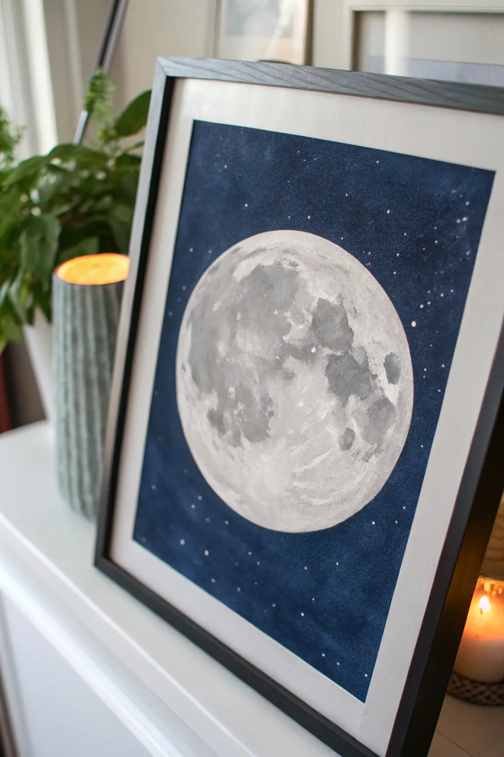
Capture the magic of the night sky with this striking watercolor painting featuring a detailed, cratered moon against a deep indigo backdrop. This project introduces young artists to working with negative space and creating texture with simple brush strokes.
Step-by-Step
Materials
- Watercolor paper (cold press, at least 140lb/300gsm)
- Pencil and round object for tracing (like a bowl)
- Masking fluid or white wax crayon
- Watercolor paints (Indigo, Payne’s Gray, Black, White)
- Round watercolor brushes (sizes 4 and 8)
- White gouache or white gel pen
- Painter’s tape
- Two jars of water
- Paper towels
Step 1: Preparation & Sketching
-
Secure the paper:
Tape down all four edges of your watercolor paper to a board or table using painter’s tape. This prevents the paper from buckling when it gets wet and creates a clean white border later. -
Outline the moon:
Place a round object, like a small cereal bowl or a large lid, in the center of your paper. Lightly trace around it with a pencil to create a perfect circle. -
Protect the edges:
If you are worried about painting inside the moon by accident, apply a thin layer of masking fluid exactly over your pencil line. Let it dry completely until it’s tacky.
Salt Texture Pro-Tip
While the gray paint inside the moon is still wet, sprinkle a tiny pinch of table salt on it. As it dries, the salt pushes the pigment away, creating amazing natural crater textures.
Step 2: Painting the Textured Moon
-
Base wash:
Mix a very watery, pale gray using a tiny dot of black paint and lots of water. Paint the entire inside of the moon circle with this light wash. -
Add first shadows:
While the paper is still slightly damp, mix a darker gray. Dab this color onto the moon in random patches to start forming the ‘maria’ or dark plains of the moon surface. -
Create craters:
Using a smaller brush, drop in more concentrated dark gray or Payne’s Gray into the damp patches. Let the paint bloom naturally to create soft, crater-like edges. -
Texture details:
Once the first layer is semi-dry, use the tip of your brush to add specific crater shapes. Paint small ‘C’ shapes or irregular blobs for a realistic, rocky look. -
Dry completely:
This is crucial: Let the moon dry 100% before moving on. I usually test it by lightly touching the back of my hand to the paper; if it feels cool, it’s still damp.
Fixing “Cauliflowers”
If you see weird jagged watermarks (blooms) forming on the moon, you probably added water to drying paint. Don’t fight it—these actually look great as moon craters, so leave them alone!
Step 3: The Night Sky Background
-
Prepare the background color:
Mix a large puddle of dark blue paint. Combine Indigo with a touch of Black to get a really deep, midnight blue color. -
Wet the sky:
Using clean water, wet the area around the moon, being very careful not to touch the moon itself. This technique helps the dark paint flow smoothly. -
Fill the void:
Load your large brush with the dark blue mix and drop it into the wet background. Paint carefully around the moon’s edge to keep a crisp circle. -
Deepen the corners:
While the blue is wet, drop even darker pigment (more black) into the corners of the paper to create a vignette effect, drawing the eye toward the center. -
Let it settle:
Allow the background to dry completely. If the blue looks too pale after drying, you can repeat the previous two steps for a second layer.
Step 4: Finishing Touches
-
Create stars:
Cover your moon with a scrap piece of paper to protect it.load a brush with white gouache or slightly watered-down white acrylic. -
Splatter technique:
Tap the handle of your paint-loaded brush against another brush handle over the dark background. This sends tiny specks of white paint down to look like distant stars. -
Manual stars:
For a few brighter stars, use a white gel pen or a fine brush with white paint to add specific dots or tiny crosses in the dark sky. -
Remove tape:
Wait until the painting is bone dry. Slowly peel the painter’s tape away at a 45-degree angle to reveal your crisp white border.
Frame your celestial masterpiece in a simple black frame to really make that bright moon pop


Tape Resist Geometric Color Block Canvas
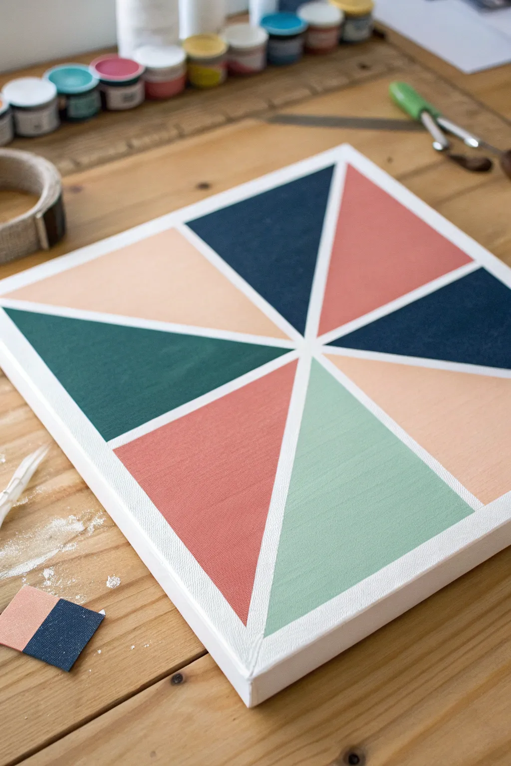
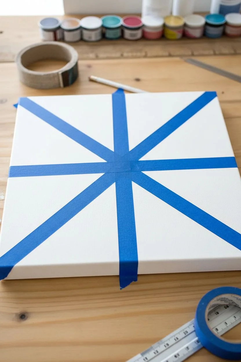
Create a sharp, modern art piece using nothing but painter’s tape and your favorite acrylic colors. This geometric pinwheel design looks incredibly professional thanks to the crisp white lines revealed when you peel away the tape.
How-To Guide
Materials
- Square stretched canvas (approx. 10×10 or 12×12 inches)
- Acrylic craft paints (Teal, Navy Blue, Coral, Mint Green, Peach)
- Painter’s tape or dedicated masking tape (approx. 1/4 or 1/2 inch width)
- Flat paintbrushes (medium size)
- Palette or paper plate for mixing
- Ruler
- Pencil
- Paper towels and water cup
Step 1: Setting the Grid
-
Find the center:
Start by laying your square canvas flat on a protected work surface. Use a ruler to lightly measure and mark the exact center point of the canvas with a pencil. -
Plan your dissecting lines:
Lay a long strip of painter’s tape diagonally from one corner to the opposite corner, ensuring it passes directly over your center mark. Press it down tentatively. -
Complete the ‘X’:
Place a second strip of tape diagonally across the other two corners, creating a large ‘X’ shape. Make sure the intersection is right on your center dot. -
Add vertical and horizontal lines:
Now, place a strip of tape vertically from the top center edge to the bottom, crossing through the middle. Follow this with a horizontal strip from left to right. -
Secure the edges:
Once you are happy with the placement and your sections look relatively even, run your finger firmly along all the edges of the tape. This is crucial—I always double-check this step to prevent paint bleeding underneath later. -
Optional: White base paint:
For extra crisp lines, paint a very thin layer of white acrylic (or whatever your canvas color is) over the tape edges first. This seals the gaps so any colored paint sits on top perfectly.
Step 2: Adding Color
-
Select your palette:
Pour small amounts of your chosen acrylic colors onto your palette. For the look in the photo, you’ll need five distinct shades: a deep navy, a forest green, a coral pink, a soft peach, and a minty green. -
Plan color placement:
Before painting, visualize where each color goes. Notice how opposing triangles often don’t match, creating a scrappy, dynamic look. You can lightly mark the canvas with a pencil code (like ‘B’ for blue) if it helps you remember. -
Paint the first section:
Load your flat brush with your first color, perhaps the deep navy. Paint one of the triangular whitespace sections, brushing away from the tape edges toward the center of the shape to avoid forcing paint under the tape. -
Continue painting sections:
Rinse your brush thoroughly and move to the next color, maybe the coral. Paint a neighboring or opposite triangle. Be generous with the paint to get solid, opaque coverage. -
Fill the canvas:
Work your way around the pinwheel, painting each triangular section a different color. Try not to have two identical dark colors touching side-by-side unless that’s the specific design you want. -
Paint the canvas sides:
Don’t forget the edges! Extend your paint color down the sides of the canvas for a finished, gallery-wrap look. -
Apply a second coat:
Lighter colors like the peach or mint might need a second coat. Let the first layer dry to the touch (about 10-15 minutes) before adding more paint to ensure it looks solid.
Bleeding Lines?
If paint seeps under the tape, it’s usually because the tape wasn’t pressed down hard enough. Fix it by using a small stiff brush and white paint to ‘erase’ the mistake.
Step 3: The Reveal
-
Wait for semi-dryness:
This is the hardest part—waiting! Let the paint dry until it is no longer wet to the touch, but don’t leave the tape on for days. Peeling when slightly tacky often yields the best results. -
Peel carefully:
Start at the center intersection or an edge. Slowly pull the tape back upon itself at a 45-degree angle. Do not yank it straight up. -
Remove all strips:
Continue peeling the tape strips one by one to reveal the stark white lines underneath. Watch the geometric pattern emerge. -
Touch up:
If any paint bled through, don’t panic. Take a tiny detail brush with white paint and carefully cover the imperfection once the colored paint is fully dry.
Make it Metallic
Swap one of the solid colors for a metallic gold or silver paint. It adds a shimmering accent that catches the light and makes the geometric pattern pop.
Hang your masterpiece on the wall and admire those satisfyingly straight lines
Cotton Swab Pointillism Flower Garden
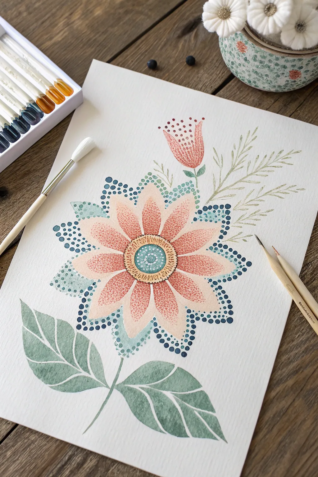
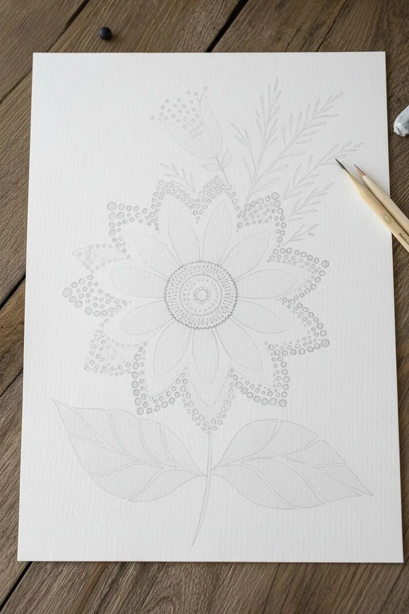
Create a stunningly detailed flower using the magic of simple dots and stippling techniques. This pointillism-inspired project builds vibrant layers of color to form a large, stylized bloom that looks intricate but is surprisingly relaxing to make.
Step-by-Step Tutorial
Materials
- Heavyweight watercolor paper or mixed media paper
- Watercolor paints or fluid acrylics (peach, coral, teal, dark blue, green)
- Cotton swabs (Q-tips)
- Small round paintbrush (size 2 or 4)
- Pencil for sketching
- Water cup and paper towels
- Fine-liner pen (optional for details)
Step 1: Sketching the Garden
-
Outline the main flower:
Start by lightly sketching a large circle in the center of your paper. Draw a smaller circle inside for the flower’s center. Around the center, sketch about 10-12 long, petal shapes extending outward. -
Add supportive elements:
Draw a sturdy stem coming down from the flower. At the base, sketch two large, broad leaves on either side of the stem. Above the main flower, lightly pencil in a smaller tulip-shaped bud and a few wispy fern sprigs to the right.
Uneven Dots?
If your cotton swab gets fuzzy and makes messy blobs, switch to a fresh one immediately. Alternatively, dip the wooden end of a brush effectively.
Step 2: Painting the Base Layers
-
Wash the leaves:
Mix a watery sage green color. Using your brush, fill in the large leaves at the bottom and the tulip stem. Keep the paint somewhat transparent to allow for texture later. -
Paint the petals:
Switch to a pale peach or blush pink color. Gently fill in the large petals of the main flower. Don’t worry about perfect coverage; a light wash is exactly what we need as a background. -
Block in the fern:
Use a very fine brush or the tip of your round brush to paint the delicate fern sprigs in a light olive green. Use short, flicking strokes to mimic pine needles.
Step 3: Applying the Dots (Pointillism)
-
Dot the petal centers:
Dip a cotton swab into a coral or reddish-orange paint. Press it gently into the center of each peach petal to create a dense cluster of dots that fades as it moves outward. -
Create the flower center:
Paint the very center circle teal. Once dry, use a clean cotton swab or the back of a paintbrush handle to add white or light blue dots in a ring pattern inside this teal circle. -
Detail the center ring:
Around the teal center, paint a yellowish-tan ring. Use a fine-tip brush or a toothpick to add tiny dark dashes or seeds to define this area. -
Outline with blue dots:
This is the defining step. Dip a cotton swab or the handle end of a paintbrush into dark teal or navy blue paint. Carefully stamp a border of dots around the outer edge of every peach petal. -
Add secondary dot layers:
Inside the navy border you just made, add a second row of smaller, lighter teal dots. This creates a beautiful layered effect. -
Stipple the tulip bud:
For the upper bud, fill the shape with many small red or coral dots. I like to concentrate the dots at the bottom of the bud and space them out near the top for a gradient look.
Level Up: Metallic Pop
Wait for the paint to fully dry, then add tiny dots of metallic gold paint to the flower’s center ring for a shimmering 3D effect.
Step 4: Refining the Leaves
-
Vein the leaves:
Return to the large green leaves at the bottom. Leave narrow strips of the paper unpainted or paint over the dry green wash with white paint to create the veins. -
Define leaf edges:
If the leaf edges look too soft, use a slightly darker green paint to crisp up the outline, giving them a sharp, finished appearance.
Step back and admire how your collection of tiny dots has merged into a beautiful, cohesive garden scene
Scrape-Paint Rainbow Stripes for Easy Color Mixing
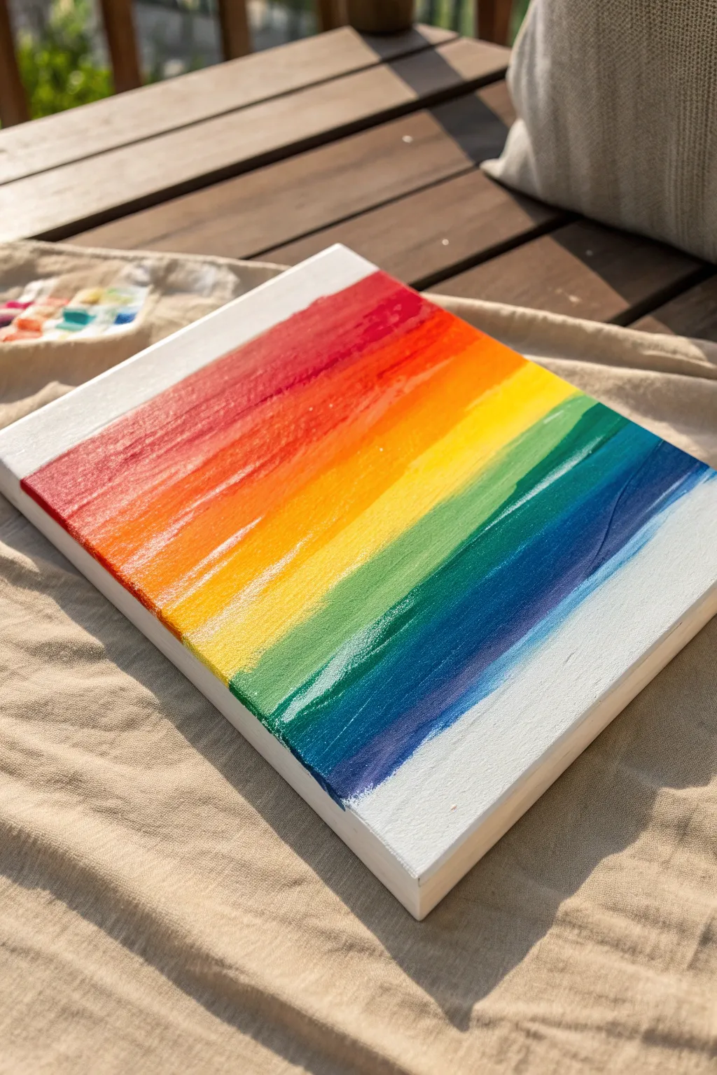
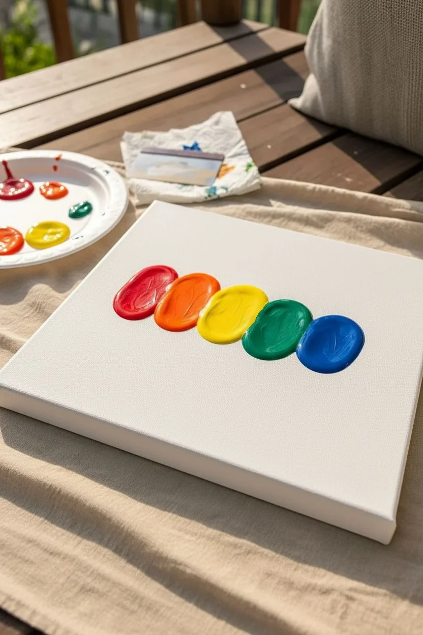
This vibrant project moves beyond traditional brush strokes to create a textured, blended rainbow that pops off the canvas. By using a scraping tool instead of just bristles, kids can achieve those satisfying, smooth transitions between colors while keeping clean, crisp edges.
Step-by-Step
Materials
- Stretched canvas (8×10 or similar size)
- Acrylic paints (Red, Orange, Yellow, Green, Blue)
- White acrylic paint (optional, for blending)
- Plastic scraper, palette knife, or an old gift card
- Painter’s tape or masking tape
- Paper plate or palette
- Paper towels for wiping the tool
Step 1: Preparation & Layout
-
Secure the Canvas:
Lay your canvas on a flat, protected surface. Since we will be applying pressure to scrape the paint, making sure it doesn’t slide around is helpful. -
Observe the Borders:
Notice how the rainbow doesn’t go all the way to the very top or bottom edge. You can use painter’s tape to mask off a strip at the top and bottom if you want perfectly straight whitespace, or just freehand it like the example. -
Prepare Your Colors:
Squeeze out small blobs of red, orange, yellow, green, and blue paint onto your palette. You want them ready to go so the paint doesn’t dry out while you work.
Step 2: Applying the Paint
-
Apply the Red:
Starting near the top (below your white border), squeeze or dab a thick line of red paint directly onto the canvas. It doesn’t need to be perfect, just a solid bead of color. -
Add Orange:
Directly below the red line, add a line of orange paint. Let the two lines tough slightly so they will mix when we scrape them. -
Continue the Spectrum:
Follow the orange with a line of yellow, then green, and finally blue. Arrange them closely together down the center of the canvas. -
Check Paint Volume:
Ensure you have a generous amount of paint on the canvas. If the blobs look too thin, add a little more; you need enough medium to drag across the surface without gaps.
Use Heavy Body Paint
For the best texture, use ‘heavy body’ acrylics. If yours are runny, mix in a tiny bit of cornstarch to thicken them up so they hold the scraper marks better.
Step 3: The Scrape Technique
-
Position the Tool:
Take your scraping tool—I find an old gift card works wonders for this size—and place the edge gently at the top of the red paint line. -
Drag Downwards:
With firm, even pressure, pull the scraper straight down through the red and into the orange. Stop after a few inches. -
Clean the Tool:
Wipe the excess paint off your scraper with a paper towel. This is crucial to prevent the colors from turning muddy too quickly. -
Blend the Next Section:
Place your clean scraper at the top of the orange section and drag it down into the yellow. The colors will naturally blend where they meet. -
Repeat for Cool Colors:
Wipe the tool again, then drag from the yellow down into the green. Repeat the wipe-and-drag motion for the green into the blue. -
Horizontal Smoothing:
Now, instead of dragging down, try dragging horizontally lightly across the stripes to smooth out ridges. Start at the red and work your way down, wiping the tool between every single color change. -
Create Texture:
If you want that feathery look on the sides like the photo, place your scraper in the middle of a color stripe and flick it outward toward the edge of the canvas. -
Refine the Edges:
Use the edge of the scraper to feather the paint out to the left and right sides so the color fades slightly rather than ending in a hard block.
Muddy Color Solution
If your colors turn brown/muddy, you are over-mixing. Let the layer dry completely, then add a fresh stripe of the bright color on top and scrape gently.
Step 4: Finishing Touches
-
Check the White Space:
If you got any paint on the top or bottom white zones, use a damp paper towel to carefully wipe it away while the paint is still wet. -
Let it Cure:
Because the paint application is thicker than usual, allow the canvas to dry flat for at least 24 hours to ensure the texture sets properly.
Once dry, you’ll have a stunning textured rainbow art piece ready to brighten up any bedroom wall
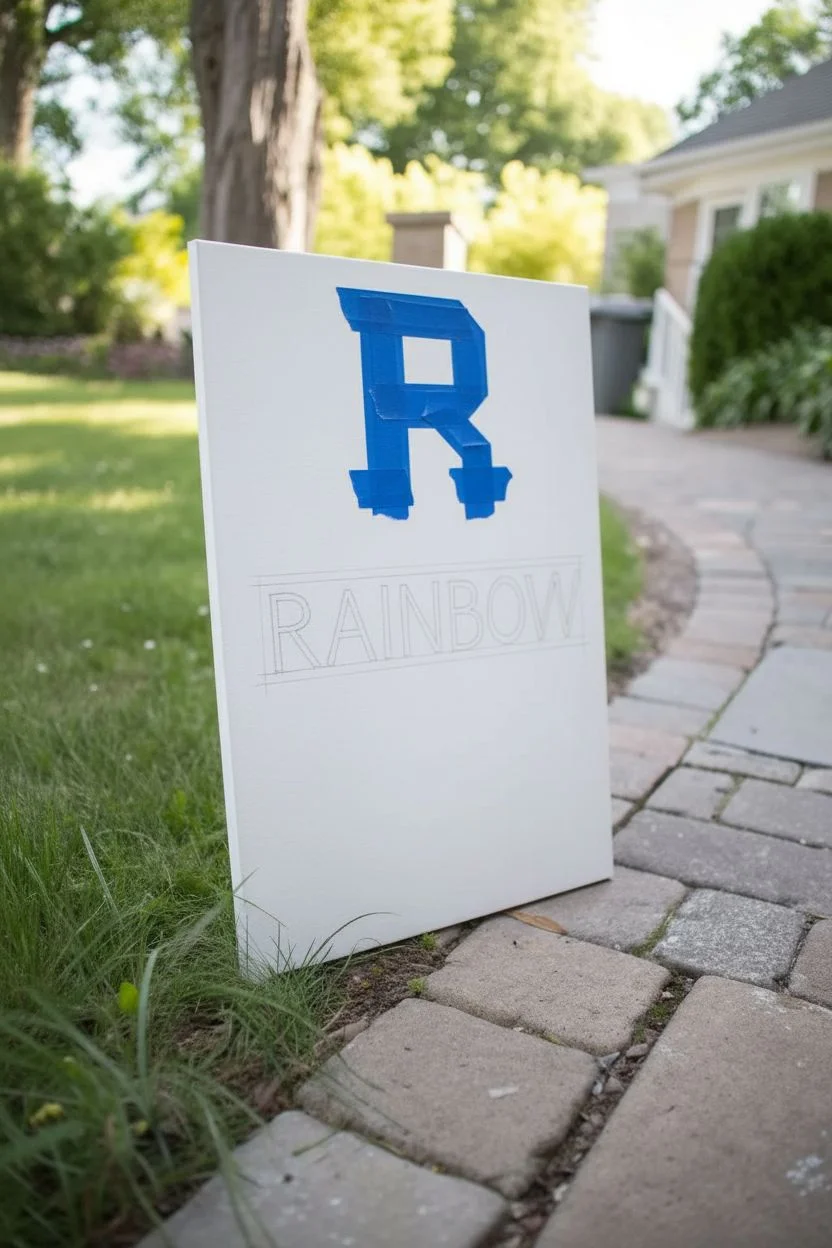
Drip Rainbow Name Painting with Big Letters
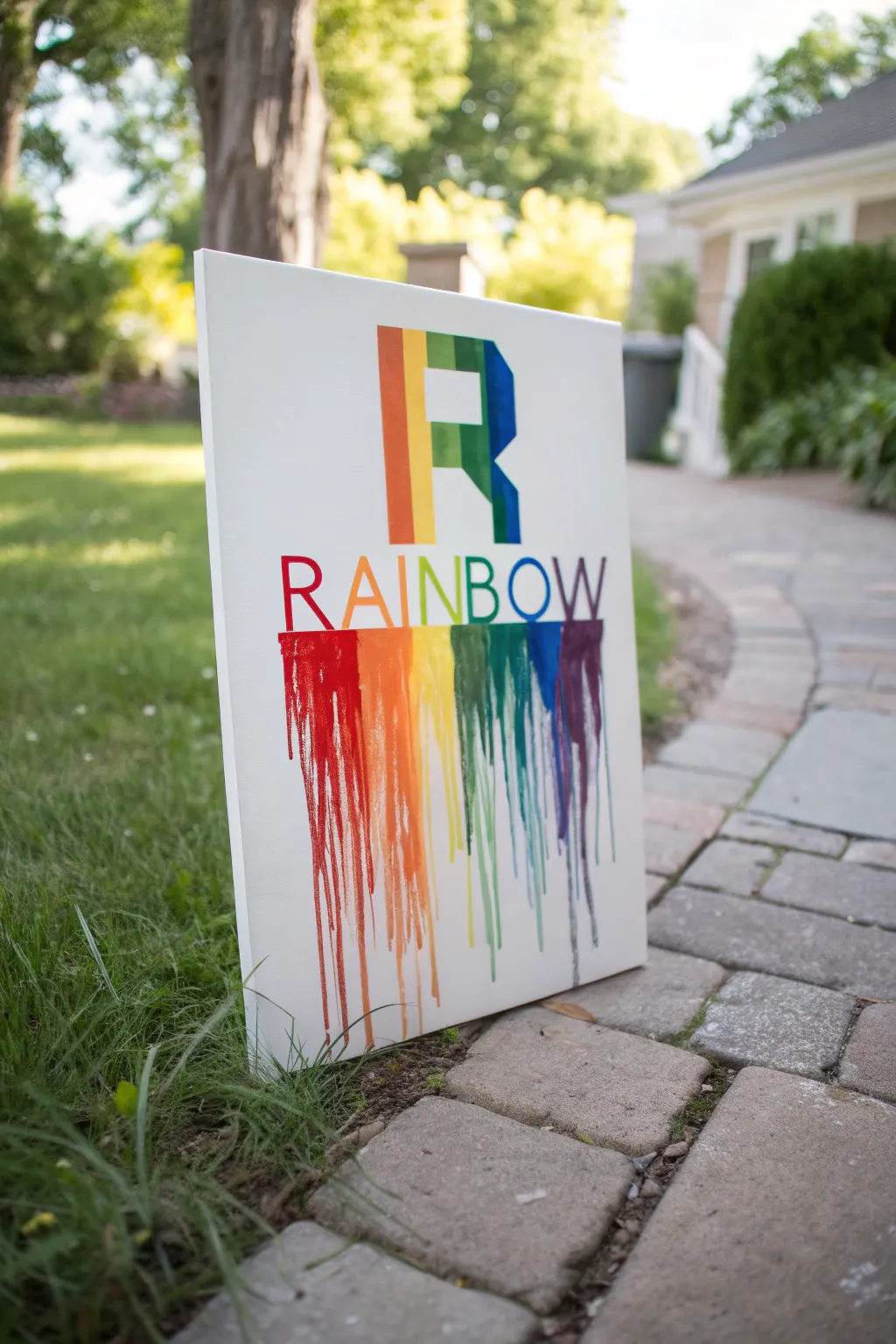
This vibrant project combines crisp lettering with the fun, messy freedom of drip painting. Using masking tape and gravity, you’ll create a stunning personalized sign where bright colors cascade down the canvas like melting crayons.
Step-by-Step Guide
Materials
- Rectangular canvas (16×20 inches is a good size)
- Painter’s tape or masking tape (1 inch width)
- Acrylic craft paints (rainbow colors: Red, Orange, Yellow, Green, Blue, Indigo/Purple)
- Paintbrushes (flat brush for filling, small round brush for details)
- Pencil and eraser
- Ruler
- Cup of water and paper towels
- Drop cloth or plastic tablecloth (to catch drips)
- Easel (or simply prop the canvas against a wall outside)
Step 1: Preparation & Lettering
-
Prepare the workspace:
Since this project involves intentional dripping, set up your workspace outdoors or cover your indoor table and floor thoroughly with a drop cloth. Have your easel or a sturdy prop ready. -
Sketch the layout:
Using a pencil and a ruler, lightly sketch a large monogram letter near the top center of the canvas. Below that, draw horizontal guidelines to write out your full name or word. -
Draft the letters:
Lightly sketch the full word (like ‘RAINBOW’) between your guidelines. Aim for tall, narrow block letters so there is plenty of space at the bottom for the paint to drip. -
Tape the monogram:
For the large letter at the top (the ‘R’), use strips of painter’s tape to block off the outside edges. This helps achieve those super sharp, crisp lines on the main focal point. -
Apply the tape carefully:
Press down firmly on the edges of the tape with your fingernail to prevent paint from bleeding underneath. This is the secret to professional-looking edges.
Step 2: Painting the Rainbow
-
Plan the color stripes:
Visualize vertical stripes of color running down the canvas. The left side will start with red, transitioning through the spectrum to purple on the right. -
Paint the Monogram:
Fill in the large taped-off letter first. Paint vertical bands of color inside the tape, blending them slightly where they meet. For the ‘R’, I made sure the rainbow pattern flowed naturally from top to bottom. -
Remove tape:
While the paint is still slightly tacky but not wet, carefully peel off the painter’s tape to reveal the sharp ‘R’ shape. -
Paint the word:
Using a smaller flat brush, carefully paint each letter of your word. Match the color to the vertical stripe position—so the ‘R’ is red, ‘A’ is orange, ‘I’ is yellow, and so on. -
Touch up:
Once the letters are painted, use a small detail brush to sharpen any wobbly edges. Let this initial layer of paint dry completely before starting the drip phase.
Drip Disaster?
If a drip runs crooked, don’t panic. Quickly wipe it away with a damp cloth before it sets, or let it dry and paint over it with white acrylic to hide the mistake.
Step 3: The Drip Technique
-
Prepare the drip paint:
Mix your acrylic paints with a tiny bit of water in separate small cups. You want the consistency of heavy cream—runny enough to flow, but thick enough to hold color. -
Position the canvas:
Stand the canvas upright on your easel or lean it safely against a protected wall. It must be vertical for gravity to do the work. -
Start the red drips:
Load a brush with watered-down red paint. Press the brush heavily at the very bottom edge of the red letter ‘R’ so a bead of paint forms and begins to roll down. -
Continue across the spectrum:
Move to the next letter and repeat with orange. Continue this process letter by letter, changing colors to match the letter above. -
Encourage differing lengths:
Add more water or paint to vary the drips. Some should run all the way to the bottom edge, while others can stop halfway down for a dynamic look. -
Control the flow:
If a drip is going sideways or looking too thin, you can guide it gently with your brush tip while it is still wet. -
Clean up stray drops:
If paint splashes onto the white background where you don’t want it, quickly dab it up with a damp paper towel corner. -
Dry flat:
Once you are happy with how the drips look, carefully lay the canvas flat to dry. This stops the drips from running further and helps them dry with a nice texture.
Add Sparkle
While the drip paint is still wet, sprinkle a tiny pinch of matching colored glitter onto the wettest parts of the drips for a shimmering finish.
Hang your colorful creation on a bedroom door or wall to show off your vibrant personality
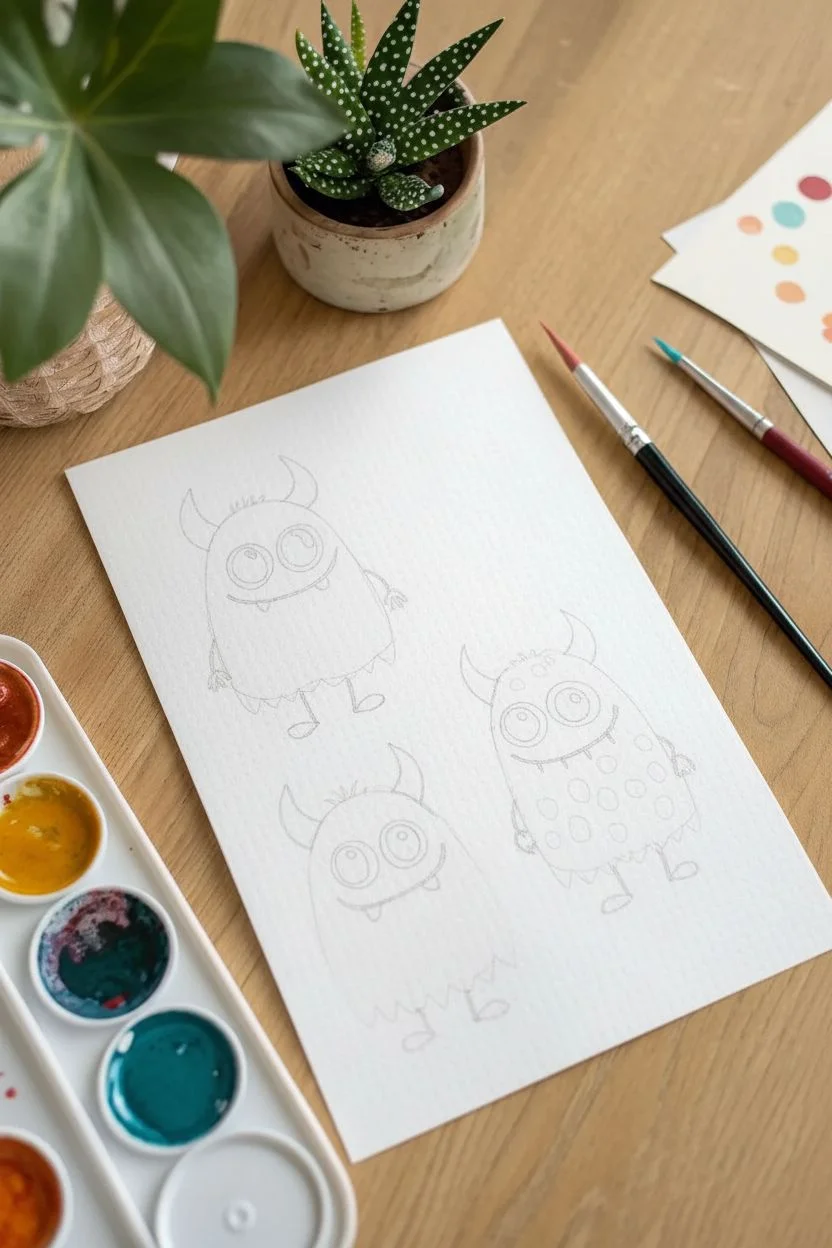
Straw Blow Painting Turned into Funny Monsters
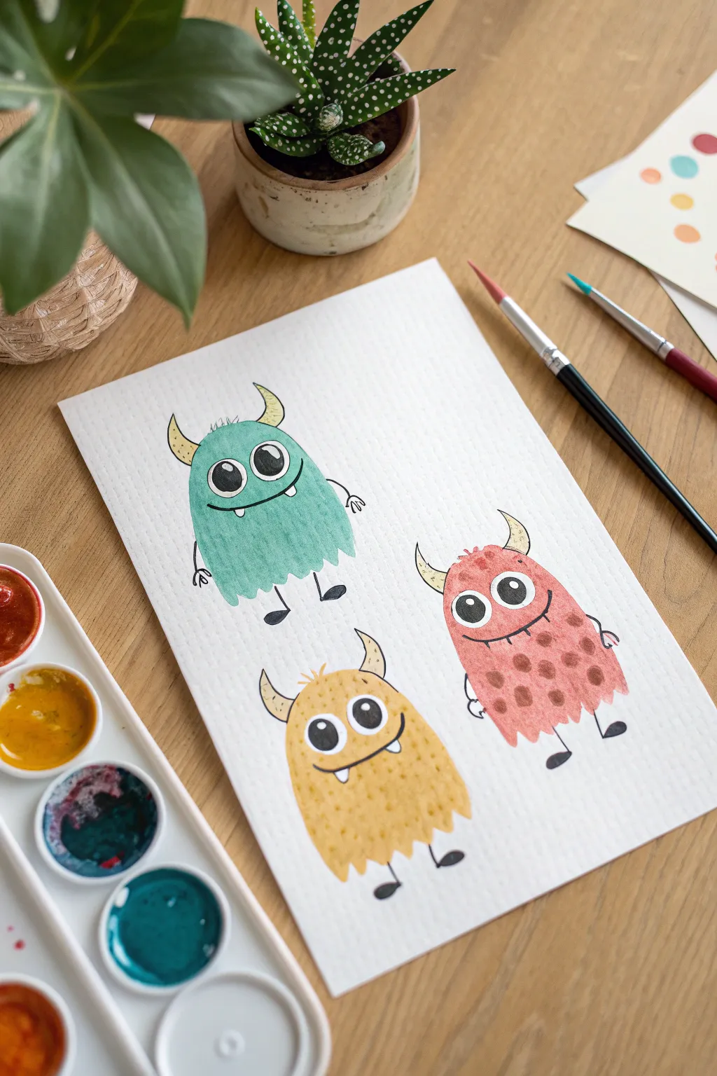
Create a friendly gang of three fuzzy monsters using soft watercolor washes and bold ink details. This project captures a playful illustrative style that focuses on simple shapes and expressive faces, perfect for budding artists.
Step-by-Step Tutorial
Materials
- Cold press watercolor paper (A4 or slightly smaller)
- Watercolor paints (teal green, warm yellow, coral red/pink)
- Small round paintbrush (size 4 or 6)
- Fine detail paintbrush (size 0 or 1)
- Black waterproof fine liner pen (0.5mm or 0.8mm)
- White gel pen or gouache (optional highlights)
- Pencil and eraser
- Water jar and paper towels
Step 1: Planning and Sketching
-
Visualize the layout:
Imagine your paper divided into three sections. You want the green monster on the top left, the red one on the right, and the yellow one centered near the bottom. -
Sketch the bodies:
Lightly draw three oval-like, gumdrop shapes with your pencil. Make the top edges slightly rounded and the bottoms jagged to suggest fur textures. -
Add features:
Sketch in large circles for the eyes. Notice that the green and yellow monsters have two eyes touching each other, while the red monster’s eyes are slightly separated. -
Define the limbs:
Draw simple stick lines for the arms and legs. Add small triangles for the horns on top of their heads. -
Refine the sketch:
Go over your pencil lines to make sure you are happy with the expressions, then gently erase them until they are very faint guides for your paint.
Step 2: Painting the Bodies
-
Mix the green wash:
Load your round brush with water and pick up some teal or turquoise paint. Ensure the mixture is watery and transparent. -
Paint the first monster:
Fill in the top-left body shape with the green wash. Use the tip of the brush to carefully dab along the bottom edge, creating a jagged, furry look rather than a straight line. -
Paint the red monster:
Rinse your brush and mix a soft coral or watered-down red. Fill in the body on the right, again paying attention to the furry bottom edge. -
Paint the yellow monster:
Use a warm, sunny yellow for the bottom monster. While the paint is still wet, you can drop in tiny dots of slightly darker yellow to create a fuzzy texture. -
Let it dry complete:
Wait for the paint to be bone dry. If you rush this steps, your marker lines will bleed later.
Bleeding Lines?
If your black ink bleeds into the color, the paint wasn’t 100% dry. Wait longer or use a hairdryer on a low, cool setting to speed up the process safely.
Step 3: Adding Details and Patterns
-
Horns and patterns:
Using a very pale yellow or cream color, paint the horns on all three monsters. For the red monster, add small darker red dots over the body for a spotted texture. -
Outline the eyes:
Switch to your black waterproof fine liner. Carefully outline the large white circles for the eyes. -
Draw the pupils:
Fill in large black circles inside the eyes for the pupils, leaving a tiny white speck in each for a reflective highlight. -
Inking the body outlines:
Go over the pencil lines of the body with the pen. Use short, sketchy strokes to mimic the look of hair or fur. -
Add the limbs:
Draw the stick legs and arms with the black pen. Add simple U-shapes or ovals for feet and hands. -
Final expressions:
Draw the mouths. Give the green monster a smirk, the red one a wide stitched smile, and the yellow one a single tooth poking out. -
Clean up:
Once the ink is totally dry, gently erase any remaining visible pencil marks to clean up the illustration.
Monster Texture
Before the colored paint dries, sprinkle a tiny pinch of salt on the wet paper. Brush it off when dry for a cool, mottled skin texture effect.
Hang up your trio of colorful creatures to add a splash of fun to your wall
Paint on Foil for Shimmery Space Planets
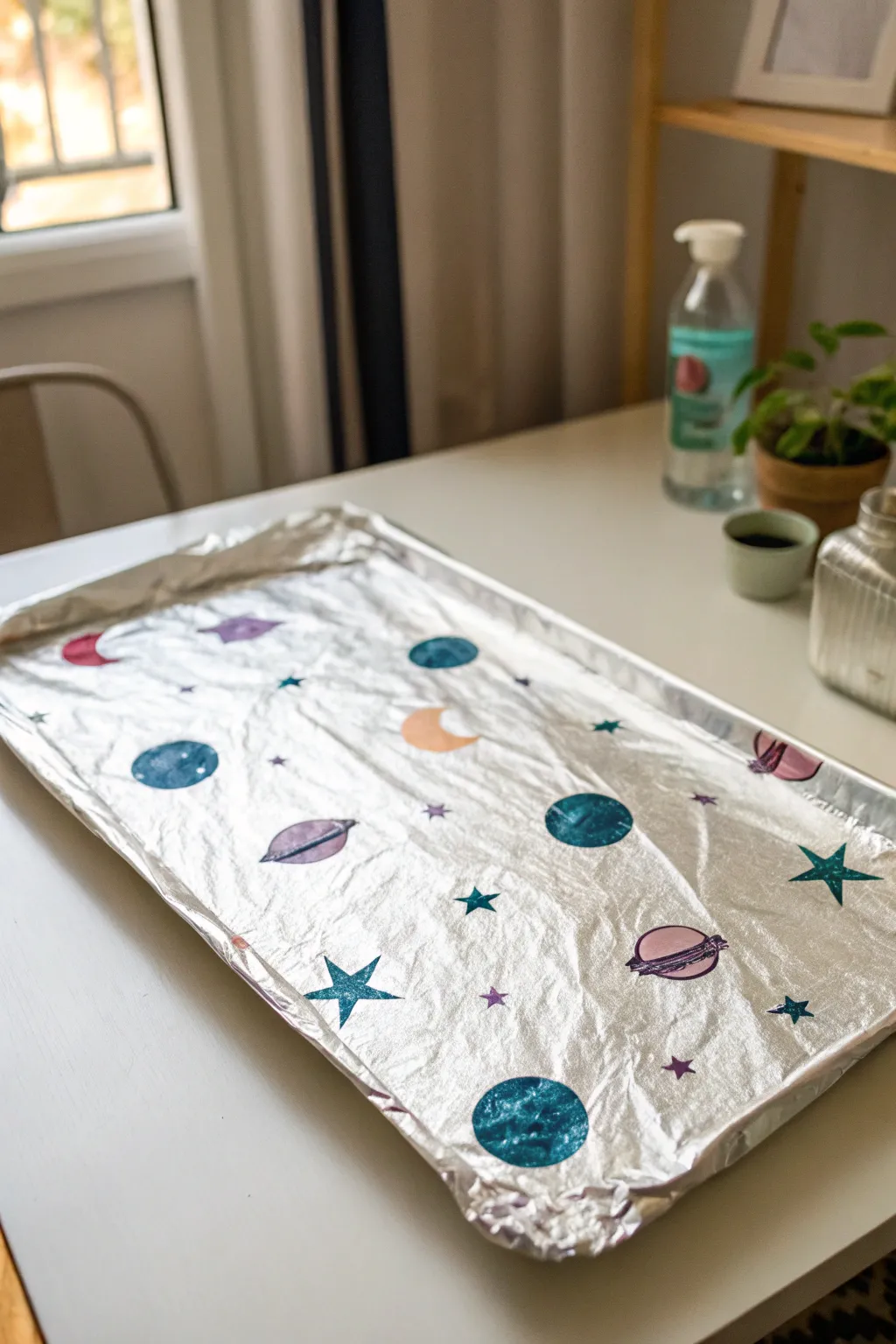
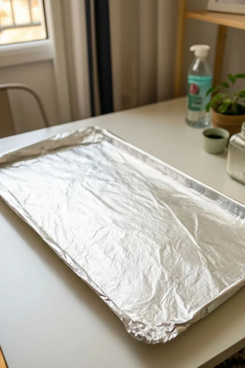
Turn an ordinary kitchen staple into a dazzling galaxy with this simple yet effective technique. By painting directly onto aluminum foil, standard celestial shapes gain an incredible metallic sheen that makes your planets and stars truly sparkle.
How-To Guide
Materials
- Large baking sheet or tray
- Aluminum foil (standard kitchen roll)
- Acrylic paints (dark blue, light blue, purple, magenta, peach)
- Assorted paintbrushes (medium flat, small round)
- Cup of water and paper towels for cleaning brushes
Step 1: Preparing the Canvas
-
Wrap the base:
Begin by pulling a sheet of aluminum foil large enough to cover the entire surface of your baking sheet. -
Secure the foil:
Wrap the foil edges tightly around the rim of the tray, smoothing it out as you go. You want a relatively flat surface, but tiny crinkles add a nice texture, so don’t worry about perfection. -
Define the orientation:
Place the tray on your work surface in front of you. Decide if you want a landscape or portrait orientation for your galaxy.
Paint sliding off?
If the acrylic paint beads up or slides off the slick foil surface, mix a tiny drop of dish soap into your paint before applying it. This helps break the tension and makes it stick.
Step 2: Creating the Planets
-
Choose your primary colors:
Select two shades of blue—a deep navy and a brighter turquoise—along with a soft purple. -
Paint the first planet:
Dip a medium brush into the dark blue paint and create a medium-sized circle in the lower-left area. The paint might streak slightly on the foil, which creates a cool gaseous look. -
Add texture:
Before the blue dries completely, dab a tiny bit of lighter blue or white onto the wet paint to give the planet dimension. -
Create a ringed planet:
Using purple paint, draw an oval shape in the middle of your canvas. Once filled in, carefully paint a thin ring around its circumference. -
Details on the ring:
I like to use a very fine brush here to add a stripe of darker purple across the planet itself, showing where the ring casts a shadow. -
Paint a large blue planet:
Near the bottom center, paint a large, bold circle using your turquoise blue. Make this one the biggest element to anchor your composition. -
Add distant worlds:
Paint smaller circles using different shades like magenta or peach in the empty spaces, keeping them spaced out to represent distance.
Step 3: Painting Stars and Moons
-
Sketch the crescent moon:
Using a peach or light yellow color, carefully paint a crescent moon shape near the center. The foil underneath will make it look like it’s glowing. -
Draw sharp stars:
Switch to your smallest brush. Paint five-pointed stars using blue or purple paint scattered across the empty silver background. -
Add tiny glimmers:
Use the very tip of a brush handle or a toothpick to dot tiny specks of purple or blue between the larger planets to represent distant stars. -
Create shooting stars:
Start with a star shape and drag the paintbrush lightly away from it to create a tail effect. -
Review the layout:
Step back and look at your galaxy. If a spot looks too empty, add a small planet or another star to balance the composition. -
Enhance opacity:
If any planets look too transparent against the foil, wait for the first coat to dry and dab a second layer of paint right on top. -
Let it set:
Allow the entire tray to sit undisturbed for at least 30 minutes. Since foil is non-porous, the drying time takes a little longer than paper.
Add 3D sparkle
While the paint is still wet, sprinkle loose glitter or adhere small sequins onto the planets. This adds physical texture and amplifies the cosmic shimmer effect.
Once dry, you can display the tray on a shelf or adhere the foil to cardboard for a permanent decoration
Simple Acrylic Pour Tiles That Look Like Marble
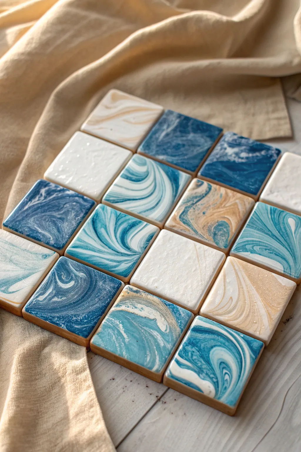
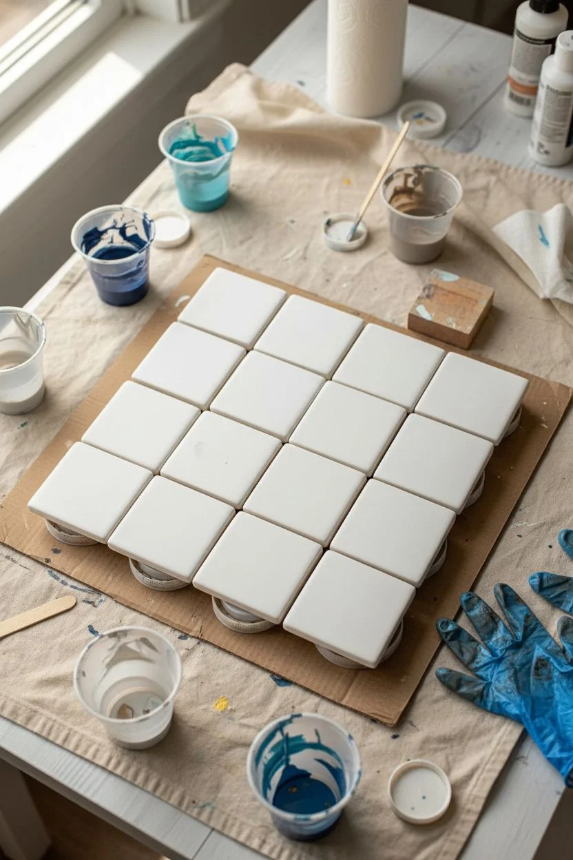
These stunning tiles look like expensive home decor, but they are actually a fun and budget-friendly acrylic pour project. With swirling blues, whites, and touches of gold, you will create a unique set of coasters or wall art that mimics real polished stone.
Step-by-Step Tutorial
Materials
- 16 square ceramic tiles (white, 4×4 inch)
- Acrylic fluid paints (navy blue, turquoise, white, metallic gold)
- Pouring medium
- Small paper or plastic cups (one for each color)
- Wooden craft sticks for stirring
- Cardboard box or drop cloth (to catch messy drips)
- Gloves
- High-gloss varnish or resin (optional, for sealing)
Step 1: Preparation
-
Set up your workspace:
Acrylic pouring is wonderfully messy, so start by covering your entire table with a drop cloth or placing a large cardboard box down. Put on your gloves to keep your hands clean. -
Clean the tiles:
Wipe down all 16 ceramic tiles with a damp cloth to remove any dust or oils, ensuring the paint sticks perfectly. Let them dry completely. -
Elevate the tiles:
Place small cups, bottle caps, or blocks underneath each tile to lift them off the table surface. This ensures that the paint can drip over the edges freely without gluing the tile to your work surface.
Step 2: Mixing the Paints
-
Prepare the colors:
In separate cups, mix your acrylic paints with pouring medium. follow the ratio on your specific medium bottle, but typically it’s about 1 part paint to 1 part medium. -
Check consistency:
Stir gently to avoid bubbles. You are looking for a consistency like warm honey—it should flow easily off the stick but not be watery. -
Create a ‘Dirty Pour’ cup:
For the marbled effect, don’t mix all colors in one big bucket. Instead, take a clean cup and layer small amounts of your colors one by one: a splash of white, then navy, then turquoise, then a hint of gold. Do not stir this cup.
Paint Moving Too Fast?
If the paint runs off the tile instantly without making shapes, your mix is too thin. Add a pea-sized amount of heavy body acrylic paint to thicken it up for better control.
Step 3: The Pouring Process
-
Pour the paint:
Gently pour the layered paint from your cup onto the center of a tile. You can pour in a small circle or a straight line; the pattern will change as you move the tile. -
Tilt and swirl:
Pick up the tile carefully by the edges. Tilt it slowly left, right, forward, and backward. Watch as the paint stretches and flows, creating those beautiful marble veins. -
Cover the corners:
Continue tilting until the paint runs over all four edges. If a corner is bare, use your finger to dab a little paint there to help the flow move effectively. -
Alternate techniques:
For variation, create some tiles using just two colors (like white and gold) swirled together with a toothpick directly on the tile, rather than a cup pour. This breaks up the grid visually. -
Creating the solid white tiles:
Notice some tiles in the image are mostly white? For these, coat the tile in white paint first, then drop just 2-3 tiny drops of gold or pale blue and lightly blow on them with a straw to spread them out thinly. -
Repeat for all tiles:
Continue this process for all 16 tiles. I usually mix up my technique every few tiles—some heavy with blue, some light and airy—to get that organic, non-uniform look shown in the photo.
Make Them Functional
Turn these art pieces into usable coasters by gluing a square of cork or small felt pads to the bottom of each tile. This protects your table from scratches.
Step 4: Finishing Touches
-
Let them dry:
Leave the tiles on their elevated stands to dry for at least 24-48 hours. Do not touch them, even if they look dry on top, as the layers underneath might still be wet. -
Clean the drips:
Once fully dry, check the underside of the tiles. You may see dried drips of paint. You can sand these off with sandpaper or use a craft knife to trim them away so the tile sits flat. -
Seal the artwork:
To protect your beautiful marble finish, especially if using these as coasters, brush on a coat of high-gloss varnish or pour a layer of clear resin over the top.
Once sealed and dried, arrange your squares on a table to admire your custom gallery of faux-marble art
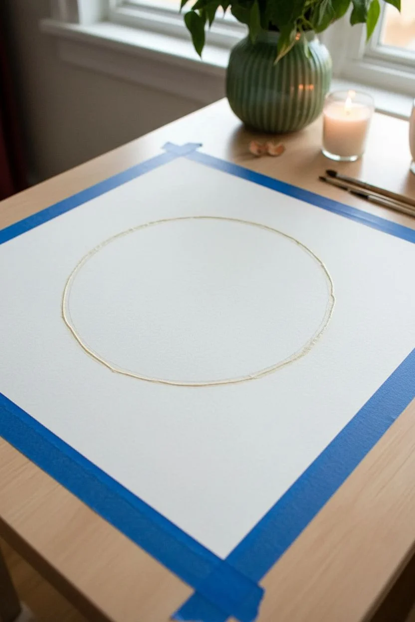
Pendulum Swing Painting for Giant Color Circles
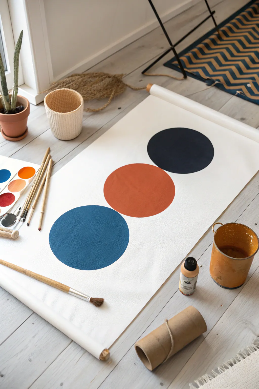
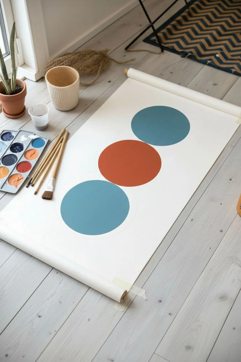
Create a striking modern art piece with bold, perfectly round shapes that look deceptively simple but make a big impact. This project uses a long paper scroll to showcase three massive, solid-colored circles in a pleasing vertical alignment.
How-To Guide
Materials
- Long roll of heavy white paper or canvas
- Acrylic paints (Navy Blue, Burnt Orange, Teal/Cerulean)
- Small plastic cups or containers for paint
- Large flat paintbrush (1-2 inch width)
- Round paintbrush (medium size)
- Pencil
- Compass (or a large round object like a dinner plate/pot lid for tracing)
- Water jar
- Paper towels
- Masking tape or painter’s tape
Step 1: Preparation and Layout
-
Prepare your workspace:
Clear a large area on the floor. Since this is a long scroll project, you’ll need plenty of room to unroll the paper fully without obstructions. -
Secure the canvas:
Unroll your paper or canvas to the desired length. Use small pieces of masking tape on the corners to hold it flat against the floor so it doesn’t curl back up while you work. -
Plan the composition:
Visualize where your three circles will go. You want them evenly spaced vertically down the center of the paper, with breathable white space between each one. -
Trace the circles:
Use a large round object, like a dinner plate or a pot lid, as a template. Place it on the paper and lightly trace around the edge with a pencil. Repeat this three times to create your vertical stack.
Clean Circle Hack
Make painting perfect edges easier by cutting a circle out of freezer paper. Iron it shiny-side-down onto your canvas to create a temporary stencil, then paint inside.
Step 2: Painting the Circles
-
Mix your navy blue:
Squeeze a generous amount of navy blue acrylic paint into a cup. If the paint is very thick, add a tiny drop of water to help it flow smoothly, but keep it opaque. -
Paint the top circle outline:
Using your medium round brush, carefully paint over your pencil line for the top circle. This creates a crisp edge to fill in later. -
Fill the navy circle:
Switch to your larger flat brush. Fill in the center of the top circle with the navy paint using long, smooth strokes to minimize texture. I find working from the center outward helps keep the paint even. -
Prepare the orange hue:
Clean your brushes thoroughly. Pour burnt orange paint into a fresh cup. Aim for a warm, terracotta shade to contrast with the cool blues. -
Outline the middle circle:
Just like before, use the round brush to carefully trace the pencil edge of the middle circle with the orange paint. -
Fill the middle circle:
Use the large flat brush to fill the middle circle with orange paint. ensure the coverage is solid so no white paper shows through. -
Mix the teal color:
Clean your brushes again. Pour a teal or deep cerulean blue into your third cup. This creates a beautiful cool-warm-cool rhythm to the artwork. -
Paint the bottom circle:
Outline and then fill the final bottom circle with the teal paint. Take your time near the edges to keep that perfect geometric shape.
Add Texture
For a cooler look, mix a little baking soda into your acrylic paint before applying. It creates a matte, sandy texture that makes the circles look like relief art.
Step 3: Finishing Touches
-
Check for gaps:
Look closely at your circles. If the paint looks streaky or transparent in spots, wait for the first layer to dry and apply a quick second coat. -
Clean up edges:
If any edges look wobbly, use a small detail brush with a tiny bit of paint to smooth out the curve creating a sharp silhouette. -
Let it dry completely:
Allow the painting to dry undisturbed on the flat floor for at least an hour before moving it. -
Roll/Mount:
Once dry, you can mount the paper on wooden dowels at the top and bottom for a scroll look, or simply tape it directly to the wall.
Hang your new geometric masterpiece vertically to add a splash of color and modern design to your room

Have a question or want to share your own experience? I'd love to hear from you in the comments below!