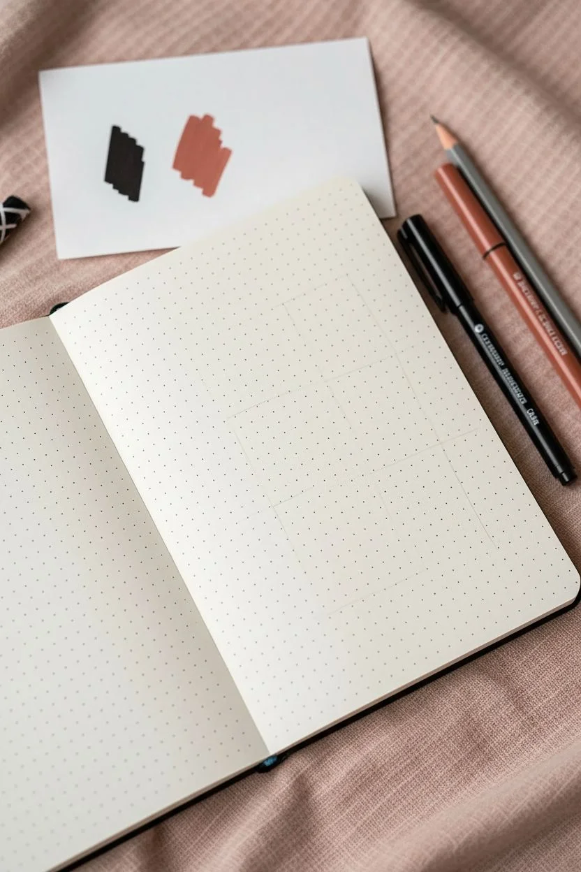
Sometimes you don’t need a big, serious “art project” to make something beautiful—you just need a little aesthetic drawing spark and a page to play on. Here are my favorite ideas that lean into cozy vibes, simple shapes, and that satisfying sketchbook feel you’ll want to pin and recreate.
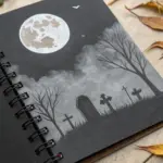
Moon Phases in a Minimal Line Style
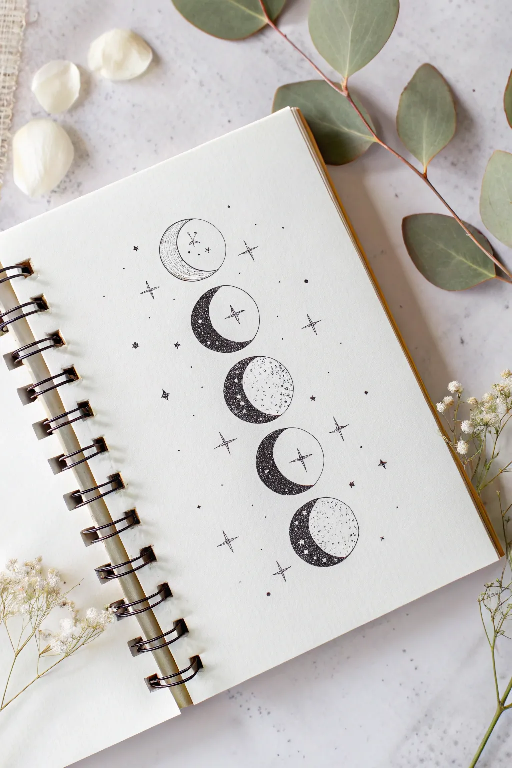
Capture the mystic beauty of the lunar cycle with this delicate, vertical arrangement of moon phases. Using fine liners and stippling techniques, you’ll create a minimalist yet detailed illustration that perfectly balances negative space with cosmic charm.
How-To Guide
Materials
- Spiral-bound sketchbook or mixed media paper
- Compass or a small circular object (approx. 1-1.5 inch diameter)
- Pencil (HB or H)
- Eraser (kneaded eraser preferred)
- Fine liner pen (01 or 005 size)
- Thicker fine liner pen (05 or 08 size) for outer circles
- Ruler
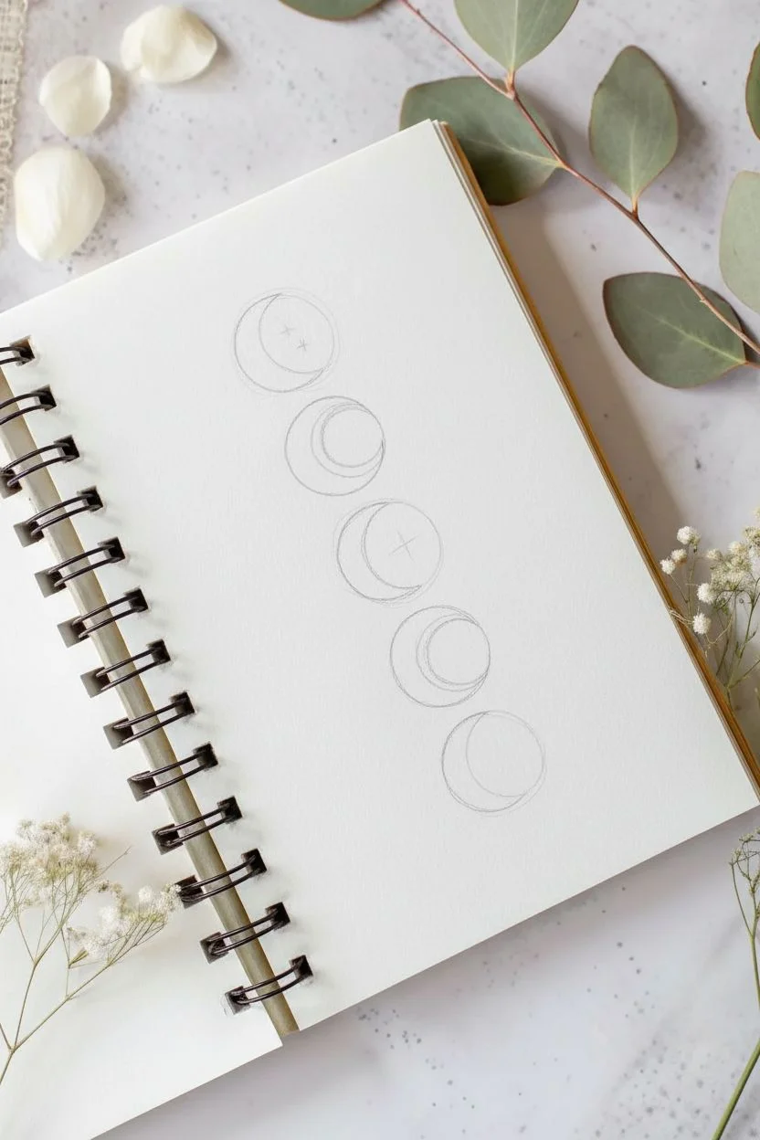
Step 1: Drafting the Layout
-
Preparation:
Begin by lightly marking a vertical centerline down the middle of your page using a ruler and pencil. This will ensure your moons stay perfectly aligned. -
Spacing the Circles:
Mark five evenly spaced points along your centerline where the center of each moon will be. Leave about half an inch to an inch of space between each position. -
Drawing the Base Circles:
Using your compass or circular template, draw five identical circles centered on your marks. Keep your pencil pressure very light so these can be erased later. -
Sketching the Phases:
Inside the circles, lightly sketch the curve for each crescent. The top and bottom moons are thin crescents, while the middle three are fuller gibbous or quarter shapes, creating a gradient of phases.
Uneven Circles?
If freehand inking feels risky, simply trace a coin or bottle cap directly with your pen. Just be sure to wipe the object’s edge first so you don’t smudge ink.
Step 2: Inking the Outlines
-
Main Circles:
Switch to your 05 fine liner. Carefully trace the full circular outline of each moon. Try to keep your hand steady to maintain a smooth, continuous line. -
Phase Lines:
Using the finer 01 pen, ink the internal curves that define the light and dark sides of the moon. Do not ink the pencil line that separates the moon from empty space; only ink the actual shape boundaries. -
Erase Sketches:
Once the ink is completely dry—I usually give it a full five minutes to be safe—gently erase all your pencil guides and the centerline.
Add a Golden Touch
Once the black ink is dry, use a metallic gold gel pen to fill in the four-pointed stars or trace the crescent edges for a luxurious, celestial finish.
Step 3: Stippling and Texture
-
Start Stippling:
This step requires patience. Using your 01 or 005 pen, begin adding tiny dots (stippling) to the dark crescent areas of the moons. Focus on the edges closest to the outline first. -
Building Density:
Add more dots to the ‘dark’ side of the moons to create a solid, shadowed look. For the top moon, keep shading minimal with just light hatching lines instead of dense dots. -
Creating Gradients:
As you move toward the lit part of the moon, space your dots further apart. This creates a fading gradient effect rather than a hard line. -
Texturing the Light Side:
On the lighter ‘lit’ sections of the moons (especially the middle one), add very sparse, random dots and tiny circles to mimic craters and surface texture. -
Adding Contrast:
Go back over the darkest sections of the crescents with your pen, adding one final layer of dense dots to ensure high contrast against the white paper.
Step 4: Stars and Embellishments
-
Drawing Large Stars:
Draw four-pointed stars inside some of the moons and floating in the background. Use a simple cross shape with elongated vertical lines. -
Adding Sparkles:
Scatter smaller four-pointed sparkles around the moons. Keep them random but balanced on both sides of the vertical column. -
Micro Details:
Fill the empty spaces with tiny single dots and miniature circles to represent distant stars or cosmic dust. -
Final Polish:
Review the composition. If any area looks too empty, add a small dot or star. Check your moon outlines and thicken any lines that look shaky or too thin.
Now you have a serene piece of lunar art ready to be framed or kept as a journal highlight


Polaroid-Style Clouds and Sky Snapshot
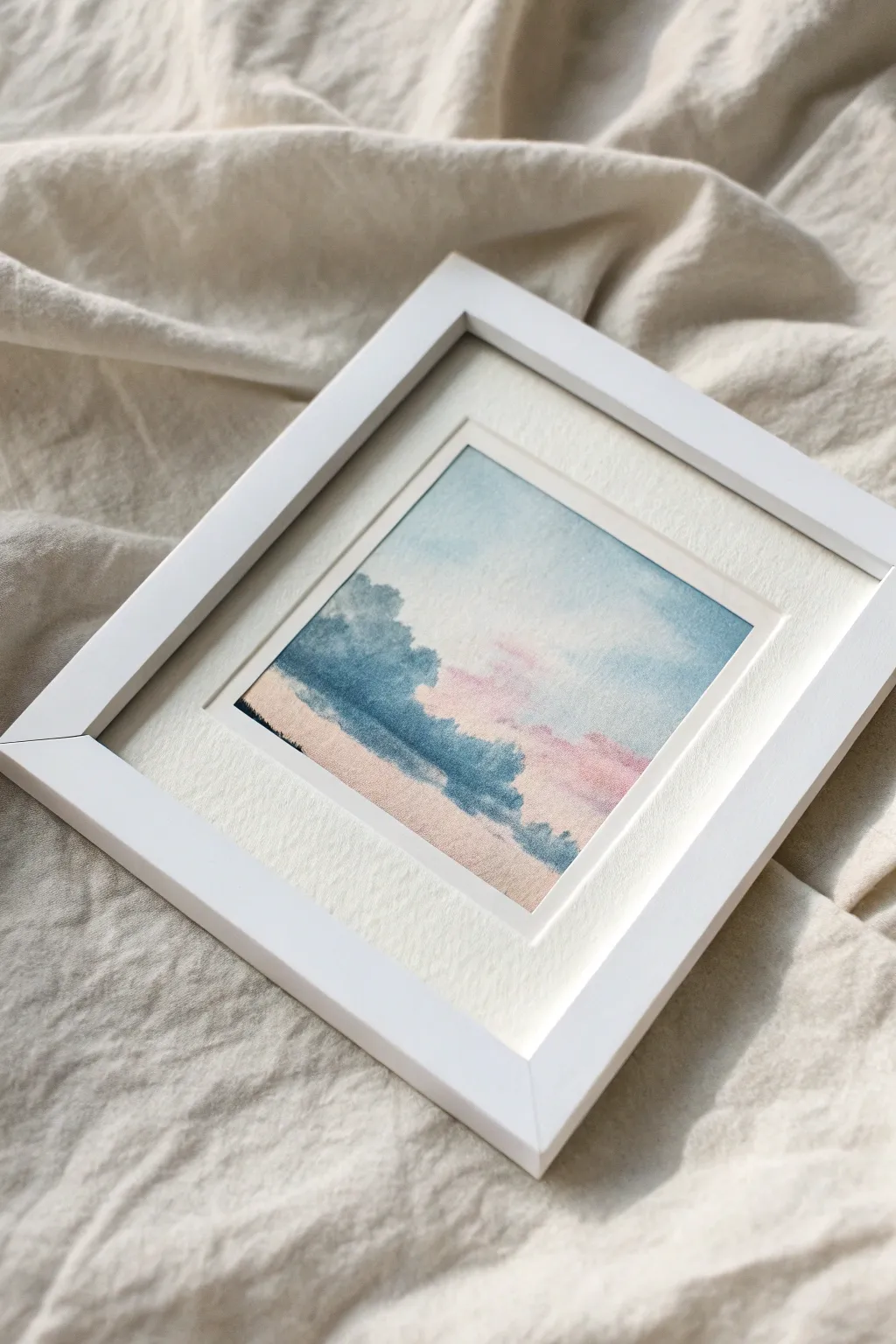
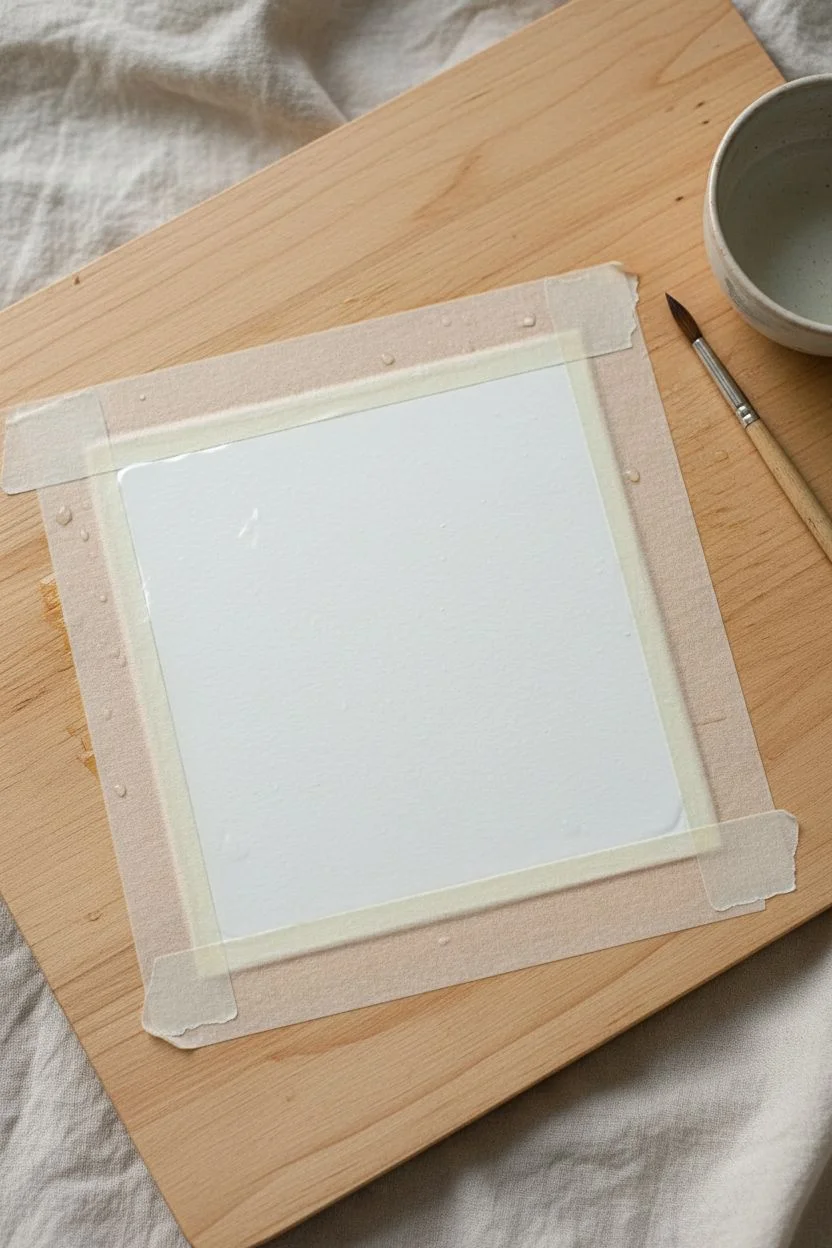
Capture the fleeting beauty of a pastel sunset in this delicate miniature painting. With soft pink clouds drifting through a gentle blue sky and resting above a hazy tree line, this project brings a serene atmosphere to any small space.
Step-by-Step
Materials
- Cold press watercolor paper (cut to 4×4 inches)
- White mat board or precut frame mat
- Watercolor paints (Cerulean Blue, Rose Madder or Pink, Indigo, Yellow Ochre)
- Painter’s tape or masking tape
- Small round watercolor brushes (size 2 and 4)
- Clean water jar
- Paper towels
- White square frame (approx. 5×5 or 6×6 inches)
Step 1: Setting the Stage
-
Prepare the paper:
Cut your watercolor paper into a small square, slightly larger than the opening of your mat board. This ensures you have space to tape it down without losing the painted edge. -
Create the border:
Using masking tape, tape down all four edges of your paper onto a hard board. Press the tape firmly to prevent paint from seeping underneath, creating that crisp, professional border later. -
Wet the surface:
Use your clean brush to apply a thin, even layer of water across the entire paper surface. This wet-on-wet technique is crucial for achieving the soft, cloudy look.
Step 2: Painting the Sky
-
Blue sky gradient:
Load your brush with a very watery Cerulean Blue. Starting from the top, gently sweep the color across, letting it naturally fade as you move toward the middle of the paper. -
Adding warmth:
While the paper is still damp, mix a soft pink using Rose Madder. Dab this gently into the lower sky area where the blue fades out, allowing the colors to bleed slightly into one another. -
Cloud formation:
Use a clean, damp paper towel to lift pigment from the page in random spots. This negative space creates fluffy white clouds amidst the pink and blue wash. -
The ground layer:
Mix a diluted wash of Yellow Ochre with a tiny touch of pink. Paint a horizontal band at the very bottom of the paper to represent a sandy field or dry grass. -
Initial drying time:
Let this first wash dry completely. The paper must be dry to the touch before adding defined shapes, or the trees will blur too much.
Keep it fluid
Work quickly during the sky phase. If the paper dries while you’re blending the pink and blue, you’ll get hard lines instead of soft, dreamy transitions.
Step 3: Layering the Landscape
-
Mixing green tones:
Create a muted blue-green by mixing Indigo with a touch of the existing blue and green. You want a cool, shadowy color rather than a bright vibrant green. -
Background foliage:
With the paper dry, use a size 4 brush to paint the distant tree line. Use a dabbing motion to create organic, irregular shapes that overlap the horizon line. -
Softening edges:
Immediately after painting a tree shape, rinse your brush and run clean water along the bottom edge of the trees. This helps them fade softly into the ground layer. -
Adding depth:
While the tree shapes are still slightly wet, drop in more concentrated Indigo pigment at the base of the clusters to create shadows and volume. -
Foreground details:
Switch to your smaller size 2 brush. Add tiny details like stray bushes or grass hints in the foreground using the darkest mix of your blue-green. -
Final drying:
Allow the entire painting to dry completely. If the paper feels cool to the back of your hand, it’s still damp inside.
Fixing “blooms”
If cauliflower-like blooms appear in your sky, you added too much water to damp paint. Let it dry fully, then lightly glaze over it to smooth the texture.
Step 4: Framing the Piece
-
The reveal:
Now for the most satisfying part—peel away the masking tape slowly at a 45-degree angle. This reveals the crisp, clean white edges of your artwork. -
Mounting:
Position your painting behind the mat board opening. Secure it from the back with a small piece of acid-free tape so it doesn’t slide. -
Assembly:
Clean the glass of your frame to remove any dust or fingerprints. Place the matted artwork inside and secure the backing.
Place your finished miniature on a desk or shelf to add a peaceful window to nature in your daily space


Cozy Coffee or Tea Cup With Steam Swirls
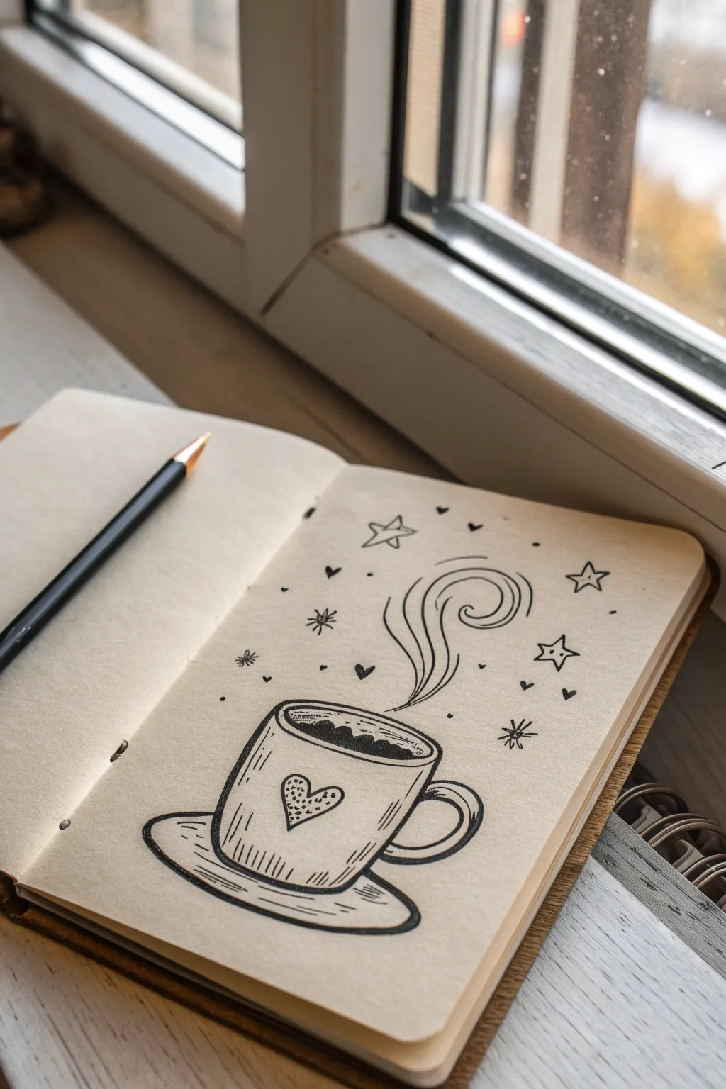
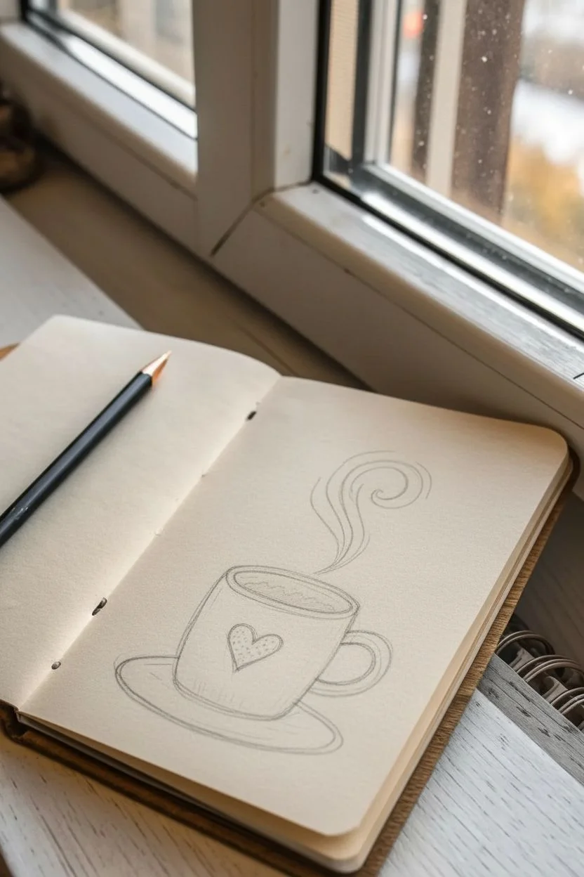
This charming doodle captures the cozy essence of a warm beverage, transforming simple steam into a magical display of swirls and stars. It is an approachable project perfect for sketchbook journaling, using clean lines and minimal supplies to create a heartwarming aesthetic.
How-To Guide
Materials
- Fine-liner pen (black, 0.5mm)
- Thicker marker or brush pen (black)
- Pencil (HB or 2B)
- Eraser
- Sketchbook or textured drawing paper
- Ruler (optional)
Step 1: Sketching the Foundations
-
Establish the cup shape:
Start by lightly sketching a slightly flattened oval for the rim of the mug. From the sides of the oval, draw two vertical lines curving slightly inward as they go down to define the body of the cup. -
Add the base curve:
Connect the bottom of your vertical lines with a curve that mirrors the bottom curve of the rim oval. This gives the cup a 3D cylindrical feel. -
Draft the handle:
On the right side of the cup body, sketch a ‘C’ shape. Add a smaller ‘C’ inside it to create the thickness of the handle. -
Outline the saucer:
Draw a larger, wider oval underneath the cup base. Make sure the cup sits centered within this shape, leaving enough room for the saucer’s rim. -
Plan the heart:
Lightly sketch a heart shape in the center of the cup’s body. It doesn’t need to be perfectly symmetrical; a slight tilt adds character.
Keep it Organic
Don’t use a ruler for the final ink lines. Slightly wobbly, hand-drawn lines make the drawing feel cozier and more authentic.
Step 2: Inking the Vessel
-
Trace the rim:
Using your fine-liner, careful ink over the top oval. I find it helpful to break the line slightly or add a second, thinner line inside the back rim to suggest thickness. -
Define the liquid:
Inside the rim oval, draw a wavy line to represent the surface of the coffee or tea. Fill the area below this line with solid black ink, leaving a tiny white gap or two near the wave tops as highlights. -
Ink the mug body:
Go over your vertical sketch lines. Instead of perfectly straight lines, give them a slightly sketchy, organic quality. -
Detail the handle:
Ink the handle, ensuring the lines connect smoothly to the body of the mug. -
Draw the saucer:
Ink the saucer’s oval. Add a second, inner curve near the bottom edge of the saucer to show depth and the lip of the plate. -
Texture the mug:
Add short, vertical hatching lines near the bottom of the cup and the top left side. These little dashes suggest curvature and shadow without needing heavy shading. -
Decorate the heart:
Outline the heart on the mug. Inside, fill it with tiny stippled dots, clustering them more densely on one side for a gradient effect.
Step 3: Adding the Magic
-
Create the main steam swirl:
Start from the center of the liquid and draw a long, flowing line that curves upward and spirals tightly at the top. -
Thicken the steam:
Draw parallel lines next to your first steam swirl to give it volume. Add a secondary, smaller swirl branching off to the left. -
Draw the stars:
Scatter three or four five-pointed stars around the steam cloud. Keep the lines loose; if the points don’t meet perfectly, it adds to the doodle aesthetic. -
Add floating hearts:
Draw tiny solid black hearts floating among the steam lines. Vary their sizes and orientation to create movement. -
Incorporate sparkles:
Draw a few ‘burst’ shapes (a central point with lines radiating out) to represent twinkling light. -
Sprinkle drawing elements:
Fill empty spaces with tiny dots and small ‘v’ shapes or miniature hearts to balance the composition.
Add Warmth
Use a light brown or grey watercolor wash over just the coffee liquid or the heart after the ink dries for a pop of subtle color.
Step 4: Final Touches
-
Allow to dry:
Wait a minute or two to ensure the ink is completely set to avoid smudging. -
Erase pencil marks:
Gently erase all the underlying pencil sketches, leaving only the crisp ink work. -
Clean up lines:
Check for any gaps or areas where the ink looks too thin and go over them once more if needed to make the black pop.
Now you have a cozy piece of art that perfectly captures the feeling of a relaxing morning break
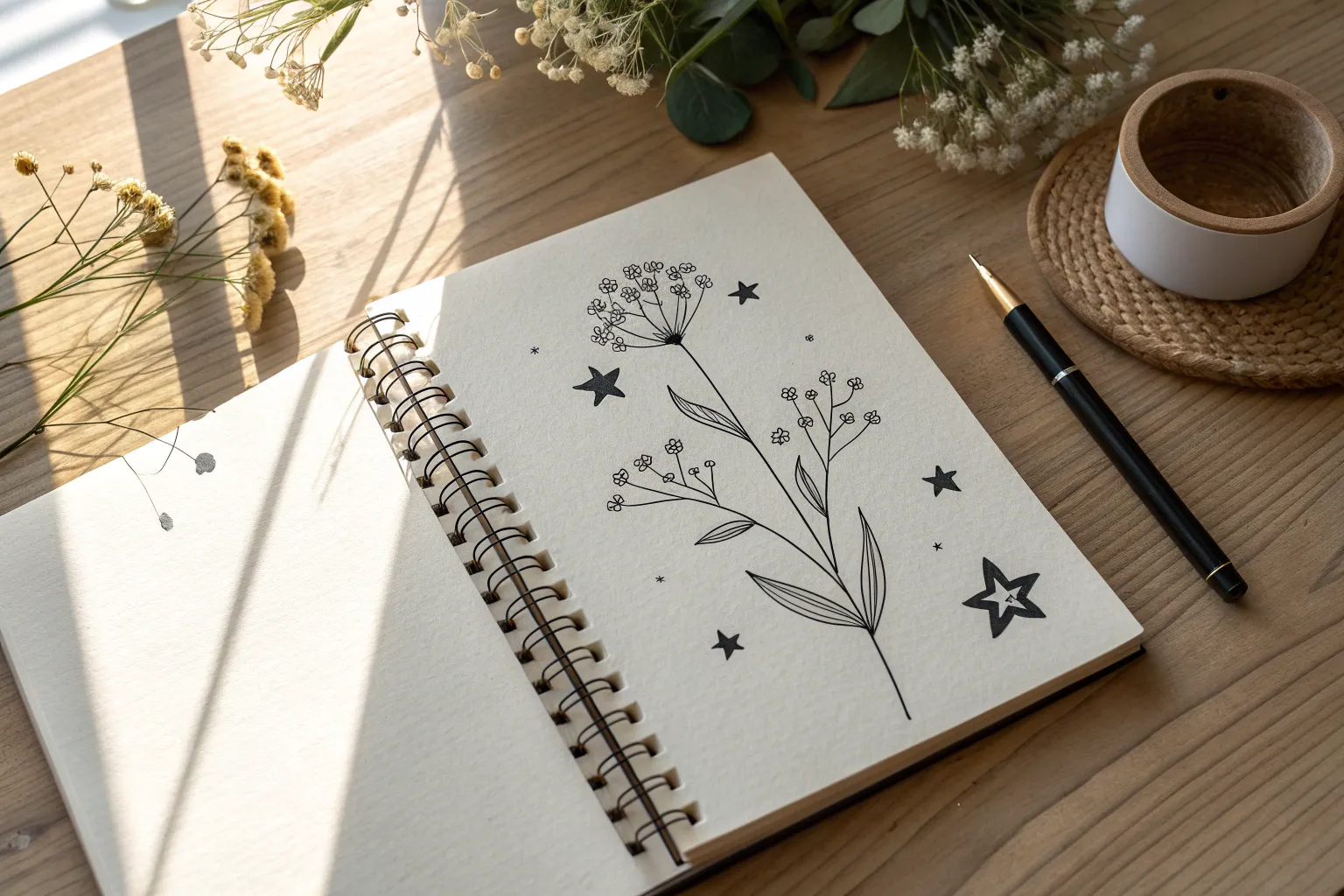
Aesthetic Floral Sprigs With Simple Shading
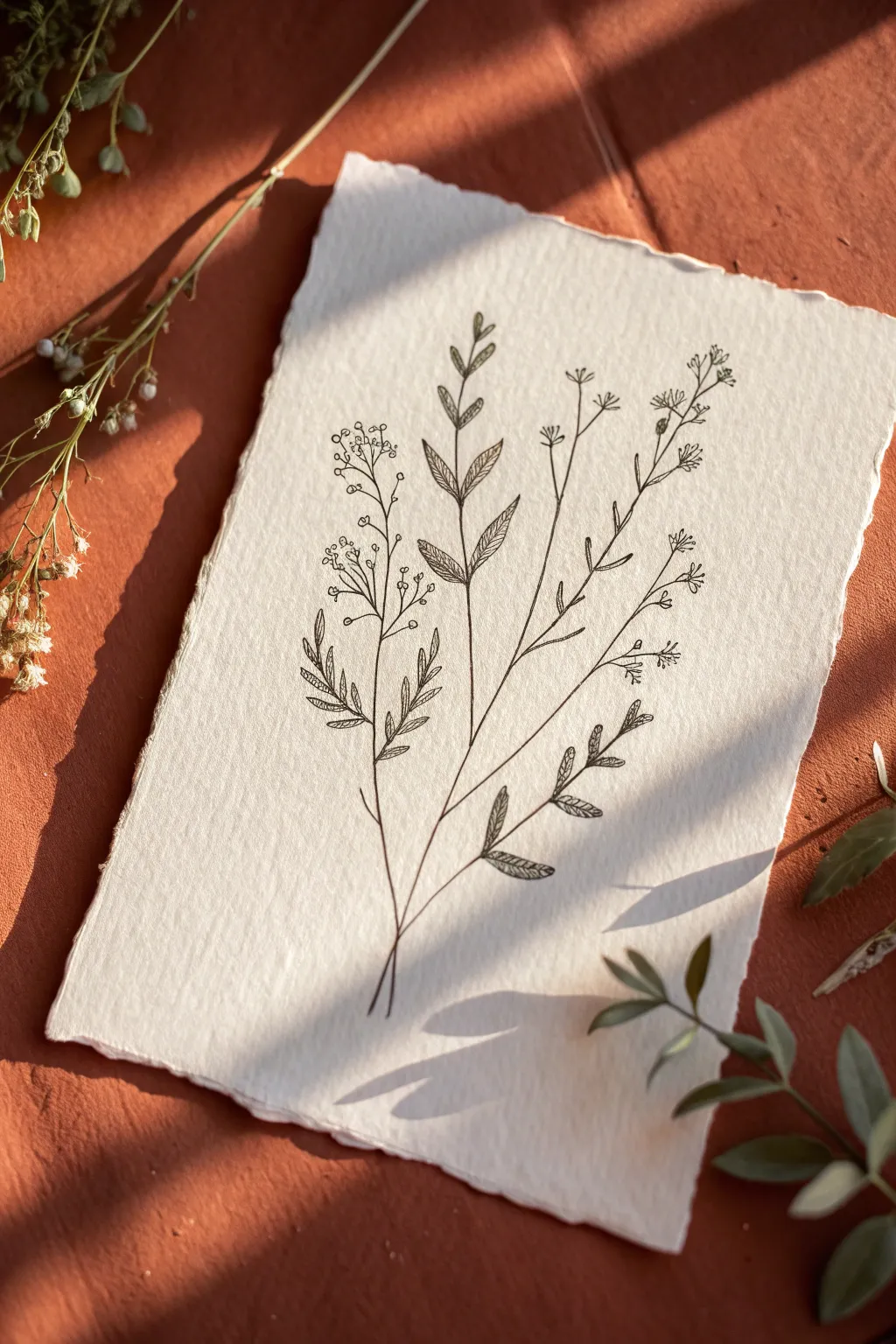
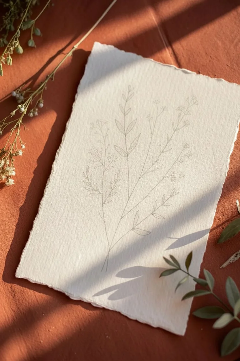
Capture the delicate beauty of dried herbs and wildflowers with this minimalist line drawing. Using fine ink pens on textured paper, you’ll create a vintage-inspired botany illustration perfect for framing or gifting.
Step-by-Step
Materials
- Cold press watercolor paper or handmade cotton rag paper (A5 size)
- Fine liner pens (sizes 0.1, 0.3, and 0.5)
- Pencil (HB or 2H)
- Kneadable eraser
- Ruler (optional)
Step 1: Planning the Composition
-
Lightly sketch the stems:
Begin with your pencil. Draw three main curved lines radiating from a single point near the bottom center of the paper. These will form the backbone of your bouquet. -
Mark stem heights:
Vary the lengths of these lines. The center stem should be roughly the tallest, with the side stems slightly shorter to create a balanced, fan-like shape. -
Sketch the foliage placement:
Lightly mark where leaves and flower heads will go. Use simple ovals or circles as placeholders to ensure your spacing isn’t too crowded before committing to ink.
Ink Confidence
Don’t worry about shaky lines! In botanical art, a slightly wavering line actually looks more organic and natural than a perfectly straight ruler line.
Step 2: Drawing the Right Sprig
-
Outline the main stem:
Switch to your 0.3 pen. Trace over your pencil line for the right-most stem, keeping your hand relaxed for a natural, slightly organic line. -
Add side branches:
Draw small, upward-curving offshoots from the main stem. Alternate them left and right as you move up the stalk. -
Draw the star-shaped flowers:
At the tip of each offshoot, draw tiny clusters of flowers. These look like small asterisks or 5-point stars with open centers. Keep them loose and airy. -
Add lower leaves:
Near the base of this stem, draw a few small, elongated leaves pointing upwards.
Go Vintage
Dip a teabag in warm water and gently dab it over the paper before drawing. Let it dry completely for an aged, parchment-like background tone.
Step 3: Drawing the Central Sprig
-
Ink the central stem:
Using the same 0.3 pen, ink the middle stem line. -
Create pointed leaves:
This sprig features larger, lance-shaped leaves. Draw them in pairs opposite each other. Start wide at the stem and taper to a sharp point. -
Add leaf veining:
Switch to a finer 0.1 pen. Draw a line down the center of each leaf, then add tiny diagonal hatching lines on just one side of the vein to suggest shadow and texture. -
Detail the leaf edges:
I like to go back over the outer edges of these leaves with the 0.3 pen to make them pop against the delicate shading inside.
Step 4: Drawing the Left Sprig
-
Ink the final stem:
Draw the left-most stem, allowing it to curve gently away from the center. -
Draw circular buds:
At the top of this stem, create a cluster of tiny circles on thin, branching stalks. These represent seed pods or unopened buds. -
Add fern-like leaves:
Lower down on this stem, draw leaves that look like small fern fronds or feathers. Use short, quick strokes to create the individual leaflets. -
Texture the lower leaves:
Use the 0.1 pen to add very subtle vertical lines inside these fern-like leaves for visual interest.
Step 5: Finishing Touches
-
Connect the base:
Ensure all three stems meet neatly at the bottom. You can add a few short, stray lines near the gathering point to simulate a tie or just the ends of the stems. -
Erase pencil marks:
Wait at least 10 minutes for the ink to fully dry. Gently dab—don’t rub hard—with your kneadable eraser to lift the graphite sketches. -
Add final depth:
Review your drawing. Use the 0.5 pen to selectively darken the bottom of the stems or the undersides of leaves where shadows would naturally fall.
Now you have a timeless botanical illustration that captures the simple elegance of nature

PENCIL GUIDE
Understanding Pencil Grades from H to B
From first sketch to finished drawing — learn pencil grades, line control, and shading techniques.
Explore the Full Guide
Tiny Hearts and Sparkles Filler Page
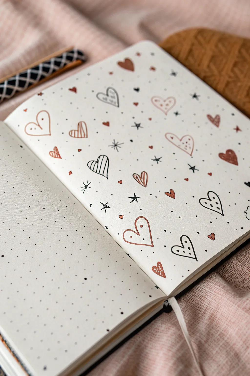
Transform a blank dotted page into a charming canvas of love with this simple yet effective filler pattern. Using a cozy palette of terra cotta and black, this doodle spread adds a touch of warmth to any bullet journal setup.
Step-by-Step Guide
Materials
- Dotted notebook or bullet journal
- Fine liner pen (Black, 0.3mm or 0.5mm)
- Brush pen or marker (Terra Cotta/Muted Pink)
- White gel pen (0.8mm or 1.0mm)
- Pencil and eraser (optional)
Step 1: Setting the Scene
-
Choose your palette:
Select a muted terra cotta or dusty pink marker to contrast with a crisp black fine liner. Swatch them on a scrap piece of paper first to ensure the ink doesn’t bleed through your specific notebook paper. -
Visualize the spacing:
Look at the blank page and imagine a loose grid. You don’t want the hearts to be aligned perfectly; the goal is a random, ‘confetti-toss’ aesthetic.
Oops, Smudged Ink?
If you accidentally smudge a heart, turn it into a ‘shadow’ style doodle by drawing an offset outline around the smudge, or cover it with a slightly larger sticker or washi tape piece.
Step 2: Drawing the Base Hearts
-
Draw outlined hearts:
Start with your black fine liner. Draw several medium-sized hearts scattered randomly across the page. Leave plenty of empty space between them. -
Add colored hearts:
Switch to your terra cotta marker. Draw solid, filled-in hearts of varying sizes—some tiny, some medium—in the gaps between the black outlined hearts. -
Create striped hearts:
Using the black fine liner again, draw a few more heart outlines. Fill these specific hearts with vertical stripes for texture variety. -
Incorporate dual-tone hearts:
Draw a few outline hearts in the terra cotta color. These add a softer touch compared to the stark black outlines.
Step 3: Adding Details & Sparkle
-
Add white highlights:
Once the marker ink is completely dry, use a white gel pen to add small dots or lines inside the solid terra cotta hearts to make them pop. -
Draw simple stars:
With the black fine liner, draw simple four-point or five-point stars (asterisk style) in the larger empty spaces. -
Create starbursts:
For variety, draw a few ‘north star’ shapes—a cross with elongated vertical and horizontal lines. -
Micro-doodling:
Fill the tiny gaps with very small black dots (stippling). I like to cluster two or three dots together in some spots for a more organic feel. -
Draw tiny solid hearts:
Use your colored marker to add the smallest possible hearts (almost like large dots) to fill any awkward white spaces.
Elevate with Metallics
Swap the black stars for a gold or silver metallic paint pen. The shimmer catches the light beautifully and makes the page feel festive for special occasions like Valentine’s Day.
Step 4: Refining the Pattern
-
Review balance:
Step back and look at the spread. Is one area too heavy with black? Add a colored heart there. Too much color? specific a black star. -
Add playful touches:
Pick one or two of the larger black outline hearts and add tiny black dots inside them for a polka-dot effect. -
Add movement:
Draw tiny curved lines or ‘wiggles’ near some of the hearts to give the impression that they are floating or fluttering. -
Check the edges:
Don’t be afraid to draw ‘half hearts’ or partial stars cutting off at the edge of the paper. This makes the pattern look like it continues infinitely beyond the page boundaries. -
Final dry time:
Let the page sit open for a few minutes to ensure the white gel pen and marker layers are fully set before closing your journal.
Now you have a lovely, patterned backdrop ready for quotes or simply to enjoy as art
Simple Mountains Under a Starry Night
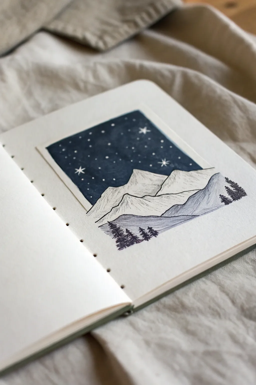
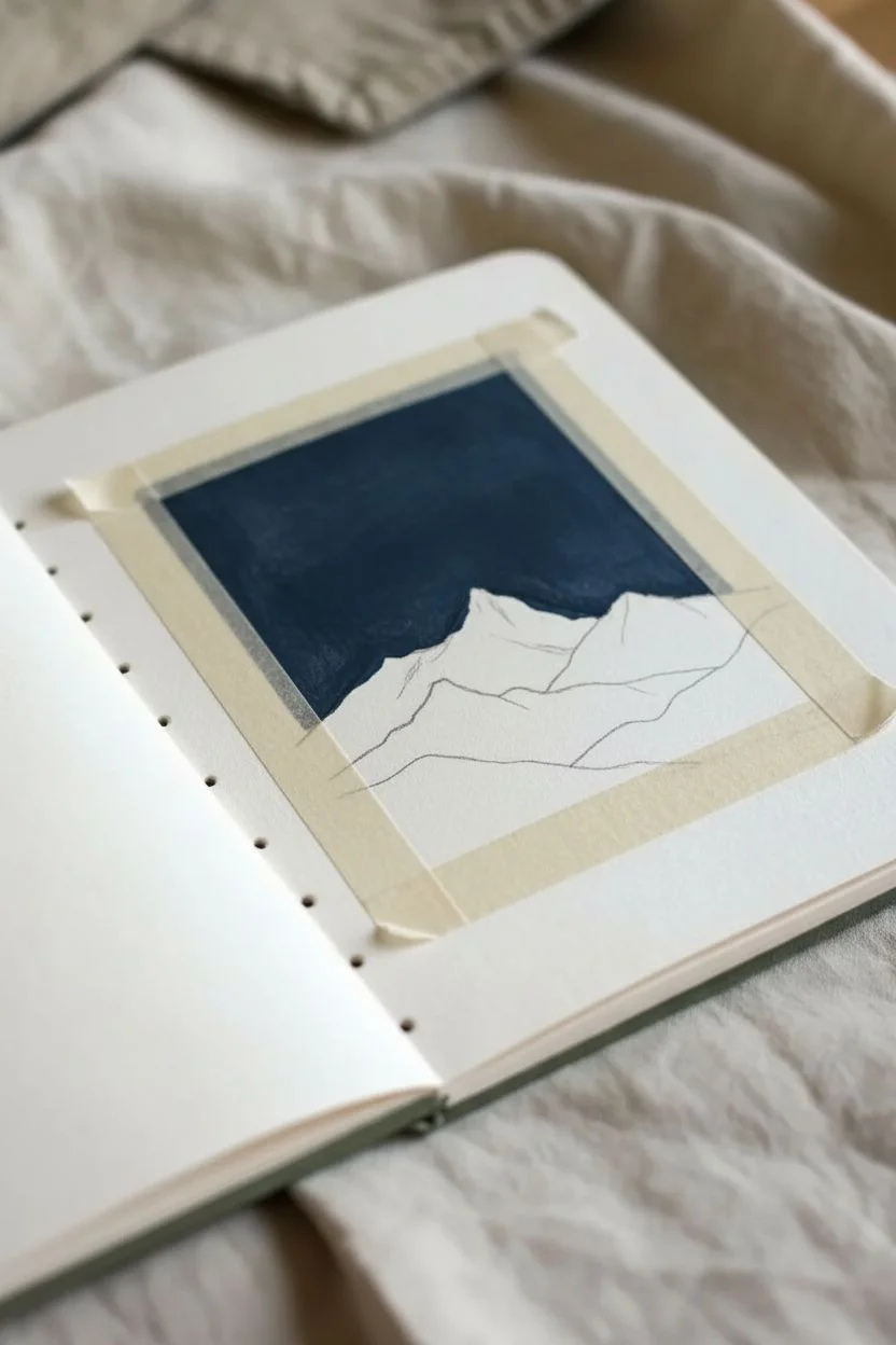
This serene artwork contrasts a deep, velvety night sky against the crisp lines of snow-capped mountains. By using a clever masking technique, you’ll create a perfectly rectangular ‘Polaroid’ effect that makes the scene feel like a captured memory.
Step-by-Step Tutorial
Materials
- Heavyweight sketchbook or mixed media paper
- Deep Prussian Blue gouache or opaque watercolor
- Washi tape or low-tack artist tape
- White gel pen (0.8mm or 1.0mm)
- Fine liner pens (0.1mm and 0.5mm, black)
- Small flat paint brush
- Pencil and eraser
Step 1: Planning & Sky
-
Tape the border:
Begin by deciding the size of your rectangle. Place four strips of washi tape on your page to create a crisp, rectangular frame. Press down firmly on the inner edges to prevent paint bleeding. -
Draft the horizon:
Lightly sketch the outline of the mountain range within the taped area. The peaks should sit in the lower third of the rectangle, leaving ample room for the sky. -
Paint the night:
Load your flat brush with deep Prussian Blue gouache. Carefully paint the sky area, stopping exactly at the pencil line of your mountains. Apply the paint thickly enough to be opaque. -
Dry thoroughly:
Let the paint dry completely. Gouache can smudge easily if damp, so be patient before moving to the next steps.
Bleed Prevention
Before painting, run a fingernail or a bone folder firmly along the tape edge. Painting a thin layer of clear matte medium first seals the edge perfectly.
Step 2: Sketching the Mountains
-
Peel the reveal:
This is the satisfying part—very slowly peel away the washi tape at a sharp angle to reveal your perfect rectangle. -
Outline the peaks:
Using a 0.5mm fine liner, trace over your pencil lines for the main mountain ridges. Extend these lines slightly outside the painted rectangle on the right side to break the frame. -
Add texture lines:
Switch to a finer 0.1mm pen. Draw jagged, vertical lines down the shadowed sides of the mountains to suggest craggy rock faces features. Keep the ‘lit’ sides mostly white to represent snow. -
Draw foreground hills:
Sketch a rolling hill in front of the main peaks. Fill this area with dense, diagonal hatching or stippling to make it appear darker and closer than the distant white mountains.
Uneven Sky?
If your gouache dries streaky, wait for it to dry fully, then apply a second thin coat. Perpendicular brushstrokes help smooth out the texture.
Step 3: Details & Atmosphere
-
Plant the trees:
Using the 0.5mm pen, draw tiny silhouette pine trees along the foreground hill. Start with a vertical line, then use quick, zig-zag scribbles that get wider at the bottom to form the branches. -
Cluster the forest:
Group a few trees together on the far right and left edges, extending them slightly out of the invisible frame just like the mountain slope. -
Add the stars:
Take your white gel pen and dot the blue sky area. Vary the pressure to create different sized distant stars. -
Create major stars:
Select three or four dominant stars and draw tiny crosses or four-pointed shapes to make them twinkle brighter than the rest.
Now you have a striking mountain vista that looks like a window into a quiet, starry world
BRUSH GUIDE
The Right Brush for Every Stroke
From clean lines to bold texture — master brush choice, stroke control, and essential techniques.
Explore the Full Guide
Crescent Moon With Hanging Stars Mobile
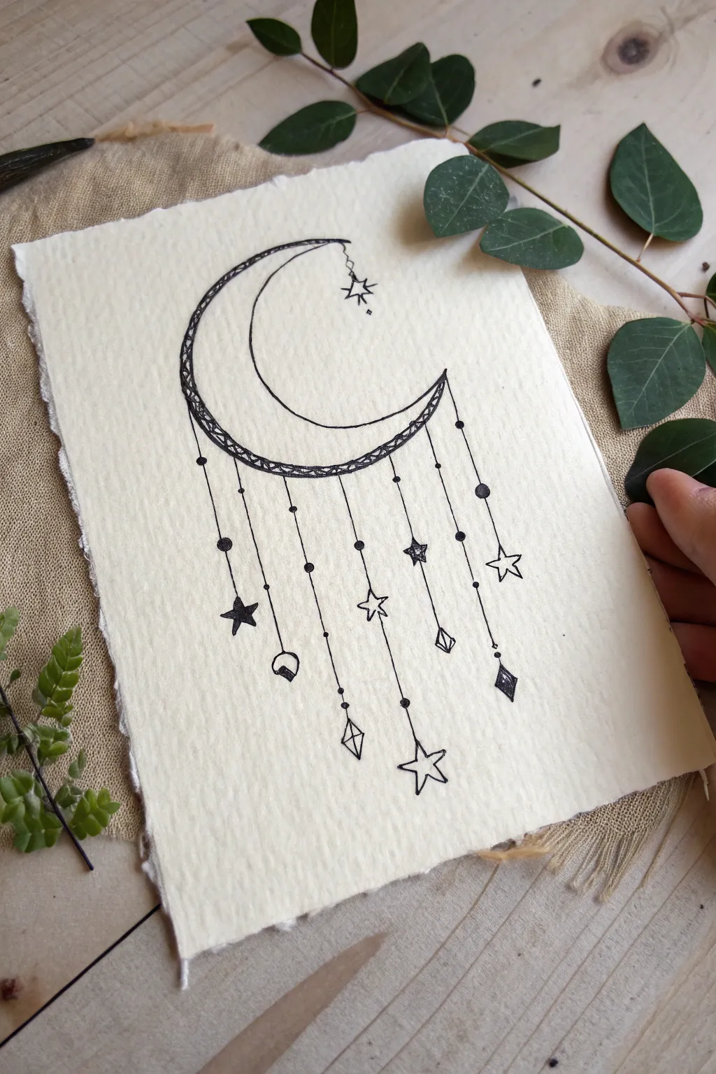
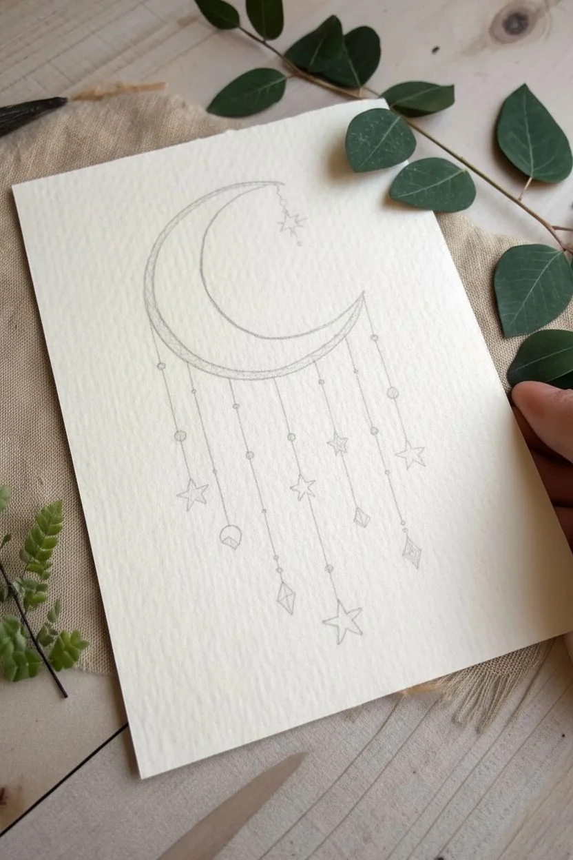
Capture the magic of the night sky with this delicate ink illustration featuring an intricate crescent moon and dangling celestial charms. This minimalist drawing relies on clean lines and balance to create a dreamy, bohemian aesthetic perfectly suited for handmade cards or bullet journals.
Step-by-Step
Materials
- High-quality textured paper (watercolor paper or deckle-edge paper)
- Fine liner pen (01 or 03 size) – black
- Thicker marker or brush pen – black
- Pencil (HB or 2H)
- Eraser
- Ruler
Step 1: Sketching the Framework
-
Outline the moon:
Start by lightly sketching a large ‘C’ shape in the upper center of your paper to form the outer edge of the crescent moon. -
Create the inner curve:
Sketch a smaller, concentric curve inside the first one. Notice how the moon in the reference image isn’t perfectly symmetrical; the bottom part is slightly thicker, giving it a stylized feel. Connect the tips to close the shape. -
Decorate the moon’s spine:
Draw a third curved line running parallel to the outer edge, creating a narrow band along the back of the crescent moon. This strip will house the intricate pattern later. -
Plot the hanging strings:
Using a ruler, lightly draw vertical lines dropping down from the bottom curve of the moon. Vary their lengths significantly—some short, some long—to create an interesting rhythm. Aim for about 6 or 7 main strings.
Ink Control Tip
Pull the pen toward you when drawing long curves like the moon. It is much easier to keep a steady hand pulling than pushing the pen away.
Step 2: Inking the Details
-
Ink the main moon shape:
Take your fine liner pen and carefully trace over the main pencil outlines of the moon. Keep your hand steady for clean, smooth curves. -
Fill the decorative band:
Inside that narrow strip along the moon’s back, draw a zig-zag pattern or a series of small triangles. I find that filling in alternating triangles with solid black adds a nice weight and contrast to the design. -
Add the top charm:
At the very top tip of the moon, draw a tiny chain link and a small open star hanging down. This little details helps balance the composition. -
Trace the strings:
Go over your vertical pencil lines with the fine liner. To make them look like strings, you can add tiny dots or ‘beads’ intermittently along the lines.
Add Some sparkle
Use a metallic gold or silver gel pen to fill inside the open stars or trace the moon’s decorative band for a magical shimmering effect.
Step 3: Drawing the Charms
-
Sketch the star shapes:
At the ends of your strings, sketch a variety of celestial shapes. Include classic five-pointed stars, diamonds, and geometric crystal shapes. -
Add variety to the stars:
Make sure each charm is slightly different. For some stars, draw a simple outline. For others, fill them in completely with black ink for visual weight. -
Create crystal gems:
Draw diamond shapes at the end of two strings. Split them in half with a vertical line or add a small triangle inside to mimic facets. -
Add connecting beads:
Where the string meets the charm, draw a small solid black dot to represent a connecting bead or knot. Add a few extra larger dots along the strings themselves for texture. -
Ink the charms:
Trace over your charm sketches with the fine liner. Be precise with the geometric shapes to keep them looking crisp.
Step 4: Finishing Touches
-
Erase pencil marks:
Wait until the ink is completely dry—this is crucial to avoid smudging—and then gently erase all remaining pencil guidelines. -
Refine the lines:
Look over the drawing for any gaps. If you want the moon’s outline to pop more, re-trace the outer curve once more to slightly thicken the line weight. -
Stipple shading:
To add depth, use your finest pen to add tiny dots (stippling) inside the moon, specifically near the tips and edges. This gives it a subtle, textured look. -
Deckle the edges:
If you are using standard paper but want the look shown in the image, you can carefully tear the edges of the paper using a ruler as a guide to create a faux deckle edge effect.
Display your celestial artwork in a simple floating frame to highlight those lovely torn edges
Butterfly Escaping a Jar Illustration
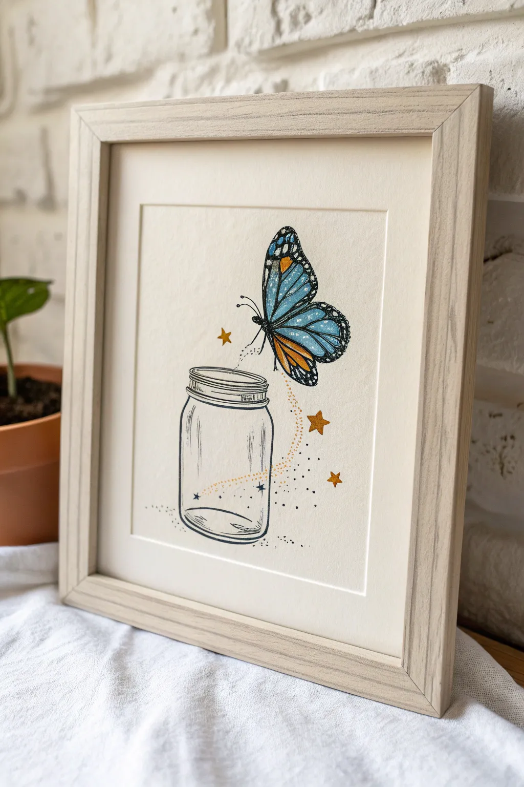
Capture a moment of magical realism with this delicate illustration of a butterfly bursting forth from a mason jar. The whimsical combination of fine-line ink work and soft colored pencil detailing creates a dreamy, vintage-inspired aesthetic perfect for any gallery wall.
How-To Guide
Materials
- Heavyweight drawing paper or mixed media cardstock
- Fine liner pens (black, sizes 01 and 03)
- Pencil (HB or 2B) for sketching
- Eraser (kneaded preferred)
- Colored pencils (Light Blue, Dark Blue, Orange, Yellow-Ocher)
- White gel pen (optional for highlights)
- Ruler (optional)
- Frame with matting (light wood finish)
Step 1: Sketching the Foundations
-
Outline the Jar Shape:
Begin lightly with your pencil. Near the bottom center of your paper, draw a vertical cylinder shape for the mason jar. Keep the sides straight but slightly rounded at the bottom corners. -
Define the Jar Rim:
At the top of your cylinder, sketch a flattened oval for the jar’s opening. Below this, add two narrow bands to represent the screw-top threading where the lid would go. -
Position the Butterfly:
Draw a diagonal axis line extending up and to the right from the jar’s opening. This will be the body line for your butterfly, ensuring it looks like it’s flying away. -
Draft the Wings:
Sketch two large, rounded triangle shapes for the forewings and two smaller, more rounded shapes below for the hindwings. The wings should be lifting upward, not lying flat. -
Add the Magic Trail:
Lightly trace a swirling S-curve path connecting the jar opening to the butterfly’s tail to guide where your magical sparkles will go later.
Uneven Jar Shape?
Don’t stress if your jar isn’t perfectly symmetrical. The ‘hand-drawn’ wobble adds charm. If one side bulges too much, thicken the outline on the opposite side to balance the visual weight.
Step 2: Inking the Details
-
Ink the Jar Outline:
Switch to your 03 fine liner. Trace the main outline of the jar. Use broken, slightly shaky lines occasionally to give it a sketched, organic glass feel rather than a perfect geometric shape. -
Add Glass Reflections:
Using the thinner 01 pen, add vertical curved lines inside the jar, specifically on the left and right sides, to suggest the curvature of distinct glass reflections. -
Detail the Threading:
Ink the rim of the jar with horizontal lines. Add short, diagonal hatching marks on the threads to mimic the texture of the screw top. -
Butterfly Anatomy:
Carefully ink the small, segmented body of the butterfly. Add tiny antennae curving gracefully forward. -
Wing Venation:
Outline the wings with the 03 pen. Then, strictly using the 01 pen, draw the iconic stained-glass vein patterns inside the wings. Leave distinct empty spaces for the color. -
Erase Pencil Guidelines:
Once the ink is completely dry—give it a solid few minutes to avoid smudges—gently erase all your initial pencil sketches.
Step 3: Bringing it to Life with Color
-
Base Wing Color:
Take your Light Blue pencil and fill in the majority of the wing sections. Apply the color softly at first, leaving some paper showing through for texture. -
Deepening the Blue:
Use the Dark Blue pencil to shade the edges of the wing panels, closest to the black veins. This creates dimension and makes the wings look iridescent. -
Adding Monarch Accents:
With the Orange pencil, color the smaller sections near the body and the lower hindwings. Blend the orange slightly into the blue for a unique, fantasy transition. -
Stars and Sparkles:
Along your invisible S-curve trail, draw three distinct five-pointed stars using the Yellow-Ocher pencil. Press firmly so the color pops against the creamy paper. -
Inking the Magic Dust:
Switch back to your 01 pen. Add tiny stippling dots clustering around the stars and the jar opening. Disperse them loosely as they move away from the jar. -
Grounding the Jar:
Add a very subtle shadow under the jar using loose stippling dots and a faint grey or light blue pencil shade to ensure the object doesn’t look like it’s floating in a void. -
Final Highlights:
If you have a white gel pen, add tiny dots to the black edges of the butterfly wings for that classic monarch spotted look, and a small streak on the jar for extra shine.
Level Up: Gold Leaf
For the stars and magic trail, swap the yellow pencil for liquid gold gilding or gold metallic ink. It catches the light beautifully when framed and makes the piece look expensive.
Once framed in light wood, your whimsical butterfly escape is ready to bring a touch of magic to your space


Anime-Inspired Eyes in a Vertical Strip Layout
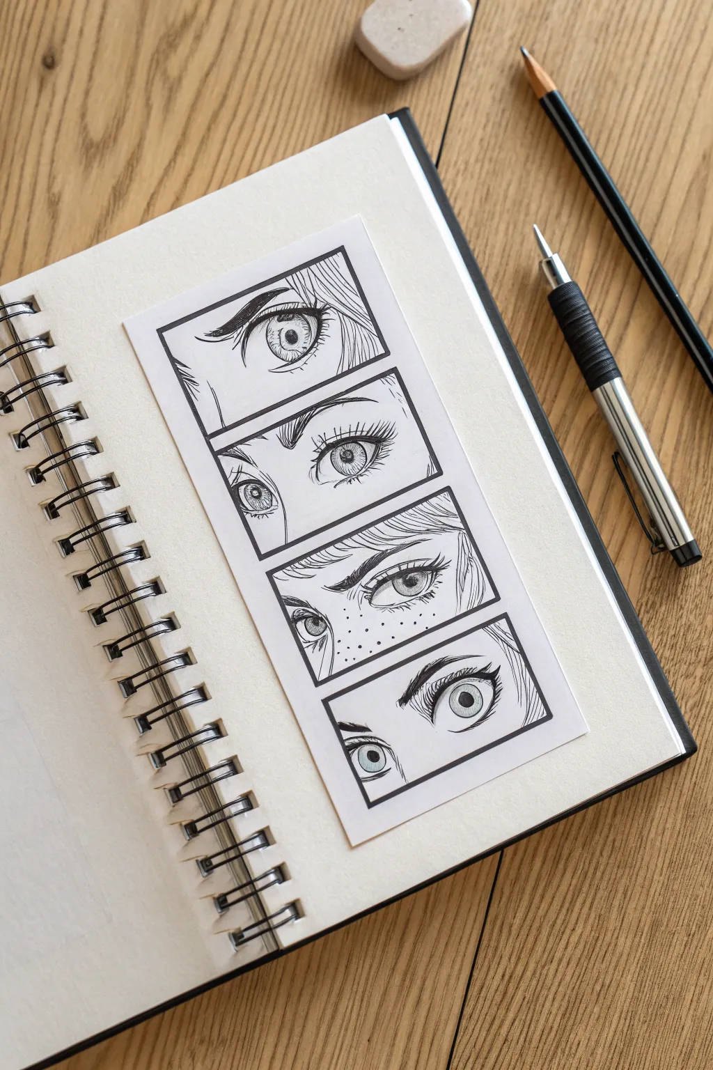

Capture a variety of emotions with this manga-inspired study of eyes, arranged in a cinematic vertical strip. This project focuses on clean linework and expressive details, creating a striking bookmark-style art piece that stands out against the sketchbook page.
Step-by-Step Tutorial
Materials
- Heavyweight drawing paper or cardstock (white)
- Sketchbook
- HB or 2B Graphite pencil
- Kneaded eraser or vinyl eraser
- Fine-liner pens (0.1mm, 0.3mm, and 0.5mm)
- Ruler
- Scissors or craft knife
- Glue stick or double-sided tape
Step 1: Planning and Layout
-
Cut the strip:
Begin by measuring and cutting a rectangular strip of drawing paper or cardstock. A size of about 2.5 inches wide by 6 inches tall works well for a standard sketchbook. -
Draft the frames:
Using your ruler and pencil, lightly draw four equal rectangular boxes stacked vertically. Leave a small, consistent gap of whitespace between each frame to mimic a manga panel layout. -
Outline the box borders:
Once you are happy with the spacing, switch to a 0.5mm fine-liner and ink the borders of the four boxes. Use the ruler to keep lines sharp and straight.
Uneven Eyes?
Drawing matching eyes is tough! Troubleshoot by drawing a horizontal guide line across both eyes for the top and bottom lids to ensure they stay on the same level.
Step 2: Sketching the Expressions
-
Rough placement circles:
Lightly sketch circles where the irises will go in each frame. Vary the positioning—some eyes looking straight, others to the side—to create dynamic storytelling. -
Frame 1: The Focused Gaze:
In the top box, sketch a single, large eye close-up. Draw a sharp, angular upper lash line and a detailed iris with a small pupil. Add a suggestion of hair strands sweeping across the corner. -
Frame 2: Wide-Eyed Surprise:
For the second box, draw a pair of eyes that are wider and rounder. Lift the eyebrows high above the eyes to convey shock or innocence. Sketch the irises so they don’t touch the bottom lid. -
Frame 3: Intense Suspicion:
Create a narrower, more intense look for the third panel. Flatten the upper eyelids and angle the eyebrows down sharply. Add small dots across the nose area to represent freckles for extra character. -
Frame 4: The Candid Look:
In the bottom panel, sketch eyes looking upward and slightly to the left. Focus on thick, curved eyelashes and a soft, wondering expression. I like to keep the eyebrows softer here to contrast with the panel above.
Step 3: Inking and Detailing
-
Inking the lashes:
Switch to a 0.3mm pen. Carefully ink the upper lash lines, making them the thickest part of the drawing. Taper the ends to sharp points for a crisp anime look. -
Detailing the irises:
Use a 0.1mm pen for the delicate details inside the eyes. Draw the pupil in the center, leave a small white circle for the highlight (reflection), and add fine radial lines for the iris texture. -
Adding texture to the skin:
Still using the 0.1mm pen, add the double eyelid creases above the eyes. Stipple the freckles in the third panel and add tiny hatching lines under the brows for shadow. -
Filling the darks:
Go back in with your 0.5mm pen or a brush pen to fill in the pupils and the darkest parts of the eyelashes. This contrast makes the eyes pop. -
Refining hair strands:
Ink the hair strands that overlap into the frames. Use quick, confident strokes so the hair looks flowy rather than stiff. -
Erase guidelines:
Wait at least 5-10 minutes for the ink to dry completely. Gently erase all pencil sketches with a kneaded eraser to avoid smudging your crisp lines.
Level Up: Screentones
Mimic professional manga by adding grey ‘screentone’ shading. Use a light grey marker or faint cross-hatching inside the irises or shadows under the hair.
Step 4: Final Assembly
-
Flatten the strip:
If the paper curled slightly during erasing, press it under a heavy book for a moment to flatten it out. -
Positioning in sketchbook:
Open your sketchbook to a fresh page. Place your finished artwork strip in the center, or slightly angled for a casual look. -
Adhering the art:
Apply glue or double-sided tape to the back of the strip and press it firmly onto the sketchbook page to complete the layout.
Now you have a striking character study that adds a unique layered element to your sketchbook spread
Open Book With Floating Stars and Notes
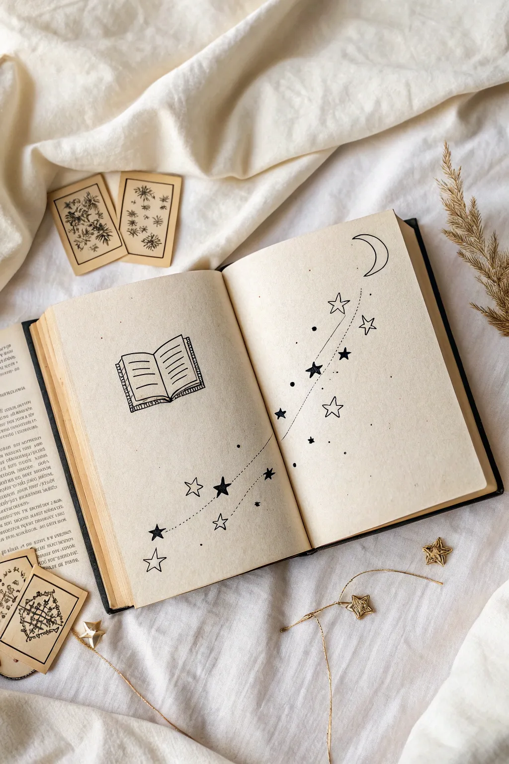
This whimsical journal spread features a charming line-art book releasing a trail of stardust that floats across the pages toward a crescent moon. Its minimalist black-and-white style makes it a perfect, relaxing project for bullet journals or sketchbooks.
Step-by-Step Tutorial
Materials
- Sketchbook or blank journal (cream or white paper)
- Pencil (HB or lighter)
- Eraser (kneaded or soft vinyl)
- Fine-liner pen (0.3mm or 0.5mm, black)
- Ruler (optional, for the book lines)
Step 1: Drafting the Layout
-
Position the spine:
Start on the left page, slightly below the vertical center. Using your pencil, draw a short vertical line for the spine of the miniature book doodle. -
Outline the pages:
From the top of your spine line, curve a horizontal line gently upward and out to the left for the top page edge. Repeat this on the right side. Do the same for the bottom edges, keeping them parallel to the top. -
Connect the sides:
Draw vertical lines connecting the outer ends of the top and bottom curves to form the sides of the pages. Add a ‘text block’ detail by drawing a slightly smaller rectangle shape underneath the bottom curves to show page thickness. -
Add text lines:
Sketch four or five short horizontal lines on each page of the mini-book to suggest written text. -
Sketch the moon:
Move to the top right corner of the right-hand page. Sketch a simple crescent moon shape, tilting it slightly so it looks like it’s watching over the scene. -
Map the star trail:
Lightly draw a swooping S-curve path that starts near the bottom right of the left page, crosses the gutter (the center fold), and ends near the moon. This will guide your stars.
Ink Smearing?
If your eraser smears the ink, switch to a harder lead (2H) for sketching next time, or check if your pen is water-based (slower drying) vs. alcohol-based.
Step 2: Inking the Stars
-
Draw the largest stars:
Along your penciled curve, pick 3 to 4 spots to draw large five-pointed stars. I like to keep these outlines open and simple. -
Add solid stars:
Intersperse solid black five-pointed stars along the path. Make these slightly smaller than the open stars to create visual weight and variety. -
Draw medium stars:
Fill in some gaps with medium-sized open stars. Try to rotate them so they aren’t all pointing the same direction, giving a sense of tumbling motion. -
Ink the book outline:
Trace over your pencil sketch of the book with your fine-liner. Use a steady hand, but don’t worry if the lines have a little organic wobble—it adds character. -
Detail the text:
Ink the horizontal lines inside the book. Add vertical hatching lines to the ‘thickness’ area underneath the pages to suggest a stack of paper.
Step 3: Refining and Connecting
-
Ink the moon:
Carefully trace the crescent moon outline. -
Connect with dots:
Drawing the dotted trail is key. Start near the bottom left star and dot along your pencil guide, weaving in and out of the stars. Let the dots act as the ‘string’ holding the constellation together. -
Add floating specks:
Sprinkle tiny single dots and small solid circles randomly around the main star path. This creates a magical, dusty effect. -
Balance the composition:
Step back and look at the spread. If a noticeable empty space exists along the trail, add a tiny star or a cluster of three dots to fill it. -
Erase guidelines:
Wait at least 5-10 minutes for the ink to dry completely. Gently erase all your pencil marks, holding the paper taut so it doesn’t crinkle.
Add Some Magic
Use a metallic gold or silver gel pen to fill the open stars or trace the dotted line for a subtle sparkle that catches the light.
Now you have a serene, celestial illustration that turns a blank page into a story of its own
Minimal Face Profile With One Flower Detail
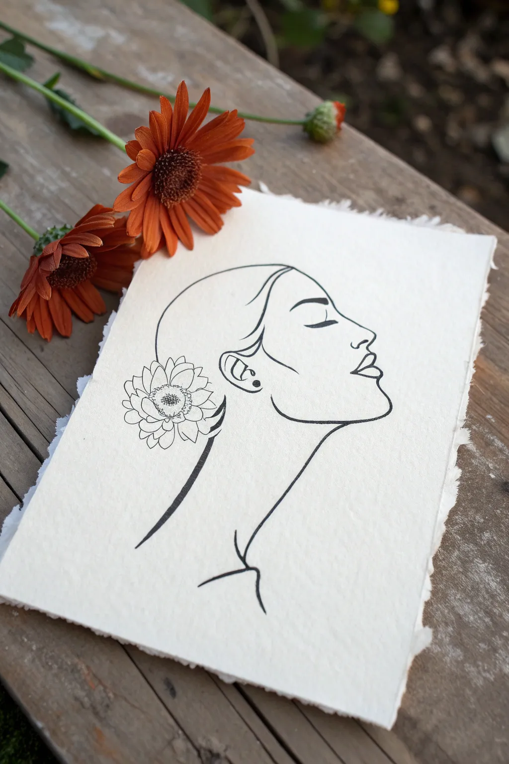
Capture the serene beauty of a minimal line art portrait paired with delicate floral details. This project balances bold ink strokes with the soft texture of handmade paper, creating a timeless and elegant artwork.
How-To Guide
Materials
- Thick cotton watercolor paper or handmade paper (300gsm)
- Fine liner pen (0.1mm or 0.3mm, black)
- Felt tip pen or marker (medium thickness, black)
- H lead pencil
- Kneadable eraser
- Ruler (optional)
- Real flower (gerbera daisy) for reference
Step 1: Planning the Profile
-
Paper Preparation:
Start by selecting a high-quality piece of thick, textured paper. If your paper has straight edges, you can carefully tear them against a ruler’s edge to create that organic, deckled look seen in the photo. -
Initial Sketching:
Using your H pencil, lightly map out the general shape of the head. Draw a gentle curve for the cranium and a sweeping line for the neck to establish placement. -
Profile Guidelines:
Sketch the forehead, nose, lips, and chin. Keep your pressure extremely light so these lines can be erased later without damaging the paper’s texture. -
Refining Features:
Define the slope of the nose and the fullness of the lips. The mouth should be slightly parted or relaxed, and the chin should round gently into the jawline. -
Neck and Shoulders:
Extend the neck line downwards, curving slightly outward to suggest the start of the shoulder and collarbone area.
Smooth Lines Pro-Tip
For the long profile lines, lock your wrist and move your entire arm from the shoulder. This creates much smoother, less shaky curvse than drawing with just your fingers.
Step 2: Adding Details
-
Flower Placement:
Instead of a complex ear, sketch a large, open blossom over the ear area. Start with a central circle for the disk florets. -
Petal Structure:
Draw two layers of petals radiating from the center. Make the inner petals slightly smaller and the outer ones larger and more rounded, mimicking a daisy or chrysanthemum. -
Hairline Flow:
Draw the hairline starting from the forehead, sweeping back behind the ear (and under the flower), and gathering at the nape of the neck. -
Facial Features:
Mark the position of the closed eye with a curved line and add the eyebrow above it. Add a small ‘C’ shape for the ear detail peeking out from the hairline if visible.
Step 3: Inking the Artwork
-
Outline the Profile:
Switch to your medium thickness black marker. Confidently trace the profile line from the forehead down to the chin. -
The Necklace Line:
Continue that bold line down the front of the neck. I like to lift my pen slightly at the end to taper the line naturally as it reaches the collarbone. -
Hair and Nape:
Ink the sweeping curve of the hair and the back of the neck with the same medium marker, ensuring a smooth, continuous flow. -
Switching Pens:
Change to your finer 0.1mm or 0.3mm pen for the intricate details. Use this for the eye, eyebrow, and the flower. -
Detailing the Flower:
Carefully ink the flower petals. Use broken or lighter lines for the inner texture of the flower center to give it depth without overwhelming the minimalism. -
Final Touches:
Add the small earring detail (a simple dot and curve) and the subtle collarbone lines at the base of the neck using the thinner pen.
Level Up: Gold Leaf
Add a touch of luxury by applying a tiny bit of gold leaf to the center of the flower or the earring. It catches the light beautifuly against the matte black ink.
Step 4: Finishing
-
Erase Guidelines:
Wait at least 15 minutes for the ink to fully dry. Then, gently roll a kneadable eraser over the drawing to lift the pencil marks. -
Clean Up:
Check for any stray pencil graphite caught in the texture of the paper and dab it away.
Display your new minimal masterpiece near a window or with fresh flowers to emphasize the connection between nature and art
Framed Circle Vignette of a Tiny Landscape
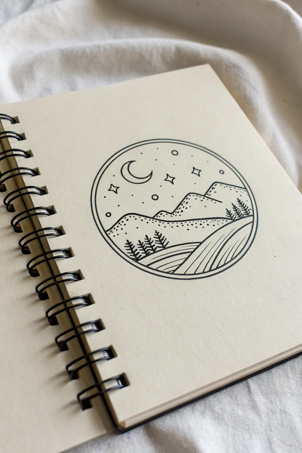
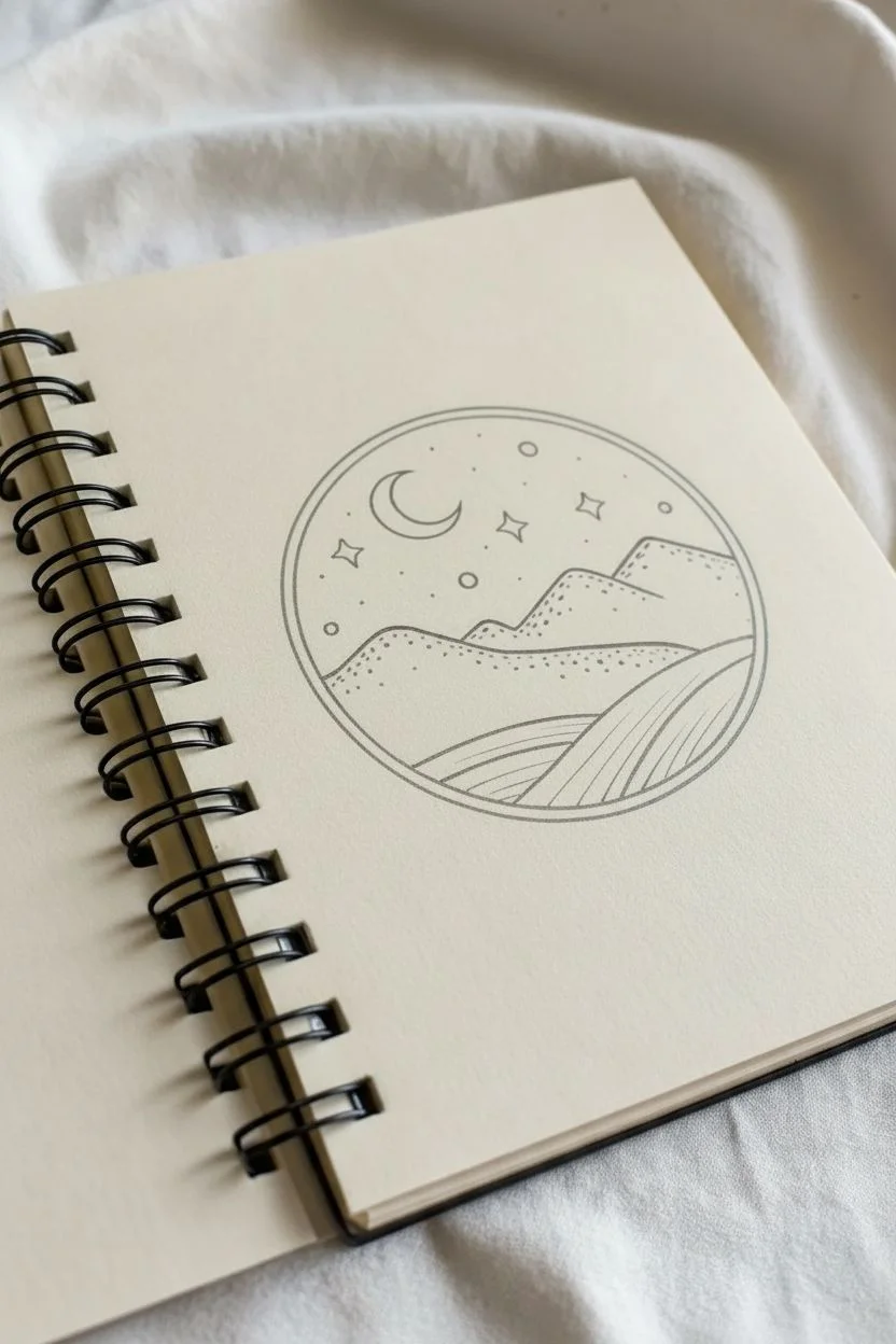
Capture the serenity of a starry night with this simple yet striking line art doodle. Using clean lines and stippling techniques, you’ll create a miniature world contained perfectly within a circular vignette.
Step-by-Step Tutorial
Materials
- Sketchbook or quality drawing paper
- Compass or a circular object to trace (like a jar lid)
- Pencil (HB or 2B)
- Eraser
- Fine liner pen (01 or 03 size)
- Thicker marker or pen (05 or 08 size) for the border
Step 1: Setting the Scene
-
Draw the boundary:
Begin by drawing a perfect circle in the center of your page. Use a compass for accuracy, or lightly trace around a circular object like a wide drinking glass or jar lid with your pencil. -
Draft the horizon lines:
Lightly sketch two rolling hills in the middle ground. The one on the left should be slightly lower, and the one on the right should peak higher, creating a valley where they meet. -
Add the foreground fields:
Below the hills, draw two curving lines that sweep from the bottom right edge toward the center left. This divides the foreground into sections for the fields. -
Place the celestial elements:
In the upper expanse of the sky, sketch a crescent moon on the left side. Scatter a few small four-pointed stars and tiny circles around it to plan the night sky layout.
Step 2: Inking the Landscape
-
Outline the main shapes:
Switch to your fine liner pen. Carefully trace over your pencil lines for the hills and the field divisions. Keep your hand steady to ensure smooth, continuous curves. -
Detail the distant mountains:
Behind your initial hills, draw a jagged, more angular line for a distant mountain range. Don’t close the bottom of these shapes; let them disappear behind the mid-ground hills. -
Draw the pine trees:
Add three small pine trees on the bottom left slope and three on the right slope. Use a simple vertical line for the trunk and short, downward-angled dashes for the branches. -
Ink the sky:
Go over the moon and star outlines. For the four-pointed stars, draw concave curves connecting four points. Add tiny dots randomly in the sky for distant stardust.
Wobbly circle fix
If your freehand circle looks uneven, don’t restart. Thicken the outer line significantly to mask imperfections, turning the wobble into a deliberate style choice.
Step 3: Adding Texture and Depth
-
Stipple the mountains:
Using the tip of your fine liner, add stippling (dots) to the mountains. Focus the density of dots near the peaks and let them fade out as you go down, creating a shadowed effect. -
Add texture to the hills:
Do the same for the rolling hills, placing dots along the top ridges. I find that keeping the dots lighter here helps separate them visually from the jagged mountains behind. -
Line the fields:
Fill the bottom field sections with varying lines. For the bottom-left patch, use horizontal slightly curved lines. For the right patch, use long, sweeping vertical curves that follow the land’s contour. -
Solidify the pine trees:
Go back over your pine trees, thickening the branches slightly to make them stand out as solid silhouettes against the line-work of the hills.
Make it moodier
For a darker night scene, fill the entire sky area with black ink instead of leaving it white, leaving the moon and stars as white negative space.
Step 4: Final Touches
-
Thicken the frame:
Take your thicker marker or pen and trace the main outer circle. You can go around it twice or simply press harder to create a bold, definitive border. -
Create the inner border:
Using a thinner pen, draw a second circle just inside the thick one. This double-line effect gives the drawing a finished, badge-like appearance. -
Erase guidelines:
Wait at least five minutes to ensure all ink is completely dry. Gently erase all remaining pencil marks, being careful not to smudge the heavy black ink of the border. -
Review contrast:
Take a look at the balance of white space and black ink. If the mountains look too pale, add a few more dots to deepen the shadows.
Now you have a serene little window into a mountain landscape to decorate your journal
Celestial Doodles as Bullet Journal Page Borders
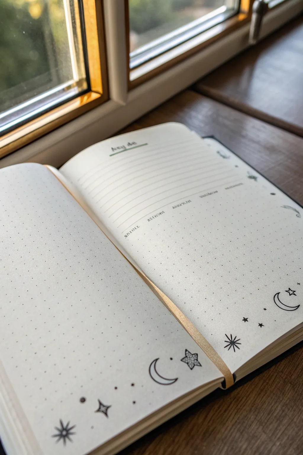
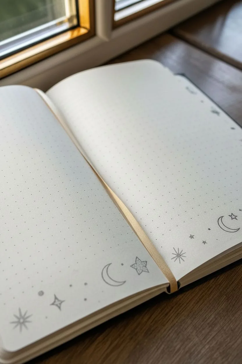
Transform your bullet journal layout into a dreamy night sky with these simple yet enchanting celestial borders. Using minimalist line art, you’ll create a soothing frame of crescent moons, twinkling stars, and cosmic dots that adds magic without overcrowding your writing space.
Step-by-Step
Materials
- Dotted grid journal or notebook
- Fine liner pen (black, 0.3mm or 0.5mm)
- Pencil (HB or H)
- Eraser
- Ruler (optional, for spacing)
Step 1: Planning the Layout
-
Define the border area:
Visualize where your doodles will sit on the page. For this layout, we are focusing on the bottom edge of the left page and wrapping around the bottom and right edge of the right page. You can lightly mark a 1-inch thick boundary with a pencil to keep your drawings contained. -
Sketch anchor elements:
Start by sketching the largest shapes first to balance the visual weight. Use your pencil to lightly draw a few crescent moon shapes spaced out along the bottom border area. Aim for about two moons per page width so it doesn’t look cluttered. -
Add primary stars:
In the spaces between the moons, sketch medium-sized five-pointed stars or diamond shapes. Don’t worry about making them perfect; a little asymmetry adds to the hand-drawn charm.
Step 2: Inking the Celestial Shapes
-
Outline the moons:
Take your fine liner pen and carefully trace over your pencil sketches of the crescent moons. I prefer to keep the lines crisp and unconnected, but you can double-line them if you want a bolder look. -
Draw open stars:
Ink the five-pointed stars you sketched. You can leave them as simple outlines to keep the page feeling airy and light. -
Create starbursts:
Add variety by drawing ‘starbursts’—simple asterisks with 6-8 lines radiating from a center point. Place these near the corners or between larger doodle groups. -
Add detail to the moons:
To give the moons some depth without heavy shading, you can add a single fine line following the inner curve of the crescent, stopping halfway, or fill them in with a delicate dot pattern (stippling).
Wobbly Lines?
If your stars look uneven, switch to drawing simple diamonds or circles instead. They are easier to control and still look very celestial when grouped with dots.
Step 3: Adding the magic dust
-
Fill the gaps:
Now, look for the larger empty spaces between your main drawings. Fill these with smaller, four-pointed sparkles (like a thin cross shape). -
Sprinkle the dots:
This step brings the whole look together. Randomly place single dots around the moons and stars using the tip of your pen. Group them in tiny clusters of two or three to simulate distant galaxies. -
Extend the border:
On the right-hand page, carry these small dots and tiny sparkles up the side of the page, creating a fading effect where the doodles get sparser as they go higher. -
Clean up:
Wait at least 5-10 minutes to ensure the ink is completely dry to the touch. Then, gently erase all your underlying pencil sketches to reveal the crisp black ink.
Add some sparkle
Use a silver or gold gel pen to fill in the moons or trace over the starbursts. The metallic shine catches the light and elevates the magical theme.
Step 4: Optional: Functional Header
-
Set up the header lines:
If you want to recreate the structured section on the right page, use a ruler to draw straight horizontal lines near the top. Leave a slightly larger gap at the very top for a title. -
Label the section:
Write your header (like ‘Key’ or ‘Notes’) in a simple script font, perhaps adding a small colored underline with a highlighter to match the minimalist vibe. -
Add sub-headers:
Below the main lines, add small text labels like ‘Monday’, ‘Tuesday’, etc., spacing them out evenly across the width of the text block.
Now you have a serene, starry layout ready to fill with your weekly plans or thoughts.
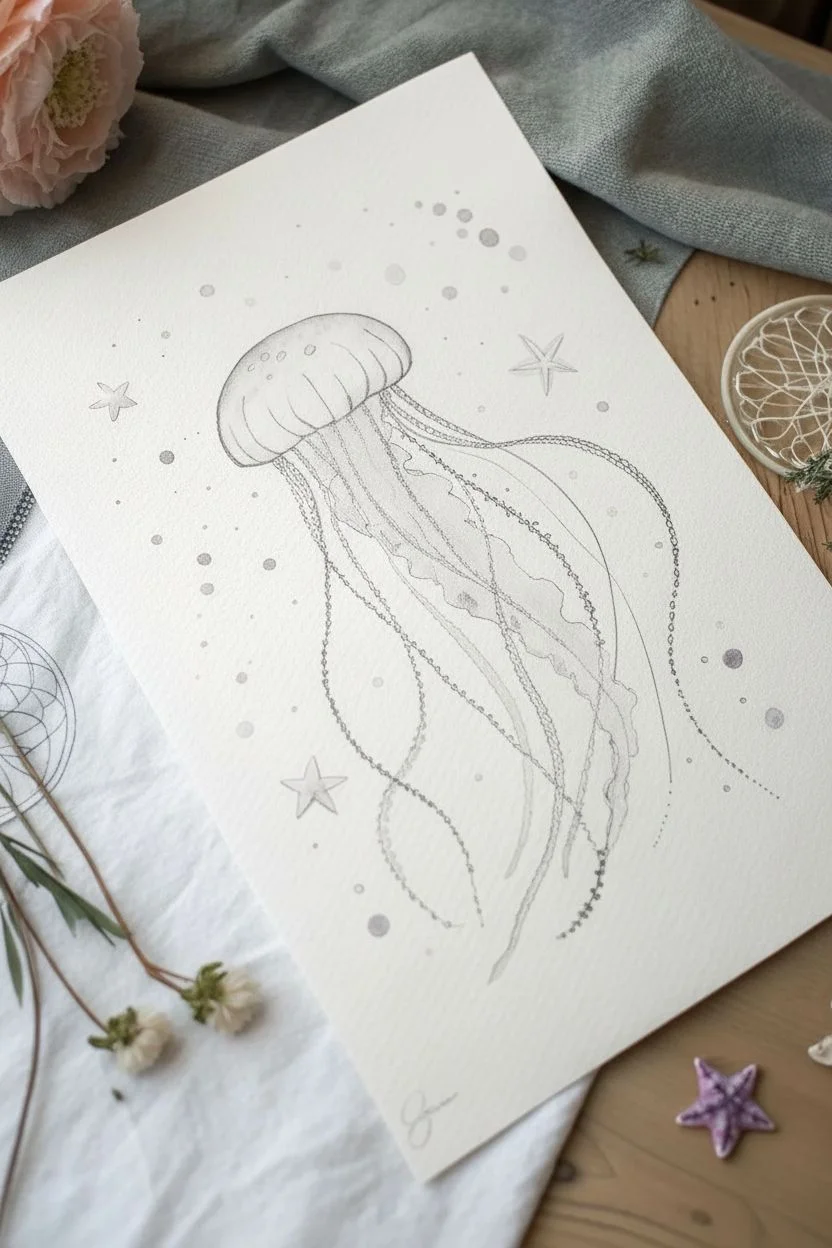
Dreamy Jellyfish Floating Through Space
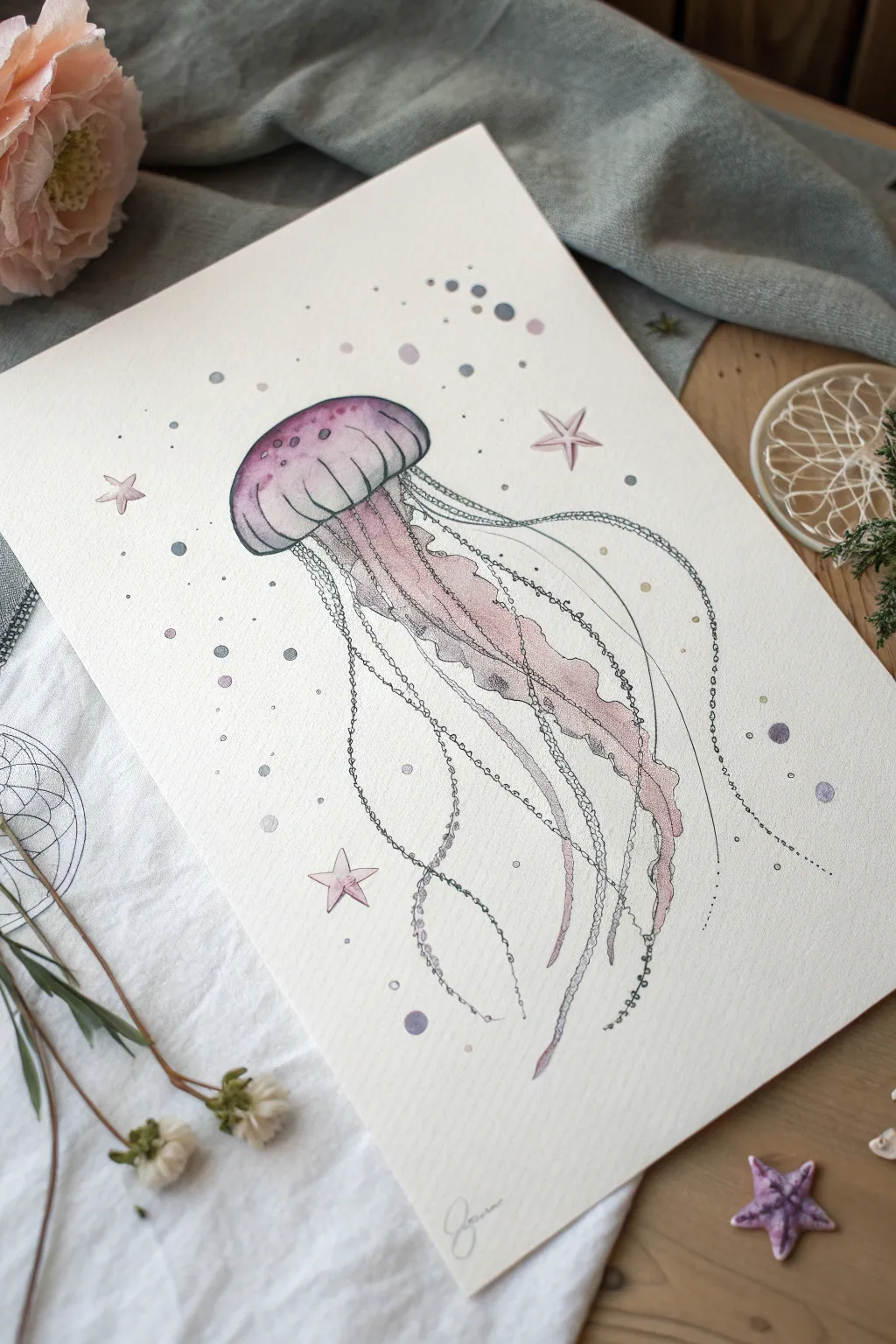
Blend the mysteries of the deep sea with the vastness of space in this delicate watercolor and ink illustration. This piece combines soft, gradient washes with precise line work to create a translucent, dreamlike jellyfish surrounded by celestial elements.
How-To Guide
Materials
- Cold press watercolor paper (A4 or similar size)
- Watercolor paints (Purple, pink/magenta, indigo/blue)
- Fine liner pens (Black, 0.1mm and 0.3mm)
- Round watercolor brushes (Size 4 and Size 0 or 1)
- Pencil (HB) and kneadable eraser
- Clean water and paper towels
- White gel pen or gouache (optional)
Step 1: Sketching the Form
-
Outline the bell:
Start near the upper third of your page by lightly sketching a wide, curved mushroom cap shape for the jellyfish’s bell. Keep your pencil pressure extremely light so the graphite doesn’t show through the watercolor later. -
Add structure:
Draw faint vertical curved lines within the bell to indicate its segmented ribs. This gives the flat shape 3D volume. -
Map the tentacles:
Sketch long, flowing S-curves extending downwards from beneath the bell. Create a mix of thicker, ribbon-like oral arms in the center and thin, wispy tentacles on the outside. -
Add celestial details:
Scatter a few small five-point stars around the jellyfish and mark positions for bubbles or ‘planets’ with small circles.
Ink Smearing?
If your pen lines bleed into the paper, the paint wasn’t fully dry. Wait until the paper feels cool to the touch, not cold or damp. Test dryness with the back of your hand.
Step 2: Painting the Wash
-
Wet-on-wet bell:
Using your size 4 brush, apply clean water to just the inside of the jellyfish bell. While wet, drop in a light wash of purple at the top edge, letting it bleed downwards. -
Gradient effect:
While the purple is still damp, introduce a soft pink or magenta at the bottom rim of the bell. Tilt your paper slightly to encourage the colors to blend seamlessly in the middle. -
Ribbon arms base:
Paint the central, thicker tentacles with a very pale, watery wash of pink and purple. Keep these shapes loose and translucent. -
Painting the stars:
Fill in your sketched stars with a diluted pink wash. I like to keep the centers slightly lighter to make them look glowing. -
Atmospheric bubbles:
Paint the scattered circles with varying shades of blue, grey, and purple. Make some solid and others just faint rings of color. -
Dry completely:
Allow the paper to bone-dry before touching it with ink. Use a hairdryer on a low setting if you are impatient.
Step 3: Adding Ink Definition
-
Outline the bell:
Using a 0.3mm fine liner, trace the outer contour of the jellyfish bell. Break the line occasionally to keep the look organic. -
Detail the ribs:
Draw the internal curved lines within the bell using a thinner 0.1mm pen. Add small stippling (dots) near the top of the bell for texture. -
Define the ribbon arms:
Outline the pale pink central arms with a wavy, irregular line. Add internal creases and folds to show movement. -
Draw wire-like tentacles:
For the outer tentacles, draw long, sweeping lines. Instead of a solid line, try drawing tiny, connected elongated loops or ‘chain’ links to give them a textural, spine-like appearance. -
Create fine filaments:
Add extremely fine, single-line threads floating outwards using your thinnest pen. Let these cross over the other shapes. -
Inking the surroundings:
Outline the stars and the larger bubbles. Use stippling to add shading to one side of the bubbles to make them look spherical. -
Final dot work:
Add tiny clusters of ink dots (stippling) around the jellyfish and stars to simulate space dust or sea foam.
Level Up: Magic Sparkle
Once the ink is dry, use a white gel pen to add tiny highlights on the darkest parts of the purple bell and the edges of the ribbon tentacles for a bioluminescent glow.
Now you have a serene, floating creature ready to frame or gift
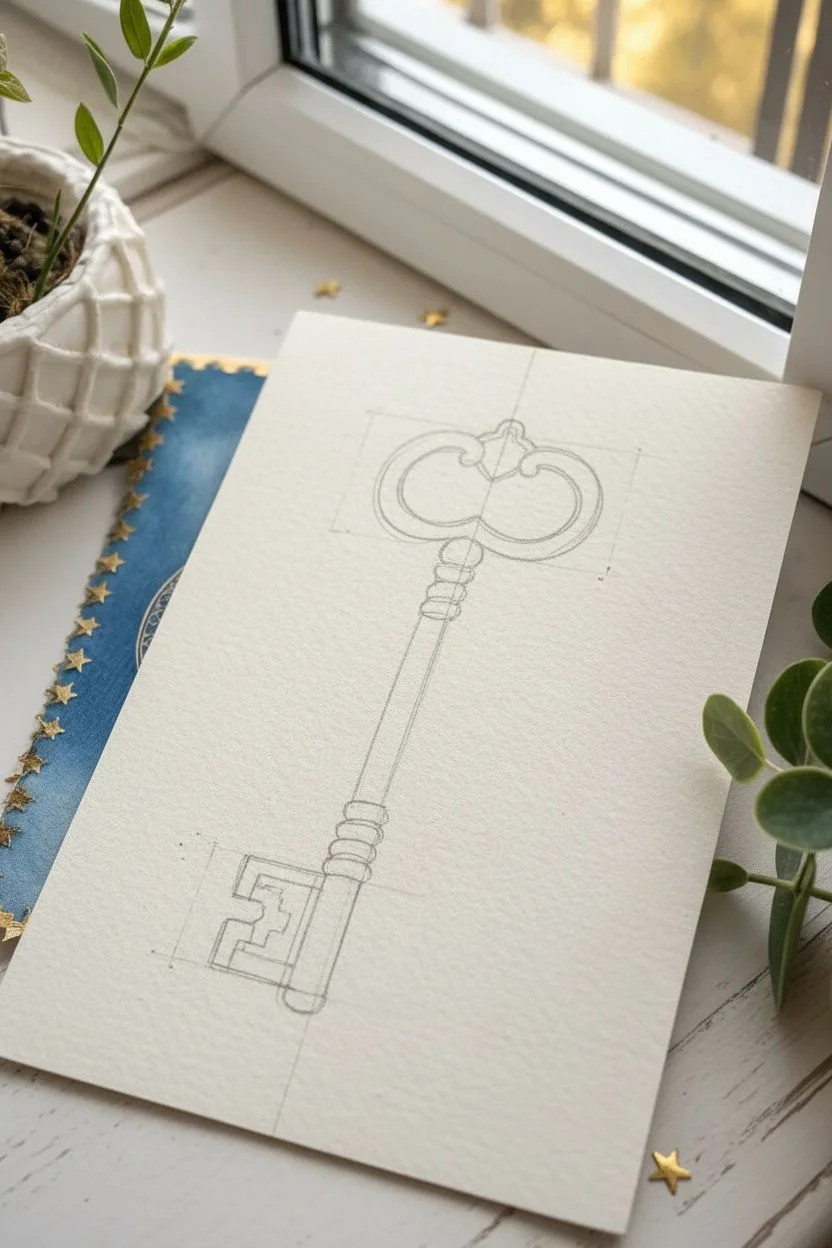
Everyday Object Made Magical With Sparkle Accents
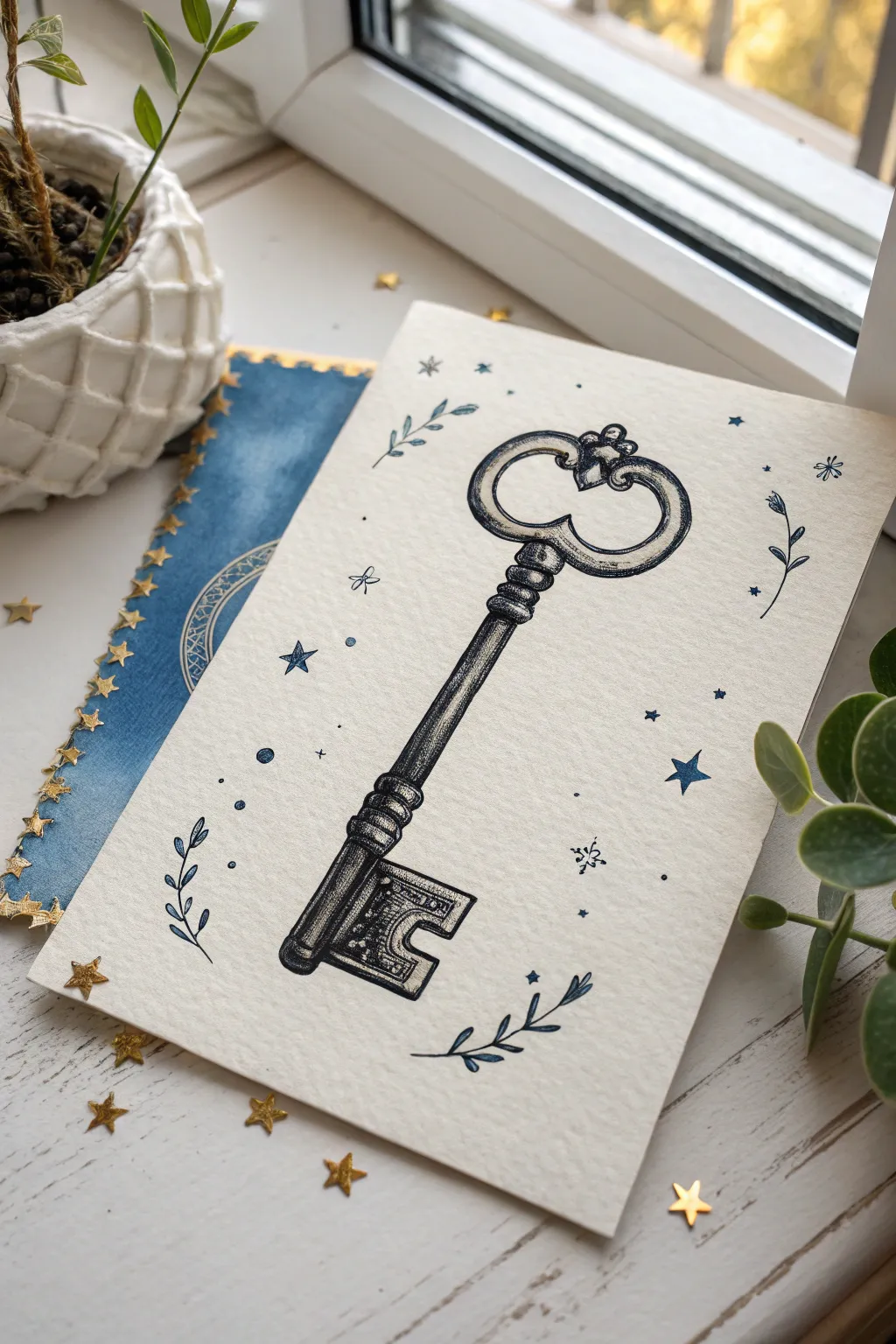
Transform a simple antique key into a mystical artifact with this delicate ink illustration. Using fine stippling and celestial motifs, you’ll create a drawing that feels like a page torn from a wizard’s field guide.
Step-by-Step Guide
Materials
- Heavyweight watercolor paper or mixed media cardstock (textured)
- Pencil (HB or H)
- Kneaded eraser
- Fine liner pens (sizes 005, 01, and 05; black or dark sepia)
- Metallic gel pen (gold or silver) or fine metallic paint marker
- Ruler
- Blue watercolor paint or blue colored pencil (optional, for accents)
Step 1: Drafting the Structure
-
Establish the centerline:
Begin by lightly drawing a vertical line down the center of your paper with a ruler. This is crucial for symmetry, especially for the key’s shaft and bow handle. -
Sketch the handle (bow):
At the top of your centerline, sketch the bow of the key. Start with a simplified heart or double-loop shape. Keep your pencil pressure very light so these lines can be erased later. -
Draw the shaft and collar:
Extend two parallel lines down from the handle to create the shaft. Just below the handle, sketch a few small rings or ridges to form the decorative ‘collar’ of the key. -
Shape the bit:
At the bottom end, block out the rectangular shape of the key’s bit (the part that turns the lock). Add a small cutout notch in the center of the rectangle to give it that authentic skeleton key look. -
Refine the outline:
Go back over your draft and curve the edges. Soften the transition between the collar and the shaft, and add a decorative trefoil or small crown shape to the very top of the handle.
Pro Tip: Lighting Logic
Decide where your light source is (e.g., top left) before shading. Keep all highlights on the left and shadows on the right for a consistent 3D effect.
Step 2: Inking the Details
-
Trace the main outline:
Switch to your 05 or 03 fine liner. Carefully trace the outer perimeter of the key. I prefer to break the line slightly in a few places to give it an aged, imperfect character rather than a stiff mechanical look. -
Add dimension to the collar:
use a thinner 01 pen to draw the rings of the collar. Add curved hatch lines on the sides of these rings to show their rounded volume. -
Texture the shaft:
drawing a key isn’t just about outlines; it’s about texture. Use vertical hatching lines down the length of the shaft to simulate brushed metal. Leave a thin strip of white space near the left side to act as a highlight. -
Stippling shadow:
Switch to your finest pen (005). Add tiny dots (stippling) on the right side of the shaft and the interior edges of the handle loops. This builds up a soft shadow that makes the key look 3D. -
Detailing the bit:
Fill in the darker recesses of the key’s bit with dense cross-hatching. Draw a few inner rectangular lines to suggest depth and complexity in the metalwork. -
Erase pencil lines:
Wait at least 5-10 minutes for the ink to dry completely. Gently use your kneaded eraser to lift away the graphite guide lines. Rubbing too hard can smear fresh ink, so be patient.
Troubleshooting: Wobbly Lines
If your long lines on the shaft are shaky, don’t worry. Add more vertical texture lines or stippling over the wobble to disguise it as antique metal texture.
Step 3: Celestial Embellishments
-
Draw the stars:
Scattered around the key, draw various stars using your 01 pen. Create a mix of five-pointed stars, tiny diamonds, and simple dots. -
Add delicate foliage:
Draw four small sprigs of leaves framing the key—two near the bottom left and right, and two near the top. Keep the leaves simple and open; don’t fill them in solid black. -
Apply metallic accents:
Using your metallic gel pen or marker, carefully fill in the stars. You can also add a thin line of gold along the highlighted side of the key shaft to make it shimmer. -
Color the leaves (optional):
If you want the subtle blue look from the reference, use a very dry watercolor brush or a colored pencil to gently tint the leaves and a few of the stars in a muted navy blue. -
Final touches:
Add a few extremely small dots or ‘dust’ around the stars to connect the elements. Use a gold star sticker or loose glitter on the table for styling if you plan to photograph your work.
Now you have a magical key illustration ready to be framed or pasted into a fantasy journal
Aesthetic Quote in Hand Lettering With Tiny Icons

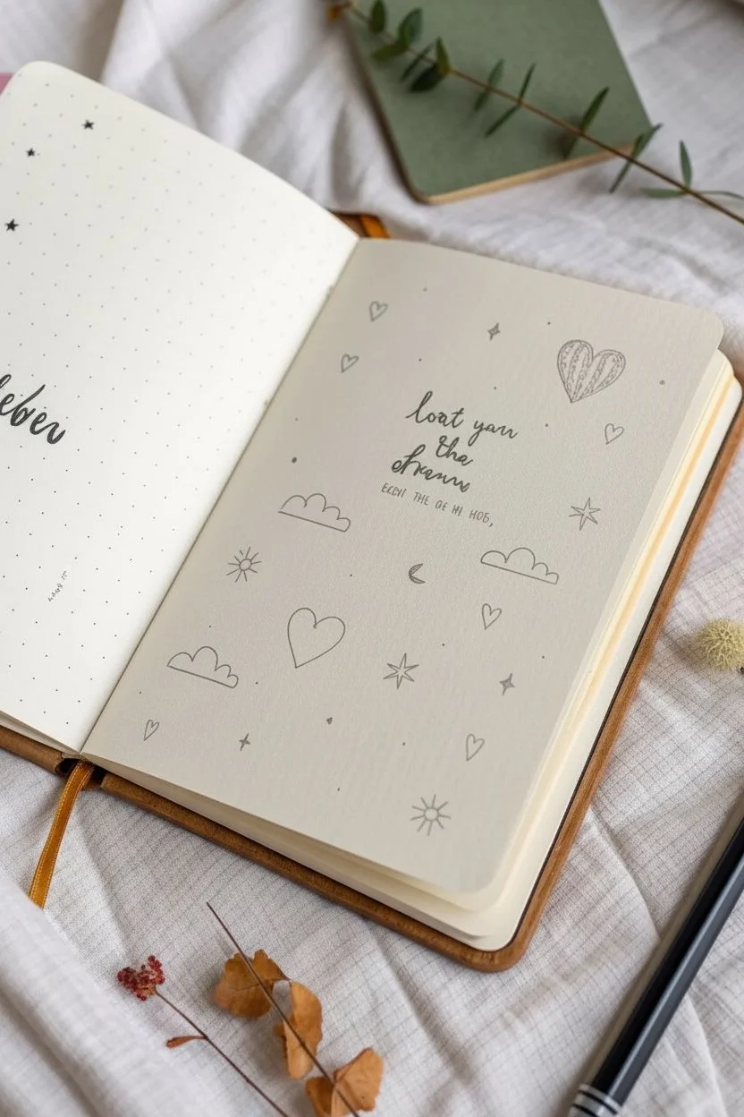
Capture a dreamy, minimalist aesthetic with this bullet journal spread that combines elegant hand lettering with scattered, simplistic icons. It’s the perfect way to practice your calligraphy while filling a page with charming little doodles of clouds, hearts, and celestials.
Step-by-Step
Materials
- Dotted grid journal or heavy stock sketchbook
- Fine liner pen (0.3mm or 0.5mm, black)
- Brush pen (small tip, black)
- Pencil (HB or 2B)
- Eraser (kneaded preferred)
- Ruler (optional, for centering)
Step 1: Planning and Layout
-
Find the center:
Begin by gently marking the vertical and horizontal center of your page with a pencil. This will serve as the anchor point for your main quote. -
Draft the quote:
Using your pencil, lightly sketch out a short, meaningful phrase in the center. Use a cursive, flowing style for lines like ‘lost in’ or ‘love you,’ and perhaps a slightly different weight for emphasis words. Keep the lettering loose and bouncy rather than rigid. -
Sketch the primary icons:
Around the quote, lightly sketch the larger icon elements first. Place a detailed heart or balloon shape in the upper right corner and a few fluffy cloud outlines floating in the open spaces on the left and bottom right. -
Fill the gaps:
In the remaining empty areas, pencil in smaller motifs like scattered hearts, simple stars, a crescent moon, and little sunbursts. Aim for a balanced, random distribution so the page feels full but not cluttered.
Keep it loose
Don’t try to make your clouds or hearts mathematically perfect. The charm of this aesthetic comes from the slightly wobbly, hand-drawn nature of the lines.
Step 2: Inking the Lettering
-
Trace the downstrokes:
Switch to your brush pen or a slightly thicker fine liner. Carefully go over your pencil sketch for the quote. Apply a bit more pressure on the downward strokes to create that classic faux-calligraphy thickness. -
Refine the upstrokes:
Keep your hand light as you trace the upward strokes, ensuring they remain thin and delicate to contrast with the bold downstrokes. -
Add the subtext:
If your design includes smaller printed text below the main script (like a date or attribution), use a very fine tip pen (0.1mm or 0.3mm) to write this clearly in small block capitals.
Step 3: Drawing the Doodles
-
Ink the clouds:
Using a consistent 0.3mm or 0.5mm pen, outline your cloud shapes. Keep the bottom lines flat and the tops bumpy and round for a stylized look. -
Detail the main heart:
Move to the detailed heart feature in the top right. Outline the shape, then add internal texture by drawing vertical lines or erratic scribbles inside just one half of the heart to give it dimension. -
Draw the celestial bodies:
Ink the sunbursts with a small circle center and radiating straight lines. For the crescent moon, fill it in solid black for a bold pop of contrast against the white page. -
Scattering secondary stars:
Draw the larger stars using a simple four-point or five-point line drawing style. Ensure the points meet crisply in the middle. -
Add tiny fillers:
Go around the page and ink the remaining tiny open hearts. I find that leaving these uncolored keeps the page feeling airy and light. -
Create micro-details:
To make the spread feel truly finished, add very small dots or specks of ink in the largest empty white spaces. These ‘dust motes’ tie the whole composition together.
Add a pop of gold
Use a gold gel pen or metallic watercolor paint to fill in the crescent moon or outline the clouds for a magical, shimmering effect.
Step 4: Finishing Touches
-
Let the ink cure:
wait at least 5 to 10 minutes to ensure every line is completely dry. Brush pens and gel inks can smear easily if erased too soon. -
Erase guidelines:
Gently glide your kneaded eraser over the entire page to lift the graphite sketches. A rolling motion works better than scrubbing to protect the paper texture. -
Review and refine:
Take a step back and look at your composition. If any area looks too empty, simple add a tiny black dot or a miniature heart to balance the visual weight.
Now you have a beautifully balanced journal page that serves as daily inspiration
Surreal Tiny Planet With a Whimsical Companion
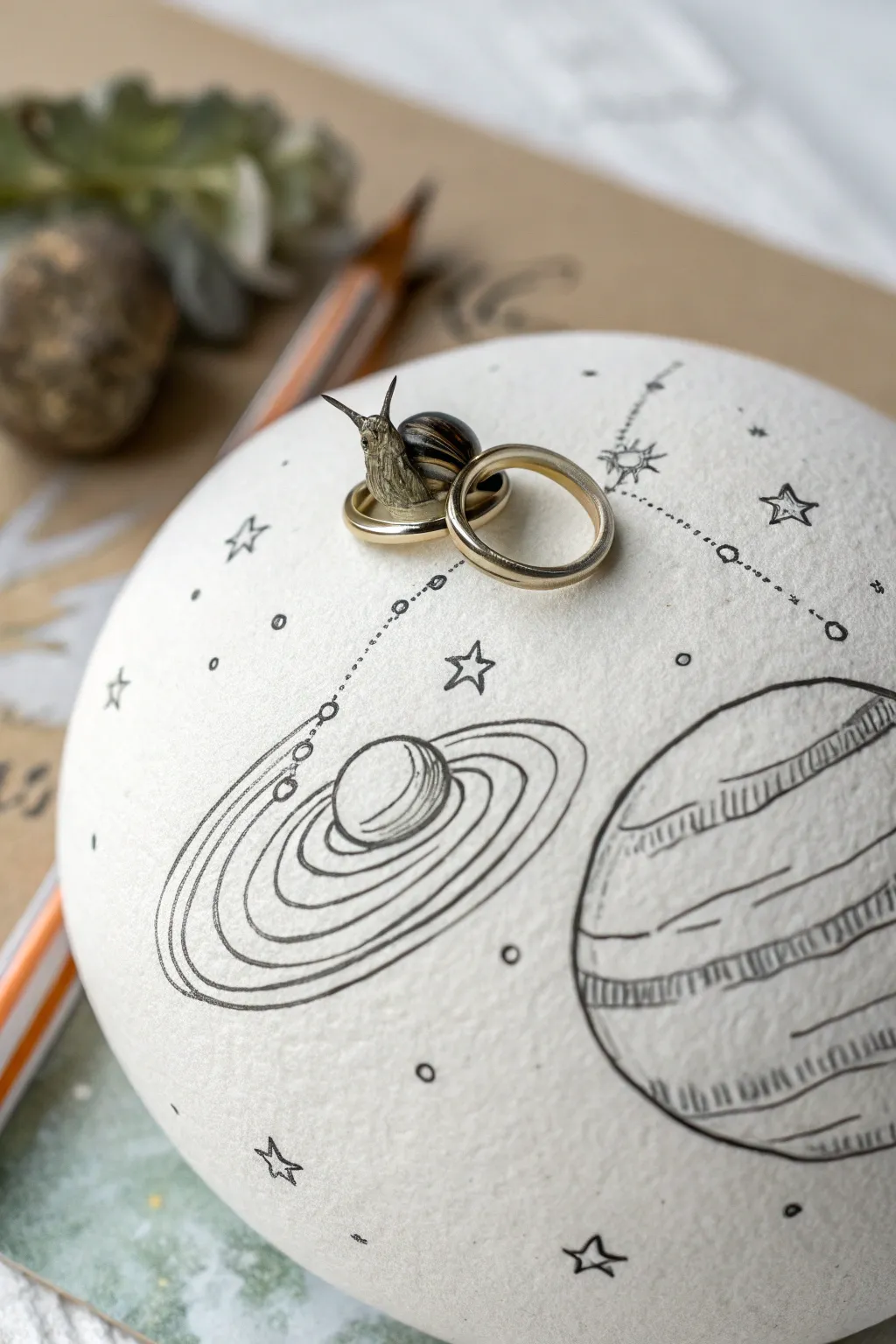
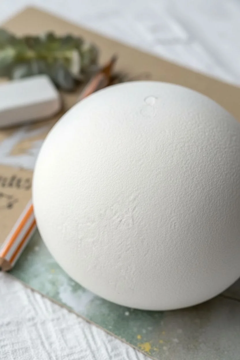
Transform a simple round form into a whimsical celestial body that fits in the palm of your hand. This delicate ink drawing project combines planetary doodles with a touch of miniature surrealism, creating a unique display piece for rings or simply for decoration.
Detailed Instructions
Materials
- Smooth white round stone or paper mache sphere (approx. 3-4 inches diameter)
- Fine liner pens (Black, 0.05mm and 0.1mm tips)
- Pencil (HB or H for light sketching)
- Kneaded eraser
- Small toy snail figurine or a real snail shell
- Super glue or heavy gel medium (optional)
- Two gold rings (for staging)
- Matte spray varnish (optional)
Step 1: Preparing the Canvas
-
Surface selection:
Choose your base carefully. A smooth, river-washed stone works beautifully for weight, but a primed paper mache sphere offers a paper-like texture that takes ink very well. -
Base cleaning:
If using a stone, wash it thoroughly with soap and water to remove oils, then let it dry completely. If using paper mache, ensure the surface is free of dust. -
Initial mapping:
Verify the top center of your sphere where the snail and rings will eventually sit. Mark this spot lightly with your pencil so you know where to build your composition around.
Ink Flow Tip
Drawing on a curved surface can be tricky. Rotate the sphere constantly so your hand stays in a comfortable, natural position while inking lines.
Step 2: Sketching the Cosmos
-
Drafting the main planet:
Using a light hand and your pencil, sketch a large planet on the lower right quadrant. Draw the sphere first, then add slightly curved horizontal bands across it to suggest Jupiter-like stripes. -
Adding the ringed planet:
To the left of your center mark, sketch a Saturn-like planet. Draw a small circle for the body, then sketch sweeping ellipses around it to form the rings. Keep the lines loose for now. -
Connecting the dots:
Draw faint, curved pathways connecting your planets to the stars. These will become the dotted constellation lines later. Planning these curves helps the drawing flow across the curved surface. -
Scattering stars:
Mark positions for different star types: simple five-point stars, small circles for distant planets, and tiny solar bursts.
Golden Touch
Use a gold gel pen or gold leaf on just the stars or the planet rings. This subtle metallic shine will perfectly echo the gold rings on top.
Step 3: Inking the Details
-
Outlining main bodies:
Switch to your 0.1mm fine liner. Carefully trace over the outline of the large striped planet. Don’t worry if the line isn’t mechanically perfect; a slight wobble adds to the hand-drawn aesthetic. -
Texturing the giant:
Switch to the ultra-fine 0.05mm pen. Fill in the bands on the large planet using short, vertical hatching lines. Vary the density of lines to create darker and lighter bands. -
Inking the rings:
Ink the Saturn-like planet with the 0.1mm pen. When drawing the rings, use multiple concentric lines close together to give them visual weight and dimension. -
Creating constellations:
Go over your pencil pathways with the 0.05mm pen. Instead of a solid line, use tiny, evenly spaced circles or dots. This creates that classic star-chart look. -
Star power:
Ink the scattered stars. For the larger stars, outline the five points and leave the center empty. For tiny stars, simple unfilled circles work best. -
Final clean-up:
Allow the ink to dry for at least 30 minutes to prevent smudging. I like to be extra patient here. Once dry, gently roll the kneaded eraser over the surface to lift all pencil marks.
Step 4: The Surreal Finish
-
Snail prep:
If your snail figurine needs a paint touch-up, do that now. A realistic palette of browns and blacks contrasts nicely with the black-and-white drawing. -
Final arrangement:
Place the two hold rings on the top center spot you marked earlier. Nestle them so they overlap slightly. -
Mounting the companion:
Place the snail figurine so it appears to be crawling through or over the rings. If this is a permanent sculpture, use a tiny dot of super glue to fix the snail and rings in place. -
Sealing (Optional):
To protect the ink from fading or rubbing off, give the sphere a light coat of matte spray varnish in a well-ventilated area.
Enjoy the quiet beauty of your new miniature world


Have a question or want to share your own experience? I'd love to hear from you in the comments below!