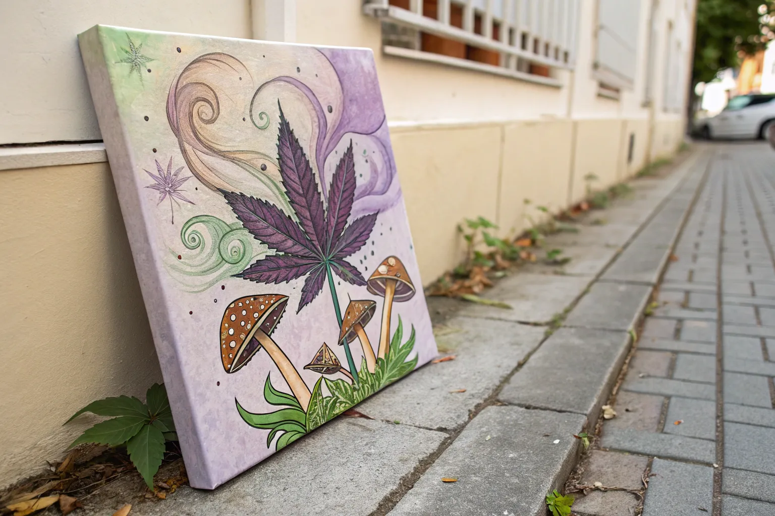
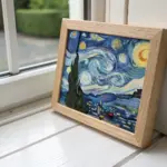
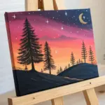
Some of my favorite painting sessions are the ones where the colors get loud and the ideas get delightfully weird. If you’re hunting for stoner painting ideas that lean into cannabis culture and dreamy, trippy vibes, here are 20 prompts I’d totally try in my own studio.
Psychedelic Cannabis Leaf Mandala
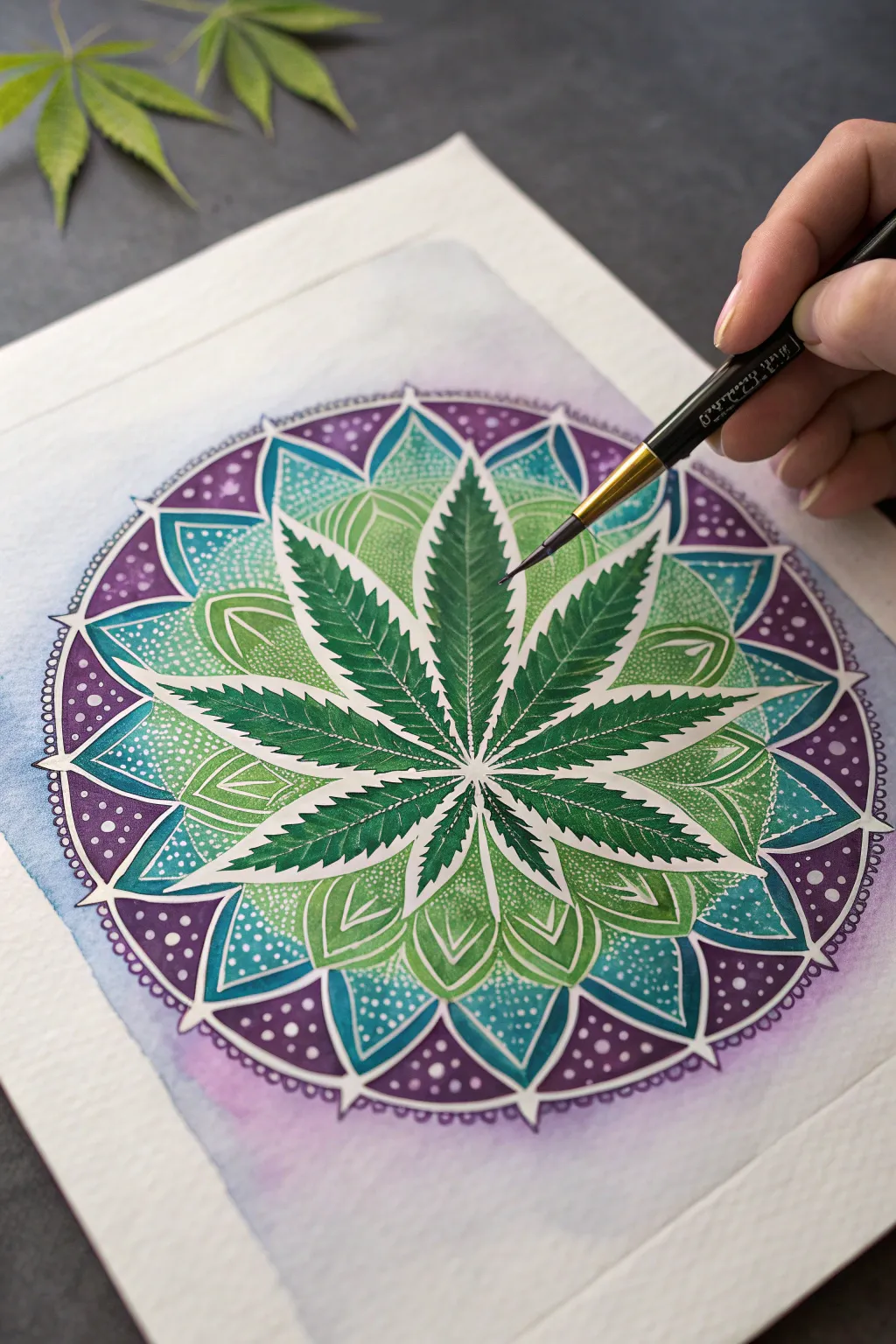
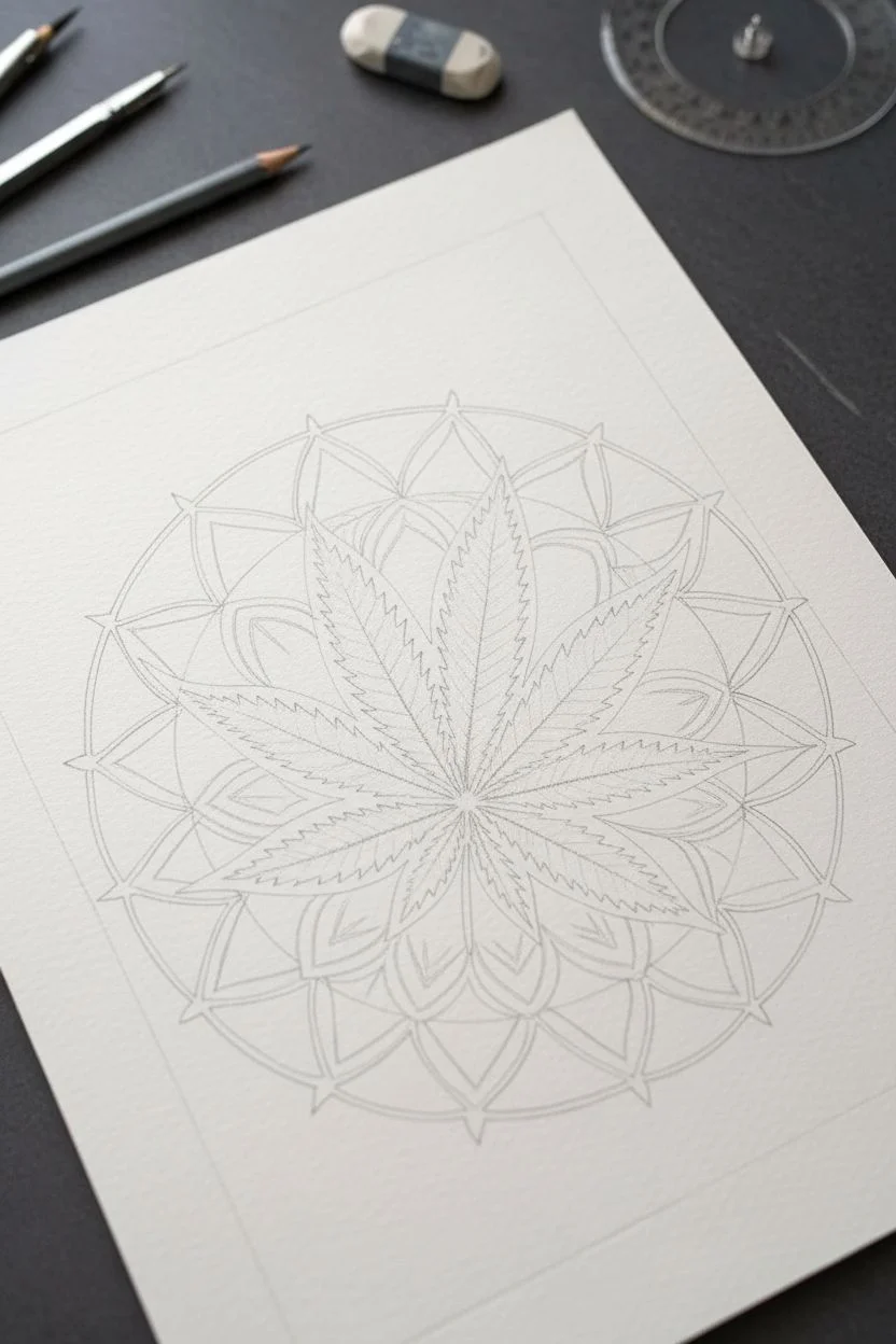
Blend botanical realism with sacred geometry in this vibrant mixed-media mandala. Featuring a striking, detailed cannabis leaf at its center, this piece radiates outward with layers of soothing teal and regal purple, enhanced by delicate white stippling.
How-To Guide
Materials
- Cold press watercolor paper (140lb/300gsm)
- Watercolor paints (Sap Green, Hooker’s Green, Turquoise, Deep Violet, Indigo)
- Compass and protractor
- Pencil (HB or 2H) and eraser
- Round watercolor brushes (sizes 2, 4, and 6)
- Fine liner brush (size 0 or 00)
- White gel pen or opaque white gouache
- Masking fluid (optional)
- Ruler
Step 1: Drafting the Geometry
-
Find your center:
Start by locating the absolute center of your paper. Use your compass to draw a small circle about 1 inch in diameter, which will serve as the hub for the leaf stems. -
Map the concentric rings:
Keeping the same center point, draw three larger concentric circles. The first should be about 3 inches wide, the second 5 inches, and the final outer ring roughly 7 inches wide to frame the design. -
Divide the circle:
Using a protractor, divide your circle into 8 or 16 equal sections. Draw light guidelines radiating from the center to the edge; these spokes will ensure your leaf placement and mandala petals are perfectly symmetrical. -
Sketch the leaf:
In the central area, sketch a classic seven-point cannabis leaf. The central leaflet should point straight up. Use your radial lines to keep the side leaflets balanced. Keep the serrated edges sharp and defined. -
Outline mandala petals:
In the space surrounding the leaf, sketch two layers of petals. The inner layer should nestle between the leaf points, while the outer layer connects to the purple ring. Aim for a lotus-like shape with pointed tips.
Bleeding Colors?
If your purple is bleeding into the teal, your sections are too wet. Use a hair dryer on the ‘cool’ setting between rings, or work on opposite sides of the circle to give sections time to dry.
Step 2: Painting the Leaf
-
Base green wash:
Mix a light Sap Green with plenty of water. Paint the entire leaf area with this pale wash to establish a glowing foundation. Let this layer dry completely. -
Deepen the veins:
Switch to a size 2 brush and Hooker’s Green. Carefully paint the serrated edges and the spaces between the veins, leaving the original light green showing as the veins themselves. This negative painting technique makes the veins pop. -
Add high contrast:
Mix a touch of Indigo into your Hooker’s Green for a dark, shadowy hue. Apply this to the very center where the leaflets meet and along the bottom edges of each blade to create depth and dimension.
Step 3: The Mandala Background
-
Teal inner ring:
Mix a vibrant Turquoise. Paint the petal shapes immediately surrounding the leaf. As you paint, dilute the color slightly with water near the leaf tips to create a subtle gradient effect. -
Purple outer ring:
Using Deep Violet, fill in the outermost ring of the mandala. Apply the paint densely at the outer edge and wash it out slightly as it moves inward toward the teal section. -
Secondary petal details:
For the secondary layer of geometric shapes between the teal and purple, use a mix of the two colors to create a transition shade. Paint these sections carefully, respecting the white borders if you chose to leave them unpainted. -
Background wash:
Wet the paper outside the main mandala circle. Drop in very faint washes of purple and teal, letting them bleed softly into the white paper to create a hazy, ethereal aura around the design.
Pro Tip: Masking Fluid
Apply masking fluid over the leaf’s main veins before painting. It blocks the paint perfectly, keeping lines crisp white or light green. Rub it off gently once the painting is totally dry.
Step 4: Detailing and Stippling
-
Outline definition:
Once the paint is bone dry, I like to use a very fine brush with dark green or indigo to crisp up the edges of the leaf and the major mandala sections if they look too soft. -
White distinct lines:
Using your white gel pen or a liner brush with white gouache, draw the fine outlines separating the purple and teal sections. This simulates the look of white ink piping. -
The stippling effect:
This is the meditative part. Create patterns of small white dots (stippling) inside the teal and purple sections. Cluster them densely near the bottom of petals and spread them out as you move up for a fading effect. -
Final leaf accents:
Add tiny, singular white dots along the central vein of each cannabis leaflet to simulate the reflective quality of the plant’s texture.
Step back and admire the hypnotic symmetry of your botanical creation


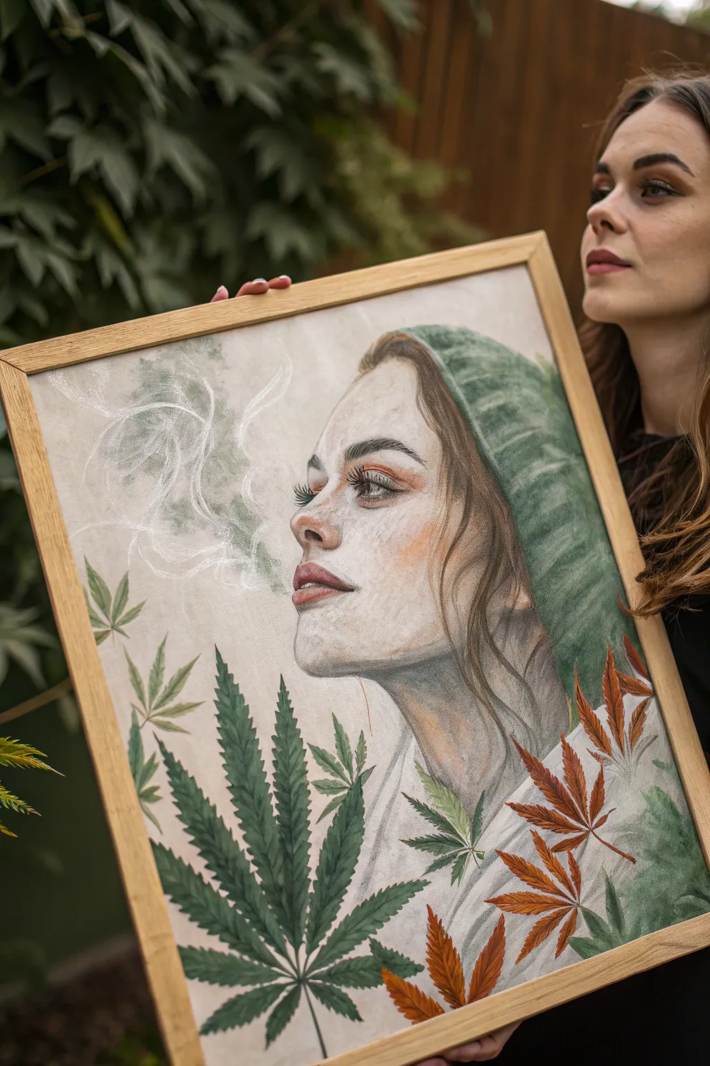
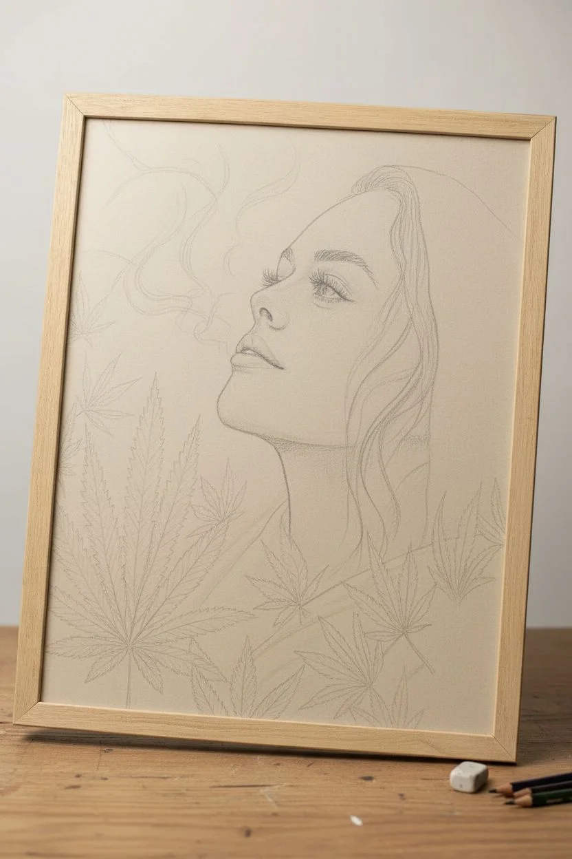
Smoke Swirl Silhouette Portrait
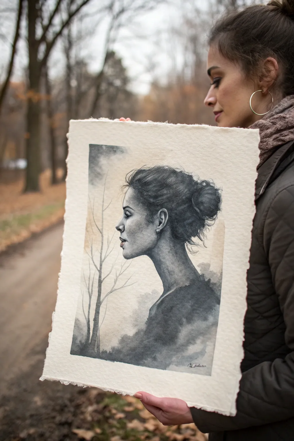
Capture the delicate balance between realism and dreamlike haze with this monochromatic watercolor portrait. By blending a sharp profile with diffused, smoky washes, you’ll create a moody and atmospheric piece that feels both grounding and transcendent.
Step-by-Step
Materials
- High-quality cold press watercolor paper (rough texture preferred, 300gsm)
- Black watercolor paint or India ink
- Payne’s Grey watercolor paint
- Burnt Sienna or Yellow Ochre (for subtle background warmth)
- Round brushes (sizes 2, 6, and 10)
- Detailed liner brush
- Pencil (HB or H for light sketching)
- Kneaded eraser
- Clean water jar
- Paper towels
- Masking tape
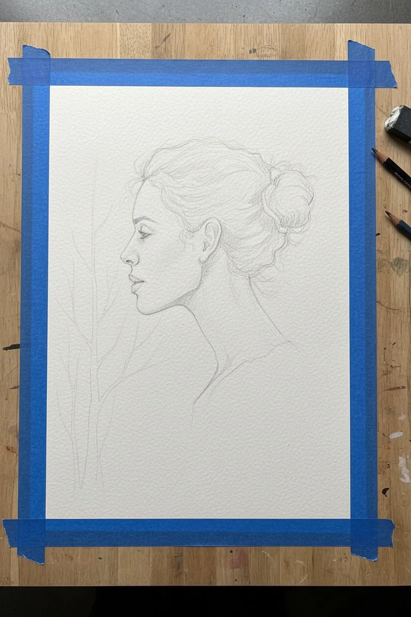
Step 1: Preparation and Sketching
-
Secure the paper:
Begin by taping down your watercolor paper to a board on all four sides. This prevents the paper from buckling when we add heavy washes later. I prefer leaving a rough, torn edge on the final piece, but tape creates a clean workspace for now. -
Sketch the profile:
Lightly sketch the side profile of your subject using an HB pencil. Focus on accurate proportions for the forehead, nose, lips, and chin. Keep the neck long and elegant. -
Outline the hair:
Sketch the general shape of the messy bun and the hairline. Don’t draw every strand; just map out the mass of the hair where the darkest values will go. -
Map the trees:
Very faintly indicate the placement of the bare trees on the left side. These should be thin and vertical, serving as a compositional balance to the face.
Bloom Control
To get perfectly smoky textures, drop clear water into semi-dry paint. The water pushes the pigment away, creating soft, unpredictable edges perfect for smoke.
Step 2: Painting the Portrait
-
Initial wash for skin:
Mix a very watery, pale grey wash. Apply this to the shadowed areas of the face—under the chin, the eye socket, and the side of the cheek. Leave the highlights (forehead, nose bridge, cheekbone) purely white paper. -
Deepening the features:
Once the first wash is damp (not soaking), use a size 2 brush with clearer black pigment to define the eye, nostril, and the line of the lips. Soften the edges immediately with a clean, damp brush so they don’t look like harsh cartoons. -
Building the hair mass:
Load your size 6 brush with a rich, dark mixture of Black and Payne’s Grey. Paint the bulk of the hair, starting from the bun and moving toward the hairline. Leave some gaps for highlights. -
Adding hair texture:
Switch to your liner brush. While the main hair mass is still slightly wet, pull fine strands outward to create the messy, flyaway look. This ‘wet-into-wet’ technique makes the hair look soft rather than stiff. -
Shading the neck:
Apply a medium-grey wash to the neck. As you move downward, add more water to fading the pigment out, preparing for the transition into the smoke effect.
Metallic Accent
Mix a tiny amount of gold mica powder into your final grey wash for the smoke. It adds a secret shimmer that only catches the light at certain angles.
Step 3: Creating the Atmosphere
-
The smoke transition:
At the base of the neck and shoulders, drop in heavy pigment (black or dark grey). Tilt your board slightly or blow gently on the wet paint to encourage it to bloom and spread downwards solely in uneven patterns. -
Clouding the bottom:
Using the large size 10 brush and plenty of water, blur the bottom section of the painting into abstract clouds. Drop in touches of pure water to create ‘cauliflower’ blooms that mimic smoke texture. -
Background wash:
Mix a very diluted wash of Burnt Sienna or Yellow Ochre to create a faint, warm haze in the background behind the face. This subtle color connects the portrait to the ‘outdoors’ feel without overpowering the monochrome palette. -
Painting the trees:
With a liner brush and diluted grey paint, draw the bare trees on the left. Keep your hand loose and shaky to mimic organic branches. Ensure the base of the trees fades into the smoky texture at the bottom. -
Refining details:
Go back in with your darkest black. Strengthen the pupil, the corner of the mouth, and the deepest shadows in the gathered hair bun for contrast. -
Declaring it finished:
Step away and let the painting dry completely. Once dry, carefully tear the edges of the paper against a ruler to create that rustic, deckled edge look shown in the photo.
Now you have a moody, atmospheric portrait that captures the stillness of a quiet afternoon
Dripping Neon 420 Typography
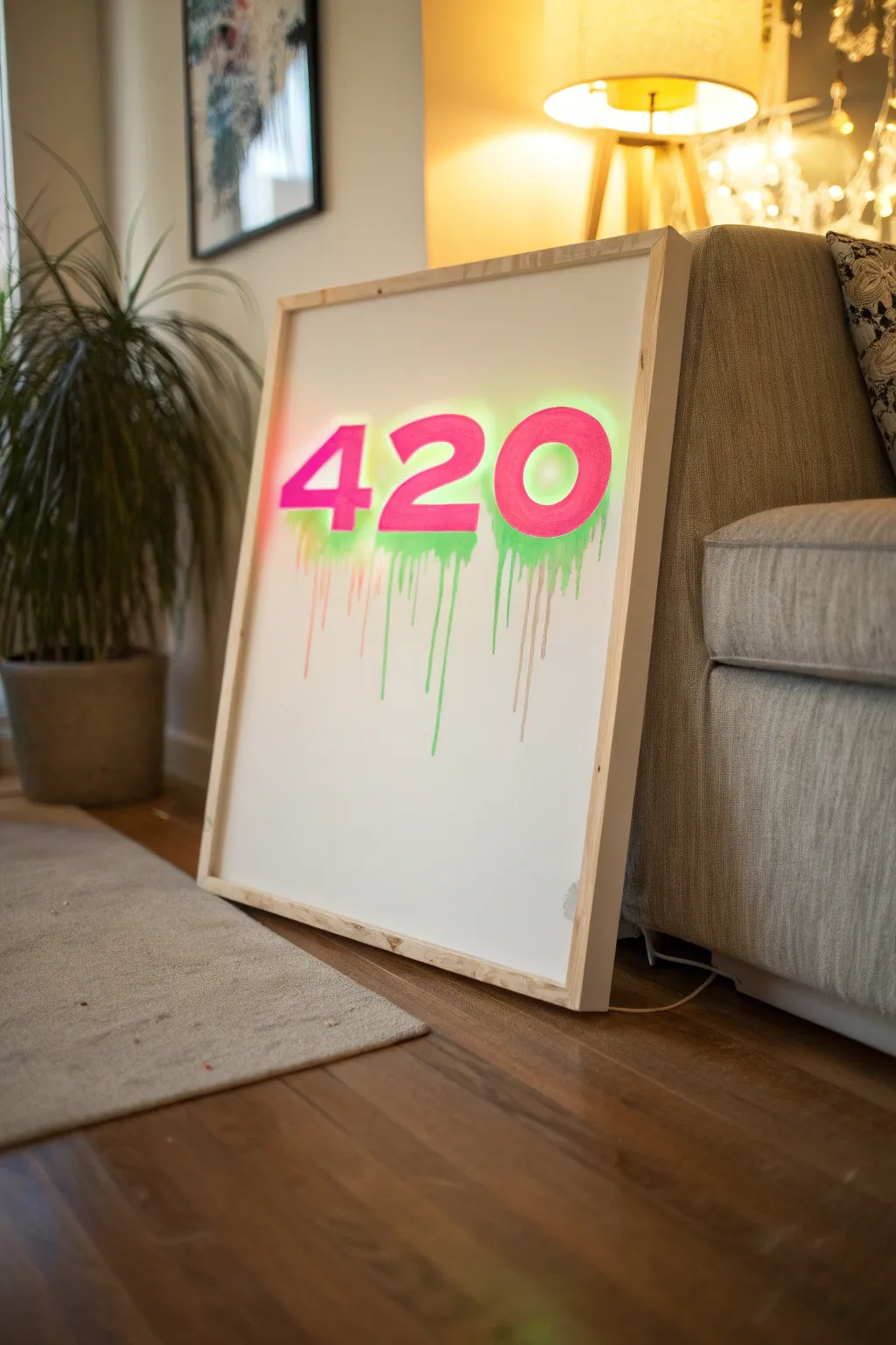
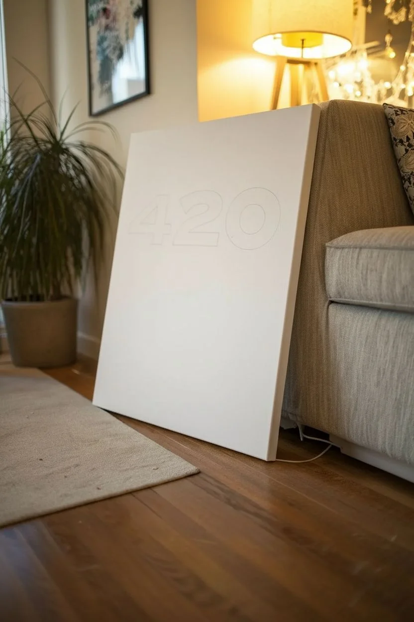
Brighten up your space with this electric piece of typographic art that combines a clean, modern aesthetic with a playful street-art vibe. The glowing backlight effect contrasts beautifully with the flat pink numbers, while the deliberate drips add movement and organic character to the crisp white background.
Detailed Instructions
Materials
- Large wooden canvas or primed wood panel (approx. 24×36 inches)
- White acrylic paint or gesso (matte finish)
- Neon pink acrylic paint (heavy body)
- Neon green acrylic paint (fluid or high-flow)
- Large foam brush or roller
- Wide flat paintbrush (2-3 inch)
- Medium round paintbrush
- Pencil and eraser
- Ruler or T-square
- Printed number templates or stencils (large sans-serif font)
- Masking tape or painter’s tape
- Spray bottle with water
- Clear matte varnish (optional)
Step 1: Preparing the Base
-
Prime the Surface:
Start by ensuring your wooden panel or canvas is perfectly smooth. Apply a generous coat of white acrylic paint or gesso using a foam roller or wide brush to minimize brushstrokes. -
Apply Second Coat:
Once the first layer is dry to the touch, apply a second coat of white base. You want an opaque, clean background so the neon colors really pop later. -
Plan the Layout:
Measure the width of your canvas to find the center point. Print out large ‘4’, ‘2’, and ‘0’ numbers in a bold, sans-serif font, sizing them to take up the upper third of the canvas width. -
Trace the Numbers:
Cut out your number templates and tape them onto the canvas, ensuring even spacing between them. Lightly trace the outline of each number with a pencil, pressing softly to avoid denting the paint.
Step 2: Creating the Glow and Drip
-
Apply the Green Base:
Before painting the pink numbers, we need to create the under-glow. Using your neon green paint, color roughly inside your pencil lines, extending about half an inch outside the borders of the numbers. -
Create the Diffusion:
While the green paint is still wet, use a damp brush to soften the outer edges, blending them into the white background to create a hazy, glowing neon effect. -
Prepare the Drips:
Mix a small amount of neon green paint with a few drops of water to create a fluid consistency that runs easily but still holds its color. -
Start the Flow:
Load your round brush heavily with the thinned green paint. Press the brush against the bottom edge of where the numbers will be, allowing gravity to pull the paint down. -
Encourage the movement:
If the drips are moving too slowly, mist them very lightly with your water spray bottle. I like to tilt the canvas vertically at this stage to get nice, long gravity-fed streaks. -
Vary the Drip Lengths:
Add more fluid paint to certain areas to create drips of different lengths. Some should stop short, while others can trail nearly to the bottom of the canvas. -
Let it Dry:
This step requires patience. Allow the green glow and drips to dry completely, preferably overnight, as the thicker drips may take longer to set.
Glow Hack
For a true neon sign effect, mist the area behind the numbers with white spray paint before adding the green. This creates a brighter ‘hot spot’ that mimics a light tube.
Step 3: Painting the Typography
-
Fill the Numbers:
Using your neon pink heavy body paint and a flat brush, carefully paint inside the original pencil lines of the ‘420’. This layer sits directly on top of the green glow. -
Sharpen the Edges:
Use a smaller flat brush to get crisp, clean edges on the pink numbers. The pink should be solid and opaque, contrasting sharply with the fuzzy green halo underneath. -
Second Pink Coat:
Fluorescent paints can be translucent. Apply a second or third coat of pink as needed to ensure the green background doesn’t show through the numbers themselves. -
Final White Drips:
To integrate the numbers with the background, mix some watered-down white paint. Create very subtle, translucent white drips alongside the green ones for added depth. -
Clean Up:
Inspect the white background for any accidental green splatters. Touch these up with your base white paint for a flawless finish. -
Build the Frame:
Cut 1×2 inch pine lathing strips to fit the outer dimensions of your canvas. Sand them smooth but leave the wood natural for a raw, organic look. -
Attach the Frame:
Nail the wood strips to the edges of your canvas using finishing nails, creating a simple shadow box frame that elevates the presentation.
Level Up: UV Reactivity
Use specifically labeled UV-reactive or blacklight paints for both the pink and green layers. Place a blacklight nearby to make the artwork actually glow in the dark.
Hang this statement piece in your favorite lounge area and enjoy the vibrant energy it brings to the room

Weed Leaf on a Trippy Checkerboard Warp
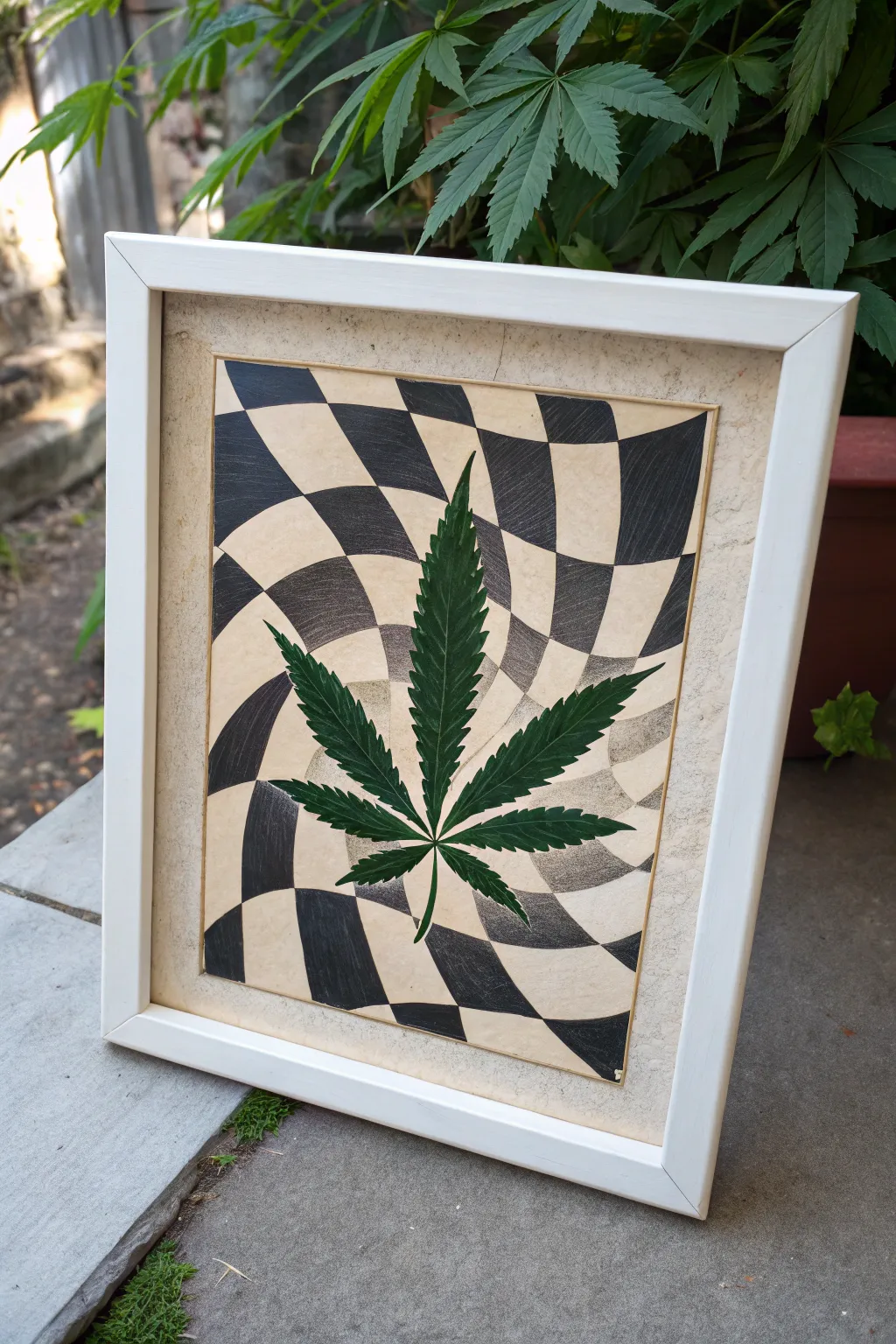
Combine the natural beauty of a preserved botanical with a mind-bending optical illusion in this mixed-media project. By mounting a real pressed leaf onto a warped checkerboard background, you create a striking contrast between organic form and geometric distortion.
How-To Guide
Materials
- High-quality art paper (cream or beige tone)
- Pencil (HB or lighter)
- Fine-tip black marker or drafting pen
- Black ink, acrylic paint, or charcoal
- Small paintbrush (if using ink/paint)
- Fresh leaf (for pressing) or pre-pressed leaf
- Heavy books or a flower press
- Matte finish Mod Podge or clear drying craft glue
- Tweezers
- 11×14 inch picture frame (white)
- Ruler
Step 1: Preparing the Specimen
-
Select your leaf:
Choose a fresh, healthy leaf with no tears or discoloration. Ensure it is symmetrical and the serrated edges are distinct. -
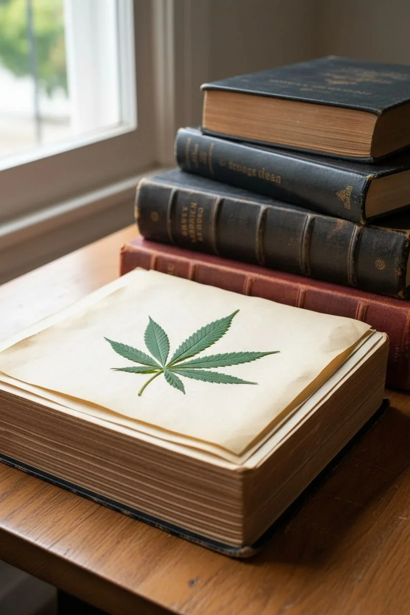
Press the leaf:
Place the leaf between two sheets of parchment paper inside a heavy book. Add extra weight on top and leave it alone for at least 7-10 days until it is completely flat and dry. I usually forget about mine for two weeks just to be safe.
Step 2: Drawing the Optical Illusion
-
Draft the grid:
On your cream art paper, lightly sketch a rectangular border leaving a generous margin. Inside this border, draw a standard grid using your ruler and pencil. -
Create the warp:
Locate the center point where your leaf will sit. Erase the straight grid lines in the central area and re-draw them as curved, wavy lines that pinch inward toward the center, creating a vortex effect. -
Define the checkers:
Choose which squares will be black. Mark them lightly with an ‘X’ so you don’t lose track of the alternating pattern, especially in the distorted sections. -
Outline with ink:
Go over your final pencil lines with a fine-tip black marker or drafting pen. Keep your hand steady on the curves to maintain a fluid look. -
Fill the dark squares:
Fill in the marked squares using black ink, acrylic paint, or charcoal depending on the texture you want. For the look in the photo, colored pencil or charcoal gives a softer, textured grain. -
Clean up the sketch:
Once the black fill is completely dry, gently erase any visible pencil marks from the lighter squares to keep the design crisp.
Fixing a Brittle Leaf
Leaf cracked during gluedown? Don’t panic. Use a tiny dot of glue to puzzle-piece it back together. Once pressed under glass in the frame, the break will be nearly invisible.
Step 3: Assembly and Framing
-
Position the dry leaf:
Take your fully dried leaf and gently place it over the center of your optical illusion to test fit. The warp should seem to radiate from behind it. -
Apply adhesive:
Using a small brush, apply a very thin layer of matte Mod Podge or clear craft glue to the back of the leaf. Be careful not to oversaturate it, as dry leaves typically become brittle. -
Mount the leaf:
Use tweezers to carefully lower the leaf onto the paper. Press down gently with a clean paper towel to ensure all points of the leaf make contact without transferring oils from your fingers. -
Seal (Optional):
If you want extra protection, brush a thin coat of matte sealer over the entire leaf surface, extending slightly onto the paper to unintentional lifting. -
Age the paper:
If your paper looks too new, lightly dab the empty margins with a used tea bag to create a vintage, parchment-like border. -
Frame the work:
Place the artwork into a simple white frame. Using a white frame helps pop the cream paper and the deep green of the leaf.
Pro Tip: Grid Logic
When drawing the warped grid, imagine a bowling ball sitting on a trampoline. The lines should curve toward the heavy center point to create convincing depth.
Hang your framed illusion in a spot with good lighting to let the intricate details of the leaf stand out against the geometric background
BRUSH GUIDE
The Right Brush for Every Stroke
From clean lines to bold texture — master brush choice, stroke control, and essential techniques.
Explore the Full Guide
Spaced-Out Stoner Alien With Floating Smoke Rings
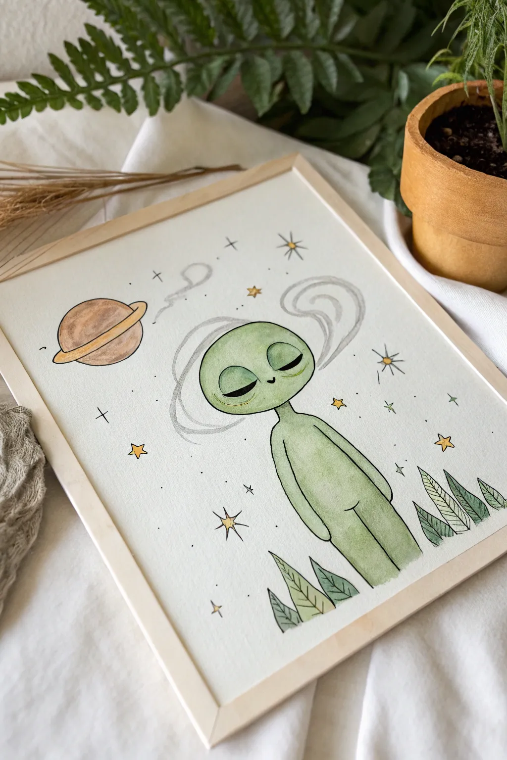
Capture the ultimate chill vibe with this watercolor illustration featuring a peaceful green alien lost in thought amidst swirling smoke rings and stardust. The soft washes and delicate ink outlines create a dreamlike atmosphere perfect for any space-themed art collection.
Step-by-Step
Materials
- Cold press watercolor paper (A4 or 8×10)
- Watercolor paint set (focus on serene greens, warm browns, and golden yellows)
- Sketching pencil (HB or 2B) and eraser
- Fine liner pens (archival ink, sizes 0.1, 0.3, and 0.5)
- Round watercolor brushes (size 4 and 8)
- Cup of water and paper towels
- Painter’s tape or masking tape
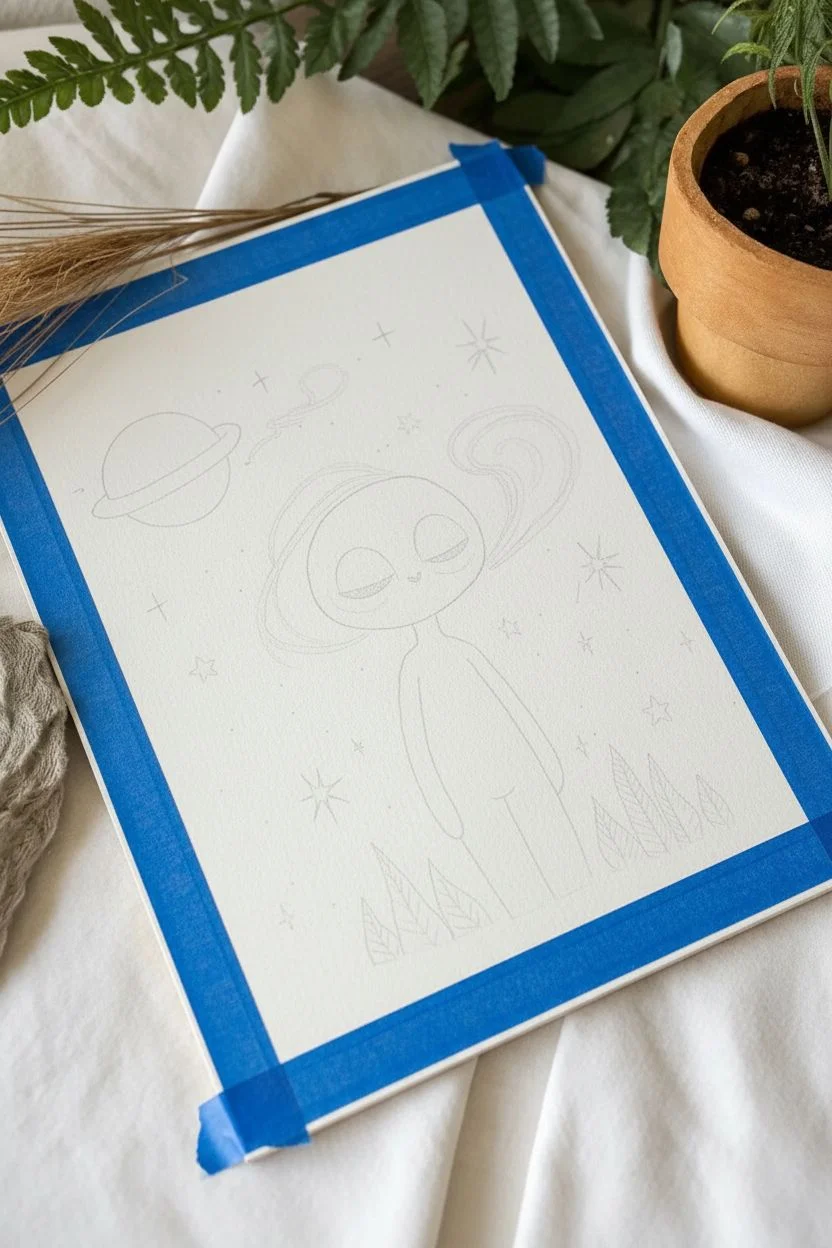
Step 1: Sketching the Outer Limits
-
Prepare your surface:
Tape down all four edges of your watercolor paper to a drawing board or hard surface. This prevents buckling when the paper gets wet and leaves a crisp white border. -
Outline the head:
Start slightly above the center of the page by sketching a wide, slightly flattened oval for the alien’s head. Keep your pencil pressure very light so mistakes are easy to erase. -
Draft the body:
Draw a slender neck extending down from the head, flowing into a simple, elongated torso. The arms should hang loosely at the sides, devoid of complex details to maintain the minimalist style. -
Add facial features:
Place two large, almond-shaped eyes that slant downwards. Draw curved lines for the eyelids to show they are closed peacefully. Add a tiny, simple curve for a smile and two dots for nostrils. -
Sketch the surroundings:
Draw a planet with a ring in the upper left corner. Create stylized, leafy plants emerging from the bottom edge of the paper to frame the figure. -
Draw the smoke and stars:
Lightly sketch wavy, ribbon-like smoke rings circling the alien’s head. Scatter small four-point and five-point stars randomly around the background relative to the main figure.
Step 2: Watercolor Washes
-
Base layer for the alien:
Mix a watery pale green. Using your larger brush, fill in the alien’s skin. I find it helpful to keep this wash quite wet so the color doesn’t streak. -
Adding shadows:
While the green is still slightly damp, drop a slightly darker, more saturated green along the bottom edge of the head and the sides of the body to create gentle dimension. -
Painting the planet:
Use a warm brown wash for the planet’s body. Once that dries slightly, paint the rings with a golden ochre or visible yellow tone. -
Coloring the foliage:
Paint the leaves at the bottom with varies shades of muted green. You can mix a tiny bit of brown into your green to make them look earthy and distinct from the alien. -
Tinting the stars:
Carefully dab yellow paint into the larger star shapes. Leave the smaller background dots unpainted for now. -
Ghostly smoke detail:
Dilute a grey or very pale blue paint with lots of water. Paint extremely faint, transparent strokes inside the smoke ring outlines to give them a vaporous feel.
Smudged Ink?
If your pen smears, the paper wasn’t fully dry. Use a hairdryer on a low, cool setting to ensure all moisture is gone before you start the inking phase.
Step 3: Inking and Definition
-
Outline the main figure:
Once the paint is completely bone-dry, use the 0.5 fine liner to trace the outline of the alien’s head and body. Use confident, smooth strokes. -
Detail the face:
Switch to a 0.3 pen for the facial features. Thicken the line of the upper eyelid slightly to simulate lash lines or depth. -
Define the cosmos:
Outline the planet, its ring, and the yellow stars. For the tiny background dots, just use the tip of the pen to create stippled stars. -
Leaf textures:
Outline the plants at the bottom. Use the 0.1 pen to draw simple veins inside the leaves—a center line with diagonal hatching works perfectly. -
Smoke outlines:
Trace the smoke rings with a shaky or broken line using the 0.1 pen. This irregularity helps the smoke look airy rather than solid. -
Final accents:
Add small floating plus signs (+) and dots around the empty spaces to balance the composition. Erase any visible pencil marks carefully.
Level Up: Cosmic Glow
Use a white gel pen to add tiny highlights to the alien’s eyelids and the planet’s ring. It makes the illustration pop and look extra magical.
Peel off your tape to reveal those clean edges and enjoy the peaceful vibe of your new extraterrestrial friend
Cannabis Bouquet With Psychedelic Petals
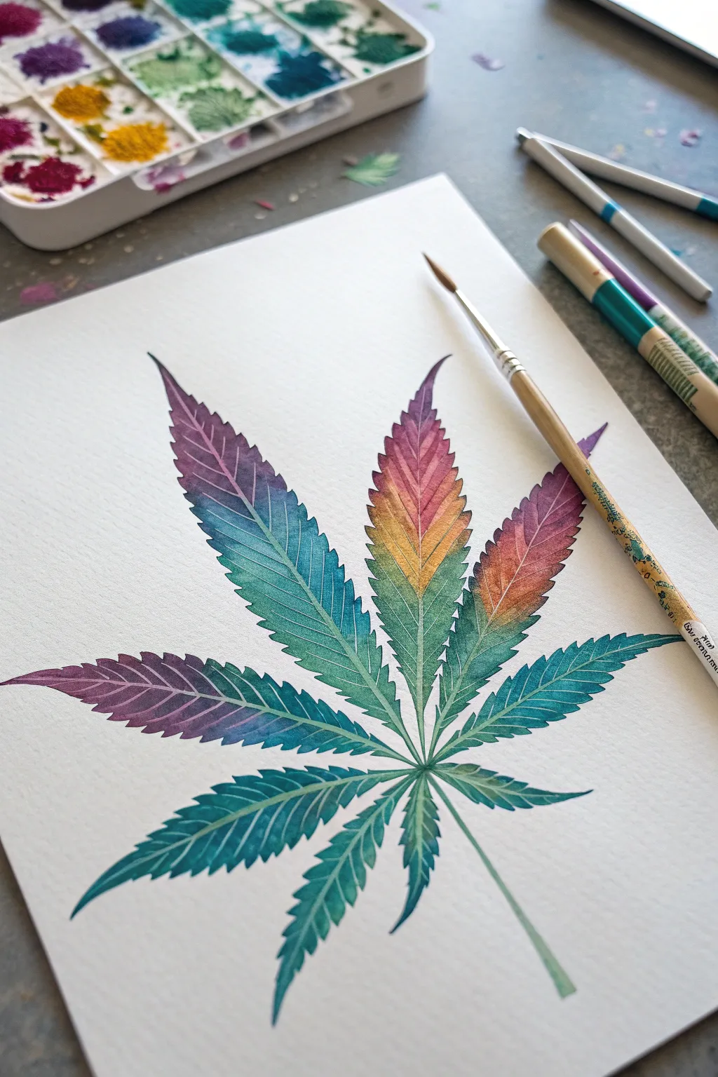
Capture the delicate structure of a cannabis leaf while infusing it with a vibrant, otherworldly gradient. This watercolor project moves beyond traditional greens, using wet-on-wet techniques to blend distinct teals, violets, and sunset oranges into a single, cohesive botanical study.
Step-by-Step Tutorial
Materials
- High-quality cold press watercolor paper (300 gsm)
- Watercolor paints (Phthalo Blue, Dioxazine Purple, Quinacridone Magenta, Cadmium Yellow, Sap Green)
- Fine round brushes (size 0 and size 4)
- Water container
- Pencil (HB or H)
- Kneaded eraser
- Masking fluid (optional, for veins)
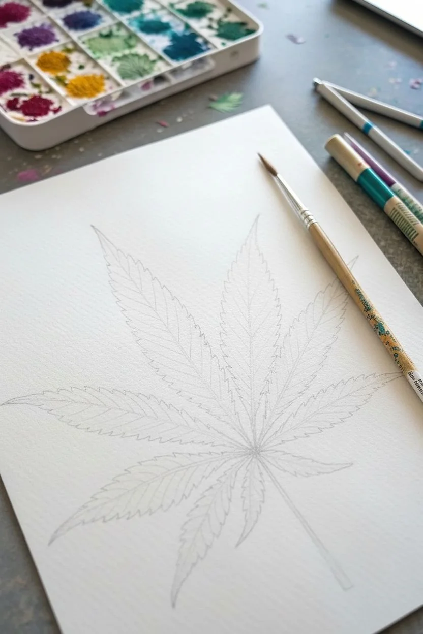
Step 1: Sketching the Structure
-
Mark the center point:
Find the lower-middle section of your paper and lightly mark a small dot. This will be the convergence point where all seven leaflets meet the stem. -
Draw the main spines:
From your center dot, draw seven lines radiating outward to establish the length and curve of each leaflet. Make the center leaflet the longest and straightest, while the side leaflets should curve gently downward. -
Outline the serrated edges:
Lightly sketch the jagged, saw-tooth edges of the leaves around your spine lines. Keep your pencil pressure extremely light so the graphite doesn’t show through the transparent watercolor later. -
Refine the veins:
Draw the central vein for each leaflet clearly. I usually take a moment here to erase any stray sketch lines with a kneaded eraser, leaving only the faintest guide for the final shape.
Wet-on-Wet Control
If your colors are spreading too fast, your paper is too wet. Blot your brush on a paper towel before picking up paint to control the flow better.
Step 2: Applying the Base Gradient
-
Prepare your palette:
Mix puddles of your key colors: deep teal, violet, magenta, warm orange, and yellow. Having these ready before you start wetting the paper is crucial for a smooth blend. -
Wet the first leaflet:
Using your size 4 brush and clean water, dampen the interior of the top-right leaflet carefully. You want the paper to be glistening but not forming a pool capable of running off the page. -
Drop in the warm tones:
While the paper is wet, touch the tip of your brush load with orange and magenta into the upper section of this leaflet. Watch the pigment bloom naturally. -
Introduce the cool tones:
Clean your brush and switch to teal or turquoise. Apply this to the base of the leaflet near the center point, encouraging it to meet the warm colors in the middle to create a soft transition. -
Continue leaf by leaf:
Move clockwise to the next leaflet. For the purple-heavy leaves on the left, start with Dioxazine Purple at the tips and blend into a deep blue-green at the base. -
Vary the gradients:
To get that ‘psychedelic’ look, ensure no two leaves have the exact same color map. Let the top middle leaf transition from yellow-orange to green, while the bottom leaves stay cooler with teals and deep greens.
Cosmic Splatter
For a spacey vibe, load a toothbrush with white gouache and flick tiny stars over the dark purple sections of the leaves once they dry.
Step 3: Detailing and Veins
-
Let it dry completely:
This is the hardest part—wait until the base layer is bone dry. If the paper feels cold to the touch, it’s still damp. -
Reserve the veins:
The veins in this style are lighter than the leaf. You can achieve this by painting negatively around them. Mix a slightly darker, more saturated version of your base colors. -
Paint the serration details:
Using the size 0 brush, paint outward from the central vein towards the jagged edges. Leave a thin, unpainted hairline strip down the center of each leaflet to represent the main vein. -
Add secondary veins:
As you paint the outer edges of the leaflets, leave tiny diagonal lines unpainted branching off the main vein. This negative space technique makes the veins pop without using white paint. -
Darken the tips:
Add a concentrated touch of purple or dark teal to the very tips of the serrations to give the leaf sharp definition and depth. -
Refine the center point:
Use your smallest brush to carefully darken the spaces between the leaflets where they converge, ensuring the lighter stems stand out against the background paper. -
Paint the stem:
Finish with a single, clean stroke for the main stem using a pale translucent green, fading it out at the bottom for an artistic touch.
Step 4: Finishing Touches
-
Clean up edges:
If any watercolor bled outside your lines, you can gently lift it with a clean, damp stiff brush, or sharpen the edge with a tiny bit of opaque white gouache if necessary. -
Flatten the paper:
Once fully dry, place the artwork under a heavy book overnight to smooth out any buckling caused by the wet-on-wet technique.
Enjoy the relaxing process of blending these vibrant hues and watching your botanical creation come to life

PENCIL GUIDE
Understanding Pencil Grades from H to B
From first sketch to finished drawing — learn pencil grades, line control, and shading techniques.
Explore the Full Guide
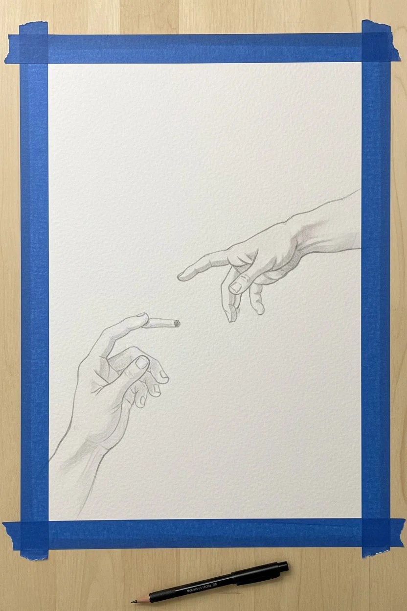
Hands Passing a Joint Gesture Study
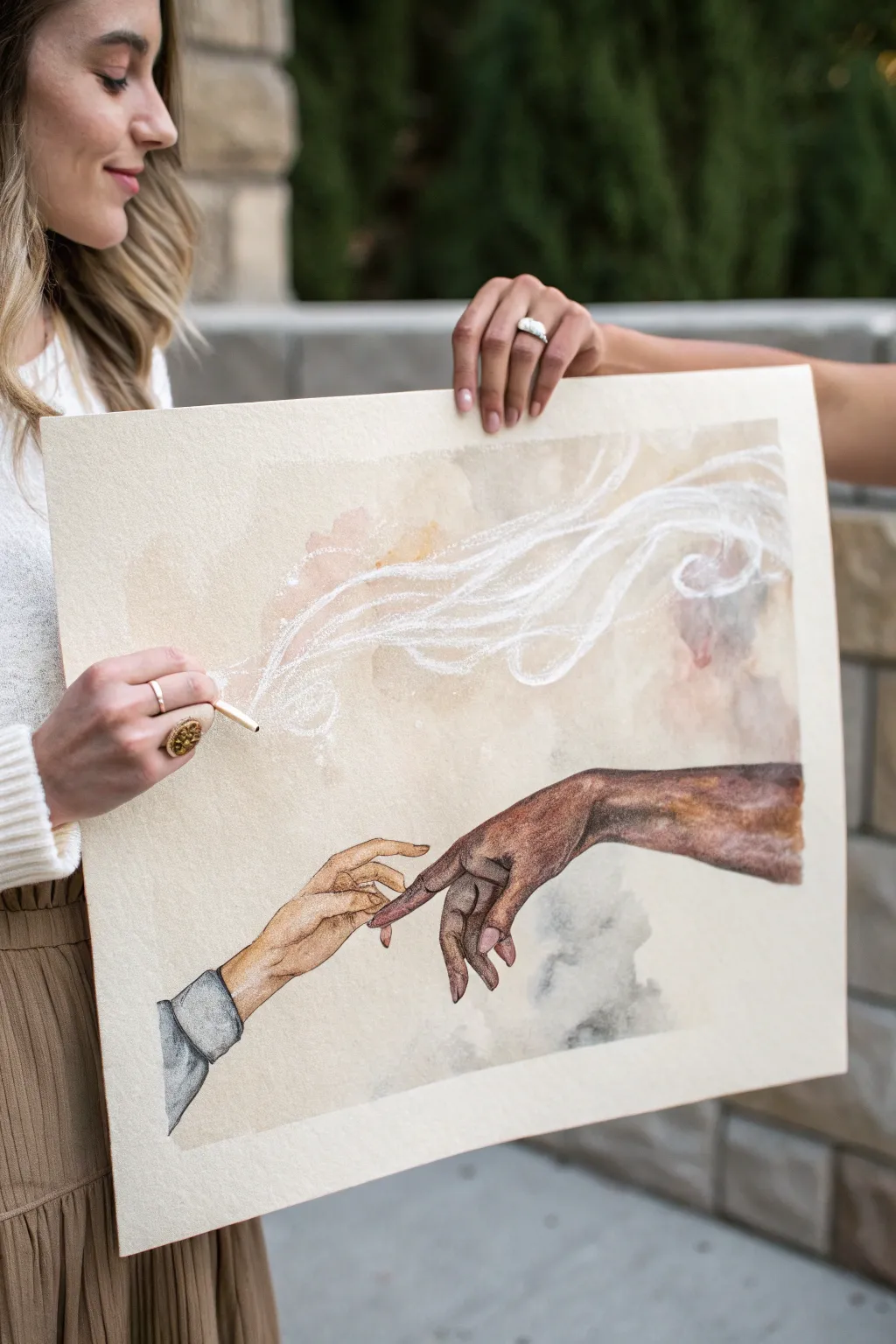
Reimagine a classic Renaissance composition with a modern, relaxed twist in this mixed-media artwork. You will combine the delicate transparency of watercolor with the precise texture of colored pencils to create a dreamy, smoke-filled gesture study.
How-To Guide
Materials
- Heavyweight cold-press watercolor paper (140lb/300gsm or higher)
- Watercolor paint set (Earth tones: Burnt Sienna, Yellow Ochre, Burnt Umber, Alizarin Crimson)
- Graphite pencil (HB or 2H for sketching)
- Black waterproof fine-liner pen (0.1mm)
- Colored pencils (wax or oil-based in skin tones and greys)
- White gel pen, gouache, or white pastel pencil
- Gold ink or gold paint (optional for accents)
- Round watercolor brushes (sizes 4 and 8)
- Masking tape
- Paper towels and water cups
Step 1: Planning and Sketching
-
Prepare your surface:
Tape down your watercolor paper to a board using masking tape. This prevents buckling when the paper gets wet and leaves a nice clean border. -
Sketch the composition:
Lightly sketch the two hands reaching toward each other. Use ‘The Creation of Adam’ as a reference for the pose, but modify the left hand specifically to hold a small, rolled joint. -
Refine the anatomy:
Pay attention to the knuckles and fingers. The hand on the right should extend gracefully, while the hand on the left should have fingers pinched to hold the object. Keep pencil lines very faint so they don’t show through the paint.
Step 2: Watercolor Washes
-
Mix skin tones:
Create two distinct skin tone palettes. For the left hand, mix a lighter wash using Yellow Ochre and a touch of Cadmium Red. For the right hand, use Burnt Umber mixed with a little Burnt Sienna for a deeper, warmer tone. -
Apply the first wash:
Using your size 8 brush, lay down a watery, pale layer of color for each hand. Don’t worry about shadows yet; just establish the base local color. -
Create the atmospheric background:
While the hands dry, mix a very dilute wash of dirty beige or soft grey. Paint loose, cloudy shapes in the background, keeping the edges soft and avoiding the hand areas. -
Build form with layers:
Once the first layer is bone dry, mix slightly darker versions of your skin tones. Paint the shadows along the sides of the fingers and under the palms to create roundness. -
add clothing details:
Paint the sleeve cuff on the left hand using a cool grey wash. Let the pigment pool slightly in the creases of the fabric to create natural shading.
Smoke Effect Tip
For realistic smoke, vary your line pressure. Press harder near the joint for density, and lighten your touch as the smoke drifts away to make it fade.
Step 3: Detailing and Texture
-
Enhance shadows with colored pencil:
Once the watercolor is deeply dry, use colored pencils to deepen the creases in the palms and knuckles. I find this gives much more control than paint for fine lines. -
Add skin texture:
Use a sharp colored pencil in a reddish-brown tone to lightly stumble over the darker skin to suggest texture. Use a peach or pink pencil for the lighter hand. -
Detail the joint:
Use a fine-liner or sharp pencil to draw the joint. Paint the tip a tiny dot of orange/red to show the ember. -
Add the smoke trail:
This is the crucial step. Use white gouache, a white pastel pencil, or a white gel pen to draw swirling lines originating from the joint. -
Blend the smoke:
Make the smoke lines flow organically across the top or center of the page. You can smudge the white pastel slightly with your finger to make it look diaphanous and airy. -
Final highlights:
Add tiny specular highlights to fingernails and knuckles using white gouache to make the hands look moist and alive.
Level Up: Gold Leaf
Apply jagged bits of gold leaf or metallic gold paint to the ‘spark’ at the end of the joint to make the ignition point literally shine.
Remove the tape carefully to reveal your crisp edges and frame this modern masterpiece
Double-Exposure Face Filled With Cannabis Smoke
Capture the serene intersection of human expression and natural elements with this dreamy mixed-media portrait. Using soft pastels and colored pencils, you’ll blend a realistic profile with stylized cannabis leaves and wisps of smoke for a surreal, double-exposure effect.
Detailed Instructions
Materials
- Heavyweight toned paper (light beige or cream)
- Wooden picture frame (approx. 16×20 inches)
- Soft pastels (earth tones, white, greens)
- Colored pencils (prismacolor or similar high-pigment brand)
- Graphite pencil (HB or 2B) and eraser
- Workable fixative spray
- Paper blending stumps or clean cloth
- White gel pen or white gouache
Step 1: Drafting the Composition
-
Center the profile:
Begin by lightly sketching the profile of the woman’s face in the upper-right quadrant of your paper. Focus on the sharp jawline, the upturned nose, and the gaze directed toward the left. -
Map out the beanie:
Sketch the outline of a loose-fitting beanie covering the hair and top of the head. Keep the lines soft, as this will eventually be textured fabric. -
Position the leaves:
Lightly draw the outlines of large fan leaves in the bottom left corner, overlapping the neck area. Add a few smaller leaves floating on the right side to balance the frame. -
Indicate smoke flow:
Draw faint, swirling guidelines coming from the mouth area, expanding outward and upward into the negative space on the left. These lines serve as a map for your smoke later.
Step 2: Building the Portrait
-
Base skin tones:
Using soft pastels, apply a light cream base layer to the face. Gently smudge this with your finger or a cloth to create a smooth, skin-like texture. -
Contouring features:
Switch to colored pencils for detail. Darken the eyebrow, define the eye lashes, and add a soft pinkish-brown to the lips. Use a terracotta pencil to add blush to the cheekbone. -
Refining the profile:
Use a darker brown or grey pencil to sharpen the shadowed areas under the jawline and the hollow of the neck. This contrast makes the face pop against the light background. -
Texturing the beanie:
Fill in the hat area with deep moss-green pastel. Use vertical strokes with a colored pencil to mimic the ribbed texture of knit fabric, adding highlights on the curve of the head. -
Render the hair:
Draw loose, wavy strands of hair escaping the beanie using dark brown and black pencils. Let a few strands fall naturally over the cheek and neck area.
Clean Edges
Keep a piece of scrap paper under your drawing hand at all times. This prevents oils from your skin transferring to the paper and keeps you from smudging the soft pastel work.
Step 3: Foliage & Smoke Details
-
Layering green leaves:
For the prominent leaves in the foreground, fill them with a gradient of emerald to dark forest green pencils. Pay close attention to the serrated edges, keeping them sharp. -
Adding autumn accents:
Color the leaves on the right side with burnt orange, rust, and brown tones. This color variation adds warmth and visual interest to the composition. -
Leaf detailing:
Use a fine-point pencil to draw the central veins in every leaf segment. I like to use a lighter green or cream color for the veins on the dark leaves to ensure they stand out. -
Creating the smoke:
With a white pastel or chalk, lightly scumble over your smoke guidelines. Use a blending stump to swirl the pigment, creating a translucent, vaporous look. -
Highlighting smoke tendrils:
Go back over the smokiest areas with a sharp white charcoal pencil or white pastel to define the edges of the swirls, making them look wispy and distinct.
Dimensional Leaves
Make the leaves look real by adding a thin line of pale yellow along the very edge of the serrated teeth where the ‘light’ would hit them.
Step 4: Final Touches
-
Ghostly overlays:
If you want a true double-exposure feel, lightly draw faint leaf shapes inside the smoke clouds using a very pale grey or green pencil. -
Brightest highlights:
Use a white gel pen or a tiny dot of gouache to add the ‘catch light’ in the eye and the moist highlight on the lower lip. -
Seal the artwork:
Take the artwork outside and spray it with a workable fixative to prevent the pastels from smudging. -
Framing:
Once the fixative is dry, mount the artwork into a simple light wood frame to complement the organic tones of the piece.
Hang your finished piece in a well-lit spot to let those subtle textures and smoke details truly shine


Blacklight Poster-Style Cannabis Scene
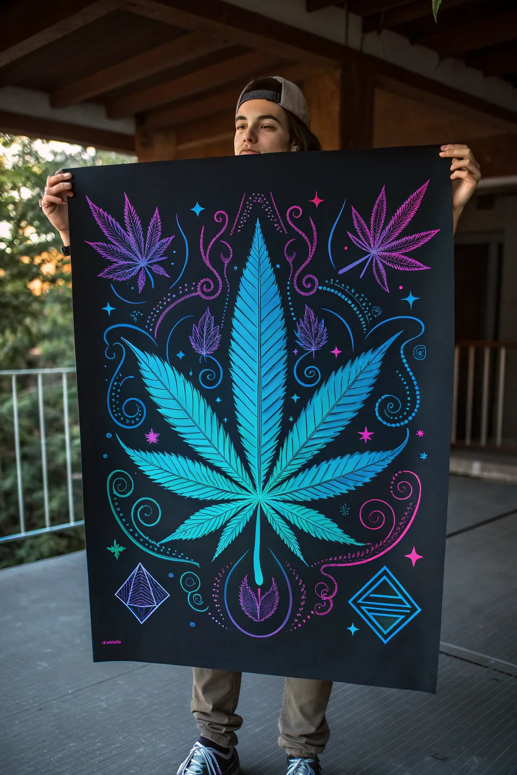
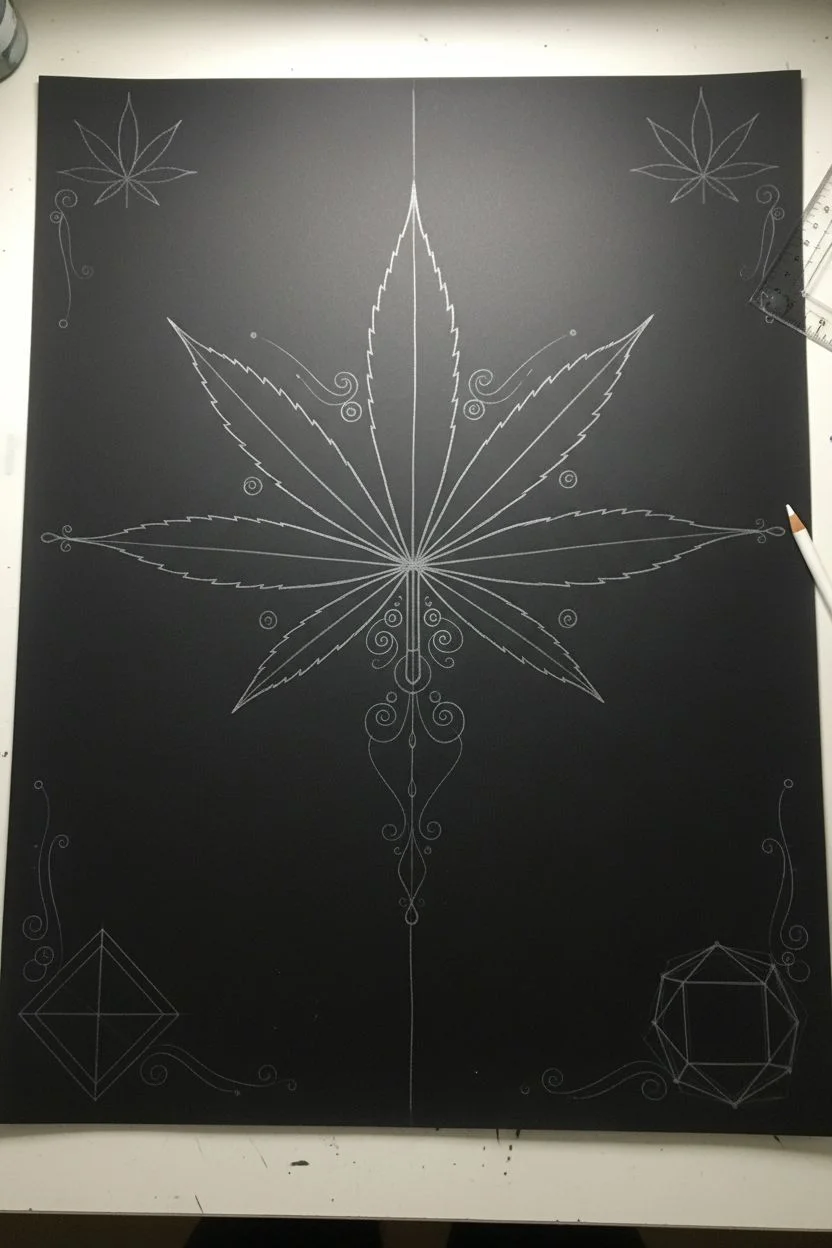
Capture the electrifying vibe of classic blacklight art with this striking cannabis leaf poster. Using high-contrast fluorescent paints on a deep black background creates a glowing, dimensional effect that brings the intricate linework to life.
How-To Guide
Materials
- Large black poster board or heavy illustration board (18×24 inches or larger)
- White colored pencil or chalk (for sketching)
- Acrylic paints (Neon Blue, Neon Pink, Neon Purple, Teal, White)
- UV/Blacklight reactive acrylic medium (optional, for extra glow)
- Flat synthetic brushes (1-inch and 1/2-inch)
- Fine liner brushes (sizes 0 and 00)
- Ruler and compass
- Palette for mixing
- Water cup and paper towels
Step 1: Layout and Sketching
-
Establish the centerline:
Place your black poster board on a flat, well-lit surface. Using a ruler and a white colored pencil, lightly draw a vertical line straight down the center. This will be the spine of your main cannabis leaf. -
Draft the main leaf shape:
Sketch the large central leaf first. Draw the central leaflet extending almost to the top, then added the side leaflets radiating outward symmetrically. Keep the edges smooth for now; you’ll add the serrated ‘teeth’ later. -
Add floating elements:
Lightly sketch the positions of the smaller, floating leaves in the upper corners. Draw the diamond and geometric shapes in the bottom corners using your ruler to ensure crisp, straight lines. -
Sketch the decorative swirls:
Freehand the swirling filigree lines that connect the elements. Think of these as energy flowing around the plant. Don’t press too hard with the pencil, as you want these lines to be barely visible guides.
Step 2: Painting the Main Leaf
-
Base coat the leaf:
Mix a vibrant teal with a touch of neon blue. Using a flat brush, fill in the entire shape of the main central leaf. You may need two coats to get solid coverage over the black paper. -
Create the serrated edges:
Once the base is dry, use a smaller brush to refine the edges, painting sharp, serrated teeth along each leaflet. Make the points sharp and distinct. -
Apply the gradient shading:
This is where the depth happens. Mix a darker blue and paint the center spine of each leaflet. While the paint is wet, blend it outward into the lighter teal edges to create a curved, dimensional look. -
Add veining detail:
Using your finest liner brush and a very dark blue or thinned black, paint thin veins radiating from the spine of each leaflet toward the serrated points.
Paint Opacity Fix
Neon paints are often translucent. If colors look dull on black paper, paint a layer of white primer exactly where the color will go first, let dry, then apply the neon over it.
Step 3: Neon Accents and Details
-
Paint secondary leaves:
Switch to your neon purple and pink paints. Fill in the smaller floating leaves in the upper corners. I find that layering pink over a purple base makes them really pop against the black. -
Line the swirls:
Load a liner brush with thinned neon blue or teal paint. Carefully trace over your swirling pencil guides. Vary your pressure to make the lines taper—thick at the start, thin at the end. -
Add intricate dots:
Dip the back end of your paintbrush handle into neon paint to create perfect dots. Follow the curves of your swirl lines, spacing the dots evenly to create decorative chains. -
Execute geometric shapes:
Paint the diamond shapes at the bottom using a small flat brush and neon blue. Use a ruler as a guide for your brush to keep the lines perfectly straight and architectural. -
Highlight with starbursts:
Using a detail brush and bright white or pale pink, add small four-pointed stars or ‘sparkles’ in the negative spaces between the leaves and swirls.
Steady Hand Trick
For the long, smooth swirl lines, mix a drop of gloss medium or water into your paint. This improves flow, preventing the brush from skipping or dragging on the paper.
Step 4: Final Touches
-
Refine the central spine:
Go back to the main leaf and paint a crisp, bright teal or white line down the very center of the main stem to simulate a highlight. -
Clean up edges:
If any neon paint strayed outside the lines, use black paint to carefully touch up the background and sharpen the silhouette of the leaves. -
Enhance contrast:
Add tiny strokes of pure white to the tips of the serrated edges and the tops of the geometric shapes. This high contrast mimics the look of a glowing light source. -
Seal (Optional):
If you want to protect the surface, apply a gentle spray varnish. Avoid brush-on varnish as it might smear the delicate black background or neon lines.
Hang your masterpiece under a blacklight to see those colors truly blaze
High-Thoughts Doodle Painting With Weed Icons
Capture a dreamy, high-vibe aesthetic with this doodle-style painting featuring stylized cannabis leaves, flowing rainbows, and soft clouds. The muted pastel palette and clean ink outlines give it a polished yet relaxed feel perfect for unwinding with your sketchbook.
Step-by-Step Tutorial
Materials
- Mixed media sketchbook (heavyweight paper essential)
- Watercolor paints or gouache (muted tones: sage green, peach, blush pink, light gold)
- Fine liner pens (black, sizes 0.3mm and 0.5mm)
- Round watercolor brush (size 4 or 6)
- Pencil (H or HB)
- Eraser
- Paper towel
- Jar of water
Step 1: Sketching the Layout
-
Start with the main leaves:
Begin by lightly sketching the large cannabis leaves in pencil. Place three main ones: one on the left center, one bottom left, and one bottom right. Give them the classic serrated edge shape but keep the vibe illustrative rather than strictly botanical. -
Add floating clouds:
Sketch fluffy, scalloped cloud shapes near the top of the page. Vary their sizes, placing a large one on the left and a couple of smaller ones drifting toward the right to create movement. -
Draw the swirls and rainbows:
Connect the elements with flowing, curved lines. Sketch rainbow arches emerging from the bottom center and flowing out from the left side. Add decorative swirls that look like gentle wind gusts between the leaves and clouds. -
Fill the gaps:
Look for empty negative spaces and sketch in small filler elements like five-pointed stars, tiny clusters of dots, and smaller, simpler leaf shapes to balance the composition.
Smudged Lines?
If your ink bleeds into the paint, your paper wasn’t dry enough. Use a hairdryer on a low, cool setting for 30 seconds to ensure deep dryness before inking.
Step 2: Adding Pastel Washes
-
Prepare your palette:
Mix your paints to achieve a desaturated, ‘dusty’ look. You want a sage green (green mixed with a touch of gray or red), a peachy-orange, and a soft blush pink. Test colors on a scrap piece of paper first. -
Paint the leaves:
Using your round brush, carefully fill in the main cannabis leaves with the sage green wash. Keep the paint fluid but not soaking wet to maintain control near the edges. -
Color the clouds:
Wash the clouds with a very pale pink or cream color. You can drop in a tiny bit of darker pink while it’s still damp to add subtle variation, but keep it light. -
Fill the rainbows and swirls:
Alternate between your peach, pink, and sage green tones for the rainbow bands and wind swirls. I like to leave small white gaps between the colors to keep the design feeling airy. -
Add accent colors:
Use a golden-yellow or ochre tone for the stars and the smaller, decorative leaf branches. Let the entire page dry completely before moving to the ink stage.
Step 3: Inking and Detailing
-
Outline the main shapes:
Once the paint is bone dry, take your 0.5mm fine liner and trace over your pencil lines. Use a smooth, confident stroke for the leaves and cloud contours. -
Detail the leaves:
Switch to a finer 0.3mm pen to draw the center veins of the cannabis leaves. Add delicate sprouting lines from the center vein to the serrated tips for texture. -
Embellish the clouds:
Add small, curved hatching lines or spirals inside the clouds to give them volume and a whimsical style. These distinct ‘c-shape’ marks help define the fluffiness. -
Define the swirls:
go over the rainbow arches and wind swirls. You can double up some lines or add a second parallel line to the wind gusts to make them look more dimensional. -
Add final texture:
Use your pen to add clusters of tiny stippling dots around the stars and in the background. This ‘confetti’ effect ties the whole piece together. -
Erase pencil marks:
Wait at least 10 minutes to ensure the ink is totally set, then gently erase any visible pencil guidelines to clean up the finished piece.
Pro Tip: Color Harmony
To keep that retro vibe, mix a tiny dot of brown or gray into every single color you use. This unifies the palette and prevents any single color from looking too neon.
Close your sketchbook knowing you’ve created a chill masterpiece perfect for a relaxed afternoon
Time-Dilation Clock Tangled in Cannabis Vines
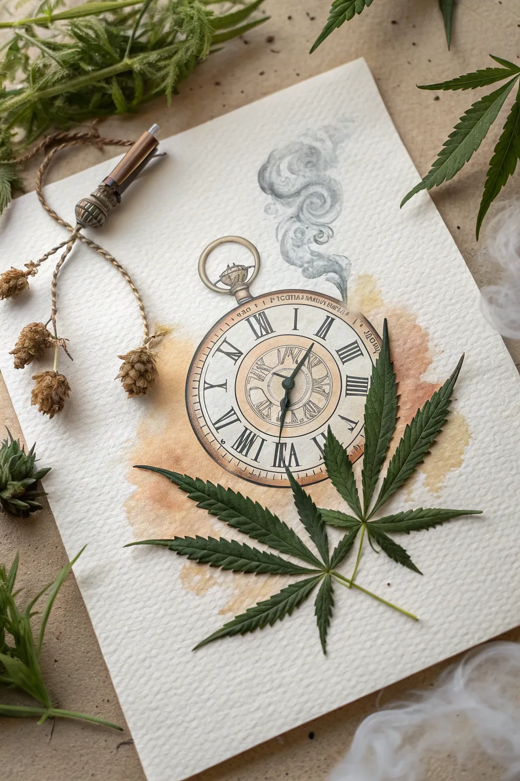
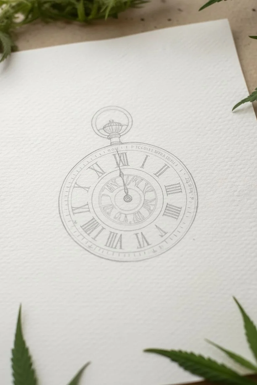
Blend the surreal with the organic in this mixed-media project where a classic pocket watch illustration meets real botanical elements. The soft watercolor washes and precise ink lines create a vintage aesthetic, while fresh cannabis leaves add a literal layer of nature to the concept of time slowing down.
Step-by-Step
Materials
- Heavyweight cold press watercolor paper (300 gsm)
- Pencil (HB) and kneaded eraser
- Fine liner pens (0.1mm, 0.3mm, 0.5mm, waterproof black ink)
- Watercolor paints (Burnt Sienna, Yellow Ochre, Payne’s Grey, Sepia)
- Round watercolor brushes (Size 4 and Size 8)
- Pressed cannabis fan leaves (fresh or semi-dried)
- Dried hops or small dried flower buds
- Jute twine or hemp cord
- Small decorative beads (wood or metal)
- White craft glue or matte medium
Step 1: Sketching the Timepiece
-
Center the Composition:
Begin by lightly marking the center of your textured paper. Use a compass or a round object to trace a perfect circle for the main body of the pocket watch, leaving enough negative space below for the leaves. -
Draft the Dial Details:
Sketch a smaller inner circle for the dial’s center. Lightly mark positions for the Roman numerals at the 12, 3, 6, and 9 o’clock spots first to ensure symmetry, then fill in the others. -
Add the Hardware:
Draw the winder knob and the loop bail at the top of the watch. Sketch the hands of the clock; placing them at an angle like 10:10 often looks balanced, or choose ‘4:20’ if you want a subtle nod to the theme. -
Detailing the Face:
Add decorative inner rings and small tick marks for minutes. Don’t worry about perfection; a slightly hand-drawn look adds vintage charm.
Step 2: Inking & Watercolor Wash
-
Ink the Outline:
Using a 0.3mm waterproof pen, carefully trace your pencil lines. Switch to a 0.5mm pen for the outer case ring to give it weight, and a 0.1mm pen for fine details like the Roman numerals and inner gears. -
Erase and Prep:
Once the ink is completely dry—give it a few minutes to be safe—gently erase all graphite marks with the kneaded eraser to keep the paper surface rough and textured. -
Applying the Vintage Wash:
Mix a watery wash of Yellow Ochre and a touch of Burnt Sienna. Wet the paper around the watch slightly with clean water, then drop the pigment in, letting it bloom outward to create an aged, stained loop. -
Painting the Watch Face:
Use a very pale wash of the same mix for the watch face, keeping the center lighter. Use Sepia to darken the rim of the watch case to simulate brass or copper shading. -
Detailed Shading:
Once the first layers are dry, use a smaller brush with more concentrated Sepia or Payne’s Grey to add shadows under the hands and inside the winder knob for depth. -
Creating the Smoke:
With a very dilute Payne’s Grey, paint swirling smoke shapes emerging from the top right of the watch. I like to keep this loose and ethereal compared to the structured clock. -
Defining Smoke Texture:
While the smoke wash is damp, drop in tiny bits of darker grey to create volume. Once dry, use a pencil or very transparent ink to add faint swirl lines for definition.
Smoke & Mirrors
Use a ‘lifting’ technique for the smoke: paint a grey swirl, then dab parts with a crumpled tissue while wet to create soft white highlights.
Step 3: Botanical Assembling
-
Select Your Leaves:
Choose a cannabis fan leaf that is relatively flat. If it’s fresh, press it under a heavy book for an hour to flatten it out without fully drying it, which keeps the vibrant green color. -
Positioning the Greenery:
Place the leaf diagonally across the bottom right of the watch. It should overlap the drawing slightly to integrate the 2D and 3D elements. -
Adhering the Leaf:
Apply small dots of white glue or matte medium to the back of the leaf stem and vein points. Press it gently onto the paper, using a clean tissue to smooth it down. -
Preparing the Vines:
Take your dried hops or small buds and tie them to a piece of jute twine. Thread a few wooden beads onto the twine near the top to mimic the pendulum or chain of an old crafting tool. -
Arranging the Left Side:
Glue a small cluster of dried buds or hops to the left side of the paper. Use the twine to create a flowing line that leads the eye toward the watch. -
Final Touches:
Check the balance of the composition. If the smoke looks too light against the real leaves, gently darken it with a graphite pencil to bridge the gap between illustration and reality.
Level Up: Resin Encapsulation
Once fully dry, coat the entire leaf area with a thin layer of UV resin. This preserves the green color permanently and adds a glossy, gem-like finish.
Display your mixed-media piece in a shadow box frame to protect the delicate dried elements while showcasing the texture.


Have a question or want to share your own experience? I'd love to hear from you in the comments below!