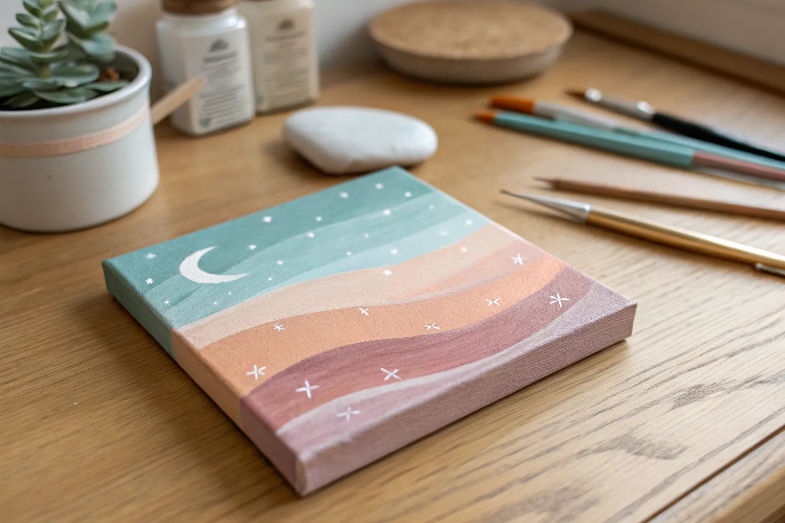
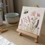
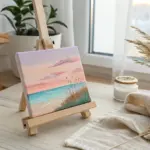
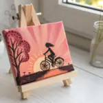
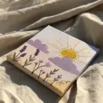
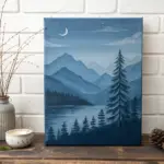
When you want easy painting ideas aesthetic enough for Pinterest, the sweet spot is simple shapes, trendy color palettes, and a finish that looks intentional even if you’re brand-new. I pulled together my favorite beginner-friendly ideas that lean into soft pastels, crisp outlines, and cozy, dreamy vibes.
Pastel Pink Sky and Crescent Moon Mini Canvas
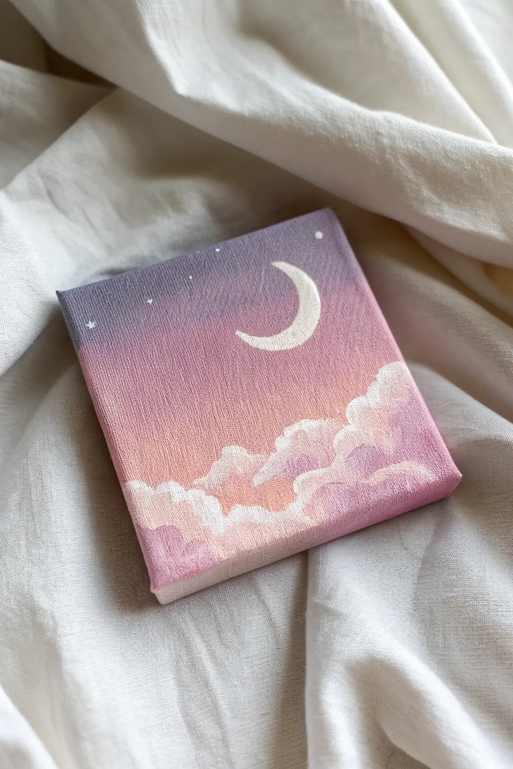
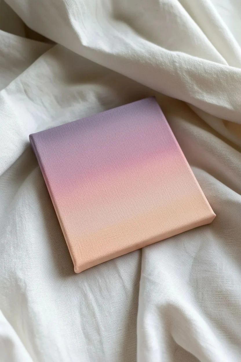
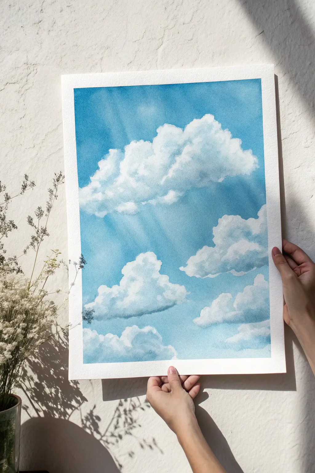
Capture the magic of twilight with this serene mini canvas painting featuring a soft gradient sky and floating crescent moon. The gentle blend of lavender, pink, and peach creates a calming aesthetic perfect for a desk or bookshelf display.
Step-by-Step
Materials
- Mini stretched canvas (4×4 or 6×6 inches)
- Acrylic paints: Titanium White, Lavender (or Purple + White), Soft Pink, Peach (or Orange + White + Pink)
- Flat shader brush (medium size for blending)
- Small round detail brush (size 0 or 1)
- Palette or paper plate
- Cup of water
- Paper towels
Step 1: Creating the Ombré Sky
-
Prepare your palette:
Squeeze out generous amounts of lavender, soft pink, peach, and plenty of titanium white onto your palette. You’ll want pre-mixed pastel versions of your colors ready to go so the blending process is smooth. -
Start at the top:
Using your flat shader brush, apply a band of the lavender paint across the top third of the canvas. Don’t forget to paint the top and side edges of the canvas for a finished, professional look. -
Apply the middle tone:
Clean your brush slightly (or wipe it well) and apply a band of soft pink directly below the lavender. While the paints are still wet, gently brush back and forth where they meet to create a seamless transition. -
Add the horizon glow:
Apply the peach color to the bottom third of the canvas. Blend this upward into the pink section using horizontal strokes until the gradient looks smooth and dreamy. Allow the background to dry completely before forcing the next steps.
Step 2: Painting the Clouds
-
Map out cloud shapes:
Switch to a smaller brush. Mix a tiny bit of lavender into your white paint to create a very pale shadow color. Roughly tap in the general shape of your cloud bank along the bottom edge, varying the height of the mounds. -
Add cloud highlights:
Load your small brush with pure titanium white. Dab the paint onto the top edges of your cloud shapes using a circular, fluffy motion. I like to keep the paint a bit thick here to add texture. -
Define the fluff:
Work your way down into the cloud body, letting the white fade slightly into the background peach color or the shadow color you applied earlier. This transparency makes the clouds look soft rather than like solid stickers. -
Layer the cloud tops:
Go back over the very top ridges of the clouds with another layer of bright white to make them pop against the sunset background. -
Soften the bottom edge:
Ensure the bottom of the clouds blends somewhat into the peach background or extends all the way to the bottom edge of the canvas.
Gradient Master Tip
If your acrylics dry too strictly while blending the sky, dip your brush in a tiny bit of water or blending medium to keep the paint fluid and workable longer.
Step 3: Celestial Details
-
Outline the crescent:
Using your smallest detail brush and thinned white paint, carefully outline a ‘C’ shape in the upper right quadrant of the sky. Thinning the paint with a drop of water helps the brush glide smoothly. -
Fill the moon:
Fill in the crescent shape with opaque white paint. You may need two coats to ensure the purple background doesn’t show through. -
Sharpen the points:
Use the very tip of your brush to taper the ends of the crescent into sharp, delicate points. -
Add big stars:
Dip the back end of your paintbrush handle into white paint and gently dot it onto the canvas to create perfectly round, larger stars. -
Add tiny stars:
Use your detail brush to paint tiny specks or cross-shaped sparkles in the darker lavender section of the sky. -
Final inspection:
Check the edges of your canvas to ensure the ombre gradient wraps around correctly and touch up any areas where the cloud white might be too sheer.
Fixing Wobbly Moons
If your crescent moon shape gets wonky, wait for the white dryness. Then, use the background lavender color to carefully ‘carve’ the shape back into a perfect curve.
Now you have a peaceful piece of sky art ready to brighten up any small corner of your room

Sunset Gradient With a Simple Black Silhouette
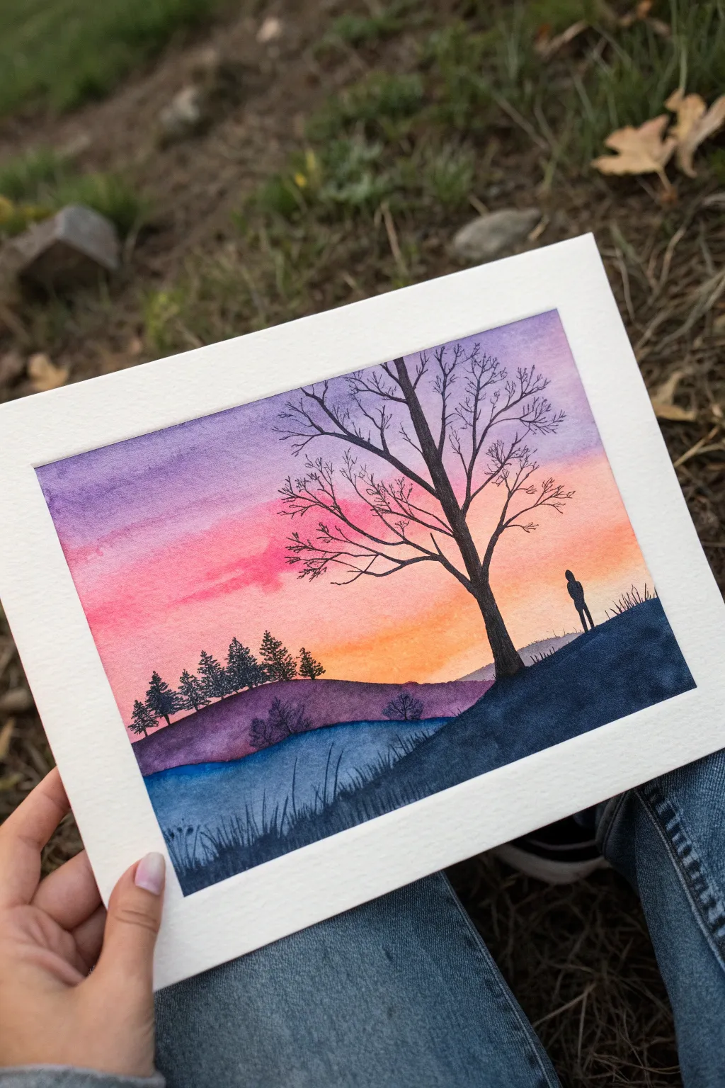
Capture the quiet beauty of a lonely figure watching the sun go down with this stunning watercolor piece. You’ll create a seamless gradient sky transitioning from violet to orange, contrasted perfectly by stark black silhouettes.
Step-by-Step Guide
Materials
- Watercolor paper (cold press, at least 140lb)
- Watercolor paints (Purple, Magenta/Pink, Orange, Indigo/Dark Blue)
- Black ink, gouache, or a fine liner pen for silhouettes
- Large flat wash brush
- Round brush (size 6 or 8)
- Fine detail brush (size 0 or 1)
- Masking tape
- Jars of clean water
- Paper towels
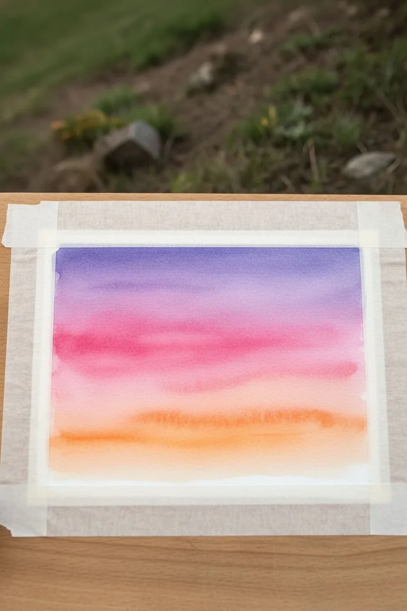
Step 1: Painting the Gradient Sky
-
Prepare your canvas:
Start by taping down all four edges of your watercolor paper to a board or table. This creates that crisp white border seen in the image and prevents the paper from buckling when wet. -
Wet the sky area:
Using your large flat brush and clean water, apply a gentle wash over the top two-thirds of the paper. You want the paper damp and glistening, but not so wet that puddles form. -
Apply the purple:
Load your brush with a rich purple hue. Starting at the very top edge, paint a horizontal strip across the paper. Let the wet paper help diffuse the bottom edge of the purple pigment. -
Blend in pink:
While the purple is still damp, pick up a vibrant magenta or pink. Paint directly below the purple, slightly overlapping the two colors so they bleed together softly. -
Finish with orange:
Clean your brush and load it with a bright sunset orange. Apply this below the pink, blending them where they meet. Bring this orange wash down until you reach the horizon line where hills will be. -
Let it dry completely:
This is crucial—wait until the sky is 100% bone dry. If you paint the hills too soon, the colors will bleed upward into your beautiful sunset.
Step 2: Creating the Landscape
-
Paint the distant hill:
Mix a muted purple-grey using your purple and a touch of indigo. With a round brush, paint a rolling hill shape across the middle ground, slightly overlapping the bottom of your orange sky. -
Add distant trees:
While the hill is still wet, or just after it dries for sharper lines, use a smaller brush to dab in tiny pine tree shapes along the left ridge of this purple hill. -
Paint the water reflection:
Below the purple hill, paint a section of blue-grey to represent a body of water or shadowed valley. I like to keep this wash loose and uneven to mimic texture. -
Form the foreground slope:
Mix a very dark indigo or navy blue. Paint a steep, sloping hill rising from the bottom right corner, sweeping diagonally upwards towards the left. This will be your main foreground element.
Bleeding Colors?
If your black silhouette bleeds into the sky, the background wasn’t dry enough. Let it dry completely, then use opaque black gouache or a pen to cover the mistake.
Step 3: Adding High-Contrast Silhouettes
-
Switch to black:
For the crispest silhouettes, switch to opaque black medium. This could be black gouache, ink, or highly concentrated black watercolor. -
Outline the main tree:
Using a fine detail brush, paint the trunk of the large tree on the right foreground hill. Make the base wider and taper it as it reaches up into the sky. -
Branch out:
Extend main branches from the trunk. Remember that trees are organic; make your lines slightly shaky and irregular rather than perfectly straight. -
Add fine twigs:
Switch to your finest brush (or a black pen) to add the delicate, wispy twigs at the ends of the branches. These should reach high into the purple section of the sky. -
Paint the figure:
Carefully paint a small standing silhouette on the ridge of the right hill. Keep the shape simple—just a head and body profile—to suggest a person looking out at the view. -
Detail the grass:
Along the curve of the foreground hill in the bottom right, add upward flicking strokes to create the look of tall grass blades. -
Enhance the lower foreground:
Darken the very bottom left corner with some grassy textures and darker washes to frame the scene and add depth. -
The final reveal:
Once absolutely everything is dry, slowly peel away the masking tape at a 45-degree angle to reveal your clean white edges.
Natural Looking Trees
To make branches look realistic, never use straight lines. Roll your brush between your fingers slightly as you pull the stroke to create natural, gnarly deviations.
Frame your new masterpiece to add a peaceful vibe to any room in your home
Soft Blue Cloud Study With Minimal Shading
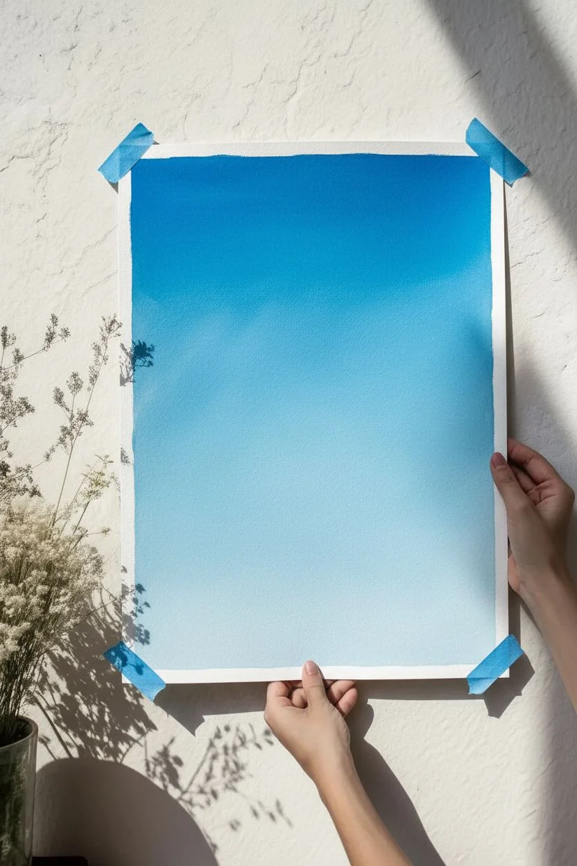
Capture the serenity of a bright summer day with this fluffy cloud study. Using opaque gouache allows you to build soft, pillowy layers of white against a vibrant blue gradient for a truly ethereal effect.
How-To Guide
Materials
- Heavyweight watercolor paper or mixed media paper (300 gsm)
- Painter’s tape or masking tape
- Gouache paint (Primary Blue, Titanium White, hint of Black or Grey)
- Large flat wash brush (3/4 inch or similar)
- Medium round brush (size 6 or 8)
- Small round detail brush (size 2)
- Palette for mixing
- Two jars of water
- Paper towels
Step 1: Setting the Sky
-
Tape the borders:
Secure your paper to a hard surface using painter’s tape on all four sides. This creates that clean, professional white border shown in the photo and prevents the paper from buckling when wet. -
Mix your blues:
Prepare a gradient of blue on your palette. You’ll need a deep, saturated blue for the top corners (mix Primary Blue with a tiny drop of Black if needed) and a lighter, whiter blue for the lower horizon. -
Paint the gradient base:
Using your large flat brush, apply the darkest blue at the very top of the paper. As you work your way down, gradually mix in more white and water, creating a smooth transition from deep azure to a pale baby blue at the bottom. -
Add diagonal light rays:
While the blue background is still slightly damp, take a clean, slightly wet brush and embrace a lifting technique. Gently drag the brush diagonally from the top left corner down towards the center to lift some pigment, creating subtle, soft rays of light. -
Let it dry completely:
The background must be bone dry before you start the clouds to keep the white edges crisp. You can use a hairdryer on a low setting to speed this up.
Cloud Texture Tip
Use a ‘scumbling’ motion (scrubbing a dry brush in circles) for the fluffy tops. This creates a broken, airy texture that mimics real cloud vapor better than smooth strokes.
Step 2: Building the Clouds
-
Map the cloud shapes:
With a diluted mixture of greyish-blue, lightly sketch the rough outlines of your three main cloud clusters: one large formation near the top, a medium one in the center-right, and smaller fluff at the bottom. -
Mix shadow tones:
Mix a soft grey-purple or grey-blue color. Clouds aren’t pure white; they have shadows on their undersides. Use your medium round brush to paint the bottom ‘bellies’ of the clouds with this shadow color. -
Apply the mid-tones:
Mix a lighter off-white (white with a tiny touch of the blue sky color). Paint the middle sections of the clouds, blending the bottom edge slightly into your shadow color while it’s still workable. -
Highlight the tops:
Load your brush with pure, thick Titanium White. Dab this onto the very tops of the cloud formations, creating rounded, fluffy edges that stand out against the blue sky. -
Refine the edges:
Use a smaller brush to stipple small, irregular bumps along the top edges of the clouds. This irregularity is key—perfect circles look unnatural, so keep your wrist loose. -
Blend the transitions:
With a clean, slightly damp brush, gently soften the boundaries between the shadow, mid-tone, and highlight areas within the cloud. Don’t over-blend; you want to keep some texture.
Level-Up: Golden Hour
Change the vibe by swapping pure white highlights for a soft peach or pale yellow on the left side of the clouds to mimic a sunset glow hitting them.
Step 3: Final Details
-
Enhance the sunbeams:
Mix a very watery, translucent white glaze. Paint faint diagonal streaks coming from the top left, passing over parts of the blue sky and even slightly over the cloud edges to simulate those ‘god rays’ hitting the vapor. -
Deepen contrast:
If your clouds look too flat, I like to go back in with a slightly darker grey-blue and reinforce the deepest shadows at the very bottom of the largest cloud. -
Bloom the small clouds:
Add tiny, floating bits of cloud ‘debris’ around the main shapes using the tip of your small brush. These little disconnected puffs make the large clouds feel more integrated into the atmosphere. -
Remove the tape:
Once the painting is 100% dry to the touch, slowly peel back the painter’s tape at a 45-degree angle away from the painting to reveal distinct, crisp edges.
Step back and admire your peaceful slice of sky, perfect for framing or gifting


Tiny Ocean Horizon With Sparkly Light Dabs
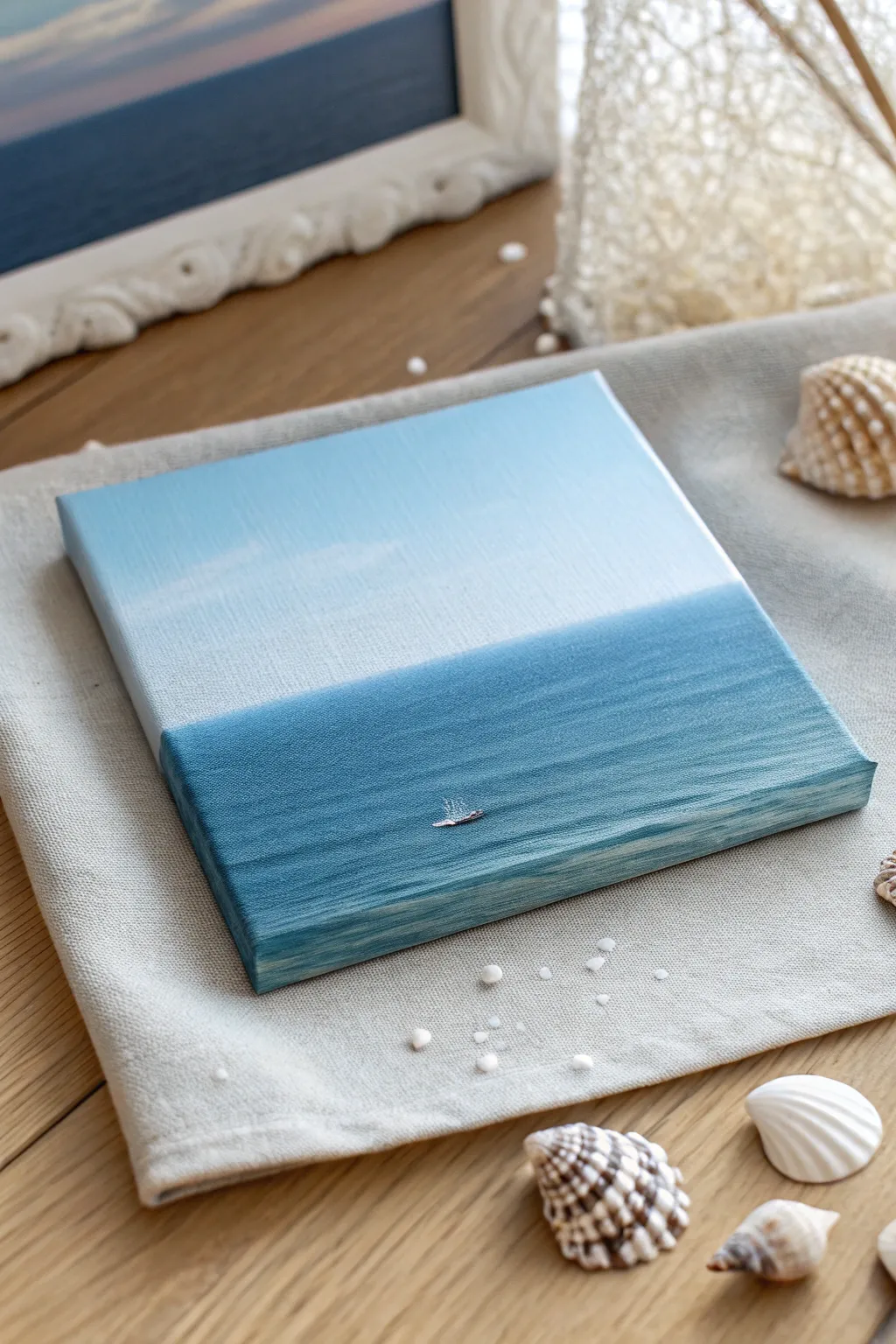
Capture the serene vastness of the ocean on a tiny canvas with this minimalist gradient painting. The soothing transition from sky to sea showcases how a simple two-tone palette can create a striking sense of depth and calm.
Step-by-Step Guide
Materials
- Small square stretched canvas (approx. 4×4 or 6×6 inches)
- Acrylic paints: Titanium White, Cerulean Blue, Prussian Blue (or Phthalo Blue)
- Flat shader brush (medium size)
- Small round detail brush
- Palette or mixing plate
- Cup of water
- Paper towels
- Silver paint or glitter glue (optional for boat detail)
Step 1: Painting the Sky Gradient
-
Prepare the sky color:
Start by mixing a large amount of Titanium White with just a tiny dot of Cerulean Blue. You want a very pale, airy blue that feels like a clear morning sky. -
Apply the top layer:
Using your flat shader brush, paint the top third of the canvas with this pale blue mixture. Use horizontal strokes to keep the texture smooth and sky-like. -
Lighten the horizon:
Without cleaning your brush, pick up a bit more pure Titanium White. Blend this into the bottom area of your sky section, working downwards to where the horizon line will be. The goal is a subtle ombré that gets lighter as it approaches the water. -
Paint the edges:
Don’t forget to extend these sky colors around the sides and top edge of the canvas. This gallery-wrapped look gives the finished piece a polished, professional feel.
Horizon Wobbles?
If painting a straight line is tough, apply a strip of painter’s tape across the dry sky area. Paint the ocean below it, then peel the tape while wet for a perfect edge.
Step 2: Creating the Ocean Depth
-
Mix the ocean base:
Clean your brush thoroughly. Mix Cerulean Blue with a touch of Prussian Blue to create a medium teal-blue tone. This will be the main color of your water. -
Establish the horizon line:
Carefully paint a straight horizontal line across the canvas where the sky meets the sea. I like to use the flat edge of the brush to guide this line for sharpness. -
Fill the water section:
Fill in the rest of the canvas below this line with your ocean mix. Keep your brushstrokes strictly horizontal to mimic the natural movement of water. -
Continue the sides:
Paint the bottom and side edges of the canvas with this same blue tone, matching the horizon line where it wraps around the corner. -
Add depth to the foreground:
While the blue paint is still wet, mix a slightly darker shade by adding more Prussian Blue. Blend this gently into the very bottom of the canvas to suggest deeper water closer to the viewer.
Level Up: Texture
Mix a tiny amount of modeling paste into your white paint for the boat. This raises it off the surface, adding 3D tactile interest to your smooth seascape.
Step 3: Refining and Detailing
-
Soften the transition:
If the horizon line looks too harsh, take a clean, slightly damp brush and run it very gently along the line once to blur the hard edge just a tiny bit. This creates atmospheric perspective. -
Add subtle waves:
Mix a lighter tint of your ocean blue (add white). Using the very tip of a clean brush or a small round brush, add extremely faint, thin horizontal streaks in the water area to suggest gentle ripples. Keep them sparse. -
Dry completely:
Let the entire canvas dry fully before moving on. The background needs to be solid so the tiny details sit crisply on top. -
Paint the tiny boat:
Switch to your smallest detail brush. Using pure Titanium White, dab a tiny, elongated horizontal shape in the lower center of the water. It should be barely larger than a grain of rice. -
Add the sail highlight:
add a microscopic vertical dab or flick of white extending upward from the boat hull to suggest a sail catching the light. -
Final sparkle:
For that magical glimmer seen in the inspiration photo, touch a tiny dot of silver paint or glitter glue right onto the boat shape. This catches the light and becomes the focal point.
Place your finished mini-canvas near a shell collection or on a sunny shelf to evoke memories of the beach
BRUSH GUIDE
The Right Brush for Every Stroke
From clean lines to bold texture — master brush choice, stroke control, and essential techniques.
Explore the Full Guide
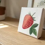
Single Strawberry With a Bold Outline
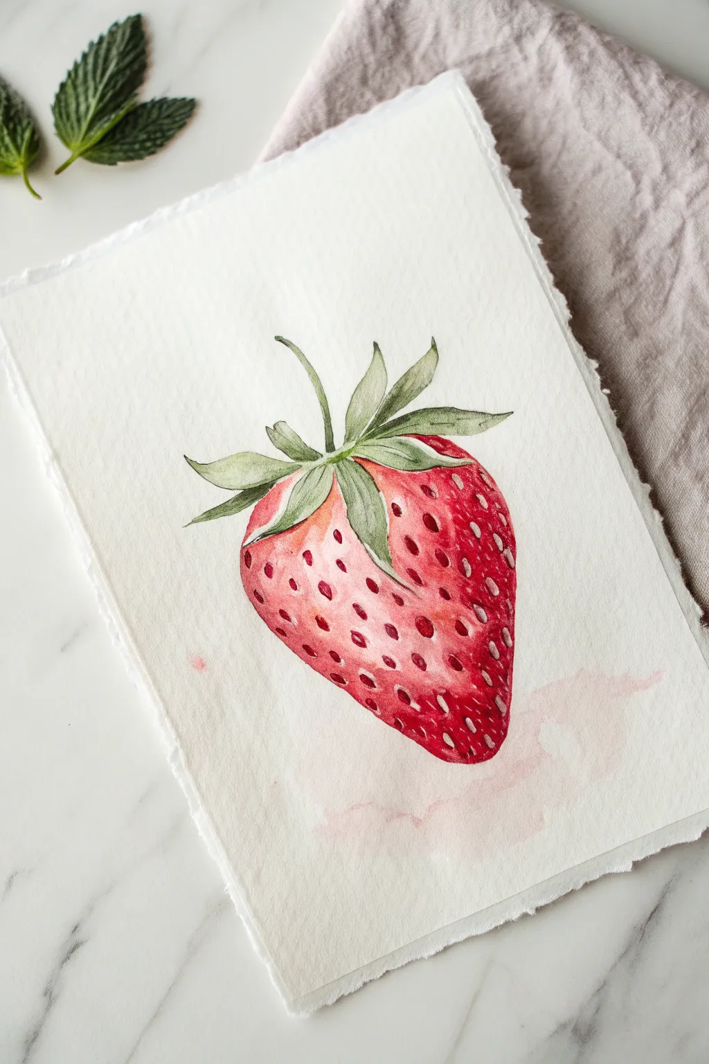
This charming botanical study captures the vibrant juicy nature of a strawberry using translucent watercolor layers. The focus is on building depth through reds and gentle greens, all set on beautiful deckled-edge paper for a vintage aesthetic.
Step-by-Step Tutorial
Materials
- Cold press watercolor paper (deckled edge preferred)
- Watercolor paints (Alizarin Crimson, Cadmium Red, Sap Green, Burnt Umber)
- Round watercolor brushes (Size 4 and Size 0 or 1 for details)
- Pencil (HB or 2H)
- Kneaded eraser
- Clean water
- Paper towels
Step 1: Drawing and Initial Wash
-
Sketch the outline:
Begin by lightly sketching the strawberry’s heart-like shape on your paper. Add the leafy calyx on top, letting the leaves curve naturally in different directions. Keep your pencil pressure very light so the graphite doesn’t show through the paint later. -
Map the highlights:
Before painting, lightly draw small ovals or circles where the brightest highlights will be on the strawberry’s shoulder. You can also sketch faint grid-like positions for the seeds to guide you later. -
Mix your base red:
Create a watery mix of Cadmium Red with plenty of water. You want a pale, transparent pink for this first layer. -
Apply the first wash:
Paint the entire body of the berry with your pale red mix, careful to paint *around* the highlight areas you marked, leaving the white paper exposed. This creates the shine. -
Paint the leaves:
While the berry dries, mix a light wash of Sap Green. Fill in the leaves at the top, varying the intensity slightly by adding more pigment to the base of the stems where they meet the fruit.
Step 2: Building Form and Depth
-
Deepen the reds:
Once the first layer is completely dry, mix a stronger, less watery version of Alizarin Crimson. Apply this to the sides and bottom of the strawberry to create a sense of roundness, feathering the edges with a wet brush so it blends into the lighter center. -
Create the seed indentations:
Using the tip of a size 4 brush and your darker red mix, dab small shadows where the seeds sit. These aren’t the seeds themselves, but the little pockets in the flesh. I like to keep these darker near the edges and lighter towards the center highlight. -
Refine the greens:
Mix a tiny bit of Burnt Umber into your Sap Green to create a darker, shadowy green. Use your smaller brush to paint thin veins on the leaves and darken the areas where leaves overlap. -
Glazing for vibrancy:
If the berry looks too dull after drying, apply a very thin, broad glaze of Cadmium Red over the mid-tones (avoiding the white highlights) to boost the saturation.
Fixing “Cauliflowers”
If you get uneven water blooms (cauliflowers) in the red paint, wait for it to dry completely, then gently scrub the edge with a damp stiff brush to soften it.
Step 3: Seeds and Final Details
-
Mix seed color:
Combine a little yellow or ochre with red to get a warm, golden-brown color for the seeds. -
Paint the seeds:
Using your smallest brush (size 0 or 1), carefully paint the teardrop-shaped seeds inside the red indentations you created earlier. Ensure the paint is thick enough to stand out against the red background. -
Enhance contrast:
Mix a concentrated dark red or crimson. Paint tiny crescent shadows underneath individual seeds, especially on the shaded side of the berry, to make them look embedded in the flesh. -
Add the background spill:
Take a very diluted, watery pink mix on a larger brush. loosely drag it beneath and to the right of the strawberry to create that subtle, aesthetic watercolor stain effect seen in the reference. -
Final assessment:
Step back and check your values. If the leaves need more definition, add a final touch of dark green to the tips or central veins.
Level Up: White Gel Pen
Use a white gel pen to add tiny, sharp highlights on the very top of a few seeds or on the glossy skin for an extra ‘wet’ look.
Allow your painting to dry fully before framing or displaying your juicy creation.
Easy Color-Block Tulip on a Neutral Background
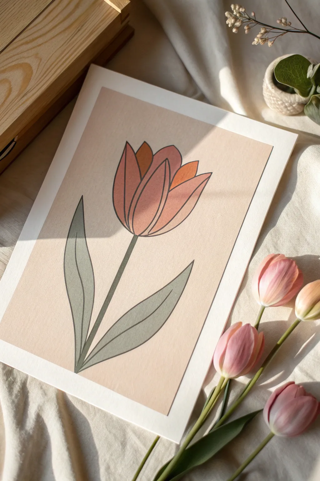
This aesthetic painting project focuses on clean lines and a warm, muted color palette that feels instantly vintage. By using simplified shapes and bold outlining, you’ll create a stylish piece of botanical art that looks professionally printed.
Detailed Instructions
Materials
- Heavyweight watercolor paper or mixed media paper (A4 or A5 size)
- Pencil (HB) and eraser
- Gouache or acrylic paints (Terracotta, Blush Pink, Sage Green, Deep Orange, Cream/Beige)
- Small flat brush (size 4 or 6)
- Fine liner brush or black paint marker (0.5mm)
- Ruler
- Painter’s tape or masking tape
- Palette for mixing
- Jar of water and paper towels
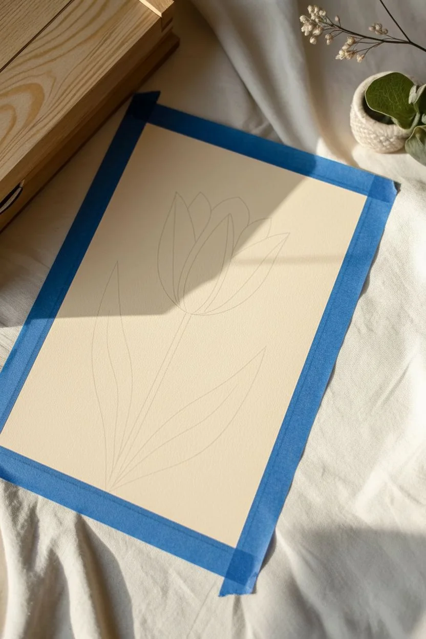
Step 1: Preparation & Drawing
-
Define the border:
Start by taping down your paper to a flat surface. To achieve that crisp white border seen in the photo, measure in about 1 inch from each edge and place strips of painter’s tape to mask off the margins. -
Create the background base:
Mix a large amount of a very pale, warm beige or cream color. Using your flat brush, cover the entire exposed rectangle with an even coat of paint. Let this dry completely before drawing; I always wait at least 15 minutes here so my pencil doesn’t dig into wet paint. -
Sketch the stem:
Lightly draw a straight vertical line starting from the bottom center, stopping about halfway up the page. This will be the center of your stem. -
Outline the tulip head:
At the top of your stem line, sketch a large U-shape for the base of the flower. Add the petals by drawing three main pointed oval shapes: a central petal and two side petals that overlap slightly. -
Add detail petals:
Peek-a-boo petals are next. Draw two smaller, triangular tips popping out from behind the main petals to add depth and complexity to the flower head. -
Draw the leaves:
From the base of the stem, sketch two large, swooping leaves. Make the left one slightly taller and curvier, and the right one a bit shorter and broader, ensuring they taper to elegant points.
Step 2: Painting
-
Paint the leaves:
Mix a muted Sage Green. Carefully fill in both leaf shapes and the stem. Use the edge of your flat brush to keep the long lines smooth. -
Block in the main petals:
For the two large side petals, mix a soft Terracotta or dusty pink shade. Paint these sections carefully, bringing the color right up to your pencil lines. -
Fill the center petal:
Use a slightly darker or more saturated version of your pink/red mix for the central petal. This slight color variation helps distinguish the overlapping shapes. -
Add the rear petals:
Paint the small ‘peek-a-boo’ petals in a Deep Orange or rust color. This contrast makes the flower look dimensional rather than flat. -
Allow to cure:
Let all the paint layers dry thoroughly. If the paint feels cool to the touch, it’s still wet. Patience here ensures your outlines won’t bleed later.
Uneven Paint Coverage?
If your background looks streaky, apply a second thin coat of the beige paint, brushing in the opposite direction (horizontally) to smooth out the texture.
Step 3: Finishing Touches
-
Outline the stem and leaves:
Using a fine liner brush with black paint (or a black paint marker for easier control), trace the outer edges of the stem and leaves. Keep the line thickness consistent. -
Detail the leaves:
Draw a single, long smooth line down the center of each leaf to represent the main vein. -
Outline the flower head:
Trace the perimeter of every petal. Ensure you outline each individual shape so they look like distinct segments, rather than one big blob. -
Add petal definition:
If your center petal looks too flat, add a subtle curved line near the base to suggest distinct separation from the side petals. -
The reveal:
Once the black ink is totally dry, slowly peel away the painter’s tape at a 45-degree angle to reveal your crisp clean borders.
Go Digital style
For a trendier look, offset the black outline slightly. Instead of tracing perfectly on the edge, draw the line just a millimeter to the right for a ‘misprint’ effect.
Frame your new geometric botanical art and enjoy the serene vibes it brings to your space

PENCIL GUIDE
Understanding Pencil Grades from H to B
From first sketch to finished drawing — learn pencil grades, line control, and shading techniques.
Explore the Full Guide
Minimal Leaf Branch Line-and-Wash in Sage Green
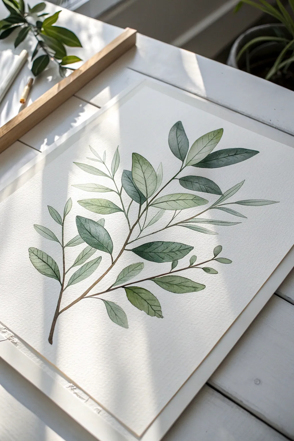
Capture the serenity of nature with this delicate watercolor branch study that balances structure with fluidity. The soft sage greens and crisp outlines create a modern botanical piece perfect for adding a breath of fresh air to any room.
Step-by-Step Guide
Materials
- Cold press watercolor paper (300 gsm)
- Watercolor paints (Sap Green, Olive Green, Payne’s Grey, Burnt Umber)
- Round brushes (sizes 2, 4, and 6)
- Pencil (HB or H)
- Kneaded eraser
- Two jars of water
- Paper towels or a rag
- Fine liner pen (brown or dark grey, waterproof, 0.1mm) – optional
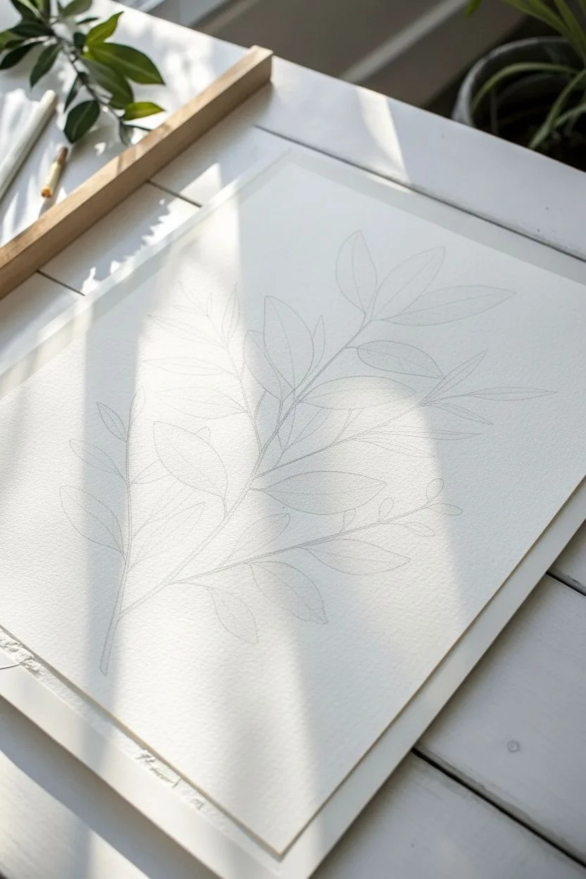
Step 1: Sketching the Bones
-
Map the central stem:
Start by drawing a gentle, curving line diagonally across your paper. It should start from the bottom left quadrant and reach towards the top right, creating a natural, fluid spine for your branch. -
Place the leaf stems:
Along the main stem, lightly mark short offshoots where your leaves will attach. Alternate them left and right rather than placing them directly opposite each other to mimic natural growth patterns. -
Outline the leaf shapes:
Sketch simple, elongated almond shapes for the leaves. Vary the sizes—make the ones near the base larger and the ones near the tip smaller and more tender. Don’t worry about perfection; organic shapes look better. -
Refine and lighten:
Once you are happy with the composition, use your kneaded eraser to lift most of the graphite. You want faint ‘ghost lines’ that guide you but won’t show through the translucent watercolor.
Step 2: Painting the Foliage
-
Mix your base green:
Create a watery mix of Sap Green with a tiny touch of Burnt Umber to dull it down. This will be your lightest sage tone for the initial wash on the leaves. -
First leaf wash:
Using a size 6 brush, paint the leaves with this light mix. Work one leaf at a time. I like to leave tiny slivers of white paper unpainted down the center or edges to suggest highlights catching the light. -
Create variation:
For some leaves, add a little more water to your brush to make them paler; for others, add a drop of Olive Green to the wet paint to create subtle depth. -
Painting the stem:
Switch to a size 2 brush. Mix Burnt Umber with a hint of Payne’s Grey for a woody brown. carefully trace the main stem and the smaller leaf attachments. Keep the line thin and delicate. -
Connecting the elements:
Ensure the stem connects smoothly to the base of each damp leaf. If the green paint runs slightly into the brown stem, let it happen—it creates a lovely ‘wet-on-wet’ bleed. -
Let it dry completely:
Wait until the paper is bone dry. If it feels cool to the touch, it’s still damp inside. Patience here prevents muddy colors later.
Fixing Blooms
If water pushes pigment to the edges creating ‘cauliflowers,’ wait for it to fully dry. Then, gently scrub the edge with a damp, stiff brush (like a jagged eraser) to soften the hard line.
Step 3: Adding Details & Depth
-
Mix a shadow color:
Prepare a darker green by mixing Sap Green with Payne’s Grey or a touch of blue. This should be significantly darker than your base wash but still transparent. -
Layering the shadows:
On the dry leaves, paint over roughly half of each leaf (usually the bottom half or one side of the central vein) with this darker mix. This creates a dimensional, folded look. -
Softening edges:
Immediately after applying the shadow paint, rinse your brush, dry it slightly, and run the damp bristles along the hard edge of the shadow paint to blur specifically the inner edge. -
Painting the veins:
Using your smallest brush (size 0 or 2) and the dark green mix (creamy consistency, less water), paint fine central veins down the leaves. Add delicate side veins sparingly. -
Defining the contours:
If you want a crisper look similar to the photo, use the tip of your brush to outline parts of the leaves with the dark mix. Don’t outline the whole leaf; broken lines look more artistic. -
Alternative: Pen outlines:
For a true illustrative style, you can skip the paint outlines and instead use a waterproof fine liner to add very loose, scribbly outlines and vein details after the paint is dry. -
Final assessment:
Step back. If any area looks too flat, glaze a very watery layer of Olive Green over just that section to tint it without losing the details underneath.
Gold Accents
Once fully dry, trace the main stem or just the tips of the leaves with metallic gold watercolor or a gold gel pen. It adds a subtle shimmer that elevates the minimalist style.
Frame your finished piece with a wide white mat to emphasize the delicate nature of your botanical study
Simple Planets on a Deep Night-Sky Background
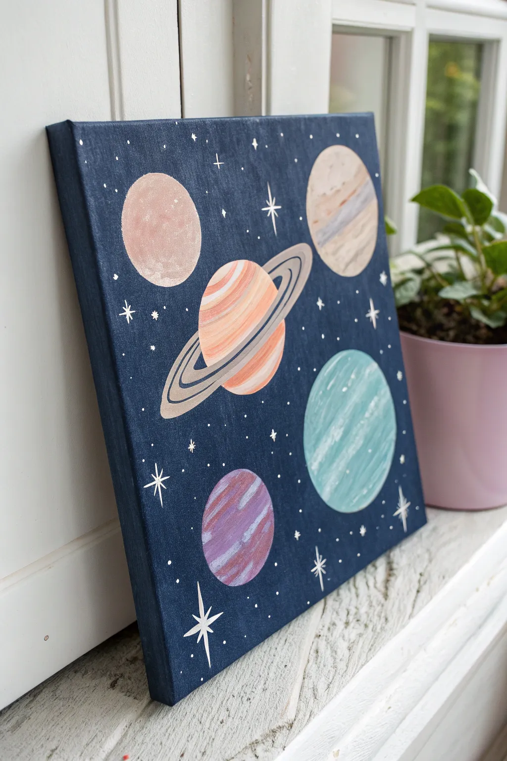
Capture the calm beauty of the cosmos with this beginner-friendly galaxy painting. Featuring soft pastel planets against a deep navy expanse, this artwork brings a touch of stellar wonder to any shelf or wall.
Detailed Instructions
Materials
- Square stretched canvas (approx. 10×10 or 12×12 inches)
- Acrylic paints: Navy blue, black, titanium white, pastel pink, light terracotta (peach), beige, light teal, purple
- Flat brush (1 inch) for background
- Medium round brush (size 6) for planets
- Fine liner brush (size 0 or 00) for details
- Circle stencils, compass, or household round objects (cups, lids) to trace
- Pencil
- Palette for mixing
- Cup of water and paper towels
Step 1: Setting the Scene
-
Prepare the canvas:
Start by laying down a protective cover on your workspace. Wipe the canvas surface gently with a dry cloth to remove any dust. -
Mix the background color:
Create a deep, rich night-sky hue by mixing a large amount of navy blue with a small touch of black. You want it dark but not pitch black, maintaining that beautiful deep indigo tone. -
Apply the base coat:
Using your large flat brush, paint the entire front and sides of the canvas with your custom navy mix. Brush in various directions to create a subtle texture that mimics the depth of space. -
Add a second coat:
Once the first layer is dry to the touch (usually 10-15 minutes), apply a second coat if needed to ensure solid, opaque coverage without white canvas showing through. Let this dry completely before moving on.
Clean Edges Trick
Use a white chalk pencil instead of graphite for sketching on dark paint. It’s visible but wipes away easily with a damp Q-tip if you make mistakes.
Step 2: Drafting the Planets
-
Plan the layout:
Visualize where your five planets will go. The largest one (Saturn-like) sits centrally, while four smaller spheres orbit in the corners. -
Trace the circles:
Use a compass or trace around household items like cups or lids to lightly draw five circles onto the dry background with a pencil. Vary the sizes slightly for visual interest. -
Sketch the ring:
For the central planet, lightly sketch an oval ring shape that tilts diagonally across the sphere. Draw the back part of the ring distinct from the front band that crosses the planet’s face.
Add Cosmic Shimmer
Once the paint is dry, brush a thin layer of iridescent glitter glaze or metallic pearl paint over just the rings to make them catch the light.
Step 3: Painting the Spheres
-
Paint the top-left planet:
Mix a soft dusty pink using white and a tiny dot of red or pink. Fill in the top-left circle, dabbing the brush slightly to create a crater-like texture. -
Paint the top-right planet:
Use a beige or sandy color for the top-right planet. While the paint is wet, streak in a little white or light grey horizontally to give it a gas-giant banded look. -
Paint the bottom-right planet:
Mix a light teal or aqua color. Fill in the circle, then immediately add curved strokes of white along the bottom curve to suggest atmospheric clouds. -
Paint the bottom-left planet:
Create a soft purple shade. Paint the sphere, then add diagonal stripes of a lighter lilac or white to give it a textured, striated appearance.
Step 4: The Ringed Giant
-
Base coat the central planet:
Fill the central circle with a peach or light terracotta tone. Let it dry partially. -
Add surface details:
Take a slightly lighter orange or cream and paint curved horizontal bands across the planet’s surface to give it volume and roundness. -
Paint the rings:
Mix a greyish-beige color. Carefully paint the flat ring shape surrounding the planet. I find using a size 2 flat brush helps handle these curves steadily. -
Separate the rings:
Use a fine liner brush with dark grey or diluted black to paint thin concentric lines within the ring band, separating it into multiple tracks.
Step 5: Starry Details
-
Create starbursts:
Switch to your finest liner brush and pure titanium white. Paint several four-pointed stars (a cross shape with elongated vertical and horizontal lines) scattered in empty spaces. -
Add distant stars:
Dip the tip of your brush or a toothpick into white paint and gently dot the background to create tiny, distant stars. Group some together for a natural galaxy feel. -
Highlight shading:
Add a tiny, thin crescent of white on the upper-left edge of each planet to indicate a light source coming from that direction. -
Final touches:
If any planet edges look messy, take a small brush with your navy background color and carefully ‘cut in’ to tidy up the silhouettes.
Now step back and admire your own little slice of the universe, ready to hang


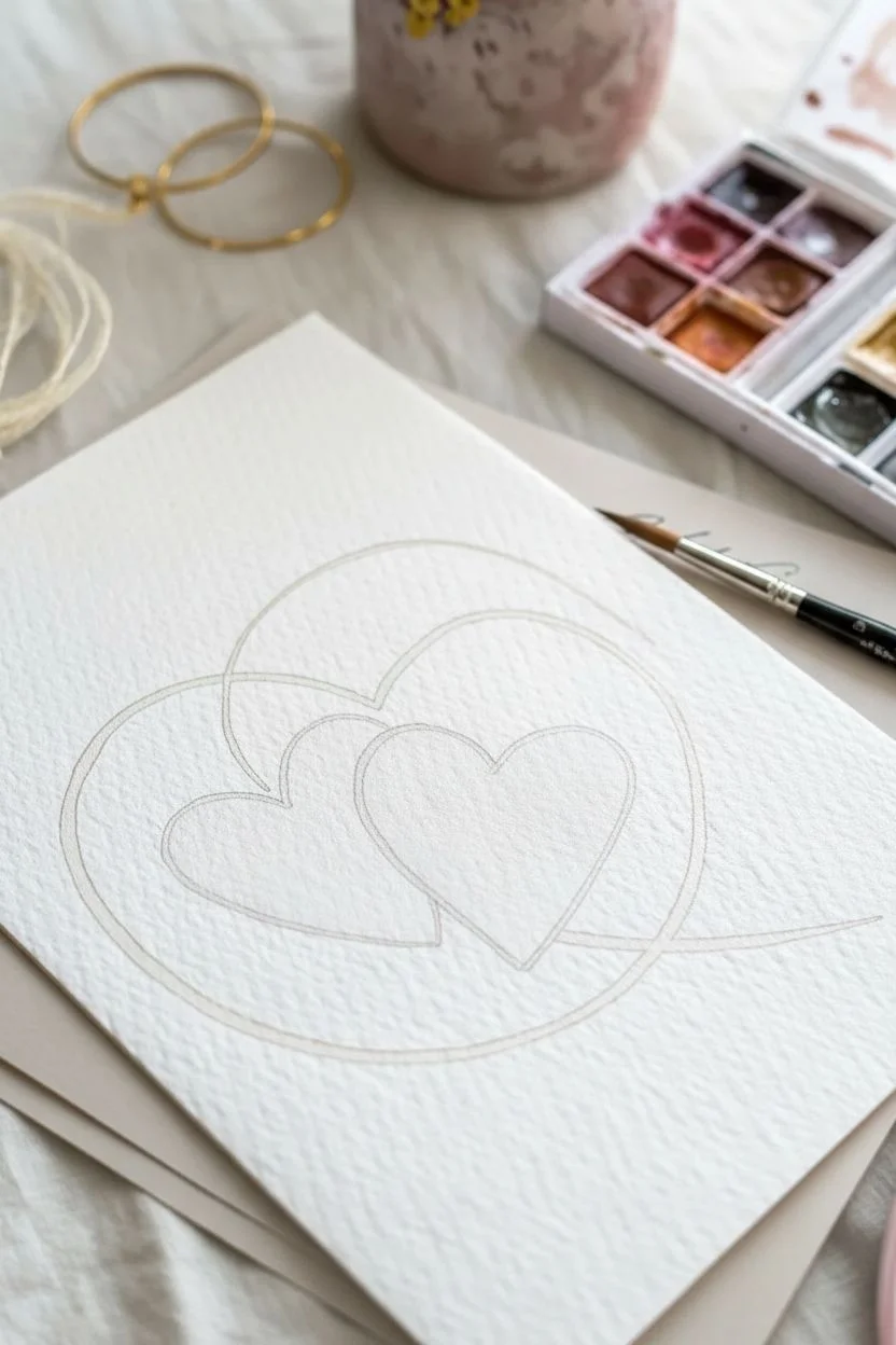
Two Hearts With a Thin Orbit Ring Detail
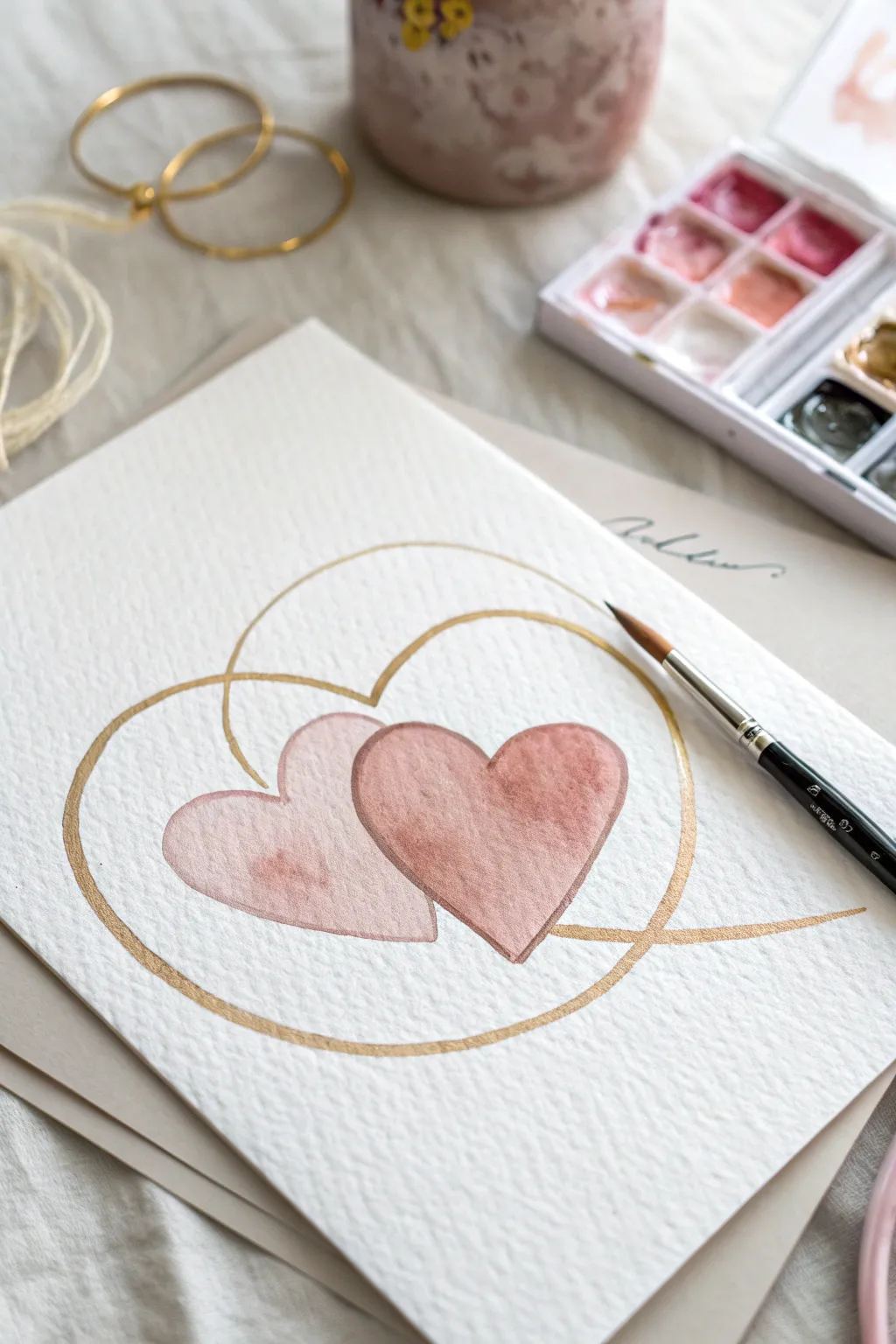
Embrace minimalist romance with this delicate watercolor study featuring two overlapping hearts caught in a shimmering golden orbit. The combination of dusty rose tones and metallic accents creates a sophisticated, modern aesthetic perfect for greeting cards or framed wall art.
Step-by-Step
Materials
- Cold press watercolor paper (300 gsm)
- Round watercolor brush (size 4 or 6)
- Small detail brush (size 0 or 1)
- Watercolor paints (dusty rose, terracotta, or burnt sienna)
- Metallic gold watercolor paint or gold ink
- Pencil (HB or H)
- Kneaded eraser
- Jar of clean water
- Paper towels
Step 1: Sketching the Layout
-
Outline the Hearts:
Begin by lightly sketching two hearts in the center of your paper using an H or HB pencil. Position them so they slightly overlap, with the right heart appearing just a bit in front of the left one. -
Add the Orbit:
Draw a large, swirling circle that encompasses both hearts. Unlike a perfect circle, let this line flow organically, perhaps looping twice or having an open end to mimic an orbital path. -
Refine the Lines:
Check your proportions. The gold ring detail should pass behind the hearts in some areas and in front in others to create depth. Use a kneaded eraser to lighten the pencil lines until they are barely visible guides.
Uneven Gold Lines?
If your metallic lines look shaky, try exhaling slowly as you pull the brush across the paper. Also, ensure your gold paint has a creamy consistency.
Step 2: Painting the Hearts
-
Mix Your Colors:
Prepare a watery mix of dusty rose. I like to add a tiny touch of brown or burnt sienna to a standard pink to mute it down and give it that vintage, earthy feel. -
First Wash – Left Heart:
Load your round brush with the watery pink mix. Paint the left heart first, keeping the wash sheer and even. -
Drop in Pigment:
While the left heart is still wet, touch the tip of your brush loaded with slightly more concentrated paint into the center or bottom curve. Let the color bloom naturally for texture. -
Let it Dry:
Allow this first heart to dry completely. If you paint the adjacent heart too soon, the colors will bleed into each other and you’ll lose the defined edge. -
Paint the Right Heart:
Once the first shape is dry, paint the second heart overlapping it. Use a slightly more saturated version of your rose color to make it visually pop forward. -
Create the Overlap:
As you paint over the section where the hearts meet, the transparency of watercolors will naturally create a darker shape at the intersection. This is a desirable effect, so don’t rework it too much.
Step 3: Adding the Gold Details
-
Prepare the Metallic Paint:
Activate your metallic gold watercolor pan with a few drops of water, letting it sit for a minute to become creamy and opaque. If using ink, give the bottle a good shake. -
Switch Brushes:
Pick up your small detail brush (size 0 or 1). You need fine control for the thin lines of the orbit ring. -
Trace the Orbit:
Carefully paint over your pencil orbit line with the gold. Maintain a steady pressure to keep the line width consistent. -
Mind the Intersection:
Pay close attention to where the gold line meets the painted hearts. Decide where the line goes ‘under’ or ‘over’ the hearts to enhance the 3D effect shown in the original design. -
Add Second Loop:
If your design includes a second, inner loop or a swirling tail, paint this now. Keep the movement fluid and swift to avoid shaky lines. -
Final Touches:
Inspect the gold line. If any areas look too faint, carefully go over them with a second layer of gold once the first is dry to ensure a rich, metallic shine.
Level Up: Texture
Make it extra special by sprinkling a tiny pinch of salt onto the wet heart paint. Once dry, brush it off for a stunning, speckled watercolor texture.
Place your finished piece in a floating frame to really show off those deckled paper edges
Muted Pastel Checkerboard With Clean Edges
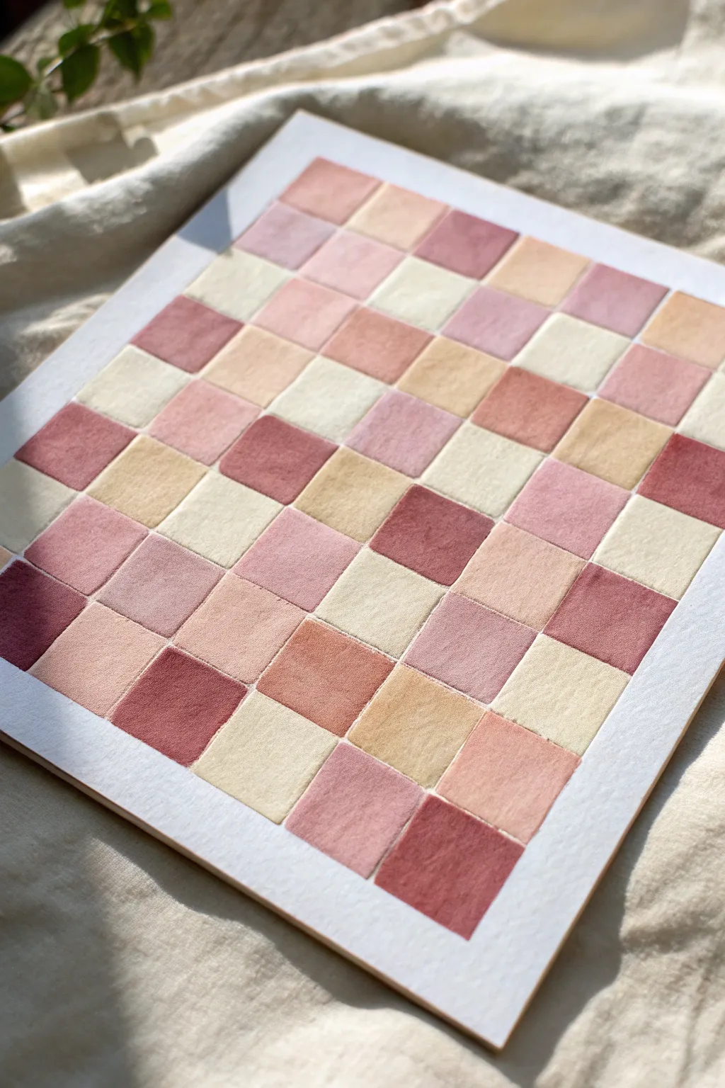
Achieve a calming, aesthetic vibe with this soft checkerboard pattern featuring a palette of dusty pinks, creams, and terracotta shades. The result is a wonderfully textured, minimalist piece that brings warmth to any space without overwhelming it.
Step-by-Step Tutorial
Materials
- Cold press watercolor paper (300 gsm)
- Gouache or watercolor paints (muted pink, ochre, maroon, white)
- Flat shader brush (size 6 or 8) and a small round brush
- Pencil (HB or H)
- Ruler
- Artist tape or masking tape
- Mixing palette
- Jar of water
- Paper towels
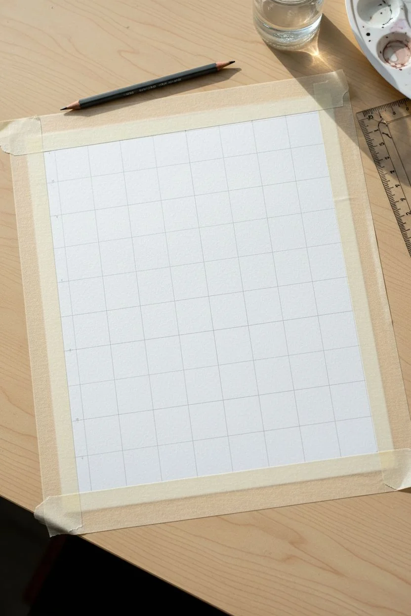
Step 1: Preparation & Grid
-
Tape the border:
Begin by securing your watercolor paper to a flat surface. Apply a strip of artist tape creating a border about 1 to 1.5 inches from the edge of the paper on all four sides. Press the edges down firmly to ensure a clean white frame later. -
Calculate your grid:
Measure the width and height of the painting area inside the tape. Decide on the size of your squares; for the look in the image, an 8×8 or 9×9 grid works well. Divide your total width by the number of squares you want to determine the size of each block. -
Mark the intervals:
Using your ruler and pencil, make tiny, faint tick marks along the top and left edges of your taped area at the measured intervals. -
Draw the grid lines:
Connect your tick marks horizontally and vertically using the ruler. Keep your pencil pressure extremely light—you want these lines to be just visible enough to guide you, but faint enough to disappear under the paint.
Clean Lines Secret
Don’t have a steady hand? You can tape off individual rows to paint, let them dry, remove tape, and then tape the columns. It takes longer but guarantees sharp edges.
Step 2: Mixing the Palette
-
Create a base cream:
Start by mixing a large amount of white gouache with a tiny touch of yellow ochre to create a warm, creamy off-white. This will be your lightest tone and can be used to lighten other shades. -
Mix the dusty pinks:
Mix a primary muted pink using red, a little white, and a speck of brown or green to desaturate it. From this master batch, create two variations: one lighter (add more white) and one deeper (add a touch more red/brown). -
Prepare the terracotta:
Mix a warm terracotta or rust shade using burnt sienna or modifying your pink with orange and brown. Aim for a palette of about 4-5 distinct but harmonious colors ranging from cream to deep rust. -
Check consistency:
Add water to your gouache until it reaches a heavy cream consistency. It should be opaque enough to cover the paper but fluid enough to spread smoothly without streaking.
Level Up: Texture
Mix a tiny pinch of fine sand or purchasing a texture medium into your paint for a tactile, plaster-like finish that adds depth to the simple shapes.
Step 3: Painting the Squares
-
Start with the darkest shade:
Dip your flat brush into the deepest reddish-brown shade. Randomly select squares across the grid to fill in. I like to scatter them so no two dark squares touch directly. -
Puddle and pull technique:
To get flat, even coverage, load the brush generously. Place the brush in the center of a square to deposit the paint, then gently push the paint toward the pencil lines, careful not to cross them. -
Apply the mid-tones:
Rinse your brush thoroughly. Move on to your dusty pink and terracotta shades, filling in more squares randomly. Try to balance the visual weight by spreading these colors evenly across the composition. -
Refine edges:
If you struggle with corners using the flat brush, switch to a small round brush to neatly fill the sharp 90-degree angles of each square. -
Fill the creams:
Finally, paint the remaining empty squares with your lightest cream mixture. Painting these last keeps your water clean and prevents the light color from getting muddied by darker pigments. -
Let it dry completely:
Allow the painting to dry undisturbed. Gouache dries matte and slightly lighter than it looks when wet. Wait until the paper is cool to the touch and no shiny spots remain.
Step 4: Finishing Touches
-
The reveal:
Once fully dry, slowly peel away the artist tape. Pull the tape away from the center of the painting at a 45-degree angle to prevent tearing the paper. -
Erase stray lines:
If any pencil grid lines are visible in the white border area, gently erase them now with a clean eraser.
Frame your new abstract piece in a light wood frame to complement those warm, earthy tones
Retro Wavy Pattern in Two Easy Tones
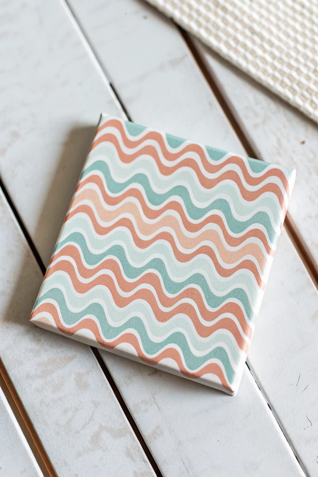
Capture a laid-back 70s vibe with this incredibly simple yet striking wavy pattern painting. Using a soothing palette of coral, teal, and soft mint, you’ll create a mesmerizing, rhythmic design that adds a pop of aesthetic charm to any shelf or desk.
How-To Guide
Materials
- Small square canvas (e.g., 6×6 or 8×8 inches)
- Acrylic paints: Coral/Terra-cotta, Teal/Sage Green, Pale Mint/Aqua, White
- Medium flat brush
- Small round detail brush or liner brush
- Pencil
- Eraser
- Palette or paper plate
- Water cup and paper towels
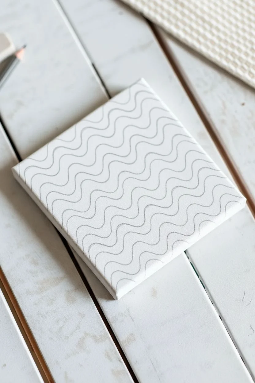
Step 1: Drafting the Design
-
Prime the canvas:
Start with a clean white canvas. If your canvas isn’t pre-primed or looks a bit dull, give it a quick coat of varying white acrylic paint to ensure a bright base. Let this dry completely. -
Sketch the first wave:
Using a pencil very lightly, draw your first wavy line starting from the top left corner moving diagonally towards the center. Keep the curves gentle and organic rather than sharp spikes. -
Repeat the pattern:
Continue drawing parallel wavy lines across the entire canvas. Aim to keep the spacing somewhat consistent, roughly half an inch to an inch apart, but don’t worry about perfection; slight irregularities add hand-painted charm. -
Refine the lines:
Step back and look at your composition. If any waves look too cramped or too wide, gently erase and adjust them now before paint touches the canvas.
Clean Lines Hack
Issues with shaky hands? Rest your pinky finger on a dry part of the canvas while painting the white lines. It acts as a stabilizer for smooth curves.
Step 2: Painting the Colors
-
Prepare your palette:
Squeeze out your coral, teal, and pale mint paints. You might want to mix a little white into the teal to get that muted, aesthetic sage look if your tube color is too bright. -
Paint the coral waves:
Select a pattern sequence (e.g., Coral, Mint, Teal). Using your flat brush, carefully fill in every third striped section with the coral paint. I find it helpful to mark the sections with a tiny dot of paint first so I don’t lose track of the pattern. -
Mind the edges:
When painting the color bands, leave a small gap between the paint and your pencil line. This gap will become the white separator line later. Don’t forget to wrap the color around the sides of the canvas for a finished, gallery-style look. -
Apply the teal layer:
Rinse your brush thoroughly. Next, fill in the teal/sage sections following your pattern sequence. Ensure the paint is opaque; you may need two coats if the canvas texture shows through. -
Add the pale mint:
Finally, fill in the remaining sections with the pale mint color. This lighter shade acts as a nice bridge between the warmer coral and the deeper teal. -
Let it dry:
Allow the entire canvas to dry completely. Acrylics dry fast, but give it at least 20 minutes to ensure you don’t smudge wet paint during the detail phase.
Disco Variation
Swap the white separator lines for metallic gold or silver paint. The shimmer adds a groovy, high-end finish that catches the light beautifully.
Step 3: Defining the Lines
-
Load the liner brush:
Thicken your white paint slightly or use it straight from the tube for maximum opacity. Load a small round detail brush or a liner brush with a smooth amount of paint. -
Paint the separators:
Carefully paint the white wavy lines in the negative space you left between the colored bands. The goal is a crisp, consistent width for each white line. -
Clean up edges:
If your colored sections look a bit wobbly, use the white line to overlap slightly and correct the shape of the wave. This is the secret to getting those clean curves. -
Check opacity:
If the white lines look streak, let them dry and apply a second coat to make them pop against the colorful waves. -
Erase guidelines:
Once the painting is 100% bone dry (wait a few hours to be safe), gently erase any visible pencil marks that might still be peeking through the white lines.
Place your finished wavy canvas on a brightly lit shelf to enjoy those soothing retro vibes every day
Cute Frog Peeking Out of Water in Flat Colors
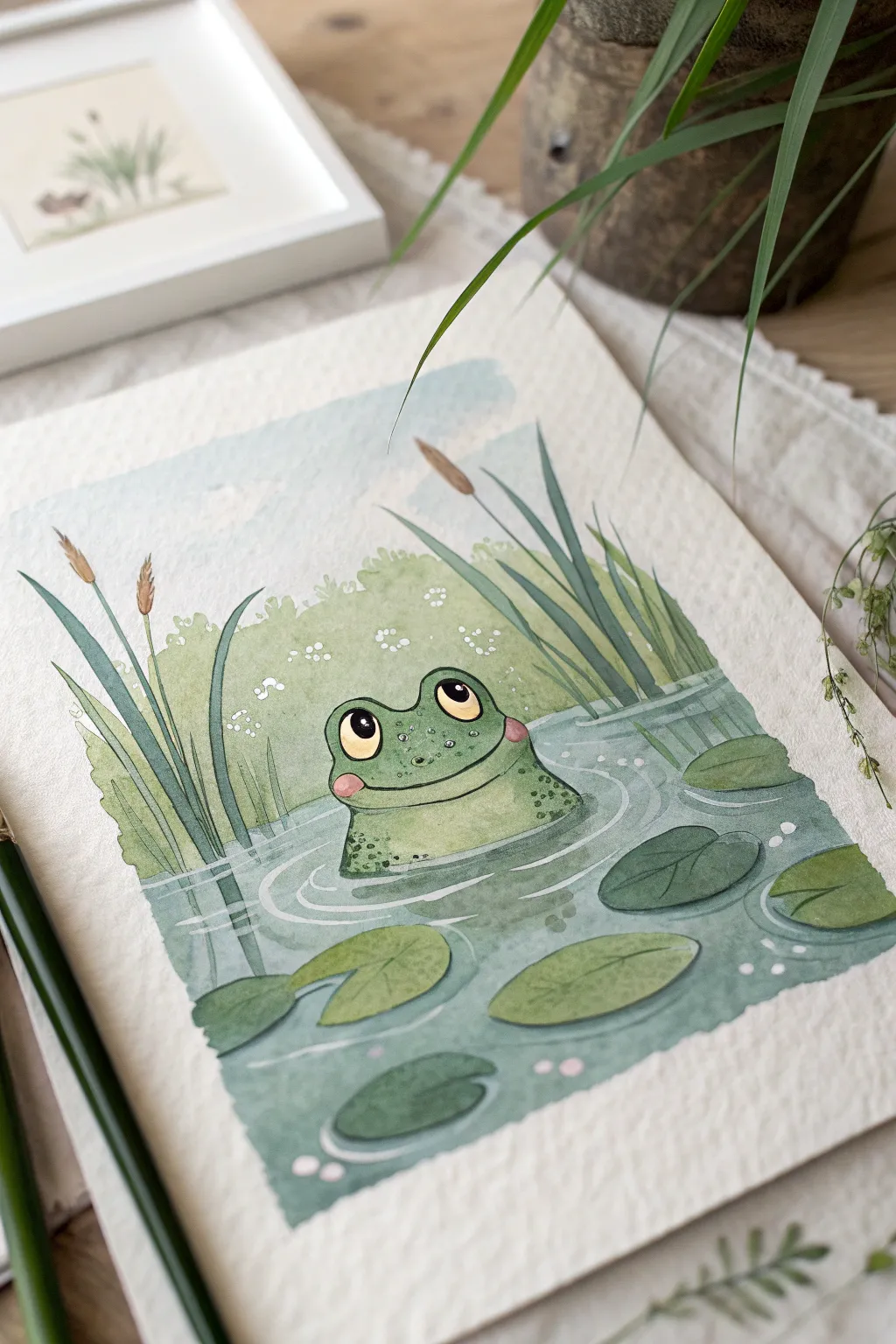
This charming project captures a sweet frog peeking above a tranquil pond using a blend of watercolor washes and fine details. The illustrative style features soft, flat colors and crisp outlines, perfect for creating a calming piece of art.
Step-by-Step Tutorial
Materials
- Cold press watercolor paper (300 gsm)
- Watercolor paint set (focus on sap green, teal, indigo, and ochre)
- White gouache or white gel pen
- Round brushes (size 4 and 8)
- Fine liner brush or waterproof archival ink pen (0.3mm)
- Pencil (HB) and eraser
- Palette for mixing
- Water cups and paper towels
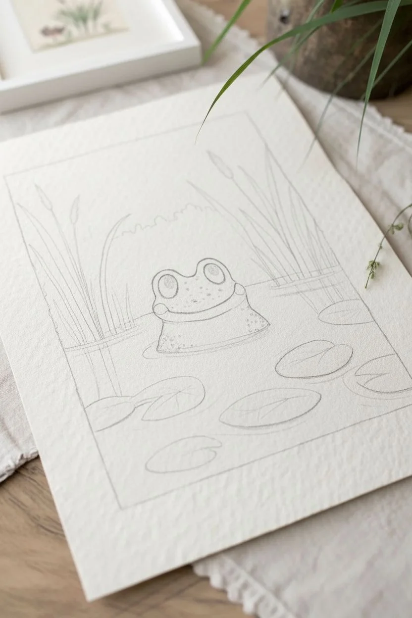
Step 1: Sketching the Scene
-
Layout the composition:
Begin by lightly sketching a square frame on your paper to delineate the painting area. Draw a horizontal water line about one-third of the way up from the bottom. -
Draw the frog:
In the center of the water line, sketch a wide, rounded mound for the frog’s head. Add two pronounced semi-circles for the eyes on top and a wide, gentle curve for the smile. -
Add nature elements:
Sketch several oval lily pads floating on the water surface in the foreground. Draw tall, vertical reeds rising on the left and right sides, extending past the horizon line. -
Background details:
Lightly outline a bushy, rounded shape for the distant foliage behind the frog, making sure it sits above the water line but below the tips of the reeds.
Step 2: Applying Base Colors
-
Paint the water:
Mix a watery wash of teal and a touch of indigo. Apply this to the water area, carefully painting around the lily pads and the frog. I like to keep the edges slightly uneven for a hand-painted feel. -
Color the frog:
Using a bright sap green mixed with a little yellow ochre, paint the entire frog shape. Let the paint pool slightly to create texture, but keep the layer relatively flat. -
Fill the lily pads:
Paint the floating leaves with a slightly darker, cooler green than the frog to help them stand out against the water. -
Paint the background bush:
Fill in the foliage behind the frog with a very pale, watered-down limestone green. This atmospheric perspective pushes the bushes into the distance. -
Sky wash:
Add a very faint wash of pale blue to the sky area, keeping it lighter near the horizon line.
Clean Edges Pro-Tip
Use masking tape for the square border. Press it down firmly to prevent leaks, peeling it away only when the paint is 100% bone dry for a crisp frame.
Step 3: Shadows and Definition
-
Deepen the water:
Once the first layer is dry, mix a slightly stronger teal. Paint horizontal ripples and shadow shapes beneath the lily pads and the frog’s chin. -
Frog details:
Paint two large black circles for the pupils, leaving small white unpainted spots (or add them later with gouache) for highlights. Add pink blush circles to the cheeks. -
Reed colors:
Paint the reed stems with a deep forest green. Use a brown ochre for the cattail tops on the left side. -
Texture on the skin:
Dab small dots of darker green on the frog’s shoulders and forehead to create a speckled skin texture.
Level Up: 3D Eyes
Add a tiny drop of clear drying craft glue or glossy accents over the pupils once finished. It creates a raised, glassy shine that makes the eyes pop.
Step 4: Final Linework
-
Outline the main subject:
Using a very fine liner brush with dark grey paint or a waterproof pen, trace the outline of the frog, emphasizing the curve of the smile and the eyes. -
Define the vegetation:
Add thin outlines to the lily pads and draw vertical veins on the reeds. Make these lines delicate so they don’t overpower the soft coloring. -
Water ripples:
Use white gouache or a gel pen to draw concentric ripple lines radiating from the frog and around the lily pads. -
Atmospheric touches:
With the white pen or gouache, add tiny clusters of dots to the background bush to suggest small flowers, and add final highlights to the water surface.
Peeling off the tape reveals a crisp border that frames your cheerful little amphibian friend perfectly
Simple Turtle and Bubble Dots for a Calm Look
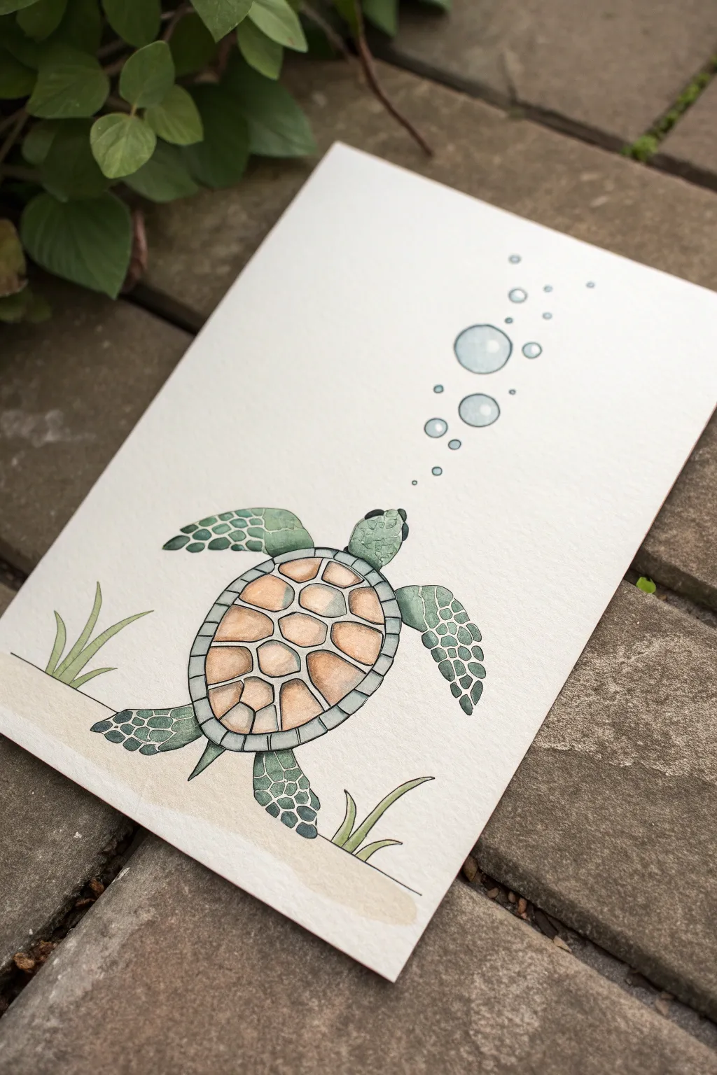
Capture the gentle movement of ocean life with this serene sea turtle painting. Using soft washes and clean ink lines, you’ll create a piece that feels both whimsical and relaxing, perfect for a beginner’s art journal or a greeting card.
Detailed Instructions
Materials
- Cold press watercolor paper (A5 size or greeting card)
- Pencil (HB or H)
- Kneaded eraser
- Waterproof fine liner pen (01 or 03 size, black)
- Watercolor paints (Sap Green, Hooker’s Green, Burnt Sienna, Yellow Ochre, Paynes Gray/Black, Cerulean Blue)
- Small round brushes (size 2 and 4)
- Water cup and paper towel
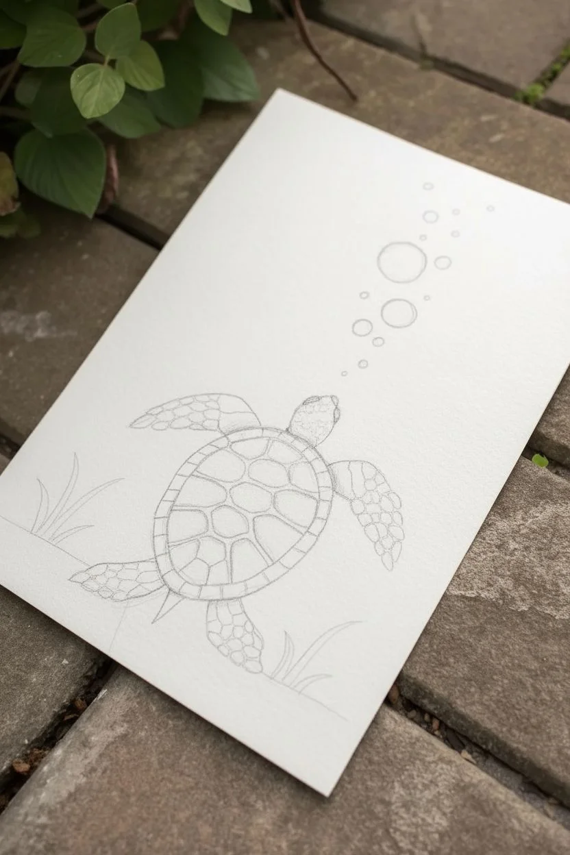
Step 1: Sketching the Outline
-
Draft the shell:
Begin in the lower center of your paper. Lightly sketch a large oval shape for the turtle’s main shell (carapace). Just inside this oval, draw a slightly smaller oval to create the shell’s rim. -
Add the head and flippers:
Draw a rounded shape emerging from the top of the shell for the head. Add two large, sweeping front flippers extending outward, and two smaller, triangular back flippers near the bottom. -
Detail the shell pattern:
Inside the central oval, sketch a pattern of irregular hexagons. They should fit together like a puzzle but don’t need to be mathematically perfect. -
Add the surroundings:
Draw three loose circles of varying sizes floating upwards from the turtle’s head to represent bubbles. Sketch a wavy horizontal line near the bottom for the sand, and add a few simple blades of grass peeking out.
Glazing Tip
Wait for the shell’s first layer to dry completely before shading. This prevents the colors from becoming muddy and keeps that crisp, illustrative look.
Step 2: Inking the Design
-
Outline the main shapes:
Using your waterproof fine liner, carefully trace over your pencil lines. Go slowly to keep the lines smooth. I find it helps to pull the pen towards me rather than pushing it away. -
Add scale details:
Inside the flippers and on the head, draw small, irregular pebble-like shapes to mimic scales. Leave some white space between them. -
Refine the bubbles:
Ink the bubble circles. To make them look spherical, add tiny, smaller distinct circles rising above the main three bubbles. -
Erase pencil marks:
Wait at least five minutes to ensure the ink is completely dry, then gently use the kneaded eraser to remove all graphite sketches.
Step 3: Painting the Turtle
-
Paint the shell scutes:
Mix a warm, sandy color using Burnt Sienna and a touch of Yellow Ochre. Dilute it with water for a soft wash and fill in the central hexagons of the shell. -
Add shading to the shell:
While the paint is still damp, touch a slightly darker brown to the bottom edge of each hexagon to create a subtle 3D rounded effect. -
Color the rim:
Use a very pale, watery green (Sap Green with lots of water) to fill in the rim of the shell surrounding the brown center. -
Paint the skin base:
For the head and flippers, mix a muted green. Paint a light wash over these areas, ignoring the scale lines for a moment—just lay down a base color. -
Darken the scales:
Once the base green is dry, mix a darker, more saturated green. Carefully paint inside the small scale shapes you drew on the flippers and head, leaving the thin lines between them the lighter base color.
Make It Sparkle
Add a tiny touch of metallic silver or gold watercolor to the bubbles or the shell rim. It catches the light just like sunlight filtering underwater.
Step 4: Finishing Touches
-
Paint the bubbles:
Take a very diluted Cerulean Blue. Paint the bubbles, but leave a small white highlight in the upper left corner of each one to suggest reflection. -
Paint the sea floor:
Use a very light wash of Yellow Ochre or light brown to fill in the sand area at the bottom. Keep the edge soft. -
Detail the grass:
With your green mix, paint the blades of sea grass. Start from the bottom and flick your brush upward to get a tapered, natural point. -
Add the eye:
Using a tiny brush or your black fine liner, fill in the turtle’s eye, leaving a tiny speck of white for a glint of life.
Now you have a peaceful underwater friend ready to frame or send to a loved one
Bear Face on a Warm Neutral Background
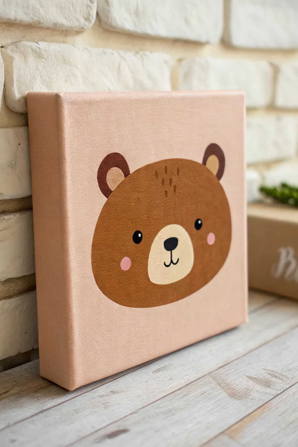
Bring a touch of nursery charm to your space with this adorable, minimalist bear face painting. The warm, peachy-pink background creates a soft, inviting atmosphere that perfectly highlights the simple, cartoonish features of the bear.
How-To Guide
Materials
- Small square stretched canvas (e.g., 8×8 or 10×10 inches)
- Acrylic paints: warm beige/peach, medium brown, dark chocolate brown, cream/off-white, black, rose pink
- Flat paintbrush (1-inch width) for the background
- Medium round brush (size 6 or 8) for the main shape
- Small round detail brush (size 0 or 1)
- Pencil for sketching
- Paper plate or palette
- Cup of water and paper towels
Step 1: Setting the Background
-
Mix the base color:
Start by mixing your warm background shade. Combine a generous amount of white with a small dollop of orange and a tiny touch of brown to get that soft, muted peach tone seen in the reference. -
Paint the canvas:
Using your large flat brush, apply this peach color over the entire front surface of the canvas. Don’t forget to paint the sides for a professional, finished look. -
Let it dry completely:
Allow this base layer to dry fully before moving on. The canvas should be dry to the touch so your pencil sketch doesn’t smudge into the wet paint.
Step 2: Sketching the Shape
-
Outline the head:
Lightly sketch a large, wide oval shape in the center of the canvas. The bottom should be slightly flatter than the top to give the bear a chubby cheek look. -
Add the ears:
Draw two semi-circles on the top corners of the head. I like to space them fairly wide apart to enhance the cute, cartoonish aesthetic. -
Mark the muzzle:
Inside the lower half of the main oval, sketch a smaller, slightly flattened oval for the snout/muzzle area.
Paint Transparency?
If the background color shows through the brown bear face, wait for the first coat to dry and apply a second layer. Acrylics often need two coats for full opacity.
Step 3: Painting the Bear
-
Fill in the main face:
Load your medium round brush with a medium brown paint. Carefully fill in the large head shape you sketched, painting around the muzzle area if you want to keep your sketch lines visible, or painting right over it if your paint is opaque enough to layer later. -
Paint the ears:
Use the same medium brown to fill in the outer shapes of the ears attached to the head. -
Add ear details:
Switch to a dark chocolate brown. Paint the inner semi-circles of the ears. Alternatively, use a lighter tan if you prefer a different contrast, but the reference uses a darker shade or shadow tone here. -
Paint the muzzle:
Mix a cream or off-white color. Paint the oval muzzle area in the lower center of the face. You might need two coats here to cover the brown or the background completely.
Perfect Circles
For perfectly round eyes or blush spots, dip the handle end of a paintbrush into the paint and stamp it onto the canvas. It works like a perfect dotting tool.
Step 4: Adding the Details
-
Create the nose:
Using black paint and your smallest detail brush, paint a soft, rounded triangle (like an inverted guitar pick) near the top of the cream muzzle. -
Draw the mouth:
Paint a small vertical line coming down from the nose, splitting into a ‘w’ shape for the classic smile. -
Add the eyes:
Place two small black circles on the brown fur, just outside the muzzle area. Add a tiny white dot inside each black circle to create a lively ‘catchlight’. -
Blush the cheeks:
Dip a round brush or a cotton swab into rose pink paint. Dab two circular spots on the cheeks, slightly below the eyes. -
Paint fur texture:
Using a slightly darker brown tone than the face, paint a few tiny, vertical dash marks at the very top of the forehead to suggest a little tuft of fur. -
Final touches:
Check for any uneven edges and smooth them out with the appropriate color. Ensure the paint is solid and opaque throughout.
Hang this warm little artwork in a kid’s room or give it as a delightful handmade gift once it dries
Whale Tail Silhouette Over a Soft Sea Gradient
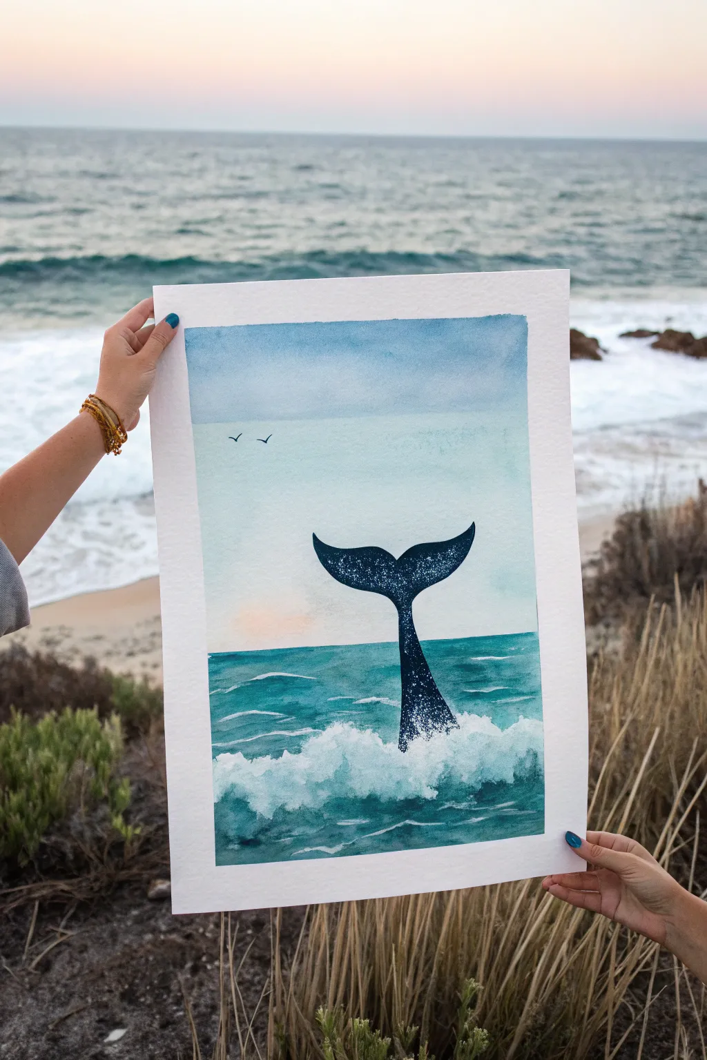
Capture the serene majesty of marine life with this watercolor project, featuring a dark whale tail emerging from rolling waves. Using wet-on-wet techniques for the sky and ocean creates a dreamy, atmospheric backdrop for the crisp silhouette.
Step-by-Step
Materials
- Watercolor paper (cold press, 300 gsm recommended)
- Watercolor paints (Indigo, Phthalo Blue, Turquoise, Payne’s Grey, touches of peach or warm yellow)
- White Gouache or white acrylic ink
- Masking tape
- Flat wash brush (large)
- Round brushes (sizes 4 and 8)
- Pencil and eraser
- Palette
- Two jars of water
- Paper towels
Step 1: Preparation & Sky
-
Tape it down:
Secure your watercolor paper to a board or table on all four sides using masking tape. This creates that crisp white border and prevents the paper from buckling when wet. -
Initial sketch:
Lightly sketch the horizon line about two-thirds down the page. Then, draw the outline of the whale’s tail extending upward from the water, centering it horizontally. Keep your pencil lines faint so they don’t show through later. -
Wet the sky area:
Using your large flat brush and clean water, evenly wet the entire sky area right down to the horizon line. -
Create the sky gradient:
Load your brush with a diluted mix of Indigo or a muted blue. Apply it at the very top of the paper. As you move downward, add more water to your brush to fade the color out, leaving the area just above the horizon almost white. -
Add a sunset hint:
While the paper is still slightly damp near the horizon, drop in a very faint wash of peach or warm yellow on the left side to suggest a setting sun. Let it blend softly into the pale blue.
Starry Texture
For the speckles on the tail, flick the bristles of a toothbrush loaded with white gouache instead of a regular brush for a finer mist.
Step 2: Ocean & Waves
-
Paint the distant water:
Once the sky is dry, mix a teal or turquoise shade. Paint a straight, crisp line across the horizon. Fill the area below the horizon with horizontal strokes, keeping the color fairly transparent. -
Deepen the foreground:
While the first layer of the sea is still damp, drop in darker blues and teals closer to the bottom to create depth. Leave some lighter, unpainted or pale areas to suggest the tops of rolling waves. -
Define wave shapes:
Use a round brush with a darker turquoise mix to paint curved, sweeping lines that mimic the movement of waves. I like to focus these darker shadows underneath the crests of the waves to make them pop. -
Dry completely:
Allow the entire ocean section to dry completely before moving on to the tail. If you paint too soon, the black silhouette will bleed.
Sunset Shift
Swap the blue sky for a pink and purple gradient to change the time of day to a dramatic dusk setting.
Step 3: The Silhouette & Details
-
Paint the tail base:
Mix a very saturated, dark color using Indigo and Payne’s Grey (or black). Carefully fill in the whale tail outline. Start from the narrow base emerging from the water. -
Fill the flukes:
Continue painting the tail, ensuring the edges are smooth and sharp. The shape should curve gracefully upwards. -
Add texture to the tail:
While the dark paint is still wet, you can lift out tiny spots with a damp brush or sprinkle a pinch of salt to create texture. Alternatively, wait for it to dry and splatter a tiny bit of white gouache for a ‘wet skin’ look. -
Create the splash:
Load a brush with thick white gouache. Paint fluffy, erratic shapes at the base where the tail meets the water to simulate crashing foam. -
Blend the foam:
Soften the bottom edges of your white foam with a damp brush so they blend into the turquoise water, but keep the top edges crisp and bumpy. -
Paint the birds:
Using your smallest round brush and the dark grey mix, paint two tiny ‘V’ shapes in the sky to represent distant birds. -
Final reveal:
Once everything is bone dry, carefully peel away the masking tape at a 45-degree angle to reveal your clean white border.
Frame your nautical masterpiece or gift it to someone who loves the calming power of the ocean.
Streetlight Glow With a Heart Cloud Accent
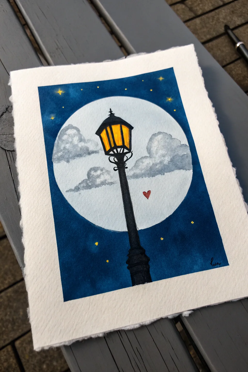
This charming painting combines the cozy glow of an old-fashioned streetlamp with the magic of a starry night sky. The high contrast between the midnight blue background and the glowing yellow light creates a striking effect for this aesthetic piece.
Step-by-Step Guide
Materials
- Watercolor or mixed media paper (heavyweight, textured)
- Small round object for tracing (like a bowl or CD)
- Pencil and eraser
- Gouache or acrylic paints (Deep Blue, Black, Yellow, Orange, Red, White)
- Set of brushes (medium flat, small round, fine detail)
- Palette
- Water cups
- Masking tape (optional, for edges)
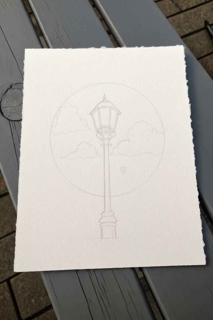
Step 1: Sketching the Layout
-
Trace the moon:
Begin by placing your round object near the center-top of your paper. Trace lightly around it with a pencil to define your large, full moon. -
Sketch the lamp post:
Draw the streetlamp structure starting from the bottom. The base is thick and tapered, leading up into a long, thin pole that crosses right in front of your moon circle. -
Detail the lantern top:
At the top of the pole, sketch the lantern head. Use geometric shapes: a trapezoid for the glass area and a pointed roof on top. Add the decorative scrolling metalwork just under the lantern. -
Outline the clouds:
Sketch two fluffy clouds inside the moon circle on either side of the lamp post. Keep the shapes soft and rounded. -
Add the heart accent:
Draw a tiny heart floating near the right side of the lamp post, within the moon’s area.
Pro Tip: Glowing Edges
For a softer moon, mix a tiny drop of your dark blue sky color into the white moon paint immediately around the edge to create a subtle vignette effect.
Step 2: Painting the Sky and Moon
-
Fill the background:
Mix a deep midnight blue using dark blue and a touch of black. Carefully paint the entire area outside the moon circle. Use a medium brush for the large areas and switch to a smaller brush to get crisp edges around the circle. -
Base coat the moon:
Once the blue is dry, paint the inside of the moon circle with white. This doesn’t need to be perfectly opaque yet, but it acts as a primer. -
Add cloud shadows:
Mix a very light grey wash. Paint the bottom portions of your sketched clouds, using a dabbing motion to create a fluffy texture. -
Layer the cloud highlights:
I like to mix pure white with just a speck of grey for the tops of the clouds to make them pop against the moon’s background.
Step 3: Illuminating the Lamp
-
Paint the glow:
Fill in the glass panels of the lantern with a bright, warm yellow paint. -
Add warmth:
While the yellow is still slightly wet, blend a tiny bit of orange near the top or edges of the glass panes to mimic the depth of a flame inside. -
Paint the metalwork:
Using your finest detail brush and black paint, fill in the streetlight’s silhouette. Be very steady when painting the thin vertical pole and the thin bars over the yellow glass. -
Refine the details:
Go back over the decorative scrolls and the pointed roof with opaque black paint to ensure sharp, clean lines.
Troubleshooting: Uneven Lines
If your black lines on the lamp are shaky, switch to a fine-tip black ink fineliner pen instead of a brush once the yellow paint is completely dry.
Step 4: Final Touches
-
Paint the heart:
Fill in the tiny floating heart with a vibrant red. -
Create stars:
Using a small brush, dab tiny yellow dots into the dark blue sky area. -
Add star flare:
For a few select stars, drag the brush gently outward from the center dot to create little twinkle cross-shapes. -
Final highlights:
Add a tiny white reflection line on the black lamp post or the roof to suggest moonlight hitting the metal.
Step back and enjoy the peaceful, romantic atmosphere you have captured on paper
Neon-Style Butterfly Line Art on a Dark Background
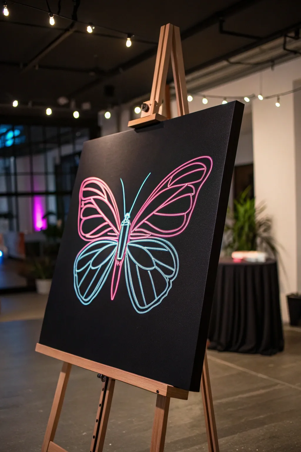
Capture the electrifying look of real neon tubing with nothing but paint and a steady hand. This project uses high-contrast colors on a dark background to create a stunning optical illusion that seems to hum with light.
Detailed Instructions
Materials
- Medium square canvas (e.g., 20×20 or 24×24 inches)
- Black acrylic gesso or matte black acrylic paint
- Wide flat brush for background
- White or grey chalk/chalk pencil
- Round synthetic brushes (sizes 2 and 4)
- Fine liner brush (size 0 or 00)
- Titanium White acrylic paint (high opacity)
- Fluorescent Pink acrylic paint
- Fluorescent Blue or Cyan acrylic paint
- Ruler or straight edge
- Reference image of a monarch butterfly wing pattern
Step 1: Preparing the Void
-
Base coat application:
Begin by covering your canvas completely with black acrylic gesso or matte black paint. The background must be solid and opaque to make the neon effect pop, so apply two coats if necessary. -
Drying time:
Allow the black background to dry fully before moving on; any moisture will cause the chalk sketch to smear. -
Sketching the centerline:
Use a ruler and your chalk pencil to lightly mark a vertical center line to help with symmetry. -
Outlining the body:
Sketch a long, slender oval for the thorax and abdomen along the center line, keeping it simple and stylized. -
Drafting the wings:
Sketch the large upper wings starting from the thorax, arching out and up. Then, draw the lower wings curving downwards. Don’t worry about perfection; chalk wipes off easily with a damp cloth.
Uneven Coverage?
If your fluorescent paint looks streaky or too transparent over the white, let it dry completely and apply a second thin coat. Neons often adhere better in layers.
Step 2: Constructing the Neon Tubes
-
Drawing the veins:
Inside the wing outlines, sketch the interior vein patterns. Think of these as bent glass tubes—keep the curves smooth and avoid sharp, jagged angles. -
Thickening the lines:
Go back over your chalk sketch and refine the lines to be double-width, creating a ‘tube’ shape rather than just a single thin line. -
Mixing the base white:
Load a size 4 round brush with Titanium White paint. You want a consistency like heavy cream—flowy but opaque. -
painting the under-layer:
Paint all your sketched lines with the white paint. This is crucial because neon colors are often transparent and need a white base to look bright against the black canvas. -
Refining edges:
Smooth out any wobbles in your white lines. The cleaner this white base is, the more convincing the final neon effect will be.
Step 3: The Glow Up
-
Applying the pink glow:
Take your round brush and the fluorescent pink paint. Paint over the white lines of the *upper* wings, slightly extending the color past the white edges onto the black canvas to create a soft ‘haze’ or glow. -
Applying the blue glow:
Repeat the previous step with the fluorescent blue paint for the *lower* wings and the body structure. -
Re-establishing the core:
Once the colored glow layers are dry, mix a tiny amount of your colored paint with Titanium White to create a very pale, almost white pastel version of each color. -
Painting the highlight:
Using your fine liner brush, paint a thin, crisp line right down the center of the pink and blue strokes. This represents the brightest part of the light tube. -
Pure white hotspots:
I like to add tiny distinct dots or dashes of pure Titanium White at the sharpest curves or intersections of the wings to simulate intense light reflection. -
Antennae details:
Paint the two thin antennae using the blue mixture, keeping the lines very fine and finishing with the white center highlight. -
Cleaning up:
Once everything is perfectly dry, use a slightly damp cloth to gently wipe away any visible chalk guidelines from the background.
Level Up: Airbrush Glow
For a pro look, use an airbrush or a dry stiff brush to lightly dust the black canvas *around* the lines with the neon color before painting the solid lines.
Step back and dim the lights to verify your new artwork really glows with that electric energy


Have a question or want to share your own experience? I'd love to hear from you in the comments below!