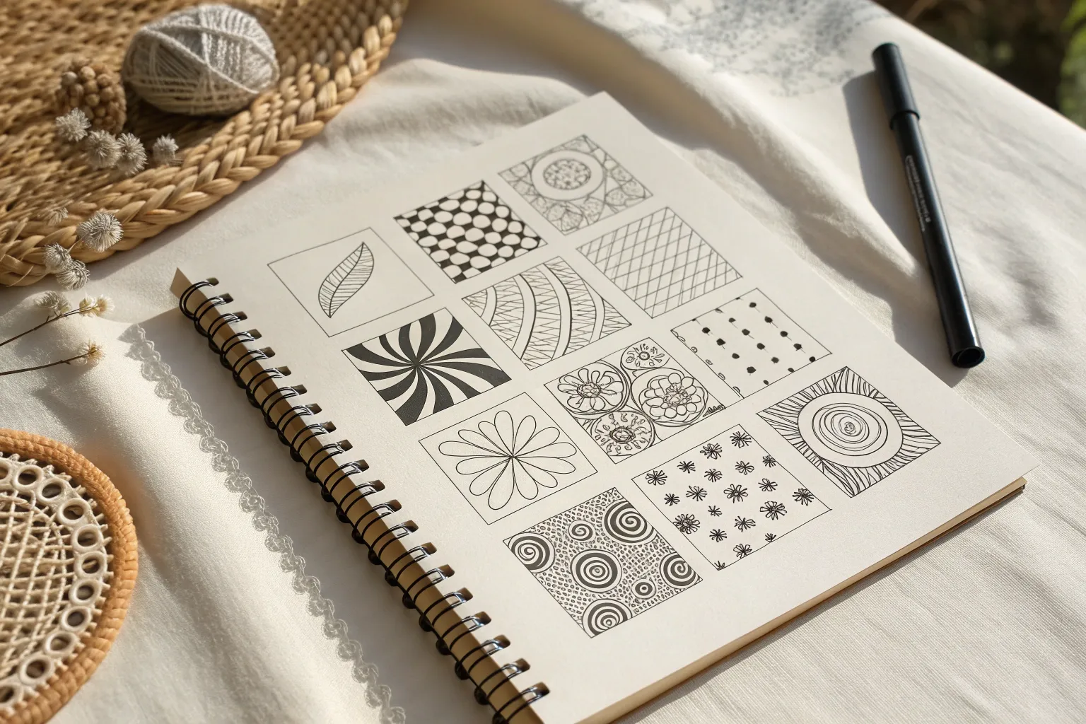
When I need a calm, creative reset, I reach for Zentangle patterns—those satisfying little repeats that turn a blank page into something you can get lost in. Here are my favorite zentangle pattern ideas to build your own cozy, desk-side pattern library you’ll actually use.
Checkerboard Twists and Broken Squares
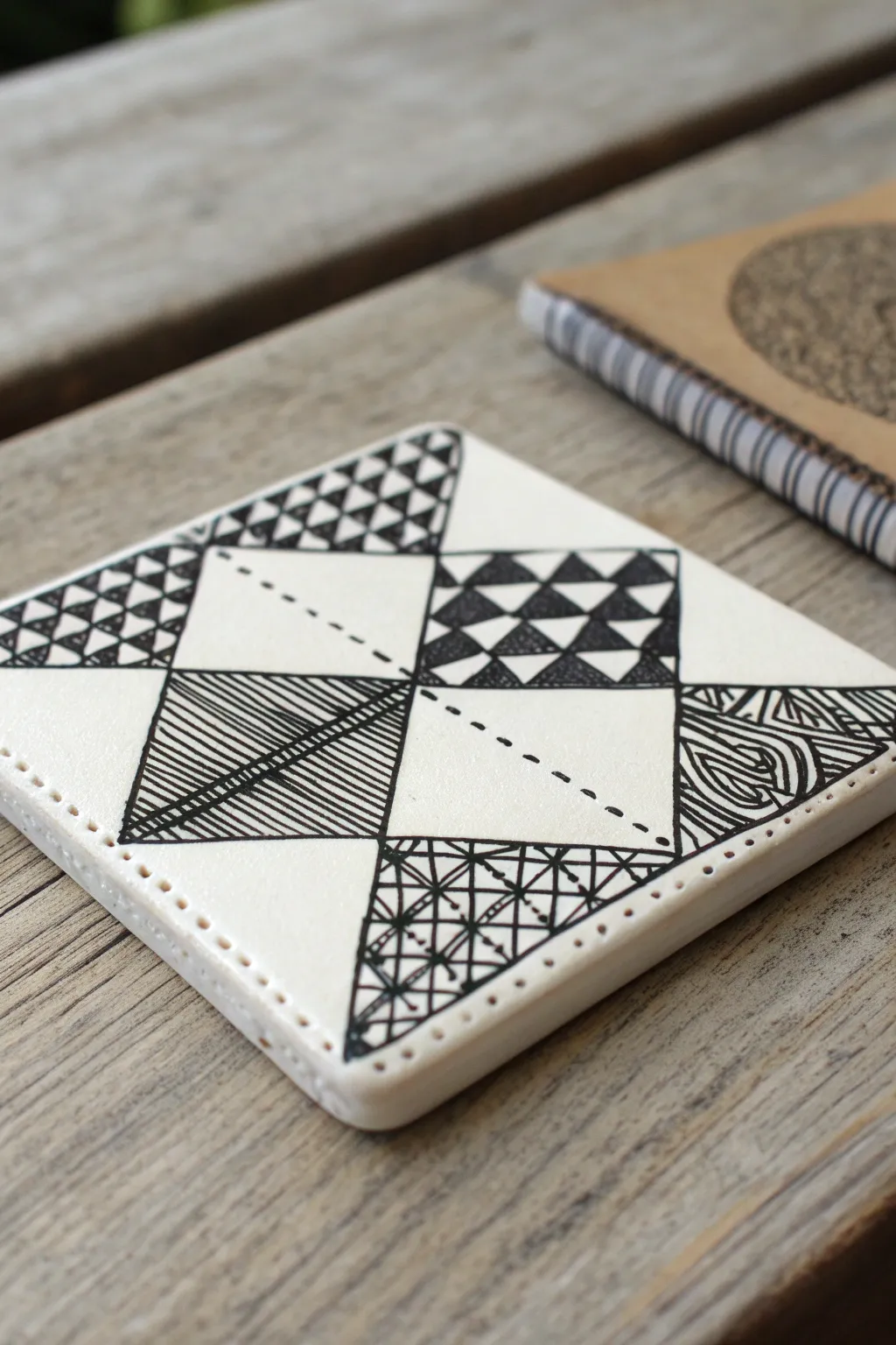
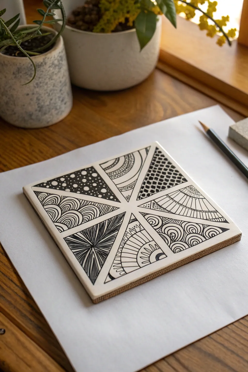
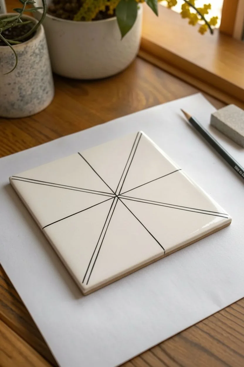
This intricate project transforms a simple square tile into a mesmerizing patchwork of geometric designs using the Zentangle method. By breaking the space into triangles and filling specific sections with high-contrast patterns, you’ll create a striking black-and-white composition that looks complex but is built one stroke at a time.
Step-by-Step Tutorial
Materials
- Square ceramic tile or thick paper coaster (approx. 3.5-4 inches)
- Black fine-liner pen (e.g., Micron 01 or 05)
- Pencil (HB or 2B)
- Ruler or straight edge
- Eraser
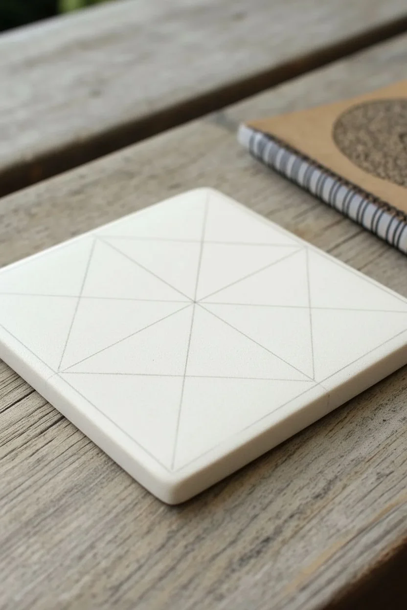
Step 1: Planning the Grid
-
Define the border:
Begin by observing the edges of your tile. If you are using a material that can be pierced, like leather or clay, you can create the decorative border holes first. If using a ceramic tile or paper, simply draw a faint pencil border about 1/8 inch from the edge to frame your work area. -
Create the main X:
Using your pencil and ruler, lightly draw two diagonal lines connecting opposite corners of the square. This large ‘X’ divides the tile into four large triangular sections. -
Subdivide the space:
Now, draw a horizontal line and a vertical line through the center point, splitting the square into four smaller quadrants. You should now see a ‘star’ or ‘Union Jack’ style grid of eight visible triangles radiating from the center. -
Establish the diamond:
Connect the midpoints of the four outer edges to create a large diamond shape in the center of the tile. This creates the primary structure for our patchwork design.
Step 2: Inking the Framework
-
Ink the main lines:
Switch to your black fine-liner. Trace over specific pencil lines to form the bold black outline. In this design, notice that we aren’t outlining every single triangle separately; instead, focus on creating the larger geometric shapes that house the patterns. -
Create the dashed line:
Locate the large white triangles on the left and right sides. Instead of a solid line dividing them, draw a dotted or dashed ink line from the outer corner towards the center. This adds a nice lighter texture compared to the solid lines.
Ink Smearing?
Ceramic tiles can be slick. If ink sits on top, let it dry for at least 10 minutes before erasing pencil lines. A heat tool can speed this up.
Step 3: Filling the Patterns
-
Pattern 1: Mini Triangles:
Focus on the top-left outer triangle and the top-right inner triangle. Using your pen, draw a grid of small triangles. Fill every other triangle with solid black ink to create a checkerboard effect. -
Pattern 2: Linear Hatching:
Move to the bottom-left inner triangle. Fill this space with closely spaced, parallel diagonal lines. I like to rotate the tile so my hand can pull the pen strokes naturally toward me for straighter lines. -
Add cross-line detail:
To break up the uniformity of the hatching, draw a single perpendicular line crossing through the hatched section, adding a small ‘stitch’ effect where it intersects. -
Pattern 3: Organic Woodgrain:
In the right-side outer triangle, create a contrast to the straight lines by drawing organic, curvy lines. Mimic a woodgrain texture by drawing elongated loops and surrounding them with echoing curved lines. -
Pattern 4: Woven Grid:
For the bottom center triangle, sketch a loose grid. Inside this grid, draw diagonal lines in alternating directions for each square to simulate a woven basket or fabric texture. -
Review and refine:
Look over the entire piece. If any black filled areas look patchy, go over them again to ensure a solid, deep black. This high contrast is essential for the final look. -
Clean up:
Once you are certain the ink is completely dry, gently erase any visible pencil guidelines to leave a crisp, clean finish.
Pro Tip: Line Weight
Use a thicker pen (0.5mm or 0.8mm) for the main structural lines and a thinner nib (0.1mm) for the delicate hatching and textures inside.
Enjoy the meditative rhythm as you fill each section and watch your geometric mosaic come to life


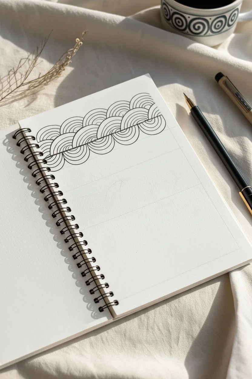
Spirals and Curl Trails for Easy Flow
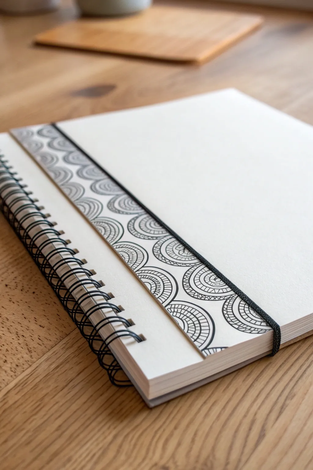
Transform a plain sketchbook page into an inviting canvas by adding a decorative zentangle-inspired border along the binding edge. This project uses repeating semi-circular motifs that create a rhythmic, calming pattern perfect for framing your future drawings or journal entries.
Step-by-Step
Materials
- Spiral-bound sketchbook with heavy paper
- Fine-liner pen (black, 0.3mm or 0.5mm)
- Pencil (HB or 2B)
- Ruler
- Eraser
Step 1: Planning the Layout
-
Define the border area:
Begin with your sketchbook open on a flat surface. Using your ruler and pencil, lightly draw a vertical line about 1.5 to 2 inches from the spiral binding on the left page. This will mark the outer edge where your pattern stops. -
Create column guides:
Divide this border area into vertical columns. Depending on the width you chose, mark out two or three equal columns with light pencil lines. In the reference image, there are two distinct columns visible. -
Mark horizontal spacing:
Lightly mark horizontal tick marks down the length of your columns to guide the size of your semi-circles. Spacing them about 1 inch apart works well, but you don’t need to be perfectly precise.
Steady Hands
Rest your wrist on a scrap piece of paper while drawing to prevent oils from your hand smudging the paper or affecting the ink flow.
Step 2: Drawing the Base Arcs
-
Start the first row:
Switch to your fine-liner pen. In the left-most column, start at the top. Draw a semi-circle arching upwards, using the column width as your base. The flat part of the semi-circle is imaginary here; you are just drawing the rainbow shape. -
Stack the arcs:
Moving down the first column, draw the next semi-circle directly below the first one. Let the top of this new arc touch the bottom edges of the one above it, creating a scalloped effect. -
Fill the columns:
Continue drawing these stacked semi-circles all the way down the first column, then repeat the process for any adjacent columns to the right. Try to stagger them slightly if you want an interlocking look, or keep them aligned for a uniform grid.
Step 3: Adding the Pattern Detail
-
Create concentric layers:
Inside each large semi-circle you’ve drawn, draw a smaller, inner semi-circle parallel to the main outline. This creates a thick band or rim. -
Add radial lines:
Within that newly created band between the two lines, draw small straight lines radiating outward from the center. Space them closely together to create a textured, tire-tread look. -
Draw the core:
Inside the smallest, innermost semi-circle, draw a few more very thin concentric arcs. I find that leaving a tiny bit of white space in the very center keeps the pattern from looking too dark. -
Thicken the outlines:
Go back over the main dividing lines between your columns and the outer edges of your main semi-circles to thicken them slightly. This adds weight and defines the structure clearly.
Variation Idea
Try filling alternating semi-circles with different patterns—like stippling dots or solid black fill—to create a checkerboard effect.
Step 4: Finishing Touches
-
Connect the pattern:
Check the spaces between the rounded tops of the semi-circles. If there are awkward gaps, you can fill them with tiny blackened triangles or simple curve lines to make the pattern feel solid and continuous. -
Clean up borders:
Draw a final, solid straight line along the right edge of your pattern area (over your initial pencil guide) to separate the decorative border from the blank writing space. -
Erase guidelines:
Allow the ink to dry completely—give it a good few minutes so it doesn’t smudge. Then, gently erase all your pencil layout lines.
Now you have a structured, elegant border ready to frame your next sketch or journal entry


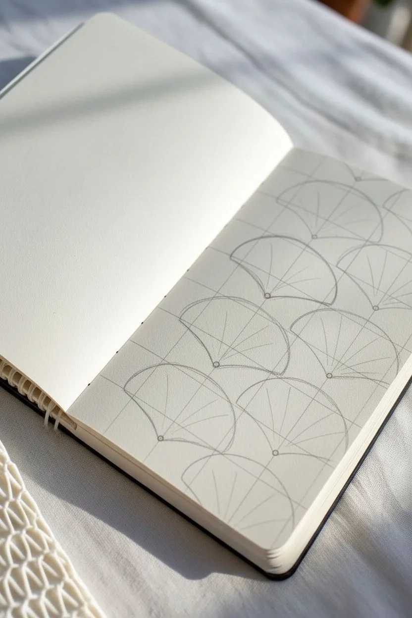
Scallops, Shells, and Fan Repeats
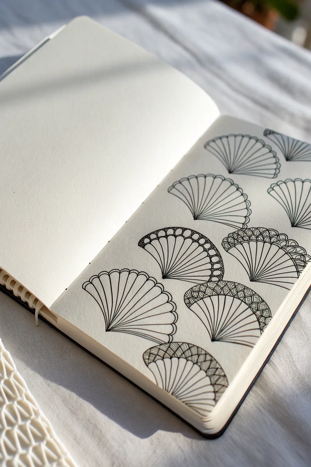
This elegant drawing exercise focuses on a repeating motif of fanned shells, reminiscent of Art Deco patterns or sea glass treasures. The beauty lies in the variation, as some shells remain simple outlines while others are filled with intricate textures like bubbles and cross-hatching.
Detailed Instructions
Materials
- Sketchbook with smooth paper (e.g., vellum or bristol finish)
- Fine liner pen (01 or 03 nib size)
- Pencil (HB or 2B) for initial grid
- Eraser
- Ruler
Step 1: Setting strict foundations
-
Lightly sketch the grid:
Begin by using your pencil and ruler to draw a very light grid across your page. These don’t need to be perfect squares; slightly rectangular shapes work well for these fans. Aim for rows that are staggered, like a brick wall pattern. -
Mark the center points:
At the bottom center of each grid box, mark a tiny dot. This will be the anchor point where all your fan lines originate. -
Draw the main arches:
Still using your pencil, draw a semi-circle arch for each shell. Keep the arches consistent in height so they nestle nicely together without overlapping too aggressively.
Step 2: Inking the basic structure
-
Start the first fan base:
Switch to your fine liner pen. Choose a shell near the bottom to start. Place your pen nib at the anchor dot you marked earlier. -
Draw radiating lines:
Draw straight lines radiating outward from that single dot to the top edge of your pencil arch. Spacing is key here; try to keep the distance between lines relatively equal. -
Cap the shell:
Connect the tops of these radiating lines with small, curved humps to create the scalloped edge of the shell. This softens the look compared to a harsh straight line. -
Repeat the base structure:
Continue this process for every ‘brick’ in your layout. Draw the radiating lines and the scalloped top edge for each shell. Don’t worry if your hand wobbles slightly; organic lines look better here. -
Erase pencil marks:
Once the ink is completely dry—give it a solid minute or two—erase your pencil grid and arch guides gently.
Clean Lines
Rotate your sketchbook as you draw the radiating lines. Pulling the pen toward your body usually results in straighter, more confident strokes than pushing away.
Step 3: Adding texture variants
-
Select random shells:
You don’t want to fill every single shell. Randomly select about half of them to receive extra detailing. This negative space creates visual breathing room. -
Variant A: The Bubble Rim:
For the first texture style, draw a second arch line slightly below the top scalloped edge. Fill this new band with small circles or ‘bubbles’ packed tightly together. -
Fill the Bubbles:
Darken the tiny interstitial spaces between the bubbles with ink. This high-contrast background makes the white circles pop. -
Variant B: Intricate Hatching:
On a different shell, create a thicker band at the top edge. I usually make this band about a centimeter wide. -
Add diagonal grids:
Inside this thick top band, draw fine diagonal lines going one way, then cross them going the other way to create a tiny distinct mesh or scale pattern. -
Variant C: Double Scallops:
For a simpler variation, just draw a second, smaller row of scallops inside the main outlines of the fan blades, creating a layered petal effect. -
Thicken select lines:
Go back over the main radiating lines of your textured shells. Retracing them to be slightly bolder helps distinguish the foreground shells from the heavy patterns. -
Final assessment:
Look at the overall balance. If a spot looks too empty, add a small partial shell peeking in from the edge of the page to frame the composition.
Ink Smudges?
If you erase too early, ink will smear. Test dryness by lightly tapping a heavy ink area with your clean finger. If no ink transfers, you are safe to erase.
Now you have a page full of diverse, rhythmic patterns that looks complex but was built one simple line at a time


Petal Chains and Simple Floral Bursts
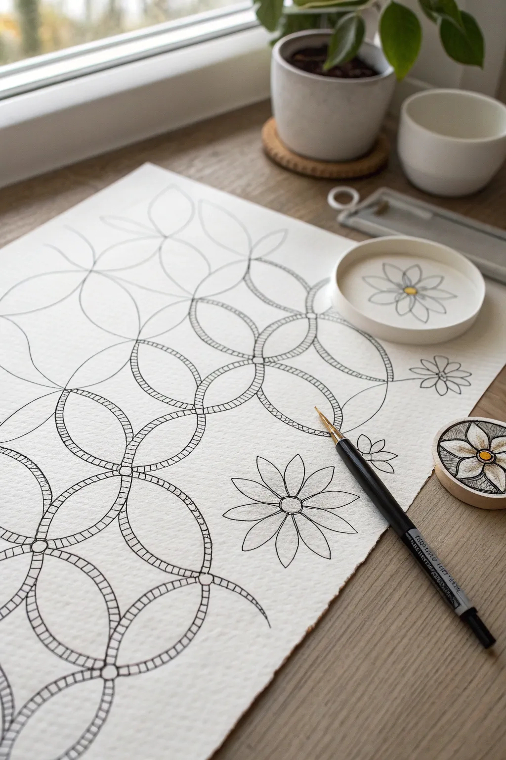
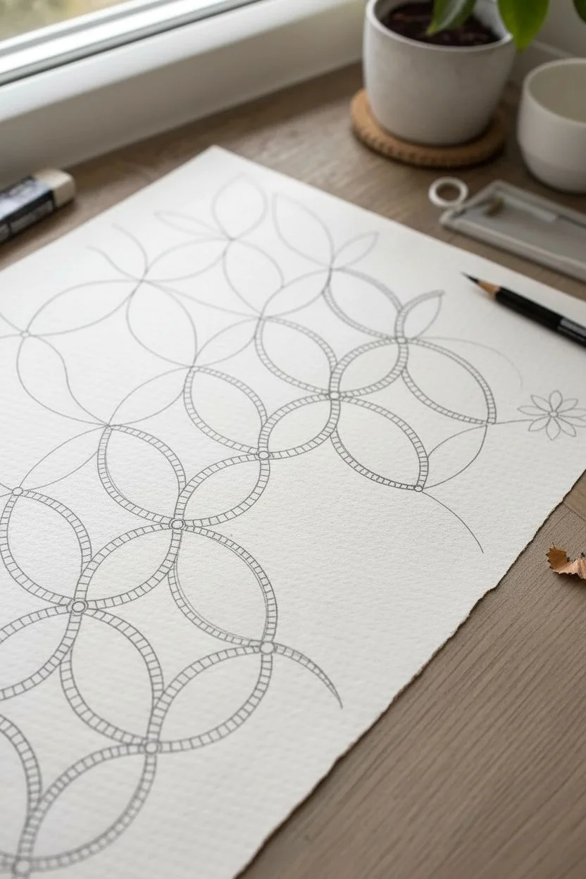
This elegant Zentangle-inspired project combines geometric precision with organic floral bursts. The overlapping circular chains create a satisfying rhythm, while the sturdy hatched lines add depth and texture to the delicate linework.
How-To Guide
Materials
- High-quality watercolor paper or mixed media paper (heavyweight, textured)
- Black fine liner pen (0.3mm or 0.5mm)
- Pencil (HB or 2B) for sketching guidelines
- Eraser
- Compass or circle variety template (optional but helpful)
- Ruler
Step 1: Establishing the Grid
-
Layout guidelines:
Begin by lightly sketching a grid of intersecting circles using your pencil. You want them to overlap significantly, so the center of one circle aligns with the edges of its neighbors. This creates the foundational ‘vesica piscis’ or almond shapes where they intersect. -
Define the petal shapes:
Within your pencil grid, identify the almond-shaped intersections. Focus on creating a chain of these shapes running diagonally or vertically across the page. Sketch the outer boundaries of these ‘petals’ more clearly with your pencil to verify the flow.
Step 2: Inking the Structure
-
Inking the primary outlines:
Switch to your black fine liner pen. Carefully trace the outer edges of your chosen petal chain. Keep your hand steady and let the pen glide over the textured paper paper. -
Create the inner border:
Draw a second line parallel to the first, just inside the shape. Leave a gap of about 3-4mm. This channel will house the hatched pattern later. -
Connect the links:
Where the petals meet at a central point (the ‘hub’), draw a small circle to lock them together. Ensure the parallel lines flow seamlessly into these connector circles. -
Extend the pattern:
Continue inking these double-walled petal shapes across your page. You can leave some areas as single lines (ghost petals) in the background to suggest depth, as seen in the upper left of the reference.
Spacing Secrets
Keep your hatch marks consistent. If they get too crowded, the design looks dark; too far apart, it looks loose. Aim for square spaces between lines.
Step 3: Adding Texture and Detail
-
Hatching the tracks:
Inside the parallel channels you created, begin drawing small, straight lines perpendicular to the framing lines. Space them evenly, like railroad tracks or a ladder. -
Maintain spacing:
As you go around the curves, angle your hatch marks slightly to fan them out, keeping them perpendicular to the path direction. -
Erase guidelines:
Once the ink is completely dry—I usually wait at least five minutes to be safe—gently erase all the underlying pencil sketch lines to reveal the crisp black pattern.
Golden Touch
Use a metallic gold gel pen or paint marker to fill the tiny circular joints where the large loops connect. It adds an elegant, illuminated manuscript vibe.
Step 4: Floral Accents
-
Position the flowers:
Choose empty spaces around your geometric chain to place floating floral motifs. These break up the rigidity of the grid. -
Draw the flower centers:
Start with a small, double-ringed circle for the flower center. This echoes the joint details in your main chain pattern. -
Add petals:
Draw 8 simple, pointed oval petals radiating from the center. Keep the lines thin and delicate compared to the heavier hatched chains. -
Split the petals:
Draw a straight line down the center of each flower petal, extending from the center almost to the tip. This adds a classic botanical illustration feel. -
Color accents (optional):
If you wish to match the reference style, add a tiny dot of yellow or gold ink to the very center of the flowers for a subtle pop of warmth.
Step back and admire the contrast between the structured geometric chain and the free-floating flowers you have created

PENCIL GUIDE
Understanding Pencil Grades from H to B
From first sketch to finished drawing — learn pencil grades, line control, and shading techniques.
Explore the Full Guide
Fish-Scale Rows With Alternate Spacing
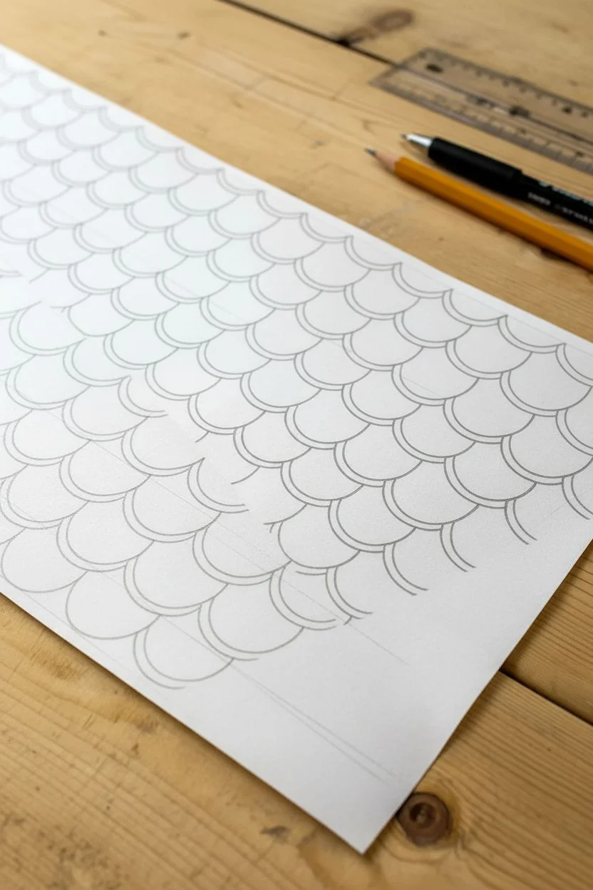
Master the rhythmic flow of a classic fish-scale pattern by adding simple line weights for depth. This approachable Zentangle-inspired design uses overlapping arcs to create a mesmerizing texture that looks complicated but is built one simple curve at a time.
How-To Guide
Materials
- Smooth white drawing paper or cardstock
- Fine-point black drawing pen (0.5mm or 0.8mm)
- Pencil (HB or 2H)
- Eraser
- Ruler (optional, for guidelines)
Step 1: Setting the Foundation
-
Prep your surface:
Place your paper on a comfortable, flat surface. Ensure your lighting is good so you can see your pencil lines clearly. -
Draw faint guidelines:
Using your pencil and ruler, lightly draw horizontal parallel lines across your page. Space them about 1 inch apart (or smaller if you want finer scales). These will help keep your pattern straight. -
Establish the first row:
On the top guideline, draw a series of connected semicircles (u-shapes). Imagine them like a row of smiles joining hands. -
Offset the second row:
For the next row down, start your semicircle from the middle (the lowest point) of the curve above it. This offset spacing is key to the fish-scale look. -
Fill the page:
Continue sketching these offset rows lightly in pencil until your desired area is filled. Don’t worry about perfection; slight variations add character.
Wobbly Lines?
If your curves look shaky, try drawing from your shoulder rather than just your wrist. Faster, confident strokes often result in smoother curves than slow, hesitant ones.
Step 2: Inking the Pattern
-
Start the ink outlines:
Switch to your black drawing pen. Begin at the top left and carefully trace over your pencil semicircles. -
Create consistent curves:
Try to keep a steady hand. If a line wobbles, just keep going; the overall pattern hides small mistakes surprisingly well. -
Trace the entire grid:
Work your way down the page, outlining every scallop shape you penciled in earlier. Let the ink dry for a minute or two to avoid smearing. -
Erase the pencil:
Once the ink is fully dry, gently erase all your horizontal guidelines and the preliminary sketch lines. You should now have a clean, simple scallop pattern.
Step 3: Adding Depth and Detail
-
Choose a shadow side:
Decide which side of the scales represents the shadow. In the reference image, the extra thickness is added to the left side of each curve. -
Draw the inner curve:
Inside one scale, start a second curve slightly inward from the left edge. Taper it so it merges with the bottom of the original curve. -
Thicken the line:
This new inner line creates a crescent moon shape on the side of the scale. You can either fill this space in solid black or leave it as a double line for a lighter look. -
Repeat the accent:
Move systematically across the row, adding that same inner curve accent to the exact same side of every single scale. -
Establish rhythm:
I find that once I get into a rhythm with this step, the motion becomes very meditative. Just repeat: curve, taper, lift. -
Check consistency:
scan your drawing to ensure every scale has received its shadow line. The uniformity is what makes the pattern pop. -
Final touches:
If you spot any gaps where lines didn’t quite connect, touch them up gently with the pen tip now.
Add Color
Use watercolor gradients inside the scales. Paint darker colors at the bottom of each scale fading to white at the top for a classic mermaid tail glisten.
Enjoy the satisfying rhythm of your completed wave pattern
Wavy Water Lines With Ripple Shading
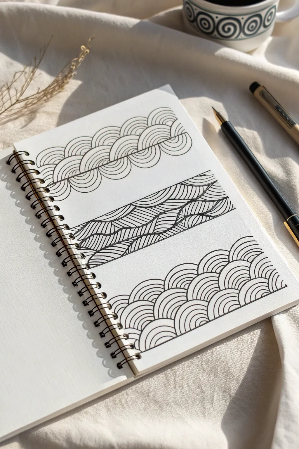
These three meditative patterns explore the flow of water through simple line repitition. From braided scales to rippling currents and classic Japanese Seigaiha waves, this page offers a soothing practice in consistency and curve control.
Step-by-Step
Materials
- Spiral-bound sketchbook or drawing paper
- Fine liner pen (black, archival ink, e.g., sizes 03 or 05)
- Pencil (HB or 2B for sketching guides)
- Eraser
- Ruler (optional for spacing)
Step 1: Pattern 1: The Braided Scale
-
Establish the centerline:
Lightly draw a horizontal pencil line across the top third of your page. This will act as the spine for your braided pattern, ensuring it doesn’t drift up or down. -
Draw the first central curve:
Using your pen, start slightly below your guide line. Draw a smooth, C-shaped curve that rises up, crosses the line, and hooks back down. Think of it like a cresting wave. -
Add the echo lines:
Inside that first C-curve, draw 4-5 smaller concentric curves, spacing them evenly. They should hug the shape of the outer line perfectly, creating a rainbow-like band. -
Create the opposing curve:
Start the next section by drawing an inverted C-shape that tucks right under the tail of your previous wave. It should curve downwards and then hook up, interlocking with the first shape. -
Fill the downward curve:
Just as before, fill this downward scoop with 4-5 concentric echo lines. The lines should appear to tuck behind the first set you drew. -
Continue the chain:
Alternate between upward and downward curving sets across the page. Make sure each new set starts from the ending point of the previous one to create that seamless, braided rope effect.
Fixing Wobbly Lines
If a curve goes astray, don’t scribble it out! Just thicken the line slightly to smooth the bump, or turn that specific wave into a solid black ‘accent’ scale.
Step 2: Pattern 2: Rippled Currents
-
Define the boundaries:
In the middle of your page, pencil in a horizontal rectangular band. Inside this band, draw two or three long, flowing wavy lines horizontally with your pen to divide the space into flowing rivers. -
Start the hatching:
Pick one of the ‘river’ sections you’ve created. Begin drawing vertical, slightly curved lines that connect the top wavy border to the bottom one. -
Vary the contour:
As you move across the section, let your vertical hatch lines tilt and curve slightly to follow the supposed volume of the wave. If the wave dips, curve your lines to accentuate that dip. -
Alternate line density:
For visual interest, I like to make the lines in adjacent sections curve in opposite directions or change the angle slightly. This separates the streams visually. -
Fill the entire band:
Continue this vertical hatching across the entire horizontal band, treating each undulating section as its own separate tube of water.
Steady Hands
Rotate your notebook constantly. It is much easier to draw curves by pivoting your wrist naturally than by contorting your hand to match a fixed page angle.
Step 3: Pattern 3: Rising Seigaiha Waves
-
Set the base:
For the bottom pattern, start at the very bottom edge of your drawing area. Draw a row of small semi-circles (humps) touching side-by-side. -
Layer the details:
Fill each of these base semi-circles with 3-4 concentric arches. Keep your hand relaxed to ensure the curves remain smooth. -
Start the second row:
The next row of waves should be offset. Place the center of your new arch directly above the valley between two waves from the bottom row. -
Build the scale effect:
Draw the outer arch of this second row first, ensuring it touches the tops of the two waves below it. Then fill it with your concentric detail lines. -
Grow the pattern upward:
Continue stacking rows in this brick-lay fashion. As you move higher, you can let the pattern naturally fade out or maintain a straight top edge depending on your preference. -
Final Cleanup:
Once all your ink is completely dry—give it a full minute—gently erase your pencil guide lines to reveal the crisp black and white contrast.
Enjoy the rhythmic calm that comes from watching these complex-looking textures build up from simple repeated strokes.
BRUSH GUIDE
The Right Brush for Every Stroke
From clean lines to bold texture — master brush choice, stroke control, and essential techniques.
Explore the Full Guide
Triangles, Chevrons, and Zigzag Ladders
Transform a simple sheet of textured cardstock into elegant stationery featuring a mesmerizing geometric zigzag pattern. This project combines precise line work with the tactile beauty of high-quality paper, resulting in a sophisticated card perfect for handwritten notes.
Step-by-Step Guide
Materials
- Heavyweight textured cardstock (cream or off-white)
- Fine-point black drawing pen (i.e., micron 01 or 03)
- Ruler or straight edge
- Pencil (H or HB)
- Kneaded eraser
- Bone folder (optional)
- Scissors or paper trimmer
Step 1: Preparation and Layout
-
Select your paper:
Choose a heavyweight cardstock with a visible texture. The subtle grain adds depth to the ink lines later. -
Cut to size:
Trim your paper to a standard card size, such as 5×7 inches, ensuring the edges are perfectly crisp and square. -
Define the drawing area:
Decide where your pattern will stop. Place a faint pencil mark or use masking tape to block off the bottom third of the card, leaving it blank for writing or folding. -
Create horizontal guidelines:
Using your pencil and ruler, lightly draw horizontal lines across the drawing area. Space them evenly, about 1/2 inch apart. -
Mark vertical intervals:
Along the top edge and your bottom boundary line, make tiny tick marks at equal intervals to guide the peaks and valleys of your zigzags.
Keep it Steady
To keep lines straight without a ruler, lock your wrist and move your entire arm. Exhale slowly as you draw each long stroke for better stability.
Step 2: Constructing the Zigzag Ladder
-
Draft the first zigzag:
Lightly sketch your initial zigzag line using the tick marks as reference. Connect a top tick mark to the bottom tick mark of the next interval to create a diagonal. -
Check the angles:
Ensure your first set of peaks and valleys creates consistent 90-degree angles if possible, or maintain a uniform softer angle. -
Begin inking the primary lines:
Switch to your fine-point black pen. Start at the top left and trace your pencil zigzag guidelines, keeping a steady hand. -
Draw the parallel partner:
Draw a second zigzag line exactly parallel to the first one, sitting just about 1/8 inch below it. This creates the first ‘stripe’ or ‘ribbon’. -
Close the shapes:
Connect the ends of your parallel lines with short vertical strokes if they run off the page edge, creating a solid enclosed shape. -
Repeat the pattern downward:
Move down to the next section. Draw the next pair of parallel zigzag lines, mirroring the spacing of the first set.
Step 3: Adding Detail and Dimension
-
Connect the layers:
Draw short vertical lines connecting the bottom point of an upper zigzag to the top point of the zigzag directly below it. -
Form the ‘steps’:
Within the negative space between your zigzag ribbons, draw straight horizontal lines connecting the inner corners. This creates the ‘ladder’ look. -
Thicken select lines:
Go back over the outer edges of your main ribbon shapes to slightly thicken the line weight. This makes the pattern pop against the textured paper. -
Erase guidelines:
Wait at least 15 minutes for the ink to fully dry. Gently use a kneaded eraser to lift away all pencil marks without damaging the paper texture. -
Score the fold:
If you are making a folded card, use a bone folder and ruler to score a clean line where the pattern meets the blank space. -
Final inspection:
Check for any gaps in your line work and touch them up carefully with the finest tip of your pen.
Ink Bleeding?
Textured paper can sometimes cause ink to feather. Test your pen on a scrap piece first. If it bleeds, switch to a harder drawing nib or a pigment liner.
Now you have a stunning, handcrafted piece of stationery ready for your next thoughtful letter
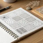
Border Bands: Pattern Strips Around a Shape
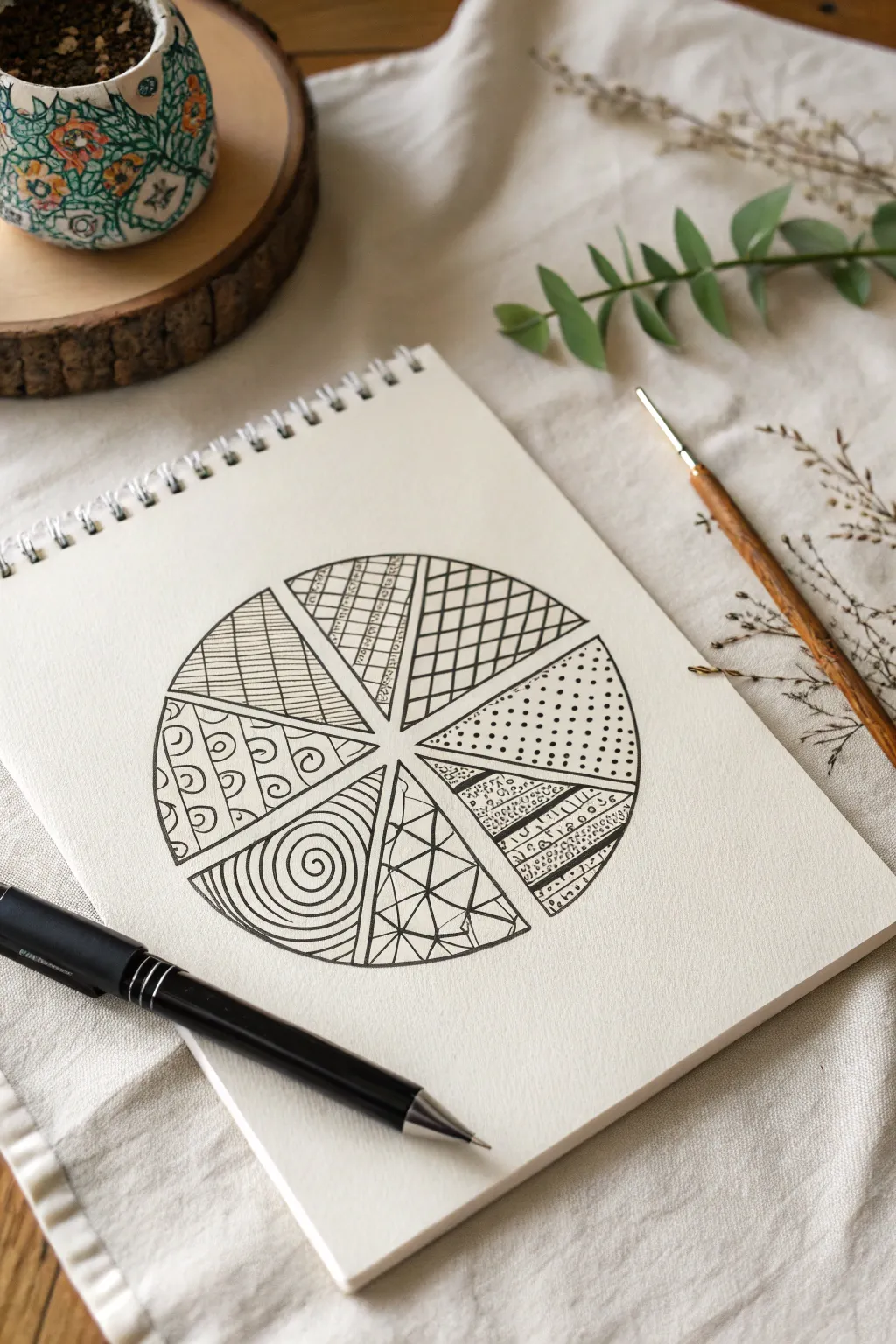
Create a soothing, symmetrical circular design that serves as the perfect playground for practicing different Zentangle patterns. This project features a segmented wheel where each slice holds a unique texture, ranging from organic swirls to structured geometric grids.
Detailed Instructions
Materials
- Spiral-bound sketchbook or heavy drawing paper
- Fine liner pen (black, 0.3mm or 0.5mm)
- Pencil (HB or 2B)
- Small ruler or straight edge
- Compass or a circular object to trace (approx. 4-5 inches diameter)
- Eraser
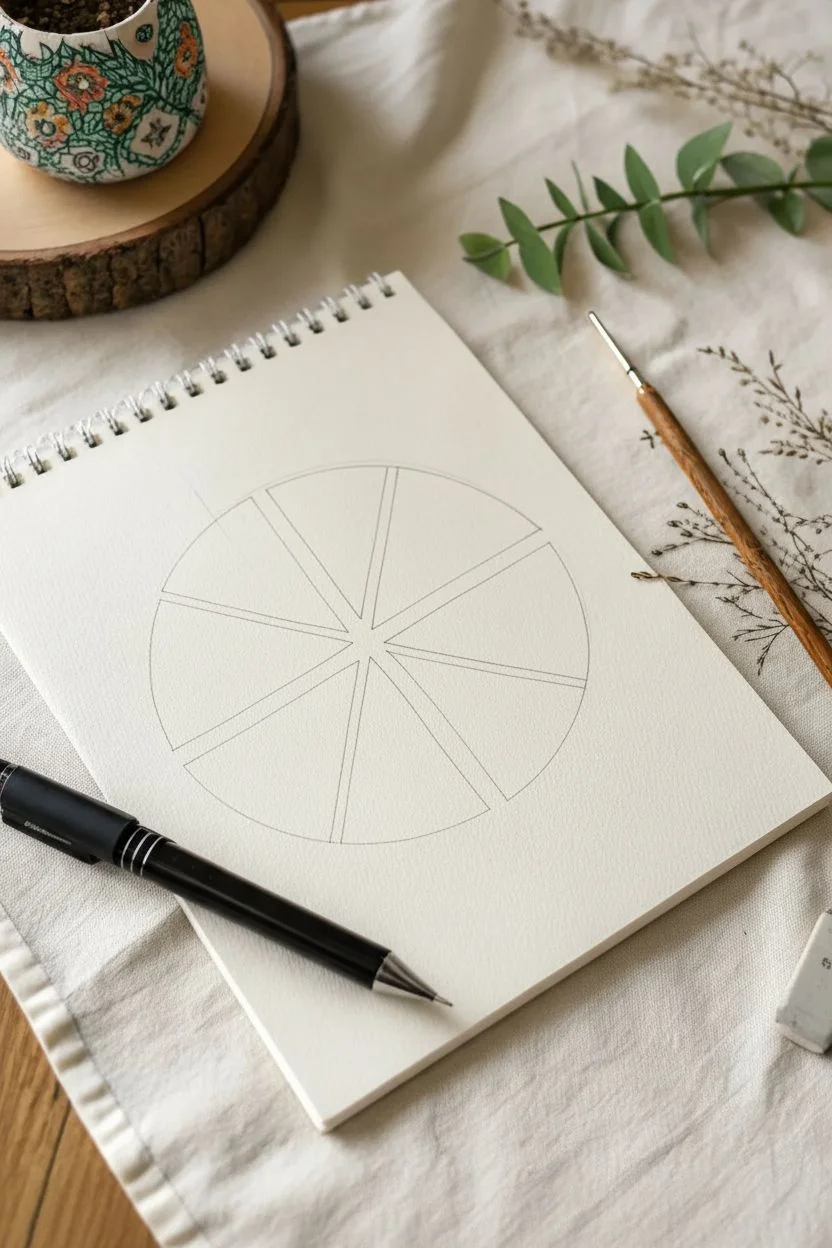
Step 1: Structure & Lines
-
Draw the main circle:
Start by finding the center of your page. Using a compass or by tracing a circular object like a bowl or large lid, draw a clean circle in pencil. It should be large enough to work inside comfortably, about 4 to 5 inches across. -
Create the segments:
Using your ruler and pencil, divide the circle into eight equal ‘pie’ slices. Draw a vertical line through the center, then a horizontal line. Finally, draw two diagonal lines to bisect the quadrants, creating eight even sections. -
Ink the outline:
Switch to your black fine liner pen. Carefully trace over the penciled circle circumference. Then, trace the internal dividing lines. I find it helps to rotate the sketchbook so I’m always pulling the pen stroke towards my body for better control.
Rotate Your Canvas
Don’t contort your wrist to draw angled lines. Always rotate the sketchbook itself so your hand creates strokes in a natural, comfortable direction (usually pulling toward you).
Step 2: Upper Hemisphere Patterns
-
Fill the top-left slice:
In the segment at the 10 o’clock position, draw horizontal parallel lines spaced evenly apart. Don’t worry if they aren’t mechanically perfect; slight wobbles add character. -
Fill the top-center-left slice:
Moving clockwise to the next slice, draw a grid pattern. Create vertical lines, then horizontal lines. Inside every other square, draw a small diagonal hatch mark for added texture. -
Fill the top-center-right slice:
For the next section, draw a diagonal diamond grid. Draw diagonal lines slanting right, then cross them with diagonal lines slanting left. Leave the resulting diamonds empty for a clean, graphical look. -
Fill the far-right slice:
In the slice at the 2 o’clock position (the far right of the upper half), fill the space with stippling. Create rows of small dots. Start with dense dots near the pointy center and let them spread out slightly as you move toward the outer rim.
Step 3: Lower Hemisphere Patterns
-
Fill the bottom-right slice:
Moving to the section at 4 o’clock, divide the slice into three mini-bands using slightly curved lines. Fill the top band with tiny circles, the middle with vertical stripes, and the bottom with more tiny bubbles. -
Fill the bottom-center-right slice:
This section introduces sharp geometry. Draw random intersecting straight lines to create shards or triangles, similar to a shattered glass effect. Leave the shapes open. -
Fill the bottom-center-left slice:
Contrast the previous sharp lines with curves. Start at the pointy center and draw a continuous spiral that expands outward until it fills the entire wedge, like a cinnamon roll. -
Fill the bottom-left slice:
For the final slice at 8 o’clock, create a ‘scales’ or ‘arches’ pattern. Draw rows of small U-shapes stacked on top of each other. Add a tiny dot or circle inside the center of each arch.
Smudged Ink?
If you accidentally smear wet ink, don’t scrap the page. Turn the smudge into a shadow or add a solid black shape over it. Zentangle is about embracing ‘no mistakes’.
Step 4: Finishing Touches
-
Thicken the borders:
To make the sections pop, go back over the main skeleton lines—the outer circle and the eight dividing spokes—and thicken them slightly with a second pass of your pen. -
Erase pencil guides:
Wait at least 5-10 minutes to ensure the ink is completely dry. Gently run your eraser over the entire design to remove the initial pencil sketch marks. -
Add final contrast:
Look at the composition as a whole. If any areas feel too light, thicken a few lines or darken the small gaps between circles to add weight and balance.
You now have a beautiful geometric sampler that highlights the variety of simple patterns when placed side-by-side


Circle Swatches for Mandala-Friendly Fills
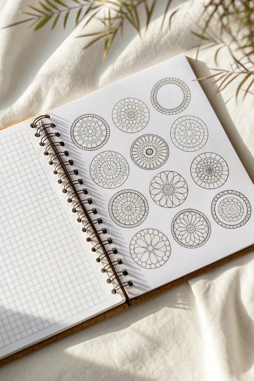
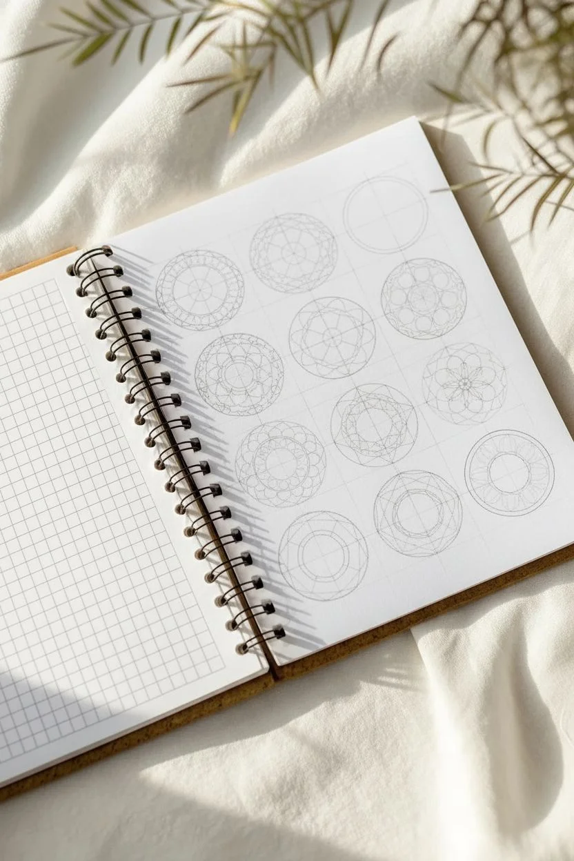
These delicate, circular swatches serve as perfect miniature canvases for practicing mandala fills and Zentangle patterns without the pressure of a full-page composition. The clean lines and varied internal structures offer twelve unique opportunities to explore radial symmetry and geometric design.
Step-by-Step Tutorial
Materials
- Spiral-bound sketchbook with smooth, heavy-weight paper (mixed media or bristol)
- Compass with a pencil holder (or circle stencils)
- Pencil (HB or 2H suitable for light guidelines)
- Fine liner pen (0.3mm or 0.5mm, black waterproof ink)
- Eraser (kneaded or high-quality vinyl)
- Ruler (preferably clear plastic)
- Protractor (optional, for precise angles)
Step 1: Setting the Stage
-
Plan your layout:
Begin by deciding on the layout for your twelve circles. Using a ruler and a light pencil touch, mark center points for a grid of three columns and four rows on your page. -
Draw the boundaries:
Set your compass to a radius of about 1 inch (or 2.5 cm). Place the needle on your marked center points and lightly draw twelve identical circles in pencil. -
Create inner guides:
For designs that require concentric rings, adjust your compass to a smaller radius and add inner circles within the main boundaries where needed. -
Mark radial sections:
Using a protractor or just your eye for estimation, lightly divide your circles into segments like a pie. Some designs need 8 slices, others 12 or 16, depending on the complexity you aim for.
Clean Lines Pro-Tip
Rotate your sketchbook constantly as you draw curves. It is much easier to pull a pen toward your body in a natural arc than to push it away at an awkward angle.
Step 2: Inking the Structures
-
Start with the ‘Wheel Spoke’ design:
For the simpler radial designs, start by inking a small center circle, then draw lines radiating outward to the edge. Cap them with a bold outer ring. -
Draft the ‘stained glass’ segments:
On a new circle, draw a medium-sized inner circle. Connect the inner limit to the outer edge with curved lines to create petal-like shapes. -
Create the ‘flower petal’ motif:
Locate the center of another circle. Draw six or eight large, looping petals that touch the outer rim, leaving negative space in between the loops. -
Build the ‘cobblestone’ texture:
For the more intricate mosaic-style circle, draw irregular, small geometric shapes clustering tightly together. Keep the gaps between them consistent to mimic grout lines. -
Form the ‘layered mandala’:
Choose a circle guide with multiple concentric rings. Draw small U-shapes or scallops along one ring, then offset them on the next ring outward to create a scale effect. -
Detail the ‘ornate frame’:
On a circle with a large empty center, focus entirely on the rim. Draw a double border and fill the space between with small zig-zags or tiny circles. -
Construct the ‘web’ pattern:
Draw straight lines crossing through the center. Connect these spokes with swooping, concave lines that spiral outward, creating a spiderweb look.
Step 3: Refining and Finalizing
-
Ink the primary lines:
Once all twelve pencil sketches are complete, switch to your fine liner pen. Trace over your pencil lines carefully, keeping a steady hand for smooth curves. -
Add line weight variety:
I find that going back over the outermost border of each circle with a slightly thicker line (or a second pass) really helps the swatches pop off the page. -
Connect the floating elements:
Check for any lines that should touch but don’t. Close those tiny gaps to ensure your shapes are solid and ready for future coloring or shading. -
Let the ink cure:
Wait several minutes to ensure the ink is completely dry. Smearing a crisp line drawing at the very end is heartbreaking. -
Clean up the page:
Gently erase all remaining pencil guidelines using a kneaded eraser to lift the graphite without damaging the paper surface.
Pattern Play Level-Up
Leave some negative space intentionally blank. Once finished, use a light grey marker or watered-down ink to add drop shadows, making the webbing look 3D.
Now you have a library of structured circles ready to be filled with intricate tangles whenever inspiration strikes
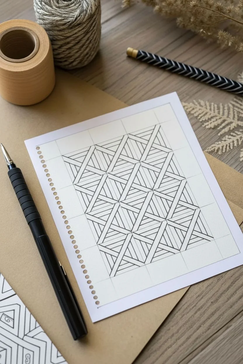
One-Pattern Challenge: A Monotangle Page
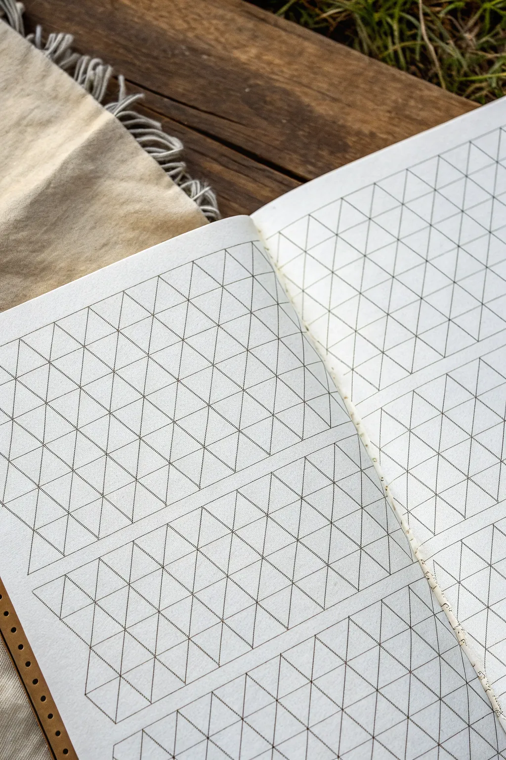
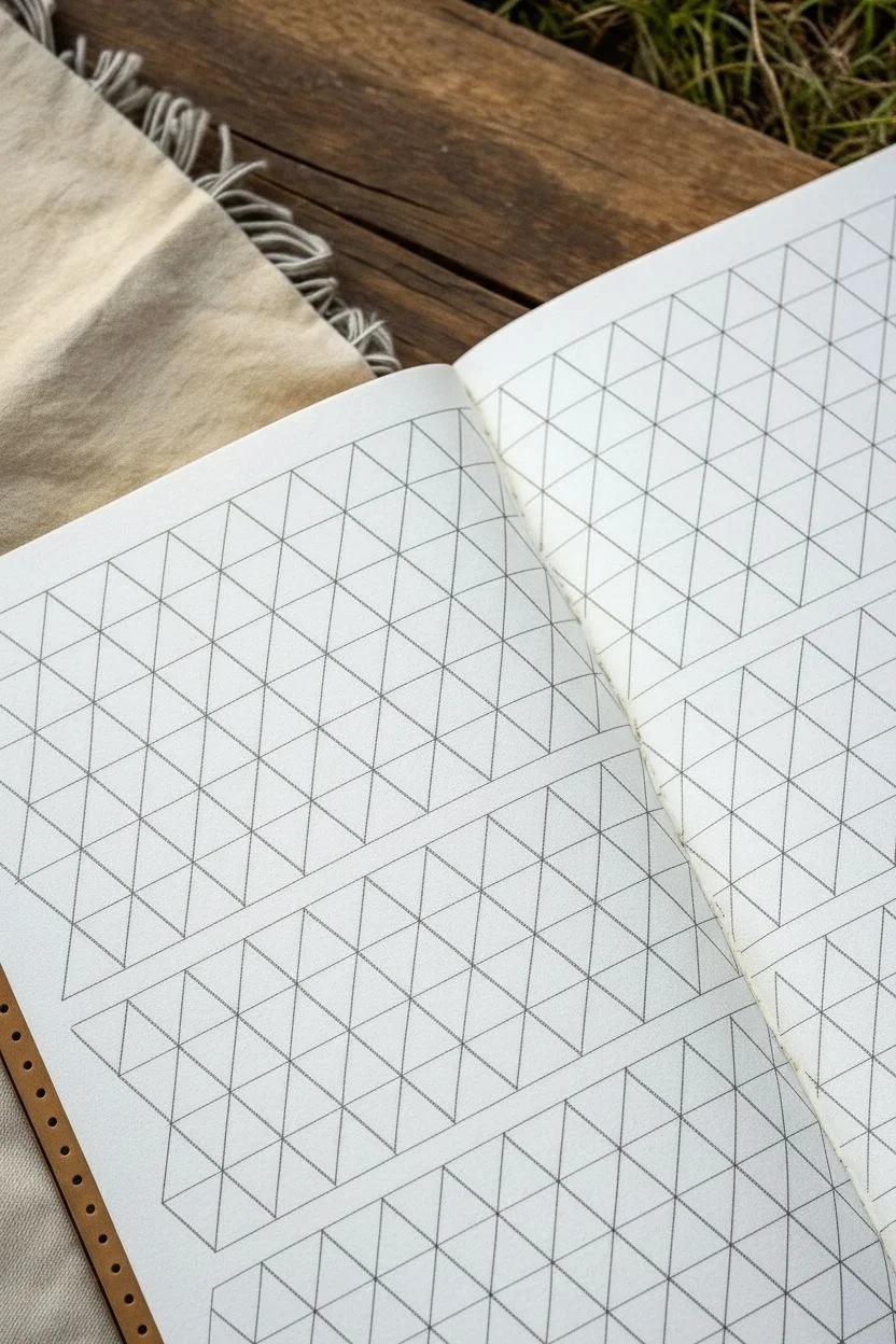
Before diving into complex tangles, this project focuses on creating the perfect geometric foundation: a custom isometric grid layout. This preparation phase sets the stage for a triangular Monotangle exploration, organizing your page into neat, manageable bands.
Step-by-Step Guide
Materials
- A5 or Letter-sized sketchbook (blank or dot grid)
- Ruler or straight edge
- Pencil (HB or lighter)
- Fine liner pen (01 or 03 micron, black)
- Isometric grid stencil or printed underlay (optional, but helpful)
- Erinser
Step 1: Planning the Layout
-
Assess your page:
Open your sketchbook to a fresh spread. Since we are creating a foundation for patterns, visualize how you want the bands to flow across the spread. The sample uses horizontal bands of different heights to create variety. -
Mark horizontal guides:
Using your ruler and pencil, lightly mark horizontal lines to define the top and bottom of your pattern bands. Leave about 1/4 inch of white space between each band to let the future patterns breathe. -
Establish the 60-degree angle:
An isometric grid relies on 60-degree angles. If you don’t have a protractor, you can approximate this or use a printed isometric grid sheet slipped under your page (if the paper is translucent enough) as a guide. Draw your first diagonal line leaning right. -
Create the first diagonal set:
Continue drawing parallel diagonal lines leaning to the right across all your marked bands. Keep the spacing consistent—about 1/2 inch apart works well for Zentangle patterns.
Grid Master
Don’t want to draw the grid every time? Draw it once in thick black marker on a separate sheet, then place it under your sketchbook page to trace as needed.
Step 2: Constructing the Grid
-
Mark the opposing diagonals:
Now, draw the second set of diagonal lines leaning to the left, intersecting your first set. This creates a field of diamonds across your bands. -
Add horizontal connectors:
To turn those diamonds into triangles, draw horizontal lines through the intersections of your X shapes. This completes the classic isometric triangular structure. -
Review pencil lines:
Take a moment to check your grid. The triangles should look relatively equilateral. Use your eraser to tweak any lines that drifted off course before committing to ink.
Step 3: Inking the Structure
-
Select your pen:
Choose a fine liner, such as a 01 or 03 size. You want the grid to be visible but delicate enough that it doesn’t overpower the tangible art you will eventually add inside. -
Ink the horizontals:
Start by tracing over your horizontal pencil lines. I find it easier to lock my wrist and move my whole arm to keep these long lines straight. -
Ink the right-leaning diagonals:
Methodically trace all the diagonal lines slanting to the right. Lift your pen at the gaps between the bands—do not draw through the ‘gutters’ or negative space you planned earlier. -
Ink the left-leaning diagonals:
Complete the grid by inking the left-leaning diagonals. Watch as the crisp triangular grid emerges from the graphite sketch. -
Define the borders:
Go over the top and bottom edges of each horizontal band one more time to clearly define the drawing area.
Hexagon Hack
Erase the central point where six triangles meet to instantly transform sections of your grid into a honeycomb hexagonal pattern for variety.
Step 4: Finishing Touches
-
Let the ink settle:
Allow the ink to dry completely for at least a few minutes. Smudging wet ink at this stage is heartbreaking. -
Erase guidelines:
Gently erase all remaining pencil marks. Use a soft, high-quality eraser to avoid roughening the paper surface. -
Clean up intersections:
Inspect the corners where lines meet. If any lines fall short, extend them slightly with your pen to close the shapes. This ensures your future color or shading won’t ‘leak’ out visually.
Your custom isometric canvas is now perfectly prepped and waiting for your creative pattern fills
Negative Space Windows for Instant Contrast
This striking project transforms a simple ceramic tile or square cardstock into a mesmerizing piece of art using negative space and high-contrast patterns. By dividing the square into a starburst of eight sections, you create distinct “windows” that showcase a variety of intricate Zentangle-inspired designs.
How-To Guide
Materials
- Square white ceramic bisque tile (approx. 4×4 inches) or heavy illustration board
- Fine-point black drawing pen (0.3mm or 0.5mm)
- Thick black marker or brush pen for filling large areas
- Pencil (HB or 2H)
- Ruler or straight edge
- Eraser
- Clear spray sealant (optional, for ceramic method)
- Cork backing sheet (optional)
Step 1: Setting the Structure
-
Establish the center:
Begin by lightly marking the exact center of your square tile with your pencil. You can find this by lightly drawing diagonal lines from corner to corner; the intersection is your center point. -
Draw the main diagonals:
Using your ruler, draw two straight lines connecting opposite corners, crossing through your center mark. This creates a large X shape. -
Create the vertical and horizontal cuts:
Next, draw a vertical line and a horizontal line through the center point, dividing your X. You should now have a “pizza” layout with eight equal triangular sections radiating from the middle. -
Ink the boundaries:
Switch to your fine-point pen and carefully trace over these eight dividing lines. Don’t worry if they aren’t machine-perfect; a slight hand-drawn wobble adds organic character.
Ink Smearing?
Work methodically from the center outward, or rotate the tile constantly so your hand never rests on wet ink. A scrap piece of paper under your hand also helps.
Step 2: Filling the Sections: Top Hemisphere
-
Start the top-left section: Stippled Darkness:
In the triangle immediately to the left of the top vertical line, draw random circles of varying sizes. Color the space *between* the circles with black ink, leaving the circles white. This negative space technique creates instant drama. -
Top-left adjacent: Curved Bands:
Move clockwise to the next section. Draw concentric curved bands radiating from the center. Fill alternating bands with different textures—one with stippling (dots), another with vertical hatching, and leave some plain. -
Top-right adjacent: Checkered Grid:
For the next slice, draw a slightly warped grid pattern. The lines should curve gently rather than be rigid graph paper squares. Fill almost every other square with solid black to create a heavy checkerboard effect. -
Top-right: Radial Arcs:
In the far right triangle, draw arcs radiating outward like a rainbow. Within these bands, add vertical dividing lines in the outer band and keep the inner band simpler to create depth.
Variation Idea
Try swapping the black and white roles! Use a black tile or cardstock and draw the same patterns using a white gel pen for a dramatic chalkboard effect.
Step 3: Filling the Sections: Bottom Hemisphere
-
Bottom-right: Scalloped Scales:
Moving to the bottom right quadrant, fill this triangle with overlapping semi-circles or ‘fish scales’. Use your fine pen to outline them, then add a smaller inner curve to each scale to give them volume. -
Bottom-center right: Floral Burst:
In this downward-pointing triangle, draw a quarter-sun or flower shape emerging from the bottom right corner of the triangle. Add petals and radiating lines, keeping the lines crisp and separated. -
Bottom-center left: Explosive Lines:
For the next section, draw straight lines radiating from a single point located about one-third up from the bottom edge. These lines should fan out to fill the whole triangle, creating a starburst effect. -
Bottom-left: Double Waves:
In the final triangle, draw rows of humps or waves stacked on top of each other. Add inner contour lines to each wave to emphasize their rounded shape, similar to the scales but arranged in tidy rows.
Step 4: Final Touches
-
Clean up contours:
Review your work and thicken any of the main dividing lines (the initial 8-slice framework) to make the sections clearly distinct from one another. -
Erase guidelines:
Once you are absolutely certain the ink is fully dry—I usually give it at least 15 minutes to be safe—gently erase any visible pencil marks. -
Seal the surface:
If you used a ceramic tile, take it to a well-ventilated area and apply a light coat of clear spray sealant to protect the ink from smudging or moisture. -
Add backing:
Peel and stick a cork backing sheet to the underside of the tile to prevent it from scratching your table surfaces.
Now you have a functional piece of art that invites the eye to wander through every detailed section
Quick Depth: 3D Illusion Cubes and Ribbons
This striking geometric pattern creates a mesmerizing optical illusion of woven ribbons or stacked prisms using nothing but straight lines. It’s an excellent project for practicing precision and learning how simple directional hatching can build incredible depth.
Step-by-Step
Materials
- Heavyweight drawing paper or mixed media paper (smooth or light texture)
- Fine liner pen (01 or 03 size, black ink)
- Graphite pencil (HB or 2B)
- Ruler or straight edge
- Eraser
Step 1: Setting the Grid
-
Establish the perimeter:
Begin by drawing a large, clean rectangle in the center of your paper using your ruler and pencil. Leave a comfortable margin of white space around the edges to frame your work. -
Mark vertical divisions:
Along the top and bottom edges of your rectangle, make small tick marks at even intervals. For this specific look, aim for roughly 4 or 5 vertical columns. -
Create the columns:
Connect your top and bottom tick marks with light, vertical pencil lines. These will serve as the backbone for your pattern. -
Add horizontal guidelines:
Now, mark even intervals along the left and right sides. These should be roughly square or slightly taller than they are wide. Connect them horizontally to form a grid of rectangles.
Clean Lines Tip
Rotate your paper constantly! It is much easier for your hand to draw hatching lines in a natural pulling motion than to contort your wrist for different angles.
Step 2: Drawing the Structure
-
Ink the zig-zag basics:
Switch to your fine liner pen. In the first column, draw a diagonal line from the top-left corner of the first rectangle to the bottom-right corner. In the rectangle below it, reverse the direction: top-right to bottom-left. -
Repeat the pattern:
Continue this alternating diagonal pattern all the way down the first column. It should look like a continuous zig-zag trapped inside the column boxes. -
Mirror adjacent columns:
Move to the second column. If your first column’s top box had a diagonal going ‘down-right’, this neighbor needs to go ‘down-left’. The diagonals should meet at the vertical grid lines to form ‘V’ or inverted ‘V’ shapes. -
Complete the skeleton:
Fill in all remaining columns with these alternating diagonals. You should now see a pattern of diamonds and chevrons emerging across the grid. -
Create the offset thickness:
To give the ribbons dimension, draw a second parallel line next to each diagonal you just inked. I usually space these about 3-4mm apart. This creates the ‘face’ of the ribbon. -
Close the shapes:
Connect these parallel lines at their ends to the vertical column lines, creating distinct, slanted rectangular shapes within each grid box.
Step 3: Texturing and Depth
-
Identify the planes:
You now have two types of spaces: the wide ‘ribbon faces’ you just created, and the triangular gaps left behind in the background. -
Hatch the ribbons:
Fill the ribbon faces with closely spaced, straight lines running parallel to the short ends of the ribbon. This uniform direction reinforces the flat plane of the object. -
Fill the triangles:
Now focus on the triangular background gaps. Fill these with lines running horizontally (or vertically, as long as it contrasts with the ribbon lines). This directional contrast separates the foreground from the background. -
Thicken the borders:
Go back over the main outline of your rectangle block with a slightly heavier line weight or a second pass of your pen to frame the composition boldly. -
Erase and refine:
Wait until the ink is completely dry to avoid smudges. Gently erase all your underlying pencil grid lines to reveal the clean, floating geometric structure.
Level Up: Shadow Play
Use a light grey marker or diluted ink wash to add drop shadows where the ‘ribbons’ appear to go under one another. This boosts the 3D effect instantly.
Now you have a sophisticated geometric lattice that looks far more complex than the simple grid it started as
Pattern-Filled Letterforms and Mini Typographic Tangling
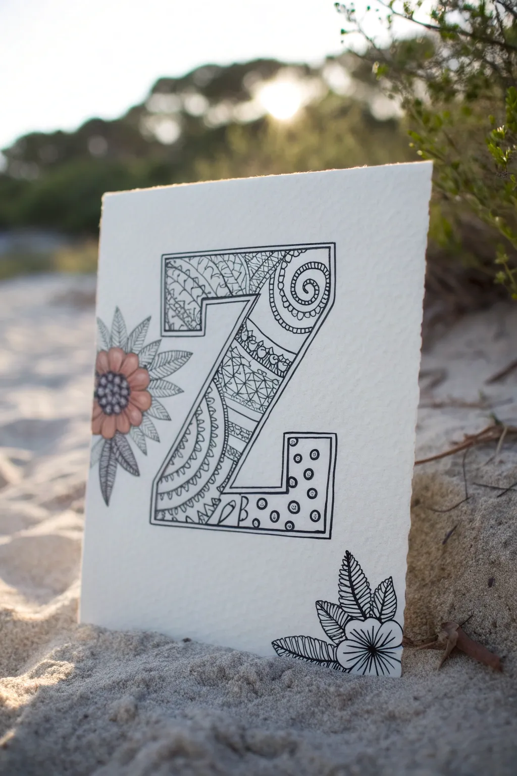
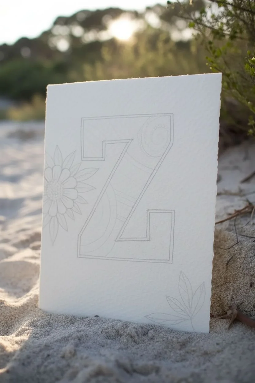
This project combines the meditative repetition of Zentangle patterns with bold typography to create a stunning monogram. Set against textured paper, the intricate linework and subtle pop of coral watercolor create a balanced, organic piece perfect for framing or gifting.
Step-by-Step Tutorial
Materials
- High-quality textured watercolor paper (cold press recommended)
- Pencil (HB or 2B)
- Eraser
- Ruler
- Fine liner pens (0.1, 0.3, and 0.5 mm nibs)
- Watercolor paint (Peach or Coral shade)
- Small round watercolor brush (size 2 or 4)
Step 1: Drafting the Layout
-
Paper Preparation:
Begin by selecting a piece of heavy, textured watercolor paper. If you want rough edges like the sample, you can carefully tear the paper against a ruler instead of cutting it with scissors. -
Letter Outline:
Using your pencil and ruler, lightly sketch a large block letter ‘Z’ in the center of the paper. Keep the lines faint so they can be easily erased later. Aim for a bold, thick structure to allow plenty of space for filling. -
Floral Placement:
Sketch a large stylized daisy-like flower overlapping the left vertical side of the ‘Z’. Then, sketch a small cluster of three leaves in the bottom right corner of the paper to balance the composition.
Step 2: Building the Framework
-
Inking the Outline:
Switch to your 0.5 mm fine liner. Carefully trace over the outer boundary of your block ‘Z’. Do not ink the parts of the letter that are hidden behind the flower petals on the left. -
Sectioning the Canvas:
Inside the ‘Z’, use a lighter touch to draw curved, flowing lines that divide the letter into organic sections. These lines will act as boundaries for your different patterns. Think of them like hills or waves spanning across the letter’s width. -
Floral Outlines:
Ink the outlines of the main flower and the corner leaf cluster. Add a center circle to the flower and detailed veins to the leaves, then erase all visible pencil marks once the ink is completely dry.
Ink Control
If your pen nib tends to snag on the rough paper texture, try holding the pen more upright and slowing down your stroke speed for cleaner lines.
Step 3: Tangling the Patterns
-
The Swirl Top:
Starting at the top right corner of the ‘Z’, draw a large spiral shape. Fill the surrounding negative space with small circles or ‘tipple’ patterns to add density. -
Cross-Hatching:
In the next section down, create a grid pattern. Instead of straight lines, let them curve slightly with the shape of the section. You can leave them open or fill alternating squares for a checkerboard effect. -
Scallops and Arcs:
Move to the diagonal mid-section. Draw rows of small semi-circles or scallops. Add tiny dots inside each scallop for extra detail. This creates a lace-like texture. -
Flowing Stripes:
For the lower diagonal area, draw parallel curved lines close together. Occasionally thicken one of the lines to add visual weight and contrast. -
Polka Dot Base:
In the bottom horizontal leg of the ‘Z’, use the 0.3 mm pen to draw dispersed circles. Color in the background black, leaving the circles white, or simply draw rings with dots inside them for a lighter look as shown in the photo.
Shading Depth
Use a soft graphite pencil to add faint shadows along the inner section dividers of the ‘Z’. Smudge it slightly for a 3D effect.
Step 4: Finishing Touches
-
Detailing the Flower:
Return to the main flower. Draw a tight grid or stippling pattern in the center disk to darken it. -
Adding Color:
Wet your brush and pick up a small amount of peach or coral watercolor. Gently paint the petals of the main flower. I like to keep the color somewhat transparent to let the paper texture show through. -
Corner Leaves:
For the bottom right leaves, use your finest pen (0.1 mm) to add intricate striped shading or hatching inside the leaves, leaving them black and white to contrast with the colored flower. -
Final Cleanup:
Check for any stray pencil lines one last time. If parts of the ‘Z’ outline look thin compared to the patterns, thicken the outer border slightly to make the letter pop.
Now you have a beautifully intricate monogram that celebrates both structure and organic flow


Have a question or want to share your own experience? I'd love to hear from you in the comments below!