
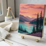
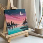
Abstract acrylic painting is one of my favorite ways to get color on a surface fast—no pressure, just play. Here are a bunch of abstract acrylic painting ideas you can actually finish, even if you’re working small, learning techniques, or just craving a creative reset.
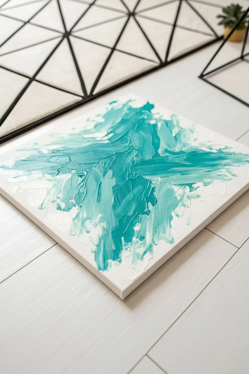
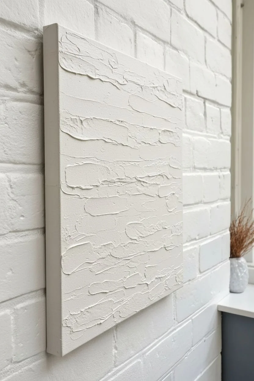
Thick Textured Brushstroke Fields (Impasto Look)
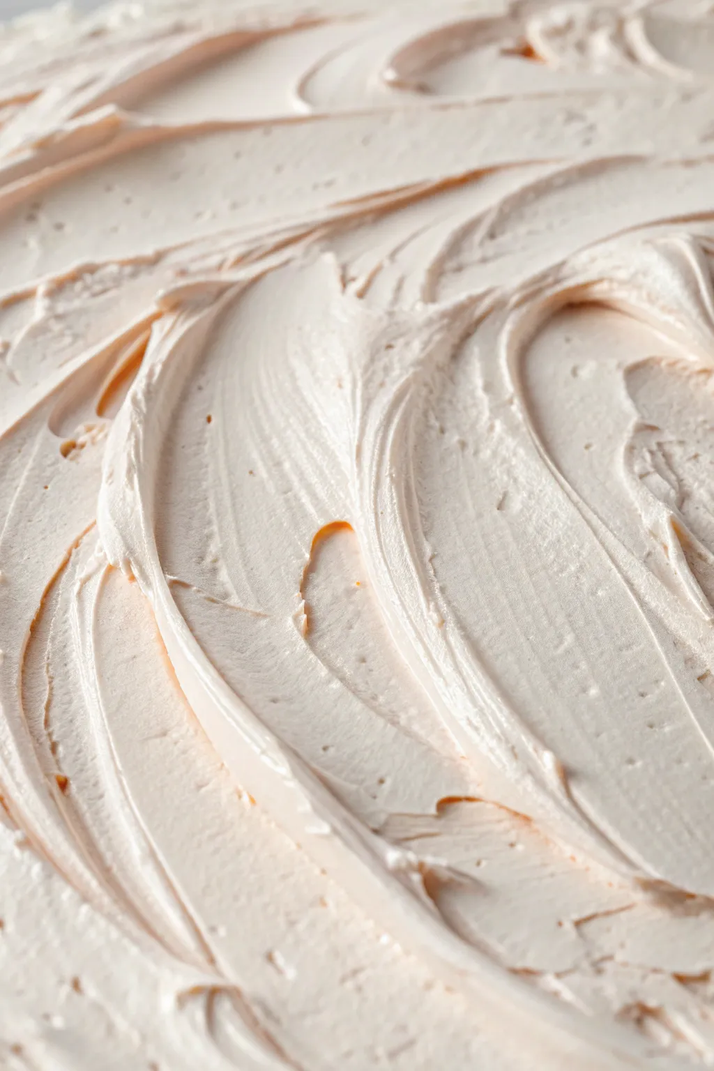
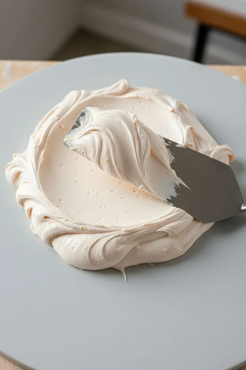
Capture the luscious, pillowy appearance of thick frosting or whipped cream using heavy body acrylics and modeling paste. This monochromatic, impasto-style piece relies entirely on the interplay of light and shadow caught within deep, sweeping ridges.
Detailed Instructions
Materials
- Canvas or rigid painting board (primed)
- Heavy body acrylic paint (Titanium White and a tiny drop of Yellow Ochre or Unbleached Titanium)
- Acrylic modeling paste or heavy gel medium (matte finish)
- Palette knife (large, offset metal trowel style)
- Palette knife (medium, diamond shape)
- Palette or mixing surface
- Clean rag or paper towels
Step 1: Mixture Preparation
-
Base Construction:
Begin by scooping a generous amount of modeling paste onto your palette. You will need significantly more volume than you would for a standard flat painting, so don’t be shy with the amount. -
Tinting the Paste:
Add a large dollop of Titanium White heavy body acrylic to the paste. This ensures the mixture remains opaque and bright rather than drying semi-translucent. -
Creating Warmth:
To achieve the specific creamy, off-white tone seen in the reference, mix in a pinhead-sized amount of Yellow Ochre or Unbleached Titanium. The goal is a very subtle warm vanilla hue, not a yellow paint. -
Consistency Check:
Fold the mixture together thoroughly with your palette knife. The final consistency should resemble stiff peaks of meringue or thick buttercream frosting—stiff enough to hold a shape without slumping.
Cracks Appearing?
Thick impasto often cracks if it dries too fast. Don’t use a hair dryer or heat source. Let it dry slowly in a cool room. If cracks appear, fill them with a little fresh paste.
Step 2: Applying the Texture
-
Initial Layer:
Using the large offset palette knife, spread a thick, even layer of your mixture across the entire canvas surface. This base coat should be about 1/8th of an inch thick to provide a foundation for the swirls. -
Loading the Knife:
Clean off your knife, then scoop up a fresh, substantial ridge of the paint mixture onto the long edge of the blade. -
The First Sweep:
Starting from one corner, press the blade gently into the wet base layer and pull it in a wide, curving arc. Tilt the knife slightly away from the canvas direction to let the excess paint drag off, creating a raised ridge. -
Creating the Peaks:
Notice how the reference image has sharp, torn edges on the ridges? Achieve this by lifting the knife abruptly at the end of a stroke rather than smoothing it out. -
Interlocking Curves:
Make a second large swooping motion that intersects or nestles against your first stroke. Vary the pressure: heavy pressure clears the paint to the canvas (creating valleys), while light pressure deposits more textured material (creating hills). -
Building Volume:
If an area looks too flat, reload your knife and lay a fresh glob of paste right on top, sculpting it into a new wave form. I find that working quickly prevents the acrylic from skinning over, which keeps the texture smooth.
Step 3: Refining the Details
-
Adding Micro-Texture:
Switch to the smaller diamond-shaped palette knife for tight spaces between the large swoops. Use the tip to pull small peaks upward in the ‘valleys’ of the painting. -
Smoothing the Troughs:
Look for the smooth, scraped-out areas in the reference image caused by the flat of the knife. Replicate this by using a clean, dry knife to gently scrape and flatten the lowest points of your swirls, emphasizing the contrast between smooth valley and rough peak. -
Creating Air Pockets:
To mimic the porous look of frosting, lightly tap the flat of the knife against a peak and pull straight back. This breaks surface tension and creates tiny pits and organic imperfections. -
Directional Flow:
Step back and check the overall movement. Ensure your strokes flow harmoniously, perhaps leading the eye across the canvas diagonally, rather than looking like isolated blobs. -
Final Peak Adjustment:
Before the medium sets, use the very tip of your knife to sharpen the highest ridges. Enhancing these sharp edges will catch the light better once the artwork is hung.
Pro Tip: Tint Control
Mix your ‘vanilla’ color slightly darker than you want the finish to be. Acrylics and modeling pastes often dry slightly darker, but lighter when mixed with white.
Step 4: Drying and Finishing
-
Initial Set:
Allow the painting to rest flat in a dust-free area. Because the application is so thick, the surface may skin over within an hour, but the center will remain wet. -
Full Cure:
Let the piece dry undisturbed for at least 24-48 hours. The thickest impasto areas might need even longer to fully harden without cracking. -
Optional Varnish:
Once fully cured (wait a week to be safe), you can apply a spray varnish. A gloss varnish will make it look wet like fresh frosting, while a matte varnish will keep it looking like soft plaster.
Hang your piece near a window where natural raking light will highlight those deep, luscious textures you created


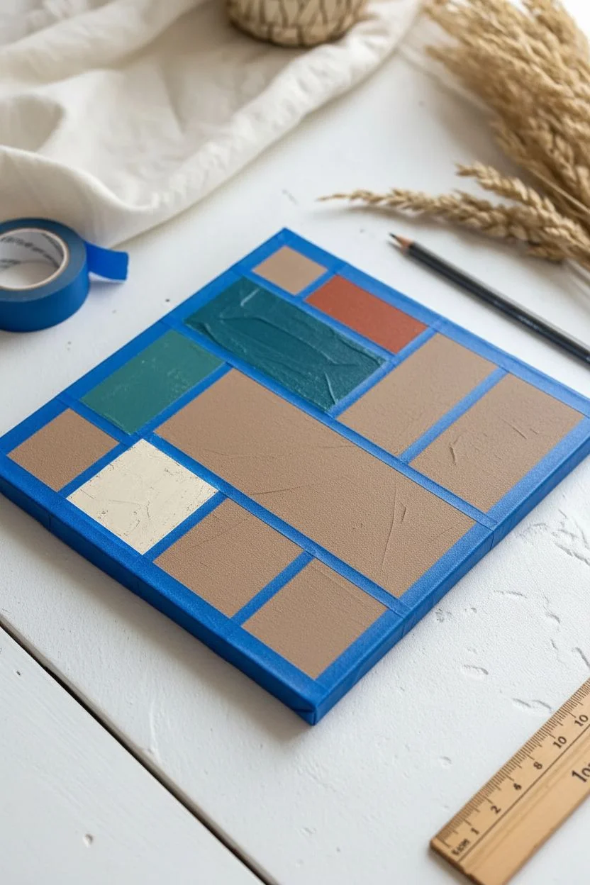
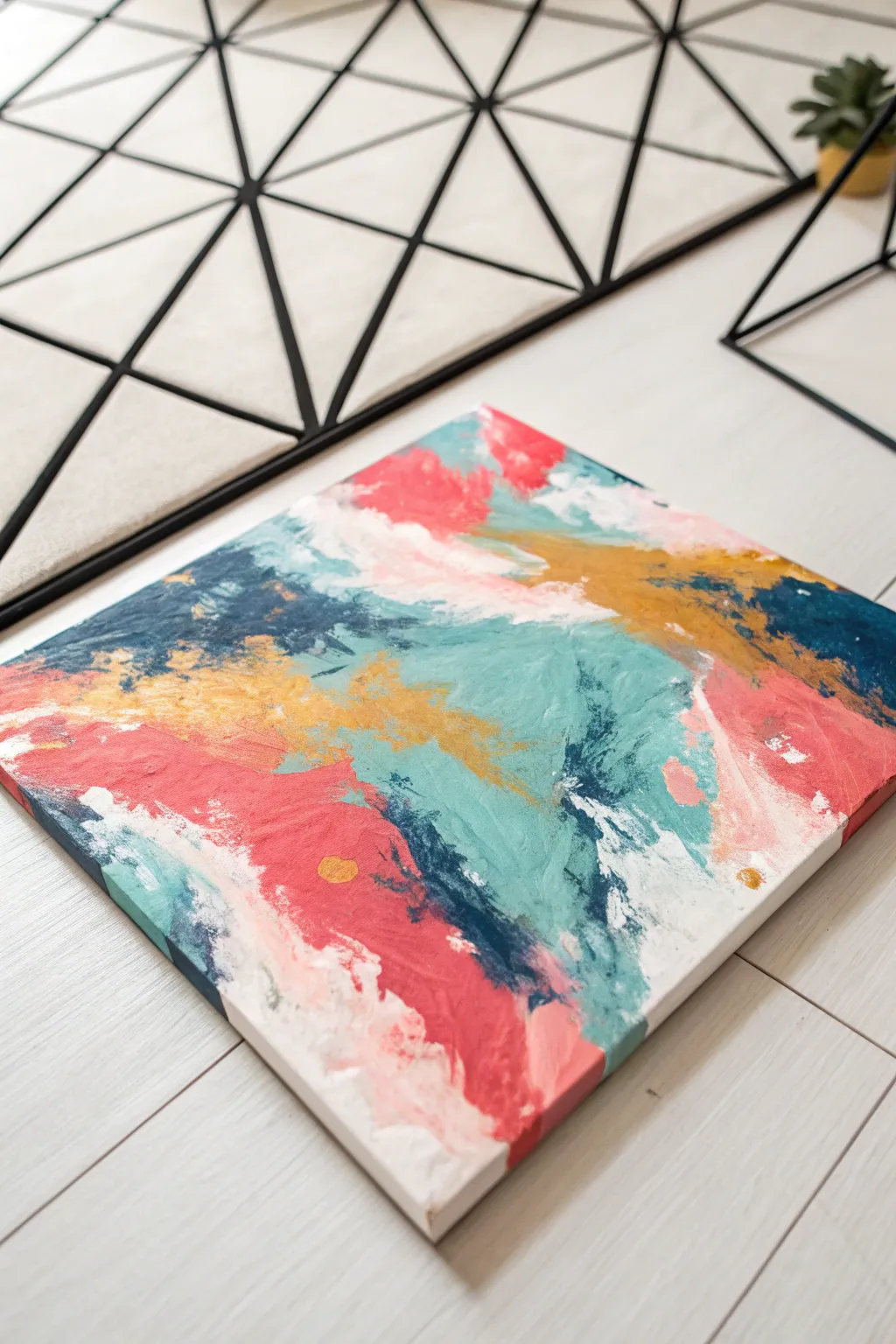
Palette-Knife Patchwork With Layered Color Plates
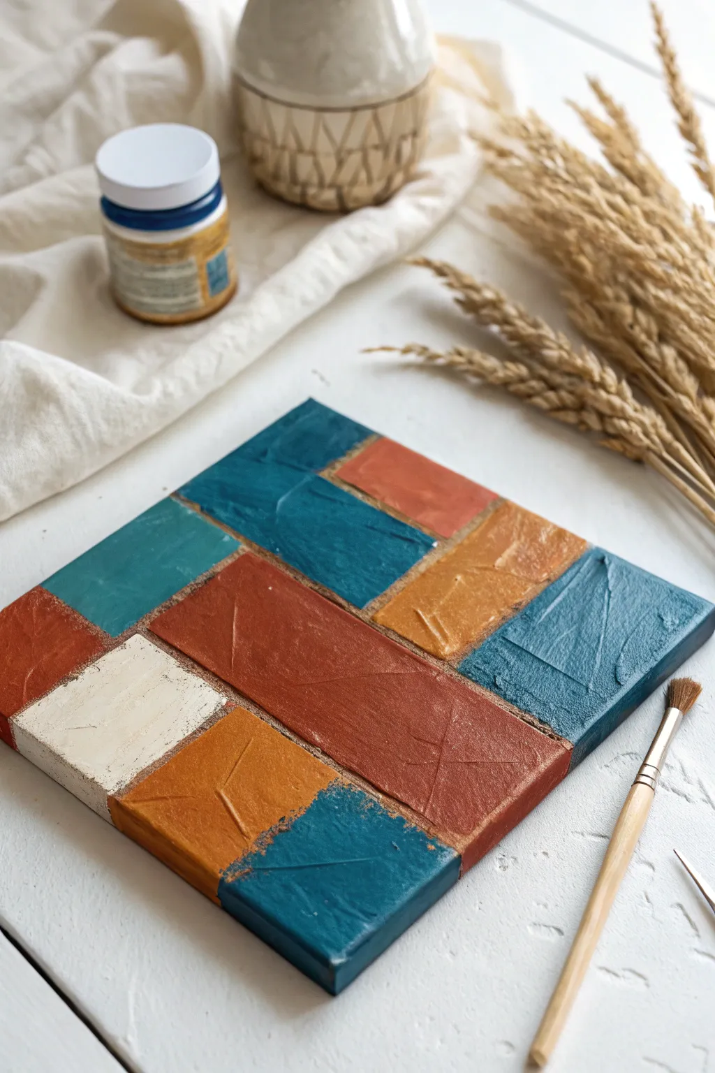
This project creates a striking modern look by combining bold color blocks with rich, rustic textures. The patchwork design mimics the feel of aged tiles or weathered metal plates, making it a perfect accent piece for varied decor styles.
Step-by-Step Guide
Materials
- Small square canvas (stretched)
- Acrylic paints (teal, rust orange, mustard yellow, warm cream)
- Painter’s tape or thin masking tape (1/4 inch width is ideal)
- Palette knife
- Flat synthetic paintbrushes (medium and small)
- Texture paste or heavy body matte gel (optional)
- Sanding block or fine-grit sandpaper (optional)
- Pencil and ruler
Step 1: Preparation and Layout
-
Surface prep:
Begin by removing any plastic wrapping from your canvas. If the surface feels too slick, give it a very light buff with fine sandpaper to help the paint adhere better. -
Base coat:
Apply a thin, neutral base coat over the entire canvas. A mixture of burnt sienna and water creates a nice, earthy ‘grout’ color that will show through later. Let this dry completely. -
Drafting the grid:
Use a pencil and ruler to lightly sketch your patchwork design directly onto the dry canvas. Aim for an asymmetrical layout of varied rectangles rather than a perfect checkerboard. -
Taping lines:
Apply thin painter’s tape along your pencil lines to mark off the boundaries of each color block. Press the edges of the tape down firmly to prevent paint bleed.
Use Heavy Body
For that raised, tactile look shown in the image, mix your acrylics with a molding paste or heavy gel medium. Standard craft paint alone will dry flat and lose the palette knife texture.
Step 2: Applying Color and Texture
-
Mixing rich tones:
Prepare your palette with your chosen colors: deep teal, rustic orange, mustard yellow, and cream. I like to add a tiny drop of brown to the teal to dull it slightly for a more vintage look. -
First block – Teal:
Load your palette knife with the teal paint. Apply it to the designated top-left and bottom-right sections. Don’t smooth it out too much; let the knife create ridges and peaks. -
Second block – Rust:
Wipe your knife clean and move to the rust orange sections. Apply this color thickly into the large central rectangular area and smaller accent blocks. -
Third block – Mustard:
Fill the remaining smaller rectangles with the mustard yellow paint. Use the flat side of the knife to ‘butter’ the paint onto the canvas texture. -
Fourth block – Cream:
Apply the warm cream color to any final empty square, creating a point of high contrast against the darker tones. -
Adding texture detail:
While the paint is still wet, use the edge of your palette knife or end of a paintbrush to gently score scratches or ‘x’ marks into the surface for added visual interest.
Step 3: Refining and Finishing
-
Removing tape:
Once the paint is tacky but not fully dry, carefully peel away the painter’s tape. Pull at a 45-degree angle to keep the lines crisp. -
Touching up edges:
If any paint seeped under the tape, use a small detail brush dipped in your base ‘grout’ color to touch up the dividing lines. -
Side application:
Extend the colors from the front face down the sides of the canvas, matching the blocks so the design wraps around the edge. -
Distressing (Optional):
Once the painting is 100% dry, you can lightly dry-brush a metallic bronze or dark gray over the highest texture peaks to accentuate the rough surface. -
Sealing:
Apply a coat of matte varnish to protect the artwork and unify the sheen of the different paint colors.
Metallic Highlights
Mix a small amount of gold or copper paint into your rust color before applying. It creates a subtle shimmer that catches the light like true oxidized metal.
Enjoy displaying your unique textural masterpiece on a shelf or wall gallery
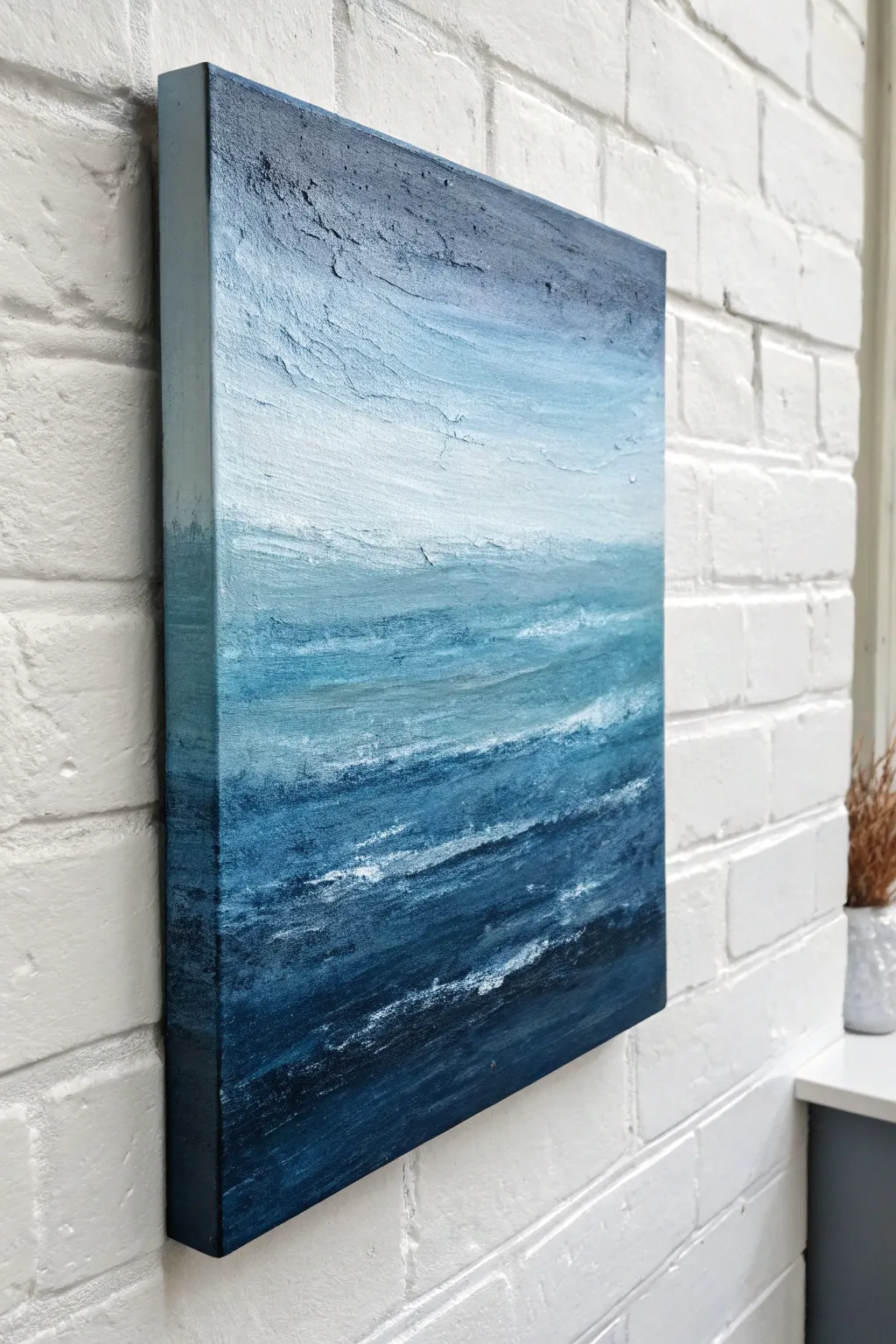
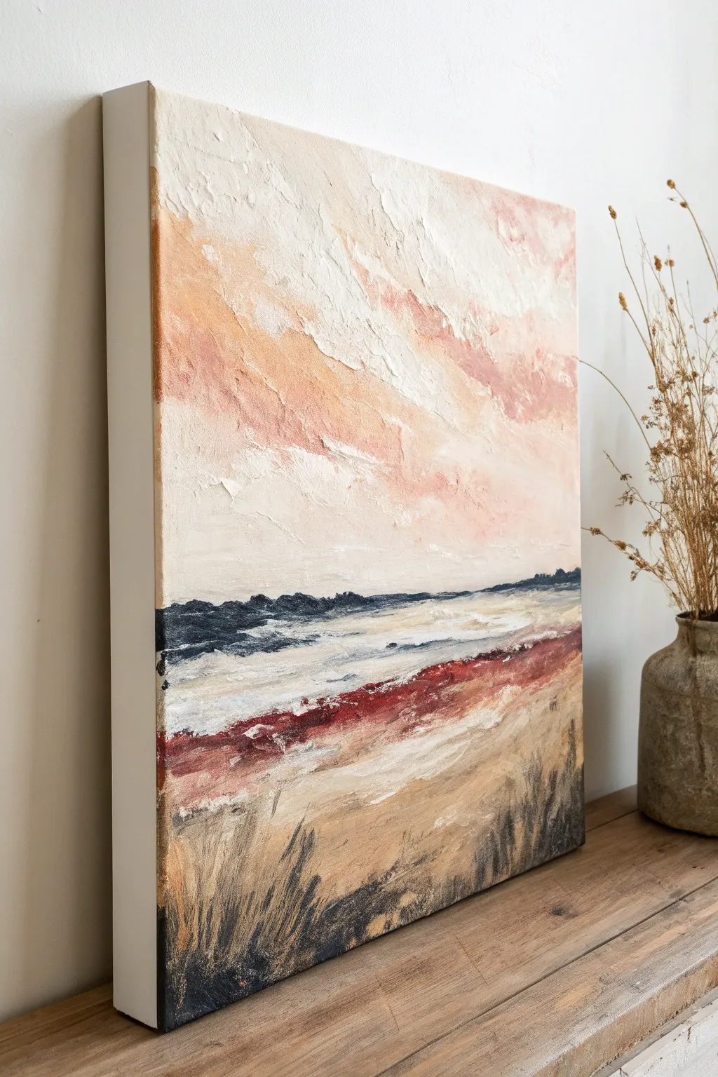
Two-Tone Horizon Blend With a Soft Fade Line
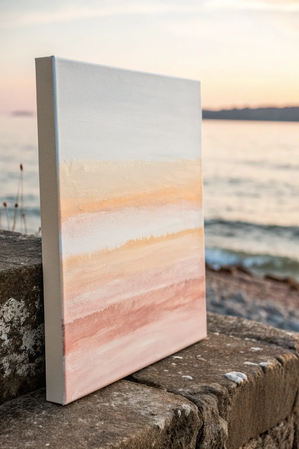
Capture the serene beauty of a sunset meeting the shoreline with this minimalist acrylic piece. By blending soft sandy beiges into warm terracottas and fading into a crisp white sky, you’ll create an atmospheric horizon that feels both modern and timeless.
How-To Guide
Materials
- Stretched canvas (rectangular, e.g., 12×16 or 16×20 inches)
- Acrylic paints: Titanium White, Unbleached Titanium (or Buff), Yellow Ochre, Burnt Sienna, and a touch of Light Blue
- Large flat synthetic brush (2-3 inch width)
- Medium flat brush (1 inch)
- Palette knife
- Water container and paper towels
- Clean mixing palette or disposable plate
Step 1: Preparing the Sky
-
Prime the upper canvas:
Begin by squeezing a generous amount of Titanium White onto your palette. Using your large flat brush, apply a thick, even layer of white to the top half of the canvas. -
Add a cool undertone:
While the white is still wet, mix a tiny speck of Light Blue into more white. Gently sweep this very pale cool tone near the very top edge to suggest atmospheric depth, blending it downwards until it disappears into the pure white. -
Refine the white space:
Ensure the white section extends down past the visual center of the canvas. This negative space is crucial for the modern look, so keep your brushstrokes horizontal and smooth to eliminate heavy texture here.
Softness Secret
Keep a spray bottle of water nearby. Misting the canvas lightly keeps acrylics workable longer, allowing for those dreamy, seamless blends between color bands.
Step 2: Building the Warmth
-
Mix the sandy transition:
Create a ‘sand’ color by mixing Unbleached Titanium with a small dot of Yellow Ochre. You want a color that is just slightly warmer than off-white. -
Apply the first band:
Using a clean medium flat brush, paint a horizontal band of this sandy mix right below the white section. Don’t worry about a perfect line yet; let the edges be slightly rough. -
Introduce the golden hour:
Mix a stronger version of the previous color by adding more Yellow Ochre and a tiny touch of Burnt Sienna. Apply this darker, golden tone directly below the sandy band. -
Blend the transition:
Clean your large brush and dry it well. With the brush slightly damp but clean, gently sweep back and forth over the line where the white sky meets the sandy band. Use a light touch to encourage a soft, misty fade rather than a sharp horizon. -
Layer the middle tones:
I like to add another thin strip of pure Titanium White horizontally right through the middle of the sandy section while it’s wet. This creates a ‘cloud’ or ‘reflection’ effect that breaks up the solid block of color.
Step 3: Deepening the Horizon
-
Mix the terracotta base:
For the bottom section, mix Burnt Sienna with Unbleached Titanium to create a muted terracotta pink. This will anchor the painting. -
Apply the base color:
Paint the bottom third of the canvas with this terracotta mix, bringing it up to meet the golden yellow section. -
Create texture with dry brushing:
Wipe most of the paint off your brush. Drag the dry brush horizontally across the terracotta section to create streaks that mimic sedimentary rock or water ripples. -
Soften the lower blend:
Where the terracotta meets the yellow-gold, use horizontal strokes to blend them. If the paint is drying too fast, a tiny mist of water can help reactivate it for smoother gradients. -
Paint the sides:
Don’t forget to wrap your colors around the edges of the canvas. Extend the white, sand, and terracotta bands onto the sides for a finished, gallery-ready look. -
Final highlights:
Once the main layers are tacky but not fully dry, use a palette knife to scrape a very thin layer of Titanium White horizontally across the darkest terracotta section. This adds a distressed, organic texture. -
Assess and adjust:
Step back and look at the bands. If the transition from the white sky to the color feels too abrupt, glaze a very watery wash of Unbleached Titanium over the boundary to marry the two sections.
Metallic Touch
Mix a small amount of gold metallic paint into your Yellow Ochre layer. It won’t be obvious, but it will catch the light beautifully when hung near a window.
Let the canvas dry completely before hanging your piece of personal horizon


Grid of Bold Lines Over Loose Color Underpainting
This project creates a dreamy, atmospheric abstract piece using fluid acrylics in a soft palette of teal, coral, and gold. The result is a vibrant yet soothing artwork that balances chaotic brushstrokes with pockets of negative space.
Detailed Instructions
Materials
- Square stretched canvas (approx. 20×20 inches)
- Acrylic paints: Teal/Turquoise, Coral/Salmon Pink, Navy Blue, Titanium White, and Metallic Gold
- Large flat brush (2-inch)
- Medium round brush
- Palette knife
- Cup of water
- Paper towels
- Plastic drop cloth or newspaper
Step 1: Setting the Background
-
Prime the surface:
Begin by applying a generous layer of Titanium White across the entire canvas. This doesn’t need to be perfectly smooth; a little texture in the white base will help grab the colors later. -
Introduce the first color:
While the white is still slightly tacky, load your large flat brush with the teal paint. Apply it in broad, sweeping strokes starting from the center-right and moving diagonally across the canvas. -
Blend the edges:
Dip your brush in a tiny bit of water and soften the edges of the teal where it meets the white background. You want a cloud-like, misty transition rather than hard lines.
Wet-on-Wet Blending
Keep a spray bottle of water handy. If your acrylics are drying too fast to blend, a light misting will open the paint back up for smoother transitions.
Step 2: Layering Colors
-
Add warm contrast:
Clean your brush thoroughly. Pick up the coral or salmon pink paint and apply it in the opposite corners—top left and bottom right. Let these patches overlap slightly with the teal to create interesting muddy purples or greys in the transition zones. -
Deepen the shadows:
Using the navy blue, add depth to the darkest parts of your composition. Focus on the areas where the teal feels most dense. Use shorter, choppier strokes here to build visual weight. -
Reintroduce white:
Take a clean brush with fresh Titanium White and cut back into the colors. Paint over areas that feels too heavy or dark. This ‘negative painting’ technique helps break up large blocks of color and adds movement. -
Create texture:
Switch to your palette knife. Scrape a small amount of white paint lightly over the drying colored layers. This ‘scumbling’ effect will catch on the canvas texture and create a beautiful, distressed look.
Add geometric flair
Once fully dry, use masking tape to block off a geometric shape (like a triangle or hexagon) and paint a sheer glaze of white over it for a modern overlay effect.
Step 3: Metallic Accents & Finishing
-
Apply the gold base:
Load your medium round brush with metallic gold paint. Look for areas where the teal and pink meet, and paint organic, flowing shapes that follow the direction of your previous brushstrokes. -
Add gold splatter:
Water down a small amount of gold paint on your palette until it’s inky. Flick the bristles of your brush to send tiny droplets of gold across the white negative space for a touch of sparkle. -
Highlight with the knife:
I like to use the edge of the palette knife to apply thick, impasto ridges of gold in just one or two focal points. This catches the light physically and adds a 3D element. -
Check the balance:
Step back from the canvas about five feet. Look for any areas that feel unbalanced or too empty. Add small touches of navy or pink to harmonize the composition if needed. -
Clean the sides:
Don’t forget the edges of your canvas. You can either wrap the image around the sides by continuing the paint strokes, or paint them a solid white for a crisp, gallery-style finish. -
Dry and seal:
Allow the painting to dry completely for at least 24 hours. Because of the metallic paint, a glossy varnish works best to make the gold pop and protect the acrylics from dust.
Hang your new masterpiece in a bright room where the sunlight can catch those metallic gold accents
BRUSH GUIDE
The Right Brush for Every Stroke
From clean lines to bold texture — master brush choice, stroke control, and essential techniques.
Explore the Full Guide
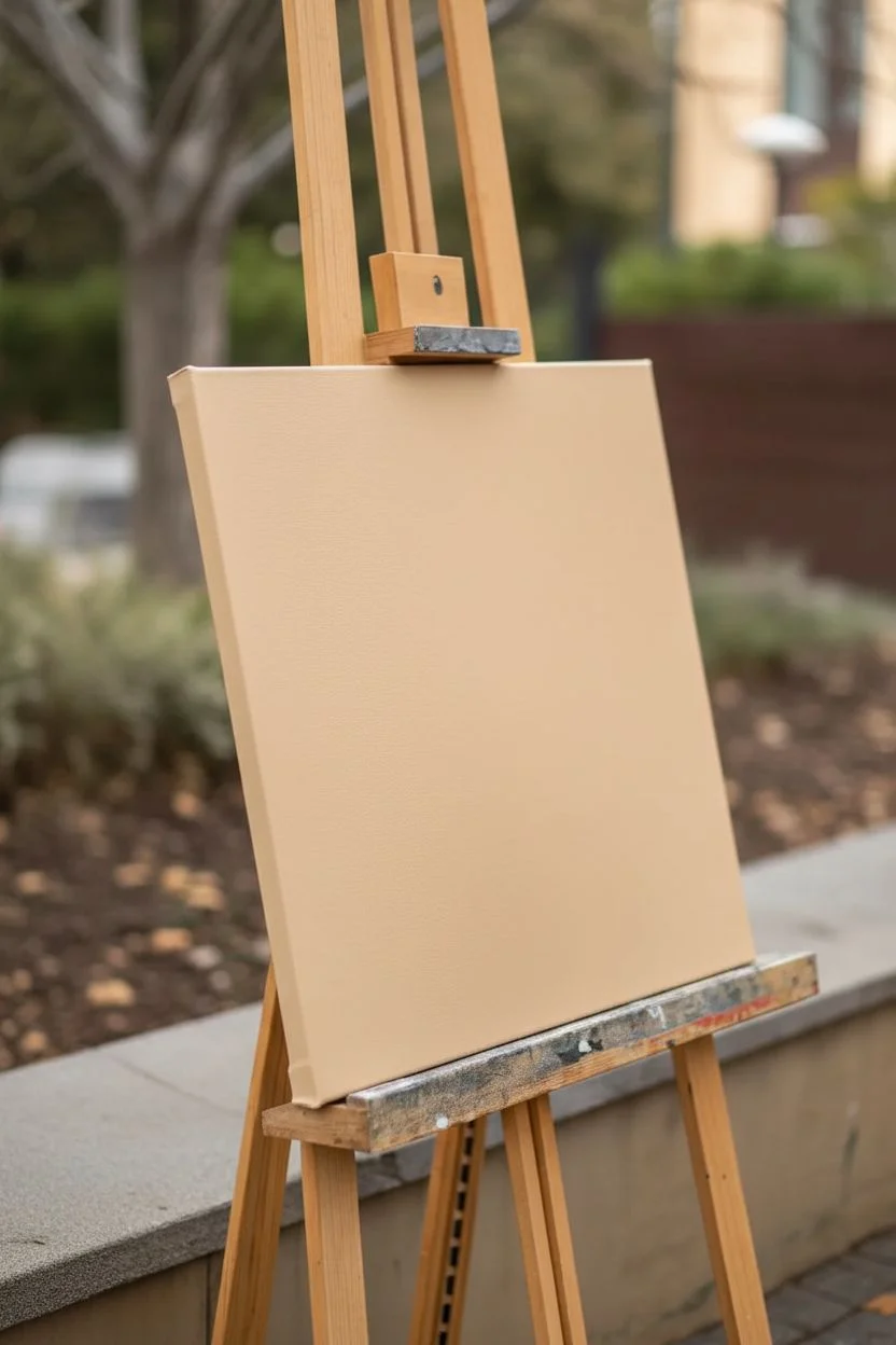
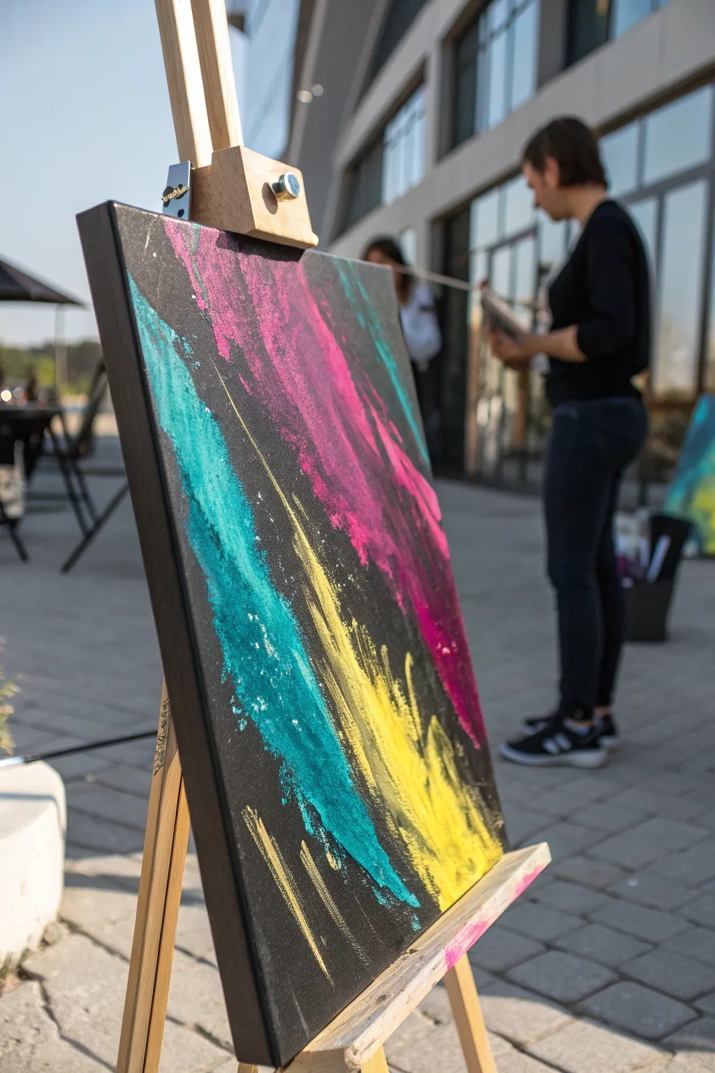
Splatter-and-Drip Energy Painting on a Neutral Base
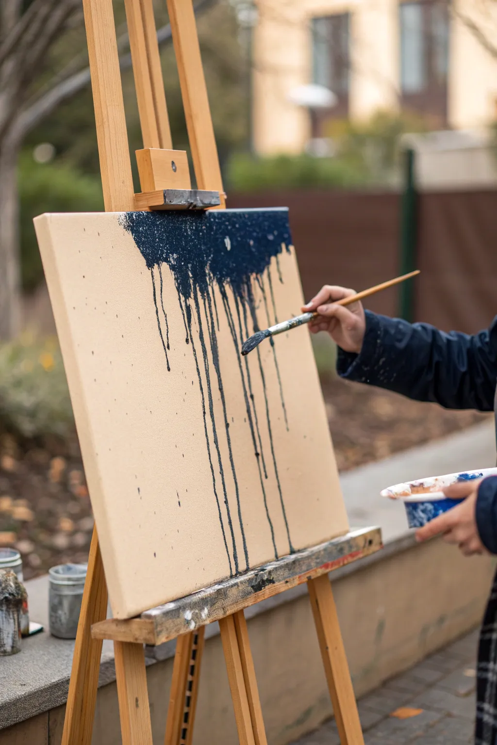
Capture the raw energy of gravity and fluid motion with this minimalist drip painting. By contrasting a calm, neutral background with striking, inky blue rivulets, you achieve an artwork that feels both spontaneous and elegantly modern.
Step-by-Step
Materials
- Stretched canvas (medium grain)
- Acrylic paint: Unbleached Titanium or Buff Titanium (for base)
- Acrylic paint: Payne’s Grey or Midnight Blue (for drips)
- Acrylic glazing medium or pouring medium
- Wide flat brush (2-3 inches)
- Round brush (size 6 or 8)
- Water container for rinsing
- Mixing palette or small cup
- Easel (essential for the gravity effect)
- Drop cloth (this will get messy)
Step 1: Setting the Stage
-
Prepare the workspace:
Since this project relies heavily on gravity, set up your easel outdoors or in a space protected by drop cloths. Ensure the easel is secure and slightly tilted back to control the speed of the drips. -
Prime the background:
Load your wide flat brush with the Unbleached Titanium (or your chosen beige). Apply a smooth, even coat across the entire canvas, ensuring full coverage. -
Refine the base coat:
While the beige is still wet, smooth out any harsh brushstrokes using long, horizontal sweeps. I like to check the edges here to make sure the paint wraps around the sides for a finished look. -
Allow to dry completely:
Let the base layer dry fully. This is crucial because if the base is wet, the blue drips will muddy into the beige rather than sitting crisply on top. Use a hair dryer if you’re impatient.
Drips too slow?
If paint isn’t running, mist the top of the canvas lightly with a spray bottle of water. This breaks the surface tension and encourages long, natural streaks.
Step 2: Creating the Drips
-
Mix the drip paint:
In a cup or palette, mix your dark blue acrylic with water or glazing medium. You want a consistency similar to heavy cream—fluid enough to run, but pigmented enough to be opaque. -
Load the paint:
Dip your round brush or a medium flat brush heavily into the thinned blue paint. You want the bristles totally saturated. -
Apply the top band:
Press the loaded brush against the very top edge of the canvas. Don’t paint a straight line; instead, dab and smoosh the bristles so a pool of paint forms right at the rim. -
Encourage the flow:
Let gravity take over. As paint accumulates at the top, it will naturally break the surface tension and begin to streak downwards. -
re-load and repeat:
Continue adding liberal amounts of paint to the top edge until you have a solid, irregular band of blue across the upper section.
Metallic Accent
Once the blue is completely dry, trace a single drip line with liquid gold leaf or metallic gold paint for a luxurious, modern contrast.
Step 3: Controlling the Chaos
-
Guide distinct rivulets:
If a drip stops halfway down and you want it longer, gently touch the tip of your wet brush to the end of the drip to pull it further down, just like the artist in the image. -
Vary the lengths:
Aim for asymmetry. Allow some drips to run all the way to the bottom edge, while letting others stop midway or near the top for visual interest. -
Create splatter texture:
For the subtle speckles seen in the reference, load a smaller brush with the thin blue paint. Hold it a foot away from the canvas and tap the handle to flick tiny droplets onto the beige areas. -
Thicken the top mass:
Go back to the top blue section and add a second layer of un-thinned paint if necessary to make the upper block look dense and textured. -
Check the drip paths:
Watch for any drips that are veering off course. If you catch them early, you can wipe them away with a damp cloth or guide them back with your brush. -
Add final touches:
Look for empty spots in the drip pattern. You can manually paint a thin line connecting to the top mass to simulate a new drip if a section feels too empty. -
Dry partially upright:
Leave the painting on the easel until the drips have stopped moving and
Step back and admire how simple gravity can create such a complex and striking composition
Metallic Accents for Chic Abstract Wall Art
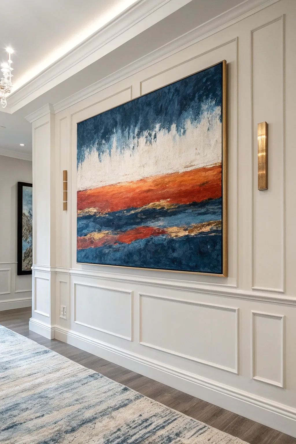
This striking, large-scale abstract landscape uses deep blues and vibrant rusty oranges to create a moody horizon, elevated by touches of shimmering gold leaf. The textured layering technique adds depth and sophistication, making it a perfect statement piece for a modern hallway or living room.
Step-by-Step Tutorial
Materials
- Large rectangular canvas (e.g., 36” x 48” or larger)
- Heavy body acrylic paints: Prussian Blue, Phthalo Blue, Burnt Sienna, Burnt Umber, Titanium White, Black
- Gold leaf sheets or metallic gold acrylic paint
- Gold leaf adhesive size (if using sheets)
- Large flat paintbrush (2-3 inches)
- Medium palette knife
- Spray bottle with water
- Soft synthetic brush for gold leaf
- Acrylic glazing medium
- High-gloss varnish
- Floater frame (gold or warm wood tone)
Step 1: Setting the Sky and Base
-
Prime the Surface:
Ensure your large canvas is primed with gesso; apply a second coat if the weave is very visible and let it dry completely. -
Establish the Horizon Line:
Visualize your composition. This piece relies on a strong horizon line just below the center. Mark this faintly with pencil or chalk. -
Paint the Deep Blue Sky:
Mix Prussian Blue with a touch of Black. Using your large flat brush, paint the top third of the canvas in vertical, downward strokes. Keep the paint darker at the top edge. -
Blend into White:
While the blue is still wet, introduce Titanium White on your brush. Blend downwards from the dark blue into the middle section, creating a misty, vertical transition. I like to spritz a little water here to help the acrylics bleed naturally. -
Create the Lower Depths:
For the bottom third (below the horizon area), apply a mix of Phthalo Blue and Prussian Blue using horizontal, sweeping strokes to mimic water or deep land. Leave the middle band empty for now.
Gold Not Sticking?
If the gold leaf lifts off, the size wasn’t tacky enough or you applied it too thin. Reapply a generous layer of adhesive, wait longer for the ‘tack’, and try again.
Step 2: The Fiery Horizon
-
Apply the Base Orange:
Mix Burnt Sienna with a little Burnt Umber. Paint the strip right below the white sky. Use horizontal strokes but let the edges overlap slightly with the blue bottom section. -
Add Brightness:
Layer pure Burnt Sienna and touches of orange mixed with white over the dark brown base to create luminosity. Use a palette knife here for texture, scraping the paint across the surface. -
Connect the Elements:
Where the orange meets the dark blue water, use a dry brush to feather the darker blue up into the orange slightly, creating shadow and depth. -
Soften the Sky Transition:
Return to the white/blue sky area. Use a clean, dry brush to drag some of the white paint downwards into the very top edge of the orange horizon, creating a ‘raining’ or misty effect.
Step 3: Texture and Metallics
-
Build Palette Knife Texture:
Mix thick Titanium White with a little glazing medium. Use the side of your palette knife to drag textured, horizontal ridges through the white section of the sky. -
Apply Metallic Adhesive:
Identify areas for gold accents—specifically along the transition line between the orange horizon and the blue base, and sporadic patches within the lower blue section. Brush on the adhesive size. -
Wait for Tackiness:
Let the adhesive sit until it becomes clear and tacky (usually 15-20 minutes depending on the brand). -
Lay the Gold Leaf:
Gently press gold leaf sheets onto the tacky areas. Don’t worry about being perfect; cracked and fragmented edges look more organic. -
Burnish the Gold:
Use a soft, dry brush to gently rub the gold leaf, removing the excess flakes. This reveals the shimmering texture adhering to the canvas. -
Seal the Gold:
Apply a sealer specifically for gold leaf or a gloss coat over the metallic areas to prevent tarnishing. -
Final Glaze:
Mix a tiny amount of Phthalo Blue with a lot of glazing medium. Wash this very lightly over parts of the lower blue section to unify the colors without hiding the gold.
Add Ocean Spray
Flick white paint mixed with water off a toothbrush onto the lower blue section. This creates a subtle sea-spray effect that complements the gold texture excellently.
Step 4: Finishing Touches
-
Assess and Adjust:
Step back to view the painting from a distance. If the horizon feels too sharp, soften it with a dry brush. If the sky feels too flat, add more vertical white streaks. -
Varnish:
Once completely dry (wait at least 48 hours for thick acrylics), apply a high-gloss varnish to make the dark blues pop and the gold shine. -
Frame It:
Install the canvas into a gold or warm wood floater frame to complete the gallery look shown in the inspiration image.
Hang your masterpiece in a focused light to catch the metallic glint as you walk by

PENCIL GUIDE
Understanding Pencil Grades from H to B
From first sketch to finished drawing — learn pencil grades, line control, and shading techniques.
Explore the Full Guide
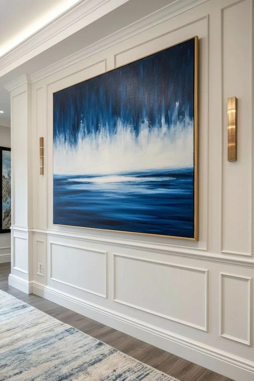
Monochrome Mood Study With Value Shifts and Texture
Capture the moody intensity of deep waters meeting a misty sky with this monochromatic acrylic study. By combining heavy texture paste with a limited palette of Phthalo Blue and Titanium White, you will create a piece that feels both tactile and atmospherically vast.
How-To Guide
Materials
- Deep edge gallery-wrapped canvas (suggested size: 16×20 or 18×24)
- Acrylic modeling paste or heavy texture gel
- Palette knife (large, flat edge)
- Wide flat synthetic brush (2-3 inch)
- Medium flat brush
- Acrylic Paint: Phthalo Blue (Green Shade) or Prussian Blue
- Acrylic Paint: Titanium White
- Acrylic Paint: Mars Black (optional, for deepest depths)
- Spray bottle with water
- Paper towels
Step 1: Building the Foundation
-
Prime the surface:
Ensure your canvas is clean and taut. Even though it is pre-primed, you might want to wipe it down with a slightly damp cloth to remove any dust that could interfere with adhesion. -
Apply texture paste:
Using your palette knife, scoop out a generous amount of modeling paste. Spread it across the entire canvas, moving primarily in horizontal strokes to mimic the motion of water or geological strata. -
Create ridges:
While the paste is wet, use the edge of the knife to scrape and lift sections, creating deliberate ridges. Vary the pressure—press harder near the top for a smoother finish and leave it chunkier near the bottom for the heavy waves. -
Don’t forget the sides:
Wrap the texture around the deep edges of the canvas. This gallery-quality finish is crucial for the immersive feel of the final piece; simply drag the knife with leftover paste along the sides. -
Let it cure completely:
This is the hardest part—waiting. Modeling paste needs significant time to dry, often 12–24 hours depending on thickness. It must be rock hard before you paint, or you risk mixing wet paste into your blue.
Cracking Paste?
If your texture paste cracks while drying, don’t panic. Mix a little more paste with gloss gel medium (which is flexible) and fill the cracks, or paint over them—it adds to the weathered look.
Step 2: Establishing the Gradient
-
Mix your darkest value:
On your palette, mix a large amount of Phthalo Blue with a tiny touch of Mars Black to create a deep, midnight navy. If you prefer a purer color, just use straight Phthalo Blue, which is naturally dark. -
Paint the bottom third:
Using the wide brush, apply this dark mixture to the bottom third of the canvas. Scrub the paint into the nooks and crannies of the dried texture paste to ensure no white canvas shows through deep down. -
mix the mid-tone:
Add a dollop of Titanium White to your dark blue pile. You want a medium, stormy ocean teal. Apply this to the middle section of the canvas, slightly overlapping the dark bottom edge. -
Blend the transition:
While both sections are wet, use long, horizontal strokes to blend the dark bottom into the mid-tone. If the paint drags, mist a tiny bit of water onto the canvas to help the acrylics flow together. -
Apply the lightest sky:
Clean your brush thoroughly. Mix a very loose tint—mostly Titanium White with just a whisper of the blue. Paint the top third of the canvas, bringing the brightness down to meet the mid-tone. -
Sides maintenance:
As you paint each horizontal band, immediately paint the corresponding side edge of the canvas. This keeps the gradient continuous and prevents you from having to color-match dried paint later.
Step 3: Dry Brushing and texturing
-
Enhance the texture:
Once the base layer is dry to the touch, load a dry brush with a lighter shade of blue than the background. Wipe most of the paint off on a paper towel until almost nothing remains. -
Highlight the ridges:
Gently drag this dry brush horizontally across the dried texture ridges in the middle section. The paint will catch only on the raised bumps, accentuating the physical texture. -
Add whitecaps:
Switch to pure Titanium White on a small, dry flat brush. Lightly skim the very top ridges of the darkest bottom section. This creates the illusion of foam or light catching the crests of dark waves. -
Deepen the shadows:
I like to go back into the bottom corners with a glaze of pure dark blue or black mixed with glazing medium. This vignette effect draws the eye toward the center brightness. -
Final assessment:
Step back and look at the blend. If any transition looks too harsh, use a dry brush with a small amount of intermediate color to feather the edges between the bands. -
Seal the work:
Because texture paste is porous and dust can settle in ridges, apply a coat of satin or gloss varnish once the painting has cured for a few days to protect your seascape.
Add Metallic Shimmer
Mix an iridescent pearl medium into your top white layer. The painting will shift and shimmer as the light in the room changes, mimicking sunlight hitting the water.
Hang your textured masterpiece in a space with good side-lighting to truly show off the dramatic ridges and depth.
High-Contrast Neon Pops Against Deep Dark Layers
Embrace the drama of high-contrast abstract art with this vibrant piece that sets neon bursts against a void-like background. The striking diagonal composition and textured dry-brush effects create movement and energy that seem to glow from within.
Step-by-Step
Materials
- Stretched canvas (rectangular, portrait orientation)
- Black gesso or heavy body black acrylic paint
- Heavy body acrylic paints: Neon Pink, Turquoise/Teal, Bright Yellow, Metallic Gold
- Large flat brush or foam brush (for background)
- Wide, coarse bristle brushes (2-3 inches)
- Palette knife
- Palette or paper plate
- Jar of water
- Rag or paper towels
Step 1: Setting the Stage
-
Prepare the canvas:
Start by ensuring your canvas surface is clean and free of dust. If you are using a standard white canvas, you will need to completely transform it first. -
Apply the darkness:
Using a large flat brush or foam brush, coat the entire canvas with black gesso or black heavy body acrylic paint. Ensure full coverage, painting the sides of the canvas as well for a professional finish. -
Let it cure:
Allow this base layer to dry completely. It must be bone dry before you add color, or the neon hues will mix with the wet black and become muddy. I usually give this at least an hour or use a hair dryer to speed it up.
Pro Tip: The Dry Brush
Don’t use water with your colored paints! A bone-dry brush creates those beautiful scratchy, textured edges where the black shows through.
Step 2: The Pink Surge
-
Load the brush:
Squeeze a generous amount of Neon Pink onto your palette. Take a wide, coarse bristle brush and dip just the tips into the paint. You want a ‘dry brush’ effect, so dab off excess paint onto a paper towel. -
First diagonal sweep:
Starting from the top center/right area, sweep the brush diagonally downward towards the middle left. Use a quick, confident motion. -
Build texture:
Apply a second layer over the pink area, pressing harder in the center of the stroke and lifting off at the edges to let the black canvas show through the bristles’ texture.
Step 3: Adding the Teal Current
-
Switch brushes:
Using a clean, wide bristle brush, pick up your Turquoise or Teal paint. Again, keep the brush relatively dry to maintain that scratchy, energetic texture. -
Counter-balance stroke:
Apply this color on the left side of the canvas, roughly parallel to the pink but slightly lower. Sweep from the middle-left down towards the bottom center. -
Overlap slightly:
Allow the edges of the teal to barely kiss the edges of the pink zone in the center, but try to keep the colors mostly distinct to avoid creating purple mud.
Troubleshooting: Muddy Colors
If colors look dull, the black base wasn’t dry enough or the paint is too transparent. Let it dry, then layer white paint first, followed by the neon.
Step 4: The Golden Flash
-
Prepare the highlight:
Mix a little Metallic Gold into your Bright Yellow paint. This gives the yellow stroke a shimmering quality that catches the light. -
Strike the center:
Load a slightly smaller brush or a palette knife with this yellow mixture. Apply it in the lower center gap between the pink and teal sections. -
Create upward motion:
Drag the yellow paint upward into the black space between the two main colors. Use short, upward flicks to create a sense of sparks or rising energy.
Step 5: Final Touches
-
Enhance texture:
If any areas look too flat, use a palette knife to scrape a thick ridge of pure paint over the dry-brushed areas. This adds physical dimension. -
Dry brush blending:
With a barely-there amount of paint on a dry brush, gently feather out the harsh tail ends of your diagonal swipes so they fade organically into the black background. -
Splatter optional:
For extra chaos, flick a tiny amount of wet white or silver paint onto the black void areas to look like distant stars, though the original piece keeps this minimal. -
Seal the work:
Once fully dry (give it 24 hours), apply a gloss varnish. This will deepen the black background and make the neon colors pop even more intensely.
Step back and admire how the colors seem to vibrate against the darkness, bringing a modern edge to your space


Negative Space Abstract With Lots of Breathing Room
Capture the serene essence of an open landscape with this textured abstract acrylic piece. By combining heavy body mediums with a soft, muted color palette, you’ll create a painting that balances negative space with rich, tactile details.
Step-by-Step Tutorial
Materials
- Deep-edge gallery wrapped canvas (16×20 or similar)
- Heavy body acrylic paints (Titanium White, Unbleached Titanium, Burnt Siena, Mars Black, Prussian Blue, Yellow Ochre)
- Modeling paste or texture gel
- Large palette knife (trowel shape)
- Medium palette knife (diamond shape)
- Large flat brush (2-inch)
- Small flat brush or rigger brush
- Cup of water and paper towels
Step 1: Preparing the Textured Sky
-
Texture base:
Begin by scooping a generous amount of modeling paste onto your palette. Using the large palette knife, spread a thick, uneven layer across the top two-thirds of the canvas. Don’t smooth it out; keep ridges and peaks to catch the light later. -
Mixing sky tones:
Mix a large pile of Titanium White with a tiny touch of Burnt Siena and a dot of Yellow Ochre to create a warm, pale peach cream color. Create a second pile of pure Titanium White. -
Applying sky colors:
While the texture paste is still wet, load your large knife with the peach mixture. Drag it diagonally across the textured area, allowing it to skip over the low points. This is the ‘sgraffito’ or dragging technique. -
Adding highlights:
Wipe your knife clean, then load it with pure Titanium White. Apply this over the peach layer in sparse, sweeping motions to add brightness and clouds. -
Softening the blend:
If the transitions feel too harsh, lightly dry-brush over the wet paint with a clean large brush to soften the sky, but be careful not to flatten your texture. -
Dry time:
Let this top section dry completely. The thick paste may take several hours or overnight to set fully.
Step 2: Creating the Horizon and Mid-Ground
-
Establish the horizon:
Mix Prussian Blue with Mars Black to create a deep navy. Using a medium palette knife, cut a jagged, uneven line about one-third up from the bottom of the canvas. This represents the distant tree line or water. -
The white wash:
Just below the dark horizon, apply a thick band of Unbleached Titanium mixed with White. Use horizontal strokes to mimic gentle waves or a sandy shore. -
Crucial red accent:
Mix Burnt Siena with a touch of Mars Black to create a rusty red-brown. Apply a bold, sweeping horizontal band right below the white section. I find this warmth grounds the composition beautifully. -
Blending down:
Using a slightly damp brush, pull some of that rust color downwards into the remaining empty canvas at the bottom, fading it out as you go.
Too Much Texture?
If your modeling paste peaks are too sharp, lightly sand them down with fine-grit sandpaper once completely dry but before you add the final color washes.
Step 3: Foreground Details
-
Sandy base:
Mix Yellow Ochre with plenty of Unbleached Titanium. specific Paint the bottom section with loose, expressive strokes, letting some of the canvas texture show through. -
Adding depth:
While the ochre layer is tacky, scumble in some darker brown tones near the bottom corners to create a vignette effect. -
Grassy textures:
Switch to a small flat brush or rigger brush. Load it with thinned Mars Black paint (add a drop of water to make it flow like ink). -
Flicking motion:
Starting from the very bottom edge, flick the brush upward quickly to create thin, tapering lines that resemble wild dune grass. Vary the height and direction. -
Layering grasses:
Mix a dark grey and add a second layer of grass strokes amongst the black ones. This adds volume without making the foreground look like a solid block. -
Defining edges:
Take a moment to paint the deep outer edges of the canvas. You can wrap the image around or paint the sides solid white for a crisp, modern finish. -
Final highlights:
Once the grass is dry, take a tiny bit of Unbleached Titanium on a dry brush and lightly hit the tips of the grass to simulate sunlight catching the blades.
Clean Palette Lines
Wipe your palette knife completely clean between every single color loading. This prevents muddy mixtures and keeps your sky colors looking fresh and distinct.
Step back and enjoy the calming balance of texture and empty space you have created
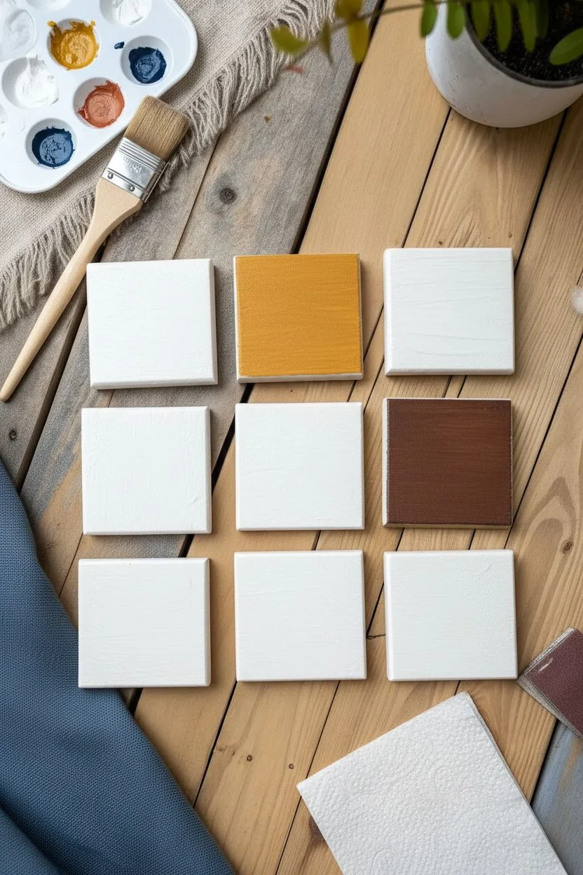
Mini-Series: Paint 6 Tiny Abstracts to Explore Variations
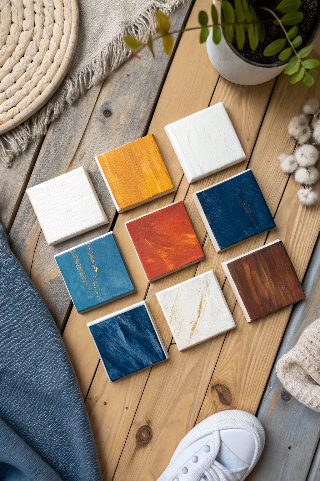
This project is a delightful exploration of color interaction and texture on a miniature scale. By working on nine small wooden squares simultaneously, you’ll create a cohesive gallery wall collection or a set of unique coasters that balances solids with distressed, painterly effects.
How-To Guide
Materials
- 9 small wooden squares (approx. 4×4 inches, 1-inch thick)
- Acrylic paints: White, Mustard Yellow, Navy Blue, Terracotta/Rust, Dark Brown, Teal
- Gold metallic acrylic paint or gold leaf pen
- Sandpaper (medium grit, around 120-150)
- Flat synthetic paintbrushes (1-inch width)
- Palette or paper plate
- Paper towels or cotton rag
- Matte or satin varnish (spray or brush-on)
Step 1: Preparation & Base Layers
-
Prep the wood:
Begin by lightly sanding all faces and edges of your nine wooden blocks to ensure they are smooth and free of splinters. Wipe away any dust with a damp cloth or tack cloth. -
Prime the surface:
Apply a thin coat of white gesso or white acrylic paint to the top face of all blocks. This helps the subsequent colors pop, especially the brighter yellows and teals. -
The solid whites:
Select two blocks to remain primarily white. Paint them with a second coat of white acrylic, using long, even strokes to create a subtle wood-grain texture. Let these dry completely. -
The solid colors:
Choose one block for the mustard yellow and one for the solid brown. Paint these fully, ensuring you cover the sides for a finished look if desired. For the yellow, you might need two coats for full opacity.
Make It Cohesive
Limit your palette to 4-5 core colors. Mix these colors into each other (e.g., add a bit of the yellow into the white) so every block shares a common DNA.
Step 2: Creating Texture & Distress
-
The distressed blue:
For the dark navy block (middle row, right), apply a base coat of navy blue. While it’s tacky but not fully wet, lightly drag a clean, dry brush over it to lift some pigment, revealing a hint of the white base underneath. -
The rusty abstract:
Take the center block and apply your terracotta or rust paint. Instead of smoothing it out, use a cross-hatching motion with a relatively dry brush to create visible brushstrokes and texture. -
Adding the darker teal:
Paint one block with a teal or slate blue mix. I like to add a tiny drop of brown to the teal to desaturate it slightly, making it fit the earthy palette better. -
Creating the stormy blue:
For the bottom left block, mix navy with a touch of white and teal. Apply this mix using diagonal strokes, layering wet-on-wet to create a swirl or ‘stormy’ effect.
Fixing Heavy Paint
If your brushstrokes look too thick or gloopy, dip your brush in water and lightly smooth over the area while wet. If dried, sand it down and recoat thinly.
Step 3: Accents & Finishing Touches
-
Dry brushing details:
Return to your white blocks. Dip a stiff brush into a tiny amount of brown or beige paint, wipe almost all of it off on a paper towel, and lightly whisk it across the white surface to age it slightly. -
The gold touch:
On the teal block (middle row, left), add vertical streaks of gold metallic paint. Use the edge of a credit card or a very thin liner brush to scratch these lines in unevenly. -
Gilded edges:
For the bottom middle white block, add a more deliberate streak of gold or brown diagonally across the textural grain to break up the white space. -
Distressing:
Once all paint isbone dry, take your sandpaper and gently scuff the edges and corners of the colored blocks. This reveals the light wood beneath and unifies the set with a rustic feel. -
Cleaning up:
Wipe the blocks down again to remove sanding dust. Check the sides of each block; paint them white or the main face color, depending on your preference. -
Sealing the work:
To protect your art, especially if these will serve as coasters, apply two coats of clear matte or satin varnish. Allow ample drying time between coats to prevent tackiness.
Arranging these tiny abstracts in a grid creates a stunning visual impact that celebrates simple color and texture
Cosmic Vortex Explosion With Radiating Scraped Color
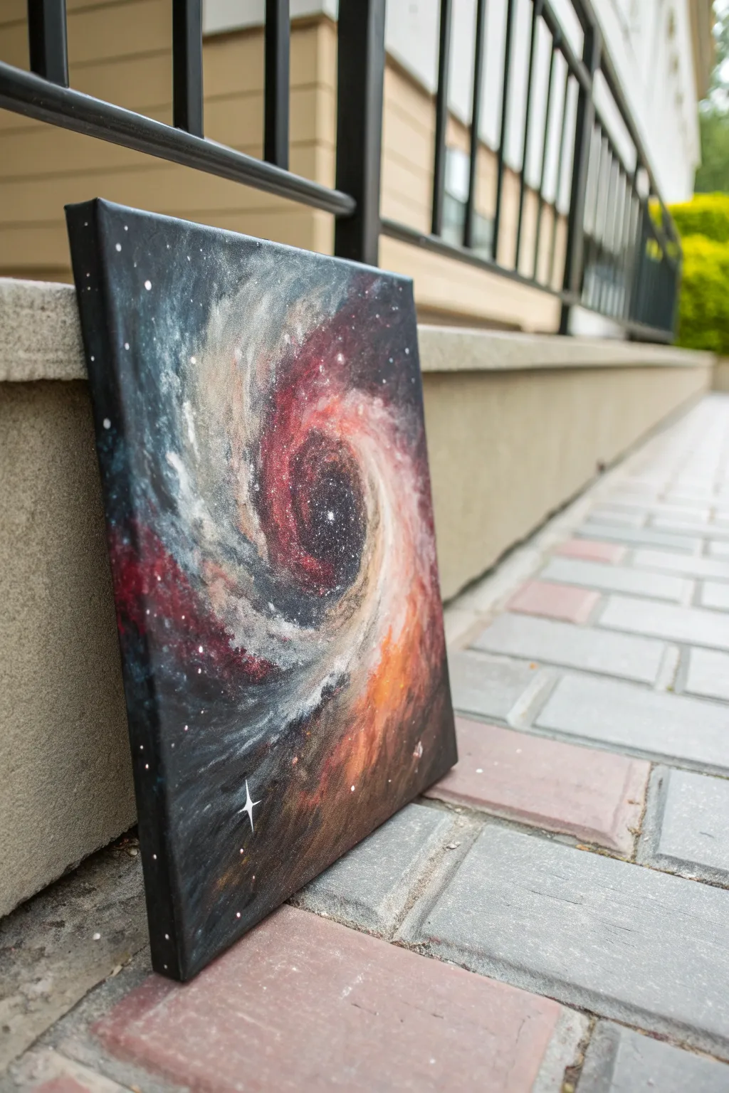
Capture the infinite depth of space with this moody, swirling galaxy painting. By layering translucent acrylics and building up textures, you can create a cosmic vortex that seems to glow from within on your canvas.
Detailed Instructions
Materials
- Square canvas (e.g., 12×12 or 10×10 inches)
- Acrylic paints: Black, Titanium White, Phthalo Blue, Crimson Red, Burnt Orange
- Large flat brush or sponge applicator
- Medium round brush
- Small detail brush
- Old toothbrush (for stars)
- Palette knife or stiff cardboard piece
- Water based glazing medium (optional but helpful)
- Paper towels
Step 1: Setting the Deep Space Background
-
Prime the Void:
Begin by painting your entire canvas solid black. Ensure you paint the sides of the canvas as well for a finished, gallery-ready look. -
Add Deep Blue Undertones:
While the black is still slightly tacky, or once dry, mix a small amount of Phthalo Blue with black. Use a large brush to scumble this very dark blue into the outer corners and edges, leaving the center pitch black. -
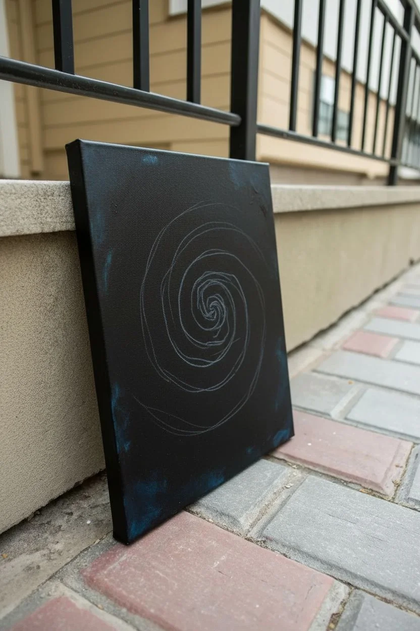
Establish the Spiral Shape:
With a damp round brush and a very watery grey (mix white and black), lightly sketch a loose spiral shape starting from the center and moving outward. This will just be a guide for your clouds.
Muddiness Fix
If your galaxy gets muddy, let the layer dry completely. Then, dry-brush fresh color on top. Wet-on-wet blending can turn grey quickly.
Step 2: Building the Nebula Layers
-
First Red Layer:
Mix Crimson Red with a tiny bit of black to deepen it. Using a dry brush technique or a sponge, dab this color along the inner arms of your spiral, keeping it transparency so the black shows through. -
Introduce Orange Glow:
While the red is still wet, blend in Burnt Orange on the outer edges of the red spiral arms. This creates a fiery transition. -
Cloudy White Textures:
Take a small amount of Titanium White and mix it with water or glazing medium to make it milky. Gently dab this over the blue and black areas between the red arms to create cloudy gas dust. -
Intensify the Colors:
Go back in with pure Crimson Red and Burnt Orange. Apply these thicker now, focusing on the brightest parts of the nebula arms to make them pop against the dark background. -
Scraping Texture:
I like to use a palette knife or the edge of a stiff piece of cardboard here. Drag it lightly across the wet paint in the direction of the spiral to create streaks and movement in the gas clouds. -
Deepen the Shadow:
If the center has become too light, glaze a thin layer of black over the very middle hole of the vortex to ensure it looks like a deep abyss.
Step 3: Defining Details and Stars
-
Highlighting the Swirls:
Mix a light grey/white and use a small round brush to paint thin, broken lines along the edges of the spiral arms. This defines the structure of the vortex. -
The Toothbrush Technique:
Dilute Titanium White paint with water until it is the consistency of ink. Dip an old toothbrush into it. -
Creating the Starfield:
Hold the toothbrush over the canvas and flick the bristles with your thumb to spray tiny white specks across the painting. Concentrate more spray in the lighter nebula areas. -
Adding Major Stars:
Use a fine detail brush to dot a few larger, brighter stars in the empty black spaces. -
The Flare Star:
Choose one spot in the lower corner or near the center to add a ‘lens flare’ star. Paint a cross shape with long, tapered tails using a detail brush and pure white. -
Final Glaze (Optional):
If the colors look chalky upon drying, apply a coat of gloss varnish to bring back the deep saturation of the wet paint.
Glittering Void
Mix a pinch of iridescent silver glitter into your white paint for the stars. It adds a subtle shimmer that catches the light as you move.
Hang your cosmic creation on the wall and enjoy the view into deep space


Have a question or want to share your own experience? I'd love to hear from you in the comments below!