Summer is basically an endless buffet of bright colors, easy shapes, and feel-good memories—perfect for filling your sketchbook fast. If you’re craving ideas that actually look and feel like summer vibes, I’ve got you covered with classics first and a few playful surprises at the end.
Beach Sunset Over the Ocean
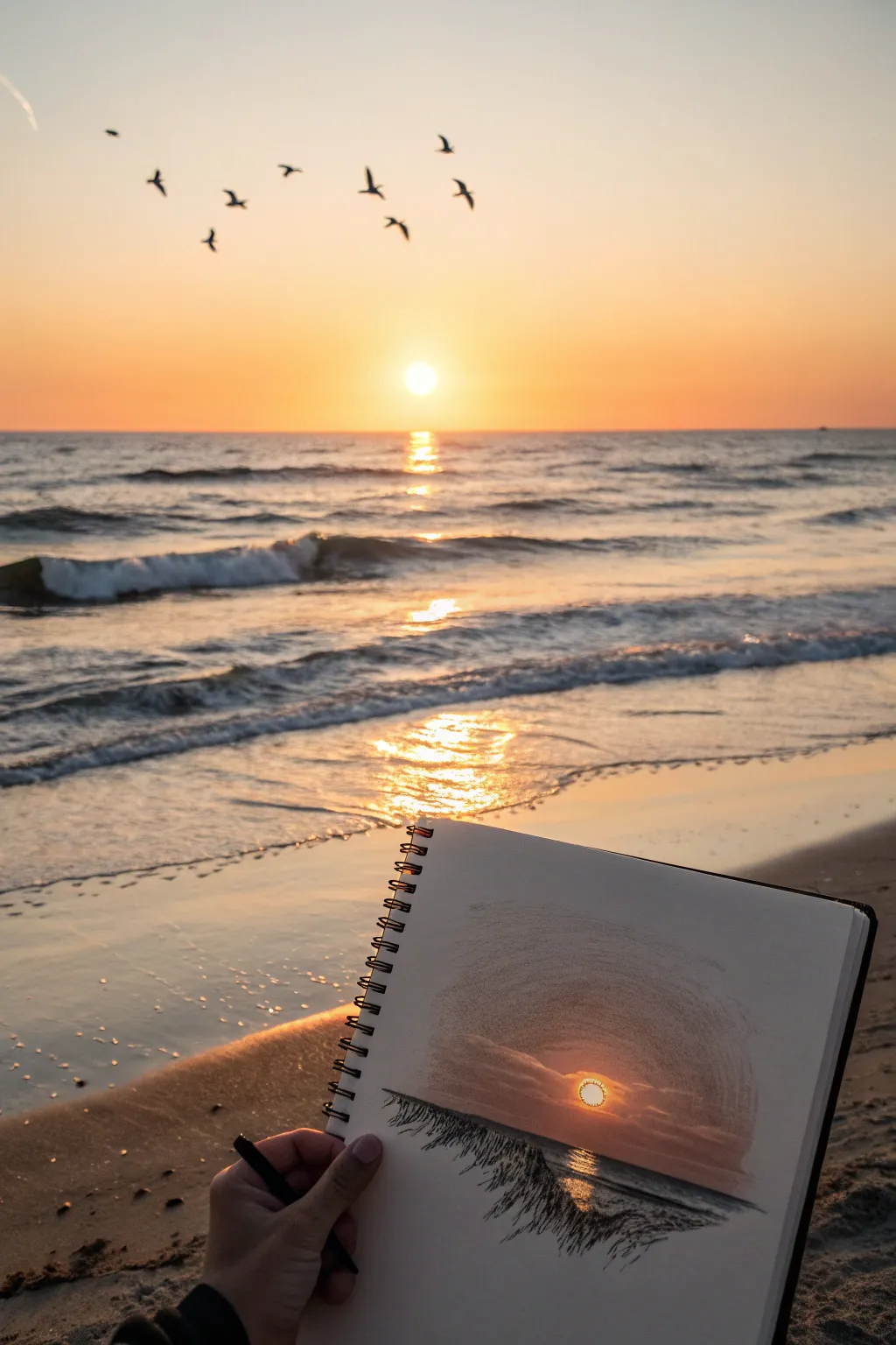
Capture the fleeting beauty of a beach sunset with this unique circular vignette sketch. Using a mix of graphite and soft shading, you’ll create a dramatic focal point that mimics looking through a camera lens at the sun dipping below the horizon.
How-To Guide
Materials
- Spiral-bound sketchbook (medium weight paper)
- Graphite pencils (HB, 2B, 4B, 6B)
- Black charcoal pencil or very dark 8B graphite
- Orange and white soft pastel or colored pencil (optional for sun)
- Blending stump or tortillon
- Kneaded eraser
- Compass or circular object to trace (e.g., a lid)
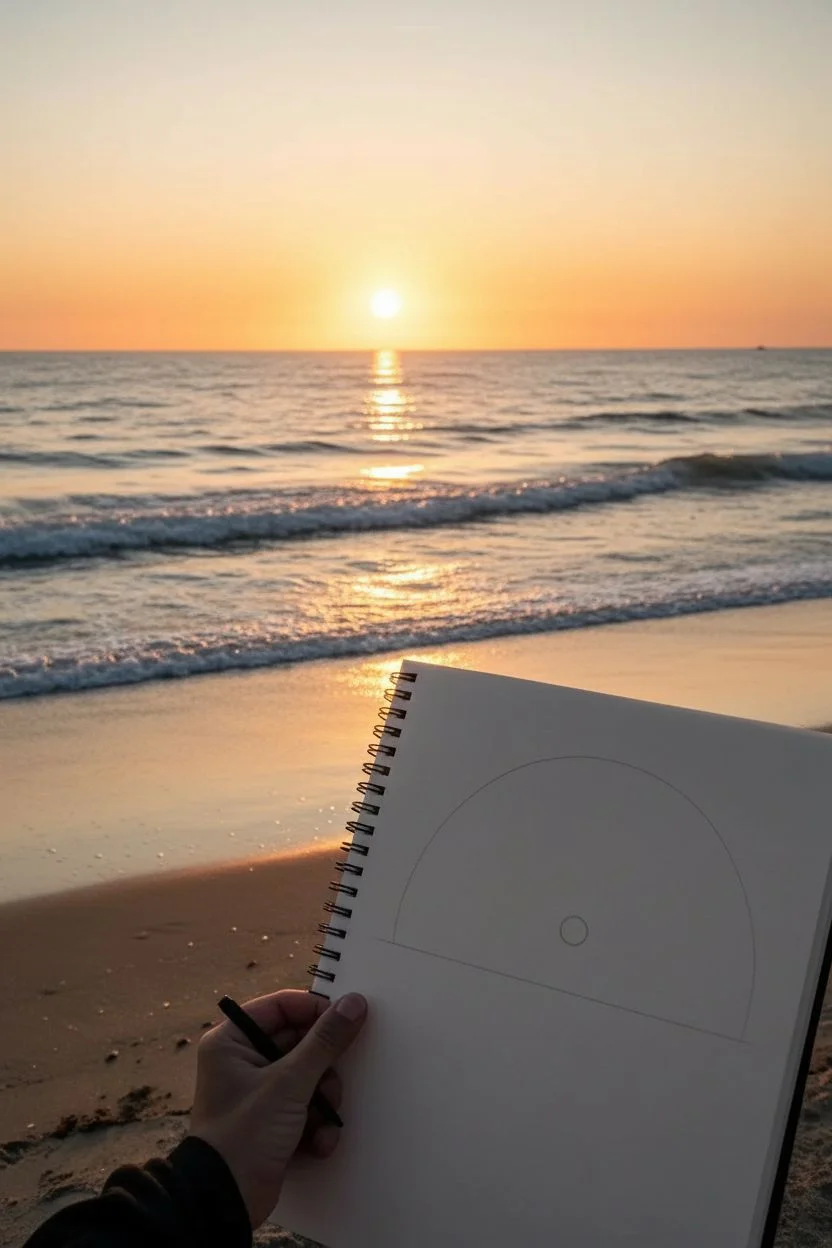
Step 1: Planning and Mapping
-
Outline the frame:
Begin by lightly drawing a large arch or semi-circle in the lower half of your sketchbook page. This doesn’t need to be a complete circle; drawing just the top arc creates a ‘dome’ effect that frames the sunset beautifully. -
Establish the horizon:
Draw a straight horizontal line across the lower third of your arched frame. Keep this line level to ensure the ocean looks flat and realistic. -
Position the sun:
Right in the center, hovering just above your horizon line, draw a small, perfect circle for the sun. Keep the outline faint, as we want the sun to be defined by the light, not a dark ring.
Use an Eraser Shield
To get those tiny, sparkling highlights on the water, tap a kneaded eraser into a point or use an eraser shield to lift out precise specks of graphite without smudging.
Step 2: Shading the Sky
-
Create the gradient base:
Using an HB pencil, lightly shade the sky area around the sun. Apply even pressure, getting gradually darker as you move away from the sun and toward the top of the arch. -
Add depth to the upper sky:
Switch to a 2B pencil to deepen the shading at the very top of your arch. Use curved strokes that follow the shape of your circular frame to enhance the vignette feel. -
Smooth the transition:
Take your blending stump and gently smudge the graphite from the top downwards. Be careful to stop before you hit the sun; leave a halo of white paper directly around the sun for maximum brightness. -
Add cloud layers:
With a 4B pencil, sketch horizontal, wispy cloud shapes cutting across the lower sky and slightly obscuring the sun. Keep the edges soft and indefinite. -
Darken the clouds:
Layer more graphite onto the cloud bottoms to give them volume. I find that scumbling (small circular motions) works best here to create that fluffy texture.
Step 3: Drawing the Water
-
Darken the horizon:
Use a 6B or charcoal pencil to create a sharp, dark line for the distant horizon. This high contrast is crucial for making the sun look bright. -
Map the reflection:
Directly under the sun, reserve a vertical column of white paper on the water. This will be the shimmering reflection path. -
Texture the water surface:
Fill in the rest of the ocean area with horizontal, choppy strokes using a 4B pencil. Leave small gaps of white paper periodically to represent wave caps catching light. -
Intensify the reflection:
Along the edges of your white reflection path, use short, dark horizontal dashes. These mimic the ripples of water breaking up the column of light.
Fixing Muddy Greys
If your sky gradient looks muddy rather than smooth, you likely pressed too hard with a soft pencil. Lift some graphite with a dapping motion using a kneaded eraser, then re-layer gently.
Step 4: Foreground and Finishing Touches
-
Sketch the foreground grass:
At the very bottom edge of your drawing, use sharp, flicking motions with your darkest pencil (8B or charcoal) to create silhouette blades of dune grass entring the frame. -
Vary the grass direction:
Ensure the grass blades curve in different directions and vary in height. This chaotic arrangement looks more natural than uniform lines. -
Add the sun’s color (optional):
If you want the pop of color seen in the photo, gently dab a bit of orange pastel or colored pencil right into the sun circle. Use a white pencil to blend the center for a glowing core. -
Clean the edges:
Use your eraser to clean up the outside of the main arch. A sharp, clean edge on the vignette makes the soft interior shading look even more impressive. -
Final contrast check:
Step back and look at your drawing. Deepen the darkest shadows in the clouds and foreground grass one last time to ensure the ‘light’ areas truly pop.
Now you have a stunning, high-contrast sunset sketch that perfectly captures the mood of golden hour by the sea


Palm Trees and Breezy Beach Shadows
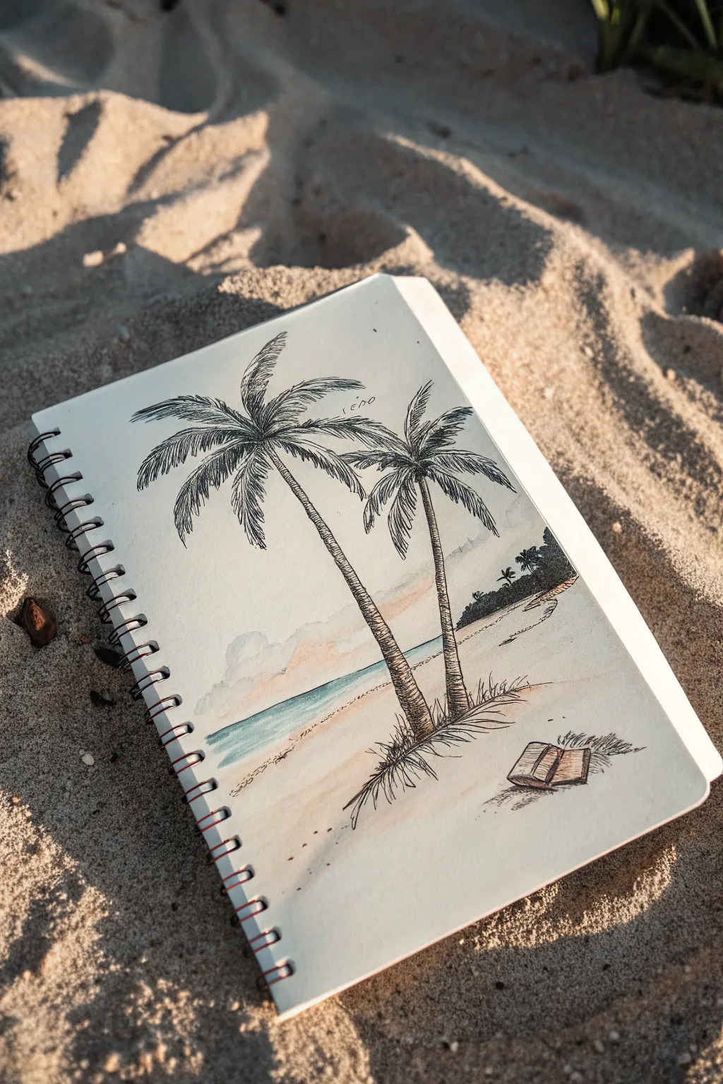
Capture the perfect lazy beach day with this mixed-media sketch featuring swaying palm trees and a forgotten book in the sand. Using fine liners for texture and soft watercolor washes for atmosphere, you’ll create a breezy, nostalgic scene right in your sketchbook.
Step-by-Step
Materials
- Sketchbook with mixed media or watercolor paper (spiral bound preferred)
- HB pencil and eraser
- Fine liner pens (sizes 0.1, 0.3, and 0.5, black waterproof ink)
- Watercolor paints (Cerulean Blue, Burnt Sienna, Yellow Ochre, Paynes Grey, Sap Green)
- Small round watercolor brush (size 4 or 6)
- Cup of water and paper towel
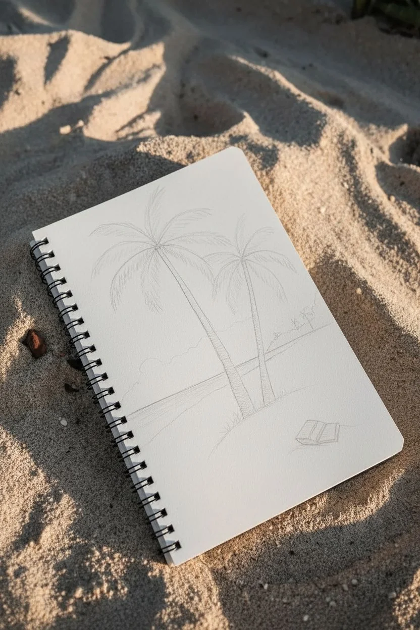
Step 1: Penciling the Composition
-
Establish the horizon:
Begin by lightly drawing a horizontal line across the page, about one-third of the way up from the bottom. This separates your sky from the sea and sand. -
Place the palm trunks:
Lightly sketch two curved lines for the palm tree trunks. Position the larger one on the left and a slightly smaller one to its right. Let them lean gently towards the right to suggest a sea breeze. -
Outline the fronds:
At the top of each trunk, draw a central point and extend 5-7 curved lines outward like a firework explosion to map where the leaves will go. -
Add background and foreground elements:
Sketch a sloping landmass on the right side of the horizon. In the foreground, near the base of the trees, draw a small open book lying flat on the sand.
Step 2: Inking the Details
-
Ink the trunks:
Using a 0.3 pen, trace over your trunk lines. Instead of straight lines, use short, horizontal dashed strokes to create the rough, segmented texture of palm bark. I like to make the side in shadow (the right side) slightly darker with more strokes. -
Draw the palm leaves:
Switch to a 0.1 pen for delicate foliage. Draw jagged, zig-zag lines along your penciled frond guides. Keep the strokes quick and loose to mimic fluttering leaves. -
Detail the background:
Use the 0.1 pen to outline the distant landmass. Add tiny, simplified palm silhouttes on this distant hill to give the drawing scale. -
Ink the book and grass:
Outline the open book with the 0.3 pen, adding vertical lines for pages. Use quick upward flicks at the base of the trees and around the book to create tufts of dune grass. -
Erase pencil marks:
Once the ink is completely dry—give it a full minute just to be safe—gently erase all your underlying pencil sketches.
Ink Smearing?
Ensure your pen is waterproof/archival before painting. If not, do the watercolor washes first, let them bone-dry, and then draw on top.
Step 3: Watercolour Atmosphere
-
Paint the sky:
Dilute a tiny drop of Cerulean Blue with lots of water. Paint a very pale wash across the upper sky, leaving some white paper showing for clouds. Add a hint of diluted Burnt Sienna near the horizon for warmth. -
Color the sea:
Mix a stronger Cerulean Blue with a touch of Sap Green. Paint the strip of ocean, keeping the edge against the sand crisp. -
Wash the sand:
Mix Yellow Ochre with plenty of water for a pale beige sand color. Apply this loosely around the tree base and foreground, fading it out towards the edges of the page. -
Add shadows:
Mix Paynes Grey with a little purple or blue. While the sand wash is dry, paint cast shadows stretching from the trees and the book towards the right. -
Final touches:
Add a darker green wash to the distant hill. Let everything dry completely. If needed, re-emphasize the tree bark texture or book outline with the 0.5 pen for contrast.
Make It Glossy
Use a white gel pen to add highlights to the ocean waves or bright spots on the palm leaves for extra sparkle.
Close your sketchbook and enjoy having a permanent piece of summer vacation with you


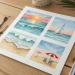
Ice Cream Cones and Melting Popsicles
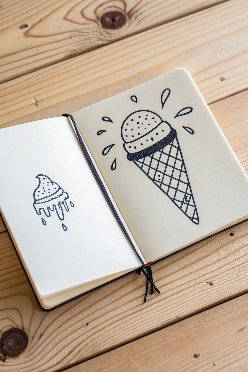
Capture the essence of summer with these crisp, black-and-white ink drawings of everyone’s favorite frozen treat. This spread features a classic scoop on a waffle cone alongside a whimsical melting dollop, perfect for filling a sketchbook page with simple yet striking art.
Step-by-Step Tutorial
Materials
- Sketchbook with smooth, heavy paper
- Pencil (HB or H for light sketching)
- Eraser (kneaded eraser preferred)
- Black fineliner pen (0.5mm or 0.8mm)
- Thicker black marker (optional, for filling areas)
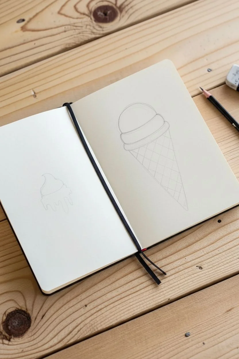
Step 1: Planning the Layout
-
Visualize the spread:
Open your sketchbook to a fresh two-page spread. We will place a smaller design on the lower half of the left page and a large, central design on the right page. -
Draft basic shapes:
Using your pencil very lightly, sketch a large inverted triangle on the right page for the cone. Add a semi-circle on top for the ice cream scoop. On the left page, sketch a small, irregular mound shape near the bottom center.
Step 2: Drawing the Melting Scoop (Left Page)
-
Outline the top:
Start with the top of the melting ice cream. Draw a curved line that peaks slightly off-center, like a soft serve swirl starting to slump. -
Add the rim:
Draw a slightly wavy horizontal line across the bottom of the mound to create a ‘skirt’ or rim where the ice cream would meet a cone (if it had one). -
Create the drips:
Below that rim, draw long, varied drips. Make some thick and others thin, reminiscent of slime or heavy liquid flowing down. Ensure the bottom ends of the drips are rounded. -
Add detail drops:
Draw two or three detached teardrop shapes falling below the main mass to suggest active melting. -
Texture with dots:
Stipple the upper portion of the ice cream with small dots to give it texture, perhaps suggesting vanilla bean or cookie crumbs. -
Ink the melting scoop:
Go over your pencil lines with the black fineliner. Keep your hand steady for smooth, continuous curves on the drips.
Uneven Waffle Grid?
Don’t stress if your diagonal lines aren’t perfectly parallel. A slightly wonky grid adds organic charm to a hand-drawn illustration.
Step 3: Drawing the Big Cone (Right Page)
-
Define the scoop shape:
Moving to the right page, refine the pencil semi-circle into a proper scoop. Give it a distinct bottom edge that curves slightly upward, separating it from the cone. -
Add the collar:
Draw a thick, dark band right below the scoop. This represents the chocolatey rim or the thick edge of the waffle cone. Make this section solid black or heavily cross-hatched for contrast. -
Draw the cone outline:
Extend the two sides of the cone downward to a sharp point. Make sure the lines are straight; you can use a ruler if you want perfection, though a hand-drawn line adds character. -
Create the waffle grid:
Draw diagonal lines across the cone in one direction. Space them evenly. Then, draw diagonal lines in the opposite direction to create a diamond grid pattern. -
Detail the waffle texture:
Inside a few random diamonds on the grid, draw tiny lines or dots. This subtle detail suggests the texture of a baked waffle cone without overcrowding the design. -
Add texture to the scoop:
Just like the smaller drawing, add stippling (dots) to the top half of the main ice cream scoop. Concentrate them more heavily on the left side to suggest a light shadow. -
Draw dynamic splash marks:
Surround the top of the scoop with teardrop shapes radiating outward. I like to vary their sizes and angles to make the drawing feel energetic and fun. -
Final inking:
Trace over all your final pencil lines with the fineliner. Be confident with your strokes, especially on the long cone lines.
Pro Tip: Line Weight
Use a slightly thicker pen for the main outlines and a thinner one for the internal waffle grid and stippling to create depth.
Step 4: Finishing Touches
-
Erase guidelines:
Wait at least a full minute to ensure the ink is completely dry. Then, gently erase all underlying pencil sketch marks. -
Reinforce blacks:
If the dark band on the cone looks patchy, go over it again to make it a deep, solid black. This anchors the drawing visually.
Now you have a cool, graphic set of ice cream illustrations ready to inspire your next summer art session


Summer Wildflowers in Loose Line Art
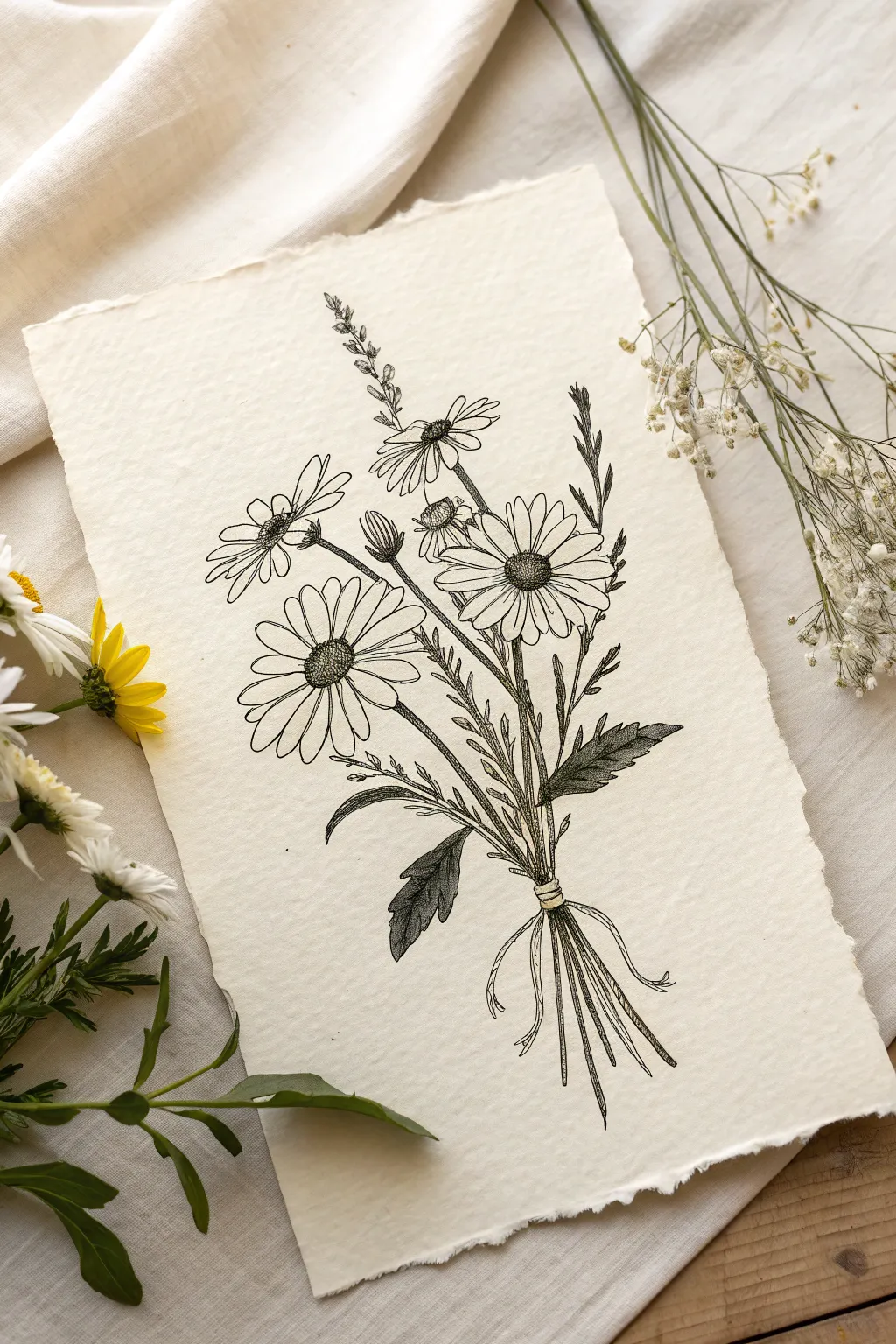
Capture the delicate beauty of a summer meadow with this elegant line art drawing. Using flowing ink lines on textured parchment, you’ll create a timeless botanical bouquet that feels both organic and refined.
How-To Guide
Materials
- Textured watercolor paper or handmade cotton paper (deckled edge)
- Fine liner pens (sizes 0.05, 0.1, and 0.3mm)
- HB pencil
- Kneaded eraser
- Ruler (optional)
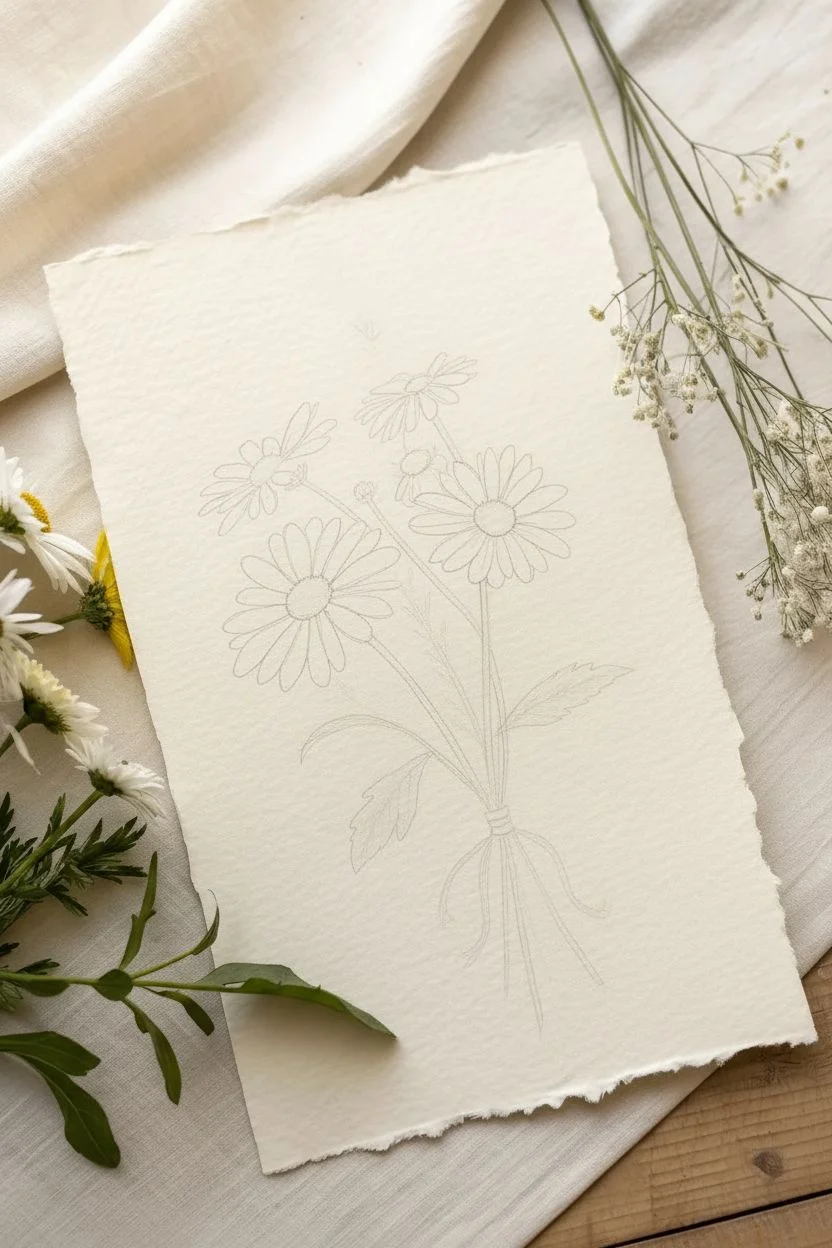
Step 1: Planning and Sketching
-
Establish the composition:
Begin by lightly tracing a central vertical axis with your HB pencil to guide the bouquet’s direction. Mark a focal point about two-thirds of the way down where the stems will gather and be tied. -
Placement of the blooms:
Lightly sketch three main circles to represent the large daisy heads: one centered, one slightly lower to the left, and one higher to the right. Add smaller ovals for the buds and side-facing flowers near the top. -
Map the stems and foliage:
Draw faint, curved lines extending from your flower heads down to the gathering point. Sketch in loose, sweeping shapes for the leaves at the base, keeping the lines fluid rather than rigid. -
Refine the pencil sketch:
Before inking, refine your flower petals. Make them slightly irregular—some overlapping, some twisting—to mimic nature. Erase any confusing construction lines so you have a clean guide for the ink.
Step 2: Inking the Blooms
-
Outline the central daisy:
Using a 0.1mm pen, trace the petals of the largest central flower. Keep your hand relaxed to allow for slight wobbles, which adds character. Don’t close every petal tip perfectly; leave some open for a lighter feel. -
Detail the flower center:
Switch to a 0.05mm pen for the pollen center. Use tiny stippling dots, clustering them denser on the shadowed side (usually bottom-right) to create volume without solid black lines. -
Ink the secondary flowers:
Move to the left and right flowers. For the side-profile daisy on the left, draw the sepals (the green cup at the base) with jagged little strokes before drawing the petals sweeping away from it. -
Add the upper buds:
Ink the smaller buds and the tall, thin sprigs at the top. Use very broken, light lines here to suggest they are delicate and further away.
Ink Flow Tip
Pull the pen toward you rather than pushing it away. This maintains a consist ink flow and prevents the nib from snagging on the textured surface of handmade paper.
Step 3: Stems, Leaves, and Finishing
-
Draw the main stems:
Switch to a 0.3mm pen for the main stems to give them structural weight. Draw them in long, confident strokes down to the binding point. It’s okay if lines cross slightly. -
Create the tie:
At the gathering point, draw two or three small horizontal bands to represent twine or ribbon holding the bouquet. Add two loose, flowing loops and trailing ends for the bow. -
Ink the bottom stems:
Below the tie, fan out the bottom of the stems. Make the cut ends slightly uneven for a natural, hand-gathered look. -
Texture the leaves:
Ink the large leaves near the base using the 0.1mm pen. Instead of coloring them in, use close hatching lines (parallel diagonal strokes) to create shading and denote the darker green value. -
Add fine foliage details:
Use your finest 0.05mm pen to add tiny, scratchy textures to the fern-like leaves and the sepals of the buds. This contrast in texture makes the smooth petals pop. -
Erase and assess:
I like to wait at least five minutes to ensure the ink is bone dry. Then, gently roll a kneaded eraser over the entire drawing to lift the graphite sketch without damaging the paper surface. -
Final touches:
Inspect your drawing for balance. If a petal looks too plain, add a tiny fold line near the center. If a stem feels disconnected, extend it carefully to hide behind a leaf.
Vintage Effect
Steep your finished drawing in weak black tear for 5 minutes, then let it air dry. This stains the paper unevenly, giving it an authentic antique botanical look.
Now you have a charming piece of botanical art ready to be framed or gifted to a flower lover
BRUSH GUIDE
The Right Brush for Every Stroke
From clean lines to bold texture — master brush choice, stroke control, and essential techniques.
Explore the Full Guide
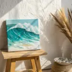
Ocean Wave Practice Strip (Calm to Choppy)
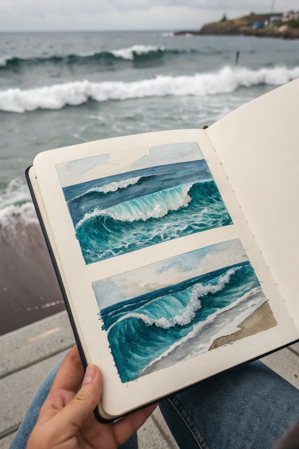
Capture the raw energy of the sea with these two dynamic wave studies painted directly into a sketchbook. This project focuses on mastering the translucency of crashing water and the deep, moody blues of the ocean using masking fluid and layering techniques.
Step-by-Step Guide
Materials
- Cold press watercolor sketchbook (heavyweight paper)
- Artist grade watercolors (Indigo, Phthalo Blue, Turquoise, Burnt Umber)
- Masking fluid (drawing gum) and old brush or nib
- Washi tape or masking tape
- Round watercolor brushes (Size 2, 6, and 8)
- White gouache or white gel pen (optional for highlights)
- Paper towels
- Two jars of water
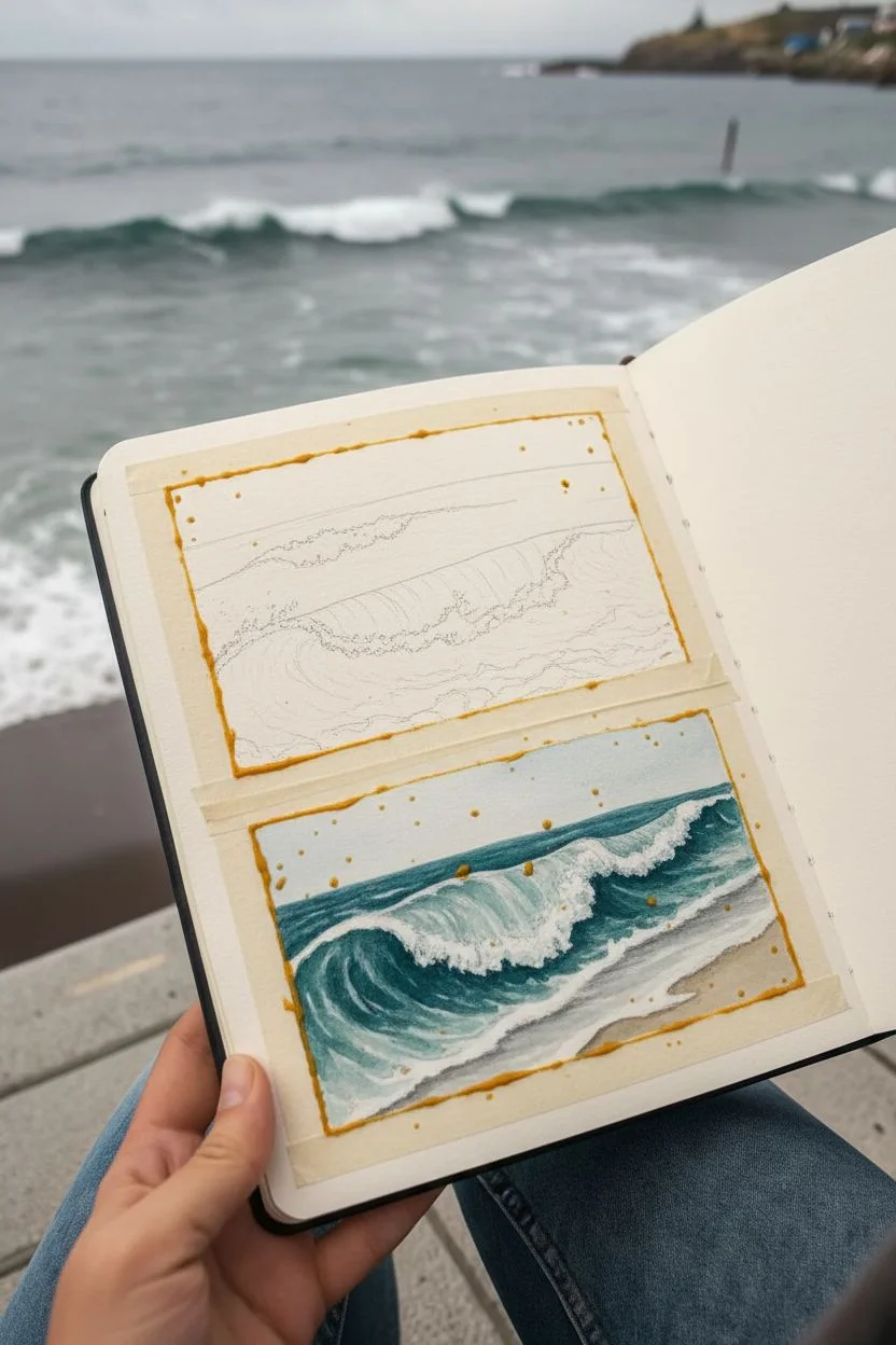
Step 1: Preparation & Masking
-
Define the borders:
Start by taping off two crisp rectangles on a single sketchbook page. Ensure the tape is pressed down firmly to prevent paint seepage, leaving enough white space between the two panels for a clean look. -
Sketch the wave motion:
Lightly sketch the main flow of the water with a pencil. In the top box, draw a curling wave in the middle ground with a smaller swell behind it. In the bottom box, bring the wave closer to the foreground, crashing onto a sandy beach. -
Preserve the white foam:
Using masking fluid and an old brush (one you don’t care about), paint the shapes of the crashing foam, the sea spray, and the jagged white lip of the wave. Dot the fluid randomly in the splash zones to create texture. -
Let it cure:
Allow the masking fluid to dry completely. It should feel rubbery and tack-free to the touch before you introduce any water.
Troubleshooting: Ripped Paper
If tape rips your paper upon removal, you might be pulling too fast. Next time, heat the tape briefly with a hair dryer to loosen the adhesive before peeling.
Step 2: Painting the Top Wave Study
-
Establish the horizon:
Mix a watery wash of soft blue-grey for the sky and apply it to the very top strip of the first rectangle. Let this dry, then paint a sharp, dark blue line for the horizon using Indigo mixed with a touch of Phthalo Blue. -
Create the deep water:
Apply a saturated mix of Indigo and Phthalo Green behind the main wave. Keep the strokes horizontal to suggest distance and movement on the water’s surface. -
Paint the translucent curve:
For the inner curve of the wave (the ‘barrel’), switch to a vibrant Turquoise or lighter Phthalo Blue. I find that diluting the paint slightly here helps create that glowing, sun-lit water effect. -
Depth and shadow:
While the turquoise area is still slightly damp, drop darker blue pigment into the base of the wave curve to create a rounded, 3D volume.
Step 3: Painting the Bottom Shore Break
-
Paint the sand:
In the bottom rectangle, mix Burnt Umber with plenty of water for a sandy beige. Paint the bottom right corner, softening the edge where the water will meet the sand. -
Build the foreground wave:
Similar to the top study, paint the deep ocean dark blue, but make the main wave’s curve larger and more dramatic. Use sweeping, C-shaped strokes to follow the direction of the water. -
Wet sand reflections:
Where the foam recedes on the sand, paint a greyish-blue wash over closer parts of the beach to show wet, reflective sand.
Level Up: Salt Texture
While the dark blue ocean area is still wet, sprinkle a pinch of table salt onto the paint. Once dry, brush it off to create a perfect blooming ‘sea foam’ texture.
Step 4: Finishing Touches
-
Remove the mask:
Once the paint is bone dry, gently rub off the masking fluid with your finger or a rubber cement pickup tool. You will be left with stark white shapes. -
Soften the edges:
The white areas might look too sharp. Take a damp, clean brush and gently scrub the edges of the foam to soften them and blend them slightly into the surrounding blue water. -
Add shadows to foam:
Mix a very pale, watery grey-blue. Paint the underside of the white foam caps to give them volume and dimension, so they don’t look flat. -
Final highlights:
If you lost any sparkle, use a touch of white gouache to add final bright splashes or mist above the crashing lip. -
The reveal:
Carefully peel away the masking tape at a 45-degree angle to reveal your crisp, clean borders.
Now you have a refreshing pair of seascapes that preserve the feeling of a day at the beach
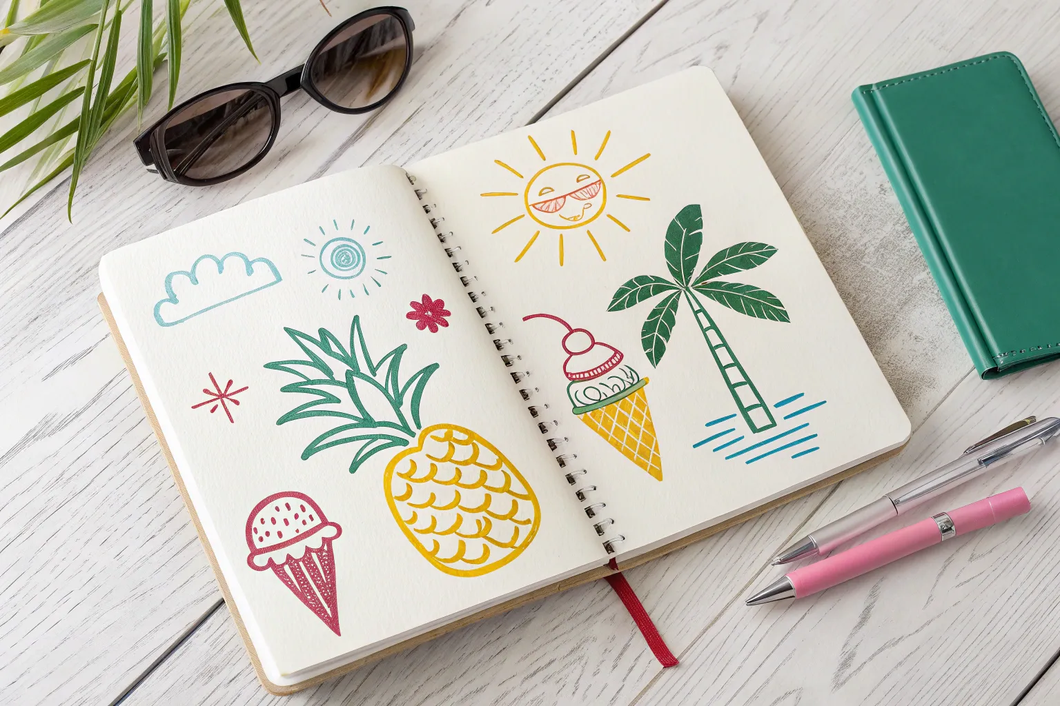
Sticker-Sheet Doodles of Summer Icons
Capture the essence of summer with this delightful collection of miniature doodles arranged like a classic sticker sheet. Using delicate fine lines and soft pastel accents, you’ll create a grid of sunny motifs that are perfect for decorating your journal or stationery.
Step-by-Step Tutorial
Materials
- A5 Sketchbook or dotted grid journal
- Fine liner pen (0.3mm or 0.5mm, black or dark grey)
- Colored pencils or fine-tip markers (pastel pink, teal, yellow, orange)
- Pencil (HB for sketching)
- Eraser
- Ruler (optional)
Step 1: Planning the Layout
-
Prepare your page:
Open your sketchbook to a fresh, blank page. If you are using plain paper, you might want to lightly place a sheet of lined paper underneath as a guide, or just trust your eye for a freehand look. -
Visualize the grid:
Imagine an invisible grid on your page, roughly 5 columns across and 8 rows down. The charm of this project is in the spacing—you want the icons to float independently like stickers on a sheet. -
Lightly sketch placeholders:
Using your HB pencil, lightly mark the center point for where each doodle will go. This ensures you don’t run out of space at the bottom or cram things too close together.
Smudge Prevention
If your fine liner isn’t waterproof, the colored markers might bleed the ink. Test your pen and marker combo on a scrap paper first, or outline *after* coloring.
Step 2: Drawing the Icons
-
Start with the suns:
Begin by drawing a few sun variations scattered across the page. For one, draw a simple circle with straight radiating lines. For another in the lower section, use a circle with short, disconnected rays. -
Add some sweets:
Sketch a classic soft-serve ice cream cone near the top left and a popsicle or scoop cone further down. Keep the shapes simple—a triangle base with a fluffy cloud-like top. -
Draw beach accessories:
Fill in a few spots with beach gear. Draw a wide-brimmed hat using an oval with a dome on top. Add a beach ball with curved segments and a striped beach umbrella. -
Incorporate nature:
Add organic shapes like a simple flower with five petals, a sea star, and a small sprig of leaves. A seashell shape (like a scalloped fan) fits perfectly in the mix. -
Include playful objects:
Draw a hot air balloon, a diamond shape, a camera, and a little message in a bottle. Keep the lines clean and minimal. -
Fill the gaps:
Look for empty spaces in your grid. Add abstract elements like a rainbow arc, a citrus slice, or a few floating seeds to balance the composition.
Step 3: Inking and Coloring
-
Outline with fine liner:
Trace over your pencil sketches with the fine liner pen. Use a steady hand and try not to lift the pen too often on curved lines for a smoother look. -
Add ink details:
Add tiny details like the seeds on the fruit slice, the waffle pattern on the cones, or the lens on the camera. Let the ink dry completely for a minute or two. -
Erase pencil marks:
Gently erase the underlying pencil structure. Make sure the ink is totally dry to avoid smudging. -
Select a limited palette:
Choose 3-4 soft colors to keep the design cohesive. A palette of pastel pink, mint teal, baby blue, and soft orange works beautifully for a vintage summer vibe. -
Color selectively:
Don’t fill in every shape completely. I usually like to leave some white space or color ‘outside the lines’ slightly for an artistic, loose feel. -
Apply pink accents:
Use pink for the ice cream, the flower, the sea star, and stripes on the beach ball. -
Apply cool tones:
Use teal or blue for the umbrella, the rainbow arc, the message bottle, and the diamond. -
Finish with warmth:
Use yellow or orange for the suns, the camera accents, and the hat bands. -
Final touches:
Review your page. If any doodle feels too light, go back over the outline or add a tiny pop of color to anchor it.
Make Real Stickers
Draw this directly onto full-sheet adhesive label paper instead of a sketchbook. Once done, cut carefully around each icon to create actual homemade stickers.
Your page is now filled with a collection of charming summer memories ready to brighten your day


Have a question or want to share your own experience? I'd love to hear from you in the comments below!