Big canvases are basically permission to paint louder—bigger shapes, bolder color, and strokes you can read from across the room. If you’ve got a wide blank wall that’s begging for a statement piece, these big canvas painting ideas will get you moving fast without overthinking every inch.
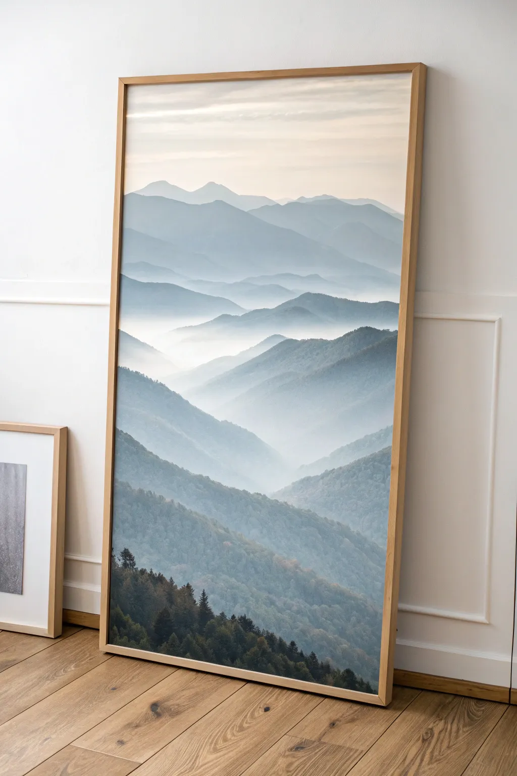
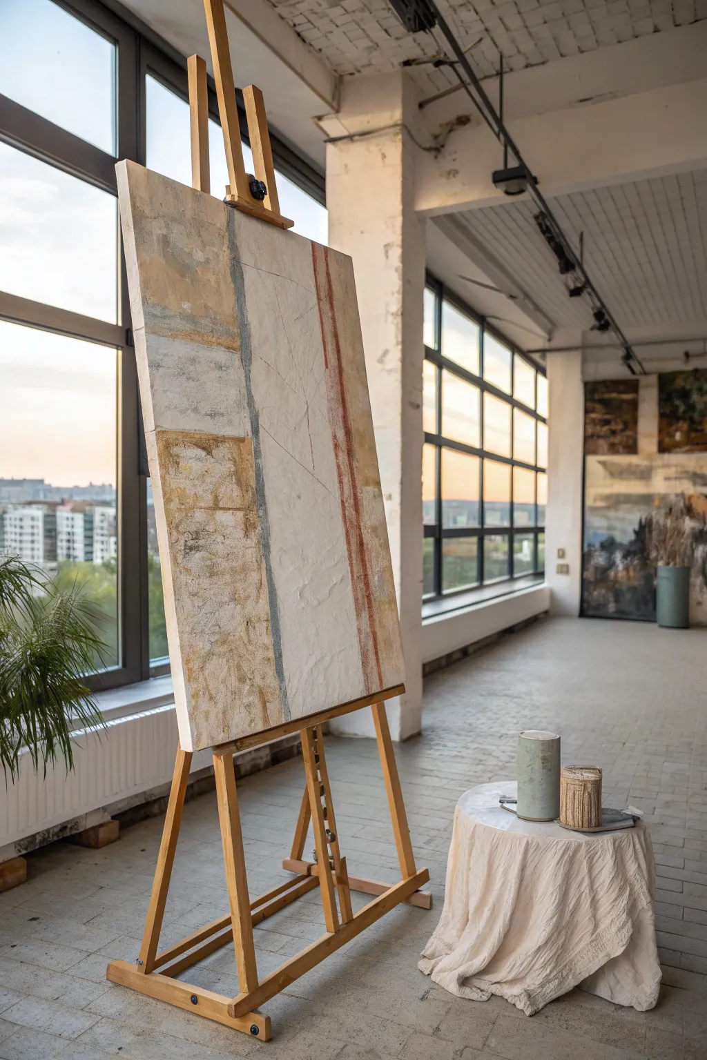
Panoramic Horizon Landscape With a Massive Sky
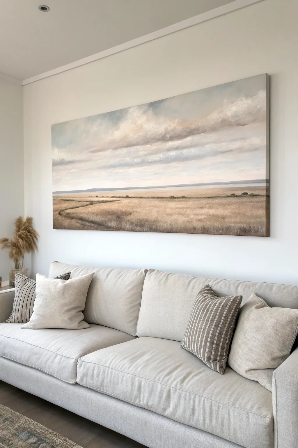
Bring the calming vastness of nature into your living room with this oversized panoramic landscape. This project focuses on mastering soft gradients and atmospheric perspective to create a massive sky that feels endless above a golden, grassy field.
How-To Guide
Materials
- Large panoramic canvas (e.g., 24×60 or 30×72 inches)
- Acrylic paints (Titanium White, Payne’s Grey, Yellow Ochre, Burnt Sienna, Raw Umber, Ultramarine Blue)
- Large flat bristle brush (2-3 inch)
- Medium filbert brush
- Small round brush for details
- Sea sponge or rag
- Spray bottle with water
- Mixing palette
- Easel or flat work surface
Step 1: Setting the Horizon
-
Prime and Prep:
Ensure your large canvas is primed with gesso. If the canvas is very rough, you might want a second coat of gesso, sanded lightly when dry, to allow for smoother cloud blending. -
Mark the Horizon Line:
Decide where your sky meets the land. For this composition, keep the horizon low—about one-third of the way up from the bottom. Lightly pencil this line straight across. -
Underpainting the Sky:
Mix a very pale blue using Titanium White and a tiny dot of Ultramarine. Paint the entire sky area with this base tone to get rid of the stark white canvas. -
Underpainting the Land:
Mix Yellow Ochre with a touch of Burnt Sienna to create a warm, wheat-colored base. Paint the bottom third of the canvas below your horizon line with this solid color.
Trouble with harsh lines?
If your clouds look too stiff, mist the canvas lightly with water and use a clean, dry makeup brush to swirl over the wet paint. This creates an instant ‘soft focus’ effect.
Step 2: Building the Massive Sky
-
Deepening the Blue:
While the sky is still slightly damp (use your spray bottle if needed), mix a deeper grey-blue using Payne’s Grey and White. Apply this to the very top corners and edges, blending downward. -
Drafting Cloud Shapes:
Using a dirty grey-white mix, loosely map out horizontal cloud formations. Keep them stretched out; this emphasizes the panoramic width of the canvas. -
Adding Cloud Volume:
Load a filbert brush with pure Titanium White. Stipple the tops of your cloud shapes to create fluffy, sunlit edges. Use a dry brush to soften these edges into the blue background immediately. -
Creating Shadow Depth:
Mix a soft lavender-grey using Ultramarine, a touch of Burnt Sienna, and White. Paint the undersides of the clouds with this shadow color to give them weight and 3D form. -
Connecting Clouds:
Use a dry, large brush to gently sweep horizontally across the sky section. This ‘knocks back’ the texture and makes the clouds look windswept and distant. -
Atmospheric Haze:
Near the horizon line, the sky should be almost white. Blend a very pale, warm white right down to the pencil line to create that distant atmospheric glow.
Level Up: Metallic Glow
Mix a tiny amount of iridescent gold medium into your final Yellow Ochre glaze on the field. It catches the light throughout the day, making the sun look real.
Step 3: Land and Details
-
Distant Hills:
Mix a pale, blue-grey color (White + Payne’s Grey). Paint a very thin, faint strip right on top of the horizon line to represent distant mountains or hills. Keep the edges soft. -
Field Texture Base:
Return to your land section. Use a scruffy or old bristle brush with Raw Umber to tap in vertical strokes, suggesting the shadows of tall grasses. -
Adding Golden Highlights:
Layer Yellow Ochre and White over the dark umber base. Use quick, short upward flicks to mimic the texture of dried wheat or tall grass catching the light. -
Carving the Path:
Visualize a winding water path or dirt trail starting from the bottom left and meandering toward the center right. Paint this area with a darker, muddy mix of Burnt Sienna and Payne’s Grey. -
Refining the Path:
Soften the edges of your path by painting grass strokes that overlap into the dark path area. This makes the trail look overgrown and natural rather than like a sharp cutout. -
Foreground Detail:
At the very bottom of the canvas, closest to the viewer, make your grass strokes larger and more distinct. Add tiny touches of pure Burnt Sienna for visual interest. -
Final Glazing:
Once everything is fully dry, mix a tiny amount of Yellow Ochre with plenty of glazing medium or water. Wash this transparently over the land area to unify the colors.
Step back and admire how this sweeping landscape opens up your room with a breath of fresh air


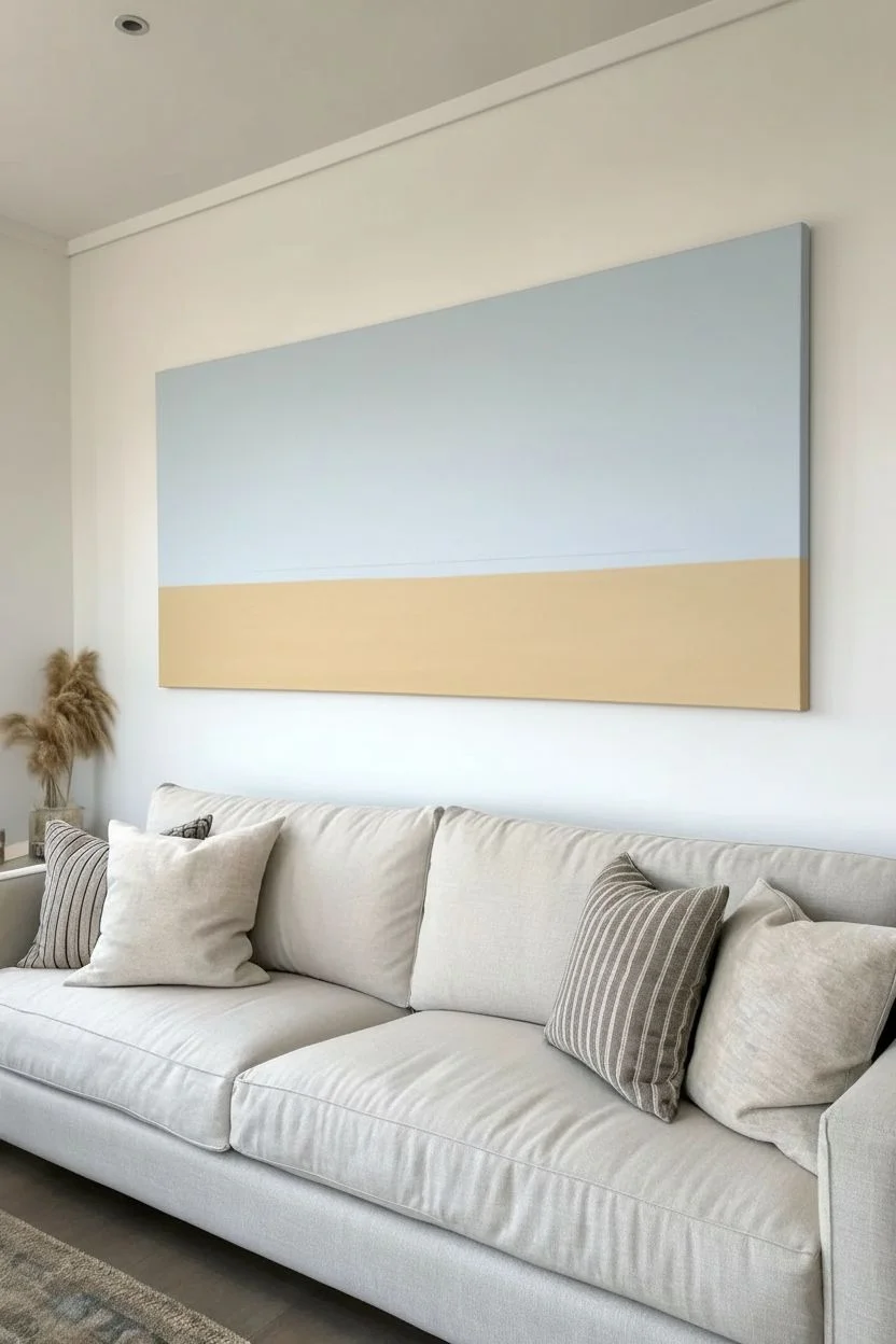
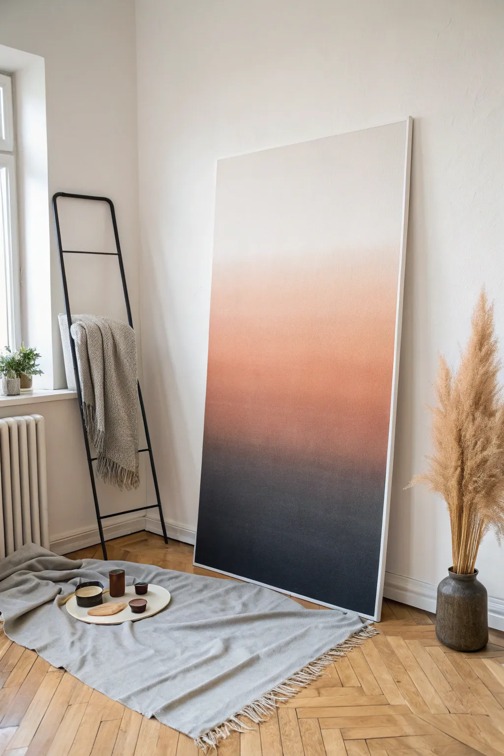
Oversized Abstract Color Field With Gentle Gradients
Capture the serene warmth of a sunset over sand with this massive abstract color field painting. Through the careful layering of washes and dry brushing, you’ll create soft, blurred transitions between earthy reds, pinks, and creams that evoke calm.
Step-by-Step Tutorial
Materials
- Oversized heavy-duty canvas (at least 48×60 inches)
- White gesso
- Acrylic paints (Titanium White, Burnt Sienna, Red Oxide, Unbleached Titanium, Raw Umber, Cadmium Red Medium)
- Wide house painting brushes (3-4 inch)
- Natural sponge
- Spray bottle with water
- Mixing buckets or large palette tray
- Drop cloth
- Matte medium
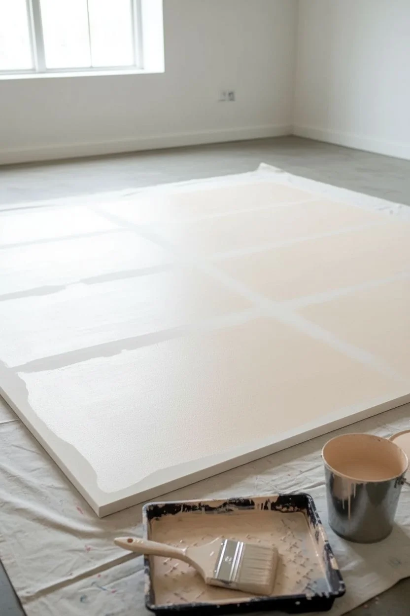
Step 1: Preparation and Base
-
Prime the Surface:
Since this canvas is so large, lay it flat on a protected floor or sturdy table. Apply two generous coats of white gesso using a wide brush, stroking first horizontally and then vertically for the second coat. Let it dry completely between layers. -
Tint the Background:
Mix a large wash of Titanium White and a tiny drop of Unbleached Titanium to create a warm off-white. Cover the entire canvas with this to kill the stark white brightness and establish a soft undertone.
Wet-on-Dry Trick
To get that chalky, fresco feel, keep your brushes relatively dry. Only use water to mist the canvas surface, not to thin the paint heavily on the brush itself.
Step 2: Establishing Color Blocks
-
Map the Horizon:
Visualize your composition in horizontal bands. Lightly mark where your main color transitions will happen with charcoal or a very faint pencil line; aim for the top third being pink/rose, the middle stripe deep red, and the bottom half a sandy beige. -
Mix the Top Rose:
Create a dusty rose color by mixing White, Red Oxide, and a touch of Burnt Sienna. Keep the paint slightly fluid but opaque. -
Apply the Upper Sky:
Using a wide brush, paint the top third of the canvas. Don’t worry about perfect edges yet; simply get the color down, keeping your strokes horizontal long. -
Mix the Deep Red Band:
In a fresh bucket, mix Red Oxide with Cadmium Red and a little Raw Umber to deepen it. This will be your strongest, most vibrant focal point. -
Paint the Middle Stripe:
Apply this darker red directly below the pink section. Overlap the edges slightly where the two colors meet. -
Mix the Sandy Base:
Combine Unbleached Titanium, plenty of White, and a dot of Raw Umber to create a sandy, limestone hue. -
Fill the Bottom Third:
Paint the bottom section with this lighter neutral tone. The canvas should now be fully covered in blocks of solid color.
Step 3: Blending and Texture
-
Create the First Transition:
While the paint is dry to the touch but not fully cured, mix a transitional color—shades between your top pink and middle red. Add a little water or matte medium to make it translucent. -
Feather the Edges:
Use a barely damp, clean brush to drag the transitional color horizontally across the seam where the pink and red meet. I prefer to use quick, light strokes here to blur the hard line. -
Mist and Soften:
Lightly mist the transition area with your spray bottle. While wet, use a clean sponge to dab and lift slight patches of paint, creating a clouded, weathered look. -
Define the Horizon Line:
Mix a dark, almost charcoal-brown using Raw Umber and a touch of blue (if you have it) or black. Using a smaller brush, paint a thin, broken line separating the deep red band from the sandy bottom, suggesting a distant landscape. -
Rough Up the Texture:
Dip a dry, stiff-bristled brush into unthinned Titanium White mixed with a little sand color. Drag this ‘dry brush’ horizontally across parts of the painting, especially the bottom section, to simulate texture and age. -
Add Translucent Glazes:
Mix a very watery glaze of Burnt Sienna. Apply this loosely over parts of the middle red band to add depth and variation so it doesn’t look like a flat wall color. -
Final Blending Check:
Stand back about ten feet. Look for any areas that feel too geometric. Go back in with a damp sponge and scumble (scrub lightly) those areas to soften them further. -
Seal the Work:
Once the painting has cured for at least 24 hours, apply a final layer of clear matte varnish to protect the surface and unify the sheen.
Add Metallic Warmth
Mix a tiny amount of copper or gold paint into your Burnt Sienna glaze. It won’t sparkle obviously, but it will catch the light subtly in the evening.
Hang your oversized masterpiece and enjoy the landscape-like serenity it brings to your room


Large Floral Close-Up That Fills the Entire Canvas
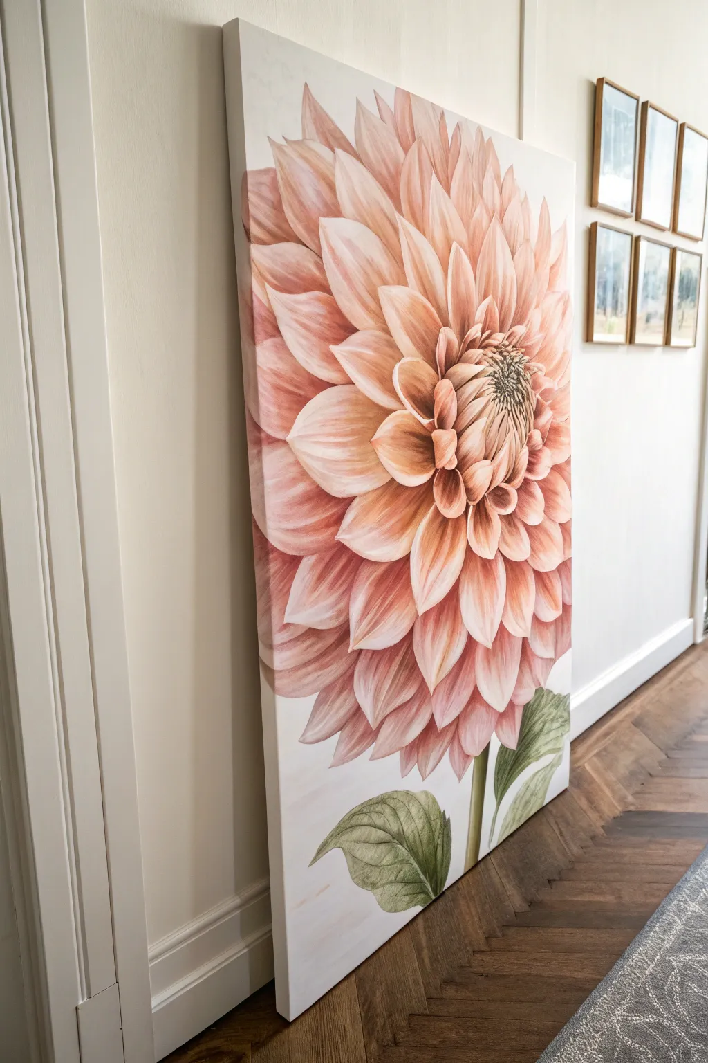
Transform a blank wall into a floral statement piece with this oversized dahlia painting. By focusing on a single flower head that fills nearly the entire canvas, you create an artwork that feels modern, soft, and impactful all at once.
How-To Guide
Materials
- Large stretched canvas (at least 36×48 inches)
- Acrylic paints: Titanium White, Unbleached Titanium, Cadmium Red Light, Yellow Ochre, Burnt Umber, Sap Green, Olive Green
- Large flat brush (2-3 inch)
- Medium filbert brushes (sizes 8 and 12)
- Small round brush (size 4)
- Acrylic glazing medium or flow improver
- HB Pencil
- Reference photo of a dahlia
- Paper plate or palette
- Water container and rags
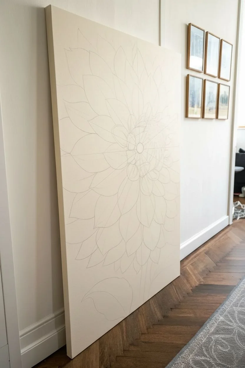
Step 1: Preparation and Sketching
-
Prime the background:
Even though the background is white, you don’t want bare canvas showing. Mix a large amount of Titanium White with a tiny touch of Unbleached Titanium to create a warm, creamy off-white. Use your large flat brush to coat the entire canvas evenly. Let this dry completely before sketching. -
Map the center:
Locate the focal point of your flower. Draw a small circle slightly off-center on the canvas (about two-thirds of the way up) to represent the tight, innermost petals of the dahlia. -
Sketch the petal guidelines:
Lightly sketch radiating lines coming out from that central circle, like the spokes of a wheel. These will help keep your petals aligned as you draw outward. Dahlias have incredible symmetry, so these guides are crucial. -
Draft the petal shapes:
Starting from the center and working outward in concentric rings, sketch the curved, pointed shapes of the dahlia petals. The petals in the center should be small and tight, gradually becoming larger and more open as they reach the edges of the canvas. Don’t worry about perfection; just get the general flow.
Smooth Operator
To get those buttery smooth petal transitions, keep a spray bottle of water handy. A light mist keeps acrylics open longer, blending almost like oils.
Step 2: Blocking In Color
-
Mix base colors:
Prepare three main shades for the flower: a deep peach shadow (Cadmium Red Light + Yellow Ochre + a touch of Burnt Umber), a mid-tone peach (the shadow mix + White), and a highlight peach (mostly White + a tiny drop of Cadmium Red Light). -
Paint the shadows:
Using a medium filbert brush, apply the darkest shadow mix to the base of each petal where it tucks under the petal above it. This creates instant depth. -
Transition to mid-tones:
While the shadow paint is still slightly tacky or wet, apply the mid-tone peach to the main body of the petal. Blend the edge where it meets the shadow slightly for a softer look. -
Add the tips:
Paint the outer tips of the petals with your lightest highlight mix. Use sweeping strokes that follow the curve of the petal toward the center to blend it into the mid-tone. -
Establish the leaves:
Mix Sap Green with a little Olive Green and Burnt Umber for a realistic, muted foliage color. Block in the leaves and the sturdy stem at the bottom, keeping the strokes fairly loose at this stage.
Step 3: Refining and detailing
-
Deepen the center:
The center of a dahlia is complex. Mix a dark greenish-brown using Burnt Umber and Sap Green. Use a small round brush to stipple small dots in the very center circle to mimic the tightly packed pollen structures. -
Glazing for glow:
Once the first layer is dry, mix a glazing medium with a tiny amount of Cadmium Red Light. I find this transparency essential for that glowing effect—brush a very thin layer over the mid-areas of the petals to boost the vibrancy without losing your lights and darks. -
Sharpen edges:
Go back in with your smallest brush and a mix of White and Unbleached Titanium. Carefully redefine the very edges of the petals where they overlap to ensure distinct separation between them. -
Add structural veins:
Using a diluted version of your shadow color and a fine liner brush, paint very faint, thin lines running down the length of the larger outer petals to suggest veins and texture. -
Detail the leaves:
Mix a light green (Leaf Green + White) and paint the veins on the leaves. Keep the leaf texture slightly rougher than the smooth, soft petals to create textural contrast. -
Final highlights:
Add touches of pure Titanium White to the very highest points of the curled petal tips and the center bud area to make the painting pop against the background.
Muddy Color Fix
If your peach tones look dirty, you likely added too much black or brown to darken them. Reroute by using red or purple to darken your orange mixes instead.
Step back and admire how this singular, massive bloom brings a gentle warmth to your entire room


Moody Ocean or Lake Scene With Big Wave Shapes
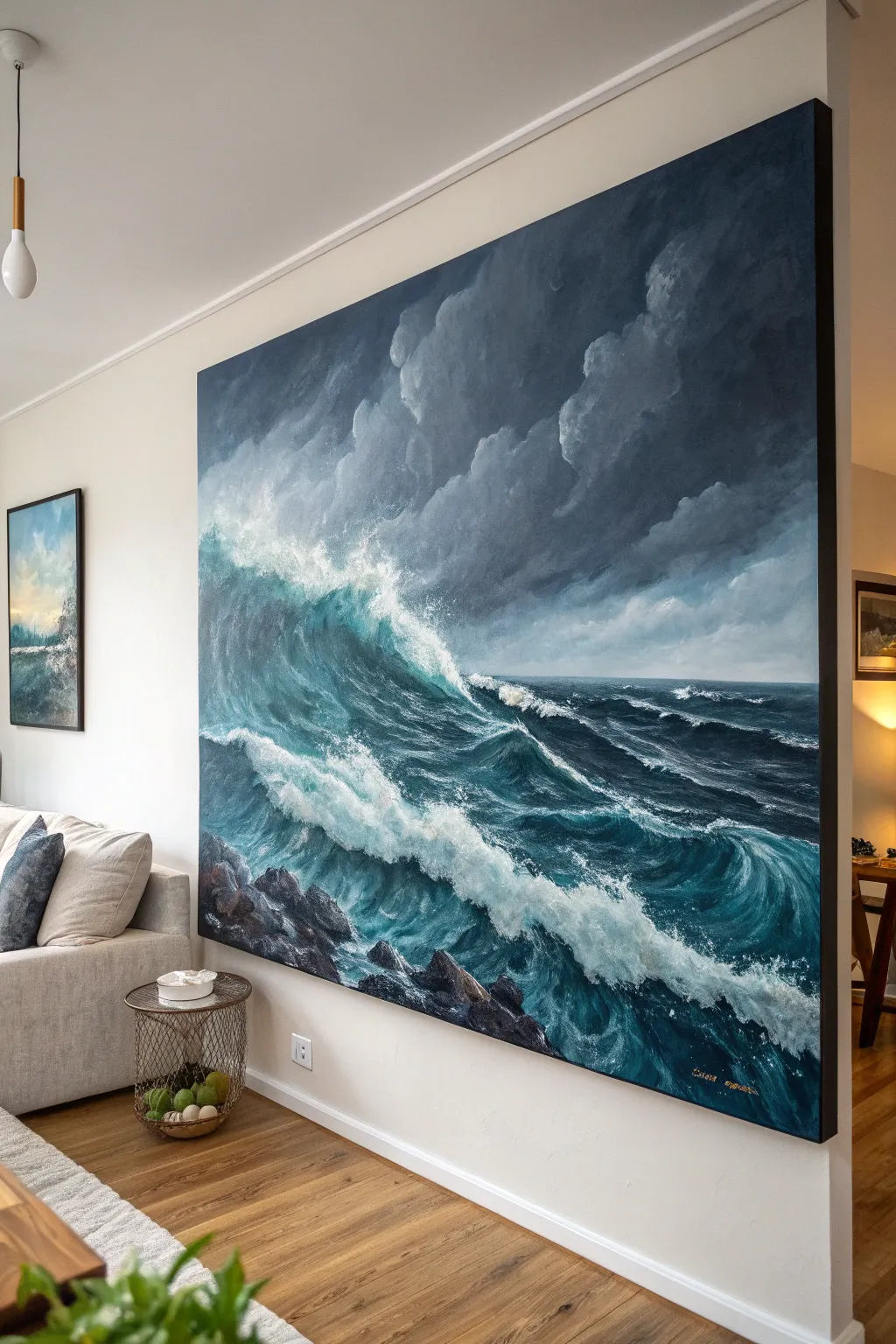
Transform a blank wall with this dramatic, oversized seascape that captures the power of a rolling ocean storm. Using a moody palette of deep teals, indigos, and greys, you will build layers of depth to create a crashing wave that feels like it is moving right into your living room.
Step-by-Step
Materials
- Large gallery-wrapped canvas (highly textured weave is best)
- Heavy body acrylic paints: Titanium White, Mars Black, Phthalo Blue (Green Shade), Ultramarine Blue, Hooker’s Green, Burnt Umber, Payne’s Grey
- Large flat brushes (3-4 inch) for blocking
- Medium filbert brushes for wave formation
- Small round brushes for foam details
- Fan brush (optional)
- Palette knives (large trowel shape and small diamond shape)
- Slow-drying medium or retarder
- Water spray bottle
- Large mixing palette
- Easel or drop cloth for floor painting
Step 1: Planning and Blocking
-
Prepare the workspace:
Since this canvas is massive, ensure you have ample space. If it doesn’t fit on an easel, lay a drop cloth down and paint flat on the floor, or lean it securely against a wall. -
Sketch the composition:
Using a diluted wash of Ultramarine Blue and a large brush, loosely sketch the horizon line about 1/3 of the way up from the bottom. Mark the diagonal flow of the main wave crashing from left to right. -
Mix the sky colors:
Create a gradient for the stormy sky. Mix Mars Black, Titanium White, and a touch of Phthalo Blue to create three shades of slate grey: dark, medium, and light. -
Paint the background sky:
Using your largest flat brush, apply the darkest grey to the top corners, blending into the medium and lighter greys as you move toward the horizon. Use crisscross strokes to mimic turbulent cloud movement. -
Block in the deep water:
Mix a dark ‘ocean deep’ color using Phthalo Blue, Hooker’s Green, and a small amount of Mars Black. Apply this generously to the bottom two-thirds of the canvas, leaving the wave crest area blank for now.
Foam looks stiff?
If your sea foam looks like solid marshmallows, smudge the edges with your finger or a dry rag while wet. Real foam is chaotic and misty, not solid white shapes.
Step 2: Forming the Waves
-
Create the wave body:
While the base layer is still slightly tacky, mix a translucent teal using Phthalo Blue, Hooker’s Green, and white. Paint the curved body of the wave, brushing upward to suggest the water lifting. -
Add deep shadows:
Strengthen the drama by adding pure Payne’s Grey or a mix of Burnt Umber and Blue under the curl of the wave and in the troughs. This contrast makes the water look heavy and voluminous. -
Establish the rocks:
In the bottom left foreground, block in rocky shapes using a mix of Burnt Umber and Black. Use a palette knife here to scrape the paint on, creating sharp, jagged rock textures instantly. -
Blend the horizon:
Softly blur the line where the distant ocean meets the sky. A sharp line looks unnatural; use a dry brush to haze this edge, making it look like rain or mist in the distance.
Step 3: Detailing and Highlights
-
Start the sea foam:
Mix a large amount of Titanium White with a tiny dot of Blue (to keep it cool) and a retarder to slow drying. Using a medium filbert brush, dab the white paint along the crest of the main wave. -
Create movement in the foam:
Don’t just dab; drag the white paint downwards following the curve of the wave. I like to use a quick, sweeping motion here to simulate gravity pulling the water down. -
Add spray and mist:
Load a fan brush or an old bristle brush with thinned white paint. Gently flick the bristles or stipple the canvas where the wave crashes to create the illusion of fine mist and ocean spray. -
Detail the surface water:
Paint thin, vein-like patterns of white foam on the dark water surface in the foreground. These should stretch and warp, following the rolling movement of the secondary waves. -
Highlight the rocks:
With a small brush or the edge of a palette knife, add highlights to the top wet edges of the rocks using a light grey-blue. This grounds the painting and establishes perspective. -
Enhance the clouds:
Return to the sky with a clean, dry brush. Add subtle highlights to the edges of the clouds using a dirty white mix, puffing them up to look more three-dimensional against the dark storm. -
Final glazes:
Once the painting is dry, you can apply a very thin glaze of Phthalo Blue mixed with glazing medium over the shadowed parts of the wave to unify the colors and deepen the transparency.
Add gloss varnish
To make the water look truly wet, apply a high-gloss varnish to just the wave and water areas, leaving the sky satin or matte for contrast.
Hang this expansive piece on a focal wall and enjoy the serene energy of the ocean every day
BRUSH GUIDE
The Right Brush for Every Stroke
From clean lines to bold texture — master brush choice, stroke control, and essential techniques.
Explore the Full Guide
Minimal Mountains in Layers of Mist
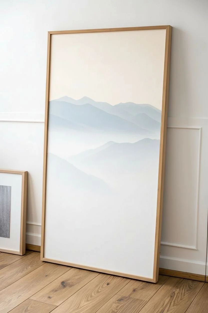
This serene, large-scale canvas captures the breathtaking depth of a mountain range fading into the mist. By mastering atmospheric perspective and a limited color palette, you can create a calming statement piece that brings the quiet majesty of nature indoors.
Step-by-Step Guide
Materials
- Large vertical canvas (approx. 24×36 or larger)
- Acrylic paints: Titanium White, Mars Black, Phthalo Blue (Green Shade), Burnt Umber, Neutral Grey
- Large flat brush (2-3 inch) for blending
- Medium filbert brush (size 8-10)
- Small fan brush or detail liner brush
- Paint palette and water containers
- Slow-drying medium or retarder (optional but recommended)
- Easel or flat working surface
Step 1: Setting the Atmosphere
-
Prime the sky:
Begin by mixing a very pale, warm off-white using Titanium White with the tiniest touching of Burnt Umber. Use your large flat brush to cover the top third of the canvas. -
Create the horizon gradient:
While the sky is still wet, mix a very faint blue-grey. Blend this horizontally into the lower part of the sky area to create a soft transition where the furthest mountains will eventually sit. -
First mountain silhouette:
Mix a light, hazy blue shade. You want this to be barely darker than the sky itself. Using the filbert brush, paint the outline of the most distant mountain peaks about one-third down from the top. -
Fill and fade:
Fill in the shape of that first mountain, but as you move downward, add more white to your brush. Fade the bottom edge of this mountain directly into the white canvas to simulate thick mist.
Step 2: Building Layers & Depth
-
Darken the mix:
For the second layer of mountains, add a little more Phthalo Blue and a touch of Neutral Grey to your previous mixture. It should be visibly darker than the first layer but still quite pale. -
Paint the second ridge:
Paint the jagged top edge of this new mountain range slightly lower than the first, overlapping it. I like to vary the peaks’ height to keep the composition dynamic. -
Create the mist effect:
Just like before, as you paint down the body of this mountain, blend in Titanium White immediately. The bottom of this shape should disappear completely into a white fog bank. -
Mid-ground transition:
Repeat this process for a third and fourth layer. With each new ridge moving closer to the bottom, increase the ratio of Blue and Grey, and decrease the amount of White in the top edge mix. -
Adding texture hints:
On the fourth layer (the mid-ground), start using slightly thicker paint on the ridge tops. Don’t blend it perfectly smooth; let some brushstrokes remain to suggest rough terrain.
Pro Tip: The Mist Trick
Use a specialized ‘slow-dry’ blending medium or a fine mist spray bottle of water. Keeping acrylics wet longer is the secret to getting that perfect, seamless fog gradient at the bottom.
Step 3: The Foreground Details
-
Prepare deep forest tones:
Mix a deep, rich color for the closest hills. Combine Phthalo Blue, Mars Black, and a hint of Burnt Umber to create a dark, cool forest green-blue. -
Paint the main slope:
Establish the large diagonal slope coming in from the left side. Paint the top edge sharp and dark, but allow the bottom right area to stay slightly misty and lighter. -
Texture the hillside:
Using a slightly dry filbert brush, stipple (tap repeatedly) color onto the body of this dark hill. This mimics the texture of thousands of distant trees without painting individual ones. -
Adding the tree line:
Switch to your fan brush or small detail brush. Along the very bottom edge of the canvas, paint the distinct silhouettes of individual pine trees. -
Detailing the pines:
Use the darkest version of your paint mix (almost black) for these trees. Create a vertical line for the trunk, then tap horizontally with the brush tip to build the branches, wider at the bottom. -
Final mist integration:
To make the foreground sit perfectly in the scene, take a clean, dry brush with a tiny amount of white paint. Lightly glaze over the ‘valley’ where the dark trees meet the lighter mist behind them. -
Review and varnish:
Step back to check your atmospheric perspective. Once the painting is fully dry (wait at least 48 hours for thick acrylics), apply a matte varnish to protect the surface without adding glare.
Level Up: Golden Hour
For a sunset vibe, glaze a very watery, transparent layer of unbleached titanium or pale orange over just the sky and the very first mountain layer after they are completely dry.
Hang your finished canvas in a well-lit room and enjoy the feeling of looking out over a vast, peaceful wilderness
Giant Tree Silhouette for a Statement Wall
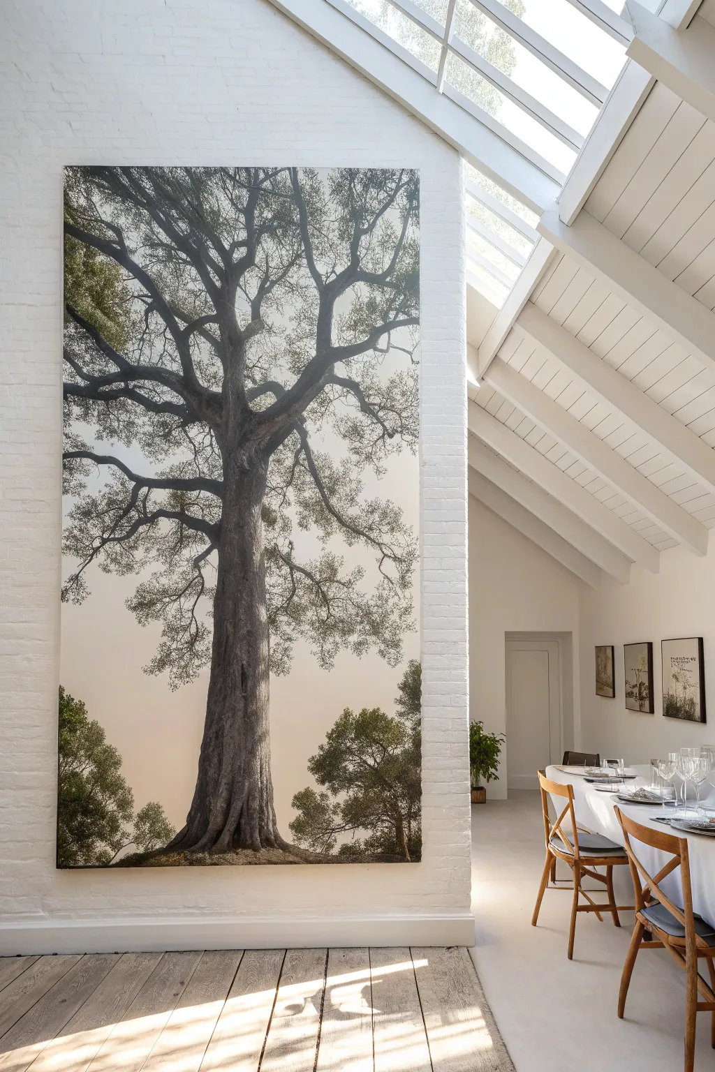
Transform a blank wall into a breathtaking focal point with this floor-to-ceiling tree silhouette painting. This large-scale project captures the serene grandeur of nature using a muted, misty palette and intricate detailing to bring the outdoors inside.
Detailed Instructions
Materials
- Extra-large heavy-duty canvas (custom size, or a painter’s drop cloth for a budget option)
- Wooden stretcher bars or frame lumber (to match canvas dimensions)
- White gesso primer
- Acrylic paints (Titanium White, Mars Black, Burnt Umber, Raw Sienna, Olive Green, Sap Green)
- Large house painting brushes (4-inch and 2-inch)
- Assorted artist brushes (filbert, round, and fine liner sizes)
- Sea sponge or natural texture sponge
- Spray bottle with water
- Projector (optional but highly recommended)
- Chalk or pastel pencil for sketching
- Matte acrylic medium
- Matte varnish
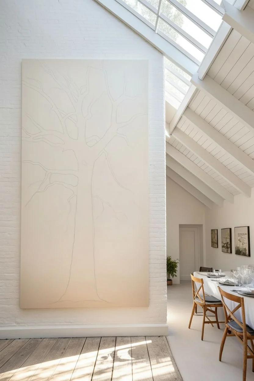
Step 1: Preparation and Background
-
Prepare the canvas:
Stretch your canvas tightly over your custom frame or stretcher bars. Since this piece is enormous, ensure the frame is cross-braced for stability. Prime the entire surface with two coats of white gesso, sanding lightly between coats for a smooth finish. -
Mix the sky gradient:
Create a large volume of the background color. Mix Titanium White with a tiny touch of Burnt Umber and Raw Sienna to create a warm, pale ‘parchment’ or misty sky tone. It should be off-white, not stark white. -
Paint the background:
Using the large house painting brush, apply the background color. Start from the bottom with a slightly darker mix and gradually add more white as you move up to create a very subtle atmospheric fade. Let this dry completely. -
Outline the tree:
Project an image of a large oak or elm tree onto the canvas to get the proportions right. Trace the main trunk and major branches using a light chalk or pastel pencil. If you don’t have a projector, sketch a grid lightly and draw section by section.
Step 2: Painting the Trunk and Architecture
-
Block in the trunk base:
Mix Mars Black with Burnt Umber to make a deep charcoal brown. Using a large filbert brush, block in the main shape of the trunk, starting wide at the roots and narrowing as you go up. -
Add texture to the bark:
While the base coat is still slightly tacky, mix a lighter grey-brown (add White to your dark mix). Dry-brush this vertically up the trunk to simulate the rough texture of bark, highlighting the ridges where light would hit. -
Paint the primary branches:
Extend the dark mixture out into the main thick branches. Watch the ‘elbows’ and turns of the wood; trees rarely grow in straight lines. Keep the edges slightly organic, not perfectly smooth. -
Develop secondary branches:
Switch to a smaller round brush. Paint the medium-sized branches splitting off from the main limbs. I like to add water to the paint here to improve the flow for longer strokes. -
Detail the fine twigs:
Using your finest liner brush and thinned paint (inky consistency), add the intricate network of twigs at the ends of the branches. A shaky hand actually helps here to make the growth look natural.
Natural Texture Hack
Crumple a piece of plastic wrap, dip it into your paint, and dab it onto the canvas. This creates unpredictable, organic leaf patterns that look more realistic than uniform brush or sponge marks.
Step 3: Foliage and Depth
-
Mix leaf colors:
Prepare three shades of green: a deep shadow green (Olive Green + Black), a mid-tone (Sap Green + Burnt Umber), and a highlight (Sap Green + White/Yellow). -
Apply base foliage:
Dip a natural sea sponge into the darkest green mixture. Dab lightly to create clusters of leaves at the ends of the branches and at the base of the tree. Don’t overdo it; keeping the foliage sparse maintains the airy, silhouette look. -
Layer the mid-tones:
Once the dark layer is dry, sponge the mid-tone green over the top, focusing on the upper sides of the leaf clusters where light would naturally fall. -
Refining the bottom landscape:
At the very bottom, paint larger, distinct leafy bushes using the filbert brush to ground the tree. Use the sponge to blend the edges of these bushes into the ‘mist’ found in the negative space. -
Add atmospheric perspective:
Mix a glaze using Matte Medium and a tiny drop of the background wall color. Lightly glaze over the furthest/smallest branches to push them back into the distance, making the main trunk pop forward. -
Blend the roots:
Soften the bottom edge where the roots meet the ‘ground’ by stippling some of the background color over the bottom of the trunk, simulating grass or soil covering the base. -
Final highlights:
Add tiny touches of the lightest green mix to the very tips of the leaf clusters and the edge of the trunk for dimension. -
Seal the artwork:
Allow the painting to cure for at least 24 hours. Apply a consistent coat of matte varnish with a wide clean brush to protect giant surface and unify the sheen.
Level Up: 3D Effect
Mix modeling paste into your bark-colored paint before applying the trunk layer. Use a palette knife to physically sculpt rough bark textures that will catch the room’s light.
Once hung, the scale of this piece will bring a quiet, majestic atmosphere to your living space

PENCIL GUIDE
Understanding Pencil Grades from H to B
From first sketch to finished drawing — learn pencil grades, line control, and shading techniques.
Explore the Full Guide
City Street Scene With Rainy Reflections
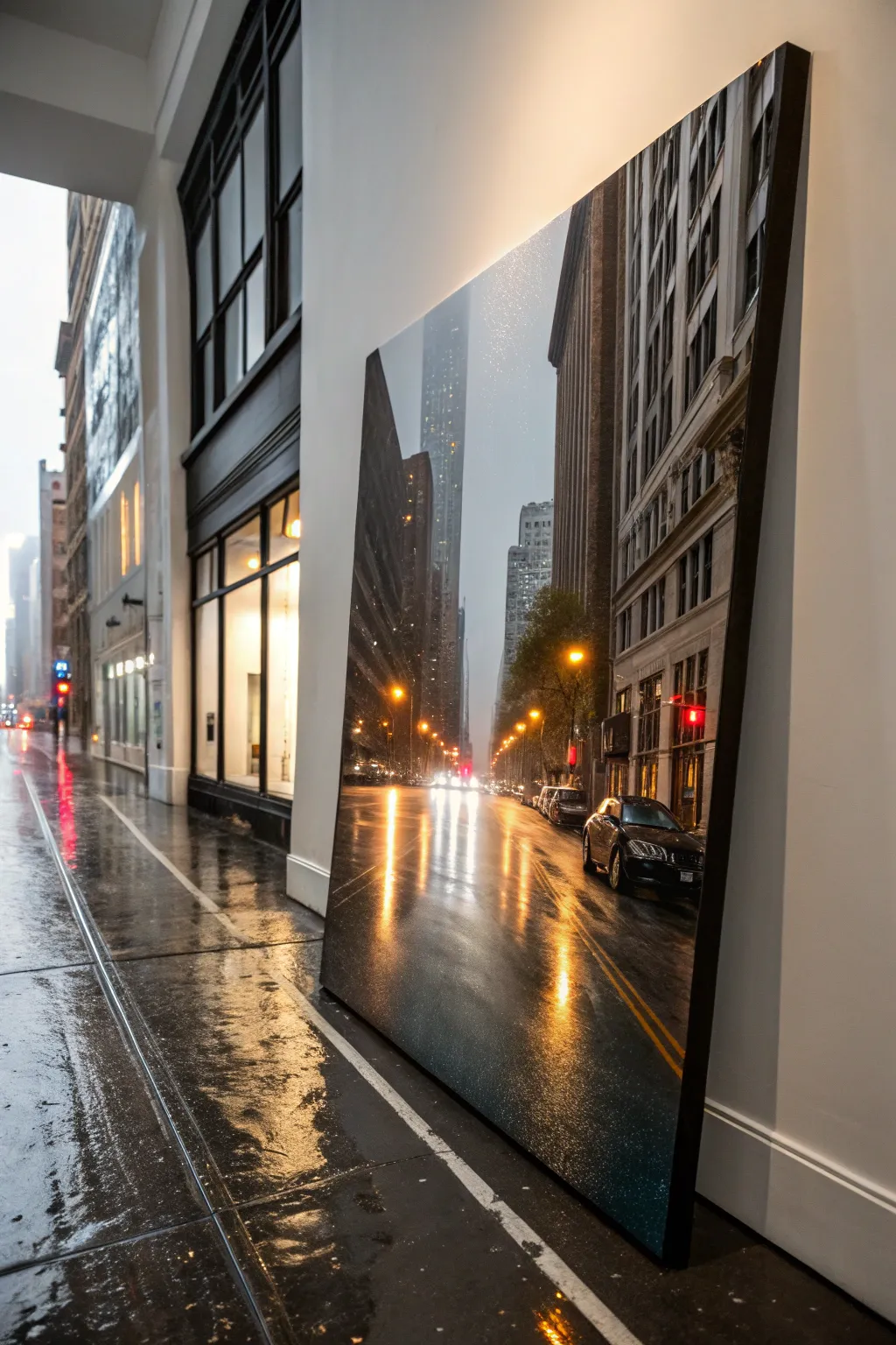
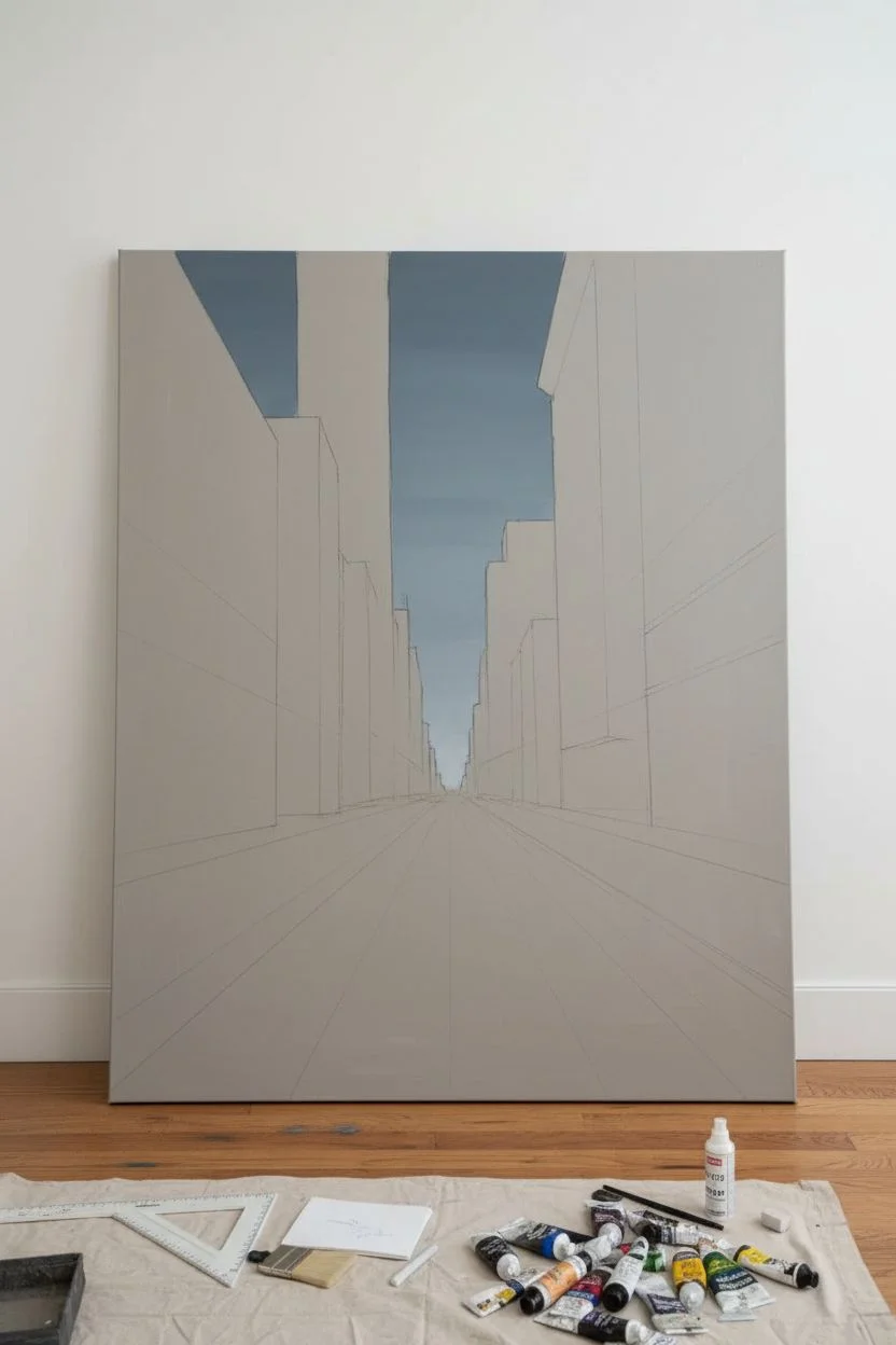
Capture the moody romance of a metropolis in the rain with this large-scale acrylic painting project. You’ll master the art of wet-on-wet reflections and dramatic perspective to create a window into a bustling, glowing city street.
Step-by-Step
Materials
- Large stretched canvas (at least 36×48 inches)
- Heavy body acrylic paints (Mars Black, Titanium White, Paynes Grey, Burnt Umber, Cadmium Yellow, Napthol Crimson, Phthalo Blue)
- Set of flat synthetic brushes (sizes 1-inch to 2-inch)
- Detail round brushes (sizes 0 and 2) for lights
- Fan brush or soft blender brush
- Acrylic glazing medium
- T-square or long ruler
- Chalk or pastel pencil for sketching
- Palette knife
- Spray bottle with water
Step 1: Setting the Scene
-
Prime the Surface:
Even if your canvas is pre-primed, apply an additional coat of gesso mixed with a tiny drop of grey paint. This creates a neutral mid-tone that makes judging values easier than starting on stark white. -
Establish the Perspective:
Locate your vanishing point. For this street view, place a small mark near the center-bottom third of the canvas. Use your T-square and chalk to lightly draw lines radiating outward from this point to define the street edges and building heights. -
Sketch the Skyline:
Block in the major shapes of the buildings. Don’t worry about windows yet; focus on the vertical dominance of the skyscrapers on the left and right, leaving a channel of sky in the center. -
Paint the Sky Gradient:
Mix a muted grey-blue using Phthalo Blue, a touch of Black, and White. Paint the sky area, keeping it lighter near the horizon line and darker at the very top. Blend it smoothly while wet.
Glazing Works Magic
Don’t try to paint reflections in one go. Build them up with 3-4 layers of transparent glazing liquid mixed with color. This creates depth that solid paint can’t achieve.
Step 2: Blocking and Architecture
-
Underpaint the Buildings:
Using a mix of Burnt Umber and Paynes Grey, fill in the darkest silhouettes of the buildings. The paint should be fairly opaque here to block out the light. -
Define the Street Base:
Paint the asphalt using a dark grey mixture (Black + White). Since the street is wet, keep your brushstrokes vertical towards the viewer to mimic the direction of reflections, rather than horizontal. -
Add Building Depth:
Once the silhouettes are dry, use a lighter grey-brown to paint the side planes of the buildings that catch the ambient city light. Use the straight edge to ensure your vertical lines remain perfectly perpendicular. -
Create Windows:
Instead of painting every single window, suggest them. Use a small flat brush and a mix of watery light grey to dab rows of rectangles. Let the paint fade out in areas to suggest distance and atmosphere.
Step 3: Lights and Reflections
-
Paint Streetlights:
Mix a warm, glowing orange using Cadmium Yellow and a bit of Crimson. Place dots of paint where the street lamps are located. Start small; you can make the glow bigger later. -
Add Car Taillights:
Use pure Red or Crimson for the taillights of cars in the distance. These should be slightly blurred dabs of paint rather than crisp distinct shapes. -
Start the Reflections:
This is the crucial step. Mix a glazing medium with the same orange and red colors used for the lights. Drag this transparent color vertically down from the light source onto the dark grey pavement. -
Intensify the Glow:
Go back to your light sources. Add a tiny dot of pure Titanium White mixed with a little Yellow into the center of each lamp to make them look blindingly bright. -
Enhance Wet Pavement:
To make the ground look slick, add streaks of lighter grey and white vertical highlights in the road. These represent the sky reflecting on the wet tarmac. Keep the edges soft.
Level Up: Neon Signs
Add a localized store sign in bright neon pink or green on one of the lower building facades. Mirror that exact neon color in a puddle on the sidewalk below for realism.
Step 4: Final Details
-
Refine the Cars:
Use black to sharpen the silhouette of the parked cars on the right. Add subtle highlights on the roofs and hoods where the streetlamps hit the wet metal. -
Atmospheric Mist:
I like to create a very thin glaze of Titanium White and water. Lightly brush this over the distant buildings at the end of the street to push them back and create a foggy, rainy atmosphere. -
Traffic Lines:
Paint the double yellow lines on the road. Remember to break the lines up and distort them slightly; they shouldn’t look like perfect stripes because they are being viewed through a wet, uneven surface. -
Rain Texture:
Use an old toothbrush or a stiff bristle brush dipped in watery white paint. Flick it very gently over the canvas to create tiny speckles that simulate falling rain or texture on the lens. -
Varnish:
Once completely dry (wait at least 24 hours), apply a high-gloss varnish. This is essential for a rainy scene as it makes the darks deeper and gives the whole painting a wet, reflective sheen.
Hang your massive canvas in a well-lit area where the gloss finish can catch the light and bring the rain to life
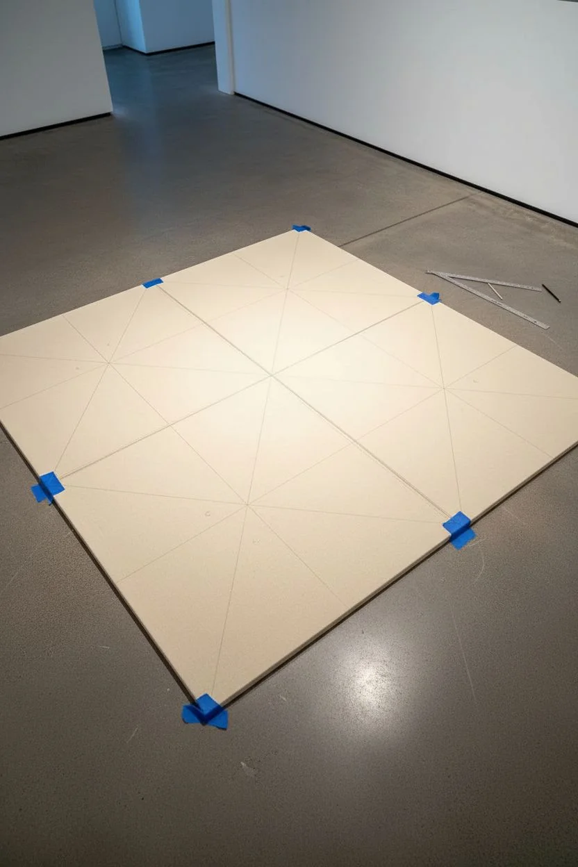
Large Geometric Shapes With Clean Edges
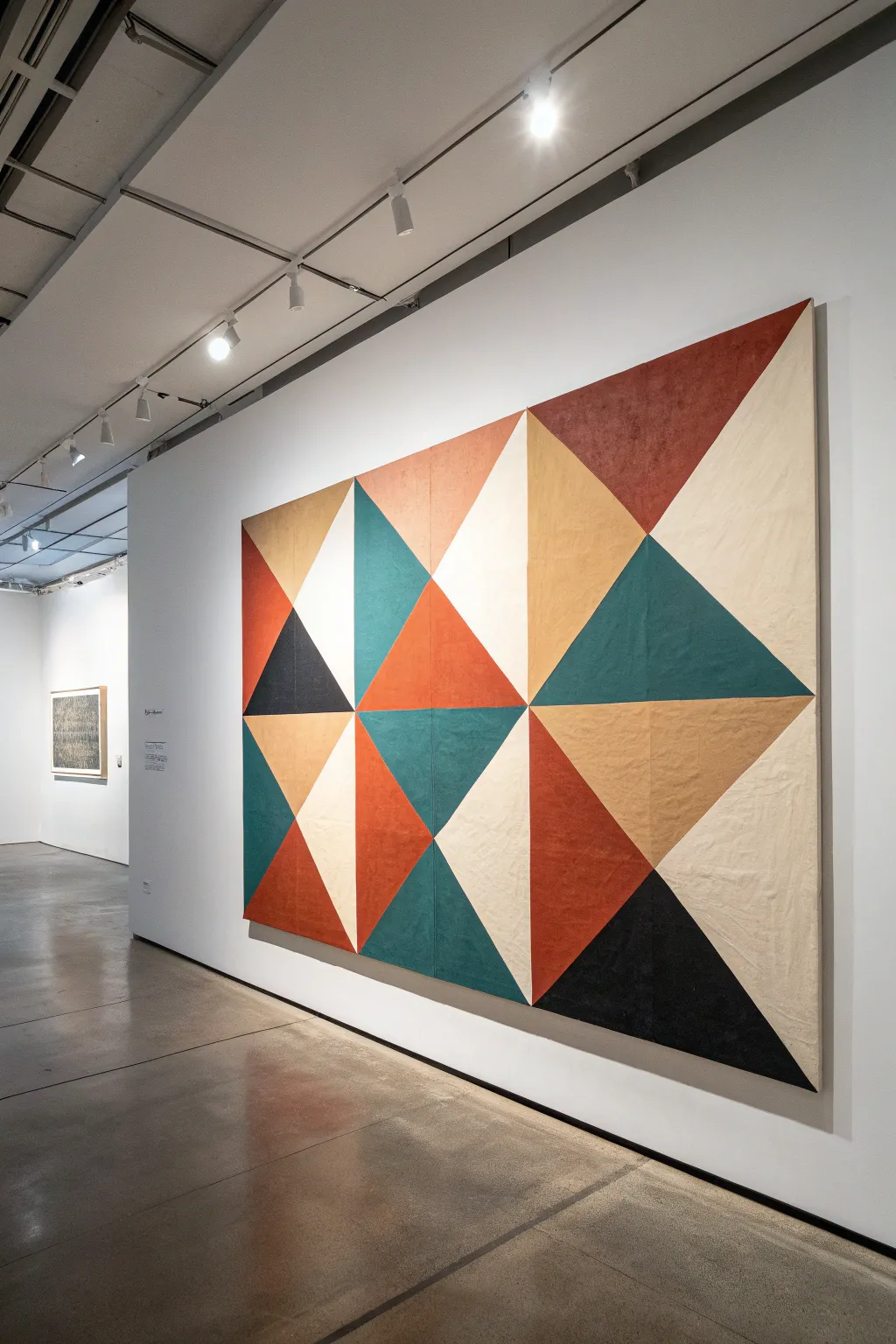
Transform a blank canvas into a striking focal point with this large-scale geometric design. Featuring crisp triangles in warm earth tones like rust, ochre, teal, and charcoal, this piece mimics the cozy, structured look of a modern quilt.
Step-by-Step Tutorial
Materials
- Large heavy-duty canvas (unstretched or stretched, 48″x72″ minimum)
- Acrylic paints (Rust, Ochre/Mustard, Dark Teal, Charcoal Black, Warm Cream)
- Matte medium or fabric medium
- High-quality painter’s tape (1-inch width)
- Long metal ruler or T-square
- Pencil and eraser
- Flat synthetic brushes (1.5 inch and 2 inch)
- Drop cloth
- Sealant or clear matte varnish (optional)
Step 1: Planning and Gridding
-
Prepare your surface:
Lay your large canvas flat on a clean floor or a very large table. If the canvas is unstretched like a tapestry, tape the corners down to the floor to keep it taut while you work. -
Base coat application:
For that warm, raw linen look, mix your Warm Cream paint with a little water or fabric medium to create a wash. Apply this over the entire canvas to knock back the bright white and create a unified undertone. -
Measure the grid:
Once dry, use your ruler to mark a grid. Divide the width into four equal columns and the height into three equal rows. Lightly mark these grid lines with a pencil. -
Draw the diagonals:
Inside each rectangular grid box, draw a single diagonal line connecting opposite corners. Alternate the direction of the diagonal in adjacent boxes to create dynamic, pinwheel-style interactions. -
Map your colors:
Take a moment to plan your color placement. Sketch a small version on paper first, or lightly write a letter (like ‘R’ for Rust, ‘T’ for Teal) inside each triangle on the canvas to avoid confusion later.
Bleed-Proof Lines
Always paint a thin layer of your BASE color over the tape edge first. This fills any gaps with the background color, meaning your top color will have a perfect, razor-sharp line every time.
Step 2: Creating Crisp Shapes
-
Tape the first set of triangles:
Apply painter’s tape along the OUTSIDE lines of your first chosen color group (e.g., all the Rust triangles). Ensure the tape is firmly pressed down to prevent bleeding. -
Seal the tape edges:
Here I prefer to brush a thin layer of matte medium explicitly over the tape edge. This seals the gap; if any seepage occurs, it’s clear medium, not colored paint. -
Mix your first color:
Mix the Rust acrylic paint with a tiny bit of water to improve flow, or texture paste if you want a rougher surface. It needs to be opaque but smooth. -
Paint the first color:
Fill in the taped triangles with your Rust mixture. Use long, confident strokes with your flat brush, working from the tape inward to avoid pushing paint under the edge. -
Remove tape while damp:
Carefully peel back the tape while the paint is still slightly tacky to ensure the cleanest edge. Let this color dry completely before moving on.
Uneven Coverage?
If your large color blocks look streaky or patchy, switch to a small foam roller instead of a brush. It applies thin, even layers quickly and eliminates visible brushstrokes.
Step 3: Filling the Composition
-
Tape for the second color:
Repeat the taping process for the Dark Teal sections. Be very gentle when applying tape over the now-dry Rust sections; stick the tape to your pants first to reduce its tackiness so it doesn’t pull up paint. -
Paint the teal sections:
Apply the Dark Teal paint, ensuring consistent coverage. If streaks appear, let the first coat dry and apply a second thin coat. -
Add the charcoal accents:
Identify the few triangles meant for Charcoal Black. These dark anchors give the piece depth. Tape, seal, and paint these just as before. -
Apply the ochre tones:
Fill in the remaining scheduled triangles with the Ochre/Mustard hue. This yellow-brown bridges the warm rust and cool teal beautifully. -
Refine the negative space:
The remaining triangles should stay the cream color of your base coat. If they got smudged during the process, carefully touch them up with a small brush and your original cream mix. -
Check the edges:
Inspect all your lines. If any paint bled under the tape, use a small stiff brush with a tiny bit of water to scrub it back, or touch it up with the adjacent color. -
Final sealing:
Once the entire painting has cured for 24 hours, apply a clear matte varnish across the whole surface to unify the sheen and protect the pigments from dust.
Now you have a stunning, gallery-worthy geometric piece ready to hang and admire


Textured Palette-Knife Abstract With Thick Movement
Recreate the organic beauty of geological layers with this stunning, large-scale abstract painting. Using heavy texture paste and a limited palette of ochres and creams, you’ll sculpt a statement piece that brings the raw elegance of a canyon wall right into your living space.
How-To Guide
Materials
- Large vertical canvas (approx. 36×60 inches)
- Heavy body acrylic paints (Titanium White, Unbleached Titanium, Raw Sienna, Burnt Sienna, Yellow Ochre)
- Modeling paste or texture gel (heavy or extra heavy)
- Large palette knives (trowel shape and long straight shape)
- Wide gesso brush
- Spray bottle with water
- Mixing palette or disposable plates
- Drop cloth
- Clean rags or paper towels
Step 1: Planning and Foundation
-
Prepare your workspace:
Lay down a drop cloth in a well-ventilated area. This project can get messy due to the amount of paste used, so protect your floors well. -
Prime the canvas:
Even on pre-primed canvas, apply a fresh coat of white gesso mixed with a tiny drop of Unbleached Titanium. This creates a warm, neutral off-white base that prevents the stark white canvas from peeking through later. -
Sketch the flow:
Lightly sketch the main diagonal ‘fault lines’ using a pencil or diluted Raw Sienna paint. Mimic the upward sweeping diagonal motion seen in the inspiration image, creating large, uneven channels where the darker colors will eventually sit.
Pro Texture Tip
Mix a handful of clean sand or coffee grounds into your darkest texture paste. This adds a gritty, realistic ‘sediment’ look to the deep fault lines.
Step 2: Building the Texture
-
Mix the texture paste:
Scoop a large amount of modeling paste onto your palette. Divide it into three piles. Keep one white, mix one with Unbleached Titanium (cream), and the third with a blend of Yellow Ochre and White (warm beige). -
Apply the base texture:
Using your largest trowel palette knife, apply the plain white and cream texture pastes to the canvas. Focus on the lighter areas between your sketched lines. Don’t smooth it out; slap it on thick to create valleys and ridges. -
Create directional movement:
While the paste is wet, use the long edge of the knife to scrape and drag the paste in an upward diagonal direction. This establishes the ‘grain’ of the rock formation. -
Refine the ridges:
Add extra dollops of the warm beige paste to the raised areas. I like to press the knife flat against the canvas and pull up sharply to create jagged peaks that catch the light. -
Add heavy structural lines:
Use the edge of your knife to carve deep grooves into the wet paste along your initial sketch lines. These grooves will later hold the darker pigments. -
First drying phase:
Let this thick texture layer dry completely. Depending on humidity and thickness, this creates a solid foundation and may take anywhere from 12 to 24 hours. Be patient; the surface must be hard.
Level Up: Metallic Veins
Once dry, use a fine liner brush to apply liquid gold leaf sparingly along the darkest crevices. It mimics mineral deposits found in natural stone.
Step 3: Adding Color to the Strata
-
Prepare the wash:
Mix Raw Sienna and water to create a fluid, ink-like consistency. You want the paint to be transparent so the texture shows through. -
Apply the mid-tones:
Brush the watered-down Raw Sienna into the textured grooves and the lower sections of the rock shapes. Use a rag to immediately wipe back the high points, leaving the color settled in the crevices. -
Deepen the contrast:
Mix Burnt Sienna with a tiny bit of Raw Sienna for a rich, rust color. Apply this sparingly to the deepest ‘fault lines’ you carved earlier, intensifying the shadows. -
Blend the transitions:
Use a damp sponge or clean brush to soften the edges where the rust color meets the creamy base texture. The transition should look eroded and natural, not like a hard painted stripe. -
Highlighting:
Take straight Titanium White paint on a dry brush or clean palette knife. Lightly skim it over the very highest peaks of the dried texture. This ‘dry brushing’ technique highlights the physical topography of the piece. -
Adjusting warmth:
If the painting feels too cool, create a very dilute wash of Yellow Ochre and glaze it over large sections of the white area. Wipe it back almost entirely so it just stains the surface with a warm glow.
Step 4: Finishing Touches
-
Step back and assess:
Hang the painting or prop it vertically. Step back 10 feet. Look for areas where the ‘flow’ is interrupted or where the contrast looks too uniform. -
Final texture edit:
If certain areas look too flat, you can add a final layer of thick, colored paint (mixed with paste) directly on top of the dry surface to build up crucial focal points. -
Seal the work:
Once fully dry (give it another 24 hours), apply a matte varnish. A glossy finish would distract from the earthy, stone-like quality we are aiming for. -
Frame it:
Install the canvas into a simple floating wooden frame, preferably in a light oak tone, to complement the organic palette and complete the high-end look.
Step back and admire how your new geological masterpiece transforms the room with its quiet, rugged elegance
Oversized Botanical Line Art Over a Washy Background
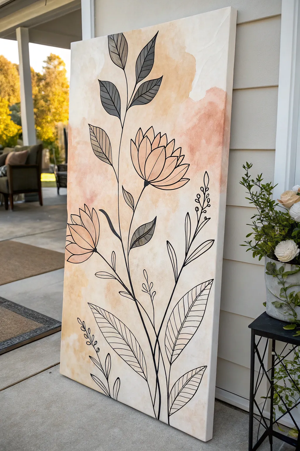
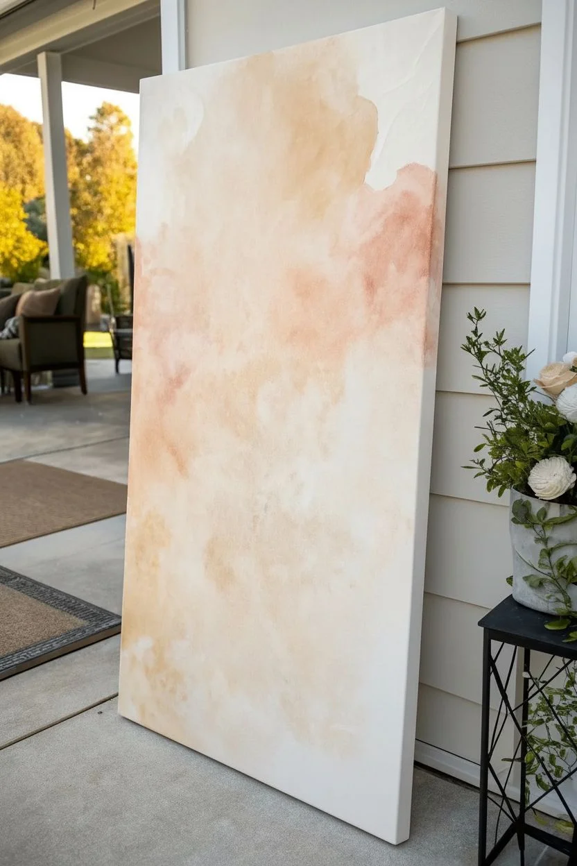
Transform a blank, oversized canvas into a piece of modern art with this simple yet striking botanical project. The combination of a soft, watercolor-style wash background and crisp black line work creates a sophisticated boho aesthetic that looks far more expensive than it is.
Step-by-Step
Materials
- Large stretched canvas (24×48 inches or larger)
- Acrylic paints (Titanium White, Burnt Sienna, Yellow Ochre, Raw Umber)
- Black acrylic paint or a broad black acrylic paint marker
- Water spray bottle
- Wide flat wash brush (2-3 inches)
- Large round synthetic brush (size 10 or 12)
- Small round detail brush (size 2 or 4)
- Mixing palette or paper plates
- Pencil for sketching
- Rags or paper towels
- Jar of water
Step 1: Creating the Background Wash
-
Prepare your palette:
Squeeze out generous amounts of Titanium White, Burnt Sienna, and a touch of Yellow Ochre onto your palette. We are aiming for a warm, earthy peach tone, so mix a large amount of white with a small dab of Burnt Sienna until you get a soft blush color. -
Wet the canvas:
Take your spray bottle and lightly mist the center and upper portions of the canvas with clean water. This helps the acrylic paint flow and mimic the transparency of watercolors. -
Apply the first wash:
Load your wide wash brush with the blush mixture and a lot of water. Apply it to the canvas in organic, cloudy patches, starting near the top right and working diagonally down. -
Add depth with darker tones:
While the first layer is still damp, mix a slightly darker tan using more Yellow Ochre and a tiny dot of Raw Umber. Dab this into the wet areas, allowing the colors to bleed and blend naturally. Avoid hard edges. -
Create negative space:
Leave large sections of the canvas unpainted or very lightly tinted with watery white paint. The contrast between the stained areas and the raw canvas gives that airy feel. -
Soften edges:
Use a damp, clean rag to gently blot the edges of your painted patches. This feathers the paint out so it fades into the canvas white rather than stopping abruptly. -
Let it dry completely:
This step is crucial. Allow the background to dry fully—for at least an hour or two—before attempting any line work. Alternatively, use a hairdryer on a cool setting to speed things up.
Paint Bloomed Too Much?
If your background wash spreads too far, use a dry, clean brush to soak up excess water instantly. You can also paint over mistakes with Titanium White once dry.
Step 2: Drafting the Botanical Design
-
Sketch the main stems:
Lightly sketch a long, curving S-shape starting from the bottom center, reaching up towards the top left. Add a secondary stem branching off to the right. -
Position the blooms:
Draw rough circles where your main flowers will sit. Place one large bloom near the top center and a slightly smaller one lower down on the left side to balance the composition. -
Outline the leaves:
Sketch large, pointed oval shapes for the leaves. Vary their sizes, placing larger leaves at the bottom and smaller ones near the tips of the stems. -
Refine the flower shapes:
Inside your rough circles, sketch the petals. These flowers resemble stylized lotuses or zinnias—start with a central petal and add curved petals fanning out on either side.
Add Metallic Flair
For a luxe touch, trace inside a few of the flower petals or along one side of the main stem with a gold leaf pen or metallic gold paint.
Step 3: Painting the Line Art
-
Prepare the black paint:
Mix your black acrylic paint with a few drops of water to improve its flow. It should have an ink-like consistency that glides smoothly off the brush. -
Paint the main stems:
Using your large round brush, trace over your pencil lines for the main stems. Apply firm pressure for a thick line at the base, lifting slightly as you go up for a tapered effect. -
Outline the flowers:
Carefully outline the petals of your flowers. I find it easiest to pull the brush towards me for better control over curves. -
Detail the leaves:
Outline the leaf shapes. For the veins, switch to your smaller detail brush to create delicate lines inside the leaves. -
Fill selected leaves:
Choose a few leaves, particularly those near the top, to fill in completely with a watery grey wash. Mix black with plenty of water and paint inside the lines for a semi-transparent ‘shadow’ look. -
Add accent foliage:
Draw small, sprig-like branches with tiny buds or leaves near the bottom and right side. These delicate fillers add texture and prevent the design from looking too heavy. -
Check line weight consistency:
Step back and look at the painting. Thicken any lines that look too spindly compared to the rest of the piece. The lines should feel bold and intentional. -
Erase pencil marks:
Once the black paint is bone dry (give it plenty of time!), gently erase any visible pencil sketch lines with a kneaded eraser.
Hang your new oversized artwork in a bright room and enjoy the calm, organic vibes it brings to your space
Three-Color Dip or Fade for an Easy Huge Impact
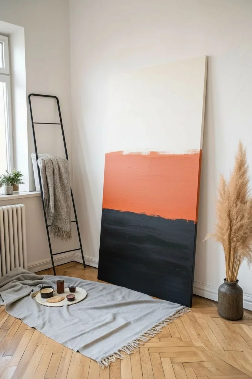
Achieve a sophisticated gallery look with this oversized gradient artwork that seamlessly blends deep charcoal into warm terracotta and soft cream. This technique relies on wet-on-wet blending to create a smooth, cloud-like transition that feels both modern and serene.
Step-by-Step Guide
Materials
- Large stretched canvas (e.g., 36” x 72” or custom framed)
- Gesso (if canvas is unprimed)
- Acrylic paints: Titanium White, Burnt Sienna, Unbleached Titanium, Mars Black
- Slow-drying medium or retarder
- Large flat paint brushes (3-4 inch width)
- Large soft blending brush (dry mop brush or clean house painting brush)
- Water spray bottle (mister)
- Drop cloth
- Palette or paper plates
- Paper towels
Step 1: Preparation and Base
-
Prepare your space:
Since this canvas is large, you might want to work vertically by leaning it against a wall protected by plastic, or lay it flat on a table. If working vertically, ensure your floor is well-covered. -
Prime the canvas:
Even if your canvas is pre-primed, adding a fresh coat of white gesso creates a uniform texture. Apply a smooth layer and let it dry completely before starting with colors. -
Mix your palette:
Prepare three large piles of paint. The top color is Titanium White mixed with a tiny drop of Unbleached Titanium for warmth. The middle is Burnt Sienna mixed with white to create a terracotta orange. The bottom is Mars Black. -
Add blending medium:
Acrylics dry fast, which is the enemy of smooth gradients. Mix a generous amount of slow-drying medium or retarder into each of your three paint piles. This buys you precious time for blending.
Keep It Wet
Work quickly! If the paint skins over, blending stops. Keep a spray bottle handy to mist the canvas every few minutes to keep the acrylics open and workable.
Step 2: Applying the Color Blocks
-
Apply the dark base:
Start at the bottom of the canvas. Using a large flat brush, paint the bottom third with your black mixture. Use strong horizontal strokes for full coverage. -
Apply the middle tone:
Clean your brush or switch to a fresh one. Paint the middle section with your terracotta mixture. Leave a small gap of about 2 inches between the wet black paint and this new orange section to prevent premature muddying. -
Apply the top light tone:
Using a clean brush, paint the top third of the canvas with your creamy white mixture. Again, leave a small gap between this layer and the terracotta section below it. -
Mist the canvas:
Before you start blending, lightly mist the entire canvas with your water spray bottle. You want the paint surface damp and glistening, but not dripping wet.
Step 3: The Blending Process
-
Bridge the bottom gap:
Take the brush used for the terracotta color. Dip one corner slightly into the black paint. Paint horizontal strokes in the gap between the black and orange sections to marry them. -
Blend dark to medium:
Using a large, clean, dry soft brush (a blending brush), stroke horizontally back and forth right over the transition line where black meets orange. Wipe the brush on a paper towel frequently to remove excess paint. -
Bridge the top gap:
Switch to a brush with the cream color. Drag it slightly down into the top edge of the terracotta section to close the upper gap. -
Blend medium to light:
Use a fresh dry blending brush for this lighter transition. brush horizontally rapidly over the line where cream meets terracotta. I find that using a very light hand here prevents brush marks. -
Smooth the gradient:
Once the gaps are closed, look for harsh lines. Use a very soft, dry brush to gently sweep back and forth across the entire width of the canvas, working from the dark section slowly up to the light section. -
Check for consistency:
Step back five feet to view the whole canvas. If the transition looks choppy, lightly mist that area again and gently work the colors together with the dry brush. -
Paint the edges:
Don’t forget the sides of the canvas depth. Carry the gradient colors around the edges for a professional, gallery-wrapped finish. -
Let it cure:
Allow the painting to dry undisturbed for at least 24 hours. Because we used a retarder and water, the drying time will be significantly longer than standard acrylics.
Fixing Muddy Colors
If the blending area turns gray or muddy, stop. Let that layer dry completely, then apply a thin glaze of the pure color (orange or black) over the muddy spot to restore vibrancy.
Once dry, hang your massive masterpiece and enjoy the warm, calming atmosphere it brings to your room
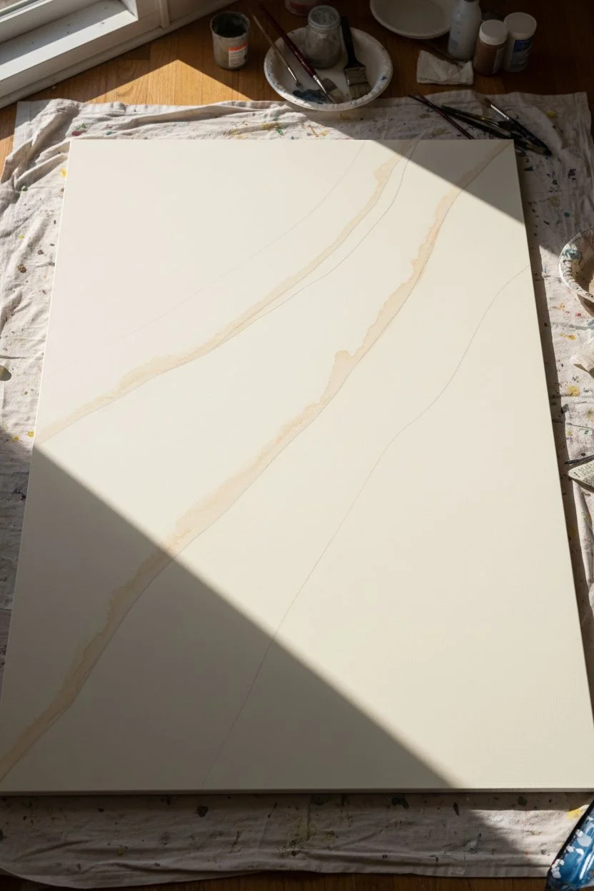
Oversized Desert Dunes With Soft Shadows
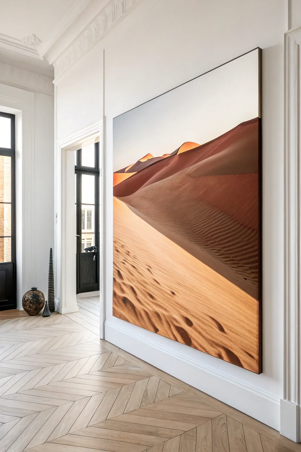
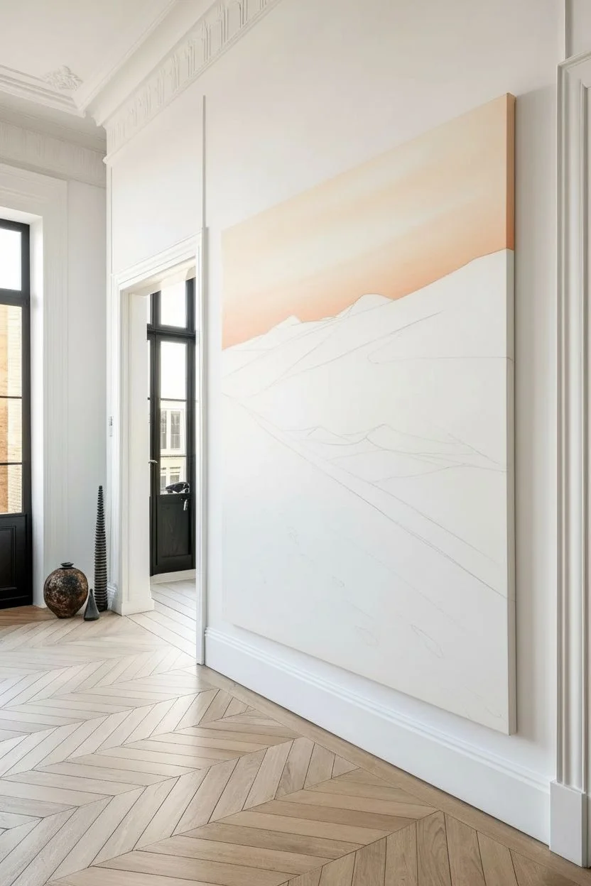
Bring the warmth and vastness of the Sahara into your home with this monumental desert landscape painting. This project focuses on capturing soft gradients, dramatic shadows, and the intricate texture of wind-swept sand on an impressive scale.
Step-by-Step
Materials
- Oversized gallery-wrapped canvas (vertical orientation)
- Acrylic paints: Titanium White, Burnt Sienna, Burnt Umber, Yellow Ochre, Cadmium Orange, Unbleached Titanium
- Large flat brushes (3-4 inch) for blocking
- Medium filbert brushes for curves
- Small round brushes for details
- Fan brush (optional)
- Slow-drying medium or retarder
- Palette knife
- Easel or large wall space with drop cloth
- Pencil for sketching
- Water spray bottle
Step 1: Preparation and Sky
-
Prepare the workspace:
Since this is an oversized canvas, ensure you have ample room to step back. If working vertically, secure the canvas firmly against a wall or heavy-duty easel. Lay down drop cloths to catch drips. -
Sketch the horizon:
Lightly sketch the main dune lines using a pencil. Focus on the grand, sweeping curve that divides the canvas diagonally from the bottom left to the upper right. Keep the lines flowing and organic. -
Mix the sky gradient:
Prepare a large amount of Titanium White with a tiny touch of Unbleached Titanium for warmth. For the lower horizon line, mix a soft, pale orange using White and a dot of Cadmium Orange. -
Paint the sky:
Starting from the top, apply the white mixture with a large flat brush, working your way down. As you approach the dune peaks, blend in the pale orange mixture while the paint is still wet to create a seamless atmospheric glow.
Step 2: Blocking in the Dunes
-
Mix shadow colors:
Create a deep, rich reddish-brown for the shadow side of the dunes by mixing Burnt Sienna, Burnt Umber, and a touch of Cadmium Orange. You want a color that feels like warm terracotta. -
Block the main shadow:
Apply the dark shadow color to the upper right quadrant of the dune layout. Follow the curve of your sketch, ensuring the edge is sharpest at the crest where the light hits. -
Mix the sunlit sand color:
Combine Yellow Ochre, Unbleached Titanium, and White to create a bright, sandy beige. This will be the base for the large foreground area. -
Paint the lit foreground:
Fill the bottom left section with the sunlit sand mixture. Use broad, sweeping strokes that mimic the direction of the wind—generally moving diagonally upward. -
Create the crest highlight:
Along the sharpest ridge where the shadow meets the light, paint a thin, bright line of virtually pure White mixed with Yellow Ochre to simulate the sun catching the very edge of the sand.
Use a Slow-Dry Medium
Acrylics dry fast, which makes large blending hard. Mixing a retarder into your paint keeps it workable longer, allowing for smoother gradients in the sky and sand.
Step 3: Adding Texture and Detail
-
Create mid-tones:
Mix a transition color—slightly darker than your sunlit sand but lighter than the deep shadow. Apply this gently near the bottom of the shadow area where reflected light might bounce back up. -
Painting the ripples:
Mix a glaze of Burnt Umber and a retarder or water to make it translucent. Using a medium filbert brush, gently paint rows of rhythmic, horizontal lines across the shadow side of the dune to represent ripples. -
Soften the ripples:
While the ripple lines are fresh, take a dry, soft brush and very lightly sweep over them in the direction of the slope. This creates that soft, wind-blown look rather than hard stripes. -
Foreground texture:
Switch to the sunlit foreground. Use a darker sand tone (add a little Burnt Sienna to your base mix) to paint organic, wavy shadows in the bottom corner, suggesting undulating sand pockets near the viewer. -
Defining footprints:
If you want to add the subtle indentations seen in the foreground, use a small round brush with a dark umber mix to paint irregular, small shadows. Highlight the top edge of these indentations with your brightest white mix to create 3D depth. -
Refining the peaks:
Look at the distant peaks near the horizon. Ensure the contrast is high there—bright orange-gold highlights against the dark shadow create the focal point of the distance. -
Final blending check:
Step back about ten feet. Look for areas where the gradients might look too choppy. Blend these areas with a clean, dry brush while slightly misting the canvas with water if the paint has dried too much. -
The finishing glaze:
Once fully dry, mix a very watery wash of Cadmium Orange and glaze over the transition zone between light and shadow to boost the glowing, ‘golden hour’ warmth. -
Varnish:
Protect your large-scale masterpiece with a matte or satin varnish to unify the sheen and prevent dust accumulation in the canvas texture.
Muddy Shadows?
If your shadows look dull or grey, you likely used black. Avoid black! Mix Burnt Umber and red/orange tones to keep the shadows warm and rich like real desert sand.
Step back and admire how the play of light and shadow transforms your room into a serene desert escape
Split-Panel Polyptych That Makes One Giant Image
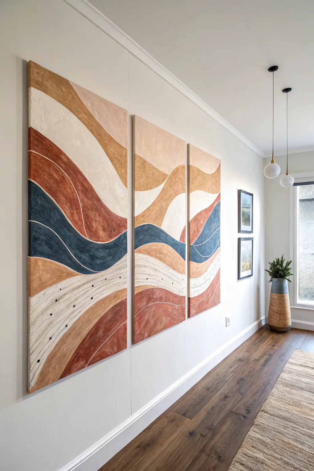
Transform a large blank wall into a gallery-worthy display with this stunning three-panel abstract landscape. By splitting a continuous flowing design across multiple canvases, you create a seamless, high-impact mural that feels organic and modern.
Step-by-Step Guide
Materials
- 3 large gallery-wrapped canvases (same size, vertical orientation)
- Acrylic paints: Cream, terracotta/rust, navy blue, tan/beige, white
- Modeling paste or texture gel (optional for added dimension)
- Wide flat paintbrushes (2-3 inch)
- Medium round brush
- Fine liner brush
- Pencil and eraser
- Painter’s tape or masking tape
- Large flat surface or easel
- Mixing palette or paper plates
- Water cup and rags
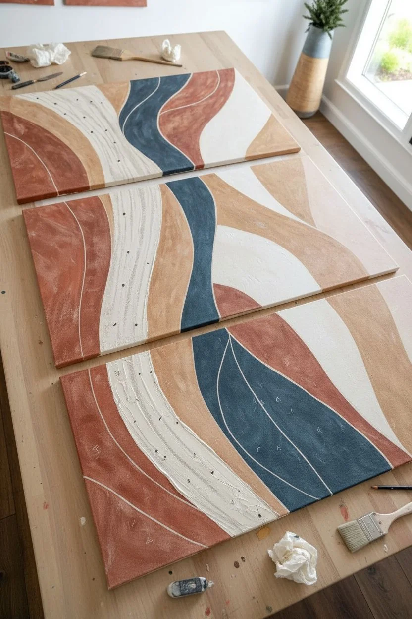
Step 1: Planning the Flow
-
Arrange the canvases:
Lay your three canvases side-by-side on the floor or a large table. Ensure they are touching or spaced exactly as you plan to hang them (usually 1-2 inches apart) so your design flows accurately across the gaps. -
Sketch the primary waves:
Using a pencil, lightly draw organic, wavy lines that span across all three panels. Think of layers of rolling hills or sediment. Start near the bottom left and sweep upwards towards the top right to create dynamic movement. -
Define color zones:
Mark each section lightly with the initial of the color intended for that spot (e.g., ‘N’ for Navy, ‘R’ for Rust). This helps you keep track of the pattern once you start painting and separate the panels. -
Add texture foundation:
If you want the textured look seen in the cream sections, apply a thin layer of modeling paste with a palette knife or old credit card in those specific zones. Let this dry completely before painting.
Step 2: Color Blocking
-
Mix your palette:
Prepare your acrylic colors. For the rust tone, you might mix burnt sienna with a touch of red or orange. For the navy, deepen a standard blue with a tiny bit of black or burnt umber to desaturate it. -
Paint the first section:
Start with the darkest color first, likely the navy blue wave in the middle. Use a wide flat brush to fill in the shape. Don’t worry about perfect edges yet; we will refine those later. -
Apply the warm tones:
Move on to the terracotta and tan sections. Apply the paint in long, sweeping strokes that follow the curve of the wave. This enhances the feeling of movement rather than static blocks of color. -
Painting the edges:
An often overlooked step is the edges. As you paint each color section, carry that color around the sides of the canvas. This gallery-wrap effect is crucial for a polished look when viewed from the side. -
Fill the light areas:
Paint the remaining sections with your cream or off-white shade. You might need two coats here to ensure the canvas doesn’t show through, especially if you didn’t use texture paste. -
Let it cure:
Allow the base layers to dry fully. Acrylics dry fast, but thick layers or texture paste zones might need a few hours.
Clean Lines
For steadier long lines, rest your pinky finger on a dry part of the canvas as a pivot point while you drag the brush.
Step 3: Detailing and Refining
-
Refine the boundaries:
Once the color blocks are dry, use a medium round brush to tidy up the lines where colors meet. You want clean, smooth curves. -
Mix the liner color:
Create a slightly thinned-down white or very light cream paint. Adding a drop or two of water improves the flow, making it easier to paint long, continuous lines. -
Paint the separation lines:
Using your fine liner brush, carefully paint thin lines between the different color zones. This acts like grout in a mosaic, making each shape pop. -
Add internal details:
Paint additional thin white lines inside the colored shapes, following the same wave curvature. These don’t need to be perfectly solid; a slightly broken or ‘dry brush’ line adds artistic character. -
Create the dot pattern:
In the lower cream/white section, use the handle end of a paintbrush or a small dotting tool. Dip it in dark navy or black paint and dot it along the curve of the wave to recreate the speckled texture shown in the inspiration. -
Final inspection:
Stand the canvases up against a wall in their correct order. Step back and check for any disjointed lines across the gaps. Touch up these transition points to ensure the eye travels smoothly from one panel to the next. -
Varnish and seal:
Protect your work with a coat of matte or satin varnish. This balances the sheen of the different paints and protects the surface from dust.
Level Up
Add metallic gold leaf foil along one of the thin white separation lines for a touch of luxury that catches the light.
Hang your masterpiece with pride and enjoy the calm, earthy atmosphere it brings to your hallway
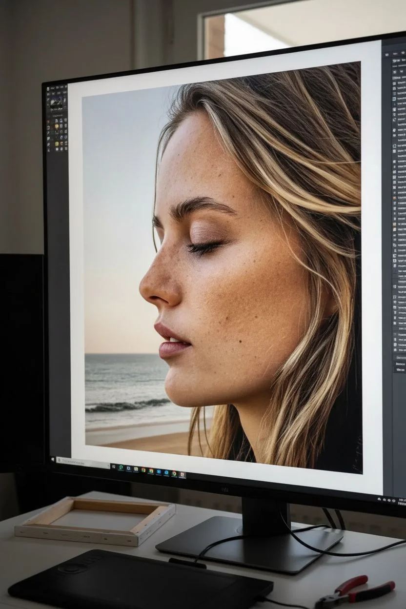
Negative Space Portrait With a Larger-Than-Life Face Crop
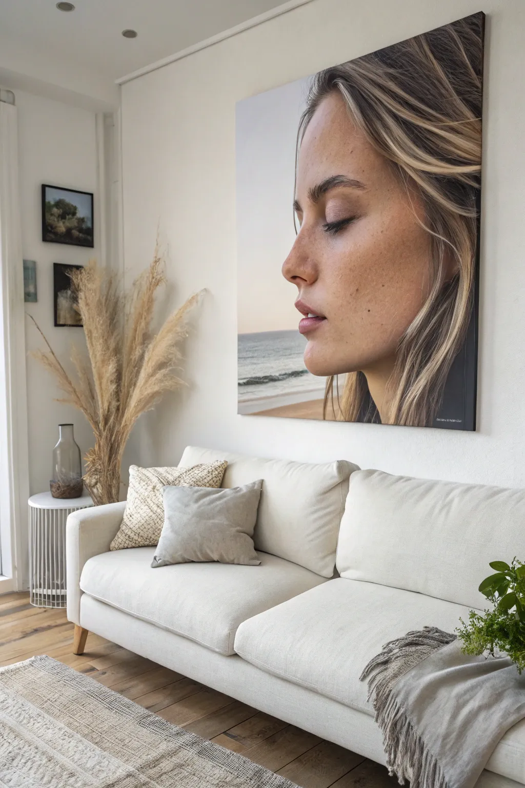
Transform your living space with a breathtaking, large-scale portrait that turns a captured moment into high-impact wall art. This project guides you through selecting, editing, and mounting a massive photographic print to achieve that gallery-worthy, larger-than-life aesthetic without the need for traditional painting skills.
Step-by-Step Tutorial
Materials
- High-resolution digital photograph (minimum 20MP recommended)
- Photo editing software (Photoshop, Lightroom, or similar)
- Professional large-format printing service
- Heavy-duty wooden stretcher bars (custom size)
- Box of heavy-duty staples
- Canvas stretching pliers
- Staple gun
- Scissors or rotary cutter
- Rubber mallet
- Measuring tape
- Gesso (optional, for textured finish)
- Matte finish varnish spray
Step 1: Image Selection and Preparation
-
Choose the right subject:
Select a high-quality portrait photo that evokes emotion. For this specific look, aim for a side profile with a soft, natural expression and significant negative space on one side (like the beach background here) to balance the composition. -
Assess image resolution:
Zoom in on your digital file to 100%. If the details around the eyes and skin texture look pixelated or blurry, the image won’t scale up to a meter-wide canvas effectively. You need a crisp, high-megapixel source file. -
Crop for impact:
Using your editing software, crop the image tightly top-to-bottom but leave width. The key to this ‘larger-than-life’ style is cutting off the very top of the head or the back of the hair to force the viewer to focus entirely on the face and the negative space. -
Enhance the colors:
Slightly boost contrast and saturation. Canvas material tends to absorb ink and dull colors slightly compared to a backlit screen, so overcompensating just a tiny bit during editing helps the final print pop. -
Add a gallery wrap border:
When preparing the file for print, add a 2-3 inch border around the entire image. You can either mirror the image edges or use a solid color; this ensures the image wraps around the sides of the wood frame seamlessly.
Wrinkle Rescue
If the canvas has slight ripples after stretching, lightly mist the *back* (unprinted side) with warm water. As it dries, the cotton fibers will shrink and tighten the drum.
Step 2: Printing and Frame Assembly
-
Order the print:
Send your file to a professional large-format printer. Request a ‘rolled canvas’ print rather than a pre-framed one to save money and ensure custom sizing. Ask for a matte or satin finish canvas to reduce glare. -
Assemble the stretcher bars:
While waiting for the print, layout your wooden stretcher bars. Slot the corners together using a rubber mallet to ensure tight, right-angle joints without damaging the soft wood. -
Check for squareness:
Measure the frame diagonally from corner to corner in both directions. If the measurements are identical, your frame is perfectly square; if not, tap the corners with the mallet until they match. -
Install cross-bracing:
For canvases this large (over 30 inches), install a center cross-brace to prevent the wood from bowing inward under the tension of the stretched canvas.
Make it Painterly
Use a heavy body clear gesso or gel medium over the hair strands in the photo. Using a stiff fan brush, follow the direction of the hair to add realistic 3D texture.
Step 3: Stretching the Canvas
-
Layout the workspace:
Clean a large floor area thoroughly. Lay the rolled canvas face down on the clean surface, ensuring there is no debris that could scratch the ink. -
Position the frame:
Place your assembled wooden frame face down onto the back of the canvas. Center it carefully so that your ‘gallery wrap’ border allowance extends evenly on all four sides. -
Secure the first side:
Starting in the middle of the longest side, pull the canvas up and over the wood. Shoot one staple into the center back of the frame. Repeat this on the exact opposite side, pulling tightly with your pliers to create tension. -
Continue the cross-stapling:
Move to the short sides, stapling once in the center of each, pulling taut. You should now have a diamond shape of tension in the middle of the canvas. -
Work toward the corners:
Return to the long sides. Place staples every 2 inches, working from the center outward toward the corners. Stop about 3 inches before reaching the actual corner. I suggest alternating sides frequently to keep the tension even. -
Fold the corners:
Tuck the excess canvas at the corner in to create a neat hospital corner fold. Pull the final flap tight over the corner joint and staple it securely on the back. -
Trim excess material:
If there is too much canvas hanging off the back after stapling, carefully trim it away with scissors or a rotary cutter for a professional finish.
Step 4: Final Touches
-
Check tension:
Flip the canvas over and tap the front. It should sound like a drum. If it’s loose, you may need to remove staples on one side and restretch tighter. -
Optional texture application:
If you want it to look more like a painting and less like a photo, mix clear acrylic gel medium with a tiny bit of water and brush it over the printed surface in stroke patterns. This mimics painted brushstrokes. -
Seal the artwork:
Take the canvas to a well-ventilated area and apply an even coat of UV-resistant matte spray varnish. This protects the ink from fading in sunlight and allows you to dust the piece safely.
Hang your massive masterpiece at eye level and enjoy the dramatic scale it brings to your room
Mixed-Media Collage Layers for a Big Statement Piece
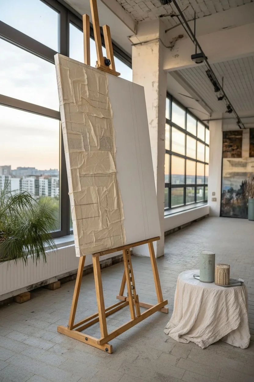
This large-scale abstract painting makes a stunning visual anchor, combining blocks of rugged texture with swathes of calm, creamy whites. Using a mix of layered papers and thick acrylic mediums, you’ll build an art piece that feels both architectural and organically worn.
Step-by-Step
Materials
- Large stretched canvas (at least 36×48 inches)
- Heavy body acrylic paint (Titanium White, Unbleached Titanium, Raw Sienna, Burnt Sienna, Payne’s Grey)
- Matte medium or Mod Podge
- Tissue paper or thin newsprint (for collage)
- Texture paste or modeling paste
- Large flat paintbrush (2-3 inch width)
- Palette knife or drywall scraper
- Graphite pencil or charcoal stick
- Ruler or straight edge
- Sandpaper (medium grit)
Step 1: Creating the Base Matrix
-
Map your composition:
Begin by lightly sketching your layout directly on the raw canvas using a graphite pencil. For this design, create a large vertical rectangle section on the left third of the canvas, which will be divided into horizontal blocks later. -
Establish the vertical lines:
Sketch two main vertical lines that define the central negative space. One line should run alongside your left rectangular block, and another thinner line should run parallel on the right side of the canvas. -
Prepare collage papers:
Tear your tissue paper or newsprint into various rectangular shapes. Some should be large enough to fill the blocks on the left, while others can be smaller strips for layering texture. -
Adhere the first layer:
Apply a coat of matte medium to the ‘block’ areas on the left side of the canvas. Lay down your tissue paper pieces, purposely allowing some wrinkles and creases to form for added character. -
Seal the paper:
Brush another layer of matte medium over the top of the adhered paper to seal it completely. Let this dry until it forms a hard shell.
Fixing the Bubble Trouble
If your collage paper bubbles up while drying, slice the bubble with a craft knife, inject a little glue or medium underneath, and press it flat again.
Step 2: Building Texture and Tone
-
Apply texture paste:
Using a palette knife or drywall scraper, spread patches of texture paste primarily over the papered sections. Scrape it thin in some areas so the paper texture shows through, and leave it thick and rough in others. -
Create the central field:
Trowel a thin, uneven layer of texture paste across the large central white space. You don’t want this smooth; use the knife to create subtle ridges and valleys that will catch the paint later. -
Initial color wash:
Mix Raw Sienna with a significant amount of water. Brush this wash over the textured blocks on the left, dabbing with a paper towel to lift color from the high points. -
Deepen the shadows:
While the wash is damp, introduce a small amount of diluted Payne’s Grey into specific crevices of the textured blocks to create depth and an aged stone appearance. -
Dry thoroughly:
Allow the texture paste to dry completely. This may take several hours or overnight depending on the thickness of your application.
Step 3: Refining the Composition
-
Paint the background:
Mix Titanium White with a touch of Unbleached Titanium for a warm, off-white hue. Paint the large central area, painting right up to—and slightly over—the edges of your textured blocks. -
Define the grey vertical:
Mix Payne’s Grey with white to get a soft blue-grey. Purposefully paint a vertical stripe separating the textured blocks from the white field. Keep the edges rugged and broken rather than perfectly straight. -
Add the red accent:
On the far right side, paint a long vertical line using thinned Burnt Sienna. Let the paint drag on the canvas texture so the line appears broken and organic, resembling rust. -
Dry brushing details:
Dip a dry brush into a tiny amount of white paint and lightly skim it over the colored textured blocks. I find this effectively highlights the wrinkles in the paper and the peaks of the paste. -
Scratched details:
Take your charcoal stick or pencil and draw faint, scribbled lines into the white space, mimicking cracks in plaster or architectural markings. -
Sand and distress:
Once fully dry, take sandpaper to random areas of the painting. Scuffing the grey and red lines reveals the canvas weave underneath and integrates the paint into the surface.
Level Up: Earth Elements
Mix actual sand or dry coffee grounds into your base texture paste for the colored blocks. It creates a gritty, organic, geological feel.
Step back and admire how the simple layers of paper and paste have transformed into a deeply textured, gallery-worthy piece.
Surreal Concept Painting With One Oversized Object
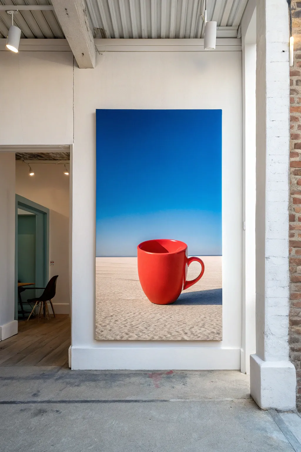
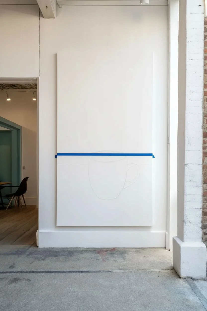
Embrace the surreal by painting an impossibly large red mug resting serenely on a vast, sandy landscape. This project plays with scale and minimalism, using a striking contrast between the vivid red object and the calm blue sky to create a dreamlike atmosphere.
Detailed Instructions
Materials
- Large vertical canvas (e.g., 24×48 inches)
- Acrylic paints (Ultramarine Blue, Titanium White, Cadmium Red, Alizarin Crimson, Burnt Umber, Yellow Ochre)
- Large flat brush (2-3 inches) for background blending
- Medium filbert brush
- Small round detail brush
- Painter’s tape or a straight edge
- Palette and water container
- Chalk or pastel pencil for sketching
Step 1: Setting the Scene
-
Divide the composition:
Begin by determining your horizon line. For this composition, place it quite low—about one-quarter of the way up from the bottom of the canvas—to emphasize the vastness of the sky. -
Sketch the subject:
Using a light piece of chalk or a pastel pencil, sketch the outline of a simple coffee mug in the center. Make it large; it should dominate the lower half of the painting and break above the horizon line significantly. -
Mask the horizon:
Apply a strip of low-tack painter’s tape across your horizon line, skipping over the sketch of the mug, to ensure a crisp separation between land and sky.
Smooth Gradients Trick
If acrylics dry too fast while blending the sky, mist the canvas lightly with a water spray bottle or add a slow-drying retarder fluid to your paint mix.
Step 2: Painting the Atmosphere
-
Mix the deep sky:
On your palette, mix a generous amount of Ultramarine Blue with a touch of Titanium White. You want a rich, dark blue for the very top of the canvas. -
Create the gradient:
Start painting at the top with your darkest blue. As you work your way down, gradually mix in more White. By the time you reach the horizon tape, the color should be a very pale, hazy blue. -
Blend smoothly:
Use a clean, slightly damp large brush to blend the transition areas between the blues while the paint is still wet. Use long, horizontal strokes to eliminate harsh lines. -
Paint the sand base:
Once the sky is dry, remove the tape. Mix Titanium White with a small amount of Yellow Ochre and a tiny dot of Burnt Umber. Paint the ground area with this pale sandy beige, using horizontal strokes.
Levitating Object
Give the painting a magical twist by adding a small, dark oval shadow *underneath* the mug instead of attached to it, making the giant cup hover in mid-air.
Step 3: The Red Mug
-
Base coat the mug:
Fill in the mug shape with a solid coat of Cadmium Red. I find it usually takes two coats to get that fully opaque, vibrant punch of color. -
Establish the shadow side:
Mix a little Alizarin Crimson and a touch of Burnt Umber into your Cadmium Red. Apply this darker shade to the left side of the cup and under the handle to create a rounded form. -
Add the highlight:
On the right side of the cup where the light hits, blend in a mixture of Cadmium Red and Titanium White. The transition should be soft to mimic a smooth ceramic surface. -
Define the rim:
Use a smaller brush to paint the inside ellipse of the mug. Use a darker red on the left inner wall and a lighter red on the right inner wall to reverse the lighting and show depth. -
Bright reflection:
Add a crisp, vertical streak of pure white or very pale pink on the highlighted side of the mug to suggest a glossy glaze.
Step 4: Details and Shadows
-
Cast the shadow:
Mix a transparent shadow color using Burnt Umber and a lot of glazing medium or water. Paint a long shadow stretching from the base of the mug to the right, sitting on top of the sand color. -
Texture the sand:
Using an old, dry brush with a tiny amount of brownish-grey paint, stipple (dab lightly) the foreground sand area to create the look of gritty texture. -
Refine the edges:
Go back with a small round brush to neaten the edges of the handle and rim. A sharp, clean line is crucial for that pop-art surrealist look. -
Final assessment:
Step back about ten feet to view the canvas. Ensure the gradient in the sky looks smooth from a distance and the mug feels heavy and grounded.
Hang this massive canvas in a minimal space to spark conversation about scale and perspective
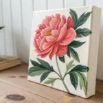

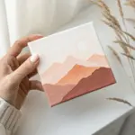

Have a question or want to share your own experience? I'd love to hear from you in the comments below!