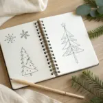
When I’m craving something cozy and festive, I reach for my sketchbook and start collecting holiday drawing ideas like little visual ornaments. Here are my favorite prompts—starting with the classics everyone loves and ending with a few playful twists that’ll spark fresh inspiration.
Classic Santa Claus Face Sketch
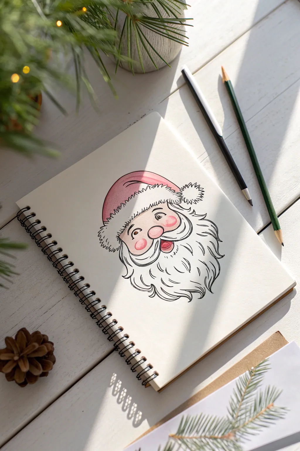
Capture the magic of Christmas with this charming Santa Claus portrait, featuring expressive ink lines and soft watercolor accents. This cheerful illustration combines clean pen work with gentle washes of pink to create a festive character that jumps right off the page.
Step-by-Step Tutorial
Materials
- Spiral-bound sketchbook (mixed media paper preferred)
- Pencil (HB or 2B)
- Eraser
- Fine liner pen (0.5mm or 0.8mm, black waterproof)
- Watercolor paints or watercolor markers (Red, Pink)
- Small round watercolor brush (size 2 or 4)
- Water cup and paper towel
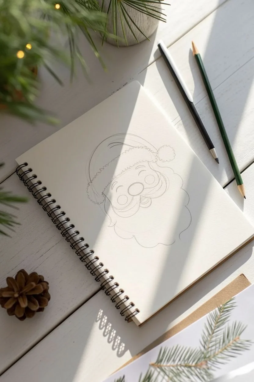
Step 1: Pencil Structure
-
Basic shapes:
Begin by sketching a large circle for Santa’s head lightly with your pencil. Divide it horizontally and vertically with curved guidelines to help place the facial features later. -
Nose and cheeks:
In the center intersection, draw a wide oval for the nose. On either side, add two slightly larger circles for his rosy cheeks, making them overlap the bottom of the nose slightly. -
Mustache placement:
Draw the mustache as two large, swooping tear-drop shapes that start from under the nose and curl upwards at the tips, framing his smile area. -
Eyes and eyebrows:
Above the nose, sketch two arched curves for closed, smiling eyes. Add thick, bushy eyebrow shapes floating just above them. -
Beard outline:
Define the beard by drawing a wavy, cloud-like perimeter that extends from the ears down to a point below the chin. Keep the lines loose and fluffy. -
Hat structure:
Top the head with the rim of the hat, drawing a fluffy rectangular band across the forehead. Add the floppy triangular part of the hat folding over behind the head, finished with a pom-pom circle.
Keep it Loose
Don’t try to make every hair curve perfect. Wobbly, uneven lines in the beard actually make it look fluffier and more organic than straight lines.
Step 2: Inking the Lines
-
Face outline:
Switch to your fine liner pen. Trace the nose and cheeks first, keeping the lines relatively smooth. I find starting in the center helps anchor the rest of the drawing. -
Fluffy textures:
Ink the hat’s rim and pom-pom using short, jagged strokes to simulate fur texture. Do the same for the eyebrows. -
Mustache details:
Outline the mustache with confident, sweeping curves. Add a few internal lines hitting the flow of the hair to give it volume. -
Beard flow:
Ink the beard using wavy lines that gather into jagged points. Add several internal wavy lines throughout the beard to suggest separate locks of hair. -
Facial features:
Ink the eye arches and add small wrinkle lines at the outer corners (crow’s feet) for a jolly expression. Draw the open mouth beneath the mustache. -
Erase pencil:
Once the ink is completely dry—give it a full minute—gently erase all your underlying pencil sketches to reveal a clean line drawing.
Festive Textures
Sprinkle table salt onto the wet red watercolor of the hat. As it dries, it creates a starry, frosty texture perfect for holiday illustrations.
Step 3: Adding Color
-
Rosy cheeks:
Dip your brush into water and pick up a very dilute amount of pink watercolor. Paint circle washes on the cheeks and the nose, keeping the edges soft. -
Hat base:
Using a slightly more saturated red or pink mix, fill in the main fabric part of the hat. Leave the fur rim and pom-pom completely white for contrast. -
Mouth accent:
Fill the inside of the mouth with a darker red shade to create depth, leaving a small white highlight if possible to show a tongue. -
Shadows:
Optionally, add a very faint grey wash under the mustache and hat rim to give the face a bit of three-dimensional form.
Now you have a timeless Santa portrait ready to decorate a card or keep in your seasonal sketchbook
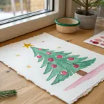
Layered Christmas Tree With Simple Branch Shapes
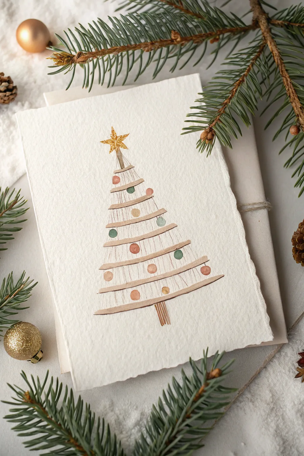
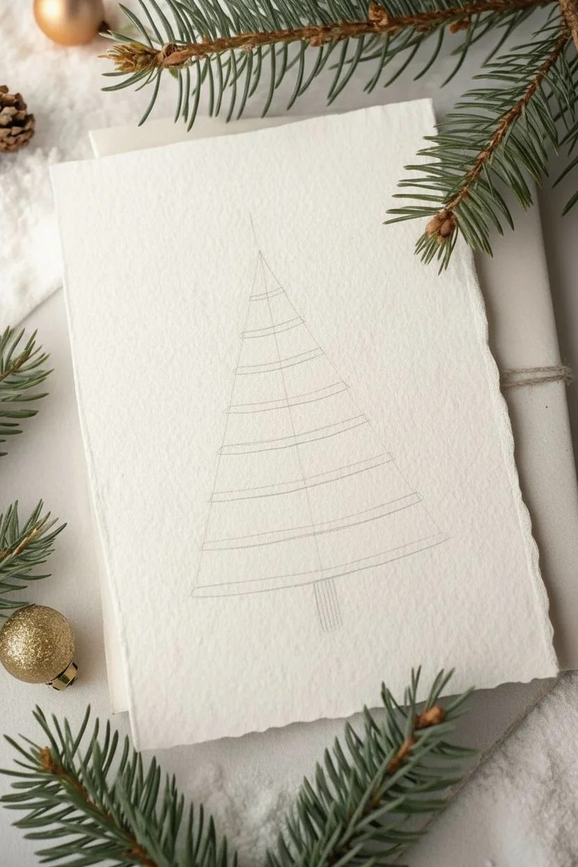
This elegant holiday card features a charmingly rustic Christmas tree design built from horizontal slats and delicate ornaments. The soft watercolor textures and muted palette give it a warm, handcrafted feel perfect for the season.
Detailed Instructions
Materials
- Textured watercolor paper (cold press creates nice grain)
- Watercolor paints (browns, muted red, muted green, gold)
- Fine liner brush (size 0 or 00)
- Small round brush (size 2 or 4)
- Pencil and eraser
- Ruler
- Gold metallic paint or gel pen
Step 1: Planning the Structure
-
Mark the center line:
Begin by lightly drawing a vertical line down the center of your paper with a pencil and ruler. This will act as the spine or trunk of your tree to ensure symmetry. -
Draft the triangle:
Sketch a light triangle shape to define the overall boundaries of the tree. The top point should be where your star will sit, and the bottom corners determine the widest branches. -
Sketch the slats:
Within your triangle, lightly sketch about 8-9 horizontal curved lines. These represent the wooden slats. Give them a very slight upward curve on the ends so they look like sweeping branches rather than rigid planks.
Uneven Lines?
Don’t worry if your slats aren’t perfectly parallel. A little wobbliness adds organic charm. If a line is too faint, wait for it to dry and layer a second wash over just that section.
Step 2: Painting the Tree
-
Mix your wood tone:
Create a watery, light brown wash. Burnt Umber mixed with a lot of water works well for a soft, natural wood look. -
Paint the slats:
Using your small round brush, paint over your sketched slat lines. Make these strokes slightly uneven in width to mimic organic branches or wood pieces. Leave the ends soft rather than perfectly sharp. -
Add vertical grain:
While the slat paint is still slightly damp, use a very fine liner brush with a slightly darker brown to draw thin, vertical lines connecting the slats. These represent the string or wire holding the structure together. -
Paint the trunk:
At the very bottom, paint a small bundle of vertical lines to form the tree stump using the darker brown shade. -
Create the topper stem:
Add a small vertical stick at the very top of the tree where the star will eventually sit.
Add Texture
Sprinkle a tiny pinch of salt onto the wet paint of the ornaments. As it dries, the salt will absorb pigment and create beautiful, frosty starburst textures perfect for holiday baubles.
Step 3: Adding Details
-
Place the ornaments:
Once the brown paint is completely dry, sketch small circles randomly on the slats. Stagger them so they aren’t perfectly aligned. -
Paint the baubles:
Fill in the circles with muted holiday colors. I personally love mixing a dusty rose and a sage green for a vintage look. Keep the paint somewhat transparent to maintain the watercolor effect. -
Add the star:
Using gold metallic paint, draw a five-pointed star at the top of the stem. Fill it in carefully, perhaps adding a second layer for extra opacity. -
Highlighting:
If you have a gold gel pen or metallic paint, add tiny dots or accents to a few of the baubles to make them shimmer. -
Erase guidelines:
Wait until the painting is absolutely bone dry, then gently erase your initial pencil guide lines, being careful not to smudge the paint.
Now you have a serene, minimalist card ready to share warm holiday wishes.

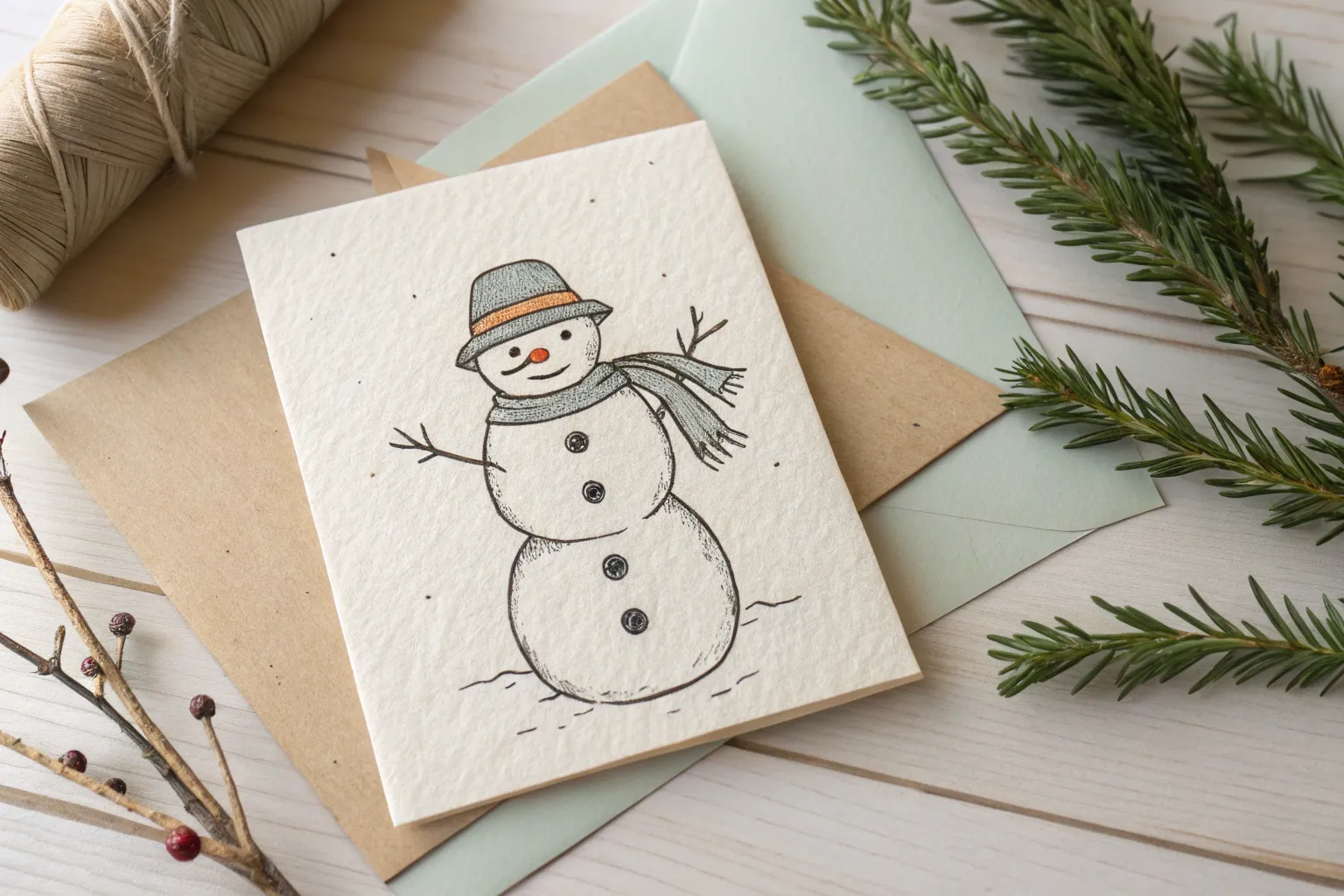
Cozy Snowman With Winter Accessories
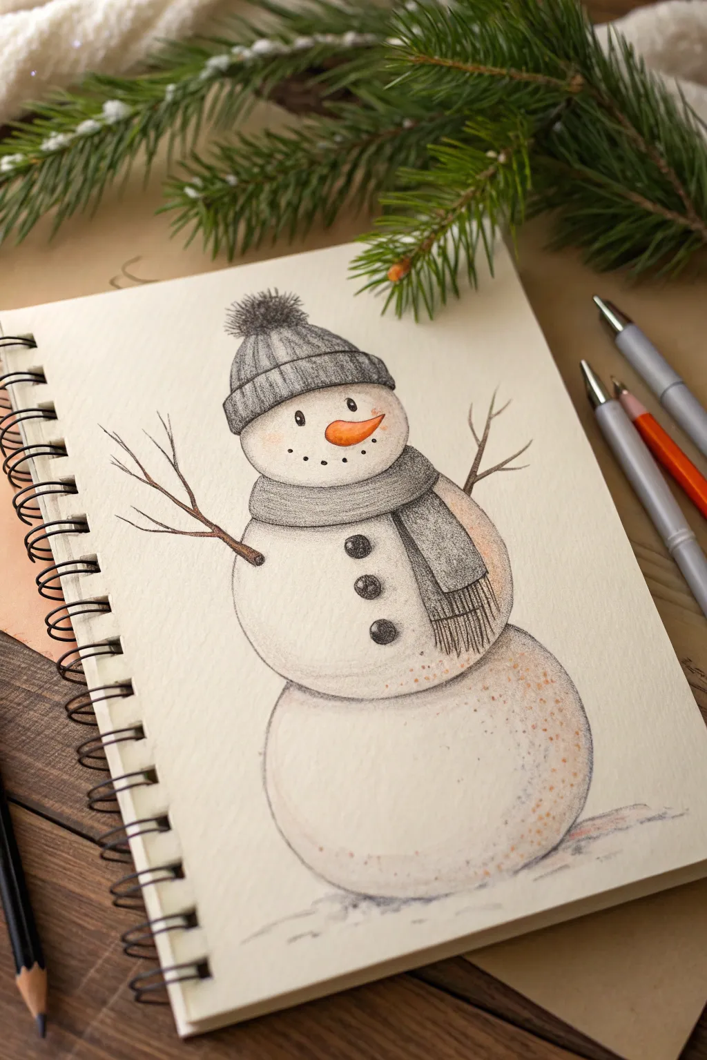
Embrace the winter spirit with this charming colored pencil illustration of a classic snowman bundled up for the cold. The soft texture of the paper combines warm orange accents with cool grays for a delightful, sketched aesthetic.
Step-by-Step
Materials
- Heavyweight drawing paper or sketchbook (cream or off-white preferred)
- Graphite pencil (HB or 2B)
- Black fine-liner pen (0.3mm or 0.5mm)
- Colored pencils (Cool Gray, Charcoal Gray, Orange, Terra cotta/Brown)
- White gel pen (optional)
- Kneaded eraser
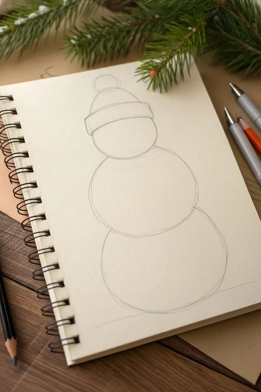
Step 1: Basic Structure
-
Outline the head:
Start near the top of your page by sketching a slightly flattened circle for the head. Don’t press too hard, as you’ll want these initial lines to disappear later. -
Draft the body:
Below the head, draw a larger, slightly squashed circle for the midsection. For the base, draw the largest, widest circle at the bottom, making sure each section overlaps slightly to look connected. -
Place the hat:
Sketch a rectangular cuff sitting right on the snowman’s ‘forehead.’ Draw a semi-circle dome above it for the beanie shape, topping it with a rough circle for the pom-pom.
Step 2: Accessories & Features
-
Add the scarf:
Draw a curved band wrapping around the neck area where the first and second snowballs meet. Extend two long, rectangular tails hanging down the right side of the body. -
Sketch the branches:
For arms, draw two twig-like lines extending outward. The left arm should point slightly down, while the right arm points slightly up. Add small ‘Y’ shapes at the ends for fingers. -
Draw the face:
Place two small dots for eyes and a curved, carrot-shaped triangle for the nose pointing to the right. Add a series of five or six small dots in a curve for the smiling mouth. -
Add buttons:
Draw three circles vertically down the middle snowball section, ensuring they are evenly spaced.
Pro Tip: Paper Grain
Using paper with a visible tooth (texture) will naturally create that snowy, speckled look when you shade lightly with colored pencils.
Step 3: Shading & Color
-
Color the hat base:
Using a cool gray pencil, fill in the beanie. Use vertical strokes on the cuff to mimic ribbing, and curved horizontal strokes on the main part of the hat. -
Texture the pom-pom:
Use short, flicking strokes radiating outward from the center of the pom-pom with a charcoal gray pencil to create a fuzzy, fur-like texture. -
Fill the scarf:
Color the scarf with the same cool gray as the hat. I find that pressing slightly harder in the folds creates natural-looking shadows. Add vertical fringe lines at the bottom of the scarf tails. -
Brighten the nose:
Color the carrot nose with a vibrant orange pencil. Add a tiny touch of brown or darker orange on the underside for dimension. -
Shade the snow:
Very lightly shade the right and bottom edges of each snowball using a light touch of gray. This gives the snowman volume so he doesn’t look flat. -
Add warmth:
To make the drawing feel cozy, lightly dust some terra cotta or soft brown pencil over the shadowed areas on the right side of the snowballs. This creates a reflected light effect. -
Define the buttons:
Fill in the buttons and eyes with a dark charcoal or black pencil. Leave a tiny speck of white paper showing in the eyes for a highlight, or add it later with a gel pen. -
Detail the branches:
Go over your branch outlines with a brown pencil. Vary the pressure to make the wood look knotty and textured.
Troubleshooting: Smudging
If your graphite sketch lines are muddying your yellow or orange colors, dab them with a kneaded eraser until they are barely visible before coloring.
Step 4: Final Touches
-
Ground the figure:
Sketch a faint, scribbly shadow underneath the snowman using your gray pencil and a hint of the brown tone to settle him onto the ground. -
Refine textures:
Use a sharpened dark gray pencil to deepen the texture lines on the hat cuff and the scarf fringe. -
Add sparkle:
If you have a white gel pen, add tiny dots to the snowballs to mimic glistening snow texture.
Now you have a frosty friend ready to greet the season from the pages of your sketchbook
Easy Candy Cane With Curved Stripes and Bow
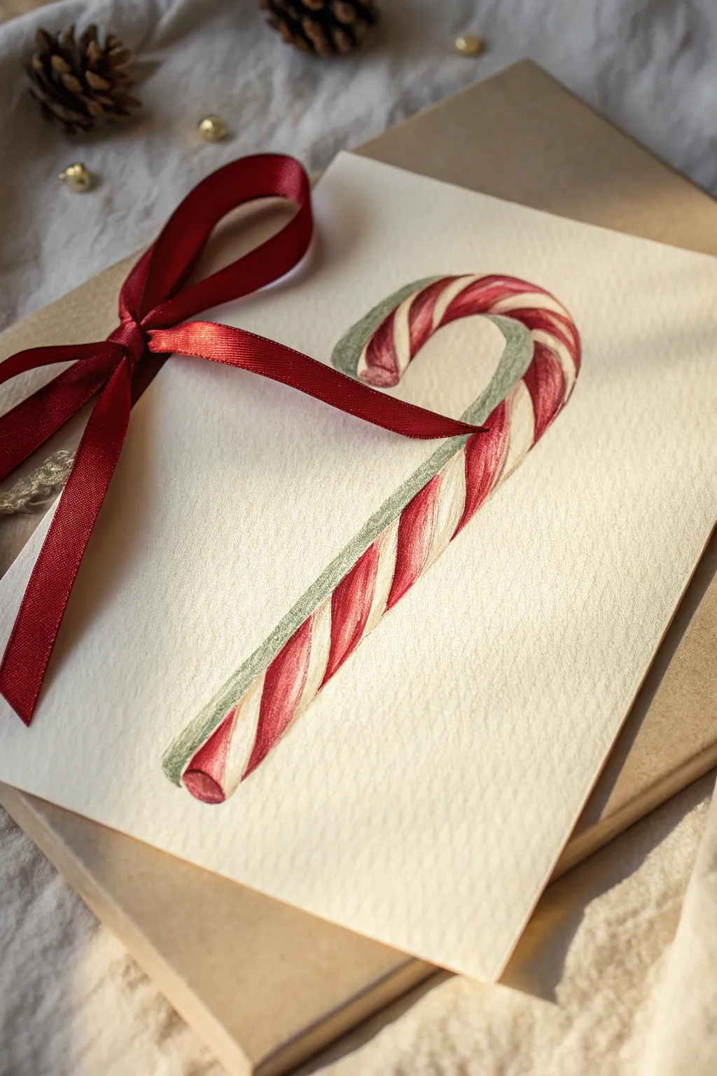
Create a stunningly simple holiday card featuring a realistic candy cane illustration. This project combines smooth colored pencil blending with a tactile satin ribbon for a sophisticated, traditional feel.
Step-by-Step Tutorial
Materials
- Heavyweight textured paper (watercolor or mixed media paper)
- H or HB graphite pencil (for sketching)
- Kneaded eraser
- Red colored pencil (crimson or deep red)
- Darker red/maroon colored pencil (for shadows)
- Green/grey colored pencil (for shadow side)
- White gel pen (optional for highlights)
- Red satin ribbon (approx. 1/4 inch width)
- Scissors
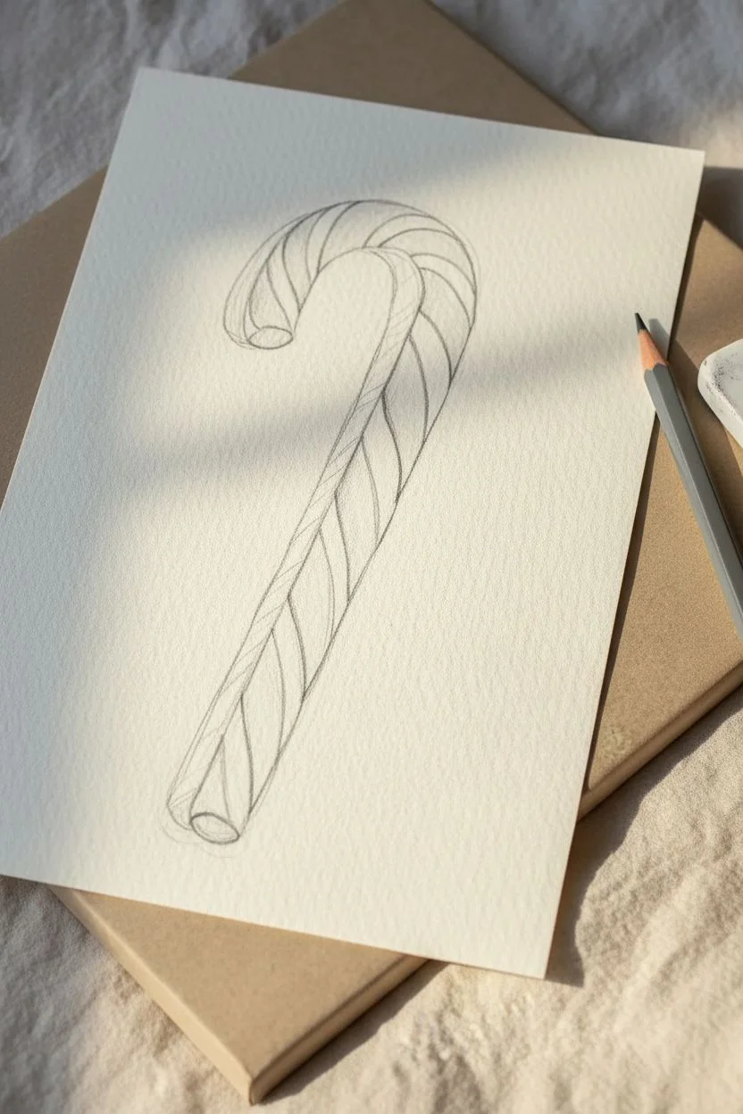
Step 1: Sketching the Shape
-
Outline the Cane:
Begin by lightly sketching the candy cane shape on your paper. Draw two parallel curved lines that hook at the top, ensuring the width remains consistent all the way down. Keep your pencil pressure very light so the graphite doesn’t show through later. -
Add Dimension:
Draw little ellipses at the bottom end and the top tip to suggest the cylindrical volume of the candy. This small detail prevents the drawing from looking flat. -
Map the Stripes:
Sketch the diagonal stripes. These should curve slightly, following the roundness of the cane. Start with the main thick red stripes, spacing them out evenly. -
Refine the Curves:
Ensure the stripes wrap around the form convincingly. At the hooked top, the stripes will fan out slightly; assist yourself by lightly drawing center guidelines if needed.
Stubborn Graphite Lines?
If your pencil sketch is showing through the light colors, try rolling a kneaded eraser over the lines to lift graphite before you start rigorous coloring.
Step 2: Coloring and Shading
-
Base Red Layer:
Take your primary red colored pencil and fill in the red stripes. Use a light hand initially to establish the color without pressing into the paper tooth just yet. -
Deepen the Color:
Go over the red stripes again, increasing pressure slightly to build saturation. Leave a very thin sliver of lighter red or white near the top curve of each stripe to act as a preliminary highlight. -
Shadows on Red:
Using your darker red or maroon pencil, shade the bottom and right edges of each red stripe. This creates the illusion that the light is coming from the top left. -
White Stripes Shading:
The white stripes aren’t purely white because of shadows. Take a very pale green or cool grey pencil and shade the right side of the white stripes, blending it softly toward the center until it fades into the white paper. -
Green Reflection:
Notice the subtle green edge in the reference? Use a sage green pencil to outline the shadowed side (the ‘inner’ curve and right side) of the entire cane. This reflected color adds realism and separates the object from the background. -
Enhance Contrast:
Go back with your darkest red to deepen the core shadows on the red stripes, especially where the cane curves. This high contrast makes the candy look glossy. -
Clean Edges:
Use your eraser to clean up any smudges around the outside. If you want extra pop, you can use a white gel pen to add tiny, sharp specular highlights on the most curved part of the red stripes.
Step 3: Finishing Touches
-
Prepare the Ribbon:
Cut a length of red satin ribbon, long enough to tie a bow around the side of your card or paper. -
Punch or Notch:
Depending on your card style, you can either punch a small hole to thread the ribbon through or simply wrap it around the fold of the card. -
Tie the Bow:
Tie a neat bow on the left side of the artwork, as shown in the image. Adjust the loops so they sit flat and trim the tails at an angle for a professional finish. -
Final Adjustments:
Take a step back and check your drawing. If the graphite outline is still visible, gently dab it with a kneaded eraser to lift it without disturbing the colored pencil pigment.
Smooth Blending Trick
If your colored pencil looks too grainy on the textured paper, use a colorless blender pencil or a white pencil to burnish the layers together for a creamy finish.
Enjoy giving this sweet, handmade card to someone special this holiday season
BRUSH GUIDE
The Right Brush for Every Stroke
From clean lines to bold texture — master brush choice, stroke control, and essential techniques.
Explore the Full Guide
Pattern-Filled Ornaments for Quick Doodles
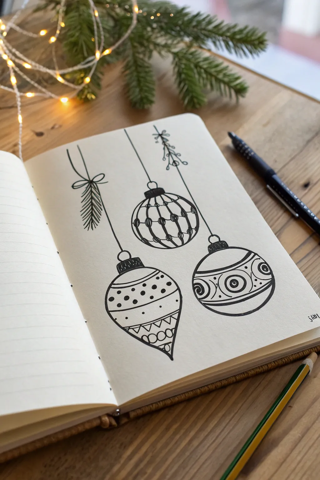
Capture the charm of the holiday season with these three distinct, patterned baubles hanging delicately from strings. This minimalist black ink drawing relies on varied line weights and geometric patterns to create depth and interest without needing a drop of color.
How-To Guide
Materials
- Blank journal or sketchbook paper (bright white or cream)
- Fine liner pen (size 01 or 03) for details
- Medium liner pen (size 05 or 08) for bold outlines
- Pencil (HB or 2B) for sketching
- Eraser
- Ruler (optional)
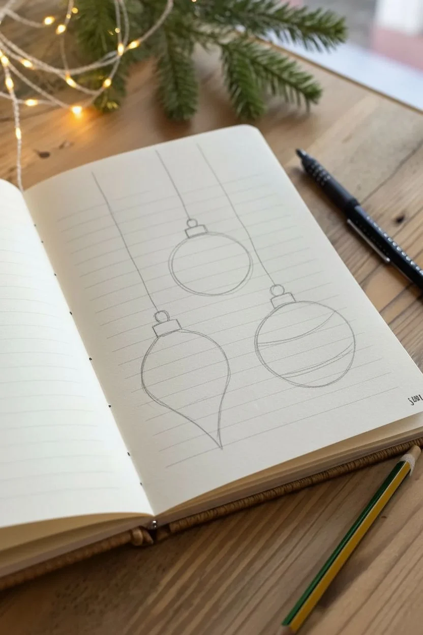
Step 1: Planning composition
-
Rough placement:
Start by lightly sketching the general positions of your three ornaments with a pencil. Place the central round ornament slightly higher than the other two to create a dynamic triangular composition. -
Define the shapes:
Sketch a perfect circle for the top-center ornament. Below and to the left, sketch a teardrop or ‘onion’ shape. To the right, draw a slightly flattened oval or circle. -
Add caps and strings:
Draw small rectangles or trapezoids at the top of each shape for the ornament caps. Sketch three vertical lines extending upward from these caps to the top of the page, varying the lengths.
Uneven Circles?
Don’t stress about perfect spheres. If a circle looks lopsided, thicken the outline on the flatter side to visually correct the shape without redrawing.
Step 2: Inking the outlines
-
Trace main shapes:
Using your medium liner pen (05 or 08), carefully trace the outer contours of the three ornaments. Keep your hand steady to ensure smooth curves. -
Ink the strings:
Switch to a finer pen (01 or 03). Draw the hanging strings. They don’t need to be ruler-straight; a tiny bit of wobble adds hand-drawn character. -
Draw the greenery:
For the left string, draw a ‘bow’ shape where the string meets the pine branch structure. Then, sketch downward-angled short strokes to mimic pine needles. For the right string, add a few small loops and leaves near the top to suggest mistletoe or holly.
Ink Smudging
Place a scrap piece of paper under your drawing hand as you work. This acts as a shield, preventing your skin oils and friction from dragging wet ink across the page.
Step 3: Detailing the center ornament
-
Vertical segments:
Draw curved vertical lines following the contour of the sphere to divide it into segments, like a peeled orange. -
Horizontal bands:
Add horizontal lines crossing the vertical ones to create a grid. Make these lines curve slightly upward to reinforce the 3D roundness. -
Beading detail:
Where the lines intersect, draw small, solid black dots. This creates a beaded, netted look.
Step 4: Detailing the left teardrop ornament
-
Dividing the space:
Divide the teardrop shape into three horizontal zones using curved bands. Leave the top and bottom zones larger. -
Top polka dots:
Fill the top section with small, scattered solid dots. I like to vary the spacing slightly so it doesn’t look too rigid. -
Geometric bottom:
In the bottom tip, draw a band of small triangles point-down. Below that, add a few half-circles or scallops to fill the point.
Step 5: Detailing the right round ornament
-
Wide central band:
Draw two bold curved lines across the center of the ornament to create a wide horizontal belt. -
Inner circles:
Inside this belt, draw three circles—one large central one and two partial ones on the sides. Add concentric rings inside these circles for a ‘bullseye’ effect. -
Decorative scrolls:
Fill the empty space between the bullseyes with small C-curves or scroll shapes to make the pattern feel dense and intricate. -
Finishing touches:
Add small dots or tiny details to the ornament caps to give them texture.
Step 6: Final steps
-
Dry and erase:
Wait at least five minutes for the ink to fully set. Gently erase all visible pencil sketches. -
Review and refine:
Look over your drawing. If any lines look too thin or disconnected, go over them again with the fine liner to crispen the edges.
Now you have a festive trio ready to adorn your holiday cards or journal spreads
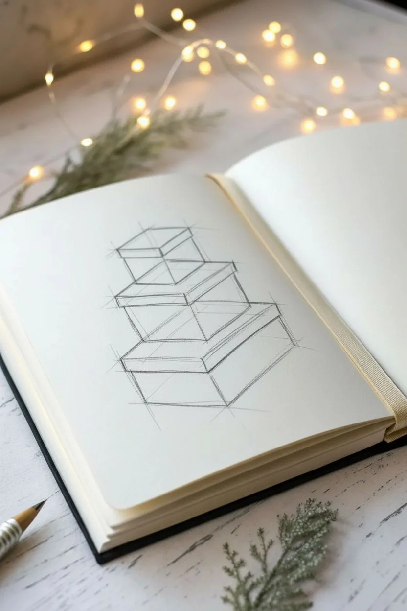
Stacked Wrapped Gifts in One-Point Perspective

Learn to draw a charming stack of holiday presents with this pencil sketching tutorial. This project focuses on building simple geometric forms into a cohesive structure, perfect for a personalized holiday card or sketchbook entry.
Step-by-Step
Materials
- Sketchbook or drawing paper (medium tooth)
- HB or 2B graphite pencil
- Fine-point mechanical pencil (optional for details)
- Kneaded eraser
- Ruler (optional)
Step 1: Building the Basic Structure
-
Draw the bottom box:
Start by drawing a wide, rectangular box shape at the bottom of your page. Angle the sides slightly to suggest a loose, 3D perspective, making sure the top surface is visible. -
Add the middle tier:
Directly on ‘top’ of the first box’s surface, sketch a second, slightly smaller box. Center it roughly, but keep the lines relaxed and sketchy rather than perfectly rigid. -
Top the stack:
Draw the smallest, cube-like box sitting on the very top. This creates your pyramid structure. -
Refine the forms:
Go back over your structural lines. Darken the vertical corners and the edges where the boxes meet to give them weight and separate the layers.
Step 2: Defining Requirements: Ribbons
-
Vertical ribbon lines:
Draw parallel lines running vertically down the center of the visible faces of each box. These represent the ribbon wrapping around the stack. -
Top surface ribbons:
Connect the vertical ribbon lines by drawing strips across the top surfaces of the bottom and middle boxes. Notice how the box above obscures part of the ribbon path. -
Horizontal ribbon band:
Now, add the horizontal band of ribbon that wraps around the sides of each box. Draw these lines parallel to the top and bottom edges of each respective box lid. -
Detail the intersections:
Where the horizontal and vertical ribbons meet on the faces, erase the tiny crossing lines so the ribbon clearly looks like it’s woven or layered; usually, the vertical strip sits visually ‘over’ the horizontal band.
Uneven Stack?
If your boxes look like they are sliding off, check your vertical lines. They should all be perfectly parallel to the side of your paper, regardless of the angle of the box tops.
Step 3: Adding the Bow
-
Center the knot:
Draw a small, rounded shape in the center of the very top box for the knot of the bow. -
Create loops:
Sketch two main loops extending outward from the knot. Keep the lines fluid to suggest soft fabric rather than stiff cardboard. -
Draw ribbon tails:
Add two shorter ribbon ends draping down from the knot, resting slightly over the edge of the top box. -
Thicken the ribbon:
Double up your lines on the bow loops to show the thickness of the ribbon fabric, adding small creases near the knot center.
Make it Patterned
Customize the look by drawing patterns on the ‘wrapping paper’ areas. Try polka dots, stripes, or stars on just one of the boxes to create visual contrast.
Step 4: Shading and Texture
-
Establish light source:
Decide on a light source coming from the left. This means shadows will fall heavily on the right side of the boxes. -
Hatch the right sides:
Use vertical hatching lines to shade the right-hand vertical faces of all three boxes. Keep these lines relatively consistent and closely spaced. -
Add cast shadows:
Draw broken horizontal lines on the ground to the right of the bottom box to create a cast shadow. Do the same where the upper boxes cast small shadows onto the boxes beneath them. -
Detail the paper:
Add tiny, sparse dots or faint ticks on the non-shaded sides of the boxes. This subtle texture mimics wrapping paper or cardstock. -
Darken the deepest crevices:
I like to take a sharper pencil here and really darken the point where the bottom of a box touches the one below it. This ‘occlusion shadow’ grounds the stack. -
Final clean up:
Use your kneaded eraser to lift away any stray construction lines, leaving only your clean sketch.
Now you have a festive, hand-drawn illustration ready to decorate your holiday spread

PENCIL GUIDE
Understanding Pencil Grades from H to B
From first sketch to finished drawing — learn pencil grades, line control, and shading techniques.
Explore the Full Guide
Delicate Snowflake Symmetry Practice
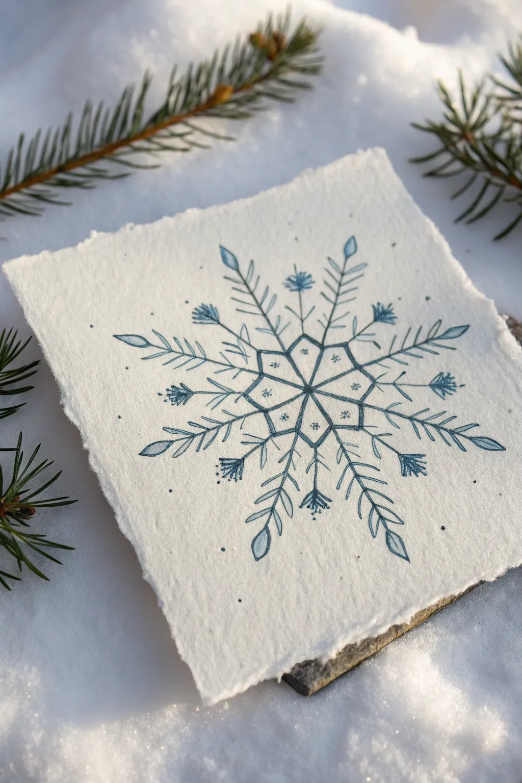
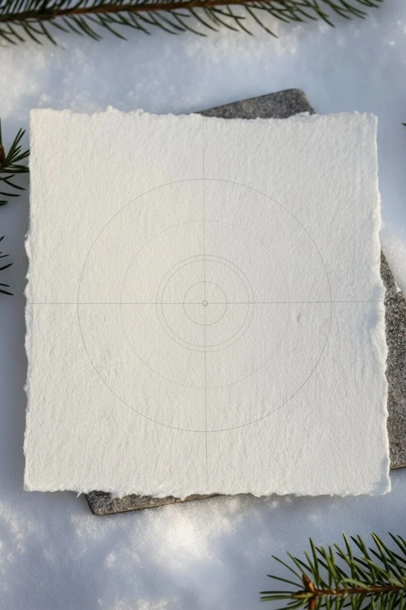
Capture the stillness of winter with this detailed snowflake study on textured paper. Using a blend of precise ink lines and soft watercolor washes, you will construct a symmetrical design that feels both organic and crystalline.
How-To Guide
Materials
- Heavyweight cold-press watercolor paper (300gsm)
- Ruler
- Pencil and eraser
- Circle compass
- Fine-point waterproof pigment liner (0.1mm – 0.3mm)
- Blue gel pen or fine marker
- Blue watercolor paint (Prussian Blue or Indigo)
- Small round watercolor brush (size 1 or 2)
Step 1: Preparation & Foundation
-
Prepare your paper:
Start by tearing a square piece of watercolor paper, roughly 5×5 inches. Tearing against a ruler’s edge creates that beautiful deckled, organic edge seen in the photo rather than a sharp cut. -
Establish the center:
Lightly find the center of your paper using a ruler. Mark it with a tiny dot using your pencil. -
Draw the grid:
Draw a vertical line and a horizontal line crossing through the center. Then, draw two diagonal lines that bisect the quadrants. You should now have an eight-spoke ‘pie’ shape to guide your symmetry. -
Create radial guides:
Using your compass, lightly draw two concentric circles starting from the center. One circle should be small (about 1 inch diameter) for the inner star, and one larger (about 3 inches diameter) to mark the outer limits of the main branches.
Rotational Trick
To maintain better symmetry, physically rotate your paper as you draw each matching arm. It’s easier to repeat the same hand motion at the same angle than to draw ‘upside down’.
Step 2: Drawing the Structure
-
Sketch the center star:
Pencil in the central eight-pointed star shape. Connect the points where the smallest circle intersects your eight radiating lines. -
Draft the primary arms:
Along every other radial line (four total), sketch a long, straight stem ending in a leaf-like teardrop shape at the wide circle’s edge. These are your main ‘leaf’ arms. -
Draft the secondary arms:
On the remaining four alternating lines, sketch slightly shorter stems. Instead of a leaf tip, these will end in a clustered fan shape, resembling a pine needle spray or thistle head. -
Add side branches:
On the main ‘leaf’ arms, lightly sketch angled lines coming off the sides, similar to the veins of a fern leaf. Keep them symmetrical on both sides of the stem.
Step 3: Inking & Coloring
-
Outline the center:
Switch to your waterproof pigment liner. Trace the central eight-pointed star. Inside this star, draw lines connecting the opposite inner corners to create a geometric ‘flower’ within the center. -
Trace the main branches:
Carefully ink the long straight lines of your eight main arms. Use a steady hand, but don’t worry if the line has a little organic waiver. -
Ink the botanical details:
Trace the fern-like side branches on the main arms. For the secondary arms (the pine sprays), use short, quick flicks of the pen to create that bristly texture at the tips. -
Erase guidelines:
Wait at least 15 minutes for the ink to fully cure. Once bone dry, gently erase all your pencil circles and radial lines. -
Apply the first wash:
Moisten your blue watercolor paint to a milky consistency. I prefer a diluted Prussian Blue here. Carefully paint the leaf-shaped tips and the fern-like side leaves. Let the color pool naturally for variation. -
Add depth to the center:
Paint the sections of the central star. You can leave tiny highlights unpainted for sparkle, or alternate the saturation to make the geometry pop. -
Enhance with detail:
Using a tiny brush tip or a blue gel pen, add small dots and ‘stamen’ details to the puffy pine-spray ends. This adds visual weight to the ends of the snowflake. -
Final decorative touches:
Scatter a few tiny blue ink dots around the negative space of the snowflake. I find this creates a magical atmosphere, like snow dust floating nearby.
Add Some Frost
Once the blue paint is completely dry, trace over just the very tips of the leaves with a clear glitter gel pen or a metallic silver marker for an icy shimmer.
Now you have a permanent frozen crystal that perfectly captures the delicate geometry of winter
Gentle Reindeer Portrait With Antler Decor
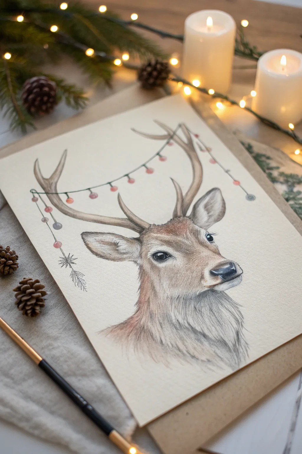
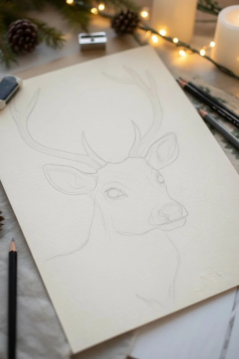
Capture the quiet magic of the season with this gentle reindeer portrait, adorned with festive minimalist garland. The soft earthy tones and delicate pencil strokes create a warm, inviting piece perfect for holiday cards or framed decor.
Step-by-Step
Materials
- Heavyweight drawing paper or mixed media paper (light cream or off-white)
- Graphite pencils (HB for sketching, 2B/4B for shading)
- Colored pencils (Warm browns, tans, greys, black, pink, muted red, muted green/blue)
- Fine liner pen (optional, for crisp details)
- Kneaded eraser
- Pencil sharpener
- Blending stump or cotton swab
Step 1: Sketching the Foundation
-
Basic Shapes:
Start lightly with an HB pencil to block out the basic shapes. Draw a slanted oval for the head and a smaller rounded rectangle for the snout area. Sketch a long, sweeping curve for the neck. -
Adding Features:
Place the large, teardrop-shaped ears on either side of the head, slightly high up. Mark the position of the eyes about midway down the oval, ensuring they are wide-set and level. -
Antler Framework:
Sketch the antlers rising from the forehead. I like to keep lines loose here; focus on the main branches curving outward and upward, adding small tines branching off. -
Refining the Outline:
Connect your shapes to create a smooth contour for the face and neck. Lightly erase your internal guideline shapes until only a ghost of the reindeer remains.
Fur Direction Trick
Always rotate your paper while drawing fur. Pulling pencil strokes toward your body often creates more natural, tapered lines than pushing away.
Step 2: Focusing on the Face
-
The Eyes:
Using a dark grey or black pencil, fill in the eyes. Leave a small, crisp white circle in each pupil for the catchlight—this brings the drawing to life immediately. Shade around the eye rims with black. -
Nose and Mouth:
Draw the nose pad with a dark grey pencil, shading the nostrils darkest black. Add a soft highlight on the top of the nose for a wet look. Sketch the mouth line with a gentle curve. -
Initial Fur Layer:
With a light tan or fawn-colored pencil, start adding fur texture. Use short, consistent strokes that follow the direction of hair growth—outward from the nose, up the forehead, and down the cheeks. -
Deepening Shadows:
Switch to a medium brown pencil to add dimension. Darken the area around the eyes, the bridge of the nose, and inside the ears. Keep your strokes light and build layers gradually.
Step 3: Building Texture and Decorations
-
Neck Fur:
The fur on the neck is longer and thicker. Use a grey or cool brown pencil to create longer, sweeping strokes that flow downward. Allow some white paper to show through for a realistic texture. -
Antler Color:
Color the antlers with a pale beige or cream base. Use a darker brown to shade the bottom edges and where the tines branch off, giving them a rounded, 3D form. -
Drawing the String:
Lightly sketch a draping line connecting the antlers. It should dip naturally in the middle. Go over this line with a dark green or grey pencil. -
Adding Ornaments:
Draw small circles hanging from the string. Alternate colors using muted reds, pinks, and grey-blues to match the soft aesthetic of the portrait. Keep the colors subtle rather than neon bright. -
Ornament Strings:
Connect each ornament to the main garland string with tiny vertical lines. You can make these lines slightly shaky or curved to imply movement.
Colors Too Waxy?
If you can’t layer colors because the surface feels slick (wax bloom), lightly blot the area with a tissue or very gently scrape with a craft knife edge.
Step 4: Final Touches
-
Ears and Details:
Add a touch of pink inside the ears and blend it softly with the surrounding browns. Darken the very tips of the ears with a dark brown pencil. -
Defining Whiskers:
Use a very sharp black or dark brown pencil to flick in a few delicate whiskers near the nose and above the eyes. -
Decorative Sprig:
On the left side, draw a small dangling sprig or pine branch graphic attached to the garland end, giving the composition a finished, illustrative feel. -
Final Contrast Check:
Step back and look for areas that need more pop. I usually find I need to darken the pupil and the deepest fur shadows one last time to anchor the drawing.
Sign your artwork subtly near the bottom and enjoy the tranquil holiday mood you’ve created


Cute Snow Globe Scene Inside a Circle
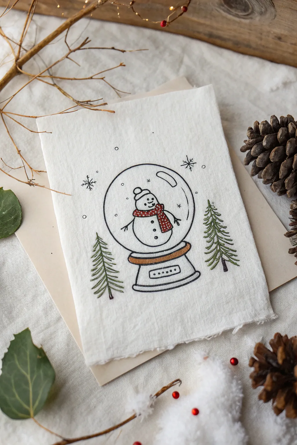
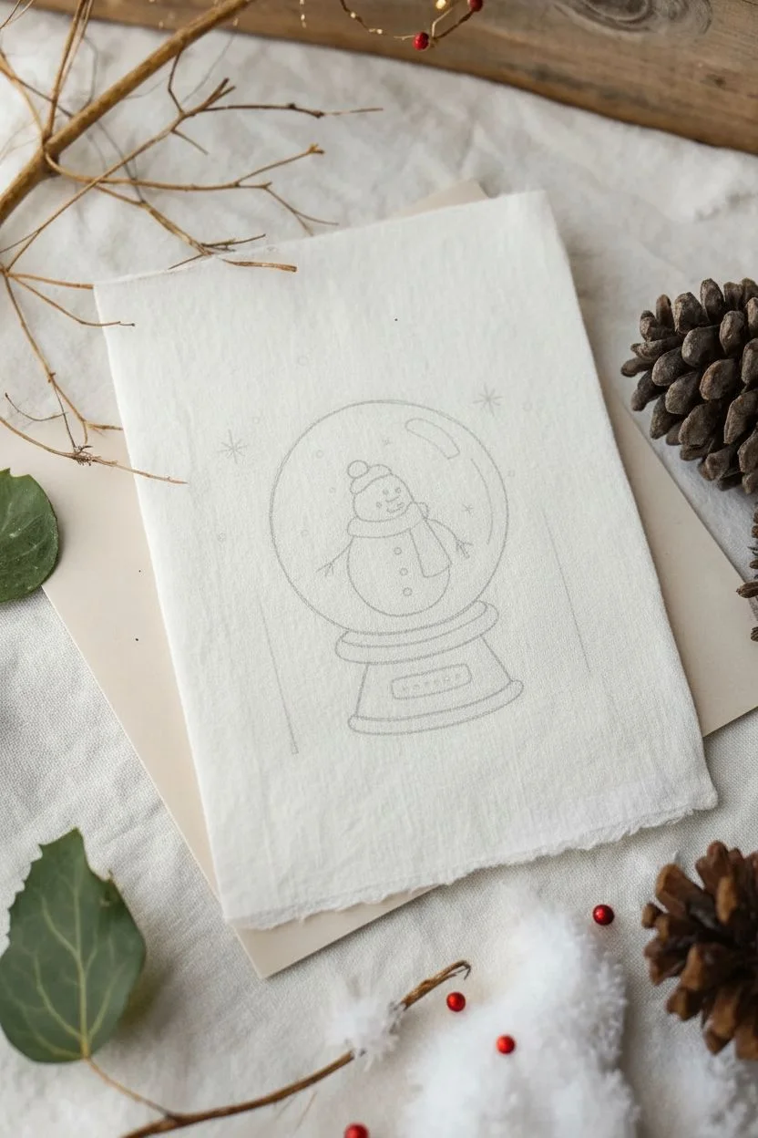
Capture the magic of winter in a jar with this charming embroidery project on fabric paper. Featuring a sweet snowman in his glassy home flanked by evergreens, this mixed-media piece combines simple linework with cozy touches of color.
Step-by-Step Guide
Materials
- Textured specialty paper or stiffened fabric sheet (cream/off-white)
- Fine-tip black illustration pen (0.1mm or 0.3mm)
- Embroidery floss (black, forest green, warm brown, red)
- Embroidery needle (size 7 or 8)
- Pencil and eraser
- Circle template or compass
- Ruler
- Piece of cardboard (optional backing)
Step 1: Drafting the Design
-
Establish the globe shape:
Begin by lightly tracing a perfect circle in the center of your paper using a compass or by recounting a similarly sized jar lid. Leave ample room on the sides for the trees. -
Sketch the base:
Draw an oval just below the circle that slightly overlaps the bottom edge. Add a smaller, parallel curve below that to create the dimension of the stand, then connect them with short vertical lines. -
Outline the snowman:
Inside the globe, sketch two stacked circles for the snowman’s body. Add a small beanie hat on top and simple stick arms extending outward. -
Add evergreen guides:
On the left and right of the globe, lightly draw vertical lines to mark the trunks of your pine trees to ensure they stand straight.
Wrinkle Rescue
If stitching warps the paper, gently press it face-down on a towel with a cool, dry iron. Avoid steam, which can ruin ink.
Step 2: Inking the Details
-
Trace the main lines:
Using your fine-tip black pen, carefully go over your pencil lines for the snow globe, the base, and the snowman’s outline. Keep your hand steady for a crisp look. -
Draw the scarf:
Detail the scarf around the snowman’s neck with the pen first. Add tiny patterns like dots or stripes, which will serve as a guide for later or stand alone if you choose not to stitch it. -
Add snow globe reflections:
Draw a kidney-bean shaped reflection near the top right creating the look of glass. Add a few small circles floating around inside for falling snow. -
Ink the snowflakes:
Outside the globe, near the top, draw a few simple asterisks or stylized snowflakes to fill the negative space. -
Erase pencil marks:
Wait until the ink is completely dry—I usually give it at least five minutes to be safe—then gently erase all visible pencil sketching.
Sparkle Upgrade
Add tiny dabs of pearlescent watercolor or glitter glue to the falling snow dots for a magical shimmering effect.
Step 3: Stitching and Coloring
-
Prep your thread:
Thread your needle with a single strand of black embroidery floss for the finest details, or two strands if you want a bolder look. -
Embroider the tree trunks:
Using a simple backstitch or a straight stitch, sew the vertical trunks of the pine trees using dark brown thread. -
Stitch the pine needles:
Switch to forest green floss. Create the branches by making downward-slanting straight stitches starting from the trunk and moving outward, getting wider towards the bottom. -
Fill the scarf:
Using red floss, fill in the snowman’s scarf with tiny satin stitches or French knots to give it a textured, knit appearance. -
Detail the base:
Use a warm brown thread to add a single line of stitching or color (colored pencil works here too) to the band on the snow globe’s base. -
Finalize snowman features:
Use a tiny dot of black pen or a single French knot for the snowman’s coal eyes and buttons. -
Add texture to the paper:
For that rustic, raw-edge look seen in the photo, rip the edges of your paper carefully against a ruler rather than cutting with scissors.
Enjoy displaying this cozy winter scene on your mantel or sending it as a heartfelt holiday card
Mistletoe Bundle as a Corner Decoration
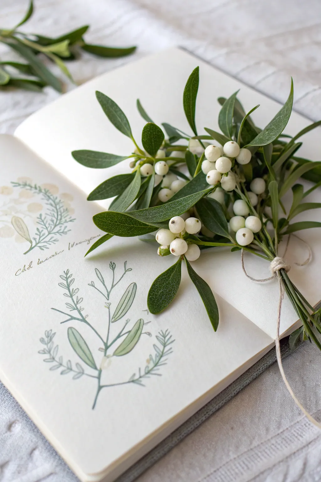
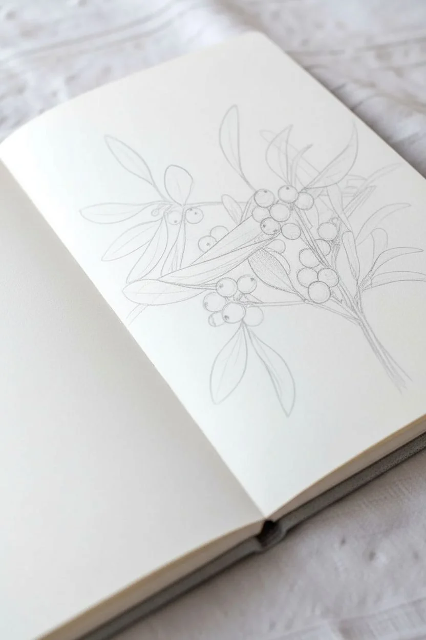
Capture the delicate elegance of winter flora with this gentle botanical sketch. This project combines loose pencil outlines with soft watercolor washes to create a vintage-style illustration that looks lovely on holiday cards or in your nature journal.
Step-by-Step Tutorial
Materials
- Hot press watercolor paper or sketchbook
- HB or 2H graphite pencil
- Kneaded eraser
- Fine liner pen (light grey or sepia, 0.1mm)
- Watercolor paints (Sap Green, Olive Green, White gouache or opaque white)
- Small round watercolor brushes (size 2 and 4)
- Jar of water
- Paper towel
Step 1: Drafting the Structure
-
Establish the main stems:
Begin by lightly sketching a central vertical line for the main stem using your HB pencil. Add two or three branches forking off to the sides in a ‘Y’ shape to create a natural, growing structure. -
Position the leaves:
Mistletoe leaves generally grow in opposite pairs. Sketch elongated oval shapes at the end of your branch forks. Keep the lines very faint so they can be erased later. -
Add the berries:
Draw small circles in the crooks where the branches meet the stem. Group them in clusters of two or three for a realistic look, ensuring they overlap slightly. -
Refine the leaf shapes:
Go back over your leaf ovals and narrow them at the base where they connect to the stem. The tips should be rounded but slightly blunt, characteristic of mistletoe. -
Lighten the guidelines:
Take your kneaded eraser and gently roll it over the entire sketch. You want to lift up most of the graphite, leaving just a ghost of an image to guide your painting.
Ink Bleeding?
If your fine liner pen bleeds when touching the paper, the paint isn’t dry yet. Wait another 10 minutes, or use waterproof ink *before* painting instead.
Step 2: Applying Color
-
Mix your greens:
Prepare a watery mix of Sap Green with a touch of brown or ochre to desaturate it. You want a vintage, muted green rather than a bright spring green. -
First wash on leaves:
Using the size 4 brush, paint the leaves with the watery green mix. Leave tiny slivers of white paper along one edge of each leaf to act as a highlight. -
Paint the stems:
Switch to your smaller size 2 brush. Using the same green mix, carefully trace the stem lines. Add a little more pigment to the mix for the ‘joints’ where stems branch off. -
Define the berries:
For the berries, use a very dilute wash of grey or a tiny dot of yellow-white. I prefer to keep these almost the color of the paper, painting only the shadows on the bottom curve to give them volume. -
Let it dry:
Allow the first layer of paint to dry completely. If the paper feels cool to the touch, it’s still damp.
Step 3: Detailing and Ink
-
Deepen the shadows:
Mix a slightly darker, thicker green (Olive Green is perfect here). Paint a second layer near the base of the leaves and on the underside of the stems. -
Add berry details:
Use a tiny dot of brown or dark green paint on the tip of the berries to create the ‘eye’ of the fruit. -
Apply gouache highlights:
If your white paper highlights got covered, take a tiny bit of white gouache and dab a small highlight on the fullest part of the berries to make them look waxy. -
Outline with ink:
Once the paint is bone dry, use your fine liner pen to loosely trace the shapes. Don’t close every line; keeping the ink broken and sketch-like adds character. -
Add textural marks:
Add tiny ticking marks or stippling along the shadowed side of the stems with the pen to suggest texture. -
Add scripted text:
To mimic the botanical plate style, verify the scientific name (Viscum album) and write it in a flowing cursive script next to the stem using your pencil or pen.
Pro Tip: Vintage Look
Make the page look aged by lightly brushing strong tea or coffee over the paper and letting it dry before you start your sketch.
Now you have a timeless botanical study ready to grace your holiday journal
Holiday Fireplace Mantel With Garland and Stockings
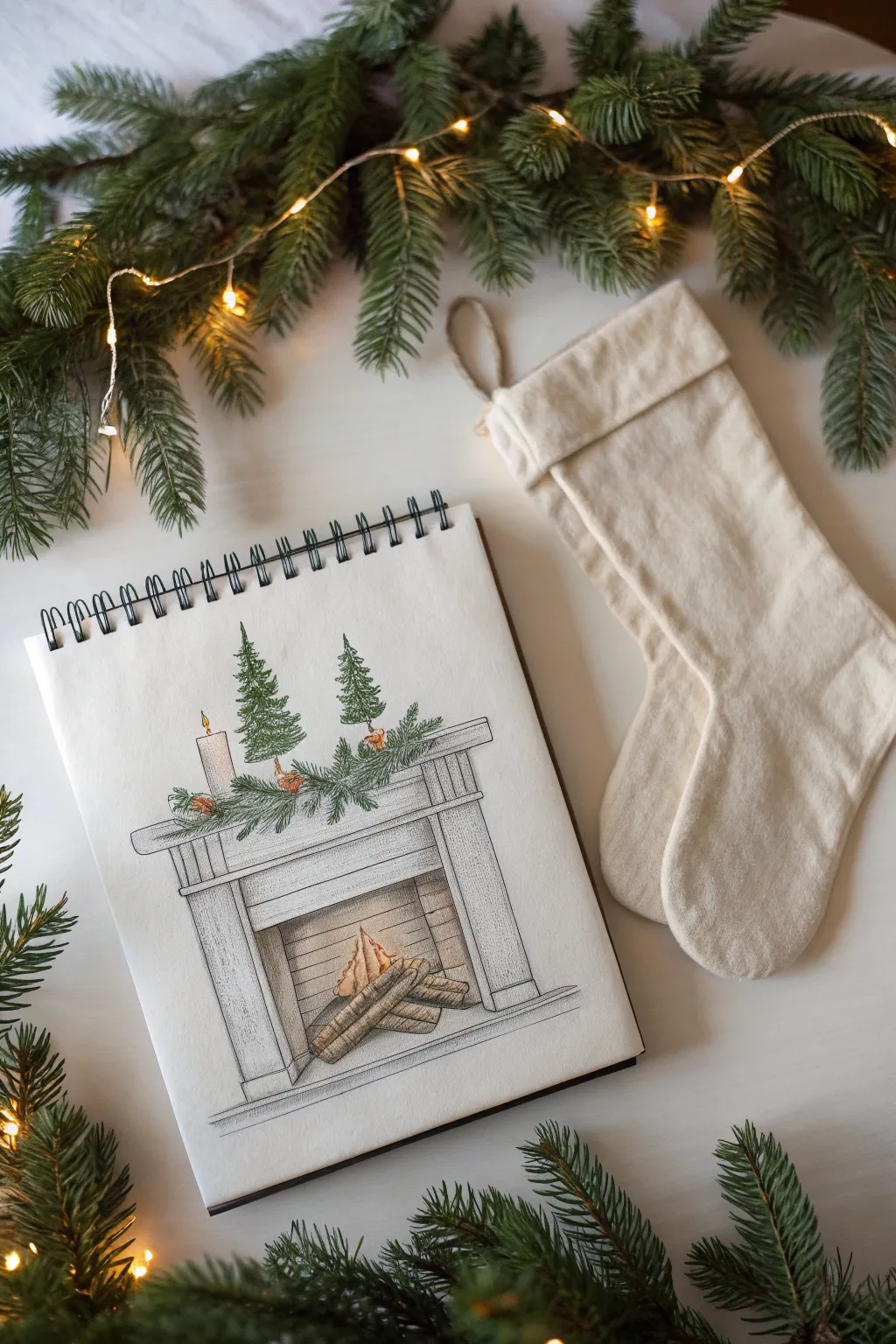
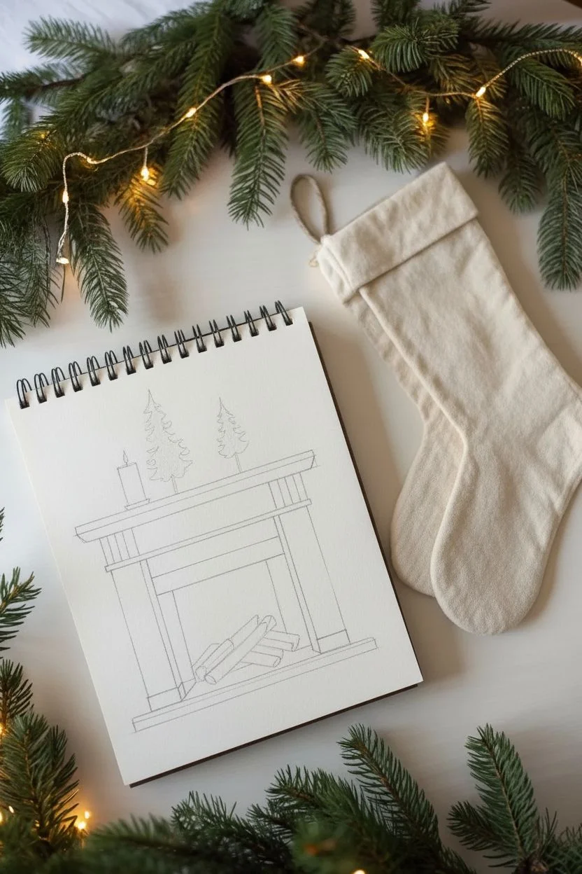
Capture the warmth of the season with this delicate illustration of a decorated fireplace mantel. Using fine ink lines and soft color shading, you’ll create a charming architectural sketch complete with festive greenery and a crackling fire.
Step-by-Step Guide
Materials
- Spiral-bound sketchbook with smooth drawing paper
- Fine liner pens (sizes 0.1, 0.3, and 0.5)
- Graphite pencil (HB or 2H)
- Eraser (kneaded preferred)
- Colored pencils (shades of green, brown, grey, orange, yellow)
- Ruler
Step 1: Structural Sketching
-
Draft the box shape:
Begin by lightly sketching a large rectangle in the center of your page using your graphite pencil and ruler. This will form the main body of the fireplace. -
Define the opening:
Draw a smaller rectangle inside the bottom half of your first shape to create the firebox opening. Add diagonal lines at the inner corners to give the firebox depth and dimension. -
Add the mantelpiece:
Sketch a long, thin horizontal rectangle hovering slightly above the main body for the mantel shelf. Connect it to the body with simple vertical lines and add a slightly thicker trim piece just below the shelf. -
Detail the facade:
Draw vertical lines on the sides of the fireplace legs to suggest paneling. I like to add a horizontal panel above the firebox opening to mimic classic woodworking details. -
Place the decorations:
Lightly sketch the shapes for two small evergreen trees sitting on the mantel—simple triangles work perfectly as guides. Add a cylinder shape for a candle on the far left side.
Needle Knowledge
When drawing pine needles, don’t make them too uniform. Varying length and density makes the greenery look lush and realistic rather than stiff.
Step 2: Inking the Details
-
Outline the structure:
Switch to your 0.3 or 0.5 fine liner. Carefully trace over your pencil lines for the fireplace structure. Use a ruler for the long straight lines to keep the architectural look crisp. -
Add wood grain texture:
With a 0.1 fine liner, draw very faint, broken vertical lines on the fireplace panels. This subtle texture mimics painted wood without being overwhelming. -
Ink the garland base:
Draw a wavy, organic line resting on top of the mantel shelf. This will serve as the spine for your evergreen garland. -
Create pine needles:
Using short, quick flicks of the pen, build up the texture of the garland and the two mini trees. Start from the center branch and flick outward. Vary the direction slightly to keep it looking natural. -
Draw the fire:
Inside the firebox, draw three or four logs stacked together. Add a wiggly, flame-like shape rising from the center logs. -
Erase guidelines:
Once the ink is completely dry, gently erase all your graphite sketch lines to reveal a clean illustration.
Shaky Lines?
If your straight lines wobble, embrace it. A slightly imperfect line adds character to hand-drawn illustrations and makes them feel cozier.
Step 3: Adding Color & Warmth
-
Color the greenery:
Take a medium green colored pencil and gently shade the trees and garland. Use small circular motions to get into the texture. Layer a darker green in the shadowed areas for depth. -
Shade the fireplace:
Use a light cool grey pencil to shade the fireplace structure. Focus on the sides of the columns and under the mantel shelf to create a three-dimensional effect. -
Illustrate the fire:
Color the logs with light and dark browns. Use yellow at the base of the flame, blending into orange, and finally a touch of red at the very tips. -
Add a warm glow:
Lightly shade the back wall of the firebox with a warm beige or light brown to suggest stone or brick illuminated by the fire. -
Highlight the candle:
Leave the candle body mostly white, adding just a tiny shadow on one side with grey. Add a small yellow teardrop for the flame. -
Add decorative accents:
If you wish, add tiny dots of red or orange within the garland to represent berries or small ornaments. -
Ground the drawing:
Add a faint horizontal line at the base of the fireplace to represent the floor, and add a little grey shading beneath the hearth to ground the object.
Your sketchbook now holds a little piece of holiday comfort ready to warm up the page
Snowy Village Scene With Rooftop Garland
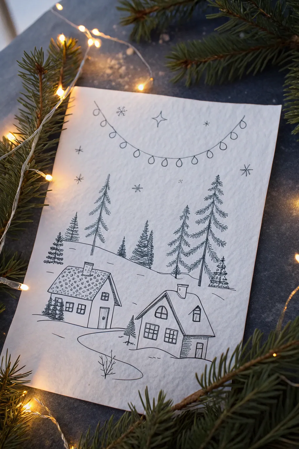
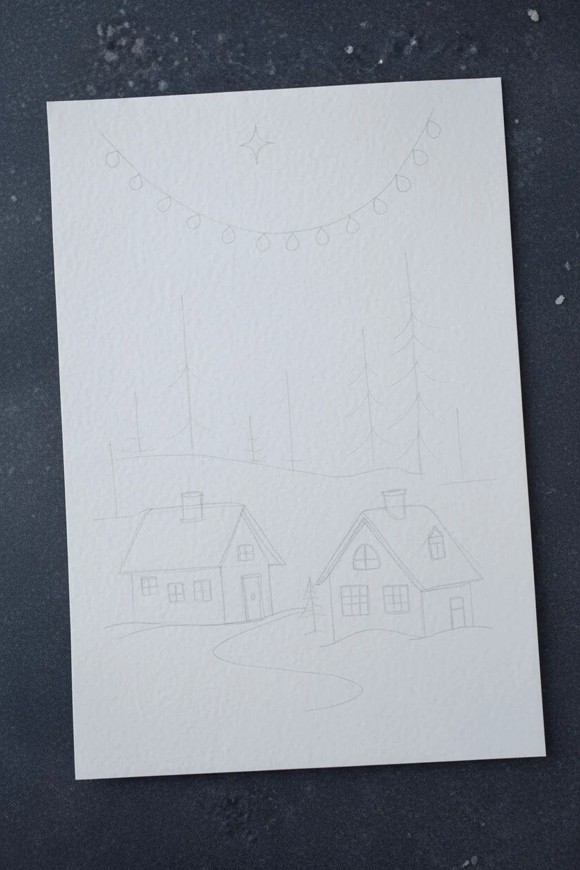
Capture the cozy charm of a snowy evening with this delicate pen-and-ink drawing. Using fine lines and simple shapes, you’ll create a serene village scene complete with rustic cabins and festive garlands.
Detailed Instructions
Materials
- High-quality textured art paper or cardstock (white or off-white)
- Fine-liner pen (black, 0.1mm or 0.3mm)
- Pencil (HB or 2B)
- Eraser
- Ruler (optional)
Step 1: Planning and Sketching
-
Establish the horizon line:
Begin by lightly sketching a sloping line across the middle of your paper to create the main snowy hill. Make it slightly curved, dipping lower on the right side. -
Block in the houses:
Place two simple house shapes in the foreground. Draw a rectangular house on the left and a slightly taller house with an angled add-on structure on the right. -
Add roof details:
Give both houses pitched roofs. For the left house, add a chimney on top. For the right house, sketch a chimney near the peak and define the side extension’s roofline. -
Position the trees:
Lightly mark vertical lines where your pine trees will go. Place several tall trees on the hill behind the houses and a few smaller ones near the buildings. -
Sketch the garland:
Draw a large, dipping curve across the top of the page for the string of lights. Add small circles hanging from the line at even intervals.
Smudged Lines?
If you smear wet ink, turn it into a shadow or a dense patch of pine needles. Adding extra texture nearby can help camouflage the mistake naturally.
Step 2: Inking the Scene
-
Ink the garland string:
Switch to your fine-liner pen. Carefully trace over the curved line of the garland first to establish the top border of your composition. -
Draw the light bulbs:
Ink the small circles or teardrop shapes hanging from the string. You don’t need to fill them in; leaving them open keeps the drawing feeling light and airy. -
Outline the houses:
Go over the main outlines of your houses. Use a steady hand for the walls and roof lines, but don’t worry if lines aren’t perfectly straight—it adds character. -
Add windows and doors:
Draw square paneled windows on both houses. Add rectangular doors, perhaps giving the left house a small arched top to the door frame. -
Detail the roofs:
On the left house, use small squiggly scribbles or dots to create a textured, snowy look on the roof. For the right house, keep the roof mostly white to suggest a thick blanket of smooth snow. -
Create wooden textures:
Add horizontal hatching lines on the side of the right house’s extension to simulate wood siding. Keep the strokes light and evenly spaced.
Step 3: Adding Landscape Elements
-
Draw the pine trees:
Ink your trees using downward, jagged scribbles. Start narrow at the top and widen as you go down, leaving gaps to suggest snow-laden branches. -
Vary the tree styles:
Make the background trees slightly less detailed than the foreground ones. Include a tiny, detailed tree right next to the right-hand house. -
Define the snow banks:
Ink the sloping hill line behind the houses. Add a winding path leading from the bottom edge up between the two cottages using smooth, flowing curves. -
Add foreground vegetation:
Sketch a small, leafless shrub or tiny pine near the bottom center to anchor the foreground composition. -
Fill the sky:
Draw a few four-pointed stars and small asterisks scattered in the sky for snowflakes. I like to vary the sizes to create a sense of depth. -
Clean up:
Wait a few minutes to ensure the ink is completely dry, then gently erase all your pencil guidelines to reveal the crisp black-and-white scene.
Creating Depth
Make foreground lines slightly thicker or press harder with your pen. Keep background trees feathery and light to make them look further away.
Place your finished drawing in a simple frame or on a mantle with some greenery to complete the festive mood
Holiday Lights String With Glow Halos
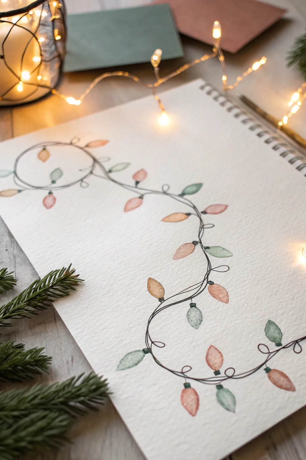
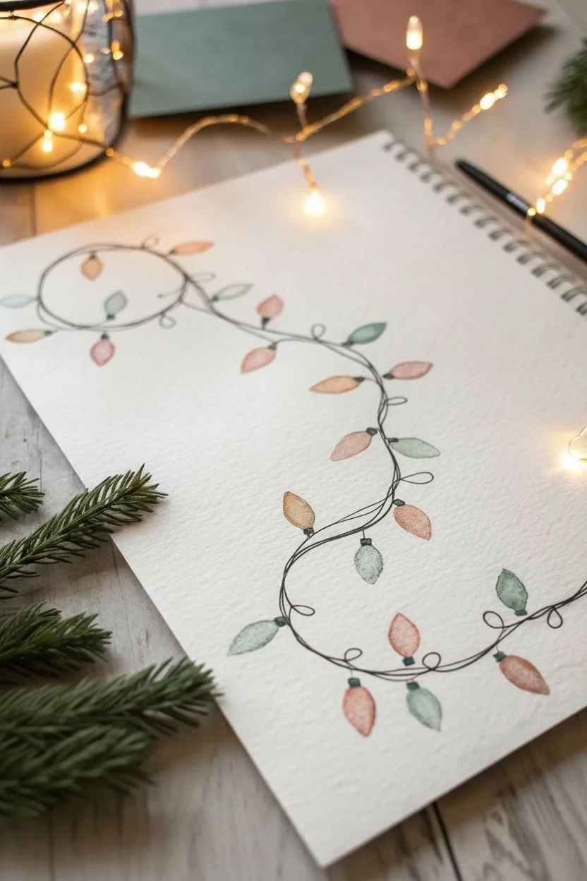
Capture the cozy glow of the season with this delicate illustration of tangled string lights. Using a mix of fine line work and soft, muted watercolors, you’ll create a festive border that dances across the page like a holiday memory.
How-To Guide
Materials
- Spiral-bound sketchbook (heavyweight textured paper)
- Black fineliner pen (0.1 or 0.3mm)
- Watercolor paints (vintage palette: sage green, dusty rose, golden ochre, burnt umber)
- Small round paintbrush (size 2-4)
- Pencil (HB)
- Kneaded eraser
- Water cup and paper towel
Step 1: Sketching the Composition
-
Map the wires:
Start by lightly sketching a loose, wandering line with your pencil. Let it curve and loop organically, starting from the upper left corner and meandering down toward the bottom right. -
Add intersecting loops:
Create visual interest by overlapping the wire upon itself. Draw a few small curlicues and larger loops where the wire twists, mimicking how lights naturally tangle when pulled from a box. -
Place the bulbs:
Sketch small oval or almond shapes along the wire at somewhat regular intervals. Alternate the direction they point—some up, some down, some sideways—to keep the strand looking relaxed. -
Draw the sockets:
At the base of each bulb, sketch a small rectangle or trapezoid where it connects to the wire.
Keep it Loose
Don’t try to draw a perfect sine wave. Real light strands are messy! Let the wire cross itself and create uneven loops for a much more natural, sketchbook aesthetic.
Step 2: Inking the Outlines
-
Ink the main wire:
Using your black fineliner, trace over your pencil wire lines. Don’t worry about being perfectly straight; a slightly jittery hand adds character. Double up the line in some sections to suggest twisted wires. -
Detail the loops:
Where the wire creates little loops or knots, draw through the intersection to show the tangle. -
Outline the sockets:
Ink the small rectangular sockets you sketched earlier. Add tiny horizontal lines inside them to mimic the screw threads. -
Outline the bulbs – lightly:
Trace the bulb shapes but keep a very light touch or use a thinner pen if you have one. You want the color to define the bulb more than a heavy black outline. -
Erase pencil marks:
Wait at least five minutes for the ink to fully dry, then gently gently rub a kneaded eraser over the entire drawing to lift the graphite.
Fixing Smears
Did your fineliner smear when painting? Dab it immediately with a clean paper towel. Once dry, repaint the bulb with a slightly more opaque mix to cover the smudge.
Step 3: Painting the Bulbs
-
Prepare your palette:
Mix three main muted colors: a sage green (green mixed with a touch of brown), a dusty rose (red mixed with a little white or water), and an amber ochre. -
Paint the first color:
Start with your dusty rose mix. Select scattered bulbs across the string—about one-third of them—and fill them in gently with your round brush. -
Add texture while wet:
While the paint is still damp, I like to drop a tiny speck of darker pigment at the bottom of the bulb to create a shadow and sense of volume. -
Paint the green bulbs:
Rinse your brush and switch to the sage green. Fill in another third of the bulbs, ensuring they aren’t all clustered together. -
Paint the gold bulbs:
Complete the string with the ochre/gold tone. This warm color acts as a highlight against the cooler green and pink tones.
Step 4: Final Details
-
Shade the sockets:
Take a very diluted gray or dark green wash and tap it onto the rectangular sockets to give them a plastic-like weight. -
Create a glow texture:
Once the bulb paint is mostly dry but the paper has a tiny bit of moisture left, create a ‘bloom’ texture by touching a clean, damp brush to the center of a few bulbs to push pigment to the edges. -
Add subtle highlights:
If your paper allows, use a white gel pen or opaque white paint to add a tiny reflective dot on the upper curve of each bulb for a glassy look.
Now you have a charming, vintage-inspired illustration perfect for holiday cards or journal headers
Holiday Card Layout With Hand-Lettered Greeting and Icons
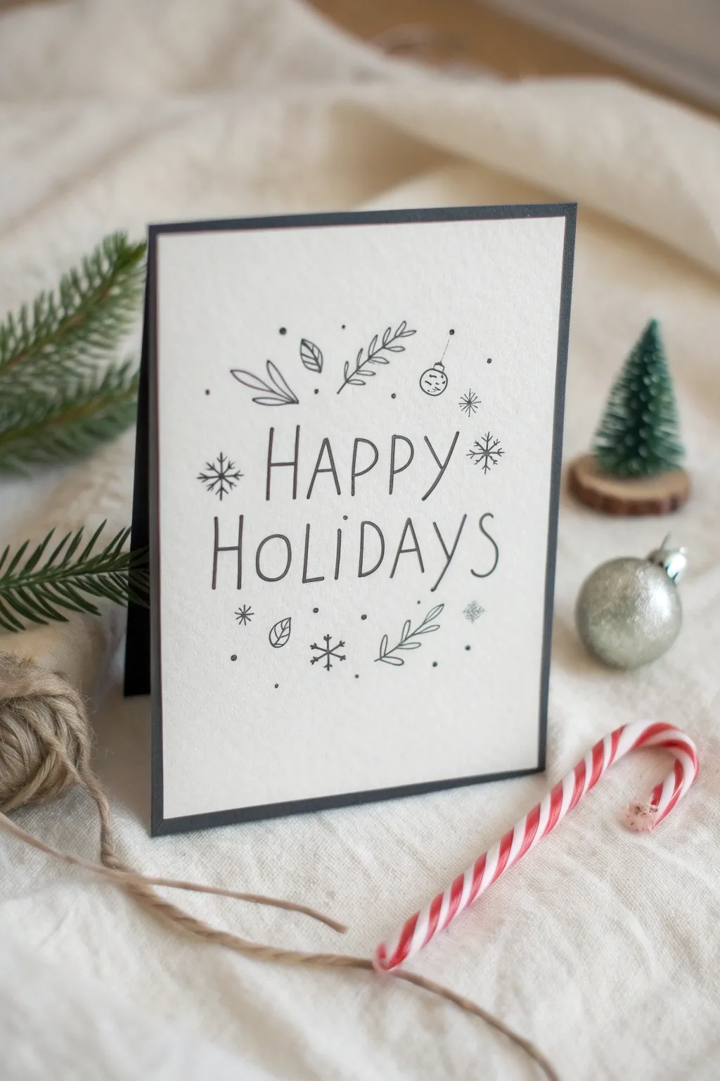
This elegant holiday card relies on clean lines and negative space to make a sophisticated statement. With simple black ink illustrations and a classic typeface style, you can create a professional-looking greeting right at home.
Detailed Instructions
Materials
- High-quality white cardstock (smooth or lightly textured)
- Black cardstock (for the backing)
- Fine-point black drawing pen (archival ink)
- Medium-point black marker or brush pen
- Pencil (HB or 2H)
- Eraser (kneaded preferred)
- Ruler
- Paper trimmer or scissors
- Double-sided tape or glue roller
Step 1: Preparation & Layout
-
Cut the Base Layers:
Begin by cutting your black cardstock to form the folded card base; a standard A2 size (4.25″ x 5.5″ when folded) works perfectly here. Next, cut a piece of white cardstock slightly smaller than the front of your black card, leaving about a 1/8-inch border visible all around. -
Mark the Center:
Use a ruler to find the exact vertical center of your white cardstock panel. Lightly sketch a vertical guideline with your pencil to help you center the text later on. -
Draft the Text Guidelines:
Measure two horizontal spaces in the visual center of the card for your greeting. Draw light horizontal lines to define the top and bottom of the words ‘HAPPY’ and ‘HOLIDAYS’, ensuring the second word is slightly wider than the first for balance. -
Sketch the Lettering:
Lightly sketch the words ‘HAPPY HOLIDAYS’ in a tall, narrow sans-serif style. Focus on keeping the stroke width consistent and the spacing between letters airy and even.
Use a Light Table
Compose your layout on scrap paper first. Then, place your final cardstock over it on a light table (or a sunny window) to trace the design perfectly without needing heavy erasure.
Step 2: Inking the Design
-
Ink the Text:
Using your medium-point black marker, carefully trace over your pencil lettering. Use confident, steady strokes rather than short sketchy ones to get clean lines. I find it helps to pull the pen toward you rather than pushing it away. -
Sketch the Upper Motifs:
Switch back to your pencil. Above the word ‘HAPPY’, lightly draw a small cluster of botanical elements: a twig with leaves on the left, a pine sprig in the center, and a hanging ornament on the right. -
Sketch the Lower Motifs:
Below the word ‘HOLIDAYS’, sketch a similar arrangement to mirror the top but not copy it exactly. Place a leaf sprig on the right and some small scattered snowflakes on the left. -
Ink the Illustrations:
Take your fine-point drawing pen to ink over these decorative sketches. The finer tip provides a delicate contrast to the bolder text. -
Add Decorative Details:
Draw small details like veins in the leaves and the hook on the ornament. Keep these lines very thin and light. -
Draw Snowflakes:
Add drawn snowflakes around the text. Use simple intersecting lines—an ‘X’ crossed with a vertical line—to create six-pointed stars. -
Balance with Dots:
Look for empty patches of white space in your composition. Gently tap the tip of your fine pen to create tiny stippled dots, clustering them slightly around the main illustrations to simulate falling snow.
Step 3: Assembly & Finishing
-
Erase Guidelines:
Wait at least 10 minutes to ensure the ink is completely dry. Gently erase all visible pencil marks, being careful not to buckle the paper. -
Check Edges:
Examine the edges of your white cardstock for any rough spots from cutting and smooth them if necessary. -
Apply Adhesive:
Flip the white panel over and run double-sided tape or a glue roller along all four edges on the back. -
Mount the Panel:
Carefully align the white panel over the black folded card base. Center it so the thin black border is even on all sides, then press down firmly to secure it.
Smudged Ink Fix
If you accidentally smudge a small area, don’t throw it out. Turn the smudge into a deliberate element by drawing a small snowflake or a cluster of dots right over the mistake.
Your finished card is now ready to share a sophisticated seasonal greeting with your loved ones
Menorah Drawing With Warm Candlelight Shading
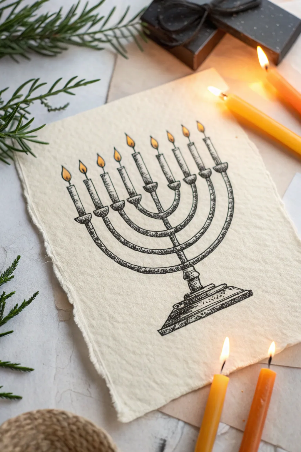
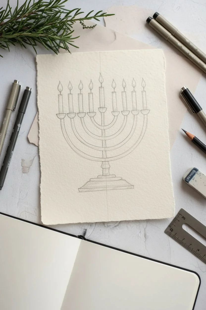
Capture the solemn beauty of Hanukkah with this elegant Menorah drawing, characterized by its textural stippling technique and handmade paper charm. The contrast between the detailed black ink work and the soft, glowing candle flames creates a warm, vintage aesthetic perfect for holiday cards or decor.
How-To Guide
Materials
- Heavyweight textured paper or handmade cotton rag paper (cream or off-white)
- Fine liner pens (sizes 0.1, 0.3, and 0.5)
- Pencil (HB or 2H)
- Kneadable eraser
- Ruler
- Yellow and orange colored pencils or brush markers
- Compass (optional, for perfect curves)
Step 1: Drafting the Structure
-
Paper preparation:
Begin by tearing the edges of your paper if using a standard sheet to replicate that deckled, handmade edge look. A ruler held firmly against the paper can help guide a rough, organic tear. -
Central axis:
Using a ruler and a light pencil touch, draw a vertical line down the center of your page. This will serve as the stem of the Menorah and the anchor for symmetry. -
Base construction:
Sketch a sturdy base at the bottom of the central line. Draw a tiered pedestal shape—a wider rectangle at the very bottom, stepping up to a narrower section that connects to the stem. -
Curved arms:
Mark four points on the central stem where the arms will branch out. Draw four U-shaped curves extending from these points, getting wider and higher as you move up the stem. Ensure the tops of all arms align horizontally. -
Candle holders:
At the top of each of the eight arms and the central stem (the Shamash), draw small cup shapes or cylinders to hold the candles. -
Adding candles:
Sketch simple, vertical rectangles rising from each holder. Keep them relatively short to match the reference style. -
Flame outlines:
Draw teardrop shapes at the top of each candle wick. Vary the tilt slightly on a few to make them look like flickering, natural fire rather than static shapes.
Stippling Rhythm
Keep your pen vertical when stippling. Slanted dots look like dashes. Find a steady rhythm—tap-tap-tap—rather than rushing, which leads to messy tadpole shapes.
Step 2: Inking and Stippling
-
Initial outline:
Switch to your 0.3 fine liner. Carefully trace over your pencil lines for the main structure—the arms, the base, and the candle holders. Leave the flames and wicks alone for now. -
Adding thickness:
Go back over the arms and stem to double the lines slightly, giving the metal structure visual weight. The lines shouldn’t be perfectly smooth; a little texture adds to the antique feel. -
Base stippling:
Using a 0.1 pen, begin the shading process on the base. Apply tiny dots (stippling) densely on the right side and bottom edges to create shadow, fading to fewer dots toward the center. -
Shading the arms:
Continue the stippling technique on the curved arms. Concentrate your dots on the undersides of the curves to give them a rounded, tubular 3D form. -
Texture detail:
For the candle holders and the connections where the arms meet the stem, use a mix of very short hatch marks and dots. This differentiates the “joined” parts of the metalwork. -
Wicks and flames:
Draw the wicks with a single confident stroke. Outline the teardrop flames very delicately with the 0.1 pen, or leave them purely pencil if you want a softer look. -
Clean up:
Once the ink is completely dry—I usually give it a full 10 minutes to be safe—gently erase all underlying pencil sketch lines with a kneadable eraser to avoid damaging the paper surface.
Step 3: Adding Warmth
-
Base color:
Take a yellow colored pencil or marker and fill in the teardrop flame shapes. Keep the color solid and bright. -
Gradient glow:
Use an orange pencil to shade just the bottom curve of each flame and a tiny bit up the center. This creates a glowing gradient effect. -
Final touches:
Inspect your stippling. If the drawing feels too flat, add a second pass of dots with your 0.5 pen in the darkest shadow areas (like the bottom right of the base) to increase the contrast.
Uneven Symmetry?
If one side of your Menorah looks wider, don’t erase everything. Thicken the outline on the narrower side to balance the visual weight without redrawing the structure.
Display your masterpiece near actual candlelight to enhance the cozy, reflective atmosphere of your drawing.
Reflective Ornament Study With Tiny Room Highlights
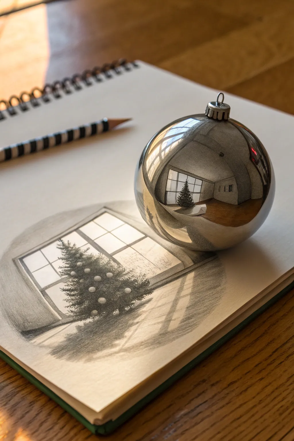
This captivating project plays with reality by combining a classic pencil sketch with a three-dimensional object study. You’ll draw a cozy holiday scene on paper, then place a real silver ornament on top to capture its distorted reflection, creating a fascinating meta-artwork.
Step-by-Step Guide
Materials
- High-quality sketchbook paper (smooth or medium tooth)
- Graphite pencils (range from 2H for light lines to 4B/6B for dark shading)
- Silver spherical ornament (reflective surface is essential)
- Kneaded eraser
- Precision eraser or eraser stick
- Blurring stump or tortillon (optional)
- Ruler
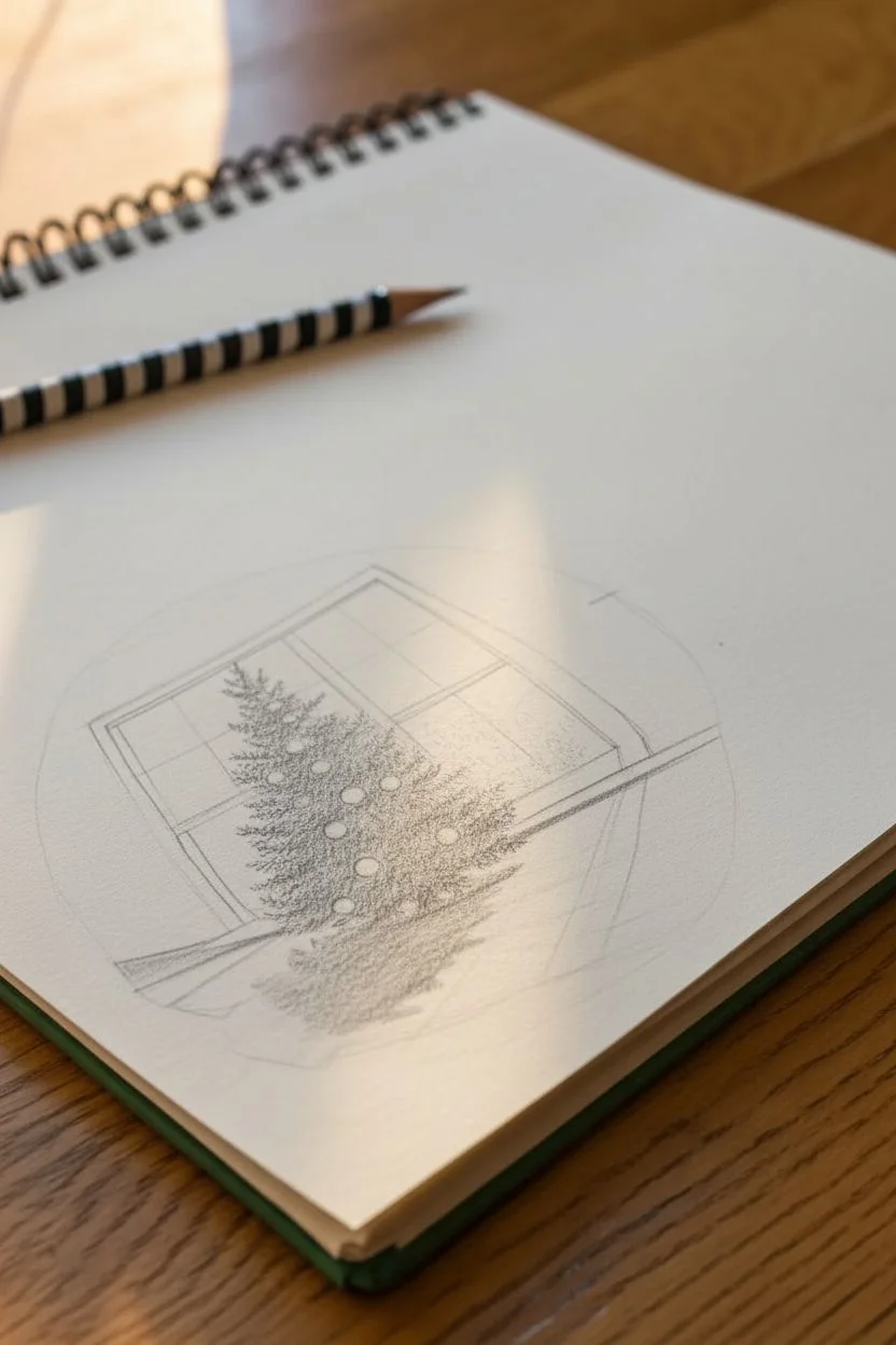
Step 1: Drafting the ‘Imagined’ Room
-
Establish the Perspective:
Begin by lightly sketching a large window frame on the lower left half of your page. Use a ruler to ensure your vertical lines are straight, but let the horizontal lines angle slightly downward toward a vanishing point on the right side of the paper. -
Block in the Tree:
Sketch a triangular shape in front of the window to represent the Christmas tree. Keep the lines faint, as this is just a guide for placement. -
Detail the Window Panes:
Add the muntins (the grid bars) to the window. Draw the thickness of the window sill and frame to give it dimension. The light source is coming from outside, so keep the interior framing darker. -
Foliage Texture:
Using a softer pencil like a B or 2B, start adding texture to the tree. Use short, flicking strokes to mimic pine needles, building up density from the center of the tree outward. -
Add Ornaments:
Draw small circles scattered across the tree. Erase the tree texture inside these circles so they appear to be sitting on top of the branches. -
Create Floor Shadows:
Draw long, angled shadows stretching from the base of the tree and the window frame across the ‘floor’ to the right. These shadows anchor the drawing and suggest bright sunlight streaming in.
Step 2: Drawing the Ornament’s Distortion
-
Position Your Model:
Place your real silver ornament on the upper right side of your paper. Look closely at how it reflects the room around you (or imagine a reflected room based on your drawing). -
Outline the Sphere:
Actually, for this specific project, the goal is to *draw* the ornament too, making it look hyper-realistic. Start by drawing a perfect circle using a compass or tracing a round object. -
Sketch the Cap:
Draw the metal cap and loop at the top of the sphere. Pay attention to the ridges on the cap and the small ring. -
Map the Reflection:
Lightly sketch the warped grid of the window reflection inside the sphere. Remember, spherical reflections curve lines; straight window panes become curved, fish-eye shapes hugging the contour of the ball. -
Distort the Tree:
Draw a tiny, warped version of your tree inside the reflection. It should look smaller and slightly bent, following the curve of the ornament’s surface.
Curve Control
Struggling with the curved reflection? Draw a grid on a cheap plastic ball with a marker. Observe how the grid lines warp, and use that as a reference for your curves.
Step 3: Shading and Photorealism
-
Deepen the Darks:
Switch to a 4B or 6B pencil. Darken the ‘floor’ inside the reflection and the shadowed side of the room. High contrast is the secret to making metal look shiny. -
Preserve Highlights:
Leave the brightest white spots of the paper completely untouched. These are your specular highlights—the spots where the light hits the metal directly. -
Render the Floor Study:
Return to the main drawing on the paper (the one beneath the ornament). Use the side of your pencil lead to shade the floor area smoothly, letting it fade out at the edges for a vignetted look. -
Refine the Tree Shadows:
Darken the core of the main Christmas tree to give it volume. I like to press harder near the trunk and lift pressure as I move toward the tips of the branches. -
Polish the Ornament:
Use a blurring stump to smooth out the graphite on the ornament for a liquid metal look. Keep the edges sharp and clean. -
Cast Shadow:
Draw a small, dark shadow underneath the ornament itself. This grounded shadow is crucial; without it, the ball will look like it’s floating rather than sitting on your sketchbook. -
Final Highlights:
Use a precision eraser or an electric eraser to pick out sharp bright lines on the window sill and the ornament’s cap for that final sparkle.
Clean Edges
To keep the ornament perfectly round, cut a circular hole in a piece of scrap paper. Place this ‘stencil’ over your drawing area while shading the edges to prevent smudging.
Step back and admire how the interplay between the flat sketch and the spherical rendering creates a beautiful optical illusion.

Have a question or want to share your own experience? I'd love to hear from you in the comments below!