When I’m stuck staring at a blank page, I love reaching for Native and Indigenous themes because they’re full of story, pattern, and strong shapes. These prompts are meant to spark your sketchbook—take a minute to do respectful research as you draw, and let the details guide you.
Native Profile Portrait With Strong Features
This striking profile portrait captures the strength and dignity of its subject through careful rendering of heavy features and braided hair. Using toned paper allows you to build depth with shadows while letting the warm background serve as a natural mid-tone for the skin.
Detailed Instructions
Materials
- Cream or beige toned drawing paper
- Set of graphite pencils (HB, 2B, 4B, 6B)
- Black charcoal pencil (optional for deepest darks)
- White charcoal pencil or white pastel stick
- Blending stump (tortillon)
- Kneaded eraser
- Pencil sharpener
Step 1: Laying the Foundation
-
Outline the silhouette:
Begin with a very light HB pencil sketch to establish the profile shape. Mark the forehead slope, the bridge of the nose, the lips, and the chin. Keep these initial lines faint so they can be easily adjusted. -
Map feature placement:
Draw faint horizontal guidelines to align the eye with the top of the ear. Sketch the basic triangular shape of the nose and the distinct angle of the jawline. -
Define the eye structure:
Refine the amygdala shape of the eye, paying attention to the heavy upper lid and the way the skin folds at the outer corner. Ensure the iris is positioned looking slightly upward and forward. -
Sketch the braid:
Outline the flow of the hair, sweeping it back from the forehead and down behind the ear. rough in the interwoven ‘Y’ shapes that make up the braid trailing down the neck.
Keep it Sharp
For hair strands that look realistic rather than like ribbons, keep your pencil point needle-sharp. Rotate the pencil slightly after every few strokes to maintain that fine point.
Step 2: Developing the Portrait
-
Shade the darkest areas:
Switch to a 4B pencil to fill in the pupil and the darkest crevices of the hair. This establishes your value range early on. -
Model the nose and cheekbone:
Using a 2B pencil, lightly shade the side of the nose and under the cheek. I like to use diagonal hatching strokes here to follow the plane of the face. -
Define the lips:
Carefully shade the upper lip, which is usually darker than the lower lip. Emphasize the corner of the mouth to give the expression a sense of resolve. -
Add texture to the hair:
Draw individual strands sweeping back from the hairline using long, confident strokes with the 2B and 4B pencils. Leave gaps where the light hits the curve of the skull. -
Develop the ear:
Shade the intricate folds of the ear, ensuring deep shadows in the canal and under the helix to make it look three-dimensional.
Aged Paper Effect
Before drawing, lightly wash your paper with cold tea or coffee and let it dry flat. This creates an authentic, parchment-like texture that complements this historical style beautifully.
Step 3: Refining and detailing
-
Build skin texture:
Lightly smudge your graphite shading with a blending stump to create smooth skin tones, but leave some pencil texture visible around the jaw and neck for a weathered look. -
Deepen the contrast:
Use a 6B pencil or charcoal to darken the shadows under the jawline, in the braid, and strictly along the lash line. This high contrast brings the face forward. -
Add the earring detail:
Draw the small earring loops. Keep them crisp and add a tiny highlight to suggest metal. -
Render the clothing:
Sketch the collar of the garment loosely. Use broader, rougher strokes here compared to the face to keep the focus on the portrait itself. -
Apply highlights:
If you have a white charcoal pencil, touch it lightly to the tip of the nose, the lower lip, the ridge of the ear, and the ‘shine’ on the hair strands. If not, use the kneaded eraser to lift pigment for these highlights. -
Final blending and cleanup:
Softly blend the background shading so it fades into the paper. Use the kneaded eraser to pick up any stray smudge marks around the profile edge for a clean silhouette.
Step back and admire the powerful character you have captured in this portrait

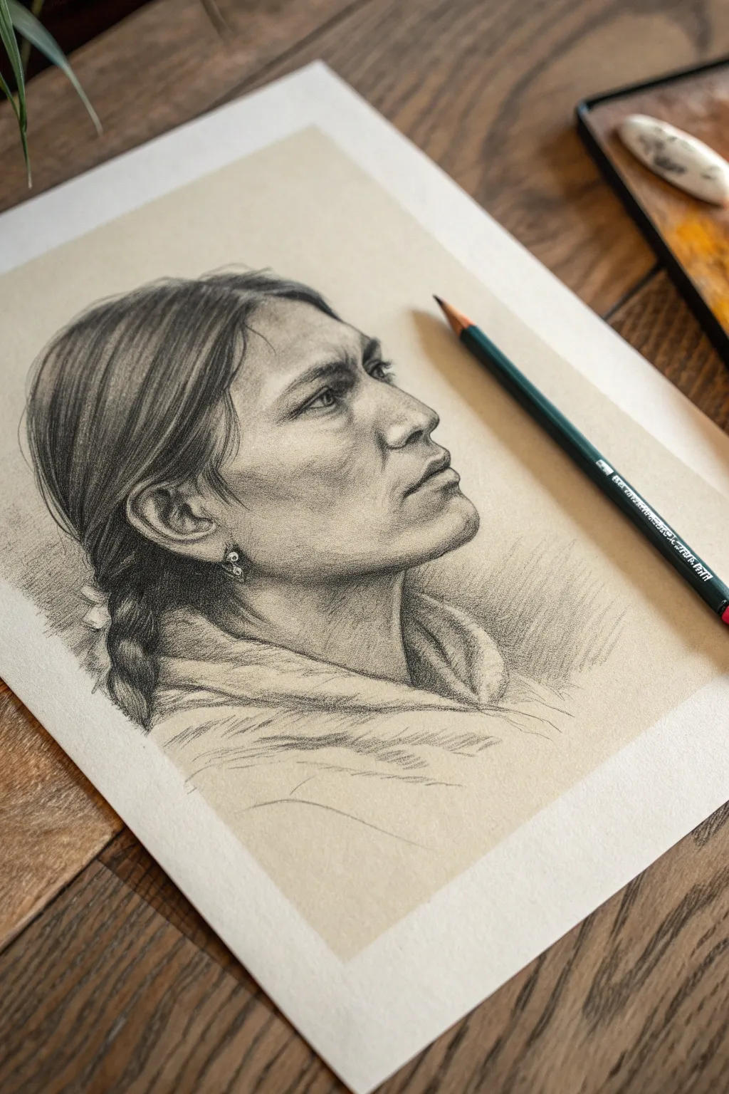
Indigenous Portrait With Feather Earrings and Braids
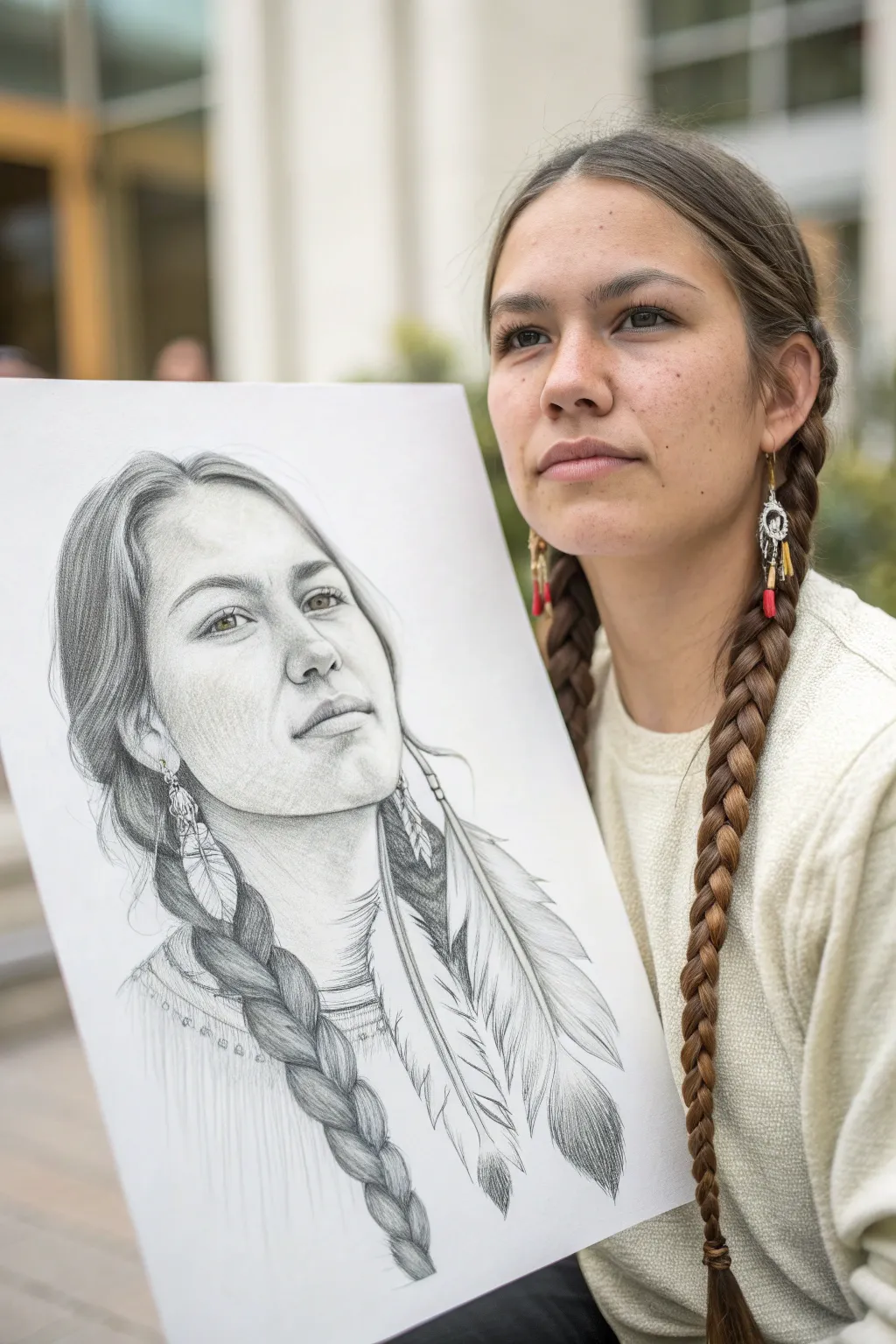
Capture the strength and heritage of this detailed Indigenous portrait using graphite techniques. This project focuses on rendering realistic skin textures, intricate braided hair, and the delicate details of feather earrings through careful shading.
How-To Guide
Materials
- High-quality drawing paper (smooth bristol or vellum finish, 9×12 or larger)
- Graphite pencils (HB, 2B, 4B, 6B)
- Mechanical pencil (0.5mm, HB lead)
- Kneaded eraser
- Vinyl eraser
- Blending stumps (tortillons)
- Tissue or chamois cloth
- Reference photo of subject
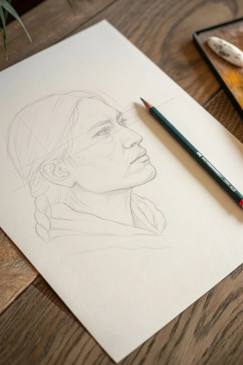
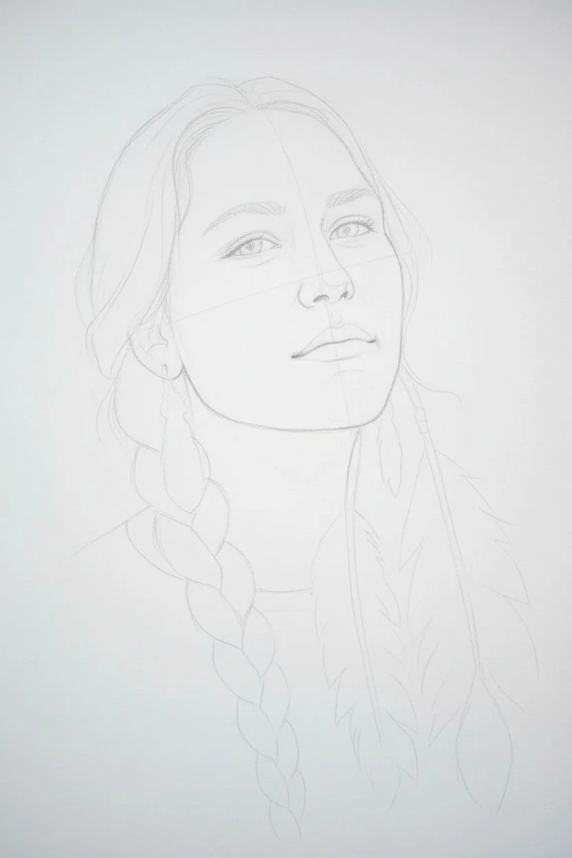
Step 1: Initial Outline & Proportions
-
Map the features:
Begin with a light HB pencil to sketch the basic oval shape of the face. Establish the central axis line and the horizontal eye line. Lightly mark the placement of the eyes, nose, and mouth, ensuring the head is tilted slightly upward for that proud, gazing-away look found in the reference. -
Refining the contour:
Sketch the outline of the jawline, keeping the chin soft but defined. Move up to map the hairline, leaving plenty of space for the forehead which gives the face its open expression. -
Blocking in hair & accessories:
Draw the sweeping curves of the hair pulled back from the face. Sketch the thick braid falling over the left shoulder and lightly outline the large feather earrings hanging from the ears, just focusing on their shape for now.
Step 2: Developing Facial Features
-
The eyes:
Using a mechanical pencil for precision, draw the irises and pupils. Leave small white circles for the catchlights to bring them to life. Shade the upper lash line darker than the lower one. -
Shaping the nose:
Instead of drawing hard lines for the nose, use light shading with a 2B pencil to suggest the bridge and nostrils. Blend softly to create rounded forms rather than sharp edges. -
Lips and values:
Define the lips, noting that the upper lip usually casts a shadow and appears darker. Use a 4B pencil for the darkest corners of the mouth and blend outward for a smooth transition. -
Skin tone foundation:
Apply a very light layer of graphite (HB) over the shaded areas of the face—under the chin, the cheekbones, and the side of the forehead. Blend this with a tissue to create a smooth, skin-like base tone.
Fixing “Muddy” Shading
If skin looks dirty or gray, you’ve overworked the graphite. Gently dab (don’t rub) with a kneaded eraser to lift excess layers, then re-blend lightly with a customized clean tortillon.
Step 3: Hair & Textures
-
Stroke direction:
Switch to a 4B and 6B pencil. Start adding the dark values of the hair. Always stroke in the direction the hair grows—from the root, sweeping back toward the braid. -
Building the braid:
The braid is a series of interlocking ‘Y’ shapes. Draw these sections carefully, shading the crevices where the strands overlap deeply with a 6B pencil creating immediate depth. -
Highlighting hair:
Leave the top curves of the braid segments lighter to show shine. I like to use a kneaded eraser here to lift graphite off the high points, enhancing the glossy texture of the hair. -
Wisps and flyaways:
Use a sharp mechanical pencil to add fine, loose strands escaping the main braid and around the hairline. This step adds essential realism so the hair doesn’t look like a solid helmet.
Pro Tip: Hand Guard
Place a clean sheet of scrap paper under your drawing hand. This prevents skin oils from smudging your work and keeps the drawing crisp while you work on details.
Step 4: Feathers & Final Details
-
Feather structure:
Draw the central quill of the feather earrings first. Then, use quick, flicking strokes outward from the quill to create the barbs of the feather. -
Adding softness:
Vary the pressure on your feather strokes. Some should be dark and distinct, while others should be faint and blended to show the fluffy, soft texture of the down. -
Clothing textures:
Sketch the neckline of the shirt. Add simple, suggested stitching lines or fringe details near the collar, but keep the clothing sketchier than the face to maintain focus on the portrait. -
Deepening shadows:
Go back in with your 6B pencil and reinforce the darkest darks: the pupils, the deep shadows in the braid, and the cast shadow under the jawline. -
Final highlights:
Take your vinyl eraser and clean up the background to make the portrait pop. Use the sharp edge of the eraser to pick out final bright highlights on the nose tip, lip, and cheekbone.
Take a moment to admire how the contrast between the dark hair and soft skin brings the subject’s expression to life
Native Headdress Detail Study (Feathers, Bands, Beadwork)
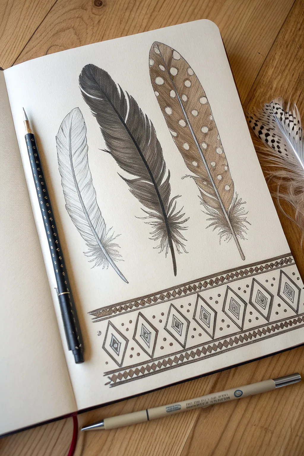
This intricate sketchbook study features three detailed feathers, ranging from a delicate outline to a bold spotted pattern, anchored by a traditional geometric border. It is a fantastic exercise in texture building, hatching, and precise line work using fine liners and graphite.
Detailed Instructions
Materials
- Sketchbook with smooth, heavy paper
- HB or 2B graphite pencil
- Fine liner pens (sizes 0.05, 0.1, and 0.3mm in black)
- Fine liner pen (brown or sepia tone)
- Light brown colored pencil or watercolor pencil
- Ruler
- Kneaded eraser
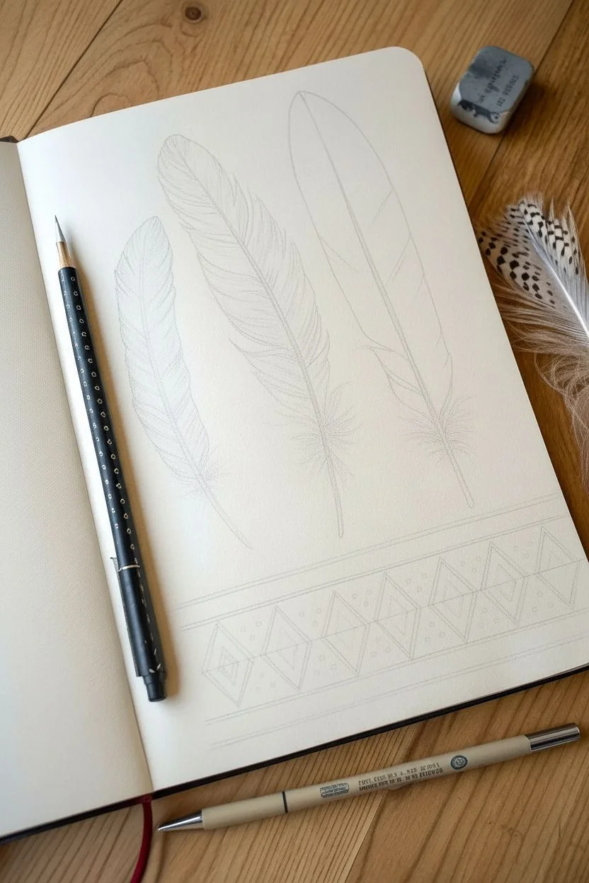
Step 1: Pencil Structure & Layout
-
Establish the feather spines:
Begin by lightly drawing three curved lines for the rachis (central shaft) of each feather. Give them a gentle, natural curve, spacing them evenly across the upper two-thirds of the page. -
Outline the feather shapes:
Sketch the outer contours of the vanes. Make the left feather slim and tapered, the middle one slightly fuller, and the right one broad and rounded. Keep your pencil pressure very light so these lines can be erased later. -
Draft the geometric band:
Using a ruler, draw two parallel horizontal lines near the bottom of the page to define the top and bottom of the decorative border. Add faint guidelines inside to help position the diamond patterns evenly.
Step 2: Detailing the Feathers
-
Ink the left feather:
Using your finest 0.05mm pen, trace the outline of the first feather. Instead of a solid line, use short, broken strokes to mimic the barbs separating. Leave the interior largely empty, adding just a few fine lines near the shaft to suggest texture. -
Start the middle feather:
For the dark central feather, switch to a 0.1mm pen. Outline the jagged edges where the barbs separate. At the base, draw loose, fluffy down feathers that curve outward freely. -
Build density with hatching:
Fill the middle feather with dense, diagonal hatching lines. I find it effective to start from the central shaft and flick the pen outward. Leave small gaps between strokes to create a sense of sheen and volume. -
Outline the spotted feather:
Move to the third feather on the right. Draw the outline in brown ink if you have it, or stick to black. Within the feather, draw small circles of varying sizes to map out the white spots. -
Add color and texture:
Use a light brown colored pencil to shade the right feather, intentionally skipping over the circular spots to leave them paper-white. Layer the pencil gently to build a warm, tan tone. -
Enhance spot definition:
Go back over the brown shading with your fine liner, adding tiny stippling dots or very short hatch marks around the white circles to make them pop against the background.
Pro Tip: Quill Volume
Don’t draw the central feather shaft as a single line. Draw it as a very thin, elongated ‘V’ shape or double line. This gives the quill physical weight and realism.
Step 3: Creating the Geometric Border
-
Draw the main diamonds:
Inside your ruled border area, draw a row of large diamonds. Try to space them consistently. Use a ruler if you want perfection, or freehand it for a more organic, traditional feel. -
Add internal details:
Draw smaller diamonds inside the large ones. In the very center of each diamond, add a tiny geometric motif like a square or a small cross-hatch pattern. -
Create the upper and lower borders:
Above and below the main diamond row, draw narrow bands filled with small, repeating triangles or zig-zags. This frames the main pattern beautifully. -
Incorporate dot accents:
Place small dots in the negative spaces between the diamonds and within the border rows. This stippling adds depth and fills the empty space without overcrowding the design. -
Shade the geometric elements:
Use your pencil or a grey marker to lightly shade specific parts of the pattern, such as the outer rims of the diamonds or every other triangle in the border. This creates a rhythm of light and dark.
Troubleshooting: Smudged Ink
If you accidentally smudge wet ink, don’t wipe it! Let it dry fully, then try to incorporate it into the feather’s texture as shadow, or cover it with darker hatching.
Step 4: Final Touches
-
Clean up the drawing:
Wait until the ink is completely dry, then use a kneaded eraser to gently lift any remaining graphite guidelines from the initial sketch. -
Refine the shafts:
Go back to the central shafts of the feathers. Darken the base of each shaft (the quill) to give it a cylindrical, 3D look. -
Final assessment:
Step back and look at the balance. If the middle feather looks too light, add another layer of hatching. If the border needs weight, thicken the outer lines slightly.
Now you have a beautifully composed study of textures and patterns that celebrates traditional artistry.


Native Dreamcatcher Line Drawing With Hanging Feathers
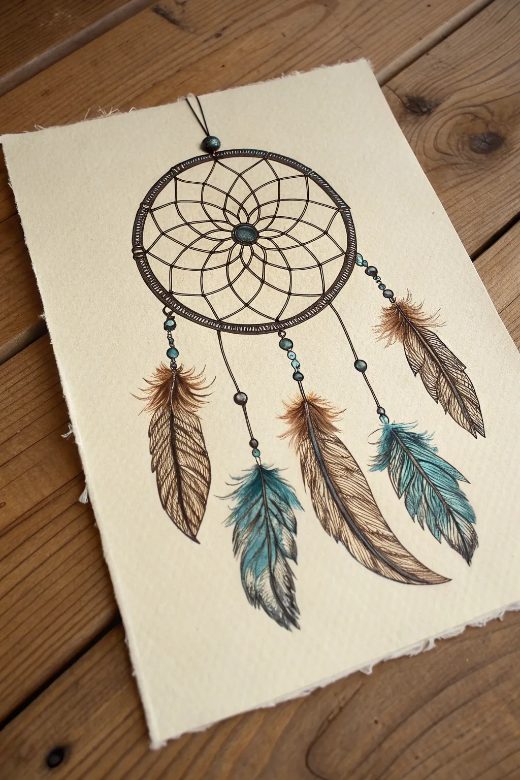
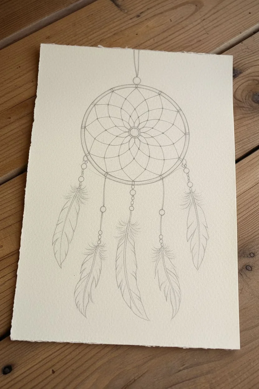
This stunning dreamcatcher illustration combines precise linework with delicate coloring to create a piece that feels both grounded and ethereal. Using fine-tipped pens and touches of teal and brown, you will capture the texture of woven webs and the softness of hanging feathers on rustic paper.
How-To Guide
Materials
- Textured cream or tan paper (deckle-edge watercolor paper works best)
- Fine liner pens (Black, sizes 01 and 03)
- Graphite pencil (HB or 2B) and eraser
- Compass or circular object for tracing
- Colored pencils or watercolors (Teal/Turquoise, Dark Brown, Tan/Ochre)
- Ruler
Step 1: Drafting the Structure
-
Establish the main hoop:
Begin by lightly tracing a perfect circle in the upper center of your paper using a compass or by tracing a bowl. This will be the main frame of the dreamcatcher. -
Draft the inner web:
Find the center point of your circle. Lightly draw a small circle in the very center (the central bead). Then, sketch a flower-petal pattern radiating from this center bead, creating about eight loops that touch a larger concentric circle guide. -
Expand the web pattern:
Continue drawing layers of loops moving outward from the petal shape. Each new row of webbing should bridge the midpoint of the loops in the previous row, mimicking a traditional weave, until you reach the outer hoop. -
Sketch the hanging strings:
Draw five vertical lines (strings) dangling from the bottom of the hoop. Vary their lengths slightly, with the outer two being shorter and the center ones longer, to create a pleasing composition. -
Outline feather shapes:
At the end of each string, lightly sketch the contour of a feather. Curve them slightly as if they are gently swaying. Mix the shapes—make some slender and others broader.
Keep it Rustic
Don’t try to make the web perfectly symmetrical. Slight wobbles in the lines mimic hand-tied sinew and add significantly to the authentic feel.
Step 2: Inking the Details
-
Ink the hoop frame:
Using your 03 pen, go over the main outer circle. Instead of a single smooth line, draw it as a wrapped cord by making small, diagonal hatch marks all the way around the ring to simulate texture. -
Define the web:
Switch to a finer 01 pen for the delicate inner web. Trace your pencil lines carefully. I like to thicken the points where lines intersect or knot together to add a sense of tension and weight. -
Draw the beads:
Along the hanging strings and at the center of the web, ink small circles for beads. Group them in twos or threes for visual interest. -
Ink the feather quills:
Draw the central shaft (rachis) of each feather with a confident, slightly curved line. Ensure it connects logically to the beaded string above. -
Detail the feather barbs:
Using short, flicking strokes with the 01 pen, draw the individual hairs of the feathers. Start at the quill and flick outward. Leave small gaps or ‘breaks’ in the feather shape to make them look natural and wind-blown.
Tearing the Edge
To get the deckle edge seen in the photo, place a ruler against the paper edge, wet the paper along the ruler with a brush, and gently tear it away.
Step 3: Adding Color and Depth
-
Color the beads:
Use a teal or turquoise pencil to color the beads. Press harder on one side of each bead to create a shadow and leave a tiny white spot on the opposite side for a highlight. -
Start the feather gradients:
For the teal feathers, gently shade the bottom half with your blue-green pencil, fading into the white paper as you move up. For the brown feathers, apply the tan color predominantly at the base. -
Layer darker tones:
Go back over your feathers with a dark brown pencil. Add strokes following the direction of the barbs (the ink lines) to deepen the texture, especially near the quill. -
Shade the hoop:
Add a very light wash of brown or tan to the wrapped hoop to separate it from the background paper. -
Final touches:
Review your drawing for contrast. If the web looks too light, go over crucial lines again. Erase any remaining pencil sketch marks completely.
Hang your finished drawing in a spot that needs a little peaceful energy and enjoy the intricate details you’ve created
BRUSH GUIDE
The Right Brush for Every Stroke
From clean lines to bold texture — master brush choice, stroke control, and essential techniques.
Explore the Full Guide
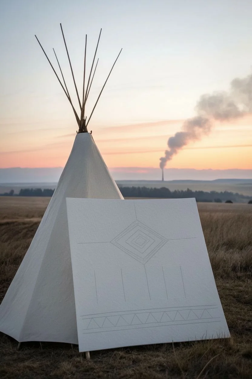
Native Tipi Silhouette Scene With Patterned Bands
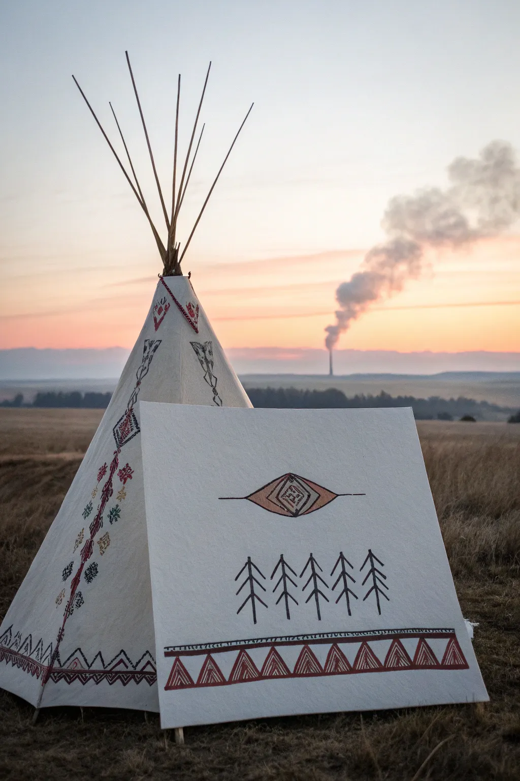
Capture the spirit of the plains with this striking canvas art project that mimics the side panel of a traditional tipi. Featuring bold geometric symbols and simple pine tree motifs, this piece combines fabric painting techniques with structured design for a rustic, authentic look.
Step-by-Step
Materials
- Heavyweight white canvas fabric or primed canvas panel (approx. 24×24 inches)
- Wooden dowels or frame for mounting
- Fabric markers (fine and broad tip, black and reddish-brown)
- Acrylic paints (burnt sienna, black, ochre)
- Small flat brush
- Fine liner brush
- Ruler or straight edge
- Pencil and eraser
- Masking tape
Step 1: Preparation & Layout
-
Prepare the canvas:
Cut your canvas to the desired size. If you want the authentic panel look shown in the image, aim for a square or slightly rectangular shape. Iron out any creases to ensure a perfectly flat drawing surface. -
Establish the baseline:
Using your ruler and pencil, lightly draw two parallel horizontal lines near the bottom edge of the canvas. These should be about 2-3 inches apart to create the thick border for the triangular pattern. -
Sketch the central motif:
Find the center of your canvas. Lightly sketch a large, elongated diamond or eye shape. Inside, draw a smaller diamond, and within that, a square symbol. Extend horizontal lines outward from the main shape’s side points. -
Placement of the pines:
Below the central eye but above the bottom border, lightly mark five vertical lines. These will be the trunks of your pine trees. Space them evenly to create a balanced forest row.
Bleeding Lines?
If paint bleeds on the canvas weave, apply a thin layer of clear gesso or matte medium over your pencil lines first to seal the surface before painting.
Step 2: Painting the Design
-
Outline the central eye:
Using a thin brush and black acrylic paint (or a broad fabric marker), carefully trace the outer lines of your central eye shape. Keep the lines crisp and confident. -
Add detail to the center:
Switch to a burnt sienna or reddish-brown color to fill in the almond-shaped sections of the eye. Paint the innermost square detail with fine black lines, adding small geometric flourishes inside as shown in the reference. -
Create the pine trees:
For the trees, start by darkening the vertical trunk lines with black. Then, draw downward-sloping branches on either side of the trunks. I find it helps to start short at the top and get progressively wider towards the bottom for a natural silhouette. -
Refine the tree branches:
Go back over your tree branches to thicken them slightly, ensuring they look robust against the white canvas background. The style should be schematic and graphic, not hyper-realistic.
Pro Tip: Stencils
Cut a simple triangle stencil from cardstock for the bottom border. This ensures every shape is identical and speeds up the sketching process significantly.
Step 3: The Geometric Border
-
Draw the triangles:
Inside your bottom pencil guidelines, sketch a row of touching triangles. Within each large triangle, draw a smaller triangle to create a double-line effect. -
Paint the triangle outlines:
Using your reddish-brown paint, carefully outline all the triangles. Use a flat brush to fill the space between the inner and outer triangle lines, creating a thick, bold colored border. -
Add texture to the border:
Once the red paint is dry, take a fine black marker or liner brush. Draw vertical hatching lines inside the red borders of the triangles to give them a woven or stitched appearance. -
Line the borders:
Paint a thick horizontal line above and below your row of triangles using the dark brown or black paint. This ‘seals’ the pattern band. -
Add the decorative tick marks:
On the very top black line of the border, make small, evenly spaced vertical tick marks or tiny loops along the entire length to add intricate detail.
Step 4: Final Assembly
-
Erase guidelines:
Wait until the paint is completely dry to the touch—usually about an hour. Gently erase any visible pencil marks, being careful not to smudge the ink or paint. -
Mount the canvas:
Stretch your finished canvas over a wooden frame or attach it to dowels. If you want the leaning look from the photo, mount it to a rigid board or heavy cardstock backing. -
Weathering (Optional):
For a more rustic, outdoorsy feel, you can lightly sponge a very watered-down tea or ochre wash over parts of the white canvas to make it look sun-bleached and aged.
Display your finished panel outdoors during golden hour to catch the beautiful light shown in the inspiration photo
Lakota-Inspired Native Winter Count Symbol Page
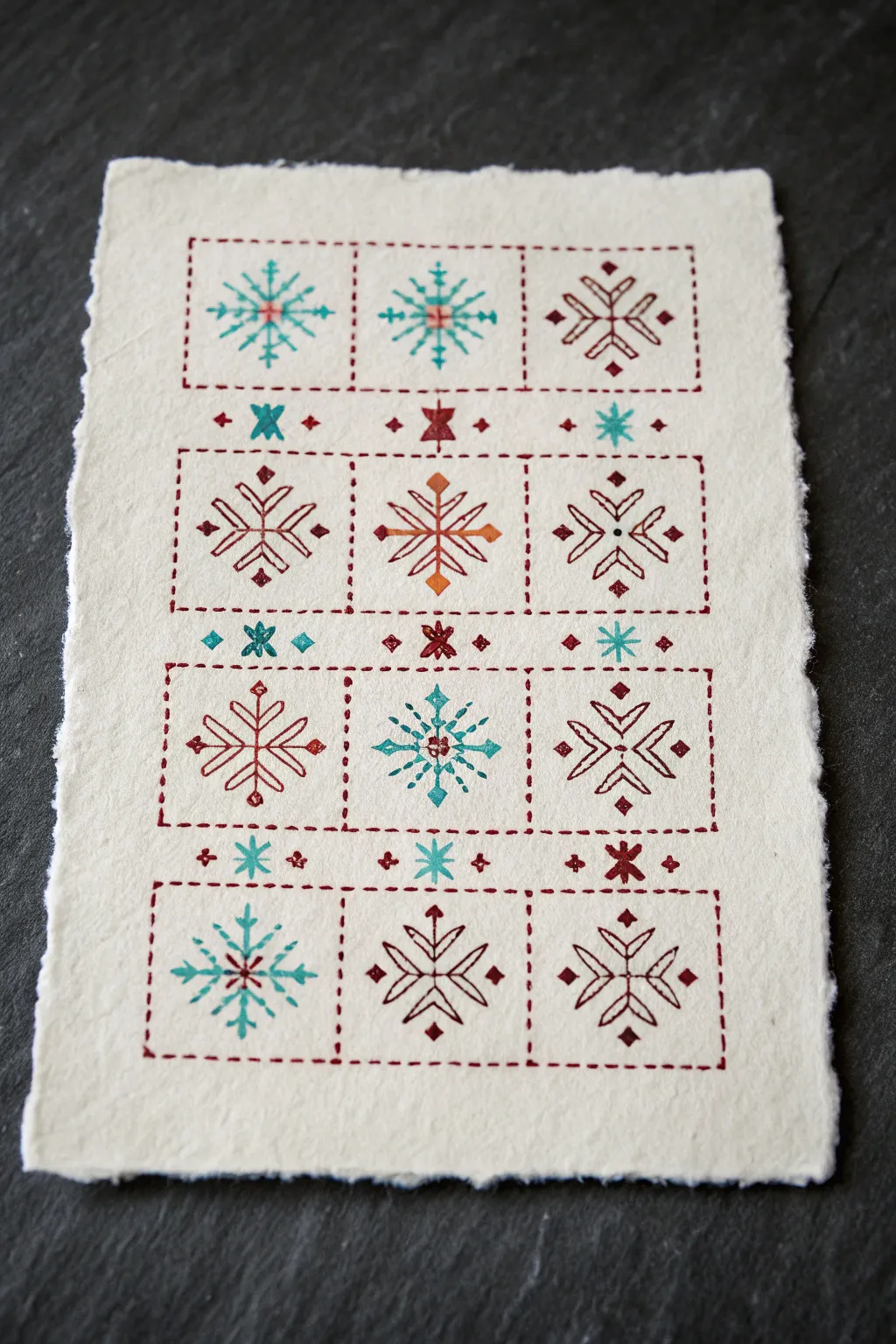
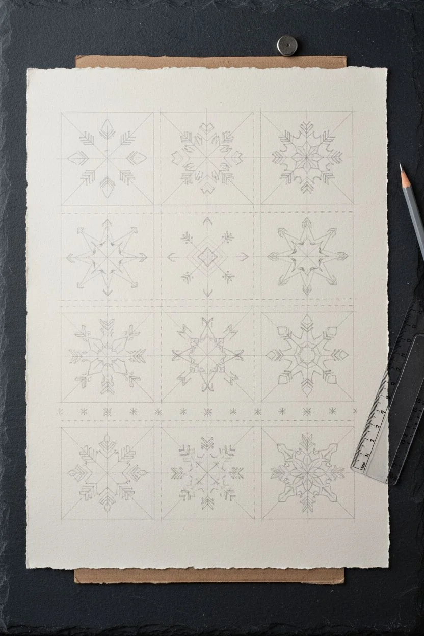
This project captures the delicate symmetry of winter with a series of folksy, geometric snowflake designs stitched onto rustic handmade paper. The combination of deep reds, warm oranges, and cool teals creates a cozy, heritage aesthetic perfect for seasonal cards or framed decor.
How-To Guide
Materials
- Heavyweight, handmade paper with a deckled edge (cream or off-white)
- Embroidery floss in deep red, burnt orange, and teal
- Embroidery needle (size 22 or 24)
- Pencil and eraser (hard lead like 2H is best)
- Clear ruler
- Awl or pushpin (for pre-punching holes)
- Piece of foam or cardboard (as a punching mat)
- Masking tape
Step 1: Design & Layout
-
Map the grid:
Begin by lightly marking a grid on your handmade paper using a pencil and ruler. You will need four columns and four rows of main square blocks, but leave space between the rows for the smaller divider motifs. -
Define the borders:
Lightly draw the dashed border lines that will define each square compartment. These squares act as frames for your main snowflakes. -
Sketch the snowflakes:
Inside each square, sketch a different geometric snowflake design. Focus on radial symmetry—using six or eight points. Incorporate arrows, diamonds, and linear spokes to mimic the folk-art style seen in the example. -
Add divider details:
In the spaces between the horizontal rows of squares, sketch the smaller repeating patterns. These are simple ‘X’ shapes, small diamonds, and miniature stars that connect the larger blocks.
Needle Knowledge
Use a blunt tapestry needle if your pre-punched holes are engaging. A sharp needle creates its own path and might tear the paper between holes.
Step 2: Preparation
-
Prepare for punching:
Place your paper on top of a piece of foam or thick cardboard. This protects your work surface and allows the needle to pass through easily. -
Pre-punch holes:
Using an awl or a pushpin, carefully poke holes along every line of your sketch at regular intervals. Spacing holes about 3-4mm apart mimics a running stitch perfectly. -
Erase guidelines:
Once all holes are punched, gently erase your pencil lines. The holes will now serve as your ‘connect-the-dots’ map, leaving the paper clean.
Step 3: Stitching the Grid
-
Thread the needle:
Cut a length of deep red embroidery floss. Separate the strands and use 2 or 3 strands depending on how bold you want lines to be. -
Stitch the borders:
Start by stitching the dashed square borders using a simple running stitch. I find it easiest to complete all the red structure lines first to establish the framework. -
Secure the ends:
Since paper doesn’t forgive knots well on the back, secure your thread ends on the reverse side with small pieces of masking tape instead of knotting.
Level Up: Metallic Accent
Add a single strand of gold metallic thread alongside your colored floss for the center stars to give the drawing a festive, subtle sparkle.
Step 4: Stitching the Motifs
-
Fill the teal snowflakes First:
Switch to teal thread. Locate the specific squares that will feature cool tones (like the top left and second row down). Stitch the main spokes of these snowflakes. -
Add contrasting details:
Some snowflakes use two colors. For these, stitch the primary shape in one color (e.g., teal spokes) and then add the center detail or tips in a contrasting color (like a red center knot). -
Stitch the warm tones:
Thread your needle with burnt orange floss. Stitch the central snowflakes that feature this warmer hue, paying attention to the diamond shapes at the ends of the spokes. -
Complete the ‘separator’ rows:
Stitch the small motifs between the main rows. Alternate colors here—a red diamond, a teal cross, a red diamond—to create a pleasing rhythm. -
Check tension:
Be careful not to pull the thread too tight, or the paper will buckle. Keep the tension just taut enough to lay flat against the paper surface.
Step 5: Finishing Touches
-
Review the back:
Turn the paper over and ensure all thread tails are taped down flat. Trim any excess thread that might be long enough to shadow through to the front. -
Flatten the artwork:
If the paper has curled slightly from handling, place it under a heavy book for a few hours to flatten it back out.
Display your stitched winter count proudly on a mantel or send it as a truly special greeting card.

PENCIL GUIDE
Understanding Pencil Grades from H to B
From first sketch to finished drawing — learn pencil grades, line control, and shading techniques.
Explore the Full Guide
Plains Native Parfleche Geometric Pattern Panel
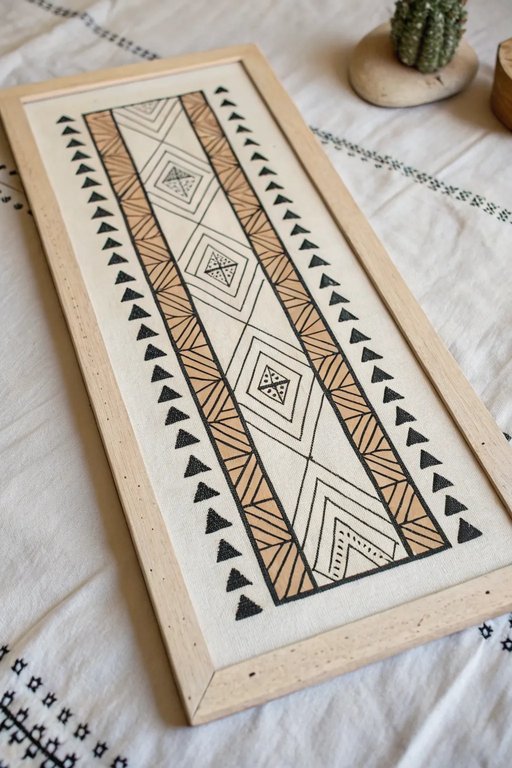
This striking wall art captures the essence of Plains Native parfleche designs with bold geometric lines and earthy tones. The piece features a central diamond motif flanked by rhythmic triangles, all rendered in black ink and warm tan paint on raw canvas for a rustic yet modern aesthetic.
Step-by-Step Guide
Materials
- Rectangular stretched canvas or canvas board (approx. 10×24 inches)
- Light wooden float frame or thin wood trim
- Pencil and large ruler
- Black permanent marker or archival ink pen (fine and medium tips)
- Acrylic paint in a warm tan or camel color
- Small flat angled brush
- Masking tape or painter’s tape
- Eraser
Step 1: Planning the Grid
-
Prepare the Surface:
Begin with a clean canvas. If you are using raw, unprimed canvas for a more authentic texture, give it a quick lint roll to remove debris. If using a primed white canvas, you might want to apply a thin wash of beige to knock back the brightness. -
Establish the Central Column:
Measure the width of your canvas and find the exact center. Lightly draw two long vertical lines running from top to bottom, creating a central column that is roughly one-third of the total width. -
Create the Side Borders:
Inside the central column, draw two more vertical lines about an inch inward from your first set. This creates the ‘tracks’ where the intricate diagonal hatching will go later. -
Grid the Diamonds:
Find the vertical center of your panel. Mark out a series of evenly spaced diamonds running down the middle of the central column. You should fit about three full diamonds in the center, with partial shapes at the top and bottom.
Step 2: Detailing the Motifs
-
Sketch the Inner Diamonds:
Inside each large diamond, lightly sketch a smaller, concentric diamond. In the very center of these, add a small square or diamond shape that will hold the detailed stippling. -
Add Chevron Ends:
At the very top and bottom of the central column, sketch inverted ‘V’ shapes or chevrons that echo the angles of the diamonds, filling the remaining vertical space. -
Draw the Outer Triangles:
Moving to the empty white space on the far left and right sides of the canvas, measure equal spacing for a column of small, solid triangles. These should point inward toward the center design. -
Detail the Striped Borders:
Return to those narrow vertical tracks bordering the central column. Use your ruler to draw diagonal hatch lines all the way down. On the left track, angle them down-left; on the right track, angle them down-right to create symmetry.
Wobbly Lines?
If your ruler slips while inking, don’t panic. Thicken the line weight slightly on the matching opposite side of the design to balance it out. The handmade look adds character.
Step 3: Inking and Painting
-
Outline in Black:
Using a medium-tip black marker and your ruler, carefully trace over all your structural pencil lines. Keep your hand steady and pressure consistent for a clean, graphic look. -
Fill the Outer Triangles:
Switch to a slightly thicker marker if you have one, or just take your time filling in the row of triangles on the far left and right with solid black ink. I find doing this first anchors the design visually. -
Add Stippling Details:
In the tiny central squares of your diamonds and the chevrons at the ends, use a fine-tip pen to add stippling (tiny dots). Group them in clusters of four or five for a traditional textural geometric look. -
Mix Your Paint:
Prepare your warm tan or camel acrylic paint on a palette. Add a tiny drop of water to improve the flow, as canvas has a lot of tooth and can drag the brush. -
Paint the Vertical Tracks:
Using a small angled brush, alternate painting the triangular spaces within the side border tracks. Paint one, skip one, paint one. This creates a striking ‘barber pole’ or zipper effect. -
Clean Up:
Once the ink and paint are fully dry, gently erase any visible pencil guidelines. Be careful not to scrub too hard over the painted areas. -
Frame the Piece:
To finish the look, attach thin strips of light wood to the outer edges of the canvas using wood glue or small finishing nails. This float-style frame gives it a polished, gallery-ready appearance.
Add Texture
For a more weathered, authentic leather look, lightly sand the dried black ink areas with fine-grit sandpaper or dab the tan paint with a sponge rather than brushing it flat.
Hang your beautiful geometric panel in a well-lit spot to enjoy the crisp lines and warm tones of your handiwork
Native Stick Game Pattern Designs (Mini Motif Set)
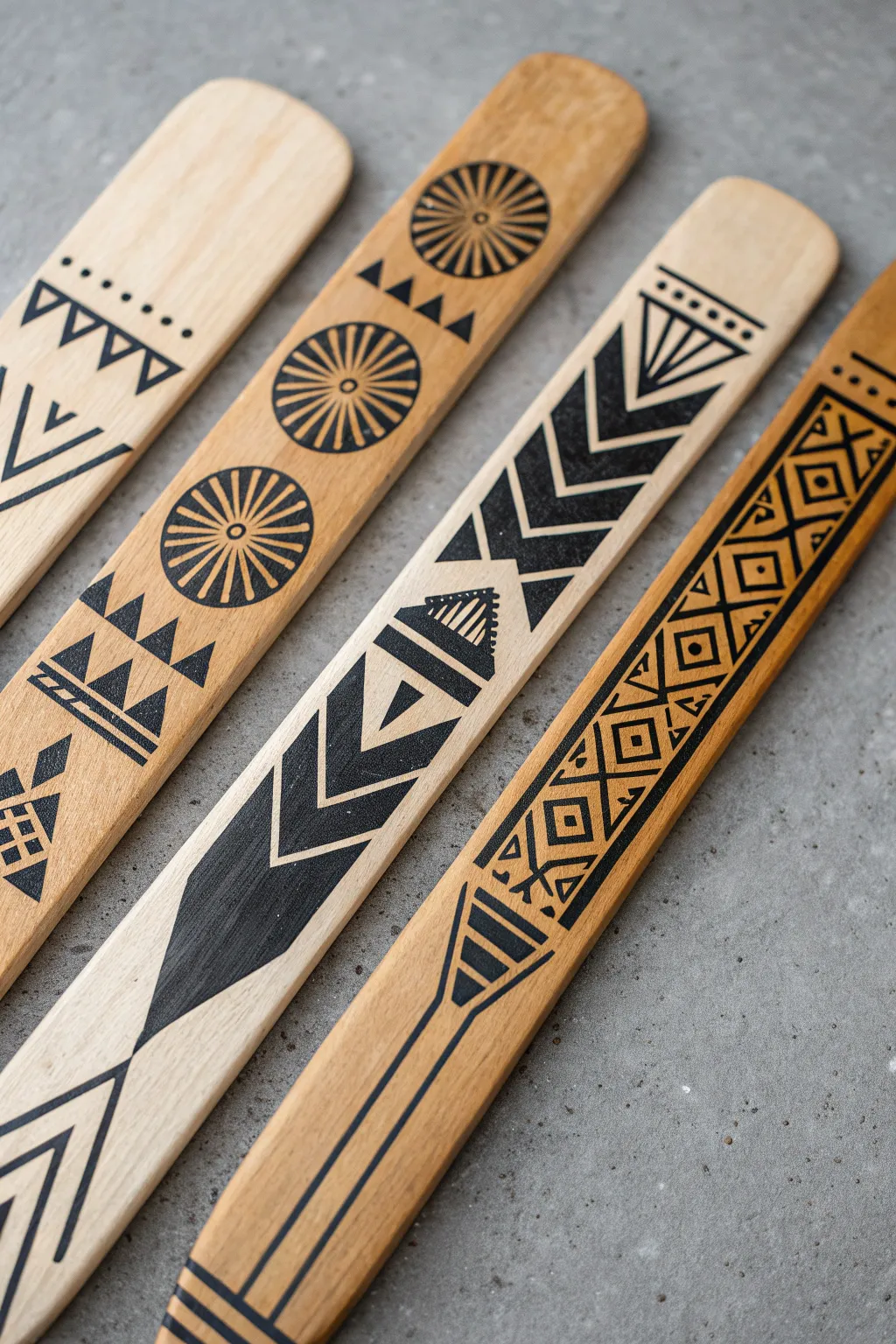
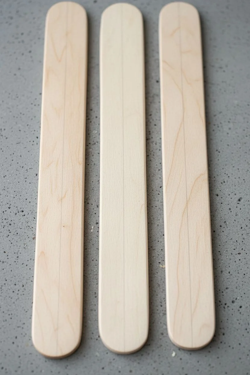
Transform simple wooden craft sticks into striking game pieces or decorative art with bold, black geometric motifs. These precise patterns, inspired by traditional stick game designs, create a stunning contrast against the natural wood grain.
Step-by-Step Tutorial
Materials
- Wide wooden craft sticks (tongue depressors) or sanded wood slats
- Fine-grit sandpaper (220 grit)
- Pencil (HB or H)
- Ruler
- Fine-point permanent marker (black)
- Ultra-fine point permanent marker (black)
- Eraser
- Clear matte acrylic sealer spray or varnish
Step 1: Preparation & Planning
-
Select your canvas:
Choose wooden sticks that are relatively flat and free of large knots or dark blemishes. Lighter wood tones like birch or pine work best to make the black ink pop. -
Smooth the surface:
Lightly sand the face and edges of each stick with fine-grit sandpaper. This step is crucial because it prevents the permanent marker ink from bleeding into rough wood fibers later. -
Wipe it down:
Remove all sanding dust with a clean, dry cloth or a tack cloth to ensure a clean drawing surface. -
Mark the centerline:
Using your ruler and pencil, very lightly draw a vertical line down the exact center of the stick. This will act as your anchor for all symmetrical designs.
Ink Bleeding?
If the marker ink bleeds into the wood grain, create a barrier first. Apply a thin layer of clear matte nail polish or matte medium over the pencil lines before inking.
Step 2: Designing the Motifs
-
Sketch the circle elements:
For the stick with wheel patterns, use a small circular object or a steady hand to lightly pencil in circles at even intervals along the length of the wood. -
Add radiating lines:
Inside the circles, lightly sketch the spokes wheel-style. I find it easiest to draw a ‘plus’ sign first, then an ‘X,’ and finally fill in the remaining lines. -
Draft the chevron patterns:
For the arrow-patterned stick, mark horizontal guidelines evenly spaced apart, then lightly pencil in the chevron points connecting to your center line. -
Outline the complex bands:
On the stick with the diamond lattice, create parallel vertical lines on either side of the center. Sketch the cris-crossing diamond shapes within these boundaries. -
Add triangular details:
Fill in the gaps of your main designs with smaller triangles, dashes, or dots as seen in the reference image. Keep your pencil pressure extremely light so it erases easily.
Pro Tip: Steady Hands
Don’t hover your hand while drawing. Rest your wrist or pinky finger on a clean piece of scrap paper placed over the stick to stabilize your line work without smudging.
Step 3: Inking the Designs
-
Outline primary shapes:
Switch to your fine-point black marker. Carefully trace over your main pencil outlines. Move the marker at a steady pace—too slow and the ink might bleed. -
Fill the solids:
Identify the areas that need to be solid black, such as the thick chevron arrows or the outer rings of the wheels. Fill these in carefully, using long strokes to avoid streakiness. -
Detail with ultra-fine lines:
Use the ultra-fine point marker for delicate details like the internal lines of the triangles, the thin parallel lines, or the small dots. -
Refine edges:
Go back over the edges of your solid black shapes with the ultra-fine marker to sharpen any fuzzy lines or correct minor wobbles. -
Create the heavy bottom point:
For the large triangular point shown on one stick, draw the outline first, then patiently fill the large shape. Let the ink dry for a few seconds before adding a second coat if the wood grain is showing through too much.
Step 4: Finishing Touches
-
Let the ink cure:
Allow the sticks to sit for at least 15 to 20 minutes to ensure the ink is completely dry and set into the wood fibers. -
Erase guidelines:
Gently erase any visible pencil marks. Be careful not to scrub too hard over the inked areas, as some markers can smear if not fully dry. -
Seal the wood:
Place the sticks in a well-ventilated area. Apply a light, even coat of clear matte acrylic sealer. This protects the wood from oils on your hands and keeps the ink sharp. -
Second coat:
Once the first coat is dry to the touch, apply a second light coat for extra durability, especially if these will be used for gaming. -
Final inspection:
Check for any rough spots that might have raised after sealing. If necessary, very lightly sand with a high-grit paper (like 400) and wipe clean.
Enjoy the rhythmic process of creating these geometric patterns and admire your clean, finished set


Indigenous Spirit-Animal Double Exposure Portrait
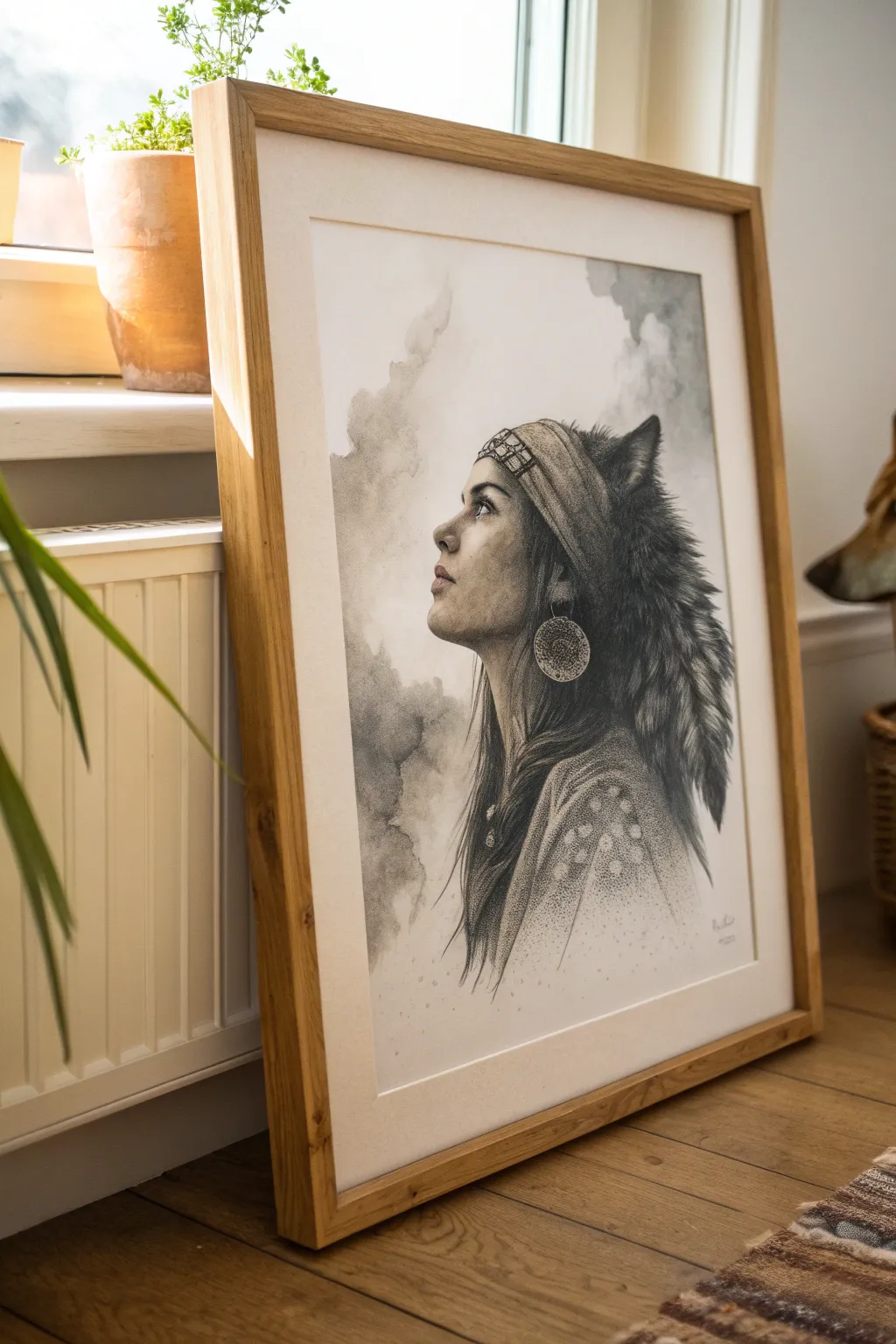
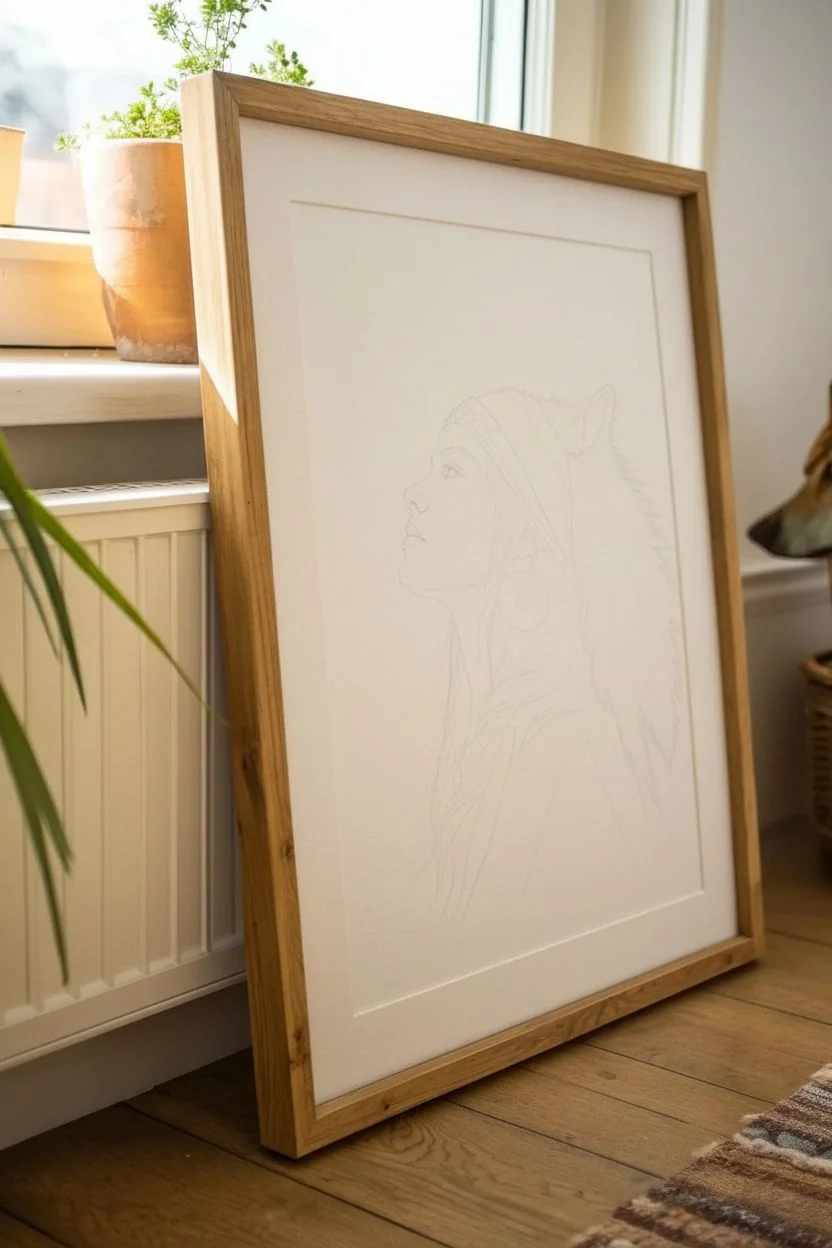
This evocative mixed-media portrait seamlessly blends a human profile with raw animalistic textures, creating a powerful spiritual connection. Using a combination of delicate graphite shading and loose ink washes, you’ll build a moody, atmospheric piece that captures both strength and serenity.
How-To Guide
Materials
- Hot press watercolor paper (smooth texture)
- Graphite pencils (HB, 2B, 4B, 6B)
- Black watercolor or India ink
- Synthetic round brushes (sizes 2, 6, and 12)
- Kneaded eraser and precision eraser
- Paper towels and mixing palette
- White gel pen or gouache (for highlights)
- Blending stump (tortillon)
Step 1: Structural Sketching
-
Establish the composition:
Begin with a very light HB pencil outline. Place the figure slightly off-center to the left, allowing ‘looking room’ for the gaze. Sketch a gentle oval for the head and a sweeping curve for the wolf pelt resting on her back and head. -
Map the facial features:
Refine the profile. Ensure the nose bridge aligns with the forehead slope. Mark the placement of the eye, the nostril, and the lips. Pay special attention to the jawline, keeping it soft but defined. -
Outline the wolf elements:
Lightly sketch the wolf’s ears peeking out from the top and the jagged, fur-like silhouette cascading down her back. Don’t draw individual hairs yet; just focus on the main masses of fur. -
Add accessories:
Draw the wide headband wrapping around the forehead and the large, circular hoop earring. Sketch the basic patterns on the headband—geometric diamonds or zig-zags work well here.
Muddy Washes?
If your ink clouds look dirty or overworked, you likely didn’t let layers dry. Wait for the paper to be bone-dry before glazing a new layer of ink over the previous grey wash.
Step 2: Graphite Shading (The Face)
-
Initial shading layer:
Using a 2B pencil, apply soft graphite to the shadowed areas of the face: under the chin, the eye socket, and the side of the cheek. Use a blending stump to smooth this into a skin-like texture. -
Detail the eye:
Switch to a sharp 4B pencil. Darken the pupil and upper lash line. Leave a tiny speck of white paper for the catchlight to bring the eye to life. Shade the iris with radial lines. -
Deepen contrast:
Use a 6B pencil for the darkest points, specifically the nostril and the corner of the mouth. This high contrast anchors the realism of the face. -
Refine the texture:
Go back over the skin with a blending stump. If it gets too dark, lift graphite with a kneaded eraser to create highlights on the cheekbone and tip of the nose.
Step 3: Ink & Texture Work (The Wolf & Hair)
-
Base wash for the wolf:
Dilute a small amount of black watercolor or ink with plenty of water to create a pale grey wash. Paint the main body of the wolf pelt, letting the brush strokes be uneven to suggest distinct tufts. -
Layering fur texture:
While the first wash is damp (but not soaking), add slightly darker ink strokes. This wet-on-wet technique creates soft, fuzzy edges perfect for undercoat fur. Let this dry completely. -
Defining the woman’s hair:
Using a size 2 brush and concentrated black ink, paint strands of hair flowing from under the headband down her neck. Allow some strands to intertwine with the wolf fur. -
Adding the headband pattern:
Once the hair area is dry, use a 4B pencil or fine liner to fill in the geometric patterns on the headband. Keep the shading grainy to suggest fabric texture. -
Creating the earring:
For the large hoop earring, use a stippling technique (dots) with a fine tip pen or sharp pencil. This mimics beaten metal or beadwork texture.
Level Up: Coffee Stain
For an antique, earthier look matching the indigenous theme, swap the pale grey background wash for weak brewed coffee or tea. It adds a warm sepia tone to the paper.
Step 4: Atmosphere and Final Polish
-
The cloudy background:
Mix a very watery grey wash. I like to blot my brush on a paper towel first so it’s not dripping. Paint abstract, cloud-like forms behind the figure, concentrating the darkness near the wolf fur and fading out toward the edges. -
Texturing the pelt:
Return to the dried wolf fur with a semi-dry brush and darker ink. Use quick, flicking motions to suggest coarse guard hairs on the outer edges and ears. -
Clothing details:
For the garment on her shoulder, use a stippling technique with ink or graphite to create patterns. Keep the values lighter here so focus remains on the face. -
Final highlights:
Use a white gel pen or a tiny touch of white gouache to add final crisp highlights to the earring, the moist edge of the lip, and the brightest part of the eye.
Step back and admire the soulful connection between the human subject and the animal spirit you have created on the page.
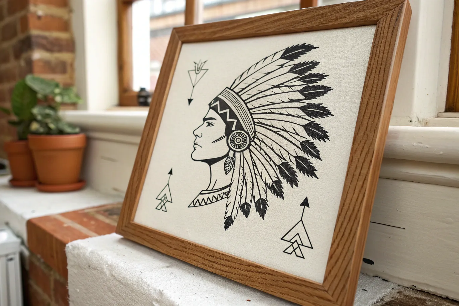
Native Tattoo-Flash Style Sheet of Icons and Motifs
This project involves creating a cohesive sheet of tattoo-flash style icons inspired by nature and indigenous motifs. Using bold black ink on toned paper gives the illustrations a timeless, rugged aesthetic perfect for journals or portfolio pieces.
Detailed Instructions
Materials
- Spiral-bound sketchbook (cream or tan toned paper)
- Fine liner pens (sizes 0.1, 0.3, and 0.5)
- Brush pen or chisel tip marker (black)
- Graphite pencil (HB or 2B)
- Kneaded eraser
- Ruler (optional)
Step 1: Planning and Layout
-
Mock up the composition:
Begin by lightly sketching the placement of your icons with a graphite pencil. Visualize an invisible grid to keep elements balanced; place the large feather in the center as an anchor point, angling it diagonally. -
Sketch the central feather:
Draw the spine of the feather first, then sketch the vane shape around it. Add small notches and splits along the edges to suggest a natural, weathered texture. -
Outline the teepee:
Below the feather, sketch a triangular teepee shape. Divide the triangle into horizontal bands for patterns later, and draw the poles extending slightly past the top. -
Add nature icons:
In the top left, sketch the silhouette of a bison. Below that, a crescent moon and star. In the bottom center, place the bull skull, focusing on the curve of the horns. -
Draft the geometric elements:
Fill the right side with circular sun motifs and a triangular eye design. Use a ruler if you want precise lines, or freehand it for a more organic feel.
Pro Tip: Line Weight
For that authentic ‘stamp’ look, outline every major shape with a thick line (0.8mm or brush) and do all internal shading with your thinnest 0.1mm pen.
Step 2: Inking the Outlines
-
Start with fine lines:
Using your 0.3 fineliner, go over your pencil sketches. Keep your hand steady but allow for slight line variation to mimic a traditional print style. -
Detail the feather:
Switch to a 0.1 pen for the feather’s internal details. Draw fine, diagonal strokes radiating from the spine to create the barbs, leaving small gaps for highlights. -
Define the bison:
Outline the bison’s humped back and legs. Use jagged, short strokes around the neck and head to simulate thick fur texture. -
Ink the geometric patterns:
Trace the sun bursts and compass designs carefully. For the triangular patterns on the teepee, use the 0.3 pen to create crisp dots and zig-zags.
Step 3: Adding Weight and Contrast
-
Fill the heavy blacks:
Grab your brush pen or chisel tip marker. Fill in the solid black areas, such as the crescent moon, the bison’s main body, and the dark stripes on the feather. -
Darken the teepee entrance:
Solidly fill the triangular door flap of the teepee to create depth. I find this high contrast really makes the surrounding delicate patterns pop on the page. -
Enhance the sun motifs:
Thicken the outer separating lines of the sun rays and compass points. This differentiation between thick borders and thin internal details is key to the tattoo-flash look. -
Refine the bull skull:
Use the brush pen to deepen the eye sockets and nasal cavity of the skull, leaving the rest of the bone structure as a clean outline.
Troubleshooting: Smudging
If you are left-handed or smudge easily, place a scrap sheet of paper under your hand as a guard while you ink, or work from right to left.
Step 4: Final Touches
-
Add filler elements:
Look for empty spaces in your composition. Sketch small pine tree icons, arrows, or small chevron patterns (arrowheads) to balance the white space. -
Texturize the palm leaf:
Ink the palm leaf on the far right using singular, confident strokes for each leaflet, ensuring they taper nicely at the ends. -
Erase pencil marks:
Once you are absolutely certain the ink is dry (give it at least 15 minutes), gently rub the kneaded eraser over the entire page to lift the graphite sketches. -
Review and correct:
Scan the page for any lines that look too thin or washed out. Go back with a 0.5 pen to re-enforce the outer perimeter of your main icons if they need more visual weight.
You now have a striking collection of icons that celebrates rugged geometry and nature.

Have a question or want to share your own experience? I'd love to hear from you in the comments below!