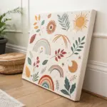
Pixel art is basically drawing with tiny squares, and it’s one of the fastest ways to make something cute and recognizable without overthinking it. I pulled together my favorite pixel art ideas you can copy on graph paper, a digital grid, or even square-by-square crafts.
Classic Pixel Heart Icons
Bring a touch of nostalgic digital charm to your analogue journal with these pixel art heart icons. These designs use a simple dot grid to create structured, 8-bit inspired motifs that pop off the page with vibrant reds and soft pinks.
Detailed Instructions
Materials
- Dot grid notebook or journal
- Fine liner pen (black, 0.3mm or 0.5mm)
- Red marker or brush pen
- Pink marker or brush pen
- White gel pen (opaque)
- Pencil
- Eraser
- Ruler (optional)
Step 1: Planning and Outlining
-
Map the large red heart:
Start near the top of your page. Using a pencil, lightly mark out a heart shape that is roughly 11 grid squares wide and 10 squares tall. I like to mark the center point first to keep things symmetrical. -
Define the pixel edges:
Instead of drawing smooth curves, follow the grid lines to create a ‘stepped’ outline. The top of the heart should have two humps, each 3-4 squares wide, with a dip in the middle. -
Outline in ink:
Once you are happy with the stair-step shape, trace over your pencil lines with a black fine liner. Be sure to trace the individual squares along the edge to emphasize the pixel look. -
Create the smaller hearts:
Move down about 3-4 grid rows. Sketch two smaller hearts side-by-side. These should be much simpler, roughly 5 squares wide and 5 squares tall, using a basic 3-pixel-wide base. -
Ink the small hearts:
Trace the outlines of these smaller hearts with your black pen. Since they are small, precise corners are key to keeping them readable as hearts. -
Map the large pink heart:
Below the small hearts, sketch another large heart similar in size to the first red one. You can vary the shape slightly if you wish, perhaps making it a bit wider or flatter. -
Final inking:
Trace this final large heart with your black fine liner, ensuring all your horizontal and vertical lines match the grid perfectly. -
Erase guidelines:
Wait a moment for the ink to dry completely to avoid smudging, then gently erase all visible pencil marks.
Uneven Color Fix
If your marker strokes look streaky, wait for the first layer to dry completely, then apply a second layer moving in perpendicular strokes to smooth it out.
Step 2: Filling and Detailing
-
Color the top heart:
Take your deep red marker. Carefully fill in the interior of the top heart. Work slowly near the black outlines to keep the color within the ‘pixels’. -
Fill the small hearts:
Use a lighter red or a coral shade for the two small middle hearts. Since the area is small, dotting the color in might work better than sweeping strokes. -
Color the bottom heart:
Switch to a soft pink marker for the large bottom heart. Fill it in completely, ensuring an even coat of color. -
Add highlights:
Once the marker ink is fully dry, take your white gel pen. On the large red heart, draw a simple ‘plus’ sign or cross near the upper left side to simulate a shine. -
Highlight the pink heart:
Repeat the highlighting process on the large pink heart. Position the white cross in roughly the same spot for a consistent light source effect. -
Add shading (optional):
If you want extra depth, re-trace the right and bottom outer edges of each heart with a slightly thicker black line to create a subtle drop shadow. -
Review and refine:
Look over your design. If any color bled outside the lines, you can carefully thicken the black outline to cover it up.
Level Up: Gradient Hearts
Instead of solid colors, use three shades of the same color family to create an ombre effect from the top to the bottom of the pixel heart.
Now you have a charming set of retro graphics decorating your journal page

Smiley Faces With Simple Expressions
Capture the full spectrum of emotions with this simple yet expressive vertical doodle. Using standard grid paper as your guide, you’ll sketch a progression from cheerful to gloomy, adding a splash of classic yellow to bring the happy faces to life.
Step-by-Step
Materials
- A4 Graph/Grid Paper (white)
- Black fine-liner pen (0.5mm or similar)
- Black pen or marker (slightly thicker for outlines)
- Yellow colored pencil or pastel
- Compass or a small circle template (approx. 2 inches diameter)
Step 1: Setting the Structure
-
Prepare the page:
Place your sheet of graph paper on a flat surface. You’ll need vertical space for four distinct faces. -
Draw the first circle:
Using your compass or circular object, lightly draw a circle near the top left of the page. It should span roughly 8-10 grid squares in diameter. -
Continue the column:
Directly below the first circle, draw three more identical circles in a vertical line. Leave a gap of about 2-3 grid squares between each one to keep them distinct.
Step 2: Defining the Expressions
-
Sketch the Big Grin:
Starting with the top circle, draw two small squares for eyes. For the mouth, draw a wide, open ‘D’ shape to make a large, toothy smile. -
Add the teeth:
Draw a horizontal line across the middle of the open mouth, then add small vertical lines to suggest teeth. -
Create the Gentle Smile:
Move to the second circle. Draw similar small square eyes, but give this one a simple, curved line for a modest smile. Add small cheek marks at the ends of the smile. -
Draw the Unhappy Face:
For the third circle, draw the eyes slightly oddly shaped or with small scribbles inside for distress. Draw the mouth as a deep frown curve. -
Sketch the ‘Dead’ Face:
On the bottom circle, draw two ‘X’ shapes for eyes. Draw the mouth as a frown, but add a small tongue sticking out to the side for a comical ‘knocked out’ look.
Wobbly Circles?
Don’t worry if your circles aren’t perfect! The charm of this style comes from the sketchy, multi-line borders. Just keep looping your pen until it looks round.
Step 3: Inking and Coloring
-
Outline the circles:
Go over your pencil circles with the black fine-liner. I like to use a sketchy, loose hand here—making multiple passes to give the line a textured, hand-drawn look rather than a perfect vector circle. -
Ink the features:
Trace over the facial features with the same sketchy style. Fill in the pupils for the top two faces, leaving a tiny white spot for a highlight if you wish. -
Shade the eyes:
For the third face (the sad one), scribble loosely inside the eyes to make them look tired or hollow. -
Color the happy faces:
Take your yellow colored pencil. Gently shade the entire interior of the top (big grin) face. Use a cross-hatching motion to match the grid texture. -
Color the second face:
Color the second (gentle smile) face yellow as well, keeping the pressure light so the grid lines still show through. -
Leave the negative faces:
Leave the bottom two faces (sad and dead) completely uncolored. This stark contrast emphasizes the shift in mood from sunny to grey. -
Add final texture:
If any lines look too thin, go back with your pen and add extra scribbles to the outlines to enhance the ‘sketchbook’ aesthetic.
Gradient Effect
Make the yellow fade out on the third face. Color just the top half very lightly to show the transition of the ‘mood battery’ running out.
Now you have a charming visual tracker of emotions ready to pin to your wall


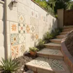
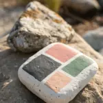
Gems, Coins, and Collectible Trinkets
Bring a touch of pixelated nostalgia to your home decor with this sturdy and charming Ace of Hearts mosaic. Using small ceramic tiles allows you to create a durable piece of art that mimics the classic 8-bit style with a satisfying, tactile finish.
Step-by-Step Tutorial
Materials
- Small ceramic mosaic tiles (aprox. 5mm x 5mm): White, Black, Gold/Mustard, Red
- Square wooden substrate/backing board (approx. 6×6 inches)
- PVA glue or specialized mosaic adhesive
- Tweezers
- Grout (light beige or white)
- Rubber spatula or squeegee
- Sponge and water
- Clean cloth
- Ruler and pencil
Step 1: Planning and Preparation
-
Substrate preparation:
Begin with a clean, sanded square wooden board. Ensure the surface is free of dust so the adhesive bonds correctly. -
Grid marking:
Measure your tiles. Using a ruler and pencil, lightly draw a grid on your wooden board that matches the size of your tiles to keep your lines straight during application. -
Design layout:
It helps to lay out your tiles on a flat table first without glue. Create the outer border using white tiles, followed by a thick inner border of gold tiles. -
Corner details:
Plan the four corners of the gold border. These feature small red squares (2×2 tiles) surrounded by a black outline to create a distinct jewel-like inset.
Uneven Gaps?
If your tiles vary slightly in size, don’t force a perfect grid. Let the grout lines absorb the differences; it adds to the handmade charm.
Step 2: Setting the Tiles
-
Adhesive application:
Starting from the top left corner, apply a small dot of PVA glue or mosaic adhesive to the wood or the back of the first tile. -
Border construction:
Place the white outer perimeter tiles first. Use tweezers for precision if the tiles are particularly small. -
Inner frame:
Build the gold/mustard frame just inside the white border. Remember to switch to black tiles to outline the red corner accents as per your dry layout. -
White background:
Once the frame is secure, begin filling the center field with white tiles. Stop when you reach the center area where the heart will go. -
Heart outline:
Using black tiles, create the staggered pixel outline of the central heart shape. -
Filling the heart:
Fill the center of the outline with red tiles. To add depth, use a lighter shade of red or a white tile near the top left of the heart to simulate a classic pixel art highlight. -
Completion:
Fill in the remaining white background tiles around the heart until the board is fully covered. Let the adhesive cure for at least 24 hours.
Pro Tip: Tile Cutting
No nippers? Use ‘micro’ mosaic tiles (5mm) so you never have to cut them. They act just like pixels for easy grid-based designs.
Step 3: Grouting and Finishing
-
Mixing grout:
Mix your grout powder with water according to package instructions until it reaches a peanut butter consistency. -
Applying grout:
Spread the grout over the entire surface using a rubber spatula. Push firmly to ensure the grout fills the tiny gaps between the ceramic chips. -
Scraping excess:
Use the edge of your spatula to scrape off the majority of the excess grout from the tile surfaces. -
First wipe:
Wait about 10-15 minutes for the grout to haze over. Dampen a sponge (wring it out well so it’s not dripping) and gently wipe the surface to clean the tiles. -
Polishing:
Once the grout is fully dry, take a soft, dry cloth and buff the tiles to remove any remaining haze and make the ceramic shine. -
Sealing backing:
If you plan to display this near a window where moisture occurs, I recommend painting the exposed wooden sides with a clear varnish for protection.
Place your finished mosaic on a shelf or windowsill to catch the light


Tools and Tiny Objects You Use Every Day
Capture the charm of creative tools with this meta pixel art project featuring a classic paintbrush. Using simple graph paper, you’ll build up a detailed icon that looks like it jumped straight out of a retro design program.
Step-by-Step Guide
Materials
- Grid notebook or graph paper (approx. 5mm squares)
- Black fine-liner pen or dark micro-tip marker
- Beige or light tan colored pencil/marker
- Orange or terracotta colored pencil/marker
- Dark brown colored pencil/marker
- Ruler (optional, for straight lines)
Step 1: Outlining the Form
-
Start the bristles:
Begin near the center of your page to ensure you have enough room. Using your black fine-liner, draw the top edge of the brush bristles. This is a stepped line: draw a horizontal line across 4 squares, step down one square on each side, and draw two vertical lines down 3 squares. -
Close the bristle shape:
From the bottom of those vertical lines, step inward one square on both sides. Connect these points with a straight horizontal line across the bottom of the bristle section. -
Draw the ferrule top:
Directly below the bristles, outline the metal ferrule (the part holding the hair). This section is wider than the bristle base. Step out one square on each side and go down 3 squares to create a rectangular block. -
Taper the ferrule:
Below that rectangular block, step inward one square on both sides. Draw down 2 squares to create the tapered transition to the handle. -
Create the handle neck:
Step in one more square on each side. Draw a vertical channel going down 3 squares. This creates the narrow neck of the paintbrush handle. -
Form the handle grip:
Widen the handle again by stepping out one square on the bottom right side only, creating an asymmetrical look, or keep it symmetrical if you prefer. Draw down 4 squares to form the main grip area. -
Finish the handle base:
Step inward and close off the bottom with a 2-square wide line. Don’t forget to add a small 1×1 pixel square inside the bottom of the handle to represent the hanging hole.
Grid Counting Trick
Mark the center of your design with a tiny pencil dot before starting ink work. It helps prevent running off the edge of the page.
Step 2: Adding Color and Detail
-
Fill the bristles:
Take your beige or light tan color. Fill in the entire top section of the brush. I like to use light, vertical strokes here to simulate the texture of actual hair bristles. -
Add bristle definition:
Using a slightly darker tan or pressing harder with your beige pencil, add 2-3 vertical lines within the bristles to show separation and volume. -
Base coat the ferrule:
Switch to your orange or terracotta color. Fill in the main rectangular block below the bristles. This represents the metal band. -
Create the ferrule pattern:
Using the dark brown marker, fill in diagonal pixels within the orange section. Create a zigzag or checkerboard pattern to simulate the crimped metal texture often seen on brushes. -
Color the handle neck:
Use the orange color to fill the narrow neck section of the handle. Keep the color solid here. -
Shade the grip:
Fill the main handle grip with the orange color as well. To add dimension, you can go over the right side a second time to create a shadow effect. -
Detail the hanging hole:
Make sure the single square we left empty at the bottom remains white. Outline it heavily with black to make it pop as a negative space. -
Reinforce the outline:
Go over the entire exterior black outline one last time to thicken the ‘pixel’ border, ensuring the drawing stands out crisply against the grid.
Metallic Effect
Use a silver or gold gel pen for the ferrule section instead of orange. It adds a surprising mixed-media pop to the flat pixel style.
Your sketchbook now has a charming artistic tribute ready to inspire your next creative session


Have a question or want to share your own experience? I'd love to hear from you in the comments below!