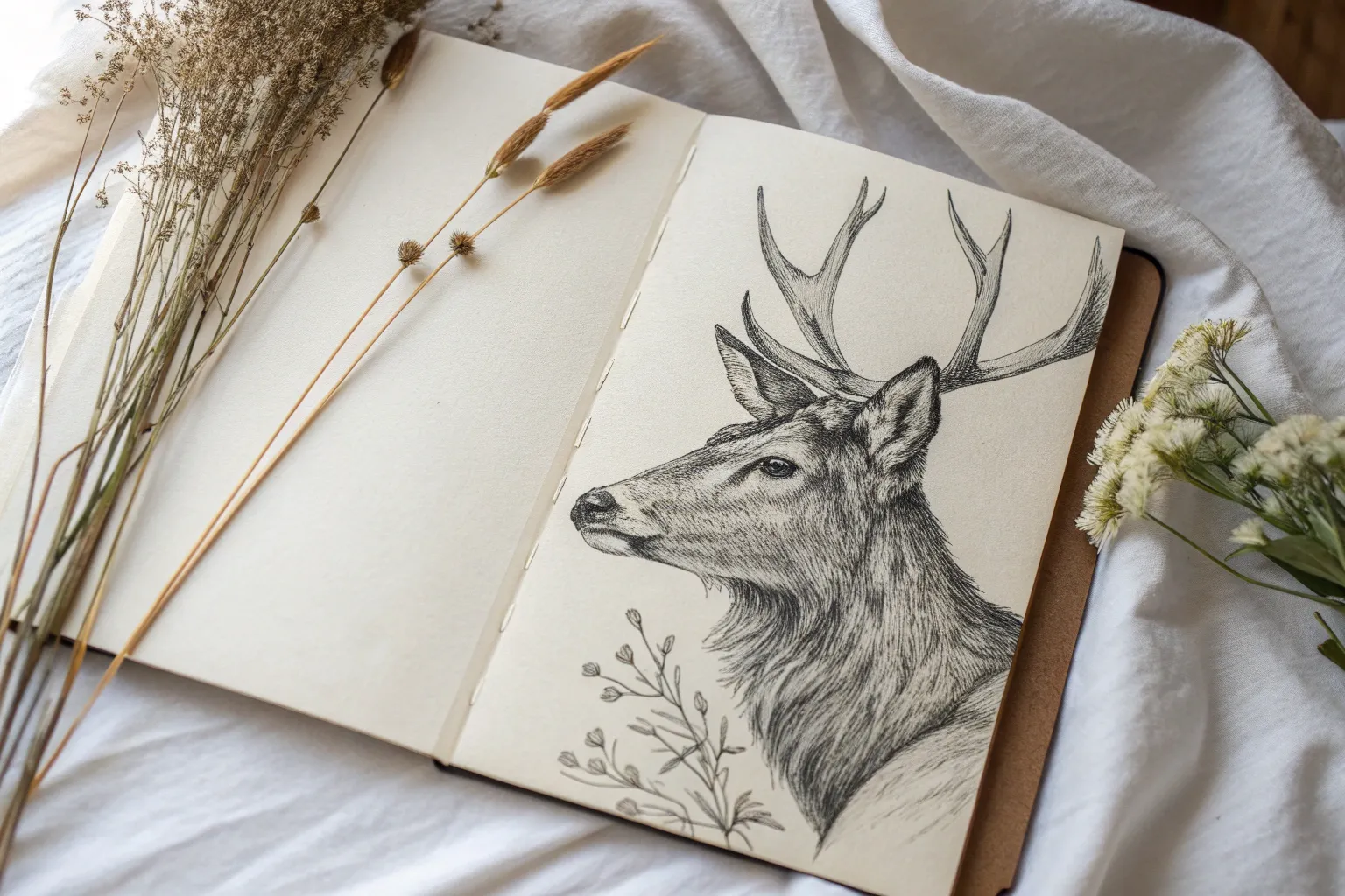
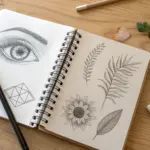
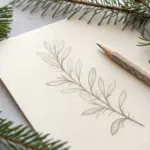
If you’re craving detailed drawing ideas that’ll pull you into that calm, focused zone, you’re in the right place. I picked these prompts to help you practice patience, precision, and all those delicious little textures that make a drawing feel alive.
Hyper-Realistic Eye Close-Up Study
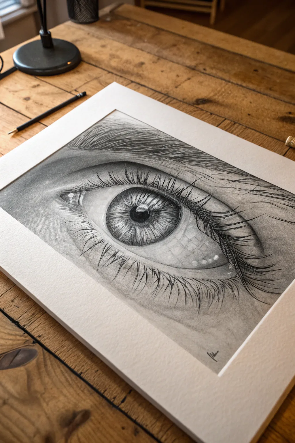
Capture the soul of a subject with this intricate graphite study of a human eye, focusing on intense texture and reflection. This project teaches you to balance soft shading with razor-sharp details to create a stunningly lifelike illusion.
Step-by-Step Tutorial
Materials
- High-quality drawing paper (smooth bristol or hot press watercolor paper recommended)
- Graphite pencils (ranges 2H, HB, 2B, 4B, 6B)
- Mechanical pencil (0.5mm or 0.3mm with HB lead) for fine hairs
- Kneaded eraser (for lifting highlights)
- Fine stick eraser (Tombow Mono Zero or similar)
- Blending stumps (tortillons)
- Soft tissue or chamois cloth
- Pencil sharpener (essential for crisp details)
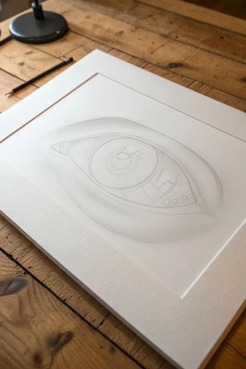
Step 1: Structural Outline and Base Tones
-
Light Outline:
Begin with a very faint sketch using your 2H pencil. Map out the almond shape of the eye, the circular iris, the pupil in the center, and the folds of the eyelid above and below. Keep lines barely visible so they don’t show later. -
Mapping the Iris:
Inside the iris, lightly draw the shapes of your main highlights. The reference image has a distinct rectangular window reflection; mark this off now so you preserve the white paper. Lightly sketch the pupil’s circle. -
Initial Shading:
Using an HB pencil, lay down a soft, even layer of graphite over the skin areas and the ‘white’ of the eye (sclera). Remember, the eyeball is a sphere, so shade the corners slightly darker to create curvature, leaving the center brightest. -
Smoothing the Base:
Take a blending stump or tissue and gently rub the graphite into the paper tooth. This creates that smooth, skin-like foundation. Do not blend over your reserve highlight areas.
Smudge Prevention
Graphite smears easily. Place a clean sheet of scrap paper under your drawing hand while you work to protect the finished areas from oils and friction.
Step 2: The Iris and Pupil
-
Darkest Darks:
Switch to a 4B or 6B pencil to fill in the pupil. Press firmly to get a rich, solid black. I like to sharpen the pencil right before this step to ensure the edge is crisp against the highlight. -
Iris Spokes:
Using a sharp 2B pencil, draw lines radiating from the pupil outward toward the limbal ring (the outer edge of the iris). Vary the length and pressure to mimic the fibrous muscle tissue. -
Limbal Ring:
Darken the outer edge of the iris with a 4B pencil. Blend this inward slightly so it doesn’t look like a cartoon outline, but rather a soft, dark transition. -
Iris Details:
Layer more radial lines with the mechanical pencil for precision. Add tiny squiggles and intricate patterns between the spokes to create depth. -
Lifting Highlights:
Use your fine stick eraser or a pinched piece of kneaded eraser to lift out thin, white radial lines in the iris. This contrast makes the eye look wet and glossy.
Add Wetness
Use a white gel pen for tiny, hard specular highlights in the tear duct and along the lower waterline to make the eye look incredibly moist.
Step 3: Skin Texture and Eyelashes
-
Deepening Shadows:
Return to the skin with a 2B pencil. Darken the crease of the upper eyelid significantly to show depth. Shade the tear duct area on the left, adding small contours for the pink fleshy part. -
Skin Micro-Texture:
Instead of smooth shading, use tiny, light circular motions or stippling with an HB pencil to mimic pores and fine wrinkles, especially under the eye. -
Upper Lashes:
Using a sharp 4B or mechanical pencil, draw the upper eyelashes. Start from the root on the eyelid rim and flick outward in a quick, confident curve. The lashes should overlap and clump slightly, not stand like picket fences. -
Lower Lashes:
Draw the lower lashes with a lighter touch (2B). These should be shorter, sparser, and grow from the outer edge of the lower waterlines. Pay attention to their chaotic, natural direction. -
Reflection Refinement:
In the main window reflection on the eye, lightly draw the suggestion of eyelashes curving upward. This subtle reflection detail adds incredible realism. -
Final Contrast Check:
Step back. Use your 6B to punch up the darkest shadows—the pupil, the lash roots, and the deep eyelid crease. Ensure your brightest whites are clean; use the eraser to tidy up the highlight glint if it got smudged.
Now, place a clean white mat over your drawing to instantly elevate its professional appearance


Highly Detailed Fur Study on a Texture-Rich Animal
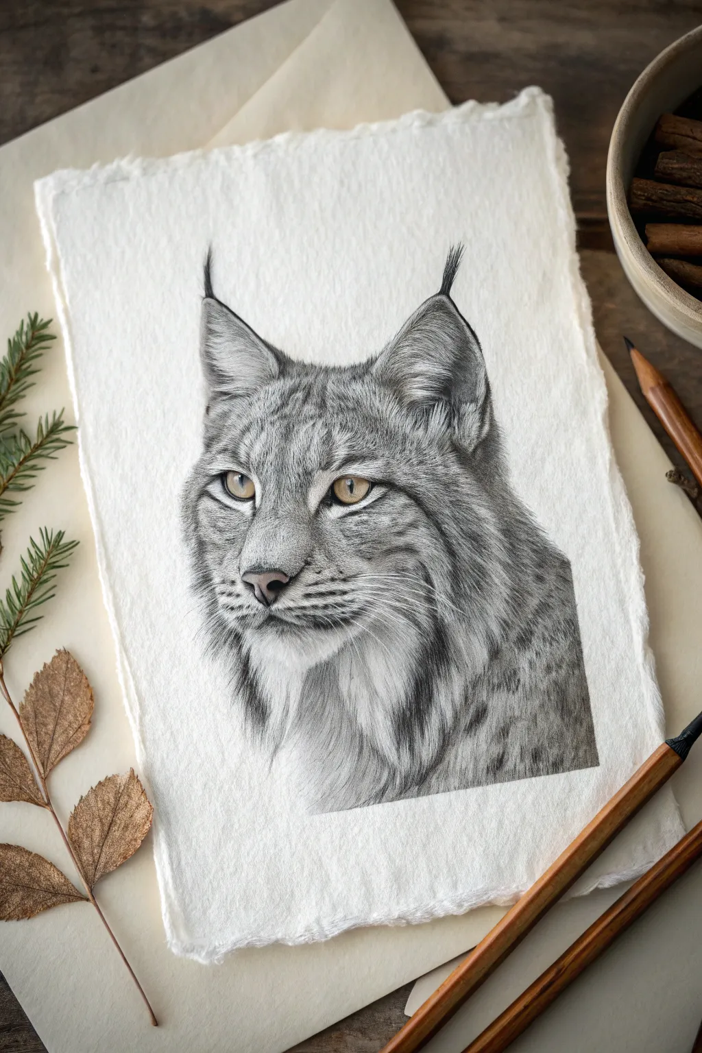
Capture the intense gaze and rugged elegance of a wild lynx with this detailed graphite and charcoal study. You’ll master the art of layering fur textures on heavy, handmade paper to create a portrait that feels alive and three-dimensional.
Step-by-Step
Materials
- High-quality, heavy cotton rag paper (approx. 300gsm) with deckled edges
- Graphite pencils (2H, HB, 2B, 4B, 6B)
- Charcoal pencil (soft/medium) for darkest blacks
- Colored pencils (Yellow Ochre, Burnt Sienna, Raw Umber, White)
- Fine-point mechanical pencil (0.3mm or 0.5mm, HB)
- Kneaded eraser
- Precision eraser pen (mono zero)
- Blending stumps (tortillons)
- Fixative spray
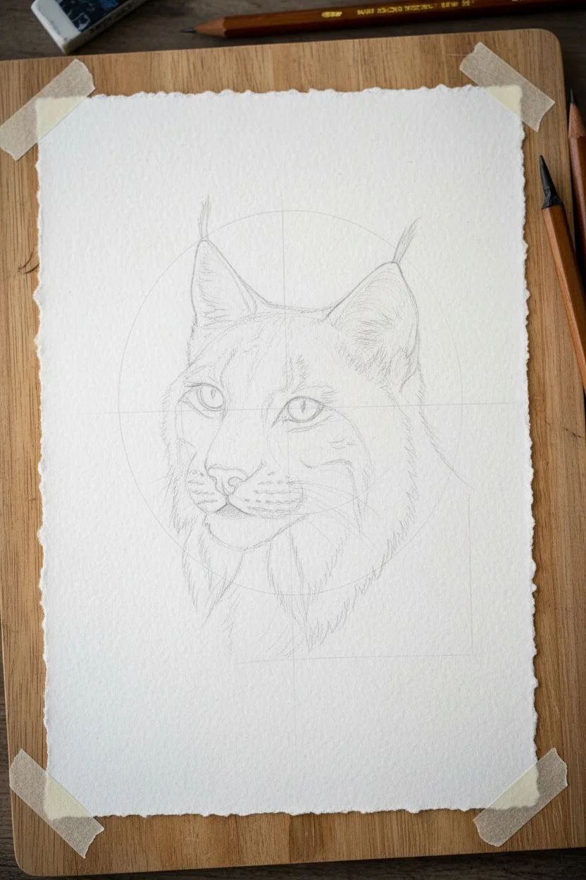
Step 1: Skeletal Structure & Initial Sketch
-
Preparing the Surface:
Begin with your textured cotton rag paper. Since this paper has a heavy tooth, lightly tape the corners down to a drawing board to prevent shifting. This surface is unforgiving with erasing, so keep your initial lines extremely faint. -
Mapping the Proportions:
Using a 2H pencil, lightly sketch a circle for the main head mass and a smaller oval for the muzzle. Mark a vertical center line and a horizontal eye line to ensure symmetry. -
Refining the Features:
Sketch the triangular shapes of the ears, paying attention to the tufts at the tips. Outline the almond shapes of the eyes, the nose pad, and the sweeping lines that define the cheek ruffs. Check your reference constantly to get the angles right.
Muddy Fur?
If your fur looks like a solid grey blob, you likely over-blended. Re-establish texture by using a sharp 4B pencil to add dark definitions and your precision eraser to pull out crisp highlights.
Step 2: The Gaze: Rendering the Eyes
-
Base Color Application:
Before diving into the graphite, establish the eye color. Lightly shade the irises with Yellow Ochre, leaving a small white circle for the highlight. -
Adding Depth:
Layer Burnt Sienna around the outer edge of the iris and near the pupil to create depth. Use Raw Umber for the darkest shadows under the upper eyelid. -
Defining the Pupil:
Switch to your charcoal pencil or a 6B graphite pencil to draw the pupil. It should be a solid, deep black. Carefully outline the eye with a dark rim to separate it from the fur. -
Final Eye Details:
Gently deepen the yellow hues until they pop. Ensure the catchlight (the white reflection) remains pure white—use a white gel pen or opaque gouache dot if you accidentally colored over it.
Step 3: Building the Fur Texture
-
Directional Mapping:
With an HB pencil, draw light arrows or flow lines indicating which direction the fur grows. This is crucial: the fur on the nose is short and downward, while the cheek ruffs sweep outward and down. -
Short Fur: The Muzzle:
Start on the bridge of the nose. Use your mechanical pencil to make tiny, ticking strokes. I like to keep these strokes very sharp and distinct to mimic the short, stiff hair here. -
Mid-Tone Layering:
Move to the forehead. Use a 2B pencil to lay down patches of tone, then draw darker hairs over the top. The lynx has a mottled coat, so vary your pressure to create faint spots and stripes. -
The Ear Tufts:
For the iconic ear tips, use long, sweeping strokes with a 4B pencil. These hairs should taper beautifully at the ends. Group them slightly so they look like distinct tufts rather than a broom. -
Developing the Cheek Ruffs:
This area requires patience. Build layers of long, flowing strokes using 2B and 4B pencils. Start with the ‘undercoat’ using a blending stump to create a soft grey base, then drawn sharp hairs on top. -
Creating Contrast in the Pattern:
Use the 6B or charcoal pencil to deepen the markings on the cheeks and neck. These dark spots provide the necessary contrast to make the drawing look realistic.
Pro Tip: The Paper Matters
Using textured cotton rag paper isn’t just for looks. The ‘valleys’ in the paper hold the graphite dust, allowing you to build up much darker values than on smooth copier paper.
Step 4: Refinement & Final Touches
-
Lifting Highlights:
Take your precision eraser (cut it with a knife to get a sharp edge if needed) and ‘draw’ white hairs back into the grey areas. This negative drawing technique adds incredible volume to the neck and chin fur. -
Whiskers and Sensory Hairs:
With a steady hand, draw the long white whiskers. Since we can’t easily draw white over dark graphite, you can indent the paper with a stylus beforehand or use white gouache/pencil now for the final pop. -
Deepening Shadows:
Go back in with your darkest charcoal pencil. Push the values in the nostrils, the corners of the eyes, and the deepest shadows within the ear cavity. High contrast is what separates a sketch from a finished piece. -
Softening Transitions:
Use a clean blending stump to gently soften areas where the fur transitions from short to long, ensuring there are no harsh, unnatural lines. -
Protecting the Work:
Clean up any smudges on the white background with a kneaded eraser. Finally, mist the drawing with a workable fixative to prevent the heavy graphite layers from smearing.
Step back and admire the piercing gaze of your predator, now permanently captured on the page.


Wrinkle and Fold Study From an Aged Portrait Crop
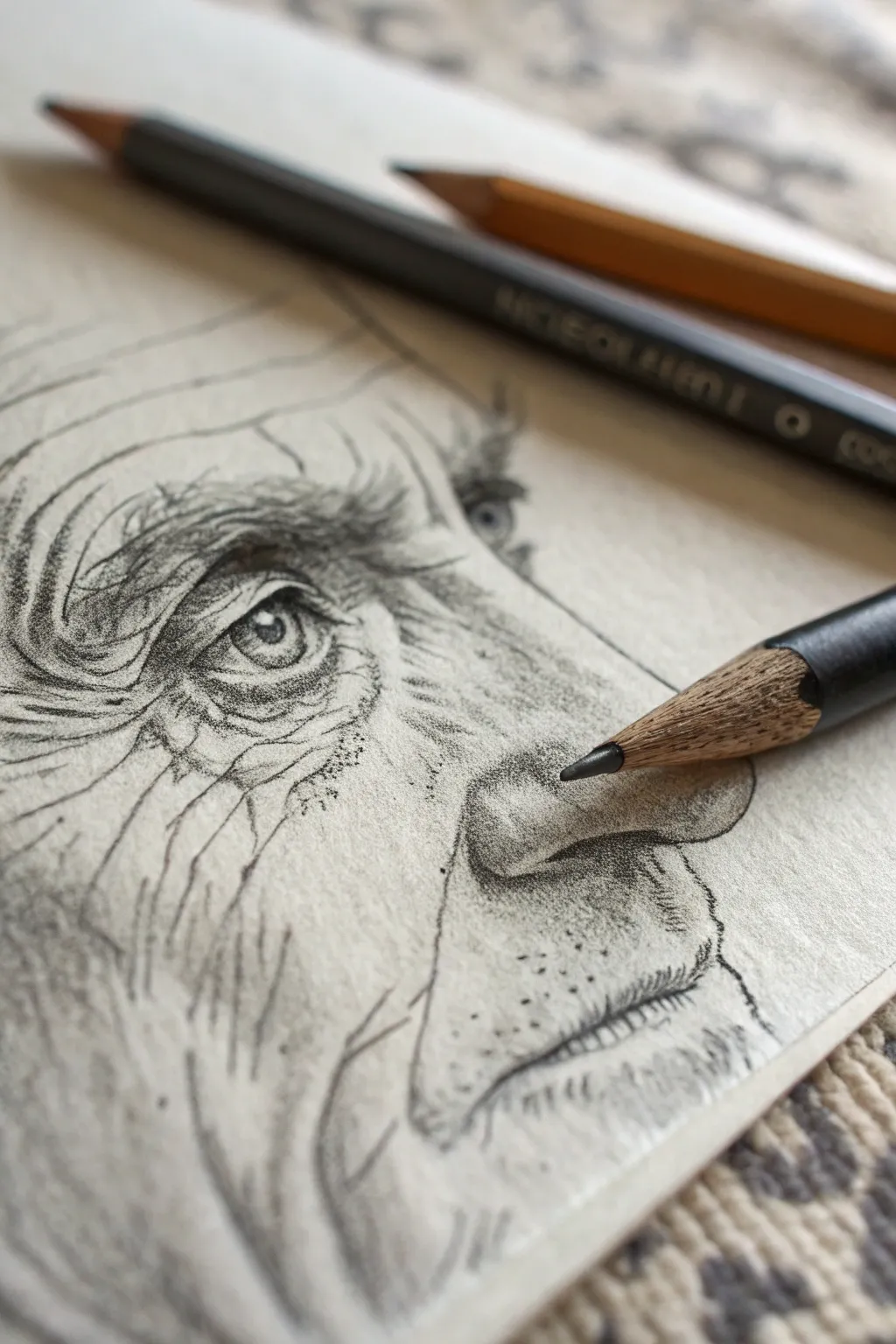
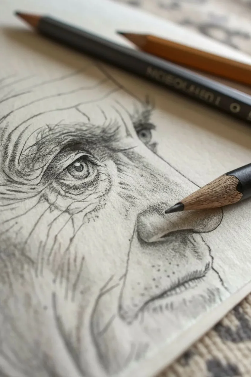
Capture the wisdom and character of age with this detailed graphite study focusing on wrinkles, skin folds, and expressive eyes. This project emphasizes texture and light, turning the natural signs of aging into a compelling map of life experience.
Step-by-Step Tutorial
Materials
- Textured sketch paper or Bristol vellum (heavyweight)
- Graphite pencils (HB, 2B, 4B, and 6B)
- Mechanical pencil (0.5mm HB or 2B) for fine details
- Kneaded eraser
- Blending stump or tortillon
- Pencil sharpener
Step 1: Establishing the Structure
-
Light Blocking:
Begin with a very light HB pencil sketch to map out the basic placements. Don’t worry about details yet; just establish the triangle between the inner corner of the eye, the bridge of the nose, and the nostril wing. -
Contour Mapping:
Lightly draw the major skin folds. Sketch the deep crease that runs from the nose past the mouth (nasolabial fold) and the heavy curvature of the forehead wrinkles. Treat these lines as topographical maps rather than flat lines. -
The Eye Setup:
Outline the almond shape of the eye, noting that age often causes the upper lid to droop slightly. Mark the pupil and iris, leaving a small, stark white circle for the catchlight.
Fixing “Wire” Wrinkles
If wrinkles look like dark wires sitting on top of the face, you missed the highlight. Every deep line needs a lighter ridge right next to it to show the raised skin volume.
Step 2: Developing the Eye
-
Iris Detail:
Switch to a sharpened 2B pencil. Fill in the pupil with a rich dark tone, then draw distinct spokes radiating outward in the iris. Keep the outer ring of the iris slightly darker to create depth. -
Lid Textures:
Use a mechanical pencil to create tiny, delicate creases on the eyelids. The skin here is thin, so your lines should be fragile and close together. -
Eyebrows:
Draw the eyebrow hairs using short, flicking strokes. For an aged look, make these hairs unruly—some long, some short, pointing in slightly different directions rather than a perfect arch. -
Shadowing the Orbit:
Deepen the shadow under the brow bone and in the inner corner of the eye using a 4B pencil. I like to smudge this slightly with a stump to make the eye socket look receded and hollow.
Step 3: rendering Texture and Wrinkles
-
Forehead Grooves:
Return to the forehead lines. Darken the deepest part of the wrinkle, but fade the line upward into the ‘hill’ of the skin fold. This gradient creates the 3D effect of a fold rather than a flat line. -
Cross-Hatching the Nose:
Use fine cross-hatching on the bridge and side of the nose. Keep your pencil strokes directional to follow the form of the nasal bone. -
Stippling for Pores:
On the nose tip and cheek area, use a stippling technique (tiny dots) mixed with very short dashes. This simulates the texture of larger pores often seen in aged skin. -
The Crow’s Feet:
Radiate fine lines outward from the outer corner of the eye. Press harder at the origin of the wrinkle and lift your pencil as you move outward to taper the line naturally. -
Cheek Volume:
Lightly shade the cheek area below the eye socket. Use a 2B pencil on its side to lay down graphite, then soften it just a touch. You want to show the sagging volume of the cheek pad.
Level Up: Paper Tone
Try this study on toned tan or gray paper. You can keep your graphite work the same, but use a white charcoal pencil to explicitly draw the highlights on the wrinkle ridges.
Step 4: Final Depth and Definition
-
Deepest Darks:
Take your 6B pencil and revisit the darkest areas: the pupil, the shadow inside the nostril, and the deepest crevices of the wrinkles. This high contrast is what makes the drawing pop. -
Facial Hair Stubble:
On the upper lip and jawline, use short, stiff strokes to suggest stubble. Vary the pressure so some hairs look thicker than others. -
Highlight recovery:
Mold your kneaded eraser into a fine point. Gently ‘stamp’ or lift vertically along the top ridges of the wrinkles and the tip of the nose to reveal bright paper highlights. -
Rough Hatching:
Add some looser, rougher hatching lines on the periphery of the drawing (like the cheek and neck area) to give it that artistic, ‘sketchbook study’ aesthetic shown in the reference.
Take a moment to appreciate how the accumulation of simple lines has created a story of a life lived on paper

Ornate Architectural Fragment With Brickwork and Carvings
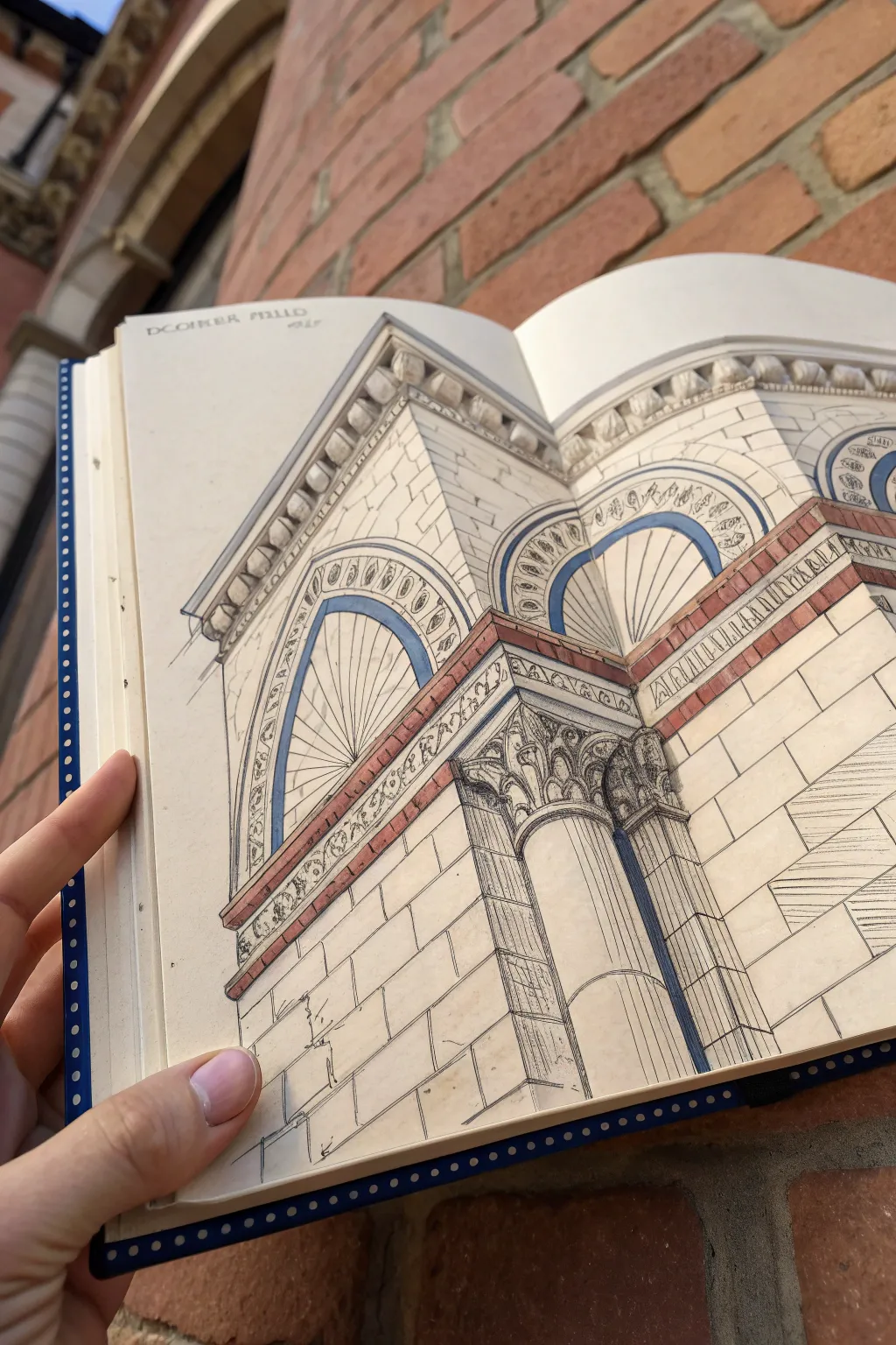
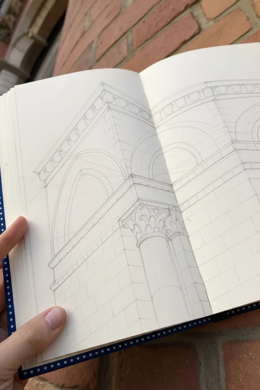
Capture the structural beauty of a building’s corner with this detailed architectural study entailing intricate moldings and decorative brickwork. The finished piece combines precise linework with subtle color washes to create a sense of depth and three-dimensionality.
Step-by-Step
Materials
- Hardbound sketchbook (smooth or mixed media paper)
- HB or 2H graphite pencil for initial layout
- Fine liner pens (0.1mm, 0.3mm, 0.5mm) – black or dark sepia
- Ruler or straight edge
- Watercolor paints or alcohol-based markers (terracotta/brick tones, cool grey, faint blue)
- Small round brush (if using watercolor)
- Eraser
Step 1: Structural Layout
-
Establish the Corner Line:
Begin by drawing a strong vertical line slightly off-center on your page spread. This represents the main corner of the building from which the perspective will recede. -
Map Vanishing Points:
Lightly sketch your perspective lines. Since we are looking up at the structure, the vertical lines should taper slightly inward toward the top, while the horizontal lines of the bricks and cornices angles sharply downward toward their respective vanishing points. -
Block in Key Shapes:
Using your pencil, rough in the large geometric shapes: the triangular top cornice, the rectangular brick sections, and the cylindrical forms of the column and archways. -
Refine the Archways:
Carefully sketch the concentric curves of the decorative arches. Pay close attention to how the thickness of the arch reveals itself; you should see the underside of the arch curve. -
Detail the Column Capital:
Sketch the intricate floral or scrollwork design at the top of the column. Don’t worry about every tiny detail yet, just capture the flowing movement of the carving.
Clean Lines
When stopping a line with your pen, lift it swiftly at the end. This creates a tapered finish that looks more professional than a blunted stop.
Step 2: Inking the Details
-
Outline Main Structures:
Switch to a 0.3mm or 0.5mm pen to ink the major structural lines—the corner edge, the main horizontal bands, and the column outline. Use a ruler for the straight lines to maintain that architectural precision. -
Render the Brickwork:
With a finer 0.1mm pen, draw the individual bricks. Notice how they are laid out in a ‘bond’ pattern, alternating seams. Keep these lines slightly lighter than the main structure lines. -
Ink the Decorative Band:
Carefully ink the small floral or geometric pattern in the horizontal band above the column. Precision is key here, so work slowly. -
Define the Arches:
Ink the concentric circles of the arches. Add the decorative ‘egg and dart’ or bead patterns found within the arch molding using small, consistent oval shapes. -
Hatch the Shadows:
Use vertical or diagonal hatching with your 0.1mm pen to create shadows, particularly inside the deep recesses of the arches and under the cornices. This immediately adds depth. -
Detail the Column Capital:
Go back to the column capital with a very fine point. Ink the leafy scrolls, adding small ticks and varying line weight to show the curvature of the stone carving. -
Clean Up:
Once the ink is completely dry, gently erase all your initial pencil guidelines.
Step 3: Adding Color Washes
-
Apply Shadow Tones:
Using a very diluted cool grey watercolor or a light grey marker, add shadows to the side of the building facing away from the light source. This anchors the form. -
Color the Brick Bands:
Mix a muted terracotta or rusty red color. Carefully paint the decorative horizontal brick bands and the small brick accents within the arch. Keep the color flat and graphic. -
Highlight the Arches:
Use a soft, pale blue wash to define the recessed areas of the arches. This mimics the shadow or perhaps painted detailing often found in Gothic or Romanesque revival architecture. -
Enhance Depth:
I find that adding a second, slightly darker layer of grey to the deepest shadow areas—like under the roofline and behind the column capital—really makes the drawing pop. -
Final Textures:
If desired, add very faint stippling or tiny stray marks on the white stone areas to suggest weathering or the texture of limestone.
Atmospheric Perspective
Make lines thicker and darker on the parts of the building closest to the viewer. Use thinner, broken lines for details further away to create depth.
Now you have a timeless architectural fragment preserved beautifully in your sketchbook

PENCIL GUIDE
Understanding Pencil Grades from H to B
From first sketch to finished drawing — learn pencil grades, line control, and shading techniques.
Explore the Full Guide
Mechanical Detail Drawing of Gears, Screws, and Cables


Capture the precision of mechanical engineering with this detailed pencil study of gears and hardware. Mimicking the look of a vintage technical schematic, this project focuses on accurate perspective, clean lines, and subtle shading to bring industrial components to life on paper.
How-To Guide
Materials
- Smooth bristol board or hot-pressed watercolor paper (cream or tan toned)
- Graphite pencils (HB, 2B, 4B, 6B)
- Mechanical pencil (0.5mm HB) for fine details
- Technical drawing pens (0.1mm, 0.3mm, 0.5mm) in black or sepia
- Ruler and compass
- Kneaded eraser and precision eraser (mono zero)
- Circle template (optional but helpful)
- Blending stump or tortillon
Step 1: Planning the Layout
-
Establish the axes:
Begin by lightly drawing a vertical and horizontal axis for your main gear using the ruler. This crosshair will serve as the anchor for the largest component in the lower center of the page. -
Map out component placement:
Lightly sketch boxes or simple circles to indicate where the other elements will go. Place the side-view gear in the upper left quadrant and the smaller screw detailed view on the right. -
Draft the main gear circles:
Using a compass anchored at your central crosshair, draw the concentric circles that define the outer rim, the inner rim of the teeth, and the central hub of the large gear. -
Divide for spokes:
The main gear has five spokes. Lightly divide your circle into five equal sections (72 degrees apart) to ensure the spokes are evenly spaced before you start detailing them.
Wobbly Ellipses?
If your perspective circles look uneven, draw a box in perspective first. Draw diagonals to find the center, then fit your ellipse inside the box tangent to the midpoints of the sides.
Step 2: Drafting the Components
-
Sketch gear teeth profiles:
On the outer rim of the main gear, sketch the trapezoidal shapes of the gear teeth. Don’t worry about perfection yet; focus on keeping the spacing consistent. -
Detail the spokes and hub:
Flesh out the five spokes, giving them thickness and curving the points where they meet the rim and the hub to suggest cast metal fillets. -
Draw the secondary gear:
Move to the upper left gear. Since it’s viewed slightly from an angle, draw these circles as slight ellipses. Sketch the smaller teeth profiles around this elliptical path. -
Outline the screw and small sprocket:
For the screw on the right, draw a central cylinder and sketch diagonal lines for threads. Draw the small sprocket nearby, focusing on the sharp geometry of its teeth. -
Add technical annotations:
Sketch light guidelines for text. Add numbers, dimension lines, and small schematic notes around the gears using a steady hand to mimic engineering lettering.
Level Up: Vintage Aging
Before drawing, lightly stain your paper with cold tea or thinned coffee and let it dry flat. This creates an authentic old-world parchment effect for your schematic.
Step 3: Refining and Inking
-
Ink the main outlines:
Using a 0.3mm technical pen, carefully trace your final pencil lines. Use a ruler for straight edges and freehand the curves for a slightly organic, hand-drawn schematic feel. -
Add line weight variety:
Go back over the ‘shadow side’ of the objects (usually the bottom and right edges) with a 0.5mm pen to create depth and visual weight. -
Hatch the shadows:
Use fine hatching lines (parallel diagonal strokes) to shade the interior of the gear rim and the side of the spokes. Keep your spacing consistent to maintain that clean, graphical look. -
Detail the screw threads:
I like to use a very fine 0.1mm pen here to draw the spiral threads of the screw, ensuring the lines curve slightly to show the cylindrical form. -
Illustrate surface texture:
Add tiny, broken lines or stippling on the metal surfaces to suggest casting marks or age. This texture prevents the drawing from looking too sterile.
Step 4: Final Shadings and Cleanup
-
Apply graphite shading:
Switch to a 2B pencil to add soft shading over your ink work. Focus on the cylindrical hub of the main gear to make it look round. -
Deepen the contrast:
Use a 4B or 6B pencil to darken the deepest crevices, such as the spaces between gear teeth and the hole in the hub. -
Blend for smoothness:
Gently gently use a blending stump to soften the graphite shading, smoothing out the transition from dark to light on the metal spokes. -
Enhance the dimension lines:
Re-trace the straight dimension lines and arrows with a sharp mechanical pencil to ensure they stand out crisp against the shaded components. -
Clean up highlights:
Use a precision eraser to lift out graphite on the highest points of the metal—like the top of the hub and the edges of the spokes—to create a metallic shine.
Now you have a precise mechanical study that celebrates the beauty of industrial design.
Stippling-Only Shading on a High-Contrast Subject
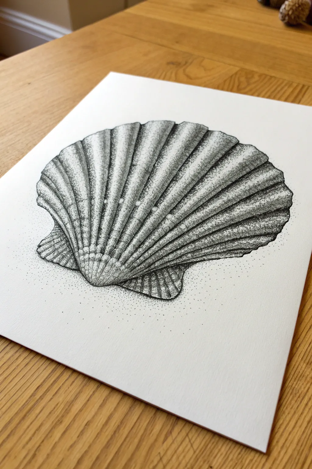
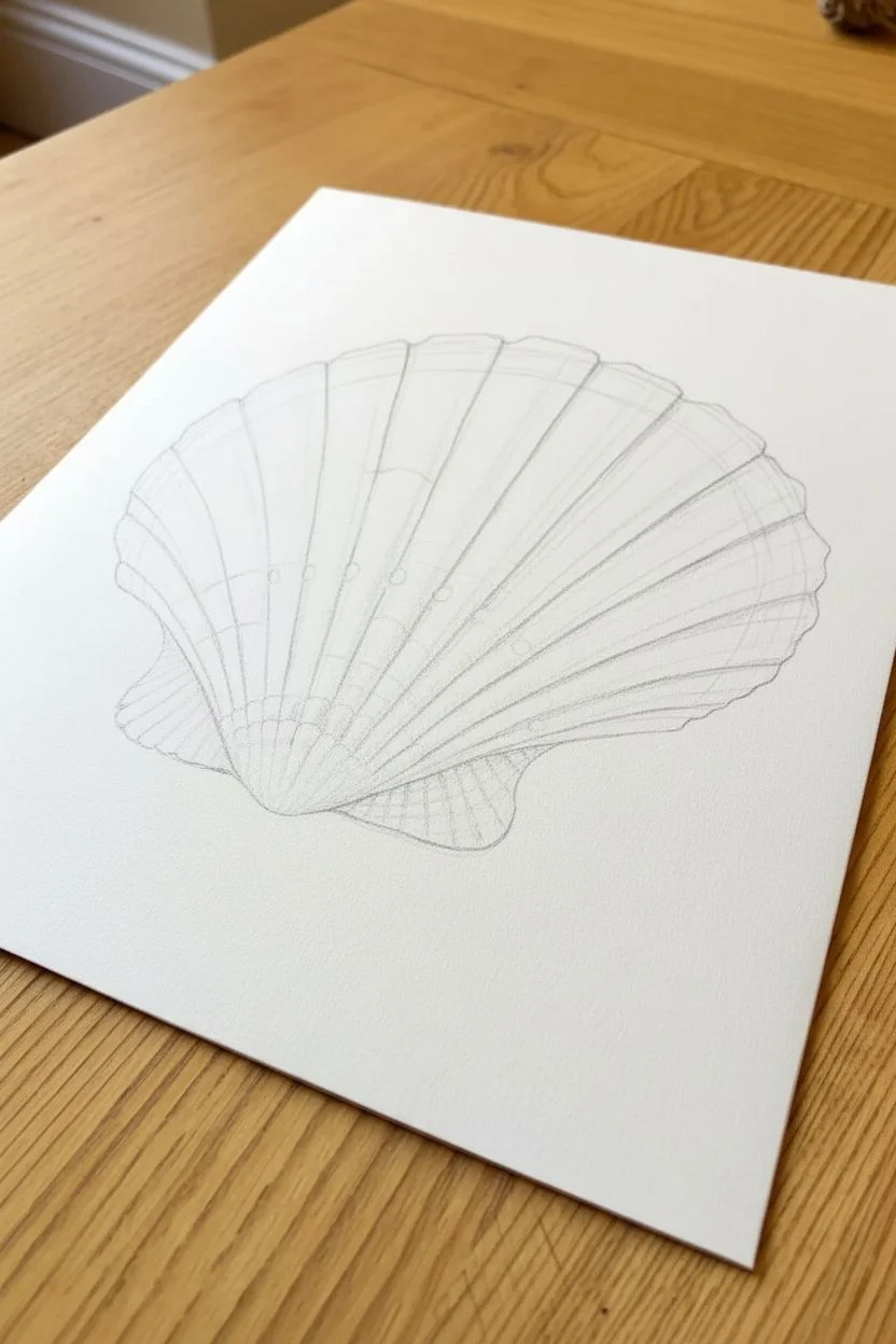
Master the art of patience with this intricate stipple drawing of a scallop shell. By building up thousands of tiny ink dots, you will create a rich, high-contrast texture that brings the natural ridges and curves of the shell to life.
Step-by-Step Tutorial
Materials
- High-quality Bristol board or smooth watercolor paper (A4 or A5)
- Fine liner pens (sizes 0.05, 0.1, 0.3, and 0.5)
- HB Graphite pencil
- Soft kneaded eraser
- Ruler (optional for rough centering)
Step 1: Drafting the Outline
-
Establish the fan shape:
Begin by lightly sketching a wide fan or semi-circle shape in the center of your paper with an HB pencil. Mark a small curved point at the bottom center to serve as the shell’s hinge (the umbo). -
Sketch the radiating ribs:
From the bottom hinge point, draw light guidelines radiating outward to the top edge of the fan. A scallop shell has distinct ridges, so aim for 12-15 main ribs that widen as they reach the top. -
Refine the scalloped edge:
Along the top curve of your fan, connect the rib lines with small, curved arches to create the classic scalloped edge. Ensure the connection points are soft, not sharp triangles. -
Add the ‘ears’:
Draw the two small, triangular wing-like protrusions (ears) at the very base of the shell next to the hinge. These shouldn’t be perfectly sticking out; give them a slight organic curve downward. -
Clean up the pencil sketch:
Once happy with the proportions, gently roll your kneaded eraser over the drawing to lift most of the graphite. You want a faint ‘ghost’ image that is barely visible to guide your ink work.
Step 2: Initial Stippling
-
Outline with dots:
Switch to a 0.1 fine liner. Instead of tracing your pencil lines with a solid stroke, begin tapping dots along the outline. Keep the dots spaced moderately close together to define the edge without creating a hard wire line. -
Establish the shadow sides:
Identify which side of each rib is in shadow. In this reference, the light source comes from the top left, meaning the right side of each individual ridge will be darker. Lightly stipple these shadow zones to map out the 3D form. -
Dense hinge shading:
The bottom hinge area is deeply recessed and textured. Use a slightly thicker pen (0.3) here to place dots densely, almost merging them, to anchor the drawing with a dark value early on.
Uneven Gradients?
If your shading looks patchy, switch to the smallest pen size (0.05). Fill the gaps between larger dots with tiny ones to smooth the transition without darkening the area too quickly.
Step 3: Building Contrast and Form
-
Deepening the rib valleys:
Troughs between the ribs need to be the darkest areas. With your 0.1 or 0.3 pen, increase the density of dots in these valleys. Transition from dense dots in the deepest part of the trough to sparse dots moving up the ridge slope. -
Creating gradients:
The secret to roundness is the gradient. On the lit side of each rib, use very few dots, letting the white paper show through. As the rib curves down into the shadow side, gradually increase dot frequency. -
Texture the ‘ears’:
Return to the small wings at the base. These often have horizontal striations rather than vertical ribs. Stipple in horizontal bands of shadow to distinguish their texture from the main body. -
Enhancing the rim:
The scalloped top edge needs dimension. Stipple a tiny shadow just under the lip of each arch to make the edge look like it has thickness, rather than being paper-thin. -
Refining the darks:
Switch to your 0.05 pen for ultra-fine transitions. go over the mid-tone areas (the grey zones between highlight and shadow) to smooth out the gradient. This makes the shell look calcified and smooth rather than gritty.
Try Colored Ink
Swap black ink for sepia or deep blue fine liners. Using a monochrome color palette retains the classic scientific illustration look while adding a subtle warmth or coolness to the piece.
Step 4: Final Touches
-
Adding surface imperfections:
Real shells aren’t perfect. Add a few random clusters of dots on the highlighted ridges to simulate weathering, pits, or growth marks. This breaks up the uniformity. -
Grounding shadow:
To place the shell in a space, create a faint cast shadow underneath the shell using a 0.05 pen. Keep the dots very sparse and scattered, fading out quickly into the white paper to suggest sand. -
Final contrast check:
Step back from your work. If the shell looks flat, go back into the deepest crevices between the ribs with your 0.5 pen and add a few strategic dark dots to punch up the contrast. -
Erase pencil marks:
Wait at least 30 minutes for the ink to fully cure. Then, gently erase any remaining pencil guidelines to leave only the crisp, clean stippled image.
Now you have a stunning, texturally rich seashell rendering that celebrates the precision of pointillism.
BRUSH GUIDE
The Right Brush for Every Stroke
From clean lines to bold texture — master brush choice, stroke control, and essential techniques.
Explore the Full Guide
Flora-Fauna Hybrid With Layered Organic Patterns
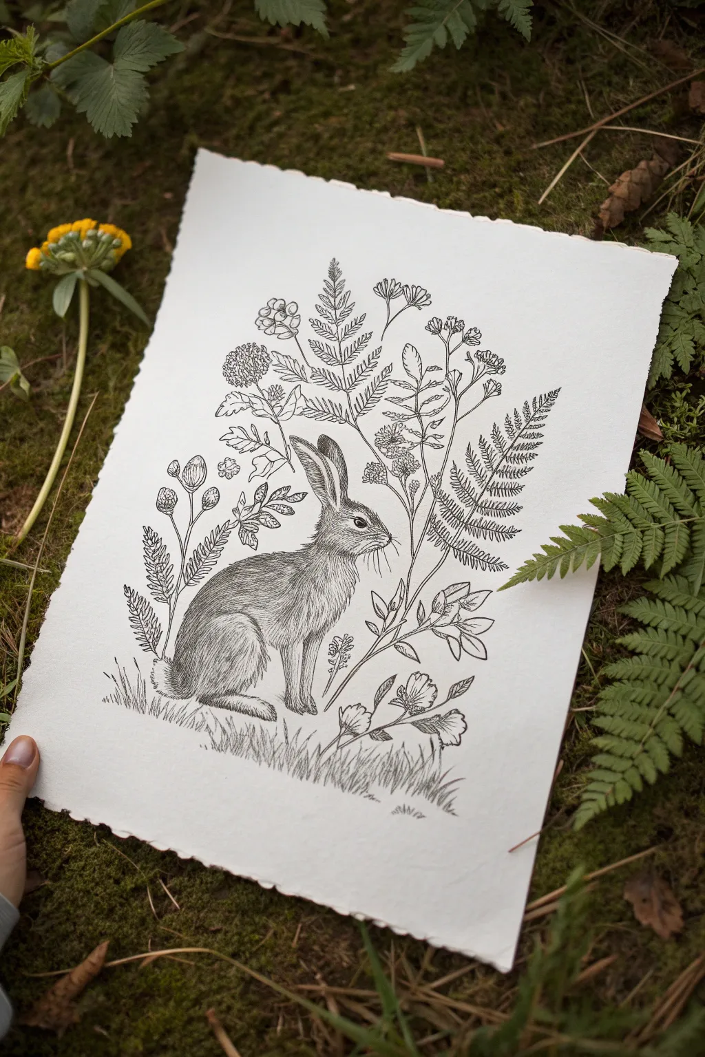
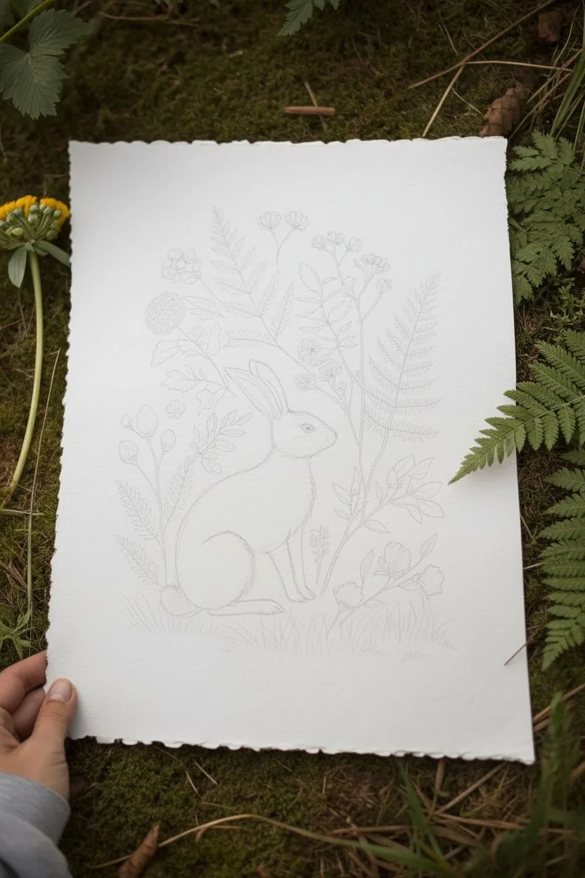
Capture the quiet beauty of the forest floor with this detailed ink drawing featuring a watchful hare nestled among ferns and wildflowers. Using fine liners on textured deckle-edge paper creates a timeless, vintage botanical print aesthetic.
Step-by-Step Tutorial
Materials
- Heavyweight cold-press watercolor paper or cotton rag paper with deckle edge
- HB or 2H graphite pencil for sketching
- Kneadable eraser
- Fine liner pens (sizes 005, 01, and 03)
- Black pigment ink (waterproof and archival)
- Ruler (optional, for composition placement)
Step 1: Planning and Sketching
-
Establish the Composition:
Begin by lightly marking the central placement for the hare. It should be positioned slightly lower than the center of the paper, facing towards the right to leave ‘looking room’. Mark the ground line gently. -
Block in the Hare’s Shape:
Using your HB pencil, sketch the basic oval for the hare’s body and a smaller circle for the head. Add the long, distinct ears—one upright and one slightly angled back. Keep these lines very faint so they are easy to erase later. -
Refine the Animal’s Form:
Connect your basic shapes to form the neck and back. Pay attention to the curve of the haunches and the delicate front paws tucked underneath. Define the eye placement and the muzzle shape. -
Map Out the Botanicals:
Lightly sketch the main stems of the plants surrounding the hare. Draw tall fern fronds rising behind the hare’s back, curving slightly to frame the animal. Place shorter flower clusters near the ground. -
Add Leaf and Flower Details:
Flesh out your botanical sketch by drawing the individual leaves on the ferns and the small petals on the wildflowers. Vary the heights to create a natural, organic hierarchy.
Step 2: Inking the Hare
-
Outline the Eye:
Switch to your 01 fine liner. Carefully ink the eye, leaving a tiny white highlight to bring the hare to life. Making the eye dark and crisp is crucial for focus. -
Fur Texture – Head and Ears:
Using the 005 pen, start creating fur texture on the face with short, flicking strokes that follow the contours of the skull. The strokes should be very short on the nose and longer on the ears. -
Fur Texture – Body:
Continue down the neck and back. I find it helpful to group your strokes to suggest muscle definition. Use denser strokes in shadow areas (under the chin, belly, and legs) and sparse strokes on the highlighted back. -
Define the Paws:
Ink the paws with careful, deliberate lines. Use slightly darker strokes where the paws meet the ground to ground the figure. -
Whiskers and Final Details:
Use quick, confident flicks with the 005 pen for the whiskers. Ensure they radiate naturally from the muzzle.
Uneven Fur Texture?
If fur looks too uniform, vary your line lengths and leave intentional white ‘gaps’ where light hits the fur. Natural coats aren’t perfect patterns.
Step 3: Inking the Flora
-
Ink the Stems:
Use the 01 pen to trace the main stems of the plants. Keep the lines relatively smooth but allow for small natural imperfections. -
Fern Fronds:
Carefully ink the small leaflets on the fern stems. Use the 005 pen for the finest details within the leaves, perhaps adding a central vein to each leaflet. -
Wildflowers and Seed Heads:
Ink the round flower heads and seed pods. Use stippling (tiny dots) or small hatching lines to give the flowers volume without making them look too heavy. -
Create the Grass:
At the hare’s feet, draw clumps of grass using upward, flicking strokes with the 01 pen. Vary the length and direction to make the ground look uneven and natural. -
Adding Depth:
Go back over the darkest areas with an 03 pen if needed—specifically deep shadows in the fur or the undersides of leaves—to increase contrast.
Protect Your Hand
Place a scrap sheet of paper under your drawing hand while inking. This prevents skin oils from transferring to the paper and smudging wet ink.
Step 4: Finishing Touches
-
Erase Pencil Guidelines:
Wait until the ink is completely dry (give it at least 10-15 minutes to be safe). Gently use the kneadable eraser to lift all graphite marks. -
Assess and Adjust:
Step back and look at the overall balance. If the hare looks too light compared to the plants, add another layer of fine hatching to darken the fur.
Now you have a delicate woodland study ready to be framed or gifted to a nature lover
Underwater Bubble and Droplet Study With Refraction Details
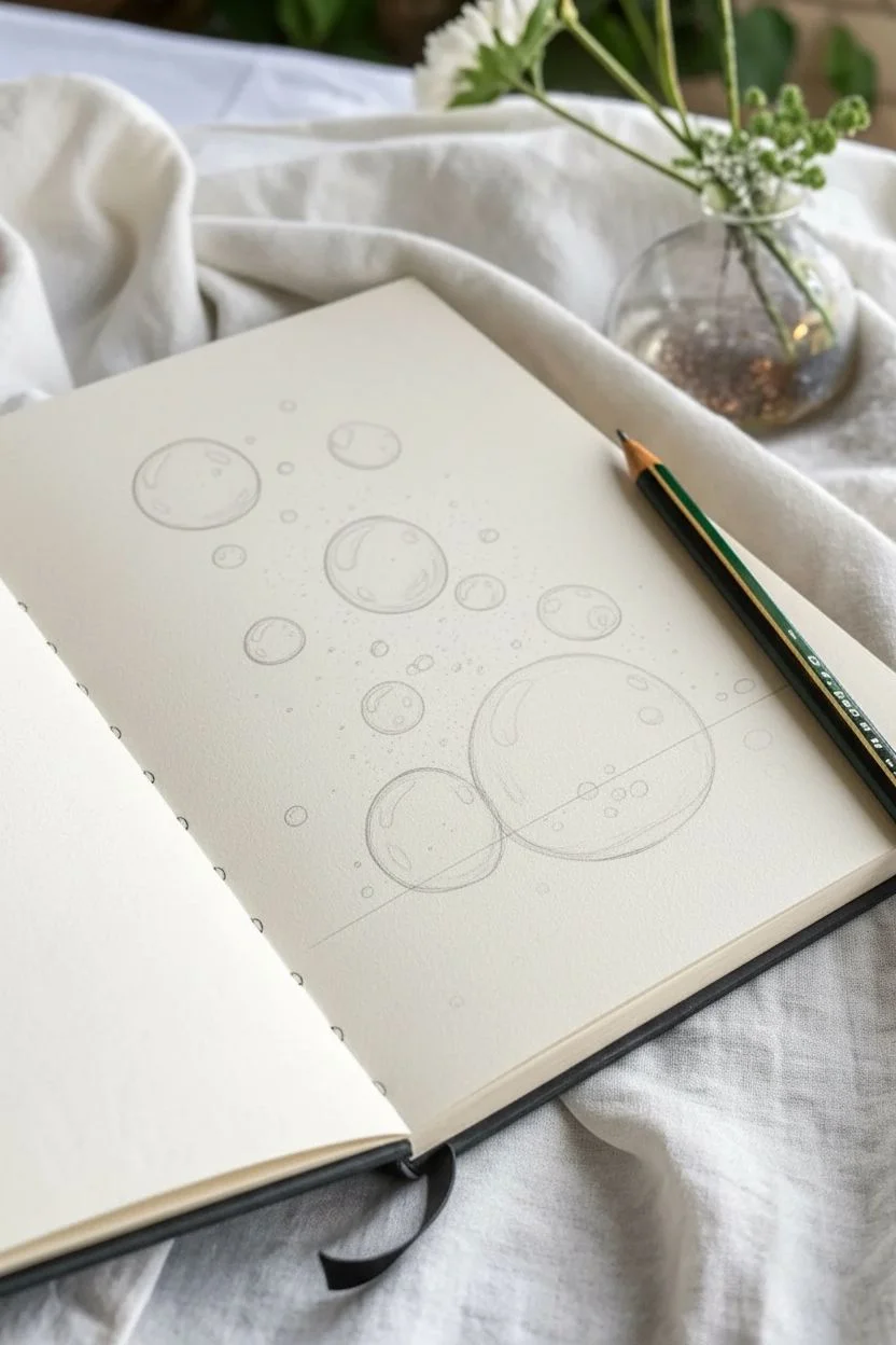
Master the art of transparency and refraction with this striking pencil study of water bubbles. By contrasting a deep black background with a soft, misty foreground, you will create a stunning illusion of depth where the bubbles seem to lift right off the paper.
Step-by-Step Guide
Materials
- Heavyweight sketching paper or sketchbook (smooth bristol is ideal)
- Graphite pencils (HB for sketching, 2B-4B for shading)
- Black charcoal pencil or very soft graphite (6B-8B) for the dark background
- White gel pen or gouache with a fine brush
- Blending stumps (tortillons)
- Kneaded eraser
- Ruler (optional)
- Compass or circle template (optional)
Step 1: Setting the Scene
-
Establish the horizon:
Begin by lightly drawing a horizontal line across the lower third of your page. This will separate your dark background from the lighter surface below. -
Map out the bubbles:
Using an HB pencil, sketch various circles of different sizes. Place a large, focal bubble resting on the horizon line along with a medium-sized companion. Scatter smaller bubbles floating upwards into the space above. -
Refine the shapes:
If you struggle with freehand circles, feel free to use a circle template or a coin to get crisp, perfect outlines. Keep these lines very faint so they don’t show through later.
Keep it Clean
Place a scrap piece of paper under your drawing hand. This prevents the oils in your skin from smudging the dense black background onto the pristine white bubbles.
Step 2: Creating the Deep Background
-
Outline the negative space:
Carefully trace around your floating bubbles in the upper section. You need to preserve the white of the paper inside the bubbles for now. -
Fill the void:
Using your darkest tool (charcoal or 8B graphite), fill in the entire upper background rectangular area. Press firmly to get a solid, opaque black, but be extremely careful not to smudge into your bubble outlines. -
Smooth the black:
Take a blending stump and work the charcoal or graphite into the paper tooth for a velvety, seamless finish. This high contrast is crucial for the glass-like effect. -
Add tiny atmosphere:
While the background is dark, you can leave tiny pinpricks of white paper exposed as ‘dust’ or distant micro-bubbles, or add them later with a white gel pen.
Level Up: Color Tint
Glaze a very faint layer of blue or teal watercolor over the finished bubble interiors. It adds a soapy, aquatic realism without overpowering the graphite work.
Step 3: Shading the Floating Bubbles
-
Understand the light:
For bubbles on a dark background, the edges catch the light. Use a 2B pencil to shade the inner edges of the bubbles, leaving the very outer rim white. -
Create the glass effect:
Inside the bubbles, draw distorted shapes that mirror the environment. The top of the bubble should reflect light (white highlights), while the bottom curve catches a darker shadow. -
Refine reflections:
Use a white gel pen to add sharp, crisp highlights on the top left curve of each floating bubble. This specular highlight makes them look wet and glossy.
Step 4: The Resting Bubbles & Foreground
-
Ground the main bubbles:
Focus on the large bubble resting on the surface. Unlike the floaters, this one is transparent against a lighter ground. Shade the top half darker (reflecting the dark background) and keep the bottom half lighter. -
Draw the horizon refraction:
The horizon line you drew earlier should look distorted inside the bubble. Curve the line downward inside the main sphere to simulate the lens effect of the water. -
Shade the surface:
Lightly shade the foreground surface with an HB pencil using horizontal strokes. Blend it out smoothly to create a misty, reflective table feel. -
Cast shadows:
Add a soft shadow underneath the resting bubbles. The shadow should be darker directly beneath the object and fade out quickly. -
Internal details:
Draw tiny, smaller bubbles sitting inside the large surface bubble if you want extra detail. Treat them as miniature versions of the main subject. -
Final highlights:
Use your white gel pen to place the brightest highlights on the top curve of the large bubbles. I usually add a few tiny white dots on the surface foreground to suggest water spray or texture.
Step back and admire how simple shading techniques have transformed flat circles into convincing, three-dimensional spheres.


Scale and Armor Pattern Drawing With Repeating Precision
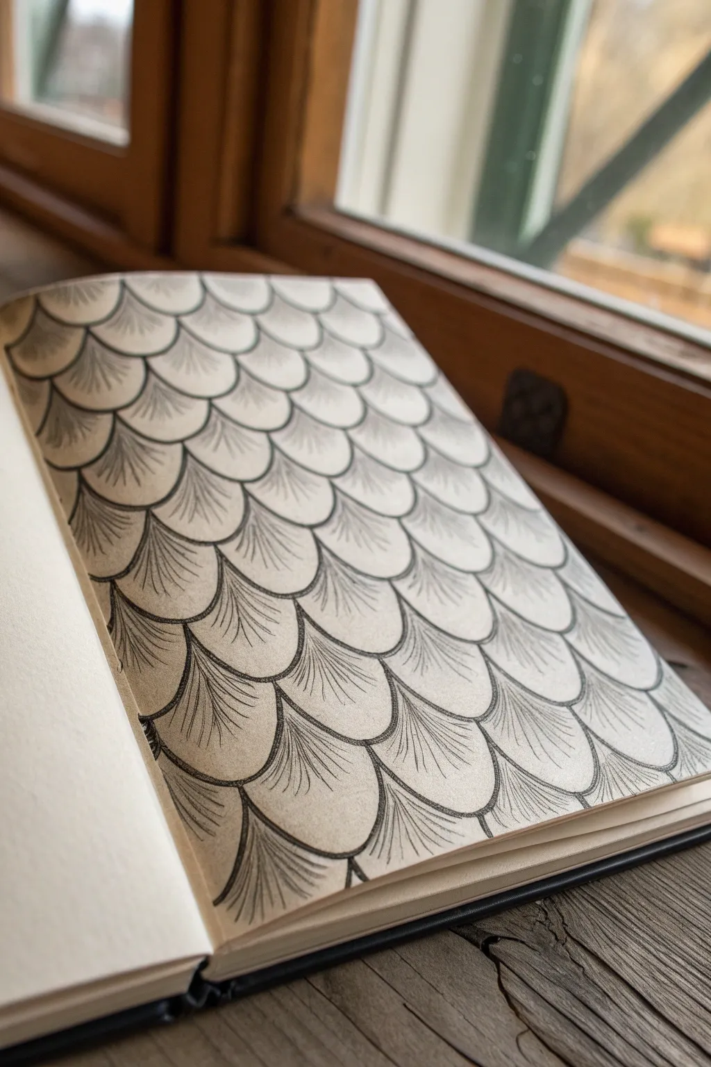
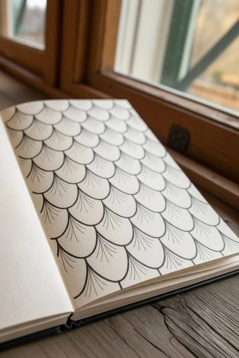
This meditative drawing exercise focuses on creating depth and rhythm through a simple, repeating fan-shaped motif. The result is a stunning texture resembling fish scales, roof tiles, or stylized feathers that pop off the page with delicate shading.
Step-by-Step
Materials
- Drawing paper or sketchbook (smooth bristol or mixed media paper recommended)
- Pencil (HB for outlining)
- Fine liner pens (0.1mm and 0.3mm)
- Compass or circular template (optional for guidelines)
- Eraser
- Ruler
Step 1: Setting the Structure
-
Sketch the first row:
Start at the very top of your page. Using your pencil, draw a row of connected semi-circles or arches. They should bow downward like upside-down ‘U’ shapes. Keep them consistent in width. -
Establish the offset pattern:
For the second row, place the center of each new arch directly below the meeting point of the two arches above it. This brick-lay or offset pattern is crucial for the scale effect. -
Fill the page:
Continue this alternating process until you fill your entire desired area. Check occasionally to ensure your rows remain relatively straight and your scale sizes don’t drift too large or small. -
Refine the outlines:
Go over your pencil sketches with a 0.3mm fine liner. Focus on making the curves smooth and continuous. Lightly erase the pencil marks once the ink is fully dry.
Keep it Consistent
For perfectly even scales without measuring, trace a coin or a small bottle cap for your initial pencil grid rows.
Step 2: Adding Texture and Depth
-
Start the center shading:
Choose a single scale to begin. Using your finer 0.1mm pen, draw a straight vertical line from the top center point down toward the bottom edge, stopping just short of the border. -
Fan out the lines:
Draw radiating lines outward from that top center point. These lines should curve slightly to follow the contour of the scale’s outer edge. -
Create the density gradient:
As you draw these radiating lines, keep them very close together near the top point of the scale. This density creates natural darkness and shadow under the overlapping scale above. -
Lighten the touch:
As your strokes move downward toward the rounded bottom of the scale, let the lines splay out further and lift your pen pressure slightly. The bottom third of the scale should remain mostly white space. -
Repeat the texture:
Apply this same fanning technique to every scale in the grid. It helps to work row by row to prevent smudging your ink with your hand.
Step 3: Final Touches
-
Deepen the overlaps:
To make the scales look truly layered, go back with your pen and add extra tick marks or short strokes right at the very top ‘V’ shape where the scales meet. This emphasizes the shadow cast by the layer above. -
Clean up edges:
Check the borders of your drawing. If you have partial scales at the edges of the paper, ensure they are shaded with the same directionality as the full scales. -
Evaluate contrast:
Step back and look at the overall pattern. If it looks too flat, I find that going back into the deepest crevices with a slightly thicker line helps pop the 3D effect immediately.
Go Metallic
Try this pattern on black paper using metallic silver or gold gel pens for a dragon scale armor effect.
Now you have a mesmerizing sheet of textured scales ready to serve as a background or a stand-alone art piece
Fantasy Creature Close-Up Focused on Invented Micro-Details
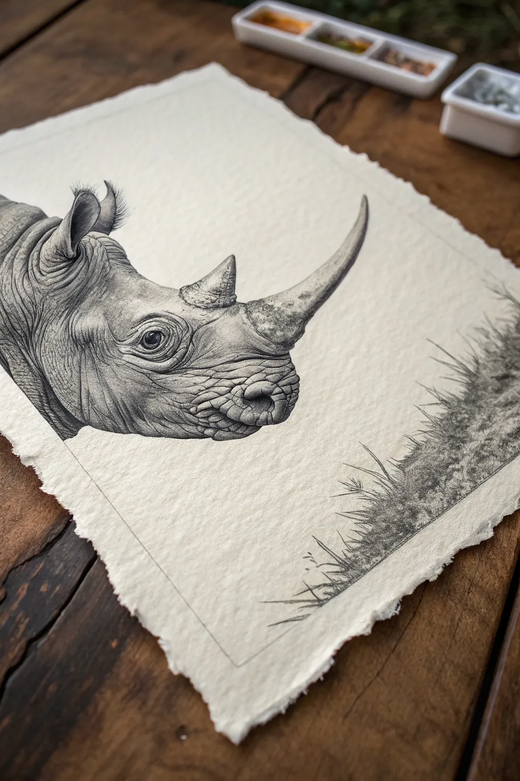
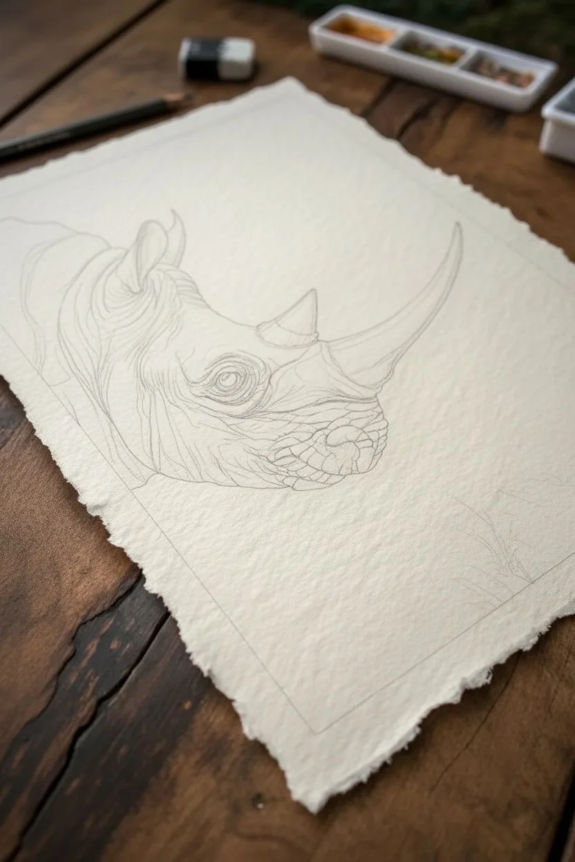
This project captures the rugged beauty of a rhinoceros through precise, monochromatic detail on textured, deckle-edge paper. You will learn to build up wrinkled skin textures and subtle shading using fine graphite or ink techniques, creating a piece that feels like a vintage scientific illustration.
How-To Guide
Materials
- Heavyweight cold-press watercolor paper (300gsm) with deckle edges
- Graphite pencils (4H, HB, 2B, 4B, 6B)
- Fine liner pens (0.05mm, 0.1mm, 0.3mm) – optional for darker contrast
- Kneaded eraser
- Precision mechanical eraser (mono zero)
- Blending stump (tortillon)
- Ruler
- Soft brush (for sweeping away eraser dust)
Step 1: Structural Layout
-
Define the boundaries:
Begin by lightly ruling a border around your composition area. Since we are using deckled paper, leave a generous margin of about 1.5 inches from the rough edge to frame the subject nicely. -
Basic shaping:
Using a hard 4H pencil, sketch the large geometric masses of the rhino’s head. Think of the snout as a rounded cylinder and the horn as a curved cone. -
Refining the silhouette:
Connect your geometric shapes to form the organic outline of the head, neck folds, and the large horn curve. Place the eye low on the head, aligning it roughly with the base of the horn. -
Mapping the textures:
Still using the light 4H pencil, draw faint contour lines across the face to map out where the major wrinkles and skin folds will flow. This acts as a topographic map for your shading later. -
Sketch environmental elements:
Lightly indicate the placement of the grassy tussock in the bottom right corner, ensuring it balances the composition without competing with the rhino.
Step 2: Detailed Shading & Texture
-
The eye focal point:
Start with the eye to anchor the drawing’s soul. Use a 4B pencil or 0.1mm pen to darken the pupil, leaving a tiny pure white highlight. Shade the heavy eyelids with deep creases. -
Texturing the horn:
For the horn, use short, vertical directional strokes that mimic fibrous growth. Start near the base with 2B graphite, making the texture dense and rough, and smooth it out as you move toward the tip. -
Developing the skin folds:
Work on the deep wrinkles around the snout. Use a 2B pencil to darken the deepest part of the cracks, then fade outward with an HB pencil to create the rounded form of the skin rolls. -
Cross-hatching technique:
To create the leathery look on the cheek, apply layers of fine cross-hatching. Keep your pencil very sharp. The strokes should follow the curvature of the animal’s facial muscles. -
Establishing contrast:
Switch to your 6B pencil or fine liner. Deepen the shadows under the jaw, inside the ear, and beneath the heavy brow ridge to make the form pop off the page. -
The ear detail:
Sketch the ear with a soft, fuzzy texture at the tip. Use quick, outward flicks of the pencil to simulate the coarse hair found on rhino ears. -
Refining the nose:
Add stippling (tiny dots) around the upper lip and nostril area. This differentiates the texture here from the smoother skin on the forehead.
Smudge Control
Place a scrap sheet of paper under your drawing hand. This prevents natural hand oils from reacting with the paper and keeps your graphite work from accidentally smearing.
Step 3: Atmosphere & Final Touches
-
Grass foreground:
Draw the grass clumps using quick, upward strokes. Vary the pressure so some blades are dark and distinct while others remain faint and atmospheric. -
Grounding shadow:
Add a darker, messy texture at the base of the grass to simulate dirt and shadow. This grounds the vegetation so it doesn’t look like it’s floating. -
Blending for softness:
Use your blending stump to gently smudge the mid-tones on the neck and cheek. This unifies the pencil strokes and makes the skin look solid and slate-like. -
Highlight recovery:
I find using a precision eraser here really brings the drawing to life. Lift out pigment along the tops of the wrinkles and the ridge of the horn to imply a light source from above. -
Final pencil perimeter:
Retrace your initial border line with a ruler and an HB pencil to give the drawing a crisp, finished edge, leaving the subject breaking the frame slightly if desired.
Vintage Wash
For an aged museum look, brush a very diluted layer of tea or coffee stain over the finished drawing. Ensure the ink is waterproof first.
Step back and admire the powerful weight and texture you have captured on the page


Have a question or want to share your own experience? I'd love to hear from you in the comments below!