If you’re craving that goth aesthetic but want drawings that stay simple and satisfying, you’re in the right place. These ideas are made for quick sketches, doodle pages, and beginner-friendly practice that still feels dark and dramatic.
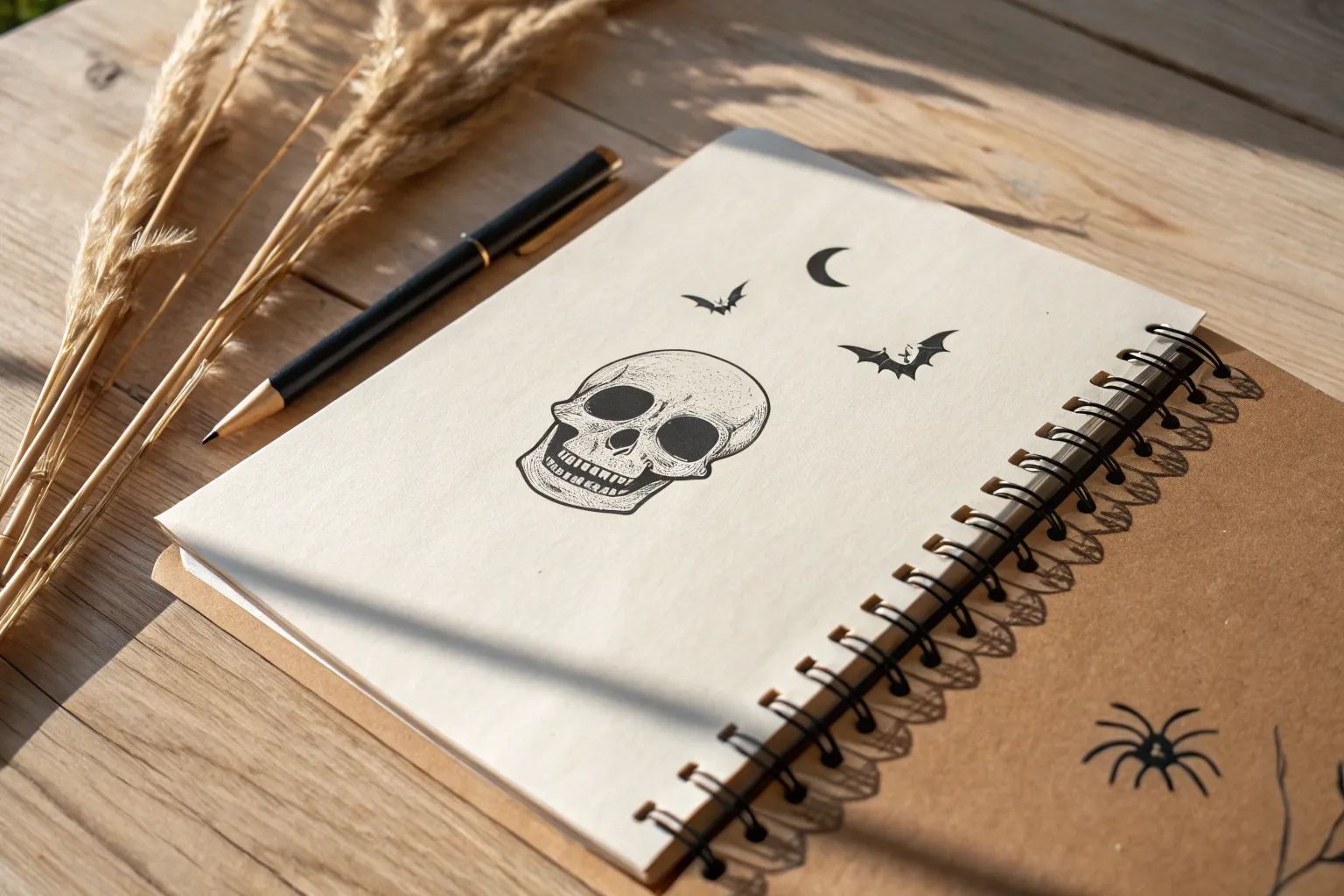
Classic Skull With Simple Shading
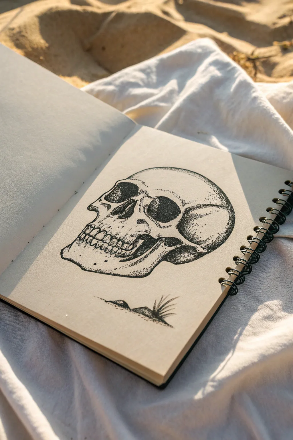
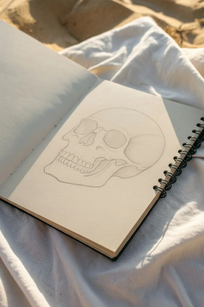
This classic skull drawing relies on patience and precision, using stippling—a technique where shading is built up entirely with dots—to create depth and texture. The result is a striking, slightly grainy effect that looks fantastic in a sketchbook against natural light.
Step-by-Step Tutorial
Materials
- Sketchbook with smooth, thick paper
- HB or 2B pencil for initial layout
- Kneaed eraser or standard soft eraser
- Fine liner pens (sizes 0.1, 0.3, and 0.5)
- Ruler (optional for checking proportions)
Step 1: Basic Structure & Outline
-
Map the cranium:
Start lightly with your pencil. draw a large circle or oval shape for the main part of the skull (the cranium). Think of it as a slightly deflated ball. -
Add the jawline:
Below the circle, sketch a squared-off U-shape to represent the jaw. Connect this to the sides of the cranium, indicating the cheekbones. -
Place the features:
Lightly mark a horizontal line across the middle for the eyes. Draw two large, roughly aviator-sunglass-shaped sockets. Below that, sketch an upside-down heart shape for the nasal cavity. -
Refine the jaw and teeth:
Carve out the jawline more distinctly. Sketch a gentle curve where the upper and lower teeth meet. Don’t draw individual teeth yet; just block in the rectangular band where they sit. -
Finalize pencil lines:
Go over your sketch to solidify the outline. Define the cheekbone ridges (zygomatic arches) and the bumpy protrusion behind the ear area. Keep your lines clean, as they will guide your ink.
Step 2: Inking the Outline
-
Trace the main shape:
Switch to a 0.5 pen for the boldest lines. Carefully trace the outer perimeter of the skull. Use confident, single strokes rather than feathery ones for a crisp look. -
Define the sockets:
Outline the eye sockets and the nose cavity. These shapes are organic and bumpy, so a perfectly smooth line isn’t necessary—a little wiggle adds realism. -
Draw the teeth:
Switch to a finer 0.1 or 0.3 pen. Draw the individual teeth within the band you marked earlier. Remember, teeth aren’t perfect chiclets; vary their sizes slightly and round the edges. -
Erase pencil marks:
Wait until the ink is completely dry—I usually give it a full five minutes to be safe. Then, gently erase all visible graphite lines so you have a clean slate for shading.
Patience is Key
Stippling takes time! Don’t rush by stabbing the paper, which creates hooks instead of dots. Maintain a vertical pen angle and find a rhythm.
Step 3: Shading with Stippling
-
Start the darkest areas:
Using your 0.5 pen, begin adding dots inside the eye sockets and nose. Pack the dots very densely together to create solid black areas, fading slightly at the edges by spacing the dots out. -
Define the shadowy recesses:
Move to the deep shadow under the cheekbone and behind the jaw. Concentrate your dots heavily here. The closer the dots, the darker the shadow. -
Create gradients:
Switch to a 0.1 pen for better control. Start stippling outward from your dark shadows toward the light areas. Gradually increase the space between dots to create a smooth fade. -
Texture the cranium:
Add very sparse stippling across the top of the head and forehead. This shouldn’t look like shadow, but rather like the porous texture of bone. -
Detail the teeth and jaw:
Add tiny clusters of dots at the roots of the teeth and along the gum line. Add a bit of shading under the chin to give the jaw volume. -
Check contrast:
Step back and look at your drawing. If an area looks too flat, go back in with more dots to deepen the contrast. The beauty of stippling is you can always go darker.
Inconsistent Dots?
If your dots look uneven or like dashes, your hand is moving too fast while the pen is touching the paper. Slow down the up-and-down motion slightly.
Step 4: Grounding the Image
-
Sketch the ground:
To keep the skull from floating, draw a simple horizon line or mound shape beneath it using stippling dots rather than clear lines. -
Add nature elements:
Draw a few simple blades of grass or small rocks poking out from the ground line near the chin. This adds a nice narrative touch. -
Final touches:
Review your work one last time. Reinforce the darkest darks with the 0.5 pen if the ink has dried too light, ensuring the eye sockets look cavernous.
Now you have a beautifully textured skull study ready to add some edge to your portfolio


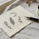
Crescent Moon With Hanging Chains
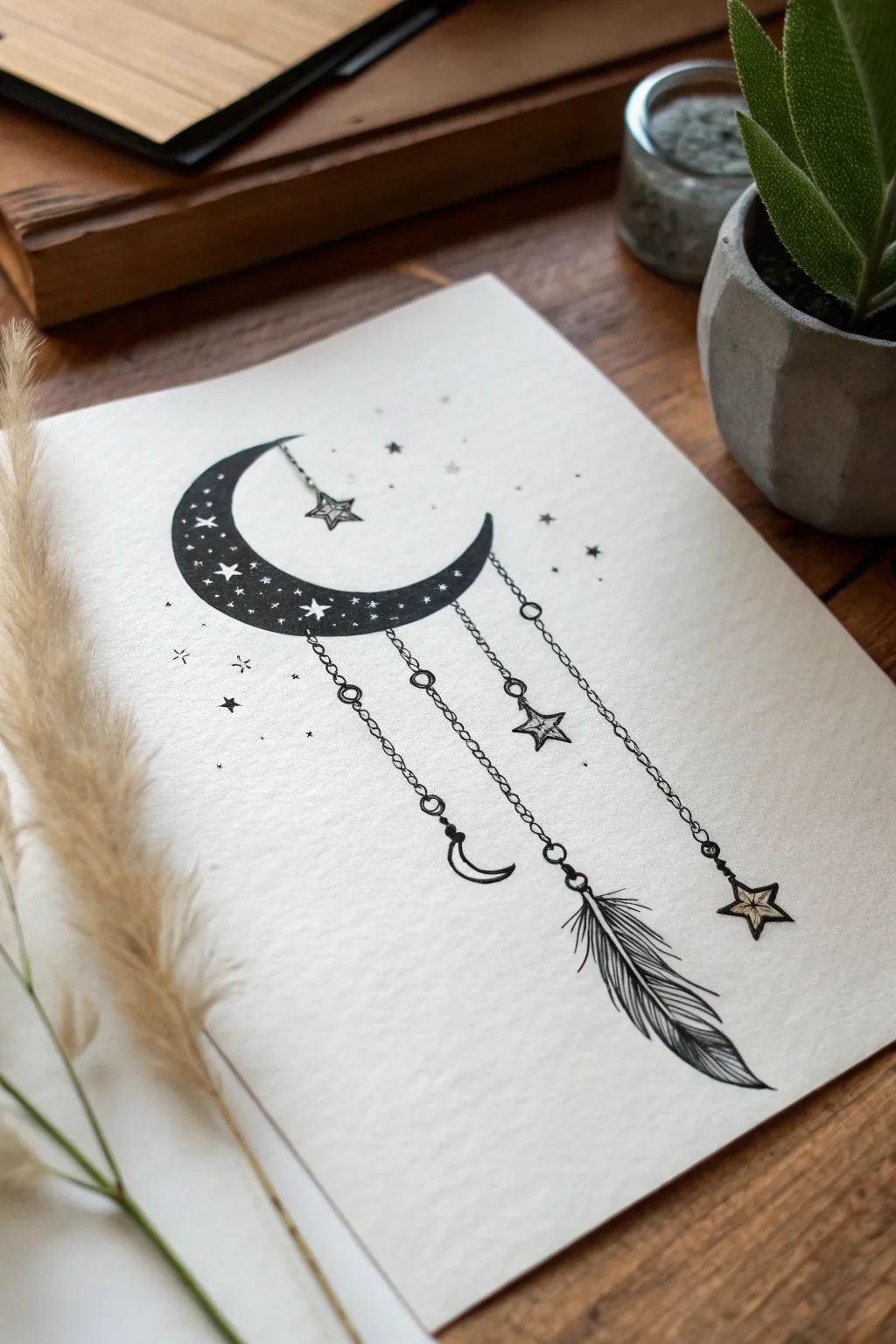
This striking black-and-white ink illustration combines celestial mysticism with gothic elegance, featuring a starlit crescent moon adorned with dangling chains and charms. The high contrast of the black ink against textured paper makes it a bold yet manageable project for artists of any level.
How-To Guide
Materials
- High-quality textured paper (cold-press watercolor or mixed media paper, approx. A5 size)
- Pencil (HB) and eraser
- Fine liner pens (sizes 0.1, 0.3, and 0.5)
- Black brush pen or marker (for filling)
- Ruler
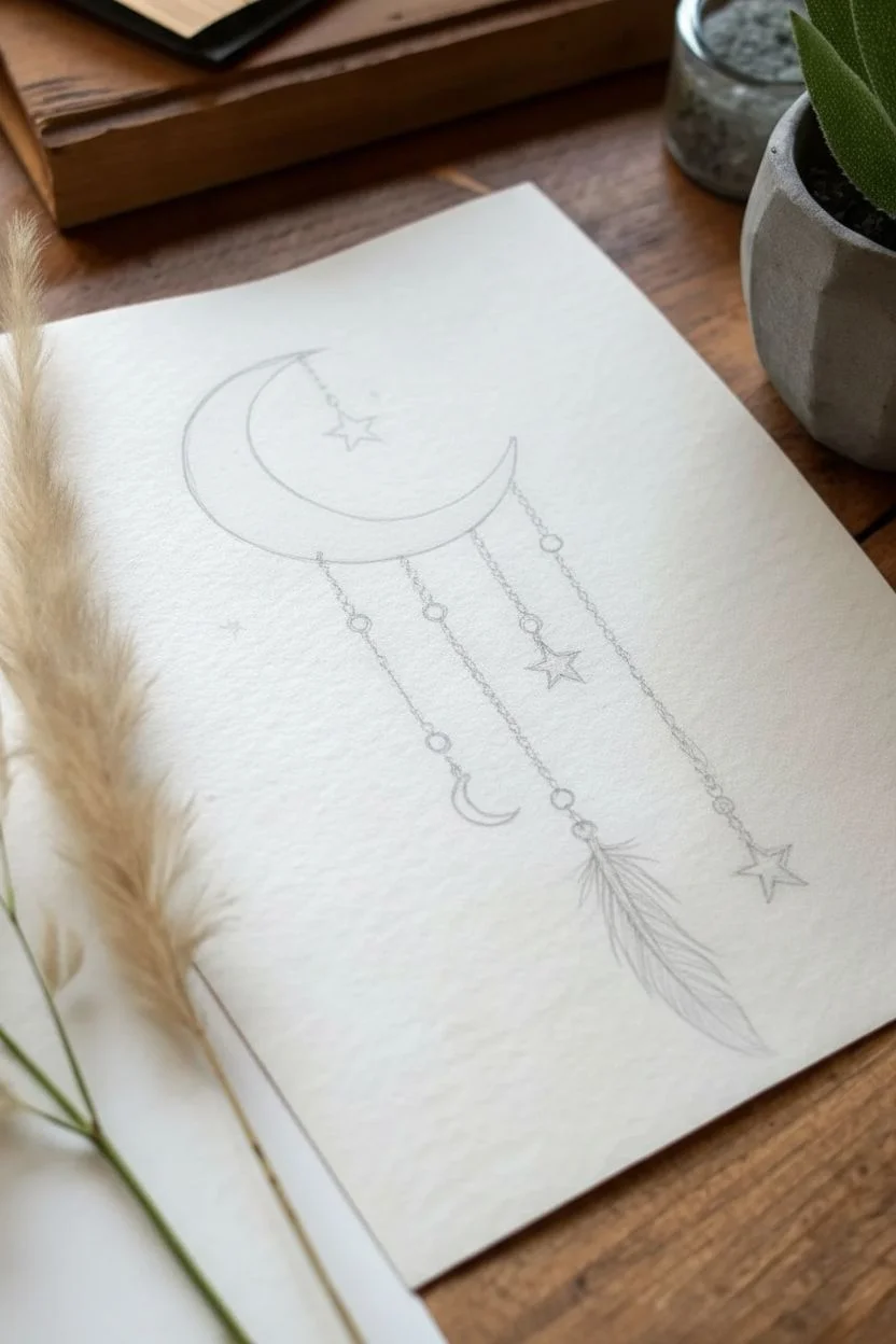
Step 1: Sketching the Framework
-
Draft the moon:
Begin by lightly sketching a large crescent moon shape in the upper center of your paper. Make sure the points curve inward nicely to create that classic ‘C’ shape. -
Outline the chains:
Using a ruler, lightly draw three or four vertical guidelines dropping down from the bottom curve of the moon. Vary their lengths to create a balanced, asymmetrical look—the center line usually works best as the longest. -
Place the charms:
At the end of your guidelines, sketch the shapes of your charms. Add a small crescent moon on the left, a traditional five-pointed star in the middle, a feather on the longest chain, and another star on the far right. -
Add connecting details:
Sketch small circles along the guidelines to represent the chain links. Don’t worry about drawing every single link perfectly yet; just indicate where the jewelry elements will sit.
Pro Tip: Clean Stars
If you accidentally color over your white stars inside the moon, use a white gel pen or opaque white gouache to draw them back on top of the black ink.
Step 2: Inking the Moon
-
Check the outline:
Once you are happy with the pencil sketch, take your 0.5 fine liner and carefully trace the outer edge of the main crescent moon. -
Draw internal stars:
Before filling in the black, draw various small stars inside the moon body. Use a mix of five-pointed stars and simple four-pointed ‘sparkles.’ These need to stay white, so outline them clearly now. -
Fill the dark space:
Switch to your brush pen or a thicker marker. Carefully color in the moon, working around your tiny stars. The solid black fill is what gives this piece its gothic impact. -
Refine the edges:
Use a 0.1 fine liner to sharpen the points of the internal stars if the thick marker made the edges a bit fuzzy.
Step 3: Detailing the Chains & Charms
-
Ink the chain links:
With the 0.1 pen, draw tiny ovals or circles over your chain guidelines. Connect them one by one. For variation, use straight lines for some sections and larger circular beads for others. -
Define the stars:
Go over your hanging star sketches. Draw a uniform outline, then add internal lines connecting the center to the tips to give them a faceted, 3D appearance. -
Ink the small moon:
Outline the small hanging crescent moon. Leave it solely as an outline rather than filling it in, creating a nice contrast with the large filled moon above. -
Texture the feather:
For the feather charm, draw the central quill first. Then, use quick, short strokes flicking outward and downward to create the barbs. Leave some gaps in the barbs to make it look organic and weathered.
Level Up: Metallic Pop
Trace the hanging chains or the internal lines of the star charms with a metallic gold or silver gel pen to add a magical shimmer to the design.
Step 4: Atmosphere and Final Touches
-
Scatter background stars:
Using the 0.1 and 0.3 pens, draw tiny stars and dots scattered around the main moon shape. Keep them sparse to maintain a clean aesthetic. -
Add subtle stippling:
To integrate the background stars, add very light stippling (tiny dots) near the main moon’s curve, fading out as you move away. -
Erase pencil lines:
Wait until the ink is completely dry—I usually give it at least 15 minutes to be safe. Then, gently erase all your initial pencil guidelines. -
Review contrast:
Step back and look at the drawing. If the large moon looks patchy, add a second layer of black ink to ensure it is deep and solid.
Enjoy the mysterious vibe of your new celestial artwork and try experimenting with different charm shapes next time


Spiderweb Corner Doodle
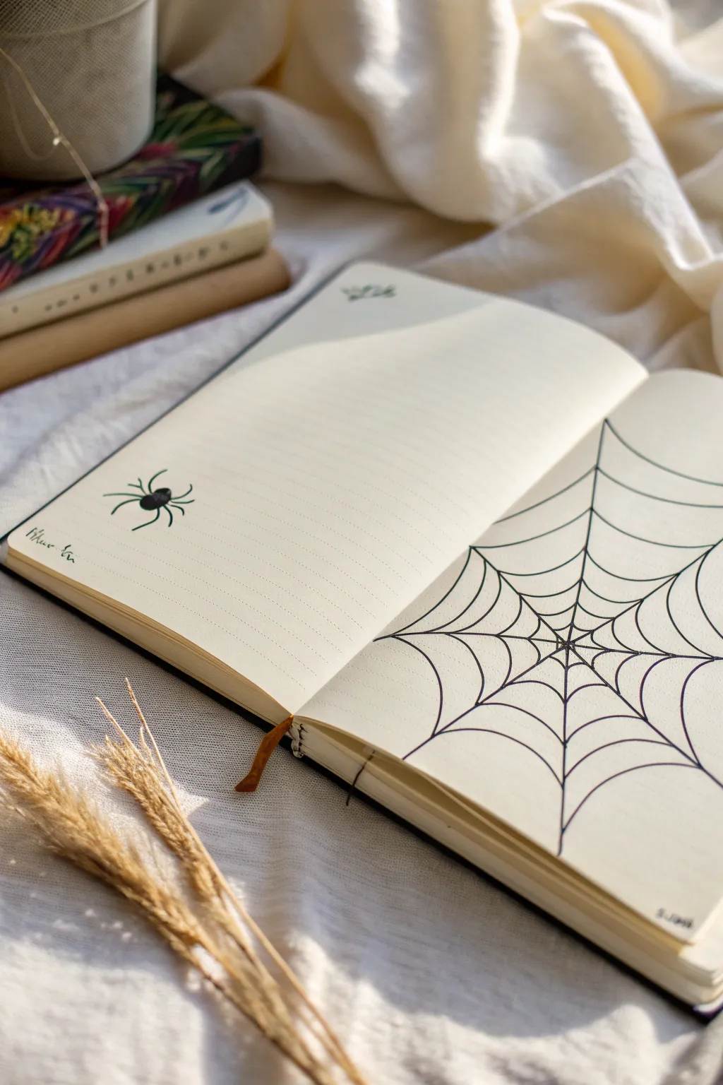
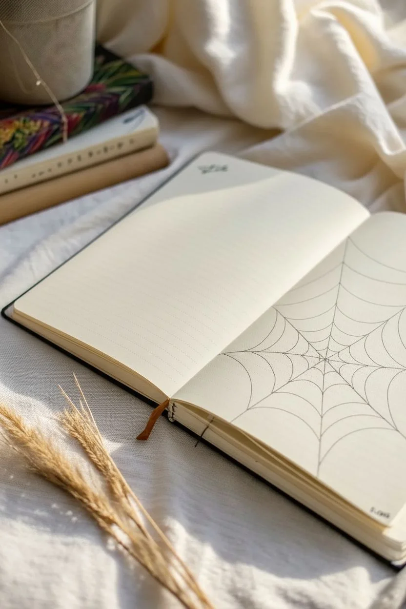
Transform a blank corner of your journal into a gothic masterpiece with this classic spiderweb spread. The clean, radiating lines create a striking geometric look that perfectly frames your writing space while a charming little spider waits on the opposite page.
Step-by-Step Guide
Materials
- Journal or notebook (blank or lined)
- Fine liner pen (black, 0.5mm)
- Pencil (HB or H)
- Eraser
- Ruler (optional, for straighter guidelines)
Step 1: Setting the Structure
-
Mark the center point:
Begin on the right-hand page. Locate a focal point near the center of the vertical spine, slightly lower than the middle of the page. This will be the anchor for your entire web. -
Draw the main spokes:
Using your pencil, draw 7 to 9 straight lines radiating outward from that center anchor point. Extend them all the way to the page edges. -
Space the spokes:
Try to space these radiating lines somewhat evenly, but don’t worry about perfection; natural spiderwebs are rarely mathematically perfect. Make sure some lines go up towards the top corner and others down towards the bottom corner. -
Ink the spokes:
Once you are happy with the placement, trace over your pencil spokes with the black fine liner pen. Keep your hand steady and confident for the smoothest finish.
Loose Hands Make Better Webs
Don’t lock your wrist. Keep your grip on the pen relaxed. The slight wobble in a relaxed hand actually makes the silk strands look more natural and organic.
Step 2: Weaving the Web
-
Start the inner circle:
Starting very close to the center anchor point, draw small curved lines connecting each spoke to its neighbor. These curves should dip inward toward the center, like a scalloped edge. -
Continue outward:
Move about half an inch outward and draw a second ring of connecting curves. I find it easiest to rotate the notebook as I work to keep my hand at a comfortable angle. -
Build the layers:
Keep adding concentric rings of these curved ‘bridge’ lines, moving further out toward the edge of the page. Imagine dropping a pebble in water and watching the ripples expand. -
Widen the gaps:
As you get further from the center, gradually increase the distance between your rings. The sections near the edge of the page should appear larger than the tiny sections near the spine. -
Handle the edges:
When a ring hits the edge of the paper, simply let the line run off the page naturally. This makes the web look expansive, as if it continues beyond the book. -
Thicken intersections:
Go back to the very center where all the spokes meet. Carefully add a tiny bit of extra ink at the junction to make it look strong and anchored.
Level Up: Dew Drops
Use a white gel pen to add tiny dots along the web strands. This mimics morning dew catching the light and adds magical dimension to the black ink.
Step 3: Adding the Residents
-
Draw the spider body:
On the opposite (left) page, choose a spot on the outer half of the paper. Draw two small connected ovals in black ink—a smaller one for the head and a slightly larger, rounder one for the abdomen. -
Add the legs:
Sketch eight legs coming from the body area. Draw the front two reaching forward and the back two reaching backward. The middle pairs should curve slightly outward. -
Thicken the spider:
Go over the spider’s body again to make it a solid black silhouette. I prefer to leave a tiny sliver of white on the abdomen to simulate a shine or reflection. -
Draw a hanging thread:
This is optional, but you can draw a very faint, straight line extending from the spider’s abdomen upward, implying it is dangling. -
Add corner details:
If your page feels empty, add a small bat silhouette or a tiny moth in the top corner near the header line for extra atmosphere. -
Erase guidelines:
Wait at least five minutes for all the ink to dry completely. Gently erase any visible pencil marks from your initial spoke sketches to leave a crisp, clean design.
Now you have the perfect gothic backdrop for your spooky poetry or October to-do lists

Bat Silhouette With Spread Wings
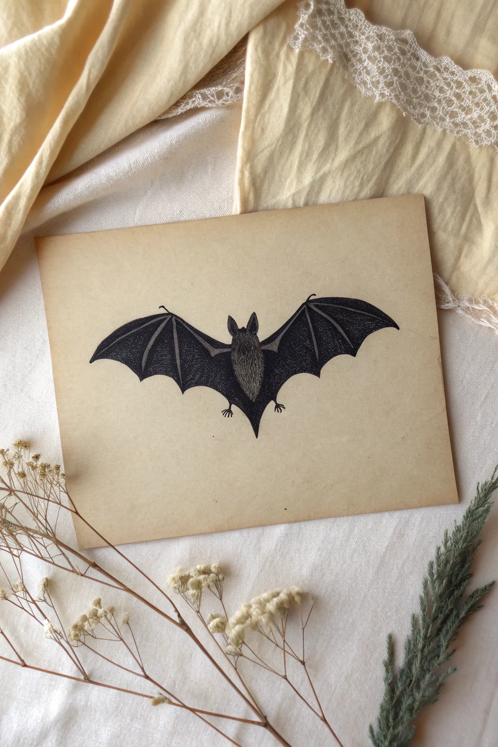
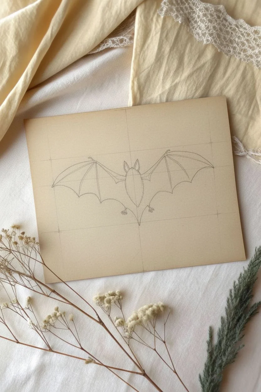
Capture the eerie elegance of the night with this detailed bat illustration. Using stippling techniques on parchment-style paper creates a vintage specimen look that is perfect for dark academia or gothic decor.
Detailed Instructions
Materials
- Toned tan or parchment paper (heavyweight cardstock preferred)
- Fine liner pens (sizes 005, 01, and 05)
- Pencil (HB or 2H)
- Kneaded eraser
- Ruler
Step 1: Sketching the Framework
-
Establish the centerline:
Begin by lightly drawing a vertical centerline in the middle of your paper. This will ensure your bat’s body is straight and help you gauge the symmetry of the wings. -
Draft the body shape:
Centered on your line, sketch diverse oval shapes for the bat’s body. Draw a smaller oval for the head and a larger, elongated oval for the torso, tapering slightly at the bottom. -
Map the wing span:
Draw faint horizontal guidelines extending from the shoulders to mark where the wingtips will end. The wings should curve upward slightly before arching down, resembling an elongated ‘M’ shape across the top. -
Define the wing structure:
Sketch the ‘fingers’ of the bat wings. These look like long, thin bones radiating from a single joint on the top edge of the wing. Bring the bottom edge of the wing up in distinct scallops to meet the tips of these bones. -
Add details:
Refine the bat’s ears, making them tall and pointed. Add tiny feet at the bottom of the body and small claw hooks at the top of the wing joints.
Ink Blobs?
If a pen leaks a blob, don’t smear it. Let it dry completely, then gently scrape the top layer with a craft knife or incorporate it into a darker shadowed area.
Step 2: Inking the Outlines
-
Trace the silhouette:
Using an 01 fine liner, carefully trace over your pencil lines. Keep your hand steady to create clean, sharp edges for the wings and body. -
Thicken the wing bones:
Go back over the lines representing the wing bones to make them slightly thicker than the membrane edges. This adds structural weight to the drawing. -
Erase guidelines:
Once the ink is completely dry, gently run a kneaded eraser over the entire drawing to lift away the graphite sketch.
Step 3: Shading with Stippling
-
Start the body texture:
Switch to your smallest pen (005). Begin tapping tiny dots onto the body of the bat. Cluster them densely at the edges of the form to create a shadowed, round effect, leaving the center slightly lighter for a highlight. -
Fill the ears:
Darken the inside of the ears with dense stippling or solid black ink, leaving the outer rims lighter to define their shape. -
Outline the inner wings:
For the wing membranes, don’t color them solid black. Instead, use your 05 pen to densely stipple or crosshatch near the ‘bones’ and the body. -
Create a gradient:
As you move away from the bones into the center typical of the membrane panels, space your dots further apart. This creates a gradient that suggests the thin, translucent nature of bat wings. -
Darken the outer edges:
Add a heavier concentration of ink—either through solid fill or very dense stippling—along the very bottom scalloped edges of the wings. -
Detail the fur:
Go back to the central body with short, quick hatched lines over your stippling to mimic the texture of rough fur. I find this creates a nice contrast against the smooth wings. -
Final contrast check:
Step back and look at the overall value. Add black ink to the deepest shadows (like under the arms or the wing tips) to make the drawing pop against the tan paper.
Aged Effect
Before drawing, lightly stain your paper with cold coffee or black tea and let it dry flat. This enhances the vintage naturalist aesthetic significantly.
Frame your spooky masterpiece in a simple black frame or pin it up for instant atmosphere
BRUSH GUIDE
The Right Brush for Every Stroke
From clean lines to bold texture — master brush choice, stroke control, and essential techniques.
Explore the Full Guide
Raven Perched on a Skull
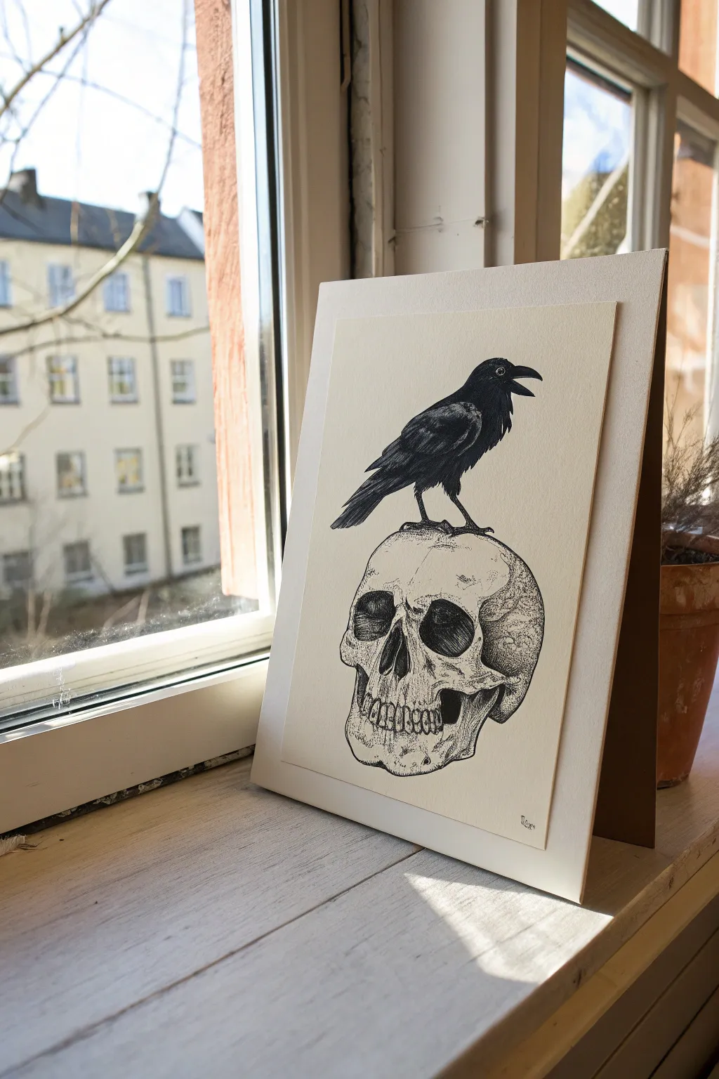
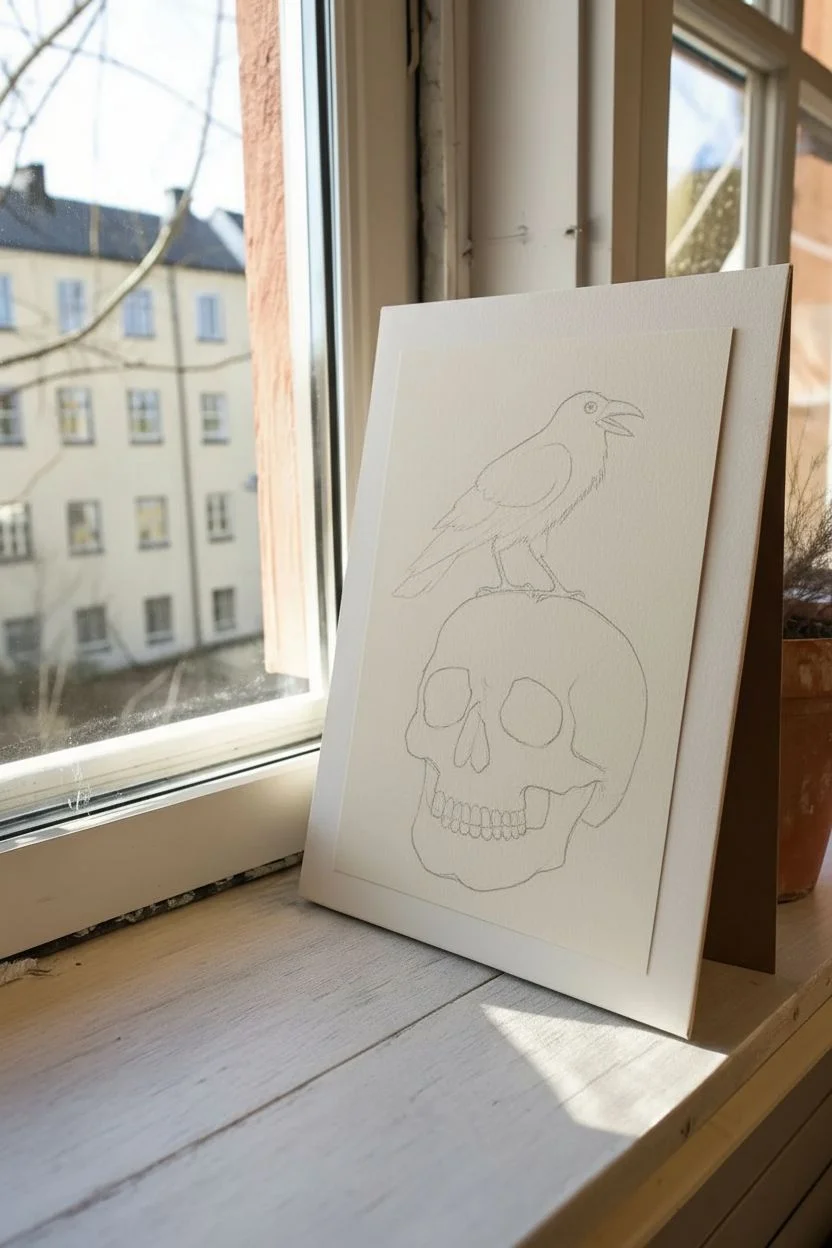
Capture the moody elegance of gothic art with this intricate pen and ink illustration of a raven claiming a skull as its perch. The high-contrast black ink against cream paper creates a striking, classic look perfect for framing.
Detailed Instructions
Materials
- High-quality cream or off-white drawing paper (smooth bristol or hot press watercolor paper works well)
- Pencil (HB or 2B)
- Kneaded eraser
- Fine liner pens (sizes 005, 01, 03, and 05)
- Brush pen or thick black marker for filling large areas
- Ruler (optional, if you want to mount it perfectly straight later)
Step 1: Drafting the Shapes
-
Sketch the skull outline:
Begin with the basic cranium shape, drawing a large, slightly distorted circle. Add the jawline below it, keeping the lines light and loose so they are easy to correct. -
Place the eye sockets and nasal cavity:
Sketch two large, slightly droopy shapes for the eye sockets. Between them but slightly lower, draw the upside-down heart shape for the nasal cavity. -
Add the teeth structure:
Draw the upper and lower rows of teeth. Don’t worry about individual teeth yet; just block in the curved rectangular band where they will sit. -
Outline the raven’s body:
On top of the skull, lightly sketch an oval for the raven’s body, angling it upwards. Attach a smaller circle for the head and a triangular shape for the beak. -
Refine the raven’s pose:
Connect the head and body smoothy using the neck lines. Sketch the wing shape folded against the side and add thin legs gripping the top of the cranium.
Step 2: Inking the Skull
-
Outline with precision:
Switch to your 03 pen. Carefully trace your pencil lines for the skull, engaging with the jagged cracks and natural imperfections of the bone. Leave gaps where the bone might be highlighted. -
Darken the cavities:
Use a brush pen or thick marker to fill in the eye sockets and nasal cavity completely black. This creates immediate, dramatic depth. -
Detail the teeth:
With a 01 pen, define the individual teeth. Add tiny vertical cracking lines near the gum line to make them look aged rather than pearly white. -
Stipple the bone texture:
Using the 005 or 01 pen, add texture to the skull surface. Use stippling (dots) and short, broken hatching lines to indicate roundness and shadows, particularly under the cheekbones and jaw. -
Add cranial cracks:
Draw wandering, jagged lines on the forehead and side of the skull to represent sutures and fractures. Vary your line weight here to make the cracks look organic.
Ink Control Pro Tip
For the raven, pull your pen strokes in the direction the feathers grow. This keeps the texture looking natural, even in the solid black areas.
Step 3: Inking the Raven
-
Define the feathers:
Outline the raven with the 03 pen, but instead of a smooth line, use short, jagged strokes to suggest ruffled feathers, especially around the neck and belly. -
Fill the silhouette:
This is where the drama happens. Use your brush pen to fill the majority of the bird with solid black ink, but leave careful white slivers to define the separation between the wing and the body. -
Detail the wing feathers:
Once the black ink is dry, use your 05 pen to reinforce the edges of the primary flight feathers at the tail end, ensuring they look sharp and distinct. -
Add highlights and texture:
If you filled too much black, you can actually use a white gel pen to add tiny highlights back in. Otherwise, use your 005 pen to add fine directional lines on the shoulder area to suggest sheen. -
Finish the eye and beak:
Draw the beak with a sharp, clean line. For the eye, draw a small white circle with a black dot in the center to give the bird a piercing, intelligent gaze.
Level Up: Aged Paper
Before drawing, lightly stain your paper with tea or coffee and let it dry flat. This gives the finished piece an ancient, parchment-like artifact feel.
Step 4: Final Touches
-
Anchor the claws:
Darken the feet and claws where they touch the skull. Add a small shadow directly under the claws on the skull’s surface to ground the bird. -
Erase pencil lines:
Wait until the ink is completely dry—I usually give it at least 10 minutes to be safe—then gently erase all underlying graphite sketches. -
Mount the artwork:
Trim your drawing paper to size. Use double-sided tape or glue to mount it onto a slightly larger piece of sturdy cardstock or mat board to create a professional border.
Now you have a brooding, beautiful piece of gothic art ready to display on your mantle or bookshelf
Coffin Outline With Tiny Details
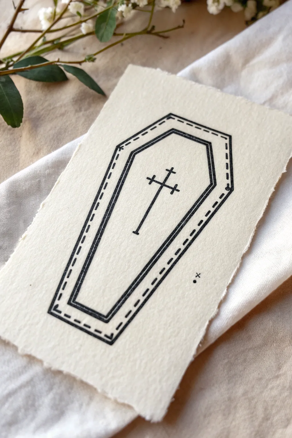
Embrace the beauty of simplicity with this elegant linear drawing that pairs perfectly with textured paper. The double-border design mimics a stitched effect, giving this spooky motif a handcrafted, vintage feel.
Step-by-Step Tutorial
Materials
- Heavyweight textured paper (watercolor or handmade cotton rag)
- Fine liner pen (black, size 0.3 or 0.5)
- Pencil (HB or H)
- Ruler
- Eraser
- Ruler or straight edge
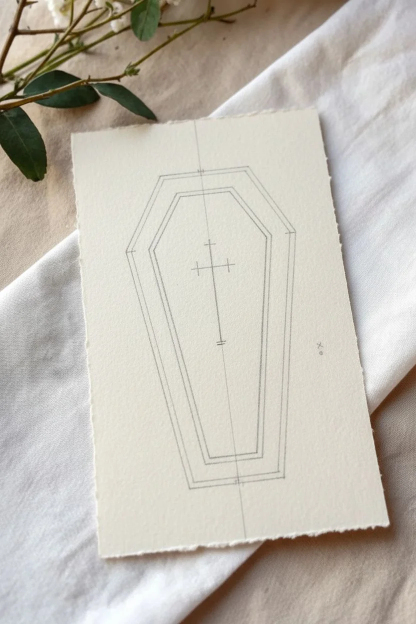
Step 1: Drafting the Shape
-
Set your boundaries:
Begin by lightly marking the top and bottom limits of your coffin shape with a pencil to ensure it fits well on your paper. -
Draw the central axis:
Sketch a faint vertical line down the center of your paper. This will act as a guide to keep the coffin symmetrical. -
Establish the width:
Decide on the widest point of the coffin (the shoulder area) and mark two points equidistant from the center line. -
Mark the top and bottom widths:
Mark the width specific to the head (top) and the foot (bottom) of the coffin. The head is usually slightly wider than the foot, but both are much narrower than the shoulders. -
Connect the outer shape:
Using a ruler, connect your marked points to form the classic hexagonal coffin silhouette. Keep your pencil pressure very light so lines are easy to erase later. -
Create the inner border:
Measure inward about a quarter-inch from your outer lines and lightly sketch a second, smaller coffin shape inside the first one.
Paper Choice Matters
For that authentic aged look, tear the edges of your paper against a ruler properly deckle the edges before you start drawing.
Step 2: Inking the Design
-
Ink the inner solid line:
Switch to your fine liner pen. Carefully trace the inner pencil outline to create a solid, continuous black line. -
Refine the corners:
Make sure your corners are crisp and sharp where the lines meet; avoid overshooting ink past the intersection points. -
Begin the outer detail:
Instead of a solid line for the outer border, you will engage in a ‘stitching’ pattern. Start at the top corner. -
Draw the dashes:
Draw small, evenly spaced dashes along the outer pencil guideline. Try to keep the length of each dash consistent. -
Mind the corners:
When you reach a corner, I find it looks neatest if you place a small perpendicular dash or a distinctive corner mark rather than just continuing the straight stitch. -
Connect the layers:
At each of the six corners, draw a very short diagonal line connecting the inner solid box to the outer stitched box.
Step 3: Adding the Emblem
-
Center the cross:
Locate the upper third of the coffin interior. Sketch a faint vertical line for the main stem for the cross. -
Add crossbars:
Sketch two horizontal bars—a shorter one near the top and a slightly wider one just below it—to create the patriarchal style cross. Add tiny perpendicular caps to the ends of the bars. -
Ink the cross:
Trace over your cross sketch with the fine liner. You can double up your stroke slightly here to make the cross stand out more boldly than the border. -
Add final embellishment:
Place a tiny dot or a small ‘x’ near the bottom right of the coffin exterior for a balanced artistic touch. -
Clean up:
Wait at least five minutes for the ink to fully cure. Gently erase all remaining pencil guidelines to reveal the clean design.
Shaky Lines?
Don’t stress if lines aren’t perfectly straight. Slight wobbles add character and make the illustration feel more like an old engraving.
This stark, symbolic piece looks wonderful framed in black or pinned to a mood board

PENCIL GUIDE
Understanding Pencil Grades from H to B
From first sketch to finished drawing — learn pencil grades, line control, and shading techniques.
Explore the Full Guide
Potion Bottle With Smoky Swirls
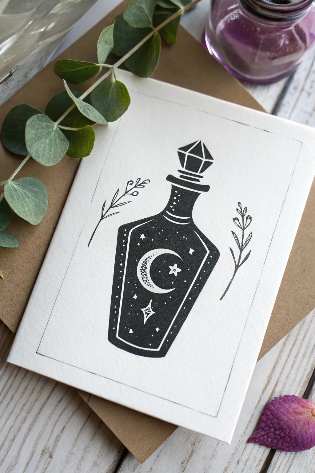
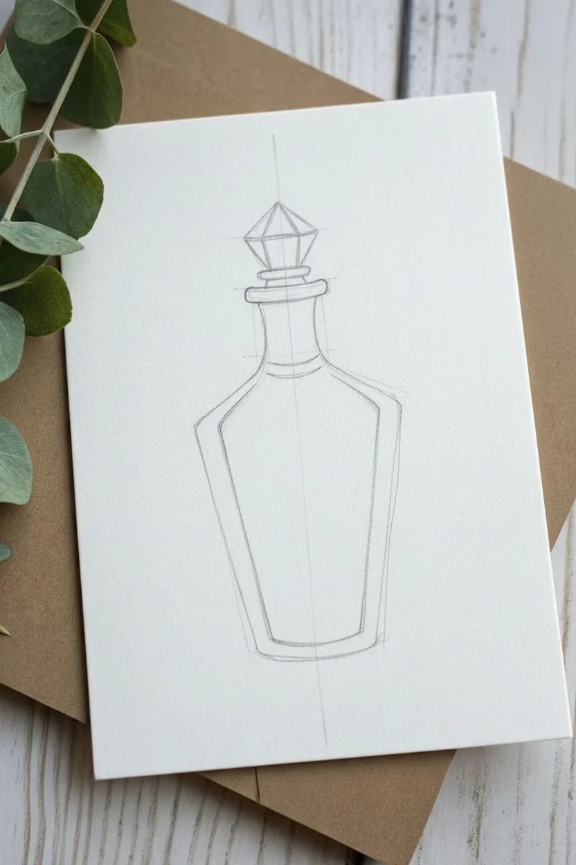
This striking illustration combines clean, bold lines with delicate celestial details to create a mystical potion bottle. Despite its detailed appearance, the design relies on simple shapes and high contrast to make the moon and stars pop against the dark liquid.
Step-by-Step
Materials
- Fine-tooth drawing paper or cardstock (white)
- Pencil (HB or 2H)
- Eraser
- Ruler
- Fine liner pens (0.1mm, 0.3mm, and 0.5mm)
- Black brush pen or broad marker for filling
- White gel pen (optional, for corrections)
Step 1: Drafting the Bottle Shape
-
Establish the centerline:
Begin by using your ruler to draw a faint vertical line down the center of your paper. This will act as your guide to keep the bottle symmetrical. -
Sketch the neck:
Near the top of your centerline, sketch a short vertical rectangle for the neck. Flair the top out slightly to create the lip of the bottle. -
Outline the shoulders:
From the bottom of the neck, draw two lines sloping downwards and outwards. These should be mirrored on either side of your centerline to form the bottle’s shoulders. -
Define the body:
Extend lines downwards from the shoulders, tapering them slightly inward as they go down, meeting at a flat base. The overall shape should look somewhat like an elongated coffin or a gem. -
Add the stopper:
Draw the crystal stopper on top of the bottle neck. Start with a diamond shape, adding a horizontal line through the middle and angled vertical lines to suggest facets.
Pro Tip: Stippling
For the moon texture, hold your pen vertically and tap lightly. Denser dots near the inner curve create a shadow effect, making the crescent look 3D.
Step 2: Inking the Outlines
-
Draw the main border:
Using a 0.5mm pen, trace over your pencil sketch of the bottle’s outer silhouette. Use confident, steady strokes to keep the lines clean. -
Create the inner liquid line:
Switch to a slightly thinner 0.3mm pen and draw a second outline inside the bottle shape. Leave a consistent gap of about 2-3mm between this line and the outer wall to represent the glass thickness. -
Detail the neck rings:
Add two curved horizontal lines across the neck of the bottle to suggest ridges or rings in the glass. -
Ink the stopper:
Trace the crystal stopper carefully. Make the bottom of the stopper slightly wider than the bottle opening to show it sitting securely on top.
Level Up: Galaxy Effect
Instead of solid black ink, use dark watercolor or ink wash. Drop in hints of deep purple or navy blue while wet to create a swirling galaxy nebula look.
Step 3: Adding Celestial Details
-
Sketch the moon:
Lightly pencil a crescent moon shape in the center of the bottle’s body. Let the bottom curve of the moon cradle the space. -
Position the stars:
around the moon, pencil in a mix of tiny four-pointed stars, diamond shapes, and small circles for stardust. -
Ink the negative space:
Before filling in the black, carefully outline your moon and stars with your finest 0.1mm pen. This protective barrier ensures you don’t accidentally color over your white elements. -
Texture the moon:
Add tiny stippling dots or subtle texture inside the crescent moon to give it a cratered, dimensional look.
Step 4: Filling and Framing
-
Fill the dark liquid:
Using a brush pen or broad marker, fill in the space inside the inner liquid line. Work carefully around your preserved moon and stars. I personally find it helpful to outline the small shapes first and then fill the larger areas. -
Add white accents:
Once the black ink is completely dry, use a white gel pen to add extra sparkle dots or refine the points of your stars if they got lost in the darkness. -
Draw the botanical elements:
On either side of the bottle, sketch two simple, floating sprigs of leaves or lavender. Keep the lines thin and delicate using the 0.1mm pen. -
Create the border:
Use a ruler to draw a thin, rectangular frame around the entire composition. This boxes in the artwork and gives it the feel of a tarot card or vintage print. -
Cleanup:
Wait until all ink is absolutely dry to the touch, then gently erase your initial pencil guides and the centerline to reveal the crisp contrast.
Step back and admire the stark contrast of your mystical creation
Crying Eye With Dark Tears
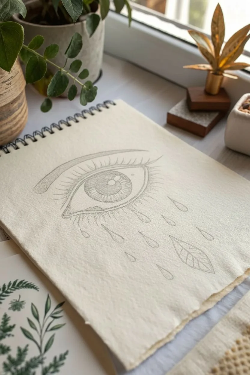
This striking drawing combines classical realism with surreal botanical elements, featuring a heavily lashed eye weeping distinct, graphic tears. The contrast between the detailed iris and the stylized droplets creates a moody, gothic aesthetic perfect for your sketchbook.
Step-by-Step Tutorial
Materials
- Textured sketchbook paper (off-white or cream)
- Black fineliner pens (sizes 0.1, 0.3, and 0.5mm)
- Soft graphite pencil (HB or 2B) for sketching
- Kneaded eraser
- Ruler (optional for spacing)
Step 1: Sketching the Framework
-
Outline the eye shape:
Begin lightly with your pencil. Draw an almond shape for the eye opening, making the upper curve slightly more pronounced than the lower one to create a natural look. -
Draft the iris and pupil:
Draw a perfect circle in the center of the eye, slightly cut off by the upper eyelid. Inside this, sketch a smaller circle for the pupil. Mark a small, rectangular or oval highlight overlapping the pupil and iris—this reflection brings the eye to life. -
Add the crease and eyebrow:
Sketch a curved line above the eye to indicate the eyelid crease. Above that, draft the sweeping arched shape of the eyebrow, thickening it slightly toward the nose and tapering it at the end. -
Position the tears:
Lightly sketch teardrop shapes falling from the lower lash line. Instead of random placement, arrange them in a cascading pattern. Make one of the lower tears larger and leaf-shaped, pointing downwards.
Ink Control Tip
Work from left to right (if right-handed) to avoid smudging wet ink with your hand. If needed, place a scrap piece of paper under your hand as a guard.
Step 2: Inking the Details
-
Outline the main features:
Switch to a 0.5mm fineliner. Carefully trace the upper lash line, making it thick and bold. Outline the iris and pupil, ensuring you preserve the white space for the highlight. -
Fill the pupil:
Color in the pupil completely black, avoiding the highlight area. I usually do this slowly to ensure a solid, deep black coverage without streaking. -
Detail the iris:
Using a 0.1mm pen, draw fine lines radiating from the pupil outward toward the edge of the iris, like spokes on a wheel. Add shorter lines coming inward from the outer iris edge to build texture. -
Add the eyelashes:
With the 0.3mm pen, draw long, sweeping curves for the upper lashes. Flick your wrist at the end of each stroke for a tapered look. Add shorter, sparser lashes to the bottom line, clumping a few together for realism. -
Refine the brow:
Fill the eyebrow shape using short, directional strokes that mimic hair growth. Use the 0.5mm pen for the main shape and the 0.1mm for wispy edges.
Make It Mystical
Turn more tears into different natural elements like crystals, flower petals, or stars to enhance the surreal, nature-goth vibe of the piece.
Step 3: Shading and Surreal Elements
-
Stipple shading:
Use your 0.1mm pen to add tiny dots (stippling) inside the corners of the eye whites (sclera) to create spherical depth. Add stippling under the upper eyelid to show a cast shadow. -
Ink the standard tears:
Outline the falling teardrops with a 0.3mm pen. Instead of filling them completely, add small stippled shading on their bottom curves to give them volume and transparency. -
Create the leaf tear:
For the special leaf-shaped tear, outline it firmly. Draw a center vein line down the middle. Add diagonal veins branching out to the sides, giving it a botanical structure. -
Texture the leaf:
Lightly shade inside the leaf sections using hatching (parallel lines) or stippling. Keep one side of the leaf slightly darker to suggest light hitting it. -
Final touches:
Review the drawing for balance. If the lash line needs more weight, go over it again. Once the ink is completely dry, gently erase all underlying pencil marks with the kneaded eraser.
This evocative drawing is now ready to add a touch of mystery to your art collection


Stitched Heart With Thorns
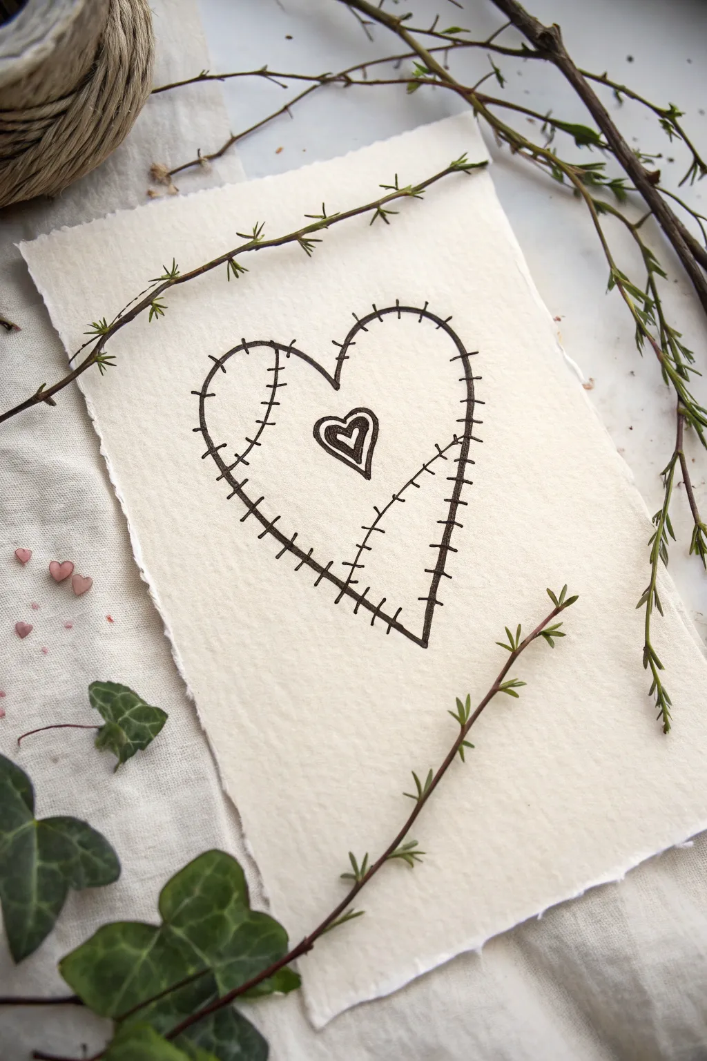
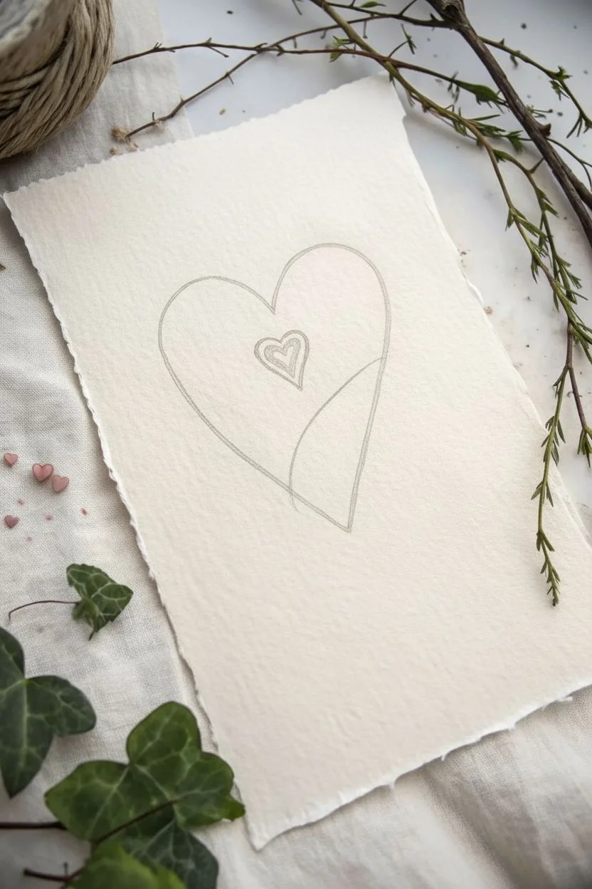
Create a poignant symbol of resilience with this simple yet evocative stitched heart drawing. Using minimal supplies and clean lines, this project captures a subtly gothic aesthetic on beautiful textured paper.
Step-by-Step
Materials
- Textured handmade paper or cold-press watercolor paper
- Fine liner pen (black, 0.5mm or 0.8mm)
- Pencil (HB or 2B)
- Soft eraser
- Ruler (optional, freehand is preferred for character)
Step 1: Conceptualizing the Shape
-
Prepare your paper:
Select a piece of paper with deckled edges or a rough texture to enhance the rustic, handmade feel. If you only have standard paper, you can carefully tear the edges to mimic this look. -
Sketch the heart outline:
Using your pencil, lightly draw a large heart shape in the center of the paper. Keep it slightly elongated rather than perfectly round to match the gothic style. -
Add the inner heart:
Draw a much smaller heart floating in the upper center area of the main heart. This will act as the focal point of the mending effect. -
Draft the stitched seam:
Lightly sketch a curved line that runs from the top cleft of the heart down towards the bottom point, but slightly off-center to the right. This line represents where the two halves are ‘stitched’ together.
Needle & Thread Tip
To make the stitches look taut, draw tiny, faint pull lines coming from the ends of the stitch marks into the paper.
Step 2: Inking the Foundation
-
Trace the main outline:
Take your black fine liner and carefully trace over your pencil outline of the large heart. Don’t worry if the line is a bit shaky; imperfections add to the spooky charm. -
Ink the seam line:
Draw over the central curved line you sketched earlier. You can make this line slightly broken or uneven to suggest fabric pulling. -
Define the inner heart:
Trace the small inner heart. To give it depth, draw a second, slightly smaller heart inside it and fill the space between the two lines with black ink, creating a bold, thick border. -
Add the inner detail:
Inside that small heart, draw one final tiny heart outline in the center, leaving it white.
Step 3: Stitching It Together
-
Start the stitches:
Along the main outline of the large heart, draw short, perpendicular hash marks that cross the black line. Space them out by about half a centimeter. -
Refine the border stitches:
Make these hash marks look purposeful—some can be slightly longer or slanted to look like rough thread tension. -
Stitch the central seam:
Move to the curved line running through the heart’s center. Draw similar perpendicular hash marks all the way down this line, crossing it like sutures. -
Vary stitch length:
I prefer to make the stitches on the central seam slightly longer than the ones on the outer border to differentiate the ‘wound’ from the edge. -
Add connecting details:
For a more realistic sewn look, draw very tiny dots at the ends of a few stitch marks to simulate needle holes.
Uneven Ink Flow?
Textured paper can drink ink quickly. If lines look faded, switch to a slightly thicker nib size like 0.8mm for solid coverage.
Step 4: Finishing Touches
-
Let the ink dry:
Wait 2-3 minutes to ensure the ink is completely set. Smudging now would ruin the crisp aesthetic. -
Erase guidelines:
Gently erase all visible pencil marks. Be careful near the deckled edges of the paper so you don’t tear them. -
Review contrast:
Look at your drawing from a distance. If the lines look too thin against the paper texture, go over the main heart outline one more time to thicken it. -
Optional aging:
If your paper is too bright, you can lightly dab a used tea bag around the edges (avoiding the ink) to antique the background.
Now you have a beautifully melancholy piece of art ready to frame or gift.
Skeletal Hand Holding a Rose
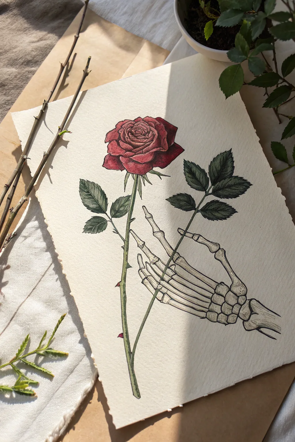
Contrast the delicate beauty of a blooming rose with the stark, intricate details of a skeletal hand in this striking drawing project. The vintage botanical style combined with a gothic twist creates a timeless piece of art perfect for framing.
Detailed Instructions
Materials
- Textured watercolor paper or heavy drawing paper (cream or off-white)
- Pencil (HB or 2B for sketching)
- Fine liner pens (0.1mm, 0.3mm, 0.5mm, black)
- Colored pencils or watercolors (Deep Red, Crimson, Sap Green, Olive Green, Pale Grey/Beige)
- Kneaded eraser
Step 1: Drafting the Structure
-
Lay out the composition:
Begin with a very light pencil sketch of a long, vertical line for the rose stem. Position it slightly off-center to allow room for the leaves and the hand that will grasp it. -
Sketch the rose bloom:
At the top of your stem, draw a loose oval shape for the rose head. Inside, lightly swirl lines to indicate where the tightly packed petals will go. -
Place the hand structure:
Sketch the basic shapes of the skeletal hand. Start with the wrist bones (carpals) near the bottom right, then extend five lines for the fingers. Make sure the fingers wrap or extend near the stem naturally. -
Detail the phalanges:
Flesh out the finger bones. Remember that skeletons have knobby joints; draw slightly wider shapes where the knuckles would be and thinner shafts for the bones in between. -
Add leaf placement:
Sketch in the triangular shapes for the leaves. Place one large cluster on the left side of the stem and another balancing cluster on the right, just above the hand.
Step 2: Inking the Outlines
-
Outline the rose petals:
Switch to a 0.3mm fine liner. Start from the center of the rose, drawing the tightly curled petals, and work your way outward to the larger, ruffled petals. -
Define the stem and thorns:
Ink the long stem, adding small, sharp thorns periodically. Don’t make the lines perfectly straight; little wobbles add organic realism. -
Ink the leaves:
Use the fine liner to outline the serrated edges of the leaves. Draw a central vein line down each leaf, but save the smaller veins for later shading. -
Ink the skeletal hand:
carefully outline the bones. Use slightly broken or thinner lines on the highlights to give the bone texture. Emphasize the separation between the wrist bones. -
Erase pencil guides:
Once the ink is completely dry (wait at least a few minutes), gently erase all your underlying graphite marks with the kneaded eraser so the paper looks clean.
Bone Anatomy Tip
Look at a reference photo of a hand x-ray while drawing. The wrist (carpus) is a cluster of small pebble-like bones, not one solid block.
Step 3: Adding texture and Color
-
Shade the bones:
Using a 0.1mm pen, add stippling (tiny dots) or very fine hatching to the sides of the bones to create roundness. Focus on the areas between the fingers and under the wrist joints. -
Detail the leaf veins:
Draw delicate veins branching off the center line of each leaf. Keep these lines very thin and faint to mimic the texture of a real rose leaf. -
Color the rose darker:
Take a deep red colored pencil or watercolor. Fill in the shadowed areas deep within the petal folds first. This establishes the depth of the flower immediately. -
Blend the rose highlights:
Use a lighter crimson or bright red to fill the rest of the petals. I find fading the color out slightly at the very tips of the petals creates a soft, vintage look. -
Color the greenery:
Fill in the stem and leaves with olive green. Layer a bit of darker sap green near the veins and the base of the leaves to add dimension. -
Tint the skeleton:
Bones aren’t pure white. Lightly glaze them with a very pale beige or diluted grey wash. Keep the center of the bones the lightest to show volume. -
Add final contrast:
Go back with your darkest red and green pencils to deepen the shadows where the petals overlap and where the leaves meet the stem. This high contrast makes the drawing pop.
Vintage Paper Effect
Before drawing, tea-stain your paper! Brush strong brewed black tea over the sheet and let it dry for an authentic ‘old manuscript’ background.
Now you have a beautifully haunting piece that balances life and death in a single frame
Witch Hat With Stars and Pins
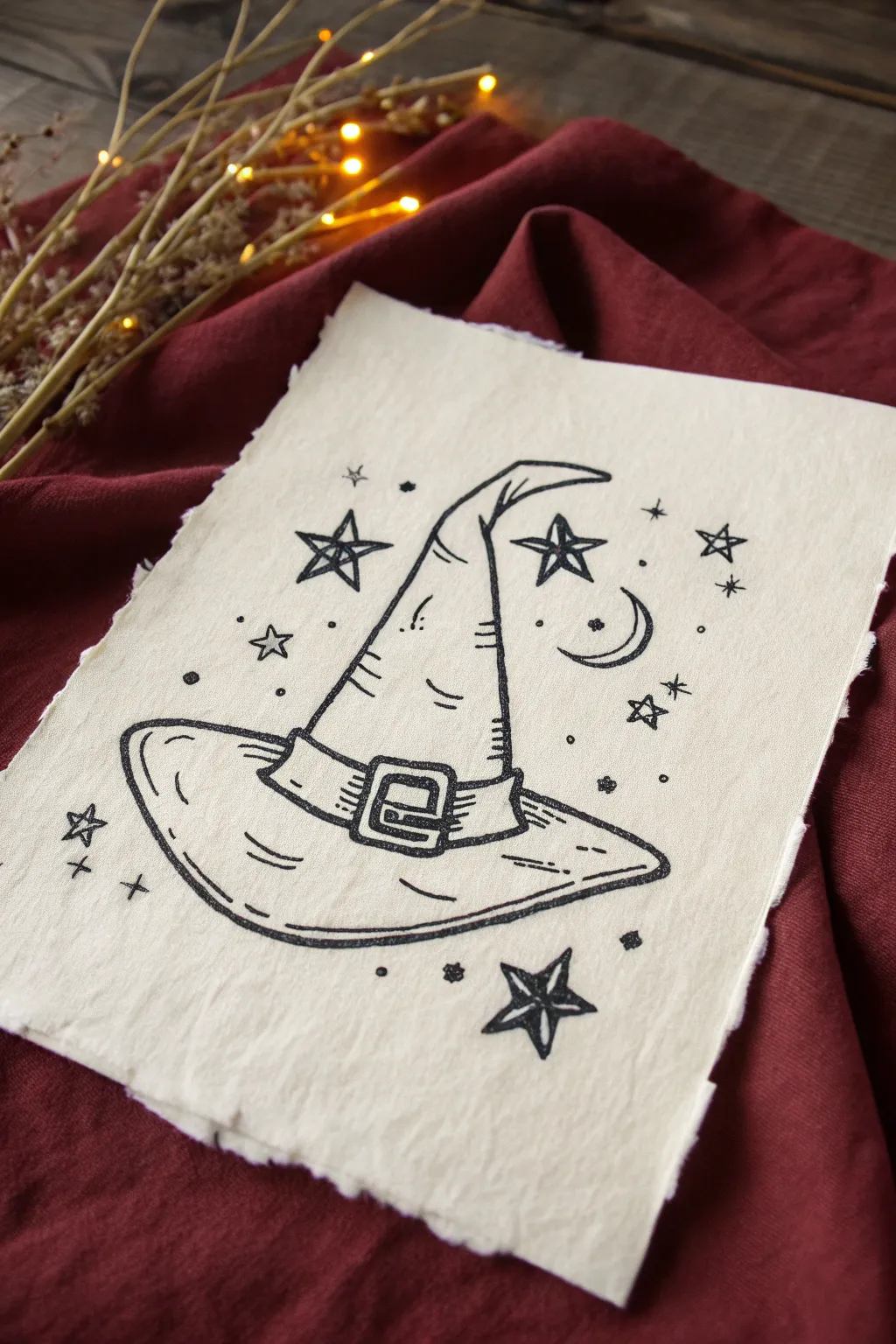
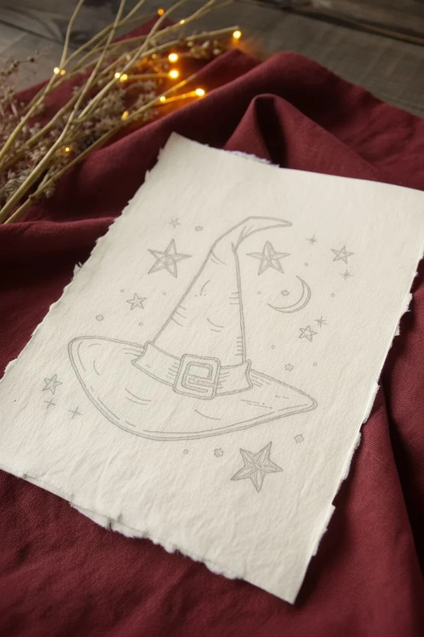
This charming project captures a witchy aesthetic with a classic pointed hat illustration surrounded by celestial motifs. The heavy texture of handmade cotton rag paper combined with bold black ink gives it an authentic, vintage grimoire feel.
How-To Guide
Materials
- Handmade cotton rag paper with deckled edges (approx. 5×7 inches)
- Black archival ink fine liner pen (size 05 or 08)
- Black brush pen or thicker marker for filling
- Pencil (HB or lighter)
- Soft kneaded eraser
- Ruler (optional)
Step 1: Sketching the Outline
-
Draft the hat base:
Start by lightly sketching a wide, curved oval shape near the bottom third of your paper. This will serve as the brim of the witch hat. Keep the lines faint so they can be easily erased later. -
Form the cone:
Draw the tall cone of the hat rising from the center of the brim. Instead of a perfect triangle, give the lines a slight inward curve and bend the very tip of the hat toward the right for a whimsical, worn look. -
Add the hat band:
Sketch a band wrapping around the base of the cone, just above where it meets the brim. In the center of this band, draw a square buckle shape with a smaller square inside it. -
Place celestial elements:
surround the hat with various star shapes. Sketch a mix of five-pointed stars, simple four-pointed sparks, and tiny circles. Add a crescent moon to the right of the hat tip.
Step 2: Inking the Hat
-
Outline the main shape:
Using your fine liner pen (size 05 or 08), trace over your pencil lines for the hat. Use a slightly shaky or organic hand rather than a ruler-straight line to mimic the texture of fabric and match the rustic paper. -
Detail the brim:
Draw the inner rim of the hat brim using a broken line technique. Add short, curved hatch marks on the left and right sides of the brim to suggest volume and shadow. -
Define the buckle:
Ink the buckle carefully. Draw horizontal lines inside the belt part of the band to simulate the texture of heavy fabric or leather. -
Add fabric creases:
Draw a few horizontal, slightly curved lines up the side of the hat cone. These represent the folds and crinkles in the fabric where the hat bends. -
Thicken the outline:
Go over the outermost perimeter of the hat a second time to create a bolder line weight. This makes the subject pop against the cream-colored paper.
Working with Rag Paper
Cotton rag paper is very absorbent. Move your pen slightly faster than usual to prevent the ink from bleeding or feathering too much into the fibers.
Step 3: Adding Magic & Atmosphere
-
Ink the stars:
Trace your star sketches. For the five-pointed stars, I like to draw the outline and then draw a second, smaller star shape inside, leaving the space between them white. -
Fill the stars:
Using your thicker marker or brush pen, fill in the center of the double-lined stars. This creates a bold, graphic look that resembles a classic tattoo style or woodblock print. -
Draw the moon:
Ink the crescent moon with a double outline similar to the stars. The lines should be crisp but can have slight variations in thickness. -
Add sparkle details:
Scatter small ‘plus sign’ stars and tiny clusters of three dots around the empty spaces. These filler details help balance the composition. -
Clean up:
Wait at least 15 minutes for the ink to fully dry on the textured paper. Once dry, gently dab (don’t rub hard) with your kneaded eraser to lift any visible pencil marks.
Age the Paper
Before drawing, create a more ancient look by lightly staining the paper with brewed black tea or coffee. Let it dry flat under a heavy book.
Now you have a bewitching piece of art perfectly suited for a seasonal display or a year-round goth aesthetic
Simple Tarot-Style All-Seeing Eye
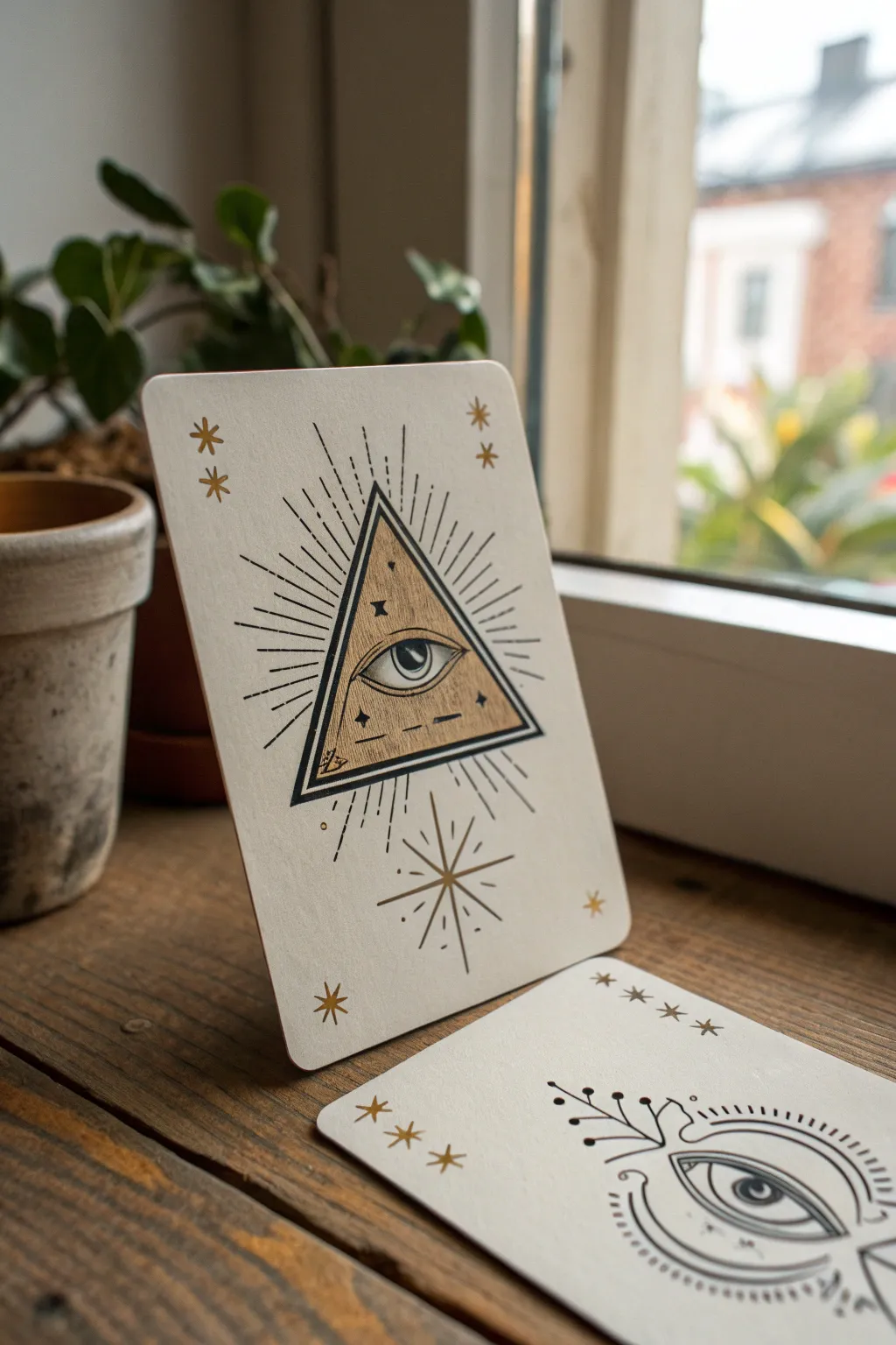
Channel mysterious vibes with this handmade tarot-inspired art card, featuring the iconic All-Seeing Eye within a pyramid. The stark contrast of black ink against creamy paper, accented with metallic gold, creates a piece that feels both ancient and modern.
Step-by-Step Guide
Materials
- Heavyweight cream or off-white cardstock (approx. 300gsm)
- Fine liner pens (Black, sizes 01, 03, and 05)
- Gold gel pen or gold metallic marker (fine tip)
- Ruler
- Pencil (HB)
- Eraser
- Scissors or craft knife
- Corner rounder punch (optional)
Step 1: Preparation & Layout
-
Cut the base:
Start by cutting your cream cardstock into a standard tarot card size, which is typically 2.75 by 4.75 inches. If you have a corner rounder punch, use it on all four corners to strictly mimic the look of a playing card; otherwise, carefully trimming them with scissors works too. -
Find the center:
Lightly mark the vertical center line of your card with a pencil. This will help you keep the pyramid symmetrical. -
Draw the main triangle:
Using your ruler and pencil, sketch an equilateral triangle in the center of the card. Leave plenty of breathing room at the top and bottom for the radiating rays and extra stars. -
Add the inner triangle:
Sketch a slightly smaller triangle inside the first one to create a border. I find that leaving about 2-3mm of space between the lines creates the perfect thickness for the frame later. -
Sketch the eye:
In the upper third of the inner triangle, lightly sketch an almond-shaped eye. Add a circle for the iris and a smaller circle for the pupil, ensuring it looks focused straight ahead.
Ink Smearing?
If gold ink smears the black lines, try drawing the gold sections first, letting them dry completely, and then adding the black outlines on top.
Step 2: Inking the Design
-
Outline the pyramid:
Switch to your 05 fine liner. Trace the two triangle outlines you sketched. For a bolder look, go over the outer triangle line a second time to thicken it slightly. -
Ink the eye details:
Use the 01 fine liner for the delicate eye details. Carefully outline the almond shape and the iris. Fill the pupil in solid black, leaving a tiny white speck as a highlight to bring the eye to life. -
Texture the pyramid:
With the 03 pen, draw a horizontal line below the eye. Then, use stippling (tiny dots) or small broken lines inside the triangle to give it an aged, textured appearance like stone or wood grain. -
Add the rays:
Using a ruler and the 01 pen, draw straight lines radiating outward from the pyramid. Vary the lengths—long, medium, short—to create a dynamic ‘burst’ effect. Keep the lines thin and sharp. -
Draw the bottom star:
Directly below the pyramid, find the center point again. Draw a simple eight-pointed star or ‘compass rose’ shape using long, thin intersected lines.
Step 3: Gold Accents & Finishing
-
Fill the pyramid:
Take your gold metallic marker or gel pen. Carefully color in the space between the eye and the pyramid’s border. Be cautious not to color over your fine black ink details; work around them. -
Add floating stars:
Draw small gold asterisks (*) or four-pointed stars in the four corners of the card. Place a few tiny gold stars inside the pyramid itself near the eye for added mystique. -
Highlight the bottom star:
Go back to the black starburst at the bottom. Use the gold pen to draw a smaller versions of the star right in the center, overlapping the black lines. -
Erase guidelines:
Once you are absolutely certain the ink is dry—give it a few minutes—gently erase all your pencil marks. -
Final touches:
Inspect your lines. If the black borders of the pyramid look a bit washed out next to the gold, re-trace them with the 05 pen to make them pop again.
Make it Ancient
Tea-stain your cardstock before drawing! Dip the paper in strong black tea and let it dry flat for a weathered, parchment-like background.
Now you have a striking talisman to add to your collection or gift to a friend who loves the arcane
Twisted Bare Tree Under a Moon
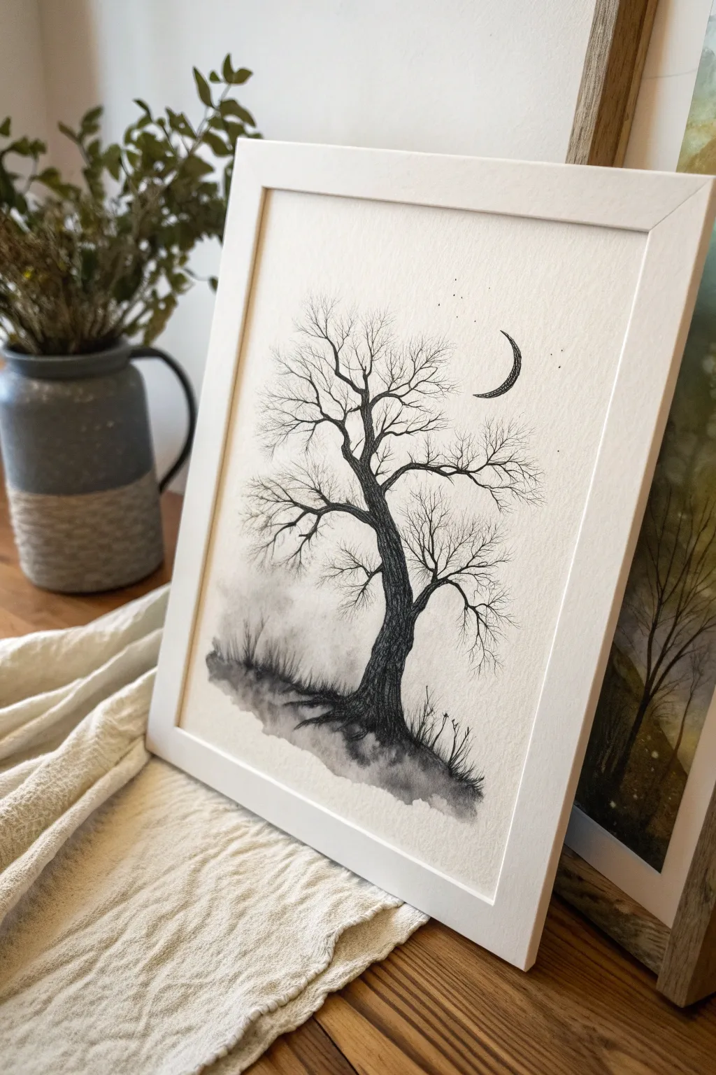
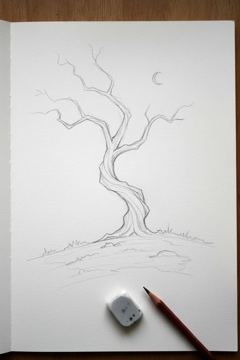
This hauntingly beautiful sketch captures the essence of Gothic atmosphere with a gnarled, leafless tree reaching toward a delicate crescent moon. Using a mix of fine ink lines for detail and soft washes for shadowy depth, you’ll create a piece that feels both eerie and serene.
Detailed Instructions
Materials
- Textured watercolor paper or heavy drawing paper (cold press recommended)
- Black pigment liners (sizes 0.1, 0.3, and 0.5)
- Black watercolor paint or black india ink
- Soft round paintbrush (size 4 or 6)
- Pencil (HB or 2H)
- Kneaded eraser
- Jar of water
- Paper towel
Step 1: Setting the Scene
-
Sketch the terrain:
Begin with your pencil, lightly tracing a sloped, uneven hill at the bottom of the page. It shouldn’t be a straight line; give it some bumps and dips to suggest wild, unkempt ground. -
Outline the trunk:
Draw the main trunk of the tree rising from the hill. Make the base wider and slightly twisted, narrowing as it reaches upward. Lean the tree slightly to one side to give it a windswept, dramatic posture. -
Add major branches:
Extend 3-4 main branches from the top of the trunk. Instead of straight lines, use jagged, angular strokes to mimic the look of old, brittle wood snapping in different directions. -
Position the moon:
To the right of the upper branches, lightly sketch a thin crescent moon shape. Keep it small and sharp to balance the heavy mass of the tree.
Step 2: Inking the Details
-
Texture the bark:
Using your 0.5 pen, go over the main trunk outline. Fill the interior of the trunk with vertical, wavy lines that follow the twist of the tree. Vary your pressure to create darker patches where shadow would fall in the deep grooves of the bark. -
Ink the main branches:
Switch to the 0.3 pen for the primary branches. Outline them with a shaky hand to create a natural, organic look, avoiding perfect smoothness. -
Create the twigs:
With your finest 0.1 pen, start adding the tiny, spindly twigs at the ends of the branches. These should be very fine and intricate, crossing over each other to form a web-like canopy. -
Detail the moon:
Ink the crescent moon outline carefully. Fill the inside with stippling (tiny dots) or very fine distinct hatching lines to give it a cratered texture, rather than coloring it solid black. -
Add celestial dust:
Scatter a few tiny dots around the moon and the upper branches to represent distant stars.
Uneven Wash?
If your watercolor ground looks too splotchy, re-wet the area with clean water and gently lift excess pigment with a paper towel, or blend it out with a damp brush.
Step 3: Creating Atmosphere
-
Prepare the wash:
Dilute a small value of black watercolor or ink with plenty of water. You want a very pale, ghostly grey, not a solid black. -
Painting the ground:
Wet the hill area slightly with clean water first. Drop in your grey wash, letting it bloom and settle into the paper’s texture to create a foggy, indistinct ground. -
Darkening the base:
While the ground is still damp, add a slightly more concentrated black paint right at the base of the tree roots. This anchors the tree and adds weight to the composition. -
Adding grass blades:
Wait for the ground wash to dry completely (this is crucial so the ink doesn’t bleed). Use your 0.3 pen to flick quick, upward strokes from the darkness, suggesting tall, dead grass. -
Grounding the tree:
Add some scribbled, darker shadows under the grass blades to blend the ink drawing into the watercolor wash seamlessly. -
Final assessment:
Step back and look at the balance. If the tree trunk looks too light compared to the misty ground, go back in with the 0.5 pen and add more density to the bark lines.
Branch Variation
When drawing the finest twigs, try holding the pen very loosely towards the end of the barrel. This reduces control and creates more natural, jagged lines.
Once the paper is fully dry, frame your artwork to highlight the stark contrast between the intricate ink lines and the soft, moody shadows
Barbed Wire Heart Doodle
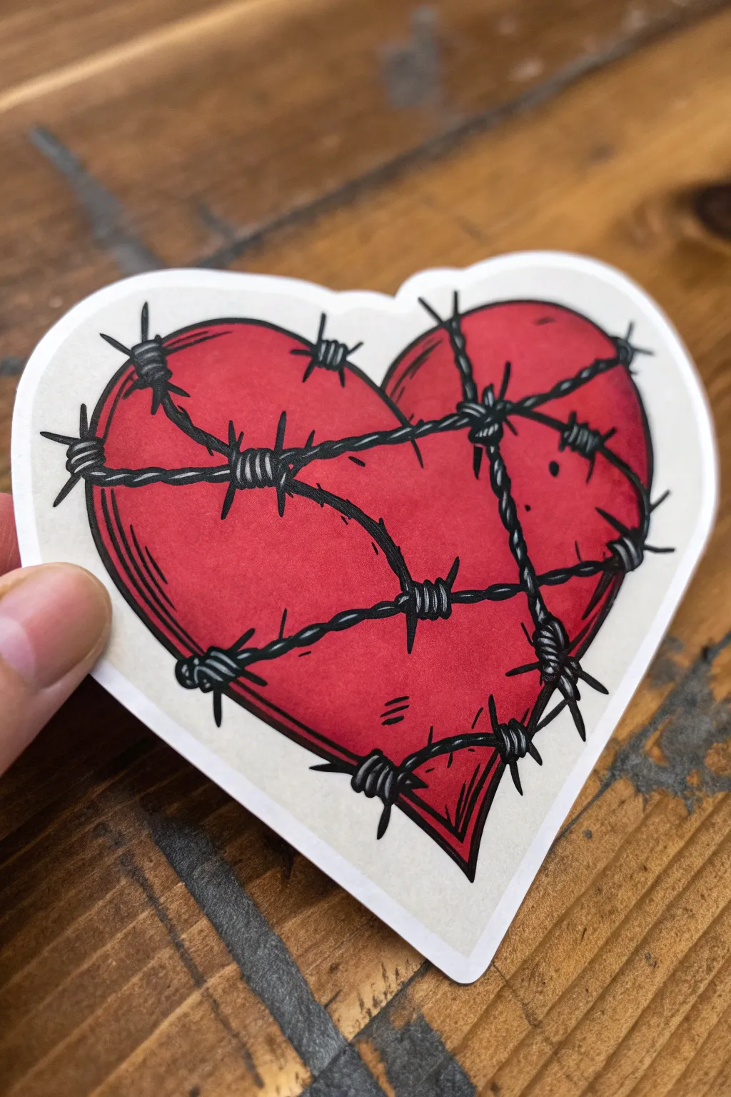
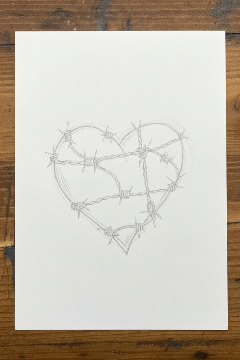
This edgy, neo-traditional style doodle combines the softness of a classic heart shape with the sharp, punk rock aesthetic of barbed wire. The result involves bold black lines and deep red shading that mimics a cool tattoo flash or sticker design.
Step-by-Step Tutorial
Materials
- Heavyweight drawing paper or cardstock
- Pencil and eraser
- Fine liner pen (0.5mm or 0.8mm)
- Thick black marker (chisel tip or large brush pen)
- Alcohol markers (Red, Dark Red/Burgundy)
- White gel pen
Step 1: Sketching the Bones
-
Draw the heart shape:
Start with a light pencil sketch of a classic heart. It doesn’t need to be perfectly symmetrical; a slight tilt adds character. -
Plot the wire path:
Lightly draw lines crossing over the heart where the wire will go. Imagine wrapping a string around it—some lines should curb horizontally, others diagonally. -
Add the barbs:
At regular intervals along your wire lines, sketch small ‘X’ shapes or knots. These will become the twisted metal barbs later. -
Thicken the wire sketch:
Go back over your single wire lines and turn them into twisted strands. Draw small, diagonal segments that look like rope or cable texture connecting the barbs.
Uneven Wire?
If your wire twists look messy, simplify them into just straight lines first, then add small diagonal hash marks along the line to simulate the twisting texture.
Step 2: Inking the Lines
-
Outline the barbs:
Using your fine liner, carefully ink the knots first. Draw tight coils for the center of the barb, then extend sharp, pointy spikes outward in four directions. -
Ink the wire strands:
Connect the barbs with twisted lines. Use short, curved strokes to replicate the texture of two wires wrapped around each other. -
Outline the heart:
Draw the outline of the heart shape, but stop your line whenever you hit a piece of wire. The wire should look like it is sitting *on top* of the heart, so don’t draw through it. -
Erase pencil marks:
Once the ink is completely dry, gently erase all your initial pencil sketches to leave a clean black-and-white framework.
Sticker Effect
For a true sticker look, trace a wide grey outline around your final white border cut-out. It mimics the subtle drop shadow of a real die-cut sticker.
Step 3: Color and Shading
-
Base coat of red:
Fill the entire heart shape with your standard red alcohol marker. Work quickly to get an even, vibrant layer. -
Add depth with dark red:
Take your darker red or burgundy marker and colour the outer edges of the heart. Feather the strokes inward so it blends into the lighter red. -
Create shadows under the wire:
I like to add a thin line of the dark red directly underneath each strand of barbed wire. This drop shadow effect is key to making the wire look 3D. -
Darken the outer edge:
To make the heart look rounded, re-line the inside edge of the heart perimeter with your dark red, creating a gradient from dark edge to lighter center.
Step 4: Final Details
-
Add line weight:
Use a slightly thicker pen to go over the main outline of the heart and the major wire strands. Varying line thickness makes the drawing pop. -
Texture lines:
Draw a few tiny, thin scratch marks or curves inside the heart shape (near the edges). These ‘action lines’ give the surface texture. -
Grey wash shading:
If you have a light grey marker, add a tiny bit of shading to the grey metal of the wire itself, just to give it volume. -
White highlights:
Use a white gel pen to add small dots or lines on the top side of the red heart (where the light hits) and tiny reflective glints on the metal barbs. -
Cut it out (Optional):
If you want the sticker look shown in the image, use scissors to cut around the heart, leaving a uniform white border about 3-4mm wide all around.
Stick this design on your sketchbook cover or laptop for an instant dose of customized goth flair
Surreal Skull Butterfly Mashup
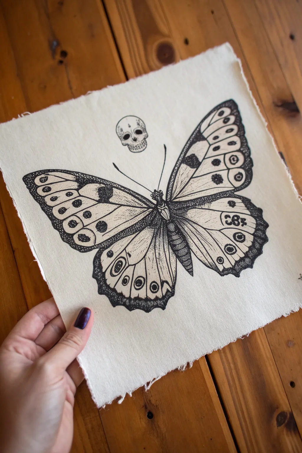
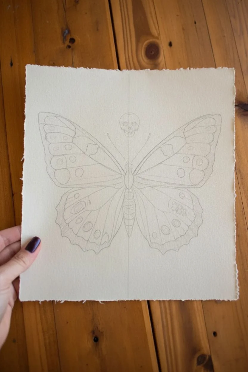
This striking project combines the delicate beauty of a specimen butterfly with a haunting skull motif, creating a perfect piece of gothic decor. Using fine liner pens on textured paper or fabric allows for incredible detail and a vintage scientific illustration feel.
Step-by-Step Guide
Materials
- Heavyweight cream textured paper or unbleached cotton fabric swatch
- Pencil (HB or H for light lines)
- Kneaded eraser
- Fine liner pens (sizes 005, 01, 03, and 05)
- Ruler (optional for symmetry)
- Reference photo of a butterfly
Step 1: Sketching the Framework
-
Establish the centerline:
Begin by lightly drawing a vertical centerline down the middle of your paper or fabric. This guide is crucial for keeping the butterfly’s wings symmetrical. -
Block out the body:
Sketch a long, segmented oval shape along the centerline for the butterfly’s body. Divide it into three sections: the head, the thorax (where the wings attach), and the abdomen. -
Draft the wing shapes:
Draw the upper forewings first, extending them out and upwards. Then, draft the lower hindwings, making them slightly rounder. Keep your pencil pressure very light so these lines can be easily erased later. -
Position the skull:
Just above the butterfly’s head, sketch a small skull. Treat it like a floating jewel. Start with a circle for the cranium and a smaller square shape below for the jawline. -
Add internal wing details:
Lightly map out the vein structures and the major patterns on the wings. Mark where the distinct ‘eye’ spots and dark bands will go, ensuring the left and right sides mirror each other.
Pro Tip: Fabric Stability
If drawing on fabric, tape the fabric taut onto a piece of cardboard or use an embroidery hoop. This prevents the fabric from bunching up while you try to draw fine details.
Step 2: Inking the Outline
-
Outline the main shapes:
Switch to your 03 fine liner pen. Carefully trace over your pencil lines for the outer edges of the wings and the main body segments. Use confident, smooth strokes. -
Detail the veins:
Switch to a finer 01 pen. Draw the veins inside the wings, starting from the body and radiating outward. These lines should be thinner than the outline to create depth. -
Define the skull:
Use the 01 pen to ink the skull. Pay attention to the hollows of the eyes and nose. I find adding tiny cracks or imperfections here gives it more character. -
Draw the antennae:
With a steady hand, draw two thin, curved lines extending from the butterfly’s head up toward the skull. Keep these lines very delicate.
Step 3: Shading and Texture
-
Fill in the darks:
Identify the solid black areas on your reference, such as the tips of the forewings or specific bands. Use the 05 pen to color these in completely solid black. -
Begin stippling:
This is the most time-consuming but rewarding part. Using your 005 pen, start adding tiny dots (stippling) to create shading. Concentrate dots heavily near the body and wing roots where shadows would naturally fall. -
Create gradients:
To make a gradient, gradually space your dots further apart as you move away from the dark areas. This technique softens the transition from black ink to the cream paper. -
Texture the body:
Add short, directional hatched lines or dense stippling to the butterfly’s body to make it look fuzzy and three-dimensional. Leave a small strip down the center slightly lighter for a highlight. -
Detail the wing patterns:
Go back into the lighter areas of the wings with the 005 pen. Add very fine dots inside the eye-spots and along the veins to give them a dusty, textured appearance typical of moth or butterfly wings. -
Shade the skull:
Add stippling to the skull, focusing on the eye sockets, nasal cavity, and the underside of the jaw. This makes the skull look rounded rather than flat.
Level Up: Tea Staining
After the ink is totally waterproof dry, lightly brush tea or coffee over the paper/fabric. This ages the piece instantly, making it look like an antique specimen chart.
Step 4: Finishing Touches
-
Assess contrast:
Step back and look at your drawing. If certain areas look too flat, go back in with your 01 pen and deepen the darkest shadows to increase contrast. -
Erase pencil lines:
Wait at least 15 minutes for the ink to cure fully. Then, gently use the kneaded eraser to lift away all remaining graphite sketches. Be careful not to pill the paper or snag the fabric. -
Create the deckled edge:
If you are using paper, you can tear the edges against a ruler to create a rough, ‘deckled’ look. If using fabric, gently pull a few loose threads from the sides to create a frayed fringe.
Frame your spooky specimen in a wooden shadow box or pin it directly to a wall for a cabinet-of-curiosities vibe


Have a question or want to share your own experience? I'd love to hear from you in the comments below!