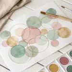
Crayons are way more powerful than they get credit for—bold color, buttery layers, and that dreamy waxy sheen can look seriously artistic. Here are my favorite crayon drawing ideas that start classic and simple, then gradually get a little more unexpected (in the best way).
Simple Landscape With Layered Crayon Texture
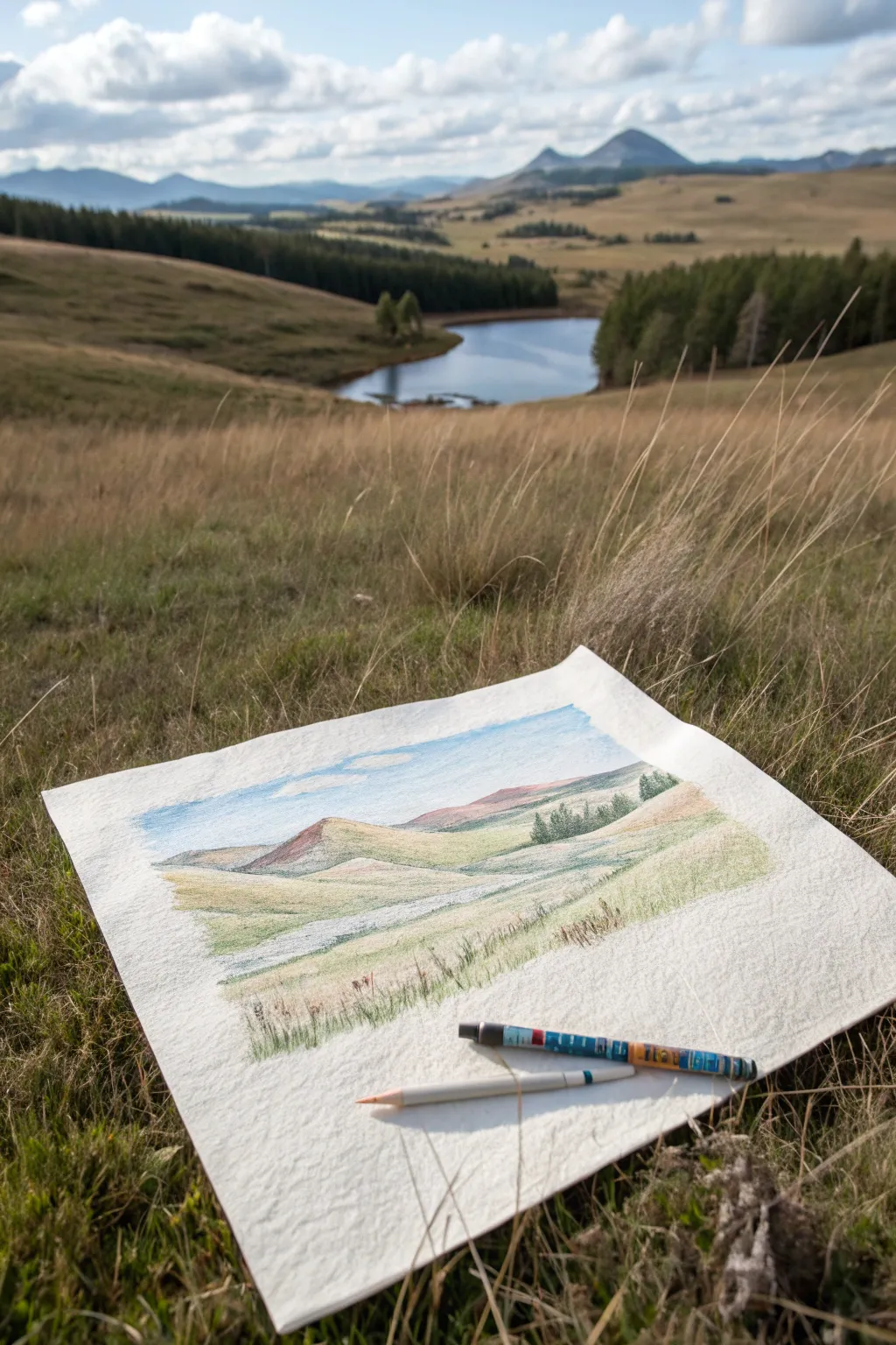
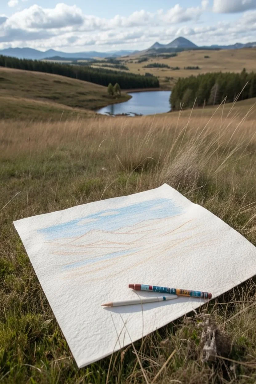
Capture the rolling serenity of wide-open spaces with this textured landscape study. Using gentle layering techniques, you will mimic the soft transitions of distant mountains and grassy foregrounds on rough paper.
How-To Guide
Materials
- Heavyweight textured drawing paper (cold press watercolor or pastel paper)
- Set of wax crayons or oil pastels
- Specific colors: Light blue, white, sage green, olive green, ochre/yellow-brown, reddish-brown, dark grey
- Paper towel or blending stump (optional)
- Masking tape (to secure paper if outdoors)
Step 1: Drafting the Horizon
-
Establish the sky:
Begin with the sky area. Take your light blue crayon and lightly shade the upper third of the paper. Use the side of the crayon rather than the tip to catch the paper’s texture. -
Add cloud forms:
Leave a few irregular, horizontal gaps in your blue shading to represent clouds. You can gently smudge white crayon into these gaps later to soften the edges. -
Rough in the mountains:
Using a light reddish-brown or terra cotta color, sketch the outline of the distant hills just below the sky. Keep the pressure very light initially. -
Define the middle ground:
Sketch sloping lines coming from the left and right sides toward the center using a pale ochre or yellow-brown. These will become the rolling hills in the middle distance.
Step 2: Layering the Landscape
-
Base layer for hills:
Fill in the mountain shapes with the reddish-brown crayon. Don’t press too hard; let the white of the paper speckle through slightly to suggest distance and atmosphere. -
Green valley tones:
Below the reddish hills, apply a layer of sage green. Follow the contours of the land, using sweeping strokes that curve downward to simulate the slope. -
Adding warmth:
Overlap the sage green with your yellow-brown crayon, particularly on the tops of the hills where the sun would hit the grass. This creates a sun-baked, late-summer feel. -
Deepening shadows:
Switch to an olive green color. Apply this to the dips and valleys between the hills, pressing slightly harder to add depth and dimension to the terrain. -
Creating the water illusion:
If you want to suggest the river or path seen in the reference, leave a narrow, winding strip of paper mostly white or very faintly blue winding through the valley floor.
Tip: Texture is Key
Use cold-press watercolor paper. Its bumpy surface breaks up the crayon marks naturally, creating an instant ‘organic’ look without needing advanced shading skills.
Step 3: Foreground and Details
-
Texture the foreground:
In the bottom third of the paper, use short, upward flicks with various greens and browns. This mimics the grassy texture of the field right in front of you. -
Draw distant trees:
Use a darker green or grey crayon to make tiny vertical marks on the distant hill slopes. Group them in small clusters to represent pockets of forest. -
Refine the tree line:
Near the right mid-ground, add a distinct cluster of pine trees using sharp, dark green strokes. Ensure they get smaller as they recede into the distance. -
Add earthy accents:
Take a dark grey or brown crayon and add subtle definition to the ridges of the mountains to give them more structure. -
Highlighting:
I like to take a white crayon at this stage and burnish (press firmly) over the lightest parts of the sky and the sunlit grassy tips. This blends the underlying wax and makes the highlights pop. -
Foreground grasses:
Add sharpness to the immediate foreground by drawing individual tall blades of grass with a sharpened olive crayon. -
Final assessment:
Step back and look at the tonal balance. If the distant mountains look too sharp, gently rub them with your finger to recede them; keep the foreground crisp.
Level Up: Mixed Media
Try painting a thin watercolor wash over the sky area first. Once dry, draw your crayon landscape on top for a richer, more vibrant contrast against the paper.
Enjoy the calming process of translating a vast view onto a small, intimate page

Big Flower Study Using Heavy Pressure Blending
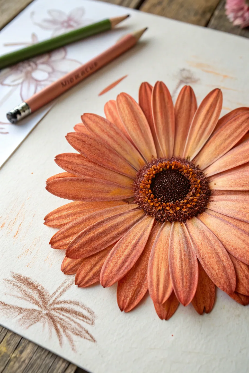
Master the art of heavy pressure blending with this vibrant study of a single Gerbera daisy. By layering rich orange tones and carefully defining petal textures, you’ll create a flower that looks dimensional enough to pick right off the page.
Step-by-Step Guide
Materials
- High-quality wax crayons (cadmium orange, burnt sienna, yellow ochre, dark brown, black, cream)
- Heavyweight textured drawing paper (vellum or cold press surface)
- Graphite pencil (HB) for initial sketching
- Soft eraser
- Blending stump (tortillon) or cotton swab
- Pencil sharpener
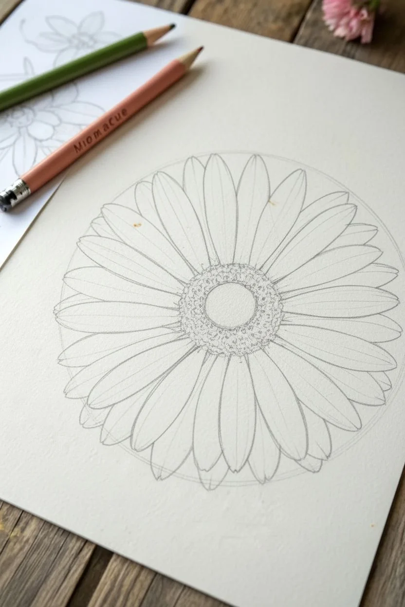
Step 1: Structural Sketching
-
Outline the center:
Begin lightly with your HB pencil by drawing a small, slightly flattened circle in the middle of your page to represent the flower’s distinct center disk. -
Establish petal guidelines:
Sketch a much larger circle around the center to define the outer boundary of the petals. Mark radiating lines from the center to guide the direction of the petals. -
Draw individual petals:
Draw the petals using long, tapered oval shapes. Ensure they overlap naturally; some should be fully visible in the front, while others should peek out from behind. -
Refine the sketch:
Lighten your graphite lines with a soft eraser until they are barely visible, leaving just enough to guide your crayon work without dirtying the colors.
Step 2: Petal Color Layering
-
Base layer application:
Select a yellow ochre crayon and fill in each petal with medium pressure. This warm underlayer will give the orange glow and depth later. -
Define the mid-tones:
Switch to your cadmium orange crayon. Apply this color over the yellow ochre, leaving the very tips of the petals slightly lighter. -
Add deep shadows:
Take a burnt sienna or rust-colored crayon. Focus on the base of the petals near the center disk and the areas where petals overlap to create separation shadows. -
Creating texture with heavy pressure:
Using the orange crayon again, apply heavy pressure (burnishing) in long strokes from the base toward the tip. This flattens the paper tooth and blends the underlying layers into a solid, waxy finish. -
Linear detailing:
Sharpen the burnt sienna crayon to a fine point. Draw delicate lines down the length of specific petals to mimic the natural veins and ridges found in Gerbera daisies. -
Highlighting edges:
Use a cream or white crayon to firmly outline the very tips and upper edges of the front-most petals. This creates a crisp highlight that separates the flower from the background.
Keep Edges Clean
As wax builds up, crumbs can appear. Keep a clean tissue nearby to frequently wipe off your crayon tip and blow away loose wax particles to prevent smudging.
Step 3: The Center & Background
-
Darken the core:
For the very center of the disk, use a dark brown crayon. Apply it in a tight circular motion, pressing firmly to create a dense, dark core. -
Stipple the pollen ring:
Surround the dark core with a ring of texture. Use bright orange and yellow ochre crayons to make tiny dots (stippling) that represent the fuzzy pollen structures. -
Deepen the contrast:
Add small touches of black crayon within the very center core to create maximum depth, blending it slightly into the brown. -
Connect center to petals:
Use the burnt sienna crayon to create tiny, short strokes radiating from the stippled ring out onto the base of the petals, blending the two sections seamlessly. -
Sketch the background foliage:
To complement the focused flower, use a brown or olive crayon to loosely sketch a stem and leaf suggestions in the lower left corner. -
Keep the background loose:
Unlike the flower, use light pressure and a sketchy style for these background elements. I prefer to leave the paper texture visible here to contrast with the smooth flower.
Add Dew Drops
To level up realism, use a white gel pen or opaque white paint to add tiny, reflective distinct dots on a few petals to simulate fresh morning dew.
Step back and admire the vibrant depth you have achieved through careful layering and pressure.
Cute Animal Portrait With Simple Shapes and Color Blocks
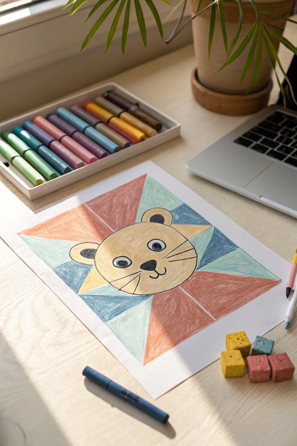
Create a cheerful lion character that pops off the page by combining simple shapes with bold blocks of color. This project uses a fun geometric background to frame a cute, approachable face, making it perfect for artists who love clean lines and vibrant patterns.
Detailed Instructions
Materials
- White drawing paper (heavyweight preferred)
- Set of vibrantly colored crayons or oil pastels
- Black fine-point marker or pen
- Pencil
- Eraser
- Ruler
Step 1: Planning the Layout
-
Center circle placement:
Start by finding the approximate center of your paper. Using a pencil, lightly draw a medium-sized circle or oval; this will be the main shape for your lion’s head. -
Determine the frame:
Decide on the outer boundary of your artwork. You can lightly mark a large rectangle centered around the head, leaving a generous white margin around the edges of the paper. -
Draft the rays:
Using your ruler, draw diagonal lines extending from the lion’s head outward to the corners and edges of your rectangular frame. Think of these as sunbeams or pizza slices radiating from behind the head. -
Add detail shapes:
Sketch two small semi-circles on top of the head for ears. Then, add triangle shapes on the sides of the head to represent parts of a mane or collar, integrating them into your geometric background pattern.
Step 2: Drawing the Lion’s Face
-
Head outline:
Once you are happy with the pencil sketch, take a black marker or a sharp black crayon and carefully trace just the outline of the head and the ears. -
Facial features:
Draw two large, wide-set circles for eyes inside the face. Add a small rounded triangle nose in the center, positioning it lower than the eyes. -
Mouth and details:
Draw a ‘W’ shape or two curved lines extending down from the nose to create the mouth. Add simple black dots for pupils inside the eyes, leaving a tiny white speck for a highlight if you can. -
Whiskers:
Add three straight lines on each cheek for whiskers. Keep them simple and bold. -
Ear details:
Draw smaller semi-circles inside the ears to give them depth, filling these inner shapes with black.
Smudge Patrol
Work from the center outward or use a scrap sheet of paper under your hand. This prevents your palm from dragging across the wax and smudging colors together.
Step 3: Coloring the Geometric Blocks
-
Base face color:
Select a warm yellow or golden ochre crayon. Color the entire face and outer ears evenly, using smooth strokes to minimize white gaps, but be careful not to color over your black facial features. -
Plan your palette:
Choose 3-4 distinct colors for the background shards. The example uses a palette of muted teal, light blue, terracotta red, and pastel orange. -
Start the top section:
Begin coloring the geometric shapes above the head. I usually like to alternate warm and cool colors here to create contrast. Fill one triangle with terracotta red and its neighbor with light teal. -
Working clockwise:
Continue around the head, coloring each triangular section. Try not to put two of the same color right next to each other. -
Adding texture:
As you color these larger blocks, apply firm pressure to get a solid, waxy finish. If you want a textured look like the example, use a consistent diagonal stroke direction. -
Lower sections:
Finish coloring the bottom triangles. Use lighter shades like pastel blue or mint green for lower sections to keep the artwork feeling balanced and not too heavy at the bottom.
Texture Twist
Try scratching patterns into the thick crayon layers with a toothpick (sgraffito technique) to add fur texture to the lion or patterns to the background shapes.
Step 4: Final Touches
-
Refining edges:
Go back with your colors and sharpen the edges where the color blocks meet. Crisp lines between the colors make the geometric effect much stronger. -
Highlighting features:
If the black lines on the face got a little waxy or dull from coloring nearby, re-trace them gently with your black marker or crayon to make the expression pop again. -
Clean up:
Use an eraser to gently remove any stray pencil lines visible in the white margins around your rectangular frame.
Now you have a charming, modern lion portrait that combines precise geometry with playful character
Food Illustration Series in Bright Crayon Colors
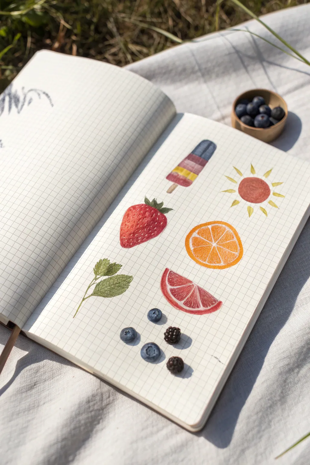
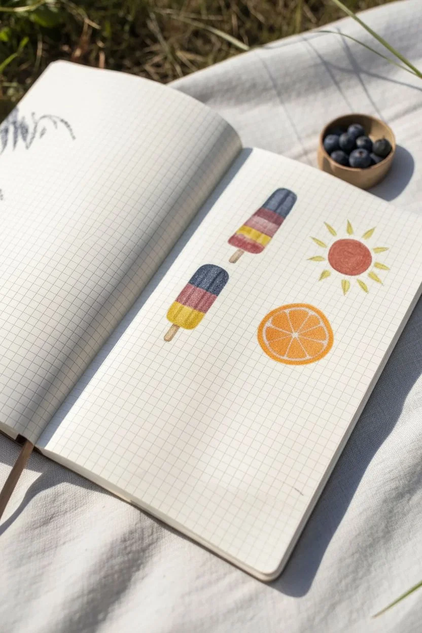
Capture the essence of a warm afternoon picnic with this cheerful collection of summer motifs. Using the structure of grid paper, you will illustrate vibrant fruits and treats with a soft, textured colored pencil or crayon finish.
How-To Guide
Materials
- Grid or graph paper notebook (ivory or off-white preferred)
- Set of colored pencils or high-quality wax crayons
- Pencil sharpener
- Fine-point eraser (for highlights)
- Real blueberries and blackberries (optional, for reference)
- Blending stump (optional)
Step 1: Setting the Scene: Popsicle & Sun
-
Outline the popsicle shape:
Begin near the top left of your page. Lightly sketch a classic rounded rectangle shape for the popsicle body and a small stick protruding from the bottom. Determine where your color stripes will go with faint lines. -
Color the popsicle layers:
Fill in the stripes with vertical strokes. Use navy blue for the top, a dusty rose or mauve for the middle, and a bright yellow for the bottom stripe. Press firmly to get solid color coverage. -
Add the stick and details:
Color the stick with a light tan or beige. To make the popsicle look frosty, lightly graze over the boundaries of the colors to blend them slightly, or leave tiny white flecks of paper showing through. -
Draw the sun icon:
Move to the right of the popsicle. Draw a small, solid circle using a terracotta or burnt orange color. Fill it in completely with a circular motion. -
Add sun rays:
Using a bright yellow, draw short, triangular rays radiating outward from the orange center. Space them evenly to create a playful, graphic look.
Uneven Color Coverage?
If the grid lines show through your drawing too much, place a smooth piece of cardstock underneath the page you are working on. This provides a harder surface for pressing down firmly to saturate the paper.
Step 2: Juicy Fruit Details
-
Shape the strawberry:
Below the popsicle, sketch a heart-like triangle shape for a strawberry. Color the body with a vibrant red, layering a darker crimson on the right side to suggest shadow and volume. -
Add seeds and leaves:
Use a dark green for the leafy cap (calyx). For the seeds, either press hard with a sharpened yellow pencil or use a white gel pen/fine eraser to lift tiny dots out of the red base. -
Create the orange slice:
To the right of the strawberry, draw a perfect circle with an orange pencil. Inside, draw a smaller circle and divide it into triangular segments, leaving thin white lines (the pith) between the segments. -
Texture the citrus:
Fill the segments with a mix of yellow-orange and bright orange. Use stippling or small dots to mimic the juicy texture of citrus pulp. -
Draft the grapefruit wedge:
Below the orange slice, draw a semi-circle shape. Outline the rind in a pale pink or salmon color. -
Color the pink flesh:
Fill the wedge with a deep pink or ruby red. Just like the orange, leave thin white lines radiating from the center to define the segments.
Step 3: Greenery & Berries
-
Sketch the mint sprig:
To the left of the grapefruit, draw a thin, curved stem. Attach pairs of serrated, oval-shaped leaves along the stem. -
Detail the leaf veins:
Color the leaves with a sage green. Use a sharpened darker green pencil to draw a central vein and delicate side veins on each leaf for realism. -
Draw loose blueberries:
Scatter three small circles near the bottom left area. Color them a slate blue. Leave a tiny white circle or crescent on the top left of each berry to represent a shiny highlight. -
Add the blueberry calyx:
On the top of two berries, draw a tiny star shape or rough circle in dark violet or black to show the blossom end. -
Create the blackberries:
Draw two clusters of tiny circles clumped together to form a blackberry shape. Use a very dark purple or black for these. -
Highlight the berry drupelets:
Leave tiny highlights on individual ‘bubbles’ of the blackberries to make them look glistening and three-dimensional, rather than flat black blobs.
Pro Tip: Realistic Highlights
Instead of trying to draw around the white highlights on the berries, color the whole berry first. Then, use a white Posca pen or white gel pen to tap in the tiny shine marks afterward.
Enjoy flipping through your sketchbook and seeing these fresh summer snacks pop off the page
BRUSH GUIDE
The Right Brush for Every Stroke
From clean lines to bold texture — master brush choice, stroke control, and essential techniques.
Explore the Full Guide
Rainbow Color Wheel Swatches in Crayon
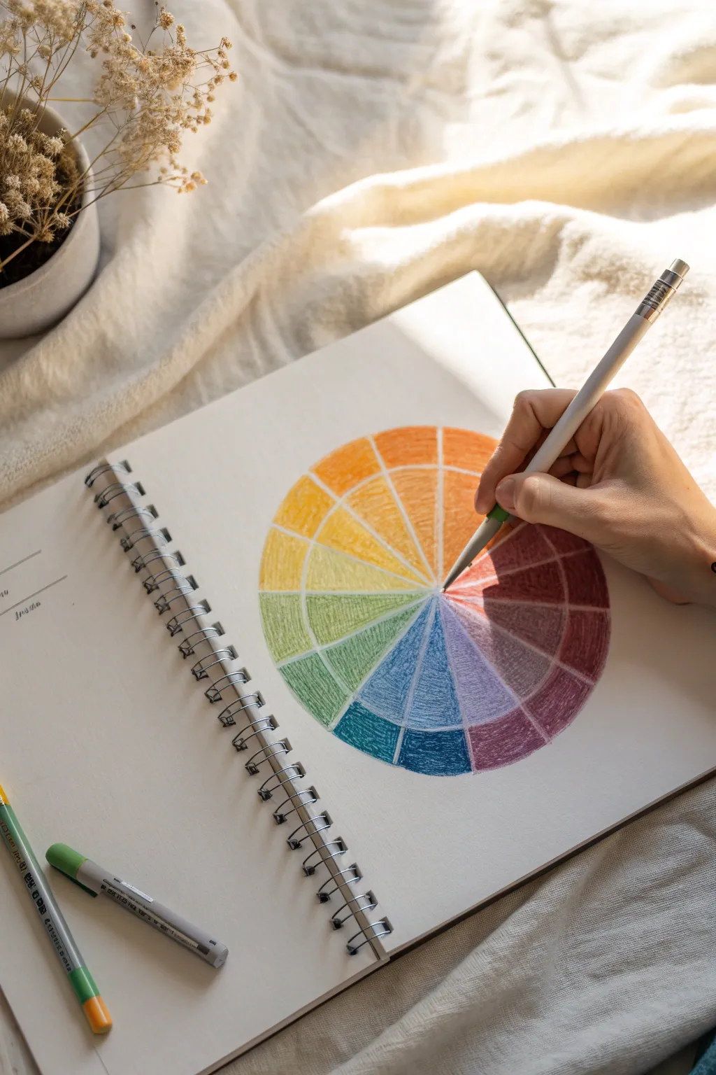
Brighten up your sketchbook with this vibrant color theory study that doubles as a satisfying art exercise. Using simple wax crayons, you’ll build up layers of pigment to create a textured, radiant wheel that explores the relationships between primary, secondary, and tertiary hues.
Step-by-Step
Materials
- Spiral-bound sketchbook (white paper)
- Set of wax crayons (must include red, blue, yellow, green, orange, purple)
- Compass or a round object to trace
- Ruler
- Pencil (light graphite)
- Eraser
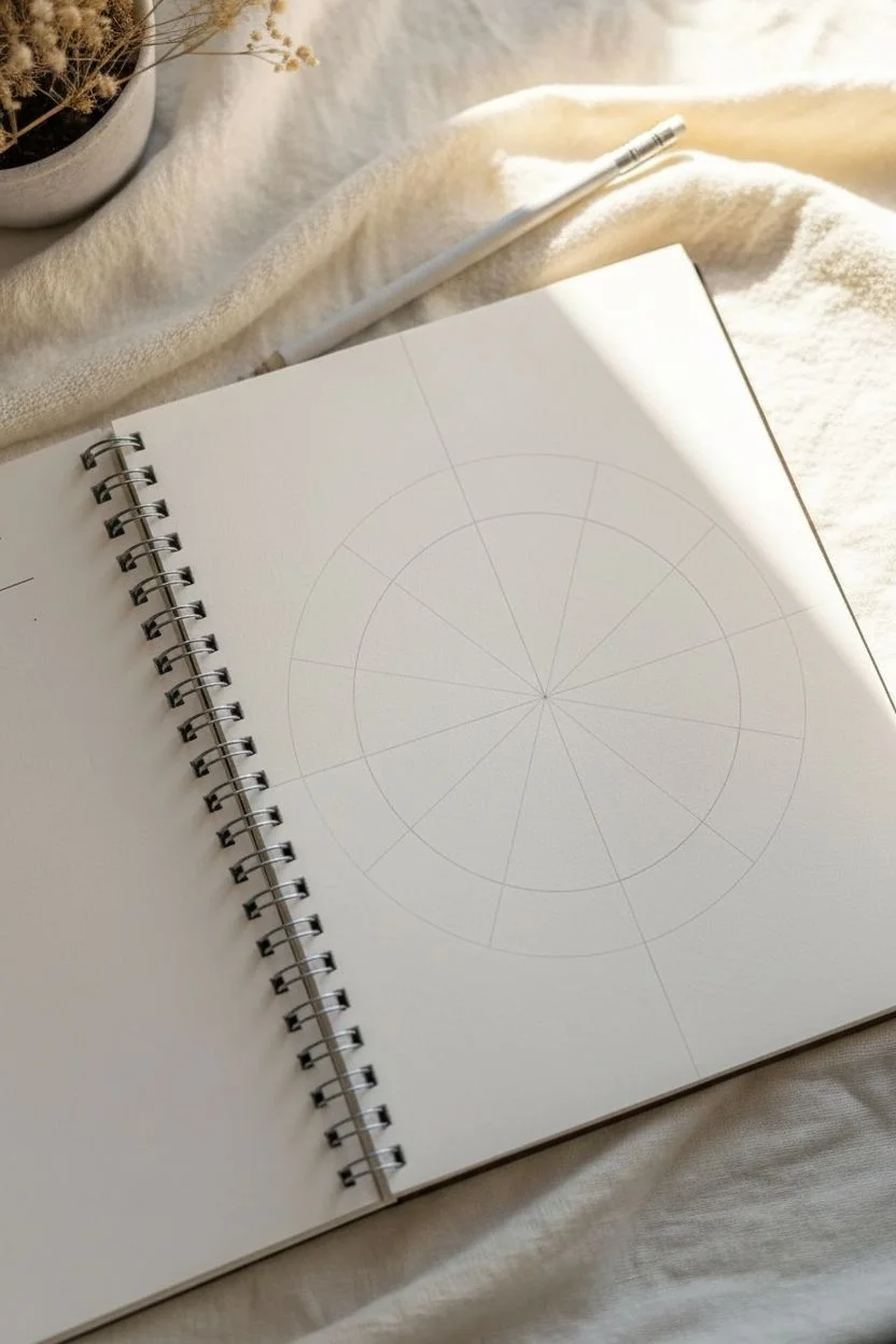
Step 1: Drafting the Wheel
-
Draw the main circle:
Open your sketchbook to a fresh, blank page. Using a compass or by carefully tracing a round plate or bowl, draw a large circle in the center of the page with a light pencil line. -
Mark the center:
If you used a compass, mark the center point clearly. If you traced an object, estimate the center as accurately as possible and make a small dot. -
Divide into quarters:
Use your ruler to draw a vertical line straight through the center point, extending to the edges of the circle. Then, draw a horizontal line perpendicular to the first, creating four equal quadrants. -
Create twelve sections:
For a standard 12-hue color wheel, you need to divide each quadrant into three equal wedges. Lightly sketch two lines within each quarter section, radiating from the center, aiming for equal spacing. You should end up with 12 “pizza slices” in total. -
Add the inner ring:
To give the wheel more structure, draw a smaller concentric circle inside the main one, about halfway between the center and the outer edge. This creates two zones per wedge, allowing for potential value changes or just a neat visual separation.
Smooth Blends
For smoother transitions between colors, gently rub the wax with a paper stump or your finger. The friction warms the wax, making it spread like paint.
Step 2: Applying the Primary Colors
-
Identify primary placements:
Visualize a triangle within your circle. Choose one wedge at the top for Yellow. Count three wedges clockwise to find the spot for Red. Count another three for Blue. -
Color the Yellow wedge:
Take your yellow crayon and fill in the top wedge. Use firm, even pressure to get a solid, sunny saturation without pressing so hard the wax clumps immediately. -
Color the Red wedge:
Move to the red position (4 spaces clockwise from yellow). Fill this wedge completely with your red crayon, maintaining that consistent, textured stroke. -
Color the Blue wedge:
Finally, fill in the blue wedge (4 spaces clockwise from red). You now have the anchors of your wheel established.
Step 3: Filling Secondary and Tertiary Hues
-
Create Orange:
Find the wedge exactly halfway between yellow and red. This is your secondary color, Orange. Fill it in using a true orange crayon if you have one, or layer yellow and red gently to mix it. -
Create Green:
Locate the wedge halfway between yellow and blue. Fill this with green. I like to colour in small circular motions here to ensure the paper tooth is well-covered. -
Create Purple:
Fill the wedge halfway between blue and red with purple or violet. Ensure the intensity matches your other secondary colors. -
Fill the Tertiary Yellow-Orange:
Go to the empty wedge between Yellow and Orange. This is Yellow-Orange. You can use a specific crayon color or lightly layer orange over a yellow base. -
Fill the Tertiary Red-Orange:
Fill the wedge between Red and Orange. This should be a deep, fiery color, leaning more towards red than the pure orange wedge. -
Fill the Tertiary Red-Purple:
Color the wedge between Red and Purple. This maroon-like hue can be achieved by layering red over purple. -
Fill the Tertiary Blue-Purple:
Fill the wedge between Blue and Purple. This should be a cool, deep indigo shade. -
Fill the Tertiary Blue-Green:
Color the wedge between Blue and Green. Use a teal or aqua crayon, or layer blue over green. -
Fill the Tertiary Yellow-Green:
Finally, fill the last empty wedge between Yellow and Green with a bright lime color.
Make it Pop
Use a white crayon or a colorless blender over the entire finished wheel. It mixes the pigments directly on the paper for a painterly, professional finish.
Step 4: Refining and Blending
-
Burnish the surface:
Go back over each wedge with a second layer of the same color. Press harder this time to “burnish” the wax, which flattens the paper grain and makes the colors pop vividly. -
Clean up edges:
Use your crayon edge or a sharper point to neaten the boundaries between the wedges so the colors touch cleanly without unintended overlapping.
Now you have a handy reference tool that looks striking in your sketchbook.
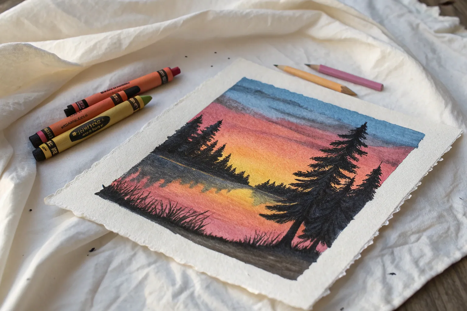
Night Sky With Moon Glow and Wax Bloom
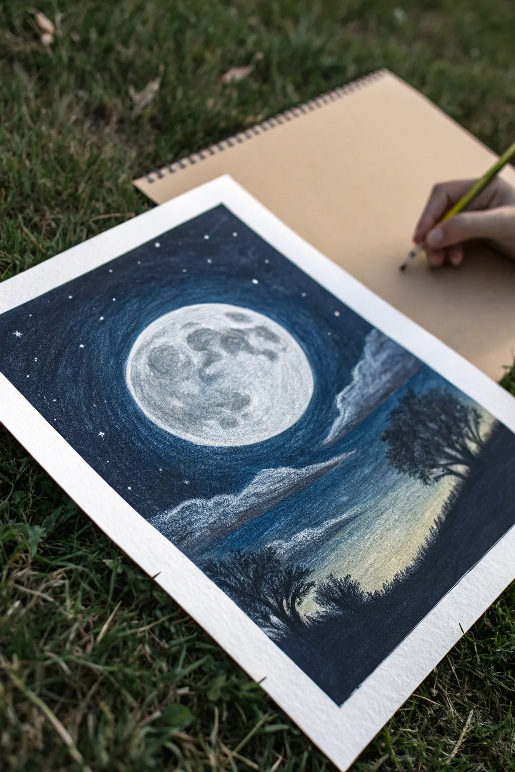
Capture the serene beauty of a full moon rising over a silhouetted landscape using the rich, blendable texture of wax pastels or crayons. This project contrasts deep midnight blues with stark whites to create a luminous glow that pops off the page.
How-To Guide
Materials
- Heavyweight drawing paper or mixed media paper (smooth to medium grain)
- Masking tape or painter’s tape
- Wax pastels or high-quality crayons (White, Light Gray, Sky Blue, Dark Blue, Black, Yellow Ochre)
- Blending stump or cotton swab
- Tissue or clean soft cloth for blending
- Circle template (can be a bowl or compass)
- Graphite pencil (HB or 2B)
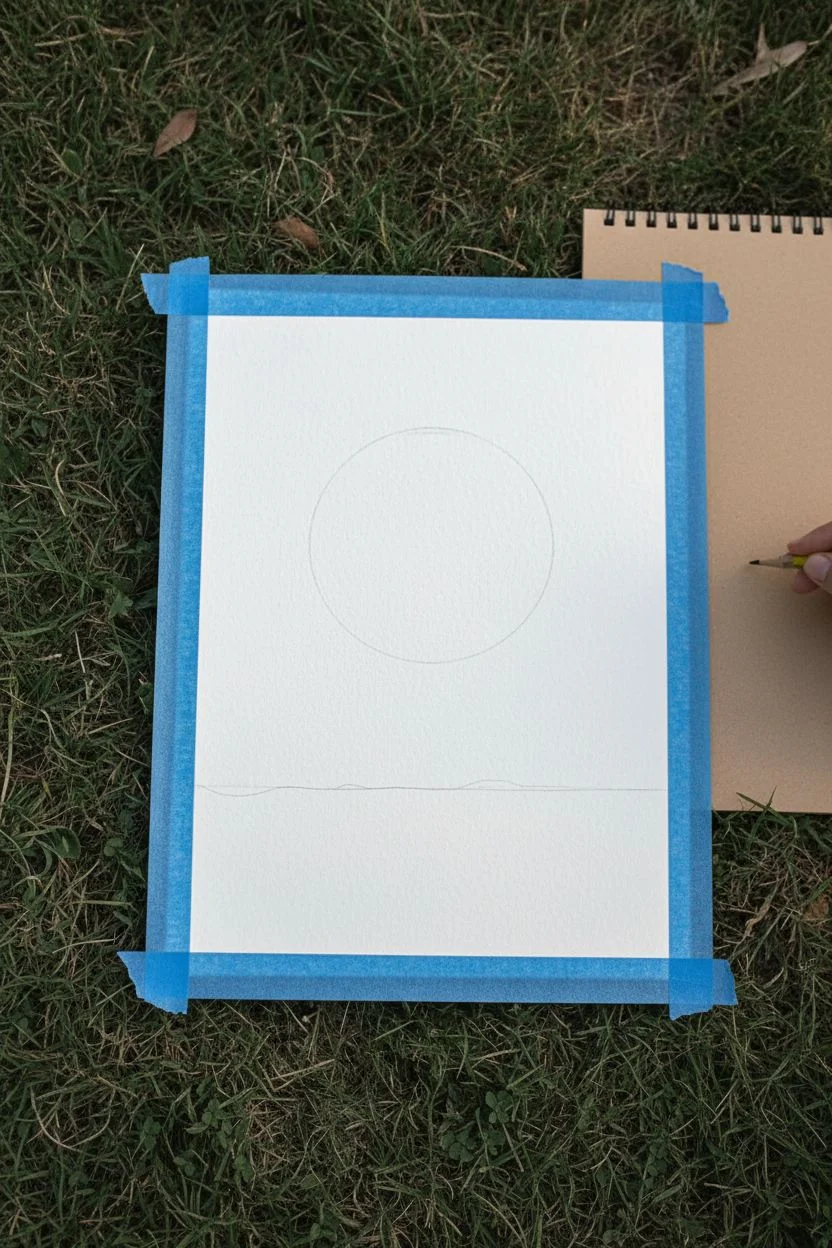
Step 1: Preparation and Outline
-
Secure the paper:
Tape down all four edges of your paper to a flat surface. This creates a crisp, clean border around your final artwork and prevents the paper from shifting while you work. -
Set the scene:
Using your graphite pencil, lightly trace a large circle in the upper center of the page for the moon. Use a bowl or compass to keep it perfectly round. -
Sketch the horizon:
Draw a faint horizon line about one-third of the way up from the bottom. It doesn’t need to be perfectly straight; a slight slope adds naturalism.
Clean Edges
Wax pastels can be messy. Keep a scrap piece of paper under your hand while you draw to prevent smudging your moon or transferring oils from your skin to the paper.
Step 2: Creating the Moon
-
Base layer for the moon:
Fill in the entire circle with your white crayon or pastel. Press firmly to get a solid, opaque layer that covers the paper grain completely. -
Adding texture:
Gently stipple or scumble light gray spots onto the white surface to mimic craters. Focus these marks on the left side and top, leaving some areas pure white for contrast. -
Softening the features:
Use a cotton swab or blending stump to lightly smudge the gray markings. This integrates them into the white base so the moon looks textural rather than sketchy.
Step 3: The Night Sky
-
Initial sky layer:
Starting just outside the moon’s edge, apply a ring of Sky Blue. Do not press too hard yet; you want to establish a transition zone. -
Deepening the blue:
Move outward from the light blue ring with a Dark Blue or Indigo crayon. Color in concentric circles, getting darker as you move away from the moon towards the paper’s edges. -
Adding the void:
Fill the corners of the sky and the area furthest from the moon with Black, blending it slightly into the Dark Blue to create a deep atmospheric gradient. -
Blending the gradient:
Take a tissue or your finger and rub the sky area in circular motions. Blend the black into the blue, and the dark blue into the light blue ring, smoothing out the crayon strokes. -
Creating the glow:
Go back over the immediate edge of the moon with White, glazing it lightly over the blue sky to create a hazy, atmospheric halo effect. -
Adding stars:
Use the sharp edge of your white pastel to dot tiny stars into the dark areas of the sky. Vary the pressure to make some stars brighter than others.
Scratchboard Technique
For sharper stars or tiny details in the trees, try scratching through the top layer of crayon with a toothpick or a dried-out ballpoint pen to reveal the white paper underneath.
Step 4: Landscape and Atmosphere
-
Drawing the clouds:
With your white crayon, sketch wispy cloud formations drifting across the lower sky and slightly over the moon’s halo. Keep the strokes horizontal and feathery. -
Shadowing the clouds:
Add a touch of gray or light blue to the bottom edge of the clouds to give them volume and dimension, blending slightly upwards. -
Horizon glow:
Just above your horizon line on the right side, lightly layer Yellow Ochre and White. This suggests distant light pollution or the last fading light of dusk. -
Silhouette base:
Color the land section below the horizon completely black. Apply heavy pressure to ensure it is solid and opaque. -
Adding trees:
Using the sharp edge of a black crayon, draw tree silhouettes rising from the dark ground. I like to twist the crayon slightly to create irregular, organic branch shapes. -
Detailing foliage:
Stipple or dab the black crayon around the branches to suggest leaves. Create a dense tree on the right and smaller shrubbery on the left for balance. -
Final reveal:
Carefully peel away the masking tape at a 45-degree angle to reveal your sharp, clean borders.
Step back and admire how the simple wax medium transforms into a sophisticated night scene

PENCIL GUIDE
Understanding Pencil Grades from H to B
From first sketch to finished drawing — learn pencil grades, line control, and shading techniques.
Explore the Full Guide
Ocean Waves Using Curved Stroke Patterns
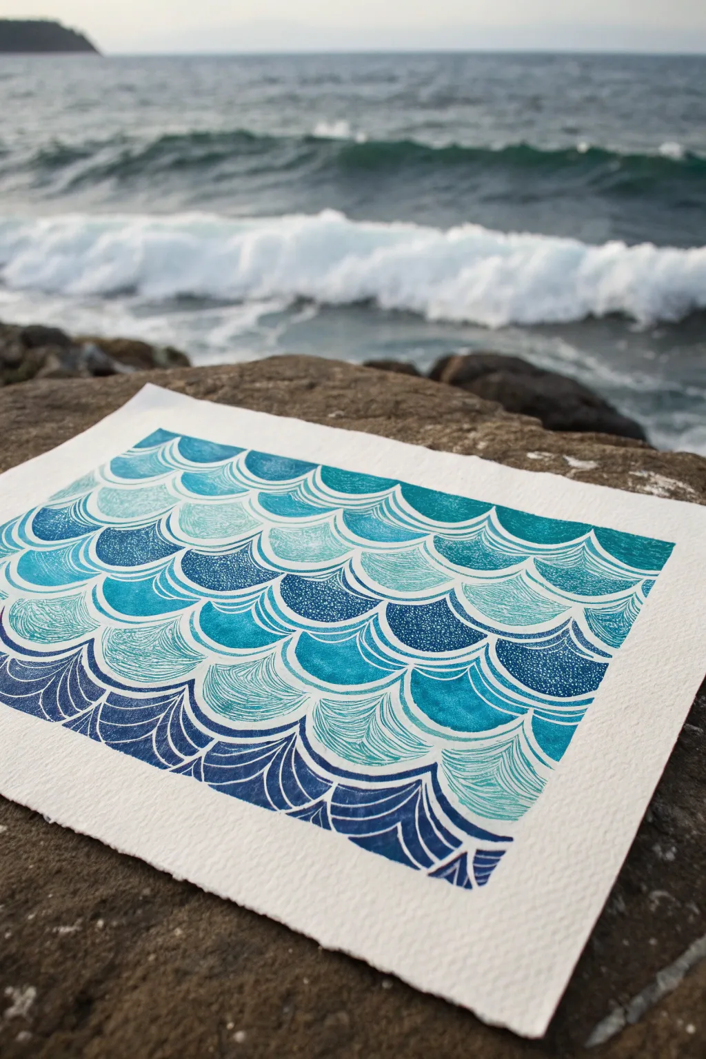
Capture the rhythmic beauty of the ocean with this mesmerizing block print project. Using repeating scalloped patterns and varying line textures, you’ll create a stylized wave design that mimics the traditional Japanese Seigaiha motif.
Detailed Instructions
Materials
- Soft-cut linoleum block (approx. 5×7 or 8×10 inches)
- Linoleum carving tools (V-gouge and U-gouge)
- Pencil and eraser
- Tracing paper
- Block printing ink (Cyan, Phthalo Blue, White)
- Brayer (rubber roller)
- Inking plate or glass palette
- Heavyweight printmaking paper (preferably ribbed or textured)
- Small spoon or baren
- Optional: Ruler
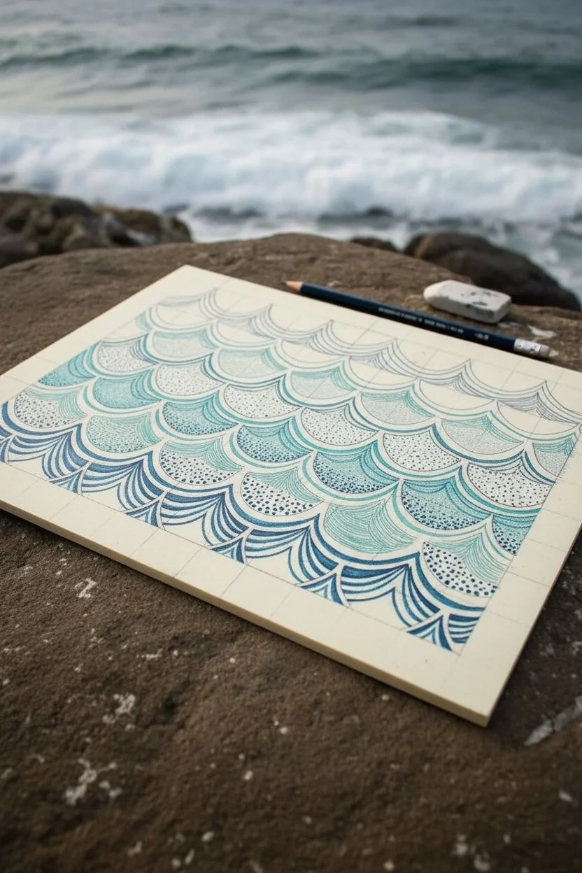
Step 1: Designing the Wave Pattern
-
Draft the grid:
Start by sketching a light grid on your linoleum block or tracing paper. Draw horizontal lines about 1 inch apart to guide your rows. -
Sketch the scallops:
Draw the base wave shapes using overlapping semicircles. The top of one arch should meet the midpoint of the arch above it, creating a fish-scale effect. -
Add line textures:
Within selected scallops, draw fine curved lines that follow the contour of the arch. Vary the spacing—some can be tight and dense, others loose. -
Incorporate solid sections:
Mark specific scallops to remain solid or mostly solid. For these, sketch tiny white dots or speckles to mimic sea foam texture. -
Vary the bottom row:
For the bottom-most row of waves, sketch bolder, sharper lines to create a visual base for the composition, giving it a ‘deep water’ feel.
Clean Lines Tip
Warm your lino block with a hair dryer for 30 seconds before carving. The heat softens the material significantly, allowing for smoother, more precise cuts.
Step 2: Carving the Block
-
Outline the shapes:
Using your fine V-gouge tool, carefully crave the outline of every scalloped wave. This separates the shapes from one another. -
Carve the fine lines:
Switch to your finest tool to carve the interior curved lines. Remember, whatever you carve away will be white; the raised ridges will be blue. -
Create the texture:
For the solid sections, use the point of the cutter to peck small holes into the surface. These divots will remain white when printed. -
Clear negative space:
Use a wider U-gouge to clear away the linoleum outside your main rectangle design. I find it helpful to clear a generous border so ink doesn’t accidentally catch on the edges. -
Clean the block:
Brush away any loose linoleum crumbs. You can wipe the block with a slightly damp cloth to ensure the grooves are clear of debris.
Step 3: Inking and Printing
-
Mix your gradient:
On your inking plate, place a dollop of dark blue ink on one side and cyan-white mix on the other. Use the brayer to roll them out, letting them blend slightly in the middle for an ombre effect. -
Charge the brayer:
Roll the brayer back and forth until it has a consisteny velvety texture and a distinct ‘hissing’ sound. -
Ink the block:
Apply the ink to your carved block. Roll in multiple directions to ensure the textured areas and fine lines catch the ink evenly. -
Align the paper:
Carefully place your textured printmaking paper on top of the inked block. Once it touches the ink, do not shift it. -
Burnish the print:
Using a baren or the back of a spoon, rub the back of the paper in circular motions. Apply firm pressure, focusing on the edges and detailed corners. -
Peel and reveal:
Slowly peel back one corner of the paper to check the transfer. If it looks patchy, lay it back down and rub some more. If good, pull the paper completely off to reveal your artwork. -
Dry the print:
Lay the finished print on a flat surface to dry. Oil-based inks may take a few days, while water-soluble inks will dry much faster.
Level Up: Gradient Sea
Try a ‘rainbow roll’ technique. Put dark blue at the bottom and teal at the top of your drawing palette. Roll them at once to create a seamless vertical fade on the final waves.
Frame your beautiful seascape or create a set of handmade cards to share the ocean vibes
Cozy House Scene With Warm Window Light
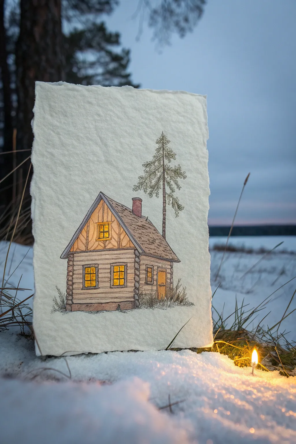
Capture the magic of a warm refuge on a cold evening with this charming mixed media piece. By combining fine liner details with the soft texture of colored pencils on handmade paper, you’ll create a cozy log cabin that literally seems to glow from within.
Step-by-Step Tutorial
Materials
- Heavyweight textured paper (watercolor or handmade cotton paper with deckle edge)
- Fine liner pens (black, 0.1mm and 0.3mm)
- Colored pencils (warm yellow/gold, browns of various shades, soft grey, sage green)
- Graphite pencil (HB or 2H)
- Eraser
- Ruler (optional)
- White gel pen (optional for snow highlights)
Step 1: Drafting the Structure
-
Paper selection:
Choose a thick, textured paper to mimic the rustic feel of the original image. If your paper doesn’t have rough edges, you can carefully tear the sides against a ruler to create a faux-deckle edge. -
Basic shapes:
Using your HB pencil very lightly, sketch the main shapes of the cabin. Start with a square for the main body and add a steep triangle on top for the roof. Add a smaller rectangular extension to the right side. -
Roof details:
Draw the roof overhangs extending slightly past the walls. Sketch the chimney on the back slope of the main roof. -
Window and door placement:
Mark out the locations for the windows. Place a small attic window in the gable, two main windows on the front wall, and a side window and door on the extension.
Step 2: Inking the Details
-
Main outlines:
Switch to your 0.3mm fine liner. Carefully go over the main structural lines of the house. Don’t make the lines perfectly straight; a little wobble adds character to the old wood. -
Log texture:
Draw horizontal lines across the façade to create the log beams. At the corners where walls meet, draw rounded log ends stacking on top of each other in an alternating pattern. -
Roof shingles:
Use a 0.1mm pen to add texture to the roof. Instead of drawing every single shingle, use short, broken sketchy strokes to suggest a weathered wooden shake roof. -
Window frames:
Ink the window frames, giving them a double line to show thickness. Draw the grid patterns (mullions) inside each window. -
Nature elements:
Sketch a tall, thin pine tree behind the house using scribbly, organic lines for the needles. Add wispy grass tufts along the base of the cabin to ground it. -
Erase pencil:
Once the ink is completely dry, gently erase all your initial pencil guides.
Textured Glow Trick
To make the windows look extra bright, leave tiny specks of the white paper showing through your yellow coloring. This ‘sparkle’ mimics real light hitting glass.
Step 3: Adding Color and Light
-
glowing windows:
Start with your brightest warm yellow colored pencil. Press firmly in the center of the window panes and fade slightly toward the edges to create a radiant glow effect. -
Adding gradients:
Layer a touch of orange very lightly at the bottom of the window panes to add depth to the light. -
Wood tones:
Use a light brown or tan pencil to shade the logs. Apply the color lightly, letting the texture of the paper show through just a bit. -
Deepening shadows:
Take a darker brown pencil and shade specifically under the roof eaves and in the corners where the logs meet. This contrast makes the house look three-dimensional. -
Roof coloring:
Color the roof with a muted grey-brown. I like to vary the pressure here, making some patches darker than others to simulate aged wood shingles. -
Chimney accents:
Use a reddish-brown or terra cotta color for the brick chimney, keeping the shading light. -
Tree and grass:
Use a dull, sage green for the pine tree and the grass tufts. Keep this coloring sparse and sketchy to match the ink style. -
Final touches:
Add a very light wash of grey pencil beneath the house to create a subtle shadow on the ‘snow’.
Real Light Display
For a magical display, carefully poke pinholes through the center of the drawn windows. Place an LED tea light behind the paper to make the cabin actually light up.
Now you have a cozy winter sanctuary captured on paper to warm your spirits


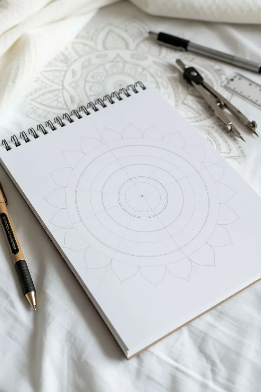
Mandala Coloring With Crayon Layering
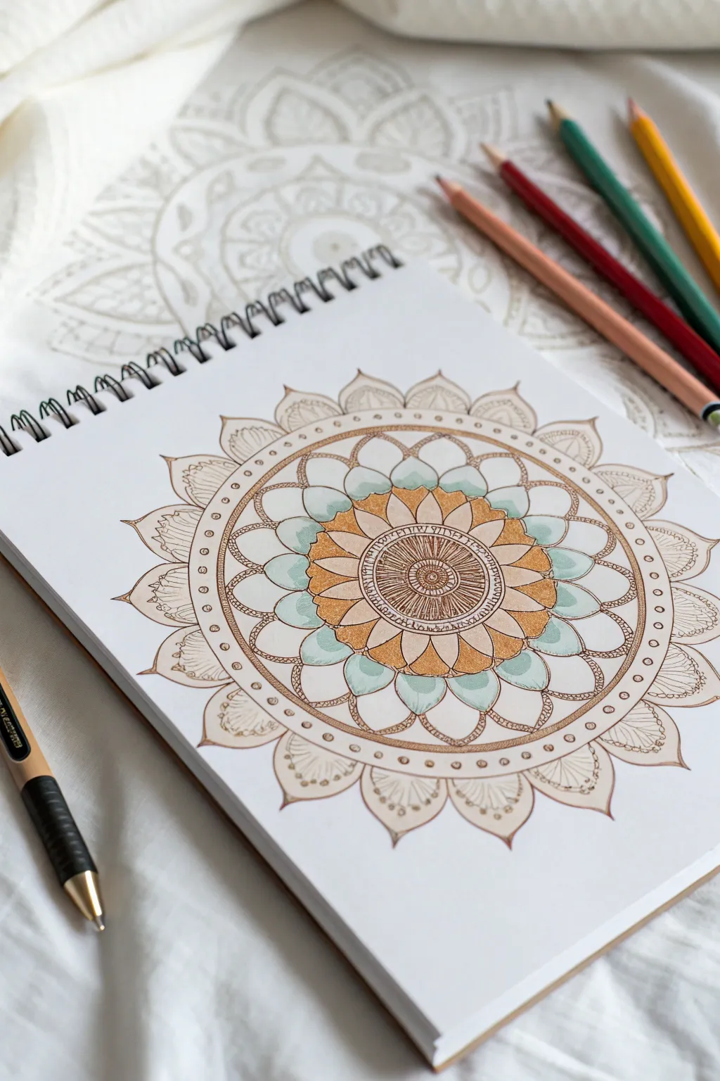
This soothing mandala project combines precision linework with soft, layered coloring to create a dimensional, jewel-like effect. The palette focuses on warm golds, earthy browns, and refreshing teals to evoke a sense of grounded calm.
Detailed Instructions
Materials
- White sketchbook paper (medium weight)
- Fine-liner pen (brown or sepia, 0.3mm or 0.5mm)
- Ruler and compass
- Wax crayons or colored pencils (Gold/Ochre, Burnt Sienna, Pale Teal/Mint, Cream)
- Pencil and eraser for sketching
Step 1: Planning the Geometry
-
Mark the center:
Begin by finding the exact center of your page. Make a small, faint pencil mark here as your anchor point for all concentric circles. -
Draw guide circles:
Using your compass, draw five concentric circles lightly in pencil. Space them out somewhat evenly, leaving the largest gap for the main petal ring. -
Divide the circle:
Use a protractor to mark every 20 or 30 degrees around the outer circle. Lightly draw lines through the center to these marks to create pie-slice guides for symmetrical petal placement.
Step 2: Inking the Foundation
-
The central seed:
Switch to your brown fine-liner. Draw a small, tight circle in the center. Surround it with tiny, dense radial lines, like the iris of an eye or the center of a sunflower. -
Inner ring details:
Move to the next guide circle outward. Create a band filled with short, vertical hash marks or tiny text-like scribbles to add texture without distinct imagery. -
Primary petal shapes:
Draw the first layer of petals. These should be pointed ovals that touch at the base. Ensure the tip of each petal aligns with one of your radial guide lines. -
Secondary petal ring:
Draw a larger ring of petals behind the first set. Make these wider and rounder, filling the largest gap you left in your pencil guides. -
Outer framing layer:
Create the final, outermost ring with broad, scallop-shaped petals. Inside each scallop, draw a smaller, similar shape to create a double-line effect. -
Decorative borders:
Add a thin double-ring border just inside the outer petals. Using the fine-liner, fill this narrow channel with tiny, evenly spaced circles or dots. -
Clean up:
Once the ink is completely dry (give it a few minutes to avoid smudging), gently erase all pencil guide circles and radial lines.
Smooth Blends
To get that creamy look without texture, rub the crayon coloring with a paper blending stump or a cotton swab. This pushes the wax into the paper grain.
Step 3: Layering the Color
-
Base gold layer:
Take your gold or ochre crayon. Color the primary (inner) ring of petals fully. Press firmly near the center of the flower and fade the pressure as you move outward to the petal tips. -
Teal accents:
Use a pale teal or mint crayon for the tips of the larger, secondary petals. Apply the color softly, fading it out as you move toward the flower’s center, leaving the base of these petals white for now. -
Deepening the teal:
Go back over the teal sections with a second layer, pressing harder just at the very tips to create a gradient effect. -
Creamy transitions:
Use a cream or white crayon to blend the faded edge of the teal into the white space of the petal. This burnishing technique creates a smooth, waxy finish. -
Outer definition:
For the outermost scalloped petals, use a very light touch with a beige or light brown crayon. Focus the color only at the base of these scallops, fading up. -
Detailed shading:
Inside the tips of the outer scallops, draw delicate fan-like lines with the fine-liner over the crayon color to add texture. -
Final contrast:
Return to the very center. Use the burnt sienna crayon or pencil to darken the ‘seed’ area, adding depth so the mandala appears to recess in the middle.
Metallic Pop
Use a gold gel pen to trace over the inner ring of circles. When the light hits the drawing, these tiny details will shimmer.
Take a moment to admire how the layered colors create a sense of depth and vibration in your finished piece
Non-Dominant Hand Crayon Drawings for Loose Style
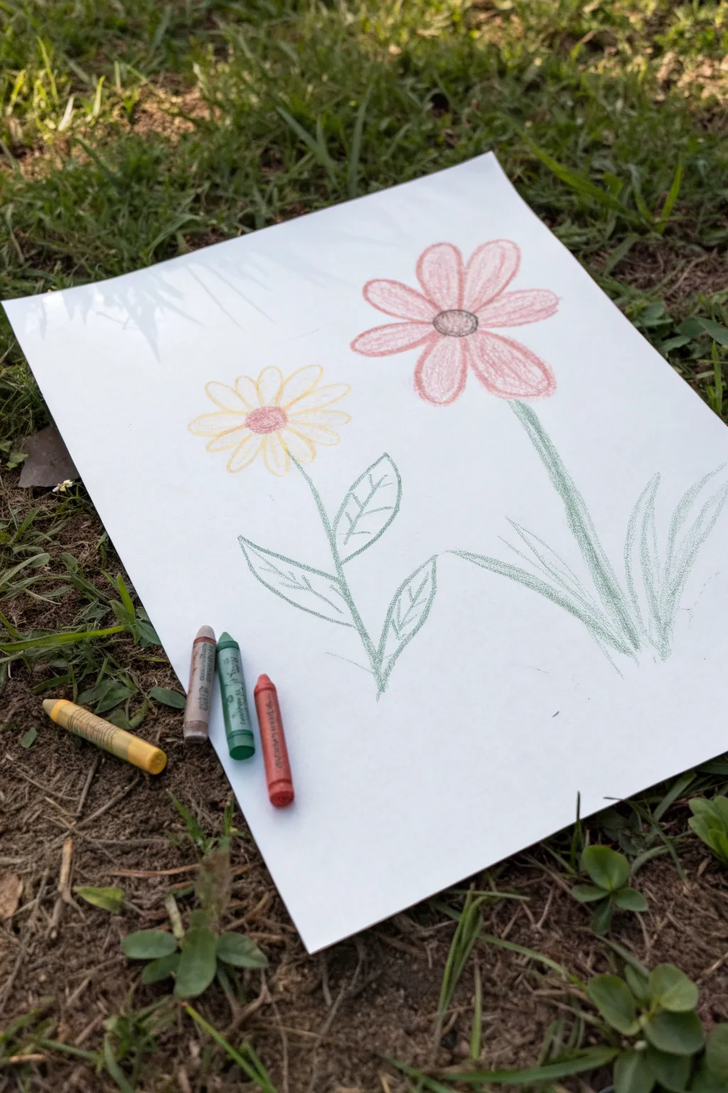
Embrace the wobbles and imperfections of drawing with your non-dominant hand to create these charmingly simple flowers. This exercise loosens up your artistic style, resulting in a gentle, dreamy aesthetic that looks right at home in a nature journal.
How-To Guide
Materials
- White drawing paper or sketchbook
- Wax crayons (yellow, pastel red/pink, light green, grey/brown)
- A flat surface (drawing board or clipboard if outside)
Step 1: Setting the Scene
-
Switch hands:
Place your piece of white paper on your work surface. Pick up your crayons, but here is the key: hold them in your non-dominant hand. If you are right-handed, use your left, and vice versa. This lack of fine motor control creates the signature style. -
Outline the tall flower:
Select a light pink or faded red crayon. On the right side of the paper, barely pressing down, draw a medium-sized circle for the center of your first flower. -
Draw the petals:
Drawing outwards from that center circle, sketch about seven or eight long, oval-shaped petals. Don’t worry if the lines don’t meet perfectly or if the shapes are uneven; that is exactly the look we want. -
Fill the petals:
Using a loose back-and-forth motion, color inside the petals with the same pink crayon. Leave plenty of white space showing through the strokes to keep the texture airy and light. -
Darken the center:
Switch to a grey or brown crayon. Color in the center circle of the pink flower. You can press slightly harder here to create a focal point, but keep the edges fuzzy.
Step 2: Adding the Lower Flower
-
Position the second bloom:
Pick up your yellow crayon. Move your hand to the left side of the paper, slightly lower than the pink flower. Draw a smaller circle for this flower’s center. -
Sketch yellow petals:
Add the petals around the yellow center. Make these slightly shorter and rounder than the pink ones to give variety to the composition. -
Color loosely:
Fill in the yellow petals with quick, scratchy strokes. I find that holding the crayon further back on the shaft helps prevent me from trying to control the lines too much. -
Add the center detail:
Take the pink crayon you used for the large flower and lightly color the center of the yellow flower. This ties the color palette together nicely.
Use Textured Paper
Place a piece of sandpaper or concrete under your drawing paper while you work. The crayon will pick up the rough texture for an enhanced grainy look.
Step 3: Stems and Foliage
-
Draw the main stem:
Switch to a light green crayon. Starting from under the pink flower, draw a line downwards. Let your hand shake or curve naturally; a straight ruler line would look out of place here. -
Draw the second stem:
Draw a stem for the yellow flower, angling it slightly so it meets or crosses near the bottom of the page. -
Add leaves on the left:
On the yellow flower’s stem, draw two large, leaf shapes pointing outwards. Keep the outlines thin and frantic. -
Detail the veins:
Inside those left-hand leaves, draw a simple line down the middle and a few diagonal veins. Do this quickly without overthinking placement. -
Create grass blades:
For the pink flower on the right, instead of standard leaves, draw three or four long, curved blades of grass rising up from the bottom right corner. -
Final shading:
take the green crayon and add incredibly light shading inside the leaves and grass blades. Use a very gentle scribbling motion, just enough to tint the white paper.
Add a Sky Wash
Take a blue watercolor paint and do a very watery wash over the whole background. The wax crayon will resist the paint, making the flowers pop.
Step back and admire how letting go of control created a surprisingly organic final piece
Heat-Softened Crayon Blending for Super Smooth Gradients
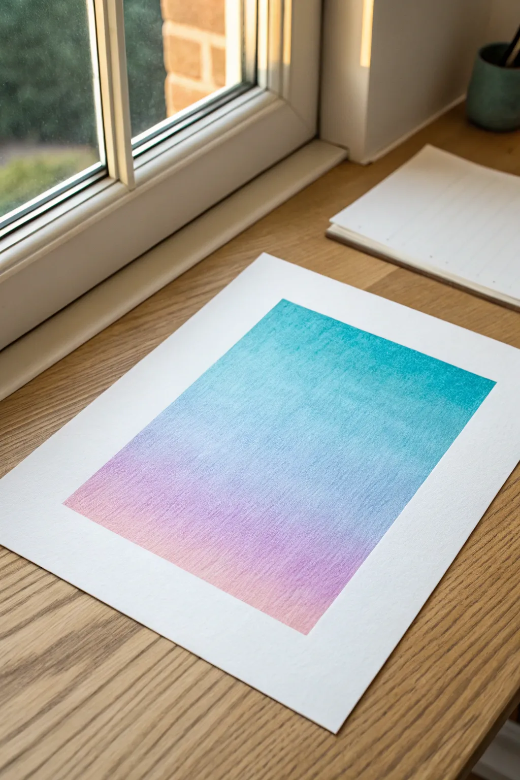
Achieve a professional, painterly finish using nothing but standard wax crayons and a little bit of heat. This project creates a stunning color-block gradient that transitions seamlessly from cool teal to a warm, dusty pink.
How-To Guide
Materials
- High-quality wax crayons (teal, light blue, lavender, pink)
- Heavyweight drawing paper or mixed media paper
- Hairdryer or embossing heat tool
- Painter’s tape or masking tape
- Paper towel or blending stump (tortillon)
- Scrap paper for testing
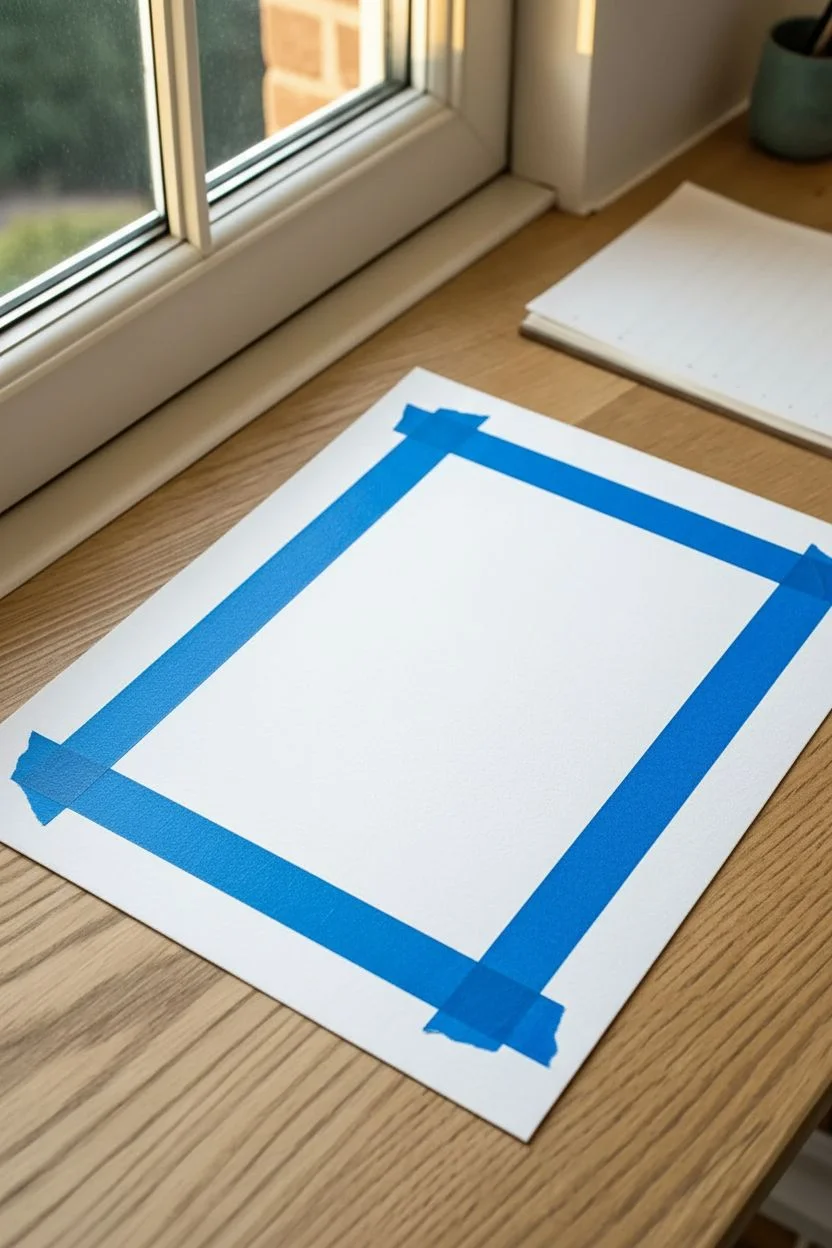
Step 1: Preparation
-
Tape the Border:
Begin by securing your heavyweight paper to a flat, hard surface. Use painter’s tape to create a clean, rectangular border in the center of the page, pressing the edges down firmly to prevent wax from bleeding underneath. -
Plan Your Gradient:
Visually divide your rectangle into three main zones: the top for the darkest teal, the middle for blending blues and purples, and the bottom for the soft pink. -
Warm the Surface:
Before you even make a mark, gently execute a quick pass over the paper with your hairdryer on a low warm setting for about 10-15 seconds. This primes the paper tooth to accept the wax more readily.
Step 2: Layering Colors
-
Apply the Base Teal:
Start at the very top of your taped rectangle. Using your teal crayon, color firmly in a horizontal motion, covering about the top third of the space. -
Soften the Grip:
As you move lower with the teal crayon, lighten your pressure significantly so the color becomes patchy and faint, preparing it for the next hue. -
Introduce Light Blue:
Take your light blue crayon and start coloring just above where the heavy teal ended. Overlap the teal section slightly to begin the blending process. -
Bridge the Gap:
Carry the light blue down into the middle section of the rectangle. Keep your strokes consistent and horizontal to maintain a clean grain. -
Add the Lavender:
Starting just below the pure light blue section, bring in your lavender crayon. Gently layer it over the bottom edge of the blue to create a soft violet transition. -
Finish with Pink:
Fill the remaining bottom portion with your pink crayon. Work from the bottom edge upwards, letting the pink fade lightly into the lavender section above it. -
Check Coverage:
Assess your rectangle. The paper tooth should still be slightly visible; we aren’t looking for a solid glossy layer just yet.
Uneven Texture?
If you see white speckles of paper showing through, you didn’t use enough crayon. Warm the area again, add another light layer of crayon, and re-blend while hot.
Step 3: Heat Blending
-
Apply Heat:
Turn your hairdryer to a medium-high heat setting with low airflow. Hold it about 4-6 inches from the paper, focusing on the top teal section first. -
Watch the Shift:
Wait until you see the wax take on a slightly glossy, ‘wet’ appearance. This indicates the binder has softened enough for blending. -
Smudge the Top:
While the wax is warm, take a folded paper towel or your fingertip and gently rub the teal section in small circles to push the pigment deep into the paper fibers. -
Blend the Transition:
Re-heat the area where teal meets light blue. I like to use a clean section of my paper towel here to smudge the boundary line until it disappears completely. -
Moving Downwards:
Work your way down the drawing, heating one colored section at a time. Always blend from the lighter color into the darker one to avoid muddying your bright pinks. -
Final Smooth:
Give the entire rectangle one last blast of warmth. Use a soft cloth to gently polish the whole gradient vertically once, unifying the texture. -
Cool Down:
Let the paper sit untouched for at least 5 minutes until the wax is completely cool and hard to the touch. -
Reveal the Edge:
Very slowly peel away the painter’s tape at a 45-degree angle, pulling away from your drawing to ensure a crisp, sharp edge.
Pro Tip: Burnishing
For an ultra-smooth, almost painted look, use a white crayon as a final ‘layer’ over everything before heating. It acts as a colorless blender for the pigments.
Now you have a serene, minimalist piece of art that looks far more expensive than a box of crayons
Impressionistic City Lights Using Broken Color Dabs
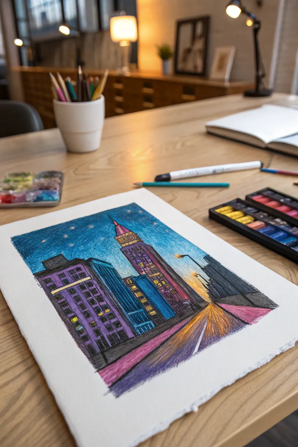
Capture the moody glow of a city at twilight with this vibrant crayon and pastel drawing. You’ll layer rich blues, purples, and oranges to create depth and atmosphere on a textured paper surface.
Step-by-Step
Materials
- Heavyweight textured drawing paper or watercolor paper
- Set of oil pastels or high-pigment wax crayons
- Graphite pencil (HB or 2B)
- Ruler (optional)
- Tissue or blending stump
- Artist tape (for securing paper)
- Fixative spray (optional)
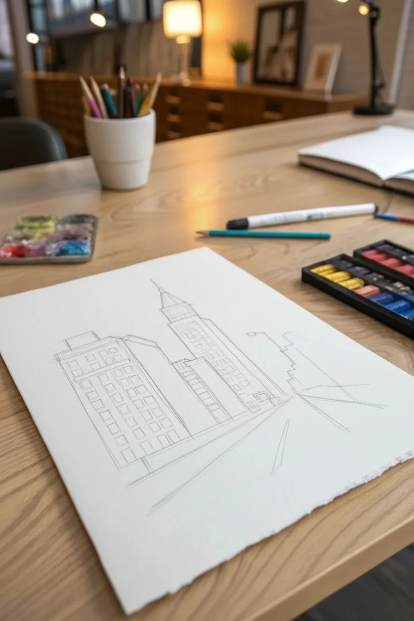
Step 1: Sketching the Bones
-
Establish the horizon:
Begin by lightly sketching a horizon line about one-third of the way up from the bottom of your paper. This will be where your street meets the distant sky. -
Draft the perspective lines:
Draw the street converging towards a single vanishing point near the center of your horizon line. The street should be wider at the bottom edge of the paper and narrow as it recedes. -
Outline the main buildings:
Sketch three main vertical blocks: a large rectangular building on the left, a taller skyscraper with a tapered spire in the center, and a darker, shadowy mass on the right. -
Add architectural details:
Lightly pencil in rows of windows on the left building and the horizontal bands on the central skyscraper. Keep these loose; precision isn’t necessary for this impressionistic style.
Tip: Keep It Rough
Don’t over-blend! The charm of this style comes from the visible strokes and ‘broken color’ where the paper texture shows through the crayon layers.
Step 2: Layering the Sky and Background
-
Create the sunset glow:
Using a yellow or pale orange pastel, color the area right above the horizon line where the street ends. Blend this upward slightly into a soft peach tone. -
Start the night sky:
Fill the upper sky with a medium blue crayon. Apply light pressure at first, leaving some of the paper’s white tooth visible for texture. -
Deepen the atmosphere:
Layer a darker indigo or deep violet over the top corners of the sky to create a vignette effect. I find blending the transition between the dark blue and the sunset glow with a clean fingertip helps smooth the gradient. -
Add starlight:
With a sharp yellow or white stick, press firmly to add small dots scattered across the darker blue sections for stars.
Step 3: Coloring the Architecture
-
Base coat the left building:
Color the large building on the left with a rich purple. Leave the window rectangles uncolored or fill them lightly with yellow to suggest interior light. -
Define the blue structure:
For the building nestled between the purple one and the skyscraper, use a cool teal or cyan. Apply vertical strokes to emphasize its height. -
render the central skyscraper:
Use pinks and magentas for the main body of the tall tower. Add golden yellow bands near the top and on the spire to reflect the city lights. -
Shadow the right side:
Fill the building mass on the right with dark grey or black. This silhouette frames the scene and directs focus to the glowing center. -
Intensify window lights:
Go back over the windows with a heavy application of bright yellow or neon orange. Press hard so the color pops against the dark building facades.
Trouble: Muddy Colors?
If your colors are turning grey or brown, you might be overworking the layers. Stop, scrape off excess wax gently, and apply a fresh, bright layer on top.
Step 4: The Street and Final Details
-
Color the roadway:
Fill the street area with strokes radiating from the vanishing point. Use a mix of dark purple for shadows and orange/yellow in the center to show reflected light. -
Add the sidewalk perspective:
Draw defined pink or reddish distinct lines along the edges of the street to represent the curb and sidewalk, reinforcing the perspective. -
Enhance contrast:
Use a black crayon to outline the buildings and darken the shadowed sides of the structures. This step separates the forms and makes the colors vibrant. -
Final texture check:
Look for areas where the paper shows through too much. If needed, scumble (lightly scribble) over these spots with a coordinating color to unify the texture without losing the gritty look. -
Clean up edges:
Use a white crayon or opaque pastel to add a single bright lane marker line on the street, leading the eye directly into the drawing.
Now you have a dynamic, glowing cityscape ready to display or gift to a friend
Abstract Crayon Mosaic With Unexpected Color Pairings
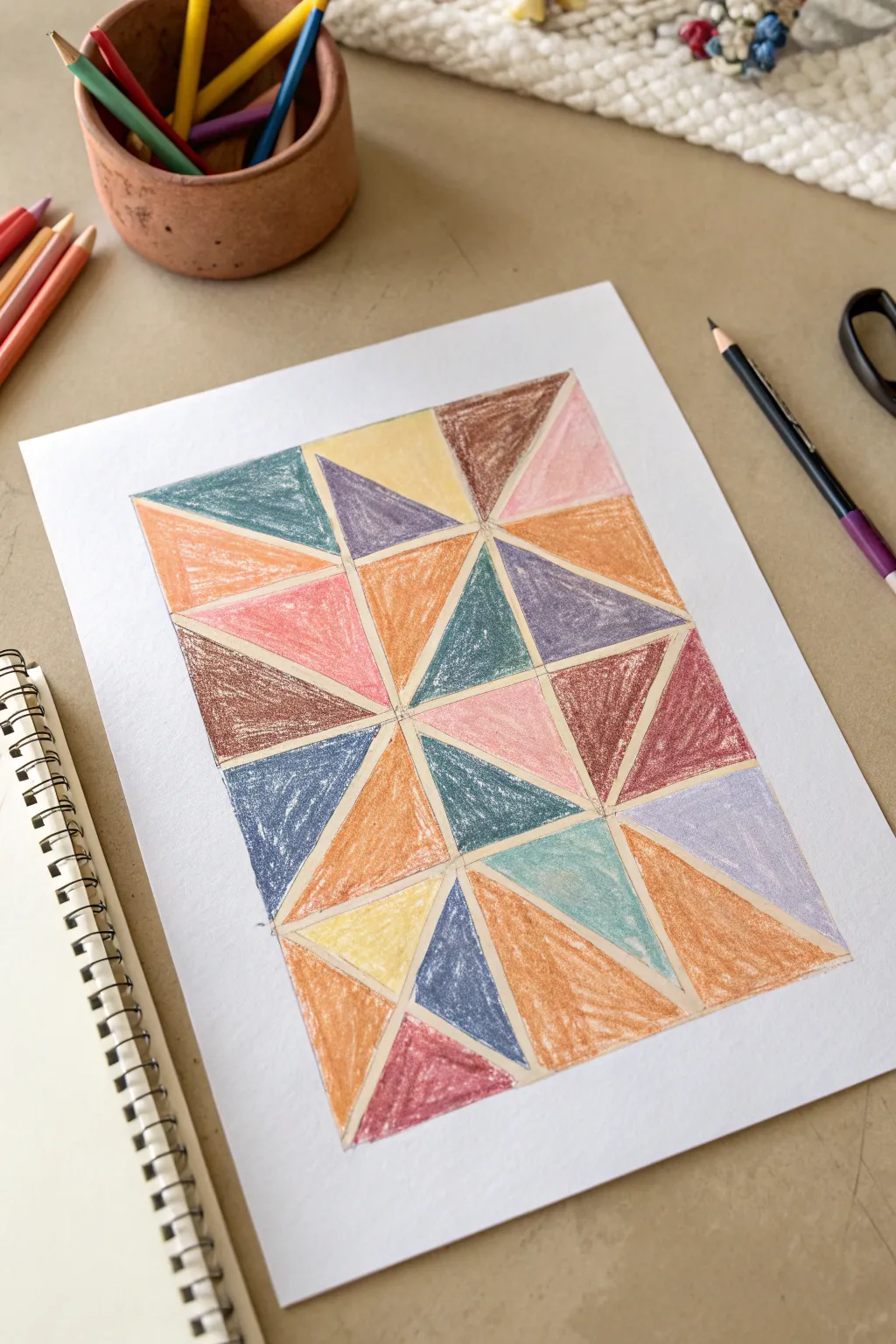
Turn simple crayons into a sophisticated piece of modern art with this geometric mosaic exercise. By breaking a rectangle into triangles and filling them with unexpected color pairings, you’ll create a vibrant, quilt-like pattern that pops off the page.
Step-by-Step Tutorial
Materials
- White drawing paper (heavyweight or cardstock)
- Ruler or straight edge
- Pencil (HB or H)
- Set of crayons (including muted and bright tones)
- Black fine-liner pen (optional, for outlining)
- Masking tape (for securing paper)
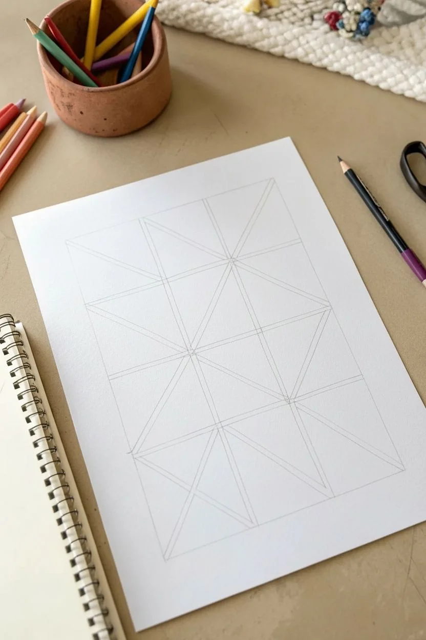
Step 1: Drafting the Grid
-
Prepare your space:
Start by taping down the corners of your paper to a smooth, hard surface. This prevents the paper from shifting while you draw your lines. -
Draw the main perimeter:
Using your ruler and pencil, lightly draw a large rectangle in the center of your paper. Leave a generous white margin around the edges to frame the artwork. -
Create vertical divisions:
Divide your large rectangle into three equal vertical columns. Draw light vertical lines from the top to the bottom edge of your rectangle to separate these sections. -
Create horizontal divisions:
Now, divide the rectangle horizontally. Since the artwork features roughly four rows, measure and mark four equal horizontal sections across your columns, creating a grid of twelve smaller rectangles. -
Draw the diagonals:
This is where the magic happens. In each small rectangular grid box, use your ruler to draw a diagonal line from corner to corner. -
Vary the direction:
Don’t draw all diagonals in the same direction. Alternate them—top-left to bottom-right in one box, then top-right to bottom-left in the next—to create a random, faceted look. -
Add secondary diagonals:
In several of the larger resulting triangles, draw lines that connect the center point of the grid to the outer corners, creating a ‘starburst’ or pinwheel effect where the corners meet.
Clean Edges Trick
Place a piece of scrap paper or a ruler over the edge of the triangle you are currently coloring. This acts as a shield, allowing you to color quickly without crossing the line.
Step 2: Coloring the Composition
-
Select your palette:
Pick out a mix of warm and cool tones. The example uses dusty pinks, slate blues, ochre yellows, burnt orange, and bright teal. -
Start with the ‘starbursts’:
Begin coloring the central points where four or more triangles meet. If you use a warm color like orange on the left, try balancing it with a cool blue on the right side of the intersection. -
Apply pressure evenly:
Fill in the first triangle using firm, even pressure. Coloring in small circular motions rather than back-and-forth strokes helps eliminate white gaps and creates a smooth texture. -
Create contrast:
As you move to an adjacent triangle, choose a color that contrasts with the one you just used. If one triangle is dark brown, make its neighbor a light pink or yellow. -
Distribute colors:
Avoid clustering one color in a single area. If you use a slate blue at the top left, try to repeat that same blue in the bottom right to balance the composition. -
Work generally top to bottom:
To avoid smudging your work with your hand, color the top row of triangles first and slowly work your way down the paper. -
Check for white spots:
Once the grid is filled, look closely at your work. Go back over any areas that look scratchy or thin to ensure the color is solid and opaque.
Step 3: Refining the Edges
-
Clean up the lines:
Use your pencil or a very sharp crayon to crisply define the edges where two colors meet. This separation makes the geometric effect much stronger. -
Leave the gutters:
Notice how the example has very faint, thin lines between shapes. You can achieve this by leaving a tiny hairline of white paper between color blocks, or defining it later with a pencil.
Texture Variation
After finishing the crayon layer, use a tissue to buff some sections for a glossy look, and gently scratch others with a toothpick to create a rough, etched texture.
Step back and admire how simple geometric planning created a complex and colorful design
Have a question or want to share your own experience? I'd love to hear from you in the comments below!