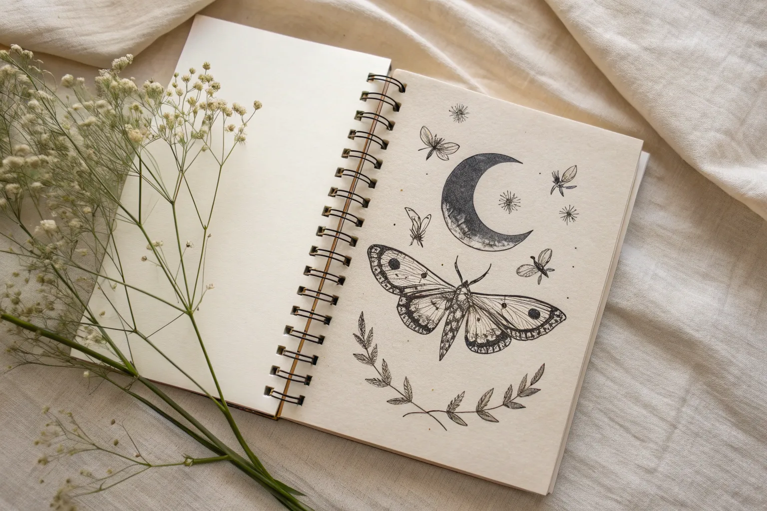
Sometimes you don’t want a “quick sketch”—you want a drawing that feels like a whole world. These big drawing ideas are all about high-impact concepts, juicy details, and compositions that fill your page with purpose.
Portrait With Botanical Overgrowth
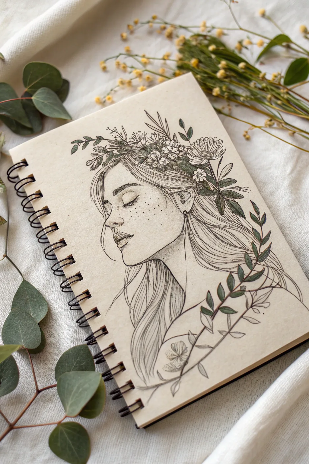
Capture the serene beauty of nature intertwined with humanity in this delicate portrait study. Using fine liners on toned paper, you will illustrate a peaceful female profile crowned with an abundant wreath of wildflowers and eucalyptus leaves.
Detailed Instructions
Materials
- Toned sketchbook (tan or cream)
- H or HB graphite pencil (for sketching)
- Kneaded eraser
- Fine liner pens (sizes 0.05, 0.1, and 0.3, black)
- Colored pencils (olive green, sage green, and white for highlights)
- White gel pen (optional)
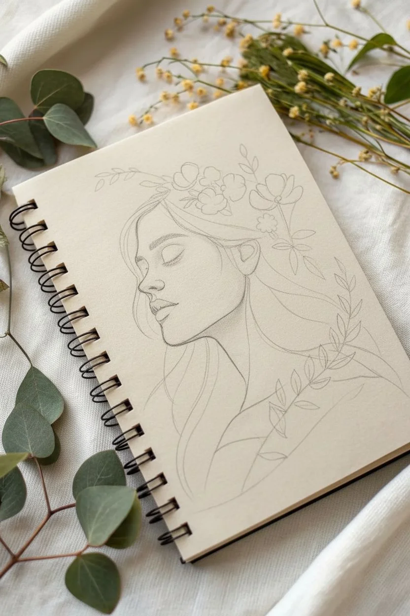
Step 1: Laying the Foundations
-
Establish the Head Shape:
Start lightly with your H pencil. Draw a loose oval for the cranial mass and a downward guiding line for the jaw. Mark the halfway point for the eye line and the thirds for the nose and mouth placement. -
Profile Contours:
Refine the profile line. Sketch a soft forehead, a gently sloped nose, and fuller lips. Pay attention to the chin’s definition; keep the lines sweeping and organic rather than rigid. -
Hair Guidelines:
Map out the flow of the hair. Instead of drawing individual strands, block in large shapes that sweep back from the forehead and down the neck, suggesting movement and volume. -
Placement of Flora:
Lightly sketch circles and ovals where the flowers will sit on the crown of the head. Add sweeping curves extending from the back of the head and the shoulder to indicate where the leafy stems will grow.
Uneven Proportions?
If the face looks ‘off,’ turn your sketchbook upside down or look at it in a mirror. This perspective shift instantly reveals symmetry errors you can fix before inking.
Step 2: Inking the Portrait
-
Facial Features:
Switch to your 0.1 fine liner. Carefully ink the eye, drawing emphasis on the upper lash line. Draw the eyebrows with short, flicking strokes to mimic hair texture. -
Refining the Profile:
Ink the nose, lips, and chin line. Keep your hand steady but allow for line weight variation—thicker on the underside of the jaw, thinner on the bridge of the nose. -
Hair Texture:
Using the 0.05 and 0.1 pens, draw long, flowing lines for the hair. Follow the shape of the skull. Allow some strands to be loose and wispy around the face for a natural look. -
Shadows and Freckles:
Add stippling (tiny dots) across the nose and cheeks to create freckles. Use denser stippling under the chin and neck to create soft shadows without harsh lines.
Step 3: Botanical Details
-
Flower Centers:
Start inking the floral crown. Begin with the centers of the daisies and wildflowers, using small loops or dots. -
Petal Work:
Draw the petals radiating outward. Use broken lines for some petals to make them look delicate and overlapping. Don’t worry if they aren’t perfect; organic imperfections add charm. -
Eucalyptus Leaves:
Ink the leaves surrounding the flowers and the branch on the shoulder. Eucalyptus leaves are often oval or lance-shaped; overlap them to create depth. -
Adding Veins:
With your finest pen (0.05), add central veins to the leaves and subtle texture lines to the flower petals. -
Shoulder Vine:
Draw the long stem wrapping across the shoulder/chest area. Add leaves growing upward and outward from this stem, varying their angles to show natural growth.
Organic Flow
Don’t stiffen your wrist when drawing hair or vines. Hold the pen slightly further back on the barrel to encourage longer, smoother, and more sweeping strokes.
Step 4: Finishing Touches
-
Erase Pencil Lines:
Once the ink is completely dry, gently roll your kneaded eraser over the entire drawing to lift the graphite guidelines. This cleans up the page instantly. -
Coloring Greenery:
Take your sage and olive green colored pencils. Lightly shade the leaves. I prefer applying more pressure at the base of the leaf and fading out toward the tip for a gradient effect. -
Deepening Shadows:
Use the 0.3 pen to darken the deepest recesses effectively—specifically behind the ear, at the nape of the neck under the hair, and in the center of the dense floral cluster. -
White Highlights:
Using a white colored pencil or a tiny touch of white gel pen, add highlights to the tip of the nose, the lip, and the edges of the foreground leaves to make them pop against the tan paper.
Now you have a serene, nature-inspired portrait that beautifully combines precise line art with organic forms


Skull With Wildflowers Above and Roots Below
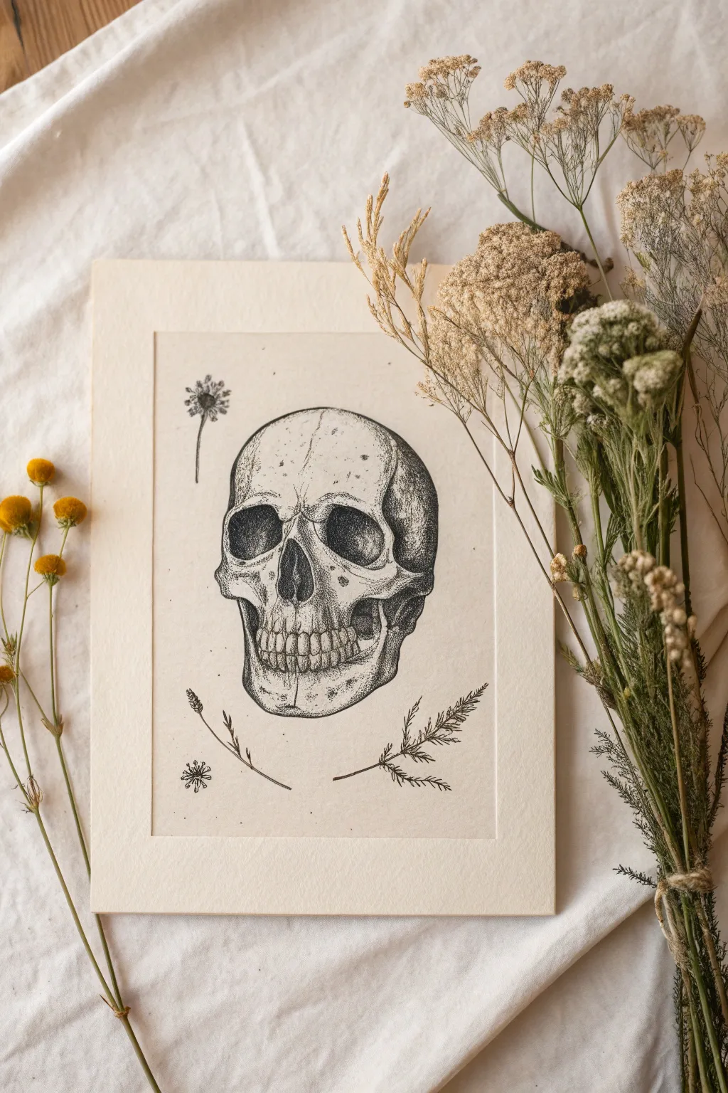
This project features a meticulously detailed human skull rendered in pen and ink, combining clean line work with rich stippling to create depth and texture. The stark black ink against cream-colored paper evokes a vintage botanical study, surrounded by delicate floating wildflowers.
Step-by-Step
Materials
- Cream-colored mixed media or bristol paper (A4 or 8×10)
- Pencil (HB or 2H)
- Kneaded eraser
- Fine liner pens (sizes 0.05, 0.1, 0.3, and 0.5)
- Ruler
- Reference photo of a skull
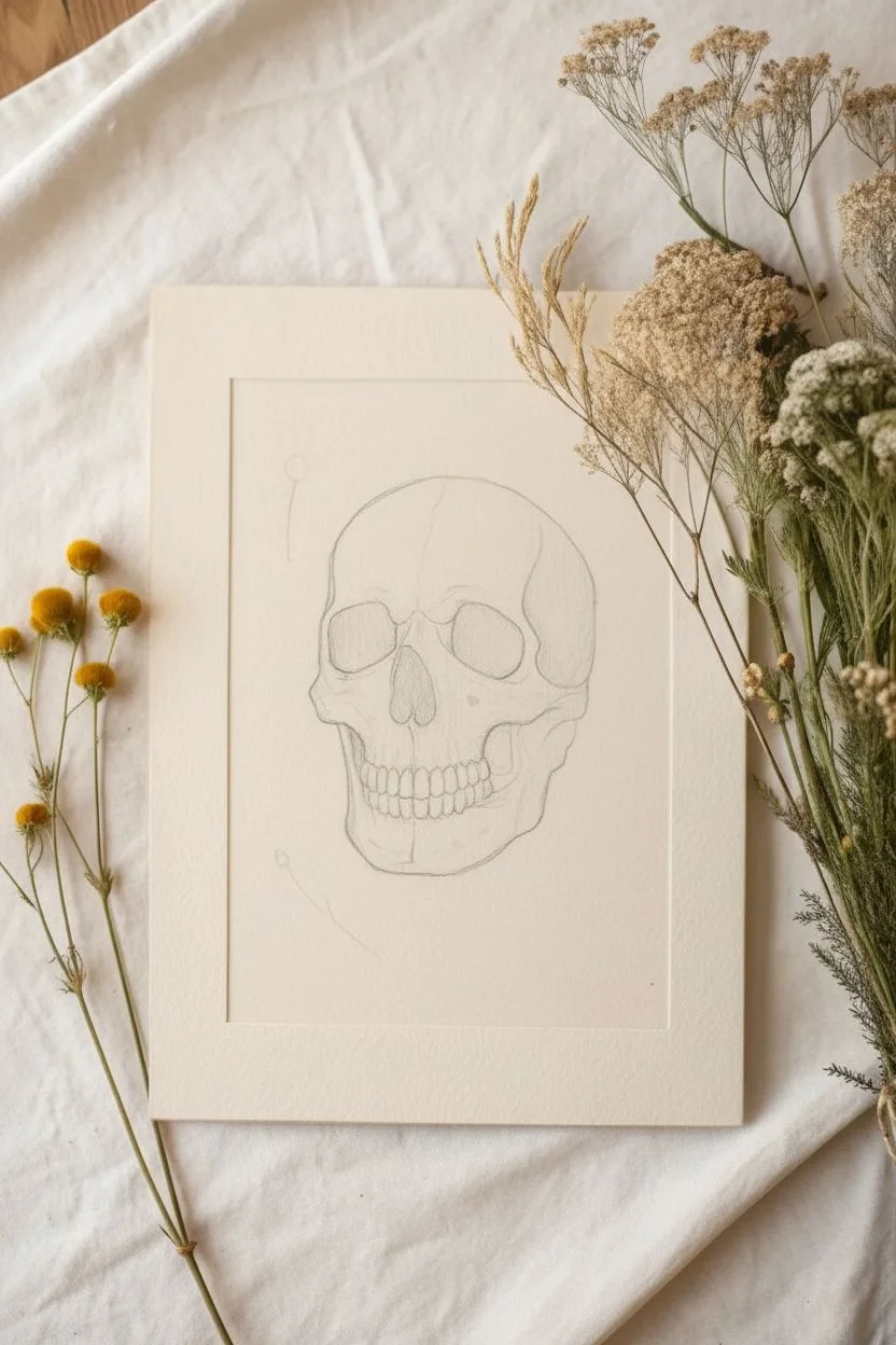
Step 1: Sketching the Framework
-
Define the borders:
Begin by measuring and drawing a rectangular border in the center of your paper using a ruler and a light pencil touch. Leave a generous margin around the outside to create a faux-matting effect directly on the page. -
Basic skull shapes:
Lightly sketch a large circle for the cranial mass in the upper center of your frame. Below that, attach a U-shaped jawline to establish the basic silhouette of the skull. -
Feature placement:
Mark the vertical center line and horizontal eye line. Sketch two large, somewhat rectangular shapes with rounded corners for the eye sockets (orbits). The nasal cavity should sit just below, shaped like an inverted heart. -
Dental details:
Sketch the maxilla (upper jaw) and mandible (lower jaw). Lightly mark vertical lines for individual teeth, observing how they curve with the jaw. Don’t press too hard, as teeth are defined by shadows, not just outlines. -
Adding botanicals:
To the left of the skull, lightly sketch a tall, thin stem with a small seed head. Below the skull, add a delicate fern frond and a small blooming stems. Keep these floating and minimal.
Step 2: Inking the Outlines
-
Main contours:
Using a 0.3 pen, carefully trace the main outline of the skull. Use broken lines in areas where the bone is smoother or hit by light to keep it from looking like a cartoon. -
Socket definition:
Use the 0.3 pen to outline the eye sockets and nasal cavity. Make the lines slightly thicker on the underside of these curves to suggest shadow weight. -
Teeth and cracks:
Switch to a 0.1 pen for the teeth. Draw the gum line and the separation between teeth, but keep the lines delicate. Add subtle wandering lines on the forehead to represent cranial sutures. -
Botanical lines:
Ink the floating plants with a 0.05 or 0.1 pen. Use short, flicking strokes for the fern leaves and seed heads to capture their feathery texture.
Ink Smudge SOS
If you smudge wet ink, don’t wipe it! Let it dry fully, then carefully scratch the ink off the paper surface with a sharp craft knife or white gel pen.
Step 3: Shading with Stippling
-
Darkest shadows:
Take a 0.5 pen to fill in the deepest black areas inside the eye sockets and the nose cavity. I like to leave tiny specks of white occasionally to suggest texture inside the bone. -
Cheekbone depth:
Switch to a 0.1 or 0.05 pen for stippling (dot work). Concentrate a dense cluster of dots under the cheekbone (zygomatic arch) to create a deep shadow that recedes backward. -
Gradient effect:
Gradually space your dots further apart as you move from the dark shadow areas towards the highlighted center of the face. This gradient creates the 3D rounded form of the bone. -
Temple shadows:
Add stippling to the temple area on the right side. The shadow should be heavy near the edge and fade as it moves toward the forehead. -
Jaw and teeth dimension:
Stipple lightly along the jawline and just under the teeth roots. This distinguishes the teeth from the jawbone without using harsh lines. -
Cranium texture:
Add very sparse dots across the forehead and top of the skull. Bone isn’t perfectly smooth, and these stray dots add realistic porosity.
Vintage Patina
Before drawing, tea-stain your paper by brushing on strong black tea and letting it dry. This gives the paper an aged, parchment-like archaeological feel.
Step 4: Final Touches
-
Botanical shading:
Add tiny clusters of dots to the bases of the leaves and flower heads you drew earlier. This grounds them and matches the style of the skull. -
Refining contrast:
Step back and assess your values. If the eye sockets look flat, darken the edges with more stippling using a 0.1 pen to smooth the transition into the solid black. -
Erase pencil:
Wait at least 15 minutes for the ink to fully cure. Gently erase all visible pencil lines, including your initial border and sketch marks. -
Border definition (Optional):
If you want the framed look to be permanent, you can lightly ink the rectangular border with a ruler and 0.1 pen, or leave it as a subtle debossed line from your pencil pressure.
Once the ink is dry, you have a striking memento mori piece perfect for framing.


Animal Portrait Built From Patterns
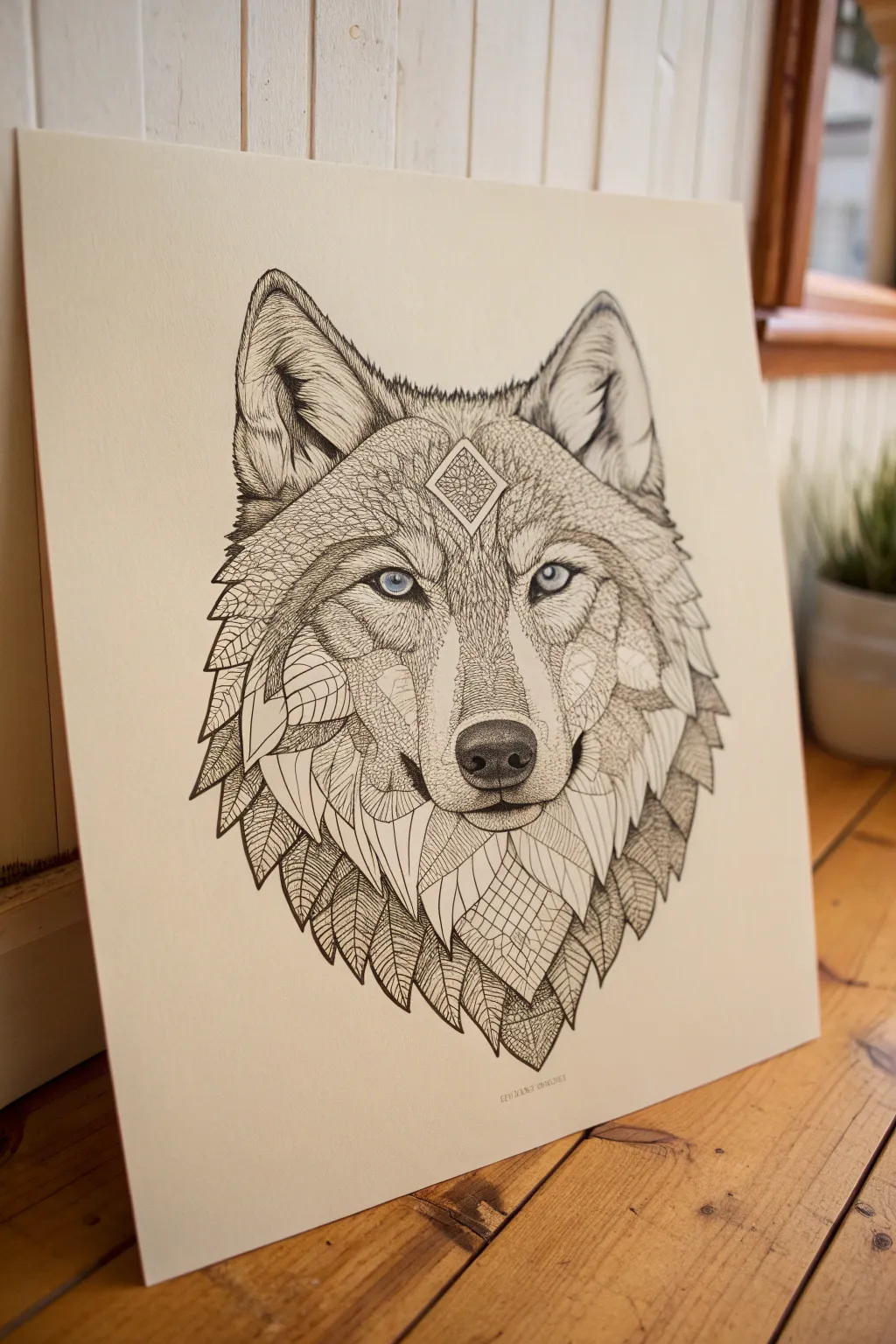
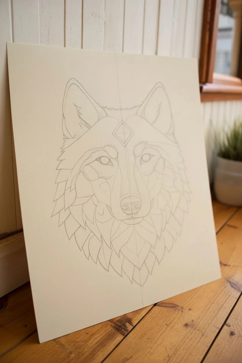
This striking wolf portrait combines the raw silhouette of nature with intricate, repetitive patterns for a mesmerizing effect. By breaking down the complex fur into manageable sections filled with leaves, lines, and geometric shapes, you create a deeply detailed illustration that looks far more difficult than it actually is.
How-To Guide
Materials
- High-quality Bristol board or smooth drawing paper (A3 size recommended)
- HB pencil and eraser
- Fine liner pens (sizes 0.05, 0.1, 0.3, and 0.5mm)
- Light blue colored pencil or watercolor marker
- Ruler
- Reference photo of a wolf
Step 1: Sketching the Framework
-
Establish the symmetry line:
Begin by lightly drawing a vertical line down the center of your paper. This guide is crucial for ensuring the wolf’s eyes and muzzle align correctly, giving you a balanced foundation. -
Block out basic shapes:
Sketch a downward-pointing triangle for the snout and nose, and two larger triangles at the top for the ears. Use the symmetry line to place two circles for the eyes evenly apart. -
Refine the silhouette:
Connect your shapes to form the outline of the wolf’s head. Don’t worry about fur texture yet; just aim for a clean, smooth contour that defines the neck ruff and cheekbones. -
Create internal sections:
Lightly map out the ‘zones’ of fur. Instead of drawing individual hairs, draw large, sweeping shapes—like elongated leaves or shards of glass—that flow in the direction the fur would naturally grow. These will be your containers for patterns. -
Add the focal point:
Draw a diamond shape perfectly centered on the forehead, just above the eyes. Add a smaller diamond inside it to create a frame effect.
Step 2: Inking the Outlines
-
Outline the main features:
Switch to a 0.5mm fine liner. carefully trace the main silhouette, the eyes, the nose, and the diamond on the forehead. Make the upper lash line of the eyes slightly thicker to add weight and intensity. -
Define the sections:
Use a 0.3mm pen to ink the internal ‘zones’ you sketched earlier. Keep these lines smooth and confident, as they act as the boundaries for your detailed filling later. -
Erase pencil guides:
Once the ink is completely dry—give it a few minutes to be safe—gently erase all your pencil lines. You should be left with a clean ‘stained glass’ style map of a wolf.
Pattern Harmony
Ensure patterns flow in the direction of real fur growth. Even though the shapes are abstract, the ‘leaves’ should point downward and outward to maintain anatomical realizm.
Step 3: Pattern Filling
-
Start with the ears:
Using a 0.1mm pen, fill the inner ear sections with fine, long lines that mimic inner ear fur. Keep the strokes swift and tapered at the ends. -
Leaf patterns on the mane:
Moving to the outer edges of the neck ruff, fill these large sections with a leaf-vein pattern. Draw a central line down the shape and add diagonal ribs. This mimics the jagged texture of wolf fur without drawing hair. -
Geometric forehead textures:
For the area around the eyes and forehead, switch to small, repetitive scales or cobblestone patterns. This tighter detail draws the viewer’s attention to the face. -
The diamond detail:
Inside the forehead diamond, draw a simple geometric lattice or cross-hatch pattern using your finest 0.05mm pen to keep it delicate. -
Texturing the snout:
Use stippling (tiny dots) on the top of the muzzle. Start with dense dots near the nose and fade them out as you move up towards the eyes. This creates a soft gradient. -
Varied neck patterns:
Fill the lower neck sections with a mix of cross-hatching and woven line patterns. I find creating contrast here helps—place a dark, dense pattern next to a lighter, more open one. -
Darken the deepest shadows:
Identify areas where shadows would fall—like under the chin or deep inside the ears. Use your 0.5mm pen to heavily cross-hatch or completely black out small areas to add depth.
Level Up: Gold Leaf
For a mystical touch, apply a small amount of gold leaf or metallic gold paint inside the diamond on the forehead or within the irises instead of blue.
Step 4: Finishing Touches
-
Detail the nose:
Fill in the nose with solid black, but leave a small, uncolored oval shape at the top to represent a highlight. This makes the nose look wet and dimensional. -
Add the eye color:
Take your light blue pencil or marker and carefully fill in the irises. Leave a tiny white speck in each pupil for the ‘catchlight’ to bring the wolf to life. -
Review and refine:
Step back from your work. If any pattern looks too light or washed out, go back in with a 0.3mm pen and thicken the separating lines to make the segments pop.
Now you have a majestic, intricately patterned guardian ready to display on your wall

City Street Perspective With Tiny Story Details
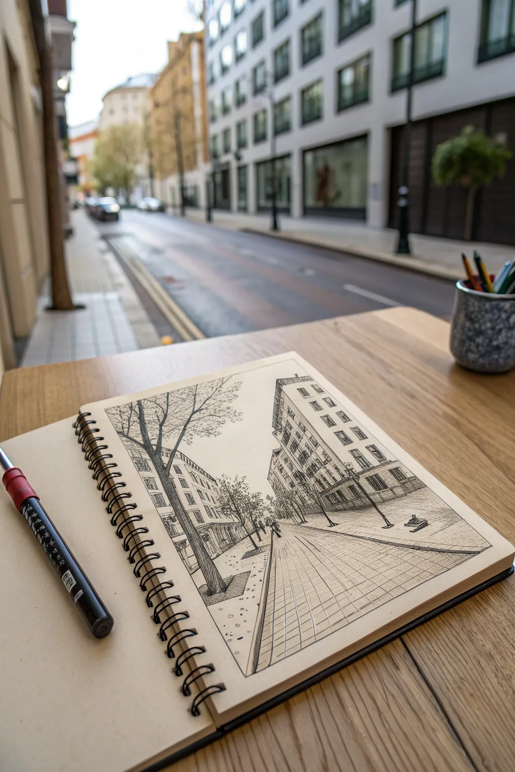
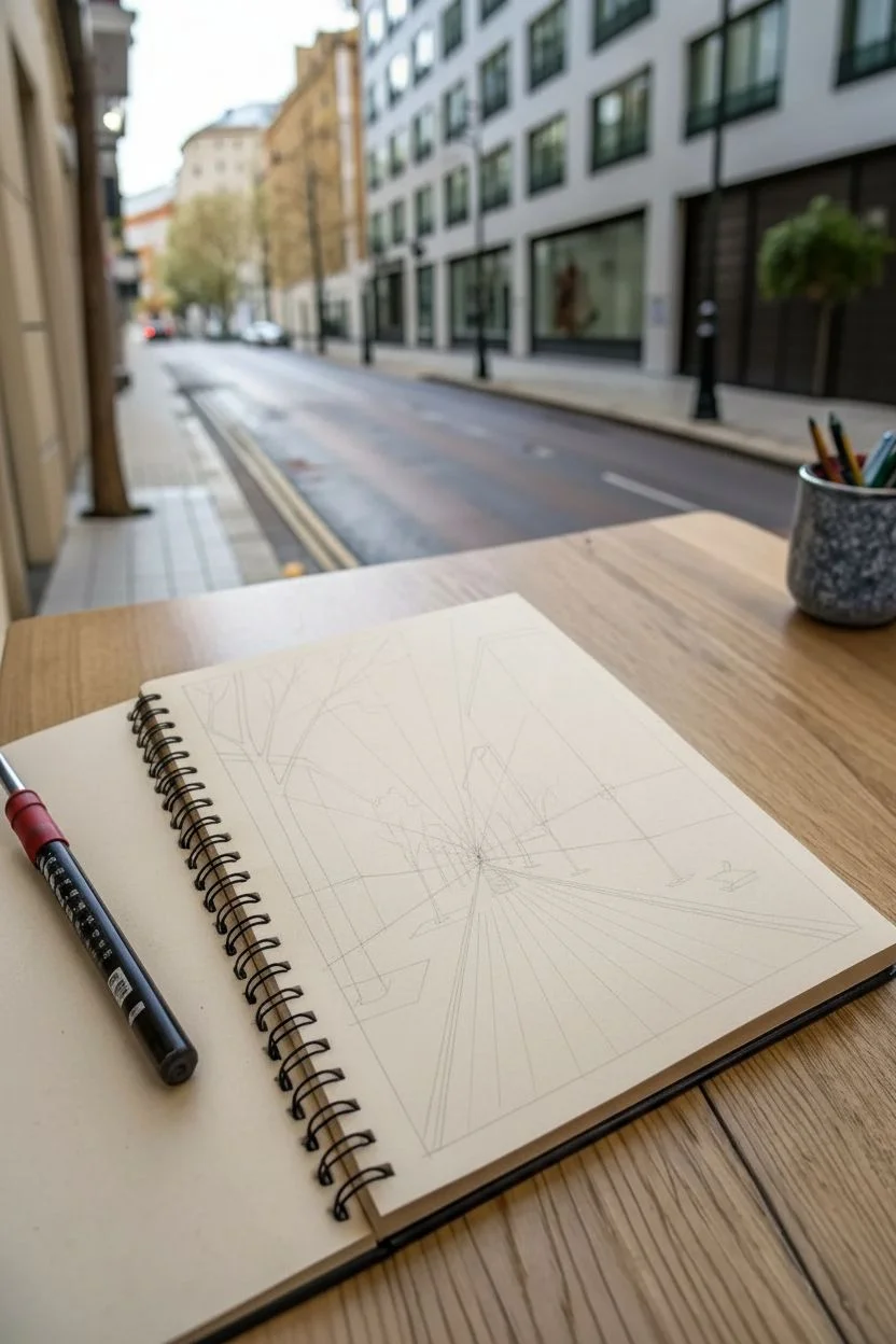
Capture the bustling energy of a city street right in your sketchbook with this detailed pen-and-ink perspective study. This project focuses on building a believable architectural scene using one-point perspective while keeping the lines loose and expressive for that authentic urban sketching feel.
Step-by-Step Tutorial
Materials
- Spiral-bound sketchbook (heavyweight mixed media or sketch paper)
- Fine liner pens (sizes 0.1, 0.3, and 0.5)
- HB graphite pencil for underdrawing
- Kneaded eraser
- Ruler or straight edge (optional, for guide lines)
- Portable stool (if sketching on location)
Step 1: Setting the Perspective Framework
-
Establish the horizon line:
Start by lightly sketching a horizontal line across the lower third of your page using your HB pencil. This represents your eye level as you sit or stand. -
Place the vanishing point:
Mark a single small dot near the center of your horizon line. In this composition, all the parallel lines of the buildings and street will converge significantly toward this single point. -
Draw converging guidelines:
From your vanishing point, draw faint diagonal lines radiating outward. These will define the tops of the buildings, the sidewalk edges, and the street curbs on both the left and right sides. -
Box in the building masses:
Block in the main shapes of the buildings using vertical lines for the walls. Ensure these vertical lines are perfectly straight up and down, perpendicular to the horizon line, to maintain structural stability.
Step 2: Inking the Structure
-
Outline the main building on the right:
Switch to a 0.5 pen to ink the silhouette of the foreground building on the right. Follow your pencil guides, emphasizing the sharp corner where the two visible faces of the building meet. -
Add window rows:
Using a 0.3 pen, draw rows of windows on the right-hand building. Remember that as the windows get closer to the vanishing point, they should appear narrower and closer together due to foreshortening. -
Detail the left side architecture:
Ink the row of buildings on the left side. These are simpler in this view, so focus on the rhythmic repetition of the rooflines and storefront awnings. -
Define the street level:
Draw the curb lines and sidewalk edges leading toward the vanishing point. I like to break the line occasionally rather than drawing a solid ruler-straight stroke, as it adds character to the pavement. -
Erase pencil guides:
Once the main ink lines are dry, gently erase the graphite under structure. This clears up the drawing before we add the finer textures.
Loose Lines
Don’t worry about perfectly straight lines. A slightly wobbly or broken line actually adds more energy and life to an urban sketch than a ruler-perfect one.
Step 3: Adding Life and Texture
-
Draw the foreground tree:
Using a 0.5 pen, draw the large tree trunk on the left foreground. Use jagged, organic vertical strokes to suggest bark texture, and spread the branches outward into the sky area. -
Render the tree canopy:
Switch to a 0.1 pen for the smaller branches and leaves. Instead of drawing individual leaves, use quick, scribbly loops and dots to suggest the volume of the foliage against the sky. -
Add distant trees:
Sketch smaller, less detailed trees further down the street. These should be significantly smaller than the foreground tree to reinforce the sense of depth. -
Create pavement texture:
Use the 0.1 pen to draw a grid pattern on the sidewalk. Keep the horizontal lines wider apart in the foreground and extremely close together as they recede into the distance. -
Hatch the shadows:
Identify a light source (the sun coming from the top left, perhaps) and add diagonal hatching to the shadowed sides of the buildings using a 0.1 pen. Cross-hatch darker areas under awnings or deep doorways. -
Populate the scene:
Add tiny, silhouette-like figures walking on the sidewalk. Keep them simple—just small shapes representing heads and torsos—to give the street scale without needing facial details. -
Final contrast adjustments:
Take a step back and look at your contrast. Use the thickest pen (0.5) to darken the closest elements, like the bottom of the foreground tree and the nearest curb, to pull them forward visually.
Watercolour wash
Once the ink is fully waterproof and dry, add a wash of diluted grey watercolor over the street and building shadows to add atmospheric depth.
Start with these perspective basics and soon you will be capturing complex cityscapes with confidence
BRUSH GUIDE
The Right Brush for Every Stroke
From clean lines to bold texture — master brush choice, stroke control, and essential techniques.
Explore the Full Guide
Giant Tree With a Miniature World in Its Roots
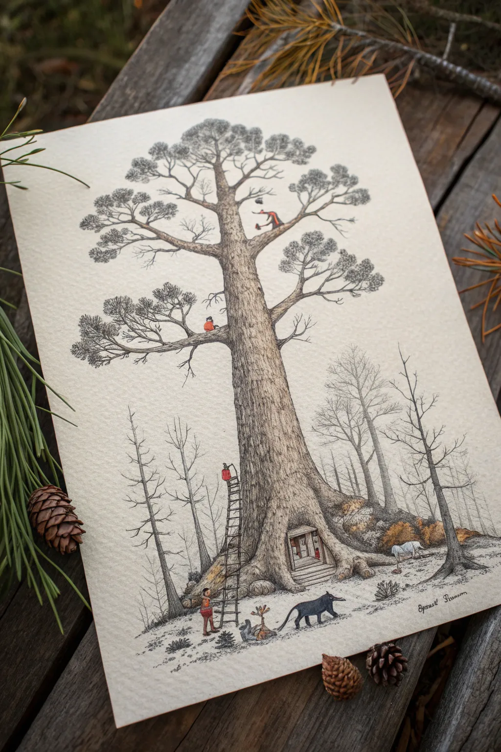
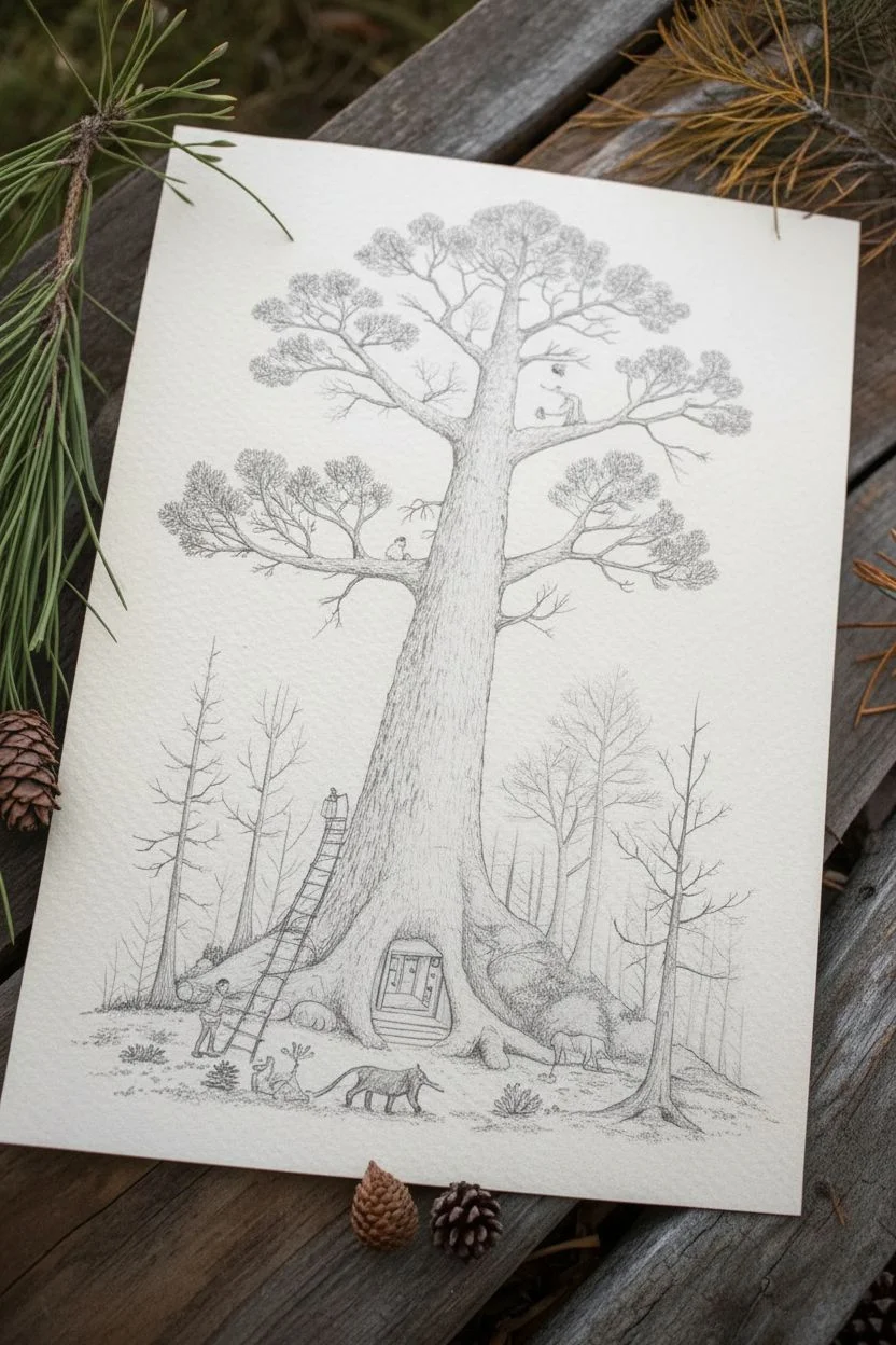
This whimsical illustration combines intricate pen work with subtle washes to create a fantasy scene where a massive pine tree hosts a tiny civilization. You’ll build up texture with fine lines and add character with delicate, miniature details.
Step-by-Step
Materials
- Heavyweight hot-press watercolor paper (smooth texture)
- Fine liner pens (sizes 0.05, 0.1, 0.3, and 0.5) in black or sepia
- Watercolor paints (Payne’s Gray, Burnt Umber, Yellow Ochre, Burnt Sienna, Vermilion)
- Round watercolor brushes (sizes 2 and 4)
- HB Pencil
- Kneaded eraser
Step 1: Sketching the Giant
-
Establish the Trunk:
Begin with your HB pencil, drawing the massive trunk slightly off-center. Make the base exceptionally wide and sloping, tapering gently as it rises past the midpoint of the paper. -
Root Structure:
Sketch the root system flaring out at the bottom. Instead of standard roots, shape the central root flare into an arched doorway and create distinct mounds on either side that suggest hidden burrows. -
Adding Branches:
Draw the main branches starting high up on the trunk. Keep them somewhat horizontal but jagged, characteristic of grand old pine trees, with clusters of pine needles at the tips. -
Population the World:
Lightly sketch the narrative elements: a tall ladder leaning against the trunk on the left, tiny figures on the branches, and a fox-like creature near the base. Keep these very simple for now. -
Background Elements:
Add faint vertical lines in the background to suggest a distant, misty forest of bare trees. These should be much thinner than your hero tree.
Step 2: Inking the Details
-
Bark Texture – Base:
Using a 0.1 pen, start at the base of the tree. Create the bark texture using short, vertical, broken lines. Make the lines denser on the shaded side (usually the right) to create volume. -
Bark Texture – definition:
Switch to a 0.3 pen to deepen the cracks in the bark. I find it helpful to follow the contour of the cylinder, curving your strokes slightly around the trunk to emphasize its roundness. -
Needle Clusters:
For the pine foliage, use the 0.05 pen. Use a stippling technique or very tiny, tight scribbles to create the dense, dark masses of the pine needles. Don’t draw individual needles; draw the shapes of the clusters. -
Inking the Tiny World:
Carefully outline the ladder, the tiny door in the roots, and the figures with your 0.1 pen. Be precise here—these small details tell the story. -
Background Trees:
Ink the background trees with the finest 0.05 pen using a lighter touch. Broken lines work best here to push them into the distance.
Pro Tip: Line Variation
Hold your pen differently for different textures. Vertical grip gives sharp lines for the ladder; a slanted grip creates skipping, organic lines perfect for rough bark.
Step 3: Adding Atmosphere
-
Initial Wash:
Mix a very watery Payne’s Gray. Paint a light wash over the shadowed side of the tree trunk and the underside of the branches to establish form. -
Ground coloring:
Apply a diluted wash of Burnt Umber and Yellow Ochre to the mounds of earth at the base of the tree, letting the colors bleed slightly into each other for a natural look. -
Pop of Color:
Once the paper is dry, use a small size 2 brush to add Vermilion or Burnt Sienna to the tiny figures’ clothing and the fox. This small splash of red draws the eye immediately. -
Defining the Doorway:
Paint the interior of the root-doorway with a darker mix of Burnt Umber to create depth, making it look like a cozy, hollow space. -
Shadows and Grounding:
Add cast shadows underneath the fox, the ladder, and the root flares using a translucent gray wash. This connects the objects to the ground so they don’t look like they are floating. -
Final Texturing:
After the paint is bone dry, go back in with your 0.05 pen to add any final texture details that might have been lost under the wash, particularly in the darkest crevices of the bark.
Level Up: Hidden details
Hide extra Easter eggs in the tree! Try adding a tiny tire swing, a lantern hanging from a branch, or a squirrel peering out of a knothole to reward close viewing.
Step back and admire the tiny story you’ve woven into the bark of your giant tree
Mandala That Evolves Into Nature Motifs
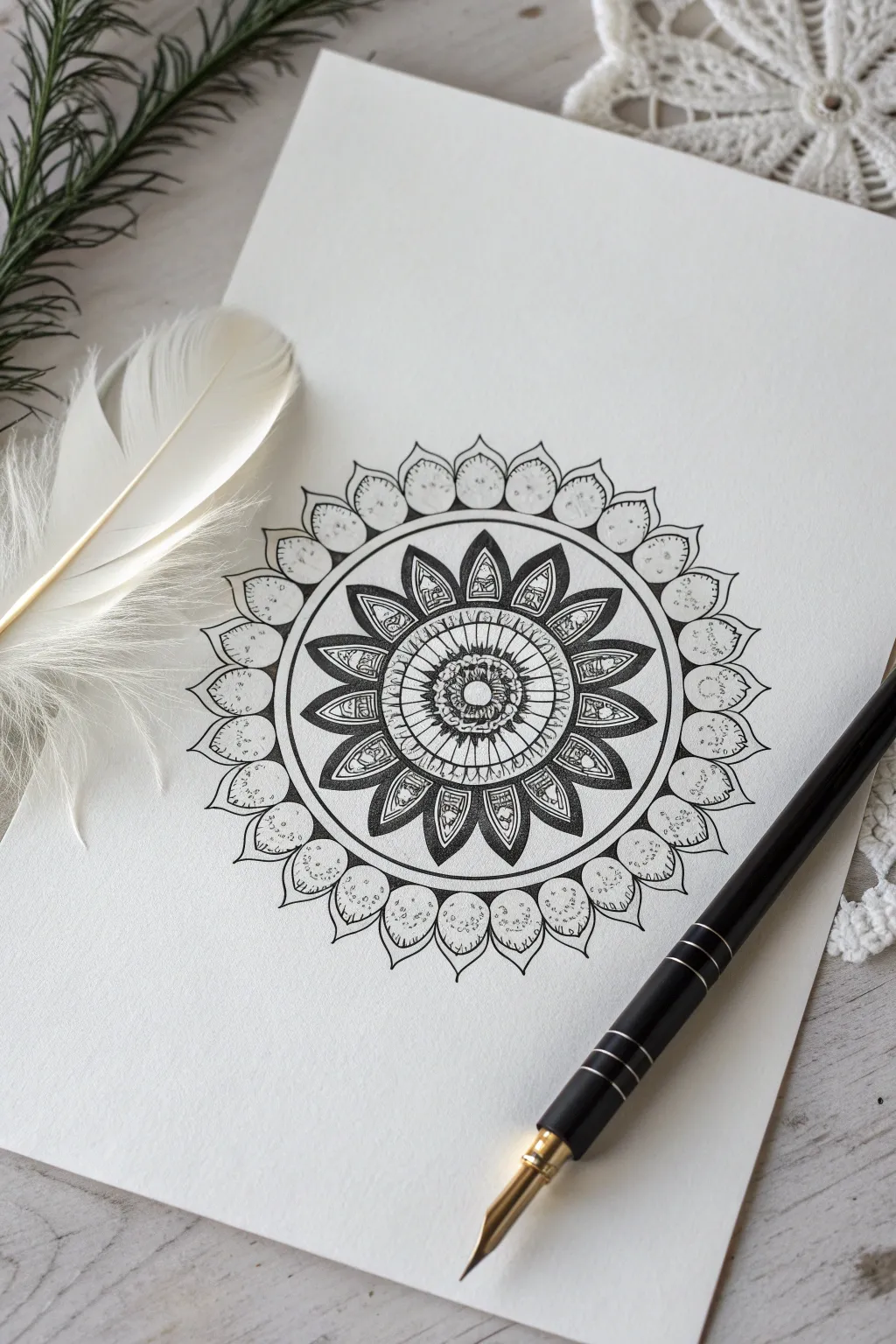
This intricate mandala captures the delicate balance between geometric precision and organic flow, resembling a sunburst or a stylized flower. Using fine liners to build layers of pattern, you’ll create a mesmerizing focal point that draws the eye inward.
How-To Guide
Materials
- Smooth white bristol or heavy drawing paper
- Fine liner pens (sizes 005, 01, 03, and 05)
- Pencil (HB or 2H)
- Compass
- Protractor
- Eraser
- Ruler
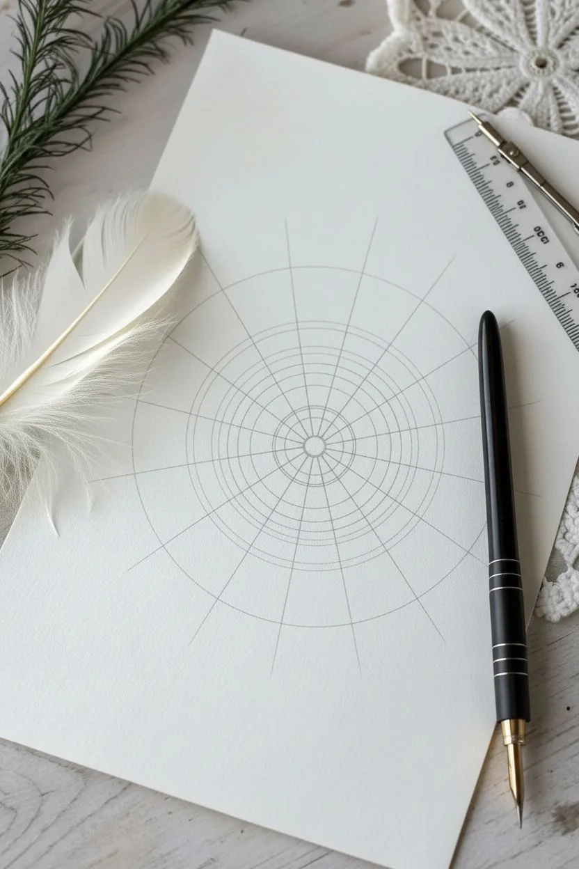
Step 1: Setting the Structure
-
Find center:
Begin by marking the absolute center of your paper. This single point will anchor the entire design, so take a moment to measure carefully from all edges. -
Draw guide circles:
Using a compass and a very light pencil touch, draw a series of concentric circles starting from the center. Create a small central circle (about 1 cm radius), then add four progressively larger circles, leaving varying gaps between them for different pattern layers. -
Establish floral perimeter:
Draw the largest, outermost circle which will define the boundary of the petal ring. Ensure this outer circle is significantly larger than the inner core to allow breathing room for the design. -
Mark radial divisions:
Use a protractor to divide your circle into equal segments. For this design, aim for 16 or 24 equal sections. Draw light straight lines through the center to the edge to create your grid.
Step 2: The Inner Core
-
Center seed:
Switch to an 03 pen. In the very center circle, draw a bold outline. Inside it, stipple tiny dots or draw a small ‘seed’ circle to create a textured focal point. -
First petal ring:
Around the central seed, on the first guide circle line, draw small, tight U-shapes or scallop shapes. Keep them uniform and touching side-by-side. -
Radiating lines:
In the next band outward, draw straight lines radiating from the center, following your pencil grid. Connect these with curved lines to create a ‘web’ or wheel-spoke effect. -
Detailed shading:
Using your finest 005 pen, add hatching lines inside this wheel section. I like to focus the shading near the center, letting it fade outward to create depth.
Grid Tricks
Don’t press hard with the compass! If the center hole gets too big, put a small piece of masking tape over the center point before you start circling.
Step 3: The Bold Floral Ring
-
Pointed petals:
Moving to the prominent middle band, draw large, pointed petal shapes. The tip of each petal should touch the next guide circle, and the base should sit on the previous one. -
Double outlining:
Take an 05 pen to thicken the outline of these pointed petals. This bold contrast is crucial for separating the ‘flower’ from the background pattern. -
Internal details:
Inside each large pointed petal, draw a smaller, parallel petal shape. Fill the space between the inner and outer lines with solid black ink or dense hatching for a striking look. -
Texture filling:
In the very center of these dark petals, use a thinner pen to draw tiny geometric motifs—like a small stack of squares or circles—to mimic veins or pollen.
Go Gold
Once the black ink is dry, use a metallic gold gel pen to add tiny accent dots inside the dark, filled-in areas for a luxurious, illuminated manuscript vibe.
Step 4: The Outer Canopy
-
Outer rounded petals:
On the outermost ring, draw wide, rounded petal shapes that connect the tips of the pointed interior petals. These should look like soft leaves wrapping around the design. -
Refining the shape:
Add a small point or ‘acumen’ to the top of each rounded petal to give it a classic lotus leaf appearance. -
Stippling texture:
This is the meditative part. Using an 01 pen, fill these outer petals with stippling (tiny dots). Start densely at the base of the petal and disperse the dots as you move toward the tip. -
Final border:
Go over the outermost edge of the entire design with your thickest pen to create a definite, clean container for the mandala. -
Clean up:
Wait at least 15 minutes for the ink to cure completely. Gently erase all pencil grid lines and circles to reveal the crisp black-and-white contrast.
Step back and admire the rhythmic symmetry you have created on the page

PENCIL GUIDE
Understanding Pencil Grades from H to B
From first sketch to finished drawing — learn pencil grades, line control, and shading techniques.
Explore the Full Guide
Hands Holding a Scene Like a Snow Globe
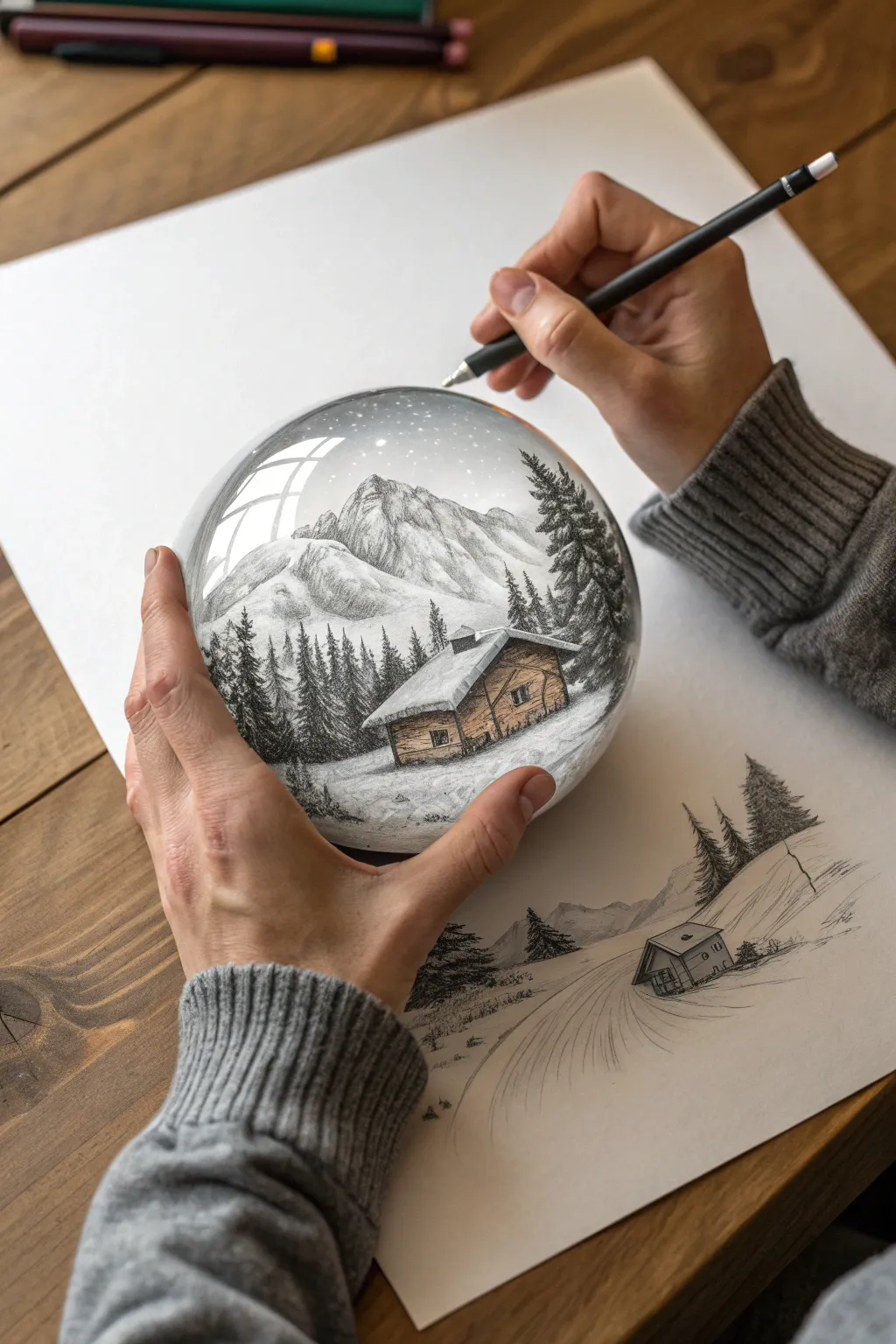
This striking optical illusion project transforms a flat drawing into a three-dimensional crystal ball held right in your hands. Using shading values and anamorphic perspective, you’ll create a magical winter scene that seems to pop off the page.
Step-by-Step Guide
Materials
- High-quality white drawing paper (smooth bristol or mixed media)
- Graphite pencils (HB, 2B, 4B, 6B)
- Black fine-liner pen (0.1mm or 0.3mm)
- White gel pen or white gouache
- Blending stump (tortillon) or cotton swatch
- Circular stencil or compass
- Ruler
- Reference photo of hands (optional)
Step 1: Setting the Stage
-
Basic layout:
Begin by positioning a large circle in the center of your paper using a compass or a bowl. This will be the boundary of your ‘crystal ball’. Lightly sketch the outline of two hands holding this sphere—one cupping it from below and one hovering with a pencil above—to establish the meta-drawing framework. -
Drafting the background:
Below the sphere, lightly sketch a simplified version of a snowy path and trees fading into the distance. This helps anchor the sphere in a perceived space on the flat paper surface. -
Sphere contents:
Inside your circle, sketch the main composition: a cozy wooden cabin in the foreground, tall pine trees flanking the sides, and majestic mountain peaks rising in the background. Keep your lines light; we are just mapping shapes.
Sphere Shaping Tip
When drawing trees or buildings near the edge of the circle, warp them slightly inward. This distortion mimics the refraction of a real glass ball.
Step 2: Rendering the Landscape
-
Mountain textures:
Establish the mountains using a 2B pencil. Use jagged, uneven shading strokes to mimic rocky cliffs. Leave the tops and certain slopes pure white to represent snow caps. -
Forest depth:
Switch to a 4B pencil for the pine trees. Use short, dense, vertical strokes to create the pine needles. Make the trees closest to the front darker and more detailed, while letting the distant trees remain slightly lighter and softer. -
Cabin details:
Draw the cabin with precision. Use horizontal lines for the timber logs and darker shading under the eaves to create depth. I find that deepening the shadows under the roof really makes the snow on top look thick and heavy. -
Atmospheric blending:
Use a blending stump to gently smudge the sky area inside the top of the sphere, creating a soft, overcast winter atmosphere. Keep this tone very light gray.
Step 3: Creating the Glass Effect
-
Defining the curve:
To make the circle look spherical, shade the outer edges of the landscape slightly darker and curve your horizontal lines (like the ground) slightly downward at the edges. This mimics the refraction of a lens. -
Adding highlights:
This is crucial for the glass text. Erase or leave distinct, curved rectangular shapes near the top left of the sphere. These represent window reflections on the glass surface. -
Enhancing reflections:
If your paper isn’t bright enough, use a white gel pen or gouache to paint crisp, bright white borders on those window reflection shapes. Their sharp edges convince the eye that the surface is hard and shiny. -
The shadow base:
Use your 6B pencil to create a deep, dark shadow directly underneath the sphere, where it physically meets the ‘hand’ and the paper. This contact shadow grounds the object.
Level Up: Color Splash
Use colored pencils very faintly on just the cabin logs (warm brown) and the trees (muted green) inside the sphere, leaving the rest monochrome.
Step 4: Drawing the Hands (The Meta-Layer)
-
Hand structure:
Refine the outlines of the hands holding the sphere. Pay attention to the knuckles and wrinkles where the fingers bend. The hand holding the pencil needs to look active and engaged. -
Skin tone and shading:
Shade the skin using soft, multi-directional hatching with an HB pencil. Focus on the shadows between fingers and the palm creases. Keep the shading smoother than the landscape textures. -
Clothing texture:
Draw the sweater sleeve on the drawing arm. Use repetitive, looped strokes to mimic a knitted fabric texture. The contrast between the rough wool texture and the smooth skin adds realism. -
The pencil prop:
Draw the pencil in the hand with sharp, straight lines. add a distinct shadow casting from the pencil onto the sphere’s surface to emphasize that it is hovering above the artwork.
Step 5: Final Illusion Touches
-
Snowfall:
Dot the inside of the sphere with a white gel pen to create falling snow. Add more dots over the dark trees where they will show up best. -
Deepening contrast:
Go back with your black fine-liner or darkest pencil and deepen the darkest cracks in the cabin wood and the deepest parts of the pine trees. High contrast is key to making the sphere look contained. -
Background fade:
Ensure the sketch on the flat paper (outside the sphere) looks unfinished and faint compared to the vibrant detail inside the sphere. This difference creates the magical focal point.
Step back and admire how flat graphite lines have transformed into a heavy, captivating world held in your hands
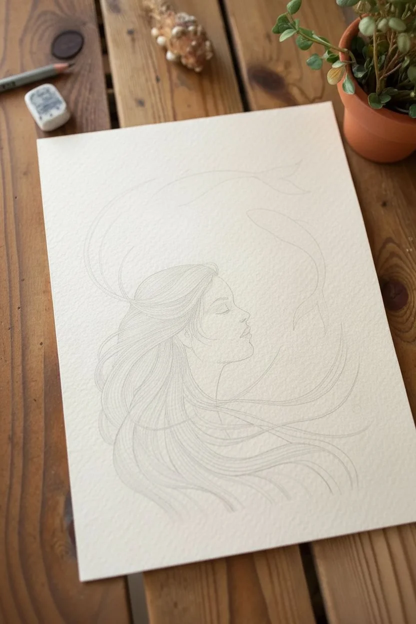
Koi Fish Swimming Through Flowing Hair
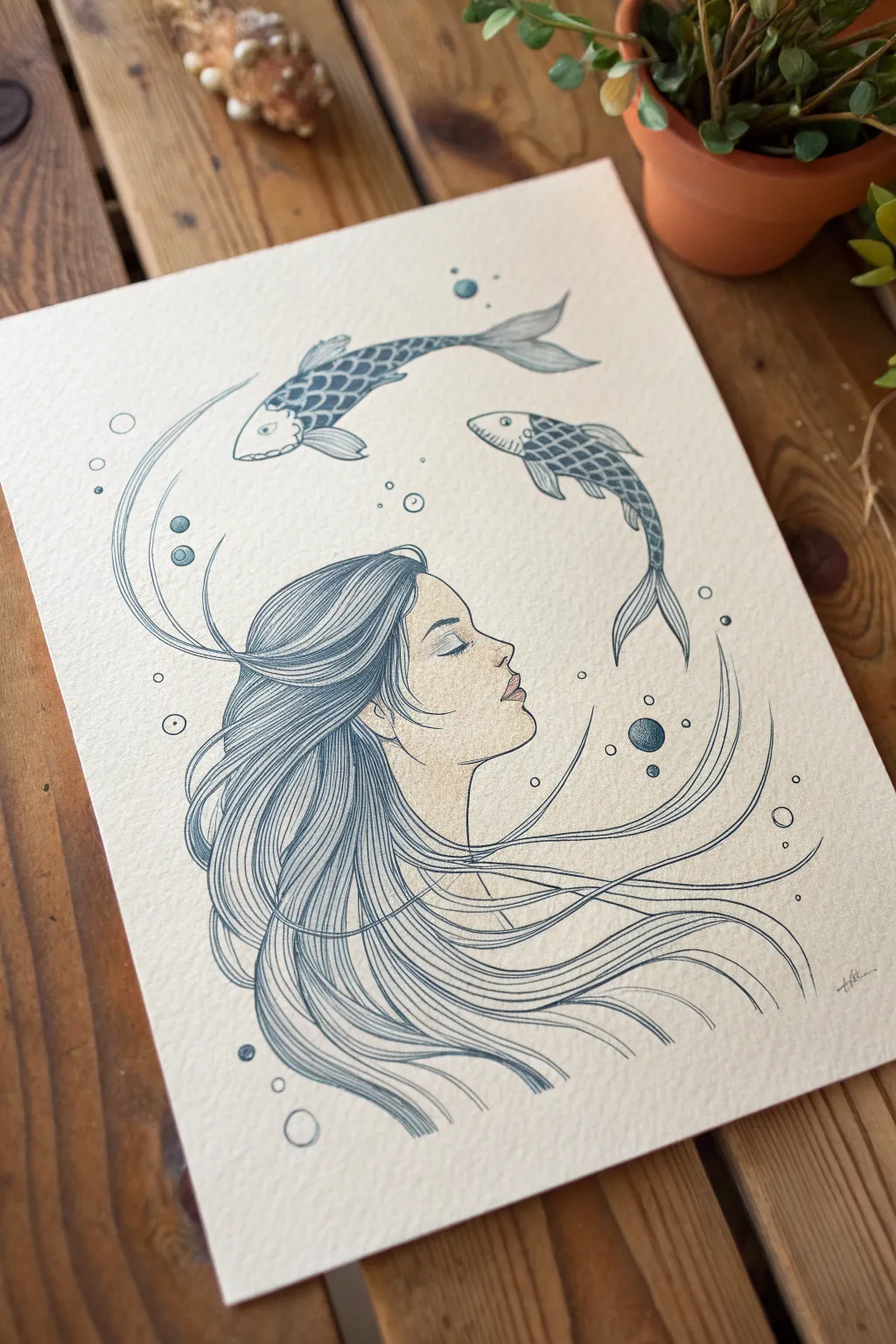
This serene illustration merges portraiture with fluid nature elements, featuring a profiled face whose hair transforms into water currents for swimming koi. With its delicate linework and textured paper, it captures a dreamlike quality perfect for practicing continuous line flow and subtle shading.
Step-by-Step Guide
Materials
- Cold press watercolor paper or heavy mixed-media paper (textured)
- Fine liner pens (0.1, 0.3, and 0.5 sizes) in dark blue-grey or slate
- Pencil (HB or 2H for sketching)
- Kneaded eraser
- Watercolor paints or colored pencils (flesh tone, soft pink)
- Small round paintbrush (if using watercolor)
- White gel pen (optional for highlights)
Step 1: Sketching the Composition
-
Map out the anchor points:
Start by lightly marking the center of your paper. Sketch a simple oval for the head placement in the lower center, leaving plenty of negative space above for the fish. -
Draft the profile:
Refine the face shape, drawing a gentle profile view. Focus on a relaxed expression with closed eyes, a soft nose, and slightly parted lips. Keep these pencil lines extremely faint so they represent a guide rather than a final border. -
Flowing hair guidelines:
Sketch long, sweeping curves originating from the hairline. Instead of drawing individual strands immediately, draw large ‘ribbons’ of movement that sweep backward and upward, mimicking the flow of water currents. -
Positioning the Koi:
Place two kidney-bean shapes in the upper negative space to represent the fish bodies. One should curve creating an arc above the forehead, and the other should dive slightly downwards near the back of the head.
Step 2: Inking the Portrait
-
Outline the face:
Using your 0.1 fine liner, carefully trace the profile. Use a confident, single stroke for the nose and chin to avoid feathering. Add delicate details for the eyelashes and the nostril. -
Detail the ear and jaw:
Ink the jawline, stopping before it meets the neck to keep the look ethereal. Add the simple curves of the ear, tucked partially behind where the hair will begin. -
Adding subtle color:
Before doing heavy inking on the hair, apply a very light wash of flesh-tone watercolor (or soft colored pencil) to the face. Add a tiny touch of pink to the lips and cheek. Let this dry completely before continuing with ink.
Uneven Ink Flow?
If your long hair lines look shaky, try drawing from your shoulder rather than your wrist. Moving your whole arm creates smoother, more confident curves than planting your hand.
Step 3: Drawing the Koi Fish
-
Outline the fish bodies:
Using a 0.3 pen, ink the outline of the fish. Give them distinct tails that flick dynamically—one pointing up, one curving down—to suggest movement. -
Add scales and fins:
Draw a grid-like pattern for the scales on the bodies. I find it helpful to draw curved diagonal lines one way, then cross them to create the diamond shapes. Add striations to the fins. -
Shading the scales:
Fill in the scales with a checkerboard or partial-fill pattern using your 0.1 pen. Leave the bellies and faces strictly white or very lightly stippled to make them look dimensional.
Level Up: Gold accents
Use metallic gold watercolor or a gold gel pen to fill every third scale on the koi fish or to outline the bubbles. This adds a magical, glimmering quality to the piece.
Step 4: Creating the Flowing Hair
-
Establish the main locks:
Switch to a 0.5 pen for the primary hair outlines. Draw long, continuous lines that sweep from the forehead and ear, distinctively curving upward at the ends like floating seaweed. -
Fill with texture:
Using a 0.1 pen, fill the space between your main hair outlines with long, parallel hatching lines. Follow the curve of the ‘ribbons’ you sketched earlier. This repetitive line work creates volume and flow. -
Connect to the environment:
Allow some hair strands to break away from the main mass, turning into single lines that act as water currents swirling around the fish. -
Darken the roots:
Add denser hatching near the roots and behind the ear to create deep shadows and contrast, making the lighter ends of the hair feel weightless.
Step 5: Atmospheric Details
-
Draw bubbles:
Scatter circles of various sizes throughout the composition, focusing on the areas where the hair curves and around the fish tails. Keep them perfectly round. -
Shade the bubbles:
Use a stippling technique (tiny dots) to shade the bottom right of each bubble, or fill them solid dark with a small white highlight left open. -
Final texture check:
Look for empty spaces in the hair that need more density. Add very fine, loose lines drifting off the main hair mass to enhance the underwater feel. -
Clean up:
Once the ink is 100% dry, gently erase all remaining pencil marks with your kneaded eraser to reveal the crisp illustration.
Step back and admire the calm, flowing movement you’ve captured in your aquatic portrait.


Underwater Coral Garden Packed With Textures
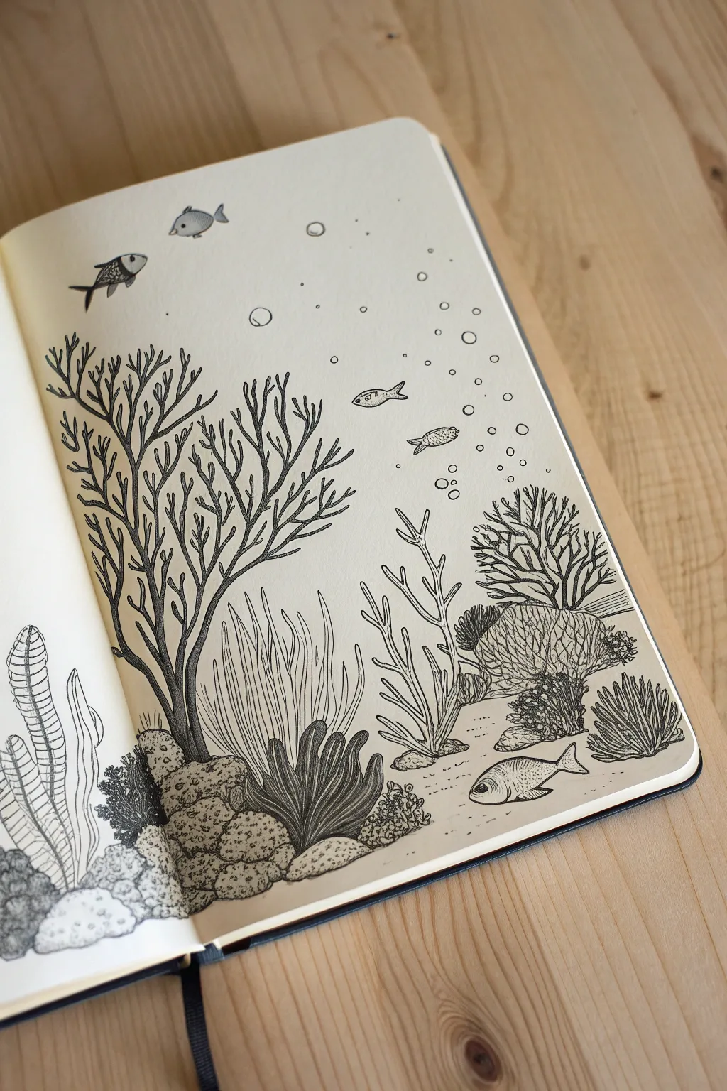
Dive into this intricate pen and ink illustration that transforms a simple sketchbook page into a bustling underwater ecosystem. By combining various line weights and repetitive mark-making techniques, you’ll build a rich, layered garden of coral and sea life without needing a drop of color.
Detailed Instructions
Materials
- Smooth sketchbook paper (160gsm or higher recommended)
- HB or 2H graphite pencil
- Kneaded eraser
- Fine liner pens (sizes 005, 01, 03, and 05)
- Ruler (optional for horizon lines)
Step 1: Sketching the Composition
-
Establish the seabed:
Begin by lightly sketching the rocky bottom of the reef. Instead of a flat line, draw clusters of rounded rocks and uneven terrain at the bottom third of the page to create a natural foundation. -
Place the main coral structures:
Lightly outline the major coral shapes. Draw a large, branching tree-like coral on the left side that reaches toward the top. On the right, sketch a mix of fan corals, brain corals (rounded mounds), and short, grassy sea plants. -
Add flowing movement:
In the center foreground, sketch long, wavy blades of seagrass or soft coral. Ensure these lines curve gently together to suggest the movement of water currents. -
Populate with sea life:
Sketch small schools of fish in the open water areas. Place a larger, bottom-dwelling fish near the seabed on the right, and a few smaller ones swimming near the surface on the left. -
Indicate bubbles:
Draw vertical trails of small circles rising from the seabed or fish to represent bubbles, adding vertical interest to the open space.
Step 2: Inking the Foreground and Rocks
-
Outline the seabed rocks:
Switch to an 03 pen to outline the rocks at the bottom. Use slightly jittery, organic lines rather than perfect circles to make them look eroded and natural. -
Texture the rocks:
Using an 01 pen, stipple (dot) the shadowed areas of the rocks. Add small cracks and crevices with short, broken lines to give them weight and rough texture. -
Detail the leafy coral:
For the dark, leafy plant in the bottom left-center, outline the shapes with your 03 pen. Then, use the 01 pen to draw fine veins running down the center of each leaf, adding density to the base for shading.
Ink Confidence
Don’t worry if lines overlap or wobble. In nature drawings, imperfections read as organic texture. A ‘mistake’ line can easily become a new branch or crack in a rock.
Step 3: Creating Texture in Corals
-
Ink the large branching coral:
Use the 03 pen for the main trunk and branches of the large tree-coral on the left. Taper the lines as the branches get thinner near the tips. -
Add wood-like grain:
Switch to your finest 005 pen. Draw long, continuous contour lines along the length of the branches to simulate a grooved texture, creating shadow on the undersides. -
Stipple the brain coral:
For the rounded brain coral on the right, draw a network of squiggly, maze-like lines. Fill the gaps between these ridges with tiny dots or hatching using an 005 pen to create depth. -
Define the sea fans:
Outline the delicate, spindly coral structures in the background with an 01 pen. Keep these lines lighter and less dense than the foreground elements to push them visually backward.
Depth Perception
To create easy atmospheric perspective, use your thickest pen (05) for closer objects and your thinnest pen (005) for background elements. This naturally pushes things back.
Step 4: Finishing Touches
-
Detail the fish:
Outline the fish with an 01 pen. Add tiny scales by drawing small ‘C’ shapes or cross-hatching on their bodies. Give them distinct eyes with a small highlight to bring them to life. -
Ink the bubble streams:
Carefully trace your bubble circles. Vary the line weight—use thicker lines for closer bubbles and very thin lines for distant ones. -
Add sand texture:
Using the 005 pen, add sparse dotting (stippling) on the seabed floor between the rocks and plants to suggest a sandy texture without decluttering the page. -
Erase and refine:
Wait at least 15 minutes for the ink to fully cure. Gently erase all pencil lines with a kneaded eraser. If any areas look too flat, go back in with the 05 pen to deepen the darkest shadows under the rocks and coral bases.
Now you have a serene underwater scene that showcases how powerful simple textures can be.
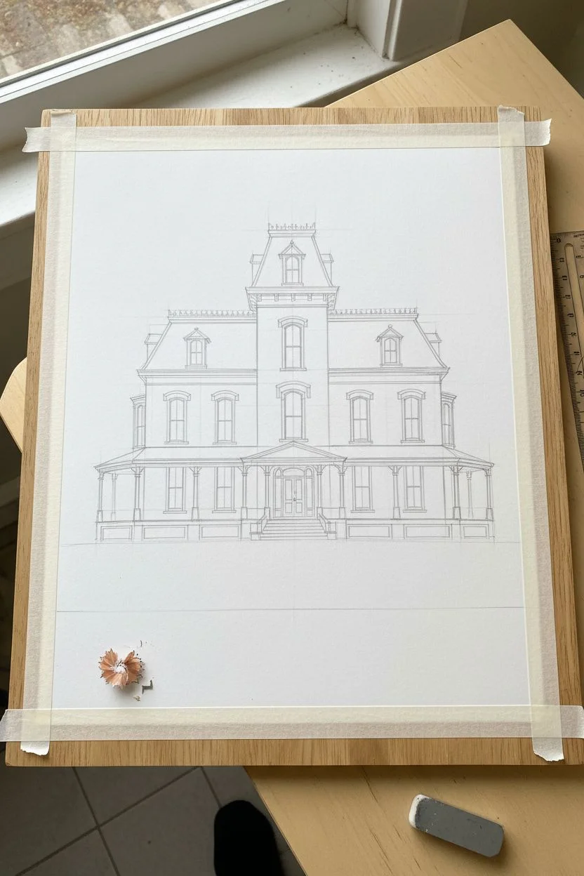
Old House Cutaway With Rooms You Can Peer Into
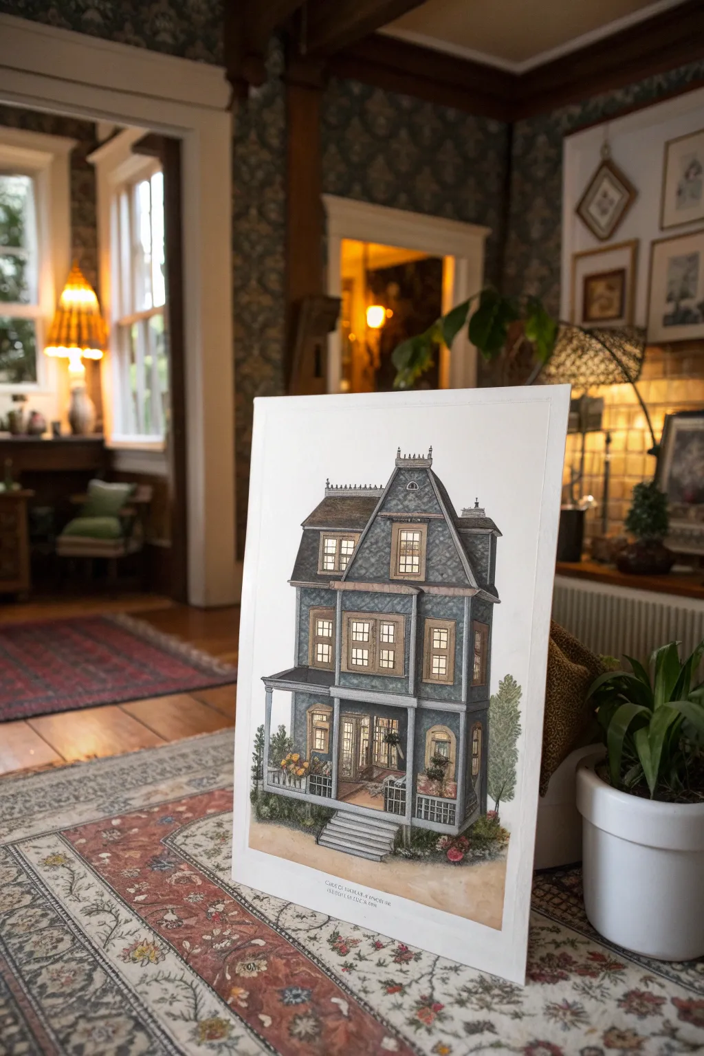
Capture the eerie elegance of a classic Victorian home with this detailed architectural illustration project. Using a combination of fine liner pens and watercolor washes, you will build a moody, intricate facade that feels like it has a history of its own.
Step-by-Step Tutorial
Materials
- Hot press watercolor paper (A3 or larger)
- Pencil (HB and 2H)
- Ruler and T-square
- Waterproof fine liner pens (005, 01, 03, 05)
- Watercolor paints (Payne’s Grey, Burnt Umber, Yellow Ochre, Ultramarine)
- White gel pen or gouache
- Soft eraser
- Round watercolor brushes (Size 2, 4, and 8)
- Masking tape
Step 1: Planning and Drafting
-
Secure your surface:
Tape your large sheet of hot press paper down to a board or table. This prevents buckling when we add the washes later. -
Establish the horizon:
Using a ruler and pencil, lightly draw a horizon line near the bottom third of the paper. This anchors your structure. -
Block in the main shapes:
Start with the large geometric forms. Draw a tall central rectangle for the tower and connect offset rectangles for the side wings. Keep your pressure light. -
Add the roof lines:
Sketch in the distinct Mansard roof shape (steep sides with a flat top). It’s crucial to get the angles symmetrical for that classic Victorian look. -
Detail the porch:
Draw the wrap-around porch structure, ensuring the columns are evenly spaced. Sketch the stairs leading up to the main entrance. -
Place windows and doors:
Mark out the window placements. Victorian houses love verticality, so make the windows tall and narrow with detailed frames.
Wobbly Lines?
If your straight lines aren’t perfect, embrace it! This is an old house; slight imperfections in the ink lines actually make the structure look more settled and historic rather than like a digital blueprint.
Step 2: Inking the Structure
-
Outline main walls:
Switch to your 05 fine liner. Go over the main perimeter walls and roof outlines. Be confident with your strokes; slight wobbles add character to an old house. -
Refine architectural details:
Use a 03 pen for the columns, window frames, and the decorative cresting on the roof ridge. I find using a ruler here helps keep things crisp. -
Add siding texture:
With the 01 pen, draw horizontal lines across the siding. Don’t draw every single board from end to end; breaking the lines suggests age and weathering. -
Draw roof shingles:
Use the 005 pen to draw small scalloped or rectangular patterns for the roof shingles. Focus on the edges and corners rather than filling every inch. -
Erase pencil marks:
Wait at least 15 minutes for the ink to fully cure, then gently erase all your preliminary pencil lines.
Step 3: Applying Color
-
Base wash for walls:
Mix a watery grey-blue using Payne’s Grey and a touch of Ultramarine. Apply a flat wash over the siding areas, leaving the window frames white. -
Darken the roof:
Mix a darker, more concentrated grey-black. Paint the roof sections, letting the color pool slightly at the bottom of the shingles for natural shading. -
Warm the windows:
Dilute Yellow Ochre until it’s very pale. Paint the glass panes to mimic warm interior light, making the house feel inhabited. -
Ground and landscaping:
Use Burnt Umber for the dirt path and a mix of greens for the bushes at the base. Keep the foliage loose to contrast with the rigid architecture. -
Deepen the shadows:
Once the first layers are dry, glaze a transparent dark blue-grey under the eaves, beneath the porch, and inside the open door to create depth. -
Final highlights:
Use a white gel pen or small brush with white gouache to add highlights to the window panes and the tips of the roof cresting.
Pro Tip: Depth Check
Make the windows on the upper floors slightly darker than the ground floor. This suggests that the rooms upstairs are deeper or unlit, adding a subtle sense of mystery to the facade.
Step back and admire your architectural rendering, perfectly capturing the spirit of a bygone era
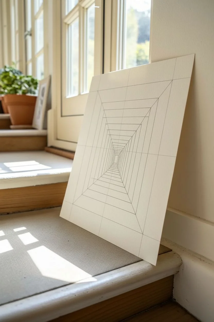
Impossible Staircase Hallway With Repeating Doors
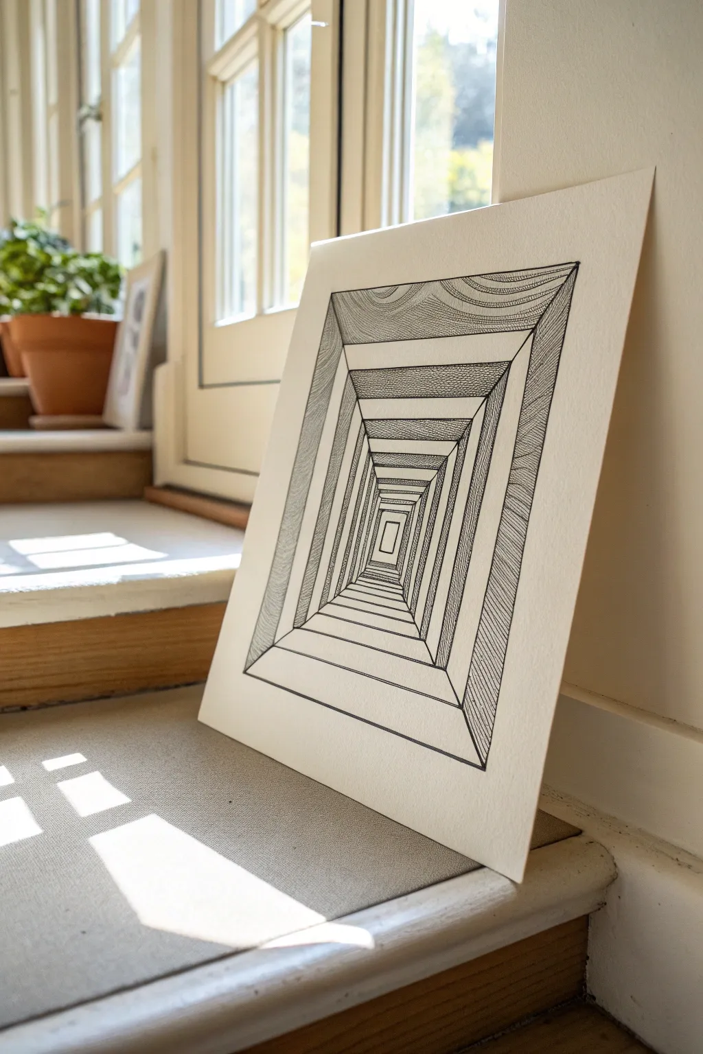
This mesmerizing pen-and-ink drawing creates a deep, tunnel-like illusion using simple geometric perspective and intricate texture. By contrasting stark white borders with detailed hatched patterns, you’ll build a hypnotic hallway that appears to stretch endlessly into the paper.
Detailed Instructions
Materials
- High-quality Bristol board or hot press watercolor paper (smooth texture)
- Ruler or triangle square
- Fine liner pens (sizes 005, 01, 03, and 05)
- Graphite pencil (HB or 2H)
- Eraser (kneaded or soft vinyl)
- Compass or protractor (optional, for checking angles)
Step 1: Drafting the Perspective Skeleton
-
Define the outer edge:
Start by drawing a large rectangle centered on your paper using your pencil and ruler. Leave a generous margin of white space around the outside to frame the optical illusion. -
Establish the vanishing point:
Mark a tiny dot in the absolute center of your main rectangle. This will be the point where all your diagonal lines eventually converge. -
Draw the main diagonals:
Connect each of the four corners of your large rectangle to that central vanishing point with light pencil lines. These ‘orthogonals’ will guide the depth of your tunnel. -
Create the repeating frames:
Drawing inward from the outer edge, pencil in a series of smaller, concentric rectangles. Space them closer together as they get nearer to the center point to mimic distance. -
Connect the corners:
Ensure the corners of every nested rectangle sit perfectly on those initial diagonal ‘X’ lines. This is crucial for the 3D effect to work properly. -
Draft the ‘floor’ and ‘ceiling’ lines:
To create the step-down effect seen in the reference, draw horizontal lines connecting the diagonal corners on the top and bottom sections. I like to double-check my ruler alignment here to ensure everything is perfectly parallel.
Straight Edge Secret
Wipe the edge of your ruler with a tissue after every few ink lines. Ink can build up on the plastic and smear across your clean white paper when you slide the ruler.
Step 2: Inking the Structure
-
Outline the main geometry:
Switch to a size 05 pen. Carefully trace the horizontal and vertical lines of your nested rectangles. -
Add the diagonal depth lines:
Ink the diagonal lines connecting the corners, reinforcing the tunnel structure. Be steady with your ruler here to avoid smudging wet ink. -
Erase pencil guides:
Once the main structural ink is completely dry, gently erase all your graphite sketch lines so you have a clean slate for texturing.
Step 3: Texturing and Shading
-
Texture the outer frame:
Using a 01 pen, fill the outermost top section with curved, wave-like contour lines. These organic lines contrast beautifully with the rigid geometry. -
Create linear hatching:
For the side panels of the outer frame, use long, vertical hatching lines. Keep them closely spaced to create a grey mid-tone. -
Stipple the second layer:
Move one rectangle inward. For the top and bottom panels of this section, use a stippling technique (tiny dots) or very tight cross-hatching to create a darker, textured shadow. -
Alternate shading styles:
As you move deeper into the tunnel, alternate your textures for each ‘ring.’ Leave the horizontal steps (the ‘floor’ and ‘ceiling’ flat planes) pure white. -
Darken the walls:
Fill the vertical side walls of the inner tunnel sections with dense vertical lines. This creates the illusion that the light is coming from the end of the tunnel, illuminating the floor but leaving walls in shadow. -
Focus on the center:
As the rectangles get tiny near the middle, switch to your finest 005 pen. The detail needs to stay sharp even in the smallest spaces. -
Deepen the contrast:
Go back over the shadowed walls with a thickening pass if needed. The contrast between the dark texture and the bright white ‘steps’ is what sells the 3D illusion.
Twist on Reality
Instead of abstract textures, try drawing realistic materials on the panels. Make the floor look like wood planks and the walls like brick for a surreal architectural look.
Step back and admire how your flat drawing has transformed into a deep, unending corridor
Negative Space Animal Form Made From a Forest
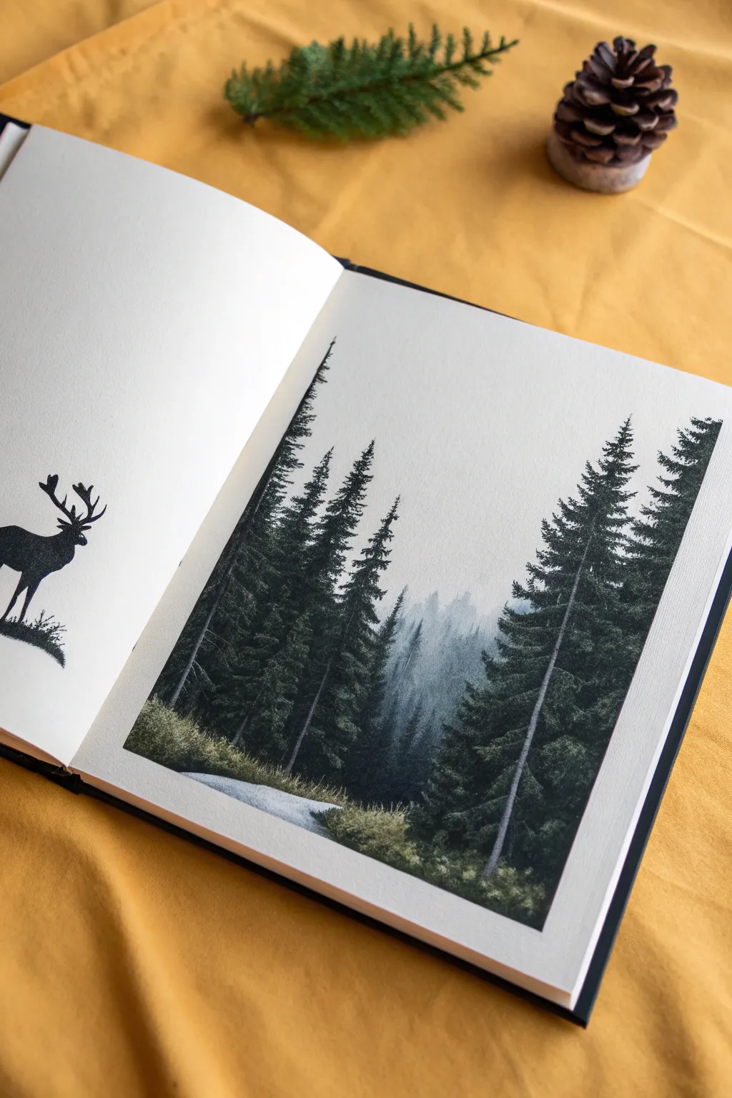
This elegant sketchbook spread juxtaposes a stark, graphic animal silhouette with a moody, atmospheric forest landscape. By splitting the concept across two pages, you create a beautiful visual dialogue between the creature and its habitat.
Step-by-Step Guide
Materials
- High-quality sketchbook (heavyweight paper)
- Black drawing ink or black gouache
- Fine liner pens (sizes 005, 01, 05)
- Small round brushes (size 0, 2, 4)
- Watercolor paints (Payne’s Gray, Prussian Blue, Hooker’s Green, Sap Green)
- White gouache (optional for mist)
- Pencil (HB) and eraser
- Ruler
- Masking tape (low tack)
Step 1: Setting the Scene
-
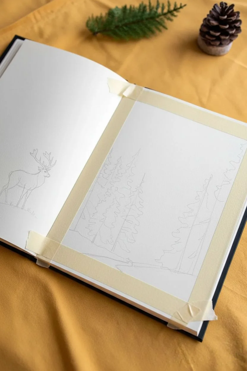
Prep the right page:
Begin on the right-hand page of your sketchbook. Use masking tape to tape off a clean rectangular border. This frame gives the landscape a polished, ‘window-like’ effect that contrasts nicely with the open silhouette on the other page. -
Sketch the forest layout:
Lightly sketch the vertical lines where your trees will stand. Don’t worry about drawing every branch; just establish the composition. Leave a small, winding negative space at the bottom for the path. -
Draft the silhouette:
On the left-hand page, lightly sketch the outline of a stag or elk. Focus on the pose—head held high with prominent antlers. Keep it relatively small so it feels dwarfed by the ‘forest’ on the facing page.
Step 2: Shouldering the Landscape
-
Mix your forest palette:
Create a deep, moody green mix using Hooker’s Green and a touch of Payne’s Gray. You want a range of values: a very watery, pale version for the background trees and a thick, saturated mix for the foreground. -
Paint the background mist:
Start with the furthest layer. lightly wash the center area with the palest grey-blue tone. While it’s wet, I like to drop in very faint tree shapes so they blur into the fog. -
Add mid-ground trees:
Once the mist layer is dry, mix a slightly darker, cooler green. Paint the trees that sit just behind the main foreground pines. Keep the edges soft but distinct enough to show depth. -
Detail the foreground pines:
Using your darkest, most saturated green-black mix and a size 2 brush, paint the two dominant trees on the left and right. Use short, horizontal dabbing motions to mimic pine needle textures, getting wider as you move down the trunk. -
Refine the tree trunks:
For the main trunks, drag a fine line of dark brown or grey down the center of your pine branches. Let the foliage interrupt the trunk line occasionally so it looks natural. -
Create the grassy floor:
Use a dry-brush technique with a yellowish-green mix (Sap Green) to stipple the undergrowth at the base of the trees. Let this texture fade as it approaches the white ‘path’ area. -
Define the path:
Add a very light wash of cool grey to the path, just to give it form. Add tiny ticks of grass overlapping the edges of the path to integrate it into the scene.
Tape Removal Tip
To prevent tearing the sketchbook paper, heat the masking tape with a hairdryer on low for 10 seconds before peeling it off. This softens the adhesive gently.
Step 3: Inking the Silhouette
-
Outline the animal:
Switch back to the left page. Using a 01 fine liner, carefully trace your stag pencil sketch. Pay special attention to the antlers; sharp, clean points are crucial here. -
Fill the form:
Fill in the body of the animal with solid black ink or opaque black gouache. Ensure the coverage is solid and consistent without streaky brush marks. -
Add the ground:
Ground the animal by creating a small, rugged patch of earth beneath its hooves. Use stippling or small scribbles with your pen to simulate grass and rocks, keeping it rough and organic.
Level Up: Hidden Details
Use a white gel pen to draw tiny stars or a thin crescent moon in the empty sky space significantly above the foggy forest canopy.
Step 4: Final Touches
-
Deepen the shadows:
Return to the forest painting. If your darks dried too light, go back in with a very dark mix (almost black) to deepen the shadows in the lower corners of the pine trees. -
Enhance the atmosphere:
If I feel the painting needs more mood, I sometimes dilute a tiny bit of white gouache and glaze over the middle section to push the distant trees further back. -
Remove the tape:
Wait until the paper is completely bone-dry. Slowly peel the masking tape away at a 45-degree angle to reveal those crisp, satisfying edges.
Close your sketchbook gently once fully dry to admire the contrast between the graphic silhouette and the soft painted world
Time-Lapse Composition: One Scene in Four Seasons
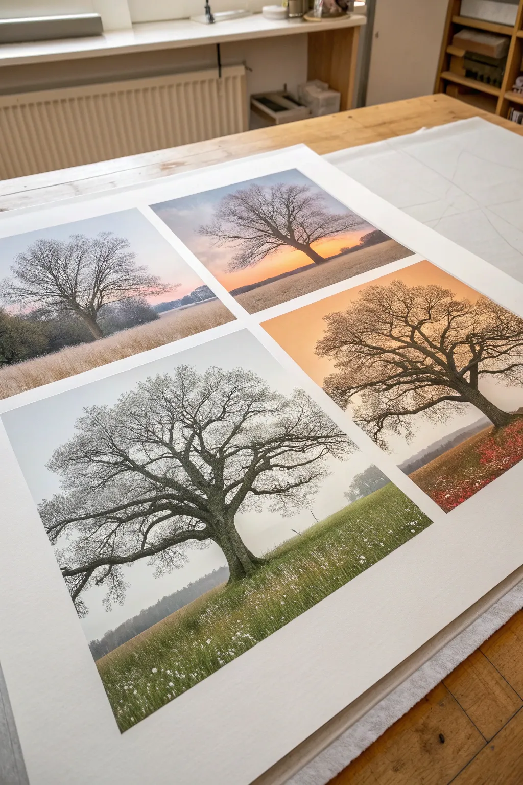
This project transforms a single landscape subject into a stunning narrative of time passing by arranging four variations of the same scene on one large sheet. The result is a high-quality, fine-art print that captures the changing light and atmosphere of the seasons through consistent composition.
How-To Guide
Materials
- High-resolution digital camera or high-quality reference photo
- Photo editing software (Photoshop, Lightroom, or similar)
- Large format inkjet printer (or access to a print shop)
- Heavyweight matte fine art paper (A2 or similar large format)
- X-Acto knife or rotary cutter
- Metal ruler
- Cutting mat
Step 1: Sourcing and Preparation
-
Select your subject:
Choose a strong, singular subject like a lone oak tree with a distinct silhouette. This subject needs to be the anchor that remains constant across all four panels. -
Gather seasonal references:
If you are drawing this digitally, gather reference photos of your subject in winter mist, summer green, autumn gold, and stark winter branches. If using one photo manipulation technique, find four distinct ‘atmosphere’ overlays (fog, sunset, snow, clear sky). -
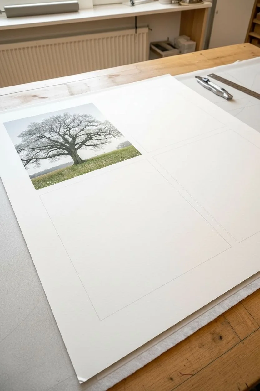
Set up your canvas:
Open your editing software and create a new large-format canvas (e.g., 20×24 inches) at 300 DPI. Create a guide grid to divide the space into four equal quadrants, leaving generous white margins between them for that gallery-style look.
Pro Tip: Anchor Point
Ensure the horizon line is at the exact same pixel height in every panel. This continuity creates a mesmerizing window-pane effect.
Step 2: Digital Composition
-
Create the base layer:
Place your primary tree image in the top-left quadrant. This will be your composition master. Ensure the horizon line is positioned at the lower third to ground the image. -
Duplicate and align:
Copy this base image to the other three quadrants. Use your software’s alignment tools to ensure they are perfectly symmetrical; slight misalignments will break the ‘time-lapse’ illusion. -
Edit Panel 1: Winter Dawn:
For the top-left panel, desaturate the greens to greys and browns. Add a subtle cool blue tint to the sky and lighten the blacks to simulate frosty morning mist. -
Edit Panel 2: Winter Sunset:
In the top-right panel, swap the sky for a gradient of warm orange and purple. Keep the tree silhouette stark and dark, perhaps increasing the contrast to make the branches pop against the setting sun. -
Edit Panel 3: Summer/Spring Mist:
For the bottom-left panel, bring out lush greens in the grass. I like to add a soft, white ‘haze’ layer over the lower half of the tree trunk to mimic ground fog rising in the morning. -
Edit Panel 4: Golden Autumn:
In the bottom-right panel, push the color temperature towards warm yellows and russet tones. Add texture to the ground to suggest fallen leaves and soften the light to create a ‘golden hour’ glow.
Level Up: Hand-Embellish
After printing, use colored pencils or gouache to add manual highlights—like white dabs for snow or gold ink for sunbeams—to make it a mixed-media original.
Step 3: Printing and Finishing
-
Proofing check:
Zoom in to 100% on your screen to check the transitions between the tree branches and the different skies. Clean up any jagged artifacts or haloing. -
Select paper type:
Choose a heavy, cotton-rag or matte fine art paper. A glossy finish often distracts from the subtle atmospheric effects of the seasons; matte absorbs the ink beautifully for a painterly look. -
Run a test strip:
Before committing to the full large-scale print, print a small horizontal strip that includes a slice of all four panels to check color accuracy and black density. -
Final printing:
Send the full file to the printer. Ensure your settings are set to ‘High Quality’ or ‘Photo’ mode to capture the delicate gradients in the skies. -
Drying time:
Allow the print to outgas and dry flat for at least 24 hours. Placing a sheet of plain tissue paper over it prevents dust from settling on the uncured ink. -
Trimming (Optional):
If you printed on a roll or oversized sheet, use your metal ruler and fresh X-Acto blade to trim the outer white borders to your desired framing size.
Once framed, this piece invites the viewer to stand back and experience the rhythm of a full year in a single glance


Have a question or want to share your own experience? I'd love to hear from you in the comments below!