
When you’re hosting a canvas painting party, the secret sauce is making it feel fun, doable, and a little bit magical—no “real artist” badge required. Here are my favorite party-ready ideas that keep the setup simple, the theme cohesive, and everyone leaving with a canvas they’re genuinely excited to hang up.
Classic Sunset Blend Canvas Painting Party
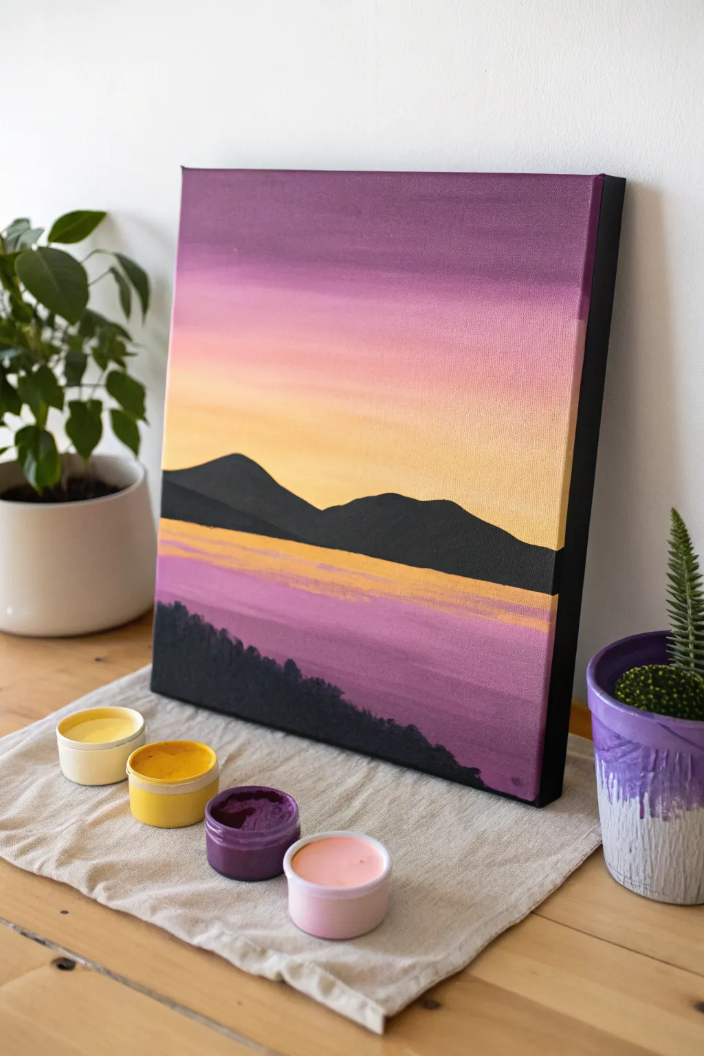
Capture the tranquil beauty of dusk with this elegant, minimalist landscape. Featuring smooth gradients from deep plum to soft peach, this project uses bold silhouettes to create a striking contrast against a calming sky.
Step-by-Step
Materials
- Stretched canvas (e.g., 11×14 inches)
- Acrylic paints: Deep Violet, Magenta, Peach/Coral, Pale Yellow, Black, White
- Wide flat brush (1 inch) for blending background
- Medium flat brush for water details
- Small round brush for fine details
- Palette or paper plate
- Cup of water and paper towels
- Pencil (optional)
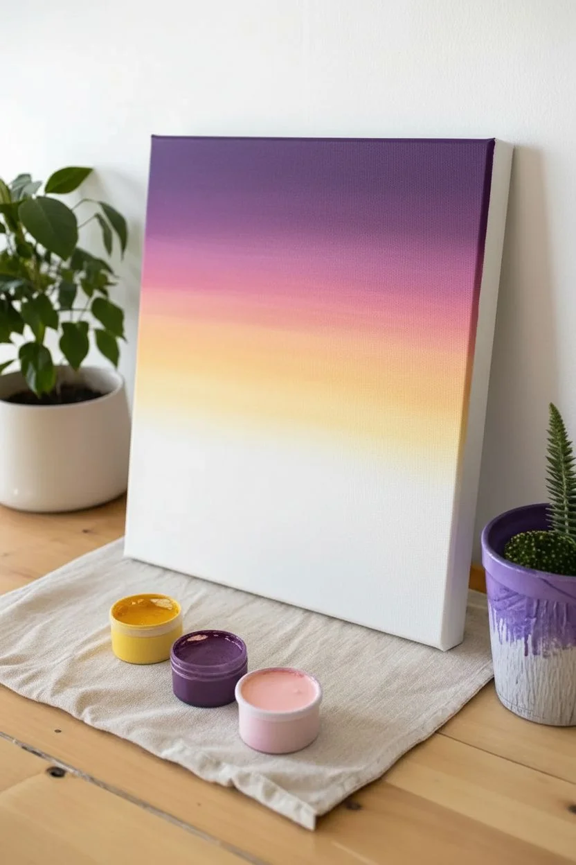
Step 1: Painting the Gradient Sky
-
Prepare the violet:
Start by squeezing out your Deep Violet paint. Load your wide flat brush generously with paint and apply a horizontal band across the very top 1/5th of the canvas. -
Blend in magenta:
Without cleaning the brush completely, pick up some Magenta paint. Apply this directly below the violet strip, using long horizontal strokes to gently blend the two colors where they meet. -
Transition to peach:
Clean your brush thoroughly. Pick up the Peach or Coral shade and paint the next band below the magenta, blending upward slightly to soften the transition between pink and peach. -
Add the sunlight:
Clean the brush again. Mix a generous amount of Pale Yellow with a tiny touch of white. Paint the final strip of the sky, bringing it down to just above the midline of the canvas, blending it smoothly into the peach layer above. -
Let it set:
Allow the background sky to dry completely before moving on. This prevents the dark mountains from muddying your beautiful sunset colors.
Step 2: Creating the Middle Ground
-
Outline the mountains:
Using a pencil or a small round brush with watered-down black paint, lightly sketch the outline of the distant mountain range about halfway down the canvas. Create two main peaks, with one overlapping the other. -
Fill the mountains:
Switch to a medium flat brush loaded with solid Black paint. Fill in the mountain shapes completely, ensuring opaque coverage so no sky shows through. -
Start the water base:
Below the black mountains, you need to create the water’s surface. Mix Magenta with a little White to create a soft, dusty pink. Paint horizontal strokes from the base of the mountains down to the bottom of the canvas. -
Layer in water depth:
While the pink base is still slightly wet, take a little Deep Violet on your brush. Add horizontal streaks near the bottom and sides to suggest depth and shadow in the water.
Muddy colors?
If your sky gradient starts looking brown or gray while blending, stop immediately. Wash your brush thoroughly and let the canvas dry completely before trying to add a fresh layer of color.
Step 3: Reflections and Foreground
-
Add yellow reflections:
Clean your brush well. Take the Pale Yellow mixture used in the sky and paint horizontal streaks directly underneath the black mountain line. -
Intensify the glow:
Add a few confident, short strokes of the yellow/peach mix further down into the pink water area to mimic the sun reflecting on ripples. -
Paint the forestry:
Using black paint and a smaller brush, create the foreground landmass in the bottom left corner. Use a dappling or stippling motion along the top edge to simulate the texture of treetops. -
Anchor the composition:
Fill in the rest of the bottom left corner with solid black, ensuring it slopes downward and disappears off the bottom edge. -
Create water ripple texture:
Take a clean, dry brush with a tiny amount of Deep Violet. Lightly drag it horizontally across the pink water sections to create subtle texture without overpowering the reflections. -
Final touches:
Check your mountain edges; if they look rugged, you can smooth them with the small round brush for a cleaner, more graphic look similar to the inspiration image. -
Paint the edges:
I always finish by painting the sides of the canvas black (or continuing the image wrap-around) to give it a polished, framed look without needing a frame.
Add some sparkle
Once the painting is fully dry, dilute white paint with water and flick it off a toothbrush across the top purple section to create a subtle starry night effect appearing over the sunset.
Now you have a stunning, peaceful landscape ready to hang or gift to a friend

Bright Floral Bouquet Canvas Painting Party
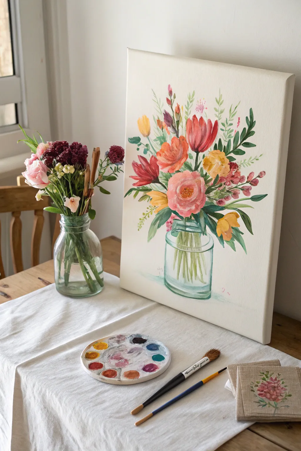
This vibrant canvas captures the fresh energy of spring with a loose, painterly bouquet of tulips, roses, and wildflowers nestled in a clear glass jar. Using acrylics to mimic the transparency of watercolors, you’ll build up layers of translucent color for a light and airy finished piece.
Step-by-Step Guide
Materials
- Rectangular stretched canvas (e.g., 12×16 inches)
- Acrylic paints (Titanium White, Cadmium Red, Alizarin Crimson, Yellow Ochre, Cadmium Yellow, Sap Green, Viridian, Ultramarine Blue, Burnt Umber)
- Soft synthetic brushes: large flat brush (3/4 inch), medium filbert brush (#6 or #8), small round brush (#2 or #4)
- Water cup and paper towels
- Palette (ceramic or paper plate)
- Pencil for sketching
- Acrylic glazing medium (optional, for transparency)
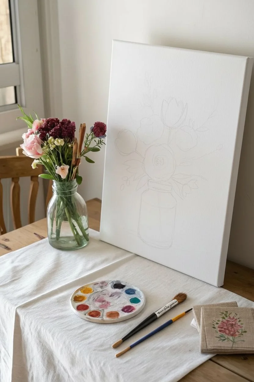
Step 1: Sketching and Background
-
Prepare the canvas:
Start with a clean white canvas. If your canvas isn’t pre-primed, apply two coats of white gesso and let it dry completely. For this specific look, we want the bright white background to shine through, so no tonal ground is needed. -
Draft the composition:
Using a light pencil, sketch a simple cylinder shape in the lower center for the glass jar. Don’t worry about perfection; a loose shape feels more organic. -
Outline the main blooms:
Lightly draw circles and ovals to position your three main focal flowers: the large pink rose in the center, the red tulip to the right, and the orange poppy shape to the left. Add faint lines radiating outward to plan where your stems and smaller filler flowers will go.
Water It Down
To get this specific look, dilute your acrylics heavily with water or medium until they have the consistency of heavy cream. This mimics watercolor transparency.
Step 2: Painting the Glass Jar
-
Mix a watery teal:
Combine a touch of Viridian green, a tiny speck of Ultramarine Blue, and plenty of water (or glazing medium) to create a very pale, transparent teal wash. -
Define the jar:
Paint the bottom curve and the side edges of the jar with this wash. Keep the center of the jar largely unpainted white canvas to represent the glass catching the light. -
Add water lines:
With a slightly darker version of your teal mix and a small round brush, add thin, confident horizontal curved lines near the top of the jar neck and vaguely at the bottom to suggest the thickness of the glass base. -
Paint the stems:
Mix Sap Green with a little White and water. Paint blurred, vertical lines inside the jar area. I find it helpful to vary the lengths and angles slightly so they look like they are resting naturally in water.
Step 3: Creating the Flowers
-
Paint the central rose:
Mix Titanium White with a small amount of Alizarin Crimson to get a soft pink. Using the filbert brush, paint broad, curved strokes in a circular motion, leaving small gaps of white canvas between strokes to separate the petals. -
Deepen the rose center:
While the pink is still tacky, add a touch more red to your brush and deepen the center of the bloom with tighter, smaller c-shape strokes. -
Paint the red tulip:
Mix Cadmium Red with a touch of Crimson. Paint the tulip on the right using upward, sweeping strokes that meet at a point. Think of painting a slender ‘U’ shape that tapers at the top. -
Create the orange blooms:
Mix Red and Cadmium Yellow to make a warm orange. Paint the flower on the left with loose, open petals. If you want variety, add a second, smaller orange bud near the top left. -
Add yellow accents:
Using Yellow Ochre mixed with Cadmium Yellow, dab in smaller floral shapes on the right side and peeking out from behind the main rose. These don’t need distinct petals; mere blobs of color work well here.
Keep It Loose
Flowers looking too stiff? Hold your paintbrush at the very end of the handle. This forces you to lose control slightly, creating more organic, natural petals.
Step 4: Greenery and Details
-
Lay in the leaves:
Mix a few variations of green—some light (Sap Green + Yellow), some dark (Viridian + Burnt Umber). Using the small round brush, paint long, thin leaves extending out from the bouquet. -
Fill the gaps:
Add smaller, fern-like sprigs in the empty spaces between flowers. Press the brush down and lift up quickly to create tapered leaf shapes. -
Add the reddish filler:
Mix a dusty rose color and dab small dots on the outer edges of the bouquet to represent filler flowers or buds. -
Paint flower centers:
Once dry, use a small brush with Yellow Ochre and White to dot the center of the pink rose and the open orange flowers. A tiny dot of brown adds depth. -
Refine the glass:
With pure Titanium White on a small brush, add a few crisp highlights to the jar—specifically a vertical line on the side and a curve on the rim—to make the glass look shiny. -
Final touches:
Step back and assess your painting. If any area looks too empty, add a floating leaf or a stray bud. Sign your name near the bottom right in a soft pink color.
Hang your beautiful bouquet in a bright spot to enjoy fresh flowers that never wilt.


Easy Ocean Horizon Canvas Painting Party
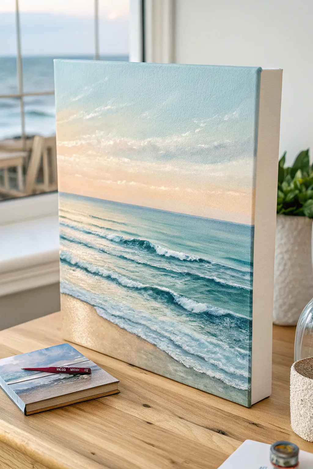
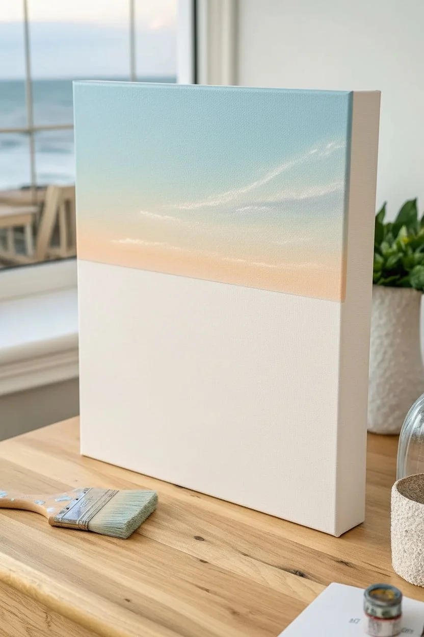
Capture the tranquil beauty of an ocean horizon with this soft, realistic seascape that brings coastal calm to any room. Using gentle blending techniques and a soothing palette of teals, blues, and warm sunset pinks, you’ll create a professional-looking piece that looks much harder than it is.
Step-by-Step Tutorial
Materials
- Rectangular stretched canvas (e.g., 16×20 or 12×16 inch)
- Acrylic paints: Titanium White, Phthalo Blue, Turquoise, Yellow Ochre, Cadmium Orange, Burnt Sienna
- Large flat brush (1-2 inch) for blending
- Medium flat brush
- Small round detail brush
- Fan brush (optional, for waves)
- Palette or paper plate
- Cup of water and paper towels
- Easel (tabletop or standing)
Step 1: Setting the Sky
-
Establish the Horizon:
Begin by lightly drawing a straight horizontal line across your canvas with a pencil. Position it about one-third of the way down from the top to leave plenty of room for the ocean. -
Mix the Sky Blue:
Create a pale, airy blue by mixing a large amount of Titanium White with a tiny dot of Phthalo Blue and a hint of Turquoise. Apply this to the top edge of the canvas using your large flat brush. -
Blend the Sky Downward:
While the blue is still wet, gradually add more white to your brush as you paint downward. This creates a gradient effect, lightening the color as you approach the horizon line. -
Add Summit Glow:
Near the horizon line, blend in a very soft mix of White with a minuscule amount of Cadmium Orange and Yellow Ochre. Seamlessly blend this pale peach tone up into the blue to simulate the sunset glow. -
Paint Soft Clouds:
Using a smaller brush or the corner of your flat brush with pure White, dab in faint, stretched-out cloud shapes. Keep the edges soft and horizontal to mimic distant stratus clouds catching the light.
Step 2: Creating the Ocean Depth
-
Paint the Deep Water:
Mix Turquoise with a touch of Phthalo Blue to create a rich teal. Paint a horizontal band right below the horizon line, ensuring you keep that line perfectly straight and crisp. -
Lighten the Shallows:
As you move down the canvas towards the bottom, gradually mix more White and a touch of Yellow Ochre into your teal mixture. This suggests the water becoming shallower and clearer near the shore. -
Establish the Sand:
At the very bottom left corner, paint a triangle of wet sand color using White, Yellow Ochre, and a tiny spot of Burnt Sienna. I like to blend this slightly upward into the pale teal water for a transparent look. -
Block in Wave Lines:
Using a darker teal shade and a medium flat brush, paint horizontal, slightly diagonal streaks across the water. These darker lines will act as the shadows behind your incoming waves.
Smooth Blending Pro-Tip
Keep a misting spray bottle handy. A light spritz of water keeps acrylics wet longer, allowing you to create that seamless, buttery gradient in the sky without the paint drying too fast.
Step 3: Detailing the Waves
-
Highlight the Crests:
Load a small round brush or the edge of a flat brush with thick Titanium White. Paint the tops of the darker wave lines you just created, focusing on the breaking points. -
Create Sea Foam:
Scumble (lightly scrub) white paint along the front of the wave crests. Use a dry brush technique here to make the texture look broken and frothy like real foam. -
Form the Shoreline Wash:
Where the water meets the sand, paint a jagged, organic line of bright white foam. Drag the paint slightly back into the water to show the retreating tide. -
Add Translucency:
Mix a pale, watery yellow-green color. Apply this right underneath the crest of the largest wave to show sunlight shining through the thin water before it breaks. -
Enhance Reflections:
Add subtle vertical streaks of white and pale pink on the wet sand area to reflect the sky. Keep these strokes extremely light and blended. -
Final Highlights:
Add the brightest touches of pure white to the very top edges of the nearest waves and the thickest piles of sea foam for extra dimension.
Level Up: Texture Gel
Mix heavy body gel medium or modeling paste into your white paint for the final wave highlights. It creates physical 3D ridges that mimic real sea foam.
Step back and admire the rhythmic calm of your new coastal masterpiece


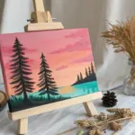
Mountains and Pines Canvas Painting Party
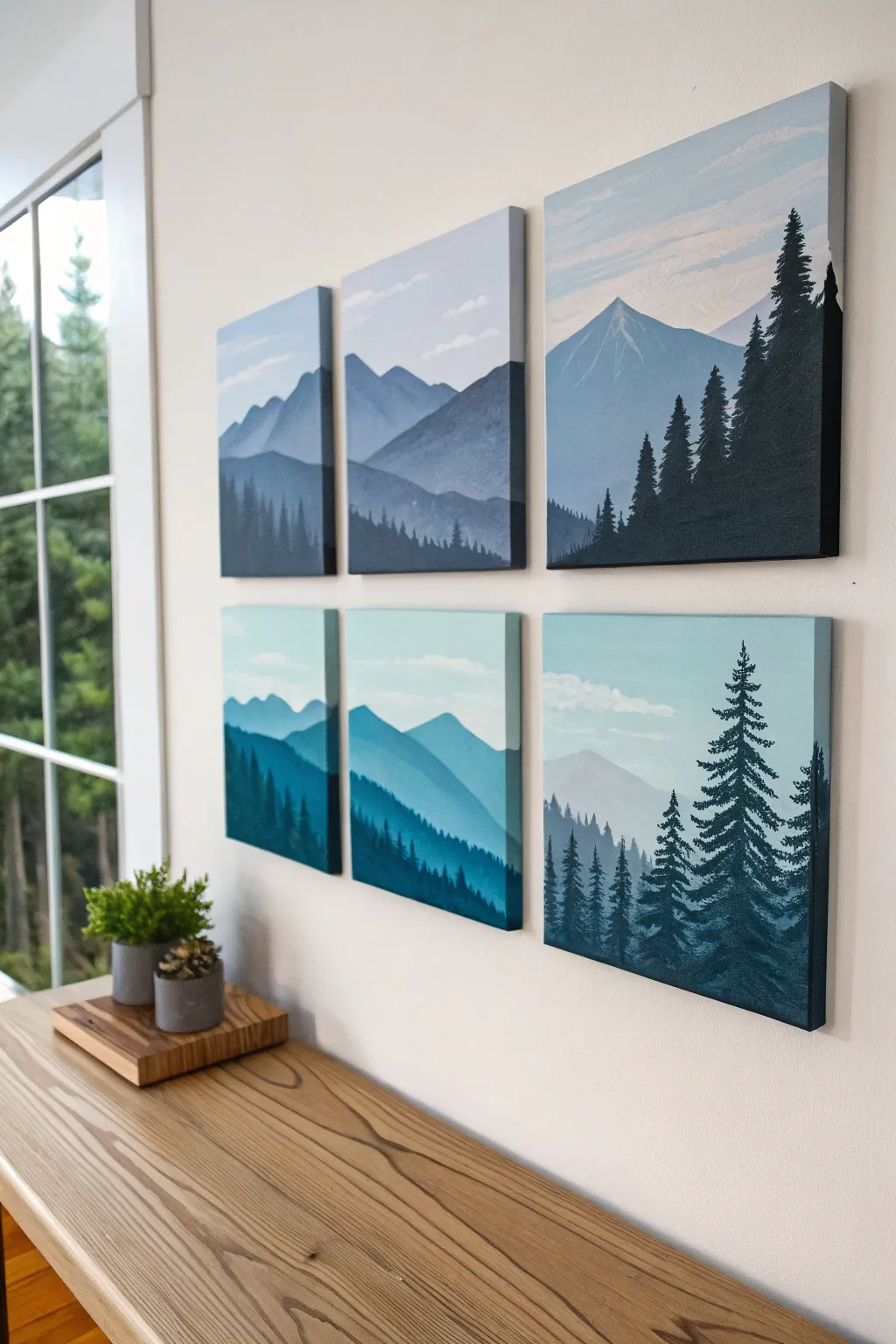
Create a breathtaking panoramic view broken across separate canvases for a modern, gallery-style aesthetic. These dual triptych sets feature serene mountain ranges and silhouetted pines in soothing gradients of moody blue and vibrant teal.
Detailed Instructions
Materials
- Six 12×12 inch square stretched canvases
- Acrylic paints: Titanium White, Mars Black, Phthalo Blue, Teal/Aqua, and Grey
- Large flat brush (1-2 inch) for backgrounds
- Medium angled brush for mountains
- Small liner or fan brush for trees
- Palette or paper plates for mixing
- Pencil and eraser
- Ruler or straight edge
- Cup of water and paper towels
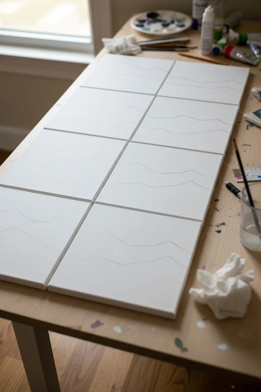
Step 1: Planning the Layout
-
Arrange the canvases:
Lay all three canvases for the top row side-by-side on your work surface, touching edges. Do the same for the bottom row separately. This allows you to draw the landscape continuously across the gaps. -
Sketch the horizon:
Using a pencil, lightly sketch the horizon lines across all three canvases at once. For the top set, keep the mountains high on the left and dipping lower on the right. For the bottom set, vary the peaks so they don’t look identical to the top row. -
Outline mountain layers:
Sketch 3-4 distinct layers of mountains. The furthest back should be the highest peak, with rolling foothills coming closer to the foreground. Ensure lines flow naturally from one canvas to the next.
Mismatched Edges?
If lines don’t match perfectly when hung, simply paint the design slightly further onto the sides of the canvas. This ‘bleeding’ image hides slight misalignments on the wall.
Step 2: Painting the Sky & Background
-
Mix the sky gradient:
Start with the top row. Mix a very pale blue-grey using plenty of white. Paint the sky area on all three canvases, blending in streaks of pure white for soft clouds while the paint is still wet. -
Paint the bottom row sky:
Repeat the process for the teal set, but use a very pale teal-white mix. Keep the strokes horizontal to mimic atmospheric stillness. -
Base coat the furthest mountains:
Mix a slightly darker shade of your base color (blue for top, teal for bottom). Paint the most distant mountain peaks, keeping the edges crisp against the sky.
Add Texture
Mix a little modeling paste into your white paint for the mountain peaks. Use a palette knife to apply it, creating physical rocky ridges that catch the light.
Step 3: Layering the Mountains
-
Mix mid-tone shades:
Create a medium-dark shade for the middle mountain range. Adding a touch of grey helps push these layers back visually without making them too bold yet. -
Paint the middle range:
Fill in the middle mountain shapes. I find it helpful to paint the edges of the canvas where the image wraps around, so the scene looks complete from the side. -
Darken the foreground hills:
Mix a dark version of your main color (deep blue-grey or deep teal). Paint the lowest rolling hills that sit just behind the tree line. -
Create atmospheric mist:
Before the mountain layers fully dry, you can dry-brush a tiny amount of white paint at the very bottom of a mountain valley to create a misty, foggy effect.
Step 4: Adding the Pine Trees
-
Mix the darkest value:
For the trees in the top set, mix black with dark blue. For the bottom set, mix black with deep teal. You want a color that is almost black but retains the color temperature of the painting. -
Establish the tree lines:
Using your smallest brush, paint a vertical line for the trunk of your tallest foreground tree. Place the largest trees on the far right canvas to anchor the composition. -
Stipple the branches:
Using a fan brush or tapping motion with a liner brush, add branches starting narrow at the top and getting wider at the bottom. Leave gaps to see the mountains behind. -
Fill the forest floor:
Paint a dense forest line across the bottom of the canvases. Use vertical strokes to suggest distant tree tops, varying the heights so it doesn’t look like a flat fence. -
Add highlights:
Mix a slightly lighter version of your tree color. Gently tap this onto the left side of the tree branches to suggest a subtle light source hitting the foliage.
Step 5: Final Details
-
Check continuity:
Line the canvases up again to ensure your mountain lines and tree branches connect smoothly across the gaps. Touch up any lines that don’t match up perfectly. -
Paint the sides:
Don’t forget the deep edges of gallery-wrapped canvas. Extend your horizon lines and colors around the sides for a professional finish. -
Varnish:
Once fully dry (give it 24 hours), apply a satin or matte varnish to protect the paint and unify the sheen across all panels.
Now step back and admire how your separate canvases come together to form a majestic window into the wilderness
BRUSH GUIDE
The Right Brush for Every Stroke
From clean lines to bold texture — master brush choice, stroke control, and essential techniques.
Explore the Full Guide
Four-Season Tree Canvas Painting Party
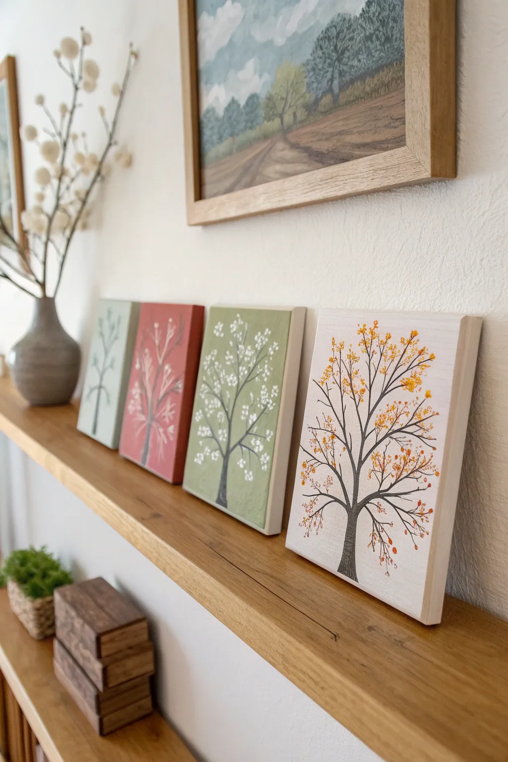
Celebrate the changing year with this charming set of four mini canvases, each depicting a stylized tree in a different season. The cohesive color palette and simple branch structures make this an approachable project for painters of all skill levels to tackle together.
Step-by-Step Guide
Materials
- 4 Small square canvases (approx. 6×6 or 8×8 inches)
- Acrylic craft paints (Sage Green, Muted Red/Rust, Olive Green, Cream/Off-White)
- Dark grey or brown acrylic paint (for tree trunks)
- Small flat brush (for backgrounds)
- Fine liner brush (for branches)
- Small round brush or cotton swabs (for foliage)
- Paper plate or palette
- Water cup and paper towels
Step 1: Prepping the Seasons
-
Select your palette:
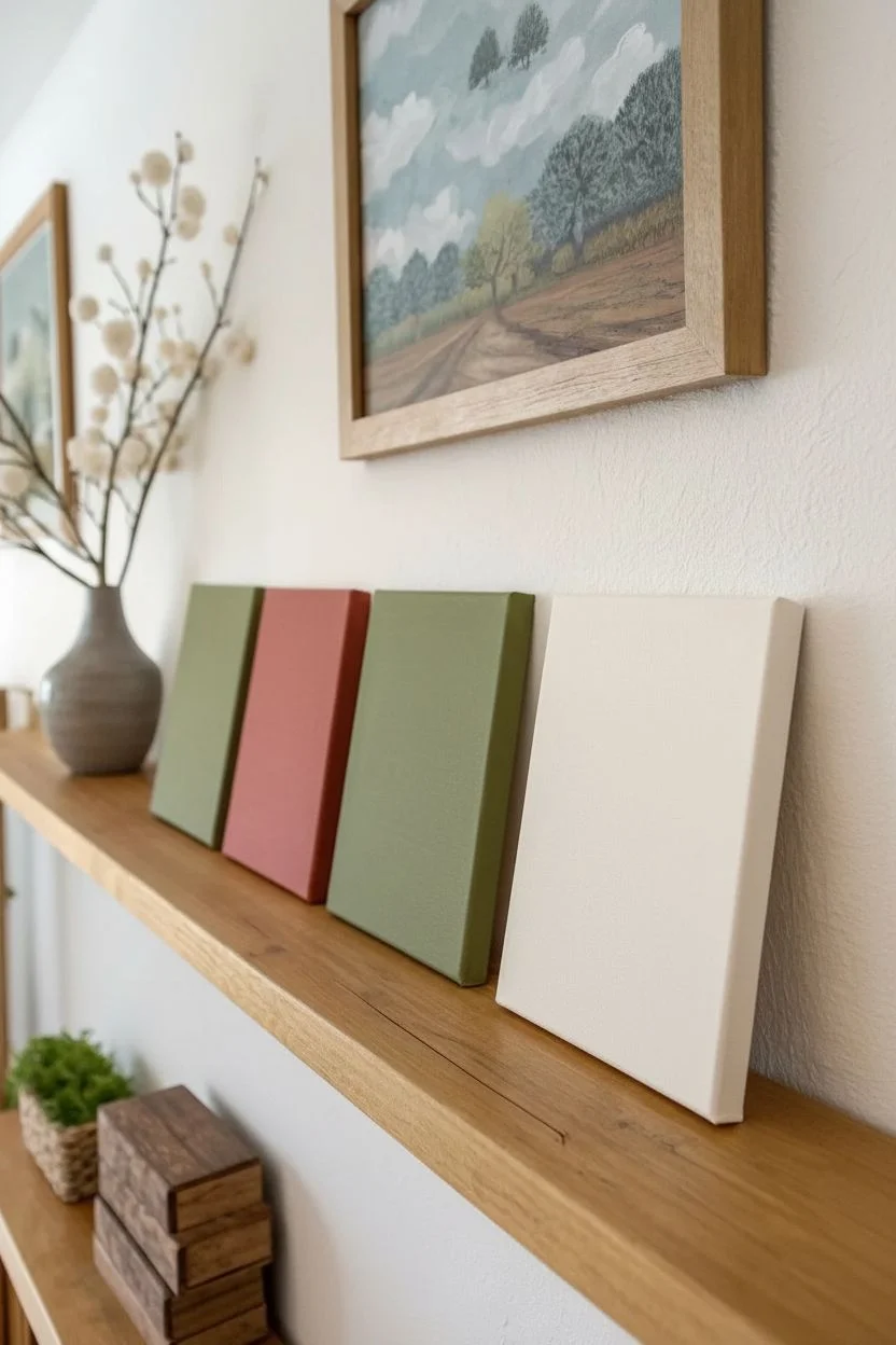
Begin by assigning a background color to each of your four canvases. To match the image, choose soft, muted tones: a dusty sage for winter, a warm rust red for autumn/spring transition, an olive green for summer, and a creamy off-white for the final fall tree. -
Paint the backgrounds:
Using a flat brush, apply the base coat to each canvas. Ensure you paint the sides of the canvas as well for a polished, frameless look. -
Build opacity:
Let the first coat dry completely. If the canvas texture or white gesso is still showing through, apply a second coat to get a solid, matte finish. I tend to wait about 15 minutes between these coats to ensure smoothness. -
arrange the order:
Once dry, line up the canvases in the order you want to display them. This helps you visualize how the tree shapes will flow from one panel to the next.
Clean Lines Pro Tip
For the thinnest branches, slightly water down your trunk paint until it has an ink-like consistency. This helps the paint flow smoothly off a liner brush without breaking.
Step 2: Growing the Trunks
-
Mix the trunk color:
Create a dark, charcoal grey by mixing black with a tiny drop of white, or use a dark espresso brown. You want a high contrast against the pastel backgrounds. -
Draft the main trunk:
Using a fine liner brush, paint a central vertical line starting at the bottom center of the canvas. Make the base slightly wider and taper it as you go up, stopping about two-thirds of the way up the canvas. -
Add major limbs:
Extend 3-4 main branches from the top of the trunk. Keep your wrist loose to create natural, slightly wavering lines rather than perfect straight edges. -
Create secondary branches:
From each major limb, paint smaller ‘V’ shaped branches splitting off. Repeat this process for all four canvases so the basic skeleton of the trees looks similar across the set.
Level Up: Texture
Mix a little modeling paste or baking soda into your background paint before applying it. This adds a subtle, slightly rough texture that mimics plaster or fresco walls.
Step 3: Adding Seasonal Details
-
Winter (Sage Canvas):
For the winter tree, keep it minimal. Use a slightly lighter shade of grey or a very faint green to add just a few ‘ghost’ lines of branches in the background, leaving the tree largely bare to represent dormancy. -
Spring (Rust Canvas):
On the reddish canvas, mix a light grey or white paint. Using the very tip of a small round brush, dab tiny, sparse spots on the branch tips to represent early buds or frost. -
Summer (Olive Canvas):
For the green canvas, use bright white paint. Dip a cotton swab or the handle end of a paintbrush into the paint and stamp clusters of dots around the branches to create the look of full, blooming white flowers. -
Fill the summer bloom:
Add density to the summer tree by overlapping some dots. Group them tightly near the branch ends and let a few solitary dots ‘float’ near the edges as falling petals. -
Autumn (Cream Canvas):
Switch to a golden yellow and burnt orange palette. Using a small round brush, dab irregular spots onto the branches. -
Layer the fall colors:
Start with yellow dots, wipe your brush, and add orange dots on top. Allow some of the dark branches to peek through the foliage. -
Falling leaves effect:
Daub a few yellow and orange spots near the bottom of the trunk on the cream canvas to simulate leaves that have fallen to the ground.
Arrange your quartet on a mantel or shelf to enjoy a full year of nature’s beauty in one glance
Simple Animal Silhouette Canvas Painting Party
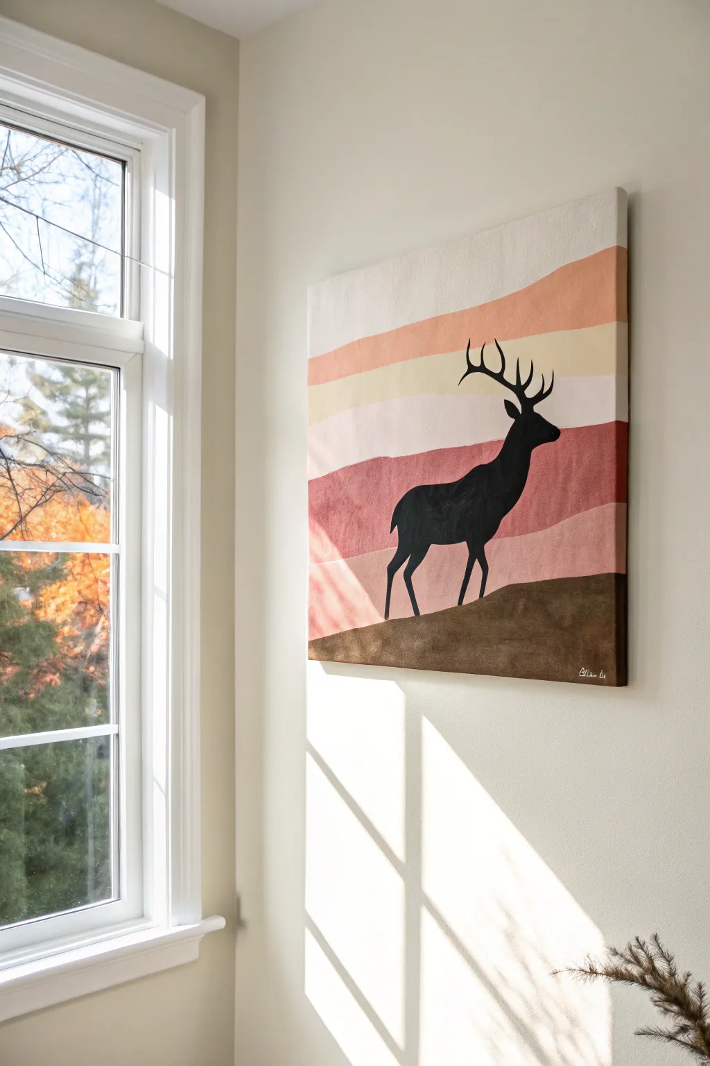
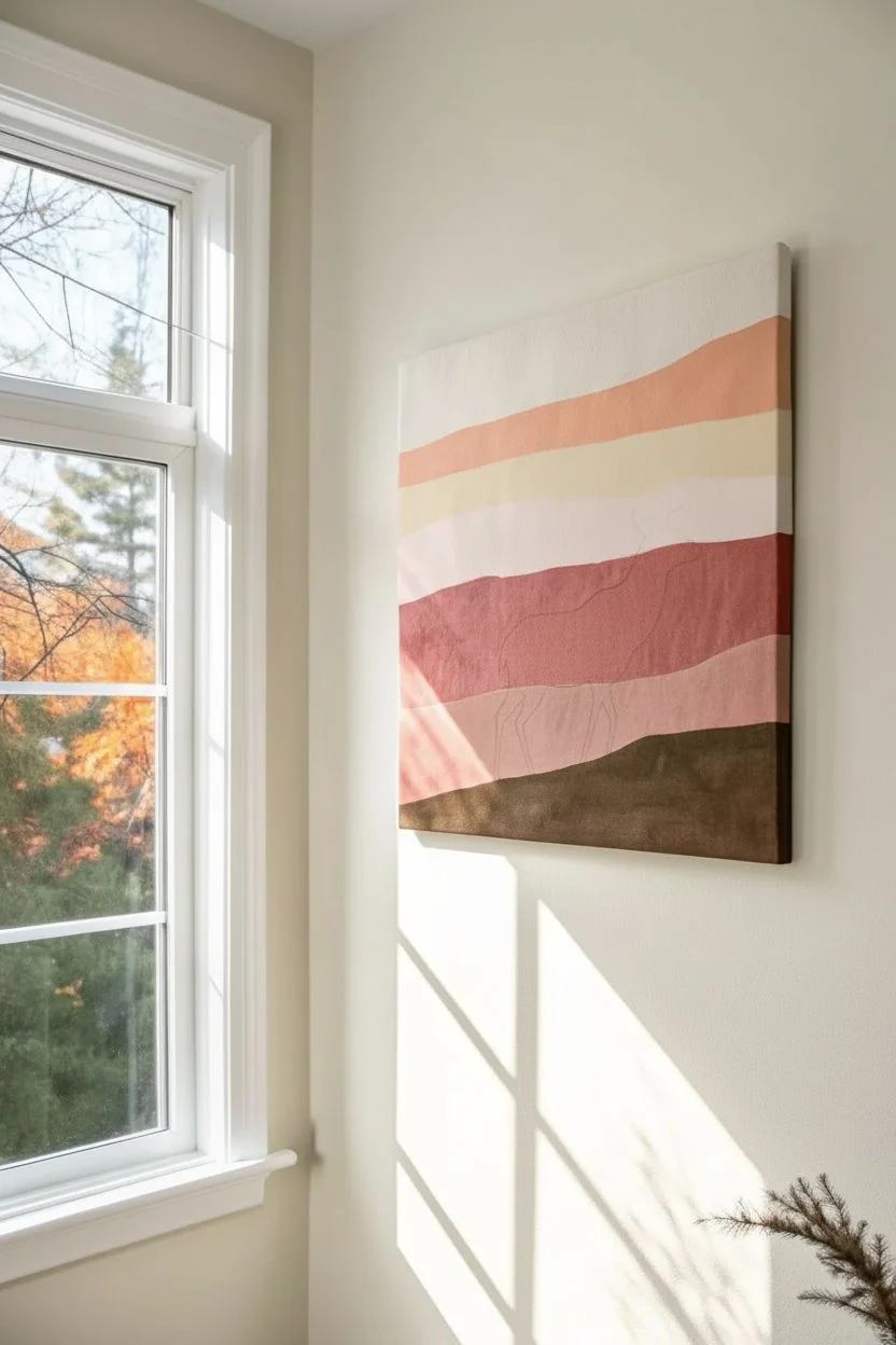
This striking yet simple project features a bold black elk silhouette standing out against a backdrop of soft, wavy sunset bands. Its modern, minimal color palette makes it a sophisticated addition to a painting party lineup, achievable even for complete beginners.
Step-by-Step Tutorial
Materials
- Square stretched canvas (e.g., 16×16 or 20×20 inches)
- Acrylic paints: warm white, beige/cream, dusty pink, terracotta/rust, dark brown, and black
- 1-inch flat brush (for background)
- Small round detail brush (size 2 or 4)
- Flat shader brush (size 6 or 8)
- Pencil
- Carbon transfer paper or printout of an elk silhouette (optional)
- Water cup and paper towels
- Palette or paper plate
Step 1: Planning the Background
-
Sketch the Bands:
Begin by using a pencil to lightly sketch the wavy horizontal bands across your canvas. These don’t need to be perfectly straight; gentle, organic curves look best. Ensure the bottom section is reserved for the ground. -
Define the Hill:
Draw the ground line slightly higher on the right side and sloping gently down towards the left. This creates the hill where your elk will stand.
Paint Bleeding?
If paint bleeds under tape or lines blur, wait for the mistake to dry fully. Then, touch it up with the original background color before repainting the crisp edge.
Step 2: Painting the Backdrop
-
Top Band:
Start at the very top of the canvas with your 1-inch flat brush. Mix a large amount of warm white with a tiny touch of beige to create an off-white cream color. Paint the top sky section. -
Second Layer:
For the next band down, mix dusty pink with a little white to soften it. Apply this color below the cream band, carefully cutting in along your pencil line. -
Middle Stripe:
Use the plain beige or a light sand color for the middle band. If you want smooth transitions, you can slightly overlap the wet paint with the pink above, but for this graphic style, crisp lines work perfectly too. -
Lower Sky:
Mix a light mauve or a very pale version of your pink for the band just above the horizon. Keep your brushstrokes horizontal to mimic the sky. -
Horizon Band:
Paint the lowest sky band (the one touching the hill) with your terracotta or rust color. This creates a sunset warmth right behind the silhouette. -
Painting the Ground:
Switch to a dark brown paint. Fill in the entire bottom hill section. I suggest applying two coats here to ensure no canvas texture shows through, as this needs to feel solid. -
Drying Time:
Let the entire background dry completely. Since acrylics dry fast, this usually takes about 15-20 minutes. The canvas must be dry to the touch before starting the silhouette.
Step 3: Creating the Silhouette
-
Outline the Animal:
If you aren’t comfortable drawing freehand, place carbon paper over the canvas and tape your elk printout on top. Trace the outline firmly to transfer the design. -
Freehand Method:
To draw freehand, start with simple shapes: an oval for the body and a smaller oval for the head, connected by the neck. Then refine the contour lines. -
Filling the Body:
Using the flat shader brush and black paint, fill in the main body of the elk. Use smooth, confident strokes to get an opaque black finish. -
Refining Legs:
Switch to your small round brush to paint the legs. Ensure the hooves connect realistically with the brown hill you painted earlier. -
Painting the Neck:
Carefully paint the neck and head shape with the small brush. Pay attention to the ears; the silhouette should show the animal is alert. -
The Antlers:
This is the most delicate part. Thin your black paint slightly with a drop of water to help it flow. Using the tip of your smallest brush, paint the main beam of the antler curving upward. -
Adding Tines:
Add the smaller points (tines) branching off the main antler. Keep your hand steady and lift the brush at the end of each stroke to taper the points. -
Final Touches:
Check for any patchy areas in the black silhouette and apply a second coat if needed. Add a tiny artist signature in the bottom corner using white or a light contour color.
Smoother Silhouettes
For the sharpest antlers, use an ‘inky’ consistency paint. Add water drop by drop to your black acrylic until it flows like heavy cream from your brush.
Step back and admire how the crisp black silhouette pops against those warm, earthy tones

PENCIL GUIDE
Understanding Pencil Grades from H to B
From first sketch to finished drawing — learn pencil grades, line control, and shading techniques.
Explore the Full Guide
Paint Your Pet Portrait Canvas Painting Party
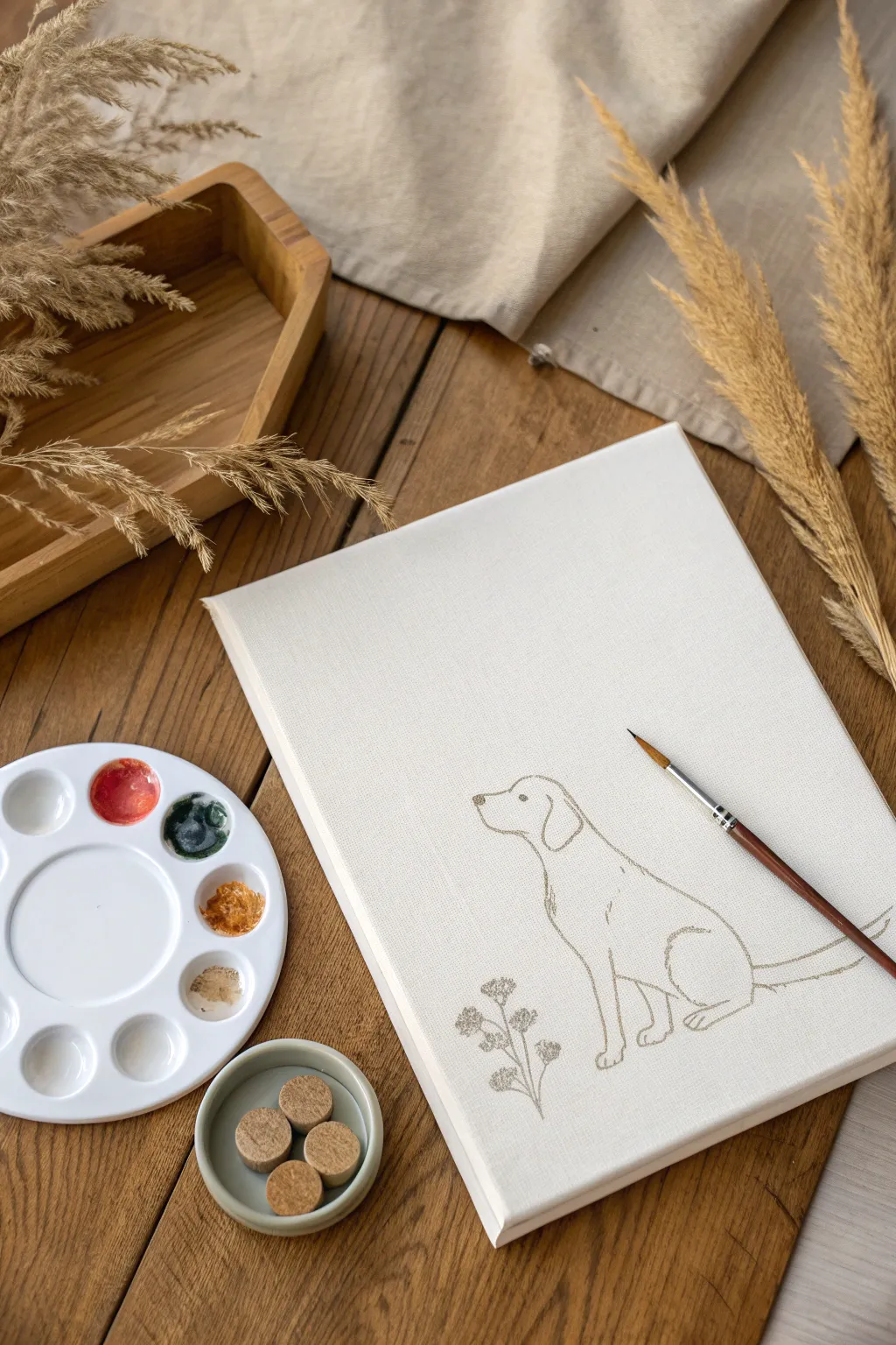
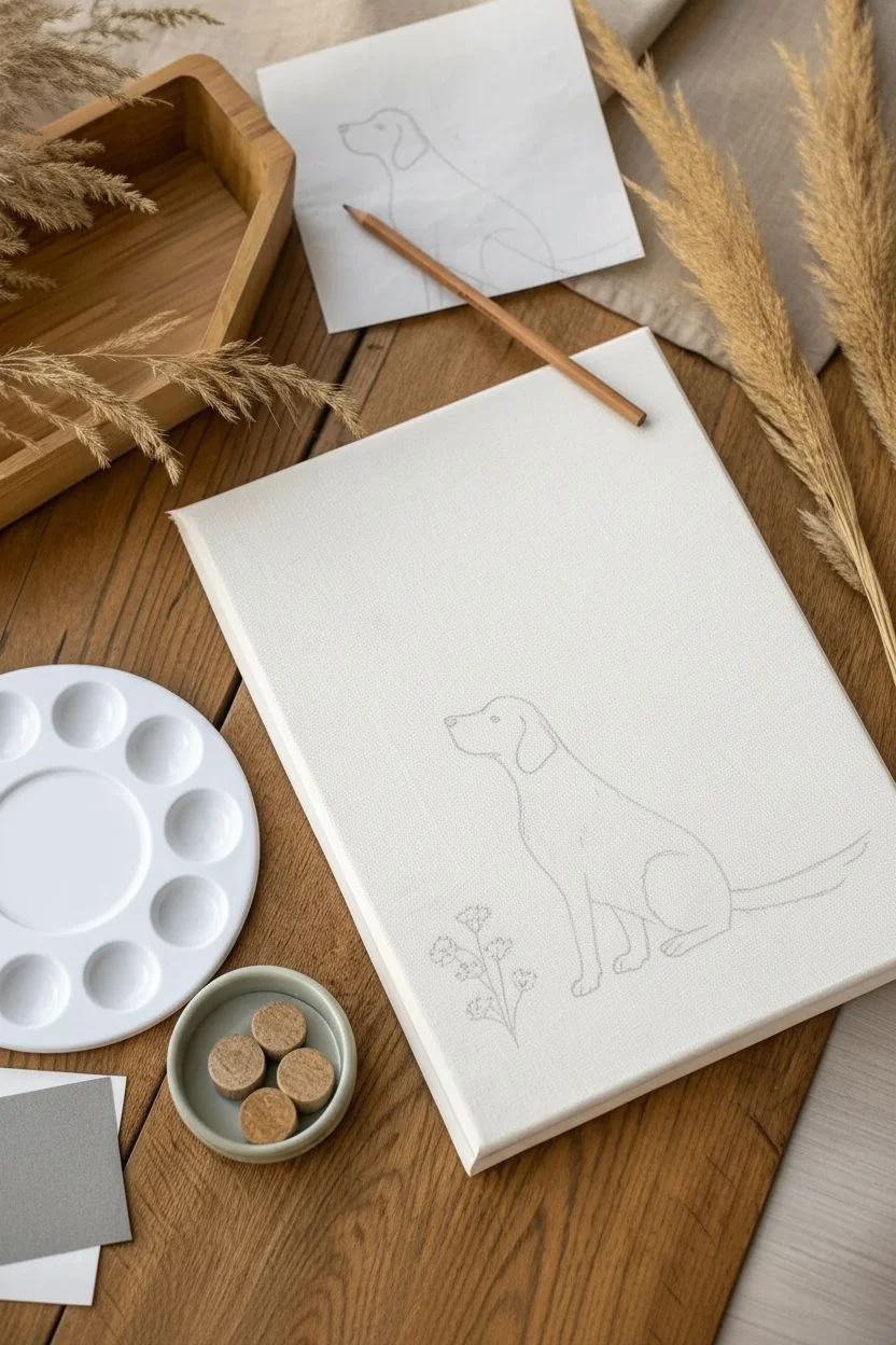
Capture the essence of your furry best friend with this elegant and minimalist approach to pet portraiture. By focusing on simple, clean lines rather than complex shading, you create a timeless piece of art that looks professionally illustrated.
Detailed Instructions
Materials
- Stretched canvas (8×10 or 9×12 inch)
- Photo of your pet (side profile works best)
- Tracing paper
- Pencil (HB or H)
- Fine liner brush (size 0 or 00)
- Light brown or taupe acrylic paint
- Water cup and palette
- Easel (optional)
- Graphite transfer paper (optional)
Step 1: Preparation and Sketching
-
Choose your photo:
Select a clear photo of your pet. For this specific style, a side profile where the animal is sitting calmly works beautifully because it emphasizes the silhouette. -
Create the outline:
If you aren’t confident drawing freehand, place a piece of tracing paper over your photo and trace just the main contour lines: the back, the head shape, the ears, and the paws. -
Simplify the details:
Ignore the fur texture and small markings. Focus on the ‘big shapes’ that define the breed and posture. Less is definitely more here. -
Transfer to canvas:
Place your tracing paper onto the canvas. You can scribble graphite on the back of the tracing paper and press down, or use specialized graphite transfer paper to get the image onto the canvas surface. -
Add botanical elements:
Sketch a few simple wildflower stems near the pet’s feet to ground the composition. This adds a delicate touch without overpowering the main subject. -
Refine the sketch:
Lightly go over your transferred lines with a pencil directly on the canvas to ensure they are visible but faint. Clean up any smudges with a kneaded eraser.
Step 2: Painting the Line Work
-
Prepare your palette:
Mix a small amount of light brown or taupe acrylic paint. You want a color that is soft and earthy, distinct from the white canvas but not as harsh as black. -
Thin the paint:
Add a few drops of water to your paint until it reaches an inky consistency. This is crucial for smooth lines; thick paint will drag and create jagged edges. -
Load the brush:
Dip your fine liner brush (size 0 or 00) into the thinned paint. Twirl the tip against the palette surface to sharpen it to a fine point. -
Test your flow:
I always find it helpful to test a line on a scrap piece of paper first to ensure the paint flows smoothly off the brush without blobbing. -
Begin the outline:
Start painting over your pencil marks. Use a light hand and try to pull the brush rather than pushing it. -
Break the lines:
Don’t feel pressured to make one continuous line. Small breaks in the line work can add artistic character and make the drawing feel more organic. -
Paint the eye:
Carefully paint the eye with a small dot or circle. The placement of the eye is key to capturing the expression, so double-check your reference photo. -
Detail the paws:
Outline the paws gently. You don’t need to draw every individual toe; a simple suggestion of the shape is often enough. -
Add the tail:
sweep the brush out to create the tail. If your pet has a fluffy tail, you can use slightly jagged or broken lines to suggest texture. -
Paint the florals:
Go over your botanical sketches with the same paint color. Keep these lines particularly delicate to differentiate them from the pet. -
Final check:
Step back and look at the composition. If any lines look too thin or faint, go over them a second time once the first layer is dry to deepen the color.
Shaky Hands?
If your hand shakes while doing fine lines, rest your wrist on a supportive object like a clean book or a mahl stick to stabilize your movement
Add a Splash
Once the outline is totally dry, add a very watery wash of watercolor inside the body shape for a soft, abstract pop of color
Now you have a stylish and modern tribute to your pet that fits perfectly with any decor
Pre-Drawn Outline Canvas Painting Party for Instant Confidence
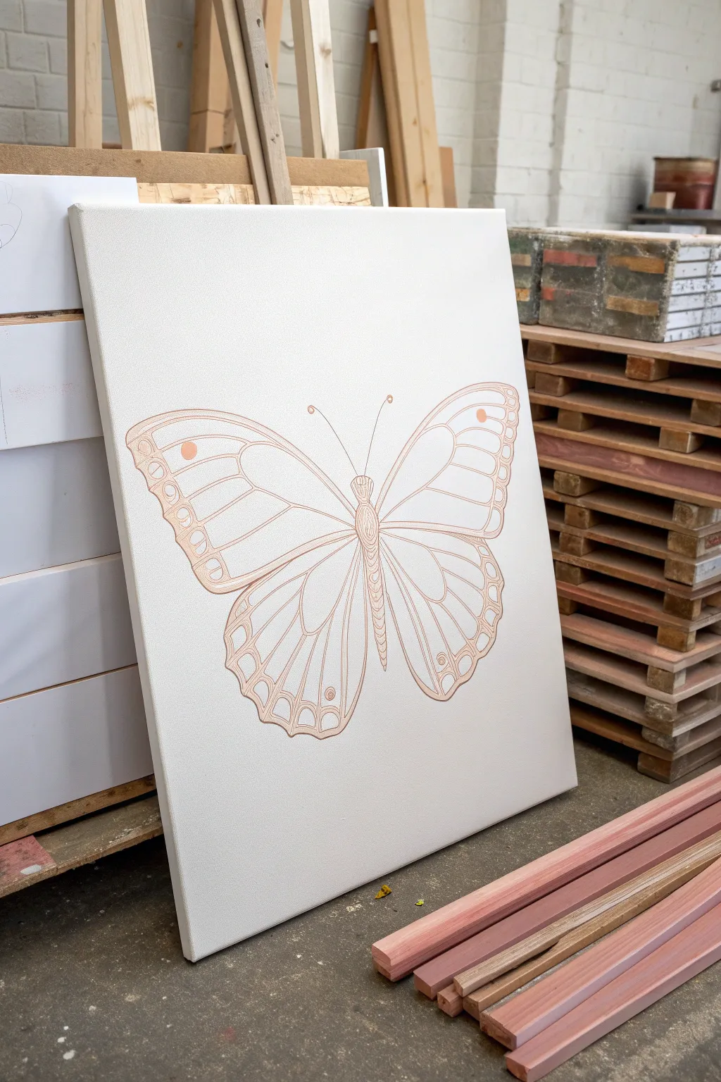
This project focuses on creating a sophisticated, pre-drawn canvas that serves as the perfect starting point for a painting party or stands alone as modern, minimalist decor. The fine, metallic lines add an elegant touch to the classic butterfly motif.
Step-by-Step Guide
Materials
- Large rectangular stretched canvas (approx. 24×36 inches)
- Pencil (HB or lighter)
- Large butterfly stencil or printed template
- Carbon transfer paper (optional)
- Metallic copper or rose gold paint marker (fine tip)
- Acrylic paint pointer or fluid acrylics with a liner brush (alternative to marker)
- Long ruler or straight edge (for symmetry checks)
- Eraser (kneaded preferred)
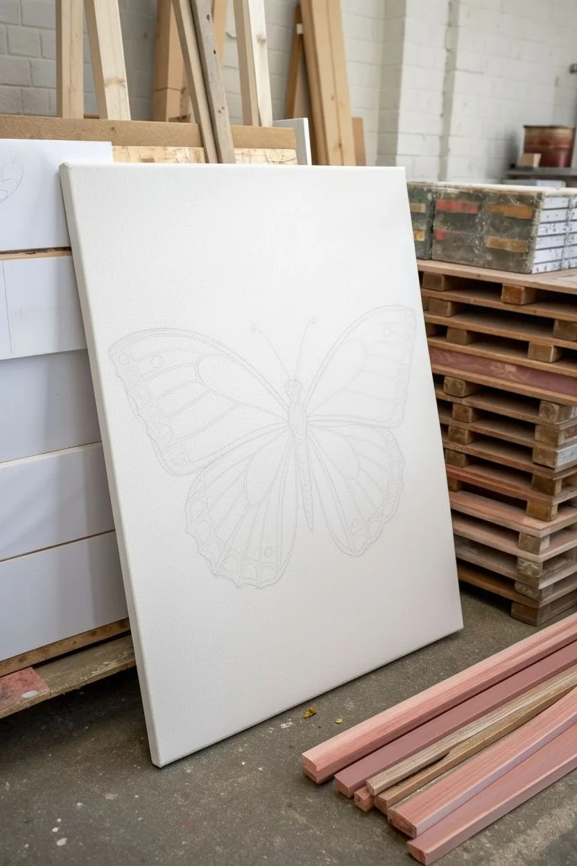
Step 1: Preparation and Sketching
-
Surface Prep:
Begin by wiping down your stretched canvas with a clean, dry cloth to remove any dust that might interfere with your drawing lines. -
Identify Center:
Measure the width of your canvas to find the exact vertical center line. Lightly mark this with a pencil at the top and bottom; this axis constitutes the body of the butterfly. -
Template Placement:
If using a large printed template, tape it securely to the canvas. Insert a sheet of carbon paper underneath if you aren’t sketching freehand. -
Rough Sketching:
Using a very light hand, pencil in the main shapes of the wings. Start with the larger upper wings, ensuring they arc upwards and outwards symmetrically. -
Lower Wing Definition:
Sketch the lower wings, making them slightly smaller and more rounded than the top ones. These should curve inward toward the bottom of the central axis. -
Define the Body:
Draw the central thorax and abdomen along your center line. I find it helpful to make segment lines slightly curved to give the body dimension. -
Internal Veins:
map out the ‘cells’ or sections within the wings. These lines shouldn’t just be random; they generally radiate from the butterfly’s body outward to the wing edges.
Step 2: Inking the Outline
-
Test Your Tool:
Before touching the canvas, test your metallic paint marker or liner brush on a piece of scrap paper to ensure the flow is smooth and consistent. -
Start from the Center:
Begin outlining the body of the butterfly first. This anchors the drawing and establishes your central reference point. -
Outline Main Shapes:
Trace over your pencil lines for the outer perimeter of the wings. Use confident, sweeping arm movements rather than planting your wrist, which helps keep curves smooth. -
Inner Details:
Carefully trace the internal vein structures. These lines are crucial as they create the ‘stained glass’ effect that is so fun to paint later. -
Detailing the Edges:
Add the small scalloped patterns along the outer edges of the wings. Creating these small loops gives the butterfly a delicate, realistic appearance. -
Adding Spots:
Draw the small circular spots near the tips of the upper wings and along the bottom edges. Keep these circles clean and closed. -
Antennae:
Add the antennae last. Place your pen tip at the head and sweep upward and outward in a single, fluid motion to create a fine, tapering line ending in a small curl or bulb.
Clean Line Secret
Rest your hand on a mahl stick or clean dry ruler raised above the canvas surface. This prevents your palm from smudging wet ink while you work on the center.
Step 3: Finishing Touches
-
Let it Set:
Allow the metallic ink or paint to dry completely. This usually takes about 15 to 30 minutes depending on the product thickness. -
Cleanup:
Once fully dry, take your kneaded eraser and gently list any visible pencil marks. Be careful not to scrub too hard over the metallic lines to preserve their sheen. -
Final Inspection:
Check for any gaps in your line work. If a line looks too thin or transparent, go over it a second time to ensure the outline acts as a solid barrier for future painting.
Paint-by-Number Hack
Lightly pencil a tiny number inside each wing section corresponding to a paint color. It turns this outline into a relaxing, guided activity for guests.
Now you have a stunning, professional-looking outline ready to be brought to life with color


Music-Inspired Abstract Canvas Painting Party
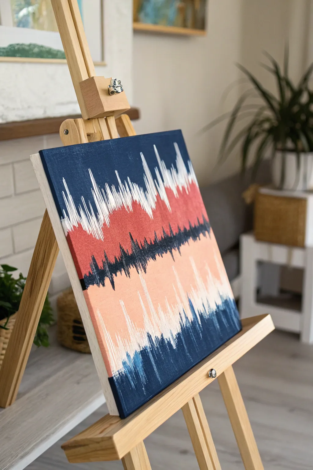
Transform your favorite song into a striking piece of visual art with this waveform-inspired canvas. Using bold, jagged strokes and a layered color palette of navy, coral, and peach, you’ll create a dynamic abstract design that looks like sound frozen in time.
Step-by-Step Guide
Materials
- Square stretched canvas (e.g., 12×12 or 16×16)
- Acrylic paints: Navy Blue, Titanium White, Muted Coral/Red, Peach/Flesh Tone, Black (optional for deepening blue)
- Flat shader brushes (medium and large)
- Detail liner brush or small round brush
- Palette or paper plate
- Cup of water and paper towels
- Easel (optional but helpful)
Step 1: Setting the Background Foundation
-
Prime the top section:
Start by loading a large flat brush with your deep navy blue. Paint the top third of the canvas in solid horizontal strokes, ensuring you cover the top edge of the canvas wrap as well. -
Create the middle ground:
Directly below the wet navy edge, switch brushes or clean your brush thoroughly. Paint a wide horizontal band using the muted coral or red tone. Don’t worry about blending perfectly yet; just get the color down. -
Fill the lower section:
For the bottom third, apply your peach or light flesh tone. Allow the colors to touch but keep distinct ‘zones’ for now. -
Add the bottom anchor:
Finish the base layer by painting a final strip of navy blue at the very bottom edge of the canvas to balance the composition.
Step 2: Creating the Waveform Spikes
-
Mix your transition shades:
On your palette, mix a little white into your navy to create a mid-tone blue, and mix some coral into the peach to bridge those colors. This helps create depth in the jagged lines. -
Start the white spikes:
Using a clean, medium flat brush turned vertically (so you are using the thin edge), create sharp, vertical strikes of pure white starting from the top navy section and pulling down into the coral. -
Vary the lengths:
Make sure your white strokes vary significantly in height. Some should be tall and dramatic like a loud beat, while others are short. Let the brush leave a ‘dry brush’ texture at the ends. -
Layering the middle waveform:
Load a brush with navy blue. Find the seam where the coral meets the peach section. Paint jagged spikes reaching both upward into the coral and downward into the peach. -
Intensify the center line:
Darken your navy with a tiny touch of black if needed. Go back over the central horizontal line with very sharp, dense vertical strokes to create a strong ‘horizon’ line of sound. -
Adding the bottom rhythm:
Move to the bottom navy strip. Using the peach paint this time, paint upward strokes that invade the navy area, and use the navy to paint upward strokes into the peach field.
Dry Brush Technique
Don’t wet your brush between color changes for the spikes. A dry, stiff brush creates those scratchy, textured ‘static’ lines much better than a wet, smooth one.
Step 3: Refining and Detailing
-
Feather the edges:
Switch to a smaller brush. Go back to your top white waveforms and feather them out. Add tiny, thin lines alongside the thick strokes to make the design look more like a digital readout. -
Enhance the coral connection:
I like to take a bit of the coral paint and drag it slightly upward into the white spikes. This blends the transition so the white doesn’t look like it’s just sitting on top. -
Sharpen the navy spikes:
Ensure the central navy band has very sharp, needle-like tips. Use a liner brush if your flat brush is making blunt edges. -
Add white highlights lower down:
Introduce a few subtle streaks of white into the bottom peach section, mimicking the intensity of the top section but keeping it much fainter. -
Texture check:
Look for areas that are too solid. Use a dry brush with very little paint to lightly scratch vertical lines over these areas, reinforcing that ‘static’ or ‘vibration’ visual texture. -
Final Contrast:
add a few final touches of pure, unmixed navy blue in the deepest parts of the central wave to emphasize the contrast against the light peach. -
Paint the sides:
Don’t forget the edges of your canvas. Extend the horizontal bands of color around the sides to give it a finished, gallery-ready look.
Personalize the Beat
Record a voice memo of you saying ‘I love you’ or a favorite phrase. Use the visual waveform from your phone screen as the specific reference for your painting’s shape.
Step back and admire how you’ve captured the rhythm and energy of sound on your canvas
Glow-in-the-Dark Neon Canvas Painting Party
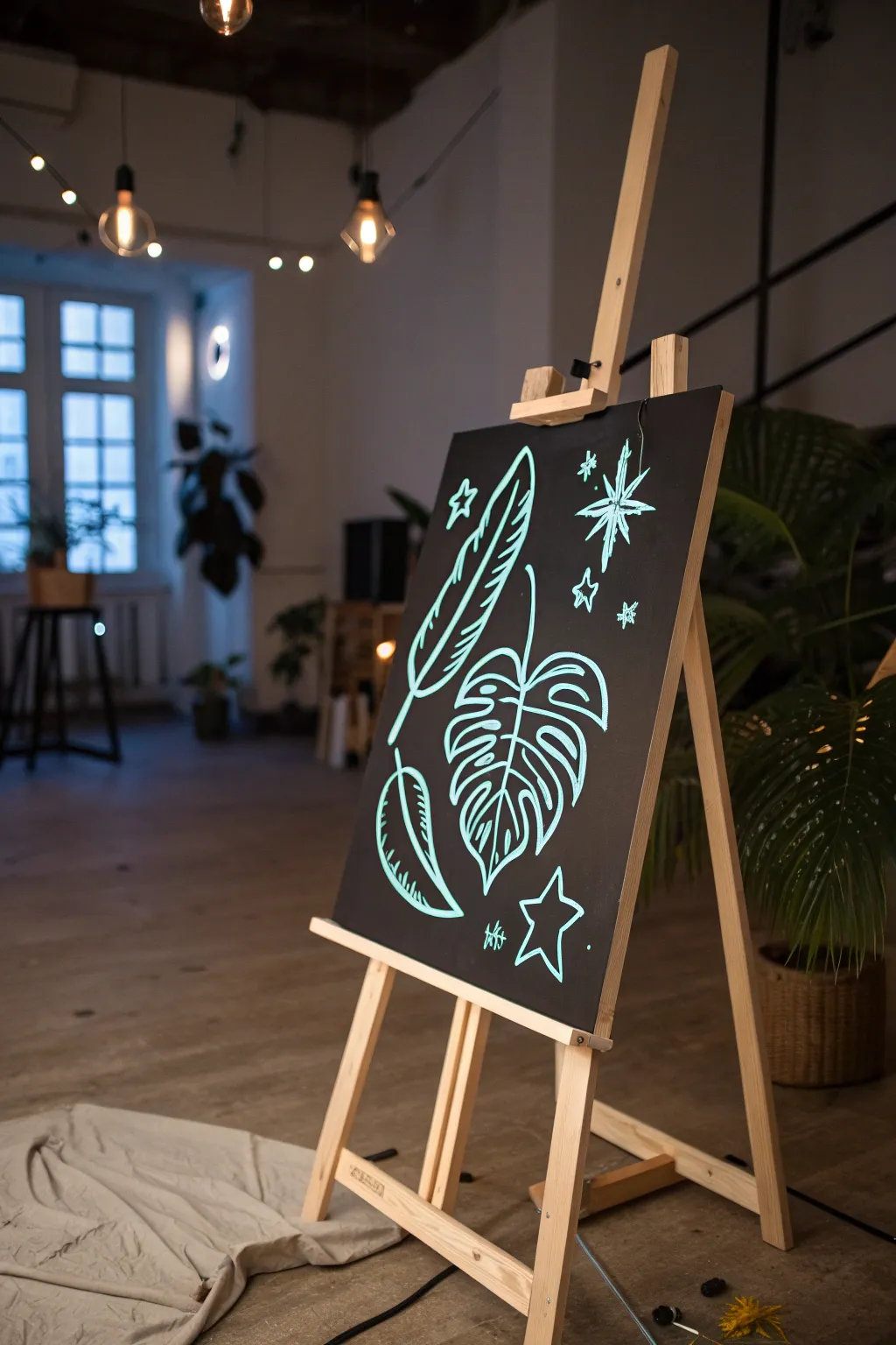
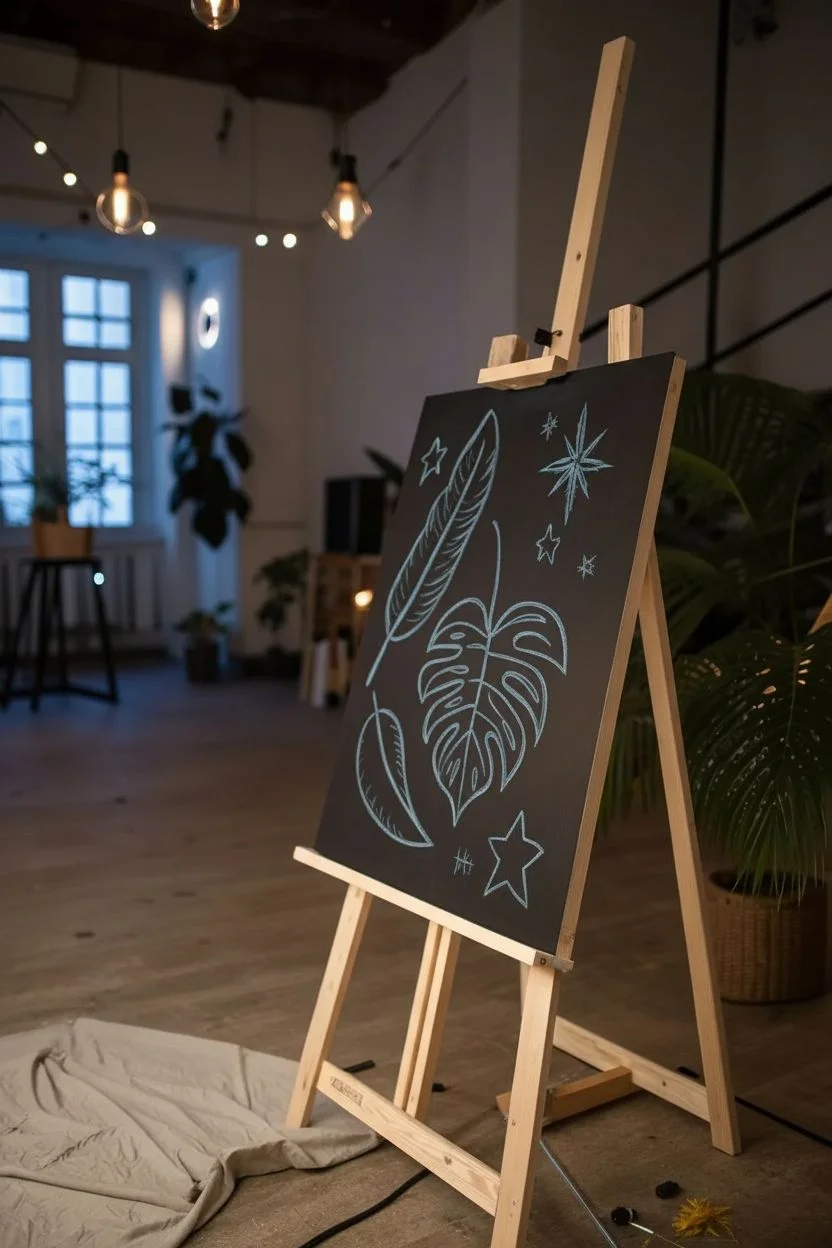
Transform a standard black canvas into a glowing masterpiece with this striking, minimalist design. Using high-contrast neon paint, you’ll create elegant botanical shapes and celestial doodles that truly pop under blacklight.
Step-by-Step
Materials
- Black stretched canvas (16×20 or similar)
- White or light blue chalk (for sketching)
- Neon teal or glow-in-the-dark acrylic paint
- Small round synthetic brush (size 2 or 4)
- Fine liner brush (size 0 or 1)
- Cup of water and paper towels
- Blacklight (optional, to test glow effect while working)
Step 1: Preparation & Sketching
-
Prepare the surface:
Ensure your black canvas is clean and free of dust. If you are painting your own canvas black, apply two coats of matte black acrylic and let it dry completely before starting. -
Plan the layout:
Visualize the composition: a large central monstera leaf, flanked by two long feathers on the left, and scattered stars on the right. -
Sketch the central leaf:
Using chalk, lightly draw a large heart shape slightly tilted to the right in the lower center. This forms the base of your monstera leaf. -
Refine the leaf shape:
Sketch the characteristic splits and holes of the monstera leaf. Draw curved lines cutting into the leaf from the edges toward the center vein. -
Add the upper feather:
Move to the upper left quadrant. Sketch a long, curved spine for your first feather, pointing diagonally upward. -
Detail the feather:
Draw the fletching of the feather, keeping the lines loose and curved to suggest movement. -
Add the lower feather:
In the bottom left corner, sketch a shorter, rounded leaf or feather shape curving upwards, balancing the composition. -
Place the stars:
Scatter star shapes in the empty spaces on the right side. Include a large eight-pointed star near the top and a classic five-pointed star near the bottom.
Chalk Marks Stick?
If the damp cloth doesn’t remove the chalk, use a clean eraser. If that fails, touch up the background with a little black paint
Step 2: Painting the Neon Lines
-
Load your brush:
Dip your round brush into the neon teal paint. You want the paint to be fluid but opaque; add a tiny drop of water if it feels too thick. -
Outline the monstera:
Start tracing your chalk lines on the main leaf. Use confident, smooth strokes. Don’t worry if you deviate slightly from the sketch. -
Add leaf veins:
Switch to a liner brush for the interior veins of the monstera leaf to give them a delicate look. -
Paint the top feather:
Outline the upper feather. Use slightly heavier pressure on the spine and lighter flicks for the edges to simulate texture. -
Paint the bottom feather:
Trace the bottom leaf shape. I like to add little distinct notches along the edge to make it look organic. -
Illuminate the stars:
Paint the star shapes. For the large starburst, start from the center and pull strokes outward to get sharp points. -
Add decorative sparkles:
Fill in any awkward gaps with tiny four-pointed sparkles or small dots. This adds a magical, constellational feel. -
Apply second coat:
Neon paints can be translucent. Once the first layer is dry to the touch, retrace the main lines to ensure maximum brightness. -
Clean up:
Once the paint is fully dry, take a slightly damp paper towel and gently wipe away any visible chalk guidelines.
Level Up: Dual Tone
Use a second neon color, like hot pink, for the inner veins or the stars to create a vibrating, electric color contrast
Turn on the blacklight and watch your botanical creation shine in the dark
Mystery Paint Swap Finale Canvas Painting Party
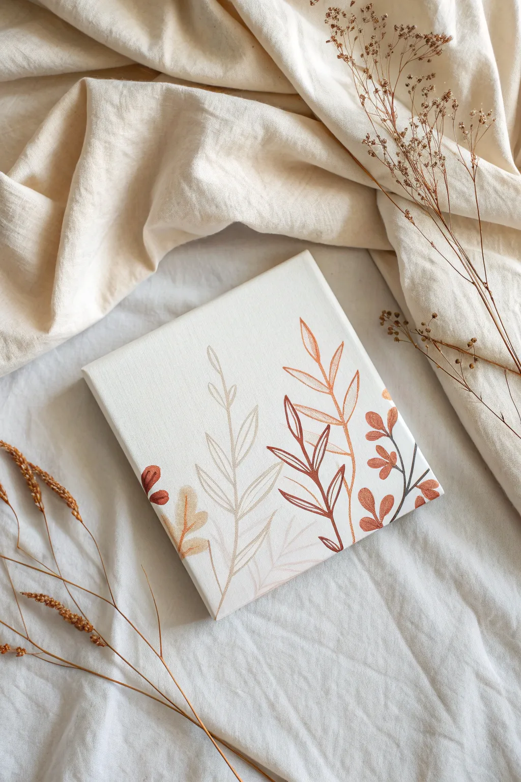
Embrace the minimalism of nature with this delicate foliage study featuring warm earth tones and graceful, organic lines. The layered leaf patterns create a soothing aesthetic that fits perfectly into any modern or bohemian decor scheme.
How-To Guide
Materials
- Small square canvas (e.g., 8×8 or 10×10 inch)
- Acrylic paints: Cream/Off-white, Burnt Sienna, Raw Umber, Terracotta/Rust, Pale Sage Green, Deep Brown
- Fine liner detail brushes (sizes 0 and 00)
- Small round brush (size 2)
- Palette for mixing
- Cup of water
- Paper towels
- Pencil (optional for sketching)
Step 1: Setting the Stage
-
Base Coat Application:
Begin by covering the entire canvas surface with a creamy off-white or very pales sand color. Use a larger brush for even strokes. -
Smooth Finish:
Apply a second coat of the base color once the first is dry to ensure a solid, opaque background with no canvas texture showing through. Let this dry completely. -
Layout Planning:
Visualize three main zones of foliage: a central pale stalk, a darker leafy stem on the right, and smaller accents near the bottom corners. You can lightly sketch these main stems with a pencil if you wish.
Clean Lines Only
If your paint is too thick, fine lines will break. Thin your acrylics with a drop of water until it has an ink-like consistency for smooth flow.
Step 2: Layer 1: The Subtle Background
-
Mixing the Pale Tone:
Mix a very light sage or taupe color by adding a tiny drop of raw umber to your base cream color. It should differ only slightly from the background. -
Painting the Ghost Stem:
Using your fine liner brush, paint a tall, thin stem rising up the center-left. Keep the line weight very delicate. -
Adding Ghost Leaves:
Draw simple, elongated oval outlines attached to this stem. These leaves are open shapes—just outlines—creating a transparent, airy feel. -
Second Pale Stem:
Create a second, smaller ghost stem branching off near the bottom right, mirroring the technique of thin lines and open leaf shapes.
Step 3: Layer 2: The Warm Accents
-
Mixing Terracotta:
Prepare a warm, rusty orange or terracotta shade on your palette. This needs to be a medium value—not too dark, not too light. -
Painting the Right Stem:
Paint a prominent stem curving up the right side of the canvas. This stem should be slightly thicker than your first layer. -
Forming Solid Leaves:
For this stem, paint the leaves as solid, filled-in shapes rather than outlines. Use single strokes of the round brush, pressing down and lifting up to create the tapered leaf shape. -
Bottom Corner Accents:
Add small clusters of solid rust-colored leaves peeking in from the bottom left and bottom right edges to frame the composition.
Gold leaf accent
Once fully dry, apply tiny touches of gold leaf adhesive to the tips of the dark brown leaves, then foil for a glamorous metallic pop.
Step 4: Layer 3: Contrast and Detail
-
Mixing Deep Brown:
Create a rich contrasting color using burnt sienna mixed with a touch of black or dark blue to make a deep espresso brown. -
The Dark Outline Stem:
Paint a third stem overlaid near the right side, slightly overlapping the terracotta leaves. Use the finest liner brush for crisp precision. -
Dual-Style Leaves:
On this dark stem, alternate between fully filled small leaves and open leaf outlines. This variety adds visual interest and depth. -
Bottom Accents:
Add a few tiny dark leaves near the bottom right corner, as if a plant is growing just off-canvas. -
Mustard Yellow Details:
Mix a soft mustard or ochre yellow. Use this to paint a small, subtle plant at the very bottom left, nestled among the other stems. -
Refining Lines:
Go back over any stem lines that look shaky. I find that holding your breath for a second while pulling a long line helps keep it steady. -
Edge Consistency:
Ensure the visuals extend slightly over the sides of the canvas or stop neatly at the edge for a polished, professional look. -
Final Inspection:
Check for any pencil marks still visible and gently erase them once the paint is 100% bone dry.
Step back and admire the calm elegance of your botanical creation

Have a question or want to share your own experience? I'd love to hear from you in the comments below!