Whenever I want a painting to feel soft, playful, or a little bit dreamy, I reach for pink paint first. These pink painting ideas are the kind you can knock out in a cozy afternoon, with plenty of room to make them totally your own.
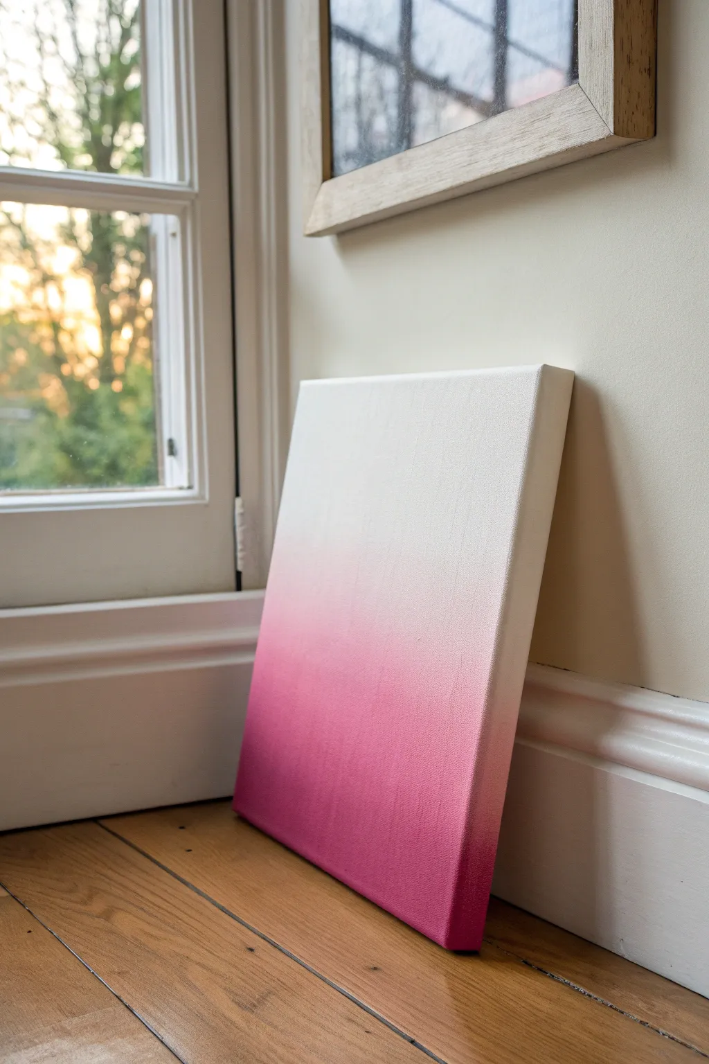
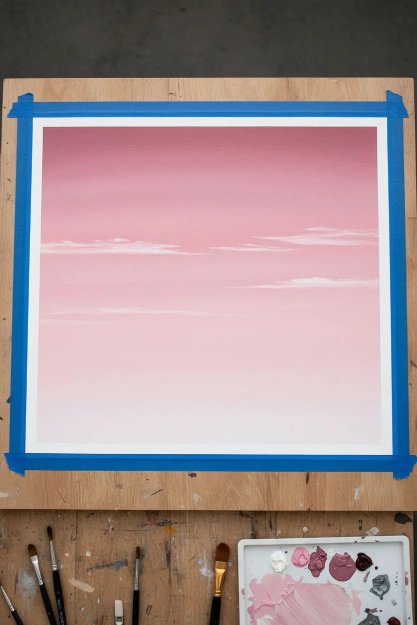
Cotton-Candy Pink Cloud Study
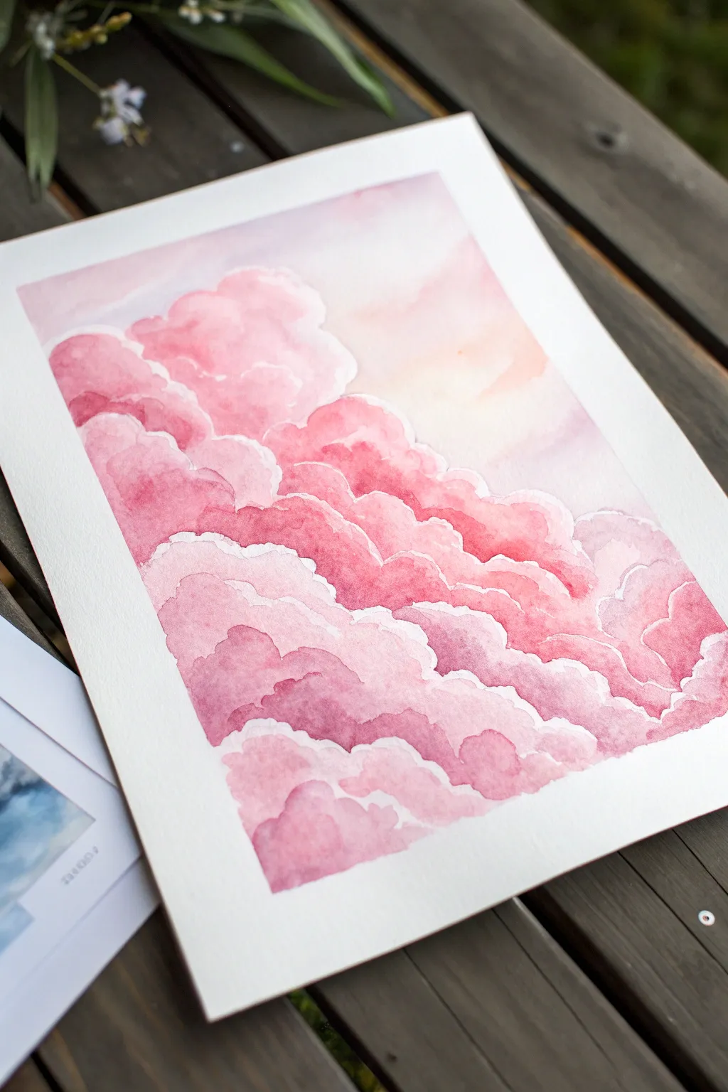
Capture the dreamlike quality of a sunset sky with this monochromatic watercolor study. By layering varying saturations of rose and magenta creates depth, you’ll transform simple shapes into fluffy, glowing cloud formations that seem to float right off the paper.
Step-by-Step
Materials
- Cold-press watercolor paper (300 gsm)
- Watercolor paints: Rose Madder, Alizarin Crimson, and a touch of Yellow Ochre
- Two cups of water
- Round watercolor brushes (size 4, 8, and 12)
- Masking tape
- Paper towels or a cotton rag
- Hardboard or painting surface
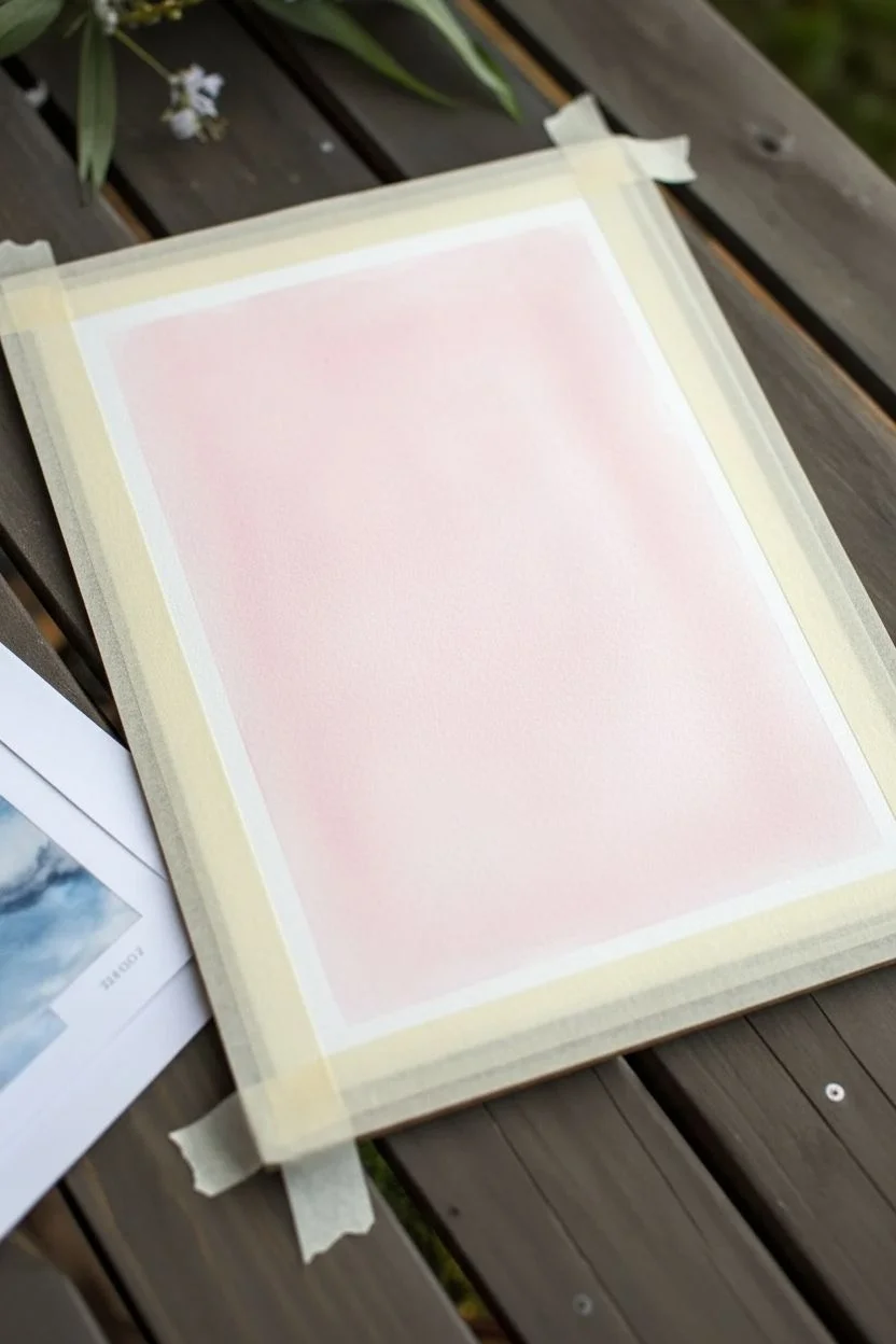
Step 1: Preparation and Sky gradients
-
Secure the paper:
Begin by taping your watercolor paper down to a hardboard on all four sides. This prevents the paper from buckling when we add wet washes. -
Mix the background hue:
Create a very dilute wash of Rose Madder with a tiny hint of Yellow Ochre to warm it up. This will be the glowing sky behind the clouds. -
Paint the upper sky gradient:
Using your largest brush (size 12), wet the top third of the paper with clean water. Apply your pale mix, starting at the top edge and fading it out as you move downward. -
Soften the transition:
While the paint is still wet, use a clean, damp brush to feather the bottom edge of this wash so it disappears seamlessly into the white paper below. -
Let it dry slightly:
Allow the initial background wash to dry until it is no longer shiny but feels cool to the touch. This prevents the next layers from bleeding uncontrollably.
Fixing “Cauliflowers”
If water blossoms (blooms) appear where wet paint met damp paper, wait for it to dry completely. Then, gently scrub the hard edge with a damp stiff brush to soften it.
Step 2: Building the Cloud Structure
-
Define the first cloud shapes:
Switch to a size 8 brush and load it with a slightly more saturated Rose Madder mixture. Paint the scalloped top edge of the highest cloud bank on the left side. -
Soften the bottom edge:
Before the paint dries, rinse your brush, dab it on a towel, and drag the bottom edge of that fresh paint downward to fade it out. This creates volume—darker at the top, lighter at the bottom. -
Layering the middle section:
Repeat this process for the clouds in the middle of the paper. Use wobbly, irregular strokes to outline the tops of the clouds. -
Leave white gaps:
As you paint new cloud clusters, be careful not to touch the wet paint of the clouds above them immediately. Leaving a tiny sliver of unpainted white paper between layers acts as a highlight. -
Introduce deeper tones:
Mix a stronger color using Alizarin Crimson and Rose Madder. I like to drop this intense pigment into the wet bottom edges of the mid-level clouds to suggest shadow.
Add Sparkle
For a magical touch, use white gouache or a white gel pen to accentuate the very brightest rims of the clouds after the watercolor is fully dry.
Step 3: Deepening Shadows and Details
-
Paint the lower cloud bank:
The clouds nearest to the bottom should appear denser. Use your darker pink mix to paint the shapes at the bottom right, keeping the edges crisp along the top. -
Create hard edges:
Allow the previous layers to dry completely if you want a distinct separation. Paint a fresh layer of clouds slightly overlapping the faded bottom of the layer above it. -
Add variance to the edges:
Use the tip of your size 4 brush to add small, bumpy details to the cloud outlines. Avoid perfect semi-circles; nature is random. -
Lift pigment for softness:
If a shadow looks too dark or hard, scrub it gently with a clean, damp brush and blot with a paper towel to lift the color back to a soft pink. -
Final shadow accents:
Mix your most concentrated magenta. Add thin glazes of this color into the deepest crevices between cloud puffs to maximize dimension. -
Final review:
Step back and check the balance. If the sky looks too flat, you can glaze a very watery layer of yellow ochre over the light areas once everything is bone dry.
Peel off the tape carefully to reveal the crisp white border that frames your fluffy pink sky

Black Silhouette Tree Against a Pink Sky
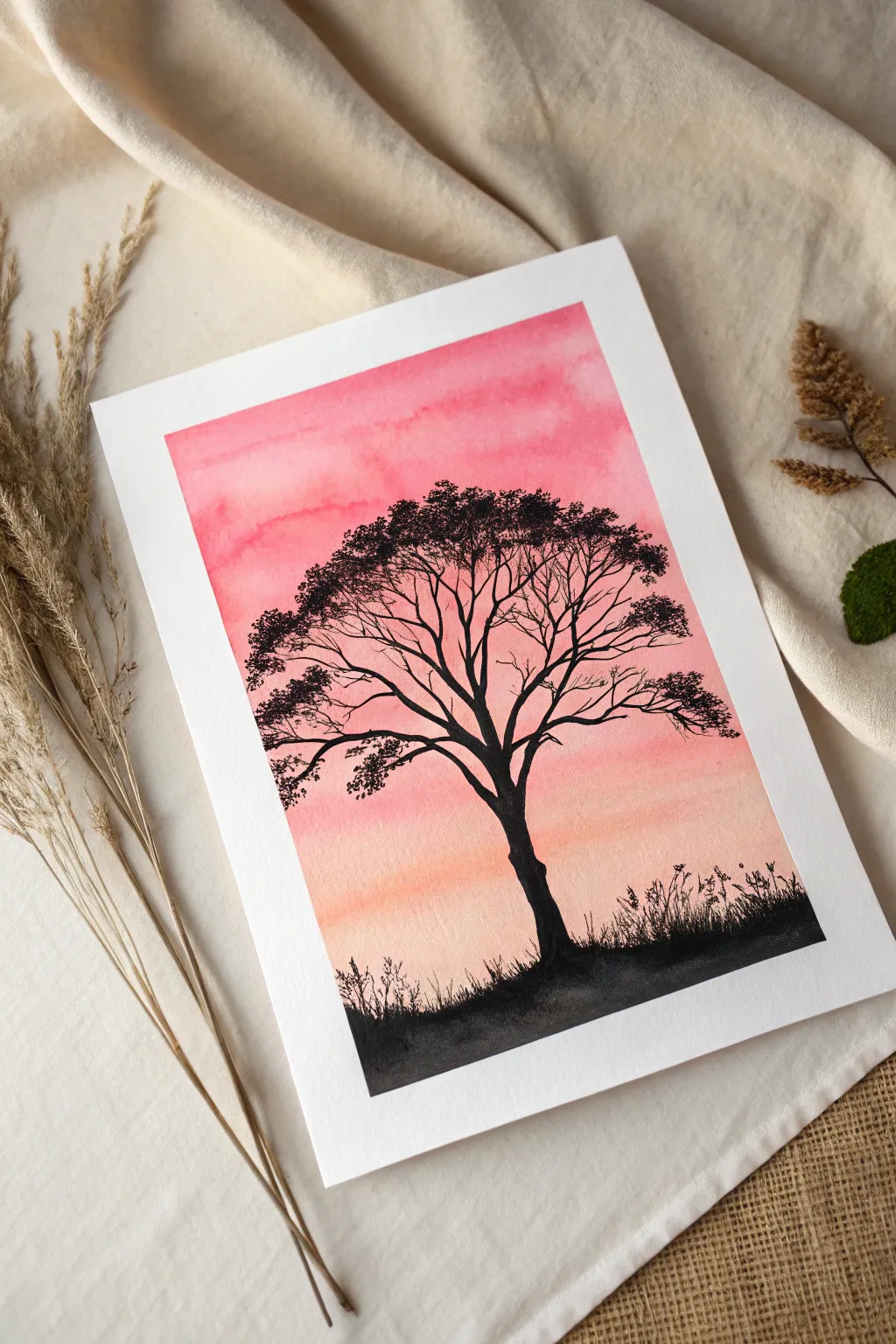
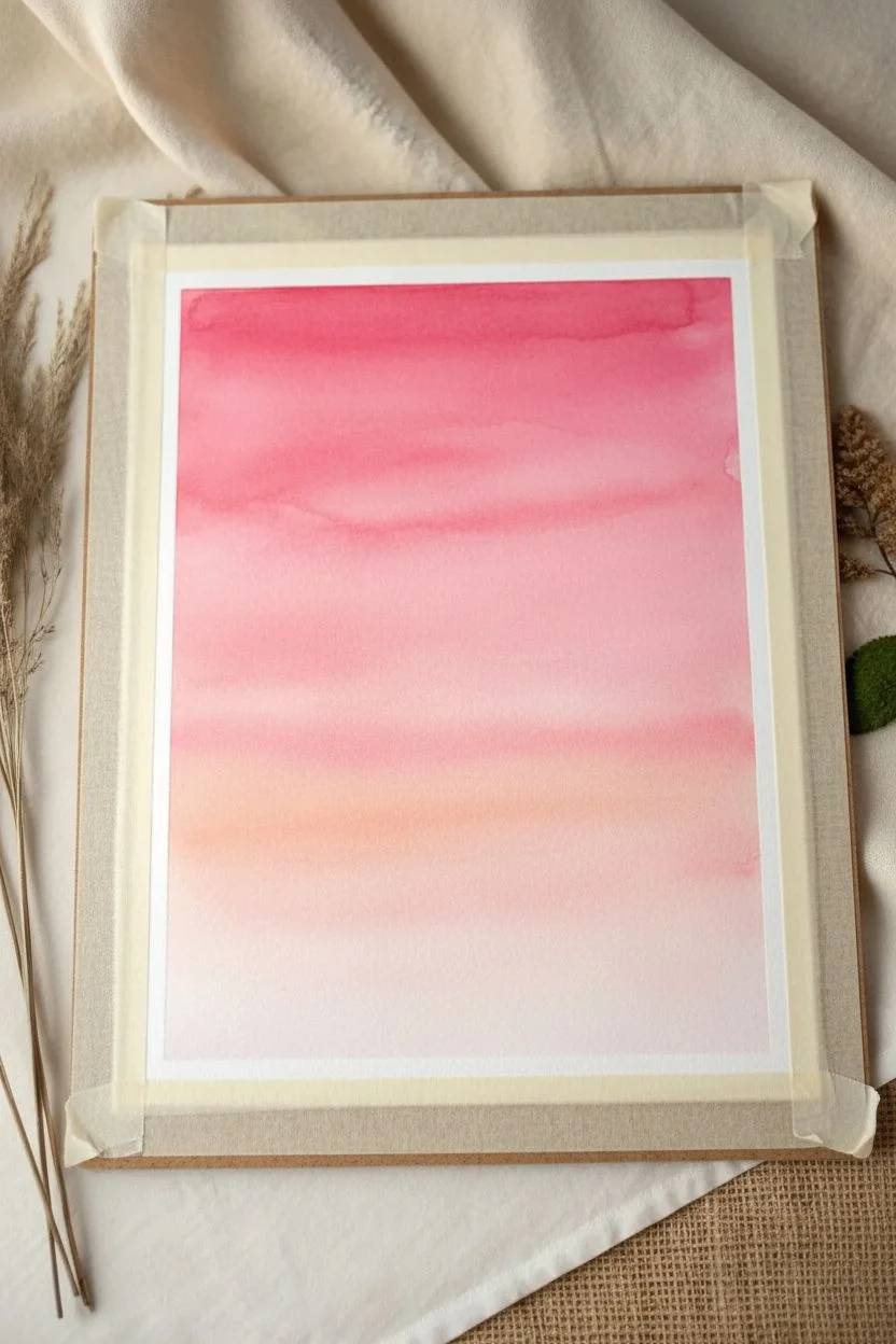
Capture the serenity of daybreak with this striking watercolor composition featuring a bold black tree silhouette against a soft, gradient pink sky. This project is perfect for beginners looking to practice wet-on-wet blending and fine brush control.
Step-by-Step Tutorial
Materials
- Cold press watercolor paper (300 gsm)
- Masking tape
- Watercolor paints (Alizarin Crimson, Opera Pink, and a touch of Yellow Ochre)
- Black gouache or waterproof black ink
- Flat wash brush (1 inch)
- Round brushes (size 4 and size 0 or 00 liner)
- Clean water
- Paper towels
- Pencil and eraser
Step 1: Setting the Sky Gradation
-
Prepare the workspace:
Begin by taping down all four edges of your watercolor paper to a hard board or table surface using masking tape. This prevents the paper from buckling when it gets wet and creates that crisp white border. -
Wet the paper:
Load your large flat wash brush with clean water and coat the entire paper surface evenly. You want an even sheen that glistens but doesn’t form puddles. -
Mix the pinks:
On your palette, prepare a vibrant pink mix using Alizarin Crimson and Opera Pink with plenty of water. Also, prepare a separate, softer wash of pink mixed with a tiny drop of Yellow Ochre for the warm horizon. -
Apply the top layer:
While the paper is still damp, apply the vibrant pink mix to the top third of the paper. Use horizontal strokes, allowing the pigment to bloom naturally into the wet paper. -
Blend downwards:
Wash your brush, load it with the lighter, warmer pink mix, and apply it to the middle section of the paper. -
Create a seamless gradient:
I like to gently tilt the board slightly so the darker pink at the top flows into the lighter pink. Use a clean, damp brush to smooth out the transition area if needed, ensuring there are no hard lines. -
Fade to the horizon:
As you reach the bottom third, add more water to your brush to fade the color out, leaving the very bottom area extremely pale, almost white. -
Dry completely:
Let the background dry completely. This is crucial; if the paper is cool to the touch, it’s still damp. Use a hairdryer on a low setting if you’re impatient.
Branch technique
To get thin, tapered branches, lift your brush as you pull the stroke outward. Press down for thickness, then lift up to a point for the wispy ends. Rolling the brush slightly helps keep a sharp point.
Step 2: Painting the Silhouette
-
Sketch the tree:
Lightly sketch the main trunk and primary branches with a pencil. Don’t worry about the fine details yet; just establish the placement and the slight curve of the trunk. -
Paint the trunk base:
Switch to your size 4 round brush and load it with black gouache or ink. Paint the ground first, creating an uneven, grassy texture at the very bottom. -
Build the trunk:
Paint the trunk of the tree, starting wider at the base and tapering as you go up. Ensure the black is opaque and solid. -
Extend main branches:
From the top of the trunk, branching outwards, paint the primary limbs. Let your hand wobble slightly to create natural, organic lines rather than straight sticks. -
Switch to the liner brush:
For the finer details, change to your size 0 or 00 liner brush. The paint should be the consistency of heavy cream so it flows smoothly. -
Add secondary branches:
Paint smaller branches splitting off from the main ones. Remember that branches generally get thinner as they move away from the trunk. -
Create the canopy illusion:
Instead of painting individual leaves, use a stippling motion (tapping the brush tip) at the ends of the finest branches to suggest clusters of foliage. Keep these clusters somewhat airy so the pink sky peeks through. -
Refine the ground:
Return to the base of the painting. Use short, upward flicking strokes with the liner brush to create the appearance of tall grass and weeds growing around the tree roots. -
Final touches:
Step back and assess your tree. Fill in any sparse areas with a few more tiny twigs or leaf clusters to balance the composition. -
Reveal the border:
Once the black paint is 100% dry, carefully peel away the masking tape at a 45-degree angle to reveal your clean white edges.
Bleeding paint?
If your black silhouette starts to bleed or spiderweb into the pink sky, your background wasn’t fully dry. Stop immediately and let it dry completely before attempting to fix the edge with opaque gouache.
Frame your silhouette piece in a simple white or black frame to let the vibrant colors truly shine

Cherry Blossom Branch in Pink Tones
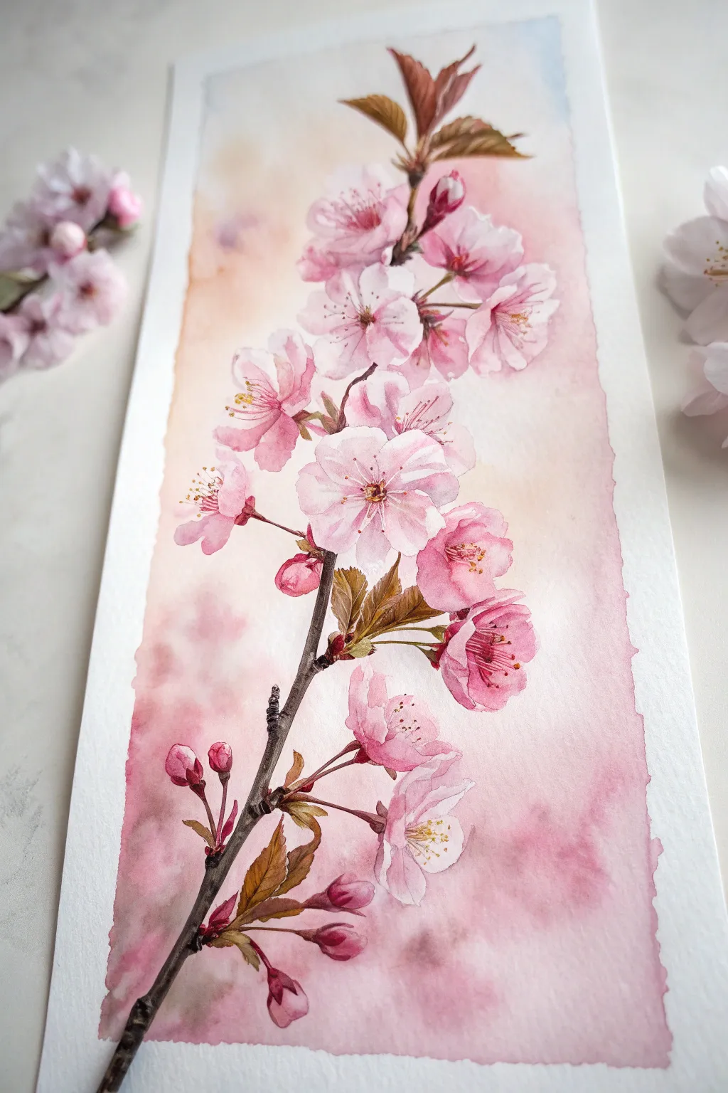
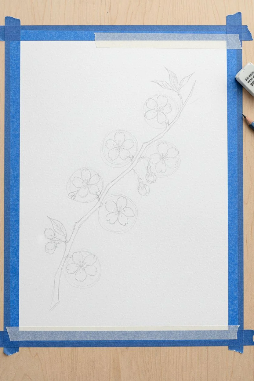
Capture the ephemeral beauty of spring with this delicate watercolor study of a cherry blossom branch. This project focuses on building soft, glowing petals against a dreamy background wash, perfect for practicing wet-on-wet and wet-on-dry techniques.
Step-by-Step Guide
Materials
- Cold press watercolor paper (300 gsm)
- Watercolor paints (Alizarin Crimson, Rose Madder, Burnt Umber, Sap Green, Yellow Ochre, Burnt Sienna)
- Round watercolor brushes (Size 8 for washes, Size 4 and 2 for details)
- Painter’s tape or washi tape
- Pencil (H or HB)
- Kneaded eraser
- Clean water jars (two)
- Paper towels
- White gouache or white gel pen (optional for highlights)
Step 1: Preparation and Sketching
-
Tape the Edges:
Begin by taping down your paper to a board. This creates the crisp white border seen in the reference image and prevents the paper from buckling during the heavy wash stage. -
Map the Composition:
Lightly sketch the main diagonal line of the branch first. It should curve gently from the bottom left corner upward toward the top right. -
Outline the Blooms:
Sketch the flower clusters using light, loose circles to denote placement. Group them naturally; some should overlap, while others stand alone. -
Refine the Details:
Tighten up your sketch by drawing individual petals, buds, and leaves. Keep your pencil pressure very light so the graphite doesn’t show through the transparent pinks later.
Preserve Your Whites
Don’t use white paint to fix mistakes. In watercolor, the brightest white is the paper itself. Plan carefully and paint around your highlights for that luminous look.
Step 2: The Dreamy Background
-
Wet the Background:
Using your large size 8 brush and clean water, carefully wet the negative space around the branch and flowers. Try to paint ‘around’ your sketch lines, keeping the flower interiors dry. -
Refine the Wet Edge:
For the rough, organic edges seen in the example, don’t wet the paper all the way to the tape. Leave shaky, uneven dry patches near the border. -
Drop in Color:
While the paper is glistening, drop in a very diluted mix of Rose Madder and a touch of Yellow Ochre. Let the colors bleed and soften on the paper. -
Deepen the Mood:
Add slightly stronger touches of pink near the bottom corners and behind the main flower clusters to create depth. Allow this background layer to dry completely before proceeding.
Add Subtle Shimmer
Once the painting is fully dry, mix a tiny amount of iridescent medium into your pollen yellow color and re-dot the stamens for a magical spring sparkle.
Step 3: Painting the Blooms
-
Base Petal Wash:
Mix a watery pale pink using Alizarin Crimson. Paint the petals of the open flowers, leaving tiny slivers of white paper untouched near the centers to suggest light. -
Softening Edges:
If a harsh line forms where you don’t want it, quickly use a damp, clean brush to soften the edge while the paint is still wet. -
Layering Shadows:
Once the base layer is dry, mix a slightly more concentrated pink. Paint the shadows where petals overlap or curl inward to give them three-dimensional form. -
Painting the Buds:
For the tight buds, use a saturated Rose Madder mix. These should be darker and more vibrant than the open flowers. -
Adding Center Details:
Use your smallest brush (size 2) to pant delicate radiating lines in the center of the flowers for stamens. I like to use a mix of Rose Madder and Burnt Sienna for this. -
Pollen Dotting:
Dot the tips of the stamens with a thick, creamy mix of Yellow Ochre or white gouache tinted yellow.
Step 4: Branch and Leaves
-
Painting the Branch:
Mix Burnt Umber with a tiny touch of Paynes Grey or dark blue to get a deep wood tone. Paint the main branch, varying your pressure to create a natural, knobby texture. -
Connecting Stems:
Use a finer brush to paint the thin stems connecting the flowers to the main branch. These should be a lighter reddish-brown. -
Adding Leaves:
Mix Sap Green with Burnt Sienna for an earthy olive tone. Paint the small, pointed leaves emerging near the buds. -
Browning the Tips:
While the green leaves are still damp, touch the tips with a bit of reddish-brown to mimic the look of young cherry blossom foliage. -
Final Contrast:
Go back with your darkest brown mix and add final details to the branch: small knots, texture lines, and the little casings at the base of the buds.
Peel off the tape slowly to reveal your crisp border and enjoy the soft elegance of your new botanical artwork


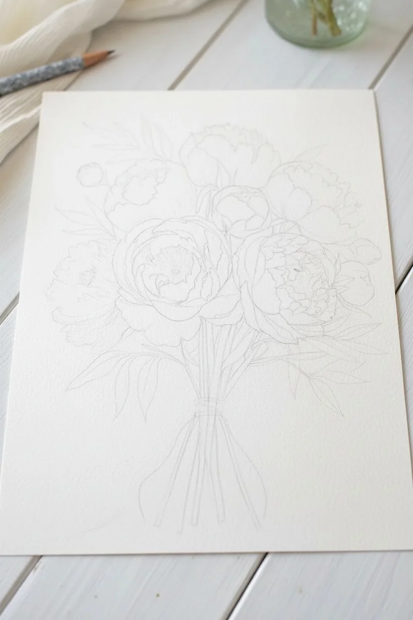
Loose Pink Peony Bouquet
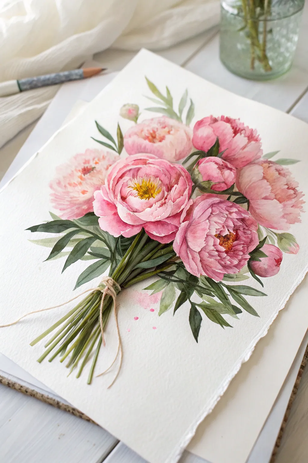
Capture the delicate charm of spring with this lovely bouquet of pink peonies tied with twine. Using soft watercolor washes and precise layering, you’ll create flowers that feel both structured and effortlessly loose.
Step-by-Step
Materials
- Cold press watercolor paper (300 gsm)
- Watercolor paints (Alizarin Crimson, Opera Pink, Sap Green, Burnt Umber, Yellow Ochre)
- Round watercolor brushes (Size 4, 8, and a fine liner)
- Graphite pencil (HB or 2H)
- Kneaded eraser
- Clean water jar
- Paper towels
- Masking fluid (optional)
Step 1: Sketching the Composition
-
Outline the Blooms:
Begin by lightly sketching the placement of your main flowers. Draw four large circles for the open peonies and three smaller ovals for the buds. Keep your pencil lines extremely faint so they disappear under the paint. -
Define Petal Structures:
Inside your circles, lightly map out the cup-shaped petals. Peonies have layers, so draw the outer ruffled petals first, then work inward toward the tight center cluster. -
Add Greenery and Stems:
Sketch the stems converging at a single point near the bottom. Add long, lance-shaped leaves protruding from behind the blooms and interspersed among the stems. -
Detail the Binding:
Draw the looped twine wrapped around the stems. This binding point is crucial for the composition’s ‘bouquet’ look.
Step 2: Painting the Blooms
-
First Wash:
Mix a very watery wash of Opera Pink. Using your size 8 brush, lay down the base color for the petals. Leave small slivers of white paper unevenly distributed; these untouched areas act as natural highlights on the petal edges. -
Build Color Depth:
While the first wash is still slightly damp but not wet, drop in a more concentrated mix of Alizarin Crimson and Opera Pink at the base of the petals. Let the color bleed naturally outward to create soft gradients. -
Define the Petals:
Once the initial layers are dry, mix a darker pink. Use the size 4 brush to paint the shadows between petals. This negative painting technique helps the lighter petal shapes pop forward. -
Paint the Centers:
For the two main forward-facing peonies, paint the center stamens using Yellow Ochre. Make short, flicking strokes. Add tiny touches of Burnt Umber at the base of these yellow strokes for depth. -
Soften Edges:
If any petal edges look too harsh, I like to take a clean, slightly damp brush and gently run it along the edge to soften the transition.
Wet-on-Wet Magic
To get those fluffy petal edges, pre-wet the paper with clean water inside the flower shape before adding pigment. The paint will bloom softly.
Step 3: Leaves and Stems
-
Base Greenery:
Mix Sap Green with a touch of Burnt Umber to dull it slightly. Paint the leaves using a single stroke method: press the brush down to widen the stroke and lift up to create a sharp point. -
Varying Values:
While painting leaves, vary your water-to-paint ratio. Some leaves should be translucent and pale, while others, especially those tucked deep behind flowers, should be dark and saturated. -
Stems and Binding:
Paint the stems using long, confident strokes with the green mix. Use a liner brush with diluted Burnt Umber to paint the twine, ensuring it looks wrapped around the green stems. -
Shadows on Greenery:
Once the green base is dry, add a second layer of darker green (Sap Green + tiny bit of Alizarin Crimson) to the center veins of the leaves and the shadowed side of the stems.
Muddy Greens?
Avoid mixing green directly with the bright pinks on the paper while wet. They are complementary colors and will turn brown/grey if mixed too much on the page.
Step 4: Finishing Touches
-
Splatter Effect:
Load your brush with watery pink paint. Tap the handle against your finger to create delicate splatters around the flowers, giving the piece a loose, artistic feel. -
Final Contrast Check:
Step back and assess your values. Add your darkest pinks into the deepest crevices of the peonies to ensure they have enough volume and don’t look flat.
Allow your beautiful bouquet to dry completely before framing it to brighten up any room
BRUSH GUIDE
The Right Brush for Every Stroke
From clean lines to bold texture — master brush choice, stroke control, and essential techniques.
Explore the Full Guide
Pink Beach at Dusk With Gentle Waves
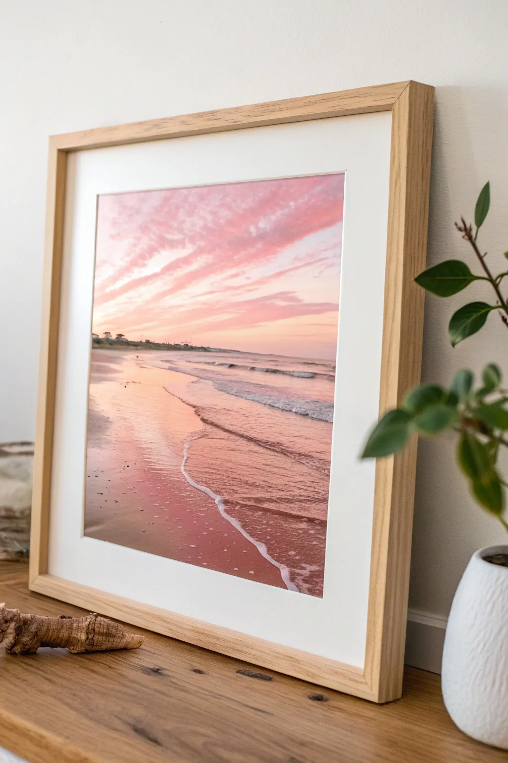
Capture the fleeting magic of a rosy dusk with this soft and inviting beach landscape. You will learn to layer gentle washes of coral and violet to create a glowing sky that reflects beautifully onto wet sand.
Step-by-Step
Materials
- Cold press watercolor paper (140lb/300gsm)
- Watercolor paints: Rose Madder, Cobalt Blue, Burnt Sienna, Yellow Ochre, Alizarin Crimson
- Flat wash brush (3/4 inch)
- Round brushes (sizes 4, 8, and 12)
- Masking fluid (optional)
- Ceramic palette for mixing
- Two jars of water
- Paper towels
- Painters tape
- Wooden frame with mat board
Step 1: Setting the Horizon
-
Prepare the surface:
Begin by taping down the edges of your watercolor paper to a board to prevent buckling. Lightly sketch a horizon live about one-third of the way up from the bottom using a hard pencil like an H or 2H. -
Map the shoreline:
Sketch the gentle curve of the shoreline starting from the left foreground and receding toward the right horizon. Keep lines very faint so they don’t show through the transparent paint later. -
Masking highlights:
If you want crisp white foam lines, apply thin lines of masking fluid where the waves meet the sand. Let this dry completely before touching it with a brush.
Step 2: Painting the Sky
-
Wet-on-wet preparation:
Using your large flat brush, wet the entire sky area with clean water until it glistens evenly but isn’t dripping. -
Base sky gradient:
Mix a watery wash of Yellow Ochre and a touch of Rose Madder. Apply this near the horizon line, blending it upwards into white paper for a soft glow. -
Cloud formation:
While the paper is still damp, mix a stronger concentration of Rose Madder with a tiny dot of Cobalt Blue to make a soft lavender-pink. Use a size 12 round brush to sweep in diagonal cloud streaks from top left toward the horizon. -
Deepening the drama:
Add a bit more Alizarin Crimson to your mix for the underside of the clouds to give them volume. The wet paper will soften the edges for you. -
Let it dry completely:
Crucial step: allow the sky to become bone dry before moving to the ocean to prevent the horizon line from bleeding.
Muddy colors?
If your pinks and oranges turn brown, you likely overmixed or layered opposite colors while wet. Let layers dry fully before glazing.
Step 3: Ocean and Reflections
-
Ocean horizon:
Mix Cobalt Blue with a touch of Burnt Sienna to gray it down. Carefully paint a straight, thin line across the horizon, leaving small gaps for light sparkle. -
Water gradient:
Pull the ocean color down, transitioning into the pinks reflected from the sky. The water near the shore should mirror the cloud colors, so introduce your Rose Madder wash here. -
Wet sand reflection:
The wet sand acts like a mirror. Paint the beach area with a wash of Burnt Sienna and Rose Madder. While wet, drop in horizontal streaks of the darker sky color to simulate reflected clouds on the sand. -
Defining the shoreline:
Create the illusion of receding land on the far left horizon using a mix of Cobalt Blue and Alizarin Crimson. Keep shapes indistinct—just suggesting dunes or trees in the distance.
Add sparkle
For extra shimmer on the water, use a dedicated iridescent medium mixed into your final glazes or slight touches of white gouache for highlights.
Step 4: Details and Finishing
-
Remove masking:
Once the painting is totally dry, gently rub away the masking fluid to reveal the stark white paper underneath. -
Softening foam edges:
Take a clean, damp brush and gently scrub the hard edges of the revealed white lines to make the foam look soft and moving. -
Wave shadows:
Mix a diluted purple-grey. Paint a thin shadow line right underneath the white foam to lift the water off the sand visually. -
Texturing the sand:
For the dry sand in the foreground, splatter a tiny bit of Burnt Sienna paint from your brush to create the texture of pebbles and sand grains. -
Final assessment:
Step back and look at your contrast. If the foreground needs more depth, add a glaze of Burnt Sienna to the bottom left corner. -
Framing:
Remove the tape carefully. Place the painting behind a white mat and a light wood frame to complement the warm beach tones.
Hang your finished piece in a well-lit spot to enjoy the calming pink hues every day
Crescent Moon in a Pink Night Sky
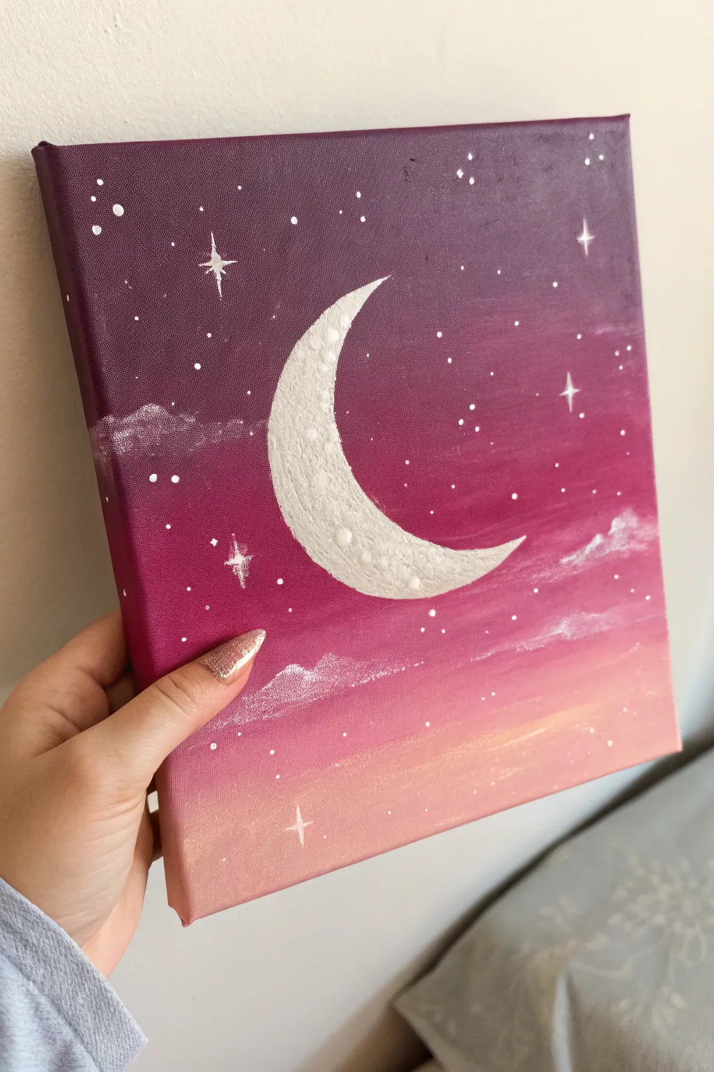
This dreamy canvas captures the magic of a twilight sky melting into dawn colors. With a smooth gradient background and a textured crescent moon, it’s a perfect beginner-friendly piece that adds a whimsical touch to any pink-themed decor.
How-To Guide
Materials
- Square stretched canvas (approx. 8×8 or 10×10 inches)
- Acrylic paints (deep violet/plum, magenta, pastel pink, peach, titanium white)
- Wide flat brush (for blending backgrounds)
- Medium round brush
- Small detail brush (liner brush)
- Palette or paper plate
- Cup of water and paper towels
- Pencil (optional)
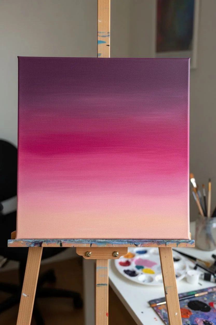
Step 1: Painting the Ombré Sky
-
Load the Palette:
Squeeze out your background colors in order: deep plum, magenta, pastel pink, and peach. Keep a large dollop of white separate for later. -
Start at the Top:
Using your wide flat brush, paint a thick horizontal strip of the deep plum color across the top quarter of the canvas. Don’t forget to paint the top edge of the canvas too for a finished look. -
Add the Magenta Layer:
Without washing your brush (unless it’s clumped), pick up the magenta paint. Apply it directly below the plum section, overlapping slightly with the wet plum paint to encourage mixing. -
Blend the Transition:
Use long, horizontal strokes back and forth where the colors meet to blur the line. If the paint feels too dry to blend, dip just the tip of your brush in water. -
Continue with Pink:
Wipe your brush on a paper towel to remove excess dark pigment, then pick up the pastel pink. Paint the next section down, blending it upward into the magenta layer. -
Finish with Peach:
Clean your brush thoroughly. Apply the peach color to the bottom quarter of the canvas, blending it softly into the pink above. Paint the bottom edge of the canvas as well. -
Let it Dry:
Allow the gradient background to dry completely. This is crucial so your white moon will stand out crisply against the dark sky.
Paint drying too fast?
If your gradient paints are drying before you can blend them, mix in a tiny drop of ‘slow drying medium’ or keep a mister bottle handy to lightly spray the canvas.
Step 2: Creating the Textured Moon
-
Outline the Shape:
Using a small round brush and white paint (or a pencil if you prefer a guide), lightly outline a large ‘C’ shape in the center of the canvas. Taper the top and bottom points to sharpness. -
Fill the Base:
Fill in the crescent shape with an even coat of white paint. Depending on your paint’s opacity, you might need two coats to hide the purple background completely. -
Add Texture:
To give the moon a cratered look, mix a tiny dot of grey or reuse a speck of the background purple into your white paint. Dab this slightly off-white mixture onto the inner curve of the moon using a stippling (dotting) motion. -
Highlight the Edge:
Clean your brush and use pure white to stipple the outer edge of the crescent, making it the brightest part of the moon.
Step 3: Stars and Details
-
Paint Wispy Clouds:
Mix a very watery, translucent white. Using a scruffy or dry brush, lightly drag some horizontal cloud streaks across the middle and lower sections of the sky. Keep them faint and irregular. -
Add Large Stars:
Switch to your smallest liner brush. Paint a few ‘cross’ shapes scattered around the sky to represent twinkling stars. Place one or two near the moon for balance. -
Dot Small Stars:
Dip the handle end of a paintbrush into white paint. Gently dot the canvas to create perfectly round stars of various sizes. -
Create Tiny Stardust:
For the tiniest stars, take a stiff distinct brush loaded with watered-down white paint and flick the bristles with your finger to splatter tiny specks across the purple section. -
Final Touches:
Check the edges of your canvas to ensure the gradient wraps around neatly. Add a protective varnish once fully dry if desired.
Make it Sparkle
Once the painting is dry, brush a thin layer of glitter glaze over the moon or stick on tiny Rhinestones in the center of the largest stars for a 3D effect.
Hang your celestial masterpiece on the wall and enjoy the peaceful vibe it brings to the room

PENCIL GUIDE
Understanding Pencil Grades from H to B
From first sketch to finished drawing — learn pencil grades, line control, and shading techniques.
Explore the Full Guide
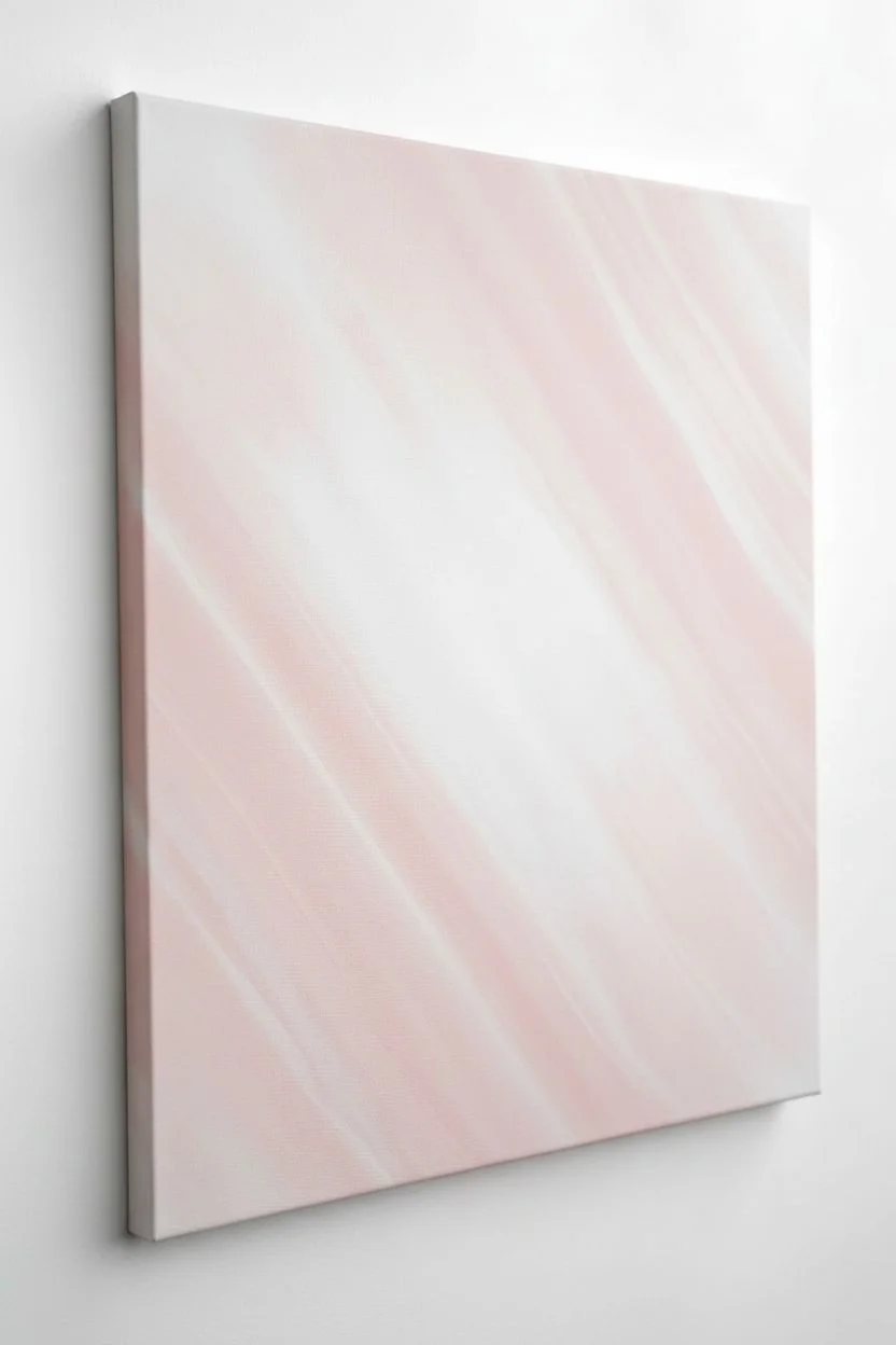
Pink Ombré Gradient Practice Panel
Master the art of the perfect gradient with this stunningly simple pink ombré panel. By blending pure white into deep magenta while the paint is still wet, you create a soft, ethereal transition that looks sophisticated in any modern space.
Step-by-Step Guide
Materials
- Stretched canvas (rectangular, medium grain)
- Heavy body acrylic paint (Titanium White)
- Heavy body acrylic paint (Magenta or Quinacridone Pink)
- Small amount of Acrylic Retarder or Slow Drying Medium
- Large flat synthetic brush (2-3 inch width)
- Medium flat brush for edges
- Palette or mixing plate
- Water cup
- Paper towels
- Spray bottle with water (optional)
Step 1: Preparation and Base Layer
-
Set up your workspace:
Lay down protective covering on your work surface. Since blending requires speed, have all your tubes of paint open and your brushes within immediate reach before you start. -
Prime the canvas:
Even if your canvas comes pre-primed, applying a fresh coat of Titanium White over the entire surface creates a slicker, more consistent base. Use your large flat brush for this. -
Paint the edges:
While you have the white paint out, use the medium brush to paint the top edge and the upper portions of the side edges white. This ensures the artwork looks finished from all angles. -
Let it dry completely:
Wait for the base coat to fully cure. If the base is wet, your gradient layer will drag and become muddy rather than smooth.
Uneven Streaks?
If the paint drags or feels sticky, it’s drying too fast. Lightly mist the canvas with water from a spray bottle to reactivate the acrylics and continue blending.
Step 2: Mixing and Application
-
Prepare your palette:
Squeeze out a generous amount of Titanium White and a separate pile of Magenta. To make blending easier, I like to mix a middle shade—a medium pink—on the palette right now. -
Add blending medium:
Mix a few drops of acrylic retarder or slow-drying medium into both of your main colors. This extends the ‘open time’ of the paint, giving you precious extra minutes to perfect the fade. -
Apply the white block:
Using the large brush, apply a thick horizontal band of pure white paint across the top third of the canvas. Don’t be stingy with the paint; it needs to be wet for blending. -
Apply the pink block:
Immediately wipe your brush (no water yet) and pick up the pure Magenta. Apply a thick band across the bottom third of the canvas. -
Fill the middle:
Quickly apply your pre-mixed medium pink to the center strip of the canvas, ensuring it touches both the wet white section above and the wet magenta section below.
Use a Mop Brush
For the absolute smoothest finish, use a dry, soft makeup brush or artist’s ‘mop’ brush for the final pass. Lightly dust over the gradient to blur brushstrokes.
Step 3: The Blending Process
-
Initial horizontal blend:
Using long, continuous horizontal strokes, brush back and forth where the medium pink meets the top white layer. Work your way down slowly. -
Clean the brush:
Wipe your brush thoroughly on a paper towel to remove excess white pigment before moving to the darker section. -
Lower blend:
Now blend the seam where the medium pink meets the magenta bottom layer. Again, use long, steady horizontal strokes across the entire width of the canvas. -
Vertical smoothing:
For a truly seamless look, very lightly brush vertically up and down the transition zones to break up any horizontal streaks. Use a feather-light touch here. -
Final horizontal pass:
Return to horizontal strokes. Start from the pure white top and work your way down to the bottom in one go. Wipe the brush frequently as you move into darker zones to prevent dragging dark color upwards. -
Check the sides:
Don’t forget the canvas edges. As you blend the front, wrap the same gradient colors around the sides so the ombré effect continues off the face of the painting.
Step 4: Finishing Touches
-
Assess the gradient:
Step back and look for harsh lines. If the paint is getting tacky, stop immediately. Overworking semi-dry paint ruins the smoothness. -
Dry and seal:
Allow the painting to dry for at least 24 hours. Because thick paint was used for blending, it may take longer than usual. -
Varnish optional:
Once fully cured, you can apply a gloss varnish to make the magenta pop, or a matte varnish to keep the soft, velvet appearance.
Place your finished gradient panel near a window to let natural light highlight the seamless color transition.
Pink Marble Effect With Veins and Highlights
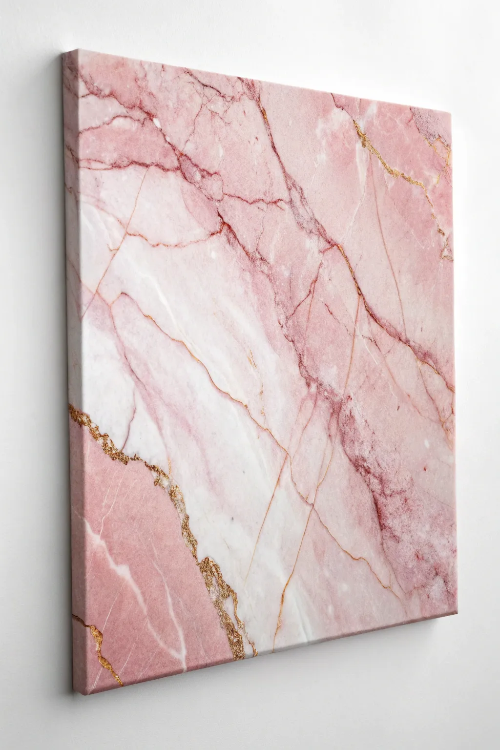
Capture the elegance of natural stone with this fluid acrylic project, blending soft blushes and deep rose tones. The addition of metallic gold fissures transforms a simple abstract piece into a luxurious statement wall hanging.
Step-by-Step
Materials
- Stretched canvas (16×20 or similar size)
- White acrylic paint (heavy body)
- Pink acrylic paints (various shades: blush, rose, magenta)
- Metallic gold paint or liquid leaf
- Acrylic glazing medium or pouring medium
- Sea sponge or natural sponge
- Feather or fine liner brush
- Round synthetic brush (medium size)
- Palette knife
- Cup of water and paper towels
- Gold glitter (fine, optional)
Step 1: Setting the Foundation
-
Prime the Surface:
Begin by applying a solid coat of white acrylic paint across the entire canvas. This ensures your pinks will show up true to color and provides a smooth base. -
Mix Your Mediums:
On your palette, mix your white and lightest pink paints with a glazing medium. You want a consistency that is creamy and spreadable but not watery. The medium increases transparency, essential for that depth found in real marble. -
Apply the Base Wash:
Using a wet sponge or large brush, dampen the canvas slightly. While wet, apply patches of white and the palest blush pink in diagonal drifts. -
Create Soft Transitions:
Use the sponge to gently dab the wet paints where they meet, blurring the hard lines. I like to keep the center area lighter and more white-heavy to create a focal point.
Step 2: Building the Marble Layers
-
Introduce Deeper Pinks:
Mix a medium rose tone with a little glaze. Using a round brush, paint irregular, organic shapes flowing in the same diagonal direction as your base. -
Soften the Edges:
While the rose paint is still tacky, use a dry, clean brush or a dry sponge to feather the edges out. This makes the color look like it’s staining the stone rather than sitting on top. -
Add Dark Contrast:
Select your darkest magenta or deep pink. Paint thin, jagged veins that branch out like lightning. Marble veins rarely run straight, so let your hand shake slightly for a natural look. -
Blur the Veins:
Immediately go over these dark lines with a barely damp brush to diffuse them. You want some parts of the vein to be sharp and others to fade into the background. -
Layering Whites:
Once the pinks are semi-dry, take some pure titanium white (unglazed) and sponge it over areas that became too dark. This ‘push and pull’ technique creates the illusion of layers within the stone.
Natural Texture
Use a real feather or a ragged piece of cardboard instead of a brush for the veins. The unpredictable edges look much more like organic stone fractures.
Step 3: The Gilded Details
-
Map the Gold Fissures:
Identify the darkest, most dramatic veins you painted earlier. These will be the guide for your gold accents. You don’t need to cover every vein, just highlight the main fractures. -
Apply Gold Paint:
Using a fine liner brush or the edge of a feather dipped in metallic gold paint, trace along one side of your dark veins. Keep the line thin and broken. -
Create the Heavy Crack:
For the prominent gold fracture shown in the lower left, use a palette knife to apply a thicker ridge of gold paint. This adds physical texture to the piece. -
Add Glitter Accent:
While the thick gold ridge is wet, sprinkle a tiny pinch of fine gold glitter onto it. Gently blow away the excess after a few minutes to catch the light even more. -
Feather the Highlights:
For the finer cracks in the upper right, switch to a feather. Dip the tip in gold ink or thinned paint and drag it lightly across the surface for ultra-fine, unpredictable lines. -
Final White Highlights:
To make the gold pop, paint a very thin, bright white line right next to your gold veins on the highlighted side. This creates a 3D effect. -
Seal the Artwork:
Allow the painting to dry for at least 24 hours. Once fully cured, apply a high-gloss varnish to mimic the polished shine of real marble slab.
Crystal Effect
Crush clear quartz or sprinkle coarse sea salt into the wet white sections. Once dry, brush off the salt or seal the crystals for a geode-like texture.
Hang your new masterpiece in a well-lit area to watch the gold veins shimmer and shift throughout the day


Tape-Resist Pink Geometric Blocks
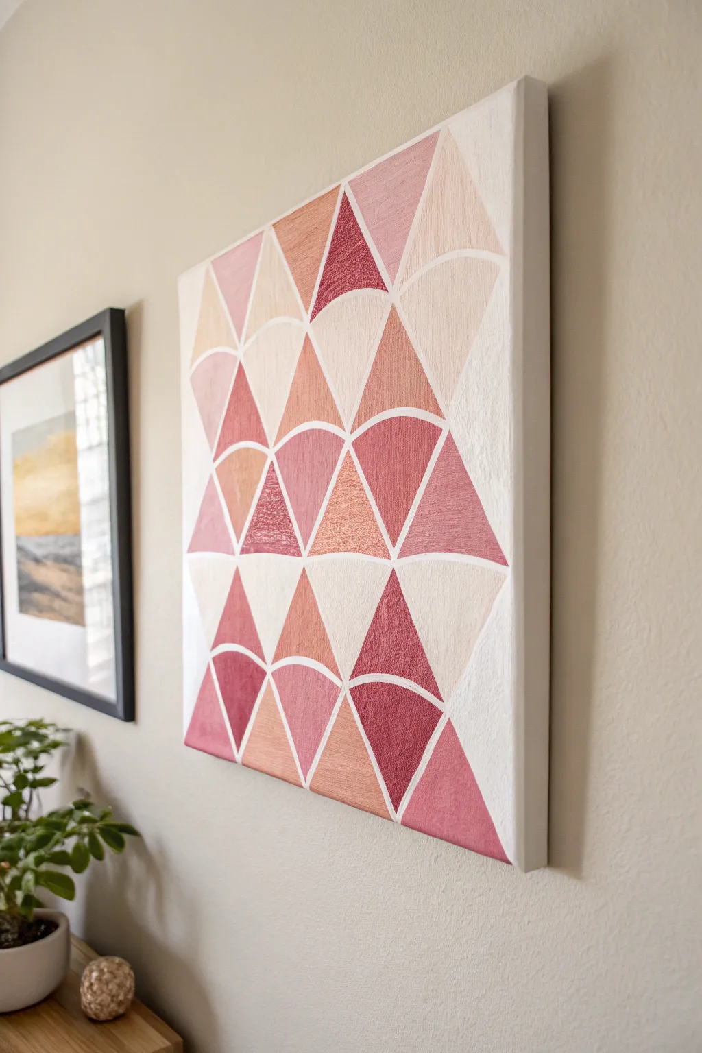
This eye-catching wall art combines sharp geometric triangles with soft scallop curves in a stunning gradient of pinks and corals. The tape-resist method creates crisp, professional-looking white lines that make the colors pop against the canvas.
Step-by-Step Guide
Materials
- Blank stretched canvas (square or rectangular)
- Acrylic paints (various shades: deep berry, coral, blush pink, metallic rose gold, peach)
- White acrylic paint (for touch-ups)
- Painter’s tape or masking tape (1/4 inch width is ideal)
- Circular stencil, lid, or compass
- Pencil
- Flat paint brushes (small and medium)
- Palette or paper plate
- Scissors
Step 1: Planning and Layout
-
Prime the Surface:
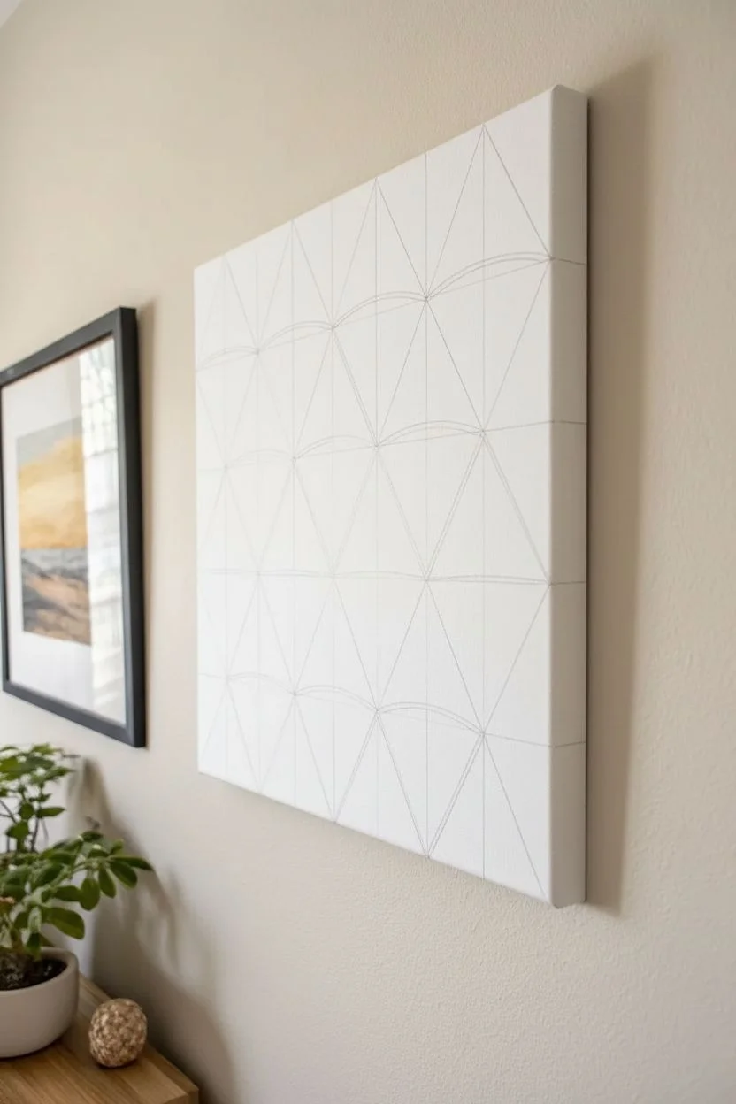
Ensure your canvas is clean and ready. If it isn’t pre-primed, apply a coat of white gesso or white acrylic paint to create a bright base, which will effectively serve as your ‘grout’ lines later. -
Mark the Grid:
Using a pencil and a ruler, lightly mark a grid on your canvas. These vertical and horizontal lines will help you center your scalloped shapes and keep the rows straight. -
Draw the Scallops:
Take a circular object (like a small bowl lid) or a compass. Trace semicircle arches along your horizontal grid lines. Stagger them row by row—so the peak of one arch sits directly below the valley of the arch above it. -
Draw the Triangles:
Connect the peak of each arch to the corners of the arch base below it using a straight edge. This turns the negative space between the curves into distinct triangle shapes, creating the interlocking geometric effect.
Clean Curve Hack
Can’t curve the tape perfectly? Use liquid masking fluid instead. Paint the fluid over your curved pencil lines, let it rubberize, paint your colors, and stick rub it off at the end.
Step 2: Creating the Resist
-
Tape the Straight Lines:
Apply thin painter’s tape over your straight pencil lines first. Press the edges down famously firmly to prevent paint bleed. -
Tape the Curves:
This is the trickiest part. For the curved lines, you have two options: use flexible vinyl tape designed for curves, or cut standard painter’s tape into very thin strips and ease them along the pencil line in small segments. -
Seal the Tape:
I like to brush a very thin layer of white paint (or clear matte medium) over the tape edges. This seals the gaps so that if any paint seeps under, it’s white and won’t show on the final piece.
Paint Peeling Up?
If paint lifts with the tape, score the edge of the tape with a craft knife very lightly before pulling. This breaks the seemingly solid seal between the paint on the tape and the canvas.
Step 3: Painting the Shapes
-
Mix Your Palette:
Prepare your acrylics. You want a gradient ranging from deep berry to light blush. Mixing in a little metallic rose gold adds a lovely shimmer to random sections. -
Plan Color Distribution:
Before painting, visualize where the colors will go. Try to spread the darkest and lightest shades evenly so one corner isn’t heavier than another. -
Paint First Layer:
Start filling in the shapes. Use a flat brush to get clean coverage. Don’t worry if you paint onto the tape; that’s what it’s there for. -
Check Consistency:
Since some pink pigments can be semi-transparent, let the first coat dry and apply a second coat to ensure the colors are solid and opaque. -
Paint the Edges:
Don’t forget to wrap the design around the sides of the canvas for a finished, gallery-wrapped look. -
Let it Dry:
Allow the paint to dry until it is tacky but not fully hardened. Removing tape too late can sometimes peel up the acrylic skin.
Step 4: The Reveal
-
Peel the Tape:
Slowly peel away the tape at a 45-degree angle. This is the most satisfying part, revealing the crisp white grid underneath. -
Fix Bleeds:
If any color bled under the tape, wait for it to dry completely. Then, using a tiny detail brush and white paint, carefully tidy up the lines. -
Erase Marks:
Gently erase any visible pencil marks that might still be showing in the white white spaces. -
Final Varnish:
Once fully cured (usually 24 hours), apply a coat of gloss or satin varnish to protect the painting and unify the sheen of the different paints.
Hang your new geometric masterpiece in a spot where it can catch the light and show off those metallic accents
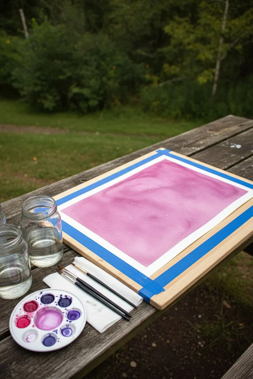
Pink Galaxy With Splatter Stars
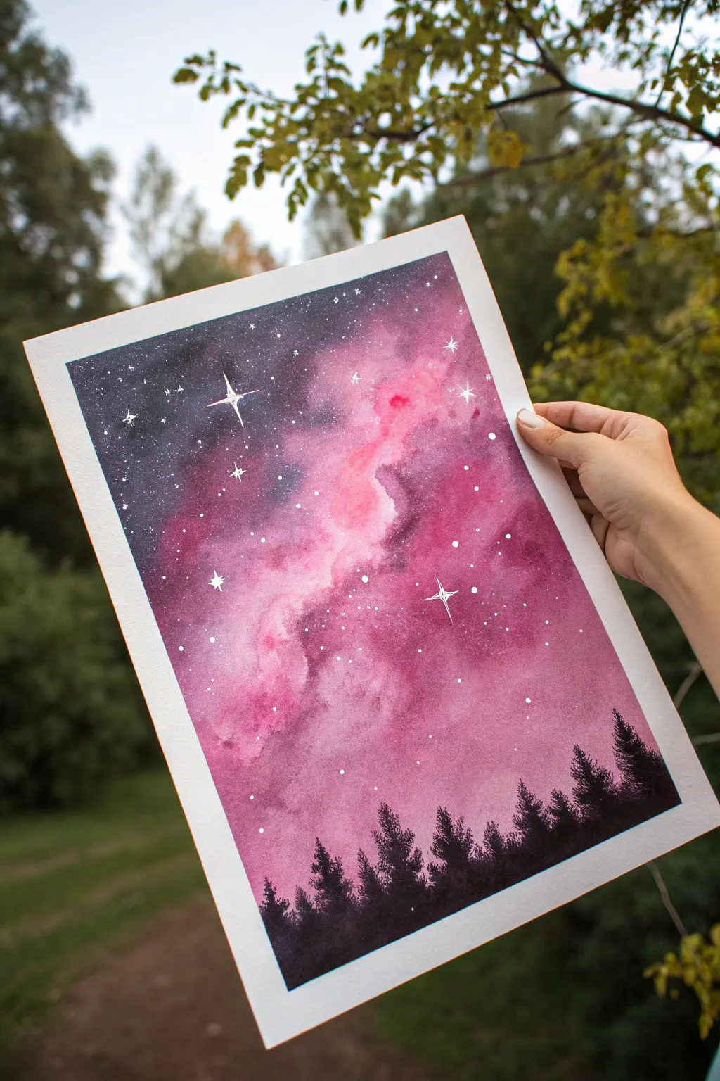
Capture the magic of the cosmos with this vibrant watercolor galaxy painting, featuring swirling nebulas of pink and violet. The striking contrast between the luminous night sky and the dark forest silhouette creates a captivating sense of depth and wonder.
Step-by-Step Tutorial
Materials
- Watercolor paper (preferable 300 gsm / 140 lb, cold press)
- Painter’s tape or masking tape
- Watercolor paints: Opera Pink (or bright magenta), Purple (dioxazine viole), Indigo (or Payne’s Gray), and Black
- White gouache, acrylic ink, or a white gel pen
- Round watercolor brushes: Size 10 or 12 (for washes), Size 4 or 6 (for details)
- Small liner brush or fine detail brush
- Clean water (two jars: one for rinsing, one for clean water)
- Paper towels
- Stiff paintbrush or toothbrush (for splattering)
Step 1: Setting the Stage
-
Prepare your canvas:
Begin by taping down all four edges of your watercolor paper to a board or hard surface using painter’s tape. This prevents the paper from buckling when wet and creates that crisp, clean white border at the end. -
Activate your paints:
Pre-wet your watercolor pans or squeeze out your tube paints onto a palette. You will need a generous amount of pink, purple, and indigo ready to go, as the wet-on-wet technique requires working fairly quickly.
Keep it luminous
To keep the pink nebula glowing, avoid mixing the purple and yellow/orange tones, which creates mud. Let the white of the paper shine through in small spots for extra brightness.
Step 2: Creating the Galaxy Background
-
Wet the paper:
Using your largest round brush, apply a clean layer of water across the upper three-quarters of the paper, leaving the bottom section dry where the trees will go. The paper should be glisten, but not form puddles. -
Lay down the pink nebula:
Load your brush with a potent mix of bright pink (like Opera Pink) and drop it broadly diagonally across the wet paper. Let the paint bloom and spread naturally, creating a central cloud-like formation. -
Add depth with purple:
While the pink is still wet, introduce purple around the edges of the pink clouds. Allow the colors to bleed into each other slightly to create soft transitions, but try to keep the center of the pink areas bright. -
Darken the night sky:
Around the outer corners and edges of the paper, apply indigo or a very dark blue. Blend this inward towards the purple, getting lighter as you get closer to the nebula to simulate glowing light. -
Intensify the contrast:
If the colors look too pale as they dry, add a second layer of pigment while the paper is slightly damp. I prefer to drop concentrated indigo into the wet corners to really frame the bright center. -
Create texture:
While the paint is drying but has lost its sheen, you can lightly lift a few spots with a thirsty brush or a clean paper towel to create faint, milky cloud effects. -
Let it dry completely:
This is crucial. Allow the background layer to dry fully before moving on. The paper must be bone-dry, or the stars and trees will bleed into the sky.
Try silver accents
Mix a little metallic silver watercolor into your white gouache for the stars. When the light hits your painting from an angle, the galaxy will shimmer magically.
Step 3: Painting the Stars
-
Prepare the white pigment:
Dilute a small amount of white gouache or white acrylic ink with a tiny drop of water until it has a creamy consistency, like melted ice cream. -
Flick the stars:
Dip a stiff brush or an old toothbrush into the white mixture. Hold it over the painting and tap the handle against another brush or your finger to spray fine speckles across the sky. -
Paint major stars:
Using a fine liner brush or a white gel pen, manually paint a few larger, brighter distinct dots in the dark areas to represent closer stars. -
Add signature sparkles:
Select two or three larger stars and turn them into four-pointed glimmers. Draw a long vertical line crossed by a shorter horizontal line, tapering the ends to sharp points.
Step 4: The Forest Silhouette
-
Mix the darkest shade:
Create a rich, opaque black. You can mix black watercolor with a touch of indigo to give it a cool undertone that matches the sky. -
Paint the horizon:
Using a medium round brush, paint an uneven, solid black strip along the bottom of the paper. This establishes the ground level. -
Form the tree trunks:
Switch to a smaller brush. Pull fine vertical lines upward from the horizon line to mark the center of each tree. vary the heights to make the forest look natural. -
Stipple the branches:
Starting from the top of a trunk line, use the tip of your brush to tap or stipple small horizontal marks, getting wider as you move down the tree. Create a jagged, pine-tree shape. -
Fill the forest:
Continue painting trees across the horizon. Let some overlap others to create density, ensuring the bottom area is solid black. -
Final reveal:
Once the trees are completely dry, carefully peel away the painter’s tape at a 45-degree angle to reveal the clean borders.
Frame your cosmic creation and enjoy the serene view of your personal galaxy
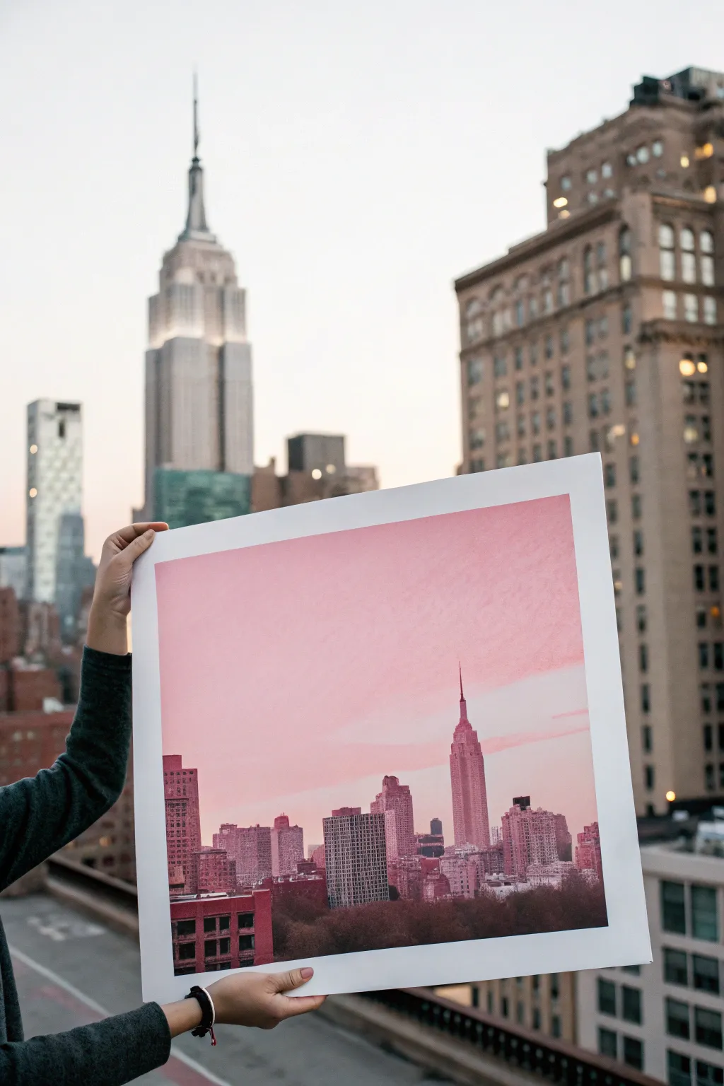
Monochrome Pink City Skyline at Dusk

Capture the romantic glow of a city sunset with this monochromatic skyline painting that balances soft gradients with structured architecture. Using various shades of pink and mauve, you’ll create an atmospheric cityscape that feels both modern and dreamy.
Detailed Instructions
Materials
- Large format watercolor paper or mixed media canvas (approx. 18×24 inches)
- Acrylic paints (Titanium White, Magenta, Alizarin Crimson, Raw Umber, Payne’s Grey)
- Wide flat wash brush (2 inch)
- Medium flat brush (1/2 inch) for buildings
- Fine detail rigger brush for antennas and windows
- Palette knife (optional for texture)
- Large palette or mixing plate
- Painter’s tape
- Pencil and ruler
- Reference photo of a skyline (NYC or your favorite city)
Step 1: Setting the Atmosphere
-
Prepare your surface:
Tape down all four edges of your paper to a rigid board using painter’s tape. This creates a clean white border and prevents buckling when adding large wet washes. -
Mix the sky gradient:
On your palette, prepare three pools of color for the sky: a pale, almost white pink (lots of white + tiny dot of magenta), a medium rosy pink, and a slightly deeper mauve-pink. You’ll need generous amounts of paint for the sky. -
Paint the upper sky:
Using the wide flat brush, start at the very top of the paper with your deepest pink mix. Use broad, horizontal strokes to cover the top third of the canvas. -
Blend the transition:
Pick up the medium rosy pink without cleaning your brush thoroughly. Paint the middle section, overlapping slightly with the top color to create a seamless ombre effect. Work quickly while the paint is wet to ensure smooth blending. -
Finish the horizon glow:
Use the palest pink mixture for the bottom third of the sky area. This lightness mimics the atmospheric haze found near city horizons. Blend it gently upward into the medium pink. Let this layer dry completely before moving on. -
Add subtle clouds:
Using a dry brush technique with a mix of white and a tiny touch of crimson, lightly scumble in some horizontal cloud streaks across the sky. Keep these transparent and feathery so they don’t overpower the gradient.
Smooth Gradients
If your acrylics are drying too fast while blending the sky, mix in a slow-drying medium or retarder. This keeps the paint workable longer for a seamless ombre.
Step 2: Constructing the City
-
Sketch the skyline:
Once the sky is bone dry, lightly sketch the outline of the buildings using a pencil. Focus on the iconic shapes—like the stepped spire of the Empire State Building—and vary the heights of surrounding skyscrapers. -
Mix building base colors:
Create a ‘shadow pink’ by mixing Alizarin Crimson with a touch of Raw Umber and Payne’s Grey. You want a color that reads as a dark silhouette but maintains warmth, rather than a cold black. -
Weave in distant buildings:
Mix a lighter version of your shadow color with some white. Paint the buildings that are furthest away first. These should be less detailed and closer in value to the sky color to create atmospheric perspective. -
Block in main structures:
Switch to your darker ‘shadow pink’ mix. Use the medium flat brush to block in the main foreground buildings. Keep your edges sharp and vertical. -
Sculpt the focal point:
For the main tower, pay attention to the architectural steps. I like to add a tiny drop of white to the mix for the illuminated side of the tower, giving it a subtle three-dimensional form.
Step 3: Refining Details
-
Create window textures:
While the building paint is still slightly tacky, you can scratch back into it with a palette knife edge to hint at windows, or wait until dry and dry-brush lighter pink highlights in a grid pattern. -
Add the antennas:
Using the fine detail rigger brush and your darkest paint mixture (add a bit more grey for opacity), paint the delicate antennas and spires on the tallest buildings. Use a steady hand or use a ruler as a guide. -
Ground the composition:
Paint the foliage or lower city elements at the very bottom using the darkest, most saturated brownish-purple mix. Scumble the edges to suggest trees or rooftops rather than solid blocks. -
Final highlights:
Add tiny dots of pure white or very pale pink to suggest city lights turning on at dusk. Place these sparingly on the focal building and randomly across the denser city sections. -
The reveal:
Once absolutely everything is dry, carefully peel away the painter’s tape at a 45-degree angle to reveal the crisp white border.
Straight Lines Help
Shaky hands on skyscrapers? Use the edge of a piece of cardstock or a ruler as a barrier when painting building edges to get perfectly crisp vertical lines.
Hang your finished piece in a well-lit spot where the subtle pink transitions can really shine


Have a question or want to share your own experience? I'd love to hear from you in the comments below!