
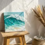
When the light gets that extra-golden summer glow, I always feel like painting something cheerful and low-pressure. These easy summer painting ideas are meant to be quick wins—simple shapes, bold color, and that relaxed vacation feeling.
Watermelon Slice With Clean Color Bands
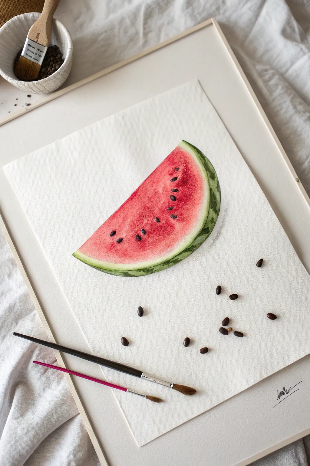
Capture the refreshing essence of a hot summer day with this realistic watercolor watermelon slice. This project focuses on vibrant gradients and crisp edges to create a juicy, mouth-watering result.
Step-by-Step Guide
Materials
- Cold press watercolor paper (300gsm for texture)
- Watercolor paints (Alizarin Crimson, Sap Green, Lemon Yellow, Paynes Grey)
- Round watercolor brushes (Size 6 and Size 2)
- Pencil (HB or H)
- Kneaded eraser
- Clean water and paper towels
- Dried watermelon seeds (optional styling prop)
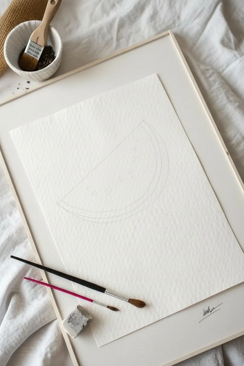
Step 1: Sketching and Preparation
-
Outline the Shape:
Begin by lightly sketching a wedge shape using your HB pencil. Draw a curved line for the rind and two straight lines meeting at a point for the flesh. -
Define the Rind:
Add a second, inner curve parallel to the skin to define the white rind area. This spacing is crucial for a realistic look, so keep it about a centimeter wide. -
Lighten the Lines:
Roll your kneaded eraser gently over the sketch to lift excess graphite. You want the lines to be barely visible guides so they do not show through the transparent watercolor later.
Bleeding Colors?
If red bleeds into the white rind, quickly blot it with a clean, dry tissue. Use a clean, damp brush to ‘scrub’ the stain gently, then blot again.
Step 2: Painting the Flesh
-
Wet-on-Wet Base:
Dip your Size 6 brush in clean water and wet the triangular flesh area of the watermelon, stopping just short of the rind line. -
Drop in Color:
While the paper is wet, load your brush with a watery mix of Alizarin Crimson. Drop the color into the wet area, letting it bloom naturally. -
Deepen the Tone:
Mix a more concentrated red. While the first layer is still damp, dab this stronger pigment near the center of the slice and along the top edge to create depth and juiciness. -
Soften the Transition:
Rinse your brush and dab it on a paper towel so it’s damp but deeply clean. Gently stroke the edge where the red meets the unpainted rind to create a soft, faded pink transition rather than a hard line. -
Let it Dry:
Allow the red section to dry completely before moving on. If you rush this, the red will bleed into the green rind, ruining the clean look.
Step 3: Painting the Rind
-
The Pale Green Base:
Mix a very watery, pale Sap Green. Using the Size 6 brush, paint the outer curve of the rind, leaving a small gap of white paper between this green line and the pink flesh. -
Adding Texture:
While the green strip is still slightly damp, mix a darker green by adding a touch of Paynes Grey to your Sap Green. -
Striping the Rind:
Using the tip of the brush, drop small, irregular dashes of the dark green mix along the outer edge to mimic the watermelon’s striped skin pattern. -
Blend the Edge:
Use a clean, damp brush to softly blend the inner edge of the green strip, ensuring it fades gently into the white rind area without touching the pink.
Make it Pop
For a hyper-realistic look, glue real dried watermelon seeds directly onto the paper instead of painting them. Use a tiny dot of clear craft glue.
Step 4: Details and Seeds
-
Detailing the Texture:
Switch to your Size 2 brush. I like to use a fairly dry mix of deep red to add tiny, stippled dots across the red flesh, mimicking the porous texture of the fruit. -
Painting the Seeds:
Mix a concentrated Paynes Grey (black can look too harsh). Paint teardrop shapes scattered on the flesh, varying their angles for a natural appearance. -
Adding Seed Shadows:
Once the dark seeds are dry, dilute your Paynes Grey to a whisper-thin gray. Paint a tiny shadow to the bottom right of each seed to make them look embedded. -
Final Highlights:
If you have white gouache or a gel pen, add a microscopic white dot on the upper left of each seed to simulate a glossy reflection.
Frame your refreshing artwork in a simple white frame to let those vibrant colors truly shine
Seashells Scattered on Warm Sand
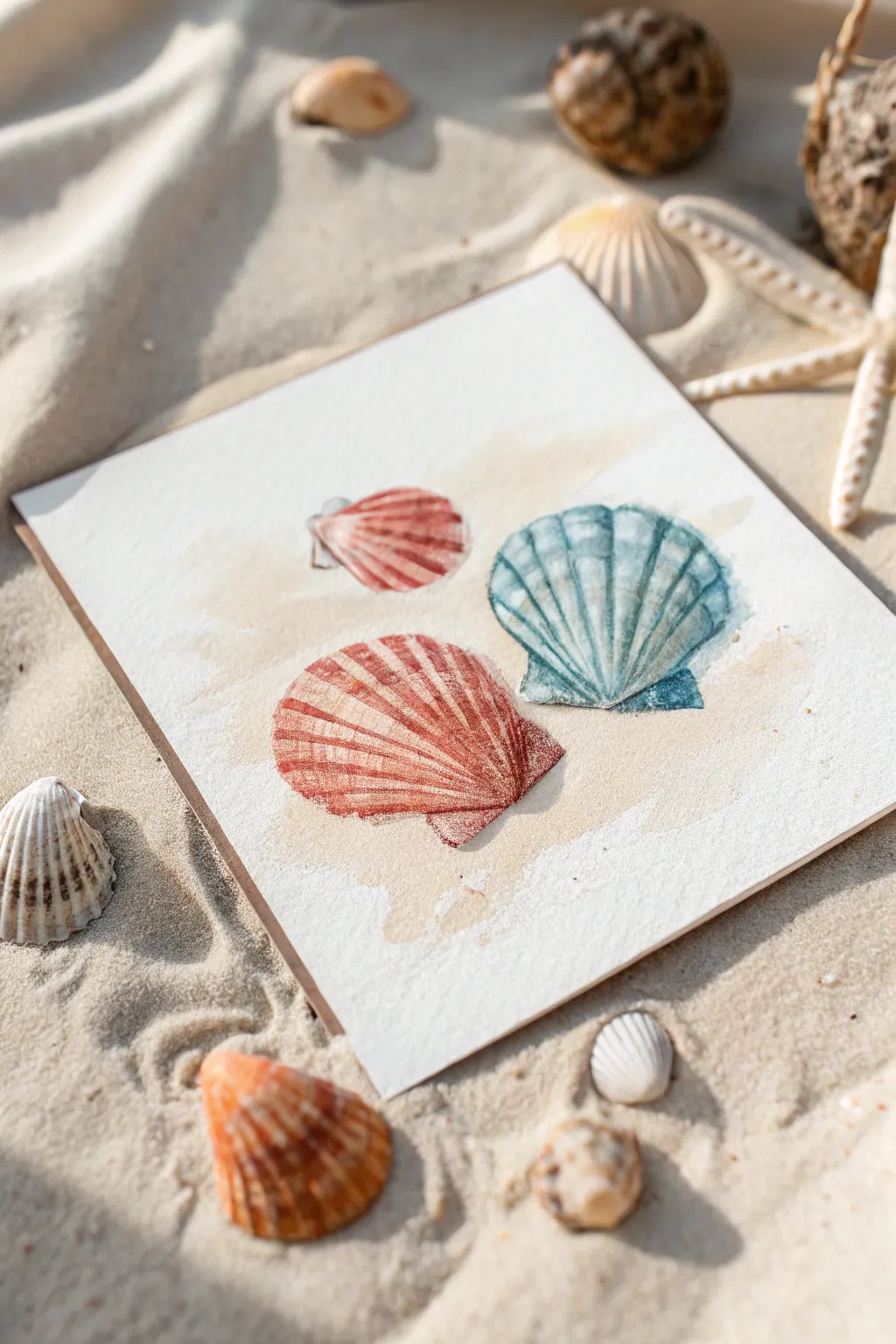
Capture the delicate beauty of a beachcombing find with this realistic watercolor study of three scallop shells resting on sun-warmed sand. The composition features soft washes of sandy beige beneath vibrant pops of coral and teal, creating a soothing coastal vibe perfect for summer décor.
Detailed Instructions
Materials
- Cold press watercolor paper (square format, approx. 6×6 inches)
- Watercolor paints: Burnt Sienna, Alizarin Crimson, Cadmium Red light, Cerulean Blue, Viridian Green, Yellow Ochre, Burnt Umber
- Synthetic watercolor brushes: Round size 6, Round size 2 for details
- Pencil (HB or H) and kneaded eraser
- Two jars of water
- Paper towels
- Painter’s tape or drawing board
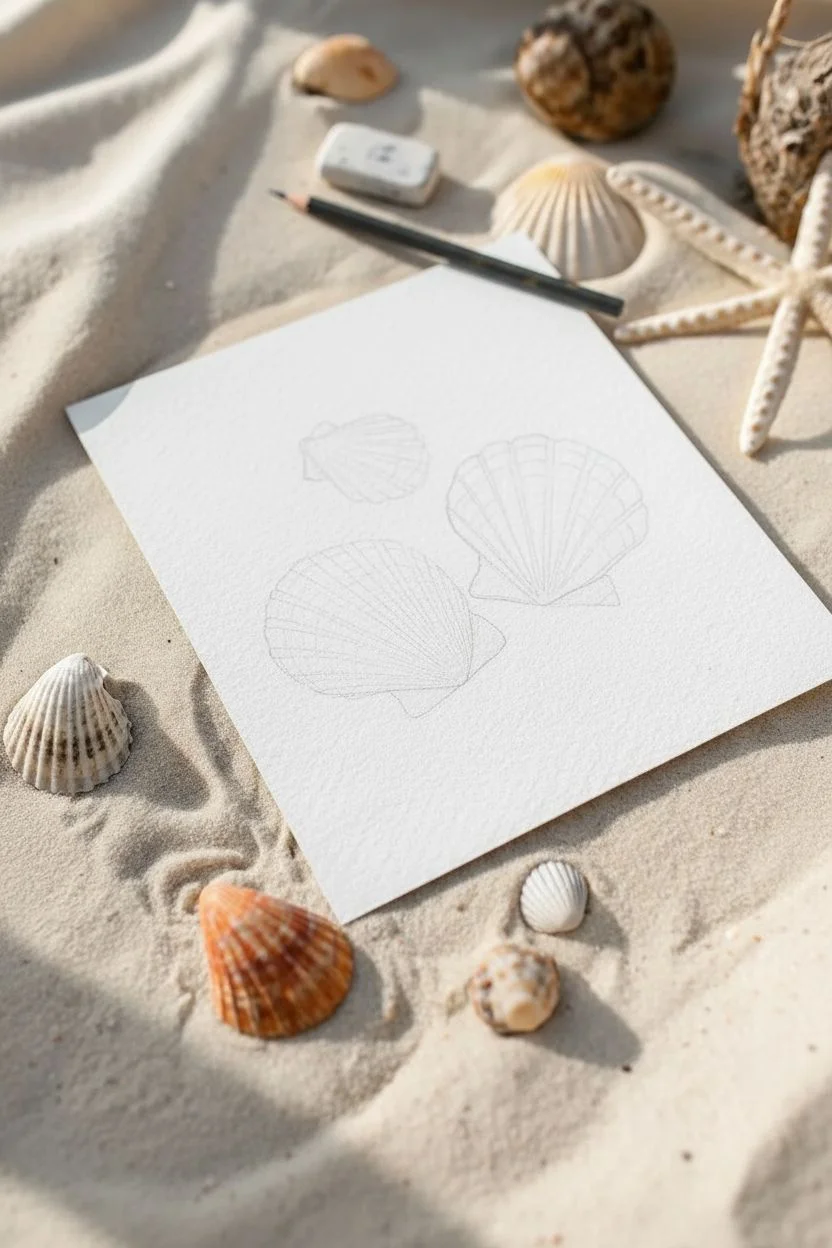
Step 1: Sketching the Layout
-
Plan the composition:
Begin by lightly marking the position of your three shells on the square paper. Place the largest shell in the bottom center, a medium one to the right, and a smaller one to the upper left to create a balanced triangle. -
Outline the shapes:
Using an H pencil, draw the fan-like outline of each scallop shell. Keep your lines incredibly faint so they won’t show through the transparent paint later. -
Detail the ridges:
Lightly sketch the radiating ribs on each shell. For the scallop shape, these lines should start narrow at the hinge (the bottom point of the fan) and widen as they reach the curved edge.
Wet-on-Dry Precision
Paint the detailed ribs on dry paper. This ‘wet-on-dry’ technique ensures crisp, hard edges that mimic the sharp texture of real seashells.
Step 2: Painting the Sand Base
-
Mix the sand color:
Create a very dilute wash using Yellow Ochre with a tiny touch of Burnt Sienna to warm it up. You want a color that looks like wet sand but is very pale. -
Apply the wash:
With your size 6 brush, paint a loose, organic shape behind and around where the shells sit. Don’t fill the whole page; leave the edges rough and white to give it that artistic, vignetted look. -
Add texture:
While the sand wash is still damp, I like to drop in tiny specks of concentrated Burnt Umber or a slightly darker tan mix to mimic grains of sand. Let this layer dry completely.
Make It Sparkle
For a magical sun-kissed look, mix a tiny amount of iridescent medium into your final glaze or spatter tiny drops of white gouache for sea spray.
Step 3: The Coral & Orange Shells
-
Base layer for the large shell:
Mix Cadmium Red Light with a touch of Burnt Sienna for a rusty orange hue. Paint a thin, watery layer over the entire bottom-center shell shape. -
Define the ribs:
Once the base is dry, use the size 2 brush and a more saturated mix of the same orange-red to paint the lines between the ridges. This negative painting technique makes the ridges pop. -
Deepen the shadows:
Mix Alizarin Crimson with a tiny bit of Burnt Umber. Paint this darker color near the hinge and along the shadowed side of the ridges to create 3D volume. -
Paint the small shell:
For the top-left shell, use a similar technique but lean more towards a pinkish-red using Alizarin Crimson and water. Keep it lighter to push it slightly into the background.
Step 4: The Teal Shell
-
Base wash:
Mix Cerulean Blue with a little Viridian Green to get a soft aquatic teal. Apply a clear water glaze to the shell area first, then drop this pigment in for a soft, diffused look. -
Build the pattern:
Once dry, switch to your size 2 brush. Mix a stronger, darker teal (add a pinch of Burnt Umber or Indigo to your mix) and paint the distinctive circular bands and vertical ribs. -
Enhance contrast:
Add the darkest teal shadows right at the bottom edge of the shell and in the deep grooves to really make the lighter ridges stand out.
Step 5: Final Touches
-
Cast shadows:
Mix a cool grey using Burnt Sienna and Ultramarine Blue. Paint a thin, transparent shadow directly underneath each shell on the ‘sand’ to ground them. -
Highlight retrieval:
If you lost any bright highlights on the top of the ridges, you can gently scrub them with a clean, damp stiff brush and blot with a paper towel to lift the color. -
Final assessment:
Step back and check your values. If the shells look too flat, add one final layer of dark pigment to the deepest crevices.
Frame your finished square painting in a light wood frame to complete the breezy, beach-house aesthetic

Starfish Close-Up With Easy Dot Texture

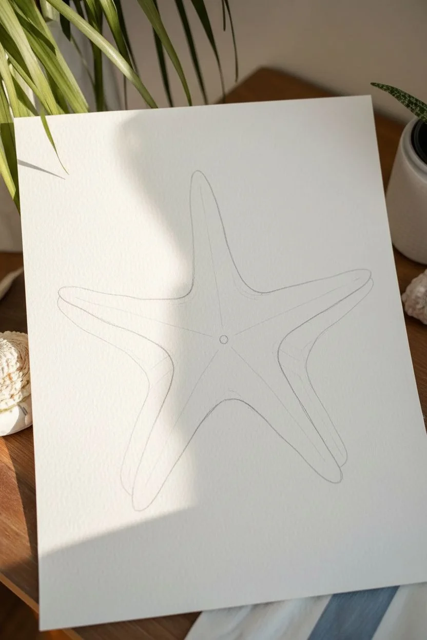
Capture the essence of a warm beach day with this beautiful watercolor starfish painting. The soft terracotta wash contrasts perfectly with the detailed, speckled creature, while simple white dots add magical underwater texture.
Step-by-Step
Materials
- Watercolor paper (cold press, at least 300gsm)
- Pencil (HB or H)
- Kneaded eraser
- Watercolor paints (Terracotta/burnt sienna, yellow ochre, raw umber, burnt umber)
- White gouache or white gel pen
- Round brushes (size 6 or 8 for wash, size 2 or 0 for details)
- Clean water
- Paper towels
- Masking fluid (optional)
Step 1: Sketching the Shape
-
Find the center:
Begin by lightly marking a small dot in the center of your paper to anchor your composition. -
Mark the arms:
Draw five light lines radiating outward from the center point, spacing them somewhat equally but keeping it organic—nature is rarely perfectly symmetrical. -
Outline the starfish body:
Using your radiating lines as a guide, sketch the outline of the starfish arms. Make them taper gently towards rounded points, and curve the webbing between the arms smoothly. -
Refine the sketch:
Clean up your drawing with a kneaded eraser so the graphite lines are barely visible, ensuring they won’t show through the final paint.
Uneven Background?
If your background wash dries with ‘blooms’ or hard water lines, don’t panic. This uneven texture mimics sand and water movement beautifully, so embrace the imperfections.
Step 2: Painting the Background
-
Mix the wash color:
Create a large puddle of watery paint using a mix of terracotta or burnt sienna with a touch of red. You want a warm, peachy sand color. -
Apply the wash:
Using your larger round brush, paint the negative space around the starfish. Work fairly quickly to keep a wet edge, but don’t worry if the edges get a bit uneven—it adds to the handmade charm. -
Let it dry completely:
Wait for the background layer to be bone dry. If the paper feels cool to the touch, it’s still damp.
Step 3: Painting the Starfish
-
Base layer:
Mix a very dilute wash of yellow ochre with a tiny hint of your background color. Fill in the starfish shape entirely with this pale, creamy tone. -
Building dimension:
While the base layer is still slightly damp (but not soaking), drop a slightly darker tan color along the center lines of each arm to suggest a ridge. -
Shadowing:
Once that layer dries, mix a light brown and paint very thin, translucent shadows along the sides of the arms to make the starfish look three-dimensional. -
Adding the texture:
Switch to your smallest brush. Load it with a concentrated burnt umber or dark brown paint. -
Stippling the center:
Begin adding small dots to the center of the starfish where the arms meet. These should be larger and more clustered. -
Stippling the arms:
Continue dotting down the ridge of each arm. I like to make the dots gradually get smaller and more spaced out as they reach the tips of the arms. -
Detailing the edges:
Add very fine outline details or tiny dots along the visible edges using the very tip of your brush to define the border.
Pro Tip: Depth
For a subtle 3D effect, paint a very faint shadow in a light grey-purple color directly underneath one side of the starfish arms after the background is totally dry.
Step 4: Final Touches
-
Add background magic:
Using white gouache with a creamy consistency or a white gel pen, add dots to the peach background. -
Vary the sizes:
Create a mix of tiny pin-prick dots and slightly larger circles. Cluster some near the starfish body and let them disperse as you move toward the paper’s edge. -
Final dry:
Let the white gouache sit until it is completely matte and dry before moving or framing your piece.
Now you have a serene piece of ocean art ready to brighten up any room

Seagulls as Simple Brushstroke Shapes
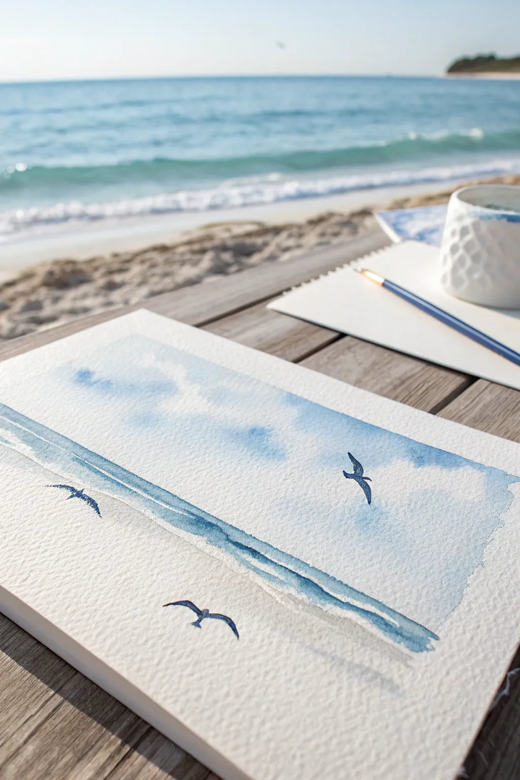
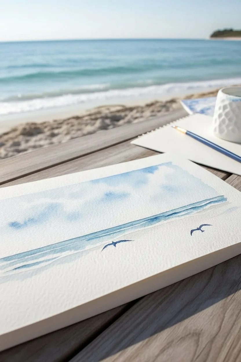
Capture the essence of a breezy beach day with this incredibly simple yet elegant watercolor study. By using negative space and confident, singular brushstrokes, you’ll create soaring birds against a soft, dreamy seascape that feels effortless.
How-To Guide
Materials
- Cold Press Watercolor paper (300 gsm)
- Watercolor paints (Cerulean Blue, Prussian Blue or Indigo)
- Medium round brush (size 8 or 10)
- Small detail brush (size 2 or 4)
- Jar of clean water
- Paper towel
- Masking tape (optional)
Step 1: Setting the Scene: Sky and Sea
-
Prepare your palette:
Mix a watery wash of Cerulean Blue for the sky. You want this to be quite transparent, more water than pigment, to create an airy atmosphere. -
Wet the paper:
Using your medium round brush and clean water, lightly wet the upper two-thirds of your paper where the sky will be. Don’t soak it; just make it glisten. -
Paint the sky:
Drop your Cerulean Blue wash into the wet area. Let the paint bloom and spread naturally. Leave some uneven patches of white paper showing through to suggest fluffy clouds. -
Create the horizon:
While the sky is still slightly damp but not soaking, mix a slightly stronger concentration of blue. Paint a horizontal band across the middle of the paper to represent the distant sea. -
Define the shoreline:
Add a second, slightly darker blue line just below the horizon line. Allow this to be a bit broken or uneven to look like waves breaking on the shore. -
Let it dry completely:
Before adding the birds, the background must be bone dry. If the paper is damp, your crisp bird shapes will bleed into fuzzy blobs.
Step 2: Painting the Seagulls
-
Mix the bird color:
Create a concentrated mix of Prussian Blue or Indigo. You need a creamy consistency that is dark enough to stand out against the pale background. -
Start the first bird:
Using your small detail brush, locate a spot in the upper right sky. Paint the torso of the bird with a tiny, elongated oval shape. -
Add the wings:
With a swift, confident motion, pull the brush out from the torso to create the wings. Angle them slightly upwards and bent, like a flattened ‘M’ shape. -
Refine the shape:
Taper the wingtips to a fine point. Keep the stroke loose; dragging the brush slightly fast across dry paper can create a nice texture. -
Paint the second bird:
Identify a spot on the lower left, near the sandy area. Paint this bird smaller than the first to suggest distance or flight level. -
Vary the pose:
For this lower bird, arch the wings downward slightly more, as if it is gliding close to the water. -
Add the final bird:
Place the third bird on the left side, slightly higher than the second one. This creates a balanced triangular composition across the page. -
Check the silhouette:
Ensure the wings on this final bird look fluid. I find that holding the brush further back on the handle helps prevent stiffness in the stroke. -
Final touches:
Step back and look at your composition. If needed, darken the belly of the birds slightly with a second layer of indigo to give them volume.
Bleeding Birds?
If your bird shapes turn fuzzy at the edges, your background wasn’t fully dry. Wait longer or use a hairdryer on the ‘cool’ setting before painting details.
Wing Motion Texture
Use ‘dry brush’ for wings: load less water on your brush and drag it quickly. The paper’s texture will break up the stroke, mimicking feathers in motion.
Now you have a serene coastal scene that captures the freedom of a summer afternoon
BRUSH GUIDE
The Right Brush for Every Stroke
From clean lines to bold texture — master brush choice, stroke control, and essential techniques.
Explore the Full Guide
Campfire Glow With Fireflies
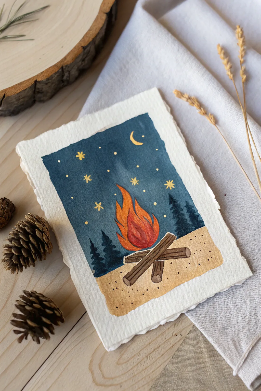
Capture the cozy magic of a summer night with this charming campfire scene painted on deckle-edged paper. The artwork features a glowing fire against a deep blue sky, accented with golden stars and a crescent moon.
Detailed Instructions
Materials
- Heavyweight watercolor paper (300gsm/140lb) with deckle edge
- Watercolor paints (Indigo/Prussian Blue, Burnt Sienna, Yellow Ochre, Cadmium Orange, Cadmium Red)
- White or metallic gold gel pen or detail brush with opaque paint
- Flat shader brush (size 6 or 8)
- Round detail brushes (size 0 and 2)
- Washi tape or masking tape
- Pencil and eraser
- Jar of clean water
- Paper towel
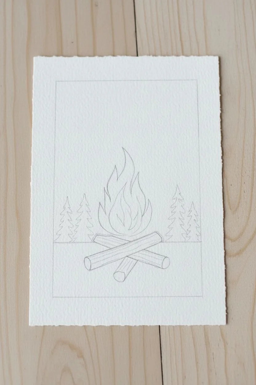
Step 1: Setting the Scene
-
Sketch the outline:
Begin by lightly sketching a square frame in the center of your paper, leaving a generous border around the edges to show off the paper texture. Inside the frame, draw a simple horizon line about one-third up from the bottom. -
Draw the logs:
Sketch three logs crossing each other in the center of the sand area. Think of them as simple cylinders or long rectangles with rounded ends. -
Outline the flames:
Draw a teardrop or leaf shape rising from the logs to represent the main fire body. Add sharp, curved points at the top to suggest flickering flames. -
Add background elements:
Lightly sketch in a few jagged tree shapes on either side of the fire, purely as placeholders for where your dark colors will go later.
Clean Edge Secret
Even though the paper has a rough edge, tape off the inner rectangle painting area with washi tape. Remove it slowly after painting for those crisp, professional lines.
Step 2: Painting the Sky and Ground
-
Paint the night sky:
Using your flat brush, load up a deep blue like Indigo or Prussian Blue. Carefully paint the entire sky area, working around the flame shape but covering the tree sketches for now. Keep the edges of your rectangle neat. -
Create the sandy ground:
Rinse your brush thoroughly. Mix a diluted wash of Yellow Ochre or light brown. Paint the bottom section below the horizon line, being careful to paint around the logs. -
Add sand texture:
While the sand layer is still slightly damp, drop in tiny specks of slightly darker brown paint, or wait for it to dry and stipple them on to create a gritty texture. -
Let it dry completely:
This is crucial—wait until both the sky and ground are fully dry to the touch before moving to the next phase to prevent colors from bleeding.
Step 3: Building the Fire
-
Base layer for flames:
Fill in the flame shape with a bright, solid orange. Don’t worry about shading yet; just get a good, vibrant base color down. -
Add the red core:
Once the orange is tacky but not soaking wet, paint a smaller, redder shape inside the bottom center of the flame to represent the hottest part of the fire. -
Define the flame tips:
Blend the red slightly upward into the orange. If needed, add a touch of yellow to the very tips of the flames to make them look like they are glowing. -
Paint the logs:
Using a dark brown or Burnt Umber, fill in the log shapes. Leave the ends of the cylinders slightly lighter to show dimension. -
Detail the wood grain:
With your smallest round brush and a very dark brown or black mixture, paint thin lines along the length of the logs to mimic wood grain and bark texture.
Make It Sparkle
Use metallic watercolor paint for the fire’s center and the stars. When the light hits your finished card, the campfire will literally shimmer and glow.
Step 4: Final Details
-
Paint the silhouette trees:
Using a very dark blue-black mix, paint the pine trees over the dry blue sky on either side of the fire. Use jagged, dabbed strokes to simulate pine needles. -
Create the stars:
Switch to your metallic gold pen or opaque yellow paint. Draw small asterisks (*) or simple dots scattered across the blue sky area. -
Add the crescent moon:
Paint a small, sharp crescent moon in the upper right corner using the same gold or yellow color. -
Highlight the sand:
Add a few tiny dark dots on the sand area with a fine-tip pen or small brush to suggest pebbles or debris. -
Final touches:
If the fire needs more pop, add thin outlines of yellow or white to separate the flames from the dark sky background.
Display this little artwork on a tiny easel or gift it to a camping buddy
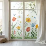
Summer Wildflower Meadow in Loose Dabs

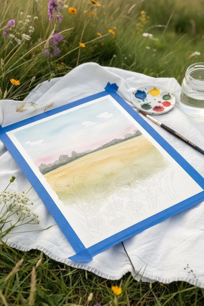
Capture the hazy warmth of a summer afternoon with this delightful watercolor tutorial. This project combines a soft, wet-into-wet sky with crisply detailed wildflowers, creating a beautiful depth that feels like you’re lying in the tall grass.
Step-by-Step
Materials
- Cold press watercolor paper (300 gsm)
- Watercolor paints (Cerulean Blue, Alizarin Crimson, Sap Green, Yellow Ochre, Cadmium Yellow, Burnt Umber)
- Masking fluid (optional)
- Round brushes (size 8 for washes, sizes 2 and 0 for details)
- Painters tape or masking tape
- Clean water and paper towels
- Pencil for light sketching
Step 1: Setting the Scene
-
Tape and sketch:
Begin by taping down your paper to a board to prevent buckling. Lightly sketch a horizon line about one-third of the way up the page. Sketch the rough shapes of the larger poppy flowers in the foreground, keeping the lines very faint. -
Wet the sky:
Using your largest brush, wet the entire sky area with clean water. You want the paper to be glistening but not forming puddles. -
Paint the sky gradient:
While the paper is wet, drop in a light wash of Cerulean Blue at the top, fading it out as you move down. Leave gaps of white paper for clouds. Add touches of very diluted Alizarin Crimson near the horizon for soft pink clouds. -
Add distant fields:
Mix Yellow Ochre with a tiny bit of Green to create a warm, grassy color. Apply this below the horizon line while the paper is slightly damp to create a soft, out-of-focus background field.
Muddy Greens?
If your grass area looks muddy, let the layers dry completely between applications. Clean your water jar frequently; dirty water turns vibrant greens into dull browns quickly.
Step 2: Middle Ground and Treeline
-
Paint the distant trees:
Mix Sap Green with a touch of Blue or Burnt Umber to get a dark, cool green. Paint a bumpy, uneven treeline along the horizon. If the sky is still slightly damp, the trees will bleed slightly, creating a nice atmospheric perspective. -
Deepen the field:
Once the first field layer is dry, glaze a slightly stronger yellow-green mix over the middle ground. While wet, lift out a few vertical streaks with a damp brush to suggest tall grasses catching the light. -
Start the foreground base:
Paint the bottom third of the paper with a wash of Sap Green and Yellow Ochre. This doesn’t need to be uniform; let the colors mix on the paper to create a variegated grassy base.
Use White Gouache
Lost the white of your paper for the daisies? Don’t panic. Use a small brush and opaque white gouache at the very end to paint bright, crisp petals over the dried background.
Step 3: Floral Details
-
Paint poppy petals:
Using a size 2 brush and a rich mix of Alizarin Crimson and Cadmium Red, paint the poppy petals. Keep the edges ragged and natural. Leave tiny slivers of white paper between petals to define their shape. -
Add daisy centers:
For the daisies, use Cadmium Yellow mixed with a dot of brown for the centers. Paint small, oval shapes where you want your flowers to sit. I like to group them in threes or odd numbers for a natural look. -
Define daisy petals:
Instead of using white paint, paint *around* the daisy shapes with darker greens (negative painting) to reveal the white paper petals. If you lose the white, you can use opaque white gouache later. -
Paint the grasses:
Switch to your size 0 rigger or detail brush. Load it with dark green and flick your wrist upward to create thin, tapering blades of grass. -
Vary the greens:
Mix different shades of green—some yellow-heavy covering the light areas, some blue-heavy for shadows deep in the clumps—and continue layering grass blades.
Step 4: Final Flourishes
-
add seed heads:
Mix Burnt Umber with a little purple or blue. Paint thin, nodding stems rising above the horizon line, topped with feathery seed heads. Use a very light touch here. -
Detail the poppies:
Add dark centers to the poppies using a concentrated mix of blue and brown (almost black). Add tiny dots around the center for pollen texture. -
Refine the daisies:
Use a very diluted grey-blue to add tiny shadows to one side of the white daisy petals, giving them dimension so they don’t look flat. -
Shadows and depth:
Look for empty spaces between stems at the bottom of the page. Fill these with your darkest green mix to push the background back and make the foreground flowers pop forward. -
Review and finish:
Step back from your painting. Add any final touches of yellow for small wildflowers or stray grass blades, then let it dry completely before removing the tape.
Frame your mini meadow and enjoy the feeling of summer warmth all year round


Have a question or want to share your own experience? I'd love to hear from you in the comments below!