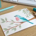
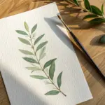
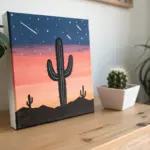
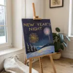
When you want something simple, cute, and genuinely easy to paint, the secret is picking subjects that look charming with just a few shapes and a cozy color palette. Here are my go-to beginner-friendly painting ideas that come together fast and still look totally frame-worthy.
Two Overlapping Hearts in Soft Blends
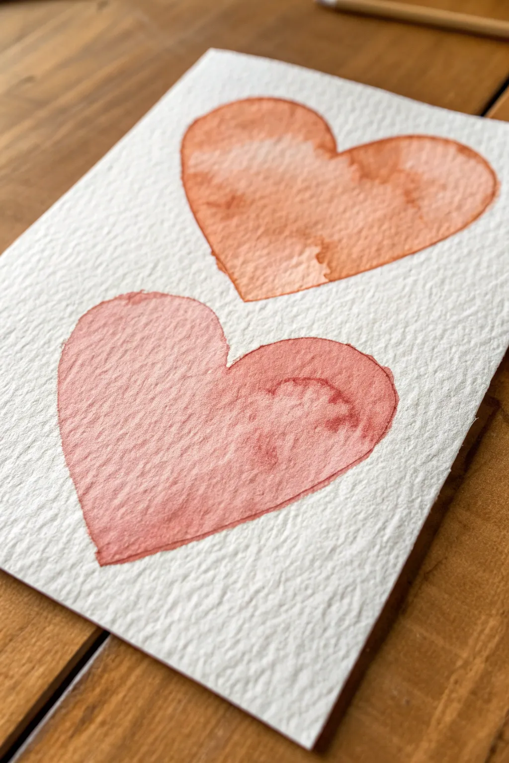
Capture the delicate beauty of love with this minimalist watercolor project featuring two gently blending hearts. The textured cold press paper adds wonderful dimension while the warm, monochromatic palette creates a cozy and inviting feel that’s perfect for a card or framed miniature.
How-To Guide
Materials
- Cold press watercolor paper (300 gsm or roughly 140lb)
- Watercolor paints (Light red, terracotta, or warm pink shades)
- Round watercolor brush (size 6 or 8)
- Jar of clean water
- Paper towels
- Pencil (HB or lighter)
- Eraser
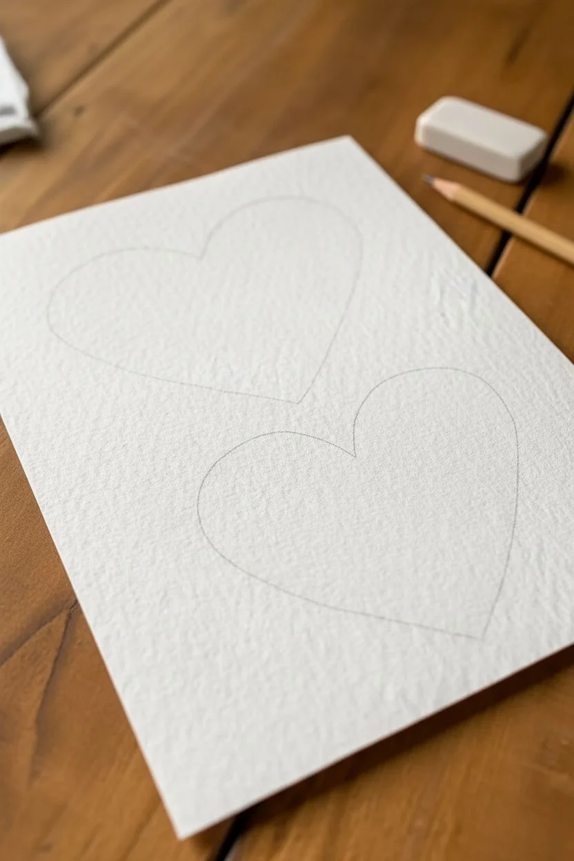
Step 1: Preparation and Sketching
-
Paper Selection:
Begin by selecting a high-quality cold press watercolor paper. The heavy texture you see in the photo is crucial for achieving that lovely, granulated effect where the paint settles into the paper’s valleys. -
Cut to Size:
Trim your paper to a small card size, approximately 4×6 inches or 5×7 inches, which suits this intimate composition perfectly. -
Light Sketching:
Using a very light hand and an HB pencil, draw the outline of the top heart. Keep it positioned slightly to the right of the center line. -
Second Sketch:
Draw the second heart slightly below and to the left of the first one. Ensure they are close but distinct; they don’t necessarily need to touch, as shown in the reference, but close proximity creates a better visual balance. -
Refine Shapes:
Clean up your lines with an eraser if needed. You want the pencil marks to be barely visible so they won’t show through the translucent watercolor later.
Bloom Control
To get that vintage ‘hard edge’ look, let a puddle of watery paint sit undisturbed until dry. The pigment naturally migrates to the edges as the water evaporates.
Step 2: Painting the Top Heart
-
Mix Your Color:
Prepare a watery mix of terracotta or a warm, orangey-red. You want a high water-to-pigment ratio to keep it transparent. -
First Wash:
Load your round brush with the mixture and fill in the top heart. Start from the outline and work your way inward. -
Creating Texture:
While the paint is still very wet, drop in a tiny bit more pigment or clean water into the center. This encourages the “bloom” effect where the pigment pushes to the edges, creating those darker rims characteristic of watercolor. -
Let it Settle:
Allow the paint to sit for a moment. You’ll notice the pigment settling into the texture of the cold press paper. -
Drying Time:
Let this first heart dry completely. This is vital to prevent the colors from bleeding uncontrollably if your hand brushes against it while painting the second one.
Step 3: Painting the Bottom Heart
-
Adjust the Hue:
For the bottom heart, mix a slightly rosier pink shade. It should harmonize with the top heart but offer a subtle variation in tone. -
Start Painting:
Fill in the bottom heart shape with your new color mix, ensuring you keep the edges crisp. -
Adding Variation:
While wet, dab a slightly darker concentration of red on the right side of this heart. I like to do this to suggest a slight shadow or volume. -
Controlling the Pool:
If a puddle forms at the bottom tip of the heart, dry your brush on a paper towel and gently touch the tip to lift the excess water. -
Edge Definition:
Check the edges of your heart. If the paint hasn’t flowed all the way to your pencil line, gently guide it there with the tip of your brush.
Muddy Centers?
If the middle of your heart looks overworked or muddy, you likely touched it too much while drying. Lay down the wash and trust the water to do the work without interference.
Step 4: Final Touches
-
Inspect the Dry:
Once both hearts are technically dry to the touch, check for any cold spots on the paper which indicate deep moisture. -
Erase Guidelines:
If any pencil lines are still visible outside the paint edges, very gently erase them now. Be careful not to scrub the painted areas. -
Flattening:
If your paper has buckled slightly from the water, place the dried artwork under a heavy book overnight to flatten it out again.
You now have a charming piece of watercolor art where the texture of the paper does as much work as the paint itself


Easy Daisy Dots on a Solid Background
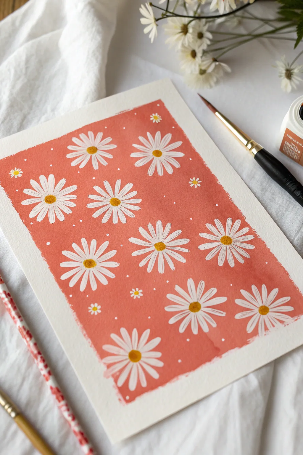
Brighten up your sketchbook with this charming floral pattern featuring crisp white daisies against a warm, peachy-coral backdrop. The contrast between the solid background and the delicate petals creates a fresh, summery vibe that looks much more complicated than it actually is.
Step-by-Step Tutorial
Materials
- Cold press watercolor paper (A5 or similar size)
- Washi tape or masking tape
- Gouache paint: Coral/Salmon pink, White, Yellow
- Flat brush (roughly 1/2 inch or size 10)
- Round brush (size 2 or 4) with a fine tip for details
- Small liner brush or detail brush (size 0 or 00)
- Palette for mixing
- Cup of water and paper towels
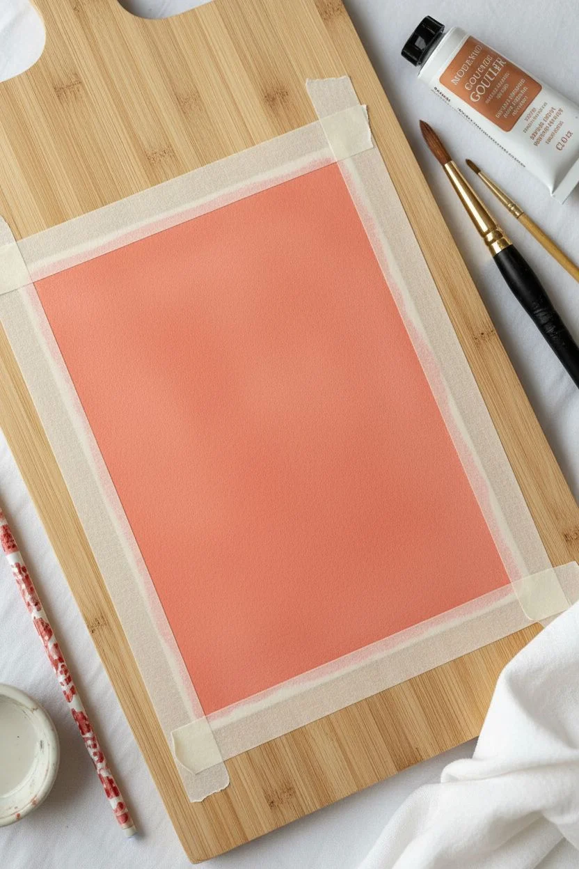
Step 1: Preparation & Background
-
Tape the edges:
Begin by taping down all four edges of your watercolor paper to a flat surface or drawing board. This creates that clean, professional white border seen in the final piece and keeps the paper from buckling. -
Mix the background color:
On your palette, mix a generous amount of coral paint. If you don’t have a pre-made coral, blend a primary red with a touch of yellow and a dab of white to soften it into a warm salmon pink hue. -
Paint the first background layer:
Using your flat brush, apply a wash of the coral paint across the entire taped-off area. Keep your strokes horizontal and even. Don’t worry if it looks slightly streaky; gouache often needs two coats. -
Apply the second coat:
Once the first layer is touch-dry (give it about 5-10 minutes), apply a second layer of the coral paint. Aim for an opaque, solid finish that hides the white paper completely. -
Let it dry completely:
This is crucial: allow the background to dry thoroughly before moving on. The paint should look matte and feel dry to the back of your hand. If it’s damp, the white flowers will turn pink.
Opacity is Key
If your white petals seem to disappear into the pink background, your paint is too watery. Use less water and more pigment for that bold, sticker-like opacity.
Step 2: Painting the Daisies
-
Prep the white paint:
Squeeze out fresh white gouache. You want a creamy consistency—thick enough to be opaque over the pink, but fluid enough to glide off the brush. -
Map out flower placement:
Mentally visualize where your large daisies will go. Aim for a staggered pattern rather than perfect rows to keep it looking organic. -
Paint the first petal:
Using your round brush (size 2 or 4), load it with white paint. Start from the outer edge of a petal and stroke inward toward the center of where the flower will be. -
Complete the first flower:
Continue painting petals around a central invisible point. Most daisies in this design have about 12-16 thin petals. Leave a tiny empty space in the very center for the yellow dot later. -
Repeat for large flowers:
Move across the paper, painting your main, large daisies. Vary the petal angles slightly so they don’t look like stamps. -
Fill gaps with medium flowers:
Look for larger negative spaces between the main flowers and paint slightly smaller daisies here to balance the composition. -
Add tiny filler flowers:
Using the tip of your smallest brush, paint miniature 5-petal flowers in the remaining small gaps. These act as cute accents. -
Layering check:
If your white paint looks a bit transparent as it dries, I like to go back over just the petals with a second coat of white to make them really pop.
Step 3: Adding Details
-
Paint the center disks:
Mix a warm yellow-orange color. Using your small round brush, dab a circle into the center of every large and medium daisy. -
Add texture to centers:
To give the centers form, mix a tiny bit of brown into your yellow. Dab a small crescent shape on the bottom-right side of each yellow center to suggest shadow. -
Dot the background:
Take your smallest detail brush or even a toothpick dipped in white paint. Add tiny white dots randomly in the coral spaces between flowers to mimic pollen or distant blooms. -
Peel the tape:
Wait until every part of the painting is bone dry. Slowly peel the tape away at a 45-degree angle to reveal your crisp white borders.
Switch It Up
Try a dark navy or forest green background for a moodier look, or swap the white daisies for sunflowers by using yellow petals and brown centers.
Step back and admire your cheerful field of flowers, ready to frame or gift to a friend

Fluffy Clouds With Simple Highlights
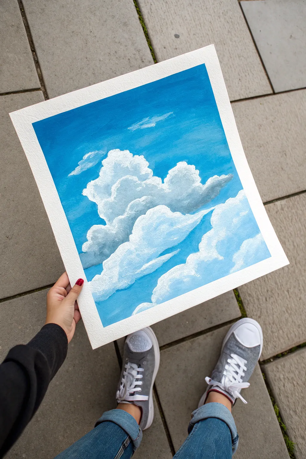
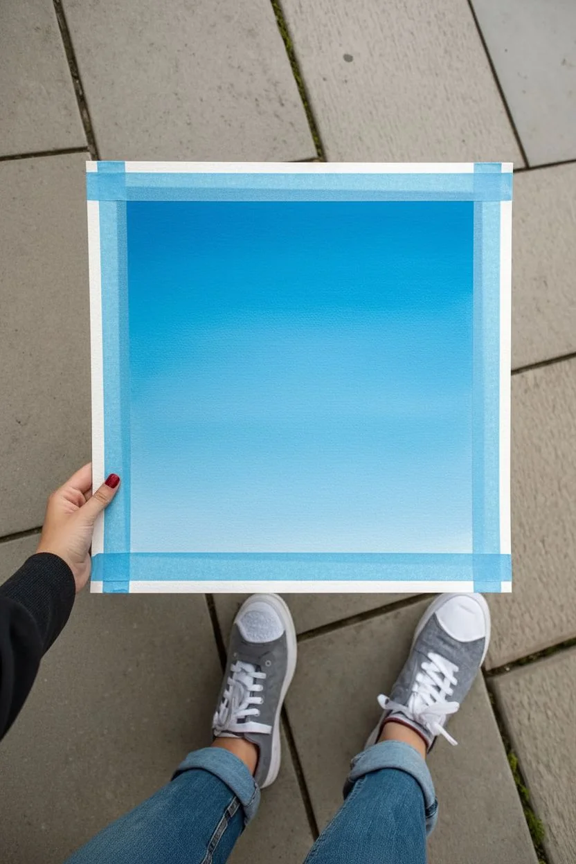
Capture the serene beauty of a perfect summer day with this fluffy cloud tutorial. Using simple layering techniques, you’ll create depth and volume that makes your clouds look soft enough to touch.
Step-by-Step
Materials
- Gouache or acrylic paint (Primary Blue, White, Black/Grey)
- Thick watercolor paper or mixed media paper (square cut)
- Painter’s tape or masking tape
- Flat brush (1/2 inch or 3/4 inch)
- Small round brush (size 2 or 4)
- Filbert brush (optional, for rounded edges)
- Palette for mixing paint
- Jar of water and paper towels
Step 1: Setting the Sky
-
Prepare your canvas:
Cut your paper into a square if it isn’t already. Tape down all four edges of your paper to a flat surface using painter’s tape. This creates that crisp, clean white border synonymous with framed art prints. -
Mix your base blue:
Squeeze out a generous amount of Primary Blue and a touch of White. Mix them to create a vibrant, mid-tone sky blue. You want enough paint to cover the entire background smoothly. -
Paint the gradient:
Start applying the blue paint at the very top of the paper using your flat brush. As you work your way down, gradually mix in tiny amounts of white to lighten the blue slightly. This mimics atmospheric perspective, where the sky is lighter near the horizon. -
Let it dry completely:
Allow the blue background layer to dry fully before moving on. Gouache dries quickly, but if you’re using acrylics, give it about 10-15 minutes. The surface should be matte and dry to the touch so the white clouds don’t turn muddy.
Keep it Fluffy
Use a rounded filbert brush or an old, frayed brush for clouds. The curved or messy bristles naturally create soft, round shapes better than a square brush.
Step 2: Building the Cloud Structure
-
Outline the main shapes:
Using a small round brush and a very faint wash of white (watered down slightly), lightly sketch the outline of your main cloud masses. Create a large, billowing shape in the center and smaller formations below it. -
Block in the base white:
Load your filbert or round brush with pure white paint. Fill in the top edges of your cloud shapes. Don’t fill the entire cloud yet—focus on the upper ‘domes’ where the sunlight hits most directly. Use a dabbing motion to create fluffy textures. -
Mix a shadow color:
Create a soft grey by mixing a large amount of white with a tiny dot of black and a hint of your sky blue. This blue-tinted grey will serve as the shadow for the clouds. -
Apply the shadows:
Paint the bottoms and lower-middle sections of the clouds with your grey mix. Allow the grey to meet the white areas you just painted. Blending them slightly while wet creates a soft transition. -
Adding mid-tones:
Mix a lighter grey (more white, less shadow color). Apply this between the bright white tops and the darker grey bottoms. This acts as a transitional color that gives the cloud roundness and volume.
Muddy Clouds?
If your white is turning blue, the background wasn’t dry enough. Let it dry completely, then apply a second thick layer of white over the muddy area.
Step 3: Refining Details
-
Layering the fluff:
Once the base layers are semi-dry, go back in with pure, thick white paint. Dab this onto the very top curves of each cloud ‘puff’. I like to use a dry brush technique here to make the edges look wispy and airy. -
Create separation:
Use your shadow grey to define the separation between different cloud clusters. Darken the area where a front cloud overlaps a back cloud to push the back one into the distance. -
Add distant wisps:
Using a very small amount of white paint on a dry brush, gently streak in a few tiny, faint clouds high up in the sky. These should look almost transparent compared to the main clouds. -
Highlight the edges:
Take your smallest round brush with thick white paint and crisp up the top edges of the most prominent clouds. This hard edge against the blue sky makes the painting pop. -
Final texture check:
Look for areas that look too flat. Add tiny dabs of shadow or highlight to break up large solid color blocks, creating that ‘cauliflower’ texture typical of cumulonimbus clouds. -
The reveal:
Wait until the painting is 100% dry. Carefully peel away the painter’s tape at a 45-degree angle to reveal your clean white borders.
Enjoy the peaceful feeling of your new sky painting and try experimenting with sunset colors next time
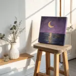
Smiling Moon and Tiny Star Dots
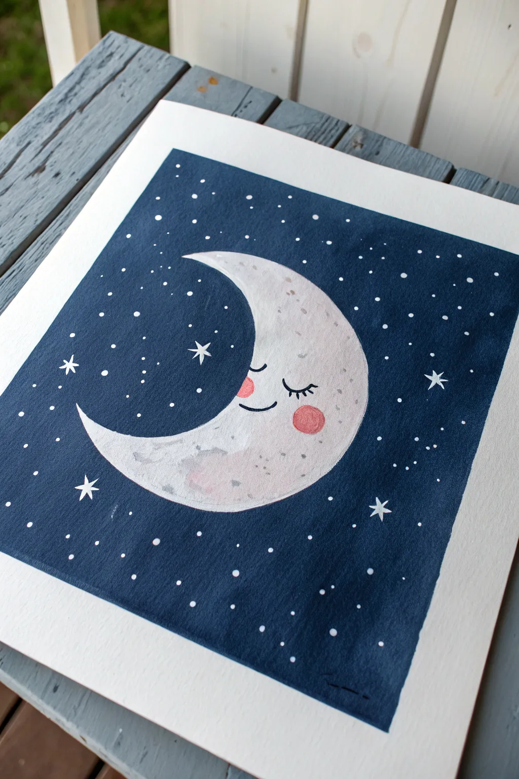
Capture the serenity of the night sky with this charming painting of a sleeping crescent moon amidst a field of stars. The high contrast between the deep indigo background and the pale, textured moon creates a cozy and dreamy aesthetic.
Step-by-Step Tutorial
Materials
- Cold press watercolor paper (square format)
- Masking tape or painter’s tape
- Pencil and eraser
- Gouache paints (Navy Blue, Black, White, Pink, Grey)
- Flat wash brush (medium)
- Round brush (small/detail)
- Mixing palette
- Cup of water
- Paper towels
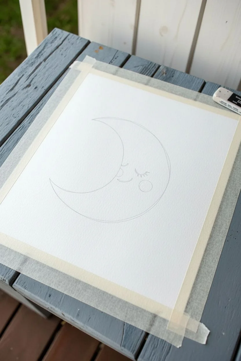
Step 1: Preparation & Sketching
-
Tape the Edges:
Begin by taping down all four edges of your watercolor paper to a hard board or table. This creates that crisp, clean white border seen in the final piece and prevents the paper from buckling. -
Sketch the Crescent:
Lightly draw a large ‘C’ shape in the center of the paper to form the crescent moon. Don’t worry about being perfectly geometric; a slightly chubby, organic curve looks friendlier. -
Refine the Shape:
Close the ends of the ‘C’ to create pointed tips. Make sure the belly of the moon is wide enough to accommodate the facial features later. -
Add Facial Features:
Sketch a small, curved line for the closed eye with eyelashes, a tiny smile, and a circular outline for the rosy cheek.
Clean Edges Trick
Before painting, run your fingernail or a bone folder firmly along the inner edge of the tape. This seals it tightly to the paper and prevents the blue paint from bleeding under.
Step 2: Painting the Night Sky
-
Mix the Background Color:
On your palette, mix a large amount of navy blue gouache with a touch of black. You want a deep, rich midnight blue that is opaque. -
Outline the Moon:
Using your smaller round brush, carefully paint the dark blue around the pencil outline of the moon. This ensures a sharp edge before filling the rest. -
Fill the Background:
Switch to the flat wash brush and paint the rest of the square in your dark blue mix. Use smooth, horizontal strokes for even coverage. -
Let it Dry:
Allow the background layer to dry completely. Gouache dries relatively quickly, but you can use a hairdryer on a low setting to speed this up.
Make it Sparkle
For a magical touch, use metallic gold or silver paint for the star accents instead of plain white. It will catch the light beautifully when displayed.
Step 3: Painting the Moon
-
Base Color:
Mix a tiny drop of black or grey into white gouache to create a very pale, off-white grey. It should be barely darker than pure white. -
Fill the Moon:
Paint the entire moon shape with this pale warm grey. Be careful when meeting the dried blue edge; take your time to keep the curve smooth. -
Add Texture:
While the moon is still slightly damp, mix a slightly darker grey tone. Dab this randomly onto the moon’s surface to create subtle craters and texture shadows. -
Paint the Blush:
Mix a soft coral pink. Paint the circular cheek area on the moon. If the white base is still wet, the pink might blend softly, which creates a nice effect. -
Facial Details:
Once the moon and cheek are dry, use a very fine liner brush and black paint to carefully trace the sleeping eye, eyelashes, and smile.
Step 4: Stars & Finishing Touches
-
Paint Large Stars:
Using pure white paint and a small brush, paint a few five-pointed or four-pointed ‘sparkle’ stars scattered around the moon. -
Create Large Dots:
Dip the handle end of a paintbrush into white paint. Dot it onto the blue background to create perfectly round, larger stars. -
Sprinkle Tiny Stars:
For the smallest stars, use the very tip of your smallest brush to tap tiny white specks filling the empty blue spaces. -
Add Moon Highlights:
Return to the moon’s face. Add a tiny dot of white to the pink cheek and a few tiny white specks on the grey moon surface for texture. -
Remove Tape:
Ensure the paint is 100% dry. Slowly peel the masking tape away at a 45-degree angle to reveal your crisp white border.
Hang your sleepy moon in a bedroom or nursery for a peaceful addition to the decor
BRUSH GUIDE
The Right Brush for Every Stroke
From clean lines to bold texture — master brush choice, stroke control, and essential techniques.
Explore the Full Guide
Whale Tail Silhouette Over Ocean Stripes
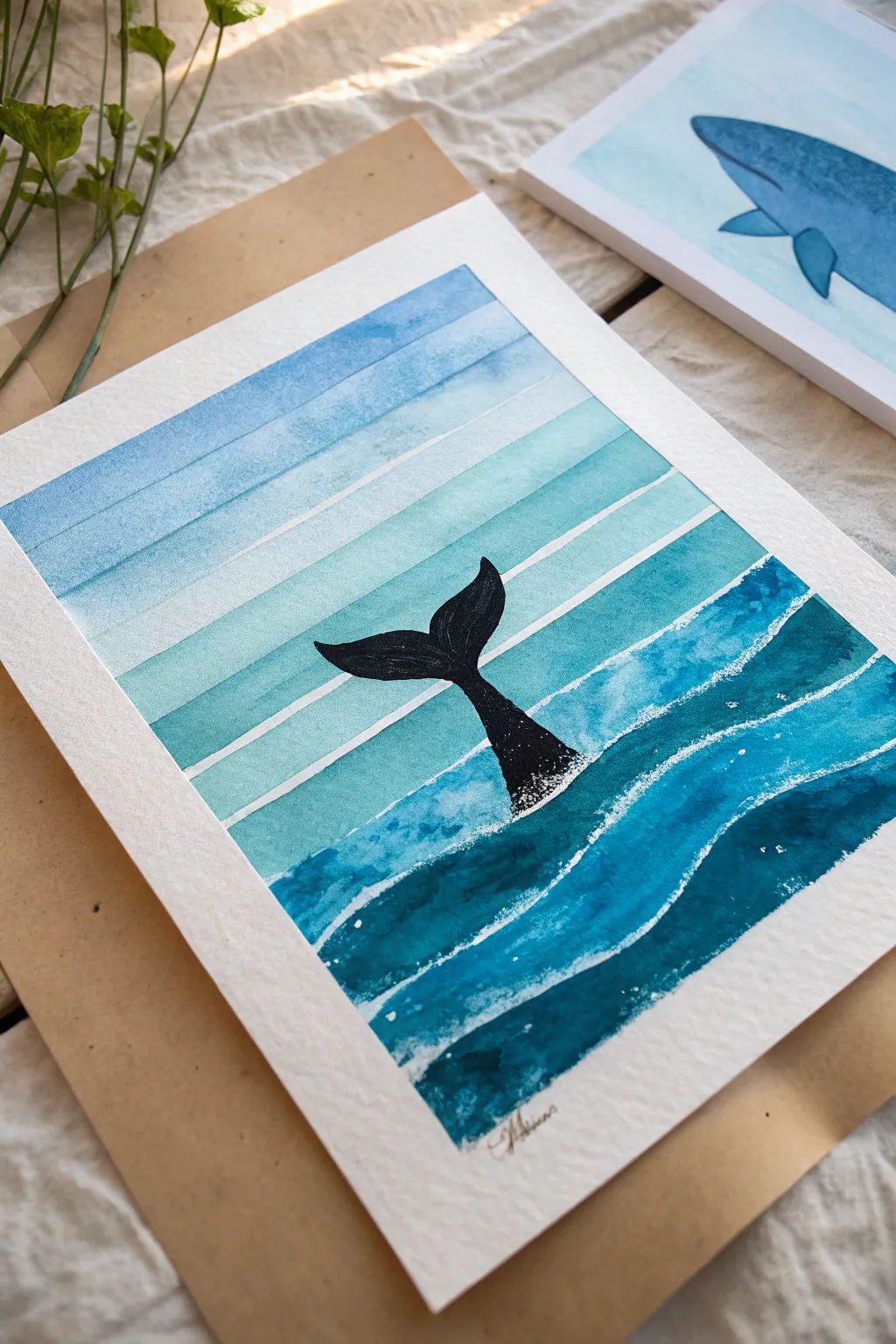
This charming watercolor project blends geometric precision with organic waves to frame a silhouette whale tail. The gradient stripes create a beautiful sense of depth, fading from soft sky blues into deep, oceanic teals.
Step-by-Step
Materials
- Cold press watercolor paper (gives texture)
- Watercolor paints (phthalo blue, turquoise visually dominant)
- Black ink, black gouache, or a fine black Posca pen
- Washi tape or masking tape (approx. 1/4 or 1/2 inch)
- Flat brush (1/2 inch) for stripes
- Round brush (size 6 or 8) for waves
- Finer detail brush (size 2)
- Pencil and eraser
- Ruler
- White gel pen or gouache (for splashes)
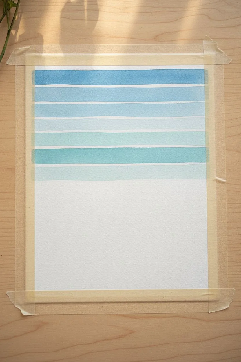
Step 1: Preparation & Sky Stripes
-
Paper Setup:
Begin by taping down all four edges of your watercolor paper to a board. This prevents buckling and creates that crisp white border seen in the final piece. -
Masking the Sky:
Decide where your horizon line will be—about halfway down the page. Above this line, place horizontal strips of masking tape across the sky area. Leave even gaps between the tape strips where your paint will go. -
Mixing the Sky Gradient:
Prepare a watery wash of cornflower or light cerulean blue. You want the top stripes to be slightly darker and the lower sky stripes to be very pale. -
Painting the Top Stripes:
Using your flat brush, paint the uppermost exposed paper strip. Keep the paint fluid but not puddling. -
Fading Downward:
For the next strips down, dilute your blue mix with more water or add a tiny touch of teal. Paint each strip, getting progressively lighter as you reach the horizon. -
Let it Dry:
Allow these sky stripes to dry completely. If the paper is cool to the touch, it’s still damp. Wait until it’s room temperature before peeling the tape to avoid tearing.
Step 2: The Ocean Waves
-
Sketching the Waves:
Lightly pencil in wavy, rolling lines below your horizon. These don’t need to be straight; give them a natural, rhythmic flow like rolling surf. -
Masking (Optional):
You can use drawing gum (masking fluid) along the top edges of these wave lines to preserve white space, or simply paint carefully around them leaving a thin white gap manually. -
Mixing Ocean Colors:
Mix a deeper palette for the water. Combine phthalo blue with emerald green or turquoise. I like to have three saturation levels ready: medium, dark, and deepest teal. -
Painting the Wave Layers:
Start with the wave strip closest to the horizon using your medium intensity mix. Paint the strip, letting the brush create a slightly uneven, organic texture. -
Deepening the Depths:
Move downwards to the next wave sections, switching to your darker and more intense teal mixes. The bottom-most waves should be the most saturated to anchor the painting.
Bleeding Stripes?
If paint bleeds under your tape, use a stiff, damp brush to gently ‘scrub’ and lift the unwanted paint while it’s still slightly wet, or cover with white gouache later.
Step 3: The Whale & Details
-
Sketch the Tail:
Once the ocean layer is bone-dry, lightly sketch the silhouette of the whale’s tail rising from the center. Focus on the graceful curve of the fluke. -
Fill the Silhouette:
Using opaque black paint or a black Posca marker, carefully fill in the tail sketch. Ensure the edges are sharp and clean against the striped background. -
Adding Texture:
While the black tail is drying, dip an old toothbrush or stiff brush into white gouache. Flick tiny droplets near the base of the tail where it meets the water for a splash effect. -
Foam Accents:
Use a white gel pen or a fine brush with white gouache to add stippled ‘foam’ dots along the white gaps between the ocean waves, enhancing the shoreline look. -
Final Reveal:
Once absolutely everything is dry, slowly peel off the border tape at a 45-degree angle to reveal your clean edges.
Metallic Magic
Mix a small amount of silver or pearl metallic watercolor into your blue ocean paint. It makes the water shimmer beautifully when the light hits the paper.
Sign your name in the corner and frame this peaceful maritime scene.
Cute Bear Face on a Mini Canvas
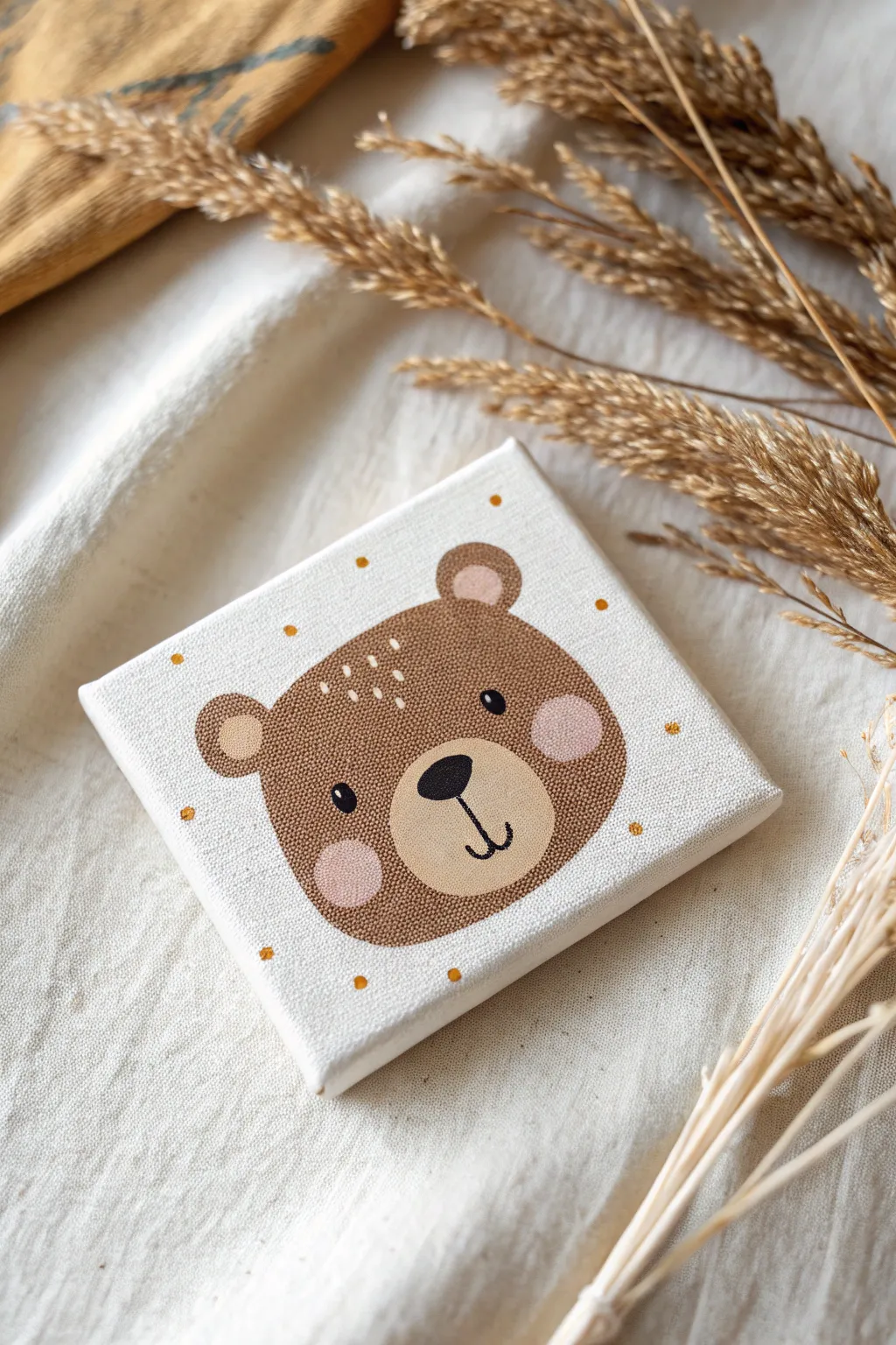
This adorable bear painting on a mini canvas is the perfect quick project to add a touch of whimsy to a shelf or desk. With simple shapes and a soft color palette, you’ll create a charming woodland friend in no time.
How-To Guide
Materials
- Mini stretched canvas (4×4 inches or similar)
- Acrylic paints: Chocolate Brown, Tan/Beige, Soft Pink, Black, Golden Yellow, White
- Flat paintbrush (medium)
- Small round detail brush
- Pencil
- Eraser
- Paper plate or palette
- Cup of water
- Paper towel
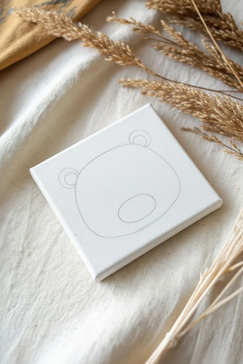
Step 1: Sketching the Shapes
-
Center the oval:
Begin by lightly sketching a wide, slightly flattened oval shape in the center of your canvas. This will be the main part of the bear’s head. Leave plenty of white space around the edges for the background dots. -
Add the ears:
Draw two small half-circles on the top left and top right of your main oval. Make sure they are evenly spaced and not too pointy—think rounded, gentle curves. -
Sketch the snout:
Inside the lower half of the main oval, sketch a smaller, slightly wider oval for the snout area. This is where the nose and mouth will eventually go.
Uneven Eyes?
If your painted eyes look lopsided, wait for the black paint to dry completely. Paint over the mistake with the brown fur color, let that dry, and simply try again
Step 2: Blocking in the Color
-
Paint the main fur:
Mix a warm Chocolate Brown shade. Using your flat brush, carefully fill in the main head shape and the outer parts of the ears. Do your best to keep your edges neat, but don’t worry if they aren’t perfect. -
Fill the ears:
Clean your brush and switch to a Tan or Soft Pink color. Paint the inner semi-circles of the ears. This subtle contrast gives the character dimension. -
Paint the cheeks:
While the brown paint is tacky or just dry, paint two round circles on the lower cheeks using Soft Pink. If the brown is still wet, the pink might muddy up, so I prefer to let the base layer dry completely first. -
Base the snout:
Using a Tan or Beige color, fill in the snout oval you sketched earlier. You may need two coats here to ensure the brown canvas texture doesn’t show through too much. -
Let it dry:
Allow the entire canvas to dry completely before moving on to the details. This prevents the black paint in the next step from bleeding into wet areas.
Step 3: Adding the Face Details
-
Paint the nose:
Using your small round detail brush and Black paint, create an inverted triangle shape with rounded corners at the top of the snout area. Fill it in solid black. -
Add the mouth:
From the bottom tip of the nose, paint a short, straight vertical line downwards. At the end of that line, paint two small curves hooking outward to the left and right to form a happy smile. -
Create the eyes:
Dip the handle end of a paintbrush into Black paint to use it as a stamp. Press it gently onto the face above the snout to create two perfectly round eyes. Alternatively, carefully paint small black circles with your brush. -
Sparkle the eyes:
Once the black eyes are dry, use a toothpick or the very tip of a clean brush to add a tiny dot of White paint to the upper right corner of each eye for a reflective glint.
Keep it Steady
For the fine mouth lines, rest your pinky finger on a dry part of the canvas to stabilize your hand. This acts as an anchor and prevents shaky lines
Step 4: Final Touches
-
Add forehead texture:
Mix a very light beige or off-white. Using your finest detail brush, paint three small sets of vertical dashes on the bear’s forehead to mimic fur texture. -
Create the background pattern:
Dip the handle of a paintbrush into Golden Yellow or Mustard paint. Randomly stamp small dots around the bear’s head in the white background space. -
Check the balance:
Look at your polka dots and add a few more if the background feels too empty, keeping the spacing uneven for a playful look. -
Sign your work:
Add your initials in the corner or on the back of the canvas to claim your masterpiece.
Display your mini canvas on a tiny easel or lean it against some dried flowers for a cozy decor vignette

PENCIL GUIDE
Understanding Pencil Grades from H to B
From first sketch to finished drawing — learn pencil grades, line control, and shading techniques.
Explore the Full Guide
Rubber Duck in a Blue Puddle
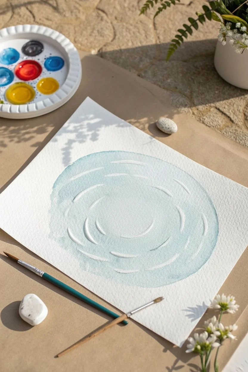
This whimsical mixed media project combines watercolor textures with modeling clay to create a playful 3D effect. The soft blue ripples frame a cheerful yellow duck, making it a perfect piece of cheery decor for a bathroom or nursery.
Step-by-Step
Materials
- Cold press watercolor paper (A4 or roughly 9×12 inches)
- Watercolor paints (Cerulean or light blue)
- Air-dry modeling clay or polymer clay (yellow and orange)
- Acrylic paints (yellow, orange, white, black) if using white clay
- Paintbrush (round, size 6 or 8)
- Smaller detail brush (size 0 or 1)
- Small cup of water
- Pencil
- Adhesive (strong craft glue or superglue)
- Clean white pebble or stone (optional for styling)
Step 1: Painting the Water
-
Sketch the ripples:
Lightly use your pencil to draw concentric ovals on your watercolor paper. These don’t need to be perfect circles; slightly irregular ovals look more like natural water movement. Leave a blank space in the very center where the duck will sit. -
Prepare your wash:
Mix a watery light blue shade on your palette. You want a very transparent consistency, so use plenty of water with just a touch of pigment. -
Paint the background puddle:
Apply the light blue wash in a circular motion, filling in the general area of your ripples. Don’t worry about staying perfectly inside lines; a ragged, organic edge looks better. -
Add depth to the water:
While the first layer is still slightly damp, drop in a slightly more saturated blue in the valleys between your pencil ripple lines to create soft shadows. -
Let it dry completely:
Wait for the paint to be bone dry. If the paper feels cool to the touch, it’s still wet. -
Add white highlights:
Using opaque white acrylic paint or white gouache and a detail brush, paint curved, dashed lines along the tops of your ripples. This simulates light catching the water’s movement.
Uneven Clay Surface?
If your clay dries with cracks or bumps, mix a little water with some fresh clay to make a paste (slip) and smooth over the imperfections before painting.
Step 2: Sculpting the Duck
-
Form the body:
Take a piece of yellow clay and roll it into a slightly elongated oval shape for the duck’s body. Flatten the bottom so it will sit flush against the paper. -
Create the head:
Roll a smaller ball of yellow clay for the head. Press it gently onto the front top of the body piece. Smooth the seam where the clay joins with your finger or a sculpting tool. -
Shape the tail:
Pinch the back end of the body clay upward to form a cute, upturned tail feather. -
Add the beak:
Roll a tiny cone of orange clay (or paint white clay orange later) and press it onto the face. Flatten it slightly to look like a bill. -
Detail the wings:
If I want extra detail, I use a needle tool or toothpick to gently etch curve lines on the side of the body to suggest a wing. -
Dry the clay:
Let your clay duck dry completely according to the package instructions. Air-dry clay usually takes 24 hours.
Use White Gouache
For the crispest white ripple highlights, use gouache straight from the tube without water. It is much more opaque than watercolor.
Step 3: Assembly and Details
-
Paint the clay (if needed):
If you used plain white clay, now is the time to paint the body yellow and the beak orange with acrylics. Let that coat dry. -
Add the eye:
Use a fine-point black marker or a tiny dot of black paint to add the eye. A tiny speck of white inside the black dot adds a sign of life. -
Glue the duck:
Apply a strong adhesive to the flat bottom of your duck and press it firmly into the center of your painted puddle. -
Add a shadow:
For a realistic finish, mix a watery grey-blue watercolor. Paint a small shadow on the paper directly behind and to the side of the duck, following the curve of the ripples.
Enjoy the dimensional charm of your new little duck friend swimming on the page
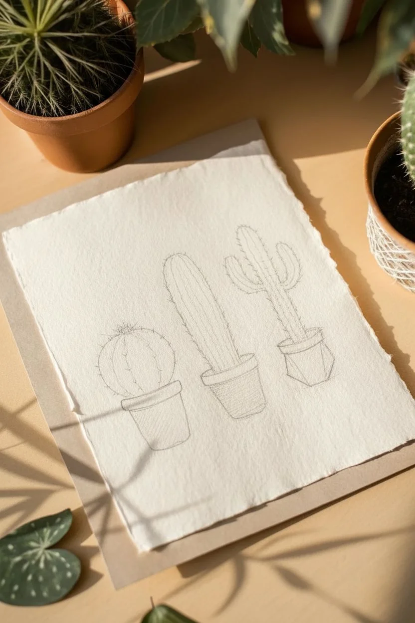
Three Simple Cacti in Little Pots
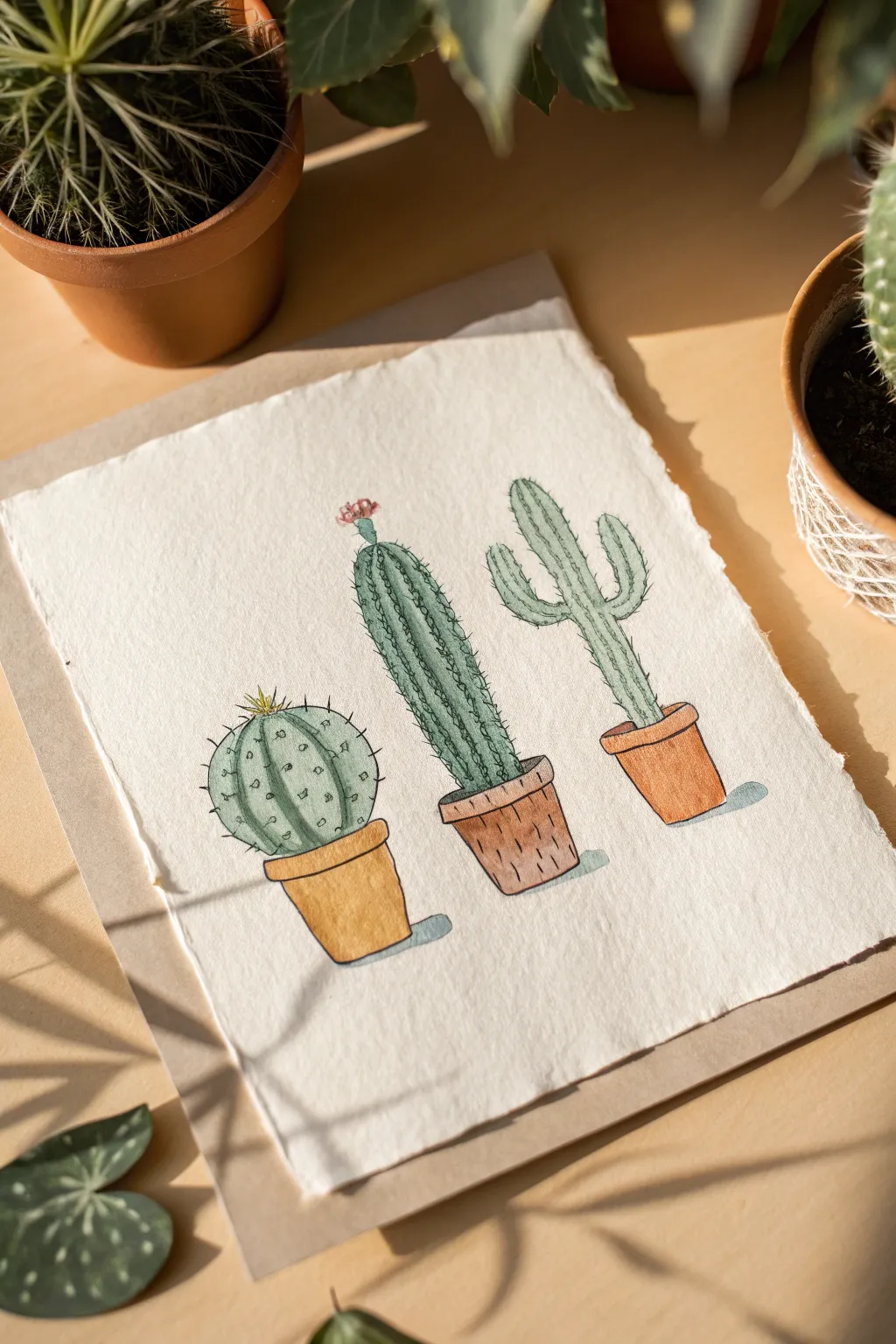
This charming trio features three distinct cactus personalities, each nestled in its own terracotta pot. With simple fine-liner details and washes of watercolor, you can capture the spiky textures and warm, earthy tones of this desert garden.
Step-by-Step Guide
Materials
- Cold-pressed watercolor paper (heavyweight, textured edge optional)
- Waterproof black fine-liner pens (sizes 0.1 and 0.3)
- Watercolor paint set (greens, browns, yellow, pink)
- Round watercolor brushes (size 4 and size 2)
- Pencil (HB) and soft eraser
- Jar of water and paper towels
Step 1: Planning the Composition
-
Draft the pots:
Start by lightly sketching three pot shapes along the bottom third of your paper. Make the left pot a simple cylinder with a rolled rim, the middle pot slightly tapered with a distinct rim, and the right pot small and angled. -
Sketch the cactus shapes:
For the left cactus, draw a plump, round ball sitting low in the pot. For the middle, sketch a tall, slender column. On the right, draw a classic ‘saguaro’ shape with branching arms. -
Refine the outlines:
Go over your pencil lines to define the ridges. Add vertical contour lines to the round cactus and the tall column to show their ribbed texture.
Smudged Ink?
If your fine-liner bleeds when you paint, it might not be waterproof. Test your pen on scrap paper first, or do the inking step *after* the watercolor dries.
Step 2: Inking the Details
-
Outline in ink:
Using your waterproof 0.3 fine-liner, trace over your main pencil outlines. Keep your hand loose; shaky lines actually add to the organic, prickly feel. -
Add texture to the round cactus:
Switch to a finer 0.1 pen. Along the vertical ribs of the round cactus, draw small ‘v’ shapes or dots to represent spines. -
Detail the tall cactus:
On the middle cactus, draw continuous vertical lines of short, dashed strokes or tiny prickles running up the length of the plant. -
Texture the branching cactus:
For the right cactus, use stippling (lots of tiny dots) and short hashes along the edges to create a fuzzy texture. -
Erase pencil marks:
Once you are certain the ink is completely dry, gently erase the underlying pencil structure.
Step 3: Adding Color
-
Paint the round cactus:
Mix a muted sage green. Paint the round cactus, leaving a few white gaps near the center of the ribs for highlights. -
Paint the tall cactus:
Use a darker, cooler forest green for the middle column. Apply the paint in vertical strokes. -
Paint the branching cactus:
Mix a lighter lime or mint green for the cactus on the right to differentiate it from the others. -
Color the pots:
Mix a terracotta shade using burnt sienna and a touch of yellow. Paint the pots, varying the saturation to make them look distinct. -
Add shadows:
While the pots are damp, drop a tiny bit of darker brown on the right side of each pot to create volume.
Go jagged
Tear the edges of your paper against a ruler instead of cutting it with scissors. This creates a lovely ‘deckled’ edge that makes the finished piece look artisanal.
Step 4: Final Touches
-
Paint the flower:
Dab a tiny spot of pink watercolor on top of the middle cactus for a blooming flower. -
Add the yellow spines:
Once the green paint is dry, use a very small brush or a yellow marker to add the star-shaped spines on the top of the round cactus. -
Cast shadows:
Mix a very watery grey-blue. Paint a small, quick shadow pooling to the right of each pot to ground them. -
Enhance pot texture:
I like to go back to the pots with the fine-liner once the paint is dry to add wood-grain or crackle textures.
Now frame your trio of painted plants for a bit of greenery that never needs watering


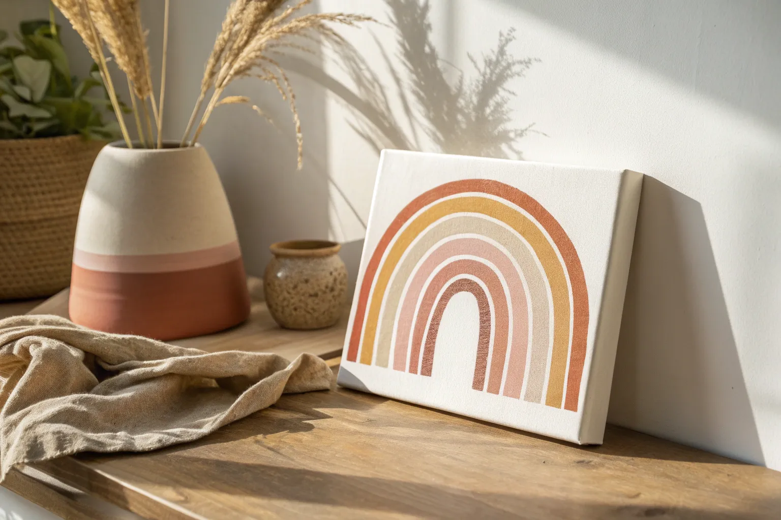
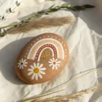
Rainbow Arc With Puffy Clouds
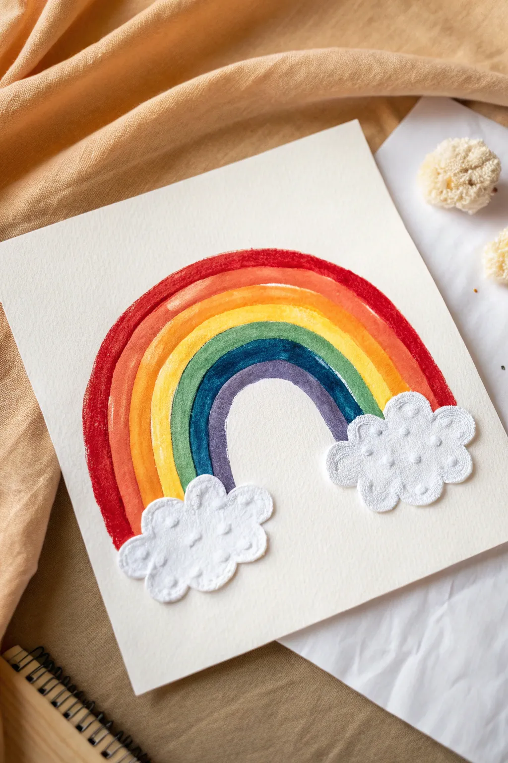
This cheerful project combines classic watercolor techniques with a touch of mixed-media texture. The result is a vibrant, clean rainbow arc that pops beautifully against crisp white paper, anchored by adorable, tactile fabric clouds.
Step-by-Step
Materials
- Heavyweight watercolor paper (cold press recommended)
- Watercolor paint set or liquid watercolors
- Round watercolor brush (size 6 or 8)
- White felt or stiff white fabric
- Pencil
- Compass or two different sized circular objects (bowls work well)
- Fabric scissors
- White craft glue (PVA) or fabric glue
- Water cup and paper towels
Step 1: Planning the Arch
-
Paper preparation:
Begin with a fresh sheet of heavyweight watercolor paper. Tape the corners down if you prefer, though for a simple shape like this, you can often work freely. -
Mark the outer boundary:
Using a compass or a large bowl, lightly trace a half-circle near the center of your page. This will be the top red band of your rainbow. -
Mark the inner boundary:
Trace a much smaller semi-circle directly inside the first one. This marks where the purple band will end and the negative space begins. -
Sketch the bands:
Lightly sketch curved lines between your inner and outer marks to create six distinct channels for your colors. Don’t worry if they aren’t mathematically perfect; a little wobble adds charm.
Clean Edges Pro Tip
For ultra-crisp edges between color bands, let each stripe dry completely before painting the neighbor. If you want a softer look, paint while wet.
Step 2: Painting the Rainbow
-
Start with Red:
Load your brush with a saturated red watercolor. Carefully paint the outermost band, using the tip of the brush to keep the top edge crisp. -
Orange band:
Rinse your brush and pick up orange paint. Apply this to the second band. I like to let the red dry for just a moment so the colors don’t bleed too heavily into each other. -
Yellow band:
Continue inward with a bright, sunny yellow. If your orange is still wet, you might get a soft blend at the border, which looks lovely. -
Green band:
Paint the next stripe with a grassy green. Keep your hand steady as the arc gets tighter. -
Blue band:
Apply a deep blue or indigo to the fifth stripe. The contrast between this and the green is usually quite striking. -
Violet finish:
Fill the final, smallest inner arch with violet or purple paint. Ensure the bottom edges of all bands end at roughly the same horizontal level. -
Dry completely:
Set the painting aside to dry fully. The paper needs to be stiff and dry before we add the clouds.
Step 3: Adding the Clouds
-
Sketch cloud shapes:
On a piece of white felt or stiff fabric, use a pencil to lightly draw two fluffy cloud shapes. Keep the bottoms relatively flat and make the tops bubbly. -
Cut out the fabric:
Using sharp fabric scissors, carefully cut along your pencil lines. The cleaner your cuts, the neater the final applique will look. -
Positioning:
Place the cut-out clouds at the base of your painted rainbow to check the fit. They should overlap the bottom ragged edges of the paint slightly to hide them. -
Apply glue:
Flip the clouds over and apply a generous amount of white craft glue or fabric glue to the back. Spread it near the edges to prevent lifting. -
Secure the clouds:
Press the clouds firmly onto the paper at the base of the rainbow. Hold them down for a few seconds to ensure the glue tacks onto the paper texture. -
Final touches:
Let the glue dry completely clear. If you see any pencil marks on the felt, you can carefully trim them away or dab them with a clean eraser.
Level Up: 3D Texture
Before gluing, embroider small French knots or simple running stitches onto the felt clouds using white thread for extra texture and detail.
Hang your new mixed-media artwork in a sunny spot to enjoy those bright colors every day
Frog Peeking Out of a Pond
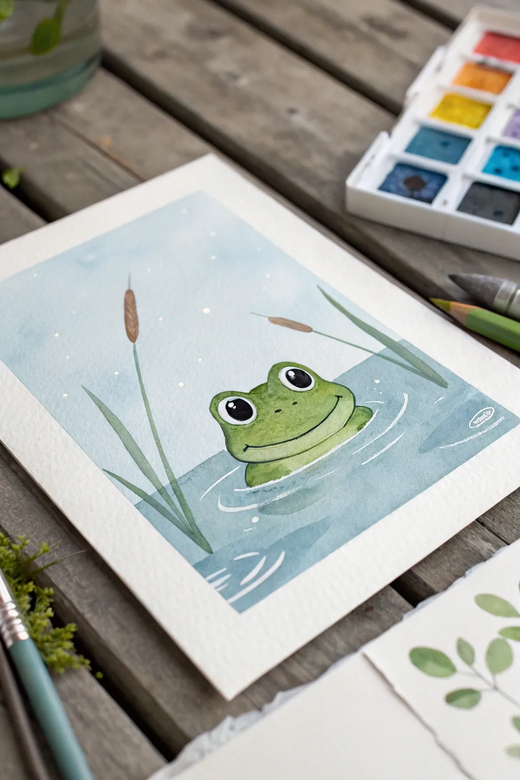
This charming little scene captures a curious frog peeking just above the water’s surface, surrounded by gentle cattails. With soft watercolor washes and bold outlines, it’s a perfect beginner project to explore wet-on-wet and wet-on-dry techniques.
Detailed Instructions
Materials
- Cold press watercolor paper (A5 size works well)
- Watercolor paints (Light Blue, Deep Teal, Grass Green, Olive Green, Brown)
- White gouache or white gel pen
- Round brushes (Size 6 for washes, Size 0 or 1 for details)
- Pencil and eraser
- Masking tape (washi tape is gentle on paper)
- Two jars of water
- Paper towels
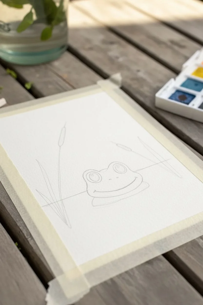
Step 1: Sketching the Scene
-
Tape it down:
Begin by taping the edges of your paper to a flat board or table. This creates that crisp, clean border you see in the photo and prevents the paper from buckling when wet. -
Map the horizon:
Lightly sketch a horizontal line about one-third of the way up from the bottom. This separates the water from the sky. -
Draw the frog:
In the center, just above the water line, draw a wide oval for the frog’s head. Add two smaller semi-circles on top for the eyes. Don’t worry about perfect symmetry; quirky shapes add character. -
Add nature elements:
Sketch two or three long, slender stems rising from the water on the left and right. Add cigar shapes near the tops for the cattail heads.
Uneven Background?
If your sky wash dries with hard edges (blooms), soften them with a damp, clean brush while the paint is still slightly workable, or embrace the texture.
Step 2: Painting the Background
-
Sky wash:
Isolate the sky area first. Wet the paper above the water line (carefully painting around the cattails and frog) with clean water. Drop in a very watery Light Blue, letting it fade to white near the top for an atmospheric look. -
Water wash:
While the sky dries, mix a deeper, more saturated blue-teal color. Paint the water section below the horizon line. I like to keep this color fairly flat and even. -
Adding depth:
While the water layer is still slightly damp, add horizontal strokes of a slightly darker teal just under the frog’s chin to hint at a reflection or shadow.
Step 3: Bringing the Frog to Life
-
Base green:
Once the background is completely bone dry, mix a vibrant Grass Green. Fill in the frog’s face shape. Keep the wash even. -
Shadowing:
While the green is still wet, drop a tiny bit of darker Olive Green along the bottom edge of the face and under the eyes to create rounded volume. -
Cattail details:
Paint the stems with a mix of green and a touch of brown. Fill in the cigar-shaped heads with a warm brown, leaving them simple and solid.
Level Up: 3D Eyes
For extra-cute eyes, paint the iris a dark brown before adding the black pupil, giving the frog a softer, deeper gaze than solid black.
Step 4: Final Details & Highlights
-
Defining the eyes:
Use a detail brush with black paint or a waterproof black pen to draw the large circles for the eyes inside the eye bumps. Leave a small white circle unpainted for the glint, or add it later with white gouache. -
The smile:
Paint a wide, thin smile line using dark green or black. Add tiny nostril dots in the center of the face. -
Water ripples:
Switch to your white gouache or a white gel pen. Draw curved, concentric lines in the blue water radiating away from the frog to show movement. -
Reflections:
Add a few small white highlight lines on the frog’s wet skin—specifically on the top of the eye bumps and the side of the cheek. -
Magical atmosphere:
Finally, dot tiny speckles of white into the pale blue sky area to represent fireflies or distant stars.
Peel off your tape carefully to reveal those crisp edges and enjoy your serene little frog friend
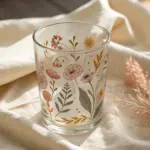
Tulips in a Simple Glass Jar
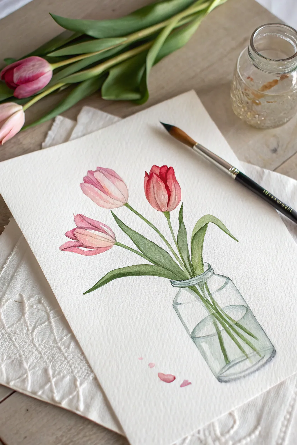
Capture the freshness of spring with this delicate watercolor study of three tulips resting in a simple glass jar. The transparent glass effect combined with the soft pinks and reds creates a lovely, airy composition perfect for beginners.
How-To Guide
Materials
- Cold press watercolor paper (300 gsm)
- Watercolor paints (Alizarin Crimson, Sap Green, Burnt Umber, Payne’s Grey, Lemon Yellow)
- Round watercolor brushes (size 4 and 8)
- Pencil (HB or 2H)
- Kneaded eraser
- Two jars of water
- Paper towels
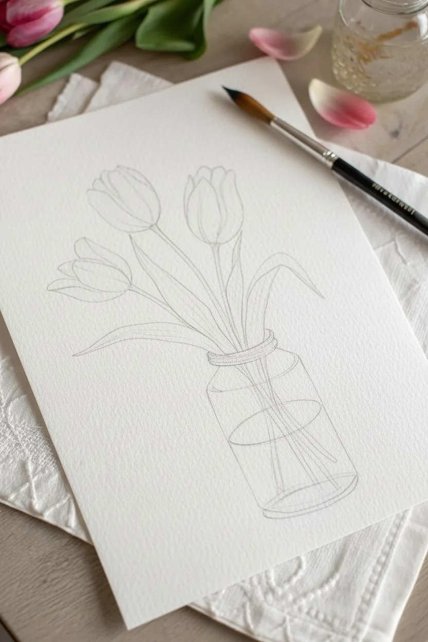
Step 1: Sketching the Composition
-
Outline the Jar:
Start by lightly sketching a simple cylindrical jar in the bottom right quadrant of your paper. Draw an oval for the rim, two vertical lines for the sides, and a curved line for the base. Keep your pencil pressure very light so the graphite doesn’t show through the paint later. -
Map the Tulip Heads:
Sketch the shapes of three tulip heads floating above the jar. Place the tallest red one slightly to the right, a pink one to the left, and a third pink bud facing leftwards beneath it. -
Connect the Stems:
Draw long, slender stems connecting the flower heads down into the jar. Make sure the stems that enter the water (inside the jar sketch) look slightly refracted or broken for realism. -
Add Leaves:
Sketch long, lance-shaped leaves emerging from the stems. Have one large leaf draping over the right side of the jar rim and another reaching up towards the middle flower.
Muddy Water?
If your jar looks dirty rather than clear, you’re using too much paint. Dilute your grey mix until it’s almost clear water, and leave 80% of the jar area unpainted white.
Step 2: Painting the Flowers
-
Base Wash for Petals:
Mix a watery pale pink using Alizarin Crimson and plenty of water. Paint the base layer of the two pink flowers. For the red tulip, use a slightly more concentrated mix but keep it light for this first layer. -
Adding Depth to Petals:
While the first layer is still slightly damp, drop in stronger pigment at the base of the petals and where the petals overlap. This wet-on-wet technique creates soft, natural gradients. -
Defining the Red Tulip:
Once dry, use a thicker mix of Alizarin Crimson to paint the individual petal shapes on the red tulip, leaving thin white lines of unpainted paper between petals to separate them. -
Detailing the Pink Tulips:
Add fine lines and darker pink shadows to the pink tulips to suggest the curve of the petals. If the edges feel too hard, soften them with a clean, damp brush.
Step 3: Greenery and Leaves
-
Mixing Greens:
Create a fresh green mix using Sap Green and a touch of Lemon Yellow. Paint the stems with a size 4 brush, using a steady hand. -
Painting the Main Leaves:
Fill in the large leaves with your green mix. While wet, drop in a bit of darker green (Sap Green mixed with a tiny bit of Crimson) at the base of the leaves and where they twist away from the light. -
Varying the Values:
I like to lift a little pigment out of the center of the leaves with a thirsty brush to create a highlight, making them look curved rather than flat.
Add Sparkle
Once the painting is completely dry, use a white gel pen to add sharp, tiny highlights on the moistest parts of the petals and the brightest reflections on the glass jar rim.
Step 4: The Glass Jar
-
Water Line:
Mix a very dilute grey-blue using a tiny amount of Payne’s Grey and a lot of water. Paint an oval shape inside the jar to represent the water surface line. -
Glass Reflections:
Using the same pale grey-blue, paint thin, curved strokes along the sides and bottom of the jar to suggest the thickness of the glass. Leave plenty of white paper untouched to represent the transparency. -
Submerged Stems:
Paint the stems inside the water using a slightly more muted green. Because they are underwater, the edges can be slightly softer, and the color less vibrant. -
Rim Detail:
Use a darker grey mix and a very fine brush to accentuate the rim of the jar and the water line with broken, thin lines. Do not outline the entire jar; broken lines look more realistic.
Step 5: Final Touches
-
Falling Petals:
Paint three or four small, loose petal shapes falling near the base of the jar using your pink mix to balance the composition. -
Review and Refine:
Step back and check your values. If the jar needs more definition, add a few tiny dark accents to the rim or base. Ensure the stems connect visually through the glass.
Now you have a charming floral piece that looks fresh enough to smell
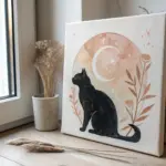
Planets on a Starry Space Background
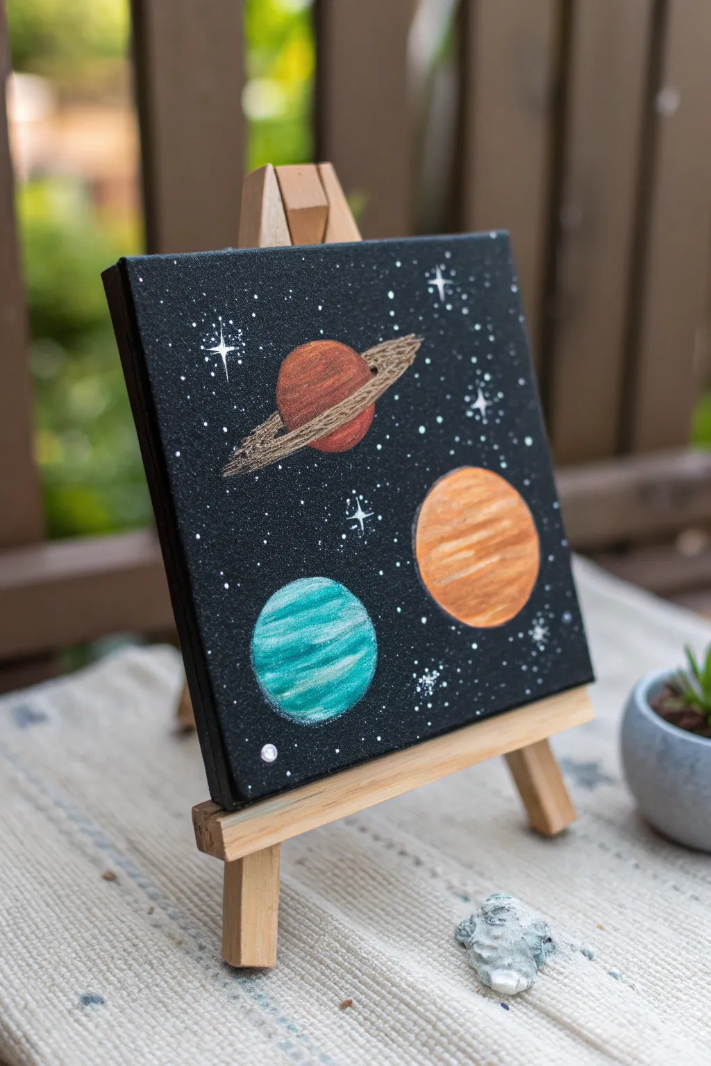
Bring a little piece of the galaxy to your desk with this charming mini canvas painting. Featuring three colorful planets set against a deep, starry background, this project is perfect for beginners wanting to practice simple shapes and blending.
Step-by-Step
Materials
- Small square canvas (e.g., 4×4 or 6×6 inches)
- Black acrylic paint
- White acrylic paint
- Acrylic paints: Terra cotta/rust, orange, cream/beige, teal, aquamarine
- Small flat paintbrushes
- Fine detail liner brush
- Toothbrush (optional, for stars)
- Small wooden easel for display
- Cup of water and paper towels
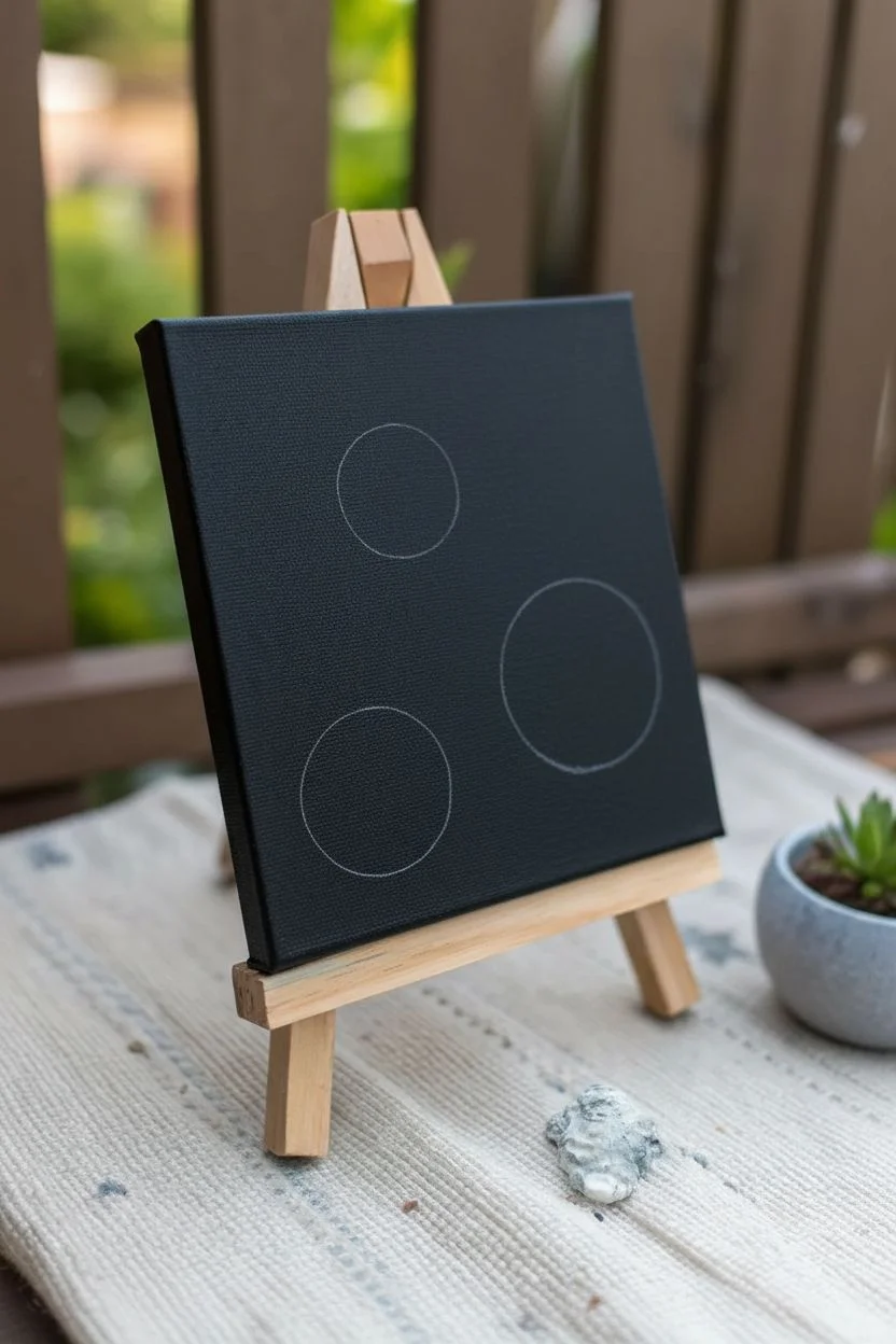
Step 1: Setting the Scene
-
Base Coat:
Begin by covering your entire canvas with black acrylic paint. Don’t forget the sides of the canvas for a clean, finished look. -
Dry Time:
Let the black background dry completely. Since the next layers involve lighter colors, any wet black paint will muddy them. -
Sketching Placement:
Using a piece of chalk or a very light pencil touch, lightly outline three circles of varying sizes to plan your planet placement. Place one larger circle in the middle right, and two slightly smaller ones in the top center and bottom left.
Step 2: Painting the Planets
-
First Planet Base:
Start with the ‘Saturn-like’ planet in the top center. Paint the circle with a rust or terra cotta color. -
Adding Dimension:
While the paint is still slightly wet, add a horizontal stripe of darker brown near the bottom and a lighter peach tone near the top to suggest spherical form. -
The Rings:
Use a light beige or cream color mixed with a tiny bit of brown. With a fine brush, paint a thin, flat oval shape that cuts across the middle of the planet. Make the lines thicker on the sides and very thin where they cross the planet’s face. -
Second Planet Base:
Move to the large planet on the right. Fill this circle with a solid orange base coat. -
Striping Texture:
Mix a little white into your orange to make a creamy peach color. Using a flat brush, paint horizontal, slightly curved bands across the orange planet to mimic gas giant storms. -
Third Planet Base:
For the bottom-left planet, paint the circle with a deep teal or turquoise color. -
Icy Highlights:
Mix white with your teal to create a pale aqua. Paint curved highlights on the top left and bottom right sections of the sphere to give it a reflective, icy look.
Clean Circles
Struggling to paint perfect circles? Trace small household objects like bottle caps or coins with a white charcoal pencil before you start painting.
Step 3: Starry Details
-
Splatter Stars:
Dilute a small amount of white paint with water until it’s the consistency of milk. -
Flicking Technique:
Dip a toothbrush or a stiff bristled brush into the watery white paint. Use your thumb to flick the bristles, spraying tiny dots across the black background. Test this on a paper towel first to control the spray. -
Twinkling Stars:
Use your finest detail brush and pure white paint to add larger, specific stars. Paint a small dot, then pull four very thin lines outward (up, down, left, right) from the center to create a ‘twinkle’ effect. -
Cluster Details:
Add tiny clusters of white dots near the edges of the canvas to create the look of distant galaxies or nebulae. -
Highlighting the Rings:
Go back to your ringed planet. Add a tiny touch of white to the brightest part of the ring to make it pop against the dark background. -
Final Polish:
Check your edges. If any planet paint spilled onto the black background, use a small brush with black paint to touch up the outline for a crisp circle.
Glow Up
Mix a tiny amount of glitter into your planet paint or use metallic acrylics (like gold or bronze) for the rings to make the artwork catch the light.
Place your dried masterpiece on its easel to enjoy your personal view of the cosmos
Wavy Stripe Pattern in Pastel Colors
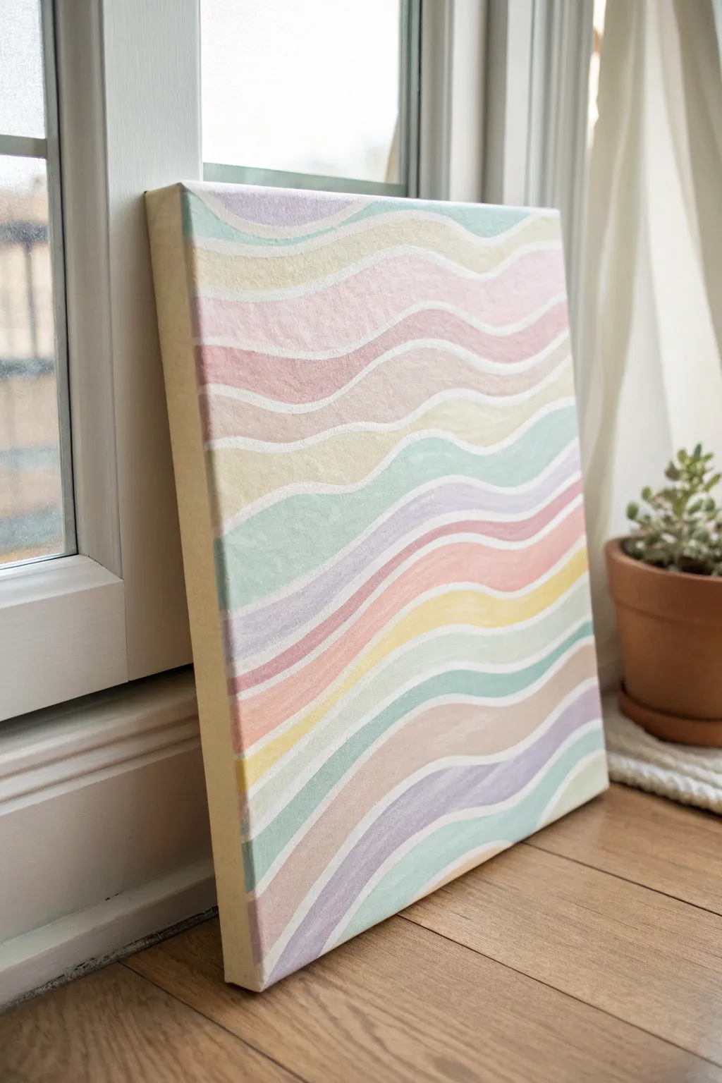
Soft, flowing lines meet gentle pastel hues in this relaxing abstract painting project. The rhythmic wavy pattern creates a calming movement that looks lovely brightening up a window ledge or shelf.
Step-by-Step Guide
Materials
- Rectangular stretched canvas (around 11×14 inches)
- Acrylic paints in pastel shades: mint green, baby pink, lavender, lemon yellow, peach
- Gesso or white acrylic paint (for the base)
- Flat shader brush (medium size, approx. 1/2 inch)
- Small round detail brush (size 1 or 2)
- Pencil
- Eraser
- Palette or paper plate
- Cup of water and paper towels
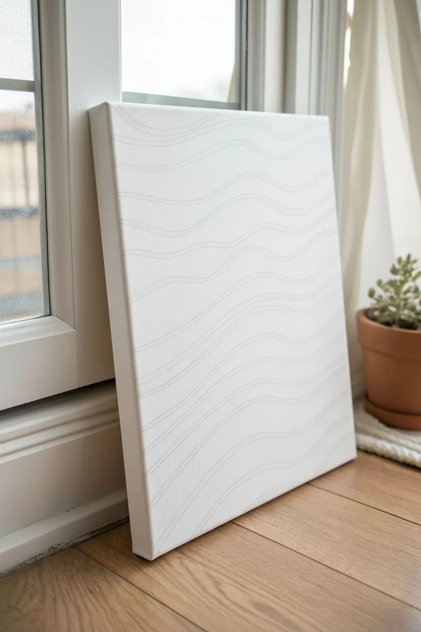
Step 1: Preparation & Sketching
-
Prime the canvas:
Begin by applying an even coat of white acrylic paint or gesso to your entire canvas. This ensures your pastel colors will pop and gives you a nice, clean surface if you decide to leave gaps for the white lines. -
Dry completely:
Allow the base coat to dry fully. If you’re impatient like I sometimes am, a hair dryer on a cool setting speeds this up significantly. -
Sketch the first wave:
Using a pencil very lightly, draw your first wavy line horizontally across the top section of the canvas. Keep the curve gentle and organic rather than sharp. -
Continue the pattern:
Draw parallel wavy lines all the way down the canvas. Space them roughly an inch apart, but vary the width slightly to keep the artwork feeling natural and hand-drawn. -
Double the lines:
To create the white separation gaps, you can either paint carefully between lines later, or for more precision, draw a second line parallel to each wave, creating a thin ‘channel’ that will remain white.
Steady Hands
Rest your pinky finger on a dry part of the canvas to stabilize your hand while painting the edges of the waves. This acts like a kickstand for smoother lines.
Step 2: Painting the Colors
-
Plan your palette:
Squeeze out your pastel acrylics onto your palette. If you only have primary colors, mix them with plenty of white to achieve those soft, candy-like tints. -
Start at the top:
Load your flat brush with your first color—perhaps a soft mint green or lavender—and fill in the top wavy section. -
Mind the gap:
Paint carefully up to your pencil line, leaving the thin channel between waves unpainted so the white base coat shows through. This negative space is key to the design. -
Alternate colors:
Clean your brush thoroughly and pick a contrasting pastel color for the next stripe. Pink next to green or yellow next to purple creates a nice visual balance. -
Work downwards:
Continue painting each stripe, working your way down the canvas so you don’t smudge wet paint with your hand. -
Paint the sides:
Don’t forget to wrap the color around the edges of the canvas for a finished, gallery-wrapped look. Extend each stripe’s color onto the side panels.
Step 3: Refining & Finishing
-
Review coverage:
Acrylic pastels can sometimes be semi-transparent. Once the first layer is dry, check if you need a second coat on any stripes to make the color solid and opaque. -
Clean up the white lines:
If you accidentally painted into the white gaps, take your small round detail brush and some white paint to carefully touch up the dividing lines. -
Smooth the edges:
Use the detail brush to smooth out any jagged edges along your colored waves, ensuring lovely flowing curves. -
Erase visible pencil:
Once the painting is 100% dry, gently erase any pencil marks that might still be visible in the white gaps.
Add Texture
Mix a tiny bit of modeling paste into your acrylics before painting the stripes. This will give the waves a slight 3D raised texture for added interest.
Now you have a serene piece of abstract art ready to add a soft pop of color to your room
Polka-Dot Mushroom Cluster
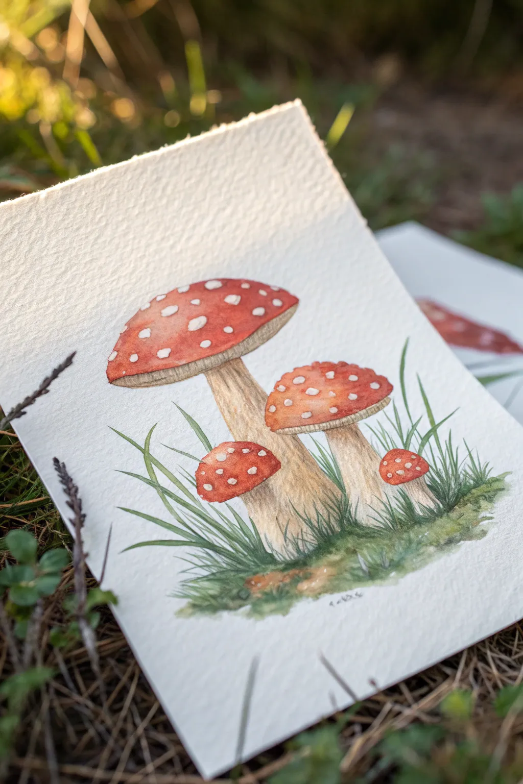
Capture the charm of the forest floor with this delightful study of Amanita muscaria mushrooms. Using layered watercolors, you’ll build up vibrant red caps and earthy stems to create a cozy, woodland illustration.
Step-by-Step
Materials
- Cold press watercolor paper (300 gsm)
- Watercolor paints (Cadmium Red, Alizarin Crimson, Yellow Ochre, Burnt Umber, Sap Green, Paynes Gray)
- Round brushes (size 2, 4, and 6)
- Pencil (HB or H)
- Kneadable eraser
- White gouache or white gel pen
- Two jars of water
- Paper towels
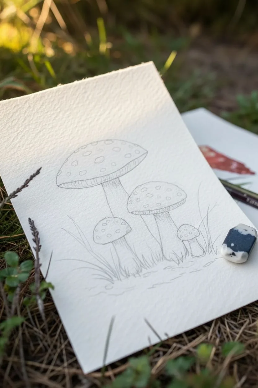
Step 1: Sketching the Composition
-
Outline the caps:
Begin by lightly sketching the four mushroom caps. Start with the largest one on the left as an elongated oval, slightly tilted. Add the medium cap to its right, and tuck the two smaller ones—one below the large cap and one peeking out on the far right—into the composition. -
Define the stems:
Draw the stems descending from the center of each cap. Make the base of the stems slightly bulbous and wider than the top where they meet the cap. Sketch the rough, textured rings (the annulus) just below the caps. -
Add grass blades:
Lightly indicate clusters of grass blades shooting up around the base of the mushrooms. Keep these lines loose and energetic, overlapping the stems slightly to ground them in the scene.
Preserve the Whites
For perfectly crisp white spots, use masking fluid before you start painting. Apply dots with an old brush, let dry, paint your red wash over them, and rub the masking off at the very end.
Step 2: Painting the Caps
-
Base wash:
Mix a watery wash of Cadmium Red with a touch of Yellow Ochre. Paint the entire surface of the caps, carefully avoiding the small circles where the white spots will be. If you accidentally paint over them, don’t worry; we can fix that later. -
Deepening the red:
While the first layer is still damp, drop in concentrated Alizarin Crimson near the bottom edges and the center of the caps to create volume. This wet-on-wet technique adds an instant 3D effect. -
Lifting highlights:
Clean your brush and blot it on a towel so it’s thirsty. Gently lift a bit of color from the top create a highlighted area where the light hits the curve of the mushroom.
Add a Dew Drop
Make it magical by adding a tiny dew drop on a blade of grass. Paint a small circle, darken the top shadow, lift the center highlight, and add a tiny dot of pure white reflection.
Step 3: Stems and Texture
-
Stem base layer:
Mix a very pale wash of Yellow Ochre and Burnt Umber. Apply this to the stems. While it’s wet, touch the left side of the stems with a slightly darker mix to establish a shadow side. -
Adding texture lines:
Once the stems are fully dry, use your smallest brush (size 2) and a mix of Burnt Umber and Paynes Gray. Paint fine, vertical striations down the length of the stems to mimic the fibrous texture of a mushroom stalk. -
Under the caps:
Paint the gills underneath the caps using a diluted brown-grey mix. Use tiny, distinct strokes that radiate from the stem outward to the edge of the cap.
Step 4: Ground cover and Details
-
Painting the grass:
Load a size 4 brush with Sap Green. Paint the grass blades using quick, upward flicking motions. Vary only the pressure to make some blades look thick and others wispy. -
Adding variety to greens:
While the green is wet, drop in hints of Paynes Gray at the very bottom for shadow, and touches of yellow on the tips for sunlight. -
Grounding shadow:
Mix a dark, earthy green-brown. Apply this horizontally right at the base of the stems to ‘plant’ the mushrooms so they don’t look like they are floating. -
Defining the spots:
If you painted around the white spots earlier, refine their edges now with a clean damp brush. If you painted over them, use opaque white gouache or a gel pen to add the crisp white polka dots now. -
Final touches:
Add a few tiny darker dots of red on the caps for texture and darken the very edge of the mushroom gills for contrast.
Step back and admire your little patch of woodland magic.
Tape-Resist Mini Mountains With a Pink Sky
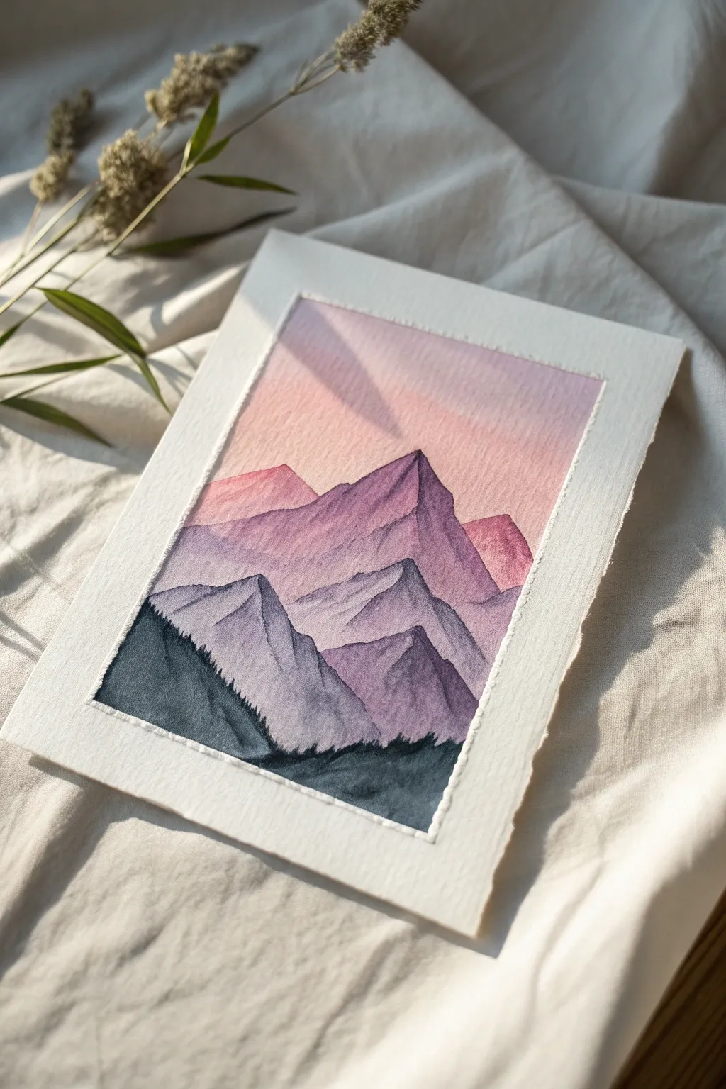
Capture the serene beauty of twilight peaks with this approachable watercolor project. Using masking tape creates crisp, clean borders around your painting, making the soft washes of pink and purple mountains pop beautifully against the white paper.
Step-by-Step Tutorial
Materials
- Cold press watercolor paper (approx. 5×7 inches)
- Painter’s tape or masking tape (low tack)
- Watercolor paints (Alizarin Crimson, Ultramarine Blue, Purple, Payne’s Gray)
- Round watercolor brushes (sizes 6 and 2)
- Jar of clean water
- Paper towels
- Mixing palette
- Pencil (optional)
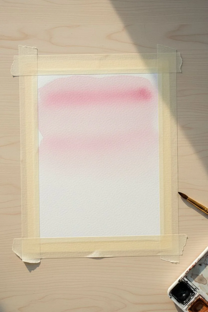
Step 1: Preparation & Sky
-
Tape the borders:
Begin by taping down all four edges of your watercolor paper to a hard surface or board. Ensure the tape is pressed down firmly to prevent paint from sneaking underneath, creating that lovely crisp white frame later. -
Pre-wet the sky area:
Load your larger brush with clean water and apply a light wash to the top two-thirds of the paper. You want the surface to be glistening but not forming puddles. -
Start the gradient:
Mix a watery wash of Alizarin Crimson or a soft pink. Starting at the very top edge, apply the pink paint across the wet paper, letting it flow naturally downwards. -
Fade the sky:
As you move down the paper with your brush, add a tiny bit more water to your brush to dilute the pink, allowing it to fade almost to white before you reach the midway point where your mountains will begin. -
Let it dry completely:
Allow the sky layer to bone dry. This is crucial; if it’s damp, your mountain edges will blur into the sky.
Step 2: Painting the Mountains
-
Sketch the outline (optional):
If you feel nervous about freehanding, use a pencil to very lightly sketch the jagged peaks of three mountain ranges: a high back range, a middle range, and a lower foreground. -
Mix the back mountain color:
Create a mix of purple with plenty of water. It should be slightly darker than your sky but still quite transparent to suggest distance and atmospheric perspective. -
Paint the furthest peaks:
Using your medium brush, paint the silhouette of the tallest, furthest mountains. Ensure the top edge is uneven and jagged to look like rock. -
Dry the first layer:
Wait for this first mountain layer to dry completely. A hair dryer on a low setting can speed this up. -
Mix the middle range color:
Add a touch of Ultramarine Blue to your purple mix, making it slightly darker and cooler than the previous layer. -
Paint the middle mountains:
Paint the second range of mountains, starting slightly lower than the first set. Let the peaks overlap the layer behind it to create depth. -
Texturing the slopes:
While the paint is still wet, you can drop slightly more saturated pigment onto just one side of the peaks to suggest shadow, but keep it subtle. -
Dry again:
Ensure this middle layer is fully dry before proceeding to the foreground.
Bleeding Edges?
If paint leaked under the tape, use a slightly damp, stiff brush or a white gel pen to tidy up the border. Next time, run a bone folder or fingernail over the tape edge before painting.
Step 3: Adding the Foreground
-
Mix the darkest color:
Mix a deep, rich color using Payne’s Gray and a bit of purple. This needs to be the most saturated tone in the painting. -
Paint the closest mountains:
Paint the final, lowest mountain range. Use the tip of your smaller brush to create sharp angles and jagged ridges. -
Add a treeline hint:
At the very bottom left corner, use concentrated Payne’s Gray. Dab your brush vertically in tiny strokes along the slope to suggest a silhouette of distant pine trees climbing the mountain. -
Fill the bottom:
Fill in the remaining bottom area with your darkest gray-blue mix, grounding the entire composition. -
Final drying time:
Let the entire painting dry completely. If the paper is cool to the touch, it is likely still damp inside. -
The reveal:
Slowly and carefully peel off the masking tape. Pull the tape away from the center of the paper at a 45-degree angle to avoid ripping the paper surface.
Paint Blooms
To avoid ‘cauliflower’ blooms on your mountains, don’t add water back into a drying wash. Prepare enough paint mix beforehand so you don’t have to pause to remix colors.
Once the tape is removed, your crisp and colorful mountain landscape is ready to be framed or gifted to a friend

Have a question or want to share your own experience? I'd love to hear from you in the comments below!