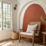
When you want big energy and instant texture, splatter paint is my go-to move—playful, expressive, and surprisingly versatile. Here are my favorite splatter paint ideas, starting with the classics and sliding into the more unexpected, studio-magic territory.
Classic Abstract Splatter Paint Canvas
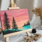
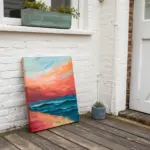
Embrace the freedom of movement with this energetic abstract piece that balances vibrant teal and mustard tones with grounding splatter effects. This project transforms a blank canvas into a sophisticated, modern art accent perfect for a minimalist bedroom or living space.
Detailed Instructions
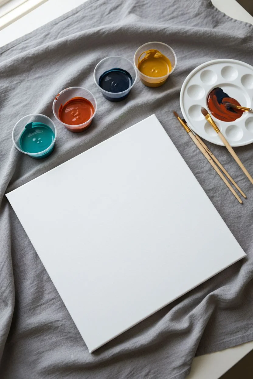
Materials
- Stretched white canvas (square format, approx. 12×12 or 16×16 inches)
- Acrylic paints (Teal/Turquoise, Mustard Yellow, Burnt Orange, Deep Navy/Black, Burgundy)
- Several small cups or a palette for mixing
- Water for thinning paint
- Round paintbrushes (Size 4 and Size 8)
- Stiff-bristled toothbrush or chip brush (optional for fine mist)
- Drop cloth or old newspapers
- Paper towels
Step 1: Preparation & Mixing
-
Protect your workspace:
Before you begin, cover a large area of your floor or table with a drop cloth. Splatter painting travels further than you think, so create a generous safety zone around your canvas. -
Prepare the canvas:
Lay your white canvas flat on the covered surface. Ensure it is clean and free of dust. -
Mix the teal paint:
Squeeze a dollop of teal acrylic paint into a cup. Add water gradually, mixing until it reaches the consistency of heavy cream or melted ice cream. It needs to be fluid enough to fly off the brush but pigmented enough to show up clearly. -
Prepare the accent colors:
Repeat the thinning process for your mustard yellow, burnt orange, burgundy, and dark navy paints. Use separate cups for each to keep colors muddy. -
Test consistency:
Do a quick test flick on a scrap piece of paper or cardboard. If the paint clumps, add a tiny bit more water; if it’s too transparent, add more paint.
Step 2: Creating the Composition
-
Start with directional streaks:
Dip a medium round brush into the teal paint. Instead of just flicking, use a whipping motion with your wrist to create longer, linear streaks that move diagonally across the canvas. -
Add secondary streaks:
Clean your brush and switch to the diluted mustard yellow. Repeat the whipping motion, aiming to cross or parallel some of the teal lines to build dynamic movement. -
Check composition:
Step back for a moment. You want a general flow running from one corner to the opposite side, leaving some negative white space for balance. -
Begin the splatter layer:
Load a brush heavily with the burnt orange paint. Hold the brush over the canvas and tap the handle firmly against a second brush handle or your finger to release distinct droplets. -
Vary droplet sizes:
For larger globs, let the paint drip naturally from a loaded brush. For smaller specks, tap sharply and closer to the surface. -
Introduce contrast:
Now use the deep navy or black paint. Be sparse with this color. Add a few focused splatters near the center of the composition to anchor the brighter colors. -
Layer with burgundy:
Add small accents of burgundy. I like to aim these near the yellow areas, as the contrast creates a nice warmth. -
Create fine mist:
Dip a toothbrush (or use your finger against the bristles of a stiff brush) into the teal paint. Flick the bristles to create a very fine spray of tiny dots across the background. -
Review and refine:
Look at the wet painting from a standing position. If an area looks too empty, add a few intentional drops of yellow or orange. -
Let it dry completely:
Allow the painting to dry flat for at least 24 hours. If you move it while wet, the thicker drips might run and ruin the spherical shape of your splatters.
Oops! Paint too thick?
If your splatters are landing as thick blobs rather than splashes, your paint needs more water. Dilute it further until it drips easily off the brush tip.
Add some sparkle
Mix a small amount of metallic gold paint with water and flick it over the dry composition for a subtle shimmer that catches the light.
Once dry, hang your vibrant creation in a spot that needs a burst of energy and color


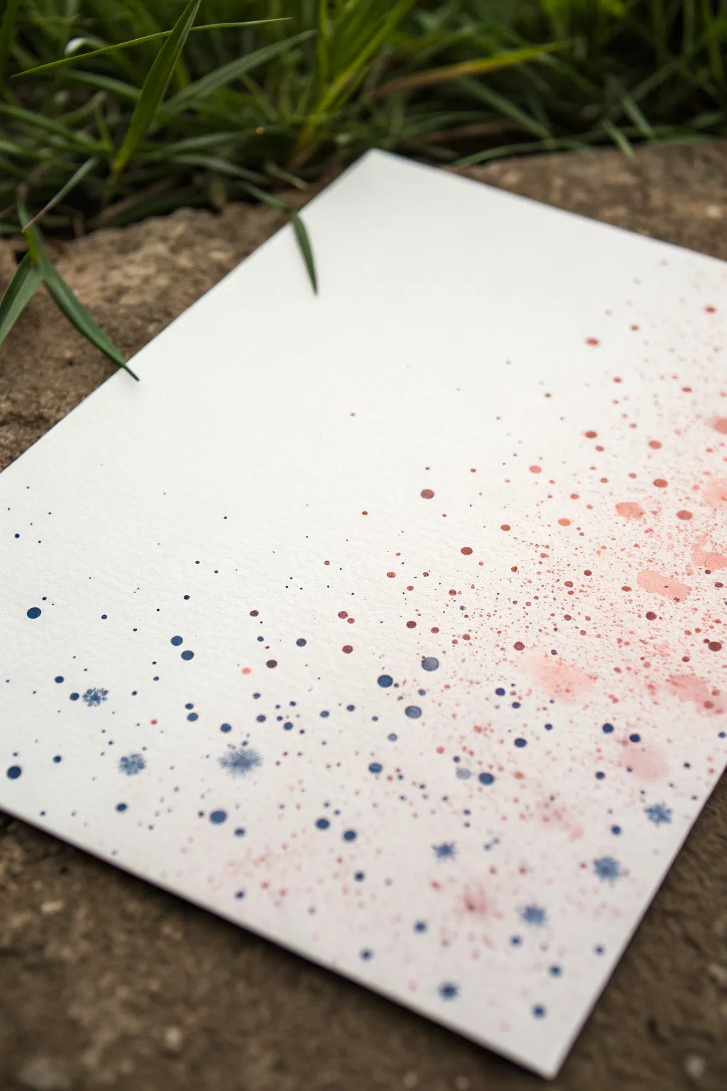
High-Contrast Splatter Paint on a White Background
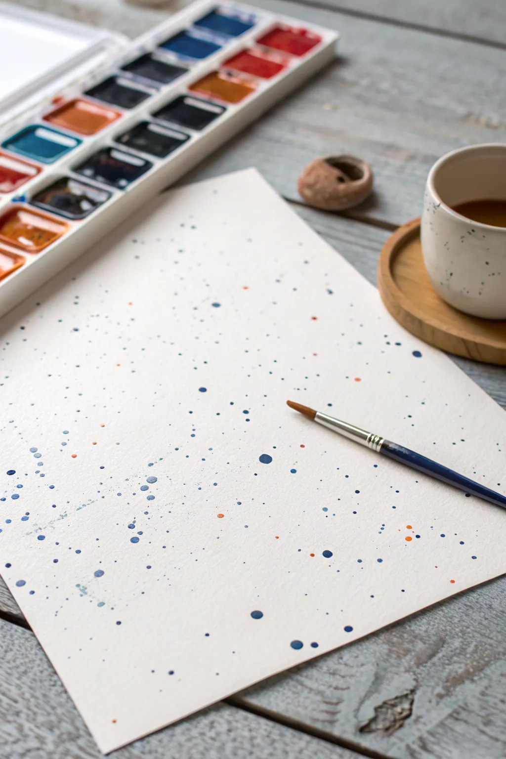
Capture the essence of chaotic beauty with this simple yet striking watercolor project. By using deep indigos alongside vibrant orange accents on crisp white paper, you’ll create a modern, speckled composition that feels both energetic and serene.
Step-by-Step Guide
Materials
- High-quality watercolor paper (cold press recommended)
- Watercolor paints (pan set featuring dark blue/indigo and bright orange)
- Round watercolor brush (size 4 or 6)
- Small cup of clean water
- Paper towels or rag
- Protective workspace covering (like newspaper or a drop cloth)
Step 1: Preparation and Setup
-
Clear your space:
Since this technique involves flying droplets, make sure your work area is cleared of anything you don’t want stained. Lay down a protective covering on your table. -
Position the paper:
Place your watercolor paper flat on the surface. While taping it down is common for wet washes, for splatter, letting it sit loose is fine unless the paper is very thin. -
Activate the paints:
Using your brush and a few drops of water, pre-moisten your paint pans. Focus on a deep, dark blue (like indigo or Prussian blue) and a bright, contrasting orange or ochre.
Step 2: Creating the Blue Foundation
-
Load the brush with blue:
Dip your brush into the water and then swirl it thoroughly into the dark blue paint. You want a very vibrant, saturated load—not too watery, but fluid enough to drip. -
The tap technique:
Hold the loaded brush about 6–8 inches above the paper. With your other hand, firmly tap the handle of the brush. This dislodges medium-sized droplets onto the surface. -
Vary the height:
For variety, move your hand higher (around 12 inches) and tap again. I find this creates finer, more delicate mist-like spots. -
Flick for directional splatter:
Instead of tapping, use your index finger to pull back the bristles slightly and release them (aiming downward). This creates a spray with a bit more direction and energy. -
Evaluate density:
Step back and look at your spread. Aim for an uneven distribution; some areas should have clusters of blue dots, while others remain sparse to let the white paper breathe.
Uneven Splatters?
If drops look too uniform, change your brush angle. Holding it perpendicular creates circles; angling it creates elongated dashes.
Step 3: Adding the Accent Color
-
Clean the brush:
Rinse your brush thoroughly in the water cup until no blue pigment remains. Squeeze it gently in a paper towel. -
Load the orange paint:
Swirl your clean brush into the orange or ochre paint. You want this pigment just as saturated as the blue to maintain high contrast. -
Sparse application:
Begin splattering the orange, but use a lighter hand. The goal is to have the orange act as a highlight, appearing about one-tenth as often as the blue. -
Target specific areas:
Try to aim a few orange drops near the denser clusters of blue. The juxtaposition of warm and cool tones makes the artwork pop.
Control the Chaos
Use a piece of scrap paper as a shield to mask off areas of the page you want to keep perfectly white while splattering nearby.
Step 4: Refining and Drying
-
Add large focal drops:
If size variation is lacking, load the brush heavily with blue again. Let one or two large drops fall naturally from the tip without tapping, just by gravity. -
Check for balance:
Scan the paper edges. Sometimes the corners get neglected, so add a tiny flick to the edges if the composition feels too centered. -
Let it dry completely:
Resist the urge to move the paper immediately. Wet splatters run easily. Leave the paper flat for at least 15–20 minutes until the shine disappears from the largest droplets. -
Flattening (Optional):
Once fully dry, if the paper has buckled slightly from the water, place it under a heavy book overnight to flatten it out for framing.
Once dry, your abstract splatter art is ready to be framed as a modern, minimalist statement piece

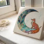
Negative Space Splatter Paint Animal Silhouettes
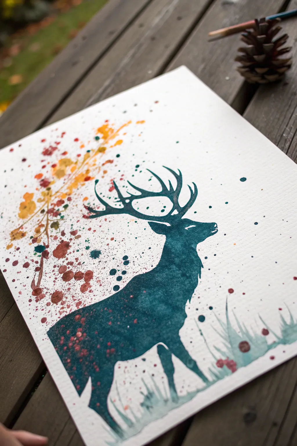
Capture the majesty of the forest with this striking watercolor silhouette project. By combining a crisp, dark stag silhouette with loose, organic splatters in autumn hues, you’ll create a piece that feels both controlled and wild.
How-To Guide
Materials
- Cold press watercolor paper (minimum 140lb)
- Deep teal or Prussian blue watercolor ink or liquid watercolor
- Golden yellow, burnt sienna, and crimson watercolor paints
- Masking fluid (drawing gum) or stencil film
- Paintbrushes: size 8 round, size 2 liner/detail brush
- Old toothbrush (for fine splatter)
- Pencil and eraser
- Paper towels
- Mixing palette
- Jar of clean water
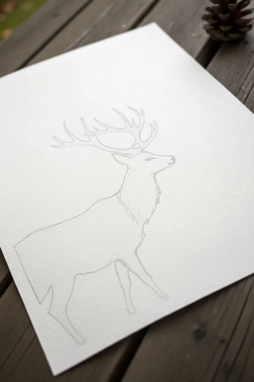
Step 1: Planning the Silhouette
-
Sketch the outline:
Begin by lightly sketching the outline of a stag on your watercolor paper with a pencil. Focus on capturing the curve of the neck and the complexity of the antlers. If you aren’t confident in your drawing skills, you can print a silhouette template and trace it using a light box or a sunny window. -
Refine the details:
Go back over your sketch to ensure the antlers are distinct and connected. Pay attention to the nose and chest fluff details; these small jagged edges will make the silhouette look more realistic once painted. -
Masking (Optional):
If you are worried about painting outside the lines during the splatter phase, apply masking fluid over the *outside* area of the deer (negative space) or cut a stencil from film. However, for the look in the photo, painting freehand is often best to allow the colors to bleed naturally.
Step 2: Painting the Stag
-
Mix the main color:
Prepare a generous amount of your deep teal or Prussian blue. You want this color to be saturated and dark, so use minimal water to dilute the concentrated pigment. -
Outline and fill:
Using your size 2 detail brush, carefully paint the edges of the antlers and the face profile. Switch to the larger round brush to fill in the body. I like to keep the paint very wet during this stage to avoid streak marks. -
Create texture:
While the body paint is still wet, drop in tiny hints of darker blue or black near the bottom and under the neck to create subtle shadow gradients within the silhouette. -
Ground the figure:
At the hooves and legs, don’t finish with a hard line. Instead, use a slightly damp brush to fade the legs out into a watery wash, suggesting the deer is standing in mist or tall grass. -
Dry completely:
Let the silhouette dry fully before moving on. This is crucial—if the blue is wet, the splatter colors will bleed into your crisp stag shape.
Splatter Control
If you’re getting paint where you don’t want it, use a torn piece of paper as a shield. Hold it over the deer’s face while splattering the background.
Step 3: Adding the Atmospheric Splatter
-
Mix autumn shades:
Prepare three separate puddles of paint: golden yellow, burnt sienna, and a deep crimson red. These should be quite watery to splatter easily. -
Splatter the ‘foliage’:
Dip a brush into the yellow paint and tap the handle against your finger over the top left area (near the antlers). Let droplets fall randomly to mimic falling leaves. -
Layering warmth:
Repeat the splatter process with the burnt sienna and crimson, concentrating these darker spots closer to the deer’s back and neck area. Allow some droplets to overlap the dried blue silhouette slightly for integration. -
Direct drops:
For larger, more distinct ‘leaves,’ load your round brush with pigment and touch the tip directly to the paper in a few spots around the main splatter zone. -
Mist the grass:
Dilute your original teal color significantly with water. Use an old toothbrush to flick a very fine spray near the bottom of the paper, creating a misty ground effect. -
Paint grass blades:
Using the diluted teal mix, paint loose, upward strokes at the bottom right to represent tall grass. Let these strokes be uneven and organic. -
Final leaf accents:
Add a few final splatters of the teal color into the autumn leaf section to tie the color palette together visually.
Salt Texture
While the autumn splatter puddles are still wet, sprinkle a tiny pinch of table salt on them. Once dry, brush it off to reveal unique crystalized textures.
Now step back and admire how a few controlled messes brought your forest scene to life
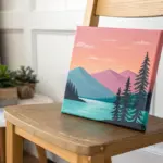
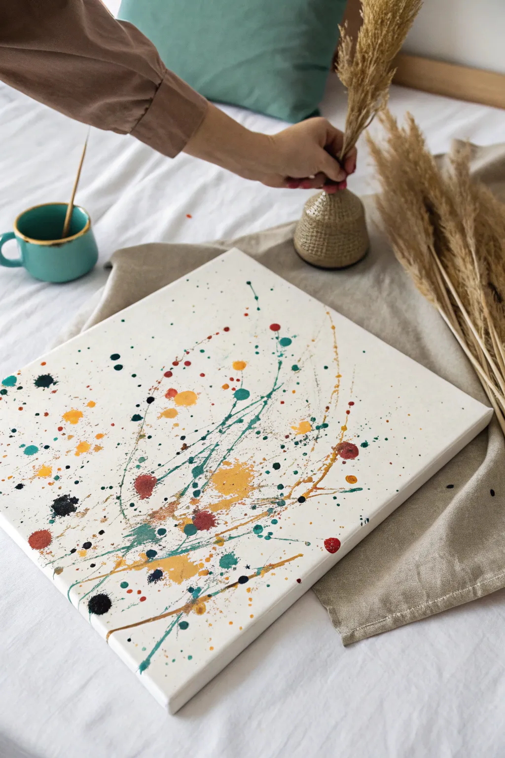
Splatter Paint Ombre Fade From Corner to Corner
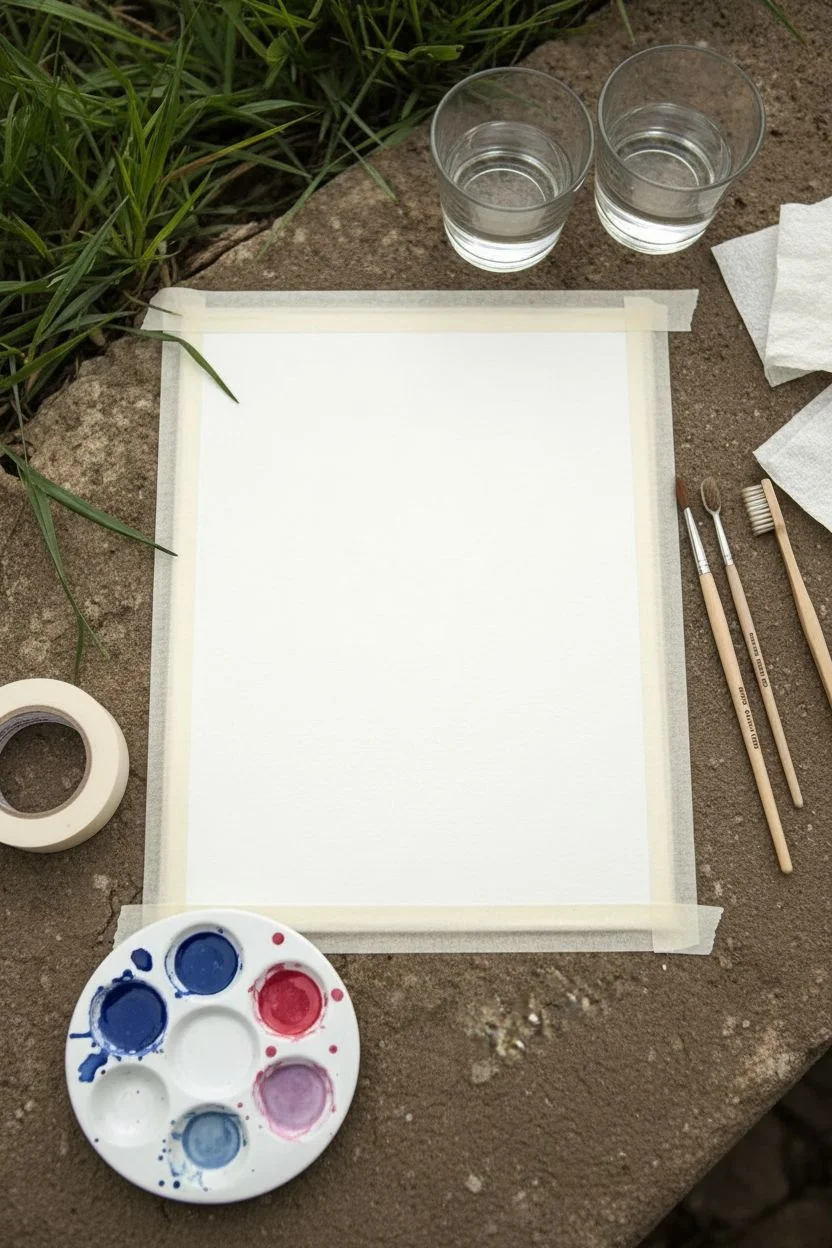
Create a delicate, airy atmosphere with this gradient splatter technique that transitions from cool blues to warm pinks. By controlling the density and placement of your droplets, you can achieve a sophisticated ombré fade that looks beautiful on greeting cards or framed art.
Step-by-Step Guide
Materials
- Heavyweight watercolor paper (min. 140lb/300gsm)
- Watercolor paints (Indigo Blue, Alizarin Crimson or similar pink/red)
- Round watercolor brushes (sizes 4 and 8)
- Old toothbrush (optional for fine mist)
- Small mixing palette or ceramic dish
- Paper towels
- Two cups of water
- Masking tape or painter’s tape
- Work surface cover
Step 1: Preparation and Mixing
-
Secure the paper:
Tape down your watercolor paper to a flat, hard surface. Use masking tape along the very edges if you want a clean border, or just on the back if you want the splatter to go all the way to the edge. -
Mix the blue wash:
In your palette, mix a generous amount of Indigo Blue with water. You want a consistency similar to milk—fluid enough to fly off the brush, but pigmented enough to show up clearly. -
Mix the pink wash:
In a separate well, mix your Alizarin Crimson (or chosen pink) with water to achieve that same milky consistency. -
Create a transition shade:
Make a third puddle by mixing a small amount of the blue and pink together to create a soft purple. This will help bridge the gap between the two main colors.
Step 2: Creating the Blue Zone
-
Load the brush:
Fully saturate your size 8 round brush with the blue mixture. The bristles should be dripping wet. -
Target the corner:
Hold the brush over the bottom-left corner of the paper. Tap the handle of your wet brush firmly against your other hand or a second brush handle to release the drops. -
Vary the height:
For larger, more organic blobs, hold the brush closer to the paper (about 6 inches away). For a finer spray, lift your hand higher (about 12 inches). -
Add ‘snowflake’ blooms:
While some larger blue drops are still very wet, touch the tip of a clean, slightly damp brush to the center of them. This pulls the pigment outward, creating those starburst or snowflake-like shapes seen in the reference. -
Fade outward:
Continue splattering blue, but move your hand slightly toward the center of the page. Tap more gently here so the dots become sparser as they move away from the corner.
Control the Chaos
Use a spare piece of paper as a shield. Hold it over the white areas you want to keep clean while splattering specific colored sections.
Step 3: The Purple Transition
-
Introduce the purple:
Clean your brush and load it with the purple mixture. Aim this color at the diagonal center line where the blue section is beginning to fade out. -
Intermingle the dots:
Allow some of the purple splatters to land near the blue ones. I like to let a few overlap while wet, creating natural color blending on the paper.
Metallic Magic
Once the main colors are dry, splatter a top layer of gold or silver watercolor. The shimmer adds a magical, gala-ready finish to the ombré.
Step 4: The Pink Finish
-
Switch to pink:
Clean your brush thoroughly and load it with the pink mixture. Focus your attention on the middle-right section of the paper. -
Create density:
Splatter heavily on the right side to balance the blue corner. Since red pigments can sometimes be overpowering, start with a lighter hand and build up the density slowly. -
Fine mist technique:
For the tiny, dust-like speckles visible in the pink section, dip an old toothbrush into the paint. Point the bristles down and run your thumb across them to flicker a fine mist onto the page. -
Add focal points:
Just like with the blue, create a few larger pink droplets by letting the paint drip directly off a fully loaded brush. -
Check the balance:
Stand back and look at the gradient. If the middle looks too empty, add a few tiny splatters of the purple mix to bridge the gap. -
Let it dry completely:
Leave the paper taped down until it is bone dry. This prevents the paper from buckling as the water evaporates.
Now you have a stunning piece of abstract art ready to frame or fold into a distinct greeting card
BRUSH GUIDE
The Right Brush for Every Stroke
From clean lines to bold texture — master brush choice, stroke control, and essential techniques.
Explore the Full Guide
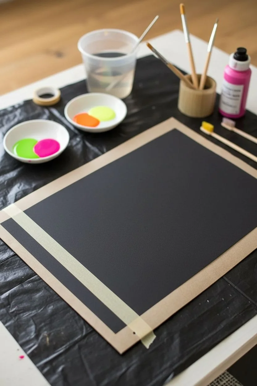
Black Background Splatter Paint for Neon Pop
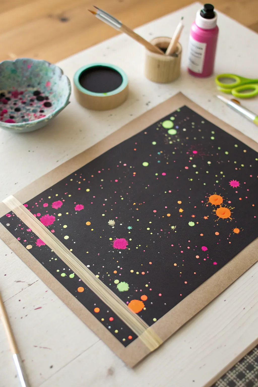
Transform a plain sheet of black paper into a vibrant cosmic explosion using high-contrast neon paints. This project relies on the dramatic interplay between deep darkness and bright, electric splashes to create a stunning piece of modern art.
Step-by-Step
Materials
- Heavyweight black cardstock or mixed media paper
- Rigid backing board (cardboard or MDF)
- Masking tape or painter’s tape
- Neon acrylic paints (pink, orange, yellow, green)
- Small round paintbrushes
- Old toothbrush (optional for fine mist)
- Water cup
- Palette or small dishes
- Drop cloth or newspaper
Step 1: Preparation & Setup
-
Prepare your workspace:
Cover your entire table with newspaper or a drop cloth. Splatter painting is inherently messy, and those tiny neon droplets travel further than you think. -
Mount the paper:
Center your sheet of heavyweight black paper onto the rigid backing board. This provides stability and makes it easier to move the wet artwork later. -
Create the diagonal mask:
Apply a strip of masking tape across the bottom left corner of the paper. Press the edges down firmly with your fingernail to ensure no paint bleeds underneath, creating a crisp line later. -
Mix your paints:
Squeeze small amounts of neon acrylic paint into separate dishes. Add a few drops of water to each color to thin them slightly; you want a consistency closer to heavy cream or melted ice cream for the best splatter.
Uneven Splatters?
If paint isn’t flying off the brush, add a tiny bit more water. If it’s too runny and making puddles, mix in more acrylic paint to thicken the body.
Step 2: Creating the Splatters
-
Start with fine mist:
Dip a stiff brush or an old toothbrush into your first color (try neon green). Hold it over the paper and run your thumb across the bristles to create a cluster of tiny, star-like specks. -
Add medium droplets:
Switch to a round paintbrush loaded with watery neon pink. Hold the brush handle in one hand and tap it sharply against a second brush handle held over the paper to release medium-sized dots. -
Layering colors:
Repeat the tapping technique with neon yellow and orange. I like to concentrate some colors in specific areas rather than spreading them perfectly evenly to create a more dynamic composition. -
Create distinct ‘splats’:
For the larger, jagged splash marks seen in the example, load a brush heavily with watered-down orange paint. Flick your wrist sharply downward toward the paper, or hold the brush high and let a large drop fall, then blow on it gently to spread the edges. -
Check density:
Step back and assess your galaxy. Ensure the black background is still the dominant force, but fill any large empty voids with a few extra flicks of contrasting color. -
Work over the tape:
Don’t be afraid to splatter directly over the masking tape strip. Heavily splattering this area ensures that when you peel it off, the negative space effect will be dramatic and clearly defined.
Glow Up
Swap standard neon acrylics for UV-reactive or glow-in-the-dark paints. Under a blacklight, your galaxy scene will literally light up the room.
Step 3: Finishing Touches
-
Let it partially dry:
Allow the painting to sit for about 10–15 minutes. The smaller dots will dry quickly, but the larger globs need a moment to set so they don’t run. -
Remove the tape:
Carefully peel back the masking tape at a 45-degree angle. Pull slowly to reveal the clean, sharp black line beneath the colorful chaos. -
Detail work (optional):
If you want specific highlights, you can use a fine-tip brush to add tiny white dots in the center of the largest neon splatters to make them look like they are glowing. -
Final cure:
Let the artwork dry completely flat for at least an hour before framing or displaying to prevent any drips.
Once dry, you have a striking piece of contrast art that adds electricity to any wall
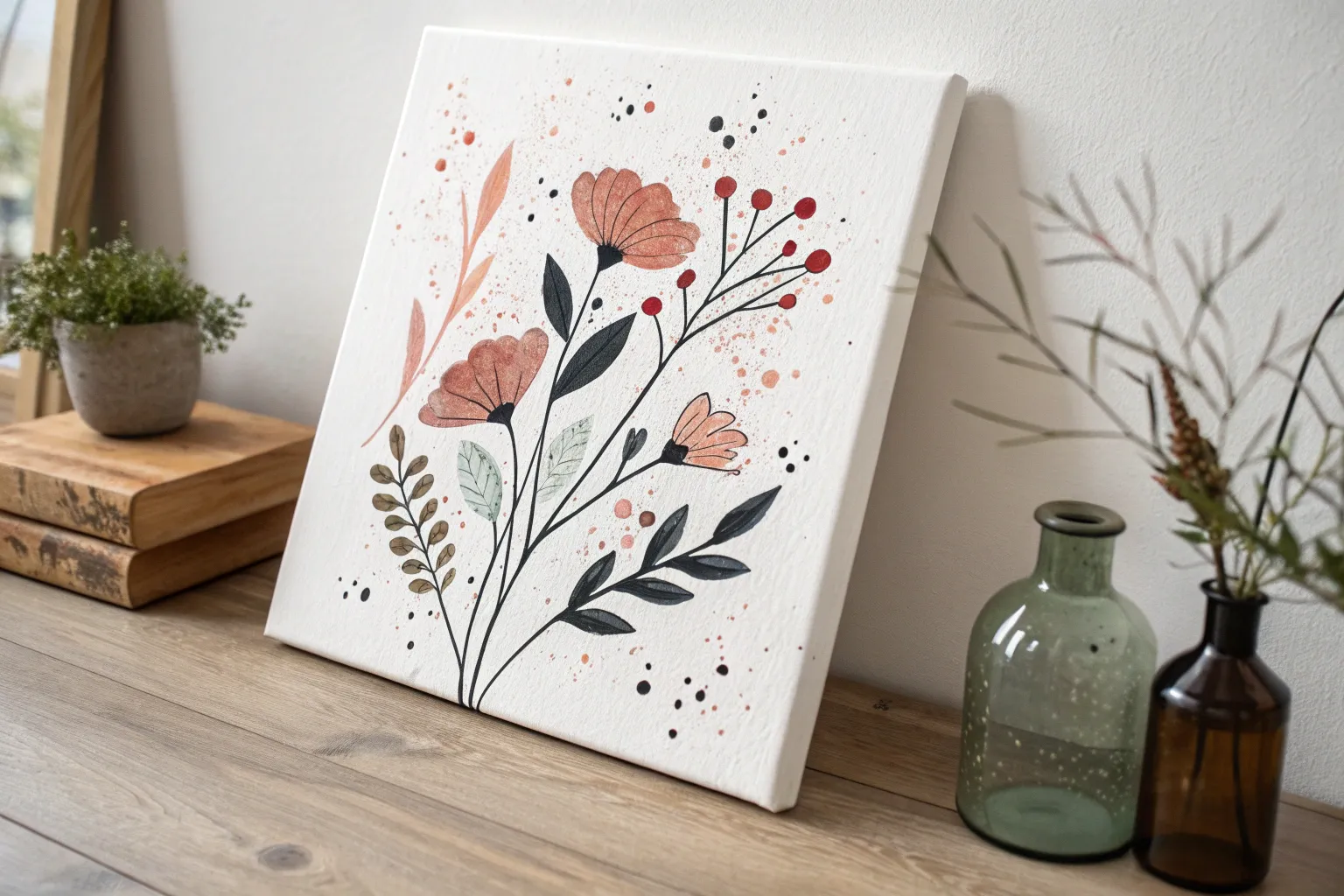
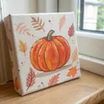
Collage + Splatter Paint Garden Scenes
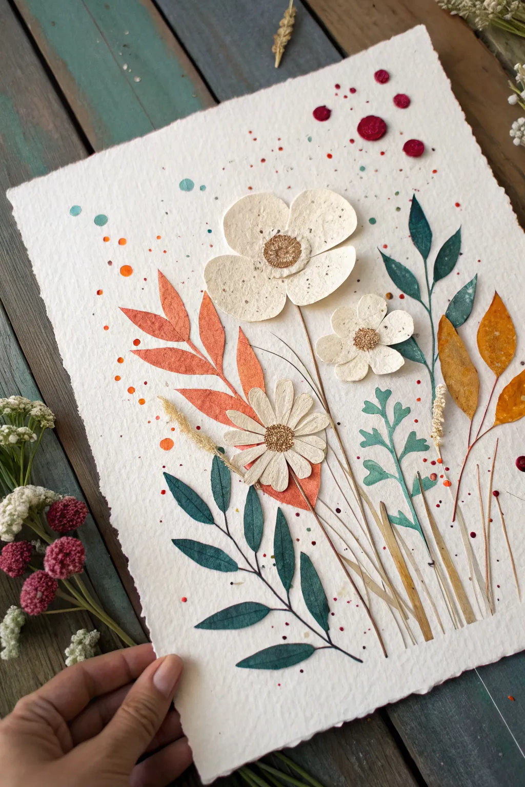
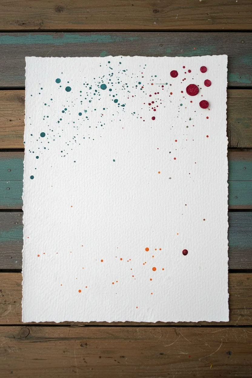
This whimsical mixed-media project combines the organic beauty of paper cutouts with the playful energy of splatter paint. By layering textured shapes over a speckled background, you’ll build a charming, everlasting garden scene full of movement and color.
Step-by-Step Guide
Materials
- Heavyweight textured watercolor paper (deckle edge optional)
- Assorted colored construction paper or cardstock (cream, teal, coral, orange)
- Dried ornamental grasses or thin faux stems
- Watercolor paints or acrylic inks (red, orange, teal)
- Stiff bristle brush (e.g., old toothbrush or hog bristle)
- PVA glue or fine-tip craft adhesive
- Scissors and X-Acto knife
- Gold metallic paint or marker
- Tweezers
Step 1: Preparing the Canvas
-
Paper selection:
Begin with a sturdy sheet of heavyweight watercolor paper. If yours doesn’t have that lovely rough edge, you can carefully tear the sides against a ruler to create a faux-deckle look. -
Initial splatter layer:
Mix a watery teal paint. Dip a stiff brush into the pigment and flick the bristles with your thumb to create a mist of fine speckles across the upper-left and center areas. Let this dry completely before moving on. -
Second color splash:
Repeat the splatter process with a deep red or burgundy hue, concentrating these larger drops near the top right corner. The contrast between fine mist and larger droplets adds great depth. -
Final accent dots:
Add a few vibrant orange splatters in the lower-middle section to balance the composition. I like to keep these sparse so they don’t overpower the floral elements later.
Natural Texture Hack
Use textured cardstock featuring visible fibers or inclusions for your flower petals. It mimics real botanical surfaces far better than standard flat construction paper.
Step 2: Crafting the Flora
-
Cream bloom shapes:
Cut three irregular, rounded flower shapes from cream textured paper. Make one large (3-4 petals), one medium, and one small daisy-like shape with many thin petals. -
Sculpting the petals:
Gently curl the edges of your paper flowers inward using a pencil or your fingers to give them a cupped, 3D appearance. -
Adding centers:
Using gold metallic paint or a marker, color the very centers of your cream flowers. Stipple the paint to mimic the texture of pollen. -
Cutting coral leaves:
Cut a large, fern-like branch from coral or salmon-colored paper. Aim for a long central stem with alternating pointed leaves. -
Creating teal foliage:
From dark teal paper, cut two distinct leaf styles: a long, straight stem with symmetrical leaves for the bottom left, and a loose, wandering vine shape for the right side. -
Accent leaves:
Cut two simple, singular tear-drop leaf shapes from golden-yellow or mustard paper to tuck in later as accents.
Step 3: Assembling the Garden
-
Base layer placement:
Dry fit your paper pieces first. Arrange the large coral fern and the dark teal stem so they cross slightly near the bottom center, creating a focal point for the stems. -
Gluing the greens:
Apply thin lines of glue to the backs of your leafy branches and press them onto the splattered background. -
Dried grass texture:
Select a few strands of dried ornamental grass or wheat. Glue these vertically near the bottom right to add natural texture alongside the paper elements. -
Positioning the flowers:
Glue the largest cream flower near the top center. Place the medium flower slightly lower to its right, and the daisy shape lower still, resting on the coral leaf instersection. -
Drawing stems:
Using a fine brown pen or very thin brush, draw delicate stems connecting the floating flower heads down into the foliage cluster. -
Final leaf tucks:
Tuck the golden-yellow tear-drop leaves behind the dried grass stems on the right side for a pop of autumnal color. -
Finishing touches:
Add tiny dots of glue under any loose petal edges if you want them flatter, or leave them lifted for more shadow and dimension.
Splatter Control
Getting big blobs instead of mist? Your brush is too wet. Blot it once on a paper towel before flicking to ensure a fine, controlled spray of color.
Step back and admire how the random energy of the paint balances the careful structure of your paper garden as it dries

Have a question or want to share your own experience? I'd love to hear from you in the comments below!