When my sketchbook starts feeling a little too predictable, I reach for one unexpected twist that makes the whole piece feel brand new. These unique art ideas are made to help you create work that pops on Pinterest and feels genuinely exciting while you’re making it.
Paint an Acrylic Pour Geode With Sparkly Veins
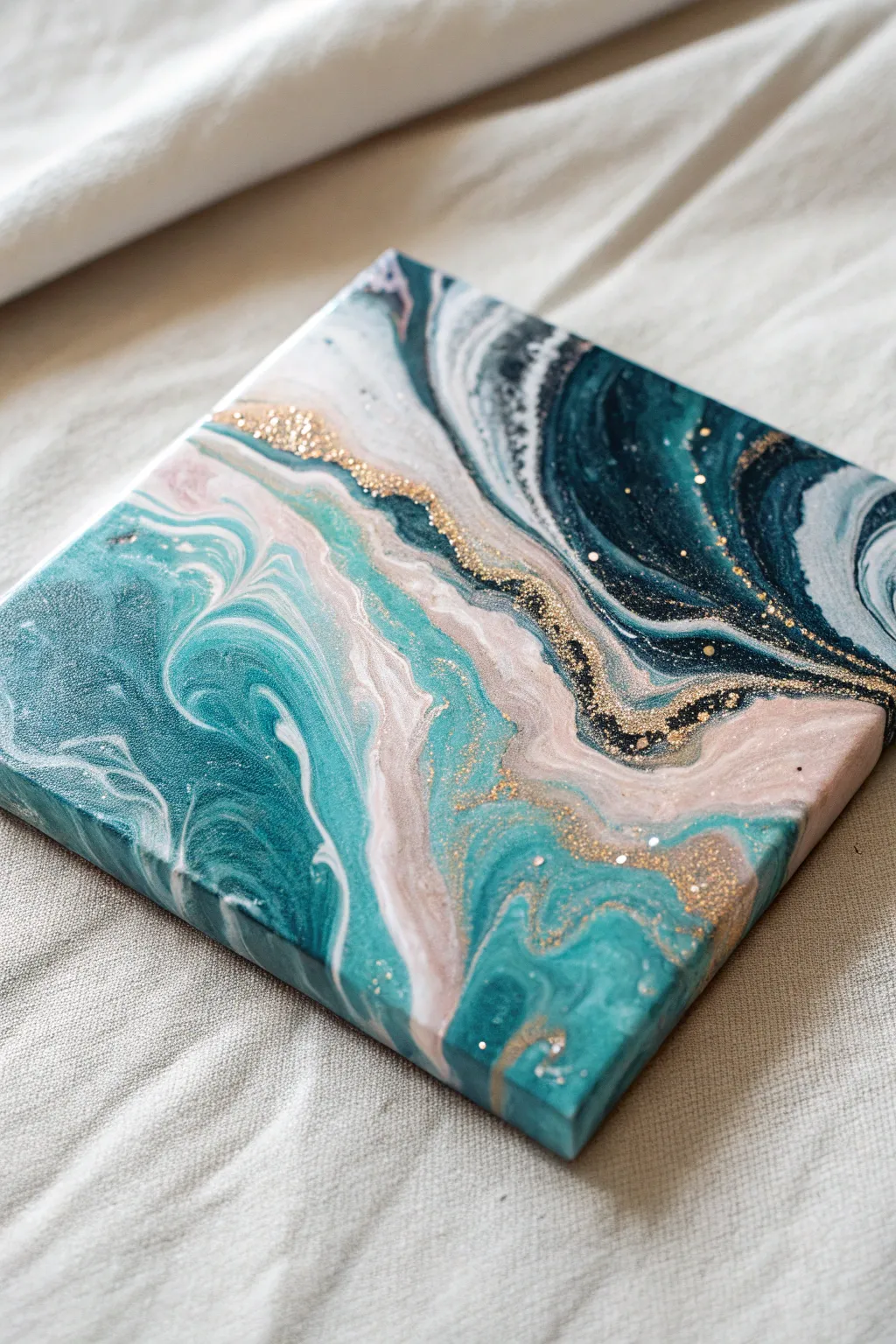
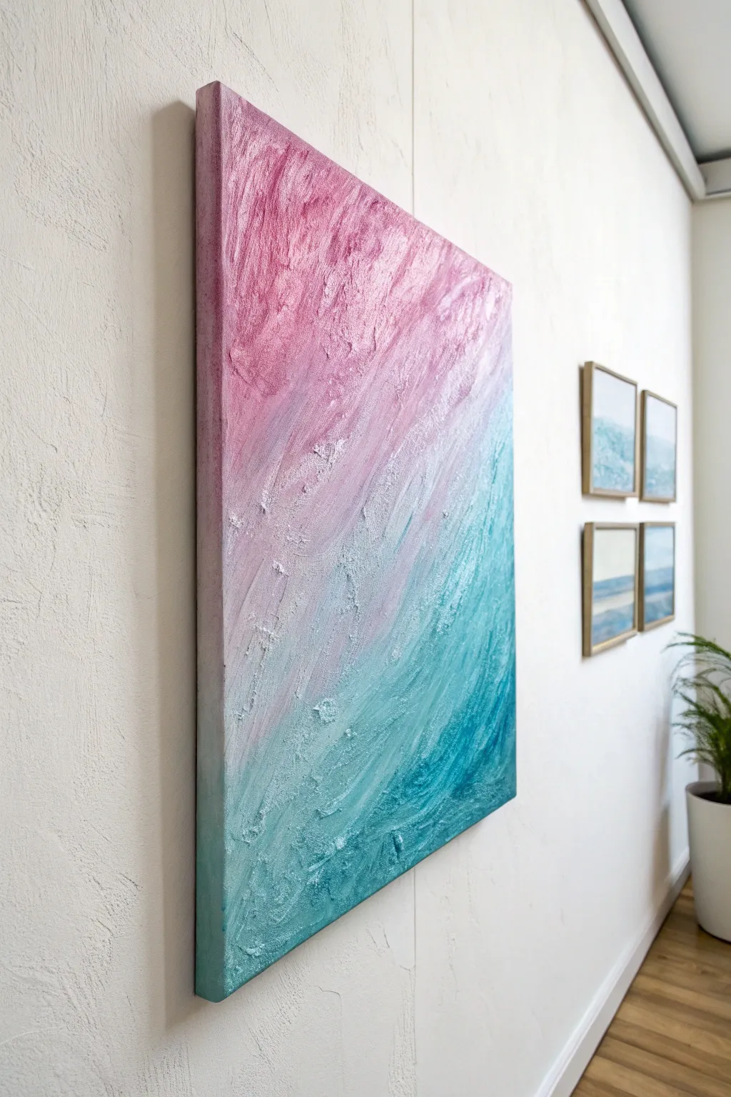
Create a stunning faux-stone effect with this acrylic pouring project that captures the swirling elegance of a sliced geode. The combination of deep ocean teals, soft blush pinks, and a striking vein of gold glitter brings a luxurious, organic feel to any small canvas.
How-To Guide
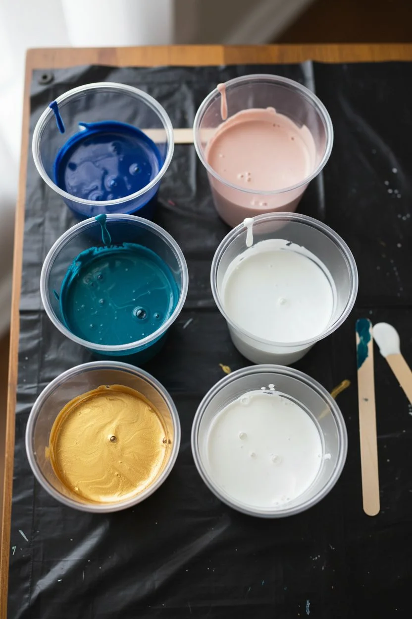
Materials
- Square stretched canvas (e.g., 8×8 or 10×10 inches)
- Acrylic pouring medium
- Acrylic paints: Deep Teal/Turquoise, Navy Blue, Titanium White, Soft Blush Pink, and Metallic Gold
- Fine Gold Glitter
- Chunky Gold Glitter (optional for texture)
- Plastic cups for mixing (one per color)
- Wooden craft sticks for stirring
- Hairdryer or drinking straw (for blowing paint)
- Gloves and plastic drop cloth
- Tweezer (for glitter placement)
- High-gloss varnish or resin (for the topcoat)
Step 1: Preparation & Mixing
-
Prepare your workspace:
Cover your entire work surface with a plastic drop cloth. Acrylic pouring is messy, and drips are inevitable. Ideally, elevate your canvas on four upturned cups so the paint can flow freely off the edges without sticking to the table. -
Mix your pouring medium:
In separate cups, mix your acrylic paints with the pouring medium. A standard ratio is usually 1 part paint to 2 parts medium, but check your specific brand’s instructions. You want a consistency similar to melted honey—fluid but not watery. -
Adjust the viscosity:
Stir each color slowly to avoid creating too many air bubbles. If the mixture feels too thick, add water a few drops at a time. The white and pink colors should be slightly more fluid than the heavier teal and navy to encourage movement.
Step 2: The Pouring Process
-
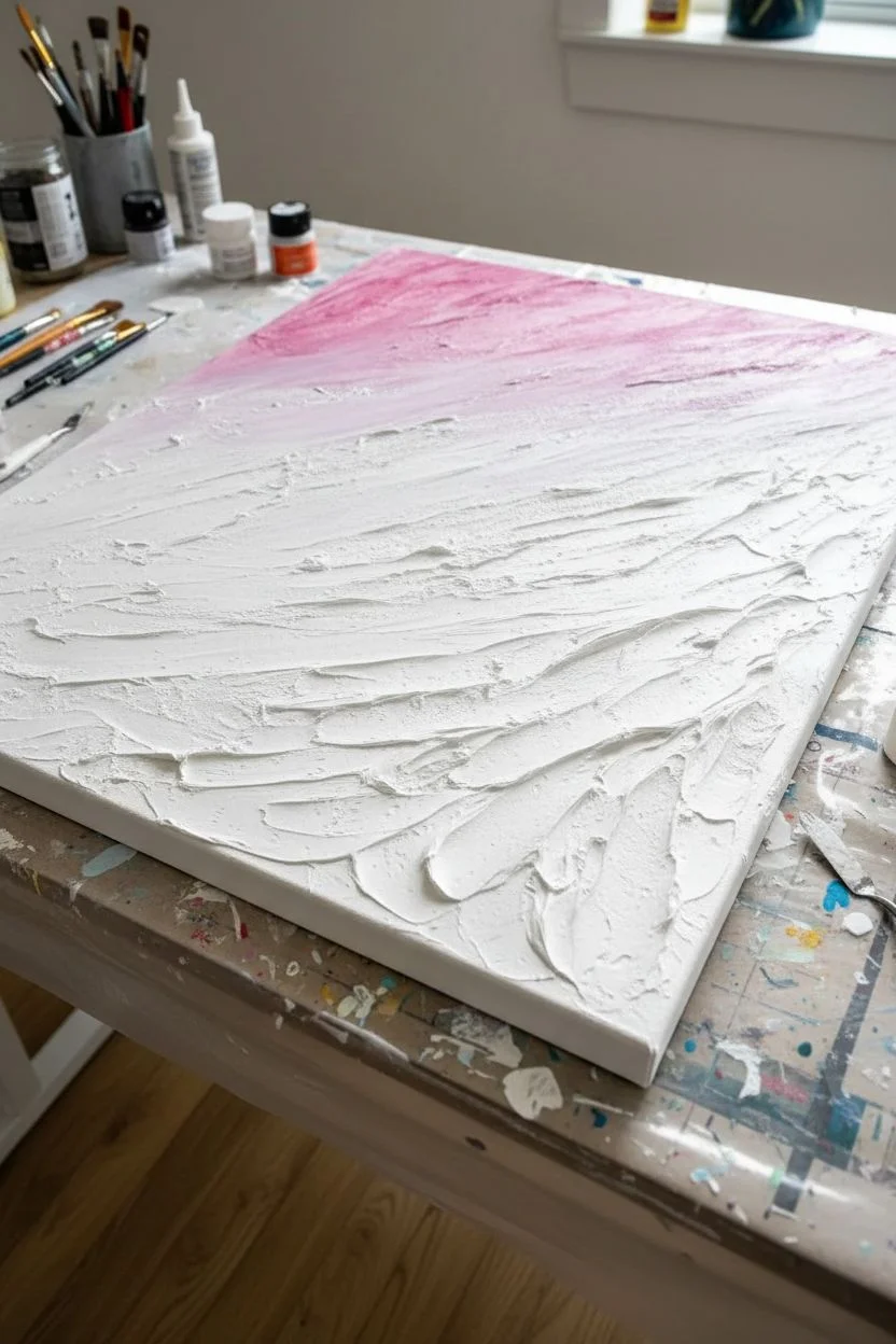
Create the base layer:
Start by pouring a puddle of your Deep Teal and Navy Blue on the top right and bottom left corners of the canvas. This establishes the dark, dramatic outer edges of your geode pattern. -
Add the lighter tones:
Pour ribbons of Titanium White and Soft Blush Pink through the center channel between your dark corners. Don’t worry about precision here; organic shapes are better. -
Tilt the canvas:
Gently pick up the canvas and tilt it back and forth. Let the paints slide over each other and run off the edges. The goal is to cover the entire surface while keeping the dark colors mostly at the corners and the lighter colors flowing diagonally through the middle. -
Manipulate with air:
Use a hairdryer on the ‘cool’ and ‘low’ setting (or just a straw for more control) to blow the white paint gently over the teal edges. This creates those beautiful, lacy cells and wispy transitions that mimic natural stone layers.
Muddy colors?
If your colors are turning brown or gray, you are likely over-tilting or mixing too much on the canvas. Try to tilt less and let the paint flow naturally.
Step 3: Adding the Gold Vein
-
Identify the fault line:
Look for a natural separation or channel in your composition where the dark and light colors meet. This will be the path for your gold vein. -
Pour the gold paint:
Drizzle a thin, steady line of your mixed Metallic Gold paint along this fault line. I usually let this line meander a bit rather than making it perfectly straight. -
Apply fine glitter:
While the paint is still very wet, immediately sprinkle fine gold glitter directly onto the gold paint line. The wet acrylic acts as the adhesive. -
Add texture:
For that clustered crystal look, carefully drop pinchers of chunky gold glitter or crushed glass into the center of the gold vein. This builds physical dimension. -
Clean the edges:
Use your finger or a tool to smooth out the paint that has dripped over the sides of the canvas, ensuring the pattern continues nicely around the edge.
Defined veins
Use the back of a plastic spoon or a palette knife to gently guide the gold vein into a specific shape before adding the glitter, ensuring sharper edges.
Step 4: Finishing Touches
-
Initial dry time:
Allow the painting to dry undisturbed for at least 24 to 48 hours. Acrylic pours dry from the outside in, so be patient even if the surface feels dry to the touch. -
Inspect for loose glitter:
Once fully dry, lightly brush off any loose glitter that didn’t adhere to the paint. You can use a soft, dry paintbrush for this. -
Seal the artwork:
To get that glass-like finish shown in the photo, apply a high-gloss varnish or a coat of art resin. This step is crucial as it makes the colors pop and protects the glitter from falling off over time.
Hang your geode art in a spot where the light catches the gold vein to fully appreciate the shimmer
Make a Galaxy Scene on a Deep Black Background
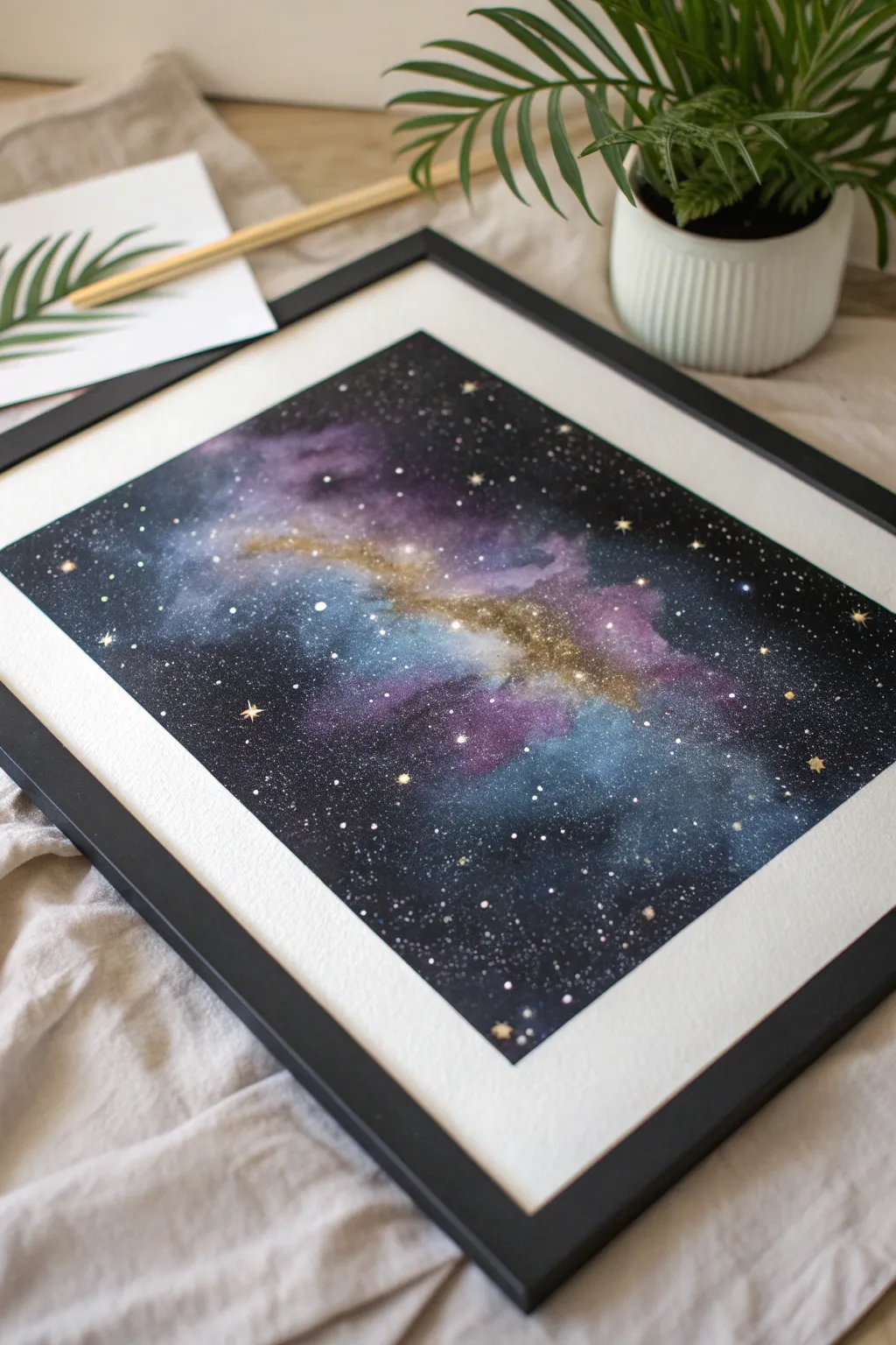
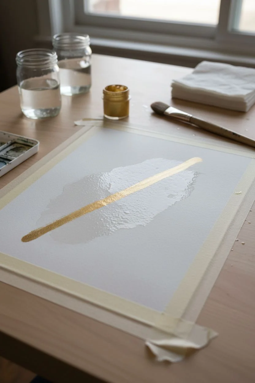
Capture the magic of deep space with this watercolor project that balances moody dark tones with a striking streak of metallic gold. The deep blacks frame a vibrant nebula of purples and teals, making the shimmering stars truly pop against the void.
Step-by-Step
Materials
- High-quality watercolor paper (cold press, 300gsm)
- Black watercolor paint or black gouache (for opacity)
- Watercolor paints: Indigo, Violet, Teal, Magenta
- Metallic watercolor gold paint (or gold calligraphy ink)
- Masking tape
- Round watercolor brushes (Size 4, 8, and a large wash brush)
- White gouache or white ink
- Old toothbrush
- Two jars of water
- Paper towels
- Black picture frame with white mat
Step 1: Setting the Scene
-
Prepare your paper:
Begin by taping down all four edges of your watercolor paper to a hard board or table. This creates that crisp white border seen in the final piece and prevents the paper from buckling under heavy washes. -
Wet on wet base:
Use your large clean brush to apply a layer of clear water to the entire paper surface. You want it shiny and damp, but not forming puddles. -
Lay the gold foundation:
While the paper is wet, load a brush with metallic gold paint or ink. Paint a loose, diagonal streak across the middle of the page. This will be the glowing heart of your galaxy.
Muddy Colors?
If your galaxy looks muddy, you likely over-blended while the paper was wet. Next time, place colors side-by-side and let the water move them naturally without brushing back and forth.
Step 2: Building the Nebula
-
Add color softness:
Around the edges of that gold streak (but not covering it entirely), dab in your lighter colors: magenta and teal. Let the pigments bleed slightly into the wet paper for a soft, cloudy effect. -
Deepen with purple:
Surround those lighter colors with violet and indigo. These act as the transition zone between the bright center and the dark void. Avoid overworking it; I like to let the water do the blending here. -
Create the void:
Switch to your black paint. Start filling in the corners and edges of the paper, working inward toward the color. Use a high concentration of pigment to get a true, deep black. -
Blend the edges:
Before the black dries, use a damp, clean brush to gently soften the boundary where the black meets the purple and indigo. You want a smoky transition, not a hard line. -
First dry:
Let this first layer dry completely. If the paper feels cold to the touch, it’s still damp. Be patient to avoid muddying the colors.
Add Texture
While the black and purple paint is still wet, sprinkle a pinch of table salt onto the paper. Once dry, brush the salt off to reveal blooming, star-like textures in the paint.
Step 3: Adding Depth and Detail
-
Second layer of black:
Once dry, assess your blacks. If they look gray, apply a second coat to the outer corners to ensure maximum contrast against the nebula. -
Intensify the core:
If the gold or colors faded during drying, glaze a transparent layer of color over them to boost saturation, being careful to preserve some of the original texture. -
Add gold structure:
Using a smaller brush and concentrated gold paint, define the central streak more clearly. Add little tendrils of gold extending into the purple areas to suggest drifting gas. -
Dry completely:
Ensure the creating is bone dry before moving to stars. This is crucial for crisp points of light.
Step 4: Starlight and Finishing
-
Splatter stars:
Dilute a small amount of white gouache or ink with water. Dip an old toothbrush into the mixture, face it toward the painting, and run your thumb across the bristles to spray fine mist. -
Controlled splatters:
Focus the densest spray of white stars along the diagonal nebula line, fading out toward the black corners. -
Hand-painted stars:
Use a fine detail brush and the white ink to dot in larger, distinct stars randomly across the piece to create variety in size. -
Golden stars:
Take your gold metallic paint and add a few specific, larger stars. Draw small crosses or four-pointed shapes on a few of them to make them twinkle. -
Reveal:
Once everything is perfectly dry, carefully peel away the masking tape at a 45-degree angle to reveal the clean edges. -
Frame it:
Place your finished galaxy inside the black frame with the white mat. The mat provides visual breathing room that makes the dark colors recede and feel deeper.
Hang your new celestial masterpiece in a well-lit area where the gold paint can catch the light and glimmer


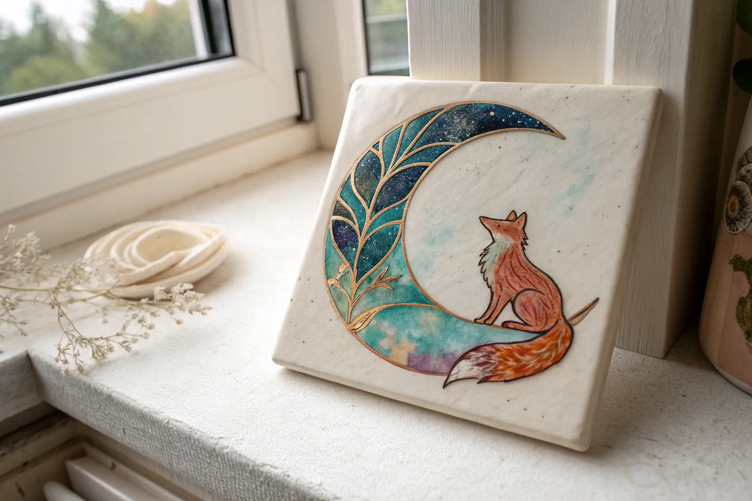
Sketch Metallic Botanicals That Catch the Light
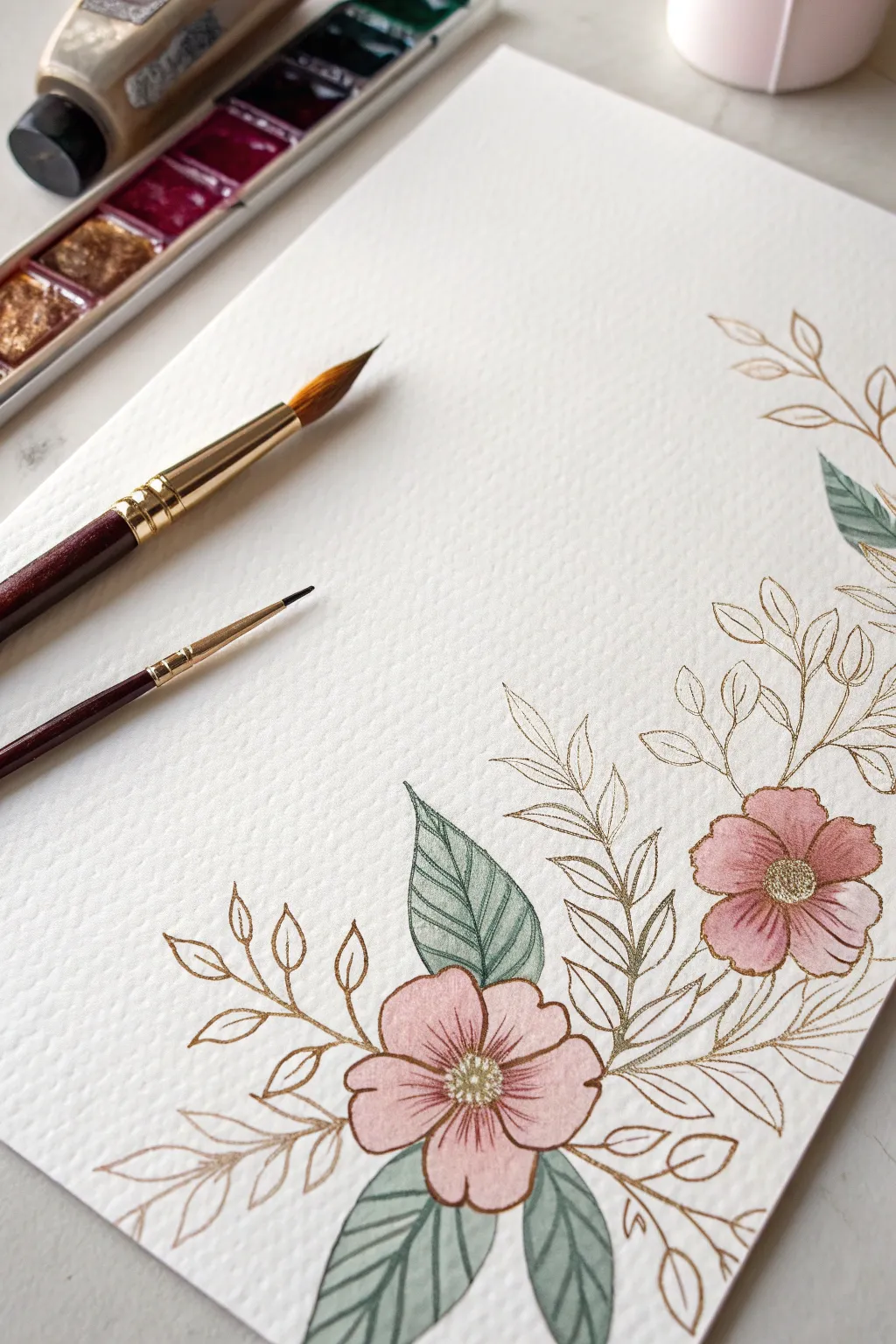
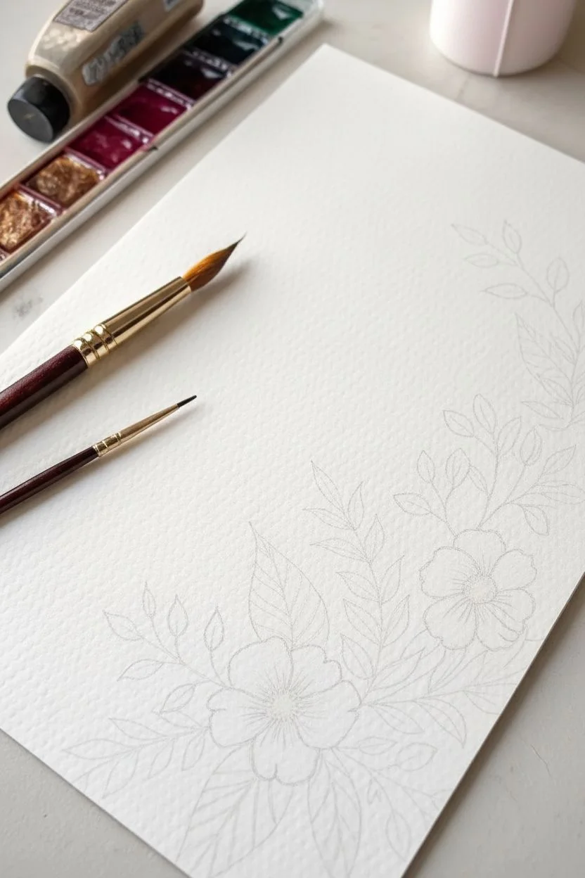
Enhance the delicate transparency of watercolor flowers by introducing the warm shimmer of metallic gold. This project combines loose, illustrative painting with crisp, sparkling linework to create an elegant floral corner piece that catches the light from every angle.
Step-by-Step Guide
Materials
- Cold press watercolor paper (300 gsm)
- Watercolor paints (dusty pink, sage green, cool green)
- Metallic gold watercolor paint or gouache
- Fine liner brush (size 00 or 0)
- Round watercolor brush (size 4 or 6)
- Pencil (HB or H)
- Kneaded eraser
- Glass of water
- Mixing palette
Step 1: Planning and Sketching
-
Map the composition:
Visualize a curving L-shape design starting from the bottom right corner. Lightly mark the positions of two main flower heads—one near the bottom edge and one slightly higher on the right side. -
Sketch the flowers:
Draw simple, five-petal flower shapes. Keep the petals slightly uneven and organic rather than perfectly geometric circles to give them a natural, wildflower appearance. -
Draft the foliage:
Extend stems outward from behind the flowers. Sketch larger, almond-shaped leaves near the blooms and longer, wispy sprigs with smaller leaves reaching up the sides and towards the center of the paper. -
Lighten the lines:
Use a kneaded eraser to roll over your sketch, lifting up most of the graphite until only the faintest guide lines remain visible so they won’t show through the paint.
Step 2: Painting the Base Colors
-
Mix your pink:
Create a watered-down dusty pink shade on your palette. You want a very translucent wash for the petals. -
Paint the first petals:
Using your round brush, fill in the petals of the bottom flower. Leave tiny gaps of white paper between the petals to define their individual shapes. -
Add depth while wet:
While the pink wash is still damp, touch a slightly more saturated pink into the center of the flower, letting it bleed outward naturally. -
Paint the second flower:
Repeat the process for the upper flower, keeping the wash light and airy. -
Mix the greens:
Prepare a muted sage green. I like to mix a tiny bit of red into my green to desaturate it for that vintage botanical look. -
Fill the large leaves:
Paint the larger, almond-shaped leaves clustering around the flowers. Ensure you paint distinct halves for some leaves, leaving a thin white vein down the center for visual interest. -
Add shadowy leaves:
For the leaves that appear ‘behind’ the main cluster, dilute your green even further or switch to a cooler, bluish-green tone to push them into the background. -
Let it dry completely:
Wait until the paper is bone dry. If you touch the paper and it feels cold, it still contains moisture and could ruin the sharp metallic lines coming next.
Gold Flow Hack
If your metallic paint feels draggy or clumpy, mix in a tiny drop of ox gall or gum arabic. This improves flow for long, continuous lines.
Step 3: Adding the Gold Details
-
Prepare the metallic paint:
Activate your metallic gold watercolor or gouache with a few drops of water until it reaches an ink-like consistency that flows smoothly from a liner brush. -
Outline the petals:
With your finest brush, trace the edges of the pink petals with thin, delicate gold lines. Don’t worry if your line doesn’t perfectly match the paint edge; that offset look adds charm. -
Create the centers:
Dot the center of each flower with concentrated gold paint to create the stamen cluster. -
Detail the painted leaves:
Outline the green painted leaves with your gold mixture. Add a central vein line to the leaves that you painted as solid shapes. -
Draw the ghost foliage:
Now, draw the stems and small leaves that you sketched earlier but didn’t paint. These gold-only sprigs add lightness and fill out the composition without weighing it down. -
Add vein details:
On the larger painted leaves, add delicate diagonal hatching lines in gold to suggest texture and veining.
Level Up: Vintage Background
Before painting, apply a very faint tea wash over the entire paper creating an aged parchment look to contrast with the modern metallics.
Step back and tilt the paper under a lamp to see your botanical garden shimmer into existence

Draw a Mandala With Unexpected Color Gradients
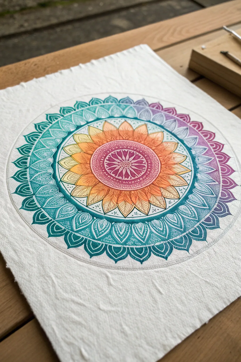
This project combines the meditative structure of mandala drawing with the fluid beauty of watercolor gradients. From a warm, sun-like core, the design radiates outward into a cool, oceanic border, creating a striking contrast on textured paper.
Step-by-Step
Materials
- Cold press watercolor paper (approx. 300gsm, textured)
- Pencil (HB or 2H)
- Protractor and compass
- Ruler
- Black fineliner pens (0.1mm and 0.3mm)
- Watercolor paints (Yellow, Orange, Magenta, Teal, Blue, Purple)
- Soft round brushes (sizes 2 and 4)
- Clean water and paper towels
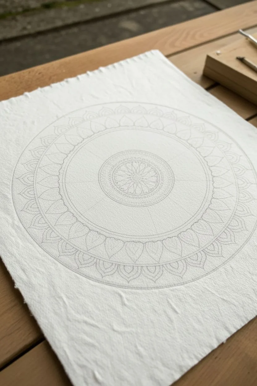
Step 1: Structuring the Grid
-
Find Center:
Begin by measuring your paper to find the exact center point. Make a tiny, faint mark here with your pencil. -
Draw Circles:
Using your compass, draw a series of concentric circles radiating from the center. Start small for the inner core (about 2cm diameter) and expand outward, leaving varying gaps for different petition designs until the total diameter is roughly 20-25cm. -
Mark Angles:
Place your protractor on the center point and mark every 22.5 degrees or every 30 degrees, depending on how many ‘petals’ you want per ring. Lightly draw straight lines through the center to connect these marks, creating pie-slice sections.
Uneven Gradients?
If your gradient looks blocky, re-wet the area slightly with clean water and gently nudge the pigment with your brush to smooth the transition.
Step 2: Drafting the Design
-
Sketch the Core:
In the innermost circle, sketch small, teardrop-shaped seeds pointing inward toward the center. -
Inner Petals:
In the next ring, draw a row of tightly packed, rounded petals. Keep them uniform in size, using your guidelines to ensure symmetry. -
Large Sun Petals:
For the prominent middle section, draw large, pointed leaf shapes. They should be substantial enough to hold the gradient transition from yellow to orange. -
The Outer Rim:
Sketch a simplified band of petals or scallops for the final outer rings. These will eventually be filled with the cool-toned teal and purple gradients.
Metallic Accent
Add gold leaf or metallic gold watercolor to the center seed shapes for a luxurious, shimmering focal point.
Step 3: Inking the Outline
-
Tracing Lines:
Take your 0.3mm fineliner and carefully trace over your pencil sketches. Rotate the paper as you work so your hand is always in a comfortable position. -
Adding Detail:
Switch to the finer 0.1mm pen. Inside the large ‘sun’ petals, draw delicate veins or lines radiating from their base. Add tiny dots or stippling in separate bands for texture. -
Erase Guidelines:
Wait at least 10-15 minutes to ensure the ink is bone dry. Gently erase all pencil lines with a kneadable eraser to avoid damaging the paper’s texture.
Step 4: Applying the Gradient
-
Pre-wet the Center:
Using a clean, damp brush, lightly wet the innermost circle area. You want the paper damp, not soaking wet. -
Core Color:
Drop in a rich magenta mixed with a little red into the very center, letting it bleed naturally to the edges of the circle. -
Sun Petal Gradient:
For the large prominent petals, mix a bright yellow and a warm orange. Paint the tips yellow and the bases orange, using a slightly damp brush to blend them where they meet in the middle. -
Transition Zone:
As you move to the outer rings, start introducing teal. Paint the first ‘cool’ ring with a mix of teal diluted with plenty of water for a pastel look. -
Outer Ring Blend:
Prepare a palette with teal, blue, and purple. Start painting the outer scallop ring at the ‘9 o’clock’ position with pure teal. -
Cool Tones:
As you work clockwise around the ring, gradually mix blue into your teal, then transition into purple as you reach the opposite side. Paint each segment individually to control the color shift. -
Solid Backgrounds:
For the background areas between petals in the outer rings, carefully fill them with a solid, saturated version of the teal or blue to make the lighter petals pop.
Step 5: Finishing Touches
-
Re-Inking:
Once the paint is completely dry, you might notice some lines look faded. Go back over key outlines with the 0.3mm pen to bold them up. -
White Highlights:
I like to use a white gel pen here to add tiny dots or sparkles on the darkest painted areas, particularly the magenta center, for extra depth. -
Flattening:
Waterproof ink and watercolor can buckle paper. If needed, place the dry artwork under a heavy book overnight to flatten it perfectly.
Step back and admire how the colors shift temperature across your unique mandala design
BRUSH GUIDE
The Right Brush for Every Stroke
From clean lines to bold texture — master brush choice, stroke control, and essential techniques.
Explore the Full Guide
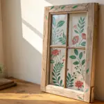
Paint a Stained-Glass Pattern Directly on a Window
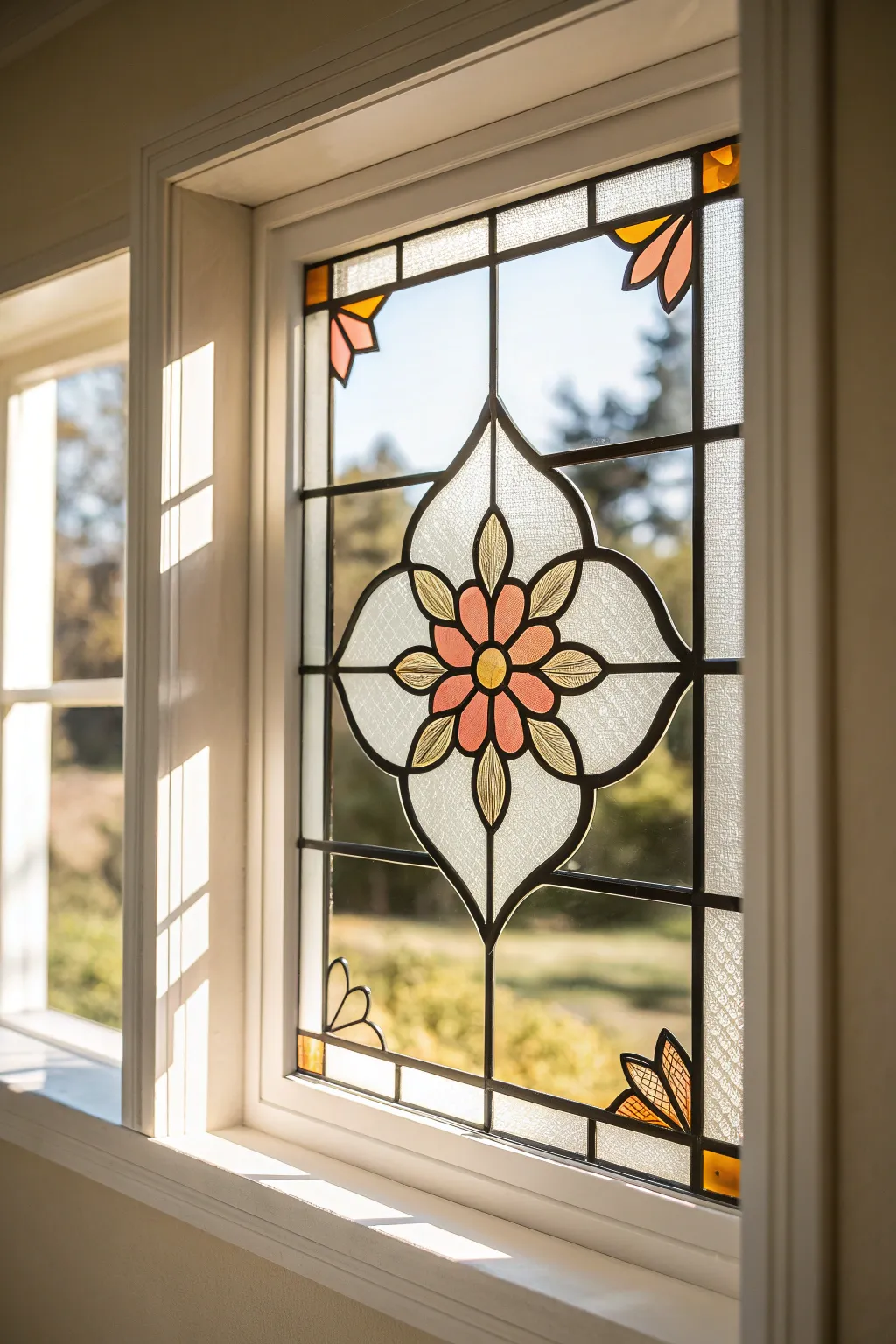
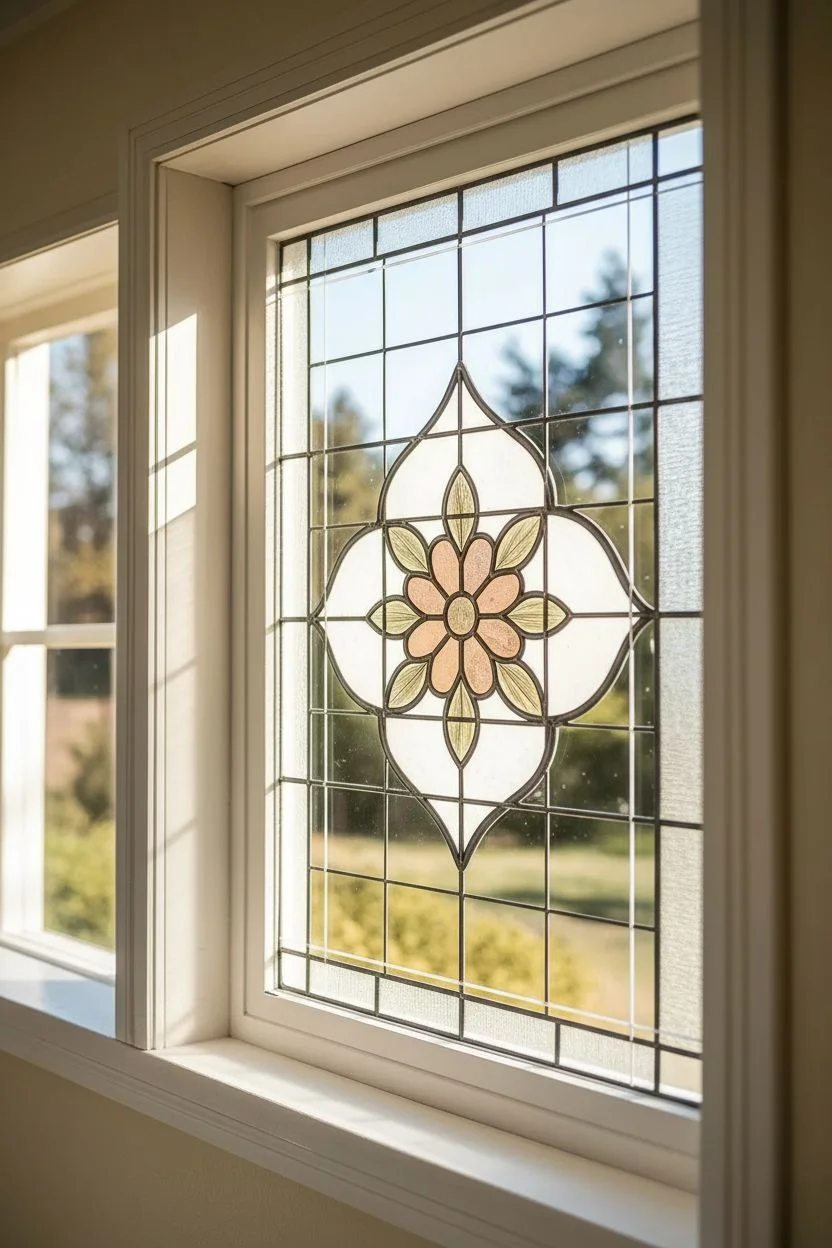
Transform a plain window pane into a stunning piece of vintage-inspired art using specialized glass paints and outlining techniques. This project captures the warm, glowing light of traditional stained glass with a delicate floral motif, all without soldering a single piece of lead.
Detailed Instructions
Materials
- Window pane (either existing window or a framed glass pane)
- Glass cleaner and microfiber cloth
- Liquid leading (black or dark grey)
- Gallery Glass or similar glass paints (colors: Peach/Coral, Pale Yellow, White/Clear texture)
- Fine-tip paint brushes
- Toothpicks
- Printed pattern template (scaled to window size)
- Masking tape
- Ruler
- Craft blade or scraper
Step 1: Preparation & Mapping
-
Clean the surface:
Begin by thoroughly cleaning the window pane with glass cleaner and a microfiber cloth. Any dust or oils will prevent the leading from adhering properly, so ensure it looks crystal clear before starting. -
Secure the template:
Tape your printed floral pattern to the *outside* of the window (or underneath the glass if working flat on a table). Verify that the central flower motif is perfectly centered within the pane. -
Map the grid:
Use a ruler and a dry-erase marker (or faint lines of tape) to lightly mark the primary vertical and horizontal grid lines if your pattern doesn’t cover the full pane. This ensures your geometric lines stay straight during the next phase.
Step 2: Creating the Lead Lines
-
Test the flow:
Before touching the glass, squeeze a small line of liquid leading onto a paper towel. You want a smooth, consistent bead without air bubbles. -
Outline the center:
Start with the central flower. Hold the leading bottle tip slightly above the glass—don’t drag it—and let the line drape onto the surface as you trace the petals and center circle. -
Draw the quatrefoil:
Move outward to trace the decorative four-lobed shape (quatrefoil) surrounding the flower. Keep your hand steady and maintain even pressure on the bottle. -
Add connecting lines:
Draw the straight vertical and horizontal lines that connect the central design to the window frame. Use your ruler as a visual guide, but freehand the line for a more organic look. -
Detail the corners:
Add the small floral details in the upper and lower corners of the pane, mirroring the style of the central flower. -
Let it cure:
Allow the leading lines to dry completely. This usually takes 8 to 24 hours depending on humidity. They should feel firm and rubbery before you paint.
Uneven Leading Lines?
If a line smudges or looks shaky, don’t wipe it while wet! Let it dry completely, then use a craft blade to slice off the mistake and redraw that specific section.
Step 3: Painting the Glass
-
Fill the petals:
Using the peach or coral glass paint, fill in the five central petals. Squeeze the paint directly from the bottle or use a brush, ensuring the paint touches the leading edges to seal the gap. -
Add yellow accents:
Fill the very center circle and the small leaf-like shapes between the main petals with the pale yellow paint. I like to pop any tiny air bubbles immediately with a sharp toothpick. -
Create texture in clear areas:
For the large clear sections inside the quatrefoil, use a ‘crystal clear’ or textured clear medium. Apply it in a swirling motion with a brush to mimic the waviness of antique glass. -
Paint the background:
Fill the remaining background rectangles with a clear or slightly frosted medium. Apply this layer thinner than the decorative elements to let maximum light through. -
Corner details:
Fill the corner floral elements with the same peach and yellow palette to tie the design together. -
Review and correct:
Hold a piece of white paper behind the glass to check for gaps where light might bleed through the leading. Add tiny drops of paint to seal any pinholes. -
Final drying:
Let the project dry undisturbed for at least 48 hours. The paint will clarify and become more transparent as it cures.
Vintage Patina Effect
Once the leading is fully dry, lightly rub a tiny amount of pewter or silver Gilding Wax over the rigid black lines to make them look like aged, soldered metal joints.
Enjoy the timeless beauty your new faux stained glass brings to the room every time the sun shines through
Create a Tape-Resist Cityscape With Razor-Sharp Lines
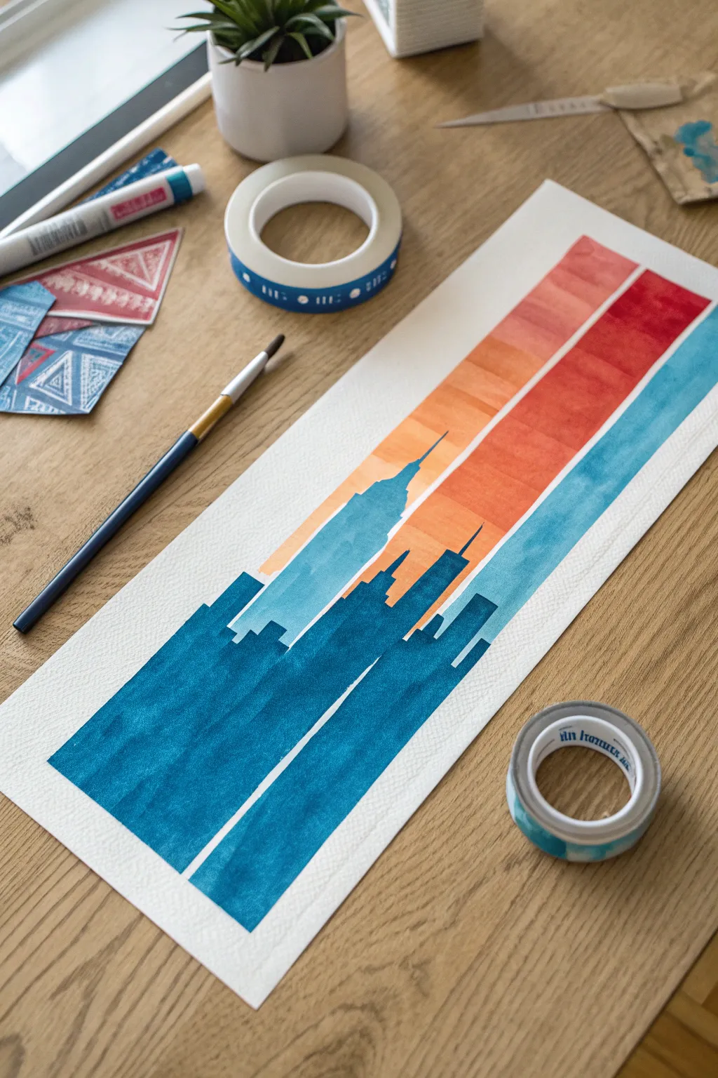
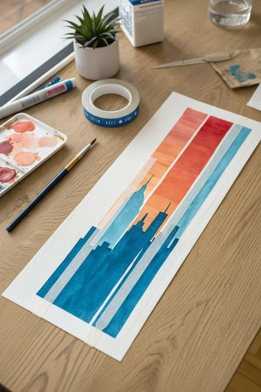
Capture the energy of a city skyline using clean lines and contrasting temperatures. This project combines the precision of tape-resist techniques with the fluid beauty of watercolor for a striking, modern minimalist piece.
Step-by-Step Tutorial
Materials
- Cold press watercolor paper (cut to a tall, narrow rectangle)
- Painter’s tape or washi tape (various widths)
- Watercolor paints (warm gradient: peach, orange, red; cool: teal blue, indigo)
- Flat shader brush (medium size)
- Round detail brush (small)
- Pencil
- Ruler
- Clean water and paper towels
- Palette for mixing
Step 1: Planning the Layout
-
Prepare your paper:
Cut your watercolor paper into a long, narrow vertical strip. A size roughly 6 inches by 14 inches works beautifully for this towering composition. -
Add masking tape strips:
Place two vertical strips of masking tape down the length of the paper to create the white negative space lines. Position them slightly off-center to mimic the verticality of skyscrapers. -
Seal the edges:
Run a bone folder or your fingernail firmly along the edges of the tape strips. This is crucial to prevent paint from bleeding underneath and spoiling those crisp white lines. -
Sketch the skyline:
Using a light pencil, sketch a simple cityscape silhouette across the bottom two-thirds of the paper, drawing right over the tape. Include recognizable shapes like the Empire State Building or generic stepped skyscrapers.
Step 2: Painting the Warm Sky
-
Mix your warm palette:
Prepare three distinct warm colors on your palette: a soft peach, a vibrant orange, and a deep red. -
Paint the top stripe:
Start near the top right with your red paint. Create a diagonal block of color that cuts across the background area but stops where your building outline begins. -
Fill the middle section:
Below the red, paint a diagonal band of orange. Keep your brush strokes horizontal even though the band is diagonal, maintaining a consistent texture. -
Finish the lowest sky layer:
Fill the remaining sky area just above the building line with the soft peach color. Be careful to paint neatly around your pencil sketch of the rooflines. -
Let the sky dry:
Allow these warm sections to dry completely. If the paper feels cool to the touch, it is still damp; wait until it is room temperature.
Sticky Situation
To ruin the adhesive slightly and protect your paper, stick the tape to your jeans or a tablecloth once before applying it to the artwork.
Step 3: Adding the Cool Skyline
-
Mix your blue tones:
Create a rich, deep teal blue. You want this to be quite saturated to contrast strongly against the white paper and warm sky. -
Paint the tallest building:
Using a smaller brush for accuracy, fill in the silhouette of the tallest central skyscraper. I find using a flat brush helps keep the vertical edges sharp. -
Fill the lower buildings:
Continue painting the rest of the building silhouettes in blue. Paint right over the tape strips just as you did with the pencil sketch. -
Vary the saturation:
For visual interest, you can water down the blue slightly for the building in the background (the one on the left), giving it a sense of atmospheric depth. -
Deepen the foreground:
Add a second layer of indigo or concentrated teal to the bottom-most geometric shapes to anchor the composition visually.
Night Mode
Try a nocturnal version: use a dark purple/navy wash for the sky and leave the buildings unpainted white for a ‘lights on’ city effect.
Step 4: The Reveal
-
Ensure total dryness:
Wait until the painting is completely bone dry. Rushing this step is the most common way to tear the paper. -
Peel the tape:
Slowly peel back the two vertical strips of tape. Pull closely to the paper at a 45-degree angle rather than pulling straight up to minimize paper damage. -
Clean up edges:
If a tiny bit of paint bled under the tape, you can gently scrape it away with a craft knife or cover it with a tiny touch of white gouache. -
Erase pencil marks:
Gently erase any remaining visible pencil lines from your initial sketch, being careful not to smudge the watercolor pigment.
Once the tape is removed, you have a stunning piece of modern graphic art ready to be framed

PENCIL GUIDE
Understanding Pencil Grades from H to B
From first sketch to finished drawing — learn pencil grades, line control, and shading techniques.
Explore the Full Guide
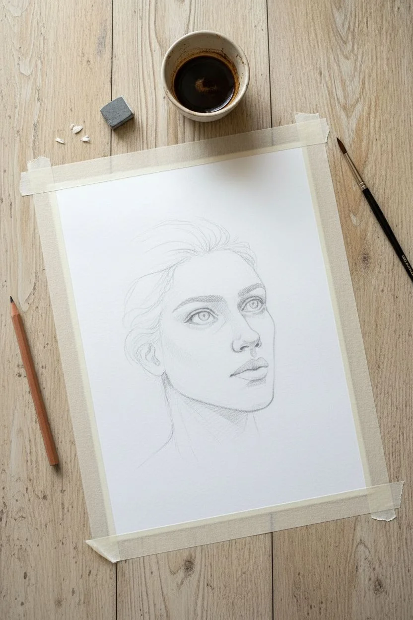
Do a Monochrome Painting Using Coffee or Tea Stains
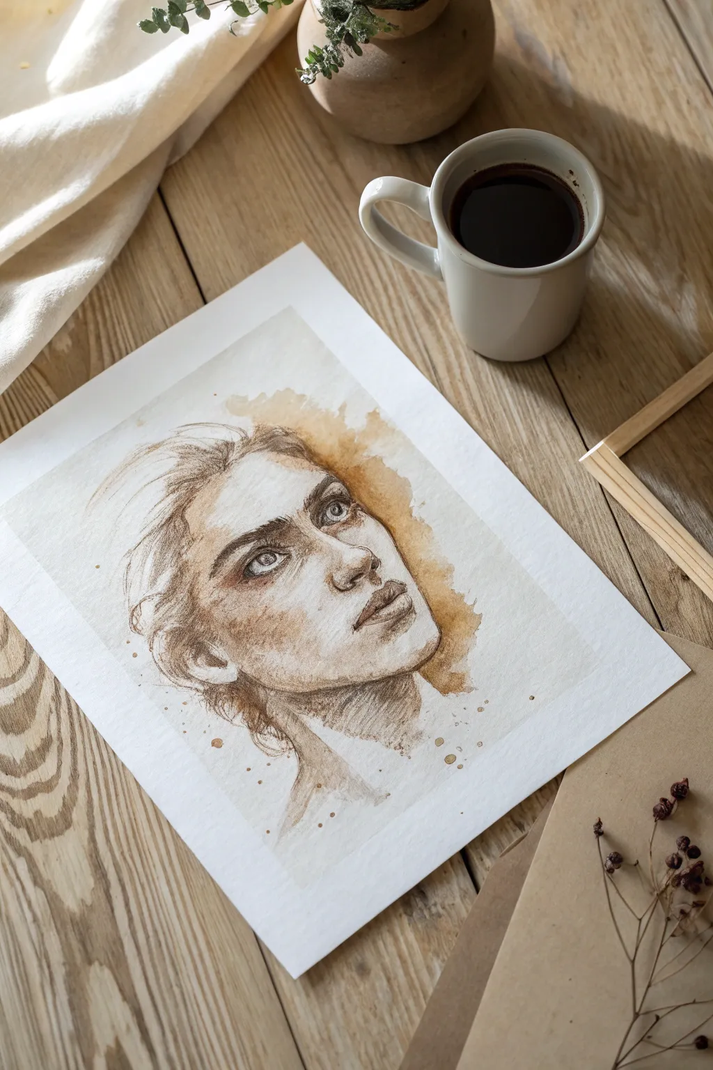
Discover the art of painting with your morning brew by creating this soulful, sepia-toned portrait. Using strong espresso and gradual layering, you will build up a monochromatic masterpiece that feels both vintage and expressive.
Step-by-Step Guide
Materials
- High-quality watercolor paper (cold press creates nice texture)
- Strongly brewed coffee or instant espresso (for dark tones)
- Weaker brewed coffee or tea (for warm washes)
- Round watercolor brushes (sizes 2, 6, and 10)
- Fine liner brush (size 0 or 00)
- Pencil (HB) and kneaded eraser
- Paper towels
- Palette or small cups for different coffee strengths
- Wooden frame (optional, for display)
Step 1: Preparation & Sketching
-
Prepare your coffee mediums:
Brew a very concentrated shot of espresso or mix instant coffee with a tiny amount of hot water to create a syrup-like consistency; this will be your darkest ‘paint’. Create two lighter dilutions in separate cups for your mid-tones and lightest washes. -
Tape down your paper:
Secure your watercolor paper to a flat surface using masking tape or artist’s tape. This prevents the paper from buckling when wet and creates a clean white border around your final piece. -
Outline the face:
Lightly sketch the woman’s face using an HB pencil. Focus on the upward tilt of the head, placing the eyes slightly higher than usual to emphasize the gaze. Keep lines faint so they won’t show through the transparent coffee layers. -
Refine facial features:
Add details to the eyes, nostrils, and lips. The expression is key here—ensure the eyebrows have a slight furrow to convey emotion. Use a kneaded eraser to lift up any graphite that looks too dark.
Sticky Situation?
Is your coffee paint staying tacky? You likely used too much sugar if using pre-mixed coffee, or the instant mix is too thick. Dilute slightly with water and let it dry longer in a warm spot.
Step 2: The First Wash
-
Apply the base skin tone:
Dip your size 10 brush into the weakest coffee dilution. Gently wash over the shadowed areas of the face—the eye sockets, under the nose, under the lip, and the neck—leaving the high points like the nose bridge and forehead white for now. -
Create the background texture:
While the face is drying, wet the area around the head with clean water. Drop in your mid-tone coffee mix, letting it bloom outward to create that loose, stain-like halo effect visible behind the hair. -
Let it dry completely:
Patience is crucial with coffee painting. Allow this first layer to dry fully to avoid lifting the pigment when you add the next layer. It should feel dry to the back of your hand.
Aromatic Intensity
For darker blacks without using ink, boil your instant coffee down in a saucepan until it reduces to a thick syrup. This concentrates the pigment far more than just adding hot water.
Step 3: Building Depth
-
Define the eyes:
Switch to a size 6 brush and your medium-strength coffee. Carefully paint the iris and the crease of the eyelid. Leave a tiny speck of white paper in each pupil to serve as the catchlight. -
Sculpt the shadows:
Using the medium mix, deepen the shadows under the jawline, the side of the nose, and the inner corners of the eyes. This is where the form starts to emerge from the flat paper. -
Paint the hair mass:
Use broad, sweeping strokes with the medium coffee to map out the hair. Notice how the hair in the original image is loose and expressive; don’t try to paint every single strand yet. -
Add warmth to lips and cheeks:
Glaze a slightly stronger layer over the lips and the hollow of the cheek. I find that dabbing this area lightly with a clean, damp brush can soften the edges for a natural look.
Step 4: Details & Contrast
-
Darkest accents with espresso:
Dip your fine liner brush (size 0) into the darkest, syrup-like coffee concentrate. Carefully outline the upper lash line, the pupils, and the nostrils. This high contrast brings the portrait to life. -
Refine the eyebrows:
Using the dark concentrate and the fine brush, paint delicate, hair-like strokes for the eyebrows. Follow the natural growth direction of the hair, making them denser towards the center of the face. -
Detail the lips:
Darken the center line of the mouth and the corners. Add faint vertical texture lines to the lips using a semi-dry brush to suggest fullness. -
Hair texture and movement:
Return to the hair with your darkest mix and a size 2 brush. Add flowing lines that sweep back from the forehead, emphasizing the messy, windswept style. Leave some of the lighter under-layers visible. -
Splatter effect:
Load a medium brush with coffee and tap it against your finger to create the subtle speckles seen around the neck and hair. This enhances the organic, imperfect aesthetic of the piece. -
Final assessment:
Step back and look at your contrast levels. If the drawing feels flat, add more of the dark espresso syrup to the deepest shadows (under the chin and in the hair) to anchor the image. -
Remove tape and frame:
Once strictly bone-dry, peel off the masking tape slowly at a 45-degree angle. Place your finished coffee painting near a natural wood frame or on a rustic table to complete the mood.
Enjoy the calming aroma of your workspace as you admire your finished monochrome creation
Layer Gel-Printed Textures Into a Modern Abstract
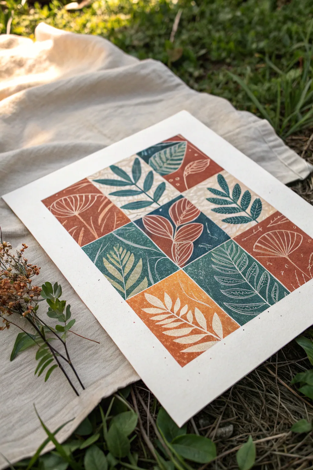
Capture the organic beauty of leaves and seed pods with this multi-block relief printing project. By arranging simple botanical carvings into a structured grid and alternating earthy ink tones, you will create a modern piece of wall art that feels both rustic and refined.
Step-by-Step Tutorial
Materials
- Soft-cut linoleum blocks (or easy-carve rubber)
- Linocut carving tools (V-gouge and U-gouge)
- Block printing ink (water-soluble) in terracotta, teal, moss green, and mustard yellow
- Brayer (rubber roller)
- Inking plate or glass pane
- Printmaking paper or thick cardstock (white or cream)
- Pencil and eraser
- Ruler
- Baren or wooden spoon
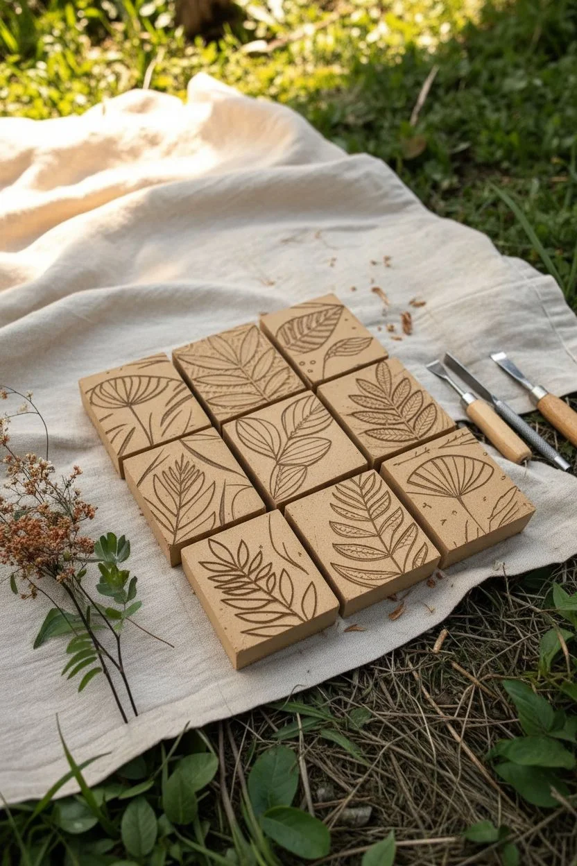
Step 1: Designing and Carving
-
Draft your grid:
Decide on the size of your individual blocks first. A 3×3 inch square is a manageable size for beginners. Measure and mark nine squares of this size on your carving material to visualize the full grid layout. -
Sketch the motifs:
Draw simple botanical shapes directly onto the blocks. Aim for variety: try a large single leaf, a sprig with many small leaves, a fern-like frond, and a seed pod shape. Keep the lines relatively bold for easier carving. -
Carve the outlines:
Using your fine V-gouge tool, carefully carve along the pencil lines of your designs. Remember to carve away from your body for safety throughout the process. -
Clear the background:
Switch to a wider U-gouge to clear away the negative space around your leaves. You don’t need to make this perfectly smooth; leaving some texture creates those charming ‘chatter’ marks characteristic of hand-printed art. -
Add detailing:
Go back in with the fine tool to add veins to the leaves or texture to the seed pods. These fine white lines will add depth to the final print. -
Cut the blocks:
If you carved on a single large sheet, carefully cut the nine squares apart using a utility knife and a metal ruler so they can be inked individually.
Registration Made Easy
Make a ‘jig’ using scrap cardboard shaped like an L-bracket. Tape it down and tuck your paper into the corner every time so your prints stay perfectly aligned.
Step 2: Inking and Panning
-
Prepare your palette:
Squeeze a small amount of each ink color—terracotta, teal, green, and mustard—onto your inking plate. Keep them well separated. -
Roll the ink:
Use your brayer to roll out one color until it sounds like sizzling bacon and has a velvety texture. I usually start with the lightest color first. -
Test print:
Ink one block and stamp it on scrap paper to check your carving. If lines are too shallow or details are getting lost, wash the block, dry it, and carve slightly deeper. -
Mark the paper:
Lightly mark the corners of where your grid will sit on the final paper with a pencil. This ensures your artwork is centered and straight.
Patchy Prints?
If the ink looks too translucent or splotchy, your layer of ink on the plate is likely too thin. Add a tiny bit more ink and roll until the texture is distinct.
Step 3: Printing the Grid
-
Ink the first set:
Choose 2-3 blocks for your first color. Ink them thoroughly with the brayer, ensuring the raised surface is fully coated but not gloopy. -
Position and press:
Place the inked blocks onto the paper in your desired grid positions. Press down firmly with your hand to adhere the block to the paper. -
Burnish the back:
Flip the paper (with the block still stuck to it) or use a baren/spoon on the back of the block to apply even pressure. Rub in small circles, focusing on the edges and corners. -
Peel and repeat:
Gently peel the block away to reveal the print. Wipe the block clean with a damp cloth if you plan to reuse it for a different color. -
Alternate colors:
Clean your brayer and switch to the next ink color (e.g., teal). Ink a new set of botanical blocks and print them in the remaining grid spaces, creating a checkerboard or random effect. -
Complete the grid:
Continue until all nine squares are filled. Try to balance the warm tones (terracotta, yellow) with the cool tones (teal, green) for a harmonious composition. -
Dry and erase:
Allow the ink to dry completely, which may take 24 hours depending on humidity. Once dry, gently erase your pencil registration marks.
Frame your botanical grid in a simple wood frame to highlight those rich organic textures


Make a Raised Relief Artwork From Cut Cardboard Shapes
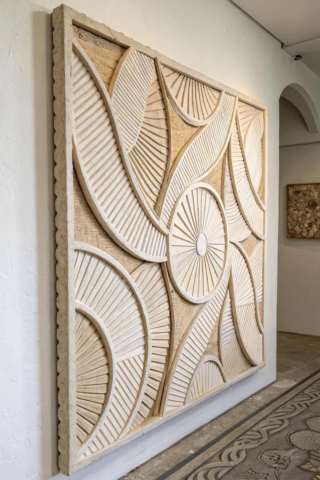
Transform humble cardboard into what appears to be an ancient, hand-carved limestone frieze. This large-scale wall art creates incredible depth through strategic layering and texturing, bringing a sophisticated, architectural focal point to any room.
Step-by-Step Guide
Materials
- Large sheet of sturdy plywood or MDF (backing board)
- Heavy-duty corrugated cardboard (multiple boxes worth)
- Thin cardstock or cereal box cardboard
- PVA craft glue or wood glue
- Sharp utility knife with extra blades
- Compass and straight edge ruler
- Joint compound or spackle
- Coarse sand or texture medium
- Stone-colored acrylic paints (beige, warm grey, cream)
- Matte spray sealer
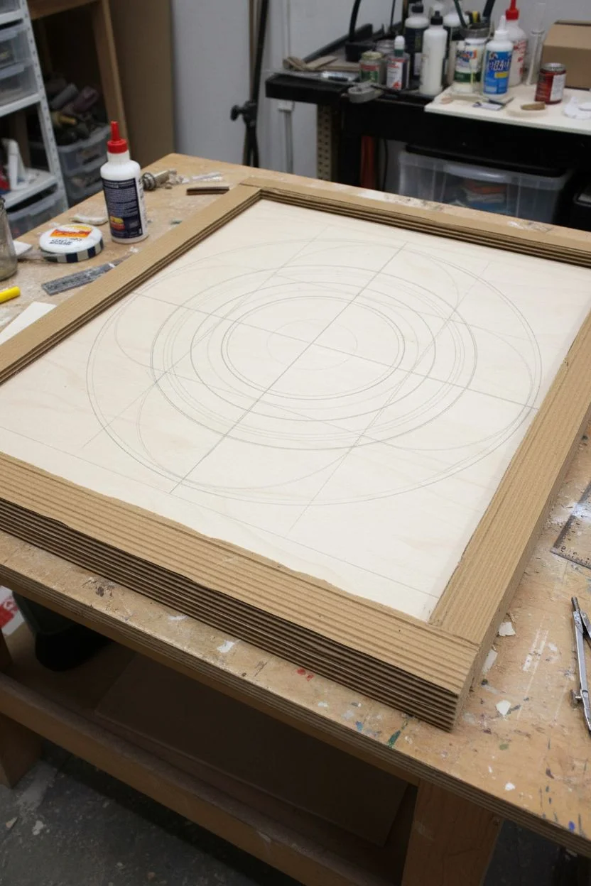
Step 1: Design and Base Construction
-
Prepare the substrate:
Cut your plywood or MDF backing board to your desired dimensions. A rectangle around 24×36 inches works well for a statement piece. Sand the edges lightly to remove splinters. -
Create a frame border:
Cut four strips of heavy cardboard, roughly 2 inches wide, to frame the outer edge of your backing board. Glue these down securely to create a raised lip, mimicking a stone slab’s edge. -
Map out the pattern:
Using a pencil, ruler, and compass, sketch your geometric design directly onto the backing board. Focus on large sweeping curves, circles, and intersecting arcs like the reference image.
Stone Texture Hack
Mix a little baking soda into your acrylic paint for the final topcoat. It creates a gritty, grainy finish that feels exactly like limestone to the touch.
Step 2: Layering the shapes
-
Cut structural curves:
Using heavy corrugated cardboard, cut out the primary curved shapes that will form the ‘skeleton’ of your design. These should follow the major arc lines you drew. -
Stack for height:
To achieve the deep relief look, glue 2-3 identical cutouts of the same shape on top of each other. This builds the height up to resemble thick carving. -
Create the slatted texture:
Cut dozens of thin, uniform strips of cardstock or thinner cardboard. These will be the ‘carved’ lines filling the spaces. -
Apply the slats:
Glue these thin strips onto the backing board within your curved boundaries, fanning them out like sun rays or feathers. Leave a tiny gap between each strip to enhance the shadow lines later. -
Add the central medallion:
For the focal point, cut a perfect circle and a smaller inner circle from thick cardboard. Surround it with radiating strips to create the sunburst effect shown in the center. -
Refine the edges:
Use thin strips of cardstock to cover any exposed corrugated edges of your cardboard stacks. This hides the ‘flutes’ of the cardboard and makes the piece look solid.
Step 3: Texturing and Finishing
-
Apply joint compound:
Mix a small amount of sand into joint compound or spackle. Using a brush or spatula, apply a thin, uneven layer over the entire piece. -
Stipple for stone effect:
While the compound is wet, use an old stiff brush to stipple (poke) the surface. This creates a pitted, eroded stone texture and hides the smoothness of the paper. -
Clean the grooves:
Before the compound fully hardens, run a toothpick or skewer through the gaps between your decorative strips to ensure the design lines stay crisp. -
Base coat painting:
Once fully dry (give it 24 hours), paint the entire piece with a base coat of sandy beige or warm cream acrylic paint. Ensure you get into every nook and cranny. -
Create depth with a wash:
Mix a darker taupe or grey paint with water (50/50 ratio). Brush this wash over the artwork and immediately verify that it settles into the deep recesses. -
Wipe back:
Use a damp rag to gently wipe the wash off the high points of the relief. This leaves the dark color in the shadows, instantly popping the 3D effect. -
Dry brush highlights:
Dip a dry brush into almost-white paint, wipe most of it off on a paper towel, and lightly graze it over the very top ridges of your design to catch the light. -
Seal the work:
Finish with a light coat of matte spray sealer to protect the texture and unite the finish without adding an artificial gloss.
Warping Worries?
If the cardboard curls from the moisture of the glue or paint, place heavy books on the corners while it dries, or paint an ‘X’ on the back to counterbalance.
Hang your new architectural relief in a spot with side-lighting to cast shadows and show off that incredible depth you created
Combine Drawing and Real Objects for a Visual Punchline
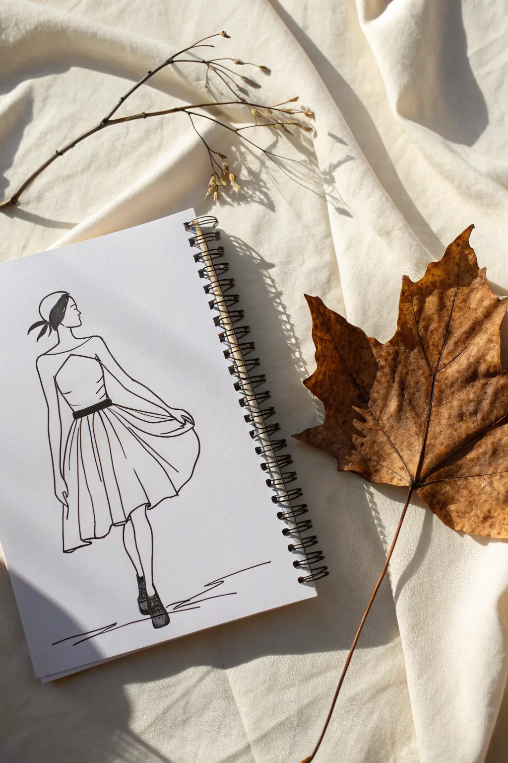
This minimalist fashion illustration captures the elegance of a swaying dress using simple line work, designed to be paired with natural elements like dried leaves for a mixed-media effect. The clean black ink on crisp white paper creates a striking contrast that feels effortless and chic.
Detailed Instructions
Materials
- Spiral-bound sketchbook (heavyweight paper preferred)
- Fine liner pens (sizes 0.3mm and 0.5mm)
- Pencil (HB or H for light sketching)
- Eraser (kneaded or high-quality white vinyl)
- Ruler (optional, for finding proportions)
- Large dried autumn leaf (for staging/inspiration)
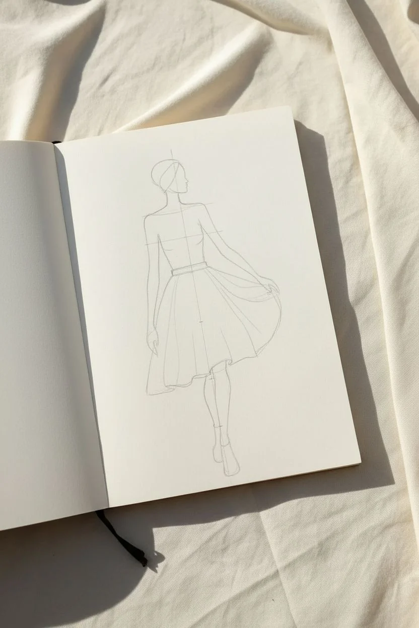
Step 1: Planning the Pose
-
Establish the vertical axis:
Start by lightly sketching a vertical line down the center of your page with your pencil. This line of action will help you keep the figure balanced as she appears to be walking forward. -
Map out proportions:
Divide your vertical line into roughly 8 or 9 equal sections (heads). Fashion illustrations often use an elongated 9-head croquis for elegance. Mark the shoulders, waist, and hips lightly. -
Sketch the head and neck:
Draw an oval for the head at the top, slightly tilted to the right. Add a slender, elongated neck connecting to a gentle slope for the shoulders. -
Draft the torso:
Sketch the bodice outline. Indicate a fitted waistline slightly higher than a natural waist to give the dress a vintage silhouette. Keep the lines loose and fluid.
Uneven Lines?
Don’t correct wobbly lines by going over them; it creates messy thickness. Instead, widen the line intentionally in that spot to simulate shadow or fabric weight.
Step 2: Defining the Dress
-
Create the skirt volume:
From the waistline, flare your pencil lines outward dramatically. The skirt should look full and billowy, reaching just below the knees. Imagine how fabric moves when someone twirls. -
Sketch the arms:
Draw the left arm hanging naturally by her side. For the right arm, position it so the hand is gently grasping the fabric of the skirt, pulling it slightly outward to create tension in the cloth. -
Draft the legs:
Below the hemline, sketch long, slender legs. Position the feet so one is directly in front of the other, mimic a runway walk. Sketch the rough shape of ankle boots. -
Add movement folds:
Inside the skirt outline, lightly draw curved lines radiating from the waist and the gathered hand. These will become the deep folds of the fabric later.
Step 3: Inking the Illustration
-
Outline the profile:
Switch to your 0.3mm fine liner. Carefully ink the profile of the face. Keep the nose dainty and the chin defined. Add a simple curve for the closed eye and lips. -
Ink the hair and scarf:
I prefer to use quick strokes here. Outline the hair tied back, and draw the small scarf tied at the nape of the neck. Fill in the hair tie/scarf ends with solid black ink. -
Define the bodice:
Trace the shoulder lines and the top of the dress. Make the lines smooth and continuous. Ink the waistband, making it a thick, solid black bar to define the silhouette. -
Flowing skirt lines:
Use confident, sweeping motions for the skirt. Ink the outer edges first, then follow your pencil guides for the internal folds. vary your pressure—press harder at the bottom of folds for weight. -
Detail the hands and arms:
Ink the arms with delicate lines. Be careful with the hand holding the skirt; imply the fingers rather than drawing every joint to keep the style abstract. -
Ink the boots:
Outline the legs and the ankle boots. Use a scribbling or stippling texture to fill in the dark boots, leaving small patches of white for highlights to suggest shiny leather.
Level Up: Real Texture
Instead of drawing the full skirt, cut the skirt shape out of the actual dry leaf and glue it onto the paper for a true 3D mixed-media collage effect.
Step 4: Finishing Touches
-
Ground the figure:
Draw a few jagged, horizontal lines near the feet to represent the ground and shadow. This prevents the figure from looking like she is floating in space. -
Erase pencil marks:
Wait at least 5-10 minutes for the ink to dry completely. Gently erase all underlying pencil sketches. Be thorough so the white space remains pristine. -
Stage for photography:
For the visual punchline shown in the example, place a large, dried maple leaf next to the drawing. Angle it so the texture of the leaf complements the texture of the drawn skirt.
You have captured a moment of effortless fashion ready for the autumn season
Stitch Into Paper to Add Thread Lines and Details
This elegant project combines the tactile warmth of handmade paper with the precision of embroidery to create a delicate botanical study. By stitching directly onto watercolor paper, you add texture and depth that transforms a simple line drawing into a dimensional piece of art.
Step-by-Step Guide
Materials
- Heavyweight cold-press watercolor paper or handmade deckle-edge paper (300 gsm)
- Pencil (HB or H)
- Fine-tipped archival ink pen (brown or sepia)
- Watercolor paints (warm earthy tones: beige, blush, ochre)
- Embroidery floss (dark brown or charcoal gray)
- Embroidery needle (size 7 or 8)
- Awl or push-pin
- Piece of foam board, cardboard, or cork mat
- Washi tape or masking tape
- Scissors
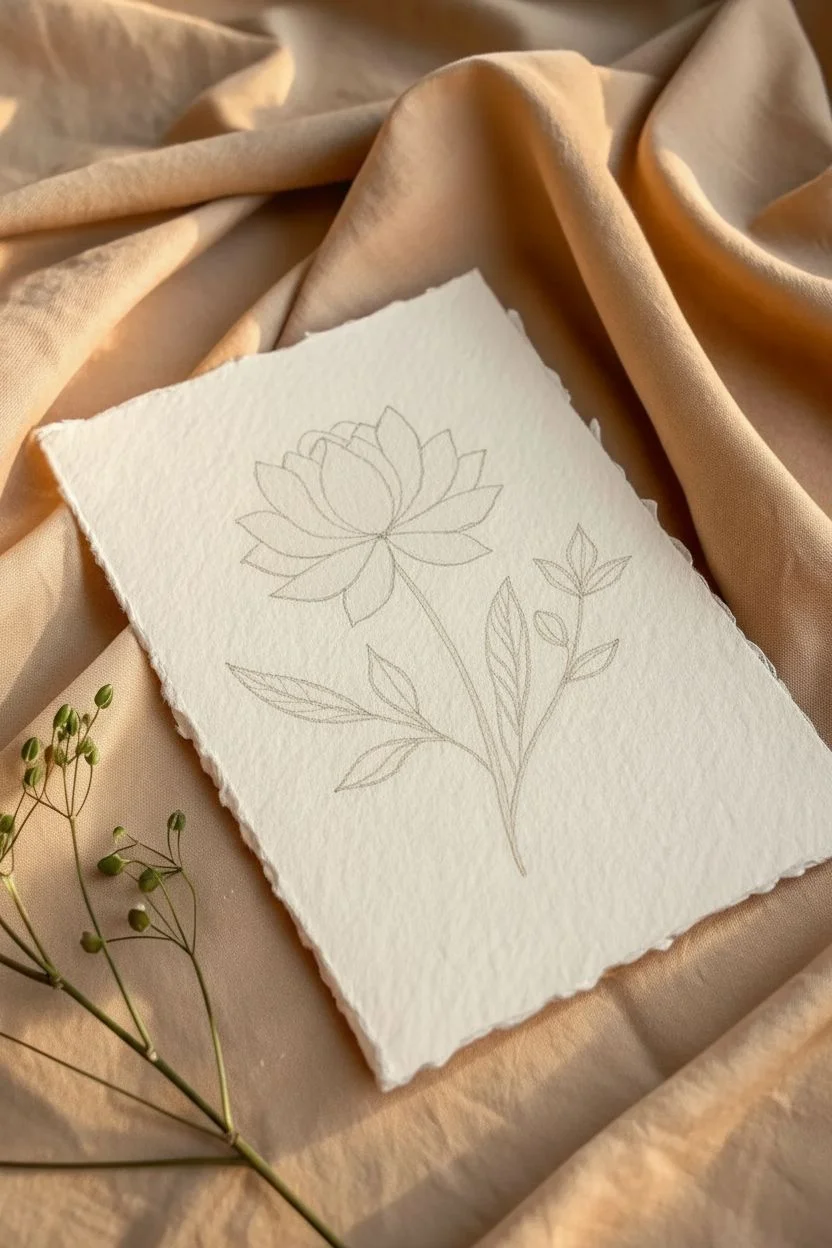
Step 1: Preparation & Drawing
-
Paper selection:
Choose a thick, textured paper. Heavyweight handmade paper with a deckle edge works beautifully here, as it supports the thread tension without tearing and adds to the rustic aesthetic. -
Sizing the paper:
If using a large sheet, tear your paper to size rather than cutting it. Crease the paper firmly and pull gently against a straight edge to create a soft, feathery deckle effect. -
Sketching the design:
Lightly sketch your botanical design in the center of the paper using a hard pencil like an H or HB to keep lines faint. Start with the central flower bloom, adding layered petals, and then extend the stem downwards. -
Adding leaves:
Draw three main leaves branching off the stem—two lower ones and a smaller cluster near the top. Keep the leaf shapes simple and almond-like, avoiding overly complex veins at this stage. -
Refining the sketch:
Go over your sketch to finalize the placement, but keep it light. You don’t want heavy graphite showing under the sheer watercolor wash later.
Don’t Force The Needle
Paper has no ‘give’ compared to fabric. If the needle feels stuck, don’t force it or the paper will buckle. Instead, re-pierce the hole with your awl to widen it slightly.
Step 2: Painting
-
Mixing the wash:
Mix a very dilute watercolor wash using warm tones like blush pink, beige, or a drop of yellow ochre. You want a translucent tint, not opaque color. -
Filling the petals:
Carefully paint inside the petal shapes of your flower. Use a small round brush and try to stay roughly within your pencil lines, though a little looseness adds charm. -
Drying time:
Let the paint dry completely. This is crucial because stitching into damp paper will cause it to tear and warp instantly. -
Optional shading:
If you want slight depth, add a second, smaller dab of the same color wash to the base of the petals once the first layer is dry, though the reference image keeps the color quite flat and uniform.
Step 3: Piercing & Stitching
-
Protecting the work surface:
Place your dry painting onto a piece of foam board, cork, or thick cardboard. This protects your table and allows the needle to pass through easily. -
Pre-punching holes:
Using an embroidery needle, an awl, or a thumbtack, gently punch holes along your pencil lines. Aim for a spacing of about 2-3mm (1/8 inch) between holes. -
Mapping the holes:
Punch holes for the entire outline of the flower petals, the stem, the leaf outlines, and the central veins of the leaves. Be precise here—the needle will follow these holes exactly. -
Threading the needle:
Cut a length of dark embroidery floss. Separate the strands and use only one or two strands for a delicate look that matches the scale of the drawing. -
Starting the stitch:
Tie a small knot at the end of your thread. Bring the needle up from the back of the paper at the base of the stem. To avoid tearing, pull the thread perpendicular to the paper surface, not at an angle. -
Backstitching the stem:
Use a simple backstitch to create a continuous line. Go down into the next hole, then come up one hole ahead, and stitch back down into the previous hole. This creates a solid line resembling an ink drawing. -
Outlining the leaves:
Continue backstitching around the leaf outlines. When you reach the leaf veins, you can switch to a running stitch (over-under) if you want a lighter look, or stick to backstitch for consistency. -
Stitching the flower:
Move up to the flower head. Carefully backstitch around each painted petal. The thread acts as the clean outline for your watercolor wash. -
Adding details:
For the very center of the flower or tiny details on the leaves, you can add single straight stitches that span mostly across the shape, simulating delicate veins. -
Securing the thread:
When you finish a section or run out of thread, flip the paper over. Instead of tying a bulky knot, I like to weave the tail end under existing stitches on the back and secure it with a tiny piece of archival tape (washi tape works well too). -
Erasing marks:
Once all stitching is complete, very gently erase any visible pencil marks that weren’t covered by paint or thread.
Metallic Accent
Swap the dark thread in the flower center for a metallic gold floss. The subtle shimmer against the matte paper creates a luxurious, high-end finish perfect for gifts.
Frame your stitched botanical piece in a shadow box or float mount to showcase the lovely deckled edges
Paint With Color-Shift Pigments for a Changing Finish
Capture the ethereal beauty of a shifting sunset sky with this textured canvas art piece, blending vibrant pinks into deep teals. The magic lies in the tactile surface and iridescent finish that catches the light from every angle, making your wall truly come alive.
Step-by-Step Tutorial
Materials
- Stretched canvas (rectangular, e.g., 24×36 inches)
- Heavy modeling paste or texture gel
- Palette knives (large and medium tapered shapes)
- Iridescent or color-shift acrylic paints (Metallic Pink, Iridescent Violet, Teal, Turquoise)
- White heavy body acrylic paint
- Large flat synthetic wash brush
- Spray bottle with water
- High-gloss varnish (spray or brush-on)
- Drop cloth
Step 1: Building the Foundation
-
Prepare your workspace:
Lay down your drop cloth to protect the floor or table, as texture paste can be messy. Ensure your canvas is clean and set it up flat on your work surface or upright on a sturdy easel. -
Apply the texture base:
Scoop a generous amount of heavy modeling paste onto the canvas. Don’t be shy with the quantity; you need a thick layer to create the ridges and valleys seen in the reference. -
Sculpt the ridges:
Using a large palette knife, spread the paste across the entire surface. Use diagonal sweeping motions from the top right to bottom left to establish the primary direction of the flow. -
Create distinct peaks:
Once the surface is covered, go back in with the edge of the knife. Lift and scrape slightly to create rough, impasto peaks and deep crevices. I like to leave some areas thicker than others to catch more light later. -
Dry the texture:
Allow the modeling paste to dry completely. This is crucial—if it’s wet, the paint will mix with the white paste and become pastel. Depending on thickness, this may take 24 hours or overnight.
Cracks in the Paste?
Thick modeling paste can sometimes crack as it dries. Don’t panic! Simply fill the cracks with a little more paste, smooth it out, and let it dry again before painting.
Step 2: The Pink Gradient
-
Mix the pink hue:
On a palette, mix your Metallic Pink with a touch of Iridescent Violet to create a cool, shimmery magenta tone. -
Start the top section:
Dip your large wash brush into the pink mixture. Begin painting at the top right corner, brushing diagonally downwards. Ensure the paint gets into the deep crevices of the texture. -
Extend the color:
Continue painting the pink diagonally until you cover roughly the top 40% of the canvas. Keep the bottom edge of this section uneven and organic. -
Feather the edge:
While the paint is still wet, clean your brush slightly and feather the bottom edge of the pink section downwards to prepare for blending.
Add Extra Sparkle
While the paint is wet, blow a pinch of dry mica powder onto the transition zone. It will stick to the wet paint and create an intense, hyper-reflective shimmer.
Step 3: The Teal Transition
-
Mix the teal hue:
Mix Teal and Turquoise acrylics. If you have a color-shift medium or pigment powder, add it now to give the blue section an extra glow. -
Paint the bottom section:
Starting from the bottom left corner, apply the teal mixture. Brush diagonally upwards toward the pink section, pushing the paint firmly into the textured grooves. -
Blend the middle:
Where the pink and teal meet in the middle diagonal band, use a slightly damp brush to blend them. Allow them to mix slightly on the canvas to create a soft transition, rather than a hard line. -
Highlight the texture:
Take a small amount of pure white or a very light metallic pearl on a dry brush. Lightly drag it over just the highest peaks of the texture, emphasizing the rough surface.
Step 4: Finishing Touches
-
Paint the edges:
Don’t forget the sides of your canvas to give it a gallery-ready look. Extend the gradient colors around the edges, matching the pink top and teal bottom. -
Check for gaps:
Inspect the canvas from different angles. If you see any raw white modeling paste peeking through the deep cracks (unless intentional), dab a little watered-down paint into those spots. -
Let the paint cure:
Allow the acrylic paint to dry fully. Since the surface is textured, thicker pools of paint in the crevices might take a few hours. -
Apply varnish:
Seal the piece with a high-gloss varnish. This will unify the sheen and make the iridescent pigments pop even more under light.
Hang your new masterpiece near a window or light source to truly enjoy the dynamic shift of colors throughout the day
Create Double-Layer Art on Transparent Sheets
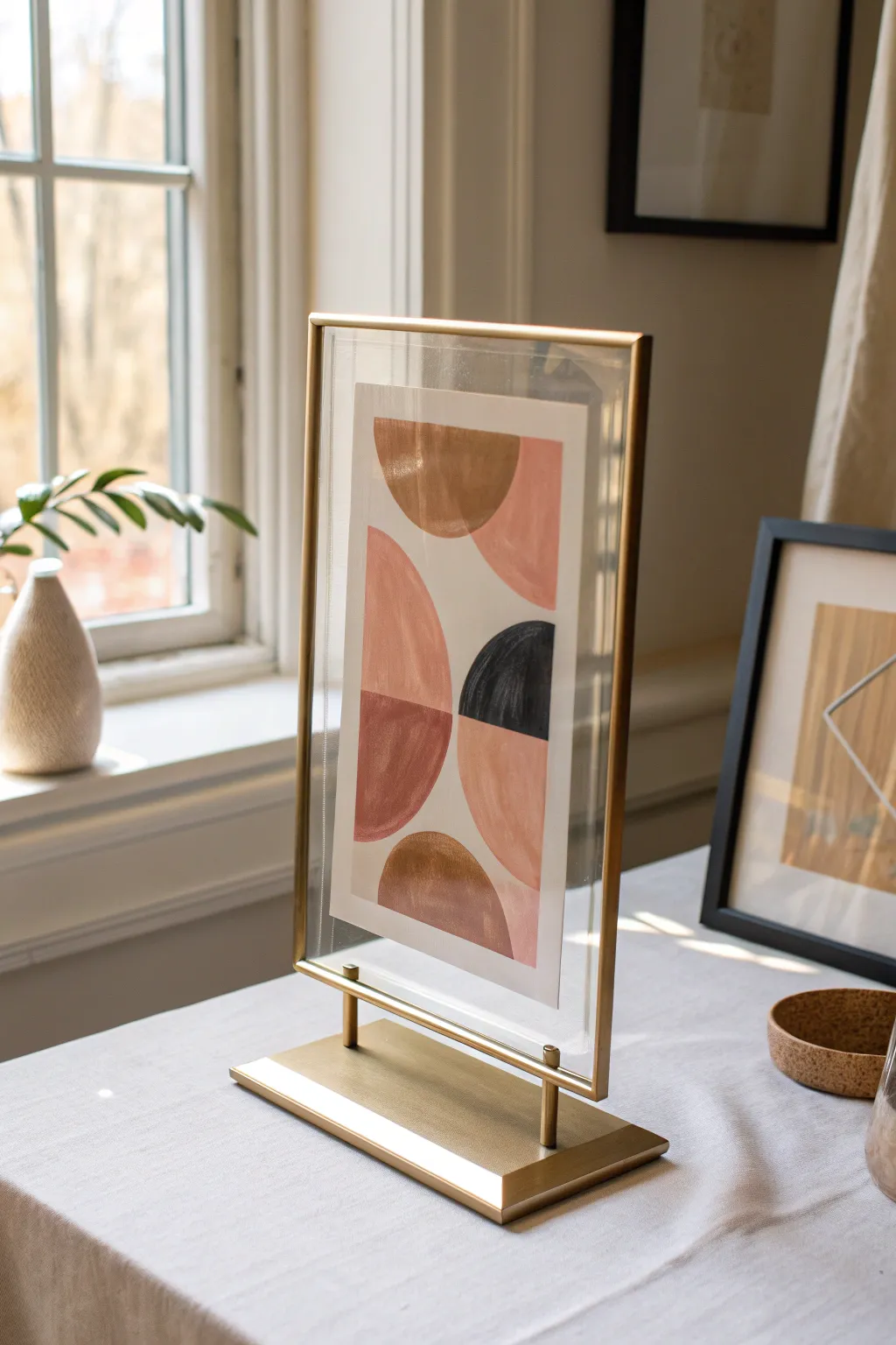
Achieve a sophisticated, high-end gallery look with this DIY abstract art piece that floats effortlessly within a brass frame. By layering painted paper between glass or acrylic, you create a beautiful sense of depth and transparency that elevates simple geometric shapes.
Step-by-Step Guide
Materials
- Gold or brass floating frames (double glass style)
- Heavyweight mixed media paper or watercolor paper
- Acrylic craft paints (terracotta, blush pink, metallic gold, black)
- Flat shader paintbrushes (medium and large)
- Pencil
- Ruler
- Compass or round objects for tracing
- Craft knife or scissors
- Double-sided tape or invisible adhesive dots
- Palette for mixing
Step 1: Design & Preparation
-
Measure your canvas:
Begin by measuring the inner dimensions of your floating frame. You want your paper insert to be significantly smaller than the glass to create that negative ‘floating’ space. Cut your watercolor paper to this custom size, leaving about 1-2 inches of clear glass margin on all sides. -
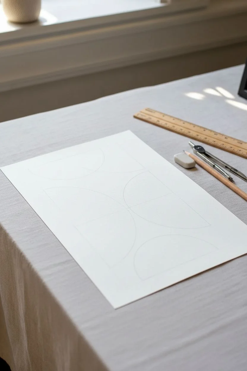
Sketch the layout:
Using a pencil, lightly sketch your geometric composition directly onto the cut paper. For this specific look, draw a vertical layout involving semi-circles and quarter-circles stacked on top of one another. -
Balance the shapes:
Ensure your composition feels balanced. If you have a heavy shape on the left, counter it with one on the right. In the inspiration piece, notice how the curves alternate direction to keep the eye moving.
Step 2: Painting the Composition
-
Mix your palette:
Prepare your acrylic colors. You’ll need a warm terracotta or rust, a soft blush pink, a deep matte black, and a metallic bronze or gold. Mixing a tiny bit of white into the terracotta can soften it if it’s too dark. -
Paint the first shape:
Start with the top semi-circle using your metallic gold paint. Use a flat brush to get a crisp, straight edge along the flat side of the semi-circle. -
Apply the blush tones:
Move to the pink sections. Paint the quarter-circle shape adjacent to the gold one. I like to keep my brushstrokes moving in the direction of the curve for a smoother finish. -
Add the bold contrast:
Paint the semi-circle on the right side using black acrylic. This dark element anchors the piece and provides crucial contrast against the lighter pastels. -
Fill the remaining shapes:
Complete the composition with the terracotta sections. Be careful where colors touch; if you want a crisp line, wait for the adjacent color to fully dry before painting right up against it. -
Let it dry completely:
Allow the paper to dry flat for at least an hour. If the paper curls slightly from the moisture, place it under a heavy book overnight once the paint is bone-dry.
Paint Bleeding?
If your paint bleeds under tape or pencil lines, use a stiff, damp brush to gently ‘erase’ the mistake while wet, or touch up with white paint once dry.
Step 3: Assembly
-
Clean the glass:
Disassemble your floating frame. Clean both panes of glass thoroughly with glass cleaner and a lint-free cloth to remove any fingerprints or dust specks. -
Position the artwork:
Place the painted paper in the exact center of the back pane of glass. A ruler helps here to ensure the margins are even on the left and right. -
Secure the art:
Apply a tiny amount of double-sided tape or a small adhesive dot to the very center of the back of your paper. Press it firmly onto the back pane to prevent it from sliding down over time. -
Close the frame:
Gently place the front pane of glass over the artwork, sandwiching it in place. Slide the glass sandwich back into the metal frame channel. -
Secure the hardware:
If your frame uses clips or a sliding mechanism to hold the glass, secure them now. Ensure the glass is tight so the artwork stays flat.
Pro Tip: Float Effect
For a true 3D effect, paint some shapes on the paper and others directly onto the front glass pane with glass-suitable acrylics.
Place your new framed artwork near a window where the light can catch the metallic accents and highlight the floating effect

Have a question or want to share your own experience? I'd love to hear from you in the comments below!