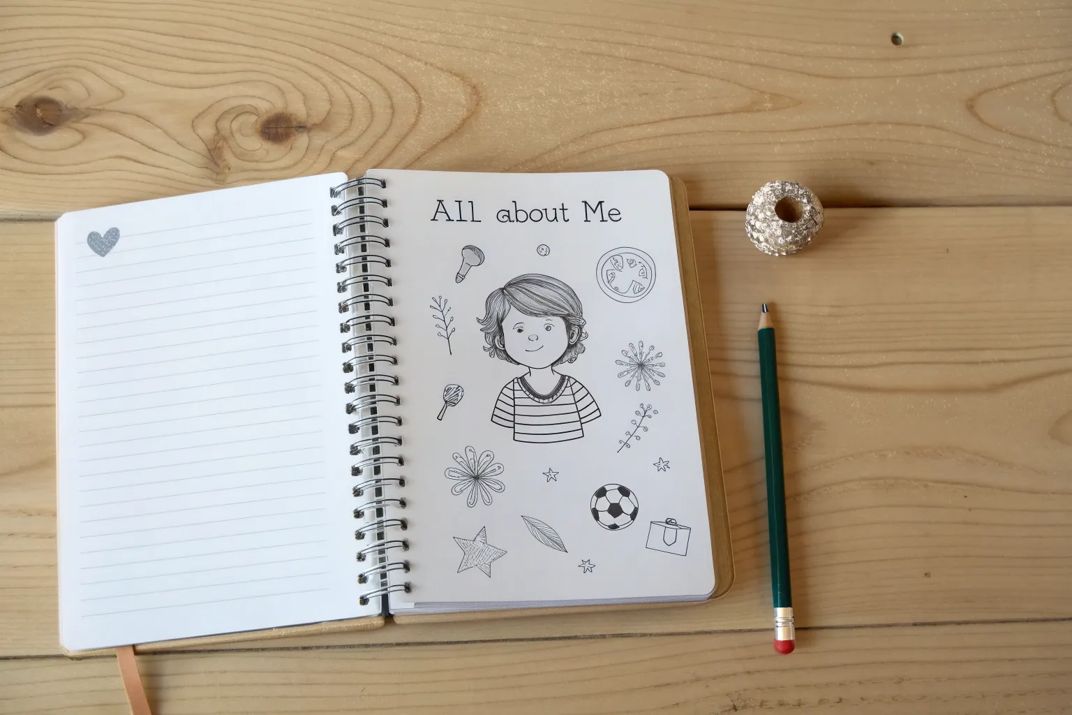
When I’m stuck on what to draw, All About Me drawings are my favorite way to warm up because you’re never short on inspiration—you. These ideas are like little visual prompts you can mix, match, and make totally personal, whether you want a quick doodle page or a full identity art poster.
Classic Self-Portrait With Simple Feature Guides
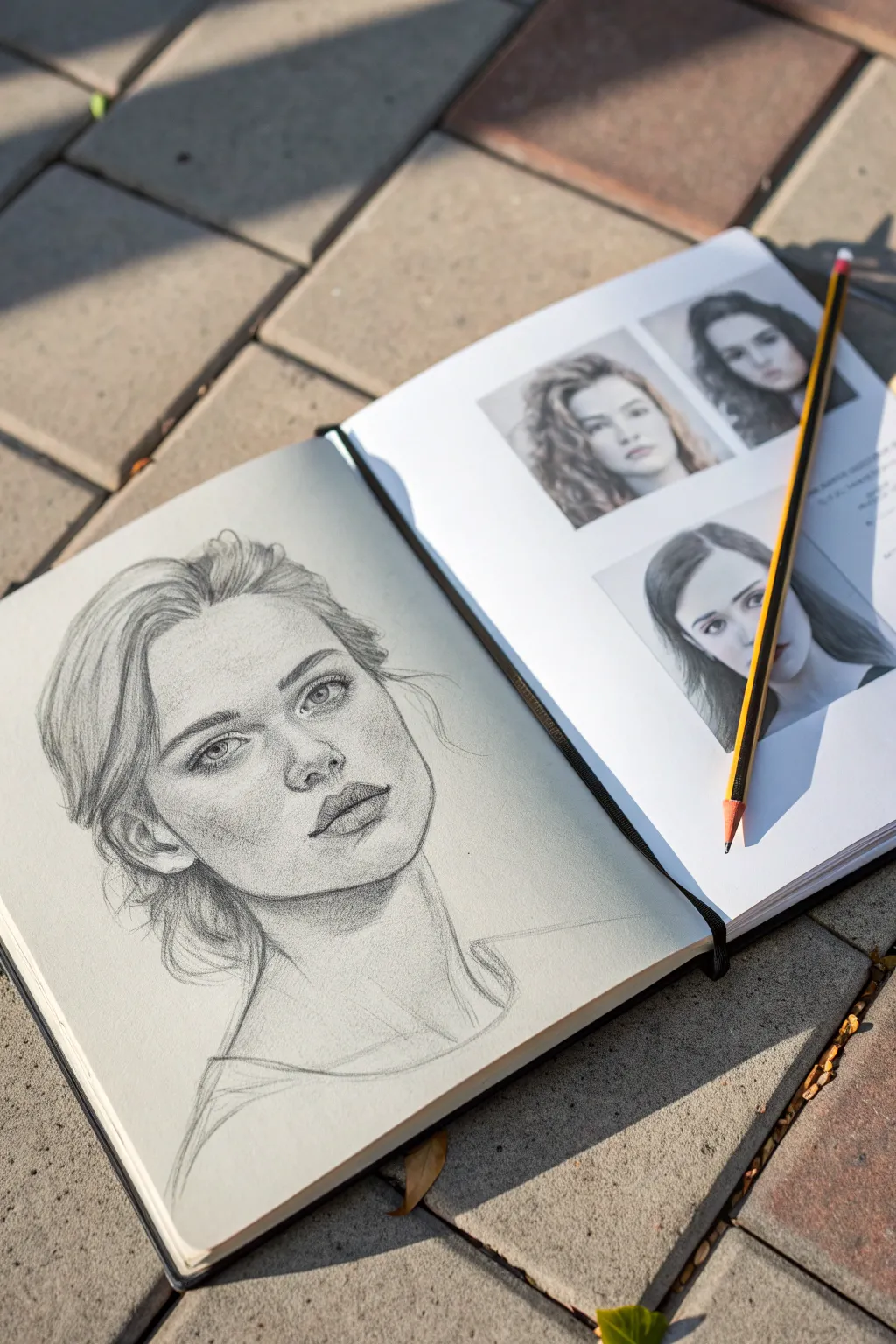
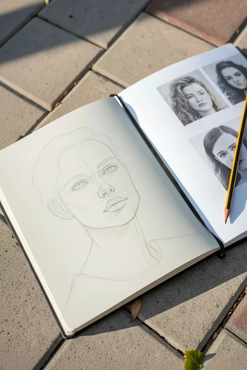
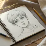
Capture the subtle details of your own features with this classic pencil sketching study. This project focuses on achieving realistic proportions and soft shading techniques to bring lifelike depth to a simple head-and-shoulders portrait.
Step-by-Step Guide
Materials
- High-quality sketchbook (heavyweight paper recommended)
- Graphite pencils (HB, 2B, 4B, and 6B)
- Kneadable eraser
- Pencil sharpener
- Blending stump or tissue
- Reference photo of your face (printed or digital)
Step 1: Pencil Sketch & Structure
-
Observe your reference:
Begin by analyzing your reference photo. Notice the angle of the head, which is tilted slightly back and to the side in our example. Pay attention to the negative space around the neck and hair. -
Establish the head shape:
Using an HB pencil with a very light hand, sketch an oval for the main mass of the head. Mark the centerline of the face, curving it to match the slight turn of the head. -
Place feature guidelines:
Draw light horizontal lines across the centerline to mark the placement of the eyes, nose base, and mouth. Remember that when looking up, the ears sit slightly lower than the eyes. -
Draft the eyes:
Sketch the almond shapes of the eyes on your guideline. Keep the outlines faint. Mark the irises, ensuring they are looking in the correct direction to convey the upward gaze. -
Map the nose and mouth:
Lightly indicate the bridge of the nose and the nostrils. For the mouth, focus on the line between the lips first, then lightly outline the upper and lower lip shapes. -
Outline the jaw and neck:
Refine the jawline, connecting it to the ear. Sketch the long, elegant lines of the neck and the hint of the collarbone and shoulders.
Keep it Sharp
Keep your pencil extremely sharp for eyes and eyelashes, but dull it down on a scrap paper before shading large skin areas to avoid harsh scratch marks.
Step 2: Shading & Definition
-
Detail the eyes:
Switch to a 2B pencil. Darken the pupil and the upper lash line. Add delicate shading to the iris, leaving a small white spot for the catchlight to bring the eyes to life. -
Define the nose:
Avoid outlining the nose with hard lines. Instead, use soft shading on the sides of the bridge and underneath the tip to suggest form. Darken the nostrils slightly. -
Render the lips:
Fill in the lips using vertical hatching strokes that follow the curve of the lip. The upper lip is usually slightly darker than the lower lip due to shadow. -
Apply facial shading:
Using the side of your 2B or 4B pencil, add shading to the side of the face, under the chin, and in the eye sockets. I like to keep this loose to show the texture of the paper. -
Soften the transitions:
If you want a smoother look, use a blending stump to gently smudge the graphite in the shadowed areas, but leave some texture visible to maintain an artistic feel. -
Add hair volume:
Map out the general flow of the hair with long, sweeping strokes. Don’t draw individual strands yet; focus on the large clumps and waves.
Try Toned Paper
Repeat this portrait on tan or gray toned paper. This allows you to use a white charcoal pencil for popping highlights, adding incredible 3D form.
Step 3: Finishing Touches
-
Deepen the darks:
Use a 4B or 6B pencil to push the darkest values. Focus on the corners of the mouth, the pupils, the nostrils, and the deep shadows in the hair behind the neck. -
Refine hair texture:
Add selective detail to the hair. Draw loose, flyaway strands around the crown and temples to create a natural, unposed look. -
Lift highlights:
Take your kneadable eraser and dab it on the cheekbones, the tip of the nose, and the center of the forehead to lift off graphite and create bright highlights. -
Review contrast:
Step back and check your contrast. Ensure there is a clear distinction between the shadow under the jaw and the neck to separate the head from the body. -
Add sketch lines:
Finish by adding a few loose, sketchy lines around the shoulders or hair to emphasize the hand-drawn quality of the portrait.
Enjoy the process of watching a face emerge from simple graphite lines on the page

Four-Square All About Me Grid
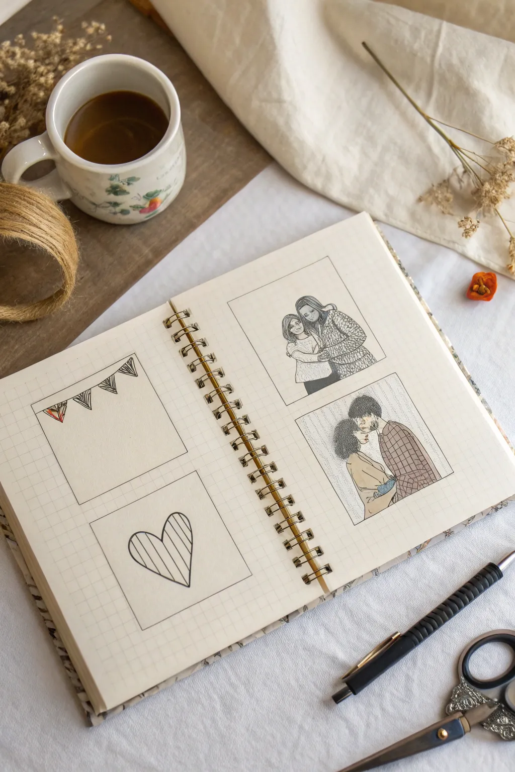
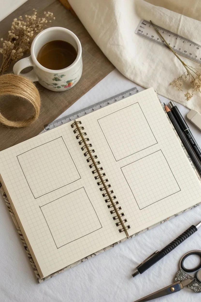
Capture your most cherished connections with this clean and sentimental four-square journal spread. Using a simple grid notebook, this project combines heartfelt portrait sketches with decorative motifs for a personalized ‘All About Me’ or ‘All About Us’ page.
How-To Guide
Materials
- Wire-bound grid or graph paper notebook
- Fine liner pen (black, 0.3mm or 0.5mm)
- Pencil (HB for sketching)
- Eraser
- Ruler
- Colored pencils, markers, or pens (optional for subtle shading)
Step 1: Setting Up the Grid
-
Plan the layout:
Open your spiral-bound grid notebook to a fresh two-page spread. Visualize four equal-sized squares arranged in a 2×2 grid pattern across the pages. -
Draw the square borders:
Using your ruler and a pencil, lightly draw four identical squares. Aim for squares that are about 3×3 inches (or roughly 10-12 grid boxes wide depending on your paper). Leave a uniform margin between the squares and the page edges. -
Ink the frames:
Once you are happy with the size and positioning, trace over your pencil lines with a black fine liner pen. Keep the corners sharp and the lines steady.
Step 2: The Decorative Panels (Left Page)
-
Sketch the banner string:
In the top-left square, draw a slightly curved line dipping from the top left corner towards the right side to create the string for a bunting banner. -
Add triangular flags:
Draw three or four triangles hanging down from the curved line. Make them roughly equal in size. -
Detail the flags:
Fill the triangles with different simple patterns using your fine liner. Try vertical stripes for one and a scribbled texture for the first flag to add variety. -
Draw the heart motif:
Move to the bottom-left square. In the center, lightly sketch a large, simple heart shape. -
Add vertical stripes:
Once the heart shape looks symmetrical, fill the interior with evenly spaced vertical lines. Ink the outline and the stripes carefully.
Grid Guide
Use the grid lines of the paper to ensure your patterns (like the stripes in the heart or plaid shirt) remain perfectly straight without measuring every line.
Step 3: The Portrait Panels (Right Page)
-
Outline the first portrait:
In the top-right square, lightly sketch the contours of two figures in an embrace—perhaps a mother and child or two close friends. Focus on the oval shapes of the heads and the drape of the arms. -
Define facial features:
Keep the faces simple. Use minimal lines for eyes, noses, and smiling mouths. The goal is capturing the emotion rather than photorealism. -
Add pattern to clothing:
Draw a cozy, scale-like or knit pattern on the taller figure’s sweater to create texture. Leave the other shirt plain for contrast. -
Sketch the second portrait:
In the bottom-right square, sketch a couple facing each other intimately. Profile views work well here and are often easier to draw than front-facing angles. -
Texture hair and clothes:
Use small, squiggly circular motions to depict curly hair texture on both figures. Then, draw a checkered or plaid pattern on the shirt of the figure on the right. -
Ink the portraits:
Go over your final pencil sketches with the fine liner. Use a confident hand, but remember that slight wobbles add to the hand-drawn charm. -
Erase pencil guides:
Wait a moment for the ink to fully dry to avoid smudging. Then, gently erase all underlying pencil marks from the entire spread. -
Add subtle shading:
Using a very light touch with a pencil or gray marker, add shading to the hair and clothes to give the figures depth. I like to keep this minimal to maintain the clean line-art aesthetic.
Adding Color
Use watercolor pencils or mild highlighters to add single pops of color to specific elements, like the heart or a single shirt, keeping the rest monochrome.
Now you have a beautifully personal journal spread ready to be filled with memories


Favorite Things Icon Row
This minimalist bookmark project captures your personality in five simple symbols, arranged in a neat vertical stack. Clean lines and muted accent colors give it a modern, graphic design feel that looks great marking your favorite page.
Step-by-Step Tutorial
Materials
- Heavyweight white cardstock or watercolor paper (approx. 2 x 8 inches)
- Pencil (HB or 2H)
- Ruler
- Circle stencil or a small circular object (bottle cap or coin, approx. 1 inch diameter)
- Fine-liner pen (black, 0.3mm or 0.5mm)
- Colored markers or pencils (muted red/coral)
- Eraser
- Paper trimmer or scissors
Step 1: Layout and Structure
-
Cut the Base:
Begin by trimming your heavyweight cardstock into a long, slender strip. A width of roughly 2 to 2.5 inches works best to give the icons some breathing room. -
Mark the Centers:
Using your ruler and a pencil, lightly mark a vertical centerline down the middle of the strip to keep everything aligned. -
Space the Icons:
Decide on the placement of your five icons. Make small tick marks along the centerline where the middle of each circle will sit, ensuring equal spacing between them. -
Draw the Guides:
Take your circle stencil or small round object and trace five circles lightly in pencil centered on your tick marks. These won’t be inked later; they just serve as boundaries for your drawings.
Uneven Spacing?
If your circles look crowded, measure the total available height first, subtract a half-inch margin at top/bottom, and divide the remaining space by five.
Step 2: Sketching the Symbols
-
Headphones Sketch:
In the top circle, sketch a pair of simple headphones. Draw the headband as a simple arch and add oval earcups on the ends. -
Fitness Icon:
For the second circle, draw a small stack of weights or a dumbbell. Keep the perspective slightly angled to show depth. -
Fruit Detail:
Sketch a strawberry shape in the third circle. Focus on the triangular body and the leafy cap on top. -
Geometric Gem:
In the fourth spot, draw a geometric diamond or grapefruit slice shape. Use straight lines to create the facets or segments. -
Nature Scene:
For the final circle at the bottom, sketch a simple mountain range with a sun rising behind it.
Step 3: Inking and Coloring
-
Outline the Drawings:
Switch to your black fine-liner pen. Carefully trace over your pencil sketches for the icons. Use confident, smooth strokes for a professional look. -
Erase Pencil Lines:
Wait a moment for the ink to dry completely to avoid smearing. Then, gently erase all pencil marks, including the circular guides and the centerline. -
Add Subtle Backgrounds:
I like to use a very light grey marker or watered-down paint to add faint circular backgrounds behind the icons, just like in the reference, to unify them. -
Color the Strawberry:
Take your muted red or coral marker and fill in the body of the strawberry. Leave small white specs for seeds or draw them in with a white gel pen later. -
Color the Gem:
Use the same red tone to color the diamond shape (or fruit slice), creating a cohesive color palette across the bookmark. -
Add Final Details:
Add tiny details with your fine liner, like the rays of the sun in the bottom icon or the seeds on the strawberry if you haven’t yet. -
Clean Up:
Do a final check for any stray pencil marks and brush away eraser dust. Your personalized icon profile is ready.
Design Cohesion
Limit your color palette to just one or two accent shades (like the coral red used here). This restrictions makes the finished piece look much more graphic and intentional.
Enjoy using your custom bookmark to track your reading progress


My Family Portrait as Simple Shapes

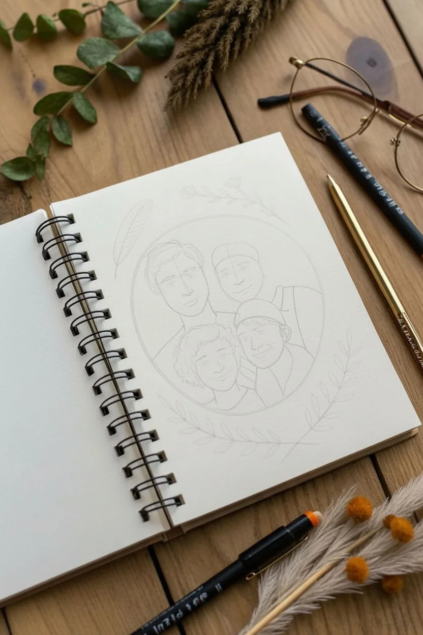
Capture your family’s unique personalities in this charming, circular line-art illustration. The fine ink details and delicate botanical accents create a whimsical and modern keepsake right in your sketchbook.
Detailed Instructions
Materials
- Sketchbook with smooth, heavy-weight paper (min. 140gsm)
- Mechanical pencil (0.5mm, HB lead)
- Kneadable eraser
- Fine liner pens (black or dark brown, sizes 0.1mm and 0.3mm)
- Colored pencils (muted tones: peach, brown, sage green)
- Compass or a circular object to trace (approx. 4-inch diameter)
- Ruler
Step 1: Setting the Scene
-
Draw the boundary:
Begin by lightly tracing a circle in the center of your page using a compass or a bowl. This will be the frame for your portrait. -
Draft the composition:
Sketch four rough ovals inside the circle to represent the heads. Arrange them closely together—try placing the parents in the back and the children in the front to create depth. -
Define the facial structures:
Lightly draw guidelines across the ovals for eyes and noses. Refine the jawlines, making sure they overlap naturally. Notice in the example how the figures are huddled; don’t be afraid to let shoulders and heads touch.
Step 2: Adding Personality
-
Sketch the features:
Draw the eyes, noses, and mouths. Keep the style simple—almond shapes for eyes and gentle curves for smiles work best for this illustrative style. -
Accessorize:
Add distinguishing elements like glasses, beanies, or specific hairstyles. For curly hair, use small, looping scrawls; for straight hair, use long, flowing lines. -
Add nature elements:
Around the outside of the main circle, lightly sketch decorative botanical elements. Add a feather shape to the top left, a small flower sprig at the top, and leafy branches curving along the bottom right. -
Review the sketch:
Step back and check the proportions. If someone looks too squeezed, gently adjust their position with your eraser before committing to ink.
Pro Tip: Line Variation
Use a thicker pen (0.5mm) for the outer contours of the people and the circle frame, while keeping facial features delicate with a 0.1mm pen. This contrast makes the faces pop.
Step 3: Inking the Lines
-
Outline the figures:
Using a 0.3mm fine liner, carefully trace over your pencil lines for the faces and clothing. Use a steady hand and pull the pen towards you for smoother curves. -
Detail the hair:
Switch to a finer 0.1mm pen to add texture to the hair. Use quick, short strokes for beards or stubble, and longer strokes for the main hairstyles. -
Ink the frame:
Draw over the main circle border. I like to go around it twice loosely to give it a sketched, organic look rather than a perfect geometric shape. -
Ink the botanicals:
Go over the leaves and feathers outside the circle. Add small veins to the leaves and hatching to the feather for texture. -
Add doodles:
Sprinkle tiny dots and small circles around the background inside and outside the frame to fill empty space and add whimsy. -
Erase guidelines:
Wait at least five minutes for the ink to dry completely, then gently erase all pencil marks with a kneadable eraser.
Level Up: Seasonal Themes
Change the border elements to match the season. Swap feathers for snowflakes in winter, pumpkins in autumn, or bright wildflowers for a spring version.
Step 4: Soft Coloring
-
Tint the skin:
Using a peach or light brown colored pencil, very lightly shade the faces. Keep the pressure minimal; you just want a hint of warmth, not heavy saturation. -
Add blush:
Apply a touch of pink or rose pencil in small circular motions to the cheeks and the tips of the noses for a lively, cold-weather flush. -
Color the hair:
Fill in the hair using brown or blonde tones. Leave small white gaps to represent shine or highlights on the curves of the hair. -
Shade the accessories:
Lightly color the beanies and clothing. Use grey or muted blue for shading under chin lines or where heads overlap to separate the figures. -
Finish the botanicals:
Add faint touches of green to the leaves and light brown to the feather. The color should look like a soft wash rather than a solid block.
Now you have a timeless, illustrated memory of your favorite people captured in your own artistic style

PENCIL GUIDE
Understanding Pencil Grades from H to B
From first sketch to finished drawing — learn pencil grades, line control, and shading techniques.
Explore the Full Guide
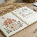
Pets and Animal Pals Page
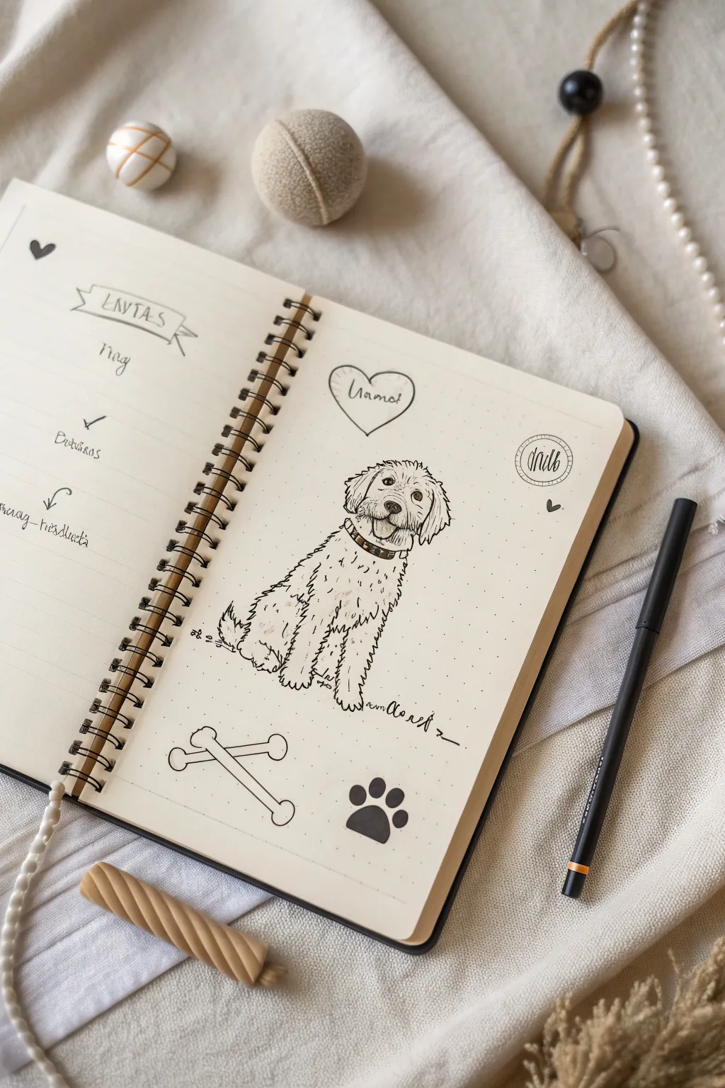
Capture the personality of your beloved pet with this charming bullet journal spread, featuring a central line-art portrait surrounded by playful motifs. The clean, minimalist style uses simple ink lines on dot-grid paper to create a heartfelt dedication page that feels both organized and artistic.
Step-by-Step Guide
Materials
- Spiral-bound bullet journal (dot grid paper)
- Fine liner pen (0.3mm or 0.5mm, black)
- Thicker marker or brush pen (black)
- Pencil (HB or 2B)
- Soft eraser
- Ruler (optional)
Step 1: Planning and Sketching
-
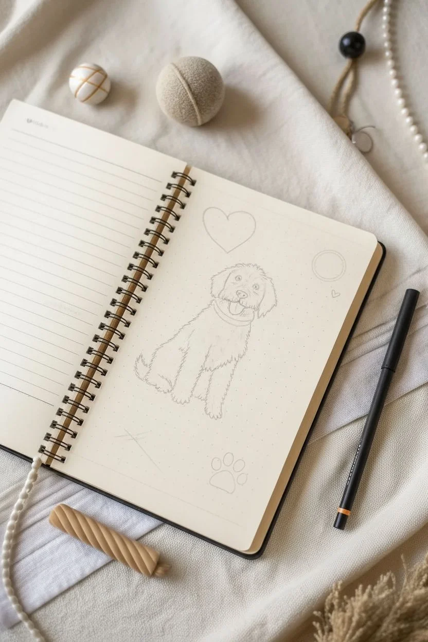
Mark placement:
Begin on the right-hand page of your open journal. Lightly sketch a large oval in the center of the page with your pencil; this will guide the placement of your dog’s body to ensure it stays centered. -
Head shapes:
Draw a rounded circle near the top of your oval for the head. Add two floppy triangular shapes on either side for the ears, keeping the lines loose and faint. -
Body outline:
Sketch the seated posture of the dog. Draw two vertical lines coming down from the head for the front legs, slightly widening at the bottom for paws. slope a line down from the neck for the back, ending with a hint of a tail on the left. -
Facial features:
Refine the face by penciling in a small, curved nose and two eyes. Add the open mouth with a tongue hanging slightly out to capture that happy, panting expression. -
Surrounding elements:
Above the head, lightly sketch a heart shape containing a placeholder for the name. Below the dog, draw two crossed bones and a simple paw print. Add a small circle stamp design in the upper right corner.
Fur Fluff Tip
Make the fur lines point in the direction hair actually grows. Downward on the ears, outward on the chest, and downward on layers.
Step 2: Inking the Portrait
-
Fur texture technique:
Switch to your fine liner pen. Instead of tracing the solid pencil outline, use short, jagged, and broken lines to mimic fluffy fur. Start at the top of the head and work your way down the ears. -
Face details:
Ink the eyes, leaving a tiny white dot in each for a highlight. Fill in the nose with a solid black, but keep the top edge slightly textured. Draw the mouth and tongue with confident, smooth curves. -
The collar:
Draw a defined band around the neck for the collar. You can add small vertical dashes or dots inside the band to suggest texture or studs. -
Body fur:
Continue using the jagged line technique for the body. When drawing the chest and front legs, break up the lines significantly to show the loft of the coat. Don’t close every shape; open lines make the doodle feel lighter. -
Paws and tail:
Define the toes on the front paws with simple curved strokes. Use wispy, upward strokes for the tail to make it look bushy. -
The signature:
Ink the artist signature or date near the bottom right of the dog drawing, extending the last letter into a long, decorative underline.
Step 3: Adding Decorative Elements
-
Name heart:
Ink the heart shape above the dog. Inside, write your pet’s name in a loose, cursive script. I like to keep the heart outline slightly imperfect to match the hand-drawn aesthetic. -
Crossed bones:
Go over the crossed bone sketch. Use clean, continuous lines for these to contrast with the scratchy texture of the dog’s fur. -
Paw print:
Using your thicker marker or brush pen, fill in the large paw pad and four toe beans in the bottom right corner. Make them solid black for visual weight. -
Corner stamp:
Ink the circular design in the top right. Draw a double circle and write a small word like date or hello inside, using vertical strokes for shading. -
Final touches:
Erase all pencil marks gently. If the page feels too empty, add a few tiny scattered dots or a mini heart around the main drawing to tie everything together.
Make It Colorful
Use watercolor pencils to lightly shade the dog’s patches, or use a mild highlighter to accent the heart and text banners.
Step 4: The Left Page Setup
-
Header banner:
On the left page, draw a simple ribbon banner at the top. Write a header like ‘Memos’ or ‘Notes’ inside using block letters. -
List format:
Create a list structure using small doodles as bullet points. Draw a small bone, a checkmark, and an arrow spaced evenly down the margin. -
Handwritten entries:
Fill in the lines with your actual pet-related tasks or memories using a casual handwriting style to match the relaxed vibe of the spread.
Now you have a permanent keepsake of your fuzzy best friend in your journal to smile at every day
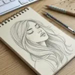
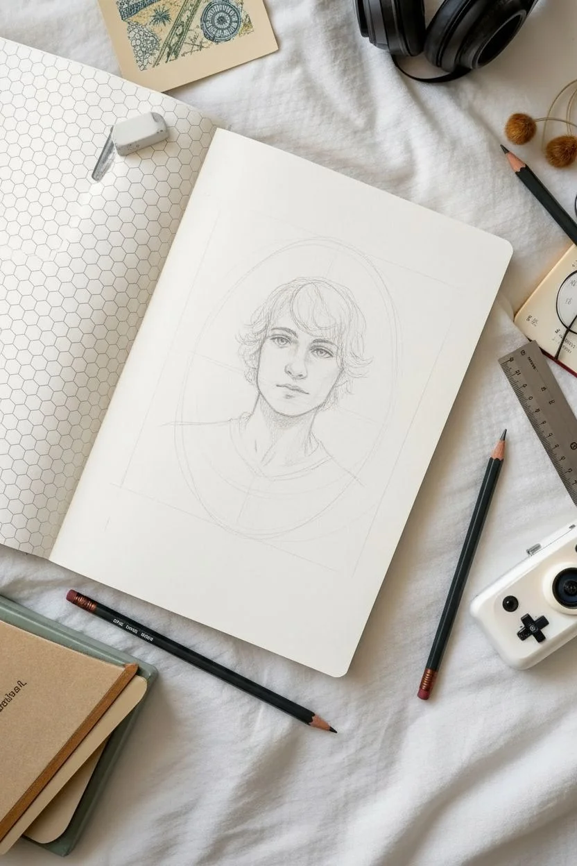
Hobbies Halo Around a Mini Self-Portrait
Create a clean, classical-style self-portrait that floats elegantly on your notebook page. This project combines a separate, detailed ink drawing with the structured simplicity of a dot-grid journal for a sophisticated “All About Me” spread.
Step-by-Step
Materials
- High-quality smooth drawing paper (white or off-white)
- Dot grid notebook or journal
- Fine liner pens (0.05mm, 0.1mm, and 0.3mm)
- Graphite pencil (HB or 2H for sketching)
- Kneaded eraser
- Ruler
- Scissors or craft knife
- Glue stick or double-sided aesthetic tape
Step 1: Planning the Portrait
-
Capture a reference:
Take a photo of yourself in three-quarter view, looking slightly off-camera. Good lighting is key here to define shadows for the line work later. -
Sketch the framework:
On your separate piece of drawing paper, lightly sketch the oval shape of the face using an HB pencil. Mark guidelines for the eyes, nose, and mouth to ensure proportion. -
Draft the features:
Flesh out the facial features. Keep the expression neutral or contemplative to match the classical aesthetic. Don’t worry about perfect likeness; aim for capturing the general character. -
Outline the hair:
Sketch the hair in clumps rather than hidden strands. Focus on the flow and direction of the hair, allowing some ends to look purposefully messy.
Step 2: Inking and Detailing
-
Start with the eyes:
Using your 0.1mm fine liner, carefully ink the eyes. Leave small white gaps for catchlights to bring them to life. -
Define the face shape:
Trace the jawline and neck. Establish the collar of the shirt—a V-neck or tunic style works well to keep the focus on the face. -
Detail the hair:
Switch to a 0.3mm pen for the main outline of the hair to give it weight. Use quick, confident strokes to prevent shaky lines. -
Add texture:
With the ultra-fine 0.05mm pen, add hatching lines for shadows under the chin, in the hair, and around the eyes. This creates depth without overwhelming the drawing. -
Erase guidelines:
Once the ink is completely dry (give it a few minutes to be safe), gently lift away all pencil marks with a kneaded eraser.
Clean Lines
Keep your wrist loose when drawing hair. Quick, sweeping strokes look more natural than slow, deliberate ones which can appear stiff.
Step 3: Assembly
-
Create the border:
Use a ruler to draw a faint rectangle around your drawing. This will determine the size of your insert. -
Cut it out:
Carefully cut along your rectangular guide. Ensure the edges are crisp and straight. -
Position on the page:
Open your dot-grid notebook. Place the cutout in the center of the right-hand page to test the placement. The negative space around it is just as important as the drawing. -
Adhere the portrait:
Apply a thin layer of glue or double-sided tape to the back of the drawing. Press it firmly into the center of the notebook page. -
Add subtle accents:
Optionally, use a pen to add tiny decorative stippling or a very faint border pattern to the garment collar, mirroring the detail in the reference image.
Use the Background
Draw tiny symbols of your hobbies (a camera, headphones, a pen) floating in the negative space around your portrait head.
Now you have a timeless, personalized artwork anchoring your journal spread
BRUSH GUIDE
The Right Brush for Every Stroke
From clean lines to bold texture — master brush choice, stroke control, and essential techniques.
Explore the Full Guide
Feelings Faces Chart for My Mood Range


Visualizing your emotional range has never been cuter with this minimalist doodle grid. This project creates a whimsical reference sheet of facial expressions in a sketchbook, perfect for checking in with yourself or just practicing cartoon emotions.
How-To Guide
Materials
- A5 Sketchbook or lined journal (cream or white paper)
- Black fine-liner pen (0.3mm or 0.5mm)
- Pencil (HB or lighter) for sketching
- Eraser
- Red colored pencil or marker (fine tip)
- Ruler (optional, if you want perfect alignment)
Step 1: Setting the Grid
-
Define the layout:
Looking at your blank page, visualize a grid of 3 rows by 5 columns (or vice versa depending on page orientation). Aim to fit about 15 faces comfortably on the page with breathing room between them. -
Sketch circular guides:
Using your pencil, lightly draw fifteen circles. They don’t need to be perfect compass circles—organic, slightly oval shapes look more hand-drawn and friendly. Space them evenly across the lined paper. -
Check alignment:
If you are using lined paper like the example, use the lines to help keep your rows straight. The bottom of each chin should rest near a line.
Expression Variation Pro Tip
Change where you place the pupils inside the eyes. Looking up, down, or sideways completely changes the context of the emotion without redrawing the whole face.
Step 2: Drawing the Base Emotions
-
Outline in ink:
Take your black fine-liner and trace over your pencil circles. Keep your hand loose; if lines overlap slightly at the join, it adds character. -
Start with happy faces:
Pick three circles scattered around the page. For the first, draw wide, U-shaped eyes and a simple smile. For the next, add open, laughing mouths—imagine a sideways ‘D’ shape. -
Create sad expressions:
Find a few circles for the lower moods. Draw downturned mouth curves. Tilt the eyebrows upward in the center to create a worried or weeping look. -
Draw neutral and bored faces:
For a calmer look, draw straight horizontal lines for mouths. Use simple dots or small circles for eyes to show a lack of strong emotion. -
Add anger and frustration:
Choose a circle for anger. Draw slanted eyebrows pointing down toward the nose area and a straight or jagged mouth line. You can add a squiggly ‘stress mark’ on the forehead.
Step 3: Adding Personality Details
-
Draw playful features:
Mix it up by adding a winking eye (a sideways V shape) or side-glancing pupils to some faces. These small changes drastically alter the ‘attitude’ of the drawing. -
Embellish with hair:
Pick just one face, perhaps the top left, and give it a tiny sprouting of hair or spikes. This acts as a cute anchor point for the whole page. -
Add the bow:
Choose a face on the left side and draw a simple bow on top of the head using two triangles meeting at a circle. -
Incorporate extra symbols:
Draw small hearts floating near a happy face, or a ‘confusion’ squiggle above a puzzled face.
Ink Smudge Troubleshooting
If your fine-liner smudges when you color the red accents, switch to coloring the red parts first, letting them dry, and then outlining in black afterward.
Step 4: Color & Final Touches
-
Color the accents:
Using your red marker or pencil, carefully fill in the bow you drew earlier. Be precise to keep the minimalist look. -
Highlight the love:
Find the faces with floating hearts and color those hearts red as well. This pops nicely against the black and white. -
Fill the mouths:
For the open, laughing mouths, color the inside shape red to represent the tongue or inside of the mouth. -
Add finishing details:
Use the red pen to add a single horizontal line across a mouth for a decorative touch, or rosy cheeks on one of the shy faces. -
Erase guidelines:
Wait until the ink is completely dry (give it a few minutes to be safe). Gently erase all your initial pencil circles so only the clean ink remains. -
Title the page:
In the top right corner, write a small title like ‘Feelings’ or the date in cursive script to finish the composition.
Now you have a charming library of expressions to reference for future journaling entries
My Birthday Cake and Number Candles
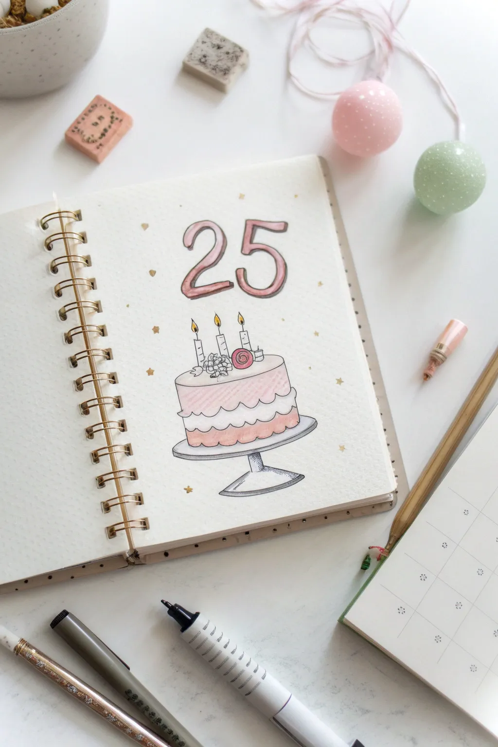
Celebrate a milestone with this sweet and simple bullet journal spread featuring a tiered birthday cake and bold typography. The soft pink pastel tones and delicate gold star accents create a festive yet elegant look perfect for marking your special day.
Step-by-Step
Materials
- A5 Dot Grid Notebook
- Pencil (HB or H)
- Eraser
- Fine liner pen (Black, 0.3mm or 0.5mm)
- Light pink brush pen or mildliner
- Darker pink/coral brush pen
- Light grey brush pen or marker
- Gold gel pen or metallic marker
- Ruler (optional)
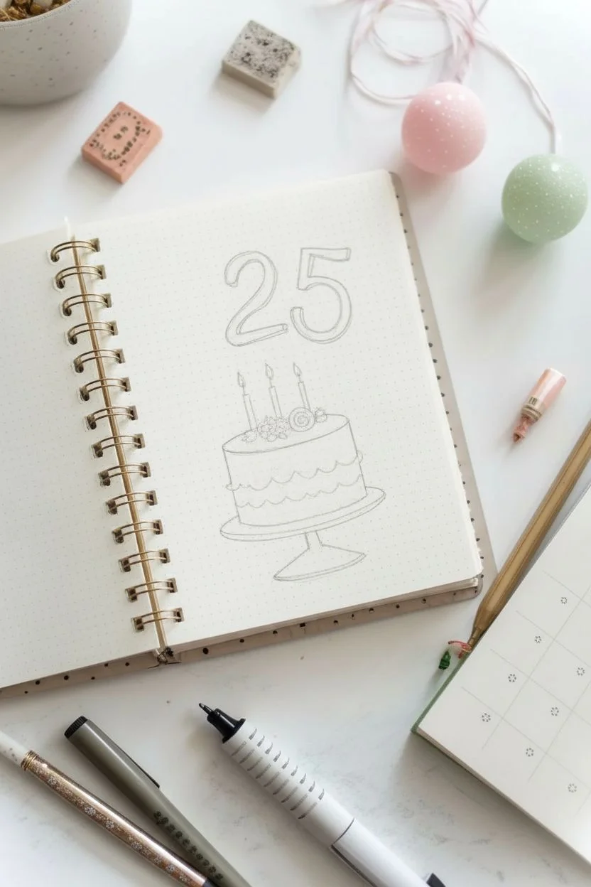
Step 1: Drafting the Layout
-
Center the design:
Start by finding the vertical center of your page. Lightly mark this with a pencil to ensure your cake and number align perfectly. -
Sketch the number 25:
About a third of the way down the page, lightly sketch a large ’25’. Use a simple serif or bubbly font style. Make the numbers approximately 3-4 grid squares high. -
Draw the cake stand:
Below the numbers, sketch an oval for the plate of the cake stand. Underneath the oval, draw a conical base for the stand. Keep the perspective slightly flattened so we see the top surface of the plate. -
Outline the cake layers:
Draw a cylinder sitting on the cake stand plate. Divide this cylinder horizontally into two layers using a wavy line to represent frosting or filling. -
Add detail to the top:
On the flat top of the cake cylinder, sketch three thin candles standing upright. You can add small flames and a few decorative frosting dollops or a rose at the base of the candles.
Step 2: Inking the Lines
-
Trace the main shapes:
Using your black fine liner, carefully trace over your pencil lines. For the cake layers, make the wavy frosting line fluid and organic rather than rigid. -
Define the number 25:
Outline the ’25’ with the fine liner. To give it a dimensional look, draw a second line slightly offset to the right and bottom of each numeral, creating a drop shadow effect. -
Ink the cake stand and candles:
Go over the cake stand and candles. Add tiny wicks inside the flames and small lines on the candles for wax details. Be sure to close your shapes so they look neat. -
Clean up:
Wait a moment for the ink to dry completely to avoid smudging, then gently erase all remaining pencil marks.
Clean Edges
When coloring the narrow shadow areas of the numbers, use the very tip of your brush pen. A light touch prevents ink from bleeding outside the lines.
Step 3: Coloring and Embellishing
-
Color the number shadows:
Take your darker pink or coral marker and fill in the ‘shadow’ areas of the number 25. Leave the main face of the numbers white for a clean, highlight effect. -
Fill the cake layers:
Use the light pink marker to color the top and bottom cake sponge layers. You can leave the wavy frosting layer white, or color it very lightly if you prefer. -
Add dimension to the cake:
With the darker pink marker, add a thin line of shadow just under the wavy frosting line and at the very bottom of the cake to give it some roundness. -
Shade the stand:
Use the light grey marker to color the cake stand. Add a little extra grey on the left side of the base and under the plate rim to suggest metallic reflection and shadow. -
Color the candles:
Use a yellow marker or pen for the candle flames. You can leave the candles white or add very subtle grey stripes for texture. -
Sprinkle some stars:
Using your gold gel pen, draw tiny five-pointed stars scattered randomly around the cake and numbers. Vary their sizes slightly for a magical confetti effect. -
Optional sparkle:
If you want extra detail, add tiny dots with the gold pen in the empty spaces between stars to balance the composition.
Make It Pop
Use a white gel pen to add tiny highlight dots or lines on the pink cake layers and the grey stand. It makes the icing look glossy and fresh.
Now you have a charming keepsake page ready for journaling your birthday memories


My Room or Favorite Corner Sketch
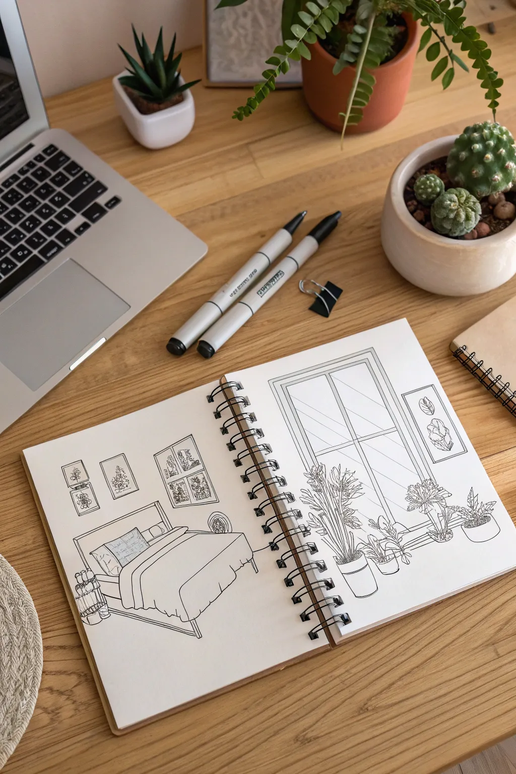
Capture the comfort of your personal sanctuary with this charming black ink illustration spread across two sketchbook pages. The clean lines and minimal shading create a crisp, architectural style that highlights the cozy details of a bedroom and a plant-filled window.
Step-by-Step Tutorial
Materials
- Spiral-bound sketchbook (heavyweight paper recommended)
- Fine liner pens (sizes 0.1, 0.3, and 0.5)
- HB pencil
- Soft eraser
- Ruler or straight edge
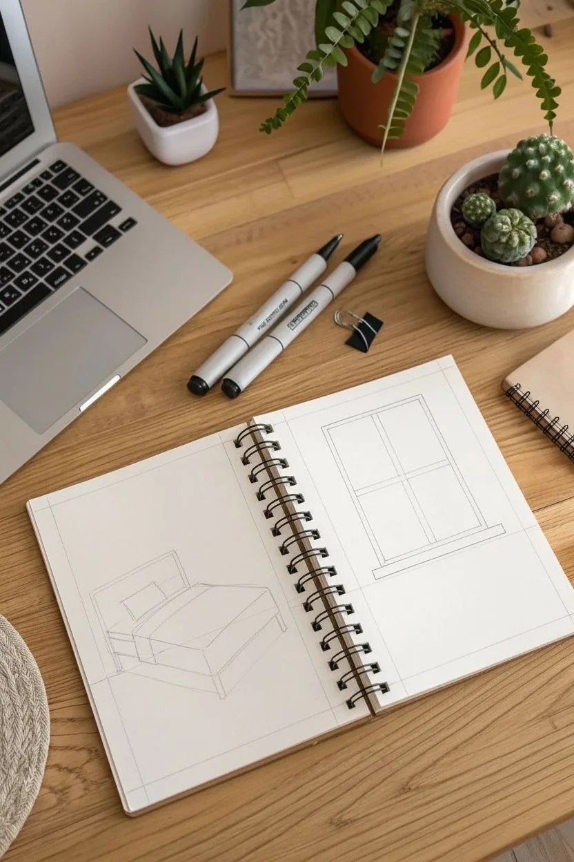
Step 1: Planning the Layout
-
Observe the Spread:
Visualize the open sketchbook as two distinct but connected scenes. The left page will feature the bedroom furniture, while the right page focuses on a bright window view. -
Pencil Rough – Left Page:
Lightly sketch the bed at an angle using your HB pencil. Focus on the big geometric shapes first: a rectangle for the mattress and a simple headboard frame. -
Pencil Rough – Right Page:
On the facing page, use your ruler to mark out a large vertical rectangle for the window frame. Add a horizontal line about a third of the way up for the windowsill. -
Connecting the Scenes:
Draw faint perspective lines to ensure the floor level matches roughly across the spiral binding, giving the illusion that these spaces exist in the same room.
Step 2: Inking the Bedroom (Left Page)
-
Outline the Bed:
Switch to your 0.3 pen. Go over the bed frame and mattress lines. Keep the lines illustrating the bedding softer and slightly wavy to suggest fabric, rather than rigid boxes. -
Add Bedding Details:
Draw the pillows and the fold of the duvet using overlapping curved lines. Add a few vertical hash marks on the duvet sides to show the drape of the fabric. -
Wall Decorations:
Above the bed, sketch three rectangular frames. Inside, create loose squiggles and organic shapes to represent botanical art prints. Don’t worry about perfect detailing here; suggestion is key. -
Floor Accessories:
Near the foot of the bed, ink a small stack of books or a basket. Add a circular shape near the headboard to represent a side table lamp or decor item. -
Clean Up:
Once the ink is dry on the left page, gently erase the pencil guidelines to reveal the crisp line work.
Loosey Goosey
Don’t stress straight lines! A slightly wobbly hand-drawn line adds character and warmth that a ruler kills. Ideally, only use the ruler for the window frame.
Step 3: Inking the Window Garden (Right Page)
-
Define the Window:
Use a ruler and the 0.5 pen to draw the window frame. Draw a double line to give the frame thickness and realism. Add the crossbars (mullions) inside the window pane. -
Tall Plant Structure:
On the left side of the window, sketch a pot on the floor. Draw long, upward-reaching stems for a tall houseplant using a 0.3 pen. -
Adding Foliage:
For the leaves of the tall plant, use quick, jagged strokes to create textured, palm-like fronds. Let some leaves cross over the lines of the window frame to create depth. -
Windowsill Plants:
Draw a series of smaller pots sitting on the floor or a low ledge. Vary the shapes—round pots, square planters—to add interest. -
Plant Variety:
Fill the smaller pots with different leaf types. Try broad, oval leaves for one (like a rubber plant) and spiky, upright leaves for another (like a snake plant). -
Hanging Art:
To the right of the window, draw a tall, narrow rectangular frame. Fill it with two simple abstract shapes resembling leaves or stones.
Add a Splash
After the ink dries fully, use a watercolor brush or marker to add a single accent color—like sage green—just to the plants for a pop of freshness.
Step 4: Refining and Shading
-
Line Weight Variation:
Go back over key outlines—like the outer edges of the bed and the main window frame—with the 0.5 pen to make them pop against the background. -
Texture Shading:
Use the 0.1 fine liner for delicate hatching. Add light vertical lines on the window glass to suggest reflection, and small stippling dots on the plant pots for texture. -
Final Erasure:
Wait at least five minutes to ensure all ink is completely set. Thoroughly erase all remaining pencil marks across the entire spread. -
Binding Check:
If your drawing gets too close to the spiral binding, you can add small ‘jump’ lines over the spirals to visually connect the drawing without drawing on the metal itself.
Now you have a serene, architectural snapshot of a favorite space preserved in your sketchbook
My Soundtrack as Visual Symbols and Patterns
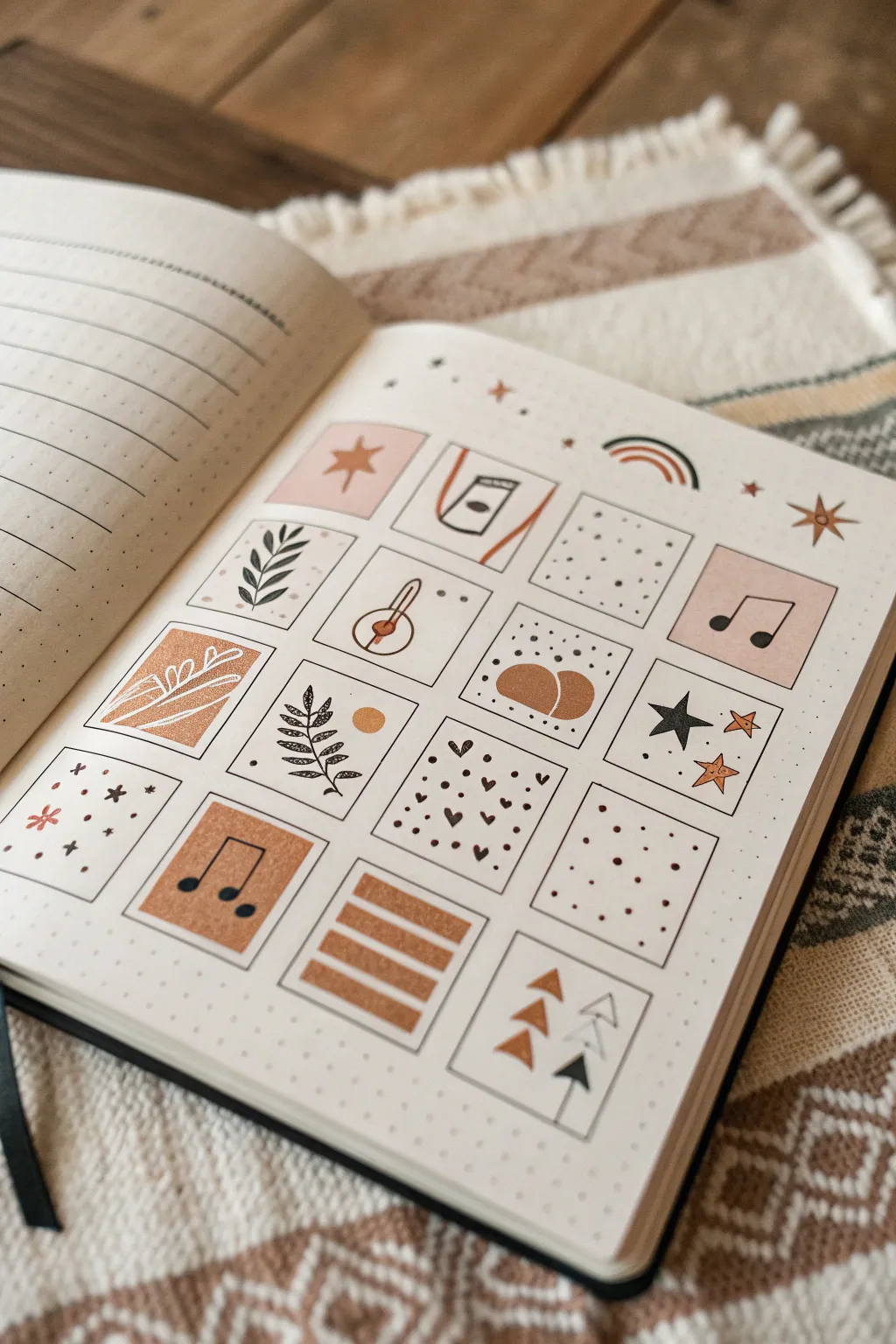
Capture the rhythm of your favorite songs through this minimalistic, bohemian-style grid spread. Soft terracotta tones mixed with crisp black fineliner details create a harmonious balance of pattern and iconography that feels personal yet designed.
Step-by-Step
Materials
- Dotted Bullet Journal or Sketchbook
- Pencil and Eraser
- Ruler
- Black Fineliner Pen (0.3mm or 0.5mm)
- Felt Tip Markers or Mildliners (Terracotta/Rust, Pale Pink/Beige, Mustard Yellow)
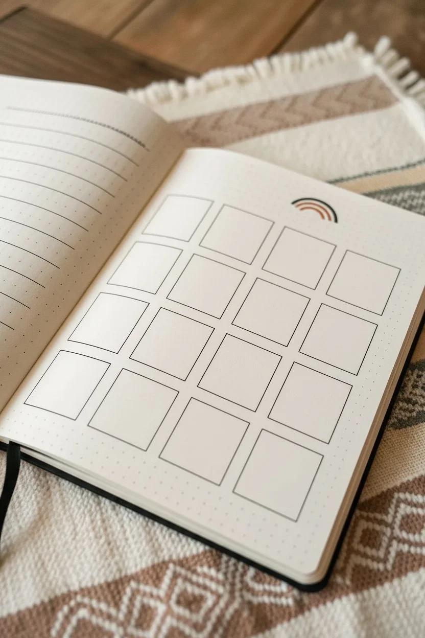
Step 1: Setting the Stage
-
Grid Measurements:
Begin by counting the dots in your journal to determine spacing. You’ll need a 4×4 grid of squares. For a standard A5 dot grid notebook, 6×6 dot squares (covering 5 spaces) usually fit perfectly with a 1-dot gap between them. -
Pencil Draft:
Lightly sketch the sixteen squares using your ruler and pencil. Don’t press too hard, as you want these guide lines to be easily erasable later. -
Outline the Grid:
Go over your pencil grid lines with a thin black fineliner. Keep your hand steady and use the ruler for crisp, clean edges that define each mini-canvas.
Smudge Alert
If your ruler smears the ink while lining the grid, stick tiny pieces of masking tape or dots of glue to the underside of the ruler. This lifts the edge slightly off the paper.
Step 2: Color Blocking
-
The Pink Note:
Select a pale pink marker. In the top row, first square, color a solid background. Repeat this for the third square in the second row (the music note box). -
Terracotta Textures:
Switch to your rust or terracotta marker. In the second row, first square, draw an organic abstract shape that fills most of the box, leaving white negative space around the edges. -
Music Note Accent:
Using the same terracotta shade, color the entire background of the second square in the bottom row. -
Geometric Details:
Still with the terracotta marker, draw three thick horizontal stripes in the third square of the bottom row. Also add two semi-circles in the second square of the third row. -
Triangle Accents:
In the final square of the bottom row, draw three small solid terracotta triangles aligned vertically on the left side.
Use A Stencil
For perfectly uniform stars and shapes, slide a plastic layout stencil under your page (if paper is thin) or trace directly. It keeps icons consisting of repetitive shapes looking cohesive.
Step 3: Iconography & Line Art
-
Botanical Elements:
With your black fineliner, draw a simple leafy branch in the second square of the top row. Repeat a similar botanical design in the first square of the third row. -
White Lines on Color:
If you have a white gel pen, draw delicate leaf veins or abstract lines over the dried terracotta shape in the second row. If not, you can draw these designs in black ink, or leave the shape solid. -
Music Symbols:
Draw distinct black eighth notes (beamed notes) inside the pink box in the second row and the terracotta box in the bottom row. They represent the ‘soundtrack’ theme. -
Celestial Shapes:
Draw black stars in the grid. Create a five-point star in the third square of the third row, and scatter tiny stars or asterisks in the very first square of the bottom row. -
Abstract Patterns:
Fill the empty white squares with patterns. Try tiny stippling dots in the third square of the top row, and small hearts or polka dots in the second square of the bottom row. -
Detailed Doodles:
Add specific symbols like a thermometer or dropper in the second square of the second row, and arrow shapes in the final square of the grid.
Step 4: Finishing Touches
-
Header Decorations:
Above the grid, draw free-floating elements to break the structure. Sketch a small rainbow arc with terracotta, black, and mustard lines. -
Sparkles and Stars:
Adorn the space around the rainbow and grid with scattered four-point stars and tiny dots using both black ink and your colored markers. -
Final Clean Up:
Wait until the ink is completely dry—I usually give it a full five minutes to be safe—then gently erase any remaining pencil marks from your initial grid sketch.
Now you have a structured yet whimsical visual representation of your personal soundtrack ready to be filled with memories
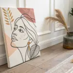
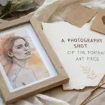
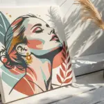
Me as a Season Color Palette Portrait
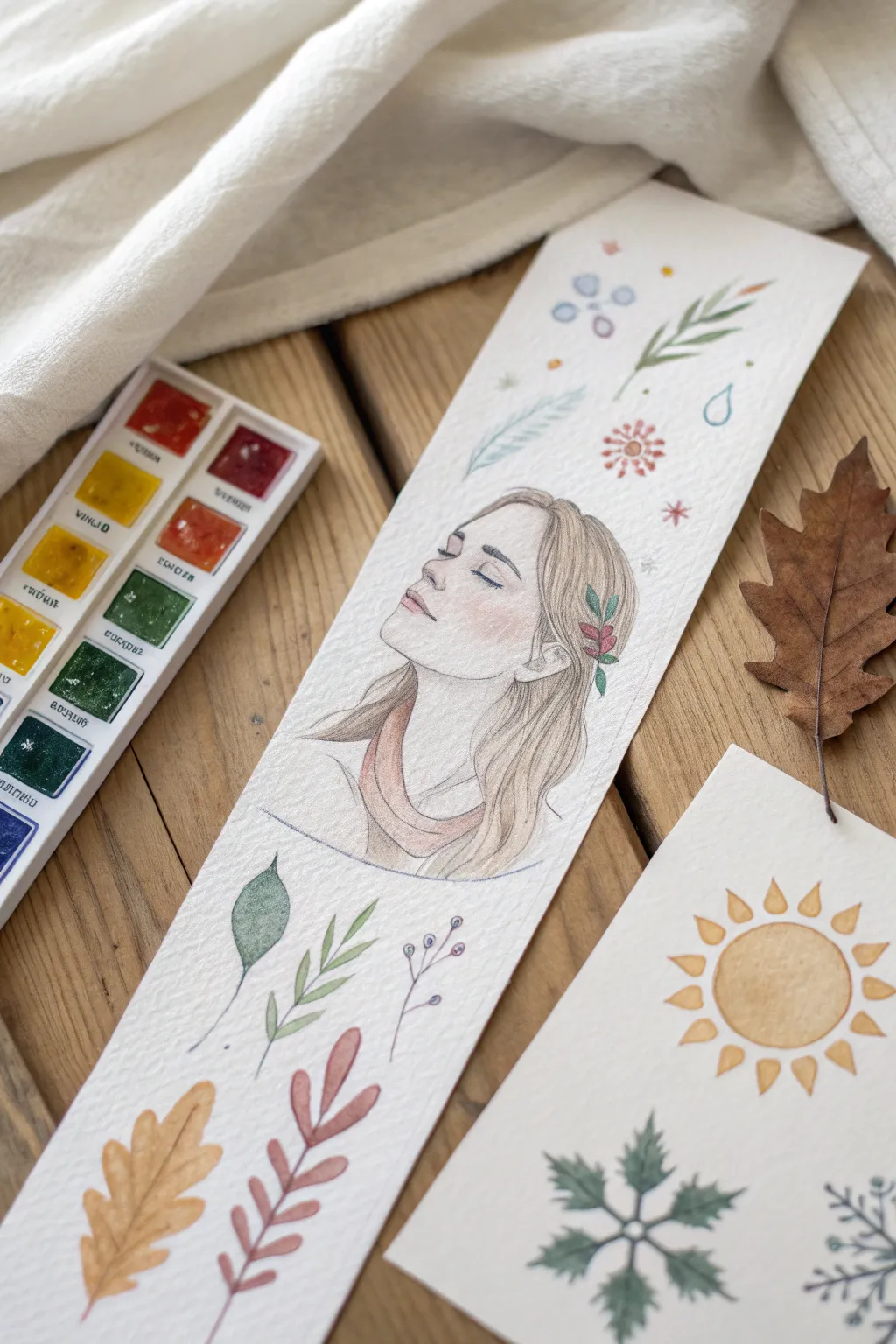
Capture the essence of your favorite season in this delicate, mixed-media portrait bookmark. Using soft watercolors and fine liners, you’ll create a serene self-representation surrounded by seasonal flora and motifs.
How-To Guide
Materials
- Cold press watercolor paper (cut into a 2.5″ x 8″ strip)
- Pencil (HB or H for light sketching)
- Kneaded eraser
- Waterproof fine liner pens (0.05mm and 0.1mm, grey or sepia)
- Watercolor pan set (autumn or earth tone palette)
- Small round watercolor brushes (sizes 0, 2, and 4)
- Jar of clean water
- Paper towel or rag
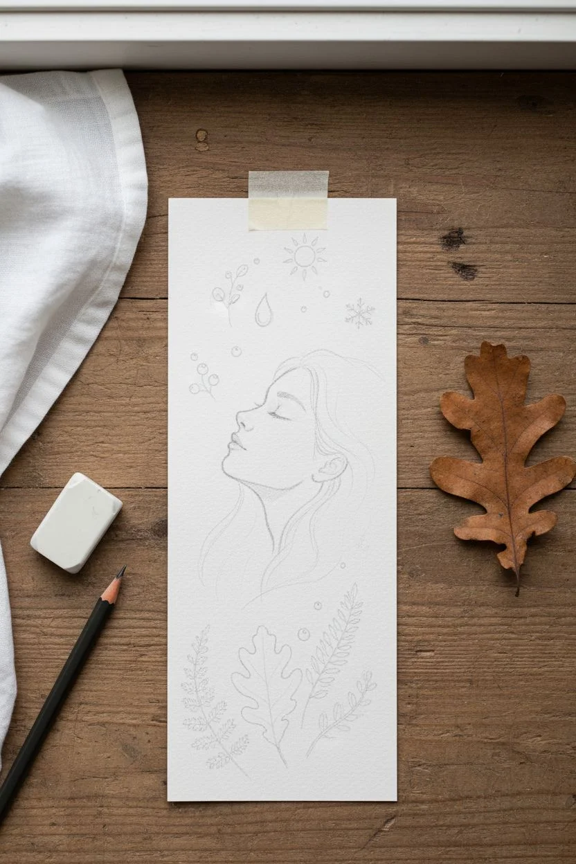
Step 1: Drafting the Composition
-
Prepare the paper:
Cut your watercolor paper into a long vertical strip, approximately 2.5 inches wide by 8 inches tall. Tape it down to a hard surface if you want to prevent warping. -
Sketch the central portrait:
In the middle third of the strip, lightly sketch a profile or 3/4 view of a face. Keep the eyes closed and chin tilted upward for a dreamy, peaceful expression. Sketch the hair flowing downward to anchor the portrait. -
Add seasonal elements:
Above the head, lightly draw small, floating motifs like berries, a water droplet, sprigs of pine, and a stylized sun or snowflake. Below the portrait, sketch larger leaves—like an oak leaf and fern springs—to fill the bottom space. -
Refine the lines:
Go over your sketch with a kneading eraser until the lines are barely visible. This ensures the graphite won’t dirty your watercolor washes later.
Step 2: Layering the Portrait
-
First wash on the skin:
Mix a very watery, pale skin tone. Using a size 4 brush, gently wash over the face area. Keep it extremely light; you can always add more color later. -
Blushing effects:
While the face is still slightly damp, drop a tiny amount of diluted rose or coral onto the cheek, tip of the nose, and the eyelid area. Let this bloom naturally for a soft look. -
Painting the hair:
Mix a diluted brown or blonde tone. Using a size 2 brush, paint the hair shape. Leave small gaps or streaks of white paper to represent highlights. -
Adding shadow:
Once the first layer is dry, mix a slightly darker version of your hair color. Paint the areas under the neck and behind the ear to create depth. -
Details in the hair:
Paint the small sprig of leaves tucked behind the ear. Use a deep green for the leaves and a pop of red for berries.
Bleeding Lines?
If your fine liner bleeds when you add paint, stop! Your pen isn’t waterproof. Either switch pens or change your order of operations: paint first, let it dry completely, then ink over the top.
Step 3: Painting the Surroundings
-
Top motifs:
Move to the top section. Use a size 0 or 2 brush to dab color into the berries and flowers. Keep the paint varied—some translucent, some more saturated. -
Bottom foliage:
Paint the large oak leaf at the bottom using a warm ochre or light brown. For the fern-like sprigs, use a muted sage green. -
Background wash:
Optional: If you want a less stark background, add extremely faint washes of blue or grey around the floating elements, but leave plenty of white space.
Pro Tip: Soft Skin
When painting the cheek blush, wet the paper with clean water first, then touch the wet area with a pigment-loaded brush. This ‘wet-on-wet’ technique creates a seamless, natural flush.
Step 4: Defining with Ink
-
Outline the face:
Ensure the watercolor is bone dry. Using a 0.05mm waterproof pen (sepia or grey works beautifully for a softer look), carefully trace the profile, nose, and jawline. -
Detail the features:
Draw the eyelashes with quick, light flicks. Outline the lips gently, not fully enclosing them, to keep them looking soft. -
Hair texture:
Use long, flowing pen strokes to define individual strands of hair. Concentrate more lines in the shadowed areas behind the neck. -
Leaf detailing:
Outline the botanical elements. Don’t worry if the ink line doesn’t perfectly match the paint edge; a little offset adds an artistic, sketched charm. -
Final accents:
Add tiny dots or stippling around the floating elements to integrate them with the rest of the piece.
Once dry, you have a personalized piece of seasonal art ready to mark your place in your next book


Have a question or want to share your own experience? I'd love to hear from you in the comments below!