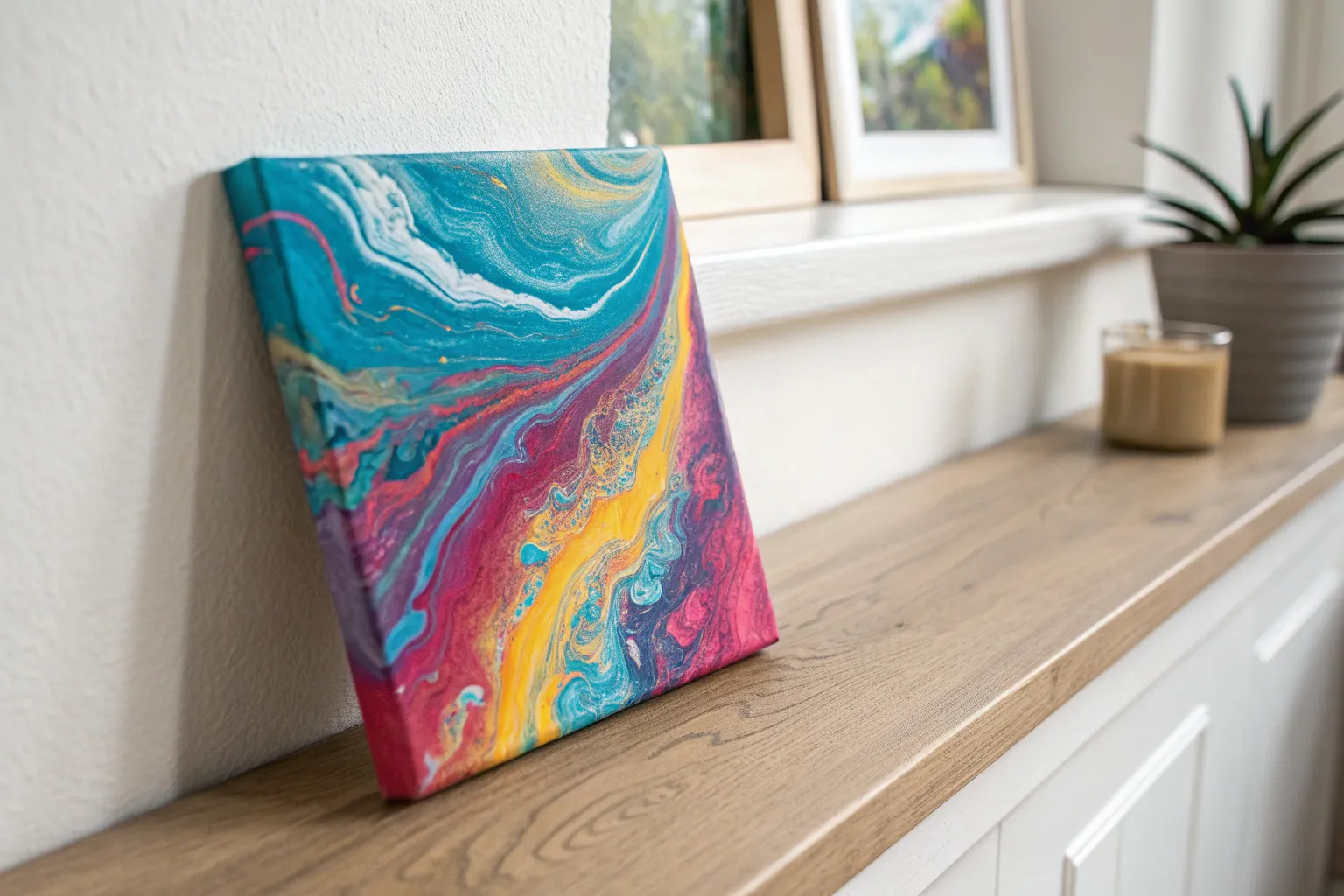
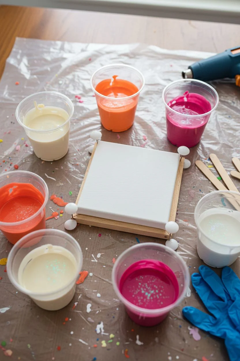
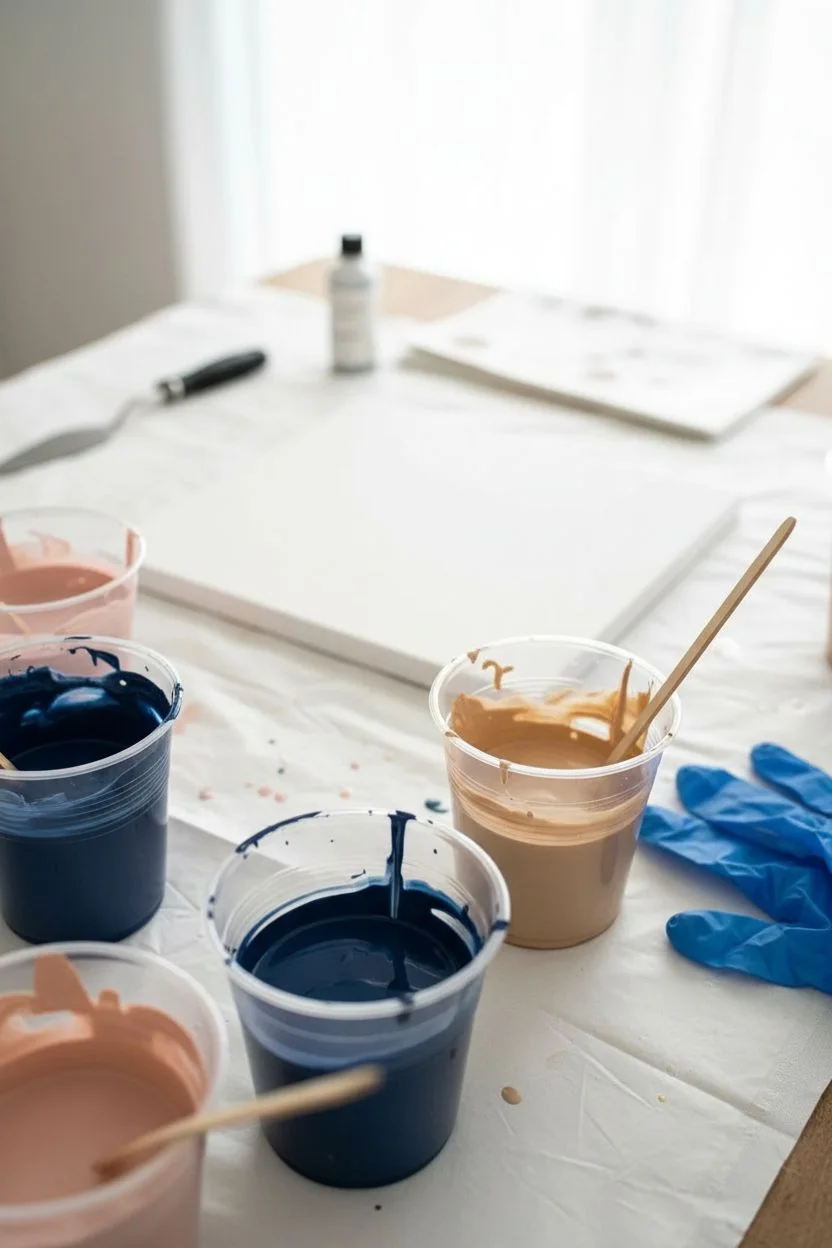
When you’re planning a pour painting session, your color palette is the thing that decides whether you get crisp ribbons, dreamy blends, or that satisfying cell formation. Here are my favorite pour painting color ideas—starting with the classics and moving into the fun, unexpected combos that still help you avoid muddy results.
Ocean Blues With White Lace
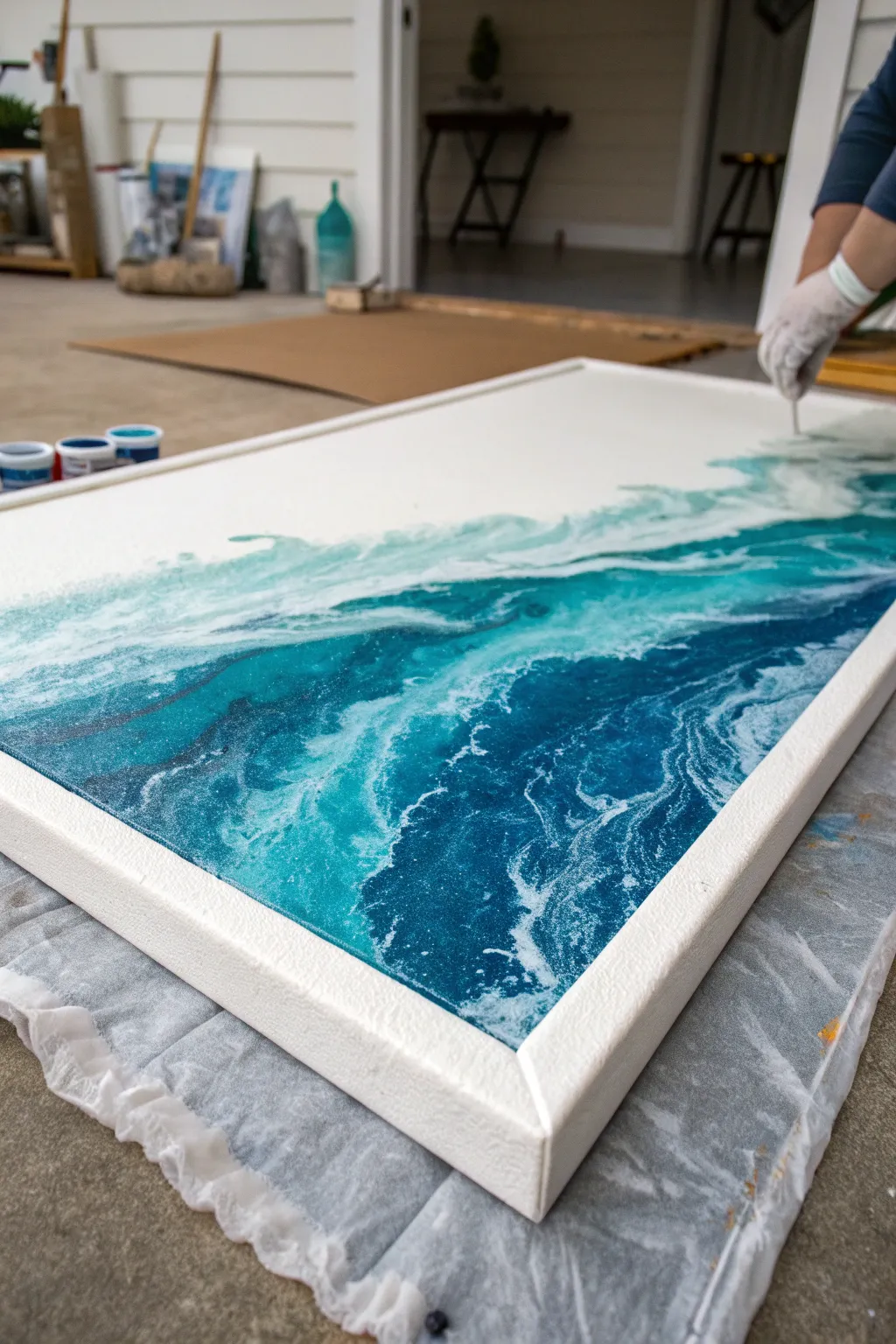
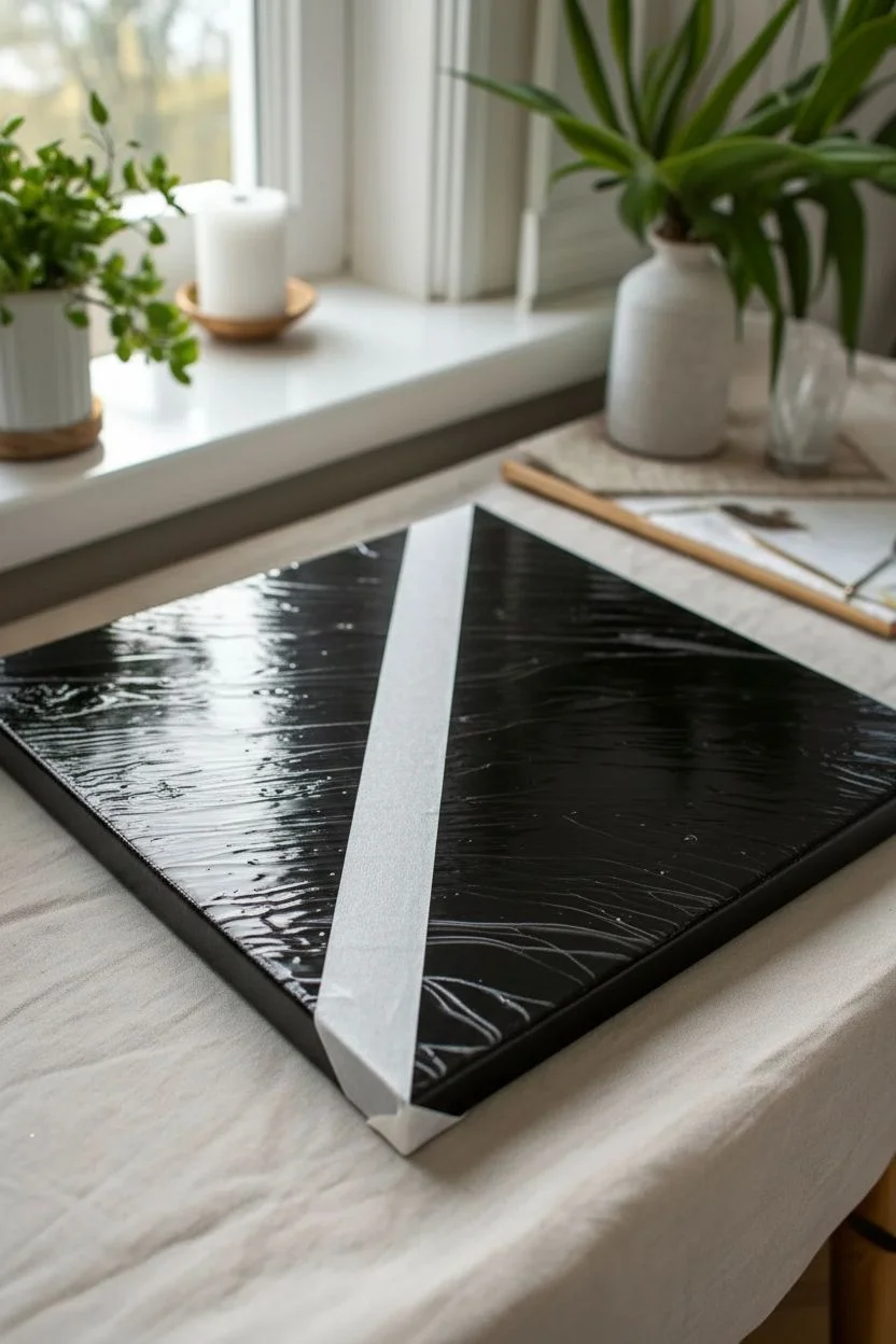
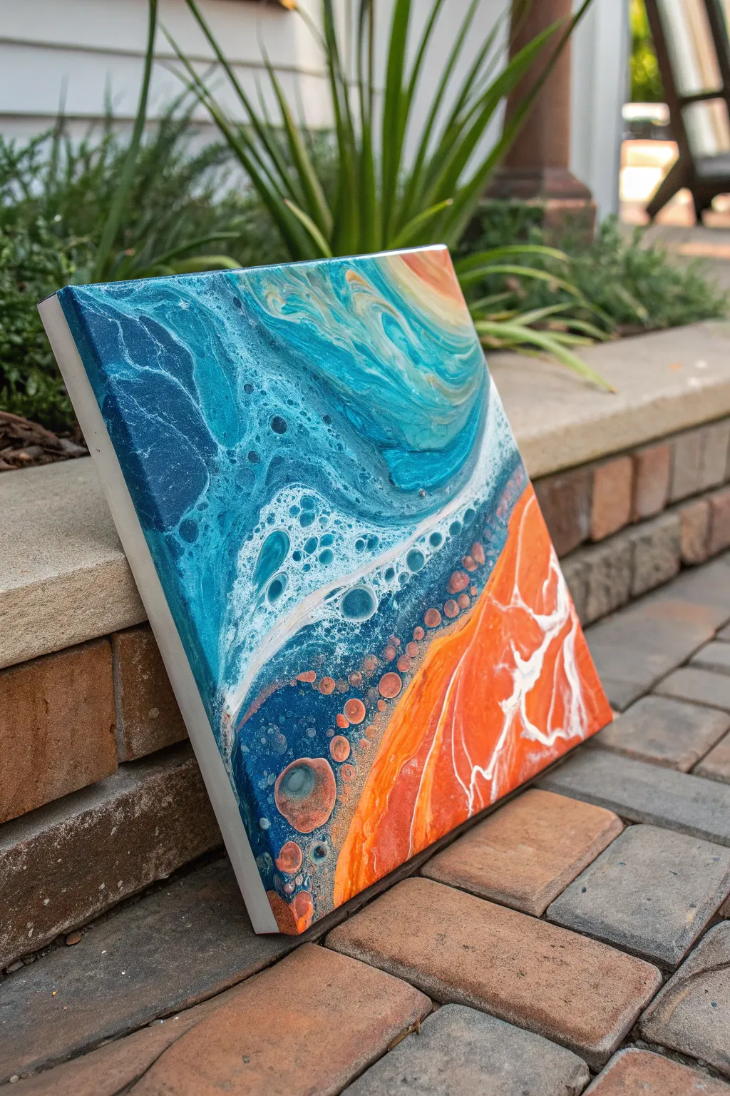
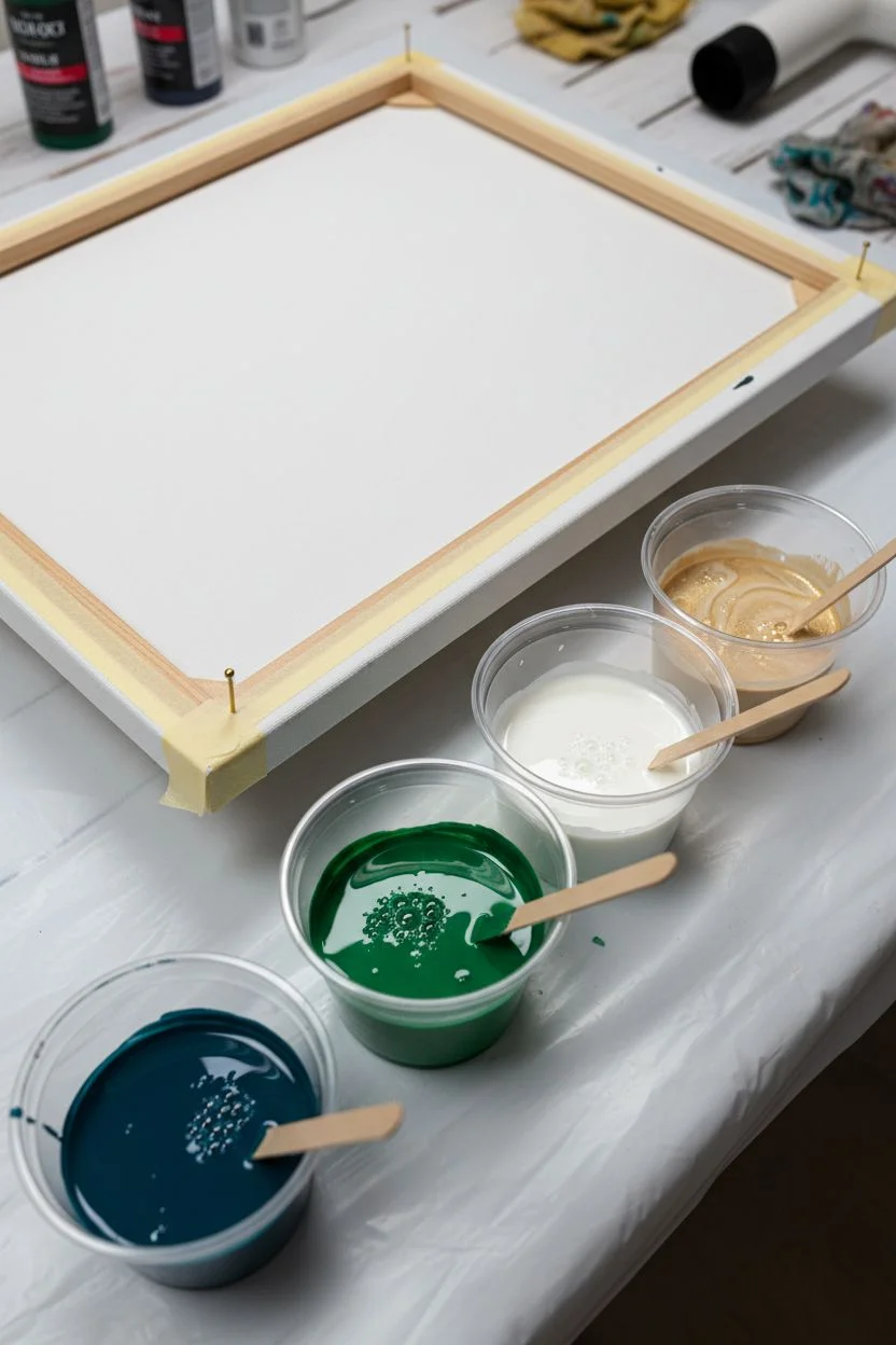
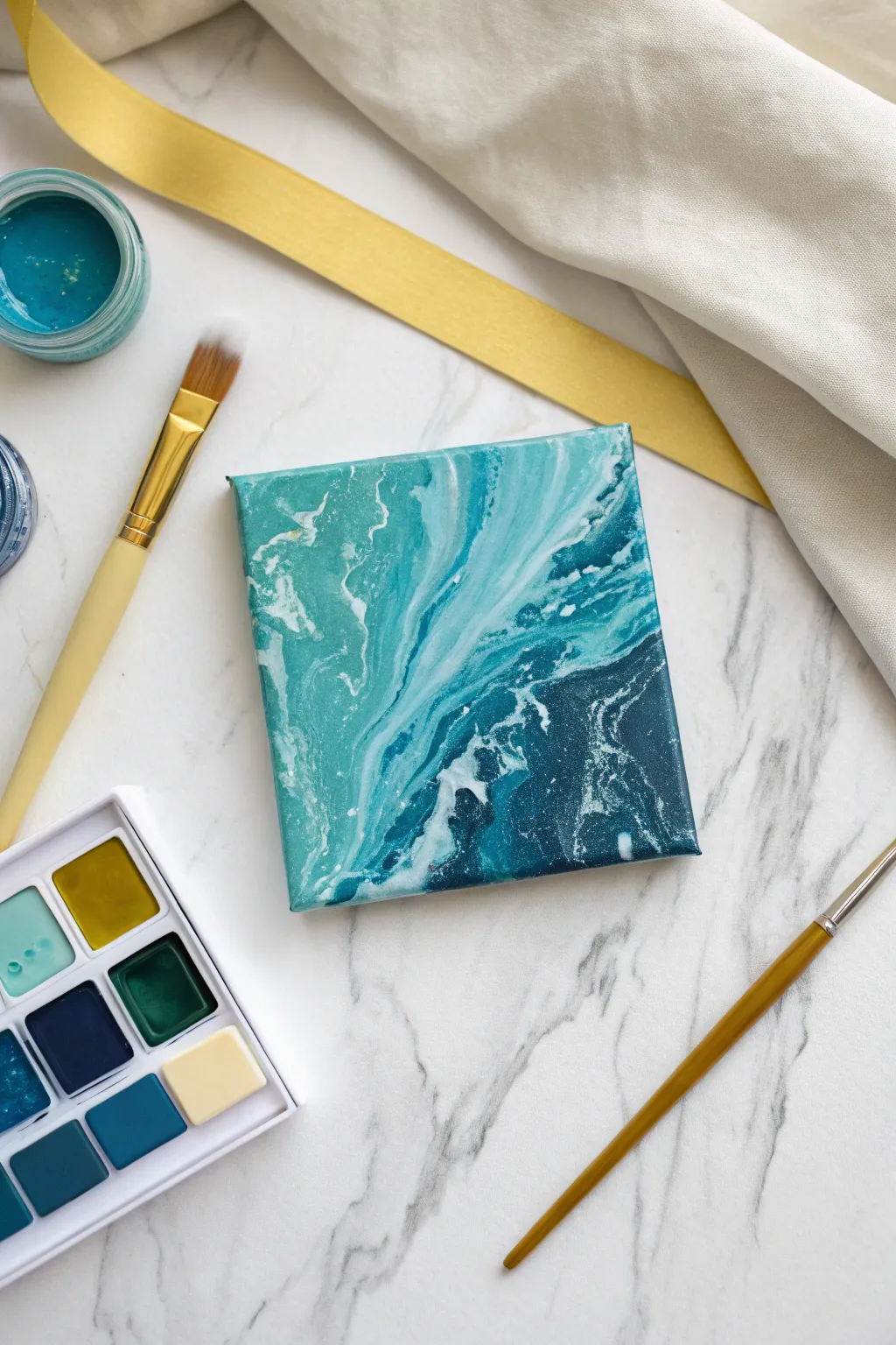
Capture the breathtaking power of the ocean with this large-scale resin pour that mimics crashing waves and deep underwater currents. By layering translucent teals and opaque whites, you will achieve a realistic foamy lace effect that looks like frozen water.
Step-by-Step Tutorial
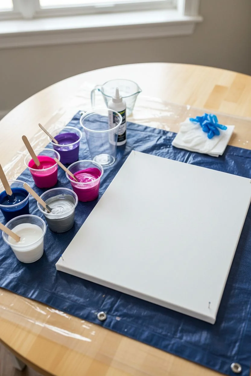
Materials
- Large rectangular canvas (gallery wrapped)
- Epoxy resin (art grade, 1:1 ratio)
- Resin pigments: Navy Blue, Turquoise/Teal, White
- White pigment paste (specifically for cells/lacing)
- Isopropyl alcohol (91% or higher)
- Heat gun
- Propane torch (optional, for bubbles)
- Plastic cups and stir sticks
- Nitrile gloves
- Plastic drop cloth
- Painter’s tape
- Masking tape
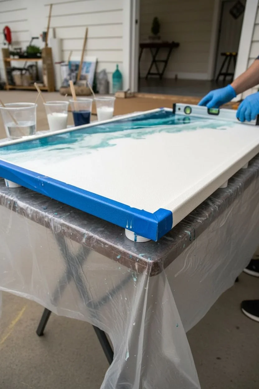
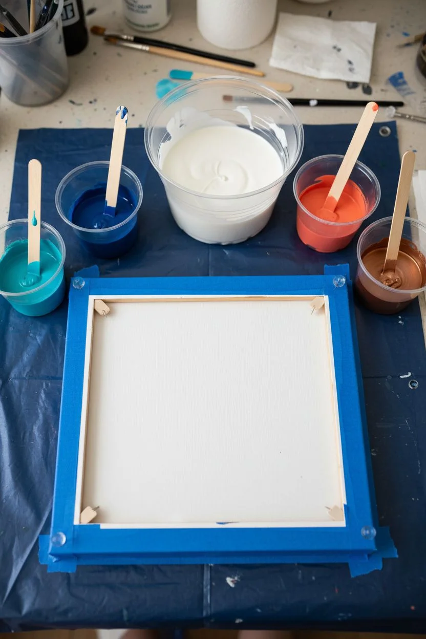
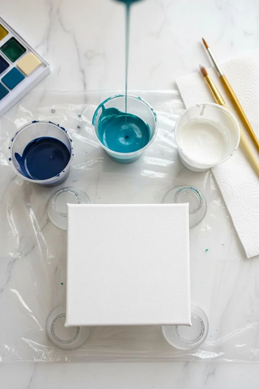
Step 1: Preparation & Mixing
-
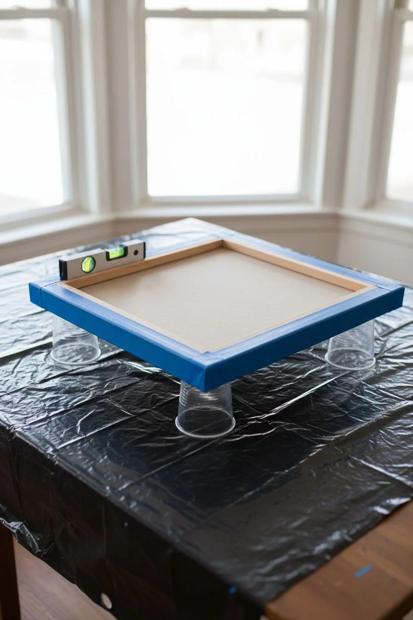
Protect the workspace:
Lay down a large plastic drop cloth on a level table. Resin can be messy, so ensure your floor is protected as well. -
Tape the canvas back:
Flip your canvas over and apply painter’s tape to the entire back edge and wooden frame. This catches drips and makes cleanup much easier later. -
Level the canvas:
Place the canvas on cups or elevated stands. Use a spirit level to check it from all angles; if it isn’t perfectly level, the resin will pool on one side. -
Mix the base resin:
Combine your epoxy resin and hardener according to the manufacturer’s instructions (usually 1:1). Stir slowly for at least 3 minutes to minimize bubbles. -
Tent the colors:
Divide the mixed resin into four cups. Leave the largest portion clear. Tint the others: deep navy blue, vibrant turquoise, and a dense opaque white.
Cells Not Forming?
If your white isn’t lacing, the resin might be too thick. Try adding a drop of silicone oil to only the white cup, or ensure your white pigment is a heavy ‘paste’ rather than a liquid dye.
Step 2: Creating the Ocean Gradient
-
Apply the deep blue:
Pour the navy blue resin along the bottom third of the canvas. This represents the deepest part of the ocean. -
Add the turquoise:
Pour the turquoise resin in the middle section, slightly overlapping the navy blue line to encourage blending. -
Pour the clear resin:
Pour the clear resin over the top third of the canvas (the ‘sky’ or shallow water area) and use a gloved hand or spreader to coat the entire canvas surface, merging the zones slightly. -
Blend the transition:
Gently run your gloved fingers back and forth where the blue and turquoise meet to create a soft, seamless gradient without mixing them into a single muddy color.
Step 3: Making Waves
-
Lay the wave line:
Pour a thin line of the white resin mixture across the canvas where the turquoise meets the clear section. -
Push with air:
Using your heat gun on a low setting, blow the white resin upwards into the clear section. Hold the gun at a 45-degree angle to push the pigment. -
Create the lacing:
I find that quickly switching the heat gun to a higher temperature for a split second helps cell formation. Watch as the white pigment breaks apart into a lacy foam pattern. -
Add a second wave:
For depth, pour a second, smaller line of white closer to the bottom deep blue section and repeat the blowing process, pushing it slightly back into the turquoise. -
Pop bubbles:
Briefly pass a propane torch or heat gun over the entire surface to pop any remaining air bubbles. Keep the flame moving constantly to avoid scorching the resin.
Add Realism
Embed real sand or small crushed shells mixed with resin along the very top edge before pouring the ‘water’ layers to create a realistic shoreline effect.
Step 4: Finishing Touches
-
Clean the edges:
Run a stir stick or gloved finger along the underside of the canvas frame to remove resin drips while they are still wet. -
Cover and cure:
Place a large box or cover over the artwork to prevent dust from settling on it. Let it cure undisturbed for 24 to 72 hours. -
Remove the tape:
Once the resin is solid but perhaps slightly soft (around the 24-hour mark), peel off the tape from the back for a simplified cleanup.
Now you have a stunning slice of the ocean ready to hang on your wall
Black, White, and Gold High-Contrast Cells
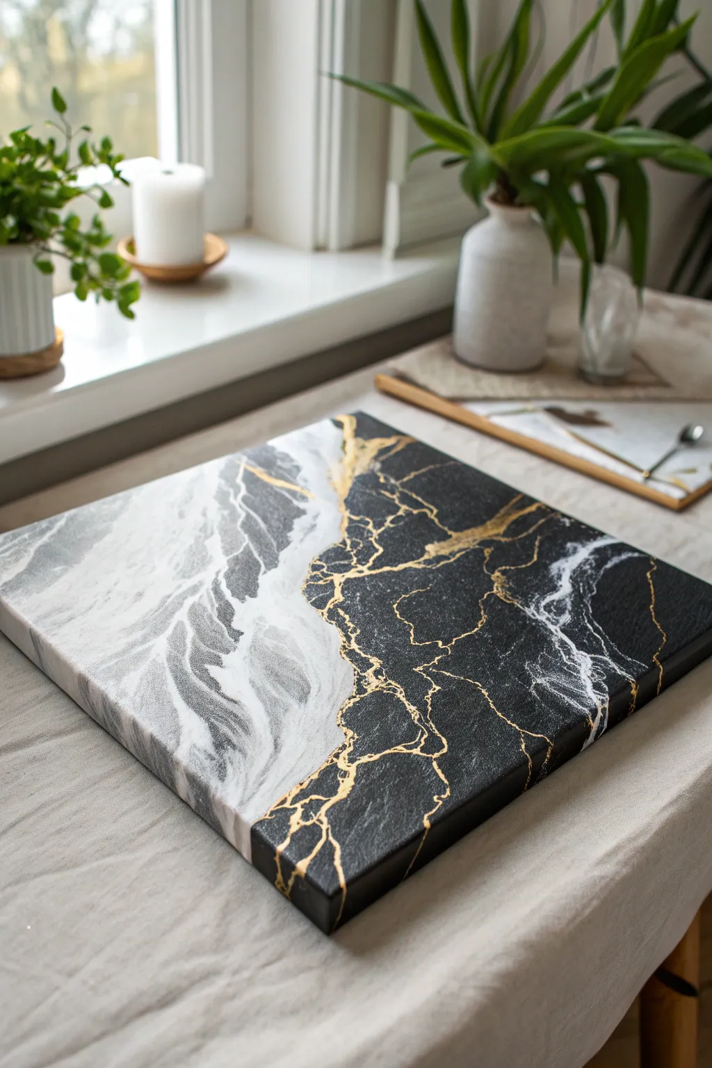
This striking project combines the softness of white marble with the drama of matte black and sharp metallic gold accents. The result is a sophisticated, high-contrast piece that mimics the elegance of cracked stone repaired with gold.
How-To Guide
Materials
- Square stretched canvas (e.g., 12×12 inches)
- Acrylic pouring paints: Titanium White, Cool Grey, Lamp Black
- Metallic Gold acrylic paint or liquid gold leaf
- Pouring medium (Floetrol or Liquitex)
- Silicone oil (optional for cells)
- painter’s tape or masking tape
- Plastic cups and stir sticks
- Hair dryer or heat gun
- Fine detail brush
- Gloss varnish (optional)
Step 1: Planning and Mixing
-
Tape the divide:
Decide on your composition line. For this look, place a strip of masking tape diagonally or in an organic wave shape across the canvas to separate the white side from the black side. -
Mix the white marble tones:
In separate cups, mix Titanium White and Cool Grey with your pouring medium. Aim for a consistency like warm honey. Add a drop of silicone oil to the grey if you want small, subtle cells. -
Prepare the black base:
Mix a generous amount of Lamp Black with pouring medium. Keep this mixture slightly thicker than the white ones to ensure it holds the sharp edge against the gold later. -
Mix the gold accent:
Prepare a small amount of metallic gold paint with medium. If you plan to hand-paint the cracks later, you can skip mixing this for pouring and just have the tube ready.
Clean Lines Pro-Tip
For a super crisp divide between the black and marble halves, seal the edge of your masking tape with a thin layer of matte medium before pouring the white side.
Step 2: Creating the White Marble Side
-
Pour the white base:
Pour a puddle of the white mixture onto the left side of the taped line, covering most of that section. -
Add grey veins:
Drizzle thin lines of the grey mixture over the white puddle. Don’t overdo it; you want the white to remain dominant. -
Blow out the pattern:
Using a hair dryer on a low, cool setting (or just your breath), gently push the white and grey paints around to create soft, blending waves. Blow away from the tape line to avoid seepage. -
Refine the marble:
Tilt the canvas slightly to stretch the marble pattern. Let the excess run off the left edge, ensuring the sides are covered. -
Remove the tape:
Carefully peel back the masking tape while the paint is still wet to reveal a relatively clean edge, then let this side dry for at least 24 hours.
Step 3: Black Pour and Gold Details
-
Apply the black side:
Once the white side is dry to the touch, carefully pour or brush the black mixture onto the empty right side of the canvas. -
Meet the edge:
Guide the black paint up to the dried white edge. You can let it naturally flow against the white paint’s bump or use a palette knife to create a jagged, organic meeting point. -
Create texture:
Unlike the smooth white side, you might want the black side to have less movement. Simply tilt it to cover the canvas and let it settle. I find tapping the bottom of the canvas helps level it out. -
Add gold veins (Wet technique):
While the black paint is still wet, drizzle very fine lines of gold paint into the black field. Use a toothpick or the end of a brush to drag through them, creating lightning-like fractures. -
Enhance the border:
Drizzle a thin line of gold exactly where the black and white paints meet. This creates the primary ‘crack’ that defines the composition. -
Allow to dry fully:
Let the entire piece dry for another 24-48 hours. Acrylics shrink as they dry, which might reveal more texture in the black section.
Level Up: Texture
Mix a pinch of fine sand or baking soda into the black paint before pouring. This creates a gritty, stone-like texture that contrasts beautifully with the smooth marble side.
Step 4: Refining the Gold
-
Sharpen the gold lines:
Once the painting is fully dry, use a fine detail brush and pure metallic gold paint (or liquid gold leaf) to re-trace the veins. This makes them pop and sit on top of the matte black. -
Add fine tributaries:
Paint tinier, branching cracks coming off the main gold lines. Tremble your hand slightly while painting to get that natural, jagged tectonic look. -
Paint the edges:
Don’t forget to carry the design over the sides of the canvas. Continue the black, white, and gold lines around the edges for a gallery-ready finish. -
Varnish (Optional):
If you want a uniform sheen, apply a coat of gloss varnish. However, leaving it unvarnished keeps the interesting contrast between the glossy metallic gold and the flatter black paint.
Hang your artwork in a well-lit spot to let those golden veins catch the light throughout the day


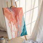
Sunset Ombre: Coral, Orange, and Magenta
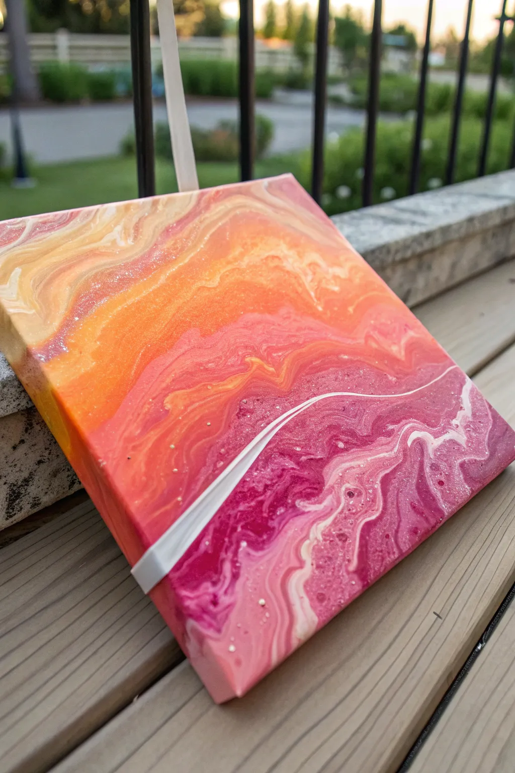
Capture the warmth of a setting sun with this vibrant acrylic pour design, featuring a seamless transition from golden yellows to deep magentas. A striking white ribbon cuts through the ombre layers, adding dynamic movement and a touch of elegance to the glowing composition.
Step-by-Step Tutorial
Materials
- Square stretched canvas (8×8 or 10×10 inches)
- Acrylic pouring paints (pre-mixed or standard acrylics mixed with pouring medium)
- Colors: Pale yellow/cream, bright orange, coral, deep magenta, white
- Fine iridescent glitter or shimmer add-in (optional)
- Pouring cups (small plastic cups)
- Stir sticks
- Painter’s tape or giant push pins (to elevate canvas)
- Plastic drop cloth or oversized garbage bag
- Gloves
- Heat gun or torch (optional, for popping bubbles)
Step 1: Preparation & Mixing
-
Prepare your workspace:
Cover your entire working surface with a plastic drop cloth or garbage bag to catch drips. Ensure the surface is level so your paint doesn’t slide off uncontrollably. -
Elevate the canvas:
Push four giant push pins into the corners of the back of the canvas frame, or prop the canvas up on spare cups. This allows paint to flow over the edges freely without sticking to the table. -
Clump-free mixing:
If you are mixing your own paints rather than using pre-mixed pouring acrylics, combine one part paint with two parts pouring medium in separate cups. Stir gently but thoroughly until the consistency resembles warm honey. -
Add shimmer:
To achieve the subtle sparkle seen in the photo, add a pinch of fine iridescent glitter or shimmer medium to your orange and magenta cups. Stir well to distribute the particles evenly. -
Check consistency:
Test the flow by lifting your stir stick; the paint should run off in a continuous, thin stream without breaking. Adjust with a few drops of water if too thick.
Sparkle control
Mix glitter into the pouring medium *before* adding the paint pigment. This suspends the sparkles better so they don’t sink to the bottom of your cup.
Step 2: Creating the Ombre Pour
-
Start with the lightest shade:
Begin at the top left corner of the canvas. Pour a generous ribbon of your pale yellow or cream mixture across the top third of the surface. -
Apply the mid-tones:
Directly below the cream, pour the bright orange paint. Allow it to slightly overlap the cream section so they will blend naturally later. -
Transition to cool tones:
Pour the coral paint next, followed by the deep magenta on the bottom third of the canvas. You should have horizontal stripes of color covering most of the canvas. -
Tilt for coverage:
Gently pick up the canvas and tilt it left, right, up, and down. Guide the paint to cover all four corners and the sides. Don’t worry about perfect blending yet; just ensure the canvas is fully coated. -
Create the ombre gradient:
Tilt the canvas back and forth specifically in the vertical direction (top to bottom) to encourage the bands of color to merge. The orange should bleed into the cream, and the magenta into the coral.
Step 3: The White Ribbon Technique
-
Prepare the white accent:
Take your cup of white paint. Ensure it is slightly thicker than the other colors so it holds its shape better. -
Pour the ribbon line:
Starting from one edge, pour a thin, confident stream of white paint diagonally across the bottom half of the canvas, cutting through the magenta section. -
Softening the line:
Tilt the canvas slightly in the direction of the white line’s flow. This will stretch the white paint out, creating wispy, marble-like edges rather than a solid stripe. -
Add final details:
If desired, drizzle tiny amounts of the cream color into the magenta section to echo the top of the painting at the bottom. -
Pop air bubbles:
Let the painting sit for a minute, then lightly pass a heat gun or torch over the surface (keep it moving constantly) to pop any trapped air bubbles.
Resin finish
For a glass-like finish that makes the colors look eternally wet, apply a 2-part epoxy resin topcoat after the paint has cured for 3 weeks.
Step 4: Drying and Finishing
-
Check the edges:
Run a gloved finger along the underside of the canvas frame to catch any drips. This prevents bumps from forming on the edges as it dries. -
Protect while drying:
Place a large cardboard box or tent over the wet painting to protect it from dust and pet hair. -
Allow extensive drying time:
Let the painting cure for at least 24 to 48 hours. The thick layers of acrylic pour take much longer to dry than standard painting. -
Optional gloss coat:
Once fully cured, you can apply a layer of high-gloss varnish or resin to enhance the wet look and make the shimmery colors pop.
Once dry, hang this radiant piece where it can catch the morning light and show off those beautiful transitions


Blue and Orange Complementary Energy (Kept Separate)
Capture the dynamic energy of crashing waves meeting warm sand with this stunning fluid art piece. By carefully balancing complementary teal and coral tones without muddying them, you’ll create a vibrant seascape full of movement and cellular details.
Step-by-Step Guide
Materials
- Square stretched canvas (approx. 12×12 inches)
- Acrylic paints (Phthalo Blue, Turquoise, White, Orange, Coral, Metallic Bronze or Copper)
- Pouring medium (Floetrol or Liquitex)
- Silicone oil or treadmill lubricant
- Plastic cups and stir sticks
- Hair dryer or heat gun
- Painter’s tape
- Push pins (for canvas elevation)
- Straw (for blowing detail)
Step 1: Preparation & Mixing
-
Prepare the workspace:
Cover your work surface with a drop cloth or heavy plastic. Pour painting is messy, so ensure you have enough space for runoff. -
Elevate the canvas:
Insert push pins into the four corners of the back of the canvas frame to lift it off the table. This prevents the painting from sticking to the surface as it dries. -
Tape the back:
Apply painter’s tape to the entire back underside of the canvas. This keeps the back clean and makes removing dried drips much easier later. -
Mix pouring medium:
In separate cups, mix your acrylic paints with the pouring medium. A standard ratio is 1 part paint to 2 parts medium, but follow your medium’s specific instructions. -
Check consistency:
Stir until the consistency resembles warm honey. The paint should flow off the stick in a consistent stream without breaking but shouldn’t be watery. -
Focus on the white:
Mix a slightly larger cup of titanium white, as this will act as your negative space and wave foam. Keep this mixture slightly thinner than the colors to encourage movement. -
Add silicone:
Add 2-3 drops of silicone oil to the Turquoise, Phthalo Blue, and Coral cups only. Stir just twice to incorporate it; over-stirring can break the oil down too much and prevent large cells.
Torch Technique Tip
Keep the torch moving constantly and hold it about 6 inches away. If you hover too long in one spot, you risk scorching the paint or drying the top film.
Step 2: The Pouring Process
-
Create the ocean base:
Pour the dark blue and turquoise paints onto the upper left diagonal half of the canvas. Do not cover the corner entirely yet; leave room for the paint to move. -
Create the shore base:
Pour the orange and coral paints onto the lower right diagonal corner. Leave a distinct gap of plain canvas between the blue ocean and orange shore sections. -
Fill the gap:
Pour a generous line of white paint into the diagonal channel between the blue and orange sections. This buffer prevents the complementary colors from mixing into brown mud. -
Add accents:
Drizzle a little metallic bronze or copper near the orange section to mimic wet sand or rocks. -
Initial tilt:
Gently tilt the canvas to spread the color blocks to the edges. Try not to let the blue and orange touch directly without the white barrier in between.
Mud Prevention
If blue and orange mix too much, they turn brown. Always keep a thick river of white between them and only blow the white over the colors, not the colors into each other.
Step 3: Creating Movement & Cells
-
The Dutch pour technique:
Using a hair dryer on a low, cool setting, blow the white paint over the blue section first to create a foamy wave effect. Then blow the white slightly over the orange/coral section. -
Use the straw:
For finer control, use a straw to blow the white paint into specific areas of the blue to create lacing and distinct ‘water’ shapes. -
Activate the cells:
If cells haven’t appeared naturally, wave a torch or heat gun quickly over the surface. The heat will bring the silicone to the top, creating those beautiful circular bubbles. -
Refine the composition:
Tilt the canvas very slowly one last time to stretch the cells and ensure the corners are fully covered. -
Check edges:
Use your finger to dab matching paint onto any bare spots along the sides of the canvas. -
Drying:
Let the painting sit undisturbed on a level surface for at least 24-48 hours. Ensure the room has good airflow but no direct draft that could dry the top layer too fast.
Once fully cured and possibly varnished for sheen, you will have a mesmerizing slice of ocean energy hanging on your wall
BRUSH GUIDE
The Right Brush for Every Stroke
From clean lines to bold texture — master brush choice, stroke control, and essential techniques.
Explore the Full Guide
Soft Pastel Pour With a Clean White Base
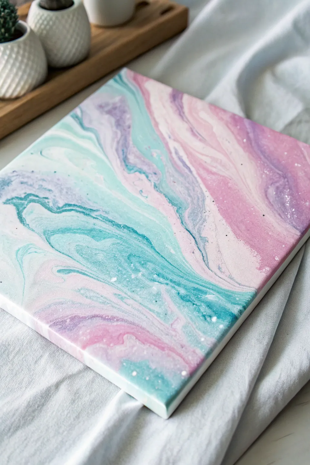
Capture the ethereal beauty of a summer sunset with this soft, pastel fluid art project on a square canvas. Using a clean white base allows the gentle swirls of mint, lilac, and blush pink to float effortlessly across the surface.
Step-by-Step
Materials
- Square canvas (e.g., 10×10 or 12×12 inches)
- White acrylic paint (large quantity for base)
- Pastel pink acrylic paint
- Pastel mint or teal acrylic paint
- Lilac or lavender purple acrylic paint
- Pouring medium (Floetrol or specialized medium)
- Water (for thinning)
- Several small plastic mixing cups
- One larger cup for the dirty pour
- Wooden craft sticks for stirring
- Push pins (for elevating the canvas)
- Plastic drop cloth or garbage bag
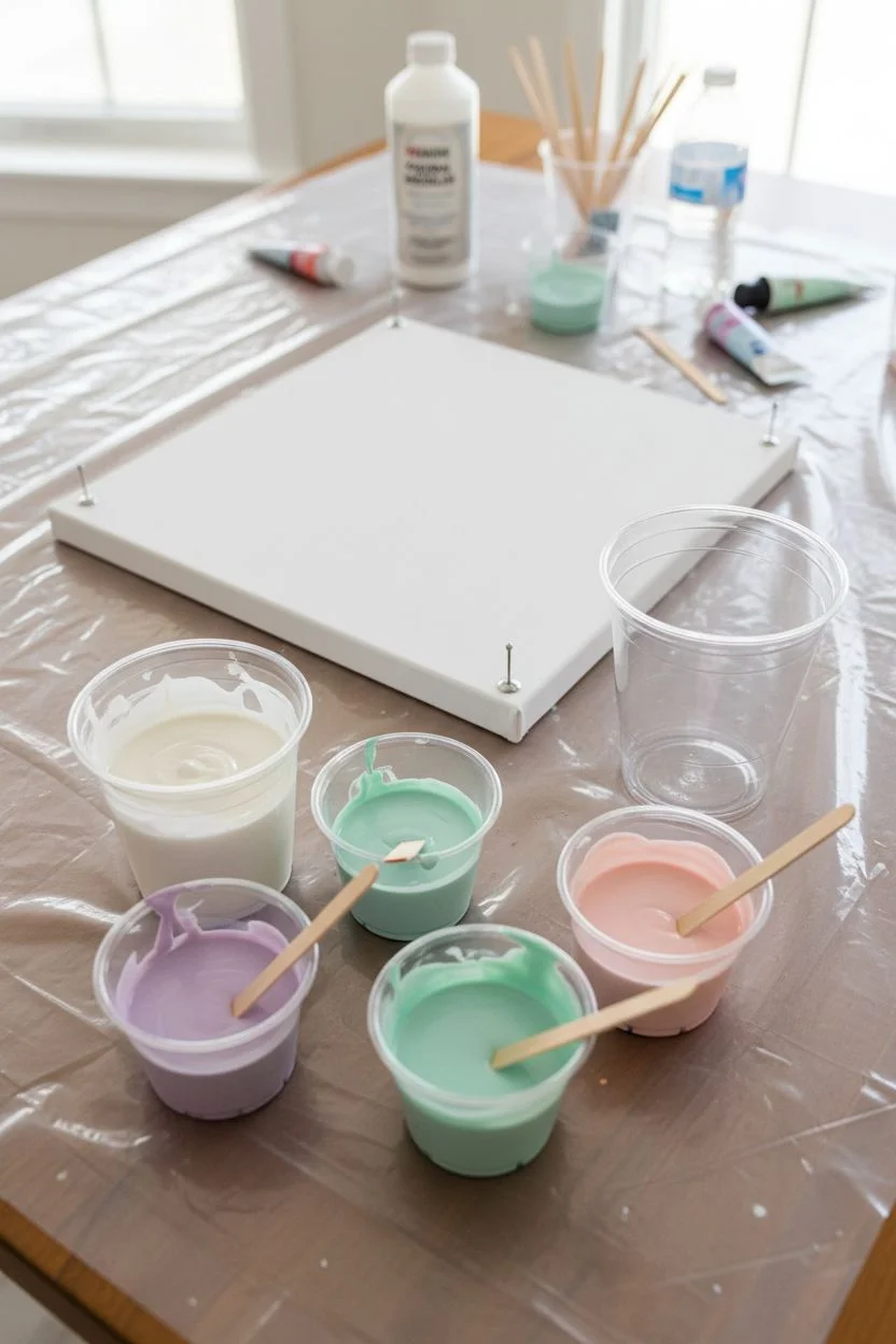
Step 1: Preparation & Mixing
-
Prepare the workspace:
Lay down your plastic drop cloth to protect your table from spills. Insert push pins into the four corners of the back of your canvas to elevate it off the surface. -
Mix the white base:
In a medium-sized cup, mix white acrylic paint with your pouring medium at a 1:1 ratio. Add a few drops of water slowly until it reaches the consistency of warm honey. You want this mixture to be fluid but substantial. -
Mix the pastel colors:
In separate smaller cups, mix the pink, mint, and lilac paints with pouring medium, also aiming for a 1:1 ratio. These should have the same consistency as your white base so they flow together smoothly. -
Check consistency:
Lift the stick from each cup; the paint should flow off in a steady stream and create a small mound that disappears within one second. If it’s too thick, add water drop by drop.
Muddy Colors?
If your pastels are turning brown or gray, you are likely over-tilting or stirring the paint too much. Stop tilting sooner to keep the crisp separation between the pink and teal.
Step 2: Creating the Pour
-
Layer the main cup:
Take an empty cup for your ‘dirty pour.’ Start by pouring a small amount of white into the bottom. -
Add pastel layers:
Gently pour the lilac paint down the side of the cup, not straight into the middle, to keep layers distinct. -
Continue layering:
Repeat the process with the mint green, followed by the pink. Add a splash of white between colors occasionally to keep the palette bright and pastel. -
Repeat until full:
Keep layering your colors until the cup is about half to two-thirds full, depending on the size of your canvas. -
Flood the canvas:
Pour your remaining plain white mixture directly onto the center of the canvas and spread it slightly with a palette knife or stick to create a wet surface for the colors to glide on. -
Execute the pour:
Pour the contents of your layered cup slowly across the canvas in a diagonal or wandering line. Don’t worry about covering everything yet.
Sparkle Finish
For a magical touch, while the paint is still wet, lightly sprinkle ultra-fine iridescent glitter over the white sections to mimic shimmering quartz or foam.
Step 3: Tilting & Finishing
-
Begin tilting:
Gently lift the canvas and slowly tilt it to one corner. Watch how the paint stretches. This slow movement is crucial for maintaining those wide, dreamy bands of color. -
Cover the corners:
Tilt the canvas toward the opposite corner. If the paint isn’t reaching a corner, I sometimes use a gloved finger to help touch up the edge rather than over-tilting and losing the design. -
Refine the composition:
Continue tilting back and forth until the entire face and sides of the canvas are covered. Aim for long, stretched shapes rather than tight swirls. -
Pop bubbles:
Look closely at the surface for air bubbles. If you see any, you can gently pop them with a toothpick or lightly pass a culinary torch over the surface (keep it moving constantly). -
Check the edges:
Run a finger along the underside of the frame to catch any drips, which stops the paint on top from continuing to be pulled down by gravity. -
Dry properly:
Place the canvas in a dust-free area where it won’t be disturbed. Let it dry on a level surface for at least 24 to 48 hours.
Once dry, display your serene artwork in a bright room to highlight those delicate color transitions
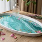
Emerald Greens With Creamy Neutrals
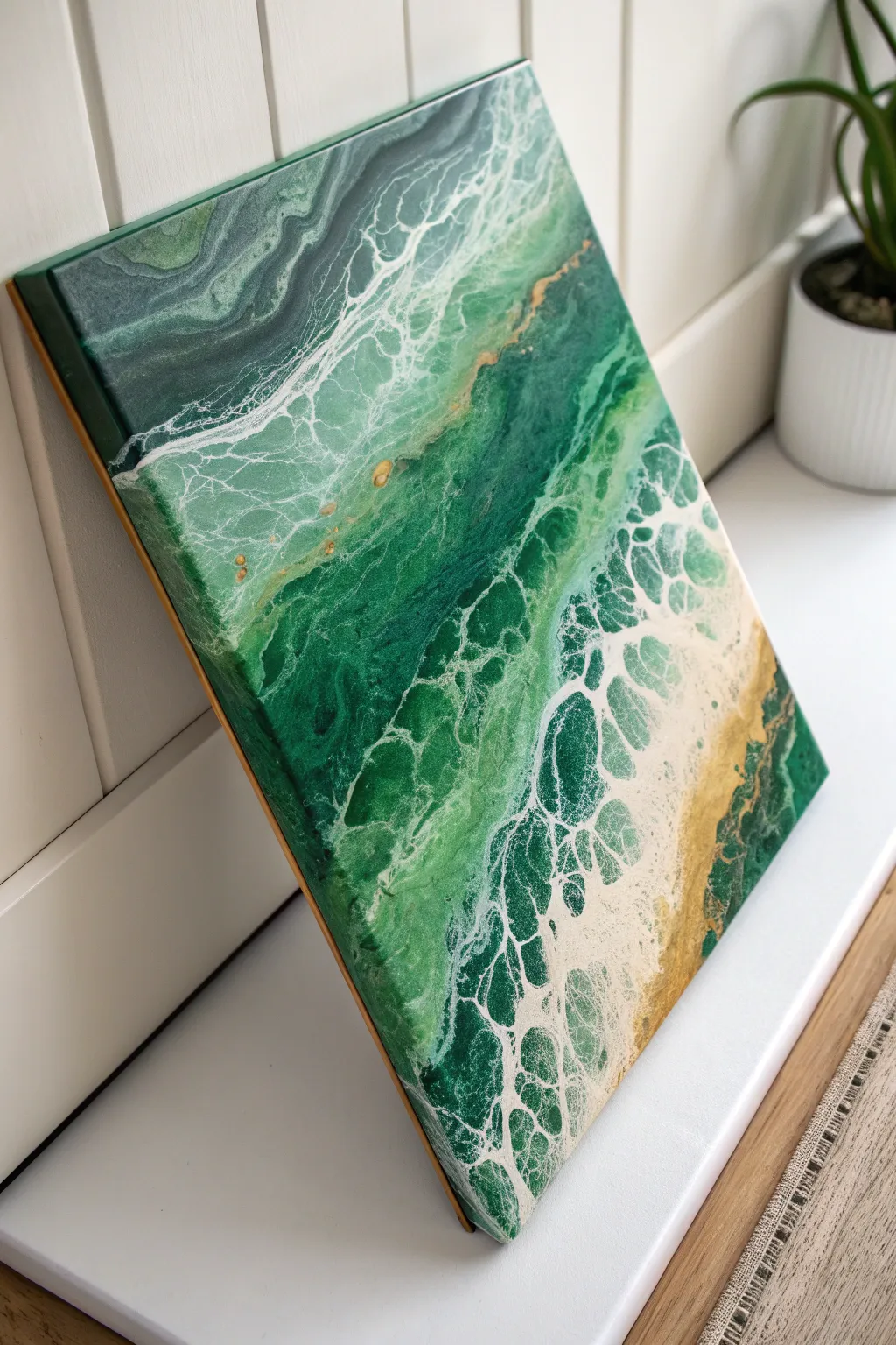
Capture the depth and mystery of deep ocean waters crashing onto a sandy shore with this striking fluid art piece. The interplay of rich emerald tones against creamy lacing creates a sophisticated seascape perfect for any modern coastal decor.
Detailed Instructions
Materials
- Rectangular stretched canvas (e.g., 16×20 inches)
- Acrylic paints: Emerald Green, Phthalo Green, Deep Teal, White, Light Cream/Beige, Metallic Gold
- Pouring medium (Floetrol or Liquitex)
- Silicone oil (optional for cells)
- Hair dryer with a concentrator nozzle
- Plastic cups and stir sticks
- Painter’s tape
- Push pins (for elevating canvas)
- Gloves and workspace cover
Step 1: Preparation and Mixing
-
Prep the canvas:
Begin by taping the back edges of your canvas with painter’s tape to keep the frame clean. Insert push pins into the four corners of the wooden frame on the back to elevate the canvas off your work surface. -
Mix your base colors:
Mix the Emerald Green, Phthalo Green, and Deep Teal individually with your pouring medium. Aim for a consistency distinct to fluid art—like warm honey. A ratio of 1 part paint to 2 parts medium is a standard starting point. -
Mix the sandy accent:
Combine your Light Cream or Beige paint with a touch of Metallic Gold and pouring medium. This will form the sandy beach area and the mineral-like veins. -
Prepare the negative space:
Mix a larger volume of White paint with pouring medium and a splash of water. This mixture needs to be slightly thinner than your colored paints to encourage the lacing effect when blown over the colors. -
Add silicone (optional):
If you want distinct cells within the green sections, add 1-2 drops of silicone oil to your green mixtures only. Stir gently just enough to incorporate it.
Step 2: Creating the Pour
-
Lay the ocean foundation:
Start by pouring the darkest green (Phthalo or Deep Teal) across the top third of the canvas. This represents the deep ocean water. -
Build the mid-tones:
Pour the Emerald Green mixture below the dark band, blending it slightly where the colors meet. Continue filling the canvas downwards, leaving the bottom right corner empty. -
Pour the shoreline:
In the bottom right corner, pour your cream and gold mixture. Overlap slightly with the greens to ensure there is no bare canvas showing between the ‘water’ and the ‘sand’. -
Flood the sides:
Use any remaining base colors to ensure the edges and corners are fully covered with wet paint. This helps the design flow over the sides. -
Apply the wave froth:
Pour a line of your thinner White mixture along the borders where different colors meet, specifically between the dark/light greens and the green/sand areas.
Pro Tip: Lacing Control
For better lacing, mix your white paint slightly thinner than the colors. The difference in density helps the white float and break apart into that beautiful ‘sea foam’ texture.
Step 3: Blowing and Styling
-
The initial blow:
Using your hair dryer on the low cool setting, gently push the white paint up and over the green sections. Angle the dryer to spread the white thinly, which creates the sea-foam lacing effect. -
Shape the composition:
Blow the paint from the center outward towards the corners. I find it helpful to stand on different sides of the table to direct the airflow properly. -
Refine the details:
Use a straw to blow on specific areas where you want more detailed lacing or to break up large patches of solid color. This is great for creating the delicate veins near the shoreline. -
Tilt if necessary:
If the composition looks too static, gently tilt the canvas to stretch the cells and organic lines. Do this slowly to avoid muddying the colors. -
Torch for cells:
Briefly pass a chef’s torch or heat gun over the surface to pop air bubbles and bring up small cells, especially in the areas with silicone. -
Clean the edges:
Run a finger or a craft stick along the underside of the canvas frame to remove drips. This prevents the paint from continuing to pull off the canvas as it dries. -
Drying process:
Let the painting dry in a dust-free area for at least 24-48 hours. Ensure the surface is perfectly level so the paint doesn’t shift. -
Varnish and finish:
Once fully cured (allow 3-4 weeks for best results), apply a gloss varnish or a coat of epoxy resin to make the emerald colors pop and give it that wet, glass-like finish.
Level Up: Resin Coat
Finish with a layer of clear art resin. This adds realistic depth, making the painting look like actual water under glass, and really brings out the metallic gold shimmer.
Now you have a stunning emerald ocean view that will add a calming, artistic touch to your wall

PENCIL GUIDE
Understanding Pencil Grades from H to B
From first sketch to finished drawing — learn pencil grades, line control, and shading techniques.
Explore the Full Guide
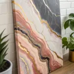
Desert Earth Tones: Terracotta, Sand, and Umber
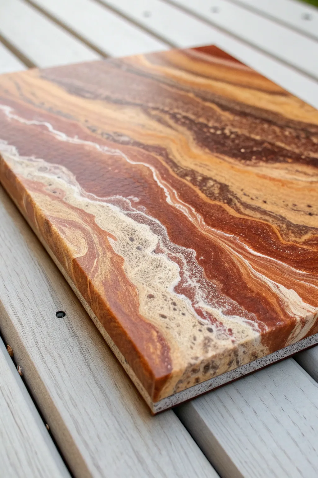
Mimic the organic beauty of sandstone canyons and desert landscapes with this fluid art project. By layering rich umbers, warm terracotta, and airy sandy tones, you’ll create a piece that feels both grounded and dynamic, capturing the essence of geological strata.
How-To Guide
Materials
- Rectangular stretched canvas or wood panel (11×14 or similar)
- Acrylic pouring medium (Liquitex or Floetrol)
- Acrylic paints: Burnt Umber, Raw Sienna, Terracotta, Titanium White, and Antique Gold
- Silicone oil (optional, for cells)
- Plastic cups for mixing
- Wooden stir sticks
- Hairdryer with a concentrator nozzle (optional)
- Plastic straw
- Cardboard or plastic drop cloth
- Gloves
- High-gloss varnish or clear art resin for finishing
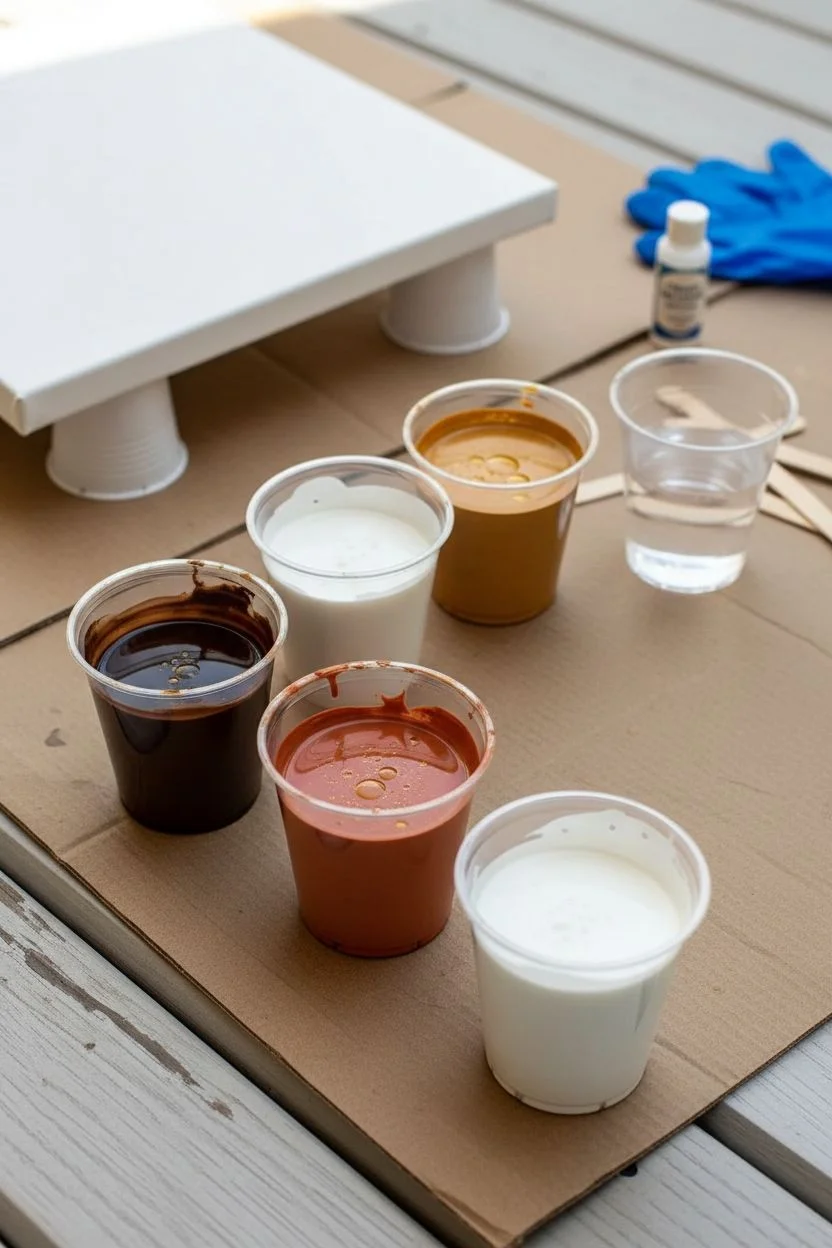
Step 1: Preparation & Mixing
-
Prepare your workspace:
Lay down your plastic drop cloth or cardboard to catch drips. Prop your canvas or wood panel up on four overturned cups (one in each corner) so the excess paint flow off freely. -
Mix your base medium:
In your mixing cups, combine one part acrylic paint with approximately two parts pouring medium. You want a consistency similar to warm honey—fluid enough to pour but thick enough to hold some shape. -
Create the desert palette:
Mix individual cups for Burnt Umber, Raw Sienna, Terracotta, and Titanium White. I like to add a tiny drop of Antique Gold to the Siena for a subtle shimmer. -
Add silicone (optional):
If you want the bubbly ‘cell’ effects seen in the white sections of the reference image, add 2-3 drops of silicone oil specifically to the White and Terracotta cups. Stir just once or twice; over-mixing breaks the oil too much.
Muddy colors?
Avoid over-tilting. If you tilt back and forth too many times, the distinctive bands of color will blend into a single brownish hue. Keep movements deliberate.
Step 2: The Pouring Process
-
Apply the base lubricant:
Pour a thin layer of your darkest color (Burnt Umber) mixed with medium around the edges of the canvas to help the subsequent colors flow smoothly. -
Layer the ‘dirty pour’ cup:
Take a larger clean cup. Pour your colors in one by one. Start with white, then layer sienna, terracotta, umber, and repeat. Don’t stir this cup; let the colors sit on top of each other. -
Execute the pour:
Pour the contents of your layered cup in a diagonal wave-like motion across the center of your canvas. Think of the path a river might carve through a canyon. -
Fill the negative space:
Pour lines of pure Burnt Umber and Raw Sienna on either side of your central diagonal pour to ensure the entire board is covered in paint.
Step 3: Manipulating the Flow
-
Tilt the canvas:
Gently lift the board and tilt it slowly from side to side. Encourage the central ‘river’ of layered colors to stretch and marbleize. Aim for long, stratified lines rather than a jumbled mix. -
Use the straw method:
For the frothy, wave-like edges where the white meets the brown, blow gently through a plastic straw. Push the white paint over the darker colors to create lacing and intricate webbing. -
Enhance the strata:
If you have a hairdryer, use it on the low-cool setting to push large bands of color across the canvas. This creates those sweeping, soft gradients characteristic of sedimentary rock. -
Check the edges:
Use your gloved finger to catch drips from the side and dab them onto any bare corners or edges. Visual continuity on the sides makes the piece look professional. -
Torch for cells:
If you used silicone, quickly pass a culinary torch or heat gun over the surface to pop air bubbles and encourage the white cells to rise to the surface.
Add Metallic Veins
Mix a small amount of copper or bronze metallic powder into your clear pouring medium and drizzle thin lines along the ‘strata’ for a stunning mineral effect.
Step 4: Finishing Touches
-
Dry properly:
Let the painting sit undisturbed for at least 24 to 48 hours. Acrylic pours dry from the outside in, so ensure the room temperature is stable to avoid cracking. -
Clean off silicone:
Once fully dry, if you used silicone oil, gently wipe the surface with a little rubbing alcohol or cornstarch to remove the oily residue before sealing. -
Apply the gloss coat:
To achieve the glass-like finish shown in the photo, mix a two-part art resin or apply 2-3 coats of high-gloss varnish. This deepens the earth tones significantly. -
Cure the finish:
Allow the varnish or resin to cure completely according to the manufacturer’s instructions, usually another 24 to 72 hours, in a dust-free environment.
Hang your new desert-inspired abstract piece horizontally to emphasize the landscape feel
Purple Galaxy With Deep Navy and Starry White
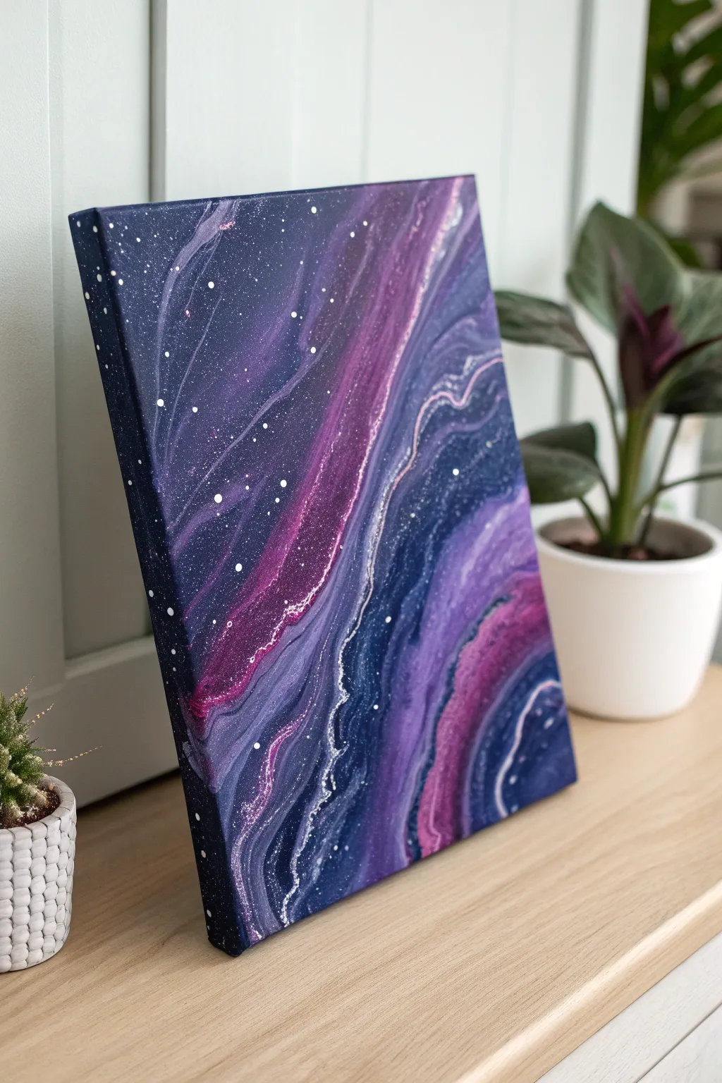
Capture the ethereal beauty of deep space with this mesmerizing fluid art project. By blending deep navy with vibrant purples and bright white stars, you’ll create a swirling galaxy that looks like a window into the cosmos.
Detailed Instructions
Materials
- Stretched canvas (e.g., 11×14 or 12×16 inches)
- Acrylic paints: Deep Navy Blue, Phthalo Blue, Dioxazine Purple, Magenta, Titanium White
- Pouring medium (Floetrol or Liquitex)
- Water (distilled is best)
- Small plastic cups for mixing
- One larger ‘dirty pour’ cup
- Craft sticks for stirring
- Silicone oil (optional, for cells)
- Old toothbrush or stiff bristle brush
- Disposable gloves
- Drop cloth or plastic sheeting
- Push pins (for canvas elevation)
Step 1: Preparation and Mixing
-
Prepare your workspace:
Fluid art gets messy. Cover your entire table with a drop cloth or plastic sheet. Ensure the surface is perfectly level, or your galaxy will slide off the canvas while drying. -
Prep the canvas:
Insert push pins into the four corners of the back of your canvas. This elevates it off the table, allowing paint to flow freely over the edges without sticking the canvas to your work surface. -
Mix your paints:
In individual cups, mix each paint color with your pouring medium. A standard ratio is 1 part paint to 2 parts medium, but check your specific medium’s instructions. Stir thoroughly until no lumps remain. -
Adjust consistency:
Slowly add water, a few drops at a time, to each cup. You are aiming for the consistency of warm honey—the paint should flow off the stick in a continuous stream but leave a slight mound before disappearing into the cup. -
Add metallic flair:
If you want a shimmer like the example, mix a small amount of silver or metallic white paint. This will create those defined, shimmering currents running through the galaxy.
Step 2: Creating the Pour
-
Layer the cup:
Take your larger empty cup. Begin layering your colors. Start with a good amount of Navy Blue for the dark base. Then gently pour in Indigo, Purple, and Magenta layers. -
Add contrast layers:
Pour small accent stripes of Titanium White and your metallic mix between the darker colors. Don’t stir the cup; just let the colors sit on top of one another. -
The flip or pour:
For the look in the photo, a ‘straight pour’ or ‘traveling ring pour’ works best. Slowly pour the contents of the cup onto the center of the canvas in a slow, circular motion, moving diagonally across the surface. -
Tilt the canvas:
Gently lift the canvas and tilt it slowly. Let the paint stretch out toward the corners. The goal is to elongate those bands of color to mimic the stretching of a nebula. -
Guide the composition:
Pay attention to the white and metallic veins. Tilt the canvas back and forth to curve these lines, creating the dynamic ‘swoosh’ shape seen in the reference image. -
Cover the edges:
Ensure the paint runs over all four edges and corners for a professional finish. You can use your gloved finger to touch up any bare spots on the corners with the drippings.
Nebula Tip
Add a drop of silicone oil to just the purple paint. This will create small ‘cells’ or reactions that look like distant gas clouds within the galaxy stream.
Step 3: Adding the Stars
-
Mix star paint:
In a small cup, take a pea-sized amount of Titanium White and mix it with a few drops of water. This needs to be much thinner than your pouring mix—think ink consistency. -
Load the brush:
Dip an old toothbrush or a stiff bristle brush into the thinned white paint. Test it on a piece of cardboard first to ensure the droplets aren’t too large. -
Flick the stars:
Hold the brush about a foot above the painting. Run your thumb across the bristles to flick a fine mist of white specks onto the wet canvas. Focus heavily on the darker navy areas for high contrast. -
Add larger stars:
Dip the end of a toothpick or the handle of a small paintbrush into the un-thinned white paint. Gently touch a few spots on the canvas to create larger, distinct stars among the mist. -
Wait and watch:
Let the painting sit for 10-15 minutes and check for any movement. If it’s still sliding, your table may not be level—shim it quickly. -
Final cure:
Allow the painting to dry undisturbed for at least 2 to 3 days. Fluid art takes a long time to cure fully, so resist the urge to touch it.
Troubleshooting: Muddy Colors
If colors look brown or grey, you likely over-tilted or stirred the cup too much. Layer the paints gently and stop tilting as soon as the canvas is covered.
Once fully dry, you will have a stunning piece of cosmic art ready to transport any room into deep space


Rainbow Stripe Pour With Neutral Separators
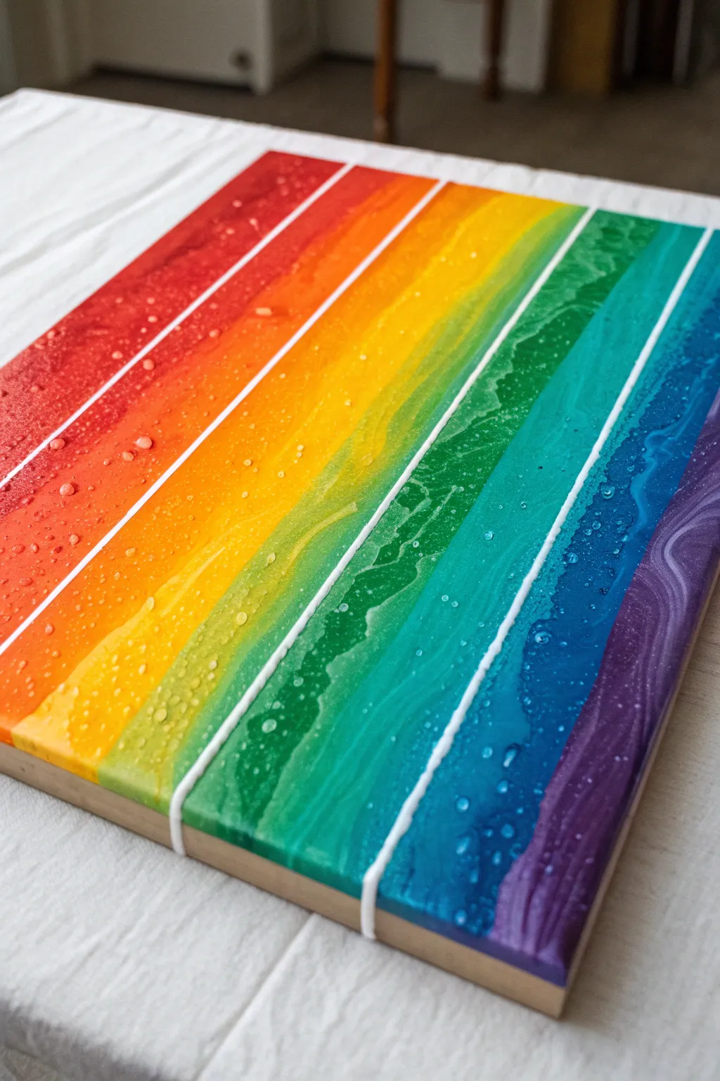
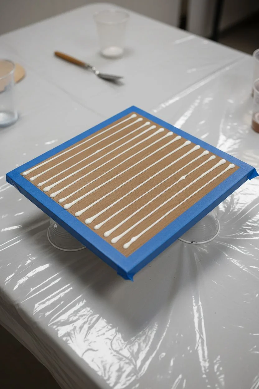
This vibrant pour painting captures the full spectrum in neat, defined bands separated by crisp white lines. The glossy, textured finish mimics the look of rippled water or stained glass, making it a striking statement piece for any room.
Step-by-Step Tutorial
Materials
- Square wood panel or canvas (approx. 12×12 inches)
- Acrylic pouring paints (Red, Orange, Yellow, Light Green, Emerald Green, Turquoise, Deep Blue, Purple)
- White acrylic paint (heavy body or high flow depending on method)
- Pouring medium (Floetrol or Liquitex)
- Squeeze bottles or piping bags (essential for the lines)
- Painter’s tape or masking tape
- Palette knife or popsicle sticks
- Cups for mixing
- Level working surface
- Clear gloss varnish or resin (optional for topcoat)
Step 1: Preparation & Mixing
-
Prepare your workspace:
Cover your table with plastic sheeting or a large garbage bag. Ensure your wooden panel is raised on cups or blocks so paint can flow off the edges freely. -
Mix your rainbow colors:
Mix each colored acrylic paint with pouring medium at a ratio of roughly 1:1 or as directed by your medium’s instructions. You want a consistency similar to warm honey—fluid enough to pour but thick enough to hold its shape slightly. -
Prepare the separator white:
For the white lines, you need a slightly thicker consistency to prevent it from bleeding into the colors. Mix your white paint with a smaller amount of medium and load it into a squeeze bottle with a fine nozzle. -
Tape the edges:
If you want clean wood sides like in the reference image, apply painter’s tape securely around the four edges of the wood panel.
Don’t Rush the White
Make sure your white separator lines are thick/tall enough. If they are too flat, the colored paint will easily flood over them and ruin the stripe effect.
Step 2: Creating the Separators
-
Mark your guidelines:
Lightly use a pencil and ruler to mark where your stripes will go. You need 8 distinct sections for the color gradient shown. -
Apply the white lines first:
Using your squeeze bottle, carefully draw the white separator lines directly onto the panel along your pencil marks. These act as dams or visual barriers. -
Let the lines set:
Allow these white lines to dry slightly, or at least firm up for about 15-20 minutes. This helps them stand up against the wet colored paint you’ll pour next.
Uneven Drying?
If the paint cracks while drying, your room might be too drafty or the paint layer was too thick. Keep the drying area temperature consistent and cover with a box.
Step 3: The Rainbow Pour
-
Start with Red:
Begin at the top left corner (or whichever side you designate as the top). Pour the Red mixture carefully into the first channel. -
Fill the Orange channel:
Move to the second section and pour your Orange paint. Use a popsicle stick to gently guide the paint to the edges of the white line without overtopping it. -
Continue with Yellow:
Pour the Yellow into the third section. I find it helpful to look closely at the boundary to ensure the paint touches the white line but doesn’t swallow it. -
Add the Greens:
Pour the Light Green into the fourth channel, followed by the darker Emerald Green in the fifth channel. -
Pour the Blues:
Next is your Turquoise or Light Blue section, followed by the Deep Blue. Maintain the same careful pouring technique. -
Finish with Purple:
Pour the final Purple section at the bottom edge. -
Create texture:
Once all channels are filled, gently tilt the board just a tiny bit left and right to level the paint. You can lightly drag a toothpick through the colored sections (avoiding the white lines) to create the subtle swirls and ripples seen in the photo.
Step 4: Drying & Finishing
-
Check for bubbles:
Use a torch or heat gun swiftly over the surface to pop any air bubbles that have risen to the top. -
Initial drying:
Let the painting sit undisturbed in a dust-free area for at least 24-48 hours. The paint will shrink slightly as it dries, revealing the texture. -
Remove tape:
Once the paint is fully dry to the touch, carefully peel away the painter’s tape from the edges to reveal the clean wood. -
Seal the piece:
For that high-gloss, glass-like finish shown in the image, apply a coat of resin or high-gloss varnish once the painting is fully cured (usually after 2-3 weeks).
Enjoy the structured beauty of your new rainbow pour art
Monochrome Grays for Dramatic Marble Swirls
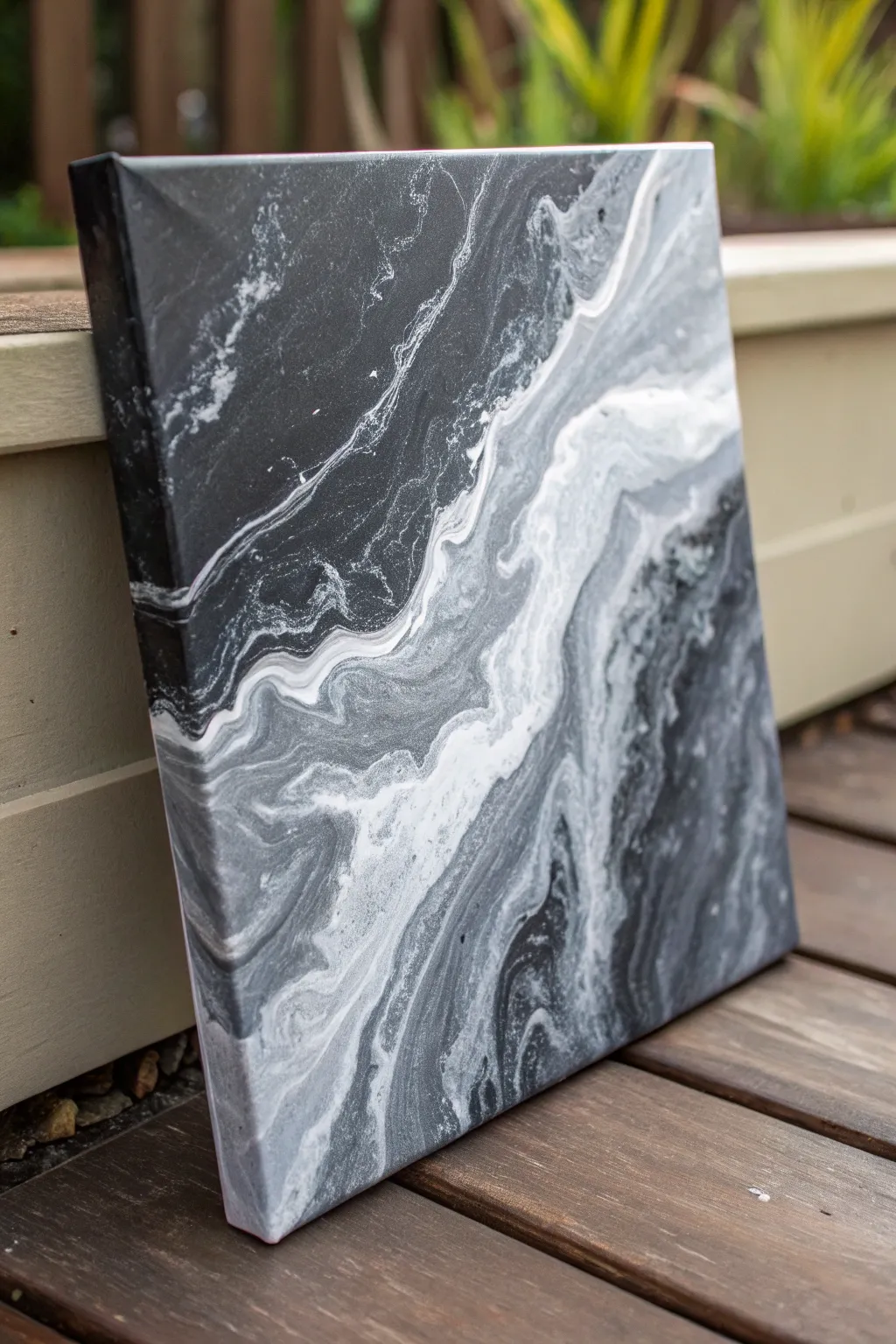
Emulate the sophisticated elegance of natural stone with this striking high-contrast pour painting. By limiting your palette to black, white, and gray, you create intense drama and fluid motion that mimics the veins found in premium marble.
Step-by-Step Guide
Materials
- Stretched canvas (e.g., 12×12 or similar)
- Black acrylic paint (heavy body or soft body)
- White acrylic paint (Titanium White)
- Pouring medium (Floetrol or Liquitex)
- Silicone oil (optional for cells)
- Plastic cups for mixing
- Stir sticks
- Hairdryer or straw for blowing paint
- Drop cloth or plastic sheeting
- Gloves
- Gesso (black or white, depending on base preference)
Step 1: Preparation & Mixing
-
Prepare your workspace:
Cover your entire work surface with a drop cloth or plastic sheeting. This process can get messy, and acrylics are permanent once dry. Ensure your canvas is raised off the table using cups or push pins in the corners. -
Prime the canvas:
If your canvas isn’t pre-primed, apply a coat of gesso. Since this piece is dark & dramatic, a black gesso base can add depth, though white works perfectly fine if that is what you have on hand. -
Mix the black paint:
In a cup, mix one part black acrylic paint with roughly two parts pouring medium. Stir slowly to avoid creating too many air bubbles. The consistency should resemble warm honey or heavy cream. -
Create the grey shades:
In separate cups, mix your white paint with pouring medium. To create the mid-tone grays seen in the photo, take a small amount of your black mixture and stir it into a portion of the white mixture until you achieve a slate grey. -
Prepare the white highlight:
Mix a final cup of pure titanium white with pouring medium. This will be your brightest highlight. I usually mix slightly less profound white than black, as the white tends to take over quickly. -
Add silicone (optional):
If you want the small cellular details seen in some marble patterns, add 1-2 drops of silicone oil to your grey and black mixtures. Stir very lightly—just one or two rotations.
Muddiness Prevention
If your greys are turning to mush, you are likely over-tilting or over-torching. Stop moving the canvas as soon as the composition looks pleasing to preserve distinct lines.
Step 2: The Pouring Process
-
Apply the base coat:
Pour a generous amount of your black mixture onto the canvas. Use a palette knife or your gloved hand to spread it, ensuring the entire surface and sides are wet. This ‘wet canvas’ helps the other colors glide. -
Create a dirty pour cup:
In a fresh, empty cup, layer your colors. Start with white, then pour in some grey, then black. Repeat this layering two or three times. Do not stir this cup. -
Pour the ribbon:
Slowly pour the contents of your layered cup diagonally across the canvas in a wandering, river-like motion. Let the stream of paint vary in width to create visual interest. -
Tilt to stretch:
Gently lift the canvas and tilt it. Allow the paint ribbon to slide and stretch across the black base. Move slowly; rapid movements can muddy the crisp lines between black and white. -
Check composition:
Look for a composition where the white and grey veins flow naturally, like sediment in stone. If you have too much negative space, you can pour a little more from your cup into the empty black areas.
Metallic Veins
Mix a small amount of silver or gold metallic paint with medium and drizzle fine lines into the wet pour for a luxurious, high-end ‘kintsugi’ marble aesthetic.
Step 3: Refining the Marble Look
-
Soften harsh edges:
If a line looks too thick or artificial, use a straw to gently blow air on it. This pushes the paint outward, creating those feathery, ethereal edges common in marble. -
Add intricate veining:
Dip a stir stick into your white or light grey mixture and drizzle very fine lines across the darker areas. Let these settle into the wet paint to mimic thin mineral fractures. -
Use the hairdryer:
For broader sweeping motion, use a hairdryer on the ‘cool’ and ‘low’ setting to push the white waves into the black. This is key for achieving that foggy, stormy effect. -
Torch for bubbles:
Quickly pass a kitchen torch or heat gun over the surface. This pops trapped air bubbles and bringing up small cells if you used silicone, adding texture to the stone effect. -
Final inspection:
Check the sides of your canvas to ensure the pattern flows over the edges, giving the piece a finished, professional look. Use your finger to dab paint onto any bald spots on the corners. -
Dry properly:
Place the painting in a dust-free area to dry on a level surface. It will take at least 24-48 hours to cure completely. Avoid fans or direct sunlight, which can cause cracking.
Once dry and varnished, you will have a sophisticated piece of art that looks heavy as stone but light as a feather
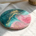
Pink-to-Red Bloom With a Dark Border
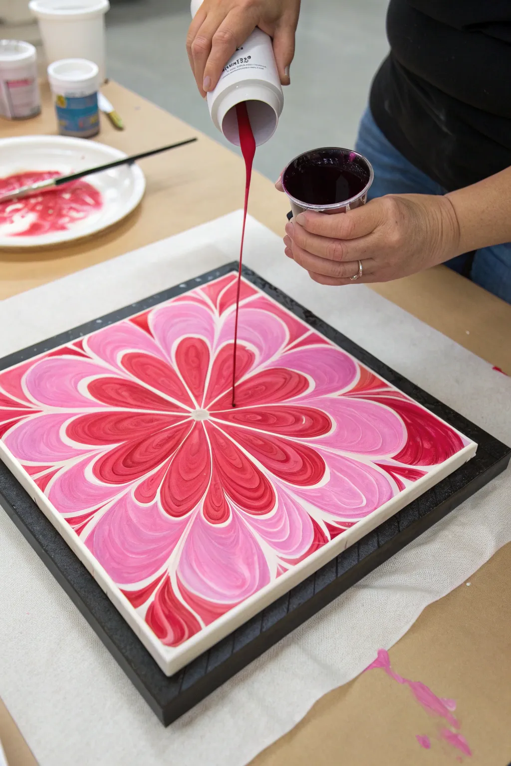
This stunning fluid art project captures the delicate symmetry of a blooming flower using shades of pink, red, and white. The result creates a mesmerizing, kaleidoscope-like design with defined petals that radiate from a central point, framed by a striking dark border.
Detailed Instructions
Materials
- Square canvas (10×10 or 12×12 inches)
- Black acrylic paint (flow consistency)
- White liquid acrylic paint
- Magenta or bright pink acrylic paint
- Deep red or crimson acrylic paint
- Pale pink or blush acrylic paint
- Pouring medium (Floetrol or similar)
- Plastic cups for mixing
- Stir sticks
- Squeeze bottles (optional, for precision)
- Lazy Susan or cake spinner (highly recommended)
- Masking tape (for the back of the canvas)
- Gloves
- Drop cloth or plastic sheeting
Step 1: Preparation and Base Layer
-
Protect your workspace:
Cover your table with a drop cloth or plastic sheeting. Tape the back of your canvas with masking tape to keep the unfinished wood clean. -
Mix your paints:
Mix each acrylic color with your pouring medium. You want a consistency similar to warm honey—fluid enough to flow but thick enough to hold a shape. Aim for a 1:1 or 2:1 ratio of medium to paint, adding water drop by drop if needed. -
Prepare the base:
Pour a generous puddle of black paint into the center of the canvas. This will act as the ‘pillow’ for your colors to float on. -
Spread the foundation:
Tilt the canvas gently or use a palette knife to spread the black paint almost to the edges, ensuring the entire surface is wet and slick.
Step 2: Building the Bloom Pattern
-
Start the center puddle:
Pour a small amount of white paint directly into the center of the wet black base layer. -
Layer the primary pink:
Pour a slightly smaller amount of your bright pink or magenta directly on top of the white puddle. -
Add depth with red:
Pour a smaller amount of deep red into the center of the pink circle. -
Create contrast:
Add a small dot of pale pink or blush into the very center. Repeat this layering process (white, pink, red, pale pink) two or three times to build up a substantial ‘puddle’ of concentric rings. -
Form the petals:
Using the handle of a paintbrush or a skewer, gently drag through the paint from the outer edge of the puddle toward the center. Wipe the tool after each stroke. -
Refine the shape:
Repeat the dragging motion at regular intervals around the circle—imagine cutting a pizza into slices. This creates the primary petal shapes. -
Create the petal curves:
Now, drag from the center outward in between your previous lines. This pulls the paint out to create the rounded tips of the flower petals.
Muddy colors?
If colors are blending into grey instead of staying distinct, your paint is likely too thin. Add a little more tube paint to thicken the mixture back to a honey consistency.
Step 3: Creating the Defined Center
-
Prepare the final pour:
Use a small cup or a squeeze bottle filled with your deep red or magenta paint. Ensure this mixture flows very smoothly. -
Pour the centerpiece:
Carefully pour a thin, steady stream of the red paint directly into the bullseye center of your flower design, just like I’m doing in the image. -
Control the flow:
Let this final color displace the existing center slightly, pushing the inner petals outward and creating a clean, defined heart for your bloom. -
Spin or tilt:
If using a lazy Susan, give the canvas a gentle spin. Centrifugal force will pull the petals outward symmetrically. If tilting by hand, rotate gently to expand the flower without distorting the shape too much. -
Check the border:
Allow the paint to expand until you have a pleasing ratio of flower to the black negative space. The black corners frame the piece beautifully. -
Dry properly:
Place the canvas on cups to elevate it for drying. Ensure it is perfectly level so the design doesn’t slide off while it cures.
Add some sparkle
Mix a fine iridescent medium or pearl white into your palest pink layer. When dry, the petals will have a subtle, shimmering quality that catches the light.
Let your masterpiece cure for several days in a dust-free area before sealing it with varnish
Neon Splash Palette Anchored by Black
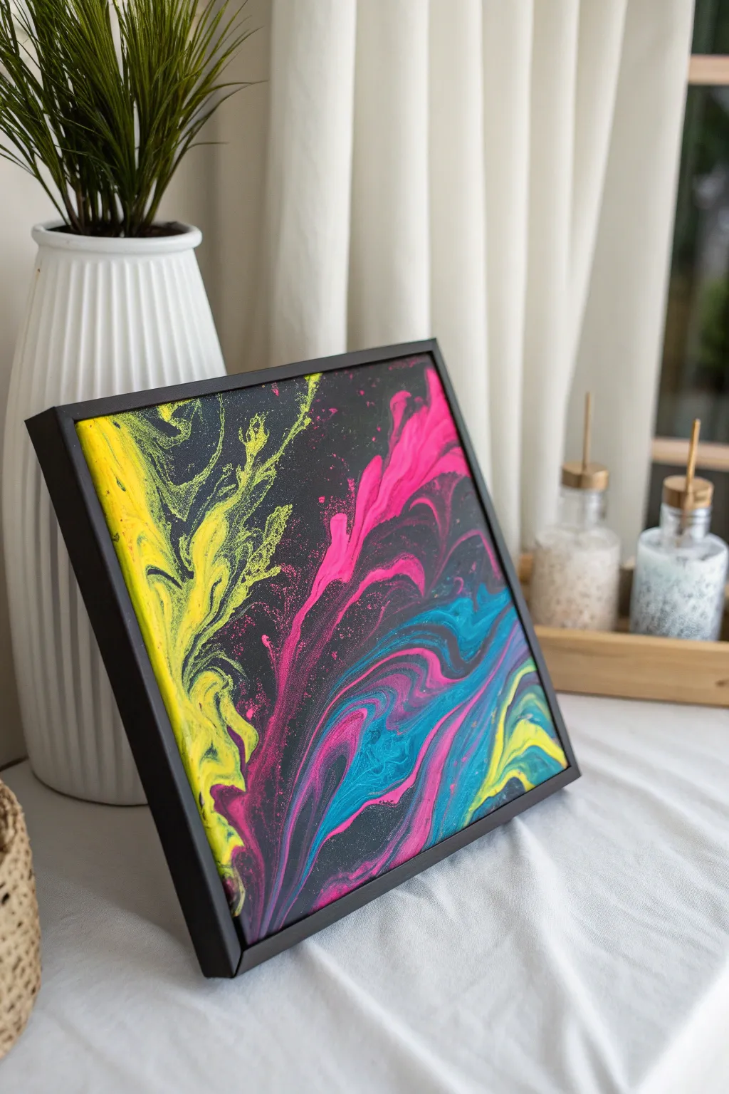
This striking acrylic pour project uses the high contrast between deep black and vibrant neon pigments to create an electric, energetic effect. The technique relies on negative space and controlled airflow to produce those signature wispy, smoke-like edges.
Step-by-Step
Materials
- Square canvas (10×10 or 12×12 inches)
- Black acrylic paint (heavy body)
- Neon yellow acrylic paint
- Neon pink/magenta acrylic paint
- Cyan blue acrylic paint
- Pouring medium (Floetrol or similar)
- Water
- Hair dryer with a diffuser or concentrator nozzle
- Plastic cups and stirring sticks
- Black floating frame (optional, for finishing)
Step 1: Preparation
-
Workspace Setup:
Cover your entire work surface with a plastic drop cloth or large garbage bags. Pour painting is messy, and acrylics can be tough to remove once dry. -
Level Check:
Use a small spirit level to ensure your canvas is perfectly horizontal. Even a slight tilt can cause your design to slide off entirely while drying. -
Tape the Back:
Apply painter’s tape to the back of the canvas edges. This keeps the back clean and makes for a professional finish later. -
Elevate Canvas:
Prop your canvas up on four upside-down cups. This allows paint to flow freely over the edges without sticking the canvas to the table.
Neon Brightness Pro Tip
Neon paints are often translucent. Mix a tiny drop of titanium white into your neon colors before adding medium to make them opaque and vibrant.
Step 2: Mixing the Paints
-
Base Consistency:
Mix your black paint with pouring medium at a ratio of about 1 part paint to 2 parts medium. Add small amounts of water slowly until it reaches a fluid consistency similar to warm honey. -
Color Consistency:
Repeat the mixing process for your neon yellow, pink, and cyan paints. It is crucial that all colors have the exact same fluidity as your black base so they move together uniformly. -
Rest Period:
Let the mixed paints sit for about 10-15 minutes to allow air bubbles created during stirring to rise to the surface and pop.
Level Up: UV Glow
Use specifically labeled UV-reactive acrylics for your neon layer. Under a blacklight, the painting will transform into a glowing light show.
Step 3: Creating the Pour
-
Flood the Canvas:
Pour a generous amount of black paint onto the center of the canvas. Spread it gently with a palette knife or spatula to cover the entire surface, ensuring the sides are also coated. -
Pop Bubbles:
Quickly run a culinary torch over the wet black base to pop any remaining air bubbles. Keep the flame moving constantly to avoid scorching the paint. -
Layering Colors:
Pour a diagonal line or puddle of the neon yellow across one section of the canvas. Follow this directly with the magenta, and then the cyan blue adjacent to it. -
Surrounding the Color:
Pour a final thin rim of black paint around your colored puddle or line. This extra ‘lubrication’ helps the colors glide over the base coat when you blow them out. -
The Initial Blow:
Using your hair dryer on the ‘cool’ and ‘low’ setting, gently blow the black rim paint slightly over the colored paints. This creates a veil that will soften the transitions. -
Blowing Out the Design:
Now, direct the airflow to push the paints outward across the black background. Aim for feathery, organic shapes rather than straight lines. -
Refining Details:
Once the main shapes are formed, use a straw to blow into specific areas. This gives you precision control to create delicate tendrils and wispy effects, particularly where the neon yellow meets the black. -
Check Composition:
Step back and look at the balance of color versus black negative space. If an area feels too heavy, use the straw to push the paint further out.
Step 4: Finishing Touches
-
Drying Process:
Allow the painting to dry undisturbed for at least 24 to 48 hours. Choose a dust-free area with stable temperature to prevent cracking. -
Remove Tape:
Once the paint is fully cured, peel off the painter’s tape from the back for a crisp edge. -
Optional Varnish:
Apply a gloss varnish to make the neon colors pop and give the black a deep, wet look. This is highly recommended for neon pigments which can dry matte. -
Framing:
Place the finished canvas into a black floating frame. This creates a shadow gap that enhances the depth of the artwork.
Hang your new neon masterpiece in a spot with good lighting to really show off those electric pigments
Minimalist Two-Color Pour Plus One Accent
This project captures the serene energy of the ocean with a restricted palette of teal, navy, and white swirling together in organic waves. It’s a perfect exercise in minimalism, proving that you only need a few colors to create deeply dimensional, water-like effects.
Step-by-Step Tutorial
Materials
- Small square canvas (e.g., 6×6 inch)
- Acrylic fluid paints or pouring medium mixture
- Colors: Deep Navy Blue, Bright Teal/Turquoise, Titanium White
- Pouring medium (like Floetrol or Liquitex)
- Small plastic cups for mixing
- Wooden stir sticks
- Hair dryer or straw (optional for blowing paint)
- Protective workspace covering (plastic sheet or drop cloth)
Step 1: Preparation & Mixing
-
Prepare the workspace:
Cover your working surface thoroughly with plastic sheeting, as pouring can get messy. Elevate your canvas on four upside-down cups to allow paint to drip off the edges freely. -
Mix the Navy base:
In the first cup, mix your Deep Navy Blue paint with pouring medium. Aim for a ratio of about 1:1 or whatever limits the bubbles while maintaining fluidity. The consistency should resemble warm honey. -
Create the Teal shade:
In a second cup, mix your Bright Teal or Turquoise with the pouring medium. Ensure this mixture has the same viscosity as your navy blue so they flow together seamlessly. -
Prepare the White accent:
In a third cup, mix Titanium White with your medium. This will be your highlight color and is crucial for creating the ‘sea foam’ effect in the final piece. -
Check consistency:
Lift your stir stick from each cup. The paint should flow off in a continuous stream without breaking, piling up slightly in the cup before settling flat.
Step 2: The Pouring Process
-
Start with the darks:
Pour a puddle of the Deep Navy Blue onto the bottom right corner and slightly towards the center of the canvas. This will anchor the composition with visual weight. -
Add the mid-tones:
Pour the Teal mixture adjacent to the navy, allowing them to touch. Pour it in a diagonal band moving from the bottom-left towards the top-right to establish movement. -
Apply the white:
Drizzle the Titanium White sparingly between the colors and along the edges of the teal. You don’t need much; thin lines work best for this scale. -
Tilt the canvas:
Gently lift the canvas and tilt it slowly in a circular motion. Watch how the paints begin to meet and marble. Don’t rush this part; let gravity do the work. -
Stretch the pattern:
Tilt the canvas more aggressively diagonal-wise to stretch the colors across the surface. Aim to cover the corners while keeping that diagonal flow intact.
Clean Lines Pro Tip
Tape the underside of your canvas with painter’s tape before pouring. Once the painting is dry, peel the tape off for perfectly clean, drip-free edges underneath.
Step 3: Refining the Details
-
Manipulate edges:
If you have distinct lines that look too rigid, gently blow on them with a straw or use a hair dryer on a low, cool setting to push the white paint over the blue, creating lacing cells. -
Create wisps:
I like to use a clean stir stick or the back of a paintbrush to drag very thin lines of white through the teal to mimic crashing waves or sea foam. -
Check the sides:
Ensure the paint has flowed over all four edges for a professional, gallery-wrapped look. Use your gloved finger to dab paint onto any bare spots on the sides. -
Pop bubbles:
Look closely for any air bubbles rising to the surface. You can pop these with a toothpick or a quick pass of a torch if you are using silicone (though this project works well without). -
Level for drying:
Place the canvas back on the elevated cups. Ensure it is perfectly level so the design doesn’t slide off while drying. -
Drying time:
Leave the painting undisturbed for at least 24 to 48 hours until completely dry. Avoid fans or drafts which can cause crazing on the surface.
Level Up: Gold Veins
Mix a small amount of metallic gold paint with medium. Drizzle very thin veins into the wet teal areas to add a luxurious shimmer that mimics sunlight hitting water.
Now you have a stunning, ocean-inspired piece of abstract art ready to brighten any small space
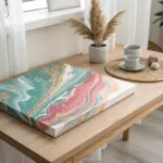
Unexpected Neutrals: Navy, Beige, and Blush
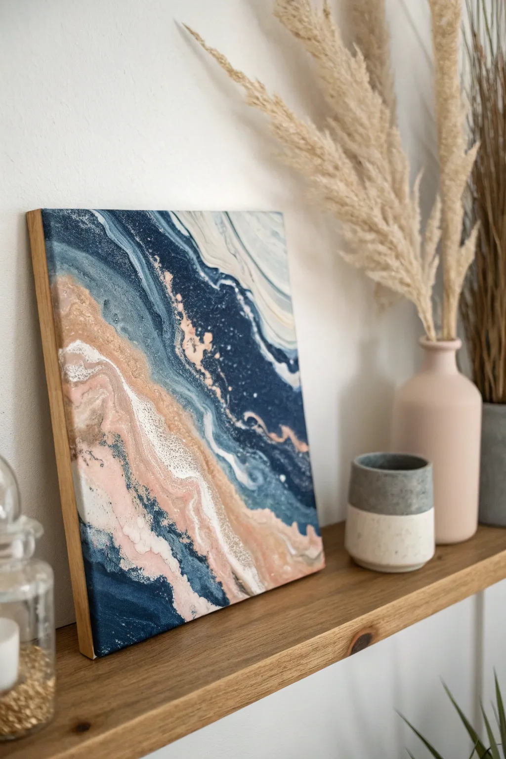
This fluid art piece captures the elegant intersection of land and sea using a refined palette of deep navy, soft blush pink, and sandy beige. The result is a calming, geode-inspired composition that brings a touch of modern serenity to any shelf or wall.
Step-by-Step Tutorial
Materials
- Square canvas (10×10 or 12×12 inch)
- Floating wood frame (natural oak finish)
- Acrylic paints (Navy Blue, Titanium White, Blush Pink, Beige/Sand, Metallic Champagne Gold)
- Pouring medium (Liquitex or Floetrol)
- Silicone oil (optional, for cells)
- Plastic cups for mixing
- Wooden stir sticks
- Palette knife or plastic spreader
- Hair dryer or straw (for blowing)
- Gloves and drop cloth
- High-gloss varnish or resin (for finish)
Step 1: Preparation & Color Mixing
-
Protect your workspace:
Lay down your drop cloth and put on gloves. Fluid art is messy, and you want to focus on the art, not the cleanup. -
Mix your base ratios:
In separate cups, mix your acrylic paints with pouring medium. A standard ratio is 1 part paint to 2 parts medium, but follow your specific medium’s instructions until the consistency resembles warm honey. -
Create the tonal variations:
To get the depth seen in the navy section, create two shades: keep one purely navy, and mix a tiny drop of black into a second cup for a deep midnight blue. -
Prepare the lighter tones:
Mix your blush pink and beige. I like to add a tiny drop of white to the beige to make it more opaque and creamy. -
Add metallics:
Mix the metallic champagne gold. This color often needs a slightly thinner consistency to shimmer properly, so add a few extra drops of medium or water.
Gold Rush
For better distinct lines like the gold veins shown here, thicken your metallic paint slightly more than the base colors so it doesn’t sink.
Step 2: The Pouring Technique
-
Map out the composition:
Visualize a diagonal line splitting the canvas. The upper right will be dominated by the dark blues, and the lower left by the lighter neutrals. -
Apply the navy base:
Pour a puddle of the navy blue mixture onto the upper right corner, spreading it slightly toward the center. -
Apply the neutral base:
Pour the white and beige mixture into the bottom left corner so the canvas is fully covered in wet paint before you add details. -
Create the diagonal river:
Along the diagonal meeting point, pour thin lines of blush pink, beige, and champagne gold. Layer them so they don’t muddily mix but sit next to each other. -
Add high-contrast accents:
Drizzle a very thin, distinct line of navy blue right into the middle of the beige/pink section to create that striking contrast seen in the reference.
Muddy Waters?
If your pink and navy are turning purple/gray where they touch, put a barrier line of white or clear medium between them before blowing.
Step 3: Manipulation & Finishing
-
The Dutch Pour technique:
Using a hair dryer on a low, cool setting (or just your breath and a straw), gently blow the white and beige paints over the edges of the navy blue. -
Refining the waves:
Use a straw to blow specifically on the blush and gold veins, feathering them out to create organic, lacy webbing rather than solid blocks of color. -
Tilt for movement:
Gently tilt the canvas just a few degrees in various directions to stretch the cells and soften any hard lines created by the blowing. -
Check the edges:
Ensure the sides of the canvas are covered. Use a finger to dab paint onto any bare spots on the edges for a professional gallery-wrap look. -
Pop bubbles:
Wait 10 minutes, then quickly pass a culinary torch or heat gun over the surface to pop air bubbles and encourage small cells to rise. -
Dry thoroughly:
Let the painting dry on a level surface for at least 48 to 72 hours. Acrylic pours dry slowly. -
Varnish:
Once fully cured, apply two coats of high-gloss varnish or a layer of art resin to achieve the glass-like finish shown in the photo. -
Frame it:
Place the finished canvas into a floating natural wood frame. Secure it from the back to complete the high-end aesthetic.
The juxtaposition of the deep ocean tones against the soft sandy hues makes this a timeless piece for your home decor


Have a question or want to share your own experience? I'd love to hear from you in the comments below!