When I’m craving that cozy holiday feeling, I reach for my paints and make a little stack of Christmas watercolor minis—cards, tags, and tiny frame-worthy pieces. Here are my favorite christmas watercolor painting ideas that feel festive, doable, and genuinely fun to paint.
Simple Evergreen Christmas Tree Silhouettes
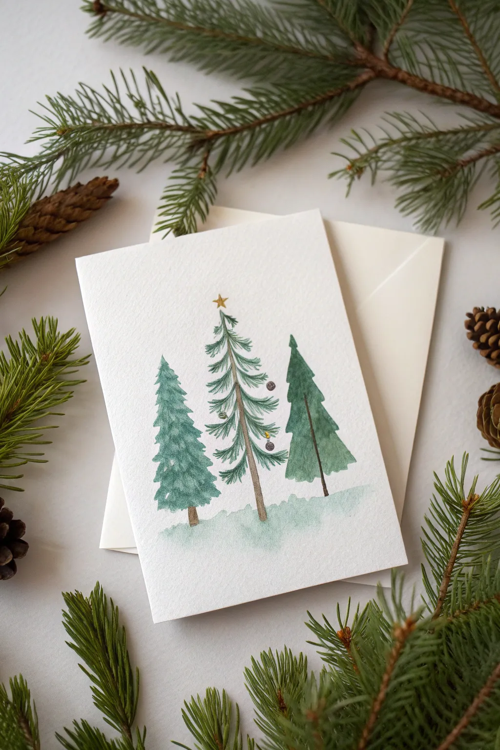
Capture the quiet beauty of a winter forest with this elegant greeting card design. Using distinct brushstrokes and a muted evergreen palette, you’ll create a trio of stylized trees that feels both modern and traditional.
Step-by-Step Guide
Materials
- Cold press watercolor paper (cut to 5×7 inches)
- Watercolor paints (Sap Green, Hooker’s Green, Burnt Umber or Sepia, Payne’s Grey, Gold)
- Round watercolor brushes (sizes 2 and 6)
- Pencil (HB or lighter)
- Kneaded eraser
- Clean water
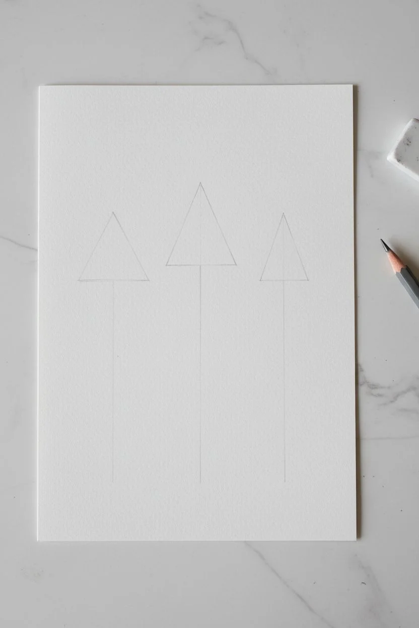
Step 1: Planning and Sketching
-
Card Preparation:
Cut your watercolor paper to size. If you want a folded card, cut a larger piece (10×7 inches) and score it down the center, but keep it flat while painting to avoid buckling. -
Vertical Guidelines:
Using a very light touch with your pencil, draw three vertical lines to mark the trunks of the trees. The center tree should be slightly taller than the flanking two. -
Shape Outlines:
Lightly sketch triangular guidelines for the overall shape of each tree. The left tree is stout and full, the middle is tall and sparse, and the right is slender and solid.
Step 2: Painting the Left Tree
-
Mixing the Color:
Mix a cool, soft green by combining Hooker’s Green with a touch of Payne’s Grey and plenty of water. -
Layering Branches:
Start from the top of the left guideline. Use the tip of your size 6 brush to dab small, irregular triangular shapes, working your way down. -
Building Volume:
As you move lower on the tree, press the brush belly down harder to create wider, fuller boughs. Leave tiny slivers of white paper showing between strokes to suggest snow or light. -
Adding the Trunk:
While the green is still slightly damp, drop a tiny line of diluted Burnt Umber for the trunk at the very bottom so it bleeds softly into the lowest branches.
Brush Control Tip
Rotate your paper while painting the branches so your hand stays in a natural position. Pull strokes toward your body for better control over the tapered ends.
Step 3: The Center Tree
-
Trunk First:
For the tall middle tree, switch to your size 2 brush. Paint a slender, broken line of Burnt Umber all the way up the center guideline, stopping just short of the top star area. -
Pine Needle Texture:
Load your brush with a brighter Sap Green. Starting from the top, paint downward-sweeping, curved branches radiating from the trunk. -
Sparse Aesthetic:
Keep this tree airy. Leave distinct gaps between layers of branches so the trunk remains visible. This creates a realistic ‘Charlie Brown tree’ look. -
Tiny Ornaments:
Once the green is dry, add minuscule dots of Payne’s Grey or dark purple to represent ornaments hanging from the tips of a few branches. -
The Golden Star:
With a steady hand and your smallest brush, paint a simple five-point star at the very peak using gold paint or metallic watercolor.
Add Some sparkle
Once the paint is dry, use a mesmerizing glitter fineliner or a white gel pen to add highlights on the ornaments or tiny snowflakes falling around the trees.
Step 4: The Right Tree
-
Solid Silhouette:
Mix a deeper, moodier green by adding more pigment and less water. Use a ‘wet-on-dry’ technique here for sharper edges. -
Single Wash:
Paint the right-hand tree as a more solid, unified shape with jagged edges, rather than individual branches. This provides contrast to the detailed middle tree. -
Trunk Detail:
Paint a very thin, distinct brown trunk line extending from the bottom of the foliage.
Step 5: Grounding the Scene
-
Snowy Shadow:
Dilute your leftover green mix with a lot of water until it is very pale. -
Applying the Wash:
Gently sweep this watery mix across the bottom of the trees to ground them. I like to let the edges be uneven and cloudy to mimic drifting snow. -
Final Cleanup:
Wait until the painting is completely bone-dry, then gently erase any remaining pencil guidelines that are visible.
Slip this charming handmade card into an envelope and it is ready to warm someone’s holiday season


Hanging Ornament Trio With Soft Gradients
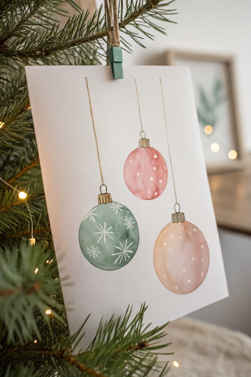
Capture the delicate beauty of the holiday season with this minimalist watercolor study featuring three hanging baubles. The piece relies on wet-on-wet techniques to create soft, dimensional lighting effects, contrasted by crisp, fine lines for the strings and patterns.
Detailed Instructions
Materials
- Cold press watercolor paper (300 gsm)
- Watercolor paints (Sage Green, Dusty Rose/Pink, Warm Beige/Peach, Yellow Ochre, Burnt Sienna)
- Round watercolor brushes (sizes 6 and 2)
- White gouache or white gel pen
- Pencil and eraser
- Ruler
- Two jars of water
- Paper towels
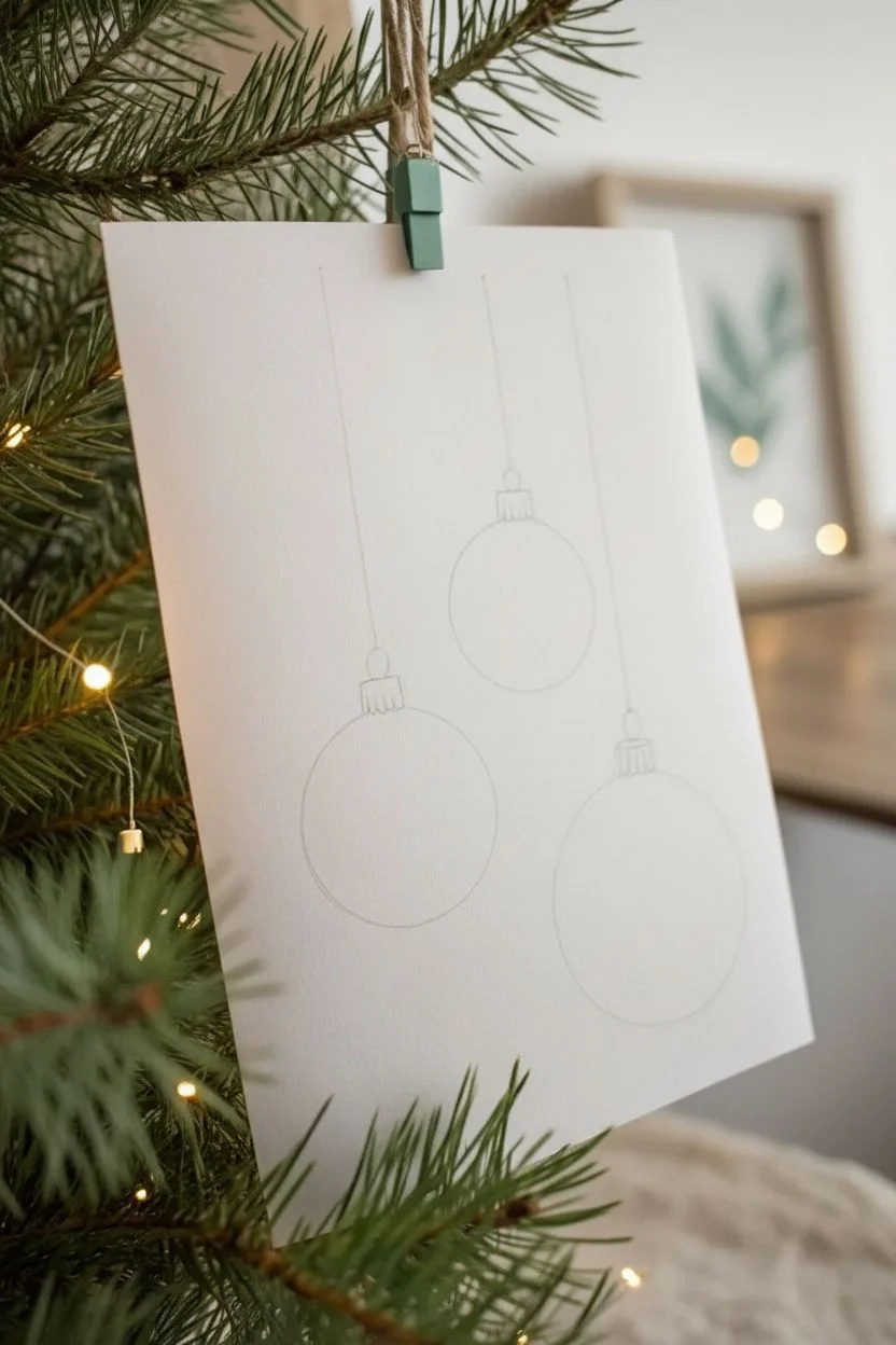
Step 1: Sketching the Composition
-
Plan the placement:
Visualize three vertical lines of varying lengths. Imagine the ornaments hanging at staggered heights to create a balanced, asymmetrical composition. -
Draw the guidelines:
Using your ruler and a very light pencil touch, draw three straight vertical lines coming down from the top edge of your paper. Make the left one the shortest string, the middle one medium length, and the right one the longest string. -
Sketch the ornament shapes:
At the end of each line, sketch a perfect circle. You can trace a small cup or circular object if you struggle with freehand circles so they stay uniform. -
Add the caps:
Draw small rectangular caps at the top of each bauble where it meets the string. Add tiny vertical lines inside the caps to mimic the texture of crimped metal.
Uneven Gradients?
If your gradient dries with hard edges (a ‘watermark’), your paper likely dried too fast. Rewet the whole shape gently and add a bit more pigment to smooth the transition.
Step 2: Painting the Pink & Beige Baubles
-
Base wash for the pink ornament:
Start with the middle ornament. Mix a watery dusty rose color. Using your size 6 brush, fill the circle with clean water first (wet-on-wet technique), then drop in your pink pigment, concentrating the color on the bottom right side. -
Create the highlight:
While the paint is still wet, lift a small amount of pigment from the upper left area using a clean, damp brush. This creates a soft highlight that makes the ornament look round. -
Paint the beige ornament:
Moving to the lower right ornament, repeat the process using a warm beige or peach tone. Wet the shape, drop in color heavily on the bottom right shadow side, and keep the top left pale and watery. -
Let them dry:
Wait for these two ornaments to dry completely before touching anything nearby to prevent colors from bleeding into each other.
Sparkle Effect
Mix a tiny pinch of metallic gold watercolor or iridescent medium into your string color or the ornament patterns for a festive shimmer that catches the light.
Step 3: Painting the Green Bauble
-
Mix the sage green:
For the bottom left ornament, mix a muted sage green. You want this one to feel slightly incredibly matte and earthy. -
Apply the green wash:
Paint the circle using the same gradient technique: darker on the bottom right, lighter on the top left. I like to tilt the paper slightly while the paint is wet to help the gradient settle naturally. -
Dry completely:
This step is crucial. The paper must be bone dry before you add the white details, or the white ink will feather and disappear.
Step 4: Adding Details & Hardware
-
Paint the caps:
Mix a golden-brown using Yellow Ochre and a touch of Burnt Sienna. With your size 2 brush, carefully paint the small caps on top of each ornament. -
Draw the strings:
Using the very tip of your size 2 brush (or a fine liner pen if you prefer stability), trace over your original pencil lines with the golden-brown mix to create the hanging strings. -
Add snow dots:
Dip a small brush into white gouache or use a white gel pen. Add random, tiny polka dots to the pink and beige ornaments to mimic falling snow or a festive pattern. -
Paint the snowflakes:
On the green ornament, draw delicate star-burst snowflakes. Start with a simple cross, then add an ‘X’ through the center, and finish with tiny ticks at the end of each line. -
Final touches:
Erase any visible pencil guidelines that weren’t covered by paint, once you are certain the artwork is 100% dry.
Hang your finished painting on the tree or frame it as a lovely minimalist holiday decoration

Snowflake Card With Masked Negative Space
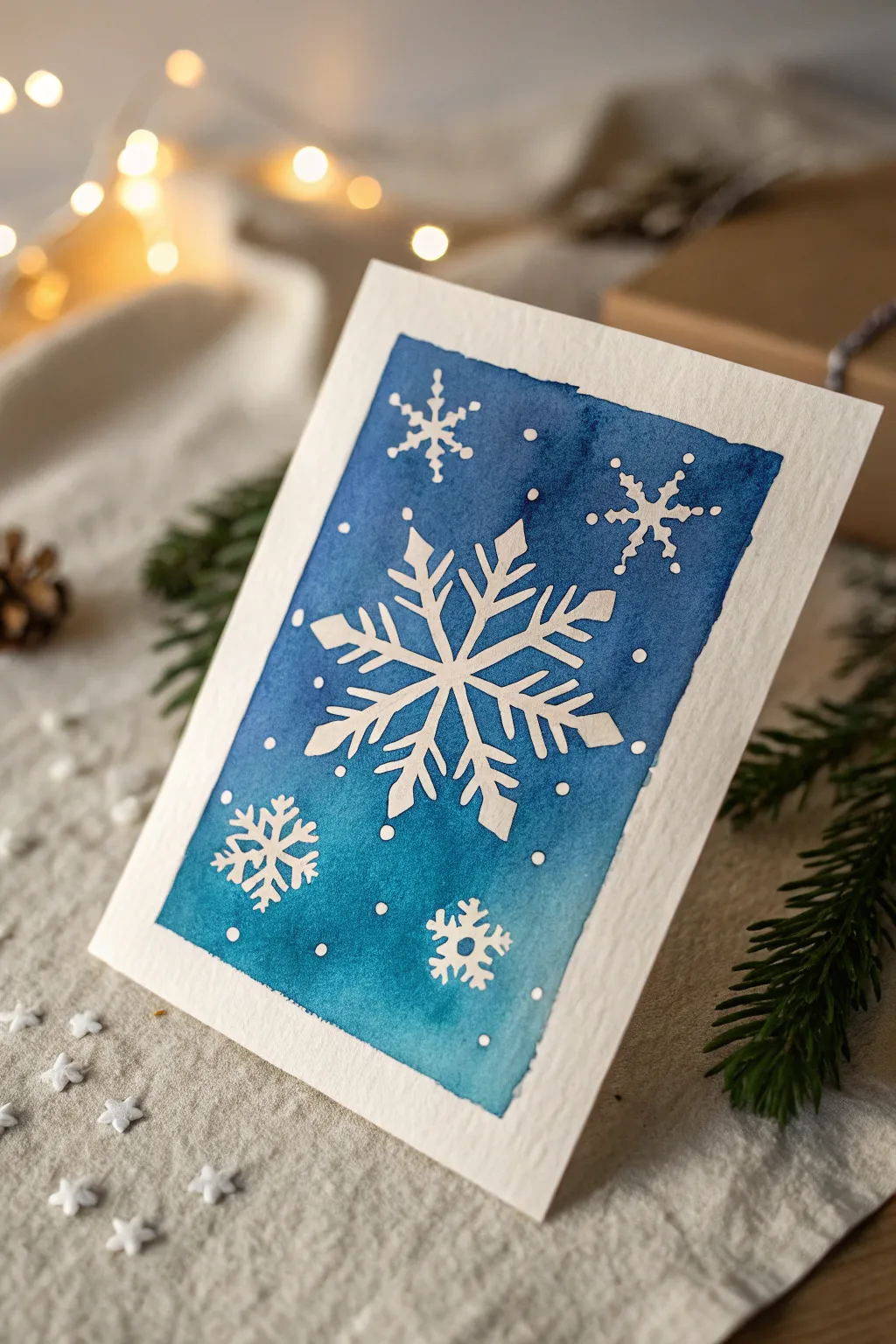
Capture the delicate beauty of winter with this striking negative space watercolor card. By using masking fluid to preserve the crisp white of the paper, you can create a vibrant, snowy scene that pops against a deep blue wash.
Step-by-Step
Materials
- Cold press watercolor paper (cut to card size)
- Masking fluid (drawing gum)
- Fine liner brush or masking fluid applicator
- Watercolor paints (Prussian Blue, Ultramarine, Turquoise)
- Wide flat wash brush
- Soft round brush (size 6 or 8)
- Clean water and paper towels
- Drafting tape or painter’s tape
- Rubber cement pickup tool or clean finger
- Pencil and eraser (optional)
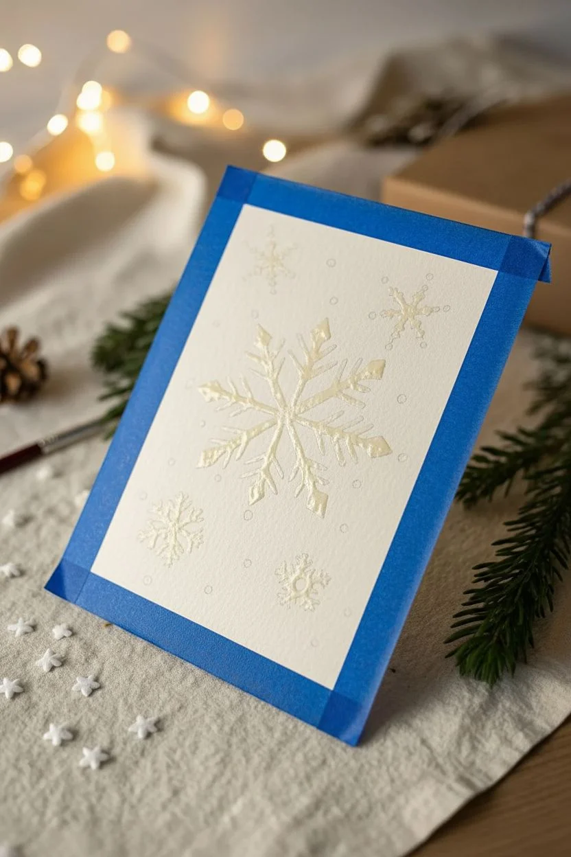
Step 1: Design & Masking
-
Prepare the card base:
Cut your watercolor paper to 5×7 inches or your desired folded card card size. If cutting a single sheet to mount later, leave a small border. -
Tape the edges:
Secure the paper to your work surface using drafting tape. This not only keeps the paper flat but creates that clean, professional white border seen in the final piece. -
Sketch the center snowflake:
Lightly sketch a large, six-pointed snowflake in the center of the card using a pencil. Keep the lines very faint so they erase easily later. -
Add floating elements:
Sketch three or four smaller snowflakes near the corners and scatter small dots randomly to represent falling snow. -
Apply masking fluid:
Dip your fine liner brush or applicator into the masking fluid. Carefully paint over your pencil lines, filling in the shapes of the snowflakes completely. -
Refine the details:
Ensure the points of your snowflakes are sharp. Adds dots of masking fluid for the snow, varying their sizes for interest. -
Let it dry completely:
Allow the masking fluid to dry fully. It should feel transparent and tacky but not wet. Patience here is crucial to prevent tearing.
Step 2: Painting & Reveal
-
Prepare your palette:
Mix a generous amount of blue watercolor. I like to blend Prussian Blue with a touch of Turquoise for that deep, icy winter sky look. -
Wet the paper:
Using a clean brush, apply a light coat of clear water over the entire masked area. This ‘wet-on-wet’ technique helps the color flow smoothly. -
Apply the wash:
Load your wide brush with the blue mixture and sweep it across the paper, painting right over the masked snowflakes. -
Create variation:
Drop in more concentrated pigment while the paper is still wet, specifically around the central snowflake, to create depth and contrast. -
Add texture (optional):
Sprinkle a tiny pinch of coarse salt onto the wet paint if you want extra icy texture, though a smooth wash looks elegant too. -
Dry the paint:
Let the paint dry completely. The paper must be bone dry before the next step, or you risk smudging the blue ink into the white areas. -
Remove the mask:
Gently rub the dried masking fluid with a rubber cement pickup tool or your clean finger. Roll it away to reveal the pristine white paper underneath. -
Erase guidelines:
If any pencil lines are still visible inside the white snowflakes, gently erase them now. -
Finishing touches:
If needed, use a white gel pen to touch up any tiny spots where the paint might have bled, or to add extra tiny sparkles. -
Remove tape:
Carefully peel away the painter’s tape at a 45-degree angle to reveal your crisp, clean frame.
Soap Saver
Before dipping your brush into masking fluid, coat the bristles with bar soap. This creates a barrier that prevents the fluid from ruining your brush bristles.
Sparkle Finish
Mix a tiny amount of iridescent medium or pearl watercolor into your blue wash. The subtle shimmer will make the background look like a frosty night sky.
Now you have a stunning, frosty card that captures the magic of the season


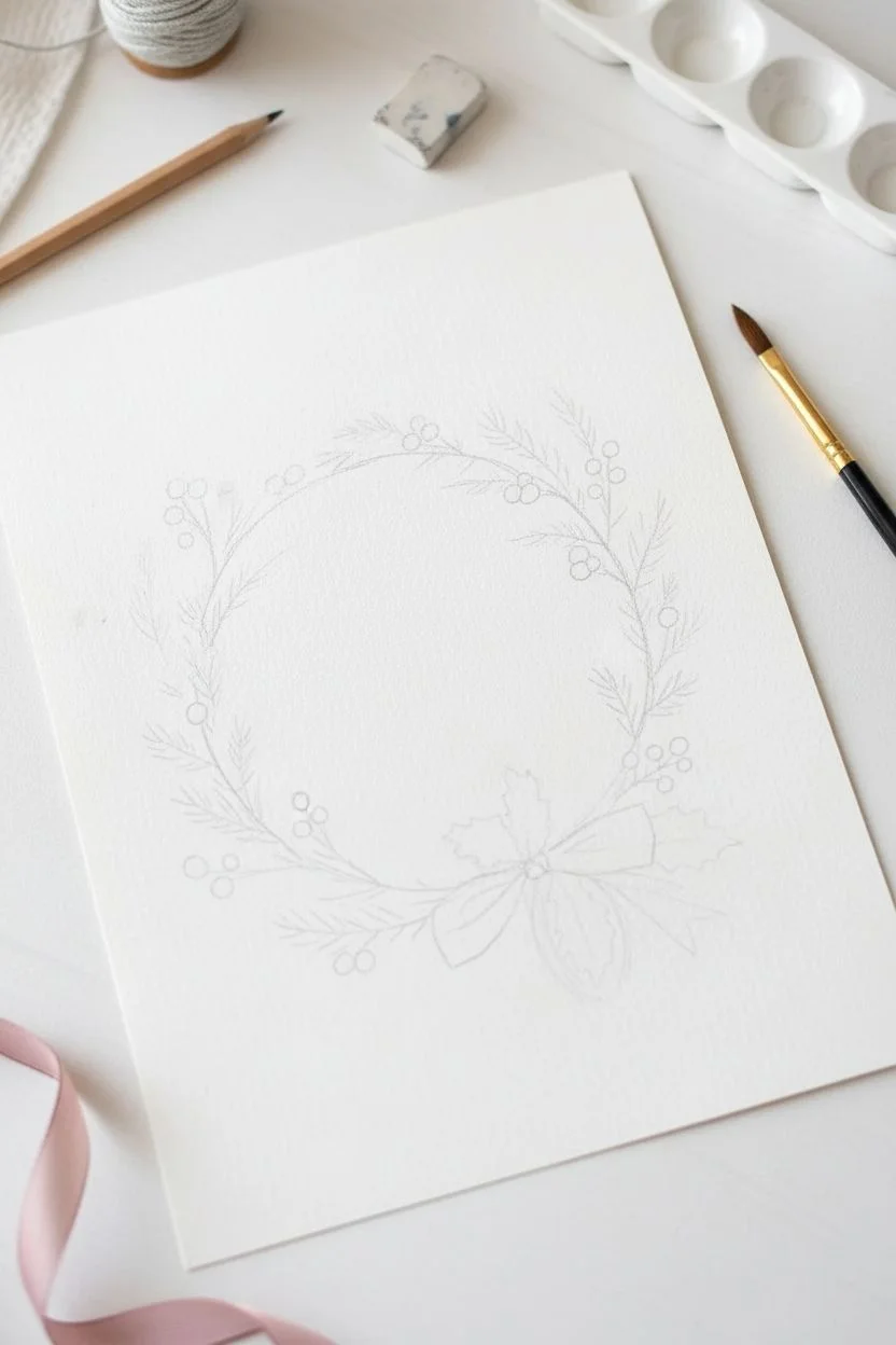
Holiday Wreath With Pine, Berries, and Bows
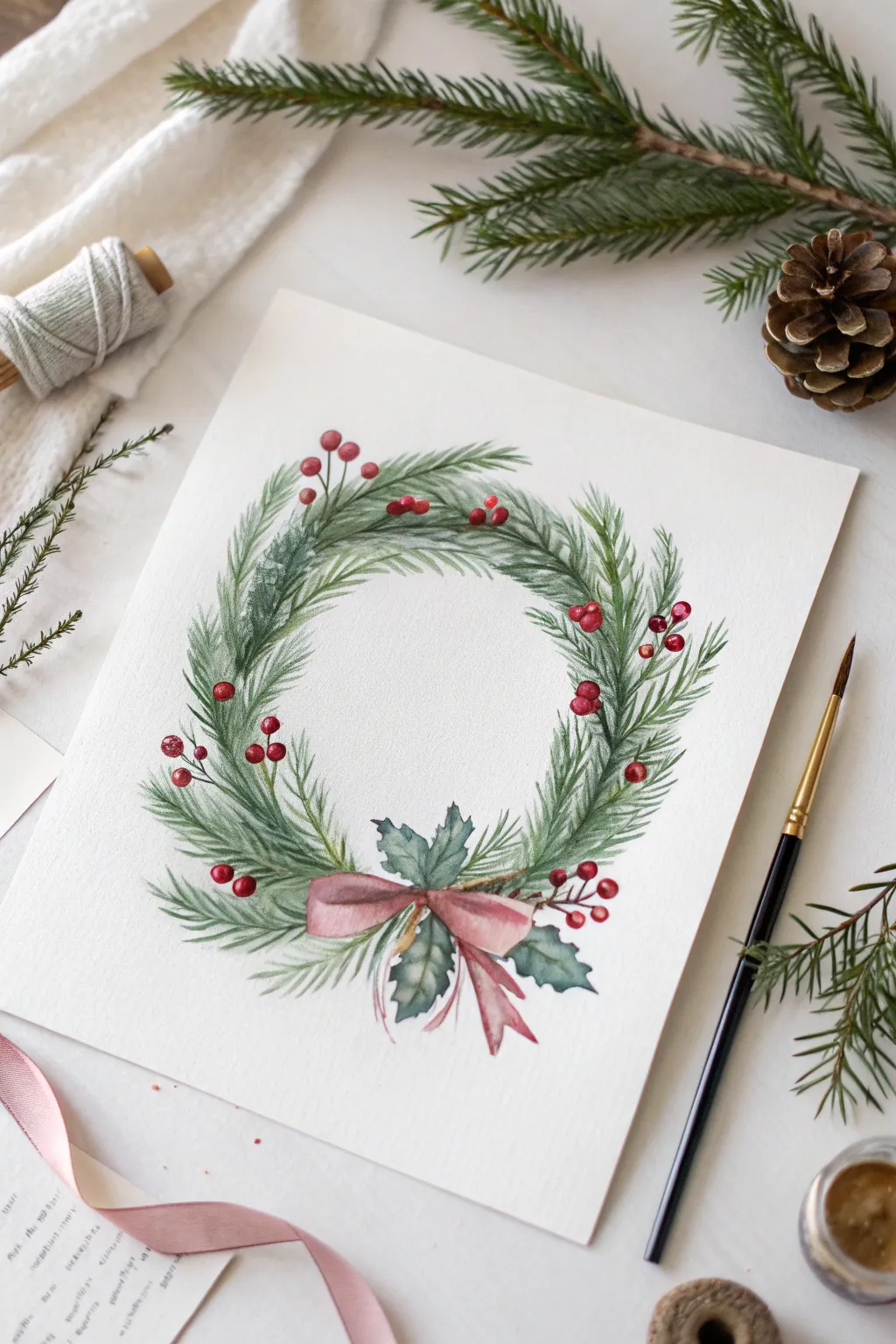
Capture the delicate beauty of the season with this elegant watercolor wreath featuring soft pine branches, vibrant red berries, and a gentle pink bow. This project balances fine detailed needlework with loose, watery washes for a timeless holiday look.
How-To Guide
Materials
- Cold press watercolor paper (140lb/300gsm)
- Round watercolor brushes (sizes 2, 4, and 6)
- Watercolor paints: Sap Green, Hooker’s Green, Alizarin Crimson, Indigo, Burnt Umber, and a soft Rose/Pink
- Pencil (HB or H) and kneaded eraser
- Two jars of water
- Paper towels
- masking fluid (optional)
Step 1: Planning and Sketching
-
Trace the Circle:
Begin by lightly tracing a perfect circle in the center of your paper using a bowl or compass. This will serve as the spine for your wreath. -
Outline Key Elements:
Sketch the placement of the bottom bow and the holly leaves underneath it. Then, lightly indicate the flow of the main pine branches wrapping around the circle, ensuring they all follow a clockwise or counter-clockwise direction. -
Mark Berry Clusters:
Draw tiny circles for the berries in small clusters of two or three around the wreath. Drawing them now helps you avoid painting green pine needles right through where the red should be.
Muddy Greens?
Wait for each layer of pine needles to dry fully before adding the next. Wet-on-wet layering blends colors into a blob; wet-on-dry keeps needle strokes crisp.
Step 2: Painting the Foliage
-
Base Pine Layer:
Mix a watery Sap Green. Using your size 4 brush, paint the first layer of pine needles. Use quick, flicking strokes that start at the branch spine and lift off the paper at the end for wispy tips. -
Deepening the Greenery:
While the first layer is still slightly damp but not soaking, mix a darker green using Hooker’s Green and a touch of Indigo. Add a second layer of needles in the shadowy areas closer to the branch spine to create depth. -
Adding Holly Leaves:
For the leaves near the bow, mix a blue-green shade using Indigo and a little Sap Green. Paint the holly leaves, leaving tiny white gaps along the veins if possible for a natural look. -
Defining the Branches:
Using a size 2 brush and a mix of Burnt Umber with a tiny bit of green, paint thin, broken lines for the visible woody stems connecting the pine sprays. -
Softening Edges:
If any pine needles look too stiff, take a clean, slightly damp brush and gently soften the outer edges of the clusters to make them look fluffier.
Step 3: Berries and Bow
-
Painting the Berries:
Load your small brush with concentrated Alizarin Crimson. paint the berries carefully. I like to leave a tiny speck of white paper unpainted on one side of each berry to act as a highlight. -
Berry Stems:
Connect the berry clusters to the main wreath using thin lines of your brown mix. Ensure the connections look logical and rooted in the greenery. -
The Pink Bow Base:
Mix a diluted Rose or soft Pink. Paint the main shape of the bow and the ribbons tailing down. Keep this wash very light and watery. -
Ribbon Shadows:
Once the base pink is dry, mix a slightly stronger, thicker pink. Paint the folds and shadows where the ribbon knots and overlaps itself to give it 3D volume.
Pro Tip: Texture
Vary your green mixes slightly for every few strokes—add a touch more yellow or blue. This creates natural variation so the wreath doesn’t look artificial.
Step 4: Finishing Touches
-
Enhancing Contrast:
Mix your darkest green yet (Indigo heavy). Add very sparse, fine pine needles in the deepest recesses of the wreath to make the lighter greens pop. -
Berry details:
If your berries dried a bit flat, add a second coat of red to the bottom curve of each sphere for a rounder appearance. -
Final Cleanup:
Wait until the painting is completely bone dry. Gently erase any visible pencil marks, specifically around the delicate tips of the pine needles.
Hang your beautiful wreath painting or digitize it for custom holiday cards
BRUSH GUIDE
The Right Brush for Every Stroke
From clean lines to bold texture — master brush choice, stroke control, and essential techniques.
Explore the Full Guide
Candy Cane Stripes and Peppermint Swirls
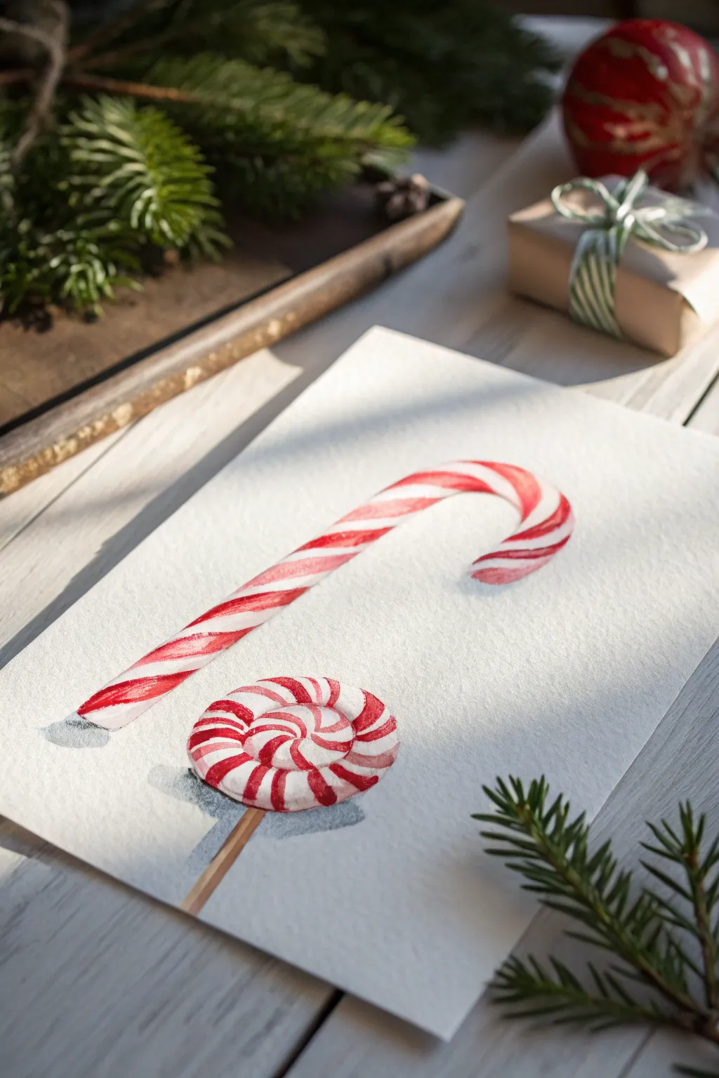
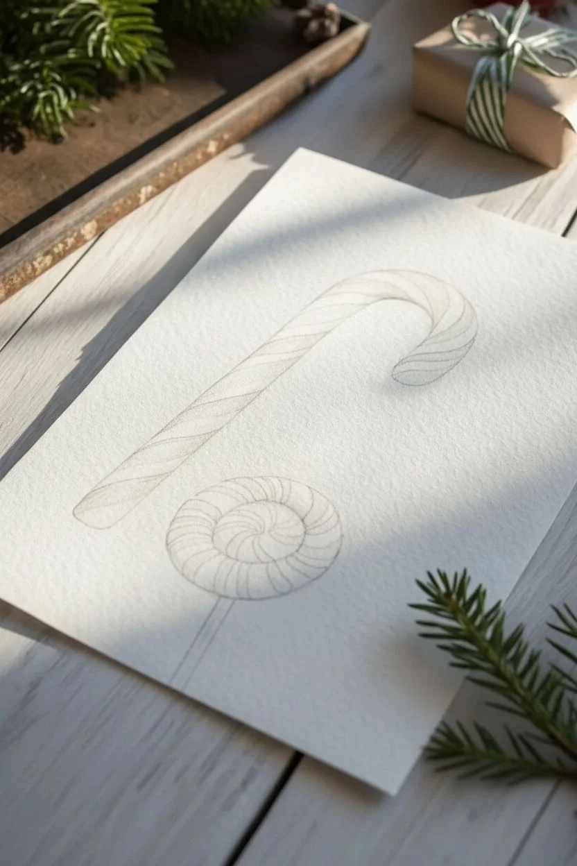
Capture the nostalgic sweetness of the holidays with this charming watercolor study of striped confections. The bright reds pop beautifully against crisp white paper, creating a festive composition that feels almost good enough to eat.
Step-by-Step Tutorial
Materials
- Cold press watercolor paper (300 gsm)
- Round watercolor brushes (Size 4 and Size 2)
- Watercolor paints (Alizarin Crimson, Cadmium Red, Burnt Sienna, Payne’s Gray)
- Pencil (HB or H)
- Kneaded eraser
- Clean water and paper towels
- Palette for mixing
Step 1: Sketching the Sweets
-
Outline the shapes:
Begin with a very light pencil sketch. Draw a long, curved hook shape for the candy cane on the upper half of the paper. Below it, sketch a circle for the lollipop head and a thin stick extending downwards. -
Map the stripes:
Lightly mark the diagonal bands across the candy cane. For the lollipop, draw curved lines radiating from the center to create the swirl pattern. Keep these lines faint so they won’t show through the red paint later. -
Clean up the sketch:
Use your kneaded eraser to lift any excess graphite. You want ghost lines that are barely visible to guide your painting without muddying the colors.
Step 2: Painting the Candy Cane
-
First red layer:
Mix a vibrant red using Cadmium Red and a touch of water. With your size 4 brush, carefully paint every other stripe on the candy cane. Leave the white stripes completely dry and untouched. -
Add curvature rendering:
While the red stripes are still damp, drop a slightly darker red (Alizarin Crimson) along the bottom edge of each red stripe. This creates a shadow that makes the cane look round rather than flat. -
Softening the highlights:
Rinse your brush and blot it until it’s just damp. Gently lift a tiny bit of pigment from the top-center of each red stripe to create a highlight where the light hits. -
Shading the white stripes:
The white stripes aren’t pure white. Mix a very watery, pale wash of Payne’s Gray. Paint a thin shadow line along the bottom edge of the white stripes to imply roundness, fading it out as it moves up.
Keep it clean
Wait for the red stripes to be bone-dry before painting adjacent shadows. Red bleeds easily into wet paper, which will turn your crisp white stripes pink.
Step 3: Painting the Lollipop
-
Swirl foundation:
Using the size 2 brush for precision, fill in the red sections of the swirl. Start from the center and paint outwards, following the curve of your sketch. -
Deepening the swirl:
Just like the candy cane, add a darker red value to the shadowed side of the lollipop (the bottom right area) while the paint is settling. This gives the flat circle dimension. -
Defining the edges:
I find that lollipops often have a hard, glassy edge. Use a slightly more concentrated red to define the outer rim of the red sections, ensuring the shape stays crisp. -
Painting the stick:
Mix Burnt Sienna with a tiny bit of red. Paint the lollipop stick with a single confident stroke. Add a thin line of darker brown on the right side for shadow.
Stripes looking flat?
You likely forgot the reflected light. Lift a tiny bit of color from the very bottom edge of the red stripes to show light bouncing up from the surface.
Step 4: Shadows and Finishing Touches
-
Mixing shadow color:
Create a cool, transparent shadow color using Payne’s Gray and a lot of water. It should be very faint. -
Cast shadows:
Determine your light source (coming from the top left). Paint a soft, diffuse shadow underneath the candy cane and the lollipop head, extending to the bottom right. -
Softening edges:
Before the shadow paint dries, use a clean, damp brush to soften the outer edges of the cast shadows so they blur gently into the white paper. -
Final highlights:
If your highlights faded during drying, you can use a tiny bit of white gouache or a white gel pen to add strictly limited sharp reflections on the glossiest parts of the candy.
Once dry, this festive painting makes a perfect holiday card or a sweet addition to your seasonal decor gallery wall.
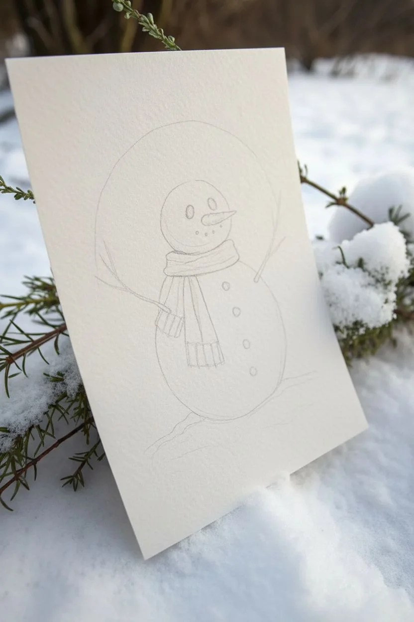
Snowman in a Soft Winter Wash
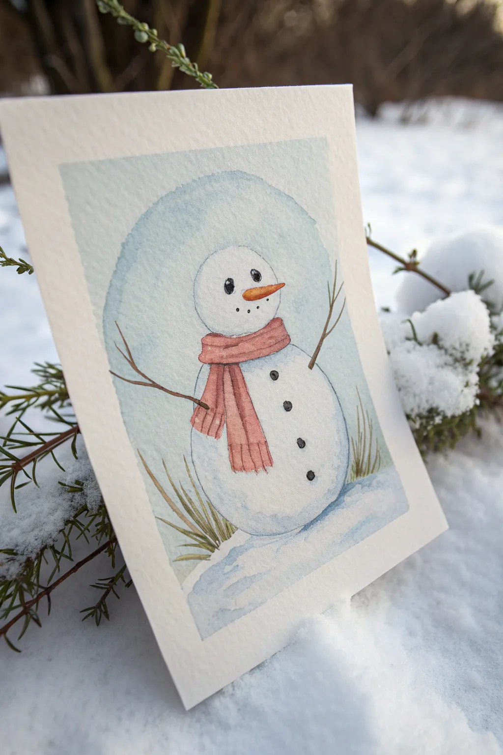
Capture the stillness of winter with this charming snowman illustration, painted in soft watercolors and gentle lines. This project features a classic arched background and uses a limited palette to create a cohesive, frosty atmosphere perfect for holiday cards.
Detailed Instructions
Materials
- Cold press watercolor paper (approx. 140lb/300gsm)
- Pencil (HB or similar) for light sketching
- Kneaded eraser
- Watercolors: Indigo or Paynes Gray, Burnt Sienna, Burnt Umber, muted red (like Alizarin Crimson or Perylene Maroon), Orange
- Round watercolor brushes (sizes 2, 4, and 6)
- Fine liner pen (black waterproof ink, 0.1 or 0.3mm)
- Masking tape (for clean edges, optional)
- Two jars of water and paper towels
Step 1: Sketching the Composition
-
Outline the Snowman:
Start by lightly sketching the snowman’s basic structure. Draw a larger circular shape for the body and a slightly smaller, rounder shape on top for the head. -
Add Details:
Sketch the carrot nose pointing to the right, two small oval eyes, a dotted smile, and simple stick arms reaching outward. -
Sketch the Scarf:
Drape a scarf around the snowman’s neck. Draw the loop first, then add the two tails hanging down the front of the body, adding faint lines for fringes at the bottom. -
Define the Background Shape:
Create the arched background commonly seen in vintage illustrations. Lightly draw an arch that frames the snowman, leaving negative space around the edges of your paper.
Step 2: Painting the Wash
-
Prepare the Background Blue:
Mix a very dilute wash of Indigo or Paynes Gray with plenty of water. You want a pale, icy blue tone. -
Paint the Sky Arch:
Carefully paint the arched background area, painting around the snowman figure. Keep the edges slightly soft or irregular for a hand-painted look. -
Soften the Snow:
While the background is still wet, you can lift a little pigment with a thirsty brush near the top to create subtle variations in the sky color. -
Ground the Figure:
Continue the pale blue wash down to the bottom of the arch to represent the snowy ground, making it slightly darker directly under the snowman. -
Shadow the Body:
Using an even lighter mix of the same blue, paint the shadowed side of the snowman (the left side) to curb the form, leaving the center and right side clean white.
Pro Tip: Soft Highlights
When painting the eyes, use a white gel pen at the very end to add the highlight if you accidentally painted over the white paper reserve.
Step 3: Adding Details & Warmth
-
Paint the Scarf:
Mix a muted red tone. Paint the scarf carefully, allowing the color to pool slightly at the bottom of the hanging sections for natural shading. -
Detail the Fringes:
Add tiny vertical strokes at the bottom of the scarf tails for the fringe details while the red is damp but not soaking wet. -
Paint the Nose:
Use a bright orange for the carrot nose. Drop a tiny speck of Burnt Sienna on the underside for a shadow. -
Create the Stick Arms:
Mix Burnt Umber with a touch of blue for a dark brown. Using your smallest brush, paint thin, branching lines for the arms. -
Add Winter Grass:
With a mix of Burnt Sienna and a little green or blue (to dull it down), flick upward strokes at the base of the snowman to create dry winter tufts of grass poking through the snow.
Troubleshooting: Hard Edges
If your background wash dries with harsh lines, soften the edge with a clean, damp brush immediately after applying the paint to blur it out.
Step 4: Final Definition
-
Wait for Drying:
Ensure the paper is completely bone dry before proceeding to ink. Touching damp paper with a fine liner will cause the ink to bleed. -
Ink the Face:
Use your fine liner to color in the eyes (leaving a tiny white highlight in each) and dot the mouth details. -
Add Texture to the Scarf:
Draw faint vertical lines on the scarf to suggest the knit ribbing texture. -
Outline Gently:
I prefer to use broken, sketchy lines rather than a solid continuous outline. Go over the snowman’s body and the arms loosely to define the shapes. -
Enhance the Buttons:
Paint or ink three distinct black buttons down the center of the body. -
Final Snow Touches:
Add a few horizontal blue wash strokes under the snowman to anchor him exclusively to the ground.
Now you have a whimsical winter friend ready to be gifted as a card or framed for seasonal decor

PENCIL GUIDE
Understanding Pencil Grades from H to B
From first sketch to finished drawing — learn pencil grades, line control, and shading techniques.
Explore the Full Guide
Santa Hat and Holly Quick Sketch
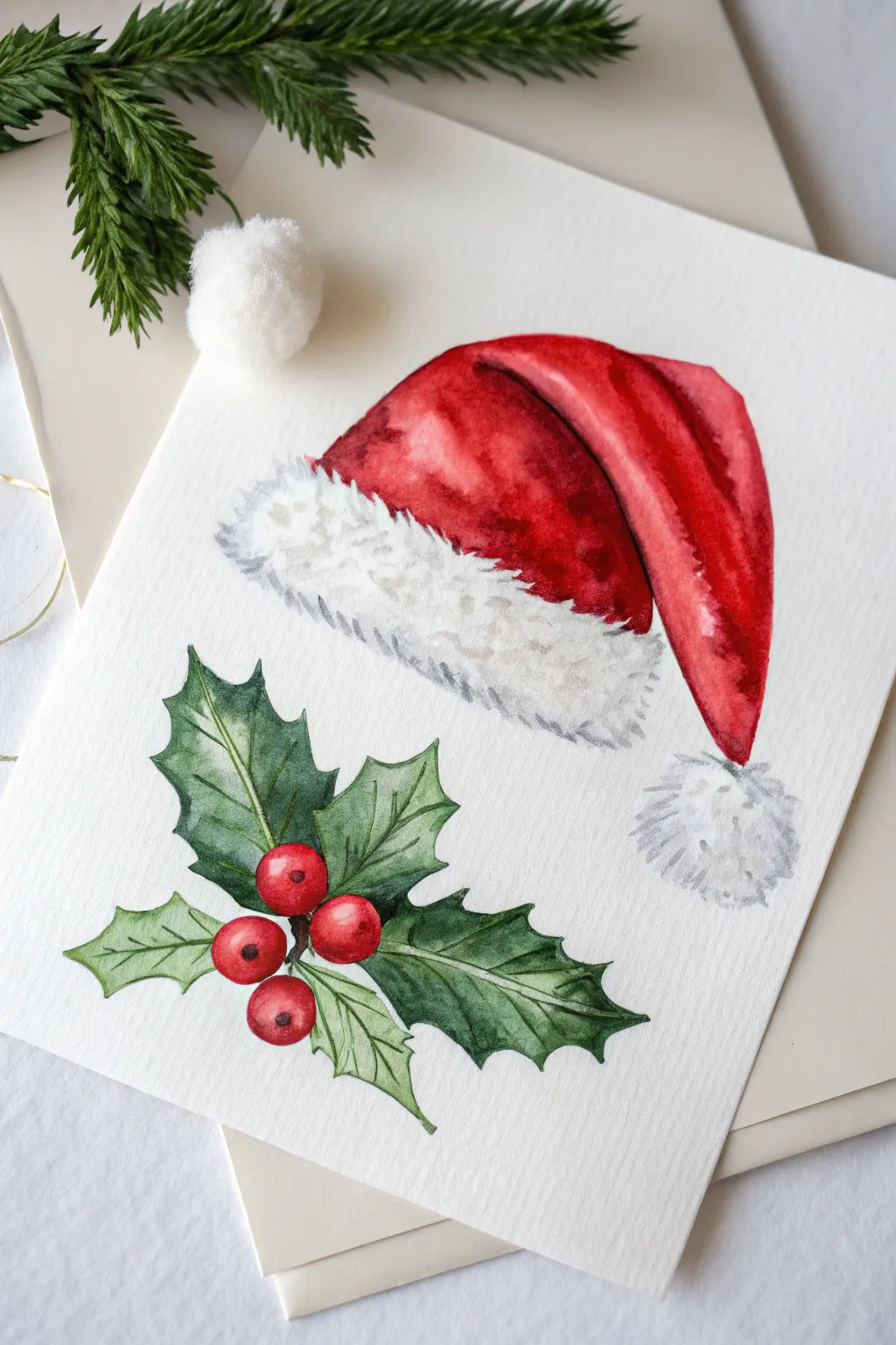
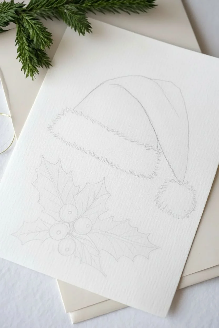
Capture the essence of the season with this crisp and vibrant watercolor duo featuring a plush Santa hat and classic holly sprig. The style is loose yet defined, using wet-on-dry techniques to create rich textures for the fur and leaves.
How-To Guide
Materials
- Cold press watercolor paper (300 gsm)
- Watercolor paints (Cadmium Red, Alizarin Crimson, Sap Green, Hooker’s Green, Paynes Grey, Burnt Umber)
- Round brushes (size 2, 6, and 8)
- HB pencil and kneaded eraser
- Two jars of water
- Paper towels
- White gouache or white gel pen (optional for highlights)
Step 1: Sketching the Composition
-
Position the elements:
Begin by lightly marking the placement of your two main subjects. Place the Santa hat in the upper right quadrant and the holly cluster in the lower left to create a balanced diagonal composition. -
Outline the hat:
Sketch the floppy triangular shape of the hat first. Add the fluffy brim as a thick, slightly curved rectangle with jagged edges to suggest fur. Draw a small circle at the very tip for the pom-pom. -
Define the holly:
Draw four small circles clustered together for the berries. Extending from behind the berries, sketch out three to four spiky holly leaves, ensuring they overlap naturally. -
Soften the lines:
Use your kneaded eraser to gently lift the graphite until the lines are barely visible. This ensures your pencil marks won’t dirty the bright red and green pigments later.
Step 2: Painting the Santa Hat
-
Base wash for the hat:
Mix a vibrant Cadmium Red. Using a size 8 brush, paint the main body of the cap, avoiding the brim and pom-pom. Keep the wash slightly uneven to suggest velvet texture. -
Adding shadows:
While the red is still damp, drop in a deeper mix of Alizarin Crimson and a touch of Burnt Umber into the folds and the area directly above the white brim. This creates instant volume. -
Defining the fold:
Once the first layer is dry, use a concentrated red mix to paint the shadow primarily on the left side of the hat’s body, emphasizing the crease where the hat flops over. -
Painting the white fur:
Mix a very watery, pale grey using Paynes Grey and plenty of water. With a size 6 brush, dab this color loosely along the bottom edge of the brim and the pom-pom to create shadow. -
Texturing the fur:
Use the tip of a smaller brush with a slightly darker grey to make tiny, rapid flicking motions along the edges of the white areas. This mimics the fluffy texture of faux fur.
Fur Texture Trick
To make the brim look extra fluffy, dampen the paper slightly before adding the grey shadows. The paint will bleed softly, creating a fuzzy, out-of-focus look perfect for wool.
Step 3: Painting the Holly
-
Painting the berries:
Fill the berry circles with bright red, leaving a tiny speck of white paper bare on each one for a highlight. If you miss this, you can add it back later with white gouache. -
Berry shadows:
Once the red base is dry, add a small crescent of darker red (mixed with a tiny bit of green to neutralize it) on the bottom right of each berry to make them look round. -
First leaf layer:
Mix a light wash of Sap Green. Paint the entire shape of the leaves. I like to let this dry completely before adding the next layer to keep the edges crisp. -
Deepening the greens:
Mix Hooker’s Green with a touch of Paynes Grey for a dark, rich holly color. Paint the leaves again, but leave small veins and edges of the previous lighter green visible. -
Adding leaf details:
Use a size 2 brush and your darkest green mix to paint the central vein lines and sharpen the spiky points of each leaf. -
Connecting the stems:
With a fine brush and brown paint, draw tiny stems connecting the berries to the leaves, anchoring the cluster together.
Make it Sparkle
Mix a tiny pinch of iridescent medium or fine glitter into your final wet glaze on the berries. When it dries, your holly will have a magical, festive shimmer.
Step 4: Final Touches
-
Refining shadows:
Check the contrast on the hat. If the red looks too flat, add a glaze of crimson over the darkest shadow areas to deepen the red without losing vibrancy. -
The berry ‘eye’:
Add a tiny dot of black or dark brown to the center of each berry, opposite the highlight, to represent the botanical remnant of the flower. -
Final highlights:
If your white paper highlights got lost, use a touch of white gouache or a gel pen to restore the shine on the berries and add a few sparkles to the snow-white fur.
Step back and admire your festive illustration, perfect for digitizing into holiday cards or framing as seasonal decor
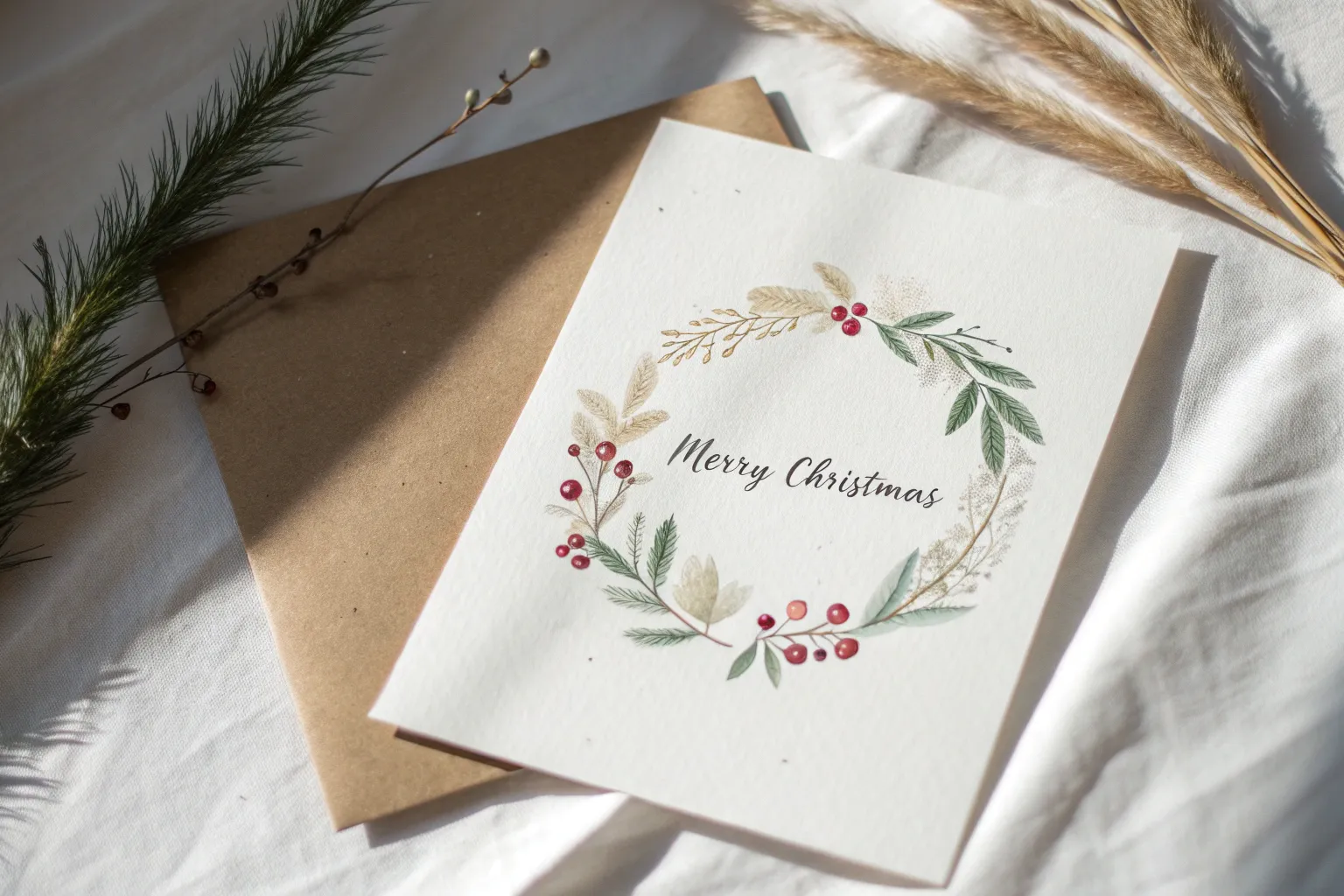
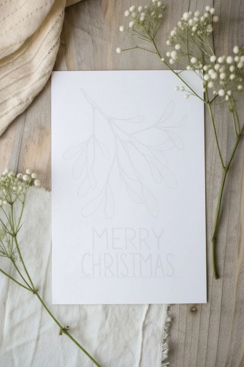
Mistletoe Sprig With Hand-Lettered Greeting
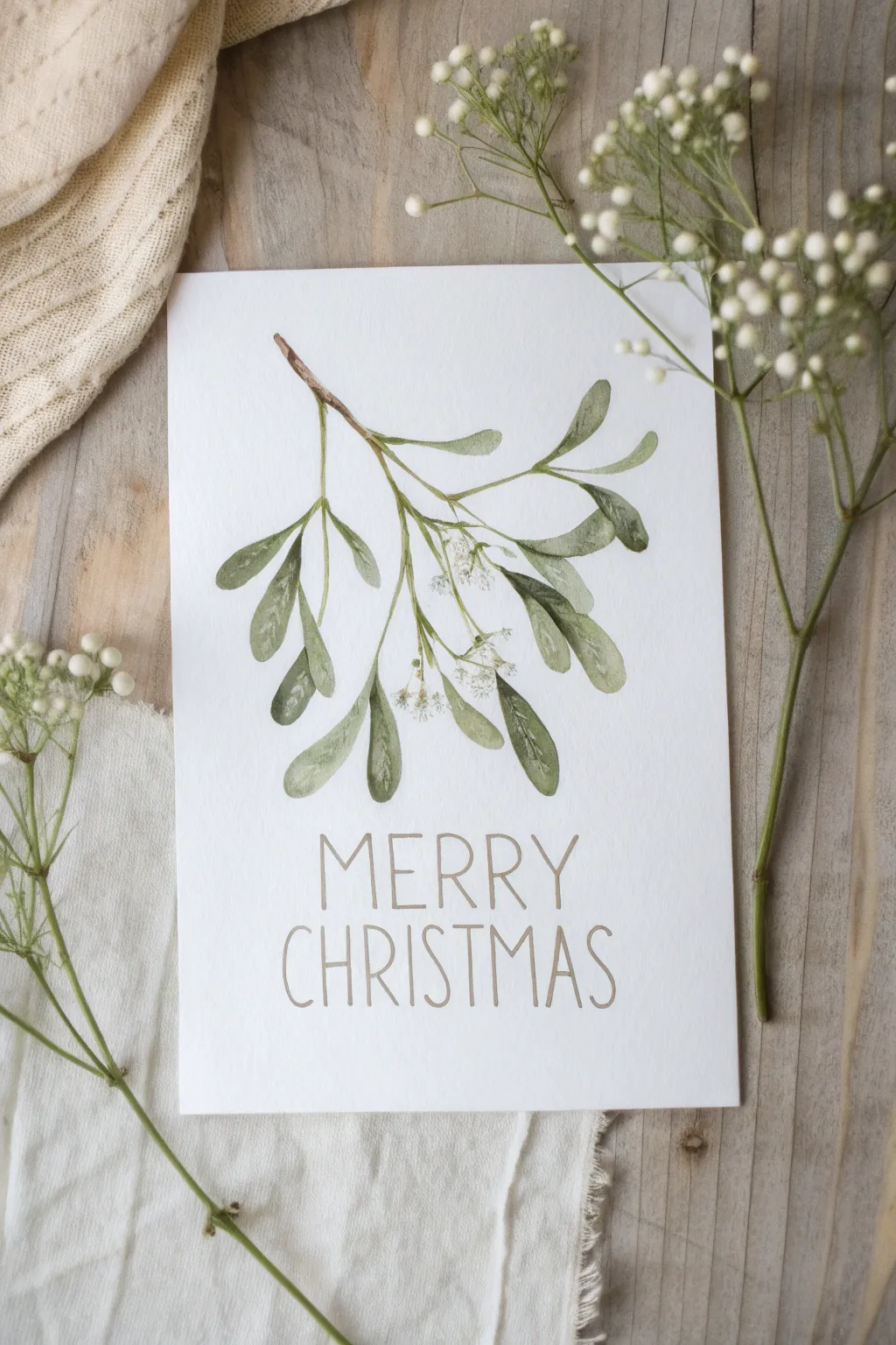
Capture the elegance of winter flora with this gentle watercolor study of mistletoe, focusing on translucent greens and delicate berries. The simple composition and thin hand-lettered greeting create a modern, sophisticated card perfect for the holiday season.
Step-by-Step
Materials
- Cold press watercolor paper (cut to card size)
- Watercolor paints (Sap Green, Olive Green, Burnt Umber, White Gouache)
- Round watercolor brushes (sizes 2 and 6)
- Fine liner brush or rigger brush
- Pencil (HB or H)
- Kneaded eraser
- Paper towel
- Water jar
- Gold or light brown fineliner pen (optional for text)
Step 1: Sketching the Layout
-
Establish the curve:
Begin by lightly drawing a curving main stem that originates from the top left and sweeps down toward the right. Keep your pencil pressure extremely light so the graphite doesn’t show through the transparent paint later. -
Add branching stems:
From the main stem, sketch smaller offshoot branches sticking out in opposite pairs. Mistletoe has a distinct structure where leaves and stems often grow in V-shapes. -
Outline the leaves:
Draw the characteristic oval-shaped leaves at the ends of the branches. Vary their sizes and angles to make the sprig look natural, with some leaves overlapping or twisting slightly. -
Place the text:
Using a ruler solely as a baseline guide, lightly sketch the words ‘MERRY CHRISTMAS’ below the botanical element in tall, thin capital letters. Ensure plenty of white space remains around the design.
Muddy Greens?
If your greens look too dull or brown, stop mixing them on the palette. Instead, mix the colors directly on the paper by dropping pure yellow into wet green paint.
Step 2: Painting the Foliage
-
Mix your greens:
Create a watery mix of Sap Green with a touch of Olive Green to get a natural, muted tone. Prepare a second puddle with a bit more pigment for darker shadows. -
Paint the first stem:
Using your fine liner or size 2 brush, paint the woody stem with a mix of Burnt Umber and a tiny bit of green. Keep the line thin and slightly broken in places for texture. -
Base layer for leaves:
Switch to the size 6 round brush. load it with the lighter green wash and fill in the leaf shapes. Use the tip of the brush for the stem connection and press down for the wider body of the leaf. -
Drop in color:
While the leaves are still wet, touch the darker green mix to the base of each leaf and along one edge. This ‘wet-on-wet’ technique creates a soft, natural gradient. -
Vary the saturation:
For leaves that appear further back or ‘underneath,’ dilute your paint more with water to make them lighter, creating a sense of depth. -
Let it dry completely:
Allow the greenery to dry fully before moving on. If the paper feels cool to the touch, it is still wet.
Step 3: Details & Berries
-
Add leaf veins:
Once dry, use your smallest brush with a slightly darker green mix to paint a single, very faint central vein on a few of the larger leaves. Don’t overdo this; keep it subtle. -
Paint the berries:
Mistletoe berries are white and pearlescent. Instead of paint, you can use the white of the paper or a dot of white gouache mixed with a tiny speck of green. Paint small clusters of 2-3 berries at the junctions of the stems. -
Add berry details:
To make the berries pop, add a tiny dot of dark green or brown at the ‘eye’ of the berry (opposite the stem) and a faint shadow underneath them. -
Touch up stems:
Revisit the woody stems. Where a branch connects to the main stem, add a small darkening stroke of brown to anchor it visually.
Touch of Sparkle
For a magical finish, mix a tiny amount of iridescent medium or pearl watercolor into your white berry paint to make them shimmer in the light.
Step 4: Finishing the Lettering
-
Choose your tool:
You can paint the letters with a very fine brush and light brown watercolor, or use a gold or taupe fineliner pen for more control. -
Lettering style:
Trace over your pencil sketch with slow, deliberate strokes. Keep the vertical lines thin and elongated. Rustic, slightly imperfect lines add to the charm here. -
Erase guidelines:
Wait until the lettering is bone dry—I usually give it an extra ten minutes just to be safe. Then, gently use the kneaded eraser to lift any visible pencil marks.
Now you have a charming, hand-painted card ready to share warm wishes with someone special


Poinsettia Bloom With Layered Petals
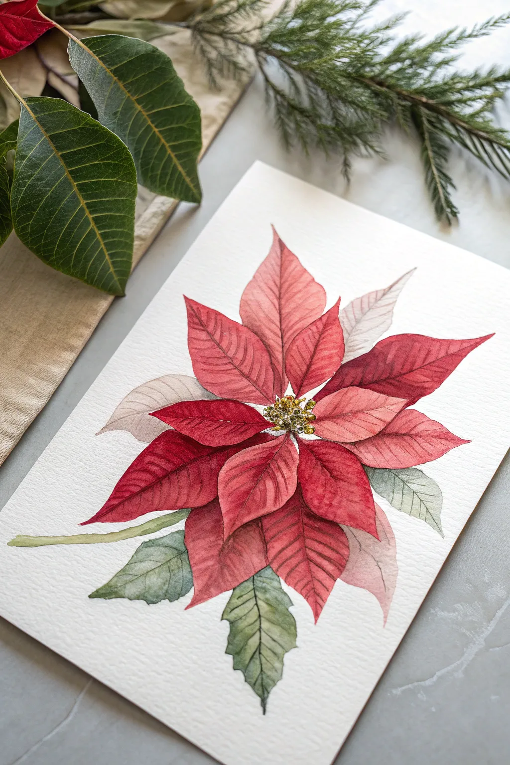
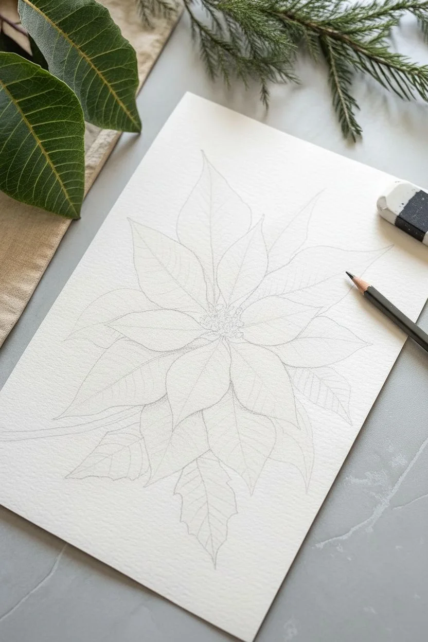
Capture the festive spirit with this vibrant poinsettia study, focusing on building depth through carefully layered crimson bracts and detailed leaf veining. The result is a lush, three-dimensional botanical illustration that pops off the cold-pressed paper.
How-To Guide
Materials
- Cold-pressed watercolor paper (300 gsm)
- Watercolor paints (Alizarin Crimson, Cadmium Red, Sap Green, Hooker’s Green, Burnt Umber, Lemon Yellow)
- Round brushes (sizes 2, 6, and 8)
- Pencil (HB) and kneaded eraser
- Gold ink or metallic watercolor (optional)
- Two jars of water
- Paper towels
Step 1: Sketching the Structure
-
Map the center:
Begin by lightly marking a small circle in the upper-middle area of your paper where the flower’s center will be. This anchor point will help radiate the petals outward. -
Draw the main bracts:
Sketch the largest, most prominent red bracts (petals) first. These should be pointed ovals, radiating roughly in a star shape. Keep your pencil lines extremely light so they don’t show through the transparent red paint later. -
Add underneath layers:
Fill in the gaps between the main bracts with smaller, slightly recessed petals. Drawing these partly tucked behind the front layer creates immediate depth. -
Outline the foliage:
Sketch three to four serrated leaves at the bottom and sides. Poinsettia leaves are often similar in shape to the colored bracts but slightly more jagged at the edges.
Step 2: Painting the Bracts
-
First wash:
Mix a watery wash of Cadmium Red with a touch of pink. Using your size 6 brush, apply this base color to the petals, using the wet-on-dry technique to keep edges crisp. Leave tiny white slivers between touching petals to prevent bleeding. -
Drop in variation:
While the first wash is still damp on a petal, drop in a slightly more concentrated Alizarin Crimson near the base and center vein line. This wet-on-wet technique creates a soft, natural gradient. -
Pale petals:
For the petals that appear furthest back or faded (like the ones on the upper right), use a much more diluted mix of your red, possibly muddying it slightly with a tiny dot of green to desaturate the color. -
Layering shadows:
Once the initial layer is completely bone dry, mix a shadow color using Alizarin Crimson and a touch of Burnt Umber. Glaze this over the areas where petals overlap to push the bottom layers backward. -
Defining veins:
Switch to your size 2 brush. Using a rich, un-watered red mixture, carefully paint the central veins and delicate branching veins on each bract. Keep your hand steady and lift the brush at the end of the stroke for a tapered line.
Pro Tip: Vein Technique
If your painted veins look too harsh, soften them immediately with a clean, damp brush. Run the damp brush parallel to the vein to slightly blur one side into the petal.
Step 3: Foliage and Details
-
Base green layer:
Mix Sap Green with a little lemon yellow for a fresh look. Paint the leaves, again leaving a thin white gap where they meet the red petals to maintain separation. -
Leaf shading:
While the green is wet, drop in Hooker’s Green or a bit of blue into the shadowed areas to create volume. Poinsettia leaves are textured, so don’t be afraid to let the pigment settle unevenly. -
Leaf veins:
When the green is dry, use a dark green mix (Hooker’s Green + Burnt Umber) and your finest brush to paint the veins on the leaves, similar to how you treated the red bracts. -
Stem work:
Paint the main stem connecting the lower leaves using a mix of light green and yellow ochre. Keep it cylindrical by adding a thin shadow line on one side. -
Center details:
For the cyathia (the yellow center buds), dab small dots of Lemon Yellow mixed with green. I like to let this dry and then add a second layer of texture to make them look spherical. -
Final highlights:
If you have gold ink or metallic watercolor, add tiny specks to the center yellow buds for a festive holiday spacing sparkle.
Level Up: Texture Trick
Sprinkle a tiny pinch of salt onto the wet green leaves. As it dries, the salt pushes the pigment away, creating a mottled, organic texture perfect for heavy foliage.
Frame this vibrant botanical piece to bring a permanent burst of holiday warmth to your walls
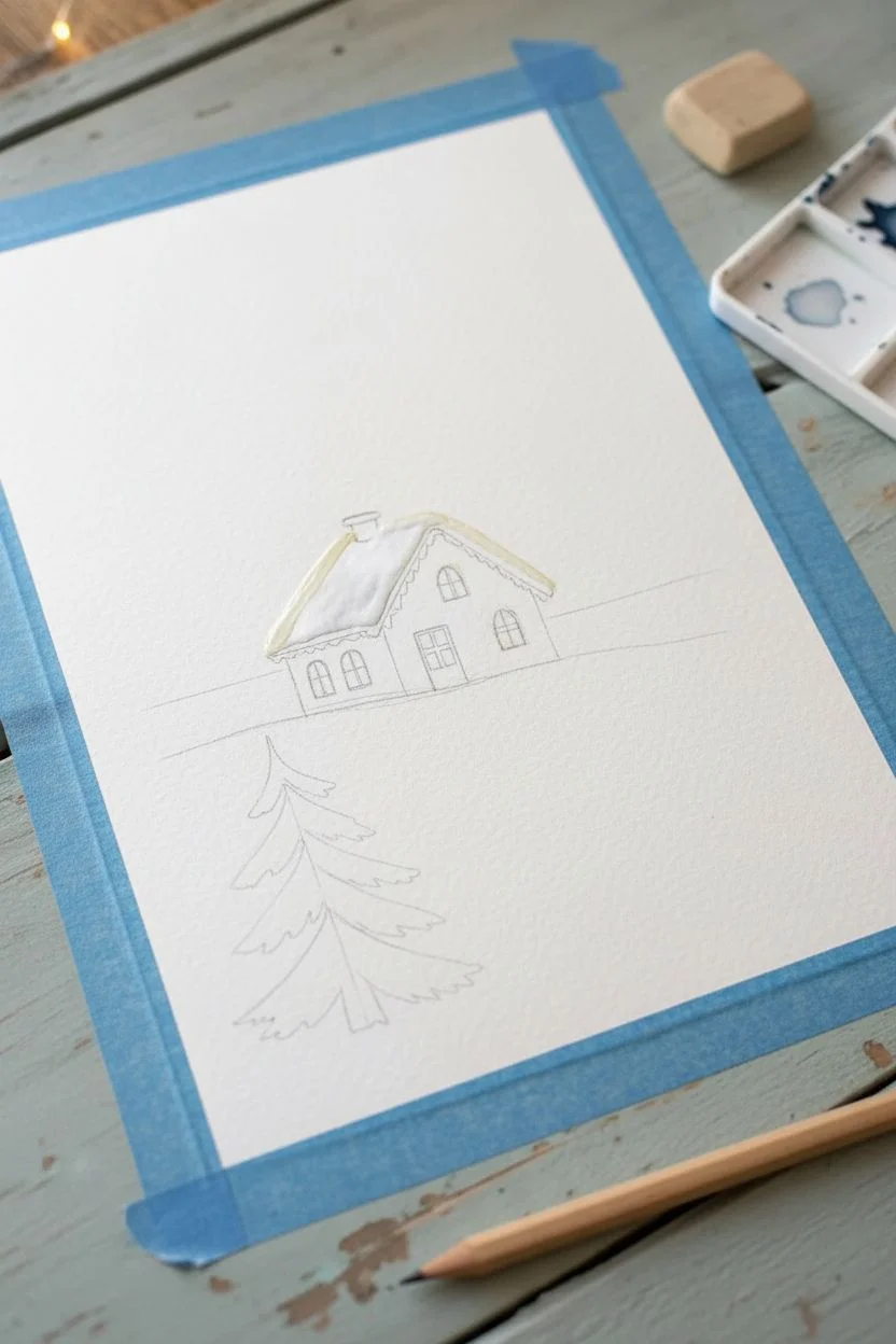
Gingerbread House With Icing Details
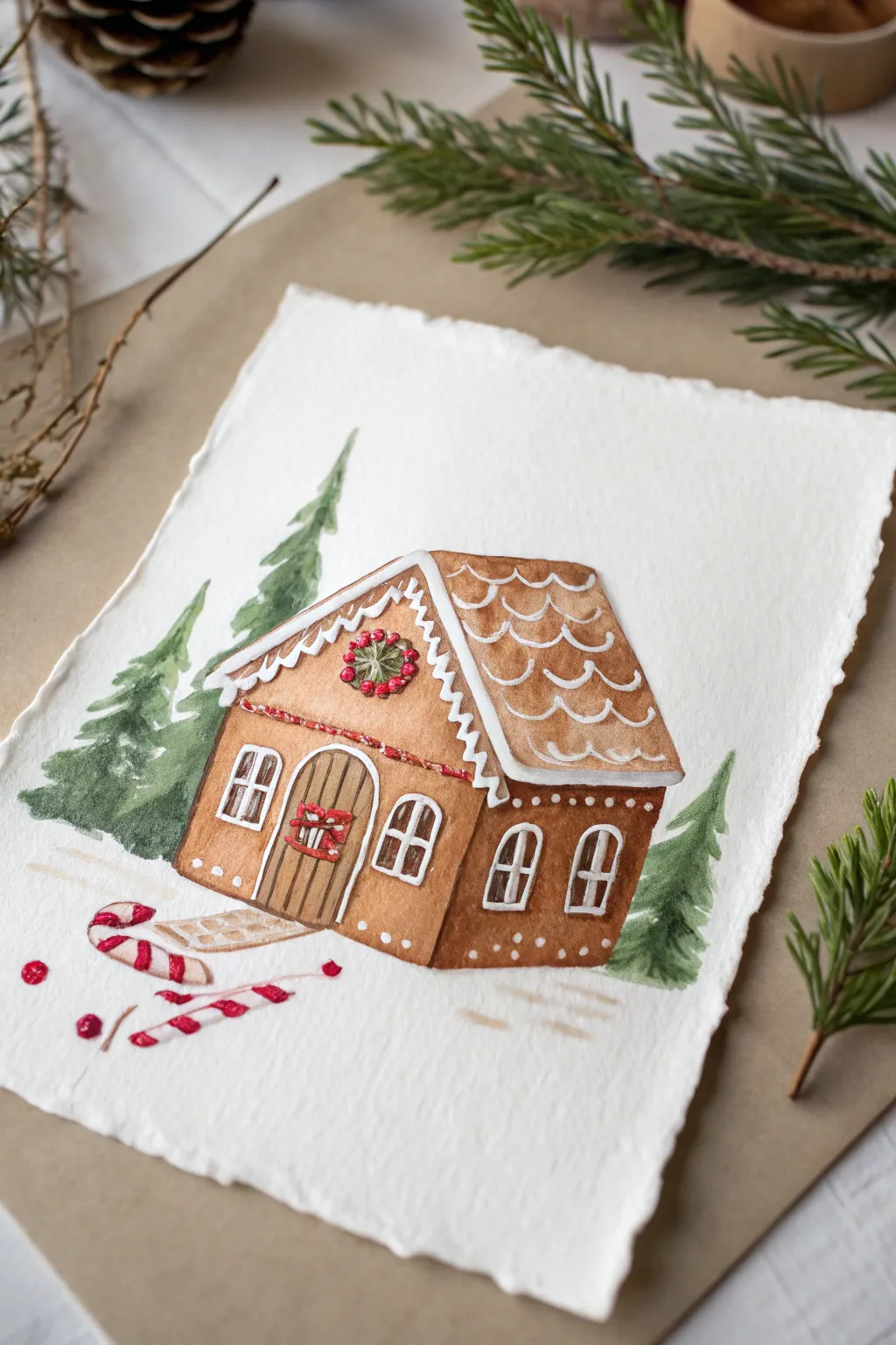
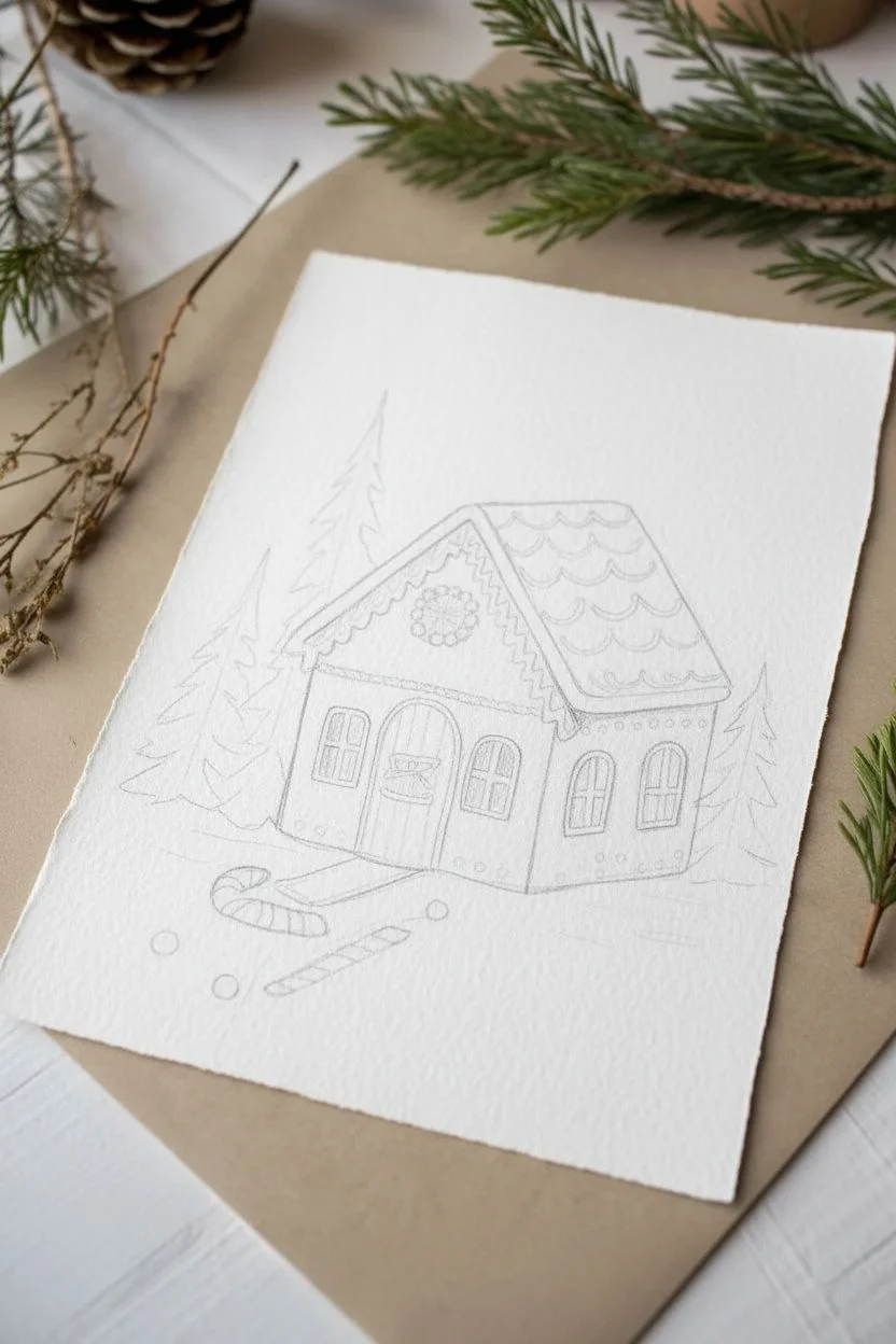
Capture the cozy charm of the season with this delightful watercolor illustration featuring a gingerbread house nestled among evergreens. The ragged, deckle-edged paper adds a rustic, vintage feel that perfectly complements the warm browns and festive reds of the painting.
How-To Guide
Materials
- Cold press watercolor paper (deckle edge preferred)
- Watercolor paints (burnt sienna, raw umber, sap green, alizarin crimson, payne’s gray)
- White gouache or white gel pen
- Round watercolor brushes (sizes 2, 4, and 6)
- Pencil (HB) and kneaded eraser
- Palette for mixing
- Jar of clean water
- Paper towels
Step 1: Sketching and Preparation
-
Map out the composition:
Begin by lightly sketching the main shape of the gingerbread house in the center of your paper. Draw a steeply pitched roof and a smaller side extension to give the house dimension. -
Add architectural details:
Lightly pencil in the arched front door, four windows (two on the front, two on the side), and the scalloped roof shingles. Don’t press too hard, as you want the graphite to disappear under the paint. -
Sketch the surroundings:
Place two tall pine trees behind the house on the left and right sides. In the foreground, sketch a few scattered candy canes and peppermint drops.
Keeping Whites Bright
If you struggle to paint around tiny details like window frames, use masking fluid before you start painting. Peel it off at the end to reveal pristine white paper.
Step 2: Painting the Gingerbread
-
Mix the perfect cookie color:
Combine burnt sienna with a touch of raw umber to create a warm, baked gingerbread hue. Use plenty of water for a translucent base layer. -
Paint the walls:
Using a size 6 brush, fill in the walls of the house. Work carefully around the windows and door frames to keep the paper white for now. -
Add texture to the roof:
Using a slightly lighter wash of the same brown mix, paint the roof sections. Leave the scalloped edges unpainted where the white icing will go later. -
Layering for depth:
Once the first layer is dry, add a second, more concentrated layer of brown to the bottom edges of the house and under the roof overhangs to create subtle shadows.
Step 3: Details and Surroundings
-
Paint the evergreens:
Mix sap green with a tiny drop of payne’s gray for a deep forest color. Use a size 4 brush to paint the trees behind the house, using loose, upward strokes to mimic pine needles. -
Vary the green tones:
While the green is still damp, drop in a bit of darker pigment near the bottom of the trees for extra dimension, letting it bleed naturally. -
Paint the door:
Use vertical strokes of raw umber to paint the wooden door planks. Leave a tiny gap between planks or use a darker brown line later to separate them. -
Add festivity with red:
Using alizarin crimson, paint the berry wreath above the door, the bow on the door handle, and the stripes on the candy canes in the foreground. I like to let the red dry completely before touching nearby areas. -
Ground the scene:
Dilute a tiny bit of brown and gray to paint faint shadows under the house and candy canes, anchoring them to the snowy ground.
Add a Little Sparkle
Mix a tiny pinch of iridescent medium into your white gouache or sprinkle ultra-fine glitter over the wet white paint to make the sugar icing glisten.
Step 4: The Icing on the Cake
-
Prepare the white details:
This is the crucial step. Use white gouache (which is opaque) or a high-quality white gel pen for crisp lines. -
Outline the roof shingles:
Draw scalloped white lines across the roof to create the look of piped royal icing tiles. -
Detail the trim:
Add thick white lines along the roof eaves, adding little drips or icicles at the corners for charm. -
Frame the windows:
Carefully outline the window panes and frames with white. If you used gouache, a size 0 or 2 brush works best here for precision. -
Final festive touches:
Add tiny white dots along the base of the house and on the roof to suggest snow or sugar dusting. Add highlights to the red berries and candy canes.
Once the white details are fully dry, your charming winter cottage is ready to be framed or sent as a holiday card
Cozy Candlelight With Glowing Halos
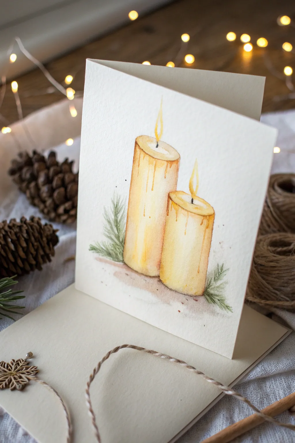
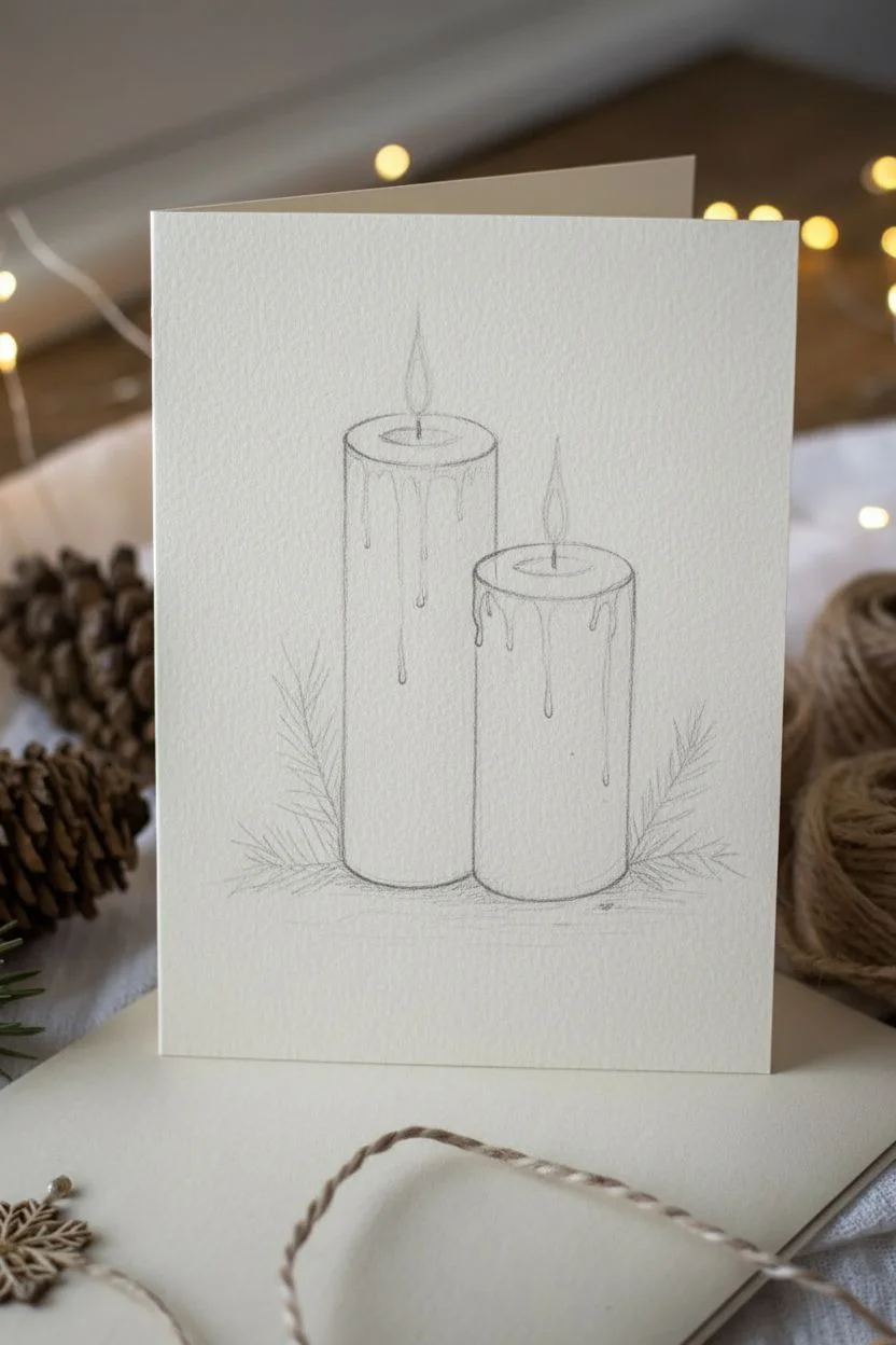
Capture the warmth of the season with this serene watercolor illustration featuring two gently melting pillar candles. The soft washes of ochre and burnt sienna create a realistic wax texture, while delicate fir sprigs add a festive touch of greenery to the base.
Step-by-Step
Materials
- Cold press watercolor paper (300 gsm)
- Pencil (HB or H for light sketching)
- Kneaded eraser
- Watercolor paints: Yellow Ochre, Burnt Sienna, Burnt Umber, Sap Green, Lemon Yellow, Lamp Black
- Round brushes: size 4 or 6 for washes, size 0 or 1 for details
- Paper towels
- Two jars of water
Step 1: Sketching the Composition
-
Outline the candles:
Begin by lightly sketching two cylinders of varying heights side-by-side. Make the taller one on the left and the shorter, wider one slightly overlapping or sitting just to the right. -
Add dimension:
Draw shallow ellipses at the top of each cylinder to create the flat top surface where the wick sits. Keep the bottom curves parallel to the top ellipses to maintain perspective. -
Sketch the wax drips:
Lightly draw irregular wavy lines coming down from the top rim of the candles to indicate melting wax. Vary lengths so they look natural rather than uniform. -
Place the greenery:
Sketch a few loose guidelines for pine sprigs at the base of the candles, angling them outward to frame the composition.
Wobbly Drips?
If wax drips look flat, assume light comes from the left. Paint a thin dark shadow line on the right edge of each drip and lift a highlight on the left side.
Step 2: First Washes & Candle Body
-
Paint the initial wash:
Mix a very watery wash of Yellow Ochre. Using your size 4 or 6 brush, fill in the bodies of both candles, leaving the wax drip areas and the very top rim white for now. -
Soften the edges:
While the paint is still damp, lift out a vertical strip of color on the left side of each candle using a clean, damp brush to suggest a highlight. -
Define the wax drips:
Once the first layer is barely dry, mix a slightly stronger Yellow Ochre with a tiny touch of Burnt Sienna. Paint the wax drips carefully, letting the color pool slightly at the bottom of each drip for a 3D effect. -
Deepen the shadows:
Add a wash of Burnt Sienna mixed with Yellow Ochre to the right side of the candles (the shadowed side). Blend this inward with water to create a rounded form. -
Paint the top surface:
Fill the top ellipses with a very pale mix of Yellow Ochre. Leave a tiny white ring around where the wick base will go to show luminosity.
Step 3: Adding Details & Flames
-
Add drip shadows:
Use a small detail brush and a mix of Burnt Sienna and Burnt Umber to paint thin shadow lines right underneath the wax drips to make them pop off the surface. -
Paint the wicks:
With your smallest brush and Lamp Black, paint thin, slightly curved vertical lines in the center of the top ellipses. Taper them at the top. -
Create the flames:
Using pure Lemon Yellow, paint a teardrop shape around the wick tip. While wet, drop a tiny dot of orange or darker yellow at the very bottom of the flame. -
Halo effect:
I like to take a clean, wet brush and gently soften the outer edge of the yellow flame into the white paper to create a faint, glowing halo. -
Refine the candle edges:
Use a fine liner brush and a dilute brown mix to outline parts of the candle rim and sides selectively—don’t outline the whole thing, just enough to afford definition.
Glow Up Your Flames
Paint the yellow flame, let it dry, then wet the paper AROUND it. Drop in very faint yellow into that wet area for a soft, diffused halo effect.
Step 4: Greenery & Grounding
-
Base layer for pine:
Mix a watery Sap Green. Using rapid, flicking strokes with a small round brush, paint pine needles stemming from your initial greenery guidelines. -
Add depth to needles:
While the first green layer is dry, go back with a more saturated Sap Green mixed with a touch of Burnt Umber. Add darker needles in the center of the sprigs for contrast. -
Ground the candles:
Mix a watery grey-brown (Burnt Umber + a touch of Black). Paint a soft, diffuse shadow directly under the base of the candles and pine sprigs so they don’t look like they are floating. -
Final touches:
Add tiny speckles of brown or grey around the greenery and base for texture by tapping a loaded brush against your finger. Let everything dry completely.
Now you have a warm, flickering holiday artwork perfect for a greeting card front.
Gift Tag Sheet With Mini Holiday Icons
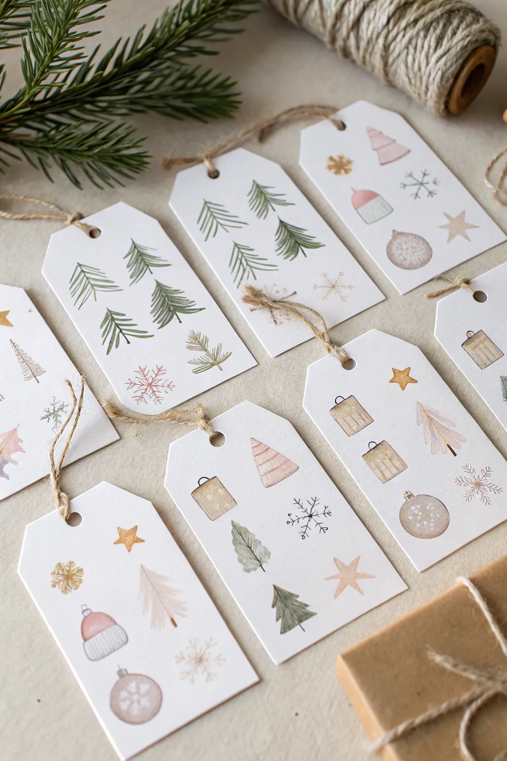

Elevate your holiday wrapping with these delicate, Scandic-inspired gift tags featuring miniature watercolor icons. The soft palette of sage greens, dusty pinks, and warm browns creates a cozy, cohesive look that feels both handmade and sophisticated.
Step-by-Step Guide
Materials
- Cold press watercolor paper (140lb/300gsm)
- Small round watercolor brushes (sizes 0, 1, and 2)
- Watercolor paints (sage green, burnt sienna, dusty pink, grey, ochre)
- Pencil and ruler
- Scissors or a paper trimmer
- Hole punch
- Jute twine
- Fine-tip waterproof ink pen (optional, for details)
- Palette for mixing
Step 1: Planning and Shaping the Tags
-
Measure and grid:
Begin by lightly drawing a grid of rectangles on your watercolor paper using a pencil and ruler. A standard size like 2 x 3.5 inches works well, but feel free to adjust to your preference. -
Shape the unique corners:
At the top of each rectangle, measure a small distance in from each corner (about 1/4 inch) and mark it. Draw diagonal lines connecting these marks to create the classic luggage tag shape. -
Outline the hole:
Mark the center point near the top of each tag where the string will go. Sketch a small circle here to remind you not to paint over this area later. -
Cut the tags:
Carefully cut out your tags using scissors or a paper trimmer for straight edges. I find cutting them out *before* painting prevents warping issues on a large sheet.
Fixing Bleeds
If paint bleeds outside your lines, quickly dab the spot with a clean, dry paper towel to lift the color. Let it dry completely before attempting to repaint the edge.
Step 2: Painting the Motifs
-
Mix your palette:
Prepare watery, muted mixtures of your paints. You want a ‘sage’ made from sap green and a touch of brown, a ‘dusty pink’ from red and plenty of water, and a warm ‘biscuit’ brown. -
Paint evergreen trees:
Using your size 1 brush, paint a central vertical line for the tree trunk in pale brown. While wet, switch to sage green and use quick, downward strokes to create branches, getting wider towards the bottom. -
Create hanging ornaments:
Paint simple circles in dusty pink or brown. While the paint is still damp, you can drop in a tiny darker dot to add volume, but keep it subtle for a flat illustration style. -
Sketch the mini houses:
Block out small squares or rectangles for house bases. Add a simple triangle on top for the roof. You can alternate colors—pink roofs on brown houses look particularly charming. -
Add gentle stars:
Using a diluted ochre or yellow ochre, paint simple five-point stars. Don’t worry about perfect symmetry; a slightly wonky star adds hand-drawn character. -
Detail the winter hats:
Paint a semi-circle for the hat beanie in pink or grey. Add a small rectangle below it for the cuff. Once dry, paint a tiny circle on top for the pom-pom.
Vintage Tone
Mix a tiny bit of burnt umber into every color on your palette. This unifies all the shades, giving the entire set of tags a cohesive, vintage-inspired warmth.
Step 3: Finishing Details
-
Add delicate snowflakes:
Switch to your smallest brush (size 0) or a fine-tip pen. Draw thin intersecting lines to form snowflakes. Keep the paint very translucent so they look frosty. -
Enhance with texture:
Once the main shapes are completely dry, add tiny lines or dots. Stripes on the hat cuffs, vertical lines on the house siding, or tiny veins on the tree branches bring the icons to life. -
Punch and string:
Use a hole punch on the mark you made earlier. Thread a 6-inch piece of jute twine through the hole and knot it securely. -
Flatten if needed:
If your paper has curled from the water, place the dry tags under a heavy book overnight to flatten them perfectly before gifting.
These charming tags are now ready to add a personal, artistic touch to your holiday presents
Star of Bethlehem Night Sky Wash
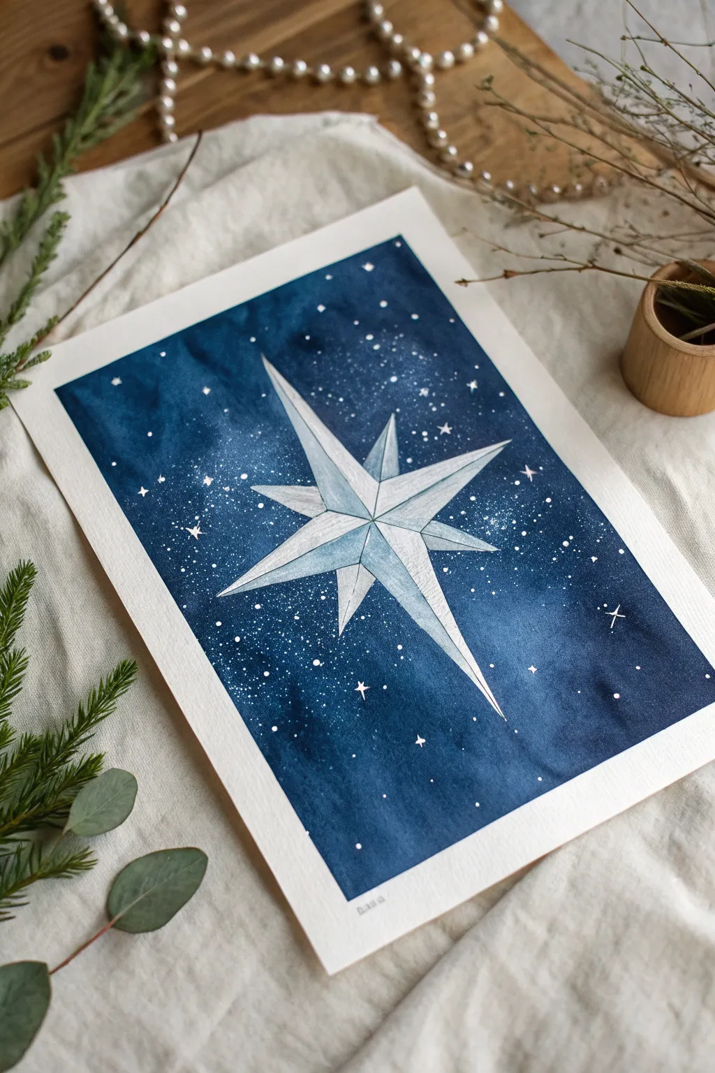
Capture the magic of a silent winter night with this striking Star of Bethlehem painting. By combining deep, moody indigo washes with crisp geometric lines, you’ll create a glowing centerpiece that feels both ancient and modern.
How-To Guide
Materials
- Cold press watercolor paper (140 lb/300 gsm)
- Watercolor paints: Indigo, Prussian Blue, Payne’s Gray
- White gouache or bleeding proof white ink
- Masking fluid (optional but recommended)
- Pencil (HB or H)
- Ruler
- Eraser
- Round brushes (sizes 2, 6, and 10)
- White gel pen (optional)
- Old toothbrush (for splattering)
- Two water jars
Step 1: Drafting the Geometry
-
Find the center:
Begin by lightly marking the center of your paper with your pencil. This will be the heart of your star. -
Draw the main cross:
Using a ruler, draw one long vertical line and one shorter horizontal line intersecting at your center point. The vertical line should be the longest element, stretching almost to the top and bottom edges. -
Add diagonal rays:
Draw two diagonal lines through the center, shorter than the main vertical and horizontal axes. These will form the smaller points of the star. -
Connect the points:
Connect the tips of your lines back toward the center structure to form an eight-pointed star shape. Instead of simple triangles, draw a line from each tip to the center point to create a ‘faceted’ diamond look for each ray. -
Protect the star:
Carefully apply masking fluid over the entire star shape. This ensures your crisp white paper is preserved while you paint the dark background. If you don’t have masking fluid, you will need to paint carefully around the shape.
Bleeding Lines?
If blue paint bleeds under your masking fluid, don’t panic. Wait for it to dry, then lift the mistake gently with a damp, stiff brush or cover it with opaque white gouache.
Step 2: Creating the Night Sky
-
Prepare the background wash:
Mix a generous puddle of Indigo and Prussian Blue. You want a very saturated, dark mixture to represent the deep night sky. -
The wet-on-wet technique:
With a large clean brush, wet the paper surrounding the star with clear water. It should be shiny but not forming puddles. -
Drop in the color:
Load your large round brush with the dark blue mix and start dropping color onto the wet paper. Work from the edges inward toward the star. -
Vary the depth:
While the paper is still wet, add touches of Payne’s Gray or more concentrated Indigo into the corners and edges to create a vignette effect. Keep the area immediately around the star slightly lighter to make it glow. -
Salt texture (optional):
If you want a subtle texture, sprinkle a tiny pinch of salt into the wet paint while it’s still glossy. It pushes pigment away, creating tiny star-like blooms. -
Let it dry completely:
Allow the background to dry fully. This is crucial—if the paper is cool to the touch, it is still wet. Wait until it is room temperature.
Step 3: Painting the Star
-
Reveal the white:
Once the paint is bone dry, gently rub off the masking fluid with your finger or a rubber cement pickup tool to reveal the pristine white star. -
Mix shadow tones:
Prepare a very watery, pale wash of your blue mix. You want this to be barely tinted water. -
Paint the facets:
Imagine a light source hitting the star. Paint only half of each star ray (one side of the center line you drew earlier) with the pale wash. This creates a 3D faceted effect. -
Deepen the shadows:
While the wash is still damp, drop a tiny bit more pigment near the center of the star where the points meet, letting it fade out toward the tips.
Level Up: Metallic Glow
Mix silver or iridescent medium into your pale wash for the star facets. It adds a festive shimmer that catches the light beautifully.
Step 4: Stars and Details
-
Splatter the stars:
Cover your main star with a piece of scrap paper to protect it. Dip an old toothbrush into white gouache (mixed with a little water until creamy) and flick the bristles to spray tiny white stars across the dark background. -
Add larger stars:
Using a small detail brush or a white gel pen, manually dot in larger stars. Add tiny cross shapes for twinkling stars scattered randomly. -
Define the edges:
If any background paint bled into your star shape, use opaque white gouache to clean up the edges and make the points razor-sharp. -
Final highlights:
Add a thin line of white gouache along the brightest ridges of the star to maximize the reflective, 3D look.
Remove any remaining pencil marks gently and frame your celestial masterpiece for the season
Christmas Lights Bokeh Background Effect
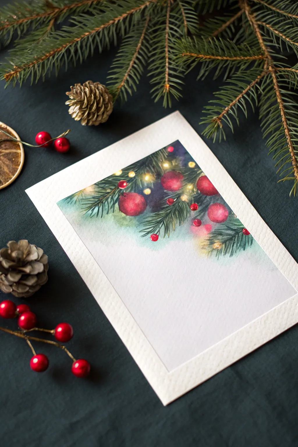
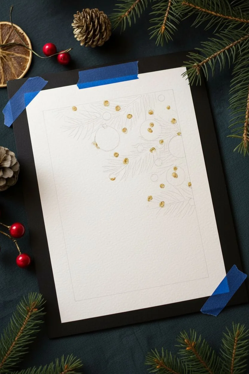
Capture the warmth of the season with this elegant watercolor card, featuring festive evergreens adorned with soft, glowing lights and vibrant red ornaments. The design focuses on the top portion of the paper, creating a beautiful cascading effect that leaves plenty of room for your holiday greetings.
Step-by-Step
Materials
- Cold press watercolor paper (cut to card size, e.g., 5×7 inches)
- Watercolor paints (Sap Green, Hooker’s Green, Alizarin Crimson, Cadmium Red, Indigo, Yellow Ochre, Lemon Yellow)
- Round watercolor brushes (size 2, 4, and 6)
- Masking fluid (optional but recommended)
- White gouache or white gel pen
- Painter’s tape
- Paper towels
- Jar of clean water
Step 1: Preparation and Sketching
-
Secure the paper:
Tape your watercolor paper down to a board using painter’s tape to prevent buckling and create a clean white border around the edge if desired. -
Light sketch:
Using a hard pencil (like an H or HB), very lightly sketch the placement of the main pine branches coming down from the top corners. -
Mark ornaments:
Sketch a few circles for the large red baubles nestled within the branches, varying their sizes for interest. -
Preserve the light:
If using masking fluid, apply small dots where you want your brightest fairy lights to be. Let this dry completely before painting.
Soft Edges Tip
To get that dreamy, out-of-focus bokeh look in the background, ensure your paper is glistening wet before dropping in the yellow paint. If edges harden, soften them with a damp brush.
Step 2: Painting the Background Glow
-
Wet-on-wet technique:
With a clean, larger brush, wet the area around the top branches with clean water, avoiding the ornament circles. -
Add the glow:
Drop in watered-down Lemon Yellow and Yellow Ochre around the areas where your lights will be, letting the pigment bloom softly into the wet paper. -
Deepen the background:
While the paper is still damp, drop in a mix of Indigo and a touch of Green into the deeper recesses between branches to create a sense of depth and night sky. -
Fade out:
Use a clean, damp brush to soften the bottom edge of the paint, fading the color seamlessly into the white of the paper below. -
Dry completely:
Allow this background layer to dry fully before moving on to the detailed foliage.
Level Up: Metallic Touch
Swap the yellow paint for gold watercolor or metallic ink for the fairy lights. It creates a stunning shimmer that catches the light when the card is tilted.
Step 3: Ornaments and Needles
-
First layer of pine:
Load a size 4 brush with a light Sap Green. Paint the pine needles using quick, flicking strokes outward from your sketched branch lines. -
Darker needles:
Mix Hooker’s Green with a little Indigo for a darker shade. Add a second layer of needles over the first, concentrating them closer to the branch stems for volume. -
Paint the ornaments:
Fill the ornament circles with Alizarin Crimson. While wet, drop in concentrated Cadmium Red on one side for shadow and lift a little paint on the opposite side for a highlight. -
Small berries:
Using the tip of your smallest brush, dot in clusters of tiny red berries among the needles for extra pops of color.
Step 4: Final Details and Lights
-
Remove masking:
If you used masking fluid, gently rub it away once the paper is bone dry. -
Enhance the lights:
Paint over the preserved white spots (or paint new dots) with a thick, creamy mix of Lemon Yellow and white gouache to make them really shine. -
Soft halos:
Take a damp brush with very diluted yellow paint and gently circle around the bright light dots to create a glowing ‘halo’ effect. -
Snowy accents:
I like to add very subtle touches of white gouache on the tops of the ornaments and pine needles to suggest a light frosting of snow. -
Refine contrast:
Check your darks; if the background dried too light, glaze a little more Indigo behind the main ornament cluster to make the red pop.
Once dry, simply fold your artwork or mount it on cardstock to send a warm, handmade greeting this season
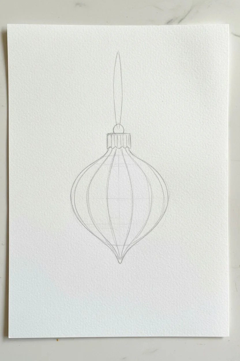
Metallic Accents on Ornaments and Stars

Capture the nostalgia of heirloom decorations with this watercolor card featuring a striped, onion-shaped ornament in muted sage and peach tones. The magic lies in the subtle metallic touches that catch the light, giving it a festive yet sophisticated shimmer.
Detailed Instructions
Materials
- Cold-press watercolor paper (300 gsm)
- Watercolor paints (Sage Green, Light Peach/Terra Cotta, Sepia)
- Metallic gold watercolor pan or gold ink
- Fine round brush (size 2 or 4)
- Detail brush (size 0 or 00)
- Pencil and kneaded eraser
- Clean water and mixing palette
Step 1: Sketching the Shape
-
Outline the ornament:
Start by lightly sketching a teardrop or ‘onion’ shape in the center of your paper. Make it slightly wider at the bottom and tapered at the top. -
Define the segments:
Draw curved lines vertically from the top point to the bottom point to create the segmented look. Imagine peeling a tangerine; the lines should follow the contour of the round shape, getting wider in the middle and converging at the tips. -
Add top details:
Sketch a small rectangular cap at the top of the ornament with vertical ridges. Add a simple loop and a long, thin string extending upward toward the card’s edge. -
Lighten those lines:
Before painting, use your kneaded eraser to lift up most of the graphite. You want the lines barely visible so they don’t muddy your delicate watercolor washes.
Pro Tip: Controlled Lines
For the finest gold lines, breathe out slowly as you pull the brush across the paper. Using a rigger brush (liner brush) can also help make long lines like the string much smoother
Step 2: Painting the Base Layers
-
Mix your palette:
Prepare a watery mix of sage green and a separate puddle of soft peach or watered-down terra cotta. Keep the pigment load light; we are aiming for a vintage, washed-out look. -
Paint the green segments:
Using your size 4 brush, paint the outer segments and the center segment with the sage green mix. Leave a tiny sliver of white paper unpainted between segments to act as a highlight and separate the sections. -
Paint the peach segments:
While the green is drying (or working carefully not to touch wet edges), fill the alternate segments with your peach mix. Again, preserve those tiny white gaps between the colors. -
Add volume:
While the paint is still damp, drop a tiny bit of slightly darker pigment (green or peach respectively) at the very bottom of each segment to create a shadow and give the ornament a rounded, 3D appearance. -
Dry completely:
Let the first layer dry fully. The paper must be bone dry before we add the metallic details to prevent bleeding.
Level Up: Embossed Effect
Instead of metallic paint, use a glue pen to draw the gold details, then sprinkle gold embossing powder over it. Heat set it for a raised, super-shiny finish that feels professional
Step 3: Adding Metallic Accents
-
Gold cap and geometric details:
Activate your metallic gold paint with a few drops of water until it has a creamy consistency. Using the detail brush, paint the ornament cap, adding vertical lines for texture. -
Segment dividers:
Very carefully drag your fine brush with gold paint down the white gaps you left between the colored segments. This creates gold piping that defines the shape. -
String loop:
Paint the hanging loop and the string extending to the top of the paper with a steady hand in gold. -
Ornament patterns:
Switch back to your green and peach mixes, but keep them fairly thick. Paint tiny stars or ‘plus’ signs on the dry segments patterns—put green stars on the peach stripes and peach stars on the green stripes.
Step 4: Background sparkle
-
Paint surrounding stars:
Using the gold paint, add a medium-sized star to the right of the ornament. I like to keep the shape loose and illustrative rather than perfectly geometric. -
Add subtle twinkling:
With a very diluted gray or sepia, paint thin, delicate asterisks (starbursts) in the background to suggest twinkling lights. -
Create soft bokeh:
Mix a very watery puddle of your sage green. Paint two or three soft, circular blobs in the background to mimic out-of-focus lights, keeping them very pale. -
Final gold touches:
Add a few tiny gold dots or micro-stars scattered randomly around the ornament to tie the composition together.
Once the gold catches the light, you’ll have a stunning handmade card ready for writing a holiday message
Negative Space Tree Made From Falling Snow
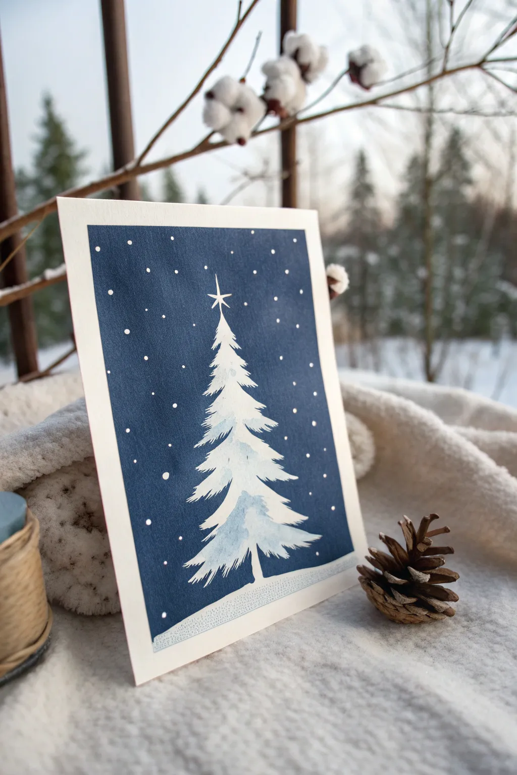
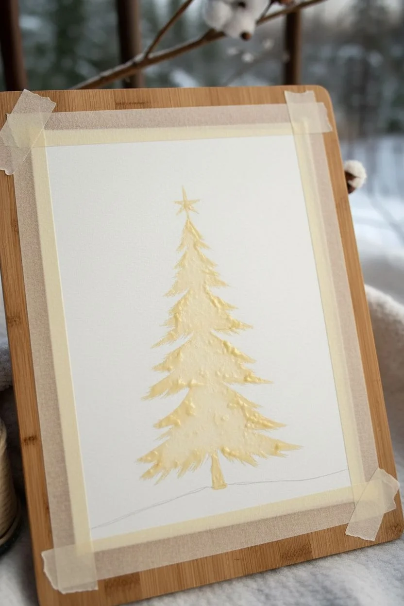
Capture the stillness of a winter evening with this elegant negative space Christmas tree. By painting a deep navy background around a masked area, you allow the pristine white of the paper to become a snow-covered pine illuminated by starlight.
Step-by-Step Tutorial
Materials
- Cold-press watercolor paper (300 gsm)
- Masking fluid (drawing gum) with applicator or old brush
- Watercolor paints: Indigo, Payne’s Gray, Prussian Blue
- Flat wash brush (1/2 inch or 3/4 inch)
- Small round brush (size 2 or 4)
- White gouache or white gel pen
- Pencil and eraser
- Artist tape
Step 1: Preparation and Masking
-
Tape the edges:
Begin by taping down all four sides of your watercolor paper to a board. Use artist tape to create a clean white border around the final image, pressing the edges firmly to prevent paint seepage. -
Sketch the tree shape:
Very lightly sketch a simple triangle for your tree in the center of the paper. This is just a guide, so keep it faint. Add a small vertical line at the top for the star. -
Apply masking fluid:
Using masking fluid, paint the silhouette of the Christmas tree. Instead of straight lines, use jagged, expressive strokes to mimic pine branches extending outward. Mask a star shape at the top and a small trunk at the bottom. -
Protect the ground:
Apply a strip of masking fluid along the bottom edge of the paper to represent the snowy ground, ensuring it connects with the tree trunk. -
Let it cure completely:
Allow the masking fluid to dry entirely. It must be yellowish or transparent and firm to the touch before you introduce any water.
Torn Paper?
If masking fluid tears your paper upon removal, the paper might be too soft or the fluid was left on too long. Try lifting it sooner or warm it slightly with your hand first.
Step 2: Painting the Midnight Sky
-
Mix a deep wash:
Prepare a large puddle of dark blue paint. I recommend mixing Indigo with a touch of Payne’s Gray to get a deep, midnight navy hue. -
Apply the background:
Using your flat wash brush, paint the entire sky area right over the dried masking fluid. Work quickly to keep a wet edge, ensuring the background is smooth and consistent without brush strokes. -
Add depth variations:
While the paint is still wet, drop in more concentrated Indigo near the corners and edges to create a vignetted look, drawing the eye toward the bright tree center. -
Dry the background:
Let this dark layer dry fast. If you want a more saturated color, wait for it to dry completely and apply a second coat of the dark blue wash.
Step 3: Revealing and Refining
-
Remove the mask:
Once the paper is bone dry, gently rub off the masking fluid with your finger or a rubber cement pickup tool. You should now have a stark white tree against a dark background. -
Soften the tree:
The white shape will look very flat. Mix a very watery, pale blue wash (use the dirty water from your rinse jar or a tiny dot of Prussian Blue). -
Add inner shadows:
Paint jagged, irregular shadows inside the white tree shape. Leave the top edges of the ‘branches’ white to look like snow, and darken the underside of the branches with your pale blue mix. -
Define the trunk:
If the trunk looks too stark, add a tiny vertical stroke of grey or brown to ground the tree. -
Add falling snow:
Using a small round brush dipped in thick white gouache (or a white gel pen), dot the dark background with ‘snow.’ Vary the size of the dots to create depth. -
Highlight the star:
Use the gouache or gel pen to sharpen the points of the star at the top of the tree, making it stand out crisp against the navy sky. -
Add ground texture:
If desired, add tiny blue stippling/dots along the bottom snow bank to give it a little texture rather than being perfectly flat white. -
Remove tape:
Slowly peel away the artist tape at a 45-degree angle to reveal your clean white border.
Level Up: Salt Magic
While the dark blue background is still wet, sprinkle coarse sea salt on it. As it dries, the salt pushes pigment away, creating beautiful, icy crystal textures.
Send this serene winter scene to a loved one or frame it as part of your holiday decor
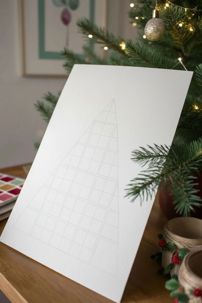
Abstract Holiday Color Swatches Into a Tree Shape
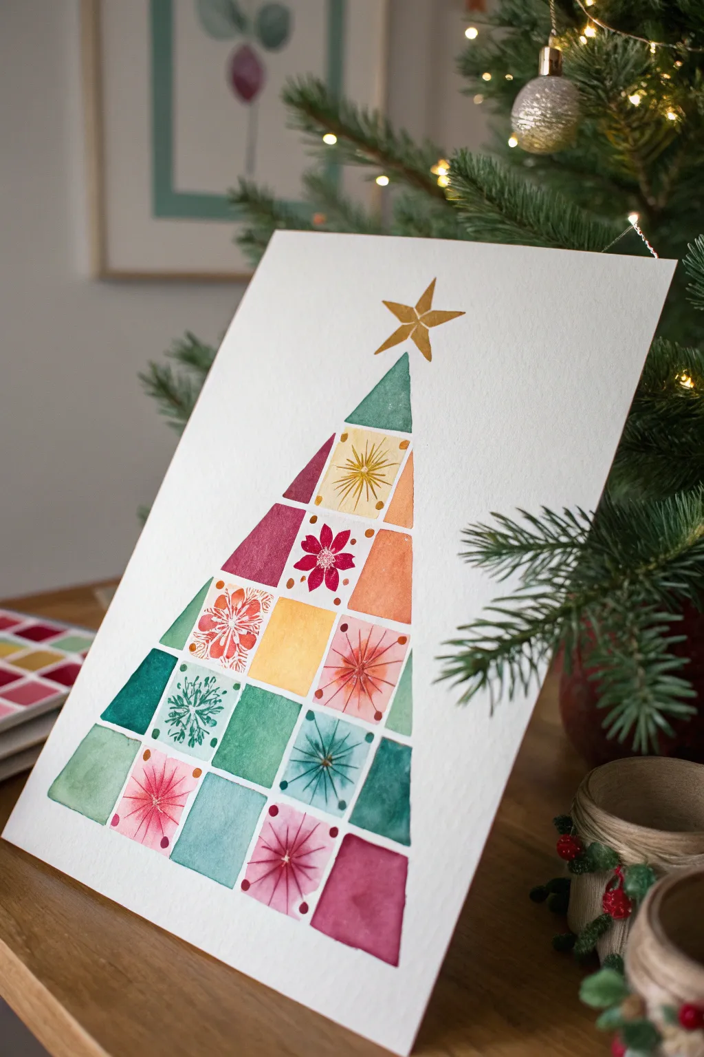
Transform a simple collection of watercolor swatches into a modern, abstract Christmas tree. This project combines the meditative quality of mixing colors with crisp geometric shapes to create a stylish piece of holiday art.
How-To Guide
Materials
- Cold press watercolor paper (A4 or 9×12 inch)
- Watercolor paint set
- Gold watercolor paint or gold metallic marker
- Flat shader brush (size 6 or 8)
- Round detail brush (size 0 or 1)
- Ruler
- Pencil and eraser
- Painter’s tape or washi tape
- Water cups and paper towels
Step 1: Drafting the Grid
-
Prepare the paper:
Tape your watercolor paper down to a board or table to prevent buckling. Lightly find the center vertical line of your paper to ensure your tree will be symmetrical. -
Mark the triangle boundary:
Using a ruler, lightly draw a large triangle shape. This will serve as the outer boundary for your tree. The bottom should be wide, tapering to a point near the top, leaving room for the star. -
Draw horizontal tiers:
Divide the triangle horizontally into five or six evenly spaced rows. These lines define the height of your swatch ‘blocks’ for each layer of the tree. -
Create the vertical divisions:
Within each horizontal row, draw vertical lines to create individual rectangular blocks. These don’t need to be perfectly uniform; varying widths add visual interest. -
Refine the edges:
Along the outer diagonal edges of the tree, modify the rectangular shapes into triangles or trapezoids so they fit neatly within your initial large triangle boundary.
Step 2: Painting the Color Blocks
-
Plan your palette:
Choose a color scheme that feels festive but sophisticated. The example uses teal, forest green, maroon, warm yellow, and orange. Pre-mix a few puddles of these colors on your palette. -
Start the checkerboard:
Begin painting individual blocks with your flat brush. To prevent colors from bleeding into each other, paint non-adjacent squares first. -
Vary the saturation:
As you fill in the blocks, vary the water-to-paint ratio. Make some blocks dense and opaque, while keeping others sheer and watery for a nice textured look. -
Fill the gaps:
Once your first set of blocks is dry to the touch, fill in the remaining spaces with your other colors. I like to place contrasting colors next to each other, like a deep green next to a bright yellow. -
Let it dry completely:
Wait for the entire tree shape to be bone dry. If the paper is damp, the details in the next phase will bleed and lose their crispness.
Bleeding edges?
If wet paint touches a neighboring wet block, they will bleed. Dry the first block completely with a hairdryer on low heat before painting the one right next to it.
Step 3: Adding Details and Accents
-
Paint the topper:
Use gold watercolor paint or a gold metallic pen to draw a freehand five-point star at the very top of your tree. -
Add radial bursts:
Select a few lighter-colored blocks (like the yellow or pale pink ones) to embellish. Using your smallest round brush and a darker shade of paint (or a fine colored pen), draw radial lines extending from a center point. -
Create starburst tips:
On the ends of those radial lines, add tiny dots or small ‘V’ shapes to make them look like sparkling stars or stylized poinsettias. -
Add snowflake details:
On the teal or green blocks, use a very dark green or white opaque ink to paint simple snowflake patterns or stylized pine needles. -
Dot the corners:
For a finishing touch, add tiny dots of contrasting color (like red berries) at the corners or intersections of some blocks to tie the whole composition together. -
Erase guidelines:
Once you are absolutely certain all paint and ink is dry, gently erase any visible pencil lines between the blocks for a clean finish.
Clean lines
For ultra-crisp edges on your geometric shapes, use thin washi tape or masking fluid to mask off the grid lines before you start painting.
Frame your geometric masterpiece or scan it to create custom holiday cards for friends and family
Tiny Christmas Village in a Single Monochrome Palette
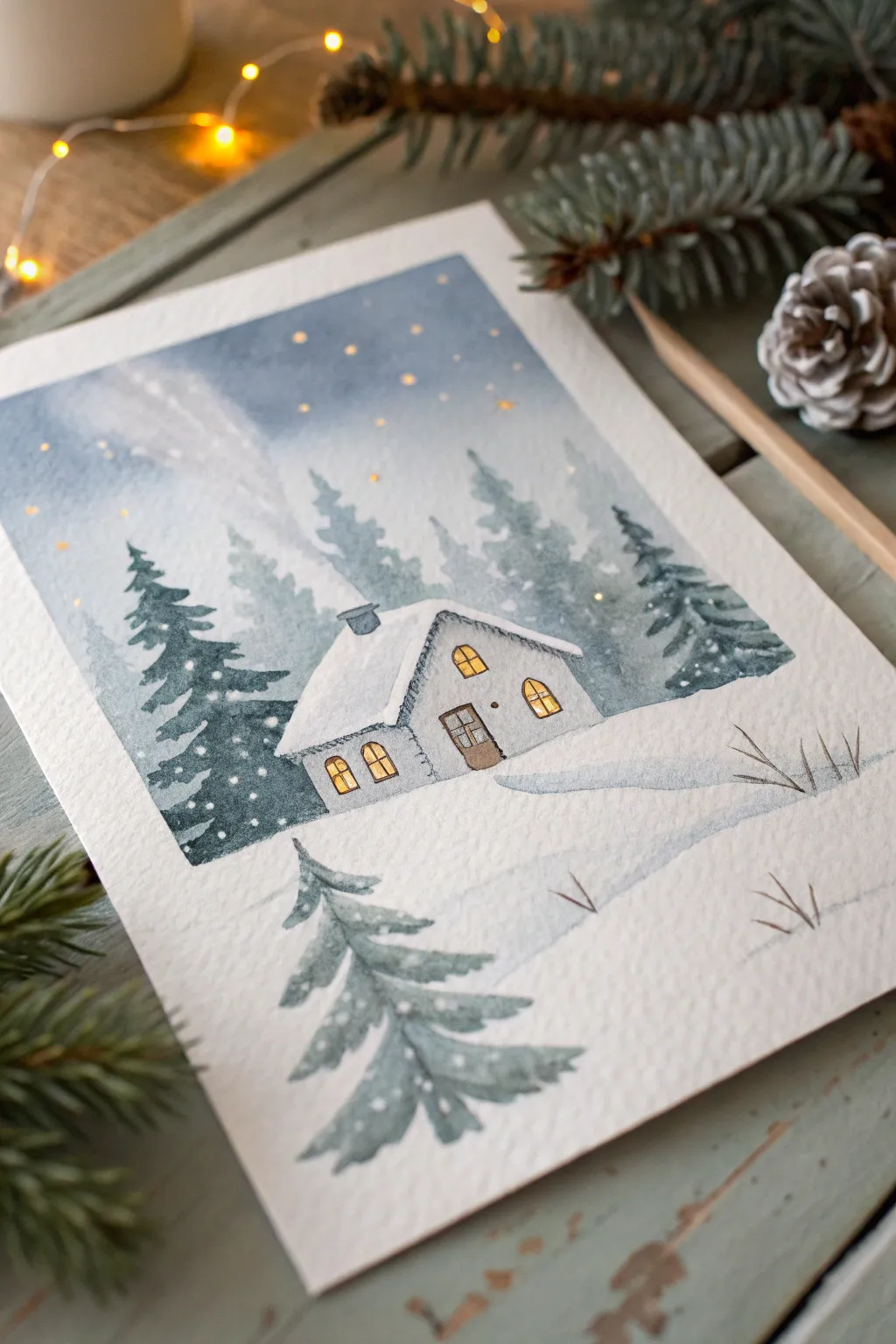
Capture the stillness of a snowy evening with this charming watercolor illustration featuring a glowing cabin nestled among evergreens. Using a limited palette primarily of cool blues and greys, you’ll learn to create depth through layering and atmospheric perspective while adding warmth with touches of gold.
Detailed Instructions
Materials
- Cold Press watercolor paper (300gsm)
- Watercolor paints: Indigo, Payne’s Grey, Cerulean Blue, Burnt Umber, Yellow Ochre or Cadmium Yellow
- White Gouache or White Gel Pen
- Round brushes: sizes 6, 4, and 0 (for fine details)
- Pencil (HB) and kneaded eraser
- Masking fluid (optional)
- Clean water and paper towels
- Painter’s tape
Step 1: Planning and Sketching
-
Prepare your surface:
Begin by taping down all four edges of your watercolor paper to a board. This prevents buckling and creates that crisp, clean border seen in the reference image. -
Sketch the composition:
Lightly sketch the main elements with an HB pencil. Place the cabin slightly off-center for visual interest. Draw the roofline, the visible side wall, the chimney, and the arched windows. Add a faint horizon line behind the house and suggest the placement of the foreground tree. -
Masking highlights (Optional):
If you want the purest white for the roof snow and window frames, apply a thin layer of masking fluid to these areas. Alternatively, you can carefully paint around them.
Muddy Colors?
If your grey shadows look dirty, you likely mixed warm and cool colors too much. Stick to mixing blues with tiny bits of brown/orange to neutralize them, rather than mixing all your colors together.
Step 2: Painting the Sky and Background
-
Wet-on-wet sky:
Brush clean water across the sky area, stopping just above the roofline. While wet, drop in a mix of Indigo and Cerulean Blue. Keep the top darker and fade it out as you approach the horizon to mimic atmospheric glow. -
Create background trees:
While the sky is still slightly damp but not soaking, mix a very watery, pale version of Payne’s Grey and Indigo. Paint loose, ghostly tree shapes in the distance behind the house. Their soft edges will push them into the background. -
Let it dry completely:
Wait for the paper to be bone dry before moving forward. This is crucial to prevent the crisp foreground layers from bleeding into the soft background.
Step 3: The Cabin and Middle Ground
-
Paint the cabin structure:
Using a size 4 brush, paint the walls of the cabin with a light wash of diluted Payne’s Grey. Leave the window panes unpainted for now. -
Add roof shadows:
The roof is mostly the white of the paper. Mix a very faint blue-grey (Cerulean + Payne’s Grey) and add a shadow line right under the snow overhangs and on the shadowed side of the chimney to give the snow volume. -
Deepen the forest:
Now, mix a stronger, more saturated Indigo and Payne’s Grey. Paint the evergreen trees flanking the house. Use the tip of your brush to create jagged pine textures, ensuring these trees are darker and sharper than the background ones. -
Grounding the scene:
Paint a wash of cool blue-grey for the snow on the ground, leaving large patches of white paper. Add a slightly darker shadow stretching from the cabin door towards the right to anchor the building.
Watercolor Card Idea
Paint this design on a folded sheet of 140lb watercolor paper to create a stunning, hand-painted holiday card. Add a metallic gold border with a paint pen for extra festive elegance.
Step 4: Details and Foreground
-
Illuminate the windows:
Once the walls are dry, fill the window panes with Yellow Ochre or a warm Cadmium Yellow. This contrast creates that inviting ‘cozy glow’ effect. -
Define the door:
Paint the door with Burnt Umber. Use a size 0 brush to add thin lines for the door frame and window mullions in a dark brown or grey mix. -
Paint the foreground tree:
In the bottom left corner, paint a large pine tree using a medium grey-blue mix. I like to keep this tree slightly softer than the middle-ground trees to suggest depth of field, but still distinct. -
Add snowy texture:
Using white gouache or a white gel pen, add tiny dots of snow on the dark pine trees and the cabin roof. This adds textural interest and reinforces the winter theme. -
Create the stars:
For the sky, dot yellow or white paint randomly to create stars. You can also flick a brush with white gouache for a more natural snowfall effect. -
Final dry grass details:
Use your smallest brush and a dark grey-brown mix to whisk in a few fine blades of dry grass poking through the snow in the foreground. -
Remove tape:
Ensure everything is 100% dry, then slowly peel away the painter’s tape at a 45-degree angle to reveal your clean edges.
Step back and admire the peaceful winter atmosphere you’ve captured on paper
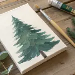


Have a question or want to share your own experience? I'd love to hear from you in the comments below!