February has this sweet mix of Valentine’s Day sparkle and late winter coziness that makes sketchbook time feel extra comforting. Here are my favorite February drawing ideas you can dip into anytime you want an easy prompt, a cute doodle, or a full-page illustration.
Classic February Heart Doodle Sampler
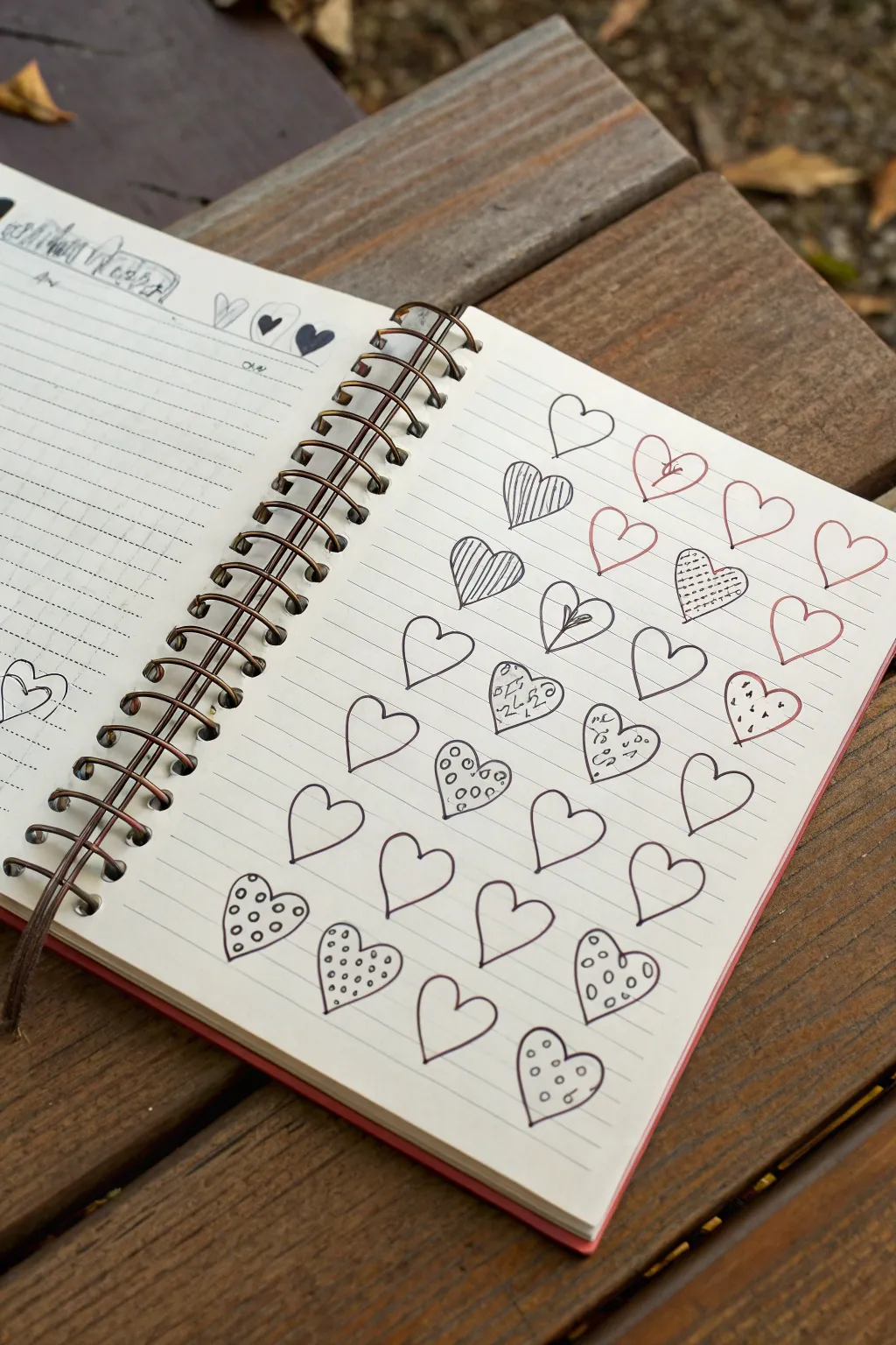
This charming page layout transforms a simple spiral notebook into a catalog of doodle ideas, perfect for warming up your creativity in February. By mixing solid outlines with various patterns like stripes, dots, and grids, you’ll create a delightful grid of hearts that feels both structured and whimsical.
Detailed Instructions
Materials
- Spiral-bound lined notebook (cream or white paper)
- Black fine-liner pen (0.3mm or 0.5mm)
- Red or pink fine-liner pen
- Ballpoint pen (black)
Step 1: Setting the Stage
-
Choose your canvas:
Open your spiral-bound notebook to a fresh, right-hand page. The lines on the paper will act as a natural guide for keeping your hearts organized, so there is no need for penciled measurements. -
Header detail:
At the very top left of the left-hand page (if visible), you can add a small doodle element—like a row of tiny hearts or a sketched word—just to frame the spread, though the main focus will be on the right side.
Wobbly Lines?
Don’t stress if your hearts aren’t symmetrical! The charm of this sampler is the hand-drawn, imperfect aesthetic. Consistent inconsistency looks intentional.
Step 2: Establishing the Grid
-
Visualize the layout:
Plan for roughly six rows of hearts. Stagger them so they aren’t perfectly aligned in columns; an offset ‘brick’ pattern looks more organic and interesting. -
First open heart:
Start with your black fine-liner. Draw a simple, open heart shape near the top center. Keep the lines relatively thin and clean. -
Adding color accents:
Switch to your red or pink pen. Draw a second heart next to the first one. For this specific sampler, try drawing a tiny flower blooming from the center cleave of the heart for a botanical touch. -
Completing the top row:
Continue across the top row, alternating between plain black outlines and red outlines. Allow about an inch of space between each heart.
Make It 3D
Use a light gray marker or pencil to add a simple drop shadow to the right side of each heart. This makes them pop off the lined paper.
Step 3: Pattern Play
-
Vertical stripes:
On the second row, draw a heart in black ink. Fill the interior with closely spaced vertical lines. I find that freehanding these lines gives them a charming, vibrating quality compared to using a ruler. -
The grid texture:
Create a neighbor for the striped heart. This time, fill the interior with a cross-hatch or grid pattern. Keep the spacing tight to make the heart appear darker. -
Simple outlines:
Intersperse these textured hearts with plain, empty outlines in both black and red ink. This ‘negative space’ keeps the page from looking too cluttered. -
Split design:
Draw a heart where a vertical line splits it down the middle. Add a small leaf or branch detail sprouting from that center line.
Step 4: Adding Whimsy
-
Confetti fill:
Move to the middle rows. Draw a heart outline and fill it with tiny, scattered dots and dashes, like falling confetti. -
Polka dots:
Create a heart featuring medium-sized circles inside. You can leave the circles white and color the space around them black, or just draw simple rings for a lighter look. -
Spiral centers:
Draw a heart and add swirly, spiral noodles inside. This doodle style looks great when done loosely. -
Stitched border:
For one of the hearts, try drawing the outline as a dashed ‘stitched’ line instead of a solid stroke.
Step 5: Finishing the Collection
-
Bottom row density:
As you reach the bottom of the page, focus on heavier patterns to ‘anchor’ the drawing. A heart filled with small, dense circles works perfectly here. -
The final polka dot:
Draw your last heart at the bottom center. Fill it with well-spaced, consistent polka dots. -
Review and refine:
Scan your page. If any black lines look too faint, carefully retrace them to thicken the line weight slightly. -
Erase stray marks:
Since we worked directly with ink, just brush away any eraser crumbs from previous sketches if you used a pencil guide, leaving the page crisp and clean.
You now have a lovely reference sheet of heart designs to use in future journal spreads and valentines


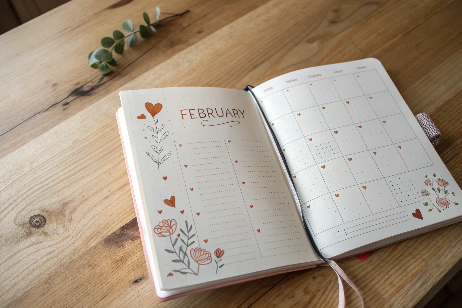
February Bullet Journal Cover Page Lettering
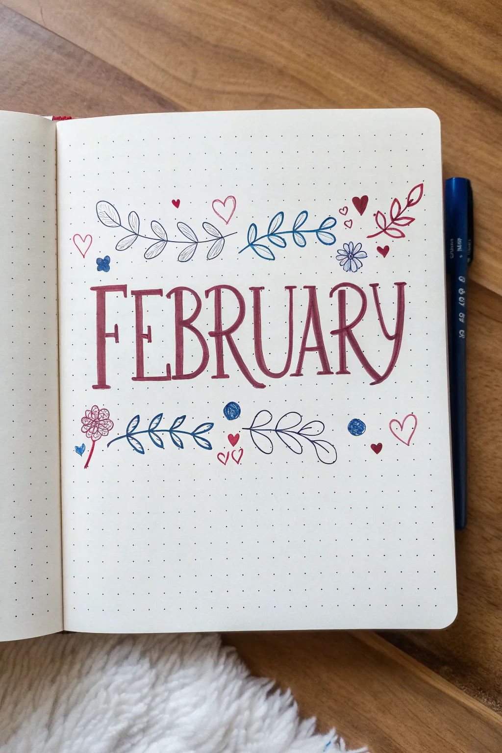
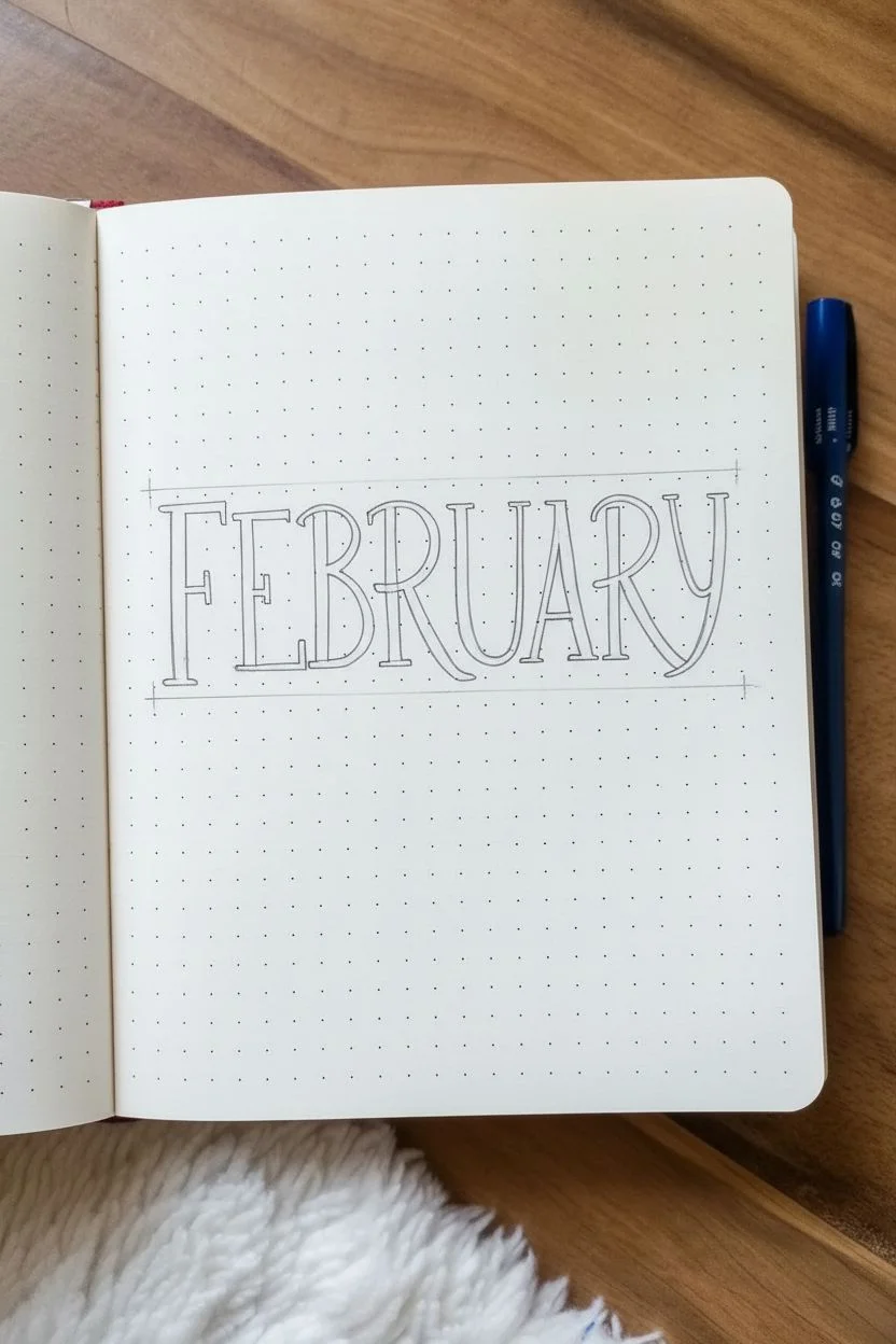
Embrace the month of love with this sweet, hand-lettered cover page featuring delicate vines and charming hearts. The design combines a bold serif font with playful blue and red accents for a balanced, romantic look.
Detailed Instructions
Materials
- A5 Dot Grid Journal
- Deep Red/Burgundy Brush Pen or Marker
- Fine Tip Blue Pen (Navy or Royal Blue)
- Fine Tip Red Pen
- Fine Tip Black Pen (optional for outlining)
- Pencil
- Eraser
- Ruler
Step 1: Drafting the Layout
-
Center Your Canvas:
Begin by finding the vertical center of your page. Count the dots to ensure your lettering will be perfectly centered. -
Map Out the Letters:
Using a pencil, lightly sketch the word ‘FEBRUARY’ in the middle of the page. Aim for tall, narrow capital letters. Leave extra space between the letters to accommodate the serifs later. -
Refine the Letter Highs:
Check that all your letters share the same baseline and cap height. You can lightly draw horizontal guidelines with a ruler if you need help keeping them straight. -
Add Weight and Serifs:
Thicken the vertical strokes of your pencil sketch to create a ‘bold’ effect. Add triangular serifs to the ends of the strokes to mimic the style in the photo.
Uneven Spacing?
If your letters look cramped, don’t restart. Turn the ‘FEBRUARY’ text into a banner by drawing a simple line box around it, distractions from spacing issues.
Step 2: Inking the Lettering
-
Outline the Text:
Take your deep burgundy marker and carefully trace the outline of your ‘FEBRUARY’ letters. Focus on sharp corners and clean lines. -
Fill in the Color:
Color inside your outlines with the same burgundy marker. Use slow, consistent strokes to avoid streakiness for a solid, opaque look. -
Let it Set:
Allow the ink to dry completely to prevent smudging before you erase your pencil guidelines. I like to wait at least a minute or two just to be safe.
Step 3: Drawing the Upper Vines
-
Sketch the Left Vine:
With your blue fine tip pen, draw a curved line starting above the ‘F’ and extending left. Add small, leaf-shaped loops along the stem. Leave the leaves uncolored for an airy feel. -
Hatch the Leaves:
Inside each leaf on this left vine, draw diagonal hatch lines using the same blue pen to add texture without solid weight. -
Create the Center Vine:
Draw another blue vine curving right, sitting above the ‘U’ and ‘A’. For these leaves, color them in solid blue for contrast. -
Add a Red Accent Branch:
On the far right, use your red fine tip pen to draw a small branch with open, loop-style leaves, angling it towards the corner.
Texture Trick
Varying your leaf styles is key. Mix solid fills, hatching lines, and empty outlines to keep the illustration dynamic and prevent it from looking heavy.
Step 4: Drawing the Lower Elements
-
Add the Blue Branch:
Beneath the word ‘FEBRUARY’, specifically under the ‘E’ and ‘B’, draw a blue branch with solid colored leaves. -
Draw the Outline Leaf:
Create a larger vine outline under the ‘R’ and ‘Y’ using a thin black or dark blue pen. Keep these leaves empty and simple. -
Sketch the Flower:
To the left of the bottom blue branch, draw a small flower. Use a red pen to create a cluster of petals on a thin stem.
Step 5: Details & Determining Accents
-
Sprinkle in Hearts:
Scatter small hearts around the text and vines using the red pen. Vary them between solid colored hearts and simple outlines. -
Add Blue Dots:
Fill empty negative spaces with small blue circles. Scribble inside them loosely for a playful, hand-drawn texture rather than a perfect fill. -
Erase and Clean Up:
Once all ink is thoroughly dry, take your eraser and gently remove any visible pencil marks from your initial sketch.
Now you have a charming, romantic cover page ready to welcome the month.


Rose and Bouquet Studies for February Romance
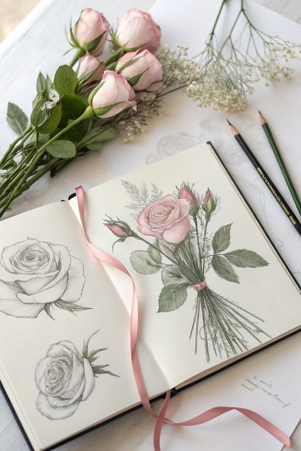
Capture the delicate beauty of February blooms with this elegant sketchbook spread featuring both monochrome graphite studies and a soft, colored pencil bouquet. This project balances structural observation with gentle color application, resulting in a timeless botanical page perfect for honing your floral drawing skills.
Step-by-Step Guide
Materials
- Sketchbook with smooth heavyweight paper
- HB and 2B graphite pencils
- Soft colored pencils (pink, olive green, cream, deep red)
- Black fine liner or dark charcoal pencil (optional for accents)
- Kneaded eraser
- Pencil sharpener
- Blending stump (optional)
Step 1: Left Page: Graphite Rose Studies
-
Map out the forms:
Begin on the left page by lightly sketching two circles to represent the overall heads of the roses. Place one near the top center and one near the bottom left to create a balanced composition. -
Define the center spiral:
For the top rose, locate the center and draw a tight, swirling spiral shape. This indicates the tightly packed inner petals that haven’t fully unfurled yet. -
Add outer petals:
Sketch larger, overlapping curved shapes radiating outward from the center spiral. Ensure the edges curl slightly backwards to give the flower volume and realism. -
Sketch the bottom bud:
For the bottom rose, draw a tighter, more spherical shape. Indications of the sepals (the green leaves at the base) should curve upward, hugging the petals. -
Refine with shading:
Switch to your 2B pencil to darken the deepest crevices between petals. Use light hatching marks to suggest the curve of each petal, leaving the top edges white for highlights. -
Add texture:
Use very faint, directional lines on the petals to mimic their silky texture. Soften any harsh outlines with a kneaded eraser for a delicate look.
Keep Pencils Sharp
For the feathery filler foliage on the bouquet, keep your green pencil extremely sharp. Dull points will make these delicate sprigs look clunky.
Step 2: Right Page: The Colored Bouquet
-
Establish the layout:
On the right page, lightly sketch a central vertical line to guide the stem direction. Draw a circle for the main rose head near the top third of the page. -
Draw the main bloom:
Using a pale pink colored pencil, outline the petals of the main rose. Follow the same spiral structure as the graphite study but keep the lines very faint. -
Add buds and height:
Sketch three smaller, teardrop-shaped buds rising above the main flower on long, slender stems. Position them at varying heights for a natural look. -
Draft the stems and ribbon:
Draw a cluster of straight, parallel lines extending downward from the flowers. At the convergence point, sketch a small rectangular band to represent the ribbon binding them. -
Layer the pink tones:
Gently layer your pink pencil on the main rose. Press harder in the shadow areas (between petals) and fade out to the paper white on the petal tips. Add touches of pink to the tips of the buds. -
Introduce greenery:
With an olive green pencil, draw the leaves using serrated, jagged edges. Create a mix of large leaves near the blossom and feathery, fern-like filler foliage in the background. -
Color the stems:
Fill in the stems with long, continuous strokes of green. I find it helpful to vary the pressure here, making some stems darker than others to create depth in the bunch. -
Detail the leaves:
Use a darker green or a sharp charcoal pencil to add veins to the leaves. Use short, hatching strokes to shade the underside of the leaves where light doesn’t hit. -
Refine the ribbon:
Color the ribbon band with a deep rose or red pencil. Add a tiny shadow just underneath it on the stems to show that it is cinched tight. -
Final stem details:
Extended the stems below the ribbon, allowing them to flare out slightly. Keep the ends loose and sketch-like rather than perfectly finished.
Step 3: Finishing Touches
-
Connect the spread:
Use a real pink ribbon as a bookmark or loosely place it across the pages to visually connect the drawing to the physical world, just like the reference photo. -
Clean up:
Erase any stray graphite lines that are still visible under the colored pencil. Sharpen the contrast on the graphite roses one last time to match the intensity of the colored side.
Waxy Buildup?
If your colored pencil layers get too slick or waxy to add more color, lightly dust the area with baby powder or use a workable fixative to add tooth back.
Now you have a beautifully balanced spread of botanical observations that captures the essence of a romantic bouquet


Couples’ Hands Holding for a February Moment
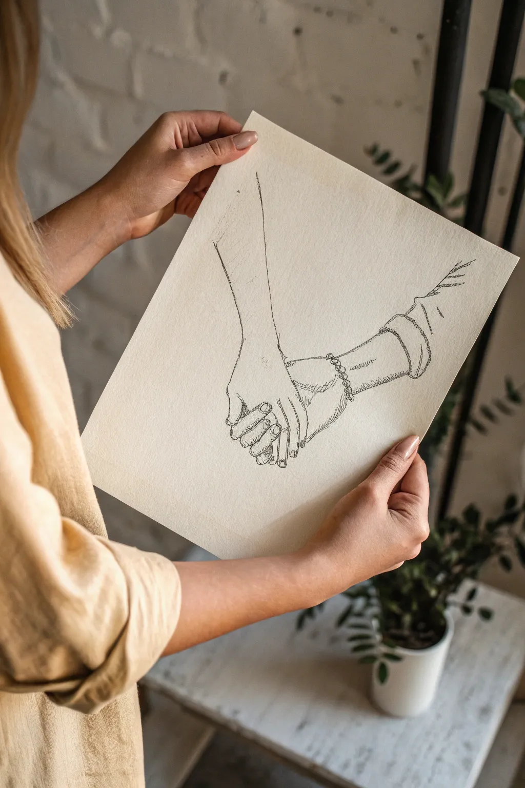
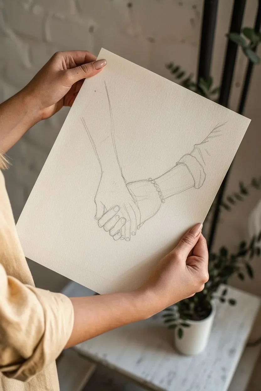
This elegant ink drawing captures the tender moment of two hands grasping each other, emphasizing connection and intimacy through minimal line work. The project uses fine liners on textured paper to create a loose, sketchy aesthetic perfect for a romantic February art piece.
How-To Guide
Materials
- Heavyweight textured drawing paper (cream or off-white, approx. 11×14 inches)
- HB graphite pencil for sketching
- Kneaded eraser
- Fine liner pen (0.1mm archival ink)
- Fine liner pen (0.3mm archival ink)
- Fine liner pen (0.5mm archival ink)
- Reference photo of hands holding
- Ruler (optional for positioning)
Step 1: Conceptualizing and Sketching
-
Paper preparation:
Begin with a high-quality sheet of cream or warm-toned paper. The textured surface adds character to the ink lines later, so ensure your paper is heavy enough to prevent bleeding. -
Basic composition:
Using your HB pencil loosely, mark the center of the page. Draw a faint diagonal line passing through the center to guide the general direction of the two arms meeting. -
Proportion blocking:
Sketch two large geometric shapes—rectangles or cylinders—to represent the forearms. Keep these very light. The arm on the left should angle down from the top, and the arm on the right should come up from the bottom right. -
Hand structure:
At the meeting point of the arms, draw rough boxy shapes for the palms. Don’t worry about fingers yet; just focus on where the knuckles on the dominant hand (the one clasping) will sit. -
Finger placement:
Sketch the fingers of the left hand wrapping around the right hand. Start with the index finger and work your way down. I find it helpful to draw simple ovals for the finger segments first to get the bending angles right. -
Refining the grip:
Draw the thumb of the left hand resting against the side of the other hand. Then, sketch the fingers of the passive hand (the right arm) tucking underneath, just barely visible. -
Adding details:
Lightly sketch the clothing cuffs. The arm on the right has a rolled sleeve and a bracelet; drawing these textural elements adds narrative to the piece. -
Final pencil adjustments:
Step back and check proportions. Are the fingers too long? Is the wrist too thick? Make necessary adjustments with your kneaded eraser now before ink touches the paper.
Step 2: Inking the Outline
-
Tracing the main contours:
Switch to your 0.3mm fine liner. Begin tracing the pencil lines of the arms and main hand shapes. Use broken, slightly wobbly lines rather than perfect continuous strokes to keep that organic sketch feel. -
Defining the fingers:
Carefully outline the fingers using the 0.3mm pen. Pay special attention to the nails and the creases at the knuckles. Let the line weight break occasionally where light would hit the skin. -
The bracelet and sleeve:
Ink the chain bracelet on the right wrist with small, interlocking loops. Use a looser, more jagged line for the rolled sleeve to suggest fabric texture. -
Erasing the guide:
Once the main ink lines are completely dry (give it a few minutes to be safe), gently dab and roll the kneaded eraser over the drawing to lift the graphite without smearing the ink.
Loose Lines Matter
Don’t connect every single line perfectly. Leaving small gaps in the outlines allows the eye to fill in the rest, giving the drawing a lively, professional sketch quality.
Step 3: Shading and Texture
-
Adding fine details:
Using the ultra-thin 0.1mm pen, add the delicate wrinkles on the knuckles and the skin folds where the thumb meets the palm. These tiny lines bring realism to the hands. -
Hatching the shadows:
Identify the shadowed areas, such as the space between the fingers and underneath the grasping hand. Use diagonal hatching lines with the 0.1mm pen to create depth. -
Darkening the contact points:
Switch to the 0.5mm pen to darken the deepest crevices where the fingers press against the skin. This higher contrast emphasizes the strength of the grip. -
Fabric texture:
Add a few quick, vertical hatch marks on the sleeve cuff with the 0.1mm pen to differentiate the fabric texture from the smooth skin. -
Arm hair suggestion:
If desired, add very sparse, short flicks on the forearms using the 0.1mm pen. Don’t overdo this; just a few lines suggest surface texture. -
Final assessment:
Review the drawing for balance. If one area looks too light or flat, add another layer of cross-hatching to build up the value.
Smudged Ink?
If you accidentally smudge wet ink, don’t erase it. Turn the smudge into a shadow by adding hatch lines over it, blending it into the surrounding texture naturally.
Frame this delicate sketch in a simple wood frame to highlight the warmth of the sentiment and the paper texture
BRUSH GUIDE
The Right Brush for Every Stroke
From clean lines to bold texture — master brush choice, stroke control, and essential techniques.
Explore the Full Guide
Lovebirds on a Bare Winter Branch
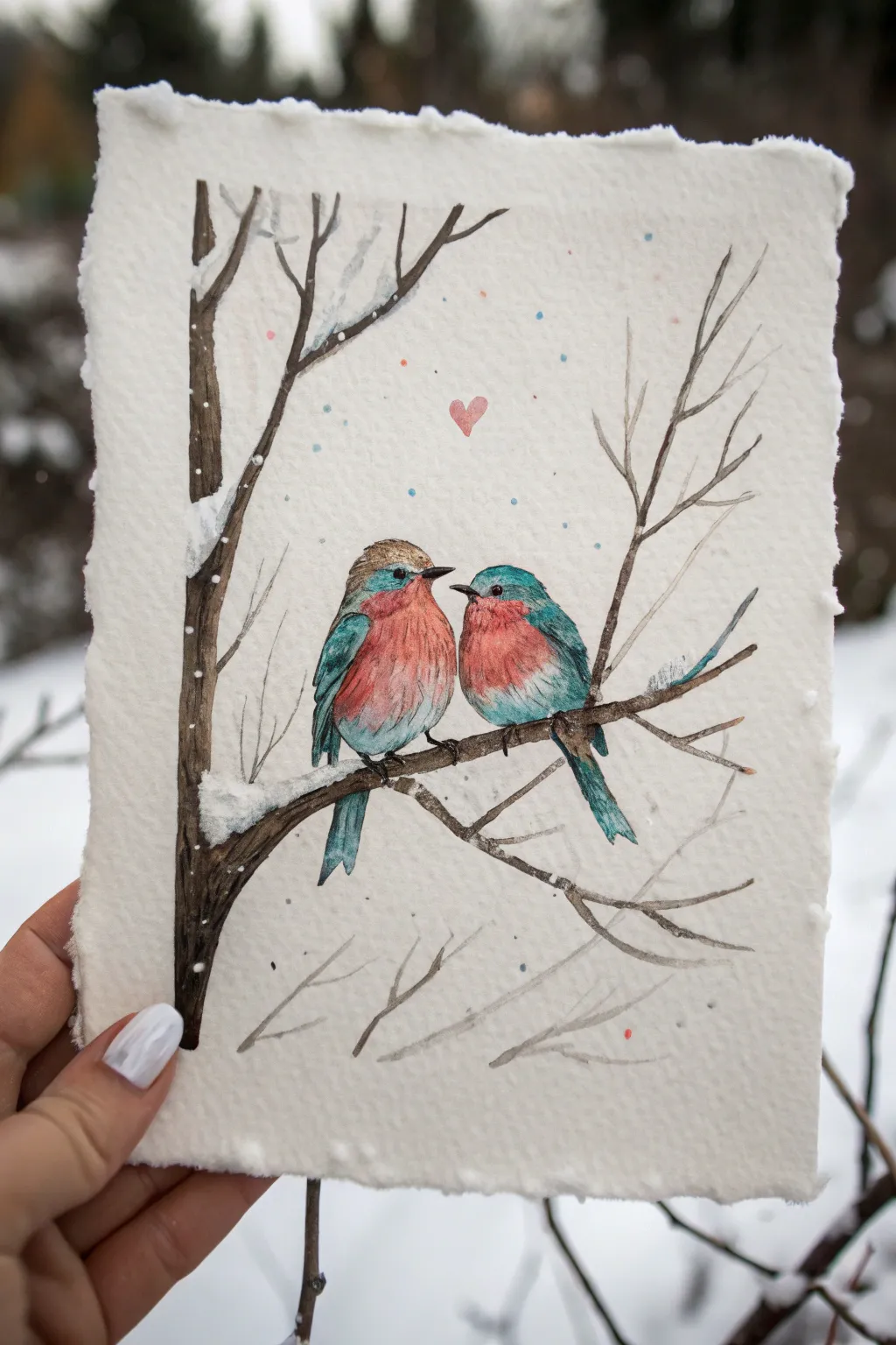
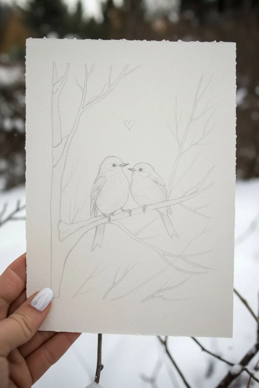
Capture the delicate beauty of bird companionship with this charming mixed-media illustration on handmade paper. This project combines watercolor washes with fine-line details to create a cozy, snowy scene perfect for a February greeting.
Detailed Instructions
Materials
- Heavyweight watercolor paper with deckled edges (300 gsm recommended)
- Watercolor paints (Cerulean Blue, Sap Green, Burnt Sienna, Burnt Umber, Alizarin Crimson, White Gouache)
- Fine liner pen (waterproof, brown or black, 0.1mm)
- Round watercolor brushes (Size 2 and 4)
- Washi tape or masking tape
- HB pencil and eraser
- Cup of water and paper towels
Step 1: Sketching the Composition
-
Map out the branch:
Begin by lightly sketching the main tree trunk on the left side of your paper. Extend a sturdy, horizontal branch across the middle for the birds to perch on. Add smaller, thinner twigs branching upwards and downwards to fill the space naturally. -
Place the birds:
Draw two oval shapes sitting close together on the main branch. The left bird should face slightly right, and the right bird should face left, creating an intimate connection. -
Add details:
Refine the bird shapes by adding their tails, defining the wing areas, and placing small beaks and round eyes. Sketch a tiny floating heart above their heads to center the composition.
Deckled Edge Hack
If you don’t have handmade paper, paint a border of water around the edge of normal watercolor paper, wait a minute, and gently tear the paper along the wet line.
Step 2: Painting the Birds
-
First wash of blue:
Load your size 4 brush with a watery mix of Cerulean Blue and a touch of Sap Green. Paint the heads, wings, and tails of both birds, leaving the chest area unpainted. Let the color pool slightly at the edges for texture. -
Add the rosy chests:
While the blue is drying (or once dry for sharper edges), mix a soft wash of Alizarin Crimson with a hint of Burnt Sienna. Paint the round belly area of each bird. I like to let the red and blue touch slightly in some areas for a soft, blended transition. -
Deepen the shadows:
Once the initial layers are dry, mix a slightly darker version of your teal blue. Add small strokes to the wings to suggest individual feathers and darken the area under the wings for volume.
Step 3: Inking and Definition
-
Outline the birds:
Using your waterproof fine liner, carefully trace the outline of your birds. Use broken, feathery strokes rather than a solid continuous line to mimic the texture of soft down. -
Add facial features:
Darken the eyes completely with the pen, leaving a tiny speck of white paper for a highlight if possible (or add it later with white paint). Draw the beaks clearly. -
Texturing the branch:
Outline the tree trunk and branches. Add jagged, vertical lines inside the trunk shape to represent rough bark texture. Darken the undersides of the branches for shadow.
Too Much Water?
If a puddle forms on your bird, don’t scrub it. Touch the very tip of a clean, dry paper towel to the puddle edge to wick away excess water instantly.
Step 4: Background and Atmosphere
-
Paint the tree:
Fill the tree trunk and branches with a mix of Burnt Umber and Burnt Sienna. Keep the paint somewhat transparent so your ink lines show through. -
Create the snow:
Use thick White Gouache (or very opaque white watercolor) to paint clumps of snow resting on top of the main branch and in the crooks of the twigs. Dab it on thickly for texture. -
Splatter the snow:
Load a wet brush with white paint and tap it against another brush handle over the paper to create falling snow speckles. Add a few blue and pink speckles for a magical, colorful winter atmosphere. -
Final touches:
Paint the floating heart with a soft pink wash. Add tiny highlight dots to the birds’ eyes with white gouache if you missed them earlier.
Now you have a sweet, handmade winter scene ready to frame or gift to someone special to brighten their February
Cupid Arrow and Bow Icon Set
These charming hand-drawn arrows and symbols are the perfect addition to a February bullet journal spread or Valentine’s Day card. The mix of sharp geometric lines and soft hearts creates a lovely icon set that is surprisingly easy to replicate with just a few basic tools.
Step-by-Step Tutorial
Materials
- Dotted notebook or bullet journal
- Fine liner pen (black, approx. 0.3mm or 0.5mm)
- Pink mildliner or marker (pastel shade)
- Ruler (optional, but helpful for straight shafts)
- Pencil and eraser (for sketching)
Step 1: Setting up the Basic Shapes
-
Map out your spacing:
Using the dots on your grid paper as a guide, lightly pencil in where you want each arrow to sit. Stagger them down the page, leaving about 3-4 dot rows between each icon to prevent clutter. -
Draw the straight shafts:
For the majority of the arrows, draw a straight line using your fine liner. Vary the lengths slightly for interest—some span 5 dots, others 7-8 dots. I like to freehand these for a organic look, but use a ruler if you prefer crispness. -
Create the diagonal shafts:
In the lower third of the page, draw two diagonal lines that will become the intersecting arrows. One should slant downwards to the right, and the other downwards to the left, but keep them separate for now.
Wobbly Lines?
If your straight lines are shaky, try drawing them faster. Moving the pen quickly often results in smoother strokes than moving slowly and overthinking.
Step 2: Adding Arrowheads and Fletchings
-
Standard triangular points:
For the first few arrows at the top, draw simple open triangles at the right end of the shafts. Vary the angles—some can be wide and shallow, others narrow and sharp. -
Diamond fletching:
On the top-most arrow, draw a small diamond shape at the tail end. Add a horizontal line through the middle of the diamond to create the look of feathers. -
Reverse V fletching:
For the second arrow down, draw two or three cascading ‘V’ shapes at the tail end, pointing inward toward the shaft to mimic traditional feathering. -
Add a ribbon banner:
Between the top two arrows, sketch a waving ribbon banner using pink ink first. Outline it loosely with your black pen, adding fold lines at the turns. You can letter a tiny phrase inside later. -
Complex fletching styles:
Move down to the middle arrows. Try drawing a rectangular shape at the tail, and fill it with closely spaced diagonal hatch marks to create a textured, feathery look. -
Heart-tipped arrows:
Instead of a sharp point, draw a small heart at the tip of one of your central arrows. For another design, place a solid black heart right in the middle of the shaft, as if the arrow is piercing it. -
Create the ‘Cupid’ heart arrow:
Near the bottom, draw a long arrow that passes through a larger outlined heart. Draw the heart first with a gap in the middle, then connect the arrow shaft through it so lines don’t overlap awkwardly.
Style Variation
Mix up your arrowheads! Try hearts, stars, or simple dots instead of triangles to make the spread feel more eclectic and playful.
Step 3: Detailed Symbols and Color
-
Botanical arrow details:
For one of the lower arrows, skip the traditional fletching and instead draw small leaves sprouting from the tail end of the shaft. -
Add peace signs:
In the open spaces near the bottom right, draw two circles. Inside, draw the vertical line and inverted ‘V’ to create the peace symbol. Double the lines if you want them to look thicker. -
Draw the double-ended arrow:
Create one horizontal line with an arrowhead on both ends. Make one arrowhead solid black and the other an open triangle for contrast. -
Sketch the globe icon:
At the very bottom, draw a circle with intersecting curved cross-lines to represent a globe or latitude/longitude lines. Add tiny loops at the cardinal points. -
Highlight with pink:
Take your pastel pink marker and carefully fill in specific details: the ribbon banner, a few standalone hearts scattered around the page, and the large feathery arrow near the top left. -
Final touches:
Erase any remaining pencil marks once the ink is totally dry. If any black lines look too thin, go over them once more to define the shapes.
Now you have a full page of whimsical doodles ready to decorate your monthly spread

PENCIL GUIDE
Understanding Pencil Grades from H to B
From first sketch to finished drawing — learn pencil grades, line control, and shading techniques.
Explore the Full Guide
Lovecore Color Palette Swatch-and-Doodle Page


Celebrate the month of love by creating a dedicated swatch page that doubles as a piece of art. This project combines organized color exploration on the left page with a whimsical, scattered heart pattern on the right, perfect for testing your pink and red drawing mediums.
Detailed Instructions
Materials
- Spiral-bound sketchbook (heavyweight paper recommended)
- Washi tape or masking tape (low-tack)
- Ruler
- Pencil and eraser
- Gouache, acrylic, or markers (assorted pinks, reds, and burgundies)
- Fine-point pen (black or dark brown) for labeling
- Palette for mixing
- Round paintbrush and flat paintbrush
Step 1: Setting the Grid
-
Measure the page:
Start by measuring the usable area of your left-hand page. You will need to create a grid that accommodates four columns and five rows of swatches. -
Mark the margins:
Using a ruler and a light pencil touch, mark a small margin around the outer edge of the page to frame your swatches nicely. -
Grid lines:
Draw your horizontal and vertical grid lines. Aim for rectangular boxes that are slightly wider than they are tall. -
Tape the borders:
Apply thin strips of washi tape over your pencil lines. This is the secret to getting those crisp, perfect white edges between colorful squares. Press the tape down firmly to prevent bleed-through.
Low-Tack Tape Tip
If your tape is too sticky, press it against your jeans or shirt a few times before applying it to the paper. This reduces tack and saves your paper from tearing.
Step 2: Creating the Gradient
-
Organize your colors:
Lay out your paints or markers. Group them from the lightest blush pinks to deep scarlets and maroons. If you are mixing paints, prepare a base gradient on your palette first. -
Start light:
Begin painting the top row. Use your lightest, almost-white pinks here. Fill the square completely, brushing right over the tape edges. -
Mid-tones:
Move to the second and third rows, increasing the saturation. Introduce coral tones, bubblegum pinks, and soft reds. -
Deepen the shades:
For the fourth row, move into true reds and berry tones. Ensure the paint is opaque enough to cover the paper grain. -
Darkest values:
Finish the bottom row with your deepest burgundy, wine, and maroon shades. I find that doing the darkest colors last helps me balance the overall visual weight of the page. -
Let it dry completely:
Wait until the paint is bone dry. This is crucial—peeling tape off wet paper can ruin the clean lines you worked hard for. -
Peel the tape:
Slowly peel the tape away at a 45-degree angle. This reveals the satisfying, clean grid structure. -
Label the swatches:
Using your fine-point pen, write the name of the color or the specific mix you used immediately underneath each colored rectangle. Keep your handwriting small and neat.
Uneven Coverage?
If your darker swatch colors look streaky, apply a second thin layer after the first one dries completely. Cross-hatch the brushstrokes for a smoother finish.
Step 3: The Heart Scatter
-
Prep the right page:
Move to the right-hand page. No grid is needed here; this side is about free-flowing movement. -
Paint the first hearts:
Using the same colors from your swatch page, start painting small hearts randomly across the page. Start with your mid-tone reds to anchor the composition. -
Vary the sizes:
Make some hearts tiny and others slightly larger. Twist your brush slightly to create the two lobes of the heart in a single fluid motion if using a round brush. -
Fill the gaps:
Switch to your lighter pinks to fill in the empty white spaces. Rotate the hearts slightly so they aren’t all facing perfectly upright. -
Add deep accents:
Finally, add a few scattered hearts in your darkest burgundy shade. These act as punctuation marks for the eye. -
Final touches:
Once the paint is dry, you can gently erase any visible pencil marks on the grid side for a pristine finish.
Your lovely color reference is now ready to inspire your next romantic artwork


Have a question or want to share your own experience? I'd love to hear from you in the comments below!