Some days you sit down to draw and your brain goes completely blank, even though you want to make something so badly. These drawing ideas are meant to get your pencil moving fast—no pressure, just playful momentum.
Simple Still Life With Everyday Objects
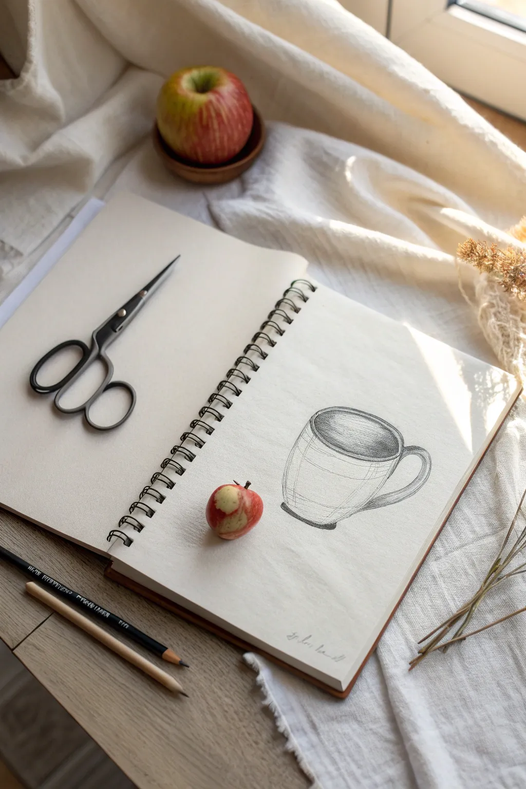

Capture the quiet simplicity of a morning moment with this gentle pencil study. Using soft shading and clean contours, you’ll render the smooth ceramic texture of a favorite coffee mug alongside a hint of sweetness.
Step-by-Step Guide
Materials
- Spiral-bound sketchbook (medium tooth paper)
- Graphite drawing pencils (HB, 2B, 4B)
- Small red apple (for reference)
- Black handled scissors (optional prop)
- Kneaded eraser
- Sharpener
Step 1: Setting the Scene
-
Arrange your composition:
Before putting pencil to paper, embrace the aesthetic of the photo. Open your sketchbook flat. Place a pair of black-handled scissors on the left page for visual balance, pointing diagonally upward toward the gutter. -
Position the subject:
On the right page, determine where your drawing will live. The mug will be the central focus, sitting slightly below the vertical center. Place a small, real apple near the bottom left of this page to serve as a 3D element that interacts with the 2D drawing.
Step 2: Drafting the Mug Structure
-
Establish the ellipse:
With an HB pencil, lightly sketch a horizontal ellipse to represent the opening of the mug. Keep your wrist loose to get a smooth, continuous curve rather than a jagged line. -
Define the body:
Drop two vertical lines down from the widest points of your ellipse. Curve these sides slightly inward as they go down to give the mug a gentle, tapered shape. -
Create the base:
Connect the bottom of your vertical lines with a curve that mirrors the bottom half of your top ellipse. This establishes the rounded bottom of the cup. -
Add volume to the rim:
Draw a second, slightly smaller ellipse inside the first one. This creates the thickness of the ceramic rim. I find paying attention to this small gap makes the object feel much more solid. -
Sketch the handle:
On the right side of the body, sketch a ‘C’ shape for the handle. Start just below the rim and end near the bottom third of the mug. Add a second inner line to give the handle thickness.
Wobbly Ellipses?
Draw through the object! Sketch the entire oval rather than just the visible curve. It’s easier to fix a full shape than 2 disconnected lines. Erase the hidden back line later.
Step 3: Shading and Definition
-
Darken the interior:
Switch to a 2B pencil. Begin shading the inside of the mug. The coffee liquid creates a dark surface, so use horizontal hatching strokes to fill the inner ellipse, leaving a thin sliver of white near the rim for a highlight. -
Define the outer contours:
Go over your initial structural lines with a bit more pressure. Make the lines on the shadowed side (the left and bottom) slightly thicker and darker than the lines on the light side. -
Add structural contour lines:
Lightly sketch a few horizontal curved lines across the body of the mug. These ‘cross-contour’ lines help communicate the roundness of the form to the viewer. -
Shade the exterior:
Using the side of your lead or a smudge tool, add very faint shading to the left side and bottom of the mug body to suggest roundness. Keep the center and top right mostly white to represent the highlight. -
Refine the handle:
Add shading to the underside of the handle and where it connects to the mug body. Use the 4B pencil here for deeper contrast. -
Ground the object:
Add a small, dark cast shadow right underneath the bottom curve of the mug. This stops the drawing from looking like it is floating in space.
Add Steam
Use your eraser to lift pigment ‘up’ from the coffee int he mug, creating faint, ghostly steam trails rising from the dark liquid.
Step 4: The Apple Element
-
Observe the apple:
Look at the small apple you placed on the paper. Notice its shape and color variation. -
Quick gesture sketch:
Very lightly sketch the outline of the apple directly on the page where it sits. This is a meta-step: you are drawing the object that is technically sitting on your paper. -
Render the apple skin:
Use the side of your 2B pencil to shade the apple’s form. If you want to replicate the photo exactly, you can leave the apple as a real object, or draw it in to complete the trompe-l’œil effect. -
Final signature:
Sign your name lightly near the bottom right corner of the page in a loose, cursive script.
Now you have a charming sketchbook study that celebrates the quiet beauty of everyday objects

A Realistic Eye Study for Shading Practice
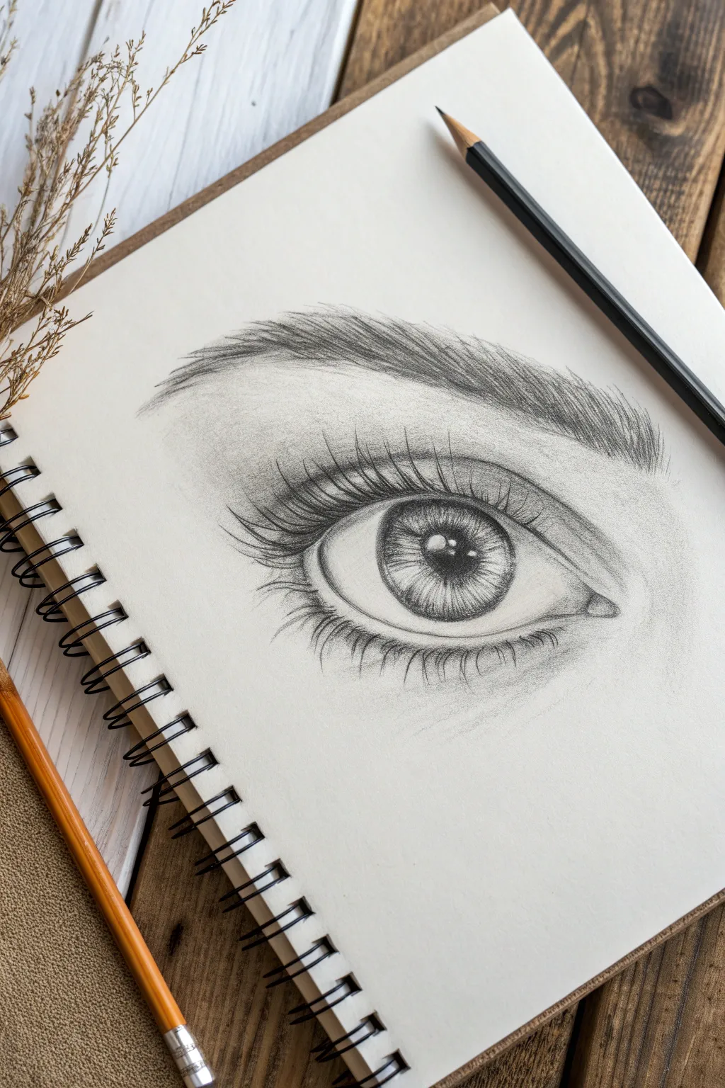
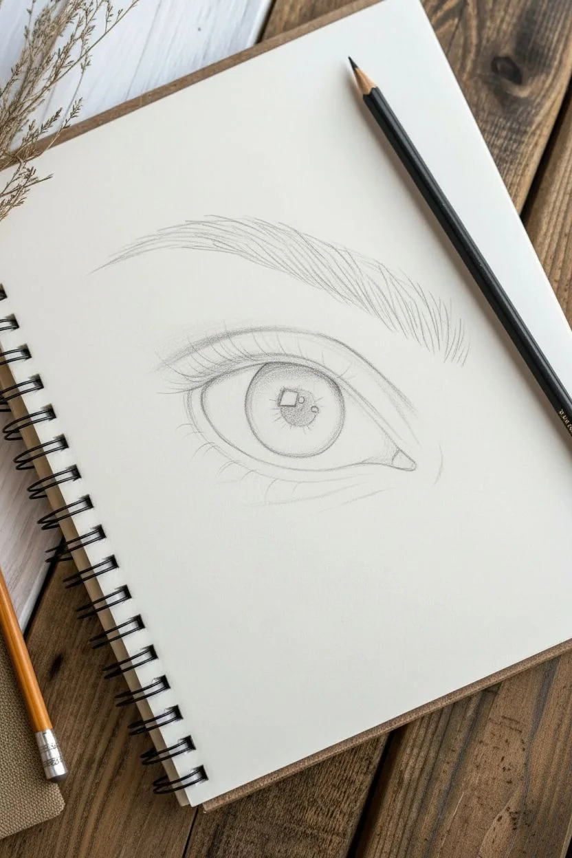
This classic graphite study focuses on capturing depth and realism through careful layering and shading. The result is a striking, soulful eye drawing featuring detailed eyelashes, a dimensional iris, and soft skin textures.
Step-by-Step
Materials
- Spiral-bound sketchbook (medium tooth paper)
- Graphite pencils (HB, 2B, 4B, 6B)
- Mechanical pencil (0.5mm HB for fine details)
- Kneaded eraser
- Precision stick eraser (optional, for highlights)
- Blending stump or tortillon
- Tissue or chamois cloth
Step 1: The Basic Framework
-
Outline the almond shape:
Begin with a very light hand using your HB pencil. Sketch a wide almond shape for the eye opening. Notice that the upper curve poses a steeper arc than the bottom curve, which is slightly flatter. -
Place the iris & pupil:
Draw a perfect circle within the almond shape for the iris. The top third of this circle should be hidden underneath the upper eyelid. Locate the center and draw a smaller, dark circle for the pupil. -
Map the highlights:
Before you start any major shading, lightly sketch a rectangular or organic shape overlapping the pupil and iris. This will be your primary light reflection—it must stay paper-white. -
Define the crease and brow:
Draw a curved line roughly a centimeter above the eye to indicate the upper eyelid crease. Above that, lightly sketch the directional flow of the eyebrow hairs, following the natural arch of the brow bone. -
Add the tear duct:
At the inner corner (left side), curve the line slightly inward to create the small, fleshy tear duct area. This shouldn’t be sharp; keep the lines soft and rounded.
Step 2: Shading the Iris
-
Fill the pupil:
Switch to a 4B or 6B pencil and fill in the pupil completely, pressing firmly to get a rich, dark black. Avoid the highlighted reflection area carefully. -
Create radial lines:
Using a 2B pencil, draw lines radiating outward from the pupil toward the edge of the iris, like spokes on a bicycle wheel. Vary their lengths—some short, some reaching the outer ring. -
Darken the outer distinct ring:
Deepen the outer perimeter of the iris (the limbal ring). Shade inward slightly from this ring to create a soft transition, making the eye look convex rather than flat. -
Blend the iris details:
Use a fine blending stump to gently smudge the radial lines. This softens the texture so it looks like muscle fibers rather than stick figures. Re-darken the pupil if it lost some contrast.
Fixing “Flat” Eyes
If the eye looks flat, the sclera (white part) is likely too white. Add more shading to the corners and under the lid to enhance the spherical form.
Step 3: Adding Depth and Skin Texture
-
Cast a shadow:
The upper eyelid casts a shadow onto the eyeball itself. With an HB pencil, shade the top portion of the ‘white’ of the eye and the top of the iris, fading downward. -
Shade the corners:
Lightly shade the inner and outer corners of the eyeball (sclera) grey. The eyeball is a sphere, so shading the edges makes it look round. Leave the center white. -
Contour the eyelid crease:
Use a 2B pencil to darken the crease line above the eye. Shade upwards and outwards from this line to visually push the crease inward. Soften this shading with your tissue. -
Build the skin tone:
Apply very light graphite dust or faint hatching around the eye socket and brow bone. Blend it smoothly with a tissue to create a flawless skin texture, keeping the immediate area around the highlights lighter.
Add Wetness
Use a white gel pen or opaque white gouache to add tiny, sharp dots of highlight on the tear duct and lower waterline for a hyper-realistic wet look.
Step 4: Lashes and Eyebrows
-
Map the eyebrow hairs:
Using a sharp HB or mechanical pencil, draw individual brow hairs. Follow the growth pattern: strokes go up at the inner brow, then gradually slant sideways toward the tail. -
Thicken the brow:
Go over the brow again with a 2B or 4B. Add variety by making some hairs cross over others. I find layering strokes creates the most realistic bushy effect. -
Start the lower lashes:
Draw the lower lashes with short, curved strokes. Notice they don’t grow visibly from the eyeball but from the lower rim of the lid. Draw a tiny ‘shelf’ or rim of skin first, then place lashes below that rim. -
Create the upper lashes:
These lashes should be longer, thicker, and deeply curled. Start from the upper lash line and flick your wrist quickly upward. Use a 4B pencil for dramatic darkness. -
Group the lashes:
Lashes rarely stick straight up individually; they tend to clump. Draw some lashes converging at the tips to form little triangular points. -
Final reflection check:
Ensure your main reflection in the eye is stark white. If it got smudged, use your precision eraser or the sharp edge of a regular eraser to clean it up for that ‘sparkle’ effect.
Now you have a detailed anatomical study that serves as perfect practice for portraiture


Hands in Gesture Poses
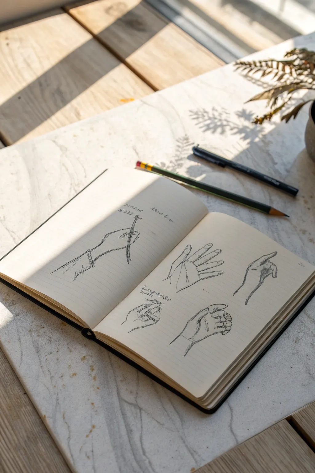
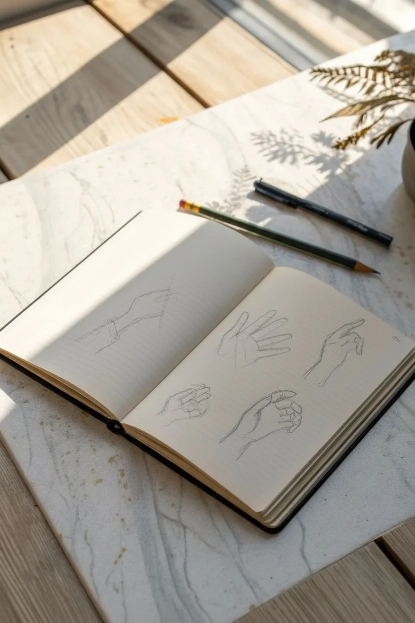
This study focuses on capturing the dynamic feel of hands in motion rather than stiff anatomical diagrams. By breaking down complex poses into simple shapes and adding line weight, you’ll create a sketchbook spread full of life and character.
Step-by-Step Tutorial
Materials
- Hardcover sketchbook (moleskine or similar)
- Graphite pencil (HB or 2B)
- Fine liner pen (0.3mm or 0.5mm)
- Black ink pen (0.1mm for details)
- Eraser
Step 1: Planning the Layout
-
Analyze the Spread:
Open your sketchbook to a fresh two-page spread. We will use the left page for a single, focused study of a hand holding an object, and the right page for a collection of four distinct gesture sketches. -
Rough Positioning on the Left:
On the left page, lightly mark the center area. This drawing will be larger, taking up the central third of the page, showing a hand gripping a thin tool. -
Rough Positioning on the Right:
Divide the right page mentally into four quadrants. You’ll place one hand study in the center of each quadrant: an open palm top-left, a pointing finger top-right, a relaxed curl bottom-left, and a loose grip bottom-right.
Step 2: Drawing the ‘Grip’ Study (Left Page)
-
Construct the Wrist:
Start with two parallel lines angling upward from the bottom left corner to suggest the forearm and wrist cuff. -
Block the Palm:
Draw a trapezoid shape attached to the wrist to represent the main block of the hand. Keep your pencil strokes very faint at this stage. -
Position the Fingers:
Sketch the thumb pressing inward. Draw the index finger wrapping over the top, and suggest the other fingers curled underneath. The focus here is the tension of holding a thin stylus or brush. -
Refine the Outline:
Go over your construction lines with darker graphite. Add the stylus extending vertically through the grip. -
Add Decorative Text:
Above the hand, scribble some loose, illegible notes to mimic the look of a working artist’s study. Keep the handwriting small and gestural.
Wonky Fingers?
Hands can look sausage-like if lines are too parallel. Taper fingers slightly toward the tips and emphasize the bony joints with a tiny bump or break in the line to add structure.
Step 3: Sketching the Gestures (Right Page)
-
Top Left: The Open Palm:
Start with a square for the palm. Extend five radiating lines for fingers. Flesh out the fingers, keeping the thumb distinctly separated. Add creases at the knuckles and palm center. -
Top Right: The Pointing Hand:
Draw the back of the hand as a wedge shape. Extend the index finger straight out. Curl the remaining three fingers into the palm, shading the area where they tuck in to show depth. -
Bottom Left: The Relaxed Curl:
This view is side-on. Draw the thumb resting against the side of the index finger. I find it helpful to draw the negative space between the thumb and fingers first to get the proportions right. -
Bottom Right: The Loose Claw:
Focus on the curvature of the wrist meeting the hand. Draw the fingers curled inwards but not touching the palm, like holding an invisible ball. Emphasize the knuckles with short, darker strokes.
Level Up: Washes
Once your ink is fully dry, brush a very diluted grey watercolor or ink wash over the shadowed side of the hands. This instantly pops the drawings off the page into 3D space.
Step 4: Inking and Finishing Touches
-
Initial Inking:
Using your fine liner, trace over the definitive lines of your pencil sketches. Don’t trace perfectly; let the ink line have a bit of ‘jitter’ or variation to keep it organic. -
Adding Line Weight:
Thicken the lines on the underside of the fingers and palms where shadows would naturally fall. This grounds the sketches. -
Hatching for Shadow:
Use simple parallel hatching lines on the sides of fingers (especially the ‘Pointing Hand’) and inside the curled palm of the ‘Loose Claw’ to create volume. -
The Sleeve Detail:
On the left page drawing, add cross-hatching to the cuff area to suggest fabric texture, distinguishing it from the smooth skin. -
Final Notes:
Add tiny alphanumeric notes or scribbles (like ‘Fig. 1’ or loose thoughts) next to the smaller gestures on the right page to balance the composition.
Your sketchbook now holds a beautiful set of anatomical studies ready for future reference


Quick Portraits Using Basic Shapes

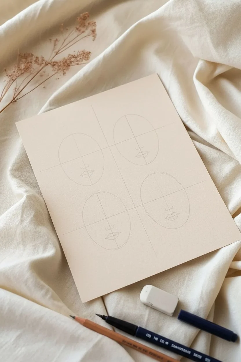
Capture the essence of expression with this minimalist quartet of line-drawing portraits. Using simple geometric foundations and confident ink strokes, you’ll create a stylish, modern art print that balances clean lines with soft, organic accents.
Step-by-Step Guide
Materials
- Heavyweight cream or beige cardstock (A5 or 5×7 inch)
- Navy blue fine liner pen (0.5mm or 0.8mm)
- Pencil (HB for light sketching)
- Soft eraser
- Peach or gold paint marker (or watercolor)
- Ruler (optional)
Step 1: Planning and Structure
-
Visualize the layout:
Visualize your card divided into four equal quadrants. You want one face centered in each quadrant, leaving a comfortable margin around the edges of the paper. -
Sketch the base shapes:
Using your pencil very lightly, draw four oval shapes. These don’t need to be perfect circles; think of them as egg shapes or rounded stones to form the boundary of each face. -
Mark the center lines:
Lightly sketch a vertical line down the center of each oval to help with symmetry, and a horizontal line roughly halfway down to mark where the eyes will sit.
Pro Tip: Line Confidence
Don’t correct mistakes while drawing the long contour lines. A slightly wobbly continuous line looks more artistic than a ‘hairy’ line made of many short, scratchy strokes.
Step 2: Inking the Upper Faces
-
Top Left: First Eye:
Start with the top-left face. Using your navy pen, draw the left eye as a simple almond shape with a circular iris. Add a strong, curved eyebrow above it. -
Top Left: Nose and Second Eye:
Draw the nose as a simple ‘L’ shape or vertical line that connects directly from the right eyebrow. Add the second eye, looking slightly to the side. -
Top Left: Mouth and Contour:
Place the lips halfway between the nose and chin, focusing on the Cupid’s bow. Trace the outer jawline, keeping the line smooth and continuous. -
Top Right: Closed Eyes:
For the top-right face, draw two U-shapes for closed eyelids. Add tiny tick marks for lashes hanging downward. -
Top Right: Forehead Detail:
Draw a continuous line from the nose bridge up to the forehead, curving it like a decorative bindi or third eye accent. Finish with a small dot at the very top.
Troubleshooting: Smudged Ink?
If you erase too soon and smudge the navy ink, turn the smudge into a deliberate shadow by adding stippling (tiny dots) over the area to mask the mistake.
Step 3: Inking the Lower Faces
-
Bottom Left: The Gaze:
Move to the bottom-left face. Draw wide, almond eyes with the pupils looking upward to the left. Give this face strong, thick eyebrows. -
Bottom Left: Decorative Dot:
Add a small circle (bindi) in the center of the forehead. Connect the nose bridge to the eyebrows in a fluid, T-shaped motion. -
Bottom Left: Jawline:
Ink the outer contour. Notice how this face is slightly more angular at the chin compared to the others. -
Bottom Right: Serene Expression:
For the final face, draw the eyes looking down or completely closed with thick, dark lashes. This creates a sleepy or meditative look. -
Bottom Right: Full Lips:
Draw the mouth slightly open or fuller than the others. Complete the oval face shape, ensuring it matches the scale of the previous three.
Step 4: Finishing Touches
-
Erase pencil guides:
Wait at least 5-10 minutes for your ink to be completely dry. Gently erase all your pencil sketches and distinct oval guidelines. -
Add cheek accents:
Take your peach or gold marker. Gently dab distinct circles on the cheeks of the top-left and bottom-left faces. -
Balance the color:
Add similar cheek dots to a single cheek on the bottom-right face. This asymmetry adds visual interest. -
Final inspection:
Check your line weights. If any lines look too thin or shaky, go over them once more with the navy pen to bold them up.
Now you have a serene piece of modern art ready to frame or gift
BRUSH GUIDE
The Right Brush for Every Stroke
From clean lines to bold texture — master brush choice, stroke control, and essential techniques.
Explore the Full Guide
Cute Animal Doodles With Big Personality
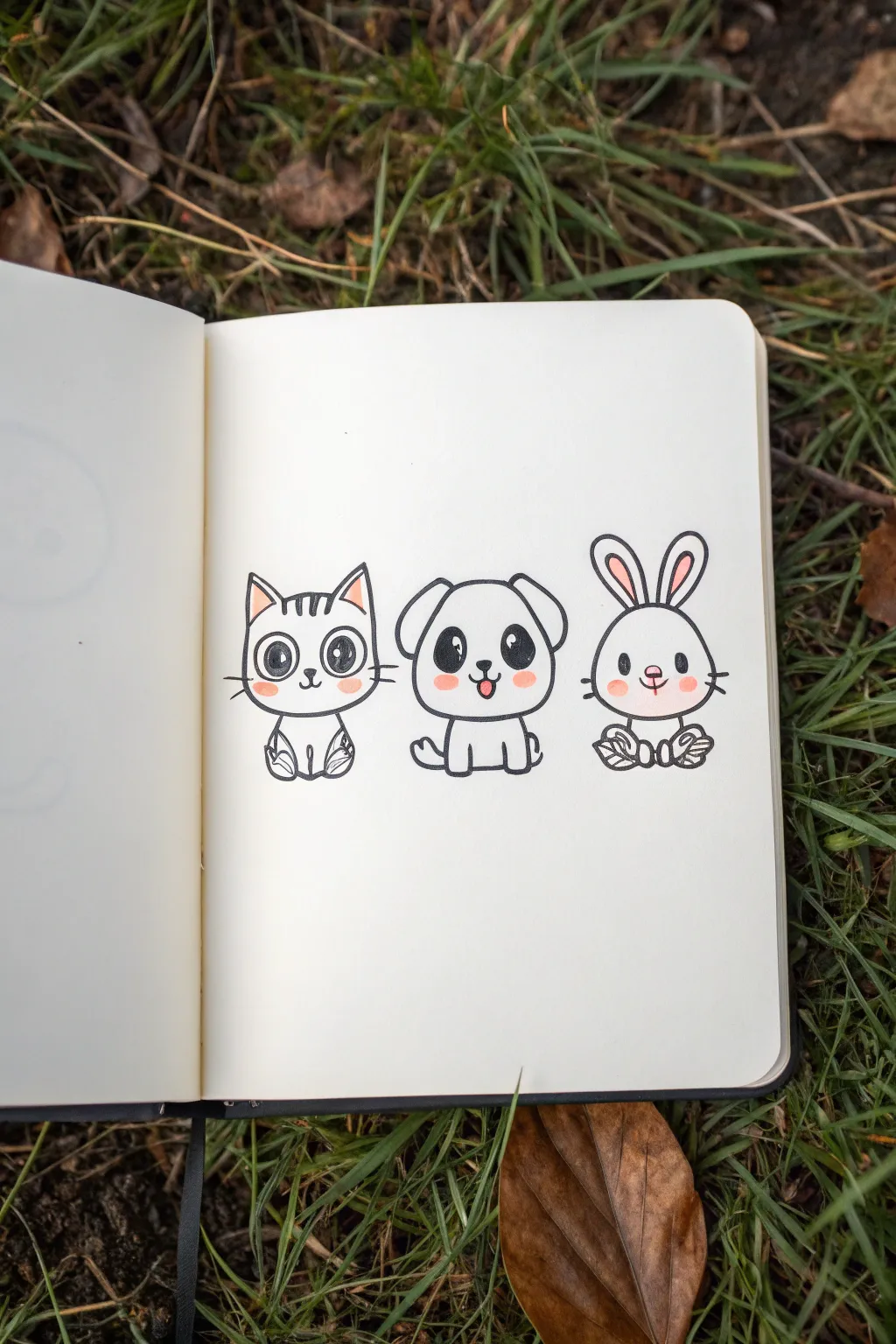
Capture the charm of three best friends with this simple ink drawing featuring oversized eyes and cute expressions. Using clean lines and just a touch of pink for blush, these minimalist doodles of a cat, dog, and rabbit are perfect for filling blank sketchbook pages.
How-To Guide
Materials
- Sketchbook or drawing paper (heavyweight preferred)
- Pencil (HB or 2H for light sketching)
- Eraser
- Fine liner pen (black, approx. 0.3mm or 0.5mm)
- Thicker marker or brush pen (black, for filling eyes)
- Light pink marker or colored pencil
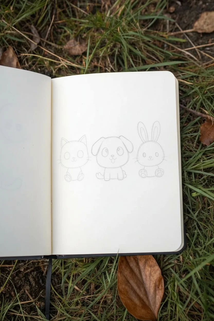
Step 1: Planning and Sketching
-
Lay the Foundation:
Start by lightly sketching three evenly spaced circles in a horizontal row across your page. These will become the heads of your animals, so keep them roughly the same size. -
Add Body Shapes:
Draw tiny, rounded bodies beneath each head circle. Think of them as small, squashed ovals or gumdrops that are much smaller than the heads to emphasize the cute, chibi aesthetic. -
Sketch the Cat’s Features:
On the left circle, add two pointed triangle ears on top. Sketch large oval eyes, a small triangular nose, and whiskers jutting out horizontally. -
Sketch the Dog’s Features:
For the middle circle, draw two floppy, U-shaped ears hanging down the sides. Add large oval eyes similar to the cat’s, but place a small, U-shaped mouth with a tongue sticking out underneath. -
Sketch the Rabbit’s Features:
On the right circle, draw two tall, vertical oval ears. Give this one a simple Y-shaped nose and mouth combo, along with whiskers. -
Define the Limbs:
Add simple paws to your sketches. The cat and rabbit are sitting with paws tucked in front, while the dog’s legs extend slightly downward in a sitting pose.
Establish Eye Contact
Make sure the white highlights in the eyes are all facing the same direction (e.g., top-left). This makes the characters look focused and lively.
Step 2: Inking the Outlines
-
Ink the Cat:
Using your fine liner, trace over the cat’s pencil lines. Be sure to include the three little stripes on its forehead and the inner triangle details of the ears. -
Ink the Dog:
Move to the center and ink the puppy. When drawing the mouth, keep the tongue shape distinct so you can color it later. I like to make the jawline slighty wider than the forehead for that classic puppy look. -
Ink the Rabbit:
Outline the bunny on the right. Add the inner details of the ears and ensure the whiskers are quick, confident flicks of the pen. -
Erase Guidelines:
Wait a moment for the ink to fully set, then gently erase all your pencil sketches to leave a clean, crisp black outline.
Accessorize!
Give them unique personalities by adding tiny bow ties, hair clips, or speech bubbles with heart symbols above their heads.
Step 3: Coloring and Details
-
Fill the Eyes:
This step brings them to life. Use your thicker black marker to fill in the large oval eyes. Leave two white circular highlights in each eye—a larger one at the top and a smaller one at the bottom. -
Add the Blush:
Take your light pink marker or colored pencil. Carefully draw small oval patches of blush directly under the eyes on the cheeks of all three animals. -
Color Ears and Noses:
Using the same pink, gently color the inside of the cat’s ears and the rabbit’s ears. Add a tiny dot of pink to the puppy’s tongue and the cat’s nose. -
Final Cat Details:
Add details to the cat’s paws by drawing curved lines to suggest toes or folded legs. -
Final Dog Details:
Draw small curved lines on the dog’s paws to separate the toes, giving them a soft, padded look. -
Final Rabbit Details:
Finish the bunny’s feet with similar toe lines, ensuring they look tucked in and cozy. -
Review and Refine:
Check your drawing for any gaps in the ink or areas that need a little more black fill. Strengthen the outer lines slightly if you want a bolder ‘sticker’ effect.
Now you have a trio of adorable companions ready to brighten up your journal
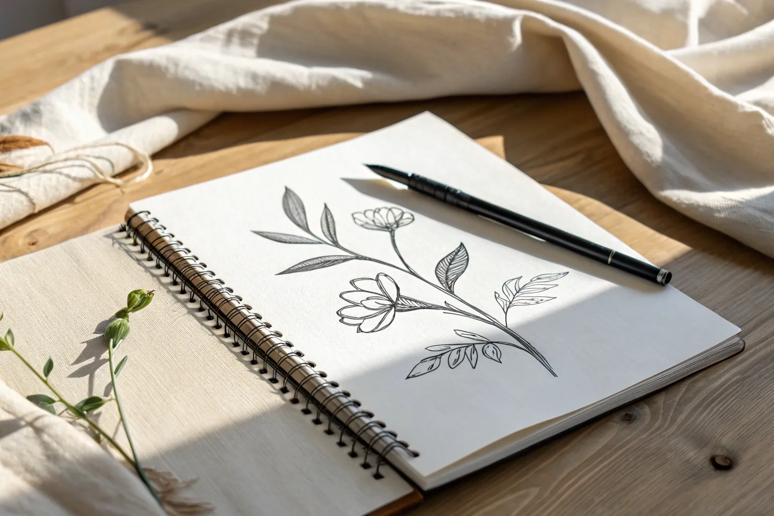
Botanical Line Drawings of Leaves and Stems
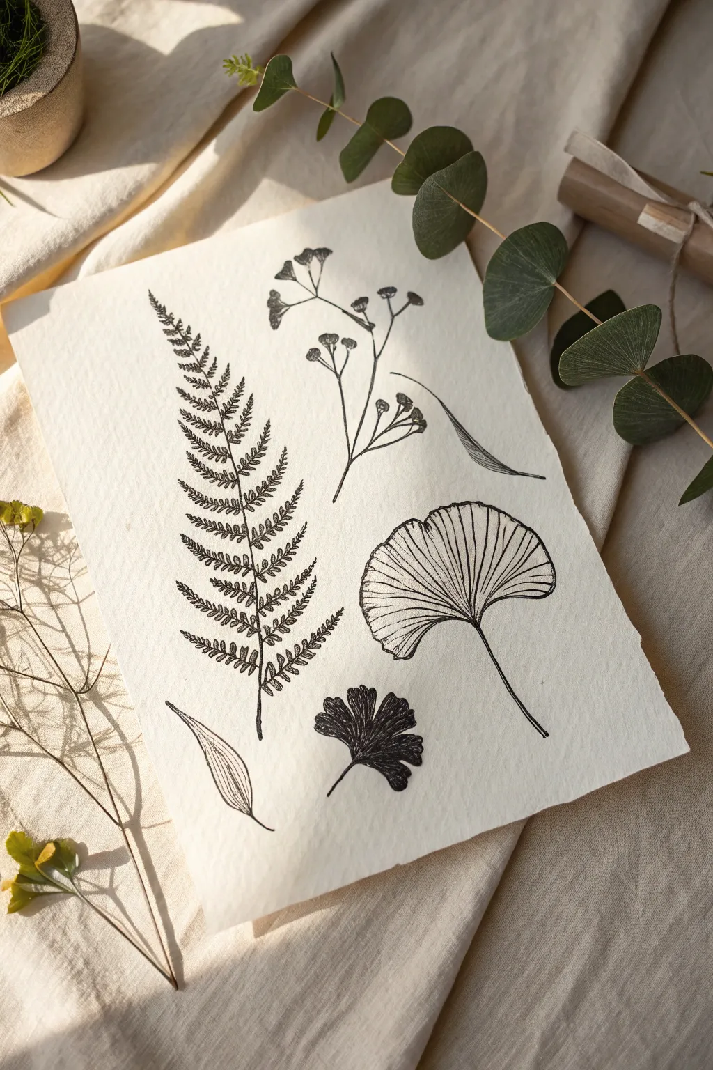
Capture the delicate beauty of nature with this fine-line ink drawing project featuring ferns, ginkgo leaves, and floral sprigs. Using varied stippling and hatching techniques on textured paper creates a vintage-inspired scientific illustration aesthetic.
Step-by-Step
Materials
- Cold press watercolor paper (medium texture)
- Fine liner pens (0.05, 0.1, and 0.3 nib sizes)
- HB Drawing pencil
- Kneaded eraser
- Ruler (optional)
- Real leaves for reference (Fern, Ginkgo, Eucalyptus, Baby’s Breath)
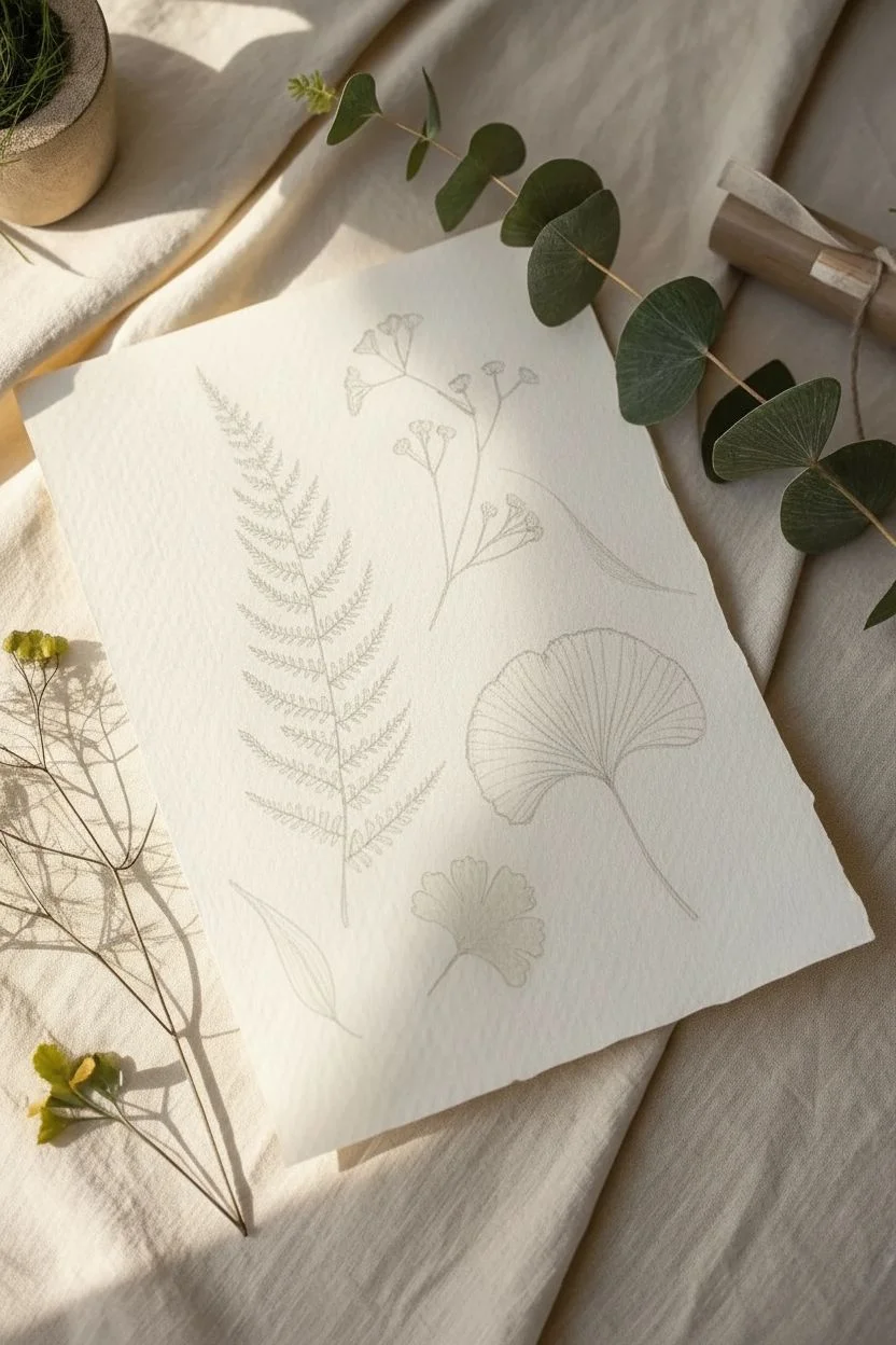
Step 1: Planning and Sketching
-
Paper Preparation:
Begin by selecting a high-quality sheet of cold press watercolor paper. The rough texture is crucial for achieving that organic, slightly broken line quality seen in the example. -
Composition Layout:
Lightly visualize where your five main elements will go. Place the large fern on the left as an anchor, the ginkgo leaf on the right, and fill the center and corners with the floral sprig and smaller leaves. -
Pencil Structure – The Fern:
Using your HB pencil with very light pressure, draw a curved central spine for the fern. Mark the spacing for each frond branching off, getting smaller as you reach the tip. -
Pencil Structure – The Ginkgo:
Sketch the fan shape of the ginkgo leaf. Draw the stem first, then fan out the top edge, adding a slight dip in the center to create that characteristic bi-lobed shape. -
Pencil Structure – Floral Sprig:
Outline the delicate, branching stems for the floral element in the top center. Keep these lines wispy and erratic to mimic nature. -
Finalizing the Sketch:
Add the outlines for the remaining two smaller leaf elements at the bottom. Once all shapes are roughly placed, gently roll a kneaded eraser over the page to lift dark graphic, leaving only faint guidelines.
Use Textured Paper
Don’t press hard! Let the nib glide over the cold press paper “peaks.” This naturally creates broken lines that look vintage and organic.
Step 2: Inking the Details
-
Inking the Fern Spine:
Switch to a 0.1 fine liner. Trace the central stem of the fern, but don’t make it a solid, thick line. Let the pen skip slightly over the paper’s texture. -
Detailed Fronds:
Change to a 0.05 pen for the ultimate precision. Draw the individual leaflets on the fern. Use tiny, rapid hatched lines to shade the underside of each leaflet where it connects to the stem. -
The Ginkgo Textures:
For the ginkgo leaf, outline the fan shape with the 0.3 pen for a bolder edge. Then, switch back to the 0.05 pen to draw the veins radiating from the stem to the outer edge. Some veins should be broken or faint to show light reflection. -
Floral Sprig Stippling:
Ink the floral sprig stems. For the tiny buds or flowers at the tips, use a stippling technique (dots) rather than solid circles to give them a fluffy, airy appearance. -
Creating Contrast:
Locate the small, dark leaf cluster near the bottom center. Use the 0.3 pen to fill these leaves in almost entirely, leaving only thin white veins visible. This heavy black provides a necessary visual weight to anchor the composition. -
Simple Leaf Blades:
Ink the final two single blade leaves. Use long, sweeping strokes. Add linear hatching inside these shapes to suggest curvature and shadow. -
Refining Shadows:
Look over the whole piece. I like to add a second pass of cross-hatching to the darkest areas, specifically under the ginkgo leaf folds and at the base of the fern, to deepen the dimension. -
Final Cleanup:
Allow the ink to dry completely for at least 30 minutes to prevent smudging. Gently erase any remaining pencil guidelines with the kneaded eraser. -
Deckled Edge (Optional):
To match the reference photo’s rustic look, tear the edges of your paper against a metal ruler to create a soft, deckled edge.
Ink Smearing?
Wait longer before erasing pencil lines. If you’re left-handed, place a scrap piece of paper under your hand as a guard while you draw.
Now you have a timeless botanical study ready to frame or display

PENCIL GUIDE
Understanding Pencil Grades from H to B
From first sketch to finished drawing — learn pencil grades, line control, and shading techniques.
Explore the Full Guide
Mountains and a Minimal Horizon Landscape

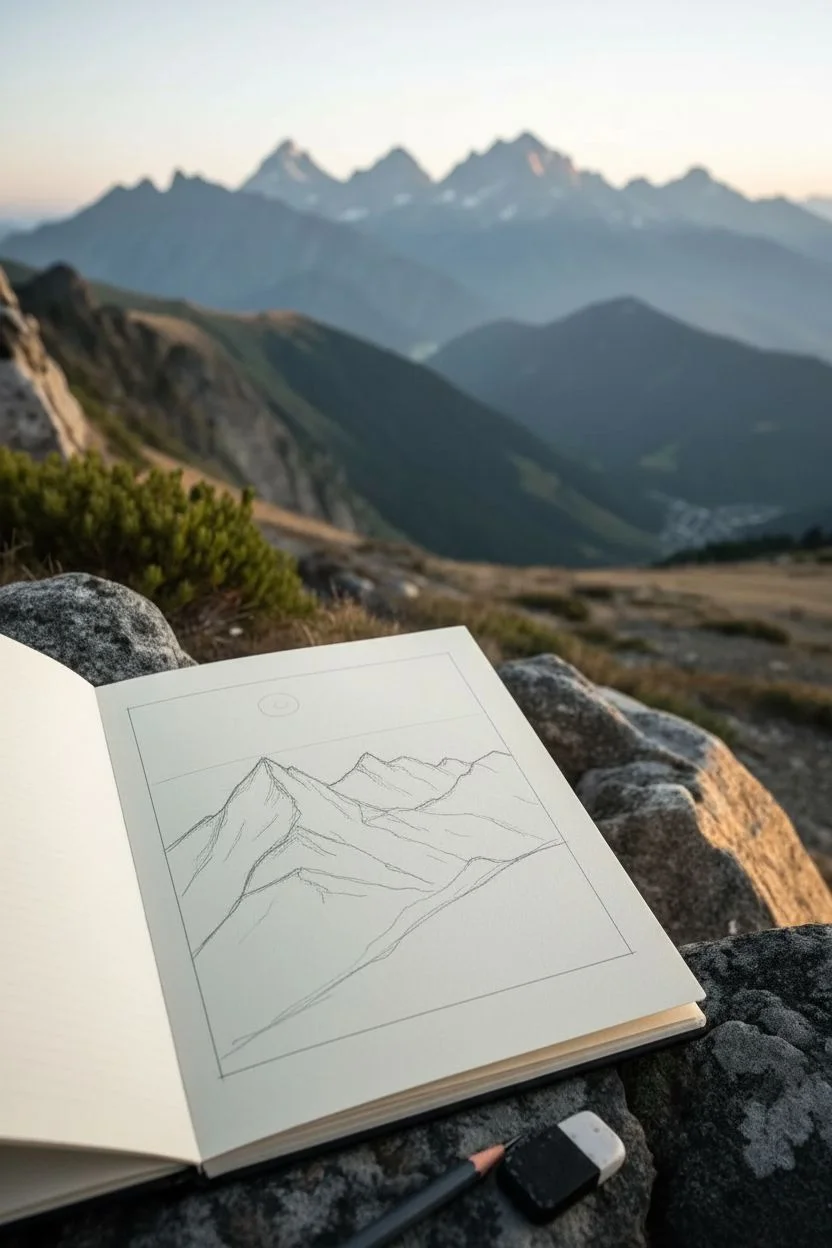
Capture the majestic atmosphere of a mountain range with this detailed pen-and-ink sketch. You will learn to use simple hatching and stippling techniques to create depth, texture, and dramatic shadows on paper.
Detailed Instructions
Materials
- Sketchbook with smooth, heavy paper (approx. A5 size)
- Graphite pencil (HB or H)
- Kneaded eraser
- Fine liner pens (sizes 0.1mm, 0.3mm, and 0.5mm)
- Ruler (optional for the border frame)
Step 1: Planning compositions & basic shapes
-
Frame the scene:
Begin by drawing a neat rectangular border on your page using your pencil and a ruler. Leave a comfortable margin of white space around the edges to give the drawing a polished look. -
Establish the horizon:
Lightly sketch a horizon line slightly below the middle of the box. This will separate the main mountain peaks from the foreground slopes. -
Outline the main peaks:
Sketch the triangular shapes of the mountains. Focus on the jagged, uneven quality of the summits rather than making perfect pyramids. Create three distinct layers: a large foreground peak on the left, a central mid-ground range, and faint background peaks. -
Add the foreground slope:
Draw a sweeping diagonal line from the bottom right corner going upwards towards the left. This represents the nearest grassy hill where you will later add trees. -
Mark sketch details:
Lightly indicate where the shadow sides of the mountains will be. Usually, light comes from one direction, so pick a side (e.g., the right side) to remain bright and the other to be shaded. -
Place celestial elements:
Draw a small circle for the sun or moon in the upper left sky area, keeping lines very faint so they don’t show through the ink later.
Hatch With Purpose
Don’t just draw random lines. Make your hatching strokes follow the contour of the mountain. If the slope curves, curve your lines slightly to match.
Step 2: Inking outlines and primary structures
-
Ink the frame:
Use your 0.5mm pen to trace over the rectangular border. A steady hand is key here, or you can use your ruler again for a crisp edge. -
Trace mountain ridges:
Switch to a 0.3mm pen. Carefully go over the pencil outlines of the mountain ridges. Make the lines slightly broken or jittery in places to mimic rocky terrain. -
Define the foreground:
Ink the foreground slope line with the 0.3mm pen. Keep this line smoother than the jagged rocks above to suggest a softer, grassy or earthy texture. -
Erase pencil guides:
Once the ink is completely dry—give it a full minute—gently erase all graphite marks with your kneaded eraser so you have a clean slate for shading.
Add Atmospheric Perspective
Make distant mountains lighter. Use thinner pens (0.05mm) and fewer details for the furthest peaks to make them recede into the background.
Step 3: Texturing and shading
-
Start the hatching:
Using a 0.1mm pen, begin shading the shadow side of the main left peak. Use diagonal parallel lines (hatching). Keep the lines close together for darker areas near the ridges and spread them out slightly as you move down. -
Cross-hatching for depth:
To make the deepest shadows even darker, add a second layer of lines perpendicular to the first layer. I often do this right at the sharpest crevices of the mountain. -
Texture the lit slopes:
On the sunlit sides of the mountains, use very sparse, broken lines. These should follow the downward slope of the mountain to suggest gravity pulling debris down, but keep most of the paper white. -
Stylize the sky:
For the clouds and background atmosphere, use thin, horizontal dashed lines. Keep these minimal and concentrated near the horizon line and around the sun/moon to give an impression of mist. -
Inking the trees:
Use the 0.3mm pen to add tiny pine trees along the bottom foreground slope. Use short, vertical strokes for trunks and quick zigzag motions for the foliage. Vary their heights to make them look natural. -
Ground the trees:
Add some stippling (tiny dots) or short grass marks at the base of the trees to plant them into the landscape, ensuring they don’t look like they are floating. -
Final contrast check:
Step back and look at your drawing. If the main mountain peak needs to pop more, deepen the shadows on its dark side with the 0.3mm pen to increase the contrast against the white sky.
Close your sketchbook with satisfaction knowing you’ve captured a piece of the wild.
Cloud Studies Using Soft Value Transitions
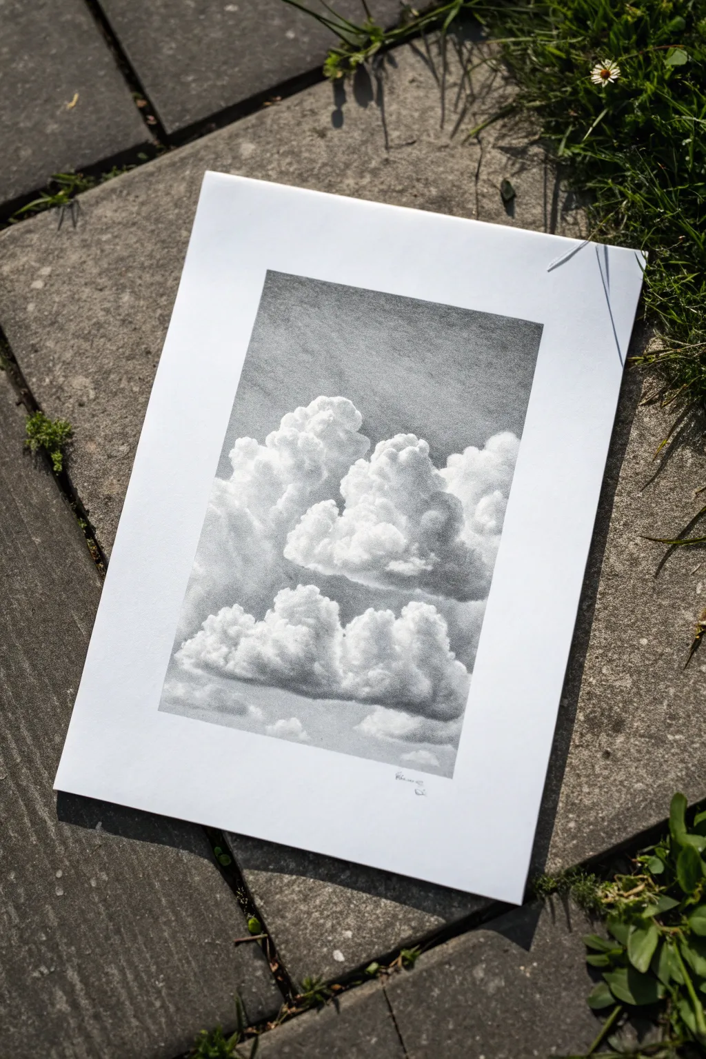
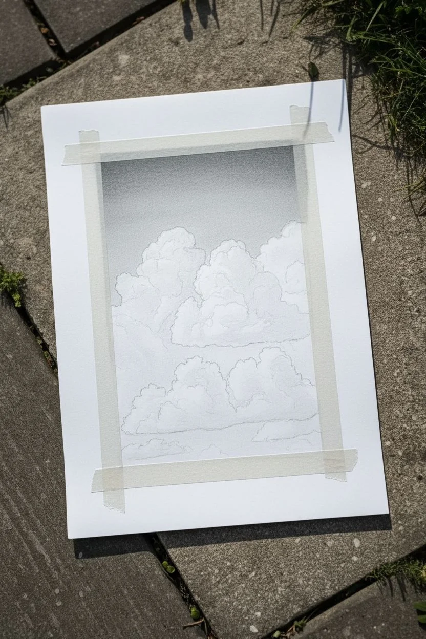
Capture the ethereal volume of cumulus clouds with this graphite pencil study. By focusing on soft gradients and subtle shading, you can create a realistic sense of depth and atmosphere on simple white paper.
Step-by-Step
Materials
- High-quality bright white drawing paper (heavyweight, smooth texture)
- Graphite pencils (HB, 2B, 4B)
- Mechanical pencil (0.5mm HB or 2B) for details
- Kneaded eraser
- Blending stump or tortillon
- Soft tissue or cotton pad
- Ruler
- Masking tape (low-tack)
Step 1: Preparation and Mapping
-
Define the frame:
Begin by measuring a rectangular border in the center of your paper using a ruler. Lightly mark the corners and connect them. To keep these edges crisp and clean throughout the process, apply strips of low-tack masking tape along the outside of these lines. -
Establish the sky gradient:
Before drawing any clouds, create the background sky tone. Using an HB pencil held at a low angle, shade the top portion of the frame horizontal strokes. The sky should be darker at the very top and fade gradually as it moves downward. -
Initial blending:
Take a soft tissue or cotton pad and gently rub the graphite you just laid down. Use small circular motions to push the graphite into the paper’s tooth, creating a smooth, seamless gray tone for the upper atmosphere. -
Outline the cloud masses:
Switch to a light HB pencil. Sketch the erratic, bumpy outlines of the main cloud formations. Don’t press hard; you want these lines to be barely visible, acting merely as a guide for where the white paper will remain untouched.
Smudge Alert
Clouds getting muddy? Place a scrap piece of paper under your drawing hand. This prevents skin oils from locking the graphite into the paper and stops your hand from smearing your smooth sky gradients.
Step 2: Building Volume
-
Identify light source:
Decide on your light source—in this reference, it comes from the upper left. This means the top-left edges of the cloud puffs will remain the stark white of the paper, while the bottom-right areas will hold the shadows. -
Layering the mid-tones:
Using a 2B pencil, lightly shade the shadowed underside of the largest central cloud. Apply the graphite in small, tight scribbles rather than straight lines to mimic the fluffy texture of vapor. -
Softening the edges:
Use a blending stump (tortillon) to soften these initial shadows. The goal is to avoid hard transitions within the cloud body. Drag the graphite slightly upward into the white eras, creating a soft gray transition zone. -
Deepening the shadows:
Introduce a 4B pencil for the darkest crevices where the clouds bunch together. Look for the ‘valleys’ between the cloud puffs and darken these areas to push them deeper into the background. -
Creating the secondary formation:
Move to the lower bank of clouds. Repeat the process: preserve the bright white tops, and shade the bottoms with your HB and 2B pencils. These clouds are smaller and lower, so keep the details slightly tighter.
Step 3: Refining Texture and Details
-
Lifting highlights:
Shape your kneaded eraser into a fine point or wedge. Dab—don’t rub—at the top edges of the clouds where your shading might have encroached too far. This ‘lifting’ technique re-establishes the blinding white highlights. -
Adding texture to the sky:
The sky isn’t perfectly flat. Use the dirty blending stump (with leftover graphite on it) to add very faint, wispy streaks in the background sky area, suggesting distant, indistinct vapor. -
Defining the edges:
Use a mechanical pencil to carefully refine the edges of the white clouds against the gray sky. While clouds generally have soft edges, a few crisp, sharp areas will pinpoint the focus and make the fluffiness elsewhere look more convincing. -
Balancing values:
Step back and look at the overall contrast. If the clouds look flat, your shadows aren’t dark enough. Gently layer more 4B graphite into the deepest bases of the clouds, blending carefully. -
Final cleanup:
Check the white border of the paper. Erase any smudges or fingerprints. Slowly peel away the masking tape at a 45-degree angle to reveal the sharp, professional frame around your drawing. -
Signing the work:
With a sharp pencil, add a tiny, subtle signature in the bottom right corner within the white margin, keeping it unobtrusive so it doesn’t distract from the artwork.
Tint the Sky
For a dramatic mood shift, grind a bit of charcoal onto sandpaper and lift the dust with a cotton ball. Apply this over your sky area for a stormier, deeper black contrast against the white clouds.
Now you have a serene, atmospheric study that captures the fleeting beauty of the sky


City Skyline Silhouette in High-Contrast Ink
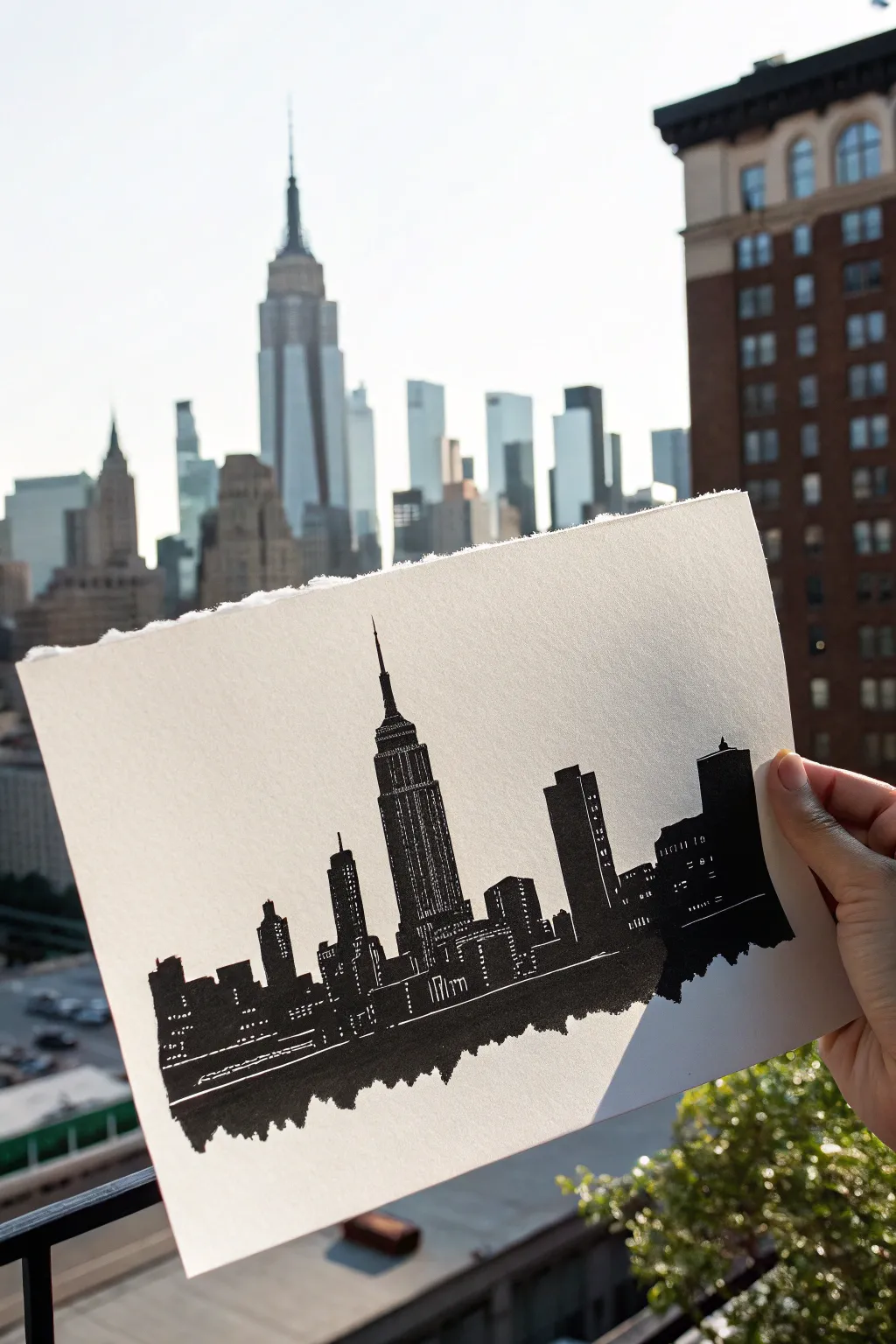
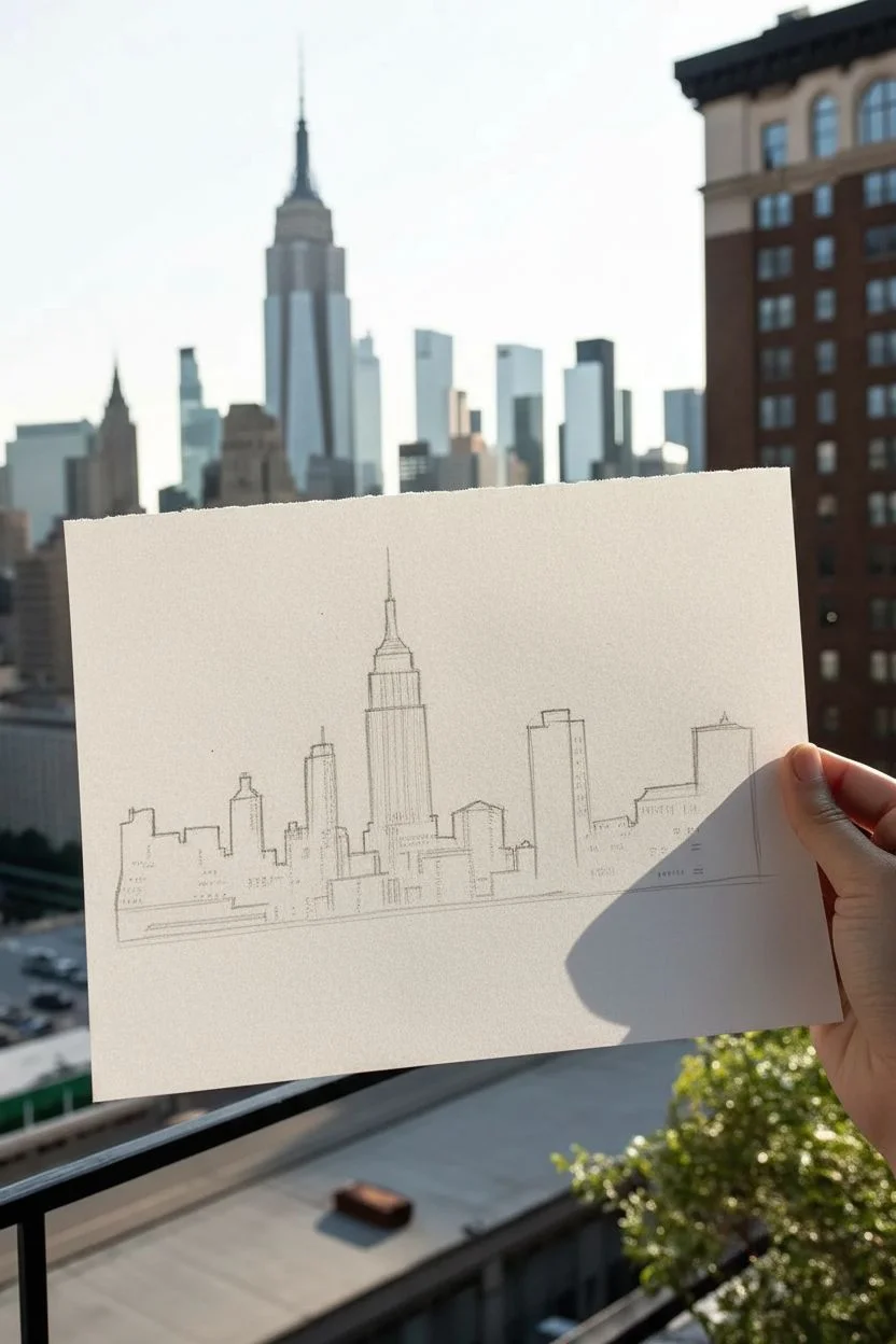
Capture the iconic energy of the city that never sleeps with this bold, high-contrast ink Skyline silhouette. By focusing on stark shapes and negative space, you’ll create a dramatic architectural portrait that pops against crisp white paper.
Step-by-Step Tutorial
Materials
- Heavyweight drawing paper (smooth bristol or mixed media paper)
- Pencil (HB or H for light sketching)
- Eraser (kneaded preferred)
- Fine liner pen (0.1mm or 0.3mm black)
- Thick graphic marker or brush pen (black)
- Ruler (optional)
- Reference photo of NYC skyline
Step 1: Planning the Horizon
-
Observe your reference:
Hold your paper up against the actual view or look closely at your reference photo. Notice which building anchors the composition—in this case, the Empire State Building stands tallest in the center. -
Establish the baseline:
Lightly sketch a horizontal guide across the lower third of your paper. This won’t be a straight line in the final piece, but it helps align the building bases. -
Block in major shapes:
Using your pencil, draw simple rectangles to represent the main skyscrapers. Don’t worry about details yet; just focus on getting the relative heights and widths correct. -
Position the hero building:
Sketch the central tower (Empire State Building) slightly off-center or dead center depending on your preference. Pay attention to its stepped tiers and the spire at the top. -
Add supporting structures:
Fill in the surrounding skyline with varied building heights. Include a mix of flat-topped skyscrapers and angled roofs to create visual rhythm.
Ink Smearing?
If your thick marker smudges, place a scrap piece of paper under your hand as a guard while you draw. Always work from left to right if you are right-handed (or vice versa).
Step 2: Inking the Silhouette
-
Outline the spire:
Switch to your fine liner pen. careful define the needle-thin antenna of the main building. Ink the tiered upper sections with precision. -
Define the vertical lines:
Draw the long vertical edges of the skyscrapers. You don’t need a ruler here; a slightly wavering hand-drawn line adds character and warmth to the stark black shapes. -
Leave windows white:
This is the crucial step for high contrast: instead of drawing windows, you are drawing the darkness *around* the lights. Outline small grids of tiny rectangles or dashes that will remain uncolored. -
Fill the solid blocks:
Use your thicker graphic marker to color in the solid black sections of the buildings. Work carefully around the tiny window shapes you just outlined. -
Create texture with strokes:
For the taller buildings, use vertical hatching lines instead of solid black fill in some areas. This mimics the vertical architectural details and windows without needing perfect precision. -
Vary the window patterns:
On adjacent buildings, try different window styles—some horizontal dashes, some tiny squares, others just random specks of white to suggest distant lights.
Pro Tip: Negative Space
Don’t overthink the windows. Random, uneven patterns of white dots often look more realistic than perfect grids when viewed from a distance.
Step 3: Grounding and Finishing
-
Create the reflection base:
Instead of a straight line at the bottom, create a jagged, rough edge. I like to scribble downward loosely to mimic a reflection in water or the chaotic cityscape at street level. -
Thicken the base:
Fill the very bottom area with solid black ink. This ‘ground’ anchors the drawing and balances the heavy vertical shapes above. -
Add horizontal street lights:
Near the base of the buildings, leave thin horizontal white streaks running through the black. These suggest traffic or street-level activity. -
Refine the edges:
Go back with your fine liner and ensure the corners of buildings are sharp and crisp. The contrast between sharp architecture and the rough bottom edge is key. -
Erase pencil marks:
Wait until the ink is completely dry—give it a few extra minutes to be safe. Gently erase all visible pencil sketching guides. -
Tear the paper edge (optional):
For the rustic look seen in the photo, carefully tear the top edge of your paper instead of cutting it. Pull the paper toward you as you tear to create a soft, deckled texture.
Now hold your masterpiece up against the sky and enjoy the satisfying contrast of your creation
A Cozy Room Corner in One-Point Perspective
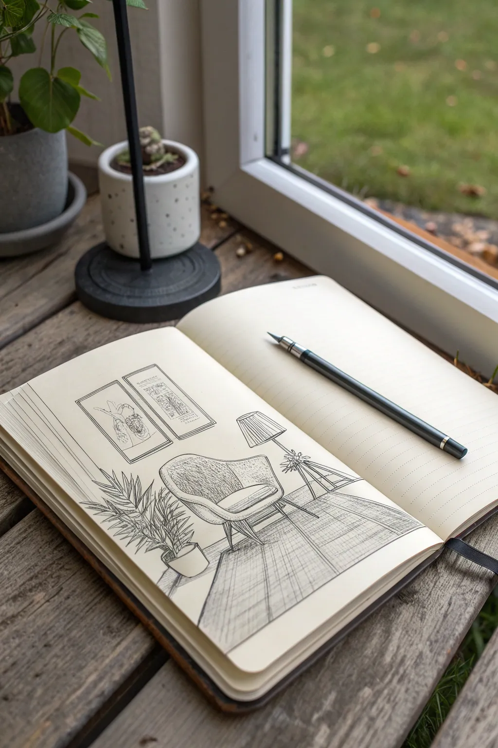
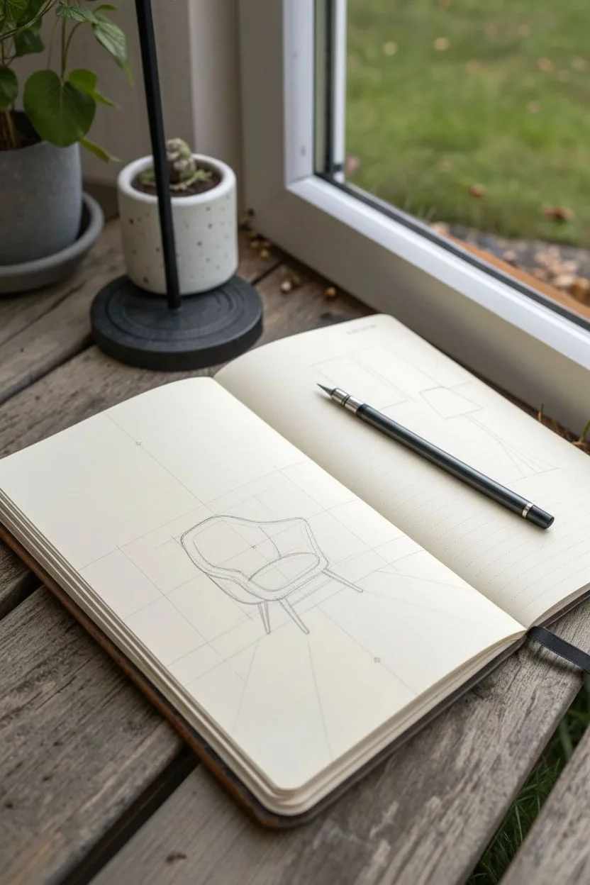
Capture the warmth of a quiet living space with this detailed pen and ink drawing tutorial. Using simple one-point perspective and hatching techniques, you’ll create an inviting scene featuring a mid-century armchair, a lush plant, and soft lighting.
Step-by-Step Guide
Materials
- A5 or A4 sketchbook (prefer warm white or cream paper)
- HB graphite pencil
- Eraser (kneaded or vinyl)
- Fine liner pens (sizes 0.1, 0.3, and 0.5)
- Ruler or straight edge
Step 1: Setting the Perspective
-
Establish the horizon:
Begin by lightly drawing a horizontal line across the lower third of your page with your pencil. Place a vanishing point right in the center of this line. -
Outline the floor and wall:
Draw faint diagonal lines radiating from your vanishing point to the bottom corners of the page. These will define the edges of your rug and help position the furniture later. -
Block in the armchair:
Visualize the armchair as a simple box first. Draw a cube shape slightly to the left of the center, ensuring the side lines angle back toward your vanishing point. -
Refine the chair shape:
Curve the back of your box to create the rounded backrest. Scoop out the seat area and sketch the angled legs, making sure the front legs appear slightly larger than the back ones for depth.
Step 2: Adding Room Elements
-
Sketch the rug:
Using the floor guide lines you drew earlier, outline a large rectangular rug underneath the chair. Add faint grid lines on the rug following the perspective to simulate a pattern. -
Place the lamp:
To the right of the chair, sketch a tall, thin vertical line for the lamp stand. Add a trapezoid shape at the top for the lampshade and a tripod base at the bottom. -
Add the potted plant:
To the left of the chair, draw a cylinder for a plant pot. Sketch several long, sweeping curved lines radiating upward from the pot to guide your leaves. -
Position the wall art:
On the wall behind the chair, draw two vertical rectangles. Use your ruler to ensure the top and bottom edges align horizontally with the room’s perspective.
Wonky Perspective?
If furniture looks like it’s floating, check the legs. The back legs must be higher up on the page than the front legs to sit flat on the floor.
Step 3: Inking the Outline
-
Outline main objects:
Switch to your 0.3 fine liner. Carefully trace the final contours of the chair, lamp, and rug. Keep your lines confident and smooth. -
Detail the plant:
Using a 0.1 pen, draw the individual palm-like leaves along your guide stems. Use jagged, erratic strokes to give the foliage a natural texture. -
Frame the artwork:
Ink the picture frames with the 0.3 pen. Inside the frames, use the 0.1 pen to create loose, abstract scribbles or faint botanical shapes, keeping them simple so they don’t distract from the chair. -
Erase pencil guides:
Once the ink is completely dry—I usually wait at least five minutes to be safe—gently erase all the underlying pencil structure.
Add Atmosphere
Use a warm gray marker to add broad strokes over shadow areas (like under the chair) for instant depth without messy cross-hatching.
Step 4: Shading and Texture
-
Hatch the chair:
With the 0.1 pen, add vertical hatching lines to the side of the chair to show shadow. Use curved hatching on the seat to emphasize its cushiony shape. -
Texture the rug:
Go over the grid lines of the rug with the 0.1 pen using a scratchy, back-and-forth motion. This mimics the weave of the fabric rather than a solid line. -
Shade the lampshade:
Add vertical lines close together on the right side of the lampshade to suggest volume. Sketch a few tiny leaves or flowers on the lamp’s base if you want to match the reference image exactly. -
Detail the floor:
Add horizontal hatching on the floorboards, but break the lines up so they aren’t continuous. Denser lines under the chair suggest cast shadows. -
Final Contrast:
Use your thickest pen (0.5) to darken the darkest shadow areas, such as underneath the chair legs and the bottom of the plant pot, to ground the objects.
Now you have a serene little interior sketch to remind you of a peaceful afternoon at home
Pattern Play With Zentangle-Style Shapes
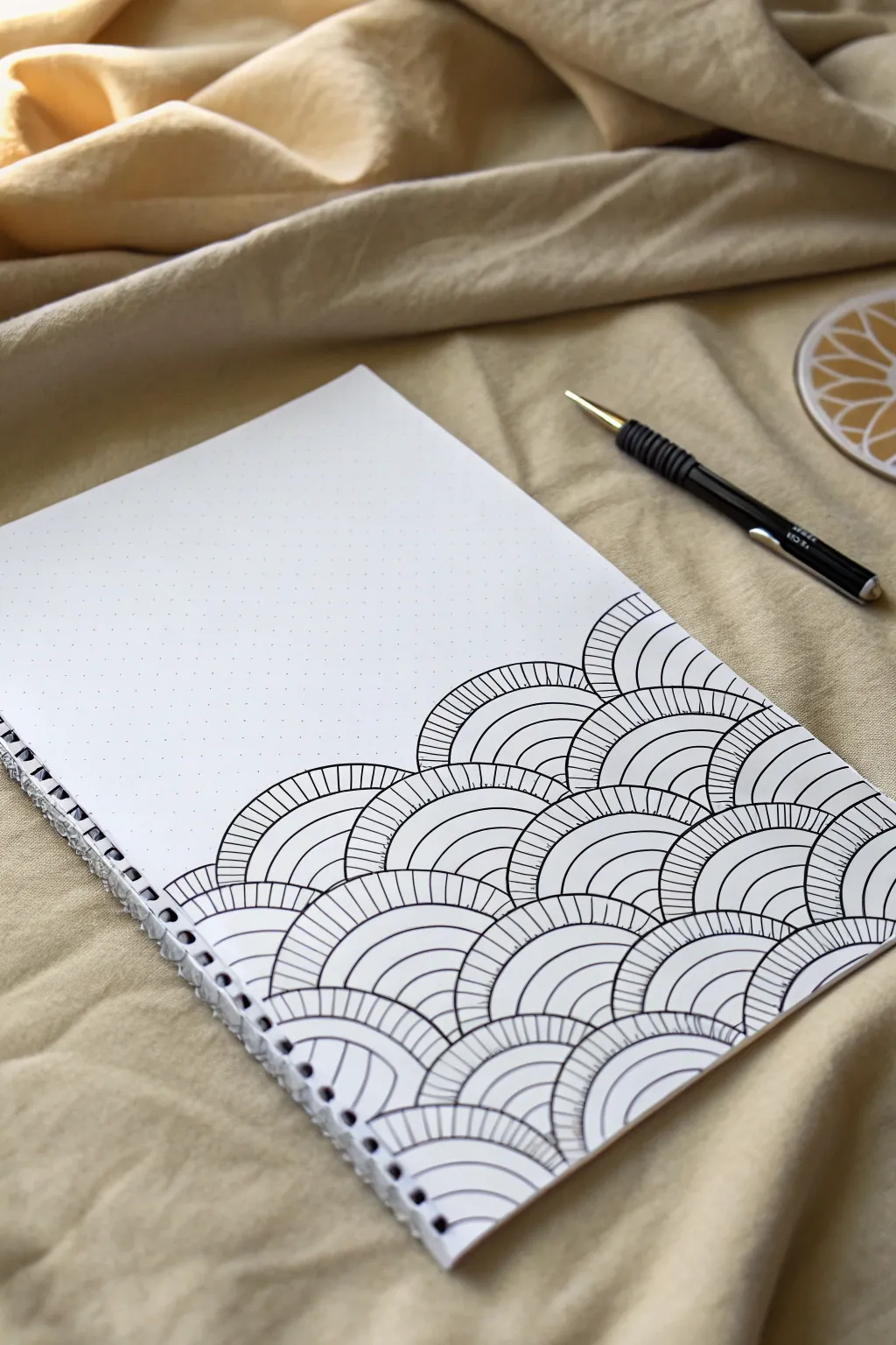
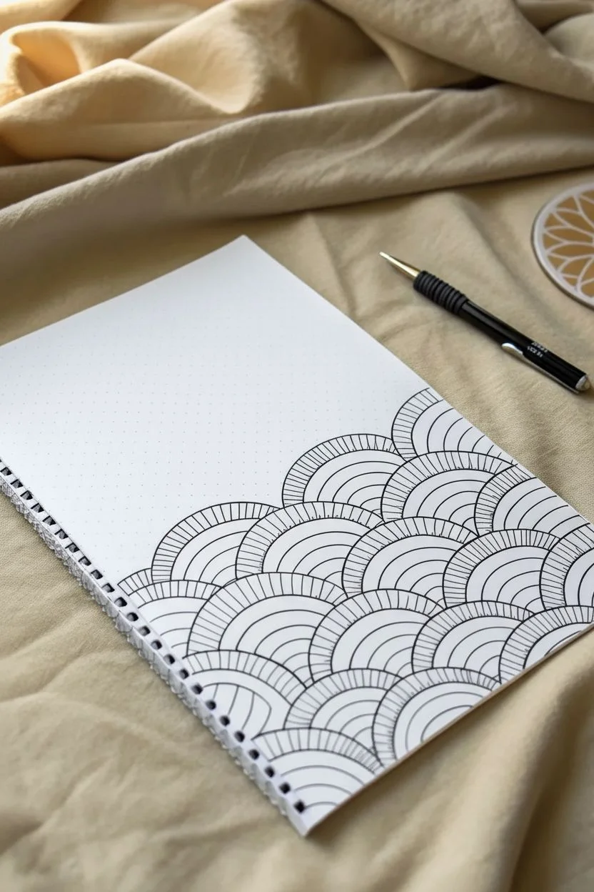
Transform a simple page into a sea of structured calm with this mesmerizing fan pattern. By combining concentric arches with simple hatching, you’ll build a cascading design that looks complex but is created one soothing curve at a time.
Detailed Instructions
Materials
- A5 dotted notebook or grid paper
- Fine liner pen (0.3mm or 0.5mm, black)
- Mechanical pencil (optional, for guidelines)
- Eraser
Step 1: Planning the Structure
-
Locate the starting point:
Begin at the bottom right corner of your page. The nature of this pattern is that it builds upwards and outwards, so starting low gives you plenty of room to grow. -
Establish the base scale:
If you are using a standard dot grid notebook, use the dots to guide the size of your semicircles. A width of 4 grid squares (dots) often works well for the base of each fan. -
Draw the first row:
Create your first row of semicircles along the very bottom edge of the paper. Connect them side-by-side so they touch but don’t overlap. -
Stack the second row:
Start the second row of arches in the ‘valley’ between the arches of the first row. The center of the new arch should align directly above the joining point of the two arches below it. -
Build the cascade:
Continue adding rows in this offset brick-laying fashion. Create a diagonal slope by reducing the number of arches as you go up, forming a triangular or hill-like overall shape.
Step 2: Adding the Details
-
Draw inner concentric arcs:
Return to your first semicircle. Draw a second, smaller arch inside it, keeping the spacing consistent from the outer edge. A gap of about 3-4mm usually looks balanced. -
Add the third arc layer:
Draw one more even smaller arch inside the previous one. You should now have a nested set of three distinct lines forming the main body of the fan. -
Create the center eye:
At the very bottom center of the nested arches, draw a tiny semicircle to act as the core. This is the smallest unit of the pattern. -
Apply vertical hatching:
Now for the texture. In the outermost band (the space between the largest arch and the second arch), draw straight, radial lines connecting the two curves. Detailed work here makes the pattern pop. -
Keep lines perpendicular:
As you draw these hatch marks, try to keep each line perpendicular to the curve of the arch so they fan out like sun rays, rather than staying purely vertical. -
Hatch the inner band:
Move to the next band inward (between the second and third arch). Fill this space with similar radial hatch marks. I find aligning these with the outer marks creates a pleasing ‘continuous’ look. -
Leave the core clear:
Leave the space immediately surrounding the tiny central core empty. This negative space provides visual breathing room and distinct separation between the overlapping fans. -
Repeat the process:
Systematically move through each semicircle in your grid, adding the concentric lines and hatching. It’s best to finish one full fan before moving to the neighbor to maintain a rhythm. -
Refine the edges:
Once all fans are filled, check the outermost boundary lines. You might want to re-trace the very outer edge of the entire shape with a slightly heavier pressure to define the silhouette. -
Erase guidelines:
If you used a pencil to plan out the initial grid or dot placements, wait for the ink to become completely dry before gently erasing stray graphite.
Wobbly Arches?
If your curves look shaky, use a drawing compass for the main structural arches first, then freehand the hatching ink over the top.
Pro Tip: Line Weight
Use a slightly thicker pen (0.5mm) for the main arches and a thinner one (0.1mm) for the hatching lines to add instant depth.
Now you have a striking geometric wave to display
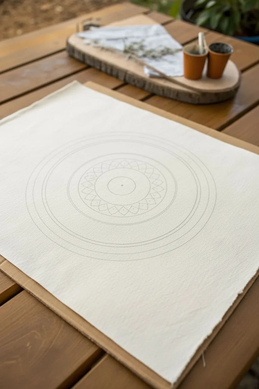
Mandala Rings Built From Repeating Motifs
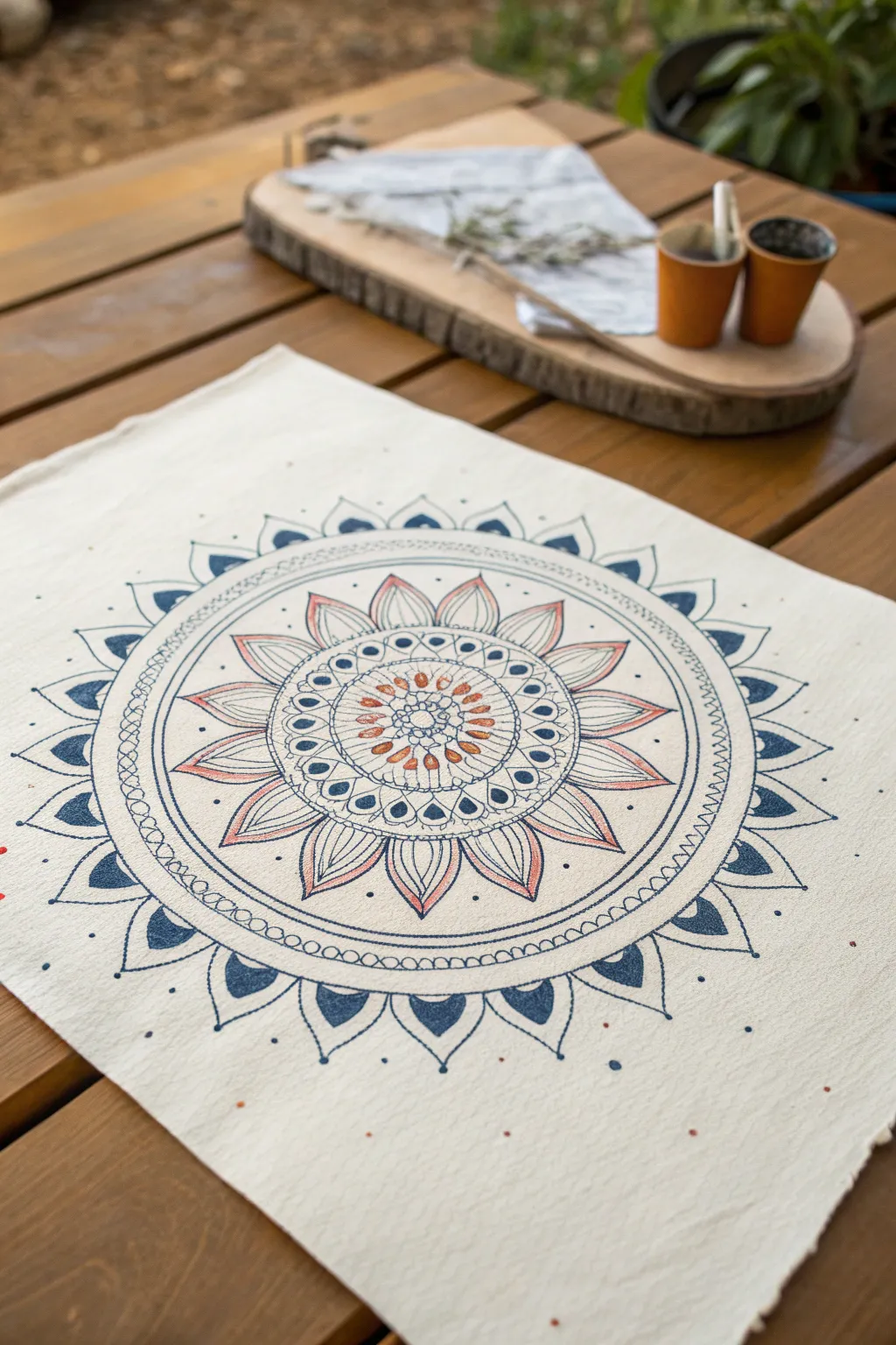
Transform a plain piece of fabric into a stunning table accessory with this detailed mandala design featuring concentric floral and geometric rings. The combination of rust-orange and deep indigo ink creates a warm, vintage aesthetic perfect for outdoor dining.
How-To Guide
Materials
- White or cream cotton/linen fabric placemat
- Fabric markers or fine-tip fabric paint pens (Navy Blue, Rust/Terracotta)
- Compass with a pencil holder
- Ruler
- Pencil (light graphite)
- Eraser
- Iron (to heat set the ink)
- Cardboard or protective mat (to place under fabric)
Step 1: Preparation and Base Structure
-
Prep the workspace:
Lay your fabric flat on a hard surface. Place a piece of cardboard underneath the fabric to prevent any ink from bleeding through onto your table. -
Find the center:
Use your ruler to measure the width and height of the fabric. Mark the exact center point lightly with a pencil. -
Draw the main guide circles:
Using your compass and pencil, draw a series of concentric circles radiating from the center. Start with a very small center circle, then add rings at roughly 1-inch intervals to guide your mandala layers.
Use a Template
Not confident in freehanding? Cut a petal shape out of cardstock and trace it repeatedly around your circle guides for perfectly uniform petals.
Step 2: Designing the Inner Core
-
The central flower:
In the very center circle, draw a small flower shape with rounded petals using the rust-colored marker. Add tiny blue dots at the base of each petal for contrast. -
First petal ring:
Draw larger, pointed petals around the central flower, extending to your first pencil guide ring. Outline these in blue and fill the centers with simple rust dashes. -
Geometric borders:
Create a border around this floral core by drawing two circles close together with the blue marker. Fill the space between them with evenly spaced dots.
Step 3: Building the Middle Layers
-
Large lotus petals:
Draw large, sweeping lotus-style petals that extend outward. I like to sketch these in pencil first to ensure symmetry before committing with the blue ink. -
Add color accents:
Inside each large lotus petal, draw a slightly smaller petal shape in rust orange. Use thin, parallel lines to shade the inside of these orange shapes. -
Teardrop details:
Between the tips of the lotus petals, draw small, inverted blue teardrops. Fill these in solid blue for visual weight. -
The chain link ring:
Draw the next enclosing ring using a ‘chain’ motif. Create a circle of small, connected oval loops in blue ink.
Watercolor Wash
Dilute fabric paint with water and brush a very faint, washed-out blue or tea-stain color over the entire dried design for an aged, antique look.
Step 4: The Outer Rim
-
Scalloped edge guide:
On your outermost pencil guide circle, lightly mark uneven intervals for the large outer points. -
Draw the outer spikes:
Draw large, curved triangle shapes (like shark fins) pointing outward along the perimeter. Outline them firmly in blue. -
Fill the spikes:
Inside each ‘shark fin’ shape, draw a smaller, solid blue triangle at the tip. Leave the base of the shape empty or add a tiny dot. -
Connect the design:
Connect the bases of these outer spikes with a smooth, curved line that dips between each point.
Step 5: Finishing Touches
-
Erase guidelines:
Once the ink is completely dry (give it at least 20 minutes), gently erase all visible pencil marks. -
Add floating dots:
Take your blue marker and add random, tiny dots scattered in the empty white space around the outer rim of the mandala to give it an organic feel. -
Heat set the design:
Follow the instructions on your fabric pens. Typically, you will need to iron the reverse side of the fabric on a cotton setting for several minutes to make the design permanent and washable.
Your unique, hand-drawn placemat is now ready to add character to your next meal
Doodle a Page of Tiny Sketchbook Icons
Fill a spread in your notebook with this charming collection of minimalist icons, perfect for practicing line work or decorating planners. From simple hearts and stars to tiny envelopes and leaves, these quick sketches celebrate the joy of drawing small.
Step-by-Step Guide
Materials
- A dotted grid notebook or journal
- Fine liner pen (0.3mm or 0.5mm)
- Pencil (optional for layout)
- Eraser
Step 1: Setting the Scene
-
Open the spread:
Begin with a fresh, open page in your dotted grid notebook. The dots will serve as your invisible scaffolding, helping you keep the icons relatively aligned without needing ruler lines. -
Prepare your pen:
Select a fine liner with a consistent flow. A 0.3mm or 0.5mm tip works best here to maintain crisp, clean lines for such small details.
Use the Dot Grid
Don’t ignore the dots! Use them to gauge size consistency. If your first heart is 2 dots wide, try to make the others roughly the same width.
Step 2: Row 1: Sweet & Simple
-
Letter icon:
Start at the top. Draw a small rectangle, roughly 2×3 dots in size. Inside, create a wavy line to simulate text. -
Script word:
Next to the rectangle, write a short word like ‘lockheart’ or ‘lovely’ in a loose, cursive script. Don’t worry about perfect calligraphy; messy is charming here. -
Basic hearts:
Draw three hearts in a row to the right. Vary their shapes slightly—make one wider and one taller—to keep the hand-drawn feel authentic. -
Cross-circle:
Finish the top area with a small circle divided into quadrants by a simple cross.
Add Pop of Color
Take a mild highlighter or a colored pencil and fill in just one small element of each doodle (like the heart eyes or the planet stripes).
Step 3: Row 2: Celestial & Shapes
-
Single heart:
Drop down a few dot rows. Draw another single heart on the left side. -
Sparkles:
Draw a four-pointed star (like a diamond with curved sides). Nearby, draw a smaller, standard five-pointed star. -
More hearts:
Add another heart in the middle of the page, keeping the spacing airy and breathable. -
Envelope icon:
On the far right, draw a small rectangle. Add a triangle pointing down from the top edge to create the flap of an envelope.
Step 4: Row 3: Stars & Sparkles
-
Five-point stars:
Draw a classic five-pointed star on the left. I usually draw these in one continuous line without lifting the pen. -
Tiny clusters:
In the middle, create a cluster of tiny dots and small open circles to represent distant stardust. -
Four-point sparkle:
Draw a large four-pointed star on the right side, elongating the vertical and horizontal lines.
Step 5: Row 4: Weather & Nature
-
Wind gusts:
On the left, draw three short, horizontal jagged lines stacked vertically to represent wind or speed. -
Rainbow arch:
Move to the center and draw three concentric arches to form a simple rainbow. -
Another star:
Add a slightly tilted five-pointed star near the rainbow. -
Floating heart:
Place a heart on the right side, perhaps tilting it slightly for movement.
Step 6: Row 5: Quirky Details
-
Smiley face:
Draw a circle. Inside, place two small dark hearts for eyes and a curved line for a smile. -
Flower:
Draw a five-petaled flower next to the smiley face. Keep the petals rounded and simple. -
Cracked egg:
Draw an oval shape. Draw a jagged ‘crack’ line through the center and add vertical hatching lines on one half. -
Small sparkle:
Add a tiny four-pointed star on the far right as a filler.
Step 7: Row 6: Botanical Elements
-
Arrow doodle:
On the far left, draw a vertical line with an arrowhead at the bottom and a curved cross-bar near the top. -
Scattered seeds:
In the middle, draw three tiny seed-like shapes or teardrops scattered randomly. -
Daisy:
Draw a larger flower with six petals radiating from a small center point.
Step 8: Row 7: Final Flourishes
-
Feather:
On the bottom left, draw a long, curved stem. Add diagonal lines upward on both sides to create a leaf or feather shape. -
Crescent moon:
Draw a simple C-shape to form a crescent moon. -
Striped planet:
Draw a circle and fill it with three diagonal stripes. -
Final leaf:
Finish the bottom right with a stem that has three leaves attached to it.
Enjoy flipping through your sketchbook and seeing this page of hand-drawn personality
A Quote Lettering Banner With Small Illustrations
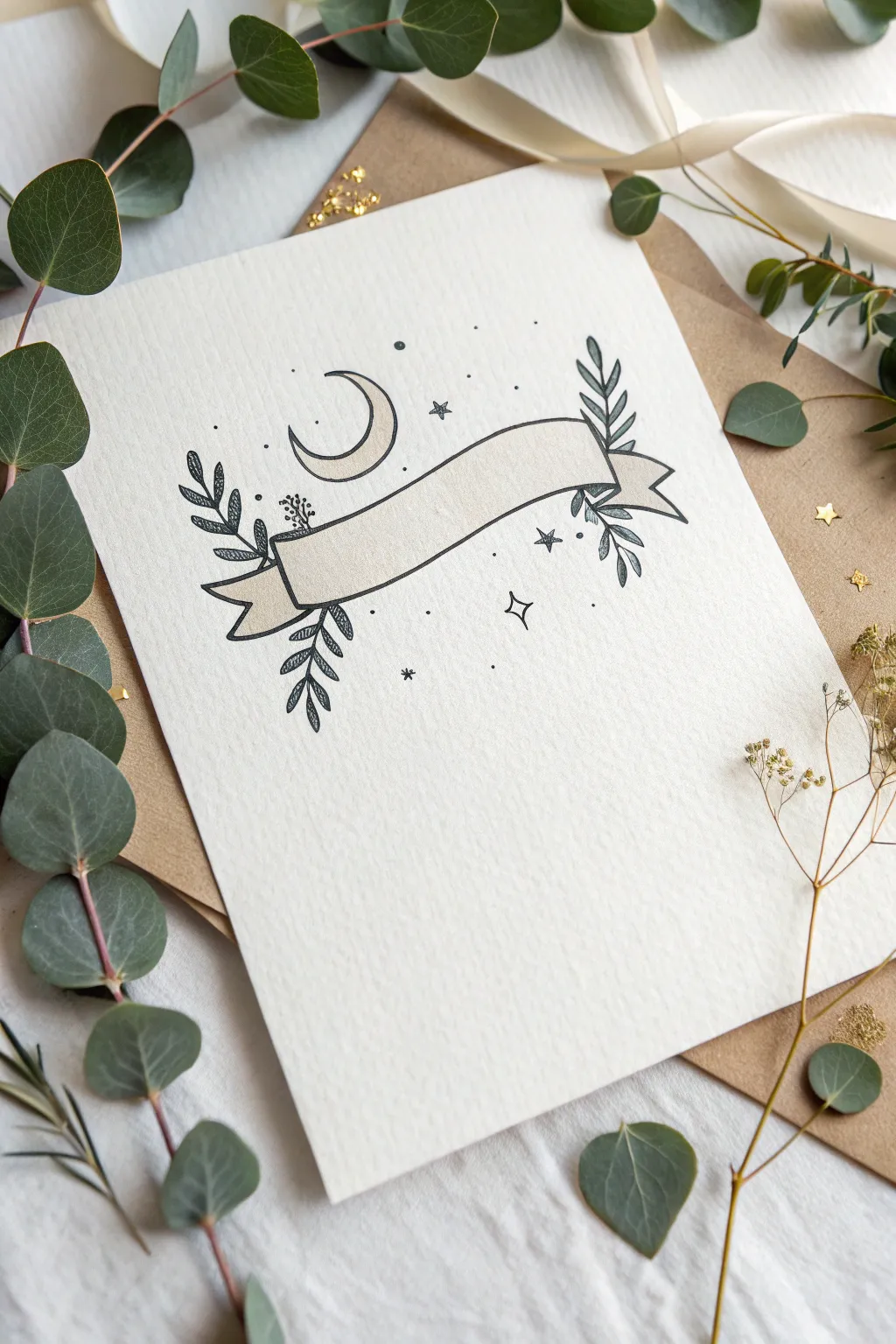
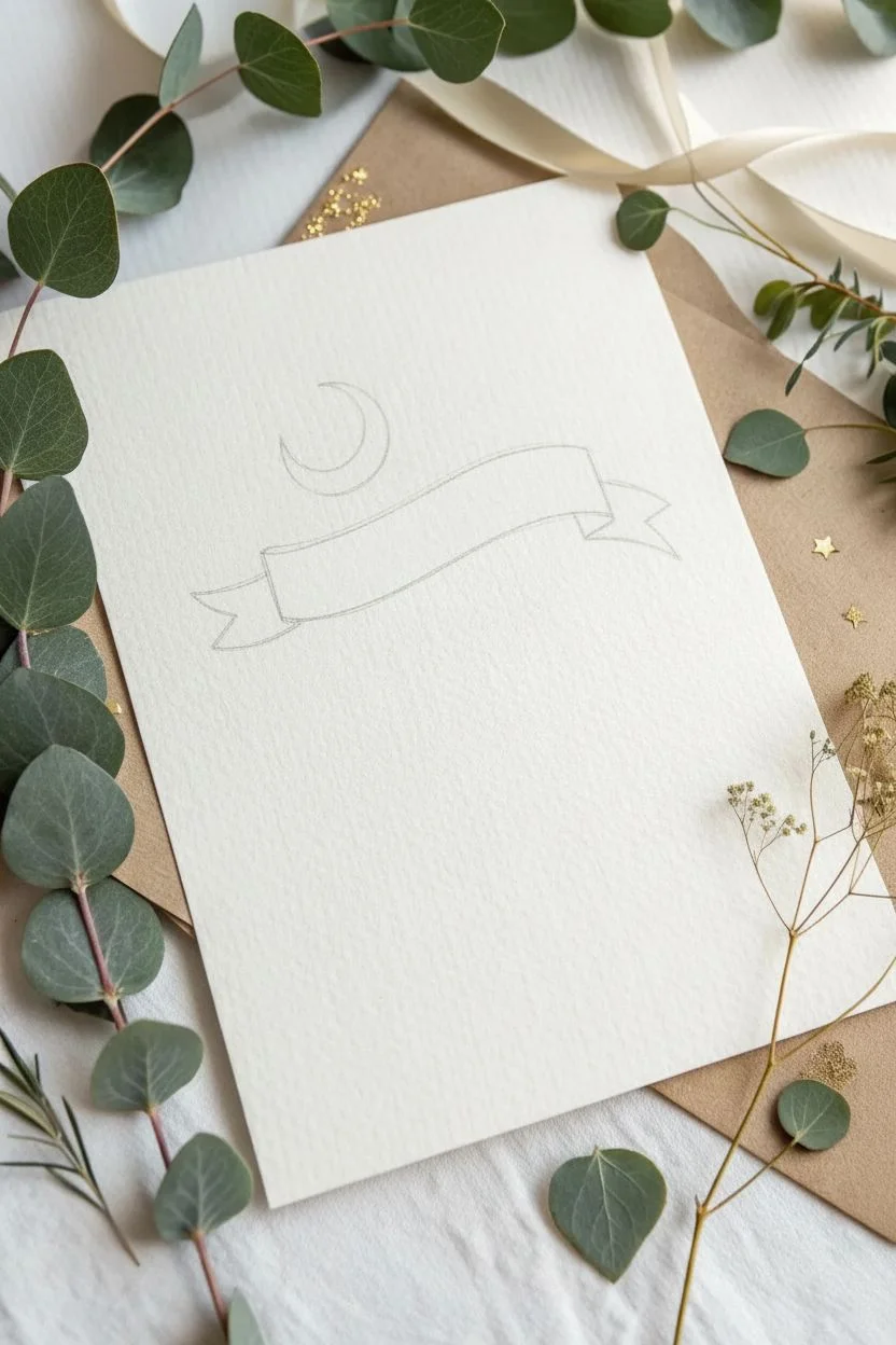
This charming project features a hand-drawn ribbon banner nestled amongst delicate foliage and a serene crescent moon. The textured paper and fine ink lines give it a mystical, sophisticated feel that is perfect for personalized greeting cards or wall art.
Step-by-Step Tutorial
Materials
- Textured watercolor paper or cardstock (off-white/cream)
- Pencil (HB or H for light lines)
- Eraser (kneaded eraser preferred)
- Fine liner pen (Black, size 01 or 03)
- Ruler (optional)
- Beige or light gray marker/watercolor (optional for shading)
Step 1: Drafting the Layout
-
Map the center:
Begin by finding the visual center of your paper. Using your pencil, lightly sketch a gentle, upward-curving arc where the main body of the banner will sit. -
Draw the ribbon body:
Draw a parallel arc about an inch below the first one. Connect the ends with vertical lines to form the main rectangle of the banner, which looks slightly waved. -
Add the ribbon tails:
Sketch the folded ends (tails) of the ribbon. On the left side, draw a small triangle shape connecting behind the main rectangle, then extend a ‘swallow-tail’ shape outward. Repeat on the right side, ensuring the tails flow naturally from the main banner. -
Position the moon:
Just above the center curve of the ribbon, lightly sketch a crescent moon. Place it slightly off-center to the left for a balanced composition.
Ink Smearing?
Textured paper traps ink longer than smooth paper. If your hand smears lines, place a clean scrap piece of paper under your drawing hand as a protective shield while you work.
Step 2: Adding Natural Elements
-
Sketch left foliage:
Draw two main stems emerging from behind the left side of the banner. One should curve upwards and one downwards. Keep the lines fluid and organic. -
Sketch right foliage:
Mirror this process on the right side. Draw a stem reaching up towards the top corner and another draping down below the ribbon tail. -
Add leaves:
Along these stems, sketch small, almond-shaped leaves. Arranging them in pairs creates a classic laurel look, but vary the angles slightly so they don’t look too stiff.
Make it Metallic
Trace over the stars and the moon with a gold gel pen or gold metallic watercolor. This adds a subtle shimmer that catches the light beautifully when the card is moved.
Step 3: Inking the Design
-
Outline the banner:
Switch to your fine liner pen. Carefully trace over your pencil lines for the banner first. I find that pulling the pen toward me helps keep the long curves smooth. -
Ink the moon:
Trace the crescent moon with a clean, continuous line. Ensure the tips of the crescent taper to a sharp point. -
Ink the leaves:
Go over the stems and leaves. For the leaves, you can add a tiny central vein line or darken the tips slightly to add dimension. -
Add texture to leaves:
Use very short, light hatching strokes inside some of the leaves to give them a shaded, illustrative quality similar to an engraving.
Step 4: Magical Details
-
Draw the stars:
Scatter a few stars around the design. Mix different shapes: some classic five-pointed stars, some four-pointed ‘diamond’ stars, and tiny simple asterisk shapes. -
Stipple the background:
Add small dots (stippling) around the banner and moon. Concentrate the dots closer to the main drawing and let them fade out as they move further away. -
Optional shading:
If you want the subtle depth shown in the example, use a very light beige marker or a diluted watercolor wash to fill in the banner body and the moon. Keep it subtle to maintain the minimal look. -
Erase pencil lines:
Wait until the ink is completely dry—give it a few extra minutes to be safe. Gently erase all visible pencil sketches with your kneaded eraser. -
Final assessment:
Step back and look at the balance. If a spot looks too empty, add a tiny dot or a small star to fill the negative space without overcrowding it.
Now you have a beautiful custom banner ready for your favorite quote or a loved one’s name
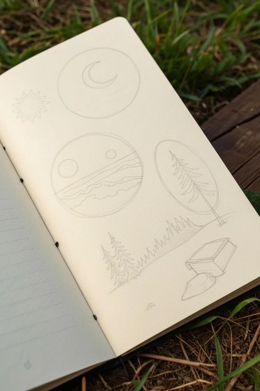
Circle Vignettes That Contain a Whole Scene
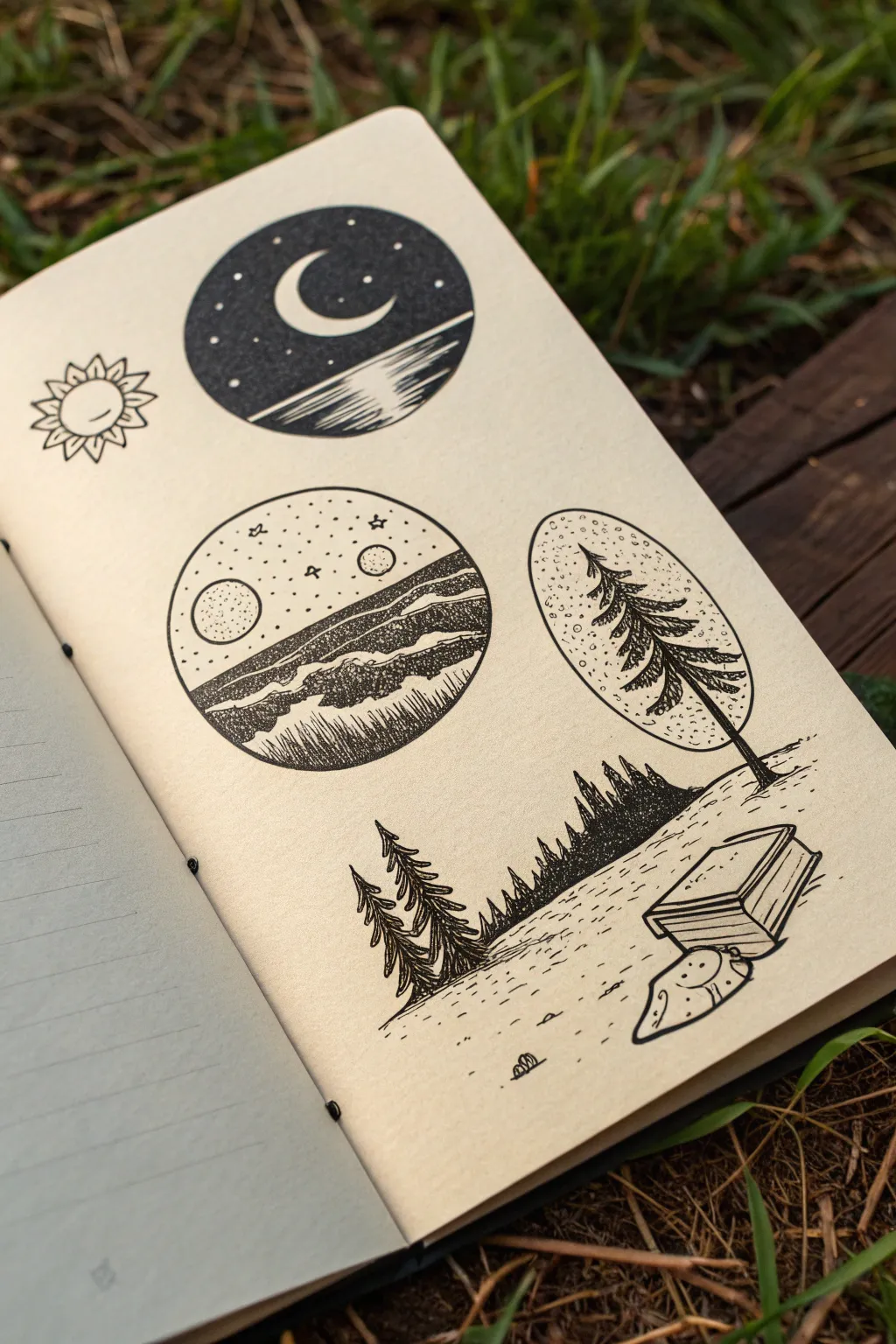
Capture the serenity of nature with this collection of simple black ink illustrations. Featuring contrasting circular nightscapes and a tranquil forest floor, this project uses crisp lines and stippling to create texture and depth.
How-To Guide
Materials
- Fine liner pen (01 or 03 size)
- Thicker graphic marker or brush pen (black)
- Pencil (HB)
- Eraser
- Compass or circular stencils (various sizes)
- Ruler
- Smooth sketchbook paper
Step 1: Planning the Layout
-
Draft the circles:
Begin by lightly drawing three circles with your compass or stencil. Place one large circle near the top right, a slightly larger one below it on the left, and a vertical oval shape to the right of the middle circle. -
Sketch the sun:
To the left of the top circle, lightly pencil a small sun with pointed rays. -
Outline the landscape:
Below the circular vignettes, sketch a horizon line that slopes gently upward from left to right. Add rough triangular shapes for pine trees and a small rectangular prism shape for the book on the right.
Ink Smearing?
If your hand drags through wet ink, place a scrap piece of paper under your drawing hand as a barrier. Also, wait at least 5 minutes before erasing pencil lines.
Step 2: Inking the Top Vignette
-
Draw the crescent moon:
Inside the top circle, draw a crescent moon shape in the upper left quadrant. Leave this shape completely white. -
Create the horizon:
Draw a diagonal line across the lower third of the circle to separate the sky from the water. -
Fill the night sky:
Using your fine liner or brush pen, fill the sky area with solid black ink. Be careful to sketch around tiny dots for stars and the large crescent moon to keep them white. -
Detail the water reflection:
For the water below, draw varying lengths of horizontal black lines extending from the right edge inward. Leave the area directly under the moon mostly white to suggest a reflection.
Step 3: Inking the Middle Vignette
-
Set the scene:
In the middle circle, draw two horizon lines to create rolling hills. Add a large circle (sun/moon) on the left and a smaller one on the right within the sky area. -
Texture the hills:
Use stippling (closely grouped dots) and short, dense lines to shade the hills. Make the bottom hill darker with vertical hatching to distinguish it from the one behind it. -
Stipple the sky:
Instead of solid black, fill the sky with sparse stippling dots. Add a few tiny stars and a small ‘4’ shape to represent a distant bird.
Add a Pop of Color
Once the black ink is totally dry, try adding a watercolor wash of deep blue to the night sky circle or a soft green to the forest floor for a mixed-media look.
Step 4: The Tree Vignette
-
Outline the oval:
go over your pencil outline for the vertical oval on the right side. -
Draw the tree structure:
Draw a pine tree that breaks the frame—let the trunk extend out of the bottom of the oval. The branches should be jagged and textured. -
Fill the background:
Fill the negative space around the tree branches inside the oval with dense stippling to create an atmospheric glow around the tree.
Step 5: The Forest Floor
-
Draw foreground trees:
Ink the two large pine trees on the far left. Use quick, downward strokes for the needles to give them a rough, organic look. -
Create the distant forest:
Ink the sloping tree line in the background. Simply fill these shapes in solid black to create a silhouette effect against the white ground. -
Detail the book & stone:
Ink the book with clean, straight lines, showing the spine and pages. Add a small organic shape below it for a rock or folded cloth, adding a few dots for texture. -
Final touches:
Add small dashes and dots across the ground to simulate grass and texture. Once the ink is fully dry, erase all underlying pencil sketch lines.
Now you have a sketchbook page filled with miniature worlds ready to inspire your next adventure.
Five-Minute Mini Drawings on Small Cards
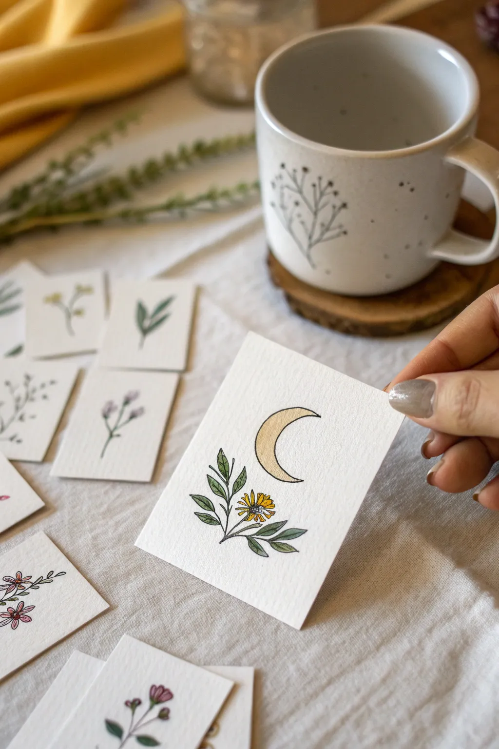
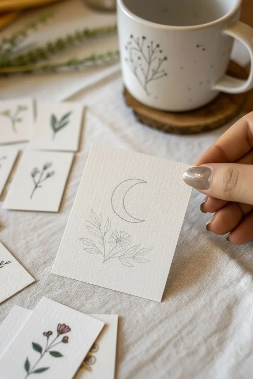
Create a charming collection of miniature art with this simple pen and watercolor project featuring a crescent moon resting above a marigold branch. The combination of crisp ink lines and soft watercolor washes on textured paper gives these tiny cards a lovely, hand-crafted feel perfect for gifting or journaling.
Detailed Instructions
Materials
- Small square watercolor paper cards (approx. 2.5 x 2.5 inches)
- Fine liner pen (black, waterproof, size 01 or 03)
- Watercolor paints (Yellow Ochre, Sap Green, Burnt Umber)
- Small round paintbrush (size 2 or 4)
- Pencil (HB or H for light lines)
- Eraser
- Jar of water and paper towel
Step 1: Sketching the Layout
-
Prepare your canvas:
Cut your watercolor paper into small squares if you haven’t already. The slightly rough texture of cold-press paper adds a wonderful tactile quality to these mini drawings. -
Draft the moon shape:
Using a pencil very lightly, draw a crescent moon shape in the upper center of the card. Aim for a slightly thicker crescent to allow room for color later. -
Position the flower:
Below the moon, sketch a small circle for the flower center, slightly offset to the left. Add radiating petal shapes around it, keeping them loose and organic. -
Add the foliage:
Draw a central stem extending from the flower. Add pairs of leaves branching out on either side, making the leaves pointy and slender to contrast with the round flower.
Step 2: Inking the Design
-
Trace the moon:
Take your waterproof fine liner and carefully trace over your pencil lines for the moon. A steady hand works best here, but don’t worry if the line isn’t perfectly smooth—it adds character. -
Outline the flower petals:
Ink the flower petals. Instead of perfect ovals, let the lines be a bit jagged at the tips to mimic the texture of a marigold or daisy. -
Detail the flower center:
Draw the center of the flower with small, stippled dots or tiny loops to suggest texture and seeds. -
Ink the leaves:
Outline the stems and leaves. Draw a central vein down the middle of each leaf for added detail and realism. -
Erase pencil marks:
Wait at least two minutes to ensure the ink is completely dry, then gently erase all visible pencil lines to leave a clean black-and-white base.
Keep it Clean
Test your fine liner on a scrap piece of watercolor paper with water first. If it smears even a little, switch pens or let the ink cure overnight.
Step 3: Adding Watercolor Washes
-
Paint the moon:
Mix a diluted wash of Yellow Ochre or a soft gold color. Carefully fill in the crescent moon. I find that leaving a tiny sliver of white paper unpainted on one edge creates a nice highlight effect. -
Color the petals:
Using a slightly more vibrant mix of the yellow, paint the flower petals. Let the color pool naturally; variation in transparency looks beautiful here. -
Paint the foliage:
Mix Sap Green with a tiny touch of Burnt Umber to get a natural, earthy green. Paint the leaves, using the tip of your brush to stay within the small lines. -
Add depth to leaves:
While the green is still slightly damp, drop a tiny bit of darker green pigment near the base of the leaves where they meet the stem. -
Finish the center:
Dab a small spot of brown or dark orange into the center of the flower to ground the drawing. -
Final drying time:
Set the card aside to dry completely before handling. The paper might curl slightly due to the water, which is normal for small cuts.
Creative Twist
Use metallic gold watercolor paint for the moon to make it shimmer when the card catches the light, adding a magical touch.
Once dry, these miniature artworks look delightful pinned to a corkboard or tucked into a handwritten letter for a friend
Fantasy Creature Mash-Up (Wings, Horns, Scales)
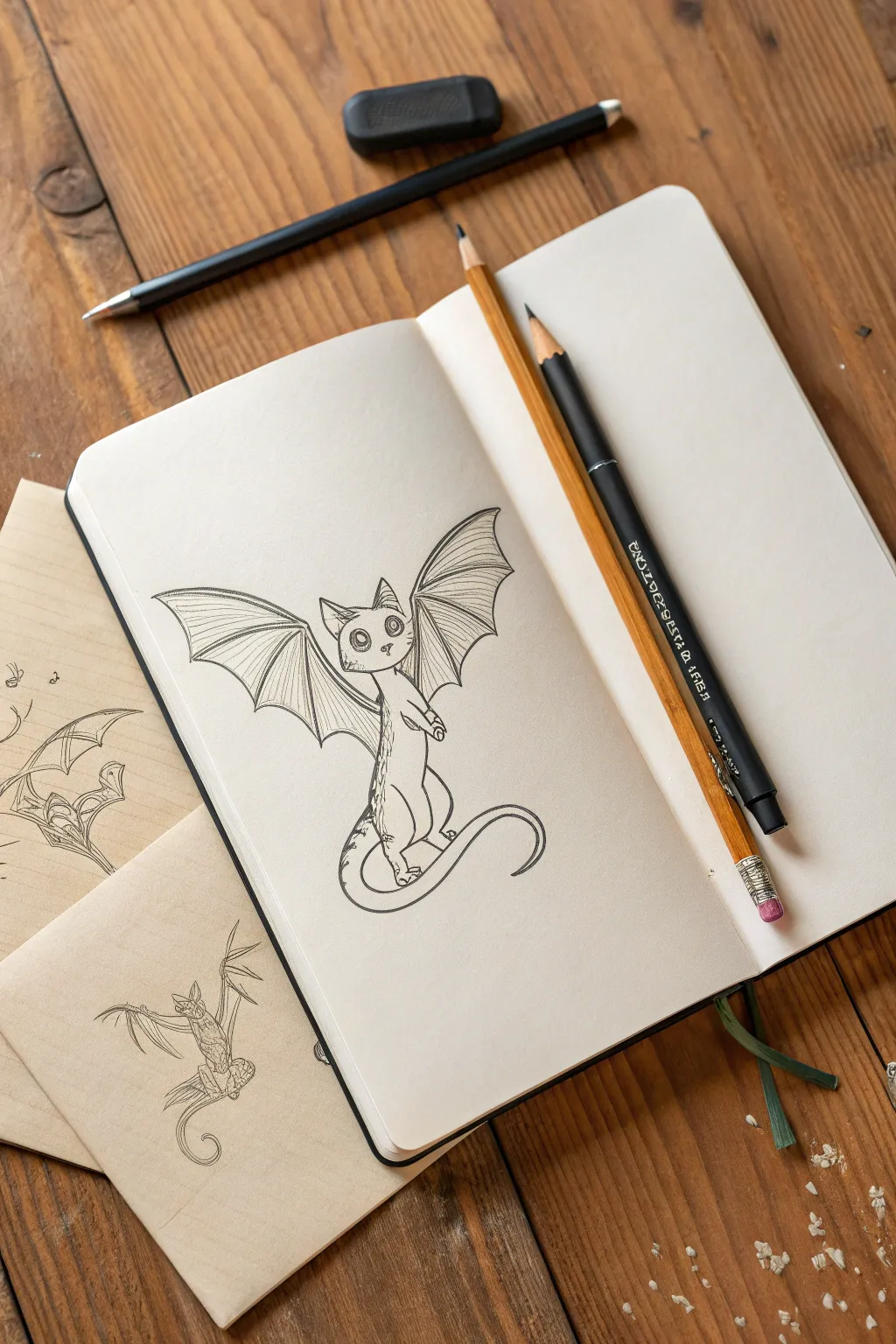
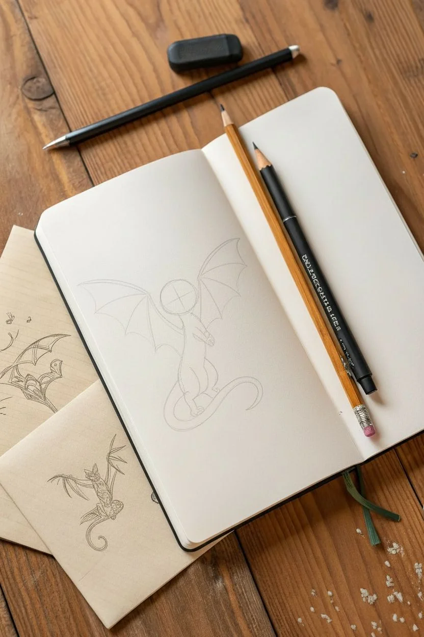
Learn to draw a delightful ‘Cat-Bat’ mash-up, combining the adorable features of a feline with the sweeping wings of a bat or dragon. This project results in a clean, inked illustration with plenty of character, perfect for filling your sketchbook with fantasy friends.
Step-by-Step Tutorial
Materials
- Sketchbook or drawing paper (medium weight)
- HB or 2B graphite pencil
- Fine liner pen (0.3mm or 0.5mm, black ink)
- Kneaded eraser or vinyl eraser
- Reference photos of cats and bats (optional)
Step 1: Basic Structure
-
Head and Body Shape:
Start by lightly sketching a rounded circle for the head. Slightly below it, draw a pear-shaped oval for the body, connected by a short, subtle neck line. Keep your pencil pressure very light so these guides are easy to erase later. -
Facial Guidelines:
Draw faint cross-hairs on the face circle to mark where the eyes and nose will sit. Since the creature is looking slightly to the side, curve the vertical line to follow the form of the sphere. -
Wing Framework:
Extend two long, curved lines outward from the shoulder area where the wings will attach. Think of these like the ‘arms’ of the wing structure. Angle them up and out to create a dynamic pose. -
Legs and Tail:
Sketch simple stick-figure lines to determine the leg placement. The creature is sitting, so draw the rear legs tucked up against the body. Add a long, sweeping S-curve line for the tail.
Uneven Wings?
Don’t stress about perfect symmetry. Wings are organic! If one looks different, just add a few ‘folds’ or wrinkles in the webbing to make the variation look like a natural pose change.
Step 2: Defining the Creature
-
Ears and Eyes:
Draw two large, triangular ears on top of the head. Then, place two large, wide circular eyes along your horizontal guideline. Add small inner circles for the pupils to give it a curious expression. -
Refining the Face:
Sketch a tiny, triangular nose and a small ‘W’ shape for the mouth. Add a cheek fluff tuft on the visible side of the face to suggest fur texture. -
Constructing the Wings:
Flesh out the wings by drawing the ‘fingers’ extending down from the main arm bone. Connect these fingers with curved lines to create the webbing (patagium). Use relaxed, draping lines to make the skin look natural. -
Body Contours:
Outline the actual shape of the body, connecting the head to the torso. Give the chest a slight curve outward and define the belly line. -
Paws and Claws:
Draw the front paws resting in a ‘t-rex’ like posture or simply dangling. Define the toes on the back feet, ensuring they look grounded and support the creature’s weight.
Level Up: Environment
Give your creature context by sketching a simple perch, like a gnarly tree branch or a stone gargoyle plinth, underneath its feet to ground the drawing in a scene.
Step 3: Inking and Details
-
Initial Inking:
Take your fine liner pen and carefully trace over your graphite lines. I prefer to start with the eyes to establish the character’s focus immediately. Use a steady hand and consistent pressure. -
Wing Texture:
When inking the wings, add thin, closely spaced lines inside the webbing to simulate the texture of stretched skin. These lines should follow the curve of the wing segments. -
Fur Texture:
Instead of a solid line for the spine and tail, use short, small dashes or jagged strokes to imply fuzzy scales or spiked fur running down the back. -
Adding Scales:
Draw small patches of scales or horizontal bands along the belly and under the tail. This reinforces the ‘dragon’ or reptile DNA in the mash-up. -
Deepening Shadows:
Use cross-hatching or slightly thicker ink lines under the chin, beneath the wings, and where the legs meet the body to create depth. -
Pupil Details:
Fill in the pupils with solid black ink, leaving a small white dot in each for a highlight. This instantly brings the creature to life. -
Clean Up:
Wait several minutes for the ink to dry completely to avoid smudging. Then, gently erase all original graphite construction lines with your eraser.
Now you have a charming fantasy hybrid ready to fly off the page
Dragon Head Studies for Texture and Expression
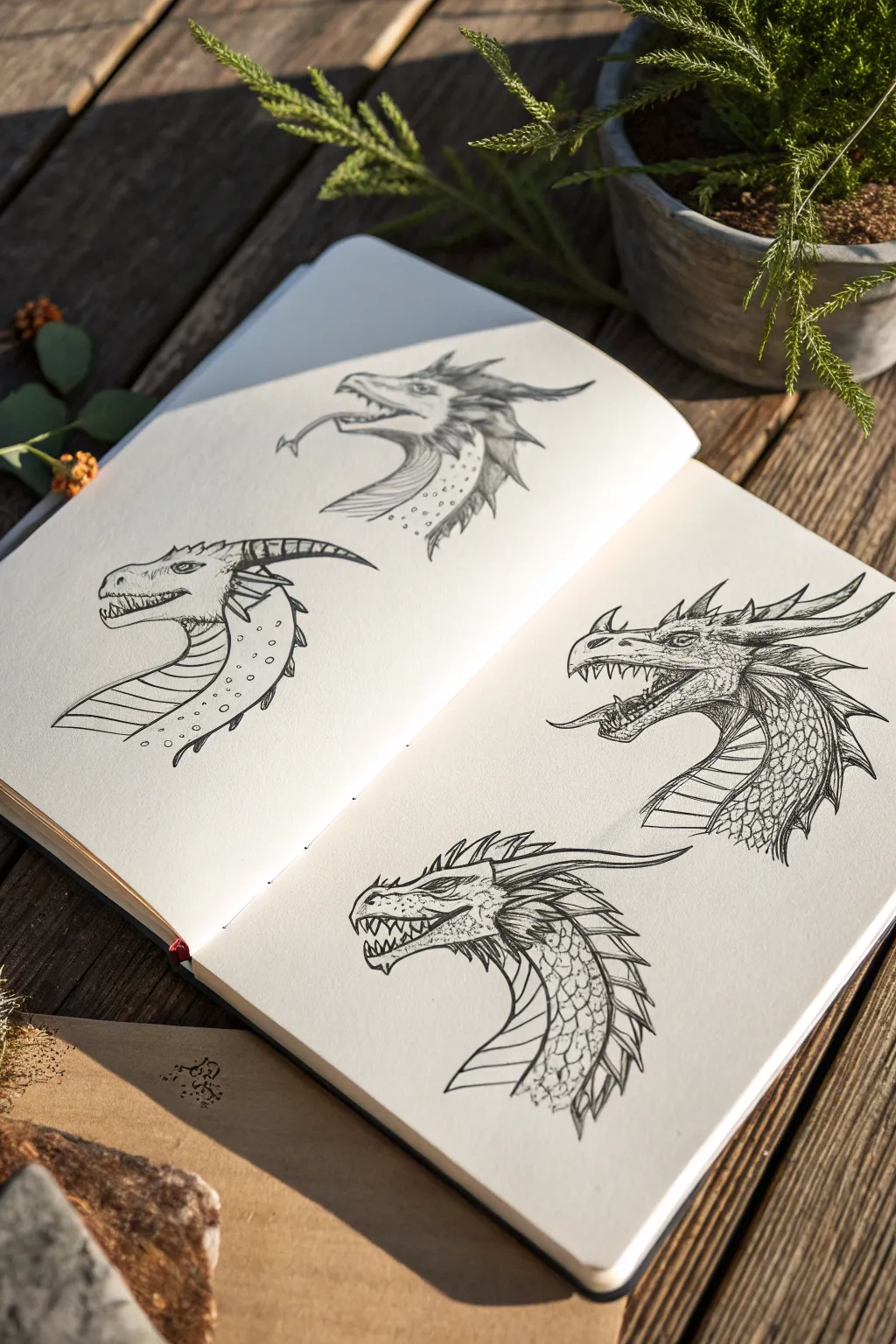
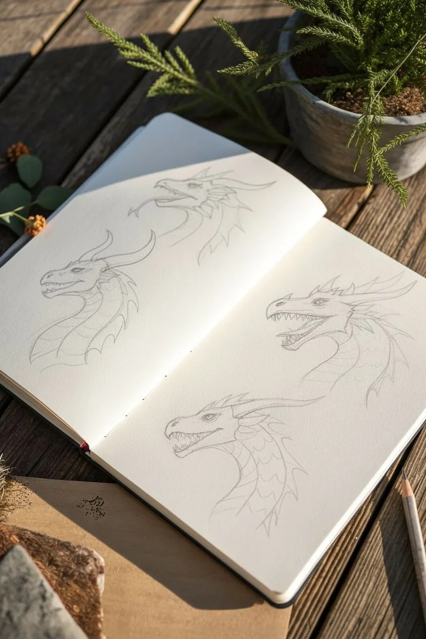
Explore the versatility of dragon designs with this study of four distinct heads, ranging from sleek and serpentine to rugged and horned. These sketches focus on capturing different textures—like scales, spikes, and smooth skin—using precise ink techniques.
Step-by-Step Guide
Materials
- Sketchbook with smooth, heavy paper (approx. A5 size)
- HB graphite pencil
- Kneadable eraser
- Fine liner pens (sizes 0.1, 0.3, and 0.5)
- Ruler (optional, for layout alignment)
Step 1: Drafting the Foundations
-
Layout planning:
Visualize the placement of four heads across your open sketchbook spread: two on the left page and two on the right. Lightly mark the center of each quadrant with your pencil to ensure balanced spacing. -
Basic shapes for the top left:
Start the top-left dragon with a simple oval for the cranium and a long, tapering snout. Add a curved guide line for the neck flowing downwards. -
Top left features:
Sketch a sleek, almost canine jawline. Add a thin, forked tongue extending out. Indicate triangular, backward-sweeping frills or fins behind the head rather than horns. -
Bottom left structure:
For the bottom-left dragon, draw a more blocky, substantial snout. Sketch a large, singular curved horn sweeping back from the brow. Define a thick, segmented neck. -
Right page dynamics:
On the right page, position the top dragon with an open mouth to show aggression. Give it a classic sharp snout and multiple backward-pointing spikes. For the bottom right, sketch a dragon with a deeply armored face and a heavy brow ridge.
Scale Variation
Mix up scale sizes! Use tiny pebbles for flexible areas like corners of mouths, and large overlapping plates for armored zones like the neck and brow ridge.
Step 2: Refining Pencils & Initial Inking
-
Defining the top left:
Refine the pencil lines for the top-left dragon. Draw small, scattered scales on the neck. Outline the frills with jagged, energetic strokes. -
Detailing the bottom left:
Add horizontal bands across the neck and underbelly of the bottom-left dragon. Draw small circle patterns on the upper neck to suggest varied skin texture. -
Complex scaling on the right:
For the right-hand dragons, sketch intricate scale patterns. On the top right, focus on overlapping plate-like scales along the jaw. On the bottom right, create a heavy, armored look on the snout. -
First ink pass:
Using a 0.3 fineliner, go over the main outlines of all four heads. Keep your hand steady but allow for slight variations in line weight to imply organic form. Don’t ink the texture details yet.
Step 3: Texture & Shading
-
Top left textures:
Switch to a 0.1 pen for the top-left dragon. Use quick, thin hatching lines on the neck frills to create shadow. Stipple small dots on the neck for a leathery texture. -
Bottom left banding:
Ink the segmented neck bands on the bottom-left dragon with clean, parallel curves. Use dots (stippling) on the upper neck to create a gradient from light to shadow. -
Top right aggression:
For the open-mouthed dragon on the top right, use sharp, jagged hatching inside the mouth to create depth. Ink the individual scales on the neck with precision, darkening the spaces between them. -
Bottom right armoring:
On the bottom-right dragon, use the 0.5 pen to thicken the lines under the jaw and neck plates, simulating heavy shadow. Use cross-hatching on the side of the face to carve out the muscular structure. -
Deepening contrast:
Review all four heads. Where neck segments or frills overlap, add small patches of solid black or dense hatching to separate the layers visually. -
Final clean up:
Once the ink is completely dry—I usually wait at least five minutes to be safe—gently erase all underlying pencil sketch marks with the kneadable eraser.
Fantasy Biology
Try adding distinct biological traits to each, like external gills relative to an aquatic dragon or heat vents for a fire breather.
You now have a reference sheet of four unique dragon personalities ready to inspire larger artworks
Surreal Object Swap (Put One Thing Inside Another)

Transform an ordinary cup into a vessel for the sky with this dreamy, surreal art project. By combining resin crafting with traditional watercolor painting, you’ll create a seamless illusion where the heavens spill out of a teacup.
Step-by-Step Tutorial
Materials
- White ceramic tea cup
- Two-part clear epoxy resin
- Blue alcohol ink (sky blue or cyan)
- Opaque white resin pigment or white alcohol ink
- Heavyweight white drawing paper or watercolor paper
- Watercolors (indigo, ultramarine, cerulean)
- Watercolor brushes (round size 4 and 8)
- Gold foil star stickers or gold paint pen
- Wooden stir sticks
- Mixing cups
- Heat gun or lighter (for bubbles)
- Masking tape (optional)
Step 1: Painting the Paper Base
-
Sketch the layout:
Place your empty teacup on the paper to visualize the composition. Lightly sketch a cloud formation near the bottom left corner where you want the moon to rest. -
Paint the watercolor clouds:
Load your larger brush with clean water and wet the cloud area on your paper. Drop in diluted cerulean blue, letting it bloom softly to create fluffy edges. -
Add depth to the sky:
While the first layer is still damp, dab in touches of darker ultramarine blue at the bottom of the cloud shapes to give them volume and shadow. -
Paint the crescent moon:
Using a smaller brush, carefully paint a crescent moon shape nestled within the clouds using a darker indigo or a metallic blue if you have it. Leave it to dry completely. -
Apply the stars to the paper:
Once your painting is bone dry, place small gold star stickers randomly across the white space of the paper. I suggest placing a few near the watercolor clouds for balance.
Pro Tip: Depth Perception
Don’t overmix your white pigment. Letting it remain slightly clumpy or thick helps it hold a distinct cloud shape rather than dissolving into mist.
Step 2: Creating the Cloud Cup
-
Prepare the resin:
In a mixing cup, combine equal parts of resin and hardener according to your specific brand’s instructions. Stir slowly for 3-5 minutes to minimize micro-bubbles. -
Tint the base layer:
Pour about two-thirds of your mixed resin into the cup. Add just one drop of blue alcohol ink to tint it transparently. This adds depth without making it opaque. -
Pop surface bubbles:
Let the resin sit for a minute, then wave a heat gun or lighter quickly over the surface to pop any rising air bubbles. -
Create the first cloud layer:
Mix a tiny amount of separate resin with white pigment. Using a toothpick or stir stick, swirl whisps of this white mixture into the blue resin in the cup. -
Layering the effect:
Wait for the first layer to cure to a gel consistency (usually 45-60 minutes). Pour a second thin layer of clear resin on top to create 3D separation. -
Add surface clouds:
On this top layer, drop slightly larger blobs of white pigment. Use a toothpick to gently fluff the edges, making them look like floating cumulus clouds. -
Final cure:
Allow the cup to cure undisturbed for fully 24-48 hours in a dust-free area.
Step 3: Finishing Touches
-
Decorate the mug exterior:
Take your gold star stickers (or a gold paint pen) and apply tiny stars to the outside of the ceramic mug. -
Arrange the scene:
Place the finished resin cup onto your watercolor paper. Orient it so the handle faces left, creating a visual flow with the painted moon. -
Photograph your work:
Take your artwork outside to natural light for the best photo, capturing the reflection on the resin surface.
Troubleshooting: Sinking Clouds
If your white clouds sink to the bottom immediately, your resin is too thin. Wait 20-30 minutes for the resin to thicken slightly before adding white swirls.
Enjoy the peaceful view of your personal cup of sky
Draw Your Day as a Tiny Comic Strip of Moments

Capture the fleeting, quiet moments of your day by turning them into a stylized, monochromatic comic strip. This project focuses on simple line work, distinct panel layouts, and selective pops of color to create a moody, personal narrative.
Detailed Instructions
Materials
- Hardbound sketchbook (smooth or mixed-media paper)
- Black fine liner pens (0.1, 0.3, and 0.5mm sizes)
- Yellow alcohol marker or highlighter
- Pencil and eraser
- Ruler
Step 1: Planning the Layout
-
Find your view:
Sit somewhere comfortable with a view, like a balcony or near a window. Observe the scene in front of you—the railing, distant buildings, or perhaps just the sky. -
Draft the panels:
Open your sketchbook to a fresh spread. Using a ruler and a light pencil touch, draw large rectangular frames. On the left page, create a grid of four uneven boxes—some square, some tall and narrow. On the right page, draw three wide, cinematic horizontal panels stacked vertically. -
Sketch the narrative:
Lightly pencil in the contents of your panels. Focus on contrasting scales: draw a close-up of a figure or object in one frame, and a wide landscape view in another. Don’t worry about perfect details yet; just get the composition down.
Ink Smearing?
If your eraser smears the ink, switch to a pigment liner or archival ink pen. These dry waterproof and handle erasing much better than standard gel pens.
Step 2: Inking the Details
-
Outline the frames:
Switch to your 0.5mm black pen. Go over your panel borders with confident, straight lines. I find freehanding these lines slightly gives the comic a more organic, handmade feel than using a ruler again. -
Ink the main subjects:
Use a 0.3mm pen to ink the primary subjects in each panel—the character’s face, the window frame, or the potted plants. Keep the lines clean and continuous. -
Add nature textures:
For the landscape panels on the right page, switch to a 0.1mm pen to draw the trees and bushes. Use rapid, scribbly strokes to suggest foliage without drawing every leaf. -
Create depth with stippling:
In the top right panel (which might represent the sky or atmosphere), add tiny dots sparingly. This adds texture without cluttering the negative space. -
Hatch shading:
On the bottom right panel showing intricate foliage, use cross-hatching to create darker shadows under the ‘trees’. This provides weight to the bottom of the page. -
Draw the character:
On the left page, refine the character’s expression with the 0.3mm pen. Keep the facial features simple—dots for eyes, a simple line for the mouth—to maintain a cartoon style. -
Detail the architecture:
For the architectural element on the bottom left, use straight vertical lines to indicate shutters or siding. Add a potted plant silhouette in the foreground for depth. -
Erase guidelines:
Once the ink is completely dry (wait at least a few minutes to avoid smearing), gently erase all your initial pencil sketches.
Try a New Perspective
Instead of drawing what you see, draw how you feel. Distort the perspective or size of objects (like a giant coffee cup) to represent their importance in your moment.
Step 3: Color and Final Touches
-
Select your accent color:
Choose one bright color to highlight specific elements. In this example, we use a sunny yellow. -
Apply the accent:
Use your yellow marker to fill in small, specific areas on the left page only—perhaps a shirt collar, a geometric shape in the corner, or a sunbeam. Leave the right page black and white for contrast. -
Add speech or thought:
If your narrative needs context, draw a small box within a panel and add handwritten text. Choose a quote or a fleeting thought that matches the mood. -
Review contrast:
Look at the whole spread. If an area feels too flat, go back in with the 0.1mm pen and add more hatching lines to deepen the shadows.
Now you have a charming visual diary entry that captures the essence of your afternoon break
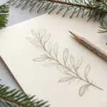
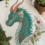


Have a question or want to share your own experience? I'd love to hear from you in the comments below!