
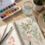
Watercolor can feel like magic—until you realize it’s mostly just water, timing, and giving yourself permission to keep it simple. Here are very easy painting ideas I use with beginners to build confidence fast, one satisfying little win at a time.
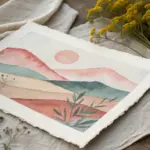
Simple Sunset Gradient Over Water
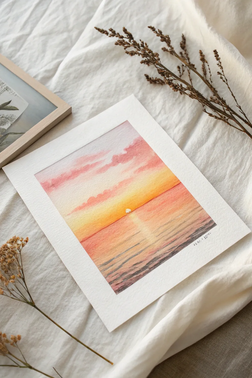
Capture the serene beauty of a setting sun with this gentle gradient study. This project focuses on soft wet-into-wet blending to create a seamless transition from a cloudy pink sky to warm, reflective waters.
How-To Guide
Materials
- Cold press watercolor paper (approx. 300 gsm)
- Masking tape or painter’s tape
- Watercolor paints (Salmon Pink, Lemon Yellow, Cadmium Orange, Burnt Umber, Payne’s Gray)
- Round brushes (size 8 for washes, size 4 for details)
- Clean water jar
- Paper towels
- Drawing board or thick cardboard backing
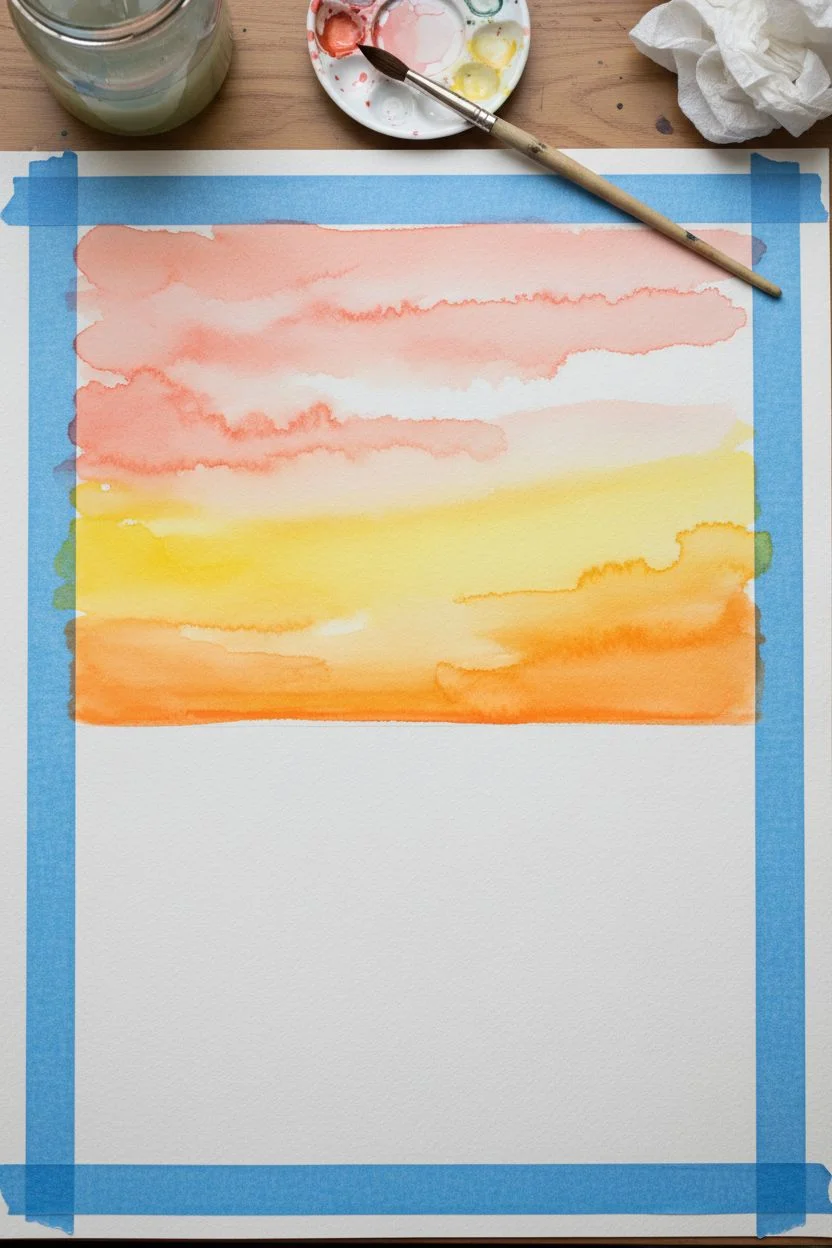
Step 1: Preparation & Sky Gradient
-
Secure the Borders:
Begin by taping down all four edges of your watercolor paper to a board. Use masking tape to create a crisp white border, pressing down firmly to prevent paint from seeping underneath. -
Establish the Horizon:
Lightly mark a horizontal line with a pencil about one-third of the way up from the bottom. This will separate your sky from the sea. Don’t press too hard; you want the line to disappear later. -
Wet the Sky Area:
Using your larger clean brush, apply a gentle wash of clean water to the entire sky area above the horizon line. The paper should be glisten but not look like a puddle. -
Paint the Upper Clouds:
While the paper is wet, load your brush with a diluted Salmon Pink or soft rose color. Dab irregular, horizontal strokes near the top edge to suggest fluffy clouds, letting the wet paper soften the edges naturally. -
Introduce the Warmth:
Rinse your brush and switch to a Lemon Yellow mixed with a touch of orange. Paint broad horizontal strokes starting just above the horizon line, blending upward slightly toward the pink clouds, but leaving some white space between them. -
Intensify the Horizon:
While the yellow area is still damp, drop in a slightly more saturated Cadmium Orange right along the horizon line to create a glowing effect where the sun will sit.
Clean Edges Pro Tip
To prevent paper tearing, warm the masking tape with a hairdryer for 10-15 seconds before peeling. This softens the adhesive gently.
Step 2: Sun & Water Reflection
-
Let the Sky Dry:
Wait for the sky section to be completely bone dry. If you rush this, the horizon line will bleed. -
Start with the Reflection Base:
Paint a wash of the same yellow-orange mix immediately below the horizon line. However, leave a vertical column in the center unpainted or very pale yellow to represent the sun’s reflection. -
Define the Sun:
Using a precise, mostly dry brush (lifting technique) or opaque white gouache if you prefer, ensure a small semi-circle remains bright white right at the center of the horizon line. -
Add Middle Water Tones:
Mix a soft coral or salmon shade similar to the sky. Paint horizontal strokes on either side of the sun’s reflection, gradually darkening the water as you move away from the center light path. -
Create Depth in the Foreground:
For the bottom third of the painting, mix Burnt Umber with a tiny touch of Payne’s Gray. Paint broken horizontal lines to suggest ripples, getting thicker and darker as you reach the bottom edge of the paper.
Level Up: Texture
Add a tiny sprinkle of salt onto the wet darker foreground waves. As it dries, the salt absorbs pigment, creating a natural, foamy sea texture.
Step 3: Final Details
-
Enhance the Ripples:
Switch to your smaller size 4 brush. With the dark umber mix, add thin, distinct ripple lines over the dried reflection area, breaking them up so the light still shines through. -
Soften the Sun’s Glow:
If the sun looks too stark, gently soften the bottom edge of the semi-circle with a damp brush to help it ‘sit’ in the water. -
Dry Completely:
Allow the entire painting to dry fully. The paper should feel neutral to the touch, not cool. -
Reveal the Painting:
Slowly peel off the masking tape at a 45-degree angle, pulling away from the painted area to ensure crisp, clean edges without tearing the paper.
Now you have a tranquil sunset scene perfect for framing or gifting


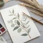
Loose Wildflower Stems
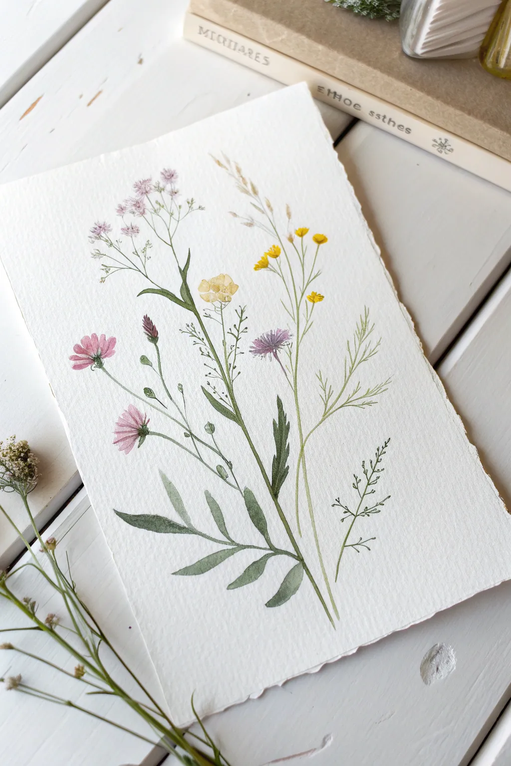
Capture the airy elegance of a summer field with this charming botanical composition. Using fine lines and soft washes, you’ll create a vertical arrangement of diverse wildflowers on beautiful textured paper.
Step-by-Step Guide
Materials
- Cold-pressed watercolor paper (deckle edge preferred)
- Watercolor paints (sage green, deep olive, lemon yellow, light ochre, dusty pink, violet)
- Round brush (size 2 or 4 for washes)
- Detail brush (size 0 or 00 for stems)
- Pencil (HB) and kneadable eraser
- Jar of clean water
- Paper towels
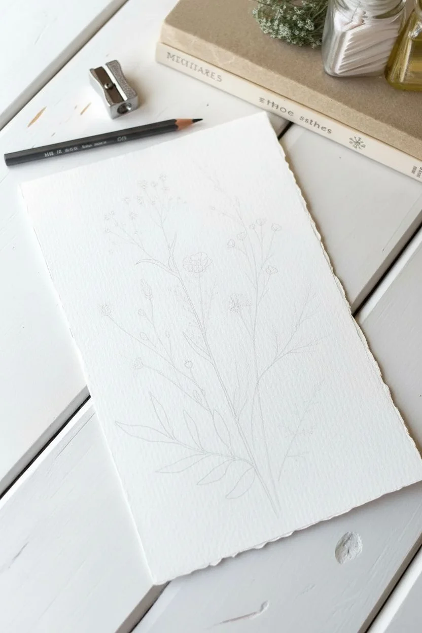
Step 1: Planning the Composition
-
Lightly sketch the layout:
Begin with a very faint pencil sketch to establish the height and positioning of your stems. Draw five main vertical lines of varying heights, curving them slightly to mimic natural growth. -
Mark leaf and bloom placement:
Add tiny circles or ovals where the flower heads will go, ensuring they are staggered so the bouquet doesn’t look too top-heavy. Sketch the placement of the large, fern-like leaves at the bottom.
Natural Imperfection
Don’t connect every single line perfectly. Leaving small gaps in the outlines of stems or petals makes the illustration feel lighter and more organic.
Step 2: Painting the Foliage
-
Mix your base green:
Create a watery sage green mix. On the central stem, paint the lower leaves using a ‘press and lift’ motion to create the varying widths of the fern-like foliage. -
Draw the main stems:
Switch to your smallest liner or detail brush. Load it with a slightly darker olive green and trace your pencil lines for the stems, keeping your hand loose to allow for natural wavers in the line. -
Add grassy details:
On the far right, paint the delicate, thread-like leaves using the very tip of your brush and a pale, yellowish-green mix. Flick the brush upward for sharp, tapered ends. -
Create the budding stems:
For the stem on the far left, add small, teardrop-shaped buds along the stalk using a mix of green and a touch of reddish-brown.
Vintage Vibe
Dip a toothbrush in diluted brown paint and flick it over the dried painting for faint speckles that mimic aged paper or pollen dust.
Step 3: Adding the Blooms
-
Paint the pink cosmos:
Mix a watery dusty pink. On the left side, paint the petals of the open flowers with quick, outward strokes, leaving a tiny bit of white space in the center. -
Detail the pink centers:
While the pink petals are still slightly damp, drop a tiny dot of darker magenta or brown into the center to let it bleed naturally. -
Create the yellow buttercups:
Using a bright lemon yellow, paint small, cup-shaped flowers on the tall, thin stem in the middle-right. Vary the sizes, making the top ones smaller. -
Add the central cream flower:
Paint the single large bloom in the center using a very diluted yellow ochre. Keep the edges irregular and ruffled. -
Paint the purple thistles:
Mix a soft violet color. Create the thistle-like flower on the right side by making many tiny, thin strokes radiating from a central point, forming a fan shape. -
Cluster the top sprigs:
At the very top left, use a pale lavender to dab tiny clusters of dots, connecting them with microscopic green stems to form a cloud of baby’s breath or similar filler flowers.
Step 4: Refining and Drying
-
Darken the stems:
Once the first layer is dry, go back in with your darkest green mixture. selectively darken the shadows where stems cross or where leaves attach to the main stalk. -
Add flower details:
Use a fine liner brush to add tiny sepals (the green parts at the base of the flower) to your yellow and pink blooms. -
Suggest texture on the wheat:
For the tall, grain-like stalk near the top center, use dry-brushing with light brown paint to suggest the rough texture of wheat or dried grass. -
Add final contrast:
I like to mix a deep crimson-green and add just a few tiny specks or lines on the stems and leaves to simulate thorns or texture. -
Erase pencil lines:
Wait until the painting is completely bone dry. Gently erase any visible pencil sketch marks with your kneadable eraser to clean up the illustration.
Frame your botanical study in a simple wooden float frame to show off those lovely deckled edges


Easy Mountain Silhouettes in Layers
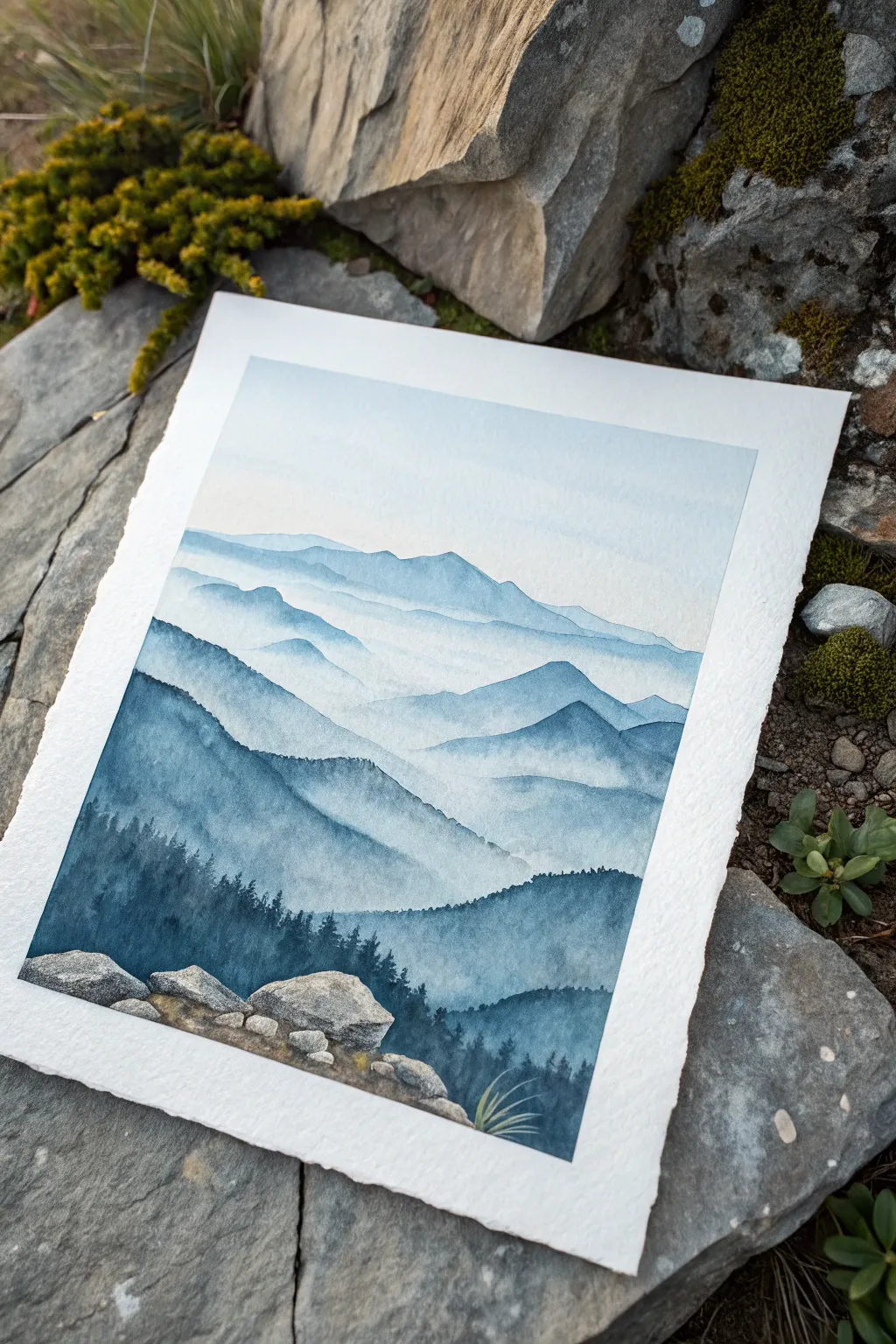
Capture the serenity of distant peaks with this atmospheric watercolor landscape. You’ll master the art of aerial perspective by layering progressively darker shades of blue to create depth, mist, and a stunning sense of scale.
Detailed Instructions
Materials
- Cold Press Watercolor Paper (300gsm, 100% Cotton recommended)
- Watercolor Paints (Indigo, Prussian Blue, Payne’s Gray, Burnt Umber, Yellow Ochre)
- Round Brushes (Size 8 for washes, Size 2 or 4 for details)
- Masking Tape (optional, for borders)
- Clean Water
- Paper Towels
- Mixing Palette
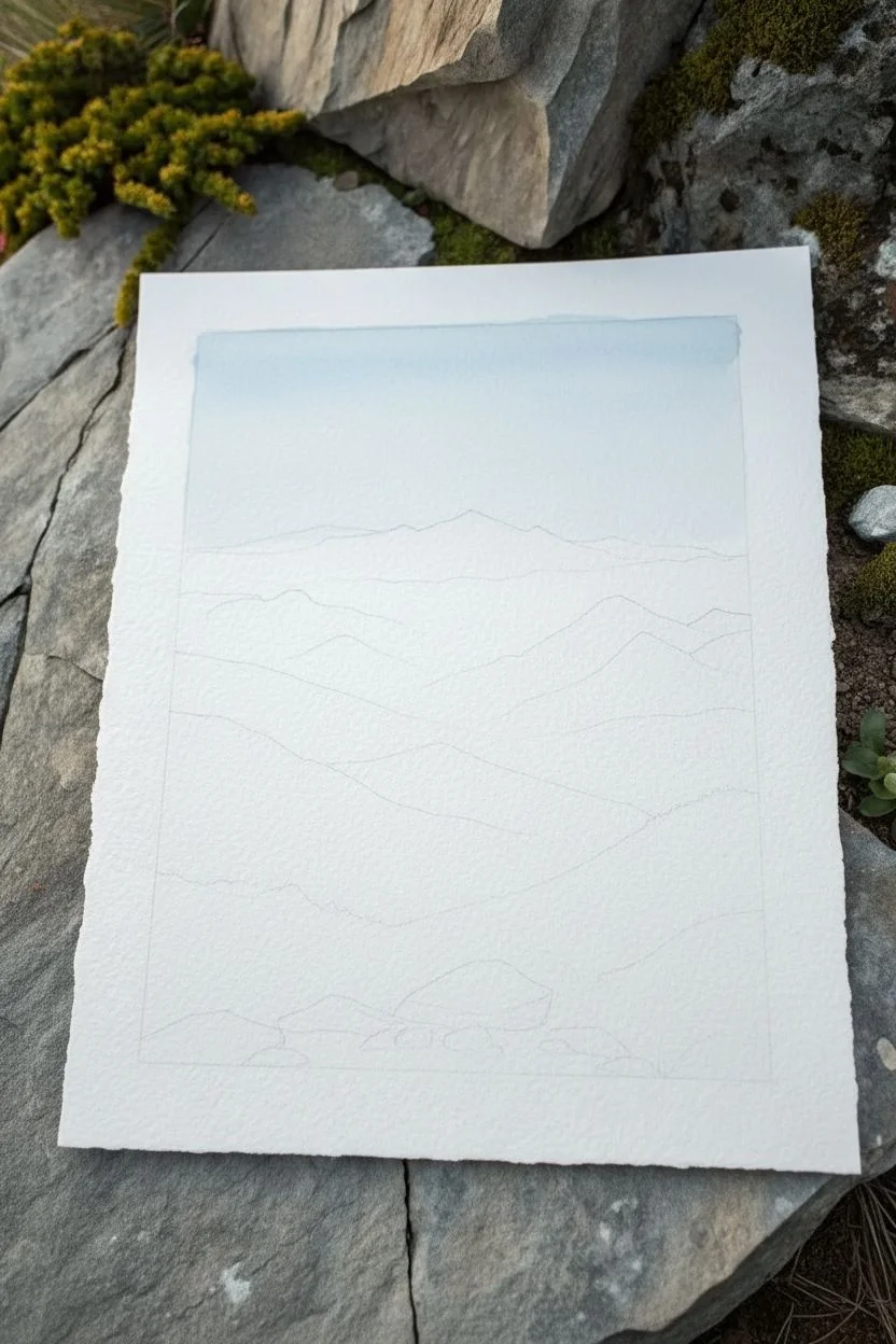
Step 1: Setting the Scene
-
Sketch the Peaks:
Begin by lightly sketching the outlines of your mountain ranges with a hard pencil (like 2H) so lines don’t show through later. Draw about 5-6 distinct layers, starting from a high, distant range and working down to a large foreground hill. -
Prepare Your Palette:
Mix a large puddle of a very pale, watery blue. I like to use a tiny touch of Indigo mixed with a lot of water for this first wash. You want this color to be barely visible, like the sky at dawn. -
Paint the Sky:
Wet the sky area of your paper with clean water first—this is the wet-on-wet technique. Drop in your palest blue mix at the top and let it fade to white as it nears the first mountain ridge. Let this dry completely.
Atmospheric Perspective
To nail the depth effect, remember: things get paler, bluer, and less detailed the further away they are. Your foreground should always have the highest contrast.
Step 2: Layering the Mountains
-
The Furthest Range:
Using the same pale blue mix but with slightly more pigment, paint the most distant mountain ridge. Keep the edges crisp along the top, but soften the bottom edge with clean water to create a misty effect. -
Second Layer:
Once the previous layer is dry, mix a slightly darker, cooler blue. Paint the next ridge down. Ensure variation in your mountain shapes—some peaks should be sharp, others rolling. -
Building Intensity:
For the third layer down, add a touch of Prussian Blue to your mix. Paint the ridge, again keeping the top edge sharp. While the paint is wet, you can lift a little pigment from the valleys with a thirsty brush to simulate swirling mist. -
Mid-Ground Ranges:
Continue down the paper, darkening your blue mixture for each new layer. Add a tiny bit of Payne’s Gray to desaturate the color as you get closer. This mimics how colors become more vibrant and dark in the foreground. -
Creating Texture:
On these middle layers, use the side of your brush (the belly) to drag paint across the paper. If you use slightly less water, the rough texture of the paper will show through, suggesting rocky terrain.
Step 3: Foreground and Details
-
The Dark Forest Layer:
Mix a deep, rich color using Indigo and Payne’s Gray with very little water. Paint the large foreground hill silhouette. This should be the darkest value in your painting. -
Adding Trees:
While the foreground hill is damp but not soaking, switch to your smallest brush. Paint tiny vertical lines along the ridge to suggest distant pine trees. Use a stippling motion for the tree tops. -
Detailed Tree Silhouettes:
As you move lower into the immediate foreground, define individual pine trees more clearly. Paint a central trunk line and use quick, jagged horizontal strokes for branches, getting wider at the bottom. -
Base for Rocks:
Leave a small white gap or reserve space at the very bottom left for the rock formation. Paint the base ground around them with your dark forest mix, blending it into the tree roots. -
Painting the Stones:
Mix a light grey using diluted Payne’s Gray and a touch of Burnt Umber. Paint the basic shapes of the foreground rocks. Keep the tops lighter to show sunlight hitting them. -
Rock Texture:
Once the base rock color is dry, use a darker grey to paint shadows in the crevices and underneath the rocks. Add tiny speckles or dry-brush strokes to create a stony texture. -
Moss and Grass:
Mix Yellow Ochre with a tiny bit of blue to make an earthy green. Dab this around the base of the rocks and in cracks to simulate moss or dry grass. -
Final Grass Blades:
Using your finest brush and the earthy green mix, flick a few sharp, curved lines upward from the cracks in the rocks to create tall blades of grass. -
Review and Refine:
Step back and look at your contrast. If the foreground trees aren’t dark enough against the misty background, add another layer of concentrated Indigo once everything is bone dry.
Hard Lines Fix
If you get a hard line where you wanted mist, scrub the edge gently with a damp, clean brush while the paint is still slightly workable to soften the transition.
Now you have a breathtaking mountain vista that draws the eye deep into the horizon
Fluffy Clouds Using Simple Lifting
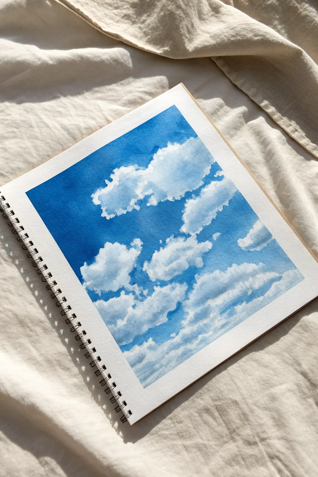
Capture the serene beauty of a bright summer sky with this surprisingly simple watercolor cloud study. By mastering the lifting technique, you’ll create soft, billowing clouds that pop against a deep, graduated blue background without needing complex masking fluid.
Step-by-Step
Materials
- Cold press watercolor paper (wiro-bound or block)
- Masking tape (for clean borders)
- Watercolor paints (Cerulean Blue, Ultramarine Blue, Cobalt Blue)
- Round brush (size 10 or 12 for washes)
- Round brush (size 4 or 6 for details)
- Clean paper towels or a thirsty sponge
- Two jars of water (one for washing, one clean)
- Palette for mixing
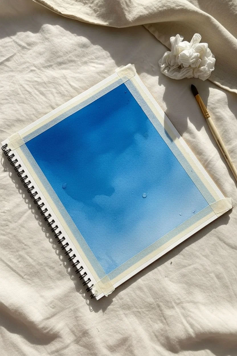
Step 1: Preparation and Sky Wash
-
Tape the edges:
Begin by taping down all four edges of your sketchbook page with masking tape. This creates that crisp, professional white border shown in the example and prevents the paper from buckling too much. -
Mix your blues:
Prepare a generous amount of blue paint on your palette. For this vibrant sky, mix a primary blue like Cobalt with a touch of Ultramarine for depth. You’ll need enough to cover the whole page without stopping to remix. -
Wet the paper:
Using your large round brush, apply a clean water wash over the entire rectangle. The paper should be glisten with moisture but not have standing puddles. -
Start the gradient:
Load your large brush with the darkest concentration of your blue mix. Apply this to the top left corner and across the top edge, where the sky appears deepest in the photo. -
Work downwards:
Continue painting downwards using horizontal strokes. As you move toward the bottom right, add a tiny bit more water to your brush to dilute the pigment, creating a natural atmospheric fade. -
Check coverage:
Ensure the blue covers the entire area where you want the sky to be. Don’t worry about the clouds yet; paint the blue wash right over where they will sit.
Timing is Everything
If you lift too early, the blue paint will rush back into the white space. If you lift too late, the paint won’t budge. Test a corner; if the lift holds its shape, go for it.
Step 2: Lifting and Shaping Clouds
-
Wait for the magic moment:
Observe the paper surface closely. You want the sheen to turn from glossy wet to a satin or matte dampness. The paint shouldn’t be running, but it must still be moist to lift. -
Prepare the lifter:
Bunch up a clean piece of paper towel into a tight, slightly rounded shape. This will be your primary cloud-sculpting tool. -
Lift the large cloud:
Press the paper towel firmly onto the paper in the upper-right section to create the largest cloud mass. Lift straight up without dragging to reveal the white paper underneath. -
Refine the edges:
Rotate the paper towel to a clean spot and dab gently around the edges of your bright white shape to create softer, mistier transitions. -
Create smaller formations:
Using smaller twists of paper towel, lift out the scattered clouds at the bottom and the smaller puffs on the left. Vary the pressure: hard pressure for bright white tops, light pressure for misty bottoms. -
Use a thirsty brush:
For more precise cloud shapes, clean your medium-sized brush and squeeze out all the water. Use this damp ‘thirsty’ brush to lift specific highlights or separate clustered clouds. -
Soisten edges while damp:
If any cloud edges look too harsh or cut-out, gently run a barely damp clean brush along the bottom edge of the cloud to blend it slightly back into the blue.
Step 3: Adding Shadow and Depth
-
Let the base dry:
Allow the sky wash and your lifted areas to dry completely. The paper should be room temperature to the touch. -
Mix a shadow color:
Create a very diluted grey-blue mix. You can add a tiny touch of burnt sienna or gray to your original sky blue. It should be very watery. -
Paint cloud bottoms:
With your smaller brush, gently paint shadow shapes along the bottom and right sides of the fluffy clouds. This gives them volume and makes them look 3D rather than flat. -
Soften shadow edges:
Immediately after placing a shadow, rinse your brush, dab it on a towel, and run the clean damp bristles along the upper edge of the shadow to blend it into the white of the cloud. -
Add final details:
If needed, reinforce the deepest blue parts of the sky around the cloud edges (called negative painting) using a small brush, but be careful not to create hard outlines. -
Remove the tape:
Once the painting is bone dry—I usually wait an extra hour to be safe—peel the masking tape away slowly at a 45-degree angle to reveal your crisp borders.
Level Up: Sun Touched
While the cloud shadows are still wet, drop in a minuscule amount of very watery yellow ochre or pale pink to the top edges for a sun-kissed, golden hour glow.
Now you have a breezy piece of sky trapped in your sketchbook to enjoy any time of year
BRUSH GUIDE
The Right Brush for Every Stroke
From clean lines to bold texture — master brush choice, stroke control, and essential techniques.
Explore the Full Guide
Tiny Leaf Study in Mixed Greens
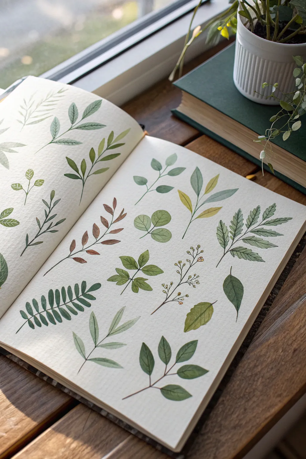
Embrace the relaxing simplicity of nature by filling a sketchbook page with a variety of botanical studies. This mixed-green leaf study explores different shapes, stem structures, and tonal values, creating a beautiful and cohesive collection perfect for practice.
How-To Guide
Materials
- A5 Watercolor Journal (hot or cold press)
- Round watercolor brushes (sizes 2, 4, and 6)
- Watercolor paints (Sap Green, Olive Green, Hooker’s Green, Burnt Sienna, Yellow Ochre)
- Small mixing palette
- Jar of clean water
- Paper towel
- HB Pencil (optional for light sketching)
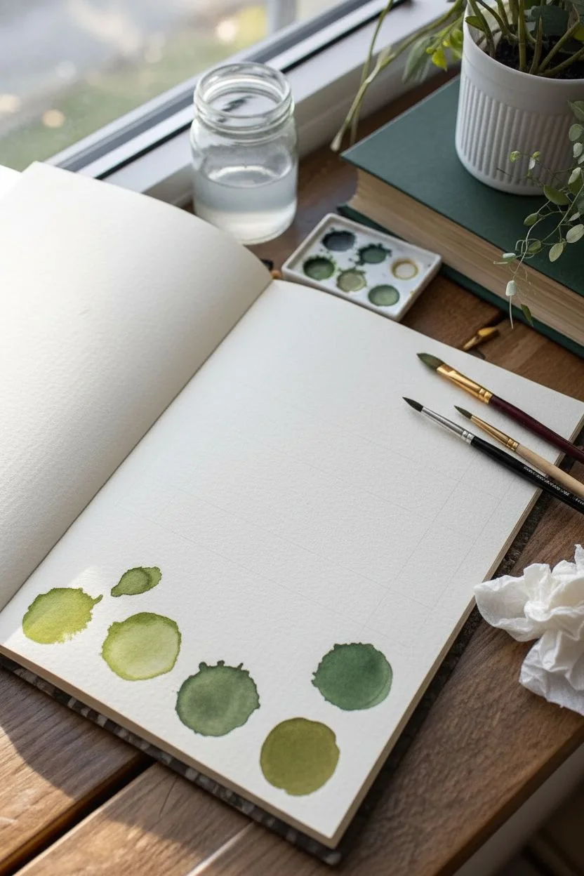
Step 1: Preparation & Color Mixing
-
Analyze your layout:
Visualize your page as a grid. You want to fit about 10-12 distinct botanical sprigs on the right-hand page. Leave comfortable white space between each one so they breathe. -
Mix your palette:
Prepare three puddles of green. Mix Sap Green with a touch of Yellow Ochre for a warm, spring green. Mix Hooker’s Green with a tiny bit of Burnt Sienna for a deep, muted forest green. Keep one puddle of pure Olive Green. -
Tint variation:
I like to create a watery, pale version of the warm green in a separate spot on the palette to allow for transparency variations.
Pro Tip: Stem Control
For thin, elegant stems, hold your brush perpendicular to the paper and use only the very finest tip. Exhale steadily as you pull the line.
Step 2: Painting the Foliage
-
The central sprig:
Start near the upper middle with a size 4 brush. Paint a thin, curving stem using your muted forest green. While wet, press the belly of the brush down to create almond-shaped leaves extending outward. -
Layering warmth:
For the sprig to its right, switch to your warm yellow-green mix. Paint longer, more slender lance-shaped leaves. Let the color fade slightly at the tips by lifting the brush pressure. -
Rounded eucalyptus shapes:
In the center of the page, paint a stem with rounded, coin-shaped leaves. Use a watered-down cool green here. Leave small gaps where the leaf meets the stem to keep the look airy. -
Creating contrast:
Move to the bottom left. Here, paint a fern-like frond with many small, closely packed leaflets. Use your darkest green mix to anchor the bottom corner of the page visually. -
Adding autumn tones:
On the middle-left side, mix a bit more Burnt Sienna into your green. Paint a branch where the leaves are shorter and slightly browner, mimicking dried or turning foliage. -
Experimenting with texture:
For the large, complex leaf on the right (the fern-like one), use the very tip of your size 2 brush to draw a central vein first, then briskly pull the paint outward to form jagged edges. -
Simple single leaves:
Fill empty spots with individual floating leaves. Paint a broad, dark green leaf near the bottom right, and a few clover-shaped groupings near the top. -
The delicate climber:
In the lower middle area, use your smallest brush (size 2) to paint a very fine, brown-tinged stem. Add tiny yellow-green buds or berries instead of full leaves for variety.
Troubleshooting: Bloom Marks
If cauliflower-like blooms appear, your brush was too wet when adding detail. Let the base layer dry completely before touching it again.
Step 3: Details & Refinements
-
Stem connections:
Once the leaves are touch-dry, go back with a size 0 or the very tip of your size 2 brush. Connect any floating leaves to their main stems using a slightly darker, concentrated green mixture. -
Veining details:
On the larger, dried leaves, paint a thin darker line down the center. Do not do this on every leaf; keeping some solid and some detailed adds visual interest. -
Softening edges:
If any leaf looks too harsh, dampen a clean brush and gently rub the edge to soften it into the paper before the paint cures completely. -
Final assessment:
Look at the overall balance. If a spot feels too empty, add a very faint, watery shadow leaf behind an existing one to create depth without clutter.
Close your journal gently once fully dry, knowing you have captured a lovely spectrum of botanical forms
Single Rose Bloom With Two Washes
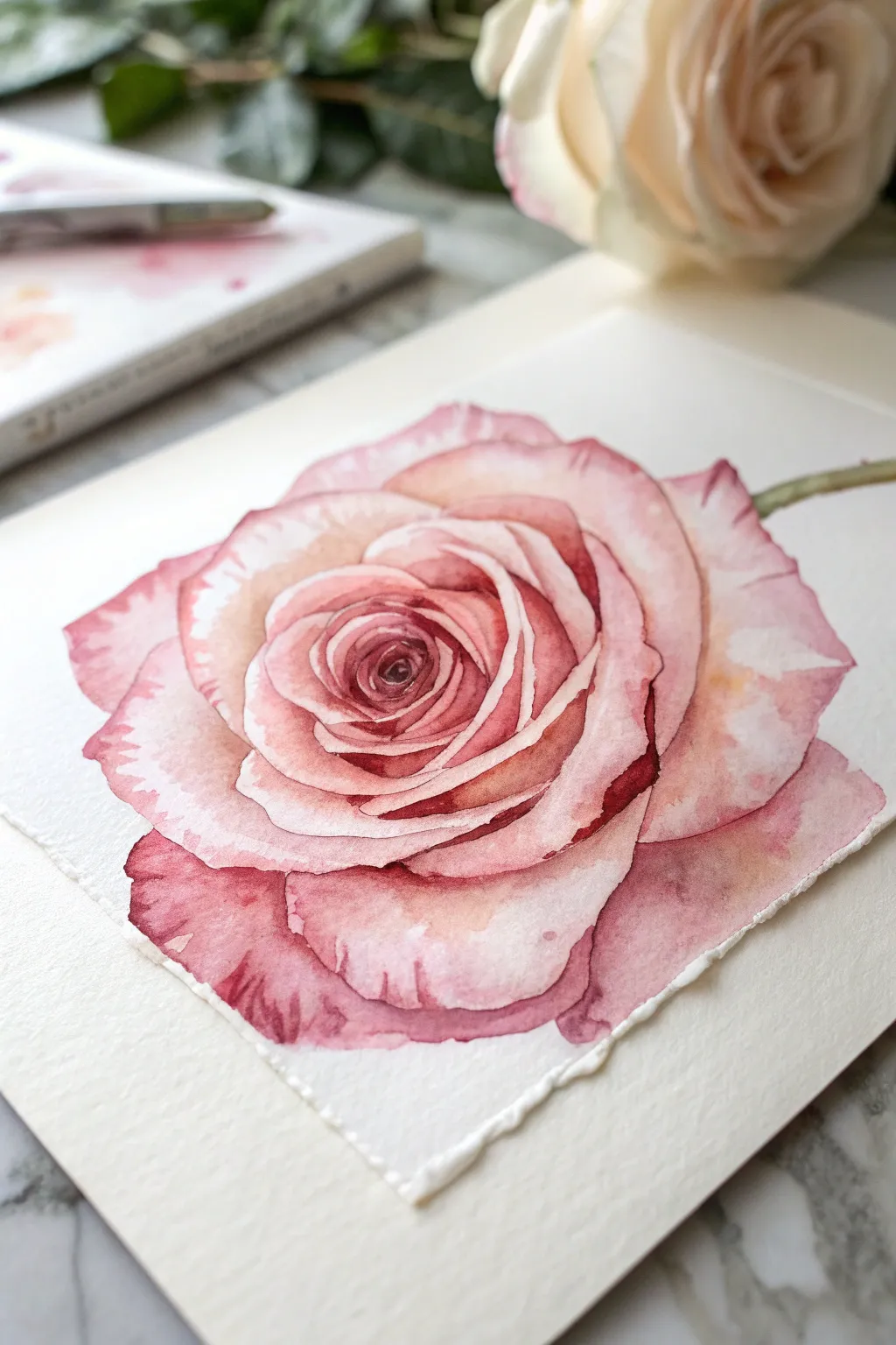
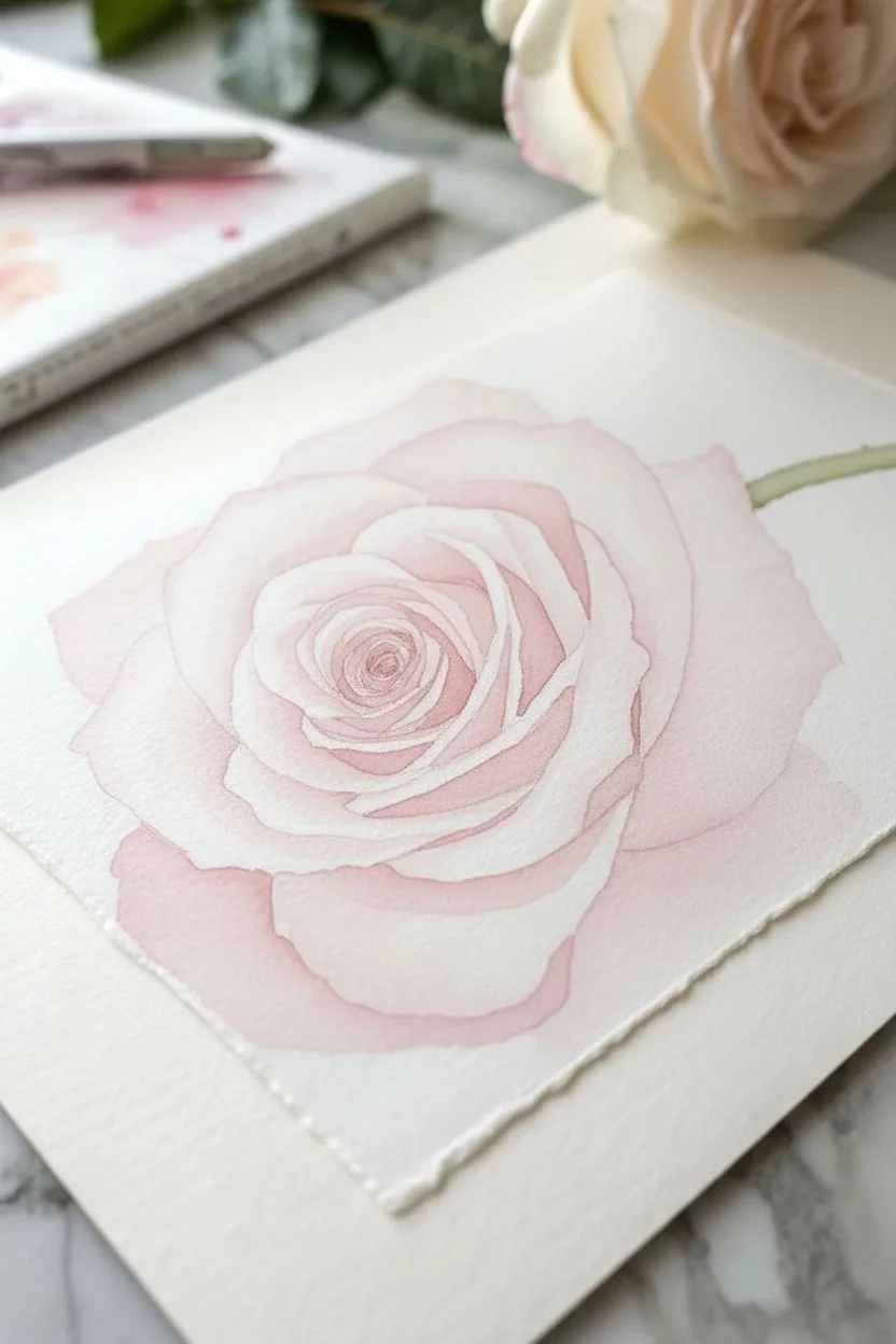
Capture the delicate beauty of a single rose bloom using gentle washes and careful layering. This project focuses on building depth through transparent pinks and crimsons, resulting in a romantic and realistic floral portrait.
Detailed Instructions
Materials
- Cold press watercolor paper (300 gsm)
- Round watercolor brushes (sizes 2, 6, and 8)
- Watercolor paints: Permanent Rose, Alizarin Crimson, Sap Green, Burnt Umber
- Pencil (HB or 2H)
- Kneadable eraser
- Two jars of water
- Paper towels
- Palette for mixing
Step 1: Sketching and First Wash
-
Light Outline:
Begin by lightly sketching the outline of the rose on your watercolor paper. Focus on the spiral center and how the petals unfurl outwards. Keep your pencil lines very faint so they won’t show through the transparent paint later. -
Defining Petal Shapes:
Refine the shapes of the outer petals. Note that the edges are slightly jagged and irregular, not perfect smooth curves. Draw the small green stem extending from the right side. -
Prepare the Base Mix:
Mix a very watery, pale wash of Permanent Rose with a tiny touch of Burnt Umber on your palette. This should be a soft, tea-rose pink. -
Wet-on-Wet Base:
Using your size 8 brush, wet the entire rose shape with clean water until it glistens but doesn’t pool. Drop your pale pink mix into the wet area, letting it spread naturally. Leave some white space at the very tips of the petals for highlights. -
Stem Base:
While the flower dries, paint a thin line of Sap Green for the stem. Let this first phase dry completely before moving on.
Preserve Your Whites
Watercolor relies on the paper for white. For crisp highlights on petal edges, use masking fluid before painting, then rub it off at the end.
Step 2: Building Petal Depth
-
Center Intensity:
Mix a slightly more concentrated version of Permanent Rose. With your size 6 brush, carefully paint the tight spiral center of the rose, leaving tiny slivers of white paper between the lines to define the overlapping petals. -
Mid-Tone Shadows:
Identify where the petals overlap. Paint the shadow areas underneath the curled edges of the petals using your mid-tone pink. Soften the edge of these shadows with a clean, damp brush to create a smooth gradient. -
Outer Petal Textures:
On the large outer petals, add broad strokes of pale pink, following the curve of the petal towards the center. This suggests the vein structure and curve of the bloom. -
Defining Edges:
Use the tip of your size 2 brush to sharpen the edges of the petals. If the paint pools too much, lift it out with a clean, dry brush or a corner of paper towel. -
Stem Detail:
Add a touch of Burnt Umber to your Sap Green and paint a shadow line along the bottom of the stem to give it roundness.
Muddy Colors?
If shadows look dirty, you may be overworking wet paint. Let layers dry completely between glazes to keep colors transparent and vibrant.
Step 3: Deep Shadows and Final Details
-
Mixing Dark Crimson:
Create a deep shadow color using Alizarin Crimson mixed with a tiny drop of Sap Green. This neutralizes the red slightly, making a rich, dark maroon. -
Deepening the Core:
Apply this dark mix into the very deepest crevices of the rose center. This high contrast instantly makes the flower look three-dimensional. -
Shadow Accents:
Look for the darkest shadow points under the large outer petals. Paint small, sharp shapes of the dark crimson here, softening the outer edge into the existing pink wash. -
Adding Veining:
I like to use a very dry size 2 brush with faint crimson paint to gently drag subtle vein lines on the lower petals. Keep this extremely subtle. -
Final Adjustments:
Step back and assess the painting. If some highlights were lost, you can reclaim tiny white edges using a white gouache or gel pen, but sparsely. -
Drying:
Allow the painting to dry fully. Erase any visible pencil lines gently with the kneadable eraser.
Now you have a timeless floral piece perfect for a greeting card or framed display

PENCIL GUIDE
Understanding Pencil Grades from H to B
From first sketch to finished drawing — learn pencil grades, line control, and shading techniques.
Explore the Full Guide
Simple Dandelion Silhouettes
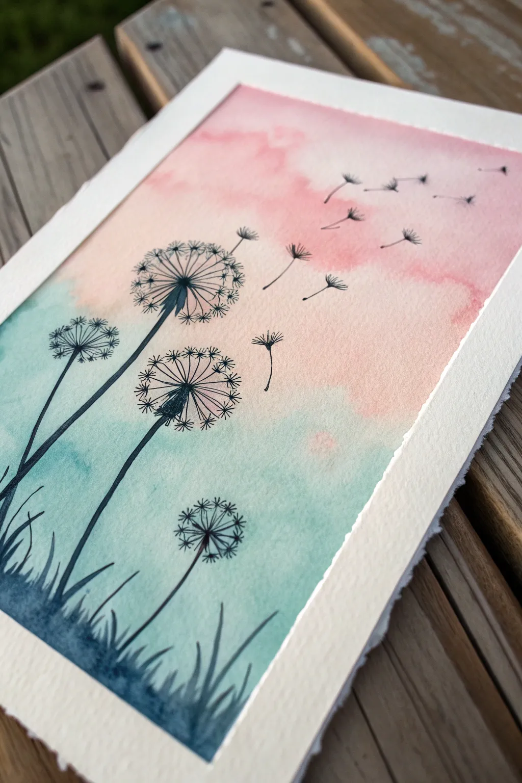
Capture the delicate beauty of dandelions releasing their seeds into a sunset sky with this beginner-friendly project. Combining a simple wet-on-wet wash with precise black ink silhouettes creates a striking contrast that looks impressive but is actually quite simple to achieve.
Step-by-Step Tutorial
Materials
- Cold-pressed watercolor paper (140lb/300gsm)
- Painter’s tape or masking tape
- Watercolor paints (Teal/Turquoise and Pink/Rose Madder)
- Large flat wash brush (3/4 inch)
- Medium round brush (size 6 or 8)
- Black waterproof fine liner pen (size 05 or 08)
- Black waterproof brush pen or fine marker
- Jar of clean water
- Paper towels
Step 1: Creating the Background Wash
-
Prepare the paper:
Tape your watercolor paper down to a board or hard surface on all four sides. This prevents the paper from buckling when it gets wet and creates that crisp white border seen in the final piece. -
Wet the surface:
Using your large flat brush and clean water, apply an even coat of water across the entire paper area inside the tape. You want the paper to be glistening and damp, but not holding puddles. -
Apply the teal:
Load your medium round brush with a watery mix of teal or turquoise paint. Gently dab and sweep this color onto the bottom left section of the paper, letting it bloom upwards diagonally across the page. -
Apply the pink:
While the paper is still wet, clean your brush and pick up a soft pink or rose color. Apply this to the top right section, allowing it to meet the teal in the middle. Where they touch, they will blend softly to create a purplish transition. -
Soften the blend:
If the transition looks too harsh, tilt your board slightly to encourage the wet pigments to travel and interact. You can add a drop of water to tight areas to help the color spread naturally. -
Dry completely:
This is crucial: allow the background to dry 100% before moving on. The paper must be bone-dry and flat. You can use a hair dryer on a low setting if you’re impatient, but air drying is safest.
Tape Tactics
To prevent the tape from ripping your paper upon removal, stick the tape to your clothes or pants first. This removes some tact, making it gentle enough for paper.
Step 2: Drawing the Silhouettes
-
Outline the stems:
Using your black fine liner or brush pen, draw three or four curved lines starting from the bottom left corner, reaching towards the middle. Vary their heights so the composition feels balanced, with the tallest stem nearest the center. -
Add the grass:
At the very bottom left, use quick, upward flicking motions with your pen to create grassy blades. Fill in the bottom-most corner with solid black ink to ground the image. -
Draw the seed heads:
At the top of each stem, draw a small, filled-in oval or cone shape for the base of the flower head. From this center, draw thin, straight radiating lines outward in a circular shape. -
Add the fluff details:
At the end of each radiating line, draw tiny ‘V’ or star shapes to represent the dandelion fluff. Keep these delicate; I find a finer pen works best for these outer details. -
Create floating seeds:
To the right of the main flowers, draw several detached seeds floating away into the pink sky. Draw a tiny line for the stem and a small tuft at the end, angling them as if carried by a breeze. -
Vary the sizes:
Make the floating seeds progressively smaller as they move toward the top right corner to create a sense of distance and movement. -
Strengthen the lines:
Go back over your main stems with a brush pen or slightly thicker marker to give them weight. The stems should be thicker at the bottom and taper slightly as they reach the flower head. -
Final touches:
Add a few tiny stray dots or specks near the flower heads to suggest pollen or loose particles caught in the air. -
Reveal the border:
Once the ink is completely dry to the touch, slowly peel away the painter’s tape at a 45-degree angle. This reveals the crisp, clean white edge that frames your artwork beautifully.
Metallic Magic
For a magical twist, trace over some of the dandelion fluff lines with a silver or white gel pen. It adds a subtle shimmer that catches the light.
Step back and admire the peaceful movement in your new silhouette masterpiece
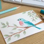
Bird-on-a-Branch Blob Style
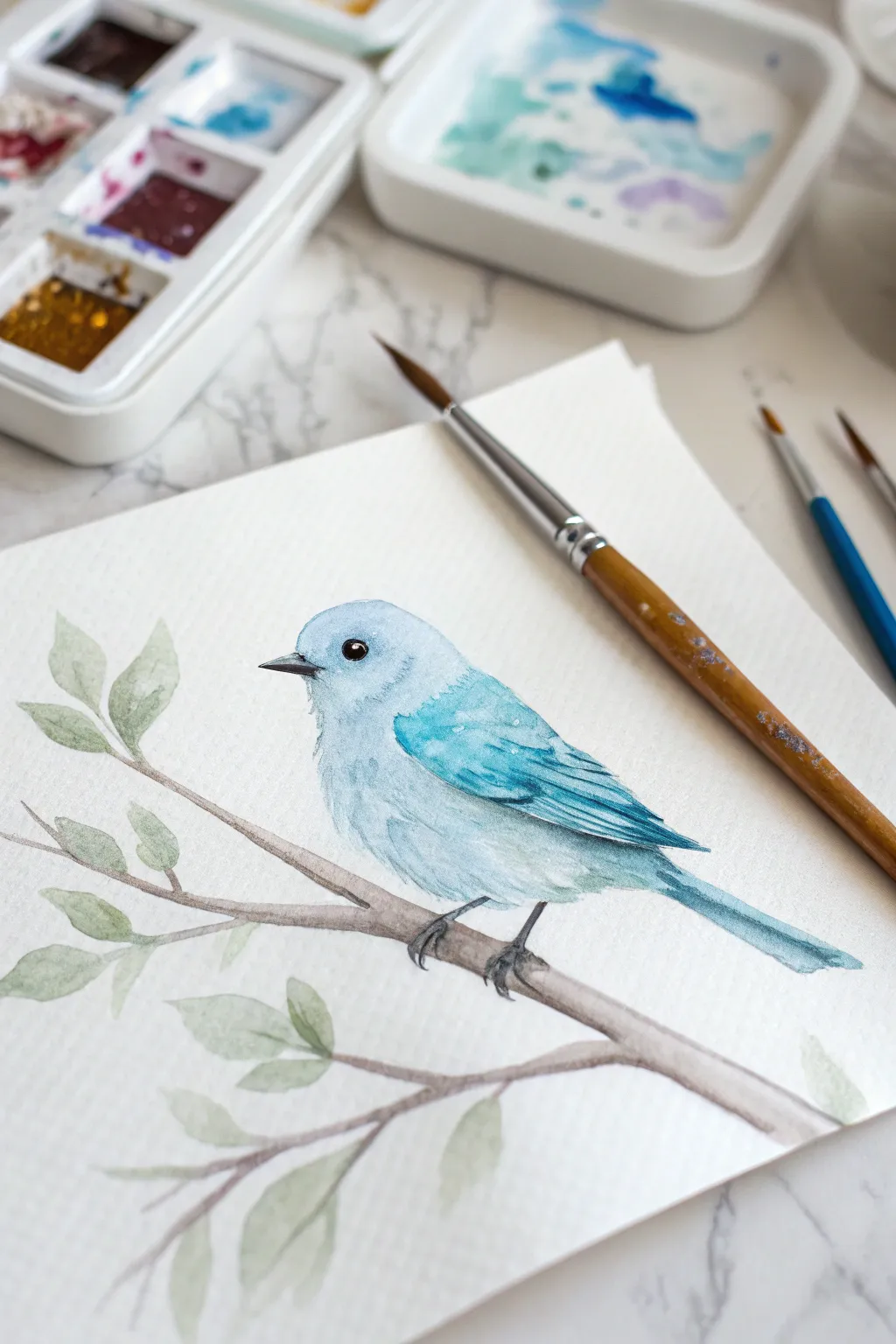
This charming project captures the delicate nature of a small bluebird perched peacefully among new leaves. Using a wet-on-dry technique, you’ll build up soft layers of blue to create a gentle, rounded form that pops against the crisp white paper.
Step-by-Step
Materials
- Cold press watercolor paper (300gsm)
- Round watercolor brushes (sizes 2, 4, and 6)
- Watercolor paints (Cerulean Blue, Ultramarine, Burnt Umber, Sap Green)
- Plastic or ceramic mixing palette
- Two jars of water
- Paper towels
- HB pencil and kneaded eraser
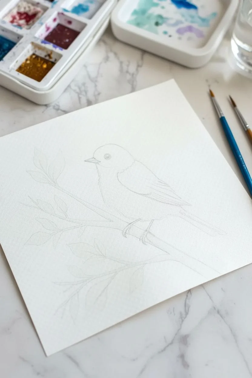
Step 1: Sketching the Framework
-
Basic Shapes:
Start with a light HB pencil sketch. Draw an oval for the bird’s body, tilted slightly upward to the right. Add a smaller circle for the head overlapping the top left of the oval. -
Defining Features:
Connect the head and body with smooth, curved lines to create the neck. Sketch a small, triangular beak pointing left and mark the position of the eye just above the beak line. -
Wing and Tail:
Draw the wing shape folding neatly against the side of the body. Extend a rectangular tail shape downwards from the back of the oval. -
Branch Placement:
Sketch a diagonal branch crossing underneath the bird. Add smaller twig offshoots and simple leaf shapes varying in size along the branch. -
Clean Up:
Gently erase any intersecting lines inside the bird and lighten your sketch with a kneaded eraser so the graphite won’t show through the paint.
Highlight Hack
If you accidentally paint over the white highlight in the eye, don’t panic. Let it dry completely, then use a tiny dot of white gel pen or opaque white gouache to restore the sparkle.
Step 2: Painting the Bird
-
Base Wash:
Mix a very watery puddle of Cerulean Blue. Using a size 6 brush, paint the entire bird shape (except the beak and eye), keeping the wash very pale and even. -
Building Form:
While the first layer is still slightly damp but not soaking, drop a slightly more saturated mix of Cerulean Blue onto the bottom curve of the belly to create a shadow. -
Developing the Wing:
Let the body dry completely. Using a size 4 brush and a mix of Cerulean and Ultramarine, painting the wing area. Use short, downward strokes to suggest feathers. -
Deepening Shadows:
Mix a stronger concentration of Ultramarine. Paint the area just under the wing and the lower edge of the tail to separate the feathers from the body. -
Feather Texture:
Switch to a size 2 brush. With the darker blue mix, add tiny, delicate lines on the wing and tail to suggest individual flight feathers. -
The Eye and Beak:
Mix a dark grey using Burnt Umber and Ultramarine. Carefully paint the eye, leaving a tiny speck of white paper for the highlight. Paint the beak with a diluted version of this grey.
Step 3: The Branch and Leaves
-
Branch Base:
Mix Burnt Umber with plenty of water. Paint the main branch using a size 4 brush, letting the color vary naturally by adding more water in some spots. -
Branch Texture:
Before the branch dries fully, drop in thicker Burnt Umber on the underside of the wood to create roundness and shadow. -
First Leaves:
Mix a pale, watery Sap Green. Paint the larger leaves, pressing down on the belly of the brush and lifting up to create a point. -
Leaf Variation:
For the smaller leaves, I like to mix a tiny bit of Burnt Umber into the green to make an olive tone. Paint these interspersed among the bright green ones. -
Connecting Stems:
Use the tip of your size 2 brush and the brown mix to draw thin stems connecting the leaves to the main branch.
Texture Boost
Sprinkle a tiny pinch of salt onto the wet paint of the bird’s belly or wing. When it dries and you brush the salt away, it creates a bloom texture that looks like fluffy down feathers.
Step 4: Final Details
-
Feet:
Using the dark grey mix and a size 2 brush, paint the tiny claws gripping the branch. Make sure the paint is opaque enough to stand out against the brown wood. -
Body Fluff:
With a damp (not wet) brush, gently soften the edges of the dark blue shadow under the wing to blend it into the paler belly. -
Defining Edges:
If the bird looks too flat, add a very thin, broken line of dark blue along the bottom edge of the belly to separate it from the background.
Allow your painting to dry fully before framing your sweet new friend


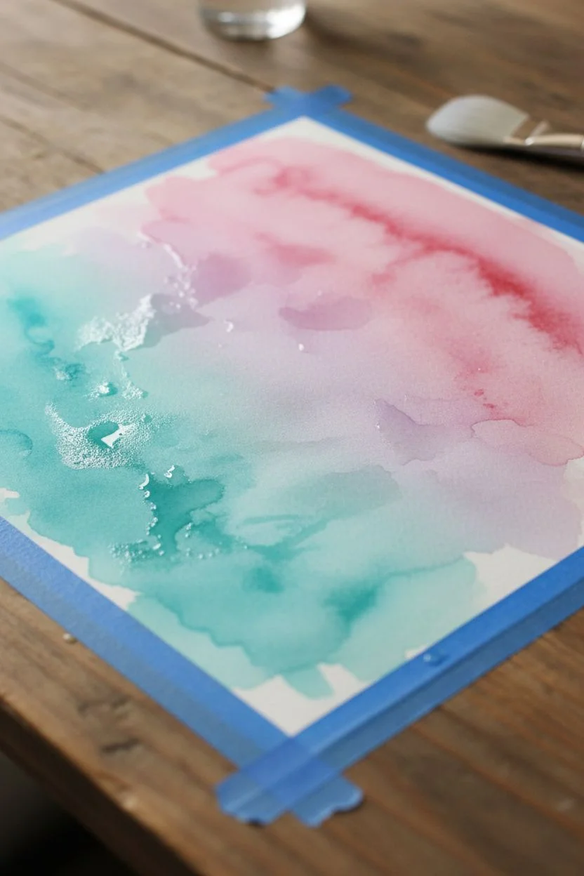
Easy Ocean Waves as a Repeating Pattern
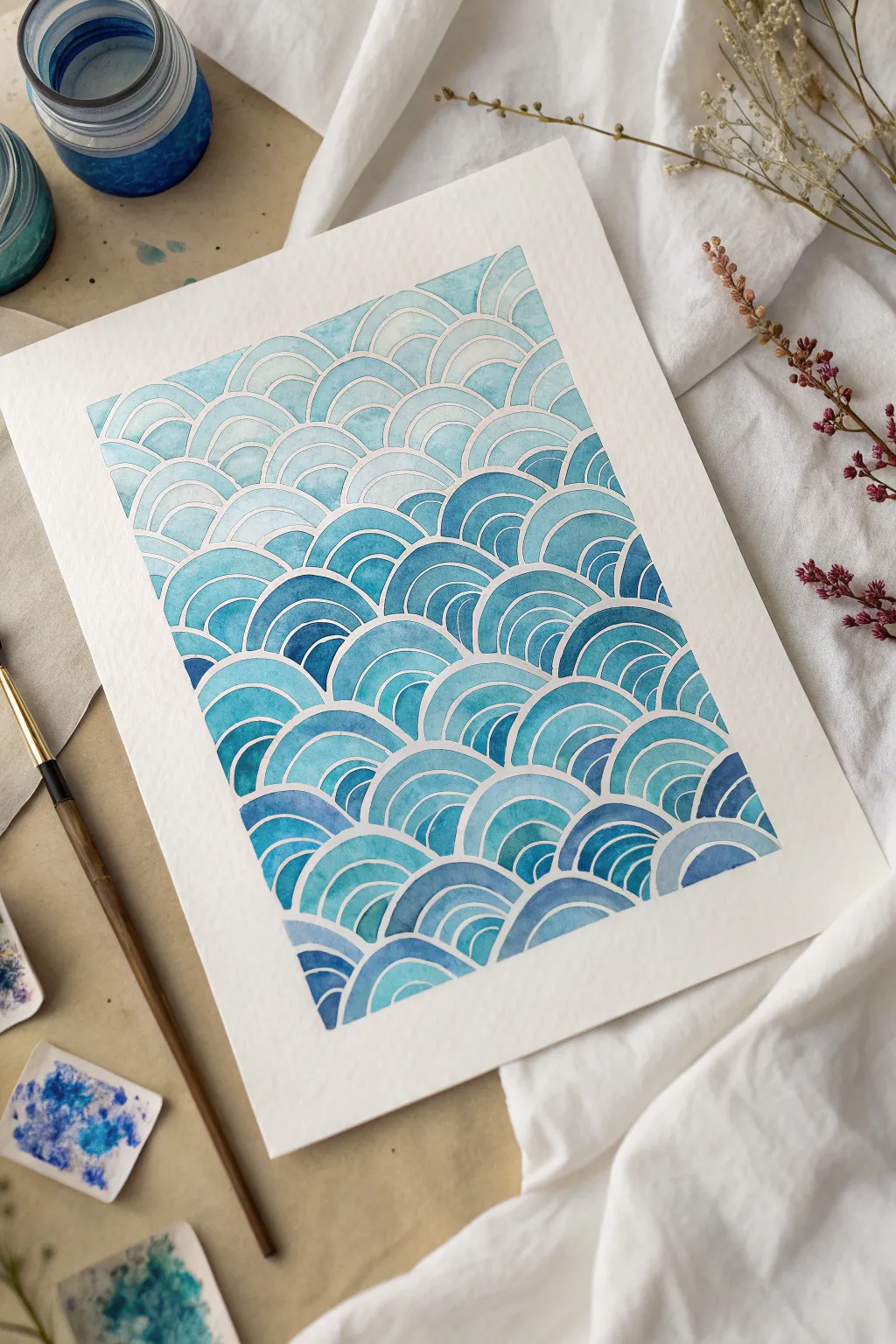
This soothing monochromatic project mimics the traditional Japanese Seigaiha motif, using overlapping concentric arches to create a rhythmic ocean texture. By varying the intensity of indigo and turquoise, you can achieve a beautiful gradient that flows from light to dark across the page.
Step-by-Step Guide
Materials
- Cold press watercolor paper (minimum 140lb/300gsm)
- Masking tape or washi tape
- Compass or circle stencil tool
- HB pencil
- Watercolor paints (Indigo, Prussian Blue, Turquoise)
- Small round brush (size 2 or 4)
- Palette for mixing
- Water jars
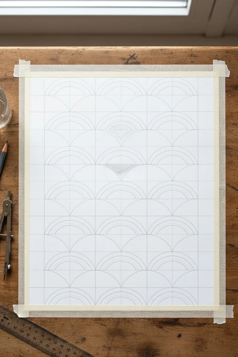
Step 1: Drafting the Pattern
-
Tape the borders:
Begin by taping down all four edges of your watercolor paper with drafting tape or gentle washi tape. This creates a crisp, professional white border around the final painting. -
Mark your grid:
Using a ruler and a light pencil touch, mark horizontal guidelines across your paper. Space them evenly, perhaps 1 inch apart, depending on how large you want your waves. -
Draw the base circles:
Set your compass to a radius that matches your guideline height. Place the compass point on the bottom line and draw a semi-circle. Move the compass point to where that semi-circle ends and draw the next one, creating a scalloped edge. -
Layer the second row:
For the row above, position the center of each new semi-circle directly above the meeting point of the two waves below it. This offset brick-laying pattern is key to the Seigaiha look. -
Complete the intersecting arches:
Continue this alternating process all the way up the page until your grid is filled with rows of overlapping semi-circles. -
Add inner details:
Go back into each semi-circle and draw 2 or 3 smaller concentric arches inside them. Keep these lines very faint so the graphite doesn’t smudge into your paint later.
Step 2: Painting the Gradient
-
Prepare your palette:
Mix three main puddles of blue paint: a very watery, pale wash; a medium-strength tone; and a concentrated, dark indigo. Having these pre-mixed ensures consistency. -
Start at the top:
Load your brush with the palest wash. Begin painting the alternating stripes within the top few rows of waves. Carefully paint around the pencil lines to leave thin strips of white paper visible. -
Alternate the bands:
For added visual interest, don’t paint every single band the same solid color. Leave some bands lighter or slightly vary the hue within the arch to create movement. -
Transition to medium tones:
As you move down the paper (around the one-third mark), start dipping into your medium-strength blue puddle. Blend a little of this into your pale wash to create a seamless transition. -
Mind the negative space:
The most important technique here is steadiness. Use the tip of your round brush to carve out those white boundaries; these unpainted lines define the structure of the waves. -
Introduce darker hues:
When you reach the bottom third of the paper, switch to your darkest indigo mix. I find that testing the color on a scrap piece of paper first helps ensure it’s dark enough to anchor the composition. -
Fill the bottom waves:
Apply the darkest blue to the base waves. The contrast between these deep tones and the delicate white lines should be striking. -
Dry thoroughly:
Let the painting sit until completely bone dry. If the paper is cool to the touch, it is still damp. -
Erase guidelines:
Once dry, gently use a kneaded eraser to lift any visible pencil lines from the white negative spaces. -
Remove the tape:
Peel your tape away slowly at a 45-degree angle to reveal the crisp edges.
Pro Tip: Masking Fluid
Struggling with steady hands? Use a ruling pen to apply masking fluid over your pencil lines before painting. Rub it off at the end for perfect whites.
Level Up: Metallic Accents
Once the blue paint is dry, paint one specific band in every third wave with metallic gold watercolor for a shimmering, high-end finish.
Step back and admire the calm rhythm of your hand-painted ocean pattern
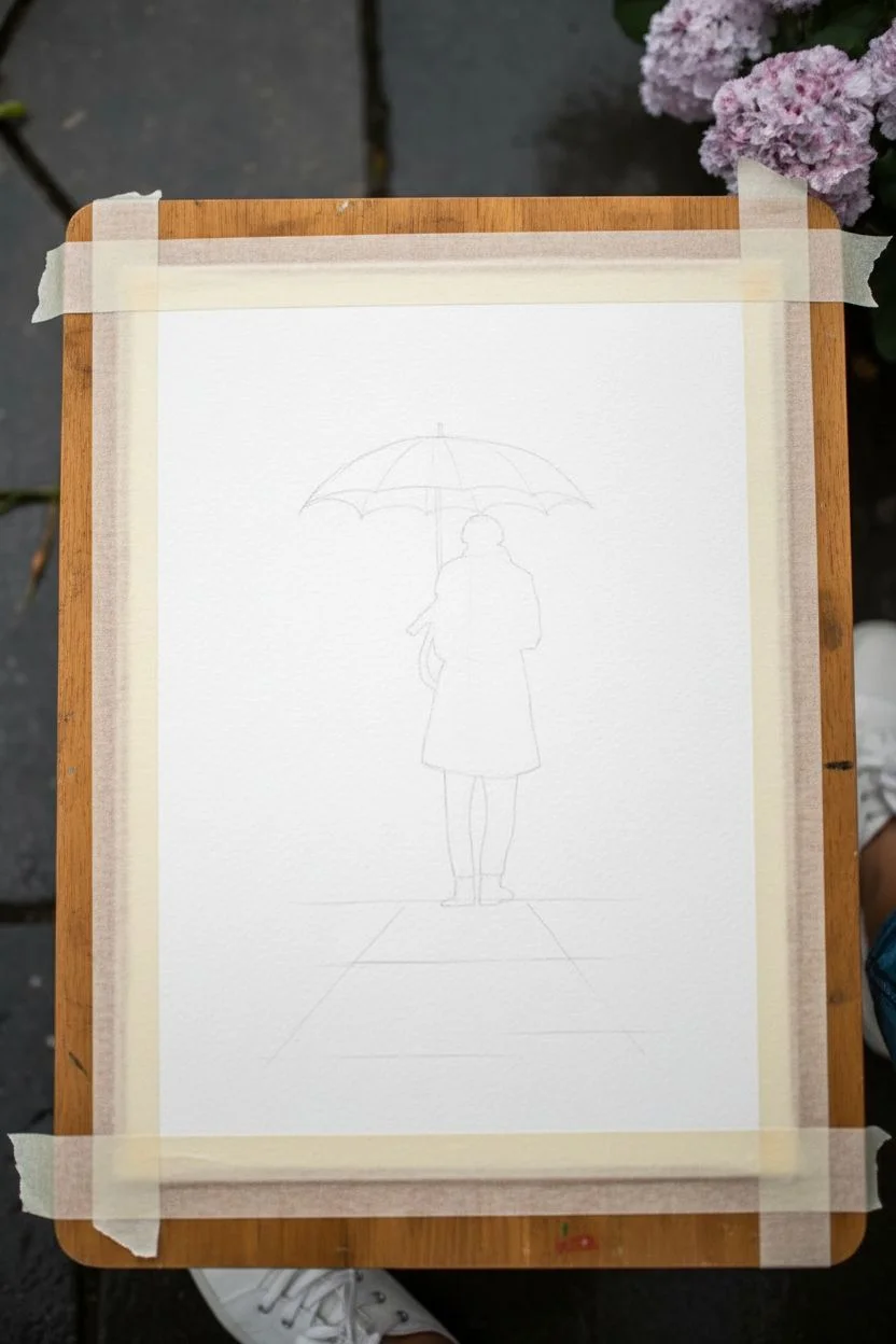
Minimalist Person With an Umbrella Silhouette
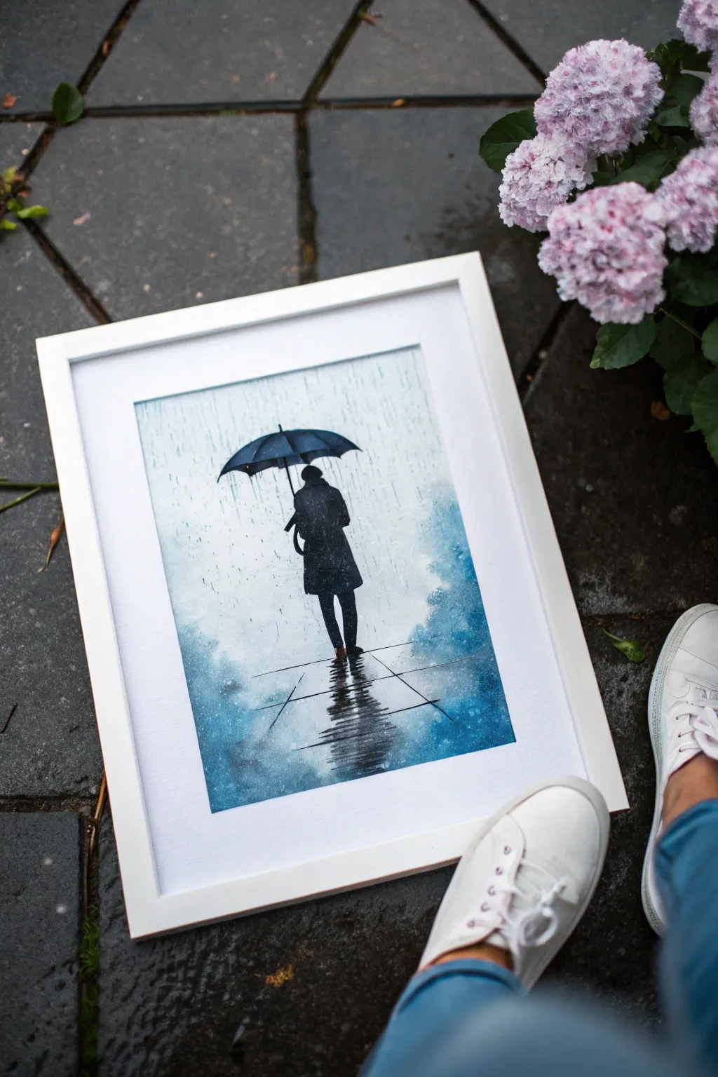
Capture the moody beauty of a rainy walk with this atmospheric watercolor silhouette. Using a limited palette of deep indigos and blacks, you’ll create a striking contrast between the lonely figure and the soft, diffused rain.
How-To Guide
Materials
- Watercolor paper (cold press, 300 gsm)
- Pencil (HB for light sketching)
- Masking tape
- Watercolor paints: Indigo, Payne’s Grey, Lamp Black, and a touch of Cerulean Blue
- Round brushes (sizes 4, 8, and 12)
- Fine liner brush or white gouache/gel pen (optional for details)
- Paper towels
- Two jars of water
- Ruler
Step 1: Preparation and Sketching
-
Surface Prep:
Begin by taping down all four edges of your watercolor paper to a board. This prevents warping and creates that crisp white border seen in the final piece. -
Pencil Outline:
Lightly sketch the central figure. Start with the umbrella shape—a shallow arc—and draw the standing figure underneath. Keep the lines very faint so they don’t show through the final paint. -
Ground Lines:
Use a ruler to lightly pencil in the perspective lines for the pavement stones. These should angle inward slightly to create depth, leading the eye toward the figure.
Step 2: Painting the Atmosphere
-
Wet-on-Wet Background:
Pre-wet the entire paper surface with clean water, avoiding the silhouette of the person and umbrella if you want to keep them dry for now, though painting over them is fine too since the silhouette will be dark. -
First Wash:
Load a size 12 brush with a very watery mix of Cerulean Blue and a touch of Indigo. Apply vertical strokes from the top down to suggest falling rain, letting the colors bleed softly. -
Deepening the Edges:
While the paper is still damp, drop clearer, stronger Indigo into the bottom corners and sides to create a vignette effect. This draws focus to the bright center. -
Creating Texture:
I like to splatter clean water droplets onto the semi-dry paint at this stage. This creates ‘blooms’ that look like mist or heavy rain hitting the lens. -
Dry Time:
Let this background layer dry completely. The paper should be flat and cool to the touch, not damp, before proceeding.
Pro Mist Tip
For a misty look, lift some color near the figure’s feet with a clean, damp tissue while the wash is still wet. This creates ‘steam’ rising from the pavement.
Step 3: The Silhouette & Reflections
-
Painting the Umbrella:
Mix a concentrated Payne’s Grey or Lamp Black. Using a size 8 brush, carefully fill in the umbrella shape. Keep the top edge crisp, but you can leave the bottom edge slightly soft. -
The Coat:
Continue painting the figure’s coat. Use vertical strokes to mimic the heavy fabric drape. If the paint pools slightly, it adds to the texture. -
Legs and Shoes:
Switch to a size 4 brush for the legs. Paint them darker at the top and let the ankles be slightly more defined. Ground the figure with small, dark shapes for shoes. -
Ground Reflections:
Immediately beneath the shoes, drag the dark paint downward using a damp brush. Use horizontal zigzag motions to break up the reflection, mimicking ripples on wet pavement. -
Pavement Details:
Using a liner brush and dilute Indigo, re-trace the perspective lines of the tiles you sketched earlier. Keep these lines broken and uneven to suggest water pooling on the ground.
Fixing Hard Edges
If your background dries with unwanted hard lines, gently scrub the edge with a damp stiff brush to soften it back into the atmosphere.
Step 4: Rain Effects
-
Vertical Rain Streaks:
Take a dry brush with a tiny amount of Indigo paint. lightly drag it vertically down the background to create discernable rain streaks. -
White Highlights:
If you want the rain to sparkle, use a tiny amount of white gouache or a white gel pen to add a few sharp vertical lines or dots on the dark silhouette, suggesting rain hitting the coat. -
Final Splatter:
Load a brush with watery blue paint and tap it against another brush handle over the painting. This creates random droplets that harmonize the whole scene. -
The Reveal:
Once absolutely everything is bone dry, carefully peel away the masking tape at a 45-degree angle to reveal your clean edges.
Frame your moody masterpiece in a simple white frame to let the deep blues really pop
Cute Cactus in a Tiny Pot
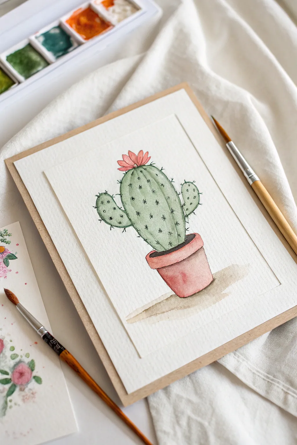
This charming illustration combines soft watercolor washes with crisp ink details to bring a cheerful cactus to life. The juxtaposition of the loose, organic paint and the defined pen lines makes it an approachable and rewarding project for any skill level.
Step-by-Step Tutorial
Materials
- Cold-press watercolor paper (300 gsm)
- Pencil (HB) and soft eraser
- Watercolor paints (Sap Green, Olive Green, Burnt Sienna, Alizarin Crimson, Light Red/Terracotta)
- Round brushes (size 4 and 8)
- Fine liner pen (black, waterproof, approx. 0.3mm)
- Jar of clean water
- Paper towels
Step 1: Sketching the Shape
-
Draw the pot first:
Begin near the bottom third of your paper. Sketch a slightly tapered cylinder for the pot base. Add a wider, rounded rim at the top of the pot to give it dimension. -
Add the main cactus body:
Draw the central cactus stem rising out of the pot. It should be an elongated oval shape, slightly wider at the top than near the soil line. -
Attach the arms:
Sketch two smaller oval shapes protruding from the sides of the main body. Place one slightly higher than the other to create natural asymmetry. -
Crown it with a bloom:
At the very top of the central stem, sketch a small cluster of pointed petals to represent the flower. -
Clean up lines:
Gently erase your pencil lines so they are barely visible, just enough to guide your painting without showing through the translucent watercolor.
Bleeding edges?
If your green cactus paint is bleeding into the pink pot, you didn’t wait long enough! Use a hairdryer on the cool setting between color zones to speed up the process.
Step 2: Painting the Cactus
-
Base green wash:
Mix a watery Sap Green. Fill in the main cactus body and the arms. Don’t worry about perfect coverage; a little variation in water amount adds texture. -
Add shadow depth:
While the green is still damp (wet-on-wet), touch a slightly darker Olive Green mix to the bottom edges of the arms and the main body to suggest roundness. -
Paint the flower:
Clean your brush and pick up a diluted Alizarin Crimson or pink. Carefully fill in the flower petals, keeping the color light and fresh. -
Let it dry completely:
Before moving to the pot, essential patience is required. Let the green and pink sections dry fully so colors don’t bleed into the pot area.
Make it bloom
Change the flower color to a bright yellow or orange to customize your cactus, or paint a second smaller baby cactus in a blue pot next to this one.
Step 3: Pot and Shadows
-
Paint the pot rim:
Mix Burnt Sienna with a touch of Light Red for a terracotta hue. Paint the rim of the pot first. -
Fill the pot base:
Using the same terracotta mix, fill the rest of the pot. I often add a tiny bit more pigment to the right side to indicate shadow. -
Create the cast shadow:
Mix a very watery grey-brown wash. Paint a loose, angled shadow shape extending from the base of the pot to the right side to ground the object. -
Darken the soil area:
Add a dark brown or grey strip right where the cactus meets the pot rim to represent the soil and shadow inside the pot.
Step 4: Inking the Details
-
Outline the silhouette:
Once the paper is bone dry, take your waterproof fine liner. Trace the outer edges of the cactus and pot. Keep your grip loose for a wiggly, organic line quality. -
Draw vertical ribs:
Draw faint vertical lines down the cactus body and arms to suggest ridges. These lines don’t need to be solid; broken lines look more natural. -
Add the spines:
Along the vertical rib lines, make small ‘stars’ or clusters of 2-3 tiny dashes to create the prickly spines. -
Add rim definition:
Outline the top and bottom of the pot’s rim, and add a small curved line inside the rim to show the opening where the cactus sits. -
Final touches:
Add a few stray dots or tiny lines on the cactus skin for added texture and detail.
Now you have a prickly little friend that never needs watering
Watermelon Slice With Juicy Wet-on-Wet Reds
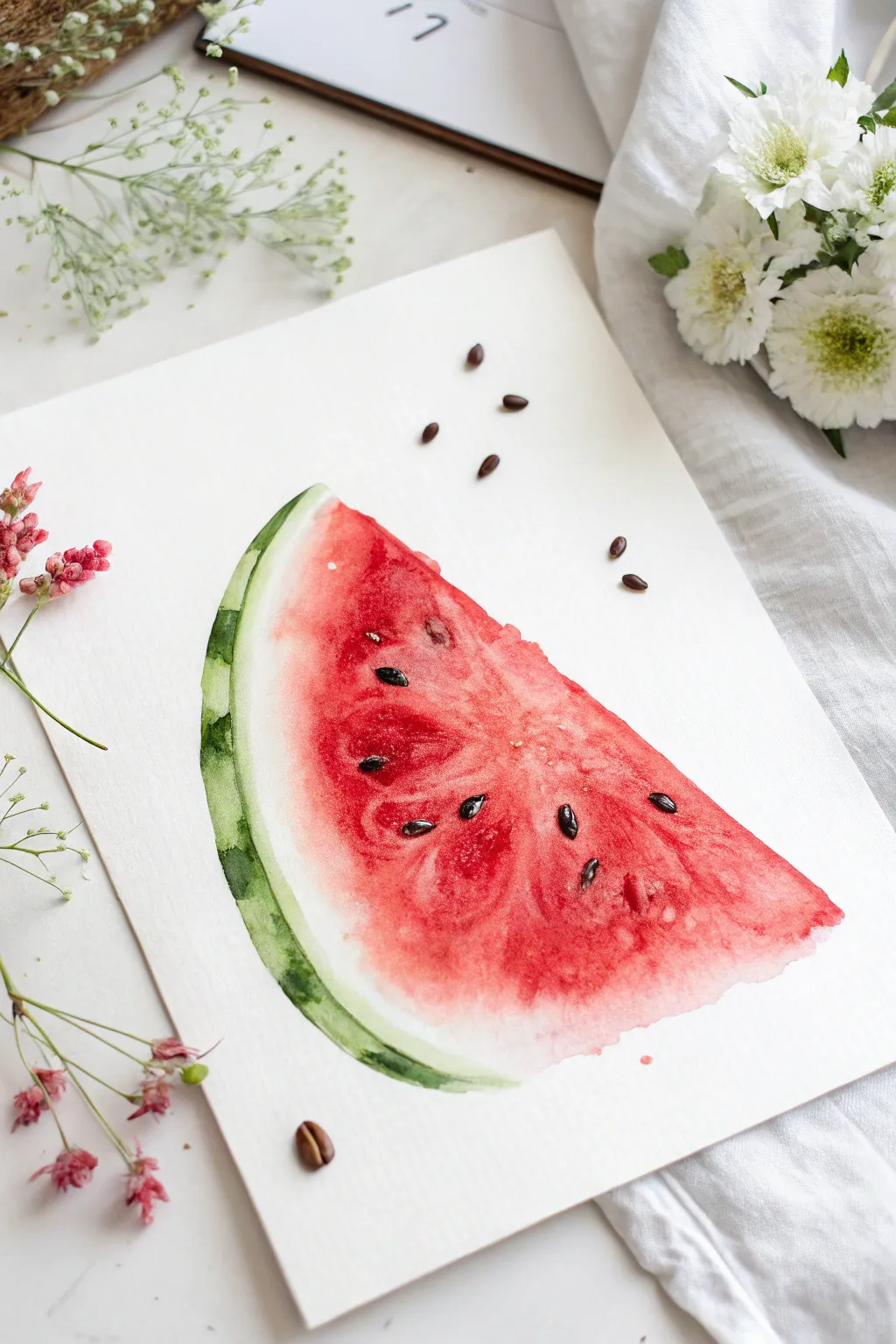
Capture the refreshing sweetness of summer with this vibrant watermelon watercolor lesson. The focus is on letting pigment flow naturally to create juicy textures and soft gradients within the fruit’s flesh.
Detailed Instructions
Materials
- Cold-pressed watercolor paper (300 gsm)
- Round watercolor brush (size 6 or 8)
- Small detail brush (size 2)
- Watercolor paints: Alizarin Crimson or Cadmium Red, Sap Green, Viridian Green, Lamp Black
- Pencil and eraser
- Clean water jar
- Paper towels
- Optional: Real coffee beans (for styling)
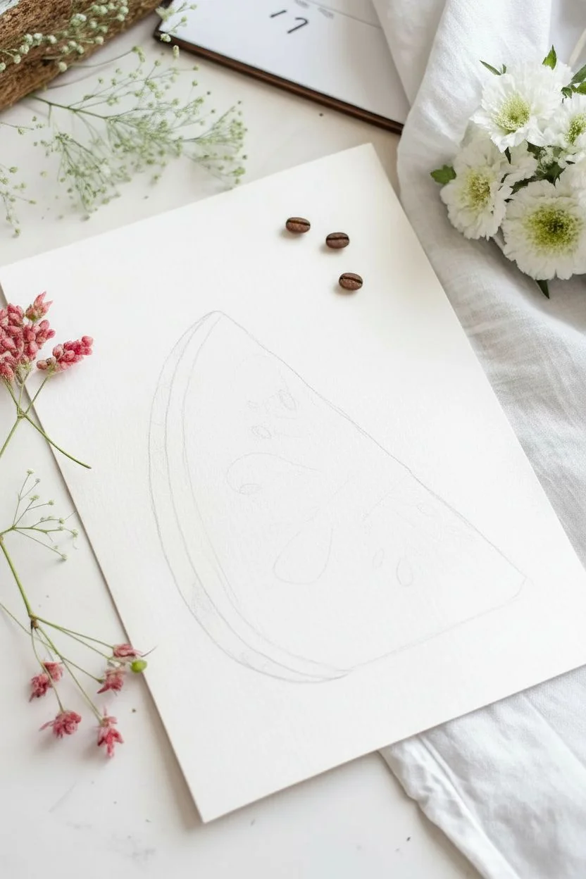
Step 1: Sketching and Preparation
-
Outline the Shape:
Begin by lightly sketching a simple triangle shape with a curved bottom edge to form the classic watermelon wedge. -
Define the Rind:
Draw an inner curved line parallel to the outer peel, leaving about a half-inch gap to designate the white rind and the green skin. -
Clean Up Lines:
Keep your pencil marks extremely faint, as they will show through the transparent paint; erase any unnecessary heavy lines now.
Bleeding Control
If red paint rushes into your white rind area, quickly dab it up with a twisted corner of a clean paper towel to restore the white gap.
Step 2: Painting the Fruit Flesh
-
Wet the Red Area:
Using your larger round brush and clean water, create a glaze over the triangular ‘flesh’ part of the melon, stopping just before you hit the pencil line for the rind. -
Check the Sheen:
Tilt your paper to the light; the surface should gleam evenly without holding large puddles of water. -
Drop in Color:
Load your brush with a saturated mix of Alizarin Crimson or Cadmium Red and lightly touch it to the wet paper, starting near the top point of the wedge. -
Let the Paint Bloom:
Allow the red pigment to spread naturally into the wet surface; encourage it to flow downward but leave some irregular lighter patches for texture. -
Deepen the Intensity:
While the paper is still damp, drop in more concentrated red near the center to create that rich, juicy look, keeping the edges slightly lighter. -
Soften the Inner Edge:
I like to use a clean, slightly damp brush to feather out the red edge where it meets the future white rind, ensuring a soft, blurry transition rather than a hard line.
Pro Tip: Salt Texture
Sprinkle a few grains of table salt onto the wet red paint. As it dries, it pulls pigment away, creating a perfect crystalline fruit texture.
Step 3: Painting the Rind
-
First Green Layer:
Once the red section is barely damp (not fully dry, but not sopping), paint a pale stripe of Sap Green along the very bottom curve. -
Leave the White Gap:
Be incredibly careful to leave a thin strip of unpainted white paper between the red flesh and the new green stroke. -
Add Texture:
While the green stripe is wet, drop in touches of darker Viridian Green in small vertical dashes to mimic watermelon stripes. -
Blend Slightly:
Allow the dark green to bleed slightly into the lighter green, but keep the outer edge crisp.
Step 4: Details & Seeds
-
Wait for Full Dryness:
This is crucial—let the painting dry completely before adding seeds, otherwise they will blur into gray blobs. -
Paint the Seeds:
Switch to your small detail brush and load it with thick Black paint (creamy consistency). -
Vary Seed Placement:
Paint small teardrop shapes scattered randomly; place some near the surface and some deeper in the red area. -
Add Highlights:
Leave tiny pinpoint specks of white paper inside a few of the black seeds to make them look shiny and wet. -
Scattered Seeds:
Paint a few loose seeds ‘floating’ outside the watermelon slice on the white background to add movement and whimsy to the layout. -
Styling Touch:
For a fun artistic photo finish, you can arrange real coffee beans or actual watermelon seeds around the paper to echo the painted shapes.
Now you have a refreshing slice of summer art ready to frame
Hot Air Balloons With Easy Stripes and Dots

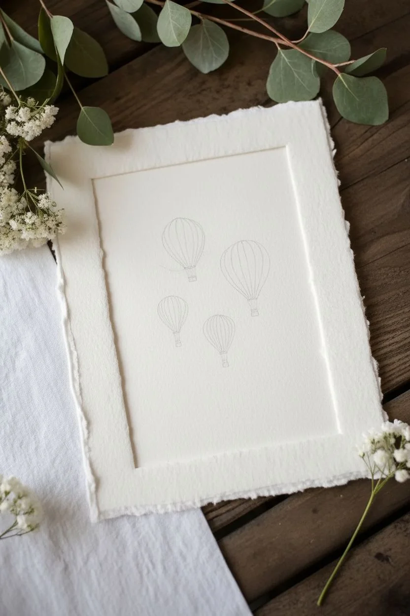
Capture the whimsy of flight with these charming hot air balloons, drifting gently against a soft watercolor sky. This beginner-friendly project uses simple stripes, dots, and a loose wash to create an artwork that feels both adventurous and serene.
Step-by-Step
Materials
- Cold press watercolor paper (deckled edge optional)
- Small round watercolor brush (size 2 or 4)
- Medium round watercolor brush (size 6 or 8)
- Watercolor paints (Alizarin Crimson, Burnt Sienna, Payne’s Gray, Cerulean Blue, Viridian Green)
- Pencil (HB or H)
- Kneaded eraser
- Clean water and paper towels
- Fine liner pen (brown or sepia, waterproof) – optional
Step 1: Sketching the Flight Path
-
Outline the balloon shapes:
Start by lightly sketching four balloon shapes onto your paper. Vary their sizes and positions to create a natural, floating composition. Draw an inverted teardrop shape for the main balloon body. -
Add baskets and ropes:
At the bottom of each teardrop, draw a small rectangle for the basket. Connect the basket to the balloon with tiny, delicate lines representing the ropes. -
Segment the balloons:
Draw curved vertical lines following the contour of the balloon shape. These lines will create the segments for your stripes later. Don’t press too hard; you want the pencil lines to be barely visible.
Uneven Stripes?
Don’t panic! Wobbly lines add handmade charm. If a stripe bleeds, lift the excess paint immediately with the corner of a clean paper towel.
Step 2: Painting the Sky
-
Prepare a sky wash:
Mix a very watery puddle of Cerulean Blue with a touch of Payne’s Gray to mute it slightly. You want a pale, airy blue. -
Apply the background wash:
Using your larger brush, paint around the balloons to create the sky. Don’t worry about filling the entire page; leave the edges rough and irregular for a vignette effect. -
Soften the edges:
While the paint is still wet, dip your brush in clean water and gently blur the outer edges of the blue wash so the sky fades naturally into the white of the paper. -
Let it dry completely:
Wait until the sky is bone dry before moving on to the balloons. If the paper is cool to the touch, it’s still damp.
Step 3: Adding Color and Pattern
-
Paint the red stripes:
Mix Alizarin Crimson with a tiny bit of Burnt Sienna for a vintage red. Use your small brush to fill in alternating segments on the largest balloon and the medium-sized one on the right. -
Add texture to the red:
While painting the red stripes on the largest balloon, leave tiny white gaps or lift a little pigment with a thirsty brush to create a mottled, vintage texture. -
Paint the teal balloon:
Mix Viridian Green with a touch of Payne’s Gray and plenty of water for a soft teal. Paint the stripes on the small balloon to the left. -
Paint the coral balloon:
Dilute your red mixture significantly with water until it becomes a soft coral or salmon pink. Use this for the smallest bottom balloon. -
Detail the baskets:
Use a thicker mix of Burnt Sienna to carefully paint the small rectangular baskets. A single dab of the brush is usually enough for these tiny details.
Vintage Finish
Tear the edges of your finished painting against a ruler to create a faux ‘deckled’ edge look, then mount it on a slightly larger piece of textured cardstock.
Step 4: Refining Details
-
Outline the segments:
Once the paint is dry, define the balloon segments. You can use a very fine brush with a dark sepia mix, or a waterproof brown fineliner pen for crispness. -
Cross-hatch the baskets:
Add tiny cross-hatching marks or vertical lines to the baskets to simulate a woven wicker texture. -
Connect the ropes:
Draw very fine lines connecting the basket corners to the balloon base. Keep your hand loose so the lines don’t look stiff. -
Add whimsical dots:
On the largest top balloon, use a thicker red paint mix to add small dots over the lighter striped areas for extra pattern interest. -
Final erase:
Once absolutely everything is dry, gently use your kneaded eraser to pick up any remaining pencil graphic lines that show through the lighter areas.
Step back and admire your airy fleet of balloons ready for their journey
Galaxy Wash With Simple Star Splatter

Capture the magic of deep space with this atmospheric watercolor project. By blending rich indigo and violet hues on wet paper, you will create a soft, nebulous background that sets the stage for a scattering of bright, distant stars.
How-To Guide
Materials
- Cold Press Watercolor Paper (140lb/300gsm)
- Painter’s Tape or Masking Tape
- Watercolors (Indigo, Prussian Blue, Violet/Purple, Magenta)
- White Gouache or White Acrylic Ink
- Large Flat Wash Brush
- Medium Round Brush (Size 6-8)
- Small Round Brush (Size 0 or 1)
- Old Toothbrush
- Two Jars of Water
- Paper Towels
Step 1: Preparing the Surface
-
Tape It Down:
Secure your watercolor paper to a solid board or table using painter’s tape along all four edges. This creates that crisp white border seen in the example and prevents the paper from buckling heavily. -
Wet on Wet Base:
Using your large flat wash brush, coat the entire paper surface with clean water. You want the paper to be shiny and damp, but not so soaked that puddles form.
Step 2: Creating the Galaxy Wash
-
Lay the Lighter Colors:
Immediately drop in patches of magenta and violet paint while the paper is wet. Focus these lighter colors diagonally across the center to form the glowing nebula cloud. -
Introduce Deep Blues:
Load your medium round brush with Prussian Blue and Indigo. Paint around the edges of your purple nebula, letting the colors bleed naturally into each other. -
Darken the Corners:
To create depth, use highly concentrated Indigo (less water, more pigment) in the four corners of the painting. This vignette effect draws the eye toward the colorful center. -
Blend Softly:
If the transitions look too harsh, clean your brush, dry it slightly on a towel, and gently feather the edges where the blue meets the purple. -
Check Contrast:
Watercolors dry significantly lighter than they look when wet. If the colors seem pale, dab in more concentrated pigment while everything is still damp to ensure a rich, dark night sky. -
Let It Dry Completely:
This is crucial: allow the background wash to dry 100%. If you rush this step, your stars will blur into fuzzy blobs rather than crisp points of light.
Keep it Clean
Cover the area around your painting with scrap paper or newspaper before doing the toothbrush splatter step to protect your table from flying white paint dots.
Step 3: Adding the Stars
-
Prepare White Pigment:
Mix a small amount of white gouache or acrylic ink with a tiny drop of water. You need a creamy consistency—thick enough to be opaque, but thin enough to splatter. -
The Splatter Technique:
Dip an old toothbrush into your white mixture. Hold it over the painting and run your thumb across the bristles to flick a fine mist of tiny stars across the ‘sky’. -
Larger Stars:
Switch to your smallest round brush (size 0 or 1). Dip it in the white paint and gently tap the handle against another brush over the paper to create slightly larger, random star clusters. -
Hand-Painted Details:
Use the tip of your small brush to manually dot a few specific bright stars in excessive empty spaces, varying their sizes for realism. -
Adding Twinkles:
Select 3 or 4 of your largest white dots. Using the very tip of your small brush, carefully drag paint outward from the center in a cross shape to create a ‘twinkling’ starburst effect.
Go Metallic
For a magical shimmer, mix a little iridescent medium into your purple paint or use metallic silver watercolor for the larger twinkling stars.
Step 4: Finishing Touches
-
Final Drying:
Let the white star splatter dry completely to avoid smearing. -
The Reveal:
Slowly peel away the painter’s tape relative to the paper surface (pulling away at a 45-degree angle) to reveal those crisp, clean edges that frame your galaxy.
Step back and admire your personal window into the universe, complete with a stunning nebulous glow
Abstract Geometric Shapes With Clean Edges
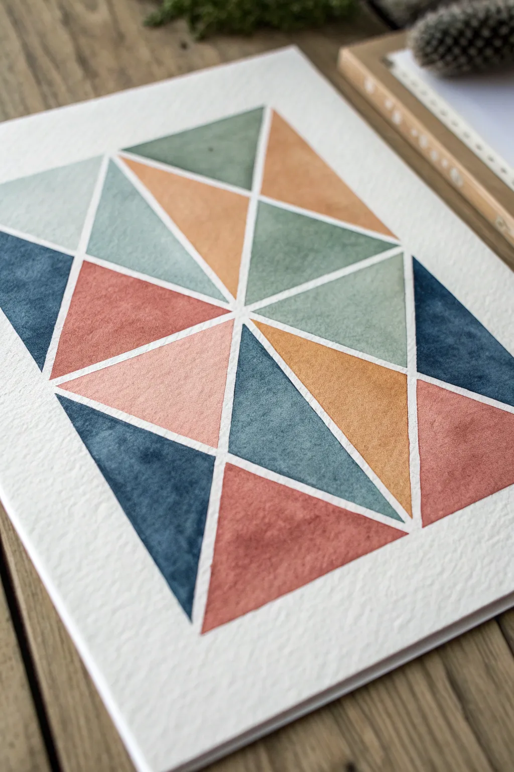
This project creates a striking modern look by combining soft watercolor textures with rigid geometric lines. The beauty lies in the crisp negative space between the shapes, which makes the muted earth tones pop off the textured paper.
Detailed Instructions
Materials
- Cold press watercolor paper (300 gsm/140 lb)
- Painter’s tape or washi tape
- Ruler
- Pencil (HB or lighter)
- Watercolor paints (Indigo, Burnt Sienna, Terra Cotta, Sage Green)
- Medium round brush (size 6 or 8)
- Small round brush (size 2 or 4)
- Palette for mixing
- Jar of clean water
- Paper towels
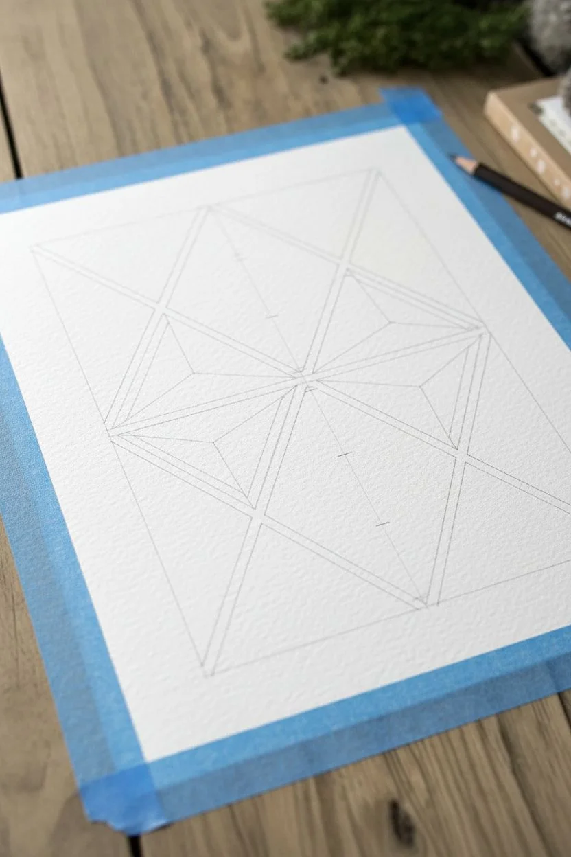
Step 1: Drafting the Design
-
Tape the edges:
Begin by securing your watercolor paper to your table or a drawing board using painter’s tape on all four sides. This creates a clean white border and prevents buckling. -
Draw a central vertical line:
Using your ruler and pencil, lightly draw a vertical line straight down the center of your paper. Keep the pressure very light so the graphite doesn’t smudge later. -
Mark horizontal divisions:
Measure and mark three or four evenly spaced points along that central vertical line. These will serve as the meeting points for your triangle vertices. -
Sketch the triangles:
Connect the central points to the edges of your taped border using diagonal lines. Create a zigzag pattern where triangles alternate pointing left and right from the center line. -
Subdivide larger shapes:
Within those main triangles, draw smaller intersecting lines to break them into smaller geometric shards. Aim for a mix of large and medium triangles. -
Refine the gaps:
This is crucial: Go back over your pencil lines and specific ‘gutters’ or channels between the shapes. You aren’t just drawing single lines; you are drawing the empty space. Draw double lines about 2-3mm apart where the white space will be.
Step 2: Planning the Palette
-
Mix your base colors:
Prepare four distinct puddles of paint on your palette. You’ll need a deep indigo blue, a dusty sage green, a warm terra cotta (reddish-brown), and a golden ochre or light brown. -
Test transparency:
Test your colors on a scrap piece of paper. You want them to be rich enough to show color but watery enough to allow the paper’s texture to show through. Add more water if they look too opaque. -
Plan color placement:
Lightly mark which color goes where with a tiny dot of pencil inside each shape. Try to ensure no two shapes of the same color touch each other directly for better visual balance.
Use masking fluid
For perfectly crisp white lines without stress, paint liquid frisket (masking fluid) over your ‘gutter’ lines before you start. Rub it off after painting!
Step 3: Painting the Shapes
-
Start with the blues:
Load your medium brush with the indigo mix. Fill in the triangles marked for blue. Be extremely careful near the ‘gutter’ lines—do not paint over the pencil boundary. -
Work in non-adjacent sections:
While the blue is wet, move to a section of the paper far away from the wet paint. Avoid painting a shape right next to a wet one, or the colors might bleed across your white gap. -
Apply the warm tones:
Switch to your terra cotta mix. Fill in the reddish-brown triangles, using the small brush for tight corners and the medium brush for the centers. -
Paint the earthy yellows:
Clean your brush thoroughly and pick up the ochre/golden brown shade. Paint these shapes, letting the water pool slightly to create that characteristic watercolor texture as it dries. -
Add the sage green:
Finally, fill in the remaining shapes with the sage green mix. I find using a size 4 brush here helps keep the points of the triangles sharp.
Add metallic accents
Once the painting is dry, use a gold gel pen or metallic watercolor to trace thin lines inside the white channels for a glamorous, inlaid look.
Step 4: Finishing Touches
-
Let it dry completely:
Allow the painting to dry undisturbed for at least 30 minutes. The paper should feel room temperature to the touch, not cool. -
Erase pencil lines:
Once bone dry, take a kneaded eraser and very gently lift the pencil lines remaining in the white gaps. Rub gently so you don’t disturb the paper texture. -
Peel the tape:
Slowly peel the painter’s tape away from the paper at a 45-degree angle to reveal your clean outer border.
Hang your geometric artwork in a simple frame to highlight those satisfying clean lines
Salt Texture Night Sky Experiment
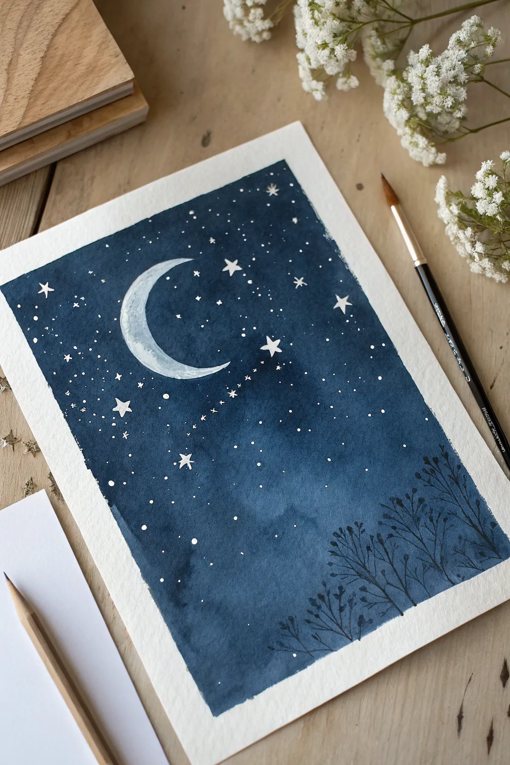
This serene night sky project explores the beauty of deep indigo washes and delicate celestial details. You’ll learn how to create a glowing crescent moon surrounded by twinkling stars and gentle plant silhouettes, perfect for capturing a peaceful evening mood.
Step-by-Step
Materials
- Cold press watercolor paper (300 gsm recommended)
- Painter’s tape or masking tape
- Indigo and Payne’s Gray watercolor paint
- White gouache or a white gel pen
- Masking fluid (optional)
- Small round brush (size 2 or 4)
- Medium round wash brush (size 8 or 10)
- Fine liner brush (size 0/00)
- Paper towels and two jars of water
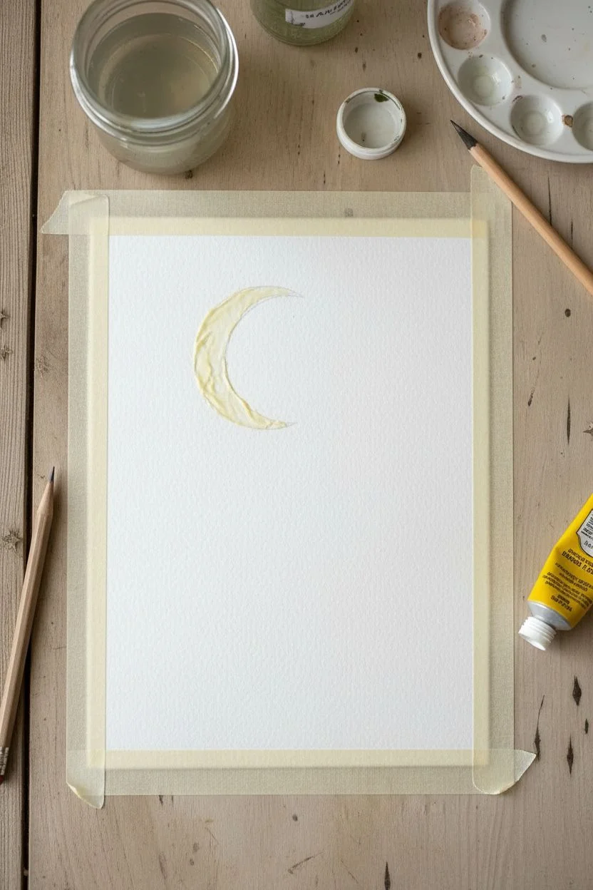
Step 1: Preparation and The Moon
-
Tape your borders:
Begin by taping down all four edges of your watercolor paper to a board. This ensures a crisp white border and prevents the paper from buckling under heavy washes. -
Sketch the crescent:
Lightly sketch the outline of a crescent moon in the upper left quadrant. Keep your pencil pressure very light so the graphite doesn’t show through later. -
Protect the moon:
Apply a thin layer of masking fluid over your moon sketch to preserve the white paper. If you don’t have masking fluid, you can carefully paint around this shape later, though masking fluid makes the wash much easier. -
Let it dry completely:
Wait until the masking fluid is fully dry and tacky to the touch before proceeding. Painting over wet fluid will ruin your brush and the paper.
Step 2: Creating the Night Sky
-
Prepare your wash:
Mix a generous amount of Indigo paint with a touch of Payne’s Gray. You want a very saturated, dark mixture to achieve that deep night sky look. -
Wet-on-wet technique:
Using clean water and your larger brush, wet the entire paper surface (go right over the masked moon). The paper should be glistening but not forming puddles. -
Apply the dark wash:
Drop your dark blue mixture onto the wet paper, starting from the top and working your way down. Allow the color to flow and bloom. -
Create a gradient:
As you move toward the bottom, slightly dilute your mix with water or lift a little pigment with a thirsty brush to make the horizon area slightly lighter than the top zenith. -
Add salt texture (optional):
While the wash is still wet/damp, you can sprinkle a tiny pinch of table salt in the upper corners to create star-like blooms. This is the ‘experiment’ part of the technique. -
Complete drying time:
Allow this background wash to dry completely. The paper must be bone dry before the next steps to prevent smudging.
Starry Splatter Tip
Test your splatter technique on a scrap paper first. If the gouache is too thick, you’ll get blobs; too thin, and it disappears. Aim for heavy cream consistency.
Step 3: Celestial Details
-
Reveal the moon:
Gently rub off the masking fluid with your finger or a rubber cement pickup tool to reveal the stark white paper underneath. -
Soften the moon:
Use a damp, clean brush to gently scrub the inner curve of the moon, softening the hard edge just a little to give it a glowing effect. -
Add texture to the moon:
Mix a very watery, pale gray wash and dab it onto parts of the moon to simulate craters and shadows. Leave some areas pure white for brightness. -
Paint larger stars:
Using white gouache or a white gel pen, draw several five-pointed stars scattered across the upper sky. Vary their sizes for interest. -
Create the milky way dust:
Dip a stiff brush or toothbrush into white gouache. Run your thumb across the bristles to splatter fine mist-like stars across the dark blue background. -
Draw tiny constellations:
use your fine liner brush or white pen to connect a few tiny stars with delicate lines, or create a ‘trail’ of fairy dust stars leading from the moon.
Add Metallic Magic
Trace over the larger stars or the moon’s rim with metallic silver watercolor or a silver gel pen for a magical shimmer that catches the light.
Step 4: Ground Elements
-
Mix the silhouette color:
Create a concentrated mix of Indigo and Black. This needs to be opaque and darker than your background. -
Paint organic branches:
Using your smallest liner brush, paint delicate plant silhouettes rising from the bottom right corner. Press down for the stems and lift up for fine tips. -
Add leafy details:
Dot the ends of the branches to create abstract leaves or flower buds. Vary the height of the plants so they don’t look like a uniform fence. -
Final reveal:
Once everything is perfectly dry, carefully peel away the painter’s tape at a 45-degree angle to reveal your crisp, clean borders.
Enjoy the calm satisfaction of peeling off the tape to see your finished celestial window
Ink-and-Wash Doodle Over Color Blobs

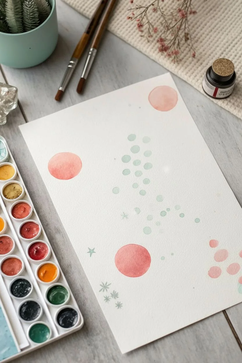
This charming project combines simple shapes and doodles to create a magical, space-inspired pattern. By mixing soft planetary circles with crisp stars and leafy sprigs, you will build a balanced composition that looks lovely on greeting cards or journal pages.
Step-by-Step Guide
Materials
- Cold press watercolor paper (A5 or similar size)
- Watercolor paint set (pinks, teal/mint, earthy green, black)
- Round watercolor brush (size 6 or 8 for larger shapes)
- Fine detail brush (size 0 or 1) or a black micron pen
- Clean water jar
- Paper towel
- Pencil (optional)
Step 1: Setting the Scene: Planets and Atmosphere
-
Mix your palette:
Prepare a watery, soft salmon-pink color and a very pale, diluted mint-teal shade. Ensure you have enough water mixed in to keep the colors transparent. -
Paint the main planets:
Using your medium round brush and the salmon-pink mix, paint three or four medium-sized circles scattered randomly across the page. Keep their edges somewhat soft, and don’t worry about making them perfect circles; organic shapes look better. -
Add floating bubbles:
Rinse your brush and switch to the pale mint-teal mixture. Paint a cluster of small dots or ‘bubbles’ floating near the center of the page, grouping them loosely together like a cloud of stardust. -
Create background dots:
While you have the pale mint color, add a few scattered star-like cross shapes or tiny dots elsewhere on the paper to fill some empty space without overwhelming the composition. -
Let it dry completely:
This is crucial. Before adding the sharper details on top, the base layer of planets and bubbles must be bone dry to prevent bleeding. I usually wait about 10-15 minutes or use a hair dryer.
Step 2: Botanical Elements
-
Mix the leaf colors:
Create two shades of green: a soft, bluish-mint green (similar to the bubbles but more saturated) and a darker, earthier forest green. -
Paint structural stems:
Using the tip of your round brush or a smaller detail brush, paint thin, curving lines for the stems. Place them in the empty white spaces between your planets, ensuring they curve in different directions for variety. -
Add the mint leaves:
On some of the stems, paint elongated, almond-shaped leaves using the bluish-mint mix. Press down on the brush belly to widen the leaf and lift up to create a point. -
Paint contrast leaves:
Switch to the darker forest green paint. Create smaller, rounder leaf sprigs in the remaining gaps. These darker elements add wonderful depth and contrast to the lighter pastel tones.
Brush Control Pro Tip
For the finest lines on the stars, hold your brush perpendicular to the paper (straight up) and barely graze the surface. This gives you maximum control over line thickness.
Step 3: Stellar Details
-
Prepare the star colors:
Load your fine detail brush with a saturated black or very dark grey watercolor. Alternatively, you can mix a vibrant orange for the smaller stars. -
Draw eight-point stars:
With the black paint, draw thin crosses with long vertical and horizontal lines. Then, add a smaller ‘X’ through the center to create sparkling eight-point stars. Place 2-3 of these prominently. -
Add solid stars:
Paint a few solid black five-point stars. These should be smaller than the sparklers but bold enough to stand out. -
Scatter orange stars:
Using the orange paint, add small five-point stars or tiny asterisks in the open areas. This warm color echoes the pink planets and ties the color scheme together. -
Add micro-dots:
Dip the very tip of your smallest brush into the black paint. Gently dot the paper in the vast white spaces to create distant stars or cosmic dust. -
Final assessment:
Step back and look at the balance. If a large white space feels empty, add one last tiny orange star or a black micro-dot to finish the piece.
Level Up: Metallic Magic
Swap the orange star paint for a gold metallic watercolor or gold ink. When the light hits your finished painting, the celestial theme will literally shimmer.
Enjoy the peaceful rhythm of painting these simple cosmic shapes
Have a question or want to share your own experience? I'd love to hear from you in the comments below!