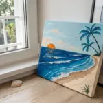
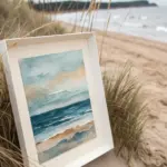
Whenever I’m stuck on what to draw, I come back to beach scenes because they’re instantly relaxing and you can keep them super simple or go surprisingly detailed. Here are my favorite beach drawing ideas—from classic sunny shorelines to playful, dreamy twists you can totally make your own.
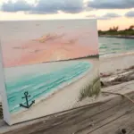
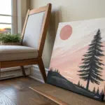
Sunset Beach Horizon With Simple Birds
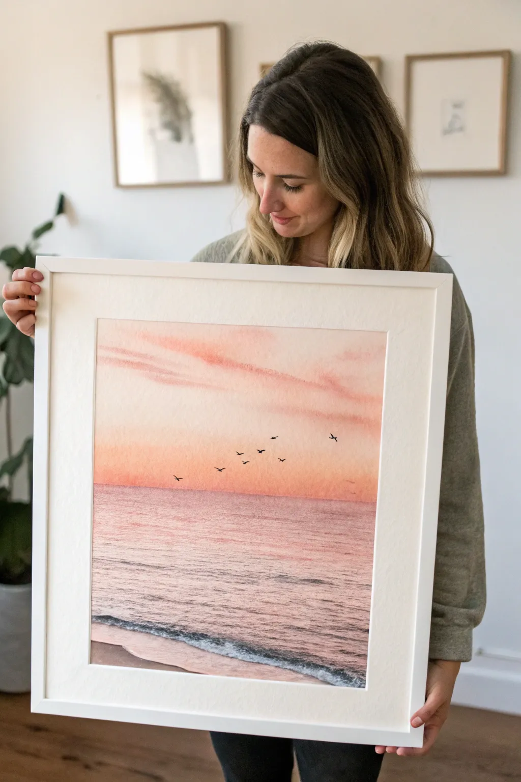
Capture the tranquil beauty of dusk with this expansive beach horizon piece, featuring soft gradients and minimalist shorebirds. The result is a dreamy, high-contrast artwork that blends warm peach tones with the calming texture of ocean waves.
Step-by-Step Guide
Materials
- Large sheet of cold-press watercolor paper (18×24 or A2 recommended)
- Watercolor paints (Alizarin Crimson, Cadmium Red Light, Yellow Ochre, Ultramarine Blue, Burnt Umber)
- Watercolor brushes: 1.5-inch flat wash brush, size 8 round brush, size 0 or 1 fine liner brush
- Masking tape
- Painting board
- Two jars of water
- Paper towels
- Pencil (HB)
- Ruler
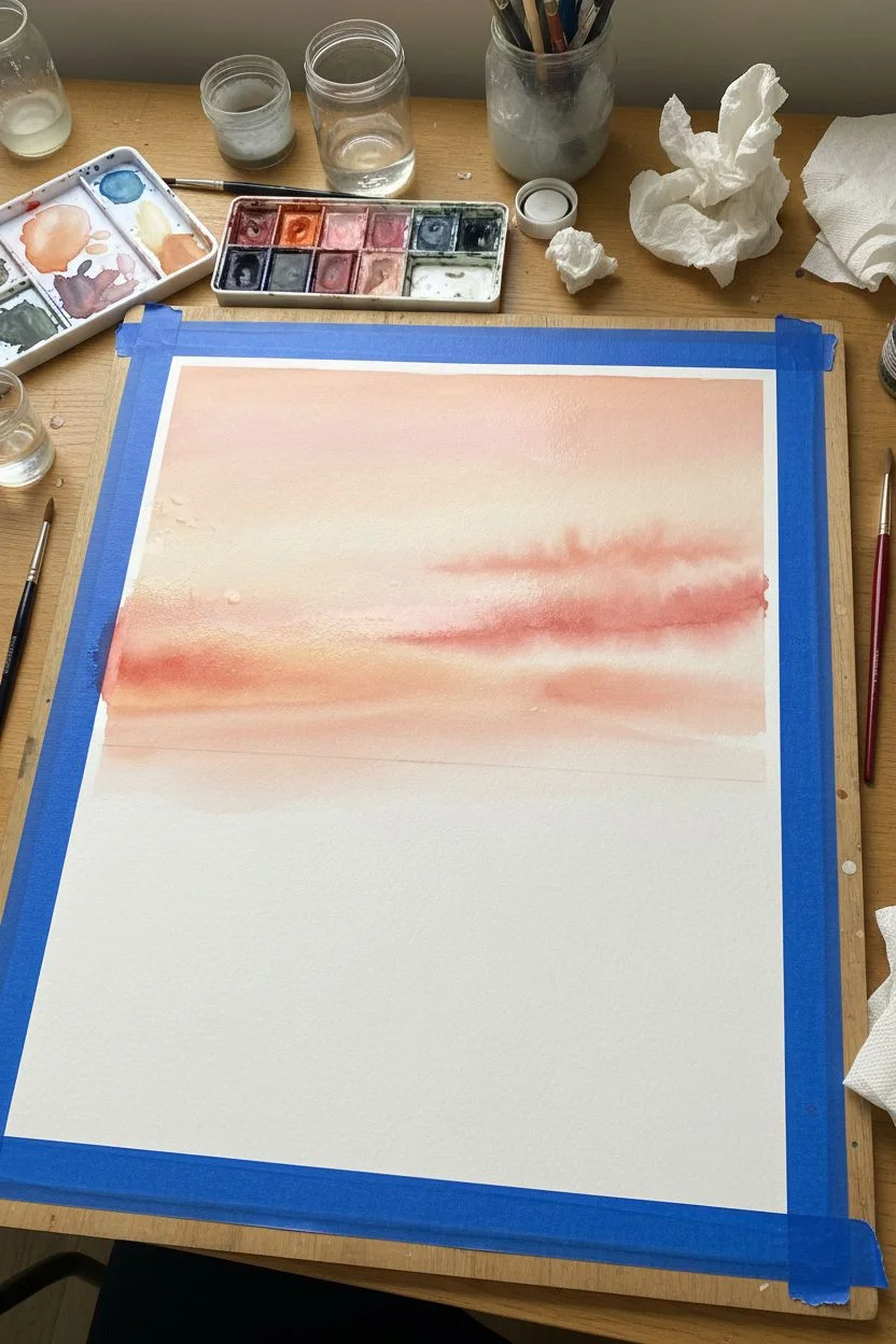
Step 1: Preparation & Sky Wash
-
Secure your surface:
Tape down all four edges of your watercolor paper to your board using painter’s tape or masking tape. This prevents the paper from buckling when we apply heavy water washes. -
Establish the horizon:
Using a ruler and a light pencil touch, draw a straight horizontal line about one-third of the way up from the bottom of the paper. This will separate your sky from your sea. -
Mix your sunset palette:
In your palette, prepare a large puddle of a soft peach color by mixing a lot of water with a touch of Cadmium Red Light and Yellow Ochre. In a separate well, mix a slightly stronger pink using Alizarin Crimson. -
Wet the sky:
Use your large flat wash brush to wet the entire sky area above the horizon line with clean water. The paper should glisten but not have standing puddles. -
Apply the warm gradient:
Starting just above the horizon line, brush on your peach mixture, moving back and forth horizontally. As you move upward, introduce more water to your brush to fade the color out into the white of the paper near the top. -
Add cloud streaks:
While the paper is still damp, take your Alizarin Crimson pink mix and gently drag horizontal streaks across the upper middle section to suggest soft, elongated clouds. Let them bleed slightly for a natural look. -
Deepen the horizon:
Add a slightly more concentrated line of the peach/orange mix right along the horizon line while it’s still wet to create that glowing sunset intensity where the sun meets the water.
Don’t Overwork The Paper
Watercolor paper can pill if you scrub too hard. Lay your washes down confidently and let the water move the pigment rather than brushing the same spot repeatedly.
Step 2: Painting the Sea
-
Dry the sky fully:
It is crucial to let the top half dry completely before starting the water to prevent the horizon line from bleeding. I usually wait about 20 minutes or use a hairdryer on a low setting. -
Basic ocean wash:
Mix a dusty mauve color by taking your pink mix and adding a tiny touch of Ultramarine Blue and Burnt Umber. With your flat brush, paint horizontal strokes below the horizon line, leaving the very bottom strip of paper white for the sand. -
Create water texture:
While the ocean wash is wet, lift out pigment in thin horizontal lines using a thirsty (damp but clean) brush to create highlights on the water surface. -
Darken the water:
Mix a slightly darker version of your mauve ocean color. Using the tip of your round brush, add thin, broken horizontal lines across the water area to suggest ripples and depth. -
Painting the shoreline:
For the wet sand at the bottom, mix a watery Burnt Umber. Paint the bottom strip, blending it softly into the ocean area. -
Adding seafoam:
Once the shoreline area is damp-dry, use opaque white gouache or very thick white watercolor on a small brush to stipple a jagged line where the water meets the sand, creating the look of crashing foam.
Step 3: Final Details
-
Outline the foam:
To make the foam pop, use a dark grey mix (Ultramarine + Burnt Umber) and paint a very thin, broken shadow line right underneath the white foam area. -
Practice the birds:
On a scrap piece of paper, practice drawing small ‘V’ and ‘M’ shapes with your fine liner brush to get the feeling of distant birds in flight. -
Paint the flock:
Using a dark grey or black mix on your size 0 liner brush, paint a scattered group of birds in the lower sky area. Vary their sizes to show depth—some larger and closer, some tiny specks in the distance. -
Finish and frame:
Allow the entire painting to dry for at least an hour. Carefully peel off the masking tape at a 45-degree angle to reveal your crisp white borders.
Add Subtle Sparkle
Once the water section is completely dry, use a gel pen or metallic watercolor to add tiny, sparse dots of white or silver on the wave crests for a glistening sun effect.
Place your finished piece in a white gallery frame to maximize that airy, coastal aesthetic

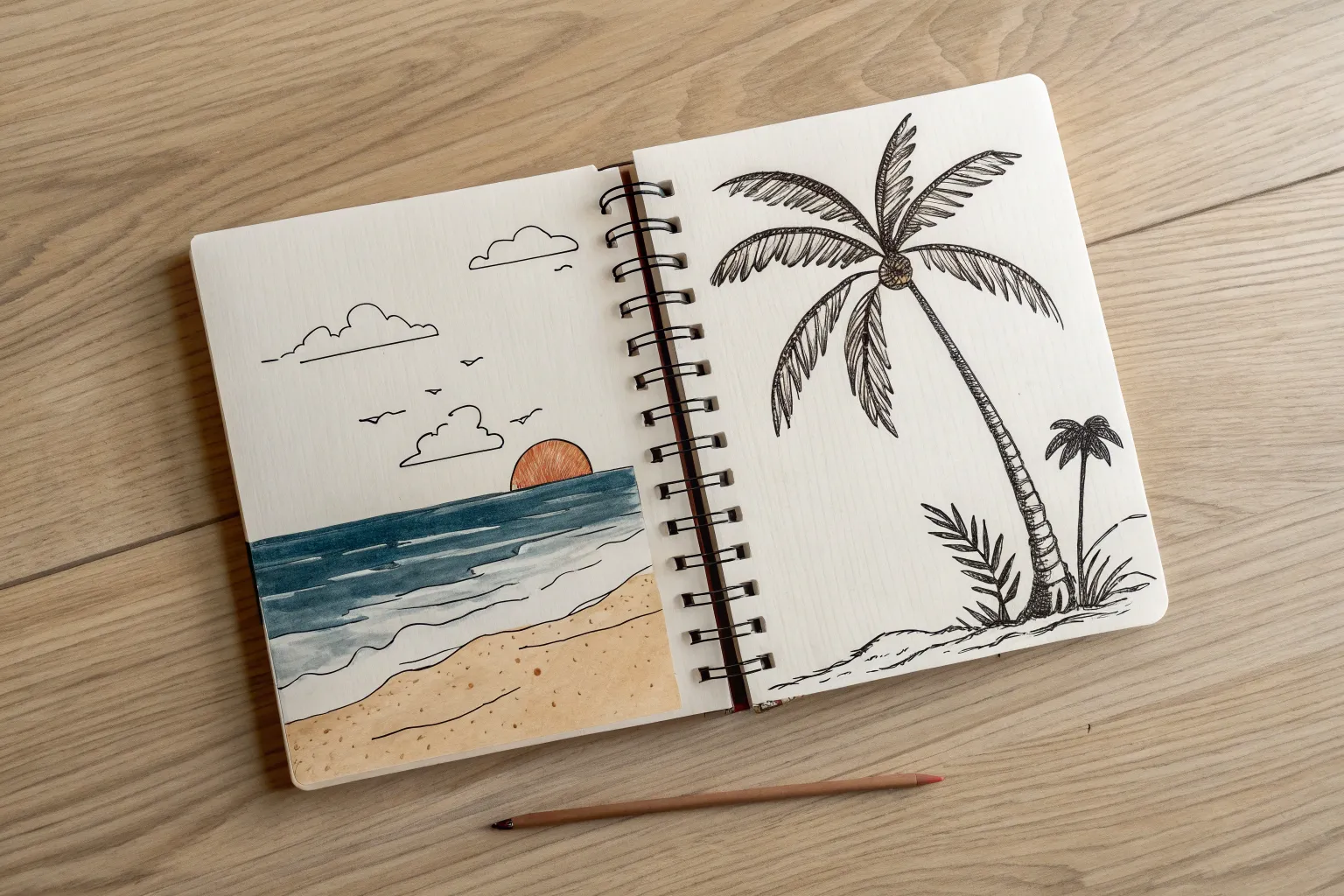
Palm Tree Framing a Curved Shoreline
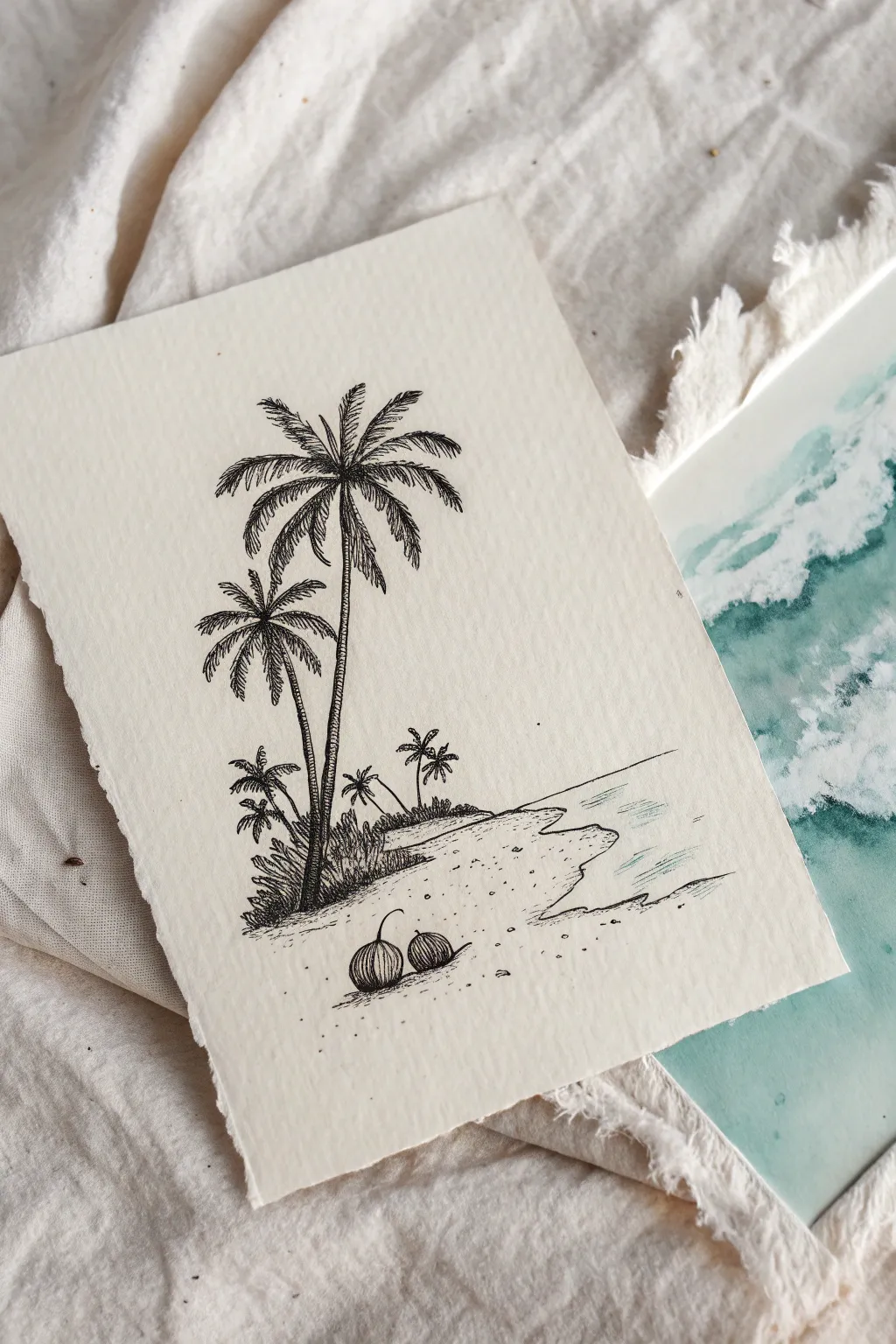
Capture the serenity of a secluded island with this detailed pen and ink drawing. Using precise linework and stippling on textured watercolor paper creates a beautifully vintage, engraved aesthetic.
How-To Guide
Materials
- Cold press watercolor paper (A5 size or similar, preferably with deckled edges)
- Fine liner pens (sizes 005, 01, and 03)
- Graphite pencil (HB or 2H)
- Kneaded eraser
- Ruler (optional)
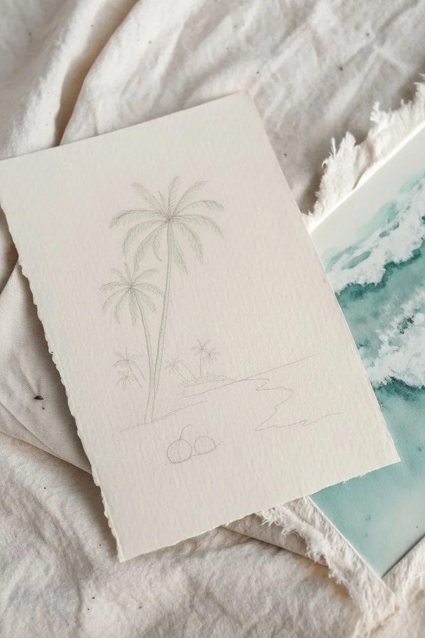
Step 1: Sketching the Layout
-
Establish the horizon:
Begin lightly with your pencil. Sketch a diagonal shoreline starting from the lower right and curving gently upward toward the left middle of the paper. Add a faint horizontal line for the distant sea horizon in the background. -
Place the main palms:
Sketch two vertical, slightly curved lines for the main palm trunks. The taller tree should stand slightly to the right, leaning left, while the shorter one stands to its left, leaning slightly right. Position their base on the left side of your sandy bank. -
Add foreground & background elements:
Draw two rough circles in the immediate foreground for coconuts. Then, sketch tiny stick-figure guidelines for the smaller cluster of palm trees in the distance along the water’s edge.
Variation in Line Weight
Don’t press hard. Let the pen size do the work. Use the 005 for distant details and the 03 strictly for deep shadows to create atmospheric depth.
Step 2: Inking the Palm Trees
-
Outline the trunks:
Switch to your 01 fine liner. Carefully outline the trunks of the two main trees. Instead of straight lines, use short, varied strokes to mimic the segmented texture of palm bark. -
Draft the fronds:
From the center top of the taller tree, draw the central spines of the palm fronds arching outward in a starburst pattern. Repeat this for the shorter tree. -
Detail the leaves:
Using the 005 pen, draw the individual leaflets hanging from each spine. Use quick, flicking strokes that taper at the end to keep them looking sharp and leafy rather than blocky. -
Darken the foliage:
Go back into the centers of the palm crowns with your 01 pen. Add more density where the leaves cluster together to create depth and shadow.
Wobbly Straight Lines?
If your water lines aren’t perfectly straight, embrace it! Ocean ripples are organic. Broken, slightly uneven lines look more natural than ruler-perfect ones.
Step 3: Creating the Landscape
-
Draw the background vegetation:
Ink the small background palms using simpler, silhouette-like shapes. Below the main trees, sketch jagged, grassy textures to represent low-lying bushes and scrubbing vegetation. -
Texture the shoreline:
Outline the edge of the sand bank where it meets the water. Use a broken, wavering line to suggest the uneven nature of sand meeting tide. -
Ink the coconuts:
Outline your two coconuts in the foreground. Use vertical, curved hatching lines to give them a round, fibrous appearance. Add a small cast shadow underneath each using horizontal hatching. -
Suggest the sand:
I like to keep this sparse. Use stippling (dots) and tiny circles scattered across the foreground to suggest sand grains without cluttering the page. Focus the density near the base of the trees and the coconuts.
Step 4: Refining and Finishing
-
Add water ripples:
Using your finest 005 pen and a very light touch, draw horizontal lines in the water area. Keep these lines broken and parallel to the shoreline to suggest calm, shallow waves. -
Deepen shadows:
Switch to your 03 pen for the darkest areas. Add strong blacks to the shadowed side of the tree trunks (usually the right side) and the deepest crevices of the bushes. -
Erase pencil lines:
Wait at least 10 minutes for the ink to fully cure. Gently roll your kneaded eraser over the entire image to lift the graphite sketch without smudging your ink. -
Final touches:
Assess the balance. If the water looks too empty, add a few more delicate ripples. If the sand looks too clean, add a few more dots near the shoreline edge.
Frame your miniature island escape in a simple mat to highlight the beautiful texture of the paper

Tiny Sailboat on a Calm Beach Horizon
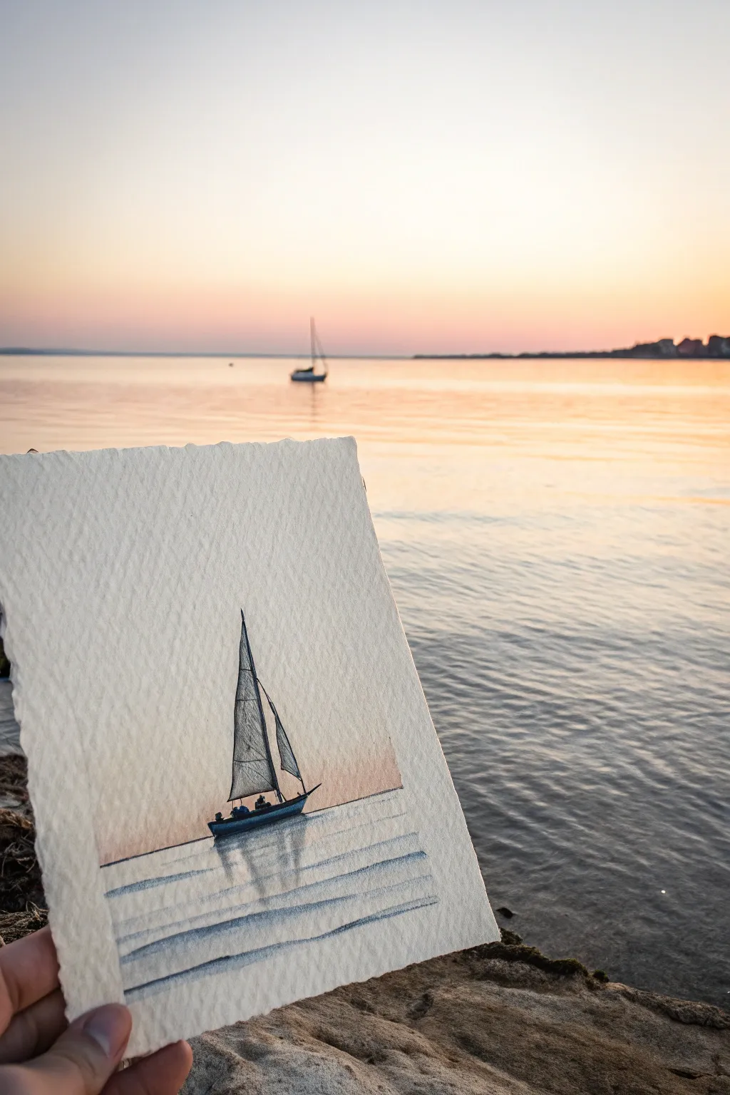
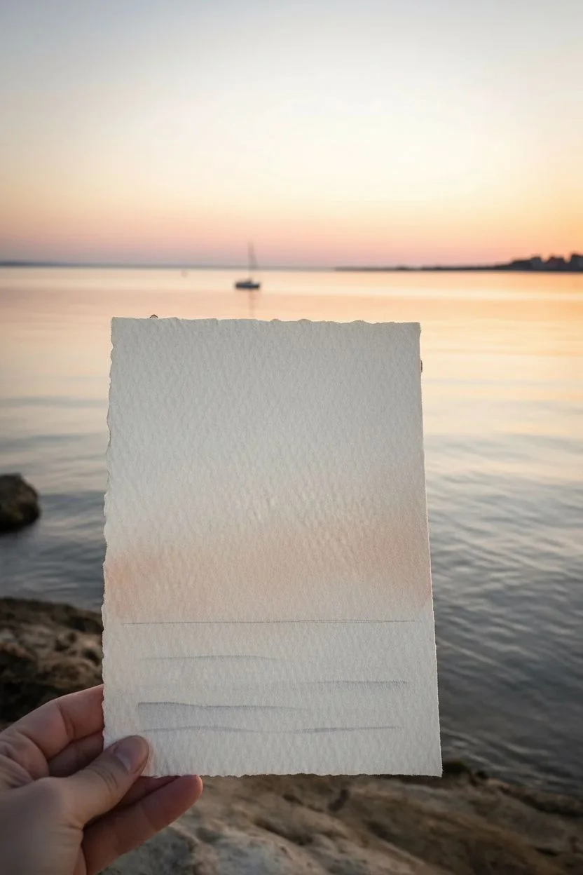
Capture the serene beauty of a twilight sail with this delicate mixed-media piece. By combining soft watercolor washes with precise pen work, you’ll create a striking silhouette against a glowing horizon on textured paper.
Step-by-Step Guide
Materials
- Heavyweight, rough-grain watercolor paper (torn to approx 4×6 inches)
- Watercolor paints (Alizarin Crimson, Ultramarine Blue, Burnt Sienna, Yellow Ochre)
- Small round watercolor brush (size 2 or 4)
- Fine-liner pen (black, water-resistant, 0.1mm or 0.3mm)
- Pencil (HB) and eraser
- Jar of water
- Paper towel
Step 1: Preparing the Horizon
-
Paper preparation:
Begin by tearing your watercolor paper to size rather than cutting it. The rough, deckled edges add a rustic charm that complements the seascape theme perfectly. -
Establish the horizon line:
Using a ruler and a very faint pencil touch, mark a straight horizon line about one-third of the way up from the bottom of the paper. This rule of thirds creates a pleasing composition. -
Mix the sky glow:
Create a very dilute wash of Alizarin Crimson mixed with a tiny touch of Yellow Ochre. You want a pale, warm peach tone that mimics the last light of the sun. -
Paint the sunset backdrop:
Apply this peach wash just above your horizon line, blending it upwards into plain water so it fades to white near the top of the page. Keep this wash extremely light and subtle. -
Add the water tint:
While the sky dries, mix a very faint wash of Ultramarine Blue with a dot of Burnt Sienna to gray it down. Apply this lightly below the horizon line to suggest the water’s surface.
Ink Smearing?
If your pen bleeds into the paper, the watercolor wasn’t fully dry. Use a hairdryer on the ‘cool’ setting to ensure the paper is moisture-free before inking.
Step 2: Drafting the Vessel
-
Outline the hull:
Once the paper is bone dry, lightly sketch the boat’s hull with your pencil. Place it slightly off-center to the left. Draw a curved bottom and a flatter top deck line, slightly angled as if rocking on waves. -
Raise the mast:
Draw a tall, vertical line for the mast. Ensure it stays straight relative to the paper’s edge, even if the boat is tipping slightly. -
Sketch the sails:
Add a large triangular mainsail behind the mast and a smaller jib sail in front. Give the lines a slight inward curve to suggest the wind isn’t fully filling them, or a soft outward curve if sailing downwind. -
Refine the sketch:
Lightly indicate two small figures sitting in the stern of the boat. These are just tiny, bumpy silhouettes, so don’t worry about details.
Step 3: Inking the Details
-
Ink the sails:
Switch to your fine-liner pen. Carefully trace the outline of your sails. Instead of coloring them in solid, use vertical hatching lines—closely spaced vertical strokes—to fill the shapes. This gives them texture and transparency. -
Detail the hull:
Outline the hull of the boat with a thicker line or go over it twice. Fill the hull in solidly with black ink, leaving tiny white specks if you want to suggest light reflecting off the gunwale. -
Add the crew:
Color in the small silhouettes of the people in the boat. Make them solid black to match the hull. -
Draw the rigging:
Connect the top of the mast to the bow and stern with extremely faint, single pen strokes to represent the wire rigging.
Golden Hour Glow
Add a tiny dot of metallic gold watercolor or gel pen to the very edge of the water ripples for a shimmering sunset effect.
Step 4: Refuting the Water
-
Add reflection depth:
Dilute a tiny amounts of indigo or dark blue watercolor. Paint a blurred, vertical reflection directly beneath the boat’s hull. I like to keep this stroke loose and wet. -
Create ripples:
Using your fine-liner pen again, draw horizontal lines across the water area. Start with short, tight lines near the horizon and make them longer and wider apart as you move down the page. -
Integrate the reflection:
Where your pen lines cross the painted reflection of the boat, make the lines slightly thicker or darker to show the shadow on the waves. -
Final touches:
Erase any remaining pencil marks gently. If the sunset needs more warmth, you can glaze a very thin layer of pink over the bottom of the sky area, careful not to smear the ink.
Now hold your miniature masterpiece up to the horizon and see how perfectly it blends with reality.

Wooden Pier Leading Out Over the Beach Water
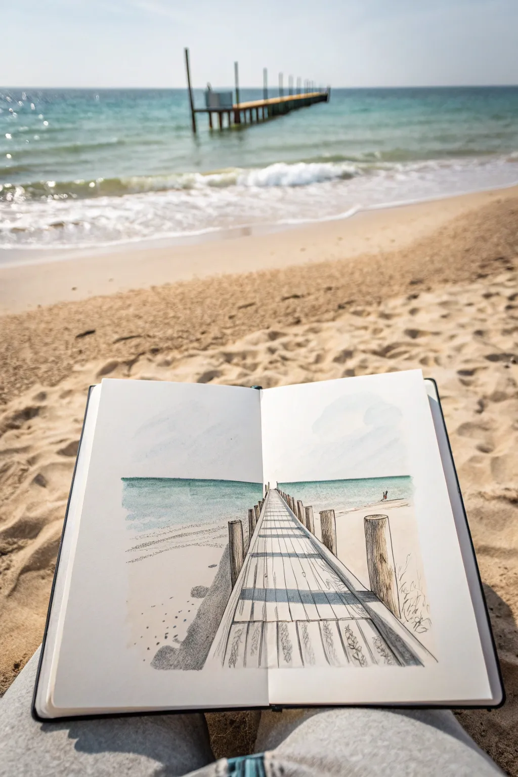
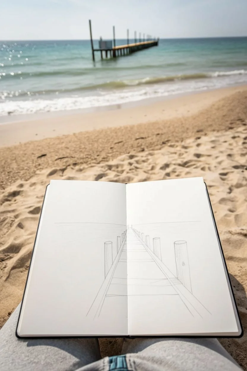
Capture the calm solitude of a wooden pier stretching into the sea with this mixed-media sketchbook study. By combining precise line work with soft watercolor washes, you’ll create a drawing that feels both structural and serene.
Detailed Instructions
Materials
- Sketchbook (heavyweight paper suitable for light washes)
- Graphite pencil (HB or 2B)
- Fine liner pen (waterproof, black, 0.3mm or 0.5mm)
- Watercolor paints (Turquoise, Cerulean Blue, Burnt Sienna, Payne’s Grey)
- Small round watercolor brush (size 4 or 6)
- Eraser
- Ruler (optional, but helpful for pier planks)
Step 1: Setting the Scene
-
Establish the Horizon:
Begin by lightly drawing a straight horizontal line across both pages of your open sketchbook, positioned about one-third of the way from the top. This separates the sky from the ocean. -
Map the Vanishing Point:
Locate the center point on your horizon line. This will be your vanishing point where all the parallel lines of the pier will appear to converge. -
Rough in the Pier Outline:
Draw two diagonal lines starting wide at the bottom center of the right page and converging toward that vanishing point. Do the same for the left side of the pier, creating a narrowing pathway. -
Adding Vertical Posts:
Sketch vertical cylinders along the outside edges of your pier pathway. Make the posts in the foreground (bottom of the page) tall and thick, and draw them progressively shorter and thinner as they recede toward the horizon.
Uneven Planks?
Don’t stress if your plank lines aren’t perfectly straight or parallel. Wobbly lines actually make the wood look more aged and realistic.
Step 2: Inking the Details
-
Outline the Pier Structure:
Using your waterproof fine liner, go over your pencil lines for the pier posts. Give them a slightly uneven, organic line quality to mimic weathered wood. -
Draw the Planks:
Draw horizontal lines across the pier walkway to create the planks. Space them wider apart at the bottom of the page and closer together as you get near the horizon to enhance the depth. -
Add Wood Texture:
Add small cracks, knots, and grain lines to the foreground posts and planks with your pen. Don’t overdo the distant posts; keep the detail focused on the front. -
Sketch Nearby Vegetation:
On the bottom right corner, loosely sketch some tufts of dune grass near the base of the pier posts using quick, upward flickering strokes. -
Erase Guidelines:
Once the ink is completely dry, gently erase all your initial graphite pencil marks to leave a clean black-and-white structure.
Step 3: Applying Watercolor Washes
-
Paint the Sky:
Dilute a tiny drop of Cerulean Blue with plenty of water. Paint a very pale, uneven wash in the sky area, leaving plenty of white paper showing to represent clouds. -
Wash the Ocean:
Mix Turquoise with a touch of Payne’s Grey for the water. Apply a flat wash horizontally directly below the horizon line, stopping where the sand begins. -
Add Shallow Water:
While the ocean layer is still wet, drop in a slightly clearer, lighter turquoise near the shoreline to suggest shallow, clear water. -
Paint the Sand:
Use a very watery Burnt Sienna or warm beige to paint the beach areas on either side of the pier. Fade this color out as you move toward the bottom corners of the page.
Level Up: Texture
Before painting the sand, sprinkle a pinch of salt onto the wet particular wash. Brush it off when dry for a granular, sandy texture effect.
Step 4: Shading and Finishing
-
Shadow the Pier:
Mix a light grey wash (heavily diluted Payne’s Grey). Paint shadows on the right side of the wooden posts to indicate sunlight coming from the left. -
Cast Shadows on Planks:
Using the same grey wash, paint horizontal shadow stripes across the pier planks. These should align with the posts, reinforcing the light source direction. -
Darken the Horizon:
Add a thin line of slightly darker blue right along the horizon line to create separation between the pale sky and the sea. -
Final Contrast Check:
I rarely skip this part—step back and see if your foreground needs more punch. Use your pen to darken the grain on the closest wood post if it needs to pop.
Close your sketchbook knowing you’ve preserved a perfect beach moment forever
BRUSH GUIDE
The Right Brush for Every Stroke
From clean lines to bold texture — master brush choice, stroke control, and essential techniques.
Explore the Full Guide
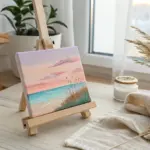
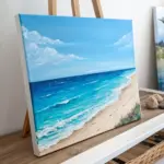
Puffy Clouds Over a Bright Midday Beach
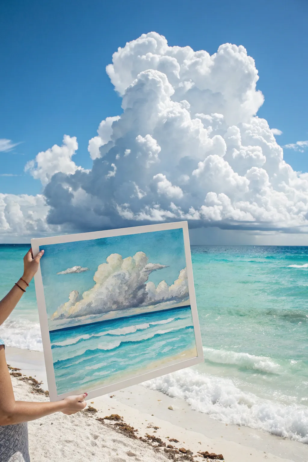
Capture the awe-inspiring volume of summer clouds with this watercolor landscape that pairs massive, fluffy formations against a vibrant turquoise sea. By carefully layering transparent washes, you’ll build depth in the waves while keeping your cloud tops brilliantly white.
Detailed Instructions
Materials
- Cold press watercolor paper (140lb/300gsm), approx 16×20 inches
- Painter’s tape or white masking tape
- Drawing board or hard backing
- Watercolor paints: Cerulean Blue, Cobalt Blue, Phthalo Turquoise, Burnt Sienna, Payne’s Grey, Yellow Ochre
- Large flat wash brush (1 inch)
- Round brushes (sizes 8 and 4)
- Clean water containers (2)
- Paper towels
- HB Pencil
Step 1: Sketching and Sky Structure
-
Secure the paper:
Tape down all four edges of your watercolor paper to your backing board. This creates a clean white border and prevents buckling when the paper gets wet. -
Establish the horizon:
Draw a faint horizon line about one-third of the way up from the bottom. Keep it perfectly straight; a ruler helps here. -
Outline the clouds:
Lightly sketch the large, billowing cloud formation in the center. Don’t worry about perfect symmetry—irregular bumps and humps look more natural. Add a few smaller, flatter cloud fragments floating to the left and right. -
Initial sky wash:
Mix a watery wash of Cerulean Blue. Use your large flat brush to paint the sky area around your cloud sketch. Be careful to cut in around the edges of the cloud, leaving the white paper untouched for the cloud’s brightest highlights. -
Deepen the blue:
While the sky wash is still damp, drop in a slightly stronger Cobalt Blue near the top corners to create an atmospheric gradient, fading as it nears the horizon.
Softening Edges
Clouds can look like popcorn if edges are too hard. Keep a ‘thirsty’ brush (clean but damp) ready to wipe and soften harsh paint lines immediately after laying them down.
Step 2: Building Cloud Volume
-
Mix shadow colors:
Create a soft grey-purple mix using Cobalt Blue, a touch of Burnt Sienna to neutralize it, and a tiny hint of Payne’s Grey. It should be very diluted. -
Paint cloud shadows:
On the dry white paper of the cloud shapes, use a size 8 round brush to paint the shadows. Focus on the bottom and right sides of the fluffy ‘humps’ to suggest volume, leaving the top-left edges pure white. -
Soften the edges:
With a clean, damp brush, gently run along the inner edge of your shadow shapes to blur them into the white areas. This creates the soft, rolling look typical of cumulus clouds. -
Add warmth:
While the shadows are still damp in a few spots, touch in a barely-there glaze of Yellow Ochre near the sunlit edges to suggest reflected sunlight. -
Define the base:
Paint a darker, flatter strip of grey-blue along the very bottom of the cloud mass. This flat base indicates the heavy moisture and gives the cloud its characteristic weight.
Level Up: Texture
Sprinkle a tiny pinch of salt onto the wet ocean wash before it dries. The salt pushes pigment away, creating intricate blooming textures that look like sea spray.
Step 3: The Turquoise Sea
-
Base ocean layer:
Mix a vibrant Phthalo Turquoise with plenty of water. Paint a horizontal wash from the horizon line down, skipping thin horizontal strips of white paper occasionally to represent foam and wave crests. -
Darken the horizon:
Strengthen the horizon line with a slightly distinct, darker blue line (Cobalt mixed with Turquoise) to separate the water from the sky clearly. -
Add mid-ground waves:
Switch to your smaller round brush. Paint rolling wave shapes using a medium-strength turquoise. Remember that waves appear flatter and closer together near the horizon, and larger/wider near the bottom. -
Preserve whitecaps:
I find the most crucial part here is negative space. Carefully paint the blue water *around* the white foam patterns, defining the shape of the crashing waves by what you don’t paint. -
Deepen the troughs:
Add a darker blue-green mix underneath the white wave crests to create shadows. This lifts the foam off the page visually.
Step 4: Foreground and Finishing
-
Sand wash:
For the bottom right corner, mix a very pale Yellow Ochre with a dot of Burnt Sienna. Apply this wash loosely for the wet sand. -
Blend sand and sea:
Where the turquoise water meets the sand, let the colors bleed slightly or use a clean damp brush to soften the transition, mimicking sea foam rushing up the beach. -
Final adjustments:
Once everything is bone dry, erase any visible pencil lines in the clouds. Re-assess your contrast—you might need one final dark glaze under the main cloud or in the deepest wave trough. -
Reveal:
Gently peel away the painter’s tape at a 45-degree angle to reveal your crisp, professional white border.
Step back and admire your breezy coastal scene, perfect for framing in a simple white or light wood frame
Underwater View Looking Back Toward the Beach
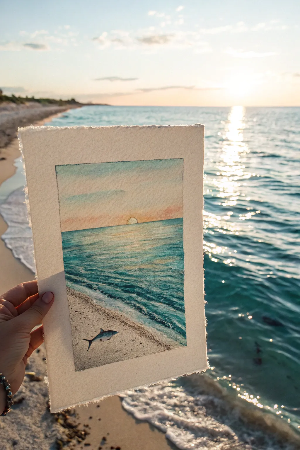
Capture the serene beauty of a golden hour sunset over turquoise waters with this detailed mixed-media painting. The composition contrasts the vastness of the ocean horizon with the stark, intriguing detail of a shark on the sandy shore.
Step-by-Step Tutorial
Materials
- Cold press watercolor paper (deckled edge preferred)
- Watercolor paints (Turquoise, Cobalt Blue, Burnt Sienna, Payne’s Grey, Yellow Ochre, Alizarin Crimson)
- White gouache or white gel pen
- Fine liner pens (Black, 0.05mm and 0.1mm)
- Round watercolor brushes (Size 4 and 8)
- Masking tape
- Pencil (HB)
- Clean water and paper towels
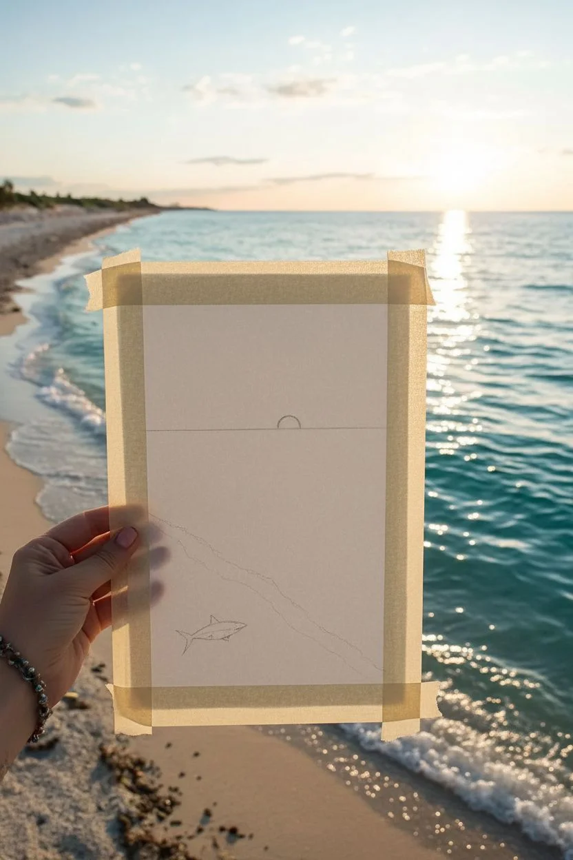
Step 1: Preparation and Sketching
-
Prepare the paper:
Begin by tearing your watercolor paper to size if it doesn’t already have deckled edges. Tape down the edges of the drawing area with masking tape to create a clean, crisp border for your painting window, leaving roughly an inch of paper border. -
Establish the horizon:
Using a ruler, lightly draw your horizon line about two-thirds of the way up the taped section. This high horizon emphasizes the water and beach foreground. -
Sketch the shoreline:
Draw a diagonal line starting from the bottom left corner extending upwards to the right, creating a wedge shape for the sand. -
Outline the details:
Lightly sketch a small semi-circle on the horizon for the setting sun. Then, carefully outline the shark shape in the bottom left sandy area.
Bleeding Edges?
If paint bleeds under the tape, wait for it to dry completely, then gently scrape the excess paint away with an X-Acto knife or cover it with white gouache.
Step 2: Painting the Sky and Water
-
Wet-on-wet sky wash:
Wet the sky area with clean water. Drop in a pale wash of watered-down Cobalt Blue at the top, transitioning into a soft mix of Yellow Ochre and a touch of Alizarin Crimson near the horizon line for a sunset glow. -
Define the sun:
Leave the semi-circle sun unpainted or lift paint out with a clean, damp brush to keep it bright. Let the sky layer dry completely. -
Base layer for the ocean:
Mix a vibrant Turquoise with plenty of water. Apply a gradient wash starting darker at the horizon line and becoming lighter as you move toward the shoreline. -
Adding wave texture:
Once the base ocean layer is semi-dry, use a smaller brush with a more concentrated Turquoise or Cobalt mixture to paint horizontal streaks. These mimic the ripples and movement of distant waves. -
Darkening the deep water:
Add Payne’s Grey to your blue mix and deepen the color right along the horizon line to create depth and contrast against the setting sun.
Step 3: The Beach and Foreground
-
Painting the sand:
Mix a diluted wash of Yellow Ochre and a tiny bit of Burnt Sienna. Apply this to the sand area, dabbing the brush slightly to create texture rather than a smooth wash. -
Creating the shoreline foam:
Leave a small gap of white paper between the blue water and the tan sand. If you painted over it, use white gouache later to re-establish the foamy edge where the water meets the shore. -
Splatter texture:
I like to load an old toothbrush or a stiff brush with darker brown paint and flick it gently over the dried sand area to create the look of pebbles and sand grains.
Sun Path Sparkle
For realistic water reflections, make your white highlight strokes shorter and closer together near the horizon, and wider/sparser as they come closer.
Step 4: Detailing the Shark and Finishing Touches
-
Base coat for the shark:
Paint the shark’s upper body with a mix of Payne’s Grey and Blue. Leave the underbelly white or very pale gray. -
Refining the shark:
Once dry, use your finest liner pen or a very small brush to outline the shark, add the gills, eye, and fin details. -
Shadows:
Paint a small, soft shadow underneath the shark using a diluted purple-grey mix to ground it on the sand. -
Highlights on the water:
Use a white gel pen or thin white gouache to add sparkling reflection lines on the water surface, directly beneath the sun, to mimic the sun path. -
Remove the tape:
Wait until the painting is 100% bone dry. Keep the tape at a 45-degree angle and pull slowly away from the painting to reveal crisp edges.
Frame your mini masterpiece or gift it to a sealife lover to bring a bit of the ocean into their home

PENCIL GUIDE
Understanding Pencil Grades from H to B
From first sketch to finished drawing — learn pencil grades, line control, and shading techniques.
Explore the Full Guide
Postcard-Style Beach Scene in a Simple Border
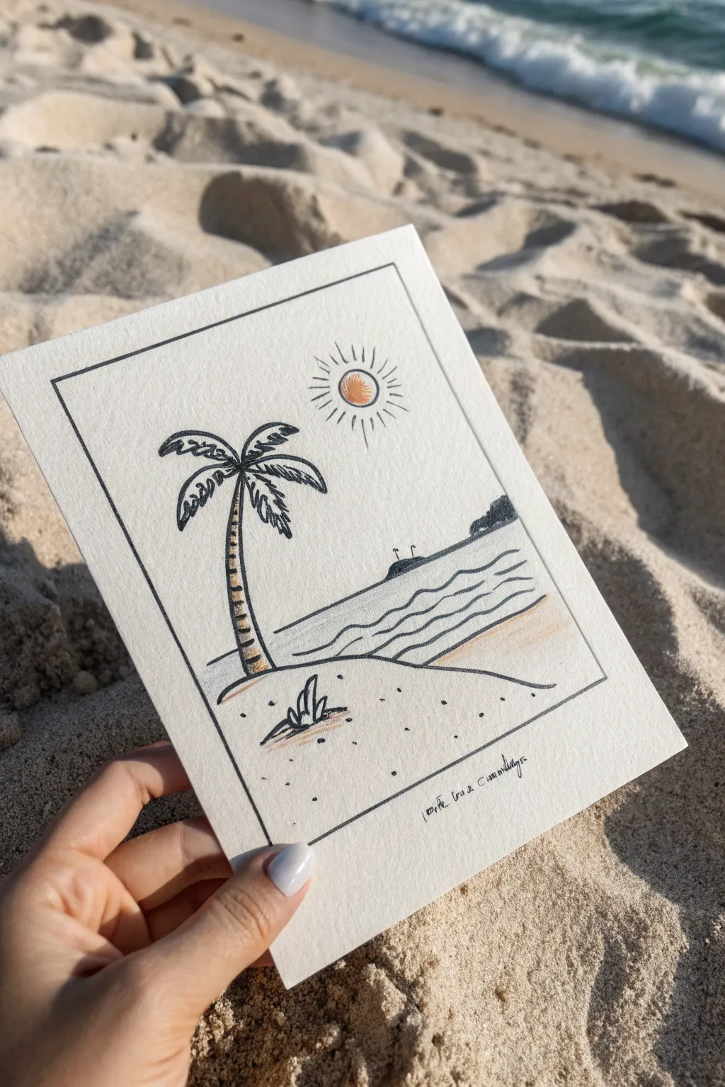
Capture the laid-back vibe of a coastal getaway with this simple yet charming line drawing. Framed within a neat border, this postcard-style sketch uses clean ink lines and faint touches of color to create a serene tropical scene.
How-To Guide
Materials
- Heavyweight watercolor paper or cardstock (approx. 5×7 inches)
- Fine-point black drawing pen (archival ink helps prevent smudging)
- Pencil and eraser for sketching
- Ruler
- Colored pencils (warm yellow/orange and sandy beige)
- Textured surface (optional, for rubbing effect)
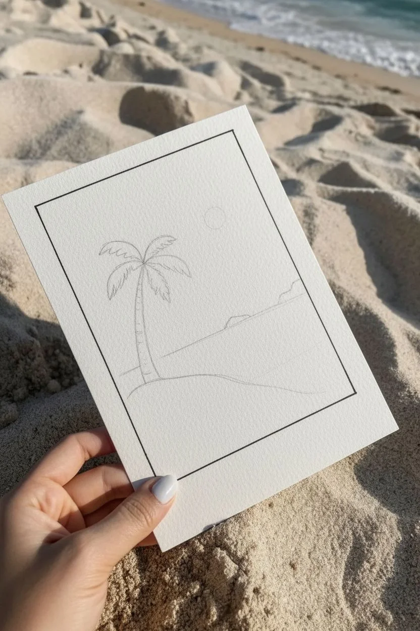
Step 1: Setting the Scene
-
Prepare your paper:
Cut your heavyweight paper to a standard postcard size, roughly 5 by 7 inches, ensuring the edges are clean and straight. -
Mark the frame:
Use your ruler and pencil to lightly measure a margin about 0.5 inches from the edge on all four sides. -
Draw the border:
Trace over your pencil guides with the black fine-point pen to create the rectangular frame. Don’t worry if the lines aren’t perfectly machine-straight; a little waver adds character.
Natural Texture
For a sandy look, place your paper over a rough surface (like concrete or actual sandpaper) when coloring the beach area to pick up the texture.
Step 2: Drafting the Composition
-
Sketch the horizon:
Lightly pencil a horizontal line about one-third of the way up from the bottom border. Angle it slightly downward toward the left to imply a shoreline perspective. -
Outline the palm tree:
Place the palm tree on the left side. Draw a curved trunk extending up past the horizon line, topped with several arching fronds radiating outward. -
Add landscape details:
Sketch a small, distant island silhouette on the right side of the horizon line and a few wavy lines below it to represent the water. -
Position the sun:
Draw a small circle in the upper right sky area to mark the sun’s location.
Step 3: Inking the Details
-
Ink the palm trunk:
Go over the trunk with your pen. Add small, horizontal curved lines all the way up the trunk to create the segmented bark texture. -
Define the fronds:
Ink the palm leaves. Instead of solid shapes, use jagged, quick strokes along the main spine of each frond to mimic the feathery texture of palm leaves. -
Draw the water line:
Ink the horizon line and the small island bump. For the water, draw three or four wavy, organic lines parallel to the shore to suggest gentle waves rolling in. -
Detail the foreground:
At the bottom left, draw a small tuft of sea grass with sharp, upward strokes. Add varying sizes of stippled dots across the bottom sand area for texture. -
Ink the sun:
Outline the sun circle. Around it, draw several short, straight lines radiating outward to represent light rays. I usually vary the length of these rays slightly for a natural look. -
Erase pencil marks:
Once the ink is completely dry, gently erase all underlying pencil sketches to clean up the drawing.
Go Retro
Use a sepia-toned ink pen instead of black for the outlines to give the drawing an instant vintage, old-photograph aesthetic.
Step 4: Adding Color Accents
-
Color the sun:
Take an orange or warm yellow colored pencil and fill in the sun circle. Use circular strokes to create a dense, vibrant center. -
Shade the trunk:
Lightly shade the left side of the palm trunk with a brown or beige pencil to give it a bit of dimension. -
tint the sand and water:
Very lightly shade the strip of sand just above the border line using a beige pencil. Add a faint touch of color between the wave lines if desired, though leaving it white keeps the minimalist look. -
Add final text:
If you wish, write a tiny location name or date in cursive script just inside the bottom right border.
You now have a delightful, hand-drawn keepsake that perfectly captures the peace of a day at the beach


Have a question or want to share your own experience? I'd love to hear from you in the comments below!