Whenever I need a fun sketchbook reset, I reach for video game drawing ideas because they’re instantly recognizable and super satisfying to draw. Let’s fill your pages with gaming-inspired art that ranges from easy doodles to big “wow” illustrations.
Pixel Art Icons on Grid Paper
Capture the charm of classic video game inventory screens with this delightful grid paper project. You will fill a page with tiny, hand-drawn treasures like potions, crystals, and hearts, creating a satisfying collection of illustrated items.
Step-by-Step Tutorial
Materials
- Grid paper notebook or loose graph paper
- Fine-point black pen (0.3mm or 0.5mm)
- Colored pencils or fine-tip markers (soft pastels and earthy tones)
- Pencil and eraser (for sketching)
Step 1: Setting the Grid
-
Prepare your canvas:
Open your grid notebook to a fresh, clean page. Ensure the lighting is good so you can see the faint grid lines clearly, as these are crucial for guiding your proportions. -
Establish spacing:
Mentally divide the page into three or four vertical columns. You won’t be drawing lines to separate them; just visualize the columns to keep your icons organized in vertical rows.
Smudged Ink?
If your black pen smears when erasing, switch to a waterproof fineliner like a Micron. Always wait at least 5 minutes before erasing sketches.
Step 2: Sketching the Top Icons
-
Start the first column:
Begin at the top left. Sketch a simple circle, outlining a thick ring to create a ‘gold coin’ or ring shape. Keep it roughly 2×2 grid squares in size. -
Draw an open book:
Move to the second imaginary column. Outline an open book shape using two curved rectangles meeting in the middle. -
Sketch a decorative tile:
In the third column, draw a square frame and place a four-petaled flower shape inside it. -
Create a mushroom sprite:
Below the decorative tile, sketch a classic mushroom cap shape inside a square border.
Step 3: Adding Magical Items
-
Draw a crystal shard:
In the first column, below the coin, draw a vertical crystal point. Use faceted angles at the top and a flat bottom. -
Create a compass:
In the middle column, draw a circle. Add a small ‘X’ or star in the center and tick marks around the edge to suggest a compass or shield design. -
Sketch a geometric gem:
Further down, draw a diamond shape composed of two triangles connected by a horizontal line, resembling a rupee or floating gem. -
Add a simple heart:
To the right of the gem, sketch a classic heart shape, tilting it slightly for a playful look. -
Draw a sparkle:
In the space between columns, draw a four-pointed star or ‘sparkle’ icon using simple crossing lines.
Level Up: Stat Block
Turn this into a functional RPG character sheet by writing tiny stats (like +5 HP or +2 Magic) next to each item using a very fine pen.
Step 4: Filling the Bottom Half
-
Outline the stars:
Scatter a few five-pointed stars down the page. Vary their sizes slightly, making some wider and some taller. -
Create a potion bottle:
Draw a small dome shape with a flat bottom. Put a tiny rectangle inside to represent a label or cork. -
Sketch a bone or wand:
Draw a long, thin bone shape or a wand with rounded ends, angling it diagonally across the grid lines. -
Add patterned hearts:
Draw three more hearts in the lower section. Inside one, lightly sketch a plaid or check pattern. -
Draw a gem pendant:
Near the bottom right, create a teardrop shape or oval with a horizontal line across the lower third.
Step 5: Inking and Coloring
-
Ink the outlines:
Take your fine-point black pen and carefully trace over your pencil sketches. Keep your hand steady and use the grid lines to keep straight edges crisp. -
Erase pencil marks:
Once the ink is completely dry, gently erase all underlying pencil sketches to clean up the page. -
Color the metallics:
Use a yellow or gold pencil to color the coin, the stars, and the base of the gem pendant. Press lightly for a soft look. -
Fill in hearts and magic:
Use a soft pink or peach tone for the hearts, the mushroom cap, and the crystal shard. Coloring in a striped or checked pattern on the hearts adds nice texture. -
Add earthy details:
Use green for the patterned heart and the bone/wand item. I like to keep the coloring somewhat loose and sketch-like rather than filling it solid. -
Final touches:
Add tiny strokes of color to the open book and compass to finish your inventory sheet.
Now you have a charming page of items ready for your next imaginary adventure


Health Bar, Mana Bar, and Hearts UI Doodles
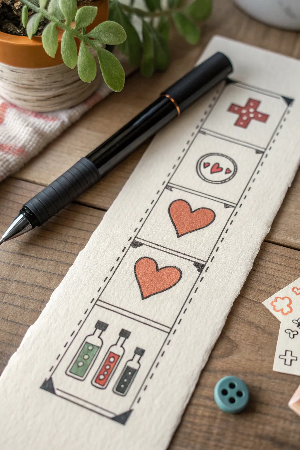
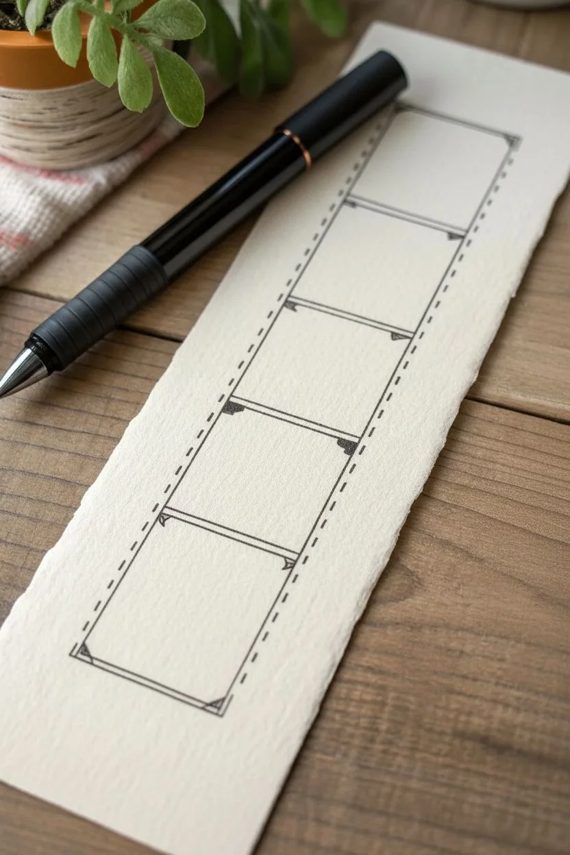
Capture the nostalgia of classic adventure games with this charming hand-drawn bookmark featuring iconic health and item slots. The clean linework and muted colors create a cozy, vintage aesthetic perfect for saving your place in a fantasy novel.
How-To Guide
Materials
- Thick, textured watercolor paper or cardstock (cream or off-white)
- Black fine-liner pen (0.3mm or 0.5mm)
- Ruler
- Pencil and eraser
- Colored pencils or fine-tip markers (muted red, sage green, gray)
- Scissors
Step 1: Setting the Grid
-
Prepare the Paper:
Start by cutting your textured paper into a long rectangular strip, approximately 2.5 inches wide by 7 inches tall. The rough, deckled edge shown in the image adds character, so you can tear the paper against a ruler instead of cutting for a rustic look. -
Draw the Main Frame:
Using a pencil and ruler, lightly sketch a long vertical rectangle down the center of your strip, leaving a comfortable margin on all sides. -
Divide Sections:
Mark horizontal lines to divide the main rectangle into five equal square sections stacked vertically. -
Outline the Film Strip:
Switch to your black fine-liner. Draw the two long vertical lines of your main rectangle. Instead of solid lines, make these solid for the inside edges, and then add a distinct dashed or stitched line effect along the outside perimeter of the main box. -
Add Decorative Corners:
At the four main corners of the large rectangle, draw small triangles pointing inward and fill them in solid black. This gives it a classic photo album or UI frame appearance. -
Ink the Dividers:
Draw the horizontal dividing lines in ink. For a stylized look, double up these lines slightly or add tiny triangular accents at the ends where they meet the vertical border.
Fixing Smudges
If you smudge ink while erasing pencil lines, turn it into a ‘damage’ effect! Add small cracks or scratches around the smudge with your pen to make the UI look battle-worn.
Step 2: Drawing the Icons
-
Sketch the Top Cross:
In the top square, pencil in a stout ‘plus’ sign or medical cross. Keep the arms thick and even. -
Sketch the Token:
In the second square down, draw a circle centered in the space. Inside, sketch three small hearts—one larger in the center and two tiny ones flanking it. -
Sketch the Big Hearts:
In the third and fourth squares, draw a single large heart in each. Try to make them identical in size and shape, filling the space generously. -
Sketch the Potions:
In the bottom square, sketch three small bottles. Vary their shapes slightly—one rectangular, one with a long neck, and one smaller vial. Draw corks or stoppers on top of each. -
Ink the Outlines:
Go over all your pencil sketches with the fine-liner. Use a steady hand for the curves of the hearts and bottles. I find it helpful to rotate the paper when inking curves to keep the line smooth. -
Detail the Potions:
Add small circles inside the potion bottles to represent bubbles or liquid levels. This small detail brings them to life. -
Add the Dots:
Inside the top cross, draw four small dots—one on each arm. In the circular token, add a dashed line border inside the main circle. -
Erase Guidelines:
Wait a moment for the ink to truly set, then gently erase all remaining pencil marks to clean up the workspace.
Level Up: Stat Tracking
Leave the hearts empty (white) and fill them in with red pencil as you finish chapters in your book, turning your reading progress into a literal health bar.
Step 3: Adding Color
-
Color the Cross:
Use a muted red pencil to fill in the top cross. Apply the color softly to maintain the vintage look, rather than pressing hard for full saturation. -
Color the Hearts:
Fill the large hearts and the tiny central heart in the circular token with the same muted red. Leave the tiny flanking hearts in the token as simple outlines or color them very faintly. -
Color the Potions:
For the bottom potions, use three distinct colors. I like a sage green for the first bottle, the same red for the middle one, and a dark slate gray or blue for the third. -
Shade the Glass:
Leave a tiny sliver of white space on the sides or top corners of the potion liquid to suggest a glass reflection. -
Final Touches:
If you want the drawing to pop, go back and thicken the outer perimeter line of the hearts and the cross just slightly, giving them a sticker-like weight.
Now you have a unique piece of gamer art to accompany your next adventure reading session


Top-Down Dungeon Map With Tiles
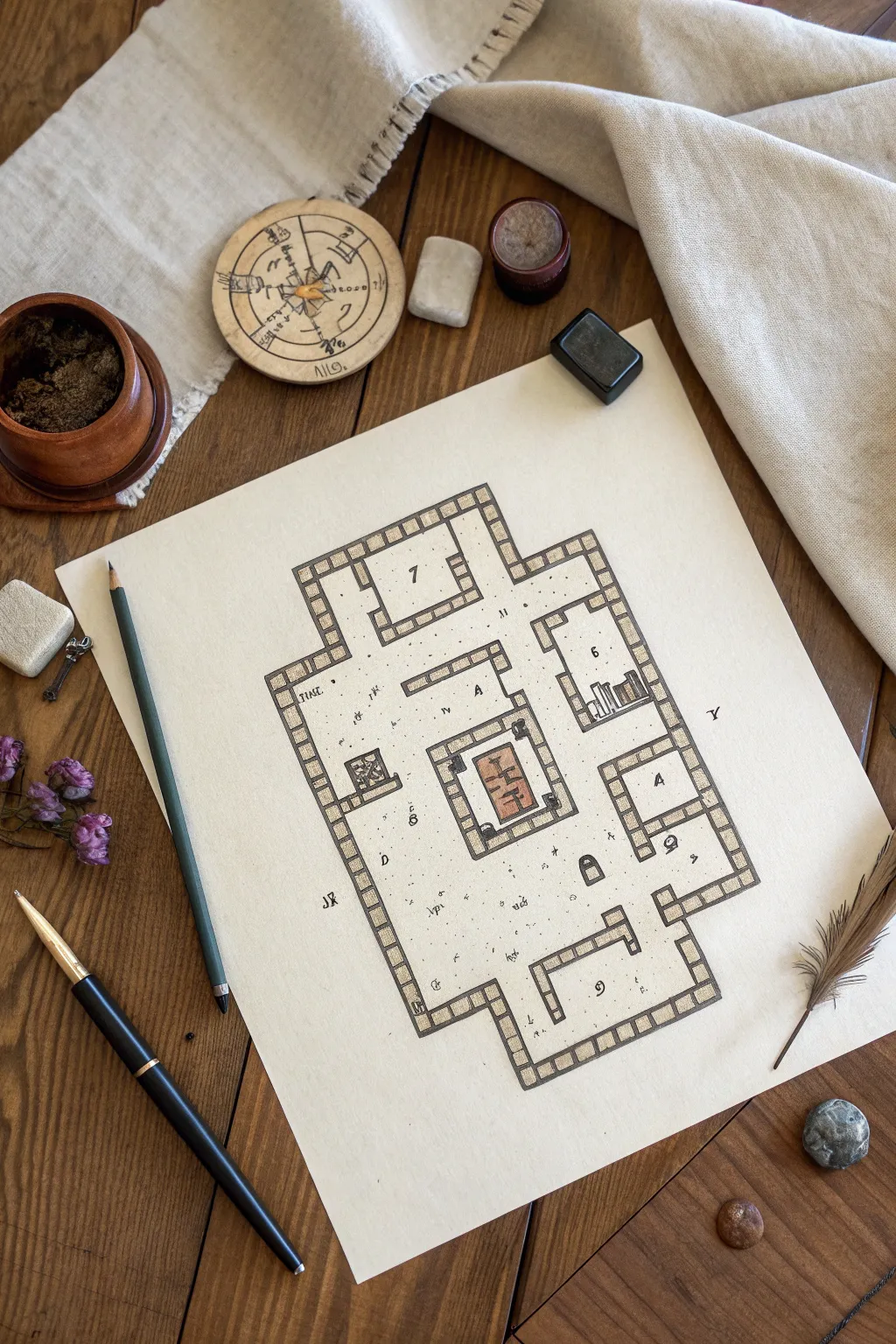
This project captures the nostalgic charm of classic RPG cartography with a clean, hand-drawn aesthetic. You’ll create a top-down dungeon map featuring distinct stone tile borders and subtle interior details on textured paper.
Step-by-Step
Materials
- Heavyweight off-white or beige textured paper (e.g., parchment style)
- Fine liner pens (Black, 0.1mm and 0.5mm)
- Graphite pencil (HB or 2B)
- Ruler or straight edge
- Colored pencils (Warm grey, terracotta/brick red)
- Eraser (kneaded preferred)
- Small blending stump (optional)
- Reference sketch of a dungeon layout
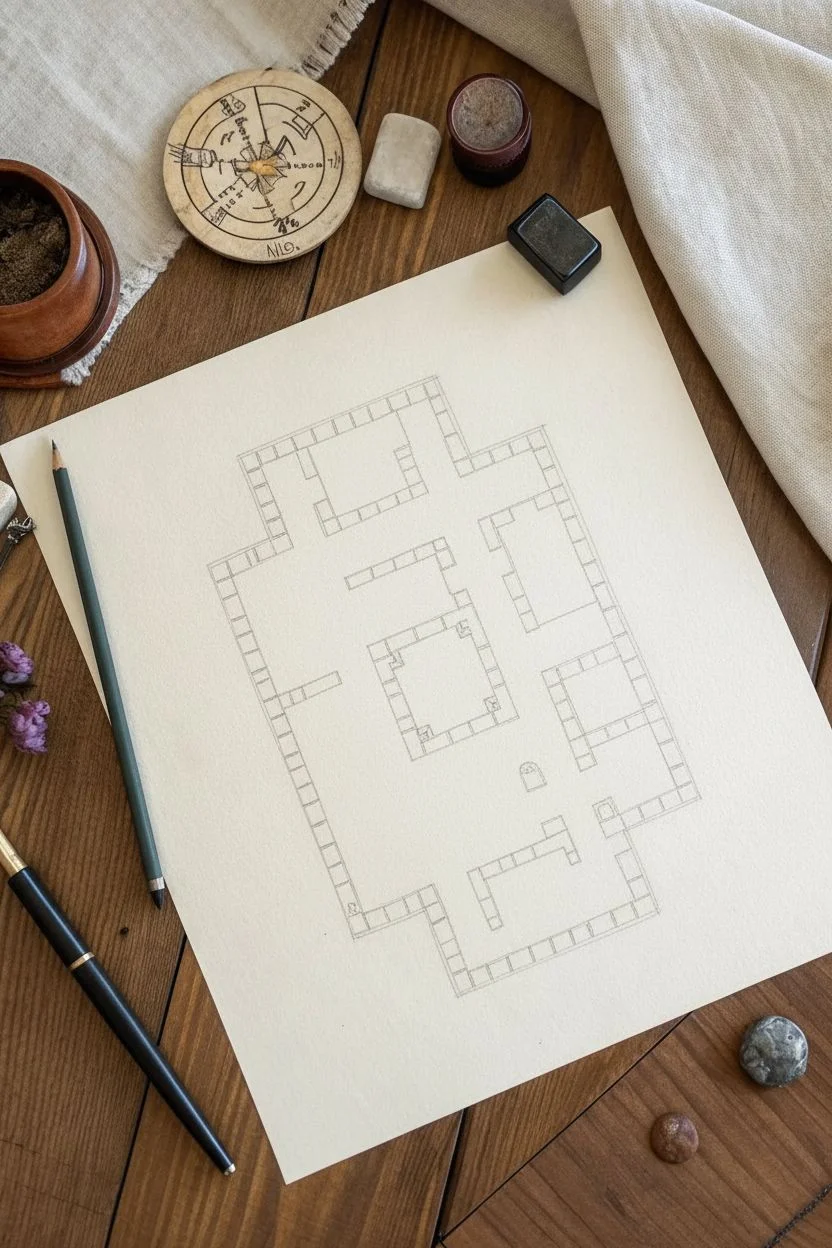
Step 1: Drafting the Layout
-
Plan the perimeter:
Begin by lightly sketching the overall shape of your dungeon rooms and corridors using a graphite pencil. Don’t press too hard, as you want these initial lines to be easily erasable later. -
Define the grid:
Inside your wall lines, establish the scale of your grid. Mark off evenly spaced increments (about 1cm or 0.5 inch squares work well) along the walls to guide where your individual stone blocks will sit. -
Sketch the wall thickness:
Draw a secondary line parallel to your room outlines to create the thickness of the walls. This double-line border will house your individual stone tiles. -
Block in the stones:
Using your grid marks as a guide, sketch vertical lines connecting the inner and outer wall lines to create individual rectangular blocks. These don’t need to be perfectly uniform; slight variation adds character.
Uneven Ink Lines?
If your straight lines look too shaky, don’t worry. Go back and add small cracks or chips to the wall stones. It turns a mistake into an intentional weathered texture.
Step 2: Inking the Structure
-
Outline the walls:
Switch to your 0.5mm black fine liner. carefully trace over the main pencil lines of your wall borders. I find it helpful to rotate the paper so I’m always pulling the pen toward me for straighter lines. -
Ink the individual stones:
Go over the dividing lines between the stone blocks. Keep your hand steady but allow for a little organic wobble to simulate rough-hewn stone. -
Erase pencil guides:
Once the ink is completely dry—give it a few minutes to be safe—gently erase all the underlying graphite sketch marks. -
Add room numbers:
With a smaller 0.1mm pen, neatly write numbers (like ‘6’ or ‘7’) in the center of key rooms. This mimics the look of a Game Master’s reference key.
Step 3: Adding Details and Color
-
Draw interior furniture:
Sketch small features like bookshelves, chests, or altars in the rooms. Ink these with the finer 0.1mm pen to differentiate them from the structural walls. -
Detail the central feature:
In the central room, draw a focus object (like the rectangular rug or altar shown). Add interior patterns or symbols to make it stand out. -
Shade the walls:
Take a warm grey colored pencil and lightly fill in the stone blocks of the walls. Using small circular motions helps get an even texture without harsh streaks. -
Highlight the central feature:
Use a terracotta or brick red pencil to color the central rug or altar. This pop of color draws the eye immediately to the middle of the composition. -
Stipple the floor:
With your finest pen, add tiny dots (stippling) and small dashes across the open floor spaces. Concentrate them slightly near corners to suggest shadows or dust. -
Add mystic symbols:
Scatter a few arcane runes or small letters in the open spaces or corridors to imply magical traps or hidden meanings. -
Draw rubble:
Sketch tiny clusters of three or four small rocks in random corners. Shade one side of these pebbles to give them volume.
Age the Paper
Before drawing, lightly stain your paper with cold tea or coffee and let it dry flat under a heavy book. This adds an authentic ancient artifact look to your map.
Now you have a professional-looking dungeon map ready for your next campaign session


Design Your Own Customizable Game Avatar
Bring your favorite video game characters to life in your sketchbook by designing customizable avatar templates. This project captures the clean, illustrative style of a character sheet, featuring line-art figures ready for outfits and color testing alongside a dedicated swatch palette.
Detailed Instructions
Materials
- Dotted grid journal or sketchbook (ivory or cream paper recommended)
- Fine liner pens (black, sizes 0.1mm, 0.3mm, and 0.5mm)
- Light grey brush pen or highlighter
- Colored pencils or fine markers (classic fantasy tones: greens, browns, muted reds)
- Pencil and eraser for sketching
- Circle stencil (optional but helpful)
Step 1: Planning and Layout
-
Grid Setup:
Open your dotted grid journal to a fresh spread. The left page will serve as your ‘outfit library’ and the right page will feature your main character design and color palette. Lightly mark the center of the pages with a pencil to help with symmetry. -
Title Block:
In the top right corner of the right-hand page, pencil in a header. Use a simple, bold sans-serif block lettering style. You can write something like ‘COLOR PALETTE’ or ‘CHARACTER GEAR.’ Once happy with the spacing, ink the outline with a 0.5mm pen. -
Header Shadows:
To give the header text some gentle depth, take your light grey brush pen and add a subtle drop shadow to the right side of each letter. This makes the title pop without being overwhelming.
Step 2: Drafting the Characters
-
Basic Shapes:
Start sketching your avatars using light pencil strokes. These figures are ‘chibi’ style—meaning large heads and smaller bodies. Draw a large oval for the head and a smaller, slightly rectangular shape for the torso. Aim for a head-to-body ratio of about 1:1.5. -
Defining the Poses:
Vary the poses slightly for visual interest. For the figure on the top left, have them standing neutrally. For the bottom left, try a 3/4 turn. On the right page, draw a dynamic, forward-facing pose. -
Adding Equipment Details:
Sketch the iconic details. For this fantasy adventurer look, add tunics, belts, simple boots, and a floppy hat. Keep the details simplified; focus on big shapes like the cuff of a boot or the strap of a satchel rather than individual stitches. -
Facial Features:
Draw large, expressive eyes placed low on the face. Add simple curved lines for the nose and mouth. The hair should be chunky and voluminous rather than detailed strands.
Clean Lines
When inking long lines on the tunic or legs, lock your wrist and move your entire arm. This prevents shaky lines and creates smooth, confident strokes.
Step 3: Inking the Line Art
-
Main Outlines:
Once your pencil sketch looks solid, switch to your 0.3mm fine liner. Carefully trace the outer perimeter of each character. I find that using a slightly thicker line for the outside silhouette makes the character stand out more on the page. -
Interior Details:
Switch to a delicate 0.1mm pen for inner details like facial features, boot folds, and belt buckles. This line weight variation is key to achieving that clean, professional illustration look. -
Erasing:
Wait at least 5-10 minutes for the ink to fully cure to prevent smudging. Gently erase all underlying pencil marks with a clean vinyl eraser. -
Spot Color:
Add tiny accents of color, like a touch of pink on the cheeks or a highlight in the eyes, to bring the characters to life immediately, even before full coloring.
Variation Ideas
Don’t stop at one outfit. Use the left-hand page to draw the same ‘base’ body doll multiple times, then draw different armor sets or costumes on each one.
Step 4: Creating the Palette System
-
Palette Box:
On the far right side of the right page, draw a long vertical rectangle with rounded corners using your 0.3mm pen. This will house your color swatches. -
Swatch Circles:
Inside the rectangle, draw two columns of small circles. A circle stencil is very helpful here to keep them uniform. Leave enough space below each circle to write color names. -
Filling Swatches:
Select your color scheme—earthy greens, muddy browns, clays, and mustards work great for this theme. Fill in the circles solid with your colored pencils or markers. -
Labeling:
Using your smallest 0.1mm pen, write the name of the color or the specific part of the outfit it corresponds to (e.g., ‘Tunic,’ ‘Boots’) underneath each colored circle in tiny, neat handwriting.
Now you have a charming reference sheet ready to inspire your next gaming session or art project

PENCIL GUIDE
Understanding Pencil Grades from H to B
From first sketch to finished drawing — learn pencil grades, line control, and shading techniques.
Explore the Full Guide
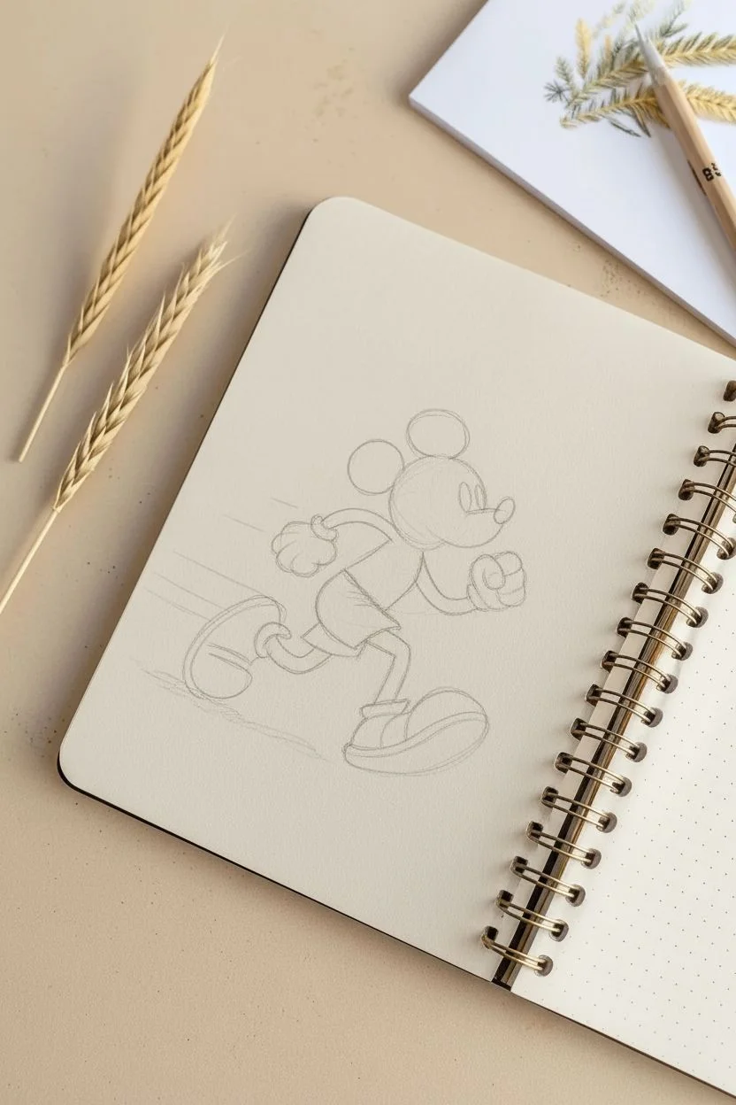
Speedy Mascot Character With Motion Lines
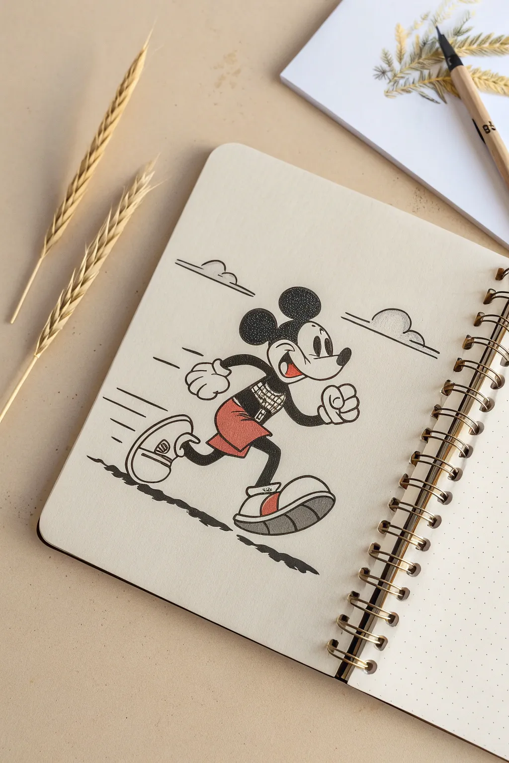
Capture the charm of classic animation with this dynamic sketch of a sprinting mouse mascot. Using stippling for texture and clean ink lines, you’ll create a lively character illustration that feels vintage yet fresh.
How-To Guide
Materials
- Sketchbook (with dotted or plain paper)
- HB Graphite pencil
- Eraser
- Fine liner pens (0.1mm, 0.3mm, 0.5mm) in Back
- Red colored pencil or marker
- Grey marker (light cool grey)
- Ruler (optional for motion lines)
Step 1: Planning the Pose
-
Basic Shapes:
Start with a light pencil sketch. Draw a large circle for the head and a smaller bean-like shape for the torso, leaning forward to suggest speed. -
Limb Placement:
Sketch stick-figure guidelines for the arms and legs. One leg should be kicked back high, and the front leg bent ready for impact. Position the arms in a classic runner’s pose—opposites to the legs. -
Adding Volume:
Flesh out the limbs with tubular shapes. Draw the large, rounded shoes—think oversized marshmallows—and add the gloved hands in fists.
Step 2: Defining the Character
-
Facial Features:
Draw the signature curved snout and nose. Add the large oval eyes with pie-cut pupils (a classic vintage detail) and a wide, open smile. -
Ears and Head:
Place two large circles on top of the head for ears. Refine the outline of the widow’s peak mask around the face. -
Clothing Details:
Sketch the shorts with two large buttons. Add a grid-like pattern to his shirt for a modern, sporty twist that contrasts the vintage style.
Dot Control
When stippling the ears, start with fewer dots and slowly build up density. It’s easier to darken an area than to fix one that became too dark too fast.
Step 3: Inking outlines
-
Main Lines:
Using a 0.3mm or 0.5mm pen, carefully go over your pencil lines. Focus on smooth, confident strokes for the curves of the ears and shoes to avoid shakiness. -
Detail Work:
Switch to a finer 0.1mm pen for delicate areas like the grid on the shirt, the facial expression, and the small details on the shoe soles. -
Cleanup:
Once the ink is completely dry—I usually give it a full five minutes to be safe—erase all your graphite guidelines gently to keep the paper surface smooth.
Customize the Kit
Change the shirt pattern from a grid to stripes or a solid number to represent your favorite sports jersey or birthday year.
Step 4: Shading and Texture
-
Solid Blacks:
Fill in the arms, legs, and nose with solid black ink. Leave small white highlights on the nose or limbs if you want a glossy look. -
Stippling Technique:
For the ears and the black part of the head, use a stippling technique instead of solid fill. Dot repeatedly with your 0.1mm pen. Denser dots create darker areas, lighter dots create highlights. -
More Dots:
Apply lighter stippling to the shadow areas of the gloves and the white face area to give it volume without harsh lines.
Step 5: Color and Final Touches
-
Adding Red:
Use your red pencil or marker to fill in the shorts. Keep the color solid but not too saturated to maintain that vintage feel. Add red accents to the shoe stripes and tongue. -
Grey Shadows:
Use a light grey marker or pencil to shade the soles of the shoes. This grounds the character and adds weight to the footwear. -
Motion Lines:
Draw horizontal speed lines trailing behind the character’s back, heels, and head. Vary the lengths to make it look energetic. -
Ground Shadow:
Ink a scribble-like shadow beneath the feet. Use a jagged, uneven line to suggest rough terrain or asphalt blurring by. -
Clouds:
Finally, add simple, stylized cloud shapes in the background using minimal lines to emphasize the open sky setting.
Now you have a timeless character dashing across your page, ready for his next adventure
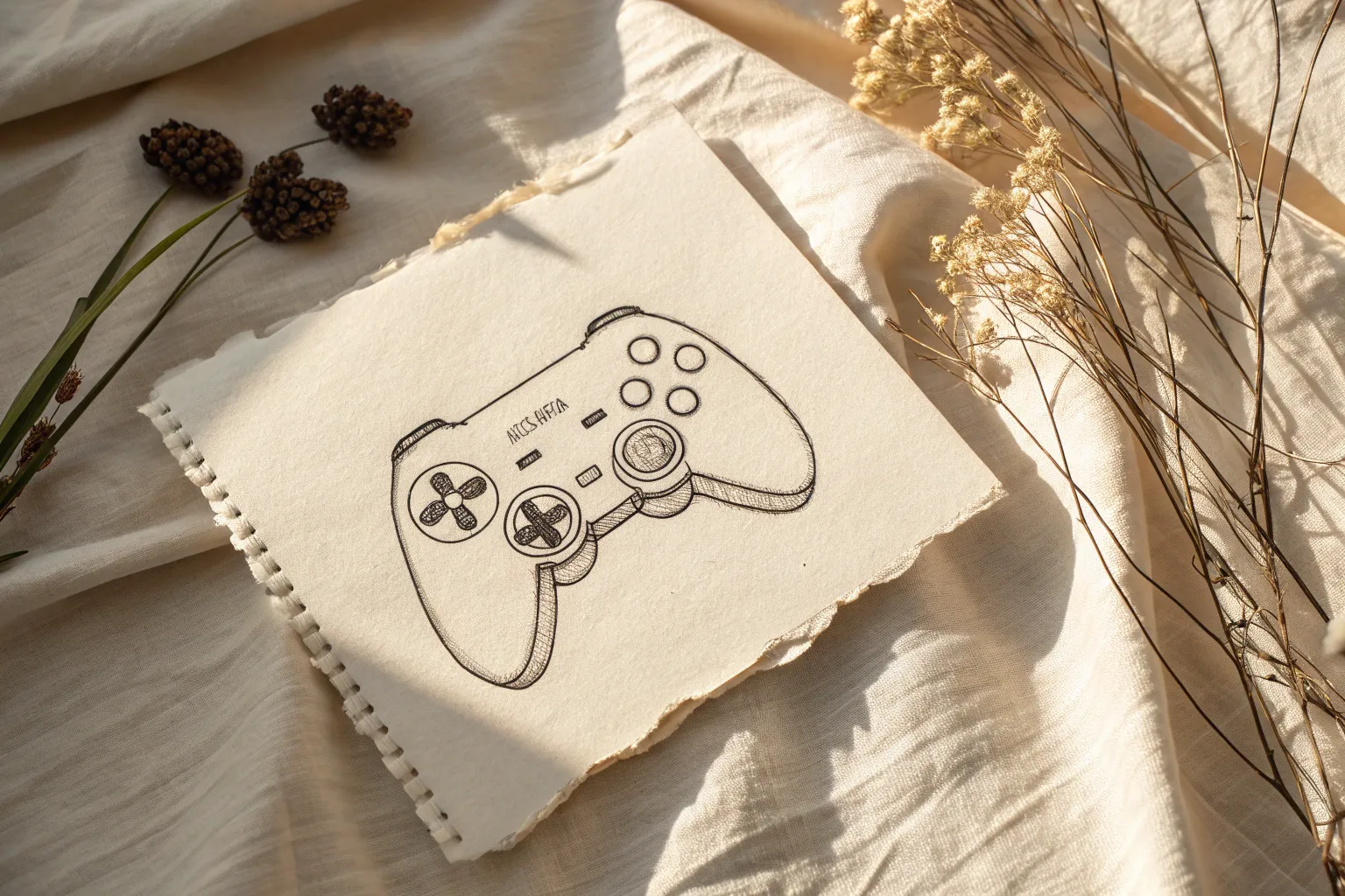
Hands Holding a Controller Action Sketch
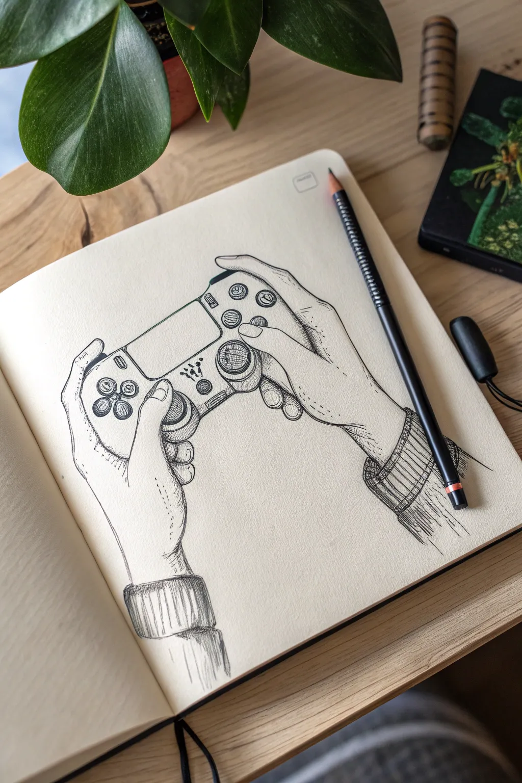
Capture the anticipation of gameplay with this detailed ink drawing of hands gripping a controller. This sketch focuses on anatomical structure and precise hatching to create a realistic yet stylized illustration perfect for your sketchbook.
Step-by-Step Guide
Materials
- Cream-colored sketchbook (A5 or similar)
- HB Graphite pencil
- Kneaded eraser
- Fine liner pens (sizes 005, 01, and 03)
- Reference photo of hands holding a controller
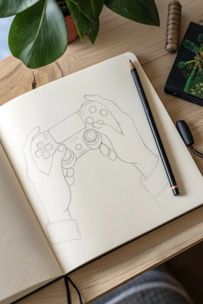
Step 1: Pencil Framework
-
Map the controller shape:
Begin by lightly sketching the central shape of the controller in the middle of your page. Focus on the main rectangular body and the two rounded grip handles at the bottom. Don’t worry about buttons yet; just get the silhouette right. -
Establish hand placement:
Draw large, loose ovals to represent where the palms sit against the controller handles. Add stick-figure lines to indicate the direction of the fingers wrapping around the top and front. -
Refine the thumbs:
Flesh out the thumbs first, as they are the primary anchor points on the face of the controller. Draw the joints clearly—remembering that the thumb has two visible knuckles—and position the tips hovering over or pressing the analog sticks. -
Sketch the fingers:
Draw the index fingers resting on the trigger buttons (L1/R1 or L2/R2). Sketch the remaining fingers wrapping around the back of the grips. Pay attention to how the skin bunches slightly at the knuckles. -
Add the wrists and sleeves:
Extend lines down from the palms to form the wrists. Sketch cylindrical shapes around the wrists to represent ribbed sweater cuffs, adding a cozy, casual vibe to the drawing. -
Detail the controller face:
Now draw the specific circles for the D-pad, face buttons, and the two analog sticks. Add the central touch pad and speaker vents. Ensure the perspective matches the angle of the hands.
Step 2: Inking the Outlines
-
Outline the hands:
Switch to your 01 fine liner. Carefully trace the outline of the hands, using slightly broken lines around wrinkles and knuckles to suggest skin texture rather than a rigid wireframe. Keep the lines near the cuffs loose. -
Define the controller:
Ink the controller’s main body. You want these lines to be smoother and more mechanical than the organic lines of the hands. Use a steady hand to circle the buttons and analog sticks. -
Add clothing details:
Ink the cuffs of the sweater. Use wavy, uneven lines for the edges of the fabric to show it is soft and knit material, distinct from the hard plastic controller. -
Erase pencil guides:
Once the foundational ink is completely dry, gently run your kneaded eraser over the entire drawing to lift away the graphite sketch. This reveals a clean, crisp line drawing.
Don’t Panic
Hands looking stiff? Check your reference. Real fingers aren’t straight interaction tubes; they have subtle bends at every joint. Add slight curves to your segments.
Step 3: Shading and Texture
-
Hatching the shadows:
Using the 005 pen, start adding diagonal hatching lines on the shadowed side of the fingers (usually the inner side facing the controller). Keep these lines thin and parallel. -
Texturing the analog sticks:
Draw tiny, concentric circles or tight cross-hatching on the heads of the analog sticks to mimic the rubberized grip texture found on real controllers. -
Shading the sleeves:
Use vertical lines on the sweater cuffs to represent the ribbing of the knit fabric. Add deeper shadows where the sleeve meets the wrist using cross-hatching to create depth. -
Deepening contrast:
Switch to the 03 pen for the darkest areas. Fill in the small gaps between the fingers and the controller body, and darken the underside of the controller handles to ground the object. -
Stippling details:
Add tiny dots (stippling) on the knuckles and the back of the hand to suggest pores and faint skin texture without making the hands look aged. Less is more here. -
Final touches:
Review the drawing for balance. If the controller feels too light, add a second layer of hatching to the sides. Sign your work or add a small date stamp near the corner.
Level Up
Add a distinct pattern to the sweater cuffs, or draw ‘stickers’ on the controller face to personalize the gadget and add narrative flair.
Now you have a dynamic study of gaming in action, ready to be the start of a new sketchbook section


Have a question or want to share your own experience? I'd love to hear from you in the comments below!