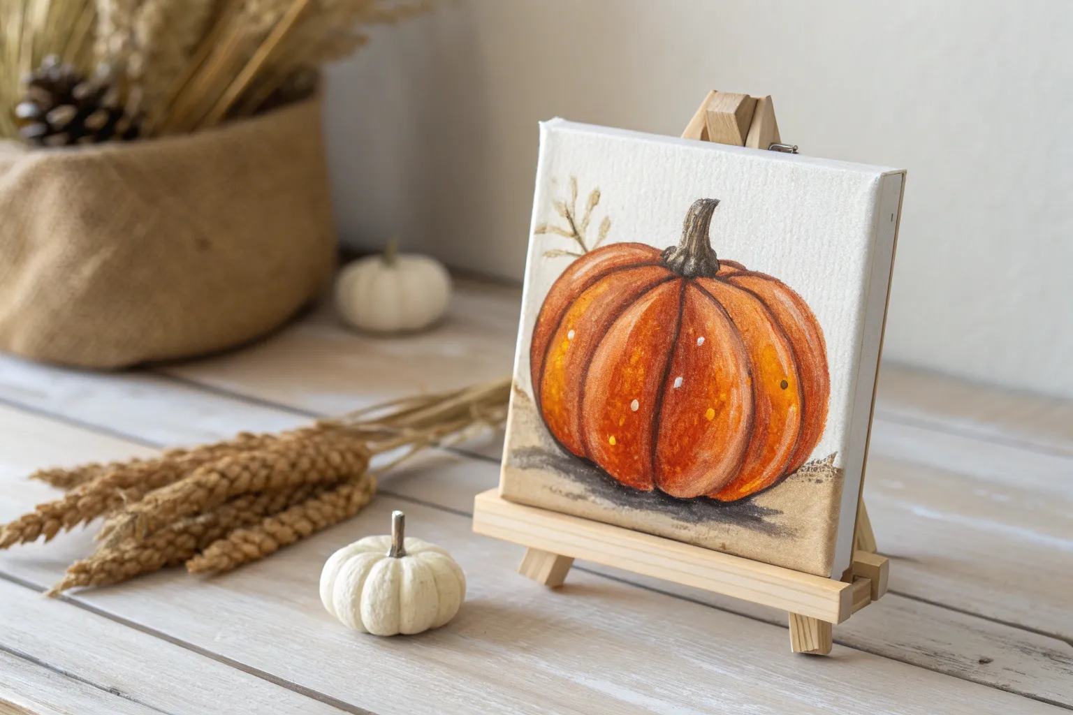
If you’re craving easy fall painting ideas that still look super satisfying when they’re done, you’re in the right season. I’m sharing beginner-friendly concepts with classic autumn symbols and simple techniques that make the whole process feel relaxed and doable.
Leaf Print Painting With Real Leaves
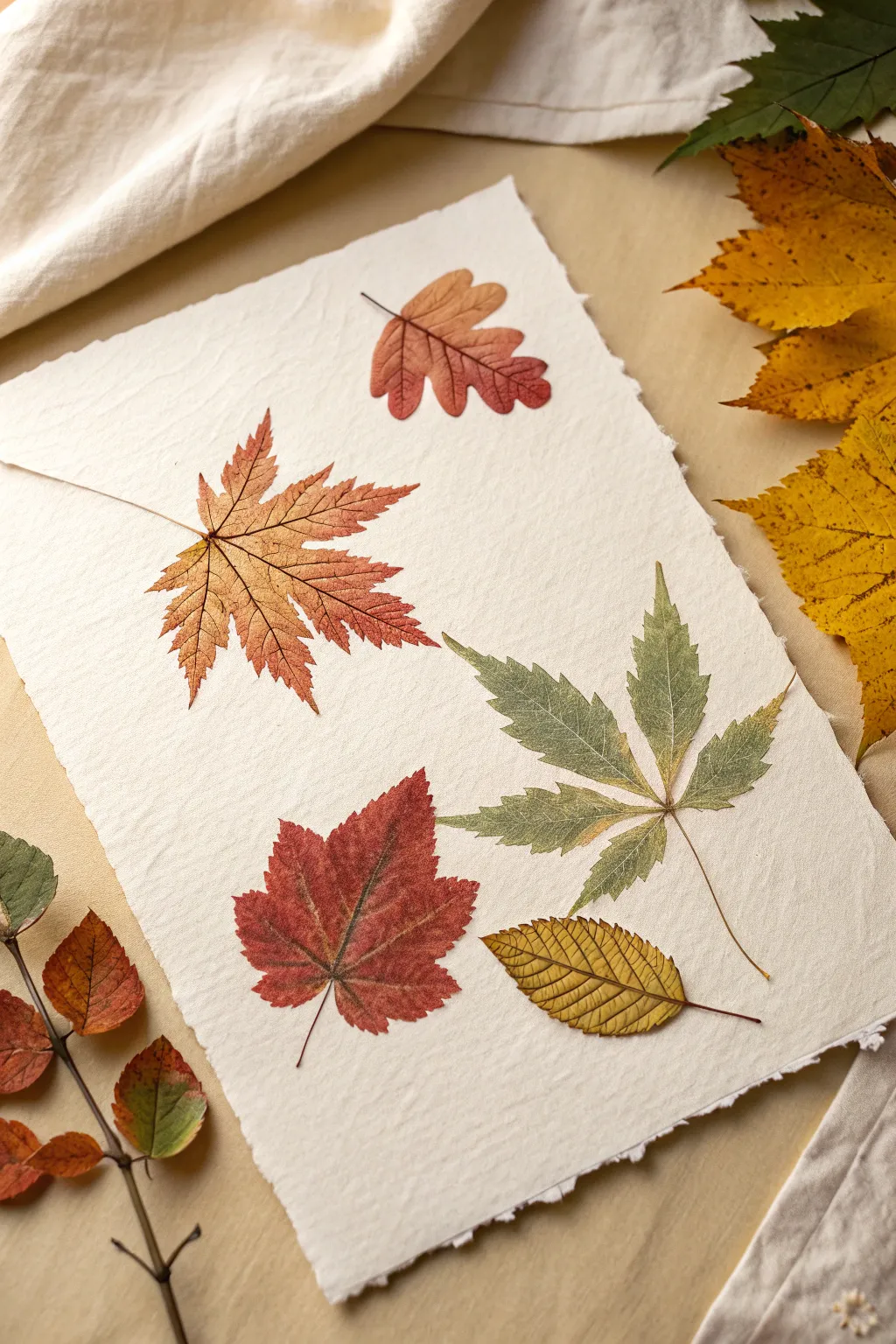
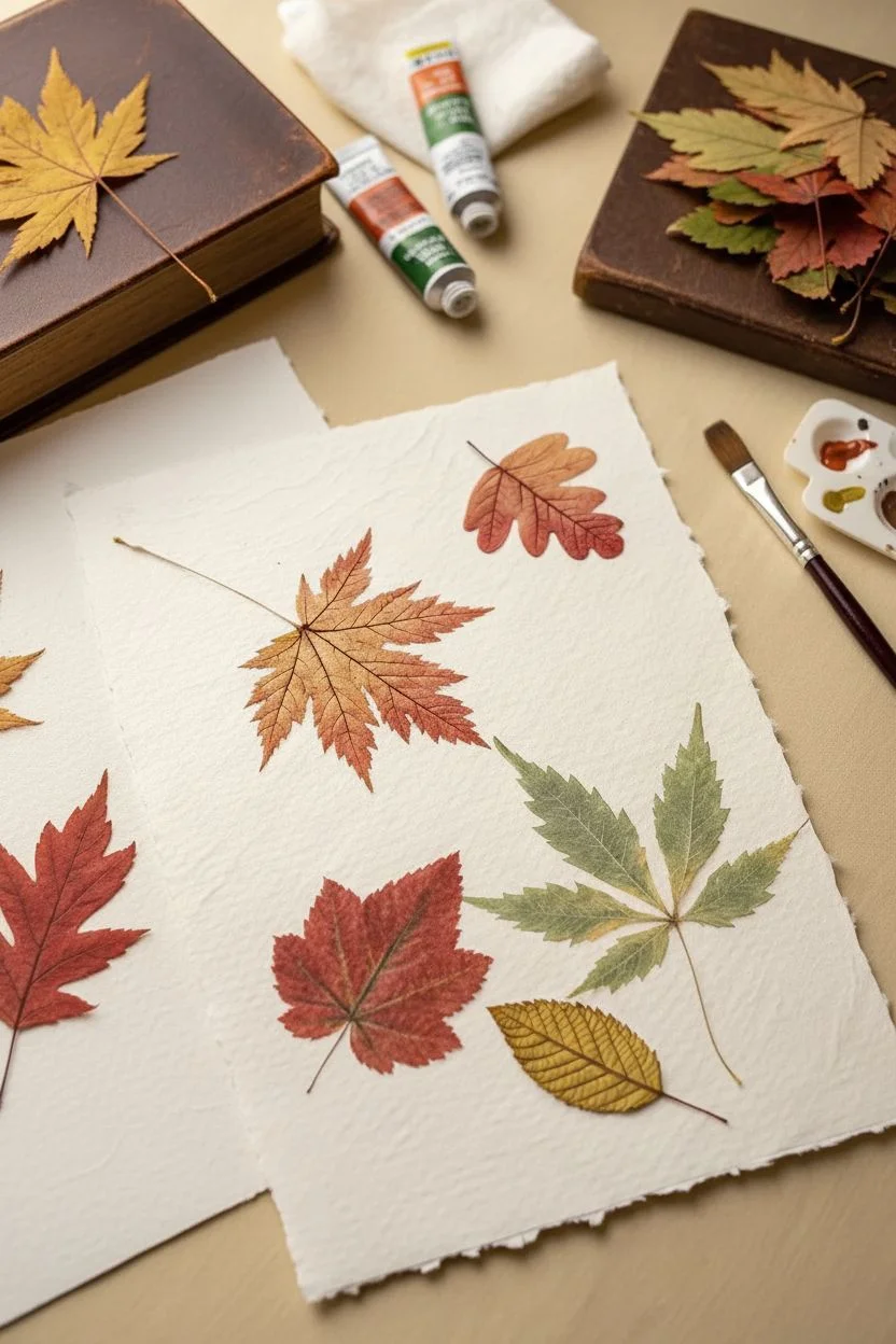
Capture the delicate beauty of autumn by creating highly realistic leaf impressions on textured paper. This project uses a careful printing technique to preserve even the finest veins and serrated edges for a botanical illustration effect.
Step-by-Step Guide
Materials
- Various fresh fallen leaves (oak, maple, elm, etc.)
- Thick textured watercolor paper with deckled edges (cotton rag or handmade)
- Acrylic paints (burnt sienna, yellow ochre, sap green, deep red)
- Wide flat paintbrush (synthetic)
- Brayer or clean foam roller
- Scrap paper or newsprint
- Paper towels
- Heavy book or pressing weight
- Tweezers (optional)
Step 1: Leaf Selection and Preparation
-
Choose your specimens:
Gather a variety of leaves with interesting shapes and prominent vein structures. Look for leaves that are still pliable and not brittle, as dry leaves tend to crumble during the printing process. -
Clean and dry:
Gently wipe your leaves with a slightly damp paper towel to remove any dirt or dust. Pat them completely dry, ensuring no moisture remains on the surface. -
Flatten briefly:
If your leaves are curled, place them under a heavy book for about 30 minutes. You don’t need them fully pressed, just flat enough to make good contact with the paper.
Blurry edges?
If your prints look like blobs, you are likely using too much paint. Sponge off excess paint from the leaf before printing to reveal the delicate veins.
Step 2: Applying the Paint
-
Prepare your palette:
Squeeze out small amounts of your autumn acrylic colors onto a palette. Don’t add water; you want the paint to be slightly tacky and rich in pigment for a crisp print. -
First color application:
Select your first leaf (try an oak leaf) and place it vein-side up on a piece of scrap paper. Load your flat brush with a burnt orange color. -
Brush technique:
Paint the surface of the leaf using light, outward strokes from the center stem to the edges. This prevents paint from pooling underneath the leaf edges. -
Blending colors:
For a realistic look, mix colors directly on the leaf. Dab a little dark red near the edges or some yellow near the center while the first color is still wet. -
Check coverage:
Ensure the entire leaf is coated thinly. If there are globs of paint, blot them very gently with a paper towel. Too much paint will smudge the fine details.
Step 3: Printing the Composition
-
Positioning:
Carefully pick up the painted leaf by its stem (tweezers can help keep things clean) and hover over your textured paper to decide placement. Aim for a diagonal or scattered arrangement. -
Making contact:
Gently lay the leaf paint-side down onto the paper. Once it touches the paper, do not shift or slide it, as this will blur the impression. -
Pressing:
Place a clean sheet of scrap paper over the leaf. Use a brayer or the heel of your hand to apply firm, even pressure over the entire leaf area. -
The reveal:
Remove the scrap paper. Hold the leaf by the stem and peel it back slowly in one smooth motion to reveal your print. -
Repeat the process:
Continue this process with different leaves—maple, elm, or serrated leaves—using varyious colors like sap green and yellow ochre. -
Create variety:
Try printing one large green leaf that transitions into yellow to mimic the changing season. I like to rotate the paper occasionally to ensure the leaves look naturally scattered. -
Fill the space:
Place a smaller, simple leaf near the bottom or corners to balance the composition, perhaps using a golden-yellow hue.
Add some sparkle
Mix a tiny drop of gold metallic paint into your yellow or red leaf colors. It gives the finished print a subtle, elegant shimmer.
Step 4: Finishing Touches
-
Stem detailing:
Sometimes the stems don’t print clearly. Use a very fine liner brush with a tiny amount of diluted brown paint to carefully connect any missing stem lines. -
Dry properly:
Let the artwork sit undisturbed until the acrylics are completely dry to the touch. -
Flattening the paper:
If the moisture from the paint buckled your paper slightly, place the dry artwork between two clean sheets of paper and weigh it down with heavy books overnight.
Now you have a stunning botanical print that preserves the fleeting beauty of fall leaves forever


Fall Tree With Dabbed Foliage
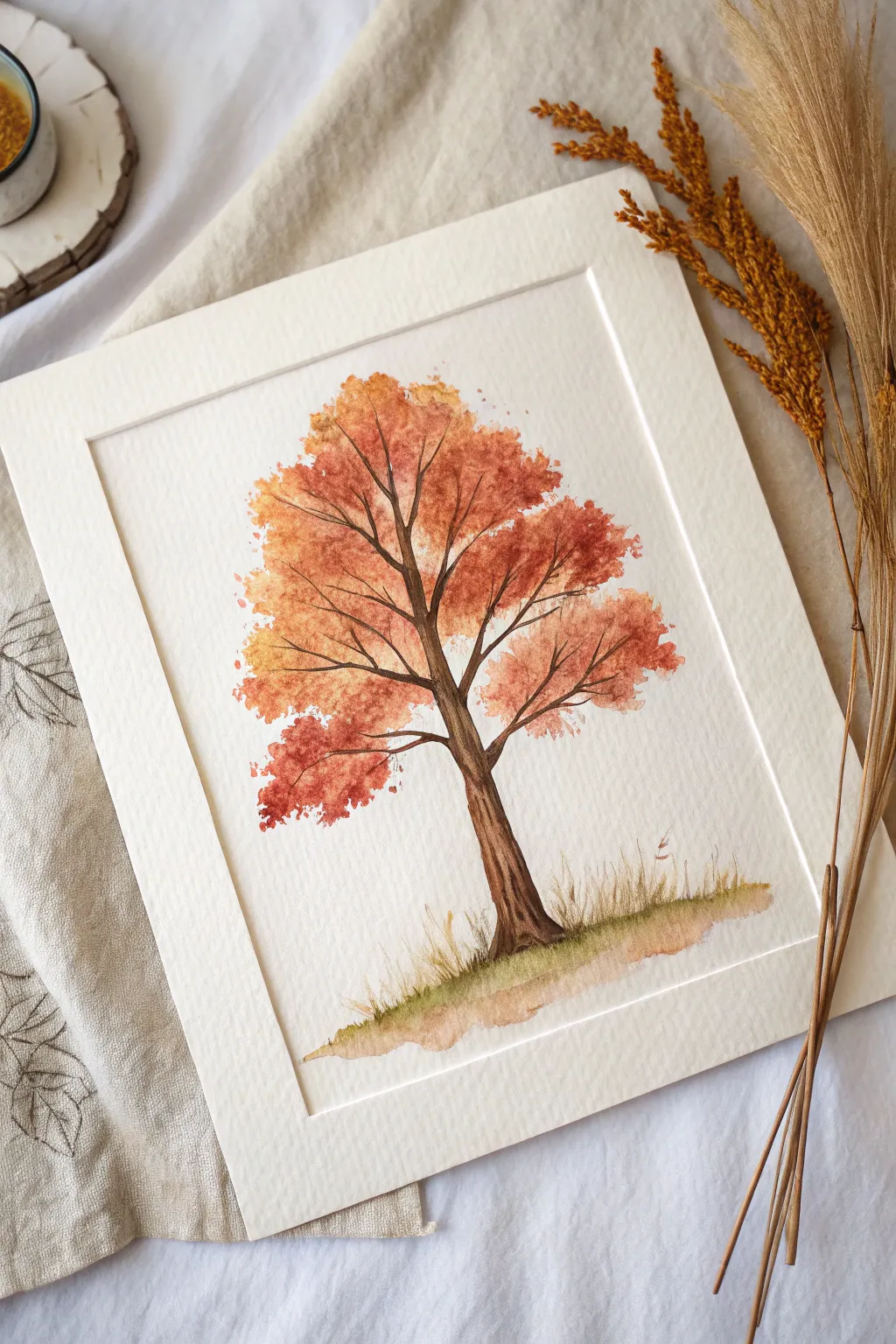
Capture the essence of fall foliage with this simple yet striking watercolor technique. Using a dabbing motion creates a lush, textured canopy full of warm seasonal hues without needing to paint individual leaves.
Step-by-Step Tutorial
Materials
- Cold press watercolor paper (140lb/300gsm)
- Watercolor paints (Burnt Sienna, Yellow Ochre, Cadmium Red, Sepia or Burnt Umber, Sap Green)
- Round brush (size 6 or 8 for trunk)
- Old scruffy brush, sea sponge, or stiff bristle brush for foliage
- Small round brush (size 2 or 4) for details
- Clean water
- Palette
- Painter’s tape or masking tape (optional for borders)
Step 1: Painting the Trunk and Branches
-
Sketch the structure:
Begin by lightly sketching the main trunk and primary branches with a pencil. Keep the lines faint so they won’t show through the paint later. Focus on a Y-shape structure that splits and reaches upward. -
Mix your trunk color:
On your palette, mix a rich brown using Burnt Umber or Sepia. You can add a tiny touch of blue to darken it for the shadowed side of the tree. -
Paint the main trunk:
Using your medium round brush (size 6 or 8), paint the trunk starting from the base and moving upward. Apply slightly more pressure at the bottom to widen the base and lift as you go up to taper the trunk. -
Add texture to the bark:
While the trunk is still damp, drop in a slightly darker brown along one side to create a shadow and roundness. Use the tip of the brush to suggest vertical bark striations. -
Extend the branches:
Switch to a smaller brush (size 2 or 4) to pull fine branches outward from the main trunk. Let your hand tremble slightly to give the branches a natural, organic look rather than perfect straight lines. -
Create the branch tips:
ensure the branches taper off into very fine points where the leaves will attach. Don’t worry about painting every single twig; many will be covered by foliage.
Muddy Colors?
If your foliage colors are turning brown and muddy, let each layer of color dry completely before dabbing the next one on top. Wet-on-wet blends; wet-on-dry layers.
Step 2: Creating the Autumn Foliage
-
Prepare your foliage colors:
Mix puddles of autumn colors: specific mixes like bright orange (Yellow + Red), a rusty red (Burnt Sienna + Red), and a golden yellow (Yellow Ochre). Keep the consistency milky—not too thick, but vibrant. -
Start with the lightest color:
Take your scruffy brush or sponge and dip it into the yellow-orange mix. Blot excess paint on a paper towel so it’s not dripping. -
Dab the first layer:
Lightly dab the color onto the paper around the branches, focusing on the outer edges of the canopy. Leave plenty of white space between dabs to keep the tree looking airy. -
Add mid-tones:
While the yellow layer is still distinct (it can be wet or dry depending on if you want soft or hard edges), switch to your rusty orange color. Dab this into the center masses of the leaf clusters. -
Deepen the canopy:
Using a reddish-brown mix, dab into the lower parts of the leaf clusters to suggest shadow and volume. I find this gives the tree a lovely three-dimensional weight. -
Refine the shape:
Step back and look at the overall silhouette. Add a few stray dabs floating away from the main clumps to simulate falling leaves or loose branches. -
Connect leaves to branches:
Once the foliage is dry, use your smallest brush to paint tiny, thin brown twigs connecting any floating foliage clumps back to the main branch structure.
Step 3: Grounding the Tree
-
Paint the base wash:
Mix a watery Sap Green with a touch of brown. Makes a horizontal sweep at the base of the trunk to ground the tree. -
Add grass texture:
While the ground wash is damp, use a specialized fan brush or just flick upward with a small round brush to create grass blades emerging from the wash. -
Soften the edges:
Clean your brush and use plain water to soften the bottom edge of the ground shadow, letting it fade naturally into the white paper. -
Final touches:
Sprinkle a tiny bit of clean water or very diluted paint onto the foliage area if you want extra texture, then let the entire piece dry completely before framing.
Sponge Secret
For the most natural leaf texture, use a natural sea sponge instead of a brush. Tear off a small piece about the size of a grape for better control.
Now you have a warm, rustic piece of autumn art ready to display.


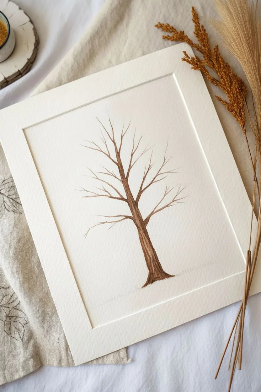
Bare Branches Silhouette Against a Sunset Sky
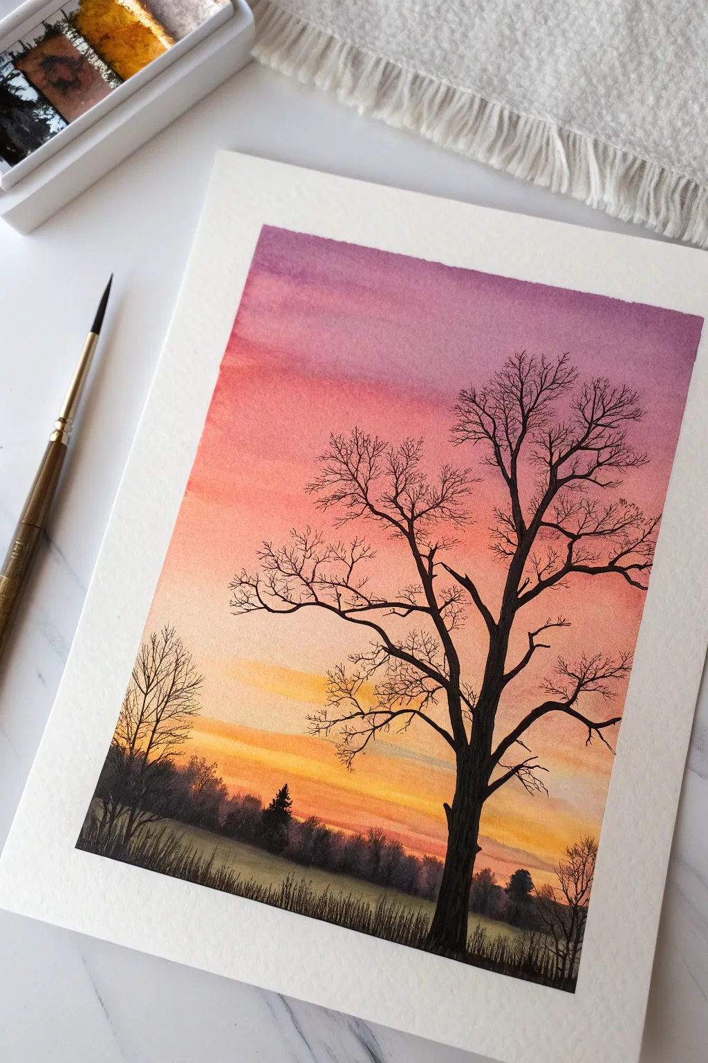
Capture the stark beauty of late autumn with this dramatic silhouette painting. The contrast between the detailed bare branches and the soft, gradient sunset creates a striking visual that looks deceptively complex but relies on simple watercolor techniques.
Step-by-Step
Materials
- Cold press watercolor paper (140lb/300gsm)
- Watercolor paints (Purple, Alizarin Crimson, Orange, Yellow Ochre, Paynes Grey/Black, Sap Green)
- Large flat wash brush
- Medium round brush (size 6-8)
- Fine liner or rigger brush (size 0-2)
- Masking tape
- Clean water jar
- Paper towels
- Palette or mixing plate
Step 1: Painting the Sky Gradient
-
Tape deeper:
Begin by taping down all four edges of your watercolor paper to a board or table. This creates that crisp white border and prevents the paper from buckling when wet. -
Prepare the sky wash:
Pre-mix your sky colors on your palette: a deep purple, a vibrant pinkish-red (like Alizarin Crimson), a bright orange, and a warm yellow. Having them ready is crucial for a smooth blend. -
Wet the paper:
Use your large flat brush to apply clean water across the entire sky area, stopping about an inch above the bottom of the paper. You want the paper glistening but not swimming in puddles. -
Apply the purple:
Starting at the very top, paint a horizontal band of purple. Let the wet paper help diffuse the bottom edge of this color. -
Blend in pink:
Pick up your pink tone and paint directly below the purple, slightly overlapping the two distinct bands. Tilt the board slightly to encourage them to merge softly. -
Transition to orange:
Rinse your brush slightly and add the orange band below the pink. Work quickly while the paper is still damp to avoid hard edges forming between colors. -
Finish with yellow:
Complete the sky gradient with yellow near the horizon line. I like to leave a few faint streaks of white paper here to suggest bright clouds catching the last light. -
Add cloud streaks:
While the sky is still damp, you can gently drag a clean, slightly damp brush horizontally through the lower orange/yellow section to lift hazy cloud shapes. -
Total dry time:
Let this layer dry completely. The paper must be bone-dry and flat before you paint the sharp silhouette details on top.
Mastering the Rigger Brush
For the finest twigs, hold your rigger brush vertically and barely touch the paper. Roll the handle slightly in your fingers to make lines naturally jittery and organic.
Step 2: Establishing the Horizon
-
Mix dark hues:
Create a very dark, near-black mixture for the foreground. Mix Paynes Grey with a touch of purple and deep green to get a rich shadow color rather than a flat black. -
Paint the distant trees:
Using a medium round brush and a slightly diluted version of your dark mix, paint a jagged tree line along the horizon. Keep the edges soft and imprecise to push them into the distance. -
Fill the ground:
Switch to a stronger, darker concentration of paint for the immediate foreground. Fill the bottom inch of the paper, using horizontal strokes to suggest a grassy field in shadow. -
Texture the grass:
While the foreground is wet, flick upward with a rigger brush or the tip of your round brush to create tall blades of grass along the bottom edge.
Fixing Water Blooms
If cauliflower-like blooms appear in your sky, you added water to drying paint. Don’t fight it! Let it dry, then turn it into a cloud by lifting pigment with a damp brush.
Step 3: Creating the Main Silhouette
-
Map the trunk:
Using your darkest paint mixture (virtually opaque), paint the main trunk of the large tree on the right side. Start wide at the base and taper as you go up. -
Branch structure:
Extend thick primary branches outward from the trunk. Remember that trees are organic; avoid perfect symmetry and let branches cross over each other. -
Fine details:
Switch to your fine liner or rigger brush. This is the key tool for those delicate, wispy twigs at the ends of the branches. Use very light pressure and quick flicks of the wrist. -
Add secondary trees:
Paint a smaller, less detailed tree on the left side to balance the composition. Use the same technique but keep the lines thinner to suggest it is further away. -
Connect the scene:
Ensure the base of your trees blends seamlessly into the dark foreground grass you painted earlier. -
Final reveal:
Once absolutely everything is dry to the touch, slowly peel away the masking tape at a 45-degree angle to reveal your clean edges.
Step back and admire the glowing warmth of your autumn evening scene


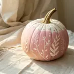
Pumpkin Patch With Simple Oval Shapes
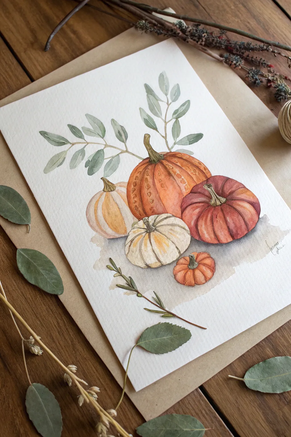
Capture the cozy abundance of autumn with this gentle watercolor illustration featuring a cluster of varied pumpkins and soft eucalyptus leaves. The muted oranges, creamy yellows, and deep russet tones create a nostalgic, farmhouse-style composition perfect for seasonal decor.
Step-by-Step Tutorial
Materials
- Cold press watercolor paper (300 gsm)
- Watercolor paints (Burnt Sienna, Yellow Ochre, Alizarin Crimson, Sap Green, Payne’s Grey, Burnt Umber)
- Round brushes (size 4 for details, size 8 for washes)
- Fine liner brush or very fine nib pen (sepia or brown)
- Pencil (HB or 2H)
- Kneaded eraser
- Clean water and paper towels
- Mixing palette
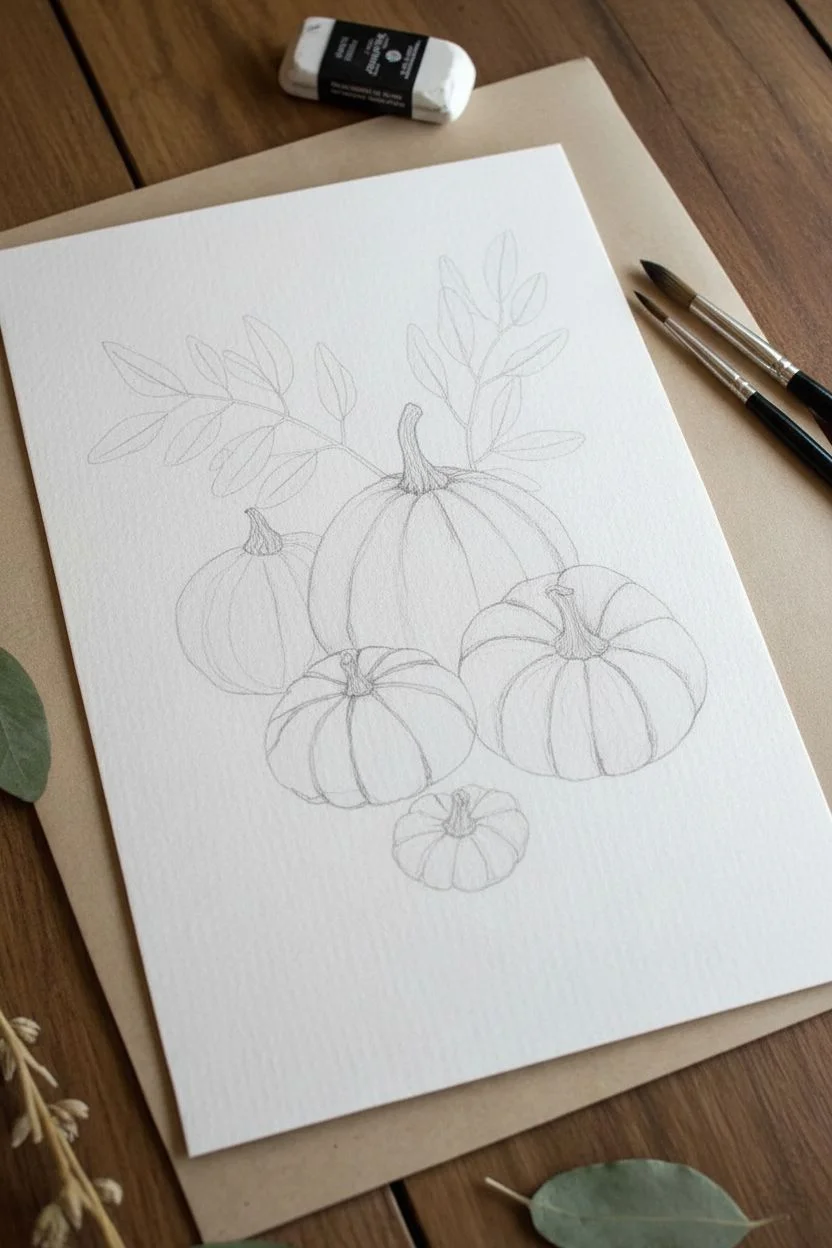
Step 1: Sketching the Composition
-
Outline the central pumpkin:
Begin by lightly sketching the largest central pumpkin. Draw it as a slightly flattened oval shape, tilting a bit to the right to add movement. -
Add flanking gourds:
To the left of the main pumpkin, draw a smaller, taller gourd shape that tucks slightly behind the main one. On the right, sketch a wide, squat pumpkin shape. -
Include the foreground:
Center a small, white pumpkin directly in front of the large orange one. Then, place a tiny, darker orange mini-pumpkin to the right of the white one to balance the cluster. -
Refine shapes and stems:
Add curved vertical lines to define the ribs of each pumpkin. Sketch twisting, knobby stems on top of each fruit, varying their lengths and directions for realism. -
Sketch the foliage:
Draw light, sweeping lines curving upward from behind the pumpkins to serve as branches. Add oval-shaped eucalyptus leaves along these stems, keeping the arrangement loose and airy.
Muddy Colors?
If your shadows look muddy or gray, you might be mixing too many colors. Let the paper dry completely between layers to keep the hues crisp and vibrant.
Step 2: Painting the Pumpkins
-
First layer: Large orange pumpkin:
Mix a watery wash of Burnt Sienna and Yellow Ochre. Paint the large central pumpkin, leaving small white gaps along the top curves to serve as highlights. -
First layer: Accompanying pumpkins:
Paint the left gourd with a pale wash of Yellow Ochre and a touch of Burnt Sienna. For the right pumpkin, use a deeper mix of Alizarin Crimson and Burnt Sienna for a reddish hue. -
Painting the white pumpkin:
The white pumpkin in the front needs very little paint. Use a very diluted mix of Payne’s Grey and Yellow Ochre to shadow the crevices between ribs, leaving the majority of the paper white. -
Adding the mini pumpkin:
Paint the tiny front-right pumpkin with a saturated mix of Burnt Sienna, making it the most intense spot of orange in the cluster. -
Deepening the shadows:
Once the first layers are dry, mix a slightly darker version of each pumpkin’s base color. Paint along the rib lines and the bottom edges to create volume and roundness. -
Adding texture spots:
I like to add little speckles while the paint is still slightly damp on the large orange pumpkin; lift out tiny spots with a dry brush or dab in darker pigment to create that bumpy gourd texture. -
Painting the stems:
Use a mix of Sap Green and Burnt Umber to paint the stems. Add vertical lines of darker brown to show the fibrous texture of dried wood.
Add Vintage Charm
Splatter tiny droplets of diluted brown or gold paint over the finished piece using an old toothbrush for an aged, rustic postcard aesthetic.
Step 3: Leaves and Final Details
-
Painting leaves:
Mix a muted, sage green using Sap Green and a touch of Payne’s Grey. Paint the eucalyptus leaves with simple, single brushstrokes, varying the pressure to taper the ends. -
Variation in greenery:
While the leaves are wet, drop in a tiny bit of brown or blue into a few of them to create color variety and depth. -
Grounding shadow:
Mix a very watery grey-brown wash. Apply this loosely underneath the pumpkins to ground them, letting the edges fade out naturally into the paper. -
Adding definition:
Once everything is completely dry, use your smallest brush or a fine liner pen to very lightly outline the pumpkin segments and define the edges of the stems. -
Final assessment:
Step back and look at contrast. If the pumpkins look too flat, add a final glaze of darker color to the deepest shadows between the fruits.
Now you have a charming autumnal centerpiece that captures the gentle spirit of the season
BRUSH GUIDE
The Right Brush for Every Stroke
From clean lines to bold texture — master brush choice, stroke control, and essential techniques.
Explore the Full Guide
Simple Scarecrow Face on a Fall Background
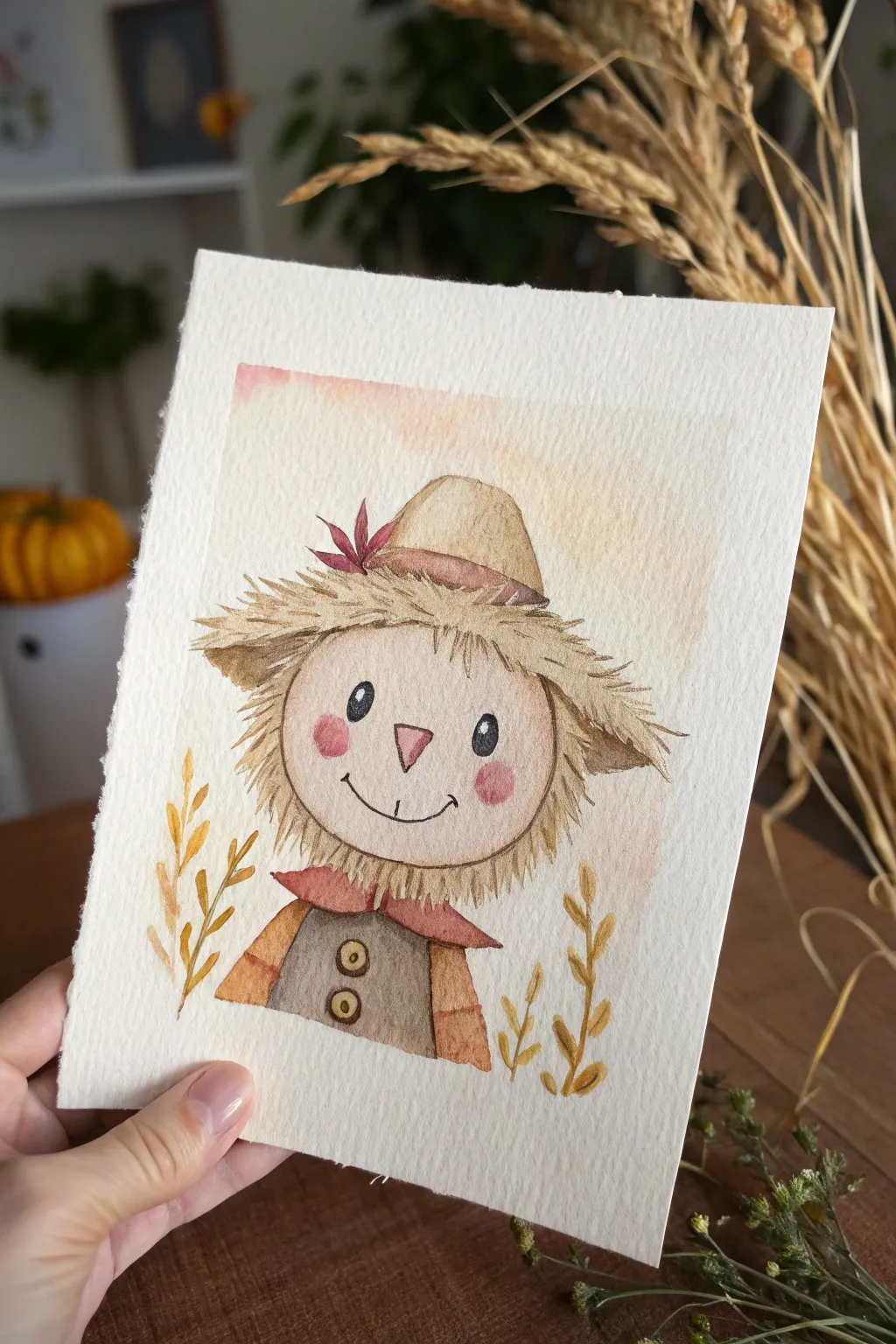
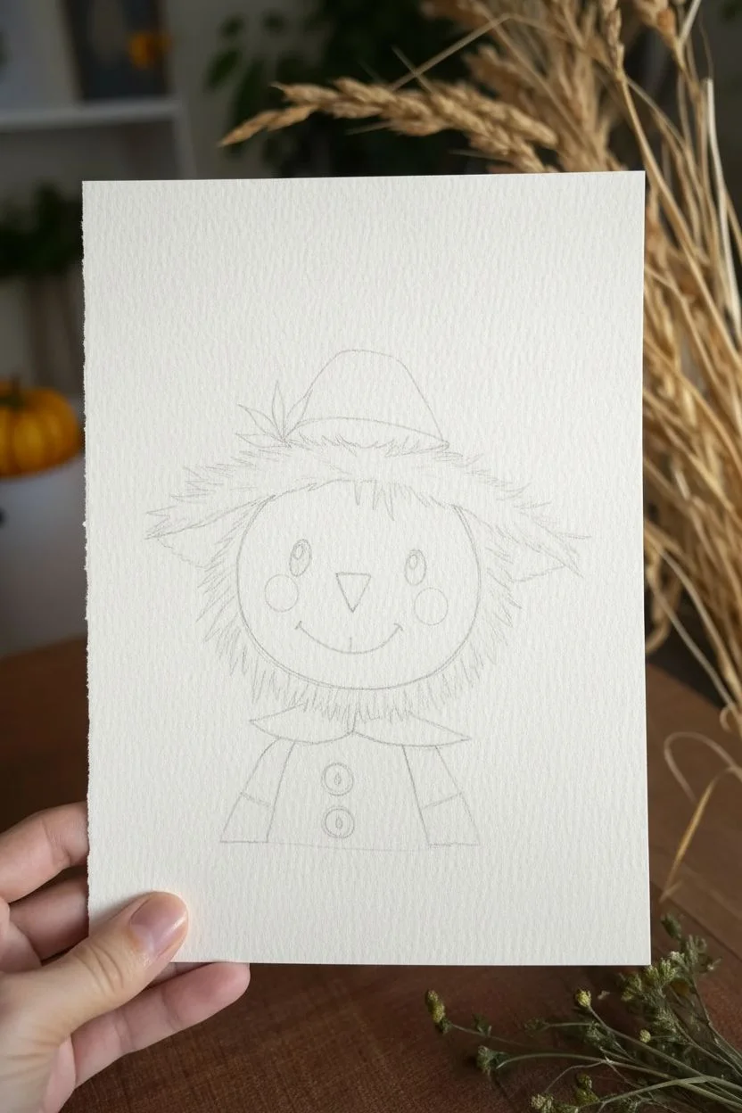
Capture the cozy charm of autumn with this sweet watercolor illustration featuring a friendly scarecrow. Using textured paper and warm earth tones, you’ll build up layers to create a soft, inviting character perfect for seasonal cards or decor.
Step-by-Step
Materials
- Cold press watercolor paper (300gsm for texture)
- Watercolor paints (Yellow Ochre, Burnt Sienna, Alizarin Crimson, Sepia, Payne’s Grey)
- Round watercolor brushes (sizes 2, 4, and 6)
- Pencil (HB or 2H)
- Kneaded eraser
- Fine liner pen (brown or sepia, waterproof)
- Masking tape
- Jar of water
- Paper towels
Step 1: Sketching the Character
-
Prepare your paper:
Cut your watercolor paper to your desired size (A5 works well). Tape the edges down to a board if you plan to do a heavy background wash, though for this vignette style, it’s optional. -
Outline the head:
Using your pencil lightly, draw a large circle in the center of the page. This will be the scarecrow’s face. Keep the lines faint so they can be erased later. -
Add hair guidelines:
Sketch a jagged, uneven halo around the circle to represent the straw hair sticking out. Don’t worry about individual strands yet; just get the general shape. -
Draw the hat:
Place a rounded triangle shape on top of the hair for the hat. Add a curved band at the base of the hat crown and a small leaf tucked into the side for detail. -
Sketch the outfit:
Below the head, draw a pointed collar (like long triangles) and the top of a shirt with a vertical placket and two round buttons. -
Map the face:
Inside the face circle, lightly mark positions for two oval eyes, a triangular nose, and two rosy cheek circles. Draw a simple curved smile line.
Muddy Colors?
If your straw texture looks muddy, ensure the yellow base layer is 100% dry before painting the brown detail strokes on top. Patience prevents blending.
Step 2: Adding the Watercolor Layers
-
Paint the skin tone:
Mix a very dilute wash of Burnt Sienna or a pale flesh tone. Using your size 6 brush, fill in the face circle. Keep it very watery for a soft look and let it dry completely. -
Base layer for the straw:
Mix Yellow Ochre with plenty of water. Paint the jagged hair area and the main body of the hat. While wet, you can drop in a tiny bit of brown at the roots for depth. -
Color the clothes:
Use a mix of Burnt Sienna and a touch of Red for the collar. For the shirt, use a muted brownish-grey or Sepia. Paint these sections carefully, leaving the buttons white for now. -
Background wash:
On the upper half of the paper, wet the area around the hat with clean water. Drop in very faint touches of pink and pale orange, letting them bleed softly into the white of the paper. This creates that hazy autumn sky effect. -
Defining the straw texture:
Once the yellow base is dry, switch to a size 2 brush. Mix a darker brown (Sepia). Paint thin, flicking strokes over the hair area to simulate individual pieces of straw sticking out. Vary the length and direction. -
Hat details:
Darken the band of the hat with a concentrated brown mix. Paint the little leaf red or burgundy. Add a shadow under the brim where it meets the hair. -
Painting the face details:
Fill in the triangle nose with a soft pink. Paint the cheek circles with a watery red or pink mix to give him a rosy glow. Fill the eyes with black or dark grey, leaving a tiny white speck in each for the highlight. -
Shirt details:
Paint the buttons a golden yellow. Add shadows under the collar using a darker version of your shirt color.
Step 3: Finishing Touches
-
Outline work:
This is crucial for the illustrative style. Take your fine liner pen (or a very fine brush with dark paint) and outline the main shapes. Use broken, scratchy lines for the straw hair to emphasize the texture. -
Refining the face:
Outline the smile, the nose, and the eyes with your pen. Add little eyelashes if desired. I like to add tiny freckles or stitch marks on the nose for extra character. -
Wheat accents:
At the bottom corners, paint simple stalks of wheat using Yellow Ochre. Use a tear-drop motion with your brush to create the grain kernels climbing up the stem. -
Final shadows:
Add a final layer of very subtle shading under the chin and hat brim using a watered-down grey or purple mix to make the face pop forward.
Add Fabric Texture
Once the shirt paint is dry, use a white gel pen to draw a tiny hatched pattern or plaid lines on the fabric for a cozy flannel shirt effect.
Now you have a charming little autumn companion ready to brighten up your desk art display
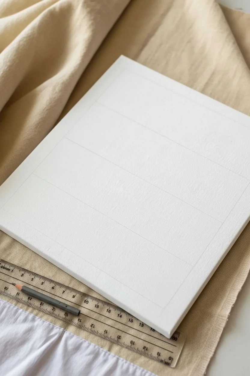
Candy Corn Color Block Painting
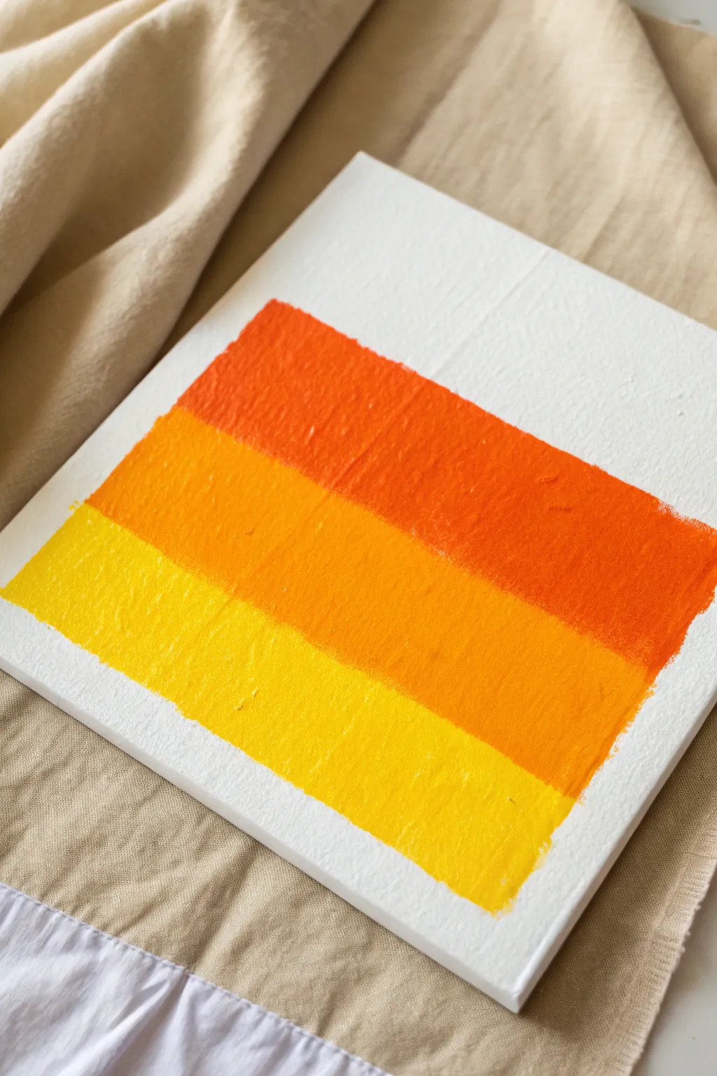
Embrace the classic colors of autumn’s most controversial treat with this bold, minimalist painting. Using just three vibrant hues on a white canvas, you’ll create a striking color-block design that captures the essence of Halloween candy without being overly literal.
Step-by-Step Tutorial
Materials
- Square stretched canvas (8×8 or 10×10 inches)
- Acrylic paint: Bright Orange
- Acrylic paint: Golden Yellow or Tangerine
- Acrylic paint: Bright Lemon Yellow
- Flat paintbrush (1-inch width to match stripe size)
- Painter’s tape or masking tape (optional)
- Ruler
- Pencil
- Paper palette or plate
- Water cup
Step 1: Preparation and Layout
-
Surface Prep:
Begin by ensuring your canvas surface is clean and free of dust. If your canvas isn’t pre-gessoed, you may want to apply a quick coat of white gesso for better paint adhesion, though standard craft store canvases are usually ready to go. -
Measure the Stripes:
Visualize the canvas divided into roughly four horizontal sections. The painted area will occupy the middle three ‘sections’, leaving white space at the very top and bottom. -
Mark Guidelines:
Using your ruler and pencil, lightly mark horizontal lines to define where your three color blocks will go. You want three equal-height bars stacked on top of each other. -
Tape Margins (Optional):
If you want crisp, machine-perfect edges, apply painter’s tape along your pencil lines and the vertical borders. However, for the textured, painterly look shown in the image, I prefer skipping the tape and trusting a steady hand.
Straight Edge Tip
For sharper lines without tape, use a stiff, flat brush. Load paint only on the tip and pull the brush steadily in one direction rather than scrubbing back and forth.
Step 2: Painting the Gradient
-
Start with Orange:
Squeeze out your Bright Orange acrylic paint. Load your flat brush generously. -
Paint the Top Stripe:
Apply the orange paint to the top-most section of your marked area. Use horizontal strokes, moving clearly from left to right. -
Build Texture:
Don’t smooth the paint out perfectly flat. Allow the brush bristles to leave visible ridges and texture, which adds visual interest to the simple blocks. -
Clean the Brush:
Rinse your brush thoroughly in the water cup and dry it on a paper towel before switching colors. -
Apply the Middle Tone:
Load your brush with the Golden Yellow or Tangerine paint. This serves as the transition color between the deep orange and bright yellow. -
Paint the Center Stripe:
Paint the middle section directly below the orange stripe. Gently butt the new color up against the wet orange edge without blending them too much; you want distinct blocks, not a smooth ombre fade. -
Finish with Yellow:
Clean your brush once more, then load it with the Bright Lemon Yellow paint. -
Paint the Bottom Stripe:
Fill in the bottom-most rectangular section. Keep your stroke direction consistent with the previous layers for a cohesive look. -
Refine Edges:
Go back along the jagged outer edges of your rectangle. You can neaten them up slightly with the tip of your brush, but keep that ‘hand-painted’ feel by leaving small irregularities.
Add Detail
Once dry, use a fine liner brush and white paint to add the word ‘BOO’ or a small ghost silhouette in the bottom corner for extra Halloween flair.
Step 3: Finishing Touches
-
Check for Transparency:
Yellow and light orange pigments can sometimes be semi-transparent. If you can see the canvas weave too clearly, apply a second coat once the first is dry to the touch. -
Dry Completely:
Let the painting sit flat in a safe area to dry for at least one hour. The thicker usage of paint might take a bit longer to cure. -
Erase Marks:
If any pencil guide marks are still visible in the white space around your painting, gently erase them now that the paint is fully dry.
Now you have a modern piece of fall decor that celebrates the season’s brightest colors

PENCIL GUIDE
Understanding Pencil Grades from H to B
From first sketch to finished drawing — learn pencil grades, line control, and shading techniques.
Explore the Full Guide
Easy Spiderweb Corner Design for Fall Nights
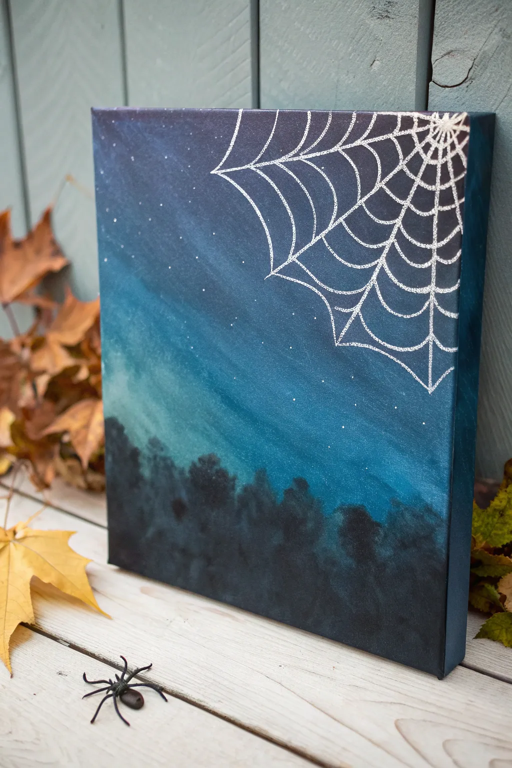
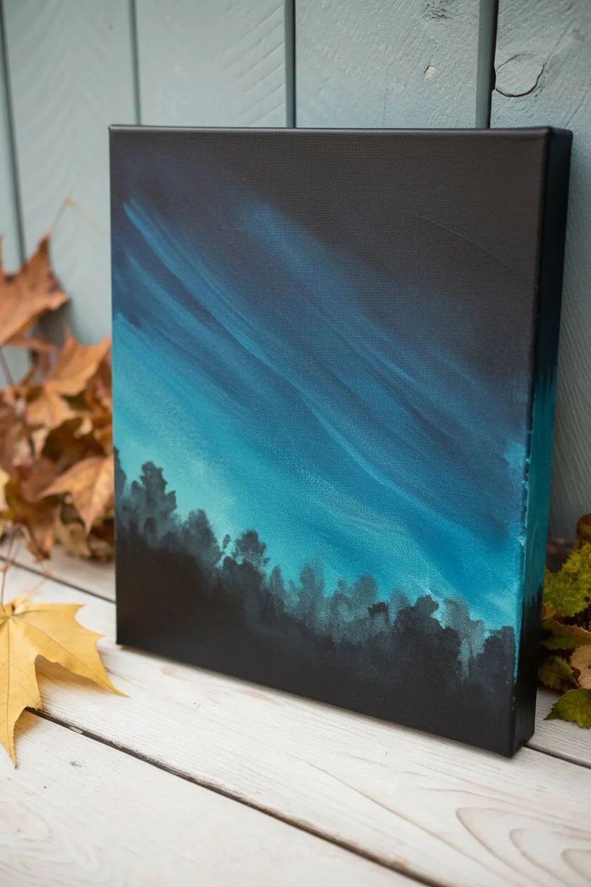
Capture the eerie beauty of an autumn evening with this moody night sky painting. Featuring a deep gradient background and a shimmering silver web, it’s the perfect blend of spooky and sophisticated for your fall decor.
Detailed Instructions
Materials
- Square stretched canvas (e.g., 8×8 or 10×10 inch)
- Acrylic paints: Black, Phthalo Blue (or Navy), Turquoise, White
- Silver metallic paint pen or fine liner brush with silver paint
- Large flat brush or sponge applicator
- Small round detail brush
- Old toothbrush (optional for stars)
- Paper plate or palette
- Cup of water and paper towels
Step 1: Creating the Night Sky Gradient
-
Prepare your palette:
Squeeze out generous amounts of black, dark blue, and turquoise paint onto your palette. You’ll need enough to cover the entire canvas surface smoothly. -
Start with the darkest tones:
Using a large flat brush, apply black paint to the very bottom quarter of the canvas and the top left corner. Don’t worry about neatness yet; just get the color down. -
Begin the transition:
Without rinsing your brush thoroughly, pick up some dark blue paint. Blend this into the edges of the wet black paint, moving towards the center. -
Add the lighter hues:
Mix the turquoise with a tiny bit of dark blue. Apply this diagonally across the middle section of the canvas, brushing back and forth to blend it into the darker blue areas. -
Smooth the gradient:
Use long, sweeping diagonal strokes to blend the colors where they meet. The goal is a seamless transition from the deep black corners into the glowing turquoise center. -
Paint the edges:
Don’t forget to wrap the dark paint around the sides of the canvas for a finished, gallery-style look that doesn’t require a frame. -
Let it dry completely:
Allow the background to dry fully. This is crucial because painting the crisp web lines over wet paint will cause smudging.
Clean Lines Trick
If you’re nervous about freehanding the web, sketch it lightly with white chalk first. The chalk wipes away easily with a damp cloth after you’ve traced over it with paint.
Step 2: Painting the Silhouette and Details
-
Stipple the treeline:
Load a medium sponge or an old, scruffy brush with black paint. Use a pouncing or stippling motion along the bottom edge to create the textured look of tree tops. -
Build density:
Ensure the bottom inch of the canvas is solid black, while the tops of the trees remain slightly uneven and textured to resemble foliage. -
Splatter the stars:
Dilute a small drop of white paint with water. Dip an old toothbrush (or firm brush) into it and run your thumb across the bristles to flick tiny specks of ‘stars’ across the sky. -
Dry the details:
Give the trees and stars a few minutes to dry. The surface needs to be tack-free before starting the web.
Add a Resident
Glue a small plastic spider to the web for 3D texture, or paint a tiny black silhouette of a spider hanging from one of the long silver threads.
Step 3: Designing the Spiderweb
-
Anchor the web:
Using your silver paint pen or a fine liner brush, start at the very top right corner. Draw 5 to 7 straight lines radiating outward like sun rays across the corner. -
Extend the main lines:
Make these anchor lines vary slightly in length, with the ones pointing toward the center of the canvas being the longest. -
Connect the first row:
Starting near the corner point, draw small curved lines (scallops) connecting the straight rays. The curve should dip inward toward the corner. -
Continue the pattern:
Move further down the rays and add a second row of curved connecting lines. Keep the spacing consistent with the first row. -
Widen the web:
As the rays get further apart, your connecting scallops will become wider. I find it helpful to rotate the canvas as I work to keep my hand steady. -
Add the final loose threads:
Near the ends of the longest rays, add a few incomplete scallops or loose hanging threads to make the web look natural and slightly weathered. -
Reinforce highlights:
Once the silver is dry, you can go back over a few key strands with a second coat to make them shine brighter against the dark background.
Display your new artwork on a mantle or shelf to bring a touch of mysterious night sky magic to your home
Pumpkin Silhouette With a Starry Fall Sky
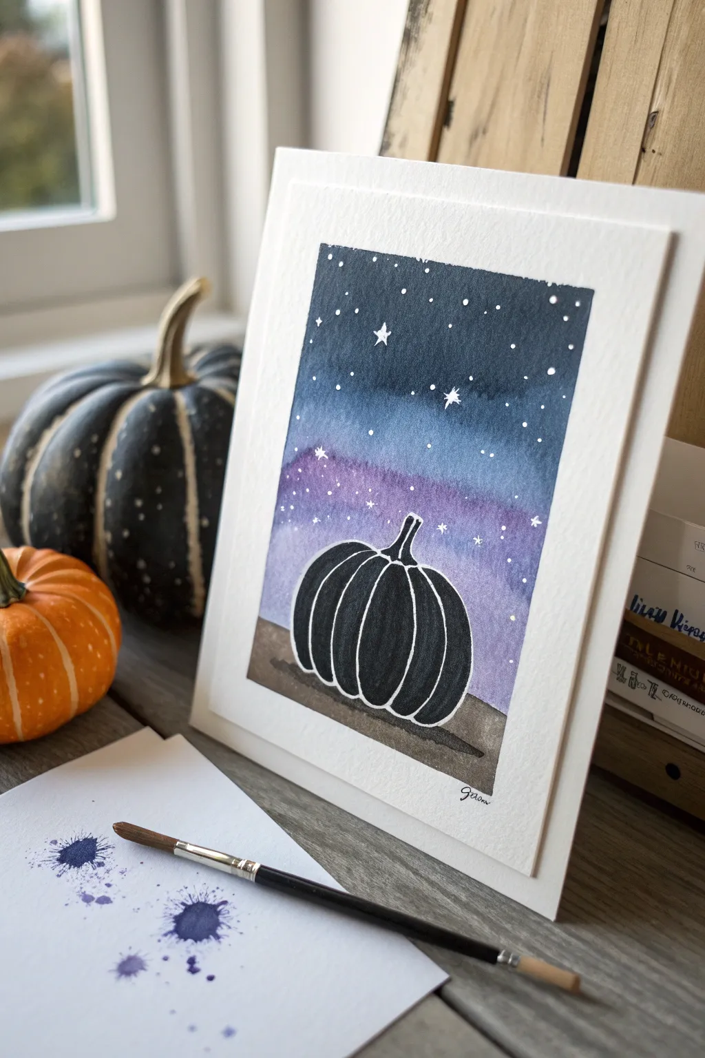
Capture the magic of an autumn evening with this high-contrast watercolor project. Featuring a deep, moody night sky that fades into a soft twilight purple, this pumpkin silhouette is striking yet surprisingly simple to master.
Step-by-Step
Materials
- Cold press watercolor paper (cut to roughly 5×7 inches)
- Painter’s tape or masking tape
- Watercolor paints (Indigo dark blue, violet/purple, black, brown)
- White gel pen or opaque white gouache/acrylic
- Medium round brush (size 6 or 8)
- Small detail brush (size 0 or 1)
- Pencil and eraser
- Two jars of water
- Paper towels
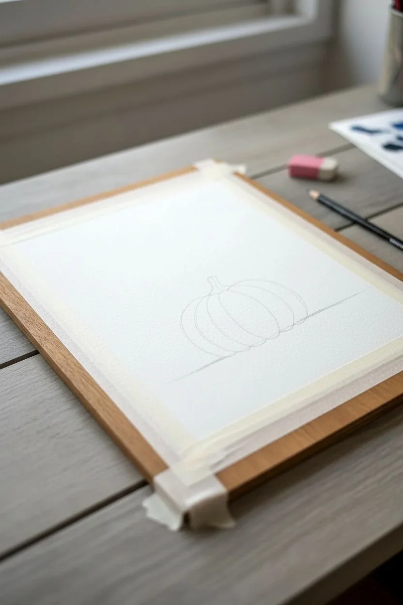
Step 1: Preparation & Sketching
-
Secure the paper:
Tape down all four edges of your watercolor paper onto a hard board or table. This creates that crisp white border seen in the final piece and prevents the paper from buckling when wet. -
Draft the horizon:
Lightly sketch a horizontal line near the bottom third of the paper to designate the ground. It doesn’t need to be perfectly straight; a slight unevenness looks more natural. -
Sketch the pumpkin:
Draw the outline of a pumpkin sitting on the horizon line. Keep the shape simple—a wide oval with a stem on top. Don’t worry about the segments yet; we will add those with white ink later.
Starry Splatter
Instead of drawing every star, load a toothbrush with white acrylic paint and flick the bristles to spray tiny, realistic stars over the sky area before painting the pumpkin black.
Step 2: Painting the Background
-
Wet the sky area:
Using clean water, brush over the entire sky area, stopping right at the edge of your pencil sketch for the pumpkin and the ground. The paper should be glistering, not swimming in puddles. -
Apply the darkest blue:
Pick up a rich Indigo or dark blue paint. Start at the very top of the sky and brush downwards. The color should be most intense at the top edge. -
Transition to purple:
While the blue is still wet, pick up a violet or purple shade. Blend this into the bottom of the blue section, pulling it down toward the horizon line. -
Fade the horizon:
As you get close to the pumpkin and the ground, clean your brush slightly and drag the purple down so it becomes paler and more transparent near the bottom of the sky. -
Paint the ground:
Let the sky dry completely. Then, mix a diluted brown or sepia tone. Paint the strip of ground beneath the pumpkin, keeping it fairly loose and textured. -
Add a shadow:
While the brown is damp, add a slightly darker strip of brown or black directly underneath the pumpkin to ground it.
Step 3: The Silhouette & Details
-
Fill the silhouette:
Once the background is totally dry, load your brush with opaque black watercolor or black gouache. Carefully fill in the entire pumpkin shape. -
Refining edges:
Use your smaller detail brush to ensure the edges of the pumpkin and the stem are sharp and clean against the colorful sky. -
Drying time:
Wait for the black paint to dry completely. If you touch it and it feels cool, it’s still wet. I usually give this step an extra five minutes just to be safe. -
Draw the segments:
Using a white gel pen, draw curved vertical lines inside the black silhouette to define the pumpkin’s ribs. Start from the base of the stem and curve down to the bottom. -
Outline the pumpkin:
Trace the outer edge of the pumpkin and the stem with the white pen to make it pop against the background. -
Add the stars:
Dot the sky with the white gel pen to create stars. cluster some closer together and leave open spaces elsewhere for a natural look. -
Draw larger stars:
Choose two or three spots to draw larger, four-pointed ‘sparkle’ stars to add variation to your night sky. -
Tape reveal:
Once all ink and paint is dry, slowly peel away the masking tape at a 45-degree angle to reveal your clean white border.
Level Up: Cosmic Glow
While the black pumpkin is drying, mix a tiny amount of metallic gold or silver paint with water and glaze it over the purple section of the sky for a magical shimmer.
Frame your mini masterpiece to bring a cozy autumn vibe to any corner of your home


Fall Wreath Made of Simple Leaf Shapes
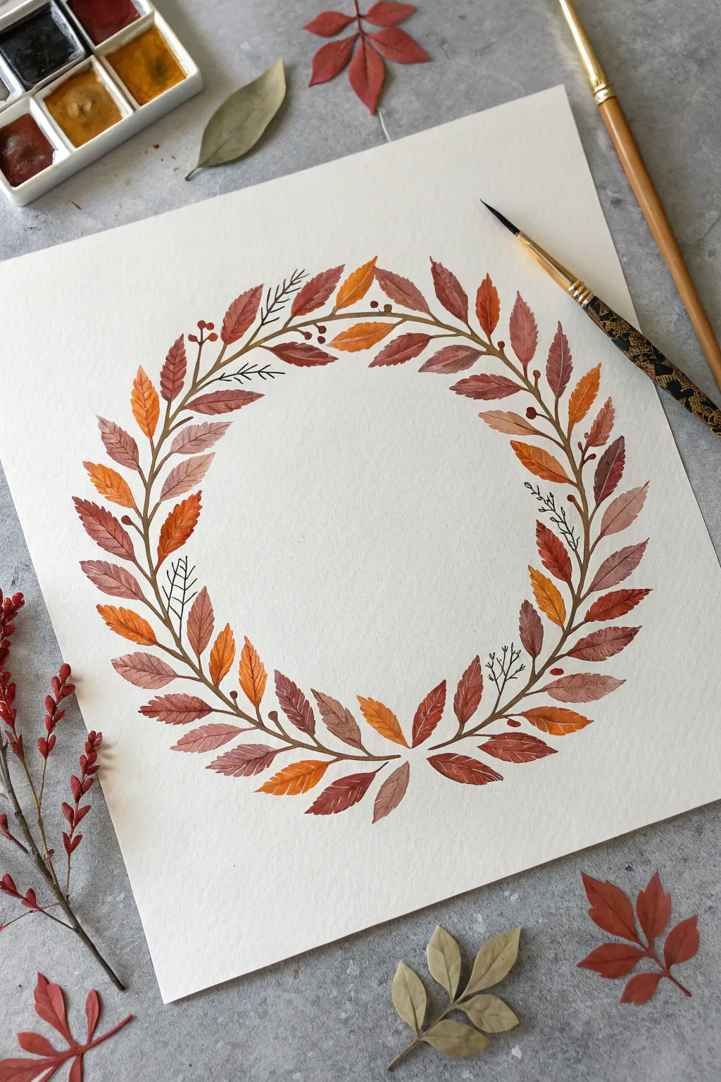
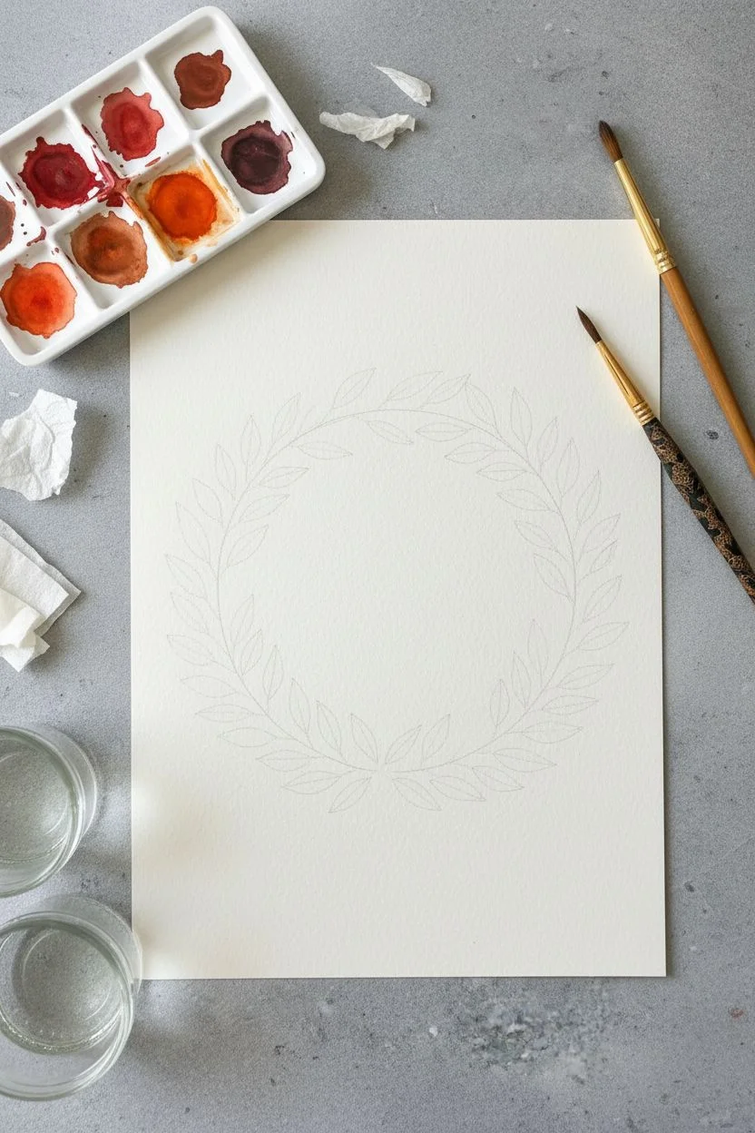
Capture the warmth of the season with this elegant watercolor wreath featuring a lovely gradient of rust, burnt orange, and chocolate brown leaves. It’s a relaxing project that builds complexity through simple, repetitive leaf shapes arranged in a perfect circle.
Step-by-Step
Materials
- Cold press watercolor paper (minimum 300 gsm)
- Watercolor paints (burnt sienna, yellow ochre, cadmium orange, sepia, alizarin crimson)
- Round watercolor brushes (sizes 2 and 6)
- Pencil (HB or 2H)
- Circular object for tracing (like a bowl or plate)
- Palette for mixing
- Paper towels
- Two jars of water
Step 1: Preparation & Sketching
-
Mix your autumn palette:
Before putting brush to paper, create puddles of paint in your palette. You need a rich range of fall colors: mix red and brown for a rusty brick tone, use pure burnt sienna for warmth, and have a vibrant orange ready. I like to mix a deep brown-purple for the darkest leaves to add contrast. -
Draw the guide:
Place your circular object in the center of your paper and trace it very lightly with your pencil. This circle will serve as the ‘spine’ or main stem of your wreath. -
Add stem guides:
Lightly sketch small, curved lines branching off both the inside and outside of your main circle. This helps you visualize the flow of the leaves before you commit with paint, ensuring the wreath looks balanced rather than lopsided.
Color Harmony Tip
Keep your colors harmonious by not washing your brush thoroughly between color changes. Let a bit of the previous orange mix into your new brown for seamless transitions.
Step 2: Painting the Leaves
-
Start the main vine:
Using your size 2 brush and a diluted brown (sepia mixed with a little burnt sienna), paint a thin line over your pencil circle. It doesn’t need to be perfectly continuous; small breaks make it look more organic. -
Paint the first leaf:
Switch to your size 6 brush. Load it with your lightest orange. Start at one of the outer stems, press the belly of the brush down to create the width of the leaf, and lift as you pull outward to create a sharp point. -
Vary your colors:
As you move around the circle, painting leaves on the outer stems first, constantly shift your paint mixture. Dip into the red-brown for two leaves, then switch to pure ochre for the next one. This color variation is key to the vibrant look. -
Paint the inner leaves:
Now, tackle the leaves that point toward the center of the wreath. Try to stagger them slightly so they aren’t perfectly aligned with the outer leaves. Use darker, cooler browns here occasionally to create a sense of depth. -
Create distinct edges:
Some leaves in the reference image have jagged edges. To replicate this, instead of one smooth stroke, use small, serrated touches along the side of the leaf shape while the paint is still wet. -
Leave center veins:
For a refined detail, try painting the two halves of a leaf separately, leaving a hair-thin line of white paper in the middle to represent the central vein. Alternatively, lift the color out with a thirsty brush while it’s damp.
Fixing Water Blooms
If a ‘cauliflower’ bloom forms on a drying leaf, don’t panic. Wait until it’s dry, then glaze over the entire leaf with a dilute wash of the same color to smooth it out.
Step 3: Details & Refining
-
Connect the stems:
Once your main leaves are painted and mostly dry, use the size 2 brush and your dark brown mix to connect each leaf back to the main vine. The stems should curve gently, flowing with the circular direction. -
Add decorative fillers:
Look for empty spaces between the larger leaves. Using the fine tip of your small brush, paint delicate sprigs or tiny black outline leaves. These shouldn’t be filled in; just simple line work adds airiness to the dense wreath. -
Paint berries:
Mix a concentrated red-orange. In clusters of two or three, paint tiny round berries on fine stems attached to the main vine. These small pops of saturated color break up the heavy leaf textures. -
Define the veins:
If you didn’t obscure the white paper for veins earlier, wait until the leaves are bone dry. Mix a darker version of the leaf color and paint very fine lines for the central vein and feathery side veins. -
Review contrast:
Step back from your work. If the wreath looks too flat, go back in with your darkest sepia mix and darken the stems or add a second layer of glaze to a few leaves to push them into the background. -
Erase guides:
Once you are absolutely certain the paper is completely dry (test it with the back of your hand), gently erase any visible pencil lines from your initial circle guide.
Hang your finished piece in a simple wood frame to bring a permanent touch of autumn into your home
Mini Fall Icons Sampler Grid
Capture the cozy spirit of autumn with this grid of charming, bite-sized illustrations. Perfect for beginners, this project combines simple line drawing with soft washes of color to create a minimalist seasonal art print.
Detailed Instructions
Materials
- Hot press watercolor paper or smooth cardstock (A5 or 5×7 inch)
- Fine liner pen (0.3mm or 0.5mm, waterproof pigment ink)
- Pencil and eraser
- Ruler
- Watercolor paints or alcohol-based markers
- Small round paintbrush (size 2 or 4)
- Jar of water and paper towels
Step 1: Setting the Grid
-
Measure margins:
Start by lightly penciling a border around your paper to center your design, leaving about an inch of breathing room on all sides. -
Draw the grid lines:
Using your ruler, pencil a grid of twelve squares arranged in four rows of three. Aim for squares that are approximately 1.5 inches each. -
Ink the boxes:
Once you are happy with the spacing, trace over your square outlines with a fine liner pen. Keep your hand steady, but don’t worry if the lines aren’t perfectly mechanical; a little wobble adds character.
Smudged Lines?
If your black ink bleeds when you paint, stop immediately. Your pen might not be waterproof. Switch to coloring with colored pencils instead to save the drawing.
Step 2: Sketching the Icons
-
The Pumpkin and Mushroom:
In the top row, first pencil a simple round pumpkin with ribbed segments. Next to it, sketch a classic toadstool mushroom with a wide cap. -
Autumn Foliage:
Fill the third spot in the top row with a maple leaf paired with two tiny oak leaves. In the second row, draw a single, symmetrical maple leaf in the center box. -
Cozy Elements:
To the left of the center leaf, sketch a small jar of honey or jam. On the right, draw a bare, branching tree to represent late autumn. -
Trees and Acorns:
Move to the third row. Sketch a classic pine tree on the left, a more stylized, triangular spruce in the middle, and a cluster of three acorns on the right. -
Final Row Details:
For the bottom row, sketch a dried oak leaf on the left. In the middle, draw a wooden mug filled with a warm drink. Finish the grid on the bottom right with a simple brown mushroom.
Use a Light Box
To get perfectly identical squares without erasing grid lines later, draw your grid in bold marker on a separate sheet and place it under your art paper as a guide.
Step 3: Inking and Coloring
-
Refining the lines:
Go over all your pencil sketches with the fine liner pen. Add tiny details now, like the dots on the mushroom cap or the bark texture on the wooden mug. -
Clean up:
Wait a moment for the ink to fully set, then gently erase all remaining pencil marks to leave a crisp black and white design. -
Mixing warm tones:
Prepare your palette with classic fall colors: burnt orange, ochre, deep brown, and sap green. Keep the colors relatively transparent if using watercolor. -
Painting the first layer:
Fill in the main shapes using a small round brush. I find it best to jump around the grid to let wet areas dry so colors don’t bleed into neighbors. -
Adding distinct colors:
Paint the pumpkin and maple leaves orange. Use red for the toadstool cap and greens for the pine tree and acorns. Use a light beige for the mushroom stems. -
Layering for depth:
Once the base wash is dry, adding a second, slightly darker layer to one side of the jar or the bottom of the acorns creates subtle shading. -
Review and refine:
Check for any areas that need a pop of contrast, perhaps darkening the tree trunk or the liquid in the mug, and let the entire piece dry completely flat.
Now you have a delightful sampler of the season ready to frame or gift to a friend
Abstract Fall Color Swatches With Leaf Line Art
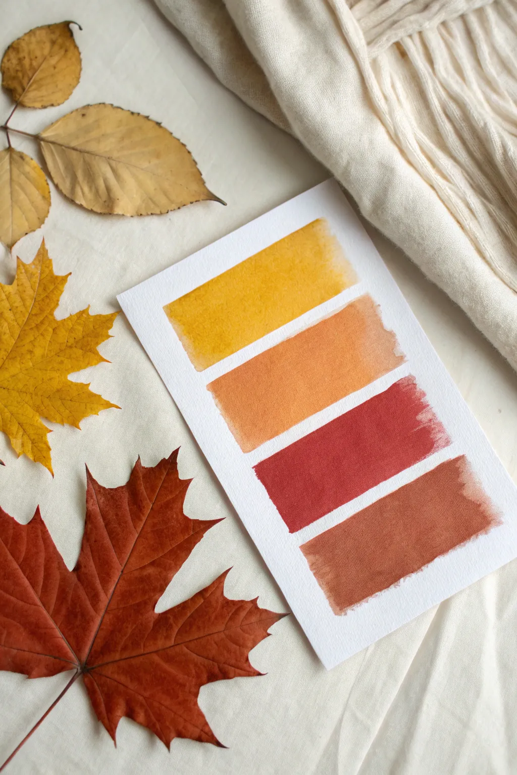
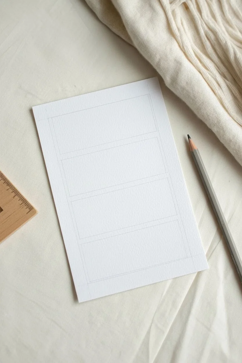
Capture the essence of the season with this minimalist watercolor study that explores the rich, warm transition of fall foliage. This project focuses on mastering clean edges and consistent washes to create a satisfying gradient of nature’s best hues.
Step-by-Step
Materials
- Cold press watercolor paper (approx. 5×7 inches)
- Watercolor paints (Yellow Ochre, Burnt Sienna, Alizarin Crimson, Burnt Umber)
- Flat shader brush (size 10 or 12)
- Washi tape or masking tape (optional)
- Jar of clean water
- Paper towels
- Pencil and ruler
Step 1: Preparation and Layout
-
Prepare your paper:
Cut your watercolor paper to size. A 5×7 inch piece is manageable and frames beautifully, though you can adjust this to fit your preferences. -
Mark the margins:
Using a ruler, lightly mark a uniform margin on the left and right sides of the paper where your swatches will begin and end. Keep these marks very faint so they can be erased later. -
Space the swatches:
Measure out the vertical spacing for four distinct bars. Aim for each bar to be roughly 1 inch tall, leaving about 0.25 to 0.5 inches of white space between them. -
Define the boundaries:
You have a choice here: for perfectly crisp edges, apply strips of washi tape along your pencil lines. If you prefer the slightly organic, hand-painted edge seen in the reference, simply use your pencil lines as visual guides without taping.
Uneven Edges?
If your freehand edges are too wobbly, let the paint dry fully, then use a ruler and a white gel pen to draw clean, straight lines along the sides to tidy them up.
Step 2: Painting the Gradient
-
Mix the golden yellow:
Start with your lightest color at the top. Mix a generous puddle of Yellow Ochre or a similar warm golden yellow. Ensure the paint is fluid but not watery to achieve opaque coverage. -
Paint the first swatch:
Load your flat brush fully. place the brush near the left guide mark and pull it smoothly across to the right. Try to do this in one or two confident strokes rather than scrubbing back and forth. -
Create the orange hue:
For the second bar, mix a warm orange. You can achieve this by adding a touch of Burnt Sienna to your previous yellow mix, or using a pure pumpkin orange color. -
Apply the orange swatch:
Paint the second rectangular bar just below the first, being careful to maintain that even white gap. I like to hold my breath for a second while painting horizontal edges to keep my hand steady. -
Mix the deep red:
The third color shifts into a rich red. Mix Alizarin Crimson with a tiny speck of brown or green to desaturate it slightly, giving it that earthy, dried-leaf quality rather than a bright candy apple red. -
Paint the red swatch:
Apply this red wash to the third designated area. Watch the edges of your brush to ensure the corners remain relatively sharp. -
Mix the final brown:
For the bottom bar, create a rust-brown color. Mix Burnt Umber with some of your red mixture to warm it up, creating a color reminiscent of late November oak leaves. -
Finish the gradient:
Lay down the final swatch at the bottom. Check that all four bars align vertically on the left and right sides.
Wet-on-Wet Variation
Make the swatches more dynamic by dropping a tiny bit of water or darker pigment into the wet paint while it’s still damp for a textured ‘bloom’ effect.
Step 3: Finishing Touches
-
Let it dry completely:
Allow the paper to sit undisturbed until the sheen of wetness has completely disappeared from all swatches. -
Flatten the paper:
If your paper has buckled slightly from the water, place it under a heavy book overnight once it is completely bone dry. -
Erase guides:
Gently erase any visible pencil marks from your initial spacing, being careful not to rub over the painted areas which might smudge.
Display your color study alongside some real pressed leaves to celebrate the season’s palette


Have a question or want to share your own experience? I'd love to hear from you in the comments below!