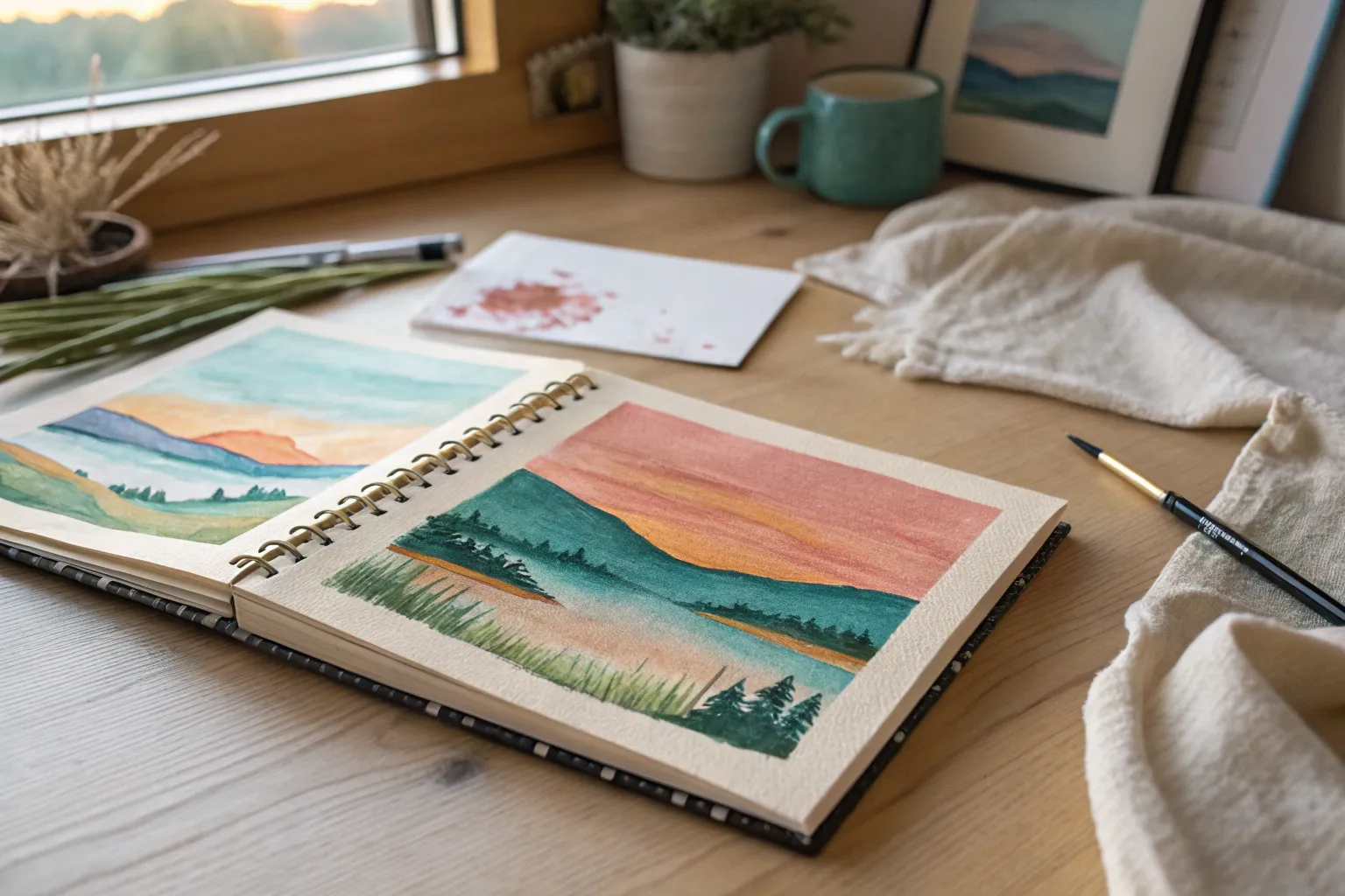
Paper is my favorite place to start because it’s low-pressure, quick to set up, and still looks seriously polished when you use a few simple tricks. Here are my go-to painting ideas on paper—from classic, beginner-friendly wins to playful experiments that’ll wake up your creativity fast.
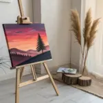
Sunset Gradient Sky With a Silhouette
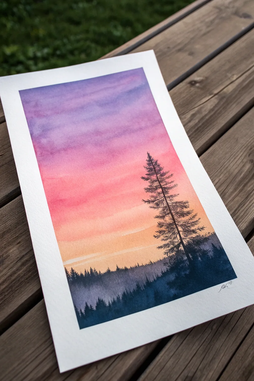
Capture the serene transition from day to night with this vibrant watercolor landscape. You will learn to blend a seamless purple-to-orange gradient sky and juxtapose it against a striking, dark pine silhouette.
Step-by-Step Tutorial
Materials
- Cold press watercolor paper (300 gsm)
- Painter’s tape or washi tape
- Watercolor paints (Purple, Magenta/Pink, Orange, Indigo/Black)
- Large flat wash brush (for the sky)
- Medium round brush (size 6 or 8)
- Fine liner brush or small round brush (size 0 or 1)
- Jar of clean water
- Paper towels
- Palette for mixing
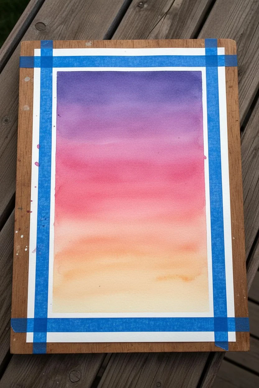
Step 1: Preparing the Gradient Sky
-
Tape boundaries:
Secure your watercolor paper to a board or table surfacing using painter’s tape on all four sides. This creates a crisp white border and prevents the paper from buckling when wet. -
Pre-wet the paper:
Using your large flat wash brush and clean water, apply an even coat of water over the entire sky area. The paper should be glisten but not have standing puddles; this technique, called ‘wet-on-wet’, is crucial for soft blends. -
Purple top layer:
Load your brush with a rich purple watercolor. Apply horizontal strokes across the top third of the paper, letting the pigment flow naturally on the damp surface. -
Mid-tone pink:
Clean your brush slightly and pick up a vibrant magenta or pink. Paint the middle section, slightly overlapping the bottom edge of the purple to encourage a soft violet transition. -
Warm horizon:
Finish the bottom third of the sky with a warm orange or peach tone. Blend it upwards into the pink. Leave the very bottom edge quite pale or wash it out to near-white to represent the glowing horizon line. -
Refine the blend:
With a clean, slightly damp brush, gently run horizontal strokes across the transitions between colors if any hard lines remain. Be careful not to overwork it, or the colors will turn muddy. -
Complete drying:
Allow the sky layer to dry completely. The paper must be bone-dry and warm to the touch before you paint the crisp tree details on top. A hair dryer can speed this up.
Muddy Colors?
If your purple and orange turn brown where they meet, you likely didn’t use enough pink in the middle. The pink acts as a buffer zone that allows cool and warm tones to transition safely.
Step 2: Adding the Misty Treeline
-
Mix a hazy dark:
Create a watered-down mix of indigo or a dark blue-grey. You want this to be transparent enough to look distant and atmospheric. -
Paint the background ridge:
Using a medium round brush, paint an uneven, jagged line across the bottom quarter of the paper to represent distant treetops. Fill in the area below this line with the same wash. -
Let it settle:
Allow this layer to dry. It should look significantly lighter than the paint you’re about to use for the foreground, creating a sense of depth.
Step 3: Painting the Silhouette
-
Mix the darkest tone:
Mix a very saturated, concentrated dark color. I prefer mixing indigo with a touch of black or sepia to get a deep, natural shadow color rather than straight black. -
Foreground base:
Paint a second, darker layer of trees at the very bottom, overlapping your hazy background layer. Make the peaks of these trees sharper and more defined. -
Main trunk line:
Switch to your fine liner brush. Choose a spot on the right side of the composition and draw a thin, straight vertical line extending nearly to the top of the pink section for the main tree trunk. -
Top branches:
Starting at the top of the trunk, dab tiny, short horizontal strokes. Keep them very narrow at the tip to create a tapered look. -
Building volume:
Work your way down the trunk, making the branches progressively wider. Use a stippling motion or zigzag strokes to mimic pine texture rather than painting individual needles. -
Asymmetry is key:
Don’t make the tree perfect. Leave small gaps between some branches to let the colorful sky peek through, and make some branches slightly longer on one side. -
Connect to base:
As you reach the bottom, blend the lowest heavy branches into the dark foreground mass you painted earlier so the tree feels rooted in the landscape. -
Final reveal:
Once the entire painting is completely dry, carefully peel away the painter’s tape at a 45-degree angle to reveal the crisp white edges.
Crisp Silhouettes
Use “dry brush” technique for the tree. Wipe excess water from your brush before picking up thick paint. This creates sharp, textured edges that mimic pine needles perfectly.
Frame this piece immediately to show off that stunning contrast between the glowing sky and the deep forest shadows


Galaxy Night Sky With Paint Splatter Stars
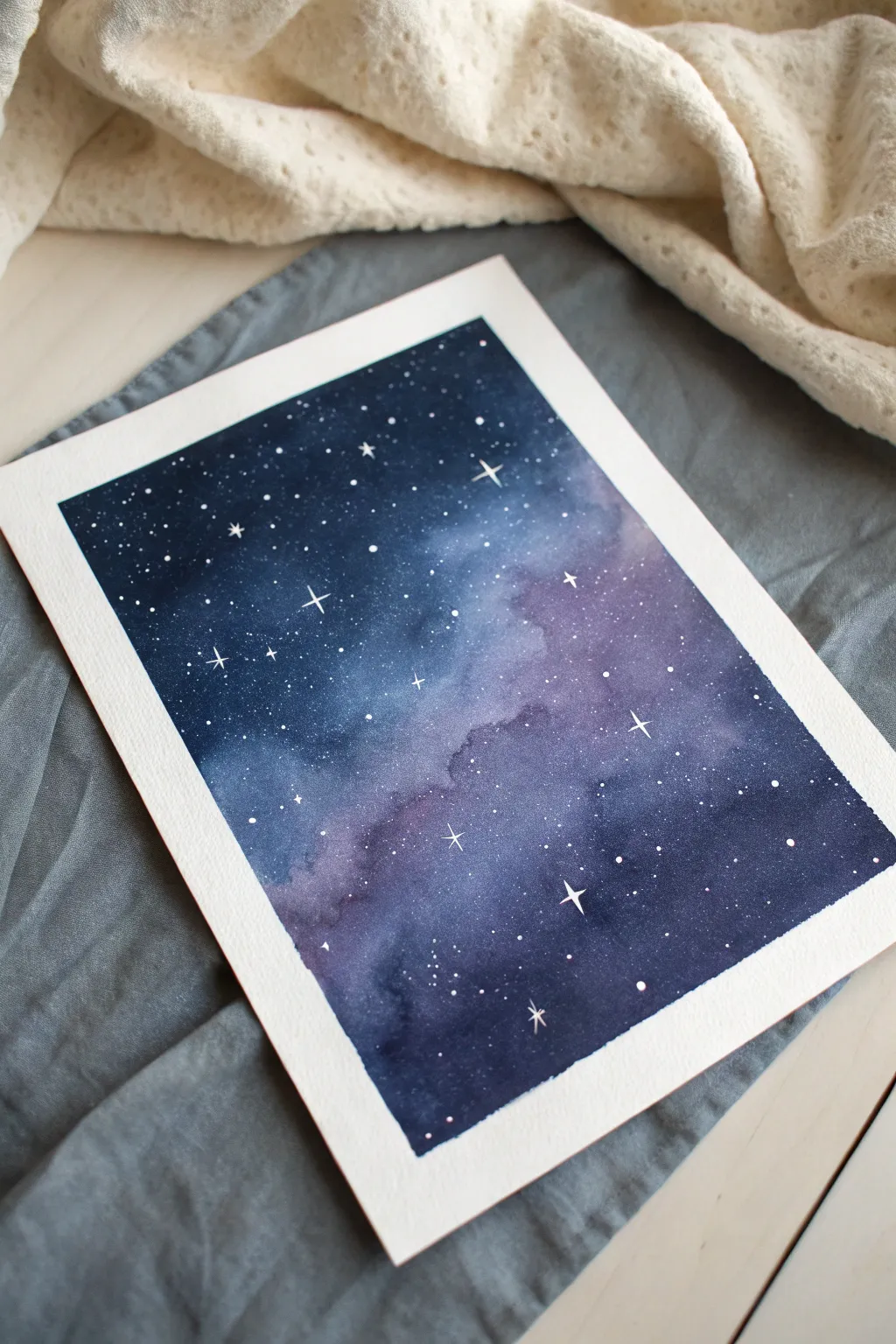
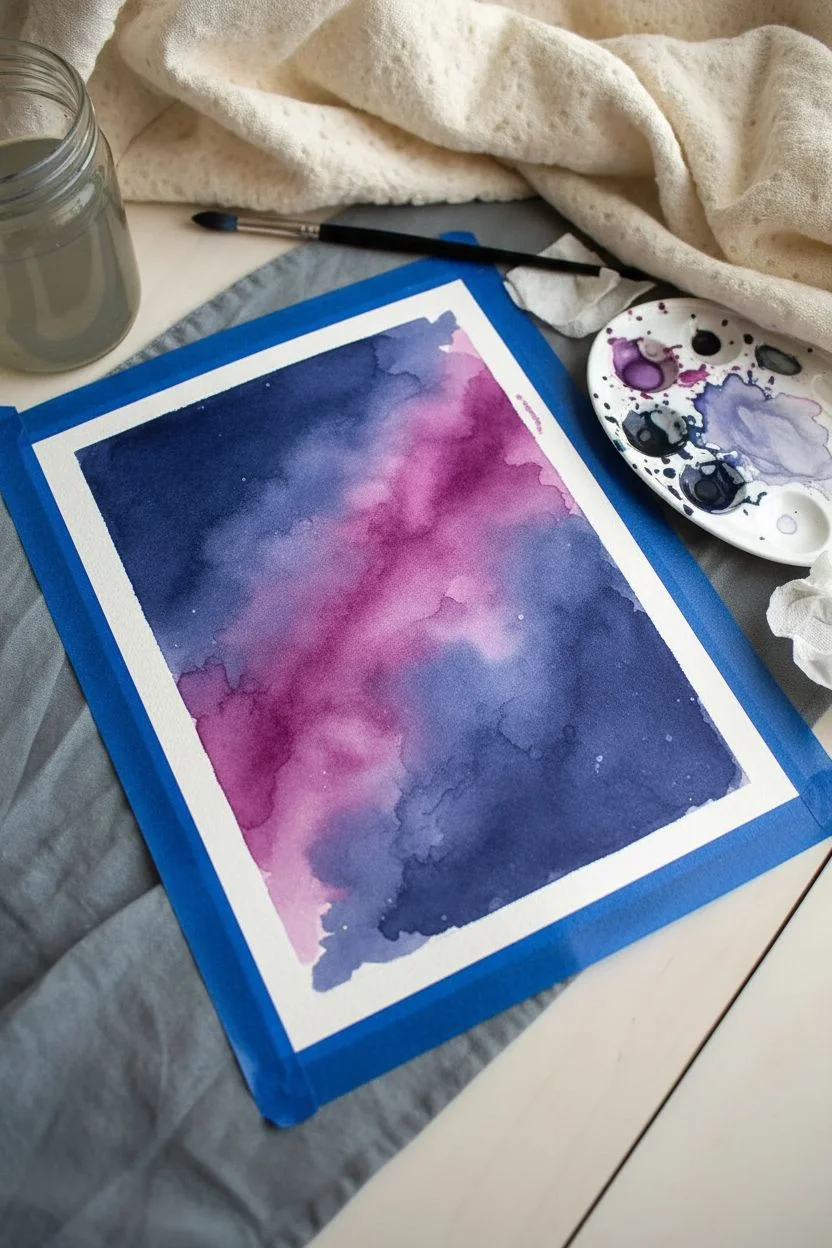
Capture the magic of deep space right on your desk with this dreamy watercolor galaxy project. By blending rich indigo tones with soft violet clouds and crisp white stars, you’ll create a celestial scene that feels vast and mysterious.
Step-by-Step Guide
Materials
- Cold-pressed watercolor paper (300 gsm)
- Painter’s tape or masking tape
- Watercolor paints (Indigo, Prussian Blue, Violet, Magenta, Black)
- White gouache or white gel pen
- Round watercolor brush (size 8 or 10)
- Small detail brush (size 0 or 1)
- Jar of clean water
- Paper towels
- Palette for mixing
- Old toothbrush (optional for splatter)
Step 1: Preparation and Base Layer
-
Secure the paper:
Begin by taping down all four edges of your watercolor paper to a hard board or table. Press the tape down firmly to ensure crisp, clean borders when you peel it off later. -
Pre-wet the paper:
Using your large round brush, apply a generous wash of clean water across the entire surface of the paper. You want it to be glisten with moisture but not have standing puddles. -
Mix your colors:
While the paper absorbs the initial moisture, prepare puddles of Indigo, Prussian Blue, and a bright Violet on your palette. You want these mixtures to be vibrant and concentrated.
Step 2: Creating the Galaxy
-
Lay down the lighter tones:
Start by dropping the Violet and Magenta paint diagonally across the center of the wet paper. This will form the glowing ‘nebula’ cloud. Because the paper is wet, the edges should bloom and soften naturally. -
Add deep blues:
Load your brush with Prussian Blue and paint around the violet nebula band, letting the blue touch the violet edges so they bleed together softly. -
Deepen the corners:
Use your darkest Indigo and a touch of Black to fill in the corners and the outer edges of the paper. This creates the depth of deep space. -
Encourage blending:
Tilt your board slightly or use a clean, slightly damp brush to blur any harsh lines between the violet center and the dark blue edges. The transition should look smoky. -
Intensify contrast:
While the paper is still damp, drop more concentrated dark indigo into the wet corners. I like to let this spread on its own to create natural-looking textures. -
Lift pigment for clouds:
Rinse your brush, dry it on a paper towel, and gently dab it into the center purple areas to lift a tiny bit of pigment. This adds a subtle, cloudy dimension to the galaxy. -
Let it dry completely:
This is crucial: allow the painting to dry 100% before moving on. The paper must be bone dry, or your stars will bleed into fuzzy blobs. Use a hairdryer on low heat if you’re impatient.
Wet-on-Wet Magic
For smoother gradients, keep the paper consistently damp. If it starts drying mid-painting, use a mist spray bottle to gently re-wet the surface without disturbing the pigment.
Step 3: Stars and Details
-
Prepare the stars:
Squeeze out a pea-sized amount of white gouache or undiluted white watercolor. It needs to be thick and opaque to stand out against the dark background. -
Splatter the distant stars:
Load a wet brush or an old toothbrush with the white paint. Tap the handle against a finger or piece of wood over the paper to create a fine mist of tiny star speckles. -
Add prominent stars:
Switch to your smallest detail brush or a white gel pen. Carefully dot larger individual stars in open spaces where you want more visibility. -
Paint the flares:
Choose a few of your larger white dots and turn them into twinkling stars. Paint a thin vertical line through the dot, followed by a thin horizontal line, creating a four-pointed cross. -
Vary the sizes:
Ensure your twinkling stars aren’t all the same size. Make one or two slightly larger and brighter to act as focal points in the sky. -
The final reveal:
Once the white paint is fully dry, slowly and carefully peel away the masking tape at a 45-degree angle to reveal your crisp white border.
Silhouettes
Once the galaxy is dry, paint a solid black silhouette along the bottom edge—like pine trees, a mountain range, or a city skyline—to give your sky a sense of scale.
Enjoy the peaceful view of the cosmos you’ve just created with your own hands


Mountain Landscape in Easy Paper Layers
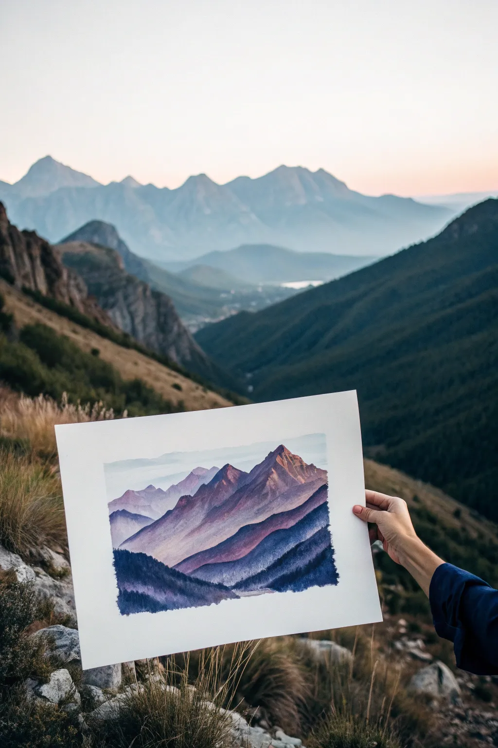
Capture the serene beauty of distant peaks with this atmospheric watercolor landscape. This project focuses on building depth through successive layers of purple and blue washes, creating a stunning sense of scale and distance.
Step-by-Step Tutorial
Materials
- Cold press watercolor paper (140lb/300gsm)
- Watercolor paints (Indigo, Payne’s Grey, Alizarin Crimson, Ultramarine Blue)
- Round brushes (Size 4, 8, and a large wash brush)
- Two jars of water
- Paper towels
- Masking tape
- Drawing board or thick cardboard
- Pencil (HB or lighter)
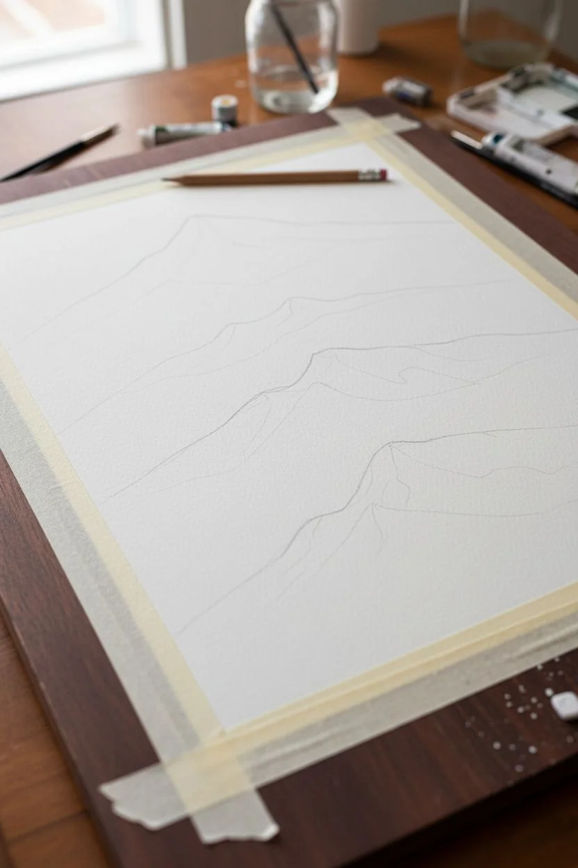
Step 1: Preparation & Sketching
-
Secure the paper:
Tape your watercolor paper down securely to your drawing board on all four sides. This prevents the paper from buckling when we add water and creates a crisp white border for your finished piece. -
Plan the ranges:
Lightly sketch four distinct mountain ranges using your HB pencil. Start with a high, faint line for the furthest peaks near the top, then draw three progressively lower ranges, allowing them to overlap naturally.
Atmospheric Depth
Make colors progressively darker and warmer as you move forward. Distant mountains should be cooler (bluer) and lighter.
Step 2: Painting the Sky & Background
-
Wet the sky area:
Using your large wash brush, apply clean water to the sky area above your first pencil line until the paper has a gentle sheen. -
Add skyscape wash:
Mix a very watery, pale wash of Ultramarine Blue. Gently drop this into the wet sky area, letting it diffuse softly to create a hazy atmosphere. Let this layer dry completely. -
First mountain range:
Mix a pale lavender using Ultramarine Blue and a touch of Alizarin Crimson. Paint the furthest mountain range, keeping the color very diluted and light to suggest atmospheric perspective.
Make it Sparkle
Splatter opaque white gouache or white ink over the dry dark foreground to create a magical starry night or falling snow effect.
Step 3: Building the Mid-Ground
-
Mix mid-tone purple:
Create a slightly stronger mix of purple by adding more pigment to your previous lavender puddle. I like to add a tiny dot of Payne’s Grey here to desaturate the color slightly. -
Paint the second range:
Apply this mix to the second mountain range. While the paint is still wet, you can drop in slightly darker purple near the peaks to create shadows and volume. -
Softening edges:
Before the bottom edge of this second range dries, rinse your brush and run clear water along the bottom edge to fade the color out into white. This creates a misty effect between layers. -
Dry thoroughly:
Ensure this layer is bone dry before proceeding. If you rush, the layers will bleed together and you’ll lose that crisp definition.
Step 4: The Dramatic Foreground
-
Prepare deep violet:
Mix a rich, dark violet using Alizarin Crimson and Indigo. This needs to be significantly darker than your previous layers to make the foreground pop. -
Third range details:
Paint the third range with this mix. Use the tip of your size 8 brush to create jagged, rocky edges along the top ridge line. -
Adding texture:
While this layer is drying, use a barely damp brush (dry brush technique) to drag color downwards, leaving some paper texture visible to simulate rocky terrain. -
Mix darkest shadow:
For the final, closest layer, mix Indigo with a little Payne’s Grey to get a near-black blue. The consistency should be like heavy cream. -
Foreground trees:
Paint the bottom-most shape. Use a dry brush technique along the top edge of this shape to suggest the texture of pine trees or dense scrub against the lighter mountains behind. -
Fill the base:
Fill in the rest of the bottom area solidly with your dark indigo mix. The contrast between this dark base and the pale sky is what gives the painting its power.
Step 5: Refinement
-
Evaluate values:
Step back and look at your dried painting. If the distant mountains look too distinct, you can gently glaze over them with a very watery blue wash to push them further back. -
Reveal the border:
Once the paper is completely cool to the touch (indicating it’s dry), carefully peel away the masking tape at a 45-degree angle to reveal your crisp white edges.
Now you have a tranquil mountain scene ready to frame or gift


Minimal Botanical Branch Studies on Paper
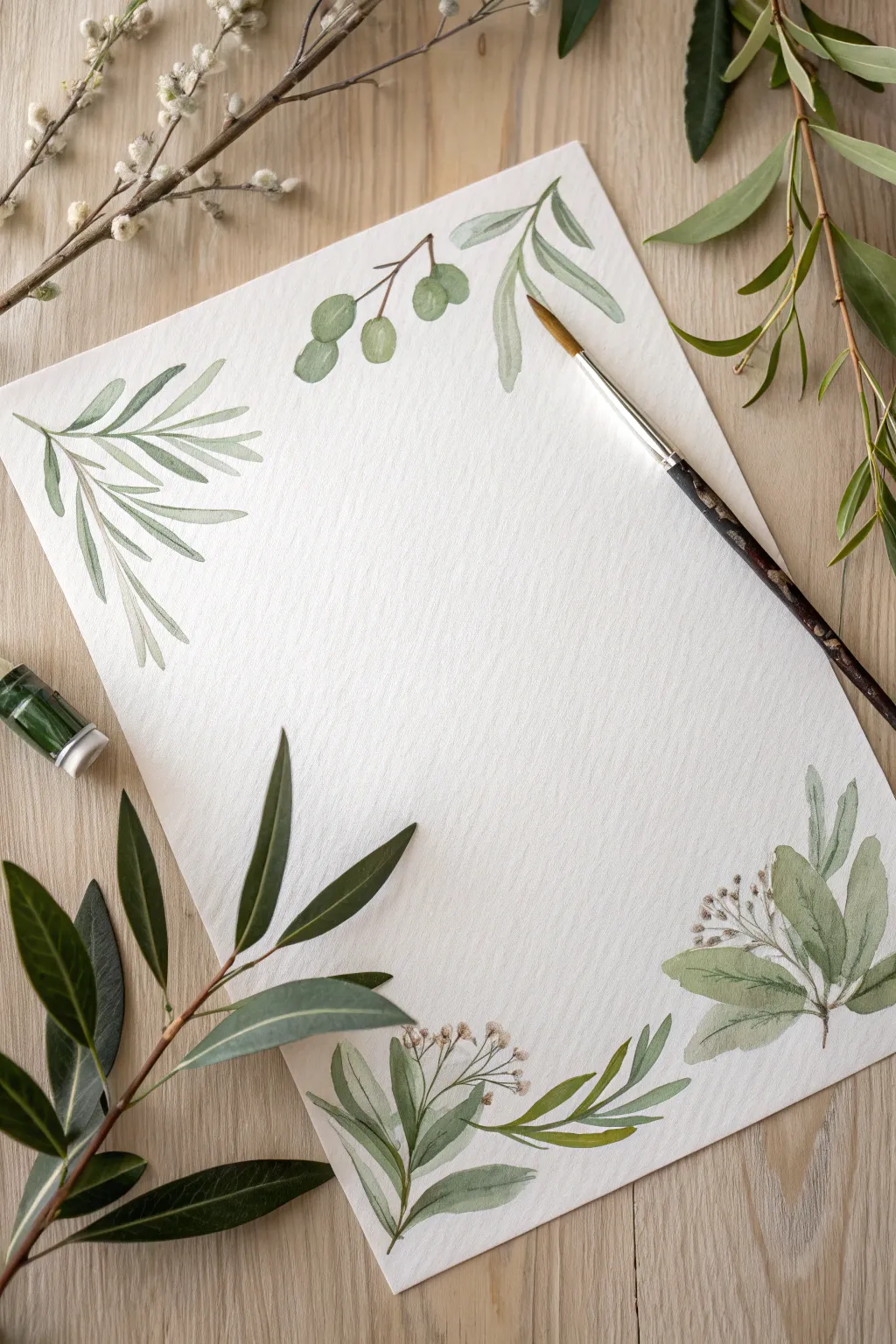
Create a serene frame for your letters or calligraphy with this delicate watercolor olive branch study. The soft greens and loose, organic brushstrokes evoke a sense of Mediterranean calm, perfect for stationery or wall art.
Step-by-Step Guide
Materials
- Cold-pressed watercolor paper (300 gsm)
- Watercolor paints (Sap Green, Olive Green, Burnt Umber, Payne’s Gray)
- Round watercolor brush (size 4 or 6)
- Small detail brush (size 0 or 1)
- Two jars of water
- Paper towels
- Pencil (HB or lighter)
- Kneaded eraser
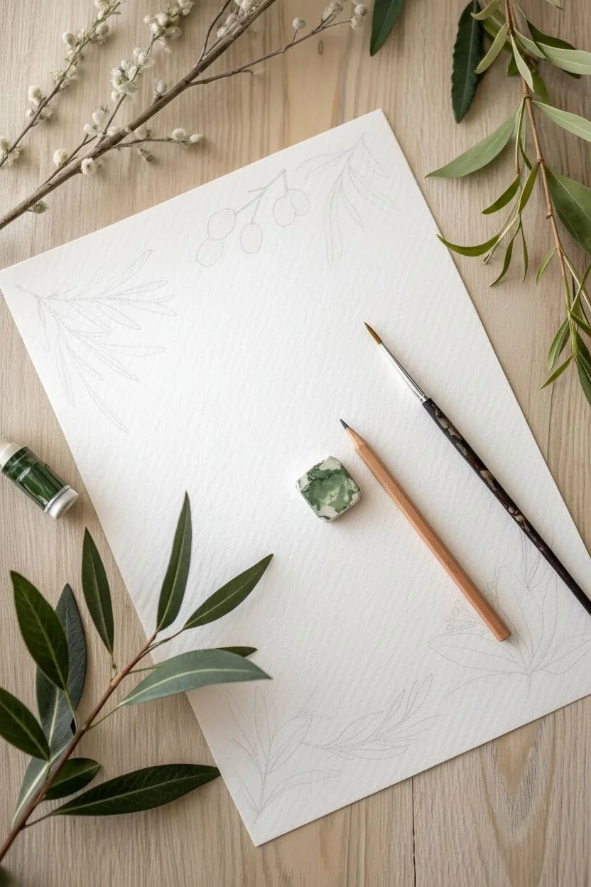
Step 1: Preparation & Layout
-
Paper placement:
Secure your watercolor paper to a flat surface with masking tape if desired, though for this loose style, you function well without it. Ensure your workspace is well-lit. -
Planning the composition:
Observe the image: the design acts as a disparate border. Lightly sketch the main flow of the branches in the corners and sides. Don’t draw every leaf; just mark the spine of the branches to guide your composition. -
Lifting guidelines:
Take your kneaded eraser and gently roll it over your pencil marks. You want the lines to be barely visible, acting as faint ghosts rather than hard boundaries.
Step 2: Painting the Foliage
-
Mixing your greens:
Prepare two puddles of green. One should be a lighter, watery Sap Green for the younger leaves. The second should be a deeper, moodier Olive Green mixed with a touch of Payne’s Gray or Burnt Umber for contrast. -
Top-left branch structure:
Start with the large frond in the top left. Load your round brush with the lighter green mixture. Using the tip, touch the paper and press down gently to widen the stroke, then lift as you pull away to create a tapered leaf shape. -
Building the frond:
Continue adding leaves along your sketched spine for the top-left branch. paint them wet-on-dry to keep edges relatively crisp, but let a few touch while wet to allow color to bleed slightly. -
Top-center olives:
Moving to the top center, paint small oval shapes for the olive clusters. Use a varied mix of green and a tiny drop of brown to make them look distinct from the leaves. -
Adding stems:
While the olives are damp, use the tip of your detail brush with a brownish-green mix to connect them to a main branch line. A shaky hand here actually helps the branch look more organic and woody. -
Top-right leafy sprig:
Paint the small, curving sprig in the top right corner. Keep these leaves looser and more transparent by adding more water to your brush, giving them an ethereal, floating quality. -
Bottom-right cluster base:
Move to the bottom right corner. Paint broad, rounded leaves using the belly of your brush. These leaves appear denser, so use a more saturated Olive Green pigment here. -
Refining the bottom right:
Add the spindly stems sticking out of the dense leaf cluster. Use the very tip of your detail brush with a dark brown mix to draw thin lines radiating outward. -
Bottom-center florals:
For the bottom center arrangement, paint the long, slender leaves first. I like to twist the brush slightly at the end of the stroke to give the leaf a natural curve. -
Adding delicate buds:
Dip your detail brush into a diluted brown or soft mauve mix. Dot tiny, irregular circles at the ends of the thin stems in the bottom clusters to represent dried buds or flowers.
Water Control Trick
For realistic botanical transparency, blot your brush on a paper towel after loading paint. This removes excess water, giving you sharper control over leaf tips.
Step 3: Details & Finishing Touches
-
Connecting the elements:
Review your composition. Use a fine liner brush with the brown mix to ensure all floating leaves are connected to a stem, even if the line is broken or faint. -
Layering depth:
Once the first layer of leaves is fully dry, glaze a darker, transparent green over the bottom half of a few select leaves. This creates a shadow effect and adds dimension. -
Softening edges:
If any leaf looks too stiff, take a clean, slightly damp brush and gently run it along one edge of the painted leaf to soften the line into the paper. -
Final assessment:
Step back and look at the visual balance. If one side feels too heavy, add a small, standalone floating leaf or a stray twig to the opposite side to even it out.
Make it Metallic
Once the watercolor is dry, trace the thin central veins of the leaves with a fine-tip gold paint pen for an elegant, luxurious finish suitable for wedding invites.
Let your beautiful botanical border dry completely before handwriting your favorite poem or letter in the center space
BRUSH GUIDE
The Right Brush for Every Stroke
From clean lines to bold texture — master brush choice, stroke control, and essential techniques.
Explore the Full Guide
Crisp Geometric Shapes Using a Masking Tape Border
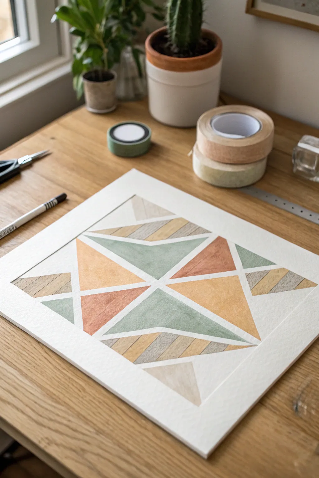
Create a striking piece of wall art using simple geometric forms and a soothing, earthy color palette. The crisp white lines, achieved through careful masking, provide a modern contrast against the textured paint fills.
Step-by-Step Tutorial
Materials
- High-quality watercolor or mixed media paper (heavyweight)
- Painter’s tape or dedicated drafting tape (low tack)
- Pencil
- Ruler
- Watercolor paints or gouache (earth tones: olive green, khaki, terracotta, beige)
- Fine liner pen (optional, for texture details)
- Round watercolor brush (size 4 or 6)
- Scissors
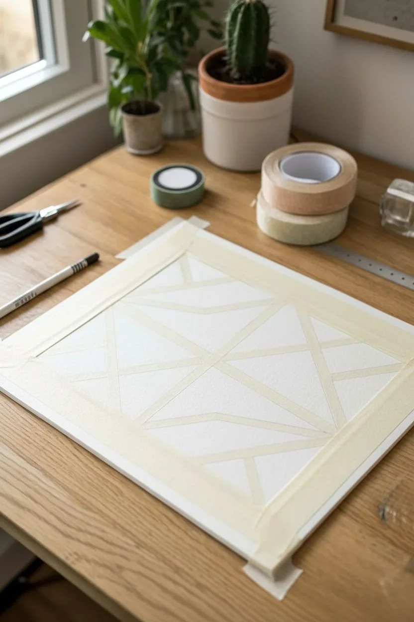
Step 1: Planning and Taping
-
Prepare your canvas:
Begin with a rectangular sheet of heavyweight paper. Tape down the outer edges to your work surface or a board. This not only creates a clean border but keeps the paper flat when wet. -
Create the inner border:
Apply a second rectangle of tape on the paper itself, inset about an inch from the edge, to define the artwork’s specific ‘frame’ within the sheet. -
Mark the center points:
Using your ruler and a light pencil touch, find and mark the exact center of your taped interior rectangle. Lightly sketch a large diamond shape connecting the midpoints of each side. -
Draft the starburst design:
Within your diamond, lightly sketch a four-point star or cross shape. Draw diagonal lines radiating from the center to create triangular segments. Don’t worry about perfection; the tape will straighten everything out. -
Apply the primary masking:
Start applying strips of tape over your pencil lines. The key is to mask off the ‘white’ negative space. I like to start with the long diagonal lines that form the main ‘X’ shape. -
Cut precise intersections:
Where tape strips meet or cross, use scissors to cut sharp angles before laying them down ensuring the corners are crisp, or overlap them and carefully trim the excess with a craft knife (very gently) if you are comfortable. -
Seal the edges:
Run your fingernail or a bone folder firmly along every edge of the applied tape. This burnishing step is crucial to prevent paint from seeping underneath and ruining your clean lines.
Clean Lines Secret
Paint a thin layer of clear matte medium or white acrylic over the tape edges first. This seals the gap, so any bleed is invisible clear paint, keeping colors sharp.
Step 2: Painting the Shapes
-
Mix your palette:
Prepare your colors. For this look, aim for muted earth tones: mix a dusty orange-terracotta, a soft olive green, a pale sandy beige, and a deeper brown-grey. -
Paint the solid triangles:
Select specific triangles to be solid colors. Fill them in completely with the terracotta and olive green paints. Keep the paint fluid but not pooling. -
Create striped textures:
For the outer geometric sections, we want a different texture. Instead of a solid fill, paint straight, diagonal stripes using your beige and grey tones to mimic wood grain or varied fabric. -
Layering for depth:
On the solid green sections, dropping in a tiny bit of water or a darker pigment while the paint is still damp can create a lovely, clouded watercolor texture. -
Let it dry completely:
Patience is everything here. Allow the paint to dry until the paper feels room temperature to the touch—any coolness means it’s still damp deep down.
Step 3: The Reveal
-
Remove the tape:
Peel the tape off slowly at a 45-degree angle not straight up. This reduces the chance of ripping the paper surface. -
Check the stripes:
If your striped sections look too faint, you can use a fine liner or colored pencil to gently enhance the definition between the bands of color. -
Erase guidelines:
Once all tape is removed and the paint is essentially cured, gently erase any visible pencil marks that were hiding under the tape. -
Final border removal:
Finally, remove the outer tape holding the paper to the desk to reveal the pristine white margin around your geometric masterpiece.
Torn Paper Fix
If tape lifts the paper fiber, stop pulling! Use a hairdryer to heat the remaining tape slightly. The warmth softens the adhesive, making it release easier.
Frame your finished piece with a wide mat to emphasize the clean, architectural quality of your work
Abstract Color Blocks on Paper With Dry Brush Texture
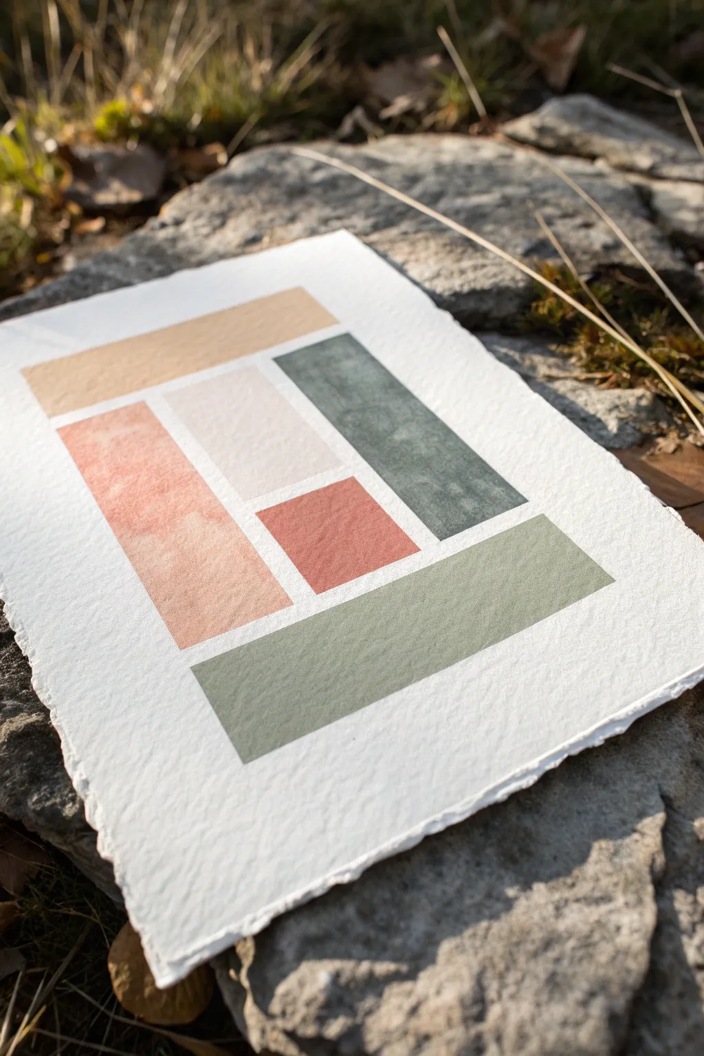
Embrace simplicity and texture with this modern abstract composition featuring muted, earthy tones arranged in a geometric layout. The beauty of this project lies in the rough, deckled edges of the paper and the subtle dry-brush effects that give the color blocks a vintage, weathered feel.
Step-by-Step
Materials
- Heavyweight watercolor paper (300gsm or higher, rough or cold press finish)
- Watercolors or gouache (Burnt Sienna, Yellow Ochre, Paynes Grey, Olive Green, Titanium White)
- Flat shader brushes (sizes 1/2 inch and 1 inch)
- Masking tape or painter’s tape (low tack)
- Ruler
- Pencil (H or HB)
- Eraser
- Paper towels
- Two jars of water
- Mixing palette
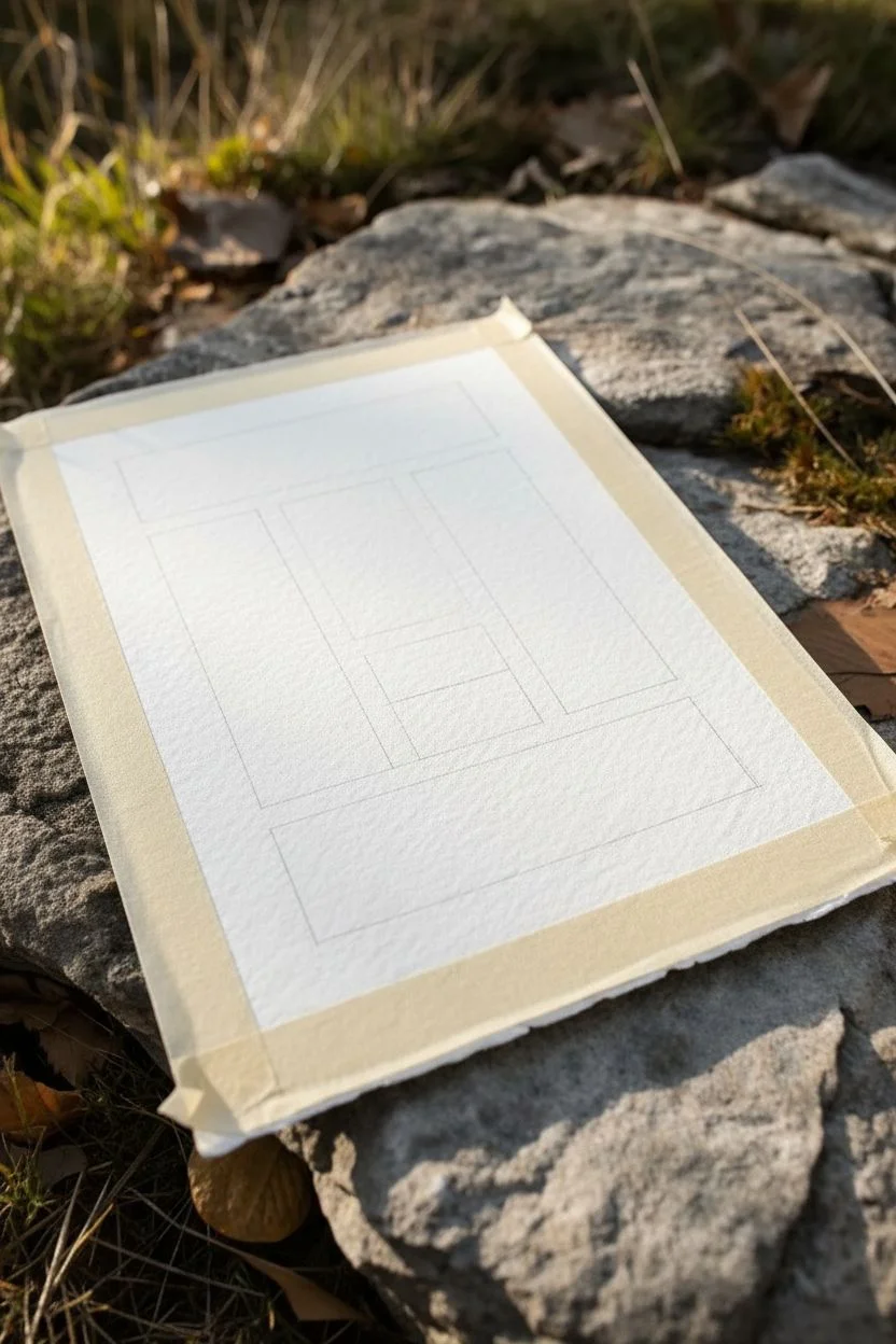
Step 1: Preparation & Layout
-
Prepare the paper:
Begin by tearing your watercolor paper to size. Instead of cutting with scissors, place a ruler firmly against the paper and tear the paper upward against the edge to create a soft, deckled look unique to high-quality art prints. -
Map out the grid:
Lightly sketch your design using a ruler and a hard pencil. Draw a large rectangle in the center, leaving a generous white border around the edges to frame the composition. -
Define the blocks:
Subdivide your main rectangle. For this specific layout, draw a horizontal rectangle at the top and bottom. In the middle section, divide the space vertically into three columns. -
Refine the middle section:
Take the middle column of that center section and split it horizontally into two smaller segments—this creates the varied block sizes that make the composition interesting. -
Tape the boundaries:
Apply masking tape along the very outer edges of your main rectangle first to create a crisp external border. Press the edges down firmly with a bone folder or your fingernail to prevent bleed-through.
Tape Tactics
Stick the masking tape to your trousers or shirt once before applying it to the paper. This reduces tackiness and prevents the paper from tearing when you remove it.
Step 2: Mixing & Painting
-
Mix the top beige tone:
Create a warm sand color by mixing Yellow Ochre with a significant amount of Titanium White and a tiny drop of Burnt Sienna. You want a creamy, opaque consistency, not too watery. -
Mask internal edges:
Place strips of tape along the internal lines of the top horizontal block. This isolates the area so you can paint freely without worrying about messy edges. -
Paint the top block:
Using a flat brush, apply the sand color. Load the brush moderately; if it’s too wet, you lose the texture. Drag the brush horizontally to match the grain of the paper. -
Remove tape and dry:
Carefully peel back the internal tape while the paint is just barely damp. Let this section dry completely before moving to adjacent shapes to avoid colors bleeding into one another. -
Mix the terracotta tone:
Mix Burnt Sienna with a touch of white to create a soft terracotta or salmon hue. This will be used for the tall vertical block on the left. -
Apply the terracotta:
Once the nearby sections are dry, re-tape the boundaries for the left vertical block. Paint this section with vertical strokes to enhance the structural feel of the shape. -
Create the sage green:
Mix Olive Green with white and a tiny dot of Paynes Grey to desaturate it. This muted sage green is for the bottom horizontal block. -
Paint the bottom section:
Tape off the bottom rectangle and fill it in with the sage green mixture. I like to use slightly less water here to let the paper’s rough texture peek through the paint layers. -
Mix the slate blue-green:
Combine Paynes Grey with a touch of the Olive Green mix. This darker slate color adds weight and contrast to the right-hand vertical block. -
Paint the right column:
Mask and paint the tall right block with the slate mixture. Ensure your brushstrokes are even but don’t overwork the paint, as gouache can lift previous layers if rubbed too hard. -
Fill the center blocks:
For the two smaller middle blocks, mix a very pale blush (white with a hint of the terracotta mix) for the top square, and use a slightly deeper version of the terracotta for the bottom square. -
Final reveal:
Once every block is fully dry, slowly peel away all remaining tape at a 45-degree angle. Erase any visible pencil lines gently.
Bleeding Lines?
If paint seeps under the tape, wait for it to dry completely. Then, use a stiff brush with just a tiny bit of water to gently scrub and lift the excess pigment away from the white border.
Frame your new abstract piece in a floating frame to show off those beautiful deckled edges

PENCIL GUIDE
Understanding Pencil Grades from H to B
From first sketch to finished drawing — learn pencil grades, line control, and shading techniques.
Explore the Full Guide
Easy Cloud Study on Paper With Soft Blending
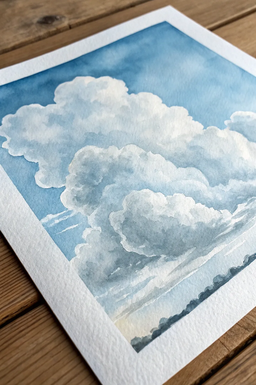
Capture the majestic height and softness of summer clouds with this approachable watercolor exercise. Using just a few shades of blue and gray, you’ll learn to balance crisp edges with gentle, wet-on-wet blending to create realistic volume.
Step-by-Step Guide
Materials
- Cold press watercolor paper (300 gsm / 140 lb)
- Masking tape or washi tape
- Watercolor paints: Cobalt Blue, Indigo, Burnt Umber or Paynes Gray
- Round watercolor brushes (size 8 and size 4)
- Clean water jar
- Paper towels
- Pencil (HB or H)
- Kneadable eraser
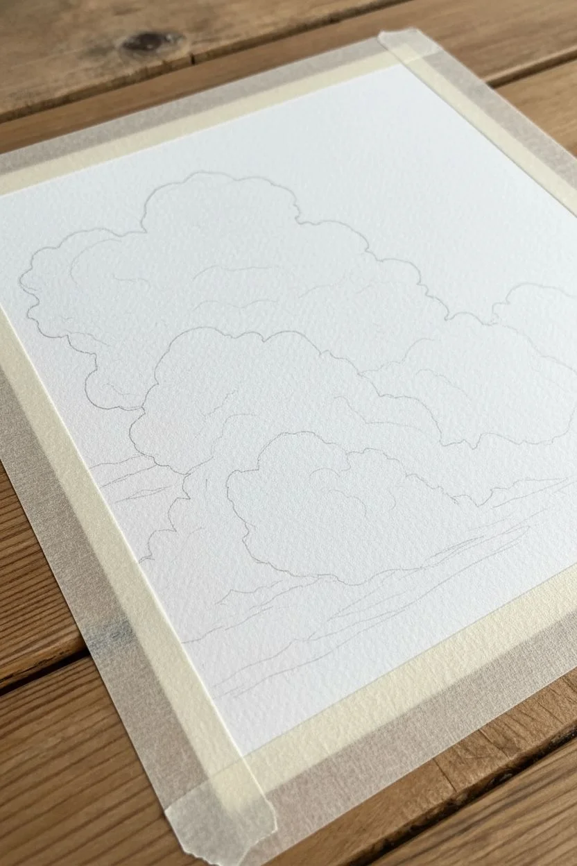
Step 1: Preparation and Sketching
-
Tape the Edges:
Secure your watercolor paper to a board or table using masking tape along all four sides. This creates that crisp, professional white border shown in the photo and prevents the paper from buckling when wet. -
Lightly Sketch the Shapes:
Using a light hand, sketch the main outline of the cloud formation. Focus on the ‘cauliflower’ tops—lots of rounded, bubbling shapes stacking on top of each other. Keep lines very faint so they don’t show through the final paint. -
Define Shadow Zones:
Gently mark where the darkest shadows will fall within the cloud mass, usually toward the bottom right of each puff, suggesting light coming from the top left.
Pro Tip: Edges Matter
Clouds need a mix of edges to look real. Keep the top edges crisp against the blue sky, but keep the internal shadows soft and fuzzy by always wetting the paper before adding shadow paint.
Step 2: Painting the Sky
-
Pre-wet the Sky Area:
With clean water and your larger brush, wet *only* the blue sky area around the clouds. Be extremely careful to paint around the cloud edges—this dry space will preserve the bright white of the paper for the cloud tops. -
Drop in the Blue:
Load your brush with a watery mix of Cobalt Blue. Touch it to the wet paper at the very top edge. Let the color flow downward. -
Create the Gradient:
As you move lower toward the horizon line, dilute the paint on your brush with more water. The sky should be deepest blue at the top and fade to a pale, almost white blue near the bottom. -
Refine the Edges:
Use the tip of your brush to carefully carve out the rounded tops of the clouds against the wet sky. The paint will stop where the water stops, giving you those necessary hard edges. -
Let it Dry:
Allow the sky layer to dry completely. If the paper feels cool to the touch, it’s still wet.
Step 3: Sculpting the Clouds
-
Mix Shadow Grey:
Create a soft grey using a mix of Cobalt Blue and a tiny touch of Burnt Umber or a very diluted Paynes Gray. You want a color that is much lighter than you think you need—watercolor dries lighter. -
Wet the Inner Cloud:
Working on one cloud puff at a time, wet the interior area with clean water, but leave the very top edge dry to keep that bright white highlight. -
Add Soft Shadows:
Drop your grey mix into the bottom areas of the wet puff. Tilt the paper slightly to let the pigment drift, creating a soft transition from the white top to the grey bottom. -
Layering Forms:
Repeat this process for the smaller cloud shapes in the foreground. I find it helpful to vary the grey intensity—make the foreground clouds slightly darker to push volume. -
Hard Edges for Definition:
Occasionally, apply the grey paint to dry paper (wet-on-dry) where one cloud overlaps another. Soften just one side of that stroke with a damp brush to blend it out, leaving a hard edge on the other side to define the separation.
Level Up: Warm Glow
Before painting the shadows, glaze a very pale, watery yellow or peach near the bottom of the clouds. This subtle hint of reflected light adds warmth and realism to the scene.
Step 4: Final Details
-
Deepen the Shadows:
Once the first shadow layer is dry, mix a slightly stronger, cooler grey (more Indigo). Add small touches of this darker value to the deepest crevices at the base of the clouds for contrast. -
Paint the Horizon:
Mix a dark blue-grey using Indigo and Paynes Gray. Use the tip of your small brush to stipple a jagged, uneven line along the very bottom of the paper to suggest a distant tree line. -
Connect to the Clouds:
While the tree line is wet, soften the top edge of the trees slightly so they blur into the mistiness of the lower atmosphere. -
Review Contrast:
Step back. If the clouds look too flat, add one more glaze of watered-down grey to the undersides. -
Remove Tape:
Wait until the painting is bone dry. Peel the masking tape away slowly at a 45-degree angle to reveal your crisp borders.
Enjoy the peaceful feeling of your new skyscape as you frame it or add it to your sketchbook collection
Loose Fruit Slice Paintings on Small Paper Squares
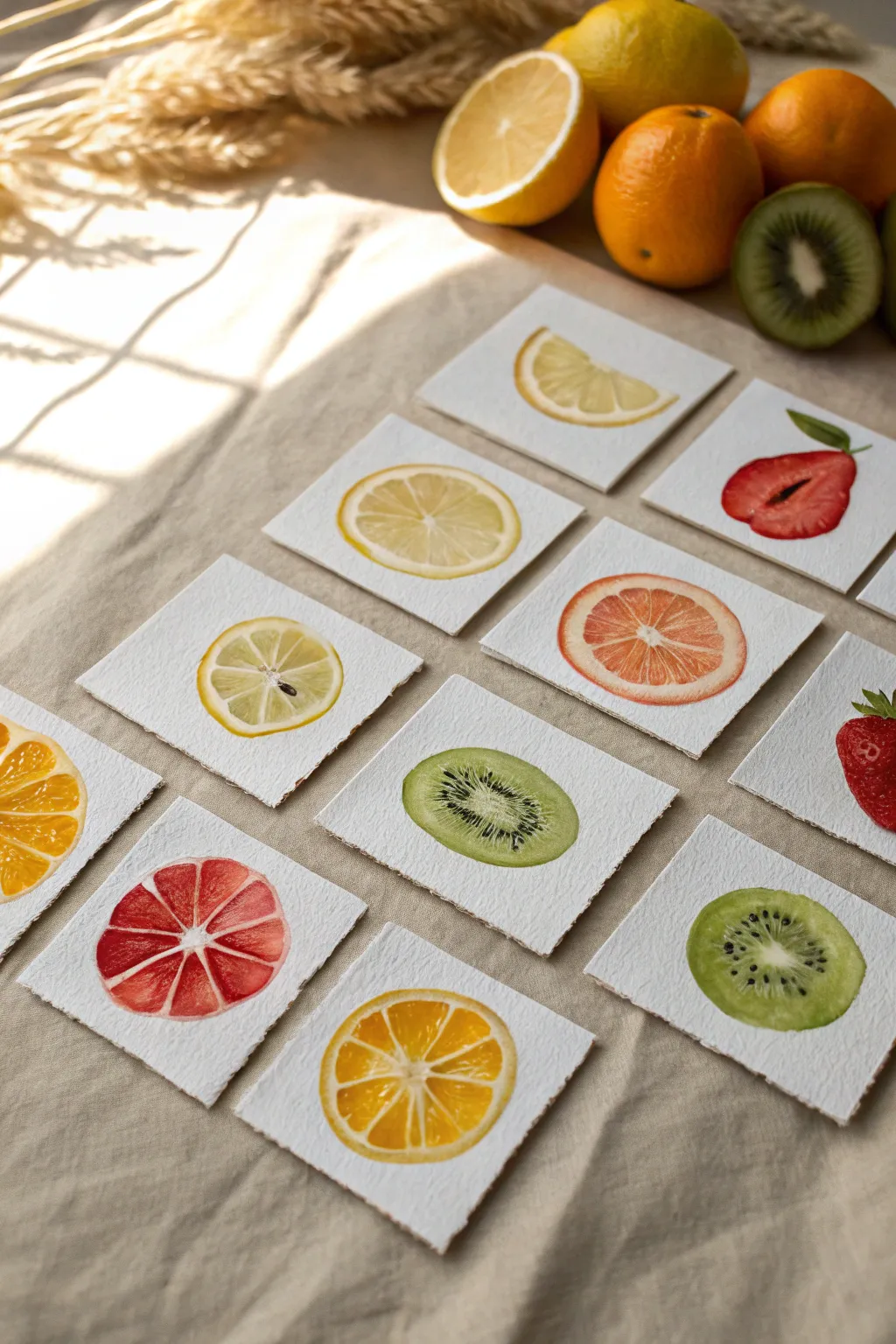
Capture the translucent beauty of citrus and berries with these delightful watercolor miniatures. Painted on small squares of textured paper, these loose yet realistic studies make for a perfect warm-up exercise or a charming gallery wall installation.
Step-by-Step Tutorial
Materials
- Cold press watercolor paper (300 gsm)
- Ruler and scissors (or paper trimmer)
- Round watercolor brushes (size 2 and 4)
- Fine detail brush (size 00 or 0)
- Watercolor paints (lemon yellow, cadmium orange, alizarin crimson, sap green, burnt umber)
- Clean water jar
- Paper towels
- HB pencil
- Kneaded eraser
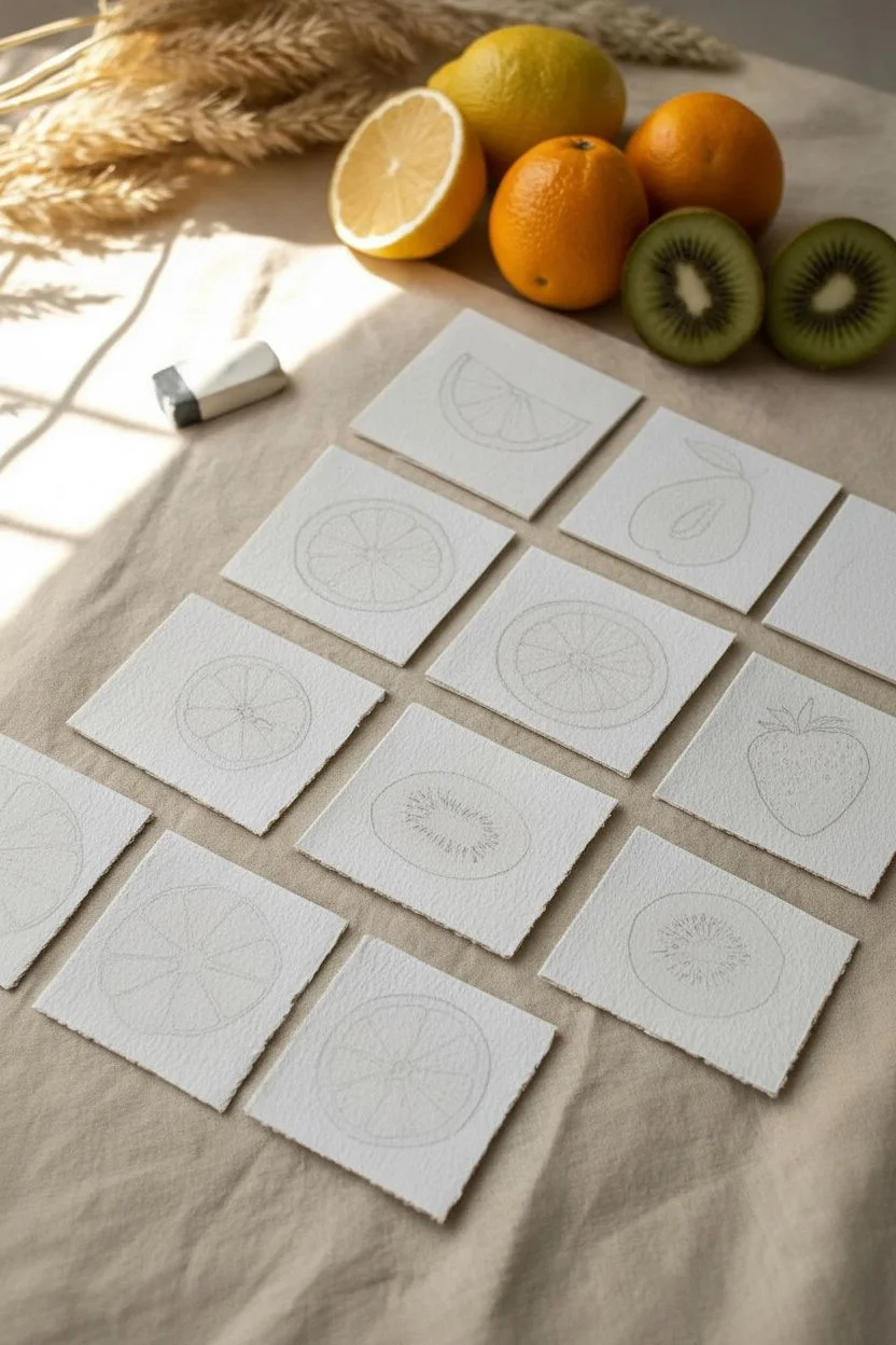
Step 1: Preparation and Sketching
-
Cut the paper:
Begin by measuring and cutting your watercolor paper into uniform 3×3 inch (or 7×7 cm) squares. The torn or ‘deckled’ edge look in the photo can be achieved by folding the paper back and forth along a ruler and carefully tearing it rather than cutting with scissors. -
Lightly sketch outlines:
On each square, draw the basic shape of your fruit slice using an HB pencil. Keep the pressure extremely light so the graphite doesn’t show through the transparent paint later. -
Map the segments:
For citrus slices, mark the center point and lightly sketch the radiating triangular segments, leaving thin gaps for the white pith. For kiwis, sketch the oval shape and a small central oval for the core. -
Soften the lines:
Take your kneaded eraser and gently roll it over your sketches. You want the lines to be barely visible—just ghost images to guide your brush.
Fixing “Cauliflowers”
If water blossoms appear in your drying wash, wait until it’s completely dry. Then, gently scrub the edge with a damp stiff brush and dab with a tissue to lift the excess pigment.
Step 2: Painting Citrus Slices
-
Wet-on-dry technique:
Using a size 4 brush, load wet pigment (lemon yellow for lemons) and fill in one triangular segment. Leave a tiny sliver of dry white paper between the pulp and the rind edge. -
Create texture:
While the paint is still wet, drop in a slightly more saturated version of the color near the outer edge of the segment to mimic the juicy depth of the fruit pulp. -
Work symmetrically:
Move to the segment opposite the one you just painted. Working in a non-adjacent pattern prevents wet edges from touching and bleeding into each other. -
Add the rind:
Once the inner segments are semi-dry, paint a very thin line around the circumference for the peel. For the lemon, use a slightly deeper yellow; for the orange, mix a touch of red into your yellow. -
Radiating lines:
If your white pith lines look too stark, soften them with a clean, slightly damp brush, gently blurring the hard edges of your paint inward. -
Seed details:
For the lemon slice showing a seed, paint a tiny teardrop shape in the center using a diluted grey-brown mix. Leave a microscopic white highlight to make it look wet.
Pro Tip: Realistic Pith
Don’t leave the pith perfectly white! Once your painting is dry, glaze a very watery, pale yellow or cream over the white gaps. It unites the segments and looks more organic.
Step 3: Painting Kiwi and Berry Slices
-
Kiwi base layer:
Mix a fresh, yellowish-green (sap green + lemon yellow). Paint the main flesh of the kiwi, leaving the center core dry and white. -
Kiwi core diffusion:
While the green is still damp, soften the inner edge where it meets the white core so the transition isn’t harsh. I find this helps the fruit look naturally ripe. -
Strawberry gradient:
For the strawberry, start with a watery red near the center and intensify the pigment as you move toward the outer edges to show volume. -
Adding seeds:
Once the base layers are bone dry, switch to your size 00 detail brush. Use a dark, concentrated mix (burnt umber + black) to dot in the kiwi seeds around the core. -
Radiating texture:
Use the fine brush to add tiny, radiating lines from the center of the kiwi outward, mimicking the fibrous texture of the fruit flesh. -
Final highlights:
Examine your dry paintings. If you lost any highlights, you can reclaim them with a tiny dot of white gouache or a white gel pen, especially on the seeds or juicy segments.
Now you can arrange your collection of fruit studies together for a vibrant and sunny display.


Cut-Paper Stencil Painting on Paper for Clean Shapes
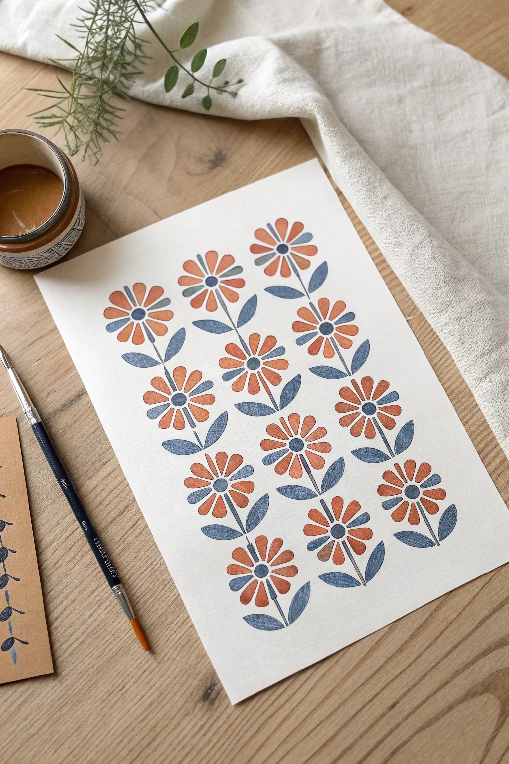
Achieve the crisp edges and charming texture of block printing using simple paper stencils. This project creates a repeating botanical pattern with a modern folk-art feel, perfect for framing or handmade cards.
Step-by-Step Tutorial
Materials
- Heavyweight watercolor paper or mixed media paper (smooth texture preferred)
- Cardstock or acetate for stencil making
- Craft knife and cutting mat
- Gouache or acrylic paint (Terracotta Orange, Slate Blue)
- Stencil brush or small sponge daubers
- Fine liner brush (for stems)
- Pencil and eraser
- Low-tack painter’s tape
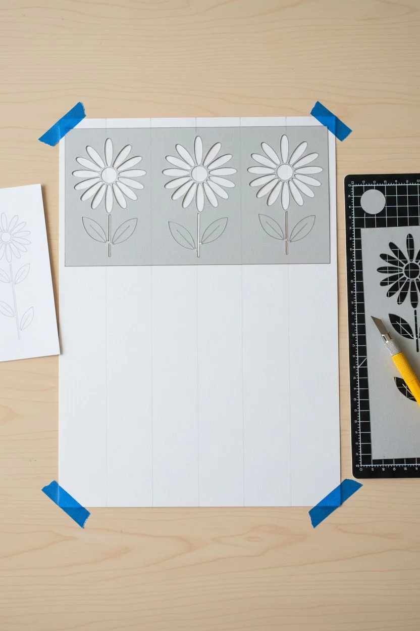
Step 1: Designing & Cutting the Stencil
-
Draft the flower shape:
Sketch a simple, symmetrical daisy-like flower on a piece of scrap paper. It should feel stylized rather than realistic. Include a separate shape for the leaf. -
Transfer to stencil material:
Trace just the flower petals (without the center) onto your cardstock or acetate. Trace the leaf shape nearby. Keep the elements separate so you can position them independently. -
Cut the positive space:
Using a sharp craft knife, carefully cut out the petal shapes and the leaf shape. The hole you leave behind is your stencil. Ensure the edges are clean and free of fuzzy paper fibers. -
Prepare the center stencil:
Cut a small, separate circle stencil for the flower centers. Alternatively, you can plan to freehand these later for a more organic look.
Step 2: Painting the Pattern
-
Plan your layout:
Before painting, lightly mark a grid or vertical lines on your final paper with a pencil to ensure your columns of flowers stay straight. -
Mix your colors:
Prepare a creamy consistency of Terracotta Orange and Slate Blue gouache. Gouache works beautifully here for its matte, opaque finish that mimics screen printing. -
Position the first flower:
Place your petal stencil at the top left of your paper. Secure the edges with a bit of low-tack tape if you’re worried about slipping. -
Apply the orange paint:
Load your stencil brush or sponge sparingly—too much paint will bleed under the edges. Dab the orange paint vertically (up and down) over the stencil opening. -
Lift and repeat:
Carefully lift the stencil straight up. Move down the column, leaving space for the stems and leaves, and repeat the stenciling process for the next flower head. -
Complete the flower heads:
Continue this process until you have three vertical columns of orange flower heads. I usually let the orange dry completely before moving to the blue to avoid smudging.
Bleeding Edges?
Paint bleeding under the stencil means your brush is too wet. Dab it on a paper towel first until it’s almost dry to the touch before stenciling.
Step 3: Adding Details & Leaves
-
Stencil the leaves:
Switch to your Slate Blue paint. Position the leaf stencil near the base of where the stems will go. Stencil two leaves per flower, angling them slightly upward. -
Paint the centers:
Using a small round brush or your circle stencil, fill in the centers of the flowers with the Slate Blue paint. Make sure the orange paint is dry first. -
Draw the stems:
Take a fine liner brush tailored for detail. With a steady hand, paint a thin blue line connecting the flower head to the leaves and extending downward. -
Connect the leaves to the stem:
Ensure the leaves don’t just float; gently pull the blue paint from the leaf base to join the main stem smoothly. -
Touch ups:
Check for any uneven edges. If you want that true ‘print’ look, leave small imperfections alone, but you can tidy up significant bleeds with a tiny bit of white gouache or white gel pen. -
Erase guidelines:
Once the paint is 100% dry (give it an hour to be safe), gently erase your pencil grid lines.
Texture Twist
Mix a tiny amount of texture paste or baking soda into your gouache for a raised, tactile surface that feels like an authentic linocut print.
Enjoy the rhythmic process of building your pattern and seeing the page fill with color


Have a question or want to share your own experience? I'd love to hear from you in the comments below!