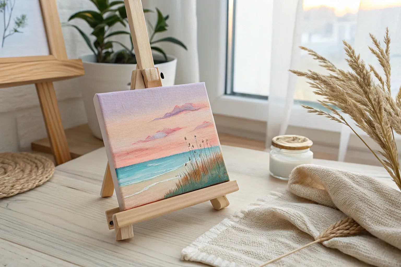
If you’re craving easy fun painting ideas that look way more impressive than they are complicated, you’re in the right place. These projects are all about bold color, simple shapes, and that “I can’t believe I made this” kind of joy.
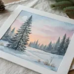
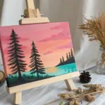
Sunset Gradient Sky with Easy Black Silhouettes
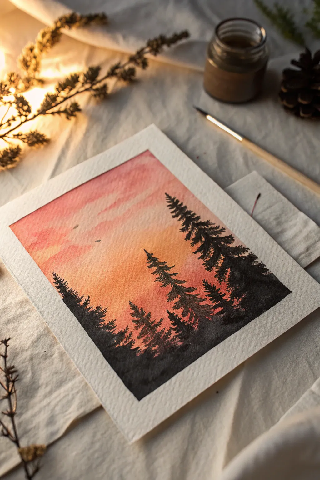
Capture the serene beauty of twilight with this glowing watercolor project featuring a vibrant gradient sky and striking pine tree silhouettes. The warm wash of pinks and oranges creates a perfect backdrop for the stark, dramatic treeline.
Step-by-Step Guide
Materials
- Cold press watercolor paper (140lb/300gsm)
- Artist tape or masking tape
- Watercolor paints (rose madder or pink, cadmium orange, yellow ochre, black)
- Flat wash brush (3/4 inch or larger)
- Round detail brush (size 2 or 4)
- Standard round brush (size 6 or 8)
- Jar of clean water
- Paper towels
- Palette or white plate for mixing
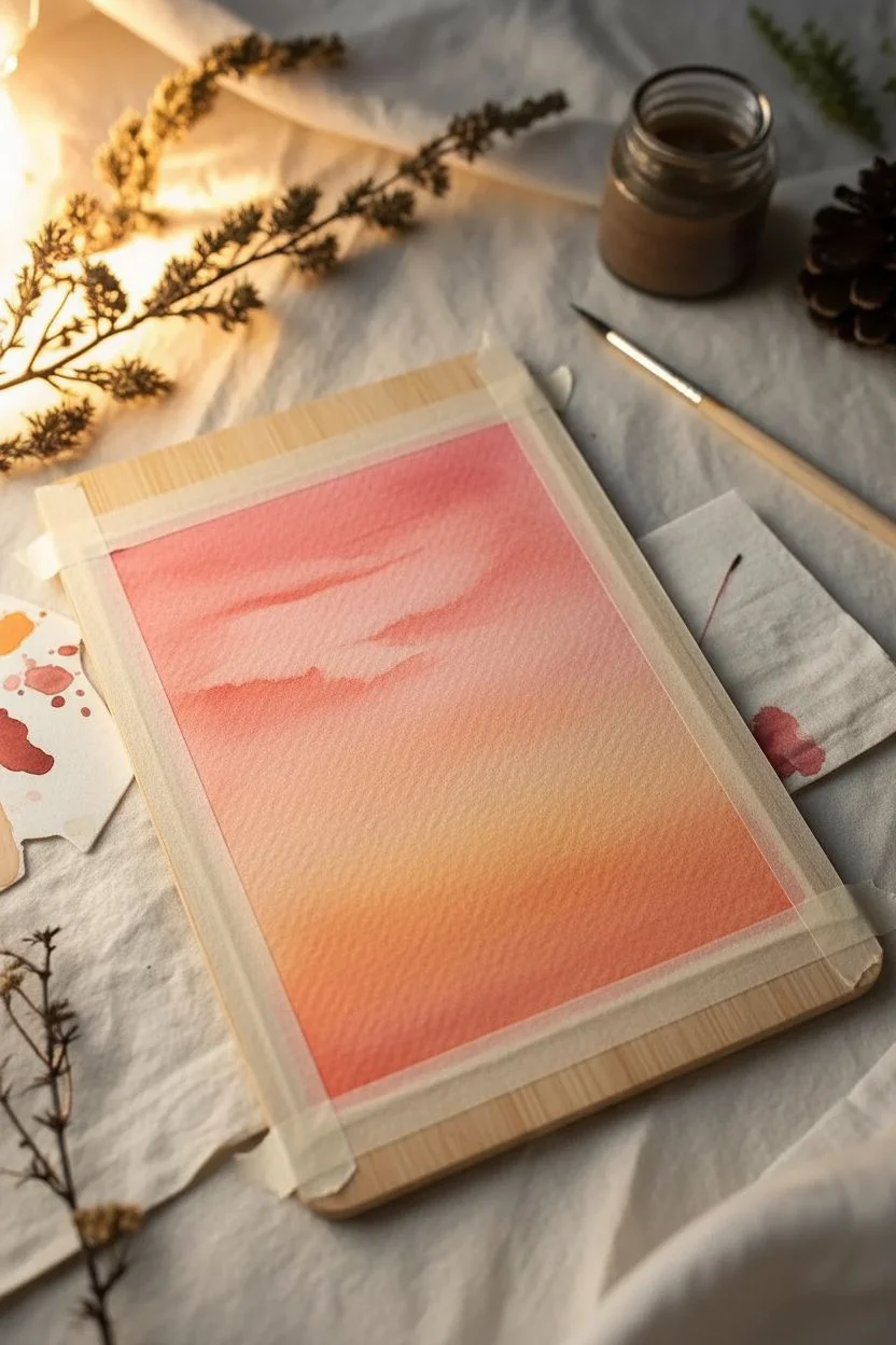
Step 1: Preparation and Sky Gradient
-
Secure the paper:
Begin by taping down all four edges of your watercolor paper to a board or table using artist tape. This creates a clean white border and prevents the paper from buckling when wet. -
Prepare the gradient colors:
On your palette, mix a generous puddle of three separate colors: a vibrant reddish-pink, a warm orange, and a soft yellow. You want them fairly watery but still pigmented. -
Wet the paper:
Using your large flat brush and clean water, apply a thin, even layer of water across the entire paper surface. This ‘wet-on-wet’ technique helps the colors blend seamlessly. -
Start with yellow:
Load your round brush with the yellow paint and apply it horizontally across the middle of the paper, slightly below the center line. Let it diffuse into the wet paper. -
Add the orange layer:
Pick up the orange paint and brush it directly above the yellow section, allowing the bottom edge of the orange to touch and bleed into the yellow naturally. -
Finish with pink:
Apply the pink paint to the top third of the paper. Gently pull the color down to meet the orange layer, creating a smooth transition from pink to orange to yellow. -
Tilt to blend:
Before the paint dries, you can slightly tilt the board back and forth to encourage the colors to merge further without overworking them with the brush. -
Create soft clouds:
While the sky is still damp, dab a little concentrated pink or diluted purple in random horizontal streaks near the top to suggest soft cloud formations. -
Let it dry completely:
This is crucial: allow the background wash to dry 100%. If it’s cool to the touch, it’s still wet. You can use a hair dryer on a low setting to speed this up.
Bleeding Lines?
If black paint feathers into the sky, your background wasn’t dry enough. Wait longer next time, or fix minor bleeds by dabbing with a clean, thirsty brush.
Step 2: Painting the Silhouettes
-
Mix the black paint:
Prepare a dark, saturated black on your palette. You want a creamy consistency here, not too watery, so it stays opaque against the colorful background. -
Practice tree shapes:
I like to test a tree shape on a scrap piece of paper first. Start with a thin vertical line for the trunk using your smallest detail brush. -
Start the main trees:
Using the detail brush, paint a thin vertical line for the tallest tree on the right side. Start the branches near the top with tiny, downward-sloping dabs. -
Thicken the branches:
As you move down the trunk, make the branches wider and denser. Use a tapping motion with the brush tip to create the texture of pine needles. -
Add variety:
Paint a second, slightly shorter tree next to the first one. Varying the heights makes the forest look natural rather than uniform. -
Fill the horizon line:
Paint a jagged, solid black mass along the bottom edge of the paper to represent foliage and smaller trees in the distance. Ensure this connects all your larger trees. -
Add detail trees on the left:
Paint a few smaller trees on the left side of the paper, ensuring they don’t overpower the open, glowing center of the sky. -
Refine the edges:
Go back with your finest brush and add tiny stray branches or tips to the tops of the trees for extra realism. -
The reveal:
Once the black paint is fully dry, slowly peel away the tape at a 45-degree angle to reveal your crisp white border.
Adding Distant Birds
For a pro touch, use your tiniest brush to add two or three microscopic ‘m’ shapes in the distance. Keep them extremely small to maintain the scale of the landscape.
Step back and admire the peaceful atmosphere you have created with just a few simple layers of color
Pink Sky Moon and Soft Cloud Blends
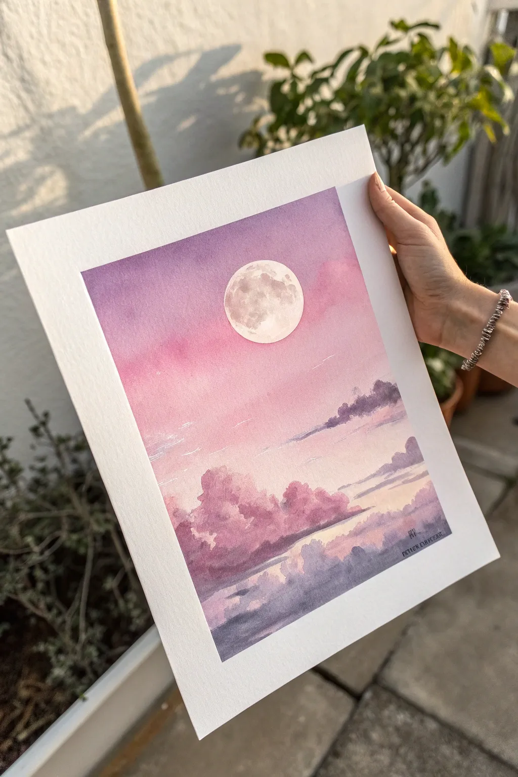
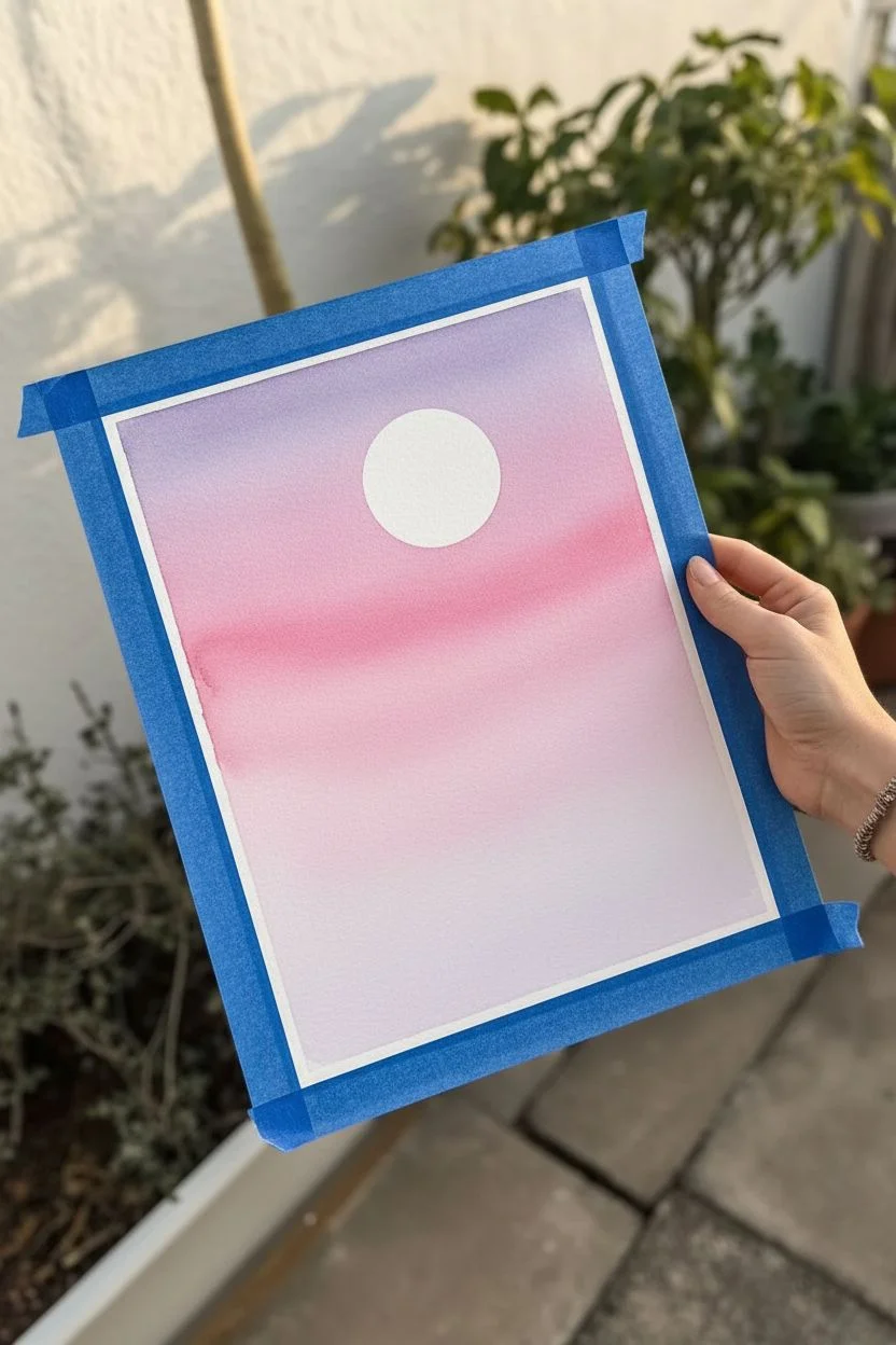
Create a serene evening sky filled with soft pinks, gentle purples, and a glowing full moon. This watercolor project focuses on mastering smooth gradients and building fluffy, dreamlike cloud layers.
Step-by-Step Tutorial
Materials
- Watercolor paper (cold press, 300 gsm recommended)
- Watercolor paints (Purple, Magenta, Rose, Indigo, Warm Gray)
- Masking fluid or white gouache
- Round brushes (sizes 8 and 4)
- Flat wash brush (large)
- Masking tape
- Jar of clean water
- Paper towels
- Palette for mixing
Step 1: Preparation & Sky Base
-
Tape it down:
Secure your watercolor paper to a board using masking tape along all four edges. This creates a clean white border and prevents buckling when wet. -
Define the moon:
Lightly trace a circle for the moon in the upper center using a jar lid or compass. Carefully apply masking fluid inside this circle to protect the white paper. Let it dry completely. -
Pre-wet the sky:
Using your large flat brush, apply clean water to the paper, starting from the top and stopping about two-thirds of the way down. The paper should be glisten, but not hold puddles. -
Start with purple:
Load your large brush with a soft purple mix. Apply it horizontally across the very top of the wet area, allowing the color to bleed downwards slightly. -
Blend in pinks:
While the purple is still wet, rinse your brush and pick up a vibrant rose or magenta shade. Paint horizontal strokes below the purple, blending the two where they meet to create a smooth transition. -
Fade to pale:
Continue bringing the pink wash down, adding more water to your brush as you go lower so the pink fades into a very pale, almost white wash near the horizon line. -
Initial dry time:
Let this first wash dry completely. The paper must be bone dry before you start adding the defined clouds, or the edges will blur too much.
Step 2: Clouds & Atmosphere
-
Mix cloud colors:
Prepare a puddle of purple-gray mix. You can make this by mixing your purple with a touch of indigo or gray. Keep a separate puddle of pure rose paint ready too. -
Paint faint distant clouds:
Using a size 8 round brush and a very diluted purple mix, paint thin, horizontal streaks across the middle section of the sky. These should look like wispy stratus clouds. -
Form the main cloud range:
Load your brush with the rose color. Near the bottom third of the paper, dab the brush to create the fluffy tops of cumulus clouds. Vary the height and size of your dabs for a natural look. -
Soften the bottoms:
While the rose tops are wet, rinse your brush and use clean, damp bristles to pull the color downwards, softening the bottom edge of the clouds so they fade into nothingness. -
Add shadows:
While the rose clouds are still damp, drop small amounts of purple-gray into the bottom sections of the cloud shapes. This adds volume and dimension. -
Layer lower clouds:
Once the pink clouds are semi-dry, paint a darker layer of purple-gray clouds beneath them, closer to the bottom edge. Make these shapes flatter and wider to suggest perspective. -
Deepen the foreground:
Add a final, darkest layer of indigo-purple clouds at the very bottom edge of your painting to ground the composition.
Master the Fade
Work quickly on the sky gradient! If the paper starts to dry, stop blending or you’ll get ‘cauliflower’ blooms. Keep the paper tilted slightly so gravity helps blend.
Step 3: The Moon & Final Details
-
Reveal the moon:
Gently rub off the masking fluid with your finger or a rubber eraser to reveal the crisp white circle. -
Soften the moon’s edge:
Take a clean, damp brush and very gently run it along the edge of the moon circle to soften the harsh line just a tiny bit, so it sits naturally in the sky. -
Add lunar details:
Mix a very watery pale gray. Using your smallest size 4 brush, dab faint, irregular shapes inside the moon to represent craters and maria. Leave plenty of pure white paper for the glow. -
Final highlights:
If any cloud tops need extra definition, you can use a tiny bit of white gouache or a white gel pen to add subtle highlights on the upper edges. -
Peel and sign:
Wait until the entire painting is perfectly dry. Carefully peel off the masking tape at a 45-degree angle to reveal your clean borders, then sign your work.
Starry Night Option
Before removing the tape, splatter tiny drops of white gouache or acrylic ink over the upper purple section to create a field of distant stars.
Enjoy the peaceful atmosphere of your new pink moonscape
Easy Beach Scene with Umbrella and Beach Ball
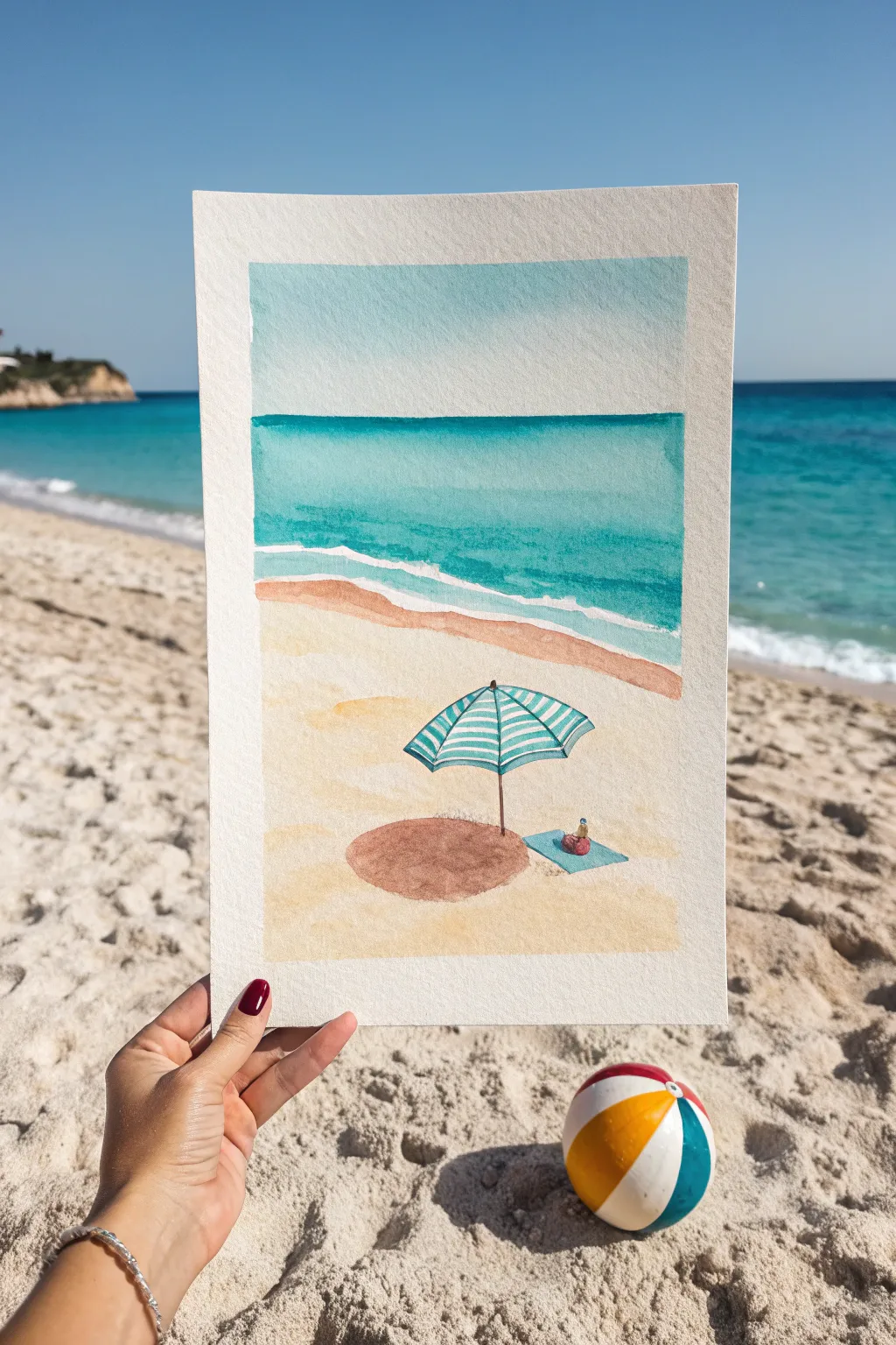
Capture the serenity of a perfect beach day with this charming watercolor scene, featuring crystal blue waters and a striped umbrella. This project relies on simple layering techniques to create depth between the sand, sea, and sky.
Step-by-Step
Materials
- Cold-pressed watercolor paper (300 gsm)
- Watercolor paints (Cerulean Blue, Turquoise, Yellow Ochre, Burnt Sienna, Payne’s Gray, White or White Gouache)
- Masking tape
- Pencil (HB or 2H)
- Round brushes (sizes 4, 8, and 12)
- Detail brush (size 0 or 1)
- Jar of clean water
- Paper towels
- Ruler
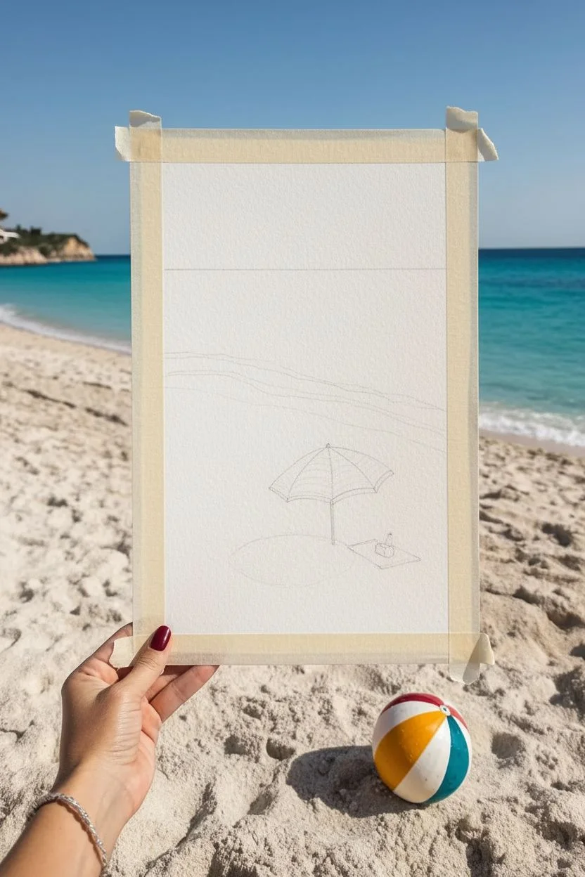
Step 1: Preparation and Sketching
-
Tape the borders:
Begin by taping down all four edges of your watercolor paper to a board or table with masking tape. This creates that crisp, clean white border seen in the photo and prevents the paper from buckling when wet. -
Establish the horizon line:
Using your ruler and pencil, lightly draw a horizontal line about one-third of the way down from the top of the paper. This separates the sky from the ocean. -
Outline the shoreline:
Sketch a gentle, wavy diagonal line across the middle section. It should start higher on the left and dip lower towards the right to create the edge where the water meets the sand. -
Sketch the umbrella and accessories:
In the lower center of the sand area, lightly sketch an open umbrella. Draw a simple dome shape with a central pole. Add a small rectangle for a beach towel underneath and a tiny circle for a beach bag.
Step 2: Painting the Background
-
Wash the sky:
Mix a very diluted Cerulean Blue. Using your largest brush, apply a flat, even wash to the sky area, stopping right at the horizon line. Let the blue fade slightly as it nears the horizon for atmospheric perspective. -
Paint the deep ocean:
While the sky dries, mix a vibrant turquoise. Paint the section just below the horizon line with a strong, saturated color to represent the deep water. Stop before you reach the shoreline sketch. -
Create the shallow water:
Dilute your turquoise mix significantly or add a touch of light green. Paint the area closest to the shore, blending it upwards into the deeper ocean color while both are still slightly damp to create a soft gradient. -
Reserve the seafoam:
Leave a thin, wiggly strip of unpainted white paper right at the shoreline. This negative space will act as the foamy white water crashing on the beach. -
Base layer for the sand:
Mix Yellow Ochre with plenty of water. Paint the entire sand area, carefully painting around your umbrella and towel sketches. I like to keep this wash uneven to mimic the texture of sand.
Fixing Water Blooms
If water pushes pigment into ‘cauliflower’ shapes, you used too much water on a damp layer. Let it dry completely, then gently scrub with a damp brush to soften the hard edge.
Step 3: Adding Details and Shadows
-
Deepen the shoreline:
Once the sand layer is dry, mix a slightly stronger brown using Burnt Sienna and Yellow Ochre. Paint a thin strip along the wet sand edge, right next to the white foam, to show where the sand is saturated with water. -
Paint the umbrella stripes:
Switch to your small detail brush. Using a teal or turquoise paint, fill in alternating segments of the umbrella canopy. Leave the remaining segments white. -
Add the umbrella pole:
Use a mix of Burnt Sienna to paint the thin pole of the umbrella. Make sure your hand is steady to keep the line straight. -
Paint the towel and bag:
Fill in the rectangular towel with a bright blue or turquoise. Paint the small bag on top with a contrasting red or pink pop of color. -
Cast a shadow:
Mix a transparent, purplish-brown shadow color (Burnt Sienna with a tiny touch of Payne’s Gray). Paint an oval-shaped shadow directly under the umbrella on the sand to ground the object. -
Enhance ocean waves:
Using white gouache or a white gel pen, add a few thin, horizontal lines in the turquoise water to suggest distant waves breaking.
Level Up: Realism
Use actual sea salt on the wet ocean paint. Sprinkle coarse salt while the turquoise wash is still damp; once dry, brush it off for a stunning, natural water texture.
Step 4: Finishing Touches
-
Add sand texture:
Load a toothbrush or stiff brush with diluted brown paint. Tap it against your finger to splatter tiny specks onto the sand area for a realistic grainy texture. -
Remove tape:
Wait until the painting is 100% bone dry. Carefully peel the masking tape away at a 45-degree angle to reveal your clean, crisp edges.
Now you have a refreshing piece of summer art ready to frame or gift


Starry Night Galaxy with Paint Splatter Stars
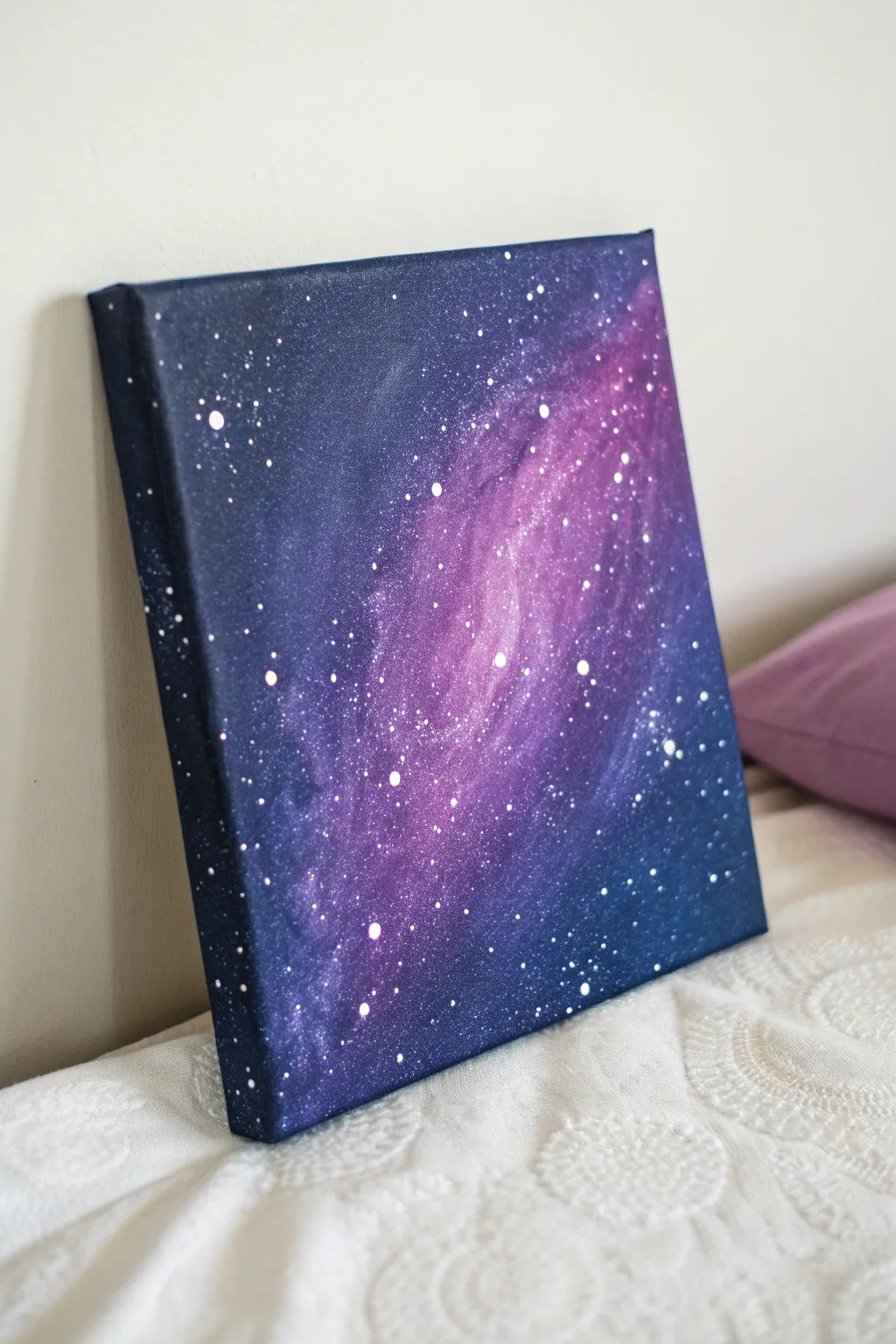
Capture the magic of deep space on a small canvas with this beginner-friendly galaxy painting. By blending deep blues and vibrant violets, you’ll create a glowing nebula effect finished with a shower of twinkling white stars.
How-To Guide
Materials
- Square stretched canvas (e.g., 8×8 or 10×10 inches)
- Acrylic paints: Black, Prussian Blue, Dioxazine Purple, Titanium White
- Flat brush (1/2 inch or 1 inch)
- Medium round brush
- Old toothbrush or fan brush
- Sponge (optional but helpful for blending)
- Palette or paper plate
- Cup of water
- Paper towels
Step 1: Setting the Background
-
Prepare the Base:
Squeeze out a generous amount of black and Prussian Blue paint onto your palette. Using your larger flat brush, mix a very dark, midnight blue shade. -
Cover the Canvas:
Paint the entire surface of the canvas with this dark blue mixture. Work quickly to ensure full coverage. -
Don’t Forget the Edges:
Extend the dark paint around all four sides of the canvas. This gallery-wrapped look gives the finished piece a professional, polished appearance without needing a frame. -
Initial Blending:
While the base layer is still slightly wet, dip the corner of your brush into pure black paint. Darken the top left and bottom right corners to create deep space depth.
Blob Control
If you accidentally drip a large blob of white paint, quickly dab it up with a paper towel corner, or let it dry and paint over it with black to turn it into a ‘void’ in space.
Step 2: Creating the Nebula
-
Mixing Purple:
Clean your brush thoroughly. Mix Dioxazine Purple with a tiny touch of Titanium White to create a vibrant, medium violet color. -
Laying the Nebula Shape:
Apply the violet paint in a diagonal swoosh across the center of the canvas, moving from the bottom left toward the top right. Use irregular, cloud-like brushstrokes rather than a straight line. -
Softening Edges:
Before the purple paint dries, use a clean, dry brush or a slightly damp sponge to dab at the edges where the purple meets the dark blue background. This softens the transition and makes it look like gas clouds. -
Building Intensity:
Mix a lighter shade of purple by adding more white. Paint this into the center of your existing purple nebula streak, focusing on the middle area to seemingly create a glow. -
Adding Highlights:
I like to take a very small amount of nearly pure white (tinted with just a speck of purple) and dab it into the absolute brightest core of the nebula. -
Refining the Blur:
Use a dry brush to gently sweep over the layers one last time to ensure there are no harsh lines. The goal is a smoky, ethereal gradient. -
Drying Time:
Let the canvas dry completely before moving on to the stars. If the paint is wet, the stars will mix with the background and turn muddy.
Glow Up
Mix glow-in-the-dark medium into your white paint for the final star layer. By day it looks normal, but at night your galaxy will come alive with a soft luminescence.
Step 3: The Starry Field
-
Preparing Star Paint:
Water down a small amount of Titanium White paint on your palette. It should be the consistency of heavy cream or ink—runny enough to splatter but opaque enough to show up. -
Test Run:
Test your splatter consistency on a piece of scrap paper first to ensure you get dots rather than blobs. -
Splatter Technique:
Dip an old toothbrush or a stiff fan brush into the watered-down white paint. Hold it over the canvas and use your thumb to flick the bristles, spraying tiny white specks across the galaxy. -
Concentrating Stars:
Focus more splatters along the diagonal path of the nebula to emphasize the ‘Milky Way’ band effect. -
Adding Major Stars:
Dip the handle end of a small paintbrush into pure, un-thinned white paint. -
Dotting Details:
Gently press the paint-covered handle onto the canvas to create larger, perfectly round stars. Place these sparsely around the composition. -
Creating Varying Sizes:
Use a toothpick or a smaller brush handle for medium-sized stars to add variety and realism to your star field. -
Final Adjustments:
If any stars look too stark, you can lightly tap them with your finger to push them back into the distance slightly.
Now let your masterpiece dry fully and find the perfect spot to display your slice of the universe
BRUSH GUIDE
The Right Brush for Every Stroke
From clean lines to bold texture — master brush choice, stroke control, and essential techniques.
Explore the Full Guide
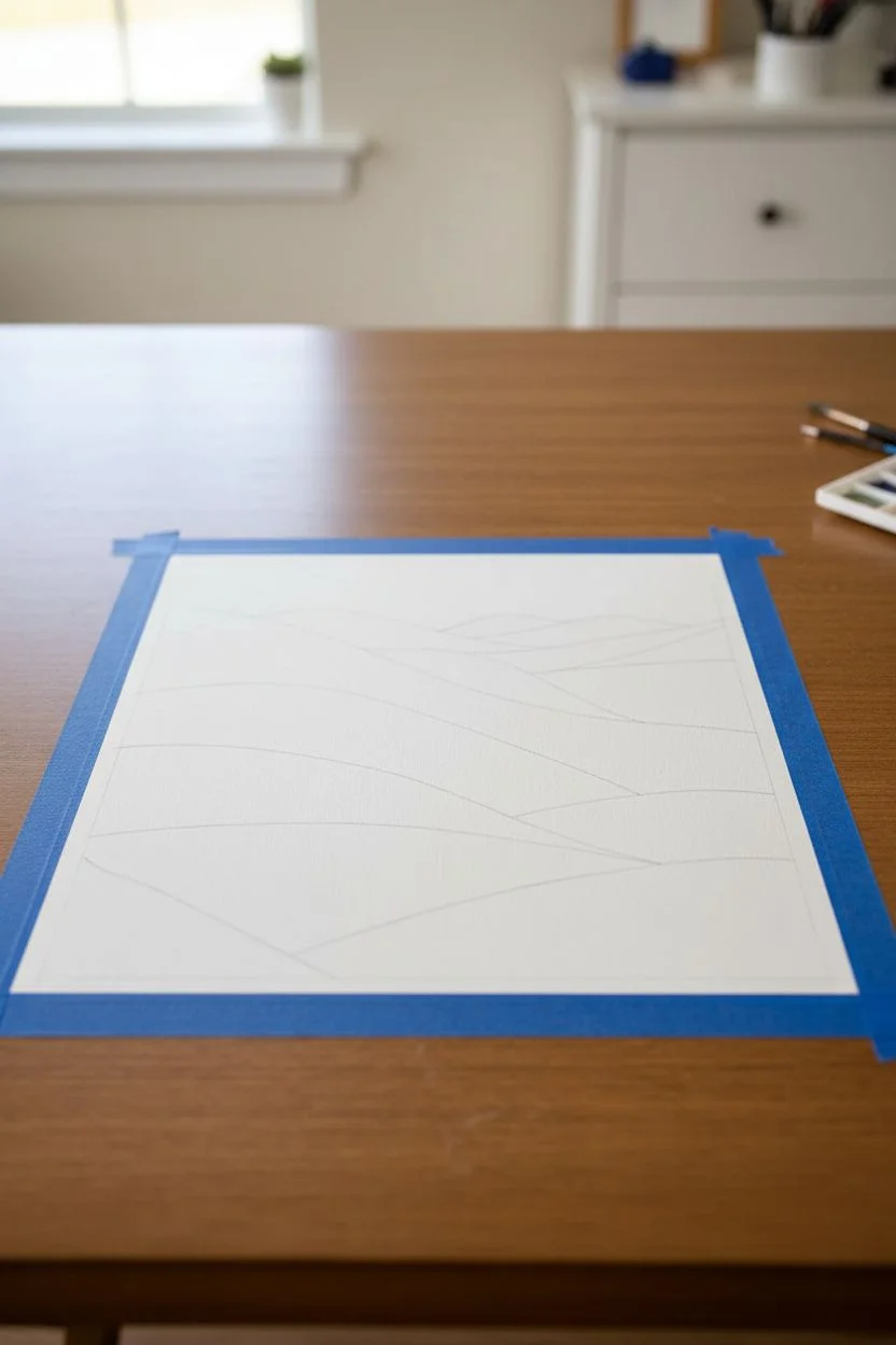
Simple Mountain Landscape with Cherry Blossom Dabs
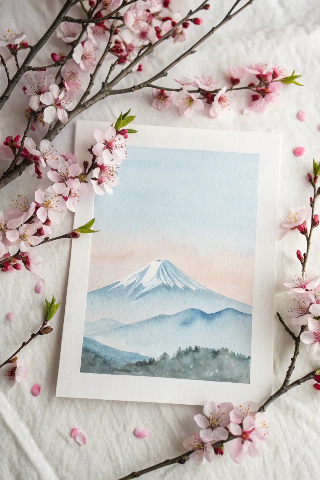
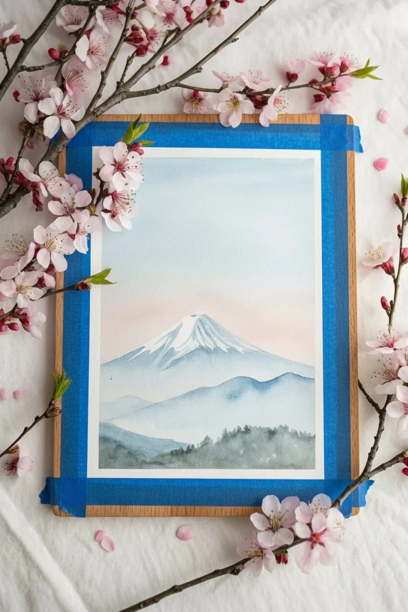
Capture the peaceful essence of a crisp morning with this gentle watercolor landscape. Using soft gradients and negative space, you’ll create a misty mountain scene framed by delicate cherry blossoms.
Step-by-Step Tutorial
Materials
- Cold press watercolor paper (140lb/300gsm)
- Watercolor paints (Cerulean Blue, Prussian Blue, Payne’s Grey, Alizarin Crimson/Rose Madder, Sap Green)
- Round watercolor brushes (Size 8 for washes, Size 4 for details)
- Masking fluid or white gouache (optional)
- Clean water jars
- Paper towels
- Painter’s tape
- Pencil and eraser
Step 1: Preparation & Sky
-
Secure the paper:
Tape down all four edges of your watercolor paper to a board or table. This creates that crisp white border seen in the final piece and prevents buckling. -
Light sketch:
Using a pencil very lightly, sketch the triangular outline of the mountain. Draw the jagged snow line near the peak and simple wavy lines below for the foreground hills. -
Wet the sky:
With your larger clean brush, apply a coat of clean water to the sky area, stopping just above the mountain outline. -
Paint the blue gradient:
Load your brush with a watery mix of Cerulean Blue. Apply it at the very top of the paper, letting it diffuses downward into the wet surface. -
Add the dawn glow:
While the paper is still damp, rinse your brush and pick up a very dilute Pale Rose or Alizarin mixture. Touch it to the horizon line just above the mountain, letting it blend softly upward into the fading blue.
Step 2: The Majestic Mountain
-
Reserve the snow:
The bright white snow cap is the unpainted paper itself. Be careful not to paint inside the jagged peak area you sketched earlier. -
Mountain base wash:
Mix a cool, slate blue using Cerulean and a touch of Payne’s Grey. Start painting immediately below the jagged snow line. Use the tip of your brush to carefully carve out the bottom edge of the snow. -
Streaking texture:
While the mountain color is wet, lift out a few streaks of color with a thirsty, clean brush to suggest ridges, or add slightly darker blue strokes to show shadows. -
Fade downwards:
Add more water to your brush as you move down the mountain body, making the color lighter and more transparent near the bottom to create a misty atmospheric effect. -
Let it dry:
Allow the mountain layer to dry completely before moving to the hills. If you rush, the colors will bleed into the sky or foreground.
Clean Edges Only
If paint bleeds under your tape, ensure you press the tape firmly before starting. Using a hair dryer to heat tape slightly before removal helps prevent paper tearing.
Step 3: Foreground Layers
-
Middle ground hills:
Mix a slightly stronger blue-grey. Paint the silhouette of the rolling hills that sit in front of the mountain base. Keep the top edge crisp but soften the bottom edge with water. -
Darkest foreground:
Mix a deep, foresty color using Payne’s Grey and a little Sap Green. Paint the bottom-most layer of hills. -
Suggesting trees:
While the bottom layer is wet, drop in more concentrated dark green pigment along the top ridge of this foreground shape. -
Tree detailing:
Switch to your smaller brush. Use the very tip to dab tiny, vertical irregularities along the top of the dark foreground to mimic the silhouette of a pine forest. -
Final drying:
Wait until the painting is bone dry to the touch to avoid smudging your crisp edges. -
The reveal:
Slowly peel away the painter’s tape at a 45-degree angle away from the painting. This reveals the satisfying clean white frame.
Snowy Peaks
Accidentally painted over your snow cap? Don’t panic. Use white opaque gouache or a white gel pen to add the snow back in on top of the dried blue paint.
Step back and admire the calm atmosphere you’ve created with just a few simple layers of color
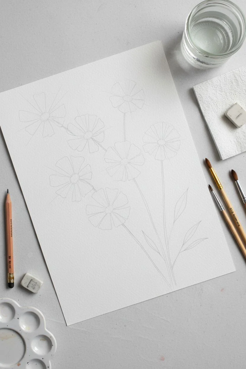
Sunflower or Daisy Field with One-Stroke Petals
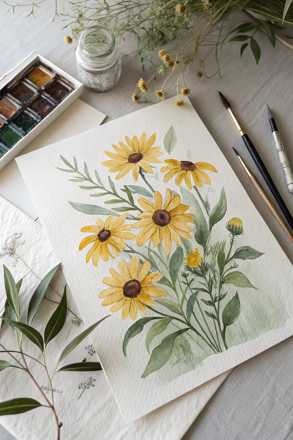
Capture the warmth of late summer with this cheerful watercolor study of Black-Eyed Susans. Using loose, expressive strokes for petals and delicate layering for foliage, you’ll create a botanical piece that feels both structured and organic.
Step-by-Step Guide
Materials
- Cold press watercolor paper (300 gsm recommended)
- Watercolor paints: Cadmium Yellow, Yellow Ochre, Burnt Sienna, Burnt Umber, Sap Green, and Indigo
- Round brushes: Sizes 2, 6, and 8
- Pencil (HB or 2H) and kneaded eraser
- Jar of water
- Paper towel or cloth
- Mixing palette
Step 1: Sketching the Composition
-
Outline flower heads:
Begin by lightly sketching five to six oval shapes scattered diagonally across the page to mark the flower centers. Keep your pencil pressure very light so the graphite doesn’t show through the yellow paint. -
Define petal direction:
Draw faint guide lines radiating from the centers to indicate the direction of the petals. Vary the angles—some flowers should face upward, others slightly downward or sideways for a natural look. -
Map the stems and leaves:
Sketch long, slender stems connecting to the flower heads, all gathering toward the bottom right. Follow this by lightly outlining lance-shaped leaves, grouping them denser at the base.
Step 2: Painting the Blooms
-
Yellow wash for petals:
Load your size 6 brush with a watery mix of Cadmium Yellow. Paint the individual petals using a loose, single-stroke motion where you press down to widen the belly of the brush and lift up for the tip. -
Add warmth:
While the first yellow layer is still slightly damp, drop in a touch of Yellow Ochre near the base of the petals (closest to the center) to create depth and shadow. -
Paint the centers:
Once the petals are dry, use Burnt Sienna mixed with a touch of Burnt Umber to paint the flower centers. Leave a tiny sliver of white paper on the upper edge of each center to represent a highlight. -
Darken the cores:
While the brown centers are wet, drop concentrated Burnt Umber or a tiny bit of Indigo into the bottom right of each center to give them a rounded, 3D form.
Paint Control Tip
For crisp petals, ensure your yellow mix isn’t too watery. Blot your brush on a paper towel just once after loading paint to strip excess moisture.
Step 3: Creating Foliage and Contrast
-
Base layer for leaves:
Mix a light Sap Green wash. Using the size 8 brush, fill in the larger leaf shapes. Let the water carry the pigment, keeping the edges soft. -
Stem work:
Switch to your size 2 brush and a darker green mix (Sap Green plus a touch of Indigo) to carefully paint the slender stems connecting the flowers to the main bunch. -
Layering details:
Once the base green layer is dry, paint a second layer of leaves over the first using a more saturated green. This transparency creates a lovely sense of density. -
Add grassy textures:
Use the tip of your smallest brush to flick in very fine, grass-like lines and wilder foliage sprigs around the base to break up the solid shapes. -
Paint the bud:
Color the small unopened bud on the right side using a mix of green for the sepals and a tiny peek of yellow at the very top.
Level Up: Texture
Once the painting is totally dry, use a fine-tip waterproof ink pen to add very subtle contour lines or stippling to the flower centers.
Step 4: Refining and Finishing
-
Deepen shadows:
Mix a dark, cool green. Carefully paint into the negative spaces between the stems at the bottom of the bouquet to make the foreground leaves pop forward. -
Petal separation:
If your petals have merged too much, use a slightly darker yellow-orange mix and a fine brush to paint thin lines separating individual petals. -
Final highlights:
Assess the dark centers. If they look flat, obscure the highlight slightly with a dry brush texture or add tiny dots of dark brown around the perimeter for a fuzzy texture. -
Bottom wash:
To ground the composition, add a very watery, pale green wash at the absolute bottom of the stems, fading it out into the white paper so the stems don’t look like they are floating in mid-air.
Step back and admire how a few simple colors can bring a sunny garden feeling right into your sketchbook

PENCIL GUIDE
Understanding Pencil Grades from H to B
From first sketch to finished drawing — learn pencil grades, line control, and shading techniques.
Explore the Full Guide
Flowery Hills Made from Repeating Tiny Blooms
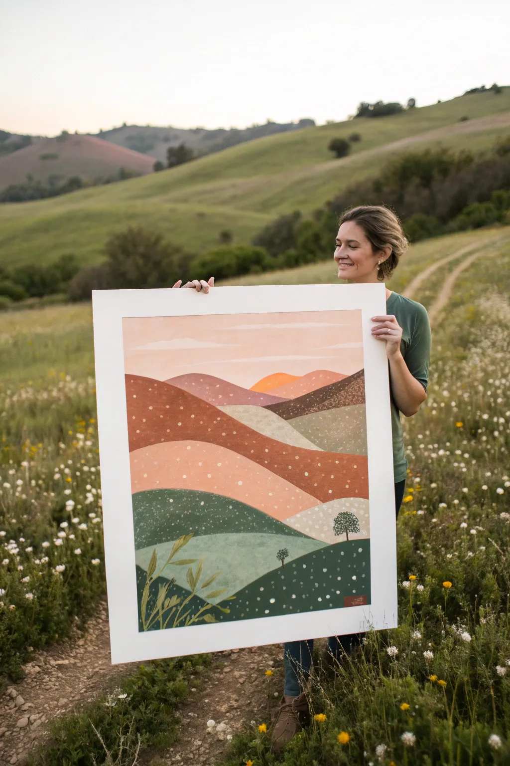
Capture the magic of an expansive landscape with this stylized, layered painting of rolling hills. By breaking the scenery down into simplified bands of color and adding whimsical floral details, you’ll create a peaceful scene that celebrates nature’s quiet patterns.
Step-by-Step Tutorial
Materials
- Large sheet of heavyweight watercolor paper or bristol board (approx. 18×24 inches or larger)
- Acrylic paints (olive green, forest green, sage green, rust orange, terracotta, light pink, warm yellow, titanium white)
- Wide flat paintbrush (1-inch width)
- Medium round brush
- Small detail brush or white paint pen
- Pencil for sketching
- Painter’s tape
- Palette for mixing
- Cup of water and paper towels
Step 1: Drawing the Landscape
-
Tape the borders:
Begin by securing your large paper to a flat surface using painter’s tape. Create an even border around all four edges; this will give you that clean, gallery-ready white frame once the tape is peeled away. -
Map out the hills:
Using a pencil, lightly sketch the rolling hills. Start from the bottom and work your way up. Draw wavy, overlapping lines that span the width of the paper. -
Plan the perspective:
Ensure the hills at the bottom (foreground) are larger and taller, while the hills towards the top (background) become narrower and flatter to create a sense of depth. -
Sketch the sky and sun:
Leave the top quarter of the paper empty for the sky. You can lightly indicate where cloud shapes or a setting sun mountain peak might peek through.
Step 2: Blocking in Color
-
Mix your palette:
Prepare your acrylic colors. You’ll want a gradation of earthy tones. Think deep greens for the bottom, moving into sage, then rusts, terracottas, and finally soft pinks and oranges for the distant hills. -
Paint the foreground:
Start with the bottom-most hill. Use your wide flat brush to fill it with a deep, rich forest green. Apply the paint smoothly, though a little texture here adds character. -
Add the middle ground greens:
Move to the next hill up and paint it a lighter, cooler sage or mint green. Let this layer dry slightly before touching the wet edge of the previous hill to keep the lines crisp. -
Transition to warm tones:
As you move up the canvas, switch to your warm earth tones. Paint the middle hills in varying shades of terracotta, rust, and burnt orange. I mix a little white into the rust color for the higher hills to simulate atmospheric haze. -
Paint the background hills:
For the furthest hills and mountain peaks, use soft peaches, light pinks, and a warm golden yellow for the sun-kissed peak in the center distance. -
Fill the sky:
Paint the sky area with a very pale, watered-down pink or peach, blending it horizontally to create a soft sunset glow.
Paint Peeling Up?
If paint lifts when removing tape, you might be pulling too fast. Use a hairdryer to warm the tape adhesive slightly, then pull it away slowly at an angle away from the painting.
Step 3: Adding Details and Patterns
-
Add foreground foliage:
Once the base layers are completely dry, use a medium round brush and a mix of olive and yellow paint to add large, stylized leafy plants in the bottom left corner. Keep the shapes simple and sweeping. -
Plant the trees:
Using a dark brownish-green, paint a few small, lollipop-shaped trees on the ridges of the lower hills. Use a stippling motion for the leaves to give them a fluffy texture. -
Create the texture mix:
Dilute some titanium white paint with a drop of water so it flows easily, or shake your white paint pen well. -
Dot the hills:
This is the meditative part. Begin adding tiny white dots across the hills to represent fields of wildflowers. Vary the density; cluster them tightly in some areas and spread them out in others. -
Vary dot sizes:
Make the dots in the dark green foreground slightly larger and the dots in the distant background hills like tiny pinpricks to reinforce the perspective.
Add Metallic Magic
For a magical twist, use metallic gold or copper paint for the “wildflower” dots on the rust-colored hills. It will catch the light beautifully when hung on the wall.
Step 4: Finishing Touches
-
Check for gaps:
Look over your piece for any spots where the white paper shows through unintentionally between the hills and touch them up with the appropriate color. -
Sign your work:
Add a small signature in the bottom corner using a contrasting color like reddish-brown. -
The big reveal:
Wait until the painting is 100% dry to the touch. Then, slowly and carefully peel away the painter’s tape at a 45-degree angle to reveal your crisp white border.
Now you have a serene, layered landscape ready to frame or gift to a nature lover
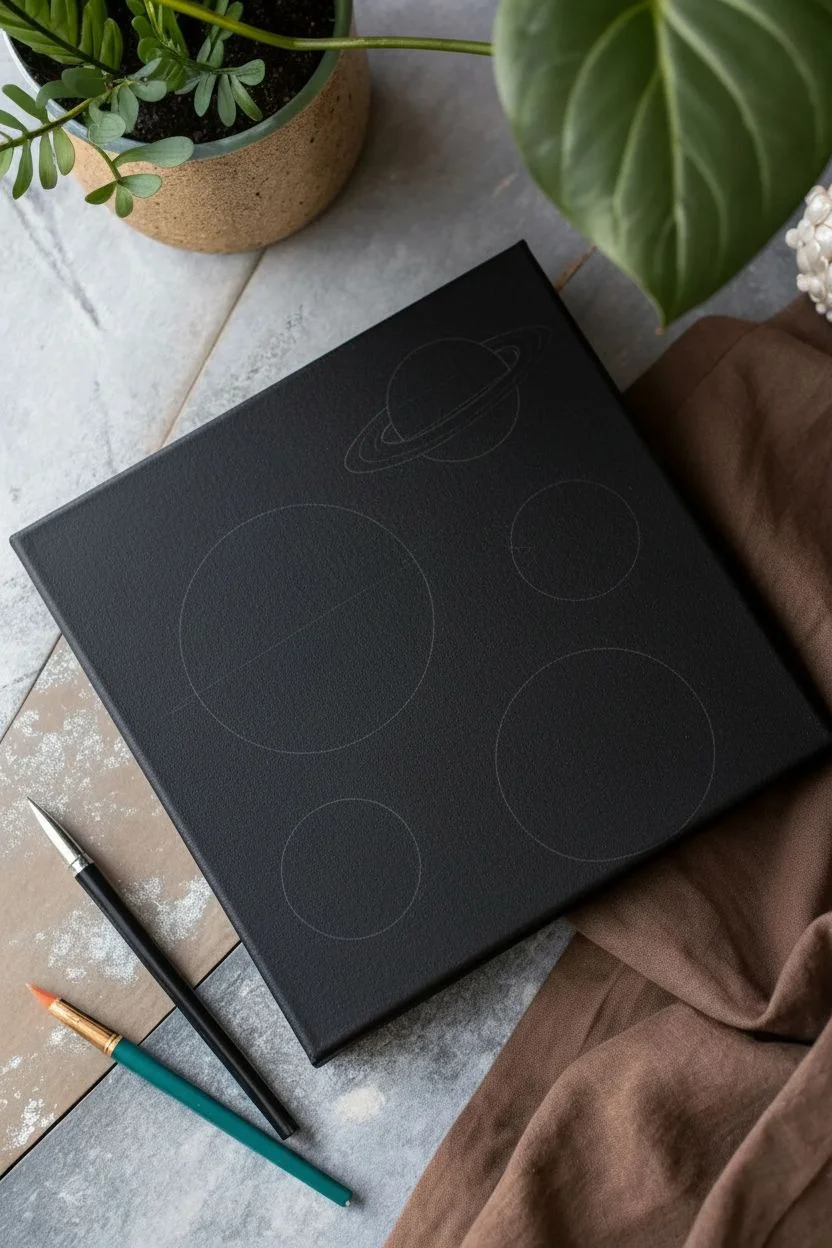
Planets and Orbits on a Dark Space Background
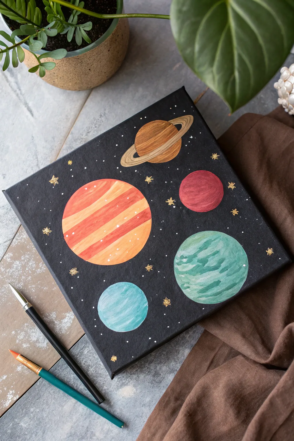
Create a stunning slice of the galaxy with this beginner-friendly acrylic painting project. Featuring vibrant, stylized planets against a deep black void, this piece combines simple geometric shapes with fun texture techniques to bring your own solar system to life.
How-To Guide
Materials
- Square canvas (approx. 8×8 or 10×10 inches)
- Acrylic paints (Black, Titanium White, Burnt Sienna, Yellow Ochre, Cadmium Red, Teal/Turquoise, Gold)
- Flat shader brush (size 6 or 8)
- Small round detail brush (size 0 or 1)
- Pencil
- Circular objects for tracing (caps, jars, or a compass)
- Palette or paper plate
- Cup of water and paper towels
Step 1: Setting the Stage
-
Prime the background:
Begin by coating your entire canvas with black acrylic paint. Use your larger flat brush and ensure full coverage, painting the sides of the canvas as well for a polished look. -
Dry thoroughly:
Allow the black background to dry completely. If the canas weave is still showing through too much, apply a second coat for a truly deep, matte space effect. -
Plan your planetary positions:
Once the paint is bone dry, lightly sketch five circles in various sizes using a pencil. Use bottle caps or small jars to trace perfect circles if you aren’t confident drawing them freehand. -
Sketch the rings:
Choose the topmost planet (our Saturn-like gas giant) and draw a thin, elliptical ring around it. Make sure the line goes ‘behind’ the planet sphere on the far side.
Uneven Circles?
If your hand is shaky on edges, wait for the planet paint to dry, then use a black paint pen or fine marker to trace the outside edge. It cleans up the shape instantly.
Step 2: Painting the Giants
-
Base coat the large striped planet:
Mix a warm orange using Cadmium Red and Yellow Ochre with a touch of White. Fill in the largest circle on the left roughly, don’t worry about perfect blending yet. -
Add the stripes:
While the paint is still wet, stroke in horizontal bands of lighter peach (add more white) and darker reddish-orange across the planet’s face to create a defined, banded atmosphere. -
Paint the ringed planet:
For the top planet, mix Burnt Sienna and a little Gold. Paint the sphere first, using horizontal brush strokes to mimic cloud layers. -
Detail the rings:
Carefully paint the rings using a mix of Yellow Ochre and White. Use the flat edge of your small brush to keep the lines crisp, and leave a tiny gap of black space between the planet and the inner ring to show separation.
Gold Pop
For extra shimmer, mix a tiny bit of gold paint into the lighter bands of the ringed planet and the orange giant. It catches the light beautifully when hung up.
Step 3: Adding the Smaller Worlds
-
Create the red planet:
Fill the medium-sized circle on the right with a deep red shade. I like to mix a tiny dot of black into the red for the shadow side to give it roundness. -
Texture the red surface:
Take a slightly lighter red (mix with a dot of white) and dab subtle curved strokes on the upper left side to suggest a highlighted, cratered surface. -
Paint the green swirled planet:
Mix Teal with White to create a minty green base for the lower right planet. Apply the paint in wavy, swirling motions rather than flat strokes. -
Add oceanic depth:
Dip your brush into unmixed Teal and add darker swirls into the wet mint green base to create a marbling effect that looks like stormy oceans. -
Paint the icy blue moon:
For the smallest circle at the bottom, mix a very pale blue using mostly White and a tiny dot of Blue or Teal. Paint this smoothly, adding a pure white highlight on the top left edge.
Step 4: Stardust & Shine
-
Add white speckles:
Using your smallest detail brush, dot tiny points of pure White paint randomly across the black background. Group some closer together to form distant clusters. -
Paint golden stars:
Dip your small brush into Gold paint. Paint small asterisks (*) or four-pointed crosses scattered among the white dots to represent twinkling, brighter stars. -
Highlight the planets:
Add tiny flecks of white or very light yellow to the lighter bands of the large orange planet to give it a sparkly texture. -
Final touches:
Check your edges. If any planet outlines are messy, use a small brush with black paint to carefully ‘cut in’ and clean up the round shapes.
Allow your interstellar masterpiece to dry before hanging it up to admire your journey through the cosmos


Easy Heart Painting with Rings, Sparkles, or Drips
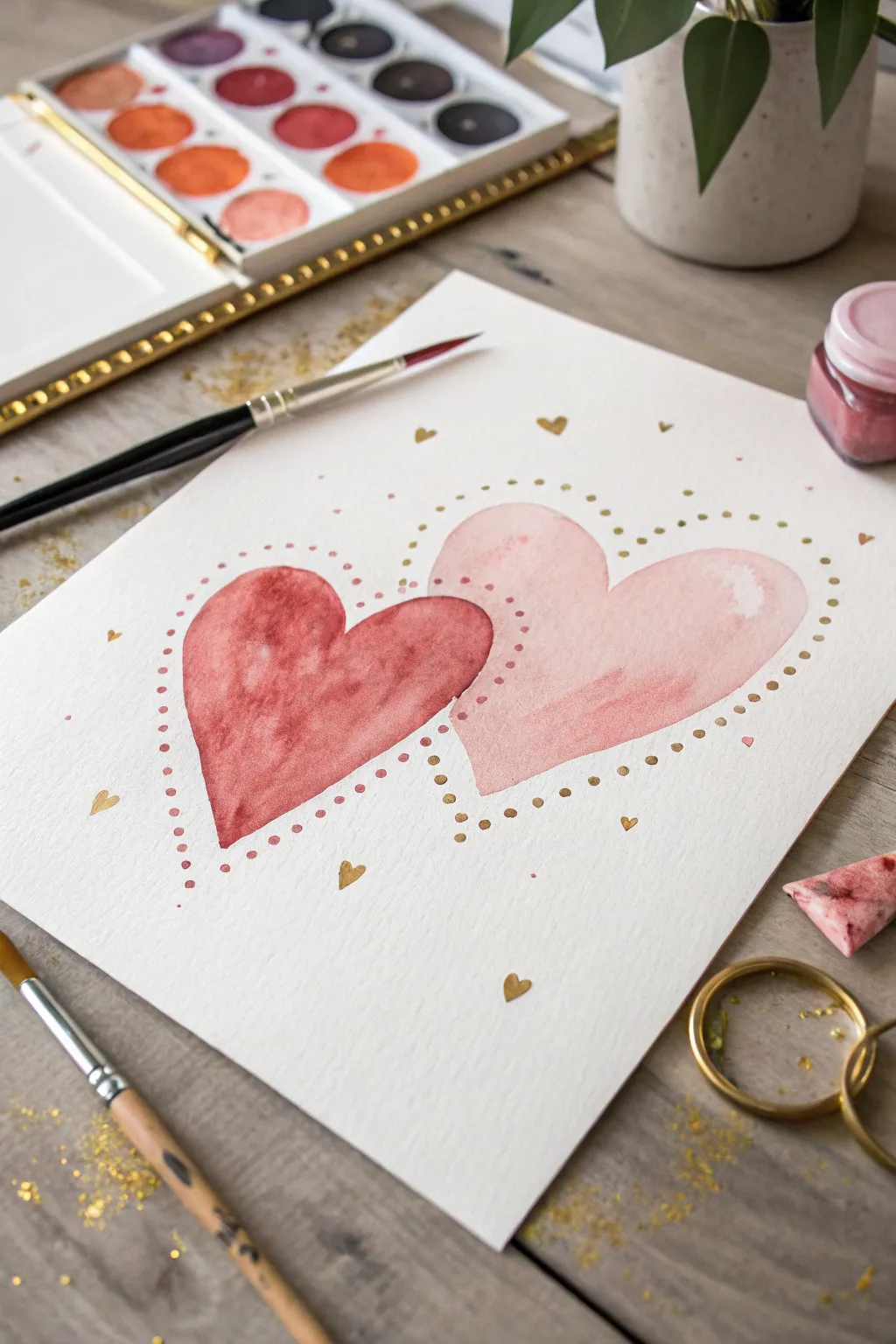
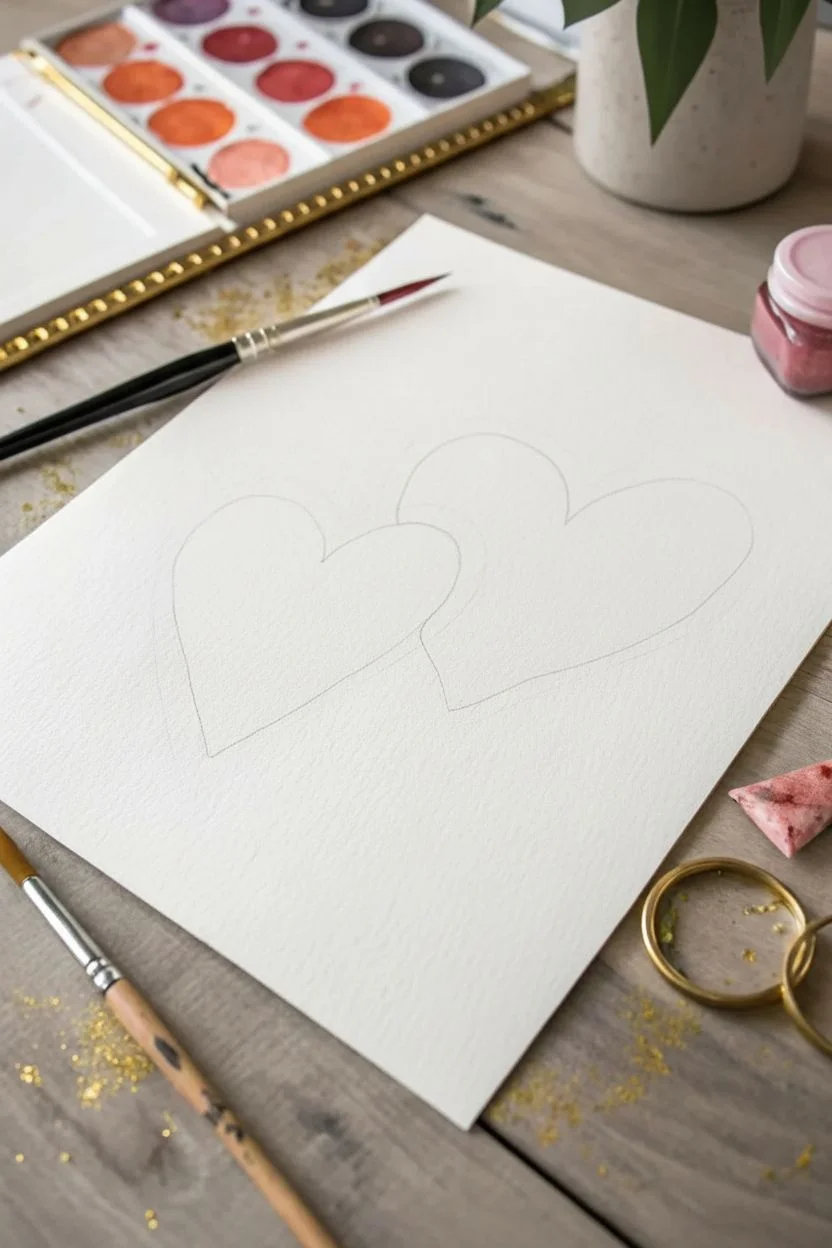
Capture the sweetness of love with this elegant watercolor project featuring two interlocking hearts surrounded by delicate gold accents. The soft washes of blush and terracotta create a romantic feel, while stippled gold details add a touch of magic.
Detailed Instructions
Materials
- Cold press watercolor paper (300 gsm)
- Watercolor paints (terracotta/red and blush pink)
- Small round brush (size 2 or 4)
- Medium round brush (size 6 or 8)
- Metallic gold watercolor paint or gold ink
- Pencil and eraser
- Two cups of water
- Paper towels
Step 1: Sketching the Shape
-
Define the layout:
Begin by lightly marking the center of your paper to ensure your composition stays balanced. -
Draw the first heart:
Sketch a medium-sized heart on the left side, tilting slightly to the right. Keep your pencil lines extremely faint so they won’t show through the translucent watercolor later. -
Add the interlocking heart:
Draw a second, slightly larger heart on the right side. Position it so the left lobe of this new heart overlaps with the right lobe of the first heart, creating a connected embracing look.
Step 2: Painting the Hearts
-
Mix the terracotta shade:
Load your medium brush with water and mix a rich, earthy red or terracotta color. Test the opacity on a scrap piece of paper; you want it pigmented but still transparent. -
Paint the left heart:
Using the terracotta mix, fill in the left heart. Work wet-on-dry to maintain crisp edges. -
Create texture:
While the paint is still wet, drop in a tiny bit of darker red pigment or clean water in the center to encourage natural watercolor ‘blooms’ and softness as it dries. -
Allow to dry completely:
Wait for the left heart to be fully bone-dry. This is crucial to prevent the colors from bleeding into a muddy mess where they overlap. -
Mix the blush tone:
Clean your brush thoroughly and mix a delicate, watery blush pink. -
Paint the right heart:
Fill in the right heart with the blush pink. When you paint over the section where the hearts overlap, the underlying terracotta will show through, creating a lovely transparency effect. -
Soften the wash:
If the pink looks too flat, lift a little pigment out with a thirsty, damp brush near the top right curve to create a highlight. -
Second drying phase:
Let the entire piece dry completely before moving on to metallic details to avoid smudging.
Transparency Trick
To maximize the overlapping effect, water down your second color (the pink) significantly more than the first layer.
Step 3: Adding Golden Details
-
Prepare the gold:
Activate your metallic gold watercolor with a few drops of water until it reaches a creamy, ink-like consistency. -
Outline technique:
Switch to your smallest brush (size 2). Instead of a solid line, we will dot the outline. -
Stipple the left heart:
Work around the terracotta heart, placing small gold dots about 2-3mm outside the painted edge following the heart shape. -
Stipple the right heart:
Repeat the process for the pink heart. I like to space the dots slightly wider here for variation. -
Add floating accents:
Paint tiny, solid gold mini-hearts randomly scattered in the white space around the main subject. -
Final sparkle:
Dip your brush in gold paint and gently tap it over the paper to create a very light splatter of gold dust for a festive finish.
Muddy Overlap?
If the colors bleed into each other, the first layer wasn’t dry enough. Use a hairdryer on low heat between layers to be sure.
Frame your sparkling masterpiece or turn it into a beautiful handmade card for someone special
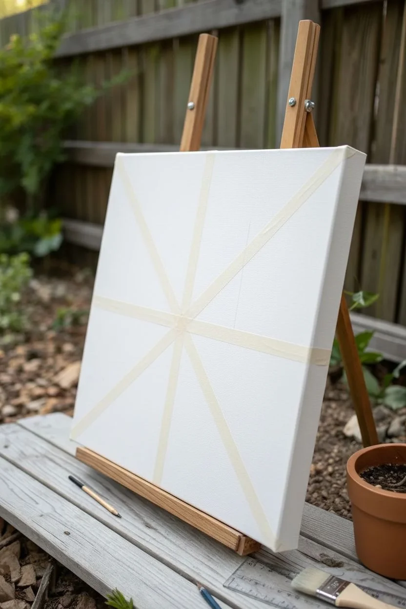
Tape-Resist Geometric Color-Block Canvas
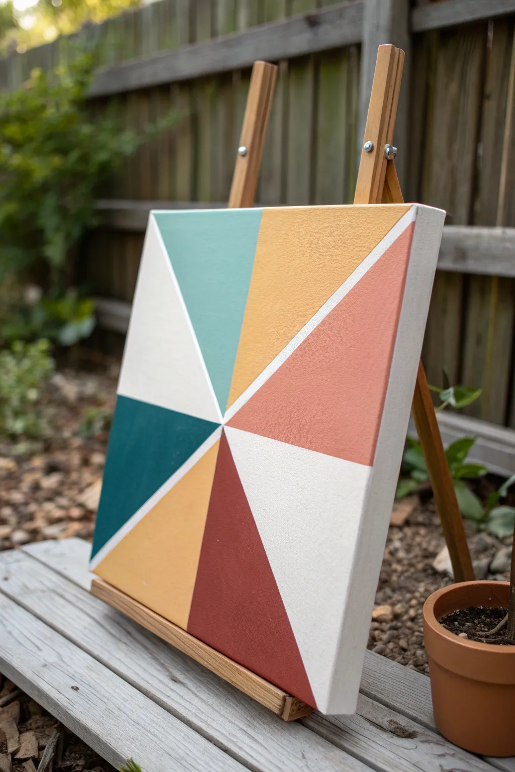
Transform a blank canvas into a striking piece of modern art with this simple tape-resist technique. The design features a radiant pinwheel of earthy, muted tones separated by crisp white lines for a clean, professional finish.
Step-by-Step Guide
Materials
- Square stretched canvas (12×12 or similar)
- Acrylic paints (teal, mustard yellow, salmon pink, deep teal, burnt sienna, burgundy, white)
- Painter’s tape or masking tape (1/4 inch width is ideal)
- Flat paintbrushes (various sizes)
- Ruler
- Pencil
- Palette or paper plate
- Cup of water
- Paper towels
Step 1: Preparation & Taping
-
Find the center:
Begin by laying your square canvas flat on your workspace. Use a ruler to measure the height and width, making a small, faint mark with your pencil exactly in the center point created where the measurements intersect. -
Mark the edges:
Using your ruler, measure the midpoint of each of the four outer edges of the canvas. Make a small tick mark on the side of the canvas at these four points. -
Lay the first diagonals:
Cut a long strip of painter’s tape. Apply it diagonally from one corner to the opposite corner, ensuring the center of the tape crosses directly over your central pencil mark. Press it down firmly. -
Complete the ‘X’:
Place a second strip of tape connecting the remaining two corners. This will create a large ‘X’ across the canvas. -
Add vertical and horizontal lines:
Apply a strip of tape vertically, connecting the top edge midpoint to the bottom edge midpoint. Then, apply a horizontal strip connecting the left and right edge midpoints. You should now have a starburst pattern of tape with 8 triangular sections. -
Seal the tape:
Run your finger or the back of a spoon firmly along the edges of every piece of tape. This is crucial to prevent paint from bleeding underneath. -
Prevent bleeding (optional):
For razor-sharp lines, I like to paint a very thin layer of white paint (or clear matte medium) over the tape edges first. This seals any tiny gaps so that any seepage is just white-on-white.
Crisp Lines Secret
Apply a layer of white paint over your tape edges before adding color. This seals the tape, ensuring the only thing that bleeds under is white, keeping your colored lines perfect.
Step 2: Painting the Sections
-
Select your color palette:
Prepare your palette with your chosen acrylic colors. Aim for an earthy mix: a soft teal, a golden mustard, a muted salmon, a dark forest green, a warm beige, and a deep burgundy. -
Paint the first triangle:
Choose a top-left triangle section and fill it in with the soft teal paint. Use a flat brush to work the paint smoothly from the center of the shape outward toward the tape. -
Apply the yellow:
Moving clockwise, paint the next triangle with the mustard yellow. Ensure the paint is opaque; if your acrylics are thin, you might need a second coat after the first dries. -
Add the salmon tone:
Paint the third section in the clockwise rotation with the salmon or terracotta pink shade. -
Leave a white section:
Skip painting the fourth triangle for now—we will leave this one white to create negative space and balance in the composition. Simply paint it with white acrylic if your canvas isn’t bright enough. -
Continue the pattern:
Paint the bottom section with the deep burgundy red. Move to the next triangle and paint it a warm beige or light ochre. -
Add the dark accent:
Fill the next triangle with the dark forest green or deep teal. This adds a necessary visual weight to the bottom left of the design. -
Finish the sections:
Paint the final remaining triangle white (or leave it blank canvas) to mirror the white section on the opposite side. Let the paint dry completely to the touch.
Paint Bleeding?
If paint seeps under the tape, wait for it to dry completely. Then, use a small flat brush and white paint to ‘erase’ the mistake by carefully painting over the bleed.
Step 3: The Reveal
-
Assess dryness:
Check that all paint sections are fully dry. If the paint is gummy, it might lift off with the tape, so patience is key here. -
Peel the tape:
Slowly and carefully peel back the tape. Pull it away from the canvas at a 45-degree angle rather than pulling straight up. Start from the center and work outward. -
Clean up edges:
If you notice any small jagged edges where the paint bled, use a tiny detail brush with a bit of white paint to touch up the lines and make them crisp. -
Paint the sides:
Finish the piece by painting the sides of the canvas white, or extend the colors from each triangle over the edge for a gallery-wrapped look.
Now you have a modern, colorful artwork ready to brighten up any corner of your home
Rainbow Arc with Simple Blended Bands
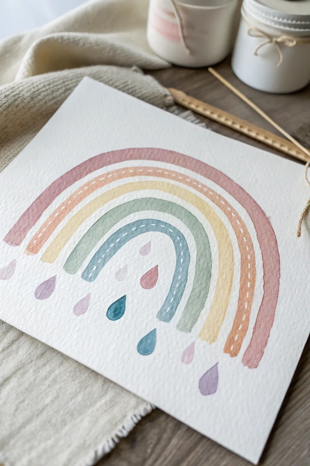
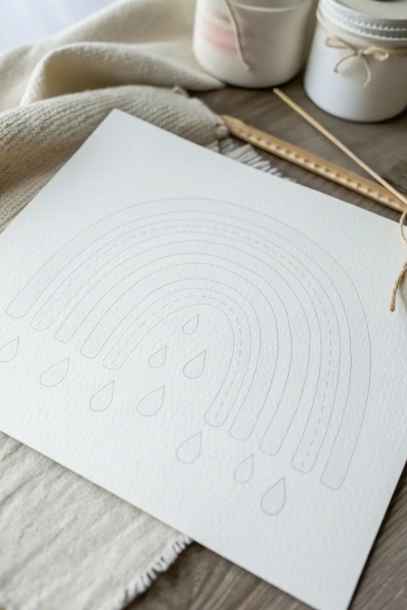
Capture the gentle charm of boutique nursery art with this soft, muted watercolor rainbow. Featuring textured arches and whimsical stitched details, this piece brings a cozy and handmade feel to any space.
Step-by-Step Tutorial
Materials
- Cold press watercolor paper (140lb/300gsm)
- Watercolor paints (rust/dusty rose, terracotta orange, mustard yellow, sage green, misty blue)
- Round paintbrushes (size 6 and size 2)
- White gel pen or white gouache
- Pencil and eraser
- Jar of water
- Paper towel
Step 1: Planning and Sketching
-
Establish the curve:
Begin by lightly sketching the outermost arch of your rainbow using a pencil. Aim for a soft, fairly flat semi-circle rather than a tall, steep arch to get that modern boho look. -
Map the bands:
Sketch four more concentric arches inside your first one. Don’t worry about perfect symmetry or spacing; a little organic variation adds to the charm. -
Add raindrops:
Below the arches, lightly draw scattered teardrop shapes of different sizes. Place some directly under the bands and others floating freely in the negative space. -
Lighten the lines:
Take a kneaded eraser (or a standard one used gently) and dab over your sketch lines. You want them to be barely visible guides so the pencil graphite doesn’t smudge into the wet paint later.
Uneven Watermark Edges?
This ‘bloom’ happens if you add water to partially drying paint. Work quickly wet-on-dry for smooth bands, or embrace the blooms for extra texture.
Step 2: Painting the Arches
-
Mix the outer color:
Load your size 6 brush with a dusty rose or muted rust color. Test the shade on a scrap piece of paper first to ensure it isn’t too saturated; add water to soften it. -
Paint the first band:
Carefully paint the outermost arch. Use the belly of the brush to fill the width in one or two smooth strokes, keeping the edges slightly rough for texture. -
Mix the second band:
Switch to a terracotta or muted orange color. Ensure it complements the rust tone you just laid down. -
Apply the orange arch:
Paint the second band, leaving a tiny sliver of white space between it and the first band. This prevents the wet colors from bleeding into each other. -
Adding brightness:
For the middle band, use a mustard or ochre yellow. Keep the consistency watery to let the paper texture show through. -
Cooling it down:
Mix a calming sage green. Paint the fourth band, maintaining that consistent curve and slight separation from the yellow. -
The inner arch:
Finish the rainbow structure with a muted, misty blue for the smallest, innermost arch. -
Let it dry completely:
Wait for the arches to be bone dry. If the paper feels cool to the touch, it’s still damp. I like to take a quick break here to ensure no smudging happens in the next steps.
Add Metallic Accents
Swap the white gel pen for a gold metallic marker or gold watercolor paint for the ‘stitch’ marks to give the piece a touch of glam.
Step 3: Details and Finishing Touches
-
Painting the rain:
Using your smaller size 2 brush, fill in the teardrop shapes below the rainbow. Alternate the colors you used for the arches—add a blue drop, a pink one, and a lavender one (mix blue and pink) for variety. -
Varying drop saturation:
Make some raindrops more concentrated with pigment and others very watery and pale to create depth. -
Preparing the detail work:
Once the paint is fully dry again, grab your white gel pen or mix a thick consistency of white gouache on a fine brush. -
Stitching the orange band:
On the second band (the orange one), draw a dashed line right down the center. Keep the dashes small and evenly spaced to mimic sewing stitches. -
Stitching the blue band:
Repeat the dashed line pattern on the innermost blue arch. This repetition ties the design together visually. -
Final assessment:
Check for any pencil marks that might still be visible and gently erase them, being careful not to rub off any paint.
Now you have a serene piece of art ready to frame or gift to a friend
Scrape Painting for Fast Abstract Color Mixing
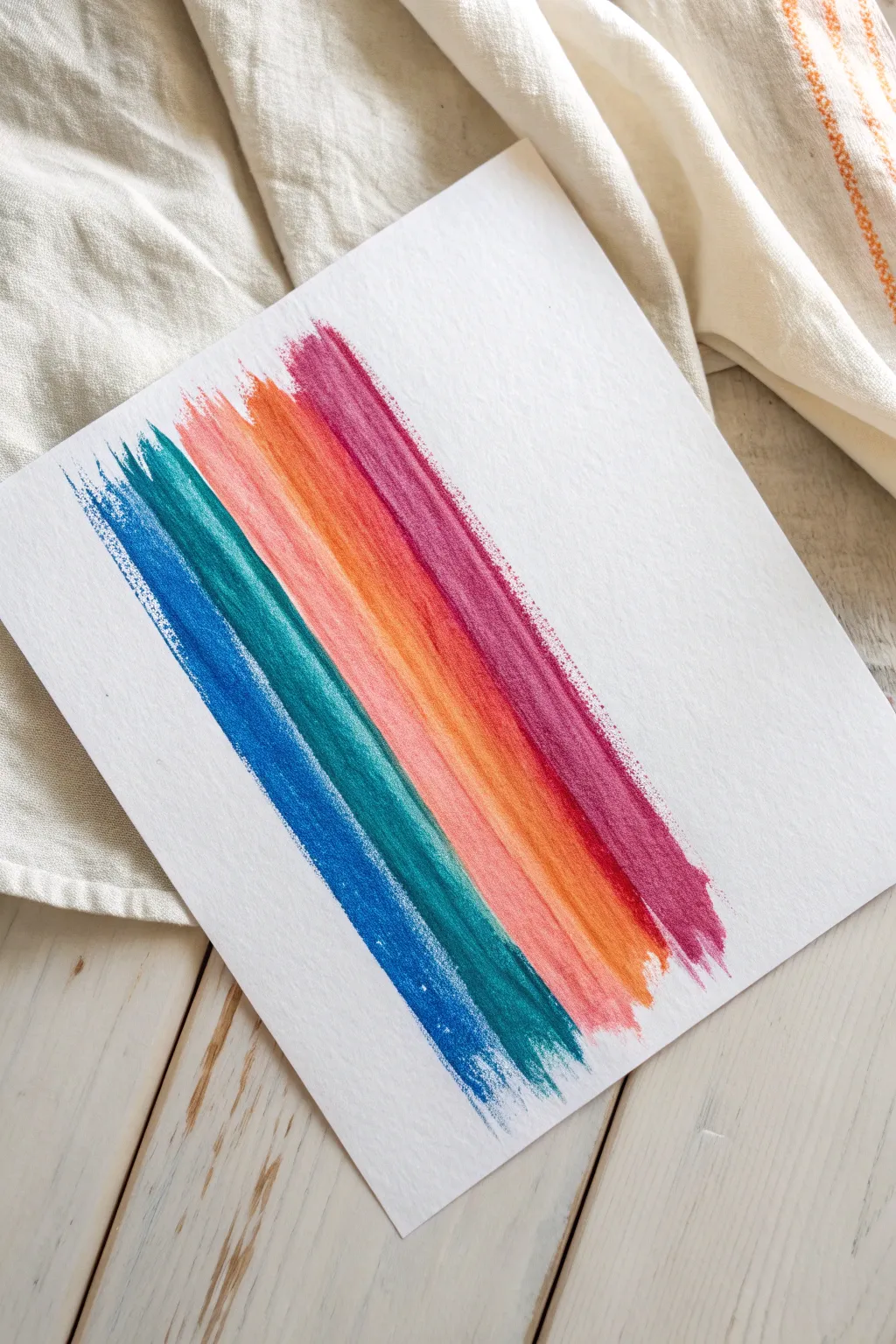
Create a stunningly simple abstract piece using nothing but paint and a piece of scrap cardboard. This project features bold, vertical bands of color with a gorgeous distressed texture that looks far more complex than it actually is.
How-To Guide
Materials
- Heavyweight watercolor paper or mixed media paper
- Acrylic paints (Phthalo Blue, Teal, Coral/Orange, Magenta)
- Scrap piece of cardboard or stiff cardstock (about 3-4 inches wide)
- Palette or paper plate
- Washi tape or masking tape (optional)
- Protective surface cover
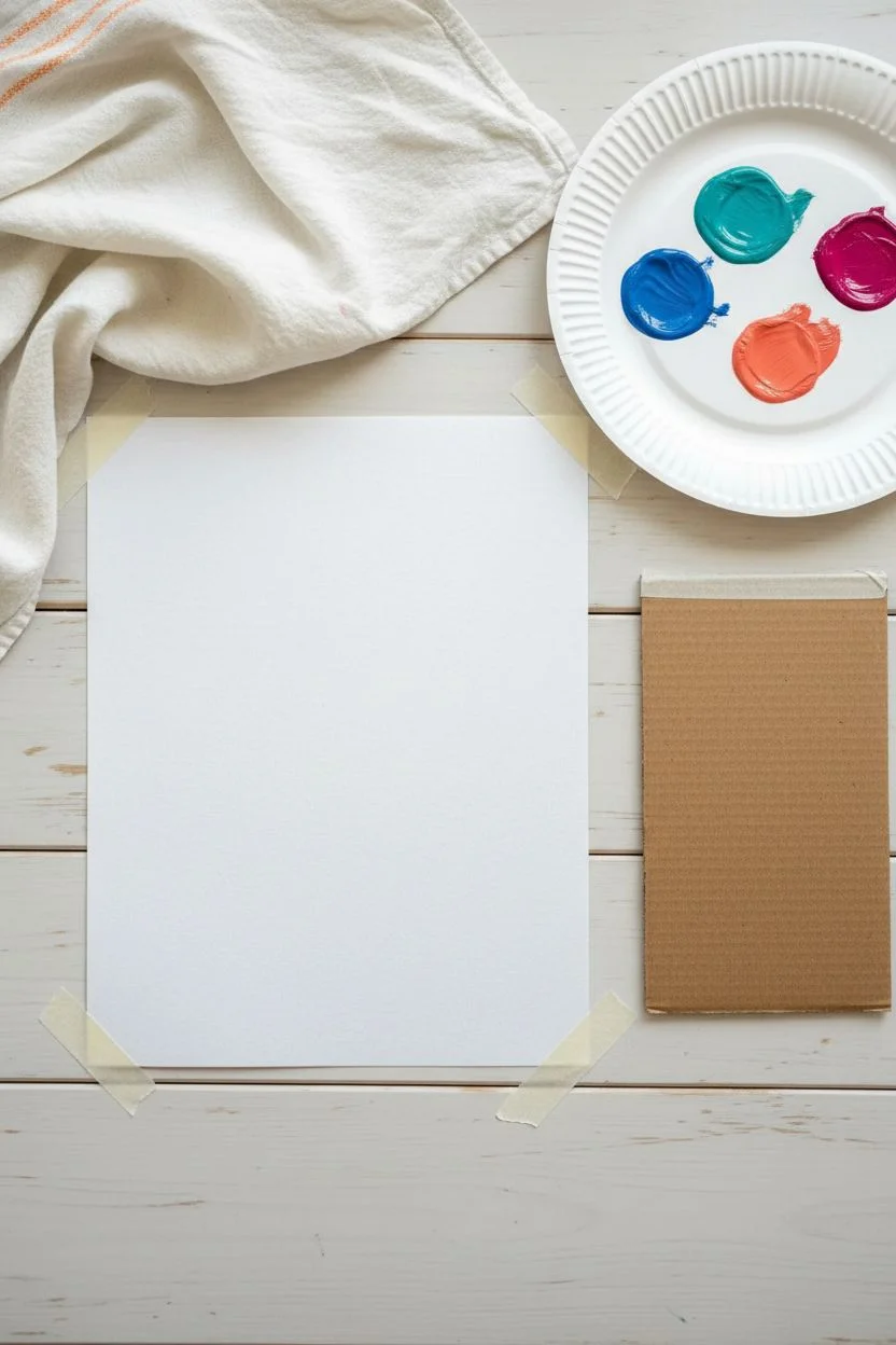
Step 1: Preparation
-
Prepare your workspace:
Lay down a protective cover on your table, as scrape painting can sometimes push paint off the edge of the paper. -
Secure the paper:
Tape your watercolor paper to the surface. While not strictly necessary, securing the corners helps keep the paper flat while you drag the paint across it. -
Create your scraper:
Cut a piece of scrap cardboard or stiff cardstock into a rectangle. The edge needs to be perfectly straight and about 3 to 4 inches wide to achieve the look in the photo. -
Select your palette:
Squeeze out small amounts of your four colors: blue, teal, coral/orange, and magenta. You want them ready to go so the process flows smoothly.
Uneven Streaks?
If your stripes are blotchy, your cardboard edge might be bent. Cut a fresh, sharp edge on your scraper for a clean, uniform pull.
Step 2: Applying the Paint
-
Apply the first color:
Place a few small dots or a focused line of the magenta paint directly onto the paper near the top edge. You don’t need a lot; a little goes a long way. -
Angle the scraper:
Take your cardboard scraper and place the edge just above the dots of paint. Hold it at roughly a 45-degree angle to the paper. -
The first scrape:
With firm, even pressure, pull the cardboard straight down towards the bottom of the page. Do this in one continuous, confident motion. -
Check the texture:
Your streak should look textured and slightly broken at the bottom, fading out naturally. If it is too solid, use slightly less paint for the next stripe.
Pro Tip: Metal Option
For an even smoother look, swap the cardboard for an old credit card or gift card. The plastic edge creates a different, slicker texture.
Step 3: Building the Rainbow
-
Position the second color:
Move slightly to the left of your magenta stripe. Apply dots of the coral or orange paint near the top edge, aligning it with the start of the magenta stripe. -
Clean or rotate tool:
Wipe the edge of your cardboard scraper clean with a paper towel, or rotate to a fresh edge to avoid muddying the colors. -
Scrape the second stripe:
Drag the scraper down over the orange paint, keeping it parallel to the first stripe. It is okay if the edges barely touch or overlap slightly; this adds organic charm. -
Third stripe: Teal:
Repeat the process with the teal paint. Position your dots, clean your tool, and scrape straight down with that same confident motion. -
Final stripe: Blue:
Place your dark blue dots for the final stripe on the far left. I like to make sure there is just a tiny gap between the blue and teal so they don’t blend into a dark mud. -
The final pull:
Drag the scraper down one last time for the blue stripe. Let the texture taper off naturally at the bottom, just like the others.
Step 4: Finishing Touches
-
Review the composition:
Look at your four stripes. If any area looks too sparse near the top, you can carefully re-scrape, but usually, the ‘imperfect’ first pass is the most beautiful. -
Dry completely:
Because the paint is applied thinly, it will dry very quickly. Give it about 10–15 minutes to set completely. -
Remove tape:
Once the paint is dry to the touch, carefully peel away any tape you used to secure the paper. -
Flatten if needed:
If the paper has buckled slightly from moisture, place it under a heavy book overnight once it is fully dry.
Hang your colorful, modern masterpiece in a simple frame to brighten up any room
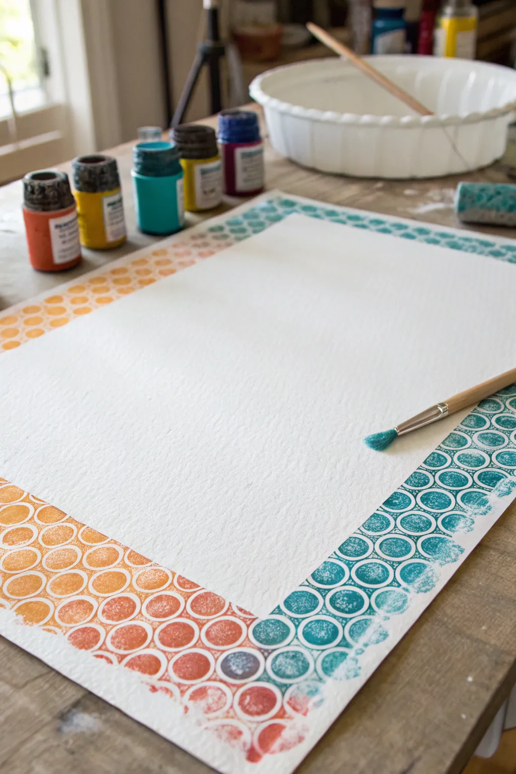
Circle Stamping with Cups for Playful Patterns
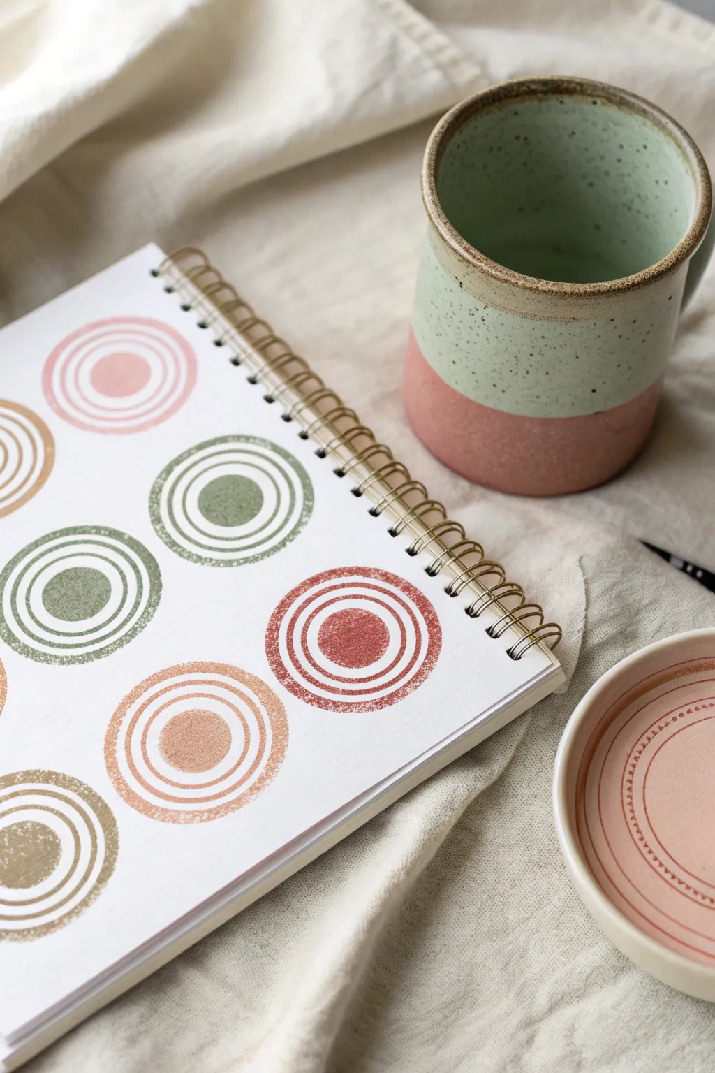

Create a soothing, geometric pattern that balances modern minimalism with the charm of handmade texture. This project uses simple household objects as stamps to build layers of earthy, muted tones on crisp white paper.
Step-by-Step Guide
Materials
- Watercolor paper or a mixed-media sketchbook
- Acrylic paints (muted pinks, olive greens, terracotta, beige)
- Flat palette or dinner plate for paint
- Assorted circular objects for stamping (bottle caps, small jar lids, paper cups, drinking glasses)
- Round foam pouncer or a wine cork
- Scrap paper for testing
- Paper towels or rag
Step 1: Preparation and Setup
-
Gather your stamping tools:
Look around your home for circular objects of varying diameters. You will need a small solid circle tool (like a foam pouncer or wine cork) for the center, and 2-3 different sized larger rings (like pill bottle lids, shot glasses, or the rim of a small cup). -
Prepare your palette:
Squeeze out small puddles of your chosen acrylic colors onto a flat palette. I typically aim for a ‘desert’ palette—mixing a touch of white or brown into bright colors to mute them down into varying shades of sage, terracotta, and dusty rose. -
Spread the paint:
Use a brush or palette knife to spread each paint puddle into a thin, flat layer slightly larger than your biggest stamp. This ensures even coating on the rim without globs of paint.
Uneven Paint?
If your rings are skipping or partial, try placing a folded towel or foam sheet under your paper. This soft surface helps the hard rim of the cup make contact with the paper evenly.
Step 2: Stamping the Centers
-
Plan your layout:
Visualize a grid on your paper. You want the circles to be spaced relatively evenly, but not perfectly rigid. Leave enough white space between them for the outer rings. -
Stamp the first center:
Dip your foam pouncer or cork into your first color (e.g., olive green). Press it firmly onto a scrap paper first to remove excess paint, then press it onto your sketchbook page to create a solid central dot. -
Continue the pattern:
Stamp more center dots across the page, alternating colors as you go. Allow these centers to dry to the touch, which usually takes about 5-10 minutes given how thin the paint is.
Step 3: Adding the Rings
-
Select the first ring size:
Choose a circular object that is slightly larger than your center dot (like a bottle cap rim). Dip the rim into the paint, ensuring the entire circle is coated. -
Stamp the inner ring:
Carefully align the stamp over a center dot and press down straight. Lift it straight up to avoid smearing. Don’t worry if the circle isn’t perfectly centered; the offset look adds character. -
Repeat for all motifs:
Continue stamping this first ring size around all your center dots. You can match the ring color to the dot, or mix and match for a more eclectic look. -
Clean your tools:
Wipe the rim of your object clean with a damp paper towel before switching paint colors to keep your hues muddy-free. -
Choose the middle ring size:
Select a slightly larger object (like a spice jar lid). Dip it into the paint and stamp a second ring around the first one. -
Vary the line weight:
If you want visual variety, some objects might have thicker rims than others. This creates a pleasing contrast between delicate thin circles and bolder thick ones. -
Add the final outer ring:
Using your largest object (such as a small juice glass), add the final, outermost ring to your designs. This frames the entire motif. -
Layering check:
Ensure distinct spacing between rings. If your paint application is light, the texture of the paper might show through, giving it a lovely vintage, worn effect.
Level Up: Texture
For a grittier, more organic texture, lightly sand the surface of your plastic lids or bottle caps with fine sandpaper before dipping them into the paint.
Step 4: Finishing Touches
-
Assess and fill:
Look at the overall composition. If a corner feels too empty, you can add a partial circle going off the edge of the page to imply the pattern continues. -
Let it cure:
Allow the entire page to dry completely. Acrylics dry fast, but thicker stamped ridges might need extra time. -
Flatten the page:
If the moisture from the paint buckled the paper slightly, place the sketchbook under a heavy book overnight once the paint is 100% dry.
Now you have a sketchbook page filled with stylish, abstract geometry that looks great on its own or as a background for lettering
Bubble Wrap Printing for Instant Texture Backgrounds
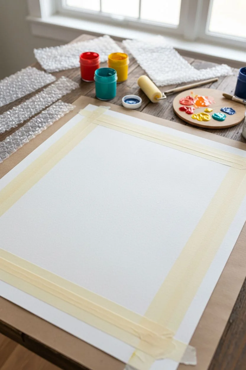
Transform a plain sheet of heavy paper into a custom framed masterpiece using nothing more than bubble wrap and acrylic paint. This project creates a vibrant, textured border with a satisfying gradient effect that serves as the perfect starting point for drawings, poems, or mixed-media art.
Step-by-Step
Materials
- Heavyweight textured paper (watercolor or mixed media paper)
- Bubble wrap (small bubbles)
- Acrylic paints (Red, Orange, Yellow, Teal, Dark Blue)
- Paintbrushes or foam rollers
- Scissors
- Palette or paper plate
- Masking tape or painter’s tape
- Work surface cover
Step 1: Preparation and Setup
-
Prepare your workspace:
Lay down a protective cover on your table, as acrylic stamping can sometimes get a little messy beyond the edges of the paper. -
Cut the bubble wrap strips:
Measure the length and width of your paper. Cut four strips of bubble wrap corresponding to these dimensions. Make them about 2-3 inches wide, depending on how thick you want your border to be. -
Mask the center:
Use masking tape or painter’s tape to block off the large rectangular area in the center of your paper where you want to keep the white space pristine. Press the edges down firmly to prevent paint bleed. -
Secure the paper:
If your paper is prone to curling, tape the very corners down to your work surface to keep it flat during the stamping process.
Clean Prints Only
Don’t overload your brush! Too much paint fills the gaps between bubbles and ruins the ring effect. A thin, even coat works best.
Step 2: Creating the Warm Border
-
Mix warm colors:
squeezed out some red, orange, and a touch of yellow onto your palette. You don’t need to over-mix them; a little marbling creates a nice effect. -
Apply paint to bubble wrap:
Take one of your bubble wrap strips and paint the ‘bubble’ side with your warm mixture. You can use a brush or a foam roller for even coverage, but ensure the paint isn’t dripping wet. -
Stamp the first side:
Carefully align the painted bubble wrap specifically along the left long edge and the bottom short edge of your paper. This forms the ‘L’ shape of the warm section. -
Press and lift:
Press down gently but firmly across the entire back of the bubble wrap strip. Peel it back slowly to reveal the circular honeycomb pattern. -
Check coverage:
If some bubbles didn’t print clearly, you can try to re-align and press again, or simply dab a little extra paint on those specific spots for a rustic look.
Level Up: Metallic Pop
Once the main colors are dry, lightly stamp a second layer using gold or silver paint for a shimmering, elegant finish.
Step 3: Creating the Cool Border
-
Mix cool colors:
Clean your brush or grab a new roller. On your palette, prepare your teal and dark blue paints. I find adding a tiny drop of white helps the teal pop against the paper. -
Apply paint to fresh bubble wrap:
Paint the remaining bubble wrap strips with the cool blue tones. Ensure the bubbles are well-coated but not pooling with paint. -
Stamp the opposite corner:
Align this strip along the right long edge and the top short edge. You want these blue tones to meet the orange ones at the corners. -
Create the gradient intersection:
Where the orange and blue strips meet at the corners, feel free to let them slightly overlap. The mixing of the wet or semi-dry paint creates an interesting transition color. -
Review the texture:
Look over your stamped border. The beauty of this technique is the variation, so don’t worry if some circles are solid and others are just rings.
Step 4: Finishing Touches
-
Let it dry:
Allow the paint to dry completely. Acrylics dry fast, but thick stamped blobs might take 20-30 minutes. -
Remove the masking:
Once the paint is dry to the touch, very carefully peel away the masking tape from the center. Pull the tape at a 45-degree angle away from the center to avoid tearing the paper surface. -
Clean up edges:
If any paint seeped under the tape, you can touch it up with a bit of white acrylic or white gouache to restore the crisp edge. -
Flatten the paper:
If the moisture from the paint buckled the paper slightly, place it under a clean sheet of paper and a heavy book overnight.
Now that you have a beautifully textured frame, the blank center is ready for your next creative idea
Pour Painting Minis for Marbled Color Swirls
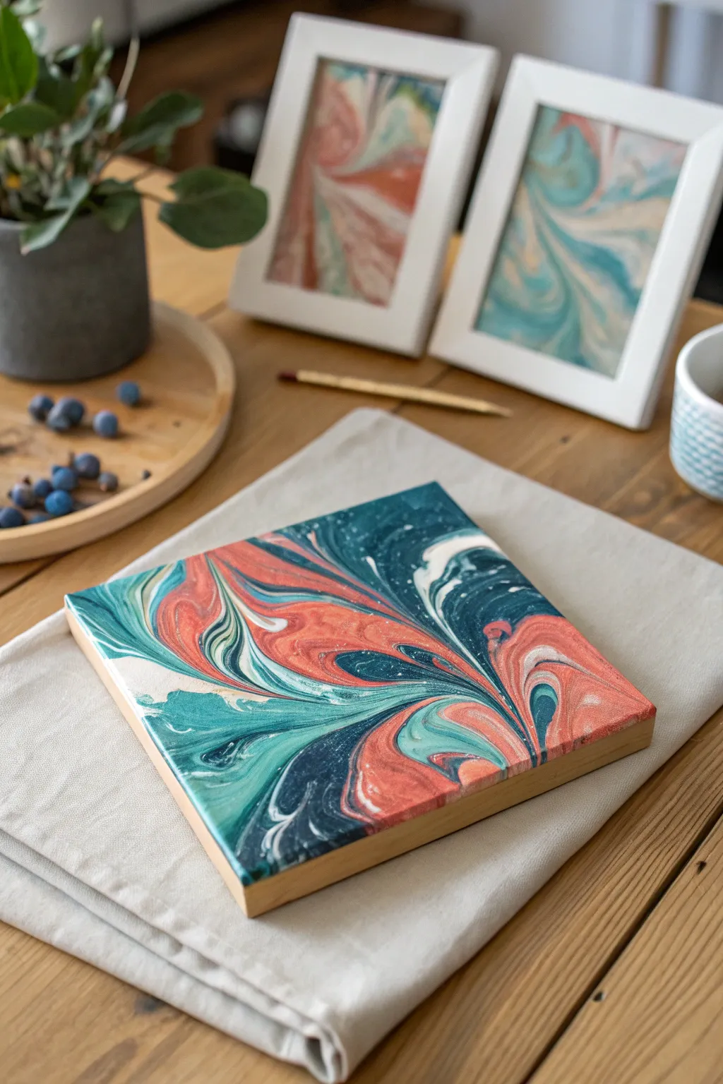
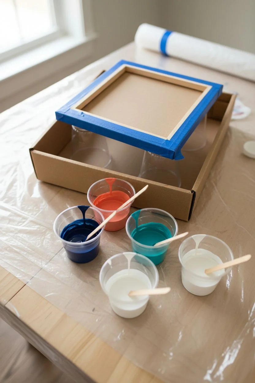
Create a mesmerizing abstract masterpiece on a small scale with this pour painting technique. The result is a vibrant, swirling interplay of teal, coral, navy, and cream that looks like polished stone or a satellite view of an alien ocean.
Detailed Instructions
Materials
- Small square canvas (e.g., 6×6 or 8×8 inches)
- Acrylic fluid paints (teal, navy blue, coral/salmon, white)
- Pouring medium
- Paper cups (one for each color)
- Wooden craft sticks for stirring
- Small offset spatula or palette knife (optional)
- A cardboard box or baking tray to catch drips
- Painter’s tape
- Plastic drop cloth
Step 1: Preparation and Mixing
-
Protect your workspace:
Acrylic pouring is incredibly fun but naturally messy. Cover your entire working area with a plastic drop cloth and set up a cardboard box or an old baking tray to catch the excess paint that will flow off the canvas. -
Tape the back:
Flip your canvas over and apply painter’s tape to the wooden frame and the back of the canvas material. This ensures that once the paint dries, you can peel away the drips for a clean, professional finish. -
Elevate the canvas:
Place four upside-down cups in your catch tray and rest your canvas on top of them. This elevation is crucial so paint can flow freely off the edges without gluing the canvas to the table. -
Mix your paints:
In individual cups, mix each acrylic paint color with pouring medium. A standard ratio is often 1 part paint to 1 part medium, but check your bottle’s instructions. You want a consistency similar to warm honey. -
Check consistency:
Lift your stirring stick; the paint should flow off in a smooth, continuous stream. If it drips or globs, add a tiny bit of water or more medium until it flows seamlessly.
Pro Tip: Cell Creation
Add 1-2 drops of silicone oil to your navy and teal paint cups before pouring. This interacts with the medium to create striking ‘cells’ and circular patterns.
Step 2: The Pouring Process
-
Layer the colors:
For this particular look, we are using a ‘dirty pour’ method. Take a fresh, empty cup and pour a small amount of white into the bottom. -
Add contrasting hues:
Pour a layer of navy blue directly into the center of the white. Follow this with the coral, then the teal. Repeat this layering process until the cup is about three-quarters full. Do not stir this cup. -
Flip the cup:
Place the canvas face down on top of your filled cup. Holding both tight, quickly flip them over so the cup is upside down on the canvas. Wait a moment for the paint to settle. -
Lift and release:
Gently lift the cup straight up. The paint will spill out in a puddle. I find it satisfying to watch the cells and patterns begin to form immediately. -
Tilt to spread:
Pick up the canvas by the taped back. Slowly tilt it in a circular motion. Encourage the paint to roll toward the corners. -
Cover the corners:
Keep tilting until the paint spills over the edges, ensuring the sides are fully coated. The pattern will stretch and change as you move the canvas. -
Add detail if needed:
If you have negative space or a corner that didn’t get covered, use a palette knife or a popsicle stick to gently guide paint to that area, or dip a finger in the run-off to touch up the sides.
Step 3: Drying and Finishing
-
Check for air bubbles:
Look closely at the wet surface. If you see tiny bubbles, you can pop them with a toothpick or lightly pass a kitchen torch over the surface (keep it moving constantly) to bring them to the top. -
Let it cure:
Move the tray carefully to a dust-free area where it can remain undisturbed. Acrylic pours require significant drying time—usually at least 24 to 48 hours. -
Remove the tape:
Once the painting is completely dry to the touch, flip it over and peel off the painter’s tape to reveal clean edges free of dried drips. -
Seal the artwork:
To enhance the colors and give it the sheen seen in the photo, apply a coat of gloss varnish or a clear resin topcoat once the paint is fully cured (usually after 2-3 weeks).
Troubleshooting: Muddy Colors
Avoid over-tilting or tilting back and forth too aggressively. This mixes the colors on the canvas too much, turning vibrant hues into a muddy brown or gray.
Display your captivating marbled mini on a small easel or group several together for a gallery wall effect
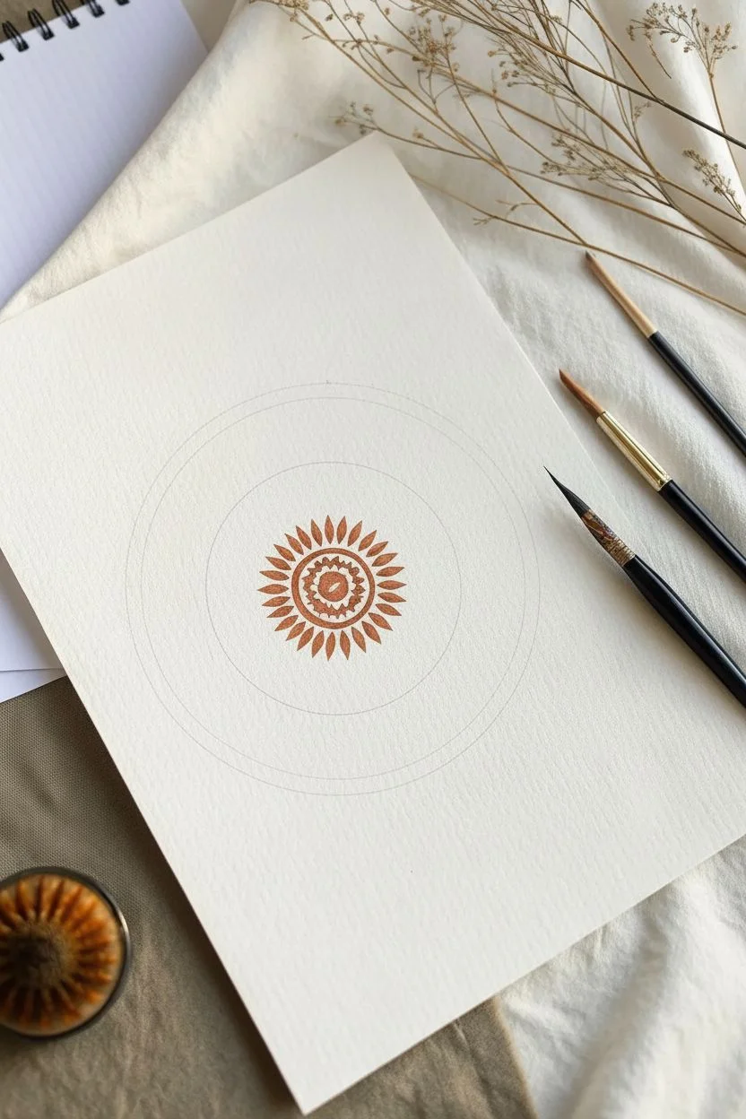
Pendulum Swing Painting for Hypnotic Spirals
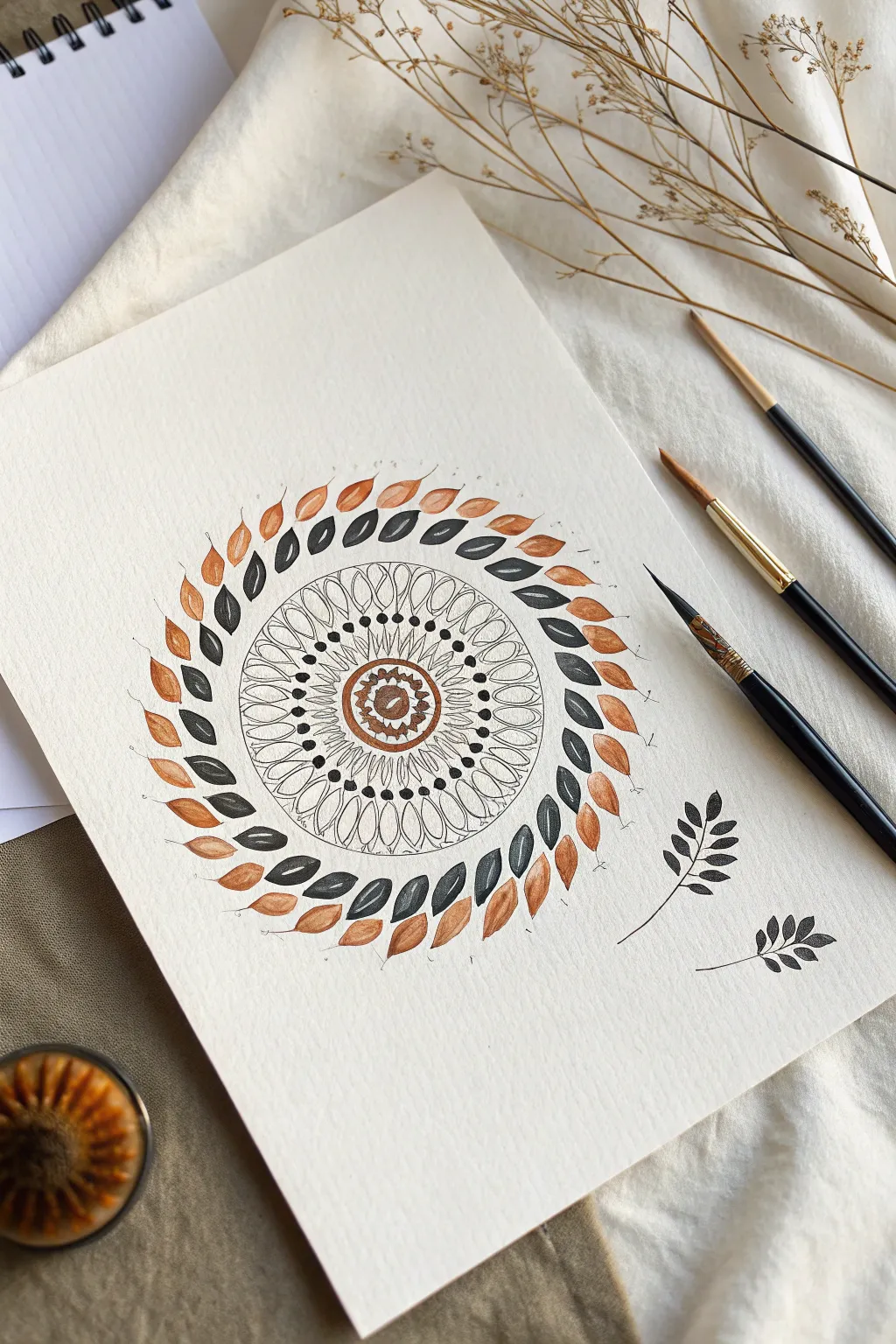
Create a soothing, nature-inspired mandala using warm terracotta and deep charcoal tones. This concentric design builds outward from a detailed center to a sweeping ring of dancing leaves, perfect for practicing brush control and spacing.
How-To Guide
Materials
- Cold press watercolor paper (A4 or similar)
- Round watercolor brushes (sizes 0 or 2 for details, size 4 or 6 for leaves)
- Watercolor paints or gouache (Burnt Sienna/Terracotta and Lamp Black/Payne’s Grey)
- Compass or circular objects to trace
- Pencil and eraser
- Jar of clean water
- Paper towel or rag
Step 1: Setting the Foundation
-
Trace concentric circles:
Begin by lightly drawing a series of concentric circles in the center of your paper using a compass. You’ll need a very small center circle, a slightly larger one around it, a middle band for the petal shapes, and a larger outer guide for the main leaf ring. -
Paint the center eye:
Using your smallest brush and the terracotta paint, fill in the innermost circle, leaving a tiny white dot in the very center for a highlight. -
Add the first ring:
Paint a thin terracotta ring around your center dot. Just inside this ring, use the very tip of your brush to add tiny triangular spikes pointing inward toward the center.
Brush Control Tip
For sharp leaf tips, ensure your paint isn’t too watery. Use a creamy consistency so the brush snaps back to a point when you lift it off the paper.
Step 2: Building the Core Pattern
-
Create the petal framework:
With a fine liner or size 0 brush and diluted black paint (or ink), outline a row of simple, almond-shaped petals around the central terracotta ring. Keep the lines delicate and thin. -
Add dot details:
Dip the tip of your brush into saturated black paint. Carefully place a small, bold dot at the pointed tip of each almond petal you just drew. -
Paint secondary petals:
Draw a second, slightly larger row of almond-shaped petals behind the first row. These should peek out from between the gaps of the first layer. -
Line details:
Inside each of these larger petals, draw a fine vertical line down the center to mimic a leaf vein. -
Outer dot border:
Place another ring of black dots, this time slightly larger, floating just above the tips of the second petal row to close off the intricate center section.
Step 3: The Floating Leaf Ring
-
Practice the leaf stroke:
Before committing to the paper, I like to practice this stroke on a scrap piece: press down to widen the brush belly, then lift as you pull back to create a sharp point. -
Start the inner leaf spiral:
Switch to your medium-sized brush (size 4 or 6). Load it with the dark grey/black paint. Paint a ring of small leaves curving counter-clockwise, keeping them evenly spaced outside your central mandala core. -
Add the outer leaf layer:
Clean your brush thoroughly and load it with the terracotta paint. Paint a second ring of leaves, slightly larger than the black ones, curving in the same direction. -
Interlocking the layers:
Position these orange leaves so they nestle slightly between and behind the black leaves, creating a sense of movement and depth. -
Add floating accents:
Using your fine brush again, draw tiny, wispy stems extending from the tips of the orange leaves, curving outward to soften the edge of the design.
Level Up: Gold Accents
Once dry, add tiny dots of metallic gold watercolor or gel pen to the center of the mandala or along the leaf veins for a touch of elegance.
Step 4: Final Touches
-
Erase guidelines:
Wait until the paint represents completely dry—touch it lightly with the back of your hand to check. Once safe, gently erase any visible pencil circles. -
Optional: Loose foliage:
To break the symmetry, paint two small, loose sprigs of black leaves falling away from the main circle in the bottom right corner, as seen in the reference.
Step back and admire the rhythmic motion of your finished botanical mandala

Have a question or want to share your own experience? I'd love to hear from you in the comments below!