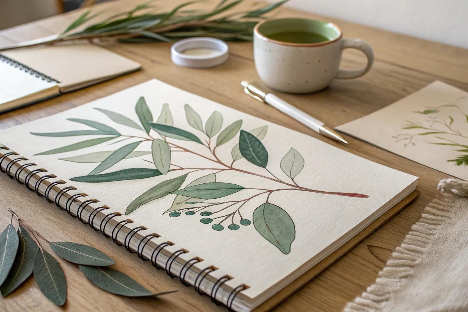
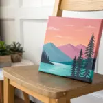
If you’re craving paintings that look bold and polished without feeling complicated, gouache is your best studio buddy. I pulled together my favorite easy gouache painting ideas that lean into that dreamy matte finish and the magic of opaque layering.
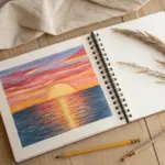
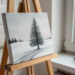
Simple Sunset Landscape With Silhouette Trees
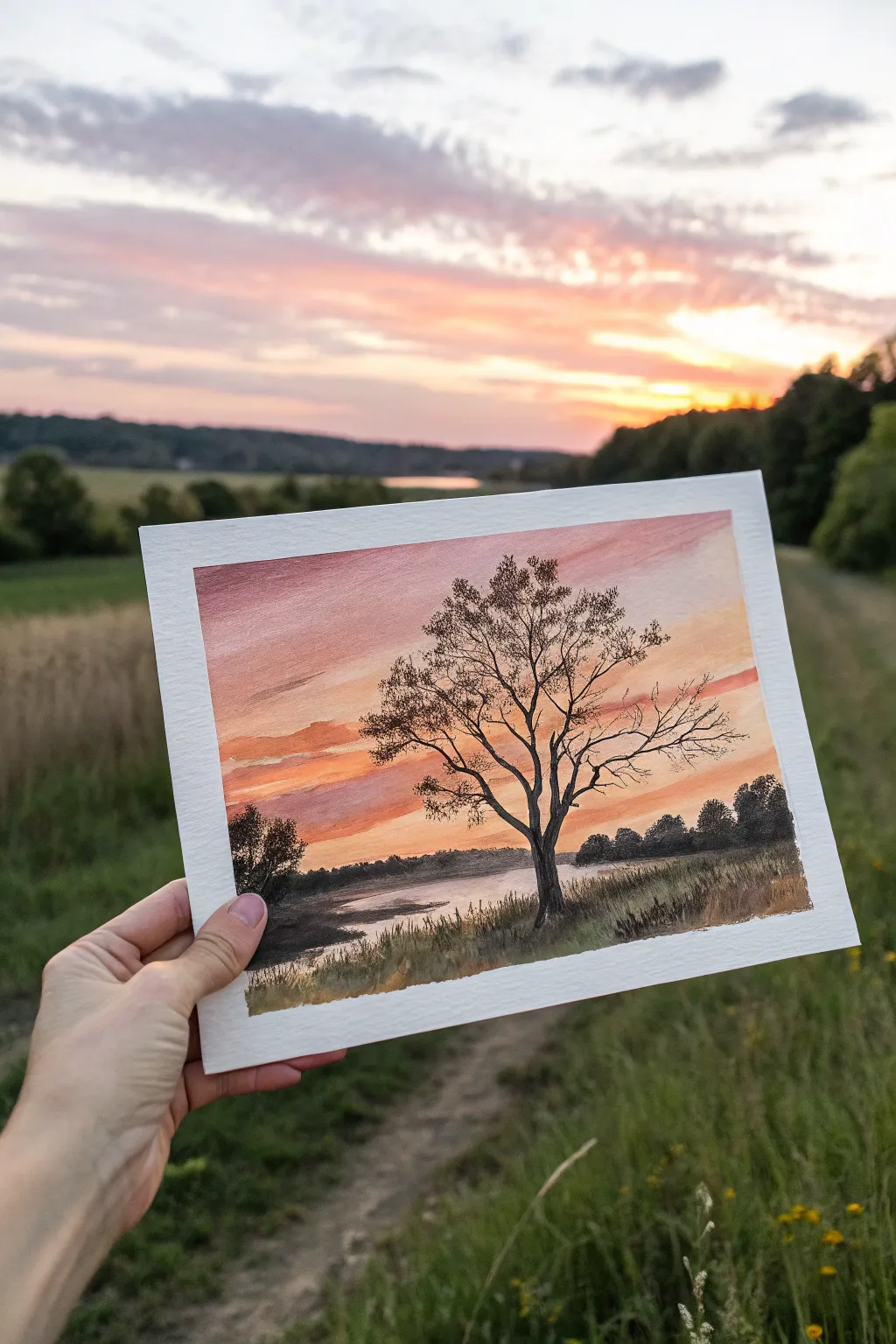
Capture the magic of a fading sunset with this serene landscape that balances vibrant sky gradients with stark, detailed silhouettes. You will learn to blend a soft, glowing background and layer crisp foreground elements to create incredible depth.
Detailed Instructions
Materials
- Gouache paint (Titanium White, Primary Yellow, Vermilion/Orange, Alizarin Crimson, Burnt Sienna, Burnt Umber, Black, Ultramarine Blue)
- Cold press watercolor paper (approx. 5×7 inches)
- Washi tape or masking tape
- Flat shader brush (3/4 inch)
- Round brush (size 4 or 6)
- Fine liner brush (size 0 or 00)
- Palette for mixing
- Two jars of water
- Paper towels
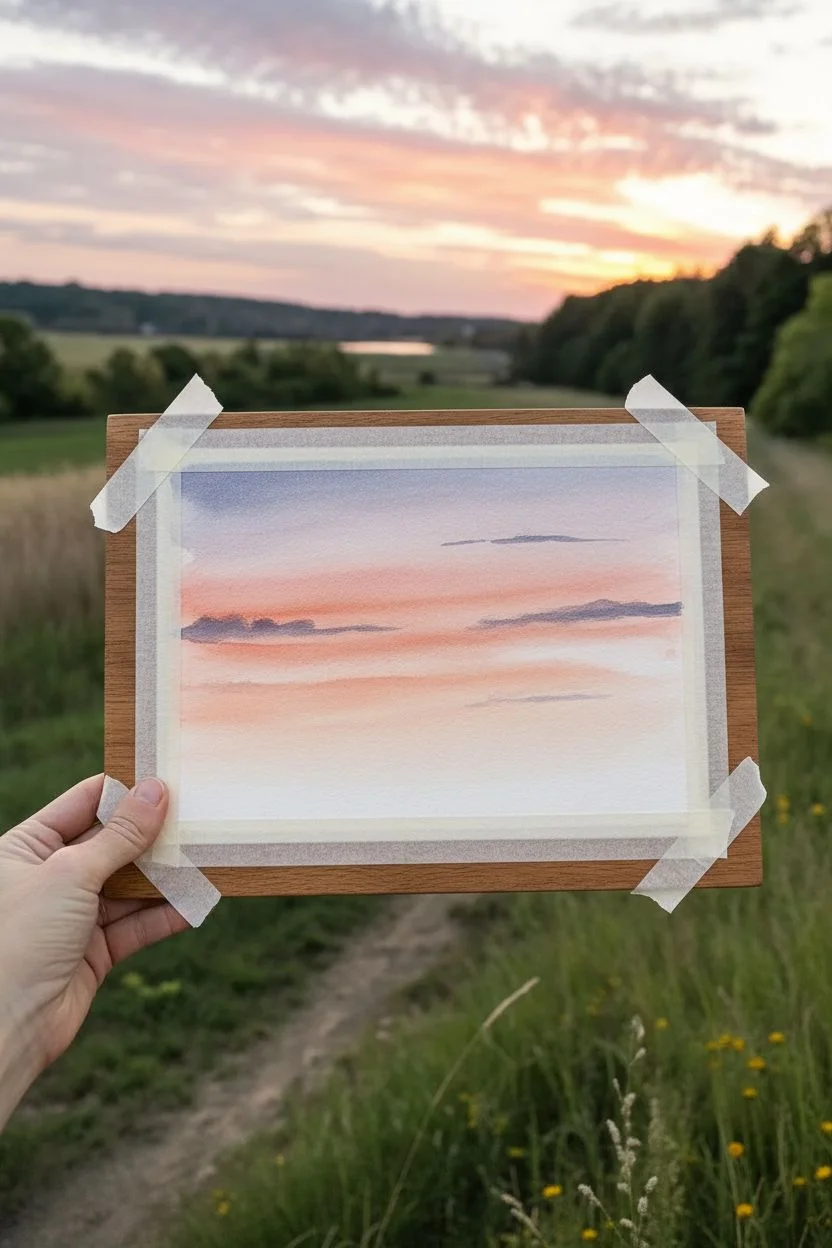
Step 1: Setting the Sky Gradient
-
Prepare your canvas:
Tape down all four edges of your watercolor paper to a sturdy board. This creates that crisp white border seen in the photo and prevents the paper from buckling when wet. -
Mix the horizon glow:
On your palette, mix a generous amount of Titanium White with a touch of Primary Yellow and a tiny dot of Vermilion to create a pale, warm peach color. -
Paint the bottom sky:
Using your flat shader brush, apply this peach mixture horizontally across the lower middle section of the paper, where the sun would constitute the brightest point. -
Introduce pink tones:
Mix a soft salmon pink using White, Vermilion, and a hint of Alizarin Crimson. Paint this directly above the peach section while the paint is still wet, blending the edges gently with long horizontal strokes. -
Deepen the upper sky:
For the top of the sky, mix a dusky lavender-grey using White, Alizarin Crimson, and a tiny touch of Ultramarine Blue. Apply this to the top third of the paper. -
Blend the transition:
Clean your damp flat brush and gently run it back and forth between the distinct color bands to create a smooth, seamless gradient from the dusky top to the glowing horizon. -
Add cloud streaks:
While the sky is damp but not soaking, use a small round brush with a slightly darker purple-grey mix to streak in thin, horizontal clouds across the pink and peach sections.
Dry Brushing Tip
For the wispy clouds, wipe most of the paint off your brush onto a paper towel first. This ‘dry brush’ leaves a textured, feathery mark that looks just like high-altitude cirrus clouds.
Step 2: Painting the Landscape Base
-
Establish the horizon line:
Mix a dark, muted tone using Burnt Umber and Ultramarine Blue. With the size 6 round brush, paint a distant tree line across the horizon, varying the height slightly to suggest bushes and trees. -
Block in the water:
Beneath the tree line, paint the water area. Use a diluted version of your sky colors—mostly the peach and pale pink—to reflect the sky, keeping strokes horizontal. -
Add water reflections:
While the water layer is wet, drop in horizontal dashes of the dark horizon color directly underneath the distant trees to create shadowy reflections. -
Create the foreground bank:
Mix a dark, earthy green using Burnt Umber, a little Black, and Yellow. Paint a sloping bank starting from the bottom corners, leaving space for the water in the center. -
Texture the grass:
Using a dry brush technique with lighter yellow-ochre tones, flick upward strokes along the bottom foreground to mimic tall, dry grasses catching the last light.
Level Up: Birds
Use your finest liner brush to add three or four tiny ‘v’ shapes in the distance. Place them near the sun’s glow to create a sense of scale and life in your landscape.
Step 3: The Silhouette Tree
-
Mix the silhouette color:
Create a near-black mixture using Burnt Umber and Black. You want this paint to be creamy and opaque, not watery. -
Paint the main trunk:
Using your size 4 round brush, plant the base of the tree on the right-side foreground bank. pull the trunk upward, letting it twist slightly as it rises against the sky. -
Branch structure:
Switch to your liner brush. Pull main branches outward from the trunk, tapering them as they extend. Remember that trees are rarely perfectly symmetrical; add some quirks and bends. -
Add fine twigs:
With the very tip of the liner brush and slightly thinned paint, add intricate twig networks to the ends of the branches. I find that rolling the brush slightly helps create natural-looking lines. -
Stipple the leaves:
Mix a slightly more transparent dark grey. Use an old, splayed brush or sponge to lightly tap (stipple) clusters of leaves onto the upper branches, keeping them sparse to let the sky show through. -
Final details:
Add a secondary, smaller bush or tree silhouette in the distant left foreground to balance the composition. -
Reveal the border:
Let the painting dry completely. Slowly peel away the tape at a 45-degree angle to reveal your clean white edges.
Once the tape is peeled away, you have a peaceful sunset moment captured forever in paint


Starry Night Sky With a Bright Moon
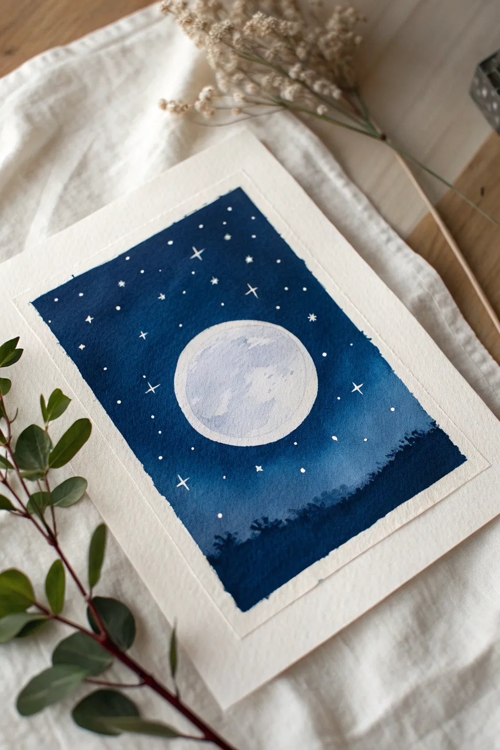
Capture the serene beauty of a crisp night sky with this simple yet striking gouache project. Using deep blues and stark whites, you’ll create a glowing moon that pops against a velvety celestial background.
Step-by-Step Guide
Materials
- Watercolor paper (cold press, at least 300gsm)
- Gouache paint (Prussian Blue, Ultramarine Blue, Black, White)
- Painter’s tape or masking tape
- Flat wash brush (1/2 inch or 3/4 inch)
- Small round brush (size 2 or 4)
- Fine detail brush (size 0 or 00)
- Compass or circular object for tracing
- Pencil
- Palette for mixing
- Two jars of water
- Paper towels
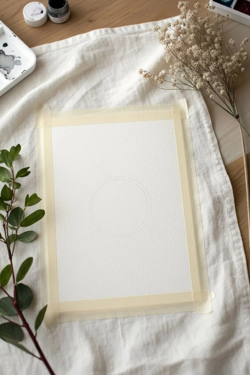
Step 1: Preparation & Sketching
-
Tape the edges:
Begin by taping down all four sides of your paper to a flat board or table. This creates that clean, crisp white border visible in the final piece and prevents the paper from buckling when wet. -
Trace the moon:
Use a compass or trace a circular object (like a jar lid or a roll of tape) lightly with a pencil in the center of the paper. Keep the lines faint so they don’t show through the paint later.
Bleeding Edges?
If paint bleeds under the tape, use a slightly damp, stiff brush (like an eradicator brush) to gently scrub away the excess paint while it’s still fresh, or cover with white acrylic later.
Step 2: Painting the Sky
-
Mix your darkest blue:
On your palette, mix Prussian Blue with a touch of Black to create a very deep, midnight blue. You want this color to be rich and opaque, like heavy cream. -
Outline the moon:
Using a smaller round brush, carefully paint around the pencil outline of the moon with your dark blue mixture. This creates a barrier so you don’t accidentally paint inside the moon shape. -
Fill the upper sky:
Switch to your flat wash brush. Load it with the dark blue mix and start painting the top third of the sky, using horizontal strokes for a smooth, matte finish. -
Create a gradient:
As you move down towards the middle section (around the moon), mix a little Ultramarine Blue into your dark mixture to slightly brighten it. Blend this into the wet edge of the darker paint above. -
Lighten the horizon:
For the area just below the moon, mix more Ultramarine Blue and a tiny dot of White to create a lighter, misty blue. Paint this section, blending upwards into the darker blue. -
Add the silhouetted treeline:
Once the blue background is dry to the touch, mix a pure, dark navy using Prussian Blue and Black. Use the tip of your round brush to stipple an uneven, organic line at the very bottom, suggesting the tips of distant trees or a forest canopy. -
Fill the forest base:
Fill in the rest of the bottom section solidly with this dark shadow color, ensuring it grounds the composition.
Step 3: The Moon & Stars
-
Base coat the moon:
Ensure your brush is very clean. Mix a large amount of White with a tiny speck of Ultramarine Blue to get a very pale, cool grey-white. Fill in the entire moon circle with this flat color. -
Add moon texture:
While the base is still slightly damp, mix a slightly darker grey-blue. Using a mostly dry brush, dab irregular patches onto the moon to simulate craters and lunar seas. Keep this subtle. -
Paint the bright rim:
Load your fine detail brush with pure Titan White. Carefully paint a thin line along the rim of the moon to make it look like it’s glowing. -
Dot the stars:
Using your smallest brush and pure White paint (thinned slightly with water), dot tiny specks all over the dark blue sky area. -
Add major stars:
Choose 5 or 6 spots to paint larger ‘twinkle’ stars. Paint a small cross shape first, then an ‘x’ over it to create an eight-pointed star, or simply a four-pointed diamond shape. -
Final touches:
Add a few extremely tiny white dots inside the shadowy tree area if you want to suggest fireflies or low stars, though keeping it dark adds contrast. -
The reveal:
Wait until the painting is completely bone dry. Slowly peel away the painter’s tape at a 45-degree angle to reveal your crisp, clean borders.
Pro Tip: Glowing Moon
For a subtle glow effect, dry brush a very faint, translucent ring of white paint around the outside of the moon onto the blue sky before adding the stars.
Now you have a peaceful piece of the night sky ready to frame or gift


Chunky Cloud Studies in Flat Shapes
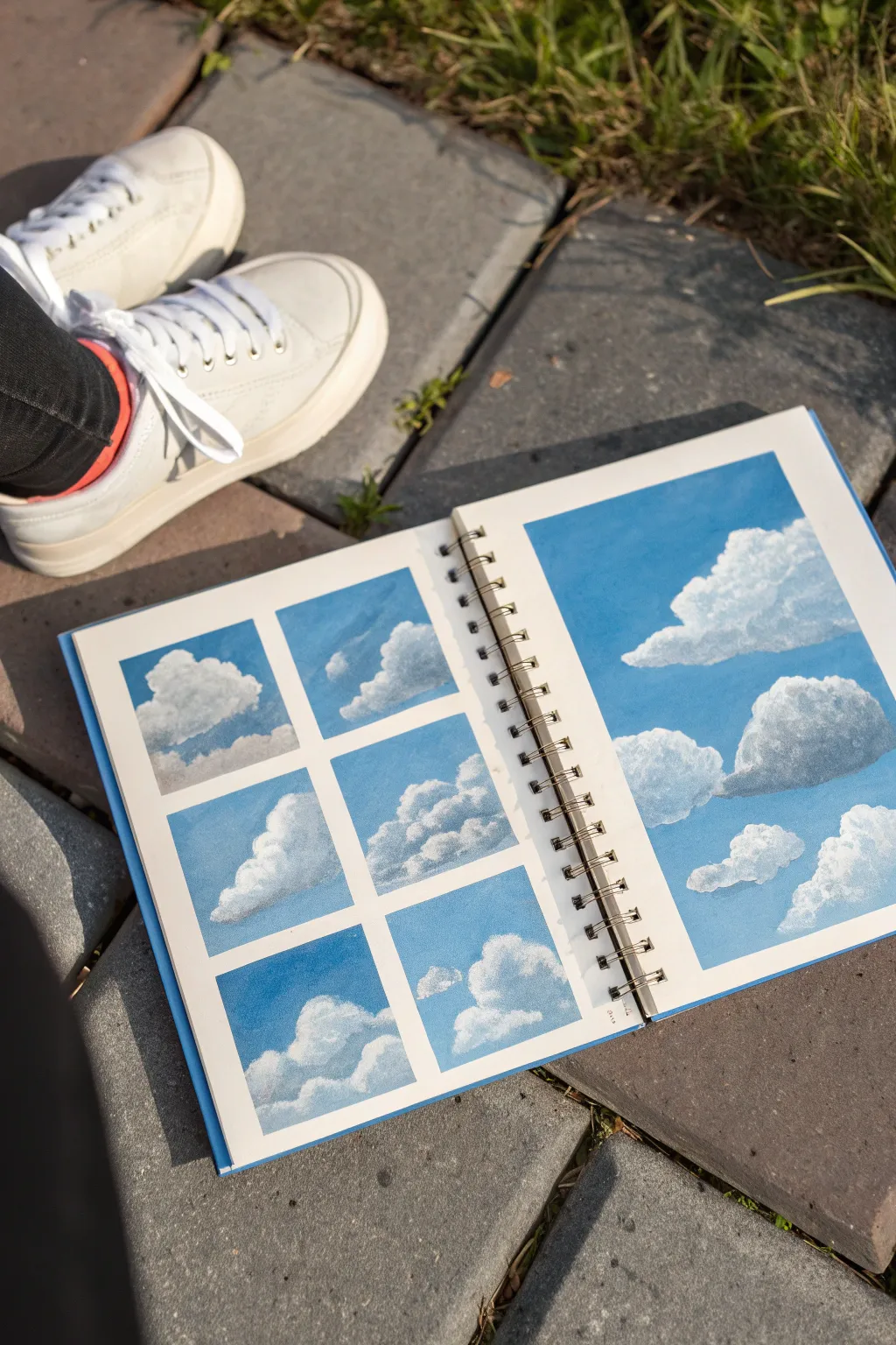
Master the art of fluffy, dimensional clouds by breaking them down into blocky shapes and simple color gradients. This sketchbook spread combines a grid of small warm-up studies with a larger, full-page cloudscape to practice varying scales and compositions.
Step-by-Step
Materials
- Gouache paint set (specifically Titanium White, Cerulean Blue, Ultramarine Blue, and Burnt Umber)
- Sketchbook with heavy-weight mixed media or watercolor paper
- Washi tape or low-tack masking tape
- Flat shader brush (size 6 or 8)
- Round detail brush (size 2 or 4)
- Mixing palette
- Cup of water and paper towels
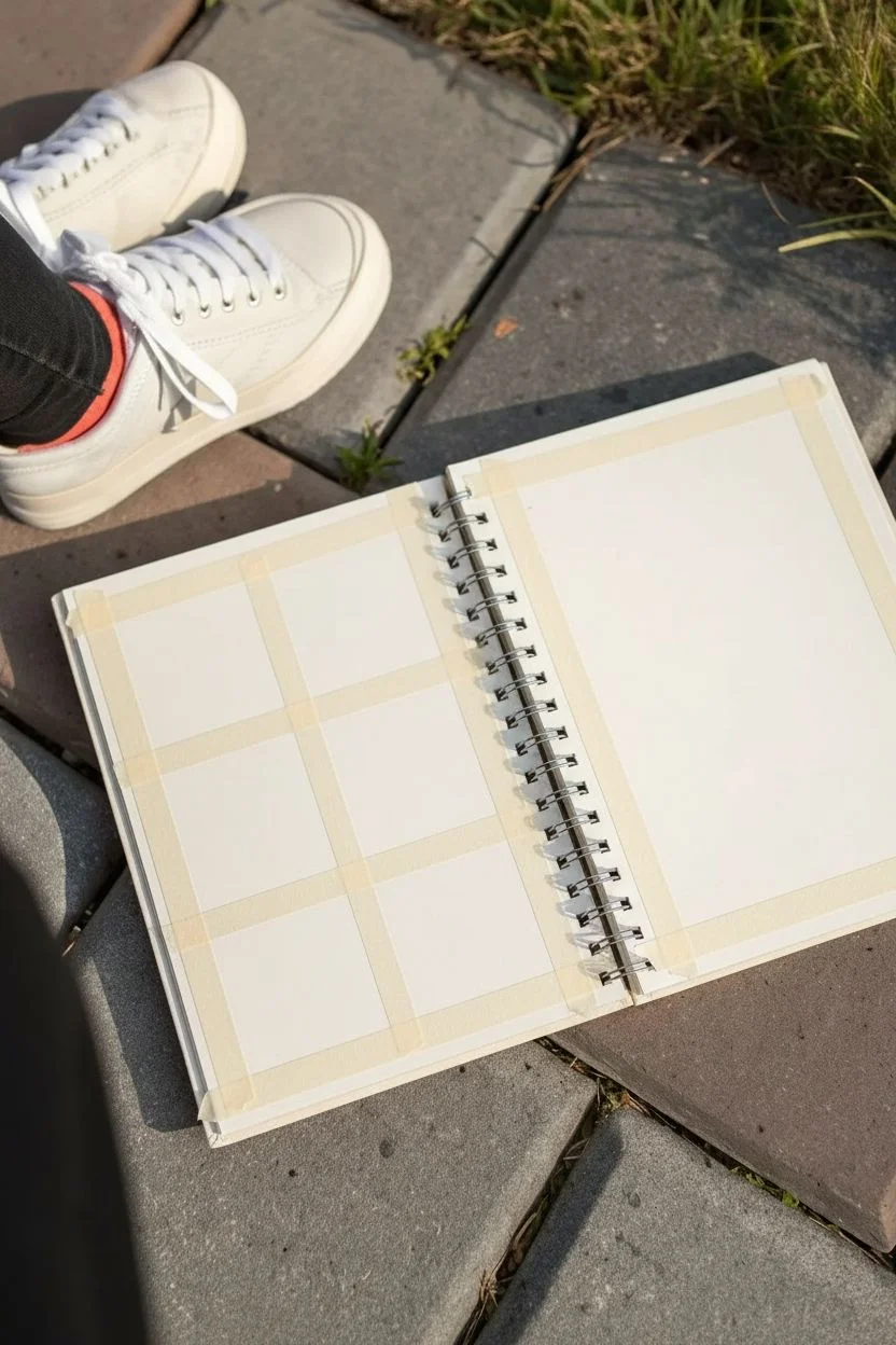
Step 1: Preparation & Grid Layout
-
Tape the grid:
On the left page of your sketchbook, use washi tape to create a 2×3 grid. Tape off six equal square boxes, ensuring the tape is pressed down firmly to prevent paint bleeding. -
Tape the main study:
On the right page, create a rectangle border with tape, leaving a clean white margin around the edges typical of gouache illustrations.
Clean Tape Lines
Before painting, run a clear layer of white gouache or matte medium over the tape edges. This seals the gap and guarantees razor-sharp borders.
Step 2: Painting the Sky Gradients
-
Mix your blues:
Create a gradient scale on your palette ranging from a deep, rich blue (Ultramarine mixed with a touch of Cerulean) to a very pale sky blue (mostly White with a dot of Cerulean). -
Fill the backgrounds:
For each square box on the left page, paint a simple gradient sky. Start with the darker blue at the top and blend downwards into lighter blue. Vary the direction slightly in a few boxes for interest. -
Paint the large background:
Apply the same gradient technique to the large right-hand page. Use your largest flat brush to ensure smooth, streak-free transitions as you work from the top down. -
Let it dry completely:
Gouache reactivates when wet, so ensure your blue sky layers are bone dry before painting white clouds on top to keep the colors crisp.
Golden Hour Glow
Instead of pure white highlights, mix a tiny drop of yellow or pink into your white paint for the top edges to simulate a sunset or sunrise effect.
Step 3: Blocking in Cloud Shapes
-
Mix shadow colors:
Clouds aren’t pure white. Mix a light grey-blue or a subtle violet-grey color to use for the shadowed underbellies of the clouds. I like using a tiny bit of Burnt Umber mixed with Ultramarine and White for a natural grey. -
Paint base shapes:
Using the shadow color, paint the general footprint of your clouds. Focus on ‘chunky’ shapes rather than perfect fluffiness. Think of them as stacked irregular triangles or pyramids. -
Vary the forms:
In the six grid squares, try different cloud types: a large single cumulus, a scattered group, or a low-hanging bank of clouds. This is your playground for experimentation.
Step 4: Adding Highlights & Depth
-
Prepare thick white:
Squeeze out fresh Titanium White. You want a creamy, opaque consistency—not watery—so it stands out against the blue. -
Apply highlights:
Dab the pure white onto the top edges of your shadow shapes, where the sunlight would hit. Use a tapping motion with your round brush to create texture. -
Blend the transition:
While the white is slightly wet, gently feather the bottom edge of the white paint into the grey shadow area. You want a soft transition, but keep the top edges of the clouds distinct and sharp. -
Enhance the large study:
On the right page, focus on one massive cloud formation dominating the right side, with smaller floaters on the left. Apply the highlight technique more deliberately here, building up layers for extra volume. -
Refine the edges:
Go back with a small detail brush. Add tiny dots or broken lines of white around the main cloud mass to suggest wispy bits breaking off into the wind.
Step 5: Finishing Touches
-
Peel the tape:
Once the paint is completely dry to the touch, slowly peel off the washi tape at a 45-degree angle away from the painted area to reveal your crisp, clean edges. -
Assess contrast:
If any clouds look too flat, add a slightly darker grey to the very bottom edge for increased dramatic weight.
Now you have a sketchbook spread filled with airy, dimensional clouds ready for future landscape paintings


Mini Botanical Sprigs With Simple Leaf Shapes
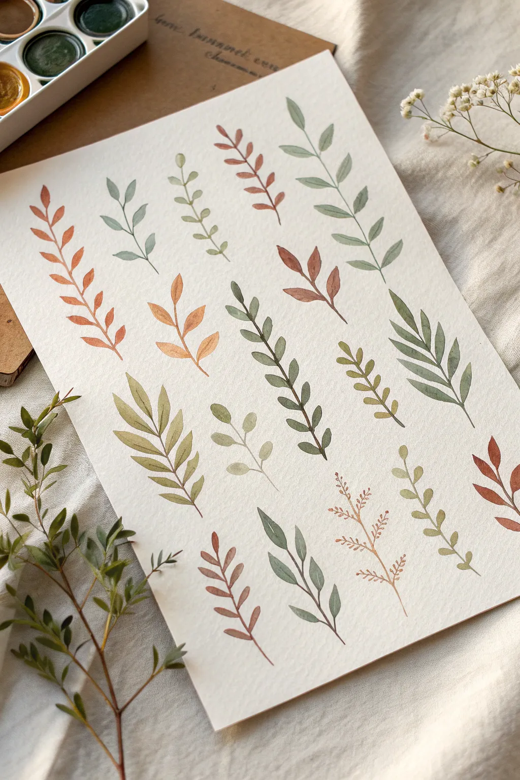
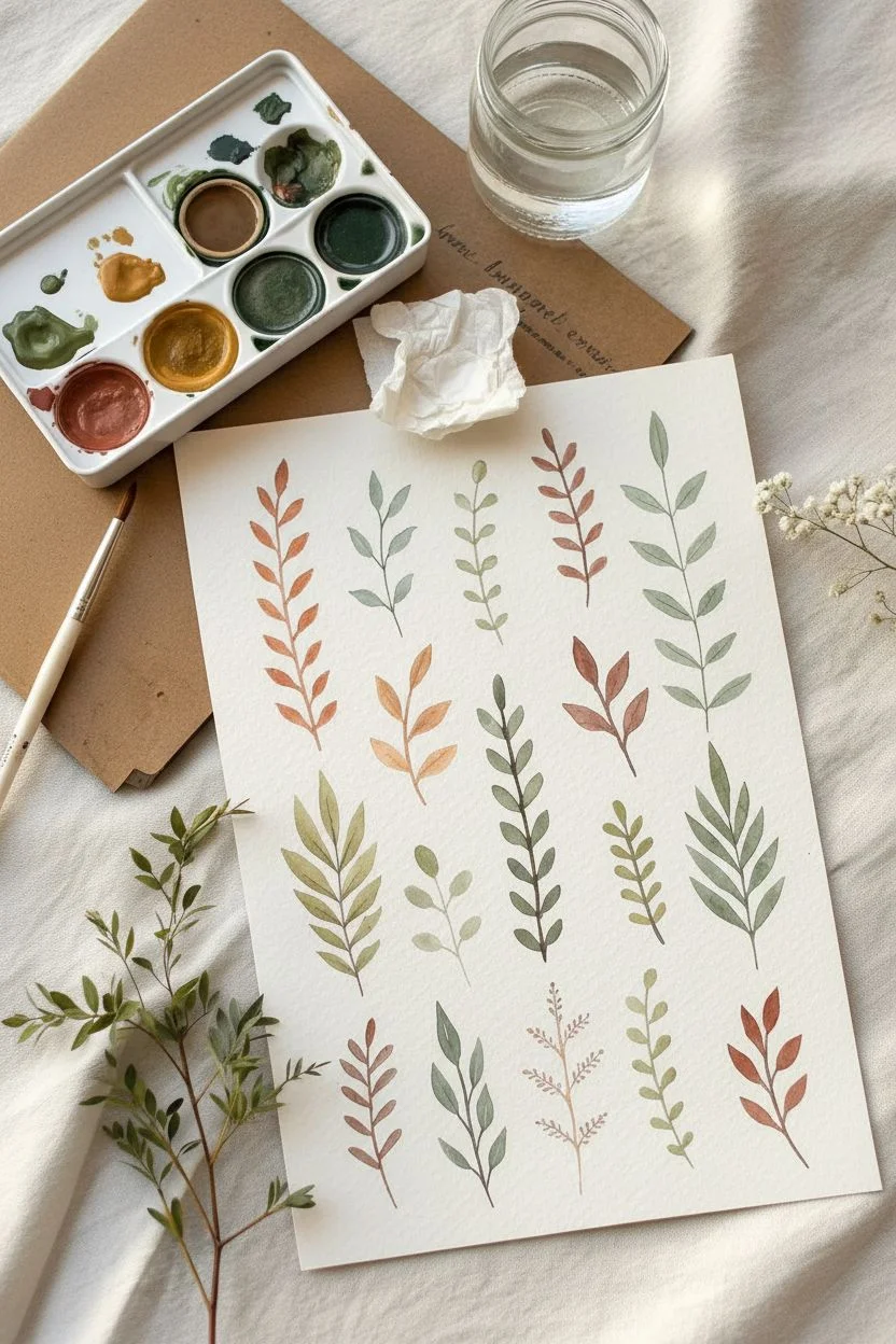
Master the art of delicate foliage with this study of fourteen unique leaf shapes, focusing on warm earth tones and varying stem structures. This practice sheet is perfect for understanding how simple brush pressure can create organic, flowing sprigs.
Step-by-Step Guide
Materials
- Cold press watercolor paper (A4 or slightly smaller)
- Gouache paints (Olive Green, Burnt Sienna, Yellow Ochre, Deep Green, Burnt Umber, White)
- Round synthetic brushes (sizes 2 and 4)
- Mixing palette
- Jar of clean water
- Paper towel
Step 1: Preparation & Color Mixing
-
Prepare your palette:
Begin by squeezing out small amounts of your greens and browns. To achieve the muted, earthy look shown here, never use colors straight from the tube. -
Mix warm rust tones:
Create the reddish-brown shade by mixing Burnt Sienna with a tiny touch of Olive Green to desaturate it. Add a drop of water to get a fluid, cream-like consistency. -
Mix varying greens:
Prepare three distinct greens: a pale sage (Green + White + brown touch), a deep forest green (Deep Green + Burnt Umber), and a warm olive (Olive Green + Yellow Ochre).
Brush Pressure Control
The shape of the leaf is dictated by pressure. Press hard for the wide belly, lift quickly for the sharp tip. Practice this ‘press-drag-lift’ motion on scrap paper first.
Step 2: Painting the Fern-Like Sprigs
-
Start with the main stem:
Using your size 2 brush and the reddish-brown mix, paint a slightly curved central line from the bottom left corner upward. Keep it very thin. -
Add opposing leaves:
Starting near the bottom, press the belly of the brush down and lift sharply to create teardrop shapes that point outward. Alternate left and right as you move up the stem. -
Paint the large rust fern:
On the far left, create a taller, more substantial sprig using the same rust color. Make these leaves longer and more slender than the previous ones. -
Create a golden sprig:
Mix a mustard yellow using Yellow Ochre and a hint of Burnt Sienna. Paint a shorter sprig near the center with fewer, broader leaves.
Step 3: Painting Rounded & Heart Shapes
-
Mixing the pale sage:
Switch to your pale sage green mix. Draw a central stem in the upper middle area. -
Form rounded leaflets:
Instead of pointed tips, tackle rounded leaves by pressing the brush down and barely dragging it before lifting. These should look like small coins or hearts attached to the stem. -
Vary the stem direction:
Paint another pale green sprig, but give the stem a slight ‘S’ curve for movement.
Make it a Pattern
Scan your finished painting and use digital software to duplicate the sprigs. This creates a custom botanical repeating pattern for wrapping paper or fabric.
Step 4: Painting Long & Slender Leaves
-
Mix a deep blue-green:
Combine your Deep Green with a touch of blue or Payne’s Gray if available, plus white to make it opaque. This will be for the large leaf on the right. -
Execute the ‘compound’ leaf:
Draw a long central vein. For the leaflets, use the full length of a size 4 brush: touch the tip to the stem, press down significantly to widen the belly, and drag outward to a fine point. -
Replicate loosely:
Create a similar structure in the bottom center using a darker olive mix, but keep the leaves slightly more separated.
Step 5: Fine Details & Texture
-
Paint thin needle sprigs:
Using the very tip of your smallest brush (size 0 or 2), paint a delicate sprig in the bottom right corner. Use faint, short strokes to mimic pine needles or dried herbs. -
Add seed-pod shapes:
For the bottom-right sprig with tiny dots, draw a thin brown framework first. Then, gently dab the tip of your brush to create tiny ‘seed’ clusters at the branch ends. -
Fill the gaps:
Look at the composition as a whole. Paint small, simple two-leaf or three-leaf sprigs in the empty spaces to balance the page. -
Layering check:
If any leaves look too transparent, wait for them to dry completely and add a second layer of gouache to increase opacity.
Allow your botanical study to dry flat completely before framing or scanning your new reference sheet
BRUSH GUIDE
The Right Brush for Every Stroke
From clean lines to bold texture — master brush choice, stroke control, and essential techniques.
Explore the Full Guide
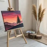
Graphic Tulips With Two-Step Petals
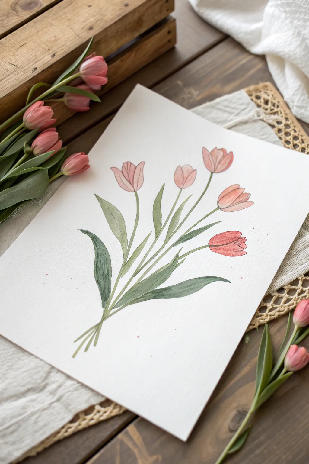
Capture the delicate beauty of spring with this illustrative tulip painting that balances soft washes with defined lines. The finished piece features a charming bouquet of five pink tulips, characterized by their unique two-tone petal shading and outlined details.
Detailed Instructions
Materials
- Heavyweight watercolor paper or mixed media paper
- Gouache paints (Carnation Pink, Salmon/Coral, Olive Green, Sap Green)
- Round synthetic brushes (Size 6 for washes, Size 0 or 00 for details)
- Pencil (HB) and eraser
- Palette covering or mixing tray
- Water cups and paper towels
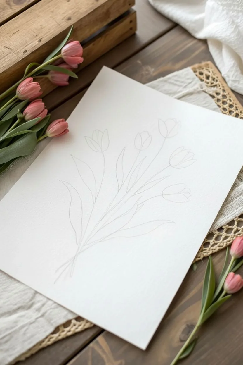
Step 1: Planning the Composition
-
Lightly sketch the layout:
Begin by sketching the general direction of your bouquet. Draw five faint curved lines radiating from a central point near the bottom to represent the stems. Top each line with a simple U-shape or oval to mark where the flower heads will go. -
Refine the flower shapes:
Inside your U-shapes, sketch the tulip petals. For this ‘two-step’ look, focus on drawing a central petal shape first, flanked by two side petals. Keep the lines very light so they don’t show through the paint later. -
Add leaf variance:
Draw long, slender leaves emerging from the base. Vary their heights—some should reach halfway up the stems, while others stay low. Let a few leaves curve outwards for a natural, relaxed look.
Brush Control Tip
For the thin outlines, dilute your gouache to an ‘ink’ consistency (like melted ice cream). This helps the paint flow smoothly off the liner brush without skipping.
Step 2: Painting the Foliage
-
Mix your greens:
Create two shades of green on your palette. Mix Sap Green with a touch of white for a base tone, and use Olive Green or mix in a tiny bit of blue for a shadowy, cooler green. -
Paint the first leaves:
Using your Size 6 brush, fill in the larger leaves on the left using the lighter green mixture. Apply the paint in long, confident strokes from the base to the tip to mimic the leaf’s texture. -
Add depth with darker leaves:
Switch to your darker, cooler green mix for the leaves on the right side and any leaves that appear ‘behind’ others. This simple color variation instantly creates depth without complex shading. -
Connect the stems:
Using the tip of your brush, paint the thin stems connecting the leaves to the flower heads. I find it helpful to pull the brush toward me rather than pushing it away to keep the line steady. -
Create the stem cluster:
At the very bottom where the stems cross, paint a few short, angled strokes to suggest the cut ends of the bouquet without needing to draw a vase or ribbon.
Step 3: Painting the Blooms
-
Base layer for petals:
Mix a watery wash of Carnation Pink. Fill in the entire shape of each tulip head with this pale color. Don’t worry about petal separation yet; just create a solid silhouette of pink. -
Allow to dry completely:
This is crucial for the graphic look. The pink base layer must be bone dry before you add the next layer, or the colors will bleed together muddy the crisp lines. -
Add the second tone:
Mix a thicker, more opaque Salmon or Coral color. Paint the ‘back’ or side petals of the tulips with this darker shade, leaving the central front petal the lighter pink. This creates the signature two-step dimension. -
Blend softly if desired:
If a line feels too harsh, you can use a damp, clean brush to gently soften the edge where the dark and light pinks meet, specifically near the bottom of the flower cup.
Chalky Finish?
If your dried dark colors look too chalky or dusty, you may have added too much white. Glazing over them with a thin wash of the pure pigment can restore vibrancy.
Step 4: Inking and Details
-
Mix a linear color:
For the graphic outlines, don’t use black paint—it’s too harsh. Instead, mix a very dark green or a deep maroon using your existing palette colors with a tiny bit of black or brown added. -
Outline the petals:
Switch to your Size 0 detail brush. With a very steady hand, trace the outer edges of the petals. Keep the lines thin and delicate. Broken lines here and there can look very artistic. -
Define the leaves:
Add thin outlines to the leaves. You can also add a simple central vein line down the middle of the larger leaves to emphasize their length. -
Add final texture:
Using the detail brush, draw a few very fine vertical lines inside the petals to suggest texture. Finally, load a brush with watered-down pink paint and tap it against your finger to splatter tiny speckles around the bouquet for a spontaneous finish.
Frame your lovely floral study to brighten up any corner of your home
Easy Daisies With Bold Centers and Petal Strokes
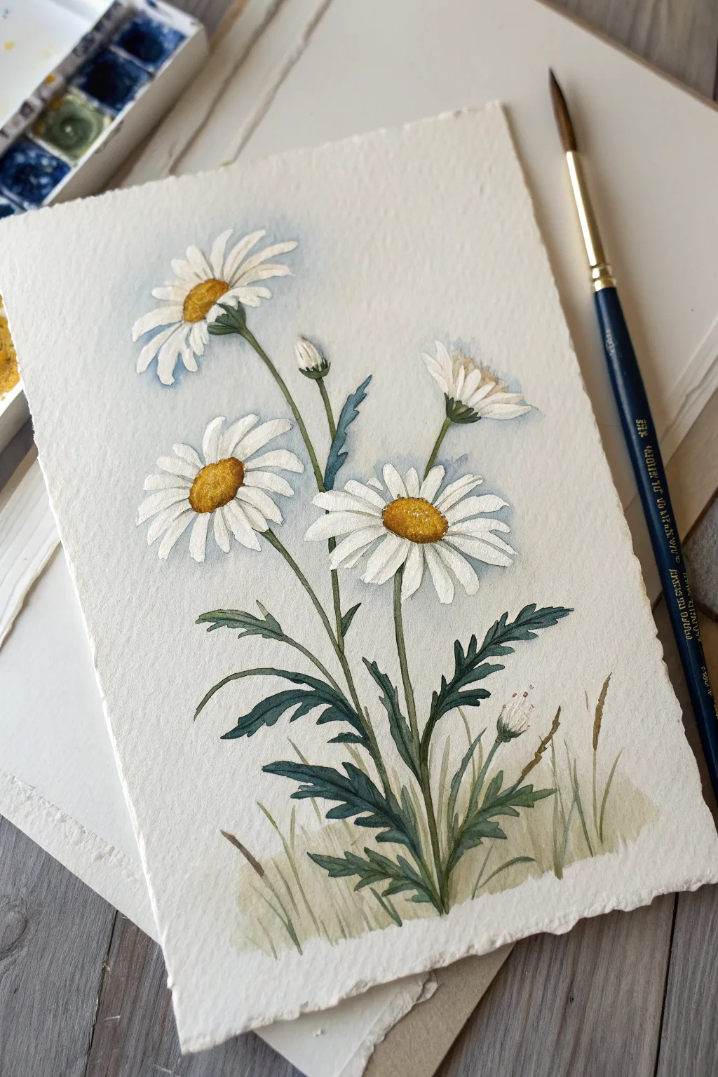
Capture the simple elegance of a meadow with this striking daisy composition. You’ll master the art of layering opaque whites over a soft, atmospheric background while using deckled-edge paper to give your piece a vintage, hand-crafted feel.
Step-by-Step
Materials
- Cold press watercolor paper (deckled edge preferred) or standard paper torn to size
- Gouache paints (Titanium White, Primary Yellow, Yellow Ochre, Burnt Umber, Prussian Blue, Sap Green, Olive Green)
- Round brushes (sizes 2, 4, and 6)
- Small flat brush (optional, for background)
- Mixing palette
- Two cups of water
- Paper towels
- Pencil (HB or H) and kneaded eraser
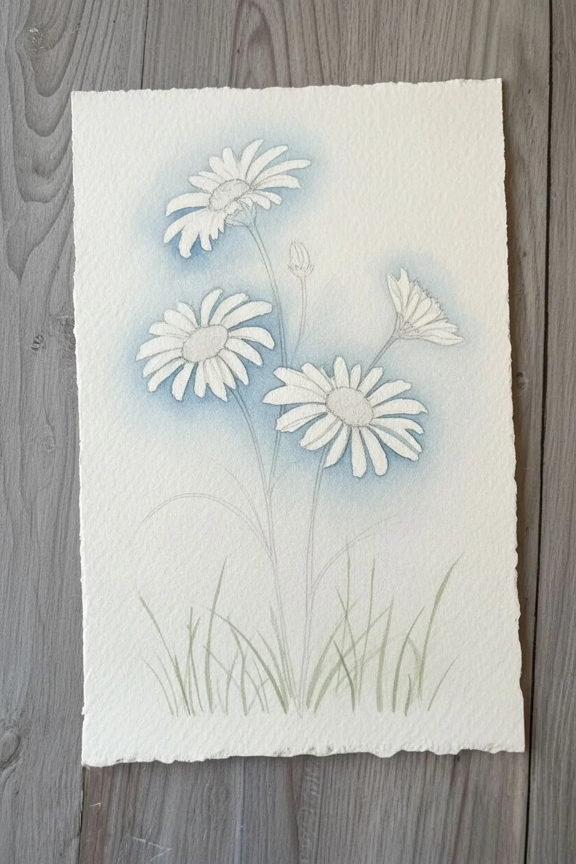
Step 1: Sketch and Background
-
Prepare your paper:
If you aren’t starting with pre-made deckled paper, gently tear the edges of a 5×7 or A5 sheet of watercolor paper against a ruler to create that beautiful, ragged edge texture. -
Lightly sketch the composition:
Using an HB pencil, map out the positions of the three main flower heads: one high on the left, one central and lower, and one facing away on the right. Add long, slightly curved lines for the stems meeting at the bottom. -
Mix a hazy blue wash:
Dilute a tiny amount of Prussian Blue with plenty of water and a touch of white gouache until it’s milky and very transparent. It should look more like watercolor than gouache. -
Apply the background wash:
Gently paint around your pencil sketch, keeping the blue wash concentrated near the flower heads and fading out as you move toward the paper’s edge. Don’t worry about being perfect; soft, irregular edges add charm. -
Add grassy hints:
While the background is still slightly damp, mix a very diluted Sap Green and swish in some faint upward strokes at the bottom to suggest grass in the distance.
Step 2: Painting the Flowers
-
Base layer for centers:
Mix Yellow Ochre with a tiny bit of Primary Yellow. Paint the oval shapes for the flower centers. For the daisy facing away, you’ll only see a sliver of yellow hidden by the green sepal. -
Establish the leaves:
Combine Olive Green with a touch of Prussian Blue to create a deep, cool green. Using your size 4 round brush, paint the jagged, fern-like leaves at the bottom, pulling the strokes upward and outward. -
Paint the stems:
Using the tip of a smaller brush and a mix of Sap Green and Olive Green, draw the long, slender stems connecting the flower heads to the base foliage. Keep your hand loose to avoid stiff lines. -
First layer of petals:
Load a size 6 brush with creamy Titanium White (consistency of heavy cream). Press the belly of the brush down near the center and lift as you pull outward to create the petal shape. Paint the petals that are “behind” or furthest from you first. -
Add the main petals:
Once the first white layer is dry, paint the front-facing petals. Let some overlap the stems or leaves slightly to create depth. I find that leaving tiny gaps between petals keeps the flower looking airy. -
Shadow the white petals:
Mix a very faint grey-blue using your white and a speck of the background blue. Glaze this gently on the bottom or shadowed side of the petals, especially on the flower that is facing away from the viewer.
Petal Perfection
To get that crisp petal shape, press the brush down fully at the start of the stroke (near the center) and lift vertically as you drag outward to taper the tip.
Step 3: Details and Final Touches
-
Texturize the centers:
Mix a darker golden brown using Burnt Umber and Yellow Ochre. Stipple (dab small dots) onto the bottom and left side of each yellow center to create a 3D dome effect. -
Highlight the centers:
Add a few tiny dots of pure Primary Yellow or even White on the upper right side of the flower centers to show where the light hits them. -
Define the sepals:
For the side-view flower and the buds, paint the cup-like green base (sepal) using your dark green mix. Add small, spiky strokes underneath the petals. -
Add the buds:
Paint the small, tight buds using White for the tip and Green for the base. Keep these strokes minimal. -
Paint foreground grass:
Dilute some Olive Green and Yellow Ochre to make a varied, grassy color. Paint quick, thin strokes at the very bottom of the cluster, overlapping the base of the main stems. -
Refine the leaves:
Go back into your main dark leaves with a slightly darker green mix (more blue/brown) to darken distinct areas where leaves overlap or fold. -
Final assessment:
Step back and look at your composition. If any white petals look too transparent, dab a little more thick white gouache on the highlights to make them pop.
Make it a Specimen
Add tiny, handwritten botanical labels in pencil or fine liner at the bottom, like “Leucanthemum vulgare,” to give your painting a scientific illustration vibe.
Now you have a timeless botanical study ready to frame or gift!

PENCIL GUIDE
Understanding Pencil Grades from H to B
From first sketch to finished drawing — learn pencil grades, line control, and shading techniques.
Explore the Full Guide
Sweet Strawberries With Quick Highlights
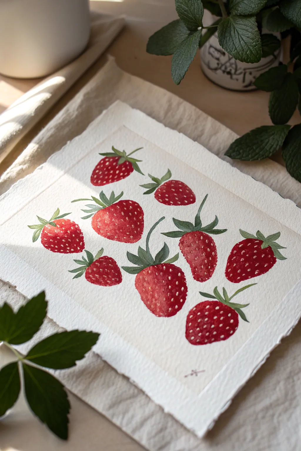
Capture the juicy freshness of summer with this delightful gouache study of nine strawberries scattered across textured paper. By layering vibrant reds and adding crisp white highlights, you’ll create a dimensional look that feels both illustrative and mouth-wateringly realistic.
Step-by-Step Guide
Materials
- Gouache paint (Primary Red, Alizarin Crimson, Leaf Green, Olive Green, Titanium White, Burnt Umber)
- Cold press watercolor paper (deckled edge optional)
- Round brushes (sizes 2, 4, and 6)
- Fine liner brush (size 0 or 00)
- Pencil (HB or lighter)
- Kneaded eraser
- Mixing palette
- Water cups
- Paper towels
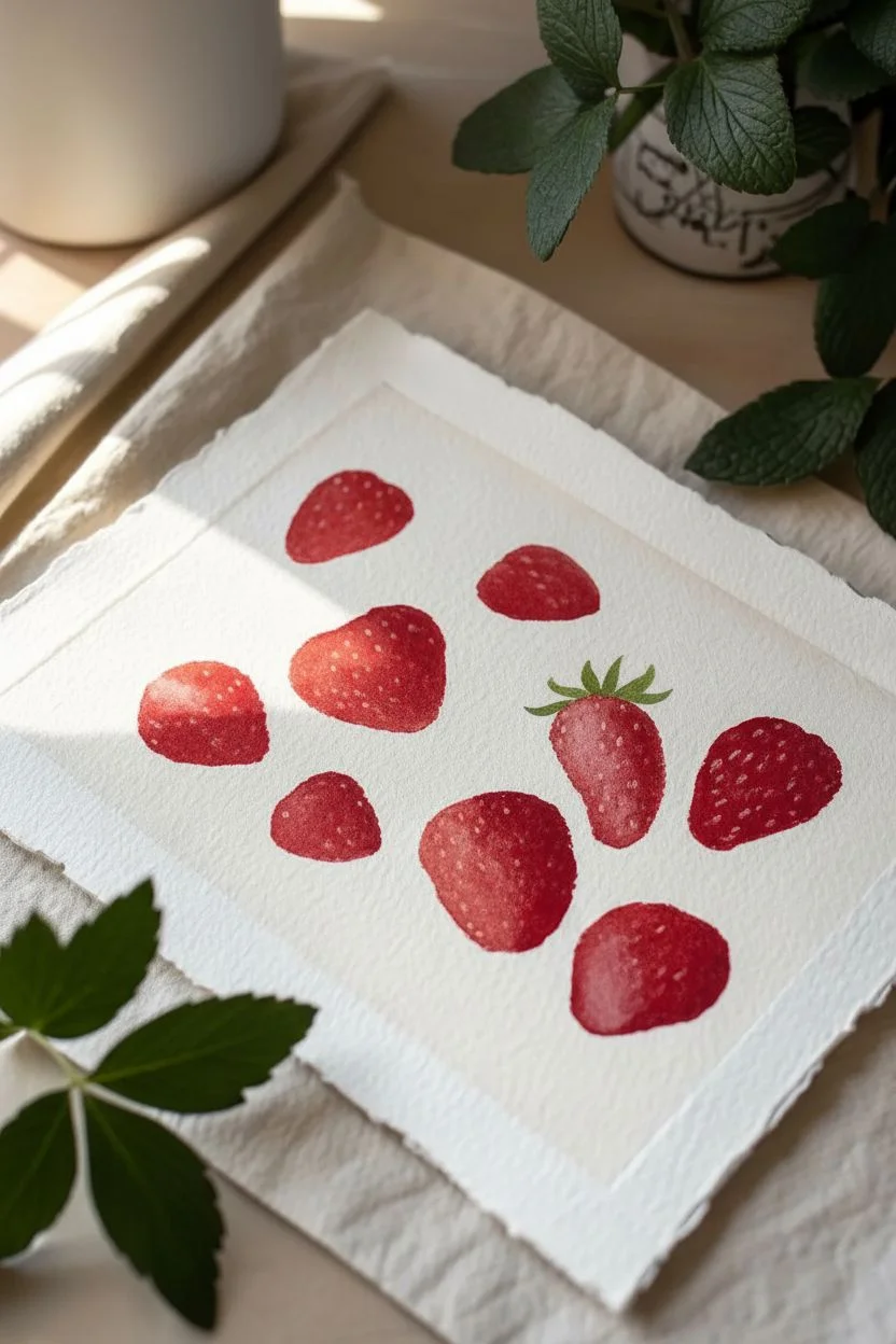
Step 1: Sketching & Base Layers
-
Plan the layout:
Lightly sketch nine strawberry shapes scattered across your paper. Vary their sizes and orientations—some pointing up, some angled sideways—to create a natural, unposed look. Draw the leafy caps (‘calyx’) on top of each berry. -
Lighten the guides:
Since gouache is opaque but red can sometimes be translucent, gently roll a kneaded eraser over your sketch to lift most of the graphite, leaving just faint guidelines. -
Mix your reds:
Create two piles of red on your palette: a bright, warm red (Primary Red mixed with a touch of yellow if needed) and a deeper, cooler red (Alizarin Crimson). This variation will help model the form of the berries. -
Paint the first berry:
Using a size 4 or 6 round brush, fill in the first strawberry shape. Start with the brighter red on the lighted side (imagine the light coming from the top left) and blend into the darker crimson on the shadowed side while the paint is still wet. -
Fill the page:
Continue painting the remaining eight berries, varying the red tones slightly for each one so they don’t look like carbon copies. Leave the green cap areas unpainted for now. -
Let it dry completely:
Wait for the red layer to be completely matte and dry to the touch before moving on to the greens, preventing muddy colors.
Seed Spacing Secret
Make seeds closer together near the edges of the berry and further apart in the center. This perspective trick mimics the curvature of the fruit.
Step 2: Adding Greenery & Detail
-
Mix leaf colors:
Prepare a fresh Leaf Green and a darker Olive Green. I like to add a tiny dot of Burnt Umber to the olive to make it feel more earthy and natural. -
Paint the calyxes:
With a size 2 brush, carefully paint the leafy caps. Use the lighter green for the tips of the leaves and the darker olive near the stem where they attach to the berry. -
Extend the stems:
For berries that have visible stems, paint thin, curving lines extending from the cap using the tip of your brush. Vary the length and curve to keep the composition dynamic. -
Deepen the shadows:
Once dry, look at your red berries again. If they look too flat, glaze a very thin, watery layer of purple or dark crimson along the bottom right edge of each berry to increase the contrast.
Background Idea
For a vintage botanical look, dilute some brown or tea-colored paint and flick gentle speckles across the white background using an old toothbrush.
Step 3: Seeds & Highlights
-
Mix the seed color:
Mix a pale, creamy color using White with a tiny touch of Yellow Ochre or Primary Red. It should be opaque enough to stand out against the red background. -
Dot the seeds:
Using your finest liner brush, paint small, teardrop-shaped seeds on the berries. Don’t just arrange them in grid lines; curve the rows slightly to follow the rounded form of the fruit, creating a 3D effect. -
Add shiny highlights:
Clean your brush thoroughly and load it with pure Titanium White. Paint tiny, crisp lines or dots near the top left of each berry (the light source) and occasionally on the glossy parts of the leaves. -
Refine the edges:
Check the edges where the red berry meets the paper. If any look ragged, smooth them out with a liner brush and your red mix for a crisp finish. -
Final assessment:
Step back and look at the whole composition. If any berry feels too light, add a second glaze of red. If the leaves need more definition, add a thin vein line with your darkest green.
Now you have a vibrant collection of berries ready to brighten up any wall or card
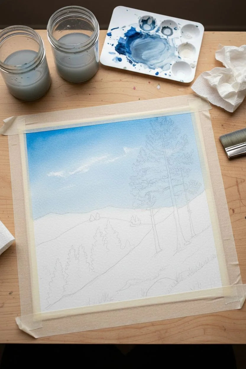
Tape-Bordered Tiny Landscape “Window”
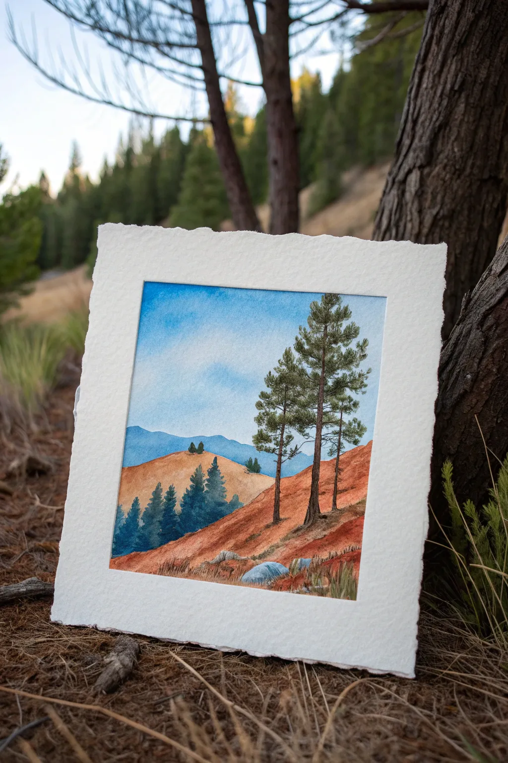
Capture the rugged beauty of an arid mountain landscape with this crisp, window-style gouache painting. The contrast between the warm, ruddy earth tones and the cool blues of the distant peaks creates a striking depth that radiates calm.
How-To Guide
Materials
- Heavyweight watercolor paper or mixed media paper (300gsm)
- Small masking tape or washi tape
- Gouache paints: Ultramarine Blue, Burnt Sienna, Yellow Ochre, Titanium White, Hooker’s Green, Burnt Umber
- Flat brush (size 6 or 8) for washes
- Round brush (size 2 or 4) for details
- Fine liner brush (size 0 or 00) for tree branches
- Mixing palette
- Two jars of water
- Paper towels
Step 1: Preparation & Sky
-
Tape the borders:
Begin by taping down all four edges of your paper to a hard board or table. Press the edges of the tape down firmly with your fingernail; this seal is crucial for achieving that signature crisp white border. -
Sketch the layout:
Lightly sketch the horizon line about one-third up from the bottom. Draw the outline of the distant blue mountains and the rolling foreground hills. Mark rough vertical lines where the prominent pine trees will stand. -
Mix the sky gradient:
Prepare a mix of Ultramarine Blue and plenty of White. You want a soft, airy blue. Gouache dries darker, so make the wet mix slightly lighter than your target color. -
Paint a flat sky:
Using your flat brush, fill the sky area. Start with a more saturated blue at the very top and gradually add more white as you move downward toward the mountains to create atmospheric fade. -
Add cloud texture:
While the sky is still slightly damp, dry-brush a tiny amount of pure white in soft, circular motions to suggest faint, wispy clouds.
Bleeding Edges?
If paint bleeds under tape, use a slightly thicker paint consistency next time. For now, cover little bleeds with opaque white gouache or scrape gently with an X-Acto knife.
Step 2: Mountains & distant Hills
-
Paint the distant mountains:
Mix Ultramarine Blue with a touch of Burnt Umber to desaturate it. Paint the furthest mountain range. Keep the edges clean against the sky. -
Layer the second range:
Create a slightly darker, greener blue by adding a pinhead of Hooker’s Green to your mountain mix. Paint slightly lower hills in front of the mountains to build depth. -
Paint the golden hill:
Mix Yellow Ochre with White and a speck of Burnt Sienna. Paint the rolling hill immediately in front of the blue mountains. Keep this wash fairly opaque. -
Add distant trees:
Using a small round brush and dark green (Hooker’s Green + Burnt Umber), dab tiny vertical strokes on the distant golden hill to represent a far-off forest patch.
Step 3: Foreground & Details
-
Base coat the red earth:
Mix Burnt Sienna effectively with a touch of Yellow Ochre for a rusty, red-clay color. Paint the large foreground slope that dominates the bottom right, sweeping the brush strokes diagonally to match the slope. -
Add texture to the earth:
Once the red base is dry, dry-brush streaks of lighter ochre and darker brown over the slope. This mimics the rugged, grassy texture of dry terrain. -
Paint the grey rocks:
Mix White with a tiny dot of Black and Blue for a cool grey. Paint the rounded boulders at the very bottom edge of the painting. -
Create the main tree trunks:
Using a liner brush and dark Burnt Umber, paint the tall, thin trunks of the pine trees on the right side. Make the lines slightly shaky rather than perfectly straight for realism. -
Details on the bark:
Add tiny highlights to the right side of the trunks using a lighter brown mix to indicate sunlight hitting the bark. -
Paint pine foliage:
Load a round brush with deep hunter green. Use a stippling motion (tapping the brush tip) to create clusters of pine needles on the branches. Keep the clusters somewhat sparse so sky shows through. -
Add small blue pines:
On the left side of the painting, paint the smaller cluster of pine trees using a mix of Green and Blue. These are in shadow, so keep them cool and dark. -
Final tufts of grass:
Use your liner brush with a mix of green and yellow ochre to flick tiny blades of grass upward around the grey rocks at the bottom. -
The reveal:
Ensure the painting is 100% bone dry. Slowly peel the tape away at a 45-degree angle, away from the paint, to reveal your perfect borders.
Add Dimension
Mix a tiny amount of purple into your shadow colors for the rocks and tree trunks. This complementary color makes the golden and rusty hues of the landscape vibrate more intensely.
Framing this piece with a wide mat will really emphasize that window-like effect you just created


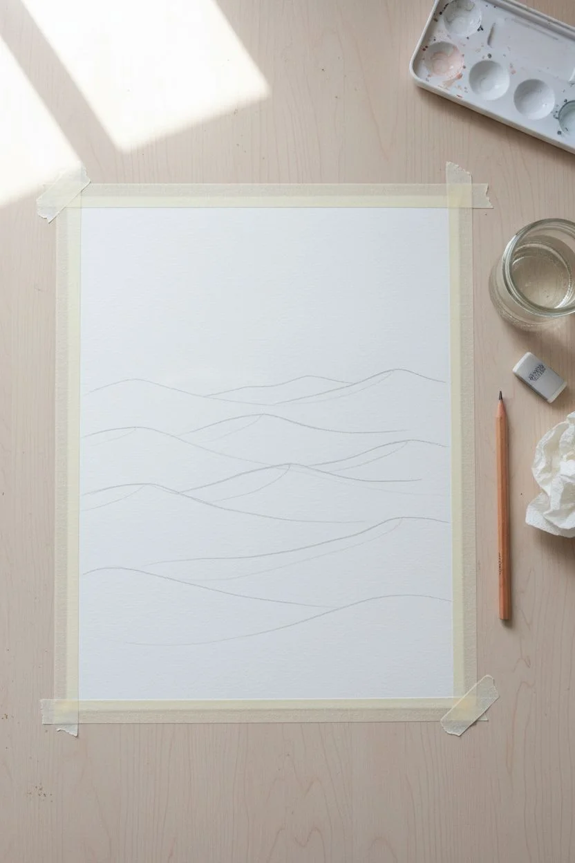
Arched Frame Scene With a Minimal Sky Gradient
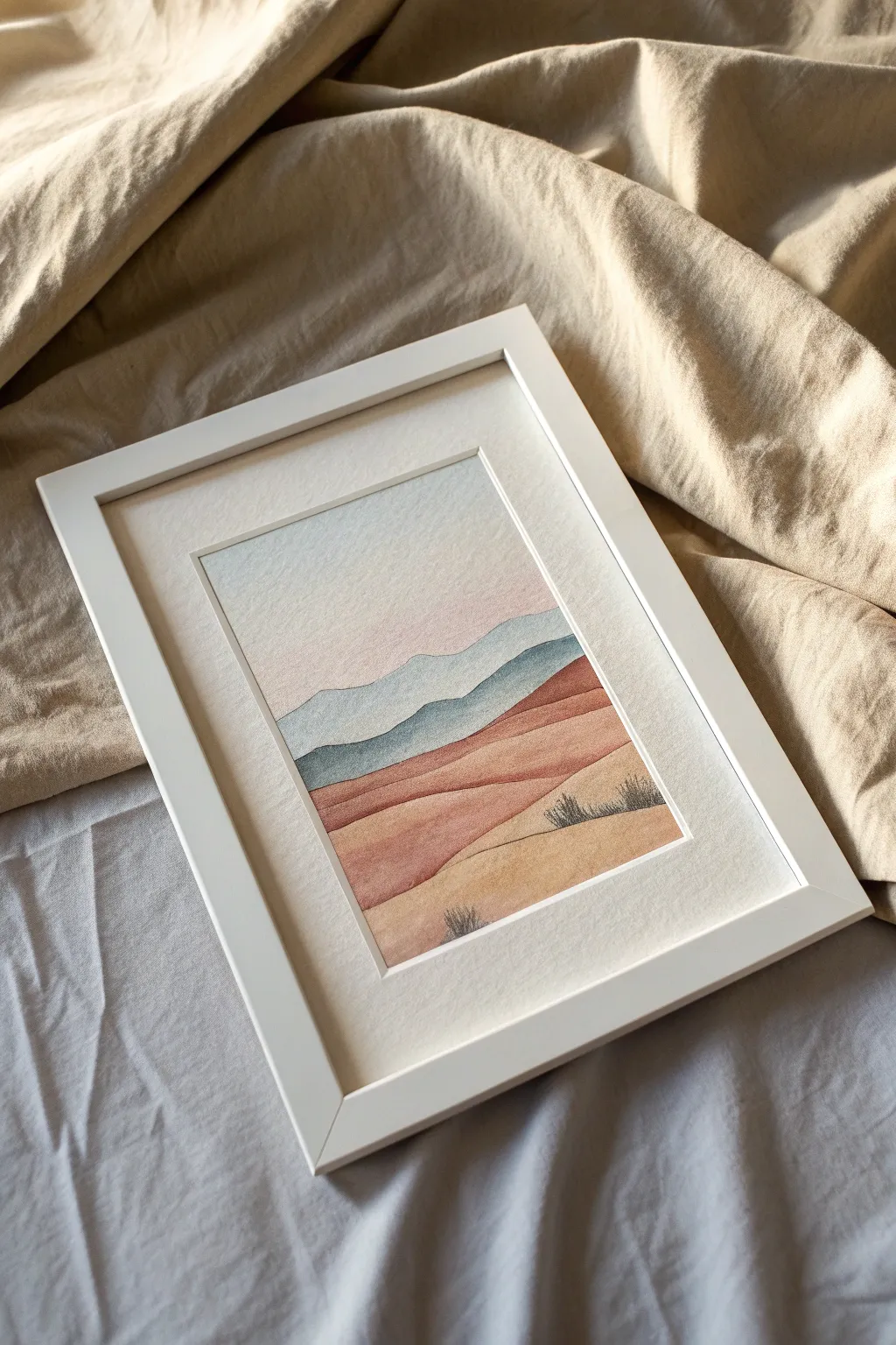
Capture the serene beauty of a desert landscape with this layered gouache project that focuses on soft gradients and clean, graphic shapes. The stacked hills create a soothing sense of depth while the color palette brings warmth to any room.
Step-by-Step
Materials
- Gouache paint (white, light blue, terracotta/burnt sienna, yellow ochre, black)
- Cold press watercolor paper (A4 or similar size)
- Flat shader brush (size 6 or 8)
- Small round detail brush (size 0 or 1)
- Washi tape or masking tape
- Mixing palette
- Pencil and eraser
- Jar of clean water
- Paper towels
- White matted frame (optional for display)
Step 1: Preparation and Sketching
-
Define the boundaries:
Begin by taping down the edges of your watercolor paper to a flat board or table. This creates a crisp clean border which looks professional once framed. -
Sketch the horizon lines:
Lightly sketch the rolling hills using a pencil. Start about 1/3 down from the top for the furthest mountains. Create 5-6 distinct layers of hills, making them progressively larger as they reach the bottom of the page. -
Keep lines fluid:
Avoid straight lines; instead, use gentle, undulating curves that overlap slightly to mimic natural sand dunes or distant ridges.
Step 2: Painting the Sky and Mountains
-
Mix the sky gradient:
On your palette, mix a generous amount of white with a tiny dot of light blue and a hint of pink purely for warmth. You want a very pale, almost white wash. -
Paint the sky:
Apply this pale wash to the entire sky area, starting from the top and pulling the color down to your first pencil line. Let the brush strokes be smooth and horizontal. -
Mix the distant blue:
For the furthest mountain range, mix white with a cool blue-grey. It should be slightly darker than the sky but still quite atmospheric and misty. -
Fill the first ridge:
Carefully paint the first mountain shape with your flat brush, keeping the top edge crisp against the sky. Let this layer dry completely before touching the one below it. -
Deepen the blue:
Add a touch more blue and a tiny bit of grey or black to your previous mix. Paint the second ridge range. The slight shift in value helps push the first range into the distance.
Fixing Patchy Color
If your gouache dries streaky, you likely used too much water. Wait for it to dry, then apply a second coat with a creamier, yogurt-like paint consistency.
Step 3: Creating the Warm Foreground
-
Transition to warmth:
Clean your brush thoroughly. Mix a terracotta or rust color using burnt sienna and white. It should be muted, not neon. -
Paint the first dune:
Apply this reddish-brown tone to the middle layer of hills. This marks the transition from the cool distant atmosphere to the warm earthy ground. -
Lighten the palette:
For the next dune down, add more white and a little yellow ochre to your rust mix. This creates a softer, sandy peach color. -
Layering continues:
Continue painting downwards. I find that adding more yellow ochre as I move to the foreground makes the sand look sun-drenched. -
The closest dune:
For the final bottom section, use your lightest, warmest sand color—mostly yellow ochre and white with just a whisper of the previous red tone.
Add Texture
Splatter faint dots of white or dark brown paint on the bottom-most dune with a toothbrush to simulate sand texture and grounded pebbles.
Step 4: Final Details
-
Dry thoroughly:
Ensure the entire painting is completely dry to the touch. Gouache can reactivate if you paint over it while damp. -
Mix a shadow color:
Create a dark grey-green or charcoal color for the vegetation. It needs to be opaque enough to stand out against the light sand. -
Paint sparse vegetation:
Switch to your smallest detail brush. Paint tiny, vertical tufts of grass or small shrubs on the lower two dunes. Keep the strokes quick and upward-flicking. -
Erase guidelines:
Once the paint is bone dry, carefully erase any visible pencil lines that weren’t covered by the opaque gouache. -
The reveal:
Slowly peel away the masking tape at a 45-degree angle to reveal your crisp, straight edges.
Place your dried artwork into a white frame to accentuate the modern, clean lines of your desert scene
Fill a Circle With Easy Patterns and Tiny Florals
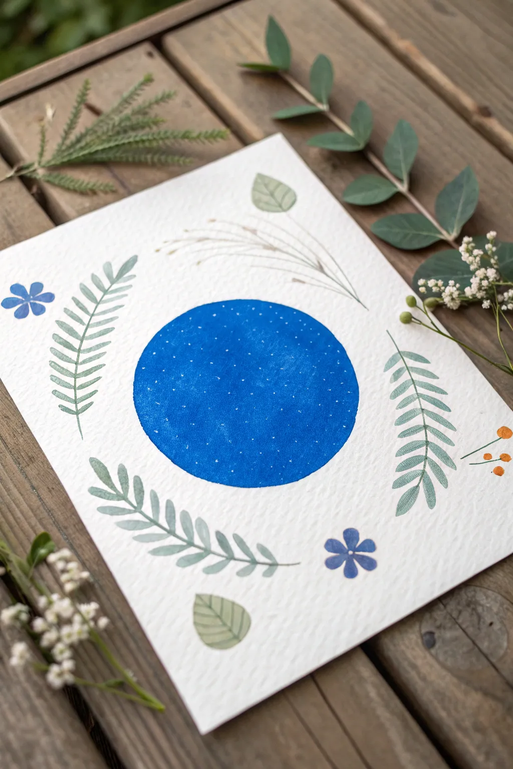
This serene project combines a bold geometric element with delicate, organic botanical flourishes. The contrast between the deep starry blue circle and the soft, earthy greens creates a balanced composition perfect for a greeting card or framed wall art.
Step-by-Step Tutorial
Materials
- Cold pressed watercolor paper (textured)
- Gouache paints: Cobalt Blue, Titanium White, Sap Green, Olive Green, Burnt Sienna, Orange
- Round brushes: Sizes 6, 2, and 00 (for fine details)
- Pencil and eraser
- Compass or circular object (like a jar lid)
- Mixing palette
- Jar of water
- Paper towel
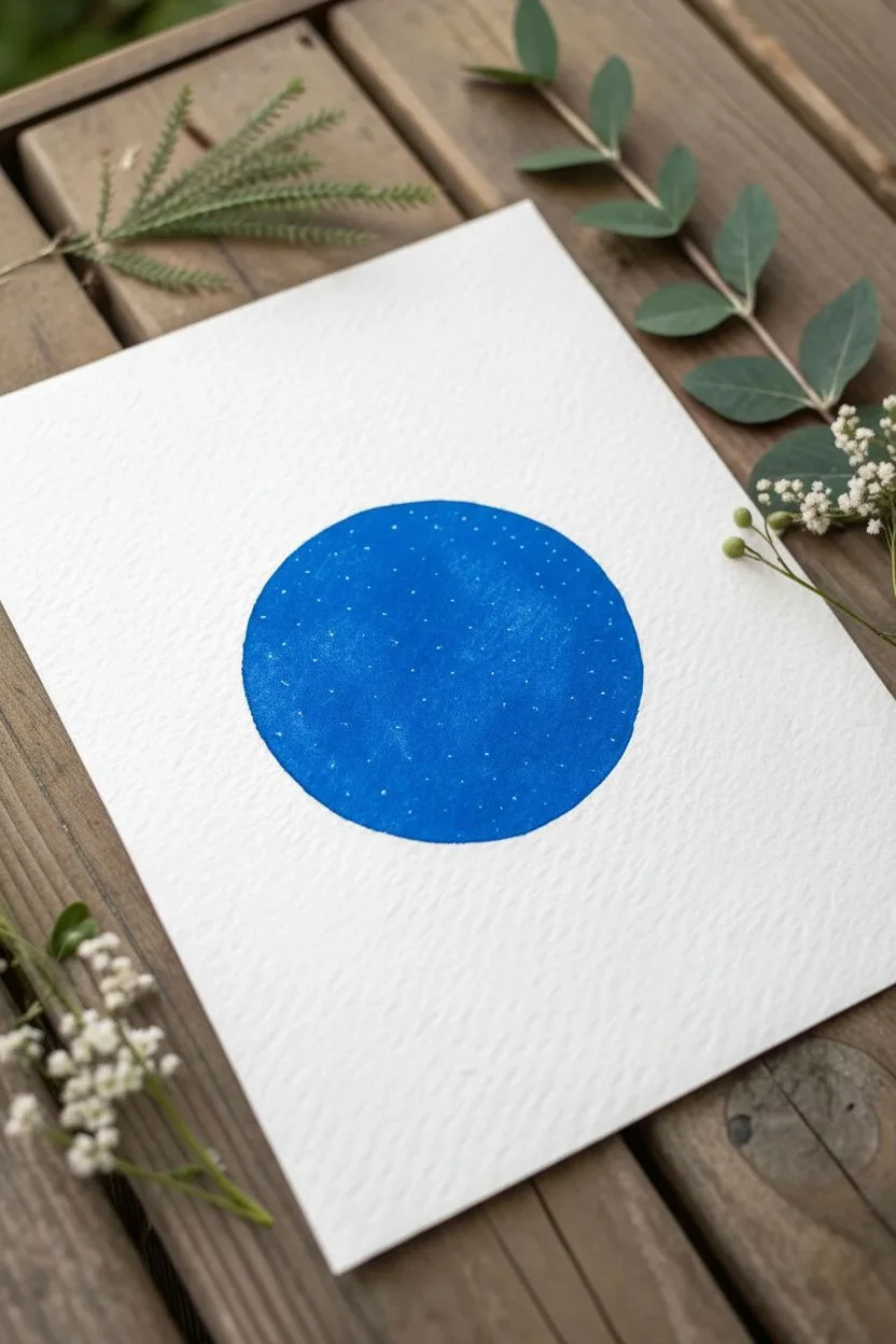
Step 1: Setting the Celestial Stage
-
Outline the center:
Begin by finding the center of your paper. Use a compass or trace around a circular object (about 3-4 inches in diameter) to create a light pencil guide for your main focal point. -
Mix the night sky color:
On your palette, load up a generous amount of Cobalt Blue. You want this to be opaque and vibrant, so use minimal water—just enough to make the paint creamy and spreadable. -
Paint the circle:
Using a size 6 round brush, carefully fill in the circle. Outline the edge first with steady strokes to keep it crisp, then fill the interior. Aim for a flat, solid wash of color. -
Let it dry completely:
Gouache can reactivate if you work over it too soon. Allow the blue circle to dry until it has a matte finish and is cool to the touch. -
Add the stars:
Dip a fine detail brush (size 00) or even a toothpick into pure Titanium White. Gently tap tiny dots across the blue surface. Vary the spacing to make it look like a natural night sky rather than a grid.
Creamy Consistency
Gouache should be the consistency of heavy cream. If your brush drags, add a drop of water. If it’s transparent, add more paint.
Step 2: Adding the Foliage Frame
-
Mix your leaf greens:
Prepare two shades of green. Mix Sap Green with a touch of white for a soft sage color, and Olive Green with a tiny bit of blue for a deeper forest tone. This variance adds depth. -
Paint the first fern:
To the left of the circle, paint a long, curved stem using the lighter sage mix. Use your size 2 brush to paint small, teardrop-shaped leaflets extending outward from the stem, curving slightly upwards. -
Mirror the fern:
Repeat this process on the right side of the circle with a similar fern frond, perhaps curving in the opposite direction to create a loose frame. -
Add the bottom branch:
Below the circle, paint a third leafy branch that curves horizontally. I like to use the slightly darker olive mix here to ground the composition visually. -
Create floating leaves:
In the open spaces at the top and bottom, paint solitary, broad leaves. Outline the leaf shape first with a pale green, fill it in, and once dry, add faint vein lines with a darker green or pencil.
Step 3: Delicate Details & Florals
-
Paint wispy grasses:
Mix a very watery, pale beige using Burnt Sienna and lots of White. Above the circle, use the very tip of your finest brush to flick quick strokes upward, mimicking dried ornamental grass. -
Paint the blue flowers:
Using the same blue from your circle (lightened slightly with white if desired), paint two simple five-petal flowers—one on the upper left and one on the lower right. -
Add flower centers:
Once the blue petals are dry, add a tiny white dot in the very center of each flower. -
Add orange berries:
On the right side, near the fern, use a small brush to paint thin brown stems. At the tips, add three or four small, bright orange dots for berries. -
Final assessment:
Step back and look at your composition. If any area feels too empty, add a tiny extra leaf or a few more white stars to the central circle to balance it out. -
Erase pencil marks:
Ensure the painting is 100% bone dry before gently erasing any visible pencil lines around the main circle or leaves.
Fixing Wobbly Circles
If your circle edge isn’t perfect, don’t keep widening it! Instead, paint a tiny leaf or flower overlapping the edge to hide the mistake.
Display your botanical moon somewhere bright to enjoy the calming contrast of nature and geometry
Flat Self-Portrait With Simple Shadow Shapes
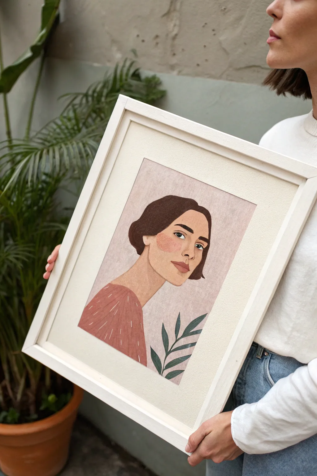
Capture a serene moment with this stylized portrait that uses flat shapes and minimal shading for a clean, modern illustration style. The soft, textured background and earthy color palette give the piece a warm, folk-art feel that is surprisingly forgiving for beginners.
Step-by-Step Tutorial
Materials
- Gouache paint set (primary colors, white, warm brown, burnt sienna)
- Heavyweight watercolor paper or mixed media board (300 gsm)
- Pencil (HB or H) for sketching
- Synthetic brushes: flat wash brush, medium round brush, fine liner brush
- Mixing palette
- Paper towels and water cup
- Painter’s tape (optional for borders)
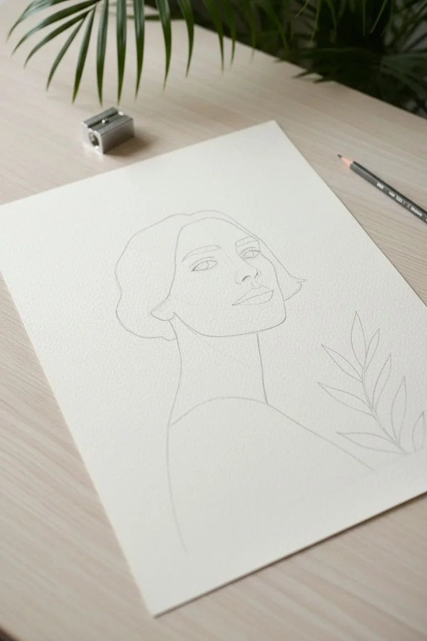
Step 1: Sketching the Foundation
-
Outline the face shape:
Begin with a light pencil sketch on your paper. Draw an oval shape for the head, slightly tilted to the right. Extend two lines down for the neck, connecting to a curved line for the shoulders. -
Add facial features:
Sketch the facial features large and simplified. Place the almond-shaped eyes wide apart, draw a simple nose with just a nostril line and a slight bridge shadow, and outline full lips. Don’t worry about perfect realism; this style thrives on caricature-like proportions. -
Block in the hair:
Draw the hair shape around the face. The style in the example is a short bob tucked behind the ears. Keep the outline smooth and chunky rather than drawing individual strands. -
Sketch the foliage:
In the bottom right corner, lightly draw a simple stem with five to six pointed leaves rising up towards the chin. This element balances the composition.
Pro Tip: Smooth Consistency
Gouache works best when it has the consistency of heavy cream. If your brush drags too much, add water drop by drop until it flows smoothly but remains opaque.
Step 2: Painting the Background and Skin
-
Mix the background color:
Mix a large amount of white with a tiny touch of red and brown to create a dusty rose or light mauve color. You want enough paint to cover the entire background without having to remix. -
Wash the background:
Using your largest flat brush, paint the background around your pencil sketch. To get that subtle texture seen in the photo, use slightly less water so the brush drags a bit on the paper’s tooth. -
Mix skin tones:
Create a skin tone using white, yellow ochre, and a touch of red. Prepare a second, slightly darker version of this mix for the shadowed areas (under the chin and the side of the nose). -
Paint the face and neck:
Fill in the face and neck shape with your base skin tone. Use a medium round brush for control around the edges. Before it dries completely, drop a little of the darker mix under the chin to create a soft shadow. -
Add the rouged cheek:
While the skin paint is still damp but not soaking wet, paint an abstract, organic shape on the cheek using a coral-pink mix. This creates the signature ‘flat shape’ blush effect.
Step 3: Adding Features and Hair
-
Fill the hair shape:
Mix a dark burnt umber or dark brown. Paint the entire hair shape with opaque layers. You may need two coats to ensure no paper shows through. -
Paint the eyebrows and eyes:
Using a fine liner brush and black or dark brown paint, carefully fill in the eyebrows and the upper lash line. Paint the irises a color of your choice, leaving tiny white spots for catchlights. -
Define the lips:
Mix a terracotta or muted red shade. Paint the lips, perhaps making the upper lip slightly darker than the lower one for basic dimension. -
Add nose contours:
Using a skin tone slightly darker than your base but lighter than the shadow mix, paint a small shape on the side of the nose and a tiny shadow under the nose tip to define it without hard lines.
Level Up: Paper Texture
For the background, try ‘scumbling’—using a dry brush with very little paint to scrub over the surface. This leaves white speckles of paper showing for a vintage look.
Step 4: Clothing and Final Details
-
Paint the blouse:
Mix a warm, reddish-brown or rust color. Fill in the shoulder and chest area. Keep the edges crisp where the clothes meet the skin. -
Add texture to clothing:
Once the shirt color is completely dry, use a fine liner brush with thin white paint to add loose, vertical dashed lines across the fabric. This mimics a pattern or fabric texture. -
Paint the leaves:
Mix a muted dark green (green mixed with a little brown or red to dull it). Carefully paint the stem and leaves in the foreground. I find it helpful to rotate the paper to get the best angle for the leaf tips. -
Final outlines:
Assess your painting. If needed, use a diluted dark brown paint and a liner brush to re-define the jawline or add a subtle line distinguishing the neck from the jaw.
Now frame your beautiful portrait and enjoy the simple elegance it brings to your space
Glowing Mushrooms on a Dark Background
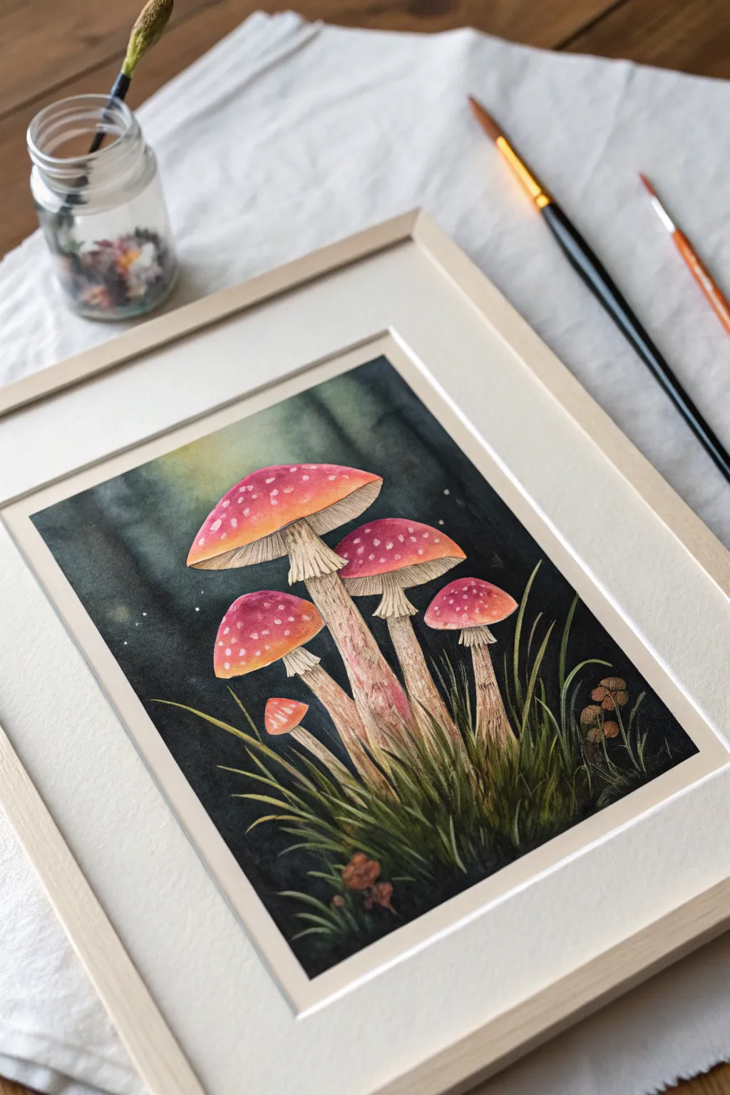
Capture the enchantment of twilight in the forest with this striking gouache study. You will build layers of opaque color to create vibrant, glowing fungi that pop dramatically against a deep, moody background.
Detailed Instructions
Materials
- Gouache paint (Primary Red, Yellow Ochre, Burnt Sienna, Prussian Blue, Black, Titanium White)
- Cold press watercolor paper (300gsm)
- Flat brush (1/2 inch) for background
- Round brushes (sizes 2, 4, and 00 for details)
- Pencil for sketching
- Masking tape
- 2 jars of water
- Mixing palette
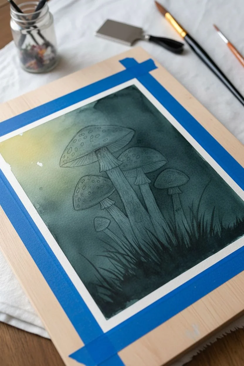
Step 1: Sketch and Background
-
Prepare the surface:
Tape down all four edges of your watercolor paper to a board to prevent buckling. Lightly sketch the main shapes of the mushrooms—cluster three large ones in the center and a couple of smaller ones near the bottom. Don’t worry about tiny details yet, just get the caps and stems placed. -
Mix the dark wash:
Create a deep, murky forest color by mixing Prussian Blue, Black, and a touch of Burnt Sienna. You want a color that is almost black but has a greenish-blue coldness to it. -
Apply the first layer:
Using the flat brush, paint the background around the mushrooms. Keep the paint slightly watered down for this first layer to get smooth coverage. Leave the mushroom shapes completely white (the paper color). -
Create the glow:
While the background is still slightly damp, lift a little pigment or blend in a tiny bit of Yellow Ochre mixed with White near the top left corner to suggest a soft light source filtering through the trees. -
Deepen the shadows:
Once the first layer is dry, go back in with a second, thicker layer of your dark mix. Focus on the corners and the spaces between grass blades at the bottom to create true opacity.
Chalky Finish?
If darks look chalky or gray when dry, you likely used too much white or water. Apply a thin glaze of pure black or dark blue over those areas to restore depth.
Step 2: Painting the Mushrooms
-
Base coat for caps:
Mix Primary Red with a little Yellow Ochre to get a warm, earthy red. Fill in the mushroom caps. For the edges of the caps, blend in a little more yellow to make them look translucent and glowing. -
Add cap shadows:
Mix a tiny bit of your dark background color into the red. Paint the very top center of the red caps to give them a rounded, 3D form. -
Paint the stems:
Mix Titanium White with a small amount of Burnt Sienna and Yellow Ochre to create a creamy beige. Paint the stems, making sure to follow the vertical grain of the mushroom stalks. -
Define the gills:
Underneath the red caps, paint the gills using a slightly darker version of your stem color. Use fine, straight lines radiating from the stem to the edge of the cap. -
Add stem texture:
Using a small round brush and a watered-down brown (Burnt Sienna), gently glaze vertical streaks down the stems. This mimics the fibrous texture of the stalk.
Gouache Consistency
Aim for a ‘heavy cream’ consistency. Too watery and it will streak; too thick and it may crack. Test the flow on a scrap paper before touching the main art.
Step 3: Details and Highlights
-
Paint the spots:
Load a small brush with thick Titanium White. Dab small irregular spots onto the red caps. Group them slightly denser near the top center and sparser toward the edges. -
Add the skirt:
Paint the ‘skirt’ (annulus) on the stems using the cream color, but add distinct shadow lines underneath the folds to make it look ruffled. -
Layer the grass:
Mix your background color with Yellow Ochre to make a muted olive green. Use the tip of your round brush to flick quick strokes upward from the bottom, creating grass blades overlapping the base of the stems. -
Highlight the grass:
Mix a lighter, fresher green and add a few selective blades of grass in the foreground that catch the light. -
Add magical spores:
Dip a toothbrush or a stiff bristled brush into watered-down white gouache. Run your thumb over the bristles to flick tiny speckles onto the dark background, creating the illusion of floating spores or fireflies. -
Final touches:
Take your smallest detail brush (size 00) and pure white paint. Add tiny highlights to the very edges of the mushroom caps and the wettest-looking parts of the stems to boost the contrast.
Peel off the tape carefully to reveal those crisp white borders and admire your luminous forest scene
Have a question or want to share your own experience? I'd love to hear from you in the comments below!