If you’re trying to give a gift that feels truly personal, a handmade painting hits different. These painting gift ideas are all about creating something beautiful enough to display, but still totally doable with the supplies you already love using.
Framed Watercolor Flowers With a Handwritten Note
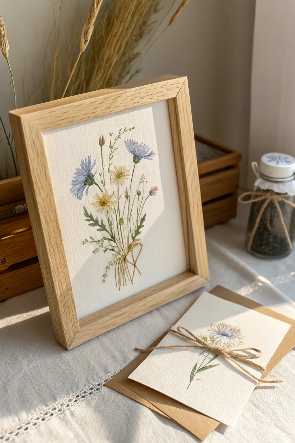
Capture the airy elegance of a summer meadow with this botanical watercolor project, featuring slender cornflowers and daisies tied with a painterly bow. The soft, natural tones and clean wood frame make this a timeless gift that pairs perfectly with a heartfelt handwritten note.
Step-by-Step Guide
Materials
- Cold-press watercolor paper (300 gsm)
- Watercolor paints (Cobalt Blue, Sap Green, Burnt Umber, Yellow Ochre, Alizarin Crimson)
- Round watercolor brushes (Size 4 for washes, Size 00 or 000 for details)
- Pencil (HB or H)
- Kneaded eraser
- Jar of water
- Paper towels
- Wooden frame (light oak finish, approx 8×10 or A4)
- Matching cardstock and twine for the note
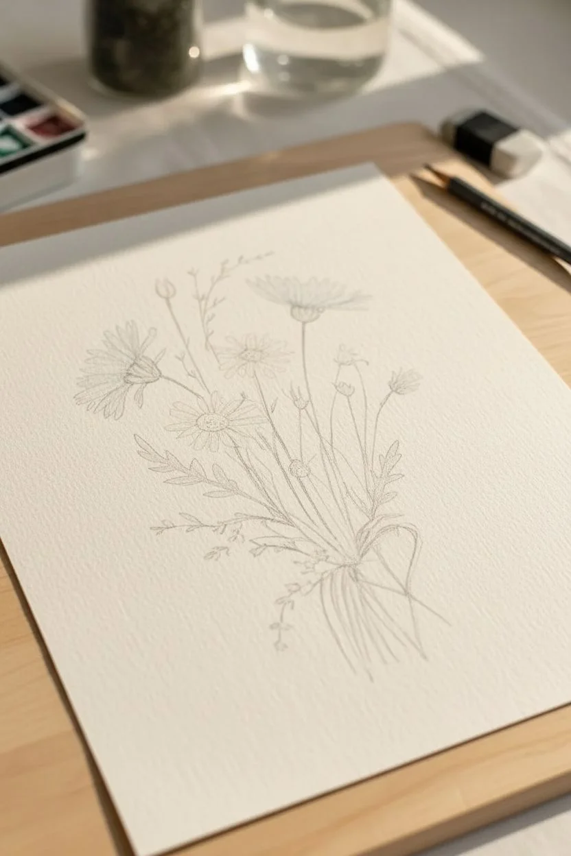
Step 1: Sketching the Composition
-
Light Framework:
Begin by lightly sketching the central axis of your bouquet. Draw a few sweeping, curved lines radiating from a central point near the bottom to establish the stems’ flow. -
Positioning Blooms:
Mark the locations of the flower heads. Place two larger circles for the cornflowers—one high on the right and one slightly lower on the left—and smaller circles for the daisies in the center. -
Detailing Petals:
Refine your sketch by drawing the jagged, distinctive edges of the cornflower petals and the simple, radiating petals of the daisies. Keep your pencil pressure very light so the graphite won’t show through the transparent watercolor later. -
Adding Greenery:
Sketch in slender leaves and tiny buds. Add feathery, fern-like shoots to fill the gaps between the main flowers, giving the bouquet a gathered, wild appearance.
Brush Control Secret
For those impossibly thin stems, hold your brush perpendicular to the paper and use only the very tip. Exhale steadily as you pull the stroke downward.
Step 2: Painting the Blooms
-
Cornflower Blue Wash:
Mix a watery Cobalt Blue with a tiny touch of Burnt Umber to desaturate it slightly. Paint the petals of the cornflowers with loose, outward strokes. Leave tiny gaps of white paper between petals to keep them distinct. -
Deepening Shadows:
While the first layer is still slightly damp, drop a more concentrated mix of the blue into the center of the flowers and the base of the petals. This wet-on-wet technique creates soft, natural gradients. -
Daisy Centers:
Using a size 4 brush, paint the daisy centers with Yellow Ochre. I like to dab in a tiny speck of Burnt Umber on the shadowed side while it’s wet to give the center a domed, 3D look. -
Delicate Whites:
For the white daisy petals, use a very dilute mix of blue-grey. Paint just the shadows of the petals rather than outlining them completely to suggest their white color without making them look heavy. -
Tiny Bud Details:
Mix a soft pink using Alizarin Crimson and plenty of water. Gently dab this onto the small closed buds in the background for a pop of warmth.
Step 3: Stems and Finishing Touches
-
Mixing Greens:
Create distinct green mixes: a fresh yellow-green for new growth (Sap Green + Yellow Ochre) and a deeper, cooler green for mature leaves (Sap Green + Cobalt Blue). -
Painting Stems:
Switch to your finest brush (Size 00). Paint the stems with confident, continuous strokes from the flower heads down to the gathering point. Vary the pressure to create thick and thin sections. -
Leaf Texture:
Paint the serrated leaves of the cornflowers using the darker green mix. Use the tip of the brush to create the jagged edges and pointier tips. -
The Bow:
Mix a neutral sandy beige color. Paint the simple loop of the string or raffia that ties the stems together. Keep the stroke fluid to mimic the movement of the tie. -
Final Contrast:
Once everything is bone dry, use your finest brush with a concentrated dark green or brown mix to add tiny definition lines—sepals under the flower heads, veins on larger leaves, and crisp edges on the bow.
Water Control
If your petals are bleeding into each other too much, your brush is too wet. Blot the bristles on a paper towel before touching paper to regain control.
Step 4: Assembly
-
Erase and Assess:
Gently use a kneaded eraser to lift any visible pencil lines that weren’t covered by paint. Be careful not to scrub the paper surface. -
Framing:
Place your finished painting into the light oak frame. Ensure the glass is clean on the inside before sealing the back. -
Matching Note Card:
To complete the gift set, paint a single miniature version of one flower (like a daisy or cornflower) onto a small piece of folded cardstock. Tie it with actual twine to mirror the painted bow.
Now you have a serene piece of botanical art ready to brighten someone’s wall or desk

Acrylic Landscape of a Place You Share
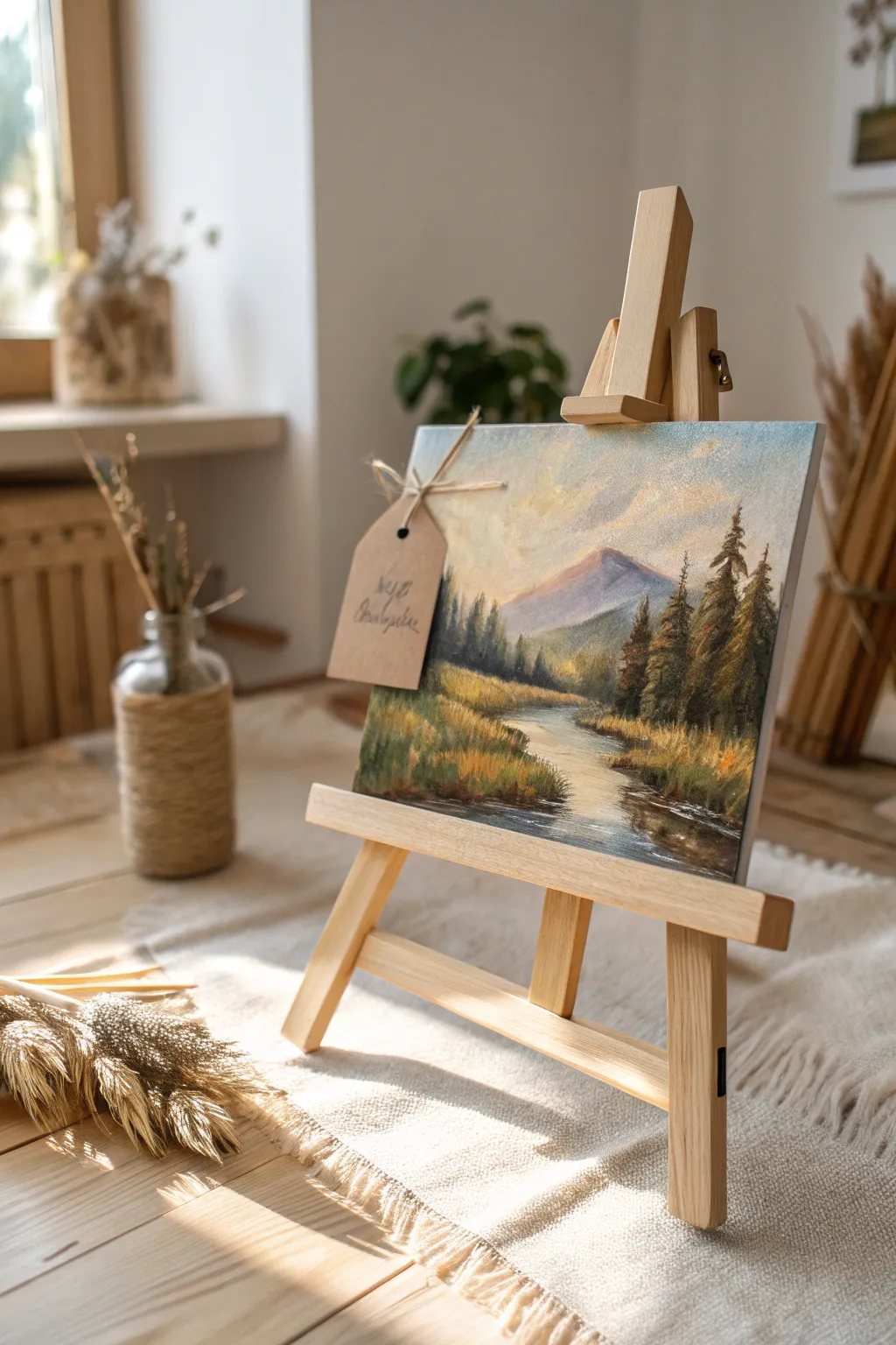
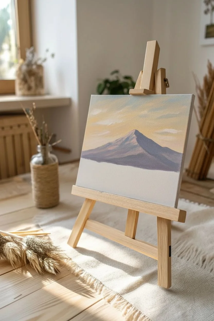
Capture the serene beauty of a mountain valley bathed in soft light with this charming acrylic landscape project. The finished piece features a gently flowing river, majestic peaks, and warm, autumnal foliage, all presented on a mini easel for a perfect gift presentation.
How-To Guide
Materials
- Small square canvas panel (approx. 8×8 or 10×10 inches)
- Acrylic paints: Titanium White, Ultramarine Blue, Burnt Umber, Yellow Ochre, Cadmium Yellow, Sap Green, Alizarin Crimson
- Set of synthetic brushes: 1/2 inch flat, #6 filbert, #2 round, and a fine liner brush
- Small wooden tabletop easel
- Palette (or paper plate)
- Cup of water and paper towels
- Kraft paper tag and twine (for the finishing touch)
Step 1: Sky and Mountain Backdrop
-
Prime the sky:
Begin by blocking in the sky area. Mix Titanium White with a tiny dot of Ultramarine Blue and a hint of Yellow Ochre to create a warm, pale atmosphere. Apply this horizontally across the top third of the canvas, letting the warmth dominate near the horizon line. -
Add cloud wisps:
While the sky is still slightly damp, scumble in subtle cloud shapes using pure White and touches of yellow. Keep these loose and soft, avoiding hard edges. -
Block in the mountain:
Mix a purple-grey tone using Ultramarine Blue, Alizarin Crimson, and White. Paint the distant mountain silhouette in the center. The color should be muted to push it into the distance. -
Mountain highlights:
Imagine the light coming from the left. Mix a pale pinkish-white and gently dry-brush the left slopes of the mountain to create a sunlit peak effect.
Muddiness Fix
If your mountain colors look muddy, let the layer dry completely before adding highlights. Wet-on-wet blending can turn grey quickly if over-worked.
Step 2: Mid-Ground and River
-
Create the foothills:
Mix Sap Green with a little White and Blue for a hazy, distant green. Paint a layer of rolling hills just below the mountain base, softening the bottom edge where it will meet the water. -
Map the river:
Sketch the river path with your filbert brush using a mix of White and the sky blue color. Start narrow at the mountain base and widen it significantly as it curves toward the bottom right foreground. -
Paint river reflections:
Add horizontal strokes of Yellow Ochre and pale pink into the water to reflect the sky. Keep your brush strokes horizontal to make the water look flat. -
Deepen the banks:
Use Burnt Umber and Sap Green to paint the dark earth along the riverbanks. Don’t worry about detail yet; just establish the dark foundation for the grasses.
Step 3: Trees and Foreground Details
-
Distant tree line:
Using the #2 round brush, mix a muted dark green. Dab small vertical shapes along the foothills to suggest a distant forest line. -
Foreground pine trees:
On the right side, paint the large pine trees. Start with a dark vertical line for the trunk using Burnt Umber and Blue. Use the corner of a flat brush or a filbert to stamp on branches, starting narrow at the top and getting wider toward the bottom. -
Left side vegetation:
Repeat the process on the left bank with smaller, less detailed trees to maintain perspective. Vary the heights to keep the composition natural. -
Highlight the pines:
Mix Sap Green with Cadmium Yellow. Lightly dab the tops of the pine branches on the right side (the sun-facing side) to give them volume and dimension. -
Paint the grasses:
Switch to your fine liner brush or turn your flat brush sideways. Use Yellow Ochre and Cadmium Yellow to flick upward strokes along the riverbanks, creating tall, sunlit grasses. -
Water movement:
Add thin, pure white horizontal lines near the riverbanks and in the center of the stream to suggest gentle currents and ripples. -
Final adjustments:
Step back and look at the contrast. Deepen the darks under the pine trees if needed, or add a few more bright yellow highlights to the foreground grass tips.
Pro Tip: Depth
Make colors paler and bluer as they get further away. The foreground trees should be the darkest and warmest greens to create true atmospheric depth.
Step 4: Presentation
-
The rustic tag:
Take a small kraft paper tag and write a personal message or signature in flowing script. I find a simple black marker works best here. -
Attach and display:
Once the painting is fully dry, place it on the wooden easel. wrap the twine around the corner or the easel leg and tie on your tag for that handcrafted gift aesthetic.
This serene little landscape is now ready to bring a touch of nature to someone’s desk or shelf


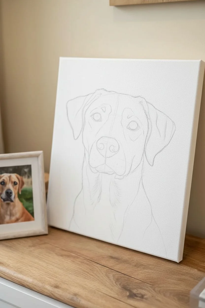
Custom Pet Portrait on Canvas Panel
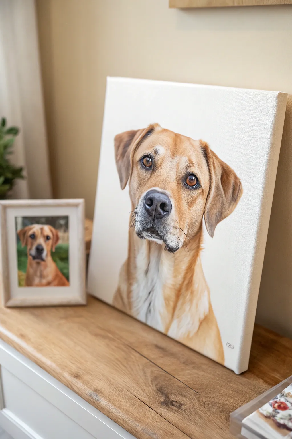
Capture the soulful gaze of a beloved pet with this realistic acrylic portrait on a canvas panel. By focusing on detailed fur texture and expressive eyes against a clean white background, you create a timeless keepsake that celebrates a furry friend.
Step-by-Step Tutorial
Materials
- High-quality reference photo of your pet
- Stretched canvas panel (12×16 inch or similar)
- Acrylic paints (Titanium White, Burnt Umber, Yellow Ochre, Burnt Sienna, Mars Black, Raw Sienna)
- Pencil for sketching (HB or 2B)
- Variety of brushes: Flat shader (size 6-8), Round brush (size 4), Rigger/Liner brush (size 0 or 00), Fan brush (optional)
- Palette and water container
- Paper towels
- Tracing paper (optional)
Step 1: Preparation and Sketching
-
Choose your reference:
Select a clear, high-resolution photo of the pet where the eyes are sharp and the lighting is good. This project works best with a photo taken at the pet’s eye level. -
Establish the outline:
Lightly sketch the dog’s head and shoulders onto the canvas using an HB pencil. Focus on key landmarks: the triangle of the nose and eyes, the spacing of the ears, and the general shape of the snout. -
Check proportions:
Before picking up a brush, double-check your proportions against the reference photo. A good trick is to measure the distance between the eyes and compare it to the width of the nose to ensure accuracy.
Fixing “Flat” Eyes
If eyes look dead, ensure you have a dark shadow under the top lid and a distinct highlight reflecting the light source. The contrast is key.
Step 2: Blocking In Colors
-
Mix your base tones:
Create a mid-tone color for the main fur areas. For a tan dog like the one pictured, mix Yellow Ochre with a touch of Burnt Sienna and White. -
Apply the first layer:
Using a flat shader brush, block in the main areas of color. Don’t worry about individual hairs yet; just focus on mapping out where the light tan, dark shadows, and white chest patches go. -
Establish the shadows:
Mix a darker shadow tone using Burnt Umber and a tiny touch of Mars Black. Paint the dark areas around the ears, under the chin, and the deep shadows of the snout. -
Block in the nose and eyes:
Fill in the nose shape with a dark grey (not pure black yet) and block in the base color of the eyes with a Burnt Sienna mixed with a little Yellow Ochre. -
Let it dry completely:
Allow this underpainting layer to dry fully. Acrylics dry darker, so don’t panic if it looks slightly different than wet paint.
Step 3: Adding Depth and Detail
-
Refine the eyes:
Switch to a smaller round brush. Add depth to the iris by darkening the upper curve (where the eyelid casts a shadow) and lightening the lower curve. Paint the pupil firmly black. -
Paint the nose texture:
Use a dark grey-black mix to detail the nostrils. Stipple tiny dots of lighter grey on the top of the nose to suggest that distinct bumpy leather texture. -
Layering the fur:
Mix a lighter version of your base fur color. Using a small round brush, start flicking small strokes in the direction of hair growth. This builds the ‘loft’ of the coat. -
Deepening the shadows:
Glaze a thin, watery layer of Burnt Umber over the shadowed side of the face to deepen the form without losing the texture underneath. -
The white chest fur:
For the white chest, use soft greys and creams first, saving pure Titanium White for only the very brightest final highlights. Use longer, looser strokes here.
Glazing technique
Mix a tiny drop of paint with glazing medium or water. Brush over dry fur to tint the color without hiding your hard-earned texture.
Step 4: Final Highlights
-
Fine detail fur:
I suggest using a rigger or liner brush here. Load it with thinned paint (almost ink consistency) and gently pull fine, wispy hairs around the ears and muzzle for maximum realism. -
The spark of life:
Add a crisp, tiny dot of pure Titanium White to the pupil of each eye. This ‘catchlight’ brings the portrait to life instantly. -
Whiskers and muzzle:
With a steady hand and your liner brush, pull long, confident strokes for the whiskers. Use a mix of black and white depending on the background they cross. -
Clean up the background:
Using a large clean brush, apply fresh Titanium White (or a very soft cream) to the background around the dog to tidy up any messy edges and make the portrait pop.
Sign your work in the corner and present this heartfelt tribute to any proud pet parent you know


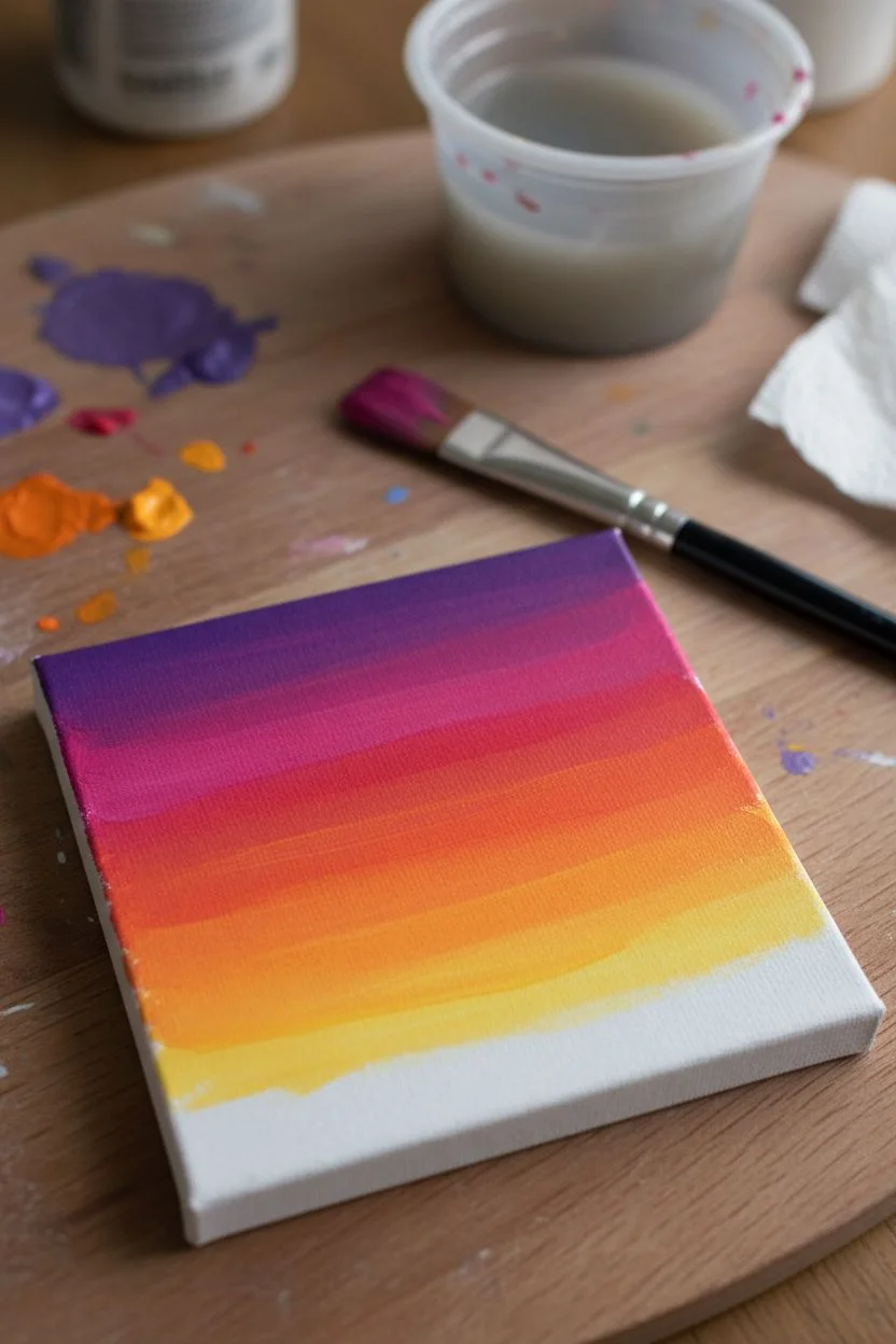
Simple Couple Silhouette in Sunset Colors
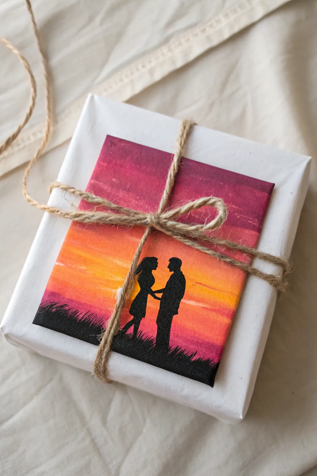
Transform a simple gift box into a heartfelt keepsake with this mini canvas topper. Featuring a vibrant gradient sunset and a romantic silhouette, this hand-painted accent adds a personal artistic touch to any present.
Step-by-Step
Materials
- Small square canvas or canvas board (approx. 4×4 inches)
- Acrylic paints: deep purple, magenta, orange, yellow, black
- Flat shader brush (medium size)
- Small round detail brush (size 0 or 1)
- Pencil
- Jute twine
- White wrapping paper
- Cup of water and paper towels
- Palette or paper plate
Step 1: Setting the Scene
-
Prepare the Gradient Base:
Begin by squeezing out your sunset colors onto the palette: deep purple, magenta, orange, and yellow. Keep black separate for later. -
Purple Sky:
Using the flat shader brush, paint a horizontal strip of deep purple across the very top edge of the canvas. -
Magenta Transition:
Without cleaning your brush fully, pick up some magenta paint. Blend it into the bottom edge of the purple strip, pulling the color downwards to create a smooth transition. -
Orange Glow:
Wipe the brush slightly, then load it with orange paint. Apply this below the magenta, blending the wet edges where they meet to soften the line. -
Yellow Horizon:
Finish the sky by blending yellow into the bottom of the orange section. Bring the yellow down until you have about a half-inch of white space left at the very bottom for the grassy ground. -
Smooth the Blend:
While the paint is still tacky, run a clean, slightly damp flat brush horizontally across the entire sky to smooth out brushstrokes and perfect the gradient. -
Dry Completely:
Let the background layer dry fully before moving on. This prevents the black silhouette from dirtying the bright sunset colors.
Clean Lines
If you struggle with freehand silhouettes, print a small photo of a couple, cut it out, and trace around it lightly with a pencil.
Step 2: Adding the Silhouette
-
Sketch the Outline:
Lightly sketch the outline of the couple and the horizon line using a pencil. Keep the pencil pressure extremely light so it doesn’t leave indentations in the paint. -
Paint the Horizon:
Switch to your black acrylic paint. Use the flat brush to fill in the bottom strip, creating a solid black ground. -
Create Grass Texture:
Using the tip of the small round brush, flick upward strokes from the black ground into the bottom of the yellow sky to create blades of grass. -
Fill the Figures:
carefully paint the couple’s silhouette using the small detail brush. Start from the center of the bodies and work outward toward the edges. -
Refine the Details:
Use the very tip of your smallest brush to shape the profiles, hair, and hands. I find holding my breath for a second helps steady my hand for these tiny details. -
Final Touches:
Check for any light spots in the black paint and apply a second coat if necessary to make the silhouette opaque and solid.
Make It Glossy
Apply a coat of high-gloss varnish over the dried painting. This makes the sunset colors pop and gives it a professional gallery finish.
Step 3: Assembly
-
Wrap the Gift:
Wrap your gift box neatly in clean white paper to provide a neutral backdrop for your artwork. -
Position the Canvas:
Once the painting is completely dry, place it centered on top of the wrapped box. -
Secure with Twine:
Cut a long length of jute twine. Wrap it vertically around the box and canvas, crossing it underneath, then wrapping it horizontally. -
Tie the Bow:
Bring the twine ends to the front center of the canvas. Tie a simple shoelace bow directly over the painting to hold it securely in place.
This personalized wrapping doubles as a piece of art the recipient can display long after opening the gift
BRUSH GUIDE
The Right Brush for Every Stroke
From clean lines to bold texture — master brush choice, stroke control, and essential techniques.
Explore the Full Guide
Baby Name and Birth-Date Nursery Painting
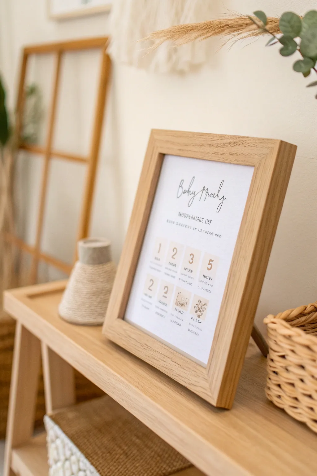
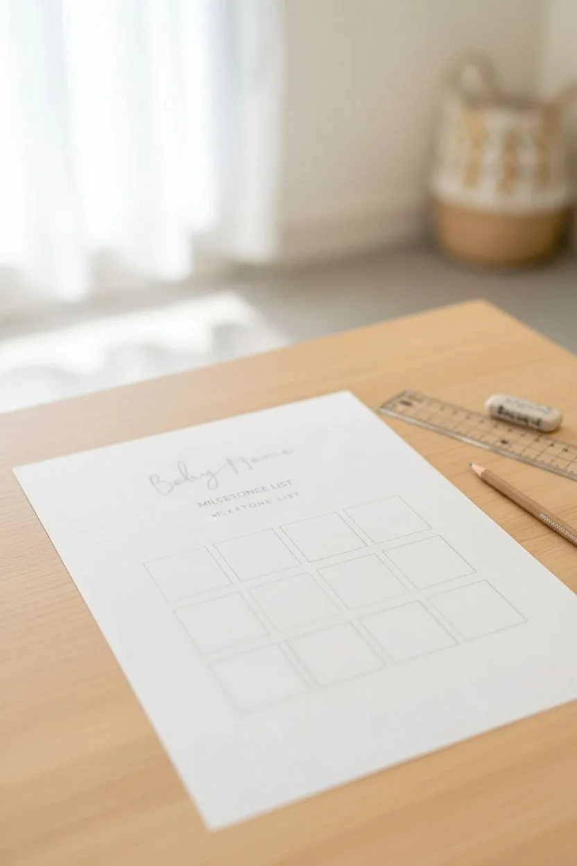
Create a timeless nursery keepsake with this minimalist milestone artwork, perfect for tracking a baby’s first year or displaying birth stats. The design features elegant typography combined with soft, neutral-toned number blocks that bring a modern, airy feel to any room.
Detailed Instructions
Materials
- High-quality watercolor paper or heavy cardstock (A4 size)
- Beige or taupe watercolor paint
- Flat shader brush (size 6 or 8)
- Fine liner pen (black, 0.3mm or 0.5mm)
- Pencil and eraser
- Ruler
- Printer (optional, for the text base)
- Digital design software (optional)
- Light oak wooden frame (A4 or 8×10)
Step 1: Design & Layout
-
Draft the layout:
Begin by lightly sketching your layout on the paper using a pencil and ruler. You’ll need a header area for the name and a grid of eight squares below for the milestones or stats. -
Plan the typography:
Decide on a flowing script font for the main header (e.g., ‘Baby Boy’ or the baby’s name) and a clean sans-serif font for the subtitles underneath. You can hand-letter this later or print it now if your paper is printer-safe. -
Grid measurements:
Measure out two rows of four squares each near the bottom half of the paper. Leave generous spacing between them to maintain that airy, minimalist aesthetic seen in the photo.
Pro Tip: Masking Tape
For crisp identifying squares, use low-tack washi tape to mask off the boxes before painting. Peel it off while the paint is still damp.
Step 2: Watercolor Backgrounds
-
Mix your neutral tone:
Dilute a beige or soft taupe watercolor paint with plenty of water. You want a very transparent, subtle wash rather than opaque color. -
Paint the squares:
Using your flat shader brush, gently fill in the squares you sketched earlier. I prefer to keep the edges slightly imperfect or organic to give it that hand-painted charm. -
Create variation:
Purposefully vary the amount of pigment in each square. Some can be slightly darker, others very faint, creating a lovely natural texture. -
Let it dry completely:
Allow the paper to dry flat for at least 30 minutes. The paper must be bone-dry before you add any ink over the top.
Troubleshooting: Warping
If your paper buckles from the watercolor, place the finished (dry) piece under a heavy stack of books overnight to flatten it out.
Step 3: Lettering & Details
-
Add the main header:
If you didn’t print the text earlier, use your fine liner pen to carefully letter the main script title at the top. Use a light touch for upward strokes and heavier pressure for downward strokes to mimic calligraphy. -
Add subtitles:
Write the smaller descriptive text (like ‘Measurements List’ or ‘Birth Stats’) just below the header in neat, small capital letters. -
Number the milestones:
Inside each painted beige square, write a large, clear number (1, 2, 3, 5, etc.) using a serif font style. Position these centrally or slightly offset for style. -
Detail the stats:
Underneath each large number, write the corresponding tiny details like ‘months’, ‘weeks’, or specific measurements using your finest pen tip.
Step 4: Assembly
-
Erase guidelines:
Once the ink is fully dry (give it extra time just to be safe), gently erase any remaining pencil marks from your initial grid. -
Prepare the frame:
Clean the glass of your light oak frame to ensure no dust is trapped inside. -
Framing:
Center your artwork in the frame. If you are using a mount, secure the paper to the back of the mount with masking tape before placing it in. -
Final check:
Inspect the front for any trapped lint before closing the back clips of the frame.
Now you have a chic, personalized piece of art ready to adorn the nursery shelf
Painted House Portrait for New Homeowners
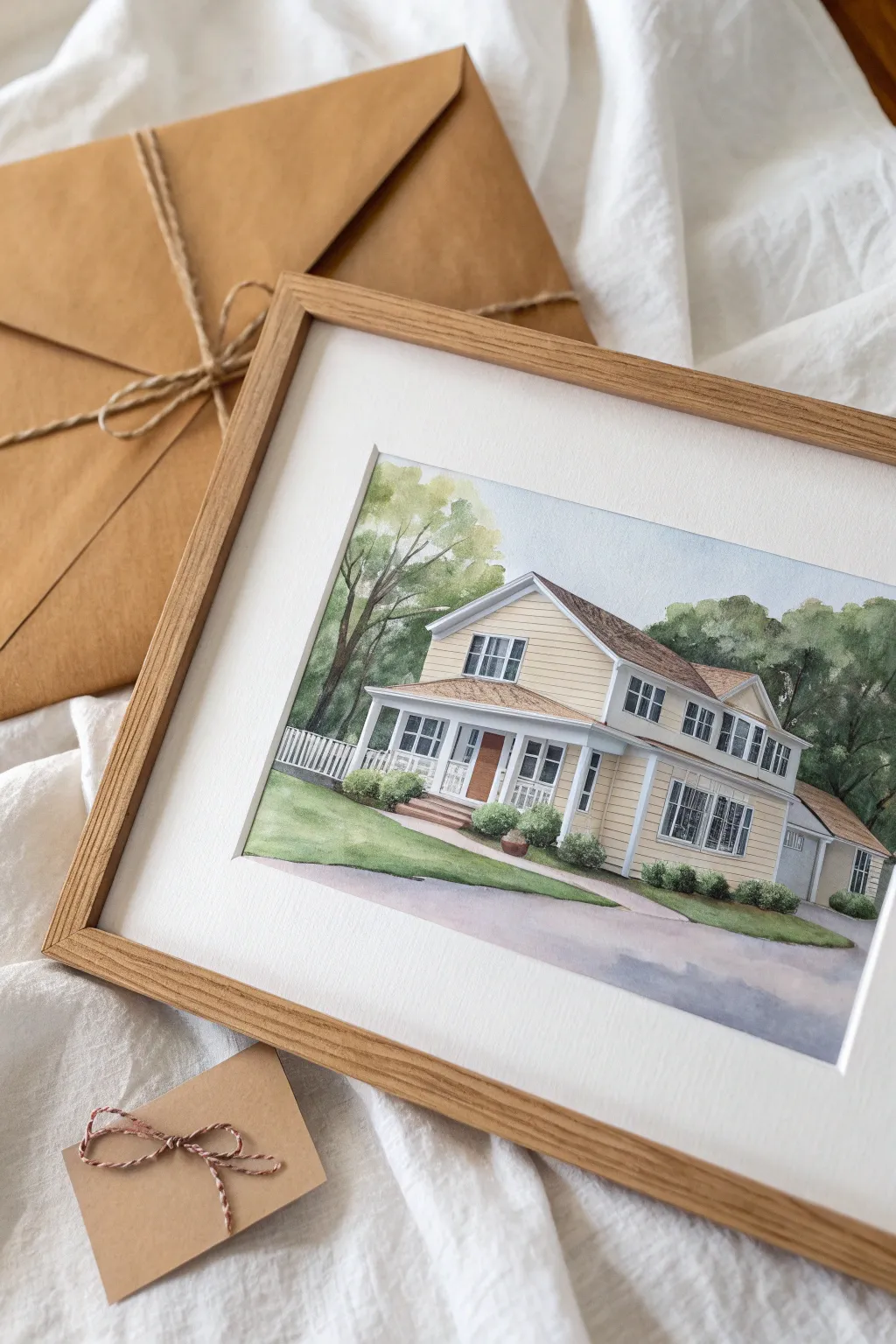
Capture the charm of a new abode with this delicate and detailed watercolor house portrait. Featuring soft washes and crisp architectural lines, this custom artwork makes for a thoughtful, heirloom-quality housewarming gift.
Step-by-Step
Materials
- High-quality hot press watercolor paper (140lb/300gsm)
- Pencil (HB or H) and kneaded eraser
- Waterproof fine liner pens (0.05mm and 0.1mm, grey or sepia)
- Watercolor paints (Yellow Ochre, burnt sienna, sap green, ultramarine blue, payne’s grey)
- Round watercolor brushes (Size 2, 4, and 8)
- Masking fluid (optional)
- Ruler
- Reference photo of the house
- Painter’s tape and drawing board
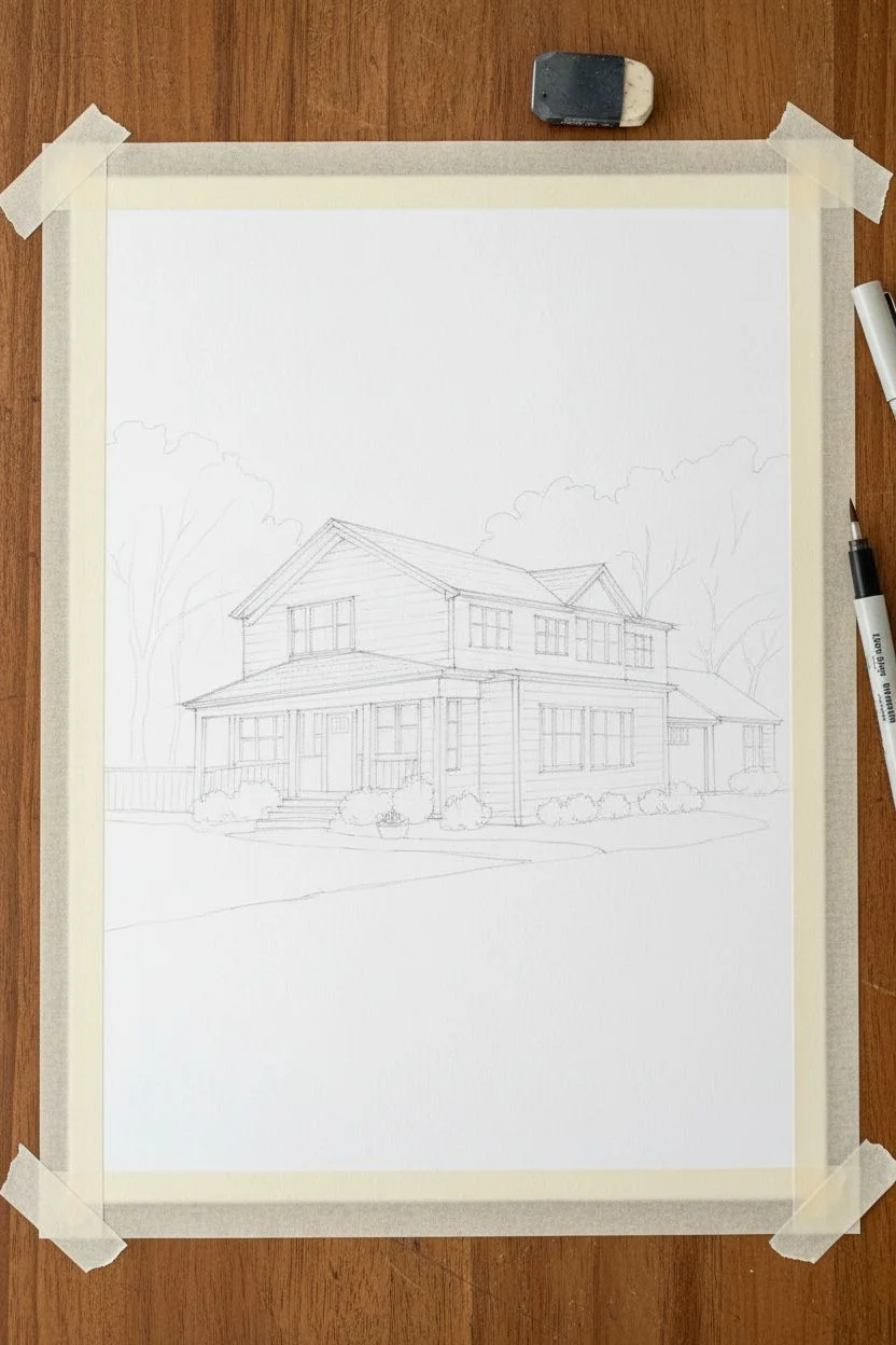
Step 1: Sketching the Structure
-
Prepare the workspace:
Tape your watercolor paper down to a board on all four sides. This prevents buckling when the paper gets wet and creates a clean white border for framing later. -
Establish the perspective:
Using a ruler and pencil, lightly map out the horizon line and vanishing points. House portraits rely heavily on accurate perspective, so take time to ensure the roof angles and foundation lines converge correctly. -
Draft the main volumes:
Sketch the main box of the house first, then add the garage and porch extensions. Keep your pencil pressure very light so graphite doesn’t smudge into the paint later. -
Detail the architecture:
Draw in the windows, door frames, siding lines, and roof shingles. Be precise with the window panes, as they add significant character to the finished piece. -
Ink the lines (optional):
For a crisper illustrative look like the example, trace your main architectural lines with a very fine waterproof pen. I prefer sepia ink over black for a softer, more nostalgic feel. Erase pencil marks once the ink is fully dry.
Step 2: Layering the Wash
-
Paint the sky:
Wet the sky area with clean water. Drop in a very dilute wash of Ultramarine Blue, fading it out as you get closer to the house roofline to keep the focus on the structure. -
Base coat the siding:
Mix a creamy beige using Yellow Ochre and a tiny touch of Burnt Sienna. Apply a flat, even wash across the siding areas, carefully painting around the white trim, windows, and porch columns. -
Roof texture:
Mix Burnt Sienna with a touch of Payne’s Grey for a brownish-grey roof color. Apply this to the roof sections. While still slightly damp, drop in slightly darker pigment near the ridgelines to suggest texture. -
Adding shadows:
Once the base layers are bone dry, mix a cool purple-grey shadow color. Paint shadows under the eaves, inside the porch, and beneath window sills to give the house three-dimensional depth.
Wobbly Lines?
If your straight lines look shaky, use a ruler strictly for pencil sketching only. Paint the final lines freehand; slightly organic lines actually make the house look more inviting and less like a blueprint.
Step 3: Landscaping & Details
-
Background trees:
Wet the paper behind the house and drop in soft Sap Green mixes. Let the edges blur slightly to push the foliage into the distance, keeping the house sharp in the foreground. -
Foreground lawn:
Paint the grass area with a fresh green mix. Use horizontal strokes that follow the contours of the land, adding a slightly darker green near the foundation shrubs. -
Driveway wash:
Mix a very watery purple-grey for the driveway. Apply it loosely, letting the color pool slightly in some areas to create the texture of asphalt or concrete without overworking it. -
Window reflections:
Paint the glass panes with a pale blue-grey. Leave tiny slivers of white paper unpainted to represent reflected light, which makes the glass look glossy. -
Shrubbery details:
Using a dryer, smaller brush, stipple in the bushes near the front door. Use varying shades of green—darker at the bottom, lighter on top—to create volume.
Pro Tip: White Trim
To keep window frames bright white, use masking fluid before you start painting. It protects the paper and rubs off easily at the end, leaving crisp, clean lines without the stress of painting around them.
Step 4: Final Touches
-
Deepen contrasts:
Go back in with your smallest brush and a dark mix to define the darkest corners, such as the space behind the porch railing or the gaps between roof shingles. -
Clean up:
Once absolutely dry, remove the tape carefully, pulling away from the painting to avoid tearing the paper. Sign your work in the corner with a fine pen.
Frame this charming portrait in light wood to complement the warm tones of the home

PENCIL GUIDE
Understanding Pencil Grades from H to B
From first sketch to finished drawing — learn pencil grades, line control, and shading techniques.
Explore the Full Guide
Mini Canvas Series: Four Tiny Seasonal Paintings
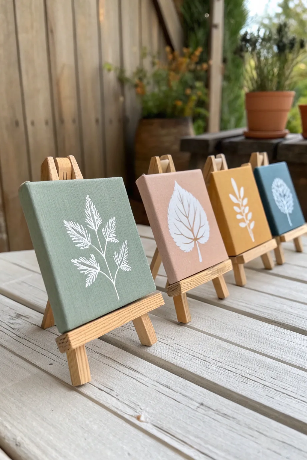
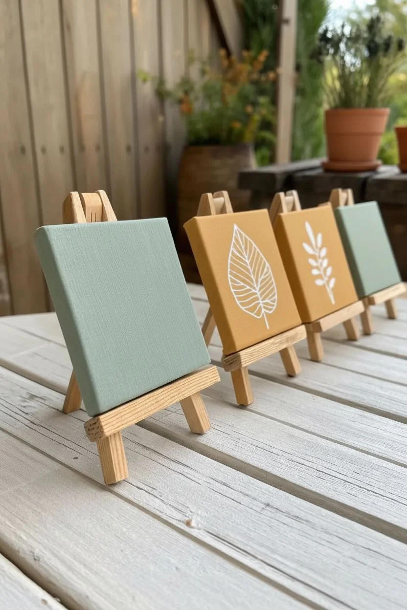
Create a unified gallery wall in miniature with this set of four botanical canvases. Featuring muted, nature-inspired base colors and crisp white leaf silhouettes, these tiny artworks make a charming desk accessory or a thoughtful handmade gift.
How-To Guide
Materials
- 4 mini stretched canvases (approx. 3×3 or 4×4 inches)
- 4 mini wooden display easels
- Acrylic craft paints (Sage Green, Dusty Rose/Terracotta, Mustard Yellow, Teal Blue)
- White acrylic paint or a white Posca marker (fine tip)
- Flat shader brush (size 6 or 8)
- Fine liner brush (size 0 or 00)
- Pencil and eraser
- Palette or paper plate
- Paper towels and water cup
Step 1: Preparing the Base
-
Surface Prep:
Wipe down your mini canvases with a dry cloth to remove any dust. If the canvas texture feels very rough, you can apply a layer of gesso first, though standard pre-primed canvases describe most store-bought options. -
Mixing the Palette:
Squeeze out your four base colors onto your palette. If your colors are too bright, tone them down by adding a tiny dot of brown or gray to make them earthy and cohesive. -
First Coat Application:
Using the flat shader brush, apply the first color (Sage Green) to the first canvas. Paint the front face completely. Don’t forget to paint the sides of these thick mini canvases for a finished, professional look. -
Complete the Set:
Rinse your brush thoroughly and repeat the process for the remaining three canvases using the Dusty Rose, Mustard Yellow, and Teal Blue paints. -
Second Coat:
Allow the first layer to dry for about 20 minutes. Apply a second coat to ensure the color is opaque and no canvas texture shows through, especially on the lighter yellow and pink hues.
Sharper Lines
Struggling with brush control? Skip the paint brush for the details and use a white acrylic paint pen (Posca or similar) for crisp, effortless lines.
Step 2: Designing the Botanicals
-
Reference Gathering:
Look at the project image or find simple leaf clip art to use as a guide. You want four distinct shapes: a fern-like frond, a broad spade-shaped leaf with veins, a simple alternating branch, and a denser, rounded tree shape. -
Sketching:
Once the base coats are fully dry to the touch, lightly sketch the central stem of your botanical design on each canvas using a pencil. Keep the lines very faint so they are easy to cover. -
Outline the Leaves:
Add the rough outlines of the leaves around your central stems. Focus on placement and balance; ensure the design is centered but stretches nicely toward the edges.
Step 3: Painting the Details
-
The Fern Design:
On the green canvas, use your fine liner brush and white paint to create the fern. Start with the central stem, then use quick, short strokes outward to create the feathery texture of the leaves. -
The Broad Leaf:
For the pink canvas, outline the large spade leaf shape first. I find it easier to fill in the solid white block next, painting around the veins to leave the base color showing through as negative space. -
The Simple Branch:
Move to the yellow canvas. Paint a solid white central line, then add simple almond-shaped leaves in pairs or alternating up the stem. Keep the paint slightly fluid to get sharp points on the leaves. -
The Round Tree:
On the blue canvas, paint a short trunk. Create the foliage by dabbing small clusters of white dots and dashes in a circular or oval shape, mimicking the texture of a full tree canopy. -
Refining Edges:
Go back over your white lines if they look translucent. A second pass with the white paint will make the designs pop crisply against the colored backgrounds. -
Cleanup:
Once the white paint is totally dry, gently erase any visible pencil marks. Be careful not to scrub too hard and damage the paint surface.
Seasonal Switch
Paint the background colors to match different seasons (like deep reds and greens for winter), keeping the white botanical style consistent for a year-round collection.
Step 4: Assembly
-
Easel Setup:
Open up the mini wooden easels. Set the back leg to an angle where the easel stands sturdy and doesn’t tip over easily. -
Final Display:
Place each dried canvas onto its corresponding easel. Arrange them in a row or a grid to verify the colors look balanced together.
Line them up on a windowsill or shelf to enjoy your miniature art gallery
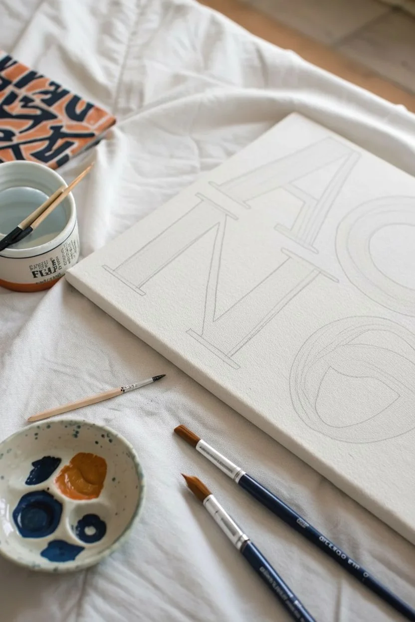
Hand-Painted Quote Painting in Your Recipient’s Style
Create a striking piece of wall art that celebrates typography with a hand-painted, organic feel. This project embraces the imperfections of brushwork to turn simple letters into a sophisticated, personalized statement piece.
Step-by-Step Tutorial
Materials
- Stretched canvas (rectangular or square)
- Black acrylic paint
- Burnt orange or terracotta acrylic paint
- Flat shader brushes (medium and large)
- Round watercolor brush (for details)
- Pencil for sketching
- Ruler or T-square
- Eraser
- Palette or ceramic mixing dish
- Water cup and paper towels
Step 1: Planning and Sketching
-
Choose your letters:
Decide on a short word or a set of initials to feature. The sample uses bold, capitalized serif letters like ‘A’, ‘N’, and ‘O’ arranged dynamically to fill the space. -
Rough layout:
Before touching the canvas, sketch your composition on a piece of scrap paper. Play with scaling the letters so they touch the edges or slightly overlap for a modern look. -
Transfer to canvas:
Lightly sketch the letter outlines onto the canvas using a pencil. Use a ruler to ensure your vertical lines are straight, particularly for structural letters like the ‘N’. -
Refine the serifs:
Add the serif details—the small feet at the ends of strokes—making sure they have a consistent thickness. Don’t worry about being mathematically perfect; the charm is in the hand-drawn quality.
Uneven Edges?
If your lines are too shaky, use painter’s tape or wash tape to mask off the straight edges of the letters. Press the edges down firmly to prevent bleed-under.
Step 2: Painting the Letters
-
Prepare your palette:
Squeeze out a generous amount of black acrylic paint. For the accent letter, like the ‘A’ in the example, mix orange with a tiny touch of brown to achieve a warm terracotta hue. -
Start with the dominant letter:
Dip a medium flat brush into the black paint. Begin filling in the largest vertical strokes of your first letter, pulling the brush confidently from top to bottom. -
Define the edges:
Carefully paint the sharp corners and serifs. Turn your brush on its narrow edge to create cleaner lines, or switch to a smaller round brush for the tightest corners. -
Embrace the texture:
Allow the texture of the canvas to show through slightly. Don’t overload your brush; dry brushing a little at the ends of strokes adds a lovely vintage printed feel. -
Move to the accent color:
Clean your brush thoroughly or switch to a fresh one. Paint the accent letter (like the ‘A’) with your terracotta mix, applying it with the same bold strokes as the black. -
Maintain opacity:
Acrylics can sometimes look streaky. If the coverage looks too thin after the first pass, let it dry completely and apply a second coat for richness. -
Letter spacing check:
As you paint adjacent letters, be mindful of the negative space between them. You want them close enough to feel cohesive but distinct enough to be legible. -
Painting curves:
For rounded letters like ‘O’ or ‘S’, use your wrist to guide the curve. Painting these in segments rather than one continuous loop often gives you better control.
Step 3: Finishing Touches
-
Clean up edges:
Inspect your lines for any unintentional wobbles. You can use a bit of white paint (or whatever color matches your canvas primed background) to tidy up slips. -
Erase guidelines:
Once the paint is 100% bone dry to the touch, gently erase any visible pencil marks. Be very gentle to avoid scrubbing off the paint. -
Seal the work:
For longevity, especially if this is a gift, apply a clear matte varnish over the entire canvas to protect the paint from dust and fading.
Add Depth
Mix a tiny drop of white into your main color and paint a thin highlight on the left side of each stroke to give the letters a slight 3D dimensionality.
Hang your new typographic masterpiece in a spot where it can serve as a bold daily reminder


Abstract Color Palette Painting Inspired by Their Favorite Room
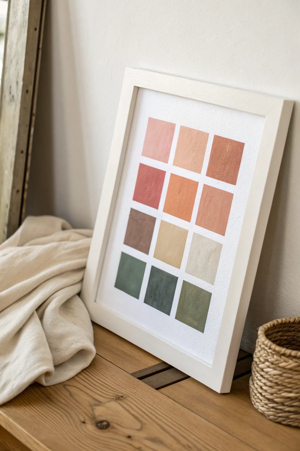
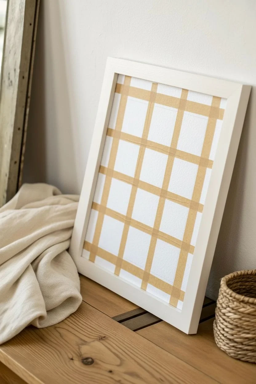
Capture the essence of a room with this minimalist color block study. Using textured paper and earthy hues, you’ll create a sophisticated grid that serves as both modern decor and a calming visual anchor.
Step-by-Step Guide
Materials
- Heavyweight textured watercolor paper (cold press)
- White or light wood frame (with matting optional)
- Painter’s tape or masking tape (low tack)
- Acrylic craft paints (terra cotta, sage green, beige, ochre, forest green, pink)
- Flat shader brush (approx. 1 inch wide)
- Palette or mixing plate
- Ruler
- Pencil
Step 1: Preparation & Layout
-
Size the paper:
Begin by trimming your textured watercolor paper to fit your frame. If your frame includes a mat, cut the paper slightly larger than the mat opening so you can tape it securely to the back. -
Mark the margins:
Decide on the size of your grid. Measure and mark light pencil dots to establish equal margins on the left, right, top, and bottom, ensuring the artwork will be centered. -
Draw the grid:
Using a ruler, very lightly draw out a grid of 12 squares—4 rows high and 3 columns wide. Aim for squares that are roughly 2 to 3 inches in size, with about 0.5 to 1 inch of white space between each one. -
Tape the vertical borders:
Apply strips of painter’s tape vertically to mask off the spaces between the columns. Press the edges of the tape down firmly with your fingernail or a credit card to prevent paint bleed. -
Tape the horizontal borders:
Apply horizontal strips of tape to mask off the spaces between the rows. This technique isolates each square, though you may need to paint in stages if your grid lines overlap.
Clean Lines Hack
Before painting your color, seal the tape edges with a thin layer of white paint or matte medium. This blocks gaps so your colors have razor-sharp edges.
Step 2: Mixing & Painting
-
Mix the top row colors:
Start with the lightest warm tones. Mix a soft blush pink, a sandy beige-peach, and a slightly darker terracotta. You want these to feel like a gradient of desert sunset hues. -
Paint the first squares:
Using your flat shader brush, fill in the top three squares. I find that applying the paint in vertical strokes adds a nice, consistent texture that mimics the paper grain. -
Create the second row colors:
Deepen your palette for the second row. Mix a rusty red, a vibrant orange-ochre, and a muted clay color. Add a tiny dot of brown to your orange if it looks too bright. -
Paint the second row:
Fill in the next three squares. Be mindful of the tape edges; brush away from the tape edge rather than into it to minimize seepage. -
Mix the third row earth tones:
For the third row, introduce neutrals. Mix a chocolate brown, a warm sand color, and a very pale griege or off-white. -
Apply the neutral layer:
Paint the third row. The flat shader brush is perfect here for getting sharp corners, but don’t worry if the paint texture looks slightly streaky—that adds character. -
Mix the greens:
For the final bottom row, switch to cool earth tones. Prepare a muted sage green, a deep forest green, and an olive-moss tone. -
Complete the grid:
Paint the final three squares. Ensure the paint is opaque enough to cover the paper texture but not so thick that it becomes gloppy.
Step 3: Finishing Touches
-
Let it dry completely:
Allow the paint to fully dry. This is crucial—if the paint is tacky, peeling the tape might lift the pigment. -
Peel the tape reveal:
Gently peel back the painter’s tape at a 45-degree angle. Move slowly to ensure crisp, clean lines between your colorful squares. -
Erase pencil marks:
Once the tape is gone, check for any visible pencil guidelines in the white negative spaces and gently erase them with a high-quality white eraser. -
Frame the artwork:
Place your dried artwork into the frame. If using a mat, center the grid perfectly within the window before securing the back.
Add Fabric Texture
Mix a small amount of baking soda or plaster into your acrylic paint. This creates a grainy, stucco-like texture that makes the art feel high-end.
Now you have a custom piece of geometric art that perfectly reflects the color story of your space
Custom Recipe Card Illustration as a Kitchen Gift Painting
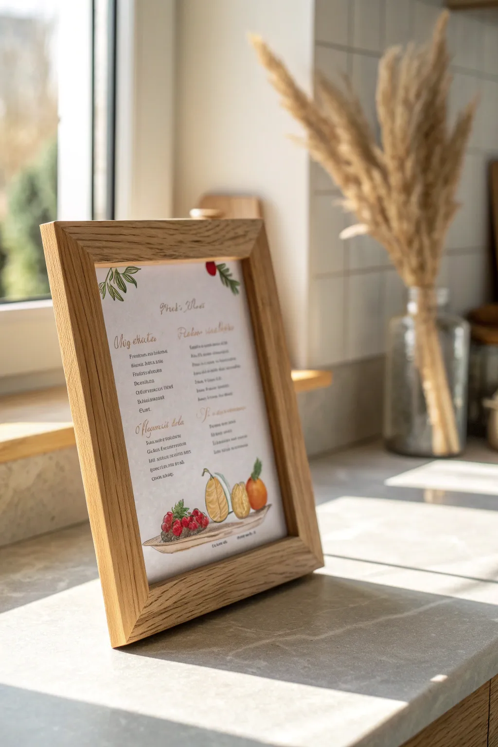
Transform a beloved family recipe into a piece of timeless kitchen decor with this delicate watercolor and ink illustration project. This tutorial guides you through creating an elegant layout that combines beautiful calligraphy with vibrant, hand-painted ingredients.
Step-by-Step Guide
Materials
- Cold press watercolor paper (140lb/300gsm)
- Light wood picture frame (8×10 or A4 size)
- Watercolor paint set (pan or tube)
- Fine liner waterproof pens (black and sepia, sizes 0.1 and 0.3)
- Round watercolor brushes (size 2 and 4)
- HB pencil and kneadable eraser
- Ruler
- Gold ink or gouache (optional)
- The recipe text you wish to transcribe
Step 1: Planning and Layout
-
Initial Sizing:
Measure the opening of your wooden frame carefully. Cut your watercolor paper to fit this size exactly, leaving a clean margin of about 1 inch on all sides to prevent important details from being hidden by the frame lip. -
Drafting Guidelines:
Using your ruler and HB pencil, draw very faint horizontal lines where your text will go. Create two distinct columns if your recipe has a list of ingredients and a separate method, or center the text for a simpler look. -
Sketching the Elements:
Lightly sketch the recipe title at the top in a cursive style. At the bottom, sketch a focal point illustration of the main ingredients—like the pear, citrus, and berry grouping shown in the example. Add small sprigs of greenery at the top corners for balance. -
Refining the Lettering:
Go over your pencil lettering to ensure the spacing helps the recipe flow naturally. If calligraphy isn’t your strong suit, you can lightly trace a printed font template using a light box or window.
Step 2: Inking the Text
-
Tracing the Title:
Use a sepia or warm brown fine liner (0.3mm) for the recipe title and headers (like ‘Ingredients’). Using brown instead of black gives it a softer, vintage aesthetic. -
Writing the Body Text:
Switch to a finer 0.1mm pen to write out the instruction steps. Keep your hand steady and maintain the alignment with your pencil guides. Let the ink dry completely for at least 15 minutes to avoid smearing during the painting phase. -
Erasing Guides:
Once you are certain the ink is bone dry, gently roll a kneadable eraser over the page to lift the graphite guidelines without damaging the paper texture.
Clean Lines Pro-Tip
To prevent shaky lettering, tape your paper to the table. Exhale slowly as you pull the downstrokes of your letters for smoother, straighter lines.
Step 3: Watercolor Illustration
-
Painting the Pears:
Load your size 4 brush with a diluted yellow ochre. Paint the body of the cut fruit shapes. While wet, drop in a tiny touch of brown on the edges to create a sense of roundness and shadow. -
Adding Berry Tones:
Mix a vibrant crimson red. Paint the individual berries in the cluster, leaving tiny specks of white paper showing on each sphere to represent a highlight. This makes the fruit look juicy and fresh. -
Greenery details:
Using a sap green mixed with a little yellow, paint the leaves at the top corners and the small leaves attached to the fruit. Use the tip of your size 2 brush for the delicate stems. -
Deepening Shadows:
I like to wait for the first fruit layer to dry completely, then mix a darker, cool grey-brown. Paint a thin cast shadow underneath the fruit platter or grouping to ground the illustration so the food doesn’t look like it’s floating. -
Adding Texture:
For the inside of the fruit or seeds, use the very tip of your smallest brush with a concentrated, darker version of your fruit color to add dots or veins.
Heirloom Level-Up
Scan the original handwritten recipe card from a grandmother or relative. Digitally print the original handwriting onto the watercolor paper, then paint around it for true authenticity.
Step 4: Final Assembly
-
Optional Metallic Touch:
If you want an extra touch of luxury, use gold ink to highlight the capital letters of the title or add tiny dots to the flower centers. -
Final Drying:
Allow the painting to sit flat in a dry area for several hours until the paper feels cool and crisp to the touch, ensuring no moisture is trapped. -
Framing:
Clean the glass of your light wood frame thoroughly. Place the artwork inside, secure the backing, and ensure the watercolor paper hasn’t shifted before closing the tabs.
Place your framed recipe on a counter easel or hang it near the stove to keep cherished family culinary traditions alive
Round Canvas Painting for a Fresh, Modern Gift
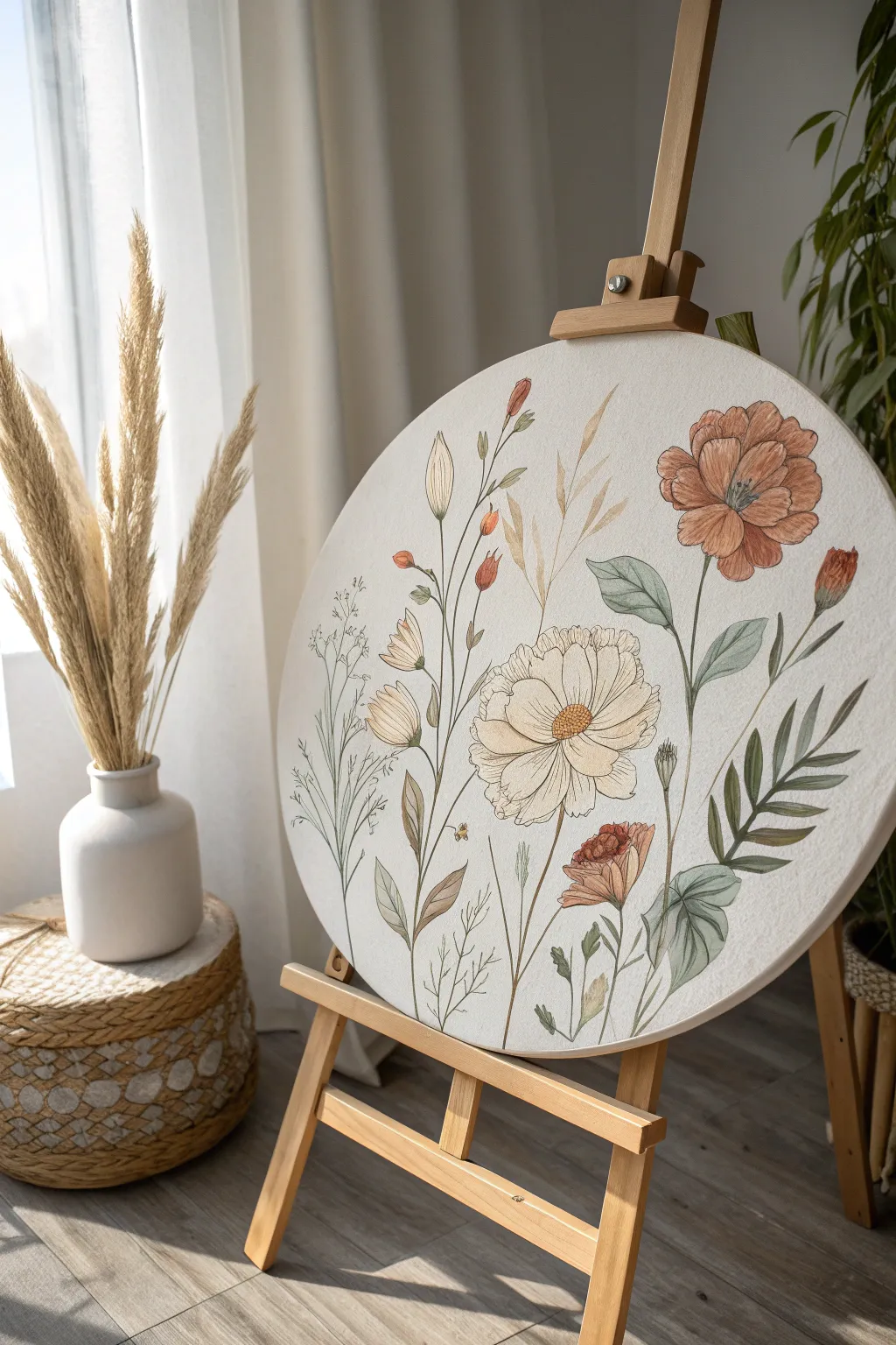
This project transforms a simple round canvas into a delicate botanical study, featuring warm, earthy wildflowers and soft foliage. The circular format adds a modern, organic touch perfect for gifting, while the fine-line details bring a vintage scientific illustration vibe.
Step-by-Step
Materials
- Round stretched canvas (approx. 16-20 inches diameter)
- Acrylic paints (Titanium White, Burnt Sienna, Yellow Ochre, Sap Green, Raw Umber, Peach)
- Very fine detail brushes (Round size 0, 00, and 1)
- Black or Sepia fineliner pens (waterproof, 0.1mm and 0.3mm)
- Pencil (HB or H) and eraser
- Palette for mixing
- Water cups and paper towels
- Spray matte varnish (optional)
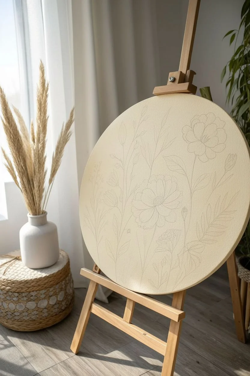
Step 1: Preparation & Sketching
-
Prime the Surface:
Even if your canvas is pre-primed, adding a layer of white gesso mixed with a tiny drop of yellow ochre or raw umber creates a warm, off-white base that feels more organic than stark white. Let this dry completely. -
Plan Composition:
Lightly sketch your main floral elements using a hard pencil like an H so lines stay faint. Start with the large poppy-like flower on the right to anchor the composition, then place the large cream cosmos flower near the center-bottom. -
Add Stems and Buds:
Draw the curving stems radiating upwards. I like to keep them slightly asymmetrical to mimic nature. Sketch in the smaller buds, filler leaves, and wheat-like stalks, ensuring they overlap naturally.
Ink Movement
Vary your pen pressure. Press harder on the shadowed underside of a petal and lift off for the lighter tips to create instant volume with just a line.
Step 2: Painting the Base Layers
-
Mix Warm Florals:
Create a muted terracotta color by mixing Burnt Sienna with a touch of Peach and White. Paint the large flower on the right using a round brush, keeping the paint thin and somewhat translucent like watercolor. -
Paint the Cream Flower:
For the central bloom, mix a generous amount of Titanium White with a tiny dot of Yellow Ochre. Fill in the petals, leaving the texture of the canvas visible to suggest delicacy. -
Add Greenery Base:
Mix Sap Green with a little Raw Umber and White to get a sage green tone. Paint the broad leaves on the right side and the smaller leaves on the left stem. -
Paint Filler Elements:
Use a diluted Yellow Ochre for the wheat-like grasses in the background. Their transparency helps push them visually behind the main flowers. -
Layering Colors:
Once the first layer is dry, add a slightly darker shade of terracotta to the center of the right flower and the underside of petals to create depth and volume.
Step 3: Refining & Detailing
-
Detailing Flower Centers:
Mix a mustard yellow tone and stipple it into the center of the cream flower. Add tiny dots of brown around the edges of the center to make it pop. -
Shading Leaves:
Take your sage green mix and add a bit more blue or grey. Paint shadows on the leaves where they tuck under petals or stems. -
Adding Buds:
Paint the small, unopened buds using the terracotta mix for the petals and sage green for the base (calyx). Keep these strokes loose. -
Enhancing Backgrounds:
If any background elements look too fading, lightly glaze them with more of the diluted ochre or brown paint to solidify their presence without overpowering the main blooms.
Antique Wash
Mix a tiny bit of brown ink or tea into clear matte varnish for the final coat. This gives the entire canvas a subtle, aged parchment look.
Step 4: Fine Line Work
-
Wait for Dryness:
Ensure the canvas feels cool and dry to the touch before starting any ink work. Moisture will bleed the ink and ruin the crisp lines. -
Outline Petals:
Using the 0.1mm waterproof pen, trace the outer edges of your painted petals. Don’t close every line perfectly; broken lines look more artistic. -
Add Leaf Veins:
Draw the central vein on the large leaves first, then add fine, radiating veins. Keep your hand light so the lines taper naturally. -
Texture the Centers:
Use the 0.3mm pen to add dense stippling (dots) in the flower centers. This mimics pollen and adds significant contrast. -
Sketch Faint Grasses:
Use the pen to draw in the very fine, wispy grasses and stems on the left side that weren’t painted. These delicate ink-only elements add a lovely sketchbook feel. -
Final Cleaning:
Gently erase any visible pencil marks that weren’t covered by paint or ink. Be careful not to smudge the paint.
Hang this round canvas in a bright corner or prop it on a shelf to bring a permanent garden indoors
Painted Constellation Night Sky With a Special Date
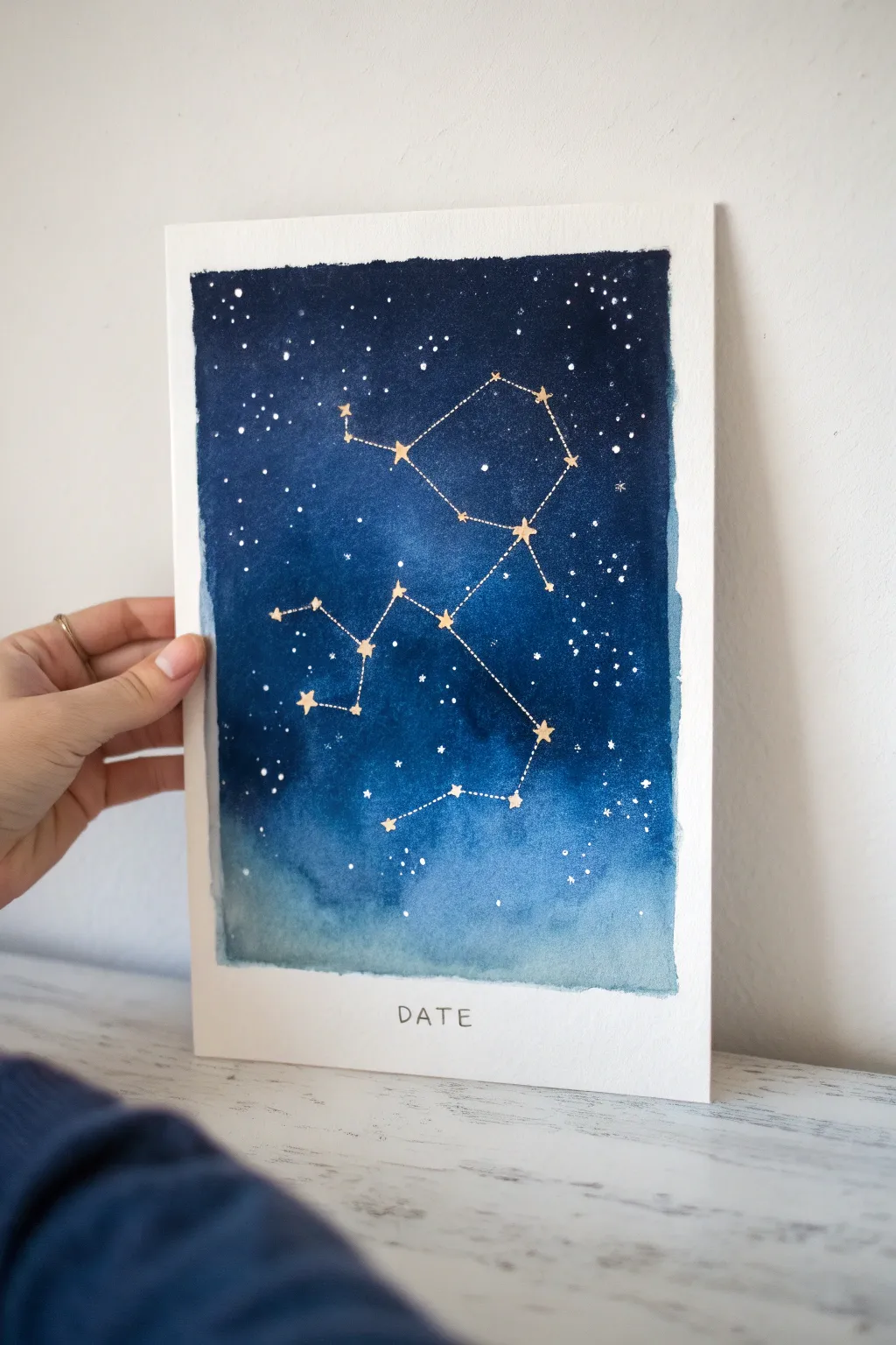
Capture a moment in the stars with this deep blue watercolor night sky painting featuring a specific zodiac constellation. The blend of rich indigo and soft teal creates a mesmerizing backdrop for delicate gold stars, making it a thoughtful, personalized gift that commemorates a special date.
Step-by-Step Guide
Materials
- Cold press watercolor paper (A4 or similar size)
- Painter’s tape or masking tape
- Watercolor paints (Indigo, Prussian Blue, Turquoise, Black)
- White gouache or opaque white ink
- Metallic gold paint or gold gel pen
- Flat wash brush (large)
- Round detail brush (size 0 or 1)
- Old toothbrush (optional for splatter)
- Fine liner pen (black)
- Pencil and eraser
- Ruler
- Jar of clean water
- Paper towels
Step 1: Preparing the Canvas
-
Tape the borders:
Secure your watercolor paper to a flat surface using painter’s tape. Create a wide margin at the bottom (about 2-3 inches) where you will later write the date, and thinner margins (about 1 inch) on the other three sides to frame the galaxy. -
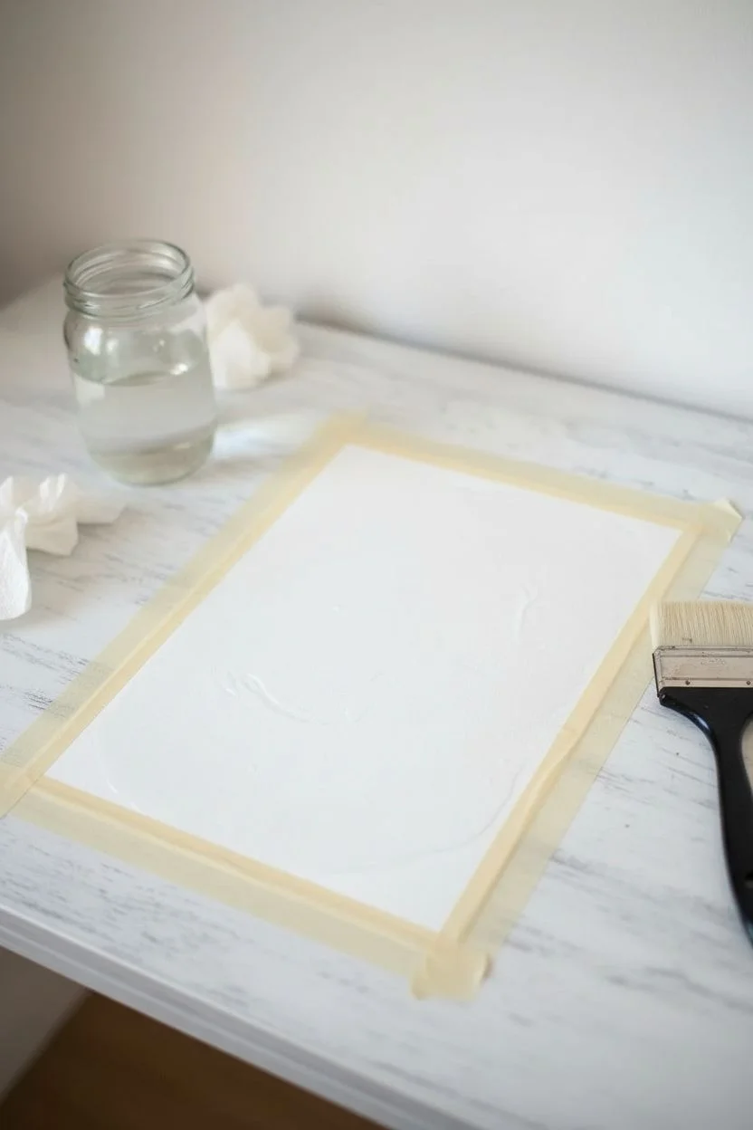
Wet the paper:
Using your large flat brush, apply a generous layer of clean water strictly within the taped rectangle. The paper should be glisten with moisture but not have standing puddles.
Bleeding Lines?
If your gold lines are feathering into the blue, the background paint wasn’t fully dry. Stop immediately and let it dry for another hour or use a hairdryer before continuing.
Step 2: Painting the Galaxy Background
-
Lay the light base:
Start at the bottom of the wet area with a watery mix of Turquoise or light Teal. Let the color flow upwards slightly, keeping this lower section lighter to suggest distinct atmospheric horizons. -
Deepen the sky:
Load your brush with Prussian Blue mixed with a touch of Indigo. Apply this to the middle section, blending it gently into the teal below while the paper is still wet to create a soft gradient. -
Add the darkest night:
Mix a very concentrated Indigo with a tiny bit of Black to get a deep midnight blue. Apply this to the top third of the painting, letting it bleed down into the mid-blue for a seamless transition. -
Intensify the contrast:
While the paint is still damp, dab extra concentrated dark blue into the upper corners and random spots in the upper section to create depth and texture. -
Let it dry completely:
Allow the background to dry fully. The paper must be bone dry before you add stars, or the fine lines will bleed. You can use a hairdryer on a low setting to speed this up.
Starry Splatter Tip
Test your ‘splatter’ technique on a scrap piece of paper first. The amount of water in your white gouache determines if you get fine mist (less water) or big globs (more water).
Step 3: Adding the Stars
-
Create the distant stars:
Mix white gouache or ink with a little water. Dip an old toothbrush or a stiff brush into the mix and flick the bristles with your thumb to spray tiny white specks across the upper, darker part of the sky. -
Add specific brightness:
Using a tiny round brush or a white gel pen, manually dot a few slightly larger white stars in the dark blue areas to vary the star sizes. -
Map the constellation:
Lightly pencil the specific constellation shape (like Sagittarius shown here) onto the blue background. Use a reference image to get the spacing between the main stars correct. -
Paint the main stars:
Using metallic gold paint or a gold gel pen, draw small five-pointed stars over your pencil marks. I like to make the ‘alpha’ or brightest stars of the constellation slightly larger than the others. -
Connect the constellation:
With a fine brush or gold pen, connect the stars with delicate dashed lines. Use a ruler if your hand is shaky, but freehand lines often add a nice organic touch.
Step 4: Final Touches
-
Remove the tape:
Carefully peel away the masking tape. Pull the tape away from the painting at a 45-degree angle to prevent tearing the paper edges. -
Add the inscription:
In the white space you preserved at the bottom, lightly pencil in the word ‘DATE’ or significant numbers. Center it carefully beneath the night sky panel. -
Ink the text:
Go over your pencil letters with a fine black liner pen using a simple, clean sans-serif font style. -
Erase guidelines:
Once the ink is totally dry, gently erase any remaining pencil marks from the text area for a crisp, professional finish.
Frame your celestial artwork to present a truly unique memory captured in the stars
Mother-and-Child Symbol Painting for a Sentimental Gift

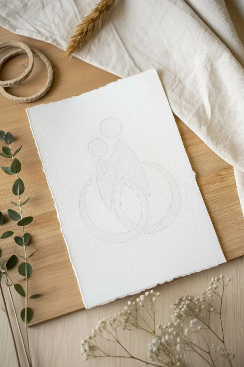
This minimalist watercolor piece uses geometric shapes and warm, earthy tones to capture the tender bond between parent and child. Painted on beautiful deckle-edged paper, it makes a sophisticated and deeply sentimental gift.
How-To Guide
Materials
- Cold press watercolor paper (deckle edge preferred, 300gsm)
- Watercolor paints (Burnt Sienna, Yellow Ochre, Alizarin Crimson)
- Round watercolor brushes (size 4 and 6)
- Pencil (HB or 2H)
- Kneaded eraser
- Jar of clean water
- Paper towels
- Palette or white plate for mixing
Step 1: Sketching the Design
-
Prepare your composition:
Begin by lightly marking the center of your paper. This abstract design relies on balance, so visualize where the main circular shapes will sit before you start drawing. -
Draw the parent’s head:
Using your pencil very lightly, draw a small circle near the top center for the parent’s head. Aim for a perfect circle, about the size of a large coin. -
Add the child’s head:
Draw a slightly smaller circle to the left and slightly below the first one, representing the child. The two circles should be close but not touching yet. -
Outline the parent’s body:
From the parent’s head, draw a shape resembling a curved triangle or a stylized cloak. It should slope down to the right, forming the back, and curve inward on the left. -
Form the child’s body:
Sketch a smaller, contrasting shape for the child that tucks into the parent’s form. It should look like a small triangle nestled against the larger one. -
Create the embrace circles:
This is the most critical part: draw two large, swooping curves at the bottom. The parent’s curve (on the right) should start from their body and arc downwards and left. The child’s curve (on the left) starts from their body and arcs downwards and right, intertwining with the parent’s curve. -
Refine the lines:
Clean up your sketch. The lines should form enclosed shapes rather than single strokes. Use your kneaded eraser to lift almost all the graphite until only a faint ghost image remains.
Bleeding Lines?
If paint bleeds where shapes touch, you’re working too fast! Let adjacent shapes dry completely before painting the neighbor, or leave a tiny white gap.
Step 2: Painting the Artwork
-
Mix your terra cotta:
Create a warm, reddish-brown hue for the parent figure. Mix Burnt Sienna with a tiny touch of Alizarin Crimson on your palette. Add water until it becomes a milky consistency. -
Paint the parent’s head:
Load a size 4 brush with the terra cotta mix. Carefully fill in the upper right circle. I like to drop a tiny bit of clean water into the center while it’s wet to create a subtle bloom texture. -
Paint the parent’s body:
Using the same terra cotta mix, fill in the large triangular body shape. Keep your edges crisp and clean. -
Mix different tones:
While the first shapes dry, mix a golden ochre shade for the child. Combine Yellow Ochre with a dot of Burnt Sienna to warm it up. -
Paint the child’s head:
Fill in the smaller head circle with the golden ochre mix. Be careful not to let it touch the parent’s head if that paint is still wet, or the colors will bleed. -
Fill the child’s body:
Paint the small triangular body shape of the child with the golden ochre. This shape should sit snugly against the darker parent shape. -
Paint the sweeping curves:
For the bottom curves, create a gradient effect. Start painting the left curve (child’s side) with the golden ochre, and as you sweep down to the bottom, pick up a little terra cotta to darken the tip. -
Finish the parent’s curve:
Paint the right-hand curve with the terra cotta mix. Where the two curves overlap or meet at the bottom, you can let the colors touch slightly if you want a soft blend, or leave a microscopic hairline of white paper between them for separation. -
Let it dry completely:
Allow the painting to lie flat until bone dry. Resist the urge to touch it, as damp paper is fragile. -
Final erase:
Once you are 100% sure the paint is dry, gently run your kneaded eraser over the edges to remove any visible pencil marks.
Add Metallic Details
Once dry, trace the intertwining curves with a fine distinct line of gold watercolor or metallic ink to symbolize the precious nature of the bond.
Frame this piece in a simple floating frame to show off those beautiful deckled edges.
Painted Handprint Art Turned Into a Polished Gift
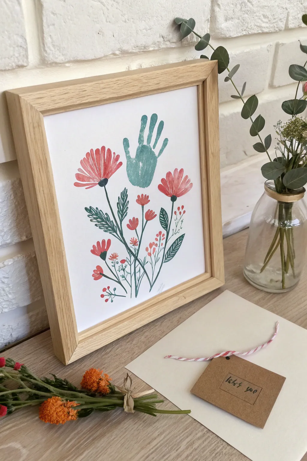
Transform a simple handprint into the centerpiece of a whimsical floral bouquet with this charming art project. This polished keepsake balances the organic texture of a stamped handprint with delicate hand-painted stems and blooms, creating a piece worthy of display or gifting.
Step-by-Step
Materials
- Heavyweight mixed media paper or watercolor paper (A4 size)
- Teal or sage green acrylic paint (for the handprint)
- Coral, red, and muted pink acrylic or gouache paints
- Dark green and sage green acrylic or gouache paints
- Flat paintbrush (medium width, about 1/2 inch)
- Round paintbrush (small, size 2 or 4)
- Fine liner brush (size 0 or 1)
- Foam sponge brush
- Palette or paper plate
- Light wood frame (A4 size or similar)
Step 1: The Handprint Foundation
-
Prepare the workspace:
Lay down newspaper or a messy mat to protect your table. Tape the corners of your mixed media paper down lightly to prevent it from shifting while you work. -
Mix the handprint color:
Create a soft teal or sage color on your palette. If your green is too bright, mix in a tiny drop of grey or white to achieve that muted, sophisticated tone shown in the example. -
Coat the hand:
Using the foam sponge brush, apply an even, relatively thick coat of the teal paint to the palm and fingers of the hand you act acting as the stamp. Avoid large globs, but ensure full coverage. -
Stamp the print:
Position the hand near the top center of the page, fingers pointing slightly upward and right. Press the hand firmly down—pressing on each finger and the center of the palm—then lift straight up to get a clean impression. -
Let it cure:
Allow the handprint to dry completely before moving on. This is crucial so you don’t smudge the main focal point while painting the surrounding garden.
Stamp Cleanly
Handprints can be slippery! Practice on a scrap piece of paper first to gauge how much paint you need. Too much paint causes sliding; too little leaves gaps.
Step 2: Painting the Blooms
-
Paint the large daisies:
Mix a coral-red shade. Using your flat brush, paint two large daisy-like flowers. Place one to the left of the handprint and one to the right, slightly lower. Create petals by pressing the flat brush down and pulling inward toward a center point. -
Add petal details:
Once the main coral shapes are down, take a slightly lighter pink shade and add a few strokes on top of the petals to create depth and texture. -
Create the flower centers:
Dip your round brush into dark green or black paint. Paint a small semi-circle at the base of the petals (where they all meet) to anchor the flower heads. -
Add medium blooms:
Using the round brush and the coral paint, dab small, simple three-petal flower shapes lower down on the paper, filling the space below the handprint. -
Paint tiny buds:
Switch to your fine liner brush. With a lighter pink or salmon color, dot tiny clusters of circles near the bottom right and left to represent berry sprays or small buds.
Step 3: Adding Greenery and Stems
-
Draw the main stems:
Load your fine liner brush with dark green paint diluted with a tiny drop of water for better flow. Draw long, thin stems connecting your large coral flowers down toward the bottom center of the page. -
Connect the smaller flowers:
Draw delicate, wispy stems connecting the medium blooms and tiny buds, allowing the lines to cross over each other slightly at the bottom to create a bouquet effect. -
Paint large leaves:
Using the dark green, paint elongated, serrated leaves near the main stems. I find that painting the central vein first and then adding short, angled strokes outward creates a nice feathery texture. -
Add detail leaves:
Use a lighter sage green to paint smaller, simpler oval leaves on the lower stems to add variety to your foliage. -
Review and refine:
take a step back and look at the composition. If there are empty gaps near the bottom, add a few extra stray stems or leaves to balance the weight of the bouquet. -
Frame the work:
Once the paint is thoroughly dry (give it at least an hour), place the artwork into a light wood frame to complement the natural, earthy tones of the paint.
Family Bouquet
Make a larger version using different hand sizes for each family member as the ‘flowers,’ creating a generational garden piece.
Now you have a captured moment in time disguised as a beautiful piece of botanical art


Have a question or want to share your own experience? I'd love to hear from you in the comments below!