
When my brain feels too loud, drawing is how I turn that inner noise into something I can actually see and hold. These mental health drawing ideas are like little studio exercises for naming feelings, easing anxiety, and giving your thoughts a softer place to land.
Make an Emotions Color Wheel
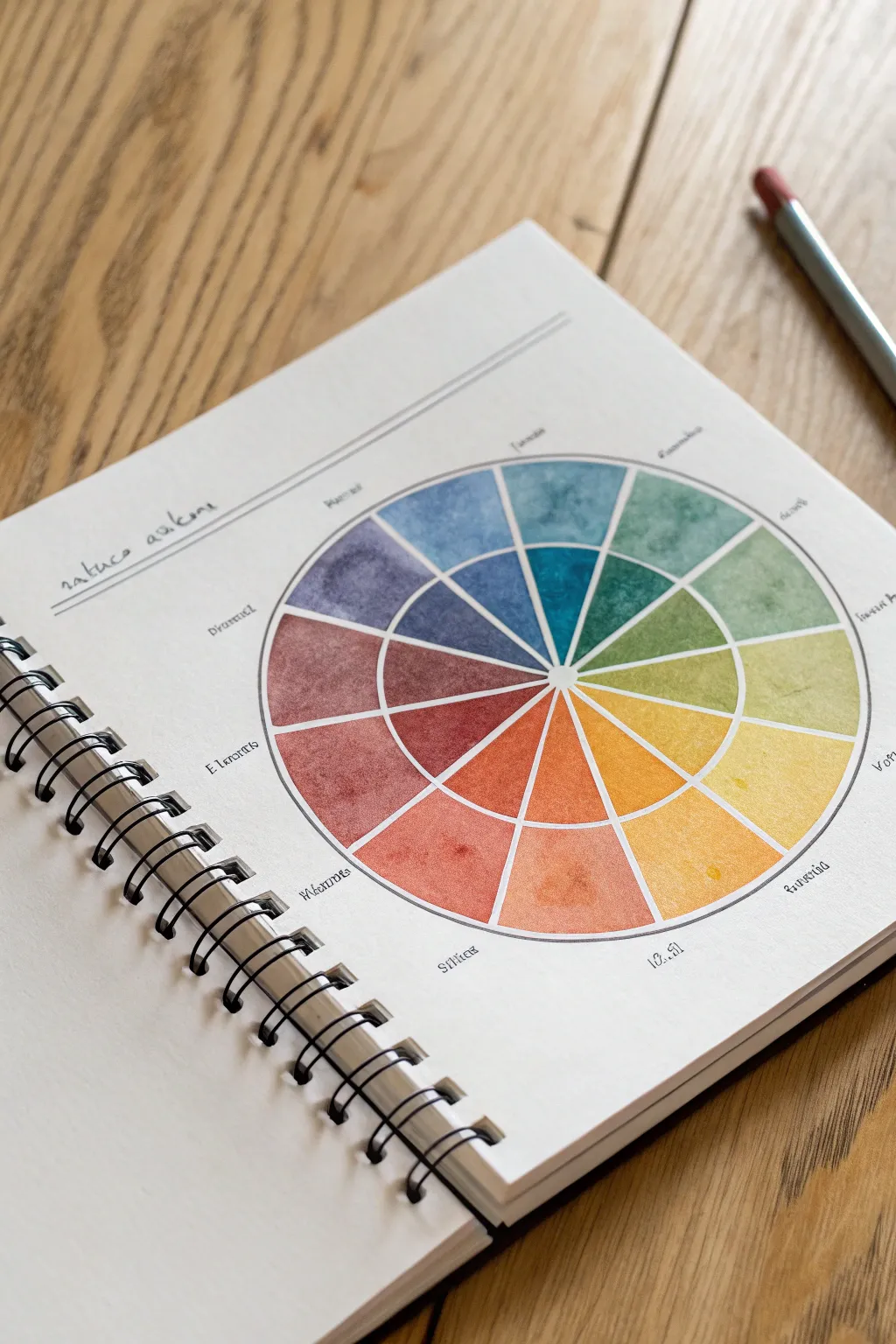

Visualizing your feelings can be incredibly grounding, and this watercolor wheel offers a structured yet expressive way to do just that. You’ll create a segmented circle that blends the logic of color theory with the fluidity of your personal emotional landscape.
How-To Guide
Materials
- Spiral-bound watercolor paper sketchbook
- Compass or round object for tracing (approx. 4-5 inches diameter)
- Ruler
- Fine liner pen (waterproof, black, 0.3mm or 0.5mm)
- Pencil (light graphite like HB or 2H)
- Watercolor paint set
- Round watercolor brush (size 4 or 6)
- Jar of clean water
- Paper towels
Step 1: Drafting the Structure
-
Draw the circles:
Begin by finding the center of your page. Using a compass or by carefully tracing round objects, draw a large circle (about 5 inches wide). Inside this, draw a smaller concentric circle (about 2 inches wide), creating a ring shape. -
Mark specific radius lines:
Using your ruler, lightly draw vertical and horizontal lines through the exact center to divide the circle into quarters. Then, divide each quarter into three equal pie slices. You should end up with 12 segments total. -
Ink the main lines:
Take your waterproof fine liner and trace over your pencil lines. Be deliberate; outlines don’t need to be mechanically perfect, but they should be clear. Ink the outer circle, the inner circle, and the radiating lines separating the segments. -
Add text labels:
Around the outside perimeter of the wheel, write small labels for different emotions or states of mind corresponding to each segment. You can use fake text like the example for aesthetic practice, or write real emotions like ‘Joy,’ ‘Calm,’ or ‘Anxiety.’ -
Create a title section:
At the top left of the page, draw two parallel lines. Between them, write a title like ‘Nature Awaits’ or ‘Daily Check-in’ in a cursive script. -
Erase pencil guides:
Once the ink is completely dry—give it a minute or two—gently erase all the underlying graphite marks to leave a crisp black framework.
Step 2: Painting the Spectrum
-
Prepare your palette:
The goal is a gradient. Arrange your paints or mix them on a palette to follow a rainbow progression: Red, Red-Orange, Orange, Yellow-Orange, Yellow, Yellow-Green, Green, Blue-Green, Blue, Blue-Violet, Violet, Red-Violet. -
Paint the first segment:
Start with the red segment. Dip your brush in water and then pigment. Fill the outer ring segment first, keeping the color fairly saturated but transparent enough to see the paper grain. -
Paint the inner segment:
Immediately paint the corresponding inner wedge. I like to use slightly more water here to make the inner circle feel lighter or more diluted than the outer ring. -
Move to orange tones:
Move clockwise to the next segment. Clean your brush thoroughly and pick up your orange-red mix. Carefully paint right up to the line of the previous segment without letting the wet paints touch and bleed. -
Continue the warm gradient:
Proceed through the yellow and gold tones. Notice how the example image has a lovely texture; achieve this by pooling the watercolor slightly and letting it dry naturally rather than overworking it. -
Transition to cool tones:
Switch to your greens and teals. If you want that earthy look from the photo, desaturate your bright greens by adding a tiny touch of red or brown paint to the mix. -
Complete the blues and purples:
Finish the circle with your deep blues and violets. For the inner wedges, you can let the paint fade toward the center point for a nice radial effect. -
Let it dry completely:
Allow the page to sit flat until bone dry. This prevents the colors from running if you close the book too soon. -
Add final details:
If any lines got obscured by opaque paint, go back over them gently with your fine liner to crisp up the boundaries.
Wet-on-Dry Control
To keep segments distinct like the image, always paint ‘wet on dry.’ Ensure paper is dry before starting a neighboring section to prevent bleeding.
Adding Texture
Sprinkle a tiny pinch of salt onto a wet segment while painting. As it dries, the salt absorbs pigment, creating beautiful starry textures.
Now you have a beautifully organized spectrum of color to reflect on whenever you open your sketchbook


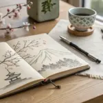
Sketch a Self-Portrait of Today’s Feelings
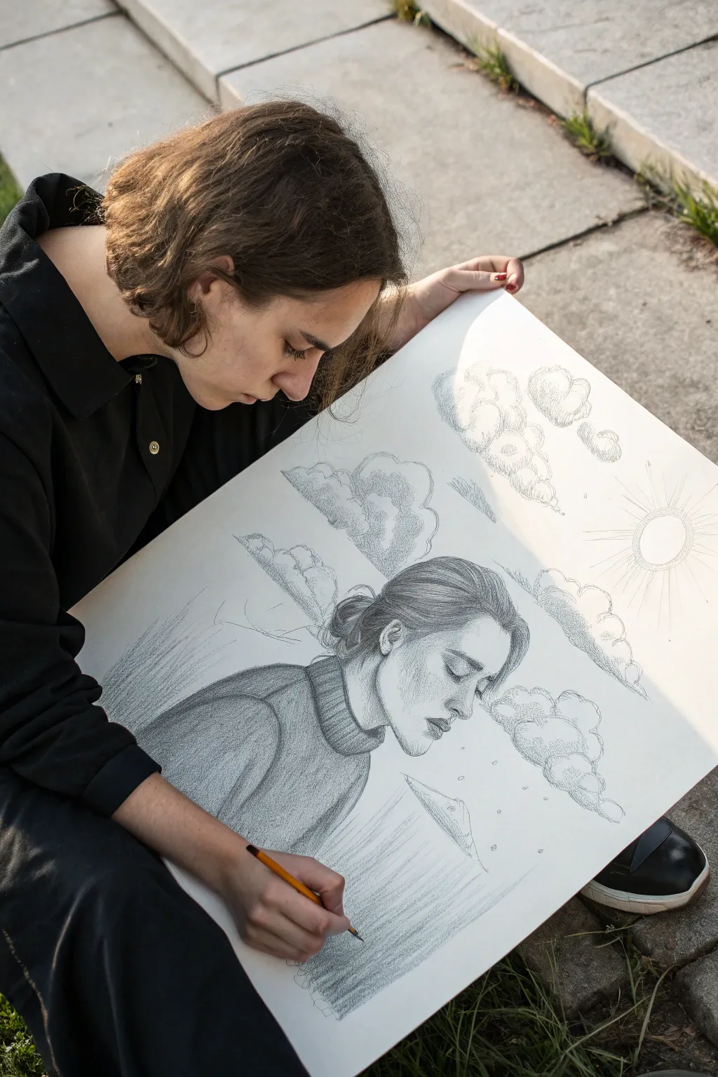
Capture a mood of quiet reflection with this graphite pencil drawing that transforms emotions into visual art. This striking composition features an introspective profile portrait surrounded by whimsical, textured clouds and stylized sunbeams.
Detailed Instructions
Materials
- Large sheet of heavyweight drawing paper (A2 or 18×24 inches)
- Graphite drawing pencils (HB for sketching, 2B and 4B for shading)
- Mechanical pencil (0.5mm) for fine details
- Kneaded eraser
- Blending stump or tortillon
- Pencil sharpener
Step 1: Laying the Foundations
-
Map the composition:
Start with a light HB pencil to establish the placement of your figure. The head should be centered slightly in the lower half of the page to leave ample room for the sky elements above. -
Outline the profile:
Sketch the basic profile view of the face. Focus on capture the downward gaze; keeping the eyes closed or looking down adds to the contemplative mood of the piece. -
Draft the sweater:
Draw the neckline and shoulders using broad, sweeping curves. Indicate a thick turtleneck collar with vertical ribbed lines, suggesting a cozy, protective garment. -
Position the sky elements:
Lightly sketch outlines for several large, fluffy cloud formations floating around and above the head. Place a circle in the upper right corner to represent the sun.
Smudge Control
Place a scrap piece of paper under your drawing hand as you work. This prevents oils from your hand transferring to the paper and stops you from smudging your careful shading.
Step 2: Shading the Portrait
-
Detail the hair:
Using a sharper pencil or mechanical pencil, begin filling in the hair. Use long, flowing strokes that follow the curvature of the head, pulling the hair back into a low bun. -
Darken hair values:
Switch to a 2B pencil to add depth to the hair. concentrate deeper shadows near the hairline and behind the ear to create volume. -
Shade the face:
Apply very gentle shading to the face using an HB pencil. Focus on the shadow under the brow bone, beneath the nose, and the hollow of the cheek to give the face dimension without making it look heavy. -
Texture the sweater:
Use a 2B or 4B pencil to shade the sweater. Use small, repetitive vertical strokes on the collar to mimic a knit texture, and broader, smoother shading for the main body of the garment.
Step 3: Creating the Atmosphere
-
Define the clouds:
Go back to your cloud outlines. Instead of a solid line, use small, scumbled (circular) pencil strokes to create the fluffy, vaporous edges of the clouds. -
Shade the cloud volume:
Shade the bottom portions of each cloud puff more heavily to give them weight and 3D form, leaving the tops distinct and white. -
Draw the sunbeams:
From your sun circle in the corner, draw long, straight lines radiating outward across the sky. Vary the lengths slightly but keep the lines thin and delicate. -
Add rain or atmosphere:
Below the clouds near the face, add very faint vertical or diagonal hatching lines. This suggests a localized rain shower or mist, reinforcing the ‘mental weather’ theme. -
Create the reflection base:
At the very bottom of the drawing, sketch vertical lines downward from the figure’s base, simulating a reflection in water or a fading away effect.
Cloud Texture Tip
For softer clouds, don’t draw a hard outline first. Instead, build the shape purely through small, circular shading motions, letting the white paper define the top edge.
Step 4: Refining and Finishing
-
Deepen the blacks:
Take your 4B pencil and identify the darkest points—proabably the crevices of the sweater and the deepest shadows in the hair—and darken them to increase contrast. -
Clean up highlights:
Use your kneaded eraser to lift graphite from the bridge of the nose, the tops of the clouds, and the forehead to create bright highlights. -
Blend selectively:
I prefer to use a blending stump gently on the skin tones to make them smooth, but leave the pencil strokes visible on the sweater and clouds for texture variety. -
Final assessment:
Step back and look at the overall balance. Reinforce the outer rim of the sun with a slightly textured line (like tiny loops) to match the whimsical style of the clouds.
Take a moment to appreciate how transferring your internal state onto paper can create a sense of calm and release


Draw Your Calm Place Sanctuary
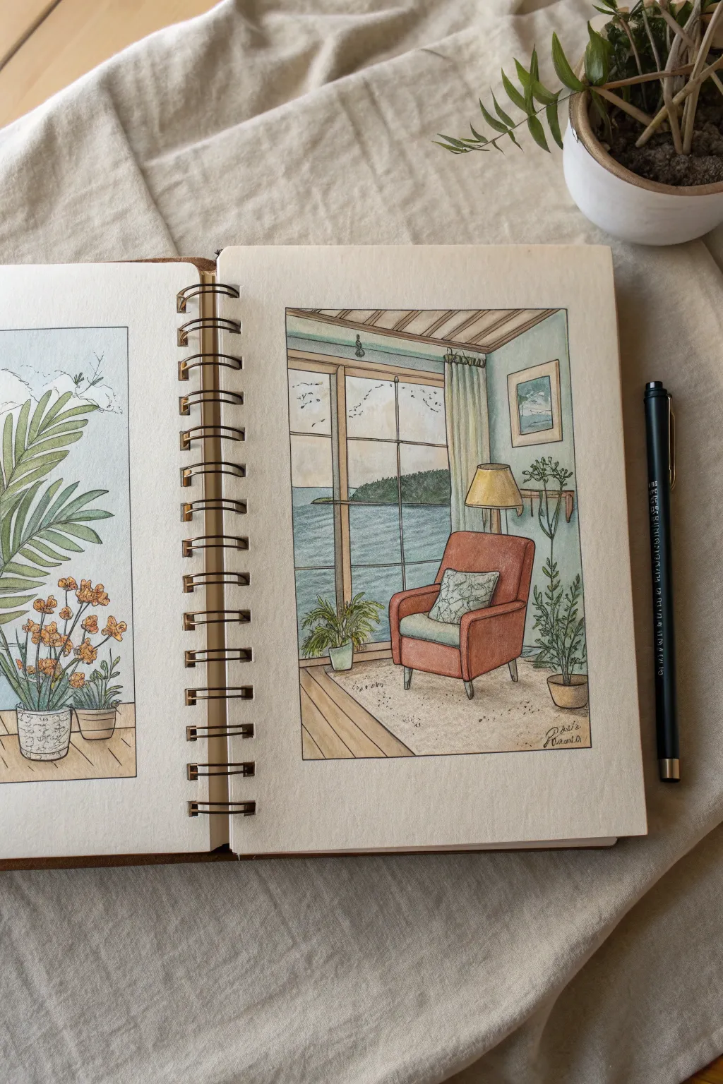
This peaceful illustration captures the essence of a quiet afternoon spent reading by the sea, framed perfectly within a sketchbook page. The soft, muted color palette and precise ink lines create a calming, attainable art piece that invites you to visualize your own personal retreat.
How-To Guide
Materials
- Sketchbook with mixed media or watercolor paper (heavyweight, smooth texture)
- Fine liner pens (black, sizes 0.1, 0.3, and 0.5mm)
- Graphite pencil (HB) and kneaded eraser
- Watercolor paints (pan set or tubes)
- Small round watercolor brushes (sizes 2 and 4)
- Ruler
- White gel pen (optional for highlights)
- Paper towel and water jar
Step 1: Structuring the Scene
-
Define the boundaries:
Start by drawing a rectangular frame in the center of your sketchbook page using a ruler and pencil. Leave a generous margin of white space around the edges to give the drawing room to breathe, just like a Polaroid photo. -
Sketch the perspective lines:
Lightly sketch the corner of the room. Draw a vertical line for the wall corner and horizontal lines for the floor and ceiling beams. Position the large window on the left side, ensuring the window frame lines follow a gentle one-point perspective leading toward the horizon. -
Block in major furniture:
Roughly outline the armchair as the focal point. Use simple geometric shapes first: a cube for the seat and angled rectangles for the backrest and arms. Position the chair slightly off-center to the right to balance the large window. -
Add nature elements:
Sketch the placement of the potted plants. Place a small, leafy plant on the floor near the window and a taller, slender plant next to the chair on the right side. Don’t worry about individual leaves yet; just mark their height and spread. -
Detail the accessories:
Add the floor lamp behind the chair, a small framed picture on the right wall, and the curtain gathered on the rod. Finally, sketch the horizon line outside the window, adding a suggestion of a distant island or headland.
Uneven Watercolors?
If your large wall areas look bloomy or uneven, your paper might be too wet. Let it dry completely, then apply a second very thin, even glaze of color to unify the texture.
Step 2: Inking the Outlines
-
Ink the main structural lines:
Switch to your 0.3mm fine liner. Go over the window pane frames, the floorboards, and the room’s corner. Use the ruler for the window and floor to keep the architecture looking structural and solid. -
Outline organic shapes:
Use the 0.1mm pen for the plants and the armchair. For the chair, make the lines slightly softer and less rigid than the window frames to suggest upholstered fabric comfort. Draw the leaves with organic, slightly wavering strokes. -
Define the textural details:
Add small details like the folds in the curtain, the pattern on the throw pillow, and the wood grain on the floorboards. Stipple small dots on the rug area to suggest a looped texture without drawing every thread. -
Finalize the horizon:
Ink the horizon line outside. Use very sparse, broken lines for the water to simulate gentle waves. Once the ink is completely dry (wait at least 5 minutes), gently erase all pencil marks.
Step 3: Applying Color
-
Wash the walls and floor:
Prepare a very dilute wash of pale teal or mint green for the walls. Paint evenly, avoiding the window and objects. For the floor, mix a light sandy beige and apply it in the direction of the floorboards. -
Paint the sanctuary chair:
Mix a warm terracotta or burnt sienna color. Apply this to the armchair, leaving the seat cushion lighter (perhaps a pale sage green) to create contrast. I prefer to drop in slightly more pigment in the shadowed areas where the arms meet the backrest while the paint is still wet. -
Bring the outdoors in:
Paint the sea with a muted blue-grey, getting darker near the horizon and lighter near the shore. Paint the distant island with a dark mossy green. Fill the indoor plant leaves with various shades of olive and sap green to differentiate them. -
Add warmth with lighting:
Paint the lampshade a soft yellow-ochre. You can also add a tiny wash of this yellow on the wall right next to the lamp to suggest it is turned on and casting a glow. -
Finalize with shadows:
Once the base layers are dry, mix a transparent grey-purple. Paint shadows under the chair, the plant pots, and along the edges of the room corners to ground the objects so they don’t look like they are floating. -
Optional highlights:
If you have a white gel pen, add tiny touches of white to the top of the lamp, the glossy leaves of the plants, or the window frame to make the drawing pop.
Depth Perception Trick
Make items in the foreground (like the chair) more vibrant and detailed, while keeping background elements (like the island outside) paler and bluer to create atmospheric depth.
Creating this small window into a peaceful world reminds you that calm is something you can build, line by line.


Create a Gratitude Doodle Collage
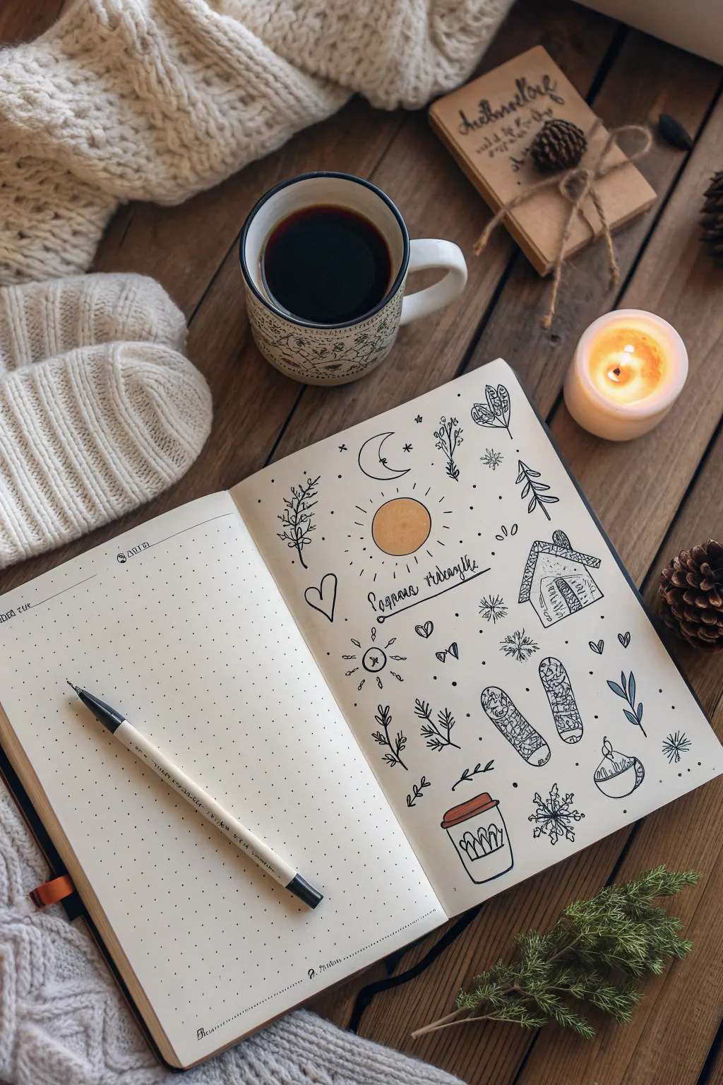

Center your mind and embrace the season with this charming bullet journal spread that combines simple line art with cozy winter motifs. This gratitude collage brings together comforting symbols like warm drinks, knitted mittens, and celestial elements to create a peaceful visual anchor for your thoughts.
Step-by-Step Guide
Materials
- A5 dotted grid notebook or journal
- Fine liner pen (black, 0.3mm or 0.5mm)
- Small set of colored pencils or markers (specifically yellow/orange, red/rust, light blue)
- Pencil and eraser for initial sketching
Step 1: Setting the Scene
-
Plan your layout:
Open your journal to a fresh two-page spread. We will be focusing on the right-hand page for the artwork, leaving the left page blank or ready for your written gratitude list. Visualize the center of the right page as your focal point. -
Sketch the central sun:
Using a light pencil, draw a circle slightly above the center of the page. This will become the sun. Around it, plan space for a banner or text. -
Outline the banner:
Directly below the sun circle, lightly sketch a rectangular banner or a simple line for text where you will write your theme, such as ‘Winter Gratitude’ or a specific date.
Pro Tip: Balance
To keep the collage looking cohesive, try to maintain equal spacing between each small doodle. Think of them as floating stickers that shouldn’t touch each other.
Step 2: Drawing the Motifs
-
Ink the sun and moon:
Switch to your fine liner pen. Go over your pencil circle for the sun, adding short, radiating lines around the circumference. Above and slightly left of the sun, draw a crescent moon shape and ink it. -
Create the text area:
Draw the ribbon banner or parallel lines below the sun. Inside, write your chosen phrase in a loose, cursive hand-lettering style. -
Add nature elements:
To the left of the sun, draw a vertical branch with small leaves or berries. On the opposite side (right), sketch a small pine tree using simple zigzag motions or stacked triangles. -
Draw the cozy house:
On the right side of the page, roughly halfway down, draw the outline of a small house or cabin. Add a textured roof with scalloped lines to mimic shingles and a small door. -
Illustrate the winter gear:
Near the bottom right quadrant, draw two oval shapes representing winter mittens or shoes. Fill them with intricate patterns like tiny flowers, loops, or cross-hatching to suggest knitting. -
Sketch the warm drinks:
At the very bottom, draw a takeaway coffee cup with a sleeve. Add vertical lines on the sleeve for texture. Nearby, draw a rounded mug with a rim, perhaps suggesting a hot chocolate bowl. -
Fill the gaps with flora:
Look for empty spaces around your main drawings. Add sprigs of pine, small leafy branches, or tiny seedling shapes to balance the composition.
Level Up: Daily Doodling
Turn this into a challenge by drawing just one small icon per day for a month. By the end of the month, your page will be a full visual diary of gratitude.
Step 3: Details and Color
-
Add celestial sparkles:
Scatter small details throughout the open white space. Draw tiny stars, dots, and small snowflakes (asterisk shapes) to make the page feel full and magical. -
Incorporate hearts:
Draw a few simple outline hearts, particularly near the left side or next to the house, to emphasize the theme of love and gratitude. -
Erase pencil lines:
Wait a moment for the ink to truly set, then gently erase all your initial pencil sketches to leave a clean black-and-white foundation. -
Color the sun:
Take a yellow or orange colored pencil and fill in the central sun circle. I like to keep the coloring soft and textured rather than perfectly solid. -
Highlight the coffee cup:
Use a rust or red pencil to color the lid of the takeaway cup. This small pop of color draws the eye to the bottom of the page. -
Tint the leaves:
If you have a muted blue or green, add very faint touches of color to a few leaves or the banner, but keep the overall aesthetic predominantly black and white.
Enjoy the peaceful process of filling your page with these comforting little reminders of the season

PENCIL GUIDE
Understanding Pencil Grades from H to B
From first sketch to finished drawing — learn pencil grades, line control, and shading techniques.
Explore the Full Guide
Illustrate the Tangled Mind and Untangling Threads
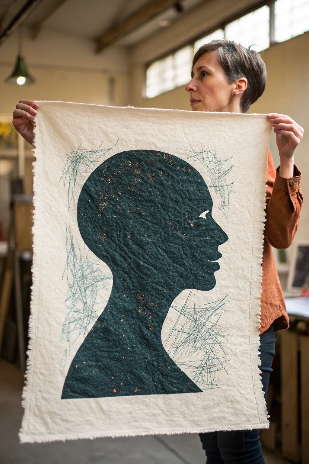
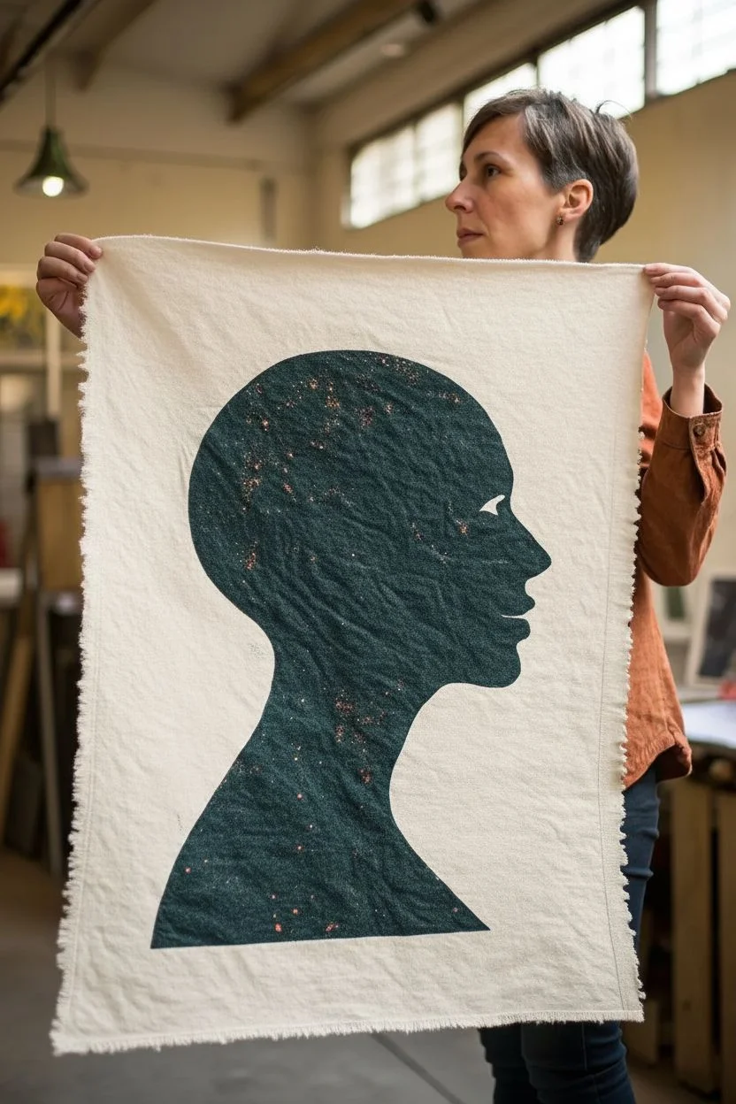
This evocative mixed-media piece combines a clean, dark silhouette with chaotic scribbles to represent the complex interplay between composure and internal noise. Using a combination of fabric painting, stenciling, and freehand ink work on raw canvas, you’ll create a striking visual metaphor for mental health.
How-To Guide
Materials
- Heavyweight unbleached canvas or calico fabric (approx. A3 size)
- Dark teal or petrol blue fabric paint
- Copper or gold metallic fabric paint (or glitter paint)
- Fine liner pens or fabric markers in teal/sage green
- Large sheet of cardstock or stencil film
- Craft knife or scalpel
- Cutting mat
- Pencil
- Painter’s tape or masking tape
- Sponge dabber or high-density foam roller
- Small stiff bristle brush
- Paper plate or palette
Step 1: Preparation and Stencil Creation
-
Prepare the canvas:
Cut your unbleached canvas to size, leaving roughly a 2-inch border around your intended image area. You can fray the edges slightly by pulling loose threads for a more organic, raw look. -
Draft the profile:
On your cardstock or stencil film, draw a side profile of a human head. Focus on a simple, classic silhouette shape—forehead, nose, lips, chin, and neck. You can find free profile clipart online to trace if drawing freehand feels daunting. -
Cut the stencil:
Place the cardstock on your cutting mat. carefully trace along your pencil lines with a craft knife to remove the positive shape (the head itself), leaving you with a negative stencil. -
Secure the fabric:
Tape your canvas piece down to a flat, hard surface so it doesn’t shift. Place your negative stencil over the canvas, positioning the head centrally but perhaps slightly lower than the vertical center. -
Seal the edges:
Use painter’s tape to secure the stencil edges to the canvas. Press down firmly right along the cut edge of the profile to prevent paint from bleeding under the cardstock.
Clean Lines Hack
Apply a thin layer of clear acrylic medium or matte gel over the stencil edge before painting your color. This seals the gap so any bleed is invisible clear gel, keeping the teal line razor sharp.
Step 2: Painting the Silhouette
-
Load the paint:
Squeeze a generous amount of dark teal fabric paint onto your palette. Dab your sponge or foam roller into the paint, then offload the excess onto a clean part of the palette; you want the applicator damp, not dripping. -
Apply the base color:
Begin dabbing color onto the exposed canvas inside the stencil. Use a vertical up-and-down motion rather than brushing side-to-side to minimize bleeding under the stencil edges. -
Build opacity:
The first layer might look patchy, and that’s okay. Let it sit for a few minutes until tacky, then apply a second coat to get that deep, solid petrol blue color. -
Add the ‘stardust’:
While the teal paint is still slightly wet, dip a stiff bristle brush into the copper or gold metallic paint. Hold the brush over the silhouette and flick the bristles with your thumb to splatter tiny specks across the head. -
Create texture:
To mimic the wrinkled texture seen in the reference, gently scrunch a plastic bag or a piece of plastic wrap and press it into the wet paint, then lift it straight up. This lifts small amounts of pigment and creates organic veins. -
Dry and reveal:
Let the paint dry completely. I prefer to wait at least an hour to be safe. Once dry, carefully peel away the tape and lift the stencil to reveal your crisp silhouette.
Step 3: The Tangled Lines
-
Select your pens:
Choose a teal or sage green fine liner that is lighter than your silhouette color but distinct enough to show up on the cream canvas. -
Start the scribbles:
Position your pen tip near the back of the head or the neck. Begin making rapid, scratchy marks that extend outward from the silhouette into the empty space. -
Vary the pressure:
Keep your hand loose. Some lines should be faint and barely there, while others can be darker and more deliberate. Think of these lines as thoughts unraveling or static noise. -
Create clusters:
Don’t cover the entire background. Focus on clustering these tangled lines around the back of the head and the throat area, leaving the face area relatively clear to symbolize clarity of vision amidst the noise. -
Overlap the silhouette:
Allow some of your pen lines to cross slightly over into the painted dark area. This connects the internal state with the external expression. -
Final assessment:
Step back and look at the balance. Add a few stray, long lines that reach further out to the edges of the canvas to create a sense of expansive tension.
Make it 3D
Instead of drawing the tangled lines, use embroidery thread. Stitch chaotic loops with teal thread directly through the canvas for a tactile element that literally untangles from the mind.
Hang your finished piece as a reminder that even amidst a tangled mind, there is a solid, resilient self.
Draw the Shadow Self vs. the Mask You Wear
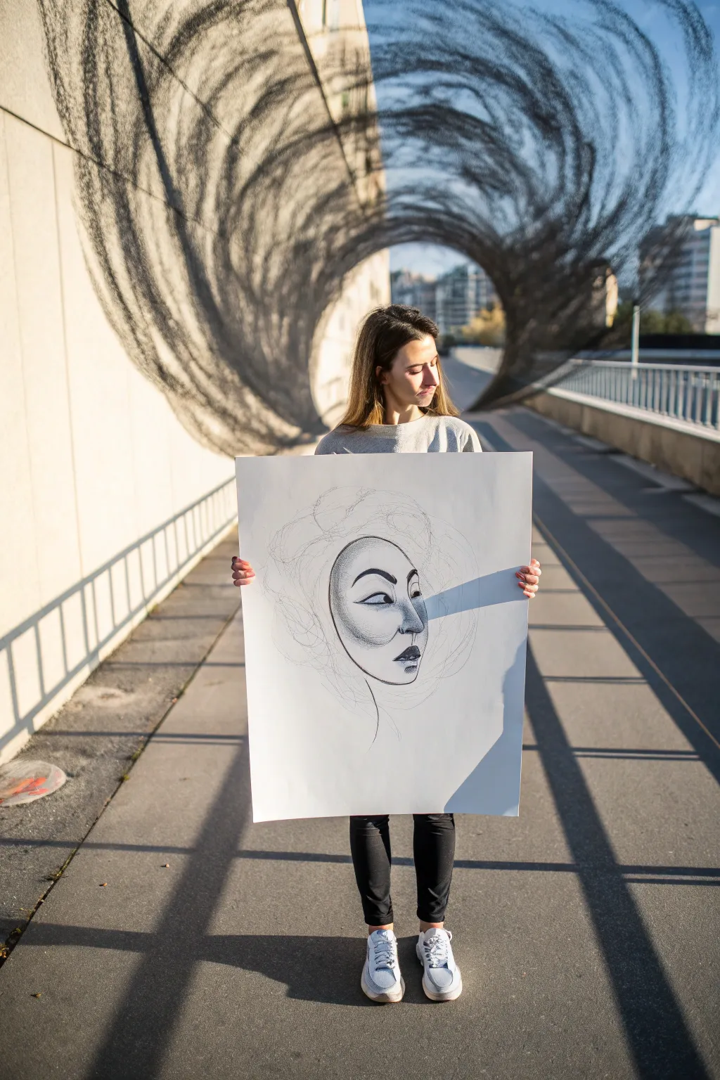
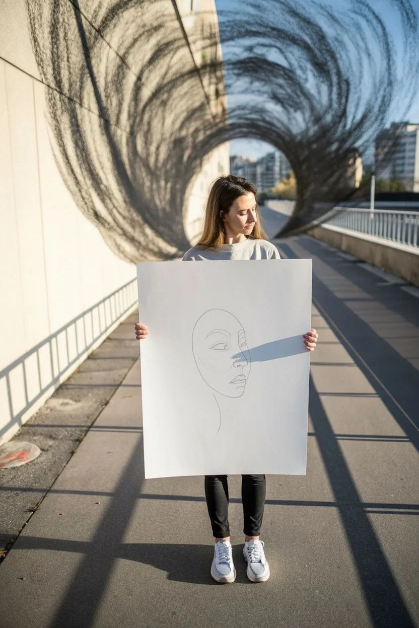
This evocative drawing project explores the contrast between the calm exterior we present to the world and the swirling, unkempt energy of our inner thoughts. Using simple charcoal and graphite techniques on a large scale, you will create a striking visual metaphor for the self.
Step-by-Step
Materials
- Large sheet of white drawing paper (A1 or A2 size)
- Soft vine charcoal sticks
- Compressed charcoal pencil (for dark details)
- Graphite pencils (HB and 4B)
- Kneadable eraser
- Blending stump or simply a tissue
- Workable fixative spray
Step 1: Conceptualizing the Mask
-
Establish the Placement:
Begin by lightly marking the center of your large paper. You want the face—the ‘mask’—to be somewhat central but slightly lower than dead center to allow room for the ‘chaos’ above. -
Outline the Face Shape:
Using an HB graphite pencil, sketch a smooth, oval-like shape for the face. Keep the linework clean and definite, as this represents the composed, visible self. I prefer to leave the top of the head open-ended, letting the line fade where the hair would start.
Keep it Loose
Hold the charcoal stick by the end, not near the tip like a pencil. This limits your control and forces the lines to be more organic and erratic.
Step 2: Drawing the Features
-
Draft the Eyes:
Place the eyes about halfway down the face shape. Draw them intentionally stylized or mask-like—almond shapes with heavy upper lids work well here. -
Add the Nose and Mouth:
Sketch a simple nose structure and full lips below. Focus on the contour lines rather than realistic shading for now, reinforcing the idea of a ‘mask’ or a persona. -
Develop Shadow and Depth:
Switch to your 4B pencil or a light touch with charcoal. Gently shade around the bridge of the nose and the cheekbones to give the face dimensionality. Keep this shading smooth and controlled. -
Intensify the Details:
Take your compressed charcoal pencil and darken the eyebrows, the lash line, and the corners of the lips. These sharp, black details will make the expression pop against the white paper.
Smudging Too Much?
If the face gets muddy from charcoal dust on your hand, place a clean scrap piece of paper under your palm while you work on the details.
Step 3: Unleashing the Shadow Self
-
Start the Scribble:
Pick up a piece of vine charcoal. Starting at the top edge of the forehead (where the mask line fades), begin making loose, circular motions. -
Build the Volume:
Expand these motions outward, creating a cloud-like mass of scribbles that surrounds the upper head. Don’t try to draw realistic hair; think about representing energy, noise, or thought. -
Vary Line Weight:
Press harder in some areas to create dense, dark pockets of shadow within the scribble cloud. Then, use a lighter touch for faint, wispy lines at the outer edges. -
Connect to the Mask:
Allow some of the faint charcoal lines to drift down over the cheeks or jawline of the mask. This visually connects the internal chaos with the external persona. -
Smudge for Atmosphere:
Use your fingers or a tissue to gently rub parts of the scribbled ‘hair.’ This creates a smoky, ethereal gray mid-tone behind the sharp charcoal lines.
Step 4: Final Touches
-
Clean the ‘Mask’:
Use your kneadable eraser to lift any stray charcoal dust off the face area. The ‘mask’ should remain stark white and clean compared to the messy surroundings. -
Accentuate Contrast:
Go back in with the compressed charcoal one last time. Darken the very center of the scribble mass to create a focal point of intensity just above the forehead. -
Reference the Jawline:
Ensure the jawline is clearly defined with a sharp graphite line, separating the face from the empty space below. -
Set the Artwork:
Take the drawing to a well-ventilated area and spray it with a workable fixative. This is crucial to prevent the loose vine charcoal from smearing or disappearing over time.
Step back and observe how the clean lines of the face interact with the wild energy of the charcoal above.
BRUSH GUIDE
The Right Brush for Every Stroke
From clean lines to bold texture — master brush choice, stroke control, and essential techniques.
Explore the Full Guide
Map Your Mental Health Journey as a Path
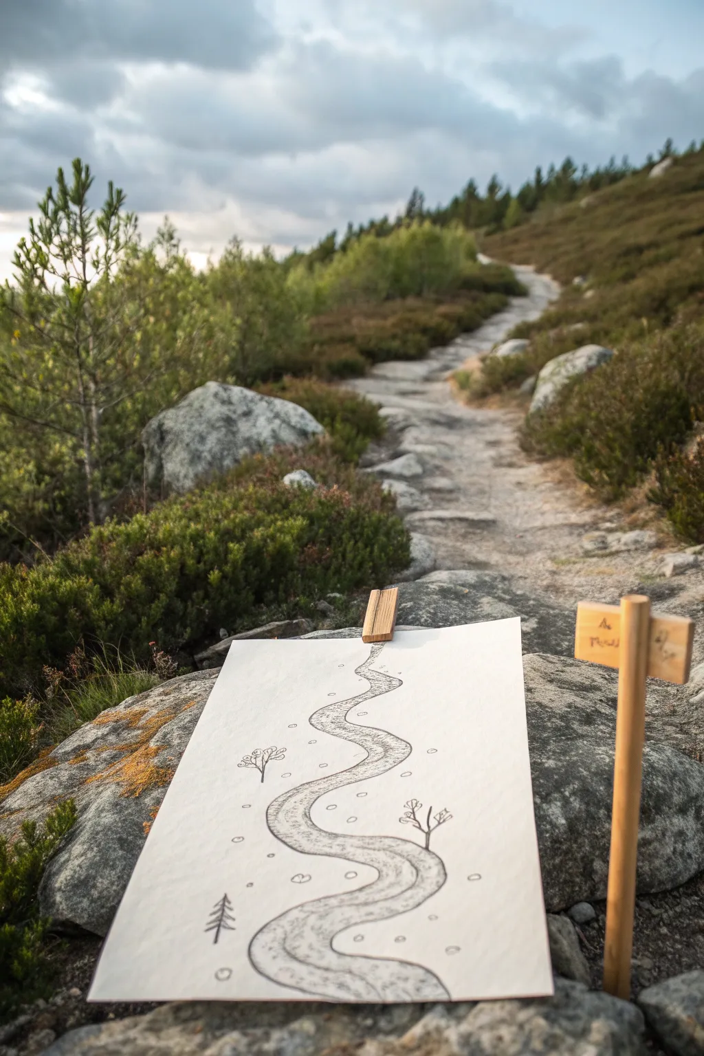
Visualizing your mental landscape can be grounding, and this project captures that journey through a simple yet evocative path drawing. The result is a minimalist, linear illustration that uses the metaphor of a winding trail to represent personal growth, obstacles, and progress.
Step-by-Step Tutorial
Materials
- Heavyweight drawing paper or mixed media paper (A4 or A5 size)
- Graphite pencils (HB and 2B)
- Fine liner pen (black, 0.5mm)
- Blending stump or cotton swab
- Wooden clothespin (optional primarily for outdoor staging)
- Small wooden sign post (optional prop)
Step 1: Laying the Groundwork
-
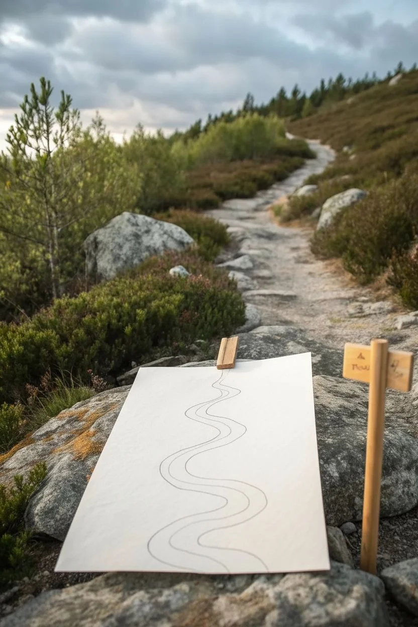
Prepare your surface:
Begin with a clean sheet of heavyweight drawing paper. Determine orientation based on the ‘length’ of the journey you want to depict; portrait mode works best for a long, winding road ahead. -
Visualize the curve:
Before putting pencil to paper, hover your hand over the page to practice the motion of a serpentine line. Imagine a river or a mountain switchback trail. -
Draft the left edge:
Using an HB pencil with very light pressure, draw a wavy line starting from the bottom left-center, meandering upward toward the top center. Let the curves be organic and slightly irregular. -
Draft the right edge:
Draw a parallel line to the right of your first one. To create perspective, make the path wider at the bottom (foreground) and gradually narrower as it reaches the top (background). -
Refine the path shape:
Step back and look at your road. If it feels too stiff, erase and loosen your wrist to create softer bends. The drawing relies on the flow of this central shape.
Step 2: Adding Texture and Detail
-
Define the boundaries:
Once satisfied with the shape, darken the outer edges of the path with a slightly firmer stroke, perhaps switching to a 2B pencil for richer contrast. -
Texture the path surface:
Inside the path, use short, scribbled strokes or stippling to simulate gravel or dirt. I like to concentrate these marks slightly more near the edges to suggest a trodden center. -
Add symbolic foliage:
Draw simple, skeletal trees along the route. For a deciduous tree, draw a thin stick with Y-shaped branches. Place one on the right side about halfway up. -
Include an evergreen:
Near the bottom or start of the path, sketch a small pine tree using a vertical line and downward-slanted strokes for branches to represent resilience. -
Scatter the obstacles:
Draw small, irregular circles or pebble shapes randomly around the path and sometimes on it. These can represent thoughts or small hurdles.
Uneven Perspective?
If the path doesn’t look like it’s receding, widen the bottom opening significantly. The drastic size difference tricks the eye into seeing distance instantly.
Step 3: Final Touches and Display
-
Create depth with shading:
Use a 2B pencil to lightly shade the ‘ground’ immediately outside the path lines. This lifts the path off the page visually. -
Blend for softness:
Take a blending stump or cotton swab and gently smudge the shading you just applied and the texture inside the path. This integrates the marks so they don’t look too scratchy. -
Reinforce key lines:
Go back over the main tree trunks and huge obstacles with your sharpest pencil or a fine liner pen to make them pop against the softer blended background. -
Erase highlights:
Use a kneadable eraser to tap the center of the path, lifting up graphite to create a highlighted, ‘walked-on’ affect down the middle. -
Stage the artwork:
To recreate the photo’s aesthetic, clip a wooden clothespin to the top center of the paper.
Personalize Your Map
Instead of trees, draw landmarks specific to your life. A stacked rock cairn can mark a milestone, or a small bridge can symbolize a transition.
Take a moment to breathe and reflect on where your drawn path might lead you next
Turn Your Strengths Into Friendly Characters
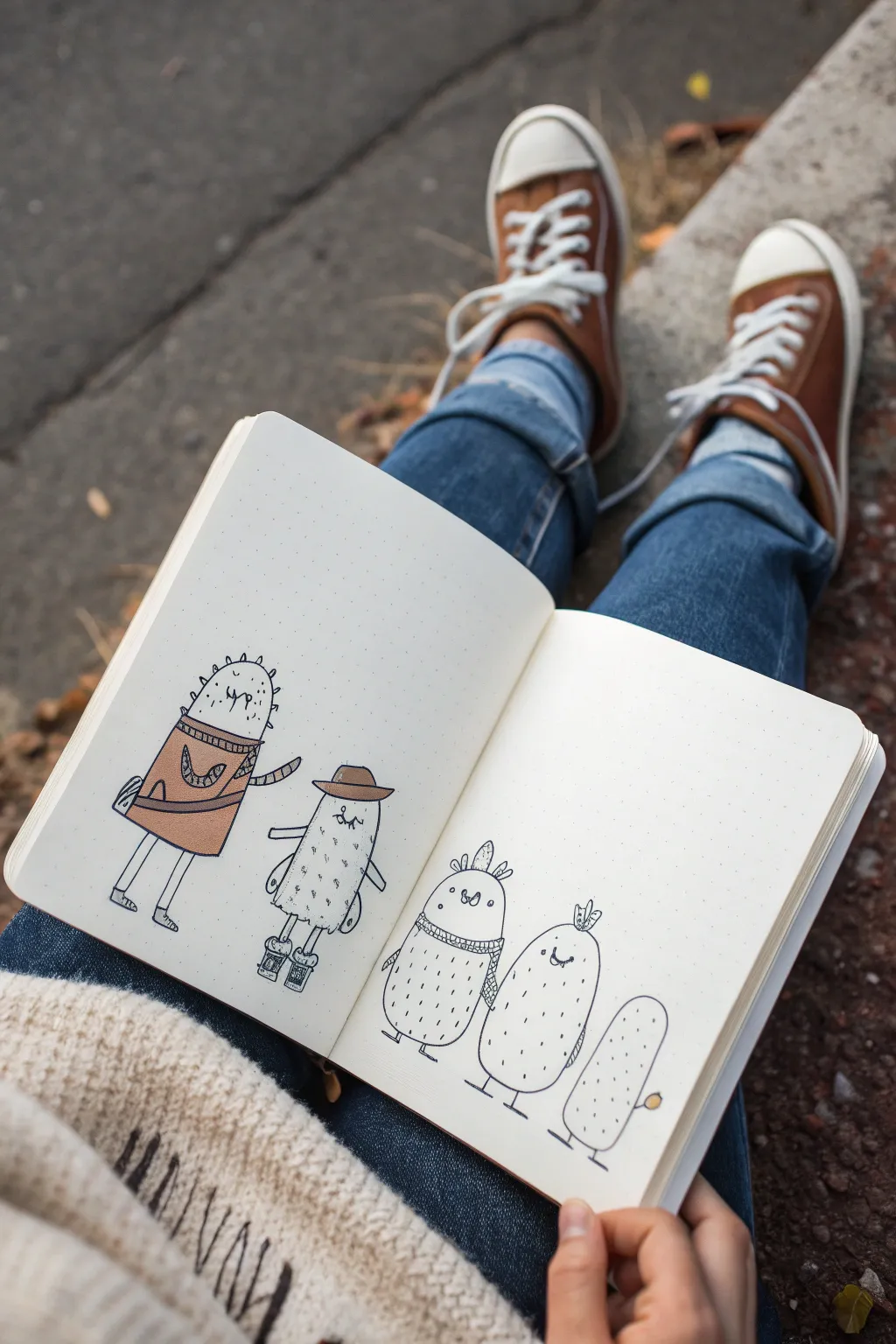
This charming spread transforms prickly cacti into a cast of friendly characters, each sporting unique accessories and expressions. Using simple line work on dot grid paper, you’ll create a whimsical lineup that feels both cozy and playfully expressive.
Step-by-Step
Materials
- A5 Dot grid notebook (e.g., Archer & Olive or Leuchtturm1917)
- Fine liner pens (black, sizes 0.1mm and 0.5mm)
- Alcohol-based marker or colored pencil (warm camel brown)
- Pencil and eraser for sketching
Step 1: Planning the Layout
-
Establish the baseline:
Start by lightly penciling a straight horizontal line across the bottom third of your open notebook spread. This invisible ground ensures all your characters stand at the same level. -
Sketch the character shapes:
Using your pencil, draw five elongated oval shapes. Place two on the left page and three on the right. Vary their heights and widths slightly—make the first one tall and sturdy, and the last one on the right the smallest. -
Draft the limbs:
Add simple stick-figure style legs to the bottom of each oval. For the arms, draw simple lines extending from their sides; on the second character, draw the arms angled down as if walking.
Use Dot Guides
Utilize the dots on your paper to keep spacing consistent. Count 3-4 dots between each character so they don’t look crowded.
Step 2: Drawing the ‘Strengths’ Characters (Left Page)
-
Dress the leader:
On the first tall cactus, sketch a sweater shape covering the middle third of its body. Add a diagonal sash across the chest. -
Add the first face:
Draw small, squiggly ‘u’ shapes for eyes and a tiny mouth near the top. Adding spectacles or angry eyebrows gives him a distinct ‘protector’ vibe. -
Detail the second character:
For the character next to him, sketch a wide-brimmed hat sitting atop its head. Give this one a closed-eye, peaceful expression and add little boots to the feet. -
Ink the outlines:
Switch to your 0.5mm black fine liner. Carefully trace over your pencil lines for the bodies, hats, and clothes. I find lifting the pen slightly at the end of lines gives a more organic look. -
Add texture:
Use the 0.1mm pen to add tiny, sparse vertical dashes or dots all over their ‘skin.’ These represent spines without looking dangerous. -
Color the accents:
Take your camel brown marker and fill in the sweater, sash, and hat. Leave the rest of the bodies black and white for contrast.
Ink Smearing?
If your fine liner smears when you color over it, change the order: lay down the brown marker color first, let it dry, then draw the ink lines on top.
Step 3: Creating the Support Squad (Right Page)
-
Sketch the scarf cactus:
Move to the right page. On the first oval, draw a thick, cozy scarf wrapped around its ‘neck’ area and add three feathers or flower petals sprouting from the top of its head. -
Add the flower crown:
On the middle character of this group, sketch a small, three-petaled flower right on the apex of the head. -
Finish the tiny one:
For the smallest cactus on the far right, draw it holding a tiny balloon or flower in one hand. -
Inking the right side:
Go over these three characters with your 0.5mm pen. Make sure the bottom curves of the bodies are smooth and rounded. -
Drawing the faces:
Give the scarf character wide, round eyes. Give the middle one a simple happy smile, and keep the smallest one minimal with just eyes. -
Pattern work:
Use the 0.1mm pen to draw a grid or knitted pattern on the scarf. Add subtle dashes on the bodies for texture, keeping it lighter than the outlines.
Step 4: Finishing Touches
-
Enhance the feet:
Go back and thicken the lines on the simple stick legs and add defined flat feet or shoes to ground them. -
Erase guidelines:
Wait until the ink is completely dry—give it a full minute—before gently erasing all your pencil sketches. -
Final assessment:
Look at the composition as a whole. If any area looks too empty, add a few extra ‘spine’ ticks or darken an outline to balance the visual weight.
Now you have a supportive little team of doodles ready to brighten your journal pages

Have a question or want to share your own experience? I'd love to hear from you in the comments below!