
When you’re missing someone, making art can feel like a quiet conversation with them—one more way to keep their presence close. Here are my favorite memorial painting ideas that turn love, memory, and symbolism into something you can hang on the wall and breathe with every day.
Paint a Memorial Portrait From a Favorite Photo
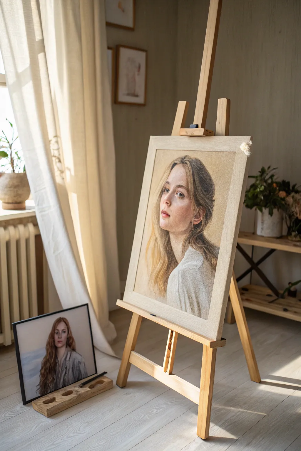
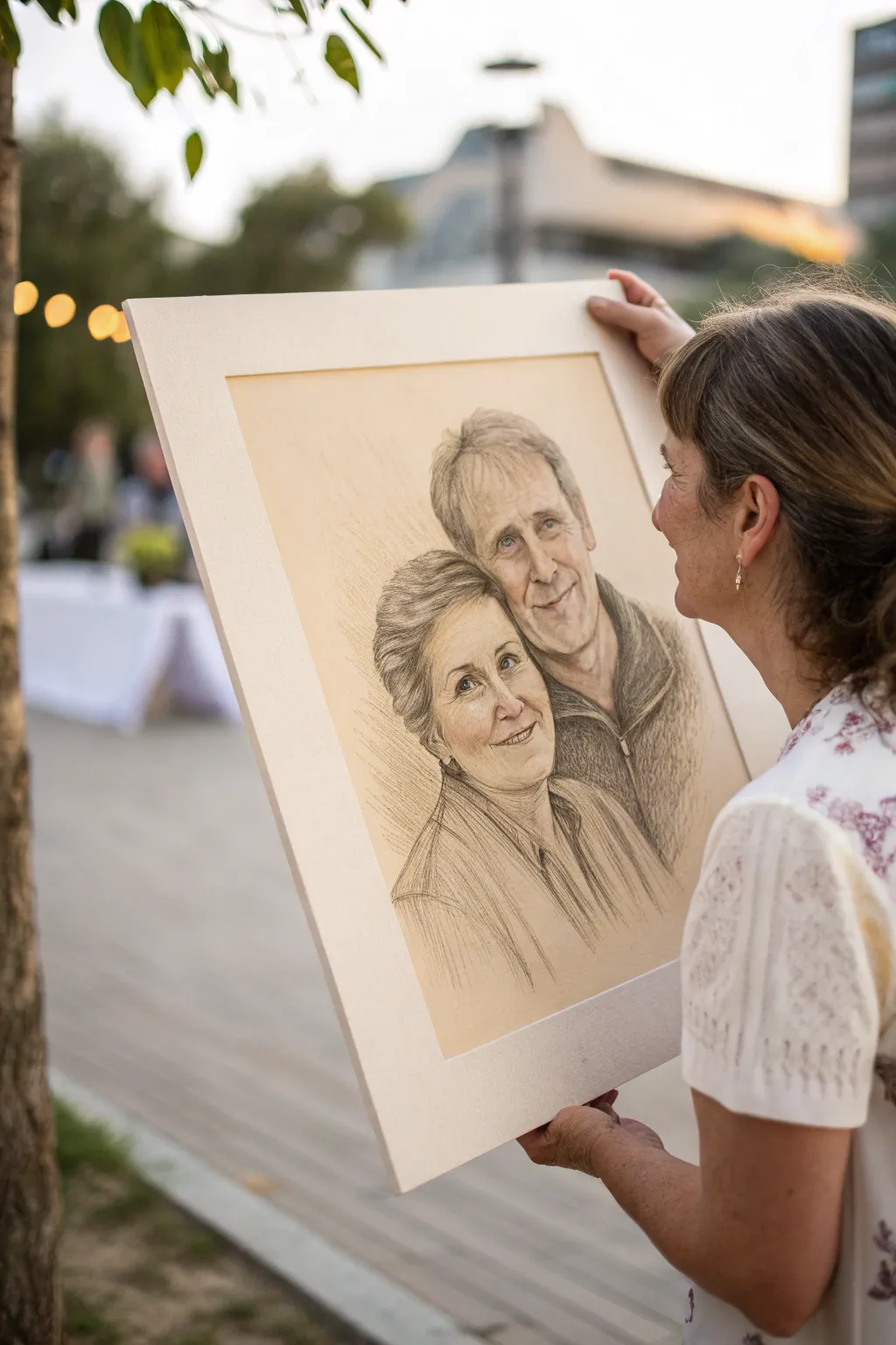
Capture the essence of a loved one by translating a favorite photograph into a soft, luminous pastel portrait. This project focuses on achieving realistic skin tones and gentle lighting effects to create a respectful and enduring tribute artwork.
Detailed Instructions
Materials
- Pastel paper or sanded paper (neutral beige or tan tone)
- Soft pastel sticks (flesh tones, warm browns, muted blues)
- Pastel pencils (for fine details and hair)
- Tracing paper and heavy pencil (for transfer)
- Masking tape
- Kneaded eraser
- Blending stumps or tortillons
- Workable fixative
- Reference photo
- Wooden easel
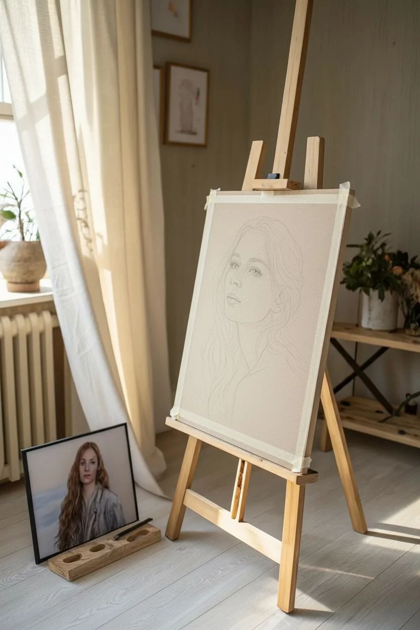
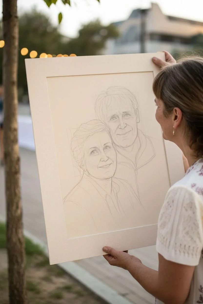
Step 1: Preparation and Transfer
-
Select your workspace:
Set up your easel in a well-lit area, preferably with natural light coming from the side, similar to the setting in the image. Tape your neutral-toned pastel paper securely to a rigid backing board. -
Prepare the reference:
Choose a high-quality reference photo. If you aren’t confident in freehand drawing, print the photo to the size of your canvas. -
Create the outline:
Trace the main contours of the face, hair, and clothing onto tracing paper. Flip the tracing paper, rub graphite over the lines on the back, flip it again, and trace it onto your pastel paper to leave a faint guide. -
Reinforce the sketch:
Using a neutral pastel pencil, like a warm grey or light brown, lightly go over your transferred lines to establish the composition without scratching the paper.
Step 2: Blocking in Values
-
Identify shadow shapes:
Squint at your reference photo to see the major shapes of light and dark. Using a soft brown pastel stick, lightly block in the darkest shadow areas under the chin, the side of the nose, and the hair masses. -
Apply mid-tones:
Select a mid-tone flesh color pastel stick. Gently apply this to the main plains of the face, avoiding the brightest highlights and deepest shadows. -
Blend the base layer:
With a soft cloth or your fingers, gently blend these initial blocks of color to create a smooth, unifying underlayer. This kills the paper’s tooth slightly but provides a base for details.
Clean Colors Only
Keep a paper towel in your non-dominant hand. Wipe your pastel sticks and pencils frequently to prevent muddy colors, especially when switching between skin tones and hair.
Step 3: Developing Skin Tones
-
Layering colors:
Start building complexity in the skin. Add warm peaches and pinks to the cheeks and nose, and cooler tones like very pale violet or green to the shadow transitions for realism. -
Refining features:
Switch to pastel pencils for the eyes, nose, and mouth. I find it helpful to keep points very sharp here. Draw the iris and pupil, ensuring you leave a small spec of empty paper for the catchlight. -
Sculpting the nose and lips:
Use soft directional strokes to shape the nose. For the lips, layer rose and terracotta tones, keeping the edges slightly soft to imply the curvature of the mouth. -
Adding highlights:
Use a creamy white or very pale tint (never pure white initially) to hit the bridge of the nose, the forehead, and the top of the cheekbones.
Golden Hour Glow
To mimic the warm lighting in the example, glaze a very light layer of yellow ochre or cream pastel over the lighted side of the face as a final step to unify the warmth.
Step 4: Focusing on Hair
-
Establish hair masses:
Don’t draw individual strands yet. Use the side of your pastel stick to sweep in the large shapes of the hair, establishing the dark sections behind the neck and the lighter sections on top. -
Define the flow:
Using a darker brown pastel pencil, draw long, flowing lines that follow the direction of hair growth. This adds volume and direction to the masses you just colored. -
Add flyaways:
With a sharp, light-colored pastel pencil, flick in a few loose strands at the temples and ends of the hair. This imperfeciton makes the portrait feel alive.
Step 5: Clothing and Final Touches
-
Sketch the clothing:
Keep the clothing loose and impressionistic compared to the face. Use broad strokes of white and light grey to suggest the fabric folds of the shirt. -
Background atmosphere:
Lightly scumble a neutral background color around the portrait. You can let the paper color show through, or add a soft vignette that fades out toward the edges. -
Review and refine:
Step back from your easel. Look for contrast balance. Deepen your darkest accents in the eyes and corners of the mouth if the image looks washed out. -
Preserve the work:
Once satisfied, take the artwork outside and lightly spray with a workable fixative to prevent the dust from smudging.
Place your finished portrait in a simple wooden frame to complete this touching tribute


Add Names, Dates, and a Handwritten Quote
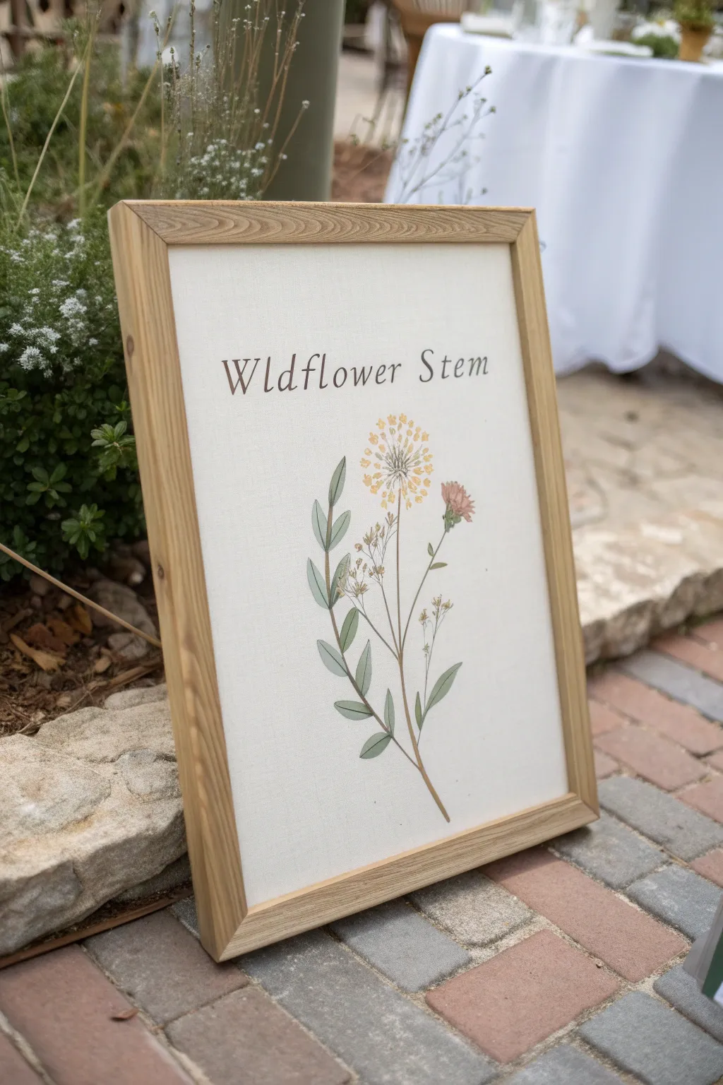
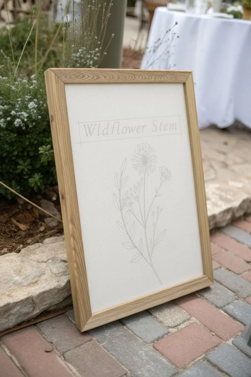
Create a serene and elegant memorial piece inspired by vintage botanical illustrations. This project combines delicate floral painting with neat typography on textured canvas to produce a timeless keepsake perfect for honoring a loved one.
Step-by-Step
Materials
- Textured canvas panel or heavy watercolor paper (A3 or similar size)
- Light wood frame to fit the canvas
- Pencil (HB)
- Fine liner pen (brown or sepia)
- Watercolor paints (sage green, forest green, muted yellow, dusty pink)
- Round watercolor brushes (sizes 2 and 4)
- Ruler
- Printed template of chosen text (optional)
- Graphite transfer paper (optional)
- Eraser
Step 1: Planning and Layout
-
Determine your composition:
Decide on the specific wildflower you wish to feature and the text you want to include above it. For this project, ‘Wildflower Stem’ is used, but names or significant dates work beautifully too. -
Center the design:
Using a ruler, lightly mark the vertical center line of your canvas panel to ensure your artwork stays balanced. -
Draft the text:
Lightly sketch your text near the top third of the canvas. If you aren’t confident in your freehand lettering, print your words in a serif font, place graphite paper underneath, and trace the outline onto the canvas. -
Sketch the stem:
Draw the main stem line starting from the bottom center, curving slightly to the right for a natural look. Add branching lines for leaves and the flower heads. -
Detail the foliage:
Sketch long, lance-shaped leaves along the stem. Ensure they alternate or pair up naturally depending on the flower species you are mimicking. -
Outline the blooms:
Lightly draw the circular shape for the main flower head and smaller buds. Keep the pencil pressure very light so it doesn’t show through the paint.
Vintage Texture Tip
For an aged botanical look, wash the canvas with a very dilute tea solution and let it dry completely before you start painting.
Step 2: Painting the Botanicals
-
Mix your greens:
Create a sage green by mixing forest green with a touch of white and a tiny bit of red to desaturate it. You want a natural, dried-herb look rather than a vibrant artificial green. -
Paint the leaves:
Using a size 4 brush, fill in the leaves with the sage mix. I like to let this dry briefly and then add a second customized layer to half of each leaf to suggest shadow and depth. -
Create the stem:
Switch to a size 2 brush and carefully trace the stem lines using a slightly darker, brownish-green mix for stability. -
Paint the yellow bloom:
Mix a muted yellow and dab small dots in a circular pattern to form the main flower head, leaving tiny white spaces between the dabs for texture. -
Add the secondary flower:
If your design includes a second bloom, use a dusty pink or diluted terracotta wash to fill it in softly. -
Add floral details:
Once the yellow base is dry, use a very fine brush with brownish-orange paint to add tiny seeds or stamens in the center of the flower cluster.
Step 3: Finalizing the Artwork
-
Ink the typography:
Using a sepia or brown fine liner pen, carefully go over your penciled text. A brown pen looks softer and more vintage than harsh black ink. -
Outline the drawing:
Use the same fine liner to add very sparse, broken outlines to the leaves and stem. Meaningful skips in the line work add to the illustrative character. -
Erase guidelines:
Wait until the ink is completely dry—give it an extra hour just to be safe—then gently erase any visible pencil marks. -
Prep the frame:
Clean the glass of your light wood frame to ensure no dust is trapped inside. -
Mount the artwork:
Place your dry canvas panel into the frame. If you used flexible canvas, mount it on a hardboard backing first to keep it flat. -
Secure the back:
Close the frame tabs securely and check the front to ensure the artwork is perfectly centered.
Make It 3D
Instead of painting the flower, press and dry a real wildflower stem. Glue it carefully to the canvas below the text for a mixed-media tribute.
Place this understated, natural tribute on an easel or shelf to bring a moment of peace to any room.

Create a Compilation Portrait of Loved Ones Who Never Met
Merge separate memories into one cohesive masterpiece with this classic charcoal and pastel portrait technique. Using toned paper and careful layering, you will create a heartwarming, unified image of two people who may have lived lifetimes apart.
Step-by-Step Tutorial
Materials
- Large sheet of toned drawing paper (cream or fawn colored, approx. 18×24 inches)
- Charcoal pencils (HB, 2B, 4B)
- White pastel pencil or charcoal white
- Kneaded eraser
- Blending stumps (tortillons) of various sizes
- Reference photos of both subjects
- Tracing paper or light box (optional)
- Workable fixative spray
- Matted frame for finished display
Step 1: Preparation and Layout
-
Select and scale references:
Gather high-quality photos of both individuals. Since they likely weren’t photographed together, you may need to resize the images digitally or with a photocopier so their head sizes match proportionally. -
Plan the composition:
Arrange the two figures so they interact naturally. Usually, placing one figure slightly behind the other, with shoulders overlapping, creates a sense of intimacy and connection. -
Sketch the initial contours:
Using an HB charcoal pencil with a very light hand, outline the basic shapes of the heads and shoulders. Focus on placement and scale rather than detail at this stage. -
Refine facial features:
Lightly map out the eyes, nose, and mouth lines. Double-check the alignment; correct spacing between the eyes is crucial for a likeness.
Step 2: Building the Form
-
Establish the shadows:
Switch to a 2B charcoal pencil. Gently shade the darkest areas of the face—typically under the chin, beneath the nose, and in the eye sockets and pupils. -
Blend the mid-tones:
Use a medium-sized blending stump to soften your charcoal strokes. Drag the charcoal dust from the dark shadow areas into the lighter areas to create smooth skin tones. -
Develop hair texture:
Sketch the hair using directional strokes that follow the natural growth pattern. Use broader strokes for the general shape and sharper lines for individual strands later. -
Define the clothing:
Sketch the collars and shoulders. Keep the clothing sketchier and looser than the faces to ensure the viewer’s focus remains on the expressions.
Smudge Control
Place a scrap piece of paper under your drawing hand while you work. This prevents oils from your skin transferring to the paper and stops your hand from smearing completed sections.
Step 3: Details and Highlights
-
Deepen the contrast:
Use a 4B pencil to reinforce the absolute darkest points, such as the pupils, corners of the mouth, and deep creases in clothing. This adds depth and drama. -
Lift out highlights:
Take your kneaded eraser and shape it into a point. Press and lift graphite specifically on the forehead, bridge of the nose, and cheekbones to reveal the lighter paper tone underneath. -
Apply white accents:
I find that adding white chalk or pastel here really brings the drawing to life. Apply it sparingly to the brightest highlights in the eyes (catchlights), the tip of the nose, and gray hair strands. -
Soften edges:
Go back with a clean blending stump to marry the white highlights with the charcoal mid-tones, ensuring there are no harsh transitions on the skin. -
Refine the eyes:
Sharpen your charcoal pencil to a fine point and crispen the eyelids and irises. The eyes are the soul of the portrait, so give them extra attention.
Lighting Consistency
If your reference photos have different light sources (left vs right), cheat the shadows on one face to match the other. Unified lighting is key to making them look like they are together.
Step 4: Finishing Touches
-
Cross-hatch the background:
Add light, loose hatching strokes around the heads. This separates the figures from the empty paper and adds an artistic, studio-quality finish. -
Final review:
Step back several feet to view the portrait as a whole. Check for balance and make minor adjustments to shadows or shapes if anything looks disjointed. -
Seal the artwork:
In a well-ventilated area, spray a coat of workable fixative over the drawing to prevent the charcoal from smudging. -
Mount and frame:
Once dry, mount the drawing behind a nice cream-colored mat and place it in a sturdy frame to protect your legacy piece.
Displaying this united portrait creates a beautiful bridge between generations and keeps their memories alive together


Add Angel Wings or a Soft Halo Glow
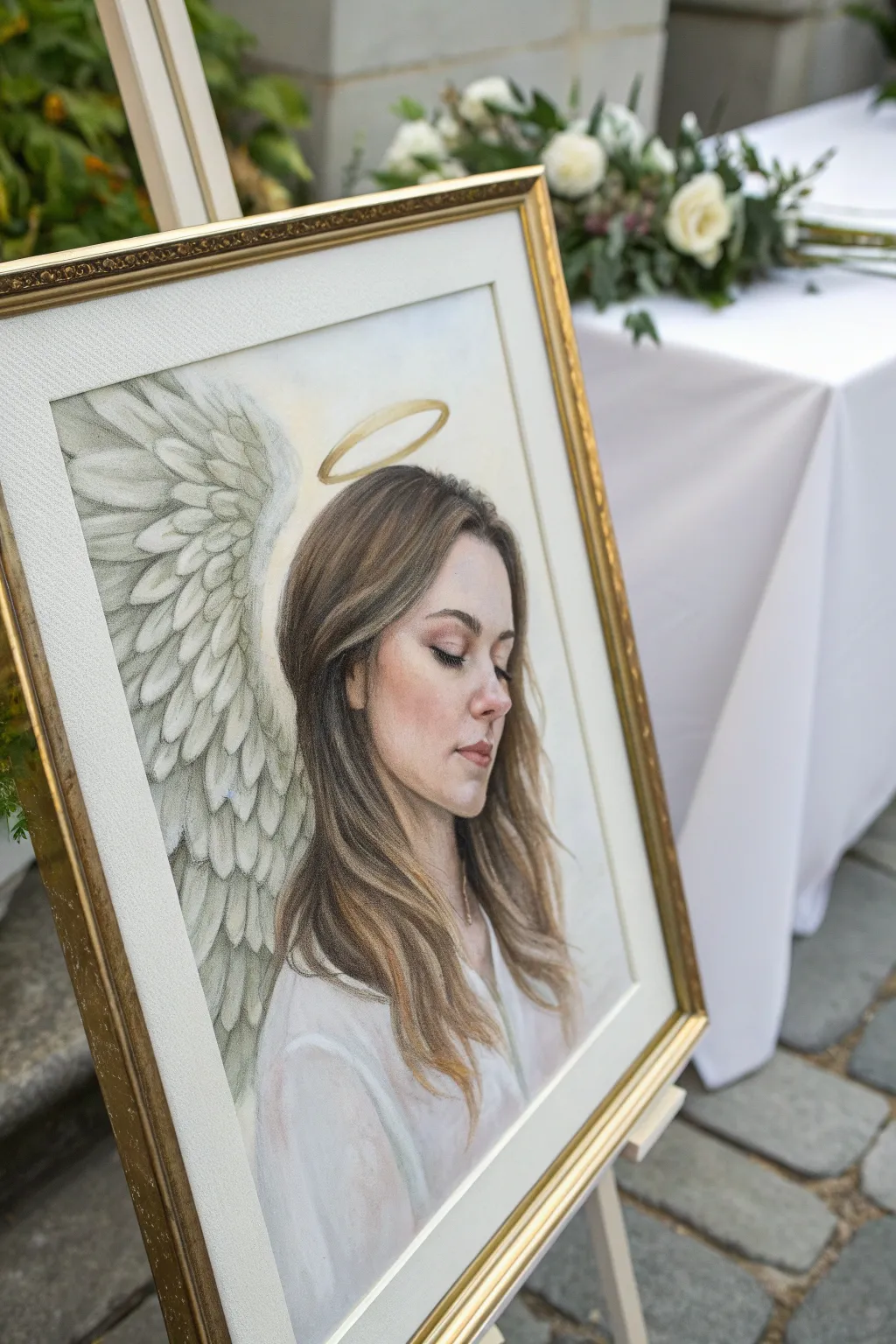
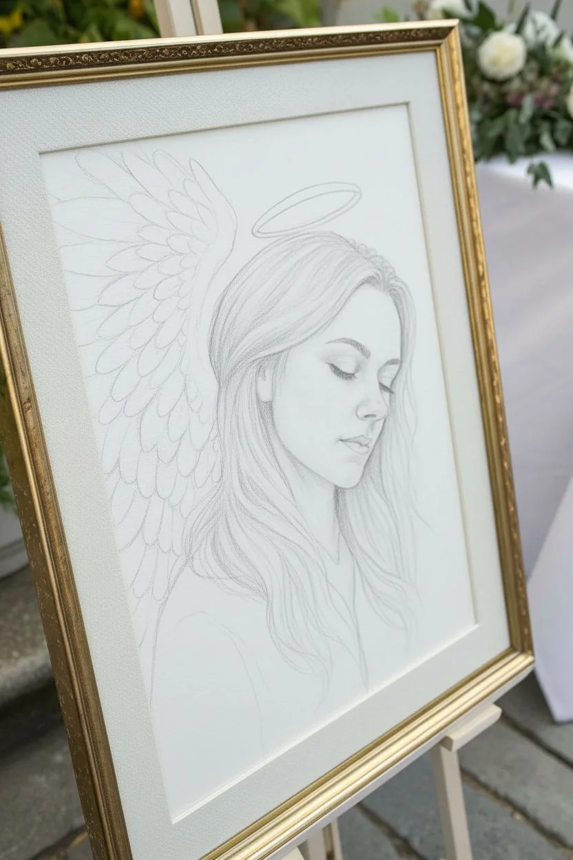
Transform a beloved memory into a serene tribute with this soft, realistic portrait featuring delicate angel wings and a golden halo. This project uses a blend of colored pencils and pastels to achieve a gentle, dreamlike quality perfect for memorializing a loved one.
Step-by-Step Tutorial
Materials
- High-quality reference photo of the subject
- Heavyweight drawing paper (Bristol vellum or mixed media paper, at least 11×14 inches)
- Graphite pencils (HB, 2B) for sketching
- Soft artist pastels or PanPastels (skin tones, white, grays, creams)
- Colored pencils (wax or oil-based for details)
- Gold acrylic paint or gold leaf pen
- Eraser (kneaded and precision)
- Blending stumps or tortillons
- Workable fixative spray
- Ornate gold frame (sized to your paper)
Step 1: Preparation and Sketching
-
Analyze the reference:
Begin by selecting a clear reference photo where the subject looks peaceful. Light-eyed, downward-looking poses work beautifully for this angelic theme. -
Block in the composition:
Using an HB pencil, lightly sketch the contours of the face, hair, and shoulders. Position the subject slightly off-center to leave room for the wings on the left. -
Draft the wings:
Sketch the outline of a large, feathered wing curving behind the subject’s head. Draw rows of individual feathers, starting with smaller coverts near the top and extending to long primary feathers at the bottom. -
Place the halo:
Draw an oval floating just above the rear crown of the head. Keep the perspective flat and elliptical to suggest it’s hovering in 3D space.
Wing Texture Tip
For fluffier wings, don’t outline every feather fully. Use broken lines and leave ‘lost edges’ where the white paper blends into the white feather for softness.
Step 2: Building the Portrait
-
Base layer for skin:
Apply a soft layer of pastel (PanPastel or soft stick) in a mid-tone skin color. Gently buff this into the paper using a soft sponge or cloth to create a smooth, glowing foundation. -
Define the features:
Switch to colored pencils for precision. Start defining the eyes, nose, and lips. I find that using warm browns and reddish tones for the shadows creates lifelike warmth without looking muddy. -
Layering the hair:
Use a mix of broad pastel strokes for the main hair mass and sharp colored pencil lines for individual strands. Pay attention to the hair direction and add lighter strokes for highlights. -
Deepen the shadows:
Add contrast under the jawline and around the eye sockets. This depth is crucial for making the face pop against the lighter background.
Step 3: Creating the Ethereal Elements
-
Shade the wings:
Using a light gray pencil or pastel, shade the undersides of each feather. Leave the tips of the feathers pure white (or the color of the paper) to create a soft, fluffy texture. -
Refine feather details:
Add central shafts to the larger feathers using a sharp gray pencil. Keep your lines delicate; we want the wings to look weightless. -
Paint the halo:
Using a small brush and gold acrylic paint (or a gold marker), carefully fill in the halo ring. Let the gold catch the light to symbolize divinity. -
Render the clothing:
Sketch the clothing lightly, likely a simple white blouse or robe. Use very faint gray shading to suggest folds in the fabric, keeping the overall look bright and clean.
Level Up: Real Gold
Instead of paint, use real gold leaf sizing and transfer sheets for the halo. The genuine metallic shine reflects light beautifully, adding a truly sacred feel.
Step 4: Final Touches and Framing
-
Soften edges:
Use a clean blending stump to soften the transition between the hair and background. This creates a slightly out-of-focus, dreamlike effect. -
Add highlights:
Use a white gel pen or very sharp white pastel pencil to add final highlights to the lips, tip of the nose, and the brightest strands of hair. -
Seal the artwork:
Once fully satisfied, spray the artwork with a workable fixative to prevent the pastels from smudging. Do this in a well-ventilated area. -
Matting:
Place a cream or white mat board over the artwork. This visual breathing room enhances the gallery-quality appearance. -
Framing:
Install the artwork into an ornate gold frame to match the halo and elevate the piece to a keepsake status.
Display this poignant piece on an easel during a memorial service or hang it in a quiet corner of your home for peaceful reflection
BRUSH GUIDE
The Right Brush for Every Stroke
From clean lines to bold texture — master brush choice, stroke control, and essential techniques.
Explore the Full Guide
Turn Their Favorite Flowers Into a Memorial Bouquet Painting
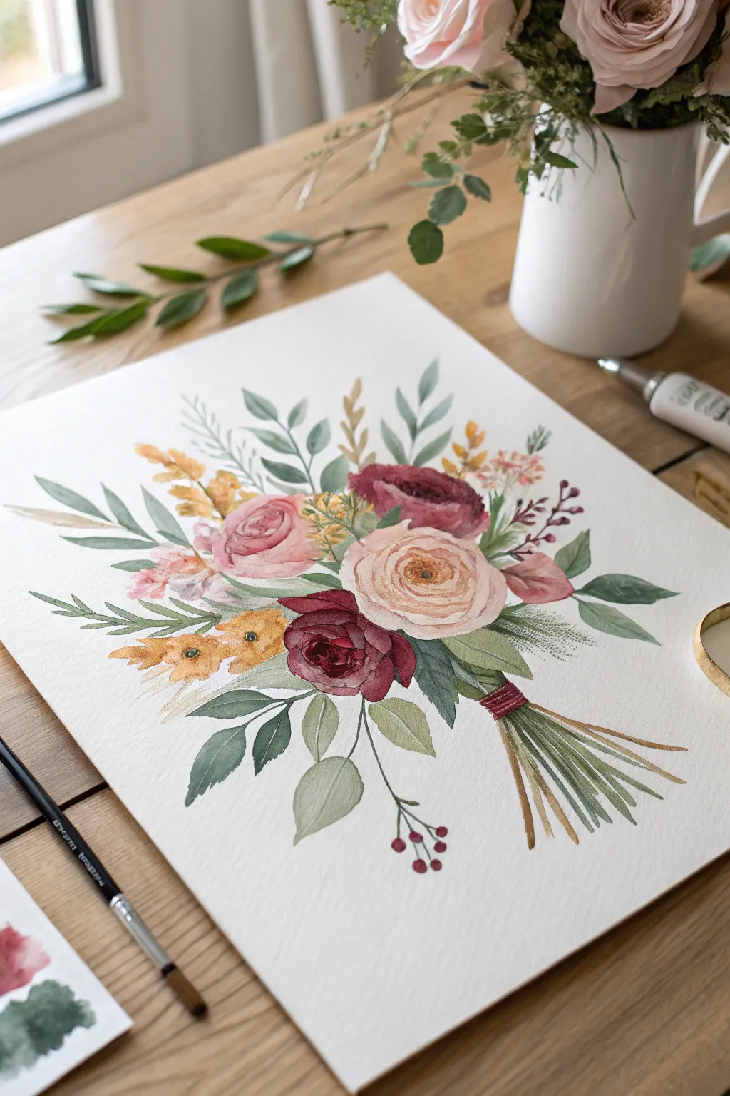
Capture the delicate beauty of a loved one’s favorite blooms with this watercolor memorial bouquet. This project uses soft washes and careful layering to create a gentle, lasting tribute that feels both personal and artistic.
How-To Guide
Materials
- Cold press watercolor paper (300 gsm or 140 lb)
- Watercolor paints: Alizarin Crimson, Sap Green, Burnt Sienna, Yellow Ochre, Rose Madder, Lamp Black or Indigo
- Synthetic round brushes: Size 6 (for washes), Size 2 (for details)
- HB or 2H graphite pencil
- Kneaded eraser
- Clean water container
- Paper towels
- Palette for mixing
Step 1: Sketching the Composition
-
Map the Shape:
Begin by lightly sketching the general diamond or oval shape of the bouquet on your paper. Place a light circle where the main central rose will go, and two smaller circles for the accompanying blooms to ensure balanced spacing. -
Detail the Flowers:
Refine the circles into flower shapes. Draw the swirling center of the large cream ranunculus first, then sketch the layered petals of the pink and burgundy roses. Keep lines faint so they won’t show through the paint later. -
Add Foliage guides:
Draw single lines radiating outward to represent the stems and branches. Add simple leaf shapes attached to these lines, mixing rounded eucalyptus-style leaves with sharper, fern-like fronds for variety. -
Ground the Bouquet:
Sketch the collected stems at the bottom, gathering them into a tight bundle. Draw a small band to represent the ribbon or twine holding them together.
Muddy Colors?
If your colors are bleeding together into brown, you’re working too fast. Let each flower section dry completely before painting a neighboring leaf or petal.
Step 2: Building the Blooms
-
The Cream Ranunculus:
Start with a very watery wash of Yellow Ochre mixed with a touch of pink for the center of the large cream flower. While still wet, drop in a slightly darker tan color to define the tight inner petals. -
The Pink Roses:
Mix a soft Rose Madder wash. Paint the outer petals of the pink roses first, leaving tiny slivers of white paper between strokes to separate the petals. As you move inward to the center, pigment should be slightly more concentrated. -
The Burgundy Rose:
Combine Alizarin Crimson with a tiny dot of black or green to deepen it. Paint the dark red rose, being careful to leave white highlights on the petal edges to prevent it from looking like a dark blob. This contrast is vital. -
Yellow Accents:
Using a clean brush, paint the small yellow wildflowers with Yellow Ochre. Keep these loose and simple compared to the detailed roses.
Pro Tip: Soft Edges
To make the bouquet look dreamy, soften the outer edges of distant leaves by running a clean, damp brush along the wet paint edge to blur it slightly.
Step 3: Painting Foliage and Stems
-
Base Greens:
Mix Sap Green with a lot of water for a translucent effect. Paint the larger, broad leaves at the bottom of the bouquet first. Let the water pool slightly at the tips for a natural gradient. -
Cooler Foliage:
Create a blue-green shade by mixing green with a touch of blue or grey. Use this for the eucalyptus-style leaves sticking out the top and sides. I find varying the greens brings the whole painting to life. -
Fern Details:
Using your Size 2 brush and a darker green mix, paint the fine, feathery fern fronds. Use quick, light flicking motions to keep them looking airy and delicate. -
Stem Bundle:
Paint the stems using a mix of Green and Burnt Sienna. Paint individual lines rather than one solid block, allowing the white paper to show through as separation between stems.
Step 4: Refining and Detailing
-
Binding the Stems:
Paint the ribbon or twine binding the stems with a saturated crimson or rust color. Add horizontal distinct lines to mimic the texture of wrapping. -
Tiny Berries:
Add the small red berries on the bottom right stem. Use concentrated red paint and leave a tiny white dot on each sphere to represent a shine or reflection. -
Deepening Shadows:
Once the flower layers are bone dry, mix a slightly darker version of your petal colors. Carefully paint into the crevices between petals to add depth and dimension. -
Veins and Textures:
With the Size 2 brush, add very thin central veins to the largest green leaves. Keep the paint mixture watery so the veins don’t look harsh. -
Final Assessment:
Step back and look for balance. If the bouquet feels floaty, add a few more darker green leaves near the center to anchor the composition visually.
Once dry, frame this delicate tribute piece behind glass to preserve the colors and memory for years to come
Use Butterflies as Gentle Symbols of Transformation
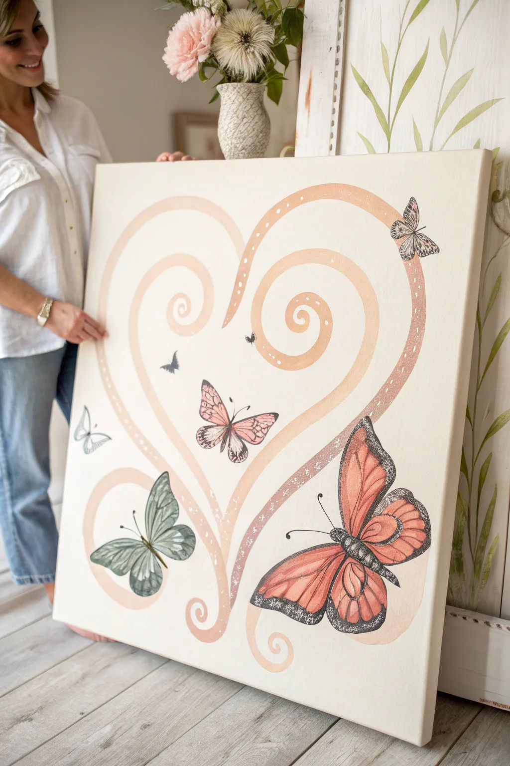
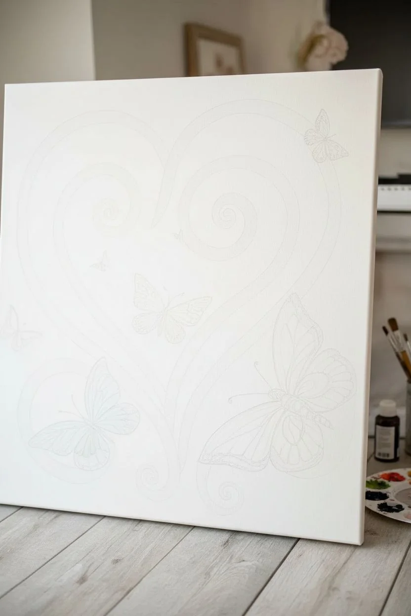
This tender memorial piece combines the soft, comforting curves of a stylized heart with intricate butterflies, symbolizing the beauty of transformation. Using acrylics on a large canvas, you will create a serene composition with muted peaches, sage greens, and intricate black detailing that feels both modern and deeply personal.
Step-by-Step Tutorial
Materials
- Large square canvas (30×30 inches or similar)
- Acrylic paints: Warm peach, blush pink, soft white, carbon black, sage green, terracota
- Wide flat brush (1-2 inch)
- Medium round brush
- Fine liner brush (size 0 or 00)
- Pencil and large eraser
- Mixing palette
- Water cup and paper towels
- Reference images of monarch and cabbage white butterflies
Step 1: Planning the Composition
-
Prepare your canvas:
Start with a clean, white-primed canvas. If your canvas feels rough, give it a quick coat of gesso and sand it lightly once dry for a smoother painting surface. -
Sketch the heart ribbons:
Lightly sketch the large, swirling heart shape using a pencil. Instead of a solid line, draw two parallel lines to create a ribbon effect. The heart should be open at the top and curl inwards at the bottom and top lobes with elegant spirals. -
Draft the butterflies:
Position your butterflies sketchily. Place the largest butterfly (a Monarch style) in the bottom right corner. Add a medium sage-green butterfly to the bottom left, a pinkish one in the center, and smaller ones floating towards the top right and left.
Uneven Curves?
If your ribbon curves look shaky, don’t worry. Wait for the paint to dry, then use the background white paint to “cut in” and reshape the edges until they are smooth.
Step 2: Painting the Heart
-
Mix the base ribbon color:
Mix a warm peach tone using blush pink, a touch of terracotta, and plenty of white to keep it soft. It should be opaque but delicate. -
Fill in the ribbons:
Using your medium round brush or a smaller flat brush, paint inside your ribbon lines. Apply the paint smoothly, following the curve of the swirl to maintain visual flow. -
Add dimension:
While the peach paint is still tacky, blend in a slightly darker terracotta shade at the bottom curves and a lighter creamy white at the top curves to suggest volume. -
Create the speckled texture:
Once the ribbon is dry, mix a watery white paint. Dip a toothbrush or stiff brush into it and gently flick speckles over specific sections of the ribbon, particularly on the right side curve, to add a magical, stardust effect.
Step 3: Detailing the Butterflies
-
Base coat the large Monarch:
Paint the wings of the large bottom-right butterfly with a gradient. Start with terracotta near the body and blend out to a lighter peach-orange at the wing tips. -
Paint the green butterfly:
For the bottom-left butterfly, use a muted sage green. Keep the paint slightly translucent so it looks ethereal, or mix with a glazing medium if you have one. -
Fill the smaller butterflies:
Paint the center butterfly in soft pink and the tiny upper ones in shades of grey or pale blue. Let all base coats dry completely before moving to details. -
Outline the wings:
Switch to your fine liner brush and carbon black paint. Carefully outline the wings. For the Monarch, create the thick black borders and veins characteristic of the species. -
Add wing texture:
For the green and pink butterflies, use very watered-down black or dark grey to paint delicate veins. Use wispy strokes that start from the body and fade outward. -
Paint the bodies:
Paint the bodies of the butterflies using solid black. Add the antennae with the very tip of your finest brush, keeping the lines crisp and curved. -
Highlight the wings:
Dip a toothpick or the end of a brush handle into white paint to add rows of tiny dots along the black edges of the Monarch wings.
Add Gold Leaf
For a truly special touch, apply gold leaf on the small white speckles of the heart ribbon or along the veins of the butterflies to catch the light.
Step 4: Final Touches
-
Refine edges:
Check the edges of your heart ribbons. If the paint bled, use a small angled brush with white paint to clean up the background and sharpen the curves. -
Add subtle background motifs:
Optionally, you can paint very faint, smaller butterflies or tiny dots in the background using a color just one shade darker than your white canvas. -
Seal the artwork:
Once the painting has dried overnight, apply a coat of satin or matte varnish to protect the colors and unify the sheen.
Hang this gentle masterpiece where it can catch the morning light and serve as a beautiful reminder of enduring love

PENCIL GUIDE
Understanding Pencil Grades from H to B
From first sketch to finished drawing — learn pencil grades, line control, and shading techniques.
Explore the Full Guide
Paint Dandelion Wishes Blowing Into the Sky
Capture the delicate, fleeting beauty of a dandelion releasing its seeds into a bright blue sky with this contemplative acrylic painting. The crisp white seeds contrasting against the gradient background create a peaceful symbol of letting go and making wishes.
Step-by-Step Tutorial
Materials
- Deep-edge square canvas (approx. 10×10 or 12×12 inches)
- Acrylic paints: Phthalo Blue, Titanium White, Sap Green, Burnt Umber, Yellow Ochre
- Large flat brush (1 inch)
- Medium flat brush
- Small round detail brush (size 0 or 1)
- Fan brush (optional, for grass)
- Palette
- Cup of water and paper towels
- Chalk or pastel pencil (white)
Step 1: Setting the Scene
-
Prepare the background gradient:
Start by mixing Phthalo Blue with a tiny touch of Burnt Umber to deepen it slightly. Apply this dark blue to the top third of your canvas using your large flat brush, painting long horizontal strokes. -
Blend downward:
Without cleaning your brush, pick up a little Titanium White and mix it into your blue on the palette. Paint the middle section of the canvas, blending the wet edge where it meets the darker top section to create a smooth transition. -
Complete the horizon:
Add significantly more white to your blue mixture to create a very pale sky blue. Paint the bottom third of the canvas, ensuring a smooth gradient from top to bottom. Remember to paint the sides of the canvas as you go so the artwork wraps around the edges. -
Add subtle clouds:
While the background is still slightly tacky or just dry, use a dry brush with a tiny amount of white paint. Scumble in soft, wispy clouds near the bottom horizon line, keeping them faint and distinct from where your main subject will be.
Pro Tip: Airy Texture
Thin your white acrylic paint with a drop of water or flow medium. Inky paint flows smoother for fine lines, preventing the dandelion seeds from looking clunky or thick.
Step 2: Creating the Dandelion Head
-
Sketch the placement:
Once the background is completely dry, use a piece of chalk to lightly mark the center point of your dandelion head and the curve of the stem. This guide helps ensure your composition feels balanced before you commit to paint. -
Paint the stem:
Mix Sap Green with a little White and Yellow Ochre to get a natural light green. Using a medium flat brush turned on its chiseled edge, paint the long, slender stem curving upward from the bottom center. -
Create the seed center:
At the top of the stem, paint a small, textured oval using Burnt Umber mixed with a touch of Green. This forms the base from which the seeds will radiate. -
Start the seed burst:
Switch to your smallest detail brush and thinned Titanium White paint. Starting from the brown center, paint very fine, straight lines radiating outward in a full circle. Vary the lengths slightly, but keep the overall shape spherical. -
Add the fluff details:
At the end of each radiating line, create a tiny ‘V’ or star shape. This mimics the parachute-like structure of the dandelion seeds. I find it easiest to work in layers, doing the outer edge first to define the size. -
Build density:
Continue filling in the sphere with more radiating lines and fluff tips. Make the lines in the very center shorter and denser to create a sense of three-dimensional volume.
Troubleshooting: Shaky Hands
If your lines are wobbling, rest your pinky finger on a dry part of the canvas to stabilize your hand while painting the delicate seed stems with the liner brush.
Step 3: Drifting Seeds and Landscape
-
Paint floating seeds:
To the right of the main flower, paint several individual seeds drifting away. Use a fine line for the stem and small, feathery strokes for the tuft at the top. -
Add heart details:
Intersperse a few tiny white heart shapes among the floating seeds. This adds a subtle symbolic touch of love and memory to the movement of the wind. -
Paint the grass base:
Mix Sap Green with a touch of Phthalo Blue for a darker shadow green. Using a small flat brush or detail brush, flick upward strokes from the bottom edge of the canvas to create varying heights of grass blades. -
Add foreground accents:
Paint a small, brown cattail shape on the right side. You can also add a small, blurred white flower cluster low in the grass using dabs of white and light green to add depth to the field. -
Highlight the stem:
Return to the main dandelion stem and add a thin line of lighter green (Green + White) along one side to suggest a light source hitting it. -
Final touches:
Check the density of your white dandelion fluff. If it dried too transparent, go back over the brightest tips with fresh white paint to make them pop against the blue sky.
Step back and admire how the simple white details bring a sense of movement and peace to your painted sky
Blend in Handwriting, Recipes, or Letters as Background Texture
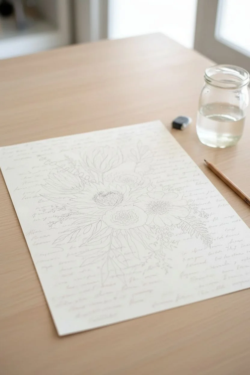
This elegant memorial piece weaves the sentimental texture of a loved one’s handwriting into a soft, botanical watercolor composition. By using a dusty palette of sage greens and muted coral pinks, the artwork feels timeless and serene, perfect for honoring a memory.
Step-by-Step Guide
Materials
- Cold-pressed watercolor paper (140lb/300gsm), approx. 11×14 inches
- High-quality watercolor paints (Sap Green, Alizarin Crimson, Burnt Sienna, Yellow Ochre, Paynes Grey)
- Round watercolor brushes (Size 4, 8, and 12)
- Fine liner brush (Size 0 or 00) or archival ink pen (brown or sepia)
- Scanner and printer (for digitizing handwriting) or transfer paper
- Light wooden frame with mat board
- Pencil (H or HB)
- Kneaded eraser
- Paper towels and two jars of water
Step 1: Preparation & Sketching
-
Digitize the sentiment:
Scan the handwritten letter, recipe, or note you wish to incorporate. Adjust the contrast digitally so the background is white and the script is dark. If you don’t have digital tools, simply photocopy the original to preserve the master copy. -
Transfer the script:
Lightly transfer selected phrases of the handwriting onto the background of your watercolor paper using a light box or graphite transfer paper. Keep this text extremely faint and scattered; it should look like a ghostly texture rather than readable text. -
Compose the bouquet:
Lightly sketch the main floral elements over the text layer. Place the large protea bloom slightly off-center near the top, followed by the rounded roses and softer filler flowers below it. -
Add stems and foliage:
Extend stems downwards from the blooms, creating a natural flow. Sketch in eucalyptus branches extending upward on the left and fern-like leaves drooping on the bottom right to balance the composition.
Water Control is Key
To keep the ‘ghostly’ look of the handwriting, apply a clear water wash over those areas before painting foliage. The paint will bleed slightly, softening the text into the art.
Step 2: Painting the Blooms
-
Mix the protea palette:
Create a dusty pink by mixing Alizarin Crimson with a touch of Burnt Sienna and plenty of water. You want a very transparent wash to start. -
First wash on the main bloom:
Paint the long, tapered petals of the protea. Use the wet-on-dry technique, leaving thin white gaps between petals to define their shape. Let the color fade towards the bottom of the flower head. -
Paint the roses:
Mix a soft peach tone using Yellow Ochre and a tiny dot of Red. Paint the center of the roses with a tighter spiral motion, then rinse your brush and pull the color outward to create fluffy, lighter outer petals. -
Deepen the shadows:
Once the first layer is dry, mix a slightly darker version of your pinks and peaches. Add shadows at the base of the petals where they overlap to give the flowers dimension and form.
Step 3: Painting Foliage & Details
-
Mix greens:
Prepare a sage green by mixing Sap Green with a little Paynes Grey or Burnt Sienna to desaturate it. Avoid bright, artificial greens. -
Paint eucalyptus stems:
Using the size 4 brush, paint the round eucalyptus leaves. Vary the pressure—press down for the belly of the leaf and lift up for the stems. I sometimes drop a tiny bit of blue into wet leaves for variety. -
Add fern details:
With the fine liner brush, paint delicate, feathery fern fronds at the base of the bouquet. Keep these strokes loose and airy. -
Integrate the handwriting:
If your initial pencil transfer of handwriting is too faint, go over selected words with a very dilute mix of brown watercolor or a sepia ink pen. Ensure the script looks like it’s fading into the background. -
Add texture to centers:
Stipple (dot) the centers of the open flowers with a mix of dark brown and purple to simulate pollen and depth. -
Refine edges:
Use a damp, clean brush to soften any hard edges on the petals that look too stiff. The goal is a dreamy, ethereal look.
Muddy Colors?
If your greens look brown or muddy, clean your water jar immediately. Dusty sage requires clean water; dirty rinse water will dull the delicate pigment transparency.
Step 4: Finishing Touches
-
Review and balance:
Step back and look at the composition. Add small sprigs of ‘baby’s breath’ or filler greens in empty spaces using very pale, watery paint. -
Erase guidelines:
Once the painting is completely bone-dry—give it several hours—gently use the kneaded eraser to lift any visible graphite lines from your initial sketch. -
Frame the work:
Mount the finished piece behind a white mat board and place it into a light wood frame to complement the organic color palette.
Display this piece freely in a quiet corner of your home as a gentle, artistic reminder of your memories


Have a question or want to share your own experience? I'd love to hear from you in the comments below!