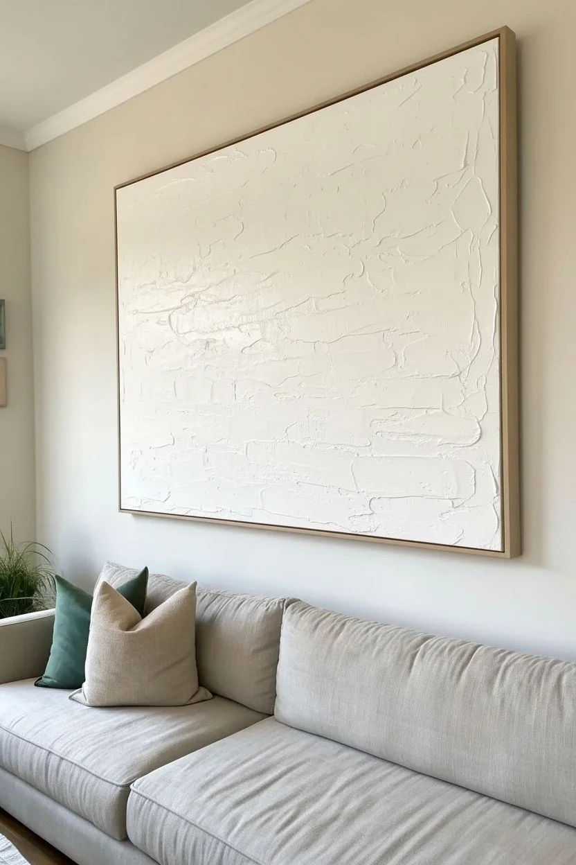
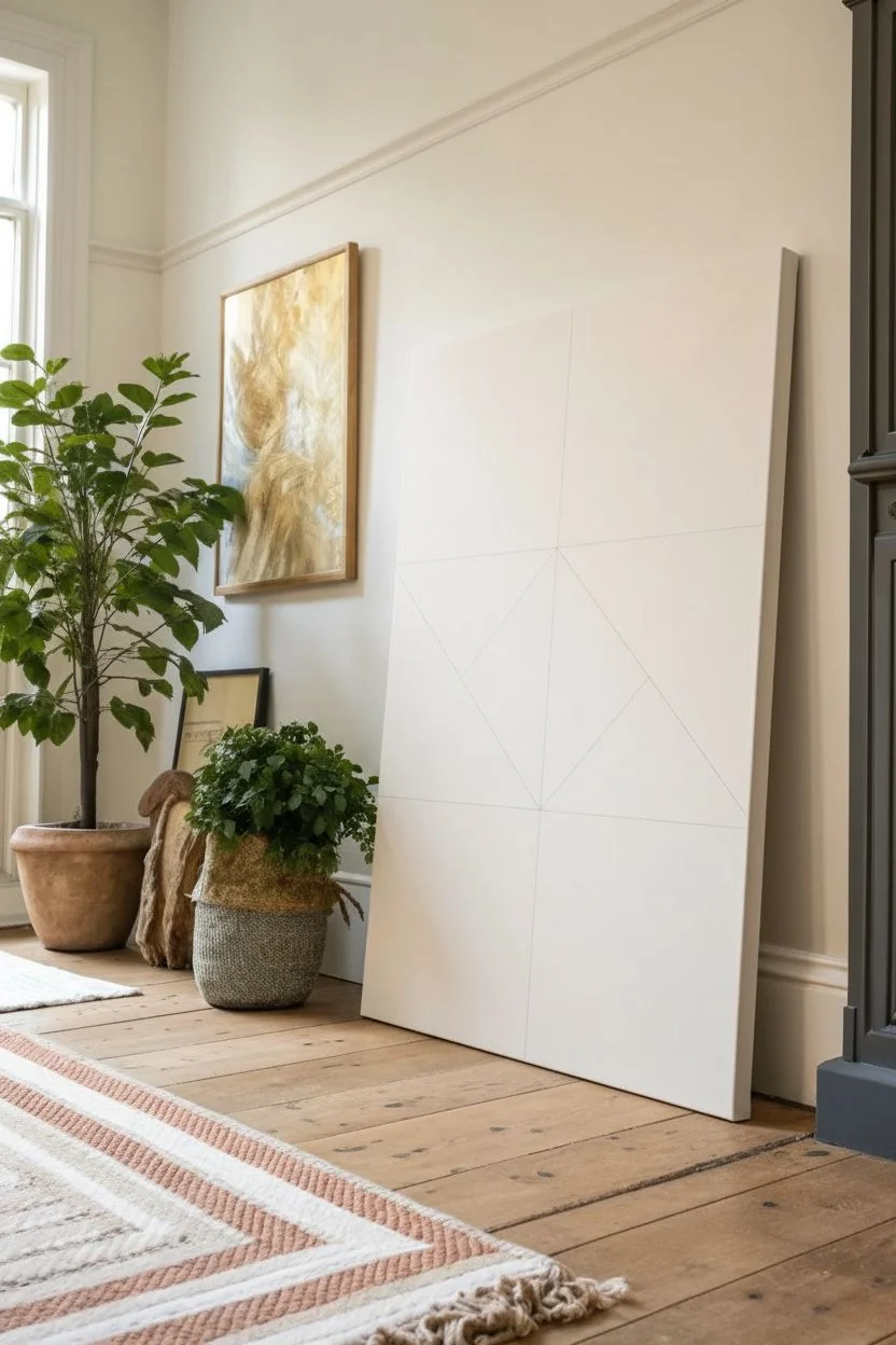
A large canvas is basically your chance to go big, breathe, and let brushstrokes have some drama. These large canvas painting ideas are all about strong compositions you can read from across the room—without the whole thing turning into visual chaos.
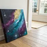
Golden Hour Sunset Gradient Over Water
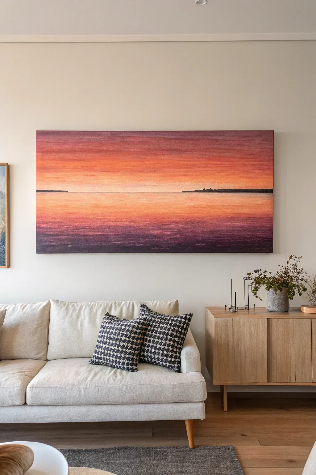
Capture the fleeting beauty of the golden hour with this expansive landscape painting that blends warm oranges into deep purples. The panoramic format emphasizes a vast horizon, creating a calming focal point perfect for living spaces.
Step-by-Step Tutorial
Materials
- Large panoramic stretched canvas (e.g., 20×60 inches or similar ratio)
- Acrylic paints: Titanium White, Cadmium Yellow, Cadmium Orange, Alizarin Crimson, Dioxazine Purple, Burnt Umber
- Large flat brush (2-3 inch width)
- Medium flat brush (1 inch width)
- Small round brush (size 4 or 6)
- Palette knife (optional for mixing)
- Water container and paper towels
- Masking tape or painter’s tape
- Clear gesso or blending medium (optional)
Step 1: Preparation and Horizon
-
Prime the surface:
If your canvas isn’t pre-primed, apply two coats of gesso and let dry completely. For a smoother gradient, lightly sand the surface between coats. -
Define the horizon:
Measure the vertical center of your canvas. Place a strip of masking tape horizontally across the entire width to create a perfectly straight horizon line. This separates the sky from the water. -
Mix your base colors:
Prepare large piles of paint on your palette. You’ll need a gradient sequence: bright white-yellow, soft orange, deep red-orange, and mute purple. Having these pre-mixed prevents drying while you work.
Wet-on-Wet Secrets
Work quickly! Acrylics dry fast. Keep a spray bottle of water handy to mist your canvas lightly. This keeps the paint workable longer, ensuring those buttery-smooth gradients without harsh lines.
Step 2: Painting the Sky
-
Start at the horizon:
Using your large flat brush, apply a mix of Titanium White with a touch of Cadmium Yellow right above the tape line. This should be your lightest value. -
Introduce orange:
While the yellow layer is still wet, pick up Cadmium Orange. Apply it just above the yellow strip, blending downwards into the wet yellow paint using long, horizontal strokes. -
Deepen the hues:
As you move higher up the canvas, gradually mix Alizarin Crimson into your orange. Paint horizontal bands, blending smoothly into the layer below. Keep your brush damp but not dripping. -
Add purple tones:
Near the top fifth of the canvas, introduce Dioxazine Purple mixed with a bit of Alizarin Crimson. I like to add a tiny dot of Burnt Umber here to desaturate the purple so it doesn’t look like candy. -
Refine the sky gradient:
Use a clean, dry large brush to gently sweep back and forth across the transition zones. This ‘dry brushing’ softens any harsh lines between colors. -
Create cloud textures:
Use a smaller flat brush with a slightly darker purple-red mix to add faint, horizontal streaks across the upper sky. These suggest thin, high-altitude clouds. -
Remove the tape:
Once you are happy with the sky and it has set slightly (but before fully curing), carefully peel off the masking tape to reveal a crisp horizon line.
Metallic Touch
Mix a small amount of gold or copper metallic paint into your lightest horizon colors. It won’t be obvious, but it will catch the light beautifully as you walk past the painting.
Step 3: Painting the Water
-
Mirror the light:
Just below the horizon line, paint a thin strip matching your palest sky color (White/Yellow mix). This represents the brightest reflection of the sun on the water. -
Establish the water base:
Working downwards, repeat the color progression from the sky but in reverse order. Move from pale orange to deep reds and finally purples at the bottom. -
Differentiate texture:
Unlike the smooth sky, use slightly choppier horizontal strokes for the water. Let the brush marks remain visible to simulate ripples and movement. -
Deepen the foreground:
At the very bottom of the canvas, use a heavy mix of Dioxazine Purple and Burnt Umber. This anchors the painting and suggests depth in the nearest water. -
Add reflection highlights:
Clean your medium flat brush. Load it with a light orange-white mix and drag it lightly horizontally across the darker water sections to show light catching the waves.
Step 4: Final Details
-
Paint the land masses:
Mix a very dark, near-black color using Blue/Purple and Burnt Umber. With the small round brush, paint thin, irregular strips of land on the horizon line on the far left and right sides. -
Refine the land edges:
Keep the top edge of the land crisp against the sky, but let the bottom edge blur slightly into the water to suggest a shadow reflection. -
Final blending check:
Step back about five feet to view the gradient. If any transition looks too abrupt, use a glazing medium with a tiny amount of pigment to smooth it over. -
Paint the edges:
Finish by painting the sides of your canvas with the dark purple-umber mix, or continue the image around the edge for a gallery-wrap look. -
Varnish (optional):
Wait at least 24 hours for the paint to fully cure, then apply a satin or gloss varnish to unify the sheen and protect the colors.
Now you have a stunning, tranquil sunset piece that brings warmth to your room every day

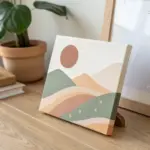

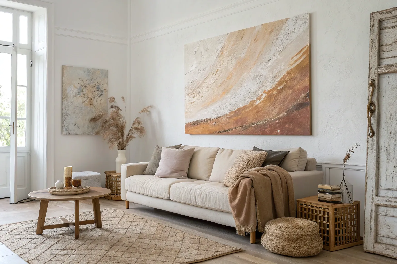
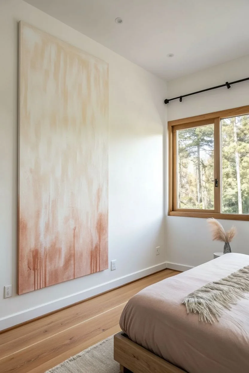
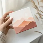
Minimal Mountain Range in Soft Neutrals
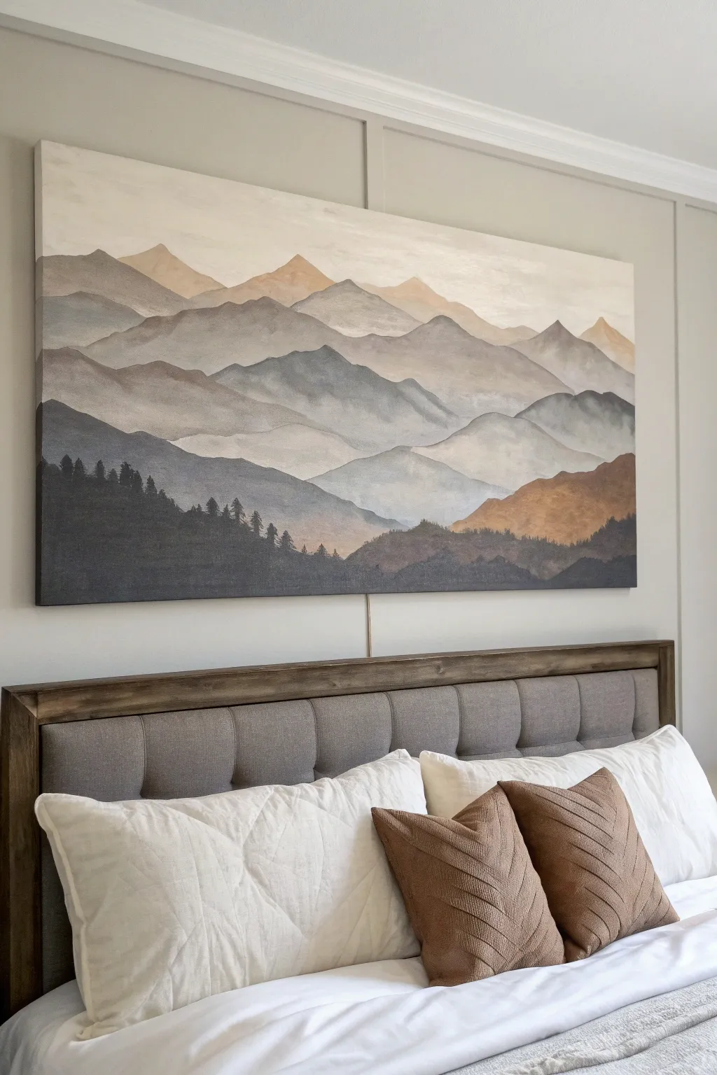
Bring the calming vastness of nature into your bedroom with this large-scale mountain painting. Featuring soft, rolling peaks in graduating shades of taupe, charcoal, and warm ochre, this piece uses simple layering techniques to achieve atmospheric depth.
How-To Guide
Materials
- Large rectangular canvas (approx. 48″ x 72″ or sized to your bed)
- Acrylic paints: Titanium White, Mars Black, Burnt Umber, Raw Sienna, Yellow Ochre, Payne’s Gray
- Wide flat bristle brushes (2-3 inches)
- Medium round brush
- Small liner brush
- Palette knife (for mixing large batches)
- Mixing cups or disposable plates
- Water spray bottle
- Paper towels
- Easier or drop cloth
Step 1: Preparation and Base
-
Prepare your workspace:
Since this is a large canvas, ensure you have plenty of floor space or a study easel. Lay down a drop cloth to protect your floors from drips. -
Mix the sky color:
Start by mixing a very large volume of Titanium White with a tiny dot of Raw Sienna to create a warm, creamy off-white. You want enough to cover the top third of the canvas. -
Paint the sky:
Using your widest flat brush, apply the cream mixture to the top section of the canvas using long, horizontal strokes. Fade this color downwards, thinning it out slightly with water as you reach the middle.
Step 2: Creating the Distant Peaks
-
Mix the lightest mountain tones:
Create two light mixtures: one pale warm beige (White + pinch of Yellow Ochre + pinch of Burnt Umber) and one very light cool gray (White + pinch of Payne’s Gray). -
Sketch the first ridge:
Using a medium brush and your warm beige mix, paint the outline of the furthest mountain peaks about 1/3 down from the top. Keep the lines wavy and irregular, not sharp triangles. -
Fill in the distant shapes:
Fill in these shapes with the warm beige, blending the bottom edge downward into nothingness using a damp brush. This creates that foggy, atmospheric perspective. -
Add secondary cool peaks:
Slightly overlapping or sitting just below the beige peaks, paint a second range using your light cool gray mix. Keep these shapes distinct but soft.
Atmospheric Perspective
To simulate real distance, remember that objects get lighter, bluer, and less detailed the further away they are. Keep your darkest, warmest colors strictly in the foreground.
Step 3: Building the Middle Ground
-
Deepen the palette:
Mix a medium taupe color by combining White, Burnt Umber, and a touch of Payne’s Gray. It should be noticeably darker than your previous layers. -
Paint the central range:
Paint a large, sweeping mountain range across the center of the canvas. Focus on creating deep valleys and high peaks. I like to keep the brushstrokes somewhat horizontal to mimic maximizing stratification. -
Add misty transitions:
While the paint is still wet, spritz a little water on the bottom edge of this layer and use a clean, dry brush to drag the paint downwards, fading it out to create a ‘mist’ effect between layers. -
Introduce warm accents:
Mix a ‘Golden Hour’ tone using Raw Sienna, Yellow Ochre, and a touch of Burnt Umber. Use this to paint a distinctive, warmer ridge on the right side of the composition, sitting below the taupe mountains. -
Layering the blue-grays:
Create a slate blue-gray by mixing Payne’s Gray with White and a speck of Black. Paint a range on the left side that intertwines with your warm ridge, creating visual balance.
Metallic Touch
Mix a tiny amount of gold metallic paint into your ‘Golden Hour’ ochre layer. It will catch the light subtly and add a luxurious glow to the landscape.
Step 4: The Foreground and Details
-
Mix the darkest shadow color:
For the bottom-most layer, mix a dark charcoal: Mars Black, Payne’s Gray, and a little Burnt Umber. It shouldn’t be pitch black, but very deep. -
Paint the foreground silhouette:
Paint a large, solid mass along the bottom, rising up on the left side. This anchors the whole painting. Ensure the top edge is rough and uneven to suggest tree tops. -
Simulate tree texture:
Switch to your small liner brush or the edge of a small flat brush. Along the top ridge of this dark layer, dab tiny vertical strokes to suggest pine trees standing against the mist. -
Add subtle highlights:
Take a slightly lighter gray and dry-brush a few vague details onto the dark foreground mountains to give them volume, so they don’t look like flat paper cutouts. -
Soften harsh lines:
Step back and look at the whole piece. If any mountain edge looks too sharp, take a slightly damp brush and gently run it over the edge to soften the transition. -
Final varnish:
Once the painting is fully dry (wait at least 24 hours), apply a matte varnish to protect the surface and unify the sheen of the different paint mixtures.
Hang your new masterpiece behind your bed for an instant focal point that invites rest and relaxation


Oversized Floral Close-Up With Cropped Petals
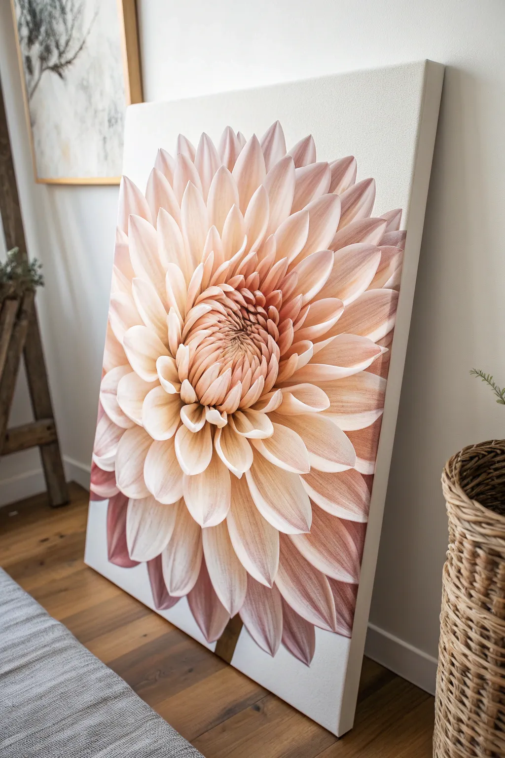
Capture the breathtaking intricacy of a dahlia bloom with this large-scale acrylic painting project. By magnifying the flower and cropping the petals, you create a modern, impactful statement piece that radiates soft warmth and organic beauty.
Detailed Instructions
Materials
- Large stretched canvas (at least 24×36 inches)
- Acrylic paints: Titanium White, Alizarin Crimson, Cadmium Yellow Light, Burnt Umber, Yellow Ochre
- Large flat brush (2-inch)
- Medium filbert brushes (sizes 8 and 12)
- Small round brush for details (size 4)
- Slow-drying medium or retarder
- Graphite pencil (HB or 2B)
- Palette knife for mixing
- Reference photo of a dahlia close-up tailored to your crop
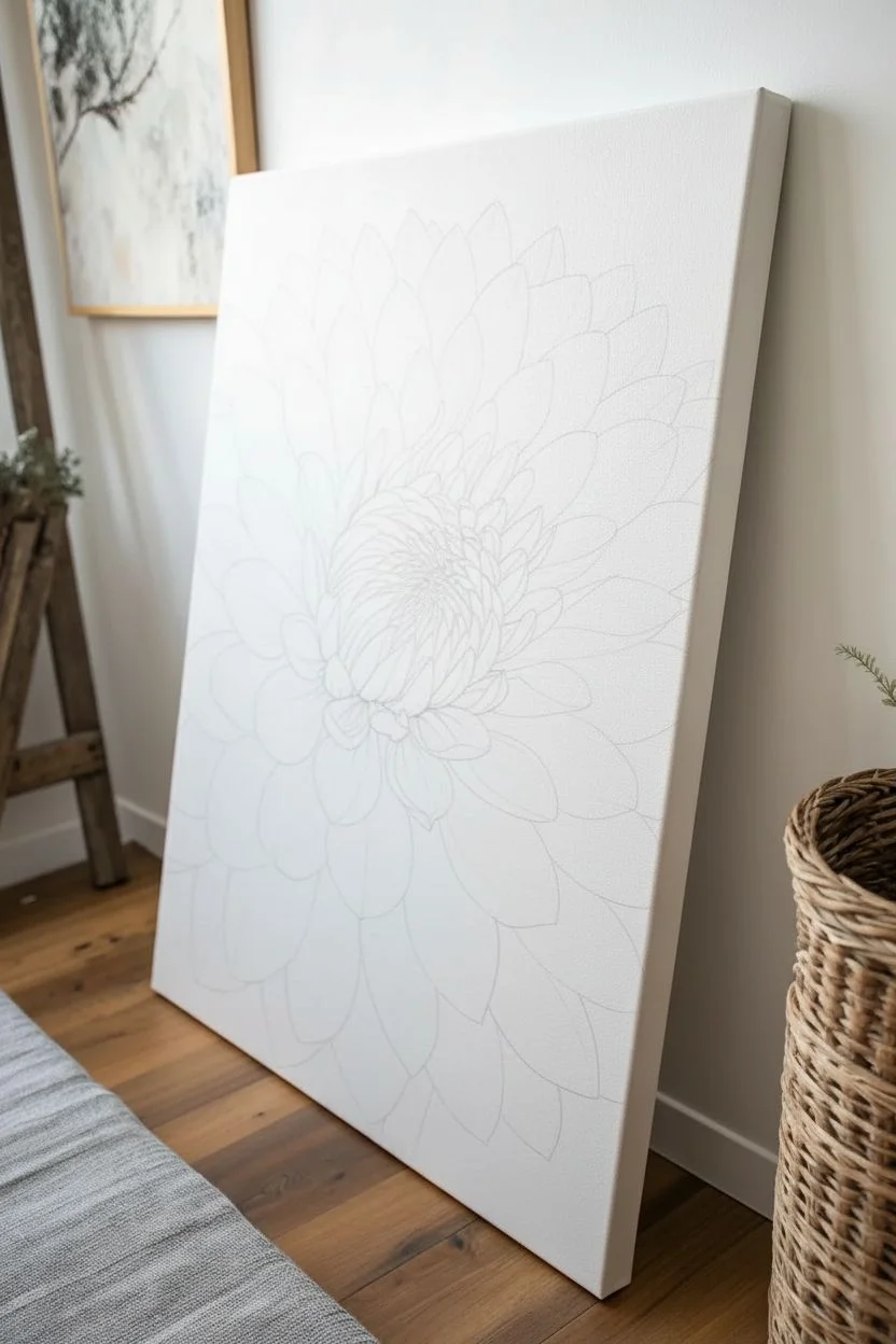
Step 1: Preparation and Sketching
-
Prime the surface:
Even if your canvas is pre-primed, apply a coat of gesso to ensure a smooth, consistent texture. Let it dry completely before proceeding. -
Map the center:
Visualize where the center of the dahlia will sit. It shouldn’t be perfectly centered; place it slightly offset to create a dynamic composition. -
Outline the central cluster:
Focusing on that focal point, lightly sketch the tight, unopened petals in the very middle. These should look like small, overlapping scales or seeds. -
Draft the radiating petals:
Work your way outward, drawing the larger, elongated petals. Don’t worry about perfect symmetry, as natural deviations add realism. -
Establish the crop:
Draw the outermost petals extending all the way off the canvas edges. This ‘macro’ cropping effect is crucial for the dramatic look we are aiming for.
Tip: Smooth Blending
Use a soft, dry mop brush to feather wet acrylics. Lightly dusting over boundaries eliminates hard lines instantly.
Step 2: Developing the Underpainting
-
Mix warm base tones:
Create a mixture of Titanium White with a touch of Yellow Ochre and a tiny speck of Alizarin Crimson to make a very pale, warm cream color. -
Block in the light areas:
Using your large flat brush, paint the tips and central bodies of the petals where the light hits most directly. Keep the paint application relatively thin here. -
Create a shadow mix:
Mix Alizarin Crimson with a little Burnt Umber and Cadmium Yellow to create a muted, dusty rose color for the shadows. -
Define the depth:
Paint this darker rose mix into the crevices between the petals and towards the base of each petal where they converge at the center.
Trouble: Muddy Colors?
Let the layer dry completely before glazing new colors. Wet-on-wet mixing can turn pinks and yellows into dull brown.
Step 3: Building Layers and Softness
-
Blend the transitions:
Add a slow-drying medium to your paints now. Use a clean, dry filbert brush to gently soften the lines where the cream light meets the dusty rose shadow. -
Intensify the center:
Mix a deeper version of your shadow color using more Burnt Umber. Use a smaller brush to paint the deepest recesses of the central button to create a sense of tunnel-like depth. -
Enhance petal texture:
With a medium filbert brush, add subtle striations along the length of the petals. I like to use a slightly lighter pink mix here to mimic the veins of the flower. -
Refine the edges:
Clean up the edges of the overlapping petals with Titanium White mixed with a tiny bit of your base cream. Sharp edges on top petals help push the blurry bottom petals back in space. -
Adjust color temperature:
Glaze a very thin, watery layer of Cadmium Yellow Light over the sun-drenched parts of the petals to give them a glowing, translucent quality. -
Deepen the outer shadows:
For the petals furthest from the center and near the bottom, darken the shadows slightly to anchor the painting and add weight. -
Add final highlights:
Use pure Titanium White (or white with merely a whisper of pink) to add crisp highlights on the curling tips of the petals closest to the viewer.
Step back and admire how the scale shifts the perspective, turning a simple flower into an architectural masterpiece


Big Botanical Leaves With High-Contrast Shadows
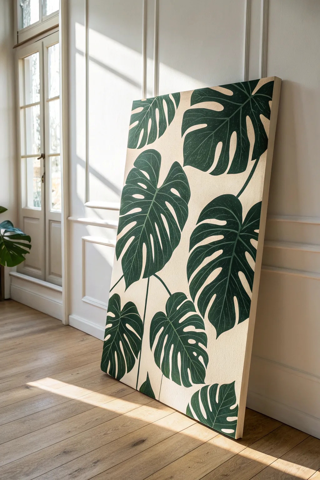
Bring the outdoors in with this striking, large-scale botanical painting that features lush monstera leaves against a creamy background. The design focuses on high contrast and elegant organic shapes, making it a perfect statement piece for any room craving a touch of nature.
How-To Guide
Materials
- Large stretched canvas (e.g., 24×36 inches or larger)
- Acrylic paints: Titanium White, Unbleached Titanium (or Cream), Phthalo Green, Mars Black, Burnt Umber
- Gesso (optional, for priming)
- Graphite pencil (HB or 2B) and eraser
- Large flat brush (2-3 inch) for background
- Medium filbert brush (size 8-10)
- Small round brush (size 2-4) for detailing
- Palette or paper plate
- Cup of water and paper towels
- Reference images of Monstera leaves
Step 1: Preparing the Foundation
-
Prime the canvas:
Even if your canvas is pre-primed, adding a fresh coat of gesso creates a smoother surface for detailed leaf work. Apply one even coat and let it dry completely. -
Mix the background color:
Create a warm, neutral base by mixing Titanium White with a generous amount of Unbleached Titanium. You want a color that resembles natural linen or heavy cream. -
Apply the base coat:
Using your large flat brush, paint the entire canvas with your background mix. Use long, horizontal strokes to ensure smooth coverage. I prefer to paint the sides of the canvas as well for a polished, frameless look. -
Apply a second coat:
Once the first layer is touch-dry (usually about 20-30 minutes), apply a second coat to ensure complete opacity and a rich, solid background. Let this dry overnight or for several hours.
Clean Lines Hack
Work from the center of the leaf outward toward the edges. This helps you control the brush better when navigating the tricky sharp points of the leaf splits.
Step 2: Sketching the Composition
-
Plan placement:
Visualize three to five large leaves dominating the space. Avoid centering them perfectly; instead, have some leaves entering from the edges or overlapping slightly for a dynamic composition. -
Draw the main veins:
Lightly sketch the central vein (midrib) of each leaf first. This establishes the direction and flow of the foliage. -
Outline the leaf shapes:
Draw the broad heart-shaped outline of the monstera leaves around your central veins. Keep your pencil pressure very light so the graphite doesn’t smudge into your paint later. -
Add the fenestrations:
Sketch the characteristic splits and holes (fenestrations) of the monstera. Remember that these are negative spaces cutout from the leaf, extending inwards from the edges or appearing as oval holes near the center.
Step 3: Painting the Foliage
-
Mix the base green:
On your palette, combine Phthalo Green with a touch of Mars Black and a tiny bit of Burnt Umber. This creates a deep, rich forest green rather than a synthetic bright green. -
Block in the leaves:
Using the medium filbert brush, paint the main body of the leaves with your dark green mix. Carefully paint around the splits and holes you sketched, preserving the cream background showing through. -
Refine the edges:
Switch to a smaller round brush to tidy up the edges of the leaves and the sharp points of the splits. Crisp edges are crucial for that graphic, high-contrast look. -
Mix a lighter tone:
Take some of your base green mixture and add a small amount of Unbleached Titanium and a drop of yellow (or just more white) to create a slightly lighter, muted green for the veins. -
Paint secondary veins:
With a steady hand and your small round brush, paint fine lines radiating from the central vein out toward the edges of the leaves. These should be subtle, just enough to give the leaf structure. -
Add subtle highlights:
I like to dry-brush a tiny bit of the lighter green mixture on the upper curves of the leaves where light would naturally hit. Keep this minimal to maintain the flat, illustrative style. -
Touching up the background:
If you accidentally painted over a line, wait for the green to dry completely, then use your background cream color to cut back in and clean up the leaf shape. -
Connect the stems:
Paint the stems extending downwards using your dark green mix. Ensure they connect logically to the base of each leaf. -
Final inspection:
Step back from the canvas to check for any patchy areas in the dark green. Apply a second coat to the leaves if necessary to get a deep, velvety finish. -
Varnish:
Once the painting has cured for at least 24 hours, apply a satin or matte varnish to protect the surface and unify the sheen of the paints.
Go Graphic
For a bolder, poster-like effect, don’t blend the vein colors. Instead, use a very light sage green for the veins to create a pop-art style striking contrast.
Hang your new botanical masterpiece in a well-lit spot to enjoy the dramatic interplay of deep green and soft cream
BRUSH GUIDE
The Right Brush for Every Stroke
From clean lines to bold texture — master brush choice, stroke control, and essential techniques.
Explore the Full Guide
Abstract Landscape Bands With a Strong Horizon Line
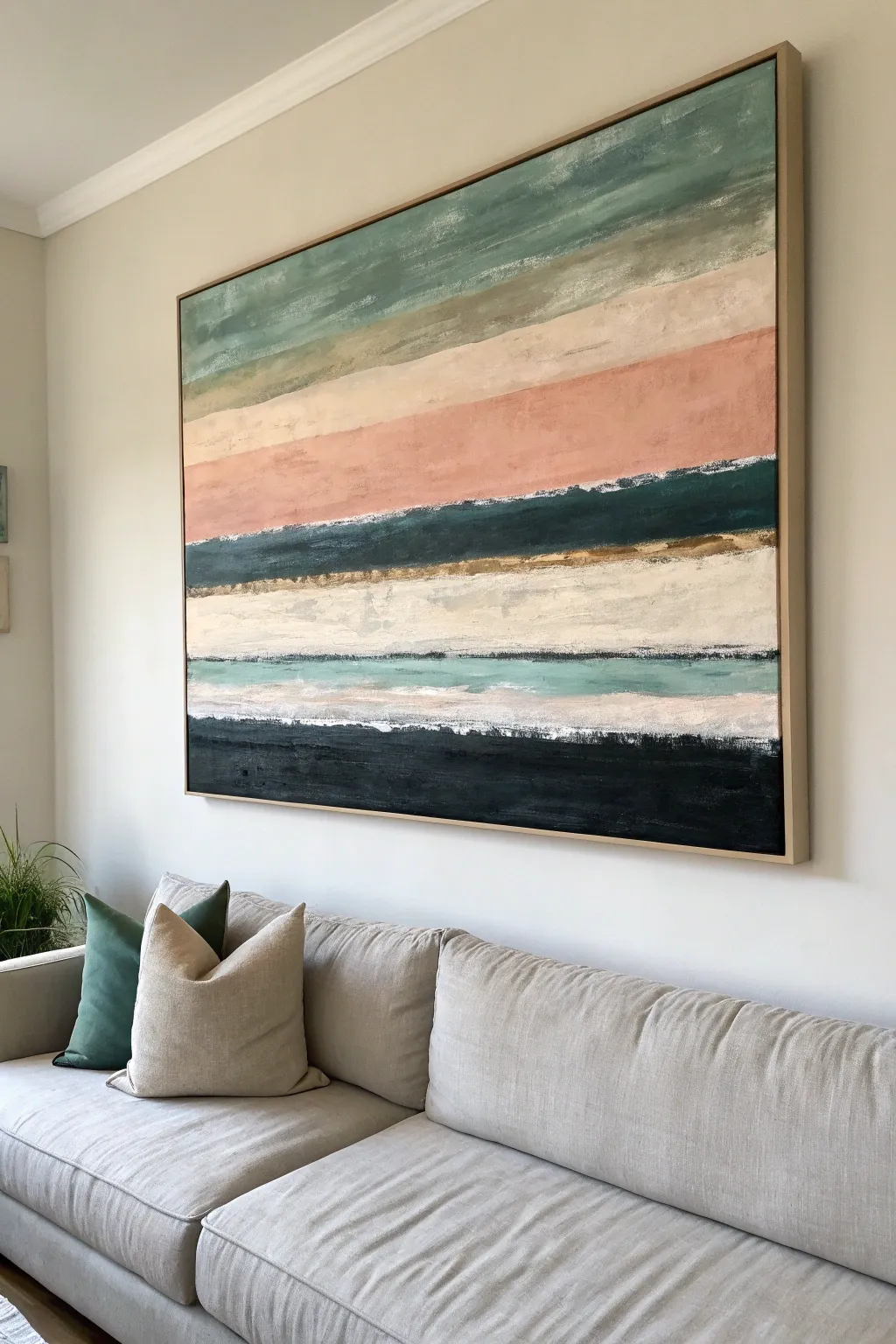
Transform a large blank canvas into a calming statement piece inspired by the horizon. This abstract landscape uses layered bands of muted teals, soft blush, and deep forest tones to create a textured, modern look that anchors any living space.
Step-by-Step Tutorial
Materials
- Large horizontally oriented canvas (e.g., 40″ x 60″)
- Float frame (light oak or natural wood, optional)
- Acrylic paints: Sage Green, Teal, Payne’s Gray, White, Burnt Sienna, Blush Pink, Gold Metallic
- Large flat brushes (2-inch and 4-inch width)
- Palette knife or plastic scraper
- Painter’s tape or masking tape (optional)
- Spray bottle with water
- Heavy body matte medium or texture paste
- Drop cloth
Step 1: Preparation & Base Layers
-
Set the Stage:
Lay down your drop cloth and position your large canvas. If you don’t have an easel large enough, propping it against a wall or lying it flat on a table works perfectly for these linear movements. -
Mix the Textures:
Mix a generous amount of plain white acrylic paint with a matte medium or light texture paste. You want a consistency that holds brush strokes but is still spreadable. -
Prime with Texture:
Apply this textured white mixture across the entire canvas using a large brush. Don’t aim for perfection; rough, horizontal strokes will add depth to the final layers. -
Let it Set:
Allow the base texture layer to dry completely. This might take a few hours depending on thickness, but it provides that essential ‘tooth’ for the colors to grab onto.
Step 2: Blocking the Colors
-
Mix the Sage Top:
Combine teal, white, and a touch of burnt sienna to create a muted sage green. This will be your topmost band. -
Apply the Sky:
Using a wide 4-inch brush, paint the top quarter of the canvas with your sage mix. Use long, sweeping horizontal arm movements rather than wrist flicks to keep the lines fluid. -
Create the Blush Band:
Mix white with just a hint of blush pink and burnt sienna for a fleshy, warm tone. Apply this band directly below the green, letting the edges kiss and slightly blend while wet. -
Anchor with dark tones:
Mix Payne’s Gray with a deep teal to get a dark forest color. Paint a strong, bold band roughly one-third of the way down the canvas. This high-contrast line acts as a focal horizon. -
Add the Bottom Weight:
Use straight Payne’s Gray or a mix with black to paint the heavy band at the very bottom of the canvas. This grounds the composition visually.
Dry Brush Secret
Keep a dry rag handy. Wipe your brush completely dry between color changes to get that scratchy, weathered texture along the edges of the stripes.
Step 3: Refining & Distressing
-
The Cream Middle:
Fill the large empty space between your dark middle band and the bottom dark band with a warm off-white (white with a speck of yellow oxide). -
Scrape Technique:
While the paint is tacky, I like to use a palette knife or plastic scraper to drag lightly across the horizontal lines. This reveals bits of the under-layer and creates that weathered look seen in the photo. -
Add the Accent Stripe:
Paint a thinner, lighter teal stripe just above the bottom black section. Let the brush be dry and scratchy here so the line isn’t too perfect. -
Gilding the Horizon:
Dip a small flat brush into metallic gold paint. Run a thin, broken line right beneath the dark middle forest-green band. This subtle shimmer mimics light hitting the landscape. -
Blend the Transitions:
Using a slightly damp clean brush, lightly feather the boundaries between colors where they feel too harsh. You want soft transitions, not rigid stripes. -
Final White Highlights:
Load a palette knife with pure heavy-body white paint. Drag it horizontally in short bursts across the ‘cream middle’ section to create raised, impasto highlights.
Metallic Magic
Mix a tiny bit of glazing liquid into your gold paint. It makes the metallic line slightly translucent, creating a more sophisticated, shimmering glow.
Step 4: Finishing Touches
-
Check the Balance:
Step back about six feet. If any horizontal line feels too straight or unnatural, mist it lightly with water and soften it with a dry brush. -
Dry and Frame:
Let the painting cure for at least 24 hours. Once fully dry, install it into a light oak float frame to replicate the clean, gallery-style presentation shown in the image.
Hang your new masterpiece and enjoy the calming coastal vibes it brings to your room
Palette Knife Impasto Waves With Real Texture
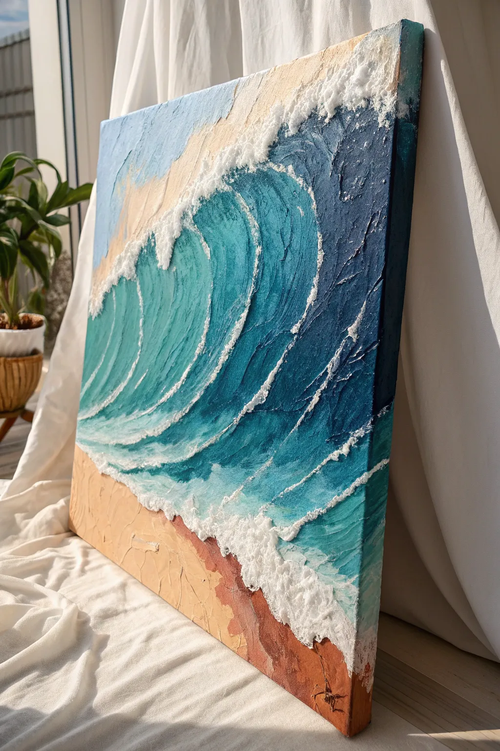
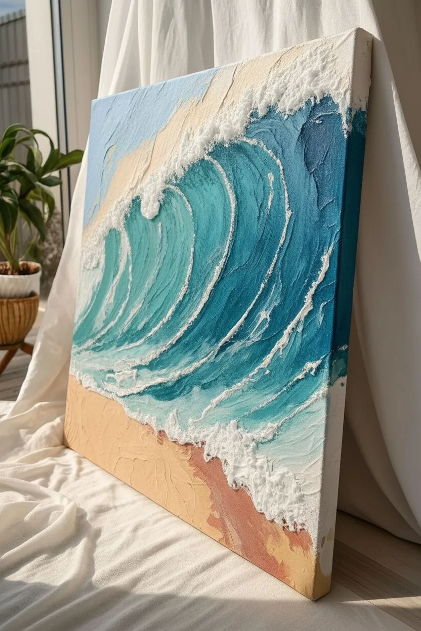
Capture the raw power of the ocean with this highly textured acrylic painting that literally pops off the canvas. By combining modeling paste with heavy body acrylics, you will sculpt crashing waves that cast their own shadows and catch the light.
Detailed Instructions
Materials
- Large stretched canvas (24×30 inches or larger recommended)
- Heavy body acrylic paints (Titanium White, Phthalo Blue, Turquoise Deep, Burnt Sienna, Yellow Ochre, Raw Umber)
- Modeling paste (heavy or molding paste)
- Set of palette knives (various sizes, especially large trowel and small diamond shapes)
- Large flat paintbrush (2-inch)
- Disposable palette or large flat surface for mixing
- Spray bottle with water
- Glaze medium (gloss)
Step 1: Creating the Textured Base
-
Map out the composition:
Start by lightly sketching the main curve of the wave and the shoreline onto your canvas with a pencil or diluted Burnt Sienna paint. This doesn’t need to be perfect; it’s just a guide for your texture placement. -
Mix the sand texture:
On your palette, mix a generous amount of modeling paste with Yellow Ochre, a touch of Burnt Sienna, and plenty of Titanium White. Aim for a warm, sandy beige color and a consistency like thick peanut butter. -
Apply the beach layer:
Using a large palette knife, spread the sand mixture onto the bottom left corner of the canvas. Don’t smooth it out perfectly; use the flat side of the knife to create ridges and bumps that mimic uneven sand. -
Prepare the wave paste:
Mix a large pile of plain white modeling paste. You want this to remain white for now to build the highest peaks of the foam, though you can tint a portion of it very lightly with blue for the under-layers. -
Sculpt the wave crest:
This is where the magic happens. Load your knife with the white paste and aggressively apply it along the curve of your wave sketch. Build it up thickest at the top of the crest where the foam is breaking. -
Create directional movement:
Use the edge of your knife to pull the paste downwards and backwards into the barrel of the wave. These distinct, raised ridges will guide your painting later and give the water its sense of motion. -
Add surface foam texture:
Dab the flat side of a clean knife into the wet paste along the shoreline and the breaking lip of the wave. Pull it straight up to create small, jagged peaks that look like splashing foam. Let this entire texture base dry completely, preferably overnight.
Step 2: Painting the Ocean Depth
-
Block in the deep water:
Mix Phthalo Blue with a tiny bit of black or purple to create a dark navy. Paint the top right corner (the deep sea behind the wave) using a brush or knife, working the paint into the nooks and crannies of the dry texture. -
Gradient the wave barrel:
Transition into the barrel of the wave. Start with pure Phthalo Blue, then blend into Turquoise Deep as you move toward the lighter, thinner section of the water. Apply the paint thinly so the texture ridges show through. -
Adding translucency:
For the lightest part of the wave (the ‘eye’), mix Turquoise Deep with plenty of Titanium White and a little glaze medium. Paint this into the center curve, blending it softly into the darker blues surrounding it to simulate light shining through the water. -
Refine the sand color:
If your dried sand texture looks too uniform, wash over it with a diluted coat of Burnt Sienna and Raw Umber. Wipe away the excess immediately with a rag, leaving the darker paint only in the deep crevices.
Don’t Overmix on Canvas
When dragging white over blue, resist the urge to blend! One confident swipe keeps the colors separate and crisp. Overworking it will turn your sparkling foam into a muddy, light blue smear.
Step 3: Finishing with Highlights and Foam
-
Highlight the ridges:
Load a clean palette knife with pure Titanium White (thick body paint, not paste this time). Hold the knife almost parallel to the canvas and gently drag it over the raised texture ridges of the wave face. This technique, called ‘dry dragging,’ catches only the exciting high points. -
Intensify the sea foam:
Using a smaller knife, apply thick dabs of white paint to the very top edge of the wave crest. I like to twist the knife slightly as I lift it to create erratic, organic shapes. -
Create the trailing foam:
Paint thin, broken lines of white trailing off the back of the wave into the deep blue water. These should follow the curve of the water, emphasizing the cylindrical shape of the wave. -
Connect to the shore:
Add a line of thick, frothy white where the water meets the sand. Use a stippling motion with the tip of your knife to create a bubbly texture. -
Paint the canvas edges:
Don’t forget the sides! Extend the colors and main horizon lines around the edges of the canvas for a professional, gallery-wrapped look. -
Seal layers:
Once fully dry (give the thick white highlights extra time), apply a gloss varnish. This mimics the wet look of water and evens out the sheen between the matte paste and glossy acrylics.
Embed Real Elements
Before drying the sand texture layer, sprinkle a pinch of real fine sand or tiny crushed shells into the wet paste. It adds authentic grit that paint alone can’t replicate.
Hang your masterpiece where side lighting will hit those ridges and bring the wave to life

PENCIL GUIDE
Understanding Pencil Grades from H to B
From first sketch to finished drawing — learn pencil grades, line control, and shading techniques.
Explore the Full Guide
Moody Storm Clouds in Dramatic Grays and Blues
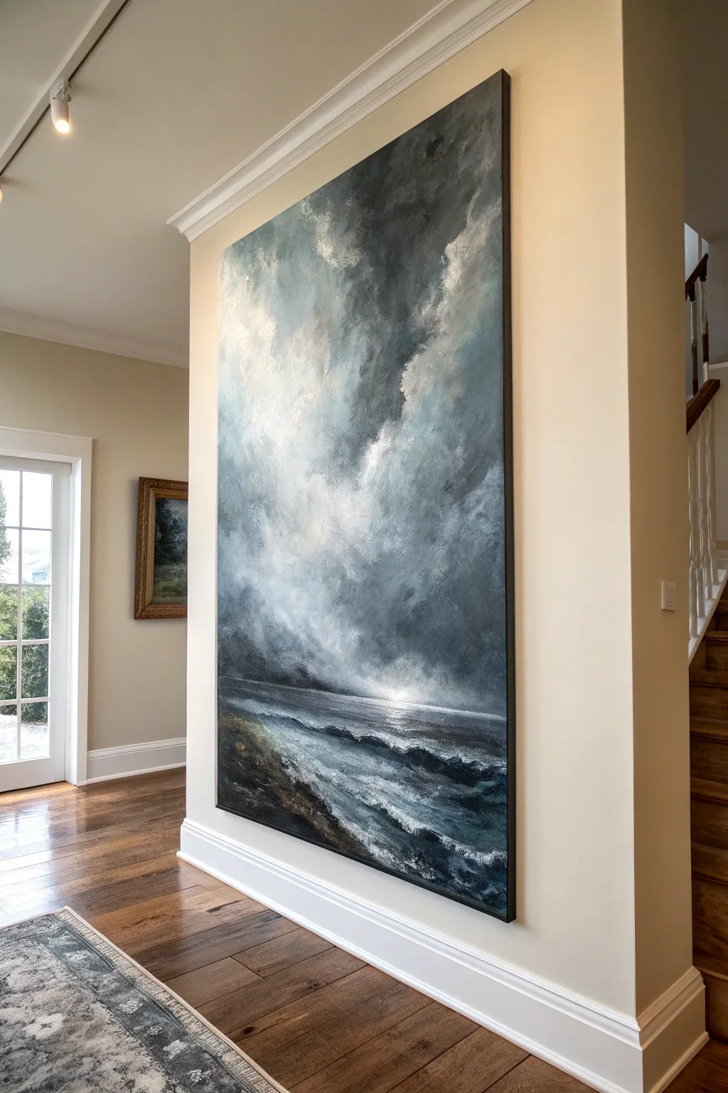
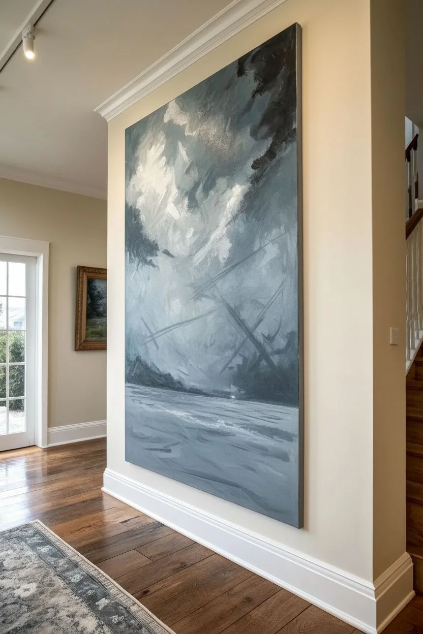
Transform a blank wall into a dramatic focal point with this oversized canvas painting of a tempestuous sea. The interplay of deep charcoal greys, stormy blues, and striking white highlights creates an emotionally resonant piece that brings the raw power of nature indoors.
Step-by-Step
Materials
- Oversized heavy-duty gallery wrapped canvas (e.g., 48×72 inches or larger)
- Acrylic heavy body paints: Titanium White, Mars Black, Payne’s Grey, Phthalo Blue (Green Shade), Burnt Umber, Raw Sienna
- Large blending brushes (chip brushes or synthetic wash brushes)
- Palette knives (assorted sizes, including a large trowel shape)
- Slow-drying medium or retarder
- Spray bottle with water
- Large mixing palette or butcher tray
- Easel or drop cloth for floor painting
- Gesso (if canvas isn’t pre-primed)
Step 1: Setting the Atmosphere
-
Prime the Surface:
Begin by ensuring your large canvas is clean and taut. If it isn’t pre-primed, apply two coats of gesso, sanding lightly between layers to create a slight tooth for the paint to grip. -
Map the Horizon:
Using a diluted mixture of Payne’s Grey and water, sketch a low horizon line about one-third of the way up from the bottom. This emphasizes the vastness of the sky, which is the main subject of this piece. -
Mix the Sky Base:
Prepare a large volume of mid-tone grey-blue. Mix Titanium White with a touch of Payne’s Grey and a tiny hint of Phthalo Blue. Add slow-drying medium, as working on a canvas this size requires extra open time. -
Block in the Sky:
Using your largest brush, cover the entire upper two-thirds of the canvas with your base mix. Apply it vigorously in crisscross motions; the goal isn’t perfect smoothness but an energetic underpainting. -
Introduce Darkness:
While the base is still wet, mix a darker storm color using Mars Black and Phthalo Blue. Apply this to the top right corner and the area just above the horizon on the left, blending wet-into-wet to create looming cloud masses.
Muddy Colors?
If your grey clouds start turning brown or muddy, stop blending immediately. Let the layer dry completely, then apply fresh colors on top to keep the tones crisp.
Step 2: Building Cloud Structure
-
Create Light Channels:
Load a clean brush with Titanium White and a touch of Raw Sienna for warmth. Strike a diagonal channel from the upper left down toward the center horizon, suggesting where sunlight is piercing the storm. -
Soften the Edges:
Use a dry, soft blending brush to gently sweep over the transitions between the dark storm clouds and the light channel. I like to barely touch the canvas here, feathering the paint to create that misty, vaporous look. -
Add Turbulence:
With a smaller brush or palette knife, scumble thick, unthinned white and grey paint in circular motions where the light meets the dark. This builds the texture of billowing cumulonimbus clouds. -
Enhance Contrast:
Deepen the shadows within the clouds using pure Payne’s Grey. Tuck these darks underneath the white billows to give the clouds volume and 3D weight. -
The Horizon Glow:
Paint a concentrated area of bright white right at the center of the horizon line. Blend it outwards into the sea and sky to represent the sun’s reflection breaking through the gloom.
Scale It Up
For a canvas this huge, step back 10 feet every 15 minutes. Details that look good up close often vanish or look messy from a viewing distance.
Step 3: Painting the Turbulated Sea
-
Base the Water:
Mix a deep, dark teal using Phthalo Blue, Mars Black, and a touch of Burnt Umber. Apply this horizontally across the entire bottom third of the canvas. -
Suggest Distant Waves:
Using a flat brush and a lighter grey-blue, paint thin, horizontal streaks near the horizon line. Keep these strokes perfectly straight to create the illusion of distance. -
Form the Foreground Waves:
Switch to a palette knife. Load it with a mix of White and the base sea color. Drag the knife sideways and slightly diagonally in the foreground to create the physical ridge of chopping waves. -
Add Sea Foam:
Dip a worn bristle brush or a piece of natural sponge into slightly watered-down white paint. Dab and stipple along the tops of your wave ridges to create the look of crashing foam/spray. -
Deepen the Troughs:
Glaze a transparent layer of pure Phthalo Blue and black into the hollows between the waves. This transparency adds depth, making the water look like liquid rather than stone. -
Detailing the Shoreline:
In the bottom left corner, mix Burnt Umber and Black for the wet sand. Drag this color upwards slightly into the white foam to show the receding tide pulling at the earth. -
Final Highlights:
Take pure Titanium White on a small palette knife. Apply sharp, thick impasto highlights on the crests of the nearest waves and the brightest part of the clouds to catch the room’s light.
Step back and admire the powerful atmosphere you have captured in your dramatic seascape
High-Contrast Color Blocking That Sets the Whole Room Palette
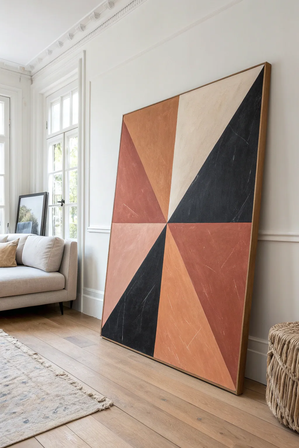
This striking large-scale canvas uses earthy terracotta tones and deep charcoal to create a sophisticated, high-contrast focal point. Its geometric pinwheel design feels modern yet timeless, perfect for grounding a minimalist or bohemian living space.
Detailed Instructions
Materials
- Large canvas (e.g., 48×60 inches or larger)
- Wooden float frame (optional, for finishing)
- Acrylic paints (Charcoal Black, Burnt Sienna, Terra Cotta/Rust, Cream/Beige, Unbleached Titanium)
- Matte medium or glazing liquid
- Large flat paintbrush (2-3 inches)
- Medium angle sash brush
- Painter’s tape (1-inch width)
- Yardstick or long straight edge
- Pencil
- Drop cloth
- Fine-grit sandpaper (optional for distressing)
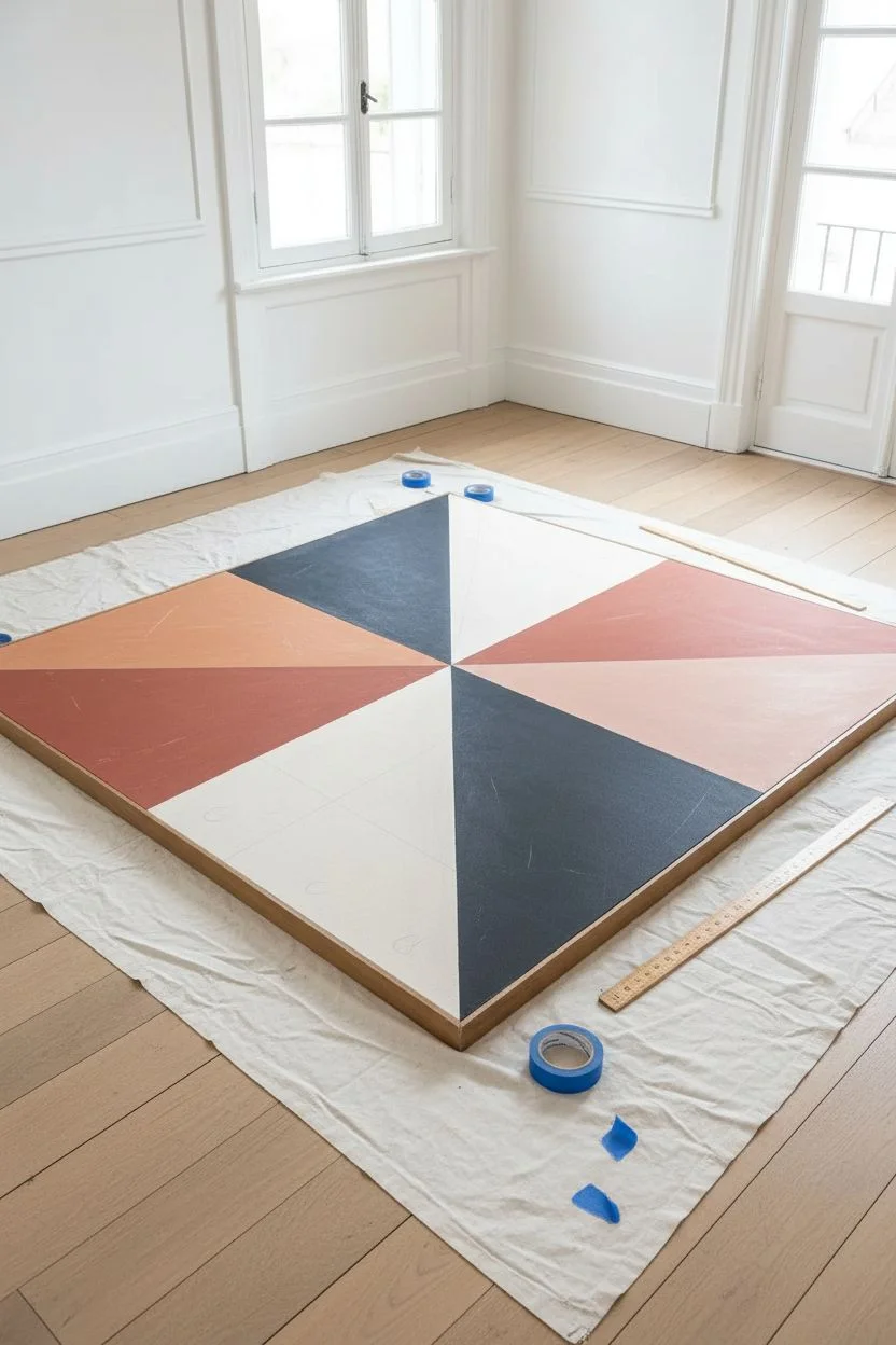
Step 1: Planning and Layout
-
Prepare your canvas:
Lay your large canvas on a flat surface protected by a drop cloth, or prop it securely on an easel. Ensure the surface is clean and free of dust. -
Find the center:
Using your yardstick, measure the width and height of the canvas to locate the exact center point. Mark this spot lightly with a pencil. -
Draw the main axes:
Draw a vertical line running through your center point from top to bottom, and a horizontal line from side to side. This divides the canvas into four equal quadrants. -
Create the diagonals:
From the center point, draw diagonal lines extending to the corners or edges of the canvas. You want to create eight triangular sections radiating from the middle. Don’t worry if they aren’t perfectly symmetrical; slight variation adds character. -
Plan your palette:
Label each triangle lightly with a ‘B’ (Black/Charcoal), ‘R’ (Rust), ‘T’ (Tan/Terra Cotta), or ‘C’ (Cream) to assign your colors before you start painting. Refer to the reference image to replicate the balanced distribution of darks and lights.
Bleeding Lines?
If paint seeps under the tape, wait for it to dry fully. Then, dampen a small angle brush and tidy up the line with the correct top-coat color for a sharp edge.
Step 2: Painting the Sections
-
Tape the first set:
Apply painter’s tape along the pencil lines for your first set of non-adjacent triangles. I usually tape off about three or four distinct sections that don’t touch each other first. Press the tape edges down firmly to prevent bleeding. -
Mix the charcoal tone:
Mix Mars Black with a tiny touch of white or brown to soften it into a deep charcoal. Apply this to the designated dark sections using the large flat brush. -
Apply the rust tones:
For the medium reddish-brown sections, mix Burnt Sienna with a little Unbleached Titanium. Paint these sections with confident strokes, keeping the texture visible. -
Fill the cream sections:
Paint the lightest sections using a mix of Unbleached Titanium and a drop of Yellow Ochre or beige. Aim for full coverage, but don’t over-smooth the paint. -
Remove tape and dry:
Carefully peel back the painter’s tape while the paint is still slightly tacky to get crisp lines. Let these sections dry completely—usually about an hour. -
Tape remaining sections:
Once dry, apply tape over the painted edges to protect them. This reveals the remaining unpainted triangles. -
Paint the remaining triangles:
Fill in the final sections with your Terra Cotta and secondary rust shades, ensuring the colors abut perfectly against the previously painted lines.
Pro Tip: Depth Control
Mix a small amount of modeling paste into your acrylics. This adds physical thickness to the paint, mimicking the texture of plaster or stone.
Step 3: Texture and Finishing
-
Peel and reveal:
Remove the final strips of tape. You should now have a clean, geometric pinwheel design covering the entire canvas. -
Add weathered texture:
To mimic the stone-like quality of the inspiration piece, lightly dry-brush a very small amount of the cream color over the darker sections, and vice versa. This creates subtle scratches and imperfections. -
Detail with scuffing:
If I want an even more aged look, I take a piece of fine-grit sandpaper and very gently scuff a few areas, particularly where the colors meet or near the edges. -
Seal the work:
Apply a coat of matte medium or clear matte varnish over the entire piece to unify the sheen and protect the surface from dust. -
Frame it:
Install the canvas into a simple wooden float frame to give it that gallery-ready, polished appearance.
Hang your massive masterpiece and enjoy the instant warmth it brings to the room


Large-Scale Geometric Shapes With Clean Edges
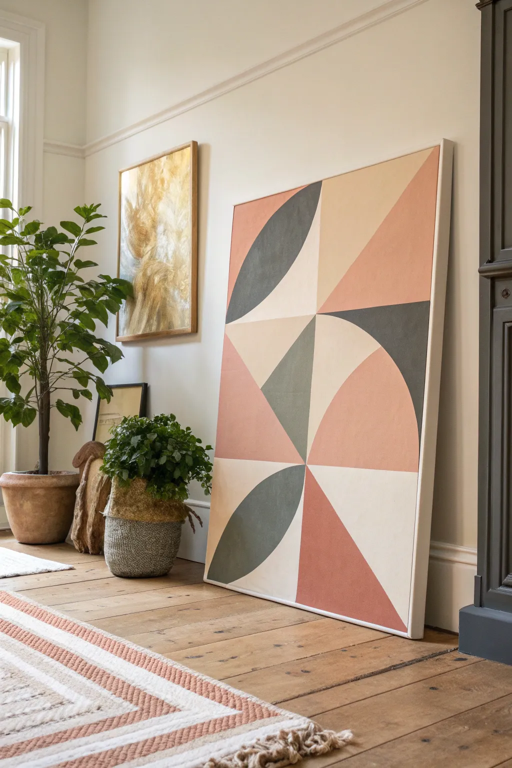
Bring modern gallery vibes to your home with this striking large-scale geometric painting. Featuring a harmonious palette of dusty rose, terracotta, cream, and charcoal, this project relies on crisp lines and bold shapes to make a sophisticated statement.
Step-by-Step Guide
Materials
- Large stretched canvas (24×36 or 30×40 inches)
- Acrylic paints (terracotta, dusty rose/blush, dark charcoal, cream/off-white)
- Painter’s tape (multi-surface or delicate surface)
- Wide flat paintbrush (2-3 inches)
- Medium flat paintbrush (1 inch)
- Pencil
- Long ruler or yardstick
- Large circular object (like a dinner plate or mixing bowl) or a makeshift compass (string and pin)
- Drop cloth or newspapers
- Paper towels and water cup
Step 1: Planning the Grid
-
Prepare your canvas:
Lay your large canvas on a flat, protected surface or prop it securely on an easel. Wipe it down with a dry cloth to remove any dust. -
Measure the center point:
Using your yardstick, measure the total width and height of the canvas. Mark the exact center point with a light pencil dot. -
Draw the grid lines:
Draw a vertical line straight down the center and two horizontal lines strictly across the width to create a 2×3 grid (two columns, three rows). Ensure these lines are perfectly straight, as they define your entire composition. -
Sketch the diagonals:
Within specific rectangles of your grid, lightly sketch the diagonal lines required for the triangular sections. Reference the finished image to see which blocks get triangles versus curves. -
Sketch the curves:
For the curved sections, use a large circular object or a string-and-pin compass to trace quarter-circles. Place the point of your compass (or edge of your bowl) at the corner of the grid block to ensure the arc spans correctly from edge to edge.
Tape Sealing Trick
To get razor-sharp lines on textured canvas, paint a thin layer of white (or the background color) over your tape edge first. This seals the gap so your colored paint sits perfectly on top.
Step 2: Masking & Painting Phase 1
-
Tape first section boundaries:
Apply painter’s tape along the pencil lines of the first set of non-touching shapes. I like to start with the darkest charcoal sections to anchor the design. -
Seal the tape edges:
Run your finger or a clean credit card firmly over the tape edges to prevent paint bleed. For extra crisp lines, paint a thin layer of your base canvas color (or matte medium) over the tape edge first. -
Paint the charcoal shapes:
Using your medium brush, fill in the charcoal geometric sections. Apply the paint in smooth, even strokes, moving in the direction of the shape. -
Apply the creamy beige:
While the charcoal dries, identify the non-adjacent sections that need the cream color. Tape off these areas and apply the paint liberally for solid coverage. -
Peel and reveal:
Carefully peel back the tape while the paint is still slightly tacky to avoid pulling up dried acrylic skins. Pull the tape away from the painted area at a 45-degree angle.
Add Texture
Mix a little baking soda or modeling paste into your acrylics before painting. This adds a subtle, gritty texture that mimics plaster or stone, giving the piece an expensive, organic feel.
Step 3: Painting Phase 2 & Finishing
-
Allow to dry completely:
Let the first batch of shapes dry completely before taping over them. This is crucial—if the paint is damp, the new tape will ruin your work. -
Tape remaining sections:
Apply tape over the dried painted edges to mask off the remaining empty spaces (the terracotta and dusty rose sections). -
Mix your warm tones:
If you don’t have premixed colors, blend orange, brown, and white to get the terracotta, and add a touch of pink to create the lighter blush tones. -
Fill remaining shapes:
Paint the final triangles and curves with your warm earth tones. Use the wide brush for large areas and the medium brush for corners. -
Double check coverage:
Look at the canvas from an angle to check for thin spots. Apply a second coat to any color that looks streaky or transparent. -
Final tape removal:
Once you are satisfied with the opacity, peel off the final pieces of tape gently. -
Touch up edges:
Use a specialized small detail brush to hand-paint any tiny spots where paint might have bled or where the canvas texture shows through. -
Paint the sides:
Don’t forget the edges of the canvas. Paint them a solid cream or continue the geometric design over the side for a polished, professional look.
Hang your new masterpiece in a well-lit spot to enjoy how the clean lines transform your space
Bold Black-and-White Gestural Abstraction
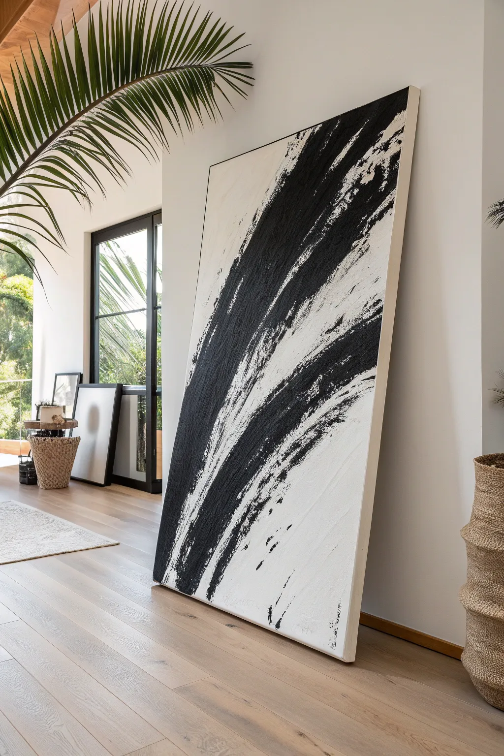
Capture the raw energy of movement with this large-scale gestural painting, featuring powerful diagonal strokes of black against a textured white ground. This minimalist yet dramatic piece creates an immediate focal point, balancing negative space with aggressive, confident brushwork.
Step-by-Step Tutorial
Materials
- Large gallery-wrapped canvas (48″x72″ or larger recommended)
- Heavy body acrylic paint (Mars Black and Titanium White)
- Texture paste or modeling paste (matte finish)
- Wide palette knives (4-6 inches)
- Large bristle brush or house painting brush (3-4 inches wide)
- Small chip brush or stiff fan brush for details
- Floetrol or acrylic pouring medium (optional)
- Large mixing palette or plastic tray
- Drop cloth
- Matte varnish
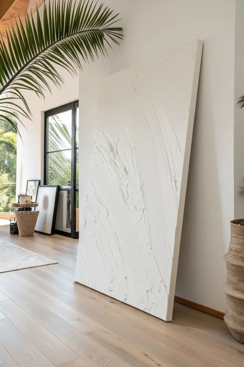
Step 1: Preparation & Base Texture
-
Prepare the workspace:
Since you are working large, lay down a drop cloth on the floor or lean your canvas against a sturdy wall. Ensure good lighting to see the texture as you build it. -
Mix the texture base:
Combine a large amount of Titanium White acrylic paint with modeling paste in a 2:1 ratio. You want a consistency similar to fluffy frosting that holds its shape but spreads easily. -
Apply the first layer:
Using a large palette knife or trowel, spread the white mixture across the entire canvas. Don’t worry about being perfectly smooth; subtle ridges add character to the final piece. -
Create directional texture:
While the white base is still wet, use a clean wide brush to lightly sweep across the surface in a diagonal direction, moving from bottom-left to top-right. This creates a ‘grain’ for the black paint to catch onto later. -
Allow for deep drying:
Let this white base layer dry completely. Because of the modeling paste, this may take 24-48 hours. It must be bone dry before adding the black.
Dry Brush Technique
To get that scratchy, broken-line look at the end of the strokes, ensure your brush isn’t dripping with paint. Wipe excess on a paper towel before the final drag.
Step 2: The Gestural Strokes
-
Prepare the black paint:
Squeeze a generous amount of Mars Black heavy body acrylic onto your palette. Do not dilute it with water; you need maximum opacity and thickness. -
Load the brush:
Take your large 3-4 inch bristle brush and load it heavily with black paint. Only load the bottom inch of the bristles to maintain control. -
Practice the motion:
Before touching the canvas, practice the arm movement in the air. The stroke needs to be a confident, sweeping arc starting from the lower-left quadrant and exploding upward toward the top right. -
Execute the primary stroke:
Place your brush firmly on the canvas near the bottom left edge. Using your whole arm (not just your wrist), drag the brush upward in a long, powerful curve. I find getting a running start creates a more natural energy. -
Lift off gradually:
As you reach the top of the stroke, lighten your pressure. This allows the bristles to break up and create that dry-brush, scratchy texture where the white background peeks through. -
Add secondary strokes:
Reload your brush and create 2-3 accompanying strokes parallel to the first one. Let them vary in thickness, some intersecting slightly with the main band, others floating independently. -
Enhance the texture:
Look for areas where the black paint looks too solid. While wet, you can use a dry chip brush to lightly drag through these areas, pulling paint away to reveal the texture underneath.
Step 3: Refinement & Details
-
Add splatter details:
Dip a smaller stiff brush into the black paint. Flick the bristles with your thumb to create tiny rogue splatters and dots around the edges of the main strokes, enhancing the feeling of speed. -
Check the balance:
Step back about 10 feet. Ensure there is enough ‘breathing room’ of white space on the bottom right and top left corners to balance the heavy black diagonal. -
Correcting edges:
If a stroke looks too blunt or stopped too abruptly, use a nearly dry brush to feather out the end of the line, extending the motion visually. -
Clean up stray marks:
If accidental black smudges land in the white negative space, wait for them to dry, then touch them up with pure Titanium White paint. -
Final drying:
Allow the black layer to dry for at least 24 hours. Thick acrylics can skin over but remain wet underneath, so patience is key. -
Varnish for protection:
Once fully cured, apply a coat of matte varnish. A matte finish is crucial here to prevent glare from distracting from the textural interplay.
Go Bigger
For a truly custom look, build your own canvas frame using 2×2 lumber and heavy drop cloth canvas. This allows you to scale up to massive sizes cheaply.
Hang your massive monochrome masterpiece and enjoy the dynamic energy it brings to your space
Oversized Line Art Figure Over a Soft Painted Ground
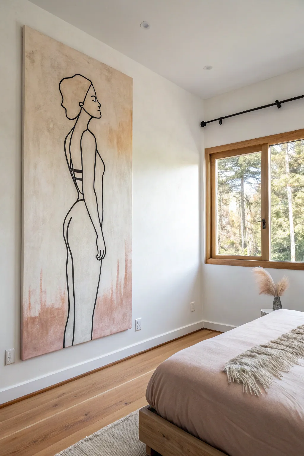
Transform a blank wall with this striking combination of organic texture and bold minimalism. This project builds a soft, atmospheric background of creams and terracottas before overlaying a single, continuous-style line drawing of a female figure.
Detailed Instructions
Materials
- Large wrapped canvas (approx. 36″ x 72″ or similar proportions)
- Acrylic paint: Titanium White, Unbleached Titanium (Cream), Burnt Sienna, and Carbon Black
- Matte medium or glazing liquid
- Large flat paintbrush (3-4 inches) for background
- Medium round brush (size 6 or 8) for line work
- Small round detail brush (size 2)
- Sponge or rag
- Chalk or soft charcoal pencil
- Easel or large drop cloth for floor work
- Water cups and palette
Step 1: Creating the Textured Ground
-
Prime the surface:
Begin by laying your large canvas flat on a drop cloth or mounting it on a sturdy wall easel. Apply a base coat of Titanium White mixed with a touch of Unbleached Titanium to create a warm, off-white foundation. Let this dry completely. -
Mix the wash colors:
Prepare two distinct mixtures on your palette. First, a milky glaze made of 80% matte medium and 20% Unbleached Titanium. Second, a terracotta wash made of matte medium, Burnt Sienna, and a tiny dot of white to soften it. -
Apply the creamy mid-tones:
Using your large flat brush, apply the cream glaze in loose, vertical streaks. Focus on the upper two-thirds of the canvas. The goal implies texture, not perfect coverage, so leave some white showing through. -
Add the earthy base:
While the cream layer is still tacky, introduce the terracotta wash at the very bottom of the canvas. Brush upward in uneven strokes, allowing the color to fade out as it reaches the knee-level of the future figure. -
Blend the transition:
Dip a damp sponge or rag into water and gently dab the area where the terracotta fades into the cream. This creates that dreamy, cloudy transition visible in the reference. I prefer to use a circular motion here to break up any harsh bristle lines. -
Introduce vertical distressing:
To mimic the worn, plaster-like look, take a nearly dry brush with a bit of undiluted Burnt Sienna and drag it vertically from the bottom edge upward. These marks should look like old water stains or peeling paint.
Uneven Lines?
Don’t panic if your hand shakes. Embrace the ‘wabi-sabi’ aesthetic! A slightly wavering line actually makes the piece feel more organic and hand-painted rather than like a vinyl decal.
Step 2: Drafting the Figure
-
Sketch the posture:
Once the background is bone-dry, use a piece of chalk or soft charcoal to lightly map out the figure. Start with a simple vertical line to establish the center of balance, ensuring the figure stands tall from the bottom edge. -
Refine the proportions:
Sketch the silhouette loosely. Focus on the elongated elegance of the neck and the curve of the hip. The head should be near the top edge, and the legs should disappear off the bottom. Don’t worry about perfection; chalk wipes off easily with a dry cloth. -
Detail the profile:
Pay special attention to the profile of the face. The nose, lips, and chin need to be distinct but simple. Keep the hairstyle abstract—just a suggested bun or updo.
Add Gold Leaf
Make it luxe by applying gold leaf to specific small details, like the hair tie or a bracelet on the wrist, to catch the light against the matte background.
Step 3: Painting the Line Art
-
Prepare the black paint:
Mix Carbon Black acrylic with a few drops of water or flow improver. You want an ink-like consistency that travels smoothly off the brush without dripping. -
Start from the top:
Using your medium round brush, begin painting over your chalk lines starting at the head. Keep your wrist loose. Variations in line thickness add character, so don’t try to be like a printer. -
Execute the long curves:
Paint the long back line and the curve of the buttocks in confident, sweeping strokes. If your brush runs out of paint halfway, stop at a natural intersection (like the waist or an armpit) to reload. -
Add definition lines:
Switch to the smaller detail brush for the facial features (eye, eyebrow, lips) and the hand. These areas require more control than the broad body outline. -
Thicken select areas:
Go back over the main outer silhouette lines to thicken them slightly, particularly around the shoulder and hip. This adds visual weight and separates the figure from the background. -
Seal the work:
Allow the black paint to cure for at least 24 hours. Once dry, gently wipe away any visible chalk marks with a microfiber cloth before displaying.
Hang your new masterpiece in a bright room and enjoy the calm sophistication it brings to your space
City Skyline at Dusk With Simplified Shapes
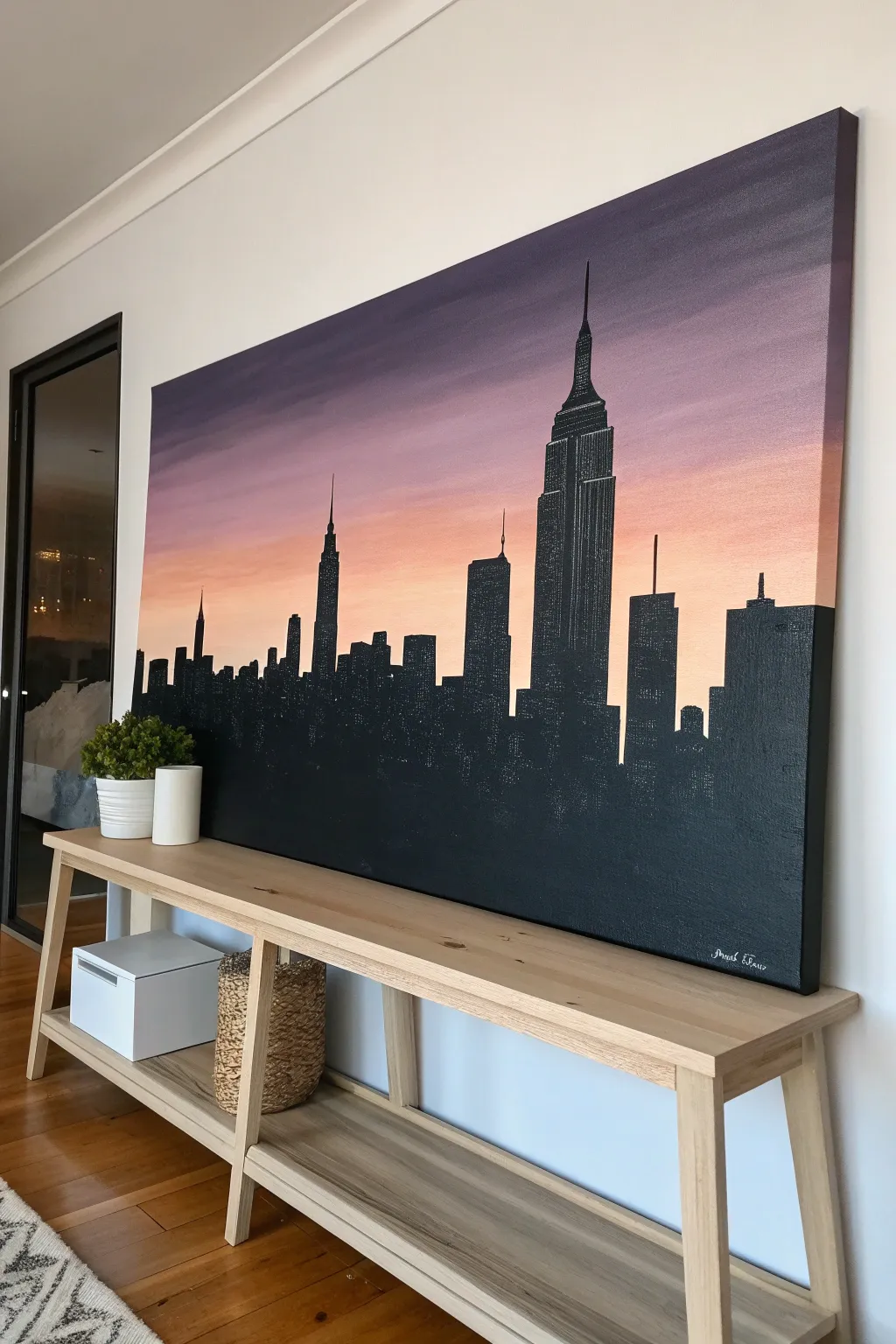
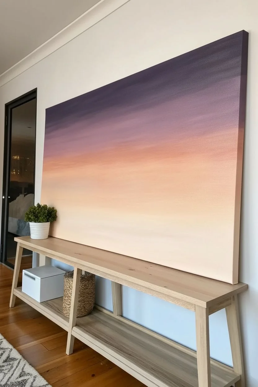
Bring the dramatic elegance of the New York City skyline into your home with this striking large-scale silhouette painting. This project focuses on mastering a smooth gradient sky that seamlessly transitions into sharply defined architectural shapes.
Step-by-Step Guide
Materials
- Large stretched canvas (e.g., 36″ x 48″ or larger)
- Acrylic paints: Titanium White, Carbon Black, Cadmium Orange, Alizarin Crimson, Dioxazine Purple
- Large flat brush (2-3 inch) for background
- Medium flat brush (1 inch)
- Small round detail brush (size 0 or 1)
- Ruler or straight edge
- Chalk or pastel pencil (light gray)
- Painter’s tape or stencil tape (optional)
- Mixing palette
- Cup of water and paper towels
Step 1: Setting the Sky
-
Prepare the Gradient Palette:
Before touching the canvas, pre-mix your sky colors on your palette to ensure a smooth workflow. You will need four distinct shades: a deep violet-purple for the top, a softer mauve/pink, a bright orange-peach, and a very pale warm off-white for the horizon line. -
Paint the Top Band:
Using your largest flat brush, apply the deep purple mixture to the top 20% of the canvas. Use long, horizontal strokes that go from edge to edge to avoid choppy textures. -
Blend the Middle Transition:
While the purple is still slightly wet, pick up your mauve/pink mixture. Paint the next section down, overlapping slightly with the purple. Brushing back and forth over the seam will create a soft, seamless fade. -
Add the Sunset Glow:
Clean your brush thoroughly or switch to a clean one. Apply the bright orange-peach tone below the pink layer, blending upward into the pink just like before. This creates the warm ‘golden hour’ effect. -
Create the Horizon Light:
Finish the bottom third of the canvas with your palest off-white peach tone. This area needs to be quite light to create high contrast with the black skyline later. Blend it upward into the orange. -
Smooth the Final Look:
With a clean, slightly damp large brush, run horizontal strokes across the entire sky one last time to soften any remaining hard lines. Let the canvas dry completely—usually at least an hour—before proceeding.
Clean Lines Hack
If you have shaky hands, use artist’s tape for the vertical building lines. Press it down firmly to prevent paint bleed, then paint black. Remove tape while wet.
Step 2: Drafting the Architecture
-
Establish the Horizon Line:
Decide how tall your buildings will be. For this composition, the cityscape occupies the bottom 40-50% of the canvas. Use a ruler to lightly visualize where the base of the buildings will sit (though they will go off the bottom edge). -
Sketch the Empire State Building:
Using a piece of chalk or a pastel pencil, sketch the outline of the main focal point—the Empire State Building—to the right of the center. Focus on the stepped tiers near the top and the needle antenna. -
Outline Supporting Skyscrapers:
Sketch the remaining buildings. Notice how they vary in height and width; include smaller buildings between the giants to create a realistic density. Don’t worry about perfect details, just the outer shapes. -
Verify Proportions:
Step back from the canvas to check your composition. The chalk is easily wiped away if you need to adjust a building’s height or position before committing with paint.
Step 3: Painting the Shadows
-
Block in Main Shapes:
Load a medium flat brush with pure Carbon Black paint. Start filling in the large rectangular bodies of the buildings. Use the flat edge of the brush to keep the sides vertical and straight. -
Define the Edges:
For long, straight building sides, you can use a ruler as a guide or apply a strip of painter’s tape for an ultra-crisp edge. Peel the tape immediately after painting the section to avoid peeling up dry paint. -
Detail the Spires:
Switch to your small round detail brush. Carefully paint the antennas, spires, and intricate stepped tops of the skyscrapers. I find resting my hand on a dry part of the canvas (or a bridge stick) helps keep my hand steady for these fine lines. -
Add Texture (Optional):
To mimic the look of windows catching the last light or interior lights turning on, you can dry-brush tiny specks of gray or leave minute gaps of the underpainting showing through, though a solid silhouette works beautifully too. -
Fill the Mass:
Ensure the bottom section of the painting is a solid, opaque black. You may need a second coat of black paint once the first dries to eliminate any streaky brushstrokes in the dense city areas. -
Final Inspection:
Check the very bottom edge and the wrapped sides of the canvas. Painting the sides black continues the image and gives the piece a professional, finished look without needing a frame.
Starry Night Upgrade
Wait for everything to dry fully, then flick a tiny amount of watered-down white paint onto the purple section of the sky with a toothbrush for subtle stars.
Hang your new cityscape in a well-lit area to let those sunset colors truly glow
Topographic Contour Lines Across a Huge Surface
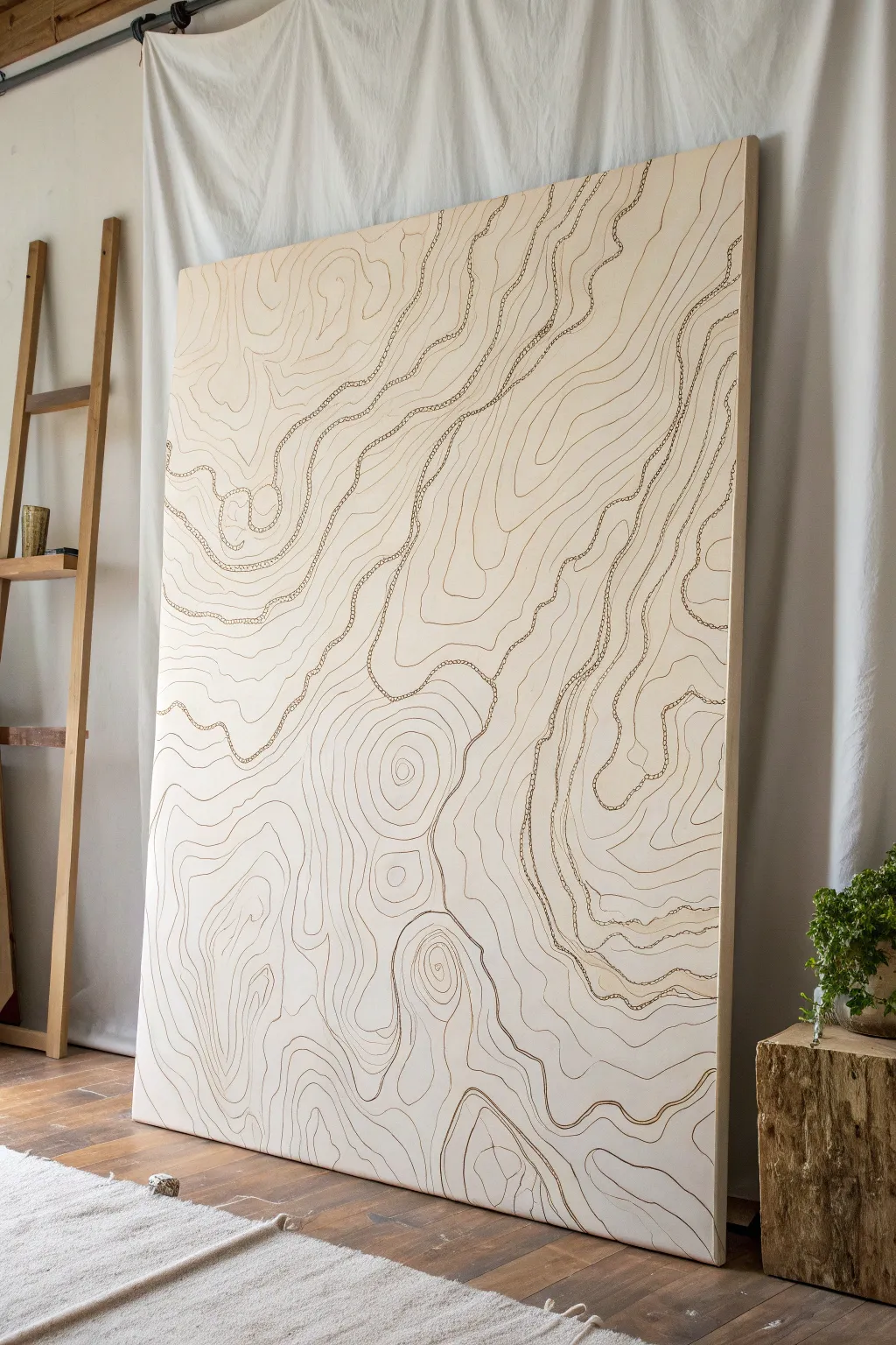
Bring the serene beauty of map-making into your home with this massive, minimalist statement piece. By tracing flowing organic lines across a neutral background, create a hypnotic artwork that mimics the elevation curves of a natural landscape.
Detailed Instructions
Materials
- Large deep-edge canvas or cradled wood panel (approx. 48″ x 60″)
- Gesso or acrylic primer
- Cream or off-white acrylic wall paint (flat or eggshell finish)
- Wide paint roller and tray
- Pencil (HB or 2B)
- Large eraser
- Acrylic paint markers (brown, bronze, or sepia tones, fine and medium tips)
- Fine liner brush (optional, for variation)
- Fluid acrylic paint (matching the marker color)
- Projector (optional, but helpful for specific maps)
- Matte varnish or spray fixative
Step 1: Preparation and Base Coat
-
Prime the Surface:
If you are using a raw wood panel or unprimed canvas, apply two even coats of gesso to seal the surface. Allow the first coat to dry completely before sanding lightly and applying the second. -
Apply the Background Color:
Pour your cream or off-white acrylic paint into a tray. Use a wide roller to apply a smooth, opaque base coat across the entire surface. This neutral backdrop is crucial for the minimalist aesthetic. -
Check Coverage:
Inspect the canvas for transparency. A second coat is usually necessary to get that rich, solid finish. Let this base layer cure overnight to ensure the surface is hard enough for drawing.
Natural Wiggles
To get organic lines, hold your marker loosely near the back end, not the tip. This reduces control slightly, creating natural, geologic jitter instead of perfect curves.
Step 2: Drafting the Topography
-
Plan Your Focal Points:
Visualize where your ‘peaks’ and ‘valleys’ will be. Lightly mark 3-4 distinct gathering points on the canvas where the lines will eventually circle tightly together to form the highest elevation points. -
Draw the Primary Contours:
Using a pencil with a very light hand, begin sketching the main flowing lines. Start from your focal points and work outward. These lines should never cross; they should flow parallel to each other, getting closer on steep ‘slopes’ and wider in flat areas. -
Create Texture Variations:
Notice how some lines in the inspiration image are wigglier than others. Dedicate certain bands or zones to have a shaking, jagged character, while others remain smooth. This contrast mimics real rocky terrain. -
Fill the Negative Space:
Continue drawing concentric irregular rings around your focal points until they meet. Where two sets of rings meet, let the lines merge into saddle shapes or elongated curves that run the length of the canvas.
Metallic Elevation
Use gold leaf pen or metallic copper paint for every 10th contour line. This subtle shimmer mimics map elevation markers and catches the light beautifully.
Step 3: Inking the Lines
-
Test Your Markers:
Before touching the canvas, test your acrylic paint markers on a scrap piece of paper to ensure the flow is consistent and the color matches your vision. A sepia or bronze tone adds warmth. -
Trace the Anchors:
Begin tracing over your pencil lines with a medium-tip marker. Start with the most prominent, longest lines to establish the flow of the composition. -
Vary Line Weight:
To add depth, switch to a finer tip marker for the lines that are tightly packed together. Alternatively, go over specific ‘major’ elevation lines a second time to thicken them up. -
Add Detailed Textures:
In the inspiration piece, some lines have a ‘stitched’ or dotted look. Pick a few bands of contours and use a fine liner brush with fluid acrylics (or a fine marker) to create small perpendicular ticks or dots along the main curve. -
Refine the Edges:
Ensure your lines flow cleanly off the edge of the canvas. Wrap the design around the deep sides of the canvas for a gallery-quality, finished look.
Step 4: Finishing Touches
-
Clean Up:
Once the ink is fully dry (give it at least an hour), use a large, soft eraser to gently remove any visible pencil sketches remaining between the ink lines. -
Assess Balance:
Step back about ten feet. If any large areas look too empty, you can add intermediate contour lines to fill the gaps, but be careful not to overcrowd the negative space. -
Seal the Work:
To protect the light background from dust and fingerprints, apply a coat of matte varnish or spray fixative. Use long, even sprays to avoid pooling liquid that might smear the ink.
Hang your new monumental map and enjoy the sophisticated, quiet movement it brings to your room


Have a question or want to share your own experience? I'd love to hear from you in the comments below!