When I’m stuck or overthinking a drawing, I flip the whole problem by focusing on negative space—the shapes of air and background that carve the subject into view. It’s one of my favorite ways to train figure-ground seeing, because the drawing starts to click the moment those “empty” shapes feel solid.
Chair Study in Negative Space
This tutorial guides you through creating a striking ink study of a simple chair, emphasizing bold contrasts and textural hatching. The finished piece features clean lines and a unique wood-grain effect on the seat that brings a flat object to life.
Step-by-Step
Materials
- Heavyweight drawing paper (smooth or hot press watercolor)
- HB or 2B graphite pencil
- Kneadable eraser
- Fine liner pen (01 or 03 size)
- Thicker black marker or brush pen
- Ruler (optional)
- Reference photo of a simple wooden chair
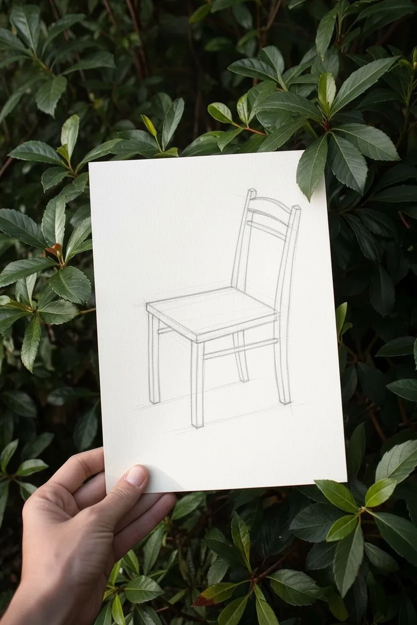
Step 1: Penciling the Framework
-
Establish the Perspective:
Begin by lightly sketching the seat of the chair as a distorted trapezoid. Position it centrally on your paper, leaving plenty of white space around it to simulate that floating ‘negative space’ feel. -
Add Vertical Supports:
Draw the two front legs extending downward from the seat’s front corners. Keep your lines loose and faint at this stage; we want to capture the gesture first. -
Draft the Backrest:
Extend lines upward from the rear corners of the seat to form the backrest supports. Add the horizontal support bars near the top, curving the uppermost bar slightly to suggest a comfortable shape. -
Refine the forms:
Thicken the single lines into 3D shapes. Add width to the legs and back supports, ensuring the perspective lines converge subtly towards a vanishing point. -
Sketch the Stretchers:
Connect the legs with the lower horizontal support bars (stretchers) underneath the seat. Pay attention to how these intersect with the legs.
Use Negative Space
Focus on drawing the emptiness BETWEEN the chair legs rather than the legs themselves. This mental shift helps attain accurate proportions.
Step 2: Inking the Outline
-
Initial Outline:
Switch to your fine liner pen. Trace over your pencil lines confidently. Don’t worry if the lines aren’t perfectly straight; a slight wobble adds character to the illustrative style. -
Erase Pencil Guidelines:
Wait a moment for the ink to set, then gently gently use your kneadable eraser to lift away the graphite sketch. You should be left with a clean, crisp outline. -
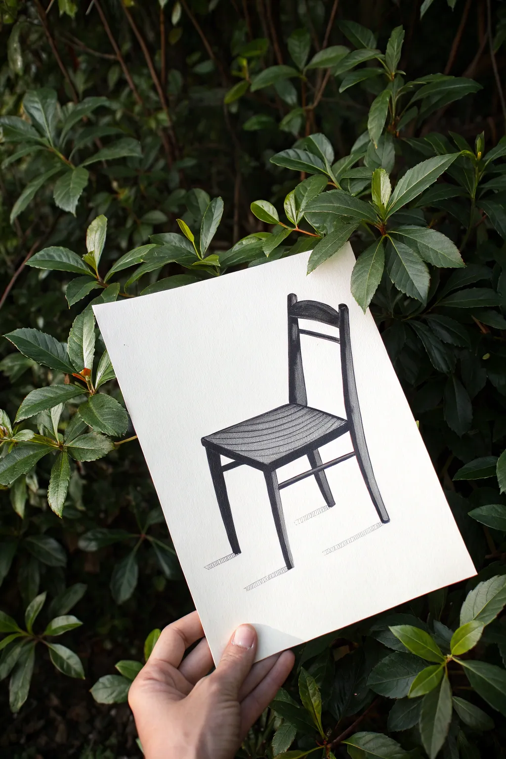
Define the Darkest Shadows:
Identify the side of the chair that would be in shadow (in this sample, the right side). Use your thicker marker to fill in the side planes of the legs and backrest completely black. -
Create Depth:
Fill in the underside thickness of the seat with solid black ink. This high contrast anchors the drawing and gives the seat visual weight.
Try Colored Inks
Instead of standard black, try a deep sepia or indigo ink. A monochromatic blue chair study can look exceptionally modern and architectural.
Step 3: Adding Texture and Detail
-
Texture the Seat:
Using the fine liner again, draw curved, parallel lines across the seat surface to mimic wood grain. I like to let these lines follow the curve of the seat slightly to emphasize its form. -
Cross-Hatching Shadows:
Add shading to the front faces of the legs using tight, vertical or diagonal hatching lines. Keep the strokes close together to create a mid-tone grey value. -
Shade the Backrest:
Apply similar hatching to the front faces of the backrest supports. Leave the very top horizontal bar lighter to suggest light hitting it. -
Grounding Shadow:
To place the chair in space, draw small cast shadows extending from the base of each leg. Use short, horizontal hatched lines that fade out as they move away from the leg. -
Final Polish:
Review your drawing for balance. If any shadow areas look patchy, go over them again with the fine liner to deepen the tone.
Step back and admire your architectural study, noticing how simple lines can convey solid weight


Hand Gesture Defined by Background Contours
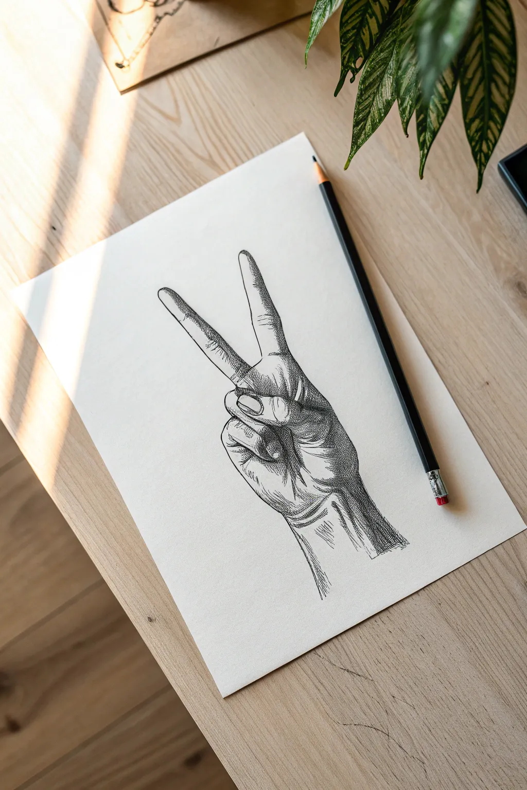
This classic sketching exercise captures the dimensional form of a hand gesture through careful hatching and contour work. The result is a striking black-and-white illustration that emphasizes structure and shadow on textured paper.
Step-by-Step Tutorial
Materials
- Heavyweight drawing paper (cream or off-white recommended)
- HB graphite pencil (for initial sketch)
- Fine liner pens (0.1mm, 0.3mm, and 0.5mm)
- Kneaded eraser
- Reference photo of your own hand
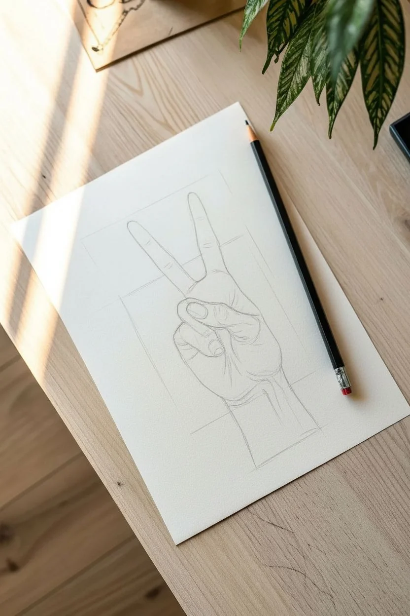
Step 1: Structural Sketching
-
Observe the pose:
Begin by making the ‘peace’ sign with your non-dominant hand or use a reference photo. Note how the index and middle fingers extend upward while the ring and pinky fingers curl tightly into the palm. -
Block in basic shapes:
Using your HB pencil with very light pressure, draw a square shape for the palm and a cylindrical shape for the wrist. Add simple oval guidelines for the folded fingers. -
Map the extended fingers:
Draw two long, tapered cylinders for the index and middle fingers. Pay attention to the ‘V’ angle between them; getting this negative space right is crucial for the gesture’s readability. -
Refine the thumb placement:
Sketch the thumb crossing over the folded ring finger. The thumb acts as a locking mechanism for the folded fingers in this pose, so ensure it overlaps correctly. -
Outline the contours:
Go over your geometric shapes to create a fluid outline of the hand. Mark the location of knuckles and skin folds, particularly where the fingers bend and at the base of the wrist.
Wobbly Lines?
If your long hatch lines are shaky, try ghosting the motion with your hand above the paper a few times before actually touching the pen tip to the page.
Step 2: Inking and Volume
-
Initial ink outline:
Switch to your 0.3mm fine liner. carefully trace the main outer contours of the hand. Keep your line weight consistent but allow it to break slightly where the light source hits the skin. -
Define the fingernails:
Draw the fingernails on the extended fingers. They shouldn’t be perfect ovals; give them slight curvature to show they wrap around the finger tip. -
Erase pencil guides:
Once the initial ink is completely dry, gently roll your kneaded eraser over the paper to lift the graphite sketch, leaving only your clean ink lines. -
Start the hatching:
Using the 0.1mm pen, begin adding diagonal hatch lines on the shadowed side of the fingers (usually the right side if light comes from the left). Keep these lines parallel and evenly spaced. -
Deepen shadows with cross-hatching:
Add a second layer of hatch lines perpendicular to the first set in the darkest areas—specifically between the two extended fingers and under the curled fingers. -
Texture the palm:
Use short, curved lines to indicate the skin folds in the palm and around the thumb. These directional lines help describe the roundness of the muscle. -
Render the wrist:
Draw subtle vertical lines extending down the wrist to suggest tendons. Add heavier shadowing on the outer edge to separate the arm from the background.
Step 3: Refining Details
-
Add emphasis:
Switch to the 0.5mm pen to darken the deepest crevices, such as the gap where the ring finger meets the palm. This high contrast adds instant depth. -
Stippling for transition:
I like to add tiny dots (stippling) at the edges of the hatched shadows to create a softer gradient where the shadow transitions into the highlighter areas of the skin. -
Knuckle details:
Add small, curved wrinkles on the knuckles of the extended fingers. Use very fine, broken lines here so the hand doesn’t look aged, just detailed. -
Final assessment:
Step back and look at the overall contrast. If the hand looks flat, add another layer of hatching to the main shadow shapes on the right side.
Add a Background
To emphasize negative space, leave the hand white and fill the background with a solid dark color or dense pattern. This makes the gesture pop instantly.
You have now created a timeless drawing study that masters form through line and shadow

Animal Silhouette With Carved-Out Background
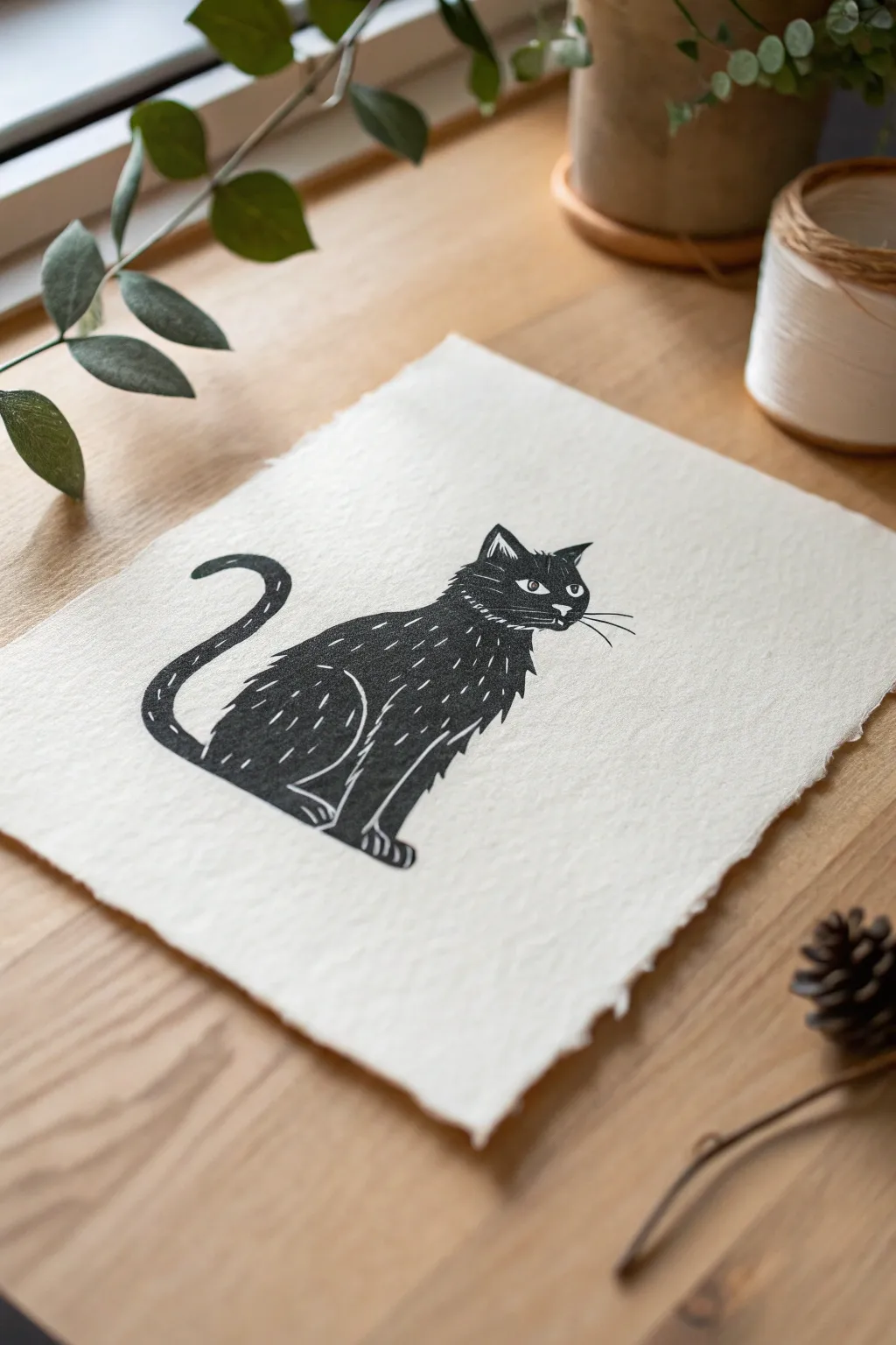
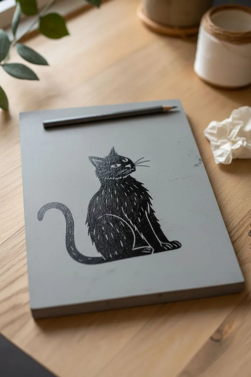
This charming black and white cat print captures the essence of negative space techniques using the bold, graphic style of block printing. You’ll carve away fine details to reveal the paper’s texture beneath the ink, creating a striking contrast that is both rustic and refined.
How-To Guide
Materials
- Soft-cut linoleum block (4×6 inch)
- Linoleum carving tools (V-gouge and U-gouge)
- Block printing ink (Black, water-soluble)
- Soft rubber brayer (roller)
- Handmade or cold-press paper with deckle edge
- Pencil and tracing paper
- Baren or wooden spoon (for burnishing)
- Craft knife
- Glass or acrylic sheet (for rolling ink)
Step 1: Drafting and Transferring the Design
-
Sketch the silhouette:
Start by sketching the general outline of the seated cat on a piece of scrap paper. Focus on the smooth curve of the back and the tail that curls upward. Keep the shapes simple, as block printing favors bold forms. -
Define the negative space:
Within your sketch, mark the areas that will remain white. This includes the fine lines of the whiskers, the fur texture on the chest and back, the separation of the legs, and the eyes. Remember, anything you draw now needs to be *carved away* later. -
Transfer to tracing paper:
Place tracing paper over your finalized sketch and trace the design carefully with a soft graphite pencil. -
Flip and rub:
Place the tracing paper face-down onto your linoleum block. By flipping it, your final print will be oriented correctly. rub the back of the paper firmly with your fingernail or a spoon to transfer the graphite onto the grey surface of the block. -
Reinforce the lines:
Lift the tracing paper and go over the faint transferred lines with a permanent marker. This ensures the design won’t smudge while you are working with your hands on the block.
Step 2: Carving the Block
-
Trace the outline:
Using a fine V-gouge tool, carve a shallow trench just outside the perimeter of your cat silhouette. This establishes a clear boundary between the inked cat and the white background. -
Clear the background:
Switch to a wider U-gouge to remove all the linoleum surrounding the cat. I like to carve away from the animal in radiating strokes, but you simply need to ensure the background is recessed enough that it won’t pick up ink. -
Carve the whiskers:
Return to your finest V-gouge for the whiskers. These need to be confident, single strokes to look sharp. Take a deep breath and carve the lines quickly for the smoothest result. -
Detail the fur texture:
Use the V-gouge to create short, dashed ticks along the cat’s back, chest, and tail. These small gouges remove the surface, meaning they will appear as white fur against the black body in the final print. -
Define the features:
Carve out the whites of the eyes and the small nose highlight. Be extremely gentle here; removing too much material can make the eyes look hollow rather than bright. -
Clean up stray bits:
Brush away all linoleum crumbs and inspect the block. If there represent any high ridges in the background area, trim them down now.
Chatter Marks
Don’t worry if the background picks up stray ink marks (chatter). On handmade paper, these faint lines around the subject add rustic authenticity and proof that it’s hand-carved.
Step 3: Printing the Design
-
Prepare the ink:
Squeeze a small amount of black block printing ink onto your glass or acrylic sheet. It should be about the size of a coin. -
Charge the brayer:
Roll your brayer back and forth through the ink, lifting it occasionally to redistribute the pigment. You want a consistent, velvety texture that makes a soft hissing sound. -
Ink the block:
Roll the inked brayer over your carved block. Apply the ink in thin, even layers, rolling in multiple directions to ensure full coverage of the black silhouette. -
Position the paper:
Carefully align your deckle-edged paper over the block. Once the paper touches the ink, do not shift it, as this will smudge the crisp edges. -
Burnish the back:
Using a baren or the back of a wooden spoon, rub the back of the paper in small circles. Apply firm, even pressure, paying special attention to the edges of the cat and the solid black areas. -
The reveal:
Gently peel one corner of the paper up to check the transfer. If the black looks patchy, lay it back down and rub that spot again. When satisfied, peel the paper entirely off the block. -
Drying:
Place the print on a flat surface to dry. Water-based inks typically dry within an hour, but oil-based versions may need a day or two.
Gradient Effect
Try an ombré effect by putting black ink on one side of your glass and blue on the other. Roll the brayer between them to blend, creating a cat that fades from midnight blue to black.
Now that you’ve mastered the basics of relief printing, you can frame your moody feline art or create a whole series of silhouette greeting cards


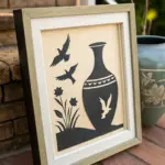
Vase and Two Faces Figure-Ground Flip
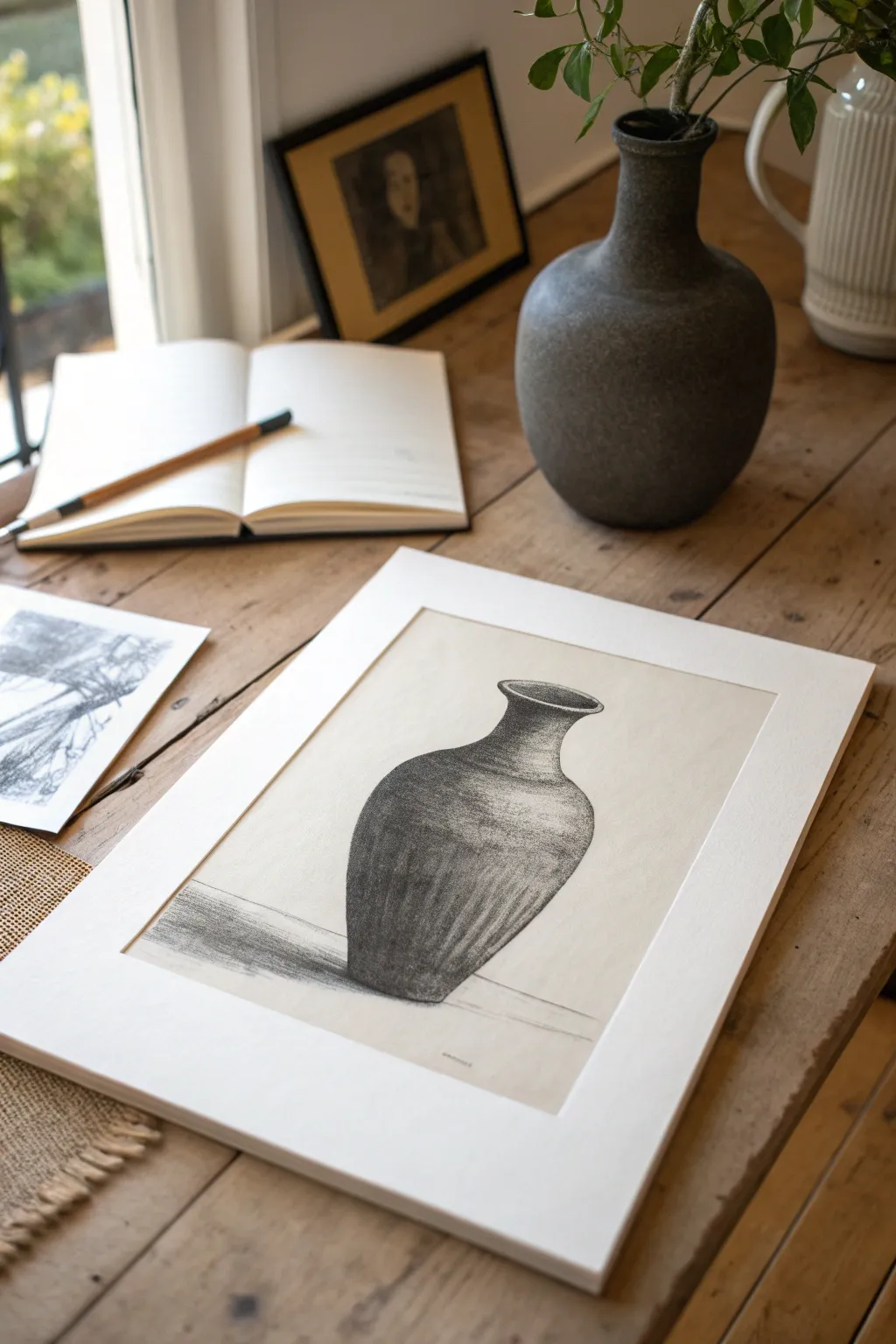
This elegant charcoal drawing captures the weight and texture of a ceramic vessel using rich tonal values. By focusing on the interplay of deep shadows and subtle highlights, you capture not just the object, but the way light shapes its form.
How-To Guide
Materials
- Textured drawing paper (cream or off-white)
- Vine charcoal (soft based)
- Compressed charcoal stick (for deepest blacks)
- Kneaded eraser
- Blending stump (tortillon)
- White mat board (for mounting)
- Fixative spray
- Paper towels or chamois cloth
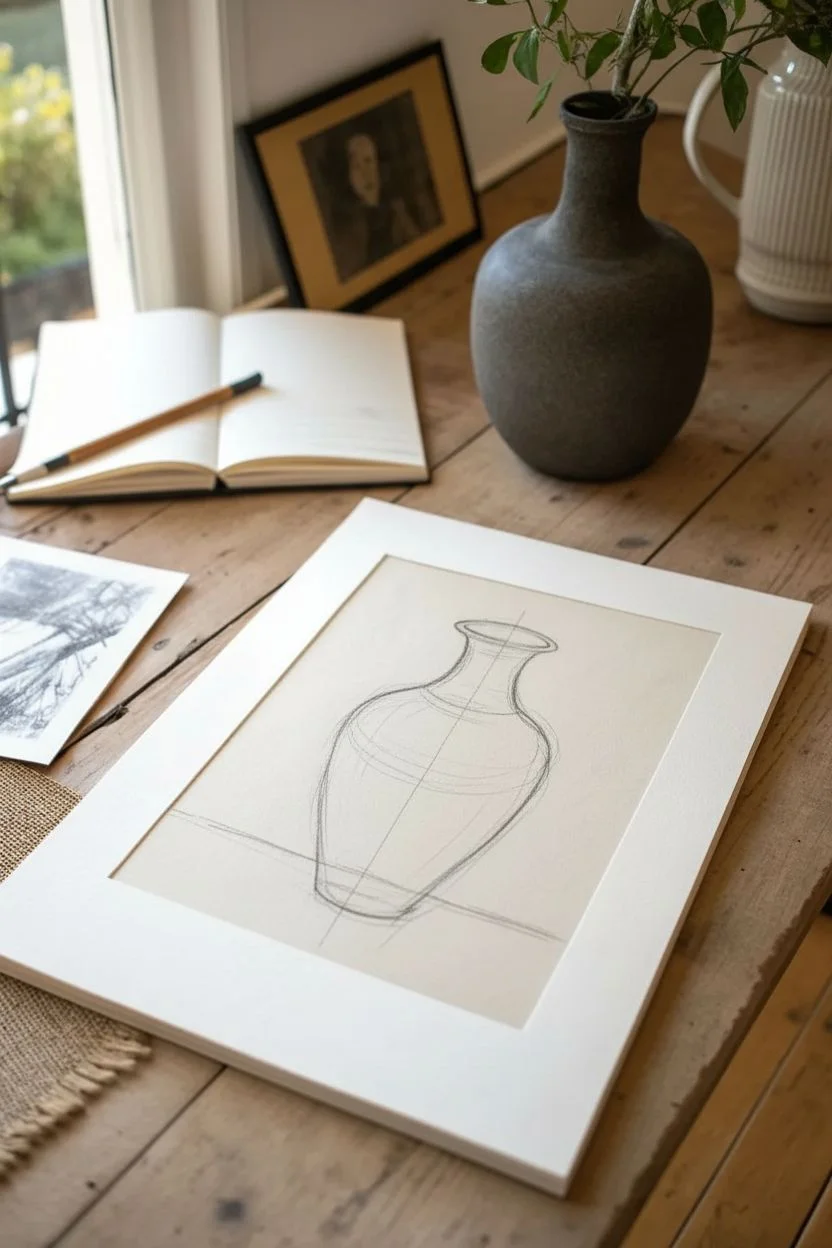
Step 1: Establishing the Form
-
Observe the Subject:
Begin by closely studying the vase you intend to draw. Notice its symmetry, the curve of the neck, and where the widest point of the body sits relative to the base. -
Light Sketching:
Using a piece of vine charcoal with a very light touch, map out the central axis line of the vase to ensure symmetry. -
Outline the Shape:
Sketch the basic silhouette of the vase. Focus on the distinct flare of the lip, the narrow neck, and the swelling curve of the body. -
Refine Curves:
Adjust your outlines until the proportions feel correct. Don’t worry about perfect lines yet; sketchy, loose marks are fine at this stage. -
Establish the Horizon:
Draw a faint horizontal line behind the vase to represent the table surface, grounding your object so it doesn’t look like it’s floating.
Smudge Control
Charcoal gets messy fast. Place a clean sheet of scrap paper under your drawing hand to prevent smearing your work or transferring oils to the paper.
Step 2: Building Value and Texture
-
Initial Tone Application:
Turn your vine charcoal on its side and sweep a broad, light layer of grey across the entire shadow side of the vase. -
Deepen the Shadows:
Switch to your compressed charcoal for darker values. Start applying pressure to the areas that are furthest from the light source, typically the side and the base. -
Directional Shading:
Apply your strokes following the curve of the form. Use vertical, slightly curved strokes to mimic the vertical ribs or texture of the pottery. -
Blend for Volume:
Use a blending stump or your finger to smudge the charcoal gently. I find this helps marry the vine and compressed charcoal together into a unified surface. -
Create Texture:
Go back over the blended areas with the tip of the charcoal to add specific texture marks, creating vertical striations that suggest a handmade ceramic surface. -
Add Cast Shadow:
Draw the cast shadow on the table surface to the left of the vase. Keep this shadow soft and diffused as it moves away from the object. -
Refine the Rim:
Pay special attention to the rim of the vase. Ensure the ellipse is open correctly and add a dark accent inside the mouth to show depth.
Step 3: Highlights and Finishing
-
Lift Highlights:
Take your kneaded eraser and shape it into a wedge. Press and lift the charcoal off the paper on the illuminated side of the vase to create highlights. -
Clean Edges:
Use the eraser to clean up the outside edges of the vase, creating a sharp contrast between the dark object and the light background paper. -
Final Contrast Check:
Step back and assess your value range. Add touches of pure black in the deepest crevices if needed to make the volume pop. -
Fix the Drawing:
Once satisfied, spray the drawing with a workable fixative in a well-ventilated area to prevent smudging. -
Matting:
Center your finished drawing behind a clean white mat board to frame the artwork professionally, just like in the example photo.
Tinted Paper Upgrade
Try this on grey or tan toned paper. You can then use white charcoal or white pastel for the highlights, creating a stunning three-value system.
Place your matted drawing on a desk or hang it up to admire the depth you have created

PENCIL GUIDE
Understanding Pencil Grades from H to B
From first sketch to finished drawing — learn pencil grades, line control, and shading techniques.
Explore the Full Guide
Disconnected Contours That Let Space Do the Connecting
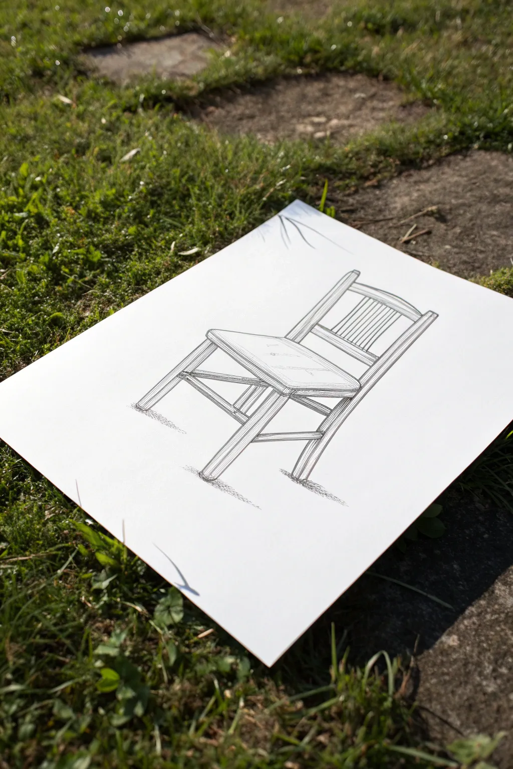
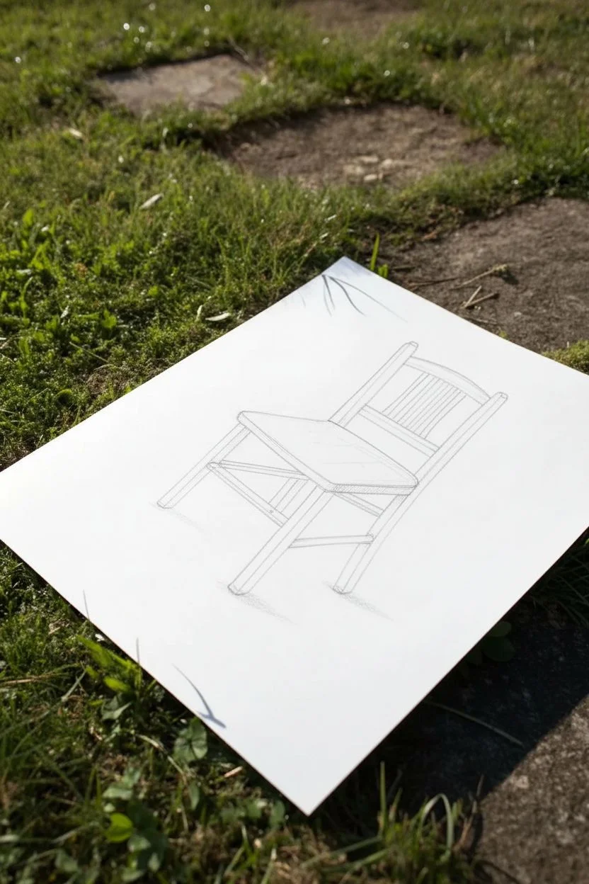
This clever line drawing uses the concept of negative space to ground a simple wooden chair without actually drawing the floor. By leaving the contour lines disconnected at the base of the legs, your eye automatically fills in the missing information, creating a distinct sense of weight and place.
Step-by-Step Guide
Materials
- High-quality white drawing paper (heavyweight cardstock or mixed media paper)
- Pencil (HB or 2H for sketching)
- Fine liner pens (0.1mm, 0.3mm, and 0.5mm)
- Soft eraser
- Ruler (optional, for guidelines)
Step 1: Constructing the Skeleton
-
Visualize the perspective:
Start by lightly sketching a loose box shape in pencil to establish the 3D space. This chair is viewed from a slightly high angle, so you should see the top of the seat. -
Map out the legs:
Draw four vertical lines for the legs. Notice that the front legs angle slightly outward, while the back legs extend upward to form the backrest support. -
Draft the seat:
Sketch a trapezoid shape for the seat. The front edge should be wider than the back edge to account for perspective distortion. -
Add the backrest:
Connect the top of the two rear uprights with a curved top rail. Add a second horizontal rail slightly below it to frame the backrest area. -
Refine the structural details:
Thicken your single lines into double lines to give the wood volume. Sketch in the side stretchers (the horizontal bars connecting the legs) and the vertical slats in the backrest.
Wobbly Lines?
Don’t stress about perfect straight lines. A slight wobble adds organic character to wooden subjects. Just ensure your perspective angles remain consistent.
Step 2: Inking the Contours
-
Start the definitive lines:
Switch to your 0.5mm fine liner. Begin tracing over your pencil sketch, focusing on the main structural outlines of the chair. -
Leave the gaps:
Crucially, as you draw the bottoms of the four legs, stop your ink line just before the ‘floor.’ Do not draw a horizontal line connecting them. Leaving these ends open suggests where the object meets the ground. -
Ink the slat details:
Use a thinner 0.3mm pen for the vertical slats in the backrest. These lines should be slightly more delicate than the main frame. -
Clean up the line work:
Wait for the ink to dry completely to avoid smudging, then gently erase all your pencil guidelines. I prefer to use a kneadable eraser here to avoid damaging the paper surface.
Step 3: Adding Texture and Shadow
-
Establish the light source:
Imagine the light coming from the upper left. This means shadows will fall on the right side and underneath the structural elements. -
Hatch the wood grain:
Using the 0.1mm pen, draw very fine, long lines along the length of the legs and seat to mimic wood grain. Keep these lines sparse; don’t overfill the white space. -
Shadow the seat edge:
Add closer hatching lines on the right-hand thickness of the seat and the right side of the legs to create volume and depth. -
Ground the object:
Instead of drawing a shadow shape, use tiny, scribbled horizontal hatching just under the feet of the chair. Fade these scribbles out quickly as they move away from the leg. -
Suggest the environment:
Add a few very faint, stray lines or subtle scribbles near the base of the legs to hint at a shadow being cast on the ground, further reinforcing the invisible floor. -
Final assessment:
Step back and look at the negative space. If the chair feels like it’s floating too much, slightly darken the small scribbles directly under the feet to ‘weigh’ it down.
Pro Tip: Line Weight
Make the lines on the underside of objects (like the bottom of the seat rails) slightly thicker. This subtle trick instantly adds implied shadow and weight.
Now you have a sketch that engages the viewer’s imagination to complete the picture
Train Platform Perspective With Big Empty Areas
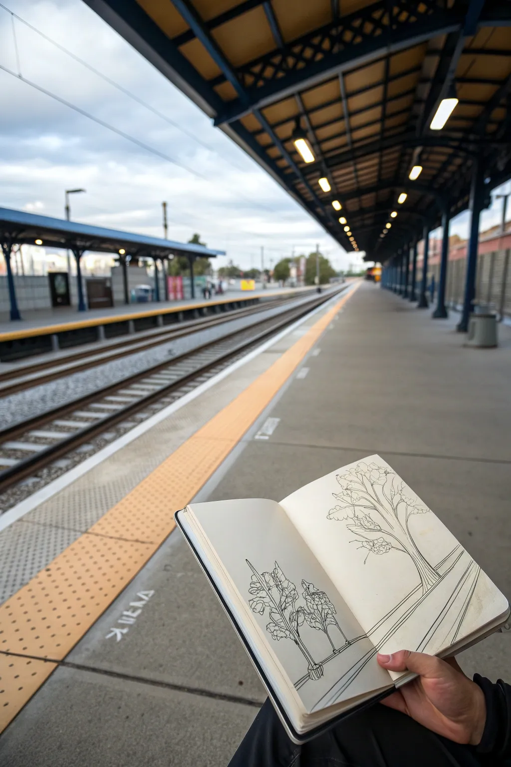
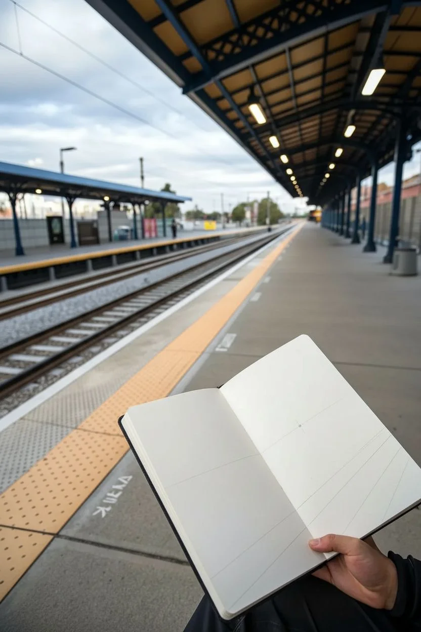
Capture the quiet stillness of a train platform with this perspective study that emphasizes negative space. By focusing on simple line work for trees and converging track lines, you let the expansive empty areas of the page do the heavy lifting to create depth.
Step-by-Step
Materials
- Sketchbook (hardcover preferred for stability)
- Fine liner pen (0.3mm or 0.5mm)
- Pencil (HB or 2B for initial guides)
- Eraser
- Ruler (optional, for crisp perspective lines)
Step 1: Setting the Scene
-
Find the horizon:
Start by lightly sketching a horizontal line across the middle of your right-hand page with your pencil. This represents your eye level. -
Mark the vanishing point:
Place a small dot on that horizon line, somewhere near the vertical center of the page. All your platform lines will converge here. -
Draft the platform edge:
Draw two diagonal lines radiating from your vanishing point toward the bottom corners of the page. These will form the main platform edges. -
Extend to the left page:
Continue these perspective lines across the gutter onto the left page, keeping the angle consistent so the scene flows across the spread.
Step 2: Drawing the Focal Tree
-
Placement:
On the right page, position the trunk of your main tree in the foreground. It should be the largest element, anchoring the composition. -
Sketching the trunk:
Using your fine liner, draw the trunk with slightly jagged, organic lines. Let the base flare out slightly where it meets the ground. -
Branch structure:
Extend branches upward and outward. Use a Y-shape method, where one branch splits into two smaller ones as you move away from the trunk. -
Adding foliage clusters:
Instead of drawing individual leaves, use loose, scribbly loops to suggest clumps of leaves at the ends of the branches. Keep these drawing lines airy. -
Detailing the bark:
Add a few vertical striations up the trunk to suggest texture without shading the entire object.
Wobbly Lines?
Don’t stress straight lines! A slightly wavering hand adds character to an urban sketch. If a line goes astray, just thicken it slightly to blend it in.
Step 3: Developing the Background
-
Foreground foliage:
On the left page, sketch a smaller, bush-like tree or shrub structure closer to the bottom edge. This creates asymmetrical balance. -
Organic shapes:
Use the same looping line technique for the leaves here to maintain stylistic consistency with the main tree. -
Inking the platform lines:
Go over your initial pencil perspective lines with the ink pen. You can double up the lines to suggest curbs or rails. -
Suggestion of tracks:
Draw faint parallel lines inside the platform path, also receding toward that single vanishing point. -
Grounding the trees:
Draw small circles or soil beds around the base of your trees so they don’t look like they are floating in mid-air.
Add some depth
Use a light gray marker to add a simple drop shadow extending from the base of the trees. Keep the shadow direction consistent.
Step 4: Refining and Clearing
-
Reviewing negative space:
Look at the large empty areas of the page. Resist the urge to fill them. The white space represents the sky and the concrete platform. -
Strengthening lines:
Re-trace the outer contour of the main tree trunk to make it pop slightly more against the background. -
Adding gentle texture:
I like to add just a few tiny specks or dots on the platform ground to suggest gritty concrete texture, but keep it minimal. -
Erase guidelines:
Once the ink is completely dry—give it a minute or two—carefully erase all your pencil horizon and perspective guides. -
Final check:
Ensure the lines crossing the book’s gutter connect visually when the book is open.
Enjoy seeing how much depth you can create just by leaving most of the paper untouched
BRUSH GUIDE
The Right Brush for Every Stroke
From clean lines to bold texture — master brush choice, stroke control, and essential techniques.
Explore the Full Guide
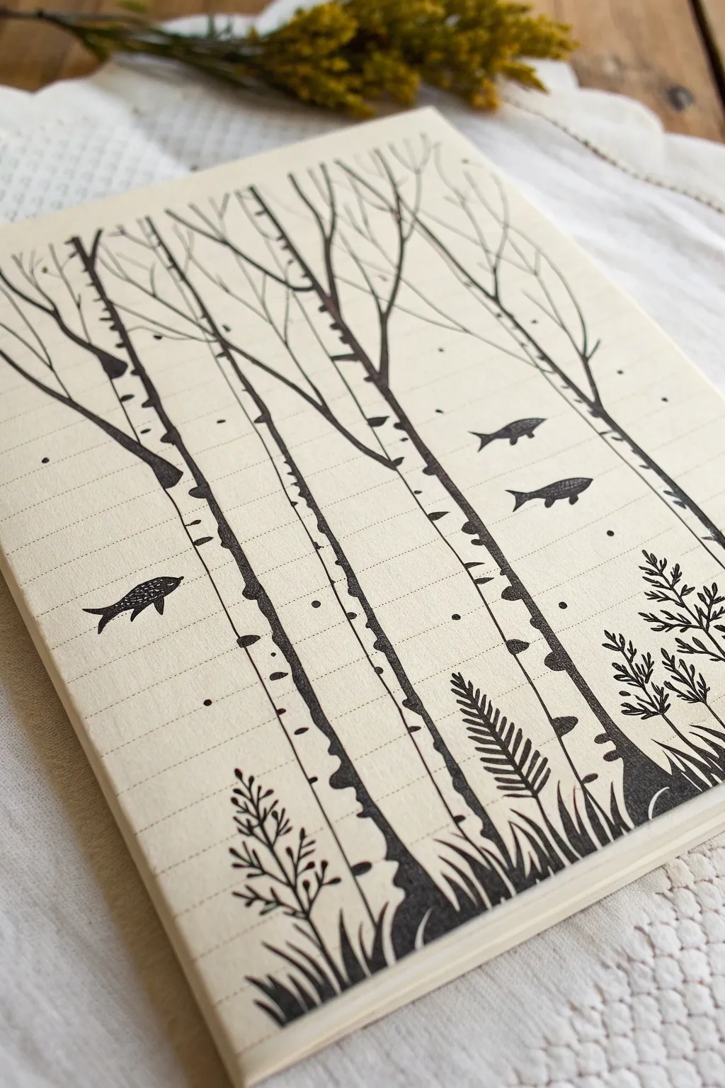
Dual-Reality Scene Where Negative Space Becomes the World

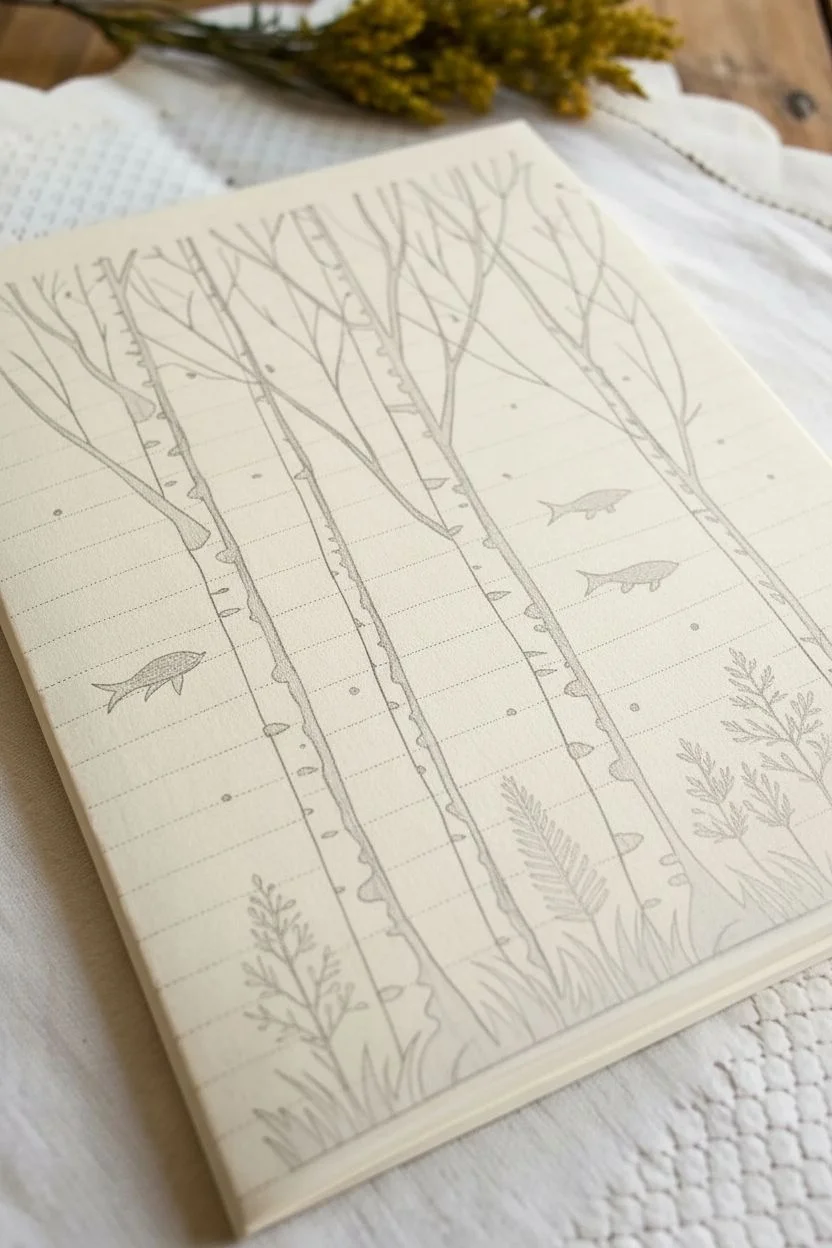
This whimsical ink drawing plays with perspective and expectation by transforming the negative space between birch trees into a watery world for floating fish. Using simple black ink on cream-colored lined paper adds a charming, sketchbook aesthetic to the surreal concept.
Step-by-Step Guide
Materials
- Cream-colored lined notebook or sketchbook paper
- Fine liner pen (0.1mm or 0.3mm)
- Medium liner pen (0.5mm or 0.8mm)
- Brush pen or thick black marker (for filling)
- Pencil (HB or 2H)
- Eraser
- Ruler (optional)
Step 1: Planning and Sketching
-
Lightly sketch the tree trunks:
Begin by using your pencil to lightly draw 4-5 vertical lines representing the birch tree trunks. Make them slightly uneven and leaning in different directions to look natural, rather than perfectly straight poles. -
Add branch structures:
Extend lines upward from the trunks to create the main branches. Let them fork and split as they reach the top of the page, keeping the lines thin and elegant. -
Place the fish:
In the spaces between the trees (the negative space), lightly sketch simple outlines of three fish. Position them at different heights to create a sense of depth and movement. -
Block in ground foliage:
Roughly sketch the placement of ferns, tall grasses, and leafy plants at the very bottom of the page to anchor the composition.
Ink Bleeding Issues?
Lined notebook paper is often thin. Place a scrap sheet behind your drawing page to prevent ink from bleeding through to the next page.
Step 2: Inking the Trees
-
Outline the trunks:
Switch to your medium liner pen (like a 0.5mm) and carefully trace the vertical lines of the tree trunks. Don’t make the lines too smooth; a little wobble adds to the organic bark texture. -
Draw the branches:
Use a finer pen (0.1mm or 0.3mm) to trace the upper branches. Lift your pen pressure as you reach the tips so the lines tamper off to a fine point. -
Create bark markings:
This is the defining feature of birch trees. Using a brush pen or the medium liner, draw horizontal, wedge-shaped markings along the edges of the trunks. -
Vary the bark texture:
Make some markings thick and solid black, resembling triangles or semicircles hugging the outline. Add smaller dots and thin horizontal dashes in the middle of the trunks to suggest peeling bark. -
Connect branches:
Ensure the transition from trunk to branch feels seamless by adding slight thickening where the wood splits.
Step 3: Drawing the Surreal Elements
-
Outline the fish:
Use your 0.3mm pen to ink the outlines of the fish. Keep their shapes simple and streamlined. -
Add fish details:
Fill in the fish silhouettes with different textures. For one fish, you might stipple tiny dots for scales; for another, use solid black fill or hatching lines. -
Incorporate ambient specks:
Dot small circles and specks randomly throughout the air around the trees and fish. This acts as both ‘snow’ in a forest or suspended particles in water, bridging the two realities.
Varying Line Weight
Use a thicker pen for the foreground grass and trunk edges, and your thinnest pen for the distant branches. This creates instant depth.
Step 4: Grounding the Scene
-
Ink the foreground grass:
Using a brush pen or thicker marker, draw sweeping, upward strokes at the base of the trees to create clumps of grass. Press down at the start of the stroke and flick up to create sharp tips. -
Draw the fern:
On the right side, carefully draw a fern leaf using a fine liner. Draw a central spine, then add small, repetitive leaflets on either side. -
Add leafy plants:
On the left side, draw a small, branching plant with simple oval leaves. Keep the stems thin but distinct. -
Fill the silhouette:
Use your thickest marker to fill in the dense patches of grass and the base of the trees. The bottom of the drawing should be the heaviest and darkest area to provide visual weight.
Step 5: Refining and Finishing
-
Erase pencil lines:
Wait until the ink is completely dry—I usually give it at least five minutes to be safe—and then gently erase all your initial pencil sketches. -
Assess the contrast:
Step back and look at the balance of black and white. If the trees look too pale, add a few more solid black accents to the bark pattern. -
Final touches:
Add a few very faint, broken lines on the tree trunks to suggest the curvature of the wood, ensuring they don’t look flat against the lined paper.
Now you have a serene little world where the forest floor meets the deep sea

Have a question or want to share your own experience? I'd love to hear from you in the comments below!