Optical illusions are my favorite kind of drawing magic—everything looks flat until your brain suddenly insists it’s popping, twisting, or sinking. Here are optical illusion drawing ideas you can pull off with simple tools and a little patience, even if you’re just getting started.
3D Hand With Curved Contour Lines
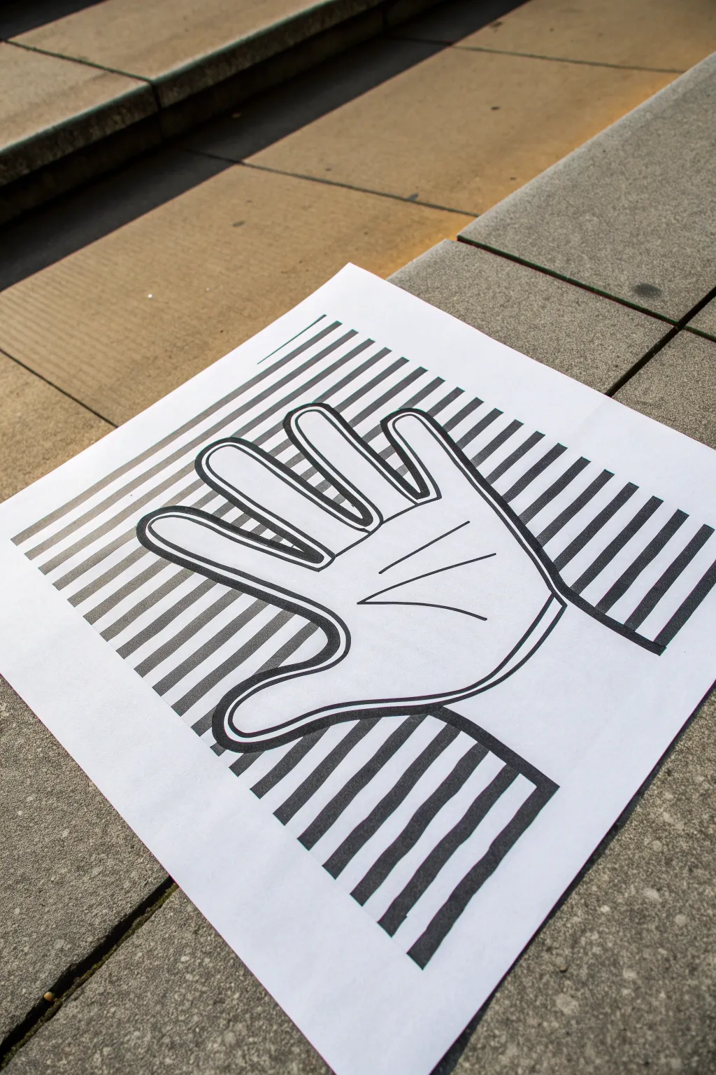
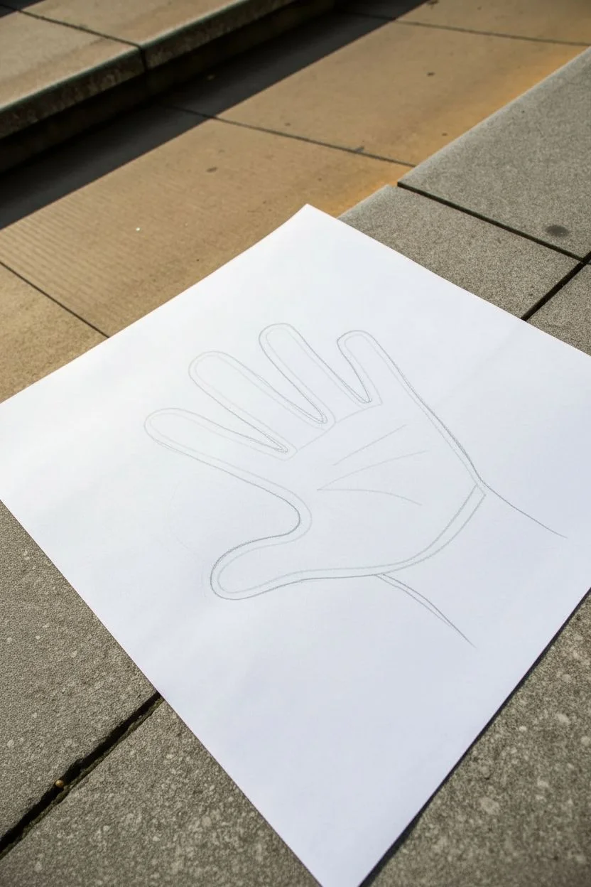
Using nothing but straight and curved lines, you can trick the eye into seeing a three-dimensional hand rising up from a flat sheet of paper. This classic optical illusion is surprisingly simple to master and makes for a fantastic beginner drawing exercise in perspective and volume.
Detailed Instructions
Materials
- White drawing paper (A4 or Letter size)
- Pencil (HB or lighter)
- Black fine-liner marker (0.5mm or similar)
- Black permanent marker or thick felt-tip pen (for filling)
- Ruler
- Eraser
Step 1: The Outline
-
Position your hand:
Place your non-dominant hand flat in the center of the paper. Spread your fingers slightly so there is clear space between each one, tilting your hand at a gentle angle for a dynamic look. -
Trace the shape:
Using your pencil, trace lightly around your entire hand and wrist. Keep the pencil vertical to get an accurate silhouette, but do not press too hard as these lines will be erased later. -
Close the wrist:
Remove your hand from the paper. Connect the two lines at the bottom of the wrist with a gentle curve to close off the shape.
Step 2: Creating the Illusion
-
Draw background lines:
Place your ruler horizontally across the paper. Starting from the bottom, draw straight pencil lines across the background, skipping over the hand outline entirely. Don’t draw inside the hand yet. -
Spacing matters:
Continue drawing these parallel horizontal lines up the entire page. Try to keep the spacing consistent—about 1 centimeter or half an inch apart works well for a bold effect. -
Curve the hand lines:
Now, connect the background lines through the hand shape using arched curves. Whenever a line hits the side of the hand, bridge it to the other side with a distinct upward curve, like a rainbow. -
Consistency is key:
Ensure the peak of each curve aligns with the center of the finger or palm it is crossing. This consistency creates the volume. -
Double the lines:
To match the bold, graphic style of the photo, go back and add a second line just above every single line you’ve drawn so far (both straight and curved). This creates thick ‘stripes’ instead of thin lines.
Flat Looking Hand?
If the effect is weak, your curves are likely too shallow. Make the arches over the fingers much taller and steeper to really push the ‘bulging’ 3D effect.
Step 3: Inking and Definition
-
Outline the hand:
Switch to your thick black marker. Draw a bold outline around the entire hand shape. Drawing this first helps define the boundary between the background and the subject. -
Add contour details:
With the same marker or a thinner pen, draw the creases of the palm and where the fingers bend. These simple lines add realistic anatomy to the silhouette. -
Trace the stripe edges:
Carefully trace over your pencil lines for the stripes with the fine-liner or marker. Make sure the transition from the straight background line to the curved hand line happens exactly at the outline border. -
Fill the stripes:
Using your thick black marker, color in the space between your doubled lines. This creates the solid black bands seen in the example. -
Clean up:
Once the ink is completely dry, take your eraser and gently remove any visible pencil sketch marks, leaving only the crisp black ink. -
Optional drop shadow:
For extra depth, I sometimes use a soft pencil to lightly shade just along the outside edge of the hand on one side, implying a shadow cast on the paper.
Add Color
Instead of black and white, use two alternating high-contrast markers (like red and blue) to fill the stripes for a vibrant pop-art variation.
Step back and view your drawing from a distance to see the hand pop right off the page


Vortex Tunnel With Alternating Black and White Bands
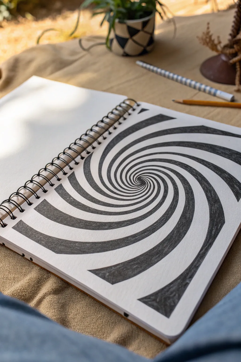
Dive into the mesmerizing world of op art with this graphite vortex tunnel, where simple lines transform into a deep, twisting abyss. The alternating black and white bands create an undeniable sense of motion and depth that looks complicated but is surprisingly meditative to draw.
Step-by-Step Guide
Materials
- Sketchbook or drawing paper (heavyweight preferred)
- Set of graphite pencils (HB, 2B, 4B, 6B)
- Pencil sharpener
- Vinyl eraser
- Precision eraser (for highlights)
- Compass (optional, for starting center)
- Blending stump (paper tortillon)
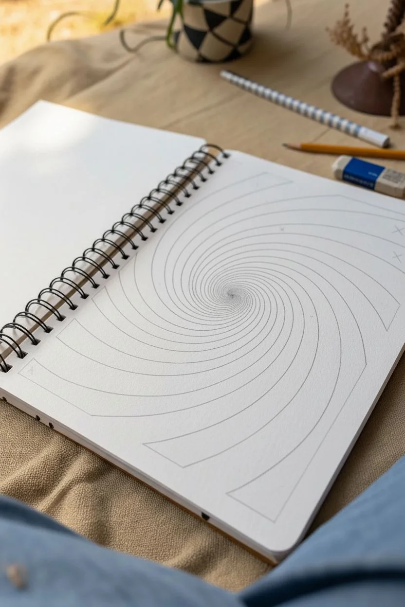
Step 1: Laying the Spiral Foundation
-
Find your center:
Begin by marking a very faint dot exactly where you want the center of your vortex to be. This doesn’t have to be the dead center of the page; offsetting it slightly can make the composition more dynamic. -
Start the coil:
Using an HB pencil with light pressure, draw a tiny, tight spiral starting from your center dot. Keep the lines very close together initially to create the illusion of infinite depth at the tunnel’s end. -
Expand the spiral:
Continue winding the single line outward. As you move away from the center, gradually increase the spacing between the rotation lines. The widening gap is crucial for creating the perspective of the tunnel opening up towards the viewer. -
Anchor the edges:
Keep spiraling until your line runs off the edge of the paper. Don’t worry if it’s not a perfect mathematical spiral; organic wobbles actually help it look more like a natural phenomenon. -
Define the second edge:
Now, go back to the center. Start a second line right next to your first one, but this time, you are defining the width of the ‘arms.’ Effectively, you want to turn that single line spiral into a ribbon by drawing a parallel line that gets wider as it moves outward. -
Check the proportions:
Step back and look at your line work. You should now have a continuous double-line spiral that creates a ribbon growing from thin at the center to wide at the edges.
Step 2: Blocking in the Dark Bands
-
Mark the dark zones:
Lightly mark an ‘X’ inside every other band of the spiral. The illusion works on alternating contrast, so it is incredibly important not to lose track of which sections remain white and which become black. -
Begin the shading process:
Switch to a 2B pencil. Start shading the marked sections, beginning from the outer edges where the bands are widest. Outline the edges of the band first to ensure a crisp, clean border against the white sections. -
Establish base values:
Fill in the large outer dark bands with a medium pressure. You don’t need pitch black yet; just get a solid grey base layer down to establish the structure. -
Refine the center shading:
Move toward the center with a freshly sharpened pencil. The bands here are tiny, so precision is key. Fill these small inner sections carefully, ensuring you don’t smudge graphite into the white neighboring lanes.
Smudge Guard
Place a scrap piece of paper under your drawing hand. This prevents your palm from dragging graphite across the pristine white sections while you work around the spiral.
Step 3: Deepening Shadows and Texture
-
Layer for darkness:
Switch to a softer 4B or 6B pencil. Go back over your shaded areas to deepen the black values. I prefer specific visible strokes that follow the curve of the spiral, as this enhances the feeling of movement. -
Create the gradient:
To make the bands look curved (like tubes) rather than flat, apply slightly more pressure at the edges of the black bands and leave the center of the black band ever so slightly lighter. This mimics light hitting a curved surface. -
Smooth the transitions:
If you want a smoother textural look, use a blending stump to rub the graphite into the paper tooth. However, for the grainy texture seen in the reference image, avoid over-blending and let the pencil texture shine. -
Clean the distinct edges:
Take your eraser and clean up any smudges on the white bands. The optical illusion relies heavily on the sharpness of the contrast between the dark and light areas. -
Add subtle depth:
Using your hardest pencil (HB or H), add extremely faint shading to the *white* bands, just at the very edges where they touch the black lines. This creates a slight shadow, suggesting the white bands are receding or overlapping. -
Final darkening pass:
Inspect the center hole. It needs to be the darkest point of the drawing to pull the eye in. Press hard with your 6B pencil right in that central vortex point. -
Sharpen outer boundaries:
Finally, re-trace the boundary lines between black and white sections one last time with a sharp pencil to make the separation razor-sharp.
Lost in the Spiral?
If you lose track of which band to color, follow the sheer white path from the outside edge all the way to the center with your finger before laying down any dark lead.
Now step back and enjoy the dizzying depth of your hand-drawn tunnel


Floating Cube With a Strong Cast Shadow
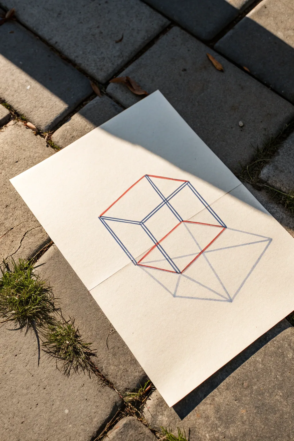
This clever optical illusion uses anamorphic perspective to make a simple geometric cube appear to float above the page. By drawing across a folded seam and adding a strategic shadow, you’ll trick the eye into seeing depth where there is only flat paper.
Step-by-Step Guide
Materials
- A4 or Letter-sized drawing paper (heavier stock like Bristol or cardstock works best)
- Ruler or straight edge
- Red felt-tip pen or fine liner
- Blue felt-tip pen or fine liner
- Graphite pencil (HB or 2B)
- Eraser
- Masking tape (optional)
Step 1: Setting the Stage
-
Fold the paper:
Take your sheet of paper and fold it in half horizontally. Crease it sharply, then unfold it so it lays somewhat flat but retains the bend. -
Position the paper:
Lay the paper on your surface. You want to work with the folded ridge rising slightly towards you, or press it flat if you prefer, knowing you will display it at an angle later. -
Establish the vanishing point:
Lightly mark a singular vanishing point near the top-center of the upper half of the paper with your pencil. This will guide your vertical lines.
Camera Ready
This illusion works best through a camera lens! Set your phone on a tripod at a 45-degree angle to the paper fold to instantly lock the perspective.
Step 2: Constructing the Cube Top
-
Draw the top square:
On the upper half of the paper, above the fold line, use your red pen to draw a diamond shape (which acts as the top of your cube). The top and bottom corners of this diamond should align vertically. -
Add the upper sides:
Switch to your blue pen. From the left, right, and bottom corners of your red diamond, drop three lines straight down towards the fold line. These form the upper vertical edges of the cube. -
Close the upper section:
Draw the bottom edges of this upper section parallel to the top red edges. Stop exactly at the fold line of the paper.
Step 3: Bridging the Fold
-
Extend across the crease:
This is the tricky part. Continue your blue vertical lines from the top section straight across the fold onto the bottom half of the paper. They need to be long enough to create a tall, elongated look. -
Draw the base:
Connect these extended lines at the bottom on the lower half of the page. This shape should mirror the geometry of the top section but will look much longer and stretched out due to the anamorphic distortion. -
Create the inner square:
Inside the main structure, draw a second, smaller square ‘floating’ within the frame. Use blue for the vertical supports and red for the horizontal cross-sections to match your outer lines. -
Connect the layers:
Ensure the inner square connects perfectly to the outer frame with small diagonal connectors at the corners, maintaining the perspective logic.
Broken Lines?
If the lines don’t meet at the fold, lay the paper completely flat to draw the crossing lines, using a single ruler stroke to bridge the gap accurately.
Step 4: The Floating Illusion
-
Map the shadow:
To make the cube float, you need a cast shadow. Using a pencil, lightly sketch a triangular projection extending from the bottom corners of your drawn cube structure. -
Extend the shadow lines:
Draw faint lines from the base of the cube extending downwards and slightly to the right, mimicking how light would cast a shadow from a hovering object. -
Connect the shadow base:
Close off the shadow shape with lines parallel to the cube’s base. The shadow should look like a flattened, distorted version of the cube’s bottom face. -
Outline the shadow:
Go over your final shadow outline with the blue pen or a softer pencil to define it clearly against the white paper. -
Add gentle shading:
Lightly shade the inside of the shadow-shape with your pencil. Keep the shading uniform and relatively transparent so it looks like a natural shadow, not a solid object.
Step 5: Final Alignment
-
Clean up lines:
Wait a moment for the ink to fully dry, then gently erase any initial pencil guide marks or the vanishing point dot. -
Refold slightly:
Re-crease your paper fold to roughly a 90-degree angle (an ‘L’ shape). -
Find the viewpoint:
Set the paper on a flat surface and close one eye. Move your head around until the top and bottom halves of the drawing align perfectly. At this specific angle, the elongated bottom half shrinks visually, and the cube pops out in 3D.
Once you find that perfect viewing angle, your flat drawing transforms into a magical floating object

Over-Under Woven Ribbon Stripes
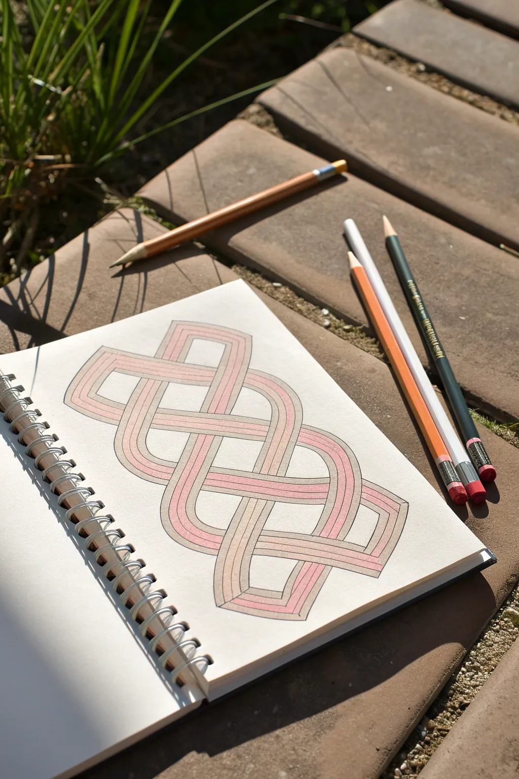
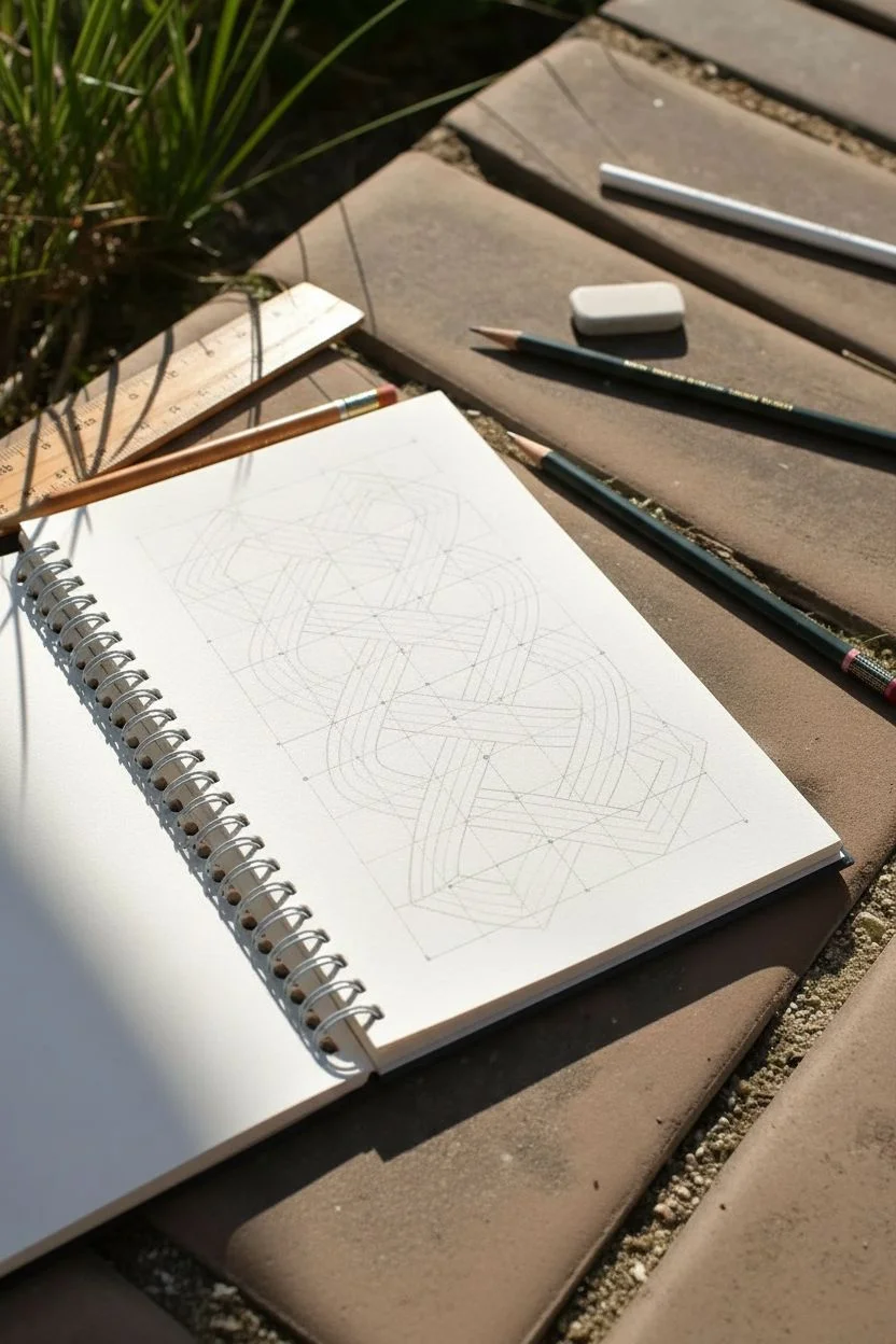
This satisfying geometric drawing features a continuous, looping knot design that creates the illusion of overlapping ribbons. By carefully placed shading and distinct color zones, the flat lines transform into a three-dimensional woven structure that seems to rise off the page.
Step-by-Step
Materials
- Spiral-bound sketchbook with smooth, heavyweight paper
- HB or 2B graphite pencil
- Fine-tip black fineliner (0.3mm or 0.5mm)
- Ruler or straight edge
- Eraser (kneaded preferred)
- Colored pencils (peach/beige, soft pink, white)
- Pencil sharpener
Step 1: Planning the Grid
-
Establish boundaries:
Begin by lightly sketching a rectangular boundary in the center of your page to frame the knot. This ensures the design stays centered and proportional. -
Draw the guidelines:
Inside your rectangle, sketch a light grid of dots or faint lines. For this specific knot, you’ll need a grid that is roughly 4 units wide by 6 units tall. These guide points will help you turn corners symmetrically. -
Sketch the primary path:
Using your pencil very lightly, draw the center line of the ribbon path first. Follow the over-under weaving pattern: a series of interlocking loops that look like figure-eights or continuous waves.
Lost in the loop?
If you lose track of the over-under pattern, trace the path with your finger. Say ‘over, under’ aloud as you move along the line to locate the error.
Step 2: Drawing the Ribbons
-
Create ribbon width:
Once the center path is correct, draw parallel lines on either side of it to create the width of the ribbon. Keep this width consistent throughout the entire design. -
Handle the corners:
At the points where the ribbon turns (the ‘elbows’), make sure the turns are sharp and angular, around 90 degrees, rather than rounded curves. This gives the knot its specific geometric style. -
Define the crossovers:
This is the most crucial step for the illusion. Wherever two ribbons cross, decide which one goes ‘over’ and which goes ‘under.’ Erase the lines of the bottom ribbon where it intersects the top ribbon so the top one appears unbroken. -
Repeat the pattern:
Go through every intersection. The pattern should alternate: over, under, over, under. If you hit two ‘overs’ in a row, double-check your initial path. -
Add internal stripes:
Draw two additional lines inside the ribbon, running parallel to the outer edges. This splits the single wide ribbon into three smaller stripes (center and two edges).
Step 3: Inking and Outline
-
Initial inking:
Take your black fineliner and carefully trace over the main outer edges of the ribbon. Use a ruler for the straight sections to keep them crisp. -
Ink the inner details:
Trace the internal stripe lines. Be very careful at the crossovers—stop your pen line exactly where the ‘under’ ribbon meets the ‘over’ ribbon. Do not draw through the top layer. -
Clean up:
Wait a moment for the ink to dry completely, then gently erase all remaining graphite guidelines to leave a clean, crisp black-and-white outline.
Pro Tip: Shadow depth
For deeper realism, add a tiny bit of cool grey pencil right at the darkest part of the cast shadow where the ribbons overlap. It adds instant depth.
Step 4: Coloring and Dimensions
-
Base layer: Beige:
Select your peach or beige colored pencil. Color the two outer stripes of the ribbon entirely in this shade, leaving the very center stripe white for now. -
Adding the pink accent:
Take the soft pink pencil. Lightly layer this color over the beige on the outer stripes, but only on specific sections to create a gradient or alternating pattern. I find keeping the pink subtle helps the ‘vintage’ look. -
Shading the ‘Under’ sections:
Use a darker touch with the beige pencil (or a light brown) to add shadows right where a ribbon goes *underneath* another. Shade close to the intersection and fade it out as you move away. -
Highlighting:
Leave the center stripe pristine white to act as a highlight. You can use a white colored pencil to blend the edges of the beige stripes slightly into the center for a softer transition. -
Final Contrast:
Go back with your black pen and slightly thicken the lines on the ‘shadow’ side of the ribbons (usually the bottom or right edges) to make the knot pop off the page.
Take a step back to admire how simple lines have transformed into a complex, woven masterpiece

PENCIL GUIDE
Understanding Pencil Grades from H to B
From first sketch to finished drawing — learn pencil grades, line control, and shading techniques.
Explore the Full Guide
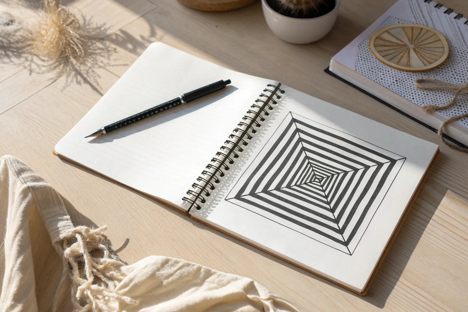
Concentric Squares That Turn Into a Pyramid
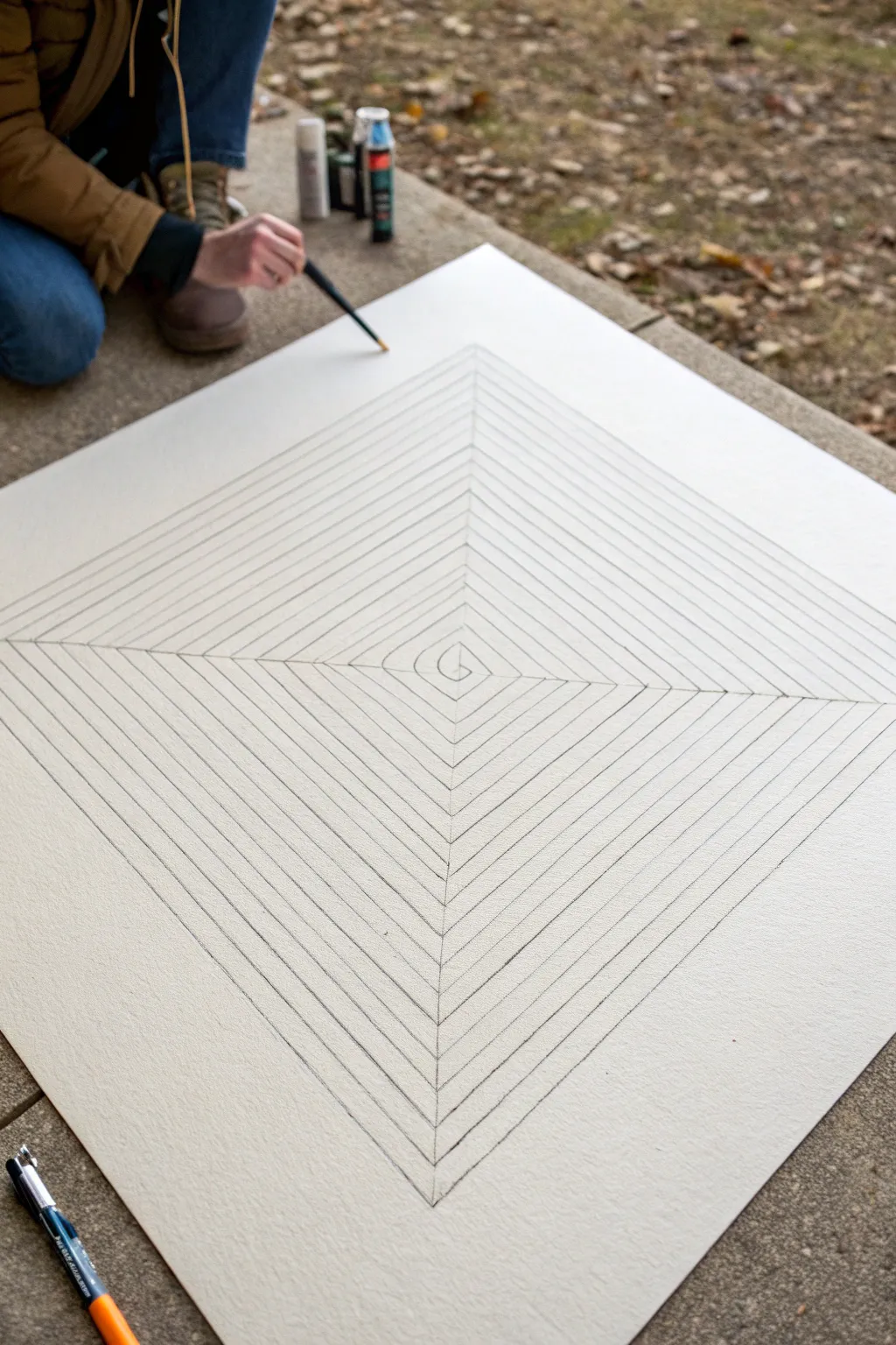
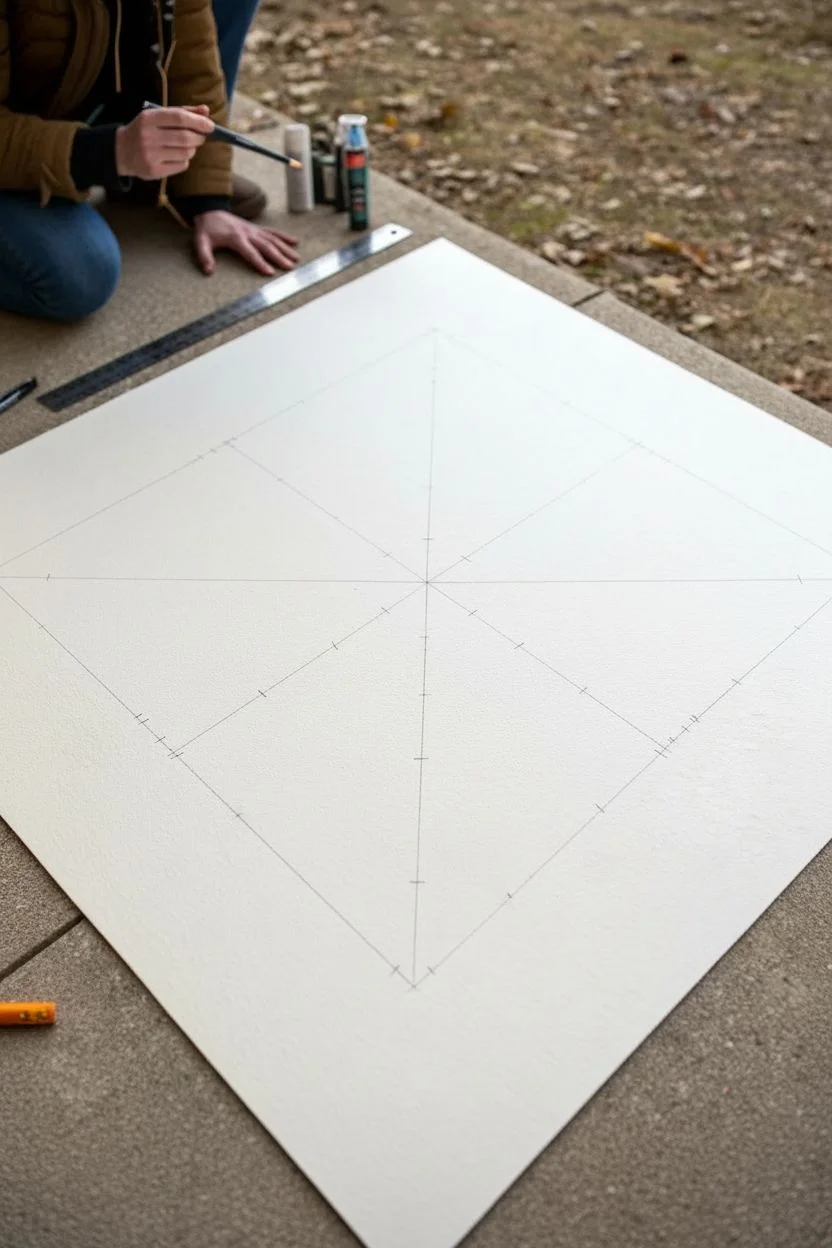
Transform a simple flat surface into a mesmerizing structure with this concentric square optical illusion. By carefully spacing expanding diamond shapes, you’ll create a tunnel effect that looks like a pyramid rising from the page.
How-To Guide
Materials
- Large square paper or illustration board
- Long straight edge or ruler (18-24 inches)
- Pencil (HB or H for light lines)
- Fine-tip black marker or drawing pen
- Eraser
- Flat surface or table
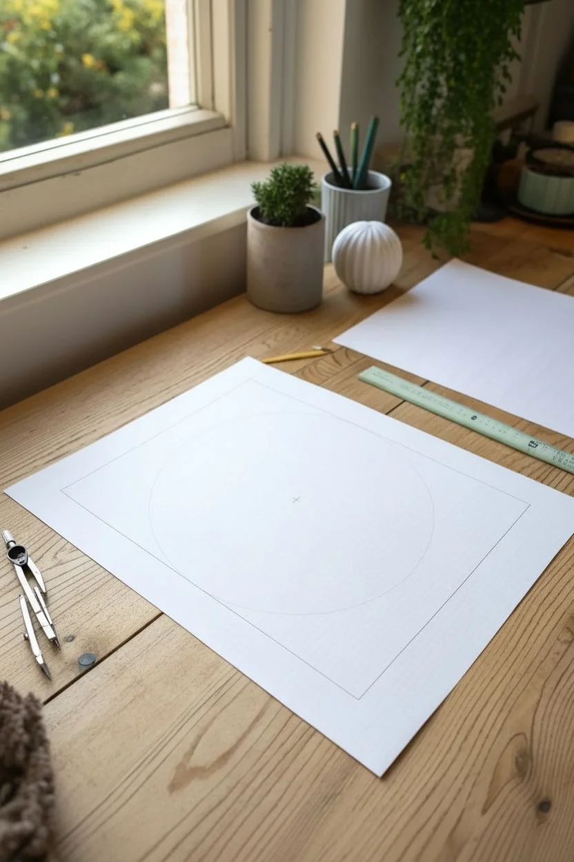
Step 1: Setting the Foundation
-
Find the center:
Begin by laying your large square paper or board on a flat, stable surface. Use your ruler to measure the width and height, placing a tiny dot exactly in the geometric center of the sheet. -
Draw the cross:
Using your long straight edge, draw a vertical line and a horizontal line that intersect perfectly at your center dot. These guide lines should extend all the way to the edges of your paper. -
Mark the intervals:
Starting from the center point and moving outward along all four arms of your cross, make small tick marks at even intervals. I find that spacing them about 1 inch (2.5 cm) apart works perfectly for a drawing this size.
Step 2: Constructing the Diamonds
-
Connect the first layer:
Locate the innermost set of four tick marks closest to the center. Use your ruler to connect these four points with straight lines, creating a small diamond shape around the center. -
Expand outward:
Move to the next set of tick marks and connect them in the same diamond pattern. Ensure your ruler aligns perfectly with the marks each time to keep the structural integrity of the illusion. -
Continue the pattern:
Repeat this process, moving outward one interval at a time. As the diamonds get larger, double-check that your ruler doesn’t slip, as the longer lines are harder to keep straight. -
Verify the spacing:
Pause occasionally to look at the overall shape. The lines should appear parallel to each other, maintaining that consistent 1-inch gap throughout the entire expansion. -
Reach the edges:
Continue drawing these concentric diamonds until your lines run off the edge of the paper. It’s okay if the corners get cut off; this actually enhances the infinite look of the illusion.
Wobbly Lines?
If your ruler slips often, stick small pieces of masking tape to the back of the ruler. The texture provides grip on the paper without damaging it.
Step 3: Inking and Details
-
Start the center spiral:
At the very center of the grid, instead of a closed diamond, sketch a small, tight spiral or a ‘G’ shape to act as the peak or vanishing point of the pyramid. -
Ink the main lines:
Switch to your fine-tip black marker or drawing pen. Carefully trace over all your pencil lines, starting from the center and working your way out to avoid smudging the fresh ink with your hand. -
Define the axis lines:
Don’t forget to trace the original vertical and horizontal cross lines you drew in the very first step. These corner seams are crucial for defining the ‘edges’ of the pyramid structure. -
Add line weight (optional):
If you want the pyramid to have more depth, you can slightly thicken the lines on one side (like the bottom right quadrant) to simulate a shadow effect. -
Let the ink cure:
Allow the drawing to sit for at least 10-15 minutes to ensure the ink is completely dry before touching it again. -
Erase the guides:
Gently run your eraser over the entire drawing to remove any visible pencil grit or tick marks, leaving only the crisp black ink illusion behind.
Add Color Depth
Use gray markers to shade every other band on two opposite sides of the pyramid. This creates a powerful lighting effect that enhances the 3D look.
Step back and admire how simple distinct lines create such a complex sense of depth.
Bulging Sphere Grid (Like a Balloon Under the Paper)
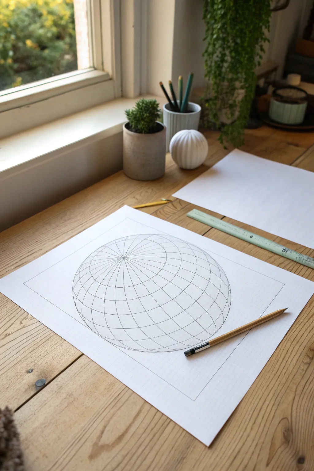
Learn how to transform a flat piece of paper into a convincing three-dimensional volume with just a pencil and ruler. This optical illusion mimics the effect of a sphere or balloon inflating beneath a grid, creating a mesmerizing warped surface.
Step-by-Step Guide
Materials
- White drawing paper (A3 or A4)
- Graphite pencil (HB or 2B)
- Ruler
- Compass
- Eraser
- Fine-liner pen (optional for inking)
Step 1: Planning the Grid Area
-
Define the borders:
Start by drawing a large rectangle centered on your paper. Leave a generous margin of white space around the edges, as this frame helps contain the illusion and makes the 3D effect pop. -
Mark the center point:
Find the exact center of your rectangle by lightly sketching diagonal lines from corner to corner. Where they cross is your center point; mark it very lightly and erase the diagonals. -
Draw the sphere outline:
Place the point of your compass on the center mark. extend the pencil arm out until you have a circle that fills most of the rectangle but doesn’t touch the edges. Draw a very faint guide circle.
Grid looks flat?
Ensure your curve lines get closer together near the edges of the sphere area. This compression of space is crucial for selling the 3D volume effect.
Step 2: Constructing the Warped Latitudes
-
Establish the vertical axis:
Using your ruler, draw a straight vertical line directly through the center point, extending from the top edge of your rectangle to the bottom. -
Draw the equator:
Draw a horizontal line through the center point. However, instead of using a ruler, slightly curve this line so it bows downward just a fraction, following the spherical nature of the shape. -
Sketch the upper curves:
Above the equator line, draw a series of arched lines that curve upward. These lines should start wider apart near the center and get progressively closer together as they reach the ‘North Pole’ of your sphere. -
Sketch the lower curves:
Create the mirror image below the equator. Draw arches that curve downward, again spacing them tighter as they move toward the bottom of the circle. -
Tip: Keep lines consistent:
Try to ensure the distance between the anchor points of these curves on the circle’s perimeter remains relatively equidistant.
Step 3: Adding the Longitudes
-
Add the central curves:
Now for the vertical curves. Starting from the top ‘pole’ (where the vertical axis hits the circle), draw a curved line connecting to the bottom pole, bowing outward to the left. -
Mirror the verticals:
Draw a matching curve bowing outward to the right side. You now have a central ‘eye’ shape. -
Fill the remaining segments:
Continue adding curved vertical lines moving outward from the center. Each line should be more curved than the last as it approaches the edge of the circle. -
Connect to the flat grid:
Outside the circle guide, use your ruler to draw faint straight horizontal and vertical lines that align with the points where your curved lines hit the circle’s edge. This connects the warped sphere to the ‘flat’ paper surface.
Level Up: Checkerboard
Turn the drawing into a warped chessboard by shading every other square black. The high contrast makes the spherical distortion even more dramatic.
Step 4: Refining and Shading
-
Darken the main lines:
Once you are happy with the wireframe structure, go over your pencil lines with firm, confident strokes. I find rotating the paper helps me keep my wrist steady on the curves. -
Erase guidelines:
Carefully remove the original circle perimeter guideline. The sphere shape should form purely from the distortion of the grid lines, not an outline. -
Identify the light source:
Choose a direction for your light (usually top-left or top-right). This determines where your shadows fall. -
Apply basic shading:
Use the side of your pencil lead to add shading on the side of the sphere opposite your light source. Focus on individual grid squares, making them darker where they curve away from the viewer. -
Add cast shadow:
Lightly shade a crescent shape on the ‘flat’ grid underneath the sphere to suggest it is hovering or bulging upward.
Step back and admire how your simple flat lines now leap off the page with geometric volume
BRUSH GUIDE
The Right Brush for Every Stroke
From clean lines to bold texture — master brush choice, stroke control, and essential techniques.
Explore the Full Guide
Cylinders Made Only With Curved Line Contours
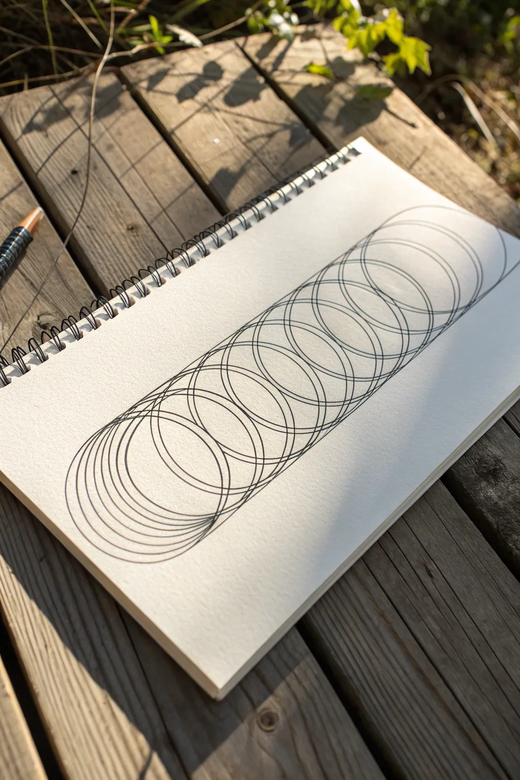
This mesmerizing exercise transforms simple overlapping circles into a dense, dimensional cylindrical form that seems to stretch across the page. By carefully repeating curved contours, you’ll create a wireframe-like structure that plays with transparency and depth.
Step-by-Step
Materials
- Sketchbook or drawing paper (heavyweight preferred)
- Black fine-liner pen (0.3mm to 0.5mm)
- Pencil (HB or 2H for light guidelines)
- Eraser
- Circle template or a compass (optional but helpful for precision)
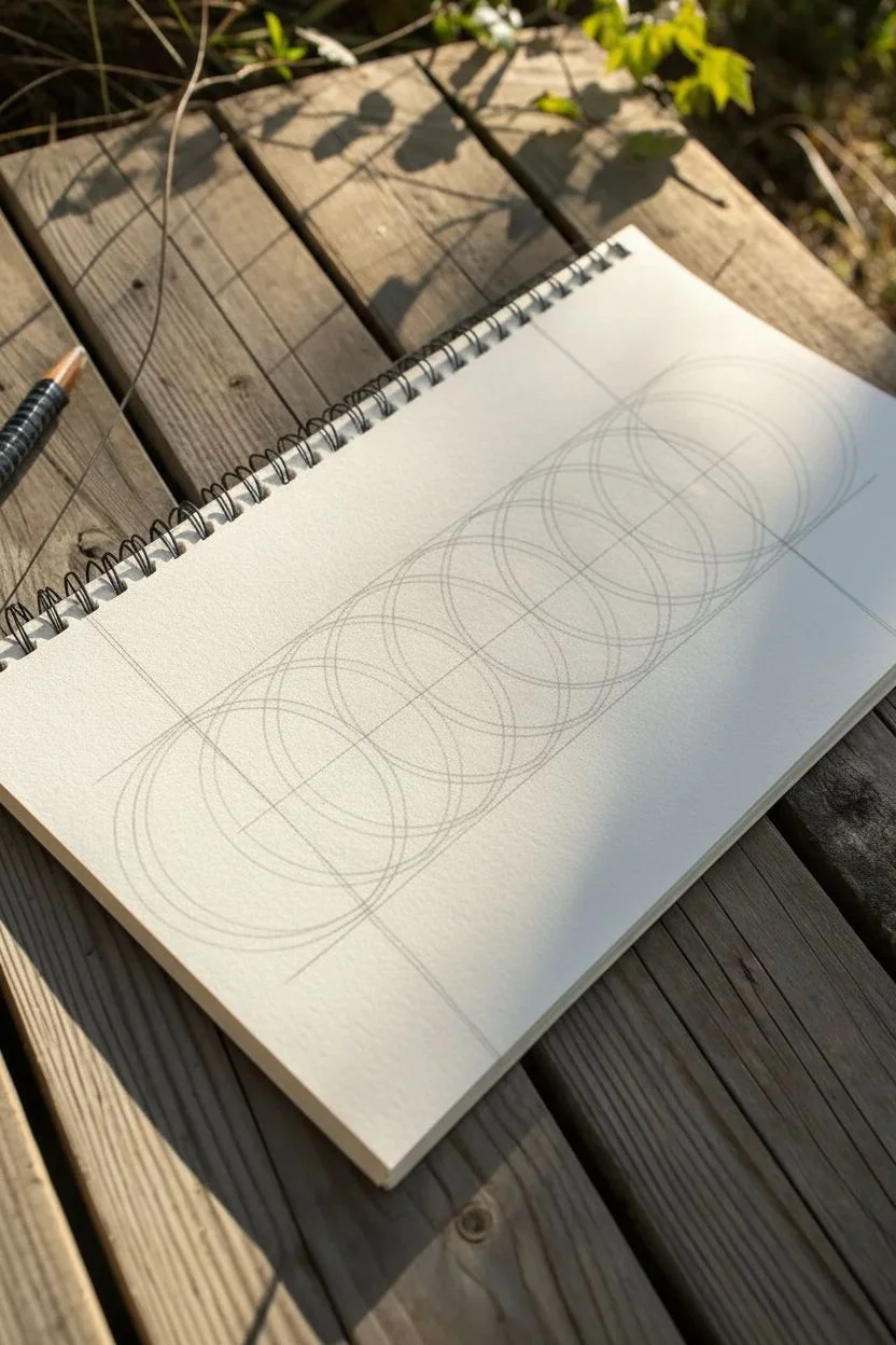
Step 1: Planning the Structure
-
Establish the axis:
Begin by lightly drawing a straight pencil line down the center of your page. This central axis will help keep your cylinder aligned and prevent it from curving unintentionally as you work. -
Mark the boundaries:
Draw two parallel pencil lines on either side of the center axis to define the width of your cylinder. The distance between these lines determines how wide your circles will be. -
Sketch the primary circles:
Using your pencil, lightly sketch the first circle at one end of your guide lines. It should touch both side boundaries. -
Map the repetition:
Continue sketching light guide circles along the track. Space them out so they overlap significantly—think of a slinky that has been stretched out. You don’t need to draw every single final line yet, just establish the rhythm.
Wobbly Lines?
If freehand circles are tough, trace a wide coin or the bottom of a cup. Slide it up just a millimeter between each tracing for perfect spacing.
Step 2: Inking the Coil
-
Start the first ink stroke:
Switch to your fine-liner pen. Carefully trace your first circle at the bottom (or top) of the form. Use a confident, steady hand to keep the line weight consistent. -
Begin the overlapping offset:
Draw the second circle just slightly higher than the first. The key illusion here is that the new circle overlaps roughly 80-90% of the previous one, shifting just a small step forward. -
Maintain the rhythm:
Continue drawing circles, moving progressively along your guide. Focus on keeping the vertical spacing (the gap between the bottom of one circle and the bottom of the next) as consistent as possible. -
Watch your edges:
Ensure the left and right sides of every circle touch your invisible boundary lines. If your circles start shrinking or growing, the cylinder effect will distort. -
Create density:
I find it helpful to draw the circles closer together in some sections to create ‘denser’ areas. This variation prevents the drawing from looking too mechanical. -
Adjust the angle:
As you move along the cylinder, you can subtly change the ellipse shape from a perfect circle to a slightly flattened oval if you want to simulate perspective, though sticking to uniform circles works perfectly for an isometric look.
Twist and Turn
Instead of a straight cylinder, draw a curved guide line first. creating a winding ‘snake’ or S-shape of overlapping circles.
Step 3: Refining and Finishing
-
Checking the flow:
Pause and look at the overall shape. Fill in any noticeable gaps with an extra partial curve if a section looks too open compared to the rest. -
Erase guidelines:
Once the ink is completely dry—give it a good few minutes to avoid smudging—gently erase your initial pencil axis and boundary lines. -
Enhance line weight:
Go back over the outermost edges of the entire cylinder form with a slightly thicker line or a second pass. This helps contain the shape and makes it pop off the page. -
Add subtle shading (optional):
You can add tiny hatching lines where the circles overlap most densely at the edges, which emphasizes the roundness of the 3D form.
Now you have a striking geometric study that looks complicated but is built from simple repetition
Inside-Out Room With Extreme One-Point Perspective
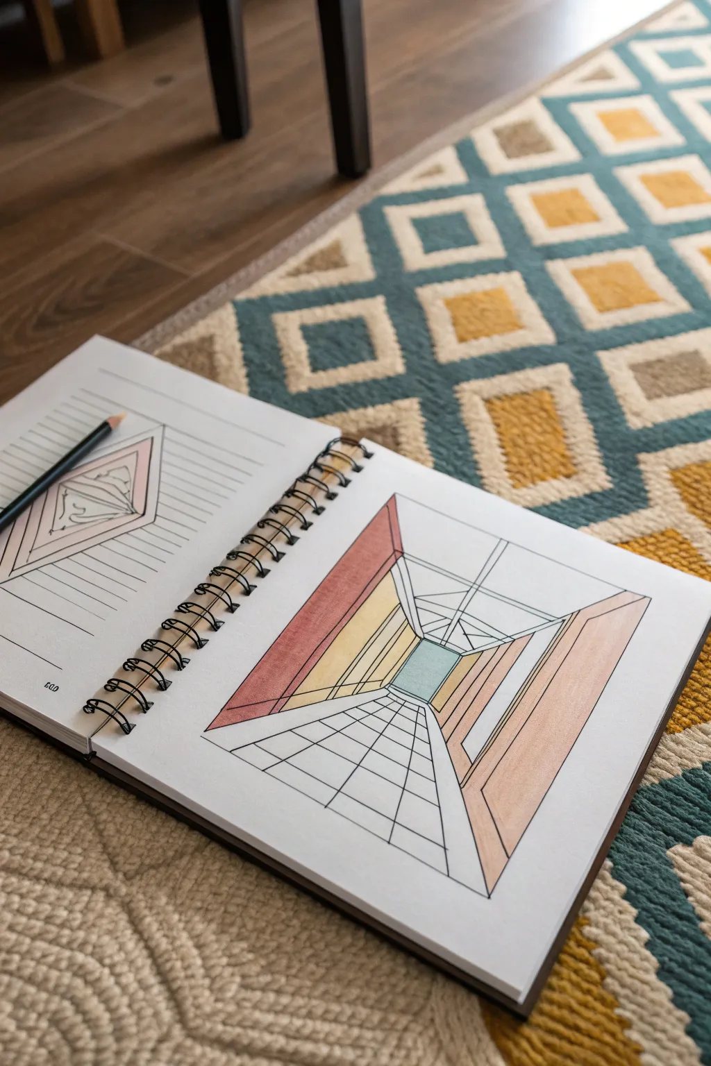
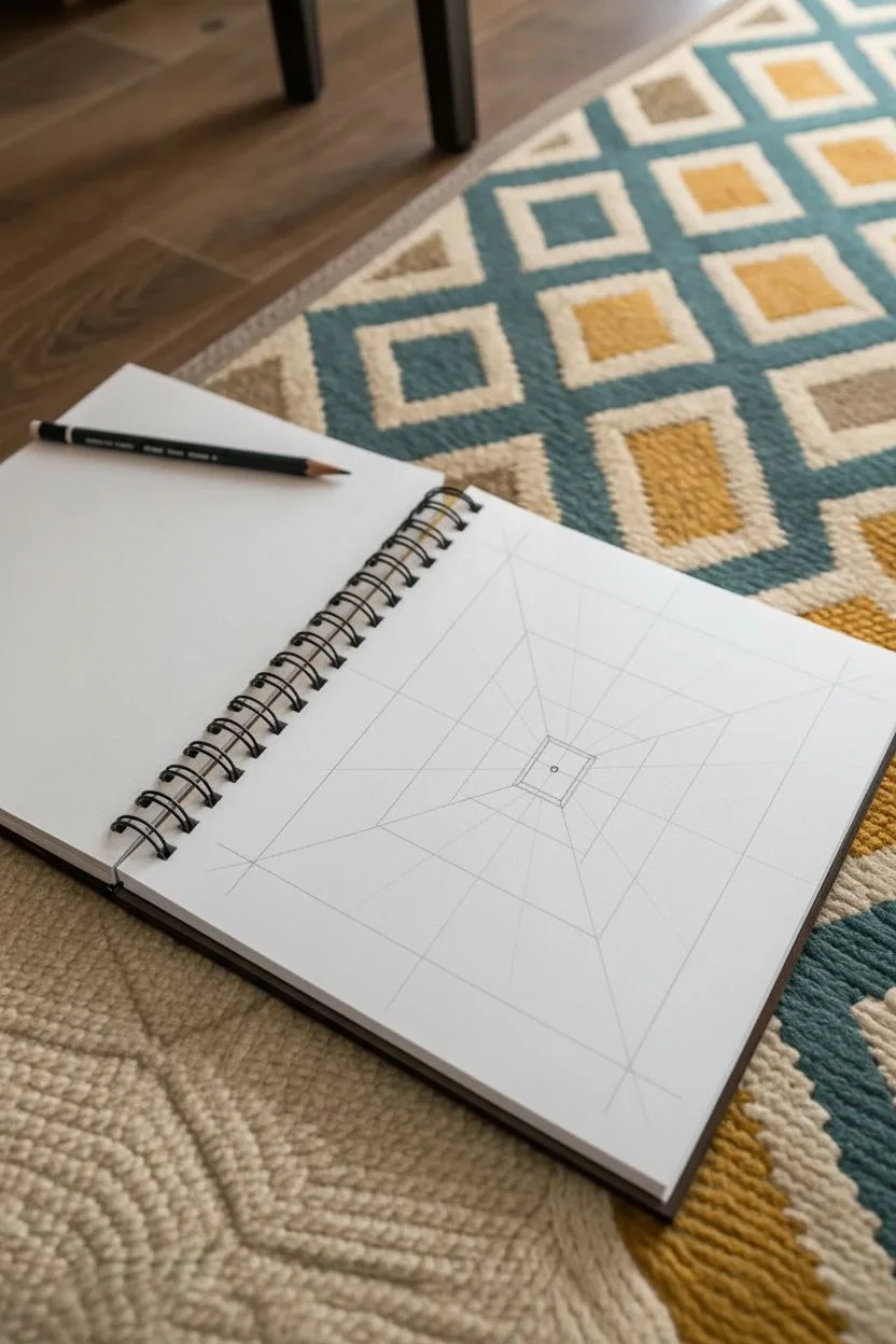
Step into a world of depth with this classic one-point perspective drawing that transforms a flat page into a long, dimensional corridor. Using simple geometric lines and a soft color palette, you’ll create an architectural space that feels like you could walk right into it.
Step-by-Step Tutorial
Materials
- Spiral-bound sketchbook (heavyweight paper recommended)
- Sharpened HB pencil
- Fine-point black fineliner (0.3mm or 0.5mm)
- Ruler or straightedge
- Eraser
- Colored pencils or light markers (terracotta, yellow ochre, peach, pale blue)
Step 1: Setting the Perspective
-
Establish the vanishing point:
Begin by lightly marking a single dot in the exact center of your page. This will be the focal point where all receding lines converge. -
Draw the back wall:
Using your ruler, lightly draw a small rectangle around your vanishing point. This represents the far end of the hallway. -
Create the main corners:
Place your ruler on the vanishing point and align it with one corner of your small rectangle. Draw a straight line extending from that corner all the way to the edge of the paper. Repeat this for all four corners to create the illusion of walls, ceiling, and floor. -
Define the room shape:
About halfway between the back wall and the paper’s edge, draw a larger rectangle that connects the four diagonal lines you just made. This creates the box-like structure of the room.
Depth Perception Tip
Make the lines of your floor tiles slightly thicker in the foreground (bottom of page) and thinner as they move toward the center.
Step 2: Structural Details
-
Add vertical wall supports:
On the side walls, draw vertical lines descending from the ceiling line to the floor line. Space them out so they get closer together as they approach the center square to enhance the depth effect. -
Sketch the ceiling beams:
Draw diagonal lines across the top ceiling section, crisscrossing to form an ‘X’ shape or simple truss pattern that recedes toward the back wall. -
Lay the floor grid:
To create the tiled floor, draw faint lines starting from the vanishing point and radiating outward along the bottom floor section. I find lightly sketching these first helps keep the grid even. -
Complete the tiles:
Draw horizontal lines across the floor section. Similar to the wall supports, space these lines widely near the bottom of the page and closer together as they get near the back wall. -
Add side panels:
On the far left and right walls, add rectangular shapes to suggest doors or panels, following the perspective lines back to the vanishing point.
Step 3: Inking and Coloring
-
Inking the main lines:
Trace over your final pencil lines with the black fineliner. Use the ruler to ensure sharp, crisp edges for the architectural look. -
Clean up:
Wait a moment for the ink to fully set, then gently erase all remaining pencil marks and construction lines. -
Color the back wall:
Fill in the small central rectangle with a pale blue or teal to suggest a window or opening to the sky. -
Shade the left wall:
Use a terracotta or muted red pencil to color the upper section of the left wall. Apply the color evenly, pressing slightly harder near the edges for definition. -
add warmth:
Color the lower section of the left wall with a yellow ochre or mustard tone. -
Color the right wall:
Use a peach or light salmon color for the large panel on the right wall, keeping the stroke direction consistent with the perspective lines. -
Leave negative space:
Leave the floor tiles, ceiling, and specific trim areas white. This contrast makes the colored walls pop and emphasizes the stark geometry of the room.
Wobbly Lines?
If your ruler slips while inking, don’t restart. Thicken the line slightly to hide the bump, or turn the mistake into a crack or texture detail.
Now you have a striking perceptual illusion that draws the viewer deep into the page


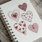
Hidden 3D Heart Illusion Using Line Direction Changes
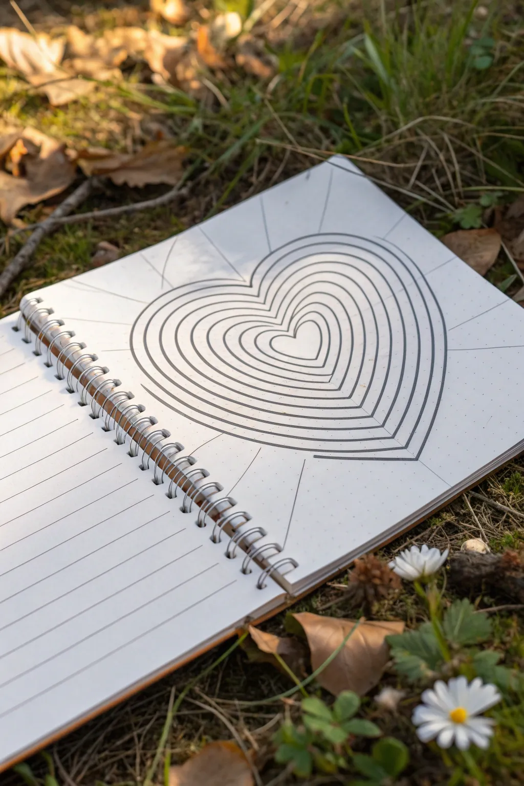
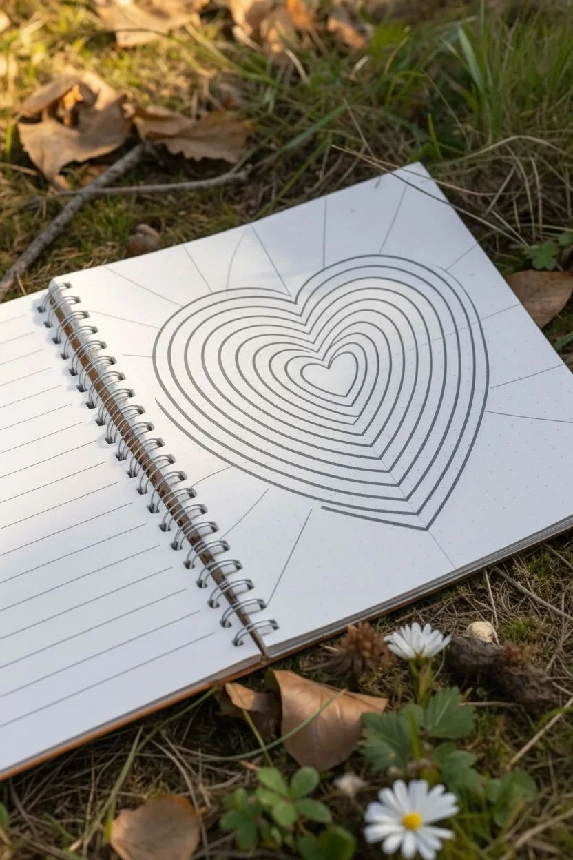
Create a mesmerizing optical illusion that looks like a heart vibrating or pulsing right off the notebook page. By alternating simple concentric hearts with straight radiating lines, you can trick the eye into seeing depth and movement in a flat drawing.
How-To Guide
Materials
- Dotted or grid notebook (preferred for precision)
- Fine-liner pen (black, 0.5mm or similar)
- Pencil (HB or lighter)
- Eraser
- Ruler
Step 1: Drafting the Heart
-
Mark the center:
Begin by finding the approximate center of your page. Since this is an optical illusion, centering is important for the symmetry, so count the dots or grid squares if you are using textured paper. -
Sketch the central heart:
Using your pencil, lightly sketch a small, symmetrical heart in the very center. It doesn’t need to be perfect, but keeping the two lobes even will make the final effect stronger. -
Draw outward guidelines:
Still using your pencil and a ruler, draw very faint straight lines radiating outward from the center of your heart to the edges of the page. Think of these like sunbeams; draw about 8 to 10 lines evenly spaced around the heart. -
Sketch expanding hearts:
Lightly sketch larger and larger heart outlines around your original center heart. Spacing is key here: try to keep the distance between each heart ring relatively consistent, though getting slightly wider as you go out adds drama.
Step 2: Inking the Illusion
-
Ink the smallest heart:
Switch to your black fine-liner. Carefully trace your central heart. This is the ‘anchor’ of the drawing, so take your time to get the curves smooth. -
Start the second ring:
Move to the next pencil heart outline. Ink this line just like the first one. -
Connect the segments:
This is where the magic happens. Instead of drawing the radiating straight lines *through* the hearts, stop your pen when you hit a heart outline. -
Draw the straight rays:
Using your ruler and pen, ink the straight ‘sunbeam’ lines only in the spaces *between* the largest heart outline and the edge of the paper. Do NOT draw these lines inside the heart shape itself. -
Add floating lines (optional):
For a more disjointed or ‘broken’ glass look, you can continue the straight lines inside the heart shapes but offset them slightly, or simply leave the interior of the hearts free of straight lines to emphasize the curves. -
Thicken selected lines:
Go back over your heart outlines. I find that making the curves slightly bolder than the straight radiating lines helps distinguish the ‘object’ from the ‘background’ visually.
Wobbly Curves?
If your hand shakes on the curves, try moving your entire arm from the shoulder rather than just your wrist. This usually creates smoother, more confident arcs.
Step 3: Refining and Finishing
-
Create distinct zones:
Verify that your radiating lines touch the outer edge of the largest heart but do not cross into it. This creates the boundary where the 3D form seems to emerge. -
Let the ink settle:
Give your drawing a few minutes to dry completely. Smudging wet ink with an eraser is heartbreaking after all that precision work. -
Erase pencil marks:
Gently erase all your initial pencil sketches. Be thorough, especially in the tight spaces between the heart rings. -
Check line consistency:
Look for any gaps in your black lines. Fill in any breaks where the pen might have skipped to ensure a solid, confident look. -
Add subtle shading (optional):
If you want extra depth, use a pencil to lightly shade just the bottom edge of each heart ring. This simulates a shadow and makes the layers look stacked.
Pro Tip: Line Weight
Use a thicker pen (0.8mm) for the heart curves and a thinner pen (0.3mm) for the straight radiating lines. This contrast instantly produces a stronger 3D pop.
Now you have a striking geometric heart that appears to be rippling right off the surface of your notebook


Have a question or want to share your own experience? I'd love to hear from you in the comments below!